class: title-slide, bottom, right background-image: url(https://images.unsplash.com/photo-1570386230314-9fe8204c6f80?ixlib=rb-4.0.3&ixid=M3wxMjA3fDB8MHxwaG90by1wYWdlfHx8fGVufDB8fHx8fA%3D%3D&auto=format&fit=crop&w=1708&q=80) background-size: cover ### Plotting # ### **Miriam Lerma**<br> June 2023 --- name: index class: title-slide, inverse # Index - [theory](#theory) - [geometries](#geoms) - [maps](#maps) - [aesthetics](#aesthetics) - [layers](#layers) - [export](#export) - [contact](#out) --- class: title-slide, inverse # Today .pull-left[ **Your profile** - You know how to use a Rmd document - You know how to install packages **Goals of today** - Create plots and maps in R - Change the apparence of the plots - Export you plots **Pauses and questions** - Exercises and 10 minute pauses for catching up - You can stop me to ask questions or use [this link <svg aria-hidden="true" role="img" viewBox="0 0 512 512" style="height:1em;width:1em;vertical-align:-0.125em;margin-left:auto;margin-right:auto;font-size:inherit;fill:#f2cc8f;overflow:visible;position:relative;"><path d="M432,320H400a16,16,0,0,0-16,16V448H64V128H208a16,16,0,0,0,16-16V80a16,16,0,0,0-16-16H48A48,48,0,0,0,0,112V464a48,48,0,0,0,48,48H400a48,48,0,0,0,48-48V336A16,16,0,0,0,432,320ZM488,0h-128c-21.37,0-32.05,25.91-17,41l35.73,35.73L135,320.37a24,24,0,0,0,0,34L157.67,377a24,24,0,0,0,34,0L435.28,133.32,471,169c15,15,41,4.5,41-17V24A24,24,0,0,0,488,0Z"/></svg>]( https://docs.google.com/document/d/1uG7a2_hkdaKQm5gKXRBFf6gcyoUBan2e69gL3ZKcwg8/edit?usp=sharing) ] .pull-right[ We will use the packages ```r devtools::install_github("MiriamLL/sula") devtools::install_github("MiriamLL/GermanNorthSea") devtools::install_github("MiriamLL/seamonas") install.packages('sf') install.packages('ggspatial') install.packages('plotly') ``` ] --- class: inverse # References .pull-left[ Tutorials/Books ggplot - [gg is for Grammar of Graphics](https://pkg.garrickadenbuie.com/trug-ggplot2)<br> - [Introduccion to ggplot](https://englelab.gatech.edu/useRguide/introduction-to-ggplot2.html) - [r4ds](https://r4ds.had.co.nz/data-visualisation.html) - [R Graphics Cookbook](https://r-graphics.org/) - [Allison Horst tutorial](https://allisonhorst.github.io/rice-data-viz/) - [Coolors](https://coolors.co/) <br> - [Palettes](https://mycolor.space/?hex=%23845EC2&sub=1) - [Size, Shape, Lines](https://ggplot2.tidyverse.org/articles/ggplot2-specs.html) - [Geocomputation with R](https://r.geocompx.org/attr.html) - [Earth Data Science](https://www.earthdatascience.org/) - [r-spatial](https://r-spatial.org/r/2018/10/25/ggplot2-sf-3.html) Gallery/Portafolios - [Data-Viz-Bookmarks](https://spcanelon.notion.site/spcanelon/Data-Viz-Bookmarks-dc01718020bd4fd6a8a4ca80e6bce933)<br> - [RGraphGallery](https://www.r-graph-gallery.com/) <br> - [DataToViz](https://www.data-to-viz.com/) <br> - [Georgios-Mastodon](https://ecoevo.social/@georgios@vis.social) ] .pull-right[ <img src="https://cdn.myportfolio.com/45214904-6a61-4e23-98d6-b140f8654a40/9a306c0a-dac8-413d-ba2e-cc7fd4c4d5c8_rw_1920.png?h=c802991088a9623f1f7aa18c470797ee" height="300" /> ] --- ## 1. Theory A typical R project looks like this: <img src="https://github.com/MiriamLL/R_intro/blob/master/Images/031Program.png?raw=true" height="200" /> .right[ Source: [R4DS](https://r4ds.had.co.nz/introduction.html) ] --- name: theory ## 1.1. Theory The objective of a graph/plot/map/chart is to communicate. <br> In science, the idea is to show information in a clear and understandable way. <img src="http://www.typesofgraphs.com/wp-content/uploads/2015/12/Typesofgraphs.png" height="350" /> Fuente: [VizThinker](https://paldhous.github.io/ucb/2016/dataviz/week2.html) --- ## 1.1. Theory Plotting is transforming data to visualizations that vary in shape, size and colors. <img src="https://paldhous.github.io/ucb/2016/dataviz/img/class2_1.jpg" height="350" /> Fuente: [VizThinker](https://paldhous.github.io/ucb/2016/dataviz/week2.html) --- ## 1.1. Theory There are many ways to plot data, and different ways to interpretate the graphs. <img src="https://paldhous.github.io/ucb/2016/dataviz/img/class2_2.jpg" height="350" /> Fuente: [VizThinker](https://paldhous.github.io/ucb/2016/dataviz/week2.html) --- ## 1.1. Theory Which one is more intuitive? <img src="https://paldhous.github.io/ucb/2016/dataviz/img/class2_4.jpg" height="350" /> Fuente: [VizThinker](https://paldhous.github.io/ucb/2016/dataviz/week2.html) --- ## 1.1. Theory Which one should I use? You can try different plots and choose the one that betters tells the story. **Tableau Public** has a suggestion on which graph to use according to the type of data you are using. <img src="https://paldhous.github.io/ucb/2016/dataviz/img/class2_5.jpg" height="300" /> --- name: intro ## 1.2. Intro There are many packages to create plots in R. - Here we will use **ggplot2**. ggplot is the most versatile one, and from which you can find more help and inspiration. <img src="https://github.com/MiriamLL/R_intro/blob/master/Images/ggplot2hex.png?raw=true" height="200" /> --- ## 1.2. Intro It can be divided in three main components: - **Data** (data): which are the variables that we plot. - **Geometry** (geom): a geometric object such as dots, lines, bars. - **Aesthetics** (aes): the aesthetic attributes to a geometric object, such as position, color, shape and size. Each component is displayed as **layers**. <img src="https://github.com/MiriamLL/R_intro/blob/master/Images/300Geoms.png?raw=true" height="200" /> Source [ggplot2 book](https://englelab.gatech.edu/useRguide/working-with-data-overview.html) --- ## 1.3. Data The package ggplot is already included in tidyverse. <br> If you have installed tidyverse you just need to call your package. ```r library(tidyverse) ``` If not you can also install it separately. ```r install.packages("ggplot2") ``` --- ## 1.3. Data For the exercises, we can use data from packages.<br> Lets add our object to our **environment**. Package with data ```r library(palmerpenguins) penguins<-penguins ``` Call library **ggplot2**. ```r library(ggplot2) ``` --- ## 1.3. Data First step: add data to a plot. ```r ggplot(data=penguins) ``` <!-- --> We told ggplot what data frame we want to use, but need to give instruction on how to plot. <br> --- ## 1.3. Add axis Using **mapping** we tell ggplot what to plot in the x and y axis.<br> **Note** that the axis are columns from your data frame. This is when having tidydata is important. ```r ggplot(data=penguins, * mapping=aes(x=bill_length_mm, * y=bill_depth_mm)) ``` 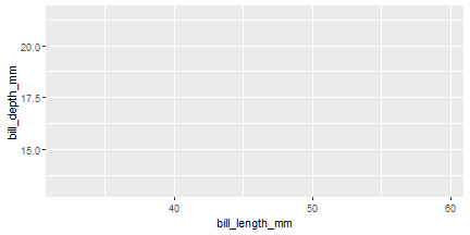<!-- --> --- ## 1.3. Geometry The next step is to give it a geometry, in this case we say plot points with the argument **geom_point** ```r ggplot(data=penguins, mapping=aes(x=bill_length_mm,y=bill_depth_mm))+ * geom_point() ``` 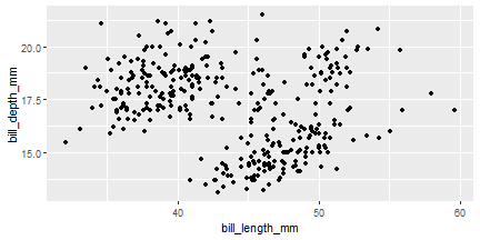<!-- --> It would likely show a **warning**. <br> This is because NAs are not going to be plotted and R is trying to warn you. --- ## 1.3. Geometry There are many **geometries**. Most of them start with **geom_*** <img src="https://github.com/MiriamLL/R_intro/blob/master/Images/302geometries.png?raw=true" height="400" /> --- ## 1.3. Geometry Examples of most common geometries are to be found on [R-graph-gallery](https://r-graph-gallery.com/). .pull-left[ <img src="https://github.com/MiriamLL/R_intro/blob/master/Images/302examples.png?raw=true" height="150" /> <img src="https://github.com/MiriamLL/R_intro/blob/master/Images/306examples.png?raw=true" height="200" /> ] .pull-right[ <img src="https://github.com/MiriamLL/R_intro/blob/master/Images/307examples.png?raw=true" height="200" /> ] --- ## 1.4. Common mistakes The most common mistakes with plotting are the same as while writing code. <img src="https://github.com/MiriamLL/R_intro/blob/master/Images/023DebuggingBingo.jpg?raw=true" height="450" /> --- ## 1.4. Common mistakes Other common mistakes specific to ggplot are: - Forgetting a plus symbol ( **+** ) ```r ggplot(data=penguins, mapping=aes(x=bill_length_mm,y=flipper_length_mm)) geom_point() ``` - Adding the **+** on the wrong order ```r ggplot(data=penguins, mapping=aes(x=bill_length_mm,y=flipper_length_mm)) +geom_point() ``` - Forgetting a parenthesis ```r ggplot(penguins, * aes(x=bill_length_mm,y=flipper_length_mm)+ geom_point() ``` --- ## 1.4. Common mistakes Not having **tidydata** is also a very common problem. <img src="https://github.com/MiriamLL/R_intro/blob/master/Images/104TidyData.jpg?raw=true" height="300" /> Source [Allison Horst](https://allisonhorst.com/) --- ## 1.5. Cheat sheet Help>CheatSheets>Data Visualization with ggplot <img src="https://github.com/MiriamLL/R_intro/blob/master/Images/314cheatsheet.png?raw=true" height="400" /> --- ## 1.6. Simplify We can skip writing **data=** and **mapping=** by just following the order of the elements. Both codes give the same output. .pull-left[ Including the elements. ```r ggplot(data=penguins, mapping=aes(x=bill_length_mm, y=flipper_length_mm))+ geom_point() ``` 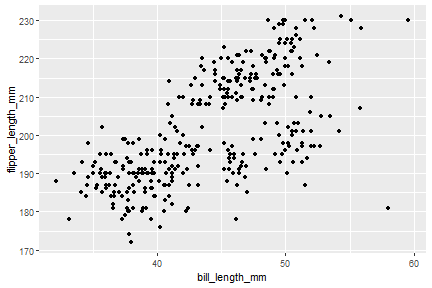<!-- --> ] .pull-right[ Simplified example. ```r ggplot(penguins, aes(x=bill_length_mm, y=flipper_length_mm,))+ geom_point() ``` <!-- --> ] --- class: inverse # Pause .pull-left[ Practice <svg aria-hidden="true" role="img" viewBox="0 0 512 512" style="height:1em;width:1em;vertical-align:-0.125em;margin-left:auto;margin-right:auto;font-size:inherit;fill:#FFFFFF;overflow:visible;position:relative;"><path d="M497.9 142.1l-46.1 46.1c-4.7 4.7-12.3 4.7-17 0l-111-111c-4.7-4.7-4.7-12.3 0-17l46.1-46.1c18.7-18.7 49.1-18.7 67.9 0l60.1 60.1c18.8 18.7 18.8 49.1 0 67.9zM284.2 99.8L21.6 362.4.4 483.9c-2.9 16.4 11.4 30.6 27.8 27.8l121.5-21.3 262.6-262.6c4.7-4.7 4.7-12.3 0-17l-111-111c-4.8-4.7-12.4-4.7-17.1 0zM124.1 339.9c-5.5-5.5-5.5-14.3 0-19.8l154-154c5.5-5.5 14.3-5.5 19.8 0s5.5 14.3 0 19.8l-154 154c-5.5 5.5-14.3 5.5-19.8 0zM88 424h48v36.3l-64.5 11.3-31.1-31.1L51.7 376H88v48z"/></svg><br> Open the file [03ExercisesPlotting.Rmd](https://github.com/MiriamLL/R_intro/blob/master/03ExercisesPlotting.Rmd) Create your first plot in R. <img src="https://github.com/MiriamLL/R_intro/blob/master/Images/316RmdIcon.png?raw=true" height="50" /> 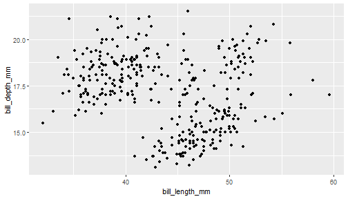<!-- --> ] .pull-right[ Until here: - [index](#index) - [theory](#theory) Next part: - [geometries](#geoms) - [maps](#maps) - [aesthetics](#aesthetics) - [layers](#layers) - [export](#export) - [contact](#out) ] --- name: geoms class: title-slide, inverse, bottom background-image: url(https://images.unsplash.com/photo-1639303638626-2003b9ac307e?ixlib=rb-4.0.3&ixid=M3wxMjA3fDB8MHxwaG90by1wYWdlfHx8fGVufDB8fHx8fA%3D%3D&auto=format&fit=crop&w=1170&q=80) background-size:cover .pull-right[ # <span style=" font-weight: bold; color: #e5e5e5 !important;border-radius: 4px; padding-right: 4px; padding-left: 4px; background-color: #003049 !important;" >Geometries</span> ### <span style=" font-weight: bold; color: #e5e5e5 !important;border-radius: 4px; padding-right: 4px; padding-left: 4px; background-color: #003049 !important;" >Different displays</span> ] --- name: scatterplot ## 2.1. Scatterplots The scatterplot is most useful for displaying the relationship between two continuous variables. Each dot represents an observation. Their position on the x (horizontal) and y (vertical) axis represents the values of the 2 variables. The argument to create scatterplots is **geom_point** ```r ggplot(data=penguins, mapping=aes(x=bill_length_mm,y=bill_depth_mm))+ * geom_point() ``` <!-- --> See more [scatterplots](https://r-graph-gallery.com/scatterplot.html) --- name: lines ## 2.2. Line chart A line chart or line graph displays the evolution of one or several numeric variables. <br> Data points are connected by straight line segments. The argument to create line charts is **geom_line()** ```r ggplot(data=penguins, mapping=aes(x=bill_length_mm,y=bill_depth_mm))+ * geom_line() ``` <!-- --> See more [line chart](https://r-graph-gallery.com/line-plot.html) --- name: barplot ## 2.3. Barplot A barplot is used to display the relationship between a numeric and a categorical variable.<br> The argument to create barplots is **geom_bar()** ```r ggplot(data=penguins, mapping=aes(x=species,y=body_mass_g))+ * geom_bar() ``` Error: stat_count() can only have an x or y aesthetic. Different from the logic of the previous plots, we need to tell what do you want inside the bars by adding **stats=**. --- ## 2.3. Barplot The argument **stats=** is to be included inside the parethesis of **geom_bar** ```r ggplot(data=penguins, mapping=aes(x=species,y=body_mass_g))+ * geom_bar(stat='identity') ``` 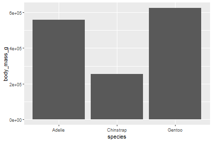<!-- --> See more [barplots](https://r-graph-gallery.com/barplot.html) --- name: boxplot ## 2.4. Boxplot Boxplot is probably the most commonly used chart type to compare distribution of several groups.<br> It visualises five summary statistics (the median, two percentiles and two whiskers). <img src="https://github.com/MiriamLL/R_intro/blob/master/Images/305boxplot.png?raw=true" height="250" /> Source [boxplot explanation](https://www.leansigmacorporation.com/box-plot-with-minitab/) --- ## 2.4. Boxplot The argument to create boxplots is **geom_boxplot()** ```r ggplot(data=penguins, mapping=aes(x=species,y=body_mass_g))+ * geom_boxplot() ``` 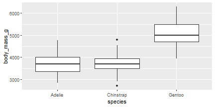<!-- --> See more [boxplots](https://r-graph-gallery.com/boxplot.html) --- name: trajectory ## 2.5. Trajectory For plotting moving objects, connecting points with a line is the most common visualization used. -- For today exercises, install **sula**. ```r devtools::install_github("MiriamLL/sula") ``` The package **sula** contains tracking data from Masked boobies on Easter Island. ```r library(sula) ``` Load data from the package **sula** into the environment. ```r tracking_data<-sula::GPS_raw ``` The data frame contains the columns **Latitude** and **Longitude**. --- ## 2.5. Trajectory The argument to create trajectories is **geom_path()**. By definition geom_path() connects the observations in the order in which they appear in the data. ```r ggplot(data=tracking_data, mapping=aes(x=Latitude, y=Longitude)) + * geom_path() ``` 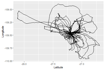<!-- --> --- ## 2.6. Maps R is an great tool for geospatial data analysis. The book [geocomputation with R](https://r.geocompx.org/attr.html) is a recommended guide to create maps in R (is open access and constantly updated). <img src="https://github.com/MiriamLL/R_intro/blob/master/Images/306Book.png?raw=true" height="400" /> --- ## 2.6. Maps For today exercises, install **GermanNorthSea**. ```r devtools::install_github("MiriamLL/GermanNorthSea") ``` The package **GermanNorthSea** compiles shapefiles from the North Sea. ```r library(GermanNorthSea) ``` To see the containing shapefiles go to my [github](https://github.com/MiriamLL/GermanNorthSea). To add shapefile to environment. ```r Europe<-German_land ``` **Note** that shapefiles can be an **sf** object. An sf object is different from a data frame, if we click on the object is not clear what it contains. ```r class(Europe) ``` ``` ## [1] "sf" "data.frame" ``` --- ## 2.6. Maps The argument to create a map is **geom_sf()** ```r ggplot(data=Europe)+ * geom_sf() ``` <!-- --> --- class: inverse # Pause .pull-left[ Practice <svg aria-hidden="true" role="img" viewBox="0 0 512 512" style="height:1em;width:1em;vertical-align:-0.125em;margin-left:auto;margin-right:auto;font-size:inherit;fill:#FFFFFF;overflow:visible;position:relative;"><path d="M497.9 142.1l-46.1 46.1c-4.7 4.7-12.3 4.7-17 0l-111-111c-4.7-4.7-4.7-12.3 0-17l46.1-46.1c18.7-18.7 49.1-18.7 67.9 0l60.1 60.1c18.8 18.7 18.8 49.1 0 67.9zM284.2 99.8L21.6 362.4.4 483.9c-2.9 16.4 11.4 30.6 27.8 27.8l121.5-21.3 262.6-262.6c4.7-4.7 4.7-12.3 0-17l-111-111c-4.8-4.7-12.4-4.7-17.1 0zM124.1 339.9c-5.5-5.5-5.5-14.3 0-19.8l154-154c5.5-5.5 14.3-5.5 19.8 0s5.5 14.3 0 19.8l-154 154c-5.5 5.5-14.3 5.5-19.8 0zM88 424h48v36.3l-64.5 11.3-31.1-31.1L51.7 376H88v48z"/></svg><br> Open the file [03ExercisesPlotting.Rmd](https://github.com/MiriamLL/R_intro/blob/master/03ExercisesPlotting.Rmd) Run the code for plotting different geometries. **Note** to see the plot in a separated window, search for the following icon. <img src="https://github.com/MiriamLL/R_intro/blob/master/Images/314Icon.jpg?raw=true" height="150" /> ] .pull-right[ Until here: - [index](#index) - [theory](#theory) - [geometries](#geoms) Next part: - [maps](#maps) - [aesthetics](#aesthetics) - [layers](#layers) - [export](#export) - [contact](#out) ] --- name: maps class: title-slide, inverse, bottom background-image: url(https://images.unsplash.com/photo-1518065896235-a4c93e088e7a?ixlib=rb-4.0.3&ixid=M3wxMjA3fDB8MHxwaG90by1wYWdlfHx8fGVufDB8fHx8fA%3D%3D&auto=format&fit=crop&w=1170&q=80) background-size: cover .pull-right[ # <span style=" font-weight: bold; color: #e5e5e5 !important;border-radius: 4px; padding-right: 4px; padding-left: 4px; background-color: #003049 !important;" >Maps</span> ### <span style=" font-weight: bold; color: #e5e5e5 !important;border-radius: 4px; padding-right: 4px; padding-left: 4px; background-color: #003049 !important;" >Elements of a map</span> ] --- ## 3.Maps What makes a map a map? A map is a symbolic representation of selected characteristics of a place, usually drawn on a flat surface. <img src="https://github.com/MiriamLL/R_intro/blob/master/Images/317PaulaScher.png?raw=true" height="350" /> Source [Paula Scher](https://www.pentagram.com/news/paula-scher-maps) --- ## 3.1. Shapefile A [shapefile](https://en.wikipedia.org/wiki/Shapefile) is a format for geospatial vector data. For the exercises download the shapefile from [Europe](https://github.com/MiriamLL/R_intro/blob/master/Downloads/Europe.shp). Give the directory where you save your shapefile, either by calling the package **here**... ```r library(here) My_directory<-here('Downloads') ``` ... or manually by adding the directory where your shapefile is. ```r My_directory<-"..." ``` Check that the folder contains your shapefile. ```r list.files(My_directory) ``` ```r My_shapefile<-paste0(My_directory,"/Europe.shp") ``` --- ## 3.1. Shapefile The package **sf** contains arguments to load shapefiles in R. ```r library(sf) ``` <img src="https://user-images.githubusercontent.com/520851/34887433-ce1d130e-f7c6-11e7-83fc-d60ad4fae6bd.gif" height="200" /> Visit the [sf page](https://r-spatial.github.io/sf/). --- ## 3.1. Shapefile The argument **st_read** loads the shapefile into the environment. ```r Europe_shp<-st_read(My_shapefile) ``` ``` ## Reading layer `Europe' from data source ## `C:\Users\lerma\OneDrive\Documents\2MonTrack\2023\Teaching\R_intro\R_intro\Downloads\Europe.shp' ## using driver `ESRI Shapefile' ## Simple feature collection with 54 features and 2 fields ## Geometry type: MULTIPOLYGON ## Dimension: XY ## Bounding box: xmin: -31.26575 ymin: 32.39748 xmax: 69.07032 ymax: 81.85737 ## Geodetic CRS: WGS 84 ``` **Note** that it gives us the Geodetic CRS: WGS 84 --- ## 3.2. Create a basic map Load the package ggplot2 ```r library(ggplot2) ``` Plot your shapefile using **geom_sf** ```r ggplot(data = Europe_shp)+ geom_sf() ``` <!-- --> --- ## 3.3. Add limits Using the argument **coord_sf** to focus in the area of interest. - Add x axis coordinates in **xlim** - Add y axis coordinates in **ylim** . ```r ggplot(data = Europe_shp)+ geom_sf()+ coord_sf(xlim = c(6, 10),ylim = c(53, 56)) ``` <!-- --> --- name: scale ## 3.4. Add scale To add more elements on a map, the package [ggspatial](https://paleolimbot.github.io/ggspatial/) contains scale and north arrow. ```r library(ggspatial) ``` The argument **annotation_scale** adds a scale. By including **br** the scale is set to the **b**ottom **r**ight. ```r ggplot(data = Europe_shp)+ geom_sf()+ coord_sf(xlim = c(6, 10),ylim = c(53, 56))+ * annotation_scale(location = "br") ``` <!-- --> --- name: arrow ## 3.5. Add arrow For including an arrow add the argument **annotation_north_arrow**. Include **tl** to set the scale on the **t**op **l**eft ```r ggplot(data = Europe_shp)+ geom_sf()+ coord_sf(xlim = c(6, 10),ylim = c(53, 56))+ annotation_scale(location = "br")+ * annotation_north_arrow(location = "tl") ``` 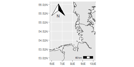<!-- --> --- ## 3.5. Add arrow There are many options for **annotation_north_arrow**. Including **style = north_arrow_minimal()** makes a more minimalistic type of arrow. ```r ggplot(data = Europe_shp)+ geom_sf()+ coord_sf(xlim = c(6, 10),ylim = c(53, 56))+ annotation_scale(location = "br")+ annotation_north_arrow(location = "tl", * style = north_arrow_minimal()) ``` 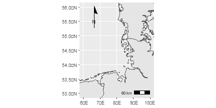<!-- --> --- ## 3.6. Important A coordinate reference system (CRS) refers to the way in which spatial data that represent the earth’s surface. ⚠️ It is important to understand the coordinate system that your data uses - particularly if you are working with different data stored in different coordinate systems. <img src="https://github.com/MiriamLL/R_intro/blob/master/Images/313CRSdeformation.jpg?raw=true" height="350" /> --- ## 3.6. CRS All maps are distorted and all projections have some error to represent the earth perfectly. The error is also depending on the [origin](https://www.earthdatascience.org/courses/use-data-open-source-python/intro-vector-data-python/spatial-data-vector-shapefiles/intro-to-coordinate-reference-systems-python/). <img src="https://github.com/MiriamLL/R_intro/blob/master/Images/318CRS.png?raw=true" height="150" /> Not using the correct projection might derive in calculation mistakes (over or under calculating distances for example). I will not go into detaill in CRS but give you some tips to transform to the corresponding system. --- ## 3.6. CRS The argument **st_transform** from the package **sf** allows you to change the CRS of your shapefile. First give the name of your shapefile and later the CRS in 4 digits numbers. **Note** that there are many options available in R to transform your CRS. ```r Europe_3035<-sf::st_transform(Europe_shp, 3035) ``` .pull-left[ CRS **4326** 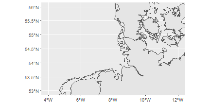<!-- --> ] .pull-right[ CRS **3035** 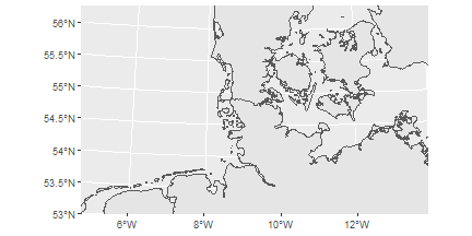<!-- --> ] Do you notice the **differences?** --- ## 3.6. CRS **Consider** that when using the map with the **CRS 3035**, the units of **xlim** and my **ylim** need to be changed accordingly. ```r ggplot(data=Europe_3035)+ geom_sf()+ * coord_sf(xlim = c(3790000,4250000), ylim = c(3350000,3680000)) ``` 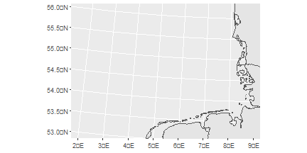<!-- --> --- class: inverse # Pause .pull-left[ Practice <svg aria-hidden="true" role="img" viewBox="0 0 512 512" style="height:1em;width:1em;vertical-align:-0.125em;margin-left:auto;margin-right:auto;font-size:inherit;fill:#FFFFFF;overflow:visible;position:relative;"><path d="M497.9 142.1l-46.1 46.1c-4.7 4.7-12.3 4.7-17 0l-111-111c-4.7-4.7-4.7-12.3 0-17l46.1-46.1c18.7-18.7 49.1-18.7 67.9 0l60.1 60.1c18.8 18.7 18.8 49.1 0 67.9zM284.2 99.8L21.6 362.4.4 483.9c-2.9 16.4 11.4 30.6 27.8 27.8l121.5-21.3 262.6-262.6c4.7-4.7 4.7-12.3 0-17l-111-111c-4.8-4.7-12.4-4.7-17.1 0zM124.1 339.9c-5.5-5.5-5.5-14.3 0-19.8l154-154c5.5-5.5 14.3-5.5 19.8 0s5.5 14.3 0 19.8l-154 154c-5.5 5.5-14.3 5.5-19.8 0zM88 424h48v36.3l-64.5 11.3-31.1-31.1L51.7 376H88v48z"/></svg><br> Open the file [03ExercisesPlotting.Rmd](https://github.com/MiriamLL/R_intro/blob/master/03ExercisesPlotting.Rmd) Create a map. 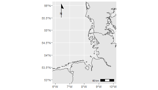<!-- --> ] .pull-right[ Until here: - [index](#index) - [theory](#theory) - [geometries](#geoms) - [maps](#maps) Next part: - [aesthetics](#aesthetics) - [layers](#layers) - [export](#export) - [contact](#out) ] --- name: aesthetics class: title-slide, inverse, bottom background-image: url(https://images.unsplash.com/photo-1653408604619-45713aad6d75?ixlib=rb-4.0.3&ixid=M3wxMjA3fDB8MHxwaG90by1wYWdlfHx8fGVufDB8fHx8fA%3D%3D&auto=format&fit=crop&w=1170&q=80) background-size:cover .pull-right[ # <span style=" font-weight: bold; color: #e5e5e5 !important;border-radius: 4px; padding-right: 4px; padding-left: 4px; background-color: #003049 !important;" >Aesthetics</span> ### <span style=" font-weight: bold; color: #e5e5e5 !important;border-radius: 4px; padding-right: 4px; padding-left: 4px; background-color: #003049 !important;" >Bring some colors</span> ] --- ## 4. Aesthetics **Aesthetics** are for controlling the overall appearance of graphs. You can change almost every tiny detail to create the plot that you want. <img src="https://github.com/MiriamLL/R_intro/blob/master/Images/308parts-ggplot.png?raw=true" height="350" /> Source [ggplot2 elements](https://isabella-b.com/blog/ggplot2-theme-elements-reference/)<br> Download [pdf](https://isabella-b.com/files/ggplot2-theme-elements-reference-v2.pdf) --- ## 4. Aesthetics There are many elements, but I will not go into detail to most of them. For going into more detail the book [R Graphics cookbook](https://r-graphics.org/) is a great guide. <img src="https://github.com/MiriamLL/R_intro/blob/master/Images/310Cookbook.jpg?raw=true" height="300" /> --- name: color ## 4.1. Color by name To go beyond the default colors, the package ggplot2 allows you to change colors on the elements of your plot. To select the colors there are several ways, I use by **name** or **hex codes**. Using by **name**, the default names are used. .pull-left[ You can see a complete list of the 657 colors typing colors(). ```r colors() ``` ] .pull-right[ You can also see the color and the name by opening this [link](https://github.com/MiriamLL/R_intro/blob/master/Images/311colornamesplot.png?raw=true). <img src="https://github.com/MiriamLL/R_intro/blob/master/Images/311colornamesplot.png?raw=true" height="300" /> ] --- ## 4.1. Color by hexcode Colors can also be defined by their **hex code**. An hex code is the code of the color in 6 digits. To find the hex code there are tons of webpages. I personally like [coolors](https://coolors.co/palettes/trending). <img src="https://github.com/MiriamLL/R_intro/blob/master/Images/312coolors.png?raw=true" height="300" /> --- ## 4.1. Fill color For a map, we can change the color of our shapefile by adding the argument **colour** and **fill** inside the brackets of **geom_sf()** ```r ggplot(data = Europe_shp)+ * geom_sf(color = "orange", * fill = "yellow")+ coord_sf(xlim = c(3, 9),ylim = c(53, 56)) ``` 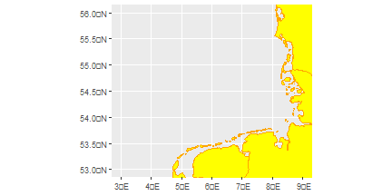<!-- --> --- ## 4.1. Fill color To use the color by **hex code** you need to add a **#**. In [coolors](https://coolors.co/palettes/trending) go to explore>put your cursor on top of the color you like>click>paste on your code ```r ggplot(data = Europe_shp)+ * geom_sf(color = "#e76f51", * fill = "#e9c46a")+ coord_sf(xlim = c(3,9), ylim = c(53,56)) ``` <!-- --> --- ## 4.2. Object To simplify the process, you can save your plot as an object in the environment. ```r My_plot<-ggplot(data = Europe_shp)+ * geom_sf(color = "#e76f51", * fill = "#e9c46a")+ coord_sf(xlim = c(3,9), ylim = c(53,56)) ``` The map is now contained in an object. ```r My_plot ``` 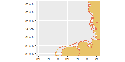<!-- --> --- name: theme ## 4.3. Theme Themes are a powerful way to customize the non-data components of your plots: i.e. titles, labels, fonts, background, gridlines, and legends. Themes can be used to give plots a consistent customized look. .pull-left[ The theme can be changed using **theme_classic()** ```r My_plot+ * theme_classic() ``` 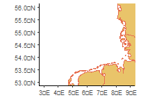<!-- --> ] .pull-right[ The theme can be changed using **theme_bw()** ```r My_plot+ * theme_bw() ``` 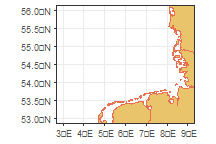<!-- --> ] --- ## 4.3. Theme There are many different themes. It would depend on the type of graph and taste to choose. .pull-left[ The theme can be changed using **theme_minimal()** ```r My_plot+ * theme_minimal() ``` 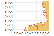<!-- --> ] .pull-right[ T he theme can be changed using **theme_void()** ```r My_plot+ * theme_void() ``` <!-- --> ] --- ## 4.3. Theme For maps, in my opinion **theme_bw** is the one that makes most sense. So lets added to our object using the **+** symbol. ```r My_plot<-My_plot+ * theme_bw() My_plot ``` 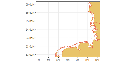<!-- --> --- name: background ## 4.4. Background colors Adding the argument **theme** and then **panel.background** we can change the color of the background. ```r My_plot<-My_plot + * theme(panel.background = element_rect(fill = '#a8dadc')) My_plot ``` 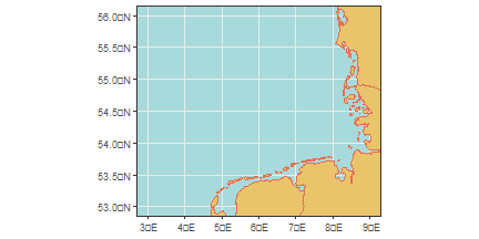<!-- --> --- ## 4.4. Background colors In theme, the grid can be removed by adding **panel.grid.major** and **panel.grid.minor** and **element_blank** to make it blank. ```r My_plot<-My_plot + * theme(panel.grid.major = element_blank(), * panel.grid.minor = element_blank()) My_plot ``` <!-- --> --- name: axis ## 4.5. Axis legends To change the legends on the axis, we can add the arguments **xlab** and **ylab** ```r My_plot<-My_plot + * xlab('Longitude')+ylab('Latitude') My_plot ``` 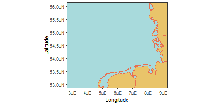<!-- --> --- ## 4.6. Add degrees To add the degrees on the x and y axis legends, use a function on **scale_x_continuous** and **scale_y_continuous**. **This is specific from when plotting maps** ```r My_plot<-My_plot + * scale_x_continuous(labels = function(x) paste0(x, '\u00B0', "W")) + * scale_y_continuous(labels = function(x) paste0(x, '\u00B0', "N")) My_plot ``` 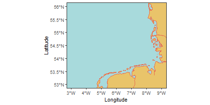<!-- --> --- ## 4.7. Esquisse There is an app to personalize all the parts, and gives you the code afterwards. To install the add-inn go to [Esquisse](https://cran.r-project.org/web/packages/esquisse/vignettes/get-started.html). <img src="https://github.com/MiriamLL/R_intro/blob/master/Images/319Esquisse.png?raw=true" height="350" /> --- class: inverse # Pause .pull-left[ Practice <svg aria-hidden="true" role="img" viewBox="0 0 512 512" style="height:1em;width:1em;vertical-align:-0.125em;margin-left:auto;margin-right:auto;font-size:inherit;fill:#FFFFFF;overflow:visible;position:relative;"><path d="M497.9 142.1l-46.1 46.1c-4.7 4.7-12.3 4.7-17 0l-111-111c-4.7-4.7-4.7-12.3 0-17l46.1-46.1c18.7-18.7 49.1-18.7 67.9 0l60.1 60.1c18.8 18.7 18.8 49.1 0 67.9zM284.2 99.8L21.6 362.4.4 483.9c-2.9 16.4 11.4 30.6 27.8 27.8l121.5-21.3 262.6-262.6c4.7-4.7 4.7-12.3 0-17l-111-111c-4.8-4.7-12.4-4.7-17.1 0zM124.1 339.9c-5.5-5.5-5.5-14.3 0-19.8l154-154c5.5-5.5 14.3-5.5 19.8 0s5.5 14.3 0 19.8l-154 154c-5.5 5.5-14.3 5.5-19.8 0zM88 424h48v36.3l-64.5 11.3-31.1-31.1L51.7 376H88v48z"/></svg><br> Open the file [03ExercisesPlotting.Rmd](https://github.com/MiriamLL/R_intro/blob/master/03ExercisesPlotting.Rmd) Create a map with your prefered colors. ] .pull-right[ Until here: - [index](#index) - [theory](#theory) - [geometries](#geoms) - [maps](#maps) - [aesthetics](#aesthetics) Next part: - [layers](#layers) - [export](#export) - [contact](#out) ] --- name: layers class: title-slide, inverse, bottom background-image: url(https://images.unsplash.com/photo-1553864250-05b20249ee0c?ixlib=rb-4.0.3&ixid=M3wxMjA3fDB8MHxwaG90by1wYWdlfHx8fGVufDB8fHx8fA%3D%3D&auto=format&fit=crop&w=1170&q=80) background-size:cover .pull-right[ # <span style=" font-weight: bold; color: #e5e5e5 !important;border-radius: 4px; padding-right: 4px; padding-left: 4px; background-color: #003049 !important;" >Layers</span> ### <span style=" font-weight: bold; color: #e5e5e5 !important;border-radius: 4px; padding-right: 4px; padding-left: 4px; background-color: #003049 !important;" >Adding geometries</span> ] --- ## 5. Geometries To add observations on a map, we can add geometries. To practice, the package **seamonas** contains data. ```r library(seamonas) ``` To add the data to your environment. <br> ```r survey_4326<-survey_4326 ``` The data frame contains the columns **latitude** and **longitude**. ```r head(survey_4326,5) ``` --- ## 5.1. Add points Because ggplot functions as layers, we can add geometries on top of each other. <img src="https://github.com/MiriamLL/R_intro/blob/master/Images/300Geoms.png?raw=true" height="200" /> --- ## 5.1. Add points For the exercise, lets create a base map. ```r Base_map<-ggplot(data = Europe_shp)+ geom_sf(color = "#e76f51", fill = "#e9c46a")+ coord_sf(xlim = c(3,9), ylim = c(53,56))+ theme_bw()+ theme(panel.background = element_rect(fill = '#a8dadc'), panel.grid.major = element_blank(), panel.grid.minor = element_blank())+ xlab('Longitude')+ylab('Latitude')+ scale_x_continuous(labels = function(x) paste0(x, '\u00B0', "W"))+ scale_y_continuous(labels = function(x) paste0(x, '\u00B0', "N")) ``` --- ## 5.1. Add points The order needs to be considered, the geometry to be on the top should be the last on the list. Using the argument **geom_point** we can add points. ```r Base_map+ * geom_point(data=survey_4326,aes(x = longitude,y= latitude)) ``` 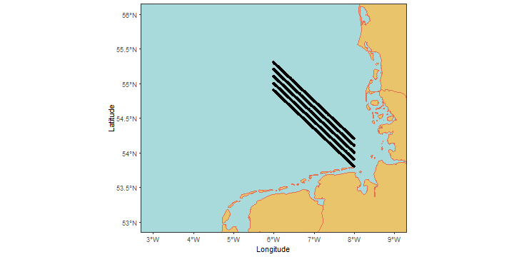<!-- --> --- ## 5.2. Change color Adding the argument **color** inside the parethesis allows to change the color of the points. ```r Base_map+ geom_point(data=survey_4326,aes(x = longitude,y= latitude), * color='red') ``` 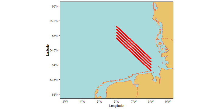<!-- --> --- ## 5.2. Change color If you wish to color by a categorical variable, then add **colour =** within your aes brackets. This tells ggplot that this third variable will colour the points. ```r Base_map+ geom_point(data=survey_4326,aes(x = longitude,y= latitude, * color=month)) ``` 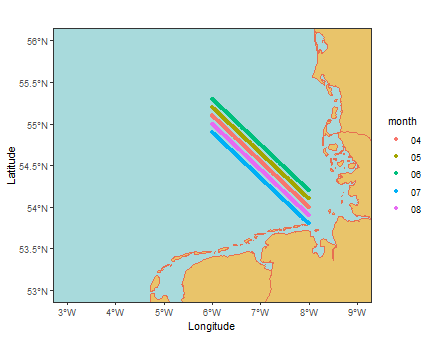<!-- --> --- ## 5.2. Select colors The colors, when not declared, are selected by default.<br> To customize your colors you can add more arguments. <br> The argument **scale_colour_manual** allows you to customize those colors. <br> You can add colors by **name**.<br> Be careful and always add the same number of colors according to the category. ```r Base_map+ geom_point(data=survey_4326,aes(x = longitude,y= latitude, color=month))+ * scale_colour_manual(values = c("purple", "yellow", "orange","green","blue")) ``` 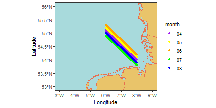<!-- --> --- ## 5.3. Change size Adding the argument **size** inside **geom_point** let us change the size of the point. .pull-left[ Smaller size ```r Base_map+ coord_sf(xlim = c(6.2,6.4), ylim = c(55.1,55.2))+ geom_point(data=survey_4326, aes(x = longitude,y= latitude), * size=0.005) ``` 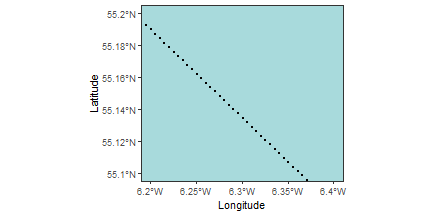<!-- --> ] .pull-right[ Larger size ```r Base_map+ coord_sf(xlim = c(6.2,6.4), ylim = c(55.1,55.2))+ geom_point(data=survey_4326, aes(x = longitude,y= latitude), * size=2) ``` 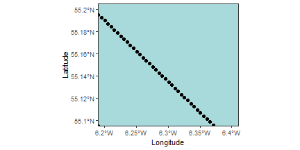<!-- --> ] --- ## 5.4. Change shape Adding the argument **shape** inside **geom_point** let us change the shape of the point. .pull-left[ ```r Base_map+ coord_sf(xlim = c(6.2,6.4), ylim = c(55.1,55.2))+ geom_point(data=survey_4326, aes(x = longitude, y= latitude), * shape=4) ``` 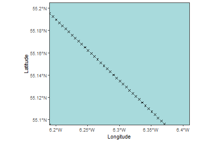<!-- --> ] .pull-right[ Other options are: <img src="https://github.com/MiriamLL/R_intro/blob/master/Images/320Shapes.png?raw=true" height="200" /> ] --- ## 5.5. Add path The argument **geom_path** can be used for trajectories. ```r Base_map+ * geom_path(data=survey_4326,aes(x = longitude,y= latitude)) ``` 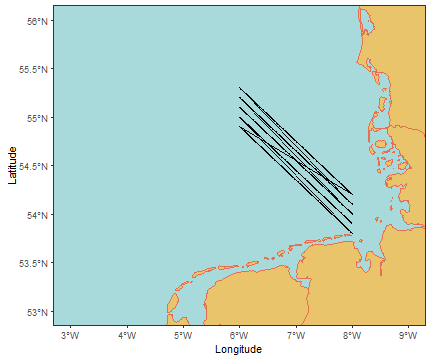<!-- --> --- ## 5.5. Add path .pull-left[ To change line type add the argument **linetype**. ```r Base_map+ geom_path(data=survey_4326, aes(x = longitude,y= latitude), * linetype = 'dashed') ``` 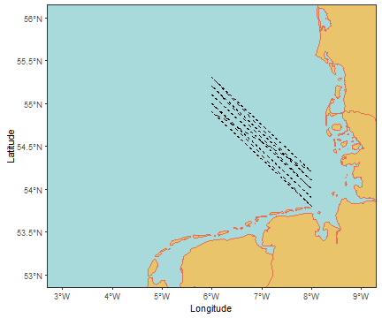<!-- --> ] .pull-right[ Other line options are: <img src="https://github.com/MiriamLL/R_intro/blob/master/Images/321Lines.png?raw=true" height="200" /> ] --- class: inverse # Pause .pull-left[ Practice <svg aria-hidden="true" role="img" viewBox="0 0 512 512" style="height:1em;width:1em;vertical-align:-0.125em;margin-left:auto;margin-right:auto;font-size:inherit;fill:#FFFFFF;overflow:visible;position:relative;"><path d="M497.9 142.1l-46.1 46.1c-4.7 4.7-12.3 4.7-17 0l-111-111c-4.7-4.7-4.7-12.3 0-17l46.1-46.1c18.7-18.7 49.1-18.7 67.9 0l60.1 60.1c18.8 18.7 18.8 49.1 0 67.9zM284.2 99.8L21.6 362.4.4 483.9c-2.9 16.4 11.4 30.6 27.8 27.8l121.5-21.3 262.6-262.6c4.7-4.7 4.7-12.3 0-17l-111-111c-4.8-4.7-12.4-4.7-17.1 0zM124.1 339.9c-5.5-5.5-5.5-14.3 0-19.8l154-154c5.5-5.5 14.3-5.5 19.8 0s5.5 14.3 0 19.8l-154 154c-5.5 5.5-14.3 5.5-19.8 0zM88 424h48v36.3l-64.5 11.3-31.1-31.1L51.7 376H88v48z"/></svg><br> Open the file [03ExercisesPlotting.Rmd](https://github.com/MiriamLL/R_intro/blob/master/03ExercisesPlotting.Rmd) Create your own map with points or a path. ] .pull-right[ Until here: - [index](#index) - [theory](#theory) - [geometries](#geoms) - [maps](#maps) - [aesthetics](#aesthetics) - [layers](#layers) Next part: - [export](#export) - [contact](#out) ] --- class: title-slide, inverse, bottom background-image: url(https://images.unsplash.com/photo-1501868984184-76121ed6a6e2?ixlib=rb-4.0.3&ixid=M3wxMjA3fDB8MHxwaG90by1wYWdlfHx8fGVufDB8fHx8fA%3D%3D&auto=format&fit=crop&w=1170&q=80) background-size: cover .pull-right[ # <span style=" font-weight: bold; color: #e5e5e5 !important;border-radius: 4px; padding-right: 4px; padding-left: 4px; background-color: #003049 !important;" >Export</span> ### <span style=" font-weight: bold; color: #e5e5e5 !important;border-radius: 4px; padding-right: 4px; padding-left: 4px; background-color: #003049 !important;" >Beyond static maps</span> ] --- ## 6.1. Interactive Graphs can be interactive. -> The package [plotly](https://plotly.com/r/) allows creating interactive maps. -> The package [tmap](https://cran.r-project.org/web/packages/tmap/vignettes/tmap-getstarted.html) is also a recommende alternative. <div class="plotly html-widget html-fill-item-overflow-hidden html-fill-item" id="htmlwidget-5f7f2b3642b0b50549c8" style="width:504px;height:288px;"></div> <script type="application/json" data-for="htmlwidget-5f7f2b3642b0b50549c8">{"x":{"data":[{"x":[3,3,3,3,3,3,3,3,3,3,3,3,3,3,3,3,3,3,3,3,3,3,3,3,3,3,3,3,3,3,3,3,3,3,3,3,3,3,3,3,3,3,3,3,3,3,3,3,3,3,3,3,3,3,3,3,3,3,3,3,3,3,3,3,3,3,3,3,3,3,3,3,3,3,3,3,3,3,3,3,3,3,3,3,null,4,4,4,4,4,4,4,4,4,4,4,4,4,4,4,4,4,4,4,4,4,4,4,4,4,4,4,4,4,4,4,4,4,4,4,4,4,4,4,4,4,4,4,4,4,4,4,4,4,4,4,4,4,4,4,4,4,4,4,4,4,4,4,4,4,4,4,4,4,4,4,4,4,4,4,4,4,4,4,4,4,4,4,4,null,5,5,5,5,5,5,5,5,5,5,5,5,5,5,5,5,5,5,5,5,5,5,5,5,5,5,5,5,5,5,5,5,5,5,5,5,5,5,5,5,5,5,5,5,5,5,5,5,5,5,5,5,5,5,5,5,5,5,5,5,5,5,5,5,5,5,5,5,5,5,5,5,5,5,5,5,5,5,5,5,5,5,5,5,null,6,6,6,6,6,6,6,6,6,6,6,6,6,6,6,6,6,6,6,6,6,6,6,6,6,6,6,6,6,6,6,6,6,6,6,6,6,6,6,6,6,6,6,6,6,6,6,6,6,6,6,6,6,6,6,6,6,6,6,6,6,6,6,6,6,6,6,6,6,6,6,6,6,6,6,6,6,6,6,6,6,6,6,6,null,7,7,7,7,7,7,7,7,7,7,7,7,7,7,7,7,7,7,7,7,7,7,7,7,7,7,7,7,7,7,7,7,7,7,7,7,7,7,7,7,7,7,7,7,7,7,7,7,7,7,7,7,7,7,7,7,7,7,7,7,7,7,7,7,7,7,7,7,7,7,7,7,7,7,7,7,7,7,7,7,7,7,7,7,null,8,8,8,8,8,8,8,8,8,8,8,8,8,8,8,8,8,8,8,8,8,8,8,8,8,8,8,8,8,8,8,8,8,8,8,8,8,8,8,8,8,8,8,8,8,8,8,8,8,8,8,8,8,8,8,8,8,8,8,8,8,8,8,8,8,8,8,8,8,8,8,8,8,8,8,8,8,8,8,8,8,8,8,8,null,9,9,9,9,9,9,9,9,9,9,9,9,9,9,9,9,9,9,9,9,9,9,9,9,9,9,9,9,9,9,9,9,9,9,9,9,9,9,9,9,9,9,9,9,9,9,9,9,9,9,9,9,9,9,9,9,9,9,9,9,9,9,9,9,9,9,9,9,9,9,9,9,9,9,9,9,9,9,9,9,9,9,9,9,null,2.7,2.72727272727273,2.80808080808081,2.88888888888889,2.96969696969697,3.05050505050505,3.13131313131313,3.21212121212121,3.29292929292929,3.37373737373737,3.45454545454545,3.53535353535354,3.61616161616162,3.6969696969697,3.77777777777778,3.85858585858586,3.93939393939394,4.02020202020202,4.1010101010101,4.18181818181818,4.26262626262626,4.34343434343434,4.42424242424242,4.50505050505051,4.58585858585859,4.66666666666667,4.74747474747475,4.82828282828283,4.90909090909091,4.98989898989899,5.07070707070707,5.15151515151515,5.23232323232323,5.31313131313131,5.39393939393939,5.47474747474747,5.55555555555556,5.63636363636364,5.71717171717172,5.7979797979798,5.87878787878788,5.95959595959596,6.04040404040404,6.12121212121212,6.2020202020202,6.28282828282828,6.36363636363636,6.44444444444444,6.52525252525253,6.60606060606061,6.68686868686869,6.76767676767677,6.84848484848485,6.92929292929293,7.01010101010101,7.09090909090909,7.17171717171717,7.25252525252525,7.33333333333333,7.41414141414141,7.4949494949495,7.57575757575758,7.65656565656566,7.73737373737374,7.81818181818182,7.8989898989899,7.97979797979798,8.06060606060606,8.14141414141414,8.22222222222222,8.3030303030303,8.38383838383838,8.46464646464647,8.54545454545455,8.62626262626263,8.70707070707071,8.78787878787879,8.86868686868687,8.94949494949495,9.03030303030303,9.11111111111111,9.19191919191919,9.27272727272727,9.3,null,2.7,2.72727272727273,2.80808080808081,2.88888888888889,2.96969696969697,3.05050505050505,3.13131313131313,3.21212121212121,3.29292929292929,3.37373737373737,3.45454545454545,3.53535353535354,3.61616161616162,3.6969696969697,3.77777777777778,3.85858585858586,3.93939393939394,4.02020202020202,4.1010101010101,4.18181818181818,4.26262626262626,4.34343434343434,4.42424242424242,4.50505050505051,4.58585858585859,4.66666666666667,4.74747474747475,4.82828282828283,4.90909090909091,4.98989898989899,5.07070707070707,5.15151515151515,5.23232323232323,5.31313131313131,5.39393939393939,5.47474747474747,5.55555555555556,5.63636363636364,5.71717171717172,5.7979797979798,5.87878787878788,5.95959595959596,6.04040404040404,6.12121212121212,6.2020202020202,6.28282828282828,6.36363636363636,6.44444444444444,6.52525252525253,6.60606060606061,6.68686868686869,6.76767676767677,6.84848484848485,6.92929292929293,7.01010101010101,7.09090909090909,7.17171717171717,7.25252525252525,7.33333333333333,7.41414141414141,7.4949494949495,7.57575757575758,7.65656565656566,7.73737373737374,7.81818181818182,7.8989898989899,7.97979797979798,8.06060606060606,8.14141414141414,8.22222222222222,8.3030303030303,8.38383838383838,8.46464646464647,8.54545454545455,8.62626262626263,8.70707070707071,8.78787878787879,8.86868686868687,8.94949494949495,9.03030303030303,9.11111111111111,9.19191919191919,9.27272727272727,9.3,null,2.7,2.72727272727273,2.80808080808081,2.88888888888889,2.96969696969697,3.05050505050505,3.13131313131313,3.21212121212121,3.29292929292929,3.37373737373737,3.45454545454545,3.53535353535354,3.61616161616162,3.6969696969697,3.77777777777778,3.85858585858586,3.93939393939394,4.02020202020202,4.1010101010101,4.18181818181818,4.26262626262626,4.34343434343434,4.42424242424242,4.50505050505051,4.58585858585859,4.66666666666667,4.74747474747475,4.82828282828283,4.90909090909091,4.98989898989899,5.07070707070707,5.15151515151515,5.23232323232323,5.31313131313131,5.39393939393939,5.47474747474747,5.55555555555556,5.63636363636364,5.71717171717172,5.7979797979798,5.87878787878788,5.95959595959596,6.04040404040404,6.12121212121212,6.2020202020202,6.28282828282828,6.36363636363636,6.44444444444444,6.52525252525253,6.60606060606061,6.68686868686869,6.76767676767677,6.84848484848485,6.92929292929293,7.01010101010101,7.09090909090909,7.17171717171717,7.25252525252525,7.33333333333333,7.41414141414141,7.4949494949495,7.57575757575758,7.65656565656566,7.73737373737374,7.81818181818182,7.8989898989899,7.97979797979798,8.06060606060606,8.14141414141414,8.22222222222222,8.3030303030303,8.38383838383838,8.46464646464647,8.54545454545455,8.62626262626263,8.70707070707071,8.78787878787879,8.86868686868687,8.94949494949495,9.03030303030303,9.11111111111111,9.19191919191919,9.27272727272727,9.3,null,2.7,2.72727272727273,2.80808080808081,2.88888888888889,2.96969696969697,3.05050505050505,3.13131313131313,3.21212121212121,3.29292929292929,3.37373737373737,3.45454545454545,3.53535353535354,3.61616161616162,3.6969696969697,3.77777777777778,3.85858585858586,3.93939393939394,4.02020202020202,4.1010101010101,4.18181818181818,4.26262626262626,4.34343434343434,4.42424242424242,4.50505050505051,4.58585858585859,4.66666666666667,4.74747474747475,4.82828282828283,4.90909090909091,4.98989898989899,5.07070707070707,5.15151515151515,5.23232323232323,5.31313131313131,5.39393939393939,5.47474747474747,5.55555555555556,5.63636363636364,5.71717171717172,5.7979797979798,5.87878787878788,5.95959595959596,6.04040404040404,6.12121212121212,6.2020202020202,6.28282828282828,6.36363636363636,6.44444444444444,6.52525252525253,6.60606060606061,6.68686868686869,6.76767676767677,6.84848484848485,6.92929292929293,7.01010101010101,7.09090909090909,7.17171717171717,7.25252525252525,7.33333333333333,7.41414141414141,7.4949494949495,7.57575757575758,7.65656565656566,7.73737373737374,7.81818181818182,7.8989898989899,7.97979797979798,8.06060606060606,8.14141414141414,8.22222222222222,8.3030303030303,8.38383838383838,8.46464646464647,8.54545454545455,8.62626262626263,8.70707070707071,8.78787878787879,8.86868686868687,8.94949494949495,9.03030303030303,9.11111111111111,9.19191919191919,9.27272727272727,9.3,null,2.7,2.72727272727273,2.80808080808081,2.88888888888889,2.96969696969697,3.05050505050505,3.13131313131313,3.21212121212121,3.29292929292929,3.37373737373737,3.45454545454545,3.53535353535354,3.61616161616162,3.6969696969697,3.77777777777778,3.85858585858586,3.93939393939394,4.02020202020202,4.1010101010101,4.18181818181818,4.26262626262626,4.34343434343434,4.42424242424242,4.50505050505051,4.58585858585859,4.66666666666667,4.74747474747475,4.82828282828283,4.90909090909091,4.98989898989899,5.07070707070707,5.15151515151515,5.23232323232323,5.31313131313131,5.39393939393939,5.47474747474747,5.55555555555556,5.63636363636364,5.71717171717172,5.7979797979798,5.87878787878788,5.95959595959596,6.04040404040404,6.12121212121212,6.2020202020202,6.28282828282828,6.36363636363636,6.44444444444444,6.52525252525253,6.60606060606061,6.68686868686869,6.76767676767677,6.84848484848485,6.92929292929293,7.01010101010101,7.09090909090909,7.17171717171717,7.25252525252525,7.33333333333333,7.41414141414141,7.4949494949495,7.57575757575758,7.65656565656566,7.73737373737374,7.81818181818182,7.8989898989899,7.97979797979798,8.06060606060606,8.14141414141414,8.22222222222222,8.3030303030303,8.38383838383838,8.46464646464647,8.54545454545455,8.62626262626263,8.70707070707071,8.78787878787879,8.86868686868687,8.94949494949495,9.03030303030303,9.11111111111111,9.19191919191919,9.27272727272727,9.3,null,2.7,2.72727272727273,2.80808080808081,2.88888888888889,2.96969696969697,3.05050505050505,3.13131313131313,3.21212121212121,3.29292929292929,3.37373737373737,3.45454545454545,3.53535353535354,3.61616161616162,3.6969696969697,3.77777777777778,3.85858585858586,3.93939393939394,4.02020202020202,4.1010101010101,4.18181818181818,4.26262626262626,4.34343434343434,4.42424242424242,4.50505050505051,4.58585858585859,4.66666666666667,4.74747474747475,4.82828282828283,4.90909090909091,4.98989898989899,5.07070707070707,5.15151515151515,5.23232323232323,5.31313131313131,5.39393939393939,5.47474747474747,5.55555555555556,5.63636363636364,5.71717171717172,5.7979797979798,5.87878787878788,5.95959595959596,6.04040404040404,6.12121212121212,6.2020202020202,6.28282828282828,6.36363636363636,6.44444444444444,6.52525252525253,6.60606060606061,6.68686868686869,6.76767676767677,6.84848484848485,6.92929292929293,7.01010101010101,7.09090909090909,7.17171717171717,7.25252525252525,7.33333333333333,7.41414141414141,7.4949494949495,7.57575757575758,7.65656565656566,7.73737373737374,7.81818181818182,7.8989898989899,7.97979797979798,8.06060606060606,8.14141414141414,8.22222222222222,8.3030303030303,8.38383838383838,8.46464646464647,8.54545454545455,8.62626262626263,8.70707070707071,8.78787878787879,8.86868686868687,8.94949494949495,9.03030303030303,9.11111111111111,9.19191919191919,9.27272727272727,9.3,null,2.7,2.72727272727273,2.80808080808081,2.88888888888889,2.96969696969697,3.05050505050505,3.13131313131313,3.21212121212121,3.29292929292929,3.37373737373737,3.45454545454545,3.53535353535354,3.61616161616162,3.6969696969697,3.77777777777778,3.85858585858586,3.93939393939394,4.02020202020202,4.1010101010101,4.18181818181818,4.26262626262626,4.34343434343434,4.42424242424242,4.50505050505051,4.58585858585859,4.66666666666667,4.74747474747475,4.82828282828283,4.90909090909091,4.98989898989899,5.07070707070707,5.15151515151515,5.23232323232323,5.31313131313131,5.39393939393939,5.47474747474747,5.55555555555556,5.63636363636364,5.71717171717172,5.7979797979798,5.87878787878788,5.95959595959596,6.04040404040404,6.12121212121212,6.2020202020202,6.28282828282828,6.36363636363636,6.44444444444444,6.52525252525253,6.60606060606061,6.68686868686869,6.76767676767677,6.84848484848485,6.92929292929293,7.01010101010101,7.09090909090909,7.17171717171717,7.25252525252525,7.33333333333333,7.41414141414141,7.4949494949495,7.57575757575758,7.65656565656566,7.73737373737374,7.81818181818182,7.8989898989899,7.97979797979798,8.06060606060606,8.14141414141414,8.22222222222222,8.3030303030303,8.38383838383838,8.46464646464647,8.54545454545455,8.62626262626263,8.70707070707071,8.78787878787879,8.86868686868687,8.94949494949495,9.03030303030303,9.11111111111111,9.19191919191919,9.27272727272727,9.3],"y":[52.85,52.8636363636364,52.9040404040404,52.9444444444444,52.9848484848485,53.0252525252525,53.0656565656566,53.1060606060606,53.1464646464646,53.1868686868687,53.2272727272727,53.2676767676768,53.3080808080808,53.3484848484849,53.3888888888889,53.4292929292929,53.469696969697,53.510101010101,53.5505050505051,53.5909090909091,53.6313131313131,53.6717171717172,53.7121212121212,53.7525252525253,53.7929292929293,53.8333333333333,53.8737373737374,53.9141414141414,53.9545454545455,53.9949494949495,54.0353535353535,54.0757575757576,54.1161616161616,54.1565656565657,54.1969696969697,54.2373737373737,54.2777777777778,54.3181818181818,54.3585858585859,54.3989898989899,54.4393939393939,54.479797979798,54.520202020202,54.5606060606061,54.6010101010101,54.6414141414141,54.6818181818182,54.7222222222222,54.7626262626263,54.8030303030303,54.8434343434343,54.8838383838384,54.9242424242424,54.9646464646465,55.0050505050505,55.0454545454545,55.0858585858586,55.1262626262626,55.1666666666667,55.2070707070707,55.2474747474747,55.2878787878788,55.3282828282828,55.3686868686869,55.4090909090909,55.4494949494949,55.489898989899,55.530303030303,55.5707070707071,55.6111111111111,55.6515151515151,55.6919191919192,55.7323232323232,55.7727272727273,55.8131313131313,55.8535353535354,55.8939393939394,55.9343434343434,55.9747474747475,56.0151515151515,56.0555555555556,56.0959595959596,56.1363636363636,56.15,null,52.85,52.8636363636364,52.9040404040404,52.9444444444444,52.9848484848485,53.0252525252525,53.0656565656566,53.1060606060606,53.1464646464646,53.1868686868687,53.2272727272727,53.2676767676768,53.3080808080808,53.3484848484849,53.3888888888889,53.4292929292929,53.469696969697,53.510101010101,53.5505050505051,53.5909090909091,53.6313131313131,53.6717171717172,53.7121212121212,53.7525252525253,53.7929292929293,53.8333333333333,53.8737373737374,53.9141414141414,53.9545454545455,53.9949494949495,54.0353535353535,54.0757575757576,54.1161616161616,54.1565656565657,54.1969696969697,54.2373737373737,54.2777777777778,54.3181818181818,54.3585858585859,54.3989898989899,54.4393939393939,54.479797979798,54.520202020202,54.5606060606061,54.6010101010101,54.6414141414141,54.6818181818182,54.7222222222222,54.7626262626263,54.8030303030303,54.8434343434343,54.8838383838384,54.9242424242424,54.9646464646465,55.0050505050505,55.0454545454545,55.0858585858586,55.1262626262626,55.1666666666667,55.2070707070707,55.2474747474747,55.2878787878788,55.3282828282828,55.3686868686869,55.4090909090909,55.4494949494949,55.489898989899,55.530303030303,55.5707070707071,55.6111111111111,55.6515151515151,55.6919191919192,55.7323232323232,55.7727272727273,55.8131313131313,55.8535353535354,55.8939393939394,55.9343434343434,55.9747474747475,56.0151515151515,56.0555555555556,56.0959595959596,56.1363636363636,56.15,null,52.85,52.8636363636364,52.9040404040404,52.9444444444444,52.9848484848485,53.0252525252525,53.0656565656566,53.1060606060606,53.1464646464646,53.1868686868687,53.2272727272727,53.2676767676768,53.3080808080808,53.3484848484849,53.3888888888889,53.4292929292929,53.469696969697,53.510101010101,53.5505050505051,53.5909090909091,53.6313131313131,53.6717171717172,53.7121212121212,53.7525252525253,53.7929292929293,53.8333333333333,53.8737373737374,53.9141414141414,53.9545454545455,53.9949494949495,54.0353535353535,54.0757575757576,54.1161616161616,54.1565656565657,54.1969696969697,54.2373737373737,54.2777777777778,54.3181818181818,54.3585858585859,54.3989898989899,54.4393939393939,54.479797979798,54.520202020202,54.5606060606061,54.6010101010101,54.6414141414141,54.6818181818182,54.7222222222222,54.7626262626263,54.8030303030303,54.8434343434343,54.8838383838384,54.9242424242424,54.9646464646465,55.0050505050505,55.0454545454545,55.0858585858586,55.1262626262626,55.1666666666667,55.2070707070707,55.2474747474747,55.2878787878788,55.3282828282828,55.3686868686869,55.4090909090909,55.4494949494949,55.489898989899,55.530303030303,55.5707070707071,55.6111111111111,55.6515151515151,55.6919191919192,55.7323232323232,55.7727272727273,55.8131313131313,55.8535353535354,55.8939393939394,55.9343434343434,55.9747474747475,56.0151515151515,56.0555555555556,56.0959595959596,56.1363636363636,56.15,null,52.85,52.8636363636364,52.9040404040404,52.9444444444444,52.9848484848485,53.0252525252525,53.0656565656566,53.1060606060606,53.1464646464646,53.1868686868687,53.2272727272727,53.2676767676768,53.3080808080808,53.3484848484849,53.3888888888889,53.4292929292929,53.469696969697,53.510101010101,53.5505050505051,53.5909090909091,53.6313131313131,53.6717171717172,53.7121212121212,53.7525252525253,53.7929292929293,53.8333333333333,53.8737373737374,53.9141414141414,53.9545454545455,53.9949494949495,54.0353535353535,54.0757575757576,54.1161616161616,54.1565656565657,54.1969696969697,54.2373737373737,54.2777777777778,54.3181818181818,54.3585858585859,54.3989898989899,54.4393939393939,54.479797979798,54.520202020202,54.5606060606061,54.6010101010101,54.6414141414141,54.6818181818182,54.7222222222222,54.7626262626263,54.8030303030303,54.8434343434343,54.8838383838384,54.9242424242424,54.9646464646465,55.0050505050505,55.0454545454545,55.0858585858586,55.1262626262626,55.1666666666667,55.2070707070707,55.2474747474747,55.2878787878788,55.3282828282828,55.3686868686869,55.4090909090909,55.4494949494949,55.489898989899,55.530303030303,55.5707070707071,55.6111111111111,55.6515151515151,55.6919191919192,55.7323232323232,55.7727272727273,55.8131313131313,55.8535353535354,55.8939393939394,55.9343434343434,55.9747474747475,56.0151515151515,56.0555555555556,56.0959595959596,56.1363636363636,56.15,null,52.85,52.8636363636364,52.9040404040404,52.9444444444444,52.9848484848485,53.0252525252525,53.0656565656566,53.1060606060606,53.1464646464646,53.1868686868687,53.2272727272727,53.2676767676768,53.3080808080808,53.3484848484849,53.3888888888889,53.4292929292929,53.469696969697,53.510101010101,53.5505050505051,53.5909090909091,53.6313131313131,53.6717171717172,53.7121212121212,53.7525252525253,53.7929292929293,53.8333333333333,53.8737373737374,53.9141414141414,53.9545454545455,53.9949494949495,54.0353535353535,54.0757575757576,54.1161616161616,54.1565656565657,54.1969696969697,54.2373737373737,54.2777777777778,54.3181818181818,54.3585858585859,54.3989898989899,54.4393939393939,54.479797979798,54.520202020202,54.5606060606061,54.6010101010101,54.6414141414141,54.6818181818182,54.7222222222222,54.7626262626263,54.8030303030303,54.8434343434343,54.8838383838384,54.9242424242424,54.9646464646465,55.0050505050505,55.0454545454545,55.0858585858586,55.1262626262626,55.1666666666667,55.2070707070707,55.2474747474747,55.2878787878788,55.3282828282828,55.3686868686869,55.4090909090909,55.4494949494949,55.489898989899,55.530303030303,55.5707070707071,55.6111111111111,55.6515151515151,55.6919191919192,55.7323232323232,55.7727272727273,55.8131313131313,55.8535353535354,55.8939393939394,55.9343434343434,55.9747474747475,56.0151515151515,56.0555555555556,56.0959595959596,56.1363636363636,56.15,null,52.85,52.8636363636364,52.9040404040404,52.9444444444444,52.9848484848485,53.0252525252525,53.0656565656566,53.1060606060606,53.1464646464646,53.1868686868687,53.2272727272727,53.2676767676768,53.3080808080808,53.3484848484849,53.3888888888889,53.4292929292929,53.469696969697,53.510101010101,53.5505050505051,53.5909090909091,53.6313131313131,53.6717171717172,53.7121212121212,53.7525252525253,53.7929292929293,53.8333333333333,53.8737373737374,53.9141414141414,53.9545454545455,53.9949494949495,54.0353535353535,54.0757575757576,54.1161616161616,54.1565656565657,54.1969696969697,54.2373737373737,54.2777777777778,54.3181818181818,54.3585858585859,54.3989898989899,54.4393939393939,54.479797979798,54.520202020202,54.5606060606061,54.6010101010101,54.6414141414141,54.6818181818182,54.7222222222222,54.7626262626263,54.8030303030303,54.8434343434343,54.8838383838384,54.9242424242424,54.9646464646465,55.0050505050505,55.0454545454545,55.0858585858586,55.1262626262626,55.1666666666667,55.2070707070707,55.2474747474747,55.2878787878788,55.3282828282828,55.3686868686869,55.4090909090909,55.4494949494949,55.489898989899,55.530303030303,55.5707070707071,55.6111111111111,55.6515151515151,55.6919191919192,55.7323232323232,55.7727272727273,55.8131313131313,55.8535353535354,55.8939393939394,55.9343434343434,55.9747474747475,56.0151515151515,56.0555555555556,56.0959595959596,56.1363636363636,56.15,null,52.85,52.8636363636364,52.9040404040404,52.9444444444444,52.9848484848485,53.0252525252525,53.0656565656566,53.1060606060606,53.1464646464646,53.1868686868687,53.2272727272727,53.2676767676768,53.3080808080808,53.3484848484849,53.3888888888889,53.4292929292929,53.469696969697,53.510101010101,53.5505050505051,53.5909090909091,53.6313131313131,53.6717171717172,53.7121212121212,53.7525252525253,53.7929292929293,53.8333333333333,53.8737373737374,53.9141414141414,53.9545454545455,53.9949494949495,54.0353535353535,54.0757575757576,54.1161616161616,54.1565656565657,54.1969696969697,54.2373737373737,54.2777777777778,54.3181818181818,54.3585858585859,54.3989898989899,54.4393939393939,54.479797979798,54.520202020202,54.5606060606061,54.6010101010101,54.6414141414141,54.6818181818182,54.7222222222222,54.7626262626263,54.8030303030303,54.8434343434343,54.8838383838384,54.9242424242424,54.9646464646465,55.0050505050505,55.0454545454545,55.0858585858586,55.1262626262626,55.1666666666667,55.2070707070707,55.2474747474747,55.2878787878788,55.3282828282828,55.3686868686869,55.4090909090909,55.4494949494949,55.489898989899,55.530303030303,55.5707070707071,55.6111111111111,55.6515151515151,55.6919191919192,55.7323232323232,55.7727272727273,55.8131313131313,55.8535353535354,55.8939393939394,55.9343434343434,55.9747474747475,56.0151515151515,56.0555555555556,56.0959595959596,56.1363636363636,56.15,null,53,53,53,53,53,53,53,53,53,53,53,53,53,53,53,53,53,53,53,53,53,53,53,53,53,53,53,53,53,53,53,53,53,53,53,53,53,53,53,53,53,53,53,53,53,53,53,53,53,53,53,53,53,53,53,53,53,53,53,53,53,53,53,53,53,53,53,53,53,53,53,53,53,53,53,53,53,53,53,53,53,53,53,53,null,53.5,53.5,53.5,53.5,53.5,53.5,53.5,53.5,53.5,53.5,53.5,53.5,53.5,53.5,53.5,53.5,53.5,53.5,53.5,53.5,53.5,53.5,53.5,53.5,53.5,53.5,53.5,53.5,53.5,53.5,53.5,53.5,53.5,53.5,53.5,53.5,53.5,53.5,53.5,53.5,53.5,53.5,53.5,53.5,53.5,53.5,53.5,53.5,53.5,53.5,53.5,53.5,53.5,53.5,53.5,53.5,53.5,53.5,53.5,53.5,53.5,53.5,53.5,53.5,53.5,53.5,53.5,53.5,53.5,53.5,53.5,53.5,53.5,53.5,53.5,53.5,53.5,53.5,53.5,53.5,53.5,53.5,53.5,53.5,null,54,54,54,54,54,54,54,54,54,54,54,54,54,54,54,54,54,54,54,54,54,54,54,54,54,54,54,54,54,54,54,54,54,54,54,54,54,54,54,54,54,54,54,54,54,54,54,54,54,54,54,54,54,54,54,54,54,54,54,54,54,54,54,54,54,54,54,54,54,54,54,54,54,54,54,54,54,54,54,54,54,54,54,54,null,54.5,54.5,54.5,54.5,54.5,54.5,54.5,54.5,54.5,54.5,54.5,54.5,54.5,54.5,54.5,54.5,54.5,54.5,54.5,54.5,54.5,54.5,54.5,54.5,54.5,54.5,54.5,54.5,54.5,54.5,54.5,54.5,54.5,54.5,54.5,54.5,54.5,54.5,54.5,54.5,54.5,54.5,54.5,54.5,54.5,54.5,54.5,54.5,54.5,54.5,54.5,54.5,54.5,54.5,54.5,54.5,54.5,54.5,54.5,54.5,54.5,54.5,54.5,54.5,54.5,54.5,54.5,54.5,54.5,54.5,54.5,54.5,54.5,54.5,54.5,54.5,54.5,54.5,54.5,54.5,54.5,54.5,54.5,54.5,null,55,55,55,55,55,55,55,55,55,55,55,55,55,55,55,55,55,55,55,55,55,55,55,55,55,55,55,55,55,55,55,55,55,55,55,55,55,55,55,55,55,55,55,55,55,55,55,55,55,55,55,55,55,55,55,55,55,55,55,55,55,55,55,55,55,55,55,55,55,55,55,55,55,55,55,55,55,55,55,55,55,55,55,55,null,55.5,55.5,55.5,55.5,55.5,55.5,55.5,55.5,55.5,55.5,55.5,55.5,55.5,55.5,55.5,55.5,55.5,55.5,55.5,55.5,55.5,55.5,55.5,55.5,55.5,55.5,55.5,55.5,55.5,55.5,55.5,55.5,55.5,55.5,55.5,55.5,55.5,55.5,55.5,55.5,55.5,55.5,55.5,55.5,55.5,55.5,55.5,55.5,55.5,55.5,55.5,55.5,55.5,55.5,55.5,55.5,55.5,55.5,55.5,55.5,55.5,55.5,55.5,55.5,55.5,55.5,55.5,55.5,55.5,55.5,55.5,55.5,55.5,55.5,55.5,55.5,55.5,55.5,55.5,55.5,55.5,55.5,55.5,55.5,null,56,56,56,56,56,56,56,56,56,56,56,56,56,56,56,56,56,56,56,56,56,56,56,56,56,56,56,56,56,56,56,56,56,56,56,56,56,56,56,56,56,56,56,56,56,56,56,56,56,56,56,56,56,56,56,56,56,56,56,56,56,56,56,56,56,56,56,56,56,56,56,56,56,56,56,56,56,56,56,56,56,56,56,56],"type":"scatter","mode":"lines","line":{"width":null,"color":"transparent","dash":null},"hoveron":"points","hoverinfo":"none","showlegend":false,"_isGraticule":true,"xaxis":"x","yaxis":"y","frame":null},{"x":[19.501152,19.50563,19.50428,19.50009,19.499399,19.501152,19.501152,null,22.073099,22.065016,22.053711,22.054636,22.046335,22.049679,22.067057,22.083979,22.090351,22.086254,22.095436,22.088057,22.073099,22.073099,null,-2.28136900000001,-2.31121400000001,-2.31806700000001,-2.32503399999999,-2.33353099999999,-2.33928900000001,-2.349197,-2.35728700000001,-2.36421300000001,-2.36646200000001,-2.37206399999999,-2.375811,-2.38005799999999,-2.38116099999999,-2.38392400000001,-2.39419699999999,-2.395813,-2.38615999999999,-2.37850399999999,-2.37483800000001,-2.36894000000001,-2.36095299999999,-2.33944099999999,-2.32523800000001,-2.31547,-2.310789,-2.30649,-2.29738900000001,-2.293352,-2.28057899999999,-2.28136900000001,-2.28136900000001,null,8.713802,8.72092000000004,8.721282,8.712535,8.70329,8.69618299999998,8.670178,8.66815099999999,8.67166599999999,8.67414400000004,8.673061,8.674016,8.68104500000002,8.68939700000001,8.69593699999998,8.70595599999998,8.71138,8.713802,8.713802,null,-5.35322199999999,-5.34002699999999,-5.34163799999999,-5.339688,-5.343073,-5.339652,-5.34377799999999,-5.34903199999999,-5.35107099999999,-5.355525,-5.35663700000001,-5.355369,-5.357257,-5.35248799999999,-5.35322199999999,-5.35322199999999,null,24.742828,24.735344,24.709164,24.702255,24.693897,24.680376,24.675188,24.662821,24.656483,24.655325,24.660788,24.686684,24.706497,24.707623,24.716259,24.731215,24.740139,24.741873,24.74073,24.743341,24.741341,24.733009,24.735603,24.735613,24.743977,24.742828,24.742828,null,-2.524834,-2.52033800000001,-2.52705900000001,-2.53463600000001,-2.54160300000001,-2.53937199999999,-2.54220799999999,-2.540571,-2.53816699999999,-2.54241999999999,-2.541864,-2.54436000000001,-2.538873,-2.538983,-2.54503299999999,-2.54882900000001,-2.54698999999999,-2.55221399999999,-2.56420900000001,-2.56601499999999,-2.57096000000001,-2.57477399999999,-2.576121,-2.59008499999999,-2.59226000000001,-2.598589,-2.60108199999999,-2.608745,-2.61750900000001,-2.61998399999999,-2.63986800000001,-2.647223,-2.64916700000001,-2.65382,-2.672425,-2.68248299999999,-2.682029,-2.67887899999999,-2.66622899999999,-2.662069,-2.657872,-2.656904,-2.65960999999999,-2.65175400000001,-2.64300900000001,-2.64067499999999,-2.61994799999999,-2.61392799999999,-2.61530500000001,-2.62104199999999,-2.61526599999999,-2.61061599999999,-2.595868,-2.594899,-2.59702300000001,-2.59769499999999,-2.59035,-2.58396200000001,-2.58601300000001,-2.579678,-2.578596,-2.56843599999999,-2.56275500000001,-2.56074100000001,-2.553088,-2.54988800000001,-2.549342,-2.55635000000001,-2.55737199999999,-2.547146,-2.54155299999999,-2.54126400000001,-2.53533100000001,-2.53180499999999,-2.52713299999999,-2.52437399999999,-2.51983100000001,-2.51313400000001,-2.509118,-2.511314,-2.51464999999999,-2.51563200000001,-2.524834,-2.524834,null,22.327251,22.322935,22.325603,22.341127,22.345814,22.345434,22.346176,22.356655,22.364416,22.3692,22.374765,22.384329,22.394447,22.4037,22.413561,22.438274,22.45455,22.467505,22.479006,22.492273,22.502222,22.508844,22.510168,22.507664,22.523201,22.524395,22.523951,22.533903,22.551401,22.56286,22.574934,22.584829,22.587044,22.572182,22.575342,22.584326,22.588345,22.595892,22.604542,22.600395,22.601746,22.602152,22.600712,22.605587,22.601484,22.600704,22.600906,22.603821,22.615147,22.619583,22.623249,22.624645,22.631395,22.640459,22.650822,22.679602,22.687698,22.697655,22.707159,22.717735,22.728876,22.733187,22.741425,22.749495,22.755611,22.764565,22.769861,22.775347,22.780308,22.781189,22.792395,22.811522,22.812698,22.809521,22.810284,22.81752,22.819239,22.822208,22.831758,22.837698,22.840668,22.840084,22.846869,22.852127,22.858953,22.863127,22.874123,22.87793,22.882818,22.889492,22.888468,22.885199,22.872967,22.87211,22.891932,22.856541,22.851425,22.851929,22.858955,22.872431,22.880106,22.887529,22.8943,22.898462,22.905991,22.895227,22.886055,22.877573,22.869818,22.86409,22.860069,22.846132,22.827604,22.814146,22.803473,22.794649,22.78546,22.778948,22.774536,22.769987,22.769672,22.77561,22.782993,22.783972,22.777758,22.770893,22.763233,22.754814,22.746862,22.727961,22.721027,22.714855,22.706343,22.701046,22.697126,22.691442,22.681025,22.667974,22.656614,22.646217,22.62439,22.608299,22.590223,22.574593,22.557207,22.538708,22.522421,22.51416,22.494616,22.480005,22.456839,22.452522,22.447754,22.444065,22.439312,22.435564,22.433594,22.433453,22.428986,22.417831,22.403883,22.394104,22.379011,22.365101,22.351677,22.342226,22.334274,22.331676,22.325583,22.31904,22.311651,22.303492,22.297691,22.288235,22.282677,22.278009,22.273705,22.268106,22.25878,22.250751,22.243376,22.237095,22.230898,22.221624,22.212234,22.203733,22.200863,22.197063,22.19521,22.190535,22.18342,22.175209,22.165581,22.159025,22.151051,22.143847,22.13802,22.131796,22.108671,22.096354,22.074902,22.062216,22.051161,22.036734,22.029425,22.022203,22.018469,22.016855,22.017179,22.023626,22.028175,22.034351,22.037464,22.036228,22.033266,22.026058,22.017492,22.005577,21.991432,21.976685,21.960735,21.94964,21.939491,21.931839,21.93046,21.926334,21.925131,21.919762,21.891766,21.887045,21.885977,21.88624,21.88397,21.883028,21.87291,21.870213,21.864168,21.858515,21.857147,21.860153,21.865946,21.871651,21.874912,21.874231,21.867468,21.863487,21.854324,21.838696,21.828764,21.820423,21.81744,21.815058,21.814732,21.809607,21.806017,21.802048,21.800777,21.798048,21.793221,21.770895,21.76149,21.750294,21.741156,21.733725,21.732197,21.728834,21.723173,21.712517,21.706085,21.698374,21.693602,21.683746,21.673761,21.666248,21.6623,21.667082,21.67831,21.68936,21.694197,21.694818,21.692656,21.685461,21.681976,21.681362,21.684546,21.687817,21.685833,21.684225,21.672155,21.666025,21.66345,21.656443,21.652277,21.639664,21.625639,21.620701,21.615854,21.613108,21.613186,21.617922,21.620747,21.622698,21.621038,21.620344,21.616814,21.611233,21.60803,21.60004,21.574398,21.55592,21.545383,21.538176,21.533159,21.532154,21.530146,21.525312,21.515381,21.503677,21.49967,21.497532,21.496851,21.498446,21.503773,21.51256,21.524715,21.536095,21.539688,21.540051,21.534817,21.52849,21.518888,21.513067,21.507473,21.506018,21.501244,21.497332,21.490509,21.483912,21.473862,21.463903,21.450211,21.444029,21.437393,21.436674,21.437136,21.441507,21.447742,21.454336,21.458023,21.459709,21.45435,21.443127,21.431814,21.424732,21.423563,21.420034,21.415363,21.397558,21.392147,21.382998,21.378311,21.369997,21.360643,21.3487,21.333176,21.328512,21.323046,21.317179,21.311174,21.313103,21.317974,21.324751,21.325266,21.322699,21.317003,21.312298,21.310909,21.307617,21.299927,21.293272,21.289932,21.283752,21.27816,21.273838,21.27088,21.270557,21.273546,21.279537,21.290791,21.302443,21.310616,21.314537,21.318739,21.319206,21.316553,21.308874,21.302959,21.300846,21.300869,21.300753,21.299461,21.295122,21.288879,21.281723,21.275503,21.263088,21.250511,21.246122,21.237633,21.227972,21.218454,21.21464,21.206379,21.200294,21.198669,21.202452,21.204479,21.200813,21.194963,21.190332,21.18433,21.185286,21.179775,21.173203,21.163136,21.156134,21.147724,21.136105,21.128078,21.121414,21.119806,21.114841,21.112942,21.109241,21.104767,21.098301,21.089893,21.083916,21.07925,21.071573,21.066132,21.061079,21.047525,21.037561,21.031727,21.02706,21.015591,20.996738,20.980413,20.969578,20.959558,20.951719,20.941065,20.932703,20.92848,20.925917,20.923986,20.920395,20.907896,20.892801,20.88126,20.871582,20.857582,20.845045,20.834301,20.820118,20.803318,20.78937,20.776703,20.766069,20.759089,20.75523,20.754448,20.756813,20.760557,20.762087,20.760338,20.752438,20.74873,20.740713,20.734695,20.730192,20.728853,20.726427,20.719753,20.713701,20.704779,20.695625,20.693163,20.686514,20.679398,20.6707,20.662624,20.656815,20.649628,20.645378,20.636234,20.631277,20.61742,20.610371,20.601051,20.58288,20.558247,20.5348,20.503389,20.495733,20.493525,20.495564,20.497902,20.497309,20.490917,20.477768,20.457327,20.442385,20.430666,20.413973,20.403502,20.387474,20.380117,20.371305,20.366817,20.358925,20.351339,20.342321,20.332647,20.315741,20.301456,20.288733,20.276505,20.271824,20.269951,20.25901,20.250875,20.241961,20.231236,20.223314,20.21508,20.202477,20.193617,20.18292,20.169144,20.160917,20.15518,20.138706,20.128878,20.121916,20.116659,20.10984,20.103128,20.098297,20.093594,20.089338,20.075283,20.071173,20.051352,20.042297,20.037943,20.036583,20.029945,20.018543,20,19.994751,19.96306,19.952236,19.94252,19.912073,19.898319,19.874598,19.856354,19.845543,19.834932,19.825682,19.817921,19.787397,19.773378,19.759809,19.738785,19.724991,19.708658,19.699133,19.685303,19.674006,19.669636,19.664303,19.655655,19.635874,19.615732,19.600985,19.585588,19.575209,19.566229,19.563498,19.558346,19.544456,19.535141,19.522379,19.514191,19.511295,19.515703,19.528164,19.526976,19.5205,19.50458,19.489613,19.479933,19.475956,19.468445,19.457108,19.451797,19.443119,19.436428,19.425814,19.416862,19.406988,19.39933,19.394743,19.38644,19.382586,19.376812,19.374178,19.366816,19.359524,19.347786,19.335545,19.321512,19.312065,19.301121,19.294395,19.291525,19.296942,19.304792,19.308212,19.304277,19.294275,19.281988,19.263058,19.251484,19.2402,19.236917,19.230272,19.219126,19.210979,19.206406,19.193474,19.178329,19.161112,19.152466,19.14596,19.144312,19.144737,19.143089,19.137867,19.130857,19.123205,19.115702,19.1077,19.095636,19.087076,19.083296,19.077021,19.072319,19.079046,19.081919,19.081711,19.076433,19.065796,19.051373,19.040663,19.028103,19.018692,19.011423,19,18.996256,18.993673,18.998985,19,18.991047,18.98226,18.96332,18.956079,18.921909,18.911018,18.895721,18.878473,18.868748,18.864626,18.838751,18.835245,18.823469,18.809486,18.805933,18.809029,18.806231,18.795082,18.777496,18.757071,18.737961,18.723286,18.698423,18.677002,18.665815,18.662312,18.662212,18.639698,18.637678,18.646685,18.625044,18.622906,18.617332,18.615553,18.602013,18.596535,18.583624,18.574448,18.572496,18.557816,18.557669,18.545063,18.545179,18.533339,18.519793,18.509052,18.494768,18.491127,18.485044,18.476496,18.465439,18.455233,18.447548,18.44096,18.404613,18.400862,18.38496,18.365484,18.353729,18.345293,18.3269,18.297915,18.280136,18.262583,18.243259,18.221472,18.197277,18.186769,18.174574,18.169655,18.163734,18.157244,18.153715,18.143784,18.12422,18.12051,18.104673,18.088985,18.069767,18.0425,18.022701,18.019537,18.001074,17.99481,17.991644,17.990803,17.979559,17.970396,17.955547,17.943729,17.937334,17.927065,17.910288,17.902409,17.88308,17.868536,17.860147,17.85391,17.836365,17.834311,17.832573,17.82683,17.823536,17.818428,17.811064,17.788275,17.760502,17.748356,17.716309,17.696661,17.673077,17.658524,17.650986,17.637297,17.61908,17.59491,17.575912,17.562117,17.532471,17.526443,17.50876,17.473265,17.447929,17.437765,17.434183,17.437147,17.435825,17.430344,17.431728,17.426352,17.418106,17.410204,17.404217,17.393541,17.38756,17.381119,17.381304,17.37866,17.36953,17.350025,17.344036,17.339544,17.341087,17.356918,17.371908,17.383978,17.387543,17.364626,17.361172,17.36537,17.370108,17.369293,17.362265,17.359039,17.355371,17.347572,17.333807,17.332272,17.321424,17.317101,17.313765,17.319,17.316948,17.30687,17.297163,17.291159,17.302551,17.298641,17.261879,17.256729,17.256439,17.256536,17.270084,17.284332,17.294014,17.28838,17.274971,17.264648,17.254919,17.253468,17.261576,17.263144,17.2589,17.245892,17.240227,17.250553,17.253237,17.242365,17.219969,17.216703,17.218182,17.21269,17.203386,17.193003,17.183786,17.176662,17.175489,17.179558,17.174282,17.162477,17.156082,17.130827,17.126381,17.108868,17.101583,17.083899,17.050434,17.027464,16.998081,16.970991,16.972067,16.968285,16.942844,16.94002,16.9324,16.926374,16.920256,16.907433,16.900513,16.89859,16.893101,16.890285,16.88822,16.881361,16.881924,16.882746,16.891855,16.88056,16.877131,16.87652,16.869169,16.871445,16.870363,16.864374,16.859674,16.855701,16.84729,16.84153,16.841295,16.835211,16.830603,16.824329,16.820118,16.814312,16.812965,16.810778,16.803984,16.794655,16.785713,16.77635,16.770702,16.766066,16.761467,16.750565,16.746038,16.742065,16.738544,16.734728,16.728437,16.723585,16.715927,16.694849,16.683752,16.673473,16.666826,16.671335,16.677719,16.676342,16.671366,16.661116,16.647673,16.593149,16.566017,16.550518,16.540138,16.534719,16.526081,16.534637,16.534124,16.524923,16.528585,16.51972,16.519056,16.517733,16.508959,16.490906,16.482492,16.478359,16.457479,16.43932,16.425714,16.411428,16.398811,16.392105,16.384903,16.390013,16.391747,16.396448,16.403812,16.413218,16.418428,16.418579,16.421551,16.420149,16.411003,16.384483,16.372717,16.371813,16.376614,16.367029,16.357527,16.349552,16.343578,16.333073,16.328371,16.320908,16.322199,16.327953,16.327106,16.314283,16.310453,16.315001,16.329618,16.338013,16.336338,16.34458,16.343903,16.338717,16.327168,16.315767,16.314436,16.30253,16.29183,16.281437,16.257906,16.24456,16.234455,16.217207,16.192226,16.179501,16.160736,16.143663,16.133125,16.12347,16.111889,16.134367,16.143414,16.15885,16.172773,16.174742,16.20027,16.220266,16.226154,16.230188,16.236296,16.235493,16.24288,16.266827,16.27265,16.270128,16.276043,16.284252,16.291735,16.299711,16.308002,16.319361,16.33761,16.357077,16.370268,16.380888,16.395136,16.408766,16.418789,16.425673,16.434769,16.453121,16.46011,16.478203,16.493525,16.509985,16.515553,16.514942,16.503067,16.475563,16.464291,16.450338,16.445841,16.455048,16.477533,16.504234,16.517694,16.517529,16.508181,16.492605,16.475149,16.474518,16.468136,16.470236,16.486872,16.492023,16.499363,16.505245,16.523268,16.52767,16.522554,16.513519,16.492184,16.453495,16.45051,16.454435,16.468693,16.459906,16.44499,16.431322,16.425268,16.417513,16.422045,16.433506,16.436775,16.440422,16.443897,16.43642,16.456738,16.47064,16.477392,16.48489,16.492718,16.480198,16.475021,16.468985,16.460714,16.447983,16.438278,16.436611,16.441233,16.453146,16.459562,16.456059,16.455639,16.454296,16.449327,16.453844,16.459433,16.48316,16.489016,16.487974,16.497824,16.503494,16.523861,16.558914,16.564842,16.576389,16.587841,16.596973,16.608635,16.621752,16.629364,16.659761,16.670994,16.670664,16.661327,16.654408,16.655733,16.665554,16.680326,16.691362,16.704605,16.706366,16.712791,16.7104,16.702957,16.687855,16.676908,16.670269,16.677795,16.676723,16.669437,16.666687,16.658403,16.653267,16.642689,16.62809,16.598501,16.588909,16.575701,16.567566,16.565657,16.545223,16.530182,16.523186,16.517433,16.504139,16.495821,16.4883,16.472738,16.455946,16.439585,16.430187,16.427563,16.431749,16.4331,16.445372,16.443686,16.44659,16.449638,16.457129,16.467323,16.472906,16.477802,16.480616,16.498247,16.51819,16.526012,16.541943,16.543337,16.55221,16.546614,16.540846,16.558163,16.568136,16.578562,16.589075,16.599165,16.613192,16.61828,16.626341,16.636295,16.643276,16.653605,16.665648,16.696667,16.707624,16.718664,16.729395,16.743378,16.75342,16.770554,16.816536,16.829807,16.835066,16.842085,16.853773,16.858589,16.866325,16.872086,16.874573,16.880684,16.890924,16.912554,16.948755,16.986866,17.090759,17.07616,17.072096,17.069759,17.068333,17.06007,17.080719,17.059471,17.062908,17.05789,17.022963,17.023832,17.027773,17.050247,17.063568,17.071617,17.093842,17.10544,17.103333,17.113611,17.096743,17.10043,17.105602,17.12026,17.119959,17.101158,17.111176,17.156624,17.162727,17.192986,17.217749,17.251564,17.268866,17.279236,17.316896,17.329929,17.348949,17.370287,17.414349,17.45228,17.478752,17.51366,17.532825,17.560501,17.579924,17.610292,17.629087,17.65567,17.687664,17.705858,17.719505,17.74032,17.768311,17.784866,17.806557,17.827656,17.842165,17.853424,17.861212,17.869707,17.880533,17.893763,17.90325,17.914021,17.941418,17.961514,17.971561,17.981464,18.002817,18.007914,18.014929,18.025082,18.040813,18.059797,18.078634,18.096397,18.110615,18.126528,18.155769,18.192059,18.240135,18.273369,18.295738,18.322571,18.351797,18.389498,18.415064,18.447197,18.475321,18.495115,18.514771,18.537327,18.568352,18.599661,18.63909,18.68,18.713377,18.735975,18.74268,18.761442,18.797295,18.823845,18.869879,18.871655,18.866415,18.859102,18.852188,18.842144,18.835823,18.830832,18.827847,18.8225,18.819191,18.811634,18.80513,18.797094,18.78919,18.786196,18.784472,18.786295,18.79171,18.793341,18.799999,18.813286,18.818771,18.82202,18.827988,18.830256,18.83003,18.831484,18.828587,18.827106,18.827723,18.834524,18.83806,18.833158,18.825926,18.832319,18.843437,18.852053,18.857334,18.864561,18.873455,18.87957,18.885963,18.892357,18.896803,18.89986,18.905975,18.913202,18.919872,18.929489,18.935732,18.946026,18.954069,18.958563,18.96554,18.972149,18.982807,18.993486,19.001503,19.035675,19.045364,19.068289,19.077602,19.088455,19.100348,19.123459,19.135422,19.150162,19.158754,19.174353,19.18576,19.211632,19.233829,19.245922,19.253468,19.274359,19.282494,19.29072,19.298355,19.306751,19.311745,19.315094,19.345142,19.371504,19.387913,19.397865,19.410412,19.429447,19.453808,19.461418,19.466953,19.468695,19.467899,19.476873,19.482437,19.482294,19.490997,19.495749,19.496784,19.496851,19.498074,19.502291,19.503788,19.518764,19.520754,19.51911,19.525284,19.530149,19.536972,19.546782,19.561071,19.587006,19.590275,19.60585,19.621935,19.636545,19.64879,19.67157,19.691532,19.695168,19.695601,19.70455,19.716618,19.729239,19.750692,19.76412,19.776346,19.790344,19.801682,19.804579,19.798878,19.79109,19.793907,19.800657,19.811178,19.828768,19.836477,19.846682,19.850941,19.857769,19.864033,19.876566,19.888771,19.905306,19.917253,19.912104,19.906706,19.911194,19.919783,19.93207,19.944769,19.960049,19.977026,19.997297,20.007513,20.021898,20.03204,20.051601,20.083307,20.071619,20.072044,20.079609,20.091612,20.111031,20.129187,20.144529,20.149179,20.149078,20.14702,20.148497,20.157192,20.166269,20.178774,20.193872,20.202188,20.205299,20.216518,20.229382,20.240828,20.244909,20.245644,20.250103,20.259995,20.280226,20.30164,20.316137,20.328037,20.338459,20.344122,20.385574,20.392441,20.409142,20.413109,20.411339,20.4086,20.412861,20.422356,20.41947,20.419056,20.429745,20.439688,20.455843,20.471832,20.470676,20.47711,20.489836,20.49264,20.496918,20.503141,20.511921,20.510199,20.500519,20.497784,20.511032,20.52277,20.533134,20.541124,20.54603,20.556154,20.587358,20.59763,20.614229,20.628803,20.648252,20.6504,20.653942,20.665825,20.683542,20.69334,20.696051,20.703348,20.72364,20.749006,20.775278,20.797455,20.823526,20.842655,20.853264,20.856989,20.865513,20.875006,20.88604,20.898485,20.915531,20.932335,20.941685,20.940401,20.949221,20.963312,20.963196,20.968384,20.977133,20.990034,20.996643,21.003965,21.011679,21.024965,21.033848,21.048758,21.058868,21.06872,21.080515,21.104809,21.104013,21.106596,21.119547,21.138538,21.152636,21.167435,21.191744,21.212765,21.218699,21.24192,21.259323,21.279331,21.298117,21.311731,21.310146,21.313244,21.321268,21.323456,21.341581,21.369928,21.413609,21.421696,21.429304,21.430714,21.433716,21.439997,21.451801,21.466026,21.485411,21.495615,21.501984,21.5116,21.51602,21.524273,21.527092,21.536896,21.552992,21.571758,21.586746,21.594355,21.606596,21.619581,21.627066,21.639568,21.648954,21.659407,21.667166,21.672222,21.678308,21.710007,21.708511,21.708679,21.725775,21.729568,21.758177,21.785006,21.793619,21.798195,21.803041,21.807135,21.818876,21.827225,21.84478,21.845211,21.854156,21.860836,21.878613,21.893106,21.918005,21.939892,21.958717,21.965612,21.974398,21.985832,21.992987,22.001356,22.011162,22.023466,22.038889,22.051044,22.059778,22.069124,22.081944,22.089088,22.092505,22.105886,22.11957,22.13036,22.132631,22.13842,22.14724,22.163097,22.179615,22.213409,22.229193,22.237995,22.277723,22.280617,22.276772,22.269457,22.25527,22.249992,22.264473,22.271402,22.274796,22.271782,22.282555,22.296013,22.309605,22.322071,22.327251,22.327251,null,-10.217261,-10.220415,-10.216108,-10.215434,-10.225221,-10.228427,-10.225171,-10.223724,-10.221363,-10.217261,-10.217261,null,-4.38349199999999,-4.37470099999999,-4.36516700000001,-4.36368899999999,-4.35627600000001,-4.350357,-4.3398,-4.32803100000001,-4.31466900000001,-4.3115,-4.31262000000001,-4.32382200000001,-4.33124699999999,-4.32839799999999,-4.33024499999999,-4.345651,-4.347081,-4.370869,-4.372759,-4.36997600000001,-4.37794400000001,-4.382778,-4.38718700000001,-4.39573899999999,-4.40453199999999,-4.405978,-4.40348299999999,-4.39681200000001,-4.396771,-4.39124799999999,-4.39196699999999,-4.41108299999999,-4.42579499999999,-4.425702,-4.44117299999999,-4.44666900000001,-4.45435000000001,-4.45906299999999,-4.467207,-4.476437,-4.48060000000001,-4.47885199999999,-4.47341800000001,-4.47105099999999,-4.471326,-4.47745499999999,-4.48749900000001,-4.50784300000001,-4.51606799999999,-4.52691999999999,-4.53421299999999,-4.53295499999999,-4.535977,-4.54713100000001,-4.54775000000001,-4.55426700000001,-4.574838,-4.58071000000001,-4.60647599999999,-4.60832600000001,-4.61632700000001,-4.62519599999999,-4.626687,-4.62381199999999,-4.61988600000001,-4.60683399999999,-4.60790600000001,-4.61559099999999,-4.62416300000001,-4.62875700000001,-4.63617600000001,-4.630054,-4.62806399999999,-4.63044400000001,-4.64238399999999,-4.65575100000001,-4.664513,-4.66327000000001,-4.66540000000001,-4.682851,-4.68265400000001,-4.68742499999999,-4.68672100000001,-4.68364800000001,-4.69150500000001,-4.69588200000001,-4.696766,-4.71073999999999,-4.72168099999999,-4.732868,-4.73309900000001,-4.73970700000001,-4.73998499999999,-4.73484199999999,-4.736313,-4.74253100000001,-4.747646,-4.75341399999999,-4.75495699999999,-4.75746899999999,-4.771434,-4.771717,-4.777884,-4.78295800000001,-4.786205,-4.798655,-4.79872599999999,-4.790696,-4.78929299999999,-4.77892399999999,-4.77566300000001,-4.77144699999999,-4.76791600000001,-4.76367200000001,-4.76298,-4.78095200000001,-4.78108,-4.76896600000001,-4.76088999999999,-4.752681,-4.75177199999999,-4.74772100000001,-4.73961800000001,-4.74095,-4.734928,-4.73390499999999,-4.73831999999999,-4.73501899999999,-4.745485,-4.74372,-4.72843399999999,-4.72433599999999,-4.72391099999999,-4.71856199999999,-4.72310400000001,-4.70372800000001,-4.702089,-4.69003000000001,-4.686239,-4.66765799999999,-4.65547699999999,-4.63051100000001,-4.60837100000001,-4.60002900000001,-4.585114,-4.57696000000001,-4.56269800000001,-4.55649600000001,-4.54814400000001,-4.521154,-4.465779,-4.434596,-4.431411,-4.39563999999999,-4.37107,-4.36713599999999,-4.36617899999999,-4.38607300000001,-4.388216,-4.38641799999999,-4.38349199999999,-4.38349199999999,null,12.461171,12.456861,12.453742,12.452688,12.455921,12.462687,12.463204,12.461171,12.461171,null,1.439922,1.45040900000001,1.45900700000001,1.46220199999999,1.47005999999999,1.474907,1.48218199999999,1.49560399999999,1.511236,1.517157,1.52153000000001,1.55441400000001,1.562825,1.57110599999999,1.594967,1.61368100000001,1.62872100000001,1.65583699999999,1.663487,1.66760500000001,1.69019900000001,1.695427,1.70157699999999,1.71773400000001,1.73253299999999,1.73620199999999,1.73644200000001,1.73004499999999,1.72832500000001,1.73067900000001,1.76384899999999,1.770793,1.78038599999999,1.77000100000001,1.74260799999999,1.73902100000001,1.73271299999999,1.73123799999999,1.73248899999999,1.72353100000001,1.72139200000001,1.72351,1.70160899999999,1.69277399999999,1.674688,1.67082199999999,1.66841700000001,1.663432,1.664514,1.64644200000001,1.628536,1.603476,1.589462,1.57185000000001,1.54841200000001,1.51754800000001,1.51542900000001,1.47353200000001,1.464789,1.452519,1.448364,1.431017,1.43035399999999,1.43215900000001,1.459947,1.46284800000001,1.46437299999999,1.463595,1.44794899999999,1.441565,1.42895799999999,1.42388,1.42210399999999,1.42935,1.43272899999999,1.42681999999999,1.42660799999999,1.43554399999999,1.439922,1.439922,null,-2.03506899999999,-2.03698800000001,-2.03486699999999,-2.03242499999999,-2.03748999999999,-2.053428,-2.06947700000001,-2.07596100000001,-2.08144100000001,-2.09359900000001,-2.099504,-2.11191400000001,-2.11326399999999,-2.11178899999999,-2.118548,-2.13125099999999,-2.14136199999999,-2.15685199999999,-2.160538,-2.16789499999999,-2.174027,-2.17356899999999,-2.16877700000001,-2.16890000000001,-2.17285999999999,-2.18315200000001,-2.19226900000001,-2.192846,-2.18959599999999,-2.19437099999999,-2.201628,-2.206873,-2.20836800000001,-2.21400800000001,-2.22415899999999,-2.23392000000001,-2.240104,-2.252242,-2.24171899999999,-2.24058600000001,-2.23674199999999,-2.23295899999999,-2.22814199999999,-2.234264,-2.23988,-2.24732800000001,-2.25597999999999,-2.255214,-2.260019,-2.25884600000001,-2.25276400000001,-2.24750599999999,-2.23988600000001,-2.234972,-2.23631499999999,-2.23176599999999,-2.225921,-2.21655200000001,-2.206954,-2.179653,-2.17214100000001,-2.15424999999999,-2.14292699999999,-2.139838,-2.12789699999999,-2.11996600000001,-2.114701,-2.11018999999999,-2.10554999999999,-2.099954,-2.09545700000001,-2.088641,-2.08501899999999,-2.08088599999999,-2.07357400000001,-2.05491799999999,-2.04802799999999,-2.048779,-2.02764400000001,-2.02440200000001,-2.030755,-2.03195700000001,-2.02646799999999,-2.02612300000001,-2.02209400000001,-2.029459,-2.03506899999999,-2.03506899999999,null,22.149971,22.177116,22.199141,22.230682,22.264793,22.296713,22.342489,22.41003,22.453939,22.487036,22.520578,22.569298,22.590229,22.602938,22.608833,22.611216,22.608244,22.597136,22.581991,22.57452,22.591341,22.598873,22.623507,22.64517,22.6598,22.710373,22.750595,22.796932,22.808598,22.8297,22.847498,22.86298,22.883297,22.898106,22.911259,22.925432,22.951132,23.005014,23.018627,23.029102,23.041124,23.098778,23.125828,23.133289,23.137962,23.137758,23.127531,23.12805,23.159887,23.168528,23.167557,23.177277,23.182283,23.180531,23.185858,23.21751,23.223686,23.231409,23.233953,23.240997,23.238216,23.242407,23.264257,23.284225,23.298344,23.346495,23.380768,23.420563,23.443148,23.461538,23.498728,23.507175,23.510645,23.530172,23.542482,23.569502,23.577559,23.597597,23.636295,23.656282,23.741314,23.770178,23.86932,23.905029,23.932795,23.942608,23.943058,23.948753,23.97576,23.999819,24.022289,24.026428,24.028973,24.039572,24.045198,24.045671,24.047506,24.066818,24.085899,24.103561,24.114353,24.149693,24.162163,24.194757,24.220623,24.23558,24.246529,24.257866,24.264288,24.268494,24.276094,24.272991,24.319769,24.332977,24.374386,24.382593,24.399433,24.408964,24.41428,24.41523,24.404217,24.405367,24.38854,24.387192,24.382608,24.386225,24.373947,24.364872,24.371208,24.367857,24.382704,24.37281,24.356815,24.349533,24.340895,24.344316,24.378099,24.392551,24.425783,24.435455,24.42503,24.414261,24.399946,24.391737,24.383322,24.375227,24.350111,24.34453,24.343866,24.340395,24.34112,24.336317,24.340347,24.342091,24.349981,24.343275,24.356222,24.372631,24.388594,24.412748,24.426365,24.457455,24.457962,24.459791,24.465231,24.485912,24.512547,24.523993,24.541927,24.556599,24.575256,24.591499,24.605623,24.619474,24.630907,24.638071,24.641994,24.649755,24.655275,24.673475,24.684872,24.696651,24.700808,24.707331,24.714842,24.724487,24.743305,24.746929,24.755964,24.772755,24.797995,24.827477,24.845394,24.858469,24.887316,24.932713,24.957069,24.987143,25.002914,25.015469,25.032253,25.048677,25.067757,25.07748,25.093195,25.109905,25.117353,25.129818,25.145655,25.162224,25.18055,25.192692,25.197798,25.202608,25.210129,25.205175,25.219381,25.219419,25.215633,25.222172,25.236824,25.249538,25.256556,25.269989,25.287876,25.296816,25.301685,25.299303,25.295944,25.275248,25.265303,25.281164,25.285799,25.293861,25.308699,25.324343,25.360403,25.373745,25.394573,25.415716,25.447819,25.456411,25.453461,25.455626,25.462589,25.475332,25.490021,25.498713,25.505957,25.513613,25.522066,25.523308,25.525402,25.53466,25.550119,25.568638,25.585148,25.580345,25.58322,25.592628,25.608141,25.630449,25.666094,25.678865,25.698181,25.713449,25.723278,25.726246,25.735029,25.749933,25.77478,25.793203,25.818626,25.834879,25.859056,25.883764,25.909611,25.940187,25.971609,25.999949,26.017893,26.03101,26.049908,26.050274,26.036644,26.021738,26.021372,26.037828,26.049067,26.077444,26.096609,26.131548,26.165054,26.185171,26.195387,26.188511,26.17977,26.18911,26.205626,26.217255,26.223856,26.242355,26.239632,26.244219,26.242929,26.24078,26.247227,26.254246,26.276857,26.30505,26.318346,26.353529,26.386827,26.422153,26.457617,26.475742,26.483629,26.504713,26.522392,26.557028,26.570631,26.591015,26.604828,26.619583,26.631229,26.677315,26.752043,26.766663,26.784306,26.810953,26.828529,26.846418,26.855679,26.872707,26.894402,26.909424,26.921432,26.934734,26.95257,26.971478,27.003241,27.025045,27.04781,27.071959,27.091669,27.118071,27.15588,27.189388,27.206398,27.228176,27.259352,27.285805,27.301989,27.322123,27.341278,27.362686,27.37536,27.385977,27.398546,27.42227,27.445116,27.512754,27.53561,27.551207,27.549738,27.547489,27.549059,27.558079,27.567291,27.564842,27.560043,27.556227,27.553194,27.545853,27.530094,27.516687,27.511908,27.513586,27.521128,27.539618,27.558786,27.574921,27.593002,27.619684,27.640198,27.649666,27.668482,27.680164,27.700838,27.742853,27.762239,27.776817,27.793304,27.809074,27.839436,27.85104,27.86179,27.866802,27.864262,27.850237,27.832794,27.821463,27.813154,27.79019,27.770662,27.75889,27.74844,27.736774,27.72687,27.722578,27.726624,27.745899,27.75226,27.749876,27.74671,27.7453,27.732029,27.728497,27.723337,27.717402,27.719004,27.735294,27.74086,27.739267,27.731209,27.732994,27.729939,27.723234,27.710289,27.695816,27.680758,27.671877,27.667885,27.670347,27.675209,27.670179,27.666685,27.666857,27.688114,27.699402,27.708765,27.718012,27.730623,27.754293,27.762112,27.770119,27.77965,27.791578,27.797379,27.799816,27.800228,27.809072,27.819668,27.84634,27.857943,27.868483,27.877176,27.892433,27.902264,27.909069,27.923368,27.948767,27.960588,27.971798,27.974991,27.972103,27.954393,27.949915,27.94969,27.951307,27.942158,27.928177,27.918154,27.911755,27.908104,27.912779,27.920469,27.954561,27.961967,27.974287,27.983261,27.981972,27.982254,27.997383,28.009432,28.015507,28.015528,28.0165,28.02318,28.034334,28.039782,28.05661,28.078953,28.110403,28.133522,28.13937,28.140751,28.138981,28.109476,28.099844,28.102545,28.110674,28.120466,28.126751,28.119915,28.122877,28.156458,28.173185,28.184324,28.187395,28.191536,28.183825,28.174389,28.164871,28.178337,28.198206,28.212891,28.223522,28.241163,28.241131,28.192595,28.188999,28.19705,28.203102,28.191204,28.181198,28.175488,28.151344,28.128946,28.116817,28.107103,28.087097,28.050232,28.040892,28.029297,28.015102,28.006447,27.990187,27.978256,27.969179,27.963655,27.955042,27.953871,27.945002,27.936491,27.922779,27.904837,27.877312,27.862846,27.822458,27.807285,27.807737,27.812693,27.824396,27.818996,27.810856,27.81996,27.804605,27.757107,27.696472,27.665171,27.653347,27.625385,27.628244,27.633823,27.614885,27.602972,27.586693,27.522205,27.466681,27.434523,27.407858,27.388481,27.37228,27.361208,27.323067,27.299658,27.2854,27.257051,27.225397,27.204033,27.193611,27.175926,27.132711,27.118113,27.098005,27.083477,27.065596,27.044088,27.022495,27.00806,26.995287,26.984177,26.93692,26.922297,26.905632,26.886988,26.879419,26.861229,26.836073,26.814413,26.803482,26.780134,26.747963,26.701645,26.667686,26.646013,26.619671,26.615084,26.572121,26.539864,26.527414,26.481091,26.463299,26.423956,26.400639,26.379177,26.377474,26.368649,26.347363,26.307953,26.279388,26.254507,26.247438,26.229828,26.206627,26.168949,26.106157,26.052349,26.020004,25.983967,25.953327,25.917248,25.91466,25.860748,25.858513,25.857443,25.851212,25.832787,25.82099,25.808643,25.786474,25.773766,25.757944,25.747105,25.736364,25.708721,25.697603,25.695202,25.696886,25.697655,25.691195,25.68478,25.685005,25.683706,25.677261,25.667938,25.655443,25.642509,25.623472,25.596518,25.566805,25.562143,25.55464,25.546824,25.531071,25.521994,25.515604,25.515501,25.51255,25.503931,25.487331,25.474043,25.461237,25.448332,25.431108,25.422953,25.406914,25.397924,25.369333,25.343822,25.330528,25.320927,25.307173,25.296255,25.276945,25.260338,25.252867,25.239161,25.227854,25.206112,25.192059,25.172226,25.147604,25.115343,25.097414,25.089642,25.084621,25.078213,25.072136,25.070744,25.06929,25.0644,25.04998,25.0394,25.029844,25.017874,25.007742,24.995892,24.973524,24.965927,24.966618,24.965801,24.947926,24.917297,24.906507,24.9074,24.911928,24.908768,24.890749,24.873367,24.86754,24.869423,24.873779,24.874096,24.864807,24.853794,24.831741,24.81872,24.812246,24.807463,24.793449,24.758789,24.73184,24.71829,24.711231,24.704401,24.684235,24.652905,24.639595,24.633863,24.633635,24.61318,24.593079,24.579321,24.578093,24.58359,24.577738,24.561392,24.527748,24.498873,24.468649,24.455963,24.438835,24.429998,24.404856,24.38447,24.359034,24.328999,24.302343,24.283327,24.246637,24.203287,24.171921,24.1576,24.134665,24.110575,24.0994,24.092449,24.077507,24.066515,24.061718,24.03657,24.014774,23.982552,23.949007,23.930513,23.910662,23.8605,23.83395,23.820719,23.806644,23.797338,23.78146,23.773458,23.768507,23.762884,23.766899,23.774982,23.779123,23.776789,23.752607,23.728451,23.704943,23.67119,23.646057,23.56155,23.536127,23.500755,23.473955,23.435638,23.425014,23.36639,23.329422,23.302591,23.277414,23.249866,23.174728,23.179893,23.157764,23.133986,23.108118,23.098158,23.079416,23.039894,23.030342,23.014263,23.015574,23.004097,22.990271,22.975218,22.95948,22.945444,22.933287,22.930042,22.924864,22.914825,22.882719,22.841864,22.806808,22.771065,22.735687,22.718924,22.698313,22.685575,22.672304,22.637623,22.632471,22.604002,22.583113,22.551113,22.527517,22.499022,22.474846,22.460203,22.43224,22.402401,22.367449,22.34244,22.336943,22.317923,22.286703,22.25922,22.244827,22.225641,22.202745,22.174995,22.144039,22.114912,22.091095,22.052568,22,22,21.994154,21.988894,21.979822,21.972418,21.957895,21.936232,21.9041,21.885534,21.857067,21.840279,21.83016,21.819715,21.800419,21.775753,21.752131,21.738676,21.725254,21.697563,21.684881,21.659742,21.605654,21.560614,21.547972,21.531185,21.524727,21.500982,21.488619,21.481783,21.472828,21.465471,21.462273,21.456837,21.428242,21.414028,21.39798,21.381472,21.354876,21.329975,21.272903,21.258974,21.239279,21.232162,21.227562,21.228489,21.241224,21.240166,21.215288,21.209518,21.194157,21.168489,21.154301,21.139898,21.128706,21.111435,21.091927,21.071428,21.050997,21.032091,21.029039,20.980858,20.98761,20.987915,20.991508,20.993351,20.98946,20.980093,20.974266,20.981527,20.992228,20.999727,21.005215,21.011803,21.008661,21.015619,21.015638,21.007055,20.995073,20.999727,21.006975,21.003613,21.006094,21.003832,21.022081,21.035875,21.035315,21.045254,21.044828,21.047634,21.056866,21.057873,21.064547,21.066072,21.064617,21.068125,21.062862,21.058304,21.066038,21.108006,21.114922,21.132444,21.176767,21.191418,21.241968,21.257196,21.280872,21.319832,21.337503,21.350489,21.36565,21.386253,21.409592,21.416862,21.421431,21.416216,21.413052,21.414804,21.411955,21.417547,21.423544,21.424042,21.417934,21.41935,21.428953,21.42952,21.463348,21.480265,21.494057,21.507828,21.516409,21.527124,21.538465,21.558668,21.560873,21.581596,21.602501,21.620701,21.66345,21.677422,21.683311,21.684801,21.695946,21.710806,21.759678,21.785376,21.804205,21.851051,21.909113,21.968376,21.988985,22,22.0026,22.022068,22.053888,22.07399,22.086235,22.095312,22.105873,22.132158,22.135838,22.140396,22.149971,22.149971,null,9.53591399999999,9.560372,9.563209,9.55519799999999,9.56003999999999,9.57989000000001,9.580693,9.57229699999999,9.573601,9.56943699999999,9.57221100000001,9.57856899999999,9.59412900000001,9.605896,9.61831599999999,9.62666100000001,9.623919,9.63219000000001,9.62967900000001,9.613574,9.60682299999999,9.60365899999999,9.599377,9.56912,9.55605199999999,9.535698,9.521072,9.50571299999999,9.485502,9.48042899999999,9.47781599999999,9.47956099999999,9.487088,9.510817,9.520658,9.52382,9.524632,9.51236,9.499448,9.49521200000001,9.49257800000001,9.492897,9.508557,9.52659600000001,9.53591399999999,9.53591399999999,null,26.220301,26.216932,26.18331,26.133821,26.105549,26.093147,26.080721,26.071873,26.0366,26.018999,25.994337,25.981991,25.967855,25.943151,25.907873,25.865686,25.854902,25.85183,25.801062,25.776484,25.75194,25.744299,25.741304,25.753626,25.758272,25.758343,25.750702,25.740005,25.737011,25.74015,25.749388,25.755592,25.763268,25.749577,25.71909,25.685543,25.668856,25.643068,25.624855,25.621874,25.621916,25.637209,25.635769,25.629717,25.608416,25.605425,25.603981,25.590403,25.567671,25.557125,25.55723,25.561834,25.575541,25.593815,25.633314,25.660635,25.691027,25.704727,25.718487,25.727446,25.745941,25.762493,25.766405,25.774204,25.792685,25.806303,25.808254,25.804375,25.783968,25.776205,25.782053,25.794712,25.792784,25.789888,25.793791,25.791864,25.779249,25.75983,25.741398,25.714258,25.69586,25.67746,25.662933,25.653238,25.641567,25.633793,25.615349,25.599833,25.567778,25.5406,25.525909,25.521967,25.528698,25.554871,25.575203,25.578043,25.577002,25.574055,25.580822,25.585648,25.584618,25.55427,25.54351,25.526886,25.520954,25.519903,25.513063,25.502367,25.495636,25.490818,25.476223,25.460642,25.447992,25.429544,25.401457,25.372353,25.330572,25.314035,25.297466,25.287731,25.276073,25.258646,25.240152,25.233292,25.216175,25.157974,25.11846,25.075556,25.053141,25.020151,24.992149,24.969353,24.952013,24.93825,24.92107,24.884947,24.8486,24.829685,24.819439,24.807844,24.803234,24.814072,24.835224,24.840828,24.842852,24.834728,24.814352,24.764727,24.749249,24.733526,24.725033,24.713116,24.699255,24.690458,24.700508,24.717224,24.718624,24.706224,24.682001,24.63221,24.562183,24.517904,24.463818,24.433258,24.385099,24.315975,24.246645,24.211731,24.186792,24.155249,24.136267,24.121111,24.090479,24.037098,23.999111,23.962214,23.935738,23.918482,23.92067,23.905422,23.874277,23.85161,23.846388,23.834745,23.821335,23.807686,23.800936,23.815168,23.825949,23.822939,23.805902,23.786753,23.765076,23.74226,23.686983,23.66671,23.636105,23.613646,23.600826,23.577869,23.555067,23.505951,23.491119,23.49514,23.512762,23.516418,23.511978,23.503487,23.498285,23.48867,23.470547,23.443548,23.424349,23.410074,23.399973,23.387379,23.35607,23.327477,23.296095,23.25643,23.24045,23.224669,23.21277,23.19754,23.188646,23.177309,23.166435,23.159128,23.147839,23.138338,23.11797,23.09972,23.084095,23.068785,23.04899,23.047218,23.05406,23.057791,23.060329,23.050365,23.029383,23.010654,23.001278,22.999207,23.002333,22.995745,22.982765,22.971502,22.96357,22.955578,22.94803,22.941908,22.933376,22.925707,22.914684,22.907875,22.89999,22.889538,22.884651,22.875486,22.864956,22.854548,22.837759,22.817478,22.798136,22.799067,22.805292,22.816624,22.819258,22.817341,22.804537,22.789639,22.787792,22.771879,22.765991,22.762968,22.757261,22.745106,22.730337,22.708654,22.707697,22.70208,22.694508,22.691429,22.689919,22.705973,22.70685,22.699379,22.686083,22.691425,22.697613,22.719082,22.720221,22.731293,22.746067,22.751427,22.754042,22.750967,22.737474,22.738907,22.74795,22.746981,22.746225,22.745455,22.744707,22.744019,22.743422,22.742947,22.742445,22.742607,22.742933,22.743406,22.743999,22.744686,22.743044,22.731997,22.728859,22.729506,22.732693,22.739584,22.749788,22.767269,22.772007,22.778307,22.795057,22.809788,22.821131,22.830706,22.844452,22.851925,22.851431,22.861013,22.869852,22.887695,22.886255,22.881054,22.876678,22.885319,22.892805,22.884462,22.885876,22.885386,22.871084,22.870592,22.872955,22.861252,22.849171,22.854345,22.859106,22.860641,22.85729,22.854765,22.845655,22.820013,22.806389,22.795242,22.788351,22.781961,22.762581,22.759386,22.758917,22.76939,22.767059,22.745913,22.740551,22.734066,22.731344,22.710569,22.700571,22.693645,22.692169,22.683592,22.67186,22.671785,22.661053,22.651211,22.637735,22.631422,22.612461,22.585573,22.580896,22.574846,22.54845,22.523369,22.493912,22.46907,22.450754,22.419456,22.394762,22.375887,22.347281,22.301615,22.275885,22.232321,22.197519,22.189627,22.162523,22.141712,22.131313,22.120054,22.108353,22.071045,22.047884,22.034975,22.0371,22.04249,22.03454,22.002916,21.970278,21.952063,21.907003,21.879011,21.849991,21.821566,21.783867,21.748646,21.727987,21.71694,21.692709,21.667141,21.653358,21.627361,21.603558,21.589304,21.575375,21.555807,21.535542,21.521603,21.502081,21.482779,21.462656,21.445583,21.434189,21.411676,21.388639,21.354273,21.324516,21.302496,21.276489,21.266535,21.278725,21.280207,21.274994,21.273684,21.273842,21.280661,21.278734,21.283859,21.290722,21.294519,21.296793,21.306959,21.316301,21.315948,21.321901,21.296539,21.300194,21.291895,21.293026,21.288429,21.299759,21.289167,21.286001,21.284323,21.259832,21.262445,21.257339,21.259012,21.26367,21.271389,21.264254,21.256361,21.249445,21.242678,21.238865,21.229662,21.221798,21.198101,21.191565,21.189449,21.214621,21.230412,21.232288,21.24135,21.250799,21.250183,21.254501,21.252005,21.259396,21.252216,21.248962,21.244038,21.240944,21.233917,21.235838,21.233891,21.217392,21.213408,21.210649,21.21138,21.21192,21.208895,21.211218,21.206602,21.187014,21.181444,21.170933,21.149172,21.145395,21.139872,21.136444,21.114622,21.104279,21.085041,21.082939,21.078394,21.070539,21.065271,21.065161,21.058828,21.060032,21.054161,21.048199,21.049849,21.062513,21.070471,21.078693,21.079088,21.077816,21.072735,21.071428,21.091927,21.111435,21.128706,21.139898,21.154301,21.168489,21.194157,21.209518,21.215288,21.240166,21.241224,21.228489,21.227562,21.232162,21.239279,21.258974,21.272903,21.329975,21.354876,21.381472,21.39798,21.414028,21.428242,21.456837,21.462273,21.465471,21.472828,21.481783,21.488619,21.500982,21.524727,21.531185,21.547972,21.560614,21.605654,21.659742,21.684881,21.697563,21.725254,21.738676,21.752131,21.775753,21.800419,21.819715,21.83016,21.840279,21.857067,21.885534,21.9041,21.936232,21.957895,21.972418,21.979822,21.988894,21.994154,22,22,22.052568,22.091095,22.114912,22.144039,22.174995,22.202745,22.225641,22.244827,22.25922,22.286703,22.317923,22.336943,22.34244,22.367449,22.402401,22.43224,22.460203,22.474846,22.499022,22.527517,22.551113,22.583113,22.604002,22.632471,22.637623,22.672304,22.685575,22.698313,22.718924,22.735687,22.771065,22.806808,22.841864,22.882719,22.914825,22.924864,22.930042,22.933287,22.945444,22.95948,22.975218,22.990271,23.004097,23.015574,23.014263,23.030342,23.039894,23.079416,23.098158,23.108118,23.133986,23.157764,23.179893,23.174728,23.249866,23.277414,23.302591,23.329422,23.36639,23.425014,23.435638,23.473955,23.500755,23.536127,23.56155,23.646057,23.67119,23.704943,23.728451,23.752607,23.776789,23.779123,23.774982,23.766899,23.762884,23.768507,23.773458,23.78146,23.797338,23.806644,23.820719,23.83395,23.8605,23.910662,23.930513,23.949007,23.982552,24.014774,24.03657,24.061718,24.066515,24.077507,24.092449,24.0994,24.110575,24.134665,24.1576,24.171921,24.203287,24.246637,24.283327,24.302343,24.328999,24.359034,24.38447,24.404856,24.429998,24.438835,24.455963,24.468649,24.498873,24.527748,24.561392,24.577738,24.58359,24.578093,24.579321,24.593079,24.61318,24.633635,24.633863,24.639595,24.652905,24.684235,24.704401,24.711231,24.71829,24.73184,24.758789,24.793449,24.807463,24.812246,24.81872,24.831741,24.853794,24.864807,24.874096,24.873779,24.869423,24.86754,24.873367,24.890749,24.908768,24.911928,24.9074,24.906507,24.917297,24.947926,24.965801,24.966618,24.965927,24.973524,24.995892,25.007742,25.017874,25.029844,25.0394,25.04998,25.0644,25.06929,25.070744,25.072136,25.078213,25.084621,25.089642,25.097414,25.115343,25.147604,25.172226,25.192059,25.206112,25.227854,25.239161,25.252867,25.260338,25.276945,25.296255,25.307173,25.320927,25.330528,25.343822,25.369333,25.397924,25.406914,25.422953,25.431108,25.448332,25.461237,25.474043,25.487331,25.503931,25.51255,25.515501,25.515604,25.521994,25.531071,25.546824,25.55464,25.562143,25.566805,25.596518,25.623472,25.642509,25.655443,25.667938,25.677261,25.683706,25.685005,25.68478,25.691195,25.697655,25.696886,25.695202,25.697603,25.708721,25.736364,25.747105,25.757944,25.773766,25.786474,25.808643,25.82099,25.832787,25.851212,25.857443,25.858513,25.860748,25.91466,25.917248,25.953327,25.983967,26.020004,26.052349,26.106157,26.168949,26.206627,26.229828,26.247438,26.254507,26.279388,26.307953,26.347363,26.368649,26.377474,26.379177,26.400639,26.423956,26.463299,26.481091,26.527414,26.539864,26.572121,26.615084,26.619671,26.631617,26.627617,26.625505,26.625134,26.628399,26.617453,26.599371,26.593786,26.573879,26.538021,26.516462,26.516352,26.532379,26.549889,26.554628,26.557371,26.558952,26.546392,26.523077,26.508711,26.494459,26.476538,26.46579,26.455061,26.449648,26.454918,26.476227,26.502871,26.529558,26.540257,26.552635,26.565025,26.57218,26.582876,26.586384,26.593431,26.620348,26.629137,26.647108,26.65959,26.665047,26.680912,26.703932,26.718132,26.728746,26.748409,26.778624,26.787521,26.798042,26.810566,26.824545,26.845848,26.852724,26.863297,26.871943,26.852386,26.820196,26.76836,26.743311,26.730453,26.726421,26.712057,26.685419,26.674654,26.67625,26.691956,26.693506,26.677357,26.657839,26.63644,26.615103,26.602806,26.554924,26.525003,26.498323,26.482176,26.467783,26.44664,26.436108,26.397215,26.372452,26.326248,26.301294,26.262152,26.262066,26.276138,26.27248,26.254667,26.245567,26.227665,26.220301,26.220301,null,6.13802000000001,6.140916,6.13212300000001,6.12934000000001,6.134029,6.13097400000001,6.12605600000001,6.13397000000001,6.12973700000001,6.125111,6.11875000000001,6.12171499999999,6.11793299999999,6.125485,6.119193,6.11888500000001,6.13073499999999,6.13619,6.131711,6.133881,6.14853299999999,6.13838000000001,6.14798500000001,6.151926,6.152682,6.14232899999999,6.15038100000001,6.15327099999999,6.158266,6.169263,6.172482,6.16735299999999,6.17062899999999,6.18067199999999,6.196922,6.199116,6.20375000000001,6.21756999999999,6.21977699999999,6.22694899999999,6.22601499999999,6.23500999999999,6.23048499999999,6.24268499999999,6.24906899999999,6.25726499999999,6.263013,6.276847,6.28566799999999,6.29476099999999,6.304866,6.31436500000001,6.322686,6.32418200000001,6.322464,6.32674,6.335925,6.34849800000001,6.36720199999999,6.408456,6.42576199999999,6.44236100000001,6.45013700000001,6.45648199999999,6.469449,6.47759199999999,6.481146,6.49210500000001,6.50339199999999,6.50869800000001,6.513667,6.51855800000001,6.52700100000001,6.52846,6.52428,6.51446100000001,6.507079,6.51664700000001,6.51318499999999,6.521017,6.518574,6.50628,6.50209699999999,6.50179399999999,6.504301,6.515297,6.51639499999999,6.50332900000001,6.49946,6.49597199999999,6.502003,6.499584,6.490837,6.476134,6.466657,6.45058800000001,6.444312,6.440101,6.42753099999999,6.43107599999999,6.4367,6.43808899999999,6.44447400000001,6.44173699999999,6.43203199999999,6.425839,6.40899999999999,6.402131,6.388473,6.38323700000001,6.37908999999999,6.38619199999999,6.382374,6.36973699999999,6.36452199999999,6.38146499999999,6.38537199999999,6.38293899999999,6.37570099999999,6.365262,6.363259,6.37334000000001,6.37093300000001,6.373446,6.37051199999999,6.37459200000001,6.36113700000001,6.35514499999999,6.33691099999999,6.329148,6.32594499999999,6.304214,6.300622,6.29363699999999,6.28549899999999,6.28263799999999,6.283614,6.267133,6.265703,6.254086,6.24776900000001,6.23903899999999,6.226066,6.21281999999999,6.206873,6.17668699999999,6.161676,6.15716599999999,6.164286,6.155911,6.14828399999999,6.13941,6.130976,6.124326,6.109341,6.09432100000001,6.083811,6.06035800000001,6.05515399999999,6.047944,6.04595800000001,6.03822400000001,6.02832900000001,6.01506699999999,6.007014,6.002039,5.99641399999999,5.99329,5.98556500000001,5.98163400000001,5.97705400000001,5.96911499999999,5.97126700000001,5.973017,5.95968999999999,5.94064299999999,5.92310000000001,5.91675799999999,5.89825099999999,5.89055300000001,5.88561200000001,5.870576,5.859981,5.85277400000001,5.85022900000001,5.84316100000001,5.83815100000001,5.83773600000001,5.841848,5.83966599999999,5.84305900000001,5.83879400000001,5.83334199999999,5.82597000000001,5.82000600000001,5.816,5.81661700000001,5.87456599999999,5.86917800000001,5.87361100000001,5.867616,5.85535100000001,5.85235299999999,5.85370900000001,5.87600900000001,5.876102,5.88711900000001,5.88701499999999,5.899978,5.90588500000001,5.90545700000001,5.90282300000001,5.90452500000001,5.90718899999999,5.90997400000001,5.900047,5.85975500000001,5.864508,5.86743300000001,5.88759099999999,5.87248600000001,5.86539300000001,5.85764399999999,5.84576899999999,5.829835,5.827955,5.83160699999999,5.83113499999999,5.82007200000001,5.78875099999999,5.78144599999999,5.770487,5.75396699999999,5.75245699999999,5.74883299999999,5.749605,5.73986099999999,5.747885,5.75090900000001,5.75110599999999,5.76053400000001,5.753601,5.75813199999999,5.77724599999999,5.78529399999999,5.782353,5.77229500000001,5.761956,5.749213,5.73455000000001,5.74879100000001,5.76274900000001,5.76315099999999,5.7705,5.775634,5.77190200000001,5.78014200000001,5.78643099999999,5.795593,5.80731399999999,5.81325100000001,5.811375,5.81521100000001,5.82121699999999,5.83385999999999,5.83963199999999,5.82893200000001,5.82344499999999,5.82108700000001,5.824557,5.850234,5.85781600000001,5.85773800000001,5.86923300000001,5.86880600000001,5.857282,5.85612499999999,5.859543,5.873231,5.88245699999999,5.888769,5.89081100000001,5.88852199999999,5.896412,5.89732100000001,5.904619,5.916946,5.95830000000001,5.96183600000001,5.96742800000001,5.964563,5.962637,5.974896,5.99621999999999,6.02025599999999,6.02558300000001,6.029886,6.03224599999999,6.03764100000001,6.055127,6.06266600000001,6.06870599999999,6.07683499999999,6.08102500000001,6.08299299999999,6.11253099999999,6.12257099999999,6.116974,6.12204500000001,6.116152,6.12550999999999,6.13802000000001,6.13802000000001,null,22.373819,22.372278,22.371645,22.373777,22.379482,22.387926,22.393282,22.396383,22.400826,22.406527,22.410318,22.4104,22.412781,22.415049,22.418549,22.423471,22.429306,22.435972,22.441778,22.445759,22.447996,22.451172,22.454832,22.461948,22.465416,22.468699,22.472227,22.474625,22.47632,22.480886,22.484697,22.490276,22.501328,22.507364,22.510262,22.51158,22.513569,22.515694,22.519396,22.524759,22.530016,22.533636,22.547037,22.564264,22.575327,22.581699,22.594124,22.60079,22.611282,22.618858,22.62496,22.633207,22.64156,22.648247,22.65686,22.665043,22.670921,22.677553,22.682287,22.686968,22.691595,22.700344,22.706545,22.711042,22.715412,22.717026,22.722538,22.730127,22.73752,22.741674,22.742867,22.743097,22.745905,22.749544,22.75169,22.753809,22.762203,22.778078,22.781895,22.787455,22.793163,22.799202,22.806404,22.811106,22.817955,22.822048,22.827505,22.836044,22.843899,22.85173,22.855698,22.85873,22.861914,22.86838,22.873888,22.87616,22.8776,22.877874,22.876354,22.873877,22.873747,22.877684,22.879322,22.882168,22.884758,22.885305,22.883482,22.88151,22.881378,22.881224,22.885027,22.883509,22.883377,22.885517,22.890505,22.898241,22.902773,22.904631,22.905968,22.910597,22.918728,22.925953,22.934195,22.940275,22.944946,22.945889,22.949038,22.954807,22.9599,22.964296,22.968666,22.971176,22.969948,22.971769,22.976616,22.987228,22.99576,23.005726,23.014572,23.021395,23.024666,23.031321,23.034063,23.036283,23.038143,23.036909,23.034124,23.030436,23.025438,23.018585,23.015732,23.011593,23.008217,23.003126,22.995777,22.992975,22.991505,22.992746,22.992659,22.989187,22.973366,22.967514,22.962381,22.959558,22.958641,22.961695,22.963842,22.9624,22.959869,22.960358,22.962624,22.968842,22.975674,22.978745,22.980373,22.982449,22.979435,22.974445,22.973171,22.975946,22.978891,22.978823,22.973009,22.966246,22.964188,22.965117,22.968227,22.97117,22.978773,22.982328,22.984274,22.980328,22.974524,22.968592,22.963362,22.964483,22.974724,22.976583,22.973997,22.970715,22.97196,22.976254,22.979887,22.978617,22.976521,22.971992,22.964951,22.95499,22.950506,22.948666,22.937786,22.913673,22.903568,22.896397,22.890982,22.881708,22.872993,22.859497,22.847393,22.837145,22.826675,22.820965,22.813595,22.808544,22.800934,22.795786,22.788931,22.775953,22.770515,22.767372,22.766476,22.768261,22.770609,22.771103,22.768135,22.767731,22.766939,22.765633,22.764378,22.761839,22.760443,22.758486,22.75597,22.749752,22.744894,22.73811,22.726561,22.718191,22.709961,22.706223,22.700691,22.691582,22.688629,22.686064,22.681307,22.677525,22.673508,22.664694,22.657373,22.652882,22.651787,22.648914,22.64349,22.634205,22.620007,22.610321,22.604397,22.595695,22.590906,22.583031,22.573044,22.563671,22.554403,22.540886,22.526211,22.512747,22.501112,22.48827,22.481373,22.47607,22.471151,22.463608,22.45841,22.454033,22.442394,22.427715,22.419985,22.415928,22.413858,22.410688,22.407677,22.40472,22.401299,22.39785,22.390169,22.382622,22.376986,22.374466,22.370911,22.363855,22.359531,22.357861,22.35586,22.353235,22.348314,22.341042,22.336424,22.334242,22.331211,22.328449,22.324181,22.320786,22.313236,22.302734,22.287691,22.282055,22.275707,22.269606,22.264023,22.252254,22.246508,22.239721,22.235233,22.228611,22.216953,22.204067,22.19449,22.185902,22.18087,22.178522,22.175817,22.170246,22.163307,22.158279,22.149126,22.1418,22.134661,22.130033,22.124008,22.120144,22.115246,22.10655,22.099817,22.097263,22.092211,22.086945,22.083103,22.080717,22.07795,22.075323,22.071524,22.071342,22.070692,22.068462,22.065189,22.058765,22.051849,22.045485,22.037949,22.028086,22.017204,22.005915,21.99865,21.989283,21.971428,21.963787,21.959322,21.953487,21.946169,21.939404,21.934563,21.929985,21.924913,21.921328,21.917711,21.918119,21.919313,21.920856,21.921322,21.918291,21.91328,21.904659,21.897322,21.893362,21.895576,21.895111,21.893686,21.888008,21.880177,21.87258,21.866003,21.862484,21.859373,21.855391,21.851755,21.845036,21.833982,21.821421,21.816509,21.812094,21.812449,21.813618,21.814816,21.816221,21.815704,21.813877,21.806936,21.805052,21.803516,21.802008,21.797855,21.78742,21.780006,21.771376,21.763725,21.753397,21.743654,21.735971,21.726048,21.720137,21.710949,21.703371,21.692396,21.689524,21.683813,21.680689,21.681519,21.683807,21.683359,21.679739,21.671234,21.665569,21.653053,21.646477,21.64292,21.641451,21.63513,21.628159,21.621248,21.617947,21.614454,21.610466,21.606295,21.598982,21.591547,21.584051,21.577271,21.570742,21.566296,21.558025,21.552336,21.54661,21.540262,21.532604,21.506207,21.499981,21.495592,21.490986,21.484543,21.477102,21.469442,21.4615,21.451597,21.439831,21.430431,21.418236,21.406733,21.391535,21.375502,21.361269,21.349266,21.334991,21.321686,21.310558,21.288483,21.284533,21.27676,21.269567,21.261841,21.257902,21.249884,21.243994,21.240042,21.233412,21.229265,21.226357,21.219727,21.217342,21.212847,21.207415,21.20219,21.194885,21.192339,21.189085,21.187607,21.185726,21.181667,21.174932,21.167263,21.157383,21.143658,21.123167,21.099865,21.088413,21.07847,21.054766,21.039932,21.024565,21.008394,21.000057,20.998291,20.99593,20.994381,20.988979,20.981134,20.975636,20.97117,20.967379,20.96369,20.957924,20.950783,20.941864,20.936705,20.929102,20.919792,20.907825,20.900648,20.891958,20.88015,20.875288,20.869728,20.863768,20.856098,20.851654,20.845535,20.837345,20.828844,20.815847,20.796438,20.779015,20.766615,20.760067,20.750578,20.74637,20.742619,20.738466,20.732487,20.725145,20.7157,20.709234,20.701221,20.693645,20.686756,20.682186,20.678404,20.670202,20.64912,20.620892,20.608849,20.605236,20.597698,20.596647,20.5993,20.602217,20.607164,20.605404,20.597294,20.588558,20.581142,20.573637,20.569576,20.566927,20.558441,20.551723,20.548012,20.545006,20.538464,20.533068,20.530943,20.529085,20.530499,20.524569,20.521381,20.524298,20.521196,20.513662,20.508694,20.503819,20.503635,20.508238,20.511429,20.517366,20.521797,20.529327,20.534378,20.539959,20.540579,20.548555,20.551834,20.555824,20.560968,20.563898,20.566118,20.571974,20.568163,20.557697,20.551399,20.538977,20.533386,20.524334,20.519627,20.514469,20.508869,20.515972,20.515348,20.510727,20.504421,20.49021,20.481941,20.481134,20.469936,20.464684,20.472404,20.479939,20.484646,20.498693,20.512115,20.52883,20.542435,20.556576,20.568674,20.567787,20.561388,20.548906,20.54241,20.539099,20.537485,20.538929,20.537825,20.535105,20.532726,20.534254,20.534678,20.536037,20.538797,20.538797,20.53684,20.532845,20.530123,20.527653,20.528502,20.532581,20.538111,20.543301,20.544918,20.551514,20.561388,20.57403,20.582117,20.583229,20.581572,20.579273,20.577232,20.573915,20.570726,20.571924,20.572016,20.572918,20.576073,20.585962,20.595938,20.600288,20.602724,20.599277,20.59417,20.592083,20.591618,20.593584,20.600031,20.608353,20.619362,20.626535,20.626545,20.631083,20.637667,20.639389,20.652584,20.667,20.67289,20.675333,20.675083,20.674639,20.67314,20.676056,20.681528,20.692722,20.702639,20.711306,20.722778,20.729361,20.738945,20.750999,20.760139,20.764917,20.777805,20.79425,20.80825,20.820583,20.831917,20.840666,20.860222,20.871305,20.874971,20.8885,20.90325,20.911333,20.922695,20.933027,20.947666,20.972279,20.9825,21.070333,21.092194,21.106777,21.119888,21.143139,21.158916,21.169222,21.177166,21.1835,21.184444,21.190195,21.192556,21.197834,21.201471,21.206972,21.219723,21.233444,21.250111,21.263,21.276194,21.290556,21.290945,21.297638,21.299667,21.303583,21.309305,21.320168,21.327473,21.334612,21.346111,21.352972,21.358944,21.369667,21.376249,21.386168,21.396389,21.406639,21.417223,21.428417,21.442417,21.452444,21.465361,21.480528,21.495111,21.510611,21.527306,21.542418,21.564306,21.56675,21.590445,21.637251,21.691416,21.705889,21.707972,21.713194,21.716362,21.727806,21.744583,21.763111,21.775944,21.792805,21.806917,21.820084,21.830444,21.83964,21.851278,21.85425,21.867584,21.878416,21.892694,21.902611,21.915667,21.928389,21.939888,21.953806,21.969278,21.985195,21.999666,22.010389,22.026945,22.041361,22.056723,22.070278,22.085388,22.098667,22.120028,22.142611,22.159306,22.184278,22.196556,22.201361,22.214361,22.229694,22.240389,22.245527,22.248472,22.251389,22.253695,22.257889,22.264833,22.273083,22.286306,22.297806,22.303722,22.314306,22.328278,22.343805,22.35836,22.373819,22.373819,null,14.33938,14.334905,14.328647,14.328261,14.336596,14.344431,14.350307,14.34476,14.33938,14.33938,null,7.40680499999999,7.40175199999999,7.396748,7.395747,7.404754,7.41776400000001,7.427772,7.436778,7.444784,7.45228599999999,7.446741,7.41107099999999,7.40680499999999,7.40680499999999,null,19.229473,19.227945,19.231388,19.232334,19.237972,19.263916,19.264111,19.287167,19.303667,19.325611,19.343973,19.359917,19.364416,19.374083,19.388445,19.406221,19.425222,19.435472,19.444195,19.467861,19.487528,19.499666,19.511917,19.519417,19.582945,19.64986,19.687361,19.709389,19.738695,19.745501,19.773916,19.784695,19.795416,19.797277,19.811167,19.833334,19.857973,19.913055,20,20.015249,20.036667,20.065722,20.085806,20.102694,20.122168,20.137611,20.155556,20.171833,20.188723,20.214111,20.237194,20.259527,20.289778,20.2985,20.305334,20.321527,20.339777,20.351166,20.356556,20.358667,20.358667,20.358749,20.358833,20.358418,20.353445,20.35014,20.345861,20.334833,20.323139,20.310444,20.295444,20.283777,20.273027,20.261444,20.253277,20.247417,20.244473,20.243055,20.240999,20.236444,20.234861,20.227556,20.220694,20.210361,20.194334,20.178278,20.163473,20.146723,20.135416,20.123083,20.109222,20.094473,20.079166,20.062416,20.048805,20.035778,20.022306,20.012167,20.007473,20.007278,20.003111,20.003084,20.001888,20.006416,20.012278,20.012611,20.01989,20.031584,20.039139,20.042889,20.046499,20.054056,20.056805,20.055639,20.05489,20.051445,20.041111,20.037027,20.033722,20.03425,20.040417,20.051056,20.05114,20.064362,20.07564,20.076778,20.085501,20.085278,20.080027,20.067953,20.06245,20.056101,20.048246,20.03433,20.023657,20.020411,20.018145,20.013762,20.007696,19.998167,19.988451,19.983286,19.978308,19.967226,19.959621,19.951923,19.946854,19.939764,19.916052,19.907839,19.906338,19.905964,19.904839,19.89996,19.895922,19.891132,19.88381,19.88184,19.880199,19.879639,19.877857,19.868238,19.864109,19.861576,19.856041,19.849943,19.845066,19.844318,19.841743,19.835646,19.829685,19.814753,19.801414,19.794266,19.789276,19.783827,19.777153,19.772869,19.772486,19.770304,19.764181,19.760122,19.758465,19.755533,19.753456,19.755234,19.757145,19.763887,19.761101,19.760237,19.763422,19.770697,19.779016,19.782589,19.783239,19.779274,19.771545,19.763515,19.758656,19.758127,19.76075,19.762484,19.763182,19.762796,19.757948,19.751642,19.747442,19.745359,19.739317,19.732769,19.72604,19.71682,19.711466,19.710688,19.704914,19.697071,19.692106,19.68939,19.683798,19.677589,19.666891,19.654903,19.632721,19.62262,19.617395,19.617836,19.620392,19.625307,19.62801,19.629629,19.622242,19.613827,19.593313,19.579666,19.572929,19.570398,19.568432,19.562706,19.556072,19.553051,19.549173,19.540089,19.531864,19.528183,19.52799,19.523598,19.519621,19.5114,19.507969,19.499977,19.494715,19.489325,19.482489,19.475109,19.469225,19.45726,19.446327,19.441261,19.439085,19.431429,19.426598,19.423994,19.426689,19.422543,19.406088,19.396702,19.390003,19.387518,19.384821,19.382175,19.375681,19.36816,19.362232,19.359852,19.359528,19.357662,19.348757,19.293961,19.331051,19.351229,19.408792,19.409903,19.407274,19.40521,19.403759,19.398819,19.395018,19.389818,19.387691,19.387054,19.386827,19.38599,19.383516,19.378521,19.376959,19.378633,19.383827,19.390144,19.393654,19.388929,19.38686,19.387415,19.384956,19.385643,19.391619,19.393574,19.391052,19.38796,19.369387,19.363155,19.360783,19.359343,19.362717,19.371187,19.37538,19.378534,19.376621,19.372147,19.356997,19.350723,19.350515,19.355242,19.364391,19.372162,19.37624,19.386196,19.388063,19.383951,19.383629,19.381153,19.380335,19.380684,19.381096,19.380219,19.379204,19.37825,19.376678,19.373188,19.370903,19.36388,19.351536,19.348772,19.313076,19.243797,19.243292,19.220665,19.20204,19.186443,19.176931,19.164928,19.15609,19.156799,19.169691,19.16922,19.165277,19.151018,19.14723,19.149021,19.150064,19.157295,19.158859,19.156647,19.151453,19.154041,19.15287,19.159279,19.157429,19.152132,19.158207,19.156908,19.151237,19.148846,19.151751,19.150146,19.142208,19.128387,19.111835,19.091944,19.081766,19.081043,19.085596,19.091818,19.096066,19.100565,19.101328,19.099028,19.092909,19.083519,19.074364,19.072521,19.068016,19.061453,19.048489,19.039845,19.035654,19.033525,19.028053,19.021011,19.016495,19.012089,19.010851,19,18.991755,18.985731,18.977695,18.969738,18.96594,18.967321,18.965624,18.960474,18.950747,18.949009,18.937975,18.930761,18.905939,18.902077,18.894936,18.893234,18.895893,18.89546,18.892273,18.892221,18.882923,18.868326,18.858231,18.855053,18.849567,18.838583,18.830021,18.825485,18.81673,18.810049,18.804289,18.806042,18.804861,18.799597,18.790503,18.786711,18.788511,18.785233,18.776541,18.760775,18.758757,18.75194,18.747787,18.738653,18.7349,18.729383,18.728062,18.718273,18.714756,18.709917,18.708345,18.713032,18.715914,18.707865,18.708248,18.70286,18.693295,18.691185,18.692869,18.688622,18.690996,18.694458,18.702837,18.705051,18.69639,18.689983,18.684587,18.680868,18.660667,18.656227,18.652531,18.656805,18.649529,18.645626,18.641172,18.633163,18.631983,18.628994,18.61801,18.612537,18.607714,18.604263,18.597261,18.596207,18.591381,18.588127,18.584501,18.581799,18.573959,18.570112,18.575699,18.575172,18.578833,18.578024,18.565968,18.559328,18.55685,18.54747,18.545435,18.54994,18.563995,18.570923,18.579468,18.589935,18.595404,18.613106,18.623907,18.660561,18.68021,18.691225,18.70064,18.70602,18.70908,18.709337,18.713751,18.71427,18.690903,18.685795,18.684881,18.689728,18.685286,18.680386,18.687643,18.686256,18.690584,18.692295,18.696848,18.70072,18.708511,18.716587,18.725481,18.734587,18.752958,18.762589,18.765745,18.768887,18.760731,18.76742,18.762533,18.764341,18.762472,18.765657,18.764833,18.758419,18.746744,18.737156,18.719086,18.700254,18.694796,18.694811,18.696587,18.694365,18.685781,18.681881,18.681087,18.670403,18.652781,18.656649,18.67082,18.686234,18.676029,18.672752,18.660196,18.653471,18.648748,18.635798,18.621681,18.612408,18.605139,18.598021,18.588104,18.565584,18.561338,18.550856,18.532753,18.516693,18.512278,18.507557,18.504814,18.5159,18.527851,18.528185,18.511845,18.508463,18.510862,18.517393,18.518581,18.523113,18.529644,18.530396,18.5278,18.522692,18.505976,18.499613,18.494755,18.485176,18.47311,18.470943,18.501638,18.500473,18.500195,18.493944,18.490749,18.481445,18.466862,18.461306,18.467333,18.469639,18.474583,18.481001,18.485083,18.501694,18.525444,18.547417,18.553888,18.554222,18.557972,18.555334,18.551945,18.549389,18.545528,18.545666,18.546888,18.55261,18.553499,18.56889,18.571888,18.571917,18.572277,18.572916,18.572222,18.569529,18.564888,18.556278,18.543722,18.525667,18.523527,18.512501,18.497833,18.48889,18.480917,18.475611,18.4725,18.471861,18.474751,18.480972,18.483305,18.485695,18.486889,18.486111,18.484417,18.485332,18.489471,18.493917,18.494972,18.504278,18.505333,18.510695,18.514223,18.518139,18.522167,18.551277,18.561306,18.578028,18.591167,18.591944,18.610361,18.617056,18.627583,18.629833,18.647388,18.650528,18.652166,18.656778,18.656694,18.653473,18.65189,18.644861,18.643694,18.64275,18.645416,18.652,18.653723,18.657167,18.683167,18.697306,18.746305,18.755444,18.760944,18.771694,18.773333,18.802279,18.807972,18.830334,18.846111,18.846251,18.848139,18.889194,18.911167,18.918861,18.922945,18.936695,18.942028,18.947001,18.947083,18.949083,18.952417,18.954306,18.954834,18.957945,18.964445,18.97225,18.98,18.987972,18.997417,19.002501,19.017584,19.023027,19.029388,19.034,19.038639,19.045805,19.055084,19.062305,19.070667,19.092167,19.101418,19.099806,19.09314,19.066029,19.049862,19.032806,19.023556,19.013861,19.00375,18.993195,18.982445,18.976473,18.976418,18.974417,18.977722,18.977833,18.977057,18.972639,18.954834,18.950027,18.94861,18.950138,18.954111,18.960833,18.967278,18.975445,18.985332,19.000278,19.005806,19.012556,19.019138,19.027306,19.041222,19.049694,19.060888,19.068806,19.075806,19.081194,19.089611,19.102306,19.119444,19.128916,19.137083,19.140862,19.153139,19.155361,19.16725,19.180611,19.194416,19.21114,19.22925,19.229473,19.229473,null,14.824039,14.806616,14.798374,14.803611,14.80116,14.794828,14.786236,14.78325,14.777946,14.762334,14.738395,14.718153,14.70948,14.705884,14.713101,14.717001,14.72694,14.726592,14.731439,14.743547,14.756441,14.770972,14.781034,14.820351,14.825551,14.824039,14.824039,null,16,16,16.008112,16.038721,16.086277,16.109999,16.134815,16.179012,16.187834,16.203072,16.221521,16.252771,16.281591,16.30183,16.329479,16.333532,16.348494,16.355051,16.366253,16.374031,16.381479,16.402224,16.412411,16.423647,16.438093,16.451185,16.467459,16.494864,16.51931,16.536407,16.545568,16.569477,16.5863,16.601112,16.613632,16.624847,16.6388,16.656542,16.668749,16.679691,16.676651,16.673349,16.682091,16.687675,16.700377,16.710606,16.7297,16.734413,16.745623,16.752125,16.754436,16.761005,16.768984,16.784811,16.796719,16.802628,16.811344,16.834734,16.853745,16.870359,16.892487,16.893501,16.903149,16.907015,16.911228,16.921816,16.920465,16.915792,16.923882,16.927277,16.922754,16.922522,16.929537,16.93634,16.947584,16.946247,16.936497,16.938316,16.936712,16.938225,16.950359,16.950195,16.952625,16.943842,16.924784,16.921259,16.917629,16.902615,16.898193,16.896118,16.884975,16.875193,16.867468,16.864098,16.864983,16.856318,16.856043,16.86734,16.865799,16.861809,16.849428,16.84774,16.855375,16.863985,16.878473,16.88693,16.893818,16.909557,16.916227,16.914995,16.904913,16.911638,16.919949,16.932325,16.954594,16.96014,16.960907,16.959681,16.963646,16.965841,16.97542,16.986214,16.989138,16.992731,17.019115,17.035755,17.051025,17.061251,17.07398,17.077427,17.08289,17.099659,17.100582,17.088726,17.082676,17.085926,17.087936,17.082342,17.082533,17.090164,17.090658,17.082264,17.083632,17.090336,17.101736,17.11676,17.129168,17.143003,17.158695,17.162727,17.156624,17.111176,17.101158,17.119959,17.12026,17.105602,17.10043,17.096743,17.113611,17.103333,17.10544,17.093842,17.071617,17.063568,17.050247,17.027773,17.023832,17.022963,17.05789,17.062908,17.059471,17.080719,17.06007,17.068333,17.069759,17.072096,17.07616,17.090759,16.986866,16.948755,16.912554,16.890924,16.880684,16.874573,16.872086,16.866325,16.858589,16.853773,16.842085,16.835066,16.829807,16.816536,16.770554,16.75342,16.743378,16.729395,16.718664,16.707624,16.696667,16.665648,16.653605,16.643276,16.636295,16.626341,16.61828,16.613192,16.599165,16.589075,16.578562,16.568136,16.558163,16.540846,16.546614,16.55221,16.543337,16.541943,16.526012,16.51819,16.498247,16.480616,16.477802,16.472906,16.467323,16.457129,16.449638,16.44659,16.443686,16.445372,16.4331,16.431749,16.427563,16.430187,16.439585,16.455946,16.472738,16.4883,16.495821,16.504139,16.517433,16.523186,16.530182,16.545223,16.565657,16.567566,16.575701,16.588909,16.598501,16.62809,16.642689,16.653267,16.658403,16.666687,16.669437,16.676723,16.677795,16.670269,16.676908,16.687855,16.702957,16.7104,16.712791,16.706366,16.704605,16.691362,16.680326,16.665554,16.655733,16.654408,16.661327,16.670664,16.670994,16.659761,16.629364,16.621752,16.608635,16.596973,16.587841,16.576389,16.564842,16.558914,16.523861,16.503494,16.497824,16.487974,16.489016,16.48316,16.459433,16.453844,16.449327,16.454296,16.455639,16.456059,16.459562,16.453146,16.441233,16.436611,16.438278,16.447983,16.460714,16.468985,16.475021,16.480198,16.492718,16.48489,16.477392,16.47064,16.456738,16.43642,16.443897,16.440422,16.436775,16.433506,16.422045,16.417513,16.425268,16.431322,16.44499,16.459906,16.468693,16.454435,16.45051,16.453495,16.492184,16.513519,16.522554,16.52767,16.523268,16.505245,16.499363,16.492023,16.486872,16.470236,16.468136,16.474518,16.475149,16.492605,16.508181,16.517529,16.517694,16.504234,16.477533,16.455048,16.445841,16.450338,16.464291,16.475563,16.503067,16.514942,16.515553,16.509985,16.493525,16.478203,16.46011,16.453121,16.434769,16.425673,16.418789,16.408766,16.395136,16.380888,16.370268,16.357077,16.33761,16.319361,16.308002,16.299711,16.291735,16.284252,16.276043,16.270128,16.27265,16.266827,16.24288,16.235493,16.236296,16.230188,16.226154,16.220266,16.20027,16.174742,16.172773,16.15885,16.143414,16.134367,16.111889,16.098417,16.090868,16.065937,16.061092,16.042355,16.033628,16.029896,16.016068,16.001966,15.991074,15.987416,15.985753,15.988274,15.995388,15.988624,15.989384,15.984419,15.989457,15.986917,15.986679,16.010717,16.037661,16.040089,16.034664,16.008215,15.986574,15.966173,15.952033,15.934199,15.900662,15.880107,15.859593,15.834948,15.81162,15.787971,15.760008,15.742727,15.730085,15.718236,15.702039,15.685616,15.670872,15.659373,15.655604,15.644946,15.631203,15.622364,15.610775,15.606903,15.605202,15.571373,15.563229,15.54926,15.549981,15.557398,15.546891,15.520229,15.515344,15.506136,15.49538,15.473706,15.46832,15.458238,15.458986,15.448905,15.435769,15.416551,15.372923,15.350994,15.342323,15.328704,15.32862,15.31065,15.29704,15.286861,15.274078,15.238279,15.225202,15.205941,15.187449,15.169827,15.148801,15.127428,15.118766,15.104112,15.086912,15.082901,15.067146,15.03901,15.038947,15.022091,15.016014,15.008254,15,14.996351,14.993783,14.980709,14.976441,14.969817,14.955765,14.943194,14.919369,14.920039,14.912991,14.890761,14.882147,14.868185,14.865311,14.85264,14.839775,14.833416,14.835441,14.829591,14.829225,14.821475,14.821366,14.817042,14.787619,14.777954,14.771501,14.756676,14.747901,14.740856,14.733578,14.725584,14.717803,14.712512,14.713834,14.712254,14.703226,14.697481,14.693703,14.680523,14.678024,14.677512,14.673334,14.657104,14.631947,14.617761,14.609528,14.603661,14.587124,14.581436,14.582014,14.591008,14.579226,14.581042,14.561567,14.55418,14.550258,14.528986,14.516026,14.504401,14.504348,14.491472,14.483134,14.460257,14.460203,14.44263,14.433074,14.438335,14.43207,14.424839,14.374718,14.353848,14.336278,14.316147,14.309717,14.284269,14.275689,14.241673,14.235382,14.224237,14.191519,14.159047,14.151527,14.139792,14.120139,14.095835,14.081966,14.057758,14.044573,14.017777,14.009497,13.996576,13.993007,13.975634,13.929755,13.906323,13.873555,13.836949,13.813437,13.795171,13.768787,13.750997,13.71563,13.689498,13.66716,13.65415,13.642701,13.614876,13.591763,13.581521,13.572248,13.563649,13.548599,13.524294,13.510554,13.505626,13.501424,13.473604,13.468332,13.451297,13.420986,13.410467,13.40312,13.381495,13.371884,13.366931,13.366233,13.342367,13.342332,13.323354,13.315306,13.291585,13.257155,13.242068,13.23676,13.221143,13.193295,13.161421,13.101263,13.084179,13.071162,13.044855,13.030245,13.01544,12.981665,12.968519,12.950938,12.933494,12.901671,12.901707,12.884017,12.855388,12.837232,12.834784,12.833833,12.828613,12.809446,12.795168,12.768083,12.756792,12.736837,12.729526,12.715276,12.694256,12.670714,12.657364,12.644056,12.627979,12.61904,12.60367,12.574739,12.565719,12.556133,12.539386,12.53063,12.51715,12.485235,12.470143,12.454603,12.442979,12.436041,12.424251,12.40383,12.389378,12.382561,12.37489,12.361239,12.347901,12.317754,12.28813,12.281309,12.287757,12.287827,12.284477,12.307916,12.29671,12.288183,12.281292,12.273247,12.268613,12.254988,12.24465,12.216027,12.208481,12.202654,12.203986,12.191195,12.183249,12.16361,12.163594,12.149025,12.155238,12.161667,12.163,12.164189,12.154703,12.138861,12.136231,12.133555,12.121616,12.128112,12.147003,12.163062,12.179493,12.200948,12.21087,12.2171,12.233039,12.233468,12.226301,12.215022,12.207664,12.184038,12.173629,12.15946,12.14537,12.118155,12.09812,12.089391,12.073437,12.057019,12.044685,12.035299,12.017753,11.993039,11.97331,11.973327,11.962856,11.949053,11.944045,11.923279,11.888615,11.878255,11.860779,11.849322,11.842954,11.826161,11.810126,11.784738,11.77167,11.750147,11.739462,11.73014,11.701626,11.693616,11.683907,11.666865,11.656853,11.630932,11.62027,11.595171,11.570064,11.547599,11.537238,11.49197,11.473613,11.466228,11.461158,11.442079,11.432007,11.42263,11.409921,11.3959,11.385565,11.36059,11.350589,11.345578,11.339887,11.334878,11.324872,11.310507,11.301808,11.281437,11.259382,11.254371,11.253035,11.245018,11.232994,11.219973,11.207617,11.190928,11.161549,11.156875,11.156873,11.157868,11.148859,11.136515,11.105824,11.102827,11.093494,11.094843,11.092513,11.072206,11.068555,11.071571,11.072581,11.068592,11.044309,11.03401,11.021404,11.014767,11.004777,10.987163,10.970198,10.962536,10.933251,10.914296,10.89004,10.876736,10.850081,10.8311,10.817807,10.808484,10.802475,10.795092,10.790081,10.772783,10.76249,10.746183,10.732856,10.728503,10.733448,10.757617,10.757232,10.751882,10.735204,10.717483,10.697479,10.688416,10.684703,10.665637,10.658967,10.641363,10.615383,10.602093,10.582858,10.556992,10.549004,10.546976,10.549582,10.547562,10.534568,10.521286,10.505301,10.489591,10.478196,10.470049,10.467368,10.465528,10.472061,10.47784,10.488399,10.488573,10.491468,10.471702,10.462667,10.454993,10.443647,10.430919,10.423566,10.425163,10.421359,10.393363,10.388004,10.372696,10.34806,10.34046,10.331116,10.322227,10.308278,10.304348,10.310537,10.292997,10.290993,10.277958,10.255487,10.249838,10.23965,10.240984,10.237175,10.235841,10.229275,10.230609,10.232322,10.227756,10.206097,10.189826,10.154781,10.134527,10.116203,10.104575,10.07995,10.061618,10.053548,10.042265,10.022301,10.005884,9.99387400000001,9.982394,9.975945,9.960936,9.949894,9.94194300000001,9.92246599999999,9.90696700000001,9.89925099999999,9.899225,9.88745599999999,9.883453,9.874638,9.87518700000001,9.87757099999999,9.87136000000001,9.880652,9.88969800000001,9.87340699999999,9.87724700000001,9.87442200000001,9.86504099999999,9.832865,9.81227899999999,9.79777200000001,9.79775000000001,9.783492,9.768393,9.756373,9.74091000000001,9.71779599999999,9.717769,9.667295,9.64184599999999,9.62692999999999,9.60642799999999,9.60365899999999,9.60682299999999,9.613574,9.62967900000001,9.63219000000001,9.623919,9.62666100000001,9.61831599999999,9.605896,9.59412900000001,9.57856899999999,9.57221100000001,9.56943699999999,9.573601,9.57229699999999,9.580693,9.57989000000001,9.56003999999999,9.55519799999999,9.563209,9.560372,9.53591399999999,9.55036699999999,9.56126599999999,9.567487,9.57280800000001,9.58405400000001,9.59287399999999,9.59402800000001,9.60273000000001,9.62166099999999,9.62425999999999,9.62469300000001,9.64906300000001,9.663962,9.66886299999999,9.67047299999999,9.67287400000001,9.66945799999999,9.65767299999999,9.65260799999999,9.65610599999999,9.650882,9.65302600000001,9.658896,9.64859899999999,9.64052000000001,9.62937500000001,9.615351,9.61198099999999,9.606359,9.60099099999999,9.592771,9.586129,9.57583199999999,9.56960599999999,9.55702700000001,9.54375200000001,9.54433399999999,9.567047,9.58955900000001,9.627769,9.66886199999999,9.69141300000001,9.721642,9.73298299999999,9.74293399999999,9.75437099999999,9.76054300000001,9.76849799999999,9.78696600000001,9.804914,9.819255,9.824591,9.823847,9.81558100000001,9.81941,9.85214300000001,9.87101200000001,9.88964200000001,9.90209999999999,9.91026299999999,9.924307,9.929002,9.94067999999999,9.95081500000001,9.957617,9.964516,9.970167,9.97597099999999,9.97688299999999,9.990646,9.99285,10.003111,10.031391,10.047956,10.048311,10.052313,10.05366,10.072478,10.092335,10.095057,10.097328,10.10049,10.094882,10.078911,10.068537,10.087457,10.091973,10.097075,10.103806,10.110134,10.119704,10.124731,10.143029,10.161831,10.167439,10.166518,10.179947,10.185966,10.19752,10.208613,10.221371,10.227468,10.23327,10.232387,10.220208,10.210601,10.201144,10.201588,10.212464,10.212902,10.201278,10.178924,10.170992,10.17143,10.177596,10.200044,10.214417,10.230554,10.259565,10.283273,10.294661,10.316038,10.333797,10.342788,10.353252,10.36119,10.379535,10.385101,10.394742,10.41786,10.429912,10.432206,10.429029,10.434668,10.457677,10.466392,10.474062,10.473682,10.462451,10.464205,10.459743,10.440111,10.42946,10.429742,10.44188,10.449018,10.443872,10.442523,10.432655,10.431871,10.434517,10.444613,10.473975,10.477061,10.467384,10.467104,10.456759,10.459491,10.491365,10.511665,10.527189,10.555499,10.567987,10.574371,10.588311,10.601087,10.607484,10.626515,10.635195,10.655432,10.683451,10.700764,10.731867,10.75042,10.757523,10.768046,10.771427,10.780883,10.797731,10.821613,10.821609,10.840481,10.840486,10.861694,10.886315,10.901169,10.913008,10.915385,10.910683,10.876666,10.872635,10.86629,10.872724,10.883508,10.89832,10.924943,10.932707,10.935099,10.945581,10.980672,10.982369,10.97903,10.981049,10.976689,10.975344,10.971663,10.97841,10.987164,10.994566,11.005996,11.02585,11.039304,11.065541,11.096827,11.11331,11.120708,11.12138,11.134501,11.168493,11.195759,11.202161,11.222693,11.239861,11.244904,11.247591,11.233435,11.224666,11.226339,11.251234,11.264017,11.284219,11.288957,11.288646,11.295058,11.314249,11.324702,11.33147,11.340235,11.358749,11.365802,11.375584,11.38871,11.394781,11.411595,11.425724,11.41333,11.411036,11.39317,11.385102,11.38378,11.388528,11.402029,11.419319,11.438914,11.455399,11.487738,11.487732,11.504251,11.513724,11.532593,11.553165,11.570387,11.588329,11.584064,11.58788,11.606998,11.615489,11.634391,11.639149,11.655617,11.664736,11.684318,11.698176,11.747119,11.774489,11.784616,11.809197,11.838531,11.844283,11.847736,11.849553,11.852958,11.872545,11.888495,11.91357,11.952059,11.969635,11.97704,11.985906,11.998785,12.009923,12.022269,12.042944,12.050343,12.06355,12.0911,12.1168,12.135631,12.160628,12.205962,12.198649,12.192812,12.178085,12.170829,12.16529,12.17485,12.188187,12.206161,12.221189,12.242203,12.253809,12.260238,12.265165,12.246978,12.245357,12.249276,12.255279,12.263702,12.290015,12.330027,12.356307,12.365991,12.374418,12.38767,12.416935,12.429806,12.441222,12.443578,12.473249,12.474938,12.487892,12.494419,12.500403,12.51121,12.511232,12.535147,12.552722,12.573605,12.578428,12.591558,12.600891,12.617966,12.628813,12.642208,12.650313,12.669242,12.688491,12.705316,12.70529,12.718388,12.743069,12.750079,12.756289,12.770885,12.778787,12.779565,12.76743,12.768554,12.776318,12.777305,12.788706,12.796749,12.820264,12.821855,12.804197,12.781191,12.780347,12.782521,12.808589,12.828071,12.847354,12.852306,12.850621,12.856015,12.864309,12.883008,12.893341,12.916945,12.938622,12.967187,12.97762,12.982194,13.005013,13.01005,13.022441,13.028154,13.041408,13.046946,13.048644,13.044137,13.036499,13.04019,13.058673,13.057395,13.04366,13.041932,13.045839,13.064057,13.070281,13.072623,13.072479,13.076769,13.090537,13.099357,13.096695,13.083596,13.075527,13.040869,13.024837,13.016681,12.992717,12.981735,12.932852,12.930822,12.915668,12.908088,12.90959,12.939204,12.944106,12.945125,12.941939,12.945475,12.963538,12.987987,12.995276,13.001946,13.01197,13.006315,12.995831,12.967729,12.957308,12.941831,12.939592,12.939088,12.942044,12.940428,12.937022,12.930438,12.924352,12.920397,12.910324,12.895455,12.883594,12.876955,12.869865,12.861777,12.860193,12.85573,12.852457,12.825806,12.815351,12.777566,12.768035,12.760169,12.754576,12.74682,12.749381,12.757277,12.757254,12.761824,12.772371,12.781857,12.785901,12.797898,12.806063,12.818959,12.826962,12.828205,12.831113,12.835773,12.844402,12.847625,12.848666,12.856302,12.860773,12.866115,12.877779,12.893497,12.926546,12.945236,12.957392,12.990596,13.003596,13.009091,13.012839,13.019171,13.027023,13.031852,13.05674,13.086702,13.122578,13.135773,13.165761,13.189617,13.249545,13.257302,13.305719,13.329951,13.351155,13.360518,13.395835,13.413392,13.420569,13.439107,13.438208,13.4347,13.431845,13.425017,13.429763,13.445781,13.448639,13.4501,13.453364,13.452713,13.444884,13.449018,13.446097,13.439258,13.436397,13.438261,13.447747,13.459756,13.475718,13.490498,13.501206,13.502466,13.5175,13.530062,13.537271,13.557957,13.573554,13.579496,13.586957,13.594364,13.604437,13.618243,13.628739,13.650809,13.655671,13.662025,13.666392,13.680149,13.713755,13.724101,13.729811,13.731906,13.747024,13.748048,13.744775,13.751223,13.749936,13.751515,13.754479,13.758388,13.762133,13.767815,13.78225,13.797337,13.805715,13.806772,13.802019,13.801846,13.806201,13.816167,13.821329,13.822344,13.827178,13.824287,13.816172,13.819288,13.818451,13.813764,13.814982,13.819388,13.814005,13.813358,13.798171,13.807775,13.821052,13.819164,13.822134,13.821852,13.836452,13.842387,13.857566,13.868257,13.891093,13.932693,13.93645,13.951617,13.955202,13.978498,13.983158,13.998832,14.005694,14.008383,14.022627,14.025409,14.033983,14.049336,14.052457,14.056813,14.055655,14.048364,14.034423,14.025452,14.011534,14.01284,14.026719,14.033156,14.040377,14.044795,14.045756,14.039196,14.0506,14.056382,14.062984,14.06477,14.093508,14.093712,14.10859,14.125903,14.139448,14.150943,14.163595,14.173925,14.178648,14.193319,14.214925,14.225455,14.237577,14.242671,14.253592,14.265664,14.274563,14.282275,14.294437,14.298257,14.312433,14.318615,14.32805,14.341324,14.355737,14.365331,14.369702,14.374143,14.384906,14.390202,14.381241,14.381126,14.386283,14.412069,14.417902,14.427461,14.43772,14.451461,14.452395,14.441007,14.443221,14.445867,14.467698,14.480955,14.488987,14.493308,14.493466,14.501763,14.511884,14.517626,14.524193,14.539801,14.552622,14.55917,14.564416,14.591352,14.603834,14.613924,14.623043,14.631127,14.640446,14.645612,14.651029,14.661799,14.69151,14.700357,14.705808,14.705377,14.717546,14.713746,14.7175,14.716592,14.718362,14.716331,14.711534,14.718488,14.725343,14.724257,14.735509,14.74318,14.754813,14.75728,14.769913,14.781584,14.787427,14.796436,14.807053,14.800858,14.802411,14.810964,14.81092,14.805881,14.808848,14.80831,14.822857,14.833495,14.841801,14.851295,14.857164,14.869815,14.878808,14.883763,14.885213,14.894928,14.917637,14.930361,14.940185,14.957326,14.97039,14.989222,14.98816,14.990871,14.988904,14.980339,14.968489,14.957592,14.954508,14.954597,14.958378,14.956022,14.969404,14.971896,14.98198,14.973216,14.972479,14.974432,14.981765,14.982973,14.988596,14.988068,14.991939,14.989252,14.974535,14.981428,14.976098,14.978755,14.977558,14.979786,14.98542,14.990476,14.996339,15,15.002331,14.998749,15.000898,15.01143,15.026686,15.037395,15.045586,15.062288,15.067637,15.06673,15.069196,15.077394,15.093808,15.104778,15.111785,15.117552,15.139525,15.154894,15.157164,15.155949,15.147624,15.160655,15.162831,15.167548,15.167331,15.180898,15.18869,15.193982,15.199487,15.209729,15.223784,15.257487,15.267232,15.265968,15.267522,15.272275,15.280634,15.275089,15.278277,15.289445,15.295938,15.300982,15.311062,15.321712,15.328044,15.349282,15.367826,15.389439,15.400668,15.412175,15.424593,15.445473,15.45204,15.456166,15.466172,15.469838,15.494927,15.49918,15.503448,15.509114,15.557266,15.574956,15.596871,15.614854,15.626279,15.645422,15.654884,15.671587,15.67803,15.683587,15.704669,15.716298,15.752023,15.766317,15.776623,15.809692,15.817153,15.826506,15.839026,15.847306,15.848724,15.84011,15.841442,15.84646,15.861767,15.869033,15.878787,15.894516,15.897772,15.915556,15.919754,15.924809,15.922146,15.935079,15.939715,15.950892,15.956714,15.948649,15.9486,15.981885,15.994663,16,16,null,14.212879,14.213489,14.212705,14.208732,14.196489,14.182546,14.2065,14.224365,14.244027,14.260474,14.276791,14.281973,14.323695,14.343596,14.363288,14.398897,14.428773,14.461258,14.493032,14.503713,14.516186,14.543014,14.570168,14.624555,14.647779,14.684264,14.70045,14.718657,14.742611,14.757842,14.762497,14.762936,14.759562,14.740451,14.725407,14.711149,14.705367,14.69904,14.693107,14.692227,14.698359,14.696196,14.699037,14.685942,14.692296,14.691666,14.682939,14.674416,14.669918,14.66357,14.662868,14.646035,14.636128,14.627497,14.619476,14.614796,14.620173,14.617245,14.61315,14.605544,14.592905,14.591869,14.587169,14.586972,14.590528,14.58592,14.580297,14.576195,14.574845,14.570287,14.57057,14.566972,14.578172,14.58334,14.575602,14.571029,14.556702,14.545812,14.538358,14.532412,14.519135,14.509161,14.500788,14.471087,14.457535,14.432465,14.420693,14.420008,14.423324,14.420621,14.410195,14.403222,14.377311,14.370462,14.368911,14.359215,14.357317,14.360106,14.368814,14.377561,14.386716,14.382751,14.36818,14.35986,14.346636,14.336754,14.321277,14.311584,14.290039,14.283834,14.282953,14.2793,14.259261,14.252674,14.243921,14.259394,14.272756,14.281739,14.296864,14.317807,14.321269,14.334072,14.339436,14.353662,14.373796,14.378669,14.383866,14.383245,14.379482,14.375339,14.368354,14.362502,14.357212,14.352754,14.349082,14.346055,14.34186,14.338918,14.337596,14.340028,14.336016,14.327439,14.319311,14.322919,14.320643,14.312393,14.285592,14.275146,14.232416,14.212879,14.212879,null,-25.837631,-25.836895,-25.841238,-25.840254,-25.837631,-25.837631,null,12.510036,12.515565,12.51344,12.504829,12.501759,12.498927,12.497916,12.498126,12.49982,12.507591,12.507243,12.50683,12.505889,12.497154,12.497992,12.496435,12.491508,12.484417,12.481426,12.461356,12.458074,12.453641,12.449822,12.441965,12.43786,12.434622,12.431373,12.428113,12.421269,12.415309,12.41178,12.409134,12.406565,12.403521,12.407909,12.407953,12.407755,12.401868,12.405552,12.411544,12.417882,12.420265,12.432477,12.441464,12.45201,12.461137,12.463561,12.470767,12.47709,12.487563,12.493264,12.49778,12.510036,12.510036,null,18.838751,18.864626,18.868748,18.878473,18.895721,18.911018,18.921909,18.956079,18.96332,18.98226,18.991047,19,18.998985,18.993673,18.996256,19,19.011423,19.018692,19.028103,19.040663,19.051373,19.065796,19.076433,19.081711,19.081919,19.079046,19.072319,19.077021,19.083296,19.087076,19.095636,19.1077,19.115702,19.123205,19.130857,19.137867,19.143089,19.144737,19.144312,19.14596,19.152466,19.161112,19.178329,19.193474,19.206406,19.210979,19.219126,19.230272,19.236917,19.2402,19.251484,19.263058,19.281988,19.294275,19.304277,19.308212,19.304792,19.296942,19.291525,19.294395,19.301121,19.312065,19.321512,19.335545,19.347786,19.359524,19.366816,19.374178,19.376812,19.382586,19.38644,19.394743,19.39933,19.406988,19.416862,19.425814,19.436428,19.443119,19.451797,19.457108,19.468445,19.475956,19.479933,19.489613,19.50458,19.5205,19.526976,19.528164,19.515703,19.511295,19.514191,19.522379,19.535141,19.544456,19.558346,19.563498,19.566229,19.575209,19.585588,19.600985,19.615732,19.635874,19.655655,19.664303,19.669636,19.674006,19.685303,19.699133,19.708658,19.724991,19.738785,19.759809,19.773378,19.787397,19.817921,19.825682,19.834932,19.845543,19.856354,19.874598,19.898319,19.912073,19.94252,19.952236,19.96306,19.994751,20,20.018543,20.029945,20.036583,20.037943,20.042297,20.051352,20.071173,20.075283,20.089338,20.093594,20.098297,20.103128,20.10984,20.116659,20.121916,20.128878,20.138706,20.15518,20.160917,20.169144,20.18292,20.193617,20.202477,20.21508,20.223314,20.231236,20.241961,20.250875,20.25901,20.269951,20.278023,20.279892,20.27668,20.270973,20.270817,20.277294,20.291185,20.299623,20.312731,20.321535,20.338076,20.343111,20.347673,20.349146,20.353706,20.359983,20.366322,20.35861,20.360775,20.366865,20.386215,20.396183,20.413773,20.429567,20.441786,20.455324,20.478945,20.485746,20.5056,20.517693,20.528055,20.543713,20.555061,20.564735,20.576883,20.587864,20.597679,20.601419,20.603485,20.605215,20.608332,20.614798,20.622499,20.630016,20.642536,20.657045,20.66292,20.665928,20.665119,20.662239,20.659431,20.661238,20.66638,20.675699,20.685898,20.693295,20.695818,20.696632,20.698709,20.701374,20.704483,20.710167,20.719698,20.72764,20.735699,20.745571,20.758633,20.765669,20.775415,20.779911,20.785238,20.786301,20.787508,20.790226,20.795347,20.803526,20.816578,20.823441,20.823635,20.822212,20.817112,20.812349,20.809809,20.807554,20.805389,20.806686,20.805462,20.804808,20.803015,20.802891,20.804384,20.807545,20.808254,20.806906,20.808664,20.811823,20.809322,20.805119,20.799017,20.79377,20.787832,20.782375,20.779364,20.776373,20.777973,20.782087,20.790705,20.806763,20.815958,20.820688,20.824869,20.828516,20.83165,20.833719,20.833416,20.82959,20.82288,20.813147,20.806864,20.796017,20.788744,20.782677,20.78376,20.787424,20.794291,20.80142,20.80908,20.823885,20.836,20.850945,20.861712,20.870035,20.874203,20.876951,20.878107,20.879797,20.885729,20.895937,20.915632,20.92536,20.931286,20.935177,20.939543,20.947231,20.956312,20.967909,20.976173,20.982124,20.98855,20.995993,21.00119,21.010868,21.016541,21.019667,21.023062,21.030733,21.039013,21.047836,21.0532,21.058867,21.061651,21.063009,21.066368,21.075054,21.082552,21.091442,21.096462,21.100328,21.104397,21.107988,21.111887,21.116465,21.12491,21.132647,21.143471,21.150158,21.151453,21.155396,21.164799,21.175253,21.181053,21.185764,21.187588,21.187239,21.189293,21.193686,21.199333,21.207008,21.211065,21.214605,21.219168,21.225931,21.235174,21.245132,21.256166,21.264997,21.277206,21.283848,21.289476,21.2969,21.313641,21.322241,21.333202,21.34309,21.352276,21.35738,21.363119,21.371124,21.376945,21.386036,21.394716,21.407082,21.423197,21.431917,21.435007,21.438288,21.443075,21.452045,21.466709,21.478001,21.485929,21.491215,21.496563,21.50106,21.508293,21.521654,21.527092,21.532215,21.534853,21.534443,21.532272,21.525171,21.504406,21.493256,21.489487,21.484684,21.481859,21.478189,21.474461,21.470324,21.464645,21.457306,21.45433,21.451921,21.450737,21.448862,21.445984,21.439404,21.430813,21.404905,21.395502,21.378819,21.378294,21.383068,21.390572,21.402246,21.411509,21.416782,21.419046,21.420027,21.425737,21.433416,21.438965,21.445614,21.450787,21.460375,21.472311,21.479923,21.490543,21.504013,21.51009,21.520863,21.53511,21.546509,21.553835,21.560532,21.563063,21.56465,21.564016,21.56135,21.55415,21.5457,21.528368,21.515699,21.508005,21.496527,21.483391,21.456396,21.437689,21.421829,21.407978,21.393967,21.387121,21.373068,21.369301,21.366568,21.366056,21.367638,21.374245,21.382822,21.390684,21.393764,21.397282,21.402794,21.408955,21.416704,21.43354,21.459686,21.463121,21.475796,21.490946,21.513662,21.529087,21.544367,21.562344,21.577566,21.587019,21.589052,21.592453,21.608351,21.614508,21.619083,21.621634,21.619118,21.620888,21.622957,21.626305,21.633738,21.653776,21.66548,21.676172,21.690546,21.711235,21.729006,21.737537,21.745121,21.768335,21.781265,21.787937,21.802734,21.819763,21.837097,21.861015,21.889507,21.921694,21.94882,21.956364,21.977663,21.998068,22.000515,22.011232,22.022257,22.024193,22.028648,22.031647,22.043291,22.053253,22.069872,22.080942,22.098959,22.112555,22.122799,22.135992,22.150898,22.1569,22.166546,22.171633,22.179281,22.187729,22.2019,22.218845,22.236588,22.246513,22.252283,22.258755,22.26395,22.267538,22.268446,22.269398,22.276575,22.283424,22.294233,22.298983,22.30299,22.308361,22.317736,22.324135,22.337841,22.365578,22.380486,22.38809,22.401279,22.409649,22.424168,22.441032,22.448782,22.456097,22.467531,22.478094,22.492722,22.508848,22.522179,22.542875,22.561916,22.580069,22.602427,22.604851,22.615236,22.632547,22.648462,22.667017,22.681215,22.68667,22.690998,22.692602,22.706137,22.718866,22.725027,22.731293,22.730356,22.748802,22.760052,22.762199,22.754246,22.743706,22.725754,22.713806,22.698542,22.683884,22.662579,22.642393,22.622845,22.601685,22.576183,22.569408,22.566019,22.566381,22.560183,22.549391,22.542698,22.53299,22.520603,22.511353,22.492146,22.480003,22.462858,22.460224,22.463083,22.472824,22.484718,22.501507,22.501631,22.50272,22.506042,22.507971,22.512863,22.516174,22.527622,22.533035,22.537439,22.553961,22.569942,22.589825,22.612251,22.624382,22.630966,22.64941,22.658798,22.667999,22.677221,22.683428,22.687841,22.691383,22.692188,22.691866,22.689352,22.684969,22.683178,22.681252,22.680538,22.681829,22.666679,22.660343,22.651661,22.640944,22.63695,22.632795,22.627409,22.624754,22.624411,22.624399,22.621847,22.620117,22.615042,22.614649,22.618727,22.622139,22.62429,22.625469,22.623203,22.622299,22.624683,22.626835,22.625032,22.614861,22.603125,22.590956,22.586283,22.576372,22.568516,22.561148,22.543949,22.541229,22.543386,22.544926,22.545031,22.541645,22.535,22.524225,22.502394,22.463301,22.448734,22.43733,22.432533,22.426151,22.420073,22.419449,22.42238,22.424545,22.422787,22.418812,22.417013,22.417542,22.414017,22.409489,22.405451,22.403038,22.403803,22.402933,22.401827,22.402195,22.400457,22.396702,22.393843,22.391157,22.388334,22.383636,22.377451,22.374161,22.371159,22.373037,22.376417,22.381287,22.387177,22.390497,22.394142,22.39963,22.405003,22.408094,22.408604,22.407612,22.408632,22.41036,22.415628,22.418093,22.42292,22.435503,22.451763,22.466038,22.480143,22.487949,22.497679,22.501886,22.500574,22.49646,22.496082,22.498449,22.500706,22.502333,22.500809,22.501369,22.500692,22.502672,22.507507,22.509514,22.510509,22.513805,22.523186,22.53018,22.533253,22.539202,22.544626,22.548901,22.556652,22.56525,22.575493,22.585379,22.592113,22.596462,22.600344,22.602531,22.612326,22.623764,22.636463,22.653242,22.661753,22.669107,22.671556,22.674469,22.677767,22.68,22.684479,22.694378,22.705593,22.71714,22.724636,22.734692,22.751907,22.768242,22.77623,22.780548,22.788147,22.796644,22.804213,22.813431,22.825926,22.834057,22.83643,22.837435,22.841974,22.845428,22.849581,22.852364,22.854759,22.857981,22.862904,22.86775,22.872311,22.87612,22.880419,22.88588,22.890259,22.892933,22.897541,22.9032,22.913446,22.923126,22.938444,22.943232,22.950251,22.956768,22.960327,22.962984,22.966644,22.979263,22.98554,22.993059,22.997845,23.003632,23.006172,23.007105,23.005646,23.002798,23.003193,23.002859,23.001749,22.999031,22.997162,22.992512,22.989403,22.987608,22.981771,22.974888,22.970657,22.961626,22.947842,22.942339,22.936111,22.93186,22.927111,22.924351,22.919329,22.916418,22.913021,22.910625,22.907715,22.906069,22.899748,22.891216,22.886208,22.876753,22.872873,22.866037,22.856586,22.847088,22.833326,22.822315,22.81287,22.801655,22.797422,22.795988,22.79748,22.797352,22.795586,22.792202,22.787844,22.786203,22.787392,22.782318,22.777092,22.773121,22.76705,22.763721,22.763163,22.758965,22.755457,22.748259,22.738678,22.730785,22.725712,22.718107,22.714523,22.70796,22.704193,22.699871,22.697933,22.694534,22.688236,22.683113,22.677723,22.671438,22.665693,22.660976,22.644161,22.637819,22.629198,22.618837,22.610022,22.601719,22.597349,22.592192,22.586981,22.580849,22.578352,22.574366,22.565931,22.560724,22.551693,22.546431,22.537643,22.530106,22.525333,22.521187,22.518047,22.513035,22.508968,22.504822,22.49962,22.495424,22.491035,22.487459,22.478327,22.470633,22.467169,22.462238,22.456278,22.449533,22.448862,22.449526,22.452162,22.456968,22.463968,22.468174,22.469269,22.471468,22.478703,22.484446,22.486616,22.48884,22.491093,22.495102,22.501762,22.505148,22.50775,22.508295,22.504242,22.497946,22.491135,22.486811,22.482138,22.48152,22.480986,22.480339,22.47715,22.474392,22.47077,22.469069,22.469748,22.473673,22.478489,22.481438,22.48274,22.479752,22.474438,22.472443,22.470366,22.465937,22.465046,22.466185,22.46916,22.471218,22.472843,22.471308,22.467779,22.465658,22.46607,22.467888,22.468594,22.464737,22.459991,22.453575,22.450264,22.449814,22.450172,22.452587,22.457338,22.464302,22.474155,22.482336,22.486794,22.490927,22.495785,22.499537,22.505421,22.509874,22.515326,22.521961,22.53019,22.536959,22.542461,22.545885,22.55109,22.555403,22.557856,22.559151,22.560633,22.562544,22.565372,22.569036,22.568443,22.56424,22.559067,22.554298,22.547592,22.544064,22.543688,22.541374,22.541805,22.544714,22.545898,22.544445,22.537449,22.532335,22.531046,22.528572,22.52416,22.511515,22.498707,22.492037,22.488813,22.48624,22.481941,22.476297,22.471998,22.471228,22.472212,22.471872,22.468737,22.46382,22.454498,22.446842,22.442272,22.436029,22.427988,22.421507,22.414736,22.40679,22.401501,22.396585,22.384335,22.376652,22.373819,22.35836,22.343805,22.328278,22.314306,22.303722,22.297806,22.286306,22.273083,22.264833,22.257889,22.253695,22.251389,22.248472,22.245527,22.240389,22.229694,22.214361,22.201361,22.196556,22.184278,22.159306,22.142611,22.120028,22.098667,22.085388,22.070278,22.056723,22.041361,22.026945,22.010389,21.999666,21.985195,21.969278,21.953806,21.939888,21.928389,21.915667,21.902611,21.892694,21.878416,21.867584,21.85425,21.851278,21.83964,21.830444,21.820084,21.806917,21.792805,21.775944,21.763111,21.744583,21.727806,21.716362,21.713194,21.707972,21.705889,21.691416,21.637251,21.590445,21.56675,21.564306,21.542418,21.527306,21.510611,21.495111,21.480528,21.465361,21.452444,21.442417,21.428417,21.417223,21.406639,21.396389,21.386168,21.376249,21.369667,21.358944,21.352972,21.346111,21.334612,21.327473,21.320168,21.309305,21.303583,21.299667,21.297638,21.290945,21.290556,21.276194,21.263,21.250111,21.233444,21.219723,21.206972,21.201471,21.197834,21.192556,21.190195,21.184444,21.1835,21.177166,21.169222,21.158916,21.143139,21.119888,21.106777,21.092194,21.070333,20.9825,20.972279,20.947666,20.933027,20.922695,20.911333,20.90325,20.8885,20.874971,20.871305,20.860222,20.840666,20.831917,20.820583,20.80825,20.79425,20.777805,20.764917,20.760139,20.750999,20.738945,20.729361,20.722778,20.711306,20.702639,20.692722,20.681528,20.676056,20.67314,20.674639,20.675083,20.675333,20.67289,20.667,20.652584,20.639389,20.637667,20.631083,20.626545,20.63312,20.634964,20.637667,20.636824,20.630857,20.62796,20.624723,20.619953,20.616932,20.611732,20.607424,20.603247,20.602531,20.59886,20.593266,20.578695,20.573483,20.568483,20.568657,20.570585,20.571144,20.568838,20.569441,20.572054,20.570389,20.567398,20.555929,20.545053,20.541285,20.538372,20.533743,20.527485,20.51638,20.501797,20.490341,20.479527,20.468237,20.453428,20.435484,20.422178,20.416515,20.408741,20.40242,20.398159,20.390512,20.371359,20.36268,20.359444,20.353926,20.344124,20.335884,20.327908,20.321522,20.314888,20.310946,20.307163,20.306808,20.308424,20.304037,20.296223,20.286615,20.270872,20.260551,20.25408,20.250654,20.249311,20.249535,20.252247,20.251171,20.245323,20.23501,20.227028,20.221668,20.221037,20.222651,20.234175,20.234398,20.22872,20.219229,20.211374,20.204458,20.201292,20.203194,20.206085,20.2024,20.195374,20.191353,20.189775,20.187929,20.184984,20.18049,20.177454,20.176548,20.168591,20.144159,20.122732,20.1127,20.10146,20.092514,20.085278,20.085501,20.076778,20.07564,20.064362,20.05114,20.051056,20.040417,20.03425,20.033722,20.037027,20.041111,20.051445,20.05489,20.055639,20.056805,20.054056,20.046499,20.042889,20.039139,20.031584,20.01989,20.012611,20.012278,20.006416,20.001888,20.003084,20.003111,20.007278,20.007473,20.012167,20.022306,20.035778,20.048805,20.062416,20.079166,20.094473,20.109222,20.123083,20.135416,20.146723,20.163473,20.178278,20.194334,20.210361,20.220694,20.227556,20.234861,20.236444,20.240999,20.243055,20.244473,20.247417,20.253277,20.261444,20.273027,20.283777,20.295444,20.310444,20.323139,20.334833,20.345861,20.35014,20.353445,20.358418,20.358833,20.358749,20.358667,20.358667,20.356556,20.351166,20.339777,20.321527,20.305334,20.2985,20.289778,20.259527,20.237194,20.214111,20.188723,20.171833,20.155556,20.137611,20.122168,20.102694,20.085806,20.065722,20.036667,20.015249,20,19.913055,19.857973,19.833334,19.811167,19.797277,19.795416,19.784695,19.773916,19.745501,19.738695,19.709389,19.687361,19.64986,19.582945,19.519417,19.511917,19.499666,19.487528,19.467861,19.444195,19.435472,19.425222,19.406221,19.388445,19.374083,19.364416,19.359917,19.343973,19.325611,19.303667,19.287167,19.264111,19.263916,19.237972,19.232334,19.231388,19.227945,19.229473,19.241278,19.248945,19.256611,19.261055,19.263,19.263916,19.264,19.265944,19.271166,19.283833,19.300945,19.312084,19.324972,19.337889,19.347889,19.354084,19.357639,19.378471,19.388584,19.39889,19.413055,19.417833,19.428528,19.436388,19.458834,19.508833,19.51436,19.518833,19.519222,19.522278,19.523611,19.523695,19.522333,19.521389,19.517694,19.515472,19.512112,19.494612,19.494473,19.485277,19.480833,19.477278,19.469,19.460917,19.458389,19.457834,19.457527,19.459917,19.463861,19.462139,19.458694,19.453806,19.446306,19.438168,19.429111,19.427,19.421444,19.276194,19.254168,19.240278,19.23225,19.231472,19.225445,19.220028,19.215416,19.21139,19.2125,19.216667,19.223722,19.238277,19.245195,19.249222,19.264723,19.307945,19.317751,19.336721,19.352139,19.373972,19.379278,19.402555,19.408695,19.416166,19.426556,19.442362,19.473305,19.494417,19.516195,19.533501,19.541721,19.558416,19.561611,19.570168,19.574362,19.597889,19.604694,19.616917,19.622223,19.620777,19.615499,19.607889,19.596527,19.586584,19.573195,19.568417,19.556639,19.532555,19.529083,19.513527,19.509361,19.499306,19.491501,19.48336,19.481306,19.478945,19.477306,19.470888,19.462667,19.453194,19.452694,19.443306,19.434305,19.432083,19.427999,19.423277,19.419333,19.416195,19.408333,19.40225,19.400723,19.394527,19.383556,19.378611,19.374584,19.361416,19.35836,19.352667,19.350695,19.346167,19.340334,19.334806,19.332834,19.331139,19.327972,19.32711,19.319416,19.307695,19.297611,19.294861,19.282305,19.278723,19.271,19.256805,19.247917,19.243195,19.237833,19.227833,19.2255,19.220806,19.216473,19.214834,19.212389,19.209278,19.206306,19.197945,19.195305,19.190584,19.188862,19.174417,19.154139,19.153418,19.146166,19.137833,19.133223,19.132973,19.130972,19.130667,19.130527,19.128611,19.128277,19.123362,19.117695,19.115778,19.110167,19.105612,19.097944,19.095638,19.093639,19.096416,19.104389,19.116138,19.119833,19.130112,19.145834,19.146889,19.148195,19.147806,19.145721,19.140194,19.125416,19.123056,19.123333,19.125416,19.12561,19.127361,19.137861,19.138971,19.146999,19.151945,19.155916,19.165445,19.169806,19.170334,19.177555,19.177694,19.177917,19.178112,19.178194,19.178749,19.185305,19.188778,19.19475,19.200306,19.212944,19.218779,19.220249,19.233194,19.254583,19.256666,19.264084,19.278999,19.296333,19.298445,19.300388,19.317612,19.353889,19.358444,19.361805,19.363916,19.367889,19.370417,19.370972,19.371944,19.368584,19.361778,19.358389,19.352472,19.347111,19.329306,19.317249,19.309834,19.308222,19.30625,19.297388,19.28875,19.285055,19.271889,19.270527,19.261055,19.252806,19.246916,19.231417,19.230749,19.215445,19.212389,19.206194,19.203945,19.200417,19.193167,19.182222,19.167305,19.157749,19.140778,19.120527,19.106001,19.095806,19.09436,19.085501,19.072001,19.065056,19.062471,19.0515,19.027945,19.027361,18.980305,18.9555,18.968056,18.979029,18.991112,19.00989,19.043667,19.061417,19.06925,19.074028,19.07675,19.080223,19.087473,19.101166,19.112833,19.114555,19.123667,19.128944,19.131916,19.126362,19.118639,19.107973,19.094723,19.078527,19.073473,19.064306,19.049723,19.041111,19.035778,19.035694,19.034555,19.034277,19.040972,19.049723,19.050388,19.051445,19.082001,19.087584,19.096695,19.102777,19.11075,19.113445,19.113251,19.112806,19.112055,19.110666,19.110222,19.109638,19.109722,19.108473,19.106083,19.102501,19.098667,19.095028,19.090611,19.084499,19.081306,19.080805,19.088249,19.098749,19.108749,19.113916,19.120916,19.121277,19.133722,19.14625,19.151306,19.154612,19.161888,19.163389,19.164139,19.163389,19.16036,19.157749,19.150833,19.144083,19.140778,19.138195,19.13825,19.142361,19.14889,19.149,19.159416,19.160973,19.171223,19.185223,19.194111,19.199806,19.208584,19.214666,19.221361,19.22275,19.230083,19.236973,19.238527,19.253805,19.2815,19.295221,19.296249,19.309973,19.324194,19.329611,19.333166,19.338499,19.346361,19.362139,19.362194,19.371471,19.381695,19.393833,19.405306,19.413166,19.421917,19.427111,19.427389,19.426834,19.425722,19.425138,19.415388,19.407139,19.404388,19.395,19.383055,19.372999,19.365612,19.358917,19.352667,19.34725,19.337555,19.322695,19.309,19.295,19.289167,19.278694,19.268028,19.265528,19.265083,19.263195,19.261389,19.261194,19.260361,19.248917,19.247055,19.241388,19.231556,19.223249,19.212917,19.196667,19.188694,19.187805,19.178444,19.177973,19.168833,19.160805,19.147223,19.145916,19.139723,19.132334,19.12575,19.115499,19.109638,19.103945,19.100973,19.092861,19.084694,19.077555,19.070555,19.058945,19.047251,19.036362,19.022194,19.008888,18.999277,18.994556,18.995611,19.000584,19.010805,19.020861,19.029667,19.038918,19.041861,19.038723,19.037111,19.032667,19.027973,19.019777,19.013083,19.009527,19.009611,19.013277,19.017084,19.026945,19.037527,19.046112,19.055056,19.066389,19.080416,19.088167,19.094973,19.102722,19.107195,19.107166,19.106777,19.103251,19.094418,19.093945,19.084528,19.078472,19.07625,19.069389,19.059361,19.046749,19.040001,19.025028,19.013834,19.002388,18.991417,18.977472,18.965166,18.95764,18.949722,18.936388,18.926695,18.915916,18.908861,18.906221,18.905945,18.907583,18.912806,18.918751,18.921223,18.920111,18.919722,18.919167,18.922611,18.924694,18.930611,18.938389,18.943056,18.950306,18.952084,18.959223,18.969444,18.973722,18.975945,18.977528,18.979389,18.976889,18.976194,18.973305,18.967333,18.959944,18.953333,18.955528,18.960861,18.96225,18.963888,18.965555,18.967861,18.968721,18.96875,18.968166,18.965944,18.963528,18.960583,18.955444,18.952499,18.948833,18.940111,18.933584,18.921972,18.913111,18.906,18.900778,18.894167,18.888056,18.882944,18.874916,18.866888,18.863138,18.859694,18.857695,18.852194,18.845638,18.840221,18.837805,18.838751,18.838751,null,18.850611,18.854162,18.871845,18.877085,18.886406,18.899221,18.922218,18.94272,18.959091,18.968222,18.971985,18.970406,18.963936,18.963884,18.969433,18.965727,18.96541,18.968092,18.973164,18.97687,18.980074,18.985983,18.990078,18.986794,18.977705,18.974079,18.974525,18.981087,18.988672,18.997047,19.007862,19.018099,19.029987,19.043459,19.048796,19.05472,19.060528,19.068007,19.072868,19.079519,19.093567,19.097239,19.101768,19.109041,19.119238,19.12837,19.138437,19.146147,19.152418,19.15774,19.169117,19.180088,19.189169,19.196289,19.199896,19.199476,19.194096,19.191381,19.200146,19.21158,19.22212,19.225985,19.226786,19.229486,19.228878,19.224152,19.225151,19.233318,19.2409,19.238831,19.241039,19.248526,19.258173,19.266413,19.270638,19.280642,19.28577,19.292107,19.298794,19.314131,19.32268,19.327602,19.331121,19.344551,19.356926,19.368443,19.372168,19.37361,19.377401,19.381987,19.395075,19.40782,19.411251,19.413342,19.421303,19.438179,19.452841,19.466692,19.474333,19.480247,19.489578,19.504009,19.516968,19.528002,19.533571,19.540276,19.548098,19.55267,19.562048,19.577087,19.589022,19.595556,19.602015,19.606331,19.612207,19.618113,19.623539,19.631348,19.639347,19.642803,19.643419,19.642065,19.643881,19.649149,19.638998,19.634333,19.661386,19.697266,19.713745,19.719002,19.730762,19.740864,19.748667,19.77037,19.782885,19.79356,19.794762,19.792654,19.801304,19.805079,19.800766,19.799206,19.802425,19.808586,19.797762,19.798777,19.810064,19.817408,19.823006,19.817043,19.803102,19.79192,19.788902,19.786064,19.774796,19.7694,19.768404,19.765024,19.76824,19.78299,19.788761,19.792519,19.800026,19.808451,19.818617,19.825487,19.834461,19.843801,19.854517,19.865597,19.876223,19.891893,19.9018,19.909422,19.930426,19.953705,19.968542,19.987419,19.993277,19.998388,20.00873,20.012917,20.01737,20.027973,20.046354,20.065084,20.081171,20.090799,20.09111,20.0861,20.087246,20.09288,20.099701,20.107365,20.100552,20.105053,20.118979,20.126217,20.132183,20.140446,20.14958,20.158684,20.173418,20.174585,20.178389,20.188461,20.193199,20.211515,20.218634,20.231197,20.259705,20.267767,20.280918,20.299925,20.314604,20.321903,20.325388,20.326498,20.32498,20.32991,20.32626,20.322187,20.32678,20.338844,20.344955,20.356335,20.367294,20.373753,20.381651,20.382486,20.387487,20.400736,20.416883,20.419699,20.421394,20.420147,20.421694,20.427599,20.432301,20.437363,20.440771,20.439484,20.434313,20.435875,20.44034,20.450447,20.454041,20.459688,20.47209,20.482361,20.489727,20.502451,20.516113,20.517868,20.539663,20.562475,20.575026,20.584801,20.594337,20.604355,20.609236,20.608515,20.613638,20.618841,20.615911,20.617641,20.622927,20.626242,20.632086,20.637224,20.648352,20.652143,20.657825,20.669741,20.68568,20.703758,20.713705,20.723221,20.72691,20.727039,20.722771,20.727262,20.741692,20.743938,20.743898,20.754921,20.74894,20.746527,20.74934,20.758554,20.756565,20.758989,20.763769,20.770096,20.784258,20.77932,20.780918,20.788639,20.798958,20.804028,20.805992,20.799511,20.804977,20.814774,20.826845,20.832504,20.840757,20.863596,20.868397,20.873894,20.89007,20.896465,20.903542,20.901636,20.900988,20.908588,20.912502,20.915913,20.923208,20.937042,20.937567,20.960049,20.977173,20.987249,20.995266,20.996878,20.995914,20.994442,21.00069,21.011429,21.017239,21.018782,21.032396,21.051317,21.061548,21.0681,21.074726,21.078257,21.082529,21.092321,21.100649,21.10331,21.096245,21.084251,21.07144,21.062826,21.055462,21.05694,21.06645,21.082962,21.100435,21.114069,21.120268,21.132,21.149021,21.162048,21.169685,21.185804,21.196394,21.207376,21.216219,21.21911,21.224283,21.23035,21.228821,21.225973,21.234325,21.254919,21.27067,21.26679,21.274326,21.282001,21.292311,21.306147,21.335054,21.346189,21.353241,21.365961,21.373148,21.386763,21.396513,21.406334,21.409788,21.428774,21.443758,21.452538,21.461184,21.471272,21.479078,21.487593,21.490377,21.497852,21.50593,21.51531,21.525396,21.530727,21.530132,21.534161,21.540733,21.548477,21.558041,21.565392,21.573269,21.580433,21.592798,21.61109,21.631664,21.638433,21.646694,21.655212,21.660408,21.669834,21.690126,21.704252,21.712122,21.727922,21.728743,21.734776,21.747442,21.760166,21.767237,21.769028,21.773405,21.784702,21.788328,21.791641,21.794521,21.795925,21.800894,21.809427,21.84173,21.848425,21.85696,21.863281,21.883358,21.892502,21.897467,21.905867,21.921394,21.931458,21.944149,21.961706,21.970781,21.976898,21.986225,22.000828,22.019602,22.032265,22.038422,22.038946,22.037031,22.038366,22.043011,22.044403,22.044809,22.042316,22.043711,22.04516,22.055542,22.069052,22.102674,22.116405,22.146257,22.15007,22.155096,22.16732,22.186375,22.193205,22.199099,22.204493,22.215115,22.223757,22.232731,22.238512,22.241209,22.239393,22.235432,22.236147,22.241758,22.26503,22.290773,22.32118,22.342487,22.376598,22.381424,22.385094,22.394369,22.405319,22.415949,22.428356,22.43935,22.456993,22.473536,22.483891,22.494143,22.501991,22.512728,22.522621,22.543558,22.562496,22.57044,22.569677,22.560099,22.558983,22.559973,22.552866,22.548532,22.548088,22.541656,22.532187,22.524323,22.511271,22.502422,22.492022,22.487747,22.48464,22.467463,22.458517,22.44261,22.438303,22.437971,22.442453,22.436937,22.432217,22.43062,22.418617,22.40251,22.394297,22.388054,22.3911,22.392225,22.380159,22.360649,22.355442,22.355175,22.368263,22.371304,22.361826,22.35705,22.336464,22.304958,22.282154,22.259455,22.244963,22.235306,22.222969,22.210735,22.19495,22.178543,22.172089,22.168062,22.168478,22.175608,22.168715,22.165239,22.164011,22.159094,22.164696,22.159712,22.157267,22.132133,22.130358,22.128899,22.13036,22.11957,22.105886,22.092505,22.089088,22.081944,22.069124,22.059778,22.051044,22.038889,22.023466,22.011162,22.001356,21.992987,21.985832,21.974398,21.965612,21.958717,21.939892,21.918005,21.893106,21.878613,21.860836,21.854156,21.845211,21.84478,21.827225,21.818876,21.807135,21.803041,21.798195,21.793619,21.785006,21.758177,21.729568,21.725775,21.708679,21.708511,21.710007,21.678308,21.672222,21.667166,21.659407,21.648954,21.639568,21.627066,21.619581,21.606596,21.594355,21.586746,21.571758,21.552992,21.536896,21.527092,21.524273,21.51602,21.5116,21.501984,21.495615,21.485411,21.466026,21.451801,21.439997,21.433716,21.430714,21.429304,21.421696,21.413609,21.369928,21.341581,21.323456,21.321268,21.313244,21.310146,21.311731,21.298117,21.279331,21.259323,21.24192,21.218699,21.212765,21.191744,21.167435,21.152636,21.138538,21.119547,21.106596,21.104013,21.104809,21.080515,21.06872,21.058868,21.048758,21.033848,21.024965,21.011679,21.003965,20.996643,20.990034,20.977133,20.968384,20.963196,20.963312,20.949221,20.940401,20.941685,20.932335,20.915531,20.898485,20.88604,20.875006,20.865513,20.856989,20.853264,20.842655,20.823526,20.797455,20.775278,20.749006,20.72364,20.703348,20.696051,20.69334,20.683542,20.665825,20.653942,20.6504,20.648252,20.628803,20.614229,20.59763,20.587358,20.556154,20.54603,20.541124,20.533134,20.52277,20.511032,20.497784,20.500519,20.510199,20.511921,20.503141,20.496918,20.49264,20.489836,20.47711,20.470676,20.471832,20.455843,20.439688,20.429745,20.419056,20.41947,20.422356,20.412861,20.4086,20.411339,20.413109,20.409142,20.392441,20.385574,20.344122,20.338459,20.328037,20.316137,20.30164,20.280226,20.259995,20.250103,20.245644,20.244909,20.240828,20.229382,20.216518,20.205299,20.202188,20.193872,20.178774,20.166269,20.157192,20.148497,20.14702,20.149078,20.149179,20.144529,20.129187,20.111031,20.091612,20.079609,20.072044,20.071619,20.083307,20.051601,20.03204,20.021898,20.007513,19.997297,19.977026,19.960049,19.944769,19.93207,19.919783,19.911194,19.906706,19.912104,19.917253,19.905306,19.888771,19.876566,19.864033,19.857769,19.850941,19.846682,19.836477,19.828768,19.811178,19.800657,19.793907,19.79109,19.798878,19.804579,19.801682,19.790344,19.776346,19.76412,19.750692,19.729239,19.716618,19.70455,19.695601,19.695168,19.691532,19.67157,19.64879,19.636545,19.621935,19.60585,19.590275,19.587006,19.561071,19.546782,19.536972,19.530149,19.525284,19.51911,19.520754,19.518764,19.503788,19.502291,19.498074,19.496851,19.496784,19.495749,19.490997,19.482294,19.482437,19.476873,19.467899,19.468695,19.466953,19.461418,19.453808,19.429447,19.410412,19.397865,19.387913,19.371504,19.345142,19.315094,19.311745,19.306751,19.298355,19.29072,19.282494,19.274359,19.253468,19.245922,19.233829,19.211632,19.18576,19.174353,19.158754,19.150162,19.135422,19.123459,19.100348,19.088455,19.077602,19.068289,19.045364,19.035675,19.001503,18.993486,18.982807,18.972149,18.96554,18.958563,18.954069,18.946026,18.935732,18.929489,18.919872,18.913202,18.905975,18.89986,18.896803,18.892357,18.885963,18.87957,18.873455,18.864561,18.857334,18.852053,18.843437,18.832319,18.825926,18.833158,18.83806,18.834524,18.827723,18.827106,18.828587,18.831484,18.83003,18.830256,18.827988,18.82202,18.818771,18.813286,18.799999,18.793341,18.79171,18.786295,18.784472,18.786196,18.78919,18.797094,18.80513,18.811634,18.819191,18.8225,18.827847,18.830832,18.835823,18.842144,18.852188,18.859102,18.866415,18.871655,18.869879,18.823845,18.797295,18.761442,18.74268,18.735975,18.713377,18.68,18.63909,18.599661,18.568352,18.537327,18.514771,18.495115,18.475321,18.447197,18.415064,18.389498,18.351797,18.322571,18.295738,18.273369,18.240135,18.192059,18.155769,18.126528,18.110615,18.096397,18.078634,18.059797,18.040813,18.025082,18.014929,18.007914,18.002817,17.981464,17.971561,17.961514,17.941418,17.914021,17.90325,17.893763,17.880533,17.869707,17.861212,17.853424,17.842165,17.827656,17.806557,17.784866,17.768311,17.74032,17.719505,17.705858,17.687664,17.65567,17.629087,17.610292,17.579924,17.560501,17.532825,17.51366,17.478752,17.45228,17.414349,17.370287,17.348949,17.329929,17.316896,17.279236,17.268866,17.251564,17.217749,17.192986,17.162727,17.158695,17.143003,17.129168,17.11676,17.101736,17.090336,17.083632,17.082264,17.090658,17.090164,17.082533,17.082342,17.087936,17.085926,17.082676,17.088726,17.100582,17.099659,17.08289,17.077427,17.07398,17.061251,17.051025,17.035755,17.019115,16.992731,16.989138,16.986214,16.97542,16.965841,16.963646,16.959681,16.960907,16.96014,16.954594,16.932325,16.919949,16.911638,16.904913,16.914995,16.916227,16.909557,16.893818,16.88693,16.878473,16.863985,16.855375,16.84774,16.849428,16.861809,16.865799,16.86734,16.856043,16.856318,16.864983,16.864098,16.867468,16.875193,16.884975,16.896118,16.898193,16.902615,16.917629,16.921259,16.924784,16.943842,16.952625,16.950195,16.950359,16.938225,16.936712,16.938316,16.936497,16.946247,16.947584,16.93634,16.943916,16.948668,16.953333,16.959055,16.962418,16.963917,16.965528,16.967112,16.972055,16.981945,16.994278,16.998138,16.998722,17.001528,17.004499,17.008694,17.013527,17.02161,17.028862,17.0385,17.049889,17.062916,17.069166,17.0795,17.087055,17.095249,17.102333,17.109667,17.121695,17.125944,17.126305,17.129694,17.130667,17.137222,17.137638,17.141056,17.153444,17.161362,17.172556,17.174194,17.190445,17.210028,17.229139,17.231806,17.243444,17.2465,17.261862,17.271418,17.278749,17.288166,17.2955,17.306612,17.317499,17.32939,17.337166,17.359083,17.374056,17.390556,17.411112,17.419445,17.434305,17.443722,17.453695,17.467083,17.487167,17.502556,17.514,17.516195,17.518612,17.524584,17.533833,17.548195,17.561916,17.573084,17.585417,17.600195,17.619749,17.636389,17.650612,17.663055,17.676527,17.687,17.697945,17.702778,17.705584,17.708805,17.71175,17.71475,17.718277,17.718584,17.723139,17.73275,17.740917,17.751278,17.758862,17.771667,17.783861,17.793528,17.805861,17.815416,17.833166,17.846777,17.857584,17.865499,17.875029,17.877583,17.87911,17.888584,17.91011,17.921722,17.931389,17.940416,17.950417,17.960611,17.970556,17.988832,17.99736,18,18.011694,18.024445,18.035444,18.043278,18.044889,18.045944,18.05125,18.054583,18.070778,18.077555,18.084417,18.090221,18.097,18.101278,18.105444,18.108166,18.109388,18.111528,18.113138,18.120806,18.129,18.146139,18.149973,18.151333,18.153862,18.154917,18.15686,18.165056,18.160055,18.162777,18.168888,18.170084,18.184305,18.192362,18.204056,18.217167,18.230917,18.250584,18.266361,18.280111,18.29561,18.3165,18.334778,18.351583,18.375528,18.399416,18.416222,18.426695,18.42775,18.431305,18.432888,18.434805,18.437389,18.442972,18.453861,18.464333,18.47225,18.484112,18.495306,18.509222,18.525694,18.52689,18.534416,18.534666,18.54225,18.559139,18.572779,18.587667,18.59811,18.609278,18.625834,18.641001,18.651417,18.697222,18.715973,18.729445,18.743973,18.753666,18.756306,18.761528,18.768944,18.775167,18.787195,18.808277,18.831083,18.844973,18.850611,18.850611,null,16.566017,16.541779,16.527779,16.49975,16.483555,16.465055,16.444279,16.439056,16.4335,16.423695,16.403,16.399778,16.390806,16.38261,16.372667,16.352694,16.347694,16.345472,16.340889,16.324028,16.312916,16.302166,16.301527,16.290667,16.288,16.287971,16.29225,16.296694,16.306583,16.312166,16.323639,16.329611,16.328583,16.321611,16.31636,16.30261,16.301083,16.288889,16.276806,16.267584,16.257584,16.244749,16.24264,16.231722,16.218805,16.212973,16.20886,16.203362,16.192888,16.183306,16.181555,16.174944,16.166805,16.166471,16.154333,16.153111,16.149834,16.142973,16.14189,16.122723,16.111528,16.101194,16.08939,16.081778,16.076611,16.074722,16.069084,16.060667,16.054083,16.045889,16.026972,16.026333,16.019861,16.010889,15.997056,15.98475,15.973695,15.964278,15.950444,15.934667,15.921722,15.905889,15.887527,15.878417,15.862166,15.85175,15.834833,15.828834,15.824944,15.821584,15.809278,15.797444,15.778111,15.766444,15.752889,15.747556,15.7445,15.728611,15.716722,15.697917,15.68625,15.676056,15.657945,15.649417,15.646305,15.634222,15.619695,15.616583,15.614028,15.613833,15.613305,15.612722,15.612695,15.612722,15.612028,15.611139,15.610917,15.615778,15.618472,15.6235,15.625195,15.634027,15.634334,15.634611,15.641639,15.653306,15.653361,15.660722,15.672112,15.684944,15.685611,15.690333,15.695666,15.705055,15.712028,15.713805,15.722694,15.722972,15.723361,15.723416,15.723666,15.723861,15.72025,15.720139,15.718056,15.716,15.716389,15.718555,15.718555,15.719055,15.718638,15.7185,15.717556,15.714889,15.709833,15.706695,15.704028,15.697639,15.697416,15.697,15.692639,15.692555,15.691916,15.693027,15.693139,15.694555,15.69275,15.693694,15.692,15.690556,15.690084,15.685583,15.683028,15.679222,15.666472,15.659639,15.651167,15.643027,15.62975,15.621555,15.598611,15.588166,15.576056,15.563916,15.553638,15.543305,15.531722,15.52375,15.513945,15.508417,15.499278,15.492278,15.486694,15.475778,15.467472,15.458777,15.454611,15.447111,15.431666,15.426583,15.4185,15.402111,15.390111,15.379167,15.368472,15.35825,15.349083,15.338028,15.329667,15.319777,15.310667,15.30775,15.305056,15.304389,15.306945,15.310194,15.316278,15.335222,15.335722,15.351,15.366889,15.38225,15.395083,15.401972,15.407833,15.410389,15.410806,15.408972,15.405972,15.404778,15.398723,15.396528,15.381667,15.363389,15.354639,15.346528,15.344889,15.336722,15.335917,15.32375,15.318139,15.317416,15.313778,15.311833,15.311306,15.312028,15.315222,15.321445,15.326639,15.327444,15.335333,15.343667,15.353222,15.35575,15.361834,15.369194,15.378417,15.38025,15.381389,15.39075,15.394944,15.3965,15.396361,15.396083,15.392944,15.388945,15.382055,15.37375,15.373305,15.362083,15.353056,15.3475,15.340083,15.338778,15.33725,15.328611,15.325277,15.310555,15.3055,15.298805,15.288694,15.277083,15.264028,15.260583,15.254472,15.254,15.248305,15.238277,15.229694,15.227417,15.21775,15.204,15.201694,15.191916,15.181889,15.16725,15.160277,15.155139,15.145695,15.136528,15.13125,15.121305,15.111389,15.105695,15.101556,15.101139,15.096416,15.090639,15.090195,15.089167,15.087028,15.081972,15.081944,15.074278,15.059889,15.0595,15.051444,15.043472,15.030806,15.022278,15.01875,15.003834,15.003361,15,14.994889,14.987972,14.982056,14.976833,14.973416,14.9685,14.961667,14.956306,14.950277,14.945861,14.9445,14.937944,14.934556,14.931194,14.92775,14.927722,14.925056,14.924027,14.923417,14.923083,14.923083,14.923111,14.922611,14.921722,14.918612,14.913806,14.913472,14.9085,14.902139,14.900917,14.89275,14.884361,14.869833,14.864583,14.858027,14.852555,14.846639,14.837694,14.831778,14.82475,14.824028,14.821527,14.816222,14.811584,14.798862,14.794917,14.792666,14.788861,14.78125,14.775805,14.77075,14.769944,14.764916,14.748,14.734889,14.733806,14.724,14.720388,14.715694,14.706778,14.701167,14.69225,14.689472,14.689278,14.689584,14.68975,14.689834,14.6905,14.688639,14.684611,14.680611,14.675056,14.6675,14.66725,14.659223,14.655833,14.651944,14.649111,14.642861,14.639028,14.636778,14.632833,14.632222,14.628361,14.627973,14.624861,14.622027,14.61975,14.616972,14.611889,14.606,14.601973,14.59525,14.588056,14.579556,14.578167,14.576612,14.570639,14.565722,14.563444,14.558888,14.5555,14.555223,14.554334,14.553805,14.552889,14.551084,14.547722,14.541805,14.54,14.539583,14.539278,14.539222,14.539667,14.539611,14.53525,14.527111,14.524333,14.513306,14.513139,14.500527,14.491361,14.483833,14.477583,14.467639,14.457417,14.445917,14.442639,14.436028,14.427389,14.425028,14.414083,14.4135,14.410639,14.406667,14.398945,14.397778,14.391167,14.374361,14.359639,14.339,14.327917,14.316972,14.309694,14.30525,14.289444,14.27825,14.275194,14.274861,14.262555,14.248111,14.248,14.236584,14.235278,14.223,14.218833,14.214583,14.210083,14.204361,14.199223,14.195056,14.189167,14.189055,14.179055,14.166667,14.155861,14.146833,14.138611,14.131695,14.128305,14.122194,14.102305,14.086833,14.076333,14.064111,14.05075,14.036972,14.028361,14.013416,13.999333,13.989139,13.977361,13.968194,13.958667,13.956944,13.947972,13.936361,13.927722,13.9235,13.911333,13.901055,13.888611,13.873972,13.8625,13.851611,13.845333,13.84425,13.840417,13.829416,13.816806,13.808333,13.803083,13.792055,13.783444,13.777555,13.759722,13.752556,13.745194,13.740666,13.732583,13.722167,13.711278,13.703639,13.696694,13.690805,13.683278,13.67325,13.667666,13.658944,13.655945,13.648444,13.638889,13.633472,13.628111,13.619638,13.614223,13.609083,13.605445,13.601222,13.600056,13.598528,13.597861,13.590356,13.591319,13.590192,13.592373,13.596157,13.594817,13.586395,13.581675,13.577058,13.572865,13.570368,13.570689,13.567593,13.568982,13.5729,13.587589,13.593111,13.603983,13.605821,13.610877,13.616441,13.636681,13.641929,13.649349,13.657919,13.661784,13.66695,13.704084,13.71886,13.724405,13.729837,13.73574,13.740213,13.744473,13.748025,13.751739,13.759558,13.761312,13.759328,13.75349,13.747748,13.746924,13.751094,13.743701,13.733959,13.725481,13.704331,13.702822,13.70427,13.718701,13.721734,13.721071,13.724405,13.733933,13.751206,13.772917,13.796124,13.817235,13.82836,13.855783,13.869091,13.88,13.898376,13.907331,13.909201,13.907813,13.895809,13.874217,13.857988,13.838194,13.824374,13.822417,13.793022,13.781172,13.750335,13.739345,13.721138,13.711757,13.702771,13.682455,13.682495,13.672229,13.664444,13.624468,13.609628,13.597489,13.588446,13.590208,13.58678,13.57753,13.577294,13.58207,13.589551,13.593377,13.593089,13.612811,13.617561,13.625759,13.643918,13.64802,13.641755,13.647699,13.645952,13.641158,13.642962,13.637601,13.625206,13.601861,13.585841,13.566287,13.543066,13.537003,13.529202,13.515278,13.513947,13.500719,13.478536,13.504607,13.509947,13.510362,13.497364,13.49636,13.503426,13.520909,13.527639,13.537652,13.569306,13.584398,13.619937,13.636673,13.647477,13.659202,13.660873,13.666951,13.658419,13.645465,13.629935,13.615275,13.60133,13.579926,13.566663,13.56276,13.554638,13.545262,13.523043,13.5231,13.511017,13.50414,13.491664,13.467849,13.467886,13.452582,13.444536,13.435122,13.423158,13.413069,13.410954,13.421748,13.420348,13.403889,13.395335,13.38356,13.383071,13.387163,13.407855,13.419087,13.423989,13.44243,13.44663,13.445568,13.438439,13.439348,13.44875,13.471907,13.499263,13.517421,13.52886,13.559995,13.56767,13.576942,13.584833,13.596026,13.625937,13.641283,13.661037,13.67606,13.689333,13.695808,13.696635,13.695278,13.709125,13.712235,13.709837,13.706331,13.713891,13.721017,13.715815,13.71563,13.750997,13.768787,13.795171,13.813437,13.836949,13.873555,13.906323,13.929755,13.975634,13.993007,13.996576,14.009497,14.017777,14.044573,14.057758,14.081966,14.095835,14.120139,14.139792,14.151527,14.159047,14.191519,14.224237,14.235382,14.241673,14.275689,14.284269,14.309717,14.316147,14.336278,14.353848,14.374718,14.424839,14.43207,14.438335,14.433074,14.44263,14.460203,14.460257,14.483134,14.491472,14.504348,14.504401,14.516026,14.528986,14.550258,14.55418,14.561567,14.581042,14.579226,14.591008,14.582014,14.581436,14.587124,14.603661,14.609528,14.617761,14.631947,14.657104,14.673334,14.677512,14.678024,14.680523,14.693703,14.697481,14.703226,14.712254,14.713834,14.712512,14.717803,14.725584,14.733578,14.740856,14.747901,14.756676,14.771501,14.777954,14.787619,14.817042,14.821366,14.821475,14.829225,14.829591,14.835441,14.833416,14.839775,14.85264,14.865311,14.868185,14.882147,14.890761,14.912991,14.920039,14.919369,14.943194,14.955765,14.969817,14.976441,14.980709,14.993783,14.996351,15,15.008254,15.016014,15.022091,15.038947,15.03901,15.067146,15.082901,15.086912,15.104112,15.118766,15.127428,15.148801,15.169827,15.187449,15.205941,15.225202,15.238279,15.274078,15.286861,15.29704,15.31065,15.32862,15.328704,15.342323,15.350994,15.372923,15.416551,15.435769,15.448905,15.458986,15.458238,15.46832,15.473706,15.49538,15.506136,15.515344,15.520229,15.546891,15.557398,15.549981,15.54926,15.563229,15.571373,15.605202,15.606903,15.610775,15.622364,15.631203,15.644946,15.655604,15.659373,15.670872,15.685616,15.702039,15.718236,15.730085,15.742727,15.760008,15.787971,15.81162,15.834948,15.859593,15.880107,15.900662,15.934199,15.952033,15.966173,15.986574,16.008215,16.034664,16.040089,16.037661,16.010717,15.986679,15.986917,15.989457,15.984419,15.989384,15.988624,15.995388,15.988274,15.985753,15.987416,15.991074,16.001966,16.016068,16.029896,16.033628,16.042355,16.061092,16.065937,16.090868,16.098417,16.111889,16.12347,16.133125,16.143663,16.160736,16.179501,16.192226,16.217207,16.234455,16.24456,16.257906,16.281437,16.29183,16.30253,16.314436,16.315767,16.327168,16.338717,16.343903,16.34458,16.336338,16.338013,16.329618,16.315001,16.310453,16.314283,16.327106,16.327953,16.322199,16.320908,16.328371,16.333073,16.343578,16.349552,16.357527,16.367029,16.376614,16.371813,16.372717,16.384483,16.411003,16.420149,16.421551,16.418579,16.418428,16.413218,16.403812,16.396448,16.391747,16.390013,16.384903,16.392105,16.398811,16.411428,16.425714,16.43932,16.457479,16.478359,16.482492,16.490906,16.508959,16.517733,16.519056,16.51972,16.528585,16.524923,16.534124,16.534637,16.526081,16.534719,16.540138,16.550518,16.566017,16.566017,null,-5.60904099999999,-5.61148700000001,-5.60965899999999,-5.60235399999999,-5.59966499999999,-5.60179400000001,-5.60341700000001,-5.60904099999999,-5.60904099999999,null,16.698172,16.694557,16.694599,16.702263,16.713303,16.715014,16.698172,16.698172,null,9.53591399999999,9.52659600000001,9.508557,9.492897,9.49257800000001,9.49521200000001,9.499448,9.51236,9.524632,9.52382,9.520658,9.510817,9.487088,9.47956099999999,9.47781599999999,9.48042899999999,9.485502,9.50571299999999,9.521072,9.535698,9.55605199999999,9.56912,9.599377,9.60365899999999,9.60642799999999,9.62692999999999,9.64184599999999,9.667295,9.717769,9.71779599999999,9.74091000000001,9.756373,9.768393,9.783492,9.79775000000001,9.79777200000001,9.81227899999999,9.832865,9.86504099999999,9.87442200000001,9.87724700000001,9.87340699999999,9.88969800000001,9.880652,9.87136000000001,9.87757099999999,9.87518700000001,9.874638,9.883453,9.88745599999999,9.899225,9.89925099999999,9.90696700000001,9.92246599999999,9.94194300000001,9.949894,9.960936,9.975945,9.982394,9.99387400000001,10.005884,10.022301,10.042265,10.053548,10.061618,10.07995,10.104575,10.116203,10.134527,10.154781,10.189826,10.206097,10.227756,10.232322,10.230609,10.229275,10.235841,10.237175,10.240984,10.23965,10.249838,10.255487,10.277958,10.290993,10.292997,10.310537,10.304348,10.308278,10.322227,10.331116,10.34046,10.34806,10.372696,10.388004,10.393363,10.421359,10.425163,10.423566,10.430919,10.443647,10.454993,10.462667,10.471702,10.491468,10.488573,10.488399,10.47784,10.472061,10.465528,10.467368,10.470049,10.47051,10.466702,10.458196,10.454235,10.450467,10.443555,10.429665,10.424106,10.427875,10.438987,10.443758,10.442152,10.409734,10.399199,10.417366,10.387072,10.380812,10.377935,10.388502,10.393638,10.395084,10.401763,10.427273,10.445537,10.458539,10.479945,10.486009,10.484682,10.485369,10.4822,10.484004,10.482678,10.472563,10.473889,10.464212,10.457007,10.450398,10.440446,10.418777,10.402225,10.393666,10.387365,10.383013,10.368044,10.353474,10.343603,10.326014,10.310137,10.303507,10.296129,10.286613,10.270916,10.263306,10.258362,10.254049,10.246365,10.240967,10.243104,10.250286,10.250842,10.239727,10.237571,10.233541,10.216209,10.208252,10.196898,10.185622,10.161552,10.134867,10.126256,10.108634,10.103017,10.098893,10.100751,10.093579,10.08145,10.074045,10.051194,10.050902,10.055843,10.052039,10.045275,10.040956,10.049178,10.044096,10.04334,10.061569,10.072781,10.081152,10.103595,10.131261,10.136252,10.142419,10.157054,10.160579,10.157722,10.128521,10.121375,10.117298,10.107898,10.105442,10.107278,10.121095,10.145206,10.159306,10.171467,10.147797,10.147216,10.133481,10.123271,10.101802,10.083955,10.071646,10.062075,10.062057,10.0511,10.042828,10.053619,10.050752,10.037715,10.008116,10.008134,10,9.991466,9.99609899999999,9.984274,9.986414,9.99157099999999,9.992695,9.98930200000001,9.96430799999999,9.956065,9.949095,9.92748499999999,9.91551799999999,9.91549800000001,9.90490299999999,9.87573699999999,9.856954,9.84174300000001,9.82696000000001,9.80419599999999,9.77700200000001,9.76763399999999,9.760289,9.74296100000001,9.72824499999999,9.726935,9.72330199999999,9.72594000000001,9.724107,9.709352,9.67921999999999,9.65990099999999,9.630314,9.60443000000001,9.59875500000001,9.58358200000001,9.57229899999999,9.543676,9.533593,9.51864900000001,9.51321799999999,9.50538900000001,9.488618,9.48130599999999,9.46786299999999,9.46661900000001,9.470235,9.46224000000001,9.450875,9.45393200000001,9.452899,9.46412799999999,9.466352,9.45913999999999,9.45180300000001,9.44521,9.42700300000001,9.41542699999999,9.411259,9.39560700000001,9.37298999999999,9.36478500000001,9.36912100000001,9.357336,9.34341000000001,9.31533099999999,9.294603,9.28388100000001,9.277185,9.27358799999999,9.274179,9.26781800000001,9.249527,9.24641800000001,9.24726100000001,9.258824,9.269926,9.27776600000001,9.28005899999999,9.27786699999999,9.29091700000001,9.28987000000001,9.292294,9.27442400000001,9.25113999999999,9.24275399999999,9.24287799999999,9.23908299999999,9.227338,9.22126900000001,9.216397,9.20181700000001,9.19496000000001,9.18896599999999,9.17343399999999,9.16258099999999,9.15606399999999,9.14978400000001,9.13282699999999,9.122379,9.10494199999999,9.10490999999999,9.08574400000001,9.07679899999999,9.075377,9.082854,9.082911,9.07601,9.067634,9.03886199999999,9.03882899999999,9.02304699999999,9.01161500000001,9.01154199999999,9.02164200000001,9.02210500000001,9.00271799999999,8.99329499999999,9.00058899999999,9.01045400000001,9.01584500000001,9.01963499999999,9.029675,9.048934,9.04896600000001,9.05575999999999,9.06734299999999,9.072642,9.08185599999999,9.08188799999999,9.083943,9.07079400000001,9.0531,9.049091,9.04750899999999,9.034448,9.03354100000001,9.02615,9.01643799999999,9.00695200000001,8.99929399999999,8.99669,8.99160499999999,8.98470800000001,8.97404,8.96414899999999,8.94940600000001,8.93860000000001,8.92529200000001,8.91396,8.914219,8.92101299999999,8.931577,8.93901,8.937456,8.92128600000001,8.92147399999999,8.89970199999999,8.89377500000001,8.89359999999999,8.885918,8.87769299999999,8.86632800000001,8.83765399999999,8.814661,8.80084600000001,8.79214999999999,8.78994700000001,8.79714899999999,8.815045,8.81508199999999,8.8312,8.836907,8.82852299999999,8.84298899999999,8.852576,8.85627199999999,8.85502299999999,8.84393600000001,8.83163300000001,8.83294699999999,8.80720299999999,8.79547199999999,8.77999800000001,8.74590799999999,8.73967200000001,8.707403,8.69123099999999,8.68435500000001,8.657534,8.64729500000001,8.631156,8.61561399999999,8.609601,8.59970100000001,8.58792,8.586648,8.57336799999999,8.563919,8.53968,8.53146599999999,8.518373,8.51833099999999,8.48760999999999,8.47373400000001,8.45432500000001,8.451571,8.45520099999999,8.43427,8.433583,8.43490199999999,8.44302999999999,8.45165700000001,8.458529,8.46016299999999,8.465622,8.46745200000001,8.46429800000001,8.459172,8.46714800000001,8.46732800000001,8.460802,8.464358,8.46090100000001,8.44868399999999,8.44293300000001,8.42073400000001,8.40563299999999,8.39329900000001,8.36156299999999,8.356044,8.34824399999999,8.326605,8.302718,8.293159,8.289514,8.29173499999999,8.302864,8.31591499999999,8.319715,8.311046,8.29548299999999,8.26682199999999,8.25170600000001,8.23250400000001,8.21874199999999,8.199352,8.18702200000001,8.161305,8.14416700000001,8.133993,8.122803,8.105334,8.08599899999999,8.08748700000001,8.112887,8.13310100000001,8.13836499999999,8.14856900000001,8.16449399999999,8.16342599999999,8.149843,8.15267499999999,8.14861400000001,8.12882099999999,8.11963600000001,8.11090999999999,8.10087999999999,8.07063400000001,8.04608999999999,8.03007700000001,8.02406500000001,8.02391700000001,8.03174100000001,8.028842,8.01273699999999,8.008363,7.99484000000001,7.985679,7.949817,7.90553,7.89399499999999,7.87281300000001,7.87412399999999,7.870159,7.86615800000001,7.867053,7.85925399999999,7.84654499999999,7.817511,7.81001699999999,7.80054899999999,7.79423299999999,7.76464100000001,7.75728599999999,7.74490499999999,7.74498500000001,7.73036200000001,7.72258199999999,7.71270200000001,7.70863499999999,7.703667,7.702179,7.68223,7.67272399999999,7.670728,7.66384099999999,7.649427,7.61726899999999,7.59858600000001,7.58559099999999,7.578125,7.571031,7.56353300000001,7.545928,7.53850600000001,7.53796600000001,7.53017399999999,7.528863,7.521996,7.50938500000001,7.501847,7.489902,7.473265,7.47059300000001,7.47247200000001,7.46783500000001,7.44165799999999,7.41592700000001,7.410123,7.396016,7.38827800000001,7.38198399999999,7.35503299999999,7.34723299999999,7.33869100000001,7.32378199999999,7.301346,7.292506,7.28520499999999,7.271783,7.25435300000001,7.240859,7.22128699999999,7.211611,7.20132899999999,7.201517,7.20411999999999,7.20287400000001,7.19714400000001,7.184901,7.156398,7.144994,7.133894,7.11690899999999,7.103061,7.09850499999999,7.09602000000001,7.082945,7.08425399999999,7.077854,7.04781199999999,7.04944800000001,7.043395,7.03618,7.03666899999999,7.04181399999999,7.03921399999999,7.031418,7.013206,7.00540799999999,7.00378599999999,7.017415,7.000958,6.98444499999999,6.97843700000001,6.96096,6.952744,6.93391199999999,6.926376,6.918533,6.89381399999999,6.88531800000001,6.87528900000001,6.871725,6.87330900000001,6.88841500000001,6.88516100000001,6.88913199999999,6.891671,6.89157700000001,6.88629299999999,6.85363799999999,6.841328,6.80093600000001,6.78193099999999,6.77667199999999,6.77578500000001,6.783219,6.799845,6.804033,6.800208,6.802493,6.808503,6.81571099999999,6.82960700000001,6.84427600000001,6.85131699999999,6.84617299999999,6.82481300000001,6.81911099999999,6.81337099999999,6.804247,6.795851,6.788546,6.786948,6.77467799999999,6.76229799999999,6.76052300000001,6.76390599999999,6.78287700000001,6.792599,6.79235600000001,6.792283,6.79784100000001,6.805936,6.80835200000001,6.80619799999999,6.77538100000001,6.75937099999999,6.71690799999999,6.69583299999999,6.695761,6.668522,6.62647899999999,6.58120600000001,6.51730699999999,6.50048000000001,6.48707200000001,6.470392,6.450321,6.42153500000001,6.39077599999999,6.387495,6.348333,6.32597200000001,6.30077700000001,6.289387,6.252982,6.24427900000001,6.208291,6.20905400000001,6.22110799999999,6.231987,6.233743,6.232426,6.22381999999999,6.24850699999999,6.25861399999999,6.272356,6.283759,6.28958700000001,6.29396299999999,6.29556600000001,6.29038199999999,6.285078,6.274034,6.263161,6.21997400000001,6.19395599999999,6.172798,6.13903500000001,6.12211600000001,6.08683600000001,6.06897799999999,6.04989,6.04183699999999,6.03152499999999,6.021941,6.004414,5.96843200000001,5.961658,5.97860700000001,5.98104000000001,5.96578600000001,5.95957999999999,5.957461,5.96927099999999,5.97185899999999,5.98572899999999,5.99444399999999,6.01750999999999,6.03500199999999,6.04972900000001,6.074838,6.07818800000001,6.103407,6.10863900000001,6.10811699999999,6.096485,6.096834,6.10186100000001,6.11198300000001,6.114938,6.13047599999999,6.146872,6.151657,6.145894,6.13498000000001,6.11866599999999,6.10233700000001,6.06699900000001,6.06307000000001,6.067207,6.07656600000001,6.07477499999999,6.06859299999999,6.07349500000001,6.11547100000001,6.14138199999999,6.141482,6.126294,6.104039,6.103162,6.109295,6.14223899999999,6.16470699999999,6.190279,6.21562599999999,6.251732,6.26512199999999,6.27196699999999,6.310148,6.33314100000001,6.332752,6.35081099999999,6.36286200000001,6.36473899999999,6.369212,6.38702699999999,6.41533200000001,6.43416500000001,6.44887600000001,6.44830899999999,6.428347,6.423124,6.42340899999999,6.433323,6.43337099999999,6.43714199999999,6.451606,6.45661699999999,6.460218,6.43368799999999,6.42796999999999,6.42856900000001,6.45472699999999,6.47911400000001,6.48907,6.49537000000001,6.49972199999999,6.51034799999999,6.52368200000001,6.55399800000001,6.56592699999999,6.58667700000001,6.614024,6.623197,6.63434599999999,6.64764199999999,6.66324900000001,6.69068100000001,6.68824599999999,6.676626,6.67738199999999,6.67889400000001,6.69296700000001,6.699039,6.70499100000001,6.714383,6.73901599999999,6.74092999999999,6.743303,6.73790099999999,6.74025800000001,6.746511,6.75760199999999,6.764737,6.77346700000001,6.78060300000001,6.795401,6.80720299999999,6.81502800000001,6.835993,6.85510400000001,6.85725600000001,6.854432,6.842253,6.83966000000001,6.83990800000001,6.84364500000001,6.86016499999999,6.86400599999999,6.86891199999999,6.87412499999999,6.876508,6.89629199999999,6.904416,6.91108600000001,6.920298,6.92524900000001,6.933393,6.937343,6.943264,6.952868,6.94698099999999,6.94567900000001,6.94859600000001,6.94897,6.942714,6.94117800000001,6.94354100000001,6.94752500000001,6.955309,6.96175299999999,6.96799899999999,6.97779700000001,6.99023500000001,6.99482499999999,6.998997,7.01096999999999,7.01341199999999,7.02933899999999,7.04227499999999,7.05111099999999,7.05429100000001,7.05669,7.049025,7.04280299999999,7.02542800000001,7.00658899999999,6.97234399999999,6.95502200000001,6.936283,6.91340199999999,6.90520599999999,6.87416899999999,6.87226999999999,6.88313600000001,6.89609200000001,6.906882,6.91175699999999,6.91323,6.91457500000001,6.929722,6.934619,6.93819300000001,6.95973900000001,6.97476,6.995104,6.99723700000001,6.97985,6.98063200000001,6.98505499999999,7.01233400000001,7.02110300000001,7.04215600000001,7.078011,7.09145599999999,7.12580299999999,7.142222,7.16300100000001,7.174981,7.174916,7.18954600000001,7.191551,7.181499,7.17862299999999,7.17478500000001,7.185564,7.206749,7.22996599999999,7.23865799999999,7.24571399999999,7.25459599999999,7.27312800000001,7.314492,7.31785500000001,7.33868799999999,7.36733599999999,7.387832,7.39869899999999,7.41297900000001,7.43686099999999,7.44161700000001,7.446146,7.446809,7.447824,7.439043,7.42789200000001,7.41694000000001,7.431117,7.44127599999999,7.470439,7.473005,7.478801,7.48645300000001,7.499222,7.51209,7.50956600000001,7.496804,7.49982,7.52749399999999,7.53780699999999,7.55086499999999,7.552199,7.56656000000001,7.56926300000001,7.58091999999999,7.58311499999999,7.60459900000001,7.617672,7.62572900000001,7.62707800000001,7.63180600000001,7.63927699999999,7.650237,7.656699,7.66538399999999,7.67130399999999,7.65900199999999,7.66945999999999,7.67103900000001,7.660169,7.65392900000001,7.65270799999999,7.65037699999999,7.646536,7.641874,7.63723400000001,7.65005199999999,7.67023499999999,7.685496,7.691518,7.71235200000001,7.760761,7.764522,7.77831900000001,7.77932699999999,7.793632,7.79920799999999,7.813683,7.817666,7.818466,7.82706300000001,7.83279999999999,7.843784,7.86548999999999,7.88091600000001,7.89106899999999,7.90164899999999,7.90443200000001,7.910642,7.91434100000001,7.91726199999999,7.927289,7.93956800000001,7.946946,7.95053300000001,7.95424499999999,7.95685,7.98481100000001,7.99520699999999,8.002026,8.012418,8.020171,8.032813,8.04484500000001,8.05216300000001,8.06083899999999,8.06718599999999,8.081591,8.08775900000001,8.093806,8.09805,8.105966,8.11247299999999,8.127917,8.13312199999999,8.13889399999999,8.14575600000001,8.158107,8.16731999999999,8.17594600000001,8.18476899999999,8.18947399999999,8.19712000000001,8.20280500000001,8.21123499999999,8.21888100000001,8.223782,8.22770199999999,8.230447,8.23358300000001,8.23593600000001,8.24005299999999,8.253973,8.257732,8.269215,8.27730199999999,8.28636599999999,8.29527200000001,8.30056099999999,8.29925499999999,8.301129,8.313512,8.32723300000001,8.33136300000001,8.333775,8.33753400000001,8.35691299999999,8.375833,8.387553,8.39897300000001,8.404349,8.41327699999999,8.417045,8.430893,8.43338900000001,8.43943999999999,8.447068,8.45714899999999,8.47554500000001,8.48756399999999,8.49024700000001,8.489577,8.485715,8.46567899999999,8.461151,8.46753799999999,8.49592100000001,8.51391100000001,8.523493,8.53098499999999,8.547878,8.55669800000001,8.56917799999999,8.57391200000001,8.56956600000001,8.595754,8.59619599999999,8.60387600000001,8.60596799999999,8.60178400000001,8.59755799999999,8.60027400000001,8.60685000000001,8.610615,8.611392,8.608654,8.61711299999999,8.623054,8.62552500000001,8.62298799999999,8.59812600000001,8.583808,8.55669499999999,8.54634899999999,8.54224500000001,8.53307100000001,8.528153,8.53155599999999,8.52900399999999,8.52229199999999,8.506291,8.49528699999999,8.48907800000001,8.48232400000001,8.47953899999999,8.470494,8.46953400000001,8.47294299999999,8.4718,8.44105300000001,8.44100900000001,8.428167,8.416066,8.413456,8.42456799999999,8.42161999999999,8.42330999999999,8.41826699999999,8.42268799999999,8.44139300000001,8.45011400000001,8.457379,8.45988500000001,8.47637599999999,8.494845,8.506518,8.529788,8.53965400000001,8.54768300000001,8.55927800000001,8.57181499999999,8.57180600000001,8.56553199999999,8.56450699999999,8.569469,8.59524099999999,8.61160100000001,8.625405,8.62885399999999,8.62778900000001,8.630109,8.63467299999999,8.63503299999999,8.641186,8.647719,8.65138200000001,8.644645,8.650228,8.65976000000001,8.68020200000001,8.68775500000001,8.68901199999999,8.68378100000001,8.687625,8.702572,8.72349500000001,8.733576,8.733881,8.729332,8.72027600000001,8.72165699999999,8.73522199999999,8.73599300000001,8.73335499999999,8.73518300000001,8.75652400000001,8.769071,8.785618,8.795659,8.79906800000001,8.80650900000001,8.80231800000001,8.778683,8.77096299999999,8.78770700000001,8.808381,8.81600800000001,8.84467900000001,8.87727699999999,8.88119,8.87725399999999,8.859263,8.85576900000001,8.86504299999999,8.883017,8.895163,8.900522,8.913085,8.926524,8.967996,8.970663,8.99831499999999,9.01340099999999,9.04680999999999,9.070243,9.10049900000001,9.122376,9.14306400000001,9.161979,9.162992,9.18740099999999,9.20513500000001,9.23074800000001,9.252239,9.27567500000001,9.29705100000001,9.35641699999999,9.40290300000001,9.41831199999999,9.46009599999999,9.496467,9.526611,9.54433399999999,9.54375200000001,9.55702700000001,9.56960599999999,9.57583199999999,9.586129,9.592771,9.60099099999999,9.606359,9.61198099999999,9.615351,9.62937500000001,9.64052000000001,9.64859899999999,9.658896,9.65302600000001,9.650882,9.65610599999999,9.65260799999999,9.65767299999999,9.66945799999999,9.67287400000001,9.67047299999999,9.66886299999999,9.663962,9.64906300000001,9.62469300000001,9.62425999999999,9.62166099999999,9.60273000000001,9.59402800000001,9.59287399999999,9.58405400000001,9.57280800000001,9.567487,9.56126599999999,9.55036699999999,9.53591399999999,9.53591399999999,null,-5.335227,-5.34557000000001,-5.34499500000001,-5.34902600000001,-5.35314399999999,-5.35519199999999,-5.347633,-5.35089500000001,-5.34033099999999,-5.33368400000001,-5.33285000000001,-5.33807300000001,-5.335317,-5.335227,-5.335227,null,5,4.99723900000001,4.990059,4.97798900000001,4.96999500000001,4.96508,4.956952,4.94515100000001,4.94434200000001,4.92058499999999,4.906678,4.89461399999999,4.87632500000001,4.87232900000001,4.86855800000001,4.85648599999999,4.85531700000001,4.85919999999999,4.866544,4.87531300000001,4.87617299999999,4.86866699999999,4.869272,4.85613000000001,4.851418,4.852304,4.857876,4.85928000000001,4.87135599999999,4.88286199999999,4.88463999999999,4.87996100000001,4.87664599999999,4.865399,4.859161,4.85063099999999,4.84141,4.83138700000001,4.80513099999999,4.799049,4.790706,4.795075,4.79885200000001,4.80982700000001,4.81917999999999,4.82013599999999,4.81783899999999,4.820618,4.81536700000001,4.82083800000001,4.84040200000001,4.840172,4.82375400000001,4.82456199999999,4.827628,4.825155,4.83916600000001,4.84289799999999,4.84261100000001,4.84643,4.84218000000001,4.84390400000001,4.86096900000001,4.86843300000001,4.872398,4.873064,4.8689,4.87137799999999,4.86991800000001,4.88505499999999,4.896523,4.88105999999999,4.88086200000001,4.877701,4.85863000000001,4.836253,4.82391100000001,4.81775200000001,4.81594200000001,4.80823899999999,4.79923700000001,4.76466300000001,4.75703100000001,4.75540899999999,4.74970400000001,4.743819,4.73275799999999,4.70505900000001,4.69327899999999,4.68879899999999,4.68706800000001,4.68040400000001,4.681625,4.69980100000001,4.70211699999999,4.695978,4.68670800000001,4.68538000000001,4.68106800000001,4.68064100000001,4.65963400000001,4.65374,4.64477400000001,4.624743,4.61791099999999,4.58782099999999,4.57591400000001,4.56744,4.55553800000001,4.543474,4.53652099999999,4.52605399999999,4.510448,4.48542800000001,4.48045300000001,4.45670699999999,4.443749,4.438535,4.40208100000001,4.39213000000001,4.38397399999999,4.37875299999999,4.348581,4.34142299999999,4.33093600000001,4.32592399999999,4.30762899999999,4.30328700000001,4.29062200000001,4.280743,4.24966900000001,4.23188500000001,4.22089800000001,4.20786899999999,4.19896199999999,4.19476499999999,4.19620599999999,4.18900099999999,4.17993999999999,4.177708,4.170614,4.15472500000001,4.14855700000001,4.146322,4.163419,4.16202799999999,4.15501399999999,4.14698799999999,4.142438,4.14243099999999,4.14256,4.145341,4.158478,4.16334599999999,4.17539600000001,4.185552,4.193434,4.200163,4.22772599999999,4.231447,4.23114899999999,4.22363100000001,4.21305799999999,4.20374799999999,4.203598,4.20646400000001,4.204407,4.19908799999999,4.20273399999999,4.20015799999999,4.20179300000001,4.19363200000001,4.18230299999999,4.16736299999999,4.15563499999999,4.146659,4.13652400000001,4.13021900000001,4.137688,4.13714899999999,4.15569500000001,4.15294900000001,4.151701,4.15093999999999,4.15551500000001,4.16125099999999,4.163738,4.153751,4.15658300000001,4.17162300000001,4.178258,4.17989399999999,4.21035599999999,4.216106,4.21759800000001,4.213187,4.206795,4.206109,4.19958199999999,4.18538000000001,4.178088,4.17471699999999,4.16847100000001,4.161483,4.15569500000001,4.154023,4.171673,4.17003700000001,4.15409,4.14194800000001,4.136595,4.13620900000001,4.13294999999999,4.12689599999999,4.12456800000001,4.12619799999999,4.12379300000001,4.12025800000001,4.10235299999999,4.09411700000001,4.08526599999999,4.07534799999999,4.06905,4.05878999999999,4.05524199999999,4.04497900000001,4.03867600000001,4.03201200000001,4.02780799999999,4.020814,4.01612499999999,4.00601900000001,3.99652699999999,3.98722799999999,3.97894099999999,3.97009299999999,3.96479500000001,3.957763,3.93413799999999,3.907309,3.89074500000001,3.88830400000001,3.884094,3.87719200000001,3.86999299999999,3.84986000000001,3.824727,3.82300699999999,3.819052,3.81159199999999,3.81238500000001,3.79836900000001,3.77385699999999,3.759139,3.754278,3.74389600000001,3.73537899999999,3.72923900000001,3.73100199999999,3.728196,3.71150800000001,3.70861300000001,3.71024700000001,3.706254,3.69488100000001,3.68534600000001,3.687051,3.677378,3.67459099999999,3.666978,3.665243,3.66102000000001,3.65969200000001,3.66301000000001,3.67497800000001,3.67259300000001,3.67380299999999,3.66898599999999,3.669319,3.65948399999999,3.65958699999999,3.65314799999999,3.64698000000001,3.632161,3.631507,3.62848,3.609137,3.60291799999999,3.58914799999999,3.58214799999999,3.57251600000001,3.56316100000001,3.550174,3.53497400000001,3.51306099999999,3.49694500000001,3.494202,3.49777800000001,3.499819,3.51695699999999,3.51053999999999,3.492873,3.469357,3.457044,3.45173600000001,3.445751,3.42842400000001,3.425579,3.413612,3.40338,3.39430899999999,3.38416599999999,3.38182499999999,3.37473299999999,3.35443900000001,3.33690999999999,3.29297800000001,3.276703,3.27776499999999,3.28146599999999,3.27608900000001,3.28298699999999,3.27730399999999,3.27867499999999,3.28070199999999,3.274812,3.277196,3.27389500000001,3.272875,3.25341299999999,3.24511899999999,3.247705,3.24322799999999,3.23945699999999,3.240872,3.24396899999999,3.26503299999999,3.26808399999999,3.256517,3.256767,3.24250699999999,3.23347200000001,3.21469099999999,3.20802499999999,3.196583,3.20255900000001,3.19960900000001,3.18798100000001,3.18353999999999,3.17974899999999,3.16801599999999,3.151093,3.15158299999999,3.13994400000001,3.11069699999999,3.08821599999999,3.07904300000001,3.06304900000001,3.057153,3.048033,3.03017800000001,3.01387299999999,2.99913599999999,2.989058,2.98536899999999,2.974605,2.951177,2.93860599999999,2.940349,2.936667,2.93066999999999,2.927952,2.925815,2.924486,2.910077,2.90137100000001,2.89414400000001,2.88948300000001,2.872175,2.86095299999999,2.854893,2.84669500000001,2.82602700000001,2.817849,2.816911,2.79544200000001,2.78809000000001,2.78832,2.783762,2.76608999999999,2.76853800000001,2.763373,2.75211400000001,2.73562100000001,2.73291,2.72640799999999,2.725123,2.72720100000001,2.724673,2.721386,2.71750900000001,2.705851,2.69082299999999,2.684562,2.67828700000001,2.668959,2.659233,2.65468100000001,2.63584800000001,2.63082299999999,2.622445,2.618044,2.61497399999999,2.60194999999999,2.61319499999999,2.61354,2.610534,2.615071,2.61066400000001,2.61331799999999,2.60801900000001,2.605774,2.595234,2.59020699999999,2.61946399999999,2.621228,2.629593,2.622894,2.6165,2.61459600000001,2.60926900000001,2.610502,2.60806099999999,2.586647,2.577935,2.57087300000001,2.57441800000001,2.56222500000001,2.55419000000001,2.54694699999999,2.554363,2.59375299999999,2.61289500000001,2.64314999999999,2.67243500000001,2.70332400000001,2.7278,2.743347,2.77684400000001,2.86676199999999,2.90897200000001,2.914738,2.922539,2.925106,2.934493,2.935273,2.926433,2.93860900000001,2.94972899999999,2.96952200000001,2.993661,3.04788600000001,3.07682,3.11662200000001,3.17819600000001,3.18562299999999,3.19034300000001,3.197866,3.20310900000001,3.194211,3.19934799999999,3.20753999999999,3.21554699999999,3.21703199999999,3.22385800000001,3.23074700000001,3.24633499999999,3.261987,3.281834,3.35020900000001,3.361524,3.369472,3.375598,3.383442,3.386742,3.384041,3.36255,3.37402299999999,3.373062,3.36808199999999,3.36493200000001,3.36462499999999,3.38156499999999,3.402501,3.41961800000001,3.426131,3.432661,3.43767700000001,3.447698,3.45981800000001,3.499144,3.530055,3.52088000000001,3.522356,3.52588800000001,3.54387500000001,3.55352300000001,3.564752,3.56862100000001,3.57927000000001,3.58392799999999,3.586838,3.586085,3.58855800000001,3.59338600000001,3.604026,3.63324900000001,3.64111,3.652379,3.65895599999999,3.69201000000001,3.714146,3.72933699999999,3.74191099999999,3.75591,3.7576,3.76856599999999,3.778818,3.79091,3.79401100000001,3.79083199999999,3.78856400000001,3.79082299999999,3.80322200000001,3.845011,3.86403300000001,3.87053900000001,3.87901299999999,3.885277,3.890972,3.88871700000001,3.88275200000001,3.88490400000001,3.89592400000001,3.91303400000001,3.92325399999999,3.92998499999999,3.93969200000001,3.94877700000001,3.97138899999999,3.98745500000001,3.99633700000001,4.02809999999999,4.031373,4.05493899999999,4.08101199999999,4.11788000000001,4.192048,4.23888600000001,4.24460400000001,4.260144,4.269454,4.25895800000001,4.248818,4.33963700000001,4.34522899999999,4.35388399999999,4.363947,4.37615199999999,4.380978,4.38829100000001,4.41590199999999,4.432626,4.42951299999999,4.43297000000001,4.39910399999999,4.38658699999999,4.383982,4.37813499999999,4.42397600000001,4.44064499999999,4.45484200000001,4.46829600000001,4.476812,4.48539400000001,4.54037199999999,4.54259200000001,4.540606,4.54704000000001,4.556704,4.56115399999999,4.577472,4.58951400000001,4.64751799999999,4.65505099999999,4.685869,4.70061100000001,4.703923,4.71390600000001,4.71493799999999,4.72998200000001,4.73010600000001,4.73437699999999,4.74546599999999,4.751486,4.76137499999999,4.78189,4.78665699999999,4.81674100000001,4.82542799999999,4.83228299999999,4.834146,4.82713100000001,4.82809499999999,4.817688,4.815439,4.82397800000001,4.82471100000001,4.82866999999999,4.82978199999999,4.78463300000001,4.772391,4.77503999999999,4.786877,4.80379400000001,4.85159999999999,4.86720199999999,4.89103499999999,4.898526,4.90149600000001,4.92490699999999,4.92943399999999,5,5.013991,5.016975,5.02074200000001,5.014983,5.037688,5.04350400000001,5.04599999999999,5.053327,5.07990699999999,5.08767,5.095932,5.07653300000001,5.101112,5.12922499999999,5.14053000000001,5.138374,5.150722,5.16621900000001,5.20733300000001,5.22112200000001,5.242819,5.224761,5.23538099999999,5.24450100000001,5.25789700000001,5.32627099999999,5.34050500000001,5.350379,5.40036499999999,5.41848899999999,5.43038899999999,5.44648100000001,5.468176,5.48515599999999,5.53750500000001,5.55722,5.555914,5.55906100000001,5.58122,5.594402,5.60471000000001,5.66836000000001,5.674488,5.71137100000001,5.726585,5.74950799999999,5.79425699999999,5.8005,5.79844800000001,5.80368000000001,5.803821,5.806073,5.82527300000001,5.82845599999999,5.83747399999999,5.84996699999999,5.85014699999999,5.84418400000001,5.83664899999999,5.818386,5.81400600000001,5.81419199999999,5.835736,5.83286100000001,5.82067799999999,5.80536900000001,5.79932600000001,5.79944399999999,5.805744,5.80134799999999,5.801489,5.79404,5.78323,5.77564100000001,5.774282,5.761,5.761122,5.77498,5.76795200000001,5.76064199999999,5.73656399999999,5.735139,5.721745,5.72796600000001,5.75070199999999,5.75701799999999,5.75099700000001,5.74517299999999,5.73021399999999,5.721553,5.692757,5.6885,5.68115,5.67364699999999,5.662972,5.646503,5.64685,5.65202199999999,5.672067,5.69020499999999,5.695707,5.697607,5.69276099999999,5.70029299999999,5.70040800000001,5.683246,5.69162800000001,5.696654,5.70445000000001,5.708449,5.72163499999999,5.72826499999999,5.74013600000001,5.74139199999999,5.750574,5.76620199999999,5.77375799999999,5.782759,5.79241500000001,5.807503,5.81687500000001,5.84616199999999,5.84944200000001,5.85283100000001,5.86528899999999,5.876418,5.88497899999999,5.88976400000001,5.88805199999999,5.890682,5.89541800000001,5.90189000000001,5.90831600000001,5.917723,5.92275699999999,5.92989800000001,5.94425200000001,5.95928699999999,5.97045299999999,5.975988,5.983216,6.002635,6.02533600000001,6.04020399999999,6.04318000000001,6.035494,6.03889000000001,6.05005,6.057514,6.06362300000001,6.07013599999999,6.11257699999999,6.12063599999999,6.12401800000001,6.155338,6.15934999999999,6.16404399999999,6.17540399999999,6.19080099999999,6.17203499999999,6.177528,6.18403599999999,6.18336199999999,6.18590699999999,6.19235800000001,6.20198199999999,6.218155,6.23796899999999,6.249112,6.272761,6.27286100000001,6.26472000000001,6.25474700000001,6.24993000000001,6.24494999999999,6.23662899999999,6.23087899999999,6.225604,6.21066400000001,6.20358100000001,6.17867000000001,6.18267599999999,6.18208999999999,6.18500900000001,6.191845,6.19647800000001,6.20012299999999,6.19981999999999,6.19594000000001,6.20644999999999,6.21372700000001,6.21946700000001,6.227901,6.233633,6.24822599999999,6.255731,6.26436100000001,6.27113499999999,6.284369,6.29195000000001,6.296256,6.310191,6.31343000000001,6.333147,6.347882,6.34868800000001,6.34214,6.34531000000001,6.37690799999999,6.37812600000001,6.36892800000001,6.36579800000001,6.36912000000001,6.34685500000001,6.34265199999999,6.362403,6.36816200000001,6.37177399999999,6.39940799999999,6.40386699999999,6.40140199999999,6.38856899999999,6.36051800000001,6.35225199999999,6.33329900000001,6.326876,6.323688,6.312995,6.30950000000001,6.299947,6.296862,6.29085599999999,6.28883400000001,6.29567499999999,6.278008,6.25912199999999,6.25026700000001,6.23142899999999,6.223995,6.21192500000001,6.207694,6.20530199999999,6.19968800000001,6.19331700000001,6.18623400000001,6.17943399999999,6.17596,6.176376,6.16824700000001,6.17327800000001,6.18113500000001,6.18582599999999,6.18811600000001,6.187174,6.19334699999999,6.19094000000001,6.17171200000001,6.16497899999999,6.16041999999999,6.15077199999999,6.14241999999999,6.14895300000001,6.14158699999999,6.15331399999999,6.157355,6.15105,6.145016,6.13802000000001,6.12550999999999,6.116152,6.12204500000001,6.116974,6.12257099999999,6.11253099999999,6.08299299999999,6.08102500000001,6.07683499999999,6.06870599999999,6.06266600000001,6.055127,6.03764100000001,6.03224599999999,6.029886,6.02558300000001,6.02025599999999,5.99621999999999,5.974896,5.962637,5.964563,5.96742800000001,5.96183600000001,5.95830000000001,5.916946,5.904619,5.89732100000001,5.896412,5.88852199999999,5.89081100000001,5.888769,5.88245699999999,5.873231,5.859543,5.85612499999999,5.857282,5.86880600000001,5.86923300000001,5.85773800000001,5.85781600000001,5.850234,5.824557,5.82108700000001,5.82344499999999,5.82893200000001,5.83963199999999,5.83385999999999,5.82121699999999,5.81521100000001,5.811375,5.81325100000001,5.80731399999999,5.795593,5.78643099999999,5.78014200000001,5.77190200000001,5.775634,5.7705,5.76315099999999,5.76274900000001,5.74879100000001,5.73455000000001,5.749213,5.761956,5.77229500000001,5.782353,5.78529399999999,5.77724599999999,5.75813199999999,5.753601,5.76053400000001,5.75110599999999,5.75090900000001,5.747885,5.73986099999999,5.749605,5.74883299999999,5.75245699999999,5.75396699999999,5.770487,5.78144599999999,5.78875099999999,5.82007200000001,5.83113499999999,5.83160699999999,5.827955,5.829835,5.84576899999999,5.85764399999999,5.86539300000001,5.87248600000001,5.88759099999999,5.86743300000001,5.864508,5.85975500000001,5.900047,5.90997400000001,5.90718899999999,5.90452500000001,5.90282300000001,5.90545700000001,5.90588500000001,5.899978,5.88701499999999,5.88711900000001,5.876102,5.87600900000001,5.85370900000001,5.85235299999999,5.85535100000001,5.867616,5.87361100000001,5.86917800000001,5.87456599999999,5.81661700000001,5.806646,5.80107000000001,5.793691,5.78689700000001,5.773067,5.76118199999999,5.75607500000001,5.75693799999999,5.75316000000001,5.752906,5.74452400000001,5.73817500000001,5.73528300000001,5.726145,5.72450699999999,5.70379399999999,5.67858100000001,5.656677,5.64992799999999,5.63568699999999,5.632982,5.62259599999999,5.61819499999999,5.62202400000001,5.61492999999999,5.60576599999999,5.59990500000001,5.595989,5.572272,5.56068099999999,5.552988,5.54001400000001,5.52471800000001,5.50975700000001,5.487301,5.480131,5.47764900000001,5.467231,5.46455599999999,5.43797799999999,5.44386700000001,5.45190600000001,5.46117799999999,5.46984599999999,5.46915100000001,5.459969,5.44485900000001,5.45632699999999,5.44132999999999,5.43172899999999,5.433536,5.39093299999999,5.37182799999999,5.364859,5.35365100000001,5.344776,5.34603000000001,5.32521199999999,5.31738000000001,5.31549899999999,5.30802499999999,5.31072499999999,5.32132799999999,5.33204499999999,5.31965199999999,5.30738500000001,5.28612100000001,5.269811,5.25975,5.24608900000001,5.22708,5.218154,5.21312399999999,5.208901,5.201922,5.19700800000001,5.180961,5.168048,5.16398799999999,5.16574199999999,5.164455,5.15813299999999,5.15214800000001,5.14545799999999,5.14141900000001,5.13930300000001,5.12735900000001,5.12424300000001,5.126768,5.09560999999999,5.08849499999999,5.07761400000001,5.06660600000001,5.06338099999999,5.059234,5.04932500000001,5.04128600000001,5.02407600000001,5.00983199999999,5,5,null,45.481846,45.490013,45.501625,45.513096,45.527336,45.541092,45.548073,45.544815,45.520737,45.482407,45.479961,45.475166,45.47187,45.481846,45.481846,null,49.022636,49.028919,49.033665,49.030289,49.02702,49.022892,49.022636,49.022636,null,30,29.953135,29.929445,29.904184,29.888618,29.880417,29.87689,29.870737,29.854513,29.819996,29.808596,29.805599,29.79998,29.784706,29.766823,29.747395,29.738865,29.734173,29.728609,29.715796,29.686996,29.658749,29.635256,29.620605,29.601133,29.592516,29.582666,29.56918,29.555908,29.548258,29.542196,29.532518,29.529457,29.526176,29.518705,29.505272,29.49493,29.480339,29.458746,29.442816,29.427614,29.405897,29.389694,29.379089,29.362247,29.342594,29.322653,29.31893,29.307182,29.289282,29.26342,29.260002,29.265551,29.276875,29.274237,29.264006,29.246553,29.220556,29.213234,29.214653,29.226698,29.229883,29.228636,29.204916,29.175306,29.162556,29.131565,29.111752,29.094698,29.086054,29.073771,29.017569,29.008104,28.999521,28.992086,28.967932,28.932463,28.911388,28.89155,28.864012,28.833704,28.820648,28.786695,28.785778,28.798792,28.800648,28.799728,28.784624,28.77314,28.754957,28.752209,28.749384,28.739252,28.728334,28.708298,28.685022,28.677633,28.675299,28.669701,28.653322,28.645367,28.646023,28.662188,28.676859,28.684856,28.682217,28.678587,28.658665,28.628622,28.614172,28.600782,28.546587,28.524035,28.503004,28.468237,28.439619,28.404245,28.39481,28.388266,28.378664,28.364187,28.34664,28.309898,28.293915,28.271366,28.265982,28.268208,28.283047,28.286392,28.280046,28.2635,28.246582,28.220238,28.190079,28.178001,28.160612,28.1527,28.140314,28.126793,28.118622,28.109499,28.102552,28.088293,28.077822,28.068047,28.05512,28.042458,28.026039,27.999186,27.957283,27.93943,27.924496,27.925161,27.920822,27.890551,27.866795,27.845074,27.835224,27.832506,27.841072,27.840679,27.823139,27.801815,27.781216,27.769957,27.762873,27.74991,27.737534,27.720003,27.682291,27.675278,27.672991,27.68145,27.676334,27.686676,27.72551,27.73436,27.736544,27.736336,27.73222,27.72064,27.704178,27.682413,27.665451,27.650143,27.639921,27.631693,27.62541,27.596882,27.57184,27.561731,27.565044,27.551456,27.538118,27.52923,27.535049,27.531668,27.52356,27.513264,27.516174,27.510262,27.491856,27.467329,27.457472,27.436905,27.42322,27.397724,27.373308,27.335079,27.284018,27.261921,27.251705,27.242588,27.233555,27.226454,27.23032,27.24317,27.243444,27.245516,27.254709,27.266924,27.2756,27.273977,27.260426,27.250418,27.232977,27.222048,27.202188,27.198772,27.198942,27.200172,27.197958,27.19182,27.173645,27.143555,27.121628,27.116261,27.102682,27.089056,27.063578,27.042608,27.031624,27.017042,27.002504,26.983917,26.972746,26.946659,26.922327,26.893698,26.847519,26.829676,26.815212,26.79438,26.774618,26.766726,26.745289,26.710526,26.701548,26.673666,26.663815,26.630606,26.614328,26.551973,26.519485,26.511396,26.489864,26.447945,26.419371,26.412279,26.405993,26.396948,26.377041,26.350922,26.332935,26.306864,26.30509,26.299721,26.291609,26.277126,26.258221,26.223116,26.195213,26.179049,26.174608,26.148478,26.137665,26.125988,26.109818,26.102621,26.090906,26.070143,26.043968,26.033873,26.018917,26.001698,25.98744,25.975451,25.963467,25.946253,25.928288,25.912561,25.893837,25.87886,25.860138,25.831675,25.822678,25.815928,25.801685,25.784464,25.779245,25.77177,25.748564,25.711136,25.680456,25.643751,25.598043,25.574051,25.540342,25.527601,25.505091,25.487129,25.463961,25.454992,25.44153,25.422041,25.399551,25.369476,25.354345,25.339262,25.312918,25.297842,25.280569,25.26116,25.224182,25.203606,25.179899,25.142094,25.095064,25.051247,25.02783,25.002644,24.945852,24.900009,24.841608,24.792778,24.769297,24.753872,24.714525,24.687609,24.669989,24.646212,24.594078,24.53718,24.467686,24.418934,24.384668,24.36956,24.375195,24.376068,24.367668,24.365305,24.350576,24.278618,24.098843,24.057404,24.034056,23.974327,23.944397,23.928415,23.923176,23.930376,23.928349,23.902866,23.877544,23.861792,23.829639,23.818588,23.80257,23.792635,23.767204,23.73909,23.688183,23.649649,23.645334,23.650414,23.662085,23.659336,23.641426,23.648159,23.670666,23.688658,23.683348,23.668251,23.630846,23.627512,23.622614,23.626434,23.618195,23.619232,23.615864,23.605591,23.598871,23.588705,23.579493,23.5728,23.570719,23.579329,23.570328,23.566385,23.556734,23.553577,23.547583,23.545639,23.55011,23.549181,23.545732,23.550714,23.540262,23.546761,23.544449,23.549131,23.557188,23.559702,23.556967,23.558296,23.560503,23.563778,23.562267,23.553787,23.551888,23.561195,23.561134,23.553328,23.557682,23.554279,23.557178,23.55677,23.549196,23.544512,23.539696,23.539997,23.533642,23.53582,23.537382,23.541351,23.550508,23.564997,23.580162,23.597355,23.607807,23.615564,23.621056,23.627525,23.633797,23.634506,23.635832,23.643385,23.638714,23.630743,23.630291,23.625433,23.608429,23.614574,23.607178,23.605305,23.608198,23.618099,23.620876,23.620451,23.615953,23.612429,23.613428,23.617453,23.621885,23.633038,23.637461,23.63019,23.64187,23.641815,23.63658,23.626564,23.622787,23.626005,23.616606,23.622049,23.62833,23.635393,23.640356,23.648476,23.649866,23.646381,23.643736,23.634439,23.631804,23.635105,23.645845,23.656,23.664875,23.668982,23.673004,23.674404,23.669809,23.673796,23.680073,23.689978,23.696117,23.691967,23.681557,23.676624,23.66576,23.663097,23.666374,23.663042,23.65811,23.659134,23.657194,23.654135,23.647341,23.635462,23.631195,23.614046,23.615444,23.62425,23.619728,23.611912,23.602461,23.590977,23.583843,23.575014,23.566372,23.56156,23.558416,23.554327,23.552067,23.548412,23.544596,23.534204,23.528273,23.524416,23.519602,23.516603,23.51981,23.518606,23.515602,23.510441,23.503748,23.498125,23.492815,23.490324,23.497307,23.497208,23.509493,23.50902,23.49964,23.489954,23.480429,23.471882,23.465834,23.466831,23.4534,23.435125,23.427288,23.422241,23.419638,23.411942,23.404102,23.401028,23.406406,23.405598,23.397722,23.399122,23.397226,23.389521,23.380611,23.374216,23.373999,23.369156,23.365129,23.358774,23.360203,23.353346,23.350021,23.345339,23.328911,23.305843,23.30501,23.314154,23.310343,23.299191,23.285896,23.273251,23.254206,23.229481,23.213837,23.20587,23.199574,23.203421,23.21249,23.212746,23.205917,23.205812,23.210829,23.208511,23.191227,23.188358,23.176876,23.204319,23.243153,23.259956,23.273943,23.290688,23.308357,23.333973,23.355743,23.407398,23.454496,23.496597,23.523129,23.544243,23.562647,23.644669,23.71126,23.783716,23.88143,23.915398,23.918024,23.924606,23.928408,23.932709,23.940851,23.956129,23.949543,23.938622,23.926447,23.918825,23.909674,23.912607,23.908375,23.896584,23.890089,23.888454,23.876497,23.879101,23.887018,23.889181,23.894434,23.890503,23.891214,23.902775,23.916338,23.918949,23.916573,23.921436,23.920218,23.909374,23.877947,23.871376,23.864681,23.866058,23.870535,23.86816,23.863327,23.831734,23.81979,23.802797,23.778645,23.747526,23.721264,23.700981,23.691559,23.688255,23.680632,23.6618,23.653828,23.643522,23.638231,23.63261,23.620737,23.613968,23.613995,23.607571,23.607393,23.607876,23.608656,23.611013,23.610949,23.598598,23.577497,23.565933,23.564096,23.562922,23.559252,23.554173,23.545231,23.539644,23.527281,23.512785,23.505951,23.555067,23.577869,23.600826,23.613646,23.636105,23.66671,23.686983,23.74226,23.765076,23.786753,23.805902,23.822939,23.825949,23.815168,23.800936,23.807686,23.821335,23.834745,23.846388,23.85161,23.874277,23.905422,23.92067,23.918482,23.935738,23.962214,23.999111,24.037098,24.090479,24.121111,24.136267,24.155249,24.186792,24.211731,24.246645,24.315975,24.385099,24.433258,24.463818,24.517904,24.562183,24.63221,24.682001,24.706224,24.718624,24.717224,24.700508,24.690458,24.699255,24.713116,24.725033,24.733526,24.749249,24.764727,24.814352,24.834728,24.842852,24.840828,24.835224,24.814072,24.803234,24.807844,24.819439,24.829685,24.8486,24.884947,24.92107,24.93825,24.952013,24.969353,24.992149,25.020151,25.053141,25.075556,25.11846,25.157974,25.216175,25.233292,25.240152,25.258646,25.276073,25.287731,25.297466,25.314035,25.330572,25.372353,25.401457,25.429544,25.447992,25.460642,25.476223,25.490818,25.495636,25.502367,25.513063,25.519903,25.520954,25.526886,25.54351,25.55427,25.584618,25.585648,25.580822,25.574055,25.577002,25.578043,25.575203,25.554871,25.528698,25.521967,25.525909,25.5406,25.567778,25.599833,25.615349,25.633793,25.641567,25.653238,25.662933,25.67746,25.69586,25.714258,25.741398,25.75983,25.779249,25.791864,25.793791,25.789888,25.792784,25.794712,25.782053,25.776205,25.783968,25.804375,25.808254,25.806303,25.792685,25.774204,25.766405,25.762493,25.745941,25.727446,25.718487,25.704727,25.691027,25.660635,25.633314,25.593815,25.575541,25.561834,25.55723,25.557125,25.567671,25.590403,25.603981,25.605425,25.608416,25.629717,25.635769,25.637209,25.621916,25.621874,25.624855,25.643068,25.668856,25.685543,25.71909,25.749577,25.763268,25.755592,25.749388,25.74015,25.737011,25.740005,25.750702,25.758343,25.758272,25.753626,25.741304,25.744299,25.75194,25.776484,25.801062,25.85183,25.854902,25.865686,25.907873,25.943151,25.967855,25.981991,25.994337,26.018999,26.0366,26.071873,26.080721,26.093147,26.105549,26.133821,26.18331,26.216932,26.220301,26.227665,26.245567,26.254667,26.27248,26.276138,26.262066,26.262152,26.301294,26.326248,26.372452,26.397215,26.436108,26.44664,26.467783,26.482176,26.498323,26.525003,26.554924,26.602806,26.615103,26.63644,26.657839,26.677357,26.693506,26.691956,26.67625,26.674654,26.685419,26.712057,26.726421,26.730453,26.743311,26.76836,26.820196,26.852386,26.871943,26.863297,26.852724,26.845848,26.824545,26.810566,26.798042,26.787521,26.778624,26.748409,26.728746,26.718132,26.703932,26.680912,26.665047,26.65959,26.647108,26.629137,26.620348,26.593431,26.586384,26.582876,26.57218,26.565025,26.552635,26.540257,26.529558,26.502871,26.476227,26.454918,26.449648,26.455061,26.46579,26.476538,26.494459,26.508711,26.523077,26.546392,26.558952,26.557371,26.554628,26.549889,26.532379,26.516352,26.516462,26.538021,26.573879,26.593786,26.599371,26.617453,26.628399,26.625134,26.625505,26.627617,26.631617,26.619671,26.646013,26.667686,26.701645,26.747963,26.780134,26.803482,26.814413,26.836073,26.861229,26.879419,26.886988,26.905632,26.922297,26.93692,26.984177,26.995287,27.00806,27.022495,27.044088,27.065596,27.083477,27.098005,27.118113,27.132711,27.175926,27.193611,27.204033,27.225397,27.257051,27.2854,27.299658,27.323067,27.361208,27.37228,27.388481,27.407858,27.434523,27.466681,27.522205,27.586693,27.602972,27.614885,27.633823,27.628244,27.625385,27.653347,27.665171,27.696472,27.757107,27.804605,27.81996,27.810856,27.818996,27.824396,27.812693,27.807737,27.807285,27.822458,27.862846,27.877312,27.904837,27.922779,27.936491,27.945002,27.953871,27.955042,27.963655,27.969179,27.978256,27.990187,28.006447,28.015102,28.029297,28.040892,28.050232,28.087097,28.107103,28.116817,28.128946,28.151344,28.157482,28.171555,28.213776,28.239912,28.251974,28.262028,28.278111,28.282131,28.324352,28.36054,28.416834,28.444981,28.451012,28.463076,28.519369,28.557568,28.595768,28.639997,28.664124,28.676186,28.674175,28.668144,28.672165,28.694281,28.712376,28.718664,28.715923,28.724525,28.737755,28.778814,28.801598,28.825714,28.842278,28.854708,28.855396,28.851013,28.86224,28.877979,28.899754,28.918833,28.922295,28.945408,28.976105,29.005358,29.024137,29.045444,29.059168,29.068558,29.074697,29.079391,29.084808,29.088781,29.091671,29.095642,29.103949,29.115505,29.130674,29.152702,29.172565,29.187012,29.196823,29.204058,29.215685,29.229185,29.243107,29.270672,29.302591,29.338205,29.386494,29.425632,29.437437,29.438511,29.434793,29.438538,29.445919,29.465393,29.477032,29.476427,29.471188,29.452419,29.430616,29.413603,29.411045,29.40834,29.396751,29.392286,29.387075,29.376947,29.369932,29.370644,29.369841,29.366079,29.366199,29.366348,29.366531,29.366745,29.366989,29.367266,29.367573,29.36791,29.36828,29.368681,29.369114,29.369576,29.370068,29.37059,29.371141,29.371723,29.372341,29.390026,29.409361,29.422592,29.445234,29.467928,29.484327,29.501312,29.521803,29.542702,29.567041,29.580738,29.587112,29.593964,29.602858,29.623604,29.658514,29.668406,29.684576,29.705908,29.717968,29.729057,29.734568,29.750746,29.759808,29.767942,29.766876,29.781439,29.802692,29.812464,29.811787,29.812218,29.819201,29.830231,29.83647,29.839697,29.848083,29.866405,29.871332,29.880093,29.903227,29.923267,29.941612,29.964457,29.999163,30.029211,30.045992,30.063301,30.085918,30.102226,30.116497,30.138168,30.160707,30.20121,30.22283,30.254663,30.267685,30.285851,30.288698,30.28516,30.286081,30.293631,30.303827,30.322296,30.343578,30.354931,30.369339,30.389791,30.406513,30.432999,30.453112,30.469086,30.488865,30.503824,30.508106,30.511707,30.516714,30.531565,30.557327,30.590462,30.615318,30.630142,30.63809,30.651228,30.655642,30.647198,30.640181,30.645649,30.655598,30.673805,30.675398,30.681379,30.689291,30.704149,30.715755,30.72666,30.735807,30.745474,30.759167,30.760117,30.760975,30.766674,30.774218,30.787298,30.807678,30.827284,30.848347,30.858295,30.886837,30.918005,30.939943,30.952194,30.956264,30.955156,30.956129,30.964718,30.962111,30.949259,30.934916,30.935129,30.948696,30.956511,30.951651,30.937967,30.910973,30.903223,30.901949,30.913342,30.933386,30.935673,30.928604,30.906094,30.89069,30.891275,30.878677,30.840048,30.828918,30.829983,30.830307,30.848518,30.87714,30.905832,30.911003,30.916204,30.930048,30.946762,30.984417,30.991137,30.991703,30.984928,30.986341,30.998905,31.023745,31.031281,31.030355,31.00618,30.997356,30.995977,30.997673,31.008091,31.020544,31.02603,31.026781,31.020958,31.004442,30.970737,30.946547,30.933756,30.931047,30.937849,30.955477,30.963251,30.964018,30.956392,30.946245,30.948128,30.950544,30.943785,30.898367,30.861557,30.837671,30.833256,30.839434,30.840815,30.825047,30.81089,30.799788,30.790501,30.77326,30.765411,30.760017,30.768236,30.783371,30.809172,30.83445,30.85421,30.874269,30.909435,30.934246,30.954163,30.967318,30.991009,31.004694,31.017193,31.006887,30.992369,30.993567,30.997694,31.013098,31.030024,31.046408,31.067562,31.072556,31.080151,31.091755,31.100538,31.110416,31.121489,31.153051,31.16498,31.177683,31.188314,31.208235,31.212452,31.208302,31.216288,31.208654,31.199511,31.178204,31.166376,31.160282,31.151714,31.141745,31.132744,31.11368,31.095942,31.0888,31.087931,31.102293,31.124762,31.137823,31.158112,31.19277,31.210354,31.236889,31.244501,31.241312,31.243551,31.257753,31.276031,31.280605,31.279593,31.274054,31.277107,31.2855,31.304178,31.310566,31.313839,31.302776,31.301992,31.309061,31.322475,31.326431,31.323748,31.321682,31.321516,31.323345,31.33543,31.357052,31.377262,31.402493,31.444689,31.485744,31.500795,31.502493,31.494352,31.505482,31.52504,31.547998,31.559322,31.573427,31.586254,31.607618,31.628674,31.649212,31.670218,31.683084,31.691364,31.699957,31.716105,31.761641,31.779869,31.785849,31.787392,31.771164,31.76782,31.775206,31.810867,31.814449,31.815985,31.815132,31.81786,31.82935,31.843866,31.86207,31.865219,31.874973,31.88765,31.893175,31.889713,31.884739,31.86775,31.863649,31.864197,31.859564,31.863575,31.870609,31.869535,31.85409,31.852041,31.852911,31.852057,31.847097,31.839655,31.832125,31.82893,31.821711,31.820755,31.816467,31.80191,31.792217,31.787279,31.790844,31.795067,31.788767,31.775679,31.765848,31.769804,31.768459,31.776241,31.775761,31.769571,31.769793,31.766953,31.770203,31.778463,31.783855,31.784143,31.791128,31.795341,31.805576,31.809404,31.813545,31.819347,31.829077,31.851603,31.863701,31.874023,31.884832,31.896036,31.902622,31.904488,31.920898,31.935051,31.947727,31.952541,31.965324,31.97476,31.986454,31.992266,32.001221,32.016357,32.035427,32.052746,32.073101,32.099457,32.112068,32.118271,32.131451,32.144588,32.165462,32.192482,32.208221,32.211552,32.219082,32.222355,32.227108,32.242222,32.260624,32.275391,32.279896,32.287518,32.294067,32.306816,32.3153,32.317028,32.328598,32.341763,32.354401,32.358582,32.3615,32.367508,32.373291,32.40773,32.420784,32.435978,32.446892,32.459091,32.465832,32.472893,32.491283,32.505501,32.506668,32.504093,32.487198,32.474159,32.463577,32.439754,32.422142,32.421505,32.43037,32.441578,32.448414,32.446922,32.439144,32.445122,32.45195,32.474762,32.479771,32.47966,32.51162,32.537804,32.563553,32.600269,32.603756,32.602779,32.603512,32.603378,32.608578,32.624958,32.632961,32.638844,32.652779,32.659763,32.653877,32.653847,32.663277,32.679867,32.733879,32.760998,32.769459,32.770798,32.759777,32.752995,32.750999,32.759178,32.758289,32.750511,32.736675,32.729794,32.729527,32.740368,32.744984,32.73888,32.728783,32.697086,32.676105,32.667217,32.663719,32.652458,32.641094,32.636761,32.633698,32.625645,32.617889,32.615639,32.618378,32.615936,32.594933,32.586128,32.570961,32.561642,32.547874,32.536423,32.52689,32.517673,32.512062,32.50708,32.507706,32.5126,32.505676,32.477364,32.454861,32.437172,32.412144,32.38509,32.365242,32.354404,32.342319,32.331333,32.307869,32.285946,32.262451,32.251629,32.245529,32.234669,32.219349,32.205502,32.190224,32.180882,32.170753,32.162956,32.155376,32.141174,32.092213,32.064377,32.038746,32.020584,32.006733,31.990259,31.970566,31.955614,31.943407,31.930445,31.924067,31.919266,31.914051,31.90266,31.892776,31.873699,31.847548,31.827633,31.803385,31.788628,31.780428,31.755365,31.721706,31.681293,31.637825,31.625109,31.610983,31.602589,31.60112,31.585043,31.536724,31.495413,31.467045,31.439493,31.426857,31.418013,31.418713,31.423204,31.422199,31.419426,31.414822,31.388832,31.378748,31.376995,31.403511,31.405727,31.398233,31.375484,31.352165,31.343863,31.341436,31.337948,31.328175,31.317165,31.292551,31.27033,31.256809,31.254564,31.262505,31.291252,31.314688,31.323765,31.353846,31.368078,31.374453,31.389549,31.3878,31.389265,31.401836,31.466419,31.484659,31.503967,31.527039,31.543772,31.546209,31.545008,31.541071,31.556042,31.581446,31.59568,31.600464,31.599966,31.603195,31.610672,31.601578,31.580666,31.567211,31.5585,31.52948,31.514421,31.516043,31.535042,31.546888,31.567938,31.574787,31.574642,31.575884,31.589592,31.614576,31.642303,31.667866,31.675617,31.677027,31.667772,31.657019,31.628654,31.616543,31.609835,31.606001,31.60461,31.611338,31.628614,31.629656,31.616541,31.610554,31.612154,31.616991,31.612364,31.609802,31.612482,31.616886,31.629486,31.635952,31.636059,31.634865,31.633713,31.626902,31.613272,31.609106,31.615812,31.628973,31.64922,31.656376,31.658913,31.668274,31.685471,31.706007,31.712029,31.717651,31.716057,31.718243,31.717043,31.704912,31.702526,31.710112,31.722692,31.739233,31.759876,31.77965,31.787298,31.787588,31.789318,31.79888,31.80497,31.796801,31.747395,31.716927,31.704681,31.659243,31.609001,31.546999,31.502245,31.490583,31.466267,31.446821,31.422125,31.395357,31.382809,31.37677,31.356256,31.333044,31.321234,31.316502,31.311571,31.305731,31.298162,31.280033,31.262691,31.234564,31.201551,31.168612,31.157721,31.137426,31.119459,31.089153,31.047192,30.997099,30.973768,30.941391,30.944176,30.952833,30.952009,30.946819,30.938545,30.943758,30.94755,30.9401,30.90946,30.902014,30.894489,30.905729,30.913124,30.905518,30.894722,30.898762,30.902035,30.899042,30.882631,30.880812,30.875357,30.865093,30.844318,30.844849,30.836565,30.828653,30.818108,30.817308,30.823606,30.831026,30.822739,30.807682,30.795788,30.771128,30.760933,30.754684,30.733273,30.725578,30.719336,30.714018,30.706329,30.702908,30.695948,30.677116,30.666979,30.664492,30.673956,30.679512,30.66851,30.662487,30.659355,30.648741,30.632067,30.628984,30.63028,30.635021,30.642857,30.64916,30.656193,30.659578,30.649588,30.644144,30.636965,30.633713,30.63031,30.634209,30.628151,30.621788,30.607876,30.584639,30.577492,30.568352,30.567898,30.577782,30.583639,30.581642,30.583668,30.590988,30.5858,30.578287,30.56394,30.563263,30.574375,30.573696,30.567141,30.557663,30.548891,30.544222,30.543882,30.5481,30.54776,30.541115,30.532007,30.522676,30.519484,30.524946,30.538464,30.551497,30.558393,30.559757,30.561167,30.558218,30.546259,30.539785,30.538361,30.540119,30.54751,30.55406,30.556168,30.577665,30.586411,30.592609,30.594662,30.596077,30.591482,30.587423,30.584646,30.572149,30.571291,30.583517,30.593239,30.59449,30.593889,30.594246,30.597485,30.615124,30.625494,30.627155,30.62393,30.601938,30.597307,30.59511,30.591805,30.594276,30.59314,30.600773,30.618692,30.633839,30.641665,30.649302,30.652332,30.663271,30.663452,30.659388,30.65102,30.648474,30.651041,30.663946,30.671503,30.671158,30.655418,30.651705,30.635847,30.624645,30.601784,30.589722,30.57584,30.567242,30.565807,30.574711,30.584202,30.582956,30.574188,30.563942,30.550358,30.5432,30.530088,30.519724,30.506685,30.494329,30.483978,30.472496,30.458193,30.459129,30.465069,30.463934,30.458387,30.446136,30.426479,30.41695,30.410091,30.376976,30.350258,30.346329,30.343216,30.345446,30.362108,30.363899,30.358761,30.3557,30.350451,30.327166,30.303377,30.281109,30.256359,30.247053,30.235895,30.21579,30.185072,30.161598,30.152742,30.13488,30.119743,30.087009,30.073008,30.064407,30.048504,30.026175,30,30,null,22.681829,22.68898,22.694439,22.701183,22.719679,22.729027,22.737724,22.747423,22.755732,22.762486,22.768227,22.784908,22.792913,22.801964,22.813181,22.821653,22.834105,22.858614,22.87064,22.885756,22.912769,22.91831,22.929241,22.93902,22.949869,22.971243,22.978771,22.994473,23.014988,23.025217,23.030785,23.041283,23.04405,23.04652,23.046402,23.044237,23.038925,23.023741,23.012159,23.00252,22.990479,22.979643,22.958925,22.946127,22.937311,22.929363,22.915983,22.905205,22.898062,22.892162,22.885475,22.885168,22.878361,22.865469,22.86133,22.852909,22.851984,22.854088,22.85689,22.859304,22.869499,22.874935,22.879139,22.88669,22.903614,22.918064,22.936312,22.952604,22.975632,22.988827,23.009619,23.03088,23.053553,23.074677,23.100206,23.115623,23.121958,23.129122,23.133715,23.143421,23.156269,23.171833,23.197001,23.202181,23.212685,23.225477,23.230225,23.262714,23.277166,23.28801,23.296583,23.310766,23.337255,23.354673,23.365215,23.38364,23.404745,23.416676,23.424685,23.430355,23.444344,23.455359,23.463703,23.477818,23.493998,23.514668,23.523914,23.549021,23.570078,23.591768,23.610081,23.623041,23.637104,23.657299,23.680471,23.6898,23.703926,23.71875,23.744759,23.755957,23.763088,23.768391,23.779348,23.800232,23.812065,23.826988,23.839003,23.859451,23.886465,23.894518,23.90436,23.912701,23.92383,23.940031,23.974146,23.983114,23.990042,24.015148,24.028545,24.039814,24.046692,24.054537,24.068033,24.075672,24.08662,24.093481,24.117201,24.123177,24.130196,24.148724,24.157843,24.167473,24.180206,24.189648,24.208578,24.219177,24.22925,24.24906,24.278122,24.284672,24.295355,24.301941,24.318636,24.330692,24.34527,24.363647,24.389019,24.399303,24.405502,24.413931,24.434752,24.459455,24.477091,24.488964,24.497654,24.510862,24.529636,24.536333,24.545578,24.55188,24.55983,24.58082,24.601534,24.615913,24.631601,24.651016,24.669407,24.688328,24.698496,24.710596,24.731533,24.736559,24.747013,24.75456,24.770216,24.781855,24.7882,24.79187,24.808008,24.820089,24.832195,24.852373,24.859386,24.875906,24.891401,24.906111,24.924078,24.941259,24.951599,24.97636,24.985388,24.993881,25.011696,25.033163,25.047104,25.063288,25.080488,25.101582,25.116323,25.132105,25.142763,25.152824,25.165152,25.176929,25.192085,25.213068,25.246178,25.265442,25.288658,25.296652,25.324627,25.331751,25.340755,25.353155,25.371546,25.388035,25.418266,25.446688,25.459511,25.474596,25.486851,25.498108,25.513994,25.537846,25.562702,25.58404,25.634165,25.652571,25.663284,25.671751,25.684896,25.694239,25.704374,25.718393,25.732336,25.748562,25.760128,25.769302,25.777029,25.788599,25.798418,25.808899,25.816452,25.828032,25.84193,25.860472,25.869663,25.879608,25.885675,25.890924,25.896954,25.909935,25.91806,25.924442,25.932388,25.938021,25.946133,25.954201,25.959881,25.98036,25.992624,26.00643,26.017874,26.03261,26.062149,26.069468,26.071802,26.076523,26.08206,26.089333,26.10479,26.118635,26.136612,26.15225,26.167124,26.180405,26.195339,26.213476,26.232409,26.244665,26.251265,26.266928,26.2759,26.286543,26.302158,26.318647,26.353367,26.364115,26.374016,26.388048,26.398809,26.412127,26.417965,26.432096,26.444246,26.458433,26.469519,26.482969,26.507402,26.539762,26.553194,26.567467,26.593641,26.609497,26.626898,26.647453,26.660881,26.680807,26.69553,26.7076,26.717672,26.731131,26.741896,26.763353,26.783449,26.81222,26.832966,26.853724,26.860416,26.877871,26.889259,26.904676,26.916101,26.929556,26.9363,26.951082,26.961836,26.975275,26.984011,26.996122,27.007553,27.017609,27.032385,27.045843,27.057962,27.072113,27.078175,27.085567,27.095648,27.108412,27.125221,27.137323,27.153475,27.163589,27.173027,27.182457,27.19659,27.212732,27.230213,27.245319,27.261955,27.273052,27.281776,27.286535,27.288923,27.289728,27.289742,27.290546,27.29373,27.299294,27.303265,27.311987,27.321499,27.334173,27.354773,27.369825,27.378542,27.395174,27.40863,27.426043,27.442665,27.46483,27.490959,27.500458,27.507578,27.528946,27.547939,27.575632,27.595411,27.619162,27.628672,27.637405,27.643782,27.650131,27.657269,27.661217,27.665945,27.684858,27.690369,27.695866,27.700548,27.703667,27.710743,27.720966,27.731209,27.739893,27.758867,27.777868,27.807941,27.826151,27.834843,27.845913,27.857836,27.869757,27.885668,27.903955,27.915854,27.929285,27.938719,27.944954,27.946409,27.951797,27.960333,27.968094,27.977438,27.983629,27.992044,27.996645,28.006018,28.013874,28.025669,28.049248,28.101116,28.159233,28.191429,28.207172,28.223656,28.241705,28.268435,28.327433,28.361233,28.39813,28.419283,28.427151,28.449154,28.477457,28.496368,28.50979,28.534983,28.583773,28.575644,28.574911,28.584038,28.583614,28.581654,28.575586,28.571028,28.569237,28.571489,28.569506,28.573181,28.579718,28.588705,28.589886,28.581865,28.57999,28.573978,28.57687,28.589767,28.595856,28.605434,28.61216,28.609291,28.597553,28.590237,28.560703,28.541023,28.531116,28.504198,28.498976,28.481138,28.474657,28.468861,28.462708,28.454208,28.446144,28.437717,28.422977,28.409616,28.39728,28.383017,28.370853,28.365276,28.358389,28.353645,28.347383,28.329279,28.276485,28.248692,28.238068,28.221655,28.199348,28.188372,28.177114,28.165304,28.161549,28.150196,28.097279,28.089895,28.072262,28.073992,28.055983,28.04635,28.038387,28.03578,28.029455,28.021734,28.007797,28.001205,27.986538,27.974905,27.962683,27.933491,27.929682,27.931818,27.929899,27.919907,27.917368,27.907021,27.908548,27.919796,27.921942,27.921255,27.923071,27.925861,27.933062,27.952717,27.95599,27.952639,27.947147,27.943687,27.940186,27.928352,27.92255,27.917755,27.911484,27.899721,27.896374,27.899313,27.905792,27.913914,27.913839,27.909674,27.904949,27.904261,27.908178,27.905874,27.908587,27.904575,27.906033,27.909998,27.905935,27.899109,27.894398,27.891493,27.892204,27.898346,27.90621,27.908871,27.90695,27.898783,27.896496,27.900841,27.908649,27.907022,27.903275,27.889936,27.846237,27.837585,27.824875,27.816786,27.810915,27.802835,27.791687,27.771286,27.735312,27.730944,27.717714,27.71673,27.715458,27.71818,27.723995,27.733549,27.731047,27.726702,27.721388,27.719469,27.714521,27.707132,27.702799,27.697515,27.691584,27.683424,27.680632,27.679119,27.658043,27.654335,27.649677,27.644636,27.642408,27.638849,27.643953,27.640442,27.642586,27.649015,27.65489,27.651716,27.642763,27.630754,27.616831,27.608135,27.598581,27.591461,27.585875,27.578087,27.571581,27.541925,27.520247,27.510923,27.500294,27.491798,27.491446,27.489819,27.477146,27.474045,27.462618,27.457651,27.455132,27.456606,27.463036,27.471025,27.470991,27.469992,27.472734,27.475826,27.480783,27.48267,27.479633,27.484308,27.480631,27.484999,27.498491,27.50219,27.509254,27.51511,27.51664,27.5135,27.528645,27.534855,27.53521,27.538641,27.543581,27.546379,27.543329,27.544891,27.551371,27.564903,27.576305,27.585262,27.588066,27.585638,27.592203,27.595556,27.607517,27.614281,27.627247,27.633472,27.63415,27.641502,27.643009,27.650738,27.654774,27.657854,27.656597,27.657785,27.652208,27.657427,27.661987,27.653952,27.649889,27.657829,27.675053,27.679066,27.684664,27.688679,27.693949,27.702682,27.707293,27.712112,27.717619,27.725031,27.72876,27.731848,27.736427,27.730503,27.720026,27.714085,27.714949,27.71739,27.72967,27.730263,27.720028,27.717831,27.719015,27.729059,27.737629,27.74456,27.756235,27.761784,27.765871,27.77636,27.781275,27.788689,27.79328,27.788914,27.789495,27.779579,27.789101,27.7906,27.801334,27.80315,27.794832,27.782763,27.771219,27.765049,27.762871,27.766993,27.772503,27.77248,27.764494,27.762014,27.760355,27.763371,27.774694,27.778721,27.781485,27.790937,27.792141,27.784439,27.784405,27.790501,27.801165,27.807611,27.825974,27.828966,27.836306,27.838713,27.844854,27.846048,27.854624,27.852125,27.852711,27.858833,27.859982,27.866402,27.862673,27.864796,27.872461,27.876087,27.87981,27.883169,27.883057,27.89193,27.895885,27.905996,27.913485,27.920223,27.920797,27.917082,27.918274,27.921555,27.930954,27.955524,27.95606,27.960934,27.964474,27.970562,27.96991,27.981714,27.983835,27.992716,28.000938,27.995049,27.994081,28.009834,28.009161,28.019449,28.019667,28.02301,28.026476,28.034979,28.043646,28.039627,28.031342,28.017229,27.998247,27.98702,27.982103,27.97867,27.960201,27.958132,27.951351,27.938524,27.935049,27.930771,27.928347,27.921251,27.914824,27.90723,27.906342,27.908564,27.906755,27.893593,27.875837,27.872896,27.868303,27.865526,27.86603,27.862322,27.858948,27.85813,27.853529,27.8519,27.844242,27.836,27.827644,27.825087,27.827175,27.82992,27.830465,27.828569,27.830681,27.833431,27.838673,27.841408,27.841948,27.839756,27.835754,27.831476,27.828463,27.820486,27.821003,27.818531,27.814875,27.812496,27.808538,27.796867,27.7911,27.787109,27.785896,27.79211,27.789982,27.78327,27.77677,27.767046,27.750198,27.747463,27.753033,27.751213,27.74144,27.737408,27.73464,27.727322,27.704359,27.703726,27.707973,27.707067,27.705507,27.692961,27.687733,27.685526,27.682148,27.680265,27.677197,27.674797,27.665243,27.662798,27.660999,27.654249,27.645321,27.643517,27.636141,27.627584,27.625126,27.625717,27.633942,27.61948,27.613955,27.613394,27.607895,27.591862,27.588497,27.582413,27.57935,27.579617,27.571888,27.579838,27.580429,27.568764,27.568752,27.577003,27.579117,27.57571,27.563147,27.553442,27.54645,27.541016,27.536362,27.531704,27.525488,27.51849,27.514599,27.509142,27.499012,27.489666,27.483438,27.479546,27.471764,27.468649,27.460854,27.449165,27.443714,27.440603,27.439045,27.43515,27.432812,27.426575,27.422678,27.419561,27.417223,27.413326,27.408648,27.400072,27.395391,27.392271,27.390711,27.389151,27.38603,27.383688,27.381346,27.375883,27.368856,27.358711,27.351686,27.343102,27.341539,27.3431,27.342314,27.339186,27.332933,27.326687,27.318874,27.312628,27.305595,27.301689,27.293879,27.28841,27.28372,27.278248,27.27434,27.268095,27.264975,27.256382,27.25013,27.24155,27.231403,27.225178,27.222849,27.216612,27.208813,27.208042,27.209625,27.212761,27.209654,27.203409,27.197937,27.194029,27.190895,27.186989,27.183086,27.172174,27.164368,27.149532,27.140934,27.133888,27.129185,27.126049,27.116665,27.105734,27.096357,27.089319,27.082283,27.074484,27.065144,27.055792,27.044077,27.033943,27.033176,27.034004,27.03405,27.028637,27.02166,27.016228,27.004559,26.999105,26.990532,26.985878,26.986717,26.985985,26.979025,26.97127,26.962698,26.946325,26.938551,26.922216,26.904306,26.886377,26.870798,26.866137,26.856834,26.853764,26.849138,26.843891,26.837265,26.830626,26.815306,26.805082,26.800972,26.797375,26.79431,26.790255,26.779123,26.771025,26.765982,26.762459,26.759935,26.756357,26.752764,26.749189,26.742079,26.732904,26.726261,26.72267,26.716553,26.709942,26.703306,26.696657,26.686968,26.67984,26.671183,26.66148,26.650253,26.642059,26.637449,26.633354,26.628263,26.626259,26.624273,26.623846,26.620817,26.61272,26.602072,26.595495,26.586927,26.580862,26.576349,26.573351,26.570362,26.570414,26.571981,26.574558,26.580217,26.584351,26.58695,26.58498,26.580469,26.574436,26.572954,26.576048,26.580683,26.58172,26.575163,26.568102,26.562082,26.555559,26.552067,26.550091,26.548624,26.543591,26.535013,26.525366,26.506042,26.482643,26.465376,26.443512,26.415537,26.381477,26.374926,26.36997,26.365023,26.356659,26.351347,26.345394,26.341757,26.336632,26.338348,26.346148,26.361893,26.355049,26.3391,26.333294,26.32811,26.317205,26.310808,26.294304,26.272251,26.267357,26.24279,26.23217,26.224964,26.224535,26.224152,26.224415,26.21369,26.203646,26.190418,26.183411,26.177164,26.167912,26.144117,26.134912,26.128059,26.122759,26.120602,26.118397,26.11305,26.10301,26.092991,26.084551,26.073839,26.069265,26.070135,26.067177,26.066507,26.070595,26.071526,26.069351,26.071028,26.075003,26.079035,26.085316,26.09388,26.097837,26.100206,26.1064,26.112555,26.117195,26.121092,26.125685,26.133354,26.136446,26.141155,26.152975,26.155411,26.154863,26.155153,26.156178,26.15556,26.160217,26.169462,26.177917,26.182573,26.187332,26.189095,26.189264,26.182554,26.179628,26.176739,26.169897,26.16309,26.160124,26.162495,26.170309,26.179657,26.185863,26.192883,26.199945,26.203115,26.203148,26.199369,26.193253,26.180269,26.170444,26.167538,26.168591,26.161211,26.152954,26.142387,26.140972,26.134993,26.127378,26.114355,26.102121,26.098339,26.089996,26.080818,26.070797,26.060863,26.050856,26.035559,26.022587,26.017277,26.009785,26.00458,25.997883,25.988773,25.977341,25.955837,25.948179,25.940578,25.933058,25.921658,25.905638,25.890356,25.88415,25.877119,25.878523,25.877687,25.876041,25.869122,25.861408,25.859011,25.850473,25.844231,25.836498,25.8304,25.825907,25.8176,25.810738,25.800047,25.796291,25.792568,25.789595,25.786577,25.780483,25.774313,25.771955,25.766626,25.763624,25.762169,25.748358,25.736876,25.724813,25.722626,25.722157,25.720718,25.714565,25.709927,25.706007,25.699759,25.688948,25.680496,25.659653,25.64975,25.6376,25.628498,25.616966,25.599279,25.59144,25.582918,25.570671,25.564598,25.554869,25.547489,25.541033,25.537363,25.531242,25.522722,25.518063,25.511141,25.504255,25.497334,25.486568,25.482744,25.478277,25.47221,25.46454,25.452337,25.444759,25.439604,25.43363,25.42223,25.410868,25.400982,25.381134,25.373543,25.366047,25.360023,25.352434,25.34259,25.33353,25.328121,25.319614,25.313459,25.305872,25.296051,25.289248,25.281544,25.263742,25.256058,25.243706,25.237488,25.237247,25.234812,25.233082,25.22336,25.215466,25.203121,25.193796,25.189684,25.187183,25.184805,25.173986,25.167055,25.152262,25.142227,25.135788,25.130941,25.120796,25.115479,25.109501,25.099546,25.091082,25.082422,25.068054,25.060986,25.050962,25.040195,25.027084,25.019335,24.99081,24.984049,24.978851,24.970785,24.964018,24.95459,24.94825,24.944595,24.938864,24.931953,24.923605,24.915764,24.910349,24.900038,24.892757,24.883436,24.874447,24.868828,24.864824,24.854574,24.840061,24.832603,24.828745,24.828169,24.829884,24.832087,24.829563,24.826197,24.825266,24.825792,24.825241,24.822327,24.816956,24.809526,24.805866,24.801804,24.799341,24.787809,24.781015,24.776886,24.769951,24.760323,24.755028,24.751617,24.750431,24.747776,24.74201,24.734005,24.720587,24.711216,24.700985,24.695406,24.691069,24.685579,24.679398,24.675529,24.671242,24.669256,24.668709,24.669767,24.670774,24.668188,24.665367,24.661444,24.659563,24.654961,24.651133,24.645237,24.639629,24.636087,24.633003,24.630743,24.630077,24.629805,24.62591,24.620682,24.614901,24.608662,24.606043,24.606562,24.607838,24.606056,24.595995,24.592384,24.58634,24.581861,24.576033,24.573328,24.572247,24.572031,24.571058,24.57477,24.574121,24.572781,24.568314,24.564726,24.563021,24.563671,24.563427,24.560122,24.55843,24.558239,24.562033,24.56225,24.560991,24.556993,24.554136,24.549204,24.542305,24.537224,24.532551,24.524775,24.515076,24.508127,24.502737,24.49721,24.490488,24.483948,24.482475,24.478714,24.474449,24.471796,24.471571,24.472101,24.465958,24.461273,24.450966,24.441442,24.430363,24.41997,24.410751,24.403259,24.393208,24.386732,24.381742,24.379166,24.376211,24.371529,24.365932,24.36064,24.35664,24.339888,24.325579,24.319532,24.3144,24.309423,24.307922,24.308355,24.310328,24.310049,24.30389,24.299,24.294228,24.289061,24.284288,24.282129,24.282419,24.285355,24.284464,24.277681,24.271742,24.265455,24.255857,24.250038,24.248178,24.248388,24.245457,24.243221,24.233883,24.224789,24.220106,24.215574,24.213083,24.211256,24.205849,24.200474,24.197454,24.196007,24.197367,24.198713,24.197779,24.193583,24.186893,24.184809,24.180422,24.175949,24.171007,24.168482,24.163284,24.157787,24.153183,24.148108,24.140038,24.12961,24.119997,24.114357,24.106863,24.10146,24.094658,24.082548,24.074997,24.070412,24.06856,24.069174,24.069445,24.071283,24.072323,24.07107,24.07049,24.070808,24.073854,24.078127,24.079618,24.079041,24.076109,24.067701,24.060425,24.056616,24.049524,24.041082,24.037016,24.032574,24.028492,24.025618,24.023296,24.021889,24.022114,24.015688,24.005606,23.998285,23.994869,23.990358,23.988512,23.985178,23.980164,23.976995,23.970968,23.962015,23.955154,23.95133,23.949532,23.946083,23.939445,23.935293,23.931206,23.927134,23.921675,23.916365,23.916941,23.915085,23.911528,23.908524,23.903542,23.900799,23.894457,23.887108,23.881636,23.871201,23.865095,23.861444,23.853672,23.844265,23.835709,23.822279,23.814371,23.807589,23.799547,23.793009,23.788614,23.787392,23.780443,23.770258,23.755129,23.741669,23.724432,23.714352,23.701746,23.696869,23.684261,23.671154,23.662144,23.657051,23.658083,23.662996,23.662497,23.654879,23.629534,23.624834,23.619423,23.613087,23.603256,23.595919,23.588051,23.572386,23.558178,23.555717,23.547628,23.543344,23.534618,23.518204,23.496941,23.482019,23.467844,23.453594,23.432819,23.415359,23.409359,23.37883,23.369034,23.361034,23.353321,23.347456,23.343746,23.339958,23.334089,23.324381,23.313261,23.304565,23.296185,23.286942,23.276133,23.274019,23.269831,23.256559,23.247242,23.241413,23.241262,23.244867,23.244715,23.23772,23.219379,23.195448,23.157942,23.096935,23.078537,23.058405,23.048813,23.014267,22.987587,22.962303,22.948666,22.950506,22.95499,22.964951,22.971992,22.976521,22.978617,22.979887,22.976254,22.97196,22.970715,22.973997,22.976583,22.974724,22.964483,22.963362,22.968592,22.974524,22.980328,22.984274,22.982328,22.978773,22.97117,22.968227,22.965117,22.964188,22.966246,22.973009,22.978823,22.978891,22.975946,22.973171,22.974445,22.979435,22.982449,22.980373,22.978745,22.975674,22.968842,22.962624,22.960358,22.959869,22.9624,22.963842,22.961695,22.958641,22.959558,22.962381,22.967514,22.973366,22.989187,22.992659,22.992746,22.991505,22.992975,22.995777,23.003126,23.008217,23.011593,23.015732,23.018585,23.025438,23.030436,23.034124,23.036909,23.038143,23.036283,23.034063,23.031321,23.024666,23.021395,23.014572,23.005726,22.99576,22.987228,22.976616,22.971769,22.969948,22.971176,22.968666,22.964296,22.9599,22.954807,22.949038,22.945889,22.944946,22.940275,22.934195,22.925953,22.918728,22.910597,22.905968,22.904631,22.902773,22.898241,22.890505,22.885517,22.883377,22.883509,22.885027,22.881224,22.881378,22.88151,22.883482,22.885305,22.884758,22.882168,22.879322,22.877684,22.873747,22.873877,22.876354,22.877874,22.8776,22.87616,22.873888,22.86838,22.861914,22.85873,22.855698,22.85173,22.843899,22.836044,22.827505,22.822048,22.817955,22.811106,22.806404,22.799202,22.793163,22.787455,22.781895,22.778078,22.762203,22.753809,22.75169,22.749544,22.745905,22.743097,22.742867,22.741674,22.73752,22.730127,22.722538,22.717026,22.715412,22.711042,22.706545,22.700344,22.691595,22.686968,22.682287,22.677553,22.670921,22.665043,22.65686,22.648247,22.64156,22.633207,22.62496,22.618858,22.611282,22.60079,22.594124,22.581699,22.575327,22.564264,22.547037,22.533636,22.530016,22.524759,22.519396,22.515694,22.513569,22.51158,22.510262,22.507364,22.501328,22.490276,22.484697,22.480886,22.47632,22.474625,22.472227,22.468699,22.465416,22.461948,22.454832,22.451172,22.447996,22.445759,22.441778,22.435972,22.429306,22.423471,22.418549,22.415049,22.412781,22.4104,22.410318,22.406527,22.400826,22.396383,22.393282,22.387926,22.379482,22.373777,22.371645,22.372278,22.373819,22.376652,22.384335,22.396585,22.401501,22.40679,22.414736,22.421507,22.427988,22.436029,22.442272,22.446842,22.454498,22.46382,22.468737,22.471872,22.472212,22.471228,22.471998,22.476297,22.481941,22.48624,22.488813,22.492037,22.498707,22.511515,22.52416,22.528572,22.531046,22.532335,22.537449,22.544445,22.545898,22.544714,22.541805,22.541374,22.543688,22.544064,22.547592,22.554298,22.559067,22.56424,22.568443,22.569036,22.565372,22.562544,22.560633,22.559151,22.557856,22.555403,22.55109,22.545885,22.542461,22.536959,22.53019,22.521961,22.515326,22.509874,22.505421,22.499537,22.495785,22.490927,22.486794,22.482336,22.474155,22.464302,22.457338,22.452587,22.450172,22.449814,22.450264,22.453575,22.459991,22.464737,22.468594,22.467888,22.46607,22.465658,22.467779,22.471308,22.472843,22.471218,22.46916,22.466185,22.465046,22.465937,22.470366,22.472443,22.474438,22.479752,22.48274,22.481438,22.478489,22.473673,22.469748,22.469069,22.47077,22.474392,22.47715,22.480339,22.480986,22.48152,22.482138,22.486811,22.491135,22.497946,22.504242,22.508295,22.50775,22.505148,22.501762,22.495102,22.491093,22.48884,22.486616,22.484446,22.478703,22.471468,22.469269,22.468174,22.463968,22.456968,22.452162,22.449526,22.448862,22.449533,22.456278,22.462238,22.467169,22.470633,22.478327,22.487459,22.491035,22.495424,22.49962,22.504822,22.508968,22.513035,22.518047,22.521187,22.525333,22.530106,22.537643,22.546431,22.551693,22.560724,22.565931,22.574366,22.578352,22.580849,22.586981,22.592192,22.597349,22.601719,22.610022,22.618837,22.629198,22.637819,22.644161,22.660976,22.665693,22.671438,22.677723,22.683113,22.688236,22.694534,22.697933,22.699871,22.704193,22.70796,22.714523,22.718107,22.725712,22.730785,22.738678,22.748259,22.755457,22.758965,22.763163,22.763721,22.76705,22.773121,22.777092,22.782318,22.787392,22.786203,22.787844,22.792202,22.795586,22.797352,22.79748,22.795988,22.797422,22.801655,22.81287,22.822315,22.833326,22.847088,22.856586,22.866037,22.872873,22.876753,22.886208,22.891216,22.899748,22.906069,22.907715,22.910625,22.913021,22.916418,22.919329,22.924351,22.927111,22.93186,22.936111,22.942339,22.947842,22.961626,22.970657,22.974888,22.981771,22.987608,22.989403,22.992512,22.997162,22.999031,23.001749,23.002859,23.003193,23.002798,23.005646,23.007105,23.006172,23.003632,22.997845,22.993059,22.98554,22.979263,22.966644,22.962984,22.960327,22.956768,22.950251,22.943232,22.938444,22.923126,22.913446,22.9032,22.897541,22.892933,22.890259,22.88588,22.880419,22.87612,22.872311,22.86775,22.862904,22.857981,22.854759,22.852364,22.849581,22.845428,22.841974,22.837435,22.83643,22.834057,22.825926,22.813431,22.804213,22.796644,22.788147,22.780548,22.77623,22.768242,22.751907,22.734692,22.724636,22.71714,22.705593,22.694378,22.684479,22.68,22.677767,22.674469,22.671556,22.669107,22.661753,22.653242,22.636463,22.623764,22.612326,22.602531,22.600344,22.596462,22.592113,22.585379,22.575493,22.56525,22.556652,22.548901,22.544626,22.539202,22.533253,22.53018,22.523186,22.513805,22.510509,22.509514,22.507507,22.502672,22.500692,22.501369,22.500809,22.502333,22.500706,22.498449,22.496082,22.49646,22.500574,22.501886,22.497679,22.487949,22.480143,22.466038,22.451763,22.435503,22.42292,22.418093,22.415628,22.41036,22.408632,22.407612,22.408604,22.408094,22.405003,22.39963,22.394142,22.390497,22.387177,22.381287,22.376417,22.373037,22.371159,22.374161,22.377451,22.383636,22.388334,22.391157,22.393843,22.396702,22.400457,22.402195,22.401827,22.402933,22.403803,22.403038,22.405451,22.409489,22.414017,22.417542,22.417013,22.418812,22.422787,22.424545,22.42238,22.419449,22.420073,22.426151,22.432533,22.43733,22.448734,22.463301,22.502394,22.524225,22.535,22.541645,22.545031,22.544926,22.543386,22.541229,22.543949,22.561148,22.568516,22.576372,22.586283,22.590956,22.603125,22.614861,22.625032,22.626835,22.624683,22.622299,22.623203,22.625469,22.62429,22.622139,22.618727,22.614649,22.615042,22.620117,22.621847,22.624399,22.624411,22.624754,22.627409,22.632795,22.63695,22.640944,22.651661,22.660343,22.666679,22.681829,22.681829,null,-6.373785,-6.38221799999999,-6.381595,-6.38650200000001,-6.396747,-6.40630200000001,-6.40827300000001,-6.40339499999999,-6.396728,-6.386777,-6.36573799999999,-6.35128900000001,-6.33881400000001,-6.32235299999999,-6.32168999999999,-6.306951,-6.30501799999999,-6.293577,-6.28492299999999,-6.28341399999999,-6.305779,-6.33153300000001,-6.33647099999999,-6.33618000000001,-6.30722299999999,-6.31576699999999,-6.314615,-6.31797499999999,-6.31578400000001,-6.323554,-6.34381999999999,-6.373785,-6.373785,null,40.010239,40.011017,40.0159,40.014587,40.016846,40.021652,40.028717,40.038754,40.041546,40.044147,40.046043,40.052101,40.063534,40.064522,40.067745,40.07415,40.088749,40.095444,40.098949,40.098434,40.093227,40.093506,40.096375,40.101826,40.106197,40.114136,40.124603,40.134628,40.147068,40.161648,40.176033,40.182652,40.192539,40.205147,40.212059,40.219215,40.226585,40.23624,40.248493,40.263062,40.282009,40.292698,40.29615,40.305542,40.313202,40.325832,40.335228,40.34462,40.355579,40.363846,40.374744,40.38171,40.392101,40.398422,40.414558,40.423992,40.431099,40.441856,40.443752,40.462379,40.475636,40.482601,40.492222,40.500751,40.510952,40.521759,40.532516,40.539478,40.551235,40.563953,40.571842,40.577412,40.587029,40.612007,40.620049,40.628815,40.635361,40.642178,40.652355,40.662758,40.668777,40.677483,40.682091,40.688068,40.6926,40.70277,40.711006,40.728336,40.740131,40.755131,40.765072,40.774109,40.786232,40.806595,40.818714,40.831844,40.854786,40.86705,40.879032,40.892113,40.89727,40.89838,40.89492,40.895668,40.89986,40.908737,40.917988,40.925064,40.930012,40.935677,40.948982,40.964657,40.973698,40.979183,40.983505,40.989765,40.997059,41.007942,41.0191,41.030529,41.037006,41.042236,41.043236,41.045483,41.05217,41.061386,41.090103,41.101391,41.106323,41.1096,41.114784,41.11972,41.125988,41.139194,41.15184,41.164219,41.179062,41.201214,41.219223,41.235714,41.252907,41.271805,41.284084,41.291996,41.298386,41.301899,41.30545,41.31189,41.323483,41.333179,41.342175,41.350494,41.361458,41.368591,41.373009,41.378712,41.382473,41.392746,41.401512,41.407818,41.414513,41.420258,41.422688,41.422886,41.425484,41.430546,41.43684,41.461361,41.467934,41.473293,41.478668,41.48378,41.48732,41.494339,41.50386,41.514603,41.525658,41.538002,41.545292,41.550728,41.554329,41.560001,41.573231,41.579296,41.582489,41.589088,41.599129,41.622795,41.630653,41.640652,41.649929,41.657429,41.661835,41.688023,41.69088,41.699677,41.707817,41.715576,41.722355,41.727222,41.730949,41.735962,41.747971,41.762894,41.772316,41.781746,41.793652,41.807198,41.814747,41.820065,41.830677,41.85218,41.863365,41.867939,41.865993,41.862144,41.860813,41.862919,41.866299,41.871918,41.878193,41.88295,41.89056,41.916996,41.927654,41.937054,41.942715,41.946522,41.954182,41.959232,41.967045,41.979809,42.000767,42.017685,42.024326,42.03001,42.038589,42.048321,42.057713,42.081039,42.091671,42.103874,42.112923,42.121624,42.136539,42.145924,42.154388,42.181343,42.187592,42.195999,42.213127,42.221264,42.231613,42.241032,42.248901,42.264046,42.269058,42.273445,42.281586,42.288471,42.29689,42.310871,42.318031,42.324604,42.340584,42.34621,42.349312,42.350857,42.352077,42.355175,42.358913,42.366104,42.377369,42.393955,42.405209,42.416451,42.426132,42.436466,42.442429,42.456257,42.464748,42.466347,42.460106,42.454811,42.450775,42.449554,42.451149,42.454296,42.459,42.467144,42.47591,42.482807,42.495979,42.516346,42.533279,42.548962,42.565258,42.577168,42.587837,42.597237,42.612572,42.625095,42.635754,42.666119,42.683006,42.686127,42.687363,42.686096,42.673836,42.675697,42.680073,42.686329,42.694149,42.701969,42.71447,42.724163,42.748547,42.76543,42.780132,42.791397,42.794216,42.797657,42.80423,42.809864,42.818623,42.828003,42.840824,42.863033,42.885551,42.892742,42.895557,42.896492,42.899307,42.90337,42.910244,42.923374,42.93087,42.931805,42.928673,42.925228,42.937416,42.948662,42.968655,42.985523,43.001759,43.017361,43.032032,43.038586,43.039513,43.034496,43.029488,43.024162,43.024761,43.026619,43.035954,43.042488,43.050274,43.059925,43.075188,43.113167,43.167873,43.177502,43.185551,43.19207,43.204208,43.218212,43.238747,43.261772,43.285389,43.300613,43.320492,43.329468,43.343132,43.35994,43.372719,43.383018,43.40295,43.42878,43.465168,43.476028,43.489372,43.497406,43.506386,43.517563,43.54369,43.552082,43.561707,43.577808,43.598202,43.604679,43.608345,43.610447,43.612263,43.616562,43.624592,43.632603,43.63998,43.64489,43.649845,43.655426,43.670387,43.680004,43.688984,43.699467,43.708355,43.722546,43.774204,43.790863,43.799129,43.803684,43.805134,43.803738,43.771698,43.766937,43.760994,43.755356,43.748798,43.74226,43.737534,43.733139,43.730923,43.730251,43.730816,43.73138,43.76128,43.770164,43.776047,43.78101,43.785675,43.800297,43.806503,43.813,43.821548,43.827343,43.835056,43.842518,43.850662,43.857811,43.863979,43.875908,43.882088,43.892925,43.907097,43.93116,43.938847,43.948078,43.955818,43.96328,43.97105,43.980766,43.989891,44.00119,44.01627,44.025993,44.034725,44.043694,44.060089,44.086861,44.104004,44.113323,44.119827,44.127838,44.134613,44.140816,44.148891,44.158546,44.16951,44.175442,44.209038,44.217186,44.221279,44.223576,44.229836,44.239433,44.248997,44.256622,44.278919,44.299561,44.32299,44.344166,44.359062,44.391888,44.404915,44.413029,44.424297,44.435291,44.456425,44.474037,44.491272,44.506245,44.523315,44.580013,44.602631,44.613209,44.62878,44.645332,44.662148,44.674519,44.687183,44.697327,44.706825,44.712864,44.720768,44.727413,44.74649,44.752987,44.758457,44.767937,44.777519,44.783428,44.798203,44.817924,44.832069,44.851135,44.860134,44.869072,44.878254,44.891708,44.906067,44.927532,44.95504,44.971058,44.995712,45.035069,45.045528,45.082947,45.103596,45.130459,45.142841,45.156155,45.167183,45.17654,45.186634,45.20686,45.231041,45.255878,45.264313,45.276138,45.289146,45.295971,45.297783,45.301563,45.311749,45.322521,45.331581,45.340141,45.35001,45.36092,45.372204,45.392818,45.399738,45.406284,45.41777,45.431419,45.444675,45.456409,45.472179,45.487656,45.503174,45.513092,45.52784,45.539776,45.556824,45.569759,45.577381,45.591442,45.601974,45.629921,45.660149,45.694714,45.708668,45.712345,45.741203,45.751404,45.760765,45.767868,45.772114,45.775055,45.774559,45.772881,45.766239,45.731258,45.727833,45.726299,45.730965,45.730553,45.724384,45.727329,45.739613,45.74345,45.744434,45.745094,45.741512,45.734848,45.713558,45.702385,45.69582,45.690285,45.683487,45.672825,45.66605,45.660381,45.654324,45.646645,45.64072,45.637421,45.623615,45.613457,45.606129,45.608395,45.612572,45.619904,45.625061,45.642307,45.652069,45.665161,45.673584,45.691055,45.699547,45.706123,45.727806,45.740353,45.744801,45.750595,45.757206,45.764633,45.768707,45.783798,45.794804,45.802868,45.808926,45.818413,45.828342,45.837337,45.850227,45.862083,45.872391,45.884144,45.90292,45.906502,45.907722,45.907463,45.908913,45.912868,45.918167,45.924351,45.924782,45.926872,45.931019,45.940018,45.94672,45.953957,45.961559,45.97205,45.978539,45.987011,45.99736,46.00491,46.014832,46.019066,46.021923,46.023911,46.025589,46.030422,46.036602,46.042244,46.048294,46.054123,46.059925,46.067501,46.07283,46.075066,46.077473,46.082302,46.092308,46.10342,46.109013,46.111336,46.11264,46.113724,46.118305,46.122364,46.127518,46.133209,46.165298,46.176579,46.191647,46.203133,46.217667,46.226166,46.235771,46.241238,46.245647,46.249233,46.259125,46.289574,46.295547,46.30434,46.30817,46.309845,46.308659,46.309166,46.325066,46.329197,46.331295,46.332394,46.335995,46.341534,46.346344,46.352989,46.358677,46.363415,46.373211,46.377628,46.382225,46.384239,46.386154,46.384995,46.388512,46.391289,46.418781,46.418076,46.414745,46.409752,46.399014,46.393154,46.376823,46.361179,46.339432,46.295868,46.290344,46.28841,46.288109,46.289665,46.290657,46.28825,46.271641,46.273338,46.250916,46.247807,46.250969,46.258419,46.274509,46.268581,46.298004,46.302589,46.305889,46.30146,46.303909,46.308414,46.310913,46.315563,46.322498,46.325047,46.338303,46.340553,46.337929,46.342167,46.351868,46.385757,46.411453,46.413044,46.413433,46.416092,46.43856,46.444809,46.453846,46.462009,46.469654,46.48885,46.503544,46.52058,46.536747,46.561249,46.562263,46.563667,46.571152,46.586842,46.593655,46.594944,46.598991,46.599766,46.602646,46.606079,46.609409,46.608604,46.606407,46.606956,46.61245,46.61665,46.619308,46.62125,46.626019,46.629692,46.635113,46.638386,46.636208,46.633308,46.628452,46.623634,46.620785,46.620014,46.627525,46.632328,46.63768,46.640491,46.64267,46.642124,46.642982,46.644424,46.649193,46.651749,46.651432,46.647865,46.650574,46.656097,46.658787,46.659332,46.657803,46.658405,46.665226,46.670746,46.675602,46.680367,46.681648,46.678131,46.679363,46.681984,46.679714,46.683651,46.690346,46.691612,46.689415,46.692112,46.715591,46.721024,46.721359,46.71656,46.706917,46.696827,46.691109,46.690163,46.672665,46.668877,46.661842,46.651409,46.653538,46.659187,46.662178,46.658459,46.658459,46.651939,46.648678,46.650635,46.643463,46.642811,46.638248,46.646072,46.638901,46.631729,46.626064,46.627167,46.623905,46.611805,46.595039,46.568352,46.549572,46.533504,46.518265,46.49506,46.466599,46.448605,46.430328,46.422184,46.420208,46.413952,46.410645,46.406979,46.402481,46.393799,46.388374,46.384121,46.37735,46.373184,46.368233,46.362972,46.345943,46.340359,46.318176,46.313591,46.302559,46.273476,46.261986,46.245434,46.237217,46.224903,46.196796,46.188663,46.152508,46.146271,46.139843,46.121243,46.102554,46.095486,46.081856,46.065731,46.053398,46.027588,46.005257,45.996067,45.976254,45.962967,45.953297,45.943916,45.918095,45.896973,45.873779,45.856789,45.844776,45.820793,45.806042,45.787495,45.777172,45.767128,45.745369,45.730545,45.717216,45.703304,45.690872,45.680473,45.676468,45.67662,45.679558,45.685055,45.690178,45.695099,45.70134,45.705482,45.709801,45.718056,45.730515,45.735737,45.737984,45.736603,45.727806,45.721329,45.715199,45.709431,45.688328,45.681065,45.671154,45.644352,45.633202,45.615528,45.597427,45.589008,45.58062,45.574993,45.569725,45.566422,45.563004,45.561615,45.549637,45.51495,45.495701,45.486752,45.481144,45.464436,45.457256,45.449383,45.441471,45.436939,45.421135,45.412991,45.407097,45.399464,45.39188,45.366806,45.345081,45.330639,45.317165,45.306873,45.299507,45.293274,45.288929,45.281338,45.273666,45.26606,45.260578,45.253975,45.245678,45.237362,45.223392,45.216156,45.20649,45.20129,45.191513,45.178669,45.17218,45.165264,45.157707,45.144634,45.131287,45.112621,45.103222,45.091187,45.077419,45.069141,45.058002,45.046539,45.024754,45.016182,45.010365,45.004055,44.995716,44.988033,44.973747,44.966915,44.961662,44.957001,44.953537,44.95174,44.946033,44.936607,44.92601,44.903416,44.898869,44.890923,44.886372,44.879509,44.866444,44.862221,44.857063,44.849808,44.832104,44.819321,44.816063,44.812107,44.809032,44.803219,44.801857,44.805981,44.807087,44.802132,44.799347,44.797424,44.814919,44.822109,44.830845,44.841084,44.85574,44.862003,44.866127,44.864777,44.855057,44.845348,44.835377,44.811111,44.801769,44.794479,44.786812,44.778702,44.759159,44.745224,44.737316,44.730827,44.728046,44.717072,44.711681,44.710716,44.707756,44.703255,44.693851,44.683777,44.678028,44.672306,44.666702,44.663837,44.658741,44.628422,44.61758,44.610935,44.607861,44.605965,44.600227,44.597195,44.595016,44.593704,44.589973,44.586597,44.579582,44.579659,44.576439,44.571583,44.556034,44.548687,44.537674,44.533688,44.530045,44.523727,44.501106,44.494434,44.488037,44.481339,44.46146,44.45417,44.447514,44.441799,44.435482,44.422932,44.405575,44.38681,44.352348,44.346622,44.341766,44.335949,44.332821,44.33139,44.331612,44.329082,44.325104,44.318466,44.298923,44.291367,44.279564,44.25922,44.248055,44.244766,44.243076,44.240883,44.23584,44.229553,44.226238,44.222221,44.214825,44.210567,44.202389,44.19545,44.183201,44.177437,44.173428,44.171844,44.172661,44.179115,44.180248,44.169235,44.164314,44.157585,44.151798,44.144806,44.135406,44.093945,44.074657,44.066174,44.056759,44.040592,44.030254,44.020554,44.008083,43.998302,43.98201,43.976246,43.965378,43.953663,43.946144,43.934341,43.899525,43.886196,43.871082,43.853245,43.844456,43.822861,43.789021,43.776871,43.769852,43.76524,43.756046,43.750534,43.744759,43.729671,43.716438,43.706192,43.692097,43.683075,43.675545,43.667068,43.652458,43.636677,43.625187,43.613388,43.600761,43.589355,43.574615,43.565559,43.553463,43.541348,43.532543,43.516449,43.503395,43.490337,43.484886,43.480049,43.475517,43.471283,43.462921,43.459694,43.455532,43.45105,43.445045,43.437233,43.424252,43.413074,43.40522,43.398285,43.384117,43.374748,43.365368,43.355366,43.317764,43.274399,43.248043,43.236839,43.226543,43.233566,43.231777,43.198135,43.192097,43.185436,43.176048,43.168461,43.153282,43.131481,43.12392,43.128174,43.140621,43.15094,43.159435,43.174927,43.188007,43.196518,43.19714,43.201092,43.202927,43.202335,43.199013,43.191444,43.18478,43.175079,43.166584,43.15992,43.155087,43.148415,43.129612,43.124477,43.116325,43.10606,43.101521,43.066349,43.047222,43.03661,43.024773,43.016594,43.009624,43.000828,42.993542,42.989601,42.989914,42.984154,42.976864,42.973522,42.973835,42.973537,42.969593,42.957741,42.944973,42.937984,42.931301,42.904537,42.902409,42.903324,42.902107,42.895412,42.88385,42.875938,42.866203,42.863777,42.861347,42.858612,42.856182,42.851925,42.847057,42.841278,42.8358,42.830624,42.822716,42.809624,42.809921,42.807175,42.799255,42.79438,42.793461,42.797707,42.804703,42.812004,42.820827,42.818367,42.818363,42.820492,42.82658,42.832363,42.838757,42.836308,42.829292,42.793339,42.789082,42.786953,42.783607,42.779953,42.772633,42.762882,42.747021,42.740005,42.733299,42.721409,42.708302,42.685753,42.677834,42.664738,42.655605,42.643429,42.638252,42.628208,42.621513,42.607189,42.602322,42.596874,42.591709,42.58411,42.579868,42.578064,42.578701,42.578732,42.577545,42.565163,42.568222,42.5695,42.562817,42.55645,42.548904,42.53582,42.531574,42.530392,42.526455,42.519165,42.516136,42.51012,42.515026,42.520847,42.523327,42.523045,42.520329,42.513641,42.50449,42.496586,42.471394,42.456497,42.447071,42.439453,42.429672,42.414719,42.411346,42.407654,42.385456,42.371178,42.362328,42.358059,42.355007,42.352253,42.347996,42.340702,42.334023,42.325176,42.317814,42.310482,42.303165,42.297352,42.288788,42.281776,42.264156,42.249813,42.233696,42.213928,42.209362,42.203911,42.198296,42.195229,42.190041,42.183895,42.171413,42.160801,42.152004,42.145615,42.137104,42.12952,42.120399,42.118484,42.111778,42.102097,42.091724,42.087154,42.078968,42.053593,42.04813,42.041416,42.018463,42.010235,41.996849,41.99258,41.989479,41.989094,41.977089,41.955185,41.947392,41.93924,41.929577,41.922939,41.918095,41.907475,41.903355,41.896435,41.89595,41.885456,41.878609,41.870739,41.851959,41.849918,41.841259,41.83461,41.827675,41.823112,41.815071,41.811012,41.804592,41.800003,41.790237,41.787678,41.781242,41.775433,41.767784,41.76226,41.754002,41.74519,41.728466,41.721142,41.715652,41.713463,41.715805,41.720619,41.721455,41.718632,41.708832,41.67588,41.663757,41.654953,41.646072,41.620869,41.607903,41.588917,41.582798,41.578735,41.571079,41.557671,41.549385,41.547001,41.54837,41.559692,41.568806,41.575726,41.57288,41.573723,41.577183,41.586029,41.59589,41.636177,41.642567,41.650925,41.657944,41.667671,41.672791,41.694359,41.70171,41.715797,41.723488,41.740551,41.750435,41.755745,41.770622,41.771805,41.770458,41.774784,41.77663,41.771809,41.763451,41.764469,41.757534,41.758324,41.749809,41.73698,41.728458,41.709679,41.702972,41.698898,41.693577,41.661568,41.657803,41.654888,41.654327,41.650356,41.653194,41.638638,41.63266,41.630177,41.626919,41.626827,41.629566,41.634129,41.639168,41.641125,41.638153,41.631512,41.603096,41.594429,41.585213,41.560177,41.554821,41.551411,41.545292,41.541267,41.528877,41.52565,41.514603,41.507923,41.497009,41.495506,41.474625,41.466167,41.438278,41.433208,41.428261,41.422638,41.415447,41.405556,41.401749,41.383213,41.371956,41.323956,41.307693,41.287514,41.27277,41.249954,41.229893,41.218323,41.20808,41.198811,41.188732,41.180103,41.170765,41.153854,41.146202,41.138119,41.122799,41.111374,41.106178,41.10183,41.097569,41.089207,41.064072,41.056679,41.048843,41.040874,41.031075,41.021412,41.014328,40.991863,40.986023,40.978226,40.973938,40.967995,40.955029,40.943867,40.93755,40.931808,40.889877,40.87719,40.865372,40.856514,40.840267,40.825722,40.817238,40.783894,40.764683,40.731552,40.701096,40.695156,40.684086,40.649624,40.639313,40.630039,40.61137,40.581074,40.575089,40.564152,40.545528,40.536758,40.528099,40.517303,40.506248,40.499073,40.491676,40.476086,40.452488,40.432606,40.415264,40.394634,40.384907,40.369453,40.361267,40.352123,40.347584,40.338493,40.313362,40.294891,40.287453,40.282471,40.280113,40.270912,40.256065,40.245846,40.233887,40.213173,40.154919,40.146881,40.13641,40.120544,40.084904,40.06649,40.044788,40.027241,40.010239,40.010239,null,-15.387833,-15.396913,-15.39336,-15.386986,-15.381617,-15.387833,-15.387833,null,-8.137269,-8.094492,-8.087695,-8.07886999999999,-8.074927,-8.059023,-8.014106,-7.99692200000001,-7.94720699999999,-7.940665,-7.920997,-7.96767800000001,-7.98759100000001,-7.98799199999999,-7.99353400000001,-7.99650700000001,-7.99301399999999,-7.98424,-7.98269999999999,-7.97246899999999,-7.980974,-8.03763499999999,-8.06638100000001,-8.12696800000001,-8.20170100000001,-8.30425500000001,-8.34526,-8.361344,-8.378759,-8.39411200000001,-8.50649200000001,-8.554406,-8.64519100000001,-8.64963900000001,-8.683807,-8.717624,-8.72814700000001,-8.752971,-8.762789,-8.79786899999999,-8.80919499999999,-8.82841500000001,-8.85033000000001,-8.894262,-8.90692200000001,-8.92987299999999,-8.95249799999999,-8.98821599999999,-9.03539000000001,-9.04542900000001,-9.04785100000001,-9.07860299999999,-9.07988900000001,-9.05424199999999,-9.04413199999999,-9.04146900000001,-9.01128700000001,-8.99652599999999,-8.982461,-8.94555,-8.938143,-8.90512100000001,-8.90482900000001,-8.851246,-8.773853,-8.76638399999999,-8.753952,-8.693693,-8.68908200000001,-8.70030600000001,-8.69057799999999,-8.667137,-8.65273500000001,-8.63808700000001,-8.605988,-8.58611300000001,-8.47566800000001,-8.45971399999999,-8.44940299999999,-8.448104,-8.44756799999999,-8.42066399999999,-8.409077,-8.39025699999999,-8.29209700000001,-8.22709699999999,-8.210477,-8.16353899999999,-8.137269,-8.137269,null,27.725243,27.747133,27.763641,27.77412,27.79458,27.807741,27.828146,27.853256,27.872658,27.879492,27.886631,27.8908,27.923576,27.936832,27.954836,27.986147,28.023308,28.050014,28.062225,28.077932,28.090733,28.096493,28.097322,28.083378,28.083937,28.092129,28.097082,28.10763,28.133677,28.144068,28.14802,28.15123,28.179607,28.188604,28.185255,28.189245,28.195724,28.205238,28.21793,28.238249,28.256407,28.286242,28.298914,28.304262,28.311989,28.318226,28.325645,28.333042,28.33909,28.346273,28.354378,28.361582,28.371731,28.369413,28.363314,28.35766,28.346899,28.337147,28.324949,28.31452,28.31101,28.31041,28.312428,28.316591,28.327635,28.336864,28.354231,28.362726,28.369072,28.370308,28.370615,28.38118,28.394474,28.426367,28.430035,28.434019,28.438862,28.441515,28.441217,28.434879,28.429766,28.429483,28.433584,28.441736,28.449493,28.456238,28.468107,28.483932,28.496698,28.501783,28.502449,28.499323,28.499964,28.500397,28.499975,28.500914,28.509714,28.520929,28.533091,28.533411,28.531425,28.530573,28.52964,28.538666,28.54332,28.544598,28.560982,28.577177,28.581348,28.582075,28.589811,28.594389,28.602209,28.610916,28.620594,28.629175,28.638683,28.650333,28.65559,28.667654,28.680771,28.685017,28.686821,28.699764,28.713005,28.721577,28.735043,28.743559,28.760254,28.771183,28.780888,28.789366,28.790085,28.803503,28.818733,28.829748,28.83626,28.854473,28.856165,28.856134,28.857555,28.853743,28.855476,28.864937,28.864622,28.855999,28.855597,28.865923,28.876778,28.884001,28.918306,28.935638,28.955694,28.962749,28.978195,28.980083,28.998501,29.011694,29.014999,29.026388,29.039278,29.039528,29.051916,29.064362,29.077528,29.088722,29.097639,29.104889,29.117584,29.121305,29.124332,29.13261,29.140139,29.148001,29.155111,29.163221,29.171917,29.182083,29.188999,29.194723,29.196611,29.202833,29.208334,29.213306,29.216389,29.220694,29.222723,29.226028,29.227472,29.230694,29.23214,29.234501,29.235889,29.239084,29.239222,29.241417,29.245695,29.254805,29.258778,29.261612,29.262306,29.260027,29.257084,29.253723,29.24925,29.244278,29.243668,29.240417,29.237362,29.233555,29.230972,29.227528,29.224112,29.219223,29.216944,29.215027,29.213972,29.213028,29.213722,29.213778,29.21525,29.222305,29.227362,29.228556,29.234028,29.241362,29.251389,29.258917,29.259417,29.26461,29.272472,29.278723,29.279194,29.277889,29.274055,29.27025,29.267139,29.264055,29.259277,29.255278,29.249889,29.246778,29.24564,29.248222,29.248972,29.249332,29.250029,29.251944,29.252001,29.252083,29.251722,29.250778,29.25061,29.250223,29.248777,29.24736,29.244917,29.241056,29.238722,29.233889,29.22839,29.222666,29.215084,29.20825,29.207695,29.198917,29.195694,29.19039,29.184055,29.17989,29.175333,29.168972,29.164362,29.162611,29.154499,29.147778,29.143444,29.139029,29.135416,29.132389,29.131195,29.1325,29.136028,29.138416,29.141251,29.148582,29.156973,29.165333,29.171278,29.175583,29.180721,29.181667,29.180916,29.180779,29.179388,29.179417,29.178806,29.177584,29.177473,29.177639,29.176695,29.176306,29.176332,29.177084,29.181168,29.182222,29.187471,29.196861,29.198416,29.205778,29.216167,29.217695,29.220667,29.230917,29.231527,29.236694,29.245583,29.249889,29.250973,29.258528,29.264528,29.272223,29.2845,29.286055,29.294611,29.301861,29.307695,29.316389,29.318556,29.325861,29.334389,29.337805,29.340111,29.343472,29.345333,29.347445,29.348833,29.350222,29.350416,29.353806,29.355223,29.361305,29.366528,29.369083,29.372278,29.37439,29.377167,29.377306,29.378639,29.379389,29.380028,29.379917,29.379694,29.380667,29.380972,29.382,29.383307,29.391251,29.392445,29.392916,29.394056,29.397917,29.407917,29.416445,29.42289,29.428749,29.431833,29.431723,29.434778,29.443277,29.448166,29.454639,29.459528,29.467056,29.475555,29.484083,29.491138,29.494556,29.498083,29.504805,29.507195,29.503111,29.502277,29.503611,29.509056,29.522499,29.534695,29.54911,29.553499,29.555611,29.561611,29.570139,29.577473,29.579166,29.585333,29.589861,29.590639,29.591612,29.59111,29.593916,29.597666,29.600889,29.601028,29.600445,29.597944,29.588638,29.580944,29.575972,29.568777,29.563667,29.561916,29.562056,29.562111,29.56225,29.5625,29.564083,29.56625,29.569695,29.570889,29.5725,29.572056,29.571222,29.567833,29.564917,29.560612,29.554306,29.548334,29.543028,29.538473,29.537556,29.53525,29.532555,29.531918,29.531555,29.533251,29.536028,29.539833,29.552639,29.558861,29.568806,29.569445,29.576471,29.584139,29.588722,29.597027,29.604305,29.615694,29.617584,29.622612,29.625084,29.626638,29.628166,29.628334,29.628445,29.629528,29.630806,29.631805,29.63236,29.632973,29.633223,29.631111,29.627972,29.625055,29.624027,29.620388,29.615444,29.609501,29.606277,29.603083,29.596111,29.592638,29.589222,29.583279,29.580111,29.576471,29.575417,29.579445,29.588833,29.598417,29.612362,29.619862,29.626278,29.637861,29.643,29.644806,29.648027,29.653028,29.656305,29.663029,29.677668,29.690277,29.700834,29.707806,29.712194,29.719084,29.728445,29.734612,29.738056,29.741306,29.744833,29.74939,29.75289,29.7565,29.760666,29.786278,29.796083,29.822779,29.84664,29.865944,29.873472,29.883472,29.887556,29.890139,29.890388,29.893167,29.890917,29.882195,29.880917,29.88286,29.889084,29.894194,29.898111,29.904249,29.912138,29.923944,29.930529,29.938028,29.942833,29.949083,29.953444,29.960138,29.971722,29.974722,29.974527,29.97225,29.963833,29.951166,29.942612,29.938749,29.94014,29.944139,29.954721,29.964277,29.983418,29.981777,29.979195,29.977694,29.977777,29.977083,29.976833,29.974583,29.974501,29.972666,29.972279,29.972027,29.971861,29.969917,29.969862,29.97286,29.972279,29.967194,29.955833,29.947834,29.9555,29.963612,29.967194,29.968834,29.969166,29.967583,29.96225,29.956362,29.951195,29.946444,29.940916,29.933361,29.931194,29.929222,29.924862,29.923721,29.919277,29.913111,29.907612,29.903055,29.901278,29.898945,29.899334,29.900888,29.900999,29.901112,29.911806,29.917805,29.928333,29.929583,29.936501,29.946167,29.960861,29.969194,29.972,29.972195,29.967833,29.967527,29.960945,29.958973,29.95886,29.971195,29.980194,29.980473,29.984888,29.986723,29.988556,29.994223,29.9965,29.997334,29.9965,29.996222,29.9965,30,30.003231,30.010239,30.016579,30.003231,30.00223,30.006235,30.012909,30.025923,30.028927,30.022587,30.000895,30.009571,30.021919,30.037601,30.056957,30.059959,30.058626,30.061962,30.067301,30.07798,30.082317,30.104675,30.116022,30.126034,30.134041,30.142717,30.15106,30.155066,30.159737,30.16374,30.156067,30.157234,30.148672,30.129284,30.117247,30.107399,30.101246,30.093098,30.087488,30.074572,30.051769,30.043236,30.035931,30.023632,30.010374,30,30,29.998611,29.996471,29.985722,29.978083,29.961056,29.950445,29.946861,29.942862,29.927444,29.907972,29.895695,29.894056,29.885555,29.877277,29.873278,29.860806,29.851528,29.83975,29.829056,29.820889,29.816334,29.816805,29.818417,29.810362,29.797667,29.793167,29.793583,29.796362,29.788221,29.775249,29.767111,29.754194,29.746973,29.745527,29.744473,29.741945,29.741751,29.746166,29.746027,29.745583,29.742695,29.739555,29.733612,29.728666,29.72525,29.723444,29.718527,29.714695,29.709249,29.704916,29.697306,29.693083,29.690361,29.690195,29.68775,29.683584,29.679306,29.674944,29.673027,29.670639,29.669556,29.66975,29.672001,29.676277,29.677999,29.681278,29.682444,29.687056,29.695333,29.699972,29.700972,29.693695,29.693556,29.680445,29.680277,29.647028,29.621666,29.61375,29.606472,29.593416,29.578583,29.567305,29.562361,29.560528,29.549917,29.536806,29.528528,29.512362,29.505417,29.498583,29.500416,29.502111,29.502472,29.507444,29.508917,29.506639,29.488028,29.465279,29.4645,29.452749,29.447889,29.434416,29.409889,29.406195,29.401306,29.404583,29.411528,29.415916,29.408667,29.402889,29.386667,29.377388,29.375278,29.375389,29.375668,29.373444,29.366472,29.363028,29.356112,29.350306,29.344305,29.334694,29.327473,29.327278,29.331888,29.338694,29.33375,29.331306,29.320555,29.314472,29.316723,29.319,29.318806,29.318722,29.316278,29.310139,29.307611,29.314722,29.319334,29.321638,29.319084,29.319084,29.321278,29.323444,29.318527,29.312445,29.307501,29.305529,29.299667,29.286472,29.274445,29.268333,29.267389,29.260445,29.257889,29.251888,29.242416,29.225889,29.216555,29.216749,29.222918,29.229166,29.224916,29.22175,29.218945,29.217417,29.215694,29.215195,29.216972,29.218834,29.220861,29.221083,29.222389,29.221195,29.218527,29.218445,29.220083,29.224333,29.227861,29.2325,29.234362,29.235916,29.2365,29.235416,29.232721,29.234167,29.237194,29.237362,29.241417,29.244223,29.242195,29.237362,29.215639,29.203556,29.19511,29.184389,29.173695,29.171194,29.173445,29.177999,29.181334,29.175138,29.166666,29.158611,29.104029,29.083027,29.07564,29.061527,29.054222,29.050306,29.046583,29.044333,29.020082,29.000805,28.996723,28.993221,28.993111,28.976917,28.97514,28.962833,28.957806,28.952389,28.943583,28.936806,28.936666,28.939972,28.941305,28.946722,28.954611,28.967222,28.973917,28.977194,28.980612,28.98625,28.991806,28.992861,28.989334,28.988861,28.987944,28.986666,28.985556,28.979279,28.979166,28.958084,28.951139,28.947416,28.950001,28.959055,28.982416,29.030251,29.039557,29.044111,29.052473,29.055944,29.05814,29.045889,29.040556,29.027639,29.011749,28.98864,28.974083,28.961945,28.958139,28.966305,28.983778,28.98889,28.995361,29.007,29.010361,29.0065,28.991528,28.978111,28.954222,28.94861,28.925638,28.897112,28.87925,28.863777,28.854445,28.849527,28.83761,28.834055,28.822111,28.8055,28.794195,28.790527,28.784445,28.775473,28.769472,28.765722,28.767889,28.769167,28.770166,28.767084,28.765083,28.767279,28.771805,28.776222,28.778805,28.782055,28.788221,28.790445,28.78739,28.780195,28.761139,28.745722,28.729944,28.727388,28.717278,28.711861,28.711721,28.713333,28.718416,28.717722,28.708195,28.693916,28.672611,28.662889,28.621916,28.605888,28.600916,28.593916,28.586195,28.566,28.564806,28.552195,28.549723,28.545973,28.532139,28.529861,28.518278,28.516806,28.501499,28.489529,28.483805,28.481112,28.481251,28.482334,28.482611,28.484612,28.493055,28.498528,28.512695,28.516527,28.523582,28.525028,28.527611,28.529055,28.529778,28.53425,28.541361,28.546862,28.547777,28.544167,28.534111,28.527472,28.509388,28.503445,28.501028,28.502666,28.509445,28.514999,28.516527,28.516277,28.509138,28.496723,28.476723,28.452583,28.443195,28.435528,28.429333,28.428528,28.42275,28.420444,28.418861,28.414833,28.413111,28.410055,28.406166,28.392694,28.374805,28.36875,28.362278,28.351833,28.348972,28.330778,28.310249,28.290194,28.268917,28.248083,28.229,28.222084,28.2195,28.218584,28.216316,28.202293,28.197275,28.186634,28.179422,28.174305,28.174063,28.172497,28.172873,28.167187,28.166697,28.166178,28.168528,28.166109,28.165972,28.161179,28.154305,28.152042,28.157988,28.158682,28.155767,28.153797,28.146896,28.145304,28.146992,28.151468,28.151867,28.149343,28.142262,28.135067,28.132481,28.127024,28.117975,28.111814,28.107624,28.104494,28.099363,28.096256,28.089111,28.08346,28.069817,28.069336,28.084429,28.094545,28.10014,28.108414,28.116293,28.12932,28.134169,28.138414,28.143341,28.148226,28.152117,28.163933,28.165926,28.16766,28.172928,28.174969,28.173086,28.166615,28.170004,28.171938,28.165802,28.168674,28.17185,28.170948,28.160477,28.15737,28.152584,28.153389,28.155563,28.15398,28.14747,28.140928,28.135435,28.129627,28.125406,28.123505,28.128679,28.118719,28.114594,28.114557,28.116808,28.122831,28.129496,28.130886,28.13003,28.120037,28.11912,28.123831,28.124973,28.117704,28.119537,28.110882,28.107746,28.107203,28.108578,28.1035,28.09936,28.098501,28.094299,28.093052,28.098459,28.095287,28.096064,28.095156,28.098534,28.106199,28.107941,28.105696,28.100183,28.106195,28.102337,28.09713,28.094881,28.100861,28.110447,28.113777,28.114481,28.110411,28.11344,28.122667,28.122484,28.126221,28.133369,28.132841,28.129368,28.133081,28.138813,28.14052,28.14183,28.140375,28.144814,28.138603,28.145243,28.146523,28.145302,28.139372,28.132154,28.127464,28.129459,28.133354,28.130823,28.122261,28.11607,28.11516,28.117119,28.117279,28.115513,28.117535,28.127113,28.148773,28.132689,28.132999,28.141542,28.142992,28.146149,28.154915,28.156212,28.162243,28.166332,28.172287,28.173634,28.176472,28.18174,28.186481,28.187786,28.18914,28.200531,28.20723,28.210821,28.203651,28.196419,28.192701,28.192125,28.196857,28.199762,28.198574,28.192625,28.189516,28.191446,28.199009,28.196884,28.2041,28.213545,28.212345,28.207365,28.209623,28.206198,28.218203,28.219849,28.224628,28.226284,28.232141,28.241056,28.245417,28.243534,28.234608,28.225443,28.240751,28.231627,28.239313,28.248026,28.251942,28.255644,28.259125,28.258953,28.256748,28.243273,28.256424,28.247288,28.245728,28.244156,28.234596,28.23135,28.230261,28.22016,28.216934,28.217356,28.224983,28.220211,28.22193,28.229916,28.232285,28.226437,28.221258,28.224941,28.232082,28.238077,28.23687,28.229507,28.230606,28.240679,28.255482,28.25201,28.24754,28.24568,28.246437,28.239925,28.24445,28.241917,28.23263,28.227694,28.224173,28.217852,28.217257,28.218657,28.206619,28.204035,28.194832,28.190313,28.189701,28.183445,28.183136,28.18189,28.182072,28.18178,28.183157,28.176722,28.1705,28.173553,28.17263,28.165689,28.152626,28.151655,28.142057,28.132267,28.125145,28.122761,28.117504,28.122648,28.128666,28.123493,28.118238,28.114332,28.10936,28.105455,28.113157,28.120132,28.122858,28.119379,28.114784,28.101196,28.09696,28.097679,28.100031,28.102055,28.109785,28.117226,28.117285,28.116318,28.109716,28.107504,28.100531,28.097918,28.099966,28.104023,28.104738,28.098574,28.089954,28.08954,28.088999,28.095757,28.096874,28.100641,28.098726,28.085217,28.075968,28.071692,28.066074,28.060081,28.054754,28.049175,28.043545,28.045589,28.05394,28.056982,28.054371,28.039825,28.034157,28.027113,28.021723,28.014399,27.997803,27.986824,27.975576,27.967876,27.962605,27.955593,27.953276,27.962065,27.960781,27.946848,27.930485,27.917177,27.907215,27.897644,27.885857,27.877934,27.874983,27.870972,27.863537,27.860312,27.853338,27.835009,27.831373,27.83374,27.843771,27.852144,27.852795,27.857519,27.856218,27.84857,27.834232,27.803493,27.795135,27.793819,27.802906,27.801275,27.794931,27.792959,27.796993,27.807707,27.811413,27.812498,27.810238,27.804304,27.803774,27.801451,27.792091,27.790827,27.792957,27.785934,27.784636,27.785322,27.785677,27.7904,27.788097,27.78042,27.776768,27.776819,27.773766,27.76581,27.761862,27.759853,27.753513,27.754541,27.760609,27.763668,27.756313,27.751291,27.749979,27.755377,27.748777,27.744846,27.73954,27.732626,27.718277,27.71694,27.711899,27.708138,27.705101,27.692347,27.690029,27.691076,27.686804,27.682499,27.67539,27.670393,27.656637,27.65259,27.648891,27.644545,27.643919,27.641605,27.635551,27.633926,27.629288,27.624931,27.618195,27.615543,27.612232,27.619371,27.61705,27.611719,27.610085,27.60673,27.603022,27.600679,27.60005,27.604832,27.6022,27.598505,27.5968,27.588076,27.58172,27.591833,27.587488,27.577414,27.576105,27.57987,27.578245,27.582296,27.587345,27.590054,27.592457,27.589809,27.585112,27.576801,27.575809,27.566048,27.562376,27.562414,27.567513,27.567904,27.570292,27.577383,27.579439,27.575493,27.569099,27.56673,27.558687,27.551666,27.547348,27.54805,27.549397,27.541676,27.535284,27.538599,27.537577,27.530855,27.526781,27.520411,27.517101,27.51239,27.512032,27.50865,27.503265,27.500614,27.49658,27.492195,27.488173,27.483778,27.479755,27.476439,27.465725,27.462406,27.466843,27.469908,27.469269,27.458439,27.454437,27.456818,27.456844,27.446419,27.442057,27.439396,27.441103,27.434057,27.432066,27.429043,27.424692,27.426384,27.431831,27.431175,27.427813,27.415684,27.399858,27.392811,27.387285,27.381395,27.381119,27.384407,27.382488,27.37591,27.367685,27.359869,27.349039,27.339354,27.326229,27.319506,27.316179,27.311815,27.301697,27.296307,27.29566,27.298723,27.294008,27.284895,27.279842,27.279516,27.28528,27.27685,27.269119,27.259336,27.260027,27.264437,27.273571,27.27803,27.280626,27.281649,27.286066,27.293079,27.296206,27.287113,27.289158,27.293224,27.29999,27.302029,27.300013,27.295277,27.289516,27.285467,27.289209,27.287527,27.280437,27.272652,27.270332,27.253447,27.252785,27.250082,27.237923,27.242689,27.241007,27.230511,27.222063,27.222073,27.225805,27.241373,27.248827,27.25087,27.247498,27.243097,27.23801,27.235357,27.231663,27.22592,27.219772,27.21566,27.216051,27.220535,27.219294,27.216412,27.215977,27.211025,27.211012,27.213865,27.215078,27.214138,27.20562,27.193708,27.171619,27.166485,27.176622,27.176586,27.173159,27.164631,27.154417,27.156082,27.166241,27.167917,27.157701,27.140692,27.133867,27.166298,27.140453,27.1376,27.131285,27.119387,27.1073,27.099941,27.09248,27.10216,27.114511,27.116684,27.114471,27.094805,27.090162,27.08769,27.088108,27.081341,27.063402,27.054201,27.048977,27.037024,27.0362,27.038395,27.048235,27.046682,27.048103,27.044813,27.033121,27.028828,27.022964,27.013027,26.997066,26.982208,26.971827,26.961895,26.959406,26.964848,26.971655,26.988781,26.995329,26.999298,26.997776,26.982944,26.972748,26.956423,26.945635,26.942745,26.958338,26.957882,26.952637,26.943945,26.93648,26.928518,26.924585,26.929838,26.926666,26.919481,26.910423,26.901499,26.902985,26.916605,26.913647,26.893244,26.881954,26.859089,26.852898,26.845179,26.839437,26.838631,26.835665,26.826504,26.819275,26.814194,26.795263,26.786221,26.778341,26.766798,26.755482,26.747509,26.741783,26.750647,26.746349,26.739937,26.733746,26.730509,26.726688,26.712675,26.708668,26.701109,26.695528,26.689245,26.668613,26.664946,26.667997,26.666418,26.660568,26.650742,26.644796,26.639692,26.628588,26.623604,26.618887,26.625851,26.64007,26.64566,26.649092,26.651405,26.653694,26.657036,26.660339,26.665791,26.670122,26.674463,26.676001,26.680166,26.683666,26.684999,26.685083,26.684111,26.683332,26.682138,26.681833,26.683111,26.684305,26.688805,26.697445,26.705334,26.713194,26.718027,26.718666,26.725166,26.731277,26.736055,26.746973,26.748861,26.752083,26.754417,26.75989,26.764473,26.767279,26.771334,26.7785,26.789778,26.791666,26.79561,26.802111,26.813055,26.817583,26.820749,26.828167,26.828362,26.828638,26.828777,26.820139,26.803667,26.8015,26.789473,26.776361,26.771029,26.753639,26.738445,26.730499,26.728834,26.721111,26.717472,26.717112,26.718195,26.724138,26.732471,26.747667,26.761417,26.771389,26.787527,26.803667,26.82225,26.834389,26.836,26.848389,26.871222,26.87225,26.881083,26.888695,26.892916,26.896889,26.905445,26.928278,26.941,26.944695,26.958918,26.983055,27.00289,27.011806,27.016388,27.023111,27.03425,27.035305,27.04525,27.051916,27.055389,27.049028,27.041222,27.036612,27.036083,27.038944,27.044167,27.051056,27.057249,27.062389,27.069279,27.0695,27.072695,27.076111,27.083445,27.09411,27.102806,27.11256,27.117887,27.124352,27.134146,27.150614,27.17495,27.188301,27.197155,27.205929,27.229538,27.242683,27.262587,27.284779,27.29715,27.315567,27.323881,27.334005,27.349525,27.359251,27.373056,27.377001,27.38126,27.39677,27.416777,27.429996,27.439848,27.455246,27.46419,27.467777,27.466774,27.471636,27.497118,27.511648,27.529387,27.54715,27.566095,27.579697,27.588381,27.598186,27.603296,27.604025,27.60054,27.599592,27.607151,27.616179,27.642391,27.653919,27.682604,27.725243,27.725243,null,29.594585,29.577394,29.548445,29.542896,29.540762,29.542736,29.55592,29.577198,29.592394,29.593901,29.594585,29.594585,null,19.229473,19.22925,19.21114,19.194416,19.180611,19.16725,19.155361,19.153139,19.140862,19.137083,19.128916,19.119444,19.102306,19.089611,19.081194,19.075806,19.068806,19.060888,19.049694,19.041222,19.027306,19.019138,19.012556,19.005806,19.000278,18.985332,18.975445,18.967278,18.960833,18.954111,18.950138,18.94861,18.950027,18.954834,18.972639,18.977057,18.977833,18.977722,18.974417,18.976418,18.976473,18.982445,18.993195,19.00375,19.013861,19.023556,19.032806,19.049862,19.066029,19.09314,19.099806,19.101418,19.092167,19.070667,19.062305,19.055084,19.045805,19.038639,19.034,19.029388,19.023027,19.017584,19.002501,18.997417,18.987972,18.98,18.97225,18.964445,18.957945,18.954834,18.954306,18.952417,18.949083,18.947083,18.947001,18.942028,18.936695,18.922945,18.918861,18.911167,18.889194,18.848139,18.846251,18.846111,18.830334,18.807972,18.802279,18.773333,18.771694,18.760944,18.755444,18.746305,18.697306,18.683167,18.657167,18.653723,18.652,18.645416,18.64275,18.643694,18.644861,18.65189,18.653473,18.656694,18.656778,18.652166,18.650528,18.647388,18.629833,18.627583,18.617056,18.610361,18.591944,18.591167,18.578028,18.561306,18.551277,18.522167,18.518139,18.514223,18.510695,18.505333,18.504278,18.494972,18.493917,18.489471,18.485332,18.484417,18.486111,18.486889,18.485695,18.483305,18.480972,18.474751,18.471861,18.4725,18.475611,18.480917,18.48889,18.497833,18.512501,18.523527,18.525667,18.543722,18.556278,18.564888,18.569529,18.572222,18.572916,18.572277,18.571917,18.571888,18.56889,18.553499,18.55261,18.546888,18.545666,18.545528,18.549389,18.551945,18.555334,18.557972,18.554222,18.553888,18.547417,18.525444,18.501694,18.485083,18.481001,18.474583,18.469639,18.467333,18.461306,18.456722,18.453611,18.450695,18.448416,18.445499,18.439638,18.432695,18.424555,18.41725,18.409,18.393833,18.382223,18.376444,18.375584,18.350889,18.331499,18.321167,18.309444,18.296612,18.291721,18.259167,18.225416,18.206083,18.181168,18.164278,18.158667,18.15361,18.143028,18.124222,18.078722,18.062027,18.020889,18,17.959362,17.934278,17.9235,17.882723,17.8685,17.844389,17.835138,17.813999,17.782583,17.738806,17.713945,17.695389,17.683445,17.673195,17.6705,17.662333,17.657167,17.655138,17.653723,17.649139,17.633333,17.564472,17.55814,17.55864,17.570612,17.571194,17.57375,17.582306,17.597334,17.620001,17.627195,17.616583,17.611361,17.602472,17.591055,17.587584,17.593779,17.61536,17.620277,17.639029,17.652584,17.660917,17.668751,17.676556,17.683527,17.689333,17.692055,17.692972,17.690472,17.684778,17.674166,17.65589,17.641722,17.636223,17.633722,17.606167,17.575001,17.565306,17.543722,17.519083,17.496639,17.476778,17.47225,17.447889,17.435694,17.425249,17.415861,17.411249,17.404249,17.399139,17.387222,17.370695,17.356222,17.351694,17.336584,17.316833,17.302555,17.292418,17.287333,17.284695,17.282667,17.280916,17.278528,17.273556,17.2735,17.273138,17.274221,17.268055,17.267334,17.266417,17.264999,17.261555,17.259361,17.254194,17.247055,17.244223,17.234028,17.233194,17.23275,17.230083,17.227945,17.214333,17.211082,17.186722,17.167555,17.122583,17.119417,17.095612,17.089417,17.073973,17.039473,17.033194,16.996222,16.973583,16.96489,16.926445,16.855389,16.847694,16.832361,16.826584,16.801083,16.792917,16.790501,16.766834,16.702278,16.656195,16.597639,16.595722,16.588194,16.581223,16.570862,16.559973,16.544472,16.520555,16.514668,16.480639,16.44364,16.4175,16.386528,16.358917,16.275194,16.265306,16.256666,16.251139,16.234472,16.224527,16.220945,16.21839,16.213333,16.212278,16.209,16.204056,16.202555,16.208055,16.213112,16.213112,16.213055,16.213028,16.203722,16.200388,16.191111,16.178278,16.175528,16.169722,16.161806,16.154499,16.147249,16.13975,16.137527,16.141834,16.147444,16.149666,16.148361,16.146194,16.139473,16.137751,16.113277,16.103361,16.09811,16.09725,16.088583,16.072834,16.064722,16.055666,16.049278,16.0485,16.042778,16.032694,16.032055,16.024889,16.015112,16.011305,16.010416,16.012556,16.014917,16.017416,16.023777,16.026167,16.025723,16.021223,16.017221,16.01425,16.006416,15.989583,15.981389,15.971111,15.963223,15.9595,15.956667,15.951667,15.948916,15.939222,15.932472,15.922944,15.914194,15.908195,15.902472,15.889112,15.873889,15.858306,15.845111,15.831472,15.816055,15.799222,15.782583,15.772583,15.761027,15.755639,15.753445,15.751306,15.750444,15.747472,15.746805,15.747194,15.745667,15.739972,15.730473,15.725778,15.720028,15.719028,15.718945,15.720028,15.721694,15.728333,15.7355,15.764222,15.769195,15.770416,15.770333,15.769167,15.764944,15.761972,15.745639,15.739223,15.733084,15.725194,15.724083,15.724334,15.727667,15.730722,15.734417,15.7395,15.744166,15.749473,15.751805,15.752194,15.748889,15.747139,15.744833,15.746195,15.748917,15.752944,15.758639,15.764389,15.771083,15.784361,15.790444,15.798083,15.816083,15.819805,15.823556,15.824778,15.833305,15.848861,15.860278,15.871139,15.880806,15.892722,15.903334,15.911639,15.931973,15.947,15.960305,15.978556,15.987722,15.996305,16.004555,16.019167,16.028278,16.044584,16.053167,16.060583,16.065056,16.065361,16.072027,16.076555,16.096361,16.109333,16.122862,16.134945,16.153999,16.171499,16.190361,16.200445,16.213083,16.229279,16.241138,16.253222,16.266972,16.280611,16.2925,16.293362,16.294445,16.296417,16.31311,16.331583,16.332806,16.342916,16.344805,16.347889,16.349777,16.352806,16.35775,16.364889,16.36536,16.369389,16.369833,16.374361,16.378889,16.379555,16.379639,16.381195,16.382166,16.383944,16.384167,16.385639,16.386444,16.387527,16.393194,16.393528,16.399111,16.403723,16.407305,16.408083,16.412361,16.418362,16.43014,16.432472,16.436832,16.451834,16.458111,16.460722,16.461056,16.465027,16.470249,16.473167,16.477722,16.479334,16.481112,16.483473,16.489471,16.497334,16.500805,16.505833,16.508944,16.512806,16.514555,16.525499,16.539362,16.541779,16.543556,16.551056,16.554167,16.566278,16.568056,16.576027,16.58736,16.609667,16.616556,16.627806,16.632084,16.643194,16.643972,16.656805,16.683361,16.692223,16.707251,16.708055,16.716305,16.734444,16.734861,16.75061,16.754612,16.762861,16.771944,16.788555,16.797138,16.797972,16.805889,16.823973,16.824972,16.836306,16.841249,16.847528,16.875778,16.882305,16.885555,16.897888,16.898806,16.899918,16.909916,16.92086,16.93725,16.946362,16.964556,16.973583,16.974667,16.985195,16.987612,17.001055,17.006222,17.014334,17.016333,17.023834,17.029499,17.037777,17.040972,17.045305,17.054138,17.069916,17.082777,17.096001,17.100861,17.116388,17.144083,17.157167,17.160999,17.163944,17.180389,17.196222,17.196861,17.203527,17.223333,17.231806,17.240528,17.245806,17.247999,17.248083,17.253056,17.259501,17.269917,17.277166,17.285055,17.293083,17.294277,17.295639,17.303888,17.311001,17.312361,17.317278,17.319445,17.325916,17.334167,17.341528,17.353027,17.359083,17.367167,17.375,17.386084,17.398806,17.409361,17.410917,17.4205,17.430416,17.436388,17.438612,17.441833,17.451361,17.458139,17.459749,17.460443,17.458279,17.455444,17.455555,17.464527,17.471472,17.475666,17.483305,17.48539,17.492332,17.494305,17.495777,17.495611,17.495611,17.500473,17.50725,17.517195,17.528223,17.541027,17.551805,17.558611,17.5695,17.571583,17.581612,17.584139,17.599806,17.614334,17.622999,17.628805,17.632389,17.632528,17.644695,17.650806,17.661083,17.669722,17.687611,17.694361,17.698166,17.703056,17.708195,17.715528,17.725334,17.737499,17.747444,17.754862,17.76475,17.769222,17.789333,17.799334,17.810749,17.819555,17.822445,17.839861,17.852888,17.862389,17.874584,17.885111,17.897362,17.90239,17.910973,17.921362,17.929277,17.938805,17.940556,17.942167,17.950945,17.952417,17.961916,17.968555,17.971027,17.978971,17.980778,17.988361,17.989222,18,18.003916,18.014833,18.021528,18.026194,18.035473,18.044195,18.04464,18.055471,18.057306,18.064751,18.071861,18.082306,18.083944,18.096306,18.106306,18.113251,18.125973,18.127111,18.144417,18.154833,18.157223,18.171749,18.197416,18.206472,18.215084,18.219723,18.220194,18.218611,18.21839,18.215279,18.215221,18.21489,18.215389,18.216972,18.222778,18.230528,18.244333,18.253529,18.265917,18.270834,18.273695,18.274445,18.283861,18.28861,18.295305,18.302723,18.305195,18.312,18.312389,18.319973,18.321138,18.330805,18.338278,18.344862,18.35111,18.366112,18.375139,18.381945,18.385639,18.395195,18.405777,18.415333,18.426834,18.428806,18.435722,18.440611,18.440805,18.445473,18.447666,18.457167,18.458279,18.462694,18.469,18.475416,18.47575,18.477333,18.485472,18.490944,18.492277,18.495806,18.500973,18.504612,18.509472,18.510111,18.517389,18.520834,18.523722,18.536722,18.546499,18.548555,18.55225,18.562666,18.56275,18.567223,18.570194,18.581556,18.586695,18.597694,18.616501,18.622223,18.625834,18.632584,18.632833,18.632055,18.630611,18.630306,18.632223,18.635944,18.652166,18.660278,18.666471,18.667028,18.670055,18.669695,18.670334,18.674055,18.675138,18.682417,18.684334,18.691389,18.693527,18.694666,18.694584,18.692638,18.693306,18.695528,18.697001,18.702139,18.712084,18.713667,18.719389,18.719862,18.728167,18.732889,18.733944,18.734333,18.737556,18.746639,18.754168,18.754499,18.761806,18.768972,18.780472,18.787306,18.788944,18.789028,18.789305,18.789362,18.791861,18.796972,18.797501,18.798611,18.790388,18.77125,18.767084,18.762806,18.759666,18.75736,18.757305,18.756945,18.758751,18.761139,18.768194,18.773527,18.780695,18.803583,18.814888,18.816833,18.818945,18.830055,18.835917,18.838472,18.867695,18.902973,18.93689,18.9555,18.980305,19.027361,19.027945,19.0515,19.062471,19.065056,19.072001,19.085501,19.09436,19.095806,19.106001,19.120527,19.140778,19.157749,19.167305,19.182222,19.193167,19.200417,19.203945,19.206194,19.212389,19.215445,19.230749,19.231417,19.246916,19.252806,19.261055,19.270527,19.271889,19.285055,19.28875,19.297388,19.30625,19.308222,19.309834,19.317249,19.329306,19.347111,19.352472,19.358389,19.361778,19.368584,19.371944,19.370972,19.370417,19.367889,19.363916,19.361805,19.358444,19.353889,19.317612,19.300388,19.298445,19.296333,19.278999,19.264084,19.256666,19.254583,19.233194,19.220249,19.218779,19.212944,19.200306,19.19475,19.188778,19.185305,19.178749,19.178194,19.178112,19.177917,19.177694,19.177555,19.170334,19.169806,19.165445,19.155916,19.151945,19.146999,19.138971,19.137861,19.127361,19.12561,19.125416,19.123333,19.123056,19.125416,19.140194,19.145721,19.147806,19.148195,19.146889,19.145834,19.130112,19.119833,19.116138,19.104389,19.096416,19.093639,19.095638,19.097944,19.105612,19.110167,19.115778,19.117695,19.123362,19.128277,19.128611,19.130527,19.130667,19.130972,19.132973,19.133223,19.137833,19.146166,19.153418,19.154139,19.174417,19.188862,19.190584,19.195305,19.197945,19.206306,19.209278,19.212389,19.214834,19.216473,19.220806,19.2255,19.227833,19.237833,19.243195,19.247917,19.256805,19.271,19.278723,19.282305,19.294861,19.297611,19.307695,19.319416,19.32711,19.327972,19.331139,19.332834,19.334806,19.340334,19.346167,19.350695,19.352667,19.35836,19.361416,19.374584,19.378611,19.383556,19.394527,19.400723,19.40225,19.408333,19.416195,19.419333,19.423277,19.427999,19.432083,19.434305,19.443306,19.452694,19.453194,19.462667,19.470888,19.477306,19.478945,19.481306,19.48336,19.491501,19.499306,19.509361,19.513527,19.529083,19.532555,19.556639,19.568417,19.573195,19.586584,19.596527,19.607889,19.615499,19.620777,19.622223,19.616917,19.604694,19.597889,19.574362,19.570168,19.561611,19.558416,19.541721,19.533501,19.516195,19.494417,19.473305,19.442362,19.426556,19.416166,19.408695,19.402555,19.379278,19.373972,19.352139,19.336721,19.317751,19.307945,19.264723,19.249222,19.245195,19.238277,19.223722,19.216667,19.2125,19.21139,19.215416,19.220028,19.225445,19.231472,19.23225,19.240278,19.254168,19.276194,19.421444,19.427,19.429111,19.438168,19.446306,19.453806,19.458694,19.462139,19.463861,19.459917,19.457527,19.457834,19.458389,19.460917,19.469,19.477278,19.480833,19.485277,19.494473,19.494612,19.512112,19.515472,19.517694,19.521389,19.522333,19.523695,19.523611,19.522278,19.519222,19.518833,19.51436,19.508833,19.458834,19.436388,19.428528,19.417833,19.413055,19.39889,19.388584,19.378471,19.357639,19.354084,19.347889,19.337889,19.324972,19.312084,19.300945,19.283833,19.271166,19.265944,19.264,19.263916,19.263,19.261055,19.256611,19.248945,19.241278,19.229473,19.229473,null,20.802177,20.80361,20.820496,20.830435,20.825069,20.802177,20.802177,null,29.119318,29.11734,29.119711,29.127172,29.128927,29.127316,29.122658,29.119318,29.119318,null,33.529884,33.527782,33.528767,33.539139,33.542923,33.529884,33.529884,null,52.654377,52.642155,52.614422,52.617878,52.633007,52.638046,52.634415,52.63916,52.655579,52.658596,52.654377,52.654377,null,4.14430100000003,4.12907600000002,4.12421800000001,4.12219400000004,4.12454500000003,4.14331999999998,4.14430100000003,4.14430100000003,null,14.300375,14.289716,14.281261,14.28002,14.28718,14.292365,14.298391,14.302413,14.30535,14.312984,14.300375,14.300375,null,14.825232,14.83687,14.850099,14.85942,14.864638,14.869376,14.880613,14.886073,14.894441,14.899622,14.920738,14.953002,14.966346,14.979819,14.995004,15.000709,15.001394,14.996336,15.002823,15.001155,14.9855,14.983277,14.99126,15.002044,15.017029,15.012217,15.013862,15.021777,15.011384,15.008566,14.994866,14.987031,14.979362,14.970746,14.987005,15.009074,15.011116,15.012577,15.025788,15.026176,15.030087,15.032701,15.031453,15.034759,15.055636,15.060144,15.077662,15.099721,15.103708,15.094918,15.096337,15.102357,15.134326,15.141936,15.133455,15.141235,15.147967,15.172372,15.174603,15.174562,15.181293,15.191505,15.196521,15.197834,15.237852,15.242982,15.249583,15.271623,15.276808,15.276781,15.279745,15.284796,15.294244,15.286868,15.271331,15.267222,15.278271,15.27967,15.27816,15.29811,15.309549,15.324979,15.353788,15.362004,15.370953,15.369246,15.364886,15.371998,15.372816,15.375087,15.38146,15.394795,15.4013,15.412921,15.419054,15.421465,15.433683,15.440507,15.446906,15.453136,15.463527,15.468756,15.485256,15.493439,15.506154,15.511075,15.523262,15.54151,15.556125,15.562844,15.58677,15.605672,15.615876,15.633395,15.65452,15.676734,15.684339,15.682715,15.684553,15.69908,15.724602,15.736485,15.743653,15.75569,15.76564,15.772786,15.781132,15.78969,15.793651,15.799049,15.807665,15.815211,15.820931,15.827548,15.827028,15.836854,15.841898,15.849037,15.861271,15.860697,15.880391,15.886185,15.911543,15.921126,15.9337,15.957822,15.972219,15.98576,15.992418,16,16.001314,16,15.995696,15.987918,15.991294,15.999352,16.013924,16.029175,16.043562,16.053337,16.058205,16.061235,16.06893,16.087383,16.097649,16.109381,16.123217,16.134733,16.143904,16.152403,16.164368,16.176783,16.187914,16.201658,16.212929,16.220741,16.222691,16.227875,16.236671,16.25066,16.268631,16.284943,16.30216,16.318632,16.333893,16.349897,16.35708,16.376072,16.395847,16.419085,16.436529,16.446226,16.445442,16.432762,16.416313,16.406864,16.402803,16.40472,16.408592,16.401747,16.392653,16.39481,16.392376,16.374733,16.363605,16.349878,16.331154,16.313484,16.303812,16.302607,16.310093,16.31196,16.30274,16.28116,16.268206,16.265354,16.256218,16.249777,16.253895,16.252096,16.244909,16.242586,16.231058,16.224245,16.22814,16.234503,16.231882,16.22163,16.212572,16.20232,16.195665,16.197468,16.208696,16.21394,16.223362,16.230616,16.241011,16.248262,16.245569,16.255959,16.264328,16.261412,16.264845,16.272316,16.279409,16.306326,16.338312,16.356461,16.362185,16.360592,16.362656,16.376657,16.38797,16.404091,16.415922,16.432524,16.438089,16.453293,16.464336,16.467932,16.472151,16.482319,16.492685,16.499147,16.510803,16.520922,16.528677,16.535131,16.555351,16.557629,16.555855,16.562929,16.559265,16.5578,16.563883,16.561512,16.564339,16.584757,16.586325,16.581034,16.584682,16.608574,16.616295,16.63588,16.654009,16.671751,16.699507,16.712605,16.727346,16.740982,16.75898,16.77306,16.787283,16.795086,16.805273,16.820919,16.823711,16.831675,16.843134,16.849422,16.854031,16.869398,16.876528,16.882263,16.888847,16.90493,16.918352,16.938198,16.952326,16.957506,16.954733,16.963976,16.971535,16.97892,16.985456,16.998291,17.01144,17.016075,17.020575,17.007486,17.000814,17.007965,17.014019,17.009195,16.998446,16.967106,16.942188,16.928486,16.928221,16.929077,16.917746,16.912157,16.913857,16.906725,16.891724,16.86788,16.859884,16.876465,16.882654,16.894176,16.912159,16.922262,16.936859,16.960287,16.988909,17.019932,17.030293,17.037144,17.040789,17.052595,17.066183,17.079933,17.098892,17.106993,17.1057,17.107504,17.122374,17.138018,17.145607,17.151762,17.162043,17.170578,17.17691,17.192497,17.198605,17.191599,17.184547,17.184099,17.204885,17.225258,17.27409,17.296329,17.326941,17.340994,17.348255,17.353401,17.339085,17.326746,17.326155,17.334932,17.346411,17.350698,17.345097,17.338112,17.342007,17.352751,17.357035,17.362898,17.364744,17.361185,17.360594,17.366922,17.388086,17.403385,17.410372,17.414259,17.414915,17.407331,17.39777,17.400667,17.409239,17.42222,17.426031,17.426741,17.433723,17.447165,17.453444,17.458002,17.478045,17.509037,17.532488,17.565248,17.579435,17.590517,17.597277,17.603777,17.611622,17.619085,17.630905,17.652945,17.663752,17.677059,17.687134,17.680828,17.685932,17.70067,17.718769,17.731014,17.748222,17.75272,17.750111,17.742144,17.731209,17.727985,17.733364,17.738729,17.754553,17.759296,17.757452,17.756102,17.737572,17.731722,17.721016,17.713306,17.707111,17.707129,17.704401,17.692598,17.682276,17.672817,17.660278,17.645863,17.637548,17.609585,17.593063,17.590988,17.594248,17.603352,17.615934,17.641571,17.646574,17.659651,17.674807,17.678896,17.67938,17.693905,17.705095,17.726463,17.734661,17.73554,17.738903,17.746822,17.752487,17.754997,17.759703,17.759626,17.769215,17.773167,17.773001,17.778717,17.778418,17.78249,17.797089,17.801155,17.811768,17.820019,17.833941,17.855648,17.862101,17.879641,17.892891,17.903042,17.910845,17.926949,17.93947,17.959188,17.976929,17.988346,17.996422,18.001999,18.010534,18.01919,18.032427,18.047167,18.050423,18.049973,18.049763,18.046204,18.028225,18.019661,18.013329,18.007143,18.007168,18.011683,18.021126,18.030933,18.044334,18.076614,18.088139,18.089495,18.088701,18.091413,18.098589,18.103413,18.103254,18.101223,18.103416,18.118475,18.129108,18.137791,18.143204,18.150253,18.154192,18.161238,18.169565,18.165508,18.170135,18.181576,18.1905,18.202129,18.209412,18.214056,18.214066,18.218824,18.230797,18.239479,18.252974,18.275089,18.278372,18.281239,18.281992,18.299219,18.318436,18.327509,18.336668,18.348164,18.342823,18.332644,18.333967,18.353054,18.363977,18.390511,18.415947,18.42985,18.455683,18.47994,18.498236,18.518492,18.533365,18.540041,18.544207,18.54929,18.557636,18.568815,18.574947,18.58169,18.574272,18.568426,18.570862,18.574598,18.584568,18.593418,18.601414,18.602648,18.593729,18.581345,18.574184,18.575388,18.589666,18.615194,18.631723,18.629501,18.632456,18.641804,18.647436,18.657654,18.653522,18.67094,18.675762,18.681749,18.688295,18.694567,18.70549,18.712578,18.718323,18.727625,18.741304,18.750174,18.764099,18.779408,18.785223,18.798071,18.808252,18.812498,18.814064,18.818384,18.822433,18.826588,18.829632,18.829639,18.83259,18.835663,18.838488,18.844646,18.855656,18.860098,18.857031,18.84988,18.846209,18.847065,18.849918,18.850611,18.844973,18.831083,18.808277,18.787195,18.775167,18.768944,18.761528,18.756306,18.753666,18.743973,18.729445,18.715973,18.697222,18.651417,18.641001,18.625834,18.609278,18.59811,18.587667,18.572779,18.559139,18.54225,18.534666,18.534416,18.52689,18.525694,18.509222,18.495306,18.484112,18.47225,18.464333,18.453861,18.442972,18.437389,18.434805,18.432888,18.431305,18.42775,18.426695,18.416222,18.399416,18.375528,18.351583,18.334778,18.3165,18.29561,18.280111,18.266361,18.250584,18.230917,18.217167,18.204056,18.192362,18.184305,18.170084,18.168888,18.162777,18.160055,18.165056,18.15686,18.154917,18.153862,18.151333,18.149973,18.146139,18.129,18.120806,18.113138,18.111528,18.109388,18.108166,18.105444,18.101278,18.097,18.090221,18.084417,18.077555,18.070778,18.054583,18.05125,18.045944,18.044889,18.043278,18.035444,18.024445,18.011694,18,17.99736,17.988832,17.970556,17.960611,17.950417,17.940416,17.931389,17.921722,17.91011,17.888584,17.87911,17.877583,17.875029,17.865499,17.857584,17.846777,17.833166,17.815416,17.805861,17.793528,17.783861,17.771667,17.758862,17.751278,17.740917,17.73275,17.723139,17.718584,17.718277,17.71475,17.71175,17.708805,17.705584,17.702778,17.697945,17.687,17.676527,17.663055,17.650612,17.636389,17.619749,17.600195,17.585417,17.573084,17.561916,17.548195,17.533833,17.524584,17.518612,17.516195,17.514,17.502556,17.487167,17.467083,17.453695,17.443722,17.434305,17.419445,17.411112,17.390556,17.374056,17.359083,17.337166,17.32939,17.317499,17.306612,17.2955,17.288166,17.278749,17.271418,17.261862,17.2465,17.243444,17.231806,17.229139,17.210028,17.190445,17.174194,17.172556,17.161362,17.153444,17.141056,17.137638,17.137222,17.130667,17.129694,17.126305,17.125944,17.121695,17.109667,17.102333,17.095249,17.087055,17.0795,17.069166,17.062916,17.049889,17.0385,17.028862,17.02161,17.013527,17.008694,17.004499,17.001528,16.998722,16.998138,16.994278,16.981945,16.972055,16.967112,16.965528,16.963917,16.962418,16.959055,16.953333,16.948668,16.943916,16.93634,16.929537,16.922522,16.922754,16.927277,16.923882,16.915792,16.920465,16.921816,16.911228,16.907015,16.903149,16.893501,16.892487,16.870359,16.853745,16.834734,16.811344,16.802628,16.796719,16.784811,16.768984,16.761005,16.754436,16.752125,16.745623,16.734413,16.7297,16.710606,16.700377,16.687675,16.682091,16.673349,16.676651,16.679691,16.668749,16.656542,16.6388,16.624847,16.613632,16.601112,16.5863,16.569477,16.545568,16.536407,16.51931,16.494864,16.467459,16.451185,16.438093,16.423647,16.412411,16.402224,16.381479,16.374031,16.366253,16.355051,16.348494,16.333532,16.329479,16.30183,16.281591,16.252771,16.221521,16.203072,16.187834,16.179012,16.134815,16.109999,16.086277,16.038721,16.008112,16,16,15.994663,15.981885,15.9486,15.948649,15.956714,15.950892,15.939715,15.935079,15.922146,15.924809,15.919754,15.915556,15.897772,15.894516,15.878787,15.869033,15.861767,15.84646,15.841442,15.84011,15.848724,15.847306,15.839026,15.826506,15.817153,15.809692,15.776623,15.766317,15.752023,15.716298,15.704669,15.683587,15.67803,15.671587,15.654884,15.645422,15.626279,15.614854,15.596871,15.574956,15.557266,15.509114,15.503448,15.49918,15.494927,15.469838,15.466172,15.456166,15.45204,15.445473,15.424593,15.412175,15.400668,15.389439,15.367826,15.349282,15.328044,15.321712,15.311062,15.300982,15.295938,15.289445,15.278277,15.275089,15.280634,15.272275,15.267522,15.265968,15.267232,15.257487,15.223784,15.209729,15.199487,15.193982,15.18869,15.180898,15.167331,15.167548,15.162831,15.160655,15.147624,15.155949,15.157164,15.154894,15.139525,15.117552,15.111785,15.104778,15.093808,15.077394,15.069196,15.06673,15.067637,15.062288,15.045586,15.037395,15.026686,15.01143,15.000898,14.998749,15.002331,15,14.996339,14.990476,14.98542,14.979786,14.977558,14.978755,14.976098,14.981428,14.974535,14.989252,14.991939,14.988068,14.988596,14.982973,14.981765,14.974432,14.972479,14.973216,14.98198,14.971896,14.969404,14.956022,14.958378,14.954597,14.954508,14.957592,14.968489,14.980339,14.988904,14.990871,14.98816,14.989222,14.97039,14.957326,14.940185,14.930361,14.917637,14.894928,14.885213,14.883763,14.878808,14.869815,14.857164,14.851295,14.841801,14.833495,14.822857,14.80831,14.808848,14.805881,14.81092,14.810964,14.802411,14.800858,14.807053,14.796436,14.787427,14.781584,14.769913,14.75728,14.754813,14.74318,14.735509,14.724257,14.725343,14.718488,14.711534,14.716331,14.718362,14.716592,14.7175,14.713746,14.717546,14.705377,14.705808,14.700357,14.69151,14.661799,14.651029,14.645612,14.640446,14.631127,14.623043,14.613924,14.603834,14.591352,14.564416,14.55917,14.552622,14.539801,14.524193,14.517626,14.511884,14.501763,14.493466,14.493308,14.488987,14.480955,14.467698,14.445867,14.443221,14.441007,14.452395,14.451461,14.43772,14.427461,14.417902,14.412069,14.386283,14.381126,14.381241,14.390202,14.384906,14.374143,14.369702,14.365331,14.355737,14.341324,14.32805,14.318615,14.312433,14.298257,14.294437,14.282275,14.274563,14.265664,14.253592,14.242671,14.237577,14.225455,14.214925,14.193319,14.178648,14.173925,14.163595,14.150943,14.139448,14.125903,14.10859,14.093712,14.093508,14.06477,14.062984,14.056382,14.0506,14.039196,14.045756,14.044795,14.040377,14.033156,14.026719,14.01284,14.011534,14.025452,14.034423,14.048364,14.055655,14.056813,14.052457,14.049336,14.033983,14.025409,14.022627,14.008383,14.005694,13.998832,13.983158,13.978498,13.955202,13.951617,13.93645,13.932693,13.891093,13.868257,13.857566,13.842387,13.821958,13.815907,13.811674,13.804729,13.811183,13.814929,13.801046,13.797829,13.791333,13.787389,13.776041,13.769179,13.751016,13.753407,13.741771,13.735654,13.732471,13.719803,13.714229,13.70075,13.695572,13.676248,13.672376,13.669915,13.665268,13.657594,13.655065,13.634618,13.621968,13.62955,13.616695,13.605428,13.59936,13.593081,13.594443,13.591509,13.583461,13.577252,13.572319,13.562948,13.55557,13.547541,13.534505,13.518658,13.509594,13.50582,13.510096,13.503192,13.492847,13.478969,13.473763,13.468529,13.463012,13.442313,13.436604,13.427069,13.42233,13.416493,13.404284,13.407595,13.401501,13.403882,13.400477,13.393562,13.394375,13.400907,13.40015,13.391316,13.391191,13.376955,13.373992,13.352687,13.345987,13.342228,13.283132,13.275168,13.262562,13.238848,13.227771,13.213431,13.200583,13.175307,13.172506,13.177572,13.17812,13.173751,13.165207,13.152878,13.139581,13.117335,13.113228,13.113021,13.10896,13.090849,13.088292,13.090636,13.086344,13.082823,13.066278,13.061484,13.057813,13.051659,13.033975,13.028602,13.027176,13.032775,13.031985,13.028118,13.011549,12.998586,12.971004,12.948919,12.917456,12.911947,12.884745,12.882338,12.886937,12.880256,12.876543,12.86822,12.856071,12.848352,12.807178,12.784089,12.780659,12.782287,12.777954,12.761971,12.760822,12.756382,12.734978,12.721986,12.709772,12.680541,12.660346,12.652574,12.632983,12.645284,12.646426,12.640404,12.643753,12.634917,12.608063,12.594932,12.589082,12.592083,12.585561,12.574997,12.572466,12.573053,12.577195,12.576891,12.564209,12.563993,12.558951,12.560526,12.552746,12.539322,12.53104,12.525114,12.5231,12.52783,12.527246,12.520643,12.517956,12.528105,12.526827,12.531341,12.529757,12.522085,12.521159,12.504727,12.496069,12.487575,12.482374,12.469208,12.461817,12.449294,12.441119,12.427135,12.416793,12.405443,12.40317,12.404408,12.408053,12.469519,12.471169,12.466563,12.473005,12.472342,12.476814,12.490834,12.496922,12.499788,12.51222,12.519332,12.524206,12.528252,12.54173,12.549936,12.551526,12.547921,12.54343,12.511361,12.493795,12.490978,12.485146,12.477961,12.471975,12.473853,12.478577,12.489079,12.493022,12.493606,12.487912,12.479117,12.470922,12.467181,12.437309,12.430793,12.437093,12.436984,12.430901,12.424057,12.410285,12.395557,12.387652,12.384579,12.376807,12.372889,12.360819,12.354883,12.347264,12.340251,12.33447,12.325427,12.322633,12.309845,12.287547,12.263821,12.275713,12.271998,12.262764,12.254514,12.247452,12.233901,12.232644,12.218488,12.211449,12.200857,12.200874,12.213256,12.220182,12.218502,12.213068,12.20742,12.196484,12.192818,12.18033,12.176402,12.17236,12.161086,12.134485,12.118947,12.109127,12.103672,12.096195,12.106223,12.102425,12.105575,12.115116,12.118565,12.124706,12.130272,12.143203,12.140627,12.130285,12.1254,12.131331,12.116167,12.131863,12.140836,12.151788,12.173069,12.18339,12.19116,12.192112,12.203651,12.201725,12.206399,12.205653,12.210707,12.226887,12.259824,12.26966,12.26582,12.258745,12.252318,12.244533,12.267436,12.286474,12.295743,12.291584,12.286059,12.293314,12.282677,12.286923,12.293314,12.297266,12.3256,12.329865,12.33416,12.34087,12.329973,12.329338,12.336118,12.34051,12.33381,12.341988,12.349874,12.361042,12.364007,12.357078,12.360371,12.365392,12.365028,12.369119,12.377065,12.380092,12.388642,12.397249,12.404407,12.406778,12.403575,12.405455,12.416993,12.422571,12.438595,12.44371,12.442892,12.45214,12.471704,12.486506,12.492417,12.494255,12.491866,12.494065,12.502364,12.508395,12.509969,12.535673,12.546571,12.551477,12.561278,12.578357,12.587521,12.60403,12.620342,12.632892,12.639202,12.657362,12.665067,12.67578,12.6986,12.707453,12.712983,12.710911,12.731401,12.745297,12.758461,12.78065,12.79462,12.798895,12.806516,12.821513,12.823462,12.844552,12.856939,12.871399,12.905324,12.914908,12.942042,12.950562,12.982432,12.993274,12.996943,13.023747,13.028402,13.022595,13.024507,13.030294,13.0288,13.035038,13.036124,13.037759,13.051365,13.061679,13.080964,13.103004,13.11128,13.130872,13.141325,13.145468,13.160398,13.181902,13.198259,13.20158,13.199089,13.206647,13.22661,13.225685,13.228559,13.23111,13.225617,13.242212,13.243567,13.240952,13.25819,13.278227,13.281251,13.289739,13.297595,13.304079,13.317775,13.3241,13.328278,13.325498,13.326583,13.330174,13.338553,13.343965,13.351987,13.369031,13.37383,13.381232,13.378269,13.377366,13.382672,13.399362,13.409637,13.413535,13.428189,13.430302,13.445178,13.452127,13.465505,13.481853,13.497846,13.505069,13.521552,13.526569,13.525441,13.519524,13.515462,13.514361,13.530321,13.533347,13.545152,13.542884,13.547821,13.546204,13.534383,13.535268,13.540676,13.54469,13.557982,13.568624,13.577415,13.581447,13.588872,13.598338,13.621728,13.628047,13.629915,13.64747,13.656211,13.667548,13.684151,13.690959,13.698342,13.70765,13.715812,13.719559,13.727894,13.733367,13.740512,13.746241,13.760325,13.766618,13.789724,13.81167,13.829578,13.853008,13.861253,13.864059,13.874526,13.8896,13.896279,13.903159,13.902031,13.891578,13.889187,13.900192,13.903913,13.931952,13.940084,13.950317,13.955132,13.967015,13.986716,14.001234,14.007273,14.020394,14.027967,14.032881,14.047967,14.055354,14.062669,14.071346,14.078265,14.091459,14.108068,14.115707,14.140179,14.160535,14.178084,14.207089,14.22474,14.23407,14.235168,14.230939,14.238457,14.253905,14.263655,14.275947,14.288809,14.298752,14.315289,14.334182,14.353311,14.356853,14.376604,14.386066,14.390442,14.390839,14.396615,14.401047,14.401527,14.398645,14.393989,14.358727,14.337481,14.322195,14.313392,14.312818,14.303911,14.302282,14.309671,14.320003,14.324801,14.321746,14.309439,14.292785,14.281659,14.281098,14.270571,14.260283,14.255122,14.266637,14.259103,14.26668,14.278828,14.278458,14.283306,14.279456,14.290625,14.295884,14.304081,14.312841,14.326002,14.337024,14.342787,14.357657,14.375145,14.378395,14.378728,14.394018,14.406754,14.428238,14.447085,14.454117,14.464124,14.47595,14.484665,14.488779,14.490863,14.495744,14.502549,14.507378,14.498595,14.500297,14.503269,14.513687,14.52983,14.533881,14.534786,14.53158,14.533849,14.541236,14.562573,14.568903,14.578276,14.585254,14.591113,14.593438,14.593275,14.595561,14.592095,14.589018,14.57599,14.56245,14.562365,14.568461,14.580557,14.597447,14.613969,14.629466,14.635488,14.646121,14.64921,14.65022,14.647651,14.640776,14.634411,14.633803,14.626711,14.62243,14.618623,14.626691,14.641047,14.64732,14.660818,14.669308,14.693529,14.712005,14.716712,14.719953,14.718168,14.719344,14.727664,14.738315,14.756277,14.769226,14.774242,14.786374,14.796729,14.799507,14.803693,14.809053,14.820706,14.825232,14.825232,null,11.99978,11.985345,11.989015,11.999762,12.001339,11.99978,11.99978,null,23.975107,23.96645,23.963886,23.959761,23.950953,23.959839,23.961086,23.967731,23.977804,23.993,24.015903,24.020304,24.016768,24.018053,24.01037,24.010199,24.005564,24.004105,23.994297,23.997904,23.995163,23.990288,23.982967,23.975107,23.975107,null,22.016834,22.018816,22.021559,22.016275,22.002762,21.997681,21.997019,22.004436,22.016834,22.016834,null,-2.86025000000001,-2.86225300000001,-2.86208500000001,-2.84993900000001,-2.84223900000001,-2.839224,-2.84152800000001,-2.83351500000001,-2.82795100000001,-2.83344600000001,-2.84016399999999,-2.843942,-2.85095799999999,-2.85210799999999,-2.849918,-2.86025000000001,-2.86025000000001,null,7.20196200000003,7.23080100000003,7.28582700000003,7.29700600000002,7.33893800000004,7.34391199999997,7.345034,7.339977,7.30954100000002,7.292163,7.26143200000001,7.22715100000002,7.20525400000001,7.19558300000003,7.18521899999998,7.17643000000001,7.167189,7.16291100000002,7.15751500000003,7.14907400000003,7.14258500000002,7.16343100000002,7.18540600000002,7.20196200000003,7.20196200000003,null,23.342283,23.33392,23.328371,23.324806,23.328842,23.336519,23.340918,23.36109,23.373608,23.375753,23.374392,23.34819,23.342283,23.342283,null,-9.428158,-9.42822200000001,-9.43473700000001,-9.43553199999999,-9.43255500000001,-9.43629899999999,-9.440799,-9.43954600000001,-9.44270700000001,-9.453114,-9.45977300000001,-9.45968099999999,-9.45091400000001,-9.447844,-9.43597399999999,-9.428158,-9.428158,null,8.24810099999999,8.241444,8.2362,8.22537600000001,8.22166999999999,8.215666,8.21498,8.218379,8.21449699999999,8.21507099999999,8.217297,8.22521699999999,8.227372,8.226033,8.21876800000001,8.218062,8.22234700000001,8.224109,8.22704100000001,8.235151,8.24099799999999,8.246466,8.25664399999999,8.265907,8.273247,8.28017500000001,8.28477000000001,8.285192,8.28036499999999,8.276321,8.27485200000001,8.276239,8.282286,8.28538399999999,8.29490200000001,8.303372,8.30896799999999,8.31634700000001,8.319357,8.33006599999999,8.32589999999999,8.327361,8.34142499999999,8.349996,8.33719300000001,8.33620300000001,8.341216,8.33742699999999,8.334228,8.334406,8.33208200000001,8.32556199999999,8.316213,8.306996,8.30037200000001,8.290018,8.28317200000001,8.275723,8.264836,8.259984,8.26530299999999,8.24021999999999,8.24032199999999,8.244291,8.247265,8.24848399999999,8.25556800000001,8.26129599999999,8.262585,8.26078999999999,8.253512,8.24810099999999,8.24810099999999,null,15.460504,15.430966,15.415327,15.41786,15.427519,15.440426,15.463109,15.460504,15.460504,null,-9.00401299999999,-9.00621699999999,-9.006281,-9.00594899999999,-9.002285,-8.996869,-8.99417099999999,-8.99861000000001,-9.00401299999999,-9.00401299999999,null,-8.84287,-8.84460799999999,-8.839167,-8.83433099999999,-8.836735,-8.84287,-8.84287,null,16.654221,16.64724,16.6427,16.6413,16.629583,16.6099,16.620417,16.603762,16.610361,16.621124,16.63221,16.639227,16.647587,16.637209,16.642815,16.651628,16.659601,16.6621,16.668129,16.670731,16.665226,16.657753,16.654221,16.654221,null,-6.42394100000001,-6.41815,-6.42230000000001,-6.431501,-6.433977,-6.448095,-6.45270300000001,-6.44490099999999,-6.435802,-6.42785699999999,-6.42394100000001,-6.42394100000001,null,49.449062,49.450096,49.445492,49.438438,49.440277,49.445053,49.449062,49.449062,null,-6.63363100000001,-6.63826,-6.640894,-6.64628999999999,-6.65961999999999,-6.66779399999999,-6.67255499999999,-6.66704799999999,-6.66819699999999,-6.685971,-6.682514,-6.66591,-6.663577,-6.656263,-6.653795,-6.638825,-6.63643200000001,-6.633396,-6.62729999999999,-6.62855500000001,-6.611006,-6.61002300000001,-6.613845,-6.62139099999999,-6.63363100000001,-6.63363100000001,null,-16.403183,-16.407171,-16.4044,-16.398008,-16.403183,-16.403183,null,22.011992,21.994249,22.007252,22.045109,22.048555,22.035496,22.011992,22.011992,null,31.748474,31.746443,31.74185,31.735777,31.740259,31.73601,31.738689,31.743822,31.754669,31.75762,31.765993,31.760073,31.771156,31.771788,31.768099,31.757734,31.752291,31.747509,31.744658,31.742069,31.748474,31.748474,null,53.248154,53.23901,53.212379,53.215553,53.234261,53.257015,53.284306,53.373802,53.38142,53.399639,53.401596,53.39603,53.38752,53.346706,53.318825,53.299442,53.285706,53.280865,53.252266,53.252209,53.243656,53.214191,53.207981,53.17688,53.162407,53.15641,53.159233,53.165375,53.204403,53.233322,53.248154,53.248154,null,4.01926499999999,4.01724300000003,4.00986700000001,4.00027399999998,3.98467999999999,3.98552700000003,3.999892,4.002551,4.00427400000002,4.00873900000002,4.016384,4.01926499999999,4.01926499999999,null,15.469751,15.465905,15.469258,15.472771,15.478325,15.477772,15.47403,15.469751,15.469751,null,10.697503,10.694419,10.71444,10.715863,10.712449,10.697503,10.697503,null,24.547333,24.526194,24.50613,24.497099,24.482151,24.483854,24.490383,24.49156,24.488462,24.497044,24.511545,24.517673,24.521404,24.523401,24.538136,24.540756,24.550331,24.553211,24.560696,24.558489,24.567677,24.565037,24.547333,24.547333,null,22.202562,22.181044,22.175791,22.187742,22.193392,22.211212,22.21187,22.207809,22.202562,22.202562,null,20.741796,20.739109,20.750019,20.751591,20.75032,20.741796,20.741796,null,11.761466,11.737371,11.731245,11.713697,11.727678,11.757083,11.762545,11.761466,11.761466,null,21.840988,21.816874,21.805859,21.802759,21.81555,21.840343,21.840988,21.840988,null,-3.11659399999999,-3.115756,-3.10364300000001,-3.106707,-3.11158399999999,-3.12029799999999,-3.12724900000001,-3.13555099999999,-3.142079,-3.142494,-3.135952,-3.130683,-3.135447,-3.12715800000001,-3.13062199999999,-3.12929099999999,-3.124042,-3.12442999999999,-3.12050199999999,-3.11659399999999,-3.11659399999999,null,25.204489,25.202858,25.227644,25.238747,25.228251,25.204489,25.204489,null,32.306511,32.296661,32.286507,32.287605,32.298218,32.30328,32.30901,32.306511,32.306511,null,21.933477,21.914543,21.914865,21.924524,21.930191,21.937048,21.933477,21.933477,null,25.445385,25.436338,25.425924,25.417454,25.411236,25.396513,25.386019,25.37785,25.371635,25.356058,25.354372,25.355801,25.360905,25.368006,25.381332,25.41415,25.426981,25.433609,25.430838,25.430616,25.423609,25.415699,25.419691,25.421438,25.420639,25.410763,25.40538,25.395163,25.38554,25.375044,25.36968,25.368582,25.377155,25.381702,25.391912,25.409479,25.416552,25.435446,25.462744,25.485006,25.489998,25.486998,25.491488,25.491741,25.474134,25.445385,25.445385,null,11.100084,11.109829,11.1147,11.111159,11.104074,11.099648,11.089466,11.084598,11.083724,11.070891,11.064688,11.066896,11.058035,11.059346,11.062888,11.06688,11.076172,11.100084,11.100084,null,18.307316,18.334681,18.351755,18.363764,18.370163,18.370564,18.359499,18.337648,18.332968,18.318045,18.32128,18.308945,18.304647,18.295105,18.292093,18.296175,18.294235,18.302456,18.304005,18.311865,18.318539,18.326488,18.33123,18.306128,18.291786,18.274834,18.283133,18.269154,18.263353,18.259443,18.255396,18.246687,18.236132,18.23694,18.242472,18.231073,18.246643,18.249556,18.254797,18.258358,18.284374,18.287836,18.293644,18.300589,18.307316,18.307316,null,-2.89223799999999,-2.895701,-2.90097,-2.91198800000001,-2.912049,-2.917789,-2.923045,-2.93273400000001,-2.93189899999999,-2.92236500000001,-2.92908600000001,-2.940495,-2.941835,-2.92842099999999,-2.914085,-2.91280800000001,-2.915887,-2.91818599999999,-2.92520200000001,-2.91956999999999,-2.92351099999999,-2.92398399999999,-2.94141999999999,-2.944425,-2.96239399999999,-2.96715699999999,-2.965779,-2.97097099999999,-2.97838200000001,-2.980052,-2.98440199999999,-2.993043,-2.99211600000001,-2.98904300000001,-2.98075600000001,-2.98154700000001,-2.97889499999999,-2.98146499999999,-2.980885,-2.98392200000001,-2.99092899999999,-3.001307,-3.00912500000001,-3.01654099999999,-3.02476999999999,-3.02385000000001,-3.01200499999999,-3.00721200000001,-3.00201899999999,-3.00469799999999,-2.99991499999999,-2.98192399999999,-2.97613200000001,-2.97786199999999,-2.98093,-2.98359400000001,-2.98884699999999,-2.997962,-3.00094000000001,-3.00748200000001,-3.032499,-3.03858099999999,-3.03679099999999,-3.017898,-3.01308700000001,-2.99041199999999,-2.988617,-2.98190500000001,-2.9667,-2.96408299999999,-2.96288899999999,-2.95719299999999,-2.95276000000001,-2.94748999999999,-2.94051099999999,-2.92734999999999,-2.908522,-2.891977,-2.88858099999999,-2.89212800000001,-2.88779199999999,-2.88253700000001,-2.88172800000001,-2.88568799999999,-2.89223799999999,-2.89223799999999,null,20.454277,20.415623,20.420771,20.439394,20.464729,20.487429,20.486828,20.454277,20.454277,null,40.683971,40.677715,40.689495,40.699497,40.702156,40.699692,40.683971,40.683971,null,24.63356,24.619686,24.620438,24.650438,24.653946,24.644459,24.640234,24.63356,24.63356,null,24.621407,24.618471,24.610598,24.607378,24.603003,24.598026,24.597431,24.600927,24.603807,24.608187,24.614054,24.618734,24.626621,24.628092,24.626078,24.621407,24.621407,null,5.48714799999999,5.480378,5.46601100000001,5.461263,5.453203,5.455242,5.45038,5.45382699999999,5.46545599999999,5.47610499999999,5.478238,5.48700400000001,5.50237899999999,5.50457,5.49645000000001,5.50868199999999,5.506474,5.501518,5.498345,5.492906,5.48714799999999,5.48714799999999,null,18.050535,18.048035,18.049305,18.038473,18.014967,18.003365,17.999805,17.999081,18.005226,18.001369,18.003633,18.013496,18.021456,18.047504,18.050535,18.050535,null,-4.35603,-4.35300599999999,-4.34472400000001,-4.33955800000001,-4.336431,-4.33249900000001,-4.33418699999999,-4.34155799999999,-4.34188,-4.34749400000001,-4.35705999999999,-4.361008,-4.35603,-4.35603,null,20.690514,20.697706,20.708183,20.718525,20.727552,20.71806,20.691084,20.671453,20.657478,20.626057,20.607372,20.619589,20.68276,20.690514,20.690514,null,32.447098,32.435089,32.426712,32.420746,32.413486,32.390121,32.382462,32.376011,32.342655,32.332275,32.334167,32.329296,32.329239,32.336346,32.379139,32.401398,32.407604,32.421745,32.440651,32.450153,32.447098,32.447098,null,21.539454,21.533155,21.532827,21.54563,21.551521,21.554588,21.553482,21.539454,21.539454,null,24.594181,24.585995,24.583941,24.586264,24.590939,24.595917,24.598267,24.594181,24.594181,null,13.994198,13.967269,13.94387,13.938392,13.939488,13.953234,13.960097,13.967021,13.972811,13.992226,13.994198,13.994198,null,18.649166,18.649942,18.657719,18.654745,18.656393,18.664055,18.670361,18.675629,18.67507,18.670094,18.678984,18.672548,18.669193,18.666292,18.658493,18.656801,18.649166,18.649166,null,-6.21414300000001,-6.21432799999999,-6.21969200000001,-6.213919,-6.21309299999999,-6.192452,-6.1832,-6.171955,-6.166539,-6.19475600000001,-6.20402899999999,-6.22685799999999,-6.23758100000001,-6.243483,-6.25105500000001,-6.24310299999999,-6.24313599999999,-6.246815,-6.24808200000001,-6.27283600000001,-6.28063700000001,-6.28763900000001,-6.28483700000001,-6.28772799999999,-6.28634700000001,-6.290795,-6.30606900000001,-6.320278,-6.325737,-6.33166499999999,-6.33146400000001,-6.32294200000001,-6.32241300000001,-6.33095800000001,-6.35436899999999,-6.363553,-6.368661,-6.36379400000001,-6.368177,-6.381968,-6.38091700000001,-6.36494400000001,-6.36167800000001,-6.34733900000001,-6.34204500000001,-6.33403100000001,-6.32188199999999,-6.31715500000001,-6.31598500000001,-6.308392,-6.307624,-6.29540800000001,-6.29084900000001,-6.27095299999999,-6.25450799999999,-6.24275299999999,-6.233047,-6.22524000000001,-6.22556700000001,-6.21378899999999,-6.21019000000001,-6.20125300000001,-6.19241400000001,-6.17982499999999,-6.169487,-6.168105,-6.163419,-6.15935400000001,-6.15237300000001,-6.14394200000001,-6.13909799999999,-6.14359200000001,-6.15253000000001,-6.15664000000001,-6.157228,-6.15163699999999,-6.147639,-6.160651,-6.161271,-6.16539399999999,-6.16548800000001,-6.157477,-6.16669300000001,-6.16346100000001,-6.17488399999999,-6.179911,-6.184685,-6.19440599999999,-6.198905,-6.20415800000001,-6.21212499999999,-6.21397899999999,-6.20944,-6.232966,-6.24958000000001,-6.26081099999999,-6.267404,-6.27341699999999,-6.278704,-6.281419,-6.288805,-6.294693,-6.30553499999999,-6.320402,-6.329599,-6.32461900000001,-6.325772,-6.33090899999999,-6.331615,-6.33238499999999,-6.33494400000001,-6.33939599999999,-6.34359000000001,-6.349726,-6.35174799999999,-6.35906600000001,-6.360905,-6.365836,-6.36346499999999,-6.36788200000001,-6.382261,-6.383241,-6.392764,-6.39782299999999,-6.393665,-6.38923299999999,-6.38852700000001,-6.38070099999999,-6.37629999999999,-6.38234,-6.383816,-6.38970499999999,-6.38487900000001,-6.379119,-6.37225100000001,-6.37240299999999,-6.37567899999999,-6.42253299999999,-6.42487800000001,-6.421436,-6.399404,-6.38353599999999,-6.372108,-6.370924,-6.375621,-6.38831200000001,-6.39414600000001,-6.39486500000001,-6.396342,-6.40327300000001,-6.41031799999999,-6.41695999999999,-6.42271700000001,-6.42873800000001,-6.437612,-6.461838,-6.46599900000001,-6.49805699999999,-6.48955000000001,-6.47439800000001,-6.469326,-6.472779,-6.46820500000001,-6.46278599999999,-6.44899899999999,-6.44980000000001,-6.44132999999999,-6.43633199999999,-6.440066,-6.441407,-6.43651500000001,-6.43186900000001,-6.43269900000001,-6.43830600000001,-6.454938,-6.457067,-6.46494200000001,-6.46937,-6.474298,-6.47874300000001,-6.48413400000001,-6.48641900000001,-6.49020400000001,-6.49032800000001,-6.50375299999999,-6.509985,-6.514161,-6.51342600000001,-6.51636999999999,-6.526476,-6.53195500000001,-6.543982,-6.54289,-6.535155,-6.53973099999999,-6.57473899999999,-6.57589400000001,-6.581411,-6.57426599999999,-6.57226700000001,-6.568612,-6.56493699999999,-6.55173300000001,-6.54337699999999,-6.53370899999999,-6.52417800000001,-6.51565400000001,-6.48698899999999,-6.48069000000001,-6.477316,-6.475495,-6.45911100000001,-6.451042,-6.43746300000001,-6.433843,-6.431231,-6.42371199999999,-6.43583100000001,-6.438502,-6.43768299999999,-6.424789,-6.419455,-6.417933,-6.419804,-6.412282,-6.406948,-6.404088,-6.401071,-6.39874499999999,-6.402807,-6.399496,-6.39320900000001,-6.38852700000001,-6.40175300000001,-6.399415,-6.39388199999999,-6.38712000000001,-6.382409,-6.38276200000001,-6.37548200000001,-6.372758,-6.38121599999999,-6.380563,-6.371881,-6.370687,-6.37042400000001,-6.375867,-6.37673799999999,-6.38298399999999,-6.420242,-6.41923,-6.41089199999999,-6.377847,-6.36530400000001,-6.36203599999999,-6.36280500000001,-6.36886000000001,-6.36971399999999,-6.382214,-6.393237,-6.390085,-6.399879,-6.40971500000001,-6.412148,-6.42272,-6.42890499999999,-6.435971,-6.43708899999999,-6.44134700000001,-6.44145800000001,-6.44608099999999,-6.451382,-6.46430899999999,-6.469774,-6.46902700000001,-6.47137900000001,-6.482474,-6.502128,-6.49876599999999,-6.493551,-6.49848299999999,-6.51789500000001,-6.52674999999999,-6.52926099999999,-6.53264999999999,-6.530946,-6.54161099999999,-6.551604,-6.5873,-6.572214,-6.55717999999999,-6.551346,-6.54728499999999,-6.523976,-6.48948899999999,-6.48318599999999,-6.47629499999999,-6.47488899999999,-6.45927900000001,-6.456041,-6.460814,-6.45277300000001,-6.453935,-6.458865,-6.45400900000001,-6.454635,-6.463176,-6.47016500000001,-6.47224700000001,-6.470381,-6.471914,-6.47753299999999,-6.483363,-6.490455,-6.49923799999999,-6.50652700000001,-6.513879,-6.52078800000001,-6.529067,-6.529877,-6.53553099999999,-6.530328,-6.542047,-6.54967300000001,-6.55138299999999,-6.55388500000001,-6.55400399999999,-6.55068,-6.554383,-6.54713899999999,-6.543273,-6.54403600000001,-6.55026899999999,-6.55427,-6.56639699999999,-6.57082500000001,-6.570819,-6.57617500000001,-6.57942199999999,-6.57420500000001,-6.579711,-6.582044,-6.58138099999999,-6.58015,-6.582763,-6.58941999999999,-6.59366199999999,-6.59899999999999,-6.59848,-6.61700400000001,-6.61322000000001,-6.615409,-6.62080800000001,-6.64597599999999,-6.645916,-6.63175200000001,-6.62720400000001,-6.631711,-6.61833799999999,-6.61696499999999,-6.61273800000001,-6.62423100000001,-6.631351,-6.633486,-6.636898,-6.63659899999999,-6.64872600000001,-6.648426,-6.65170499999999,-6.65604400000001,-6.66626500000001,-6.691609,-6.69437099999999,-6.69896299999999,-6.70434,-6.70738499999999,-6.70533800000001,-6.71284499999999,-6.71540899999999,-6.71324899999999,-6.71176299999999,-6.70755500000001,-6.70941199999999,-6.715464,-6.71537599999999,-6.69520700000001,-6.690181,-6.68440200000001,-6.67793,-6.668025,-6.67043699999999,-6.66809599999999,-6.66268600000001,-6.649924,-6.63392300000001,-6.629457,-6.63122100000001,-6.62432200000001,-6.616863,-6.59415000000001,-6.592141,-6.60170199999999,-6.60586900000001,-6.615115,-6.62971899999999,-6.63719900000001,-6.69958600000001,-6.69978900000001,-6.69039799999999,-6.684212,-6.67410599999999,-6.67443,-6.67758699999999,-6.70486099999999,-6.71110999999999,-6.72611900000001,-6.72938400000001,-6.75992299999999,-6.752892,-6.75419400000001,-6.75992199999999,-6.75506799999999,-6.74347599999999,-6.728229,-6.728756,-6.72476399999999,-6.726553,-6.732393,-6.729952,-6.74162799999999,-6.74574000000001,-6.743472,-6.72537700000001,-6.71414300000001,-6.70884899999999,-6.70657,-6.706109,-6.696338,-6.68615500000001,-6.67651000000001,-6.679789,-6.68998199999999,-6.69866200000001,-6.702327,-6.71635800000001,-6.707582,-6.696404,-6.695266,-6.68837099999999,-6.676759,-6.674734,-6.677064,-6.66880900000001,-6.66932199999999,-6.67211599999999,-6.67930000000001,-6.69314,-6.69896900000001,-6.70512299999999,-6.70798199999999,-6.714978,-6.71946700000001,-6.72953699999999,-6.73708600000001,-6.74678800000001,-6.754378,-6.76131100000001,-6.761718,-6.77138099999999,-6.77490700000001,-6.77609000000001,-6.79078899999999,-6.805453,-6.80750499999999,-6.79686699999999,-6.79438400000001,-6.798101,-6.79190199999999,-6.79153099999999,-6.79530500000001,-6.803226,-6.804294,-6.80774099999999,-6.81679700000001,-6.808966,-6.80804900000001,-6.801052,-6.79480599999999,-6.791944,-6.796573,-6.79200599999999,-6.77942400000001,-6.76660899999999,-6.76769200000001,-6.77266399999999,-6.76417000000001,-6.76206099999999,-6.757631,-6.74888799999999,-6.74271899999999,-6.74879300000001,-6.74461700000001,-6.74218400000001,-6.753804,-6.760357,-6.763992,-6.76358500000001,-6.76694800000001,-6.77184,-6.76784000000001,-6.76921400000001,-6.773718,-6.774035,-6.775341,-6.77866499999999,-6.791448,-6.79870299999999,-6.80183199999999,-6.79503700000001,-6.799577,-6.78994399999999,-6.79445999999999,-6.811556,-6.81445400000001,-6.81325000000001,-6.81648300000001,-6.819513,-6.82601,-6.83085800000001,-6.83211900000001,-6.82583500000001,-6.83341899999999,-6.846249,-6.852856,-6.85636299999999,-6.864405,-6.86799500000001,-6.86736200000001,-6.855209,-6.84054900000001,-6.844236,-6.84532100000001,-6.84970000000001,-6.85310000000001,-6.85385600000001,-6.857011,-6.860332,-6.86024,-6.86681300000001,-6.86387300000001,-6.87167099999999,-6.87227999999999,-6.862537,-6.86062100000001,-6.86200500000001,-6.86940899999999,-6.88241199999999,-6.885411,-6.88874999999999,-6.88364200000001,-6.87670600000001,-6.877376,-6.887834,-6.89572000000001,-6.899946,-6.900553,-6.89727500000001,-6.91424599999999,-6.91582299999999,-6.91032200000001,-6.91230400000001,-6.92068599999999,-6.92434299999999,-6.92409499999999,-6.91367299999999,-6.907836,-6.90211300000001,-6.92829599999999,-6.938121,-6.93996000000001,-6.94458800000001,-6.941249,-6.947486,-6.95387199999999,-6.95538500000001,-6.960115,-6.96692300000001,-6.971474,-6.98052999999999,-6.97833800000001,-6.96933300000001,-6.97298499999999,-6.98732000000001,-6.98675299999999,-6.99836300000001,-7.00658300000001,-7.01386099999999,-7.012879,-7.02466699999999,-7.026815,-7.01728,-7.03113200000001,-7.031927,-7.05057400000001,-7.05477999999999,-7.06331700000001,-7.07254800000001,-7.07653999999999,-7.07347899999999,-7.08178699999999,-7.08869300000001,-7.10731100000001,-7.12202500000001,-7.12751800000001,-7.126419,-7.132653,-7.112515,-7.108071,-7.08471700000001,-7.079635,-7.08042399999999,-7.07638600000001,-7.07287700000001,-7.07128499999999,-7.06939199999999,-7.074747,-7.05622700000001,-7.04837900000001,-7.037971,-7.025678,-7.021975,-7.016199,-7.00579099999999,-7.005314,-6.999596,-6.99591100000001,-6.99821499999999,-6.99454900000001,-6.98816299999999,-6.985195,-6.968332,-6.958787,-6.955263,-6.95069799999999,-6.952663,-6.95124200000001,-6.942891,-6.94155000000001,-6.940663,-6.919535,-6.90929700000001,-6.96290300000001,-6.96359699999999,-6.949749,-6.95147800000001,-6.94861900000001,-6.94173900000001,-6.92567,-6.91893200000001,-6.90373,-6.887415,-6.87952200000001,-6.88061999999999,-6.87834799999999,-6.87028900000001,-6.866983,-6.85692299999999,-6.852295,-6.854725,-6.85094900000001,-6.822813,-6.822138,-6.836984,-6.86219700000001,-6.86290199999999,-6.86892599999999,-6.84975800000001,-6.84313499999999,-6.85303400000001,-6.85638599999999,-6.85945799999999,-6.87305900000001,-6.879661,-6.885366,-6.88475500000001,-6.90149099999999,-6.90276900000001,-6.916639,-6.91678099999999,-6.906645,-6.90315000000001,-6.90450999999999,-6.90835000000001,-6.916741,-6.92336299999999,-6.92685700000001,-6.928077,-6.93199799999999,-6.936182,-6.945592,-6.95619600000001,-6.96253999999999,-6.96739099999999,-6.97041899999999,-6.97331,-6.98540199999999,-7.002959,-7.00675899999999,-7.00785099999999,-6.99902399999999,-6.997817,-7.00110599999999,-7.01194000000001,-7.02203299999999,-7.02443099999999,-7.03410600000001,-7.05500499999999,-7.057389,-7.064987,-7.06381500000001,-7.06840399999999,-7.07324700000001,-7.08118400000001,-7.078023,-7.083125,-7.08083999999999,-7.09012799999999,-7.09634199999999,-7.101294,-7.10507200000001,-7.11227,-7.10770299999999,-7.09136699999999,-7.08797100000001,-7.09027900000001,-7.08562599999999,-7.08292900000001,-7.073441,-7.06267500000001,-7.06049899999999,-7.05483899999999,-7.052763,-7.052829,-7.04332400000001,-7.02882600000001,-7.012383,-6.98523499999999,-6.970529,-6.96606600000001,-6.96006399999999,-6.941012,-6.924003,-6.910304,-6.90956199999999,-6.90900400000001,-6.91365200000001,-6.98182199999999,-7.01669200000001,-7.03581399999999,-7.04100800000001,-7.043398,-7.05182300000001,-7.05316500000001,-7.06146000000001,-7.05970300000001,-7.05457100000001,-7.04423800000001,-7.03168700000001,-7.02289400000001,-7.024002,-7.03105600000001,-7.035933,-7.040663,-7.04716400000001,-7.05347399999999,-7.05830700000001,-7.055949,-7.05104700000001,-7.04330400000001,-7.03809999999999,-7.03668999999999,-7.02123599999999,-7.02951400000001,-7.03061600000001,-7.032735,-7.04070400000001,-7.066834,-7.061913,-7.065853,-7.08546699999999,-7.086499,-7.081774,-7.09792100000001,-7.09725800000001,-7.10051100000001,-7.09802999999999,-7.10291100000001,-7.10068899999999,-7.11084199999999,-7.10870299999999,-7.110184,-7.132645,-7.12984,-7.131516,-7.12585100000001,-7.12096099999999,-7.11812900000001,-7.11515,-7.10726600000001,-7.114666,-7.111322,-7.10553200000001,-7.09732099999999,-7.09938,-7.09481299999999,-7.09391299999999,-7.08807899999999,-7.10034999999999,-7.09936500000001,-7.10736800000001,-7.103981,-7.09544099999999,-7.07994600000001,-7.082629,-7.06264999999999,-7.05640700000001,-7.05464499999999,-7.051683,-7.048551,-7.05117300000001,-7.043882,-7.03975500000001,-7.02951100000001,-7.02258,-7.01571999999999,-7.012046,-7.01637700000001,-7.01853500000001,-7.02526599999999,-7.027131,-7.030395,-7.04132000000001,-7.04999900000001,-7.06393,-7.06018700000001,-7.05301399999999,-7.05406400000001,-7.05758499999999,-7.05657299999999,-7.04888,-7.05386100000001,-7.04921100000001,-7.04104599999999,-7.04080099999999,-7.03133800000001,-7.024889,-7.02641199999999,-7.02164300000001,-7.01287099999999,-7.00124,-6.998561,-6.994663,-6.98622700000001,-6.98558800000001,-6.97049999999999,-6.96723,-6.97033400000001,-6.96392900000001,-6.96028899999999,-6.955376,-6.95369199999999,-6.94271900000001,-6.94155000000001,-6.92276899999999,-6.91738899999999,-6.90912399999999,-6.91327699999999,-6.91012799999999,-6.917306,-6.94368800000001,-6.946157,-6.95001500000001,-6.953192,-6.95855299999999,-6.960778,-6.96394699999999,-6.96409199999999,-6.934538,-6.91922600000001,-6.913319,-6.90970100000001,-6.90088900000001,-6.89694499999999,-6.88804400000001,-6.893956,-6.893631,-6.87929199999999,-6.877667,-6.86392499999999,-6.86952400000001,-6.869777,-6.86986099999999,-6.885096,-6.885457,-6.88315800000001,-6.885818,-6.88518099999999,-6.8843,-6.876091,-6.871532,-6.88045500000001,-6.88063199999999,-6.87825900000001,-6.87513300000001,-6.87474800000001,-6.86195799999999,-6.86656600000001,-6.86564100000001,-6.85592700000001,-6.853444,-6.847351,-6.84660099999999,-6.84164799999999,-6.84067899999999,-6.83605499999999,-6.837604,-6.84519399999999,-6.856583,-6.86734100000001,-6.874638,-6.878332,-6.875426,-6.86494200000001,-6.86375000000001,-6.860671,-6.85964899999999,-6.85423499999999,-6.854848,-6.85931099999999,-6.86299500000001,-6.866321,-6.863798,-6.871521,-6.87490399999999,-6.873952,-6.86471900000001,-6.87501599999999,-6.878896,-6.87506300000001,-6.88054099999999,-6.88613000000001,-6.88994400000001,-6.88848200000001,-6.88791800000001,-6.89330699999999,-6.89356799999999,-6.85802000000001,-6.849582,-6.84490500000001,-6.844819,-6.840228,-6.840656,-6.83776,-6.83549500000001,-6.831367,-6.81952999999999,-6.82377399999999,-6.829916,-6.82735600000001,-6.819829,-6.81363899999999,-6.814367,-6.80355599999999,-6.80050299999999,-6.79827499999999,-6.79075800000001,-6.78614899999999,-6.78411199999999,-6.79105999999999,-6.785552,-6.78831700000001,-6.79763199999999,-6.804979,-6.828273,-6.83189999999999,-6.82994299999999,-6.822033,-6.815651,-6.79235600000001,-6.79001099999999,-6.76367999999999,-6.75503499999999,-6.751034,-6.74830399999999,-6.741905,-6.735804,-6.72993199999999,-6.71860100000001,-6.71495100000001,-6.71641099999999,-6.722555,-6.72233800000001,-6.72592599999999,-6.72459599999999,-6.71138300000001,-6.724591,-6.731945,-6.743675,-6.747443,-6.757768,-6.76249200000001,-6.76872,-6.763273,-6.760794,-6.75233900000001,-6.74441200000001,-6.74419599999999,-6.752456,-6.76186799999999,-6.76829499999999,-6.76792599999999,-6.77255700000001,-6.77673999999999,-6.78236699999999,-6.794431,-6.795895,-6.80307099999999,-6.799128,-6.812815,-6.81287,-6.81864100000001,-6.81752900000001,-6.82074,-6.82005899999999,-6.81413499999999,-6.807582,-6.80488700000001,-6.79199800000001,-6.792744,-6.784019,-6.77823100000001,-6.78048100000001,-6.78863799999999,-6.79749799999999,-6.80235099999999,-6.811699,-6.82380900000001,-6.830524,-6.81738899999999,-6.81177299999999,-6.80717799999999,-6.80718400000001,-6.80509000000001,-6.801096,-6.798202,-6.79969199999999,-6.809403,-6.80459300000001,-6.800365,-6.792317,-6.78852000000001,-6.78922700000001,-6.77814799999999,-6.76532399999999,-6.76019500000001,-6.75766999999999,-6.752657,-6.74472800000001,-6.74006800000001,-6.73889299999999,-6.742514,-6.742729,-6.73905199999999,-6.73119399999999,-6.73154299999999,-6.72829100000001,-6.71965299999999,-6.70585,-6.70060100000001,-6.69849199999999,-6.693971,-6.68982500000001,-6.672439,-6.67344299999999,-6.67016599999999,-6.65815000000001,-6.65374800000001,-6.64981,-6.64558299999999,-6.63909799999999,-6.63885500000001,-6.634714,-6.62632199999999,-6.61360400000001,-6.59914699999999,-6.58361600000001,-6.57065600000001,-6.56056100000001,-6.55138500000001,-6.52480299999999,-6.51724999999999,-6.503848,-6.49674200000001,-6.49123800000001,-6.46508600000001,-6.44596200000001,-6.446697,-6.432481,-6.39533700000001,-6.38304600000001,-6.37322700000001,-6.36022399999999,-6.34889999999999,-6.34396100000001,-6.337535,-6.32733400000001,-6.315572,-6.30480700000001,-6.30374,-6.27877100000001,-6.277275,-6.28072599999999,-6.27698000000001,-6.286642,-6.28551100000001,-6.279899,-6.27498700000001,-6.26420899999999,-6.255762,-6.256877,-6.24706599999999,-6.240587,-6.22666599999999,-6.22744900000001,-6.22327300000001,-6.2313,-6.22482600000001,-6.218602,-6.21122800000001,-6.206605,-6.208539,-6.198104,-6.19518099999999,-6.185835,-6.184709,-6.19644600000001,-6.19740200000001,-6.19319899999999,-6.19811200000001,-6.19346100000001,-6.19003499999999,-6.18240900000001,-6.18387899999999,-6.17689799999999,-6.17188400000001,-6.173609,-6.17174600000001,-6.17811399999999,-6.19102000000001,-6.19669999999999,-6.20386099999999,-6.205929,-6.21048200000001,-6.211285,-6.21414300000001,-6.21414300000001,null,23.748922,23.805023,23.887651,23.960331,24.041704,24.092205,24.139193,24.155069,24.16798,24.22348,24.288095,24.323372,24.353491,24.371296,24.356607,24.293541,24.263882,24.179985,24.149332,24.194283,24.207838,24.231606,24.289665,24.297361,24.310814,24.28532,24.235405,24.20219,24.140324,24.05969,23.927132,23.943096,23.96773,23.999092,24.102079,24.118614,24.144115,24.166792,24.175695,24.171492,24.147652,24.093334,24.002291,23.975868,23.944284,23.885366,23.838911,23.814747,23.802912,23.740942,23.73966,23.708853,23.679129,23.639273,23.652348,23.650312,23.638464,23.59133,23.571945,23.533562,23.461235,23.35964,23.332758,23.313999,23.297291,23.20113,23.220783,23.177074,23.152077,23.134356,23.116295,23.091249,23.057293,23.018656,22.949663,22.91577,22.880562,22.787218,22.74431,22.704781,22.6991,22.681829,22.59564,22.557472,22.554541,22.551968,22.560989,22.554115,22.596598,22.591427,22.64966,22.673958,22.717306,22.702669,22.683685,22.631466,22.628447,22.61594,22.619936,22.613533,22.628819,22.618122,22.634697,22.638803,22.634544,22.650196,22.66078,22.674294,22.699453,22.740475,22.765396,22.784697,22.790276,22.767382,22.717411,22.645647,22.655287,22.653757,22.649418,22.666424,22.661512,22.636456,22.60454,22.556911,22.520237,22.490759,22.481834,22.446959,22.423367,22.361166,22.286686,22.223286,22.046757,22.033134,22.019924,22.020874,22.007063,21.782494,21.670996,21.576082,21.537338,21.53606,21.476133,21.435238,21.240528,21.169653,21.120125,21.120321,21.036448,21.027727,21.005257,20.906118,20.902288,20.868402,20.845394,20.840544,20.85935,20.883175,20.893967,20.883242,20.874811,20.852795,20.828178,20.85084,20.875223,20.880888,20.860361,20.845024,20.831326,20.828913,20.815044,20.813076,20.841934,20.852825,20.863293,20.876295,20.891804,20.901239,20.885389,20.895292,20.878872,20.879658,20.899343,20.899979,20.915831,20.920315,20.933569,20.916307,20.913809,20.951103,20.960665,20.963602,20.973122,21.003105,21.026928,21.041777,21.075287,21.135899,21.156235,21.170334,21.163778,21.191814,21.174326,21.179354,21.208635,21.230038,21.275011,21.287022,21.324263,21.3431,21.392382,21.474253,21.470589,21.476078,21.488544,21.519857,21.553371,21.549911,21.542891,21.530706,21.474073,21.425035,21.223175,21.179071,21.127026,21.048666,20.951113,20.897165,20.840845,20.806292,20.808973,20.819677,20.807802,20.819304,20.824812,20.824589,20.842873,20.880653,20.891611,20.977047,21.018225,21.059938,21.102674,21.25371,21.328024,21.386417,21.398834,21.4473,21.502714,21.529348,21.605402,21.719151,21.775719,21.971342,21.97369,22.061171,22.162809,22.209528,22.252207,22.294338,22.382246,22.400995,22.433825,22.443499,22.430283,22.439884,22.454132,22.495361,22.529266,22.554701,22.594397,22.700817,22.72822,22.792847,22.817142,22.840555,22.979801,22.998932,23.052578,23.07818,23.111635,23.171801,23.177473,23.203127,23.254221,23.263115,23.237829,23.183853,23.153111,23.128054,23.128283,23.136494,23.133207,23.223471,23.248095,23.264162,23.324415,23.384235,23.385344,23.413601,23.442919,23.520796,23.561674,23.603647,23.721966,23.748922,23.748922,null,32.162624,32.145611,32.096573,32.092476,32.101841,32.100151,32.080418,32.067402,32.061211,32.057606,32.064068,32.103058,32.153606,32.162113,32.165573,32.162624,32.162624,null,21.805338,21.791431,21.783846,21.785265,21.806068,21.810471,21.805338,21.805338,null,27.397163,27.393242,27.390938,27.388693,27.382002,27.380352,27.38133,27.375336,27.373043,27.368872,27.363993,27.362951,27.365713,27.357979,27.355272,27.35025,27.345694,27.336113,27.329859,27.323811,27.323097,27.320133,27.314564,27.310017,27.306368,27.299976,27.295547,27.294149,27.300396,27.300022,27.297359,27.298031,27.306162,27.309578,27.310671,27.306578,27.305899,27.318441,27.325237,27.332684,27.337061,27.343727,27.351295,27.352558,27.355097,27.359186,27.361696,27.389284,27.391798,27.402327,27.403387,27.39139,27.387165,27.388758,27.392673,27.399494,27.406183,27.409328,27.413528,27.42276,27.429668,27.433468,27.432457,27.433968,27.438799,27.446375,27.452171,27.451914,27.439987,27.414696,27.4076,27.40461,27.40259,27.399725,27.397163,27.397163,null,5.43352200000001,5.44077300000001,5.43834899999999,5.42288400000001,5.407175,5.41393500000001,5.41295199999999,5.397246,5.39622399999999,5.407284,5.402447,5.395839,5.391099,5.38975400000001,5.38766899999999,5.37924799999999,5.37201300000001,5.37466900000001,5.38992099999999,5.396379,5.38938099999999,5.37659500000001,5.37232700000001,5.37280699999999,5.382723,5.370272,5.370655,5.37777700000001,5.39260100000001,5.392427,5.38026199999999,5.38626300000001,5.39183299999999,5.40364600000001,5.418744,5.444558,5.457539,5.47221200000001,5.470946,5.476383,5.46423300000001,5.45830599999999,5.455309,5.45818499999999,5.455151,5.448137,5.44165100000001,5.43352200000001,5.43352200000001,null,18.548454,18.538805,18.536423,18.538536,18.548454,18.548454,null,-5.17773500000001,-5.16849099999999,-5.16663199999999,-5.16983099999999,-5.182343,-5.19389799999999,-5.201731,-5.20880700000001,-5.20770899999999,-5.19627700000001,-5.19234800000001,-5.18253799999999,-5.17773500000001,-5.17773500000001,null,22.451771,22.465126,22.438307,22.43232,22.42219,22.425882,22.451771,22.451771,null,32.712818,32.71022,32.703278,32.680157,32.677158,32.677227,32.696255,32.700787,32.705845,32.715897,32.712818,32.712818,null,21.752398,21.729406,21.719852,21.738844,21.751434,21.754408,21.752398,21.752398,null,23.941341,23.954226,23.962088,23.972067,23.978788,23.980801,23.97871,23.974009,23.97191,23.970919,23.967621,23.967564,23.972155,23.97323,23.976789,23.976887,23.980486,23.981531,23.98564,23.99147,23.994164,23.989849,23.990219,23.983261,23.987436,23.984907,23.986187,23.983583,23.972128,23.968527,23.965302,23.960367,23.95685,23.952112,23.954124,23.947063,23.939039,23.941341,23.941341,null,12.895452,12.890003,12.89397,12.878278,12.881222,12.879542,12.878764,12.89562,12.894683,12.888173,12.869296,12.849604,12.84123,12.834747,12.837612,12.825265,12.830045,12.828085,12.831535,12.842768,12.880023,12.891637,12.897583,12.895452,12.895452,null,18.549438,18.556171,18.559301,18.574202,18.576771,18.567831,18.561661,18.549438,18.549438,null,-7.57504,-7.57751400000001,-7.586545,-7.59383600000001,-7.59330399999999,-7.584666,-7.582525,-7.57504,-7.57504,null,32.592102,32.588558,32.558361,32.559536,32.56356,32.592911,32.596882,32.592102,32.592102,null,22.127525,22.111267,22.107,22.108225,22.114664,22.115128,22.121569,22.129398,22.133415,22.134119,22.127525,22.127525,null,24.437502,24.431913,24.432739,24.437134,24.437502,24.437502,null,4.88918799999999,4.90186199999999,4.904462,4.90087,4.87738400000001,4.87100799999999,4.85719800000001,4.84626499999999,4.84236200000001,4.84806699999999,4.84576100000001,4.84996000000001,4.83767399999999,4.832212,4.81322399999999,4.806659,4.79598300000001,4.80630300000001,4.82012,4.825109,4.83722399999999,4.84264400000001,4.85092,4.859219,4.864294,4.86980199999999,4.87494100000001,4.88467700000001,4.88789700000001,4.88542000000001,4.88918799999999,4.88918799999999,null,18.155661,18.153212,18.136314,18.129778,18.125481,18.119324,18.110931,18.113953,18.109943,18.106306,18.092113,18.08497,18.068373,18.058033,18.073317,18.066164,18.063251,18.065565,18.074223,18.096733,18.08856,18.087519,18.097321,18.097761,18.09844,18.106871,18.115343,18.13785,18.153093,18.164116,18.171793,18.19232,18.21373,18.223919,18.234339,18.233635,18.229633,18.193996,18.180864,18.176632,18.183804,18.189461,18.200365,18.204041,18.201143,18.201969,18.199295,18.195776,18.193108,18.186394,18.161604,18.153929,18.151087,18.154202,18.164637,18.158873,18.150087,18.145111,18.149622,18.148399,18.166527,18.162882,18.161848,18.155661,18.155661,null,-6.87982099999999,-6.872694,-6.86313000000001,-6.860387,-6.86272600000001,-6.88124099999999,-6.88881499999999,-6.88549499999999,-6.87982099999999,-6.87982099999999,null,32.589489,32.579597,32.577305,32.585842,32.584824,32.577068,32.567543,32.558125,32.543671,32.531631,32.534389,32.537758,32.54842,32.553596,32.546581,32.548096,32.55806,32.563595,32.590698,32.592548,32.589489,32.589489,null,20.554159,20.547161,20.531025,20.506516,20.503996,20.49992,20.489315,20.485561,20.487434,20.505421,20.512924,20.513893,20.517256,20.522497,20.528904,20.536198,20.545776,20.566536,20.575991,20.577333,20.571507,20.570648,20.554159,20.554159,null,24.495819,24.485851,24.482897,24.4849,24.489569,24.494509,24.504366,24.508169,24.509356,24.507643,24.505049,24.499802,24.496635,24.495819,24.495819,null,9.14603500000001,9.13482500000001,9.13757100000001,9.14652000000001,9.15460200000001,9.15623600000001,9.14603500000001,9.14603500000001,null,18.075768,18.093397,18.084364,18.080793,18.075768,18.075768,null,-5.24793299999999,-5.25259600000001,-5.25634099999999,-5.269758,-5.27455699999999,-5.27161899999999,-5.27435299999999,-5.281272,-5.2818,-5.27411699999999,-5.26445200000001,-5.259242,-5.26035200000001,-5.248569,-5.24691100000001,-5.24345600000001,-5.24671900000001,-5.24483799999999,-5.24793299999999,-5.24793299999999,null,32.633797,32.63044,32.621311,32.614758,32.611439,32.620232,32.636345,32.638386,32.633797,32.633797,null,22.99436,22.991146,22.994749,23.002325,23.010149,23.012531,23.011585,22.99436,22.99436,null,20.180977,20.17359,20.169556,20.166227,20.161486,20.15559,20.151587,20.146036,20.139858,20.136971,20.137283,20.130102,20.125038,20.121944,20.118959,20.120857,20.141188,20.169001,20.172747,20.177744,20.184052,20.188711,20.194107,20.196892,20.20314,20.206303,20.203625,20.205084,20.200546,20.193462,20.180977,20.180977,null,9.048708,9.04641799999999,9.03875099999999,9.037522,9.05564100000001,9.06470899999999,9.05933099999999,9.048708,9.048708,null,17.655489,17.644817,17.642254,17.657793,17.655489,17.655489,null,-6.93595500000001,-6.933986,-6.93639999999999,-6.93987899999999,-6.95003600000001,-6.95075499999999,-6.942352,-6.94047,-6.93595500000001,-6.93595500000001,null,32.678127,32.669014,32.655727,32.656944,32.667309,32.682529,32.678127,32.678127,null,20.686819,20.683434,20.682629,20.685587,20.682678,20.674942,20.672049,20.665892,20.665216,20.673489,20.671314,20.684359,20.688194,20.69198,20.698416,20.710913,20.714956,20.711943,20.713791,20.723423,20.717787,20.712719,20.699749,20.686819,20.686819,null,24.362028,24.348824,24.347044,24.356359,24.359819,24.371523,24.375042,24.380676,24.378069,24.373978,24.362028,24.362028,null,9.13424800000001,9.13216299999999,9.13449600000001,9.12858600000001,9.12999199999999,9.13811000000001,9.14338499999999,9.151534,9.15318400000001,9.15027799999999,9.13424800000001,9.13424800000001,null,18.186613,18.181547,18.16794,18.170708,18.185089,18.19025,18.198229,18.202993,18.186613,18.186613,null,-6.91404499999999,-6.91410099999999,-6.918114,-6.922809,-6.923608,-6.91404499999999,-6.91404499999999,null,32.941666,32.931099,32.923897,32.909645,32.906513,32.917755,32.926884,32.942455,32.945576,32.941666,32.941666,null,21.100677,21.097563,21.090858,21.084,21.096991,21.109493,21.109529,21.100677,21.100677,null,-4.962221,-4.96603300000001,-4.96724699999999,-4.960813,-4.95506599999999,-4.959451,-4.962221,-4.962221,null,7.440453,7.43964199999999,7.43427800000003,7.42924600000004,7.41078099999999,7.374688,7.36779899999998,7.37751399999999,7.38987000000004,7.396799,7.41673399999999,7.43095900000003,7.440453,7.440453,null,26.974997,26.969362,26.958818,26.953047,26.951241,26.927938,26.89732,26.888819,26.884897,26.883566,26.881498,26.872259,26.862383,26.850002,26.838253,26.820358,26.8106,26.800892,26.785376,26.772068,26.761848,26.75963,26.760588,26.758396,26.750689,26.731583,26.720135,26.695641,26.662973,26.639494,26.635941,26.636148,26.626816,26.626146,26.623215,26.619804,26.615459,26.607809,26.60408,26.603306,26.599855,26.593739,26.588257,26.588423,26.58161,26.580849,26.585989,26.583256,26.573362,26.569843,26.570219,26.575417,26.579802,26.588734,26.600798,26.609234,26.632948,26.640804,26.666958,26.673658,26.695641,26.713638,26.742134,26.812542,26.826311,26.855143,26.858553,26.865171,26.870836,26.882267,26.896338,26.910261,26.93239,26.938675,26.946867,26.957178,26.969915,26.973938,26.97607,26.974169,26.964277,26.965816,26.953375,26.951183,26.952103,26.961336,26.96879,26.975903,26.981375,26.982601,26.979582,26.986979,26.989538,26.990988,26.994957,27.017447,27.034891,27.040701,27.048035,27.054659,27.062225,27.068256,27.069069,27.067251,27.062267,27.053274,27.037432,27.031942,27.028622,27.032991,27.042019,27.04249,27.038637,27.041151,27.063946,27.068729,27.069729,27.068144,27.06488,27.06143,27.057184,27.050646,27.037621,27.02442,27.009077,27.001957,26.989288,26.981449,26.974997,26.974997,null,-9.395094,-9.39278999999999,-9.395802,-9.39998600000001,-9.40145999999999,-9.395094,-9.395094,null,12.950261,12.947541,12.951957,12.949067,12.941882,12.938985,12.942211,12.947495,12.947959,12.957974,12.963841,12.966099,12.971172,12.984625,12.993011,12.996523,12.988538,12.977946,12.973253,12.96813,12.965902,12.966557,12.961973,12.961368,12.964341,12.969175,12.970631,12.961237,12.950261,12.950261,null,15.923513,15.914344,15.884933,15.869468,15.85885,15.845798,15.827946,15.809117,15.781006,15.762304,15.702308,15.673148,15.597386,15.56264,15.541535,15.53191,15.506254,15.48845,15.479487,15.472507,15.495283,15.503592,15.521215,15.552716,15.555028,15.571596,15.605844,15.631233,15.659736,15.672033,15.680333,15.68551,15.716258,15.746107,15.770958,15.802824,15.815827,15.853607,15.872943,15.881945,15.88995,15.902953,15.918038,15.915503,15.926355,15.923513,15.923513,null,-8.99253300000001,-9.01353499999999,-9.01463200000001,-9.007171,-9.00286600000001,-8.99858900000001,-8.98476500000001,-8.98442399999999,-8.99253300000001,-8.99253300000001,null,-9.001779,-9.00559899999999,-9.00852900000001,-9.00863899999999,-9.00517199999999,-9.00125700000001,-8.994722,-9.001779,-9.001779,null,16.695391,16.684631,16.681686,16.678753,16.671474,16.667948,16.6642,16.660568,16.657927,16.661285,16.667963,16.664618,16.667442,16.673407,16.680338,16.689129,16.694695,16.709606,16.710848,16.705284,16.711779,16.721449,16.738411,16.738548,16.73867,16.726507,16.721136,16.713858,16.708277,16.701078,16.695391,16.695391,null,-5.98910799999999,-5.99347499999999,-5.99378200000001,-6.006677,-6.00806299999999,-6.001169,-5.99938700000001,-5.97403299999999,-5.97289499999999,-5.98300699999999,-5.981934,-5.977869,-5.97609700000001,-5.96459200000001,-5.961015,-5.94894500000001,-5.941271,-5.935382,-5.930725,-5.919118,-5.91291200000001,-5.904864,-5.879131,-5.867594,-5.857924,-5.84969100000001,-5.841354,-5.846756,-5.85769999999999,-5.86604399999999,-5.87583900000001,-5.88462799999999,-5.89484200000001,-5.90221099999999,-5.90445,-5.91983500000001,-5.930206,-5.938243,-5.98125999999999,-5.995632,-5.99867900000001,-5.99801500000001,-6.005124,-6.00579999999999,-6.00679299999999,-6.00993,-6.021908,-6.026748,-6.03874400000001,-6.043249,-6.039062,-6.03021000000001,-6.02886799999999,-6.031327,-6.042315,-6.04866799999999,-6.05363,-6.05073100000001,-6.05856,-6.05972399999999,-6.06530000000001,-6.068983,-6.069232,-6.08013,-6.08033699999999,-6.085217,-6.08618300000001,-6.101033,-6.115263,-6.11011199999999,-6.11124899999999,-6.10494700000001,-6.105998,-6.11295200000001,-6.113035,-6.12377699999999,-6.12625800000001,-6.13500500000001,-6.14150100000001,-6.14902000000001,-6.150137,-6.15632500000001,-6.162015,-6.16592399999999,-6.172314,-6.16813200000001,-6.17327499999999,-6.18863200000001,-6.20374799999999,-6.20597799999999,-6.21161000000001,-6.250415,-6.26050499999999,-6.318772,-6.32770400000001,-6.32042300000001,-6.317521,-6.301999,-6.28798,-6.286407,-6.29636500000001,-6.29968700000001,-6.33667299999999,-6.34208100000001,-6.35056800000001,-6.36314200000001,-6.38887500000001,-6.389903,-6.38565,-6.379953,-6.356842,-6.351562,-6.35055399999999,-6.346192,-6.34642600000001,-6.35276500000001,-6.35675599999999,-6.357226,-6.359959,-6.36408299999999,-6.38770199999999,-6.39623,-6.40920299999999,-6.42800800000001,-6.43292099999999,-6.454937,-6.456594,-6.464383,-6.45910000000001,-6.470742,-6.47694899999999,-6.48257100000001,-6.48336499999999,-6.484905,-6.47927100000001,-6.46317500000001,-6.46014600000001,-6.450872,-6.44243299999999,-6.435892,-6.43092100000001,-6.434797,-6.43580399999999,-6.433772,-6.425848,-6.42050599999999,-6.407038,-6.393325,-6.38329100000001,-6.37305799999999,-6.368762,-6.367413,-6.35386199999999,-6.34017900000001,-6.327268,-6.32377700000001,-6.313984,-6.31910400000001,-6.32535200000001,-6.34071399999999,-6.35164399999999,-6.361502,-6.363148,-6.386188,-6.39161899999999,-6.40521699999999,-6.40041400000001,-6.40944300000001,-6.41000700000001,-6.40647799999999,-6.40362400000001,-6.38876200000001,-6.39142000000001,-6.40964500000001,-6.418105,-6.428346,-6.435036,-6.439348,-6.44671700000001,-6.45944900000001,-6.45663300000001,-6.45863,-6.46330399999999,-6.46517299999999,-6.45909499999999,-6.45695599999999,-6.45977400000001,-6.46891500000001,-6.47171800000001,-6.47511600000001,-6.47874200000001,-6.48778200000001,-6.472398,-6.490465,-6.48740000000001,-6.49262400000001,-6.494362,-6.497658,-6.50035199999999,-6.504188,-6.51439500000001,-6.51679100000001,-6.52420900000001,-6.52686600000001,-6.52302700000001,-6.529247,-6.52909399999999,-6.52038999999999,-6.52148,-6.52855,-6.54091099999999,-6.54296199999999,-6.543282,-6.543859,-6.53770700000001,-6.53701100000001,-6.54467299999999,-6.54170999999999,-6.545219,-6.557087,-6.56752499999999,-6.57299399999999,-6.57863,-6.57296400000001,-6.57368399999999,-6.566901,-6.57218599999999,-6.569412,-6.56690900000001,-6.578406,-6.58224100000001,-6.587626,-6.588652,-6.595224,-6.61504099999999,-6.62562,-6.64023800000001,-6.653414,-6.656139,-6.66301200000001,-6.672586,-6.67814300000001,-6.68527800000001,-6.701301,-6.706627,-6.71324100000001,-6.71883800000001,-6.72922800000001,-6.73088799999999,-6.74096,-6.73357899999999,-6.73051699999999,-6.738517,-6.739002,-6.74389400000001,-6.749212,-6.762913,-6.767526,-6.776004,-6.782644,-6.78803600000001,-6.791327,-6.79284000000001,-6.786835,-6.78997899999999,-6.78873899999999,-6.781409,-6.782274,-6.78673699999999,-6.785899,-6.77981,-6.77011899999999,-6.75261399999999,-6.747309,-6.74664000000001,-6.73786899999999,-6.72840299999999,-6.727071,-6.721765,-6.745237,-6.749392,-6.749809,-6.73981800000001,-6.72218899999999,-6.71095299999999,-6.70647700000001,-6.71163899999999,-6.706357,-6.70211499999999,-6.70058599999999,-6.691945,-6.69021000000001,-6.68230199999999,-6.68068199999999,-6.671437,-6.671019,-6.66341499999999,-6.65763999999999,-6.648763,-6.624088,-6.62026299999999,-6.614476,-6.618065,-6.61288200000001,-6.60165599999999,-6.59248500000001,-6.59177399999999,-6.596169,-6.595001,-6.58806300000001,-6.58601200000001,-6.584157,-6.580951,-6.596125,-6.59760499999999,-6.604051,-6.609272,-6.614293,-6.61533700000001,-6.62777700000001,-6.62715499999999,-6.61967999999999,-6.61814200000001,-6.62560099999999,-6.62732600000001,-6.63172599999999,-6.63134400000001,-6.638812,-6.64057600000001,-6.63432299999999,-6.62362899999999,-6.62119899999999,-6.61831000000001,-6.61609100000001,-6.60401999999999,-6.59268499999999,-6.580916,-6.57354699999999,-6.56714099999999,-6.57045600000001,-6.56432599999999,-6.564616,-6.59170399999999,-6.598398,-6.612641,-6.619011,-6.64766299999999,-6.65465699999999,-6.65487899999999,-6.65526,-6.65773799999999,-6.66002399999999,-6.64965000000001,-6.646512,-6.64542,-6.64325400000001,-6.63842399999999,-6.64034000000001,-6.63795500000001,-6.64174600000001,-6.64020600000001,-6.63689600000001,-6.62872999999999,-6.624133,-6.618064,-6.615195,-6.60543200000001,-6.59465800000001,-6.58883299999999,-6.58709099999999,-6.576292,-6.575819,-6.573759,-6.572588,-6.56807499999999,-6.555556,-6.54391100000001,-6.53873400000001,-6.52932899999999,-6.51393200000001,-6.50333699999999,-6.501699,-6.49133800000001,-6.481559,-6.463945,-6.45839100000001,-6.44572400000001,-6.43980199999999,-6.432333,-6.429102,-6.43535900000001,-6.45379700000001,-6.45434399999999,-6.44629800000001,-6.443207,-6.43915799999999,-6.43622500000001,-6.439909,-6.42920100000001,-6.42475999999999,-6.417776,-6.406857,-6.40285900000001,-6.40414899999999,-6.40769900000001,-6.409626,-6.40784099999999,-6.40455,-6.386661,-6.386977,-6.38295500000001,-6.379865,-6.374988,-6.35492099999999,-6.35183599999999,-6.349222,-6.34675899999999,-6.345609,-6.341407,-6.33928800000001,-6.334383,-6.333147,-6.32150100000001,-6.31823,-6.318378,-6.325355,-6.326481,-6.32382999999999,-6.33170999999999,-6.32804899999999,-6.317576,-6.31381400000001,-6.31438499999999,-6.32143300000001,-6.33135100000001,-6.33470500000001,-6.365386,-6.38050200000001,-6.37864500000001,-6.377127,-6.39522500000001,-6.38890599999999,-6.388317,-6.39741000000001,-6.400744,-6.40136100000001,-6.398323,-6.394993,-6.389106,-6.38569100000001,-6.38527199999999,-6.380302,-6.37115800000001,-6.364733,-6.37290400000001,-6.38398100000001,-6.40087600000001,-6.40101300000001,-6.39406399999999,-6.40249299999999,-6.400621,-6.39955499999999,-6.402117,-6.39885200000001,-6.39960099999999,-6.41514100000001,-6.43038200000001,-6.42998600000001,-6.42511200000001,-6.41081700000001,-6.413321,-6.40874700000001,-6.40056100000001,-6.38454899999999,-6.36316400000001,-6.35145,-6.350483,-6.35536500000001,-6.35150899999999,-6.34609,-6.3526,-6.362267,-6.35522700000001,-6.35464999999999,-6.36292800000001,-6.35576900000001,-6.34336999999999,-6.33317600000001,-6.314593,-6.306434,-6.30437900000001,-6.29915,-6.30797899999999,-6.30362299999999,-6.29083700000001,-6.283624,-6.26801800000001,-6.259995,-6.24019699999999,-6.24083400000001,-6.23630800000001,-6.228151,-6.22017099999999,-6.21054599999999,-6.199185,-6.195503,-6.177393,-6.17656600000001,-6.16484600000001,-6.156758,-6.15028899999999,-6.14191,-6.14796999999999,-6.150271,-6.15308899999999,-6.14689000000001,-6.14667,-6.14258699999999,-6.14673300000001,-6.14512199999999,-6.14937399999999,-6.15334200000001,-6.14581000000001,-6.14545000000001,-6.152917,-6.15313599999999,-6.14754400000001,-6.139984,-6.14226500000001,-6.139892,-6.14223000000001,-6.14296899999999,-6.15267299999999,-6.17165199999999,-6.17754199999999,-6.18662,-6.19081399999999,-6.19462799999999,-6.20181700000001,-6.20567299999999,-6.20305200000001,-6.18855400000001,-6.18712400000001,-6.175648,-6.16456700000001,-6.14381499999999,-6.132327,-6.12601799999999,-6.126284,-6.13453100000001,-6.14024900000001,-6.14178200000001,-6.149066,-6.14022,-6.132296,-6.12445299999999,-6.11651800000001,-6.11138299999999,-6.108114,-6.107955,-6.09966399999999,-6.106234,-6.10977,-6.11067700000001,-6.103466,-6.11477500000001,-6.13137499999999,-6.139994,-6.15857700000001,-6.16967700000001,-6.172023,-6.16356500000001,-6.15327400000001,-6.14326,-6.12017800000001,-6.106832,-6.093988,-6.08597900000001,-6.073127,-6.05490399999999,-6.05140900000001,-6.05224799999999,-6.04367199999999,-6.086422,-6.088279,-6.085251,-6.08110199999999,-6.07999000000001,-6.07377399999999,-6.06203099999999,-6.047122,-6.03914800000001,-6.02720099999999,-6.022989,-6.008174,-6.00272699999999,-5.99543399999999,-5.98707200000001,-5.983497,-5.976078,-5.943027,-5.94157899999999,-5.934563,-5.92687000000001,-5.918555,-5.90951200000001,-5.91543100000001,-5.90337,-5.89758599999999,-5.883804,-5.88010499999999,-5.87696099999999,-5.86185800000001,-5.85180299999999,-5.84900999999999,-5.84700900000001,-5.853308,-5.85417699999999,-5.86508499999999,-5.86069499999999,-5.837649,-5.82517799999999,-5.82195899999999,-5.81648000000001,-5.794051,-5.77538300000001,-5.764002,-5.74373399999999,-5.73943299999999,-5.72515300000001,-5.719515,-5.71407400000001,-5.71143900000001,-5.73452599999999,-5.728981,-5.69139699999999,-5.665413,-5.655396,-5.64944700000001,-5.64911799999999,-5.65304,-5.66204099999999,-5.66708299999999,-5.66513599999999,-5.67091099999999,-5.67026200000001,-5.68212800000001,-5.68650400000001,-5.69599500000001,-5.69828799999999,-5.73351199999999,-5.74137400000001,-5.74852799999999,-5.75787700000001,-5.78385399999999,-5.788903,-5.79162299999999,-5.805386,-5.808694,-5.79908,-5.80267000000001,-5.799566,-5.801806,-5.80780899999999,-5.80262500000001,-5.800984,-5.79251099999999,-5.79177000000001,-5.79966099999999,-5.80517699999999,-5.80829199999999,-5.80199300000001,-5.80060399999999,-5.80750800000001,-5.807479,-5.817024,-5.818883,-5.82855699999999,-5.84224800000001,-5.85133999999999,-5.85621,-5.85703799999999,-5.85773599999999,-5.85345699999999,-5.86371199999999,-5.86544000000001,-5.87602200000001,-5.88349600000001,-5.88796400000001,-5.88748799999999,-5.896794,-5.899103,-5.894677,-5.90598700000001,-5.907543,-5.902311,-5.90308999999999,-5.91021000000001,-5.919149,-5.92377300000001,-5.95930200000001,-5.96442099999999,-5.968998,-5.976744,-5.981559,-6.00040300000001,-6.003131,-6.01307199999999,-6.01897199999999,-6.02275299999999,-6.02465699999999,-6.02130199999999,-6.02884900000001,-6.03300400000001,-6.03474399999999,-6.039602,-6.04026200000001,-6.034842,-6.03639000000001,-6.025611,-6.01602500000001,-6.00657200000001,-6.01002800000001,-6.01087200000001,-6.01450600000001,-6.01358300000001,-6.00576100000001,-6.00703999999999,-6.00334899999999,-6.00271799999999,-5.98910799999999,-5.98910799999999,null,49.45435,49.450603,49.451439,49.45689,49.464348,49.471706,49.47736,49.480938,49.485554,49.491241,49.493282,49.492546,49.484184,49.466389,49.45435,49.45435,null,-6.76220000000001,-6.76369199999999,-6.761258,-6.75223700000001,-6.74391199999999,-6.74480500000001,-6.73671400000001,-6.74016700000001,-6.76220000000001,-6.76220000000001,null,-15.211783,-15.210488,-15.197016,-15.197755,-15.211783,-15.211783,null,22.835321,22.867168,22.868219,22.858019,22.845737,22.826252,22.835321,22.835321,null,32.299103,32.296093,32.299377,32.32502,32.323448,32.299103,32.299103,null,52.379574,52.358265,52.341454,52.330254,52.321156,52.32848,52.341488,52.361717,52.385632,52.390472,52.387623,52.379574,52.379574,null,3.8631,3.874673,3.87743800000001,3.87511600000001,3.85114700000003,3.840164,3.83461200000001,3.83241299999999,3.83399500000001,3.84288800000001,3.84631399999999,3.88527500000001,3.89682900000001,3.91544599999999,3.92893799999999,3.93637200000003,3.97747900000001,3.98754300000001,3.99325200000003,3.99715100000003,4.002405,4.01029900000007,4.01928799999997,4.02603500000001,4.048916,4.07401599999999,4.07951399999997,4.11159500000001,4.10715099999999,4.10647100000003,4.10230000000004,4.10243600000003,4.097519,4.08488800000002,4.06444600000004,4.05143700000002,4.04487900000007,4.02694099999999,3.97474599999999,3.95947000000005,3.94889600000004,3.94208600000002,3.94137000000002,3.93442699999998,3.92830300000001,3.92448699999999,3.907876,3.89806700000002,3.895061,3.89113199999999,3.89105900000004,3.88334299999999,3.87638600000002,3.86389400000001,3.85513200000001,3.82982400000003,3.82262700000001,3.82281999999999,3.82010100000003,3.80814400000004,3.78478400000002,3.778163,3.76804200000007,3.76129899999999,3.76004600000001,3.754283,3.72648000000002,3.71695700000002,3.69735,3.68531700000006,3.68148000000002,3.68005400000002,3.68221500000004,3.69238399999999,3.70005699999998,3.71664200000002,3.75305600000004,3.77219300000001,3.77444299999998,3.79316900000002,3.820265,3.826758,3.82535600000001,3.84323399999998,3.86589799999997,3.86755300000001,3.8631,3.8631,null,15.774071,15.770296,15.762739,15.760264,15.753093,15.750865,15.752747,15.7593,15.777865,15.780611,15.768748,15.775178,15.774071,15.774071,null,11.892437,11.903079,11.901614,11.897296,11.894552,11.890176,11.879792,11.883879,11.892437,11.892437,null,24.769142,24.760157,24.751923,24.740728,24.760145,24.768654,24.774296,24.780897,24.78467,24.788513,24.791626,24.789497,24.769142,24.769142,null,21.411324,21.404638,21.408539,21.415298,21.418587,21.417007,21.411324,21.411324,null,20.605106,20.612165,20.623356,20.626427,20.650482,20.654722,20.668631,20.674397,20.679438,20.688757,20.698055,20.710886,20.720909,20.721621,20.716793,20.69713,20.689344,20.692228,20.700331,20.711723,20.722654,20.72821,20.726429,20.728544,20.725887,20.736904,20.737852,20.736099,20.730656,20.722563,20.716322,20.705303,20.713781,20.730246,20.724669,20.719032,20.716131,20.710457,20.700172,20.697296,20.700312,20.691916,20.689699,20.683256,20.675709,20.670593,20.6577,20.651094,20.647896,20.647291,20.651705,20.65044,20.646074,20.640667,20.634369,20.637045,20.636269,20.633253,20.628872,20.622395,20.6189,20.615198,20.610914,20.607109,20.605373,20.601139,20.597378,20.592367,20.585062,20.581753,20.572334,20.57041,20.563326,20.55551,20.54978,20.545403,20.54915,20.544985,20.545925,20.550692,20.552481,20.551439,20.556459,20.559849,20.558081,20.560677,20.559368,20.561172,20.577221,20.600248,20.605106,20.605106,null,8.565201,8.56155799999999,8.55958699999999,8.56509500000001,8.55963700000001,8.561779,8.561969,8.55259000000001,8.53564600000001,8.527534,8.52165400000001,8.532555,8.53949900000001,8.54643100000001,8.54156399999999,8.508658,8.47352699999999,8.460185,8.44877099999999,8.45492899999999,8.47106600000001,8.486885,8.51173499999999,8.51251400000001,8.51404199999999,8.51128600000001,8.499684,8.49331599999999,8.50597999999999,8.49717699999999,8.51104699999999,8.53741099999999,8.56355500000001,8.58644100000001,8.59719799999999,8.607427,8.62024,8.62919500000001,8.645613,8.644938,8.649957,8.65639200000001,8.67629299999999,8.68842900000001,8.69568000000001,8.69023000000001,8.69760199999999,8.70839899999999,8.709035,8.696527,8.67483100000001,8.65589600000001,8.633137,8.620971,8.565201,8.565201,null,18.338116,18.33672,18.344002,18.349878,18.355473,18.338116,18.338116,null,-6.89355599999999,-6.89020300000001,-6.88095999999999,-6.88444000000001,-6.89380700000001,-6.89860999999999,-6.89629600000001,-6.89355599999999,-6.89355599999999,null,42.561142,42.601604,42.623249,42.635086,42.647671,42.646542,42.637077,42.628513,42.613846,42.489311,42.462887,42.456406,42.420345,42.401119,42.404575,42.415592,42.452831,42.491566,42.505791,42.530155,42.544514,42.561142,42.561142,null,21.504066,21.486473,21.476618,21.467894,21.470011,21.495213,21.509089,21.516212,21.50967,21.504066,21.504066,null,24.594139,24.594067,24.589687,24.585289,24.579756,24.575377,24.568384,24.573416,24.572268,24.569937,24.554115,24.554672,24.552614,24.547646,24.54586,24.536814,24.534458,24.535898,24.532949,24.535275,24.541716,24.547525,24.565634,24.56913,24.571733,24.569349,24.569271,24.566336,24.560192,24.548532,24.543858,24.540037,24.535891,24.526548,24.521276,24.515436,24.51137,24.507231,24.510719,24.508951,24.503977,24.496395,24.489943,24.485853,24.483498,24.486677,24.481075,24.477266,24.472034,24.467638,24.462303,24.454399,24.447403,24.441843,24.438032,24.434202,24.443516,24.447287,24.453712,24.455444,24.455683,24.465036,24.47057,24.465849,24.466978,24.465199,24.460226,24.457289,24.457539,24.450739,24.45306,24.458899,24.459726,24.461763,24.468195,24.474014,24.47752,24.483379,24.486881,24.49217,24.497448,24.50304,24.506266,24.538887,24.547974,24.55092,24.561764,24.567932,24.571766,24.579689,24.586134,24.581482,24.577684,24.575943,24.580168,24.570839,24.576147,24.582575,24.590782,24.595459,24.597515,24.596649,24.59812,24.6028,24.613371,24.621557,24.647354,24.655548,24.670799,24.673456,24.677263,24.679892,24.684315,24.684328,24.679085,24.678217,24.682333,24.681763,24.672428,24.664246,24.656084,24.646143,24.640013,24.636482,24.632395,24.623951,24.618692,24.610788,24.608143,24.60664,24.594139,24.594139,null,7.86969999999999,7.85732100000001,7.85616400000001,7.86434800000001,7.85056900000001,7.84887599999999,7.855616,7.853544,7.88136700000001,7.89940200000001,7.905226,7.89734100000001,7.89368200000001,7.88448,7.87830199999999,7.87386699999999,7.86969999999999,7.86969999999999,null,18.541433,18.54043,18.546507,18.538904,18.531513,18.521301,18.523611,18.522472,18.524393,18.528561,18.532661,18.541433,18.541433,null,-7.12215499999999,-7.11907199999999,-7.116389,-7.12355600000001,-7.13316599999999,-7.13295500000001,-7.128355,-7.12726499999999,-7.136515,-7.135019,-7.12953999999999,-7.12215499999999,-7.12215499999999,null,32.913742,32.893444,32.887474,32.907314,32.916306,32.913742,32.913742,null,21.789228,21.768356,21.761248,21.7575,21.758949,21.772655,21.789228,21.789228,null,23.06847,23.061674,23.063093,23.077959,23.080963,23.076944,23.06847,23.06847,null,8.12441000000001,8.10472300000001,8.11258799999999,8.12024600000001,8.12973099999999,8.13743500000001,8.139747,8.12808899999999,8.12441000000001,8.12441000000001,null,18.15609,18.150892,18.161201,18.170313,18.174814,18.190199,18.195026,18.189798,18.177397,18.176153,18.168238,18.15609,18.15609,null,-5.43796699999999,-5.435733,-5.42410599999999,-5.430882,-5.44637,-5.451325,-5.44934900000001,-5.441034,-5.43796699999999,-5.43796699999999,null,33.013481,32.989647,32.985012,32.988453,33.005379,33.015896,33.017578,33.013481,33.013481,null,21.753235,21.734129,21.719303,21.714203,21.713684,21.729446,21.739386,21.745853,21.748299,21.747171,21.754395,21.753235,21.753235,null,24.063557,24.059448,24.058199,24.065205,24.0702,24.071394,24.069679,24.063557,24.063557,null,8.257565,8.254863,8.25809699999999,8.247468,8.24221700000001,8.24901600000001,8.25435400000001,8.26534000000001,8.269724,8.27118400000001,8.26817299999999,8.26405,8.257565,8.257565,null,18.488651,18.489645,18.496475,18.501209,18.492374,18.488651,18.488651,null,-7.14548199999999,-7.14874699999999,-7.15406999999999,-7.15638799999999,-7.16083599999999,-7.166135,-7.14489,-7.142269,-7.13308000000001,-7.127906,-7.12452400000001,-7.114113,-7.10695100000001,-7.098375,-7.10051000000001,-7.10839100000001,-7.11702,-7.12390300000001,-7.12962999999999,-7.14548199999999,-7.14548199999999,null,33.222031,33.22765,33.231071,33.238235,33.251926,33.24794,33.251114,33.275295,33.297089,33.313534,33.396328,33.402409,33.405567,33.402012,33.386761,33.383972,33.395069,33.408291,33.421944,33.422573,33.405502,33.431297,33.42963,33.417877,33.42252,33.457581,33.4771,33.512249,33.523941,33.530682,33.521225,33.459671,33.383934,33.252121,33.239254,33.232769,33.207283,33.177013,33.171619,33.143417,33.141552,33.130623,33.111912,33.06509,33.059368,33.057713,33.06057,33.066998,33.078018,33.08889,33.100475,33.110058,33.118263,33.121204,33.109268,33.102238,33.105843,33.123764,33.134651,33.173672,33.190773,33.212997,33.224052,33.220829,33.203072,33.19849,33.200275,33.218838,33.222672,33.220306,33.225666,33.222031,33.222031,null,21.898321,21.890213,21.881041,21.875446,21.88006,21.897291,21.902088,21.898321,21.898321,null,23.47596,23.48542,23.489208,23.502439,23.50955,23.521311,23.522514,23.517355,23.520332,23.527071,23.545107,23.559464,23.569805,23.576092,23.578712,23.583862,23.589731,23.590956,23.58942,23.591558,23.595655,23.603991,23.609035,23.636135,23.64344,23.6492,23.653645,23.662117,23.664238,23.670313,23.685513,23.691256,23.697334,23.701916,23.706886,23.726521,23.73806,23.741682,23.745823,23.753752,23.757462,23.763086,23.773367,23.790016,23.798233,23.816673,23.831675,23.853939,23.867437,23.888994,23.896828,23.902454,23.922918,23.934921,23.955128,23.955864,23.973137,23.981228,23.97971,23.981714,23.986084,23.992851,24.00248,24.012449,24.016191,24.027571,24.03256,24.038307,24.042673,24.048265,24.054379,24.066977,24.076286,24.094761,24.12431,24.150957,24.157446,24.154846,24.139402,24.134474,24.125019,24.121969,24.122663,24.126537,24.140345,24.168221,24.190769,24.210411,24.213375,24.216307,24.220459,24.231194,24.234421,24.229239,24.195709,24.192015,24.191004,24.194633,24.189425,24.188305,24.190096,24.186375,24.189619,24.209513,24.206936,24.209301,24.206121,24.201172,24.196487,24.1933,24.191017,24.19223,24.185886,24.201992,24.215384,24.217735,24.216051,24.217537,24.22311,24.218794,24.217987,24.211964,24.212582,24.217552,24.222488,24.22254,24.22986,24.23078,24.239784,24.244167,24.240992,24.238716,24.244261,24.246059,24.250151,24.255089,24.259495,24.260136,24.25654,24.258348,24.261282,24.259272,24.254633,24.251776,24.251564,24.259436,24.261518,24.265615,24.266844,24.274166,24.281706,24.28783,24.298565,24.304096,24.303837,24.308216,24.315195,24.320707,24.332272,24.333755,24.33988,24.333242,24.333578,24.34,24.35483,24.376791,24.396479,24.399677,24.403511,24.408752,24.418903,24.429375,24.44647,24.458387,24.484165,24.490808,24.507603,24.523565,24.542109,24.5569,24.562979,24.572224,24.573942,24.582924,24.587252,24.590164,24.591368,24.589682,24.58222,24.578804,24.582045,24.580664,24.585335,24.591143,24.593473,24.587727,24.588341,24.583776,24.584656,24.5812,24.584978,24.571726,24.572044,24.558229,24.558849,24.557123,24.541536,24.538084,24.53318,24.527731,24.508406,24.494534,24.48411,24.4786,24.476557,24.478827,24.473553,24.460432,24.450258,24.433153,24.422731,24.409142,24.402792,24.397038,24.397959,24.392195,24.391672,24.39431,24.401863,24.395254,24.39093,24.388664,24.377378,24.375034,24.361111,24.358467,24.351542,24.34803,24.341351,24.336346,24.33544,24.336843,24.334791,24.326948,24.320879,24.314781,24.308661,24.308043,24.310596,24.322401,24.323524,24.308601,24.302782,24.297577,24.290945,24.288589,24.290586,24.289112,24.280359,24.276295,24.272247,24.265543,24.257727,24.248714,24.243793,24.241209,24.240099,24.237499,24.229944,24.220398,24.214878,24.210827,24.20709,24.2036,24.202997,24.207876,24.209181,24.216042,24.214853,24.211353,24.199757,24.19281,24.185595,24.183813,24.185486,24.193516,24.195768,24.197794,24.200148,24.208483,24.211597,24.208599,24.210011,24.202671,24.195976,24.187887,24.164852,24.145161,24.143452,24.144655,24.129362,24.126684,24.122606,24.121412,24.132053,24.140944,24.141724,24.14978,24.153774,24.162725,24.158556,24.153296,24.146328,24.133659,24.131117,24.132635,24.130335,24.122507,24.117044,24.113497,24.107077,24.114592,24.10844,24.112467,24.11158,24.104336,24.097876,24.099306,24.111153,24.117264,24.118116,24.116617,24.123184,24.120245,24.114212,24.112467,24.112141,24.116108,24.114895,24.106754,24.09333,24.089266,24.086397,24.080601,24.077971,24.074408,24.067785,24.043972,24.027973,24.024429,24.025826,24.028706,24.045847,24.058853,24.060549,24.055231,24.055748,24.051023,24.050686,24.058176,24.061954,24.062494,24.056931,24.052208,24.046955,24.040859,24.029285,24.022312,24.01763,24.004978,24.002048,23.995939,23.986145,23.9711,23.967083,23.964186,23.95282,23.932798,23.907223,23.892967,23.883312,23.875774,23.86227,23.831659,23.8241,23.819763,23.806585,23.795828,23.771349,23.76317,23.754957,23.746826,23.743061,23.728086,23.705303,23.696281,23.690825,23.680902,23.676271,23.672043,23.668604,23.652592,23.650234,23.644053,23.646296,23.643307,23.6348,23.632093,23.625347,23.623253,23.624928,23.617409,23.612377,23.607706,23.608988,23.602297,23.594801,23.593897,23.596703,23.594303,23.595383,23.604197,23.609417,23.618509,23.621113,23.628805,23.636265,23.635624,23.630869,23.631638,23.62952,23.622087,23.623426,23.614883,23.606453,23.600819,23.59466,23.568409,23.560452,23.557215,23.549034,23.528097,23.513134,23.507479,23.505859,23.498158,23.501179,23.494448,23.49,23.4818,23.474649,23.467306,23.454779,23.450933,23.442362,23.433386,23.425116,23.41571,23.394318,23.386948,23.372641,23.348085,23.34198,23.320492,23.312262,23.303366,23.293791,23.287371,23.280186,23.270773,23.260967,23.257271,23.250711,23.230358,23.224037,23.210514,23.201998,23.193739,23.181131,23.145412,23.133711,23.107038,23.080147,23.068323,23.060091,23.050272,23.043056,23.040977,23.032633,23.023514,22.991692,22.98494,22.968937,22.954466,22.951916,22.954615,22.964546,22.97014,22.9776,22.986689,22.990543,22.99441,22.991566,22.974533,22.960611,22.943369,22.938154,22.925224,22.91596,22.910084,22.904388,22.897434,22.888609,22.881422,22.871799,22.868055,22.864834,22.860947,22.853453,22.845013,22.83576,22.833321,22.837975,22.835442,22.837374,22.846897,22.850891,22.85335,22.873161,22.883238,22.896973,22.912214,22.921778,22.941969,22.944721,22.965706,22.989143,22.997324,23.005566,23.012123,23.026991,23.033327,23.041704,23.046917,23.059792,23.066864,23.07103,23.075708,23.083473,23.08773,23.095444,23.101501,23.116911,23.136871,23.136524,23.127995,23.133789,23.141956,23.167135,23.173923,23.193384,23.203947,23.212387,23.229708,23.23727,23.248686,23.25762,23.277704,23.287622,23.304012,23.316643,23.324049,23.331905,23.342596,23.36709,23.3759,23.379463,23.38224,23.375713,23.375618,23.390331,23.407669,23.413298,23.430254,23.432625,23.432486,23.435268,23.431021,23.433155,23.42734,23.431082,23.438026,23.444536,23.447857,23.442482,23.444038,23.47596,23.47596,null,8.331729,8.31644499999999,8.31779800000001,8.31391300000001,8.304317,8.300117,8.29970399999999,8.307605,8.31341599999999,8.31928300000001,8.34181599999999,8.343706,8.33367000000001,8.337593,8.33625900000001,8.331729,8.331729,null,17.676924,17.686928,17.692268,17.694696,17.70669,17.705896,17.713741,17.706602,17.710209,17.717485,17.720175,17.721575,17.718884,17.722141,17.715969,17.710646,17.71187,17.707603,17.720312,17.715826,17.708038,17.709358,17.706238,17.701094,17.690285,17.698238,17.701267,17.701136,17.710135,17.71093,17.709919,17.690598,17.685677,17.669697,17.664028,17.657869,17.65494,17.641665,17.637596,17.638361,17.633644,17.63619,17.642532,17.66889,17.671967,17.666229,17.667627,17.664186,17.664091,17.658434,17.666056,17.66777,17.684408,17.686615,17.679693,17.676924,17.676924,null,-5.407625,-5.39651799999999,-5.39985999999999,-5.40170000000001,-5.39599200000001,-5.38194799999999,-5.3809,-5.39734799999999,-5.41022100000001,-5.414692,-5.421187,-5.420806,-5.41486399999999,-5.41284099999999,-5.414309,-5.407625,-5.407625,null,34.375774,34.357025,34.337997,34.334892,34.342617,34.34626,34.353558,34.376415,34.380119,34.375774,34.375774,null,22.908707,22.892317,22.891592,22.886877,22.859859,22.849947,22.844038,22.845638,22.869629,22.868715,22.871382,22.888288,22.904455,22.912539,22.934818,22.958281,22.963882,22.959452,22.961365,22.971607,22.967157,22.970039,22.960484,22.953171,22.948078,22.938816,22.933201,22.937895,22.954544,22.953823,22.93441,22.926718,22.920601,22.908707,22.908707,null,24.079813,24.077398,24.081163,24.085279,24.08737,24.084482,24.079813,24.079813,null,8.922909,8.913771,8.89138700000001,8.880878,8.88506000000001,8.883748,8.90066899999999,8.90642199999999,8.937749,8.941937,8.92356899999999,8.921786,8.92406,8.94677899999999,8.949457,8.943048,8.93590900000001,8.922909,8.922909,null,18.243553,18.242634,18.217087,18.204836,18.203354,18.212208,18.206261,18.207964,18.229105,18.233185,18.231112,18.243553,18.243553,null,-5.42555100000001,-5.43325899999999,-5.43706800000001,-5.44823099999999,-5.45077000000001,-5.45015599999999,-5.45648399999999,-5.44764900000001,-5.44188399999999,-5.43869900000001,-5.43283,-5.430553,-5.43056899999999,-5.42555100000001,-5.42555100000001,null,33.116871,33.062122,33.03529,33.016949,33.013958,33.023804,33.036243,33.061916,33.076328,33.101448,33.114021,33.11932,33.116871,33.116871,null,20.265053,20.268585,20.276733,20.282736,20.290121,20.301161,20.304771,20.300484,20.305206,20.299286,20.308685,20.29229,20.281616,20.273624,20.274036,20.282717,20.284941,20.278671,20.277233,20.280687,20.277348,20.271341,20.266388,20.261663,20.257504,20.261976,20.255045,20.249428,20.243917,20.239319,20.240881,20.231182,20.224554,20.217171,20.216461,20.219559,20.219204,20.230001,20.230541,20.2216,20.220171,20.226984,20.229744,20.233448,20.24773,20.242491,20.232891,20.232767,20.232328,20.238907,20.237165,20.23979,20.244516,20.250818,20.260899,20.260183,20.256222,20.261835,20.261356,20.265949,20.273579,20.264046,20.272491,20.263586,20.265053,20.265053,null,23.950266,23.947325,23.946358,23.95068,23.953936,23.955452,23.953754,23.950266,23.950266,null,8.415772,8.403313,8.39599200000001,8.38690199999999,8.381507,8.374379,8.36686900000001,8.37021300000001,8.374864,8.37395699999999,8.38999899999999,8.39734200000001,8.40430799999999,8.408492,8.41707400000001,8.42116899999999,8.424487,8.42287300000001,8.43140600000001,8.44288299999999,8.453419,8.46578600000001,8.48270600000001,8.47122100000001,8.45648299999999,8.437693,8.43194800000001,8.426805,8.415772,8.415772,null,18.687521,18.679743,18.687496,18.692125,18.702593,18.700541,18.69684,18.687521,18.687521,null,-6.72375600000001,-6.71569199999999,-6.72536700000001,-6.72967600000001,-6.743357,-6.73997499999999,-6.731583,-6.72375600000001,-6.72375600000001,null,33.64838,33.619907,33.616646,33.633797,33.647503,33.651524,33.64838,33.64838,null,22.392027,22.388863,22.389153,22.379732,22.379644,22.387609,22.391676,22.40066,22.399544,22.392027,22.392027,null,24.10578,24.103125,24.10367,24.109484,24.110033,24.104368,24.106361,24.102757,24.103592,24.113777,24.117889,24.120264,24.119127,24.122149,24.118124,24.119061,24.124935,24.129072,24.125587,24.127987,24.125948,24.117451,24.111629,24.10578,24.10578,null,8.499751,8.50805600000001,8.512259,8.51726600000001,8.517033,8.53168400000001,8.528446,8.51681300000001,8.50427500000001,8.489915,8.50116,8.499751,8.499751,null,18.528988,18.522303,18.526573,18.532454,18.531441,18.528988,18.528988,null,-5.50679,-5.50518299999999,-5.49400700000001,-5.49722,-5.51632699999999,-5.51562999999999,-5.52265700000001,-5.51419999999999,-5.50679,-5.50679,null,33.424927,33.392056,33.387779,33.38887,33.400364,33.422283,33.42976,33.424927,33.424927,null,21.725227,21.697477,21.694866,21.69697,21.703936,21.712643,21.727139,21.730648,21.725227,21.725227,null,27.282463,27.27998,27.284107,27.287239,27.28973,27.296507,27.298153,27.296114,27.282463,27.282463,null,8.194695,8.184552,8.18008699999999,8.171087,8.163318,8.17062200000001,8.171111,8.17488499999999,8.197506,8.204735,8.20605599999999,8.21025499999999,8.22591299999999,8.22420199999999,8.22796,8.22001800000001,8.20601400000001,8.194695,8.194695,null,18.620758,18.606171,18.610052,18.615868,18.62009,18.622028,18.620758,18.620758,null,-5.20796999999999,-5.20658599999999,-5.21444,-5.210026,-5.22107299999999,-5.232474,-5.23616100000001,-5.20796999999999,-5.20796999999999,null,33.404701,33.378464,33.378647,33.396095,33.405563,33.407448,33.404701,33.404701,null,20.471581,20.476692,20.484652,20.496367,20.504004,20.478956,20.471581,20.471581,null,23.978456,23.975138,23.975691,23.980913,23.98386,23.985065,23.983988,23.982557,23.978456,23.978456,null,7.973063,7.97318300000001,7.986659,7.99590900000001,8.021638,8.023776,8.00654499999999,7.99393699999999,7.973063,7.973063,null,15.778487,15.774105,15.771249,15.780211,15.783489,15.782779,15.778487,15.778487,null,-2.18074799999999,-2.170671,-2.16389699999999,-2.17001300000001,-2.179968,-2.180815,-2.18577199999999,-2.19473400000001,-2.22274200000001,-2.236828,-2.239958,-2.239453,-2.22942699999999,-2.22614899999999,-2.213055,-2.20979299999999,-2.20627999999999,-2.20074299999999,-2.193646,-2.194624,-2.19102000000001,-2.18606700000001,-2.18282099999999,-2.18074799999999,-2.18074799999999,null,33.806839,33.800617,33.765411,33.722031,33.723713,33.768585,33.782146,33.809387,33.806839,33.806839,null,21.606205,21.603447,21.604177,21.596182,21.598358,21.606005,21.612057,21.606205,21.606205,null,-5.116298,-5.11227600000001,-5.10911400000001,-5.108474,-5.11161000000001,-5.11103299999999,-5.097388,-5.094719,-5.09084999999999,-5.08498299999999,-5.073815,-5.077684,-5.07329799999999,-5.06484399999999,-5.06070099999999,-5.05628300000001,-5.05245400000001,-5.06006199999999,-5.05520300000001,-5.05488,-5.04040000000001,-5.03860800000001,-5.04060000000001,-5.04604599999999,-5.05156700000001,-5.06030799999999,-5.06391500000001,-5.071899,-5.07714300000001,-5.07901200000001,-5.08356499999999,-5.089471,-5.09419600000001,-5.09833699999999,-5.10201699999999,-5.112931,-5.12054800000001,-5.110983,-5.113111,-5.111786,-5.10359099999999,-5.09481,-5.09528599999999,-5.099107,-5.101618,-5.10975199999999,-5.12072499999999,-5.12782000000001,-5.14223100000001,-5.141625,-5.13620599999999,-5.134649,-5.13164,-5.116298,-5.116298,null,7.63444000000002,7.63235800000001,7.62888599999999,7.620873,7.59227200000003,7.56859100000002,7.53309700000002,7.51424800000001,7.505322,7.50595,7.498939,7.496997,7.48895200000004,7.48310800000002,7.478472,7.47125000000002,7.47102200000001,7.47737399999998,7.483679,7.49482100000002,7.571082,7.61339000000004,7.63294600000003,7.63444000000002,7.63444000000002,null,23.485125,23.479605,23.470076,23.457251,23.454271,23.455654,23.465414,23.468212,23.463577,23.457155,23.435984,23.427359,23.426004,23.421822,23.430944,23.438751,23.447947,23.463692,23.487869,23.496279,23.508932,23.512705,23.544733,23.552267,23.560345,23.564999,23.564835,23.558025,23.555964,23.549871,23.538971,23.537287,23.540819,23.539009,23.53413,23.522221,23.523991,23.522667,23.525957,23.525431,23.520613,23.513964,23.508801,23.50316,23.499447,23.493958,23.485125,23.485125,null,-9.41986700000001,-9.420177,-9.41449399999999,-9.41120900000001,-9.412238,-9.418981,-9.419951,-9.41638699999999,-9.42173600000001,-9.42091099999999,-9.408466,-9.402143,-9.40260900000001,-9.40529000000001,-9.402963,-9.39634100000001,-9.39634799999999,-9.39841699999999,-9.40175300000001,-9.404866,-9.40225100000001,-9.40684400000001,-9.409344,-9.42457899999999,-9.426591,-9.431152,-9.439449,-9.44243599999999,-9.44706199999999,-9.44649899999999,-9.44332299999999,-9.439652,-9.44253599999999,-9.439875,-9.436971,-9.43031500000001,-9.42791199999999,-9.42522399999999,-9.43707900000001,-9.43674100000001,-9.43220700000001,-9.42561000000001,-9.41986700000001,-9.41986700000001,null,9.69868299999999,9.68600699999999,9.677606,9.675771,9.677502,9.69160199999999,9.69810000000001,9.70586800000001,9.72788800000001,9.73108099999999,9.73558299999999,9.735038,9.741185,9.740014,9.71883299999999,9.71235100000001,9.69868299999999,9.69868299999999,null,15,15.022553,15.039143,15.051064,15.05726,15.063421,15.071604,15.12756,15.134551,15.129874,15.114948,15.109477,15.131153,15.146377,15.131856,15.136522,15.147315,15.166065,15.175046,15.190029,15.209432,15.239567,15.251179,15.315513,15.329712,15.326911,15.315462,15.307405,15.29869,15.285711,15.261419,15.25139,15.245411,15.201058,15.156089,15.143747,15.139938,15.123837,15.114846,15.105074,15.116576,15.110858,15.065354,15.038628,15.014843,15,14.986215,14.973866,14.978474,14.97382,14.95046,14.954762,14.961322,14.962985,14.972792,14.984262,14.984797,14.976202,14.971075,14.972889,14.983232,14.999306,15,15,null,-9.06567699999999,-9.05400800000001,-9.040235,-9.033998,-9.03240700000001,-9.04246699999999,-9.04628700000001,-9.055395,-9.06330399999999,-9.06567699999999,-9.06567699999999,null,-8.93671699999999,-8.937544,-8.94350700000001,-8.93466100000001,-8.93242699999999,-8.93551500000001,-8.932737,-8.92811699999999,-8.925231,-8.91608600000001,-8.91365999999999,-8.92423199999999,-8.930025,-8.93671699999999,-8.93671699999999,null,16.567379,16.563316,16.555977,16.551916,16.553957,16.560062,16.568291,16.574862,16.573769,16.567379,16.567379,null,-7.281385,-7.274778,-7.27930699999999,-7.29704100000001,-7.295085,-7.301242,-7.28935000000001,-7.27886100000001,-7.27444199999999,-7.27372800000001,-7.281385,-7.281385,null,50.460312,50.453762,50.455933,50.452934,50.456589,50.462505,50.460312,50.460312,null,-6.92802900000001,-6.936046,-6.945562,-6.943724,-6.93489500000001,-6.92966300000001,-6.92677800000001,-6.91884899999999,-6.91426100000001,-6.905472,-6.89231899999999,-6.86420899999999,-6.84724499999999,-6.82606200000001,-6.822001,-6.84130400000001,-6.84868900000001,-6.85044400000001,-6.84940700000001,-6.807096,-6.769509,-6.76048900000001,-6.75595300000001,-6.75733399999999,-6.763125,-6.78275099999999,-6.79160400000001,-6.806175,-6.810114,-6.79646299999999,-6.79355000000001,-6.786383,-6.78603799999999,-6.785686,-6.77250699999999,-6.75516400000001,-6.74310700000001,-6.73378099999999,-6.72700699999999,-6.70427900000001,-6.62925999999999,-6.62575799999999,-6.63335799999999,-6.66990200000001,-6.68487200000001,-6.73301599999999,-6.736728,-6.74033900000001,-6.740151,-6.74553499999999,-6.74466899999999,-6.72975500000001,-6.719097,-6.711693,-6.685044,-6.658976,-6.627646,-6.62023199999999,-6.59162699999999,-6.58860200000001,-6.591115,-6.615703,-6.64255,-6.69374500000001,-6.69410500000001,-6.66131899999999,-6.65568400000001,-6.653606,-6.647974,-6.64014499999999,-6.620576,-6.619596,-6.645602,-6.65839099999999,-6.67058900000001,-6.67806999999999,-6.679654,-6.67318800000001,-6.683277,-6.67717300000001,-6.68005500000001,-6.68563700000001,-6.697801,-6.731932,-6.73389700000001,-6.73245299999999,-6.73888199999999,-6.73195200000001,-6.72023799999999,-6.721869,-6.730626,-6.729885,-6.77088599999999,-6.79569699999999,-6.814504,-6.823711,-6.83789400000001,-6.831096,-6.78030200000001,-6.75325100000001,-6.75051999999999,-6.76334600000001,-6.76153500000001,-6.773955,-6.79107400000001,-6.814213,-6.82914099999999,-6.849152,-6.86057199999999,-6.87099499999999,-6.88651200000001,-6.89652699999999,-6.92565099999999,-6.93170900000001,-6.932998,-6.95614,-6.96204599999999,-6.97594900000001,-6.99009599999999,-6.99120600000001,-7.00249500000001,-7.00072900000001,-7.01365899999999,-7.02259900000001,-7.021931,-7.02914999999999,-7.03604899999999,-7.045706,-7.04558700000001,-7.05932100000001,-7.061263,-7.06231700000001,-7.069031,-7.07713200000001,-7.07664600000001,-7.082267,-7.11179100000001,-7.106133,-7.09812500000001,-7.09460100000001,-7.08259799999999,-7.073566,-7.06474600000001,-7.038444,-7.01667800000001,-7.01716300000001,-7.01743999999999,-7.01230200000001,-6.992963,-6.989893,-6.98253299999999,-6.97889499999999,-6.95676599999999,-6.95556500000001,-6.94196700000001,-6.935486,-6.901197,-6.89458500000001,-6.919014,-6.95687899999999,-6.94689399999999,-6.94654800000001,-6.95164399999999,-6.93741800000001,-6.934988,-6.92802900000001,-6.92802900000001,null,-15.346267,-15.349621,-15.354478,-15.359666,-15.3631,-15.363045,-15.374331,-15.370914,-15.340665,-15.327245,-15.325118,-15.329603,-15.342318,-15.346336,-15.337578,-15.346267,-15.346267,null,21.709703,21.717958,21.696171,21.686878,21.664349,21.661367,21.667379,21.703646,21.709703,21.709703,null,29.776962,29.773552,29.776518,29.780949,29.783592,29.776962,29.776962,null,53.163166,53.110847,53.103573,53.106651,53.13036,53.146416,53.160851,53.163166,53.163166,null,3.95197699999999,3.96900100000002,3.96801200000002,3.95155900000002,3.931389,3.91399999999999,3.91020599999998,3.92125700000004,3.92779500000006,3.93453800000001,3.939731,3.95197699999999,3.95197699999999,null,15.459818,15.453542,15.442624,15.443704,15.449718,15.456618,15.459818,15.459818,null,9.66968299999999,9.68344099999999,9.69448299999999,9.71759399999999,9.72612899999999,9.73799099999999,9.744877,9.75280100000001,9.75115299999999,9.75832500000001,9.76339999999999,9.76833300000001,9.77097000000001,9.77729500000001,9.781463,9.78243699999999,9.78014999999999,9.772648,9.76576800000001,9.75383500000001,9.734432,9.71717200000001,9.70588599999999,9.70292900000001,9.70336900000001,9.71016299999999,9.72244000000001,9.74241900000001,9.74452299999999,9.75002799999999,9.76200800000001,9.76149000000001,9.765275,9.751822,9.74419700000001,9.72759400000001,9.726223,9.72125199999999,9.7088,9.711028,9.70805999999999,9.69671,9.69173599999999,9.67798300000001,9.670672,9.659606,9.648267,9.643291,9.641434,9.65879899999999,9.65777,9.648717,9.64495400000001,9.642323,9.630911,9.620947,9.61496399999999,9.607516,9.60786999999999,9.615959,9.633917,9.64003299999999,9.646297,9.65271899999999,9.66451499999999,9.67622900000001,9.67187799999999,9.658052,9.64788200000001,9.64069599999999,9.63055299999999,9.62090599999999,9.612663,9.604941,9.59980300000001,9.594022,9.59548100000001,9.60292999999999,9.60189399999999,9.59856500000001,9.582998,9.57968399999999,9.58190300000001,9.58041299999999,9.569095,9.562184,9.555485,9.54270600000001,9.53959599999999,9.53098199999999,9.52309,9.515951,9.50985,9.502591,9.48951500000001,9.485186,9.47213199999999,9.40523300000001,9.38228599999999,9.36441500000001,9.348725,9.303729,9.29745299999999,9.289614,9.274778,9.27556000000001,9.256821,9.21862999999999,9.15458100000001,9.11992699999999,9.08966599999999,9.02940799999999,9.00255799999999,8.98191399999999,8.917159,8.891457,8.87163799999999,8.86538899999999,8.84859900000001,8.83388099999999,8.826718,8.81776400000001,8.79360500000001,8.769328,8.754953,8.729254,8.69813400000001,8.68157299999999,8.651432,8.656171,8.654427,8.65705399999999,8.660707,8.66181700000001,8.67139499999999,8.67551900000001,8.671189,8.656508,8.656094,8.64956000000001,8.64669599999999,8.634692,8.65167,8.673732,8.67988700000001,8.683482,8.69243700000001,8.687749,8.670536,8.65719000000001,8.660281,8.667564,8.68311,8.68839600000001,8.68120400000001,8.674924,8.66793999999999,8.66290900000001,8.66199599999999,8.66099500000001,8.664694,8.66306399999999,8.66496599999999,8.66035099999999,8.664434,8.662801,8.65934200000001,8.654484,8.65060800000001,8.653954,8.652961,8.658659,8.65961200000001,8.655675,8.66964999999999,8.67426,8.67748700000001,8.67719299999999,8.668959,8.66837699999999,8.664085,8.656567,8.65871899999999,8.64769999999999,8.64377200000001,8.637136,8.63566700000001,8.63899000000001,8.62922599999999,8.62571,8.62065799999999,8.609567,8.58523600000001,8.56814,8.555263,8.54687699999999,8.521434,8.50463500000001,8.49874800000001,8.48995199999999,8.48590200000001,8.476889,8.46937500000001,8.45752400000001,8.45114000000001,8.44724400000001,8.43246199999999,8.42989299999999,8.417035,8.417801,8.41536300000001,8.41313199999999,8.391783,8.38013599999999,8.32052400000001,8.313232,8.29830200000001,8.29566500000001,8.297415,8.30395200000001,8.312802,8.31971799999999,8.31643299999999,8.30733900000001,8.289421,8.273337,8.266413,8.251082,8.24091300000001,8.23945000000001,8.24501599999999,8.25996000000001,8.27153799999999,8.25838899999999,8.258308,8.258284,8.26738499999999,8.271242,8.28041400000001,8.30976999999999,8.31580299999999,8.31352799999999,8.304035,8.24531899999999,8.22453100000001,8.19838999999999,8.18851900000001,8.14598799999999,8.101384,8.087399,8.077068,8.075603,8.07963699999999,8.08031,8.098645,8.11051800000001,8.14271400000001,8.15813600000001,8.16646800000001,8.17673300000001,8.18017699999999,8.176061,8.16669300000001,8.16470100000001,8.13788199999999,8.13717299999999,8.12170599999999,8.111355,8.11372,8.10714400000001,8.109836,8.11776900000001,8.119742,8.128243,8.13497100000001,8.13505599999999,8.13314600000001,8.13034500000001,8.131505,8.122455,8.12379799999999,8.12144799999999,8.12266199999999,8.135741,8.135277,8.12870799999999,8.12320199999999,8.12087,8.117377,8.11864199999999,8.12217699999999,8.12028599999999,8.126037,8.12654699999999,8.12674000000001,8.13753,8.162464,8.171584,8.18119899999999,8.19082,8.20298,8.20888199999999,8.21610200000001,8.22768400000001,8.23494199999999,8.241321,8.23743300000001,8.22897,8.22119000000001,8.219089,8.213942,8.21308400000001,8.20517100000001,8.19475499999999,8.20353399999999,8.21193199999999,8.21994000000001,8.220585,8.22641899999999,8.225505,8.22040000000001,8.20106699999999,8.194366,8.17930200000001,8.176346,8.18413799999999,8.21121299999999,8.237334,8.24466699999999,8.24574799999999,8.24231499999999,8.24547899999999,8.25323900000001,8.26400000000001,8.27455800000001,8.28000499999999,8.30191199999999,8.314638,8.317792,8.314717,8.29540700000001,8.29405499999999,8.300329,8.30908600000001,8.300308,8.30602500000001,8.311195,8.3175,8.32256699999999,8.33188799999999,8.353477,8.364992,8.37353400000001,8.40977699999999,8.49239,8.52085299999999,8.52963,8.55524500000001,8.55895599999999,8.55668399999999,8.548182,8.52936600000001,8.51105699999999,8.50952899999999,8.50433200000001,8.49335500000001,8.496465,8.49348900000001,8.48892499999999,8.483464,8.47797299999999,8.47256200000001,8.447058,8.44081199999999,8.432647,8.400961,8.372884,8.36688000000001,8.366559,8.36052900000001,8.352833,8.34885800000001,8.331931,8.32204200000001,8.31628499999999,8.31432699999999,8.29755399999999,8.27652399999999,8.26842400000001,8.25218000000001,8.24956399999999,8.25553600000001,8.252793,8.247692,8.257912,8.25634400000001,8.25039699999999,8.24731600000001,8.243155,8.239228,8.234005,8.22981100000001,8.22710599999999,8.23441600000001,8.24141599999999,8.25648200000001,8.268326,8.308291,8.34432100000001,8.36940200000001,8.377239,8.391447,8.43113500000001,8.452065,8.46626900000001,8.48011199999999,8.51737199999999,8.570548,8.589493,8.62320600000001,8.63570200000001,8.64886999999999,8.674082,8.693003,8.72359900000001,8.74558300000001,8.78670099999999,8.81651299999999,8.83369500000001,8.85532599999999,8.874304,8.89092600000001,8.894363,8.94672299999999,8.967026,8.975211,8.980639,8.99375599999999,9.02923699999999,9.09525099999999,9.099917,9.14000799999999,9.233259,9.251261,9.31119100000001,9.32216399999999,9.354252,9.39670699999999,9.412395,9.44032200000001,9.487032,9.51011199999999,9.51774599999999,9.53430299999999,9.596507,9.60618400000001,9.61684600000001,9.65182999999999,9.69474600000001,9.74279799999999,9.756529,9.764869,9.77014299999999,9.78947299999999,9.79830799999999,9.88221100000001,9.901195,9.928664,9.94125700000001,9.94457,9.95335600000001,10,10.006819,10.072977,10.107375,10.140352,10.163975,10.187058,10.211574,10.218912,10.279998,10.290932,10.318815,10.387965,10.408762,10.443645,10.46733,10.494344,10.528656,10.56769,10.587252,10.592201,10.616278,10.661217,10.662171,10.65618,10.629358,10.606882,10.595815,10.594596,10.573762,10.549664,10.540254,10.514367,10.470255,10.435697,10.433013,10.453396,10.463341,10.502317,10.510503,10.515608,10.520042,10.526037,10.532052,10.532564,10.546635,10.553497,10.558705,10.559334,10.562388,10.554857,10.545175,10.540868,10.542202,10.534389,10.537379,10.537899,10.543659,10.541796,10.557169,10.560701,10.563248,10.559707,10.556413,10.552197,10.542417,10.532243,10.518433,10.501741,10.457314,10.439935,10.428851,10.420738,10.407176,10.412284,10.393888,10.387384,10.378396,10.382612,10.383925,10.373623,10.368794,10.346036,10.342646,10.32853,10.31654,10.309317,10.30108,10.29254,10.300878,10.303837,10.303472,10.286735,10.279409,10.279345,10.276594,10.278057,10.293962,10.301577,10.310568,10.326241,10.338877,10.337013,10.329642,10.305924,10.281888,10.266501,10.256579,10.246202,10.232859,10.224989,10.206153,10.189622,10.193541,10.203014,10.207183,10.217091,10.252378,10.259006,10.282727,10.292642,10.314416,10.325187,10.342897,10.347264,10.355328,10.362897,10.362153,10.34974,10.348143,10.35199,10.363653,10.364998,10.354674,10.348507,10.34731,10.344274,10.348247,10.352776,10.361648,10.414351,10.428094,10.443029,10.522429,10.548011,10.615183,10.622581,10.628976,10.634871,10.645581,10.677341,10.707015,10.732612,10.754836,10.772562,10.791536,10.834113,10.84552,10.86307,10.871778,10.876364,10.879342,10.884317,10.937609,10.955796,10.957487,10.962029,10.956691,10.945664,10.94065,10.93408,10.926329,10.923502,10.919165,10.918115,10.899721,10.894843,10.876459,10.867102,10.857551,10.850327,10.842165,10.827564,10.812133,10.79664,10.765225,10.753417,10.744105,10.742689,10.745352,10.742548,10.728765,10.716659,10.704057,10.696276,10.683471,10.65424,10.647185,10.646732,10.649979,10.661869,10.6688,10.677313,10.683293,10.681579,10.675359,10.664655,10.653576,10.644156,10.625706,10.61713,10.597246,10.589605,10.588874,10.575871,10.572696,10.557699,10.54844,10.544502,10.55164,10.561918,10.56459,10.567943,10.566869,10.562073,10.55029,10.538981,10.532466,10.525918,10.518083,10.495048,10.496628,10.505971,10.523943,10.528399,10.530976,10.534741,10.536245,10.53452,10.510048,10.501037,10.478833,10.466941,10.458779,10.432124,10.408436,10.396967,10.388288,10.386477,10.386022,10.378115,10.368211,10.357547,10.352167,10.356208,10.374617,10.38683,10.410789,10.417269,10.422078,10.433529,10.442086,10.448257,10.447904,10.440215,10.439034,10.448186,10.462465,10.46901,10.471106,10.476831,10.487314,10.484733,10.475157,10.471033,10.465317,10.46045,10.45552,10.454259,10.472833,10.480989,10.492753,10.495058,10.499497,10.51138,10.515845,10.513308,10.520209,10.520168,10.515635,10.508281,10.506021,10.496741,10.487841,10.478839,10.472651,10.47385,10.483231,10.481966,10.465978,10.463888,10.465803,10.46327,10.458745,10.451017,10.437864,10.424389,10.407973,10.401445,10.389688,10.396395,10.388741,10.377615,10.371116,10.356108,10.353723,10.358773,10.349494,10.351671,10.349324,10.343244,10.323663,10.31475,10.295907,10.296397,10.281044,10.263958,10.256695,10.253613,10.248833,10.234012,10.232404,10.234116,10.238999,10.241124,10.226418,10.228568,10.247783,10.255286,10.262543,10.271338,10.284139,10.285958,10.280904,10.293574,10.295254,10.280031,10.256093,10.255028,10.258346,10.268606,10.266048,10.259598,10.260365,10.257935,10.247852,10.20801,10.197144,10.195374,10.196232,10.200727,10.206756,10.208091,10.205879,10.201047,10.198446,10.19593,10.198789,10.197139,10.194002,10.187093,10.164587,10.146525,10.143627,10.146729,10.145889,10.140637,10.135013,10.131664,10.129617,10.122406,10.115479,10.112506,10.080644,10.078597,10.063575,10.049803,10.042266,10.018696,10.012259,10,9.99259900000001,9.97573199999999,9.97150999999999,9.964923,9.970654,9.96637899999999,9.95138299999999,9.93900500000001,9.91854000000001,9.90886599999999,9.90559500000001,9.89685,9.89494199999999,9.88601,9.87787900000001,9.87037599999999,9.86314899999999,9.857654,9.86029500000001,9.880424,9.89144899999999,9.90835799999999,9.952991,9.971913,9.979342,10,10.005408,10.017907,10.023224,10.025684,10.026024,10.020465,10.022323,10.020562,10.017026,10.037766,10.048693,10.051646,10.05834,10.066639,10.068071,10.060547,10.047435,10.018141,10.018965,10.029664,10.046057,10.056024,10.06824,10.077718,10.083327,10.082008,10.054534,10.044441,10.039974,10.013431,10.003399,10.000624,10.002317,10.015803,10.020271,10.024386,10.034507,10.031597,10.018209,10.015364,10.005337,10,9.986786,9.97457900000001,9.922416,9.88278199999999,9.86832999999999,9.84620799999999,9.83228500000001,9.82544200000001,9.81429,9.81260700000001,9.79044999999999,9.77302,9.749312,9.72110599999999,9.71935199999999,9.71580800000001,9.70165800000001,9.69194100000001,9.678078,9.62163699999999,9.61756199999999,9.61263099999999,9.587121,9.57667599999999,9.56681800000001,9.544365,9.55828299999999,9.57029299999999,9.58138600000001,9.589799,9.600966,9.611988,9.63164699999999,9.64777599999999,9.65319299999999,9.663681,9.668722,9.67273499999999,9.68974800000001,9.69583499999999,9.70744199999999,9.71955,9.7388,9.74472900000001,9.750608,9.745791,9.759635,9.785066,9.81395000000001,9.828461,9.85399200000001,9.86016000000001,9.861514,9.86201700000001,9.85981799999999,9.825954,9.80654699999999,9.79814300000001,9.79424599999999,9.775611,9.77189200000001,9.76933399999999,9.76491799999999,9.75910999999999,9.73716899999999,9.733294,9.73169999999999,9.73445599999999,9.74319600000001,9.73930799999999,9.73157399999999,9.720392,9.69114400000001,9.676782,9.67058900000001,9.64618300000001,9.640522,9.633139,9.62675400000001,9.61653999999999,9.61428900000001,9.60910699999999,9.605053,9.591264,9.57628299999999,9.571853,9.568814,9.579553,9.58786900000001,9.591385,9.59244799999999,9.58163500000001,9.59010000000001,9.58800099999999,9.54445799999999,9.517347,9.50169299999999,9.504199,9.517169,9.541089,9.551354,9.57233600000001,9.58237199999999,9.59239199999999,9.60547199999999,9.62853999999999,9.63505699999999,9.643764,9.670804,9.678076,9.68141600000001,9.69045299999999,9.69503399999999,9.69519399999999,9.690021,9.678088,9.67495099999999,9.649337,9.63791000000001,9.61700300000001,9.60765699999999,9.59772799999999,9.59511000000001,9.60050699999999,9.615802,9.62317999999999,9.622423,9.61607100000001,9.604736,9.60181600000001,9.60149000000001,9.62635299999999,9.64927,9.64805999999999,9.65205900000001,9.64685800000001,9.63337999999999,9.62284700000001,9.62388799999999,9.63396,9.64100999999999,9.64639299999999,9.652242,9.673508,9.67143200000001,9.67020500000001,9.664366,9.65120300000001,9.64616000000001,9.644768,9.64114599999999,9.63778300000001,9.62848500000001,9.61354399999999,9.59383700000001,9.585632,9.58303900000001,9.58740800000001,9.58325300000001,9.57525100000001,9.56761900000001,9.55675199999999,9.542406,9.524609,9.51570599999999,9.53508199999999,9.56055499999999,9.57060799999999,9.57808800000001,9.588618,9.59236000000001,9.588607,9.59483299999999,9.61490699999999,9.632206,9.64059800000001,9.64671100000001,9.65963099999999,9.67156600000001,9.683483,9.699299,9.71550999999999,9.719143,9.71835799999999,9.71267900000001,9.71670800000001,9.711209,9.69428600000001,9.69224700000001,9.69722999999999,9.69415699999999,9.67101500000001,9.64936,9.64215999999999,9.63740300000001,9.62986100000001,9.62805800000001,9.62422000000001,9.62523999999999,9.62097399999999,9.60314299999999,9.592321,9.581332,9.56343100000001,9.548867,9.527019,9.500754,9.498189,9.50001499999999,9.50582800000001,9.508161,9.52278200000001,9.521029,9.51333500000001,9.508284,9.48191399999999,9.46718300000001,9.461108,9.462581,9.47252599999999,9.47911500000001,9.48778200000001,9.49432899999999,9.49984799999999,9.512068,9.523833,9.536733,9.54264900000001,9.55237700000001,9.554902,9.54830100000001,9.54506499999999,9.53397699999999,9.52103600000001,9.50585699999999,9.496441,9.47263100000001,9.45791600000001,9.433671,9.42912100000001,9.42795899999999,9.43409800000001,9.44045499999999,9.444965,9.45402200000001,9.47320400000001,9.49479700000001,9.50796199999999,9.527613,9.558999,9.57372699999999,9.57787500000001,9.575526,9.57759999999999,9.58749800000001,9.60189199999999,9.60762399999999,9.619608,9.63366300000001,9.63595100000001,9.65441000000001,9.66317699999999,9.66968299999999,9.66968299999999,null,25.243996,25.232555,25.224852,25.218042,25.203581,25.223293,25.227427,25.234739,25.235407,25.244223,25.243996,25.243996,null,21.849316,21.840858,21.839241,21.865211,21.871098,21.868607,21.854109,21.855835,21.849316,21.849316,null,23.500242,23.497839,23.497887,23.49962,23.503168,23.507132,23.507523,23.500242,23.500242,null,7.85278,7.851067,7.856111,7.87175500000001,7.87651299999999,7.866355,7.85278,7.85278,null,20.585064,20.583117,20.578323,20.571203,20.568031,20.583834,20.586155,20.585314,20.590237,20.585064,20.585064,null,-7.04431199999999,-7.040919,-7.03375800000001,-7.03275099999999,-7.02077399999999,-7.01452699999999,-7.01145,-7.005336,-7.00200899999999,-6.99611300000001,-6.99157099999999,-6.99078299999999,-6.99498600000001,-6.995419,-6.990972,-6.99127300000001,-6.99847399999999,-6.99943999999999,-7.01576900000001,-7.02353099999999,-7.03751800000001,-7.043881,-7.04775699999999,-7.051017,-7.052177,-7.05952300000001,-7.065956,-7.07408899999999,-7.08175299999999,-7.077451,-7.07896199999999,-7.08620300000001,-7.08360400000001,-7.07293300000001,-7.05454800000001,-7.049351,-7.04431199999999,-7.04431199999999,null,33.859325,33.838737,33.836033,33.845905,33.839031,33.808289,33.803772,33.807289,33.806622,33.798153,33.801311,33.807106,33.823212,33.848541,33.85519,33.862179,33.859325,33.859325,null,22.178307,22.174374,22.174952,22.180414,22.199194,22.202753,22.185404,22.183189,22.178307,22.178307,null,20.243767,20.241058,20.239323,20.232574,20.225479,20.223043,20.217916,20.218081,20.230759,20.241505,20.245989,20.249889,20.256662,20.257935,20.25658,20.243767,20.243767,null,7.88999699999999,7.90359900000001,7.91386900000001,7.92928800000001,7.93915899999999,7.95307199999999,7.95376899999999,7.951875,7.921785,7.91389100000001,7.899766,7.890615,7.88772599999999,7.88999699999999,7.88999699999999,null,18.630259,18.62693,18.630381,18.63513,18.633255,18.63538,18.630259,18.630259,null,-6.340768,-6.33834899999999,-6.32992899999999,-6.33328800000001,-6.346397,-6.344639,-6.340768,-6.340768,null,33.796757,33.767769,33.764618,33.775867,33.766632,33.670948,33.65308,33.652111,33.662857,33.658112,33.666332,33.738998,33.76627,33.785465,33.79784,33.801125,33.796757,33.796757,null,22.41544,22.416327,22.424145,22.42791,22.428368,22.422733,22.41544,22.41544,null,23.06875,23.066645,23.067165,23.072048,23.069023,23.071898,23.078402,23.090328,23.093576,23.095409,23.093725,23.082458,23.075197,23.06875,23.06875,null,8.533199,8.52585300000001,8.51890399999999,8.506258,8.50406599999999,8.518506,8.52181400000001,8.52884499999999,8.54210699999999,8.54474200000001,8.54468900000001,8.54930200000001,8.550467,8.542666,8.533199,8.533199,null,18.64513,18.642487,18.652998,18.656889,18.64513,18.64513,null,-6.37248299999999,-6.385648,-6.38443799999999,-6.364046,-6.35710599999999,-6.36293599999999,-6.36356699999999,-6.35426000000001,-6.35253900000001,-6.35606799999999,-6.35906700000001,-6.36854500000001,-6.37248299999999,-6.37248299999999,null,33.875416,33.852287,33.828228,33.807739,33.802368,33.807758,33.83065,33.861553,33.876713,33.879692,33.875416,33.875416,null,22.389099,22.387964,22.406305,22.408947,22.405121,22.389099,22.389099,null,26.962599,26.961517,26.963318,26.969128,26.97514,26.981071,26.980391,26.973116,26.962599,26.962599,null,8.11641800000001,8.111154,8.117313,8.13756799999999,8.14026100000001,8.15052600000001,8.15995899999999,8.176962,8.188367,8.19025500000001,8.18677,8.189886,8.21021300000001,8.21518699999999,8.223005,8.231953,8.21903900000001,8.12896499999999,8.11641800000001,8.11641800000001,null,18.547039,18.545433,18.547501,18.554413,18.568554,18.569511,18.567049,18.547039,18.547039,null,-5.464529,-5.459677,-5.46075500000001,-5.46964600000001,-5.475483,-5.479511,-5.470687,-5.464529,-5.464529,null,33.482845,33.4711,33.44986,33.433819,33.418343,33.420444,33.429256,33.465992,33.485912,33.482845,33.482845,null,21.478388,21.468239,21.469297,21.48431,21.496864,21.508413,21.488413,21.478388,21.478388,null,20.72542,20.722784,20.71335,20.706577,20.700838,20.694492,20.690704,20.674143,20.670631,20.671095,20.665724,20.658108,20.652117,20.643196,20.644581,20.642513,20.635513,20.631884,20.62911,20.621872,20.619463,20.619568,20.623051,20.627373,20.642437,20.652159,20.654963,20.657513,20.653154,20.652744,20.654802,20.661316,20.669312,20.678339,20.68417,20.681528,20.675322,20.674301,20.676237,20.670298,20.670855,20.678553,20.682522,20.691925,20.69698,20.693493,20.695072,20.699369,20.702061,20.704031,20.710703,20.707657,20.70676,20.701782,20.700974,20.693258,20.692184,20.681353,20.678442,20.681295,20.685095,20.696733,20.703651,20.708347,20.718824,20.719873,20.716465,20.702692,20.702137,20.704094,20.709333,20.721165,20.723108,20.720243,20.721243,20.730558,20.737314,20.741705,20.746641,20.748531,20.755537,20.758047,20.756985,20.751444,20.746935,20.748331,20.744286,20.746134,20.748959,20.758558,20.769125,20.762199,20.759773,20.756306,20.747938,20.730087,20.72542,20.72542,null,7.77193399999999,7.767732,7.77041600000001,7.78980300000001,7.791416,7.78339700000001,7.77193399999999,7.77193399999999,null,18.267838,18.253119,18.250557,18.253336,18.260054,18.269382,18.277124,18.286358,18.297092,18.299259,18.297058,18.285547,18.281048,18.282475,18.291351,18.301577,18.330141,18.33647,18.330641,18.328495,18.342474,18.352375,18.348213,18.329203,18.316917,18.303001,18.268675,18.241323,18.237535,18.238012,18.249851,18.243414,18.233912,18.229441,18.232801,18.252899,18.267838,18.267838,null,-6.67519899999999,-6.67292800000001,-6.67628500000001,-6.68354099999999,-6.68337199999999,-6.68692200000001,-6.69735,-6.69748999999999,-6.69073499999999,-6.689123,-6.701178,-6.699566,-6.70307600000001,-6.70055400000001,-6.678809,-6.664254,-6.65543600000001,-6.656507,-6.64972599999999,-6.64844500000001,-6.665334,-6.67519899999999,-6.67519899999999,null,33.962238,33.938667,33.92099,33.912308,33.904202,33.896599,33.870152,33.848392,33.82225,33.783009,33.783878,33.813137,33.830727,33.870228,33.881775,33.889328,33.904411,33.910789,33.91647,33.935001,33.956432,33.965191,33.962238,33.962238,null,21.976305,21.952726,21.944567,21.941902,21.928972,21.927015,21.932005,21.946329,21.956408,21.968298,21.975245,21.973587,21.97724,21.988005,22.014893,22.018248,22.013351,21.976305,21.976305,null,23.515203,23.510969,23.510263,23.507069,23.504267,23.501322,23.492346,23.485596,23.481127,23.475836,23.472681,23.469908,23.464998,23.46389,23.467264,23.466173,23.459089,23.453829,23.448795,23.446619,23.443657,23.433725,23.426979,23.419903,23.405563,23.398941,23.394474,23.394939,23.392185,23.400814,23.404329,23.407,23.417732,23.434141,23.439667,23.44598,23.4452,23.446611,23.452763,23.461718,23.473757,23.490339,23.499594,23.506346,23.510246,23.514956,23.514505,23.515203,23.515203,null,7.43610899999999,7.43502000000001,7.43894599999999,7.43022300000001,7.43345199999999,7.44323299999999,7.452731,7.45804999999999,7.45632499999999,7.43147200000001,7.43851900000001,7.448465,7.45851300000001,7.46396200000001,7.47655800000001,7.49966900000001,7.51237800000001,7.52273099999999,7.51801499999999,7.50232199999999,7.480423,7.47716199999999,7.48195000000001,7.49504400000001,7.498774,7.50970000000001,7.544859,7.55094800000001,7.555567,7.557005,7.56864100000001,7.58017799999999,7.578395,7.575457,7.58001899999999,7.59548699999999,7.58901800000001,7.59863899999999,7.59098800000001,7.58771300000001,7.594435,7.59121300000001,7.59123,7.57365200000001,7.57388399999999,7.57720599999999,7.59122600000001,7.611808,7.63473300000001,7.63763700000001,7.64677599999999,7.64159900000001,7.629763,7.60973200000001,7.61178100000001,7.61477300000001,7.613314,7.61566500000001,7.63128599999999,7.63963799999999,7.62935200000001,7.63543200000001,7.63426899999999,7.617288,7.60581099999999,7.59811400000001,7.581571,7.57538,7.58165700000001,7.57971699999999,7.58826199999999,7.59201400000001,7.60823199999999,7.610343,7.63820000000001,7.64243400000001,7.64164,7.66929099999999,7.67012399999999,7.672066,7.66304099999999,7.67686699999999,7.67928900000001,7.67594600000001,7.682232,7.68177700000001,7.66938500000001,7.62810999999999,7.626789,7.62943200000001,7.65311500000001,7.66386399999999,7.66945999999999,7.677649,7.67952,7.67706000000001,7.681702,7.681015,7.679529,7.685484,7.68547799999999,7.69382999999999,7.71073000000001,7.71683400000001,7.73180199999999,7.735477,7.72713100000001,7.66184799999999,7.64465200000001,7.62801300000001,7.60947899999999,7.60201599999999,7.55100200000001,7.533727,7.508477,7.500012,7.494168,7.49611899999999,7.49048199999999,7.47954799999999,7.46543600000001,7.43790100000001,7.39782,7.38278399999999,7.36646400000001,7.35392999999999,7.37043700000001,7.38083599999999,7.41653199999999,7.41491300000001,7.426546,7.44438500000001,7.459024,7.461251,7.45571000000001,7.42943399999999,7.419186,7.420908,7.43053900000001,7.43610899999999,7.43610899999999,null,18.303015,18.301638,18.304813,18.324568,18.325462,18.323057,18.303015,18.303015,null,-8.491051,-8.48732000000001,-8.492435,-8.501924,-8.4974,-8.49417500000001,-8.491051,-8.491051,null,33.919495,33.90387,33.905945,33.91214,33.92252,33.924271,33.919495,33.919495,null,22.214792,22.211094,22.212357,22.231197,22.240829,22.242723,22.228472,22.214792,22.214792,null,22.987375,22.983667,22.983248,22.973913,22.975496,22.973963,22.969074,22.954121,22.941269,22.934776,22.931021,22.928919,22.931423,22.934448,22.942055,22.94632,22.954477,22.957512,22.966293,22.973276,22.983019,22.985107,22.983643,22.986702,22.986202,22.982016,22.989786,22.992718,22.987375,22.987375,null,8.03647799999999,8.04587699999999,8.0489,8.05478299999999,8.07167899999999,8.09047000000001,8.11080000000001,8.112595,8.09645499999999,8.09381300000001,8.069681,8.05595700000001,8.03798800000001,8.03476499999999,8.03647799999999,8.03647799999999,null,18.508841,18.499683,18.502243,18.517071,18.528645,18.525595,18.51568,18.516504,18.508841,18.508841,null,-5.64034799999999,-5.63417000000001,-5.63477800000001,-5.624458,-5.60300599999999,-5.60071500000001,-5.608486,-5.610263,-5.62096500000001,-5.63941299999999,-5.64008200000001,-5.64573200000001,-5.64034799999999,-5.64034799999999,null,34.970089,34.947552,34.951286,34.947346,34.936474,34.929745,34.888649,34.888775,34.881401,34.871952,34.87001,34.859917,34.820801,34.803734,34.804493,34.790565,34.77457,34.777069,34.774338,34.750057,34.745361,34.737625,34.73489,34.728024,34.701794,34.699055,34.714943,34.71624,34.70229,34.695736,34.702808,34.701927,34.679459,34.674866,34.678448,34.700657,34.791946,34.825092,34.847771,34.854538,34.853352,34.85783,34.873978,34.884705,34.89365,34.902142,34.891537,34.890759,34.903057,34.892471,34.886787,34.888741,34.903118,34.910465,34.907082,34.90033,34.875736,34.867569,34.860149,34.847939,34.853054,34.854683,34.8353,34.84531,34.881111,34.885784,34.88522,34.889126,34.900322,34.90509,34.914654,34.921593,34.931046,34.934074,34.93766,34.950401,34.964409,34.971344,34.968071,34.947411,34.944359,34.949459,34.973591,34.974117,34.970089,34.970089,null,22.020807,21.99859,21.988546,21.983677,21.985302,22.015659,22.02425,22.03047,22.028412,22.021038,22.023727,22.020807,22.020807,null,23.716637,23.709198,23.70941,23.705294,23.699043,23.694681,23.66506,23.658043,23.656851,23.657089,23.661413,23.657675,23.66115,23.661097,23.656992,23.654875,23.654436,23.648781,23.644228,23.632364,23.624479,23.612822,23.596581,23.592321,23.595758,23.600979,23.606548,23.614042,23.613506,23.616516,23.626528,23.63483,23.637571,23.642654,23.645878,23.652985,23.661385,23.66815,23.673801,23.688818,23.69862,23.715403,23.721321,23.728216,23.725084,23.731096,23.735523,23.738716,23.742983,23.77882,23.787104,23.789791,23.782175,23.7703,23.763868,23.756626,23.743435,23.736807,23.728651,23.716637,23.716637,null,7.60372599999999,7.58968400000001,7.583055,7.585104,7.56245799999999,7.567778,7.56782000000001,7.562476,7.57079400000001,7.572588,7.565395,7.56411900000001,7.57564400000001,7.58291700000001,7.59129200000001,7.601316,7.60639,7.60372599999999,7.60372599999999,null,18.490391,18.4974,18.501223,18.494352,18.496105,18.484833,18.486832,18.477421,18.466341,18.460062,18.453747,18.450455,18.442982,18.44009,18.444105,18.440624,18.445225,18.439497,18.444195,18.429026,18.42355,18.412054,18.406918,18.421789,18.423304,18.419739,18.413233,18.405262,18.392984,18.389515,18.39382,18.383217,18.379135,18.37583,18.36521,18.360943,18.360249,18.353933,18.361061,18.366447,18.374174,18.387144,18.386841,18.373917,18.357513,18.354715,18.359356,18.362354,18.369402,18.38085,18.397242,18.375492,18.374531,18.371616,18.38102,18.387335,18.405758,18.419621,18.424225,18.431284,18.430893,18.438684,18.470226,18.476503,18.483871,18.492002,18.491449,18.482172,18.484917,18.493889,18.496973,18.490391,18.490391,null,-8.641122,-8.631292,-8.62959499999999,-8.63223500000001,-8.646006,-8.64791700000001,-8.646097,-8.650678,-8.64964800000001,-8.641122,-8.641122,null,35,35.013878,35.01667,34.99577,34.992157,35,35.00779,35.008102,34.995911,34.99263,34.99715,34.992241,34.975067,34.971436,34.959919,34.947624,34.929466,34.899265,34.926048,34.930275,34.934734,34.937279,34.934906,34.920219,34.914135,34.917305,34.916485,34.935558,34.936024,34.945068,34.952217,34.960171,34.969254,34.981026,34.985512,34.964706,34.964333,34.993965,35,35,null,22.322968,22.317928,22.305412,22.302584,22.311518,22.339287,22.340349,22.330893,22.319225,22.317053,22.322968,22.322968,null,27.849091,27.847008,27.850161,27.853899,27.866941,27.854807,27.849091,27.849091,null,7.48168799999999,7.471125,7.458191,7.461928,7.47009600000001,7.474639,7.47743,7.49776600000001,7.49865399999999,7.48835800000001,7.49061499999999,7.50249199999999,7.503242,7.48168799999999,7.48168799999999,null,18.557541,18.552448,18.573387,18.575485,18.573217,18.557541,18.557541,null,-8.57740699999999,-8.590554,-8.60271,-8.61525800000001,-8.619136,-8.61807200000001,-8.62356,-8.62298200000001,-8.618402,-8.60114899999999,-8.60144600000001,-8.59689499999999,-8.58409900000001,-8.57326699999999,-8.56975,-8.56997100000001,-8.55821399999999,-8.55658199999999,-8.559257,-8.56553500000001,-8.574748,-8.57759999999999,-8.58022199999999,-8.57740699999999,-8.57740699999999,null,35,34.995281,34.985085,34.985424,35,35.017578,35.022125,35.019077,35,35,null,21.879131,21.876108,21.875072,21.887087,21.897673,21.903189,21.879131,21.879131,null,25.837168,25.829937,25.836157,25.838867,25.842112,25.845308,25.840834,25.839542,25.837168,25.837168,null,8.48543699999999,8.47111200000001,8.45039299999999,8.43836200000001,8.42263399999999,8.405721,8.37497099999999,8.36006900000001,8.34483399999999,8.29516799999999,8.290199,8.278334,8.27122800000001,8.27446,8.268845,8.27003199999999,8.28300999999999,8.28975700000001,8.29050599999999,8.27946299999999,8.28052199999999,8.27648400000001,8.270374,8.268068,8.25800599999999,8.260885,8.30855,8.32361700000001,8.339753,8.341599,8.340745,8.34714600000001,8.35628399999999,8.362662,8.372478,8.38722200000001,8.399473,8.40317200000001,8.405034,8.39900399999999,8.40151700000001,8.40391099999999,8.41477800000001,8.41748200000001,8.410766,8.40888799999999,8.409829,8.402781,8.40632600000001,8.39969300000001,8.399779,8.41044500000001,8.43052900000001,8.451908,8.45739699999999,8.47034400000001,8.46632199999999,8.474998,8.482055,8.48094499999999,8.485207,8.49831399999999,8.50262799999999,8.50540100000001,8.51371700000001,8.54152400000001,8.54737299999999,8.55829800000001,8.56423899999999,8.57640599999999,8.57869199999999,8.57836399999999,8.56831600000001,8.56740500000001,8.57602,8.57249400000001,8.56662,8.54369299999999,8.48543699999999,8.48543699999999,null,18.426136,18.413437,18.427902,18.432711,18.429029,18.426136,18.426136,null,-7.223691,-7.21383299999999,-7.20823100000001,-7.20066199999999,-7.199037,-7.205187,-7.208167,-7.21361999999999,-7.220932,-7.235612,-7.26259300000001,-7.26426699999999,-7.26276999999999,-7.25765200000001,-7.257158,-7.24816999999999,-7.23907399999999,-7.234375,-7.223691,-7.223691,null,34.890053,34.881832,34.86507,34.869518,34.878288,34.893745,34.890053,34.890053,null,22.040403,22.02619,22.03858,22.043802,22.040403,22.040403,null,-4.85871299999999,-4.851888,-4.85111599999999,-4.85477399999999,-4.86074099999999,-4.87435099999999,-4.87004099999999,-4.86597,-4.85871299999999,-4.85871299999999,null,14.2708030000001,14.268534,14.263062,14.2532520000001,14.250561,14.2608720000001,14.267493,14.2692750000001,14.2708030000001,14.2708030000001,null,23.763996,23.758806,23.75675,23.761564,23.766172,23.768833,23.763996,23.763996,null,-9.52780200000001,-9.511191,-9.508396,-9.48803899999999,-9.47339099999999,-9.46965399999999,-9.46570800000001,-9.46665300000001,-9.47108800000001,-9.477744,-9.47838400000001,-9.48366999999999,-9.484036,-9.50089399999999,-9.50520599999999,-9.50475,-9.507667,-9.509975,-9.508577,-9.51416499999999,-9.516684,-9.524124,-9.52344099999999,-9.52309399999999,-9.52780200000001,-9.52780200000001,null,12.849017,12.846943,12.847343,12.852501,12.855598,12.853291,12.856388,12.859613,12.859245,12.861526,12.859954,12.85604,12.853251,12.849017,12.849017,null,15.496174,15.491897,15.477667,15.452527,15.441081,15.441512,15.462561,15.47238,15.480947,15.499382,15.496174,15.496174,null,-8.732553,-8.73487700000001,-8.737855,-8.745341,-8.74948499999999,-8.75476900000001,-8.754265,-8.751417,-8.74717699999999,-8.73148599999999,-8.732553,-8.732553,null,-8.90071800000001,-8.90456699999999,-8.90188800000001,-8.90248,-8.90894499999999,-8.90759,-8.90428700000001,-8.89767399999999,-8.89341899999999,-8.89890600000001,-8.90071800000001,-8.90071800000001,null,16.655138,16.657236,16.656458,16.642918,16.639116,16.639912,16.644861,16.655138,16.655138,null,-0.967444,-0.961446999999993,-0.958856999999995,-0.963556000000011,-0.963564999999988,-0.965766000000002,-0.971747999999991,-0.974743999999987,-0.96867499999999,-0.970936999999992,-0.979963999999995,-0.977587,-0.966397000000001,-0.963573999999994,-0.961894999999998,-0.964043000000004,-0.971485000000001,-0.969395999999989,-0.963628999999997,-0.959837999999991,-0.96140299999999,-0.958904999999987,-0.947869999999995,-0.94577000000001,-0.94538399999999,-0.947284999999994,-0.955658999999997,-0.977867000000003,-0.986355000000003,-1.028761,-1.03224499999999,-1.034145,-1.03224599999999,-1.027308,-1.025385,-1.017515,-1.008779,-0.998717999999997,-0.992396000000014,-0.993687999999992,-0.977422999999987,-0.975606999999997,-0.975741999999997,-0.967444,-0.967444,null,50.320919,50.327305,50.33115,50.333618,50.338341,50.345642,50.340717,50.343914,50.346226,50.351078,50.356495,50.360695,50.360832,50.356232,50.350796,50.352325,50.349075,50.346584,50.34552,50.340229,50.333675,50.332726,50.341469,50.332741,50.324371,50.324257,50.318668,50.312721,50.299625,50.295444,50.296631,50.303112,50.309635,50.313972,50.316216,50.320919,50.320919,null,-6.875866,-6.88066900000001,-6.88831400000001,-6.90212199999999,-6.88933800000001,-6.89327499999999,-6.90135000000001,-6.903278,-6.909234,-6.91010499999999,-6.91753399999999,-6.911305,-6.91982999999999,-6.920401,-6.92932200000001,-6.935654,-6.941429,-6.94638499999999,-6.93953300000001,-6.90348,-6.88284999999999,-6.87246400000001,-6.85718299999999,-6.84390500000001,-6.82709600000001,-6.81583599999999,-6.80769100000001,-6.799904,-6.791616,-6.78501,-6.78466,-6.75515100000001,-6.73723100000001,-6.732687,-6.71361899999999,-6.69530499999999,-6.682761,-6.67794699999999,-6.66354799999999,-6.653222,-6.63680400000001,-6.63157200000001,-6.63728599999999,-6.63835599999999,-6.66105899999999,-6.66760099999999,-6.664005,-6.65496300000001,-6.65419800000001,-6.675963,-6.66890699999999,-6.65170900000001,-6.65920399999999,-6.657445,-6.66471799999999,-6.670953,-6.679171,-6.68481,-6.687881,-6.69837999999999,-6.70499899999999,-6.713638,-6.720945,-6.73221899999999,-6.73863499999999,-6.73974999999999,-6.751733,-6.753073,-6.76673099999999,-6.76693599999999,-6.79884300000001,-6.80758299999999,-6.806049,-6.81778700000001,-6.821258,-6.82704699999999,-6.852035,-6.858791,-6.866939,-6.86469199999999,-6.86676700000001,-6.875866,-6.875866,null,-14.175772,-14.18461,-14.174145,-14.154498,-14.156281,-14.175772,-14.175772,null,21.876846,21.854759,21.855003,21.845898,21.837221,21.854229,21.876846,21.876846,null,36.578945,36.57296,36.553753,36.543606,36.520828,36.516895,36.517242,36.524849,36.530468,36.544067,36.550213,36.557499,36.567516,36.575863,36.583813,36.583092,36.578945,36.578945,null,53.391388,53.370659,53.374588,53.387959,53.392323,53.378315,53.37899,53.366673,53.375565,53.411404,53.427982,53.426456,53.399258,53.393799,53.391388,53.391388,null,3.97214399999998,3.96847900000003,3.96171299999999,3.96205199999999,3.97473500000001,3.97214399999998,3.97214399999998,null,15.71685,15.707012,15.69746,15.697343,15.706012,15.680456,15.684831,15.683561,15.680035,15.671944,15.671106,15.673713,15.685526,15.691333,15.692613,15.697629,15.704246,15.705056,15.712399,15.716345,15.72613,15.727576,15.721116,15.722213,15.718817,15.72162,15.71685,15.71685,null,11.016675,11.000281,10.985134,10.969935,10.960672,10.956049,10.941374,10.93128,10.927896,10.929972,10.926591,10.921113,10.909758,10.902583,10.900385,10.878843,10.874667,10.86952,10.872025,10.903938,10.91904,10.931231,10.983888,11.001158,11.01716,11.030649,11.052505,11.092226,11.110785,11.132299,11.148754,11.164783,11.192204,11.202321,11.209904,11.210737,11.203542,11.195523,11.184136,11.172487,11.166431,11.157578,11.141141,11.121752,11.115429,11.105737,11.089746,11.081333,11.069134,11.060308,11.033412,11.034718,11.03555,11.033466,11.025494,11.016675,11.016675,null,25.381016,25.377285,25.377914,25.373755,25.367353,25.369766,25.382147,25.383684,25.389236,25.381016,25.381016,null,21.253376,21.238623,21.231138,21.231565,21.245502,21.255323,21.253376,21.253376,null,24.006046,23.998106,23.995134,23.998285,24.000647,24.007504,24.006046,24.006046,null,7.738057,7.724762,7.723072,7.739824,7.748885,7.733405,7.731123,7.734734,7.73104900000001,7.72438,7.72167899999999,7.70685399999999,7.69053199999999,7.69696999999999,7.71065899999999,7.699153,7.72280000000001,7.73365999999999,7.73668000000001,7.73246,7.74568199999999,7.75287299999999,7.76908399999999,7.78971899999999,7.795118,7.808291,7.80919599999999,7.810272,7.82293100000001,7.837165,7.84093899999999,7.833269,7.84159700000001,7.84640099999999,7.85709,7.85489799999999,7.86547999999999,7.870372,7.87302600000001,7.86970400000001,7.853466,7.81968699999999,7.79294999999999,7.765131,7.746072,7.738057,7.738057,null,18.583349,18.581932,18.587547,18.597082,18.597643,18.591591,18.583349,18.583349,null,-7.084383,-7.09777800000001,-7.08499800000001,-7.084191,-7.080432,-7.072497,-7.07538600000001,-7.080161,-7.084383,-7.084383,null,34.528889,34.519257,34.504101,34.497021,34.512905,34.527882,34.532612,34.528889,34.528889,null,21.94363,21.937719,21.941366,21.953838,21.955982,21.950237,21.94363,21.94363,null,26.468071,26.466116,26.470448,26.463789,26.466419,26.47179,26.475615,26.4827,26.483768,26.477182,26.468071,26.468071,null,7.81564599999999,7.790547,7.81233599999999,7.82555500000001,7.83599799999999,7.840407,7.845114,7.855909,7.85861299999999,7.85762800000001,7.862583,7.86974000000001,7.88109,7.87795499999999,7.86957000000001,7.85760400000001,7.84139099999999,7.81564599999999,7.81564599999999,null,18.693264,18.692263,18.700684,18.708036,18.713709,18.693264,18.693264,null,-7.08663300000001,-7.07916499999999,-7.06726599999999,-7.06357600000001,-7.071595,-7.07691800000001,-7.081458,-7.08977300000001,-7.094356,-7.094123,-7.08663300000001,-7.08663300000001,null,59.333679,59.319363,59.309685,59.312286,59.476135,59.496819,59.499325,59.480515,59.460297,59.432518,59.358101,59.333679,59.333679,null,20.64587,20.642769,20.647976,20.655752,20.659136,20.666067,20.666752,20.679512,20.681967,20.680447,20.690531,20.692633,20.694876,20.701448,20.696012,20.692114,20.67123,20.66317,20.655006,20.647179,20.643373,20.64587,20.64587,null,26.44434,26.441252,26.443581,26.459295,26.460407,26.460058,26.44434,26.44434,null,6.948792,6.94747799999999,6.962987,6.970541,6.970484,6.948792,6.948792,null,18.810453,18.803667,18.808754,18.818159,18.810453,18.810453,null,-7.16014200000001,-7.14587499999999,-7.14394200000001,-7.146761,-7.15235300000001,-7.15221600000001,-7.155924,-7.16403299999999,-7.168949,-7.170298,-7.165841,-7.16736399999999,-7.17584299999999,-7.176018,-7.17925700000001,-7.18619200000001,-7.20129800000001,-7.22059100000001,-7.22547399999999,-7.21605299999999,-7.19788800000001,-7.18676099999999,-7.164896,-7.16014200000001,-7.16014200000001,null,53.23954,53.176254,53.16782,53.148651,53.149708,53.163662,53.176422,53.197739,53.224766,53.245586,53.243366,53.235279,53.23185,53.243473,53.23954,53.23954,null,21.084955,21.079803,21.082104,21.089865,21.095018,21.091173,21.097372,21.096167,21.084955,21.084955,null,26.228882,26.224915,26.221895,26.226273,26.229401,26.234127,26.228882,26.228882,null,8.41027,8.40525600000001,8.39641800000001,8.38830400000001,8.389533,8.39657,8.40655599999999,8.41027,8.41027,null,18.630775,18.629074,18.631989,18.638428,18.656561,18.660978,18.662361,18.657133,18.648588,18.630775,18.630775,null,-5.79332400000001,-5.79400799999999,-5.80256700000001,-5.811069,-5.81723400000001,-5.82273799999999,-5.82550699999999,-5.82133099999999,-5.81522100000001,-5.81360599999999,-5.795501,-5.79332400000001,-5.79332400000001,null,52.352734,52.336048,52.320507,52.31477,52.318935,52.336254,52.339489,52.358685,52.362854,52.352734,52.352734,null,19.688736,19.686722,19.688681,19.693127,19.697887,19.6998,19.693398,19.688736,19.688736,null,26.140001,26.137241,26.141636,26.139727,26.131876,26.132776,26.136765,26.140793,26.149349,26.150434,26.148455,26.144268,26.140001,26.140001,null,6.82063500000001,6.815226,6.819063,6.83555000000001,6.83827099999999,6.82063500000001,6.82063500000001,null,18.701019,18.696325,18.697668,18.711319,18.716724,18.718086,18.71438,18.701019,18.701019,null,-6.35072700000001,-6.34468899999999,-6.34097399999999,-6.345302,-6.348185,-6.349583,-6.35837699999999,-6.35291799999999,-6.35072700000001,-6.35072700000001,null,52.625427,52.594028,52.588478,52.593048,52.604252,52.619034,52.625427,52.625427,null,20.50882,20.519629,20.527853,20.517466,20.512495,20.507444,20.50882,20.50882,null,26.400259,26.39629,26.390173,26.391363,26.394779,26.400259,26.400259,null,6.92031700000001,6.894203,6.88278299999999,6.878545,6.867288,6.86295899999999,6.863969,6.85941600000001,6.84904499999999,6.84266299999999,6.84254799999999,6.831051,6.805656,6.77404300000001,6.77109899999999,6.79317800000001,6.795436,6.78492600000001,6.77684600000001,6.77903800000001,6.78643299999999,6.79875999999999,6.818309,6.81844899999999,6.798967,6.78700599999999,6.78651500000001,6.80069,6.81352200000001,6.84616800000001,6.86361199999999,6.87298799999999,6.88075900000001,6.89444599999999,6.90824799999999,6.930058,6.93728300000001,6.94643300000001,6.96782400000001,6.97171900000001,6.966475,6.96002899999999,6.963212,6.96104199999999,6.95054300000001,6.93488600000001,6.91488899999999,6.898348,6.89565099999999,6.90044399999999,6.91449600000001,6.917766,6.90730300000001,6.905643,6.91099500000001,6.93466699999999,6.937434,6.931353,6.92031700000001,6.92031700000001,null,18.640989,18.639679,18.647699,18.657911,18.66147,18.66942,18.673231,18.646055,18.640989,18.640989,null,-7.04607100000001,-7.04620600000001,-7.05122399999999,-7.05782600000001,-7.059134,-7.05456100000001,-7.05438899999999,-7.05066199999999,-7.04607100000001,-7.04607100000001,null,47.305759,47.303619,47.306648,47.306721,47.303158,47.302032,47.294731,47.297325,47.303078,47.308624,47.311787,47.313377,47.320869,47.309322,47.305759,47.305759,null,22.078354,22.072763,22.073942,22.092724,22.095528,22.090303,22.078354,22.078354,null,27.067219,27.065294,27.06595,27.069702,27.073986,27.085266,27.07547,27.067219,27.067219,null,7.13392899999999,7.12806399999999,7.150509,7.15323900000001,7.14227199999999,7.13392899999999,7.13392899999999,null,18.867735,18.863104,18.853868,18.851322,18.865059,18.867735,18.867735,null,-7.17220499999999,-7.177795,-7.178056,-7.18195,-7.18572700000001,-7.181603,-7.17279300000001,-7.17071200000001,-7.17220499999999,-7.17220499999999,null,47.469059,47.465393,47.450768,47.462708,47.467178,47.470013,47.475883,47.47739,47.472015,47.469059,47.469059,null,21.939919,21.931843,21.915478,21.916357,21.94664,21.952055,21.954172,21.943857,21.939919,21.939919,null,27.046577,27.044022,27.036491,27.032978,27.033619,27.036774,27.044331,27.048082,27.046577,27.046577,null,7.14552699999999,7.14080300000001,7.13190800000001,7.125079,7.125214,7.136899,7.14552699999999,7.14552699999999,null,18.668928,18.66811,18.677044,18.682394,18.687782,18.699127,18.704262,18.709146,18.71553,18.719183,18.755064,18.760798,18.737438,18.724688,18.72006,18.712406,18.697054,18.675371,18.668928,18.668928,null,-7.12409099999999,-7.12140400000001,-7.120406,-7.129086,-7.126577,-7.128288,-7.12409099999999,-7.12409099999999,null,48.007473,47.994701,47.988884,47.990627,47.979794,47.985973,47.983765,47.987709,47.99839,48.009396,48.048012,48.055908,48.058052,48.047863,48.04203,48.015644,48.007473,48.007473,null,21.995712,21.986572,21.982008,21.981276,22.004723,22.00732,22.006006,21.995712,21.995712,null,26.355671,26.35113,26.343025,26.342503,26.345919,26.354633,26.355671,26.355671,null,6.60244900000001,6.593931,6.586375,6.58340799999999,6.586568,6.59606600000001,6.60086999999999,6.60933800000001,6.601394,6.60406399999999,6.60244900000001,6.60244900000001,null,18.730783,18.722481,18.728188,18.733906,18.730244,18.730783,18.730783,null,-6.53366299999999,-6.540798,-6.544408,-6.551706,-6.55183099999999,-6.53717399999999,-6.53366299999999,-6.53366299999999,null,48.220184,48.213867,48.210197,48.214733,48.224804,48.244495,48.247253,48.245945,48.240425,48.237633,48.220184,48.220184,null,21.496483,21.489391,21.490206,21.495693,21.504009,21.505571,21.501806,21.496483,21.496483,null,27.190546,27.181547,27.172379,27.166433,27.148441,27.138474,27.135416,27.135273,27.127041,27.12397,27.124596,27.131479,27.132679,27.12969,27.132103,27.12821,27.129789,27.136747,27.155785,27.180473,27.188448,27.193739,27.208862,27.209509,27.215609,27.216822,27.213467,27.20219,27.193403,27.190546,27.190546,null,6.534209,6.52365599999999,6.52728500000001,6.54133300000001,6.54469599999999,6.54205899999999,6.534209,6.534209,null,18.462996,18.447693,18.443186,18.445213,18.467772,18.468224,18.462996,18.462996,null,-7.387024,-7.38524000000001,-7.38010600000001,-7.370249,-7.36555999999999,-7.363485,-7.368346,-7.366544,-7.361502,-7.357944,-7.35306,-7.34614099999999,-7.343535,-7.348131,-7.35775899999999,-7.347151,-7.34718899999999,-7.35428200000001,-7.355208,-7.35136,-7.354928,-7.36769899999999,-7.37005500000001,-7.37462400000001,-7.382249,-7.40449599999999,-7.40362500000001,-7.399833,-7.397447,-7.387024,-7.387024,null,47.990971,47.997368,48.003674,47.996574,47.9981,47.990772,48.004532,48.003357,47.990532,47.973465,47.9589,47.929264,47.922165,47.914101,47.915215,47.922401,47.918232,47.906651,47.909184,47.942966,47.949024,47.949974,47.947609,47.936958,47.934711,47.937447,47.944969,47.954388,47.962662,47.96833,47.965363,47.957092,47.954014,47.955627,47.969818,47.973568,47.977921,47.985859,47.98579,47.978439,47.979446,47.983494,47.990971,47.990971,null,21.303007,21.293598,21.289495,21.27454,21.278067,21.288322,21.294807,21.305565,21.303007,21.303007,null,-4.85926499999999,-4.86421100000001,-4.86687900000001,-4.86694600000001,-4.86234400000001,-4.85902899999999,-4.85071300000001,-4.84719000000001,-4.84650300000001,-4.85116500000001,-4.85745600000001,-4.85926499999999,-4.85926499999999,null,7.699721,7.75017000000003,7.77061800000006,7.81101300000004,7.81404400000002,7.81205300000003,7.80779100000001,7.79275200000003,7.765258,7.75473099999999,7.72279100000001,7.71476100000003,7.69860700000002,7.69077300000003,7.68993599999999,7.678404,7.67544799999998,7.67154100000001,7.67878799999999,7.69430900000005,7.699721,7.699721,null,24.527588,24.518606,24.519733,24.524651,24.529598,24.52932,24.527588,24.527588,null,-8.24119999999999,-8.24078499999999,-8.2259,-8.22324699999999,-8.21012999999999,-8.20057,-8.198882,-8.19511199999999,-8.19631000000001,-8.20009899999999,-8.20577,-8.220766,-8.229645,-8.23971499999999,-8.25632999999999,-8.25606400000001,-8.247387,-8.24119999999999,-8.24119999999999,null,13.415098,13.410294,13.410389,13.424862,13.428437,13.432678,13.431867,13.433536,13.428573,13.415098,13.415098,null,14.963079,14.964108,14.931551,14.925831,14.936742,14.963079,14.963079,null,-8.83161000000001,-8.84164200000001,-8.83837600000001,-8.83097799999999,-8.829215,-8.83161000000001,-8.83161000000001,null,-8.909054,-8.909738,-8.90190699999999,-8.898335,-8.89975000000001,-8.909054,-8.909054,null,16.688246,16.684078,16.671667,16.672804,16.684624,16.696899,16.70092,16.699326,16.693562,16.688246,16.688246,null,0.673909000000009,0.674500999999992,0.680245000000014,0.684259999999995,0.685732999999999,0.689968999999991,0.687249000000008,0.678677999999991,0.672757999999988,0.664832999999987,0.668001000000004,0.667518999999999,0.661887000000007,0.665741999999995,0.673909000000009,0.673909000000009,null,49.576981,49.57999,49.582848,49.586899,49.576981,49.576981,null,-6.86300499999999,-6.865104,-6.87070700000001,-6.879412,-6.88990699999999,-6.898538,-6.91162499999999,-6.91192599999999,-6.92101700000001,-6.927267,-6.923272,-6.91256899999999,-6.90387000000001,-6.89197100000001,-6.88936699999999,-6.874199,-6.85699199999999,-6.86300499999999,-6.86300499999999,null,-14.335876,-14.327655,-14.326953,-14.335876,-14.335876,null,21.975256,21.938927,21.91744,21.911089,21.920002,21.92909,21.953499,21.975256,21.975256,null,37.676239,37.684589,37.684444,37.670361,37.66428,37.676239,37.676239,null,53.585232,53.568104,53.550529,53.54134,53.51358,53.485687,53.472637,53.451054,53.461693,53.462837,53.458477,53.469528,53.473507,53.504677,53.518635,53.527573,53.540058,53.544205,53.533875,53.550236,53.572784,53.598999,53.602512,53.600903,53.541035,53.539433,53.538502,53.542774,53.55143,53.566475,53.574257,53.590618,53.645374,53.64637,53.639217,53.640354,53.619671,53.624928,53.622543,53.600601,53.585232,53.585232,null,4.86525000000002,4.86711800000004,4.87358400000002,4.87376600000003,4.86669499999999,4.85034899999998,4.85135999999999,4.85430700000001,4.85787700000002,4.85742200000001,4.86626200000002,4.86749199999998,4.86525000000002,4.86525000000002,null,15.465865,15.469582,15.475466,15.481851,15.496558,15.506521,15.515352,15.516753,15.509484,15.501284,15.490658,15.487418,15.482403,15.468084,15.465865,15.465865,null,11.556922,11.547401,11.515413,11.518794,11.525872,11.546985,11.558593,11.59301,11.655538,11.664662,11.664176,11.617453,11.60075,11.575602,11.556922,11.556922,null,26.405579,26.430353,26.435795,26.443893,26.456339,26.465403,26.476555,26.501005,26.511377,26.515823,26.507427,26.508745,26.527752,26.546598,26.556379,26.562191,26.578785,26.58955,26.58876,26.582632,26.56675,26.571251,26.586622,26.592236,26.599382,26.617683,26.625135,26.657963,26.670387,26.676788,26.684725,26.697433,26.720234,26.718773,26.724155,26.748566,26.751028,26.747782,26.749855,26.761269,26.776066,26.806744,26.857042,26.909647,26.92882,26.950891,26.97167,27.002054,27.033821,27.051023,27.108322,27.149141,27.18536,27.270824,27.353395,27.387144,27.469316,27.519705,27.532364,27.549797,27.589491,27.66555,27.697008,27.719521,27.734949,27.745115,27.754496,27.772528,27.800737,27.817881,27.842678,27.854681,27.884956,27.909428,27.950975,27.981571,28.025181,28.048414,28.065201,28.103559,28.120756,28.13756,28.156843,28.174541,28.189758,28.205118,28.209692,28.212212,28.214777,28.212189,28.205008,28.195415,28.18297,28.171581,28.170292,28.175617,28.182966,28.188066,28.186777,28.180073,28.173389,28.165638,28.159765,28.141563,28.11961,28.098644,28.071892,28.029589,28.009916,27.989412,27.970716,27.952711,27.930901,27.915846,27.910082,27.90427,27.902008,27.900137,27.892359,27.889807,27.881161,27.86853,27.85675,27.842772,27.828934,27.817133,27.809666,27.805614,27.807432,27.79908,27.791292,27.783567,27.776184,27.775572,27.776514,27.771955,27.761967,27.748547,27.746574,27.743996,27.740131,27.742023,27.709394,27.684015,27.635847,27.617451,27.548153,27.506136,27.476725,27.449705,27.443535,27.439644,27.437061,27.442526,27.469547,27.487602,27.506931,27.509295,27.499273,27.490665,27.5077,27.541203,27.57403,27.598583,27.614897,27.616983,27.615656,27.609135,27.615314,27.62532,27.638428,27.654922,27.671633,27.682371,27.695374,27.698387,27.694479,27.683025,27.68121,27.682789,27.695648,27.695335,27.698586,27.718515,27.722561,27.727474,27.731905,27.752657,27.78557,27.796764,27.806442,27.816593,27.82617,27.826881,27.815851,27.801653,27.795462,27.779003,27.746778,27.736475,27.727001,27.710512,27.672132,27.65888,27.64246,27.618814,27.591812,27.559471,27.542568,27.524498,27.510866,27.501297,27.505865,27.514772,27.517153,27.534632,27.539869,27.535053,27.531021,27.52383,27.507174,27.494452,27.481928,27.474741,27.456312,27.44507,27.422361,27.393778,27.386669,27.380716,27.387344,27.392109,27.39863,27.400753,27.388689,27.37859,27.376768,27.372581,27.366709,27.346798,27.333675,27.327139,27.322123,27.301989,27.285805,27.259352,27.228176,27.206398,27.189388,27.15588,27.118071,27.091669,27.071959,27.04781,27.025045,27.003241,26.971478,26.95257,26.934734,26.921432,26.909424,26.894402,26.872707,26.855679,26.846418,26.828529,26.810953,26.784306,26.766663,26.752043,26.677315,26.631229,26.619583,26.604828,26.591015,26.570631,26.557028,26.522392,26.504713,26.483629,26.475742,26.457617,26.422153,26.386827,26.353529,26.318346,26.30505,26.276857,26.254246,26.247227,26.24078,26.242929,26.244219,26.239632,26.242355,26.223856,26.217255,26.205626,26.18911,26.17977,26.188511,26.195387,26.185171,26.165054,26.131548,26.096609,26.077444,26.049067,26.037828,26.021372,26.021738,26.036644,26.050274,26.049908,26.03101,26.017893,25.999949,25.971609,25.940187,25.909611,25.883764,25.859056,25.834879,25.818626,25.793203,25.77478,25.749933,25.735029,25.726246,25.723278,25.713449,25.698181,25.678865,25.666094,25.630449,25.608141,25.592628,25.58322,25.580345,25.585148,25.568638,25.550119,25.53466,25.525402,25.523308,25.522066,25.513613,25.505957,25.498713,25.490021,25.475332,25.462589,25.455626,25.453461,25.456411,25.447819,25.415716,25.394573,25.373745,25.360403,25.324343,25.308699,25.293861,25.285799,25.281164,25.265303,25.275248,25.295944,25.299303,25.301685,25.296816,25.287876,25.269989,25.256556,25.249538,25.236824,25.222172,25.215633,25.219419,25.219381,25.205175,25.210129,25.202608,25.197798,25.192692,25.18055,25.162224,25.145655,25.129818,25.117353,25.109905,25.093195,25.07748,25.067757,25.048677,25.032253,25.015469,25.002914,24.987143,24.957069,24.932713,24.887316,24.858469,24.845394,24.827477,24.797995,24.772755,24.755964,24.746929,24.743305,24.724487,24.714842,24.707331,24.700808,24.696651,24.684872,24.673475,24.655275,24.649755,24.641994,24.638071,24.630907,24.619474,24.605623,24.591499,24.575256,24.556599,24.541927,24.523993,24.512547,24.485912,24.465231,24.459791,24.457962,24.457455,24.426365,24.412748,24.388594,24.372631,24.356222,24.359232,24.359858,24.379107,24.386278,24.389557,24.402391,24.401478,24.413614,24.420355,24.435259,24.445457,24.450563,24.459631,24.469652,24.482033,24.478445,24.468155,24.483147,24.483463,24.480074,24.473557,24.476515,24.468868,24.467737,24.460072,24.455751,24.458803,24.464096,24.466003,24.471241,24.472078,24.466253,24.467033,24.475294,24.479603,24.479975,24.466463,24.469135,24.483898,24.487528,24.485617,24.499838,24.512249,24.520353,24.554556,24.569263,24.573509,24.580063,24.582327,24.576262,24.567104,24.540991,24.515862,24.493708,24.483238,24.480753,24.471514,24.456791,24.41547,24.370602,24.362301,24.352854,24.304947,24.290903,24.28491,24.286572,24.291077,24.290482,24.280733,24.277222,24.272846,24.276512,24.275633,24.261702,24.267202,24.263748,24.253698,24.249947,24.243629,24.23653,24.223888,24.2131,24.208952,24.2057,24.197695,24.189013,24.17601,24.170702,24.166719,24.166021,24.163197,24.158598,24.154415,24.146021,24.138107,24.133026,24.121906,24.118601,24.114685,24.110228,24.094927,24.07448,24.06303,24.052801,24.048204,24.050043,24.038027,24.034157,24.029188,24.022625,24.013594,24.007206,23.995483,23.994507,24.002737,24.001101,23.993982,23.984331,23.978003,23.976479,23.981579,23.979374,23.974771,23.965298,23.955534,23.951412,23.945824,23.940302,23.936022,23.911436,23.909414,23.908052,23.905178,23.899534,23.870829,23.865524,23.866116,23.84181,23.830229,23.817766,23.817484,23.826296,23.816175,23.805189,23.797243,23.794804,23.796848,23.790583,23.786678,23.772573,23.770184,23.767351,23.766748,23.762732,23.754477,23.751963,23.752546,23.761292,23.763733,23.759401,23.750467,23.74087,23.735939,23.738247,23.747017,23.748138,23.734137,23.731943,23.733124,23.719944,23.714035,23.713751,23.70752,23.69599,23.693308,23.688297,23.683451,23.682077,23.688486,23.683504,23.690392,23.686573,23.689058,23.695986,23.693874,23.690662,23.68804,23.693596,23.685265,23.685389,23.689707,23.691528,23.683611,23.682089,23.674282,23.669439,23.668524,23.661583,23.657698,23.659626,23.655769,23.649641,23.643827,23.62953,23.628325,23.618635,23.606438,23.60927,23.607197,23.599747,23.591776,23.583527,23.580286,23.586721,23.588343,23.582207,23.573326,23.572287,23.578897,23.575699,23.578615,23.586506,23.587219,23.584841,23.578224,23.572191,23.563946,23.555859,23.552681,23.5627,23.563095,23.557869,23.557743,23.564556,23.559719,23.554123,23.551674,23.543896,23.540522,23.52746,23.526865,23.52124,23.52203,23.518353,23.512434,23.506033,23.502369,23.505985,23.515339,23.523186,23.525723,23.532503,23.540697,23.539759,23.53137,23.529118,23.533167,23.524994,23.522095,23.517273,23.519075,23.511547,23.513899,23.506182,23.505329,23.511253,23.511995,23.500727,23.503645,23.501057,23.502806,23.514057,23.521118,23.519964,23.511606,23.51609,23.521837,23.532413,23.536081,23.556231,23.573286,23.576387,23.573999,23.562168,23.55246,23.534786,23.53504,23.529011,23.554874,23.569172,23.577599,23.602154,23.608017,23.627214,23.647131,23.651899,23.659561,23.666105,23.6586,23.659109,23.663788,23.669695,23.676178,23.688009,23.695011,23.701723,23.714262,23.731678,23.755775,23.754009,23.762356,23.762571,23.754868,23.755888,23.750128,23.749971,23.742546,23.726706,23.725128,23.729771,23.719732,23.709982,23.698753,23.683531,23.673187,23.660685,23.641888,23.607309,23.589802,23.574173,23.554544,23.519253,23.462845,23.466923,23.466103,23.456141,23.459772,23.462751,23.470661,23.478989,23.480436,23.489677,23.49424,23.486605,23.489334,23.503803,23.501743,23.503429,23.513647,23.521479,23.538073,23.538395,23.531284,23.531878,23.518242,23.510918,23.506454,23.490391,23.491751,23.488224,23.473291,23.45957,23.451645,23.447851,23.450106,23.46381,23.460798,23.458021,23.442276,23.435673,23.427687,23.425142,23.42609,23.437054,23.437687,23.434286,23.437654,23.453075,23.460142,23.464775,23.470762,23.479248,23.49366,23.516815,23.530764,23.532503,23.525801,23.513067,23.526684,23.528976,23.532738,23.539827,23.550234,23.559025,23.56665,23.570976,23.582315,23.591297,23.594774,23.604851,23.607302,23.595804,23.599545,23.610258,23.614481,23.624052,23.629412,23.634418,23.640881,23.650166,23.658697,23.66081,23.665762,23.660141,23.649118,23.645403,23.65436,23.649815,23.643557,23.635639,23.633215,23.618179,23.614323,23.632029,23.629814,23.621071,23.599182,23.590384,23.582352,23.570559,23.573895,23.564825,23.554966,23.552465,23.546427,23.530222,23.515375,23.502956,23.491703,23.484945,23.472752,23.46184,23.44342,23.427826,23.417223,23.418945,23.427635,23.447855,23.451595,23.453594,23.451548,23.457184,23.456253,23.443235,23.440321,23.434738,23.440853,23.441345,23.445597,23.463631,23.471695,23.482885,23.486074,23.492254,23.491404,23.50152,23.509722,23.521839,23.540979,23.546659,23.546919,23.530436,23.525339,23.523426,23.525703,23.524752,23.538048,23.531839,23.519171,23.521738,23.517082,23.491661,23.488607,23.499441,23.513746,23.517857,23.517622,23.513515,23.51536,23.521154,23.536421,23.553513,23.589695,23.613882,23.629005,23.638391,23.644543,23.656105,23.666622,23.671598,23.679972,23.697737,23.707058,23.729572,23.742233,23.749498,23.748146,23.735489,23.731152,23.737902,23.740204,23.747213,23.760309,23.769865,23.779938,23.786238,23.804886,23.816132,23.818512,23.826902,23.84156,23.856806,23.864946,23.877207,23.884809,23.895588,23.910387,23.916321,23.925676,23.938166,23.950922,23.957737,23.964106,23.974501,23.998535,24.014059,24.021503,24.036463,24.043026,24.053062,24.061646,24.071615,24.081778,24.084427,24.081457,24.075777,24.080185,24.087254,24.092932,24.094833,24.102282,24.128536,24.123423,24.123436,24.117054,24.109098,24.103241,24.095346,24.082582,24.078094,24.07304,24.069376,24.050602,24.035927,24.032692,24.037052,24.044334,24.067757,24.08143,24.103638,24.124832,24.145758,24.161726,24.212315,24.238754,24.245352,24.248085,24.241468,24.239103,24.227074,24.219299,24.214758,24.20936,24.200336,24.187363,24.184715,24.196404,24.205654,24.207678,24.203157,24.223213,24.234236,24.24534,24.260998,24.267094,24.282103,24.285589,24.292402,24.303432,24.314835,24.341383,24.350245,24.353916,24.348856,24.351898,24.361597,24.361088,24.363327,24.373644,24.379133,24.392517,24.418043,24.457542,24.469509,24.495184,24.507298,24.548965,24.556759,24.573275,24.581734,24.577332,24.581711,24.592648,24.64333,24.660543,24.673754,24.682049,24.688009,24.686113,24.677937,24.664865,24.662554,24.665754,24.660744,24.65185,24.647816,24.645323,24.645617,24.659851,24.674025,24.688316,24.694574,24.697662,24.688356,24.689873,24.697613,24.708202,24.708416,24.710373,24.723055,24.724056,24.717165,24.722908,24.7323,24.742117,24.747856,24.785679,24.801123,24.832911,24.837759,24.82255,24.807495,24.813126,24.814631,24.808386,24.803696,24.793791,24.79863,24.801132,24.808338,24.817379,24.834885,24.850811,24.858839,24.871658,24.876139,24.88349,24.889521,24.890018,24.898544,24.895376,24.898027,24.914274,24.917679,24.925819,24.954485,24.967197,24.980055,25.005566,25.01136,25.017929,25.028748,25.041225,25.054905,25.092596,25.092667,25.112373,25.121063,25.13077,25.145477,25.156672,25.159721,25.176863,25.181311,25.174284,25.165197,25.148788,25.151957,25.150492,25.145967,25.148195,25.15679,25.17415,25.185806,25.196402,25.201921,25.203541,25.208834,25.220703,25.228224,25.244221,25.267086,25.278479,25.284653,25.28129,25.283121,25.331944,25.347029,25.373882,25.397686,25.411491,25.413069,25.418308,25.424482,25.436964,25.452538,25.460144,25.464685,25.46224,25.465797,25.472895,25.530369,25.540525,25.557207,25.554783,25.549034,25.53742,25.527519,25.52655,25.511684,25.503534,25.49472,25.498251,25.502352,25.503651,25.521729,25.52714,25.52037,25.527018,25.522348,25.534683,25.548626,25.562765,25.572203,25.577265,25.575521,25.580221,25.594368,25.606522,25.611814,25.611824,25.616016,25.612555,25.621407,25.628796,25.652666,25.668024,25.680199,25.695158,25.705284,25.712025,25.710897,25.715771,25.710117,25.703405,25.69319,25.687977,25.683998,25.684261,25.689795,25.690243,25.672527,25.6759,25.685444,25.690981,25.693804,25.697733,25.705881,25.716379,25.711046,25.716738,25.726408,25.733376,25.737303,25.744261,25.76824,25.765587,25.768213,25.786263,25.786407,25.781658,25.777817,25.786516,25.781874,25.785805,25.794235,25.799206,25.809748,25.815306,25.828873,25.838844,25.849594,25.862268,25.867964,25.872734,25.868494,25.872219,25.869181,25.871611,25.882969,25.9104,25.913675,25.92831,25.929483,25.917702,25.915745,25.921892,25.929611,25.95149,25.962971,25.966835,25.976156,25.977226,25.963589,25.966055,25.97303,25.975983,25.980911,25.983887,25.988787,25.993317,25.997507,26.011196,26.027147,26.031527,26.035614,26.042984,26.055721,26.061203,26.052149,26.049318,26.054304,26.061821,26.073574,26.097311,26.103184,26.097614,26.099207,26.10667,26.111942,26.143122,26.175894,26.212797,26.235565,26.269228,26.274338,26.27387,26.284174,26.2876,26.288025,26.335926,26.34898,26.369909,26.380611,26.405579,26.405579,null,20.29018,20.306734,20.309746,20.322048,20.328558,20.313246,20.305553,20.308645,20.305656,20.290026,20.29018,20.29018,null,25.686779,25.679726,25.676651,25.67869,25.682104,25.687742,25.695122,25.697935,25.696205,25.68882,25.686779,25.686779,null,6.50699399999999,6.495394,6.49161100000001,6.49310800000001,6.50822700000001,6.51451299999999,6.517448,6.51541700000001,6.50699399999999,6.50699399999999,null,18.659145,18.650043,18.641165,18.627159,18.634401,18.64724,18.657568,18.652836,18.662563,18.659145,18.659145,null,-5.980907,-5.99160800000001,-5.99556999999999,-5.988147,-5.99847199999999,-5.999628,-5.98857899999999,-5.987154,-5.99436499999999,-5.99540999999999,-6.00268,-6.00140500000001,-5.998099,-5.994979,-5.9871,-5.983676,-5.97855100000001,-5.986682,-5.99113399999999,-5.98613499999999,-5.99042700000001,-5.983957,-5.97935000000001,-5.968896,-5.96758600000001,-5.973499,-5.97410300000001,-5.973375,-5.95997399999999,-5.95633000000001,-5.967725,-5.96625299999999,-5.97063600000001,-5.97153800000001,-5.976023,-5.97273000000001,-5.97681800000001,-5.980907,-5.980907,null,48.581497,48.573826,48.569996,48.563808,48.563946,48.556808,48.56805,48.567394,48.559593,48.561062,48.559753,48.549091,48.547413,48.555321,48.576595,48.59214,48.59713,48.599339,48.597588,48.59943,48.597633,48.598808,48.591267,48.581497,48.581497,null,22.267036,22.263945,22.264067,22.260677,22.242506,22.236332,22.237366,22.249968,22.25415,22.256706,22.284279,22.286777,22.281734,22.267036,22.267036,null,27.835794,27.832584,27.825434,27.823824,27.827196,27.832331,27.84049,27.844547,27.843765,27.837908,27.842943,27.841618,27.826197,27.815605,27.811087,27.808506,27.806288,27.798265,27.791487,27.789558,27.790794,27.800802,27.798691,27.80077,27.806196,27.808268,27.805864,27.797632,27.785593,27.771164,27.760254,27.755354,27.763397,27.766241,27.764427,27.766264,27.768845,27.778158,27.781406,27.780144,27.782541,27.788229,27.791151,27.793657,27.792103,27.787066,27.818932,27.827471,27.830788,27.816357,27.81456,27.815794,27.819628,27.831656,27.836901,27.863197,27.867439,27.869593,27.868353,27.852795,27.849543,27.85006,27.854286,27.869534,27.874868,27.874912,27.865732,27.865648,27.872334,27.874208,27.872402,27.86006,27.856815,27.858158,27.870838,27.872162,27.870314,27.86088,27.863804,27.87207,27.868536,27.871296,27.861839,27.851257,27.846058,27.835794,27.835794,null,6.79266000000001,6.78888799999999,6.787869,6.77717200000001,6.779957,6.79244700000001,6.79853299999999,6.79266000000001,6.79266000000001,null,21.607683,21.605572,21.58342,21.574396,21.567841,21.573524,21.569927,21.596857,21.602919,21.609173,21.607683,21.607683,null,-7.427717,-7.42172600000001,-7.41567699999999,-7.40361100000001,-7.40971400000001,-7.41651400000001,-7.429801,-7.43535399999999,-7.436939,-7.43207899999999,-7.427717,-7.427717,null,48.513256,48.505894,48.506203,48.51078,48.532478,48.53656,48.544312,48.541462,48.542641,48.538738,48.536461,48.529385,48.525452,48.521893,48.513283,48.514496,48.510281,48.51759,48.513256,48.513256,null,21.923542,21.937731,21.94772,21.949865,21.937054,21.931961,21.926865,21.916145,21.918016,21.923542,21.923542,null,25.009708,25.006868,25.006302,25.016258,25.020807,25.024784,25.026487,25.025064,25.009708,25.009708,null,6.460475,6.45250899999999,6.44752199999999,6.44950800000001,6.44288800000001,6.4316,6.430894,6.436137,6.44067699999999,6.45194599999999,6.451133,6.43416400000001,6.41736599999999,6.415097,6.41612699999999,6.43254200000001,6.449568,6.45315600000001,6.470474,6.475111,6.48245600000001,6.48485400000001,6.48283699999999,6.49966599999999,6.472159,6.460475,6.460475,null,18.679972,18.688869,18.693825,18.710127,18.710634,18.702114,18.683212,18.679972,18.679972,null,-6.65167600000001,-6.64987099999999,-6.643686,-6.64474799999999,-6.65322399999999,-6.655171,-6.65717599999999,-6.65167600000001,-6.65167600000001,null,49.130993,49.125565,49.109058,49.110077,49.107082,49.097504,49.093784,49.099991,49.106781,49.115154,49.121017,49.128284,49.138157,49.145,49.149399,49.150711,49.145874,49.130993,49.130993,null,19.630775,19.625103,19.619339,19.624966,19.632778,19.634972,19.630775,19.630775,null,26.428249,26.420984,26.413937,26.410431,26.395802,26.390381,26.38805,26.383511,26.376371,26.368763,26.366158,26.37063,26.371376,26.369944,26.360346,26.358017,26.362429,26.359215,26.360556,26.359365,26.357075,26.348572,26.347643,26.367153,26.368208,26.364754,26.34572,26.339561,26.335014,26.32608,26.321529,26.319082,26.315992,26.3092,26.303598,26.29702,26.290569,26.284241,26.281868,26.265944,26.269365,26.271679,26.271521,26.271049,26.26405,26.265543,26.264214,26.268057,26.271196,26.278803,26.277876,26.280092,26.283516,26.284191,26.286211,26.291592,26.300999,26.319025,26.324877,26.34075,26.344,26.349081,26.356483,26.361109,26.363815,26.366423,26.374361,26.378929,26.383844,26.388966,26.406122,26.409573,26.394558,26.39377,26.398521,26.414494,26.414816,26.402906,26.398054,26.390549,26.385427,26.377913,26.37664,26.372442,26.38027,26.385931,26.393635,26.40177,26.405222,26.409191,26.449806,26.464411,26.477926,26.47418,26.467966,26.463383,26.454296,26.45009,26.456955,26.458414,26.451702,26.443449,26.428974,26.428249,26.428249,null,6.64404400000001,6.63737499999999,6.64133899999999,6.667203,6.67051900000001,6.66569100000001,6.652748,6.64404400000001,6.64404400000001,null,18.416683,18.416536,18.409937,18.402849,18.406685,18.409985,18.412842,18.421753,18.422886,18.419882,18.416683,18.416683,null,-7.60294200000001,-7.59883099999999,-7.59951899999999,-7.609847,-7.61136400000001,-7.607798,-7.61780899999999,-7.62177399999999,-7.62411399999999,-7.62023400000001,-7.621116,-7.61026899999999,-7.60294200000001,-7.60294200000001,null,49.105007,49.098839,49.096149,49.098724,49.1031,49.117828,49.120228,49.116791,49.110916,49.105007,49.105007,null,21.307878,21.300873,21.306942,21.309105,21.318399,21.324842,21.327562,21.325693,21.307878,21.307878,null,27.831032,27.82881,27.829514,27.824577,27.826117,27.831615,27.839514,27.848293,27.853752,27.855629,27.85285,27.860807,27.859301,27.831032,27.831032,null,6.38887500000001,6.383276,6.38391100000001,6.39787200000001,6.41066699999999,6.409852,6.38887500000001,6.38887500000001,null,18.933167,18.918554,18.909313,18.909838,18.932522,18.943991,18.933167,18.933167,null,-7.67223899999999,-7.67665199999999,-7.67826099999999,-7.676446,-7.66952599999999,-7.655551,-7.655428,-7.64734999999999,-7.64371499999999,-7.63283000000001,-7.63033300000001,-7.63269399999999,-7.63614100000001,-7.63732400000001,-7.64729299999999,-7.668835,-7.67223899999999,-7.67223899999999,null,48.836712,48.837746,48.841324,48.85532,48.862118,48.86237,48.866035,48.872952,48.88232,48.879993,48.876583,48.874115,48.879307,48.887299,48.896816,48.920963,48.931946,48.941544,48.922611,48.91758,48.914814,48.918663,48.917858,48.913673,48.910053,48.901836,48.891022,48.891468,48.878246,48.864178,48.86018,48.862228,48.860306,48.852741,48.8382,48.836712,48.836712,null,20.580069,20.57243,20.574444,20.584496,20.584309,20.601042,20.612183,20.61269,20.61722,20.615395,20.594664,20.591673,20.588501,20.580069,20.580069,null,24.934122,24.912533,24.906282,24.892637,24.894623,24.892916,24.88752,24.881836,24.859098,24.85824,24.851418,24.850559,24.843161,24.836903,24.836899,24.854803,24.863615,24.873285,24.880682,24.900869,24.902861,24.905987,24.913376,24.917641,24.921619,24.926451,24.949184,24.952593,24.948614,24.950886,24.956001,24.955999,24.960258,24.955143,24.951164,24.934122,24.934122,null,6.72628399999999,6.73252600000001,6.737877,6.74177599999999,6.73950099999999,6.74171699999999,6.750147,6.761459,6.78000800000001,6.80992800000001,6.82117299999999,6.84544,6.85520299999999,6.86891800000001,6.894274,6.90386100000001,6.92980299999999,6.931116,6.932278,6.94339600000001,6.93844200000001,6.94555700000001,6.94094899999999,6.94167400000001,6.893058,6.86703,6.85404199999999,6.82524100000001,6.818611,6.79804100000001,6.77278100000001,6.75020499999999,6.726282,6.70952399999999,6.69979599999999,6.690495,6.68637200000001,6.68636799999999,6.67831100000001,6.67995400000001,6.669815,6.66759400000001,6.66224099999999,6.694186,6.70464899999999,6.697115,6.69440299999999,6.68544299999999,6.687521,6.69873799999999,6.703744,6.69580999999999,6.68648899999999,6.68169399999999,6.70165299999999,6.716893,6.728071,6.72664900000001,6.72975600000001,6.74103099999999,6.745195,6.735108,6.73272800000001,6.72628399999999,6.72628399999999,null,18.616137,18.589375,18.588612,18.579168,18.563124,18.552723,18.544651,18.524088,18.520779,18.52986,18.532244,18.536213,18.546793,18.554899,18.559864,18.561104,18.557579,18.559406,18.565073,18.589458,18.592094,18.589224,18.579922,18.570885,18.563293,18.551247,18.540009,18.531885,18.524704,18.514677,18.504642,18.496479,18.472843,18.465956,18.461868,18.45821,18.457781,18.447348,18.408298,18.40159,18.366316,18.352854,18.344023,18.345535,18.351738,18.356762,18.365595,18.392956,18.40896,18.42411,18.444471,18.471085,18.505587,18.517742,18.532022,18.527632,18.527676,18.55308,18.568911,18.579393,18.583071,18.601036,18.616137,18.616137,null,-6.000034,-5.995136,-5.986749,-5.98658800000001,-5.98168200000001,-5.98468600000001,-5.990193,-5.99720199999999,-6.00998100000001,-6.02851100000001,-6.034458,-6.03528700000001,-6.02384900000001,-6.02225799999999,-6.02188000000001,-6.01473799999999,-6.005402,-5.995204,-5.99400399999999,-5.999855,-6.010953,-6.024427,-6.05901700000001,-6.070618,-6.071371,-6.07496,-6.07364200000001,-6.08844400000001,-6.08918600000001,-6.08610200000001,-6.08812,-6.08082300000001,-6.07744700000001,-6.086994,-6.08400800000001,-6.08847399999999,-6.07934599999999,-6.07052999999999,-6.06907200000001,-6.06017700000001,-6.056037,-6.04954799999999,-6.044703,-6.03818200000001,-6.03339500000001,-6.02371500000001,-6.018621,-6.02135999999999,-6.03205,-6.02393000000001,-6.02388099999999,-6.02024900000001,-6.02011100000001,-6.002149,-5.99521300000001,-6.00042300000001,-5.99690699999999,-6.000034,-6.000034,null,49.175762,49.155964,49.141071,49.158859,49.166348,49.169575,49.177654,49.190704,49.195061,49.208138,49.209553,49.202816,49.198261,49.175762,49.175762,null,24.897413,24.879248,24.877354,24.881086,24.883934,24.879768,24.868769,24.864443,24.862154,24.864288,24.86911,24.872564,24.879795,24.897457,24.899839,24.893278,24.899572,24.897413,24.897413,null,27.118187,27.112232,27.106192,27.107153,27.119135,27.131773,27.135489,27.138861,27.145418,27.14394,27.128759,27.123844,27.11788,27.118187,27.118187,null,6.36776900000001,6.36394100000001,6.372647,6.38806500000001,6.38831300000001,6.36776900000001,6.36776900000001,null,18.556376,18.552826,18.544836,18.518187,18.500574,18.482767,18.484243,18.513279,18.520615,18.526295,18.536469,18.552065,18.558325,18.557249,18.551014,18.548727,18.550741,18.558281,18.559168,18.556376,18.556376,null,-5.99756099999999,-5.99878200000001,-6.002319,-6.008835,-6.012889,-6.01827900000001,-6.00830400000001,-5.99857,-5.99756099999999,-5.99756099999999,null,49.18792,49.178188,49.175114,49.159561,49.159046,49.163776,49.166878,49.178272,49.185738,49.193989,49.203831,49.213413,49.217022,49.217979,49.214931,49.207546,49.198151,49.18792,49.18792,null,21.133686,21.129795,21.120842,21.108448,21.110556,21.116495,21.128237,21.133686,21.133686,null,27.185764,27.177244,27.172186,27.173092,27.177692,27.184237,27.186954,27.185764,27.185764,null,7.21125699999999,7.20910000000001,7.22055700000001,7.233419,7.24345099999999,7.25441799999999,7.26398800000001,7.28638000000001,7.297135,7.27846400000001,7.27161100000001,7.276139,7.31215700000001,7.35022599999999,7.250597,7.21125699999999,7.21125699999999,null,18.959101,18.953478,18.964569,18.975809,18.987085,18.959101,18.959101,null,-7.16078899999999,-7.17057600000001,-7.159865,-7.15874199999999,-7.165314,-7.169994,-7.16726199999999,-7.17260999999999,-7.17445900000001,-7.17867200000001,-7.18947800000001,-7.18541500000001,-7.18662599999999,-7.19331700000001,-7.20097000000001,-7.20120900000001,-7.20426800000001,-7.20126500000001,-7.20272600000001,-7.19730999999999,-7.17813100000001,-7.17573100000001,-7.19278,-7.192532,-7.17918900000001,-7.16512299999999,-7.16614300000001,-7.16637800000001,-7.16078899999999,-7.16078899999999,null,49.248177,49.232937,49.22607,49.220974,49.226273,49.229904,49.221977,49.225613,49.233616,49.248177,49.248177,null,20.338196,20.32987,20.329861,20.340673,20.346281,20.3554,20.361181,20.35639,20.359653,20.351641,20.351959,20.352175,20.338196,20.338196,null,21.885195,21.887291,21.890116,21.892168,21.894184,21.890293,21.885195,21.885195,null,7.808142,7.774956,7.75883999999999,7.74355800000001,7.731784,7.70728,7.70127400000001,7.707232,7.70742799999999,7.71223900000001,7.72249400000001,7.72945200000001,7.71509499999999,7.72133099999999,7.74479400000001,7.75991300000001,7.77353299999999,7.79558,7.80019999999999,7.79570000000001,7.80029400000001,7.84531699999999,7.846768,7.85549399999999,7.87695600000001,7.88311300000001,7.889207,7.89423199999999,7.90170900000001,7.901624,7.89077,7.89718999999999,7.89206100000001,7.89637099999999,7.89397199999999,7.889149,7.88718299999999,7.85168999999999,7.83797200000001,7.830423,7.82716500000001,7.815584,7.808142,7.808142,null,18.80172,18.79929,18.793354,18.792448,18.782475,18.751102,18.737133,18.733707,18.728144,18.731106,18.72332,18.7229,18.728373,18.728218,18.73637,18.734585,18.739828,18.738377,18.729855,18.722879,18.714996,18.725061,18.727026,18.727894,18.732445,18.739435,18.768204,18.770748,18.768185,18.776764,18.785494,18.789932,18.778666,18.793676,18.796511,18.799448,18.806276,18.814301,18.809492,18.806112,18.80172,18.80172,null,-7.15532999999999,-7.15986100000001,-7.16124099999999,-7.15428700000001,-7.14281500000001,-7.140556,-7.14984799999999,-7.15532999999999,-7.15532999999999,null,49.316803,49.303944,49.309532,49.306808,49.312096,49.314995,49.319565,49.316803,49.316803,null,21.504454,21.485189,21.475153,21.472404,21.473547,21.484856,21.490545,21.499933,21.508875,21.504454,21.504454,null,25.071671,25.06599,25.06259,25.068295,25.073423,25.079967,25.086823,25.095955,25.108761,25.124996,25.15205,25.175093,25.179352,25.181332,25.178188,25.177876,25.153942,25.14567,25.134848,25.130564,25.10837,25.076788,25.071671,25.071671,null,6.65773100000001,6.65306200000001,6.66019499999999,6.67645099999999,6.67916299999999,6.66994700000001,6.65773100000001,6.65773100000001,null,18.483414,18.464685,18.457932,18.45739,18.475925,18.483467,18.483414,18.483414,null,-7.27383499999999,-7.271815,-7.26221200000001,-7.25635600000001,-7.25529499999999,-7.26272499999999,-7.266628,-7.26751400000001,-7.27383499999999,-7.27383499999999,null,49.136936,49.132721,49.126938,49.125614,49.121494,49.11269,49.10638,49.097767,49.087448,49.083736,49.068233,49.059986,49.041512,49.04137,49.049114,49.053398,49.065067,49.068539,49.069374,49.075523,49.084156,49.104599,49.117043,49.133671,49.135696,49.13409,49.127083,49.119511,49.10923,49.104877,49.128513,49.141647,49.147434,49.140232,49.142544,49.143185,49.147549,49.143955,49.136936,49.136936,null,20.667168,20.657598,20.671217,20.685078,20.680485,20.67226,20.667168,20.667168,null,-0.597829999999988,-0.61545799999999,-0.628039000000001,-0.653120999999999,-0.671761000000004,-0.674891000000002,-0.674529000000007,-0.652217000000007,-0.597829999999988,-0.597829999999988,null,7.92344200000003,7.97689300000002,7.96931100000003,7.94553100000001,7.92007700000003,7.90057200000002,7.88137900000002,7.87712300000002,7.87124800000004,7.87418000000001,7.86947300000003,7.85695699999999,7.85320900000002,7.85501999999999,7.87841700000003,7.92344200000003,7.92344200000003,null,23.252382,23.24601,23.238689,23.242682,23.246498,23.253983,23.257515,23.252382,23.252382,null,-7.23058599999999,-7.22093100000001,-7.219964,-7.240307,-7.240916,-7.23273399999999,-7.23058599999999,-7.23058599999999,null,13.988564,13.986037,13.989008,13.994762,14.001957,14.003352,14.001415,14.002069,14.009604,14.010592,14.008665,14.010242,14.020262,14.029299,14.032758,14.030192,14.030939,14.027328,14.022133,14.016737,14.011606,14.018662,14.013814,14.014152,14.005196,14.000344,13.997493,13.993881,13.988564,13.988564,null,14.884731,14.871876,14.861034,14.87584,14.881786,14.887736,14.884731,14.884731,null,-8.71450400000001,-8.720596,-8.730999,-8.731191,-8.71428800000001,-8.71295499999999,-8.71450400000001,-8.71450400000001,null,-8.899125,-8.90197699999999,-8.906395,-8.90448699999999,-8.90168,-8.895737,-8.889555,-8.886495,-8.886898,-8.89254,-8.899125,-8.899125,null,16.670271,16.666029,16.660107,16.666981,16.673815,16.670271,16.670271,null,0.656734,0.657994000000002,0.670633000000009,0.682577000000009,0.683663999999993,0.68124499999999,0.677822999999989,0.673808000000008,0.66907599999999,0.666197000000011,0.665006000000005,0.656734,0.656734,null,49.980244,49.970203,49.980034,49.981293,49.97982,49.983395,49.980244,49.980244,null,-6.95153199999999,-6.955907,-6.97563199999999,-6.99659299999999,-7.00604200000001,-6.990047,-6.966004,-6.95153199999999,-6.95153199999999,null,-14.328837,-14.341032,-14.341108,-14.310256,-14.306747,-14.31243,-14.303397,-14.300015,-14.290328,-14.304703,-14.328837,-14.328837,null,18.986738,19.01475,19.01787,19.073259,19.095743,19.144093,19.157192,19.171888,19.181927,19.181372,19.195158,19.210649,19.280869,19.293484,19.28318,19.293774,19.263401,19.239092,19.207788,19.209332,19.211407,19.207241,19.194288,19.190174,19.168034,19.173735,19.12719,19.118553,19.122705,19.093182,19.086658,19.062105,19.057316,19.035362,19.04151,18.995045,18.979794,18.9608,18.933197,18.917244,18.891342,18.891623,18.86018,18.836355,18.839649,18.840002,18.80801,18.810406,18.789444,18.78838,18.771645,18.767202,18.780291,18.80855,18.830147,18.848671,18.853767,18.866945,18.925022,18.941227,18.962963,18.973158,18.986738,18.986738,null,29.611635,29.60758,29.632111,29.635441,29.631405,29.632614,29.65299,29.657858,29.660566,29.658375,29.667494,29.661985,29.664755,29.673502,29.677883,29.675123,29.67787,29.677322,29.689676,29.691412,29.689304,29.701036,29.710785,29.716232,29.729635,29.732704,29.727697,29.730764,29.734995,29.738966,29.744503,29.749258,29.758701,29.759468,29.763319,29.764809,29.762451,29.757511,29.746536,29.743534,29.736576,29.733782,29.734369,29.744413,29.754038,29.755741,29.752455,29.758856,29.761,29.756519,29.758251,29.763723,29.768045,29.75448,29.755136,29.735647,29.738644,29.744518,29.740877,29.722874,29.718269,29.719193,29.710072,29.703783,29.701756,29.699867,29.702297,29.696461,29.687439,29.678783,29.675732,29.675108,29.67226,29.66926,29.661459,29.665684,29.670235,29.680639,29.67971,29.678644,29.674417,29.67462,29.673527,29.665424,29.660341,29.657406,29.648069,29.643202,29.640003,29.598534,29.582117,29.570726,29.561815,29.545084,29.506544,29.487288,29.464249,29.442558,29.429789,29.397274,29.371414,29.345676,29.343943,29.33679,29.327597,29.318283,29.315596,29.313753,29.260921,29.249189,29.228071,29.209387,29.197538,29.188513,29.182549,29.171762,29.161528,29.154299,29.149342,29.141155,29.131044,29.113659,29.099382,29.090578,29.078753,29.061607,29.054602,29.049976,29.043121,29.030127,29.020369,29.006973,28.996794,28.985498,28.966869,28.958391,28.957148,28.959656,28.957211,28.952568,28.946697,28.931448,28.927303,28.904745,28.902237,28.900446,28.875238,28.849897,28.826843,28.813955,28.794504,28.794222,28.801878,28.808218,28.809376,28.800104,28.785784,28.772799,28.767488,28.769854,28.778687,28.790117,28.795164,28.795012,28.783302,28.766441,28.746984,28.736591,28.718531,28.685169,28.657015,28.639088,28.623619,28.587582,28.573235,28.564671,28.556141,28.545273,28.49544,28.489239,28.47757,28.457306,28.442509,28.421455,28.40353,28.387169,28.354456,28.342039,28.331133,28.315956,28.305822,28.293156,28.285639,28.286207,28.290281,28.289169,28.282215,28.281502,28.278805,28.267723,28.259636,28.251526,28.244711,28.236942,28.220119,28.216316,28.218584,28.2195,28.222084,28.229,28.248083,28.268917,28.290194,28.310249,28.330778,28.348972,28.351833,28.362278,28.36875,28.374805,28.392694,28.406166,28.410055,28.413111,28.414833,28.418861,28.420444,28.42275,28.428528,28.429333,28.435528,28.443195,28.452583,28.476723,28.496723,28.509138,28.516277,28.516527,28.514999,28.509445,28.502666,28.501028,28.503445,28.509388,28.527472,28.534111,28.544167,28.547777,28.546862,28.541361,28.53425,28.529778,28.529055,28.527611,28.525028,28.523582,28.516527,28.512695,28.498528,28.493055,28.484612,28.482611,28.482334,28.481251,28.481112,28.483805,28.489529,28.501499,28.516806,28.518278,28.529861,28.532139,28.545973,28.549723,28.552195,28.564806,28.566,28.586195,28.593916,28.600916,28.605888,28.621916,28.662889,28.672611,28.693916,28.708195,28.717722,28.718416,28.713333,28.711721,28.711861,28.717278,28.727388,28.729944,28.745722,28.761139,28.780195,28.78739,28.790445,28.788221,28.782055,28.778805,28.776222,28.771805,28.767279,28.765083,28.767084,28.770166,28.769167,28.767889,28.765722,28.769472,28.775473,28.784445,28.790527,28.794195,28.8055,28.822111,28.834055,28.83761,28.849527,28.854445,28.863777,28.87925,28.897112,28.925638,28.94861,28.954222,28.978111,28.991528,29.0065,29.010361,29.007,28.995361,28.98889,28.983778,28.966305,28.958139,28.961945,28.974083,28.98864,29.011749,29.027639,29.040556,29.045889,29.05814,29.055944,29.052473,29.044111,29.039557,29.030251,28.982416,28.959055,28.950001,28.947416,28.951139,28.958084,28.979166,28.979279,28.985556,28.986666,28.987944,28.988861,28.989334,28.992861,28.991806,28.98625,28.980612,28.977194,28.973917,28.967222,28.954611,28.946722,28.941305,28.939972,28.936666,28.936806,28.943583,28.952389,28.957806,28.962833,28.97514,28.976917,28.993111,28.993221,28.996723,29.000805,29.020082,29.044333,29.046583,29.050306,29.054222,29.061527,29.07564,29.083027,29.104029,29.158611,29.166666,29.175138,29.181334,29.177999,29.173445,29.171194,29.173695,29.184389,29.19511,29.203556,29.215639,29.237362,29.242195,29.244223,29.241417,29.237362,29.237194,29.234167,29.232721,29.235416,29.2365,29.235916,29.234362,29.2325,29.227861,29.224333,29.220083,29.218445,29.218527,29.221195,29.222389,29.221083,29.220861,29.218834,29.216972,29.215195,29.215694,29.217417,29.218945,29.22175,29.224916,29.229166,29.222918,29.216749,29.216555,29.225889,29.242416,29.251888,29.257889,29.260445,29.267389,29.268333,29.274445,29.286472,29.299667,29.305529,29.307501,29.312445,29.318527,29.323444,29.321278,29.319084,29.319084,29.321638,29.319334,29.314722,29.307611,29.310139,29.316278,29.318722,29.318806,29.319,29.316723,29.314472,29.320555,29.331306,29.33375,29.338694,29.331888,29.327278,29.327473,29.334694,29.344305,29.350306,29.356112,29.363028,29.366472,29.373444,29.375668,29.375389,29.375278,29.377388,29.386667,29.402889,29.408667,29.415916,29.411528,29.404583,29.401306,29.406195,29.409889,29.434416,29.447889,29.452749,29.4645,29.465279,29.488028,29.506639,29.508917,29.507444,29.502472,29.502111,29.500416,29.498583,29.505417,29.512362,29.528528,29.536806,29.549917,29.560528,29.562361,29.567305,29.578583,29.593416,29.606472,29.61375,29.621666,29.647028,29.680277,29.680445,29.693556,29.693695,29.700972,29.699972,29.695333,29.687056,29.682444,29.681278,29.677999,29.676277,29.672001,29.66975,29.669556,29.670639,29.673027,29.674944,29.679306,29.683584,29.68775,29.690195,29.690361,29.693083,29.697306,29.704916,29.709249,29.714695,29.718527,29.723444,29.72525,29.728666,29.733612,29.739555,29.742695,29.745583,29.746027,29.746166,29.741751,29.741945,29.744473,29.745527,29.746973,29.754194,29.767111,29.775249,29.788221,29.796362,29.793583,29.793167,29.797667,29.810362,29.818417,29.816805,29.816334,29.820889,29.829056,29.83975,29.851528,29.860806,29.873278,29.877277,29.885555,29.894056,29.895695,29.907972,29.927444,29.942862,29.946861,29.950445,29.961056,29.978083,29.985722,29.996471,29.998611,30,30,30.010374,30.023632,30.035931,30.043236,30.051769,30.074572,30.087488,30.093098,30.101246,30.107399,30.117247,30.129284,30.148672,30.157234,30.156067,30.16374,30.159737,30.155066,30.15106,30.142717,30.134041,30.126034,30.116022,30.104675,30.082317,30.07798,30.067301,30.061962,30.058626,30.059959,30.056957,30.037601,30.021919,30.009571,30.000895,30.022587,30.028927,30.025923,30.012909,30.006235,30.00223,30.003231,30.016579,30.010239,30.003231,30,29.9965,29.996222,29.9965,29.997334,29.9965,29.994223,29.988556,29.986723,29.984888,29.980473,29.980194,29.971195,29.95886,29.958973,29.960945,29.967527,29.967833,29.972195,29.972,29.969194,29.960861,29.946167,29.936501,29.929583,29.928333,29.917805,29.911806,29.901112,29.900999,29.900888,29.899334,29.898945,29.901278,29.903055,29.907612,29.913111,29.919277,29.923721,29.924862,29.929222,29.931194,29.933361,29.940916,29.946444,29.951195,29.956362,29.96225,29.967583,29.969166,29.968834,29.967194,29.963612,29.9555,29.947834,29.955833,29.967194,29.972279,29.97286,29.969862,29.969917,29.971861,29.972027,29.972279,29.972666,29.974501,29.974583,29.976833,29.977083,29.977777,29.977694,29.979195,29.981777,29.983418,29.964277,29.954721,29.944139,29.94014,29.938749,29.942612,29.951166,29.963833,29.97225,29.974527,29.974722,29.971722,29.960138,29.953444,29.949083,29.942833,29.938028,29.930529,29.923944,29.912138,29.904249,29.898111,29.894194,29.889084,29.88286,29.880917,29.882195,29.890917,29.893167,29.890388,29.890139,29.887556,29.883472,29.873472,29.865944,29.84664,29.822779,29.796083,29.786278,29.760666,29.7565,29.75289,29.74939,29.744833,29.741306,29.738056,29.734612,29.728445,29.719084,29.712194,29.707806,29.700834,29.690277,29.677668,29.663029,29.656305,29.653028,29.648027,29.644806,29.643,29.637861,29.626278,29.619862,29.612362,29.598417,29.588833,29.579445,29.575417,29.576471,29.580111,29.583279,29.589222,29.592638,29.596111,29.603083,29.606277,29.609501,29.615444,29.620388,29.624027,29.625055,29.627972,29.631111,29.633223,29.632973,29.63236,29.631805,29.630806,29.629528,29.628445,29.628334,29.628166,29.626638,29.625084,29.622612,29.617584,29.615694,29.604305,29.597027,29.588722,29.584139,29.576471,29.569445,29.568806,29.558861,29.552639,29.539833,29.536028,29.533251,29.531555,29.531918,29.532555,29.53525,29.537556,29.538473,29.543028,29.548334,29.554306,29.560612,29.564917,29.567833,29.571222,29.572056,29.5725,29.570889,29.569695,29.56625,29.564083,29.5625,29.56225,29.562111,29.562056,29.561916,29.563667,29.568777,29.575972,29.580944,29.588638,29.597944,29.600445,29.601028,29.600889,29.597666,29.593916,29.59111,29.591612,29.590639,29.589861,29.585333,29.579166,29.577473,29.570139,29.561611,29.555611,29.553499,29.54911,29.534695,29.522499,29.509056,29.503611,29.502277,29.503111,29.507195,29.504805,29.498083,29.494556,29.491138,29.484083,29.475555,29.467056,29.459528,29.454639,29.448166,29.443277,29.434778,29.431723,29.431833,29.428749,29.42289,29.416445,29.407917,29.397917,29.394056,29.392916,29.392445,29.391251,29.383307,29.382,29.380972,29.380667,29.379694,29.379917,29.380028,29.379389,29.378639,29.377306,29.377167,29.37439,29.372278,29.369083,29.366528,29.361305,29.355223,29.353806,29.350416,29.350222,29.348833,29.347445,29.345333,29.343472,29.340111,29.337805,29.334389,29.325861,29.318556,29.316389,29.307695,29.301861,29.294611,29.286055,29.2845,29.272223,29.264528,29.258528,29.250973,29.249889,29.245583,29.236694,29.231527,29.230917,29.220667,29.217695,29.216167,29.205778,29.198416,29.196861,29.187471,29.182222,29.181168,29.177084,29.176332,29.176306,29.176695,29.177639,29.177473,29.177584,29.178806,29.179417,29.179388,29.180779,29.180916,29.181667,29.180721,29.175583,29.171278,29.165333,29.156973,29.148582,29.141251,29.138416,29.136028,29.1325,29.131195,29.132389,29.135416,29.139029,29.143444,29.147778,29.154499,29.162611,29.164362,29.168972,29.175333,29.17989,29.184055,29.19039,29.195694,29.198917,29.207695,29.20825,29.215084,29.222666,29.22839,29.233889,29.238722,29.241056,29.244917,29.24736,29.248777,29.250223,29.25061,29.250778,29.251722,29.252083,29.252001,29.251944,29.250029,29.249332,29.248972,29.248222,29.24564,29.246778,29.249889,29.255278,29.259277,29.264055,29.267139,29.27025,29.274055,29.277889,29.279194,29.278723,29.272472,29.26461,29.259417,29.258917,29.251389,29.241362,29.234028,29.228556,29.227362,29.222305,29.21525,29.213778,29.213722,29.213028,29.213972,29.215027,29.216944,29.219223,29.224112,29.227528,29.230972,29.233555,29.237362,29.240417,29.243668,29.244278,29.24925,29.253723,29.257084,29.260027,29.262306,29.261612,29.258778,29.254805,29.245695,29.241417,29.239222,29.239084,29.235889,29.234501,29.23214,29.230694,29.227472,29.226028,29.222723,29.220694,29.216389,29.213306,29.208334,29.202833,29.196611,29.194723,29.188999,29.182083,29.171917,29.163221,29.155111,29.148001,29.140139,29.13261,29.124332,29.121305,29.117584,29.104889,29.097639,29.088722,29.077528,29.064362,29.051916,29.039528,29.039278,29.026388,29.014999,29.011694,28.998501,28.980083,28.978195,28.962749,28.955694,28.935638,28.918306,28.884001,28.876778,28.865923,28.855597,28.855999,28.864622,28.864937,28.855476,28.853743,28.857555,28.856134,28.856165,28.854473,28.83626,28.829748,28.818733,28.803503,28.790085,28.789366,28.780888,28.771183,28.760254,28.743559,28.735043,28.721577,28.713005,28.699764,28.686821,28.685017,28.680771,28.667654,28.65559,28.650333,28.638683,28.629175,28.620594,28.610916,28.602209,28.594389,28.589811,28.582075,28.581348,28.577177,28.560982,28.544598,28.54332,28.538666,28.52964,28.530573,28.531425,28.533411,28.533091,28.520929,28.509714,28.500914,28.499975,28.500397,28.499964,28.499323,28.502449,28.501783,28.496698,28.483932,28.468107,28.456238,28.449493,28.441736,28.433584,28.429483,28.429766,28.434879,28.441217,28.441515,28.438862,28.434019,28.430035,28.426367,28.394474,28.38118,28.370615,28.370308,28.369072,28.362726,28.354231,28.336864,28.327635,28.316591,28.312428,28.31041,28.31101,28.31452,28.324949,28.337147,28.346899,28.35766,28.363314,28.369413,28.371731,28.361582,28.354378,28.346273,28.33909,28.333042,28.325645,28.318226,28.311989,28.304262,28.298914,28.286242,28.256407,28.238249,28.21793,28.205238,28.195724,28.189245,28.185255,28.188604,28.179607,28.15123,28.14802,28.144068,28.133677,28.10763,28.097082,28.092129,28.083937,28.083378,28.097322,28.096493,28.090733,28.077932,28.062225,28.050014,28.023308,27.986147,27.954836,27.936832,27.923576,27.8908,27.886631,27.879492,27.872658,27.853256,27.828146,27.807741,27.79458,27.77412,27.763641,27.747133,27.725243,27.682604,27.653919,27.642391,27.616179,27.607151,27.599592,27.60054,27.604025,27.603296,27.598186,27.588381,27.579697,27.566095,27.54715,27.529387,27.511648,27.497118,27.471636,27.466774,27.467777,27.46419,27.455246,27.439848,27.429996,27.416777,27.39677,27.38126,27.377001,27.373056,27.359251,27.349525,27.334005,27.323881,27.315567,27.29715,27.284779,27.262587,27.242683,27.229538,27.205929,27.197155,27.188301,27.17495,27.150614,27.134146,27.124352,27.117887,27.11256,27.102806,27.09411,27.083445,27.076111,27.072695,27.0695,27.069279,27.062389,27.057249,27.051056,27.044167,27.038944,27.036083,27.036612,27.041222,27.049028,27.055389,27.051916,27.04525,27.035305,27.03425,27.023111,27.016388,27.011806,27.00289,26.983055,26.958918,26.944695,26.941,26.928278,26.905445,26.896889,26.892916,26.888695,26.881083,26.87225,26.871222,26.848389,26.836,26.834389,26.82225,26.803667,26.787527,26.771389,26.761417,26.747667,26.732471,26.724138,26.718195,26.717112,26.717472,26.721111,26.728834,26.730499,26.738445,26.753639,26.771029,26.776361,26.789473,26.8015,26.803667,26.820139,26.828777,26.828638,26.828362,26.828167,26.820749,26.817583,26.813055,26.802111,26.79561,26.791666,26.789778,26.7785,26.771334,26.767279,26.764473,26.75989,26.754417,26.752083,26.748861,26.746973,26.736055,26.731277,26.725166,26.718666,26.718027,26.713194,26.705334,26.697445,26.688805,26.684305,26.683111,26.681833,26.682138,26.683332,26.684111,26.685083,26.684999,26.683666,26.680166,26.676001,26.674463,26.670122,26.665791,26.660339,26.657036,26.653694,26.651405,26.649092,26.64566,26.64007,26.625851,26.618887,26.623604,26.622446,26.621275,26.623072,26.616142,26.606255,26.600847,26.593924,26.590164,26.574921,26.573772,26.577831,26.57268,26.561884,26.557739,26.555094,26.528927,26.52018,26.487499,26.478748,26.461815,26.458626,26.460495,26.45525,26.439867,26.438334,26.441856,26.437393,26.430042,26.425262,26.398579,26.391026,26.388699,26.390192,26.388292,26.38423,26.378393,26.365515,26.358374,26.352692,26.335678,26.321823,26.321302,26.321251,26.327475,26.324709,26.324652,26.317352,26.304586,26.299021,26.29174,26.284454,26.282532,26.272493,26.260698,26.23892,26.223478,26.199629,26.194807,26.167023,26.15818,26.144281,26.131556,26.112484,26.102413,26.092304,26.073153,26.056679,26.040228,26.026314,26.023937,26.014029,25.994223,25.979221,25.96789,25.96525,25.950251,25.930111,25.915112,25.9025,25.890888,25.879305,25.868389,25.859528,25.844528,25.834972,25.826778,25.816555,25.808056,25.801916,25.787306,25.787251,25.772249,25.770222,25.751472,25.738167,25.723528,25.7075,25.695583,25.68364,25.672722,25.665222,25.655361,25.650583,25.642389,25.633862,25.628084,25.624695,25.622723,25.622305,25.619249,25.614834,25.607361,25.576694,25.563417,25.546722,25.535805,25.523556,25.513334,25.499695,25.487112,25.479279,25.471806,25.461611,25.456861,25.447027,25.446278,25.438917,25.431444,25.425694,25.41925,25.410778,25.403973,25.360834,25.346195,25.330584,25.315195,25.310112,25.299889,25.279945,25.260584,25.251528,25.235666,25.235556,25.232162,25.228867,25.203129,25.189857,25.177652,25.166786,25.154831,25.13899,25.120668,25.111931,25.094355,25.080675,25.071108,25.055689,25.036966,25.004002,24.949554,24.929426,24.910046,24.896931,24.894724,24.896338,24.893501,24.888811,24.8759,24.859451,24.843401,24.830366,24.822983,24.813787,24.807196,24.783262,24.77335,24.764885,24.758982,24.746988,24.737179,24.727388,24.720015,24.709841,24.703701,24.697016,24.682863,24.677742,24.676531,24.674057,24.671125,24.658998,24.650347,24.643608,24.640387,24.633471,24.626183,24.618309,24.607803,24.595007,24.584906,24.578312,24.555672,24.545275,24.528421,24.511993,24.490744,24.476784,24.461748,24.447412,24.431261,24.419096,24.409569,24.397932,24.392323,24.384153,24.368572,24.35548,24.339634,24.331833,24.319033,24.308916,24.286316,24.271442,24.26116,24.242529,24.234707,24.22192,24.211161,24.201254,24.188814,24.175148,24.163618,24.146769,24.127108,24.110315,24.100039,24.087673,24.077494,24.065462,24.042858,24.011061,23.985559,23.974522,23.954161,23.927908,23.910032,23.890774,23.872375,23.862938,23.85047,23.842449,23.83485,23.823673,23.798189,23.766455,23.737167,23.713844,23.690466,23.668304,23.647627,23.620174,23.530109,23.527821,23.521255,23.511185,23.498165,23.479027,23.464266,23.448072,23.435625,23.403154,23.372705,23.357058,23.345352,23.341469,23.341993,23.333511,23.317045,23.303373,23.290281,23.286293,23.295982,23.300011,23.2862,23.278635,23.27725,23.270649,23.263531,23.250393,23.235966,23.220409,23.205013,23.201174,23.204416,23.196836,23.186647,23.180399,23.169708,23.161926,23.157888,23.14106,23.129644,23.131788,23.138268,23.120922,23.123133,23.118275,23.113348,23.117155,23.113232,23.101974,23.103354,23.099163,23.090059,23.079189,23.066902,23.053423,23.047512,23.038139,23.029692,23.013861,23.002316,22.999378,22.982534,22.971914,22.962626,22.950708,22.938898,22.931952,22.93318,22.940434,22.941389,22.944845,22.949059,22.950275,22.946785,22.932142,22.922396,22.905991,22.898462,22.8943,22.887529,22.880106,22.872431,22.858955,22.851929,22.851425,22.856541,22.891932,22.87211,22.872967,22.885199,22.888468,22.889492,22.882818,22.87793,22.874123,22.863127,22.858953,22.852127,22.846869,22.840084,22.840668,22.837698,22.831758,22.822208,22.819239,22.81752,22.810284,22.809521,22.812698,22.811522,22.792395,22.781189,22.780308,22.775347,22.769861,22.764565,22.755611,22.749495,22.741425,22.733187,22.728876,22.717735,22.707159,22.697655,22.687698,22.679602,22.650822,22.640459,22.631395,22.624645,22.623249,22.619583,22.615147,22.603821,22.600906,22.600704,22.601484,22.605587,22.600712,22.602152,22.601746,22.600395,22.604542,22.595892,22.588345,22.584326,22.575342,22.572182,22.587044,22.584829,22.574934,22.56286,22.551401,22.533903,22.523951,22.524395,22.523201,22.507664,22.510168,22.508844,22.502222,22.492273,22.479006,22.467505,22.45455,22.438274,22.413561,22.4037,22.394447,22.384329,22.374765,22.3692,22.364416,22.356655,22.346176,22.345434,22.345814,22.341127,22.325603,22.322935,22.327251,22.322071,22.309605,22.296013,22.282555,22.271782,22.274796,22.271402,22.264473,22.249992,22.25527,22.269457,22.276772,22.280617,22.277723,22.237995,22.229193,22.213409,22.179615,22.163097,22.14724,22.13842,22.132631,22.13036,22.128899,22.130358,22.132133,22.157267,22.159712,22.164696,22.159094,22.164011,22.165239,22.168715,22.175608,22.168478,22.168062,22.172089,22.178543,22.19495,22.210735,22.222969,22.235306,22.244963,22.259455,22.282154,22.304958,22.336464,22.35705,22.361826,22.371304,22.368263,22.355175,22.355442,22.360649,22.380159,22.392225,22.3911,22.388054,22.394297,22.40251,22.418617,22.43062,22.432217,22.436937,22.442453,22.437971,22.438303,22.44261,22.458517,22.467463,22.48464,22.487747,22.492022,22.502422,22.511271,22.524323,22.532187,22.541656,22.548088,22.548532,22.552866,22.559973,22.558983,22.560099,22.569677,22.57044,22.578835,22.590729,22.601871,22.61211,22.624743,22.637125,22.644695,22.658707,22.679008,22.696772,22.714964,22.724802,22.734783,22.750444,22.762619,22.76783,22.775238,22.77844,22.784025,22.82752,22.840971,22.887974,22.896557,22.898001,22.886328,22.882307,22.887602,22.885746,22.875671,22.874865,22.881176,22.876492,22.874084,22.876358,22.87306,22.87328,22.879103,22.886736,22.896019,22.893482,22.884106,22.872564,22.865496,22.862608,22.866272,22.863724,22.857033,22.851223,22.841475,22.836174,22.83494,22.815269,22.804363,22.798998,22.800529,22.796661,22.791752,22.782825,22.773737,22.762993,22.747448,22.745821,22.749428,22.753931,22.755091,22.761215,22.757637,22.745434,22.738203,22.734205,22.730417,22.724792,22.717363,22.713642,22.715567,22.720991,22.725946,22.73241,22.734396,22.734179,22.751226,22.746233,22.738195,22.733187,22.733814,22.741199,22.744362,22.745083,22.746555,22.748777,22.751722,22.755112,22.757528,22.758917,22.758556,22.757166,22.754055,22.750944,22.746195,22.744055,22.742945,22.740612,22.73875,22.737167,22.735834,22.732721,22.730778,22.729139,22.728971,22.72925,22.729137,22.723116,22.704729,22.697069,22.70005,22.700142,22.671095,22.666935,22.667654,22.675945,22.680424,22.698185,22.742496,22.762667,22.779963,22.793985,22.803347,22.823942,22.849932,22.861494,22.864328,22.882772,22.896898,22.900446,22.906637,22.916086,22.934465,22.952629,22.970133,22.995876,23.022757,23.059029,23.097286,23.147545,23.180698,23.21314,23.220541,23.224253,23.230618,23.243881,23.263601,23.276711,23.286217,23.292276,23.301025,23.318764,23.330572,23.375416,23.400436,23.441376,23.455372,23.482857,23.509232,23.553186,23.577524,23.601837,23.609983,23.62727,23.669338,23.690351,23.695694,23.700768,23.704681,23.714417,23.720863,23.731871,23.74534,23.750895,23.755056,23.766171,23.791994,23.821217,23.861006,23.892838,23.93705,23.965096,23.995354,24.021036,24.042143,24.056353,24.062613,24.071938,24.074387,24.07629,24.10886,24.102007,24.095186,24.091576,24.090443,24.085003,24.092142,24.089584,24.08952,24.085197,24.083351,24.07361,24.072475,24.067141,24.064445,24.05537,24.056032,24.061718,24.072826,24.074232,24.071299,24.065168,24.041059,24.02911,24.026241,24.020111,24.022861,24.019203,24.023083,24.019753,24.026146,24.022846,24.011625,23.983505,23.97806,23.976578,23.968576,23.971039,23.965914,23.964771,23.970478,23.970406,23.993118,24.004305,24.026716,24.037897,24.043734,24.05167,24.105452,24.122372,24.148607,24.150745,24.150681,24.139488,24.131872,24.123554,24.118462,24.113033,24.103594,24.087227,24.063347,24.058992,24.056421,24.046221,24.003979,23.994055,23.991121,23.976547,23.973394,23.968191,23.953506,23.942207,23.927307,23.922558,23.92469,23.940619,23.932224,23.93107,23.925938,23.935629,23.936661,23.927242,23.921408,23.91992,23.922718,23.920073,23.916737,23.919197,23.918072,23.911846,23.907883,23.892193,23.886412,23.876383,23.86466,23.867138,23.866343,23.856722,23.858822,23.863123,23.867353,23.874035,23.876511,23.872004,23.873026,23.867886,23.866369,23.858402,23.854027,23.850683,23.843409,23.836151,23.829544,23.828753,23.822147,23.819878,23.811405,23.802588,23.792017,23.787514,23.782734,23.775103,23.774137,23.761175,23.758917,23.746132,23.74353,23.748199,23.748142,23.742601,23.744389,23.74069,23.733763,23.729286,23.730602,23.728224,23.719999,23.71237,23.701687,23.687042,23.670786,23.660969,23.654024,23.655054,23.651857,23.643301,23.640951,23.644741,23.648697,23.661039,23.660255,23.656195,23.660717,23.669355,23.671797,23.680929,23.686003,23.686981,23.683998,23.684658,23.690079,23.689308,23.68298,23.687735,23.690914,23.696024,23.698906,23.706202,23.702398,23.698338,23.704107,23.703346,23.694551,23.691156,23.683382,23.688416,23.684605,23.664076,23.658543,23.652138,23.653898,23.660839,23.679277,23.678471,23.670961,23.664299,23.652275,23.645679,23.630846,23.668251,23.683348,23.688658,23.670666,23.648159,23.641426,23.659336,23.662085,23.650414,23.645334,23.649649,23.688183,23.73909,23.767204,23.792635,23.80257,23.818588,23.829639,23.861792,23.877544,23.902866,23.928349,23.930376,23.923176,23.928415,23.944397,23.974327,24.034056,24.057404,24.098843,24.278618,24.350576,24.365305,24.367668,24.376068,24.375195,24.36956,24.384668,24.418934,24.467686,24.53718,24.594078,24.646212,24.669989,24.687609,24.714525,24.753872,24.769297,24.792778,24.841608,24.900009,24.945852,25.002644,25.02783,25.051247,25.095064,25.142094,25.179899,25.203606,25.224182,25.26116,25.280569,25.297842,25.312918,25.339262,25.354345,25.369476,25.399551,25.422041,25.44153,25.454992,25.463961,25.487129,25.505091,25.527601,25.540342,25.574051,25.598043,25.643751,25.680456,25.711136,25.748564,25.77177,25.779245,25.784464,25.801685,25.815928,25.822678,25.831675,25.860138,25.87886,25.893837,25.912561,25.928288,25.946253,25.963467,25.975451,25.98744,26.001698,26.018917,26.033873,26.043968,26.070143,26.090906,26.102621,26.109818,26.125988,26.137665,26.148478,26.174608,26.179049,26.195213,26.223116,26.258221,26.277126,26.291609,26.299721,26.30509,26.306864,26.332935,26.350922,26.377041,26.396948,26.405993,26.412279,26.419371,26.447945,26.489864,26.511396,26.519485,26.551973,26.614328,26.630606,26.663815,26.673666,26.701548,26.710526,26.745289,26.766726,26.774618,26.79438,26.815212,26.829676,26.847519,26.893698,26.922327,26.946659,26.972746,26.983917,27.002504,27.017042,27.031624,27.042608,27.063578,27.089056,27.102682,27.116261,27.121628,27.143555,27.173645,27.19182,27.197958,27.200172,27.198942,27.198772,27.202188,27.222048,27.232977,27.250418,27.260426,27.273977,27.2756,27.266924,27.254709,27.245516,27.243444,27.24317,27.23032,27.226454,27.233555,27.242588,27.251705,27.261921,27.284018,27.335079,27.373308,27.397724,27.42322,27.436905,27.457472,27.467329,27.491856,27.510262,27.516174,27.513264,27.52356,27.531668,27.535049,27.52923,27.538118,27.551456,27.565044,27.561731,27.57184,27.596882,27.62541,27.631693,27.639921,27.650143,27.665451,27.682413,27.704178,27.72064,27.73222,27.736336,27.736544,27.73436,27.72551,27.686676,27.676334,27.68145,27.672991,27.675278,27.682291,27.720003,27.737534,27.74991,27.762873,27.769957,27.781216,27.801815,27.823139,27.840679,27.841072,27.832506,27.835224,27.845074,27.866795,27.890551,27.920822,27.925161,27.924496,27.93943,27.957283,27.999186,28.026039,28.042458,28.05512,28.068047,28.077822,28.088293,28.102552,28.109499,28.118622,28.126793,28.140314,28.1527,28.160612,28.178001,28.190079,28.220238,28.246582,28.2635,28.280046,28.286392,28.283047,28.268208,28.265982,28.271366,28.293915,28.309898,28.34664,28.364187,28.378664,28.388266,28.39481,28.404245,28.439619,28.468237,28.503004,28.524035,28.546587,28.600782,28.614172,28.628622,28.658665,28.678587,28.682217,28.684856,28.676859,28.662188,28.646023,28.645367,28.653322,28.669701,28.675299,28.677633,28.685022,28.708298,28.728334,28.739252,28.749384,28.752209,28.754957,28.77314,28.784624,28.799728,28.800648,28.798792,28.785778,28.786695,28.820648,28.833704,28.864012,28.89155,28.911388,28.932463,28.967932,28.992086,28.999521,29.008104,29.017569,29.073771,29.086054,29.094698,29.111752,29.131565,29.162556,29.175306,29.204916,29.228636,29.229883,29.226698,29.214653,29.213234,29.220556,29.246553,29.264006,29.274237,29.276875,29.265551,29.260002,29.26342,29.289282,29.307182,29.31893,29.322653,29.342594,29.362247,29.379089,29.389694,29.405897,29.427614,29.442816,29.458746,29.480339,29.49493,29.505272,29.518705,29.526176,29.529457,29.532518,29.542196,29.548258,29.555908,29.56918,29.582666,29.592516,29.601133,29.620605,29.635256,29.658749,29.686996,29.715796,29.728609,29.734173,29.738865,29.747395,29.766823,29.784706,29.79998,29.805599,29.808596,29.819996,29.854513,29.870737,29.87689,29.880417,29.888618,29.904184,29.929445,29.953135,30,30.026175,30.048504,30.064407,30.073008,30.087009,30.119743,30.13488,30.152742,30.161598,30.185072,30.21579,30.235895,30.247053,30.256359,30.281109,30.303377,30.327166,30.350451,30.3557,30.358761,30.363899,30.362108,30.345446,30.343216,30.346329,30.350258,30.376976,30.410091,30.41695,30.426479,30.446136,30.458387,30.463934,30.465069,30.459129,30.458193,30.472496,30.483978,30.494329,30.506685,30.519724,30.530088,30.5432,30.550358,30.563942,30.574188,30.582956,30.584202,30.574711,30.565807,30.567242,30.57584,30.589722,30.601784,30.624645,30.635847,30.651705,30.655418,30.671158,30.671503,30.663946,30.651041,30.648474,30.65102,30.659388,30.663452,30.663271,30.652332,30.649302,30.641665,30.633839,30.618692,30.600773,30.59314,30.594276,30.591805,30.59511,30.597307,30.601938,30.62393,30.627155,30.625494,30.615124,30.597485,30.594246,30.593889,30.59449,30.593239,30.583517,30.571291,30.572149,30.584646,30.587423,30.591482,30.596077,30.594662,30.592609,30.586411,30.577665,30.556168,30.55406,30.54751,30.540119,30.538361,30.539785,30.546259,30.558218,30.561167,30.559757,30.558393,30.551497,30.538464,30.524946,30.519484,30.522676,30.532007,30.541115,30.54776,30.5481,30.543882,30.544222,30.548891,30.557663,30.567141,30.573696,30.574375,30.563263,30.56394,30.578287,30.5858,30.590988,30.583668,30.581642,30.583639,30.577782,30.567898,30.568352,30.577492,30.584639,30.607876,30.621788,30.628151,30.634209,30.63031,30.633713,30.636965,30.644144,30.649588,30.659578,30.656193,30.64916,30.642857,30.635021,30.63028,30.628984,30.632067,30.648741,30.659355,30.662487,30.66851,30.679512,30.673956,30.664492,30.666979,30.677116,30.695948,30.702908,30.706329,30.714018,30.719336,30.725578,30.733273,30.754684,30.760933,30.771128,30.795788,30.807682,30.822739,30.831026,30.823606,30.817308,30.818108,30.828653,30.836565,30.844849,30.844318,30.865093,30.875357,30.880812,30.882631,30.899042,30.902035,30.898762,30.894722,30.905518,30.913124,30.905729,30.894489,30.902014,30.90946,30.9401,30.94755,30.943758,30.938545,30.946819,30.952009,30.952833,30.944176,30.941391,30.973768,30.997099,31.047192,31.089153,31.119459,31.137426,31.157721,31.168612,31.201551,31.234564,31.262691,31.280033,31.298162,31.305731,31.311571,31.316502,31.321234,31.333044,31.356256,31.37677,31.382809,31.395357,31.422125,31.446821,31.466267,31.490583,31.502245,31.546999,31.609001,31.659243,31.704681,31.716927,31.747395,31.796801,31.814838,31.830606,31.848906,31.867085,31.900421,31.917364,31.937332,31.948765,31.953211,31.941031,31.92922,31.928106,31.942984,31.974089,32.002121,32.023994,32.054169,32.07394,32.095982,32.108833,32.129482,32.141594,32.152256,32.163788,32.172192,32.18866,32.200394,32.209717,32.225475,32.240025,32.274113,32.296288,32.296841,32.300095,32.307346,32.334923,32.355099,32.363415,32.367821,32.364845,32.35075,32.342896,32.344894,32.348904,32.347366,32.331997,32.330452,32.335995,32.3587,32.38179,32.39349,32.396137,32.37254,32.36039,32.362774,32.37302,32.388039,32.411823,32.436119,32.462433,32.470932,32.48291,32.486969,32.496353,32.508911,32.521915,32.539413,32.576546,32.618263,32.644402,32.685612,32.697968,32.706299,32.715912,32.725357,32.737549,32.745407,32.755783,32.770771,32.797222,32.811348,32.819508,32.827942,32.838024,32.854603,32.873405,32.881153,32.882164,32.889034,32.896507,32.905487,32.916737,32.977043,33.010307,33.023918,33.031006,33.052734,33.079903,33.121704,33.133698,33.152241,33.162281,33.170094,33.173313,33.175835,33.189796,33.196224,33.206116,33.210442,33.219234,33.24295,33.30135,33.342747,33.35294,33.380924,33.392372,33.404488,33.412216,33.422207,33.442966,33.456093,33.451687,33.458431,33.493576,33.520721,33.520054,33.497387,33.486977,33.492771,33.511238,33.526703,33.545898,33.557922,33.551044,33.557503,33.568645,33.582424,33.592915,33.619125,33.632259,33.653156,33.670773,33.689899,33.706284,33.720524,33.739372,33.770607,33.814491,33.833897,33.842552,33.841904,33.848019,33.860111,33.871407,33.889118,33.902954,33.911144,33.9221,33.936928,33.938141,33.943443,33.941113,33.964199,33.991695,33.99831,34,34,34.012424,34.021404,34.049873,34.0714,34.079128,34.085632,34.093399,34.105373,34.129261,34.130398,34.112915,34.114666,34.118778,34.119102,34.107731,34.090408,34.082199,34.076336,34.077099,34.082432,34.101208,34.109489,34.095398,34.11005,34.131062,34.130421,34.138676,34.154293,34.173046,34.187176,34.206745,34.22279,34.22813,34.258011,34.259487,34.251678,34.251915,34.257915,34.265007,34.288521,34.312603,34.333542,34.382771,34.389603,34.398724,34.409149,34.426235,34.43087,34.429878,34.451633,34.454247,34.455124,34.451447,34.436779,34.407661,34.338638,34.325871,34.278721,34.254765,34.217461,34.130337,34.102489,34.091629,34.137989,34.169312,34.179787,34.194408,34.200897,34.214397,34.234604,34.257923,34.264072,34.274609,34.294773,34.302319,34.301788,34.292717,34.279263,34.26963,34.266182,34.261982,34.240345,34.224472,34.229568,34.244221,34.274933,34.287029,34.302002,34.322067,34.327942,34.338066,34.341415,34.315861,34.31007,34.276009,34.273575,34.302071,34.325493,34.377258,34.383133,34.394123,34.457336,34.487377,34.515831,34.542568,34.574871,34.586884,34.605495,34.633549,34.656136,34.665298,34.665771,34.672916,34.68066,34.704853,34.726128,34.75415,34.781513,34.822208,34.856476,34.898605,34.912041,34.934231,34.96283,34.980453,35.023125,35.037056,35.042011,35.049976,35.067749,35.087978,35.128021,35.134655,35.138489,35.132515,35.14093,35.165321,35.167374,35.163902,35.168427,35.177258,35.17981,35.167385,35.180733,35.188137,35.215309,35.228012,35.238796,35.252274,35.261143,35.268295,35.280193,35.283527,35.289379,35.298244,35.310143,35.319511,35.334183,35.349224,35.373577,35.416157,35.4263,35.427437,35.420456,35.397781,35.366798,35.344692,35.333855,35.332375,35.34874,35.347618,35.352158,35.357811,35.397877,35.405174,35.39085,35.396778,35.414577,35.417892,35.423443,35.440994,35.472588,35.489967,35.493286,35.481838,35.488605,35.500019,35.503536,35.494274,35.440491,35.422634,35.411987,35.414959,35.443657,35.445099,35.440502,35.41291,35.407955,35.40844,35.434029,35.443943,35.467258,35.48576,35.509201,35.553562,35.580181,35.588745,35.592819,35.590775,35.592213,35.617908,35.624031,35.645161,35.680489,35.699417,35.724464,35.75634,35.806046,35.816711,35.813282,35.824276,35.844723,35.859982,35.88773,35.981285,35.996082,36.069366,36.08672,36.13073,36.183189,36.193405,36.204967,36.224655,36.231079,36.226475,36.233047,36.258396,36.295811,36.315388,36.327343,36.35817,36.382504,36.434467,36.452835,36.520687,36.537064,36.5466,36.594757,36.599876,36.597973,36.587749,36.573666,36.573727,36.579514,36.588795,36.613251,36.643414,36.656742,36.690899,36.729454,36.747913,36.796741,36.925392,36.931957,36.956226,36.990028,37.007744,37.075439,37.093933,37.120239,37.155567,37.174942,37.281441,37.307953,37.319427,37.343288,37.370014,37.38916,37.408043,37.417305,37.439941,37.474274,37.489334,37.492085,37.49313,37.477825,37.47485,37.481308,37.50135,37.536224,37.590458,37.611935,37.623405,37.635212,37.641495,37.649124,37.645397,37.63636,37.634895,37.625301,37.634048,37.645775,37.652149,37.652344,37.718685,37.761395,37.799343,37.86491,37.88953,37.910854,37.919537,37.939705,37.970337,37.988731,38.005188,38.011024,38.013653,38.025742,38.043736,38.049698,38.119255,38.133171,38.146618,38.163986,38.163231,38.177845,38.195202,38.199493,38.213688,38.218128,38.200008,38.192955,38.1926,38.206425,38.222683,38.249813,38.269516,38.282021,38.320259,38.328312,38.341408,38.350262,38.363529,38.364616,38.358952,38.366497,38.409359,38.428017,38.461689,38.470013,38.502922,38.515972,38.538204,38.551769,38.575191,38.612537,38.655308,38.671452,38.682667,38.687801,38.689358,38.697399,38.714283,38.698322,38.704254,38.722069,38.736832,38.775581,38.793503,38.806503,38.813251,38.829689,38.849648,38.897015,38.921078,38.929417,38.933552,38.935444,38.938618,38.946686,38.961941,38.991634,39.013783,39.046513,39.056816,39.082596,39.105732,39.127434,39.164001,39.172935,39.18705,39.21891,39.222935,39.220963,39.225452,39.235779,39.266537,39.282269,39.344357,39.368816,39.39798,39.459827,39.471268,39.511345,39.580212,39.611675,39.610794,39.605446,39.602592,39.607334,39.633305,39.642746,39.661926,39.68898,39.732922,39.751717,39.802563,39.836388,39.869762,39.900475,39.924114,39.966919,39.979996,40.002663,40.034687,40.044765,40.082539,40.100739,40.142368,40.148159,40.162018,40.185772,40.208546,40.214043,40.218071,40.217403,40.197819,40.185028,40.163284,40.160042,40.16217,40.172726,40.188648,40.181873,40.1884,40.200325,40.204617,40.199638,40.151058,40.136566,40.114773,40.107601,40.076008,40.033417,40.001637,39.977158,39.947784,39.943832,39.944389,39.941475,39.931702,39.920383,39.905167,39.895958,39.871155,39.858852,39.813713,39.802635,39.779602,39.759464,39.73658,39.734127,39.704327,39.691978,39.66917,39.674034,39.684528,39.682098,39.688801,39.710007,39.732254,39.749306,39.759399,39.760864,39.789589,39.786125,39.785732,39.78841,39.797626,39.811905,39.82671,39.839092,39.838291,39.828651,39.801029,39.798805,39.789639,39.789406,39.769783,39.767681,39.746552,39.74017,39.742462,39.732571,39.720402,39.713196,39.710899,39.712013,39.720577,39.723969,39.71793,39.712082,39.709736,39.70256,39.695217,39.689327,39.677193,39.673492,39.666557,39.667061,39.681034,39.688667,39.727791,39.742493,39.750225,39.764919,39.783699,39.821507,39.823448,39.840065,39.850052,39.869755,39.869114,39.864834,39.853714,39.848625,39.84758,39.851891,39.869717,39.882656,39.895912,39.893211,39.894424,39.897839,39.90823,39.909595,39.917812,39.911827,39.910557,39.912292,39.917622,39.923164,39.927536,39.929691,39.940765,39.940483,39.946037,39.938015,39.913017,39.867023,39.846443,39.850292,39.887768,39.901039,39.916161,39.927395,39.947231,39.986366,39.991032,39.998379,40.014893,40.018047,40.016499,40.00507,39.996429,39.979542,39.959415,39.947319,39.942417,39.942169,39.940228,39.933815,39.91629,39.907024,39.914448,39.906532,39.879025,39.882122,39.879505,39.856232,39.818954,39.815975,39.816154,39.808105,39.812378,39.821526,39.822609,39.821114,39.820625,39.799946,39.790527,39.7868,39.782761,39.781059,39.784389,39.784344,39.7826,39.778347,39.769562,39.762287,39.759857,39.758286,39.755829,39.750233,39.747665,39.741646,39.726303,39.70163,39.679863,39.654881,39.630028,39.610245,39.581375,39.568085,39.557968,39.549583,39.542538,39.529602,39.503433,39.473827,39.462463,39.456013,39.446724,39.437309,39.433472,39.425129,39.416058,39.40646,39.393253,39.386948,39.384144,39.379436,39.369831,39.35928,39.349098,39.33939,39.331181,39.324711,39.316105,39.28043,39.270393,39.26487,39.251579,39.232666,39.225937,39.218269,39.214863,39.210285,39.198166,39.190376,39.166885,39.157833,39.150059,39.14444,39.126213,39.118824,39.110268,39.107693,39.10252,39.096592,39.087708,39.078499,39.075325,39.06945,39.055004,39.038261,38.995758,38.94738,38.930038,38.915165,38.906067,38.898617,38.893139,38.889572,38.879955,38.876293,38.872849,38.873001,38.870625,38.864964,38.85358,38.840553,38.836777,38.834763,38.835365,38.839409,38.831783,38.827496,38.827152,38.828854,38.828545,38.827374,38.825123,38.802582,38.796288,38.793121,38.791275,38.792877,38.790897,38.794689,38.791187,38.788361,38.787121,38.783199,38.777706,38.773212,38.773907,38.776436,38.775776,38.76931,38.767941,38.766457,38.764786,38.759853,38.7477,38.735561,38.723675,38.696304,38.675144,38.66679,38.663181,38.660374,38.663074,38.66433,38.663097,38.654819,38.640587,38.631668,38.625179,38.619453,38.614265,38.60553,38.457428,38.455212,38.456802,38.460045,38.466732,38.460758,38.444111,38.425854,38.412708,38.385468,38.371609,38.365372,38.357014,38.356392,38.357651,38.349991,38.339752,38.322029,38.315445,38.310749,38.309662,38.306164,38.298199,38.293804,38.292309,38.290516,38.297119,38.299385,38.303288,38.307922,38.311337,38.308594,38.306614,38.303314,38.302288,38.301804,38.299267,38.298317,38.293747,38.285748,38.275623,38.26453,38.257259,38.252487,38.250256,38.249615,38.246807,38.235615,38.230354,38.227737,38.224415,38.226326,38.232998,38.259644,38.287937,38.316803,38.325645,38.333351,38.336422,38.333794,38.331036,38.334229,38.327507,38.320179,38.297592,38.293983,38.289482,38.290211,38.285336,38.278305,38.267181,38.259151,38.254223,38.245892,38.242958,38.237801,38.236137,38.238621,38.243992,38.244446,38.240986,38.237099,38.234844,38.23436,38.224712,38.208767,38.199982,38.177143,38.158955,38.121822,38.103943,38.096333,38.092194,38.094273,38.102161,38.114426,38.133625,38.137459,38.138294,38.136395,38.108826,38.099613,38.092758,38.063053,38.058163,38.045677,38.036369,38.02877,37.994568,37.981384,37.973259,37.971203,37.979069,37.968266,37.911549,37.900932,37.892605,37.881538,37.857578,37.841507,37.824932,37.808468,37.801689,37.78381,37.732872,37.706444,37.672909,37.657902,37.647827,37.63636,37.614784,37.590523,37.571289,37.557083,37.541306,37.527168,37.52,37.512619,37.504585,37.50182,37.496994,37.489258,37.483566,37.448799,37.440735,37.434784,37.407001,37.390747,37.364666,37.342937,37.332348,37.32336,37.310322,37.301556,37.289211,37.290623,37.315159,37.321331,37.325497,37.321777,37.324608,37.310863,37.300133,37.283123,37.260994,37.246864,37.239853,37.210831,37.20586,37.198997,37.185295,37.153568,37.12587,37.112705,37.093578,37.053402,37.029736,37.001751,36.98019,36.938095,36.929066,36.91507,36.901184,36.888119,36.880508,36.850998,36.838341,36.831203,36.813633,36.795879,36.764244,36.753559,36.749119,36.750191,36.761581,36.754326,36.768387,36.773106,36.774006,36.76115,36.762188,36.769268,36.776871,36.784088,36.792591,36.801556,36.806911,36.798828,36.797417,36.802151,36.805855,36.807747,36.804379,36.807804,36.813763,36.81749,36.827114,36.825508,36.818596,36.808971,36.77652,36.737331,36.723465,36.70916,36.70018,36.688797,36.677448,36.658573,36.622551,36.608521,36.5886,36.569401,36.51915,36.49334,36.455597,36.416077,36.397575,36.386284,36.360886,36.346733,36.333202,36.302902,36.270214,36.255909,36.24548,36.222324,36.174473,36.170238,36.162956,36.156746,36.14159,36.115864,36.110615,36.108139,36.10743,36.111721,36.11853,36.131916,36.143745,36.148373,36.148602,36.157543,36.161804,36.162754,36.168056,36.180489,36.190285,36.197754,36.203697,36.213066,36.219921,36.225262,36.249424,36.257328,36.256451,36.252617,36.245262,36.220341,36.19619,36.196026,36.185196,36.165871,36.142876,36.111664,36.106426,36.070103,36.051853,36.020828,36.004082,35.992538,35.982838,35.972637,35.937908,35.921543,35.876362,35.863487,35.850677,35.826439,35.783169,35.762531,35.730072,35.719383,35.710094,35.658691,35.612915,35.591839,35.574478,35.550453,35.536457,35.516022,35.505543,35.48563,35.468956,35.454437,35.454346,35.454109,35.448902,35.432865,35.402786,35.393051,35.376709,35.356209,35.346519,35.331272,35.290726,35.272713,35.255821,35.246643,35.225483,35.207657,35.18309,35.141956,35.123421,35.089092,35.040188,35.011703,35,34.996269,34.991337,34.988522,34.98896,34.99155,34.988911,34.992847,34.991024,34.993351,35,35.002655,35.003784,35.007133,35.016094,35.02055,35.028629,35.034,35.041466,35.060764,35.064507,35.068771,35.084362,35.08812,35.086231,35.071125,35.066555,35.050529,35.047752,35.050682,35.069187,35.077637,35.10014,35.132813,35.170818,35.214184,35.222328,35.226639,35.22699,35.233898,35.236469,35.244518,35.250351,35.266083,35.310017,35.309086,35.301945,35.300713,35.307442,35.322575,35.330479,35.343647,35.357986,35.35643,35.349586,35.335739,35.325527,35.31501,35.305016,35.271454,35.267262,35.26762,35.262882,35.264011,35.260105,35.271465,35.27816,35.273804,35.277241,35.274685,35.226807,35.215469,35.208893,35.205956,35.202168,35.187279,35.192165,35.191132,35.186848,35.18129,35.168797,35.166378,35.165592,35.177513,35.1847,35.184071,35.188763,35.207233,35.212067,35.217251,35.21933,35.214458,35.203136,35.18541,35.148869,35.136986,35.128849,35.113369,35.077343,35.060017,35.006119,35,34.995789,34.984226,34.959484,34.943657,34.931904,34.909431,34.902332,34.895638,34.872894,34.845142,34.8354,34.825176,34.819489,34.810448,34.809055,34.810078,34.815098,34.817253,34.817413,34.816002,34.817657,34.827526,34.833019,34.838932,34.840649,34.842873,34.844044,34.848324,34.84824,34.861435,34.865189,34.869198,34.87545,34.882301,34.887802,34.896572,34.917549,34.933567,34.943855,34.956356,34.976799,34.998039,35,35.004524,35.040413,35.108864,35.142559,35.166313,35.188808,35.205402,35.244316,35.264362,35.291409,35.328468,35.335186,35.342953,35.377102,35.415043,35.456028,35.491238,35.505466,35.517052,35.530079,35.5658,35.615593,35.649281,35.693592,35.717907,35.727345,35.732471,35.736408,35.756092,35.762653,35.764858,35.763439,35.752399,35.752735,35.776527,35.787571,35.816898,35.828335,35.826267,35.81884,35.820461,35.818691,35.819511,35.825356,35.83474,35.840767,35.86293,35.868416,35.872589,35.873386,35.870918,35.852352,35.85091,35.857944,35.87254,35.905987,35.964291,35.978256,35.997395,36.008686,36.02256,36.036114,36.048752,36.059452,36.067837,36.071156,36.073555,36.071991,36.076332,36.071774,36.073959,36.082676,36.091717,36.108692,36.131969,36.198227,36.224628,36.238297,36.252792,36.279129,36.293438,36.314636,36.329025,36.337242,36.341919,36.346962,36.357723,36.374271,36.384361,36.393375,36.428116,36.436794,36.441849,36.447666,36.4809,36.486362,36.494751,36.526497,36.548199,36.560081,36.565361,36.56583,36.575195,36.584663,36.594433,36.599617,36.604599,36.613068,36.615631,36.608135,36.615654,36.642437,36.646095,36.647984,36.646015,36.629978,36.623505,36.613796,36.608719,36.580879,36.57476,36.565678,36.553364,36.543686,36.53537,36.524696,36.518948,36.500843,36.493572,36.483799,36.482288,36.477512,36.463253,36.465099,36.470295,36.47337,36.478676,36.491066,36.495152,36.482876,36.479282,36.449867,36.43417,36.424343,36.417873,36.417236,36.419319,36.425423,36.427483,36.430141,36.43314,36.43121,36.432732,36.437397,36.439964,36.440048,36.435257,36.429546,36.422256,36.421886,36.405823,36.403439,36.403606,36.406345,36.402336,36.407101,36.41943,36.417412,36.421528,36.419697,36.426075,36.425747,36.423813,36.426422,36.450291,36.455307,36.448837,36.439152,36.431202,36.424656,36.41188,36.40625,36.395809,36.390076,36.381607,36.373337,36.368912,36.358704,36.349628,36.335201,36.324364,36.305122,36.297787,36.285778,36.270908,36.246372,36.239635,36.222256,36.202114,36.182045,36.148636,36.104851,36.042431,36.02166,36.010353,35.998379,35.983635,35.958549,35.949146,35.933357,35.918571,35.882511,35.857208,35.8563,35.84444,35.841454,35.840336,35.837914,35.832375,35.826256,35.817062,35.81448,35.819138,35.818989,35.813358,35.789448,35.734779,35.690983,35.657349,35.601063,35.585968,35.564316,35.534988,35.474415,35.463768,35.452568,35.442421,35.409336,35.392521,35.38427,35.387371,35.393185,35.395,35.39909,35.414745,35.419624,35.422813,35.422173,35.395523,35.363129,35.35952,35.361019,35.375198,35.381504,35.390926,35.387493,35.370827,35.362186,35.356869,35.34782,35.332939,35.32756,35.320934,35.311424,35.302303,35.297108,35.290272,35.277409,35.2575,35.25494,35.253258,35.256203,35.253212,35.25407,35.247482,35.225037,35.198662,35.193039,35.186913,35.174763,35.168163,35.160542,35.146393,35.138714,35.132359,35.135139,35.124943,35.115749,35.098957,35.090641,35.085037,35.078819,35.06686,35.057884,35.053619,35.051788,35.053806,35.050831,35.038692,35.030231,35.004772,35,34.996994,34.984249,34.964344,34.951202,34.931198,34.918739,34.915176,34.915619,34.908962,34.904701,34.892048,34.882984,34.877319,34.869404,34.854774,34.843262,34.832462,34.82095,34.809315,34.776443,34.755867,34.749866,34.731873,34.695023,34.668751,34.652737,34.645,34.636505,34.611042,34.598976,34.589123,34.579071,34.563705,34.545521,34.534019,34.503273,34.480431,34.461323,34.452442,34.420902,34.409191,34.395245,34.384663,34.378635,34.372005,34.371376,34.373657,34.370506,34.359821,34.353287,34.346977,34.346382,34.350281,34.347862,34.343063,34.339859,34.335922,34.328766,34.325687,34.318089,34.312008,34.303043,34.294186,34.288189,34.281204,34.277702,34.271954,34.270348,34.274719,34.267654,34.264118,34.258495,34.251881,34.233112,34.218971,34.210835,34.184196,34.169304,34.153904,34.139145,34.131516,34.128578,34.1259,34.114807,34.106079,34.095562,34.085663,34.071487,34.055126,34.046448,34.040089,34.031109,34.028973,34.021763,34.014393,33.989357,33.974758,33.965698,33.950527,33.948406,33.943718,33.938423,33.904785,33.900917,33.897133,33.885262,33.871887,33.870956,33.866215,33.837883,33.827847,33.821655,33.813366,33.809135,33.805897,33.802349,33.788574,33.774082,33.768303,33.744457,33.740086,33.72987,33.723492,33.718517,33.709827,33.671345,33.647186,33.644588,33.6455,33.643398,33.634888,33.62479,33.620068,33.601215,33.597557,33.595325,33.58913,33.580517,33.574173,33.561813,33.552681,33.533226,33.525436,33.511322,33.504807,33.498337,33.492817,33.488258,33.483215,33.480457,33.473381,33.46883,33.447048,33.437046,33.428761,33.424274,33.420792,33.411522,33.407375,33.403156,33.38176,33.399082,33.403767,33.406368,33.407104,33.413361,33.416992,33.41925,33.420208,33.419006,33.423153,33.429726,33.434753,33.439465,33.442974,33.43277,33.429901,33.43047,33.439308,33.439777,33.442089,33.4426,33.445816,33.446941,33.452778,33.457306,33.471718,33.473545,33.4744,33.476894,33.478745,33.477482,33.480118,33.490334,33.50325,33.515137,33.527779,33.529613,33.529121,33.532162,33.533882,33.537521,33.545246,33.543785,33.541893,33.524731,33.517727,33.515301,33.51442,33.517181,33.534935,33.541225,33.544895,33.550163,33.550426,33.541645,33.542164,33.533539,33.534142,33.54174,33.55415,33.558105,33.555984,33.55859,33.56126,33.563721,33.570759,33.578205,33.58564,33.591679,33.597992,33.606667,33.615837,33.618244,33.61729,33.614281,33.613564,33.602993,33.604988,33.606342,33.612598,33.609741,33.604008,33.584965,33.55249,33.547943,33.522396,33.493477,33.477085,33.431225,33.430046,33.410152,33.388283,33.381294,33.378048,33.348907,33.341053,33.313038,33.307243,33.300819,33.285622,33.268936,33.263187,33.25457,33.24696,33.243633,33.233479,33.213074,33.206745,33.195869,33.18885,33.17868,33.172302,33.163025,33.153671,33.14983,33.146442,33.139271,33.1143,33.105408,33.093483,33.060143,33.028904,33.018032,33.007118,32.994106,32.99704,33.002441,33.02187,33.027935,33.029472,33.039585,33.041161,33.028591,33.052193,33.05806,33.062378,33.064308,33.06699,33.068382,33.076374,33.074467,33.067699,33.06348,33.052765,33.058155,33.058506,33.063805,33.064972,33.073799,33.078217,33.083912,33.091793,33.102047,33.102386,33.105373,33.113926,33.116833,33.123768,33.128525,33.137268,33.133926,33.12175,33.145756,33.158539,33.154369,33.158211,33.164242,33.170643,33.17635,33.192547,33.196552,33.201424,33.210033,33.219597,33.231049,33.234482,33.233822,33.236252,33.254864,33.260555,33.254349,33.257435,33.253723,33.248611,33.248547,33.254337,33.255295,33.226357,33.220306,33.212761,33.206726,33.188988,33.183472,33.181183,33.176182,33.162346,33.159142,33.159767,33.156906,33.148792,33.140823,33.135284,33.130428,33.117046,33.112431,33.109226,33.103481,33.096043,33.094387,33.089382,33.084427,33.080025,33.077065,33.073036,33.06546,33.064907,33.058193,33.051376,33.048531,33.049519,33.045536,33.025024,33.021507,33.01899,33.015617,33.012215,32.997959,32.996384,32.992157,32.990868,32.98877,32.983871,32.97858,32.974308,32.969135,32.94648,32.94685,32.963478,32.97987,32.988594,32.987255,32.980259,32.960339,32.940453,32.929413,32.920815,32.911091,32.89547,32.878242,32.872395,32.86729,32.863388,32.858765,32.853775,32.824276,32.794594,32.782349,32.758076,32.748062,32.735451,32.726864,32.725426,32.722073,32.716278,32.702644,32.693275,32.684929,32.67728,32.669598,32.656578,32.650414,32.642296,32.624863,32.618896,32.610771,32.607132,32.598942,32.577133,32.571095,32.554321,32.550915,32.541153,32.530434,32.517197,32.510902,32.496128,32.493713,32.495995,32.514011,32.519699,32.521141,32.517056,32.511162,32.494446,32.488144,32.486343,32.483608,32.482929,32.484966,32.493809,32.496155,32.508404,32.52832,32.538704,32.545094,32.546776,32.553299,32.555134,32.586113,32.587929,32.59251,32.600746,32.615231,32.620636,32.628349,32.633781,32.644035,32.64843,32.661274,32.669865,32.69717,32.709423,32.713909,32.726196,32.743732,32.767742,32.776718,32.788403,32.794415,32.806919,32.812134,32.820721,32.83419,32.841137,32.847595,32.84745,32.846706,32.843777,32.838306,32.831169,32.826324,32.826797,32.851955,32.857632,32.86607,32.877953,32.90564,32.912457,32.935944,32.940746,32.951607,32.959805,32.966145,32.973782,33.005028,33.011482,33.014477,33.029007,33.037739,33.045387,33.053589,33.060425,33.069778,33.079605,33.090958,33.100685,33.108978,33.116856,33.139248,33.153618,33.165169,33.167736,33.172779,33.177109,33.179436,33.179703,33.172718,33.174019,33.189949,33.205406,33.225079,33.246056,33.28693,33.299179,33.316719,33.33778,33.345516,33.361984,33.373528,33.380886,33.408825,33.415943,33.419579,33.425335,33.427254,33.442524,33.452702,33.439335,33.430737,33.423817,33.410004,33.414112,33.419876,33.421734,33.418716,33.422459,33.430107,33.434193,33.437828,33.450233,33.45472,33.458336,33.47657,33.479065,33.483082,33.49334,33.497803,33.50824,33.514328,33.529408,33.536003,33.539986,33.541866,33.547432,33.552002,33.559185,33.568817,33.569347,33.571751,33.575996,33.579567,33.583504,33.600895,33.612511,33.619961,33.621853,33.638214,33.641178,33.649055,33.658524,33.663933,33.669868,33.68655,33.690125,33.692863,33.69249,33.687824,33.681732,33.685822,33.689999,33.694878,33.732311,33.739758,33.744652,33.751434,33.764053,33.765808,33.761173,33.753624,33.74894,33.737724,33.732685,33.718426,33.710175,33.698341,33.689693,33.683147,33.662109,33.647041,33.640759,33.633774,33.625793,33.624096,33.632332,33.636703,33.635246,33.632534,33.636642,33.630589,33.623234,33.625923,33.633953,33.637699,33.639771,33.636093,33.631725,33.627422,33.623787,33.618713,33.617451,33.61845,33.621517,33.625275,33.632206,33.636185,33.639977,33.643997,33.643078,33.639843,33.630505,33.620609,33.618237,33.61438,33.603848,33.594532,33.581947,33.570698,33.563591,33.561161,33.56493,33.558262,33.552299,33.546776,33.543819,33.540268,33.53056,33.522999,33.516182,33.511189,33.506954,33.511929,33.510532,33.531586,33.541622,33.550713,33.555683,33.560661,33.569977,33.572414,33.568913,33.562908,33.5453,33.527107,33.512856,33.504162,33.494053,33.48967,33.488007,33.49062,33.497665,33.503048,33.507633,33.515797,33.512154,33.495132,33.483154,33.473236,33.466274,33.457176,33.44923,33.447689,33.442646,33.427803,33.421352,33.429123,33.423916,33.408298,33.405769,33.401978,33.369019,33.372963,33.37072,33.359486,33.347595,33.33884,33.334126,33.318321,33.315105,33.312553,33.312786,33.313068,33.315441,33.324028,33.329391,33.329746,33.327282,33.319576,33.290806,33.284451,33.28484,33.281067,33.282093,33.293438,33.300804,33.306522,33.314026,33.313969,33.31081,33.302315,33.278984,33.250164,33.240551,33.221325,33.213348,33.209961,33.209713,33.214825,33.221123,33.222443,33.21703,33.207207,33.201138,33.199966,33.197712,33.204361,33.206898,33.212795,33.21632,33.225155,33.224792,33.208759,33.212616,33.215637,33.225288,33.228649,33.227917,33.223454,33.219509,33.205372,33.200558,33.195892,33.190331,33.188213,33.186161,33.19352,33.194527,33.178543,33.16378,33.161259,33.150833,33.147446,33.141685,33.133984,33.128387,33.123096,33.114891,33.101318,33.087139,33.081501,33.0686,33.048061,33.042004,33.02882,33.020039,33.017132,33.029755,33.027596,33.028526,33.025669,33.018135,33.01619,33.017448,33.024891,33.027645,33.027199,33.015572,33.005035,32.998951,32.985008,32.965675,32.949295,32.938019,32.928215,32.886833,32.867828,32.855282,32.848049,32.836502,32.828728,32.814816,32.808613,32.79982,32.77972,32.77211,32.751339,32.743668,32.738155,32.706261,32.677933,32.671051,32.654675,32.640541,32.626797,32.614513,32.607632,32.595596,32.567047,32.552261,32.541218,32.544952,32.543491,32.53133,32.513138,32.481785,32.461079,32.444229,32.400597,32.371735,32.35281,32.340607,32.32613,32.317448,32.303764,32.22617,32.224735,32.232811,32.238613,32.230927,32.234703,32.237202,32.241776,32.244762,32.246044,32.238907,32.211887,32.200748,32.199234,32.193672,32.188568,32.18502,32.180687,32.16964,32.157669,32.134125,32.126465,32.110207,32.108261,32.090385,32.086208,32.083134,32.069927,32.064121,32.060963,32.053333,32.049332,32.045746,32.027313,32.017242,32.010761,32.005871,31.998764,31.97858,31.976524,31.967695,31.960833,31.954765,31.952505,31.948288,31.940376,31.911699,31.904095,31.900187,31.900036,31.896032,31.891932,31.894489,31.880472,31.873348,31.868126,31.860291,31.845068,31.836208,31.825579,31.820082,31.817022,31.808199,31.805616,31.799837,31.793879,31.793173,31.789988,31.780077,31.777925,31.783552,31.782518,31.777094,31.772902,31.774902,31.77323,31.771021,31.761057,31.758612,31.762182,31.762245,31.764164,31.770687,31.779402,31.784412,31.78903,31.786406,31.811911,31.827772,31.83894,31.851912,31.862991,31.875576,31.913239,31.923605,31.94029,31.952183,31.967596,31.972982,31.999176,32.010651,32.015697,32.021744,32.027969,32.045948,32.053062,32.059219,32.064682,32.066528,32.065907,32.044765,32.038288,32.029991,32.024708,32.019321,32.012375,32.002026,31.994078,31.983368,31.96843,31.959276,31.963675,31.968958,31.982771,31.989738,31.987276,31.973522,31.951759,31.948849,31.949875,31.947004,31.934767,31.938143,31.937504,31.927628,31.922487,31.916897,31.905001,31.891203,31.883806,31.871248,31.820356,31.786417,31.760937,31.748978,31.727114,31.711884,31.701227,31.696125,31.69623,31.699268,31.715641,31.715767,31.708858,31.692467,31.640228,31.624468,31.603033,31.564732,31.538597,31.523001,31.513895,31.51475,31.517895,31.530191,31.542715,31.558167,31.579304,31.589476,31.620277,31.641312,31.665707,31.671215,31.685257,31.710318,31.726233,31.739162,31.747774,31.772011,31.792711,31.83613,31.840595,31.841866,31.8472,31.849537,31.85533,31.8801,31.903387,31.911974,31.944252,32.010792,32.011345,32.051167,32.071087,32.081188,32.159763,32.160316,32.153461,32.153706,32.156364,32.16391,32.179543,32.182556,32.180824,32.166508,32.164265,32.183243,32.197018,32.206505,32.243973,32.270016,32.292351,32.306637,32.325207,32.344048,32.364502,32.412506,32.41885,32.423992,32.423027,32.418995,32.415012,32.402954,32.401962,32.392395,32.382465,32.373863,32.356693,32.347412,32.344604,32.346161,32.342854,32.339535,32.331276,32.327736,32.322834,32.319729,32.316578,32.300888,32.291035,32.292213,32.319443,32.327148,32.328239,32.351494,32.347618,32.340382,32.324844,32.314449,32.302608,32.300663,32.29475,32.294891,32.280239,32.280426,32.286663,32.303097,32.310722,32.312294,32.311024,32.293777,32.271267,32.267368,32.26305,32.261585,32.25964,32.238609,32.228344,32.21093,32.181831,32.167793,32.152851,32.142822,32.139557,32.132736,32.128487,32.126465,32.125843,32.104362,32.090897,32.055756,32.042404,32.029041,31.997227,31.98834,31.987373,31.979811,31.972103,31.9732,31.969757,31.964693,31.951519,31.946842,31.934244,31.940857,31.944859,31.944605,31.944004,31.941156,31.932785,31.946978,31.953207,31.957273,31.949528,31.95289,31.986191,31.989204,31.988426,31.984909,31.985088,31.992283,31.975077,31.962383,31.947115,31.935194,31.914017,31.910563,31.897366,31.885714,31.883768,31.877018,31.873583,31.871113,31.874418,31.901583,31.91184,31.9142,31.91003,31.912081,31.899309,31.901115,31.906252,31.904482,31.896561,31.889343,31.878954,31.855177,31.825546,31.804861,31.795252,31.787687,31.770208,31.765009,31.739088,31.715048,31.70779,31.69536,31.676643,31.63201,31.618345,31.617561,31.60586,31.595255,31.582319,31.560398,31.554266,31.547739,31.521683,31.491842,31.479542,31.473763,31.459148,31.454304,31.447006,31.430265,31.45009,31.456429,31.469341,31.480333,31.483927,31.464922,31.456429,31.457048,31.459141,31.46822,31.504417,31.507439,31.512703,31.508671,31.510908,31.530241,31.53438,31.532103,31.534883,31.541756,31.551105,31.5487,31.550907,31.568539,31.572767,31.584782,31.599981,31.607422,31.607159,31.599695,31.598522,31.594105,31.591442,31.5865,31.586227,31.590942,31.588373,31.595045,31.594791,31.59164,31.582865,31.549519,31.54141,31.532055,31.528811,31.523008,31.515404,31.514229,31.515881,31.523306,31.525791,31.52512,31.520414,31.521389,31.521626,31.507927,31.504122,31.492283,31.487101,31.475439,31.467186,31.460972,31.45182,31.445326,31.440334,31.438526,31.435822,31.428101,31.422894,31.417284,31.415432,31.419136,31.42775,31.432135,31.434137,31.438253,31.445549,31.467802,31.47275,31.479431,31.490597,31.490644,31.488628,31.486887,31.489477,31.485666,31.474829,31.460047,31.451555,31.442402,31.427883,31.422235,31.419798,31.420563,31.418125,31.412552,31.411642,31.410234,31.393997,31.380445,31.363884,31.357983,31.348566,31.345554,31.33766,31.32888,31.301485,31.287474,31.277374,31.266914,31.264805,31.245892,31.216393,31.182465,31.159903,31.145359,31.125444,31.119188,31.114491,31.112566,31.110817,31.101921,31.069248,31.054777,31.0303,31.011534,30.995527,30.978121,30.953049,30.947067,30.936132,30.927408,30.873837,30.829342,30.821709,30.814583,30.808464,30.783337,30.782063,30.77076,30.751074,30.737305,30.737885,30.742012,30.747622,30.764069,30.769058,30.770685,30.767664,30.771629,30.774279,30.771328,30.748167,30.742233,30.737846,30.721336,30.70314,30.698057,30.679762,30.676769,30.670698,30.666918,30.649948,30.612501,30.593893,30.575603,30.57337,30.572845,30.566019,30.54664,30.525803,30.515242,30.509636,30.498619,30.481556,30.469702,30.471514,30.471994,30.472107,30.470661,30.45281,30.430525,30.405863,30.375534,30.348112,30.345871,30.312147,30.280518,30.259102,30.247459,30.242104,30.21697,30.197472,30.16851,30.145405,30.103373,30.102844,30.084711,30.052116,30.034973,30,29.970152,29.890013,29.86874,29.858696,29.841446,29.814161,29.773565,29.727686,29.724098,29.721893,29.731388,29.757219,29.791183,29.82436,29.845301,29.880554,29.87706,29.870554,29.865906,29.850742,29.841185,29.833174,29.820961,29.802933,29.80151,29.786613,29.785316,29.790833,29.790249,29.787767,29.782864,29.782259,29.777824,29.770126,29.75128,29.748215,29.754837,29.748423,29.744822,29.740055,29.735331,29.729031,29.723122,29.703058,29.679661,29.681202,29.691978,29.695051,29.694309,29.685524,29.684731,29.690626,29.691166,29.692606,29.698635,29.697109,29.695326,29.691195,29.686918,29.685183,29.680948,29.6705,29.667059,29.656845,29.65464,29.652098,29.645075,29.638803,29.637325,29.644352,29.647408,29.650459,29.653713,29.654264,29.652836,29.644402,29.637442,29.628138,29.625937,29.628878,29.644777,29.642038,29.63076,29.61072,29.605896,29.603188,29.604582,29.611383,29.613409,29.606327,29.607922,29.599403,29.599815,29.602188,29.611586,29.627579,29.646912,29.654419,29.688002,29.712727,29.716326,29.717554,29.715456,29.692234,29.673557,29.662088,29.64509,29.640013,29.629473,29.619505,29.611635,29.611635,null,54.003841,53.97966,53.974464,53.961697,53.951084,53.949551,53.957531,53.969536,53.992149,54.013653,54.024586,54.027607,54.01601,54.003841,54.003841,null,5.10995800000007,5.120628,5.14040600000001,5.14234200000008,5.14090700000002,5.13420700000006,5.10243199999999,5.09826199999998,5.09815699999999,5.10433499999998,5.10661200000005,5.10995800000007,5.10995800000007,null,15.866487,15.856317,15.823722,15.817908,15.820313,15.831561,15.833632,15.832556,15.837421,15.842566,15.866488,15.869132,15.866765,15.871627,15.866487,15.866487,null,11.72349,11.716159,11.714167,11.717517,11.722862,11.747746,11.75098,11.740265,11.72349,11.72349,null,23.992485,23.975792,23.970652,23.962685,23.949686,23.93976,23.934694,23.934433,23.941263,23.95742,23.967093,23.994625,24.014383,24.010546,24.001827,23.992485,23.992485,null,20.404253,20.39996,20.401245,20.414598,20.42075,20.42935,20.438297,20.450167,20.44343,20.440332,20.430742,20.404812,20.404253,20.404253,null,21.780083,21.76849,21.76582,21.768927,21.758169,21.754131,21.750744,21.750311,21.753757,21.754732,21.758545,21.760994,21.763573,21.772449,21.776194,21.782974,21.785379,21.790298,21.791536,21.785362,21.777107,21.776382,21.781227,21.776724,21.775679,21.78289,21.780083,21.780083,null,7.18071599999999,7.158636,7.15187399999999,7.143823,7.12708599999999,7.12346500000001,7.124742,7.164367,7.16807600000001,7.17916299999999,7.18246400000001,7.18071599999999,7.18071599999999,null,18.631279,18.639467,18.645359,18.663395,18.688755,18.703577,18.709446,18.711525,18.716852,18.70083,18.68784,18.683125,18.660887,18.647921,18.647905,18.667263,18.668089,18.66065,18.654436,18.649424,18.640249,18.63763,18.617691,18.567404,18.566244,18.568197,18.577801,18.590219,18.595715,18.614361,18.614231,18.591269,18.583317,18.587488,18.582058,18.552954,18.548777,18.54982,18.554012,18.557674,18.631279,18.631279,null,-6.026509,-6.02360400000001,-6.030812,-6.03566000000001,-6.03806900000001,-6.037691,-6.03227999999999,-6.03075799999999,-6.026509,-6.026509,null,49.263039,49.245655,49.24707,49.251167,49.266132,49.26886,49.267445,49.270927,49.269459,49.263039,49.263039,null,20.734095,20.72262,20.725805,20.732794,20.739401,20.743095,20.749233,20.734095,20.734095,null,24.333815,24.327253,24.322941,24.321167,24.323673,24.331583,24.334949,24.330322,24.331429,24.33709,24.339327,24.336716,24.331553,24.332943,24.336357,24.340324,24.341337,24.353205,24.359741,24.379801,24.391165,24.400267,24.401424,24.39813,24.398451,24.400755,24.405321,24.41898,24.422688,24.427855,24.455458,24.468773,24.472162,24.471266,24.457272,24.451284,24.43535,24.418749,24.414978,24.410118,24.41576,24.412291,24.41256,24.415958,24.42594,24.43305,24.435635,24.43169,24.433701,24.441402,24.444555,24.450819,24.461386,24.471931,24.485571,24.493504,24.507998,24.513641,24.517056,24.521339,24.529295,24.534424,24.543289,24.550129,24.552992,24.539923,24.537663,24.543688,24.542307,24.544056,24.551212,24.55324,24.551285,24.539146,24.534334,24.530077,24.520115,24.513592,24.509039,24.503931,24.499695,24.495441,24.482634,24.480942,24.481812,24.478987,24.469553,24.465851,24.456478,24.450487,24.436049,24.426386,24.412477,24.407917,24.401096,24.395426,24.365864,24.341736,24.333815,24.333815,null,6.404909,6.39018200000001,6.369325,6.36051900000001,6.35160200000001,6.32863599999999,6.326404,6.331951,6.37924799999999,6.38742500000001,6.393047,6.421391,6.42475300000001,6.43232499999999,6.44342800000001,6.44186300000001,6.43524600000001,6.404909,6.404909,null,18.866632,18.891426,18.911001,18.911907,18.908434,18.895908,18.896242,18.889172,18.878033,18.866632,18.866632,null,-7.19126199999999,-7.187141,-7.186971,-7.19259299999999,-7.188051,-7.18717599999999,-7.183674,-7.18533400000001,-7.20093700000001,-7.21268499999999,-7.215506,-7.21178800000001,-7.20418799999999,-7.20590100000001,-7.22222400000001,-7.228218,-7.22234900000001,-7.21411800000001,-7.21006199999999,-7.20579499999999,-7.196305,-7.19126199999999,-7.19126199999999,null,49.224003,49.227516,49.227493,49.23439,49.228607,49.215446,49.211422,49.202484,49.198467,49.187675,49.180336,49.179844,49.188202,49.154984,49.144012,49.134571,49.128132,49.128151,49.132412,49.143028,49.15062,49.160088,49.16584,49.178364,49.185608,49.194035,49.196362,49.194393,49.185997,49.184078,49.187748,49.197586,49.210098,49.211025,49.207661,49.212788,49.21447,49.213799,49.204243,49.208519,49.206806,49.212696,49.216644,49.226021,49.227917,49.224003,49.224003,null,21.506899,21.487995,21.488525,21.493196,21.507383,21.515791,21.506899,21.506899,null,25.357624,25.351099,25.344318,25.342371,25.333866,25.325392,25.301855,25.29281,25.296824,25.294561,25.285461,25.278053,25.269802,25.26782,25.268402,25.275255,25.272429,25.26445,25.260715,25.255878,25.254763,25.247381,25.253088,25.262283,25.26008,25.268946,25.272398,25.276392,25.29405,25.301186,25.307158,25.321911,25.327284,25.330946,25.327206,25.328619,25.343122,25.359596,25.365864,25.367817,25.370646,25.382587,25.387409,25.402082,25.403204,25.394398,25.390121,25.386679,25.38665,25.382923,25.383759,25.389986,25.389688,25.383717,25.383699,25.392496,25.396732,25.396435,25.385344,25.384197,25.389851,25.391792,25.389788,25.385231,25.379833,25.37077,25.367638,25.366169,25.36331,25.357624,25.357624,null,6.59817200000001,6.589034,6.58004800000001,6.58056099999999,6.59016500000001,6.57989699999999,6.582525,6.58839499999999,6.60248999999999,6.60413199999999,6.601215,6.60420500000001,6.61185599999999,6.613055,6.64461700000001,6.653684,6.65996200000001,6.65065100000001,6.65213700000001,6.66593599999999,6.668205,6.676974,6.67526000000001,6.66002599999999,6.64282299999999,6.62468100000001,6.614497,6.59817200000001,6.59817200000001,null,18.848833,18.856037,18.863035,18.863686,18.868881,18.865015,18.850088,18.848833,18.848833,null,-7.37452500000001,-7.36808400000001,-7.36447000000001,-7.361626,-7.37053599999999,-7.37452500000001,-7.37452500000001,null,38.3451,38.340343,38.336231,38.323524,38.321072,38.333015,38.351151,38.355927,38.355888,38.351887,38.343071,38.341541,38.346577,38.3451,38.3451,null,20.470713,20.460793,20.468632,20.478422,20.470713,20.470713,null,24.65209,24.644405,24.635271,24.619894,24.617315,24.619576,24.616142,24.617546,24.612112,24.610096,24.611217,24.622875,24.628855,24.632002,24.638262,24.643118,24.651375,24.65395,24.662498,24.665359,24.664528,24.667418,24.665718,24.65209,24.65209,null,6.34332800000001,6.31645499999999,6.30313200000001,6.28783999999999,6.27401499999999,6.267571,6.263837,6.236064,6.232212,6.23499899999999,6.26867100000001,6.27681000000001,6.285887,6.319503,6.341249,6.34949399999999,6.35946200000001,6.361727,6.35782699999999,6.34767099999999,6.34332800000001,6.34332800000001,null,18.85643,18.851448,18.840124,18.836655,18.823845,18.825199,18.830858,18.837175,18.846308,18.862246,18.86965,18.864801,18.862795,18.85643,18.85643,null,-6.49430899999999,-6.49112099999999,-6.49434099999999,-6.49915300000001,-6.50457800000001,-6.50865899999999,-6.51767000000001,-6.519598,-6.517326,-6.50908200000001,-6.50966099999999,-6.50686200000001,-6.49859900000001,-6.49430899999999,-6.49430899999999,null,29.737879,29.738165,29.703554,29.678093,29.650295,29.643053,29.655787,29.727718,29.741339,29.751991,29.760618,29.77099,29.781942,29.806082,29.809668,29.798971,29.797043,29.790949,29.785694,29.786001,29.778671,29.774956,29.767195,29.762518,29.75329,29.748308,29.74095,29.737534,29.737879,29.737879,null,22.211821,22.198298,22.196154,22.203291,22.205666,22.211449,22.226139,22.238914,22.244038,22.2526,22.261494,22.267994,22.247873,22.220465,22.211821,22.211821,null,21.699713,21.695713,21.693153,21.696133,21.694511,21.700298,21.70365,21.707937,21.714121,21.726263,21.728338,21.72073,21.720356,21.717793,21.706078,21.704,21.706171,21.699713,21.699713,null,7.964303,7.95822699999999,7.957458,7.96824799999999,7.977248,7.97942699999999,7.976652,7.964303,7.964303,null,18.614172,18.610994,18.599356,18.571707,18.575829,18.583576,18.590086,18.599611,18.632229,18.633579,18.627398,18.63051,18.622047,18.614172,18.614172,null,-7.226451,-7.22773599999999,-7.23431299999999,-7.23444900000001,-7.244404,-7.24811399999999,-7.24068399999999,-7.24518399999999,-7.24133,-7.25030699999999,-7.25734299999999,-7.25873300000001,-7.254591,-7.258273,-7.2594,-7.26216700000001,-7.266189,-7.278839,-7.28262799999999,-7.29909000000001,-7.30182500000001,-7.294783,-7.28666000000001,-7.28182699999999,-7.28241499999999,-7.29365200000001,-7.298678,-7.30370500000001,-7.30416500000001,-7.31545,-7.31818200000001,-7.324792,-7.335792,-7.34036,-7.34845200000001,-7.357944,-7.36092199999999,-7.361976,-7.35409100000001,-7.35505499999999,-7.34825799999999,-7.34204399999999,-7.33405999999999,-7.33062699999999,-7.324872,-7.320222,-7.31824,-7.321438,-7.31247099999999,-7.30601200000001,-7.31165200000001,-7.29875899999999,-7.300916,-7.29804899999999,-7.285337,-7.27288999999999,-7.26938699999999,-7.26861700000001,-7.260335,-7.260648,-7.263205,-7.25743700000001,-7.248571,-7.243629,-7.24537100000001,-7.24308400000001,-7.24510000000001,-7.25347300000001,-7.256753,-7.267313,-7.27694700000001,-7.28889000000001,-7.30603099999999,-7.307637,-7.31678099999999,-7.327065,-7.330918,-7.33435600000001,-7.32632799999999,-7.32164599999999,-7.318341,-7.313536,-7.307209,-7.31253899999999,-7.302525,-7.304125,-7.30213800000001,-7.31628599999999,-7.31588199999999,-7.322169,-7.33015599999999,-7.33532,-7.33815799999999,-7.35035199999999,-7.351912,-7.347419,-7.34238199999999,-7.33886000000001,-7.337064,-7.33314799999999,-7.32787300000001,-7.30390499999999,-7.29834299999999,-7.28475399999999,-7.263577,-7.253421,-7.24251599999999,-7.241131,-7.247075,-7.242741,-7.237842,-7.23918599999999,-7.237345,-7.22867500000001,-7.224368,-7.22303500000001,-7.21801300000001,-7.20893000000001,-7.20985899999999,-7.21346600000001,-7.225266,-7.21957699999999,-7.220418,-7.22809000000001,-7.22467,-7.228692,-7.25774999999999,-7.27468500000001,-7.29599899999999,-7.29580200000001,-7.298373,-7.30498299999999,-7.327675,-7.35148799999999,-7.35883000000001,-7.36709999999999,-7.371814,-7.37289699999999,-7.382644,-7.392337,-7.39388400000001,-7.38905399999999,-7.38980100000001,-7.402683,-7.400621,-7.407456,-7.409187,-7.406935,-7.42375000000001,-7.42150699999999,-7.42458199999999,-7.42031399999999,-7.421144,-7.42776599999999,-7.43023500000001,-7.43497300000001,-7.443252,-7.455397,-7.45639600000001,-7.45364900000001,-7.43973500000001,-7.429866,-7.425366,-7.42493400000001,-7.420706,-7.42067599999999,-7.42735300000001,-7.41924299999999,-7.419061,-7.396456,-7.396332,-7.39833300000001,-7.39288199999999,-7.396165,-7.40598499999999,-7.420478,-7.42892399999999,-7.426861,-7.42281800000001,-7.416191,-7.409043,-7.39800199999999,-7.39593600000001,-7.39196799999999,-7.38614899999999,-7.381989,-7.37786299999999,-7.38489999999999,-7.381202,-7.36917099999999,-7.37067300000001,-7.35350500000001,-7.347061,-7.33497700000001,-7.326582,-7.32460900000001,-7.326886,-7.32385300000001,-7.319782,-7.31530900000001,-7.32097200000001,-7.31933000000001,-7.315922,-7.31196399999999,-7.30614499999999,-7.299263,-7.29246699999999,-7.28861900000001,-7.27399299999999,-7.269126,-7.26569799999999,-7.26718099999999,-7.27830700000001,-7.28074100000001,-7.28594000000001,-7.289433,-7.29602600000001,-7.30575999999999,-7.31069199999999,-7.28160299999999,-7.26043799999999,-7.266853,-7.25425100000001,-7.249256,-7.24386100000001,-7.23776100000001,-7.237078,-7.24247299999999,-7.25211200000001,-7.257814,-7.26939899999999,-7.267852,-7.26188400000001,-7.25945200000001,-7.25830500000001,-7.24866700000001,-7.242696,-7.23522800000001,-7.23105000000001,-7.23190700000001,-7.22715500000001,-7.225379,-7.22153700000001,-7.21889200000001,-7.22285199999999,-7.23045500000001,-7.22842600000001,-7.230772,-7.24246299999999,-7.252543,-7.25594599999999,-7.25663,-7.26124799999999,-7.26131599999999,-7.27179000000001,-7.270883,-7.28250700000001,-7.29526000000001,-7.30218199999999,-7.31695099999999,-7.31675200000001,-7.30791199999999,-7.31114299999999,-7.31638100000001,-7.326177,-7.33551499999999,-7.333291,-7.33373499999999,-7.33558500000001,-7.336611,-7.33970600000001,-7.336106,-7.338279,-7.35000700000001,-7.35664299999999,-7.36246700000001,-7.359534,-7.34884,-7.35450700000001,-7.367357,-7.372072,-7.37652399999999,-7.375944,-7.38192100000001,-7.390477,-7.396614,-7.39676,-7.38387499999999,-7.380967,-7.379457,-7.37473399999999,-7.36792199999999,-7.356357,-7.35470599999999,-7.34561299999999,-7.34492299999999,-7.34814900000001,-7.335983,-7.33338000000001,-7.33988199999999,-7.337234,-7.331616,-7.324005,-7.30744200000001,-7.29097100000001,-7.27437499999999,-7.26938200000001,-7.26962599999999,-7.264544,-7.25548499999999,-7.249987,-7.24474900000001,-7.23755199999999,-7.230918,-7.22093699999999,-7.224099,-7.22278499999999,-7.219054,-7.218626,-7.211558,-7.20185699999999,-7.19141999999999,-7.19061099999999,-7.19943000000001,-7.193986,-7.197631,-7.20108999999999,-7.21393800000001,-7.222454,-7.226451,-7.226451,null,28.699184,28.693548,28.685825,28.676521,28.6668,28.660412,28.651016,28.639351,28.632607,28.627098,28.620054,28.615158,28.58102,28.576574,28.560591,28.55711,28.54812,28.54603,28.550026,28.547714,28.552256,28.54574,28.545553,28.549519,28.558298,28.566635,28.585358,28.587566,28.5846,28.590441,28.598372,28.59893,28.604769,28.607704,28.621531,28.625416,28.624672,28.631378,28.643984,28.653805,28.668467,28.678051,28.684181,28.69293,28.698473,28.709913,28.715714,28.717781,28.731215,28.726824,28.717224,28.715029,28.699007,28.696978,28.70186,28.694626,28.695414,28.705372,28.699184,28.699184,null,20.304426,20.293434,20.301504,20.306387,20.31019,20.304426,20.304426,null,24.248007,24.24259,24.236261,24.225666,24.223619,24.224669,24.228905,24.234297,24.253117,24.258852,24.259525,24.253897,24.251118,24.248007,24.248007,null,6.87456499999999,6.87272999999999,6.878094,6.91625500000001,6.922291,6.92666399999999,6.92407,6.91544300000001,6.89243200000001,6.87456499999999,6.87456499999999,null,21.740082,21.72554,21.72064,21.716728,21.722666,21.734415,21.739378,21.740082,21.740082,null,-5.84825799999999,-5.841249,-5.836962,-5.83378500000001,-5.82290599999999,-5.82226700000001,-5.833325,-5.85053500000001,-5.85277099999999,-5.84825799999999,-5.84825799999999,null,28.519449,28.505703,28.492739,28.487757,28.46677,28.462072,28.461561,28.456621,28.45339,28.44552,28.450512,28.42905,28.421499,28.426241,28.435999,28.450752,28.472454,28.481247,28.486315,28.494566,28.497963,28.513813,28.519161,28.517548,28.531401,28.53091,28.535231,28.52758,28.526989,28.53187,28.530731,28.525717,28.525209,28.519449,28.519449,null,20.361275,20.359573,20.363749,20.371605,20.375765,20.361275,20.361275,null,25.749491,25.745512,25.742172,25.742504,25.750484,25.751591,25.749491,25.749491,null,7.44731899999999,7.45476300000001,7.45406600000001,7.43600900000001,7.420063,7.415212,7.41846899999999,7.430927,7.44475600000001,7.44731899999999,7.44731899999999,null,18.88942,18.882864,18.887857,18.886032,18.890661,18.903772,18.907274,18.913576,18.922747,18.931566,18.88942,18.88942,null,-5.921627,-5.91937100000001,-5.930668,-5.926953,-5.93136899999999,-5.93602799999999,-5.94618800000001,-5.96282600000001,-5.98351600000001,-5.990419,-5.99802199999999,-6.00840299999999,-6.024779,-6.02646899999999,-6.02211299999999,-6.017641,-6.00962999999999,-6.01064700000001,-6.00525999999999,-5.99660800000001,-5.99548100000001,-5.98844099999999,-5.973389,-5.96675500000001,-5.95563100000001,-5.95144500000001,-5.92937900000001,-5.921627,-5.921627,null,28.690447,28.681517,28.670086,28.666426,28.667244,28.673233,28.677418,28.679893,28.695679,28.690447,28.690447,null,21.358141,21.338396,21.352022,21.358749,21.362988,21.361698,21.358141,21.358141,null,25.671217,25.66358,25.663345,25.666496,25.672966,25.671217,25.671217,null,7.41886099999999,7.41264100000001,7.42694,7.42979600000001,7.447519,7.432669,7.41886099999999,7.41886099999999,null,18.877705,18.877316,18.881676,18.898191,18.910965,18.913206,18.907743,18.904991,18.885014,18.877705,18.877705,null,-7.24175600000001,-7.23789300000001,-7.242898,-7.247502,-7.248437,-7.24175600000001,-7.24175600000001,null,28.53311,28.520903,28.5123,28.521475,28.534027,28.538303,28.536226,28.528633,28.519289,28.513992,28.509033,28.508835,28.496344,28.495092,28.500937,28.49827,28.492081,28.478916,28.469509,28.4674,28.452972,28.457495,28.445196,28.447691,28.451702,28.454956,28.463602,28.492218,28.494358,28.488024,28.49074,28.495024,28.503189,28.512175,28.522551,28.517334,28.507969,28.508539,28.516939,28.532282,28.538826,28.53311,28.53311,null,22.088839,22.081907,22.070272,22.07,22.083527,22.094603,22.105862,22.111691,22.088839,22.088839,null,23.894211,23.889927,23.885584,23.88291,23.885422,23.890848,23.896317,23.897804,23.896738,23.894211,23.894211,null,6.52903499999999,6.52493999999999,6.52590699999999,6.549048,6.558616,6.56364500000001,6.56246999999999,6.52903499999999,6.52903499999999,null,18.824411,18.822029,18.813608,18.813185,18.827988,18.831497,18.824411,18.824411,null,-6.29930400000001,-6.29372100000001,-6.28940700000001,-6.28180800000001,-6.28604799999999,-6.29208800000001,-6.29111900000001,-6.29283100000001,-6.30765500000001,-6.30641399999999,-6.31043500000001,-6.320213,-6.32300000000001,-6.32420500000001,-6.32881599999999,-6.33174199999999,-6.332674,-6.32439600000001,-6.318612,-6.31412599999999,-6.314065,-6.31783799999999,-6.314379,-6.30292600000001,-6.29930400000001,-6.29930400000001,null,28.664389,28.669588,28.675846,28.678614,28.677366,28.667156,28.664389,28.664389,null,21.590389,21.575336,21.56842,21.551481,21.546846,21.540354,21.537367,21.532415,21.526196,21.523701,21.523451,21.520542,21.510677,21.504574,21.512554,21.536013,21.541992,21.550837,21.558863,21.566275,21.583469,21.593178,21.592075,21.581554,21.559973,21.539412,21.523315,21.514063,21.510536,21.514832,21.523678,21.537281,21.538551,21.545149,21.551258,21.563025,21.56926,21.583984,21.605722,21.619539,21.649899,21.673359,21.687784,21.691957,21.695454,21.689648,21.680817,21.669872,21.656567,21.637466,21.64147,21.649618,21.660784,21.671629,21.671528,21.666355,21.650019,21.621248,21.590389,21.590389,null,25.677565,25.674742,25.677914,25.686758,25.691551,25.690397,25.677565,25.677565,null,6.20863700000001,6.198082,6.18701300000001,6.182377,6.174306,6.15707699999999,6.151702,6.132023,6.132068,6.14104399999999,6.14946,6.15432699999999,6.17467300000001,6.18923699999999,6.20816400000001,6.228534,6.23193800000001,6.20863700000001,6.20863700000001,null,18.893559,18.890135,18.894949,18.900967,18.906687,18.899698,18.893559,18.893559,null,-5.78445199999999,-5.785484,-5.789096,-5.79450800000001,-5.798541,-5.79363699999999,-5.78495899999999,-5.78445199999999,-5.78445199999999,null,28.658926,28.661453,28.666845,28.678047,28.663876,28.658926,28.658926,null,21.992308,21.987886,21.99073,22.00206,22.005211,22.014116,22.020208,22.017033,22.00983,21.992308,21.992308,null,9.48366899999999,9.485861,9.48783399999999,9.48775900000001,9.49238800000001,9.48497800000001,9.48330300000001,9.475424,9.47349800000001,9.46815699999999,9.46663699999999,9.45989599999999,9.45733200000001,9.45369099999999,9.45119299999999,9.44588100000001,9.44858300000001,9.447529,9.45545000000001,9.464416,9.46811199999999,9.46865600000001,9.47629000000001,9.482462,9.49781999999999,9.50872200000001,9.51210599999999,9.51417900000001,9.51217,9.496362,9.48669100000001,9.48327699999999,9.48242500000001,9.48532399999999,9.48295400000001,9.48011299999999,9.47514000000001,9.47837999999999,9.475146,9.468887,9.46503300000001,9.46088499999999,9.455322,9.45428100000001,9.45573400000001,9.47153800000001,9.49435700000001,9.49891199999999,9.509006,9.521818,9.529032,9.535067,9.534492,9.53341399999999,9.53033500000001,9.52869100000001,9.52991499999999,9.542416,9.54280600000001,9.540561,9.54311200000001,9.536811,9.53698800000001,9.531373,9.542439,9.55130199999999,9.555915,9.55949799999999,9.558674,9.561553,9.55265800000001,9.55535,9.55065200000001,9.559786,9.55656400000001,9.55513300000001,9.56123400000001,9.555396,9.553515,9.55082300000001,9.54661999999999,9.54197500000001,9.539601,9.54374300000001,9.54320000000001,9.55060499999999,9.551592,9.54979900000001,9.54117299999999,9.535076,9.53830199999999,9.53380899999999,9.53573399999999,9.53336100000001,9.521151,9.51845599999999,9.52538100000001,9.53122400000001,9.54022599999999,9.54357999999999,9.54736600000001,9.547552,9.55319900000001,9.55332000000001,9.54875699999999,9.545222,9.52983499999999,9.52559400000001,9.53884500000001,9.54046199999999,9.533209,9.52268599999999,9.517402,9.50204099999999,9.49742000000001,9.48876000000001,9.48150699999999,9.44575,9.443241,9.439042,9.43819400000001,9.42521300000001,9.42459400000001,9.431299,9.43467899999999,9.419523,9.41169600000001,9.40921800000001,9.40898300000001,9.40622200000001,9.40273400000001,9.40064599999999,9.40290899999999,9.40186,9.40549899999999,9.41033999999999,9.41469599999999,9.408975,9.40391299999999,9.403537,9.39487800000001,9.3991,9.39586,9.39591999999999,9.399,9.40062499999999,9.399878,9.40475699999999,9.403513,9.39500799999999,9.39953700000001,9.39613299999999,9.396547,9.406655,9.404113,9.408614,9.403741,9.405968,9.404167,9.40708599999999,9.40455900000001,9.40118699999999,9.39984699999999,9.39685900000001,9.40072799999999,9.39808099999999,9.39176599999999,9.38628499999999,9.378244,9.373954,9.36972399999999,9.374978,9.37448499999999,9.378556,9.38282799999999,9.383498,9.377185,9.37662499999999,9.383962,9.39166299999999,9.38696400000001,9.38709700000001,9.38369800000001,9.38096899999999,9.37898300000001,9.37187,9.365475,9.361119,9.35171,9.34640200000001,9.342196,9.34437700000001,9.34981400000001,9.35200699999999,9.35089500000001,9.354691,9.35257799999999,9.34948399999999,9.33632499999999,9.326144,9.320043,9.32086799999999,9.328453,9.32749000000001,9.31776600000001,9.30508599999999,9.303045,9.30470099999999,9.30301399999999,9.28551300000001,9.28255899999999,9.28459899999999,9.282332,9.283601,9.29035300000001,9.289736,9.29217499999999,9.297979,9.30453299999999,9.30767700000001,9.317904,9.32404099999999,9.33526599999999,9.341578,9.356526,9.36611099999999,9.36927700000001,9.36636799999999,9.356537,9.34921,9.34889899999999,9.34564,9.32562999999999,9.31786700000001,9.313028,9.309461,9.310126,9.307098,9.28538399999999,9.28136799999999,9.270172,9.26522600000001,9.27801700000001,9.28081,9.28187800000001,9.278437,9.26732999999999,9.27631700000001,9.28113200000001,9.28509399999999,9.28612799999999,9.28341900000001,9.27862400000001,9.275418,9.268168,9.26611399999999,9.27504300000001,9.27570900000001,9.27239499999999,9.26378299999999,9.259906,9.258906,9.25494,9.23552900000001,9.212209,9.20928799999999,9.21910700000001,9.22387900000001,9.218503,9.222521,9.222094,9.214799,9.213335,9.21320499999999,9.21661599999999,9.22234599999999,9.23124999999999,9.254537,9.259728,9.260704,9.25806299999999,9.25734299999999,9.250766,9.25,9.234891,9.23121900000001,9.226157,9.22229799999999,9.21135599999999,9.20504299999999,9.180149,9.17461700000001,9.169714,9.165683,9.14896200000001,9.134422,9.12768700000001,9.124796,9.11577299999999,9.105186,9.09778,9.09167600000001,9.09525600000001,9.09911399999999,9.10458299999999,9.10811799999999,9.10861199999999,9.104568,9.124775,9.12347,9.11981299999999,9.11571900000001,9.11117300000001,9.10871700000001,9.10515100000001,9.10135399999999,9.096418,9.095563,9.09366199999999,9.085802,9.07681099999999,9.073161,9.06851399999999,9.06283999999999,9.06841399999999,9.07701,9.07529099999999,9.05675099999999,9.049104,9.03883200000001,9.034865,9.030902,9.02201500000001,9.02059299999999,9.011956,9.01414,9.00492700000001,9.00066000000001,8.99038300000001,8.98614499999999,8.981201,8.97769500000001,8.970641,8.969607,8.966836,8.95994899999999,8.961231,8.95627200000001,8.951381,8.936961,8.93046699999999,8.92669599999999,8.92241200000001,8.91850299999999,8.91751300000001,8.92034100000001,8.914514,8.91921199999999,8.90971400000001,8.90500900000001,8.900475,8.89215999999999,8.884107,8.88074900000001,8.87946199999999,8.88557399999999,8.88087400000001,8.87585300000001,8.86297500000001,8.85864000000001,8.84438,8.840653,8.84378699999999,8.85115200000001,8.846992,8.85098199999999,8.84763000000001,8.842342,8.83991900000001,8.83673300000001,8.834012,8.830907,8.82310899999999,8.817275,8.80686499999999,8.79377299999999,8.78873300000001,8.78888900000001,8.79980399999999,8.79882499999999,8.79076900000001,8.78872799999999,8.78206,8.77577600000001,8.785946,8.78278700000001,8.78986499999999,8.78482199999999,8.791303,8.79181199999999,8.80162000000001,8.80257399999999,8.80467200000001,8.81819200000001,8.826176,8.855333,8.8614,8.87031899999999,8.87270699999999,8.878139,8.88346300000001,8.89074299999999,8.89760899999999,8.90642199999999,8.910616,8.91409300000001,8.91156100000001,8.91059999999999,8.88776799999999,8.88224199999999,8.87540200000001,8.86592300000001,8.85909799999999,8.845102,8.83711199999999,8.82306299999999,8.82450600000001,8.82108700000001,8.815336,8.807625,8.80376100000001,8.798858,8.79466400000001,8.79237499999999,8.78394,8.782374,8.78551999999999,8.78357399999999,8.77498900000001,8.77217899999999,8.771773,8.783963,8.780764,8.77211600000001,8.74584400000001,8.73539199999999,8.718062,8.71144100000001,8.705927,8.70309599999999,8.70042799999999,8.69699600000001,8.66579100000001,8.663692,8.66004799999999,8.663465,8.666451,8.68014299999999,8.68366399999999,8.68929499999999,8.69387,8.702797,8.71220299999999,8.71770000000001,8.729894,8.73154600000001,8.72600199999999,8.72512699999999,8.718682,8.716477,8.71690799999999,8.71342999999999,8.71765300000001,8.72380899999999,8.73196899999999,8.73813200000001,8.747139,8.75090499999999,8.75455199999999,8.75831700000001,8.76197199999999,8.76648,8.777513,8.780103,8.76781800000001,8.762542,8.760201,8.75106199999999,8.749773,8.75179299999999,8.77920499999999,8.78309300000001,8.785279,8.781418,8.779551,8.781871,8.77677199999999,8.788791,8.796087,8.79846699999999,8.799218,8.79587799999999,8.788206,8.77687900000001,8.77159499999999,8.756632,8.748187,8.74024199999999,8.73826199999999,8.74002200000001,8.738585,8.72911400000001,8.72230200000001,8.69685999999999,8.687712,8.68081900000001,8.67563699999999,8.657757,8.649452,8.634207,8.62303499999999,8.61503999999999,8.60916800000001,8.61561699999999,8.613485,8.61451199999999,8.619506,8.623332,8.61918399999999,8.61057400000001,8.60653300000001,8.59976499999999,8.60082600000001,8.59916100000001,8.59385900000001,8.595281,8.603824,8.60832500000001,8.63057900000001,8.636258,8.647907,8.65544499999999,8.66436300000001,8.66872599999999,8.67003800000001,8.66862900000001,8.66007300000001,8.65508299999999,8.65759199999999,8.69241,8.714742,8.72193999999999,8.72628800000001,8.73763600000001,8.73966999999999,8.73981499999999,8.73686799999999,8.73031,8.716813,8.70994400000001,8.701447,8.69816399999999,8.700682,8.69759500000001,8.69344000000001,8.68948700000001,8.679677,8.667686,8.663253,8.65892299999999,8.65034399999999,8.64757499999999,8.64411899999999,8.63765000000001,8.63165900000001,8.62408500000001,8.60709199999999,8.589022,8.58559099999999,8.58666400000001,8.59058200000001,8.593749,8.589406,8.578912,8.57155299999999,8.564649,8.56036900000001,8.56499600000001,8.57601199999999,8.58068700000001,8.58679100000001,8.589652,8.58738399999999,8.56375700000001,8.56238999999999,8.57951499999999,8.581537,8.574749,8.576177,8.57274200000001,8.563253,8.567958,8.57374999999999,8.57430099999999,8.569591,8.57162700000001,8.56129100000001,8.555915,8.553428,8.54923700000001,8.54299700000001,8.54166499999999,8.54499100000001,8.54997399999999,8.558592,8.56526400000001,8.574161,8.583743,8.59907200000001,8.60977,8.621095,8.62433200000001,8.63178400000001,8.63730100000001,8.641121,8.64491200000001,8.65820199999999,8.66836900000001,8.67582899999999,8.67994200000001,8.69057699999999,8.68740500000001,8.68656999999999,8.68400399999999,8.68031199999999,8.675284,8.675918,8.66681800000001,8.659448,8.65272999999999,8.64838599999999,8.64345499999999,8.62992399999999,8.623063,8.61504199999999,8.607809,8.603219,8.59686300000001,8.59890799999999,8.60565399999999,8.62168199999999,8.624899,8.62501700000001,8.61885000000001,8.61693,8.61857900000001,8.616614,8.60899499999999,8.598569,8.593604,8.588233,8.58235400000001,8.571147,8.56590299999999,8.558108,8.554294,8.55628300000001,8.55217999999999,8.55595299999999,8.552166,8.5472,8.54357899999999,8.545298,8.54987199999999,8.55525900000001,8.56354999999999,8.56521900000001,8.568273,8.575084,8.569762,8.57665700000001,8.58592999999999,8.58943600000001,8.59880899999999,8.60327699999999,8.60638700000001,8.60879800000001,8.603005,8.60316800000001,8.608554,8.608146,8.60413800000001,8.602823,8.60635099999999,8.62235699999999,8.629178,8.63188099999999,8.64431500000001,8.64613199999999,8.65015,8.649382,8.65634900000001,8.658357,8.660021,8.65652800000001,8.650958,8.650552,8.65535399999999,8.653741,8.65456800000001,8.65821700000001,8.65903900000001,8.66313700000001,8.66526099999999,8.665753,8.669974,8.67721399999999,8.67273399999999,8.652964,8.64792700000001,8.66229899999999,8.66366500000001,8.66166000000001,8.66393500000001,8.68121199999999,8.68595099999999,8.689243,8.69385,8.69975700000001,8.70495600000001,8.70781400000001,8.713401,8.71669499999999,8.71183500000001,8.71619999999999,8.71492799999999,8.709912,8.719663,8.723038,8.72419099999999,8.73022800000001,8.72607300000001,8.726752,8.730797,8.736232,8.740542,8.755809,8.76566299999999,8.78451699999999,8.792461,8.79604499999999,8.79584199999999,8.80731800000001,8.80220199999999,8.805227,8.82433,8.829713,8.83643499999999,8.84700799999999,8.851046,8.852665,8.86537300000001,8.871747,8.87705700000001,8.879583,8.881215,8.88352599999999,8.90056899999999,8.92039,8.92266799999999,8.92977200000001,8.937421,8.945538,8.96227400000001,8.98656199999999,8.99727200000001,9.00750300000001,9.01128600000001,9.03221500000001,9.04486499999999,9.05802199999999,9.05847800000001,9.05347,9.05578299999999,9.06035499999999,9.05625499999999,9.054609,9.05604,9.071596,9.07789600000001,9.08408499999999,9.08706699999999,9.085623,9.089808,9.098795,9.100863,9.11397400000001,9.11860799999999,9.11837,9.12087199999999,9.125384,9.129378,9.138193,9.14032599999999,9.14256599999999,9.168521,9.17925700000001,9.18195,9.18536700000001,9.19080299999999,9.202327,9.20774800000001,9.214899,9.21879999999999,9.22158300000001,9.22449599999999,9.228587,9.231977,9.24287899999999,9.24586400000001,9.24836300000001,9.255719,9.25158099999999,9.25417400000001,9.26919899999999,9.27022099999999,9.275218,9.277242,9.280675,9.28608500000001,9.289669,9.29563200000001,9.29516599999999,9.297223,9.30765199999999,9.321347,9.324286,9.32251199999999,9.32355899999999,9.32977,9.34116599999999,9.34249500000001,9.33967100000001,9.340056,9.34247300000001,9.33979400000001,9.34438399999999,9.32108099999999,9.31859900000001,9.31157999999999,9.322956,9.329713,9.33653699999999,9.33734200000001,9.331615,9.32809700000001,9.32294400000001,9.32525100000001,9.35797199999999,9.35816199999999,9.35309100000001,9.355682,9.354478,9.34842800000001,9.34638200000001,9.347342,9.34187900000001,9.34347199999999,9.33953299999999,9.34069500000001,9.35320100000001,9.35968299999999,9.367537,9.37830500000001,9.40132,9.407298,9.411945,9.41957199999999,9.424982,9.431163,9.433626,9.448488,9.45758900000001,9.461479,9.45617899999999,9.45837599999999,9.46506199999999,9.467376,9.466566,9.473174,9.470922,9.475145,9.47402500000001,9.47637700000001,9.472894,9.47302199999999,9.479389,9.48744500000001,9.48366899999999,9.48366899999999,null,9.25550000000005,9.24885099999998,9.226361,9.22758500000002,9.25333000000002,9.25550000000005,9.25550000000005,null,20.905226,20.93218,20.943211,20.947985,20.950773,20.958052,20.971075,20.993315,20.994389,20.993147,20.99778,20.994364,20.993389,20.98806,20.98748,20.984991,20.973194,20.969664,20.963154,20.933668,20.924156,20.909195,20.902296,20.894711,20.870617,20.867306,20.862881,20.858635,20.853888,20.846416,20.847883,20.844286,20.838566,20.837273,20.845909,20.85206,20.856079,20.861679,20.862711,20.860361,20.862101,20.859896,20.852201,20.846413,20.835567,20.831934,20.823328,20.81563,20.810175,20.80864,20.810146,20.807913,20.808331,20.804646,20.790768,20.783695,20.777313,20.773479,20.763536,20.760029,20.755301,20.747288,20.742397,20.739468,20.734409,20.729517,20.72073,20.696444,20.700451,20.697557,20.702179,20.69569,20.684956,20.679256,20.681372,20.676247,20.678337,20.682558,20.683235,20.680466,20.674074,20.669851,20.663498,20.65288,20.644106,20.6388,20.636456,20.635426,20.637791,20.634531,20.625933,20.635548,20.634089,20.62742,20.630184,20.62534,20.625526,20.629513,20.63163,20.63076,20.633698,20.640194,20.641819,20.650532,20.655638,20.674768,20.685722,20.705153,20.708956,20.713787,20.713472,20.711615,20.721399,20.720844,20.730865,20.736574,20.738781,20.740093,20.755871,20.769079,20.777252,20.781841,20.789873,20.794764,20.813158,20.821545,20.828287,20.844416,20.860035,20.870331,20.877382,20.889803,20.901789,20.909414,20.910482,20.907982,20.911486,20.909382,20.904663,20.905226,20.905226,null,-8.18102200000001,-8.172235,-8.16577699999999,-8.16857200000001,-8.17544699999999,-8.184349,-8.18102200000001,-8.18102200000001,null,9.734216,9.729949,9.71482399999999,9.71296100000001,9.71763100000001,9.72278299999999,9.73295899999999,9.74418399999999,9.74037200000001,9.74135899999999,9.739912,9.734216,9.734216,null,14.832497,14.816818,14.810351,14.813177,14.830071,14.837296,14.832497,14.832497,null,-7.85510300000001,-7.85549399999999,-7.853239,-7.83068800000001,-7.82816399999999,-7.837042,-7.84486000000001,-7.85510300000001,-7.85510300000001,null,-8.83742699999999,-8.84187499999999,-8.847892,-8.84833,-8.83781099999999,-8.83742699999999,-8.83742699999999,null,18.857258,18.852327,18.853546,18.859976,18.867527,18.870161,18.866724,18.857258,18.857258,null,1.26593199999999,1.262935,1.256304,1.259052,1.27762100000001,1.28032999999999,1.26593199999999,1.26593199999999,null,49.919296,49.907299,49.897964,49.901592,49.921959,49.92992,49.930561,49.919296,49.919296,null,-7.44166999999999,-7.441417,-7.431511,-7.415199,-7.44166999999999,-7.44166999999999,null,-14.141153,-14.144011,-14.13387,-14.133734,-14.141153,-14.141153,null,25,25.038765,25.042248,25.067633,25.103539,25.116701,25.160908,25.217407,25.251961,25.287897,25.321672,25.334734,25.381224,25.386145,25.439674,25.434746,25.458063,25.458929,25.50564,25.549507,25.58637,25.5895,25.543674,25.529491,25.490561,25.433901,25.415804,25.394632,25.308756,25.234388,25.237017,25.225086,25.175558,25.120682,25.079285,25.057816,25.033619,25.016937,25.042404,25.040102,25.023376,25,24.998173,24.975946,24.958632,24.94733,24.944895,24.963522,24.993425,24.996567,25,25,null,53.450554,53.424393,53.409443,53.407581,53.431908,53.448498,53.454483,53.450554,53.450554,null,5.383422,5.37371600000004,5.36428300000002,5.36568700000003,5.38057400000002,5.386158,5.383422,5.383422,null,15.767375,15.760694,15.750541,15.747164,15.741225,15.736231,15.736815,15.744888,15.746028,15.763504,15.771227,15.773435,15.77087,15.767375,15.767375,null,10.800512,10.797634,10.801682,10.809419,10.817998,10.819644,10.817217,10.810305,10.800512,10.800512,null,23.94684,23.937054,23.920433,23.913963,23.90003,23.865709,23.867147,23.872522,23.87842,23.887398,23.910145,23.926863,23.926182,23.918591,23.915121,23.926334,23.946009,23.950191,23.947168,23.952312,23.94684,23.94684,null,19.348648,19.34012,19.339891,19.353317,19.348648,19.348648,null,24.546352,24.538656,24.534937,24.532919,24.532875,24.526285,24.524544,24.525597,24.528151,24.532715,24.537832,24.560812,24.565937,24.572224,24.575346,24.574835,24.576553,24.583664,24.5888,24.595636,24.601606,24.606747,24.610764,24.60935,24.598839,24.593737,24.591772,24.592958,24.584173,24.577084,24.566549,24.554605,24.546352,24.546352,null,6.595292,6.59117000000001,6.593301,6.599063,6.61971700000001,6.623447,6.62177299999999,6.595292,6.595292,null,18.987432,18.979076,18.9757,18.984882,18.993458,18.987432,18.987432,null,-6.22187,-6.21877499999999,-6.19769199999999,-6.18576200000001,-6.18508700000001,-6.188256,-6.196406,-6.20510400000001,-6.21372199999999,-6.21416400000001,-6.20631700000001,-6.220473,-6.23791800000001,-6.251058,-6.25849500000001,-6.25822400000001,-6.234623,-6.229918,-6.22621699999999,-6.22207399999999,-6.21817300000001,-6.22187,-6.22187,null,28.688681,28.672468,28.658958,28.645996,28.626745,28.616474,28.598917,28.577034,28.570936,28.570362,28.577059,28.581116,28.584362,28.5942,28.598505,28.605143,28.609221,28.622095,28.626547,28.661932,28.66959,28.67635,28.685572,28.696783,28.688681,28.688681,null,20.890652,20.882147,20.877165,20.878468,20.888033,20.890652,20.890652,null,25.457438,25.431803,25.424412,25.419888,25.423059,25.426489,25.437885,25.440466,25.437366,25.43796,25.44854,25.459393,25.463451,25.468315,25.472589,25.476568,25.479383,25.476204,25.477034,25.48073,25.482136,25.478357,25.477726,25.475428,25.465736,25.457438,25.457438,null,6.07232300000001,6.06693899999999,6.02819299999999,6.02255099999999,6.014094,6.018373,6.03640899999999,6.04368199999999,6.04262,6.03151800000001,6.020791,6.02189000000001,6.03617299999999,6.04436000000001,6.06316200000001,6.07253,6.08568600000001,6.105558,6.106244,6.09608,6.07938999999999,6.10212999999999,6.10714400000001,6.127408,6.14058700000001,6.131089,6.12803400000001,6.128974,6.14351099999999,6.13397499999999,6.13263799999999,6.14193399999999,6.140514,6.12866099999999,6.11557400000001,6.10800399999999,6.10763700000001,6.099155,6.092296,6.08630600000001,6.077325,6.07232300000001,6.07232300000001,null,18.183588,18.136263,18.128717,18.12928,18.127604,18.110559,18.111071,18.117264,18.12294,18.150064,18.180788,18.183208,18.182877,18.20023,18.205454,18.21509,18.218477,18.236975,18.245935,18.254869,18.270174,18.268591,18.267387,18.264381,18.233583,18.225143,18.206604,18.199312,18.187094,18.184486,18.189886,18.205563,18.228027,18.242273,18.248327,18.238197,18.226204,18.216066,18.207731,18.183588,18.183588,null,-7.32289299999999,-7.33260100000001,-7.33092300000001,-7.32790399999999,-7.32534899999999,-7.32289299999999,-7.32289299999999,null,28.648357,28.635817,28.632278,28.639086,28.643179,28.648712,28.648357,28.648357,null,20.405064,20.400066,20.411964,20.42168,20.424997,20.416332,20.405064,20.405064,null,25.525654,25.523096,25.519775,25.522692,25.52129,25.515045,25.504225,25.502247,25.503132,25.515213,25.528322,25.53087,25.534424,25.537554,25.545261,25.547237,25.539801,25.54203,25.540306,25.529213,25.527966,25.525654,25.525654,null,9.06764999999999,9.06389100000001,9.10853800000001,9.111243,9.10928200000001,9.10371799999999,9.08339100000001,9.06764999999999,9.06764999999999,null,18.362701,18.380638,18.385979,18.384012,18.386189,18.394842,18.393847,18.397108,18.441198,18.433979,18.424202,18.398798,18.396229,18.383823,18.362701,18.362701,null,-7.280913,-7.27813599999999,-7.28454300000001,-7.29441600000001,-7.30672999999999,-7.306209,-7.30142799999999,-7.30931100000001,-7.31076899999999,-7.301062,-7.293004,-7.28749099999999,-7.281364,-7.27343500000001,-7.26908700000001,-7.26785899999999,-7.27145999999999,-7.271703,-7.27793800000001,-7.277411,-7.28608700000001,-7.29614900000001,-7.296278,-7.28269599999999,-7.280913,-7.280913,null,28.606077,28.601784,28.595211,28.600271,28.598038,28.592838,28.593718,28.598497,28.60935,28.608763,28.616688,28.613462,28.613642,28.606077,28.606077,null,22.101179,22.096628,22.100128,22.120306,22.121859,22.151123,22.155752,22.154037,22.148209,22.133797,22.143877,22.14246,22.114162,22.101179,22.101179,null,25.91626,25.910862,25.902016,25.888416,25.889292,25.894444,25.92408,25.931175,25.933411,25.930817,25.921711,25.91626,25.91626,null,7.39792299999999,7.406589,7.41466299999999,7.42439100000001,7.42673400000001,7.41852399999999,7.40241499999999,7.39792299999999,7.39792299999999,null,18.509916,18.503548,18.490946,18.487913,18.493504,18.500999,18.526207,18.529629,18.525417,18.517977,18.509916,18.509916,null,-7.30029200000001,-7.308457,-7.31188399999999,-7.30710199999999,-7.30029200000001,-7.30029200000001,null,28.476147,28.470558,28.442856,28.439665,28.440109,28.452072,28.459183,28.458134,28.464396,28.479607,28.476147,28.476147,null,21.661331,21.655186,21.64616,21.62607,21.622021,21.607466,21.609205,21.617201,21.626932,21.65728,21.656775,21.668653,21.667406,21.661331,21.661331,null,25.641569,25.63801,25.626245,25.608355,25.606096,25.612471,25.615335,25.629034,25.637041,25.64938,25.655083,25.661873,25.670414,25.674374,25.675449,25.683094,25.684469,25.681877,25.675875,25.647959,25.641569,25.641569,null,7.19914499999999,7.192609,7.19339400000001,7.20928799999999,7.244764,7.246398,7.24566999999999,7.215068,7.19914499999999,7.19914499999999,null,18.659582,18.650272,18.638281,18.64255,18.646811,18.653173,18.662897,18.668961,18.669567,18.659582,18.659582,null,-7.25196600000001,-7.259524,-7.26278600000001,-7.25289599999999,-7.25196600000001,-7.25196600000001,null,28.657085,28.651991,28.645088,28.646933,28.656944,28.657085,28.657085,null,21.249706,21.22348,21.218328,21.218531,21.238991,21.244511,21.252911,21.263943,21.261175,21.249706,21.249706,null,24.721687,24.719398,24.724226,24.733351,24.734497,24.721687,24.721687,null,6.12296699999999,6.116961,6.10988900000001,6.10157599999999,6.10438400000001,6.100078,6.10451699999999,6.102521,6.110893,6.12039799999999,6.128615,6.13541599999999,6.14658,6.141865,6.14572699999999,6.138936,6.12296699999999,6.12296699999999,null,21.698086,21.694357,21.699396,21.682673,21.677639,21.667259,21.662256,21.665874,21.658091,21.659073,21.680271,21.686918,21.686556,21.697989,21.700779,21.698086,21.698086,null,-6.33226500000001,-6.32829599999999,-6.32584199999999,-6.31398100000001,-6.30993100000001,-6.30479500000001,-6.29942199999999,-6.286259,-6.27330000000001,-6.27057400000001,-6.26340200000001,-6.25219200000001,-6.25308899999999,-6.26204899999999,-6.270882,-6.281621,-6.28562500000001,-6.28381300000001,-6.251485,-6.24243100000001,-6.24807200000001,-6.25499199999999,-6.255359,-6.25345300000001,-6.263025,-6.264737,-6.27396899999999,-6.29238599999999,-6.29365999999999,-6.29920799999999,-6.31423799999999,-6.334732,-6.33754099999999,-6.344346,-6.348919,-6.35467800000001,-6.359869,-6.37589600000001,-6.372885,-6.37466900000001,-6.380763,-6.38024899999999,-6.40180000000001,-6.411135,-6.42220599999999,-6.43369100000001,-6.442125,-6.46049600000001,-6.44931600000001,-6.436353,-6.40644399999999,-6.407982,-6.40363300000001,-6.37893500000001,-6.36912599999999,-6.35380900000001,-6.34992099999999,-6.34100900000001,-6.33359899999999,-6.33226500000001,-6.33226500000001,null,28.545521,28.555685,28.550087,28.552834,28.540838,28.515125,28.51593,28.5229,28.530201,28.545521,28.545521,null,22.314432,22.307949,22.292377,22.289881,22.290688,22.296856,22.2997,22.296377,22.297262,22.29315,22.29591,22.305977,22.305662,22.297596,22.297203,22.31093,22.325542,22.337568,22.347294,22.364614,22.368425,22.388432,22.390324,22.380192,22.379545,22.369959,22.365896,22.350451,22.331566,22.310488,22.308237,22.309832,22.33054,22.337835,22.340708,22.341738,22.339111,22.325336,22.314432,22.314432,null,26.170694,26.162998,26.159914,26.163427,26.166286,26.168543,26.171034,26.170694,26.170694,null,6.29156599999999,6.27229,6.26245299999999,6.24447599999999,6.22605799999999,6.218739,6.209664,6.19837699999999,6.18317099999999,6.174406,6.17758699999999,6.19289900000001,6.217838,6.23806300000001,6.247231,6.25650999999999,6.27806899999999,6.286914,6.299014,6.31859299999999,6.32989599999999,6.36470600000001,6.37320500000001,6.393878,6.40382600000001,6.41226800000001,6.41437199999999,6.42829699999999,6.45554999999999,6.46497400000001,6.46725599999999,6.46527699999999,6.46249800000001,6.41047,6.38250400000001,6.37353999999999,6.36658199999999,6.35066900000001,6.320595,6.30968799999999,6.297742,6.29156599999999,6.29156599999999,null,18.798569,18.779125,18.778412,18.797255,18.800238,18.798569,18.798569,null,-6.54472799999999,-6.55248499999999,-6.55774700000001,-6.56063800000001,-6.575693,-6.58085800000001,-6.591263,-6.59433100000001,-6.61148,-6.612931,-6.59321600000001,-6.56170800000001,-6.55865600000001,-6.540369,-6.533098,-6.51371599999999,-6.497581,-6.49412100000001,-6.49213800000001,-6.495214,-6.52169900000001,-6.5343,-6.54085000000001,-6.54472799999999,-6.54472799999999,null,28.531601,28.536217,28.541498,28.536201,28.526194,28.531601,28.531601,null,21.881046,21.872803,21.875814,21.886858,21.891272,21.889685,21.881046,21.881046,null,26.974272,26.967297,26.958218,26.943794,26.939705,26.927456,26.92149,26.926304,26.924719,26.928371,26.925022,26.924364,26.927439,26.932289,26.935858,26.945114,26.956154,26.963001,26.971785,26.980341,26.990557,26.997459,27.01248,27.028883,27.056614,27.066622,27.078188,27.117319,27.139647,27.162701,27.181101,27.203625,27.24638,27.27737,27.281954,27.286753,27.288889,27.287874,27.290831,27.30176,27.31501,27.323832,27.338209,27.343048,27.34726,27.357193,27.354908,27.344162,27.331202,27.29537,27.280075,27.259207,27.233418,27.199928,27.169462,27.162796,27.152428,27.134594,27.12212,27.112619,27.10548,27.093864,27.080065,27.063911,27.041447,27.020271,27.007578,26.98781,26.978525,26.976112,26.977972,26.983845,26.986055,26.983974,26.978807,26.972994,26.971405,26.970182,26.976643,26.974272,26.974272,null,6.158907,6.155733,6.16282699999999,6.17317199999999,6.17782299999999,6.158907,6.158907,null,18.837948,18.832424,18.827087,18.823927,18.816984,18.823975,18.824621,18.831978,18.839905,18.840952,18.837948,18.837948,null,-7.38623899999999,-7.37686299999999,-7.371546,-7.369891,-7.37561400000001,-7.37727100000001,-7.385707,-7.38989699999999,-7.39843500000001,-7.400025,-7.39030500000001,-7.395624,-7.38804099999999,-7.38623899999999,-7.38623899999999,null,28.599236,28.597332,28.60388,28.609625,28.611418,28.599236,28.599236,null,20.052425,20.042892,20.047821,20.043545,20.045452,20.058414,20.056877,20.052425,20.052425,null,26.942896,26.933504,26.932404,26.940447,26.943403,26.946476,26.946054,26.942896,26.942896,null,6.066844,6.04535799999999,6.027455,6.02881500000001,6.035098,6.059586,6.07427000000001,6.076042,6.066844,6.066844,null,18.871683,18.861067,18.858318,18.857615,18.862692,18.86162,18.880955,18.878519,18.882622,18.878828,18.871683,18.871683,null,-7.49717899999999,-7.50084100000001,-7.50378000000001,-7.505381,-7.50104099999999,-7.506652,-7.512079,-7.51905600000001,-7.52596,-7.53607700000001,-7.542224,-7.55398199999999,-7.55839800000001,-7.560091,-7.552841,-7.553382,-7.555273,-7.55297100000001,-7.53793200000001,-7.53532000000001,-7.52450899999999,-7.51911999999999,-7.516673,-7.512283,-7.52347599999999,-7.51353499999999,-7.50838100000001,-7.50699499999999,-7.51284699999999,-7.51067499999999,-7.50311400000001,-7.51067900000001,-7.51995500000001,-7.52606399999999,-7.51130699999999,-7.501451,-7.48116200000001,-7.46323899999999,-7.461286,-7.45334500000001,-7.44453799999999,-7.444648,-7.44823299999999,-7.45280600000001,-7.44073900000001,-7.44123500000001,-7.43857399999999,-7.42391799999999,-7.418947,-7.41937100000001,-7.42303799999999,-7.422234,-7.433876,-7.44429600000001,-7.445573,-7.41609199999999,-7.41423700000001,-7.41143099999999,-7.40975499999999,-7.40004200000001,-7.39357999999999,-7.39550399999999,-7.407242,-7.423496,-7.420759,-7.411641,-7.42531199999999,-7.426401,-7.41084699999999,-7.404527,-7.39994799999999,-7.39272299999999,-7.37821099999999,-7.37794099999999,-7.37364400000001,-7.37588400000001,-7.39772400000001,-7.406621,-7.415571,-7.419387,-7.41884200000001,-7.409774,-7.40570600000001,-7.40735699999999,-7.41377800000001,-7.42671100000001,-7.424297,-7.42545699999999,-7.438106,-7.440955,-7.438671,-7.428833,-7.432399,-7.44468499999999,-7.45083,-7.45152400000001,-7.44674499999999,-7.45441500000001,-7.482981,-7.47993,-7.49295900000001,-7.49717899999999,-7.49717899999999,null,28.614449,28.604534,28.586212,28.578878,28.581648,28.595242,28.605959,28.614449,28.614449,null,24.208281,24.202543,24.199652,24.226656,24.236595,24.228563,24.208281,24.208281,null,25.574854,25.570311,25.557777,25.556078,25.556665,25.566395,25.571863,25.577574,25.589905,25.595901,25.598454,25.597013,25.5884,25.580383,25.578074,25.578878,25.574854,25.574854,null,6.58309499999999,6.574691,6.56095999999999,6.55871999999999,6.56336999999999,6.57656,6.59412900000001,6.59344899999999,6.58309499999999,6.58309499999999,null,18.335514,18.316469,18.312952,18.316805,18.332291,18.351133,18.36311,18.365831,18.360096,18.335514,18.335514,null,-6.51185799999999,-6.50678500000001,-6.498323,-6.49130099999999,-6.47359299999999,-6.47321199999999,-6.49006700000001,-6.49243000000001,-6.499797,-6.51649599999999,-6.52007800000001,-6.51185799999999,-6.51185799999999,null,28.70121,28.710447,28.711094,28.700113,28.690662,28.695559,28.70121,28.70121,null,21.396929,21.390434,21.38257,21.381603,21.390072,21.394939,21.397978,21.392418,21.402073,21.404797,21.396929,21.396929,null,4.58513199999999,4.58253500000001,4.57821200000001,4.570853,4.57043100000001,4.580275,4.58513199999999,4.58513199999999,null,8.509843,8.50171300000001,8.492427,8.48642600000004,8.48953700000003,8.49747400000004,8.50511999999999,8.51945400000001,8.51890100000001,8.509843,8.509843,null,23.453375,23.44356,23.43638,23.431801,23.428562,23.424805,23.411976,23.408131,23.410357,23.406723,23.409435,23.407494,23.410374,23.417421,23.424599,23.443365,23.458736,23.470287,23.475136,23.490011,23.499748,23.495932,23.492161,23.487852,23.475409,23.466005,23.446379,23.441967,23.435307,23.427317,23.425503,23.421141,23.423399,23.443819,23.450989,23.453243,23.447107,23.435846,23.424784,23.42046,23.419241,23.421215,23.43557,23.445997,23.452108,23.45772,23.473265,23.477259,23.476923,23.470703,23.479633,23.486748,23.493101,23.497168,23.508871,23.523951,23.528112,23.53454,23.535019,23.529701,23.528934,23.547218,23.550749,23.543255,23.541267,23.544752,23.558605,23.568464,23.569098,23.565088,23.547184,23.540281,23.537462,23.538969,23.543344,23.546309,23.538288,23.536968,23.532974,23.522247,23.517931,23.515371,23.508623,23.503126,23.494789,23.487041,23.482853,23.473957,23.46541,23.453375,23.453375,null,-8.44876400000001,-8.44880599999999,-8.444569,-8.442916,-8.45519400000001,-8.46090699999999,-8.46004600000001,-8.46208300000001,-8.46469400000001,-8.45627099999999,-8.44876400000001,-8.44876400000001,null,14.207834,14.205213,14.198588,14.193735,14.197002,14.194381,14.197131,14.202596,14.210866,14.215757,14.219564,14.230966,14.236187,14.249646,14.257741,14.260602,14.264748,14.257035,14.257745,14.254566,14.250621,14.244621,14.230806,14.22471,14.220842,14.21277,14.207834,14.207834,null,14.705992,14.698817,14.695588,14.689538,14.672817,14.667756,14.652857,14.64924,14.655474,14.668346,14.666429,14.674066,14.676731,14.687543,14.706341,14.705992,14.705992,null,-7.88634300000001,-7.91671099999999,-7.94514699999999,-7.93896100000001,-7.94147100000001,-7.95832899999999,-7.960791,-7.960454,-7.956647,-7.94814700000001,-7.94206399999999,-7.93164300000001,-7.92145099999999,-7.91538499999999,-7.906781,-7.89676499999999,-7.88908499999999,-7.87264999999999,-7.869922,-7.872477,-7.879572,-7.88634300000001,-7.88634300000001,null,-2.421514,-2.429607,-2.434078,-2.43185,-2.42487199999999,-2.42124000000001,-2.421514,-2.421514,null,18.988205,18.984592,18.984386,18.980061,18.989433,18.997049,18.997763,18.988205,18.988205,null,0.741849000000002,0.764162999999996,0.786354999999986,0.809190999999998,0.866093000000006,0.880051000000009,0.892177000000004,0.897797999999995,0.899187000000012,0.906689999999998,0.926110999999992,0.940100000000001,0.941624999999988,0.94294099999999,0.938190999999989,0.930689999999998,0.917746999999991,0.918643000000003,0.915551999999991,0.904201999999998,0.894185999999991,0.877164999999991,0.866536999999994,0.858902,0.856842,0.846767,0.84305599999999,0.843119000000002,0.839044999999999,0.806297000000001,0.798147,0.788731000000013,0.786799999999999,0.784997000000004,0.776551000000012,0.762371999999999,0.759984000000003,0.764012000000008,0.761879999999991,0.752026999999998,0.739672000000013,0.727968000000004,0.720170999999993,0.722141999999991,0.723702000000003,0.729883000000001,0.736615,0.734373000000005,0.732656999999989,0.741811000000013,0.742441000000014,0.736604999999997,0.738745999999992,0.741849000000002,0.741849000000002,null,-7.52334999999999,-7.56513699999999,-7.574749,-7.59093799999999,-7.620676,-7.62123199999999,-7.641966,-7.65274299999999,-7.667564,-7.68124800000001,-7.67669900000001,-7.651588,-7.639681,-7.625991,-7.61846399999999,-7.612605,-7.59679399999999,-7.57922400000001,-7.571135,-7.56048799999999,-7.53950499999999,-7.526882,-7.52334999999999,-7.52334999999999,null,-13.742849,-13.751988,-13.749932,-13.742418,-13.742849,-13.742849,null,16.528009,16.541929,16.646893,16.645817,16.628828,16.625738,16.61495,16.598581,16.580938,16.55773,16.550632,16.554043,16.570295,16.573633,16.564932,16.549206,16.547293,16.536579,16.516357,16.510618,16.520414,16.517345,16.528009,16.528009,null,53.55294,53.528111,53.477596,53.468285,53.470482,53.48344,53.513287,53.551006,53.555218,53.55294,53.55294,null,4.79965299999999,4.794034,4.79321899999999,4.78899599999998,4.78565500000001,4.78289000000001,4.77653599999998,4.76630500000002,4.76378399999999,4.75743099999998,4.73115799999998,4.72340300000002,4.722514,4.71384299999998,4.70846000000004,4.70843700000002,4.72382700000003,4.73414500000003,4.74253700000003,4.74852000000003,4.76426000000002,4.82970800000003,4.853017,4.859114,4.87591500000002,4.87770299999999,4.88379300000002,4.89685800000001,4.90978900000003,4.90360100000008,4.90592100000005,4.90336400000002,4.902311,4.90229300000001,4.88302900000001,4.876102,4.856668,4.84334599999999,4.82230600000002,4.79965299999999,4.79965299999999,null,15.679092,15.670453,15.657617,15.64569,15.646585,15.650324,15.663247,15.675775,15.679229,15.688117,15.692844,15.691758,15.679092,15.679092,null,8.28066200000001,8.29076599999999,8.279797,8.275688,8.28066200000001,8.28066200000001,null,23.427883,23.42259,23.408426,23.389559,23.375107,23.359674,23.362461,23.375092,23.39871,23.415798,23.427248,23.427883,23.427883,null,24.000235,23.986624,23.974489,23.979574,24.004864,24.009514,24.008486,24.000235,24.000235,null,23.469917,23.462158,23.456299,23.452156,23.452354,23.456305,23.457514,23.470364,23.469917,23.469917,null,6.40921299999999,6.40031099999999,6.39659599999999,6.40623299999999,6.40454800000001,6.395082,6.38862800000001,6.38000199999999,6.35524599999999,6.35404399999999,6.364071,6.36020400000001,6.352903,6.352262,6.361098,6.35059899999999,6.34336400000001,6.32830899999999,6.31135599999999,6.29557399999999,6.263824,6.26062400000001,6.26104100000001,6.26450299999999,6.248908,6.24798100000001,6.25544600000001,6.27036799999999,6.28021899999999,6.312164,6.334202,6.34365500000001,6.37279799999999,6.37602699999999,6.380933,6.38707700000001,6.39951199999999,6.41640699999999,6.44462200000001,6.456121,6.46053599999999,6.47058999999999,6.48332500000001,6.488179,6.499833,6.50636700000001,6.51259099999999,6.51369800000001,6.519227,6.52984799999999,6.532263,6.52708899999999,6.52933200000001,6.539906,6.55450300000001,6.577034,6.58724699999999,6.596889,6.60103000000001,6.60423,6.620124,6.62599499999999,6.63290699999999,6.63750200000001,6.641402,6.64191600000001,6.64996199999999,6.664366,6.68063100000001,6.68416400000001,6.688852,6.72135700000001,6.72263699999999,6.71565000000001,6.70394400000001,6.687884,6.68074200000001,6.67540399999999,6.65087199999999,6.633759,6.62314699999999,6.62571600000001,6.61008899999999,6.60496800000001,6.598907,6.59531000000001,6.58370199999999,6.57149200000001,6.56319199999999,6.53766100000001,6.52265800000001,6.494698,6.484319,6.47340600000001,6.45899800000001,6.452404,6.44750099999999,6.43992900000001,6.427548,6.40921299999999,6.40921299999999,null,18.41164,18.388594,18.374681,18.377846,18.403818,18.413219,18.422665,18.446007,18.448479,18.444715,18.41164,18.41164,null,-7.36532700000001,-7.360962,-7.361965,-7.35961499999999,-7.364104,-7.37043700000001,-7.37739999999999,-7.37249399999999,-7.36532700000001,-7.36532700000001,null,28.708323,28.71191,28.715002,28.719454,28.71796,28.733175,28.752739,28.751373,28.760401,28.733267,28.719255,28.711784,28.712414,28.716465,28.719288,28.708323,28.708323,null,24.373106,24.374613,24.366926,24.363955,24.363207,24.366917,24.369215,24.373106,24.373106,null,25.802109,25.774229,25.759804,25.747044,25.744001,25.746866,25.753956,25.759943,25.768257,25.770874,25.780615,25.783512,25.787813,25.789457,25.797461,25.806541,25.812309,25.825935,25.834488,25.84506,25.849573,25.853601,25.855646,25.85206,25.853498,25.860315,25.86574,25.860977,25.847584,25.842781,25.844604,25.85006,25.862326,25.877249,25.889238,25.901859,25.93247,25.973551,25.976755,25.973364,25.966799,25.959126,25.956022,25.962635,25.967312,25.971909,25.977852,25.981039,25.98592,26.000732,26.004187,26.000288,26.004599,26.010567,26.023821,26.045614,26.060669,26.076826,26.085279,26.068949,26.06382,26.0576,26.04965,26.032507,26.024248,26.01079,26.000727,25.976099,25.962557,25.949339,25.935007,25.930347,25.91337,25.905237,25.886866,25.881588,25.874397,25.858402,25.831623,25.82189,25.806385,25.802109,25.802109,null,6.35072500000001,6.3451,6.345766,6.366029,6.37130199999999,6.35072500000001,6.35072500000001,null,18.675329,18.657125,18.648123,18.639433,18.637819,18.654854,18.646048,18.651672,18.659557,18.676432,18.673887,18.658144,18.656578,18.662153,18.665241,18.685158,18.705349,18.709044,18.702045,18.691408,18.669712,18.66831,18.678511,18.675329,18.675329,null,-7.32102499999999,-7.32325800000001,-7.31829500000001,-7.320705,-7.338537,-7.32648499999999,-7.32102499999999,-7.32102499999999,null,37.899414,37.887325,37.875229,37.870537,37.873379,37.884048,37.893627,37.899414,37.899414,null,22.639961,22.626768,22.626926,22.648306,22.652647,22.639961,22.639961,null,27.097939,27.093964,27.091829,27.094902,27.097748,27.099333,27.097939,27.097939,null,5.984836,5.97146799999999,5.94189600000001,5.93995899999999,5.94779800000001,5.96218400000001,5.97411,6.02210700000001,6.03768400000001,6.05228,6.05031399999999,6.04419300000001,6.03886399999999,6.02915200000001,6.00425000000001,5.984836,5.984836,null,18.400398,18.38447,18.392628,18.40312,18.413408,18.420982,18.417568,18.400398,18.400398,null,-7.34993800000001,-7.36165199999999,-7.346295,-7.33679799999999,-7.33453700000001,-7.335014,-7.32907299999999,-7.32718600000001,-7.32869600000001,-7.340406,-7.34993800000001,-7.34993800000001,null,36.76004,36.769955,36.787956,36.783932,36.770931,36.759647,36.755634,36.765022,36.765987,36.757721,36.76004,36.76004,null,22.513632,22.50876,22.512209,22.530277,22.530201,22.513632,22.513632,null,21.674776,21.670462,21.667498,21.666212,21.658688,21.657564,21.65976,21.664066,21.66707,21.676249,21.674776,21.674776,null,6.14085399999999,6.11970700000001,6.10863699999999,6.09870100000001,6.095834,6.10151300000001,6.09929199999999,6.10273599999999,6.126589,6.139376,6.17234300000001,6.20581799999999,6.215068,6.24440000000001,6.255765,6.26300599999999,6.27030199999999,6.24927600000001,6.23700700000001,6.21948,6.20532499999999,6.1926,6.123099,6.12471500000001,6.13203899999999,6.16797399999999,6.17189200000001,6.16745800000001,6.14085399999999,6.14085399999999,null,18.690218,18.686258,18.689785,18.706667,18.70516,18.690218,18.690218,null,-7.435902,-7.43436,-7.444061,-7.44863000000001,-7.45201299999999,-7.44060899999999,-7.435902,-7.435902,null,36.288998,36.284424,36.28944,36.299282,36.29483,36.288998,36.288998,null,21,21.001223,21,21,20.983961,20.981367,20.983194,21,21,21,null,25.605368,25.601093,25.58918,25.59869,25.606426,25.625219,25.628044,25.6271,25.617403,25.605368,25.605368,null,6.337549,6.33142100000001,6.32792599999999,6.308448,6.29269500000001,6.267088,6.21644000000001,6.17963599999999,6.14589699999999,6.12154899999999,6.08479700000001,6.08294599999999,6.06586899999999,6.080105,6.09271899999999,6.131382,6.199276,6.19914499999999,6.22984400000001,6.23159000000001,6.229297,6.215745,6.22112899999999,6.23082600000001,6.24041600000001,6.24623099999999,6.248524,6.24366499999999,6.24813900000001,6.245665,6.25097299999999,6.26381499999999,6.27152599999999,6.286089,6.29206500000001,6.305924,6.315495,6.31978100000001,6.31096400000001,6.29422199999999,6.29315600000001,6.30140599999999,6.29992300000001,6.28735399999999,6.305905,6.31419099999999,6.333414,6.348557,6.36390900000001,6.37089499999999,6.37107800000001,6.36792600000001,6.34452300000001,6.337549,6.337549,null,18.633583,18.626453,18.614246,18.617901,18.63184,18.635313,18.633583,18.633583,null,-7.49293399999999,-7.50302199999999,-7.515398,-7.53422800000001,-7.53297800000001,-7.50398899999999,-7.50006500000001,-7.502926,-7.51866100000001,-7.52807799999999,-7.53340299999999,-7.540627,-7.546693,-7.552718,-7.55277599999999,-7.55318600000001,-7.55566200000001,-7.560396,-7.56014400000001,-7.556014,-7.54830200000001,-7.54071200000001,-7.54099299999999,-7.54621299999999,-7.56553600000001,-7.57104100000001,-7.568532,-7.558886,-7.569356,-7.56949700000001,-7.56079099999999,-7.54958400000001,-7.53595999999999,-7.52930499999999,-7.54022399999999,-7.496467,-7.49293399999999,-7.49293399999999,null,36.663254,36.663506,36.659191,36.660538,36.670578,36.672615,36.679401,36.684746,36.681927,36.678391,36.663254,36.663254,null,21.430166,21.411087,21.415648,21.414429,21.406351,21.396896,21.388523,21.363092,21.35442,21.346779,21.343891,21.346472,21.357586,21.364941,21.372192,21.385834,21.393799,21.398581,21.40996,21.415976,21.417627,21.409172,21.407497,21.410803,21.41938,21.421083,21.422466,21.410889,21.425886,21.428318,21.423527,21.435436,21.445879,21.456062,21.45735,21.440506,21.447588,21.438894,21.444294,21.441299,21.43399,21.421064,21.419502,21.423372,21.436165,21.441513,21.443989,21.442335,21.431086,21.429613,21.433077,21.430166,21.430166,null,27.174185,27.16234,27.155809,27.146055,27.136936,27.133585,27.131523,27.124165,27.109819,27.111887,27.128523,27.132174,27.138456,27.141161,27.146004,27.148727,27.155367,27.163042,27.169214,27.170223,27.15699,27.165169,27.173248,27.176765,27.174185,27.174185,null,6.34027900000001,6.31800000000001,6.32891799999999,6.33621099999999,6.34260399999999,6.34458900000001,6.34027900000001,6.34027900000001,null,18.569031,18.560299,18.569805,18.566303,18.565775,18.575123,18.593681,18.59693,18.569031,18.569031,null,-6.13343699999999,-6.14058299999999,-6.14290500000001,-6.15093400000001,-6.164546,-6.17422099999999,-6.18457799999999,-6.19465600000001,-6.198261,-6.21022300000001,-6.20866000000001,-6.21065300000001,-6.18829299999999,-6.18088800000001,-6.16819899999999,-6.157253,-6.15873199999999,-6.16483199999999,-6.157319,-6.16535999999999,-6.165605,-6.16600800000001,-6.14191299999999,-6.13686000000001,-6.131114,-6.12174899999999,-6.116164,-6.121928,-6.11789899999999,-6.125518,-6.12951699999999,-6.132318,-6.12951899999999,-6.135966,-6.13343699999999,-6.13343699999999,null,36.743515,36.725185,36.728745,36.735298,36.743282,36.743515,36.743515,null,21.368132,21.369234,21.361757,21.364576,21.386692,21.384743,21.368132,21.368132,null,24.959242,24.957531,24.958673,24.965239,24.970947,24.972086,24.970371,24.966375,24.959242,24.959242,null,5.79556400000001,5.78824,5.77606,5.78871799999999,5.81609700000001,5.83624,5.839899,5.843771,5.85227800000001,5.855076,5.853745,5.858709,5.867335,5.86976200000001,5.862391,5.854491,5.846586,5.84325999999999,5.825085,5.82308499999999,5.82138699999999,5.82956200000001,5.832492,5.822384,5.82381899999999,5.85204899999999,5.864248,5.90896100000001,5.930609,5.94634400000001,5.958067,6.00035700000001,6.00721899999999,6.010581,6.01701600000001,6.02751000000001,6.04032900000001,6.041989,6.03724199999999,6.04353699999999,6.087523,6.089665,6.077687,6.07836499999999,6.08242799999999,6.08788100000001,6.09975399999999,6.12592599999999,6.12795299999999,6.126892,6.08004600000001,6.059686,6.000857,5.97234599999999,5.95819499999999,5.95755600000001,5.95375300000001,5.935676,5.924612,5.91697199999999,5.901455,5.868134,5.860466,5.84638100000001,5.815303,5.813605,5.82386399999999,5.82822999999999,5.83986300000001,5.84354999999999,5.85590300000001,5.86427900000001,5.86581899999999,5.872072,5.860929,5.85348500000001,5.844561,5.84327099999999,5.847588,5.84088299999999,5.84967800000001,5.834236,5.82988,5.81606600000001,5.82187200000001,5.819784,5.813354,5.802515,5.79467700000001,5.77965399999999,5.776523,5.79324,5.791629,5.79556400000001,5.79556400000001,null,18.496189,18.479605,18.477226,18.465084,18.467409,18.47942,18.487476,18.497849,18.503489,18.495783,18.491299,18.478632,18.465736,18.451797,18.44829,18.433548,18.432608,18.438547,18.452009,18.454384,18.461161,18.469376,18.47225,18.494364,18.507362,18.529856,18.533356,18.521263,18.527342,18.537588,18.543919,18.545643,18.538116,18.539974,18.563667,18.568905,18.580025,18.592377,18.595379,18.5877,18.568756,18.570728,18.575466,18.589455,18.603935,18.613457,18.62956,18.636421,18.646208,18.647518,18.659538,18.662764,18.654697,18.652384,18.637283,18.637352,18.681355,18.687086,18.690542,18.702887,18.708202,18.715916,18.731539,18.73765,18.738539,18.743399,18.750334,18.743309,18.747931,18.752478,18.758501,18.752676,18.756954,18.754436,18.74847,18.740875,18.735739,18.732401,18.726902,18.718237,18.709925,18.698524,18.689451,18.684521,18.682671,18.69038,18.704342,18.709787,18.697411,18.694387,18.695789,18.704582,18.715219,18.721449,18.723476,18.726482,18.731075,18.724545,18.724684,18.730368,18.730974,18.729454,18.724861,18.706476,18.700466,18.682135,18.677927,18.635288,18.606787,18.588285,18.571148,18.560982,18.546112,18.533924,18.529919,18.532408,18.53549,18.535038,18.5182,18.509205,18.50757,18.510826,18.524406,18.53932,18.548027,18.562786,18.568764,18.576857,18.57412,18.575539,18.604382,18.616224,18.627014,18.632572,18.63921,18.642103,18.641304,18.643782,18.644331,18.651669,18.656796,18.663877,18.667074,18.674473,18.677237,18.679285,18.674906,18.674978,18.65951,18.651791,18.646442,18.631403,18.57926,18.567265,18.549358,18.52994,18.514378,18.512302,18.50742,18.490425,18.468735,18.462528,18.46909,18.465788,18.452221,18.445217,18.440975,18.431652,18.428547,18.411785,18.375814,18.374411,18.359617,18.35881,18.363636,18.358887,18.369932,18.387346,18.38917,18.378801,18.368099,18.35409,18.343729,18.317945,18.321873,18.313814,18.288748,18.279434,18.267593,18.241365,18.237658,18.238861,18.23258,18.232487,18.240692,18.253262,18.26787,18.267118,18.274851,18.294136,18.303679,18.322296,18.32843,18.328823,18.330032,18.341105,18.346258,18.35125,18.353863,18.352222,18.336689,18.343542,18.357908,18.357756,18.364326,18.382513,18.406176,18.400541,18.401772,18.419903,18.434328,18.435312,18.441532,18.452047,18.46142,18.453526,18.45051,18.442167,18.449268,18.462545,18.46669,18.469646,18.473539,18.489197,18.486298,18.488773,18.47192,18.470995,18.486261,18.494608,18.496189,18.496189,null,-6.27336500000001,-6.28214600000001,-6.27128200000001,-6.26673400000001,-6.26986400000001,-6.26664,-6.25794099999999,-6.24992900000001,-6.24480600000001,-6.23253199999999,-6.22504599999999,-6.21831700000001,-6.22164000000001,-6.22408100000001,-6.230526,-6.232968,-6.23094399999999,-6.23817199999999,-6.24582899999999,-6.24817400000001,-6.25497100000001,-6.26178300000001,-6.27336500000001,-6.27336500000001,null,36.623913,36.610729,36.606171,36.61272,36.611259,36.59256,36.572739,36.566418,36.561787,36.576199,36.579762,36.586269,36.606552,36.615154,36.619743,36.628929,36.629406,36.623219,36.642891,36.654984,36.668896,36.682091,36.686455,36.682053,36.660542,36.6311,36.623913,36.623913,null,21.091841,21.085526,21.074871,21.069832,21.074675,21.084019,21.091099,21.107893,21.106306,21.091841,21.091841,null,25,24.991491,24.987785,24.980368,24.991791,24.992649,24.996361,25.003777,25.008629,25.012054,25.016907,25.031454,25.032022,25.025742,25.02174,25.016317,25.012043,25.009186,25.004904,25.000906,25,25,null,5.62394,5.61602300000001,5.61169699999999,5.61532800000001,5.61605800000001,5.58586500000001,5.589009,5.594931,5.61523700000001,5.631246,5.64210499999999,5.667552,5.67040800000001,5.66186400000001,5.652592,5.62394,5.62394,null,18.727894,18.721079,18.719065,18.729063,18.732403,18.74943,18.748129,18.734486,18.727894,18.727894,null,-7.521423,-7.511019,-7.50566599999999,-7.50199799999999,-7.494685,-7.49865199999999,-7.49076400000001,-7.50045,-7.49892700000001,-7.50425200000001,-7.51463000000001,-7.51596499999999,-7.52445499999999,-7.53633400000001,-7.534053,-7.537173,-7.532308,-7.531318,-7.52689100000001,-7.521423,-7.521423,null,36.437931,36.449795,36.44931,36.439011,36.427567,36.425339,36.431122,36.437931,36.437931,null,21.657307,21.656487,21.666801,21.668598,21.671997,21.68214,21.67782,21.667738,21.657307,21.657307,null,25.121931,25.119078,25.107121,25.111979,25.117964,25.122234,25.12422,25.121931,25.121931,null,5.65611699999999,5.64498599999999,5.61872199999999,5.618762,5.635976,5.64580900000001,5.66228799999999,5.68072699999999,5.682399,5.677898,5.669658,5.65611699999999,5.65611699999999,null,18.492346,18.473345,18.475031,18.480677,18.48889,18.496307,18.492346,18.492346,null,-7.57299,-7.55712700000001,-7.55772300000001,-7.56364600000001,-7.56712099999999,-7.56865400000001,-7.582549,-7.59667099999999,-7.59939600000001,-7.590508,-7.59314900000001,-7.59038699999999,-7.58439200000001,-7.576818,-7.57299,-7.57299,null,36.399269,36.378948,36.378922,36.390575,36.399616,36.41634,36.415596,36.405186,36.399269,36.399269,null,21.624359,21.620142,21.6187,21.625498,21.620869,21.627455,21.634974,21.633554,21.624359,21.624359,null,26.285055,26.280203,26.273413,26.270056,26.2707,26.268194,26.273344,26.280996,26.288424,26.300512,26.305084,26.30818,26.30724,26.301168,26.288559,26.285055,26.285055,null,5.54969299999999,5.54227599999999,5.53399999999999,5.529053,5.51880800000001,5.51667599999999,5.527018,5.52831599999999,5.53073900000001,5.505111,5.50929500000001,5.52751599999999,5.54202599999999,5.558097,5.561466,5.57566800000001,5.593975,5.61070000000001,5.605041,5.59204600000001,5.567971,5.54969299999999,5.54969299999999,null,18.619352,18.611692,18.605131,18.605196,18.609116,18.620852,18.619352,18.619352,null,-7.63159400000001,-7.62202400000001,-7.616038,-7.613269,-7.62228200000001,-7.62530899999999,-7.629862,-7.63337300000001,-7.63797400000001,-7.646435,-7.65787599999999,-7.65558300000001,-7.64165,-7.63159400000001,-7.63159400000001,null,36.238091,36.252628,36.24366,36.237152,36.238091,36.238091,null,21.535624,21.524271,21.515568,21.503675,21.497183,21.492903,21.488892,21.493706,21.479496,21.484449,21.492744,21.50502,21.519304,21.534269,21.536163,21.542019,21.535624,21.535624,null,6.23218700000001,6.21461199999999,6.208887,6.19850099999999,6.19226599999999,6.18963299999999,6.19016300000001,6.15775500000001,6.167922,6.17661000000001,6.18125699999999,6.18769499999999,6.19094999999999,6.200278,6.2099,6.21163899999999,6.22394700000001,6.22963999999999,6.235443,6.24001799999999,6.24678499999999,6.24382,6.23639499999999,6.23218700000001,6.23218700000001,null,8.46758800000003,8.46561800000003,8.449369,8.441557,8.43901800000003,8.43430799999999,8.43372000000002,8.44043200000002,8.44934100000004,8.45077100000001,8.43687400000001,8.42951400000003,8.42795200000004,8.41795,8.41571900000004,8.42571000000004,8.42200199999999,8.42255400000003,8.41581700000003,8.40756400000001,8.41205000000001,8.43573900000004,8.44233200000001,8.46422400000004,8.46758800000003,8.46758800000003,null,23.586851,23.58103,23.585302,23.594213,23.598005,23.586851,23.586851,null,-8.41437099999999,-8.41642400000001,-8.42107899999999,-8.426401,-8.42544100000001,-8.441822,-8.43987899999999,-8.43419599999999,-8.42596599999999,-8.42476099999999,-8.429474,-8.43049400000001,-8.434731,-8.43139099999999,-8.424271,-8.417922,-8.41218499999999,-8.41437099999999,-8.41437099999999,null,17.15274,17.149475,17.143858,17.141785,17.143497,17.149092,17.156057,17.160122,17.162487,17.156658,17.15274,17.15274,null,14.600225,14.594881,14.588136,14.572097,14.56789,14.57663,14.579843,14.597601,14.601809,14.600225,14.600225,null,-7.86497399999999,-7.86596,-7.86315200000001,-7.84621999999999,-7.84369599999999,-7.83750000000001,-7.83379600000001,-7.82992899999999,-7.837233,-7.85703000000001,-7.86497399999999,-7.86497399999999,null,1.19590600000001,1.19095899999999,1.19134500000001,1.201638,1.20366000000001,1.19590600000001,1.19590600000001,null,16.736935,16.721798,16.718376,16.721996,16.726877,16.736578,16.744877,16.749075,16.736935,16.736935,null,0.564152000000007,0.573138,0.578328999999997,0.581775999999991,0.580540000000013,0.56119799999999,0.561195999999995,0.564152000000007,0.564152000000007,null,-7.236063,-7.25367800000001,-7.257317,-7.271376,-7.283198,-7.306543,-7.31787600000001,-7.32881800000001,-7.33783099999999,-7.35299599999999,-7.38292300000001,-7.382599,-7.399103,-7.39793800000001,-7.40464600000001,-7.40360000000001,-7.38134700000001,-7.37183099999999,-7.37017700000001,-7.35691,-7.338662,-7.31112999999999,-7.31327999999999,-7.32072199999999,-7.35560799999999,-7.37311600000001,-7.380379,-7.387969,-7.402061,-7.39702700000001,-7.41363100000001,-7.42414600000001,-7.434349,-7.43916200000001,-7.44065000000001,-7.441326,-7.45287500000001,-7.45800700000001,-7.453496,-7.457176,-7.45414099999999,-7.457753,-7.45368300000001,-7.4435,-7.43849800000001,-7.40776,-7.39747399999999,-7.38710800000001,-7.34428299999999,-7.34071599999999,-7.336524,-7.335994,-7.32082,-7.247005,-7.234847,-7.23358999999999,-7.23808199999999,-7.23569699999999,-7.228644,-7.19051200000001,-7.16511499999999,-7.16153,-7.13130799999999,-7.084507,-7.07200499999999,-7.05784499999999,-7.056139,-7.07225299999999,-7.074556,-7.08087,-7.09356399999999,-7.10017400000001,-7.11605499999999,-7.130977,-7.14164099999999,-7.146862,-7.14938799999999,-7.15762100000001,-7.184012,-7.173483,-7.15364600000001,-7.14122900000001,-7.14139399999999,-7.15789899999999,-7.17050499999999,-7.19781699999999,-7.21670800000001,-7.22635399999999,-7.23463000000001,-7.236063,-7.236063,null,-13.694294,-13.697507,-13.69551,-13.686967,-13.694294,-13.694294,null,11.560964,11.614152,11.661409,11.665213,11.622318,11.586462,11.560964,11.560964,null,61.276531,61.264118,61.260384,61.272099,61.288509,61.392254,61.473839,61.481422,61.466789,61.433071,61.312973,61.276531,61.276531,null,5.13499900000001,5.13046600000005,5.12692500000003,5.12797200000001,5.13952500000003,5.15194700000001,5.153947,5.15251699999999,5.13499900000001,5.13499900000001,null,15.474665,15.471554,15.469131,15.463902,15.463775,15.470118,15.475226,15.477088,15.474665,15.474665,null,12.174113,12.171958,12.154684,12.144335,12.126183,12.112617,12.105732,12.100903,12.080568,12.050526,12.029563,12.011059,11.982479,11.962157,11.953827,11.939592,11.934477,11.932926,11.919735,11.921299,11.923782,11.920055,11.913363,11.907945,11.897098,11.89192,11.87067,11.853014,11.835285,11.820328,11.789898,11.76748,11.740828,11.723524,11.689463,11.667646,11.661591,11.64786,11.640199,11.623187,11.622633,11.631906,11.673671,11.721296,11.751236,11.774946,11.800984,11.817239,11.829714,11.834931,11.835207,11.832564,11.817089,11.811537,11.797059,11.785789,11.781054,11.779257,11.777945,11.768901,11.775009,11.775051,11.770899,11.764191,11.74806,11.758527,11.766791,11.763042,11.746154,11.725369,11.721269,11.723837,11.729886,11.733132,11.731247,11.733329,11.746608,11.764155,11.767122,11.770032,11.776131,11.783436,11.798005,11.808249,11.812572,11.819113,11.818125,11.815965,11.792729,11.788882,11.788567,11.779947,11.773691,11.778358,11.777153,11.765656,11.755227,11.745097,11.735986,11.72654,11.718159,11.71784,11.728524,11.739655,11.74573,11.745659,11.743479,11.742274,11.731937,11.72921,11.73089,11.744454,11.731721,11.726826,11.726013,11.718361,11.707704,11.697875,11.691011,11.677567,11.674309,11.672661,11.658051,11.65887,11.650311,11.646737,11.639615,11.617555,11.601768,11.553665,11.543328,11.512401,11.503631,11.494655,11.494453,11.490287,11.482888,11.470757,11.469386,11.458292,11.452867,11.448519,11.439062,11.4322,11.427308,11.422655,11.418156,11.401161,11.389153,11.382584,11.376495,11.369368,11.354992,11.347262,11.34209,11.33843,11.33742,11.331185,11.322785,11.316895,11.321268,11.351007,11.347489,11.335229,11.325591,11.318611,11.300923,11.296254,11.287851,11.265514,11.248628,11.241109,11.241742,11.243763,11.252141,11.254699,11.241302,11.237235,11.238696,11.247899,11.25131,11.251413,11.263279,11.282753,11.285185,11.293238,11.290724,11.280603,11.273089,11.267098,11.262099,11.244759,11.244378,11.245583,11.249241,11.239756,11.240864,11.234126,11.1763,11.157244,11.137778,11.142656,11.1417,11.145144,11.148779,11.155859,11.162173,11.17461,11.18102,11.191257,11.195848,11.209529,11.21259,11.210295,11.200632,11.187047,11.174323,11.166478,11.162556,11.165235,11.161886,11.167243,11.16667,11.154998,11.152511,11.151937,11.149545,11.145814,11.134142,11.132928,11.122563,11.11335,11.100676,11.097788,11.0973,11.117002,11.125307,11.150648,11.1663,11.179099,11.205988,11.220435,11.216594,11.20137,11.199981,11.207756,11.207882,11.18237,11.182781,11.176132,11.162559,11.159003,11.127913,11.125107,11.121421,11.127114,11.121634,11.11093,11.09856,11.092436,11.08758,11.086262,11.095709,11.101087,11.108512,11.114972,11.12658,11.144779,11.147218,11.148995,11.155881,11.157495,11.149855,11.156992,11.162709,11.16408,11.153827,11.141297,11.135694,11.12569,11.098624,11.042153,11.024794,10.952864,10.950216,10.944129,10.938924,10.936398,10.940385,10.947361,10.953947,10.962866,10.968551,10.977871,10.988591,11.001363,11.071929,11.080612,11.086051,11.100315,11.108621,11.111392,11.109598,11.099995,11.087721,11.076427,11.088191,11.082533,11.067891,11.034709,11.011328,11.000278,10.986672,10.975581,10.953956,10.945589,10.936497,10.927659,10.890456,10.881288,10.880306,10.897701,10.908777,10.916962,10.926172,10.946862,10.981496,11.004944,11.017746,11.055946,11.088222,11.09832,11.112282,11.119419,11.13522,11.165491,11.178043,11.184772,11.188824,11.188211,11.198064,11.215927,11.222716,11.22159,11.226415,11.231604,11.236223,11.250326,11.259019,11.268256,11.290172,11.297041,11.297692,11.29331,11.292277,11.301291,11.304414,11.3023,11.308849,11.312952,11.316774,11.347906,11.372753,11.382515,11.380325,11.386264,11.380743,11.382996,11.380205,11.36939,11.361062,11.358505,11.364121,11.369069,11.37805,11.392417,11.393164,11.399656,11.416696,11.452619,11.479424,11.488476,11.496655,11.508109,11.519312,11.522643,11.524698,11.52748,11.532047,11.535563,11.536649,11.535151,11.531487,11.526119,11.524595,11.528809,11.529315,11.525167,11.520331,11.512424,11.49827,11.486365,11.469669,11.436533,11.429898,11.381122,11.369282,11.362177,11.342464,11.313911,11.303405,11.295326,11.288771,11.311227,11.352979,11.383066,11.415049,11.444712,11.476994,11.483046,11.512291,11.524786,11.538223,11.55681,11.584491,11.594585,11.613451,11.637486,11.650866,11.674732,11.684242,11.704805,11.7266,11.750524,11.767219,11.777953,11.782324,11.795389,11.793544,11.790277,11.788871,11.781852,11.765366,11.75882,11.752905,11.757027,11.754256,11.748127,11.736798,11.727935,11.714337,11.708077,11.697942,11.69206,11.686646,11.674086,11.669952,11.671322,11.674955,11.687611,11.696897,11.709909,11.715492,11.732119,11.739985,11.736765,11.719331,11.713636,11.688936,11.677751,11.672207,11.661121,11.656814,11.6439,11.632126,11.616914,11.613044,11.635962,11.667774,11.687942,11.698585,11.70822,11.715769,11.724455,11.731345,11.740271,11.749869,11.752756,11.764918,11.76053,11.755836,11.753997,11.750344,11.744582,11.748104,11.749104,11.758355,11.773758,11.773815,11.767803,11.752423,11.7375,11.725733,11.690489,11.67932,11.6619,11.657522,11.663074,11.656255,11.658318,11.665562,11.669153,11.68575,11.702886,11.722742,11.732584,11.75535,11.768785,11.776763,11.776346,11.767962,11.770599,11.776151,11.788086,11.798546,11.796255,11.799887,11.807182,11.809831,11.812294,11.817325,11.819209,11.812783,11.809428,11.807975,11.799644,11.796652,11.795555,11.791894,11.782263,11.775266,11.780642,11.788784,11.803091,11.808381,11.815022,11.822296,11.830437,11.831885,11.835979,11.836897,11.841912,11.843452,11.841187,11.844322,11.863482,11.877994,11.880029,11.861716,11.859088,11.860916,11.859147,11.853567,11.850972,11.857004,11.861017,11.86695,11.869339,11.88062,11.884871,11.880254,11.882986,11.892404,11.914661,11.923653,11.936213,11.9403,11.94877,11.963551,11.963203,11.954435,11.949619,11.943553,11.93984,11.934846,11.933224,11.923862,11.904195,11.910945,11.913545,11.940585,11.967623,11.975711,11.988036,11.995815,11.997649,12.00848,12.013268,12.018521,12.02943,12.031902,12.013299,12.0111,12.005471,12.007251,12.003956,12.004673,12.009888,12.03243,12.035828,12.042665,12.042628,12.042627,12.046566,12.056699,12.055136,12.048883,12.044816,12.045184,12.049062,12.055488,12.062135,12.063051,12.058105,12.069828,12.06812,12.0606,12.062723,12.066288,12.068998,12.06637,12.060657,12.054994,12.048145,12.047635,12.040902,12.037649,12.03374,12.019527,12.013787,12.012821,12.010236,12.002473,11.994284,11.987407,11.985532,11.971418,11.950571,11.945628,11.944748,11.938004,11.933906,11.934886,11.940884,11.948136,11.957377,11.95597,11.959212,11.997854,12.001389,11.998467,11.987556,11.986179,11.997299,11.99808,12.003508,12.011006,12.011837,12.006717,12.00841,12.012028,12.018523,12.024177,12.04118,12.045712,12.046042,12.054616,12.05838,12.056567,12.04285,12.035353,12.028637,12.015265,12.008231,12.00533,12.00507,12.012133,12.016513,12.014868,12.018799,12.024947,12.032804,12.039412,12.047618,12.052307,12.060775,12.066012,12.060176,12.060913,12.064207,12.073759,12.075162,12.080431,12.084476,12.088041,12.094372,12.09154,12.085827,12.076338,12.075112,12.08059,12.084042,12.092227,12.093365,12.096952,12.099415,12.09718,12.088707,12.089433,12.096935,12.104486,12.107772,12.101141,12.113904,12.116832,12.108179,12.106475,12.107742,12.108793,12.112709,12.123135,12.121419,12.112104,12.102089,12.105607,12.101142,12.091291,12.092598,12.092894,12.089563,12.080156,12.077778,12.083988,12.073771,12.068285,12.061701,12.05763,12.051497,12.049808,12.053836,12.058503,12.068947,12.071875,12.069863,12.062285,12.052481,12.051397,12.045236,12.037044,12.027241,12.023297,12.017578,12.015621,12.01094,11.997289,11.978325,11.962423,11.957465,11.953637,11.9415,11.921273,11.899263,11.889065,11.860079,11.855535,11.854239,11.849929,11.847681,11.855516,11.889679,11.90306,11.926118,11.953709,11.98408,11.998948,12.01566,12.023969,12.031769,12.041316,12.057746,12.076735,12.096424,12.112573,12.161259,12.175236,12.18726,12.254893,12.271377,12.299638,12.313038,12.329551,12.363694,12.378054,12.430686,12.459686,12.497576,12.548409,12.58126,12.618333,12.631276,12.634849,12.635114,12.617614,12.613083,12.60558,12.596081,12.557863,12.540073,12.533288,12.527035,12.522713,12.524467,12.550348,12.57178,12.578929,12.578834,12.582235,12.58631,12.59949,12.597375,12.602816,12.603086,12.606463,12.585566,12.587992,12.593057,12.604092,12.601834,12.603168,12.597516,12.579855,12.565386,12.551699,12.538434,12.534856,12.532925,12.52851,12.511761,12.509639,12.497086,12.501594,12.498112,12.467573,12.461739,12.452083,12.448368,12.443254,12.418721,12.387119,12.362347,12.346551,12.308079,12.282485,12.265517,12.235882,12.220354,12.196018,12.195243,12.197623,12.194407,12.199734,12.200908,12.226726,12.230041,12.311276,12.337309,12.362971,12.374604,12.416126,12.443149,12.450578,12.451909,12.456378,12.456831,12.450009,12.449181,12.450915,12.458738,12.458544,12.449147,12.426972,12.420999,12.416407,12.399667,12.373115,12.366019,12.360085,12.354704,12.338254,12.308991,12.265047,12.244539,12.231359,12.213334,12.191458,12.156217,12.146184,12.14061,12.12442,12.114645,12.110681,12.113519,12.109529,12.102263,12.095578,12.091292,12.081386,12.086958,12.086416,12.089978,12.097792,12.098596,12.095198,12.067145,12.047001,12.032726,12.017726,12.016117,12.019286,12.035805,12.043301,12.043266,12.039007,12.040646,12.053765,12.055058,12.060183,12.068388,12.086378,12.090993,12.092056,12.102703,12.109571,12.101623,12.114178,12.127176,12.130099,12.152439,12.165538,12.185411,12.184057,12.175087,12.17215,12.172747,12.157208,12.152353,12.137625,12.1274,12.121647,12.11531,12.111109,12.104712,12.104672,12.108438,12.117424,12.120801,12.119659,12.125396,12.125896,12.118844,12.130641,12.127758,12.144322,12.14677,12.141465,12.152384,12.174113,12.174113,null,22.868,22.865305,22.83943,22.837652,22.851971,22.857914,22.853399,22.856609,22.869328,22.88356,22.890471,22.888996,22.879475,22.87479,22.874956,22.883888,22.882919,22.854567,22.85199,22.853321,22.844231,22.837214,22.822666,22.797491,22.790997,22.79994,22.808136,22.819365,22.815331,22.804819,22.790438,22.781216,22.768015,22.760403,22.74423,22.739241,22.738699,22.735437,22.727453,22.727188,22.718348,22.713242,22.718811,22.7295,22.731359,22.717718,22.693596,22.667656,22.644772,22.628471,22.619226,22.614471,22.600046,22.58605,22.564201,22.537024,22.487406,22.483145,22.465176,22.47275,22.470293,22.455709,22.461187,22.471516,22.483206,22.489988,22.505795,22.507816,22.504206,22.50305,22.487307,22.487953,22.478487,22.469168,22.468225,22.475086,22.477251,22.484329,22.485409,22.477739,22.471592,22.461905,22.460382,22.450613,22.451403,22.459782,22.459557,22.439508,22.44001,22.45969,22.460482,22.453751,22.458729,22.458643,22.454718,22.44594,22.440851,22.430191,22.431479,22.419872,22.405777,22.386454,22.371494,22.364895,22.356133,22.331478,22.322243,22.316435,22.314564,22.308846,22.305473,22.299236,22.291817,22.281298,22.278633,22.272396,22.267227,22.263613,22.251482,22.214344,22.205404,22.200336,22.194077,22.174431,22.164364,22.156315,22.152718,22.148716,22.138073,22.13203,22.137217,22.138025,22.134352,22.117718,22.103132,22.080122,22.071804,22.064901,22.059116,22.050756,22.044325,22.052235,22.068644,22.075212,22.084223,22.102892,22.127722,22.161032,22.201496,22.219061,22.225105,22.244698,22.265398,22.282896,22.301504,22.311728,22.320152,22.338182,22.361322,22.383104,22.397909,22.418144,22.424803,22.418829,22.418821,22.42514,22.441004,22.448488,22.456545,22.466871,22.4729,22.469553,22.463301,22.454351,22.444292,22.444792,22.451334,22.46203,22.470175,22.474686,22.47578,22.484148,22.482332,22.486841,22.494112,22.494255,22.487417,22.48967,22.486467,22.494032,22.496504,22.491846,22.491407,22.485876,22.486746,22.482737,22.48098,22.486366,22.492559,22.503042,22.508286,22.514547,22.523136,22.534569,22.539448,22.540325,22.545568,22.548267,22.554962,22.562025,22.566828,22.579725,22.584036,22.583296,22.587284,22.591078,22.603247,22.626646,22.640726,22.651752,22.662621,22.700397,22.694456,22.69165,22.695341,22.691799,22.706488,22.715408,22.722755,22.731974,22.755148,22.768713,22.778465,22.792683,22.805779,22.817173,22.828751,22.837263,22.835358,22.841206,22.847719,22.862278,22.866365,22.876143,22.877224,22.883308,22.887108,22.892191,22.897758,22.92374,22.928001,22.934692,22.938517,22.946152,22.939688,22.936703,22.938902,22.960081,22.95919,22.944788,22.941715,22.941732,22.952429,22.958361,22.971596,22.978025,22.989126,22.996469,23.012341,23.030876,23.032742,23.030277,23.035351,23.051888,23.053658,23.073687,23.074671,23.062628,23.050634,23.040386,23.035624,23.034822,23.031197,23.022148,23.011644,22.993866,22.973234,22.960773,22.955915,22.964191,22.965336,22.959526,22.950777,22.940132,22.935034,22.936529,22.929689,22.926802,22.921253,22.927797,22.928234,22.923489,22.922794,22.916847,22.868,22.868,null,21.057247,21.051556,21.046154,21.048649,21.056862,21.070473,21.065628,21.057247,21.057247,null,27.212095,27.207546,27.205637,27.207184,27.219143,27.223396,27.224764,27.222971,27.212095,27.212095,null,5.65714199999999,5.64879500000001,5.63938899999999,5.62851499999999,5.61678499999999,5.60595000000001,5.60106500000001,5.63768400000001,5.653009,5.67424299999999,5.68096499999999,5.681939,5.678382,5.66574900000001,5.67181299999999,5.677311,5.68709200000001,5.69051899999999,5.68972299999999,5.69844800000001,5.70044799999999,5.67649800000001,5.68434199999999,5.688952,5.69783100000001,5.70118500000001,5.725413,5.72503800000001,5.72984199999999,5.736583,5.744293,5.75358199999999,5.75413599999999,5.73849300000001,5.735939,5.74513099999999,5.74043,5.725607,5.69888800000001,5.69261800000001,5.66992999999999,5.66635199999999,5.660855,5.65714199999999,5.65714199999999,null,18.739424,18.73035,18.712217,18.704525,18.697622,18.692007,18.691628,18.707766,18.726316,18.739424,18.739424,null,-7.65110300000001,-7.654537,-7.651678,-7.65769399999999,-7.65264300000001,-7.647774,-7.640626,-7.63475299999999,-7.632386,-7.630424,-7.62469300000001,-7.62121099999999,-7.62053499999999,-7.62356500000001,-7.61673200000001,-7.628129,-7.62664799999999,-7.620611,-7.61949799999999,-7.62608700000001,-7.649676,-7.65262200000001,-7.65088700000001,-7.65655799999999,-7.66335799999999,-7.665549,-7.65857399999999,-7.66029599999999,-7.65110300000001,-7.65110300000001,null,35.898121,35.896488,35.886215,35.851528,35.851418,35.843632,35.849751,35.859192,35.87413,35.886826,35.886189,35.897888,35.886719,35.898121,35.898121,null,21.684582,21.672346,21.679157,21.677975,21.681166,21.689068,21.693438,21.69034,21.684582,21.684582,null,26.920088,26.917879,26.92,26.918066,26.892086,26.890995,26.908539,26.91654,26.925175,26.927324,26.922108,26.920088,26.920088,null,5.483159,5.48135400000001,5.49577500000001,5.51442900000001,5.521625,5.51968099999999,5.50886499999999,5.49120600000001,5.483159,5.483159,null,18.31283,18.307976,18.309303,18.315241,18.315126,18.322792,18.313869,18.319733,18.331099,18.337187,18.360624,18.364548,18.362572,18.339918,18.327377,18.323076,18.31283,18.31283,null,-5.81952999999999,-5.831233,-5.83718500000001,-5.843478,-5.85708600000001,-5.87598499999999,-5.893449,-5.89285599999999,-5.88199800000001,-5.87750500000001,-5.862481,-5.847252,-5.84070600000001,-5.83425299999999,-5.81509,-5.81952999999999,-5.81952999999999,null,36.480938,36.470657,36.460835,36.45602,36.456249,36.46262,36.476776,36.48727,36.490055,36.491547,36.488342,36.480938,36.480938,null,21.116863,21.110659,21.097002,21.096796,21.106068,21.114548,21.119276,21.116863,21.116863,null,26.433861,26.421061,26.420242,26.432831,26.440042,26.43808,26.428391,26.425293,26.430805,26.434816,26.445332,26.447964,26.454,26.458748,26.461884,26.465452,26.48789,26.498608,26.500813,26.49962,26.475601,26.46763,26.466623,26.464064,26.457733,26.449329,26.433861,26.433861,null,5.745329,5.738022,5.73241899999999,5.720687,5.696427,5.68485999999999,5.66904199999999,5.639678,5.63132300000001,5.61774,5.61453900000001,5.60975300000001,5.58184399999999,5.56786099999999,5.55872500000001,5.529664,5.53137899999999,5.532983,5.549093,5.59174200000001,5.600303,5.618819,5.651985,5.65259499999999,5.650811,5.63266300000001,5.61362099999999,5.594942,5.56821400000001,5.54297600000001,5.53765899999999,5.53528499999999,5.532591,5.533838,5.54097899999999,5.55219600000001,5.56695300000001,5.577316,5.57995600000001,5.56336400000001,5.54960299999999,5.54952599999999,5.56564900000001,5.63885300000001,5.64959899999999,5.65700000000001,5.65879699999999,5.66485800000001,5.68369799999999,5.68805900000001,5.69647699999999,5.71274600000001,5.71795700000001,5.71764400000001,5.73069000000001,5.73943399999999,5.75233600000001,5.75509500000001,5.75390999999999,5.74316300000001,5.74595400000001,5.745385,5.749898,5.759714,5.77529699999999,5.77878000000001,5.80183700000001,5.80913100000001,5.82151099999999,5.833877,5.83620400000001,5.831636,5.82073099999999,5.809178,5.809618,5.79575700000001,5.797876,5.81272200000001,5.81890899999999,5.81852799999999,5.80084600000001,5.77814900000001,5.745329,5.745329,null,18.893909,18.887445,18.882034,18.865105,18.86639,18.877317,18.887352,18.897703,18.908604,18.931425,18.938297,18.935881,18.927021,18.918005,18.906769,18.901106,18.893909,18.893909,null,-5.89832100000001,-5.900915,-5.88618099999999,-5.876814,-5.87609800000001,-5.88455300000001,-5.88595599999999,-5.89008799999999,-5.893281,-5.89832100000001,-5.89832100000001,null,36.43652,36.418411,36.422321,36.428654,36.437145,36.44891,36.451195,36.445251,36.43652,36.43652,null,21.375368,21.368204,21.365215,21.349907,21.351055,21.360249,21.364536,21.372484,21.378082,21.381165,21.373579,21.384041,21.381407,21.375368,21.375368,null,24.705416,24.703417,24.702549,24.699409,24.690233,24.695356,24.693356,24.689079,24.685081,24.679604,24.681015,24.678427,24.674135,24.667282,24.670691,24.670393,24.661804,24.661793,24.665203,24.676319,24.674311,24.660601,24.656303,24.661142,24.654846,24.653954,24.643375,24.636791,24.636497,24.64193,24.645916,24.645906,24.63932,24.640743,24.652174,24.658186,24.665903,24.673925,24.680504,24.699924,24.701654,24.705374,24.709364,24.711651,24.711662,24.715384,24.719122,24.72542,24.737999,24.743166,24.758904,24.763206,24.762356,24.757509,24.755814,24.748672,24.744682,24.742704,24.739578,24.735003,24.731007,24.728447,24.728464,24.719925,24.717093,24.705416,24.705416,null,5.49036699999999,5.47360699999999,5.45823799999999,5.43607,5.41543100000001,5.41013599999999,5.410222,5.410246,5.39503099999999,5.40575899999999,5.41228899999999,5.41685000000001,5.42558500000001,5.43825000000001,5.444605,5.46307200000001,5.47753399999999,5.491871,5.493246,5.49025,5.47855000000001,5.463089,5.45882700000001,5.46062499999999,5.47913500000001,5.49038899999999,5.496903,5.49718999999999,5.49036699999999,5.49036699999999,null,18.782286,18.780424,18.796553,18.797985,18.810635,18.815327,18.816378,18.813656,18.802401,18.782286,18.782286,null,-6.513688,-6.50632300000001,-6.50027700000001,-6.49743699999999,-6.49707699999999,-6.494666,-6.48899900000001,-6.47878700000001,-6.474051,-6.45710800000001,-6.45599100000001,-6.46082999999999,-6.45849000000001,-6.46207200000001,-6.46016299999999,-6.47006500000001,-6.47120200000001,-6.480684,-6.48551800000001,-6.49239700000001,-6.49096900000001,-6.49614399999999,-6.49777599999999,-6.50264200000001,-6.50245200000001,-6.508689,-6.51362399999999,-6.52145100000001,-6.529111,-6.53325599999999,-6.52889999999999,-6.536168,-6.53662499999999,-6.54203999999999,-6.54971800000001,-6.55245500000001,-6.56093899999999,-6.56606300000001,-6.572395,-6.57032100000001,-6.57575199999999,-6.58014399999999,-6.58430200000001,-6.584587,-6.587526,-6.59059300000001,-6.600255,-6.606922,-6.61340999999999,-6.61765700000001,-6.62624,-6.62685099999999,-6.62267600000001,-6.63094000000001,-6.63523799999999,-6.634107,-6.641899,-6.64890399999999,-6.64998700000001,-6.65588399999999,-6.66835900000001,-6.67853600000001,-6.68249299999999,-6.68596400000001,-6.69349800000001,-6.70428799999999,-6.711386,-6.71213,-6.70989800000001,-6.706243,-6.701617,-6.697194,-6.68523999999999,-6.680815,-6.67928599999999,-6.66444300000001,-6.66007300000001,-6.66283799999999,-6.661406,-6.649126,-6.64907600000001,-6.636495,-6.63021699999999,-6.62020799999999,-6.618379,-6.62096399999999,-6.61755500000001,-6.60570999999999,-6.599535,-6.590577,-6.58597900000001,-6.578835,-6.57333800000001,-6.57324399999999,-6.560294,-6.55598699999999,-6.55129600000001,-6.55075099999999,-6.537162,-6.53866500000001,-6.53052400000001,-6.52670000000001,-6.52116000000001,-6.513688,-6.513688,null,36.122082,36.109341,36.096443,36.09893,36.108349,36.116875,36.125751,36.122082,36.122082,null,21.558367,21.555,21.542677,21.526283,21.519657,21.527065,21.530872,21.536299,21.551996,21.561146,21.565498,21.556139,21.556105,21.56406,21.572012,21.576351,21.569052,21.562923,21.558367,21.558367,null,25.071365,25.067657,25.06197,25.046579,25.036318,25.029182,25.018631,25.018633,25.02206,25.023491,25.021498,25.022934,25.021513,25.024662,25.030666,25.050955,25.052963,25.063833,25.076405,25.077841,25.0807,25.087555,25.090979,25.083813,25.083223,25.078062,25.078606,25.07659,25.064856,25.074226,25.07365,25.071365,25.071365,null,5.872759,5.86381299999999,5.865861,5.87329199999999,5.87692000000001,5.87389899999999,5.88523599999999,5.89412999999999,5.91159500000001,5.91699800000001,5.90398999999999,5.880032,5.872759,5.872759,null,18.633818,18.630056,18.632351,18.669403,18.671066,18.667332,18.654697,18.633818,18.633818,null,-5.94934699999999,-5.94485599999999,-5.94152700000001,-5.94934699999999,-5.94934699999999,null,36,36.00547,36.002651,36,35.980816,35.964878,35.95023,35.936863,35.925404,35.919998,35.899582,35.897312,35.87355,35.87101,35.882896,35.900249,35.914349,35.928791,35.939144,35.949398,35.954117,35.950809,35.953968,35.998505,36,36.002865,36.003815,36,36,36,null,21.224386,21.215057,21.207069,21.202524,21.207901,21.216232,21.223146,21.231735,21.235571,21.234428,21.224386,21.224386,null,27.100382,27.093004,27.077028,27.074501,27.075718,27.089825,27.094288,27.102808,27.104984,27.100382,27.100382,null,5.37582499999999,5.366758,5.34894199999999,5.35014799999999,5.35844700000001,5.365396,5.37472199999999,5.37582499999999,5.37582499999999,null,18.677917,18.674414,18.678509,18.689207,18.692724,18.693701,18.677917,18.677917,null,-6.04590999999999,-6.036101,-6.03313800000001,-6.04907700000001,-6.05124599999999,-6.04590999999999,-6.04590999999999,null,35.76606,35.76144,35.754002,35.734013,35.726746,35.718433,35.712597,35.726002,35.73505,35.747471,35.75803,35.765934,35.768314,35.76606,35.76606,null,20.889997,20.881495,20.875914,20.878889,20.890854,20.89843,20.901941,20.898401,20.889997,20.889997,null,21.552345,21.550819,21.553633,21.552618,21.547419,21.541834,21.543142,21.551916,21.560846,21.563192,21.559933,21.558537,21.552345,21.552345,null,5.89060799999999,5.886168,5.89311499999999,5.905674,5.90796900000001,5.901252,5.89060799999999,5.89060799999999,null,18.721533,18.719664,18.721619,18.729273,18.748701,18.753592,18.780273,18.788408,18.791691,18.796045,18.810078,18.815434,18.786654,18.753225,18.733725,18.721533,18.721533,null,-5.93441899999999,-5.94366500000001,-5.952504,-5.944444,-5.94217399999999,-5.94651400000001,-5.94481999999999,-5.93825000000001,-5.939797,-5.931288,-5.927909,-5.92470399999999,-5.92059699999999,-5.912271,-5.92324500000001,-5.93441899999999,-5.93441899999999,null,35.26289,35.27174,35.282761,35.287209,35.291317,35.292152,35.295528,35.304516,35.30933,35.311409,35.30859,35.30172,35.291584,35.288174,35.276245,35.264523,35.252468,35.247467,35.228378,35.222477,35.232349,35.248127,35.255932,35.26289,35.26289,null,21.033712,21.024633,21.0187,21.024471,21.027267,21.027544,21.035839,21.033712,21.033712,null,26.961531,26.952761,26.945305,26.943041,26.941763,26.935913,26.931265,26.927906,26.921898,26.918224,26.914322,26.922112,26.932659,26.933947,26.928854,26.932158,26.941521,26.945427,26.94552,26.941351,26.941719,26.956846,26.963318,26.967327,26.966024,26.958035,26.944599,26.92523,26.92337,26.917915,26.915134,26.918993,26.918301,26.914988,26.88508,26.886303,26.894058,26.901178,26.910732,26.920189,26.934929,26.944162,26.952995,26.954166,26.949999,26.952053,26.959148,26.969498,26.977453,26.983624,26.995499,26.997711,26.996794,26.986803,26.97579,26.973166,26.982935,26.989971,26.996618,27.006788,27.008694,27.010668,27.016294,27.020947,27.026924,27.036736,27.039865,27.041689,27.047623,27.05448,27.0481,27.044806,27.045767,27.043386,27.036474,27.044949,27.04686,27.045073,27.036999,27.033773,27.035702,27.039944,27.044601,27.047424,27.054096,27.057396,27.056231,27.042673,27.028627,27.02268,27.014097,26.996435,26.99127,26.988024,26.98933,26.986006,26.987318,26.984665,26.973551,26.968815,26.964108,26.961531,26.961531,null,5.46865500000001,5.46450999999999,5.46399500000001,5.453948,5.45499000000001,5.466148,5.48252600000001,5.477823,5.46865500000001,5.46865500000001,null,18.754211,18.743124,18.731821,18.729109,18.730808,18.750456,18.754211,18.754211,null,-5.60151400000001,-5.578013,-5.57971599999999,-5.575163,-5.57740100000001,-5.57386500000001,-5.56882999999999,-5.534391,-5.52975699999999,-5.52325200000001,-5.50764799999999,-5.492726,-5.483034,-5.47995599999999,-5.47335100000001,-5.47190499999999,-5.46977999999999,-5.469493,-5.47366,-5.47471400000001,-5.470226,-5.46643599999999,-5.465327,-5.45415399999999,-5.44052500000001,-5.43240399999999,-5.42823799999999,-5.43635399999999,-5.46602799999999,-5.49422200000001,-5.49561499999999,-5.50673399999999,-5.508061,-5.535436,-5.553697,-5.559843,-5.58800600000001,-5.59736599999999,-5.60151400000001,-5.60151400000001,null,35.462059,35.453594,35.443527,35.441193,35.449745,35.45211,35.458656,35.465302,35.465862,35.462059,35.462059,null,21.504732,21.494543,21.486044,21.491169,21.499874,21.509033,21.51206,21.504732,21.504732,null,25.687862,25.68417,25.6842,25.688194,25.689638,25.688818,25.690252,25.695375,25.697634,25.696173,25.693296,25.687862,25.687862,null,5.41922600000001,5.41139999999999,5.39236199999999,5.38237599999999,5.36874700000001,5.35145700000001,5.347487,5.35146,5.35673199999999,5.37072800000001,5.382496,5.39820499999999,5.40627000000001,5.417405,5.42917700000001,5.42953199999999,5.41922600000001,5.41922600000001,null,18.569515,18.560463,18.553455,18.557531,18.548031,18.542089,18.527113,18.524208,18.528883,18.528095,18.524185,18.520647,18.518812,18.521303,18.529291,18.53931,18.559195,18.561722,18.567505,18.579437,18.583624,18.587646,18.595253,18.598452,18.591171,18.581989,18.571743,18.568161,18.569515,18.569515,null,-5.38448,-5.38818900000001,-5.39527200000001,-5.39980800000001,-5.405134,-5.40333699999999,-5.38782499999999,-5.38448,-5.38448,null,35.580444,35.569202,35.559971,35.55645,35.550232,35.539948,35.543728,35.543495,35.534794,35.538467,35.56076,35.565243,35.564938,35.572441,35.58419,35.580444,35.580444,null,21.594763,21.581961,21.573053,21.566759,21.565895,21.57021,21.581358,21.586821,21.599243,21.594763,21.594763,null,25.828838,25.823158,25.816597,25.808645,25.805782,25.802017,25.787846,25.788479,25.780298,25.779766,25.782625,25.795124,25.799704,25.80575,25.808361,25.811909,25.816765,25.827383,25.834532,25.833887,25.830982,25.822058,25.832577,25.836815,25.838158,25.836933,25.828838,25.828838,null,5.32271499999999,5.314402,5.29933700000001,5.28929299999999,5.29084399999999,5.297326,5.309404,5.31782100000001,5.32660899999999,5.32681700000001,5.32271499999999,5.32271499999999,null,18.841644,18.840279,18.846132,18.855791,18.860752,18.865059,18.874296,18.87645,18.86978,18.863216,18.841644,18.841644,null,-6.71113,-6.711116,-6.73111499999999,-6.73499000000001,-6.73521500000001,-6.71848700000001,-6.71113,-6.71113,null,35,35.018448,35.029003,35.030434,35.025845,35.022411,35.021339,35.015316,35.001122,34.994625,34.971626,34.968941,34.970619,34.980072,35,35,null,21.515854,21.506931,21.506159,21.509136,21.524769,21.52459,21.515854,21.515854,null,7.05529000000001,7.04692,7.03554800000001,7.03053700000001,7.035856,7.03824499999999,7.06440000000001,7.06425200000001,7.05529000000001,7.05529000000001,null,11.48215,11.482952,11.4755530000001,11.471689,11.457407,11.452725,11.447906,11.44484,11.4500800000001,11.447394,11.432413,11.431256,11.435007,11.428733,11.421596,11.415551,11.4059730000001,11.397995,11.394177,11.39881,11.4085470000001,11.409824,11.399857,11.393948,11.3812270000001,11.378608,11.379728,11.3847120000001,11.405522,11.421423,11.44933,11.4741070000001,11.492659,11.499898,11.496976,11.497784,11.494351,11.485316,11.48215,11.48215,null,24.790474,24.826626,24.829231,24.826075,24.82782,24.835054,24.838242,24.837961,24.841431,24.850964,24.853567,24.871475,24.876968,24.906721,24.908745,24.913366,24.931852,24.937052,24.938786,24.943985,24.946873,24.953804,24.956692,24.95438,24.957262,24.952353,24.951195,24.948597,24.939936,24.94109,24.937336,24.936758,24.939356,24.944841,24.945995,24.944551,24.950323,24.950901,24.957537,24.958689,24.960709,24.968502,24.973404,24.972536,24.978596,24.980326,24.968199,24.971371,24.970791,24.964733,24.959881,24.960403,24.95348,24.956938,24.962128,24.975685,24.988373,24.996738,25.000771,24.996441,24.997303,24.986624,24.982578,24.975946,24.969889,24.955765,24.954901,24.959221,24.956915,24.959217,24.958929,24.956335,24.952879,24.929546,24.92753,24.930122,24.924936,24.910814,24.913694,24.901299,24.888601,24.883698,24.867258,24.857157,24.849949,24.847063,24.844742,24.8407,24.83522,24.825697,24.823097,24.82395,24.821638,24.806326,24.79998,24.796814,24.79393,24.792772,24.794197,24.791294,24.784929,24.787231,24.78665,24.779131,24.773941,24.767557,24.761194,24.755129,24.74761,24.740391,24.732889,24.731153,24.730846,24.728249,24.723942,24.710951,24.709194,24.706594,24.705999,24.709452,24.707422,24.693243,24.695822,24.692623,24.693769,24.692032,24.683943,24.68046,24.68508,24.689131,24.690863,24.693436,24.690237,24.683868,24.682121,24.685852,24.697384,24.708355,24.729734,24.734344,24.745609,24.752546,24.761513,24.778856,24.791872,24.792461,24.786402,24.790752,24.790474,24.790474,null,-8.36958100000001,-8.365295,-8.36156299999999,-8.36181400000001,-8.35440299999999,-8.35781499999999,-8.36521999999999,-8.37239500000001,-8.37617499999999,-8.38380100000001,-8.374809,-8.37581800000001,-8.38315,-8.381778,-8.37521899999999,-8.36958100000001,-8.36958100000001,null,13.908604,13.921249,13.925591,13.930381,13.93831,13.941719,13.948202,13.954815,13.962808,13.963825,13.958899,13.958138,13.962841,13.960859,13.955334,13.953568,13.950216,13.94514,13.94076,13.92635,13.91666,13.899676,13.896646,13.893397,13.89072,13.887052,13.883165,13.874325,13.866251,13.857358,13.851733,13.849447,13.85564,13.856798,13.851148,13.852483,13.859135,13.863013,13.859537,13.862372,13.872948,13.877678,13.883401,13.889431,13.908604,13.908604,null,15.134117,15.12924,15.119317,15.1054,15.072722,15.063079,15.055567,15.035893,15.024878,15.018789,15.019176,15.040571,15.047451,15.058929,15.067962,15.09807,15.114154,15.135035,15.134117,15.134117,null,-16.278208,-16.275116,-16.281679,-16.28167,-16.278208,-16.278208,null,1.19054700000001,1.18797599999999,1.19756000000001,1.20383899999999,1.201707,1.197643,1.19054700000001,1.19054700000001,null,19.025822,19.022091,19.01922,19.013844,19.010872,19.014967,19.020941,19.029579,19.035906,19.042156,19.049072,19.037025,19.026199,19.029772,19.025822,19.025822,null,0.61151799999999,0.615508000000005,0.611737000000005,0.608353999999991,0.60539399999999,0.600649000000004,0.593717999999996,0.595056,0.601726000000014,0.61151799999999,0.61151799999999,null,-13.620202,-13.626666,-13.627327,-13.613898,-13.615412,-13.620202,-13.620202,null,11.386816,11.346503,11.314826,11.289868,11.304845,11.328254,11.354696,11.360397,11.38482,11.386816,11.386816,null,61.08577,61.062836,61.04855,61.056267,61.202156,61.204952,61.185543,61.156715,61.08577,61.08577,null,5.10152900000007,5.096737,5.06817899999998,5.05591300000003,5.03866600000004,5.011093,4.99999999999999,4.97381399999999,4.97051300000008,4.979654,4.98537900000003,4.987356,4.98554899999997,4.96466899999999,4.94582000000001,4.921187,4.905624,4.89523400000002,4.88890900000002,4.87399100000003,4.86321799999999,4.85949800000004,4.85470400000001,4.85990500000004,4.87971200000005,4.90010400000001,4.91879300000003,4.938484,4.95844100000003,4.986631,5.00000000000002,5.00184300000006,5.03754100000003,5.06279400000003,5.07152699999999,5.09947399999998,5.10152900000007,5.10152900000007,null,15.915988,15.906078,15.908151,15.906785,15.909116,15.916935,15.918929,15.915988,15.915988,null,10.694288,10.695359,10.687284,10.683648,10.685081,10.683184,10.667151,10.648879,10.641594,10.648342,10.640045,10.636006,10.629083,10.625363,10.58618,10.556993,10.552238,10.53563,10.532354,10.533179,10.534888,10.554311,10.576245,10.5845,10.590903,10.599412,10.59856,10.605139,10.603733,10.597682,10.588966,10.575841,10.574131,10.558912,10.541051,10.528913,10.525429,10.528103,10.546431,10.561593,10.570539,10.57227,10.581879,10.591795,10.609444,10.62195,10.640079,10.648749,10.652516,10.646397,10.641222,10.637583,10.634578,10.635491,10.631721,10.624969,10.617342,10.616149,10.625491,10.626241,10.634921,10.632938,10.637999,10.646636,10.661813,10.675041,10.680724,10.687676,10.694288,10.694288,null,23.127291,23.128653,23.143642,23.152718,23.16538,23.167349,23.177982,23.198643,23.200792,23.194471,23.200972,23.205677,23.205523,23.216013,23.231113,23.240667,23.248829,23.261562,23.264128,23.263199,23.272432,23.274361,23.277998,23.28758,23.290577,23.295128,23.298328,23.304445,23.313066,23.321289,23.32863,23.331963,23.328762,23.333477,23.341158,23.351561,23.359978,23.371178,23.37541,23.387754,23.393906,23.387434,23.38809,23.382978,23.367447,23.361633,23.350504,23.341524,23.337017,23.319231,23.311127,23.302723,23.29722,23.301155,23.314131,23.32119,23.316622,23.310741,23.290369,23.250584,23.236521,23.228214,23.223921,23.223436,23.22942,23.219904,23.213568,23.207905,23.206175,23.199512,23.196165,23.199112,23.197611,23.190744,23.18874,23.184862,23.169516,23.160805,23.161783,23.173119,23.176464,23.155302,23.139933,23.136356,23.125454,23.123985,23.127291,23.127291,null,21.100641,21.085751,21.068222,21.057838,21.056568,21.064444,21.083654,21.093708,21.105083,21.107718,21.100641,21.100641,null,25.179615,25.163069,25.160795,25.157375,25.148808,25.145388,25.133146,25.123995,25.120567,25.117432,25.114594,25.104334,25.101784,25.100945,25.1064,25.108158,25.111027,25.120178,25.130201,25.137917,25.14994,25.158823,25.154829,25.148821,25.142258,25.133387,25.132534,25.151457,25.160631,25.198706,25.208176,25.217041,25.220198,25.220209,25.226231,25.233658,25.236792,25.234491,25.230778,25.227341,25.223867,25.215567,25.21298,25.216684,25.223251,25.231833,25.249016,25.255304,25.261293,25.264154,25.269894,25.272785,25.272238,25.261082,25.258806,25.26226,25.265411,25.26882,25.277145,25.281149,25.28656,25.293417,25.294264,25.288242,25.28393,25.27964,25.282179,25.278143,25.269808,25.264906,25.269156,25.258806,25.262218,25.267929,25.280174,25.279026,25.2696,25.267015,25.270145,25.276426,25.280127,25.279549,25.265816,25.2549,25.253408,25.249985,25.245684,25.240549,25.236546,25.225376,25.220478,25.213072,25.205341,25.196201,25.185896,25.179615,25.179615,null,5,5.00738699999999,5.02507600000001,5.07921099999999,5.091342,5.09502800000001,5.08491599999999,5.08042800000001,5.082752,5.09207799999999,5.11440899999999,5.112247,5.123988,5.13687200000001,5.135289,5.139948,5.14399299999999,5.147942,5.15587600000001,5.15698800000001,5.137835,5.13533200000001,5.142877,5.14103299999999,5.11774800000001,5.11030099999999,5.081996,5.07519199999999,5.06041999999999,5.05344099999999,5.04401200000001,5.03944300000001,5.033264,5.02051,5.00877700000001,5.005054,5.01083499999999,5.02394899999999,5.030967,5.039782,5.042811,5.047718,5.05063699999999,5.062039,5.064753,5.05425099999999,5.05014399999999,5.041132,5.03396900000001,5.004807,5,4.98827299999999,4.98525900000001,4.987988,4.977306,4.99683300000001,5,5,null,18.779842,18.777187,18.771278,18.768906,18.770395,18.812536,18.832325,18.841658,18.841185,18.836191,18.823713,18.820301,18.815622,18.809208,18.794811,18.779842,18.779842,null,-6.817836,-6.81155100000001,-6.80971400000001,-6.80135300000001,-6.79904999999999,-6.81149199999999,-6.80985899999999,-6.81462300000001,-6.81278800000001,-6.82529500000001,-6.833854,-6.83498599999999,-6.84035600000001,-6.84141700000001,-6.847431,-6.849479,-6.84505200000001,-6.85432900000001,-6.87871000000001,-6.88410200000001,-6.887507,-6.89852999999999,-6.89950899999999,-6.89147299999999,-6.89707200000001,-6.896017,-6.88928899999999,-6.89030700000001,-6.90171100000001,-6.911439,-6.934586,-6.93276800000001,-6.93785500000001,-6.94445300000001,-6.94993199999999,-6.958699,-6.964371,-6.97077899999999,-6.97895500000001,-6.98109600000001,-6.97818799999999,-6.97111000000001,-6.979152,-6.97526099999999,-6.97851800000001,-6.97601800000001,-6.98156299999999,-6.97818100000001,-6.97816800000001,-6.985691,-6.985128,-6.98896999999999,-6.993785,-6.997547,-6.99494799999999,-6.983743,-6.978283,-6.97529800000001,-6.97030100000001,-6.96529100000001,-6.95592199999999,-6.95094800000001,-6.95371399999999,-6.94901300000001,-6.93147400000001,-6.92951199999999,-6.924789,-6.91567599999999,-6.91114899999999,-6.90566100000001,-6.90585799999999,-6.90333000000001,-6.89790199999999,-6.89190400000001,-6.88806700000001,-6.87478300000001,-6.867512,-6.86090200000001,-6.86321100000001,-6.860522,-6.856503,-6.85313199999999,-6.828338,-6.823733,-6.81855200000001,-6.810317,-6.80415500000001,-6.79698500000001,-6.789447,-6.78804199999999,-6.78304399999999,-6.778629,-6.77853099999999,-6.77816300000001,-6.77002300000001,-6.76775900000001,-6.76287300000001,-6.76249899999999,-6.757801,-6.75433699999999,-6.754075,-6.74228400000001,-6.734442,-6.73019500000001,-6.726742,-6.735725,-6.74316899999999,-6.749157,-6.750112,-6.757295,-6.76782700000001,-6.78217799999999,-6.802997,-6.817836,-6.817836,null,34.984982,34.95676,34.948692,34.951401,34.984692,34.988411,34.984982,34.984982,null,21.06385,21.049644,21.040581,21.034666,21.036386,21.042051,21.060808,21.072594,21.077187,21.071079,21.06385,21.06385,null,26.89537,26.891678,26.882517,26.876255,26.874775,26.878897,26.876524,26.871082,26.855448,26.843281,26.838522,26.840893,26.857317,26.860279,26.85866,26.852146,26.839132,26.831509,26.825432,26.813301,26.813391,26.819395,26.822971,26.82872,26.83164,26.831141,26.826963,26.817314,26.802387,26.799086,26.786955,26.779776,26.774595,26.770773,26.769508,26.771318,26.779671,26.781485,26.784681,26.800888,26.808317,26.809788,26.808708,26.799414,26.801792,26.805552,26.810978,26.815777,26.819033,26.82239,26.828791,26.838757,26.856327,26.860451,26.842089,26.845722,26.863749,26.875935,26.876467,26.868389,26.867161,26.869608,26.876656,26.883919,26.893866,26.89537,26.89537,null,5.265007,5.26691099999999,5.275049,5.28615199999999,5.29829100000001,5.30992900000001,5.321552,5.32324499999999,5.32049799999999,5.289017,5.278651,5.268361,5.258039,5.253041,5.256361,5.25063700000001,5.255044,5.26401899999999,5.265007,5.265007,null,18.599947,18.594313,18.592966,18.582777,18.571096,18.567799,18.572523,18.586809,18.591793,18.591164,18.577553,18.570757,18.572611,18.569937,18.562414,18.552515,18.549446,18.554428,18.564901,18.574364,18.569218,18.572109,18.586815,18.597965,18.605074,18.615555,18.636265,18.649651,18.655066,18.665077,18.67238,18.679462,18.696924,18.699192,18.697475,18.691732,18.684473,18.684406,18.691156,18.747963,18.760626,18.763288,18.757334,18.746128,18.728348,18.703527,18.679586,18.67878,18.688585,18.689568,18.678631,18.662849,18.660706,18.664553,18.671614,18.668871,18.661131,18.650484,18.646936,18.650824,18.644512,18.633842,18.630434,18.615788,18.611221,18.611364,18.619261,18.615536,18.601234,18.597895,18.6057,18.606226,18.621449,18.612612,18.605293,18.599947,18.599947,null,-5.42174,-5.42938599999999,-5.4307,-5.42033699999999,-5.40772200000001,-5.402321,-5.402233,-5.40704299999999,-5.40728999999999,-5.41469900000001,-5.42174,-5.42174,null,34.820885,34.811855,34.826904,34.828251,34.820885,34.820885,null,21.699425,21.691198,21.690226,21.695929,21.701521,21.699425,21.699425,null,25.448681,25.443851,25.440126,25.434452,25.433905,25.427391,25.427866,25.42617,25.417618,25.411366,25.398556,25.388,25.38604,25.391233,25.3748,25.365709,25.366583,25.372885,25.376631,25.375797,25.351973,25.347416,25.338852,25.340042,25.346064,25.352903,25.361193,25.365185,25.360863,25.363705,25.365995,25.37355,25.373287,25.367027,25.368471,25.372753,25.379335,25.393099,25.402,25.412935,25.418957,25.443567,25.451595,25.462521,25.48188,25.490229,25.498848,25.517773,25.538166,25.546404,25.551176,25.555424,25.561155,25.564297,25.577902,25.579296,25.584127,25.590874,25.598648,25.59363,25.596441,25.60701,25.607273,25.600647,25.590347,25.587475,25.588253,25.579937,25.564566,25.558069,25.545647,25.541649,25.539114,25.517416,25.50198,25.489094,25.483873,25.480431,25.474766,25.471062,25.466486,25.461283,25.454685,25.448681,25.448681,null,5.203496,5.19365199999999,5.18288999999999,5.1814,5.18786399999999,5.19187299999999,5.20075199999999,5.20836499999999,5.21368200000001,5.21058500000001,5.203496,5.203496,null,18.670877,18.652411,18.65954,18.672762,18.677507,18.681564,18.689766,18.68915,18.682669,18.677406,18.670877,18.670877,null,-6.26678899999999,-6.26238000000001,-6.25646800000001,-6.25651500000001,-6.26511199999999,-6.271198,-6.27020400000001,-6.26678899999999,-6.26678899999999,null,39.573895,39.587486,39.596165,39.572308,39.56184,39.573895,39.573895,null,21.549477,21.544918,21.545374,21.534224,21.531569,21.536543,21.551598,21.558393,21.556688,21.549477,21.549477,null,26.772097,26.768305,26.774349,26.776985,26.773911,26.776812,26.788271,26.790226,26.778328,26.775574,26.772097,26.772097,null,5.26575,5.261843,5.25075899999999,5.25309899999999,5.258813,5.26148699999999,5.26291499999999,5.26681199999999,5.26575,5.26575,null,19.055635,19.045963,19.042698,19.033958,19.0355,19.062506,19.06654,19.086548,19.087902,19.081186,19.067253,19.055635,19.055635,null,-6.422541,-6.42067800000001,-6.428156,-6.427031,-6.435463,-6.43809899999999,-6.426108,-6.42589899999999,-6.422541,-6.422541,null,40.223743,40.241261,40.271011,40.276066,40.276478,40.239014,40.230114,40.223743,40.223743,null,21.737642,21.733746,21.729782,21.729828,21.733511,21.741045,21.747309,21.750408,21.748304,21.737642,21.737642,null,24.463177,24.464949,24.470125,24.473848,24.478121,24.474659,24.478939,24.490694,24.493534,24.495823,24.499857,24.505013,24.511299,24.515902,24.52709,24.532846,24.534004,24.530308,24.534342,24.525545,24.526421,24.534805,24.541365,24.541662,24.538538,24.540001,24.535742,24.532022,24.52507,24.521923,24.517973,24.521185,24.510668,24.508101,24.505516,24.498962,24.494083,24.486385,24.483505,24.486629,24.498028,24.492577,24.480278,24.465139,24.461123,24.463945,24.463076,24.459068,24.454529,24.451378,24.447912,24.44248,24.437366,24.432514,24.427362,24.423683,24.422256,24.418802,24.416756,24.418434,24.422991,24.428419,24.430658,24.425737,24.425997,24.428843,24.434559,24.435972,24.43536,24.437626,24.442764,24.445028,24.44385,24.448706,24.453535,24.45726,24.463177,24.463177,null,5.10757000000001,5.089788,5.07550699999999,5.06369000000001,5.05203700000001,5.044026,5.02996200000001,5.02507299999999,5.014779,5.01616999999999,5.008081,5.01817399999999,5.022032,5.02436900000001,5.032749,5.045807,5.05558600000001,5.067679,5.08139700000001,5.09060500000001,5.097219,5.11360400000001,5.122105,5.10757000000001,5.10757000000001,null,18.694315,18.692148,18.696518,18.708445,18.706274,18.70113,18.694315,18.694315,null,-6.084678,-6.081211,-6.08878300000001,-6.10362599999999,-6.10540499999999,-6.10270700000001,-6.09216699999999,-6.084678,-6.084678,null,40.485374,40.490799,40.493137,40.479233,40.477165,40.485374,40.485374,null,21.336454,21.33268,21.328321,21.323439,21.322914,21.327892,21.336454,21.336454,null,23.17811,23.16363,23.161263,23.161757,23.165983,23.181114,23.182915,23.18153,23.17811,23.17811,null,5.12333799999999,5.14263800000001,5.16412399999999,5.20271700000001,5.23652999999999,5.25501499999999,5.25745499999999,5.25175999999999,5.25500500000001,5.25167099999999,5.21713800000001,5.20766,5.190562,5.188839,5.176185,5.16307800000001,5.15049099999999,5.14454900000001,5.13790599999999,5.132181,5.12868700000001,5.13073800000001,5.13375400000001,5.14686800000001,5.16072800000001,5.161215,5.153131,5.142809,5.14097100000001,5.149235,5.15150700000001,5.14621500000001,5.14927399999999,5.14756800000001,5.135941,5.129559,5.12256400000001,5.118683,5.10916,5.09601699999999,5.081604,5.06951599999999,5.05829900000001,5.05023600000001,5.04355799999999,5.03296499999999,5.02327500000001,5,4.957639,4.954926,4.96654799999999,4.95531800000001,4.95122499999999,4.951899,4.95024699999999,4.94242,4.93550300000001,4.94077100000001,4.92495,4.92145600000001,4.925442,4.90212700000001,4.90450999999999,4.92244700000001,4.93324000000001,4.953462,4.95798199999999,4.947248,4.946662,4.95058299999999,4.964248,4.976596,4.98817500000001,4.98859999999999,4.98594600000001,4.97123999999999,4.96392499999999,4.95426399999999,4.94488999999999,4.935486,4.92383100000001,4.913375,4.903807,4.895825,4.89066199999999,4.8843,4.838536,4.82907900000001,4.818174,4.82148900000001,4.85018600000001,4.85839100000001,4.864012,4.872275,4.87796,4.887934,4.89980499999999,4.90938600000001,4.915189,4.92268100000001,4.92612600000001,4.91996700000001,4.90786800000001,4.899393,4.902997,4.91731799999999,4.93297100000001,4.94260800000001,4.98076699999999,5,5.00572199999999,5.03135,5.03267,5.050442,5.07452900000001,5.08762300000001,5.12333799999999,5.12333799999999,null,18.785334,18.777229,18.766209,18.763777,18.768156,18.769133,18.77622,18.78923,18.790676,18.791584,18.785334,18.785334,null,-6.385548,-6.38898800000001,-6.38851,-6.38752400000001,-6.400048,-6.40486300000001,-6.409705,-6.42433700000001,-6.44647499999999,-6.447462,-6.44469599999999,-6.439356,-6.43395899999999,-6.42626100000001,-6.42852600000001,-6.423745,-6.42471499999999,-6.43667300000001,-6.42741699999999,-6.414773,-6.39764500000001,-6.388926,-6.385548,-6.385548,null,40.468403,40.474461,40.484451,40.487629,40.484764,40.478825,40.466595,40.468403,40.468403,null,21.520029,21.504221,21.496916,21.504133,21.523098,21.520029,21.520029,null,21.006739,21.00177,20.999331,21.003952,21.009058,21.013296,21.011776,21.006739,21.006739,null,5.29302200000001,5.26873800000001,5.26057700000001,5.25379000000001,5.243595,5.21744000000001,5.196259,5.19783799999999,5.22507200000001,5.233352,5.27289300000001,5.308682,5.31545399999999,5.325898,5.33070000000001,5.30664100000001,5.29302200000001,5.29302200000001,null,18.718494,18.717428,18.712626,18.727541,18.732573,18.737211,18.731253,18.718494,18.718494,null,-6.15301099999999,-6.16638,-6.163523,-6.166732,-6.16935000000001,-6.167147,-6.16944599999999,-6.163421,-6.155203,-6.15301099999999,-6.15301099999999,null,40.025295,40.024868,40.042103,40.057667,40.056,40.040318,40.025295,40.025295,null,21.321249,21.319761,21.326519,21.321367,21.31402,21.294874,21.293076,21.29921,21.302643,21.309555,21.321249,21.321249,null,20.996429,20.999735,21.003262,21.003687,20.999269,20.995363,20.996429,20.996429,null,5.15548100000001,5.163434,5.160312,5.15025900000001,5.12406300000001,5.120619,5.146502,5.15548100000001,5.15548100000001,null,19.027155,19.024443,19.039206,19.044859,19.042492,19.027155,19.027155,null,-5.49919499999999,-5.49244999999999,-5.50018499999999,-5.49866399999999,-5.51396800000001,-5.518123,-5.525384,-5.53076799999999,-5.53764000000001,-5.53629100000001,-5.54267999999999,-5.54335900000001,-5.54728,-5.54930200000001,-5.557728,-5.562276,-5.56280599999999,-5.55755500000001,-5.55725100000001,-5.565494,-5.56811099999999,-5.59023400000001,-5.591151,-5.58586399999999,-5.57650699999999,-5.578293,-5.57639599999999,-5.57060100000001,-5.57205999999999,-5.56782999999999,-5.559326,-5.54650100000001,-5.534053,-5.532681,-5.52936,-5.518823,-5.51652200000001,-5.505629,-5.50615500000001,-5.502951,-5.49919499999999,-5.49919499999999,null,40.262424,40.266033,40.288181,40.295536,40.299416,40.298294,40.274872,40.266617,40.270046,40.280994,40.27898,40.200039,40.176281,40.151844,40.142075,40.146534,40.164272,40.171734,40.182167,40.188919,40.190567,40.185104,40.19146,40.19614,40.214363,40.217793,40.217014,40.220619,40.243607,40.254196,40.262424,40.262424,null,21.174267,21.167088,21.163183,21.162466,21.165686,21.170731,21.185068,21.183813,21.176746,21.174267,21.174267,null,24.610752,24.603294,24.590698,24.588106,24.589239,24.596096,24.601826,24.60384,24.613308,24.61561,24.615047,24.610752,24.610752,null,5.284583,5.27960300000001,5.270276,5.28052700000001,5.28669600000001,5.28992299999999,5.284583,5.284583,null,18.896095,18.867216,18.860085,18.87817,18.874773,18.88282,18.886395,18.900717,18.904825,18.904171,18.896303,18.909163,18.92185,18.931606,18.954206,18.961782,18.970293,18.97917,18.985657,18.990551,18.998795,19.002682,18.999512,18.98551,18.977072,18.9748,18.983774,18.983849,18.977495,18.962555,18.947002,18.942184,18.952768,18.952726,18.944956,18.929461,18.92827,18.920048,18.929596,18.921982,18.924316,18.913137,18.903313,18.908537,18.896095,18.896095,null,-5.62760800000001,-5.62234000000001,-5.61760200000001,-5.61147600000001,-5.60866999999999,-5.61329900000001,-5.618495,-5.62760800000001,-5.62760800000001,null,40.116081,40.086514,40.074001,40.067818,40.074734,40.089153,40.10191,40.123562,40.116081,40.116081,null,21.444153,21.428524,21.431335,21.449575,21.444153,21.444153,null,23.278244,23.274181,23.277506,23.277119,23.279371,23.282804,23.287703,23.288054,23.284925,23.282764,23.278244,23.278244,null,5.209092,5.19765599999999,5.21937199999999,5.22683799999999,5.209092,5.209092,null,18.78134,18.777275,18.780302,18.773912,18.792295,18.804747,18.798634,18.800194,18.78134,18.78134,null,-6.35941500000001,-6.361378,-6.365961,-6.376012,-6.37498199999999,-6.37950000000001,-6.382429,-6.387947,-6.378962,-6.378997,-6.37172699999999,-6.35941500000001,-6.35941500000001,null,40.418186,40.423744,40.432526,40.440319,40.45351,40.459084,40.474876,40.465958,40.45541,40.454041,40.457603,40.473576,40.473892,40.469551,40.44487,40.442471,40.444427,40.455791,40.457344,40.449238,40.405254,40.394852,40.377159,40.353092,40.353493,40.3437,40.308125,40.29652,40.288483,40.285057,40.294468,40.312424,40.313541,40.311817,40.299473,40.286804,40.287952,40.322289,40.369656,40.376148,40.373768,40.366417,40.372158,40.407784,40.4128,40.412472,40.418186,40.418186,null,19.51741,19.514374,19.510906,19.512566,19.516544,19.51741,19.51741,null,20.267139,20.258726,20.262777,20.267725,20.275248,20.283382,20.284323,20.29357,20.298647,20.308273,20.3232,20.325233,20.322462,20.323456,20.33107,20.314119,20.308659,20.295242,20.286154,20.284126,20.267139,20.267139,null,-2.21895799999999,-2.208595,-2.17544100000001,-2.174306,-2.15637599999999,-2.14840899999999,-2.15263300000001,-2.14847399999999,-2.14757499999999,-2.154123,-2.16086300000001,-2.17523299999999,-2.18998099999999,-2.199443,-2.216115,-2.23062200000001,-2.23996299999999,-2.252139,-2.25869,-2.26726500000001,-2.294488,-2.29657900000001,-2.29226700000001,-2.291349,-2.2955,-2.301052,-2.303808,-2.30164199999999,-2.29728800000001,-2.285417,-2.27360400000001,-2.261639,-2.248468,-2.23777200000001,-2.220563,-2.21717100000001,-2.22076000000001,-2.228678,-2.233824,-2.231922,-2.23366200000001,-2.233565,-2.23137299999999,-2.227733,-2.21895799999999,-2.21895799999999,null,9.69847599999999,9.74062100000003,9.77137699999999,9.78422099999998,9.78782800000003,9.784686,9.77642200000002,9.75985000000004,9.69855000000006,9.67421900000001,9.67511500000003,9.69847599999999,9.69847599999999,null,25,24.99749,24.990011,24.976774,24.974474,24.976784,24.981394,24.983698,24.985998,24.987724,24.992624,24.99464,24.998663,25.002695,25.013073,25.016815,25.020561,25.023157,25.026613,25.030355,25.036106,25.039562,25.04533,25.051956,25.054543,25.053957,25.05827,25.059122,25.055368,25.071489,25.07954,25.082998,25.092213,25.097113,25.105469,25.115547,25.124754,25.137398,25.140833,25.146009,25.14889,25.151201,25.150644,25.154102,25.168194,25.175388,25.182884,25.189209,25.201868,25.225994,25.23694,25.238367,25.236904,25.239771,25.250988,25.25701,25.257275,25.250551,25.233221,25.230602,25.231995,25.212992,25.201784,25.19775,25.19286,25.187113,25.177641,25.172756,25.16844,25.164707,25.162134,25.158405,25.152655,25.14463,25.134289,25.126118,25.114161,25.11475,25.112751,25.114777,25.098982,25.088627,25.084894,25.075407,25.072254,25.065348,25.061897,25.046961,25.027405,25,25,null,-2.369922,-2.35985400000001,-2.358913,-2.35127399999999,-2.35185799999999,-2.355063,-2.357822,-2.360322,-2.366286,-2.37339900000001,-2.375676,-2.38029,-2.385536,-2.3903,-2.37543299999999,-2.376071,-2.385085,-2.38427200000001,-2.38038700000001,-2.376081,-2.374482,-2.37200300000001,-2.369922,-2.369922,null,-10.247441,-10.238438,-10.237659,-10.243983,-10.25049,-10.264532,-10.261806,-10.260592,-10.252276,-10.247441,-10.247441,null,-4.80566099999999,-4.81098399999999,-4.812421,-4.81550999999999,-4.81832,-4.82255900000001,-4.826483,-4.83018100000001,-4.828709,-4.81991400000001,-4.812906,-4.80677700000001,-4.803247,-4.80566099999999,-4.80566099999999,null,15.479606,15.47304,15.472981,15.476791,15.478639,15.482723,15.486717,15.488929,15.492698,15.495846,15.496648,15.490249,15.485213,15.48238,15.479606,15.479606,null,20.941515,20.955006,20.994389,21.002268,21.042675,21.064106,21.072111,21.091084,21.103292,21.106003,21.095457,21.082756,21.089039,21.097431,21.116423,21.134924,21.130623,21.13175,21.135044,21.134485,21.13278,21.134043,21.128431,21.13118,21.132122,21.126558,21.118301,21.117056,21.119879,21.114952,21.112013,21.114742,21.120907,21.102367,21.10302,21.095316,21.096815,21.091667,21.095484,21.090858,21.103489,21.112801,21.109636,21.090769,21.097921,21.088064,21.076471,21.074583,21.082163,21.085222,21.058365,21.060904,21.057936,21.064051,21.064425,21.057831,21.058298,21.062906,21.047758,21.035152,21.02556,21.018555,21.011127,21.009203,21.005724,20.99971,21.002298,21.00202,20.996662,20.985386,20.979374,20.976887,20.982201,20.987701,20.988373,20.9459,20.941515,20.941515,null,14.430474,14.439741,14.444745,14.453702,14.456879,14.464478,14.477983,14.482973,14.494926,14.497772,14.495688,14.494888,14.499533,14.504908,14.515772,14.515678,14.506044,14.513824,14.522884,14.521937,14.517865,14.510359,14.508824,14.515627,14.520741,14.529403,14.530809,14.537765,14.55791,14.577627,14.572671,14.577257,14.568903,14.575917,14.57719,14.575431,14.5695,14.570159,14.567293,14.562883,14.55724,14.55233,14.546594,14.541235,14.537749,14.537727,14.545568,14.54386,14.535601,14.519053,14.49312,14.479282,14.469132,14.457236,14.447778,14.430622,14.425927,14.421174,14.415698,14.40733,14.396684,14.385002,14.37085,14.362307,14.357446,14.346964,14.34401,14.341512,14.335632,14.337296,14.34329,14.3437,14.337618,14.343884,14.346028,14.345314,14.336446,14.342661,14.343472,14.341617,14.338308,14.326449,14.324006,14.328988,14.333945,14.336849,14.343324,14.364393,14.371379,14.376406,14.380399,14.378881,14.35903,14.355744,14.357554,14.361969,14.376189,14.390582,14.395888,14.401567,14.401155,14.393185,14.393395,14.40892,14.430117,14.432226,14.430474,14.430474,null,18.845539,18.843775,18.848473,18.852278,18.858576,18.855251,18.851051,18.845539,18.845539,null,16.372524,16.376017,16.367352,16.341938,16.324575,16.323463,16.353268,16.372524,16.372524,null,14.751884,14.750808,14.74555,14.738546,14.732489,14.719297,14.710853,14.704145,14.701948,14.707855,14.714725,14.714931,14.710174,14.716876,14.730807,14.752309,14.755434,14.752664,14.755836,14.751884,14.751884,null,-25.443754,-25.44121,-25.44244,-25.447901,-25.448114,-25.443754,-25.443754,null,-3.037193,-3.042563,-3.04428899999999,-3.04237000000001,-3.036494,-3.03142,-3.02968100000001,-3.03157999999999,-3.037193,-3.037193,null,18.994162,18.991808,18.976362,18.972696,18.980255,18.986443,18.993065,18.999504,19.001726,18.994162,18.994162,null,-4.787071,-4.79625899999999,-4.79669200000001,-4.80055999999999,-4.80399600000001,-4.80298400000001,-4.798655,-4.799049,-4.79620700000001,-4.78972899999999,-4.78295800000001,-4.78241399999999,-4.787071,-4.787071,null,46,45.967281,45.951412,45.922188,45.904152,45.886162,45.865257,45.818676,45.812325,45.798279,45.794525,45.795799,45.808426,45.824257,45.83757,45.840458,45.836529,45.826035,45.822845,45.82597,45.823277,45.81749,45.799175,45.791367,45.783939,45.774349,45.769039,45.744987,45.708939,45.700104,45.686626,45.669716,45.652943,45.636528,45.61026,45.579472,45.546364,45.537628,45.509445,45.500164,45.48595,45.463551,45.456829,45.453224,45.442154,45.433231,45.411278,45.382374,45.350861,45.339874,45.331432,45.329041,45.303658,45.286098,45.268276,45.257885,45.248997,45.23489,45.229309,45.226139,45.214207,45.198563,45.191471,45.186012,45.189812,45.185402,45.193741,45.192753,45.186028,45.175812,45.157101,45.147194,45.127979,45.100487,45.090363,45.081944,45.066502,45.058819,45.018852,44.991417,44.968468,44.953381,44.894878,44.835083,44.800922,44.771915,44.762733,44.757717,44.746655,44.738491,44.727184,44.725048,44.722206,44.717606,44.711887,44.704845,44.700691,44.695808,44.701134,44.698235,44.691399,44.683605,44.675243,44.64674,44.637764,44.621567,44.626869,44.625511,44.607941,44.601555,44.598541,44.597736,44.596905,44.593975,44.590176,44.573631,44.564186,44.561111,44.557549,44.540546,44.529217,44.522991,44.509941,44.488705,44.484707,44.471981,44.465595,44.45525,44.426231,44.419186,44.397266,44.396309,44.391617,44.387787,44.379768,44.374794,44.361031,44.344627,44.331398,44.319321,44.309799,44.302299,44.297359,44.288483,44.28236,44.262772,44.241886,44.237621,44.229916,44.222946,44.207481,44.201859,44.190792,44.169037,44.162529,44.152664,44.141068,44.12825,44.117367,44.112019,44.097134,44.076073,44.056717,44.046879,44.032555,44.016834,44.002872,43.992123,43.982525,43.969376,43.950386,43.937595,43.922726,43.905479,43.891575,43.878574,43.861794,43.842556,43.829254,43.819542,43.805614,43.79528,43.76992,43.749664,43.737457,43.718761,43.707241,43.702541,43.695755,43.687752,43.672333,43.66256,43.655479,43.648441,43.646481,43.650196,43.655037,43.663467,43.694527,43.708538,43.713631,43.714008,43.707249,43.695728,43.691681,43.682495,43.659199,43.658089,43.659885,43.666443,43.672989,43.681953,43.680565,43.683308,43.681252,43.682259,43.681713,43.675514,43.667511,43.654121,43.639866,43.639935,43.636391,43.632027,43.61702,43.593693,43.594429,43.596313,43.596405,43.603416,43.608559,43.613693,43.620983,43.613373,43.618809,43.612648,43.608521,43.597813,43.59042,43.575562,43.569878,43.557045,43.553799,43.546658,43.545551,43.554855,43.556171,43.560986,43.57571,43.588669,43.608269,43.615227,43.619434,43.621788,43.626862,43.631783,43.630043,43.631859,43.640182,43.647968,43.643143,43.642006,43.655849,43.663456,43.675224,43.686489,43.704834,43.715561,43.719276,43.720287,43.726421,43.729725,43.739334,43.742409,43.746685,43.750053,43.747696,43.74445,43.743305,43.741882,43.736301,43.740608,43.746761,43.748699,43.742619,43.716522,43.71302,43.706772,43.689491,43.683517,43.679359,43.676109,43.676197,43.679028,43.672607,43.673561,43.675812,43.678596,43.680462,43.676907,43.671879,43.674664,43.676243,43.671791,43.649071,43.642502,43.629025,43.615562,43.604504,43.599415,43.590107,43.585598,43.577759,43.559071,43.551544,43.544025,43.523598,43.509769,43.499836,43.488686,43.480858,43.47216,43.470398,43.47171,43.470638,43.467964,43.462872,43.454788,43.451519,43.44978,43.452267,43.457493,43.471283,43.475517,43.480049,43.484886,43.490337,43.503395,43.516449,43.532543,43.541348,43.553463,43.565559,43.574615,43.589355,43.600761,43.613388,43.625187,43.636677,43.652458,43.667068,43.675545,43.683075,43.692097,43.706192,43.716438,43.729671,43.744759,43.750534,43.756046,43.76524,43.769852,43.776871,43.789021,43.822861,43.844456,43.853245,43.871082,43.886196,43.899525,43.934341,43.946144,43.953663,43.965378,43.976246,43.98201,43.998302,44.008083,44.020554,44.030254,44.040592,44.056759,44.066174,44.074657,44.093945,44.135406,44.144806,44.151798,44.157585,44.164314,44.169235,44.180248,44.179115,44.172661,44.171844,44.173428,44.177437,44.183201,44.19545,44.202389,44.210567,44.214825,44.222221,44.226238,44.229553,44.23584,44.240883,44.243076,44.244766,44.248055,44.25922,44.279564,44.291367,44.298923,44.318466,44.325104,44.329082,44.331612,44.33139,44.332821,44.335949,44.341766,44.346622,44.352348,44.38681,44.405575,44.422932,44.435482,44.441799,44.447514,44.45417,44.46146,44.481339,44.488037,44.494434,44.501106,44.523727,44.530045,44.533688,44.537674,44.548687,44.556034,44.571583,44.576439,44.579659,44.579582,44.586597,44.589973,44.593704,44.595016,44.597195,44.600227,44.605965,44.607861,44.610935,44.61758,44.628422,44.658741,44.663837,44.666702,44.672306,44.678028,44.683777,44.693851,44.703255,44.707756,44.710716,44.711681,44.717072,44.728046,44.730827,44.737316,44.745224,44.759159,44.778702,44.786812,44.794479,44.801769,44.811111,44.835377,44.845348,44.855057,44.864777,44.866127,44.862003,44.85574,44.841084,44.830845,44.822109,44.814919,44.797424,44.799347,44.802132,44.807087,44.805981,44.801857,44.803219,44.809032,44.812107,44.816063,44.819321,44.832104,44.849808,44.857063,44.862221,44.866444,44.879509,44.886372,44.890923,44.898869,44.903416,44.92601,44.936607,44.946033,44.95174,44.953537,44.957001,44.961662,44.966915,44.973747,44.988033,44.995716,45.004055,45.013298,45.016777,45.021355,45.039196,45.0448,45.046745,45.047028,45.037479,45.011219,45.010468,45.010918,45.01738,45.04047,45.073952,45.08094,45.091095,45.110912,45.114887,45.121269,45.130581,45.158306,45.164452,45.167946,45.192986,45.203083,45.206879,45.204334,45.194923,45.190624,45.187164,45.178337,45.165146,45.134022,45.084858,45.079361,45.07283,45.067772,45.068977,45.067951,45.063213,45.0453,45.046604,45.049728,45.05862,45.071335,45.082699,45.090435,45.094994,45.100113,45.108776,45.113335,45.121948,45.131008,45.129906,45.124241,45.115593,45.115105,45.116737,45.121048,45.130146,45.148029,45.154587,45.155933,45.15749,45.162315,45.164532,45.168961,45.173794,45.182949,45.191002,45.196587,45.202995,45.213612,45.215881,45.220364,45.225754,45.232151,45.241592,45.25808,45.262959,45.265453,45.265926,45.267448,45.275459,45.286201,45.291607,45.296619,45.30056,45.313072,45.318283,45.324581,45.334244,45.342445,45.352005,45.402332,45.425983,45.430756,45.431202,45.425182,45.41188,45.408768,45.409744,45.413563,45.418934,45.424049,45.458649,45.46463,45.467873,45.471024,45.470402,45.471622,45.476456,45.484097,45.492779,45.495094,45.491737,45.507492,45.510807,45.514355,45.522282,45.525822,45.534519,45.549202,45.554836,45.56369,45.568245,45.580185,45.584324,45.588177,45.592239,45.59409,45.59568,45.593761,45.586132,45.580681,45.570034,45.542313,45.503456,45.467972,45.451622,45.441418,45.421604,45.41338,45.408409,45.401726,45.398155,45.389496,45.374821,45.356731,45.355572,45.355083,45.357281,45.367901,45.371929,45.372673,45.370605,45.371628,45.376225,45.386547,45.41246,45.430962,45.437801,45.451191,45.439045,45.438206,45.445522,45.439865,45.435028,45.433472,45.435787,45.443596,45.484249,45.497948,45.524796,45.534225,45.545959,45.554527,45.564732,45.599319,45.616043,45.627937,45.645233,45.673573,45.691963,45.752804,45.799812,45.810352,45.821972,45.832363,45.841461,45.848427,45.857334,45.863609,45.905548,45.912663,45.921703,45.952209,45.955288,45.952763,45.944569,45.937767,45.921051,45.914524,45.909412,45.906967,45.910271,45.916664,45.938145,45.948509,45.958916,45.967995,45.975388,45.977215,45.972679,45.965508,45.96225,45.961773,45.959679,45.956963,45.955166,45.946857,45.94212,45.934101,45.918274,45.906776,45.901272,45.897827,45.894871,45.894791,45.89613,45.896896,45.895149,45.885639,45.884777,45.881348,45.875576,45.870537,45.863155,45.856537,45.844635,45.829079,45.823532,45.818657,45.814415,45.808479,45.801479,45.788879,45.760372,45.753971,45.745438,45.730923,45.687317,45.664829,45.653275,45.633884,45.61602,45.598999,45.588749,45.5793,45.578693,45.616848,45.616146,45.617222,45.620865,45.633667,45.663872,45.717564,45.74548,45.7519,45.773952,45.790665,45.806187,45.811214,45.811676,45.825905,45.829029,45.831882,45.837162,45.84483,45.886768,45.94178,45.995995,46,46.002998,46.006134,46.008862,46.01178,46.015564,46.019917,46.022388,46.024986,46.028179,46.032764,46.033867,46.034164,46.036892,46.038013,46.040466,46.043953,46.048302,46.052017,46.057636,46.064137,46.068699,46.070873,46.072773,46.074146,46.075264,46.075729,46.074425,46.072441,46.069889,46.06818,46.065922,46.064278,46.064743,46.068375,46.071583,46.075363,46.080322,46.085407,46.090427,46.094814,46.098293,46.101501,46.105804,46.110596,46.114731,46.117935,46.121838,46.126858,46.13131,46.138794,46.144108,46.149082,46.155262,46.159901,46.164936,46.167866,46.170246,46.173828,46.175488,46.175549,46.174091,46.172256,46.172611,46.175289,46.177372,46.179138,46.177956,46.177345,46.17614,46.175865,46.179485,46.184097,46.18766,46.189617,46.191013,46.193882,46.197723,46.20034,46.204052,46.207153,46.211201,46.214699,46.219105,46.225784,46.236298,46.241776,46.247463,46.25193,46.256042,46.260998,46.267345,46.273335,46.278778,46.286835,46.299896,46.309624,46.318424,46.326992,46.342945,46.349949,46.356678,46.368191,46.37215,46.373772,46.377232,46.377789,46.378918,46.381207,46.383396,46.388199,46.390053,46.392971,46.395283,46.397274,46.398872,46.402077,46.406342,46.409603,46.412544,46.414684,46.417007,46.419662,46.424446,46.429134,46.42997,46.429661,46.427685,46.427242,46.425854,46.426807,46.427799,46.429852,46.432728,46.436508,46.43956,46.443729,46.447487,46.448719,46.452393,46.455956,46.459675,46.463692,46.466957,46.470039,46.472477,46.47501,46.478725,46.485493,46.494934,46.506634,46.517807,46.523335,46.529278,46.534412,46.537834,46.539803,46.541832,46.546318,46.549152,46.554363,46.558002,46.560463,46.563019,46.567978,46.571007,46.572777,46.573307,46.573486,46.570656,46.563499,46.557777,46.554531,46.551033,46.547867,46.544724,46.542522,46.5383,46.536728,46.534214,46.530243,46.525135,46.515076,46.51075,46.507942,46.506313,46.505157,46.505398,46.506245,46.507664,46.510162,46.516258,46.527054,46.53051,46.53867,46.542145,46.544407,46.54702,46.548397,46.549221,46.545471,46.540131,46.536083,46.532112,46.526711,46.5219,46.516792,46.514061,46.512012,46.51001,46.507748,46.505249,46.502773,46.498608,46.49427,46.489479,46.485065,46.476616,46.472694,46.469208,46.467072,46.464813,46.461105,46.456982,46.449772,46.443741,46.426807,46.421505,46.417282,46.412254,46.408211,46.404858,46.403019,46.401199,46.400993,46.399864,46.398129,46.394501,46.391151,46.387878,46.386589,46.386875,46.388393,46.391174,46.393578,46.398525,46.401306,46.402531,46.404465,46.40567,46.40847,46.411774,46.420624,46.423965,46.430351,46.437832,46.447098,46.455853,46.463017,46.467098,46.472652,46.477497,46.483002,46.488331,46.492973,46.499065,46.501888,46.505749,46.509579,46.513187,46.517643,46.520958,46.522335,46.524357,46.528515,46.531693,46.535576,46.536736,46.537971,46.537426,46.53529,46.533138,46.530746,46.5313,46.532848,46.534107,46.535442,46.537327,46.53915,46.542385,46.545071,46.547932,46.550598,46.554829,46.558178,46.564484,46.570221,46.574768,46.578388,46.580074,46.580605,46.584618,46.587631,46.592293,46.596836,46.601551,46.606564,46.61097,46.617489,46.623146,46.627651,46.62896,46.630035,46.62896,46.625298,46.621616,46.618149,46.613804,46.602352,46.594856,46.589199,46.584675,46.57851,46.574108,46.570057,46.565559,46.562958,46.560276,46.556911,46.554371,46.551319,46.549656,46.547798,46.546196,46.544651,46.542736,46.540798,46.538273,46.536079,46.535664,46.534485,46.534168,46.533165,46.531734,46.528206,46.524273,46.520496,46.517052,46.513081,46.504086,46.501427,46.49955,46.497402,46.4949,46.491711,46.486481,46.481312,46.467606,46.461109,46.454514,46.449814,46.446918,46.445198,46.443226,46.441074,46.439533,46.438702,46.438629,46.438339,46.438702,46.439415,46.44128,46.4426,46.444508,46.445549,46.44688,46.448196,46.449135,46.452187,46.458115,46.461636,46.470562,46.475178,46.478954,46.482334,46.485462,46.488041,46.490643,46.493675,46.496746,46.499252,46.497437,46.493198,46.491364,46.490704,46.490314,46.491726,46.493645,46.497341,46.50108,46.505577,46.508102,46.509178,46.509335,46.509281,46.507992,46.508171,46.509266,46.509991,46.512302,46.515392,46.52026,46.522743,46.525208,46.528217,46.533691,46.535709,46.537388,46.538231,46.536221,46.532784,46.529423,46.526924,46.525051,46.524036,46.52306,46.523571,46.529984,46.53389,46.537994,46.542175,46.54604,46.549381,46.551884,46.552685,46.552021,46.551086,46.548683,46.546246,46.543533,46.540546,46.536102,46.533413,46.531094,46.52858,46.52636,46.524937,46.524353,46.523613,46.523888,46.525257,46.52729,46.528053,46.52821,46.527588,46.524956,46.522224,46.518364,46.516533,46.515579,46.514122,46.513618,46.514812,46.51688,46.51897,46.520729,46.525105,46.530998,46.536228,46.538589,46.541264,46.542259,46.543198,46.543045,46.5434,46.544395,46.547237,46.533733,46.524284,46.521793,46.517754,46.512131,46.504402,46.483494,46.470345,46.458611,46.453884,46.444607,46.434372,46.425869,46.420883,46.390072,46.379028,46.359051,46.34623,46.319725,46.308662,46.298107,46.290916,46.286606,46.271652,46.263729,46.250919,46.236576,46.233383,46.223564,46.208664,46.196571,46.18306,46.177555,46.137672,46.147923,46.14949,46.150932,46.149807,46.146137,46.139729,46.137745,46.132568,46.125591,46.123753,46.119576,46.117107,46.114098,46.109352,46.1068,46.104084,46.102074,46.102135,46.102573,46.103134,46.102276,46.10104,46.098133,46.094326,46.090832,46.08736,46.084408,46.082253,46.081036,46.079987,46.077076,46.073513,46.071815,46.067692,46.062393,46.05806,46.052574,46.048302,46.04311,46.037811,46.034962,46.033577,46.03186,46.029716,46.0285,46.026714,46.025768,46.025745,46.026325,46.026279,46.027676,46.029369,46.029301,46.028458,46.026489,46.0242,46.021645,46.019066,46.013317,46.010025,46.009182,46.008591,46.009193,46.010902,46.014267,46.013885,46.01189,46.007713,46,46,45.996677,45.995602,45.997623,46,46,46,null,49.434429,49.427715,49.426304,49.429108,49.432152,49.437931,49.440105,49.434429,49.434429,null,-7.02285699999999,-6.99052800000001,-6.95847499999999,-6.93852899999999,-6.93865099999999,-6.91315700000001,-6.88833399999999,-6.87963099999999,-6.86730800000001,-6.869327,-6.879344,-6.894588,-6.90354600000001,-6.91625999999999,-6.933435,-6.928877,-6.90424400000001,-6.89008000000001,-6.88013100000001,-6.866083,-6.85468599999999,-6.83921000000001,-6.79796200000001,-6.81794199999999,-6.82015799999999,-6.84121300000001,-6.872051,-6.896434,-6.88361699999999,-6.86659800000001,-6.83011200000001,-6.79377400000001,-6.77696800000001,-6.75992199999999,-6.751375,-6.742796,-6.75221099999999,-6.74765400000001,-6.754582,-6.75864799999999,-6.761842,-6.772232,-6.76268099999999,-6.75638599999999,-6.728757,-6.72756699999999,-6.733079,-6.73148599999999,-6.73510300000001,-6.72451899999999,-6.74163999999999,-6.74927299999999,-6.764321,-6.77933100000001,-6.791257,-6.806343,-6.82106300000001,-6.86537200000001,-6.873088,-6.879096,-6.89158399999999,-6.90723199999999,-6.91358399999999,-6.92772600000001,-6.936384,-6.957358,-6.97264999999999,-6.98085399999999,-6.98354900000001,-6.98566099999999,-6.990195,-6.99621500000001,-6.990881,-6.99547100000001,-7.00386700000001,-7.00967800000001,-7.039118,-7.03874200000001,-7.059967,-7.07347999999999,-7.07811599999999,-7.10765900000001,-7.13161199999999,-7.15785399999999,-7.162274,-7.174858,-7.19914800000001,-7.21015199999999,-7.22833600000001,-7.23922099999999,-7.25455299999999,-7.25162900000001,-7.24767,-7.23741000000001,-7.23679000000001,-7.24301199999999,-7.234758,-7.224638,-7.22060999999999,-7.208259,-7.23011399999999,-7.23405500000001,-7.23327399999999,-7.22665900000001,-7.22619800000001,-7.22215299999999,-7.22449,-7.22824600000001,-7.223668,-7.22192999999999,-7.216036,-7.21177299999999,-7.19373200000001,-7.19101499999999,-7.18754999999999,-7.174755,-7.16731899999999,-7.14456100000001,-7.14127300000001,-7.14202499999999,-7.13663600000001,-7.12401199999999,-7.104871,-7.08041,-7.06344100000001,-7.03543999999999,-7.01962499999999,-7.00191699999999,-7.00225800000001,-7.002926,-7.00738999999999,-7.02316500000001,-7.02285699999999,-7.02285699999999,null,-18.065533,-18.073408,-18.078568,-18.06815,-18.063408,-18.065533,-18.065533,null,26.839437,26.845179,26.852898,26.859089,26.881954,26.893244,26.913647,26.916605,26.902985,26.901499,26.910423,26.919481,26.926666,26.929838,26.924585,26.928518,26.93648,26.943945,26.952637,26.957882,26.958338,26.942745,26.945635,26.956423,26.972748,26.982944,26.997776,26.999298,26.995329,26.988781,26.971655,26.964848,26.959406,26.961895,26.971827,26.982208,26.997066,27.013027,27.022964,27.028828,27.033121,27.044813,27.048103,27.046682,27.048235,27.038395,27.0362,27.037024,27.048977,27.054201,27.063402,27.081341,27.088108,27.08769,27.090162,27.094805,27.114471,27.116684,27.114511,27.10216,27.09248,27.099941,27.1073,27.119387,27.131285,27.1376,27.140453,27.166298,27.133867,27.140692,27.157701,27.167917,27.166241,27.156082,27.154417,27.164631,27.173159,27.176586,27.176622,27.166485,27.171619,27.193708,27.20562,27.214138,27.215078,27.213865,27.211012,27.211025,27.215977,27.216412,27.219294,27.220535,27.216051,27.21566,27.219772,27.22592,27.231663,27.235357,27.23801,27.243097,27.247498,27.25087,27.248827,27.241373,27.225805,27.222073,27.222063,27.230511,27.241007,27.242689,27.237923,27.250082,27.252785,27.253447,27.270332,27.272652,27.280437,27.287527,27.289209,27.285467,27.289516,27.295277,27.300013,27.302029,27.29999,27.293224,27.289158,27.287113,27.296206,27.293079,27.286066,27.281649,27.280626,27.27803,27.273571,27.264437,27.260027,27.259336,27.269119,27.27685,27.28528,27.279516,27.279842,27.284895,27.294008,27.298723,27.29566,27.296307,27.301697,27.311815,27.316179,27.319506,27.326229,27.339354,27.349039,27.359869,27.367685,27.37591,27.382488,27.384407,27.381119,27.381395,27.387285,27.392811,27.399858,27.415684,27.427813,27.431175,27.431831,27.426384,27.424692,27.429043,27.432066,27.434057,27.441103,27.439396,27.442057,27.446419,27.456844,27.456818,27.454437,27.458439,27.469269,27.469908,27.466843,27.462406,27.465725,27.476439,27.479755,27.483778,27.488173,27.492195,27.49658,27.500614,27.503265,27.50865,27.512032,27.51239,27.517101,27.520411,27.526781,27.530855,27.537577,27.538599,27.535284,27.541676,27.549397,27.54805,27.547348,27.551666,27.558687,27.56673,27.569099,27.575493,27.579439,27.577383,27.570292,27.567904,27.567513,27.562414,27.562376,27.566048,27.575809,27.576801,27.585112,27.589809,27.592457,27.590054,27.587345,27.582296,27.578245,27.57987,27.576105,27.577414,27.587488,27.591833,27.58172,27.588076,27.5968,27.598505,27.6022,27.604832,27.60005,27.600679,27.603022,27.60673,27.610085,27.611719,27.61705,27.619371,27.612232,27.615543,27.618195,27.624931,27.629288,27.633926,27.635551,27.641605,27.643919,27.644545,27.648891,27.65259,27.656637,27.670393,27.67539,27.682499,27.686804,27.691076,27.690029,27.692347,27.705101,27.708138,27.711899,27.71694,27.718277,27.732626,27.73954,27.744846,27.748777,27.755377,27.749979,27.751291,27.756313,27.763668,27.760609,27.754541,27.753513,27.759853,27.761862,27.76581,27.773766,27.776819,27.776768,27.78042,27.788097,27.7904,27.785677,27.785322,27.784636,27.785934,27.792957,27.790827,27.792091,27.801451,27.803774,27.804304,27.810238,27.812498,27.811413,27.807707,27.796993,27.792959,27.794931,27.801275,27.802906,27.793819,27.795135,27.803493,27.834232,27.84857,27.856218,27.857519,27.852795,27.852144,27.843771,27.83374,27.831373,27.835009,27.853338,27.860312,27.863537,27.870972,27.874983,27.877934,27.885857,27.897644,27.907215,27.917177,27.930485,27.946848,27.960781,27.962065,27.953276,27.955593,27.962605,27.967876,27.975576,27.986824,27.997803,28.014399,28.021723,28.027113,28.034157,28.039825,28.054371,28.056982,28.05394,28.045589,28.043545,28.049175,28.054754,28.060081,28.066074,28.071692,28.075968,28.085217,28.098726,28.100641,28.096874,28.095757,28.088999,28.08954,28.089954,28.098574,28.104738,28.104023,28.099966,28.097918,28.100531,28.107504,28.109716,28.116318,28.117285,28.117226,28.109785,28.102055,28.100031,28.097679,28.09696,28.101196,28.114784,28.119379,28.122858,28.120132,28.113157,28.105455,28.10936,28.114332,28.118238,28.123493,28.128666,28.122648,28.117504,28.122761,28.125145,28.132267,28.142057,28.151655,28.152626,28.165689,28.17263,28.173553,28.1705,28.176722,28.183157,28.18178,28.182072,28.18189,28.183136,28.183445,28.189701,28.190313,28.194832,28.204035,28.206619,28.218657,28.217257,28.217852,28.224173,28.227694,28.23263,28.241917,28.24445,28.239925,28.246437,28.24568,28.24754,28.25201,28.255482,28.240679,28.230606,28.229507,28.23687,28.238077,28.232082,28.224941,28.221258,28.226437,28.232285,28.229916,28.22193,28.220211,28.224983,28.217356,28.216934,28.22016,28.230261,28.23135,28.234596,28.244156,28.245728,28.247288,28.256424,28.243273,28.256748,28.258953,28.259125,28.255644,28.251942,28.248026,28.239313,28.231627,28.240751,28.225443,28.234608,28.243534,28.245417,28.241056,28.232141,28.226284,28.224628,28.219849,28.218203,28.206198,28.209623,28.207365,28.212345,28.213545,28.2041,28.196884,28.199009,28.191446,28.189516,28.192625,28.198574,28.199762,28.196857,28.192125,28.192701,28.196419,28.203651,28.210821,28.20723,28.200531,28.18914,28.187786,28.186481,28.18174,28.176472,28.173634,28.172287,28.166332,28.162243,28.156212,28.154915,28.146149,28.142992,28.141542,28.132999,28.132689,28.148773,28.127113,28.117535,28.115513,28.117279,28.117119,28.11516,28.11607,28.122261,28.130823,28.133354,28.129459,28.127464,28.132154,28.139372,28.145302,28.146523,28.145243,28.138603,28.144814,28.140375,28.14183,28.14052,28.138813,28.133081,28.129368,28.132841,28.133369,28.126221,28.122484,28.122667,28.11344,28.110411,28.114481,28.113777,28.110447,28.100861,28.094881,28.09713,28.102337,28.106195,28.100183,28.105696,28.107941,28.106199,28.098534,28.095156,28.096064,28.095287,28.098459,28.093052,28.094299,28.098501,28.09936,28.1035,28.108578,28.107203,28.107746,28.110882,28.119537,28.117704,28.124973,28.123831,28.11912,28.120037,28.13003,28.130886,28.129496,28.122831,28.116808,28.114557,28.114594,28.118719,28.128679,28.123505,28.125406,28.129627,28.135435,28.140928,28.14747,28.15398,28.155563,28.153389,28.152584,28.15737,28.160477,28.170948,28.17185,28.168674,28.165802,28.171938,28.170004,28.166615,28.173086,28.174969,28.172928,28.16766,28.165926,28.163933,28.152117,28.148226,28.143341,28.138414,28.134169,28.12932,28.116293,28.108414,28.10014,28.094545,28.084429,28.069336,28.069817,28.08346,28.089111,28.096256,28.099363,28.104494,28.107624,28.111814,28.117975,28.127024,28.132481,28.135067,28.142262,28.149343,28.151867,28.151468,28.146992,28.145304,28.146896,28.153797,28.155767,28.158682,28.157988,28.152042,28.154305,28.161179,28.165972,28.166109,28.168528,28.166178,28.166697,28.167187,28.172873,28.172497,28.174063,28.174305,28.179422,28.186634,28.197275,28.202293,28.216316,28.220119,28.236942,28.244711,28.251526,28.259636,28.267723,28.278805,28.281502,28.282215,28.289169,28.290281,28.286207,28.285639,28.293156,28.305822,28.315956,28.331133,28.342039,28.354456,28.387169,28.40353,28.421455,28.442509,28.457306,28.47757,28.489239,28.49544,28.545273,28.556141,28.564671,28.573235,28.587582,28.623619,28.639088,28.657015,28.685169,28.718531,28.736591,28.746984,28.766441,28.783302,28.795012,28.795164,28.790117,28.778687,28.769854,28.767488,28.772799,28.785784,28.800104,28.809376,28.808218,28.801878,28.794222,28.794504,28.813955,28.826843,28.849897,28.875238,28.900446,28.902237,28.904745,28.927303,28.931448,28.946697,28.952568,28.957211,28.959656,28.957148,28.958391,28.966869,28.985498,28.996794,29.006973,29.020369,29.030127,29.043121,29.049976,29.054602,29.061607,29.078753,29.090578,29.099382,29.113659,29.131044,29.141155,29.149342,29.154299,29.161528,29.171762,29.182549,29.188513,29.197538,29.209387,29.228071,29.249189,29.260921,29.313753,29.315596,29.318283,29.327597,29.33679,29.343943,29.345676,29.371414,29.397274,29.429789,29.442558,29.464249,29.487288,29.506544,29.545084,29.561815,29.570726,29.582117,29.598534,29.640003,29.643202,29.648069,29.657406,29.660341,29.665424,29.673527,29.67462,29.674417,29.678644,29.67971,29.680639,29.670235,29.665684,29.661459,29.66926,29.67226,29.675108,29.675732,29.670439,29.636959,29.633394,29.630274,29.642973,29.649752,29.655197,29.669281,29.67486,29.690462,29.691048,29.67869,29.665369,29.657671,29.655489,29.642467,29.627794,29.625786,29.621073,29.614412,29.610228,29.614017,29.618128,29.618954,29.615608,29.614683,29.609287,29.597107,29.596718,29.583189,29.56428,29.548565,29.515022,29.490259,29.465593,29.432297,29.407495,29.389343,29.363045,29.339556,29.32613,29.310076,29.290825,29.278851,29.257814,29.234619,29.175701,29.143513,29.112564,29.096563,29.062456,29.05583,29.043442,29.011572,29.00386,28.968843,28.961311,28.953083,28.949564,28.940084,28.938211,28.932428,28.919584,28.902229,28.858507,28.8431,28.835463,28.794432,28.736794,28.719625,28.711163,28.707775,28.697233,28.693642,28.676628,28.668968,28.661226,28.656019,28.650259,28.634542,28.630014,28.637602,28.644939,28.654924,28.664433,28.663845,28.665686,28.670103,28.671204,28.669201,28.659021,28.641863,28.640425,28.645996,28.649874,28.657572,28.647915,28.64893,28.653221,28.664612,28.677122,28.676003,28.672626,28.645014,28.641247,28.644672,28.638735,28.631298,28.620098,28.612974,28.606131,28.613487,28.612366,28.609715,28.602631,28.600281,28.598629,28.59424,28.589876,28.591047,28.582281,28.581478,28.587111,28.583773,28.534983,28.50979,28.496368,28.477457,28.449154,28.427151,28.419283,28.39813,28.361233,28.327433,28.268435,28.241705,28.223656,28.207172,28.191429,28.159233,28.101116,28.049248,28.025669,28.013874,28.006018,27.996645,27.992044,27.983629,27.977438,27.968094,27.960333,27.951797,27.946409,27.944954,27.938719,27.929285,27.915854,27.903955,27.885668,27.869757,27.857836,27.845913,27.834843,27.826151,27.807941,27.777868,27.758867,27.739893,27.731209,27.720966,27.710743,27.703667,27.700548,27.695866,27.690369,27.684858,27.665945,27.661217,27.657269,27.650131,27.643782,27.637405,27.628672,27.619162,27.595411,27.575632,27.547939,27.528946,27.507578,27.500458,27.490959,27.46483,27.442665,27.426043,27.40863,27.395174,27.378542,27.369825,27.354773,27.334173,27.321499,27.311987,27.303265,27.299294,27.29373,27.290546,27.289742,27.289728,27.288923,27.286535,27.281776,27.273052,27.261955,27.245319,27.230213,27.212732,27.19659,27.182457,27.173027,27.163589,27.153475,27.137323,27.125221,27.108412,27.095648,27.085567,27.078175,27.072113,27.057962,27.045843,27.032385,27.017609,27.007553,26.996122,26.984011,26.975275,26.961836,26.951082,26.9363,26.929556,26.916101,26.904676,26.889259,26.877871,26.860416,26.853724,26.832966,26.81222,26.783449,26.763353,26.741896,26.731131,26.717672,26.7076,26.69553,26.680807,26.660881,26.647453,26.626898,26.609497,26.593641,26.567467,26.553194,26.539762,26.507402,26.482969,26.469519,26.458433,26.444246,26.432096,26.417965,26.412127,26.398809,26.388048,26.374016,26.364115,26.353367,26.318647,26.302158,26.286543,26.2759,26.266928,26.251265,26.244665,26.232409,26.213476,26.195339,26.180405,26.167124,26.15225,26.136612,26.118635,26.10479,26.089333,26.08206,26.076523,26.071802,26.069468,26.062149,26.03261,26.017874,26.00643,25.992624,25.98036,25.959881,25.954201,25.946133,25.938021,25.932388,25.924442,25.91806,25.909935,25.896954,25.890924,25.885675,25.879608,25.869663,25.860472,25.84193,25.828032,25.816452,25.808899,25.798418,25.788599,25.777029,25.769302,25.760128,25.748562,25.732336,25.718393,25.704374,25.694239,25.684896,25.671751,25.663284,25.652571,25.634165,25.58404,25.562702,25.537846,25.513994,25.498108,25.486851,25.474596,25.459511,25.446688,25.418266,25.388035,25.371546,25.353155,25.340755,25.331751,25.324627,25.296652,25.288658,25.265442,25.246178,25.213068,25.192085,25.176929,25.165152,25.152824,25.142763,25.132105,25.116323,25.101582,25.080488,25.063288,25.047104,25.033163,25.011696,24.993881,24.985388,24.97636,24.951599,24.941259,24.924078,24.906111,24.891401,24.875906,24.859386,24.852373,24.832195,24.820089,24.808008,24.79187,24.7882,24.781855,24.770216,24.75456,24.747013,24.736559,24.731533,24.710596,24.698496,24.688328,24.669407,24.651016,24.631601,24.615913,24.601534,24.58082,24.55983,24.55188,24.545578,24.536333,24.529636,24.510862,24.497654,24.488964,24.477091,24.459455,24.434752,24.413931,24.405502,24.399303,24.389019,24.363647,24.34527,24.330692,24.318636,24.301941,24.295355,24.284672,24.278122,24.24906,24.22925,24.219177,24.208578,24.189648,24.180206,24.167473,24.157843,24.148724,24.130196,24.123177,24.117201,24.093481,24.08662,24.075672,24.068033,24.054537,24.046692,24.039814,24.028545,24.015148,23.990042,23.983114,23.974146,23.940031,23.92383,23.912701,23.90436,23.894518,23.886465,23.859451,23.839003,23.826988,23.812065,23.800232,23.779348,23.768391,23.763088,23.755957,23.744759,23.71875,23.703926,23.6898,23.680471,23.657299,23.637104,23.623041,23.610081,23.591768,23.570078,23.549021,23.523914,23.514668,23.493998,23.477818,23.463703,23.455359,23.444344,23.430355,23.424685,23.416676,23.404745,23.38364,23.365215,23.354673,23.337255,23.310766,23.296583,23.28801,23.277166,23.262714,23.230225,23.225477,23.212685,23.202181,23.197001,23.171833,23.156269,23.143421,23.133715,23.129122,23.121958,23.115623,23.100206,23.074677,23.053553,23.03088,23.009619,22.988827,22.975632,22.952604,22.936312,22.918064,22.903614,22.88669,22.879139,22.874935,22.869499,22.859304,22.85689,22.854088,22.851984,22.852909,22.86133,22.865469,22.878361,22.885168,22.885475,22.892162,22.898062,22.905205,22.915983,22.929363,22.937311,22.946127,22.958925,22.979643,22.990479,23.00252,23.012159,23.023741,23.038925,23.044237,23.046402,23.04652,23.04405,23.041283,23.030785,23.025217,23.014988,22.994473,22.978771,22.971243,22.949869,22.93902,22.929241,22.91831,22.912769,22.885756,22.87064,22.858614,22.834105,22.821653,22.813181,22.801964,22.792913,22.784908,22.768227,22.762486,22.755732,22.747423,22.737724,22.729027,22.719679,22.701183,22.694439,22.68898,22.681829,22.680538,22.681252,22.683178,22.684969,22.689352,22.691866,22.692188,22.691383,22.687841,22.683428,22.677221,22.667999,22.658798,22.64941,22.630966,22.624382,22.612251,22.589825,22.569942,22.553961,22.537439,22.533035,22.527622,22.516174,22.512863,22.507971,22.506042,22.50272,22.501631,22.501507,22.484718,22.472824,22.463083,22.460224,22.462858,22.480003,22.492146,22.511353,22.520603,22.53299,22.542698,22.549391,22.560183,22.566381,22.566019,22.569408,22.576183,22.601685,22.622845,22.642393,22.662579,22.683884,22.698542,22.713806,22.725754,22.743706,22.754246,22.762199,22.760052,22.748802,22.730356,22.731293,22.725027,22.718866,22.706137,22.692602,22.690998,22.68667,22.681215,22.667017,22.648462,22.632547,22.615236,22.604851,22.602427,22.580069,22.561916,22.542875,22.522179,22.508848,22.492722,22.478094,22.467531,22.456097,22.448782,22.441032,22.424168,22.409649,22.401279,22.38809,22.380486,22.365578,22.337841,22.324135,22.317736,22.308361,22.30299,22.298983,22.294233,22.283424,22.276575,22.269398,22.268446,22.267538,22.26395,22.258755,22.252283,22.246513,22.236588,22.218845,22.2019,22.187729,22.179281,22.171633,22.166546,22.1569,22.150898,22.135992,22.122799,22.112555,22.098959,22.080942,22.069872,22.053253,22.043291,22.031647,22.028648,22.024193,22.022257,22.011232,22.000515,21.998068,21.977663,21.956364,21.94882,21.921694,21.889507,21.861015,21.837097,21.819763,21.802734,21.787937,21.781265,21.768335,21.745121,21.737537,21.729006,21.711235,21.690546,21.676172,21.66548,21.653776,21.633738,21.626305,21.622957,21.620888,21.619118,21.621634,21.619083,21.614508,21.608351,21.592453,21.589052,21.587019,21.577566,21.562344,21.544367,21.529087,21.513662,21.490946,21.475796,21.463121,21.459686,21.43354,21.416704,21.408955,21.402794,21.397282,21.393764,21.390684,21.382822,21.374245,21.367638,21.366056,21.366568,21.369301,21.373068,21.387121,21.393967,21.407978,21.421829,21.437689,21.456396,21.483391,21.496527,21.508005,21.515699,21.528368,21.5457,21.55415,21.56135,21.564016,21.56465,21.563063,21.560532,21.553835,21.546509,21.53511,21.520863,21.51009,21.504013,21.490543,21.479923,21.472311,21.460375,21.450787,21.445614,21.438965,21.433416,21.425737,21.420027,21.419046,21.416782,21.411509,21.402246,21.390572,21.383068,21.378294,21.378819,21.395502,21.404905,21.430813,21.439404,21.445984,21.448862,21.450737,21.451921,21.45433,21.457306,21.464645,21.470324,21.474461,21.478189,21.481859,21.484684,21.489487,21.493256,21.504406,21.525171,21.532272,21.534443,21.534853,21.532215,21.527092,21.521654,21.508293,21.50106,21.496563,21.491215,21.485929,21.478001,21.466709,21.452045,21.443075,21.438288,21.435007,21.431917,21.423197,21.407082,21.394716,21.386036,21.376945,21.371124,21.363119,21.35738,21.352276,21.34309,21.333202,21.322241,21.313641,21.2969,21.289476,21.283848,21.277206,21.264997,21.256166,21.245132,21.235174,21.225931,21.219168,21.214605,21.211065,21.207008,21.199333,21.193686,21.189293,21.187239,21.187588,21.185764,21.181053,21.175253,21.164799,21.155396,21.151453,21.150158,21.143471,21.132647,21.12491,21.116465,21.111887,21.107988,21.104397,21.100328,21.096462,21.091442,21.082552,21.075054,21.066368,21.063009,21.061651,21.058867,21.0532,21.047836,21.039013,21.030733,21.023062,21.019667,21.016541,21.010868,21.00119,20.995993,20.98855,20.982124,20.976173,20.967909,20.956312,20.947231,20.939543,20.935177,20.931286,20.92536,20.915632,20.895937,20.885729,20.879797,20.878107,20.876951,20.874203,20.870035,20.861712,20.850945,20.836,20.823885,20.80908,20.80142,20.794291,20.787424,20.78376,20.782677,20.788744,20.796017,20.806864,20.813147,20.82288,20.82959,20.833416,20.833719,20.83165,20.828516,20.824869,20.820688,20.815958,20.806763,20.790705,20.782087,20.777973,20.776373,20.779364,20.782375,20.787832,20.79377,20.799017,20.805119,20.809322,20.811823,20.808664,20.806906,20.808254,20.807545,20.804384,20.802891,20.803015,20.804808,20.805462,20.806686,20.805389,20.807554,20.809809,20.812349,20.817112,20.822212,20.823635,20.823441,20.816578,20.803526,20.795347,20.790226,20.787508,20.786301,20.785238,20.779911,20.775415,20.765669,20.758633,20.745571,20.735699,20.72764,20.719698,20.710167,20.704483,20.701374,20.698709,20.696632,20.695818,20.693295,20.685898,20.675699,20.66638,20.661238,20.659431,20.662239,20.665119,20.665928,20.66292,20.657045,20.642536,20.630016,20.622499,20.614798,20.608332,20.605215,20.603485,20.601419,20.597679,20.587864,20.576883,20.564735,20.555061,20.543713,20.528055,20.517693,20.5056,20.485746,20.478945,20.455324,20.441786,20.429567,20.413773,20.396183,20.386215,20.366865,20.360775,20.35861,20.366322,20.359983,20.353706,20.349146,20.347673,20.343111,20.338076,20.321535,20.312731,20.299623,20.291185,20.277294,20.270817,20.270973,20.27668,20.279892,20.278023,20.269951,20.271824,20.276505,20.288733,20.301456,20.315741,20.332647,20.342321,20.351339,20.358925,20.366817,20.371305,20.380117,20.387474,20.403502,20.413973,20.430666,20.442385,20.457327,20.477768,20.490917,20.497309,20.497902,20.495564,20.493525,20.495733,20.503389,20.5348,20.558247,20.58288,20.601051,20.610371,20.61742,20.631277,20.636234,20.645378,20.649628,20.656815,20.662624,20.6707,20.679398,20.686514,20.693163,20.695625,20.704779,20.713701,20.719753,20.726427,20.728853,20.730192,20.734695,20.740713,20.74873,20.752438,20.760338,20.762087,20.760557,20.756813,20.754448,20.75523,20.759089,20.766069,20.776703,20.78937,20.803318,20.820118,20.834301,20.845045,20.857582,20.871582,20.88126,20.892801,20.907896,20.920395,20.923986,20.925917,20.92848,20.932703,20.941065,20.951719,20.959558,20.969578,20.980413,20.996738,21.015591,21.02706,21.031727,21.037561,21.047525,21.061079,21.066132,21.071573,21.07925,21.083916,21.089893,21.098301,21.104767,21.109241,21.112942,21.114841,21.119806,21.121414,21.128078,21.136105,21.147724,21.156134,21.163136,21.173203,21.179775,21.185286,21.18433,21.190332,21.194963,21.200813,21.204479,21.202452,21.198669,21.200294,21.206379,21.21464,21.218454,21.227972,21.237633,21.246122,21.250511,21.263088,21.275503,21.281723,21.288879,21.295122,21.299461,21.300753,21.300869,21.300846,21.302959,21.308874,21.316553,21.319206,21.318739,21.314537,21.310616,21.302443,21.290791,21.279537,21.273546,21.270557,21.27088,21.273838,21.27816,21.283752,21.289932,21.293272,21.299927,21.307617,21.310909,21.312298,21.317003,21.322699,21.325266,21.324751,21.317974,21.313103,21.311174,21.317179,21.323046,21.328512,21.333176,21.3487,21.360643,21.369997,21.378311,21.382998,21.392147,21.397558,21.415363,21.420034,21.423563,21.424732,21.431814,21.443127,21.45435,21.459709,21.458023,21.454336,21.447742,21.441507,21.437136,21.436674,21.437393,21.444029,21.450211,21.463903,21.473862,21.483912,21.490509,21.497332,21.501244,21.506018,21.507473,21.513067,21.518888,21.52849,21.534817,21.540051,21.539688,21.536095,21.524715,21.51256,21.503773,21.498446,21.496851,21.497532,21.49967,21.503677,21.515381,21.525312,21.530146,21.532154,21.533159,21.538176,21.545383,21.55592,21.574398,21.60004,21.60803,21.611233,21.616814,21.620344,21.621038,21.622698,21.620747,21.617922,21.613186,21.613108,21.615854,21.620701,21.625639,21.639664,21.652277,21.656443,21.66345,21.666025,21.672155,21.684225,21.685833,21.687817,21.684546,21.681362,21.681976,21.685461,21.692656,21.694818,21.694197,21.68936,21.67831,21.667082,21.6623,21.666248,21.673761,21.683746,21.693602,21.698374,21.706085,21.712517,21.723173,21.728834,21.732197,21.733725,21.741156,21.750294,21.76149,21.770895,21.793221,21.798048,21.800777,21.802048,21.806017,21.809607,21.814732,21.815058,21.81744,21.820423,21.828764,21.838696,21.854324,21.863487,21.867468,21.874231,21.874912,21.871651,21.865946,21.860153,21.857147,21.858515,21.864168,21.870213,21.87291,21.883028,21.88397,21.88624,21.885977,21.887045,21.891766,21.919762,21.925131,21.926334,21.93046,21.931839,21.939491,21.94964,21.960735,21.976685,21.991432,22.005577,22.017492,22.026058,22.033266,22.036228,22.037464,22.034351,22.028175,22.023626,22.017179,22.016855,22.018469,22.022203,22.029425,22.036734,22.051161,22.062216,22.074902,22.096354,22.108671,22.131796,22.13802,22.143847,22.151051,22.159025,22.165581,22.175209,22.18342,22.190535,22.19521,22.197063,22.200863,22.203733,22.212234,22.221624,22.230898,22.237095,22.243376,22.250751,22.25878,22.268106,22.273705,22.278009,22.282677,22.288235,22.297691,22.303492,22.311651,22.31904,22.325583,22.331676,22.334274,22.342226,22.351677,22.365101,22.379011,22.394104,22.403883,22.417831,22.428986,22.433453,22.433594,22.435564,22.439312,22.444065,22.447754,22.452522,22.456839,22.480005,22.494616,22.51416,22.522421,22.538708,22.557207,22.574593,22.590223,22.608299,22.62439,22.646217,22.656614,22.667974,22.681025,22.691442,22.697126,22.701046,22.706343,22.714855,22.721027,22.727961,22.746862,22.754814,22.763233,22.770893,22.777758,22.783972,22.782993,22.77561,22.769672,22.769987,22.774536,22.778948,22.78546,22.794649,22.803473,22.814146,22.827604,22.846132,22.860069,22.86409,22.869818,22.877573,22.886055,22.895227,22.905991,22.922396,22.932142,22.946785,22.950275,22.949059,22.944845,22.941389,22.940434,22.93318,22.931952,22.938898,22.950708,22.962626,22.971914,22.982534,22.999378,23.002316,23.013861,23.029692,23.038139,23.047512,23.053423,23.066902,23.079189,23.090059,23.099163,23.103354,23.101974,23.113232,23.117155,23.113348,23.118275,23.123133,23.120922,23.138268,23.131788,23.129644,23.14106,23.157888,23.161926,23.169708,23.180399,23.186647,23.196836,23.204416,23.201174,23.205013,23.220409,23.235966,23.250393,23.263531,23.270649,23.27725,23.278635,23.2862,23.300011,23.295982,23.286293,23.290281,23.303373,23.317045,23.333511,23.341993,23.341469,23.345352,23.357058,23.372705,23.403154,23.435625,23.448072,23.464266,23.479027,23.498165,23.511185,23.521255,23.527821,23.530109,23.620174,23.647627,23.668304,23.690466,23.713844,23.737167,23.766455,23.798189,23.823673,23.83485,23.842449,23.85047,23.862938,23.872375,23.890774,23.910032,23.927908,23.954161,23.974522,23.985559,24.011061,24.042858,24.065462,24.077494,24.087673,24.100039,24.110315,24.127108,24.146769,24.163618,24.175148,24.188814,24.201254,24.211161,24.22192,24.234707,24.242529,24.26116,24.271442,24.286316,24.308916,24.319033,24.331833,24.339634,24.35548,24.368572,24.384153,24.392323,24.397932,24.409569,24.419096,24.431261,24.447412,24.461748,24.476784,24.490744,24.511993,24.528421,24.545275,24.555672,24.578312,24.584906,24.595007,24.607803,24.618309,24.626183,24.633471,24.640387,24.643608,24.650347,24.658998,24.671125,24.674057,24.676531,24.677742,24.682863,24.697016,24.703701,24.709841,24.720015,24.727388,24.737179,24.746988,24.758982,24.764885,24.77335,24.783262,24.807196,24.813787,24.822983,24.830366,24.843401,24.859451,24.8759,24.888811,24.893501,24.896338,24.894724,24.896931,24.910046,24.929426,24.949554,25.004002,25.036966,25.055689,25.071108,25.080675,25.094355,25.111931,25.120668,25.13899,25.154831,25.166786,25.177652,25.189857,25.203129,25.228867,25.232162,25.235556,25.235666,25.251528,25.260584,25.279945,25.299889,25.310112,25.315195,25.330584,25.346195,25.360834,25.403973,25.410778,25.41925,25.425694,25.431444,25.438917,25.446278,25.447027,25.456861,25.461611,25.471806,25.479279,25.487112,25.499695,25.513334,25.523556,25.535805,25.546722,25.563417,25.576694,25.607361,25.614834,25.619249,25.622305,25.622723,25.624695,25.628084,25.633862,25.642389,25.650583,25.655361,25.665222,25.672722,25.68364,25.695583,25.7075,25.723528,25.738167,25.751472,25.770222,25.772249,25.787251,25.787306,25.801916,25.808056,25.816555,25.826778,25.834972,25.844528,25.859528,25.868389,25.879305,25.890888,25.9025,25.915112,25.930111,25.950251,25.96525,25.96789,25.979221,25.994223,26.014029,26.023937,26.026314,26.040228,26.056679,26.073153,26.092304,26.102413,26.112484,26.131556,26.144281,26.15818,26.167023,26.194807,26.199629,26.223478,26.23892,26.260698,26.272493,26.282532,26.284454,26.29174,26.299021,26.304586,26.317352,26.324652,26.324709,26.327475,26.321251,26.321302,26.321823,26.335678,26.352692,26.358374,26.365515,26.378393,26.38423,26.388292,26.390192,26.388699,26.391026,26.398579,26.425262,26.430042,26.437393,26.441856,26.438334,26.439867,26.45525,26.460495,26.458626,26.461815,26.478748,26.487499,26.52018,26.528927,26.555094,26.557739,26.561884,26.57268,26.577831,26.573772,26.574921,26.590164,26.593924,26.600847,26.606255,26.616142,26.623072,26.621275,26.622446,26.623604,26.628588,26.639692,26.644796,26.650742,26.660568,26.666418,26.667997,26.664946,26.668613,26.689245,26.695528,26.701109,26.708668,26.712675,26.726688,26.730509,26.733746,26.739937,26.746349,26.750647,26.741783,26.747509,26.755482,26.766798,26.778341,26.786221,26.795263,26.814194,26.819275,26.826504,26.835665,26.838631,26.839437,26.839437,null,21.740435,21.748438,21.774725,21.786503,21.80344,21.785934,21.783112,21.795153,21.812731,21.833275,21.842213,21.868698,21.87595,21.899954,21.940001,21.997921,22.010948,22.00104,22.012373,22.075817,22.092701,22.097717,22.116535,22.13163,22.139252,22.132479,22.142553,22.179966,22.187042,22.201117,22.206907,22.197195,22.141006,22.1322,22.140722,22.110847,22.075058,22.044437,21.959572,21.873728,21.804724,21.753443,21.722946,21.688334,21.675858,21.657824,21.611183,21.544697,21.396332,21.304193,21.195969,21.189463,21.162231,21.101734,21.067774,20.999651,20.988676,21.012947,20.985825,20.883224,20.817295,20.766701,20.729895,20.715254,20.732367,20.712978,20.713808,20.737518,20.756176,20.780508,20.791517,20.778458,20.774164,20.734434,20.705292,20.675718,20.632198,20.644108,20.642464,20.615887,20.614113,20.62225,20.580307,20.562712,20.557505,20.665565,20.665312,20.667677,20.673912,20.64032,20.622332,20.631992,20.654408,20.661919,20.661669,20.651918,20.669744,20.66267,20.674809,20.614326,20.591669,20.565378,20.472122,20.387644,20.350218,20.329424,20.283672,20.267559,20.229927,20.195812,20.169123,20.189665,20.220779,20.279884,20.288656,20.423628,20.492876,20.562862,20.644941,20.654276,20.680281,20.726728,20.770908,20.852402,20.887159,20.928181,20.958841,20.998989,21.066629,21.116167,21.097399,21.101568,21.113209,21.166952,21.178844,21.194834,21.202265,21.21715,21.232742,21.318571,21.344549,21.404261,21.461382,21.467224,21.46874,21.469471,21.490526,21.598751,21.613583,21.639187,21.695721,21.740435,21.740435,null,29.054214,29.046072,29.047956,29.051556,29.05673,29.054214,29.054214,null,34.994549,34.98447,34.947624,34.941891,34.960991,34.987381,34.994549,34.994549,null,53.057972,53.070381,53.077625,53.060314,53.057972,53.057972,null,4.24881800000004,4.25895800000004,4.26945399999998,4.26014400000001,4.24460400000004,4.23888600000002,4.24764300000003,4.246518,4.228956,4.230547,4.24881800000004,4.24881800000004,null,14.777584,14.757423,14.748874,14.736396,14.737226,14.742348,14.745174,14.749685,14.770232,14.776054,14.779554,14.779627,14.777584,14.777584,null,12.101885,12.09369,12.082828,12.078108,12.066358,12.066164,12.088432,12.094818,12.106329,12.106288,12.100583,12.101885,12.101885,null,22.476593,22.469151,22.465601,22.468431,22.47538,22.478292,22.476593,22.476593,null,20.795664,20.791698,20.807947,20.818424,20.816244,20.819349,20.814892,20.807108,20.802372,20.795664,20.795664,null,5.31175300000001,5.302705,5.292114,5.30187100000001,5.31081900000001,5.318318,5.316778,5.31175300000001,5.31175300000001,null,11.502466,11.498111,11.488378,11.4972770000001,11.502466,11.502466,null,24.273474,24.2616,24.253466,24.250343,24.242521,24.23205,24.23258,24.246807,24.252295,24.2563,24.261253,24.274601,24.281017,24.283665,24.286634,24.284935,24.282063,24.281811,24.278671,24.273474,24.273474,null,-8.48206099999999,-8.475379,-8.47452699999999,-8.458653,-8.46019100000001,-8.46408700000001,-8.46644000000001,-8.47106099999999,-8.48206099999999,-8.48206099999999,null,13.408869,13.408131,13.404701,13.400373,13.400784,13.401174,13.403532,13.404943,13.407311,13.409921,13.40985,13.408869,13.408869,null,15.208469,15.197818,15.17638,15.152382,15.138061,15.140326,15.146147,15.181791,15.192069,15.19522,15.203815,15.210223,15.208469,15.208469,null,-16.289536,-16.285074,-16.290106,-16.289801,-16.285938,-16.287979,-16.287939,-16.287523,-16.300934,-16.312122,-16.322187,-16.332464,-16.337549,-16.35347,-16.373758,-16.377583,-16.379053,-16.381546,-16.388676,-16.386858,-16.39069,-16.38912,-16.385845,-16.383968,-16.374636,-16.370724,-16.370081,-16.358101,-16.352451,-16.329155,-16.318295,-16.314991,-16.306786,-16.3015,-16.295485,-16.289536,-16.289536,null,1.47860399999999,1.47491099999999,1.47100699999999,1.47285099999999,1.475908,1.47819799999999,1.48003800000001,1.477935,1.48398299999999,1.48299399999999,1.47860399999999,1.47860399999999,null,19.058334,19.037649,19.036396,19.038795,19.043976,19.050001,19.058809,19.065733,19.073746,19.074657,19.067881,19.063425,19.058334,19.058334,null,0.61577299999999,0.627120999999988,0.642515000000003,0.635860000000008,0.61577299999999,0.61577299999999,null,-13.682613,-13.693387,-13.689207,-13.682252,-13.679957,-13.682613,-13.682613,null,11.50771,11.529678,11.515192,11.481684,11.449869,11.476946,11.50771,11.50771,null,62.550266,62.546867,62.555073,62.591877,62.594498,62.586037,62.571293,62.550266,62.550266,null,4.24881800000004,4.245615,4.24803400000002,4.23947,4.23039700000001,4.21109999999999,4.206528,4.20093800000001,4.19042300000005,4.17980500000002,4.16852399999999,4.15341500000004,4.14206800000001,4.12873600000005,4.11864599999999,4.077791,4.05798300000004,4.05036200000001,4.03779200000003,4.03343799999999,4.02083200000001,4.00993800000002,3.97971300000003,3.97604699999999,3.96711500000002,3.95107600000002,3.93215299999999,3.92766600000002,3.93094500000006,3.923506,3.92185099999999,3.921034,3.91409800000003,3.90149600000001,3.88281000000003,3.87939600000004,3.85715300000001,3.81360600000001,3.79040100000004,3.77950500000002,3.778199,3.77045499999999,3.75670700000002,3.75170700000001,3.73325300000005,3.72710800000001,3.72646499999999,3.71850400000002,3.683649,3.68963600000001,3.695175,3.69986700000005,3.69439700000003,3.690248,3.67646600000001,3.67408200000001,3.66704999999998,3.660667,3.66017199999998,3.65792700000005,3.64999700000002,3.64311500000005,3.63420400000001,3.62901499999999,3.61517700000001,3.607464,3.60385800000004,3.588451,3.57935399999998,3.57794799999998,3.56195299999998,3.55229900000001,3.530622,3.51497900000001,3.493677,3.46691200000003,3.446597,3.43605600000002,3.43675800000003,3.44524,3.470961,3.492881,3.50293000000001,3.52637599999999,3.535463,3.55387900000003,3.57178200000003,3.58160500000001,3.59093799999999,3.60816700000002,3.62718000000003,3.65964500000004,3.67262500000004,3.68867800000007,3.70213599999999,3.71447200000001,3.719878,3.727218,3.74389600000006,3.749131,3.75514200000004,3.769351,3.78150000000003,3.78417200000003,3.81741700000002,3.824834,3.84010100000003,3.85984399999999,3.87002900000001,3.87545099999998,3.88623400000003,3.89373300000002,3.90402399999999,3.901343,3.87994,3.872902,3.87133700000001,3.88338100000003,3.89813200000001,3.907076,3.92536899999999,3.93029899999998,3.944726,3.96614900000004,3.98134499999998,4.00714399999999,4.01563800000001,4.02738000000001,4.03419400000002,4.05360899999997,4.06407500000001,4.06066800000001,4.068606,4.09135500000002,4.10255500000004,4.123838,4.13228899999998,4.14360100000002,4.154253,4.15773199999999,4.16689699999999,4.172867,4.18275799999999,4.188473,4.19429,4.19843700000001,4.20863499999996,4.21072000000003,4.22277000000005,4.23106000000004,4.23895600000001,4.24239700000006,4.25303299999998,4.25851100000003,4.262642,4.27135600000004,4.27449200000006,4.28733700000007,4.297487,4.29592800000001,4.28763900000001,4.28835599999999,4.28843299999999,4.28523200000002,4.27277699999999,4.26198400000002,4.25391099999999,4.22163400000004,4.21215,4.20669100000002,4.19212999999998,4.188303,4.16294600000004,4.15537100000003,4.14319499999998,4.13863200000003,4.12678999999999,4.07693800000003,4.06462800000004,4.06250999999999,4.05516399999998,4.04954399999999,4.033261,4.02361300000004,4.00178900000004,3.99488800000002,3.989212,3.98633699999999,3.98854799999999,3.99387200000001,4.000044,4.020374,4.02853099999998,4.07191000000004,4.088428,4.10106400000006,4.11504200000002,4.12241499999999,4.16043600000002,4.18008000000003,4.18359900000001,4.178607,4.18253900000002,4.183254,4.16113699999999,4.152208,4.127234,4.12153799999998,4.11582300000001,4.10803000000001,4.10520600000002,4.10752699999999,4.11679400000004,4.13975199999997,4.14898900000002,4.17076499999999,4.20209400000002,4.21503000000008,4.220374,4.23335000000002,4.255767,4.27490900000002,4.28549200000001,4.31008700000007,4.336721,4.34315,4.355095,4.36335800000003,4.37784900000003,4.387047,4.402852,4.40532100000001,4.403079,4.391718,4.38912400000001,4.39641000000004,4.38712100000004,4.38365600000003,4.37570000000002,4.36728,4.36018700000001,4.35154600000004,4.33336600000001,4.32041899999999,4.26989399999999,4.254686,4.22914500000004,4.22358900000004,4.212228,4.197785,4.19174199999999,4.176234,4.16784200000007,4.15655700000001,4.13934599999998,4.10925100000004,4.09834300000003,4.09200500000001,4.075888,4.06847500000002,4.060133,4.05687000000004,4.05377999999999,4.05302400000003,4.04573199999997,4.03783999999999,4.03665900000001,4.02794999999999,4.02489900000001,4.02150999999999,4.02497899999998,4.02479999999999,4.02097100000002,4.01018000000002,4.00252599999998,3.99074500000001,3.983717,3.97556600000003,3.96915300000007,3.952212,3.94651200000001,3.91616200000005,3.91128900000002,3.90578500000004,3.88952499999999,3.88325899999999,3.87649100000003,3.87546300000003,3.86972700000001,3.86879500000003,3.86660499999999,3.87181100000001,3.86256500000001,3.859733,3.86302800000003,3.869695,3.88406399999999,3.92173600000001,3.94884600000003,3.97977900000003,3.986465,4.01475600000004,4.012134,4.02465199999999,4.03696700000002,4.040621,4.04080800000001,4.04616400000003,4.04878400000001,4.051125,4.04604000000004,4.04995800000001,4.055341,4.06201000000004,4.07419000000001,4.10647200000002,4.11563100000003,4.12427700000001,4.13170999999998,4.15628100000004,4.189969,4.19832300000002,4.20691700000004,4.21437000000004,4.221854,4.22842800000001,4.248047,4.25933400000004,4.276532,4.30775700000002,4.315886,4.32135500000001,4.34106999999998,4.357964,4.37362100000001,4.37935200000005,4.38377199999999,4.38992799999998,4.39774099999999,4.40070400000001,4.40185700000004,4.40548899999999,4.40936300000003,4.415238,4.42162100000001,4.42716600000001,4.41537100000003,4.41670100000002,4.41929500000003,4.42828299999999,4.43849300000002,4.44378900000001,4.447863,4.46306300000001,4.48323600000004,4.50021600000002,4.56991300000001,4.597517,4.60019700000001,4.60537100000002,4.603726,4.61601300000005,4.63088099999998,4.64039899999999,4.63106300000005,4.61403100000004,4.598673,4.56310400000002,4.52574400000001,4.51295800000001,4.48051200000003,4.45142900000001,4.43928600000003,4.42150400000001,4.408845,4.37275399999999,4.36084500000003,4.35248799999999,4.348444,4.33568600000004,4.30821800000002,4.27545499999999,4.25520499999998,4.23793200000001,4.23777699999999,4.24803800000001,4.25412499999999,4.252867,4.24528299999999,4.23409100000001,4.22603900000002,4.20868100000002,4.20054500000001,4.18284099999999,4.17594800000002,4.15672100000005,4.14425700000003,4.13569500000001,4.129382,4.12649400000005,4.121857,4.11392100000001,4.10021500000002,4.08998600000004,4.081827,4.05938699999997,4.05995800000003,4.06963999999999,4.07163,4.067407,4.05832200000001,4.03516,4.03344800000004,4.03579099999999,4.03879699999999,4.04327,4.05635200000003,4.06004100000005,4.06163600000003,4.04823599999999,4.04392000000003,4.04235399999999,4.039062,4.031972,4.03421800000004,4.02928399999999,4.02896100000006,4.02457700000001,4.021401,4.014458,4.02061200000004,4.02595600000004,4.03186600000004,4.03566400000004,4.04086200000001,4.04719299999998,4.06465600000004,4.07858900000001,4.084352,4.087678,4.08423199999999,4.07644499999999,4.06691100000001,4.07041500000003,4.05932400000003,4.03627400000001,4.03733600000004,4.04556299999998,4.03973799999998,4.040763,4.058259,4.066112,4.07750499999999,4.07961199999999,4.08150399999999,4.07806,4.07417899999998,4.04785200000002,4.04351200000003,4.03991800000004,4.04517800000005,4.05446000000003,4.07412700000001,4.097805,4.09944599999999,4.08973800000002,4.08910800000004,4.08979099999999,4.097695,4.09889799999999,4.09197800000005,4.09841799999999,4.10386300000002,4.120429,4.12712500000004,4.09852599999999,4.132147,4.153015,4.16175100000004,4.26598000000005,4.28083699999999,4.28226300000002,4.31034000000002,4.33955200000001,4.37214700000004,4.40344999999998,4.428134,4.495549,4.51123000000004,4.54685499999999,4.568079,4.56894700000003,4.57509699999999,4.58144700000001,4.58534199999999,4.59097999999998,4.59447800000003,4.60184799999997,4.60381799999999,4.61022500000003,4.64506400000003,4.63929700000004,4.63498899999998,4.62551500000001,4.61767900000003,4.606323,4.58878200000005,4.58629199999998,4.57994000000002,4.57948700000004,4.60577699999998,4.610929,4.61892500000003,4.623593,4.62907300000003,4.63048300000005,4.63563300000007,4.64067800000003,4.64510699999998,4.65498200000001,4.659178,4.66547199999998,4.67746300000003,4.70739800000004,4.71495800000005,4.71592500000001,4.71843900000002,4.72184200000007,4.73042599999999,4.736711,4.78237999999997,4.78219700000003,4.78117900000001,4.78733400000003,4.79223300000002,4.80336000000002,4.80717999999999,4.80796,4.79978900000002,4.79928200000002,4.81707800000003,4.83021499999999,4.84857000000001,4.85479700000005,4.87806900000002,4.88394700000001,4.90137900000002,4.906543,4.93827400000004,4.95737199999999,4.96525900000003,4.97303600000004,5.00000000000002,5.005608,5.01970100000005,5.03237599999999,5.04154,5.04634900000001,5.056107,5.05135200000004,5.05867900000002,5.07772499999998,5.08352800000003,5.09359500000004,5.12198200000003,5.12263499999999,5.11013500000002,5.111019,5.12024900000007,5.12639000000001,5.12917800000002,5.12860600000003,5.13217300000001,5.14249800000002,5.149608,5.15574200000002,5.173406,5.18153500000004,5.19729299999998,5.204014,5.26490100000003,5.27663200000001,5.27999400000001,5.28682599999997,5.29194000000003,5.29097800000002,5.29540700000005,5.30309999999999,5.30283200000003,5.29850099999998,5.28739400000004,5.28941800000002,5.29526100000004,5.29533900000003,5.281771,5.27820299999999,5.27340299999998,5.25390500000002,5.24545100000002,5.24605000000002,5.239192,5.19785999999997,5.181347,5.16482000000002,5.137239,5.13194700000001,5.130182,5.12212500000005,5.10630200000003,5.09681100000001,5.094438,5.08655999999998,5.07061500000005,5.05284300000006,5.03017800000003,5.02508199999998,5.02266700000003,5.02741100000001,5.02569999999999,5.02847000000004,5.02716100000001,5.04219600000002,5.039425,5.04783600000002,5.05250799999999,5.05864299999999,5.06253799999999,5.064757,5.07688799999999,5.08459000000001,5.08939600000001,5.08882200000002,5.084171,5.07981599999999,5.068758,5.06796499999999,5.07542900000002,5.07143300000003,5.06623700000003,5.042394,5.04440500000001,5.05707300000001,5.05508100000001,5.05855900000001,5.08929100000002,5.09724700000002,5.083337,5.07917300000006,5.06760699999999,5.05979700000003,5.04349599999999,5.036088,5.02578400000001,5.018587,5.017497,5.01354100000003,5.00177999999999,5.00000000000001,4.987738,4.98325400000002,4.96307800000005,4.94175200000005,4.91430599999999,4.91049899999999,4.906319,4.900327,4.90382399999997,4.90299099999998,4.89603800000002,4.88285400000001,4.87202099999999,4.870438,4.86139300000002,4.851779,4.84842600000001,4.84226300000003,4.838578,4.82510100000003,4.82122699999997,4.81465000000002,4.77037400000003,4.771401,4.77497800000003,4.77785800000001,4.78123700000006,4.783186,4.79511600000004,4.793532,4.78451400000006,4.77849300000001,4.77989199999999,4.78464199999999,4.79740300000002,4.80363500000005,4.81254200000001,4.818899,4.823146,4.82016200000001,4.81463800000001,4.81443100000001,4.82607100000001,4.83600199999999,4.83531199999998,4.83264900000003,4.83168200000003,4.826191,4.820956,4.82314000000001,4.84184900000003,4.839312,4.85070000000006,4.87222000000003,4.87630400000001,4.87987800000001,4.886936,4.89638900000006,4.90045800000002,4.90920099999998,4.91691000000003,4.93194800000001,4.94132900000003,4.94991600000001,4.951672,4.94857300000001,4.958012,4.96047000000001,4.96229,4.95711400000004,4.95810100000001,4.96250099999999,4.98158499999998,4.97004500000003,4.96532899999999,4.98009300000004,4.994575,4.99651299999999,4.99523400000001,5.00000000000005,5.00862700000002,5.01497999999999,5.029406,5.03465100000005,5.04155700000002,5.03534800000006,5.035519,5.06335599999999,5.073478,5.08714200000007,5.10172700000001,5.11922799999999,5.134211,5.138752,5.13966800000002,5.14556799999999,5.14170800000002,5.134179,5.136482,5.13636299999999,5.13462500000003,5.12574100000006,5.12562200000001,5.12921500000003,5.15646400000006,5.16268100000003,5.16477699999997,5.20448099999999,5.21113500000003,5.21563099999999,5.22806600000002,5.26276999999999,5.28884600000005,5.31357900000003,5.31758400000006,5.35338100000001,5.37732299999998,5.39179700000001,5.42411399999999,5.430179,5.44337899999999,5.46487400000002,5.48388999999998,5.50072800000002,5.55663400000006,5.56701899999999,5.62644900000006,5.63980200000003,5.64766500000003,5.65187099999999,5.66152500000004,5.63382499999999,5.62545100000001,5.61084600000001,5.60746100000004,5.60245399999999,5.59718699999998,5.59183899999999,5.59548799999997,5.59703800000002,5.59858900000003,5.59677600000003,5.60513399999999,5.66914299999998,5.68306200000001,5.69354999999998,5.71576200000005,5.71912,5.71752800000001,5.69933000000006,5.678229,5.66432399999997,5.66067400000001,5.65143100000004,5.64500899999999,5.63574399999997,5.61885800000002,5.60753099999999,5.59328600000005,5.583441,5.56014600000005,5.547699,5.47131600000001,5.46225500000001,5.45054699999998,5.42812399999999,5.40684499999999,5.38114100000002,5.37353999999998,5.36125599999999,5.36518399999999,5.37960000000001,5.39082000000004,5.39874600000002,5.40656500000002,5.41020300000004,5.40854600000001,5.39987700000002,5.40170000000007,5.41105800000004,5.41317499999999,5.41069300000003,5.41439900000001,5.41492699999999,5.40276499999998,5.40629500000005,5.404082,5.39750300000004,5.40527100000002,5.40337800000002,5.393925,5.38682299999999,5.38044199999998,5.383422,5.39856900000002,5.40001200000002,5.38326799999997,5.37967699999998,5.38396300000003,5.39952600000002,5.40865400000001,5.41540200000002,5.413782,5.41707700000001,5.42715799999998,5.421341,5.43214800000001,5.44466800000001,5.47119699999998,5.49970099999997,5.509464,5.52833500000007,5.55972399999998,5.56110500000003,5.56925799999998,5.59821100000003,5.61480499999998,5.66434600000004,5.67789700000002,5.68580099999999,5.696824,5.73563900000001,5.76596799999998,5.78874700000004,5.79629700000004,5.821708,5.83038600000001,5.86192299999999,5.88274200000003,5.89413500000004,5.92526700000001,5.96571300000006,5.986637,6.00659600000001,6.034626,6.051044,6.074677,6.09073400000001,6.09678900000001,6.14346800000001,6.18341500000001,6.19529199999999,6.201717,6.236525,6.24794199999999,6.283178,6.30006300000006,6.31237900000002,6.33556800000003,6.38207200000001,6.38890000000007,6.43546799999999,6.45950400000003,6.48355600000003,6.50228700000001,6.548872,6.56642000000002,6.597357,6.61135700000001,6.63285799999998,6.64354599999997,6.666083,6.72074100000002,6.74789000000002,6.77657200000003,6.79760200000002,6.81481,6.82742600000004,6.82742100000002,6.81632899999999,6.82206100000004,6.84353300000003,6.843528,6.83582500000006,6.83544500000001,6.83889100000002,6.84500800000002,6.88014900000001,6.87631100000001,6.87744000000007,6.87206699999997,6.88769500000002,6.88766700000004,6.90322100000003,6.92607399999999,6.94814000000003,6.97403900000002,6.98164799999999,6.98506099999999,7.00182,7.002569,7.00712700000006,7.01968199999998,7.07336900000008,7.092465,7.09358300000002,7.08355399999999,7.08247499999999,7.088089,7.08418600000002,7.10313600000002,7.11377200000001,7.13278300000002,7.15898100000005,7.16546600000001,7.18292200000003,7.21328100000005,7.21533900000003,7.21950000000005,7.222814,7.21889200000001,7.22074000000003,7.227938,7.21648300000002,7.20582200000003,7.19238999999998,7.18389400000005,7.18461800000006,7.20267700000003,7.20451399999999,7.20208900000002,7.20992899999999,7.21659,7.21086299999997,7.18587400000001,7.16521800000002,7.11594400000005,7.089423,7.09426400000002,7.07605400000003,7.07146199999998,7.07329599999999,7.07005400000004,7.062733,7.05645799999999,7.047043,7.03428200000005,7.01253500000005,7.00242200000001,6.98891500000001,6.96452000000002,6.95138,6.93411900000002,6.91723900000002,6.91124099999998,6.90561200000001,6.89998600000007,6.87033600000003,6.86432999999999,6.84969400000001,6.83543100000004,6.82379800000001,6.803531,6.79264299999999,6.779507,6.76938100000004,6.75549500000003,6.74536699999998,6.74049300000001,6.73487900000002,6.72400200000006,6.7139,6.72593300000006,6.72745100000007,6.722265,6.72340100000002,6.76467900000002,6.76618300000001,6.76394099999998,6.75308200000001,6.73022499999998,6.72723099999998,6.71977800000002,6.68344100000001,6.70638700000005,6.702403,6.70839700000002,6.72224099999999,6.76079200000001,6.77200999999998,6.85310699999999,6.85609700000006,6.85684600000001,6.91251100000002,6.94238500000001,6.94870500000001,6.95696200000002,6.96781399999999,6.98168100000001,6.98991899999997,6.99700500000002,7.006307,7.01333700000006,7.02489100000003,7.03937500000001,7.05951900000001,7.066213,7.07803100000003,7.07608,7.06148300000001,7.057714,7.04085300000002,7.03411999999999,7.036669,7.032174,7.04586400000001,7.05290400000002,7.06440399999999,7.06587900000001,7.05915900000003,7.04164499999999,7.02937299999999,7.01041700000001,7.002985,6.99517400000002,6.990335,6.98269400000002,6.974298,6.96126600000003,6.95790800000002,6.95084099999999,6.938208,6.91666699999999,6.908492,6.90663100000001,6.89771500000004,6.88360299999998,6.87469400000003,6.85688200000004,6.83166200000003,6.762679,6.75716299999999,6.749012,6.74753699999999,6.75126600000003,6.74016700000001,6.73313099999998,6.719423,6.70053999999999,6.69758700000002,6.698714,6.69023100000005,6.692876,6.71471800000001,6.72398800000001,6.75325100000002,6.77178200000001,6.77992699999998,6.802884,6.81288199999998,6.81325700000004,6.82731100000006,6.83360200000006,6.83249799999999,6.835829,6.83213699999999,6.82807299999998,6.80294800000001,6.79927000000006,6.78784999999999,6.77014700000002,6.757602,6.75023600000005,6.74101300000002,6.73291100000002,6.72737800000001,6.72073300000003,6.71186399999999,6.697056,6.68080200000002,6.67231800000001,6.63583800000001,6.58569700000004,6.56029900000003,6.54959000000001,6.52827400000005,6.51133300000005,6.507689,6.500727,6.47938100000002,6.46792700000002,6.458261,6.45456699999999,6.44244700000002,6.434706,6.42801100000003,6.42097100000001,6.40622300000002,6.39511000000001,6.39337800000007,6.41154200000006,6.41268000000003,6.40832599999999,6.41021000000004,6.40997400000002,6.40073300000002,6.39145900000003,6.37044800000003,6.366311,6.35887299999999,6.35221500000003,6.32455799999999,6.31404300000002,6.30263800000001,6.294034,6.28082800000002,6.27482599999999,6.267023,6.260419,6.252216,6.22540400000001,6.21478400000001,6.19658,6.19135100000001,6.19309999999999,6.17410900000002,6.16715999999999,6.15120900000001,6.14335500000003,6.12318200000005,6.11147600000001,6.13407400000002,6.14901000000001,6.14872799999999,6.15543500000003,6.16288499999999,6.16225400000002,6.16725899999999,6.14287400000006,6.1008,6.07594700000005,6.06884300000001,6.05941100000006,6.05948100000001,6.023541,6.01848000000001,5.99979099999999,5.97503200000001,5.96474600000004,5.95623499999998,5.95267000000001,5.95171199999998,5.95372000000006,5.970048,5.96792900000003,5.97619599999997,5.97440100000004,5.98258900000005,5.99078000000002,5.989608,5.98416999999999,5.960103,5.95721599999997,5.96108000000003,5.99642,6.03231100000002,6.04051900000001,6.05457200000003,6.04210900000003,6.035177,6.03164100000005,6.03726900000004,6.03294399999998,6.03192700000006,6.03362700000004,6.05577600000001,6.11282700000001,6.12059500000004,6.12174800000001,6.11345099999999,6.10425900000002,6.09844799999997,6.09673100000003,6.09834400000001,6.12384900000005,6.13245600000001,6.16128199999999,6.180353,6.20210900000001,6.20840400000004,6.21888799999998,6.219506,6.22666899999998,6.22549499999999,6.217498,6.21742499999999,6.210691,6.21008000000005,6.21236100000001,6.232772,6.217995,6.22664299999997,6.22533700000006,6.20725600000001,6.19613100000004,6.18082999999999,6.17104699999999,6.16282000000001,6.16003200000004,6.13456500000003,6.12819599999999,6.10194000000002,6.07671099999998,6.07566700000002,6.086096,6.08468800000003,6.07524700000001,6.07093600000002,6.07625200000003,6.08517600000002,6.09102999999998,6.11529800000001,6.12534500000001,6.16836100000004,6.18340100000005,6.15012100000001,6.14364800000002,6.15570699999999,6.17140900000001,6.17400900000001,6.17223500000001,6.157431,6.127449,6.098506,6.09490400000003,6.085648,6.07374300000001,6.06433100000005,6.054385,6.03497900000003,6.019052,6.000384,5.98437100000007,5.97254100000004,5.96850600000002,5.956324,5.94225599999998,5.93497699999998,5.92235100000002,5.916311,5.90975600000003,5.88760300000005,5.865627,5.88183600000002,5.877732,5.88039300000001,5.89687799999998,5.89884,5.90471,5.90559600000004,5.90314100000002,5.89206799999999,5.90010099999999,5.92530999999998,5.94251800000004,5.95191800000005,5.96290300000003,5.97016799999999,5.99795399999999,6.02834700000003,6.03313199999999,6.02922799999999,6.023102,6.01318400000004,6.00711100000002,6.01772000000003,6.01750899999998,6.02124900000005,6.02635700000002,6.05679700000001,6.06191300000002,6.08509300000003,6.08702700000003,6.08600000000002,6.08029699999999,6.07928000000003,6.08150800000002,6.07703399999999,6.08848900000004,6.094222,6.084918,6.07921200000001,6.07726600000006,6.074401,6.06608700000003,6.05087500000003,6.04587099999999,6.033638,6.02576600000004,6.02093500000003,6.02833600000003,6.02312499999999,6.00893600000001,5.998468,5.98828100000005,5.98110600000004,5.97803100000004,5.98458800000001,5.99218599999999,6.01985200000002,6.02530599999999,6.02612900000002,6.02304800000001,6.025336,6.00263500000002,5.98321600000003,5.97598800000001,5.97045299999999,5.95928699999998,5.94425200000002,5.92989800000004,5.92275699999998,5.917723,5.908316,5.90189000000006,5.89541800000001,5.89068200000003,5.88805199999999,5.88976400000006,5.88497900000004,5.87641799999999,5.86528899999999,5.85283100000001,5.84944200000002,5.84616200000001,5.81687500000001,5.80750300000003,5.79241500000005,5.78275899999999,5.77375799999999,5.76620200000003,5.75057400000002,5.741392,5.74013600000003,5.72826499999999,5.721635,5.70844900000004,5.70445000000004,5.69665399999999,5.69162800000004,5.68324600000004,5.700408,5.70029300000002,5.69276099999999,5.69760700000002,5.69570699999998,5.69020500000003,5.672067,5.65202199999997,5.64685000000002,5.64650299999998,5.66297200000002,5.67364700000001,5.68114999999999,5.68850000000002,5.692757,5.721553,5.73021399999997,5.74517299999999,5.75099700000002,5.75701800000005,5.75070200000002,5.72796599999999,5.72174499999998,5.73513900000004,5.73656400000002,5.76064200000001,5.76795200000004,5.77498000000003,5.76112200000002,5.761,5.774282,5.77564100000001,5.78323,5.79404,5.80148900000004,5.80134799999998,5.80574400000002,5.79944400000003,5.799326,5.80536900000001,5.82067799999999,5.83286100000004,5.83573600000002,5.81419199999998,5.814006,5.81838600000001,5.83664899999998,5.84418400000003,5.85014699999999,5.84996699999999,5.83747399999997,5.82845600000004,5.82527299999999,5.806073,5.803821,5.80368000000003,5.79844800000001,5.80050000000002,5.79425699999999,5.74950800000003,5.72658500000005,5.71137100000005,5.67448800000003,5.66835999999999,5.60471000000002,5.59440200000001,5.58122,5.55906100000005,5.55591400000002,5.55722000000001,5.53750500000003,5.48515599999999,5.46817600000001,5.44648100000003,5.43038900000003,5.418489,5.40036499999999,5.35037900000003,5.34050500000001,5.32627100000001,5.257897,5.24450100000001,5.235381,5.22476100000004,5.24281900000002,5.22112200000004,5.20733300000002,5.16621900000002,5.15072200000004,5.13837400000004,5.14053000000005,5.12922500000001,5.10111200000003,5.07653300000004,5.09593200000004,5.08767,5.079907,5.05332700000001,5.04599999999998,5.04350400000004,5.037688,5.01498300000002,5.02074200000002,5.01697500000001,5.01399100000001,5,4.92943399999999,4.92490700000003,4.90149600000001,4.89852600000002,4.89103500000001,4.86720200000002,4.85160000000002,4.80379400000002,4.786877,4.77504000000001,4.77239100000001,4.78463300000005,4.82978199999999,4.82866999999998,4.82471099999999,4.82397800000002,4.81543899999998,4.81768800000001,4.82809500000001,4.82713099999999,4.83414600000004,4.83228300000001,4.82542800000002,4.816741,4.78665699999998,4.78189000000006,4.76137500000002,4.75148600000006,4.74546599999999,4.734377,4.730106,4.72998199999999,4.71493799999999,4.71390600000001,4.70392300000005,4.70061100000006,4.685869,4.65505099999999,4.64751800000003,4.58951400000001,4.57747200000001,4.56115399999999,4.556704,4.54704000000001,4.54060600000001,4.54259200000005,4.540372,4.48539400000002,4.47681199999999,4.468296,4.454842,4.44064499999999,4.42397600000002,4.37813499999998,4.38398199999999,4.38658700000005,4.39910400000005,4.43296999999999,4.429513,4.432626,4.41590200000005,4.38829100000003,4.38097800000002,4.37615200000003,4.36394699999999,4.353884,4.345229,4.33963700000002,4.24881800000004,4.24881800000004,null,15.686579,15.66439,15.659326,15.654457,15.650762,15.641266,15.627302,15.622378,15.620369,15.62049,15.616944,15.606643,15.602521,15.604356,15.602347,15.602628,15.60551,15.618592,15.633142,15.646974,15.654479,15.657258,15.667627,15.687898,15.696922,15.731048,15.732052,15.73067,15.726217,15.708211,15.704916,15.700131,15.694323,15.69076,15.69175,15.690054,15.686579,15.686579,null,10.462825,10.444689,10.438552,10.42002,10.408655,10.416536,10.422068,10.440667,10.462825,10.462825,null,23.390146,23.383137,23.39448,23.397266,23.394419,23.390146,23.390146,null,21.663603,21.669058,21.672089,21.673164,21.663807,21.661022,21.663603,21.663603,null,23.14356,23.129765,23.119549,23.107428,23.095709,23.096489,23.100153,23.109974,23.114176,23.118446,23.126537,23.134295,23.144396,23.14736,23.161449,23.170469,23.17226,23.169176,23.166082,23.157784,23.14356,23.14356,null,6.27474100000001,6.26308900000001,6.22061400000001,6.20576500000001,6.19467700000001,6.17786000000001,6.17958999999999,6.16951599999999,6.17745199999999,6.179541,6.184652,6.19104799999999,6.20327800000001,6.22489100000001,6.25004000000001,6.25644299999999,6.274429,6.28856999999999,6.289041,6.281475,6.27474100000001,6.27474100000001,null,19.033638,19.04261,19.050493,19.06146,19.033638,19.033638,null,-5.643452,-5.654169,-5.65262100000001,-5.661846,-5.65840399999999,-5.66744299999999,-5.66806399999999,-5.66533999999999,-5.66312500000001,-5.658726,-5.65385699999999,-5.65737999999999,-5.65844300000001,-5.65120300000001,-5.64594500000001,-5.644903,-5.64086,-5.63396900000001,-5.633376,-5.636763,-5.62874099999999,-5.62660299999999,-5.62081599999999,-5.621555,-5.62883500000001,-5.62893800000001,-5.63368399999999,-5.63432900000001,-5.63040599999999,-5.633082,-5.63247799999999,-5.63636700000001,-5.632147,-5.630653,-5.635358,-5.63404700000001,-5.63782399999999,-5.642673,-5.643452,-5.643452,null,35.712631,35.70462,35.678391,35.648106,35.644428,35.644131,35.649773,35.659805,35.669975,35.686981,35.6908,35.6889,35.699879,35.715603,35.712631,35.712631,null,20.958841,20.95347,20.945507,20.947016,20.957153,20.96719,20.962456,20.958841,20.958841,null,27.091213,27.084116,27.08123,27.081669,27.085424,27.090384,27.098408,27.101166,27.095192,27.096497,27.104301,27.10017,27.095287,27.091213,27.091213,null,4.93419399999999,4.92217400000001,4.91957600000001,4.93138400000001,4.93991600000001,4.947204,4.94962000000001,4.94506100000001,4.94690600000001,4.93419399999999,4.93419399999999,null,18.826233,18.827623,18.837084,18.842068,18.844595,18.853115,18.860783,18.85886,18.843678,18.826233,18.826233,null,-5.723354,-5.72866999999999,-5.73079100000001,-5.72516999999999,-5.71364299999999,-5.71319800000001,-5.71883099999999,-5.723354,-5.723354,null,35,35.005665,35.014122,35.01609,35.012947,35.002254,34.994568,35,35,null,21.995007,21.91202,21.907057,21.91069,21.920252,21.927576,21.924292,21.909149,21.897987,21.875126,21.863293,21.827858,21.822906,21.825281,21.822754,21.817448,21.811895,21.805962,21.796221,21.80455,21.79529,21.796755,21.81255,21.816288,21.813824,21.806501,21.800613,21.802128,21.808382,21.827667,21.832932,21.841722,21.8638,21.855106,21.853718,21.860754,21.874687,21.878191,21.866692,21.856249,21.848194,21.843508,21.848053,21.844357,21.835228,21.827326,21.824148,21.832027,21.824419,21.818588,21.801857,21.789984,21.78591,21.78788,21.809093,21.812168,21.811066,21.800493,21.805355,21.803345,21.792315,21.78754,21.788713,21.799664,21.801895,21.807289,21.812304,21.81827,21.819576,21.81424,21.815111,21.827513,21.829811,21.822975,21.829874,21.825108,21.829796,21.839394,21.844805,21.852659,21.871134,21.887293,21.893135,21.895761,21.917236,21.919313,21.927454,21.927553,21.941282,21.93742,21.942226,21.951454,21.95677,21.966927,21.959538,21.972172,21.959429,21.975548,21.971502,21.948988,21.945024,21.955072,21.988094,21.992699,21.995777,22.00799,22.007181,21.99884,21.993885,21.976515,21.970833,21.965891,21.951403,21.956367,21.96393,21.969791,21.997313,22.009703,22.01804,22.023455,22.016741,22.015558,22.021643,22.029285,22.033869,22.030809,22.035984,22.038986,22.033598,22.037251,22.042641,22.047773,22.051388,22.044418,22.021683,22.008795,21.995007,21.995007,null,26.788126,26.78454,26.777988,26.770397,26.768301,26.765224,26.765846,26.771021,26.771912,26.768803,26.75791,26.75326,26.748659,26.723692,26.714848,26.715765,26.720591,26.728054,26.723,26.722485,26.735411,26.741371,26.748379,26.746567,26.769274,26.778429,26.788887,26.795408,26.798693,26.794224,26.79525,26.790836,26.790722,26.788126,26.788126,null,4.86252500000001,4.85852,4.85567699999999,4.847735,4.83838,4.84210999999999,4.83041,4.82678100000001,4.82909699999999,4.82554200000001,4.826246,4.830915,4.83944700000001,4.85062300000001,4.85869,4.86367999999999,4.857393,4.872806,4.87820600000001,4.88374400000001,4.88825199999999,4.87151900000001,4.87354500000001,4.887461,4.88396499999999,4.889861,4.89524299999999,4.89258899999999,4.88751300000001,4.881258,4.86723699999999,4.86252500000001,4.86252500000001,null,18.764387,18.760571,18.767321,18.766396,18.771854,18.780989,18.785931,18.787338,18.792042,18.798334,18.808117,18.81349,18.829556,18.841526,18.858223,18.931385,18.940495,18.959597,18.960119,18.951487,18.94585,18.935509,18.90132,18.878099,18.868118,18.862143,18.855928,18.848614,18.840666,18.837797,18.840719,18.837118,18.828093,18.794672,18.764387,18.764387,null,-5.76700299999999,-5.77426700000001,-5.77845300000001,-5.78134399999999,-5.77757800000001,-5.75951699999999,-5.75572099999999,-5.75479899999999,-5.759545,-5.76700299999999,-5.76700299999999,null,40.282059,40.287598,40.291454,40.284515,40.280006,40.278301,40.282059,40.282059,null,21.104029,21.095732,21.086996,21.072803,21.075396,21.084743,21.087622,21.09927,21.106157,21.113518,21.119915,21.105513,21.104029,21.104029,null,23.311678,23.301592,23.287109,23.283602,23.282362,23.284597,23.293749,23.306437,23.31156,23.319746,23.326031,23.330938,23.332697,23.333107,23.336853,23.342525,23.346373,23.351238,23.360849,23.362051,23.358788,23.344324,23.311678,23.311678,null,4.789254,4.784976,4.77662799999999,4.77631099999999,4.786653,4.792349,4.795601,4.806285,4.80549999999999,4.809988,4.789254,4.789254,null,18.769684,18.774212,18.778194,18.791637,18.781843,18.769684,18.769684,null,-5.69557699999999,-5.70256699999999,-5.69582299999999,-5.69256100000001,-5.69557699999999,-5.69557699999999,null,40.265823,40.230022,40.220993,40.212872,40.206173,40.189976,40.202148,40.202553,40.19503,40.195187,40.200874,40.21405,40.21825,40.225105,40.232857,40.239399,40.242043,40.238708,40.239651,40.255714,40.27042,40.265587,40.26635,40.274719,40.276176,40.265823,40.265823,null,21.660618,21.652391,21.64632,21.645254,21.655029,21.658062,21.651369,21.650595,21.662506,21.670891,21.678188,21.677467,21.660618,21.660618,null,24.144787,24.139784,24.135323,24.134968,24.13879,24.14472,24.146812,24.144787,24.144787,null,4.97053500000001,4.96135899999999,4.95485199999999,4.95591400000001,4.96104800000001,4.96224000000001,4.96983800000001,4.974909,4.97053500000001,4.97053500000001,null,18.925013,18.918898,18.925949,18.942863,18.947634,18.925013,18.925013,null,-5.68722,-5.68912599999999,-5.702034,-5.704545,-5.70927399999999,-5.71264500000001,-5.71774500000001,-5.72345300000001,-5.72905399999999,-5.725956,-5.72033300000001,-5.71515600000001,-5.696563,-5.69420299999999,-5.69596999999999,-5.68722,-5.68722,null,35.600021,35.587761,35.57962,35.538586,35.510921,35.508408,35.511028,35.518311,35.556557,35.563126,35.578434,35.591034,35.6022,35.604698,35.600021,35.600021,null,22.037746,22.033491,22.021801,21.996519,21.993769,21.990564,21.9825,21.948038,21.937286,21.933041,21.92844,21.931438,21.933588,21.948404,21.96356,21.984612,21.989019,21.99526,22.007885,22.029022,22.03661,22.034334,22.038176,22.051043,22.053438,22.071611,22.075449,22.071283,22.064732,22.037746,22.037746,null,23.3734,23.389198,23.409985,23.430126,23.443218,23.448835,23.460814,23.469017,23.483084,23.492172,23.509321,23.518974,23.522411,23.533407,23.538578,23.542007,23.546515,23.56057,23.569517,23.580114,23.582712,23.58363,23.572248,23.542789,23.534552,23.524281,23.508253,23.505136,23.504339,23.508163,23.503389,23.507828,23.460278,23.44206,23.433598,23.427536,23.417557,23.401381,23.397945,23.396441,23.392401,23.381006,23.374706,23.368647,23.368029,23.3734,23.3734,null,4.85173900000001,4.83903100000001,4.84198699999999,4.836164,4.83929900000001,4.84803199999999,4.851034,4.85173900000001,4.85173900000001,null,19.190002,19.187464,19.192535,19.197716,19.202013,19.205938,19.206957,19.190002,19.190002,null,-5.60634999999999,-5.60459499999999,-5.59497500000001,-5.59472199999999,-5.59079199999999,-5.592691,-5.614327,-5.616118,-5.614825,-5.620678,-5.622063,-5.618165,-5.613223,-5.61591799999999,-5.60634999999999,-5.60634999999999,null,35,34.983765,34.972412,34.977646,34.987144,35.005871,35.013496,35.010193,35,35,null,20.934393,20.94471,20.95607,20.955683,20.961557,20.959499,20.964615,20.960546,20.946587,20.942797,20.935661,20.939159,20.933992,20.941536,20.933302,20.935749,20.945578,20.937439,20.931099,20.934393,20.934393,null,26.712273,26.707701,26.701265,26.705605,26.706299,26.717102,26.718777,26.712273,26.712273,null,5.093997,5.08058199999999,5.07428100000001,5.073014,5.09220300000001,5.098893,5.103714,5.10745,5.105367,5.093997,5.093997,null,22.814972,22.806164,22.803402,22.816534,22.81377,22.807724,22.796782,22.789167,22.793039,22.799084,22.810097,22.817734,22.814972,22.814972,null,-5.805555,-5.80228500000001,-5.80395799999999,-5.80961300000001,-5.81749400000001,-5.822834,-5.805555,-5.805555,null,40,39.99913,39.96524,39.956966,39.915627,39.89127,39.885323,39.891106,39.885807,39.878429,39.859158,39.838009,39.828564,39.820507,39.813019,39.816673,39.868103,39.887814,39.905003,39.919518,39.925098,39.942741,39.954296,39.938866,39.935928,39.93927,39.948742,39.955467,39.961395,39.993244,40.019104,40.027767,40.079239,40.099201,40.108864,40.12582,40.133919,40.137619,40.148232,40.166824,40.168999,40.16386,40.16766,40.179165,40.172676,40.176285,40.171093,40.1609,40.149754,40.138618,40.122932,40.102837,40.075954,40.069977,40.067638,40.05291,40.032394,40.010807,40,40,null,20.234137,20.233452,20.2267,20.225958,20.238602,20.245207,20.248489,20.244532,20.245371,20.234137,20.234137,null,26.560394,26.55563,26.548197,26.546219,26.546015,26.554451,26.553921,26.549097,26.544222,26.539566,26.534967,26.527884,26.534115,26.531549,26.535395,26.534422,26.543371,26.538347,26.536901,26.541857,26.533197,26.534206,26.539951,26.550404,26.558453,26.563372,26.569302,26.571903,26.57728,26.581097,26.584198,26.596785,26.601265,26.599743,26.604202,26.616625,26.614578,26.608261,26.589806,26.569769,26.561314,26.562439,26.557816,26.551302,26.548441,26.547815,26.552866,26.573088,26.57556,26.574604,26.572567,26.563684,26.564404,26.562283,26.564518,26.574158,26.575602,26.569906,26.560394,26.560394,null,4.81630799999999,4.81223700000001,4.80460099999999,4.79932299999999,4.80126999999999,4.80799999999999,4.81141400000001,4.816846,4.81939499999999,4.81630799999999,4.81630799999999,null,22.588221,22.556301,22.55464,22.561779,22.549095,22.556252,22.568922,22.579395,22.590408,22.601965,22.622326,22.623974,22.619024,22.612427,22.588221,22.588221,null,-5.532387,-5.52908600000001,-5.53411199999999,-5.541247,-5.55170000000001,-5.557388,-5.55829900000001,-5.55156299999999,-5.54398900000001,-5.532387,-5.532387,null,40,39.985077,39.977806,39.98035,39.986946,40.002121,40.017536,40.016129,40.024036,40.023201,40.017582,40.001633,40,40,null,21.805805,21.800686,21.806213,21.810869,21.81521,21.818459,21.816938,21.811401,21.805805,21.805805,null,26.750395,26.744371,26.746487,26.744835,26.739044,26.738306,26.731321,26.724754,26.718742,26.719145,26.723253,26.726847,26.732765,26.742456,26.745464,26.764902,26.757141,26.750395,26.750395,null,5.146387,5.13475700000001,5.12520900000001,5.126293,5.139488,5.16184100000001,5.17407600000001,5.16261499999999,5.15194099999999,5.146387,5.146387,null,22.71995,22.72963,22.737289,22.733429,22.721331,22.702639,22.692747,22.704315,22.709831,22.71995,22.71995,null,-5.68768900000001,-5.68409600000001,-5.67700300000001,-5.68097399999999,-5.681961,-5.67972900000001,-5.673418,-5.676929,-5.68139400000001,-5.68639200000001,-5.70226400000001,-5.74146400000001,-5.74977999999999,-5.75628900000001,-5.75059200000001,-5.74500599999999,-5.74164999999999,-5.734545,-5.73570699999999,-5.72289499999999,-5.717547,-5.71195700000001,-5.69575800000001,-5.691416,-5.68768900000001,-5.68768900000001,null,40.381432,40.382965,40.38876,40.39196,40.396381,40.404289,40.407089,40.395481,40.389702,40.381409,40.381432,40.381432,null,21.190062,21.182281,21.170557,21.169079,21.175865,21.187025,21.19239,21.190062,21.190062,null,24.317326,24.311073,24.317787,24.320684,24.318567,24.322058,24.326162,24.329403,24.332067,24.333876,24.332169,24.326059,24.329956,24.326448,24.317326,24.317326,null,4.794668,4.786945,4.78282300000001,4.78229099999999,4.78899799999999,4.79458700000001,4.798136,4.794668,4.794668,null,20.582123,20.579216,20.585205,20.58741,20.591776,20.593662,20.582123,20.582123,null,-2.56729300000001,-2.55443500000001,-2.56098600000001,-2.57027099999999,-2.57463200000001,-2.56729300000001,-2.56729300000001,null,35.042309,35.036175,35.018703,35.043289,35.045681,35.042309,35.042309,null,21.55636,21.553888,21.556768,21.566574,21.574404,21.574818,21.588797,21.588568,21.55636,21.55636,null,6.43995899999999,6.43493100000001,6.43124800000001,6.43618599999999,6.44280499999999,6.452743,6.46641500000001,6.46460099999999,6.47047900000001,6.480265,6.49470299999999,6.50684200000001,6.51048800000001,6.50451899999999,6.48790399999999,6.48131599999999,6.471754,6.46718999999999,6.45766900000001,6.452518,6.43995899999999,6.43995899999999,null,8.695744,8.691676,8.68277700000003,8.67670200000003,8.66597799999999,8.66395399999999,8.66590400000003,8.67518300000001,8.69132399999999,8.69588500000002,8.68828600000002,8.68571600000003,8.68984800000001,8.69798700000001,8.699853,8.69702899999999,8.68882099999998,8.695744,8.695744,null,23.211903,23.212852,23.210072,23.206043,23.203411,23.209019,23.211903,23.211903,null,-8.437287,-8.44412399999999,-8.45330200000001,-8.458294,-8.46081699999999,-8.449535,-8.445592,-8.437287,-8.437287,null,11.104871,11.097803,11.090434,11.096901,11.101513,11.107364,11.110748,11.111358,11.115659,11.108275,11.100885,11.105186,11.111027,11.111023,11.104871,11.104871,null,14.756244,14.736251,14.719203,14.714952,14.7153,14.741684,14.754738,14.756244,14.756244,null,-16.379354,-16.371853,-16.377977,-16.388241,-16.379354,-16.379354,null,3.11459300000001,3.12107800000001,3.13469900000001,3.145579,3.16810699999999,3.20624799999999,3.207312,3.235862,3.24460400000001,3.25116700000001,3.260381,3.271062,3.304698,3.31975700000001,3.32881900000001,3.331434,3.32973699999999,3.3322,3.34074799999999,3.34796399999999,3.36811700000001,3.37267399999999,3.37755799999999,3.396986,3.402129,3.40961899999999,3.42273700000001,3.43262100000001,3.44327000000001,3.454058,3.45742799999999,3.45812000000001,3.449083,3.448699,3.45258799999999,3.46507500000001,3.469067,3.47059300000001,3.46703099999999,3.45279099999999,3.44912400000001,3.44969499999999,3.45490000000001,3.454916,3.45151300000001,3.450243,3.453913,3.452246,3.44077999999999,3.43779499999999,3.434393,3.43614400000001,3.434493,3.43196,3.42842200000001,3.41430199999999,3.40753699999999,3.40294,3.39037200000001,3.38479599999999,3.39026200000001,3.39303799999999,3.40045599999999,3.402952,3.39966100000001,3.39511999999999,3.38182599999999,3.37752800000001,3.37302500000001,3.37427700000001,3.37178499999999,3.36555100000001,3.35893200000001,3.33867100000001,3.329622,3.31451200000001,3.30884399999999,3.29905600000001,3.29088400000001,3.291394,3.27968100000001,3.27428599999999,3.27550099999999,3.27374499999999,3.27081999999999,3.26387199999999,3.261124,3.258746,3.261821,3.25898100000001,3.25097600000001,3.23733999999999,3.232294,3.228894,3.231121,3.227261,3.22301300000001,3.21371600000001,3.20849200000001,3.207134,3.21087600000001,3.20514299999999,3.19100599999999,3.18843899999999,3.190293,3.18914699999999,3.18383700000001,3.17267000000001,3.166088,3.15825699999999,3.15024399999999,3.14164400000001,3.13718700000001,3.13831099999999,3.13609099999999,3.11502300000001,3.10723999999999,3.095316,3.06551099999999,3.058582,3.050983,3.04480000000001,3.04009600000001,3.027951,3.01990599999999,3.016704,3.01896300000001,3.013443,3.00157100000001,2.99669599999999,2.98987700000001,2.985028,2.982879,2.991005,2.99085500000001,2.98658599999999,2.973016,2.96396200000001,2.95616899999999,2.94903600000001,2.929407,2.917676,2.91259600000001,2.90933200000001,2.88468399999999,2.876485,2.86217300000001,2.84781699999999,2.84068500000001,2.82764299999999,2.82168799999999,2.81678400000001,2.80864600000001,2.80162200000001,2.78931800000001,2.78652299999999,2.78423100000001,2.77595099999999,2.77051599999999,2.75124,2.742425,2.73718299999999,2.73650900000001,2.74262300000001,2.742831,2.74086,2.730965,2.721915,2.72421900000001,2.73059900000001,2.73567,2.74310399999999,2.746679,2.73986099999999,2.73335700000001,2.71925200000001,2.704408,2.68845999999999,2.681275,2.672291,2.65012200000001,2.640275,2.63533899999999,2.62866099999999,2.62476599999999,2.62517700000001,2.63183100000001,2.62777700000001,2.60934900000001,2.60224700000001,2.59210300000001,2.58520799999999,2.573835,2.54410899999999,2.53942599999999,2.538926,2.54449500000001,2.53938500000001,2.53838500000001,2.538388,2.52674999999999,2.52206100000001,2.524081,2.522684,2.501869,2.487054,2.477035,2.47952900000001,2.476811,2.48021900000001,2.478669,2.47117700000001,2.46325400000001,2.45804799999999,2.455772,2.45778300000001,2.46267,2.47453899999999,2.477306,2.47686100000001,2.46445399999999,2.45348999999999,2.44314800000001,2.435351,2.42130399999999,2.42029700000001,2.42208500000001,2.42025100000001,2.41469499999999,2.40989400000001,2.405508,2.39756299999999,2.389343,2.39053799999999,2.38865999999999,2.38331400000001,2.37795700000001,2.371106,2.36577399999999,2.363011,2.36740499999999,2.38186200000001,2.38770199999999,2.387507,2.385794,2.38126,2.372139,2.35044600000001,2.349436,2.352329,2.351348,2.345381,2.34437,2.35060799999999,2.35449800000001,2.35907800000001,2.374618,2.38910100000001,2.40877399999999,2.418644,2.427254,2.43709799999999,2.458922,2.47098099999999,2.47957400000001,2.489238,2.49910299999999,2.50466499999999,2.51734300000001,2.52554799999999,2.53098,2.54815600000001,2.55943099999999,2.56800999999999,2.59332499999999,2.60024200000001,2.62399300000001,2.63527999999999,2.64205699999999,2.64962499999999,2.658602,2.672055,2.68021999999999,2.691059,2.69545600000001,2.69418300000001,2.69532899999999,2.732461,2.74100300000001,2.750798,2.75650999999999,2.76246800000001,2.76630700000001,2.77188100000001,2.77428699999999,2.77736899999999,2.78526400000001,2.7928,2.803888,2.80331100000001,2.806206,2.82356999999999,2.84501499999999,2.85702800000001,2.871172,2.878838,2.890626,2.90445299999999,2.91287800000001,2.92036400000001,2.92723599999999,2.93551600000001,2.94986,2.95455100000001,2.96746400000001,2.98208399999999,3.00845899999999,3.03534500000001,3.04159799999999,3.040797,3.04398900000001,3.053742,3.05986300000001,3.05524399999999,3.055511,3.06177700000001,3.09166099999999,3.09557599999999,3.09898200000001,3.09730400000001,3.09801200000001,3.11719299999999,3.12456499999999,3.13486700000001,3.14694800000001,3.167968,3.175703,3.177347,3.17444800000001,3.17574500000001,3.18260699999999,3.20603299999999,3.2098,3.20288199999999,3.19895399999999,3.19524899999999,3.18935999999999,3.18391299999999,3.15752699999999,3.151126,3.13184799999999,3.12181200000001,3.11631800000001,3.10909799999999,3.10881699999999,3.09592499999999,3.08788300000001,3.08155300000001,3.07946699999999,3.08242999999999,3.09032400000001,3.10225700000001,3.118101,3.13015100000001,3.13403,3.13889399999999,3.143957,3.15050099999999,3.16621799999999,3.17454000000001,3.18442999999999,3.18967799999999,3.196517,3.202269,3.18599599999999,3.18238700000001,3.18387899999999,3.187803,3.192882,3.193468,3.18661,3.17562100000001,3.16883200000001,3.15580299999999,3.144497,3.13891100000001,3.13475600000001,3.12902299999999,3.12573699999999,3.12074100000001,3.11697699999999,3.11365799999999,3.11459300000001,3.11459300000001,null,16.683983,16.687582,16.699984,16.708742,16.714924,16.718065,16.715288,16.726604,16.728632,16.726696,16.717306,16.712843,16.70545,16.689196,16.683983,16.683983,null,0.540518999999989,0.530720000000002,0.524147999999997,0.522125999999986,0.537272000000002,0.546151000000009,0.544557999999995,0.548244000000011,0.566259000000002,0.59212500000001,0.604466000000002,0.621544,0.634203000000014,0.632940999999988,0.622347999999988,0.596473000000003,0.591251,0.585214000000008,0.577065000000005,0.553957999999994,0.543950999999993,0.540518999999989,0.540518999999989,null,-13.520853,-13.511681,-13.51791,-13.526582,-13.520757,-13.520853,-13.520853,null,10.929604,10.94283,11.012383,11.047564,11.04673,11.016294,10.979492,10.928492,10.924144,10.812282,10.754354,10.68409,10.660398,10.705158,10.754593,10.755148,10.79269,10.877643,10.914392,10.923775,10.929604,10.929604,null,62.946339,62.938713,62.95005,63.012146,63.014267,62.979176,62.970295,62.946339,62.946339,null,6.06816900000004,6.06667799999999,6.063218,6.058314,6.05412100000002,6.05038499999999,6.04538099999999,6.04529500000001,6.04175199999999,6.04554400000005,6.06196800000004,6.06816900000004,6.06816900000004,null,16.180721,16.176575,16.171135,16.171682,16.167377,16.154406,16.150415,16.15114,16.147482,16.141047,16.126257,16.107864,16.117365,16.124371,16.121296,16.121529,16.126183,16.141645,16.141899,16.134655,16.134378,16.136003,16.141857,16.15638,16.165657,16.176067,16.176165,16.180214,16.180721,16.180721,null,10.769309,10.762446,10.749592,10.762686,10.768694,10.772816,10.769309,10.769309,null,23.037731,23.021564,23.016207,23.018261,23.01318,23.012943,23.016294,23.038897,23.051853,23.051649,23.044058,23.041012,23.037731,23.037731,null,21.689039,21.68284,21.684961,21.696383,21.705679,21.707241,21.694887,21.689039,21.689039,null,24.068459,24.054522,24.05271,24.053848,24.05678,24.063574,24.066193,24.060192,24.056652,24.050529,24.046082,24.044567,24.046568,24.051546,24.04734,24.052776,24.059494,24.06822,24.073511,24.077074,24.078014,24.07601,24.068171,24.068499,24.07143,24.079088,24.080544,24.07873,24.07958,24.082804,24.086956,24.092506,24.094597,24.09346,24.097317,24.099728,24.095177,24.099762,24.09656,24.091572,24.086643,24.081053,24.068459,24.068459,null,4.81704999999999,4.80595,4.78692000000001,4.787891,4.792565,4.79491999999999,4.80036999999999,4.80952300000001,4.81613300000001,4.819335,4.818513,4.82725099999999,4.83999399999999,4.85121599999999,4.85284999999999,4.84930800000001,4.86407600000001,4.87066200000001,4.87657200000001,4.879661,4.87938500000001,4.88610499999999,4.88005899999999,4.886054,4.88845599999999,4.886752,4.861774,4.85693699999999,4.85003499999999,4.81704999999999,4.81704999999999,null,21.966288,21.958637,21.95146,21.92647,21.925844,21.930784,21.948524,21.965073,21.966288,21.966288,null,-6.151749,-6.14474200000001,-6.14246299999999,-6.14383699999999,-6.13462699999999,-6.144229,-6.147807,-6.15408400000001,-6.15542600000001,-6.16829200000001,-6.17108999999999,-6.19041300000001,-6.186926,-6.20122499999999,-6.19667200000001,-6.194738,-6.18643,-6.192136,-6.18826000000001,-6.19643400000001,-6.20441500000001,-6.20820499999999,-6.21508700000001,-6.21942200000001,-6.224535,-6.22124600000001,-6.22548399999999,-6.22989699999999,-6.23041499999999,-6.242459,-6.24629200000001,-6.25861800000001,-6.24788699999999,-6.24733900000001,-6.24943500000001,-6.260278,-6.266096,-6.273338,-6.27035599999999,-6.26863399999999,-6.262125,-6.25860499999999,-6.26183,-6.251439,-6.25560200000001,-6.260032,-6.26585,-6.26227299999999,-6.251893,-6.25117299999999,-6.261897,-6.25391300000001,-6.25291200000001,-6.247322,-6.24785399999999,-6.256968,-6.252129,-6.251769,-6.23950500000001,-6.236873,-6.231247,-6.22941399999999,-6.21418199999999,-6.21350699999999,-6.21772000000001,-6.21659099999999,-6.21207799999999,-6.20855,-6.20320599999999,-6.188985,-6.18218100000001,-6.179498,-6.18350100000001,-6.17838699999999,-6.182376,-6.17959999999999,-6.17457099999999,-6.17257900000001,-6.17243099999999,-6.17167699999999,-6.163555,-6.15884500000001,-6.152761,-6.151749,-6.151749,null,35.090851,35.079746,35.067455,35.079712,35.091091,35.093479,35.090851,35.090851,null,21.603191,21.601761,21.604908,21.616596,21.61883,21.616646,21.613953,21.609791,21.607754,21.614546,21.623388,21.620844,21.630669,21.637531,21.644659,21.643106,21.648302,21.648058,21.626545,21.628902,21.619436,21.612648,21.603191,21.603191,null,25.909159,25.913494,25.921156,25.920782,25.923662,25.928617,25.938341,25.9471,25.952978,25.965166,25.971054,25.97509,25.978016,25.987438,26.002224,26.004654,26.014414,26.019407,26.025806,26.033728,26.036699,26.036465,26.041792,26.038305,26.042141,26.04653,26.050583,26.062664,26.075659,26.083117,26.093454,26.098005,26.101259,26.108217,26.115232,26.127371,26.140444,26.157837,26.17445,26.177492,26.175217,26.17083,26.168554,26.176147,26.173557,26.161566,26.16073,26.176668,26.182032,26.185566,26.190805,26.201992,26.218008,26.233334,26.260906,26.310638,26.320076,26.325418,26.333244,26.339165,26.343647,26.346878,26.349377,26.352873,26.353683,26.355446,26.360823,26.365215,26.366024,26.361225,26.359962,26.352848,26.353346,26.3503,26.352318,26.357872,26.363771,26.367863,26.37042,26.37421,26.38459,26.398161,26.40307,26.420372,26.423542,26.424082,26.420759,26.41061,26.416174,26.416718,26.408716,26.404179,26.399147,26.39547,26.388607,26.385859,26.379885,26.378937,26.382673,26.392818,26.413811,26.420483,26.430725,26.436749,26.444937,26.474825,26.478001,26.476789,26.48661,26.496164,26.508835,26.520803,26.52993,26.534859,26.538084,26.54154,26.534315,26.534525,26.540627,26.545631,26.548517,26.551672,26.555428,26.561859,26.564734,26.565252,26.560709,26.561794,26.579689,26.585655,26.595833,26.600248,26.618481,26.619272,26.612482,26.609495,26.594774,26.586594,26.567696,26.562132,26.554718,26.541559,26.537512,26.533899,26.521767,26.52956,26.527552,26.516445,26.513315,26.516399,26.52673,26.529524,26.526476,26.507015,26.488525,26.483877,26.468018,26.456806,26.45175,26.444525,26.443518,26.454865,26.467297,26.486525,26.496334,26.532148,26.533167,26.540956,26.546846,26.547989,26.541397,26.542154,26.522198,26.516359,26.514698,26.508505,26.500854,26.492374,26.488525,26.483244,26.479971,26.467991,26.456514,26.449518,26.444437,26.419172,26.394012,26.37892,26.367262,26.349424,26.332535,26.28278,26.266769,26.220341,26.202513,26.189907,26.178709,26.171282,26.167976,26.163307,26.159342,26.141342,26.137699,26.111803,26.09074,26.086111,26.085272,26.086781,26.093847,26.10458,26.110752,26.118069,26.128565,26.133848,26.144207,26.162148,26.165724,26.170639,26.181053,26.188431,26.200186,26.204325,26.208813,26.212934,26.218182,26.223204,26.23451,26.239235,26.245672,26.24864,26.251417,26.263451,26.27113,26.278566,26.282175,26.281958,26.283745,26.28961,26.293472,26.294737,26.292809,26.277163,26.257626,26.237686,26.222916,26.21385,26.202675,26.167255,26.158298,26.155268,26.153534,26.150187,26.1395,26.132328,26.127308,26.122915,26.11994,26.115097,26.111938,26.11244,26.110361,26.10626,26.1031,26.098709,26.092434,26.08564,26.087318,26.08403,26.077246,26.070164,26.055517,26.004133,25.992128,25.973314,25.970064,25.959805,25.954763,25.952156,25.95368,25.952538,25.946142,25.941296,25.935783,25.91711,25.910656,25.90324,25.898262,25.895987,25.887865,25.879648,25.873804,25.868307,25.866039,25.864315,25.854958,25.850021,25.842403,25.838953,25.832241,25.839317,25.848368,25.850147,25.852652,25.850941,25.849802,25.854561,25.853464,25.85471,25.853579,25.849173,25.848623,25.858404,25.85993,25.856533,25.858637,25.862452,25.868088,25.872913,25.878782,25.880571,25.880026,25.884207,25.893902,25.909159,25.909159,null,5.15482299999999,5.136056,5.10150999999999,5.10259300000001,5.118673,5.12951000000001,5.14624499999999,5.145635,5.15759800000001,5.15798599999999,5.15482299999999,5.15482299999999,null,21,20.998913,21,21,21,null,-5.78996100000001,-5.79791,-5.799116,-5.806498,-5.80521200000001,-5.81164699999999,-5.810677,-5.821652,-5.83108200000001,-5.83676800000001,-5.84084100000001,-5.85423299999999,-5.85036600000001,-5.853544,-5.85470000000001,-5.871498,-5.87160600000001,-5.87962200000001,-5.87390600000001,-5.88028399999999,-5.875946,-5.88742400000001,-5.890005,-5.89013299999999,-5.88279700000001,-5.883757,-5.89075600000001,-5.899023,-5.90143699999999,-5.89666600000001,-5.901364,-5.89720399999999,-5.903413,-5.911384,-5.91958299999999,-5.92763099999999,-5.93678299999999,-5.94819000000001,-5.95271299999999,-5.95165299999999,-5.94489999999999,-5.94345000000001,-5.95440600000001,-5.95622,-5.954365,-5.961702,-5.96027900000001,-5.96659600000001,-5.981223,-5.98546400000001,-5.993326,-6.011934,-6.020455,-6.02190200000001,-6.032444,-6.038149,-6.03913,-6.04497900000001,-6.06047799999999,-6.06965299999999,-6.091478,-6.090733,-6.096091,-6.09063499999999,-6.09284299999999,-6.09961899999999,-6.09562,-6.09578099999999,-6.089043,-6.080994,-6.06450799999999,-6.04683299999999,-6.03641200000001,-6.02700100000001,-6.01962399999999,-6.00484800000001,-5.99461500000001,-5.98858300000001,-5.98238699999999,-5.96351300000001,-5.96040500000001,-5.94647699999999,-5.932559,-5.92481699999999,-5.91769400000001,-5.89872600000001,-5.886574,-5.884927,-5.87057899999999,-5.864881,-5.85275100000001,-5.856335,-5.85539900000001,-5.85767000000001,-5.87190899999999,-5.88267500000001,-5.88663,-5.88961900000001,-5.88787300000001,-5.89055500000001,-5.89715000000001,-5.89729600000001,-5.90428299999999,-5.90697599999999,-5.909874,-5.919498,-5.926648,-5.93119799999999,-5.94041200000001,-5.952326,-5.96195900000001,-5.96628699999999,-5.97159400000001,-5.973849,-5.98610400000001,-5.996611,-6.00615999999999,-6.00935200000001,-6.00770600000001,-6.001058,-6.00326000000001,-6.00117800000001,-5.993335,-5.99093099999999,-5.97851800000001,-5.97907900000001,-5.967051,-5.96936600000001,-5.965791,-5.959003,-5.95598699999999,-5.94563400000001,-5.940596,-5.921412,-5.90878799999999,-5.90987799999999,-5.89475200000001,-5.894147,-5.883095,-5.88046299999999,-5.86333300000001,-5.84607600000001,-5.84062800000001,-5.83458400000001,-5.828407,-5.82562200000001,-5.826796,-5.81774300000001,-5.80603199999999,-5.809214,-5.798,-5.79467399999999,-5.79364899999999,-5.79036199999999,-5.78386499999999,-5.77623700000001,-5.773605,-5.76598899999999,-5.75984700000001,-5.757634,-5.74955600000001,-5.74945,-5.74884800000001,-5.74142900000001,-5.740781,-5.736422,-5.72649200000001,-5.723254,-5.709473,-5.69445099999999,-5.69618800000001,-5.690303,-5.689682,-5.69657599999999,-5.69763599999999,-5.68995899999999,-5.69091800000001,-5.694028,-5.69972100000001,-5.70062799999999,-5.71135200000001,-5.71810199999999,-5.72295,-5.73643999999999,-5.76171099999999,-5.75755100000001,-5.76816099999999,-5.769542,-5.78064800000001,-5.78581600000001,-5.78996100000001,-5.78996100000001,null,35,35.005959,35.014515,35.01627,34.983974,34.974941,34.948429,34.911789,34.893002,34.889393,34.867317,34.848698,34.838444,34.831966,34.830627,34.843399,34.841629,34.848541,34.847603,34.850227,34.87495,34.885738,34.895069,34.925892,34.933849,34.941887,34.949738,34.960339,34.975414,34.989933,34.997784,35,35,null,25.675303,25.66733,25.668055,25.681953,25.686829,25.675303,25.675303,null,24.158363,24.153599,24.142422,24.139742,24.152004,24.156303,24.162169,24.158592,24.158258,24.164078,24.171402,24.174555,24.177767,24.180426,24.181631,24.179342,24.17975,24.185356,24.187462,24.185511,24.180851,24.171169,24.165913,24.161888,24.158363,24.158363,null,5.15822299999999,5.14319900000001,5.135796,5.120521,5.11323200000001,5.11370700000001,5.106256,5.100628,5.062499,5.05637400000001,5.05779200000001,5.068071,5.08061900000001,5.08668700000001,5.10268500000001,5.137832,5.169443,5.16753299999999,5.15822299999999,5.15822299999999,null,22.094173,22.089153,22.090698,22.085646,22.087746,22.08161,22.084332,22.102571,22.115234,22.128508,22.130211,22.122589,22.112171,22.11009,22.100155,22.094173,22.094173,null,-5.55999600000001,-5.55896799999999,-5.574422,-5.57731200000001,-5.56651099999999,-5.56289899999999,-5.55999600000001,-5.55999600000001,null,40.379345,40.372093,40.366249,40.360653,40.340935,40.343143,40.376354,40.382275,40.379345,40.379345,null,21.329178,21.323093,21.320042,21.323732,21.324659,21.318644,21.312307,21.309645,21.31522,21.313011,21.297977,21.284189,21.281525,21.290638,21.291615,21.285593,21.274096,21.269608,21.275665,21.273706,21.250423,21.242121,21.240593,21.255486,21.2593,21.262146,21.266716,21.276842,21.279694,21.276632,21.278858,21.287195,21.288204,21.279539,21.282454,21.298746,21.300602,21.29788,21.294266,21.281788,21.276096,21.267849,21.260981,21.258797,21.252424,21.254944,21.239071,21.235121,21.240469,21.245604,21.252356,21.258627,21.260536,21.264664,21.264908,21.278084,21.30299,21.308569,21.317265,21.32196,21.323429,21.316866,21.316446,21.333937,21.337393,21.336802,21.340916,21.346275,21.355499,21.358498,21.356403,21.342407,21.336544,21.329178,21.329178,null,24.179171,24.176497,24.175871,24.182011,24.185846,24.187647,24.18709,24.184761,24.179171,24.179171,null,7.30782099999999,7.27700100000001,7.246386,7.240185,7.23811900000001,7.22842299999999,7.23770999999999,7.24105900000001,7.27325200000001,7.30427800000001,7.32575399999999,7.35211200000001,7.37703200000001,7.37871999999999,7.387203,7.397683,7.39892499999999,7.37658500000001,7.34723099999999,7.30782099999999,7.30782099999999,null,20.875429,20.87191,20.875711,20.87192,20.849695,20.845135,20.847605,20.839048,20.860188,20.866018,20.872837,20.872564,20.88324,20.8988,20.900484,20.902817,20.909033,20.9149,20.931948,20.93565,20.940411,20.945044,20.942497,20.944582,20.95401,20.948126,20.948355,20.934183,20.924927,20.910526,20.892162,20.887579,20.875429,20.875429,null,-5.17590999999999,-5.15832700000001,-5.12251900000001,-5.10969800000001,-5.09329600000001,-5.087391,-5.07631000000001,-5.07405700000001,-5.090687,-5.08980299999999,-5.07153400000001,-5.06043299999999,-5.06040400000001,-5.06022899999999,-5.054676,-5.04325499999999,-5.031193,-5.02422000000001,-5.023202,-5.020264,-5.02167700000001,-5.01837800000001,-5.01364899999999,-5.01191499999999,-5.00550200000001,-5.000969,-5,-5.00265400000001,-5.00944000000001,-5.011978,-5.01431600000001,-5.021523,-5.02942300000001,-5.03050300000001,-5.02231599999999,-5.008205,-5.006709,-5.002566,-5.00373500000001,-5.008993,-5.00766899999999,-5.01451800000001,-5.02725799999999,-5.03211200000001,-5.04739900000001,-5.05434500000001,-5.04921899999999,-5.055815,-5.05473599999999,-5.05971,-5.060587,-5.064763,-5.073342,-5.07492400000001,-5.07593,-5.082829,-5.092668,-5.09205,-5.09822600000001,-5.11654899999999,-5.12023400000001,-5.11970299999999,-5.124639,-5.12275600000001,-5.127308,-5.12283500000001,-5.12360200000001,-5.12617900000001,-5.133792,-5.13348199999999,-5.13636099999999,-5.13995600000001,-5.14244099999999,-5.14048299999999,-5.139512,-5.13656399999999,-5.12703200000001,-5.128196,-5.128443,-5.14323099999999,-5.152829,-5.174226,-5.18145899999999,-5.19049899999999,-5.204554,-5.21240299999999,-5.21160800000001,-5.213832,-5.21958799999999,-5.21019899999999,-5.19781900000001,-5.18993699999999,-5.185349,-5.17590999999999,-5.17590999999999,null,40,40.010094,40.01992,40.034393,40.038849,40.038536,40.016083,40.005356,39.949505,39.941063,39.908611,39.902168,39.907185,39.91814,39.927368,39.927959,39.947361,39.969593,39.978237,39.993801,40,40,null,21.756117,21.746918,21.74114,21.741875,21.750784,21.759613,21.763332,21.757652,21.756117,21.756117,null,25,25.002998,25.007427,25.011263,25.021584,25.028374,25.033092,25.039865,25.04517,25.054609,25.05608,25.051937,25.036283,25.027126,25.023289,25.015915,25.009716,24.999382,24.995834,24.988167,24.972853,24.980247,24.979368,24.982321,24.993536,24.998262,25,25,null,5.247838,5.22861,5.20998900000001,5.21215799999999,5.24777399999999,5.253389,5.247838,5.247838,null,22.717945,22.700912,22.672359,22.674564,22.682268,22.692162,22.699297,22.712481,22.720148,22.717945,22.717945,null,-6.25976900000001,-6.259489,-6.27048300000001,-6.277895,-6.274035,-6.264387,-6.248232,-6.23992699999999,-6.226304,-6.21688900000001,-6.20948300000001,-6.213832,-6.21811400000001,-6.22889000000001,-6.23342400000001,-6.23883499999999,-6.243371,-6.260501,-6.26294100000001,-6.25951800000001,-6.25976900000001,-6.25976900000001,null,40.304066,40.319427,40.323326,40.348774,40.371231,40.377464,40.381653,40.392525,40.404819,40.40012,40.404938,40.400436,40.388176,40.362335,40.343723,40.325184,40.308907,40.301373,40.298706,40.297203,40.279095,40.254456,40.232681,40.198242,40.156891,40.127731,40.118446,40.111832,40.112625,40.187794,40.209061,40.236401,40.257858,40.259674,40.2752,40.289513,40.304066,40.304066,null,21.478786,21.467903,21.458462,21.450462,21.440189,21.434937,21.423628,21.409817,21.40486,21.392384,21.391872,21.387012,21.386234,21.370237,21.33614,21.336662,21.345308,21.347692,21.346056,21.336956,21.332228,21.361237,21.351423,21.351662,21.362009,21.371872,21.379509,21.374775,21.381916,21.382917,21.379864,21.383793,21.397442,21.402752,21.407623,21.420849,21.418606,21.426918,21.439287,21.451275,21.451717,21.463957,21.484095,21.489317,21.49159,21.501295,21.515814,21.517384,21.527884,21.53837,21.53199,21.523537,21.517485,21.517523,21.510807,21.494518,21.484692,21.480093,21.478882,21.486521,21.499662,21.49921,21.488699,21.488665,21.480593,21.478361,21.480724,21.478786,21.478786,null,25.210455,25.208385,25.208694,25.214048,25.219385,25.220564,25.21937,25.213718,25.210455,25.210455,null,4.75761800000001,4.754008,4.742717,4.734927,4.73915,4.748355,4.75720699999999,4.76154099999999,4.760186,4.767223,4.77024599999999,4.75761800000001,4.75761800000001,null,22.582232,22.533905,22.519606,22.50964,22.509617,22.515654,22.526642,22.534893,22.567358,22.586071,22.582232,22.582232,null,-6.31731400000001,-6.33366799999999,-6.343174,-6.339753,-6.33931100000001,-6.34161800000001,-6.33389700000001,-6.33626699999999,-6.33282500000001,-6.32041899999999,-6.317846,-6.306974,-6.29906099999999,-6.290863,-6.27757700000001,-6.26688799999999,-6.26517999999999,-6.25725399999999,-6.26345900000001,-6.26288500000001,-6.28578400000001,-6.297338,-6.310146,-6.32095899999999,-6.33027200000001,-6.34911,-6.354883,-6.358925,-6.36873299999999,-6.37822700000001,-6.380731,-6.418396,-6.435822,-6.465959,-6.47553400000001,-6.477282,-6.48853500000001,-6.49763799999999,-6.507724,-6.516156,-6.515672,-6.52464499999999,-6.52507600000001,-6.525406,-6.51939200000001,-6.51302699999999,-6.502038,-6.50190499999999,-6.49688,-6.49506500000001,-6.50814600000001,-6.505966,-6.49698900000001,-6.48877999999999,-6.48740100000001,-6.47653199999999,-6.465408,-6.47286299999999,-6.47388900000001,-6.47143,-6.46297799999999,-6.459068,-6.45997399999999,-6.46588299999999,-6.468164,-6.47186199999999,-6.484948,-6.48826600000001,-6.489327,-6.48619500000001,-6.487257,-6.459891,-6.46149,-6.458809,-6.46320499999999,-6.458923,-6.46848,-6.46057099999999,-6.45996,-6.454206,-6.45761200000001,-6.45880700000001,-6.45534699999999,-6.439335,-6.43310500000001,-6.42823100000001,-6.42924600000001,-6.416752,-6.416079,-6.41576900000001,-6.41300100000001,-6.39646500000001,-6.389814,-6.378702,-6.37533300000001,-6.37019699999999,-6.36125200000001,-6.36018200000001,-6.353036,-6.34822,-6.33479700000001,-6.327763,-6.326258,-6.33206799999999,-6.340855,-6.34164100000001,-6.34830299999999,-6.34938600000001,-6.342849,-6.344098,-6.33832200000001,-6.33153999999999,-6.32497000000001,-6.32221799999999,-6.324758,-6.325514,-6.330546,-6.332874,-6.32624999999999,-6.32213300000001,-6.323747,-6.32204200000001,-6.31609599999999,-6.311881,-6.311612,-6.31621100000001,-6.31805499999999,-6.28380999999999,-6.271739,-6.272052,-6.266695,-6.23686900000001,-6.22311500000001,-6.21458100000001,-6.20263399999999,-6.19064900000001,-6.18032500000001,-6.171132,-6.167768,-6.154922,-6.145093,-6.13559599999999,-6.12754100000001,-6.124223,-6.124334,-6.12691100000001,-6.13144700000001,-6.136719,-6.130492,-6.12556900000001,-6.11942400000001,-6.11473100000001,-6.113675,-6.106751,-6.10440800000001,-6.108204,-6.10606899999999,-6.10956899999999,-6.101328,-6.096644,-6.09567100000001,-6.09436500000001,-6.08939599999999,-6.08660399999999,-6.06259299999999,-6.051435,-6.052516,-6.05534299999999,-6.05110199999999,-6.04916900000001,-6.043733,-6.03570099999999,-6.03368499999999,-6.035302,-6.03876299999999,-6.037408,-6.04324600000001,-6.041157,-6.034616,-6.03915599999999,-6.03858099999999,-6.02659399999999,-6.02701500000001,-6.03164100000001,-6.03184300000001,-6.02754999999999,-6.02462700000001,-6.032667,-6.04140899999999,-6.04040000000001,-6.04328000000001,-6.04629,-6.055376,-6.060193,-6.061465,-6.05574899999999,-6.05880099999999,-6.06873300000001,-6.073442,-6.07665299999999,-6.07692499999999,-6.08085299999999,-6.078833,-6.07638600000001,-6.077606,-6.07538700000001,-6.08095499999999,-6.087965,-6.09061500000001,-6.10391899999999,-6.13676100000001,-6.15009699999999,-6.154526,-6.15555699999999,-6.16114999999999,-6.16616300000001,-6.18866499999999,-6.19154399999999,-6.19320099999999,-6.19011599999999,-6.19380100000001,-6.19726600000001,-6.20296500000001,-6.21893700000001,-6.22354000000001,-6.217163,-6.21782999999999,-6.22283400000001,-6.229466,-6.236557,-6.238787,-6.23685399999999,-6.24578399999999,-6.25264000000001,-6.261336,-6.26893100000001,-6.26950099999999,-6.30260999999999,-6.30397400000001,-6.30767299999999,-6.31645900000001,-6.31642199999999,-6.31757200000001,-6.318962,-6.342376,-6.33607900000001,-6.33615499999999,-6.330389,-6.33508800000001,-6.33635599999999,-6.332797,-6.30376799999999,-6.285684,-6.27427700000001,-6.271366,-6.261867,-6.266538,-6.27532500000001,-6.29383200000001,-6.30530999999999,-6.31731400000001,-6.31731400000001,null,35.035732,35.028858,35.022644,35.017296,35.013115,35.022808,35.016891,35.024658,35.036915,35.035732,35.035732,null,21.422256,21.419134,21.407078,21.406731,21.42539,21.430387,21.429604,21.422256,21.422256,null,25.135452,25.129459,25.128519,25.136047,25.147661,25.149237,25.146698,25.135452,25.135452,null,4.96841499999999,4.972489,4.976934,4.980829,4.98358300000001,4.98748000000001,4.99084400000001,4.98642000000001,4.971543,4.96446900000001,4.93352400000001,4.92774800000001,4.91801699999999,4.92333600000001,4.920197,4.925207,4.93267800000001,4.93604300000001,4.95109600000001,4.96841499999999,4.96841499999999,null,22.025259,22.010969,22.007689,22.008846,22.022648,22.020535,21.99791,21.987919,21.992704,22.005341,22.028461,22.025259,22.025259,null,-4.90124700000001,-4.89834200000001,-4.900046,-4.90011699999999,-4.89506499999999,-4.90032199999999,-4.91375500000001,-4.91662299999999,-4.917272,-4.92694599999999,-4.936125,-4.943175,-4.949319,-4.953172,-4.94678400000001,-4.93888999999999,-4.93785,-4.93390500000001,-4.932502,-4.92663200000001,-4.91662600000001,-4.90124700000001,-4.90124700000001,null,40.143864,40.164833,40.194431,40.213043,40.22216,40.205727,40.203533,40.195831,40.178772,40.160061,40.115074,40.039387,40.04438,40.077709,40.090443,40.098721,40.137272,40.143864,40.143864,null,21.571884,21.556805,21.545401,21.546682,21.566561,21.573128,21.571884,21.571884,null,25.152803,25.148294,25.150366,25.158976,25.173838,25.183941,25.188984,25.193144,25.193735,25.200565,25.206806,25.210966,25.222557,25.229095,25.233555,25.237913,25.252796,25.259321,25.271498,25.273867,25.273262,25.266415,25.265478,25.268124,25.27256,25.281446,25.289434,25.277536,25.277517,25.284037,25.293545,25.301876,25.307257,25.319771,25.325125,25.329882,25.332247,25.32539,25.324169,25.327131,25.331886,25.336355,25.347689,25.348301,25.340315,25.342415,25.350468,25.366282,25.370564,25.372942,25.37324,25.374725,25.377399,25.381859,25.387505,25.389585,25.393745,25.397015,25.400879,25.404148,25.406229,25.410389,25.413956,25.41782,25.424061,25.429411,25.43268,25.437138,25.436543,25.435354,25.435652,25.437435,25.44101,25.440481,25.447533,25.448387,25.445698,25.439447,25.425795,25.41806,25.405767,25.394148,25.387873,25.382734,25.387405,25.385008,25.382635,25.376738,25.371109,25.362774,25.355589,25.357641,25.363869,25.367708,25.368885,25.367683,25.3573,25.349575,25.345106,25.342703,25.345341,25.349777,25.356544,25.346167,25.343468,25.345499,25.372883,25.370197,25.35951,25.349701,25.347902,25.353188,25.350197,25.347822,25.336306,25.324177,25.309399,25.301407,25.296097,25.295233,25.290218,25.293242,25.289999,25.274921,25.266329,25.259548,25.263124,25.258097,25.250727,25.246878,25.238869,25.235321,25.240089,25.257589,25.264425,25.265923,25.262394,25.27672,25.272881,25.26812,25.264576,25.260468,25.254845,25.243866,25.227823,25.195728,25.194534,25.209957,25.217352,25.227718,25.230375,25.229479,25.212299,25.204288,25.187033,25.178099,25.178383,25.181044,25.185793,25.192644,25.195604,25.199717,25.204165,25.205631,25.202932,25.204395,25.225338,25.22295,25.204084,25.185648,25.178848,25.172924,25.16758,25.163727,25.150434,25.137983,25.137703,25.145119,25.14782,25.152567,25.156151,25.160015,25.167433,25.171595,25.169535,25.163904,25.15531,25.149662,25.147869,25.139271,25.129766,25.127693,25.128298,25.135128,25.126835,25.125959,25.123592,25.117371,25.107584,25.103422,25.085344,25.083858,25.087997,25.084139,25.075861,25.072899,25.065786,25.052734,25.04693,25.045626,25.063734,25.065815,25.06345,25.058708,25.053068,25.050104,25.052485,25.051308,25.052794,25.060503,25.059322,25.052505,25.05073,25.051327,25.058746,25.055792,25.056688,25.063812,25.063231,25.069176,25.07156,25.065056,25.050518,25.047855,25.050833,25.047007,25.047625,25.041397,25.037252,25.037849,25.043789,25.056549,25.068729,25.080605,25.086241,25.101097,25.104212,25.111702,25.117645,25.123589,25.129236,25.135775,25.141718,25.150635,25.154202,25.154202,25.152803,25.152803,null,9.10457299999999,9.09788699999999,9.10419899999999,9.10376400000001,9.09846200000001,9.103758,9.11378199999999,9.13896099999999,9.16366400000001,9.16636399999999,9.16443000000001,9.15234899999999,9.14701700000001,9.135571,9.14399900000001,9.13249500000001,9.113507,9.10457299999999,9.10457299999999,null,22.094954,22.091127,22.084444,22.065628,22.066118,22.073782,22.079323,22.094883,22.094954,22.094954,null,-5.159547,-5.146514,-5.153537,-5.157195,-5.16392999999999,-5.16715199999999,-5.16597300000001,-5.16282100000001,-5.159547,-5.159547,null,40.160671,40.172859,40.180653,40.173351,40.156368,40.130653,40.116295,40.126297,40.160671,40.160671,null,21.702187,21.702505,21.693684,21.701195,21.714201,21.717533,21.713854,21.71652,21.721394,21.725634,21.712633,21.702187,21.702187,null,23.727823,23.725599,23.730307,23.738348,23.742031,23.742546,23.727823,23.727823,null,8.28801799999999,8.28779900000001,8.296268,8.30001999999999,8.317477,8.31915699999999,8.30615,8.298213,8.28801799999999,8.28801799999999,null,22.698687,22.676725,22.676731,22.691013,22.698687,22.698687,null,-5.15852699999999,-5.15158199999999,-5.14946699999999,-5.12033600000001,-5.10932500000001,-5.10464300000001,-5.08444299999999,-5.084002,-5.08312000000001,-5.091903,-5.09896000000001,-5.11290399999999,-5.12737100000001,-5.12679299999999,-5.12101000000001,-5.094472,-5.07948999999999,-5.082131,-5.09081499999999,-5.09250499999999,-5.091295,-5.085905,-5.08523299999999,-5.08059299999999,-5.08034699999999,-5.080287,-5.08370099999999,-5.09272000000001,-5.09455299999999,-5.102439,-5.13743299999999,-5.15744000000001,-5.16802300000001,-5.175184,-5.21052800000001,-5.24680499999999,-5.26848000000001,-5.287575,-5.29257200000001,-5.31338199999999,-5.319267,-5.326853,-5.32854399999999,-5.326054,-5.332728,-5.342164,-5.35552300000001,-5.34933799999999,-5.35319200000001,-5.35078799999999,-5.34154799999999,-5.34705,-5.36165700000001,-5.376283,-5.396243,-5.39669599999999,-5.39421999999999,-5.386516,-5.38181599999999,-5.37394599999999,-5.36460700000001,-5.350381,-5.337953,-5.327989,-5.32744199999999,-5.322497,-5.31581199999999,-5.30418900000001,-5.29893200000001,-5.29194799999999,-5.28674100000001,-5.29506900000001,-5.292417,-5.28251700000001,-5.264791,-5.25585899999999,-5.217356,-5.19557499999999,-5.189232,-5.186959,-5.16247300000001,-5.15703099999999,-5.156025,-5.15098800000001,-5.152028,-5.13640899999999,-5.135391,-5.13023899999999,-5.127387,-5.12796900000001,-5.13339300000001,-5.142101,-5.145171,-5.15152699999999,-5.15258399999999,-5.15852699999999,-5.15852699999999,null,34.962059,34.958668,34.952156,34.947338,34.946552,34.954124,34.966579,34.962059,34.962059,null,21.368765,21.361284,21.361355,21.368893,21.36981,21.375702,21.380363,21.386068,21.389345,21.390825,21.388399,21.379805,21.377882,21.368765,21.368765,null,23.80291,23.796827,23.78434,23.77972,23.782171,23.778133,23.778193,23.788311,23.791706,23.797457,23.795994,23.802361,23.804611,23.80291,23.80291,null,5.08901399999999,5.05820199999999,5.042474,5.03669199999999,5.03602799999999,5.026163,5.03778500000001,5.07862700000001,5.09341900000001,5.10297399999999,5.10303300000001,5.098781,5.08901399999999,5.08901399999999,null,22.750883,22.739281,22.712923,22.712389,22.727219,22.729973,22.721197,22.728909,22.7421,22.743231,22.749819,22.7542,22.750883,22.750883,null,-4.939176,-4.944638,-4.950898,-4.956164,-4.96772000000001,-4.967072,-4.95839599999999,-4.94044500000001,-4.939176,-4.939176,null,34.920868,34.917477,34.908634,34.901886,34.896111,34.887371,34.883484,34.877792,34.875168,34.88097,34.887501,34.908863,34.920868,34.920868,null,24.155983,24.147688,24.135376,24.134552,24.151115,24.156538,24.158846,24.155983,24.155983,null,5.28779599999999,5.28403700000001,5.290379,5.29879199999999,5.305012,5.306456,5.29907399999999,5.29694699999999,5.28779599999999,5.28779599999999,null,8.69634300000001,8.69586300000004,8.68509800000006,8.68108100000001,8.68510399999998,8.69794700000002,8.69155099999999,8.69180800000003,8.69634300000001,8.69634300000001,null,20.804853,20.800406,20.797035,20.795334,20.796583,20.800192,20.811583,20.822483,20.827694,20.829697,20.828524,20.824118,20.82514,20.822622,20.815582,20.804853,20.804853,null,-8.65641600000001,-8.64980199999999,-8.65727899999999,-8.670615,-8.671064,-8.66205299999999,-8.65641600000001,-8.65641600000001,null,10.308373,10.304033,10.298804,10.285419,10.291012,10.295931,10.301419,10.313746,10.328701,10.326286,10.327917,10.325203,10.317221,10.31206,10.308373,10.308373,null,14.690075,14.646963,14.650653,14.678909,14.706592,14.71277,14.684444,14.65249,14.651875,14.664532,14.685387,14.690075,14.690075,null,-16.671724,-16.678164,-16.6847,-16.68882,-16.697443,-16.705391,-16.711086,-16.728092,-16.73572,-16.744917,-16.75242,-16.753695,-16.763237,-16.769964,-16.773144,-16.780457,-16.784698,-16.794077,-16.797239,-16.797138,-16.80352,-16.806631,-16.817646,-16.829393,-16.844065,-16.85272,-16.858528,-16.869421,-16.906693,-16.920925,-16.939821,-16.943932,-16.949751,-16.965313,-16.972483,-16.987253,-16.993322,-16.995457,-16.998667,-17.014189,-17.040045,-17.061649,-17.066397,-17.088589,-17.094313,-17.101864,-17.107309,-17.111418,-17.115057,-17.128727,-17.135742,-17.155167,-17.1702,-17.179646,-17.184816,-17.198627,-17.208227,-17.212332,-17.215088,-17.219597,-17.222586,-17.231739,-17.23633,-17.243483,-17.2453,-17.242165,-17.251375,-17.256441,-17.266071,-17.250559,-17.242355,-17.242212,-17.234924,-17.225639,-17.219179,-17.206926,-17.19084,-17.180141,-17.177017,-17.170473,-17.168701,-17.162203,-17.157703,-17.150267,-17.138325,-17.138184,-17.135653,-17.128222,-17.114571,-17.093618,-17.077513,-17.052004,-17.040874,-17.035248,-17.016819,-16.996107,-16.984482,-16.974121,-16.968079,-16.942516,-16.93759,-16.935343,-16.930544,-16.924341,-16.917528,-16.915009,-16.906965,-16.902859,-16.895929,-16.887993,-16.871799,-16.866865,-16.857893,-16.856472,-16.859594,-16.859266,-16.822626,-16.809898,-16.807159,-16.798126,-16.788101,-16.776798,-16.773815,-16.76997,-16.765907,-16.759041,-16.75634,-16.748428,-16.732769,-16.730904,-16.718565,-16.705572,-16.693586,-16.691458,-16.685123,-16.677217,-16.671724,-16.671724,null,1.98257599999999,1.98218800000001,1.98654400000001,2.00057799999999,2.003038,2.004831,2.002207,1.967794,1.960531,1.948804,1.953047,1.972959,1.975043,1.976687,1.98046099999999,1.98546999999999,1.98257599999999,1.98257599999999,null,16.648645,16.642963,16.643749,16.652145,16.654545,16.648645,16.648645,null,0.770816999999994,0.780093999999991,0.780290000000008,0.767088000000001,0.748554000000013,0.761585999999994,0.765111999999988,0.770816999999994,0.770816999999994,null,-13.911478,-13.906959,-13.909761,-13.918627,-13.919871,-13.911478,-13.911478,null,11.560032,11.557232,11.581021,11.606718,11.643551,11.65845,11.649405,11.59933,11.560032,11.560032,null,60.668766,60.713341,60.758209,60.762695,60.755775,60.729462,60.643295,60.636494,60.63636,60.663242,60.667633,60.581738,60.562607,60.56081,60.571148,60.601559,60.626354,60.668766,60.668766,null,5.57791000000002,5.56237700000001,5.55359500000003,5.54876500000002,5.52415700000003,5.51570599999999,5.504387,5.495636,5.488857,5.480871,5.474664,5.46968499999998,5.474892,5.46428700000001,5.45499100000003,5.44976000000003,5.44982200000005,5.46822000000001,5.463729,5.39274000000001,5.36440799999998,5.32826600000001,5.31866600000005,5.30802100000001,5.30127900000001,5.29180299999998,5.28448399999998,5.26540900000001,5.25216900000004,5.24208100000008,5.22568800000003,5.216442,5.208873,5.20551600000001,5.20561600000001,5.19321800000004,5.184136,5.17264900000001,5.163346,5.15596800000002,5.157652,5.19057200000006,5.20057400000001,5.21194300000003,5.20023599999998,5.20983399999999,5.224397,5.27010200000001,5.29976199999998,5.373827,5.39203300000001,5.538733,5.55628899999997,5.57592900000005,5.57791000000002,5.57791000000002,null,16.084734,16.082363,16.084198,16.083273,16.070206,16.054447,16.052172,16.05616,16.065926,16.069363,16.078407,16.083336,16.088718,16.093206,16.100004,16.092455,16.088568,16.084734,16.084734,null,12.132614,12.121292,12.120478,12.112721,12.109917,12.106699,12.106065,12.113129,12.117574,12.115814,12.121387,12.132614,12.132614,null,23.471689,23.462429,23.451607,23.447254,23.452717,23.472342,23.481182,23.482306,23.471689,23.471689,null,22.115049,22.111078,22.108055,22.103565,22.09197,22.08861,22.088955,22.089859,22.131388,22.142046,22.150539,22.164076,22.202108,22.2054,22.20203,22.183184,22.168398,22.149408,22.141922,22.134388,22.127817,22.122845,22.115049,22.115049,null,23.952929,23.931282,23.924267,23.925297,23.9214,23.916767,23.913521,23.906286,23.900137,23.888334,23.898653,23.911373,23.916523,23.92095,23.922075,23.924885,23.930918,23.932272,23.929461,23.932087,23.942291,23.954615,23.952929,23.952929,null,4.92195799999999,4.90901299999999,4.908568,4.92521500000001,4.92432299999999,4.92809800000001,4.93513400000001,4.92794000000001,4.92195799999999,4.92195799999999,null,22.244316,22.239941,22.225611,22.215071,22.207354,22.166214,22.1574,22.147905,22.151129,22.147728,22.149303,22.164675,22.165188,22.161278,22.145222,22.144613,22.152292,22.184893,22.186636,22.190393,22.190899,22.164925,22.164864,22.168676,22.179104,22.182499,22.232088,22.22937,22.220575,22.215668,22.203587,22.200884,22.219763,22.236317,22.230942,22.23321,22.246502,22.244316,22.244316,null,-5.727486,-5.72719599999999,-5.73362399999999,-5.737504,-5.739946,-5.73864800000001,-5.73503199999999,-5.731706,-5.73271299999999,-5.73656700000001,-5.74337,-5.754727,-5.75812400000001,-5.76600400000001,-5.765647,-5.770509,-5.77031099999999,-5.76488699999999,-5.762033,-5.77176,-5.77640199999999,-5.77551399999999,-5.76558,-5.74810299999999,-5.749233,-5.75122099999999,-5.746128,-5.74197699999999,-5.73959400000001,-5.737807,-5.743977,-5.74018100000001,-5.73444000000001,-5.72422,-5.72051099999999,-5.722769,-5.71339599999999,-5.71639999999999,-5.73168799999999,-5.73390599999999,-5.72850800000001,-5.727903,-5.72256899999999,-5.73008400000001,-5.73233999999999,-5.72939,-5.73470800000001,-5.72955999999999,-5.72445200000001,-5.72033500000001,-5.71877900000001,-5.727486,-5.727486,null,35.151783,35.132347,35.124672,35.119503,35.112804,35.097157,35.099922,35.096947,35.10247,35.125443,35.131863,35.14193,35.155357,35.158363,35.151783,35.151783,null,21.042845,21.037249,21.027145,21.032747,21.063547,21.067953,21.067621,21.054262,21.042845,21.042845,null,25.61363,25.62397,25.634888,25.647837,25.659214,25.664341,25.671438,25.700874,25.692497,25.696085,25.693491,25.683905,25.669764,25.654547,25.647734,25.635496,25.61655,25.593348,25.571171,25.553679,25.532927,25.504494,25.491945,25.460577,25.447285,25.449318,25.453218,25.459923,25.473957,25.480074,25.500423,25.523565,25.546019,25.553116,25.563843,25.572527,25.604473,25.61363,25.61363,null,4.97907599999999,4.97363100000001,4.962557,4.96477999999999,4.97430199999999,4.98176100000001,4.98616999999999,4.98462900000001,4.97907599999999,4.97907599999999,null,22.658552,22.638794,22.642092,22.649229,22.656918,22.661299,22.658552,22.658552,null,-6.13479599999999,-6.14352,-6.146547,-6.155359,-6.15828200000001,-6.14012,-6.13479599999999,-6.13479599999999,null,35.171368,35.166935,35.156647,35.155979,35.151314,35.137192,35.142494,35.168877,35.174126,35.171368,35.171368,null,20.045452,20.03829,20.040924,20.037323,20.0294,20.022282,20.027515,20.048143,20.053621,20.051565,20.045452,20.045452,null,24.785103,24.782003,24.78685,24.790091,24.791691,24.785103,24.785103,null,5,5.00237799999999,5.00746599999999,5.01602500000001,5.028143,5.01980699999999,5.02183199999999,5.027432,5.03481500000001,5.010561,5.00958,5,4.980054,4.96944300000001,4.96815599999999,4.956232,4.95141699999999,4.94490200000001,4.952068,4.935958,4.922225,4.91536099999999,4.90078700000001,4.89294899999999,4.88110900000001,4.88206500000001,4.88988800000001,4.899531,4.91786099999999,4.917191,4.906193,4.918294,4.92850899999999,4.93502100000001,4.93642700000001,4.950772,4.96037799999999,4.96617599999999,4.98695599999999,4.995316,5,5,null,22.42977,22.4265,22.415009,22.410646,22.382753,22.339966,22.322453,22.312027,22.294331,22.293106,22.292633,22.299181,22.299696,22.292543,22.289185,22.292995,22.300177,22.328804,22.332678,22.323965,22.326199,22.357456,22.360729,22.356304,22.365049,22.363342,22.374807,22.378595,22.408854,22.411623,22.423166,22.429745,22.42977,22.42977,null,-1.799522,-1.789152,-1.783411,-1.78100900000001,-1.779901,-1.78286299999999,-1.78396599999999,-1.78139200000001,-1.79219800000001,-1.80515800000001,-1.80829299999999,-1.80636999999999,-1.81630000000001,-1.823589,-1.83604099999999,-1.84302400000001,-1.85068000000001,-1.85580899999999,-1.85647499999999,-1.82184899999999,-1.803933,-1.799522,-1.799522,null,53.290859,53.235668,53.230644,53.221283,53.203522,53.180546,53.176888,53.170231,53.162804,53.142651,53.144085,53.152012,53.170246,53.18663,53.182903,53.166019,53.162594,53.166241,53.180187,53.20435,53.211994,53.216259,53.213375,53.227467,53.244926,53.260956,53.276382,53.282284,53.279869,53.297787,53.290859,53.290859,null,20.079058,20.072008,20.059776,20.060358,20.065727,20.072672,20.082579,20.084034,20.079058,20.079058,null,24.611753,24.61042,24.598381,24.588655,24.57478,24.558306,24.547001,24.536177,24.534042,24.529905,24.520277,24.518038,24.52022,24.515284,24.515602,24.527769,24.528332,24.535105,24.536053,24.548975,24.564949,24.566803,24.565233,24.568445,24.580851,24.586838,24.592716,24.598906,24.602694,24.616358,24.620676,24.638664,24.646458,24.654448,24.659945,24.6742,24.686634,24.698551,24.709986,24.716499,24.71933,24.722336,24.730156,24.735933,24.733076,24.737581,24.744429,24.753584,24.752201,24.765293,24.770697,24.773916,24.777262,24.778606,24.783468,24.78483,24.789467,24.784439,24.778893,24.772982,24.768177,24.764736,24.762184,24.763203,24.766605,24.772917,24.775427,24.783539,24.784189,24.779881,24.78511,24.770458,24.767628,24.774469,24.771366,24.776522,24.77783,24.77446,24.777309,24.786486,24.78071,24.779148,24.77656,24.769657,24.766043,24.75289,24.749456,24.733894,24.724546,24.722357,24.715588,24.705719,24.697517,24.69474,24.67585,24.673841,24.66787,24.663614,24.660982,24.654966,24.648592,24.646069,24.643557,24.632431,24.628439,24.624846,24.626137,24.624521,24.607193,24.61278,24.611753,24.611753,null,5.32667699999999,5.32079999999999,5.32954899999999,5.332199,5.34777399999999,5.351979,5.34528900000001,5.32667699999999,5.32667699999999,null,22.630001,22.614092,22.611347,22.612991,22.620676,22.622869,22.613539,22.615185,22.621773,22.630554,22.632748,22.630001,22.630001,null,-5.74868599999999,-5.75235799999999,-5.75132300000001,-5.75483299999999,-5.76184699999999,-5.75627700000001,-5.75273999999999,-5.74868599999999,-5.74868599999999,null,53.103596,53.094048,53.067429,53.049454,53.045074,53.051666,53.061363,53.08498,53.105659,53.110588,53.10685,53.114597,53.111679,53.103596,53.103596,null,20.963329,20.962391,20.955858,20.954195,20.956478,20.965481,20.971943,20.973948,20.963329,20.963329,null,24.72065,24.705986,24.705297,24.717333,24.722935,24.722446,24.72065,24.72065,null,4.83499800000001,4.83175399999999,4.83562499999999,4.82659000000001,4.82960199999999,4.84650300000001,4.852249,4.86068,4.863427,4.85896199999999,4.83499800000001,4.83499800000001,null,22.134453,22.12838,22.124617,22.1313,22.130812,22.122005,22.112595,22.117987,22.1141,22.118868,22.133232,22.137695,22.134453,22.134453,null,-5.58430000000001,-5.568285,-5.56697,-5.56925100000001,-5.578779,-5.583831,-5.591466,-5.59757500000001,-5.59618900000001,-5.587953,-5.58430000000001,-5.58430000000001,null,35.676327,35.672714,35.667942,35.654896,35.646851,35.646587,35.656967,35.663849,35.67923,35.678997,35.676327,35.676327,null,21.428135,21.416737,21.412474,21.412788,21.423382,21.419886,21.430449,21.43372,21.430853,21.439075,21.441725,21.428135,21.428135,null,25.147594,25.15151,25.1495,25.145193,25.139744,25.134367,25.129486,25.137175,25.147594,25.147594,null,4.76408699999999,4.74798799999999,4.75474399999999,4.76075499999999,4.775869,4.78756200000001,4.79216299999999,4.78200200000001,4.773312,4.76408699999999,4.76408699999999,null,22.539635,22.536364,22.516096,22.512236,22.501259,22.501245,22.511108,22.513838,22.519861,22.522058,22.519882,22.526459,22.529211,22.536335,22.541821,22.539635,22.539635,null,-5.078112,-5.05936500000001,-5.06006099999999,-5.06515200000001,-5.069616,-5.074322,-5.08578199999999,-5.088966,-5.08299,-5.078112,-5.078112,null,40.206642,40.21228,40.243881,40.248913,40.259525,40.279018,40.289486,40.296505,40.291153,40.29483,40.287312,40.287975,40.316555,40.31802,40.310341,40.295242,40.291035,40.290642,40.299244,40.299484,40.294155,40.282707,40.27042,40.260544,40.250027,40.242168,40.230026,40.226688,40.230145,40.227673,40.203369,40.206642,40.206642,null,24.860081,24.844822,24.833708,24.831638,24.822227,24.81885,24.823652,24.821348,24.860081,24.860081,null,26.224964,26.23217,26.24279,26.267357,26.272251,26.294304,26.310808,26.317205,26.32811,26.333294,26.3391,26.355049,26.361893,26.367945,26.384956,26.412615,26.426359,26.435488,26.443888,26.452341,26.462397,26.473934,26.483892,26.496962,26.499361,26.508694,26.518768,26.536484,26.551039,26.58617,26.596138,26.600832,26.602474,26.594109,26.60531,26.597815,26.599396,26.606152,26.608953,26.609941,26.604879,26.61381,26.615904,26.619919,26.617353,26.618954,26.622627,26.630854,26.633913,26.641775,26.639729,26.636871,26.633572,26.626631,26.613325,26.602776,26.596418,26.592201,26.5828,26.572132,26.564165,26.557171,26.539911,26.528671,26.521776,26.516024,26.507551,26.502439,26.495897,26.47238,26.468252,26.459806,26.444988,26.422436,26.415852,26.407103,26.362902,26.358347,26.348879,26.343109,26.339411,26.332432,26.328833,26.326927,26.325693,26.32715,26.333645,26.335045,26.335514,26.326159,26.323517,26.328524,26.315008,26.311769,26.316175,26.318941,26.336916,26.337099,26.337574,26.324688,26.326874,26.324492,26.316986,26.310745,26.313507,26.316856,26.327047,26.333988,26.338001,26.333565,26.321594,26.318035,26.31786,26.332361,26.33153,26.333075,26.343925,26.350666,26.359751,26.362793,26.36833,26.358334,26.346325,26.340876,26.33847,26.330078,26.328316,26.330786,26.357269,26.359739,26.35771,26.352007,26.334229,26.326719,26.315388,26.309685,26.295202,26.291555,26.289015,26.288956,26.29043,26.291843,26.295666,26.296883,26.297459,26.299263,26.300663,26.301432,26.297771,26.295303,26.293228,26.290234,26.286781,26.283306,26.273596,26.267752,26.265871,26.264711,26.25585,26.254232,26.249756,26.240435,26.2362,26.233438,26.228289,26.222973,26.228209,26.226162,26.214766,26.209099,26.216398,26.206549,26.210815,26.219526,26.223171,26.216106,26.211584,26.207438,26.206823,26.194559,26.187134,26.169338,26.165575,26.159246,26.158743,26.154938,26.135519,26.131823,26.132814,26.125116,26.100359,26.084196,26.06411,26.056721,26.044342,26.041151,26.038029,26.037285,26.037844,26.043488,26.037363,26.037884,26.040154,26.037163,26.029896,26.025862,26.019495,26.011969,26.012819,26.006264,25.997057,25.984573,25.952435,25.937962,25.924356,25.913521,25.903967,25.890102,25.875429,25.865196,25.851555,25.826859,25.817471,25.757549,25.73839,25.732433,25.686834,25.633579,25.625433,25.623751,25.603325,25.590225,25.583988,25.57407,25.566944,25.562725,25.509415,25.511047,25.507973,25.474016,25.454493,25.423582,25.39496,25.38431,25.37628,25.364105,25.354935,25.341906,25.329168,25.313208,25.301588,25.296953,25.291878,25.280117,25.275084,25.278248,25.276495,25.270157,25.262856,25.262199,25.267246,25.251991,25.239326,25.23292,25.207199,25.180107,25.165668,25.134163,25.129665,25.134258,25.138987,25.145672,25.147972,25.151609,25.160734,25.160965,25.156008,25.162598,25.167597,25.164181,25.156054,25.141281,25.134949,25.123957,25.117252,25.095175,25.066271,25.051542,25.047041,25.043875,25.048304,25.046902,25.039162,25.030405,25.009945,25.001413,25.000895,25.006207,24.992237,24.99324,24.982445,24.980127,24.970877,24.958227,24.922949,24.89197,24.870998,24.861366,24.846037,24.814648,24.810579,24.808832,24.803135,24.792065,24.782915,24.770798,24.746742,24.724468,24.716682,24.700611,24.699587,24.698261,24.702042,24.700083,24.695116,24.678198,24.658138,24.637182,24.632078,24.633411,24.622765,24.619473,24.61002,24.601311,24.581051,24.577829,24.575235,24.561684,24.556587,24.551619,24.545237,24.512438,24.508022,24.489037,24.477684,24.476173,24.463543,24.451391,24.433447,24.43161,24.424383,24.421537,24.418547,24.416563,24.401827,24.398926,24.394531,24.388327,24.388445,24.38434,24.38213,24.375488,24.372919,24.369026,24.366497,24.35829,24.351719,24.3421,24.337446,24.329945,24.324741,24.322006,24.325819,24.343143,24.340557,24.339396,24.334646,24.326244,24.320862,24.31448,24.312368,24.313646,24.317736,24.330652,24.335932,24.339828,24.346893,24.333416,24.321356,24.311407,24.300501,24.294521,24.290747,24.285969,24.278061,24.258518,24.245974,24.237997,24.232922,24.202984,24.171631,24.153355,24.106684,24.089895,24.078001,24.069878,24.054186,24.036236,24.01696,23.981564,23.958954,23.946302,23.923786,23.876045,23.866087,23.864817,23.867378,23.865734,23.859381,23.855598,23.851234,23.838463,23.829054,23.810936,23.802828,23.793257,23.767813,23.754591,23.746332,23.739672,23.713943,23.703594,23.70322,23.70318,23.705477,23.734346,23.747814,23.753164,23.760426,23.773121,23.779921,23.787386,23.790478,23.794085,23.796589,23.800779,23.805727,23.80793,23.809175,23.813187,23.825878,23.830772,23.833235,23.839277,23.85187,23.858566,23.863136,23.867468,23.870977,23.87739,23.885059,23.88797,23.890385,23.90061,23.89908,23.900728,23.909441,23.914574,23.917095,23.921869,23.925379,23.923986,23.918062,23.911676,23.897827,23.87215,23.850821,23.840986,23.836079,23.833408,23.8291,23.830711,23.828506,23.828957,23.831652,23.839006,23.847481,23.852928,23.856209,23.859571,23.870401,23.885674,23.897366,23.908514,23.917835,23.929007,23.941587,23.954214,23.961134,23.970318,23.974987,23.981243,23.985685,23.989256,24.00441,24.012413,24.020018,24.021341,24.01634,24.012812,24.01198,24.006802,24.005548,24.007105,24.003929,24.007023,24.011061,24.007021,24.002264,24.002106,24.004108,24.01235,24.014915,24.021765,24.022675,24.021946,24.024458,24.029659,24.035933,24.037006,24.041397,24.046053,24.05398,24.061352,24.065287,24.067562,24.07217,24.079472,24.093626,24.103836,24.105053,24.107748,24.109446,24.125069,24.128351,24.134422,24.151388,24.154692,24.160809,24.164558,24.169374,24.179569,24.192245,24.200243,24.203724,24.201159,24.202932,24.206976,24.216705,24.221785,24.232981,24.239294,24.258192,24.262211,24.260298,24.26223,24.27968,24.279823,24.279819,24.288433,24.290348,24.303476,24.319981,24.337433,24.345175,24.350681,24.359135,24.365284,24.373093,24.387144,24.393707,24.40168,24.406359,24.407772,24.407009,24.404854,24.400135,24.394455,24.387344,24.380774,24.376553,24.37126,24.363747,24.348021,24.332802,24.318306,24.312708,24.30942,24.30097,24.29962,24.301565,24.299807,24.291212,24.289513,24.275187,24.267351,24.252701,24.242748,24.235399,24.228224,24.227238,24.230961,24.228884,24.211082,24.203142,24.193171,24.16963,24.164787,24.147163,24.11982,24.100843,24.095713,24.089346,24.07692,24.068188,24.059866,24.054003,24.041874,24.027719,24.011904,23.997555,23.987362,23.983671,23.969545,23.963684,23.943577,23.919353,23.912113,23.906788,23.896875,23.887981,23.871567,23.864359,23.852793,23.827143,23.812262,23.799017,23.791897,23.788639,23.777533,23.769146,23.756197,23.748022,23.742117,23.738672,23.735931,23.735523,23.732437,23.726625,23.720736,23.715618,23.713415,23.713028,23.709049,23.703493,23.703163,23.707613,23.720877,23.730959,23.734028,23.736441,23.74251,23.745832,23.74728,23.753035,23.755846,23.753731,23.755077,23.757805,23.76314,23.764601,23.770092,23.768738,23.769051,23.767456,23.774162,23.783985,23.787699,23.790995,23.799301,23.805765,23.808825,23.817392,23.821331,23.824982,23.837711,23.865726,23.880142,23.891653,23.903301,23.909512,23.922255,23.925777,23.936218,23.941683,23.966877,23.979395,23.984728,23.990139,23.999123,24.000069,23.997507,23.997288,24.002977,24.003651,23.994881,23.989723,23.986179,23.986437,23.988047,23.99597,24.006205,24.014381,24.014503,24.011095,24.006071,24.002378,23.997606,23.993607,23.992905,23.994545,23.997021,24.000639,24.006155,24.011234,24.01428,24.018656,24.02257,24.026165,24.025167,24.031445,24.031532,24.029324,24.023697,24.025995,24.015417,23.998642,24.000753,23.999908,23.993666,23.991327,23.993164,24.000359,24.003687,23.99987,23.987129,23.979689,23.974649,23.970848,23.979507,23.994968,23.997086,23.994183,23.988882,23.957127,23.950401,23.945045,23.936172,23.933176,23.934614,23.931889,23.924135,23.921097,23.920147,23.927816,23.928661,23.925339,23.919962,23.919434,23.915659,23.911226,23.907631,23.906662,23.902426,23.90468,23.895674,23.882257,23.876036,23.873072,23.868732,23.844471,23.840342,23.834513,23.831663,23.836395,23.834743,23.829666,23.82402,23.828484,23.826847,23.820154,23.817402,23.815399,23.817844,23.814285,23.809143,23.80563,23.802294,23.796141,23.797174,23.795357,23.796795,23.800274,23.800203,23.799978,23.794025,23.78812,23.784163,23.781166,23.783922,23.781271,23.779963,23.77253,23.766428,23.760624,23.752859,23.745958,23.741079,23.730839,23.723427,23.715982,23.711449,23.707275,23.704859,23.698351,23.695265,23.692081,23.685177,23.687843,23.68388,23.676689,23.663967,23.661871,23.645487,23.631359,23.624413,23.611353,23.604311,23.595963,23.589327,23.567398,23.558689,23.556604,23.553913,23.544607,23.53278,23.528147,23.52495,23.511848,23.507538,23.503679,23.49736,23.480955,23.475126,23.464935,23.456631,23.446711,23.441608,23.437603,23.433184,23.426266,23.418182,23.408558,23.397671,23.392483,23.377735,23.374512,23.355198,23.346931,23.340763,23.339399,23.344931,23.358072,23.362272,23.369648,23.379616,23.390854,23.400661,23.405891,23.426329,23.432899,23.439316,23.444195,23.4489,23.452904,23.468002,23.476011,23.486353,23.50824,23.526247,23.559004,23.57744,23.598339,23.632109,23.646111,23.659464,23.668135,23.676256,23.6758,23.685148,23.688522,23.688051,23.692013,23.699823,23.707277,23.714975,23.726185,23.738962,23.742764,23.745762,23.74675,23.753361,23.751665,23.737774,23.729752,23.715899,23.709385,23.690882,23.675144,23.662743,23.647017,23.629417,23.622889,23.614332,23.608953,23.596188,23.591705,23.581173,23.562416,23.546854,23.478405,23.456638,23.442385,23.432631,23.418854,23.406729,23.387653,23.375774,23.360497,23.359871,23.374571,23.382551,23.3902,23.384851,23.383938,23.383142,23.372562,23.370836,23.371056,23.366268,23.360294,23.3561,23.35235,23.348734,23.337519,23.325966,23.320456,23.319899,23.321747,23.320112,23.314846,23.318243,23.328217,23.330942,23.327347,23.32402,23.330002,23.335039,23.336185,23.3295,23.323706,23.319536,23.307478,23.287922,23.274519,23.257572,23.241882,23.22822,23.208345,23.192369,23.184896,23.17161,23.157499,23.15201,23.14452,23.135977,23.122751,23.110533,23.097904,23.088221,23.071018,23.04661,23.037123,23.032417,23.029039,23.025532,23.022642,23.003881,22.998083,22.99124,22.985813,22.972422,22.969633,22.96656,22.962831,22.945038,22.935165,22.91466,22.909695,22.901587,22.899376,22.909416,22.913361,22.907536,22.905174,22.899216,22.897055,22.890957,22.878338,22.87324,22.872934,22.875002,22.869764,22.865751,22.858889,22.842136,22.8328,22.827423,22.82465,22.826786,22.830015,22.832865,22.836956,22.858536,22.87174,22.888552,22.90554,22.915878,22.923183,22.936468,22.959616,22.96685,22.986778,22.990381,22.992071,22.98962,22.990339,22.976999,22.966663,22.960588,22.949696,22.946417,22.947119,22.959656,22.959984,22.958633,22.961849,22.958719,22.954435,22.950706,22.945345,22.932222,22.91934,22.916645,22.894556,22.881838,22.877176,22.884846,22.885912,22.883701,22.884697,22.880882,22.874849,22.872324,22.875877,22.869131,22.873713,22.878555,22.888685,22.889421,22.882206,22.879091,22.870697,22.863623,22.84304,22.839609,22.832378,22.824707,22.822752,22.826368,22.818371,22.809078,22.803822,22.793636,22.779881,22.776337,22.781437,22.779768,22.755838,22.747904,22.744001,22.758011,22.75584,22.751354,22.74547,22.741346,22.739677,22.740545,22.753592,22.757273,22.754835,22.750288,22.730259,22.720732,22.719679,22.715212,22.711733,22.710693,22.715174,22.712404,22.703487,22.699821,22.69376,22.703037,22.70228,22.695185,22.694128,22.704054,22.696421,22.691412,22.689938,22.691126,22.689978,22.686531,22.674171,22.668751,22.664564,22.662899,22.669088,22.673981,22.671402,22.667751,22.662922,22.659285,22.660206,22.659203,22.656294,22.647106,22.644545,22.644522,22.641953,22.644255,22.654127,22.656048,22.658424,22.664816,22.668953,22.676416,22.677458,22.672092,22.661654,22.660078,22.650101,22.645409,22.649359,22.65489,22.660946,22.670658,22.676352,22.67975,22.680603,22.680407,22.678631,22.672382,22.665907,22.663242,22.655653,22.659712,22.655102,22.65185,22.64683,22.63393,22.636028,22.6294,22.633121,22.632395,22.624928,22.619305,22.606621,22.606594,22.60396,22.601288,22.60251,22.593796,22.597158,22.608727,22.615232,22.616226,22.619303,22.61841,22.626251,22.627277,22.639418,22.646236,22.653425,22.667133,22.669992,22.671585,22.667723,22.649126,22.629681,22.610472,22.60667,22.601934,22.597157,22.593199,22.592131,22.594652,22.593739,22.587015,22.585924,22.59256,22.576385,22.564959,22.556959,22.555468,22.55998,22.568033,22.577753,22.57515,22.576633,22.580008,22.590675,22.595261,22.597893,22.602417,22.617918,22.624039,22.621876,22.629747,22.647581,22.703215,22.709946,22.711611,22.71069,22.709949,22.712059,22.71619,22.720194,22.731358,22.732347,22.730642,22.723286,22.721594,22.73819,22.763723,22.784605,22.796341,22.80217,22.810677,22.847689,22.85438,22.859968,22.865709,22.877125,22.886806,22.906021,22.914173,22.933971,22.93914,22.96627,22.980928,22.995159,23.003231,23.013527,23.023119,23.032948,23.049747,23.05719,23.074265,23.091997,23.103481,23.110979,23.116434,23.134954,23.148149,23.167494,23.196804,23.197887,23.206011,23.205221,23.209185,23.218132,23.221886,23.228729,23.240728,23.259701,23.264875,23.272615,23.279398,23.278656,23.281195,23.287216,23.288654,23.316265,23.32366,23.332666,23.342564,23.344341,23.346231,23.351616,23.35318,23.347691,23.345781,23.336828,23.335451,23.324532,23.314301,23.305605,23.293879,23.286922,23.280464,23.2763,23.269838,23.253668,23.24959,23.228758,23.221899,23.218973,23.216103,23.217981,23.223032,23.225231,23.224138,23.210178,23.206141,23.205385,23.199266,23.195526,23.177608,23.168278,23.161428,23.154688,23.144623,23.136995,23.128651,23.121693,23.098476,23.079731,23.068699,23.060226,23.054239,23.053259,23.056879,23.064362,23.073654,23.077974,23.082644,23.092081,23.10025,23.107603,23.110224,23.112028,23.110937,23.114769,23.116297,23.111765,23.114561,23.119246,23.122557,23.113111,23.114677,23.110962,23.10511,23.101368,23.097347,23.102633,23.115881,23.131525,23.14229,23.156332,23.158041,23.151443,23.153717,23.178761,23.180458,23.178623,23.182285,23.178877,23.184244,23.188747,23.194216,23.197468,23.19969,23.208925,23.214462,23.219322,23.217426,23.22336,23.220325,23.205101,23.193083,23.187767,23.180914,23.177565,23.181002,23.179441,23.183083,23.182106,23.176939,23.167772,23.166254,23.166704,23.153883,23.14809,23.126595,23.12118,23.104868,23.092518,23.076181,23.053612,23.046455,23.036764,23.023466,23.016314,23.00938,23.005409,22.997318,22.98967,22.984472,22.975655,22.952971,22.93881,22.934174,22.936121,22.944103,22.946266,22.928835,22.927761,22.930254,22.938299,22.947063,22.94183,22.919304,22.899084,22.888288,22.879055,22.871513,22.859468,22.85313,22.849333,22.843683,22.838978,22.830584,22.82288,22.817837,22.819389,22.822844,22.828884,22.832655,22.840595,22.850357,22.848438,22.855724,22.860983,22.8636,22.867556,22.875689,22.873846,22.876158,22.880013,22.880831,22.875292,22.87458,22.889246,22.89052,22.888666,22.889715,22.892107,22.903515,22.910959,22.918186,22.915745,22.919374,22.924484,22.926451,22.931768,22.943079,22.933718,22.935369,22.9377,22.945498,22.957367,22.960678,22.964798,22.968683,22.972681,22.983713,22.979649,22.985754,22.990494,22.995016,23.001818,23.002157,22.995472,22.996151,22.992756,22.99958,22.99357,22.993969,22.99728,22.991241,22.982752,22.979898,22.976978,22.971092,22.964668,22.960344,22.960701,22.96664,22.96472,22.96516,22.971075,22.981493,22.992611,23.002218,23.006838,23.011076,23.019295,23.033123,23.039238,23.045395,23.060722,23.067961,23.069166,23.05827,23.047054,23.041201,23.032787,23.027903,23.022278,23.016943,23.004299,22.998558,22.998039,22.98942,22.98237,22.970839,22.95722,22.955595,22.951843,22.946579,22.9403,22.935946,22.934847,22.9394,22.939465,22.934572,22.925482,22.918041,22.911297,22.900511,22.895182,22.885555,22.884048,22.872976,22.864906,22.858742,22.855291,22.852789,22.849594,22.84738,22.842461,22.839899,22.843256,22.837748,22.831018,22.816238,22.80595,22.795071,22.77873,22.759693,22.752069,22.74081,22.730827,22.719561,22.709734,22.70504,22.700958,22.695637,22.692411,22.685265,22.670925,22.662361,22.654453,22.651922,22.647486,22.641375,22.635469,22.631575,22.624575,22.617434,22.61129,22.603773,22.591841,22.571228,22.555847,22.535753,22.535765,22.531263,22.528944,22.524675,22.53266,22.533638,22.524504,22.52981,22.539145,22.550749,22.561054,22.566553,22.571218,22.578943,22.562151,22.557508,22.554323,22.561537,22.57132,22.574036,22.575445,22.579622,22.586643,22.591228,22.596857,22.598972,22.610367,22.611021,22.602997,22.600262,22.60281,22.606052,22.610979,22.623528,22.62989,22.634573,22.641407,22.646683,22.652781,22.6642,22.670502,22.674791,22.68586,22.698069,22.701033,22.700384,22.705914,22.733648,22.746531,22.751806,22.758139,22.768869,22.77949,22.789904,22.812683,22.817312,22.824427,22.840382,22.866632,22.871592,22.877941,22.884375,22.890667,22.899654,22.907864,22.923491,22.926508,22.933393,22.949116,22.972082,22.981146,22.989807,22.997753,23.018143,23.030573,23.038469,23.048018,23.049585,23.054976,23.066669,23.070038,23.066006,23.06678,23.070242,23.074791,23.079283,23.08176,23.095549,23.097715,23.096313,23.091356,23.090519,23.09321,23.101671,23.104372,23.102463,23.106676,23.113749,23.12291,23.131338,23.139235,23.150517,23.163347,23.171646,23.174545,23.177002,23.193913,23.197021,23.19339,23.176565,23.172085,23.172005,23.198185,23.211254,23.222738,23.232323,23.25387,23.260426,23.266335,23.281103,23.287817,23.30048,23.314556,23.333836,23.342228,23.344212,23.341118,23.332733,23.323563,23.31226,23.292719,23.286531,23.290432,23.297853,23.303907,23.310633,23.318741,23.320534,23.318624,23.321054,23.32966,23.333702,23.33782,23.347059,23.368685,23.38055,23.379164,23.375406,23.354721,23.350401,23.341671,23.335024,23.330563,23.333864,23.337696,23.347902,23.352493,23.355564,23.364897,23.37533,23.391655,23.401827,23.408253,23.415117,23.420715,23.42882,23.446562,23.461447,23.469046,23.484936,23.495705,23.515604,23.524225,23.53019,23.536243,23.539097,23.538157,23.540422,23.543608,23.563225,23.563324,23.569206,23.569841,23.575115,23.578415,23.586353,23.589052,23.596081,23.591578,23.575729,23.574343,23.575281,23.578533,23.582291,23.580137,23.584734,23.589138,23.590052,23.590044,23.597782,23.599556,23.598495,23.607077,23.60424,23.59874,23.596161,23.599997,23.614779,23.625008,23.635006,23.632509,23.632622,23.637426,23.63575,23.638474,23.64258,23.647671,23.652903,23.666176,23.672308,23.682037,23.69162,23.703882,23.710552,23.716398,23.728821,23.731733,23.740263,23.745466,23.749784,23.759647,23.766874,23.772978,23.777676,23.786007,23.790104,23.797077,23.808043,23.814144,23.838171,23.843664,23.854767,23.860003,23.867237,23.874212,23.879528,23.892107,23.897346,23.902821,23.908327,23.925209,23.933714,23.958166,23.966358,23.997215,24.002485,24.011522,24.03089,24.051306,24.052534,24.065643,24.072895,24.075525,24.07645,24.074188,24.06551,24.064405,24.06682,24.070921,24.07963,24.083147,24.083759,24.082035,24.075649,24.065294,24.057926,24.058559,24.062391,24.058689,24.057245,24.051266,24.04863,24.043697,24.021469,24.013704,23.994764,23.984756,23.981668,23.991171,24.002005,24.000053,24.001839,23.99959,24.012413,24.018559,24.020638,24.031065,24.031389,24.027418,24.030972,24.028997,24.021797,24.014929,24.012125,24.013073,24.01169,24.01885,24.012339,24.007486,24.017645,24.034988,24.044384,24.045031,24.043045,24.038158,24.025167,24.02087,24.018635,24.019852,24.028376,24.034119,24.041267,24.045034,24.045935,24.042816,24.044584,24.054174,24.056541,24.051208,24.052986,24.059376,24.059988,24.052517,24.049675,24.055223,24.063616,24.06654,24.064854,24.066317,24.073835,24.081692,24.087254,24.088764,24.079912,24.082018,24.080877,24.072212,24.068485,24.073746,24.071459,24.059595,24.057102,24.065571,24.066181,24.063072,24.066597,24.062656,24.072878,24.067762,24.068081,24.063772,24.054249,24.05315,24.038874,24.030087,24.024038,24.020517,24.013042,24.001465,23.985886,23.981915,23.976124,23.969721,23.946341,23.940523,23.941559,23.937998,23.93902,23.937796,23.946316,23.946571,23.943058,23.938162,23.933884,23.928703,23.924147,23.920391,23.911381,23.905487,23.902487,23.904646,23.900736,23.901163,23.898245,23.892757,23.887901,23.885855,23.888376,23.887741,23.872339,23.865883,23.855181,23.841772,23.836874,23.830887,23.826834,23.817762,23.810795,23.805967,23.800123,23.79553,23.790909,23.782122,23.777369,23.771925,23.769545,23.770874,23.767378,23.761042,23.757555,23.766697,23.771513,23.772028,23.769926,23.754427,23.749493,23.744022,23.741961,23.746761,23.746418,23.730547,23.716551,23.705666,23.69013,23.688519,23.685888,23.672264,23.668528,23.66259,23.65451,23.644812,23.636459,23.630642,23.627367,23.628176,23.63653,23.638792,23.637577,23.632931,23.62084,23.61677,23.611938,23.609005,23.564764,23.556324,23.552191,23.552126,23.556303,23.568838,23.56872,23.585184,23.593472,23.598907,23.592623,23.583336,23.577742,23.567303,23.564137,23.547777,23.542276,23.530859,23.524792,23.514458,23.508953,23.504072,23.492134,23.459475,23.453163,23.441492,23.420626,23.417339,23.414474,23.394823,23.390802,23.389122,23.393799,23.413843,23.419968,23.420862,23.418861,23.411905,23.405617,23.400675,23.39912,23.39562,23.378067,23.372267,23.362606,23.35535,23.339157,23.324453,23.308376,23.300011,23.293926,23.280231,23.261122,23.230274,23.20348,23.198902,23.191114,23.1831,23.173012,23.163628,23.150963,23.143017,23.117115,23.109085,23.099249,23.089645,23.071558,23.065496,23.061687,23.057415,23.050488,23.039906,23.030355,23.020161,23.015556,23.012468,23.017883,23.017431,23.019283,23.013882,23.008266,22.997702,22.99695,23.003872,23.003824,23.011341,23.019484,23.031815,23.038481,23.043159,23.050314,23.059032,23.064894,23.068361,23.072912,23.08506,23.091284,23.115255,23.117666,23.117159,23.118923,23.124603,23.129519,23.134228,23.135815,23.144236,23.151045,23.160053,23.164549,23.17103,23.176805,23.179459,23.177828,23.179075,23.18351,23.172594,23.170654,23.171597,23.161879,23.158556,23.146463,23.137308,23.134409,23.134251,23.130236,23.125179,23.121086,23.129444,23.124653,23.12674,23.143244,23.150244,23.156746,23.161377,23.172533,23.178894,23.173889,23.174025,23.169315,23.154743,23.154551,23.164585,23.172668,23.172447,23.166464,23.168819,23.168333,23.171053,23.163967,23.169252,23.161278,23.160194,23.160315,23.163301,23.183302,23.201395,23.231071,23.240906,23.250357,23.267633,23.272509,23.276627,23.30238,23.314085,23.322195,23.329678,23.341127,23.349676,23.359556,23.366716,23.367825,23.361921,23.357878,23.353172,23.34795,23.344036,23.322058,23.316835,23.307356,23.30559,23.310635,23.324589,23.327065,23.333071,23.339125,23.347664,23.371824,23.380682,23.384712,23.399197,23.404148,23.415771,23.414446,23.409958,23.41012,23.396009,23.385513,23.381247,23.373159,23.371479,23.373556,23.388632,23.391611,23.415363,23.419207,23.417006,23.411034,23.394064,23.39212,23.396292,23.402058,23.407755,23.42399,23.437778,23.47809,23.47933,23.48658,23.500418,23.504848,23.517967,23.520369,23.518219,23.520914,23.518406,23.506163,23.501921,23.488152,23.461021,23.432026,23.425194,23.413002,23.405272,23.381279,23.350817,23.335352,23.324024,23.320011,23.311035,23.30588,23.304506,23.31028,23.313526,23.311581,23.302923,23.295794,23.289755,23.28042,23.270086,23.267252,23.262886,23.252077,23.260406,23.261595,23.257929,23.250208,23.239876,23.239277,23.232719,23.230757,23.232109,23.235888,23.240704,23.243849,23.248478,23.253899,23.255663,23.248341,23.249275,23.25334,23.258793,23.263056,23.269409,23.278994,23.279037,23.27393,23.235378,23.225372,23.211432,23.197704,23.18833,23.182966,23.17993,23.182634,23.19606,23.201132,23.202431,23.197289,23.190928,23.187239,23.181923,23.176233,23.169914,23.164928,23.149063,23.145844,23.140724,23.146032,23.155767,23.158577,23.157671,23.151896,23.145599,23.138575,23.134583,23.123037,23.110922,23.114637,23.134912,23.13777,23.137728,23.126589,23.116966,23.098751,23.073771,23.072001,23.076574,23.072302,23.073063,23.064264,23.06678,23.071659,23.086702,23.094942,23.105253,23.112293,23.114433,23.112469,23.114372,23.116365,23.127409,23.130095,23.135593,23.140728,23.144655,23.134935,23.132587,23.126207,23.122852,23.102646,23.069662,23.064245,23.058199,23.047115,23.054703,23.055498,23.050776,23.044666,23.036343,23.019819,23.011402,23.006746,23.003874,23.004236,22.99333,22.991159,22.989183,22.982557,22.97616,22.937197,22.933517,22.92852,22.922735,22.921932,22.929008,22.927618,22.925051,22.904778,22.894136,22.879858,22.867506,22.864105,22.86204,22.858658,22.853756,22.848734,22.837429,22.830378,22.820862,22.818462,22.825668,22.823582,22.812881,22.802219,22.794605,22.793659,22.795341,22.803379,22.804468,22.7918,22.785046,22.777784,22.768574,22.755146,22.737745,22.721321,22.719517,22.722647,22.734369,22.740009,22.73682,22.730101,22.728231,22.737265,22.749981,22.746513,22.750444,22.750311,22.760323,22.766228,22.771612,22.773748,22.75717,22.757444,22.760359,22.769838,22.775976,22.785255,22.79269,22.802,22.801321,22.805531,22.814873,22.815241,22.812468,22.814262,22.819523,22.82819,22.822611,22.822687,22.830721,22.831224,22.834158,22.840481,22.841713,22.83935,22.84174,22.851828,22.859684,22.8615,22.857721,22.859037,22.863182,22.874416,22.878218,22.885128,22.891455,22.901043,22.906069,22.906504,22.904097,22.897699,22.896366,22.891882,22.896084,22.900862,22.917358,22.923344,22.928827,22.933086,22.940561,22.942942,22.948366,22.952888,22.956068,22.961617,22.961699,22.957525,22.959682,22.96484,22.963282,22.964773,22.97205,22.980059,22.982214,22.987425,22.987494,22.985807,22.975533,22.968641,22.966984,22.978174,22.980591,22.988699,22.992382,23.003445,23.004404,23.003027,22.998219,22.998297,23.004429,23.005062,23.001766,23.00769,23.008078,23.005045,22.996899,22.994478,22.998951,23.002962,23.01088,23.014034,23.014931,23.009348,23.00832,23.019236,23.016527,23.019928,23.035746,23.042219,23.051003,23.051363,23.049686,23.043156,23.041494,23.043282,23.04612,23.049885,23.046543,23.047443,23.053164,23.058647,23.059853,23.05621,23.055984,23.066368,23.074785,23.078093,23.08099,23.088394,23.090185,23.087849,23.092619,23.091885,23.081097,23.078869,23.079245,23.081554,23.092926,23.099237,23.103325,23.108128,23.113079,23.110069,23.10305,23.093126,23.088089,23.087633,23.091318,23.086782,23.070715,23.061413,23.055712,23.051487,23.049984,23.048025,23.034599,23.030951,23.026062,23.024166,23.02487,23.028404,23.038431,23.039494,23.043816,23.056862,23.059738,23.060368,23.059017,23.041538,23.038565,23.031082,23.028681,23.032862,23.035263,23.045984,23.047279,23.055534,23.056719,23.055687,23.06583,23.072306,23.112635,23.126587,23.130919,23.136059,23.140362,23.148903,23.154072,23.154985,23.146835,23.144344,23.143364,23.144688,23.140015,23.134693,23.133612,23.135944,23.142488,23.146002,23.1444,23.146152,23.149282,23.152351,23.157219,23.164562,23.168631,23.169767,23.171501,23.184534,23.193733,23.198694,23.206152,23.207043,23.201357,23.197737,23.163359,23.151182,23.144169,23.140047,23.135834,23.127871,23.114986,23.106922,23.100115,23.093409,23.087017,23.084568,23.076227,23.068083,23.06418,23.070168,23.06609,23.071348,23.068649,23.056732,23.040615,23.02886,23.019453,23.004124,22.999901,22.989033,22.983654,22.977577,22.972446,22.961042,22.951818,22.948608,22.941772,22.93828,22.945301,22.944403,22.936934,22.920616,22.916338,22.911381,22.902807,22.896143,22.888149,22.879417,22.874561,22.875626,22.882141,22.884899,22.885645,22.882267,22.873205,22.870485,22.856714,22.852051,22.846998,22.83606,22.832666,22.827496,22.823689,22.822706,22.820438,22.815601,22.807766,22.806194,22.808266,22.81345,22.810984,22.81962,22.820133,22.821419,22.817982,22.809353,22.799456,22.794188,22.795448,22.790998,22.793669,22.792448,22.785416,22.782064,22.774269,22.754799,22.718,22.711199,22.686214,22.655687,22.638006,22.627756,22.620155,22.612345,22.606123,22.597462,22.58783,22.573067,22.569164,22.565929,22.573084,22.577673,22.575216,22.550364,22.542538,22.533882,22.526846,22.525885,22.531172,22.525888,22.525692,22.53764,22.54291,22.549135,22.552671,22.549219,22.553753,22.551292,22.546221,22.540232,22.534983,22.529808,22.514938,22.508535,22.504726,22.504023,22.518532,22.526932,22.529678,22.527056,22.51565,22.507967,22.504475,22.501698,22.496023,22.492161,22.484819,22.480091,22.476643,22.476233,22.483793,22.477768,22.477827,22.479418,22.490858,22.491638,22.501579,22.503523,22.505285,22.504293,22.498198,22.497993,22.501493,22.503059,22.501791,22.497681,22.486389,22.484518,22.485193,22.490179,22.492447,22.496286,22.495316,22.491713,22.491217,22.499884,22.491167,22.488441,22.487246,22.483076,22.48082,22.481281,22.470387,22.467882,22.470057,22.477083,22.478413,22.475763,22.465984,22.460726,22.458439,22.445467,22.438948,22.435757,22.429493,22.418858,22.410894,22.403675,22.39884,22.396893,22.393488,22.390667,22.375374,22.367489,22.351198,22.347755,22.365164,22.366835,22.375288,22.381546,22.387146,22.384258,22.385984,22.383812,22.385643,22.384687,22.37718,22.374125,22.377674,22.388149,22.390347,22.387905,22.382988,22.369829,22.366899,22.365314,22.366936,22.376167,22.368969,22.365372,22.366882,22.379107,22.381582,22.380939,22.368557,22.365917,22.364614,22.368526,22.377779,22.391008,22.390366,22.383228,22.37196,22.363438,22.355125,22.350172,22.347849,22.339699,22.335678,22.32486,22.31595,22.307152,22.304798,22.309345,22.301945,22.294035,22.283003,22.277851,22.269089,22.260521,22.259041,22.260063,22.256466,22.258001,22.256214,22.249592,22.247511,22.248224,22.240025,22.241522,22.231445,22.22645,22.215302,22.20792,22.201284,22.196486,22.194113,22.18557,22.184853,22.180918,22.17148,22.144232,22.134539,22.13233,22.132971,22.136482,22.145695,22.147284,22.143013,22.145613,22.142302,22.144381,22.151873,22.15745,22.155787,22.148397,22.127312,22.119747,22.112936,22.076778,22.047731,22.033558,22.004547,21.973158,21.963627,21.947666,21.937649,21.932661,21.928545,21.929317,21.934067,21.940031,21.942072,21.939474,21.935034,21.930872,21.929953,21.93346,21.932703,21.944447,21.9538,21.971443,21.972961,21.952545,21.939991,21.93644,21.934195,21.935503,21.933661,21.923161,21.920563,21.91234,21.904791,21.88299,21.872784,21.872267,21.866104,21.861364,21.855692,21.853931,21.847506,21.835302,21.829615,21.824606,21.825069,21.822941,21.816826,21.799782,21.788715,21.780333,21.769316,21.765738,21.762976,21.760679,21.758078,21.748102,21.735844,21.732363,21.729189,21.72065,21.716047,21.707952,21.705835,21.701218,21.692114,21.692533,21.686512,21.684271,21.682238,21.683519,21.690264,21.691311,21.695957,21.70602,21.710669,21.712706,21.711651,21.708488,21.705856,21.688698,21.677546,21.674892,21.677059,21.682098,21.683943,21.682013,21.675631,21.669983,21.667799,21.66433,21.658882,21.661854,21.659101,21.651546,21.637716,21.620146,21.602831,21.59539,21.573097,21.572655,21.576485,21.58222,21.576662,21.574663,21.567759,21.570322,21.574976,21.583538,21.590385,21.617073,21.629433,21.639158,21.656624,21.669334,21.679066,21.681347,21.690083,21.694292,21.694492,21.699852,21.697887,21.693417,21.681385,21.652933,21.639729,21.612665,21.569815,21.554564,21.514793,21.472971,21.450953,21.445057,21.428854,21.408308,21.371002,21.360025,21.345118,21.335035,21.328512,21.324335,21.321947,21.322725,21.317005,21.31447,21.308035,21.300734,21.306763,21.31114,21.309507,21.300274,21.305593,21.303982,21.306168,21.311859,21.320024,21.319532,21.315907,21.305504,21.309896,21.310057,21.304976,21.303541,21.299067,21.292404,21.270288,21.220978,21.191105,21.176844,21.147148,21.129608,21.12141,21.109131,21.106342,21.109327,21.107342,21.10849,21.114225,21.119846,21.126453,21.129196,21.132814,21.139746,21.162621,21.16995,21.185764,21.204157,21.211178,21.226925,21.243475,21.263504,21.279364,21.285036,21.285187,21.279634,21.275957,21.278677,21.281834,21.285118,21.28743,21.288857,21.290613,21.293095,21.306673,21.316969,21.312386,21.307438,21.292946,21.287977,21.294001,21.308186,21.333044,21.34132,21.345201,21.354067,21.360489,21.363451,21.368349,21.361082,21.365677,21.364649,21.373491,21.369493,21.37129,21.374187,21.377493,21.380087,21.384001,21.386843,21.386164,21.387823,21.400866,21.408165,21.409294,21.407984,21.394646,21.384138,21.386372,21.390814,21.40769,21.415701,21.422108,21.428368,21.439314,21.453245,21.458532,21.47002,21.479746,21.521336,21.538067,21.554937,21.56992,21.576012,21.598351,21.609346,21.630335,21.640152,21.652634,21.662695,21.670332,21.675034,21.677513,21.686342,21.694563,21.705954,21.713657,21.721548,21.724857,21.733988,21.741934,21.746405,21.754152,21.762077,21.770657,21.782516,21.792459,21.806496,21.819876,21.830975,21.846388,21.850651,21.856167,21.865795,21.872583,21.880133,21.889215,21.899603,21.910379,21.929188,21.939377,21.950338,21.974842,21.988213,22.00679,22.017363,22.020975,22.027586,22.0352,22.047132,22.057203,22.06426,22.071087,22.076334,22.079704,22.08559,22.093107,22.103073,22.110882,22.117048,22.136015,22.145769,22.147493,22.163973,22.179869,22.185699,22.189137,22.195465,22.205137,22.212545,22.217531,22.22468,22.232504,22.23735,22.241722,22.251806,22.26148,22.269022,22.289761,22.299622,22.316545,22.330637,22.335312,22.338676,22.349358,22.354383,22.365467,22.377802,22.388481,22.415672,22.42967,22.434313,22.450703,22.460253,22.470577,22.483866,22.492273,22.504604,22.517954,22.546854,22.572191,22.583595,22.61121,22.628115,22.641539,22.652102,22.660139,22.676903,22.695583,22.708895,22.727627,22.777027,22.797739,22.803974,22.815334,22.836994,22.861029,22.87759,22.891989,22.901873,22.912846,22.929432,22.944439,22.954494,22.964172,22.966734,22.976557,22.973566,22.95779,22.937794,22.929337,22.920692,22.913054,22.90284,22.888323,22.884497,22.888184,22.894932,22.897945,22.895861,22.88019,22.873476,22.872694,22.875118,22.87343,22.865614,22.85685,22.856764,22.861855,22.880125,22.88921,22.899902,22.904182,22.909983,22.915392,22.917286,22.921555,22.935766,22.939163,22.939629,22.951916,22.962042,22.975428,22.981628,22.989716,22.995573,23.003601,23.012663,23.021072,23.026339,23.028814,23.043869,23.050694,23.056225,23.079849,23.098354,23.13586,23.167482,23.181421,23.187433,23.19812,23.208359,23.215286,23.218681,23.21995,23.212744,23.208918,23.2026,23.193233,23.185677,23.183613,23.185242,23.178417,23.180103,23.191755,23.196608,23.205873,23.213366,23.220638,23.22467,23.227476,23.225357,23.187717,23.16939,23.143135,23.1353,23.131193,23.128773,23.13011,23.134705,23.135767,23.139755,23.126755,23.123371,23.116337,23.107441,23.080416,23.075905,23.069317,23.06366,23.055164,23.047991,23.042406,23.033978,23.031851,23.034103,23.039621,23.044209,23.051785,23.054043,23.053101,23.048082,23.035458,23.026499,23.022131,23.004204,22.999247,22.992901,22.989079,22.972788,22.968538,22.964443,22.958998,22.956844,22.951797,22.948288,22.945381,22.937056,22.924904,22.922421,22.922039,22.92565,22.930046,22.932631,22.939949,22.944263,22.949507,22.959471,22.963055,22.964024,22.972525,22.970264,22.953764,22.947529,22.943779,22.940182,22.934355,22.929905,22.919724,22.911726,22.906515,22.899061,22.900105,22.895779,22.899294,22.89686,22.889776,22.889687,22.881762,22.879448,22.873989,22.867014,22.858116,22.832726,22.825394,22.818705,22.808691,22.806112,22.808811,22.808018,22.805122,22.795034,22.786957,22.780222,22.773043,22.765778,22.764566,22.765919,22.774656,22.778097,22.787704,22.791147,22.786371,22.788055,22.79582,22.800373,22.788799,22.780926,22.771807,22.761391,22.756702,22.753506,22.742411,22.693911,22.682262,22.677271,22.677217,22.684452,22.687857,22.691305,22.689812,22.686848,22.680748,22.664766,22.659502,22.65082,22.633541,22.630766,22.633221,22.646599,22.650629,22.641308,22.636425,22.631184,22.627636,22.623577,22.611425,22.607241,22.604059,22.601957,22.598776,22.593819,22.592318,22.595615,22.60833,22.594984,22.593161,22.58972,22.589598,22.584734,22.587463,22.587618,22.585629,22.57938,22.57308,22.563419,22.55382,22.55101,22.552687,22.54113,22.534182,22.52739,22.523136,22.525875,22.536867,22.539352,22.535101,22.515369,22.512423,22.504986,22.502777,22.479666,22.464066,22.459679,22.454365,22.442482,22.434774,22.430048,22.423046,22.420332,22.418943,22.416573,22.409922,22.409811,22.413439,22.411751,22.409523,22.403793,22.396511,22.391043,22.384808,22.379896,22.3818,22.386517,22.389574,22.398962,22.40033,22.404839,22.403156,22.390694,22.382566,22.382101,22.39164,22.395498,22.395313,22.387815,22.379347,22.373608,22.360426,22.35885,22.360479,22.357473,22.334845,22.315056,22.301516,22.299908,22.294241,22.29355,22.288919,22.273823,22.265926,22.260057,22.252903,22.246859,22.244461,22.240686,22.235329,22.22872,22.212273,22.197367,22.193449,22.190018,22.187147,22.183613,22.176939,22.16692,22.158283,22.153271,22.145405,22.143314,22.143976,22.140001,22.129478,22.127832,22.118572,22.114054,22.109789,22.096764,22.088562,22.082283,22.074429,22.070293,22.066525,22.05974,22.05373,22.050816,22.038494,22.025331,22.018164,22.009737,22.004726,21.989635,21.97537,21.965815,21.950676,21.945639,21.940714,21.932846,21.925381,21.91744,21.912109,21.908369,21.902502,21.892218,21.877666,21.855879,21.84823,21.84199,21.832928,21.825176,21.815605,21.810459,21.795673,21.78709,21.780804,21.779953,21.773811,21.771612,21.768551,21.765657,21.757639,21.752375,21.748676,21.74201,21.73666,21.729925,21.714638,21.707922,21.701399,21.682137,21.675129,21.665604,21.66209,21.654308,21.649826,21.637251,21.614304,21.605333,21.596493,21.588484,21.577551,21.571575,21.552849,21.543062,21.528215,21.523735,21.519554,21.515192,21.510084,21.502861,21.495169,21.490807,21.47226,21.464983,21.459324,21.456224,21.435637,21.425165,21.423162,21.424747,21.429081,21.46063,21.483711,21.487524,21.489092,21.486866,21.488499,21.486311,21.475023,21.47436,21.482655,21.485622,21.484638,21.481953,21.47205,21.466688,21.465445,21.47397,21.468836,21.460114,21.451181,21.444679,21.43886,21.427994,21.423389,21.420671,21.419579,21.4256,21.42124,21.411423,21.395756,21.3894,21.385862,21.378918,21.373611,21.368845,21.366535,21.366215,21.372902,21.363855,21.366325,21.365284,21.330795,21.322382,21.318287,21.311705,21.305813,21.303993,21.304771,21.311592,21.338041,21.34322,21.350798,21.356503,21.354424,21.345703,21.340319,21.339285,21.341349,21.336624,21.331728,21.325563,21.320637,21.318367,21.308048,21.301411,21.292315,21.294804,21.292988,21.288052,21.277227,21.269556,21.26005,21.257835,21.258324,21.266552,21.265083,21.260805,21.250633,21.247517,21.241472,21.237045,21.234444,21.227827,21.212624,21.204767,21.199364,21.193245,21.187239,21.182259,21.185932,21.187071,21.203157,21.210903,21.211874,21.208836,21.195822,21.191246,21.185867,21.181871,21.169907,21.166828,21.174629,21.169586,21.15797,21.148527,21.141048,21.137653,21.139048,21.144527,21.152821,21.156525,21.156168,21.147873,21.141218,21.134134,21.130243,21.123198,21.119219,21.115971,21.109186,21.104961,21.105776,21.103413,21.107498,21.101616,21.098154,21.094528,21.090837,21.090038,21.097517,21.099771,21.103394,21.104979,21.107069,21.110809,21.127855,21.129234,21.122303,21.119917,21.113935,21.111731,21.101873,21.100929,21.10391,21.101814,21.098688,21.096596,21.092768,21.086344,21.083923,21.080359,21.082661,21.09622,21.099451,21.104858,21.115177,21.118282,21.148577,21.1602,21.163574,21.163998,21.161783,21.154549,21.145414,21.120802,21.116671,21.113472,21.103546,21.098919,21.09762,21.108047,21.107492,21.103222,21.096472,21.09688,21.104969,21.103657,21.09918,21.09165,21.087801,21.086164,21.079895,21.07942,21.08604,21.091099,21.095171,21.096767,21.087965,21.092634,21.090231,21.098221,21.104086,21.101133,21.091562,21.081491,21.046152,21.034992,21.033783,21.030176,21.024088,21.024296,21.019487,21.014784,21.01376,21.018692,21.011974,21.01153,21.019165,21.017649,21.02326,21.021872,21.025585,21.018463,21.009008,21.007364,21.001019,20.992519,20.990534,20.992367,20.988794,20.982679,20.976416,20.966515,20.952295,20.948191,20.939098,20.935856,20.928041,20.923632,20.919067,20.910692,20.897285,20.894491,20.897108,20.895578,20.885574,20.882402,20.879496,20.874155,20.866247,20.859446,20.853971,20.844376,20.838062,20.832979,20.830343,20.812222,20.808161,20.802013,20.797064,20.788799,20.787893,20.784149,20.779062,20.77684,20.769812,20.761591,20.762812,20.757729,20.75528,20.737753,20.734999,20.737415,20.733152,20.737005,20.735254,20.736197,20.744682,20.745638,20.742516,20.735491,20.733662,20.732586,20.735626,20.743914,20.749659,20.753939,20.753695,20.746786,20.749493,20.759651,20.768002,20.790466,20.791842,20.791641,20.760401,20.752142,20.752337,20.75885,20.768078,20.771235,20.774958,20.783613,20.797678,20.803041,20.81675,20.839113,20.839659,20.846737,20.843332,20.845867,20.854704,20.857533,20.859419,20.862431,20.867378,20.869587,20.869598,20.877132,20.879972,20.876913,20.873428,20.865931,20.86603,20.877573,20.875988,20.86898,20.865654,20.868164,20.873148,20.883812,20.909281,20.91144,20.910917,20.91371,20.919756,20.921539,20.919153,20.920532,20.926479,20.936592,20.943487,20.953815,20.971918,20.982307,20.99041,20.996828,21.004133,21.029953,21.034927,21.032354,21.021946,21.021467,21.024227,21.043888,21.061686,21.06794,21.079136,21.082481,21.080137,21.086897,21.090019,21.091026,21.087276,21.090799,21.087282,21.097153,21.099798,21.103153,21.109552,21.113239,21.115505,21.114237,21.117558,21.12129,21.127787,21.132734,21.13789,21.148438,21.153254,21.157011,21.162832,21.173615,21.176054,21.175547,21.177637,21.169468,21.164585,21.156891,21.147539,21.143229,21.139297,21.140263,21.145208,21.142796,21.147009,21.150993,21.155071,21.154093,21.155638,21.160736,21.162794,21.160168,21.156788,21.152735,21.15118,21.150557,21.118433,21.112871,21.105093,21.088369,21.080818,21.081717,21.078045,21.076708,21.072025,21.069918,21.063406,21.059351,21.058588,21.060989,21.058504,21.051346,21.051533,21.063633,21.070263,21.065201,21.065784,21.05974,21.051378,21.045942,21.038342,21.023699,21.005203,20.993189,20.987602,20.984203,20.97184,20.965481,20.966825,20.972343,20.974461,20.970743,20.967215,20.957764,20.93795,20.927689,20.922211,20.907663,20.897867,20.878595,20.871981,20.868832,20.863121,20.855347,20.840872,20.820314,20.814219,20.809151,20.791016,20.783163,20.772762,20.765865,20.760088,20.758745,20.763899,20.767859,20.773664,20.781668,20.797825,20.810434,20.826611,20.834263,20.826023,20.821609,20.817863,20.819471,20.816483,20.810169,20.79088,20.774811,20.768526,20.758801,20.756405,20.761244,20.759731,20.752998,20.742466,20.730742,20.719219,20.705379,20.706575,20.714647,20.716124,20.716125,20.712118,20.698771,20.682014,20.659657,20.655371,20.638983,20.635668,20.630896,20.601839,20.59445,20.58861,20.579588,20.575846,20.573933,20.562311,20.558956,20.549665,20.544788,20.502785,20.496166,20.484785,20.481367,20.482409,20.476923,20.476347,20.472446,20.478128,20.472387,20.468891,20.466299,20.471807,20.473301,20.471497,20.477991,20.473541,20.46999,20.467041,20.466976,20.464159,20.459085,20.440514,20.437014,20.43611,20.432974,20.414063,20.403639,20.395901,20.388248,20.382843,20.361946,20.343687,20.336611,20.328989,20.293596,20.282494,20.280855,20.281429,20.276232,20.282824,20.275904,20.274796,20.279428,20.267418,20.253067,20.24889,20.244843,20.240974,20.235317,20.232332,20.231359,20.227154,20.224909,20.227947,20.232132,20.23312,20.226946,20.227587,20.223076,20.213488,20.215084,20.225407,20.235231,20.249506,20.257215,20.269316,20.272579,20.26697,20.254978,20.250082,20.239388,20.237288,20.23315,20.228344,20.212074,20.213728,20.220194,20.226419,20.231951,20.239553,20.245279,20.255568,20.258524,20.256697,20.258921,20.251677,20.238735,20.219061,20.22547,20.222383,20.219101,20.20698,20.192884,20.183426,20.177246,20.161985,20.156803,20.156557,20.173557,20.179041,20.193596,20.196135,20.193956,20.17881,20.166588,20.161829,20.150696,20.144096,20.139471,20.138103,20.138727,20.146589,20.14801,20.145481,20.147018,20.150969,20.153465,20.157343,20.162178,20.168276,20.170401,20.162477,20.163145,20.172039,20.17588,20.185385,20.188667,20.178289,20.179937,20.177935,20.168411,20.164421,20.158077,20.139542,20.110451,20.106245,20.096899,20.08946,20.089298,20.095558,20.098333,20.091103,20.069016,20.065044,20.062372,20.058371,20.04133,20.035896,20.02915,20.014486,20.008823,20.00683,20.017361,20.035587,20.049753,20.061037,20.074825,20.087059,20.10446,20.114437,20.140303,20.185133,20.210054,20.215092,20.217857,20.217346,20.213676,20.218521,20.224792,20.235346,20.252115,20.257833,20.26086,20.26046,20.257938,20.262035,20.274319,20.283955,20.301458,20.310741,20.312035,20.31296,20.309467,20.290848,20.289019,20.290312,20.295305,20.298126,20.294792,20.285248,20.285196,20.289303,20.293533,20.301249,20.314161,20.329655,20.340837,20.348551,20.358189,20.36779,20.376677,20.386528,20.395975,20.404034,20.406548,20.407841,20.405033,20.394794,20.381203,20.376255,20.371231,20.361584,20.355013,20.337982,20.332296,20.330305,20.333002,20.331604,20.322313,20.306698,20.30562,20.310518,20.326704,20.355894,20.373653,20.388287,20.410179,20.413651,20.415714,20.420357,20.421934,20.423536,20.422747,20.424837,20.428123,20.433027,20.435156,20.442617,20.4505,20.458031,20.463072,20.472158,20.481827,20.487551,20.492918,20.497961,20.50284,20.507557,20.509754,20.513956,20.518351,20.524429,20.527597,20.532835,20.546478,20.553621,20.560602,20.573145,20.581194,20.58795,20.596617,20.600626,20.607277,20.619621,20.640158,20.67458,20.682926,20.687689,20.692553,20.692696,20.692587,20.692541,20.69216,20.694698,20.699305,20.70155,20.700916,20.698982,20.694717,20.690809,20.688391,20.687916,20.689383,20.690884,20.693182,20.696344,20.702091,20.710133,20.718103,20.722816,20.726099,20.727041,20.73093,20.734749,20.736774,20.734737,20.731478,20.729952,20.730011,20.73135,20.73,20.726389,20.722019,20.722403,20.72407,20.728544,20.731573,20.740002,20.742601,20.746426,20.749784,20.754683,20.759651,20.763033,20.767208,20.773693,20.773777,20.773758,20.772943,20.772234,20.776529,20.781843,20.785673,20.790401,20.794977,20.797619,20.799517,20.799583,20.799633,20.798283,20.797108,20.798351,20.801769,20.802582,20.803339,20.805569,20.812035,20.822893,20.829603,20.838562,20.842628,20.847979,20.849817,20.854197,20.857952,20.863644,20.875509,20.880335,20.890421,20.903761,20.91148,20.918606,20.92367,20.929132,20.936062,20.944916,20.951303,20.957952,20.963932,20.966089,20.970407,20.975992,20.978886,20.98414,20.9835,20.982229,20.979158,20.978254,20.978714,20.984802,20.992393,20.997353,21.00404,21.007431,21.011623,21.014118,21.018913,21.023943,21.030874,21.03787,21.044735,21.050167,21.052431,21.055096,21.055126,21.053659,21.053591,21.05509,21.059191,21.061525,21.062592,21.066326,21.06846,21.066292,21.064791,21.064322,21.06539,21.061649,21.056273,21.050694,21.038261,21.0284,21.02038,21.007883,20.997684,20.993235,20.992693,20.993721,20.993845,20.989223,20.982367,20.978184,20.974571,20.972696,20.973763,20.977173,20.982721,20.986933,20.992714,20.996119,20.996714,20.99777,20.998964,20.999352,20.999302,21.000057,21.008394,21.024565,21.039932,21.054766,21.07847,21.088413,21.099865,21.123167,21.143658,21.157383,21.167263,21.174932,21.181667,21.185726,21.187607,21.189085,21.192339,21.194885,21.20219,21.207415,21.212847,21.217342,21.219727,21.226357,21.229265,21.233412,21.240042,21.243994,21.249884,21.257902,21.261841,21.269567,21.27676,21.284533,21.288483,21.310558,21.321686,21.334991,21.349266,21.361269,21.375502,21.391535,21.406733,21.418236,21.430431,21.439831,21.451597,21.4615,21.469442,21.477102,21.484543,21.490986,21.495592,21.499981,21.506207,21.532604,21.540262,21.54661,21.552336,21.558025,21.566296,21.570742,21.577271,21.584051,21.591547,21.598982,21.606295,21.610466,21.614454,21.617947,21.621248,21.628159,21.63513,21.641451,21.64292,21.646477,21.653053,21.665569,21.671234,21.679739,21.683359,21.683807,21.681519,21.680689,21.683813,21.689524,21.692396,21.703371,21.710949,21.720137,21.726048,21.735971,21.743654,21.753397,21.763725,21.771376,21.780006,21.78742,21.797855,21.802008,21.803516,21.805052,21.806936,21.813877,21.815704,21.816221,21.814816,21.813618,21.812449,21.812094,21.816509,21.821421,21.833982,21.845036,21.851755,21.855391,21.859373,21.862484,21.866003,21.87258,21.880177,21.888008,21.893686,21.895111,21.895576,21.893362,21.897322,21.904659,21.91328,21.918291,21.921322,21.920856,21.919313,21.918119,21.917711,21.921328,21.924913,21.929985,21.934563,21.939404,21.946169,21.953487,21.959322,21.963787,21.971428,21.989283,21.99865,22.005915,22.017204,22.028086,22.037949,22.045485,22.051849,22.058765,22.065189,22.068462,22.070692,22.071342,22.071524,22.075323,22.07795,22.080717,22.083103,22.086945,22.092211,22.097263,22.099817,22.10655,22.115246,22.120144,22.124008,22.130033,22.134661,22.1418,22.149126,22.158279,22.163307,22.170246,22.175817,22.178522,22.18087,22.185902,22.19449,22.204067,22.216953,22.228611,22.235233,22.239721,22.246508,22.252254,22.264023,22.269606,22.275707,22.282055,22.287691,22.302734,22.313236,22.320786,22.324181,22.328449,22.331211,22.334242,22.336424,22.341042,22.348314,22.353235,22.35586,22.357861,22.359531,22.363855,22.370911,22.374466,22.376986,22.382622,22.390169,22.39785,22.401299,22.40472,22.407677,22.410688,22.413858,22.415928,22.419985,22.427715,22.442394,22.454033,22.45841,22.463608,22.471151,22.47607,22.481373,22.48827,22.501112,22.512747,22.526211,22.540886,22.554403,22.563671,22.573044,22.583031,22.590906,22.595695,22.604397,22.610321,22.620007,22.634205,22.64349,22.648914,22.651787,22.652882,22.657373,22.664694,22.673508,22.677525,22.681307,22.686064,22.688629,22.691582,22.700691,22.706223,22.709961,22.718191,22.726561,22.73811,22.744894,22.749752,22.75597,22.758486,22.760443,22.761839,22.764378,22.765633,22.766939,22.767731,22.768135,22.771103,22.770609,22.768261,22.766476,22.767372,22.770515,22.775953,22.788931,22.795786,22.800934,22.808544,22.813595,22.820965,22.826675,22.837145,22.847393,22.859497,22.872993,22.881708,22.890982,22.896397,22.903568,22.913673,22.937786,22.948666,22.962303,22.987587,23.014267,23.048813,23.058405,23.078537,23.096935,23.157942,23.195448,23.219379,23.23772,23.244715,23.244867,23.241262,23.241413,23.247242,23.256559,23.269831,23.274019,23.276133,23.286942,23.296185,23.304565,23.313261,23.324381,23.334089,23.339958,23.343746,23.347456,23.353321,23.361034,23.369034,23.37883,23.409359,23.415359,23.432819,23.453594,23.467844,23.482019,23.496941,23.518204,23.534618,23.543344,23.547628,23.555717,23.558178,23.572386,23.588051,23.595919,23.603256,23.613087,23.619423,23.624834,23.629534,23.654879,23.662497,23.662996,23.658083,23.657051,23.662144,23.671154,23.684261,23.696869,23.701746,23.714352,23.724432,23.741669,23.755129,23.770258,23.780443,23.787392,23.788614,23.793009,23.799547,23.807589,23.814371,23.822279,23.835709,23.844265,23.853672,23.861444,23.865095,23.871201,23.881636,23.887108,23.894457,23.900799,23.903542,23.908524,23.911528,23.915085,23.916941,23.916365,23.921675,23.927134,23.931206,23.935293,23.939445,23.946083,23.949532,23.95133,23.955154,23.962015,23.970968,23.976995,23.980164,23.985178,23.988512,23.990358,23.994869,23.998285,24.005606,24.015688,24.022114,24.021889,24.023296,24.025618,24.028492,24.032574,24.037016,24.041082,24.049524,24.056616,24.060425,24.067701,24.076109,24.079041,24.079618,24.078127,24.073854,24.070808,24.07049,24.07107,24.072323,24.071283,24.069445,24.069174,24.06856,24.070412,24.074997,24.082548,24.094658,24.10146,24.106863,24.114357,24.119997,24.12961,24.140038,24.148108,24.153183,24.157787,24.163284,24.168482,24.171007,24.175949,24.180422,24.184809,24.186893,24.193583,24.197779,24.198713,24.197367,24.196007,24.197454,24.200474,24.205849,24.211256,24.213083,24.215574,24.220106,24.224789,24.233883,24.243221,24.245457,24.248388,24.248178,24.250038,24.255857,24.265455,24.271742,24.277681,24.284464,24.285355,24.282419,24.282129,24.284288,24.289061,24.294228,24.299,24.30389,24.310049,24.310328,24.308355,24.307922,24.309423,24.3144,24.319532,24.325579,24.339888,24.35664,24.36064,24.365932,24.371529,24.376211,24.379166,24.381742,24.386732,24.393208,24.403259,24.410751,24.41997,24.430363,24.441442,24.450966,24.461273,24.465958,24.472101,24.471571,24.471796,24.474449,24.478714,24.482475,24.483948,24.490488,24.49721,24.502737,24.508127,24.515076,24.524775,24.532551,24.537224,24.542305,24.549204,24.554136,24.556993,24.560991,24.56225,24.562033,24.558239,24.55843,24.560122,24.563427,24.563671,24.563021,24.564726,24.568314,24.572781,24.574121,24.57477,24.571058,24.572031,24.572247,24.573328,24.576033,24.581861,24.58634,24.592384,24.595995,24.606056,24.607838,24.606562,24.606043,24.608662,24.614901,24.620682,24.62591,24.629805,24.630077,24.630743,24.633003,24.636087,24.639629,24.645237,24.651133,24.654961,24.659563,24.661444,24.665367,24.668188,24.670774,24.669767,24.668709,24.669256,24.671242,24.675529,24.679398,24.685579,24.691069,24.695406,24.700985,24.711216,24.720587,24.734005,24.74201,24.747776,24.750431,24.751617,24.755028,24.760323,24.769951,24.776886,24.781015,24.787809,24.799341,24.801804,24.805866,24.809526,24.816956,24.822327,24.825241,24.825792,24.825266,24.826197,24.829563,24.832087,24.829884,24.828169,24.828745,24.832603,24.840061,24.854574,24.864824,24.868828,24.874447,24.883436,24.892757,24.900038,24.910349,24.915764,24.923605,24.931953,24.938864,24.944595,24.94825,24.95459,24.964018,24.970785,24.978851,24.984049,24.99081,25.019335,25.027084,25.040195,25.050962,25.060986,25.068054,25.082422,25.091082,25.099546,25.109501,25.115479,25.120796,25.130941,25.135788,25.142227,25.152262,25.167055,25.173986,25.184805,25.187183,25.189684,25.193796,25.203121,25.215466,25.22336,25.233082,25.234812,25.237247,25.237488,25.243706,25.256058,25.263742,25.281544,25.289248,25.296051,25.305872,25.313459,25.319614,25.328121,25.33353,25.34259,25.352434,25.360023,25.366047,25.373543,25.381134,25.400982,25.410868,25.42223,25.43363,25.439604,25.444759,25.452337,25.46454,25.47221,25.478277,25.482744,25.486568,25.497334,25.504255,25.511141,25.518063,25.522722,25.531242,25.537363,25.541033,25.547489,25.554869,25.564598,25.570671,25.582918,25.59144,25.599279,25.616966,25.628498,25.6376,25.64975,25.659653,25.680496,25.688948,25.699759,25.706007,25.709927,25.714565,25.720718,25.722157,25.722626,25.724813,25.736876,25.748358,25.762169,25.763624,25.766626,25.771955,25.774313,25.780483,25.786577,25.789595,25.792568,25.796291,25.800047,25.810738,25.8176,25.825907,25.8304,25.836498,25.844231,25.850473,25.859011,25.861408,25.869122,25.876041,25.877687,25.878523,25.877119,25.88415,25.890356,25.905638,25.921658,25.933058,25.940578,25.948179,25.955837,25.977341,25.988773,25.997883,26.00458,26.009785,26.017277,26.022587,26.035559,26.050856,26.060863,26.070797,26.080818,26.089996,26.098339,26.102121,26.114355,26.127378,26.134993,26.140972,26.142387,26.152954,26.161211,26.168591,26.167538,26.170444,26.180269,26.193253,26.199369,26.203148,26.203115,26.199945,26.192883,26.185863,26.179657,26.170309,26.162495,26.160124,26.16309,26.169897,26.176739,26.179628,26.182554,26.189264,26.189095,26.187332,26.182573,26.177917,26.169462,26.160217,26.15556,26.156178,26.155153,26.154863,26.155411,26.152975,26.141155,26.136446,26.133354,26.125685,26.121092,26.117195,26.112555,26.1064,26.100206,26.097837,26.09388,26.085316,26.079035,26.075003,26.071028,26.069351,26.071526,26.070595,26.066507,26.067177,26.070135,26.069265,26.073839,26.084551,26.092991,26.10301,26.11305,26.118397,26.120602,26.122759,26.128059,26.134912,26.144117,26.167912,26.177164,26.183411,26.190418,26.203646,26.21369,26.224415,26.224152,26.224535,26.224964,26.224964,null,4.772513,4.771129,4.76518899999999,4.75889699999999,4.75475499999999,4.75463199999999,4.75235699999999,4.73583300000001,4.72824600000001,4.718593,4.704486,4.70191700000001,4.69250400000001,4.693321,4.69686999999999,4.70574199999999,4.70803699999999,4.71729099999999,4.71542600000001,4.71819600000001,4.72386599999999,4.72862699999999,4.733825,4.74355499999999,4.75425200000001,4.77747299999999,4.77970199999999,4.772513,4.772513,null,22.07408,22.071365,22.073076,22.064941,22.059477,22.036869,22.044327,22.077875,22.07408,22.07408,null,-6.24272099999999,-6.23127099999999,-6.21187900000001,-6.202765,-6.174836,-6.17339799999999,-6.18154100000001,-6.17959999999999,-6.18536499999999,-6.18767399999999,-6.19324,-6.20066499999999,-6.20222100000001,-6.205095,-6.20510300000001,-6.20116400000001,-6.193343,-6.19796199999999,-6.19820300000001,-6.22843499999999,-6.26441399999999,-6.27099000000001,-6.27811800000001,-6.28862599999999,-6.28994900000001,-6.28571099999999,-6.285192,-6.27665099999999,-6.26317499999999,-6.26027199999999,-6.25412399999999,-6.24676199999999,-6.24272099999999,-6.24272099999999,null,35,35.001274,35.008038,35.012444,35.007572,35.004818,35.008385,35,34.992043,35,35,null,21.227324,21.226501,21.212336,21.207499,21.203304,21.188902,21.174549,21.16596,21.168299,21.174919,21.18428,21.188019,21.19384,21.197495,21.201633,21.206915,21.21615,21.2279,21.225897,21.228746,21.234997,21.238472,21.236925,21.226141,21.232378,21.232117,21.227324,21.227324,null,19.594143,19.583948,19.576893,19.570929,19.573776,19.572218,19.574194,19.578259,19.584015,19.5898,19.59651,19.598167,19.596167,19.594143,19.594143,null,4.90949800000001,4.90303399999999,4.90429900000001,4.915009,4.91799499999999,4.915918,4.90949800000001,4.90949800000001,null,21.721807,21.719223,21.724949,21.722311,21.685434,21.658659,21.658531,21.704994,21.707674,21.702038,21.708004,21.708445,21.714458,21.724203,21.730431,21.756817,21.779392,21.79719,21.818933,21.830353,21.81288,21.791325,21.771517,21.757658,21.721807,21.721807,null,-5.11341300000001,-5.11056400000001,-5.10951,-5.114599,-5.12265600000001,-5.12557899999999,-5.12295900000001,-5.11665300000001,-5.11341300000001,-5.11341300000001,null,34.839737,34.82695,34.8148,34.807301,34.805401,34.810047,34.823151,34.836155,34.842068,34.843861,34.839737,34.839737,null,21.331446,21.339128,21.34351,21.356234,21.359249,21.372257,21.371925,21.368202,21.361187,21.358147,21.35932,21.353748,21.331326,21.328384,21.331446,21.331446,null,19.388975,19.383881,19.378496,19.374439,19.380089,19.383648,19.387564,19.398087,19.405224,19.423481,19.432884,19.436619,19.42366,19.419842,19.415411,19.409857,19.397072,19.388975,19.388975,null,4.68650400000001,4.668488,4.66675599999999,4.67385999999999,4.683402,4.68319600000001,4.692553,4.68650400000001,4.68650400000001,null,19.011768,19.007198,19.006945,19.012148,19.019451,19.029026,19.031868,19.027853,19.020473,19.011768,19.011768,null,-5.628613,-5.61807400000001,-5.61895799999999,-5.623715,-5.62781200000001,-5.63090800000001,-5.63216499999999,-5.628613,-5.628613,null,36,35.989933,35.982143,35.983711,36,36,36,null,21.232355,21.227486,21.228611,21.220711,21.225224,21.231419,21.239349,21.243793,21.23778,21.232355,21.232355,null,19.534393,19.522261,19.520109,19.516644,19.515541,19.511206,19.512468,19.51692,19.522505,19.526529,19.533195,19.537333,19.534393,19.534393,null,4.972329,4.959452,4.95076299999999,4.946752,4.949997,4.96453399999999,4.96934300000001,4.972838,4.972329,4.972329,null,18.841108,18.837545,18.851608,18.860291,18.860765,18.852428,18.841108,18.841108,null,-5.522974,-5.52911399999999,-5.53565699999999,-5.53799900000001,-5.54594700000001,-5.54667000000001,-5.538274,-5.529293,-5.52606299999999,-5.52353600000001,-5.522974,-5.522974,null,35.038975,35.03706,35.029678,35.025604,35.026699,35.032829,35.038975,35.038975,null,21.343979,21.330683,21.333359,21.340191,21.352955,21.351213,21.343979,21.343979,null,5.77948699999999,5.77877100000001,5.78106299999999,5.789141,5.77948699999999,5.77948699999999,null,8.71615900000002,8.708752,8.70376500000003,8.70319200000003,8.70766100000003,8.71428700000003,8.71615900000002,8.71615900000002,null,26.291447,26.282137,26.278107,26.28079,26.290956,26.293249,26.291447,26.291447,null,-8.55541400000001,-8.54985600000001,-8.54970399999999,-8.55617799999999,-8.562871,-8.56193400000001,-8.54773700000001,-8.542517,-8.54472000000001,-8.53883300000001,-8.53171900000001,-8.532861,-8.52276499999999,-8.51576600000001,-8.51302100000001,-8.51242300000001,-8.50594799999999,-8.50152,-8.50306499999999,-8.50213500000001,-8.491569,-8.48959600000001,-8.49259799999999,-8.503244,-8.50599800000001,-8.51142899999999,-8.52097000000001,-8.524338,-8.52163200000001,-8.52497299999999,-8.52785299999999,-8.53032899999999,-8.56242900000001,-8.56861699999999,-8.56849399999999,-8.56303600000001,-8.56232299999999,-8.56646900000001,-8.56564399999999,-8.55541400000001,-8.55541400000001,null,10.916512,10.90942,10.899253,10.892149,10.877338,10.875477,10.871771,10.867453,10.859133,10.856657,10.857262,10.864635,10.868034,10.875422,10.876321,10.874771,10.87569,10.878768,10.885867,10.890491,10.893885,10.902543,10.905628,10.9121,10.91426,10.91396,10.922605,10.91768,10.919844,10.918924,10.925416,10.923281,10.920823,10.916512,10.916512,null,14.4182,14.376564,14.350694,14.310973,14.272104,14.231527,14.21988,14.212982,14.212788,14.219408,14.236806,14.241724,14.247649,14.25664,14.259263,14.269485,14.326534,14.357038,14.369906,14.376744,14.381269,14.3987,14.400042,14.385913,14.386509,14.392557,14.411598,14.419534,14.4182,14.4182,null,-27.281357,-27.246365,-27.245237,-27.237324,-27.232134,-27.21656,-27.214455,-27.210623,-27.20451,-27.199768,-27.190784,-27.181103,-27.147552,-27.14576,-27.143414,-27.138783,-27.136917,-27.131397,-27.125599,-27.105375,-27.091139,-27.077877,-27.06278,-27.06048,-27.061451,-27.057873,-27.046043,-27.047295,-27.058607,-27.059021,-27.056379,-27.053595,-27.041128,-27.040009,-27.043745,-27.052073,-27.055599,-27.054554,-27.057825,-27.065731,-27.075815,-27.073879,-27.076349,-27.073271,-27.076288,-27.082811,-27.08778,-27.09293,-27.102055,-27.110241,-27.112534,-27.119484,-27.123684,-27.140673,-27.176796,-27.189659,-27.200523,-27.210152,-27.216906,-27.221869,-27.224245,-27.220526,-27.220898,-27.22443,-27.231989,-27.234869,-27.233023,-27.234135,-27.238359,-27.270662,-27.282997,-27.284136,-27.297575,-27.311443,-27.324202,-27.344858,-27.360779,-27.370878,-27.372492,-27.377069,-27.381964,-27.380911,-27.376085,-27.375729,-27.378614,-27.378859,-27.370642,-27.370804,-27.366659,-27.364853,-27.365999,-27.363932,-27.352058,-27.326492,-27.323729,-27.281357,-27.281357,null,4.21094199999999,4.25617299999999,4.25007600000001,4.24770599999999,4.250317,4.25507200000001,4.26210900000001,4.26201599999999,4.25923900000001,4.26307299999999,4.26593099999999,4.27049,4.273955,4.26881900000001,4.269386,4.27794599999999,4.28089800000001,4.279191,4.28388899999999,4.291168,4.29962800000001,4.299936,4.30602200000001,4.314029,4.315392,4.31134,4.30261400000001,4.29850999999999,4.28896399999999,4.28217799999999,4.262282,4.25793999999999,4.25293400000001,4.254279,4.263351,4.283334,4.28774200000001,4.29701800000001,4.30071699999999,4.29414199999999,4.29766000000001,4.29703499999999,4.29258400000001,4.27987100000001,4.274575,4.26966300000001,4.22999100000001,4.214482,4.200874,4.194986,4.17769799999999,4.16009600000001,4.153616,4.13743600000001,4.12328600000001,4.10744299999999,4.086983,4.080365,4.07361299999999,4.05544900000001,4.04867400000001,4.038308,4.01341600000001,4.00150400000001,4,3.99616800000001,3.99024399999999,3.976799,3.950534,3.943792,3.92923099999999,3.92494300000001,3.89815300000001,3.88767000000001,3.88433900000001,3.88297299999999,3.88351800000001,3.88031899999999,3.86773299999999,3.831627,3.81593699999999,3.81277499999999,3.812669,3.822586,3.82274200000001,3.81802500000001,3.81456700000001,3.80554100000001,3.794701,3.79819900000001,3.80152200000001,3.80623700000001,3.805882,3.81131999999999,3.822168,3.83369500000001,3.85146800000001,3.872784,3.90130500000001,3.90589600000001,3.907839,3.91637700000001,3.92574200000001,3.92048399999999,3.924294,3.92838499999999,3.93169499999999,3.937522,3.944569,3.95486500000001,3.96342999999999,3.96897000000001,3.98432299999999,3.99327700000001,4.00846999999999,4.01547099999999,4.022434,4.025859,4.03018,4.05211700000001,4.055611,4.05750800000001,4.06944100000001,4.07562100000001,4.08220800000001,4.081186,4.08459199999999,4.087065,4.078394,4.07910699999999,4.08655999999999,4.092904,4.097948,4.09198900000001,4.093152,4.09833399999999,4.098388,4.09446500000001,4.09254300000001,4.09362999999999,4.09220500000001,4.09371400000001,4.09768600000001,4.10030699999999,4.10655299999999,4.11421300000001,4.123017,4.12880699999999,4.13066000000001,4.120519,4.121657,4.12491499999999,4.12942699999999,4.13171800000001,4.13933499999999,4.14319800000001,4.13759200000001,4.13837599999999,4.15352300000001,4.16194200000001,4.16509400000001,4.17140900000001,4.17135999999999,4.16516999999999,4.164727,4.15710899999999,4.15790200000001,4.1617,4.167271,4.173608,4.17383000000001,4.169073,4.17247599999999,4.183594,4.18872200000001,4.19197700000001,4.20156299999999,4.19631100000001,4.19667699999999,4.203271,4.20751899999999,4.21158500000001,4.21094199999999,4.21094199999999,null,16.694977,16.683025,16.66947,16.676764,16.677195,16.66711,16.667652,16.672062,16.680298,16.688328,16.699081,16.702688,16.707588,16.710344,16.708206,16.694977,16.694977,null,0.719405999999992,0.719635000000011,0.725324999999998,0.725807000000003,0.722698000000008,0.715580999999986,0.708104999999989,0.705636999999996,0.708787999999998,0.709922000000006,0.716182000000003,0.719405999999992,0.719405999999992,null,-18.296852,-18.288584,-18.285076,-18.286711,-18.290956,-18.296852,-18.296852,null,11.359772,11.399226,11.420877,11.393717,11.315286,11.315371,11.359772,11.359772,null,61.981476,61.952858,61.903046,61.899994,61.927757,61.972378,61.996185,62.019299,62.004166,61.981476,61.981476,null,5.68956700000008,5.72324300000004,5.82906100000003,5.92261799999999,5.94861700000003,5.96050099999999,5.97436099999999,5.95729200000003,5.91482300000004,5.89011200000002,5.849037,5.82530199999998,5.80859000000001,5.79594500000003,5.78908300000004,5.76261900000002,5.75385199999998,5.73159900000003,5.72514699999998,5.70899299999999,5.69304500000003,5.66862699999997,5.64681100000001,5.625592,5.61772300000001,5.61639199999999,5.62236500000001,5.61693299999999,5.61838199999999,5.62405000000005,5.63350400000001,5.64537000000005,5.67229900000001,5.68956700000008,5.68956700000008,null,16.390339,16.385963,16.381582,16.373268,16.371096,16.374313,16.370455,16.364323,16.357176,16.335382,16.325502,16.32272,16.313856,16.317343,16.31559,16.308027,16.298676,16.292948,16.289316,16.291412,16.288273,16.283018,16.28039,16.266891,16.260937,16.253159,16.249372,16.240948,16.230965,16.228205,16.218748,16.20735,16.205437,16.208353,16.205484,16.201986,16.205078,16.199898,16.200741,16.206219,16.216799,16.22517,16.236496,16.263172,16.26792,16.28112,16.285807,16.296164,16.300568,16.303886,16.307741,16.310938,16.316648,16.321352,16.322866,16.31736,16.322746,16.324532,16.32329,16.330454,16.333328,16.337305,16.344698,16.351505,16.355669,16.361984,16.366219,16.369986,16.376245,16.374901,16.378197,16.380209,16.387051,16.393824,16.399979,16.401838,16.400558,16.397917,16.396614,16.393843,16.391514,16.390339,16.390339,null,10.683209,10.677639,10.679541,10.684714,10.695994,10.692121,10.685709,10.682514,10.683209,10.683209,null,23.01478,22.989021,22.991165,22.998348,23.002388,23.012396,23.018158,23.01478,23.01478,null,21.422146,21.416035,21.401628,21.406275,21.409697,21.416975,21.421146,21.422146,21.422146,null,23.903227,23.898481,23.890278,23.885557,23.880316,23.878883,23.884834,23.864058,23.868235,23.865314,23.85857,23.852167,23.849463,23.842068,23.837074,23.830936,23.828238,23.833944,23.840948,23.847708,23.856384,23.869272,23.878582,23.880283,23.87373,23.873095,23.878056,23.882206,23.886511,23.906096,23.914526,23.918375,23.920971,23.929747,23.934401,23.938379,23.94421,23.951159,23.955261,23.957962,23.946651,23.947849,23.95138,23.958395,23.966076,23.967569,23.973104,23.980536,23.980375,23.971344,23.949369,23.933666,23.923769,23.917387,23.91242,23.90333,23.901295,23.903227,23.903227,null,8.325367,8.31110799999999,8.31503499999999,8.33557400000001,8.33390199999999,8.325367,8.325367,null,19.02936,19.023323,19.024704,19.044346,19.045708,19.040302,19.02936,19.02936,null,-5.64978600000001,-5.64402200000001,-5.64183399999999,-5.63432299999999,-5.634241,-5.63890000000001,-5.64305999999999,-5.639746,-5.64634100000001,-5.64797100000001,-5.64558299999999,-5.63127600000001,-5.63063299999999,-5.625618,-5.62087700000001,-5.63377399999999,-5.64190099999999,-5.65056100000001,-5.654053,-5.64947799999999,-5.64978600000001,-5.64978600000001,null,36,36.010448,36.015766,36.01569,36.007099,36,35.997772,35.99052,35.958839,35.934368,35.918526,35.906406,35.897221,35.893116,35.88517,35.882496,35.886906,35.897419,35.915791,35.945728,35.966648,35.982677,35.988598,36,36,null,21,20.995661,20.992624,20.990305,20.991812,20.99688,21,21,21,21,null,26.142933,26.139038,26.137182,26.127436,26.126076,26.130056,26.129002,26.134352,26.154308,26.159798,26.153074,26.142933,26.142933,null,6.23585499999999,6.22992400000001,6.23145500000001,6.241567,6.24805000000001,6.25502499999999,6.261638,6.26499699999999,6.26258200000001,6.24545599999999,6.24472299999999,6.23585499999999,6.23585499999999,null,22.025476,22.028301,22.02565,22.008139,22.005444,22.009893,22.005596,21.998455,21.990149,21.990093,21.998831,21.998798,21.990494,21.978188,21.981102,21.99259,21.997677,22.010897,22.023077,22.027571,22.025476,22.025476,null,-3.25812999999999,-3.254243,-3.253862,-3.26477199999999,-3.26557,-3.26325900000001,-3.253569,-3.249324,-3.24741299999999,-3.244001,-3.24945099999999,-3.23938899999999,-3.22696400000001,-3.22737499999999,-3.22117,-3.22741099999999,-3.226654,-3.22162700000001,-3.21464599999999,-3.208065,-3.20459500000001,-3.20734100000001,-3.20308800000001,-3.19805199999999,-3.18094600000001,-3.177065,-3.17631800000001,-3.17322799999999,-3.19769199999999,-3.20235199999999,-3.21125599999999,-3.26072099999999,-3.267672,-3.26917599999999,-3.27265299999999,-3.276477,-3.27293,-3.25812999999999,-3.25812999999999,null,34.81292,34.806667,34.805714,34.807091,34.815468,34.818222,34.817585,34.81292,34.81292,null,21.369659,21.356354,21.358057,21.36396,21.371679,21.369659,21.369659,null,24.010092,24.007582,24.003342,23.99494,23.991278,23.99291,23.996803,24.007166,24.01284,24.010092,24.010092,null,6.264466,6.25247999999999,6.26296300000001,6.269791,6.269981,6.264466,6.264466,null,21.258415,21.255219,21.245237,21.241005,21.230066,21.230505,21.242828,21.257021,21.260395,21.258415,21.258415,null,-5.643944,-5.64206999999999,-5.64304100000001,-5.63619800000001,-5.63454999999999,-5.63861900000001,-5.63676000000001,-5.643944,-5.643944,null,40.19326,40.191113,40.198143,40.189335,40.184036,40.182949,40.183952,40.190109,40.193462,40.19326,40.19326,null,21.318247,21.3137,21.314154,21.315023,21.322514,21.327196,21.322531,21.323563,21.310411,21.294947,21.291786,21.296598,21.28533,21.285852,21.289335,21.295307,21.302866,21.302965,21.296738,21.294378,21.289856,21.286201,21.284361,21.288937,21.287331,21.28422,21.280632,21.27478,21.266741,21.2659,21.263567,21.269831,21.269482,21.24839,21.25408,21.253611,21.23934,21.236557,21.239393,21.248598,21.254541,21.264708,21.286339,21.287031,21.284353,21.261864,21.259439,21.26162,21.26548,21.27594,21.283613,21.284462,21.295666,21.301735,21.308107,21.313528,21.321882,21.321798,21.312313,21.30534,21.309015,21.320242,21.324272,21.338524,21.341066,21.347515,21.35183,21.359732,21.361948,21.36142,21.332327,21.328064,21.324068,21.318247,21.318247,null,25.711199,25.691784,25.688759,25.688797,25.693279,25.698563,25.707144,25.714642,25.72188,25.729424,25.73666,25.736591,25.733507,25.725716,25.711199,25.711199,null,4.83997600000001,4.825794,4.82320899999999,4.82567299999999,4.83563599999999,4.84438900000001,4.84820500000001,4.84719699999999,4.83997600000001,4.83997600000001,null,22.448931,22.431471,22.424358,22.430347,22.42869,22.41721,22.383696,22.382011,22.389101,22.395687,22.394089,22.4188,22.428661,22.446707,22.451103,22.448931,22.448931,null,-5.66503299999999,-5.671313,-5.66576000000001,-5.661709,-5.65479099999999,-5.65689900000001,-5.66503299999999,-5.66503299999999,null,35.711048,35.716656,35.689934,35.685833,35.691418,35.672619,35.661274,35.635376,35.589115,35.574741,35.536518,35.514473,35.507645,35.498058,35.495682,35.497425,35.517838,35.523701,35.568474,35.591595,35.596222,35.584347,35.58379,35.560894,35.556473,35.560001,35.576389,35.583435,35.572742,35.575436,35.59211,35.606335,35.617683,35.657948,35.652569,35.658592,35.672726,35.728771,35.740345,35.752518,35.780495,35.790092,35.8172,35.833927,35.835747,35.823204,35.822308,35.850117,35.853928,35.829952,35.831955,35.84626,35.847301,35.829071,35.816841,35.809265,35.814415,35.810524,35.803902,35.794434,35.782402,35.769547,35.771973,35.759525,35.75893,35.751057,35.756508,35.767773,35.777542,35.803219,35.822811,35.859329,35.864365,35.850952,35.858913,35.857628,35.863117,35.834713,35.824528,35.810043,35.804485,35.790119,35.767056,35.755772,35.736038,35.729664,35.717602,35.71336,35.716187,35.734253,35.730011,35.717522,35.703838,35.711048,35.711048,null,21.345922,21.33935,21.330574,21.330219,21.336948,21.345922,21.345922,null,24.126694,24.119722,24.107126,24.084263,24.077806,24.060482,24.056808,24.044445,24.047485,24.064438,24.069139,24.072384,24.089876,24.099081,24.109343,24.112417,24.114717,24.121099,24.123901,24.126757,24.117161,24.11611,24.120359,24.125412,24.133785,24.138559,24.137461,24.130524,24.126694,24.126694,null,6.20003399999999,6.197168,6.20749799999999,6.216523,6.21866199999999,6.20003399999999,6.20003399999999,null,19.169971,19.156351,19.153313,19.161764,19.17527,19.176964,19.169971,19.169971,null,-0.566519999999997,-0.556476000000004,-0.544661999999988,-0.532603999999992,-0.541232000000008,-0.552335999999997,-0.566519999999997,-0.566519999999997,null,36,35.995705,35.986477,35.972698,35.934937,35.926746,35.923359,35.93634,35.932575,35.934666,35.969334,35.978168,35.978359,35.962814,35.959724,35.963795,35.968914,35.978237,35.989929,35.995464,36,36.004593,36.012558,36.026703,36.033287,36.044552,36.049919,36.046013,36.054111,36.066647,36.095943,36.114555,36.137653,36.202339,36.22575,36.237328,36.258507,36.263958,36.26152,36.237499,36.203945,36.15889,36.10759,36.089287,36.08308,36.072121,36.062881,36.061382,36.076328,36.07336,36.065891,36.049011,36.03891,36.028011,36.017273,36,36,null,21.32254,21.314531,21.306795,21.289808,21.298185,21.31139,21.316362,21.327581,21.330889,21.328615,21.32254,21.32254,null,25.219017,25.216755,25.229706,25.232016,25.230883,25.226017,25.21855,25.214249,25.211395,25.216583,25.215729,25.2097,25.203688,25.198845,25.200006,25.20718,25.218647,25.22069,25.223862,25.22731,25.231289,25.239016,25.24044,25.238129,25.240696,25.237226,25.238064,25.243784,25.254417,25.255547,25.254066,25.251461,25.247728,25.244289,25.2423,25.238573,25.23481,25.230791,25.225903,25.219017,25.219017,null,4.80006800000001,4.795616,4.78570500000001,4.79181399999999,4.80072999999999,4.80828099999999,4.81561099999999,4.829928,4.846791,4.86801,4.88903999999999,4.87658099999999,4.853892,4.83780899999999,4.825354,4.814852,4.808999,4.80006800000001,4.80006800000001,null,18.916544,18.906416,18.894777,18.890799,18.902884,18.913044,18.926121,18.916544,18.916544,null,-5.783197,-5.78359699999999,-5.78715399999999,-5.787262,-5.783197,-5.783197,null,34.714199,34.697346,34.689594,34.686825,34.694328,34.702824,34.712688,34.717167,34.714199,34.714199,null,21.341721,21.329483,21.328922,21.332981,21.346107,21.350603,21.34746,21.341721,21.341721,null,25.258888,25.256027,25.266966,25.269855,25.267923,25.269962,25.274267,25.280306,25.281729,25.277676,25.280519,25.278208,25.275566,25.263479,25.258888,25.258888,null,5.06580400000001,5.040066,5.031001,5.02168599999999,5.01987,5.02461500000001,5.03922299999999,5.05246500000001,5.07109800000001,5.07457400000001,5.069705,5.07144700000001,5.06580400000001,5.06580400000001,null,18.01996,18.019333,18.003292,18.000856,18.011,18.017653,18.028524,18.038382,18.045603,18.047503,18.041229,18.034037,18.034407,18.041626,18.044287,18.039127,18.04343,18.035662,18.02581,18.01996,18.01996,null,0,0.0165609999999958,0.0286409999999933,0.0433629999999994,0.0446949999999902,0.0484889999999893,0.0535739999999976,0.0611780000000124,0.0905380000000093,0.102744999999999,0.125056000000001,0.136698999999993,0.137515000000008,0.148005000000012,0.151517000000013,0.166024999999991,0.16951499999999,0.172140000000013,0.182756000000012,0.190731999999997,0.192201000000011,0.207328999999987,0.210546999999991,0.231098000000003,0.257889000000006,0.290757000000013,0.317782999999991,0.324510000000004,0.349712000000011,0.367312999999996,0.364021000000008,0.366972000000004,0.373392999999993,0.379480000000001,0.39987099999999,0.441023999999999,0.441958999999997,0.447070999999994,0.450122999999991,0.452431999999988,0.457421000000011,0.466443999999996,0.473703,0.484820000000013,0.490641000000011,0.518215999999995,0.530072999999987,0.533727999999996,0.537590999999992,0.538761999999991,0.549870999999996,0.558315999999991,0.562641000000013,0.563295000000011,0.563902000000013,0.567935000000006,0.583705000000009,0.585825999999997,0.599792000000008,0.610016999999999,0.618229000000014,0.627615999999989,0.658787999999987,0.668844000000007,0.668966000000012,0.646344999999997,0.646972000000005,0.661248999999998,0.66933499999999,0.673363999999992,0.677737000000008,0.674149999999997,0.675098999999989,0.683208000000008,0.686932000000013,0.692376999999993,0.697334000000012,0.699860000000001,0.705563000000012,0.685737999999986,0.677944999999994,0.674479999999988,0.677019000000001,0.669231999999994,0.662385,0.657117,0.662265999999988,0.690041000000008,0.733193,0.74469400000001,0.745123000000007,0.73542599999999,0.719761000000005,0.721627000000012,0.729743000000013,0.736321000000004,0.745463999999998,0.733464999999995,0.730182000000013,0.742521000000011,0.751467999999988,0.746904000000001,0.747920999999991,0.750560000000007,0.764598000000007,0.772292999999991,0.806917999999996,0.811243999999988,0.825233999999995,0.828496000000001,0.843747000000008,0.845557000000014,0.842389999999995,0.843142999999998,0.849504999999994,0.854079000000013,0.846096999999986,0.851330999999988,0.84776500000001,0.855084000000005,0.857878999999997,0.862639999999999,0.86936399999999,0.872557,0.87766400000001,0.886604000000005,0.898885000000007,0.910491000000007,0.920110999999991,0.943715999999995,0.952155000000005,0.968767000000014,0.974387000000007,0.985906,1.00005400000001,1.020298,0.985809999999987,0.964257000000003,0.955107999999996,0.956447999999995,0.962368999999995,0.971131000000014,0.990220999999991,1.04018600000001,1.047472,1.13480300000001,1.17839000000001,1.19514799999999,1.23648399999999,1.25073399999999,1.255945,1.30375100000001,1.31533400000001,1.33710099999999,1.38192699999999,1.40492800000001,1.42959400000001,1.432165,1.451145,1.48539700000001,1.49463299999999,1.520408,1.54017200000001,1.581796,1.585249,1.63535999999999,1.65598,1.68778699999999,1.70013900000001,1.7002,1.7045,1.717241,1.723646,1.73979800000001,1.73666800000001,1.73616200000001,1.73322200000001,1.73236700000001,1.72787700000001,1.731808,1.72935100000001,1.73341500000001,1.75801799999999,1.75900200000001,1.75553400000001,1.747985,1.73132100000001,1.728071,1.72516300000001,1.723761,1.72227699999999,1.72600600000001,1.68528699999999,1.67982900000001,1.67346499999999,1.66706500000001,1.647875,1.63615799999999,1.624021,1.62145100000001,1.616547,1.61632900000001,1.61621299999999,1.59846899999999,1.59591499999999,1.58375799999999,1.579712,1.57710599999999,1.57307399999999,1.56598299999999,1.48977600000001,1.474121,1.46305699999999,1.459172,1.45846,1.45321799999999,1.453407,1.446696,1.43455499999999,1.424216,1.41477699999999,1.41485,1.39580699999999,1.390907,1.38727700000001,1.38317499999999,1.37099000000001,1.36830900000001,1.360556,1.34212500000001,1.32683599999999,1.320583,1.32455300000001,1.31509500000001,1.31258399999999,1.31105299999999,1.30383900000001,1.30742699999999,1.30692999999999,1.30239700000001,1.28387699999999,1.279292,1.276713,1.27733499999999,1.272997,1.272153,1.25671800000001,1.251544,1.25123300000001,1.222634,1.216477,1.208595,1.19560300000001,1.17772199999999,1.15943799999999,1.153291,1.14925099999999,1.151826,1.14937699999999,1.142966,1.14471399999999,1.176411,1.194729,1.20940100000001,1.22250199999999,1.23544899999999,1.23587900000001,1.23913300000001,1.24341200000001,1.26157699999999,1.26399499999999,1.26593299999999,1.266141,1.272333,1.271781,1.26495299999999,1.24817400000001,1.24086,1.216397,1.20447300000001,1.18213,1.176849,1.174318,1.16058899999999,1.157411,1.15514200000001,1.14883599999999,1.13306800000001,1.123806,1.11711399999999,1.11060599999999,1.100358,1.08002500000001,1.063987,1.05997300000001,1.05392399999999,1.05193199999999,1.05336399999999,1.05407,1.05806200000001,1.06784400000001,1.112031,1.11925299999999,1.12677299999999,1.135819,1.14750000000001,1.16063199999999,1.16895299999999,1.17617000000001,1.194863,1.20771099999999,1.212794,1.213224,1.217142,1.22817900000001,1.230098,1.23768000000001,1.248898,1.253851,1.25807599999999,1.26886099999999,1.27232599999999,1.272414,1.278727,1.28251299999999,1.28361000000001,1.283525,1.27907500000001,1.274134,1.258983,1.25205500000001,1.24830499999999,1.24242799999999,1.237955,1.23253,1.22234599999999,1.214866,1.20884699999999,1.207504,1.21994699999999,1.22339700000001,1.22158999999999,1.21200400000001,1.20533399999999,1.194682,1.19218000000001,1.186666,1.17915400000001,1.18242599999999,1.183437,1.193826,1.196539,1.20452800000001,1.21866,1.22166899999999,1.21910299999999,1.224941,1.23656600000001,1.241569,1.24553800000001,1.248818,1.248166,1.25442899999999,1.26163199999999,1.260527,1.26128299999999,1.26496800000001,1.26698200000001,1.26225600000001,1.28074799999999,1.28663700000001,1.28356099999999,1.235142,1.229051,1.215316,1.20152400000001,1.19510600000001,1.130743,1.102419,1.03757899999999,1.028628,1.02577099999999,1.02514300000001,1.03348700000001,1.028008,1.014567,1.013848,1.01551699999999,1.011573,1.00528600000001,0.99860799999999,0.982127999999989,0.977667999999994,0.977836999999994,0.980730999999992,0.968936000000014,0.962761999999998,0.961545000000001,0.970910000000003,0.971409999999992,0.967333999999994,0.96826999999999,0.973065999999989,0.970422000000013,0.962288999999998,0.947067000000004,0.939279999999997,0.948184999999995,0.962944999999991,0.970899000000003,0.979533000000004,0.981539999999995,0.975560999999999,0.968902000000014,0.960433999999992,0.930562000000009,0.926884999999999,0.924183999999997,0.915063000000004,0.911198000000013,0.896251000000007,0.89268100000001,0.889215000000007,0.887079,0.884828999999996,0.877886999999987,0.867002000000014,0.850767999999988,0.853839999999991,0.874527,0.877010000000013,0.888079000000005,0.881497999999993,0.85629800000001,0.852440000000001,0.847861999999992,0.845783000000011,0.850326999999993,0.851427999999999,0.867063999999999,0.877251999999999,0.85455300000001,0.850919000000005,0.847610000000003,0.8459,0.839261999999991,0.833760000000012,0.823952999999989,0.806567000000001,0.797201999999999,0.79108500000001,0.778066999999993,0.774047999999993,0.769284999999996,0.766279999999995,0.765267999999992,0.763019000000014,0.757046000000003,0.754755999999986,0.755517999999995,0.747133999999988,0.740905999999995,0.745104999999995,0.743339999999989,0.733653000000004,0.729676000000012,0.707906000000008,0.710532000000001,0.706184000000007,0.70076499999999,0.698833000000008,0.69353000000001,0.691306999999995,0.686442,0.704523999999992,0.759777000000014,0.748509000000013,0.749490000000009,0.74409399999999,0.74392499999999,0.738373999999993,0.735300999999993,0.732300000000009,0.731772000000007,0.735824000000008,0.744299000000012,0.751678999999996,0.754173000000009,0.764798000000013,0.767694000000006,0.770217000000002,0.783163999999999,0.786066000000005,0.793671999999987,0.79942299999999,0.817339000000004,0.823284000000001,0.833808000000005,0.852958000000001,0.864461000000006,0.880663999999996,0.883739999999989,0.891898999999995,0.911021000000005,0.919890000000009,0.927852999999999,0.929181,0.937126000000006,0.937396000000007,0.943131999999991,0.941631000000001,0.944191999999987,0.934069999999991,0.934472999999997,0.941083999999989,0.939195000000012,0.946213999999998,0.941644999999994,0.944659999999999,0.934528,0.935699,0.930126999999999,0.932220000000001,0.930144000000013,0.917505000000006,0.903132999999997,0.852555999999993,0.834793999999988,0.815296999999987,0.814910999999995,0.859212000000014,0.869430999999992,0.891455000000008,0.895136000000008,0.895724999999999,0.897534000000007,0.941883999999988,0.947915999999992,0.948250000000002,0.943141999999995,0.924462000000005,0.899587999999994,0.88074499999999,0.870940999999988,0.862385999999987,0.862877999999995,0.857126999999991,0.850033999999994,0.842977999999988,0.844741999999997,0.841423999999989,0.806223999999986,0.777222999999992,0.755154000000005,0.740623999999997,0.727365999999989,0.71946299999999,0.691734999999994,0.67082400000001,0.638797000000011,0.61081200000001,0.568373000000008,0.547624000000013,0.541606000000002,0.540234999999996,0.537531999999999,0.516430000000014,0.510368,0.508410999999995,0.506567999999987,0.509843999999987,0.516376000000008,0.516816000000006,0.520947000000007,0.526701000000003,0.537044000000009,0.538733000000008,0.537354999999991,0.530550000000005,0.519270000000006,0.512752000000006,0.480626999999998,0.478149999999999,0.472465999999997,0.464980999999995,0.458031000000005,0.458951000000013,0.444790000000012,0.440701999999987,0.440259999999995,0.433195000000012,0.40253100000001,0.388511999999992,0.381626000000011,0.381146000000001,0.37714600000001,0.372376000000003,0.366780000000006,0.358913999999999,0.350505999999996,0.344281999999993,0.375094999999988,0.387070999999992,0.401717999999988,0.435063000000014,0.443086999999991,0.451569000000006,0.457671000000005,0.45834099999999,0.455466000000001,0.454743000000008,0.458999000000006,0.462865999999991,0.467124000000013,0.467746000000005,0.479350000000011,0.527005000000003,0.542010000000005,0.545162000000005,0.549144000000013,0.554669999999987,0.561046000000005,0.566876000000008,0.574147000000011,0.579793999999993,0.584261999999995,0.585195999999996,0.591756000000004,0.60722899999999,0.613830000000007,0.623232999999999,0.639762999999988,0.662523999999991,0.667004999999989,0.672392000000002,0.677204999999987,0.697401000000013,0.706912999999986,0.716091000000006,0.71740299999999,0.718873000000002,0.717669999999998,0.713433000000009,0.708007000000009,0.696415999999999,0.672064000000006,0.669643000000008,0.672020000000003,0.664985000000001,0.665785,0.657395000000008,0.649224000000004,0.646156999999988,0.655056999999999,0.646451000000013,0.639151999999996,0.626836999999995,0.623931999999996,0.616038000000003,0.610469999999992,0.608039999999988,0.610576000000009,0.614654000000002,0.618347,0.62106399999999,0.62039200000001,0.602734999999996,0.591273999999999,0.581435999999997,0.563245999999992,0.541565999999989,0.540739000000002,0.546636000000007,0.553820999999999,0.575231000000002,0.595033000000001,0.599128000000007,0.599512000000004,0.602572000000009,0.611385000000013,0.617669000000006,0.616557,0.630722999999989,0.619814999999988,0.621677000000005,0.624635000000012,0.627251999999999,0.634976999999992,0.637236000000001,0.640361000000013,0.645145000000014,0.650453999999996,0.65161599999999,0.655878000000001,0.657250000000005,0.66364999999999,0.662205,0.670041999999995,0.676896999999997,0.679955000000007,0.686082999999996,0.694295000000011,0.697756999999996,0.689044999999993,0.688389999999998,0.691224000000005,0.705864999999989,0.712140000000005,0.704407000000003,0.700955999999991,0.694898999999992,0.693062999999995,0.69378900000001,0.704192000000006,0.709570000000014,0.724162000000007,0.727422999999987,0.723057000000011,0.722082,0.715607000000006,0.713947999999988,0.722263999999996,0.727235000000007,0.734032000000013,0.739336000000009,0.747824000000008,0.757419999999996,0.754331000000008,0.758109999999988,0.758352000000002,0.766155999999995,0.799358000000012,0.802418999999986,0.811555999999996,0.829329000000001,0.860633000000007,0.871693999999991,0.879556000000008,0.890546999999998,0.890330000000006,0.911169999999998,0.935824999999994,0.956827000000004,0.987081999999987,0.996778000000006,1.00642400000001,1.019094,1.05002500000001,1.05253400000001,1.061621,1.074288,1.089529,1.090463,1.11105699999999,1.14332300000001,1.19708700000001,1.225065,1.24315000000001,1.253523,1.255875,1.259041,1.260131,1.27220700000001,1.28074899999999,1.288231,1.30811399999999,1.32254699999999,1.32933800000001,1.33299400000001,1.35148599999999,1.35574099999999,1.372995,1.37705199999999,1.41061999999999,1.417766,1.424621,1.43732499999999,1.439145,1.44292999999999,1.44268199999999,1.43759800000001,1.438254,1.42823899999999,1.42495299999999,1.42611299999999,1.41977700000001,1.401252,1.398461,1.383825,1.36911599999999,1.356233,1.35672299999999,1.35151099999999,1.36342200000001,1.36716100000001,1.373919,1.38071099999999,1.39436000000001,1.39784800000001,1.39684099999999,1.39861999999999,1.39934299999999,1.392426,1.378862,1.37301600000001,1.356077,1.34578300000001,1.326458,1.31157899999999,1.31003999999999,1.31894,1.31614200000001,1.31179399999999,1.304587,1.29763,1.258332,1.22264699999999,1.20211699999999,1.19699,1.193806,1.186307,1.183018,1.16895600000001,1.13706999999999,1.117276,1.09040999999999,1.07002,1.03952699999999,1.02693500000001,0.987028000000009,0.972815999999995,0.965657999999991,0.958498999999989,0.956858000000011,0.971755999999999,0.970234000000005,0.963790999999986,0.941369000000009,0.886486999999988,0.859163999999993,0.847649999999987,0.774318999999991,0.764845000000008,0.755185000000012,0.742195000000009,0.732946999999996,0.739416000000006,0.754809999999992,0.763127999999995,0.763557999999989,0.723743000000013,0.715778,0.678723999999988,0.666392999999999,0.655403000000007,0.631974000000014,0.618445000000008,0.604919999999993,0.585708000000011,0.556022000000013,0.549263999999994,0.51961,0.479354000000001,0.413240999999999,0.394857000000002,0.359672999999987,0.344126999999986,0.32750200000001,0.309676999999994,0.30658600000001,0.285382999999996,0.271401999999995,0.262712999999991,0.255852000000004,0.237589000000014,0.226454999999987,0.211203000000012,0.188106000000005,0.146872000000002,0.13821999999999,0.132102000000003,0.117986999999999,0.0734620000000064,0.0631919999999866,0.0541519999999878,0.0406879999999887,0.00719000000000847,0,-0.0730700000000013,-0.104563000000013,-0.123323999999997,-0.134186999999997,-0.164650999999992,-0.248719999999992,-0.261824999999988,-0.267382999999995,-0.253486000000009,-0.254727000000003,-0.265826000000004,-0.285753,-0.332482999999996,-0.351661000000007,-0.383060999999998,-0.40401,-0.470832000000001,-0.500706000000008,-0.54814300000001,-0.569553000000013,-0.609073999999993,-0.657394000000011,-0.688476000000009,-0.712031999999994,-0.737323000000004,-0.738787000000002,-0.749173000000013,-0.760432000000009,-0.762125999999995,-0.756910000000005,-0.765276,-0.763915999999995,-0.773282999999992,-0.77245400000001,-0.78725,-0.789490999999998,-0.788915000000003,-0.792779999999993,-0.784725000000009,-0.780801999999994,-0.768993999999992,-0.763020000000012,-0.772231000000005,-0.783704999999998,-0.793831000000011,-0.798549000000008,-0.80878899999999,-0.83060900000001,-0.831966999999992,-0.854038000000003,-0.916459000000003,-0.924731000000008,-0.921436,-0.917806000000013,-0.916824999999989,-0.920294000000013,-0.917138999999992,-0.911955000000006,-0.910920000000004,-0.906880000000001,-0.904394999999994,-0.901385000000005,-0.897571999999997,-0.888454999999993,-0.886426,-0.88064399999999,-0.864688000000001,-0.851811999999995,-0.840737999999988,-0.836103000000008,-0.832781000000011,-0.833346000000006,-0.822834,-0.822894999999988,-0.817763000000014,-0.817554000000001,-0.821508999999992,-0.826098000000002,-0.828859999999992,-0.848207000000002,-0.856589000000014,-0.865114000000005,-0.864587,-0.875675999999999,-0.879090999999988,-0.878564000000011,-0.860340000000008,-0.86966799999999,-0.867700000000013,-0.871726999999993,-0.873138000000012,-0.877751999999987,-0.878392999999988,-0.882127999999994,-0.874459999999999,-0.882841000000013,-0.885026000000011,-0.889005999999995,-0.89999499999999,-0.904324000000003,-0.901533999999998,-0.903509000000014,-0.921487000000013,-0.924797000000012,-0.924351000000001,-0.921007000000003,-0.916073000000011,-0.918704999999989,-0.922423000000009,-0.938472999999988,-0.95062200000001,-0.952338999999995,-0.947239999999994,-0.949766000000011,-0.947652000000005,-0.941818000000012,-0.939316999999988,-0.942888000000011,-0.952033999999998,-0.957795000000004,-0.966602999999992,-0.981324000000001,-0.985330000000005,-0.989109000000013,-0.995653000000004,-1.00419199999999,-1.008579,-1.01291000000001,-1.031351,-1.03201100000001,-1.03706099999999,-1.04378399999999,-1.04608200000001,-1.05157800000001,-1.05197799999999,-1.04838000000001,-1.05014299999999,-1.04848100000001,-1.054078,-1.050532,-1.043937,-1.03902400000001,-1.037532,-1.03949,-1.08868699999999,-1.10195100000001,-1.108868,-1.114149,-1.11218099999999,-1.10686100000001,-1.10262900000001,-1.09812299999999,-1.10122799999999,-1.10989599999999,-1.10672,-1.102811,-1.10227499999999,-1.10582400000001,-1.10747699999999,-1.10382300000001,-1.09305900000001,-1.09260399999999,-1.09509499999999,-1.10959600000001,-1.11404300000001,-1.11193700000001,-1.12420800000001,-1.125395,-1.121038,-1.12291200000001,-1.13088400000001,-1.16017600000001,-1.16470899999999,-1.16981799999999,-1.17577399999999,-1.18347600000001,-1.18417400000001,-1.16224199999999,-1.159108,-1.159403,-1.164951,-1.164331,-1.16001900000001,-1.15333899999999,-1.15050299999999,-1.13376400000001,-1.13491500000001,-1.14511400000001,-1.14194800000001,-1.13284200000001,-1.13226,-1.126,-1.12726499999999,-1.136324,-1.136416,-1.148224,-1.14410000000001,-1.13346000000001,-1.131597,-1.138093,-1.14767900000001,-1.15196900000001,-1.164546,-1.19564500000001,-1.201606,-1.20325199999999,-1.221293,-1.23760799999999,-1.24873500000001,-1.266042,-1.30382599999999,-1.31451000000001,-1.31931399999999,-1.351901,-1.37922399999999,-1.38602700000001,-1.38952699999999,-1.38594699999999,-1.38749799999999,-1.37747300000001,-1.37800999999999,-1.39129199999999,-1.39066099999999,-1.38279199999999,-1.39249599999999,-1.39207999999999,-1.40160399999999,-1.40937400000001,-1.41617500000001,-1.41734299999999,-1.44858500000001,-1.454274,-1.45896099999999,-1.47156200000001,-1.47438,-1.47865100000001,-1.48205999999999,-1.48265599999999,-1.47021100000001,-1.45305099999999,-1.44082299999999,-1.43229099999999,-1.41412800000001,-1.39704,-1.38963000000001,-1.386988,-1.36549199999999,-1.36204799999999,-1.35848100000001,-1.355343,-1.35171399999999,-1.347466,-1.343233,-1.34351599999999,-1.32977,-1.32914299999999,-1.333248,-1.32451699999999,-1.31778,-1.31415100000001,-1.31434300000001,-1.31142500000001,-1.31134,-1.317972,-1.33287999999999,-1.34766099999999,-1.36001099999999,-1.377251,-1.40111400000001,-1.41188700000001,-1.410473,-1.41577699999999,-1.42275900000001,-1.42178699999999,-1.44033099999999,-1.44235599999999,-1.451176,-1.45308800000001,-1.44223500000001,-1.426906,-1.42785799999999,-1.42397199999999,-1.418904,-1.417903,-1.41649100000001,-1.418015,-1.41454100000001,-1.403561,-1.39600200000001,-1.40091100000001,-1.415898,-1.43073200000001,-1.49760599999999,-1.51245299999999,-1.52536499999999,-1.53592599999999,-1.53635299999999,-1.53675100000001,-1.530304,-1.53008700000001,-1.53231400000001,-1.54027600000001,-1.541451,-1.53496799999999,-1.53662700000001,-1.54592199999999,-1.54991999999999,-1.55383399999999,-1.55838800000001,-1.562423,-1.567398,-1.576573,-1.57256799999999,-1.564111,-1.554618,-1.55275900000001,-1.55375799999999,-1.56608499999999,-1.594491,-1.59978799999999,-1.64702800000001,-1.690091,-1.72004200000001,-1.73237900000001,-1.744576,-1.74744799999999,-1.748075,-1.75463999999999,-1.76035100000001,-1.76444499999999,-1.76979600000001,-1.77039099999999,-1.77515199999999,-1.77345399999999,-1.76640399999999,-1.75920400000001,-1.75462400000001,-1.75171900000001,-1.747951,-1.74470199999999,-1.74816200000001,-1.75222199999999,-1.75692699999999,-1.76759999999999,-1.796131,-1.823972,-1.85247000000001,-1.89083199999999,-1.90975700000001,-1.92986200000001,-1.945356,-1.95263399999999,-1.95692099999999,-1.95752899999999,-1.94509099999999,-1.939638,-1.93992299999999,-1.95303100000001,-1.95717999999999,-1.96364500000001,-1.964247,-1.968538,-1.97288699999999,-1.97658899999999,-1.99678499999999,-1.99712,-1.99158,-1.996951,-1.996093,-1.99953500000001,-2.00803099999999,-2.01628299999999,-2.012947,-2.00799799999999,-2.001407,-1.997592,-1.99168700000001,-1.992861,-2.00426200000001,-2.01625799999999,-2.04265899999999,-2.038003,-2.044387,-2.04800299999999,-2.05422899999999,-2.05503899999999,-2.05220700000001,-2.047089,-2.049465,-2.04706899999999,-2.048205,-2.05925400000001,-2.06538900000001,-2.07564600000001,-2.075008,-2.065697,-2.06972500000001,-2.07804999999999,-2.07784000000001,-2.08548500000001,-2.08629999999999,-2.08463599999999,-2.06985599999999,-2.057626,-2.045548,-2.042293,-2.03685999999999,-2.02826400000001,-2.02508700000001,-2.026612,-2.031947,-2.034876,-2.03038000000001,-2.02988500000001,-2.047405,-2.05641199999999,-2.05828,-2.05328499999999,-2.04316399999999,-2.03181000000001,-2.03311400000001,-2.04589100000001,-2.044487,-2.030348,-2.02722499999999,-2.02251200000001,-2.013971,-2.01271399999999,-2.01158100000001,-2.00435100000001,-2.00223600000001,-2.00303400000001,-2.00663800000001,-2.00744299999999,-1.99991199999999,-1.99471800000001,-1.98561799999999,-1.989856,-1.98634699999999,-1.97635099999999,-1.974538,-1.975053,-1.96810199999999,-1.96231800000001,-1.95493999999999,-1.952922,-1.947946,-1.947698,-1.956324,-1.957661,-1.95458099999999,-1.94432699999999,-1.94075599999999,-1.93097700000001,-1.929958,-1.935948,-1.955231,-1.96122299999999,-1.96248399999999,-1.959699,-1.95076299999999,-1.95010400000001,-1.956343,-1.957685,-1.97109499999999,-2.00446400000001,-2.02138199999999,-2.03403900000001,-2.039197,-2.04010099999999,-2.059528,-2.06592699999999,-2.06933900000001,-2.07052999999999,-2.11169699999999,-2.13520299999999,-2.14183399999999,-2.152334,-2.16188500000001,-2.183818,-2.19311500000001,-2.19161600000001,-2.19566,-2.20407299999999,-2.22206199999999,-2.23226700000001,-2.24700200000001,-2.25340399999999,-2.25956500000001,-2.26848200000001,-2.31612799999999,-2.335161,-2.34724800000001,-2.36630099999999,-2.381652,-2.39352,-2.40609499999999,-2.41728800000001,-2.42728600000001,-2.438514,-2.45569599999999,-2.45833300000001,-2.45732899999999,-2.44981999999999,-2.45601500000001,-2.45716100000001,-2.46953199999999,-2.47543300000001,-2.47595000000001,-2.463595,-2.45572799999999,-2.45225600000001,-2.447813,-2.44068899999999,-2.434932,-2.42660599999999,-2.425318,-2.43270899999999,-2.44509600000001,-2.45246,-2.46552199999999,-2.46904000000001,-2.46489700000001,-2.462444,-2.464508,-2.45863199999999,-2.45962,-2.45742799999999,-2.45887099999999,-2.45913899999999,-2.501946,-2.529999,-2.60286600000001,-2.62787599999999,-2.663263,-2.68147099999999,-2.706557,-2.74160599999999,-2.772436,-2.79860400000001,-2.815515,-2.82056900000001,-2.83059499999999,-2.84823800000001,-2.91004599999999,-2.92953800000001,-2.948035,-2.95342199999999,-2.963581,-2.97187099999999,-2.98525699999999,-3.00219200000001,-3.017349,-3.03247500000001,-3.063751,-3.08500100000001,-3.09731300000001,-3.09988300000001,-3.104928,-3.12290400000001,-3.15170800000001,-3.18553499999999,-3.233419,-3.24408099999999,-3.258985,-3.26907700000001,-3.27053000000001,-3.28386399999999,-3.28748100000001,-3.28606199999999,-3.30517,-3.30732800000001,-3.308628,-3.310754,-3.30815100000001,-3.30978200000001,-3.313928,-3.31264899999999,-3.314875,-3.31476499999999,-3.31182999999999,-3.31322599999999,-3.31739099999999,-3.34867700000001,-3.360544,-3.361997,-3.36487600000001,-3.36882199999999,-3.37169599999999,-3.383556,-3.39397,-3.40869799999999,-3.42917199999999,-3.42917,-3.420545,-3.41659100000001,-3.416662,-3.41694699999999,-3.42736300000001,-3.434912,-3.434551,-3.439224,-3.43634700000001,-3.44713300000001,-3.454328,-3.453249,-3.45576700000001,-3.45907199999999,-3.463382,-3.47882899999999,-3.483619,-3.48527300000001,-3.47699499999999,-3.47231500000001,-3.467634,-3.458282,-3.45504500000001,-3.44857400000001,-3.45037099999999,-3.44534300000001,-3.436002,-3.43204900000001,-3.42953399999999,-3.42845700000001,-3.43456699999999,-3.44318799999999,-3.44720899999999,-3.447858,-3.45970700000001,-3.468681,-3.46975399999999,-3.472623,-3.501668,-3.501397,-3.50631999999999,-3.51525599999999,-3.517369,-3.51485600000001,-3.50088,-3.505177,-3.50374099999999,-3.49335099999999,-3.49263099999999,-3.48439400000001,-3.485108,-3.49692200000001,-3.50515899999999,-3.52019100000001,-3.525565,-3.53021899999999,-3.53070700000001,-3.53703300000001,-3.547755,-3.558482,-3.56167400000001,-3.55701400000001,-3.557366,-3.563087,-3.56415200000001,-3.55804699999999,-3.55875,-3.549083,-3.535854,-3.52154300000001,-3.51474200000001,-3.50938300000001,-3.50366199999999,-3.49042900000001,-3.48649399999999,-3.488033,-3.49578600000001,-3.506866,-3.50793400000001,-3.50113899999999,-3.501137,-3.51185799999999,-3.51899700000001,-3.51791600000001,-3.52255500000001,-3.52433400000001,-3.51790099999999,-3.519677,-3.52752799999999,-3.53395699999999,-3.54179999999999,-3.547156,-3.55073200000001,-3.556151,-3.56958700000001,-3.57713100000001,-3.59211999999999,-3.60602600000001,-3.615658,-3.633105,-3.640567,-3.65085199999999,-3.659648,-3.66067200000001,-3.66350600000001,-3.663938,-3.66418300000001,-3.66059100000001,-3.64845399999999,-3.658413,-3.684076,-3.70646099999999,-3.712838,-3.718897,-3.72564,-3.73921799999999,-3.74244999999999,-3.75851599999999,-3.77206200000001,-3.777784,-3.77724699999999,-3.78747999999999,-3.794421,-3.80692400000001,-3.82866999999999,-3.846586,-3.87481600000001,-3.877342,-3.874156,-3.87021999999999,-3.86809,-3.86576199999999,-3.88906,-3.887889,-3.902683,-3.90881400000001,-3.921728,-3.94885500000001,-3.95320100000001,-3.94121000000001,-3.93947700000001,-3.934158,-3.93524099999999,-3.940597,-3.937093,-3.938886,-3.94454300000001,-3.94340500000001,-3.945853,-3.95719600000001,-3.97106700000001,-3.98077599999999,-3.984297,-3.99357599999999,-4.001057,-4.00636900000001,-4.01242500000001,-4.018159,-4.027693,-4.03128100000001,-4.038028,-4.04551799999999,-4.05266800000001,-4.078846,-4.07959399999999,-4.077257,-4.085013,-4.09104400000001,-4.09756999999999,-4.10543999999999,-4.11432199999999,-4.120102,-4.125833,-4.128018,-4.12676300000001,-4.13441900000001,-4.135794,-4.129085,-4.12986599999999,-4.137125,-4.12497300000001,-4.12133800000001,-4.11596700000001,-4.11351199999999,-4.119598,-4.11783600000001,-4.12535099999999,-4.139096,-4.14387500000001,-4.16062700000001,-4.16822400000001,-4.17206899999999,-4.17280600000001,-4.16904400000001,-4.17157599999999,-4.174646,-4.18896000000001,-4.19322299999999,-4.19135399999999,-4.19693799999999,-4.19209900000001,-4.19414499999999,-4.20056600000001,-4.209915,-4.21103199999999,-4.20647299999999,-4.19894600000001,-4.205175,-4.216466,-4.21987100000001,-4.21411000000001,-4.21330800000001,-4.216511,-4.22031000000001,-4.208336,-4.21367599999999,-4.20360700000001,-4.20714000000001,-4.19991400000001,-4.199513,-4.20199,-4.20375300000001,-4.212695,-4.22444999999999,-4.228757,-4.23406399999999,-4.24082999999999,-4.234003,-4.23009200000001,-4.226845,-4.22823600000001,-4.22356500000001,-4.221014,-4.217153,-4.21217300000001,-4.204644,-4.20174600000001,-4.20278099999999,-4.208797,-4.21631099999999,-4.22022100000001,-4.21124599999999,-4.20271,-4.198103,-4.19814400000001,-4.18359699999999,-4.17855499999999,-4.17777699999999,-4.17309399999999,-4.172698,-4.172651,-4.17476300000001,-4.194695,-4.20603,-4.207043,-4.19619499999999,-4.195415,-4.21540200000001,-4.231966,-4.23061999999999,-4.232574,-4.22654,-4.22732300000001,-4.234567,-4.273932,-4.27959899999999,-4.30973299999999,-4.325458,-4.33621099999999,-4.343309,-4.35798399999999,-4.371534,-4.39305400000001,-4.42305300000001,-4.442656,-4.451504,-4.458178,-4.457052,-4.460173,-4.477552,-4.477462,-4.480997,-4.500013,-4.50499199999999,-4.50774000000001,-4.51950099999999,-4.54150999999999,-4.552933,-4.586322,-4.59202999999999,-4.59945999999999,-4.602554,-4.607598,-4.60729699999999,-4.61197200000001,-4.61364399999999,-4.62648999999999,-4.641503,-4.65665200000001,-4.66280499999999,-4.67073099999999,-4.67515599999999,-4.680509,-4.68813800000001,-4.68789100000001,-4.695899,-4.69564,-4.704587,-4.71188900000001,-4.72039699999999,-4.73714200000001,-4.74988099999999,-4.758093,-4.76927800000001,-4.769915,-4.76683600000001,-4.764557,-4.75629900000001,-4.75761700000001,-4.756055,-4.76789299999999,-4.78538499999999,-4.78633099999999,-4.78048799999999,-4.78503799999999,-4.78702799999999,-4.78375399999999,-4.786462,-4.77131499999999,-4.77294800000001,-4.78705400000001,-4.79081600000001,-4.783975,-4.78460899999999,-4.79597000000001,-4.79920899999999,-4.800938,-4.804802,-4.81311400000001,-4.81686999999999,-4.82119800000001,-4.829365,-4.841936,-4.84377900000001,-4.86301,-4.87494899999999,-4.87767400000001,-4.88648699999999,-4.88746499999999,-4.893463,-4.89690400000001,-4.902231,-4.90640400000001,-4.904539,-4.911225,-4.91251299999999,-4.917753,-4.92272199999999,-4.92392699999999,-4.92661100000001,-4.93444700000001,-4.939446,-4.95147800000001,-4.958845,-4.966477,-4.96935099999999,-4.968694,-4.97506200000001,-4.976685,-4.97306,-4.973377,-4.98589100000001,-4.983555,-4.99803700000001,-5,-5.00844599999999,-5.01340099999999,-5.01847699999999,-5.020455,-5.01072600000001,-5.00738100000001,-5,-4.995282,-4.997499,-4.99653000000001,-5,-5.003297,-5.00545199999999,-5.01931500000001,-5.02492100000001,-5.02782099999999,-5.02870899999999,-5.02423899999999,-5.021567,-5.016987,-5.01686000000001,-5.02199999999999,-5.025845,-5.02874499999999,-5.03249,-5.03597500000001,-5.03423699999999,-5.03922499999999,-5.0394,-5.04323199999999,-5.04718800000001,-5.04832500000001,-5.05251799999999,-5.056926,-5.061182,-5.061196,-5.06416999999999,-5.05669800000001,-5.05541099999999,-5.05783199999999,-5.063872,-5.07507000000001,-5.07754499999999,-5.07639800000001,-5.06701200000001,-5.04953,-5.04621900000001,-5.047493,-5.05664300000001,-5.065012,-5.07181800000001,-5.07732100000001,-5.092713,-5.09588199999999,-5.08788999999999,-5.082897,-5.07702399999999,-5.06609800000001,-5.06053499999999,-5.05749499999999,-5.05207200000001,-5.049744,-5.050488,-5.04321200000001,-5.04272499999999,-5.04841300000001,-5.055263,-5.06412900000001,-5.07746599999999,-5.077282,-5.08211600000001,-5.09330600000001,-5.09182799999999,-5.09296900000001,-5.09072499999999,-5.08429000000001,-5.09218200000001,-5.10166000000001,-5.11494099999999,-5.12622500000001,-5.126732,-5.10996700000001,-5.09379999999999,-5.09695600000001,-5.10303400000001,-5.10826299999999,-5.09864300000001,-5.091589,-5.08400399999999,-5.080895,-5.07840999999999,-5.07692599999999,-5.08027799999999,-5.08139600000001,-5.07920300000001,-5.06888499999999,-5.06806399999999,-5.06230600000001,-5.06568300000001,-5.059516,-5.06823800000001,-5.06737000000001,-5.07117099999999,-5.07065,-5.07554500000001,-5.07843199999999,-5.08757399999999,-5.09350800000001,-5.09691799999999,-5.09504100000001,-5.09671,-5.093729,-5.09794400000001,-5.10364999999999,-5.113495,-5.12218899999999,-5.13247899999999,-5.13558699999999,-5.14346900000001,-5.149809,-5.15764999999999,-5.16781399999999,-5.173258,-5.174037,-5.188793,-5.18822599999999,-5.18793199999999,-5.199602,-5.202316,-5.207258,-5.21862400000001,-5.22196600000001,-5.22583700000001,-5.232316,-5.24725699999999,-5.24981500000001,-5.248254,-5.25154800000001,-5.25978699999999,-5.253513,-5.25938500000001,-5.26455899999999,-5.269407,-5.270692,-5.26184499999999,-5.26372499999999,-5.260595,-5.25896299999999,-5.264689,-5.26888299999999,-5.26506900000001,-5.27456699999999,-5.283535,-5.27887000000001,-5.288162,-5.31741,-5.326696,-5.335138,-5.34656699999999,-5.35894999999999,-5.361726,-5.36674400000001,-5.36862199999999,-5.37544500000001,-5.378456,-5.38557800000001,-5.393629,-5.40133,-5.412858,-5.427142,-5.43245099999999,-5.431636,-5.44153700000001,-5.45447300000001,-5.46224900000001,-5.466947,-5.47724199999999,-5.48274000000001,-5.49494300000001,-5.52966900000001,-5.53514100000001,-5.532197,-5.532591,-5.53275500000001,-5.55266800000001,-5.55142699999999,-5.53739999999999,-5.53688299999999,-5.540909,-5.543351,-5.552809,-5.55731900000001,-5.56308999999999,-5.56695199999999,-5.568905,-5.577934,-5.60132999999999,-5.61112700000001,-5.62607,-5.63914600000001,-5.64748599999999,-5.65208799999999,-5.653108,-5.65648300000001,-5.669209,-5.679686,-5.68689900000001,-5.68594400000001,-5.69103999999999,-5.69348600000001,-5.69853900000001,-5.69622000000001,-5.69770500000001,-5.708371,-5.718659,-5.720733,-5.71202500000001,-5.71295599999999,-5.69648100000001,-5.696269,-5.692204,-5.692724,-5.700176,-5.701381,-5.70227600000001,-5.70399900000001,-5.703564,-5.71398600000001,-5.70593500000001,-5.707987,-5.69809000000001,-5.69509500000001,-5.67752899999999,-5.67707999999999,-5.66236799999999,-5.652593,-5.64397099999999,-5.630563,-5.62538699999999,-5.622409,-5.61120399999999,-5.61137199999999,-5.60341099999999,-5.59728799999999,-5.58864299999999,-5.58193299999999,-5.578248,-5.57281499999999,-5.55851200000001,-5.55653000000001,-5.54494600000001,-5.541875,-5.53180399999999,-5.524439,-5.51551699999999,-5.51203799999999,-5.50036800000001,-5.48805100000001,-5.47932900000001,-5.478478,-5.481909,-5.47995,-5.47160400000001,-5.47076300000001,-5.469953,-5.46591900000001,-5.458089,-5.45511400000001,-5.44223299999999,-5.43849900000001,-5.437881,-5.44157200000001,-5.43938800000001,-5.43261200000001,-5.43284499999999,-5.43579800000001,-5.43378899999999,-5.41604100000001,-5.40500299999999,-5.39451700000001,-5.394958,-5.398901,-5.39789999999999,-5.38544899999999,-5.380922,-5.377095,-5.37169499999999,-5.35688300000001,-5.348615,-5.333763,-5.317036,-5.30534700000001,-5.297853,-5.28730300000001,-5.289559,-5.28048799999999,-5.272716,-5.26805400000001,-5.26152999999999,-5.25014400000001,-5.24533600000001,-5.23900699999999,-5.235153,-5.236548,-5.228027,-5.22347500000001,-5.21341200000001,-5.20632599999999,-5.202697,-5.19788,-5.190495,-5.18957800000001,-5.18319500000001,-5.183075,-5.17172600000001,-5.16544200000001,-5.15623199999999,-5.15330700000001,-5.14855299999999,-5.14940899999999,-5.15739600000001,-5.15280899999999,-5.159144,-5.146717,-5.14438100000001,-5.150642,-5.148673,-5.14690999999999,-5.13923500000001,-5.139084,-5.13663099999999,-5.13185899999999,-5.12574000000001,-5.115127,-5.09536399999999,-5.08990299999999,-5.081784,-5.122052,-5.11569800000001,-5.109959,-5.10143299999999,-5.09963500000001,-5.095945,-5.0891,-5.08827299999999,-5.07965799999999,-5.058243,-5.04578000000001,-5.04174399999999,-5.04423499999999,-5.04070999999999,-5.043263,-5.043339,-5.043374,-5.04020600000001,-5.03553500000001,-5.03455500000001,-5.04044099999999,-5.03580099999999,-5.03638599999999,-5.04049900000001,-5.04740799999999,-5.04219800000001,-5.03652700000001,-5.035562,-5.032016,-5.02625900000001,-5.02593899999999,-5.03107399999999,-5.03185199999999,-5.03045700000001,-5.02754999999999,-5.02543,-5.02461,-5.02881099999999,-5.040763,-5.041527,-5.03628800000001,-5.02807799999999,-5.024587,-5.02408500000001,-5.02251100000001,-5.01888600000001,-5.00671399999999,-5.00586699999999,-5,-4.994055,-4.984723,-4.97266500000001,-4.96622300000001,-4.95669100000001,-4.95785000000001,-4.95613,-4.95148,-4.94678500000001,-4.95247800000001,-4.940932,-4.93604199999999,-4.938458,-4.93673000000001,-4.932648,-4.936869,-4.935363,-4.934301,-4.93000699999999,-4.92588599999999,-4.916651,-4.91225900000001,-4.91642899999999,-4.91689600000001,-4.92890499999999,-4.92883599999999,-4.92716100000001,-4.93230800000001,-4.92644799999999,-4.92258000000001,-4.916867,-4.919546,-4.935148,-4.93559500000001,-4.92277300000001,-4.92323400000001,-4.92034699999999,-4.91877299999999,-4.912239,-4.91109700000001,-4.89746299999999,-4.889107,-4.883736,-4.87563499999999,-4.87115,-4.86072300000001,-4.85113999999999,-4.848951,-4.84383399999999,-4.83920800000001,-4.83554899999999,-4.83166700000001,-4.82445200000001,-4.80122,-4.79127800000001,-4.77287000000001,-4.774385,-4.76872599999999,-4.76375200000001,-4.761686,-4.761077,-4.768012,-4.76775000000001,-4.76288500000001,-4.76587900000001,-4.76484400000001,-4.76229499999999,-4.75910999999999,-4.75635199999999,-4.75260399999999,-4.746894,-4.74914799999999,-4.74268599999999,-4.73790199999999,-4.73085399999999,-4.73026100000001,-4.724568,-4.72021899999999,-4.70734300000001,-4.70850300000001,-4.70387500000001,-4.70428999999999,-4.68529799999999,-4.68823900000001,-4.68692100000001,-4.68374900000001,-4.67370700000001,-4.658852,-4.654493,-4.65796700000001,-4.65041400000001,-4.644687,-4.64046099999999,-4.64353600000001,-4.63898499999999,-4.62659500000001,-4.61391800000001,-4.59526199999999,-4.590318,-4.579926,-4.57784699999999,-4.57141899999999,-4.564751,-4.56346300000001,-4.565776,-4.56245000000001,-4.56292199999999,-4.56037000000001,-4.554574,-4.55242999999999,-4.55899199999999,-4.560508,-4.56286,-4.56363899999999,-4.566562,-4.56701799999999,-4.57290499999999,-4.566517,-4.567745,-4.573339,-4.56981300000001,-4.56786099999999,-4.55793399999999,-4.55870100000001,-4.55082100000001,-4.549845,-4.55355,-4.55325400000001,-4.548361,-4.547235,-4.54849999999999,-4.53935000000001,-4.540075,-4.535146,-4.54002199999999,-4.536124,-4.53950800000001,-4.53702699999999,-4.54005000000001,-4.53359800000001,-4.53272100000001,-4.52948599999999,-4.51168899999999,-4.4751,-4.46728899999999,-4.45101500000001,-4.433964,-4.42192800000001,-4.408006,-4.40355,-4.39586299999999,-4.378747,-4.35013599999999,-4.319783,-4.312974,-4.30478199999999,-4.29682099999999,-4.285079,-4.272648,-4.25971799999999,-4.24669299999999,-4.24131600000001,-4.23822200000001,-4.23005000000001,-4.22462400000001,-4.21806699999999,-4.21366399999999,-4.21908199999999,-4.219403,-4.21570700000001,-4.21100300000001,-4.20309499999999,-4.19795999999999,-4.196417,-4.203541,-4.203384,-4.18945299999999,-4.18574899999999,-4.18689699999999,-4.174306,-4.16306900000001,-4.160606,-4.15772200000001,-4.14354,-4.13193799999999,-4.12400400000001,-4.12336500000001,-4.0822,-4.07736299999999,-4.110713,-4.117268,-4.13430500000001,-4.136055,-4.14871400000001,-4.174128,-4.17336599999999,-4.17623699999999,-4.19069400000001,-4.19823600000001,-4.19891000000001,-4.19597400000001,-4.198858,-4.22262799999999,-4.227496,-4.22870499999999,-4.22871799999999,-4.23203799999999,-4.239676,-4.246645,-4.24742699999999,-4.244237,-4.24511999999999,-4.24721500000001,-4.266291,-4.260885,-4.231427,-4.227093,-4.221396,-4.21759399999999,-4.220741,-4.225796,-4.23565199999999,-4.23327399999999,-4.22381300000001,-4.21547699999999,-4.20979199999999,-4.193747,-4.185755,-4.17600300000001,-4.15349800000001,-4.150577,-4.14443499999999,-4.13607200000001,-4.124833,-4.11533700000001,-4.09030999999999,-4.083382,-4.075029,-4.06768700000001,-4.05050499999999,-4.04432800000001,-4.04290700000001,-4.037092,-4.03604999999999,-4.01677100000001,-3.97858099999999,-3.96582799999999,-3.95240200000001,-3.942272,-3.92664199999999,-3.907318,-3.901093,-3.89635799999999,-3.88328000000001,-3.877805,-3.87384499999999,-3.86764600000001,-3.86003299999999,-3.84802999999999,-3.834531,-3.811949,-3.80542,-3.79529400000001,-3.78947099999999,-3.775578,-3.75152399999999,-3.7355,-3.683268,-3.682287,-3.63566900000001,-3.62472399999999,-3.59452899999999,-3.58144799999999,-3.56615400000001,-3.558877,-3.541031,-3.50569899999999,-3.498783,-3.497995,-3.47875500000001,-3.47438600000001,-3.472927,-3.44672299999999,-3.43798899999999,-3.43544399999999,-3.409987,-3.39762099999999,-3.37033700000001,-3.35106300000001,-3.32938200000001,-3.313177,-3.297471,-3.272863,-3.25719599999999,-3.253199,-3.21888999999999,-3.201763,-3.200942,-3.19018,-3.18109699999999,-3.16798,-3.156666,-3.129347,-3.11663300000001,-3.09989100000001,-3.07701800000001,-3.048573,-3.03282999999999,-3.024438,-3.02012500000001,-3.012384,-3.00622999999999,-3.004727,-3.00133600000001,-3.003083,-3.01066299999999,-3.01458299999999,-3.023617,-3.011188,-3.012203,-3.01508699999999,-3.030756,-3.03692799999999,-3.03144599999999,-3.023979,-3.01869400000001,-3.007383,-2.995036,-2.988393,-2.988001,-2.986459,-2.98707400000001,-2.996882,-2.99576300000001,-2.98659499999999,-2.970865,-2.96680900000001,-2.965543,-2.96951100000001,-2.978284,-2.98009500000001,-2.94089299999999,-2.93875499999999,-2.91715500000001,-2.90317400000001,-2.89577499999999,-2.89026000000001,-2.88756000000001,-2.880213,-2.88052400000001,-2.866523,-2.86424299999999,-2.85723400000001,-2.85609199999999,-2.832527,-2.80516499999999,-2.79321100000001,-2.783512,-2.778301,-2.76692700000001,-2.76254599999999,-2.76111599999999,-2.75707,-2.74940799999999,-2.74023500000001,-2.73613800000001,-2.72251800000001,-2.71818500000001,-2.70071100000001,-2.701021,-2.708304,-2.71590699999999,-2.71442300000001,-2.71956900000001,-2.706928,-2.705377,-2.67476300000001,-2.67072300000001,-2.64959899999999,-2.63421600000001,-2.629006,-2.62259700000001,-2.620878,-2.60121799999999,-2.59115499999999,-2.574038,-2.56208799999999,-2.54987,-2.537566,-2.51982100000001,-2.500821,-2.49593200000001,-2.48908700000001,-2.48786100000001,-2.48731799999999,-2.4736,-2.461659,-2.45570799999999,-2.43805499999999,-2.43209100000001,-2.427289,-2.417948,-2.403122,-2.388206,-2.38931700000001,-2.39118400000001,-2.39917299999999,-2.416358,-2.44174899999999,-2.45162500000001,-2.45105899999999,-2.43785600000001,-2.43191400000001,-2.42714599999999,-2.420311,-2.41044400000001,-2.392458,-2.37969000000001,-2.371591,-2.35265799999999,-2.351088,-2.35280900000001,-2.364103,-2.364361,-2.36904100000001,-2.36998700000001,-2.367559,-2.36210500000001,-2.359871,-2.35436200000001,-2.35590400000001,-2.36373399999999,-2.37224699999999,-2.378861,-2.387584,-2.41247799999999,-2.42075600000001,-2.428471,-2.44184200000001,-2.44932499999999,-2.45880099999999,-2.457593,-2.45470499999999,-2.442982,-2.42453900000001,-2.40990199999999,-2.413681,-2.44196299999999,-2.45990599999999,-2.47993600000001,-2.48266000000001,-2.50163000000001,-2.50851800000001,-2.513015,-2.527073,-2.53341599999999,-2.549305,-2.55752899999999,-2.560069,-2.603039,-2.61939100000001,-2.63094599999999,-2.63035600000001,-2.642324,-2.64499799999999,-2.656148,-2.656959,-2.65237400000001,-2.65688,-2.66197299999999,-2.66442000000001,-2.666416,-2.66780199999999,-2.675589,-2.68112199999999,-2.69811899999999,-2.717163,-2.75869700000001,-2.77527599999999,-2.791515,-2.80069499999999,-2.84724800000001,-2.848657,-2.874742,-2.90784400000001,-2.91333900000001,-2.92134799999999,-2.92647500000001,-2.92906500000001,-2.96169499999999,-2.975211,-2.98286899999999,-2.98173399999999,-2.96664000000001,-2.967322,-2.973141,-2.983734,-2.985592,-2.97501600000001,-2.974321,-2.99198000000001,-2.99495099999999,-2.99688699999999,-3.002793,-3.029661,-3.043228,-3.04876300000001,-3.080375,-3.09546900000001,-3.10464099999999,-3.11782500000001,-3.122972,-3.124842,-3.133273,-3.139915,-3.13852499999999,-3.15837400000001,-3.163803,-3.17303999999999,-3.16755599999999,-3.165009,-3.17057399999999,-3.17287899999999,-3.16961900000001,-3.170727,-3.19160199999999,-3.208405,-3.22154800000001,-3.229229,-3.23656199999999,-3.24863099999999,-3.26107999999999,-3.26657299999999,-3.27533299999999,-3.281192,-3.28410700000001,-3.28154000000001,-3.283725,-3.287384,-3.289593,-3.29397800000001,-3.300905,-3.30747700000001,-3.34002899999999,-3.36450300000001,-3.39665500000001,-3.40177,-3.41053299999999,-3.45035899999999,-3.473016,-3.478497,-3.52491699999999,-3.54318699999999,-3.560371,-3.56549699999999,-3.56916899999999,-3.57639399999999,-3.58235400000001,-3.584205,-3.60180199999999,-3.60985400000001,-3.61060000000001,-3.641391,-3.645432,-3.64582100000001,-3.64876899999999,-3.65427600000001,-3.66930199999999,-3.67589100000001,-3.68318199999999,-3.70186799999999,-3.70441400000001,-3.70807400000001,-3.72568200000001,-3.73381900000001,-3.74154799999999,-3.74542199999999,-3.74704800000001,-3.75441499999999,-3.75040100000001,-3.75777500000001,-3.763712,-3.765252,-3.783736,-3.785248,-3.791167,-3.8064,-3.804472,-3.79090099999999,-3.784055,-3.78375800000001,-3.790615,-3.80153300000001,-3.806186,-3.819953,-3.84765300000001,-3.83746400000001,-3.83715100000001,-3.855797,-3.86683500000001,-3.88223199999999,-3.90205700000001,-3.90679,-3.91594900000001,-3.91090600000001,-3.92223899999999,-3.929213,-3.934687,-3.941338,-3.96434600000001,-3.96991,-3.99477099999999,-3.99984599999999,-4.00374400000001,-4.00293600000001,-3.98229499999999,-3.98080400000001,-3.986637,-3.99105,-3.997264,-4.01235600000001,-4.018587,-4.022954,-4.03029000000001,-4.033635,-4.041729,-4.065133,-4.06484900000001,-4.06470100000001,-4.06797700000001,-4.07976600000001,-4.08820800000001,-4.09595899999999,-4.106977,-4.11583400000001,-4.11623700000001,-4.118448,-4.12427400000001,-4.14006499999999,-4.155046,-4.16232400000001,-4.16699499999999,-4.16585499999999,-4.15476899999999,-4.152883,-4.154687,-4.16088400000001,-4.178562,-4.19936799999999,-4.20829800000001,-4.21595600000001,-4.21215900000001,-4.217658,-4.22210699999999,-4.23495,-4.245633,-4.27884599999999,-4.28849,-4.29769400000001,-4.30423999999999,-4.31348700000001,-4.29567599999999,-4.296235,-4.30015399999999,-4.30083099999999,-4.31328199999999,-4.30269799999999,-4.29423600000001,-4.277883,-4.26911799999999,-4.257148,-4.25224399999999,-4.249315,-4.238136,-4.243236,-4.247649,-4.250843,-4.25003100000001,-4.247444,-4.24531999999999,-4.239451,-4.235027,-4.23213000000001,-4.225379,-4.21769,-4.21518800000001,-4.21035900000001,-4.20372800000001,-4.197135,-4.17724699999999,-4.17176699999999,-4.17072200000001,-4.161158,-4.156397,-4.15463800000001,-4.145521,-4.14485300000001,-4.13674399999999,-4.12502799999999,-4.121013,-4.12435400000001,-4.108294,-4.105311,-4.09691000000001,-4.08148299999999,-4.087625,-4.09265300000001,-4.095902,-4.11680799999999,-4.123796,-4.132958,-4.13813500000001,-4.148774,-4.15092200000001,-4.15569300000001,-4.164953,-4.17092199999999,-4.17057199999999,-4.166168,-4.166572,-4.172822,-4.178833,-4.18102099999999,-4.17874900000001,-4.17940200000001,-4.18123,-4.183829,-4.18618599999999,-4.191034,-4.21096600000001,-4.23118099999999,-4.23222899999999,-4.25572,-4.26527100000001,-4.27800099999999,-4.27963299999999,-4.26777100000001,-4.27288200000001,-4.290854,-4.31000700000001,-4.31103999999999,-4.32369299999999,-4.346766,-4.37030799999999,-4.39282800000001,-4.39178000000001,-4.38775000000001,-4.37443999999999,-4.358284,-4.34501399999999,-4.341646,-4.32944900000001,-4.322836,-4.32103499999999,-4.33247900000001,-4.332537,-4.32964000000001,-4.338526,-4.344031,-4.37392800000001,-4.379513,-4.38366199999999,-4.38460599999999,-4.38003399999999,-4.373141,-4.37104199999999,-4.371984,-4.347486,-4.349672,-4.352293,-4.35851099999999,-4.37100799999999,-4.38078400000001,-4.383184,-4.394092,-4.39656199999999,-4.40460899999999,-4.41151099999999,-4.41815099999999,-4.42671300000001,-4.44075100000001,-4.45379800000001,-4.44543400000001,-4.445176,-4.45377400000001,-4.46604099999999,-4.474862,-4.465236,-4.45694900000001,-4.46050199999999,-4.461018,-4.467431,-4.46848399999999,-4.46437499999999,-4.46465699999999,-4.45429100000001,-4.42741699999999,-4.431423,-4.46620899999999,-4.55256600000001,-4.56450100000001,-4.57421299999999,-4.57995600000001,-4.58705699999999,-4.60849200000001,-4.62577899999999,-4.634175,-4.65369899999999,-4.682241,-4.693488,-4.69921299999999,-4.700838,-4.69509300000001,-4.685821,-4.687409,-4.69957199999999,-4.70595700000001,-4.70762500000001,-4.699467,-4.70160899999999,-4.70965200000001,-4.71579299999999,-4.720392,-4.71695700000001,-4.733835,-4.739386,-4.75961100000001,-4.76250400000001,-4.76421500000001,-4.75899899999999,-4.77256600000001,-4.78094200000001,-4.78153,-4.78370000000001,-4.78812199999999,-4.79225,-4.79636500000001,-4.798101,-4.80883600000001,-4.80819,-4.81115700000001,-4.82693399999999,-4.827753,-4.83405400000001,-4.84241399999999,-4.85643899999999,-4.86559500000001,-4.86915500000001,-4.86502200000001,-4.87126599999999,-4.88142999999999,-4.88352499999999,-4.88684499999999,-4.89956900000001,-4.90167700000001,-4.900826,-4.907318,-4.89871199999999,-4.898639,-4.900453,-4.90419,-4.90932900000001,-4.91952000000001,-4.92441500000001,-4.92579499999999,-4.92306400000001,-4.925904,-4.92539600000001,-4.94301999999999,-4.95185799999999,-4.960138,-4.97488999999999,-4.97536500000001,-4.99636699999999,-5,-5.00840299999999,-5.04181,-5.052099,-5.060992,-5.06367,-5.064426,-5.06350399999999,-5.06063900000001,-5.052616,-5.051796,-5.063492,-5.06992,-5.10312300000001,-5.11167800000001,-5.11877999999999,-5.126035,-5.12464900000001,-5.107844,-5.117099,-5.12251800000001,-5.119632,-5.10490300000001,-5.078509,-5.07735700000001,-5.085723,-5.07332700000001,-5.05086,-5.04500999999999,-5.04450800000001,-5.05715599999999,-5.05073899999999,-5.034604,-5.00821500000001,-5.007159,-5.002026,-5,-4.985062,-4.984656,-4.98972699999999,-4.98744300000001,-4.98444699999999,-4.98203100000001,-4.978309,-4.94789399999999,-4.94007500000001,-4.93761499999999,-4.924386,-4.92407800000001,-4.93187399999999,-4.95023599999999,-4.97768400000001,-4.96459100000001,-4.961816,-4.950706,-4.943725,-4.94603000000001,-4.937637,-4.93185700000001,-4.93372400000001,-4.94486800000001,-4.946629,-4.94696999999999,-4.95137600000001,-4.95843500000001,-4.972354,-4.987627,-5,-5.01689099999999,-5.041267,-5.044781,-5.04086899999999,-5.04201,-5.05710199999999,-5.062366,-5.07656800000001,-5.08507,-5.088447,-5.08858000000001,-5.101122,-5.10819799999999,-5.10965300000001,-5.107235,-5.10932600000001,-5.11451099999999,-5.115037,-5.125191,-5.132892,-5.13502399999999,-5.156723,-5.16689199999999,-5.166426,-5.168622,-5.16853699999999,-5.17316500000001,-5.170514,-5.16818499999999,-5.151869,-5.15772100000001,-5.156384,-5.162892,-5.15870899999999,-5.16551200000001,-5.17228,-5.17099400000001,-5.17277100000001,-5.179057,-5.189694,-5.19153399999999,-5.18838199999999,-5.19114999999999,-5.20485199999999,-5.20282900000001,-5.207449,-5.21786,-5.22449399999999,-5.230537,-5.231707,-5.23710399999999,-5.23083199999999,-5.23223899999999,-5.24229399999999,-5.246487,-5.256203,-5.25531699999999,-5.24645100000001,-5.24562800000001,-5.23202599999999,-5.21790300000001,-5.21202199999999,-5.20468199999999,-5.205791,-5.200321,-5.19292100000001,-5.18490600000001,-5.16331099999999,-5.148627,-5.136066,-5.130798,-5.121589,-5.110738,-5.11012700000001,-5.10689500000001,-5.10652999999999,-5.105422,-5.112404,-5.11179200000001,-5.11738299999999,-5.11859200000001,-5.116758,-5.12269900000001,-5.13461799999999,-5.14021500000001,-5.14532299999999,-5.16154700000001,-5.16907800000001,-5.18222800000001,-5.181726,-5.19423499999999,-5.19647000000001,-5.19663299999999,-5.20094,-5.198815,-5.199456,-5.20235600000001,-5.20871199999999,-5.21311600000001,-5.21773400000001,-5.22591,-5.24061499999999,-5.248784,-5.25311300000001,-5.25839199999999,-5.26307199999999,-5.269801,-5.282242,-5.29603700000001,-5.300467,-5.30062599999999,-5.315146,-5.322225,-5.322709,-5.31188,-5.310327,-5.31256500000001,-5.31750199999999,-5.31695400000001,-5.31256999999999,-5.30757800000001,-5.297755,-5.30125799999999,-5.30956499999999,-5.315741,-5.31875299999999,-5.316991,-5.29114200000001,-5.28028599999999,-5.26236299999999,-5.240903,-5.23485500000001,-5.220418,-5.209822,-5.21018000000001,-5.21073200000001,-5.20161200000001,-5.20356799999999,-5.19919300000001,-5.19641999999999,-5.18784299999999,-5.18197799999999,-5.16817900000001,-5.15821,-5.15725800000001,-5.150935,-5.144397,-5.14266799999999,-5.14759799999999,-5.137383,-5.125719,-5.121701,-5.10875200000001,-5.10550599999999,-5.10749899999999,-5.10128499999999,-5.09565000000001,-5.08973800000001,-5.08289099999999,-5.08854099999999,-5.08900499999999,-5.08910299999999,-5.083642,-5.08407099999999,-5.092626,-5.09090900000001,-5.094686,-5.09402,-5.07171600000001,-5.07328799999999,-5.078835,-5.08007900000001,-5.077922,-5.087627,-5.08774299999999,-5.07913600000001,-5.073241,-5.07153700000001,-5.064201,-5.053629,-5.036957,-5.022783,-5.02344299999999,-5.01967500000001,-5.00280000000001,-5,-4.99571299999999,-4.98944700000001,-4.98467299999999,-4.98156800000001,-4.97104999999999,-4.973251,-4.96606,-4.959349,-4.92712299999999,-4.92187100000001,-4.91929999999999,-4.92131699999999,-4.91191599999999,-4.91273899999999,-4.91759999999999,-4.915853,-4.90893800000001,-4.90375,-4.89362700000001,-4.887406,-4.87330600000001,-4.85632200000001,-4.83176399999999,-4.826641,-4.84048999999999,-4.83850000000001,-4.84562600000001,-4.84723700000001,-4.837805,-4.836792,-4.83088799999999,-4.82909799999999,-4.81769499999999,-4.796548,-4.79261,-4.77830599999999,-4.76709199999999,-4.76046199999999,-4.76129700000001,-4.75295,-4.753388,-4.74609899999999,-4.74517,-4.75004799999999,-4.73764499999999,-4.73666299999999,-4.732259,-4.71684400000001,-4.71416099999999,-4.694008,-4.69390799999999,-4.68518800000001,-4.684585,-4.678201,-4.679068,-4.69110900000001,-4.690978,-4.694805,-4.69262699999999,-4.69137000000001,-4.683156,-4.66138100000001,-4.64872800000001,-4.64358300000001,-4.64661599999999,-4.63996,-4.631021,-4.60768999999999,-4.595721,-4.58608100000001,-4.58177800000001,-4.575818,-4.561678,-4.561959,-4.554844,-4.551412,-4.546257,-4.53692599999999,-4.51880800000001,-4.50221099999999,-4.496464,-4.47660300000001,-4.473028,-4.47643600000001,-4.47350900000001,-4.46973399999999,-4.461536,-4.45117400000001,-4.446056,-4.43461600000001,-4.43373299999999,-4.41890100000001,-4.40490500000001,-4.39542700000001,-4.38950800000001,-4.38627399999999,-4.37816000000001,-4.37219999999999,-4.367773,-4.364023,-4.360163,-4.35380900000001,-4.34310199999999,-4.33080899999999,-4.31862699999999,-4.303912,-4.29649699999999,-4.28429,-4.27032500000001,-4.26295200000001,-4.24549200000001,-4.21185199999999,-4.204858,-4.20381,-4.198689,-4.19421700000001,-4.189178,-4.17508000000001,-4.16993500000001,-4.16744199999999,-4.15966700000001,-4.15418099999999,-4.14862500000001,-4.139083,-4.13879399999999,-4.12994399999999,-4.12307699999999,-4.12280000000001,-4.11259699999999,-4.10827,-4.10410400000001,-4.10121899999999,-4.09494100000001,-4.09591900000001,-4.09035800000001,-4.090474,-4.08422100000001,-4.08734000000001,-4.07165599999999,-4.06683799999999,-4.06576799999999,-4.057951,-4.058978,-4.05990299999999,-4.064572,-4.06239600000001,-4.05682400000001,-4.04655099999999,-4.03978699999999,-4.03119599999999,-4.02292800000001,-4.011346,-3.996094,-3.97930400000001,-3.948004,-3.95552799999999,-3.961523,-3.97459000000001,-3.9907,-4.01424800000001,-4.024326,-4.02998600000001,-4.045309,-4.06403399999999,-4.07267899999999,-4.07759999999999,-4.09486899999999,-4.116241,-4.12724399999999,-4.12462300000001,-4.110276,-4.09602100000001,-4.09456299999999,-4.09685500000001,-4.10288299999999,-4.113361,-4.12617299999999,-4.13104100000001,-4.133759,-4.11664400000001,-4.096645,-4.08581100000001,-4.06904700000001,-4.06305499999999,-4.05860799999999,-4.058761,-4.06261499999999,-4.05479399999999,-4.05216300000001,-4.05100899999999,-4.05547799999999,-4.056557,-4.05427700000001,-4.04413,-4.03815299999999,-4.040098,-4.03447399999999,-4.029946,-4.02211,-4.01796400000001,-4.02093099999999,-4.018655,-4.016032,-4.01308800000001,-3.990319,-3.973805,-3.96160499999999,-3.95582400000001,-3.944119,-3.93924899999999,-3.93964800000001,-3.94679400000001,-3.956988,-3.97276500000001,-3.99449799999999,-4.006158,-4.01628700000001,-4.024576,-4.02869699999999,-4.03310400000001,-4.04022000000001,-4.05825300000001,-4.07155299999999,-4.08842799999999,-4.09352200000001,-4.114757,-4.119079,-4.14914999999999,-4.15530100000001,-4.15464399999999,-4.138912,-4.143655,-4.14102199999999,-4.119778,-4.130326,-4.12895700000001,-4.12232,-4.12474900000001,-4.14964800000001,-4.154797,-4.15204,-4.14444599999999,-4.143067,-4.12943100000001,-4.085317,-4.08687499999999,-4.08508,-4.088131,-4.08739499999999,-4.08360099999999,-4.07456099999999,-4.063276,-4.060295,-4.06446399999999,-4.07159999999999,-4.07919200000001,-4.08559700000001,-4.10774499999999,-4.11459099999999,-4.11058,-4.11251200000001,-4.11892700000001,-4.130323,-4.133985,-4.13956999999999,-4.14481599999999,-4.153347,-4.156451,-4.16323600000001,-4.17498000000001,-4.19019900000001,-4.19892100000001,-4.20761200000001,-4.21561399999999,-4.23115200000001,-4.239779,-4.258295,-4.26882499999999,-4.30849900000001,-4.32394300000001,-4.328821,-4.33127899999999,-4.33008599999999,-4.37588400000001,-4.39476300000001,-4.40821800000001,-4.41125600000001,-4.42288300000001,-4.400519,-4.40576300000001,-4.41598200000001,-4.434834,-4.44231099999999,-4.44686999999999,-4.469347,-4.46998600000001,-4.47860800000001,-4.48491899999999,-4.484105,-4.476528,-4.47530499999999,-4.47714999999999,-4.492188,-4.510276,-4.50612100000001,-4.50267600000001,-4.50812099999999,-4.50616400000001,-4.50005899999999,-4.49482800000001,-4.489801,-4.49034499999999,-4.49774500000001,-4.50651400000001,-4.52001999999999,-4.523358,-4.524666,-4.53399300000001,-4.545862,-4.54643799999999,-4.54167799999999,-4.54325499999999,-4.565259,-4.56656799999999,-4.590565,-4.607608,-4.61590799999999,-4.63057699999999,-4.64657,-4.65332599999999,-4.65796900000001,-4.66519600000001,-4.67527699999999,-4.68204399999999,-4.69238999999999,-4.694658,-4.70012399999999,-4.716813,-4.72358600000001,-4.72469799999999,-4.73657499999999,-4.73993999999999,-4.74301500000001,-4.746388,-4.75599299999999,-4.75972100000001,-4.76429200000001,-4.76550499999999,-4.77122700000001,-4.75682900000001,-4.75230500000001,-4.744868,-4.737233,-4.72677400000001,-4.72577999999999,-4.72949600000001,-4.72808499999999,-4.71903800000001,-4.71669399999999,-4.69916499999999,-4.695122,-4.693511,-4.678436,-4.67358999999999,-4.66888700000001,-4.670513,-4.65606500000001,-4.65281400000001,-4.64106699999999,-4.628028,-4.626645,-4.619992,-4.60723200000001,-4.59952999999999,-4.58882199999999,-4.58587299999999,-4.584047,-4.57616200000001,-4.571833,-4.56842900000001,-4.57057,-4.56859700000001,-4.55680899999999,-4.549634,-4.54290599999999,-4.54134099999999,-4.53602900000001,-4.52362500000001,-4.50080700000001,-4.49563900000001,-4.488597,-4.48373000000001,-4.47691800000001,-4.466174,-4.464429,-4.44867099999999,-4.44426200000001,-4.43297100000001,-4.41967399999999,-4.415527,-4.39877000000001,-4.39843500000001,-4.38751500000001,-4.37596600000001,-4.36993000000001,-4.36922999999999,-4.36094800000001,-4.35761600000001,-4.356649,-4.349478,-4.34817100000001,-4.347329,-4.344404,-4.34418700000001,-4.35564099999999,-4.354658,-4.347587,-4.33889300000001,-4.33390800000001,-4.32861399999999,-4.32743300000001,-4.33611300000001,-4.34023099999999,-4.33486400000001,-4.330457,-4.32586900000001,-4.32248899999999,-4.31994900000001,-4.31854300000001,-4.320719,-4.30492799999999,-4.289062,-4.28459799999999,-4.278932,-4.26814899999999,-4.253502,-4.220629,-4.21734499999999,-4.215699,-4.20403099999999,-4.18487099999999,-4.16986399999999,-4.15816100000001,-4.14915400000001,-4.14380800000001,-4.14005,-4.13134500000001,-4.12365299999999,-4.11873800000001,-4.10238200000001,-4.09817899999999,-4.09544600000001,-4.08893499999999,-4.076819,-4.05246199999999,-4.03918200000001,-4.032758,-4.01678999999999,-4.01453699999999,-4.00808699999999,-4.009265,-3.96485799999999,-3.93592100000001,-3.92376899999999,-3.90887900000001,-3.89039299999999,-3.875124,-3.869034,-3.856889,-3.85002800000001,-3.84504699999999,-3.84653700000001,-3.83314899999999,-3.82967099999999,-3.82085799999999,-3.816574,-3.832885,-3.83360300000001,-3.816778,-3.81936200000001,-3.81476000000001,-3.81372500000001,-3.826122,-3.82356999999999,-3.80667,-3.80410599999999,-3.823216,-3.82937000000001,-3.842388,-3.84546599999999,-3.849827,-3.85521700000001,-3.867107,-3.86904999999999,-3.882803,-3.88437999999999,-3.880967,-3.873345,-3.86455100000001,-3.859217,-3.84276600000001,-3.83704800000001,-3.83585400000001,-3.829353,-3.83466000000001,-3.82929300000001,-3.81401299999999,-3.79418699999999,-3.783142,-3.777412,-3.77814599999999,-3.76818399999999,-3.747557,-3.74219400000001,-3.73330799999999,-3.73251099999999,-3.736186,-3.72722899999999,-3.71043399999999,-3.66732500000001,-3.643687,-3.61964900000001,-3.606685,-3.54608099999999,-3.51564500000001,-3.50820999999999,-3.49190400000001,-3.45376200000001,-3.42780200000001,-3.38770400000001,-3.31780000000001,-3.31474900000001,-3.31172100000001,-3.31288799999999,-3.29612299999999,-3.28545,-3.285144,-3.28431699999999,-3.26906199999999,-3.25726700000001,-3.250024,-3.24165199999999,-3.20776699999999,-3.171661,-3.15079700000001,-3.13405399999999,-3.126383,-3.12573399999999,-3.10370900000001,-3.094582,-3.06980799999999,-3.06122999999999,-3.06229099999999,-3.06830600000001,-3.09491499999999,-3.09454700000001,-3.08985699999999,-3.08343300000001,-3.083731,-3.075897,-3.06997699999999,-3.07701299999999,-3.07689199999999,-3.06961200000001,-3.06590800000001,-3.064054,-3.061465,-3.06393600000001,-3.06974,-3.082943,-3.087018,-3.09146899999999,-3.100731,-3.10246699999999,-3.093332,-3.08715699999999,-3.083572,-3.077696,-3.07721100000001,-3.07406900000001,-3.07543100000001,-3.083699,-3.09025,-3.09651700000001,-3.101741,-3.11347699999999,-3.11447100000001,-3.111389,-3.10385500000001,-3.09879599999999,-3.091632,-3.09559300000001,-3.09423699999999,-3.08312000000001,-3.06730300000001,-3.07027099999999,-3.08028200000001,-3.087763,-3.09344100000001,-3.090754,-3.09188399999999,-3.10066699999999,-3.104848,-3.10252199999999,-3.10822999999999,-3.11957000000001,-3.12445700000001,-3.12174999999999,-3.147201,-3.16585499999999,-3.17572799999999,-3.17723100000001,-3.189042,-3.19283200000001,-3.199691,-3.20457500000001,-3.19730300000001,-3.193457,-3.18387999999999,-3.17844500000001,-3.142156,-3.103092,-3.07910899999999,-3.06196299999999,-3.04691700000001,-3.03242800000001,-3.022177,-3.01843600000001,-3.01731699999999,-3.01312200000001,-3.01032699999999,-2.997195,-2.98378500000001,-2.954216,-2.93553399999999,-2.92412200000001,-2.896334,-2.88399999999999,-2.86381700000001,-2.858844,-2.86109200000001,-2.848097,-2.84805900000001,-2.85603399999999,-2.85522800000001,-2.84949399999999,-2.83613500000001,-2.821281,-2.80993599999999,-2.789017,-2.78665000000001,-2.775102,-2.75627499999999,-2.757384,-2.76985300000001,-2.767301,-2.76657399999999,-2.758353,-2.74415400000001,-2.74553700000001,-2.76220499999999,-2.769474,-2.77600799999999,-2.783389,-2.78623899999999,-2.795467,-2.801198,-2.82129,-2.82928899999999,-2.83810600000001,-2.842353,-2.87019699999999,-2.89640800000001,-2.90666300000001,-2.925952,-2.959408,-2.96784099999999,-2.990196,-3.00976299999999,-3.01339899999999,-3.01899800000001,-3.029078,-3.02992,-3.034121,-3.04757900000001,-3.04077899999999,-3.026296,-3.026983,-3.03563800000001,-3.05652699999999,-3.064447,-3.06693100000001,-3.07075699999999,-3.07881800000001,-3.08755199999999,-3.101314,-3.10548900000001,-3.108091,-3.10104200000001,-3.090171,-3.065789,-3.064311,-3.052965,-3.04549499999999,-3.04046,-3.03623999999999,-3.03353999999999,-3.02193500000001,-2.99941000000001,-2.98895200000001,-2.980007,-2.98379399999999,-2.97877,-2.971464,-2.966891,-2.956041,-2.956017,-2.96137899999999,-2.95596499999999,-2.94556499999999,-2.94476599999999,-2.95588699999999,-2.955074,-2.93499800000001,-2.93116000000001,-2.927975,-2.92037999999999,-2.90882400000001,-2.90764799999999,-2.91953599999999,-2.90484799999999,-2.90217200000001,-2.89060699999999,-2.86434800000001,-2.8536,-2.83947699999999,-2.84170399999999,-2.85623699999999,-2.83531600000001,-2.84069400000001,-2.87007199999999,-2.928315,-2.939077,-2.94635199999999,-2.95216300000001,-2.96874600000001,-2.996453,-3.00647499999999,-3.02685,-3.03339600000001,-3.042924,-3.04830999999999,-3.05824200000001,-3.06050099999999,-3.05946800000001,-3.06136100000001,-3.05721700000001,-3.05126899999999,-3.05412799999999,-3.051772,-3.04632599999999,-3.03159500000001,-3.023864,-3.01453900000001,-3.00797700000001,-3.006089,-3.01154600000001,-3.00847899999999,-3.01011600000001,-3.00526500000001,-2.99104700000001,-2.97795099999999,-2.975281,-2.97608399999999,-2.97777199999999,-2.982674,-2.98425700000001,-2.98198600000001,-2.97775799999999,-2.96384599999999,-2.958136,-2.953146,-2.94465,-2.93609699999999,-2.922934,-2.916326,-2.91707099999999,-2.922122,-2.93992499999999,-2.94614899999999,-2.950391,-2.957661,-2.973073,-2.97537199999999,-2.967602,-2.96727799999999,-2.96640099999999,-2.97059899999999,-2.98863900000001,-2.997803,-2.99582100000001,-2.99966499999999,-2.99690899999999,-3.00186400000001,-3.00138899999999,-2.999031,-2.987785,-2.941171,-2.92910800000001,-2.92138600000001,-2.913882,-2.91250700000001,-2.91489300000001,-2.91180700000001,-2.90673699999999,-2.902109,-2.89355,-2.89009200000001,-2.88228599999999,-2.881472,-2.891131,-2.891873,-2.877161,-2.86971399999999,-2.857313,-2.85690099999999,-2.87545,-2.880067,-2.882676,-2.875666,-2.87477100000001,-2.85680400000001,-2.85412600000001,-2.84095199999999,-2.837051,-2.83622600000001,-2.840451,-2.83573999999999,-2.83411699999999,-2.83554000000001,-2.83349899999999,-2.84425400000001,-2.84725800000001,-2.850763,-2.85083299999999,-2.84049099999999,-2.84273200000001,-2.84665100000001,-2.874211,-2.87841599999999,-2.88124099999999,-2.881719,-2.88563099999999,-2.887936,-2.89959500000001,-2.90460400000001,-2.90687700000001,-2.904875,-2.91061999999999,-2.91211100000001,-2.90858700000001,-2.90773300000001,-2.92200399999999,-2.92662200000001,-2.926976,-2.912519,-2.910507,-2.90153599999999,-2.89635999999999,-2.883444,-2.88183100000001,-2.87872300000001,-2.87094300000001,-2.867414,-2.85031499999999,-2.822147,-2.81814800000001,-2.819604,-2.812544,-2.81002799999999,-2.80028200000001,-2.79712000000001,-2.79825099999999,-2.80411100000001,-2.80874499999999,-2.81099900000001,-2.80709100000001,-2.806657,-2.810914,-2.815236,-2.81411399999999,-2.81844100000001,-2.827101,-2.83421899999999,-2.837526,-2.841014,-2.85214300000001,-2.85287700000001,-2.85905700000001,-2.861715,-2.86828600000001,-2.86666600000001,-2.86932899999999,-2.85802100000001,-2.848206,-2.82826399999999,-2.829756,-2.81798900000001,-2.81442100000001,-2.79793799999999,-2.79476099999999,-2.80172400000001,-2.805058,-2.80892700000001,-2.81751700000001,-2.816382,-2.81095099999999,-2.811947,-2.82098400000001,-2.83778799999999,-2.84496300000001,-2.84889799999999,-2.873065,-2.89028999999999,-2.89729399999999,-2.911787,-2.918102,-2.919332,-2.92639800000001,-2.93312599999999,-2.93477999999999,-2.93300199999999,-2.934853,-2.942542,-2.94997900000001,-2.959734,-2.976877,-2.99861999999999,-3.005573,-3.00265099999999,-2.99967599999999,-3.000022,-2.9965,-2.996476,-3.003086,-3.01119600000001,-3.01858200000001,-3.02125599999999,-3.03287800000001,-3.033244,-3.02658700000001,-3.02577600000001,-3.01875200000001,-3.01795000000001,-3.02257299999999,-3.02561,-3.03065000000001,-3.02789799999999,-3.039905,-3.045793,-3.048124,-3.04922199999999,-3.046862,-3.04022699999999,-3.03473600000001,-3.032805,-3.028909,-3.02849399999999,-3.035381,-3.051941,-3.05439799999999,-3.05248599999999,-3.04469800000001,-3.04083,-3.039705,-3.04361599999999,-3.042609,-3.04249300000001,-3.05619899999999,-3.056667,-3.06449900000001,-3.064932,-3.06146000000001,-3.061533,-3.065866,-3.07249899999999,-3.08467400000001,-3.087852,-3.105086,-3.10512199999999,-3.114081,-3.122277,-3.12347299999999,-3.12970799999999,-3.12982600000001,-3.14103600000001,-3.16873100000001,-3.16487900000001,-3.15133499999999,-3.15059099999999,-3.15331900000001,-3.16684900000001,-3.169926,-3.173036,-3.172281,-3.175004,-3.176939,-3.176096,-3.18848800000001,-3.18650199999999,-3.19035700000001,-3.19734,-3.20158900000001,-3.21004600000001,-3.21170799999999,-3.21095099999999,-3.223793,-3.225764,-3.23892499999999,-3.24356,-3.24296799999999,-3.23789400000001,-3.244102,-3.24995100000001,-3.25420700000001,-3.262754,-3.26390799999999,-3.261167,-3.25571099999999,-3.23826099999999,-3.231976,-3.22183999999999,-3.216341,-3.224107,-3.22448600000001,-3.21553499999999,-3.211187,-3.212322,-3.20411300000001,-3.20330100000001,-3.19622799999999,-3.200886,-3.20121900000001,-3.212097,-3.21477899999999,-3.21866,-3.22683699999999,-3.227564,-3.23305300000001,-3.23153099999999,-3.22297,-3.223377,-3.23001600000001,-3.22887700000001,-3.23515800000001,-3.2414,-3.24142000000001,-3.24925099999999,-3.255494,-3.25628900000001,-3.25239999999999,-3.25163699999999,-3.24230700000001,-3.241151,-3.24702500000001,-3.25717299999999,-3.26221200000001,-3.26107200000001,-3.26769899999999,-3.27586500000001,-3.28480099999999,-3.29689400000001,-3.31208799999999,-3.32570999999999,-3.37390400000001,-3.38948300000001,-3.399113,-3.420264,-3.42455200000001,-3.424938,-3.417519,-3.41594900000001,-3.426479,-3.42686599999999,-3.415919,-3.41435200000001,-3.41161600000001,-3.41162700000001,-3.40147099999999,-3.39111500000001,-3.39052599999999,-3.38778300000001,-3.39208099999999,-3.395994,-3.40341900000001,-3.40693400000001,-3.40575200000001,-3.413175,-3.40221700000001,-3.41277600000001,-3.413172,-3.41825399999999,-3.42528899999999,-3.43193600000001,-3.43740700000001,-3.43584100000001,-3.44170500000001,-3.444052,-3.44327100000001,-3.43701799999999,-3.420604,-3.43311399999999,-3.438975,-3.44366299999999,-3.47338099999999,-3.474558,-3.48943,-3.513327,-3.518811,-3.55646899999999,-3.559901,-3.56705600000001,-3.57020499999999,-3.581591,-3.58435700000001,-3.596542,-3.609905,-3.62048999999999,-3.62441699999999,-3.629558,-3.64097000000001,-3.642574,-3.63081299999999,-3.61514,-3.604591,-3.60412199999999,-3.60267200000001,-3.597565,-3.592083,-3.59210200000001,-3.582323,-3.58626899999999,-3.58238600000001,-3.57572400000001,-3.57416599999999,-3.57575,-3.57103799999999,-3.573804,-3.572643,-3.57738800000001,-3.57821000000001,-3.58137300000001,-3.577834,-3.57153,-3.56759700000001,-3.56840299999999,-3.558198,-3.55073300000001,-3.53696099999999,-3.526343,-3.51336800000001,-3.51298700000001,-3.50510199999999,-3.49643800000001,-3.46252899999999,-3.45621800000001,-3.43885599999999,-3.43569600000001,-3.435294,-3.44082,-3.43923799999999,-3.43291099999999,-3.42143899999999,-3.41392400000001,-3.40758299999999,-3.40360899999999,-3.39569299999999,-3.386584,-3.381429,-3.37152,-3.345766,-3.341418,-3.347363,-3.34499099999999,-3.33668499999999,-3.33074400000001,-3.32449800000001,-3.31689700000001,-3.30384799999999,-3.30307999999999,-3.294377,-3.28964300000001,-3.29125500000001,-3.28730300000001,-3.28410600000001,-3.28448399999999,-3.291955,-3.289568,-3.28441799999999,-3.273741,-3.265815,-3.25945200000001,-3.2535,-3.25822299999999,-3.256629,-3.25187399999999,-3.24594300000001,-3.23841400000001,-3.22854100000001,-3.22616199999999,-3.22693799999999,-3.22743700000001,-3.23681999999999,-3.25423599999999,-3.260977,-3.270115,-3.282791,-3.30297100000001,-3.313254,-3.31759299999999,-3.30051900000001,-3.28977800000001,-3.252512,-3.23285999999999,-3.228284,-3.206863,-3.18825000000001,-3.183144,-3.16374999999999,-3.156263,-3.142821,-3.12973700000001,-3.11429699999999,-3.07537199999999,-3.068173,-3.05865399999999,-3.05152899999999,-3.047156,-3.05502100000001,-3.06455500000001,-3.07921999999999,-3.08877899999999,-3.09393,-3.09747300000001,-3.09701799999999,-3.09222,-3.081107,-3.06947,-3.06348800000001,-3.057537,-3.05084099999999,-3.04765399999999,-3.051163,-3.060157,-3.06621699999999,-3.07975400000001,-3.096462,-3.11151799999999,-3.12025299999999,-3.140558,-3.15287699999999,-3.17107100000001,-3.20435699999999,-3.213877,-3.235713,-3.24326300000001,-3.25396000000001,-3.26388600000001,-3.26707099999999,-3.26906099999999,-3.27857599999999,-3.302752,-3.315426,-3.32930200000001,-3.33366799999999,-3.340025,-3.35549399999999,-3.36977999999999,-3.37572900000001,-3.38920999999999,-3.39595199999999,-3.40745799999999,-3.41419999999999,-3.42331899999999,-3.435216,-3.441565,-3.453867,-3.454939,-3.45823100000001,-3.44553400000001,-3.44037599999999,-3.445932,-3.45624599999999,-3.48797099999999,-3.53318200000001,-3.54389499999999,-3.56136699999999,-3.56654900000001,-3.57570100000001,-3.57751200000001,-3.57958099999999,-3.58290700000001,-3.59601900000001,-3.602532,-3.58792,-3.58214699999999,-3.58481,-3.583135,-3.582044,-3.583629,-3.57964100000001,-3.58239599999999,-3.58794,-3.58752000000001,-3.58115699999999,-3.58469700000001,-3.59180599999999,-3.59215800000001,-3.58857599999999,-3.57866300000001,-3.57407699999999,-3.56593599999999,-3.57542100000001,-3.57619700000001,-3.600311,-3.59988200000001,-3.60540900000001,-3.617693,-3.64659900000001,-3.682222,-3.68934100000001,-3.70006699999999,-3.71769699999999,-3.719425,-3.730906,-3.73523399999999,-3.735209,-3.746252,-3.74741299999999,-3.768721,-3.79202799999999,-3.79638399999999,-3.79324600000001,-3.796052,-3.81869800000001,-3.822813,-3.82558399999999,-3.82673500000001,-3.82622499999999,-3.830994,-3.83454800000001,-3.82934299999999,-3.82888399999999,-3.823318,-3.82051200000001,-3.81377599999999,-3.81253100000001,-3.81725599999999,-3.82916,-3.83567099999999,-3.84354400000001,-3.84830500000001,-3.854221,-3.85458600000001,-3.84140300000001,-3.846937,-3.85963799999999,-3.86831100000001,-3.86708899999999,-3.86151699999999,-3.85161099999999,-3.84564399999999,-3.84242699999999,-3.830153,-3.831312,-3.84349599999999,-3.85257899999999,-3.862471,-3.87426199999999,-3.87500299999999,-3.87552600000001,-3.91127,-3.91676100000001,-3.936846,-3.94080299999999,-3.960442,-3.964313,-3.98651100000001,-4.008915,-4.01678000000001,-4.02905100000001,-4.04321400000001,-4.05910600000001,-4.06097199999999,-4.06868600000001,-4.068039,-4.06177700000001,-4.05559400000001,-4.04896199999999,-4.05258000000001,-4.051039,-4.05783299999999,-4.06449900000001,-4.07148900000001,-4.075839,-4.073556,-4.06457599999999,-4.06472600000001,-4.05289400000001,-4.044318,-4.05072100000001,-4.04284899999999,-4.053597,-4.055048,-4.049848,-4.054509,-4.05607000000001,-4.06321800000001,-4.07414700000001,-4.076829,-4.08500599999999,-4.092061,-4.08957100000001,-4.09516500000001,-4.09274400000001,-4.101833,-4.10810000000001,-4.10846599999999,-4.10450399999999,-4.09860699999999,-4.093436,-4.09398100000001,-4.094911,-4.09725499999999,-4.10832400000001,-4.11374699999999,-4.11319,-4.115185,-4.12030999999999,-4.128254,-4.122423,-4.123242,-4.127194,-4.131114,-4.134176,-4.13965200000001,-4.15231199999999,-4.16580500000001,-4.16350199999999,-4.16787199999999,-4.17497299999999,-4.17501999999999,-4.183897,-4.18867499999999,-4.182062,-4.189549,-4.19352799999999,-4.197463,-4.214585,-4.211905,-4.220271,-4.223117,-4.21736300000001,-4.22726399999999,-4.226911,-4.219852,-4.22627499999999,-4.204848,-4.21942000000001,-4.225784,-4.23206300000001,-4.233901,-4.237404,-4.24371099999999,-4.24995200000001,-4.25783899999999,-4.26095000000001,-4.260075,-4.26713799999999,-4.273482,-4.279888,-4.29181,-4.306039,-4.31237200000001,-4.351023,-4.36818600000001,-4.377151,-4.38511,-4.38882000000001,-4.38811999999999,-4.39294100000001,-4.38997900000001,-4.39685900000001,-4.40080399999999,-4.39978600000001,-4.402219,-4.42091500000001,-4.42701700000001,-4.419117,-4.42985999999999,-4.44857300000001,-4.450973,-4.44471899999999,-4.446011,-4.45162400000001,-4.457945,-4.45023,-4.451167,-4.46059099999999,-4.46206599999999,-4.44906900000001,-4.43222399999999,-4.42828499999999,-4.428933,-4.42565300000001,-4.403325,-4.41057799999999,-4.40931800000001,-4.39853500000001,-4.42295799999999,-4.43391800000001,-4.432266,-4.43768299999999,-4.43755999999999,-4.43751599999999,-4.434629,-4.42984000000001,-4.418419,-4.415178,-4.405272,-4.396894,-4.38742999999999,-4.373457,-4.35718299999999,-4.346272,-4.348074,-4.35194300000001,-4.366703,-4.37099799999999,-4.37130300000001,-4.36547400000001,-4.36412999999999,-4.36473699999999,-4.373357,-4.37450100000001,-4.372063,-4.35940199999999,-4.361277,-4.35987399999999,-4.363293,-4.36333099999999,-4.37078,-4.36496399999999,-4.37042099999999,-4.37116,-4.36662899999999,-4.357167,-4.35421600000001,-4.357631,-4.364272,-4.36220299999999,-4.36414199999999,-4.37012300000001,-4.369969,-4.36995400000001,-4.38627299999999,-4.39605399999999,-4.40985900000001,-4.42848699999999,-4.441258,-4.45396299999999,-4.47650400000001,-4.499112,-4.52383599999999,-4.53509,-4.545759,-4.54657700000001,-4.54416800000001,-4.543464,-4.551558,-4.56030699999999,-4.57491200000001,-4.58099300000001,-4.58317400000001,-4.591589,-4.59406799999999,-4.59096700000001,-4.592274,-4.59989200000001,-4.605987,-4.60913300000001,-4.62031999999999,-4.63499200000001,-4.64982800000001,-4.681365,-4.68490299999999,-4.71525199999999,-4.74535800000001,-4.75372200000001,-4.76432199999999,-4.78424999999999,-4.79073500000001,-4.79414499999999,-4.80619799999999,-4.80958999999999,-4.814425,-4.81614099999999,-4.82873900000001,-4.83706900000001,-4.85110299999999,-4.85856699999999,-4.85496800000001,-4.85205400000001,-4.85271599999999,-4.85932500000001,-4.88992099999999,-4.91603900000001,-4.93798100000001,-4.93935200000001,-4.96006,-4.959172,-4.948182,-4.94262000000001,-4.93610100000001,-4.937994,-4.93076300000001,-4.92648199999999,-4.91676699999999,-4.91817800000001,-4.91170199999999,-4.91309699999999,-4.90696199999999,-4.90679600000001,-4.90145200000001,-4.904054,-4.90348700000001,-4.89667800000001,-4.89568700000001,-4.88421600000001,-4.88449299999999,-4.88045500000001,-4.87375800000001,-4.86497700000001,-4.865589,-4.88152700000001,-4.88015999999999,-4.88258999999999,-4.87721199999999,-4.87615400000001,-4.864282,-4.85684499999999,-4.852857,-4.853545,-4.87434999999999,-4.88030499999999,-4.882026,-4.89541,-4.90616700000001,-4.92433,-4.94356999999999,-4.95328699999999,-4.964809,-4.96337299999999,-4.96663799999999,-4.96248700000001,-4.96805699999999,-4.974277,-4.97129100000001,-4.964339,-4.94559899999999,-4.95605499999999,-4.95903300000001,-4.96556100000001,-4.96220199999999,-4.95667399999999,-4.95478399999999,-4.958472,-4.967589,-4.97598600000001,-4.984578,-4.992605,-4.99141900000001,-4.98953399999999,-4.990826,-4.98608899999999,-5,-5.00082,-5.004908,-5.00422,-5,-4.99874600000001,-4.99775500000001,-5,-5.00883200000001,-5.00976700000001,-5.01562000000001,-5.028131,-5.04091199999999,-5.039231,-5.054621,-5.06854300000001,-5.077384,-5.08363,-5.090508,-5.09680399999999,-5.10482400000001,-5.10575,-5.11422099999999,-5.115183,-5.119496,-5.127565,-5.129752,-5.134433,-5.13805500000001,-5.13862499999999,-5.14425299999999,-5.144014,-5.149304,-5.16405399999999,-5.17174299999999,-5.17270300000001,-5.182874,-5.18327099999999,-5.184978,-5.176388,-5.17745300000001,-5.18387300000001,-5.185563,-5.169894,-5.17119600000001,-5.165592,-5.16396700000001,-5.16296299999999,-5.15869000000001,-5.152378,-5.142787,-5.12824000000001,-5.11497299999999,-5.1138,-5.10469599999999,-5.09832599999999,-5.09343699999999,-5.090417,-5.085521,-5.08533399999999,-5.08370600000001,-5.08125000000001,-5.07364000000001,-5.07303999999999,-5.06696600000001,-5.07025300000001,-5.06534400000001,-5.06396100000001,-5.055001,-5.057346,-5.065415,-5.07127500000001,-5.07228799999999,-5.06770700000001,-5.06911600000001,-5.06349,-5.061364,-5.057726,-5.04525699999999,-5.032231,-5.018708,-5.01001500000001,-5,-4.994437,-4.99143699999999,-4.99225999999999,-5,-5.00581600000001,-5.00363300000001,-5.007092,-5.01442299999999,-5.015817,-5.02801299999999,-5.029798,-5.03286499999999,-5.03553099999999,-5.03874099999999,-5.04211599999999,-5.04814500000001,-5.04956200000001,-5.05522400000001,-5.060911,-5.060337,-5.05469500000001,-5.053809,-5.04522900000001,-5.039018,-5.02919199999999,-5.007395,-5.00826699999999,-5.01224500000001,-5.011021,-5.006687,-5,-4.99720600000001,-4.99903399999999,-4.997196,-4.98206300000001,-4.95225300000001,-4.945514,-4.939245,-4.93310500000001,-4.93094199999999,-4.917067,-4.882758,-4.87444400000001,-4.862041,-4.86335800000001,-4.862799,-4.854592,-4.85420300000001,-4.848287,-4.84324000000001,-4.84005500000001,-4.84242800000001,-4.84130200000001,-4.84390099999999,-4.84923000000001,-4.841475,-4.83516599999999,-4.82242500000001,-4.81498199999999,-4.81171000000001,-4.78596099999999,-4.782646,-4.77657300000001,-4.77282299999999,-4.775306,-4.77022099999999,-4.76074,-4.75890200000001,-4.75499400000001,-4.73363699999999,-4.72481500000001,-4.71775199999999,-4.712974,-4.69134600000001,-4.68463,-4.66462999999999,-4.657871,-4.65316300000001,-4.646365,-4.63398599999999,-4.63313299999999,-4.62760900000001,-4.625731,-4.62680599999999,-4.63765699999999,-4.65475599999999,-4.66348500000001,-4.67241000000001,-4.679326,-4.68938499999999,-4.69182900000001,-4.690788,-4.68730300000001,-4.676635,-4.67218399999999,-4.66345100000001,-4.66330300000001,-4.67293599999999,-4.68536700000001,-4.699118,-4.69094799999999,-4.688255,-4.68912800000001,-4.705039,-4.71508600000001,-4.713662,-4.71846300000001,-4.71824599999999,-4.70738600000001,-4.69830999999999,-4.69791599999999,-4.70048,-4.74422999999999,-4.75433200000001,-4.75319400000001,-4.75527399999999,-4.774711,-4.78326300000001,-4.79580999999999,-4.80412899999999,-4.80248399999999,-4.80435800000001,-4.811443,-4.82182,-4.82943,-4.831322,-4.83548400000001,-4.824117,-4.82611499999999,-4.85472300000001,-4.85752400000001,-4.86081300000001,-4.86177599999999,-4.88652999999999,-4.89505299999999,-4.903471,-4.90725699999999,-4.90168299999999,-4.894575,-4.888564,-4.882645,-4.878173,-4.881778,-4.87684100000001,-4.869665,-4.861211,-4.85844700000001,-4.860761,-4.87778299999999,-4.88122999999999,-4.87957299999999,-4.884378,-4.891245,-4.89412300000001,-4.893991,-4.89023,-4.89261999999999,-4.88997599999999,-4.89143999999999,-4.89901399999999,-4.89896300000001,-4.898751,-4.87697199999999,-4.88358299999999,-4.88254900000001,-4.87696399999999,-4.87607199999999,-4.88231200000001,-4.88060100000001,-4.86659599999999,-4.82914700000001,-4.820392,-4.81732700000001,-4.809642,-4.80569499999999,-4.79164299999999,-4.77920800000001,-4.757023,-4.74752599999999,-4.72221099999999,-4.722714,-4.69906700000001,-4.69784000000001,-4.68624399999999,-4.650373,-4.62809999999999,-4.620735,-4.57185000000001,-4.558088,-4.52999800000001,-4.519893,-4.51131100000001,-4.493469,-4.51512299999999,-4.553045,-4.56238200000001,-4.56933900000001,-4.570607,-4.579508,-4.59051400000001,-4.62492499999999,-4.63919799999999,-4.65811500000001,-4.67810800000001,-4.684834,-4.688939,-4.70103,-4.70512099999999,-4.70530299999999,-4.69632899999999,-4.691529,-4.69896800000001,-4.69995499999999,-4.70626300000001,-4.70771400000001,-4.71238099999999,-4.732246,-4.73587699999999,-4.76083399999999,-4.76865599999999,-4.77201299999999,-4.77893499999999,-4.786383,-4.794917,-4.793508,-4.825548,-4.82587100000001,-4.83423999999999,-4.83441400000001,-4.834441,-4.83824799999999,-4.84475,-4.84301199999999,-4.84597400000001,-4.84556799999999,-4.835576,-4.811993,-4.80135000000001,-4.80287799999999,-4.79735099999999,-4.79159799999999,-4.78072299999999,-4.77784,-4.77233899999999,-4.774587,-4.77089100000001,-4.77076299999999,-4.77038899999999,-4.778111,-4.80801600000001,-4.81823,-4.82997800000001,-4.84178700000001,-4.85370599999999,-4.85707500000001,-4.85655299999999,-4.85919000000001,-4.87257399999999,-4.872061,-4.87563499999999,-4.885931,-4.886743,-4.887091,-4.873085,-4.865061,-4.85398900000001,-4.845145,-4.829905,-4.825973,-4.824603,-4.796121,-4.793443,-4.79084700000001,-4.78322299999999,-4.78012000000001,-4.758385,-4.75217000000001,-4.75468699999999,-4.75873799999999,-4.762247,-4.786033,-4.785089,-4.793622,-4.79842500000001,-4.79827399999999,-4.823217,-4.823071,-4.831793,-4.83770799999999,-4.84822600000001,-4.85858500000001,-4.867088,-4.871994,-4.87823599999999,-4.88389599999999,-4.889691,-4.89626699999999,-4.887261,-4.89037500000001,-4.898765,-4.90091799999999,-4.90548200000001,-4.90881400000001,-4.918734,-4.91807900000001,-4.90377699999999,-4.904178,-4.911349,-4.91508300000001,-4.91150999999999,-4.90514200000001,-4.883566,-4.877645,-4.87710999999999,-4.882758,-4.883869,-4.90381600000001,-4.91070500000001,-4.917438,-4.91198299999999,-4.908604,-4.902614,-4.902086,-4.90721099999999,-4.894307,-4.89447200000001,-4.89784,-4.90065200000001,-4.91548599999999,-4.91761399999999,-4.92446100000001,-4.94673399999999,-4.95421999999999,-4.956458,-4.96408,-4.96235300000001,-4.952057,-4.95116100000001,-4.93033500000001,-4.911372,-4.90801500000001,-4.90817799999999,-4.91123200000001,-4.92075,-4.92334600000001,-4.93299999999999,-4.937656,-4.938095,-4.94355200000001,-4.94726800000001,-4.94887900000001,-4.97202799999999,-4.977743,-4.97869499999999,-5,-5.019801,-5.025183,-5.03812500000001,-5.04353499999999,-5.04200499999999,-5.04305199999999,-5.046616,-5.04980499999999,-5.05453499999999,-5.059381,-5.070223,-5.083628,-5.09512899999999,-5.10308599999999,-5.119272,-5.121397,-5.119911,-5.12329500000001,-5.12270599999999,-5.12909999999999,-5.128547,-5.11955399999999,-5.11658600000001,-5.111875,-5.10394500000001,-5.10174799999999,-5.09309099999999,-5.08149900000001,-5.080142,-5.07314299999999,-5.07154600000001,-5.07461900000001,-5.075872,-5.078214,-5.09814,-5.10959700000001,-5.166496,-5.17588900000001,-5.178101,-5.18427700000001,-5.18820199999999,-5.186375,-5.187546,-5.184055,-5.18688,-5.18938499999999,-5.19370000000001,-5.196541,-5.20065099999999,-5.19434699999999,-5.20689999999999,-5.21652900000001,-5.23475300000001,-5.240893,-5.239012,-5.22287499999999,-5.221564,-5.213213,-5.20826299999999,-5.20999499999999,-5.20652000000001,-5.20153400000001,-5.200413,-5.206627,-5.21558200000001,-5.22015300000001,-5.22701599999999,-5.246928,-5.251137,-5.253038,-5.25717800000001,-5.265725,-5.26796400000001,-5.287486,-5.28732600000001,-5.289849,-5.29452900000001,-5.30259599999999,-5.31033300000001,-5.30674999999999,-5.30722700000001,-5.316596,-5.30973900000001,-5.30958200000001,-5.31692799999999,-5.315505,-5.322509,-5.32680300000001,-5.33614700000001,-5.33794800000001,-5.34472400000001,-5.345136,-5.348964,-5.344278,-5.34820300000001,-5.346406,-5.33979500000001,-5.34515300000001,-5.34582399999999,-5.341902,-5.341623,-5.341544,-5.33448899999999,-5.32795400000001,-5.32770500000001,-5.34481,-5.34549100000001,-5.336985,-5.34121200000001,-5.33487700000001,-5.33435800000001,-5.32848999999999,-5.31960699999999,-5.31214399999999,-5.30385899999999,-5.304911,-5.295467,-5.296967,-5.29398900000001,-5.28422399999999,-5.272265,-5.27239800000001,-5.26337699999999,-5.24703099999999,-5.246387,-5.24125100000001,-5.22399999999999,-5.21547899999999,-5.205377,-5.21120199999999,-5.21142900000001,-5.215217,-5.21043299999999,-5.21059099999999,-5.20310799999999,-5.19110599999999,-5.17043699999999,-5.16431700000001,-5.157704,-5.10622100000001,-5.09546900000001,-5.08501100000001,-5.08741900000001,-5.079429,-5.076483,-5.05659299999999,-5.03415000000001,-5,-4.99614500000001,-4.98674800000001,-4.98070000000001,-4.967545,-4.96261799999999,-4.961084,-4.95337900000001,-4.95193599999999,-4.948689,-4.94493900000001,-4.92258799999999,-4.927133,-4.939662,-4.946819,-4.95648,-4.973928,-5,-5.00255799999999,-5.02253899999999,-5.03743900000001,-5.04434599999999,-5.05056999999999,-5.049747,-5.056274,-5.06182000000001,-5.07026300000001,-5.07540599999999,-5.07407900000001,-5.09706399999999,-5.09853200000001,-5.10571100000001,-5.10714100000001,-5.11157900000001,-5.10772600000001,-5.11049,-5.11764500000001,-5.117885,-5.14350200000001,-5.171122,-5.17183199999999,-5.19337200000001,-5.20583500000001,-5.216555,-5.22421600000001,-5.22728000000001,-5.23775499999999,-5.239206,-5.24686299999999,-5.25192300000001,-5.25629599999999,-5.25887700000001,-5.25704400000001,-5.261833,-5.256811,-5.261957,-5.271309,-5.27766600000001,-5.285346,-5.292788,-5.29624200000001,-5.300963,-5.30541099999999,-5.308503,-5.31370200000001,-5.32268999999999,-5.32564500000001,-5.32601199999999,-5.33093,-5.33331999999999,-5.337256,-5.33583400000001,-5.328305,-5.339932,-5.341307,-5.346405,-5.347038,-5.351439,-5.357314,-5.36457100000001,-5.36889600000001,-5.369484,-5.384398,-5.38853900000001,-5.39585400000001,-5.39465799999999,-5.39935,-5.40303499999999,-5.409978,-5.41224099999999,-5.422549,-5.42331799999999,-5.43131,-5.43074999999999,-5.434414,-5.433053,-5.43518700000001,-5.44153,-5.44901899999999,-5.443871,-5.44775899999999,-5.449669,-5.44516899999999,-5.44324900000001,-5.44806800000001,-5.44314399999999,-5.42840100000001,-5.424082,-5.420378,-5.417035,-5.41920500000001,-5.41809799999999,-5.41429600000001,-5.40825799999999,-5.40443500000001,-5.41001199999999,-5.40302600000001,-5.39387199999999,-5.40267800000001,-5.40678500000001,-5.411495,-5.409009,-5.400949,-5.387427,-5.38285200000001,-5.38139000000001,-5.36554899999999,-5.35786400000001,-5.35481999999999,-5.33913100000001,-5.33150699999999,-5.32236499999999,-5.31484599999999,-5.32069200000001,-5.32779099999999,-5.33139700000001,-5.33917099999999,-5.349627,-5.35310699999999,-5.36621,-5.38739100000001,-5.39435700000001,-5.39657600000001,-5.40716900000001,-5.41094799999999,-5.419309,-5.42594500000001,-5.42662100000001,-5.449657,-5.44763900000001,-5.449456,-5.46166099999999,-5.45873800000001,-5.45978099999999,-5.46664999999999,-5.47088400000001,-5.47143199999999,-5.48070000000001,-5.48320899999999,-5.48125999999999,-5.477924,-5.47882999999999,-5.47661400000001,-5.47922,-5.47525899999999,-5.47684699999999,-5.472407,-5.46009799999999,-5.46027799999999,-5.46379999999999,-5.46013600000001,-5.469255,-5.47086400000001,-5.48939999999999,-5.48704699999999,-5.49287799999999,-5.49350200000001,-5.490138,-5.493731,-5.49141599999999,-5.49411699999999,-5.49043900000001,-5.490849,-5.505214,-5.50610599999999,-5.51302999999999,-5.51110499999999,-5.516154,-5.516604,-5.512866,-5.52549500000001,-5.525668,-5.53125199999999,-5.53587999999999,-5.53744399999999,-5.54563999999999,-5.54652899999999,-5.549711,-5.55597700000001,-5.555756,-5.55163099999999,-5.55998099999999,-5.56813299999999,-5.583189,-5.585677,-5.60252600000001,-5.60712899999999,-5.59904599999999,-5.58953199999999,-5.58186000000001,-5.557222,-5.55031600000001,-5.54320100000001,-5.53080399999999,-5.52657099999999,-5.51745700000001,-5.51918499999999,-5.532839,-5.56219100000001,-5.56309999999999,-5.57926,-5.602317,-5.61940799999999,-5.62712099999999,-5.64274499999999,-5.650824,-5.65429,-5.66506699999999,-5.681128,-5.712593,-5.71560299999999,-5.721858,-5.75689,-5.76692800000001,-5.80436499999999,-5.80622299999999,-5.801466,-5.804136,-5.80071899999999,-5.79899,-5.80070599999999,-5.80637200000001,-5.80300399999999,-5.80270899999999,-5.806814,-5.800217,-5.79946799999999,-5.79546500000001,-5.79936499999999,-5.79602,-5.776984,-5.77440999999999,-5.75484700000001,-5.75359900000001,-5.730828,-5.72654499999999,-5.72164599999999,-5.720855,-5.715541,-5.71597700000001,-5.705939,-5.71331699999999,-5.71406899999999,-5.717399,-5.71562399999999,-5.69589199999999,-5.68644399999999,-5.68683999999999,-5.681815,-5.68067300000001,-5.67573300000001,-5.675398,-5.67043000000001,-5.669602,-5.66505799999999,-5.665401,-5.67629199999999,-5.675659,-5.63812899999999,-5.624146,-5.60857999999999,-5.59890100000001,-5.60234800000001,-5.59396100000001,-5.58507299999999,-5.585251,-5.57640599999999,-5.56972400000001,-5.556017,-5.537711,-5.51533800000001,-5.51469,-5.509649,-5.500843,-5.48819399999999,-5.48491200000001,-5.48139599999999,-5.46826799999999,-5.471225,-5.469348,-5.45374799999999,-5.44739200000001,-5.44723200000001,-5.451842,-5.436556,-5.43751,-5.45403400000001,-5.45807600000001,-5.46552299999999,-5.469673,-5.47326000000001,-5.48271500000001,-5.48818900000001,-5.49659700000001,-5.52110099999999,-5.53300400000001,-5.54437100000001,-5.551176,-5.55821900000001,-5.572609,-5.57322500000001,-5.57801799999999,-5.58144300000001,-5.58999,-5.59322499999999,-5.61352500000001,-5.61639,-5.61609799999999,-5.60863499999999,-5.60381899999999,-5.60550799999999,-5.618517,-5.62078,-5.61049600000001,-5.60961699999999,-5.621644,-5.63350800000001,-5.64202399999999,-5.664964,-5.665627,-5.66856999999999,-5.66811799999999,-5.67141699999999,-5.662003,-5.66431,-5.66205299999999,-5.66351399999999,-5.65528,-5.65148500000001,-5.62880000000001,-5.626992,-5.623065,-5.621274,-5.62164999999999,-5.61341200000001,-5.603826,-5.58662100000001,-5.584126,-5.57427899999999,-5.573656,-5.57790399999999,-5.59606099999999,-5.60539299999999,-5.61893599999999,-5.622702,-5.629096,-5.63286099999999,-5.640075,-5.646186,-5.657195,-5.67778200000001,-5.683887,-5.6833,-5.68766500000001,-5.681588,-5.68297899999999,-5.689211,-5.68640199999999,-5.68096,-5.68204499999999,-5.667123,-5.665795,-5.640681,-5.63263799999999,-5.61969300000001,-5.620306,-5.60828599999999,-5.60677100000001,-5.60319699999999,-5.58335700000001,-5.57549800000001,-5.57301899999999,-5.56779399999999,-5.56833599999999,-5.57178200000001,-5.57957999999999,-5.58651699999999,-5.59569200000001,-5.60006799999999,-5.60147900000001,-5.574026,-5.56905399999999,-5.571709,-5.58764500000001,-5.59197599999999,-5.585779,-5.58629099999999,-5.58973700000001,-5.60240899999999,-5.60726700000001,-5.59396100000001,-5.57986700000001,-5.58468199999999,-5.61409900000001,-5.623119,-5.62584000000001,-5.63031899999999,-5.61550700000001,-5.620631,-5.634434,-5.63299599999999,-5.63599099999999,-5.647347,-5.65830500000001,-5.65322,-5.639578,-5.645185,-5.64612199999999,-5.65379799999999,-5.65667999999999,-5.66339199999999,-5.67169899999999,-5.65707399999999,-5.676897,-5.68678600000001,-5.682221,-5.67281399999999,-5.67565099999999,-5.69489799999999,-5.70108500000001,-5.704926,-5.70461700000001,-5.69944799999999,-5.69626199999999,-5.690122,-5.68462199999999,-5.68334899999999,-5.69042200000001,-5.70209800000001,-5.71676600000001,-5.708743,-5.708529,-5.69658999999999,-5.685959,-5.682695,-5.67798300000001,-5.68517700000001,-5.67625200000001,-5.677153,-5.67001200000001,-5.66082,-5.658603,-5.66046399999999,-5.653054,-5.651848,-5.63958400000001,-5.64064200000001,-5.64477199999999,-5.636258,-5.63647800000001,-5.62531200000001,-5.62354400000001,-5.61542600000001,-5.60187500000001,-5.60091800000001,-5.58829,-5.58803800000001,-5.580285,-5.57108500000001,-5.56512799999999,-5.55874299999999,-5.55427599999999,-5.55477200000001,-5.54849899999999,-5.54401899999999,-5.53212600000001,-5.53608299999999,-5.53053199999999,-5.53878399999999,-5.54644200000001,-5.533547,-5.531766,-5.54173399999999,-5.551805,-5.55837199999999,-5.55180899999999,-5.55266,-5.554721,-5.56109000000001,-5.57103699999999,-5.57195899999999,-5.55283700000001,-5.55111600000001,-5.545883,-5.53738799999999,-5.525915,-5.52016399999999,-5.522741,-5.522133,-5.51826,-5.504257,-5.50559699999999,-5.515152,-5.52525900000001,-5.53434799999999,-5.53162900000001,-5.533736,-5.547899,-5.55100100000001,-5.55076099999999,-5.54108199999999,-5.541055,-5.58031600000001,-5.58276599999999,-5.59355300000001,-5.59334899999999,-5.59763100000001,-5.60641100000001,-5.61827299999999,-5.61055300000001,-5.60328699999999,-5.59226899999999,-5.59552099999999,-5.60215400000001,-5.606866,-5.600143,-5.60440500000001,-5.598489,-5.58918399999999,-5.587684,-5.59186099999999,-5.58816200000001,-5.58009200000001,-5.579443,-5.57469699999999,-5.57416599999999,-5.55960999999999,-5.56463199999999,-5.56234599999999,-5.547054,-5.54598100000001,-5.550162,-5.55146300000001,-5.55212499999999,-5.55945600000001,-5.56672,-5.56970000000001,-5.56947,-5.56511499999999,-5.54914400000001,-5.54042999999999,-5.53465700000001,-5.52819500000001,-5.531631,-5.52716699999999,-5.52257399999999,-5.51563300000001,-5.51342199999999,-5.50746000000001,-5.50137000000001,-5.49308400000001,-5.484937,-5.485006,-5.493257,-5.500044,-5.49789999999999,-5.50122099999999,-5.508937,-5.51866799999999,-5.52333100000001,-5.53075200000001,-5.533759,-5.560925,-5.575355,-5.58360999999999,-5.59106800000001,-5.59752800000001,-5.60047499999999,-5.601102,-5.59611000000001,-5.59765100000001,-5.581785,-5.58272400000001,-5.588022,-5.59236799999999,-5.59448699999999,-5.58859899999999,-5.58976699999999,-5.58488700000001,-5.58748900000001,-5.59736699999999,-5.60880900000001,-5.611132,-5.61206899999999,-5.60382000000001,-5.60572099999999,-5.60251700000001,-5.605707,-5.61549400000001,-5.61601999999999,-5.62628000000001,-5.63641999999999,-5.63545099999999,-5.64074299999999,-5.636683,-5.64792299999999,-5.656058,-5.654946,-5.65789799999999,-5.66178099999999,-5.66740200000001,-5.665133,-5.65859399999999,-5.655913,-5.65101200000001,-5.65205399999999,-5.64268100000001,-5.62135000000001,-5.61602400000001,-5.614226,-5.603827,-5.599997,-5.59309200000001,-5.592007,-5.58399199999999,-5.581582,-5.57912099999999,-5.56744900000001,-5.566374,-5.556072,-5.552019,-5.54525799999999,-5.54299800000001,-5.53893299999999,-5.52458300000001,-5.509917,-5.502861,-5.493954,-5.485377,-5.47834800000001,-5.464553,-5.460667,-5.44923900000001,-5.446879,-5.44996399999999,-5.453202,-5.468962,-5.47448700000001,-5.48507000000001,-5.49753100000001,-5.49585500000001,-5.50116800000001,-5.510075,-5.51907600000001,-5.52481700000001,-5.53138799999999,-5.53712999999999,-5.53977900000001,-5.53972099999999,-5.53138899999999,-5.53601900000001,-5.524753,-5.530697,-5.524765,-5.518641,-5.51771299999999,-5.501192,-5.49142900000001,-5.48503099999999,-5.47874400000001,-5.47304099999999,-5.47190000000001,-5.48594700000001,-5.48664400000001,-5.48301599999999,-5.48493500000001,-5.482561,-5.479592,-5.47030100000001,-5.46973,-5.46619000000001,-5.452065,-5.44089700000001,-5.44201799999999,-5.43744000000001,-5.43018699999999,-5.42686499999999,-5.416009,-5.41668799999999,-5.414199,-5.40684999999999,-5.404777,-5.391819,-5.40960899999999,-5.402906,-5.40205800000001,-5.40974800000001,-5.418755,-5.42665199999999,-5.41988699999999,-5.421335,-5.44260700000001,-5.45488900000001,-5.45814300000001,-5.45958099999999,-5.45356799999999,-5.45385200000001,-5.45958899999999,-5.46428800000001,-5.47117900000001,-5.475807,-5.462479,-5.459632,-5.45457999999999,-5.45312699999999,-5.45854499999999,-5.457436,-5.445504,-5.44408300000001,-5.43496099999999,-5.43205599999999,-5.433134,-5.42858200000001,-5.42115999999999,-5.41500400000001,-5.40907200000001,-5.403851,-5.40051199999999,-5.40238299999999,-5.40167500000001,-5.40049300000001,-5.385797,-5.37476699999999,-5.36671699999999,-5.36086700000001,-5.35474400000001,-5.35611900000001,-5.351708,-5.34454600000001,-5.33437900000001,-5.33081100000001,-5.309361,-5.30326299999999,-5.29636199999999,-5.28776999999999,-5.27610799999999,-5.25078300000001,-5.246835,-5.24987300000001,-5.246667,-5.24719099999999,-5.27230599999999,-5.28784300000001,-5.308977,-5.322439,-5.337987,-5.367943,-5.37478200000001,-5.37997300000001,-5.383713,-5.391099,-5.39568600000001,-5.39754300000001,-5.39356599999999,-5.40346600000001,-5.41313400000001,-5.41531499999999,-5.41584900000001,-5.40659400000001,-5.40755100000001,-5.41814400000001,-5.42108300000001,-5.41518099999999,-5.409053,-5.41374300000001,-5.40277900000001,-5.39355,-5.386943,-5.39049399999999,-5.38102000000001,-5.370656,-5.36992900000001,-5.38374200000001,-5.38474299999999,-5.389746,-5.38789299999999,-5.382575,-5.37858199999999,-5.36381,-5.35991999999999,-5.35053500000001,-5.34131099999999,-5.325085,-5.299395,-5.30013400000001,-5.31300400000001,-5.31433799999999,-5.325863,-5.30128199999999,-5.28694200000001,-5.27637300000001,-5.27178499999999,-5.266122,-5.257803,-5.254302,-5.25186299999999,-5.249628,-5.24281400000001,-5.22499500000001,-5.185799,-5.170804,-5.15728899999999,-5.156364,-5.147346,-5.14151000000001,-5.135865,-5.128412,-5.12293199999999,-5.11108300000001,-5.10809499999999,-5.075613,-5.04123000000001,-5.015252,-5,-4.98566,-5,-5.015852,-5.069254,-5.09769700000001,-5.11488199999999,-5.126407,-5.14724100000001,-5.15557999999999,-5.16124300000001,-5.17231799999999,-5.18251000000001,-5.18843799999999,-5.18778399999999,-5.18652800000001,-5.187907,-5.214541,-5.22645800000001,-5.237739,-5.24974599999999,-5.248648,-5.240174,-5.241275,-5.233778,-5.2124,-5.207672,-5.195989,-5.19412700000001,-5.18842599999999,-5.170773,-5.16955100000001,-5.17219499999999,-5.162184,-5.14919800000001,-5.12068099999999,-5.10813300000001,-5.107821,-5.09646499999999,-5.120306,-5.12465,-5.127748,-5.14713,-5.161361,-5.173329,-5.20214999999999,-5.27644100000001,-5.30204900000001,-5.329082,-5.33608799999999,-5.33724799999999,-5.318657,-5.25025400000001,-5.22782599999999,-5.20714799999999,-5.19755900000001,-5.18477799999999,-5.17095900000001,-5.15692999999999,-5.15237099999999,-5.145749,-5.12356700000001,-5.12393900000001,-5.13214199999999,-5.15190100000001,-5.154562,-5.16320300000001,-5.190709,-5.197901,-5.215766,-5.21768700000001,-5.22103100000001,-5.221172,-5.22368,-5.23806999999999,-5.23706899999999,-5.22762,-5.23074199999999,-5.256168,-5.25583900000001,-5.25331,-5.244428,-5.245082,-5.26561000000001,-5.276534,-5.28688399999999,-5.28983299999999,-5.28707299999999,-5.29006200000001,-5.287271,-5.29651999999999,-5.301061,-5.30665300000001,-5.317612,-5.32107999999999,-5.35271499999999,-5.36051699999999,-5.35459900000001,-5.35479599999999,-5.36719199999999,-5.37883299999999,-5.38578000000001,-5.40700200000001,-5.41323199999999,-5.414716,-5.435045,-5.45451,-5.470979,-5.47680399999999,-5.487053,-5.490927,-5.503186,-5.521489,-5.53011000000001,-5.52875299999999,-5.49363,-5.519398,-5.52053100000001,-5.52935600000001,-5.53667100000001,-5.54464300000001,-5.55396500000001,-5.56132299999999,-5.56274400000001,-5.58040299999999,-5.58856900000001,-5.59485699999999,-5.61461,-5.622409,-5.63371599999999,-5.64976200000001,-5.67537999999999,-5.67642900000001,-5.686227,-5.69423699999999,-5.69278,-5.69521900000001,-5.703643,-5.731368,-5.74672100000001,-5.75288499999999,-5.75824499999999,-5.76120700000001,-5.766671,-5.77409599999999,-5.77579900000001,-5.77074099999999,-5.76601199999999,-5.76089200000001,-5.757733,-5.748502,-5.74791200000001,-5.74350899999999,-5.74853300000001,-5.76542599999999,-5.76798199999999,-5.76992799999999,-5.77581499999999,-5.77651,-5.78241800000001,-5.80991299999999,-5.81922900000001,-5.832876,-5.843884,-5.84877299999999,-5.85464999999999,-5.86786000000001,-5.86965799999999,-5.88644099999999,-5.90078,-5.90829400000001,-5.91152600000001,-5.923743,-5.93276299999999,-5.939798,-5.94500199999999,-5.952574,-5.96471600000001,-5.96293900000001,-5.97631000000001,-5.978476,-5.98468299999999,-6.00542300000001,-6.00895700000001,-6.01191499999999,-6.00748899999999,-6.00856200000001,-5.99109899999999,-5.961491,-5.95377099999999,-5.949411,-5.941294,-5.931296,-5.910955,-5.89788799999999,-5.89641499999999,-5.89177599999999,-5.88611900000001,-5.88182399999999,-5.87120400000001,-5.859498,-5.845179,-5.83353600000001,-5.83125999999999,-5.831346,-5.85412500000001,-5.863359,-5.87109100000001,-5.87198599999999,-5.88054500000001,-5.88382200000001,-5.877488,-5.85710499999999,-5.84821099999999,-5.83334400000001,-5.82599999999999,-5.82448199999999,-5.79360700000001,-5.78424200000001,-5.77482499999999,-5.770422,-5.759736,-5.74844400000001,-5.72415799999999,-5.723556,-5.72267199999999,-5.71504899999999,-5.710193,-5.70595700000001,-5.69912099999999,-5.68449799999999,-5.68141399999999,-5.660595,-5.64250699999999,-5.63082,-5.610176,-5.60582500000001,-5.59804399999999,-5.591331,-5.55633399999999,-5.54016200000001,-5.53776400000001,-5.53949,-5.549881,-5.550737,-5.56184099999999,-5.574547,-5.58638099999999,-5.592997,-5.59806900000001,-5.60952499999999,-5.61578900000001,-5.63167999999999,-5.64522299999999,-5.648606,-5.65508299999999,-5.67374000000001,-5.68155899999999,-5.686609,-5.683841,-5.692353,-5.705792,-5.70844099999999,-5.715925,-5.72371899999999,-5.738133,-5.750686,-5.76123200000001,-5.764351,-5.77333400000001,-5.77970999999999,-5.78150099999999,-5.79125500000001,-5.79665900000001,-5.84211099999999,-5.85158899999999,-5.86230499999999,-5.87018599999999,-5.88479100000001,-5.89630700000001,-5.90169399999999,-5.910225,-5.912882,-5.91622899999999,-5.92422199999999,-5.92999499999999,-5.935025,-5.93472399999999,-5.92943600000001,-5.94118700000001,-5.94843800000001,-5.95416499999999,-5.95685900000001,-5.96392900000001,-5.967862,-5.97611499999999,-5.973748,-5.976482,-5.98101399999999,-5.98999499999999,-5.99124,-5.99733900000001,-6.00486699999999,-6.03526400000001,-6.03707900000001,-6.046807,-6.05464699999999,-6.07092,-6.07946699999999,-6.086232,-6.09937600000001,-6.106267,-6.11853600000001,-6.113303,-6.12483399999999,-6.13946000000001,-6.14634799999999,-6.152165,-6.16442900000001,-6.174319,-6.189324,-6.19291100000001,-6.19802899999999,-6.20793499999999,-6.210666,-6.21965700000001,-6.22080500000001,-6.22716600000001,-6.22823,-6.23249100000001,-6.235613,-6.22353000000001,-6.22450000000001,-6.23286200000001,-6.22359,-6.217624,-6.21269000000001,-6.213717,-6.20274599999999,-6.19708399999999,-6.187613,-6.18706599999999,-6.190853,-6.185643,-6.188423,-6.19394399999999,-6.195176,-6.18809300000001,-6.17987299999999,-6.16847799999999,-6.15674799999999,-6.15977000000001,-6.15385000000001,-6.142177,-6.118752,-6.100438,-6.095687,-6.089979,-6.08165,-6.072315,-6.064446,-6.059271,-6.05413799999999,-6.054833,-6.03522000000001,-6.03174100000001,-6.02246700000001,-6.017955,-6.01557199999999,-6.017078,-6.01508000000001,-6.00910500000001,-6.00256400000001,-5.988349,-5.981437,-5.981638,-5.97413800000001,-5.968997,-5.96402399999999,-5.949522,-5.949365,-5.93808300000001,-5.92324600000001,-5.918466,-5.91866899999999,-5.912935,-5.89964699999999,-5.892223,-5.889757,-5.87528900000001,-5.875708,-5.88033100000001,-5.87881200000001,-5.85404299999999,-5.84982500000001,-5.84883199999999,-5.856188,-5.85156799999999,-5.84760199999999,-5.844357,-5.84482,-5.846768,-5.85453999999999,-5.85842199999999,-5.856853,-5.861819,-5.86442400000001,-5.86906300000001,-5.891907,-5.889927,-5.887055,-5.897481,-5.89755199999999,-5.89017000000001,-5.87851900000001,-5.87476699999999,-5.86376100000001,-5.86054300000001,-5.85798600000001,-5.859093,-5.855446,-5.84459000000001,-5.83991,-5.837953,-5.83542600000001,-5.833911,-5.82880800000001,-5.82310100000001,-5.81463600000001,-5.80846,-5.80220399999999,-5.79805899999999,-5.792419,-5.786869,-5.75475900000001,-5.75669300000001,-5.809639,-5.871174,-5.859871,-5.85417200000001,-5.84415200000001,-5.839968,-5.833853,-5.82500300000001,-5.82361,-5.820718,-5.819649,-5.81073599999999,-5.798607,-5.77973,-5.77699799999999,-5.77124000000001,-5.76360399999999,-5.75656000000001,-5.750136,-5.73124999999999,-5.715723,-5.709023,-5.696573,-5.686982,-5.679621,-5.67492899999999,-5.68469999999999,-5.697035,-5.70767900000001,-5.71983299999999,-5.72431,-5.73051100000001,-5.73356100000001,-5.759849,-5.76083600000001,-5.77078900000001,-5.78215900000001,-5.79039700000001,-5.78672399999999,-5.75270499999999,-5.72707600000001,-5.73098400000001,-5.74303399999999,-5.73528300000001,-5.73701500000001,-5.73840100000001,-5.77784199999999,-5.79097999999999,-5.797696,-5.80292399999999,-5.80793600000001,-5.82521199999999,-5.83202299999999,-5.84993600000001,-5.867481,-5.88058100000001,-5.88371000000001,-5.89236299999999,-5.89874699999999,-5.90367599999999,-5.90799799999999,-5.90906699999999,-5.91558800000001,-5.92334700000001,-5.92098200000001,-5.924747,-5.92706699999999,-5.912375,-5.907318,-5.89964499999999,-5.903223,-5.89597800000001,-5.88961699999999,-5.883104,-5.86764299999999,-5.86409800000001,-5.85403700000001,-5.85877400000001,-5.849433,-5.85673399999999,-5.867017,-5.87707800000001,-5.88194300000001,-5.88659999999999,-5.88610199999999,-5.876024,-5.87096399999999,-5.866514,-5.87085200000001,-5.869077,-5.867808,-5.86313999999999,-5.86214000000001,-5.85543699999999,-5.856449,-5.84510399999999,-5.841814,-5.837569,-5.82428200000001,-5.82100700000001,-5.830545,-5.83041600000001,-5.83655200000001,-5.85209499999999,-5.84961100000001,-5.84878599999999,-5.84473199999999,-5.84705400000001,-5.843052,-5.83698899999999,-5.83533600000001,-5.83205599999999,-5.830253,-5.82737700000001,-5.82556500000001,-5.82470599999999,-5.79996600000001,-5.79526000000001,-5.776286,-5.766605,-5.74838199999999,-5.72920500000001,-5.72712000000001,-5.717444,-5.712277,-5.697361,-5.692061,-5.69184300000001,-5.67945800000001,-5.66089099999999,-5.65732,-5.654313,-5.64420799999999,-5.64024699999999,-5.635201,-5.637079,-5.620912,-5.61695800000001,-5.604206,-5.58734799999999,-5.58129600000001,-5.52723800000001,-5.50931,-5.51321200000001,-5.52076099999999,-5.519068,-5.52288999999999,-5.531834,-5.53813299999999,-5.54159000000001,-5.54907299999999,-5.55497800000001,-5.563548,-5.573095,-5.58046100000001,-5.591354,-5.62245899999999,-5.625866,-5.62642,-5.64113699999999,-5.641717,-5.64810399999999,-5.656791,-5.66398699999999,-5.66833099999999,-5.66995,-5.68209100000001,-5.683661,-5.68717599999999,-5.68212600000001,-5.67096900000001,-5.67293000000001,-5.69119699999999,-5.71093099999999,-5.74566799999999,-5.736401,-5.73457500000001,-5.73860099999999,-5.74570399999999,-5.75773699999999,-5.75535300000001,-5.75972300000001,-5.75861599999999,-5.76165599999999,-5.759298,-5.76300900000001,-5.76644200000001,-5.77342899999999,-5.783197,-5.783198,-5.791583,-5.790536,-5.790088,-5.795175,-5.794085,-5.79715400000001,-5.79759999999999,-5.80160900000001,-5.80231900000001,-5.78970799999999,-5.78916899999999,-5.78026500000001,-5.77399299999999,-5.77475200000001,-5.77100200000001,-5.77328800000001,-5.76807199999999,-5.76621,-5.747424,-5.752092,-5.74797799999999,-5.744812,-5.73143200000001,-5.725245,-5.72160099999999,-5.69496699999999,-5.681059,-5.66999100000001,-5.665772,-5.65847600000001,-5.65016700000001,-5.64089300000001,-5.636538,-5.59451300000001,-5.581411,-5.58082200000001,-5.571865,-5.57074900000001,-5.56692799999999,-5.56041400000001,-5.553391,-5.52279200000001,-5.519893,-5.51937699999999,-5.518912,-5.513802,-5.50886,-5.49588499999999,-5.480232,-5.474301,-5.44616500000001,-5.433595,-5.422482,-5.390972,-5.38730000000001,-5.392449,-5.41006899999999,-5.42069799999999,-5.43156500000001,-5.43811600000001,-5.45751000000001,-5.46917099999999,-5.48373699999999,-5.48824099999999,-5.49048199999999,-5.50053399999999,-5.51458700000001,-5.53088199999999,-5.554441,-5.551243,-5.55700300000001,-5.555488,-5.56061399999999,-5.56000800000001,-5.564322,-5.57145499999999,-5.578011,-5.58340799999999,-5.610052,-5.614802,-5.62496899999999,-5.634004,-5.655169,-5.66911099999999,-5.67173500000001,-5.682346,-5.68394699999999,-5.69168300000001,-5.69323499999999,-5.68938499999999,-5.69488999999999,-5.67677399999999,-5.66361900000001,-5.644419,-5.64286999999999,-5.63708199999999,-5.63861600000001,-5.63219000000001,-5.62639999999999,-5.62672499999999,-5.635144,-5.63373100000001,-5.639724,-5.65483800000001,-5.65758099999999,-5.649755,-5.634783,-5.608487,-5.59954500000001,-5.59496799999999,-5.588899,-5.548314,-5.54347200000001,-5.53584799999999,-5.53387000000001,-5.52288799999999,-5.51907600000001,-5.50473700000001,-5.494833,-5.48126999999999,-5.44486499999999,-5.44387800000001,-5.43962999999999,-5.43351200000001,-5.428043,-5.41730699999999,-5.408154,-5.406182,-5.393719,-5.39133799999999,-5.394407,-5.41553999999999,-5.42111399999999,-5.44832099999999,-5.454531,-5.46442999999999,-5.476777,-5.50200899999999,-5.51564500000001,-5.515907,-5.50192100000001,-5.48494700000001,-5.48696799999999,-5.473715,-5.46651600000001,-5.44895600000001,-5.43034,-5.43879899999999,-5.44023200000001,-5.453866,-5.46397099999999,-5.47220999999999,-5.48188300000001,-5.492042,-5.49181999999999,-5.48996299999999,-5.49936,-5.51388900000001,-5.51871199999999,-5.52566100000001,-5.53055000000001,-5.5309,-5.52525900000001,-5.525586,-5.52961400000001,-5.541977,-5.55226400000001,-5.558558,-5.55914899999999,-5.561271,-5.575569,-5.579455,-5.592242,-5.59611699999999,-5.59472400000001,-5.59946299999999,-5.60043899999999,-5.603734,-5.604018,-5.62064599999999,-5.62389300000001,-5.62731299999999,-5.63400300000001,-5.641366,-5.64935299999999,-5.662555,-5.68093099999999,-5.692837,-5.70065500000001,-5.71001799999999,-5.71953999999999,-5.73403200000001,-5.730413,-5.71727100000001,-5.72292400000001,-5.729286,-5.72863100000001,-5.71958900000001,-5.719314,-5.72866999999999,-5.72293500000001,-5.719863,-5.71887599999999,-5.70290199999999,-5.703149,-5.69743600000001,-5.685148,-5.67557500000001,-5.67826299999999,-5.68456599999999,-5.68483699999999,-5.67903000000001,-5.678764,-5.680892,-5.67223200000001,-5.66418200000001,-5.659673,-5.663228,-5.659075,-5.646399,-5.64907600000001,-5.657228,-5.654222,-5.63383099999999,-5.61825300000001,-5.60835299999999,-5.59295299999999,-5.58962199999999,-5.582437,-5.57198600000001,-5.53286800000001,-5.526656,-5.51932600000001,-5.509772,-5.49797599999999,-5.45652999999999,-5.45724100000001,-5.454128,-5.44233199999999,-5.44039900000001,-5.45106699999999,-5.46046100000001,-5.465902,-5.480062,-5.50057699999999,-5.50834900000001,-5.511923,-5.500092,-5.51758799999999,-5.524406,-5.555025,-5.55807899999999,-5.56795299999999,-5.584934,-5.60071600000001,-5.60829699999999,-5.61221900000001,-5.610241,-5.60066800000001,-5.59863899999999,-5.599988,-5.60875799999999,-5.61085199999999,-5.63451599999999,-5.64013199999999,-5.631945,-5.62518700000001,-5.62030100000001,-5.61021500000001,-5.59709599999999,-5.598174,-5.60581300000001,-5.60677999999999,-5.61582000000001,-5.60673600000001,-5.61242200000001,-5.617063,-5.62487400000001,-5.627915,-5.64976799999999,-5.65761000000001,-5.666831,-5.67247800000001,-5.69240300000001,-5.69802000000001,-5.71650500000001,-5.72820200000001,-5.75438500000001,-5.76075800000001,-5.77068700000001,-5.77493100000001,-5.78492600000001,-5.79871700000001,-5.799734,-5.80756099999999,-5.80935600000001,-5.816103,-5.81825499999999,-5.816258,-5.82124999999999,-5.825457,-5.82664399999999,-5.83065099999999,-5.82831100000001,-5.826097,-5.82316499999999,-5.822588,-5.82010399999999,-5.81814600000001,-5.81203500000001,-5.809157,-5.812757,-5.809933,-5.81099399999999,-5.82209399999999,-5.827091,-5.82769099999999,-5.82804899999999,-5.82073199999999,-5.80887100000001,-5.81292199999999,-5.816293,-5.82147399999999,-5.836534,-5.85601500000001,-5.861378,-5.86697699999999,-5.872501,-5.875214,-5.870645,-5.872401,-5.86849100000001,-5.87124700000001,-5.87035900000001,-5.85484299999999,-5.85603399999999,-5.85742300000001,-5.84874500000001,-5.853148,-5.84942699999999,-5.84055799999999,-5.83770999999999,-5.83961600000001,-5.843054,-5.84545900000001,-5.83598499999999,-5.82946200000001,-5.82158000000001,-5.82511500000001,-5.81477599999999,-5.81327400000001,-5.80088799999999,-5.80321900000001,-5.80206699999999,-5.79803699999999,-5.78401600000001,-5.78675899999999,-5.78575000000001,-5.78239600000001,-5.773751,-5.77345500000001,-5.76679999999999,-5.76209700000001,-5.763204,-5.746441,-5.75140500000001,-5.74688599999999,-5.74172300000001,-5.73553100000001,-5.727926,-5.72194400000001,-5.711885,-5.70857100000001,-5.71773099999999,-5.71065100000001,-5.700579,-5.69993400000001,-5.70397800000001,-5.70061000000001,-5.699468,-5.68844200000001,-5.688241,-5.68523300000001,-5.676006,-5.66499899999999,-5.66475399999999,-5.65634900000001,-5.64930000000001,-5.64433600000001,-5.653278,-5.650116,-5.654135,-5.65237999999999,-5.65859,-5.65895699999999,-5.65624700000001,-5.655742,-5.64761799999999,-5.64649299999999,-5.640207,-5.63238799999999,-5.633836,-5.631485,-5.62288699999999,-5.622342,-5.618752,-5.62632300000001,-5.62344200000001,-5.61693,-5.614024,-5.61381499999999,-5.60757899999999,-5.60167799999999,-5.599738,-5.59545199999999,-5.588334,-5.584283,-5.576806,-5.57388599999999,-5.576717,-5.57339899999999,-5.56463099999999,-5.56050500000001,-5.56241600000001,-5.55991700000001,-5.55425500000001,-5.55006599999999,-5.53796,-5.52362299999999,-5.517033,-5.51930100000001,-5.513047,-5.513757,-5.51707999999999,-5.52458899999999,-5.52463599999999,-5.52467200000001,-5.51892799999999,-5.52085400000001,-5.52887200000001,-5.55488199999999,-5.578947,-5.593503,-5.60276400000001,-5.613564,-5.622975,-5.62800899999999,-5.633655,-5.63829100000001,-5.63553999999999,-5.63842199999999,-5.64785900000001,-5.653749,-5.66613100000001,-5.66998599999999,-5.66889800000001,-5.67715999999999,-5.68951999999999,-5.68886900000001,-5.69452000000001,-5.69912400000001,-5.70557600000001,-5.705838,-5.70297099999999,-5.696179,-5.68927199999999,-5.683367,-5.68193500000001,-5.69292200000001,-5.706838,-5.727149,-5.73004399999999,-5.737594,-5.733655,-5.733498,-5.740441,-5.74277000000001,-5.75992099999999,-5.77783299999999,-5.7938,-5.801984,-5.807941,-5.81578099999999,-5.819703,-5.81823299999999,-5.81200200000001,-5.81262100000001,-5.78851599999999,-5.789568,-5.79431400000001,-5.78975800000001,-5.77905799999999,-5.77188899999999,-5.770409,-5.761414,-5.73294799999999,-5.72548399999999,-5.7235,-5.714642,-5.70745700000001,-5.702966,-5.693647,-5.691755,-5.681859,-5.67940400000001,-5.68082000000001,-5.68690100000001,-5.68748099999999,-5.68288000000001,-5.67769899999999,-5.67399800000001,-5.68121500000001,-5.67757800000001,-5.69201699999999,-5.69344699999999,-5.68758500000001,-5.688942,-5.70293100000001,-5.72533799999999,-5.759458,-5.76511300000001,-5.78745900000001,-5.81181599999999,-5.81561400000001,-5.80744899999999,-5.805969,-5.81041099999999,-5.81060400000001,-5.80405400000001,-5.802739,-5.81037000000001,-5.81612200000001,-5.81388699999999,-5.815167,-5.81993199999999,-5.81876500000001,-5.80954199999999,-5.81497200000001,-5.81401199999999,-5.807706,-5.78871899999999,-5.78448700000001,-5.76128499999999,-5.75006099999999,-5.730358,-5.72214399999999,-5.717298,-5.699457,-5.69846000000001,-5.68992800000001,-5.68538000000001,-5.692227,-5.69028700000001,-5.691348,-5.69618399999999,-5.692646,-5.69411299999999,-5.692331,-5.683829,-5.68150499999999,-5.68460999999999,-5.67578499999999,-5.67006000000001,-5.67012299999999,-5.66130100000001,-5.66238300000001,-5.66986,-5.66653299999999,-5.66854000000001,-5.65960899999999,-5.63539399999999,-5.63395299999999,-5.62081000000001,-5.608924,-5.60546199999999,-5.60085100000001,-5.596451,-5.60122699999999,-5.60975199999999,-5.60870499999999,-5.61851100000001,-5.622738,-5.62582800000001,-5.60833600000001,-5.602182,-5.60498200000001,-5.59674100000001,-5.59557799999999,-5.587538,-5.58047099999999,-5.58209600000001,-5.59706800000001,-5.59926999999999,-5.58449200000001,-5.583789,-5.586544,-5.596047,-5.59924000000001,-5.60367299999999,-5.60232300000001,-5.611042,-5.61829299999999,-5.62311800000001,-5.63426799999999,-5.640153,-5.64370099999999,-5.64434600000001,-5.639388,-5.64635699999999,-5.64409699999999,-5.650552,-5.651623,-5.65629799999999,-5.653999,-5.643912,-5.65450200000001,-5.642978,-5.64793700000001,-5.63355300000001,-5.62291999999999,-5.62140500000001,-5.61298600000001,-5.59087400000001,-5.58143899999999,-5.582142,-5.57648499999999,-5.575909,-5.572911,-5.567275,-5.56303399999999,-5.559485,-5.560227,-5.551963,-5.55935500000001,-5.559584,-5.552311,-5.54912899999999,-5.55351099999999,-5.551289,-5.54016999999999,-5.541179,-5.53592,-5.526374,-5.517954,-5.50712300000001,-5.48833200000001,-5.486437,-5.474096,-5.47059400000001,-5.47080800000001,-5.459746,-5.45541700000001,-5.45208,-5.449994,-5.456075,-5.45536300000001,-5.44916000000001,-5.44190399999999,-5.438647,-5.44268,-5.44025099999999,-5.43140600000001,-5.43025399999999,-5.439345,-5.43605199999999,-5.43625,-5.42165199999999,-5.406068,-5.40058099999999,-5.39627100000001,-5.389579,-5.358407,-5.35219699999999,-5.33837700000001,-5.32572999999999,-5.28813600000001,-5.280948,-5.262877,-5.258916,-5.218073,-5.21621300000001,-5.22391999999999,-5.22658999999999,-5.23435000000001,-5.24007599999999,-5.24037899999999,-5.244755,-5.250505,-5.269308,-5.295005,-5.30753799999999,-5.312378,-5.313591,-5.338808,-5.35847200000001,-5.373097,-5.380325,-5.392877,-5.394657,-5.406407,-5.39821499999999,-5.39428000000001,-5.38650999999999,-5.378907,-5.37323499999999,-5.369091,-5.37274199999999,-5.359577,-5.34965399999999,-5.35311100000001,-5.34202099999999,-5.31639999999999,-5.30050800000001,-5.283085,-5.26582999999999,-5.23895200000001,-5.23455000000001,-5.22551799999999,-5.21729500000001,-5.215947,-5.17785699999999,-5.166246,-5.16530299999999,-5.15796700000001,-5.15092799999999,-5.14278100000001,-5.13515899999999,-5.12784500000001,-5.12733,-5.119968,-5.104367,-5.09348,-5.07355100000001,-5.06455600000001,-5.07457600000001,-5.08070000000001,-5.07999100000001,-5.08842000000001,-5.094944,-5.10086899999999,-5.12253999999999,-5.128051,-5.13367,-5.13564199999999,-5.149236,-5.15650500000001,-5.16364300000001,-5.16953799999999,-5.17221799999999,-5.19522000000001,-5.205423,-5.214415,-5.22229200000001,-5.220699,-5.21139299999999,-5.19772599999999,-5.19524699999999,-5.19803300000001,-5.18779900000001,-5.176456,-5.17867100000001,-5.17355599999999,-5.17664600000001,-5.179585,-5.18476000000001,-5.194163,-5.19170399999999,-5.19398200000001,-5.19063700000001,-5.19034199999999,-5.19645499999999,-5.202789,-5.20970500000001,-5.22297599999999,-5.22566399999999,-5.23854,-5.241715,-5.245317,-5.285392,-5.312005,-5.31339600000001,-5.30713700000001,-5.30601899999999,-5.32800700000001,-5.33054300000001,-5.34967499999999,-5.355312,-5.351113,-5.352552,-5.348994,-5.35175000000001,-5.36012500000001,-5.36158800000001,-5.36897500000001,-5.37373600000001,-5.382474,-5.406722,-5.418656,-5.41743,-5.42360600000001,-5.42308700000001,-5.41503599999999,-5.42076299999999,-5.414029,-5.41634300000001,-5.42990599999999,-5.43937299999999,-5.447292,-5.44973899999999,-5.45625799999999,-5.45820699999999,-5.44806800000001,-5.44912400000001,-5.45559800000001,-5.447429,-5.44512700000001,-5.44257899999999,-5.43902199999999,-5.43563900000001,-5.43635,-5.43881500000001,-5.43650099999999,-5.42756700000001,-5.407895,-5.38713300000001,-5.380244,-5.381325,-5.377196,-5.369497,-5.36328599999999,-5.356998,-5.35364000000001,-5.35666900000001,-5.35569799999999,-5.35114200000001,-5.34115499999999,-5.33571900000001,-5.32400699999999,-5.31855999999999,-5.30694099999999,-5.30978500000001,-5.30411899999999,-5.30014199999999,-5.29504399999999,-5.29480100000001,-5.28829999999999,-5.28318100000001,-5.281981,-5.29074499999999,-5.28632400000001,-5.276657,-5.28329500000001,-5.27312599999999,-5.28034199999999,-5.28189699999999,-5.27170100000001,-5.27269699999999,-5.27825999999999,-5.28619399999999,-5.283355,-5.29623000000001,-5.30105599999999,-5.30340699999999,-5.29961299999999,-5.27473599999999,-5.265793,-5.26888199999999,-5.28347600000001,-5.29905600000001,-5.29614000000001,-5.28971300000001,-5.284885,-5.27973600000001,-5.27339699999999,-5.26352800000001,-5.261843,-5.26369800000001,-5.26029700000001,-5.255481,-5.25232399999999,-5.24377200000001,-5.24059199999999,-5.24619200000001,-5.264352,-5.28025400000001,-5.28516999999999,-5.296727,-5.30931699999999,-5.31027399999999,-5.30074999999999,-5.312309,-5.31160399999999,-5.317286,-5.31698800000001,-5.312727,-5.308719,-5.30604199999999,-5.31214199999999,-5.31443300000001,-5.32523800000001,-5.33205599999999,-5.33354399999999,-5.33913999999999,-5.34137799999999,-5.33761100000001,-5.338537,-5.343715,-5.34204700000001,-5.34435099999999,-5.35901100000001,-5.362289,-5.371477,-5.38312500000001,-5.40675400000001,-5.40561400000001,-5.40007900000001,-5.39642599999999,-5.39554000000001,-5.389184,-5.38430600000001,-5.37880100000001,-5.377501,-5.37369200000001,-5.37517500000001,-5.36987400000001,-5.368775,-5.33993000000001,-5.33918,-5.33892299999999,-5.34314900000001,-5.3434,-5.31991099999999,-5.30971099999999,-5.29534000000001,-5.29424499999999,-5.29048299999999,-5.276824,-5.27450200000001,-5.263734,-5.26134500000001,-5.25396499999999,-5.248154,-5.24074200000001,-5.23708099999999,-5.231548,-5.22974300000001,-5.234781,-5.232944,-5.22338199999999,-5.217029,-5.21305599999999,-5.21068,-5.20325,-5.18236899999999,-5.17699999999999,-5.175782,-5.16614300000001,-5.16580500000001,-5.17284100000001,-5.16989799999999,-5.16459599999999,-5.16159300000001,-5.153572,-5.144363,-5.138396,-5.12831600000001,-5.13151099999999,-5.122736,-5.119362,-5.12144799999999,-5.12455,-5.13191900000001,-5.13202799999999,-5.12943000000001,-5.12311600000001,-5.119632,-5.11752799999999,-5.12195199999999,-5.11337,-5.10512,-5.107136,-5.08695299999999,-5.059415,-5.056432,-5.05696599999999,-5.05186800000001,-5.03579199999999,-5.03160099999999,-5.03045900000001,-5.02201700000001,-5.01933199999999,-5.01243600000001,-5.007507,-5.006325,-5,-4.99184199999999,-4.98121499999999,-4.978959,-4.95989800000001,-4.95336699999999,-4.945843,-4.94327999999999,-4.940867,-4.95306099999999,-4.95194799999999,-4.96208300000001,-4.99216899999999,-4.99571299999999,-4.994596,-4.98223999999999,-4.970088,-4.95287099999999,-4.93922900000001,-4.928406,-4.92499699999999,-4.927246,-4.94111000000001,-4.948455,-4.96855500000001,-4.98064500000001,-4.98762400000001,-4.99661800000001,-5,-5.01748599999999,-5.02471199999999,-5.031227,-5.03715099999999,-5.05772899999999,-5.07300699999999,-5.08600999999999,-5.10283899999999,-5.10974999999999,-5.12333799999999,-5.13140300000001,-5.13661099999999,-5.14021700000001,-5.13683,-5.13729900000001,-5.137832,-5.13533699999999,-5.13140000000001,-5.12949699999999,-5.12598199999999,-5.12219400000001,-5.12453600000001,-5.13265000000001,-5.137216,-5.14278100000001,-5.14205899999999,-5.13609600000001,-5.13745900000001,-5.14743100000001,-5.149665,-5.13995399999999,-5.13590500000001,-5.13231500000001,-5.147141,-5.14515599999999,-5.132452,-5.136843,-5.13872799999999,-5.15324899999999,-5.15140299999999,-5.158221,-5.16877199999999,-5.167845,-5.15898000000001,-5.16250199999999,-5.17288500000001,-5.17643799999999,-5.16877500000001,-5.17805000000001,-5.17733999999999,-5.18264199999999,-5.17708300000001,-5.16224800000001,-5.15414999999999,-5.16826399999999,-5.17568399999999,-5.168138,-5.16833199999999,-5.158615,-5.15367499999999,-5.14602199999999,-5.144485,-5.151498,-5.14865499999999,-5.15311700000001,-5.15205399999999,-5.14613399999999,-5.14651699999999,-5.14675800000001,-5.13288800000001,-5.11955599999999,-5.115882,-5.106425,-5.09156999999999,-5.09098299999999,-5.083755,-5.074884,-5.06761700000001,-5.06620100000001,-5.069828,-5.06567999999999,-5.063694,-5.05862500000001,-5.04915199999999,-5.040008,-5.039906,-5.046775,-5.04791900000001,-5.04356300000001,-5.03930199999999,-5.03970899999999,-5.02816899999999,-5.025184,-5.04276899999999,-5.045492,-5.03783000000001,-5.03919200000001,-5.06448700000001,-5.064987,-5.063748,-5.059494,-5.06044399999999,-5.06898100000001,-5.07202100000001,-5.064357,-5.05371099999999,-5.03905599999999,-5.036394,-5.04684,-5.05042599999999,-5.06363200000001,-5.06843699999999,-5.071247,-5.080851,-5.09383500000001,-5.10954000000001,-5.112752,-5.100728,-5.086896,-5.076877,-5.07693399999999,-5.09279799999999,-5.10734600000001,-5.11403200000001,-5.11723699999999,-5.111311,-5.107203,-5.10019399999999,-5.089066,-5.08672200000001,-5.09717800000001,-5.09831500000001,-5.08083500000001,-5.066023,-5.067477,-5.07962599999999,-5.07843299999999,-5.06717399999999,-5.058829,-5.04982899999999,-5.03196,-5.003974,-5,-4.995464,-4.99126000000001,-4.99230800000001,-5,-5.00462899999999,-5.003837,-5,-4.99567500000001,-4.996162,-5,-5.02059,-5.020746,-5.013474,-5.01634899999999,-5.040434,-5.05129199999999,-5.05688499999999,-5.07738599999999,-5.067125,-5.058413,-5.05722,-5.06812600000001,-5.08148199999999,-5.08789400000001,-5.08906099999999,-5.105602,-5.10701900000001,-5.11811800000001,-5.11906400000001,-5.114823,-5.11533499999999,-5.12276600000001,-5.12201899999999,-5.12817100000001,-5.12232700000001,-5.11438899999999,-5.10704999999999,-5.10512,-5.09312800000001,-5.09163799999999,-5.08733100000001,-5.073781,-5.05413100000001,-5.04155499999999,-5.04259400000001,-5.03149199999999,-5.03267099999999,-5.01822300000001,-5.021884,-5.02217400000001,-5.01362900000001,-5.01391899999999,-5.01998699999999,-5.01160100000001,-5.01849200000001,-5.01178100000001,-5.01239100000001,-5,-4.996487,-4.99453500000001,-4.978441,-4.977654,-4.96238199999999,-4.96096199999999,-4.95487900000001,-4.95047099999999,-4.94481400000001,-4.94541799999999,-4.938581,-4.91800799999999,-4.911959,-4.895734,-4.89185000000001,-4.88827900000001,-4.87608900000001,-4.867774,-4.858734,-4.85271,-4.845392,-4.834835,-4.832514,-4.82404199999999,-4.82604000000001,-4.824116,-4.827415,-4.82259199999999,-4.82484400000001,-4.81986699999999,-4.80181200000001,-4.80239,-4.81696500000001,-4.82833099999999,-4.836658,-4.83210099999999,-4.81925699999999,-4.81722199999999,-4.81464500000001,-4.810971,-4.80449200000001,-4.80418700000001,-4.78765200000001,-4.78356099999999,-4.785889,-4.795931,-4.81187399999999,-4.80568099999999,-4.80499,-4.77330599999999,-4.77488600000001,-4.78737000000001,-4.79657900000001,-4.798429,-4.79591099999999,-4.79061799999999,-4.78984,-4.77817899999999,-4.772896,-4.76631900000001,-4.755244,-4.75007199999999,-4.74655200000001,-4.748987,-4.743934,-4.738642,-4.72750199999999,-4.71390199999999,-4.71673699999999,-4.70965799999999,-4.69966400000001,-4.68830199999999,-4.682096,-4.66088099999999,-4.666831,-4.66065,-4.660043,-4.658649,-4.66965099999999,-4.67326299999999,-4.67150899999999,-4.67541700000001,-4.67794699999999,-4.678225,-4.69183200000001,-4.68953200000001,-4.69508400000001,-4.69646599999999,-4.700344,-4.699724,-4.713866,-4.728825,-4.75028399999999,-4.750531,-4.758195,-4.75688299999999,-4.76282399999999,-4.75318100000001,-4.748491,-4.74239600000001,-4.73729599999999,-4.730366,-4.715307,-4.70505199999999,-4.70098400000001,-4.69359299999999,-4.67996400000001,-4.673395,-4.670818,-4.66990999999999,-4.67687100000001,-4.67487299999999,-4.669659,-4.66771700000001,-4.658356,-4.655137,-4.65420800000001,-4.647344,-4.64210600000001,-4.62841700000001,-4.62312299999999,-4.622613,-4.60980799999999,-4.607778,-4.600977,-4.60169200000001,-4.61012600000001,-4.611546,-4.60268199999999,-4.606752,-4.60551899999999,-4.600358,-4.59886900000001,-4.593997,-4.58534700000001,-4.577384,-4.57138599999999,-4.56353200000001,-4.55231599999999,-4.53884400000001,-4.532241,-4.52493100000001,-4.50701799999999,-4.50079500000001,-4.46411000000001,-4.45786100000001,-4.45989800000001,-4.446955,-4.44530800000001,-4.434765,-4.434067,-4.42786699999999,-4.43605400000001,-4.43464700000001,-4.42979,-4.415887,-4.414107,-4.417495,-4.42866100000001,-4.431994,-4.43934400000001,-4.450898,-4.45981699999999,-4.45863199999999,-4.471622,-4.47344000000001,-4.48625699999999,-4.48174,-4.450379,-4.44668999999999,-4.43632099999999,-4.43163999999999,-4.430059,-4.43360000000001,-4.4419,-4.427235,-4.42507599999999,-4.421708,-4.40336099999999,-4.391255,-4.364136,-4.34601599999999,-4.33946800000001,-4.33865800000001,-4.33562800000001,-4.32643999999999,-4.32649699999999,-4.313985,-4.31003000000001,-4.30436499999999,-4.30132900000001,-4.29091399999999,-4.27607699999999,-4.269036,-4.26853500000001,-4.25806399999999,-4.24637200000001,-4.24546699999999,-4.23585800000001,-4.23442299999999,-4.22394600000001,-4.223558,-4.23587699999999,-4.23549,-4.24603300000001,-4.24914899999999,-4.24660900000001,-4.21700100000001,-4.22712300000001,-4.22499099999999,-4.21545399999999,-4.219504,-4.216937,-4.211758,-4.20609899999999,-4.206489,-4.20214000000001,-4.19641100000001,-4.191675,-4.18644800000001,-4.18335400000001,-4.18032199999999,-4.179484,-4.171706,-4.17092500000001,-4.16523799999999,-4.162643,-4.16189800000001,-4.160079,-4.158895,-4.15987200000001,-4.15466799999999,-4.15040300000001,-4.14078000000001,-4.13557900000001,-4.13003399999999,-4.12564900000001,-4.12134900000001,-4.117749,-4.11470700000001,-4.10998000000001,-4.10473300000001,-4.10074599999999,-4.09641400000001,-4.093863,-4.09040300000001,-4.08854500000001,-4.08026699999999,-4.07468600000001,-4.07568800000001,-4.05325099999999,-4.05514700000001,-4.049081,-4.04840899999999,-4.04616200000001,-4.04309699999999,-4.04008200000001,-4.03400099999999,-4.02796799999999,-4.024575,-4.021534,-4.016122,-4.017788,-4.013813,-4.011458,-4.00321700000001,-3.996747,-3.98635100000001,-3.97157899999999,-3.96079700000001,-3.95599100000001,-3.95463100000001,-3.95113799999999,-3.946821,-3.942982,-3.93776299999999,-3.936432,-3.93163999999999,-3.92631700000001,-3.91762399999999,-3.91454400000001,-3.91111699999999,-3.914616,-3.91290799999999,-3.901229,-3.86862400000001,-3.85414599999999,-3.85042000000001,-3.84783400000001,-3.83786699999999,-3.82873699999999,-3.82528300000001,-3.80708200000001,-3.797935,-3.797451,-3.79136600000001,-3.779225,-3.78059200000001,-3.76333,-3.75545600000001,-3.72353200000001,-3.70179400000001,-3.68400299999999,-3.675298,-3.67251200000001,-3.66220000000001,-3.657826,-3.647976,-3.63710499999999,-3.58061799999999,-3.56150500000001,-3.53889899999999,-3.53975800000001,-3.54539399999999,-3.55364399999999,-3.552763,-3.543194,-3.52624399999999,-3.519473,-3.51713000000001,-3.50884300000001,-3.48600300000001,-3.46586500000001,-3.451089,-3.440224,-3.43501000000001,-3.43631600000001,-3.43327500000001,-3.42675600000001,-3.420242,-3.41502800000001,-3.403729,-3.38375199999999,-3.37941599999999,-3.37420399999999,-3.35941600000001,-3.34982500000001,-3.35242,-3.36747,-3.37457800000001,-3.37804700000001,-3.39282600000001,-3.414557,-3.41542200000001,-3.40931699999999,-3.40191200000001,-3.37361000000001,-3.35969800000001,-3.35580100000001,-3.35058799999999,-3.35017199999999,-3.32494199999999,-3.32277400000001,-3.313469,-3.30979199999999,-3.29754800000001,-3.28142299999999,-3.27358899999999,-3.26358999999999,-3.24921699999999,-3.24400499999999,-3.24228299999999,-3.22618600000001,-3.22050300000001,-3.21509900000001,-3.20484400000001,-3.195246,-3.19566499999999,-3.183075,-3.179633,-3.17526799999999,-3.17098999999999,-3.16330500000001,-3.15346,-3.13350800000001,-3.13145800000001,-3.117369,-3.112179,-3.10223500000001,-3.06790699999999,-3.053504,-3.044848,-3.03611900000001,-3.02659600000001,-3.027064,-3.03624099999999,-3.040651,-3.04300000000001,-3.03998999999999,-3.047946,-3.07435000000001,-3.07493199999999,-3.07238000000001,-3.063311,-3.06334699999999,-3.070797,-3.06956700000001,-3.078273,-3.091441,-3.10799,-3.11455599999999,-3.12498299999999,-3.12978799999999,-3.13508400000001,-3.13386800000001,-3.13648699999999,-3.12626299999999,-3.11720800000001,-3.10467199999999,-3.08214599999999,-3.06998300000001,-3.053946,-3.05050499999999,-3.04883799999999,-3.05890500000001,-3.05339900000001,-3.064684,-3.06299000000001,-3.07812899999999,-3.090259,-3.075614,-3.073047,-3.07481799999999,-3.083055,-3.08351999999999,-3.09269,-3.09147899999999,-3.10408899999999,-3.10021499999999,-3.100618,-3.101114,-3.108968,-3.10771600000001,-3.10990799999999,-3.122062,-3.127723,-3.14675,-3.15543700000001,-3.18230199999999,-3.186654,-3.21179599999999,-3.22994199999999,-3.24453500000001,-3.24633600000001,-3.25324699999999,-3.26531,-3.29248200000001,-3.29724300000001,-3.31966800000001,-3.32612900000001,-3.33259699999999,-3.33088799999999,-3.34381500000001,-3.38217599999999,-3.40200100000001,-3.40545299999999,-3.41880699999999,-3.430859,-3.44162299999999,-3.47001,-3.47602599999999,-3.47688099999999,-3.488483,-3.500506,-3.518958,-3.53742099999999,-3.56701100000001,-3.57301799999999,-3.576866,-3.61501899999999,-3.643688,-3.655754,-3.664267,-3.67536200000001,-3.689054,-3.716824,-3.72281100000001,-3.73352,-3.74205699999999,-3.746295,-3.76554999999999,-3.76722799999999,-3.777534,-3.78780599999999,-3.810866,-3.81551400000001,-3.826527,-3.83598000000001,-3.84192100000001,-3.84734399999999,-3.84597400000001,-3.855132,-3.85233199999999,-3.86042800000001,-3.866411,-3.868956,-3.87664699999999,-3.88814300000001,-3.89745400000001,-3.92092500000001,-3.93930399999999,-3.972174,-3.98613,-3.99248399999999,-4.00154499999999,-4.01083700000001,-4.0164,-4.030903,-4.034763,-4.02712199999999,-4.02591100000001,-4.02165099999999,-4.01702,-4.02729400000001,-4.051131,-4.05756299999999,-4.06021799999999,-4.06322599999999,-4.069603,-4.07475500000001,-4.07653400000001,-4.08468400000001,-4.09149300000001,-4.08676,-4.08789899999999,-4.08058700000001,-4.07708700000001,-4.051806,-4.043226,-4.038048,-4.022751,-4.01549299999999,-4.00819000000001,-4.004707,-4.00409200000001,-3.99885900000001,-4.00821500000001,-4.01238599999999,-4.02042599999999,-4.01774499999999,-4.02027799999999,-4.02618699999999,-4.01754500000001,-4.021241,-4.02470700000001,-4.04142999999999,-4.08105399999999,-4.113271,-4.116141,-4.11953700000001,-4.12131199999999,-4.12860599999999,-4.135829,-4.142233,-4.14859100000001,-4.15502699999999,-4.14357200000001,-4.144035,-4.137674,-4.138721,-4.14038500000001,-4.14467099999999,-4.153164,-4.1463,-4.15137300000001,-4.15212299999999,-4.16148100000001,-4.177674,-4.18025600000001,-4.17992000000001,-4.18378899999999,-4.19527500000001,-4.21329600000001,-4.23293200000001,-4.24352300000001,-4.27333100000001,-4.283511,-4.27657600000001,-4.27869200000001,-4.29880399999999,-4.29960700000001,-4.31305499999999,-4.33103399999999,-4.34786399999999,-4.361029,-4.37185400000001,-4.38130000000001,-4.39281500000001,-4.401071,-4.405495,-4.408466,-4.40750600000001,-4.40172999999999,-4.38273899999999,-4.378107,-4.36828,-4.360005,-4.35696200000001,-4.358135,-4.36660900000001,-4.36216899999999,-4.354038,-4.352248,-4.324759,-4.30768900000001,-4.309247,-4.30066600000001,-4.28796399999999,-4.28272899999999,-4.27805900000001,-4.273788,-4.25898599999999,-4.19774899999999,-4.19581400000001,-4.19408799999999,-4.19115400000001,-4.19206700000001,-4.18825799999999,-4.17439899999999,-4.172113,-4.16952800000001,-4.15843599999999,-4.14984200000001,-4.14003299999999,-4.124752,-4.12394,-4.12563299999999,-4.13893999999999,-4.145848,-4.14416800000001,-4.121858,-4.11545799999999,-4.10781600000001,-4.108192,-4.08769599999999,-4.05808400000001,-4.05339499999999,-4.036441,-3.98041699999999,-3.97418300000001,-3.96438800000001,-3.95499699999999,-3.93783999999999,-3.92091300000001,-3.920737,-3.93388200000001,-3.93724599999999,-3.94915399999999,-3.95631599999999,-3.95544699999999,-3.94311300000001,-3.94229999999999,-3.933784,-3.92235400000001,-3.914277,-3.905745,-3.89340899999999,-3.88917599999999,-3.87341599999999,-3.86153100000001,-3.858845,-3.84967399999999,-3.84074699999999,-3.826819,-3.825998,-3.82006999999999,-3.81800200000001,-3.80311800000001,-3.77884900000001,-3.78518500000001,-3.78258700000001,-3.798855,-3.83006599999999,-3.852532,-3.85950199999999,-3.88181499999999,-3.897479,-3.90376000000001,-3.922776,-3.92269400000001,-3.936151,-3.941563,-3.95681500000001,-3.978971,-3.98954800000001,-4.01461499999999,-4.02518599999999,-4.035417,-4.04050899999999,-4.03891400000001,-4.03045299999999,-4.03193300000001,-4.019305,-4.01430500000001,-4.01861199999999,-4.02883299999999,-4.052144,-4.05593200000001,-4.06013999999999,-4.064424,-4.07802100000001,-4.083528,-4.11471299999999,-4.12644700000001,-4.16895700000001,-4.17656400000001,-4.18935999999999,-4.20808,-4.22118399999999,-4.23264800000001,-4.241106,-4.25202400000001,-4.25626700000001,-4.26425,-4.27101300000001,-4.285111,-4.29271700000001,-4.309528,-4.31116499999999,-4.30639500000001,-4.309628,-4.31295800000001,-4.324343,-4.33156399999999,-4.338728,-4.354964,-4.38004100000001,-4.421515,-4.42480599999999,-4.422988,-4.41567499999999,-4.430699,-4.43061900000001,-4.437691,-4.44565399999999,-4.44564,-4.44555500000001,-4.42510300000001,-4.419152,-4.413028,-4.40158,-4.39468500000001,-4.379425,-4.338548,-4.313828,-4.285674,-4.25041200000001,-4.244317,-4.228892,-4.17084800000001,-4.168282,-4.17321999999999,-4.17314400000001,-4.16884999999999,-4.16036,-4.12478899999999,-4.094763,-4.06143800000001,-4.05308600000001,-4.04747900000001,-4.03863000000001,-4.03094400000001,-4.02372,-4.015263,-4.00336899999999,-3.99822599999999,-4.02132,-4.03355999999999,-4.040257,-4.05164099999999,-4.070503,-4.07673399999999,-4.08218099999999,-4.09228999999999,-4.096847,-4.105413,-4.106944,-4.10937799999999,-4.119417,-4.11805000000001,-4.10603699999999,-4.097104,-4.10045400000001,-4.12466000000001,-4.14201399999999,-4.17686800000001,-4.18228500000001,-4.182952,-4.19509199999999,-4.21572,-4.21759299999999,-4.226043,-4.240476,-4.25857999999999,-4.25146899999999,-4.23526100000001,-4.229725,-4.21235999999999,-4.20731900000001,-4.19961499999999,-4.20411100000001,-4.216961,-4.224142,-4.22749400000001,-4.24241000000001,-4.24787699999999,-4.26564200000001,-4.27670599999999,-4.28049200000001,-4.31843599999999,-4.33920800000001,-4.35103100000001,-4.363404,-4.38033999999999,-4.40137999999999,-4.42572100000001,-4.42979,-4.43902600000001,-4.43853999999999,-4.44427200000001,-4.45101199999999,-4.45780600000001,-4.46535,-4.46402499999999,-4.46733699999999,-4.46234000000001,-4.455603,-4.44503499999999,-4.438751,-4.43928700000001,-4.420086,-4.40091699999999,-4.392278,-4.38845900000001,-4.373245,-4.36865700000001,-4.36019999999999,-4.34927500000001,-4.334936,-4.323058,-4.315079,-4.30068600000001,-4.27379999999999,-4.26921899999999,-4.263272,-4.24903599999999,-4.244811,-4.24558500000001,-4.240892,-4.23970299999999,-4.22244900000001,-4.21007900000001,-4.19394,-4.17713800000001,-4.157488,-4.15170699999999,-4.15641400000001,-4.15566699999999,-4.15149199999999,-4.13749999999999,-4.12481700000001,-4.113901,-4.11436599999999,-4.12026800000001,-4.121555,-4.10617099999999,-4.068333,-4.05072100000001,-4.04572200000001,-4.046235,-4.05139399999999,-4.06207000000001,-4.068018,-4.077315,-4.08369200000001,-4.066856,-4.057581,-4.02202700000001,-4.012405,-4.00585100000001,-3.98627999999999,-3.986805,-3.97944899999999,-3.95975999999999,-3.96096600000001,-3.97427400000001,-4.000022,-4.00108399999999,-3.99803900000001,-3.96437399999999,-3.936229,-3.879963,-3.87388899999999,-3.86964699999999,-3.86416,-3.84178499999999,-3.838382,-3.803797,-3.772595,-3.77093400000001,-3.734298,-3.731764,-3.73172400000001,-3.740264,-3.755506,-3.75099,-3.739577,-3.71284199999999,-3.705299,-3.69492700000001,-3.69651099999999,-3.71341000000001,-3.714978,-3.705669,-3.674947,-3.64951600000001,-3.632126,-3.62405000000001,-3.62276399999999,-3.62572499999999,-3.62950599999999,-3.63204200000001,-3.644757,-3.647716,-3.64727099999999,-3.64007599999999,-3.63964300000001,-3.63582400000001,-3.63495800000001,-3.62946400000001,-3.624382,-3.61971600000001,-3.61336399999999,-3.59597500000001,-3.58624599999999,-3.58797799999999,-3.62577099999999,-3.61772199999999,-3.54945000000001,-3.52098699999999,-3.51681400000001,-3.51173299999999,-3.50198499999999,-3.49436,-3.48970499999999,-3.490556,-3.50074599999999,-3.49183600000001,-3.48376999999999,-3.46509499999999,-3.434957,-3.429438,-3.41924700000001,-3.41245599999999,-3.38570000000001,-3.363405,-3.33685299999999,-3.31096400000001,-3.28971200000001,-3.27995200000001,-3.28337099999999,-3.28185500000001,-3.27318700000001,-3.26217700000001,-3.23251099999999,-3.19436999999999,-3.182096,-3.12025399999999,-3.10668899999999,-3.10586499999999,-3.09952200000001,-3.10126600000001,-3.097048,-3.093639,-3.09231500000001,-3.095675,-3.03724299999999,-3.01432600000001,-2.98918499999999,-2.95559700000001,-2.94025999999999,-2.91890699999999,-2.909583,-2.90786700000001,-2.90058200000001,-2.89765600000001,-2.89342099999999,-2.888316,-2.880189,-2.873839,-2.858947,-2.85175799999999,-2.851832,-2.84720899999999,-2.832832,-2.81581800000001,-2.80819500000001,-2.802626,-2.79539299999999,-2.786157,-2.77345199999999,-2.769609,-2.76244399999999,-2.751846,-2.75069099999999,-2.747322,-2.74265199999999,-2.72870399999999,-2.72041899999999,-2.71709799999999,-2.705263,-2.69377399999999,-2.690853,-2.68619100000001,-2.67250300000001,-2.66748000000001,-2.66322,-2.649508,-2.64680100000001,-2.63957099999999,-2.63324700000001,-2.625159,-2.61970299999999,-2.61158599999999,-2.592997,-2.58788200000001,-2.589114,-2.58103,-2.57102900000001,-2.56175099999999,-2.54694699999999,-2.52911499999999,-2.52916400000001,-2.52040600000001,-2.514725,-2.50145900000001,-2.49724599999999,-2.48534900000001,-2.48117099999999,-2.462919,-2.454508,-2.435721,-2.434078,-2.42563799999999,-2.41839999999999,-2.40829500000001,-2.39131699999999,-2.37545800000001,-2.36695800000001,-2.356843,-2.35522399999999,-2.334238,-2.334037,-2.33011500000001,-2.3211,-2.31646000000001,-2.30531500000001,-2.29897199999999,-2.30079599999999,-2.27715599999999,-2.27812700000001,-2.26288500000001,-2.26070899999999,-2.25304700000001,-2.24423100000001,-2.23529600000001,-2.226899,-2.221349,-2.20205200000001,-2.19060999999999,-2.18373700000001,-2.181207,-2.17172199999999,-2.169027,-2.162271,-2.153627,-2.14762899999999,-2.14191700000001,-2.12986000000001,-2.12137300000001,-2.11892,-2.08863600000001,-2.046481,-2.02422100000001,-2.01922099999999,-2.00978599999999,-2.00153700000001,-2.005439,-2.00644800000001,-1.99396100000001,-1.97495000000001,-1.97287700000001,-1.956772,-1.95495399999999,-1.94510399999999,-1.92457200000001,-1.92350400000001,-1.914535,-1.907014,-1.90384800000001,-1.89361700000001,-1.89585199999999,-1.88869600000001,-1.87011200000001,-1.83236500000001,-1.82700299999999,-1.82511299999999,-1.82582300000001,-1.83175399999999,-1.83277100000001,-1.829387,-1.82137299999999,-1.808571,-1.80531099999999,-1.810112,-1.81121400000001,-1.80939699999999,-1.80286799999999,-1.80350999999999,-1.79632100000001,-1.777196,-1.77776399999999,-1.77183400000001,-1.770016,-1.77561,-1.77850599999999,-1.77756500000001,-1.79352,-1.79758799999999,-1.79434499999999,-1.78602000000001,-1.786529,-1.80066600000001,-1.79656199999999,-1.79192,-1.78749099999999,-1.775451,-1.776363,-1.78273899999999,-1.785166,-1.80324999999999,-1.80084500000001,-1.803595,-1.81125700000001,-1.811419,-1.82248100000001,-1.81822299999999,-1.826773,-1.82857000000001,-1.83328,-1.83435600000001,-1.842536,-1.852487,-1.86234099999999,-1.86636899999999,-1.86675500000001,-1.86270999999999,-1.868649,-1.88037,-1.890176,-1.89032,-1.89586199999999,-1.89791199999999,-1.91497100000001,-1.91594900000001,-1.91613599999999,-1.92506599999999,-1.92588000000001,-1.92863,-1.93029200000001,-1.93778599999999,-1.93955299999999,-1.959157,-1.95932099999999,-1.97289900000001,-1.98821799999999,-1.99372199999999,-1.99450300000001,-1.99066400000001,-1.98880600000001,-2.002306,-1.99398199999999,-1.99473,-2.00125199999999,-2.00343599999999,-2.012227,-2.01629199999999,-2.02301399999999,-2.01644999999999,-2.015321,-2.009953,-2.000348,-2.013138,-2.01675,-2.005492,-2.00056499999999,-2.00176500000001,-1.99678900000001,-1.99697399999999,-1.99995699999999,-1.99634399999999,-1.99610000000001,-2.01007200000001,-2.0341,-2.05927,-2.06924900000001,-2.07360600000001,-2.081951,-2.09208699999999,-2.09542099999999,-2.092995,-2.08251200000001,-2.08388400000001,-2.08126200000001,-2.07484299999999,-2.077811,-2.082753,-2.08613099999999,-2.08793800000001,-2.08125999999999,-2.06181900000001,-2.05733799999999,-2.050693,-2.052865,-2.060844,-2.063039,-2.05478600000001,-2.05405500000001,-2.06101699999999,-2.06439399999999,-2.06456900000001,-2.07095799999999,-2.06981500000001,-2.07874200000001,-2.07808800000001,-2.08790200000001,-2.08677399999999,-2.09708000000001,-2.09590499999999,-2.10101700000001,-2.09820199999999,-2.10128800000001,-2.11059700000001,-2.10901100000001,-2.11140800000001,-2.11799300000001,-2.11978500000001,-2.131562,-2.12665999999999,-2.14035999999999,-2.14917399999999,-2.15405200000001,-2.16001800000001,-2.162081,-2.16886400000001,-2.17038700000001,-2.175917,-2.17533900000001,-2.18335999999999,-2.186531,-2.18513899999999,-2.19431900000001,-2.210442,-2.21178399999999,-2.21189699999999,-2.208608,-2.20826299999999,-2.20330200000001,-2.207975,-2.20310699999999,-2.20729900000001,-2.20282599999999,-2.20537400000001,-2.20258899999999,-2.206399,-2.206986,-2.20378400000001,-2.20769999999999,-2.20340200000001,-2.20318499999999,-2.21029100000001,-2.21208200000001,-2.208833,-2.21679700000001,-2.223196,-2.22144700000001,-2.24245400000001,-2.243675,-2.252949,-2.25974400000001,-2.263229,-2.269552,-2.28205700000001,-2.27983900000001,-2.28536199999999,-2.297057,-2.31374199999999,-2.33025499999999,-2.33990900000001,-2.36748900000001,-2.37047799999999,-2.37672800000001,-2.383049,-2.38357300000001,-2.38608500000001,-2.39762500000001,-2.40846199999999,-2.42191399999999,-2.424589,-2.42535799999999,-2.44330199999999,-2.43645699999999,-2.43585400000001,-2.446718,-2.455005,-2.45778300000001,-2.46324100000001,-2.46824000000001,-2.48548700000001,-2.48166399999999,-2.48316500000001,-2.48807199999999,-2.49556200000001,-2.51866999999999,-2.525723,-2.52824899999999,-2.52753100000001,-2.53386,-2.538004,-2.537476,-2.53829300000001,-2.544456,-2.54532,-2.54206500000001,-2.54375200000001,-2.55402799999999,-2.558177,-2.54258799999999,-2.525846,-2.51924700000001,-2.49063899999999,-2.48804100000001,-2.47657100000001,-2.47198700000001,-2.44593,-2.44432699999999,-2.45317399999999,-2.44786500000001,-2.46096900000001,-2.471777,-2.478939,-2.48593500000001,-2.49586199999999,-2.49677700000001,-2.50976499999999,-2.512013,-2.51658499999999,-2.514579,-2.509274,-2.500573,-2.49032299999999,-2.489248,-2.49971199999999,-2.51496800000001,-2.52368799999999,-2.527062,-2.526791,-2.53097500000001,-2.529402,-2.53565499999999,-2.54388800000001,-2.54434699999999,-2.54933199999999,-2.54660899999999,-2.56202400000001,-2.57232200000001,-2.58978200000001,-2.59273099999999,-2.600165,-2.60838200000001,-2.62043,-2.632565,-2.643518,-2.66799399999999,-2.683426,-2.692138,-2.716137,-2.72654499999999,-2.72589400000001,-2.73397700000001,-2.738575,-2.747668,-2.764455,-2.77260200000001,-2.793092,-2.79469399999999,-2.83053699999999,-2.84169199999999,-2.84212400000001,-2.87683799999999,-2.88871900000001,-2.90514999999999,-2.93109899999999,-2.94757999999999,-2.97316699999999,-2.97815399999999,-2.995452,-3.03532799999999,-3.047586,-3.05130199999999,-3.062455,-3.07028,-3.07483099999999,-3.082629,-3.09623400000001,-3.10783000000001,-3.12966700000001,-3.15156099999999,-3.15526600000001,-3.15364199999999,-3.16602700000001,-3.17549600000001,-3.207639,-3.20836800000001,-3.209721,-3.23562200000001,-3.26108199999999,-3.27958100000001,-3.295592,-3.308718,-3.31814800000001,-3.33494200000001,-3.355445,-3.360783,-3.338234,-3.32758699999999,-3.31242,-3.30136300000001,-3.29684800000001,-3.28537,-3.25993,-3.23324400000001,-3.202158,-3.19667899999999,-3.18473299999999,-3.13125700000001,-3.122185,-3.102047,-3.06539599999999,-3.05054799999999,-3.043094,-3.021297,-3.00819999999999,-3.00400099999999,-2.99455,-2.97471100000001,-2.95988399999999,-2.956143,-2.94872899999999,-2.94575499999999,-2.92594800000001,-2.90578199999999,-2.886044,-2.871397,-2.86073200000001,-2.82323299999999,-2.82022900000001,-2.81908300000001,-2.80850799999999,-2.811635,-2.81457599999999,-2.81343699999999,-2.81764200000001,-2.81568899999999,-2.817024,-2.824083,-2.83249799999999,-2.84326899999999,-2.84614199999999,-2.84599499999999,-2.857901,-2.86581899999999,-2.87491499999999,-2.894621,-2.895884,-2.89345399999999,-2.88649699999999,-2.86882499999999,-2.85822999999999,-2.84314000000001,-2.84106800000001,-2.833642,-2.82690600000001,-2.81635900000001,-2.8124,-2.81369900000001,-2.79732999999999,-2.789604,-2.783559,-2.757338,-2.746332,-2.73037600000001,-2.71966800000001,-2.71603300000001,-2.70884899999999,-2.69789299999999,-2.691971,-2.68788000000001,-2.68005400000001,-2.66741400000001,-2.66590299999999,-2.64931899999999,-2.641167,-2.637562,-2.627779,-2.622533,-2.610671,-2.59607199999999,-2.60116199999999,-2.614023,-2.62878900000001,-2.63834499999999,-2.63879900000001,-2.647469,-2.65205,-2.65712099999999,-2.666515,-2.682118,-2.691712,-2.69952799999999,-2.709746,-2.71845500000001,-2.756179,-2.79560000000001,-2.80631099999999,-2.81625199999999,-2.83005399999999,-2.837084,-2.83865800000001,-2.843625,-2.84812199999999,-2.85580999999999,-2.860703,-2.87096199999999,-2.87463199999999,-2.871714,-2.873323,-2.88433800000001,-2.882653,-2.88424599999999,-2.89073500000001,-2.91151199999999,-2.93764400000001,-2.96137999999999,-2.97860399999999,-2.99958799999999,-3.000856,-3.01237399999999,-3.021387,-3.025532,-3.04072099999999,-3.04723999999999,-3.065696,-3.071887,-3.07925499999999,-3.08627300000001,-3.09282300000001,-3.096881,-3.104254,-3.106742,-3.11738,-3.128052,-3.14110600000001,-3.15114,-3.15173799999999,-3.157501,-3.16041999999999,-3.16178099999999,-3.17450500000001,-3.17453900000001,-3.22260399999999,-3.225471,-3.22426999999999,-3.227127,-3.23322999999999,-3.24097699999999,-3.253164,-3.25967800000001,-3.278345,-3.28943000000001,-3.28822099999999,-3.29026099999999,-3.29717199999999,-3.30124799999999,-3.30819500000001,-3.31348700000001,-3.31430900000001,-3.311061,-3.31880100000001,-3.32328699999999,-3.33304000000001,-3.338739,-3.348108,-3.349335,-3.34690399999999,-3.35383100000001,-3.365634,-3.375395,-3.39208500000001,-3.39737199999999,-3.401037,-3.40022500000001,-3.39168100000001,-3.39372599999999,-3.39006900000001,-3.39129399999999,-3.396422,-3.401467,-3.411224,-3.41488100000001,-3.447834,-3.46248399999999,-3.47062399999999,-3.47591399999999,-3.48568299999999,-3.48934700000001,-3.49952400000001,-3.506304,-3.50929099999999,-3.521107,-3.52965699999999,-3.534942,-3.55082200000001,-3.57570200000001,-3.59117800000001,-3.58912799999999,-3.59238400000001,-3.60502199999999,-3.59971400000001,-3.59970100000001,-3.60701299999999,-3.615576,-3.61926700000001,-3.64857599999999,-3.66036500000001,-3.67012199999999,-3.67501200000001,-3.67907700000001,-3.69905499999999,-3.71538100000001,-3.71642900000001,-3.73340999999999,-3.74198899999999,-3.74283299999999,-3.75383199999999,-3.77141,-3.80012199999999,-3.812377,-3.82216299999999,-3.82825700000001,-3.83310299999999,-3.836375,-3.83762400000001,-3.83031,-3.831997,-3.854084,-3.862493,-3.863055,-3.87171599999999,-3.87392700000001,-3.873254,-3.86680699999999,-3.86761200000001,-3.87228099999999,-3.87046599999999,-3.87639999999999,-3.87473399999999,-3.868191,-3.86006499999999,-3.85891899999999,-3.854039,-3.843411,-3.84217000000001,-3.84822199999999,-3.84696400000001,-3.837144,-3.832911,-3.82653500000001,-3.81595899999999,-3.80907999999999,-3.80253300000001,-3.795523,-3.777477,-3.76478800000001,-3.74885699999999,-3.74274299999999,-3.73742200000001,-3.73038199999999,-3.73397299999999,-3.72946200000001,-3.72129799999999,-3.72250700000001,-3.732708,-3.72661500000001,-3.721532,-3.714553,-3.710554,-3.714236,-3.70437699999999,-3.69681399999999,-3.69061400000001,-3.68474399999999,-3.67881,-3.67687799999999,-3.68234799999999,-3.67494500000001,-3.674431,-3.668981,-3.662026,-3.65868699999999,-3.652827,-3.64370700000001,-3.643745,-3.63845499999999,-3.61383599999999,-3.60896500000001,-3.59960100000001,-3.599186,-3.58005800000001,-3.56986900000001,-3.53080499999999,-3.52185700000001,-3.51412099999999,-3.48199399999999,-3.47589500000001,-3.435971,-3.433606,-3.42140699999999,-3.41815199999999,-3.41408899999999,-3.40677099999999,-3.401489,-3.38721899999999,-3.3604,-3.35552000000001,-3.32668899999999,-3.318569,-3.30800300000001,-3.30435299999999,-3.29541699999999,-3.28118699999999,-3.266154,-3.25637800000001,-3.23605000000001,-3.225065,-3.222666,-3.204373,-3.198013,-3.19961900000001,-3.182107,-3.17913899999999,-3.174971,-3.159052,-3.157444,-3.14550299999999,-3.1378,-3.12525299999999,-3.12079,-3.105424,-3.09529599999999,-3.07259400000001,-3.053065,-3.04326599999999,-3.03350499999999,-3.01890399999999,-2.998153,-2.972814,-2.95202900000001,-2.93130600000001,-2.91460799999999,-2.90273400000001,-2.902524,-2.894499,-2.88952599999999,-2.89028300000001,-2.895859,-2.89503199999999,-2.89011400000001,-2.88278199999999,-2.873862,-2.864093,-2.85469000000001,-2.869642,-2.87361300000001,-2.870645,-2.85189500000001,-2.83959100000001,-2.838291,-2.83093099999999,-2.82305700000001,-2.81569500000001,-2.812872,-2.80507,-2.79981799999999,-2.793261,-2.78393800000001,-2.779696,-2.777818,-2.76403999999999,-2.75751600000001,-2.752993,-2.728195,-2.72609399999999,-2.71722,-2.70744999999999,-2.70252199999999,-2.68825100000001,-2.67811800000001,-2.66547600000001,-2.66101900000001,-2.656203,-2.65010000000001,-2.632294,-2.619494,-2.61917099999999,-2.605097,-2.60188199999999,-2.599425,-2.59492,-2.59137699999999,-2.597373,-2.59741,-2.603342,-2.60384400000001,-2.61280500000001,-2.606874,-2.60203300000001,-2.591399,-2.584743,-2.58066199999999,-2.55729199999999,-2.55036000000001,-2.551841,-2.544882,-2.52006299999999,-2.51894799999999,-2.51170099999999,-2.495532,-2.485726,-2.47725800000001,-2.47616400000001,-2.468907,-2.461151,-2.45753099999999,-2.45504700000001,-2.453811,-2.450616,-2.449118,-2.42374799999999,-2.41363699999999,-2.40603300000001,-2.40456599999999,-2.39095,-2.359959,-2.358384,-2.34382299999999,-2.34111200000001,-2.32774800000001,-2.309057,-2.30505500000001,-2.29251099999999,-2.285676,-2.284356,-2.26255499999999,-2.25232199999999,-2.247344,-2.22986299999999,-2.21893700000001,-2.20657700000001,-2.19365300000001,-2.17556999999999,-2.157355,-2.15277599999999,-2.14708099999999,-2.13677999999999,-2.13647,-2.141063,-2.13345899999999,-2.139747,-2.13338400000001,-2.13216199999999,-2.13150400000001,-2.10945100000001,-2.09884400000001,-2.09296000000001,-2.08597800000001,-2.081604,-2.077,-2.07848300000001,-2.075693,-2.07629700000001,-2.071269,-2.059382,-2.053416,-2.04078200000001,-2.03450599999999,-2.02535,-2.019116,-2.00794999999999,-2.00362799999999,-2.002925,-1.99896100000001,-1.99985899999999,-1.99532199999999,-1.984217,-1.94368399999999,-1.92414299999999,-1.91317100000001,-1.90513300000001,-1.90203299999999,-1.88766799999999,-1.88264799999999,-1.88242700000001,-1.87526199999999,-1.87614600000001,-1.87012999999999,-1.87143699999999,-1.86311799999999,-1.857427,-1.856143,-1.84307999999999,-1.84324799999999,-1.83413999999999,-1.812972,-1.80522500000001,-1.802212,-1.79308900000001,-1.79551599999999,-1.79225400000001,-1.787508,-1.78506400000001,-1.775836,-1.75160500000001,-1.755257,-1.761798,-1.76913200000001,-1.77246199999999,-1.774564,-1.782994,-1.78507300000001,-1.776388,-1.769822,-1.76281700000001,-1.760617,-1.75127900000001,-1.74709100000001,-1.74342799999999,-1.73466099999999,-1.72819799999999,-1.71990299999999,-1.70948999999999,-1.69758300000001,-1.66223400000001,-1.645028,-1.64556999999999,-1.63887,-1.642368,-1.644643,-1.639028,-1.62467100000001,-1.62637000000001,-1.63361699999999,-1.640973,-1.63624999999999,-1.63053199999999,-1.62099699999999,-1.62074699999999,-1.611617,-1.61953399999999,-1.61609100000001,-1.61554100000001,-1.61891600000001,-1.61037400000001,-1.592037,-1.59525600000001,-1.59506200000001,-1.59455399999999,-1.589696,-1.59429399999999,-1.58901599999999,-1.58922100000001,-1.59432100000001,-1.58738,-1.57829100000001,-1.58152999999999,-1.58152200000001,-1.589145,-1.594528,-1.596755,-1.60991899999999,-1.614375,-1.62112300000001,-1.620183,-1.61782099999999,-1.61171300000001,-1.60217599999999,-1.60355999999999,-1.58672799999999,-1.58722,-1.591959,-1.60073,-1.60105899999999,-1.60419899999999,-1.60743099999999,-1.60080099999999,-1.588584,-1.58748700000001,-1.57178300000001,-1.548115,-1.55044799999999,-1.56082699999999,-1.562275,-1.56884500000001,-1.572249,-1.57108700000001,-1.55735899999999,-1.548227,-1.538408,-1.52720500000001,-1.52955800000001,-1.52551800000001,-1.51330899999999,-1.502295,-1.504985,-1.501633,-1.50954200000001,-1.515985,-1.514938,-1.520308,-1.52378999999999,-1.52821399999999,-1.52970300000001,-1.54183800000001,-1.55398199999999,-1.57186799999999,-1.57431,-1.56210400000001,-1.52636999999999,-1.519374,-1.50607600000001,-1.49961200000001,-1.50161499999999,-1.51410899999999,-1.52082100000001,-1.54141899999999,-1.536317,-1.52463700000001,-1.51681300000001,-1.50872000000001,-1.500246,-1.49071000000001,-1.49730299999999,-1.49867699999999,-1.496309,-1.484129,-1.47527400000001,-1.47014899999999,-1.469505,-1.46359699999999,-1.45769300000001,-1.45096899999999,-1.454454,-1.44904,-1.444503,-1.43250800000001,-1.42832799999999,-1.41954000000001,-1.419253,-1.41378499999999,-1.41865899999999,-1.426973,-1.431082,-1.44027299999999,-1.44792799999999,-1.44795400000001,-1.45527899999999,-1.47578300000001,-1.46797599999999,-1.46436299999999,-1.461277,-1.459262,-1.45907800000001,-1.4487,-1.44187299999999,-1.44064499999999,-1.440156,-1.438343,-1.42438100000001,-1.420963,-1.41263499999999,-1.412182,-1.408736,-1.40300500000001,-1.39257499999999,-1.383486,-1.378896,-1.380663,-1.366761,-1.364587,-1.35680500000001,-1.35379699999999,-1.35485299999999,-1.36259799999999,-1.36667499999999,-1.360658,-1.352498,-1.358341,-1.35144199999999,-1.35224500000001,-1.36011999999999,-1.36090300000001,-1.352756,-1.35286199999999,-1.34532899999999,-1.346057,-1.326593,-1.31909300000001,-1.31350399999999,-1.31070500000001,-1.31217899999999,-1.30847600000001,-1.30806200000001,-1.30776800000001,-1.297349,-1.28555299999999,-1.280508,-1.27754100000001,-1.26789500000001,-1.26476,-1.238742,-1.21874399999999,-1.20012299999999,-1.18120099999999,-1.17756499999999,-1.18024600000001,-1.18634499999999,-1.19744800000001,-1.19402500000001,-1.19524899999999,-1.20273,-1.206412,-1.20189199999999,-1.19844699999999,-1.18865099999999,-1.18219199999999,-1.16390899999999,-1.158198,-1.16861800000001,-1.17077,-1.164626,-1.185754,-1.20263600000001,-1.172426,-1.16928100000001,-1.17083,-1.16706199999999,-1.16406799999999,-1.16606100000001,-1.160393,-1.16093499999999,-1.16888399999999,-1.18672799999999,-1.202291,-1.208268,-1.22071800000001,-1.24040600000001,-1.24596700000001,-1.23095799999999,-1.219695,-1.22023300000001,-1.21791300000001,-1.21268599999999,-1.20011600000001,-1.161036,-1.15217000000001,-1.148596,-1.14888999999999,-1.15703099999999,-1.15047000000001,-1.150755,-1.135344,-1.13477499999999,-1.139419,-1.1396,-1.14425800000001,-1.13916699999999,-1.13867300000001,-1.136842,-1.13665900000001,-1.12480500000001,-1.12656699999999,-1.11993200000001,-1.10800699999999,-1.07989000000001,-1.069616,-1.051411,-1.033942,-1.00313700000001,-0.970943000000005,-0.955230999999998,-0.942119999999989,-0.930781999999994,-0.922303999999997,-0.92091099999999,-0.905936999999994,-0.901940999999994,-0.900956000000008,-0.888024999999999,-0.875991999999997,-0.866414999999989,-0.853878000000009,-0.843768000000011,-0.814889999999991,-0.804046999999997,-0.798822999999999,-0.790960000000013,-0.779969999999992,-0.780228999999991,-0.774849999999986,-0.771330000000006,-0.765828999999997,-0.75739200000001,-0.753468999999996,-0.756461999999999,-0.746541000000008,-0.737897000000004,-0.728277999999989,-0.724776999999989,-0.721025999999995,-0.717073999999997,-0.713268999999997,-0.711210999999992,-0.700569999999999,-0.691595000000007,-0.677276000000006,-0.676656000000008,-0.680711000000002,-0.679654999999997,-0.662842000000012,-0.639476999999999,-0.620233000000013,-0.620400999999987,-0.611973000000006,-0.601954000000006,-0.596014999999994,-0.592405000000014,-0.575806,-0.569785999999993,-0.56084899999999,-0.549712,-0.540815000000009,-0.527444000000003,-0.528181999999987,-0.538513999999992,-0.539312999999993,-0.535775999999998,-0.523246999999998,-0.512063000000012,-0.510591000000005,-0.510280999999992,-0.497689000000008,-0.475807000000003,-0.461486000000008,-0.454399999999993,-0.452550000000002,-0.443760999999995,-0.436205999999999,-0.438268999999991,-0.430851999999987,-0.426067999999987,-0.423806000000013,-0.426522000000006,-0.423642999999998,-0.426324999999991,-0.422471999999999,-0.413776000000013,-0.41692900000001,-0.410073000000011,-0.402875999999992,-0.392963000000009,-0.390737999999999,-0.393324000000007,-0.40261799999999,-0.403659000000005,-0.397458,-0.39724799999999,-0.389731000000012,-0.380509999999987,-0.380091999999991,-0.370582000000013,-0.370747999999992,-0.374741999999998,-0.373025000000013,-0.354772999999994,-0.346868000000001,-0.333313000000004,-0.322601999999989,-0.319138000000009,-0.315886000000006,-0.282976999999988,-0.271012000000013,-0.270386000000002,-0.274700999999993,-0.280421999999987,-0.285939000000013,-0.28890100000001,-0.289999999999992,-0.284012999999987,-0.277570999999995,-0.265314999999987,-0.243160999999986,-0.218659000000002,-0.173956000000004,-0.166570000000007,-0.147440999999986,-0.139246000000014,-0.0990109999999902,-0.094301999999999,-0.0819180000000017,-0.0836040000000082,-0.114212000000009,-0.125733999999994,-0.142903999999987,-0.169757000000004,-0.189414999999997,-0.188581999999997,-0.191489999999988,-0.198509000000001,-0.202949999999987,-0.204477999999995,-0.215460000000007,-0.217614999999995,-0.221552000000003,-0.222465999999997,-0.222542000000004,-0.220034999999996,-0.203827999999987,-0.173784000000012,-0.165744999999987,-0.158416999999986,-0.12259499999999,-0.0680260000000033,-0.0110349999999926,0,0.0108999999999924,0.0229960000000062,0.0268250000000023,0.0392650000000003,0.103260000000006,0.118903999999986,0.127947000000006,0.14382599999999,0.150887000000012,0.148897000000005,0.124102999999991,0.107611999999989,0.10494700000001,0.104310999999996,0.140400999999997,0.144058000000001,0.140366999999998,0.134625,0.114622999999995,0.112177000000003,0.0796929999999918,0.066898000000009,0.0269619999999975,0.0196100000000001,0.0135740000000055,0,-0.0179329999999993,-0.0294299999999907,-0.0548019999999951,-0.0592760000000112,-0.0631679999999903,-0.0783539999999903,-0.108101000000005,-0.122653000000014,-0.18307200000001,-0.207781000000011,-0.236807999999996,-0.242127000000011,-0.253012000000012,-0.257848999999993,-0.265730999999988,-0.272458999999998,-0.29464999999999,-0.338129000000009,-0.345774000000006,-0.367761999999999,-0.40043,-0.409783000000004,-0.453902999999997,-0.476093999999989,-0.494209000000012,-0.549018999999987,-0.566609999999997,-0.576386000000014,-0.589308999999986,-0.605157999999989,-0.625749000000013,-0.657256999999987,-0.681903000000005,-0.68434400000001,-0.696697999999998,-0.707764999999995,-0.706891000000013,-0.700812000000013,-0.684818000000007,-0.663735000000003,-0.662092999999999,-0.62189699999999,-0.617739999999998,-0.60237699999999,-0.568915000000004,-0.554871999999989,-0.533018999999996,-0.515611000000007,-0.488833999999997,-0.48254,-0.4786,-0.462029999999999,-0.442352,-0.417738000000014,-0.337297000000007,-0.300533999999999,-0.294511,-0.278390000000002,-0.27136999999999,-0.252779000000004,-0.240672999999987,-0.228860999999995,-0.200185000000005,-0.180089000000009,-0.161815999999988,-0.108822000000004,-0.0886079999999936,-0.0841470000000015,-0.0759979999999985,-0.0694269999999904,-0.0653320000000122,-0.0437110000000018,-0.0362059999999929,-0.0255730000000085,-0.00465399999998795,0,0.0116010000000131,0.0155039999999929,0.0260429999999872,0.0325180000000103,0.0351229999999987,0.0508399999999938,0.052236999999991,0.0612840000000006,0.0663839999999993,0.074625999999995,0.0838779999999986,0.0903729999999996,0.0949369999999874,0.10240300000001,0.109348000000011,0.114202000000006,0.105019999999996,0.108118999999988,0.116621000000009,0.123145999999991,0.130613000000011,0.133485000000007,0.125876000000005,0.123856999999987,0.135890999999987,0.142068999999992,0.143482000000006,0.139306000000005,0.142518999999993,0.145904999999999,0.147349999999989,0.161408999999992,0.159706999999997,0.156054000000012,0.153318000000013,0.157051999999993,0.169713999999999,0.180556999999993,0.178264000000013,0.186866000000009,0.187132999999989,0.179430999999994,0.18136100000001,0.183921999999995,0.189730999999995,0.196934999999996,0.195941000000005,0.188278999999994,0.184418999999991,0.183712000000014,0.191717000000011,0.19593900000001,0.204822000000007,0.209364999999991,0.202603000000011,0.208922999999999,0.205482999999987,0.209951999999987,0.211231999999995,0.216597000000007,0.226024999999993,0.225314999999995,0.22815700000001,0.22368800000001,0.224562999999989,0.23057399999999,0.235473000000013,0.231178,0.234434999999991,0.256787000000003,0.272582,0.280384999999995,0.288849999999996,0.301319000000007,0.318846000000008,0.337989999999991,0.341172,0.348599000000007,0.354928000000001,0.353836999999999,0.350207000000012,0.350934999999993,0.347667999999999,0.342041999999992,0.339486999999991,0.330135000000013,0.316847999999993,0.314872000000008,0.308762000000002,0.305308999999994,0.304258000000004,0.289859000000007,0.282968000000011,0.277963,0.273133000000001,0.255235999999996,0.250643999999994,0.238854000000003,0.235208999999998,0.229051999999996,0.214388000000014,0.210674000000012,0.206015000000008,0.202681000000013,0.188614000000001,0.185188000000011,0.181959000000006,0.178675999999996,0.164087999999992,0.155138999999991,0.139047000000005,0.129252000000008,0.128669000000002,0.117122999999992,0.116050999999999,0.0985029999999938,0.0854759999999999,0.0782320000000141,0.0725679999999898,0.0648209999999949,0.0691659999999956,0.0686420000000112,0.0343689999999981,0.0292619999999886,0.0227140000000077,0.0231640000000084,0.0176060000000007,0.0290229999999951,0.020858000000004,0,0,null,46.908192,46.903278,46.902069,46.898811,46.884365,46.882061,46.885738,46.891041,46.896492,46.910984,46.919491,46.921257,46.918484,46.913639,46.908192,46.908192,null,22.222965,22.206181,22.170248,22.159515,22.17382,22.176678,22.174908,22.156712,22.152283,22.150705,22.150831,22.168108,22.178041,22.182863,22.195595,22.203058,22.208822,22.217485,22.225651,22.25634,22.260345,22.269333,22.266855,22.261097,22.247118,22.242048,22.249603,22.247196,22.235439,22.222965,22.222965,null,25.567863,25.565025,25.565914,25.571684,25.574835,25.577101,25.575922,25.57217,25.567863,25.567863,null,4.880256,4.87297699999999,4.861142,4.856729,4.87840600000001,4.88243,4.880256,4.880256,null,19.180643,19.170429,19.168982,19.175213,19.181353,19.184286,19.180643,19.180643,null,-7.405216,-7.40252000000001,-7.411384,-7.40845200000001,-7.411348,-7.40594200000001,-7.41003900000001,-7.398123,-7.397379,-7.402682,-7.39277100000001,-7.38254499999999,-7.35984099999999,-7.34517399999999,-7.33965000000001,-7.333877,-7.317994,-7.30913200000001,-7.30225899999999,-7.28225699999999,-7.27778900000001,-7.26785100000001,-7.255213,-7.249156,-7.25341700000001,-7.25127000000001,-7.25315000000001,-7.25820300000001,-7.26396800000001,-7.266685,-7.27877599999999,-7.284516,-7.29063199999999,-7.29543000000001,-7.30158499999999,-7.30947399999999,-7.311161,-7.31723099999999,-7.32041000000001,-7.31924000000001,-7.31663399999999,-7.31749500000001,-7.34750700000001,-7.35394400000001,-7.364047,-7.37851800000001,-7.39453399999999,-7.405216,-7.405216,null,47.007801,46.985138,46.979069,46.976028,46.977287,46.979904,46.986752,46.992153,47.006905,47.013706,47.007801,47.007801,null,21.014874,21.010363,21.009909,21.015495,21.035196,21.041018,21.025391,21.030033,21.032625,21.02597,21.014874,21.014874,null,26.948946,26.942032,26.93009,26.932756,26.944866,26.959387,26.972324,26.971546,26.975578,27.000589,27.006241,27.00869,27.008615,27.00197,26.998848,26.995249,26.992361,26.982565,26.978203,26.97007,26.966614,26.96242,26.958921,26.954334,26.948946,26.948946,null,4.69777500000001,4.69288499999999,4.69651099999999,4.70018400000001,4.70538300000001,4.70347799999999,4.69777500000001,4.69777500000001,null,19.128828,19.120678,19.12064,19.112753,19.121294,19.128441,19.157833,19.162565,19.156075,19.149162,19.140366,19.135118,19.131927,19.128828,19.128828,null,-5.65637000000001,-5.66216299999999,-5.667317,-5.673689,-5.68029899999999,-5.680961,-5.687071,-5.69041999999999,-5.68975399999999,-5.69391899999999,-5.69418899999999,-5.70530299999999,-5.703889,-5.69713400000001,-5.68942799999999,-5.688839,-5.682256,-5.68591699999999,-5.68450999999999,-5.68255600000001,-5.67635000000001,-5.67151699999999,-5.670568,-5.665086,-5.664433,-5.65788599999999,-5.65384800000001,-5.64917,-5.647322,-5.64862400000001,-5.64255900000001,-5.63736,-5.61670599999999,-5.60948400000001,-5.60519600000001,-5.60061899999999,-5.60036700000001,-5.59265099999999,-5.58351999999999,-5.578507,-5.573757,-5.57164299999999,-5.579913,-5.57118700000001,-5.570133,-5.56506300000001,-5.56288799999999,-5.5669,-5.56534099999999,-5.56447,-5.560181,-5.551175,-5.54765399999999,-5.552955,-5.553211,-5.547605,-5.54667699999999,-5.550715,-5.544386,-5.54098200000001,-5.54593499999999,-5.54578900000001,-5.54211699999999,-5.54321899999999,-5.53534400000001,-5.526972,-5.527007,-5.530598,-5.536315,-5.53988699999999,-5.54199,-5.55080899999999,-5.55494400000001,-5.56078600000001,-5.56187700000001,-5.57399599999999,-5.57689999999999,-5.586535,-5.59583599999999,-5.600078,-5.606157,-5.60961900000001,-5.60945699999999,-5.60469800000001,-5.605637,-5.61116000000001,-5.61845,-5.62286499999999,-5.62063000000001,-5.62155000000001,-5.62670900000001,-5.63167200000001,-5.63309899999999,-5.63870800000001,-5.64788799999999,-5.641819,-5.64313100000001,-5.63845699999999,-5.64504600000001,-5.64829800000001,-5.650183,-5.66296199999999,-5.66773699999999,-5.66883300000001,-5.67518899999999,-5.676254,-5.68074300000001,-5.67970600000001,-5.68966399999999,-5.69906599999999,-5.70796999999999,-5.71233000000001,-5.71809099999999,-5.72628700000001,-5.72883400000001,-5.73666600000001,-5.75599299999999,-5.75778199999999,-5.76673299999999,-5.778651,-5.78816599999999,-5.81144399999999,-5.81876199999999,-5.82621599999999,-5.82922400000001,-5.838999,-5.836737,-5.82611,-5.82186200000001,-5.81850499999999,-5.82346200000001,-5.82467500000001,-5.81920700000001,-5.819007,-5.82332299999999,-5.830703,-5.83384100000001,-5.84211199999999,-5.84416899999999,-5.862426,-5.86010400000001,-5.854229,-5.84490199999999,-5.843895,-5.839561,-5.83581100000001,-5.835363,-5.86622499999999,-5.89300299999999,-5.89483000000001,-5.88216399999999,-5.876949,-5.876015,-5.879696,-5.88388399999999,-5.89375200000001,-5.89311599999999,-5.88894199999999,-5.889511,-5.89668499999999,-5.89620199999999,-5.90456,-5.91336000000001,-5.91624300000001,-5.926661,-5.95984999999999,-5.961095,-5.96716900000001,-5.96803800000001,-5.99190400000001,-6.007564,-6.01393999999999,-6.02487600000001,-6.042464,-6.066193,-6.07012499999999,-6.06965700000001,-6.07444799999999,-6.08368300000001,-6.088821,-6.09465599999999,-6.10444899999999,-6.110435,-6.102878,-6.10126399999999,-6.08397299999999,-6.07976300000001,-6.08619300000001,-6.086975,-6.09520499999999,-6.102069,-6.10938400000001,-6.119598,-6.126824,-6.13494299999999,-6.14437000000001,-6.15465800000001,-6.168756,-6.174735,-6.178921,-6.18711300000001,-6.193116,-6.19570200000001,-6.20101199999999,-6.21703400000001,-6.22264699999999,-6.234352,-6.239,-6.25626299999999,-6.259503,-6.26617899999999,-6.284064,-6.29271499999999,-6.297169,-6.308153,-6.315675,-6.32153099999999,-6.33068599999999,-6.34375600000001,-6.34421,-6.332414,-6.327269,-6.31123700000001,-6.29848000000001,-6.28500199999999,-6.269285,-6.26609199999999,-6.28673599999999,-6.30075099999999,-6.31559799999999,-6.31787600000001,-6.334373,-6.34507199999999,-6.34418099999999,-6.34770499999999,-6.35565,-6.37684899999999,-6.37205900000001,-6.37093200000001,-6.38265200000001,-6.39327499999999,-6.40354500000001,-6.439819,-6.45167000000001,-6.45643699999999,-6.46033600000001,-6.46958599999999,-6.480209,-6.50520599999999,-6.51827499999999,-6.53070399999999,-6.535213,-6.542768,-6.569627,-6.585093,-6.595786,-6.60329400000001,-6.60580300000001,-6.61482699999999,-6.62514100000001,-6.63431499999999,-6.64546100000001,-6.65387899999999,-6.671482,-6.67345800000001,-6.66549800000001,-6.667914,-6.66914499999999,-6.666032,-6.657151,-6.66102699999999,-6.665965,-6.66824700000001,-6.65989500000001,-6.65115900000001,-6.64872800000001,-6.64310499999999,-6.64112800000001,-6.645005,-6.67292699999999,-6.68685300000001,-6.704172,-6.71322599999999,-6.72085799999999,-6.73180199999999,-6.74769800000001,-6.76336800000001,-6.78266600000001,-6.807525,-6.811286,-6.81525199999999,-6.82214400000001,-6.82369199999999,-6.824183,-6.83480499999999,-6.83933500000001,-6.83404200000001,-6.83809199999999,-6.85806700000001,-6.88531599999999,-6.88058899999999,-6.863215,-6.858282,-6.86535900000001,-6.872671,-6.87294600000001,-6.87308400000001,-6.88064299999999,-6.88399100000001,-6.88962000000001,-6.89572899999999,-6.89934299999999,-6.91244599999999,-6.911697,-6.919926,-6.93790999999999,-6.95286300000001,-6.96300600000001,-6.96660399999999,-6.98047399999999,-6.986548,-6.99274700000001,-7.00213199999999,-7.01792900000001,-7.032411,-7.03848600000001,-7.05624299999999,-7.080941,-7.09935300000001,-7.09968799999999,-7.110713,-7.10714200000001,-7.112604,-7.12710100000001,-7.13130699999999,-7.14151799999999,-7.15248399999999,-7.16154399999999,-7.174181,-7.18268399999999,-7.19175100000001,-7.184586,-7.18139300000001,-7.18329399999999,-7.20248000000001,-7.20788899999999,-7.20715999999999,-7.18698900000001,-7.18442999999999,-7.18562,-7.18606500000001,-7.179802,-7.16597100000001,-7.15997300000001,-7.15044,-7.14680300000001,-7.14870500000001,-7.15640400000001,-7.15944999999999,-7.15116499999999,-7.152738,-7.14979400000001,-7.16397000000001,-7.18364299999999,-7.18868699999999,-7.201776,-7.214046,-7.22138100000001,-7.22314299999999,-7.237368,-7.24673000000001,-7.253334,-7.25205500000001,-7.24060299999999,-7.23791299999999,-7.23980399999999,-7.25468799999999,-7.25987699999999,-7.26008400000001,-7.247705,-7.25423599999999,-7.25700000000001,-7.25639799999999,-7.26582199999999,-7.265286,-7.281203,-7.28230400000001,-7.29225500000001,-7.30469299999999,-7.30973800000001,-7.31370799999999,-7.31054900000001,-7.294409,-7.28775099999999,-7.287012,-7.30154300000001,-7.289502,-7.29118399999999,-7.28829200000001,-7.28283999999999,-7.28539799999999,-7.31164699999999,-7.33470700000001,-7.331808,-7.32454000000001,-7.32183599999999,-7.32009300000001,-7.32654299999999,-7.34012200000001,-7.34947,-7.355662,-7.373356,-7.38645399999999,-7.396671,-7.39212800000001,-7.37532400000001,-7.38037800000001,-7.40324699999999,-7.411112,-7.41540800000001,-7.42219800000001,-7.425837,-7.42646199999999,-7.42002299999999,-7.41021000000001,-7.416068,-7.44316799999999,-7.45654099999999,-7.475717,-7.479657,-7.48730499999999,-7.49651800000001,-7.52372500000001,-7.53215299999999,-7.54022599999999,-7.550656,-7.56939800000001,-7.57080099999999,-7.580951,-7.60174499999999,-7.61368400000001,-7.62620699999999,-7.63094699999999,-7.64798300000001,-7.66052199999999,-7.66960399999999,-7.67610199999999,-7.68097299999999,-7.69126800000001,-7.68820299999999,-7.69366600000001,-7.69821099999999,-7.733698,-7.74407500000001,-7.760775,-7.77565799999999,-7.80412699999999,-7.81198800000001,-7.817408,-7.843503,-7.856629,-7.86655400000001,-7.86569499999999,-7.86541500000001,-7.87130500000001,-7.87925799999999,-7.87797,-7.88615200000001,-7.89434499999999,-7.900158,-7.91315,-7.920264,-7.92662000000001,-7.93503899999999,-7.94773699999999,-7.964189,-7.966646,-7.97441499999999,-7.978408,-7.98454100000001,-7.99506400000001,-8.00809000000001,-8.00666200000001,-8.00238400000001,-8.003927,-8.01113599999999,-8.02008799999999,-8.04329999999999,-8.06910099999999,-8.07473899999999,-8.10316599999999,-8.11049,-8.118258,-8.13525200000001,-8.14896400000001,-8.16095799999999,-8.16374999999999,-8.16103200000001,-8.15124399999999,-8.14926800000001,-8.16135,-8.17195699999999,-8.181905,-8.177627,-8.132475,-8.114779,-8.113359,-8.10556500000001,-8.101201,-8.10283799999999,-8.09986599999999,-8.05362400000001,-8.047078,-8.05018200000001,-8.02737300000001,-8.019857,-8.02049400000001,-8.011662,-8.00358700000001,-7.98934700000001,-7.98612399999999,-7.984905,-7.97705199999999,-7.971047,-7.96472700000001,-7.942026,-7.88912099999999,-7.866893,-7.85735700000001,-7.83959100000001,-7.83205100000001,-7.83866399999999,-7.833583,-7.81724199999999,-7.81272100000001,-7.80632800000001,-7.804857,-7.79923500000001,-7.790998,-7.773978,-7.76642200000001,-7.765872,-7.760549,-7.72749099999999,-7.71623500000001,-7.70135999999999,-7.699645,-7.70979,-7.70807600000001,-7.713075,-7.72997000000001,-7.74547799999999,-7.76319599999999,-7.77591200000001,-7.78977,-7.80040500000001,-7.817511,-7.82514699999999,-7.83538899999999,-7.84580700000001,-7.84896800000001,-7.855828,-7.86762899999999,-7.87734800000001,-7.90195299999999,-7.911911,-7.91847799999999,-7.92049600000001,-7.91386399999999,-7.90870100000001,-7.90924699999999,-7.91426899999999,-7.92021600000001,-7.92076299999999,-7.904707,-7.89419100000001,-7.88864899999999,-7.88100900000001,-7.86649700000001,-7.857845,-7.830724,-7.82245599999999,-7.81134499999999,-7.78670700000001,-7.77846199999999,-7.76889199999999,-7.74935199999999,-7.74201199999999,-7.73449099999999,-7.721037,-7.68911,-7.66270299999999,-7.64148499999999,-7.62929800000001,-7.597622,-7.58545100000001,-7.575954,-7.570806,-7.56515300000001,-7.56072800000001,-7.55551299999999,-7.54862800000001,-7.544207,-7.54348100000001,-7.55392000000001,-7.550005,-7.553124,-7.55160100000001,-7.544344,-7.528954,-7.50753399999999,-7.48304899999999,-7.48122599999999,-7.475089,-7.47169500000001,-7.47007199999999,-7.46915799999999,-7.46826999999999,-7.459993,-7.45849699999999,-7.44766999999999,-7.447371,-7.45388700000001,-7.45599000000001,-7.44990999999999,-7.45706300000001,-7.45419899999999,-7.45127199999999,-7.43977000000001,-7.423385,-7.405216,-7.40436199999999,-7.40065200000001,-7.38908799999999,-7.35633100000001,-7.345101,-7.338267,-7.31770399999999,-7.31445099999999,-7.31423100000001,-7.314097,-7.292609,-7.28739400000001,-7.28775099999999,-7.28384800000001,-7.27645000000001,-7.25945899999999,-7.237571,-7.23124799999999,-7.22965600000001,-7.23276300000001,-7.23284100000001,-7.224583,-7.21982,-7.21111400000001,-7.17974599999999,-7.15165400000001,-7.14629099999999,-7.144194,-7.12504000000001,-7.105344,-7.07131000000001,-7.04890399999999,-7.04669899999999,-7.038442,-7.03659400000001,-7.039726,-7.01152500000001,-7.02040400000001,-7.02077499999999,-7.01816099999999,-7.01151400000001,-7.004516,-6.99479500000001,-6.986772,-6.980457,-6.97411500000001,-6.97636499999999,-6.98843400000001,-6.9907,-6.99394599999999,-6.98843500000001,-6.98077499999999,-6.970281,-6.96008499999999,-6.959529,-6.96388200000001,-6.95961700000001,-6.94554199999999,-6.92294999999999,-6.91056900000001,-6.90158299999999,-6.87646799999999,-6.830105,-6.80473799999999,-6.7895,-6.77522200000001,-6.75893500000001,-6.75050400000001,-6.741196,-6.72770399999999,-6.71722299999999,-6.70636300000001,-6.71826799999999,-6.74322699999999,-6.76651699999999,-6.76756700000001,-6.75272799999999,-6.72563600000001,-6.72778400000001,-6.72133600000001,-6.722545,-6.71416199999999,-6.710429,-6.70521500000001,-6.69983300000001,-6.695322,-6.67621199999999,-6.663861,-6.65884,-6.65789000000001,-6.66465299999999,-6.66444899999999,-6.662093,-6.64868999999999,-6.62902600000001,-6.61204599999999,-6.58560299999999,-6.577958,-6.554034,-6.55293,-6.550488,-6.54701900000001,-6.54836800000001,-6.54526300000001,-6.54114100000001,-6.53619599999999,-6.52988999999999,-6.53554,-6.53539499999999,-6.52566200000001,-6.52162300000001,-6.52027899999999,-6.51238699999999,-6.504446,-6.50004100000001,-6.48566400000001,-6.48007799999999,-6.469472,-6.46526800000001,-6.46378999999999,-6.45436900000001,-6.441474,-6.43675300000001,-6.42979299999999,-6.41950399999999,-6.41721799999999,-6.40510699999999,-6.389509,-6.386225,-6.38199700000001,-6.37703400000001,-6.37481700000001,-6.37049200000001,-6.36178000000001,-6.353881,-6.348904,-6.34129300000001,-6.33581899999999,-6.33355700000001,-6.31100699999999,-6.30081000000001,-6.29589899999999,-6.29287400000001,-6.27693400000001,-6.26524499999999,-6.24911499999999,-6.24235400000001,-6.233555,-6.216184,-6.208054,-6.19727499999999,-6.18031199999999,-6.166584,-6.153617,-6.14435499999999,-6.14023499999999,-6.12214900000001,-6.11724799999999,-6.10894999999999,-6.09701200000001,-6.08973499999999,-6.08391,-6.07382999999999,-6.067127,-6.06869599999999,-6.06985599999999,-6.063265,-6.06141500000001,-6.05727300000001,-6.05530899999999,-6.04944800000001,-6.038893,-6.030621,-6.03190799999999,-6.045739,-6.04694699999999,-6.04333800000001,-6.03951699999999,-6.03977599999999,-6.045132,-6.055666,-6.057976,-6.062161,-6.06040100000001,-6.045222,-6.023999,-6.015985,-6.007003,-5.977687,-5.97442100000001,-5.96823499999999,-5.96716699999999,-5.96986200000001,-5.97540499999999,-5.974827,-5.979354,-5.98027999999999,-5.98918900000001,-5.99093999999999,-5.994823,-5.99366900000001,-5.98341099999999,-5.97403299999999,-5.96469400000001,-5.959855,-5.95579499999999,-5.94918000000001,-5.93473299999999,-5.92773199999999,-5.91873699999999,-5.90683799999999,-5.90106499999999,-5.893653,-5.89157700000001,-5.88529299999999,-5.88463300000001,-5.877151,-5.86129600000001,-5.85031900000001,-5.846296,-5.84161800000001,-5.84427099999999,-5.842311,-5.83636999999999,-5.82595699999999,-5.81666899999999,-5.81401199999999,-5.808741,-5.79877999999999,-5.79861399999999,-5.80321699999999,-5.800284,-5.801355,-5.806646,-5.806366,-5.81876,-5.81939600000001,-5.813976,-5.817452,-5.81227699999999,-5.80836199999999,-5.78230600000001,-5.777209,-5.77269899999999,-5.76574099999999,-5.759716,-5.75463199999999,-5.74645799999999,-5.74437,-5.747443,-5.752059,-5.754369,-5.75826799999999,-5.75008199999999,-5.74615499999999,-5.73845399999999,-5.74306799999999,-5.737022,-5.725426,-5.723108,-5.72242900000001,-5.727239,-5.7218,-5.72240400000001,-5.72802999999999,-5.72469799999999,-5.734657,-5.736188,-5.74029999999999,-5.74708899999999,-5.74681899999999,-5.75409200000001,-5.75227799999999,-5.75435400000001,-5.76669799999999,-5.769656,-5.77916099999999,-5.788071,-5.79283799999999,-5.79170300000001,-5.78572299999999,-5.783399,-5.773594,-5.76722000000001,-5.764195,-5.76717600000001,-5.76207400000001,-5.74640500000001,-5.73299900000001,-5.727453,-5.70994200000001,-5.70809199999999,-5.69481500000001,-5.69162499999999,-5.69215299999999,-5.69511700000001,-5.692396,-5.69615999999999,-5.697337,-5.68872300000001,-5.69570300000001,-5.69669200000001,-5.70366999999999,-5.70429999999999,-5.709687,-5.710182,-5.71476699999999,-5.71794600000001,-5.72550000000001,-5.73374200000001,-5.747006,-5.76334800000001,-5.781858,-5.78332700000001,-5.81593799999999,-5.84321800000001,-5.84457399999999,-5.849132,-5.85192799999999,-5.85412199999999,-5.882857,-5.897302,-5.89971,-5.91834399999999,-5.918328,-5.91832299999999,-5.92725799999999,-5.93083999999999,-5.92947799999999,-5.92420999999999,-5.915291,-5.91297900000001,-5.899022,-5.890792,-5.86752799999999,-5.858442,-5.851687,-5.83234300000001,-5.82560899999999,-5.80635699999999,-5.796976,-5.781893,-5.77791999999999,-5.77101300000001,-5.74189899999999,-5.74088900000001,-5.734565,-5.72400999999999,-5.71656899999999,-5.71273099999999,-5.70124300000001,-5.69476299999999,-5.68748099999999,-5.67534499999999,-5.66152299999999,-5.656836,-5.656263,-5.64793800000001,-5.63587799999999,-5.64056199999999,-5.62385800000001,-5.622512,-5.61897500000001,-5.61218199999999,-5.60011700000001,-5.59283300000001,-5.58626699999999,-5.57742099999999,-5.571091,-5.556039,-5.545345,-5.54210499999999,-5.534978,-5.53171800000001,-5.53217900000001,-5.535651,-5.53186400000001,-5.53585100000001,-5.53103200000001,-5.535189,-5.529122,-5.52144699999999,-5.521174,-5.50998200000001,-5.505887,-5.50480099999999,-5.500269,-5.49118999999999,-5.48653999999999,-5.479197,-5.477801,-5.48529099999999,-5.48739399999999,-5.48402400000001,-5.48533,-5.48190600000001,-5.47232600000001,-5.47330600000001,-5.46965599999999,-5.46843699999999,-5.46172999999999,-5.453294,-5.446564,-5.43712300000001,-5.43461199999999,-5.44323,-5.44348099999999,-5.43825899999999,-5.43727200000001,-5.44211899999999,-5.44028499999999,-5.45067700000001,-5.455523,-5.46335400000001,-5.47341399999999,-5.48060100000001,-5.48074199999999,-5.47397900000001,-5.47338099999999,-5.46674999999999,-5.465656,-5.46372600000001,-5.46001799999999,-5.46177900000001,-5.46003200000001,-5.46964500000001,-5.478398,-5.48264499999999,-5.491331,-5.48907,-5.49405200000001,-5.494213,-5.48304999999999,-5.48120599999999,-5.484477,-5.49035599999999,-5.493394,-5.49119999999999,-5.49747300000001,-5.49911900000001,-5.496621,-5.50083000000001,-5.49737400000001,-5.50552099999999,-5.51152300000001,-5.51397399999999,-5.524767,-5.52555599999999,-5.52780899999999,-5.53094999999999,-5.52956599999999,-5.53725900000001,-5.54194799999999,-5.54207199999999,-5.539772,-5.54686599999999,-5.56635800000001,-5.58013700000001,-5.58059600000001,-5.575593,-5.576098,-5.58207899999999,-5.578822,-5.58071899999999,-5.574421,-5.57934599999999,-5.571496,-5.56616399999999,-5.56630200000001,-5.56283500000001,-5.55691899999999,-5.55587199999999,-5.55361099999999,-5.547944,-5.544702,-5.54679400000001,-5.542946,-5.53736499999999,-5.53879499999999,-5.54729800000001,-5.548767,-5.54491400000001,-5.54081600000001,-5.53621999999999,-5.53799900000001,-5.53632200000001,-5.52986000000001,-5.53350900000001,-5.537655,-5.539478,-5.535685,-5.54234400000001,-5.54901100000001,-5.558785,-5.55006599999999,-5.535312,-5.53606199999999,-5.539582,-5.54253800000001,-5.53869800000001,-5.542171,-5.53886299999999,-5.532161,-5.53498300000001,-5.54319100000001,-5.54410999999999,-5.53948500000001,-5.54019299999999,-5.54732799999999,-5.54945799999999,-5.54808199999999,-5.553326,-5.55078499999999,-5.556377,-5.55607599999999,-5.551818,-5.552762,-5.55834300000001,-5.559327,-5.571246,-5.580861,-5.57825500000001,-5.58012500000001,-5.58758900000001,-5.58390600000001,-5.583585,-5.59115499999999,-5.59711100000001,-5.59811300000001,-5.598243,-5.60457,-5.61020500000001,-5.60952499999999,-5.61847599999999,-5.62392700000001,-5.640986,-5.64355499999999,-5.661,-5.66071400000001,-5.676999,-5.68217799999999,-5.68683200000001,-5.70069799999999,-5.698431,-5.70172199999999,-5.69791000000001,-5.700536,-5.69868700000001,-5.70996,-5.71565200000001,-5.722286,-5.72374500000001,-5.71817799999999,-5.71117599999999,-5.70471499999999,-5.691598,-5.69106099999999,-5.68419900000001,-5.68441100000001,-5.68162899999999,-5.67543699999999,-5.66501099999999,-5.65723800000001,-5.65103400000001,-5.654921,-5.658581,-5.66548499999999,-5.66651899999999,-5.672461,-5.67747399999999,-5.67964699999999,-5.67824300000001,-5.681603,-5.67442700000001,-5.67308299999999,-5.66988799999999,-5.662643,-5.66235800000001,-5.65724900000001,-5.654268,-5.65026499999999,-5.65431699999999,-5.65732,-5.64742799999999,-5.65443500000001,-5.64811800000001,-5.651467,-5.657984,-5.65399600000001,-5.646659,-5.64002600000001,-5.648169,-5.641333,-5.652143,-5.650938,-5.64071799999999,-5.63715500000001,-5.63732300000001,-5.632769,-5.634007,-5.63141100000001,-5.62669600000001,-5.63013000000001,-5.63657799999999,-5.640838,-5.64070899999999,-5.64337900000001,-5.641256,-5.63580999999999,-5.63182499999999,-5.63134099999999,-5.629919,-5.632518,-5.63684699999999,-5.63511399999999,-5.64549400000001,-5.640702,-5.64172300000001,-5.64815200000001,-5.64839000000001,-5.64514199999999,-5.65210200000001,-5.65117699999999,-5.64534399999999,-5.645466,-5.651084,-5.65200899999999,-5.66047,-5.65637000000001,-5.65637000000001,null,47.52784,47.518948,47.508766,47.485203,47.477139,47.46957,47.461491,47.460037,47.46492,47.467682,47.473495,47.497787,47.507771,47.518803,47.526054,47.531895,47.536537,47.542282,47.540085,47.52784,47.52784,null,21.75926,21.752491,21.740215,21.752703,21.76129,21.75926,21.75926,null,20,20.003271,20.009981,20.014372,20.03858,20.051001,20.056681,20.069134,20.07308,20.079834,20.087633,20.090164,20.093706,20.103556,20.121109,20.108055,20.094633,20.084869,20.054794,20.028536,20.018784,20.009485,20,19.969833,19.94696,19.933249,19.912926,19.908419,19.902771,19.90296,19.905872,19.910425,19.926304,19.928772,19.927397,19.919516,19.912081,19.907112,19.901579,19.892315,19.882294,19.879675,19.879271,19.89423,19.895296,19.889936,19.878399,19.87188,19.86462,19.862362,19.848732,19.851889,19.846838,19.847305,19.843464,19.848539,19.848866,19.846821,19.837111,19.831047,19.819193,19.80662,19.780931,19.775497,19.768276,19.774107,19.771435,19.75317,19.743944,19.740479,19.741497,19.734476,19.720331,19.725033,19.723783,19.727057,19.722256,19.713774,19.707169,19.701981,19.68194,19.675749,19.670929,19.671925,19.676849,19.683413,19.681664,19.675701,19.665331,19.661043,19.656717,19.65373,19.652508,19.65609,19.654306,19.649363,19.636076,19.633144,19.635035,19.641392,19.650118,19.660015,19.671017,19.67391,19.679752,19.684744,19.692867,19.698797,19.711477,19.718264,19.737309,19.749615,19.763783,19.776606,19.786648,19.792406,19.80036,19.820375,19.84247,19.849556,19.859331,19.870884,19.874914,19.889126,19.903969,19.91151,19.916399,19.91818,19.919954,19.926765,19.93475,19.93704,19.939602,19.94293,19.952703,19.95462,19.951777,19.946743,19.940332,19.939795,19.927362,19.902704,19.888023,19.871023,19.85998,19.847136,19.84045,19.840479,19.845123,19.841143,19.841965,19.84824,19.861507,19.863199,19.854031,19.844025,19.843262,19.849611,19.853682,19.856869,19.859028,19.864132,19.86882,19.888294,19.893118,19.906126,19.911036,19.916656,19.922476,19.925383,19.931965,19.924908,19.923622,19.927301,19.925541,19.921873,19.914499,19.912283,19.911537,19.908352,19.903572,19.902191,19.913233,19.910542,19.925325,19.924006,19.927778,19.93405,19.938301,19.959677,19.97245,19.998011,20,20,null,5.06733700000001,5.04236800000001,5.03670700000001,5.03751299999999,5.03787700000001,5.02886699999999,5.034514,5.02455599999999,5.02869699999999,5.05726200000001,5.06304499999999,5.06994900000001,5.08121,5.09405699999999,5.10223099999999,5.10099600000001,5.09604200000001,5.06733700000001,5.06733700000001,null,19.146851,19.131607,19.134296,19.132868,19.142742,19.153597,19.156101,19.146851,19.146851,null,-6.275485,-6.271478,-6.266874,-6.25348500000001,-6.25288399999999,-6.24883399999999,-6.23915099999999,-6.23350199999999,-6.234624,-6.224401,-6.20919900000001,-6.20689300000001,-6.20114899999999,-6.195763,-6.18621099999999,-6.182751,-6.17944499999999,-6.17966100000001,-6.175307,-6.16933299999999,-6.167396,-6.16360299999999,-6.158152,-6.149618,-6.145296,-6.14224899999999,-6.14846399999999,-6.14988099999999,-6.154484,-6.149776,-6.17617300000001,-6.17855499999999,-6.18238299999999,-6.18919299999999,-6.195359,-6.20110600000001,-6.20211599999999,-6.21435,-6.22557399999999,-6.22838999999999,-6.237099,-6.25052700000001,-6.26294200000001,-6.27131700000001,-6.28586899999999,-6.28988899999999,-6.29407,-6.29518300000001,-6.297044,-6.30229499999999,-6.309608,-6.32065399999999,-6.341453,-6.345405,-6.34245200000001,-6.343852,-6.33633499999999,-6.317893,-6.31105099999999,-6.30964499999999,-6.30080599999999,-6.30149299999999,-6.296232,-6.29434800000001,-6.28499600000001,-6.28468000000001,-6.292754,-6.314278,-6.318465,-6.320966,-6.321123,-6.32710700000001,-6.32665700000001,-6.33044599999999,-6.32592500000001,-6.321111,-6.315304,-6.31092899999999,-6.305914,-6.29914400000001,-6.28665599999999,-6.27856299999999,-6.275375,-6.269203,-6.267731,-6.247579,-6.24225000000001,-6.23840999999999,-6.235117,-6.231292,-6.228813,-6.223646,-6.221216,-6.21035900000001,-6.20408699999999,-6.195976,-6.192419,-6.197587,-6.209778,-6.218445,-6.220134,-6.226203,-6.223007,-6.22278900000001,-6.23345499999999,-6.22962200000001,-6.23276899999999,-6.22975099999999,-6.23116300000001,-6.217793,-6.197969,-6.20836199999999,-6.202957,-6.203191,-6.193376,-6.189504,-6.173799,-6.14979,-6.14342600000001,-6.13434100000001,-6.131708,-6.12471600000001,-6.12031300000001,-6.11901800000001,-6.10112599999999,-6.08805599999999,-6.084813,-6.07112699999999,-6.06114199999999,-6.06435300000001,-6.06962999999999,-6.069864,-6.06432100000001,-6.06325899999999,-6.05163099999999,-6.048923,-6.04377400000001,-6.03536299999999,-6.027852,-6.02011999999999,-6.01832999999999,-6.002579,-5.99301,-5.99258699999999,-5.976563,-5.97734199999999,-5.96603200000001,-5.974694,-5.967196,-5.95541,-5.948511,-5.94586799999999,-5.940955,-5.93860100000001,-5.92601099999999,-5.91898399999999,-5.91172700000001,-5.90280899999999,-5.8862,-5.85903999999999,-5.84381200000001,-5.842704,-5.83848,-5.828588,-5.828687,-5.824611,-5.82203200000001,-5.81338700000001,-5.808753,-5.80101099999999,-5.79575199999999,-5.78296700000001,-5.77710400000001,-5.76937000000001,-5.74831699999999,-5.74132399999999,-5.725089,-5.72174699999999,-5.71314899999999,-5.71720999999999,-5.716646,-5.70770200000001,-5.699927,-5.683333,-5.68614299999999,-5.68324100000001,-5.67967899999999,-5.67791,-5.66789399999999,-5.66343499999999,-5.66293899999999,-5.657208,-5.65456599999999,-5.64998700000001,-5.65444299999999,-5.657094,-5.66088300000001,-5.67375200000001,-5.66711799999999,-5.674937,-5.683931,-5.692927,-5.69738799999999,-5.69325499999999,-5.688951,-5.688807,-5.682346,-5.678606,-5.679461,-5.67549199999999,-5.67301399999999,-5.66739999999999,-5.65972099999999,-5.65740500000001,-5.666922,-5.67015699999999,-5.66699600000001,-5.67057500000001,-5.67201900000001,-5.684527,-5.69369399999999,-5.71303399999999,-5.72016400000001,-5.72374199999999,-5.72171499999999,-5.716904,-5.71399,-5.72198399999999,-5.725628,-5.72697500000001,-5.731955,-5.733791,-5.74971500000001,-5.74786499999999,-5.740847,-5.735726,-5.73451800000001,-5.74575300000001,-5.758476,-5.76326499999999,-5.77305100000001,-5.79527100000001,-5.79556299999999,-5.788524,-5.773043,-5.76068000000001,-5.755281,-5.73242400000001,-5.721012,-5.70417499999999,-5.69504499999999,-5.69282999999999,-5.69880699999999,-5.70368199999999,-5.709171,-5.73125300000001,-5.74860899999999,-5.77364499999999,-5.79777200000001,-5.81339399999999,-5.83407399999999,-5.832221,-5.83502100000001,-5.84728200000001,-5.86101500000001,-5.86832000000001,-5.88910200000001,-5.88843399999999,-5.89268200000001,-5.88376400000001,-5.867018,-5.866457,-5.86219299999999,-5.850919,-5.852158,-5.86179300000001,-5.874011,-5.87781100000001,-5.88148699999999,-5.88755499999999,-5.896207,-5.89433199999999,-5.90493599999999,-5.93339399999999,-5.94174599999999,-5.96790799999999,-5.98171099999999,-5.99073799999999,-5.99491499999999,-6.00794300000001,-6.01398499999999,-6.01741100000001,-6.02490299999999,-6.041777,-6.052333,-6.06679299999999,-6.072834,-6.08079000000001,-6.09723500000001,-6.12880200000001,-6.13867300000001,-6.13909899999999,-6.14570800000001,-6.14749699999999,-6.15510599999999,-6.163321,-6.162655,-6.17013,-6.17742000000001,-6.181738,-6.18742800000001,-6.193521,-6.20225500000001,-6.20904300000001,-6.21532199999999,-6.22141500000001,-6.222802,-6.22755799999999,-6.23539500000001,-6.24139099999999,-6.25673900000001,-6.26227399999999,-6.26663199999999,-6.269588,-6.27665099999999,-6.27764400000001,-6.27250100000001,-6.27350999999999,-6.29259400000001,-6.30016599999999,-6.30381499999999,-6.30752100000001,-6.31798900000001,-6.32194000000001,-6.328577,-6.334497,-6.33288999999999,-6.32619299999999,-6.33463599999999,-6.34504799999999,-6.35328100000001,-6.356371,-6.34841700000001,-6.36341300000001,-6.36960300000001,-6.368393,-6.37819200000001,-6.376846,-6.37234100000001,-6.37553700000001,-6.37395000000001,-6.36952600000001,-6.369642,-6.367164,-6.361481,-6.360874,-6.35830799999999,-6.355186,-6.352169,-6.34708800000001,-6.341939,-6.33238299999999,-6.321372,-6.314944,-6.30940699999999,-6.30709300000001,-6.29642200000001,-6.29141899999999,-6.288444,-6.28331900000001,-6.27884299999999,-6.276715,-6.27418499999999,-6.28283500000001,-6.293237,-6.298779,-6.29254,-6.28116600000001,-6.27514500000001,-6.26803899999999,-6.263283,-6.24931000000001,-6.24138500000001,-6.242109,-6.24590599999999,-6.24026499999999,-6.239619,-6.242785,-6.247274,-6.24937199999999,-6.256338,-6.255314,-6.24639300000001,-6.23406700000001,-6.224816,-6.21490900000001,-6.20808299999999,-6.21238299999999,-6.20584199999999,-6.20359099999999,-6.195651,-6.179779,-6.18937299999999,-6.17894899999999,-6.16685000000001,-6.14505500000001,-6.13177300000001,-6.12872100000001,-6.10393400000001,-6.10244499999999,-6.09105700000001,-6.09366499999999,-6.091824,-6.05249900000001,-6.04129499999999,-6.03429499999999,-6.020906,-6.01464799999999,-6.00904399999999,-6.01720599999999,-6.015342,-6.01941099999999,-6.016201,-6.014048,-5.99740499999999,-5.985197,-5.98378299999999,-6.00021100000001,-6.00864899999999,-6.018822,-6.02472599999999,-6.03133600000001,-6.04141999999999,-6.06380899999999,-6.06789599999999,-6.06883400000001,-6.063738,-6.07619299999999,-6.077889,-6.08658600000001,-6.09555,-6.10273799999999,-6.11651599999999,-6.12813399999999,-6.13173499999999,-6.14532800000001,-6.15954300000001,-6.166269,-6.173542,-6.189911,-6.19650200000001,-6.20755,-6.213897,-6.21047100000001,-6.21322699999999,-6.20483899999999,-6.19397699999999,-6.192947,-6.18377100000001,-6.17764500000001,-6.15460300000001,-6.15317400000001,-6.156261,-6.15025499999999,-6.14662000000001,-6.140154,-6.139546,-6.14342500000001,-6.13269700000001,-6.12940800000001,-6.123425,-6.107764,-6.08615599999999,-6.07024899999999,-6.06178,-6.04677599999999,-6.04567800000001,-6.03954100000001,-6.03760199999999,-6.02532600000001,-6.02055300000001,-6.01521600000001,-6.00475499999999,-5.99821,-5.99594300000001,-6.00125499999999,-6.01628400000001,-6.025825,-6.036743,-6.041856,-6.062746,-6.06627,-6.08015,-6.085714,-6.10795100000001,-6.11916400000001,-6.126565,-6.13711699999999,-6.14069599999999,-6.148753,-6.156004,-6.15549899999999,-6.150047,-6.145692,-6.14454900000001,-6.14855499999999,-6.15677600000001,-6.16218000000001,-6.18360300000001,-6.190304,-6.19997900000001,-6.19794899999999,-6.20659900000001,-6.20959400000001,-6.209833,-6.21308999999999,-6.21244999999999,-6.22099,-6.22562199999999,-6.228453,-6.22948199999999,-6.24058099999999,-6.24500800000001,-6.247522,-6.24689000000001,-6.25066899999999,-6.248739,-6.25383099999999,-6.26033000000001,-6.275485,-6.275485,null,46.811821,46.809067,46.807343,46.810246,46.813702,46.816227,46.817455,46.819084,46.828289,46.833492,46.836823,46.820171,46.811821,46.811821,null,21.392492,21.38608,21.394278,21.407017,21.407925,21.399742,21.397907,21.401834,21.392492,21.392492,null,6.361469,6.358059,6.360904,6.35979499999999,6.36445399999999,6.36739399999999,6.36462499999999,6.361469,6.361469,null,13.420775,13.417418,13.412898,13.406177,13.398057,13.415368,13.424965,13.420775,13.420775,null,21.029366,21.018805,21.01288,21.015114,21.01709,21.02891,21.03167,21.029366,21.029366,null,-8.58852400000001,-8.581211,-8.58013,-8.58491699999999,-8.58648299999999,-8.59154799999999,-8.59594100000001,-8.59832900000001,-8.594291,-8.59948700000001,-8.59327999999999,-8.58852400000001,-8.58852400000001,null,10.088252,10.07985,10.071817,10.063102,10.051376,10.049054,10.046705,10.044404,10.045578,10.050498,10.067833,10.071797,10.07507,10.075141,10.076958,10.080967,10.084071,10.08754,10.083004,10.083697,10.088177,10.093822,10.098914,10.088252,10.088252,null,14.51447,14.533403,14.555771,14.560941,14.562889,14.554002,14.537475,14.521079,14.51447,14.51447,null,-8.710837,-8.71476999999999,-8.716094,-8.71129099999999,-8.703744,-8.69160600000001,-8.68055000000001,-8.67692400000001,-8.68713700000001,-8.69681,-8.701502,-8.710837,-8.710837,null,1.21737300000001,1.21014,1.21057999999999,1.20761400000001,1.21432899999999,1.216219,1.215034,1.218797,1.22044700000001,1.21737300000001,1.21737300000001,null,16.692629,16.717567,16.723785,16.730536,16.720181,16.71903,16.711531,16.69529,16.684555,16.673908,16.662971,16.658041,16.666395,16.675604,16.692629,16.692629,null,0.895546999999993,0.898838000000012,0.899665999999996,0.912882999999994,0.921688999999986,0.929181999999997,0.937377999999995,0.961506000000014,0.968410000000006,0.96961300000001,0.974142999999998,0.988451999999995,0.995632999999998,0.995783999999986,0.984581999999989,0.981661000000003,0.960062999999991,0.941001999999997,0.928812999999991,0.897248999999988,0.890481999999992,0.891957999999988,0.895546999999993,0.895546999999993,null,-16.879768,-16.857082,-16.847519,-16.845612,-16.875307,-16.879768,-16.879768,null,10.987982,10.994373,11.031993,11.043645,11.012524,11.013618,11.071383,11.093716,11.097121,11.087765,11.070714,11.042288,10.988362,10.945509,10.91931,10.868619,10.861736,10.79704,10.786805,10.793271,10.750094,10.772476,10.77691,10.762512,10.771468,10.822619,10.821551,10.877756,10.869335,10.774382,10.746894,10.746201,10.791328,10.828358,10.860987,10.929347,10.963616,10.987982,10.987982,null,61.88924,61.875053,61.824444,61.809425,61.845837,61.87014,61.910072,62.032597,62.194271,62.300663,62.317085,62.317123,62.297977,62.230949,62.16077,62.104057,61.956806,61.912476,61.895847,61.878464,61.88924,61.88924,null,6.24530400000002,6.19916200000004,6.17840399999999,6.16275900000005,6.15632199999999,6.14718300000001,6.146865,6.13472999999999,6.13091500000001,6.128965,6.13041200000001,6.13568799999999,6.134107,6.12766900000003,6.12531500000001,6.12598600000004,6.13461599999998,6.145975,6.15853499999999,6.28316499999998,6.309567,6.33485400000007,6.339483,6.32538800000003,6.31506600000002,6.30516600000005,6.277649,6.26588500000003,6.24530400000002,6.24530400000002,null,16.174551,16.166456,16.170172,16.173067,16.18038,16.178638,16.174551,16.174551,null,11.222906,11.200575,11.187242,11.17665,11.162629,11.155647,11.138689,11.123898,11.112914,11.103232,11.098287,11.091887,11.0878,11.085594,11.089831,11.098064,11.115458,11.121191,11.121969,11.133165,11.149787,11.166724,11.176833,11.186238,11.20147,11.215367,11.222906,11.222906,null,23.068726,23.065292,23.066002,23.073185,23.069361,23.07877,23.082088,23.080921,23.078014,23.068726,23.068726,null,21.392607,21.393652,21.394527,21.400831,21.406143,21.407661,21.415941,21.416962,21.424686,21.422533,21.431095,21.424234,21.427004,21.419426,21.400959,21.37886,21.371054,21.380318,21.394785,21.396523,21.385614,21.391359,21.385746,21.394958,21.395285,21.38751,21.386694,21.386072,21.377787,21.378233,21.392607,21.392607,null,25.395853,25.39537,25.385918,25.377569,25.368731,25.370079,25.339645,25.325153,25.315409,25.299282,25.293438,25.287024,25.281715,25.277225,25.268856,25.263288,25.261875,25.256016,25.245737,25.231239,25.216209,25.212862,25.210581,25.203398,25.19532,25.188654,25.187277,25.17392,25.166969,25.1241,25.110165,25.103481,25.099308,25.094309,25.073206,25.055922,25.051195,25.046743,25.034212,25.02615,25.019468,25.015297,25.009735,25.000553,25,24.969955,24.966337,24.96439,24.958548,24.950483,24.938801,24.937571,24.923223,24.918495,24.909872,24.901527,24.894575,24.884279,24.845051,24.832254,24.815844,24.795834,24.793694,24.786098,24.778872,24.776089,24.774691,24.762459,24.759403,24.744661,24.738546,24.734648,24.73325,24.735737,24.748238,24.75322,24.750406,24.755678,24.752045,24.753149,24.750706,24.747845,24.749912,24.751438,24.762281,24.763103,24.760269,24.752428,24.749897,24.73984,24.728392,24.696875,24.680433,24.672623,24.653391,24.649221,24.595409,24.587877,24.582008,24.578386,24.574217,24.568361,24.563328,24.559954,24.553804,24.549585,24.527756,24.507912,24.485296,24.476936,24.47221,24.465796,24.453783,24.436985,24.426086,24.422436,24.422401,24.419882,24.407345,24.400917,24.398098,24.399475,24.405607,24.405586,24.396889,24.391294,24.373728,24.359274,24.352861,24.346979,24.33552,24.320454,24.310982,24.292913,24.287891,24.280895,24.264427,24.259666,24.251848,24.244055,24.238491,24.230373,24.217155,24.207899,24.196152,24.190016,24.173599,24.16523,24.154375,24.146545,24.138655,24.134735,24.120796,24.115755,24.111856,24.109661,24.106041,24.100277,24.094263,24.090088,24.082655,24.078197,24.075029,24.071955,24.065033,24.050276,24.030695,24.022005,24.018578,24.012083,24.009493,24.004128,23.991768,23.987015,23.969168,23.960489,23.953295,23.933815,23.925985,23.918091,23.89451,23.885288,23.878054,23.871349,23.857904,23.850285,23.841621,23.832893,23.820086,23.811464,23.804855,23.801756,23.796452,23.794847,23.789581,23.778141,23.773718,23.770651,23.764126,23.759348,23.73254,23.72644,23.721689,23.713528,23.707657,23.697096,23.68742,23.68582,23.680265,23.677471,23.676319,23.679607,23.679001,23.663563,23.654352,23.649904,23.642485,23.639681,23.638773,23.619583,23.614498,23.600506,23.593866,23.58938,23.580563,23.580206,23.584244,23.583065,23.57686,23.549664,23.536907,23.534836,23.52194,23.520502,23.525208,23.52149,23.52533,23.526894,23.532143,23.534569,23.543783,23.547373,23.550625,23.55003,23.541876,23.535606,23.543249,23.538433,23.532936,23.538065,23.53772,23.535154,23.552542,23.55357,23.548447,23.549786,23.555878,23.557478,23.561407,23.565554,23.569906,23.568394,23.571516,23.563938,23.561663,23.557554,23.558857,23.563829,23.567331,23.574543,23.579222,23.58189,23.579548,23.568699,23.573092,23.57303,23.569574,23.572269,23.571615,23.573195,23.581657,23.589127,23.58474,23.589151,23.588545,23.583439,23.582273,23.58305,23.591516,23.597013,23.595665,23.597605,23.600418,23.610697,23.610231,23.613182,23.604328,23.607199,23.609871,23.610876,23.616304,23.618633,23.61554,23.617565,23.628012,23.634464,23.637217,23.641714,23.64381,23.649782,23.657669,23.672812,23.692406,23.71475,23.721691,23.724428,23.728056,23.731567,23.728342,23.726706,23.728331,23.716345,23.71191,23.718924,23.714609,23.714817,23.710228,23.710148,23.713816,23.720163,23.723431,23.731468,23.740559,23.747334,23.760405,23.77227,23.775436,23.768581,23.768093,23.772816,23.770351,23.777262,23.778639,23.782381,23.783659,23.781025,23.785404,23.784174,23.786488,23.793833,23.803122,23.815489,23.827824,23.835106,23.842981,23.852024,23.860748,23.872816,23.892439,23.910406,23.931107,23.93812,23.960115,23.970469,23.975817,23.978889,23.981928,23.989504,23.993675,23.998734,24.00186,24.005503,24.020281,24.027847,24.035164,24.051344,24.054358,24.053755,24.057898,24.056671,24.05777,24.063929,24.066132,24.072632,24.087444,24.088535,24.086502,24.080835,24.079041,24.076759,24.081221,24.086182,24.099358,24.109669,24.119743,24.137993,24.149284,24.170351,24.178249,24.19755,24.205647,24.191511,24.189671,24.173748,24.165958,24.161198,24.152773,24.143257,24.129765,24.120224,24.113739,24.102007,24.082106,24.072086,24.071007,24.072729,24.078066,24.091784,24.103338,24.112329,24.123346,24.146893,24.154989,24.159477,24.162304,24.162088,24.175289,24.182053,24.191311,24.204191,24.20809,24.210533,24.214426,24.22703,24.244856,24.249649,24.262133,24.263578,24.261137,24.262011,24.269379,24.270361,24.267056,24.26906,24.263563,24.26902,24.274645,24.294256,24.321684,24.328972,24.359179,24.379509,24.38533,24.394341,24.400196,24.407467,24.415594,24.423382,24.446026,24.4519,24.462553,24.467859,24.473133,24.477037,24.485155,24.496094,24.51008,24.524609,24.543335,24.610678,24.619879,24.646687,24.652824,24.668213,24.676056,24.696201,24.700943,24.70682,24.717461,24.735931,24.745735,24.754408,24.75609,24.774288,24.784359,24.789398,24.790522,24.788294,24.793615,24.796967,24.800323,24.804523,24.815996,24.822157,24.829147,24.832785,24.839228,24.85042,24.877838,24.879515,24.882872,24.891827,24.898827,24.90918,24.90834,24.910301,24.920376,24.926252,24.931568,24.933805,24.956751,24.960108,24.97187,24.975792,24.978027,24.982782,24.991735,24.99873,25,25,25.004053,25.007412,25.012169,25.021404,25.024202,25.023355,25.025309,25.03006,25.04237,25.04685,25.049927,25.054665,25.044575,25.042887,25.045109,25.050121,25.054031,25.069124,25.090931,25.11834,25.140715,25.153015,25.162807,25.17539,25.197229,25.210569,25.221764,25.242437,25.248037,25.295561,25.307312,25.338905,25.355957,25.379463,25.390083,25.391438,25.402533,25.410318,25.415613,25.42511,25.429012,25.431761,25.434263,25.440962,25.491282,25.502474,25.517899,25.533569,25.555456,25.569704,25.575863,25.585674,25.591873,25.651241,25.66555,25.673092,25.689253,25.704329,25.729231,25.733702,25.738148,25.743763,25.751856,25.771738,25.77396,25.77478,25.77191,25.772699,25.769857,25.733616,25.730766,25.7346,25.72835,25.729124,25.725988,25.728739,25.737926,25.740448,25.745821,25.740814,25.740276,25.746204,25.741785,25.744396,25.748055,25.757811,25.760277,25.753185,25.755678,25.75989,25.76292,25.757814,25.763844,25.762711,25.759638,25.745163,25.740955,25.737564,25.736969,25.741865,25.737026,25.727507,25.721878,25.718737,25.725363,25.721123,25.721947,25.727196,25.727724,25.720125,25.715014,25.725206,25.727076,25.72621,25.727591,25.731785,25.732876,25.730288,25.731916,25.734945,25.739391,25.741058,25.742767,25.748875,25.751671,25.755562,25.761993,25.774744,25.785324,25.793074,25.813391,25.819256,25.825718,25.835047,25.838493,25.842136,25.848724,25.854347,25.859377,25.863523,25.876671,25.883974,25.887409,25.8964,25.898188,25.900431,25.903179,25.910736,25.921022,25.937206,25.948112,25.956837,25.96224,25.966187,25.971781,25.977026,26.004166,26.00979,26.007908,26.011059,26.031916,26.036947,26.045214,26.053644,26.058489,26.064651,26.062044,26.064508,26.071428,26.077581,26.086487,26.113974,26.117031,26.118103,26.113752,26.114233,26.116987,26.128622,26.139771,26.164371,26.177011,26.187206,26.185898,26.182051,26.183472,26.196886,26.207338,26.208853,26.215233,26.225407,26.229734,26.225307,26.224558,26.225712,26.234705,26.235338,26.240732,26.246647,26.251003,26.256582,26.263964,26.272638,26.286407,26.289528,26.288158,26.279207,26.277843,26.28377,26.296114,26.298668,26.297863,26.289207,26.28758,26.287058,26.294401,26.306744,26.311188,26.315548,26.315489,26.310112,26.310556,26.307701,26.300158,26.298313,26.293228,26.273226,26.27088,26.275049,26.279636,26.278166,26.280296,26.271172,26.276068,26.282166,26.285959,26.304544,26.315865,26.317026,26.315786,26.311813,26.295033,26.288841,26.28599,26.282352,26.285013,26.290205,26.28665,26.282597,26.275791,26.269625,26.258186,26.262856,26.269773,26.273335,26.273273,26.270407,26.262527,26.257059,26.250271,26.247074,26.23658,26.235065,26.231438,26.225643,26.221458,26.211224,26.200611,26.19467,26.181305,26.174036,26.154251,26.150047,26.149118,26.147131,26.132053,26.117565,26.11422,26.114468,26.112242,26.095818,26.094936,26.094442,26.096476,26.094059,26.086914,26.080828,26.054106,26.029802,26.022627,26.005667,25.997404,25.983017,25.976894,25.962345,25.953718,25.941786,25.889009,25.876421,25.862486,25.849365,25.839266,25.801561,25.794331,25.787411,25.767368,25.75795,25.752117,25.734806,25.710398,25.699547,25.686726,25.684484,25.667727,25.630131,25.620964,25.60955,25.59477,25.568199,25.568459,25.553741,25.542875,25.53425,25.518332,25.508856,25.493279,25.484123,25.473557,25.454906,25.448849,25.418421,25.395853,25.395853,null,4.79312300000001,4.79109700000001,4.77951400000001,4.76942099999999,4.76526899999999,4.78117499999999,4.779888,4.78587999999999,4.78448900000001,4.777074,4.77803,4.79312300000001,4.79312300000001,null,18.277473,18.281233,18.302391,18.306122,18.302647,18.287174,18.277473,18.277473,null,-4.572057,-4.57477800000001,-4.57180500000001,-4.58639500000001,-4.59530000000001,-4.58286799999999,-4.581062,-4.567857,-4.56831399999999,-4.554608,-4.55284599999999,-4.561959,-4.569864,-4.572181,-4.56912399999999,-4.57109500000001,-4.578756,-4.57773,-4.58999399999999,-4.588176,-4.590519,-4.58639199999999,-4.582922,-4.57874699999999,-4.57443799999999,-4.57639399999999,-4.57364200000001,-4.56872200000001,-4.563378,-4.56840399999999,-4.573183,-4.57065499999999,-4.580275,-4.57652400000001,-4.576965,-4.582041,-4.57791900000001,-4.57071400000001,-4.55955599999999,-4.557309,-4.54237000000001,-4.53514000000001,-4.53525999999999,-4.51891900000001,-4.51735500000001,-4.526038,-4.52292299999999,-4.51758100000001,-4.52193299999999,-4.52010999999999,-4.51531,-4.50320099999999,-4.50124500000001,-4.49666300000001,-4.49542,-4.49411799999999,-4.483135,-4.47964999999999,-4.482257,-4.47452799999999,-4.46690599999999,-4.45768000000001,-4.45502999999999,-4.45854600000001,-4.45364799999999,-4.45867899999999,-4.45066700000001,-4.44347200000001,-4.437321,-4.43395100000001,-4.423923,-4.41591600000001,-4.412071,-4.413117,-4.410042,-4.40362500000001,-4.38604000000001,-4.37796399999999,-4.374807,-4.36782099999999,-4.35666699999999,-4.35371000000001,-4.34765300000001,-4.34304,-4.34144900000001,-4.33461700000001,-4.33152000000001,-4.32117700000001,-4.312714,-4.31236699999999,-4.30353600000001,-4.300544,-4.29711399999999,-4.29124100000001,-4.293848,-4.28656100000001,-4.28306699999999,-4.28296700000001,-4.27794499999999,-4.27741499999999,-4.29804799999999,-4.296481,-4.284357,-4.28751,-4.281823,-4.28024600000001,-4.27942200000001,-4.27248399999999,-4.273505,-4.265029,-4.258579,-4.25053700000001,-4.247818,-4.243987,-4.23866899999999,-4.23710800000001,-4.243514,-4.23496900000001,-4.24066199999999,-4.239439,-4.23372900000001,-4.23102800000001,-4.22573199999999,-4.21114499999999,-4.212953,-4.21897200000001,-4.220798,-4.210048,-4.207426,-4.19369599999999,-4.19013200000001,-4.187636,-4.17887500000001,-4.17588900000001,-4.164028,-4.15233799999999,-4.14927499999999,-4.14396300000001,-4.142481,-4.127872,-4.10627600000001,-4.07604900000001,-4.06540899999999,-4.06044199999999,-4.05812499999999,-4.04703499999999,-4.05229800000001,-4.06180900000001,-4.06558799999999,-4.06437500000001,-4.073624,-4.07613900000001,-4.08472800000001,-4.090767,-4.09438,-4.10162399999999,-4.10954799999999,-4.10760500000001,-4.11786699999999,-4.162172,-4.17090300000001,-4.18379100000001,-4.196517,-4.200335,-4.207292,-4.21432899999999,-4.22033400000001,-4.22291000000001,-4.22157899999999,-4.22754900000001,-4.25481600000001,-4.25893600000001,-4.26951199999999,-4.27171999999999,-4.281183,-4.28977499999999,-4.306735,-4.327899,-4.331728,-4.331041,-4.34508500000001,-4.34385599999999,-4.36227199999999,-4.35352499999999,-4.34826000000001,-4.34702899999999,-4.346991,-4.366409,-4.38636500000001,-4.40545900000001,-4.41569999999999,-4.41447400000001,-4.42050399999999,-4.41611499999999,-4.42401000000001,-4.422967,-4.40147400000001,-4.393845,-4.38845900000001,-4.39392699999999,-4.40825899999999,-4.41233800000001,-4.41951800000001,-4.42014800000001,-4.423114,-4.43032299999999,-4.43483000000001,-4.435846,-4.44493399999999,-4.450559,-4.45211,-4.449162,-4.458798,-4.461196,-4.464259,-4.465586,-4.47291300000001,-4.49028000000001,-4.4956,-4.496801,-4.49579,-4.49463299999999,-4.496948,-4.50378499999999,-4.51105100000001,-4.51279400000001,-4.506552,-4.51190199999999,-4.51052899999999,-4.52292299999999,-4.52866599999999,-4.52794499999999,-4.531814,-4.52929499999999,-4.531261,-4.54312400000001,-4.56094999999999,-4.55988300000001,-4.55685299999999,-4.559988,-4.56460100000001,-4.56434200000001,-4.55940899999999,-4.56066799999999,-4.56376599999999,-4.56553,-4.572057,-4.572057,null,47.73811,47.73093,47.722816,47.706539,47.692829,47.68922,47.696129,47.698067,47.691708,47.68182,47.678375,47.681919,47.69408,47.696514,47.69471,47.672817,47.65448,47.647343,47.625435,47.627449,47.627983,47.633076,47.645782,47.652233,47.671608,47.708027,47.774902,47.81987,47.837391,47.848766,47.85537,47.874199,47.875397,47.873981,47.862026,47.849319,47.820313,47.764736,47.753841,47.73811,47.73811,null,21.271563,21.258205,21.252399,21.258512,21.269152,21.277719,21.285101,21.271563,21.271563,null,22.975161,22.968834,22.967031,22.970888,22.980385,22.984638,22.991007,22.993389,22.99287,22.983698,22.975161,22.975161,null,4.80437499999999,4.79041100000001,4.78992400000001,4.79457600000001,4.79925700000001,4.80437499999999,4.80437499999999,null,19.086336,19.084404,19.076061,19.073839,19.087593,19.092211,19.106346,19.109341,19.098709,19.10364,19.086336,19.086336,null,-3.234115,-3.23325700000001,-3.22367399999999,-3.22325499999999,-3.231561,-3.23854,-3.246363,-3.25508099999999,-3.26425800000001,-3.270366,-3.27517499999999,-3.283028,-3.29352299999999,-3.298733,-3.319377,-3.330547,-3.325739,-3.325278,-3.32657699999999,-3.334439,-3.334431,-3.33005199999999,-3.370642,-3.377185,-3.37673000000001,-3.37978100000001,-3.37583599999999,-3.38851500000001,-3.40777,-3.43621099999999,-3.436001,-3.43095099999999,-3.422631,-3.42393899999999,-3.41341299999999,-3.399382,-3.39456100000001,-3.38536300000001,-3.38316900000001,-3.37878900000001,-3.37790799999999,-3.36913899999999,-3.359487,-3.33450999999999,-3.32706999999999,-3.32839999999999,-3.32490200000001,-3.31439499999999,-3.31265300000001,-3.32011700000001,-3.31725900000001,-3.313558,-3.28597099999999,-3.26717300000001,-3.25055599999999,-3.24576500000001,-3.240521,-3.234825,-3.212999,-3.21039500000001,-3.218278,-3.228365,-3.21437599999999,-3.21264600000001,-3.221416,-3.19959600000001,-3.201403,-3.211488,-3.21410700000001,-3.21455800000001,-3.21194399999999,-3.19707600000001,-3.193174,-3.202811,-3.20502300000001,-3.19016199999999,-3.17488599999999,-3.17272700000001,-3.18806699999999,-3.19681199999999,-3.20250999999999,-3.20341099999999,-3.20735099999999,-3.21345500000001,-3.22133500000001,-3.24231,-3.24799999999999,-3.25767500000001,-3.24632600000001,-3.23804699999999,-3.234115,-3.234115,null,58.79147,58.792656,58.813206,58.908463,59.033588,59.039925,59.172794,59.296497,59.464329,59.557114,59.662159,59.684677,59.746857,59.801491,59.84087,59.864494,59.879795,59.902096,59.910053,59.924564,59.928345,59.967251,59.9147,59.900002,59.892761,59.89933,60,60.01683,60.022446,60.02486,60.009441,60,59.908222,59.854156,59.846775,59.796173,59.755497,59.717167,59.674473,59.632759,59.522442,59.491776,59.473267,59.479343,59.469227,59.427757,59.360863,59.328854,59.308441,59.305603,59.283012,59.186943,59.14991,59.071945,59.069859,59.023895,58.930771,58.902931,58.820423,58.814434,58.799999,58.79147,58.79147,null,21.348021,21.34996,21.335878,21.341404,21.353592,21.375603,21.380676,21.365614,21.358768,21.348021,21.348021,null,25.483727,25.482319,25.477461,25.489033,25.492188,25.490669,25.483727,25.483727,null,4.73450600000001,4.72718900000001,4.71844899999999,4.710159,4.718501,4.73756599999999,4.73450600000001,4.73450600000001,null,19.183504,19.181126,19.172747,19.173349,19.180195,19.177378,19.168003,19.165689,19.193169,19.206778,19.207317,19.193304,19.191811,19.183504,19.183504,null,-7.22906800000001,-7.23429999999999,-7.23745,-7.23459399999999,-7.23980599999999,-7.22017099999999,-7.21534299999999,-7.22616099999999,-7.234735,-7.240407,-7.24698699999999,-7.24970099999999,-7.24383900000001,-7.248346,-7.26467500000001,-7.26711399999999,-7.26762400000001,-7.27254400000001,-7.27108200000001,-7.26498900000001,-7.27767800000001,-7.267235,-7.26305500000001,-7.27041199999999,-7.26789199999999,-7.261088,-7.24934099999999,-7.240082,-7.23027300000001,-7.22041200000001,-7.23058700000001,-7.23608300000001,-7.21558200000001,-7.20902799999999,-7.20449199999999,-7.20083,-7.214202,-7.218324,-7.20433499999999,-7.20321100000001,-7.20622299999999,-7.211277,-7.23176599999999,-7.23370499999999,-7.23772700000001,-7.24893,-7.24964399999999,-7.24330800000001,-7.23772700000001,-7.233564,-7.234983,-7.23834299999999,-7.28362999999999,-7.30063200000001,-7.300995,-7.27311,-7.26639499999999,-7.25712999999999,-7.263104,-7.272751,-7.28345899999999,-7.28711899999999,-7.291281,-7.29480000000001,-7.30210700000001,-7.30739600000001,-7.29891499999999,-7.29995400000001,-7.31210899999999,-7.31797900000001,-7.32703599999999,-7.33734000000001,-7.34135800000001,-7.34762499999999,-7.35243299999999,-7.35891699999999,-7.365545,-7.38400200000001,-7.391065,-7.39257000000001,-7.395689,-7.408072,-7.40937299999999,-7.404943,-7.400644,-7.400351,-7.40996100000001,-7.40642199999999,-7.408772,-7.39837600000001,-7.38557599999999,-7.378197,-7.36463800000001,-7.35425799999999,-7.346113,-7.34396799999999,-7.333898,-7.329127,-7.33229600000001,-7.32539600000001,-7.320007,-7.310911,-7.305036,-7.29503299999999,-7.28944200000001,-7.296694,-7.29607200000001,-7.29446799999999,-7.29117099999999,-7.275566,-7.27367100000001,-7.278594,-7.27746300000001,-7.26968099999999,-7.265469,-7.26065600000001,-7.255934,-7.24946399999999,-7.245339,-7.251586,-7.24757099999999,-7.25011799999999,-7.24472800000001,-7.23517200000001,-7.243537,-7.24249699999999,-7.23245700000001,-7.22881799999999,-7.22978699999999,-7.22603799999999,-7.22122899999999,-7.208001,-7.20250999999999,-7.22224299999999,-7.22906800000001,-7.22906800000001,null,60,60.016251,60.028446,60.073109,60.069408,60.050381,60,59.955849,59.921284,59.902878,59.86483,59.854042,59.863979,59.900848,59.916382,59.930595,59.969719,60,60,null,21.06032,21.053627,21.055538,21.051701,21.046234,21.041637,21.043898,21.039566,21.044861,21.050316,21.068811,21.073704,21.069069,21.06032,21.06032,null,23.92572,23.917673,23.913607,23.910246,23.899204,23.900303,23.903723,23.910049,23.920788,23.93087,23.935505,23.947502,23.943804,23.93486,23.92572,23.92572,null,4.78709000000001,4.785966,4.77179100000001,4.763037,4.76735099999999,4.762134,4.75847300000001,4.75643199999999,4.75913700000001,4.756778,4.74450200000001,4.74134000000001,4.737854,4.730481,4.73144500000001,4.74195,4.74678,4.75177600000001,4.75176999999999,4.75168400000001,4.75608600000001,4.76289399999999,4.762688,4.75548499999999,4.75790799999999,4.789681,4.79899499999999,4.797732,4.80046400000001,4.80832599999999,4.80928900000001,4.813804,4.81754000000001,4.821685,4.819774,4.816597,4.81756100000001,4.826435,4.82616899999999,4.816305,4.818882,4.81316799999999,4.81001499999999,4.804543,4.80093099999999,4.796212,4.793623,4.79401899999999,4.785696,4.78296599999999,4.79169999999999,4.790873,4.78018599999999,4.778627,4.79345799999999,4.78709000000001,4.78709000000001,null,21.853088,21.827803,21.823816,21.799692,21.765385,21.765846,21.794125,21.806252,21.831434,21.844713,21.856228,21.853088,21.853088,null,-4.69242499999999,-4.684121,-4.68392700000001,-4.69575499999999,-4.699332,-4.70891399999999,-4.69037900000001,-4.68664200000001,-4.68687499999999,-4.68421699999999,-4.680712,-4.67577700000001,-4.66918799999999,-4.659459,-4.65748099999999,-4.65083100000001,-4.64590200000001,-4.63474400000001,-4.631021,-4.627464,-4.63655900000001,-4.63573400000001,-4.62969200000001,-4.62197599999999,-4.62034,-4.613438,-4.608147,-4.60317699999999,-4.601596,-4.596215,-4.59486699999999,-4.59745799999999,-4.60921099999999,-4.604939,-4.60909000000001,-4.598725,-4.602428,-4.60159999999999,-4.59132600000001,-4.58476899999999,-4.586907,-4.584329,-4.58039299999999,-4.572057,-4.570052,-4.57689300000001,-4.578757,-4.57185200000001,-4.567532,-4.57206199999999,-4.568183,-4.56130899999999,-4.56390999999999,-4.57042100000001,-4.57378,-4.58479,-4.58890199999999,-4.59273400000001,-4.59551500000001,-4.599299,-4.599222,-4.60262499999999,-4.61916099999999,-4.62000800000001,-4.615891,-4.615239,-4.61869200000001,-4.621881,-4.62760299999999,-4.62658300000001,-4.633105,-4.62636900000001,-4.62418600000001,-4.626541,-4.631045,-4.63266400000001,-4.641839,-4.645713,-4.65603200000001,-4.656476,-4.65915799999999,-4.67350400000001,-4.68158700000001,-4.68799799999999,-4.691868,-4.69242499999999,-4.69242499999999,null,60,59.995716,59.971996,59.940174,59.918461,59.906094,59.897293,59.897903,59.909824,59.934032,59.969643,60,60.016808,60.06002,60.093975,60.115192,60.13036,60.149616,60.172436,60.24263,60.313728,60.364777,60.409462,60.471207,60.494038,60.500771,60.493248,60.485699,60.472515,60.446072,60.427151,60.324814,60.306904,60.274406,60.261265,60.19997,60.138004,60.118172,60.099167,60.095276,60.111801,60.102219,60.085171,60.071407,60.040848,60.009872,60,60,null,21.382755,21.393488,21.393082,21.382053,21.382755,21.382755,null,26.992737,26.991343,26.993422,27.003529,27.007486,27.002794,26.992737,26.992737,null,4.73564500000001,4.732553,4.72339199999999,4.72183699999999,4.72443799999999,4.72109,4.714528,4.70963599999999,4.710824,4.70013,4.70310000000001,4.70521299999999,4.71495200000001,4.717241,4.70993300000001,4.70738499999999,4.70842200000001,4.699161,4.69391300000001,4.69208499999999,4.687682,4.679554,4.679191,4.67845500000001,4.672436,4.67807300000001,4.67568,4.671179,4.66774699999999,4.65526800000001,4.650158,4.66031599999999,4.65434300000001,4.65510499999999,4.66270299999999,4.65167199999999,4.65271100000001,4.65951100000001,4.65480299999999,4.65669600000001,4.695167,4.70576299999999,4.71274,4.70859100000001,4.70675600000001,4.717288,4.71848600000001,4.71635699999999,4.70979399999999,4.70889099999999,4.72057100000001,4.72370599999999,4.74382399999999,4.74982299999999,4.74171100000001,4.73564500000001,4.73564500000001,null,19.132927,19.125385,19.130358,19.120752,19.115011,19.119381,19.127401,19.137482,19.155506,19.153284,19.14213,19.132927,19.132927,null,-3.14365699999999,-3.155506,-3.149845,-3.140648,-3.13455099999999,-3.14550199999999,-3.167351,-3.173892,-3.18089699999999,-3.187726,-3.190946,-3.203159,-3.213605,-3.234115,-3.219224,-3.21306100000001,-3.20737700000001,-3.19778400000001,-3.17635200000001,-3.16763399999999,-3.16237599999999,-3.160606,-3.15230099999999,-3.14488299999999,-3.14100199999999,-3.14365699999999,-3.14365699999999,null,59.557266,59.537346,59.528587,59.534843,59.569084,59.672932,59.701252,59.728016,59.726364,59.717125,59.658119,59.584518,59.557266,59.557266,null,21.318459,21.314259,21.313084,21.320717,21.323488,21.321789,21.318459,21.318459,null,24.37521,24.369465,24.363396,24.365664,24.373125,24.371376,24.373648,24.369884,24.372686,24.380713,24.376947,24.381767,24.380583,24.387171,24.387995,24.391699,24.399729,24.40229,24.392153,24.392078,24.39753,24.397505,24.392881,24.394583,24.391678,24.392517,24.397663,24.395063,24.38846,24.38155,24.369492,24.368616,24.374556,24.385365,24.38994,24.398205,24.414778,24.421091,24.424231,24.438269,24.43972,24.436043,24.438675,24.43383,24.435879,24.430485,24.433657,24.442848,24.444296,24.443773,24.454103,24.458141,24.466759,24.471367,24.483248,24.485582,24.484735,24.476164,24.470655,24.467499,24.464376,24.460915,24.458344,24.454819,24.458168,24.44908,24.447393,24.449736,24.447172,24.43428,24.432865,24.43432,24.431763,24.424015,24.421446,24.419495,24.415773,24.412069,24.404341,24.404934,24.401798,24.37521,24.37521,null,4.88861900000001,4.88488899999999,4.87922,4.87375700000001,4.87164100000001,4.881562,4.881497,4.87414999999999,4.87283500000001,4.88072,4.875653,4.88275999999999,4.90254300000001,4.91253399999999,4.891875,4.88861900000001,4.88861900000001,null,18.893923,18.889721,18.897745,18.899923,18.912546,18.940924,18.949516,18.960068,18.96735,18.977898,18.982138,18.996708,18.99979,18.995974,18.999884,19.010748,19.010998,19.00724,18.999796,19.000896,18.995926,19.00111,19.003113,18.984802,18.989719,19.011354,19.01276,18.990789,18.9821,18.972942,18.964375,18.950506,18.949017,18.941532,18.926491,18.915865,18.90443,18.893923,18.893923,null,-7.23536100000001,-7.246241,-7.25379899999999,-7.252094,-7.24090699999999,-7.22313500000001,-7.22331800000001,-7.23536100000001,-7.23536100000001,null,49.129616,49.206215,49.253826,49.331821,49.367184,49.399139,49.450184,49.489338,49.573154,49.615566,49.663509,49.726936,49.750282,49.766968,49.780853,49.831875,49.944832,49.982445,49.977966,49.96299,49.934212,49.929214,49.934708,49.952366,49.951729,49.959446,49.96941,49.977207,49.99437,49.99828,49.990108,49.992367,49.997368,50.011196,50.149357,50.193062,50.233841,50.26466,50.288788,50.300922,50.302792,50.296928,50.289211,50.266529,50.236885,50.170399,50.157291,50.131603,50.11964,50.111595,50.123417,50.120209,50.108261,50.141499,50.187389,50.193642,50.185753,50.197689,50.230518,50.249634,50.257679,50.258358,50.241138,50.224369,50.218288,50.215431,50.234825,50.23571,50.229954,50.22263,50.172085,50.103443,50.066532,50.058243,50.056538,50.060341,50.078426,50.083858,50.084343,50.070953,50.035736,50.012043,49.982922,49.939625,49.931393,49.925873,49.923573,49.91259,49.904907,49.897789,49.886791,49.871452,49.857182,49.88401,49.890007,49.865311,49.861427,49.857037,49.841705,49.837852,49.858604,49.861305,49.851952,49.854126,49.862316,49.888073,49.893513,49.883064,49.810207,49.797649,49.778549,49.775269,49.782871,49.779034,49.761021,49.74955,49.736473,49.723396,49.723934,49.734818,49.733177,49.702682,49.670063,49.667889,49.672241,49.663555,49.656498,49.645092,49.635315,49.631508,49.626076,49.583752,49.533321,49.530109,49.444599,49.432682,49.421795,49.410957,49.415894,49.411049,49.360756,49.342873,49.317223,49.310238,49.311394,49.326103,49.330509,49.327827,49.215603,49.179012,49.112991,49.087364,49.010242,48.982243,48.947346,48.938171,48.93647,48.942066,48.928154,48.921913,48.907982,48.829975,48.813229,48.804859,48.797115,48.729771,48.72105,48.718204,48.725353,48.733845,48.707596,48.703171,48.709518,48.702988,48.69223,48.686424,48.687656,48.702557,48.703266,48.693954,48.699535,48.697227,48.669796,48.64703,48.614738,48.604454,48.594833,48.583481,48.54752,48.506927,48.501892,48.503345,48.514683,48.560268,48.576496,48.573692,48.547401,48.522114,48.448238,48.436783,48.411392,48.395676,48.37561,48.366066,48.330578,48.319725,48.321148,48.331154,48.322281,48.316902,48.309067,48.303123,48.269184,48.261086,48.266426,48.293541,48.304707,48.328678,48.325207,48.265377,48.25322,48.252815,48.251186,48.243568,48.231754,48.222988,48.232464,48.251011,48.287743,48.315327,48.329224,48.326336,48.333038,48.354065,48.384804,48.390583,48.404839,48.408237,48.405212,48.385105,48.369663,48.33952,48.301453,48.248169,48.241333,48.21833,48.205875,48.210464,48.202579,48.202995,48.209164,48.221981,48.214001,48.225658,48.245697,48.251904,48.272556,48.277016,48.307178,48.349388,48.407471,48.412628,48.525429,48.642185,48.669582,48.718128,48.830608,48.838333,48.910069,48.95414,48.989376,49.074539,49.129616,49.129616,null,19.771414,19.763813,19.762299,19.766747,19.771141,19.778435,19.783289,19.784035,19.779224,19.776014,19.771414,19.771414,null,22.875017,22.866013,22.860352,22.858028,22.857662,22.862167,22.866447,22.873135,22.877008,22.875017,22.875017,null,4.962514,4.95934500000001,4.959914,4.97154,4.97253900000001,4.97781800000001,4.98111299999999,4.98226299999999,4.987436,4.99198899999999,5,5.01014599999999,5.01392300000001,5.01989599999999,5.01908,5.016344,5.007091,5,4.99578,5,5.00298699999999,5.021717,5.03788599999999,5.033648,5.019735,5.00832500000001,5,4.97915599999999,4.97135399999999,4.96704,4.960623,4.95196999999999,4.945187,4.93982299999999,4.925951,4.92911100000001,4.93112400000001,4.92453699999999,4.92668399999999,4.93957900000001,4.95112499999999,4.96368200000001,4.96646100000001,4.96636699999999,4.96616399999999,4.962514,4.962514,null,18.96163,18.957394,18.954239,18.950882,18.95153,18.965506,18.971436,18.977951,18.98455,18.988756,18.974277,18.974815,18.96163,18.96163,null,-7.20523700000001,-7.21075200000001,-7.22609199999999,-7.227307,-7.234139,-7.23538600000001,-7.242906,-7.25264000000001,-7.258781,-7.26521500000001,-7.27388999999999,-7.27195900000001,-7.259885,-7.24160699999999,-7.23536100000001,-7.22121999999999,-7.220302,-7.217603,-7.214034,-7.214868,-7.21737400000001,-7.215476,-7.20416800000001,-7.20226500000001,-7.20493200000001,-7.20027899999999,-7.20208400000001,-7.20523700000001,-7.20523700000001,null,59.354923,59.375629,59.362408,59.359962,59.31015,59.302662,59.337009,59.343426,59.23719,59.207867,59.096714,58.861389,58.858341,58.823769,58.794666,58.760132,58.708969,58.654377,58.608433,58.560215,58.514435,58.483692,58.454933,58.434547,58.361767,58.220654,58.189362,58.14986,58.149319,57.976288,57.971176,57.987522,57.960125,57.965496,57.99601,58.047295,58.064499,58.03532,58.006531,57.978413,57.939266,57.936649,57.93285,57.91254,57.935841,57.986446,58.115711,58.215836,58.248508,58.357136,58.430309,58.476669,58.536739,58.572708,58.595055,58.775375,58.812038,58.849571,58.940033,59.096756,59.209648,59.242207,59.283768,59.344139,59.354923,59.354923,null,21.294479,21.289309,21.27788,21.284403,21.29637,21.303392,21.306879,21.30649,21.29973,21.294479,21.294479,null,22.934275,22.927668,22.915806,22.91169,22.912762,22.917328,22.933043,22.935688,22.934275,22.934275,null,4.834552,4.82668699999999,4.81692899999999,4.81685999999999,4.82628099999999,4.837639,4.85987800000001,4.86827500000001,4.864328,4.85960700000001,4.85795999999999,4.84944999999999,4.85016300000001,4.834552,4.834552,null,18.899704,18.89185,18.886633,18.878113,18.870096,18.862368,18.853085,18.867487,18.878357,18.878967,18.893526,18.895134,18.903074,18.907713,18.898315,18.902372,18.914984,18.918041,18.915661,18.899704,18.899704,null,-6.310191,-6.31509700000001,-6.31410299999999,-6.28134900000001,-6.275586,-6.272898,-6.264093,-6.261686,-6.25976499999999,-6.26106799999999,-6.27041500000001,-6.275927,-6.275485,-6.28305399999999,-6.28699499999999,-6.28606600000001,-6.29304099999999,-6.29496900000001,-6.31152900000001,-6.312772,-6.309426,-6.30523199999999,-6.30246600000001,-6.30366000000001,-6.310191,-6.310191,null,58.854893,58.812145,58.816711,58.888779,58.9095,58.897446,58.854893,58.854893,null,21.364243,21.358137,21.349205,21.343729,21.344378,21.359133,21.362822,21.364243,21.364243,null,25.360359,25.363884,25.376179,25.380207,25.386295,25.386896,25.382929,25.38555,25.397326,25.404808,25.408823,25.410522,25.40703,25.408167,25.417957,25.426277,25.430595,25.432592,25.433701,25.437702,25.446617,25.454367,25.461271,25.46413,25.464954,25.461403,25.457064,25.42861,25.424864,25.431999,25.427105,25.422533,25.420513,25.423071,25.420469,25.40789,25.404961,25.400032,25.400881,25.397717,25.393427,25.391163,25.385988,25.381376,25.379337,25.370161,25.367859,25.36582,25.357782,25.351452,25.345745,25.333403,25.326271,25.322247,25.319929,25.320473,25.317293,25.311264,25.30727,25.313913,25.313358,25.304504,25.304813,25.309708,25.314587,25.320869,25.325754,25.330786,25.328514,25.315615,25.311947,25.31399,25.318024,25.326357,25.339615,25.349672,25.354832,25.360359,25.360359,null,5.080997,5.069729,5.04487399999999,5.04490999999999,5.07894099999999,5.089414,5.080997,5.080997,null,19.110275,19.098787,19.097067,19.110531,19.122175,19.124777,19.142952,19.149439,19.148861,19.144112,19.140804,19.131407,19.117483,19.110275,19.110275,null,-7.219134,-7.222836,-7.22957400000001,-7.22906800000001,-7.22071199999999,-7.219134,-7.219134,null,58.70533,58.734486,58.694969,58.620518,58.601215,58.565956,58.530697,58.501801,58.444504,58.395092,58.341053,58.309834,58.298927,58.318192,58.331017,58.385708,58.399429,58.374912,58.356712,58.383789,58.431805,58.60918,58.679245,58.70533,58.70533,null,21.181883,21.154886,21.145586,21.140932,21.150824,21.156567,21.169603,21.185671,21.186501,21.181883,21.181883,null,26.545353,26.542217,26.539461,26.540377,26.549553,26.550957,26.545353,26.545353,null,4.95138299999999,4.94610900000001,4.93980999999999,4.93427199999999,4.93552700000001,4.94023300000001,4.95218800000001,4.96330699999999,4.97445500000001,4.97880699999999,4.97372100000001,4.95138299999999,4.95138299999999,null,21.562565,21.549416,21.532753,21.539814,21.558521,21.562433,21.562565,21.562565,null,58.871292,58.857178,58.801533,58.808884,58.828236,58.924107,58.936337,58.91769,58.873684,58.871292,58.871292,null,20.830938,20.827124,20.823336,20.82818,20.832922,20.843323,20.845234,20.830938,20.830938,null,6.38997000000001,6.38562999999999,6.373726,6.36786499999999,6.378726,6.37994699999999,6.39202399999999,6.40848700000001,6.41422600000001,6.41353699999999,6.42103599999999,6.42181500000001,6.415164,6.40169800000001,6.39698200000001,6.38997000000001,6.38997000000001,null,13.832625,13.845984,13.866201,13.871383,13.877313,13.9229150000001,13.9406350000001,13.948863,13.993357,14.0146530000001,14.0823169999999,14.098177,14.134178,14.183132,14.224365,14.2065,14.182546,14.1964890000001,14.208732,14.212705,14.213489,14.212879,14.2044940000001,14.199246,14.186468,14.124823,14.1171370000001,14.087768,14.079048,14.0654480000001,14.045483,14.037841,14.022516,14.016563,14.004971,13.99568,13.992,13.981789,13.9383870000001,13.9302080000001,13.928474,13.945095,13.950654,13.954677,13.952556,13.946792,13.935845,13.931264,13.92923,13.927485,13.919639,13.918768,13.9088360000001,13.894144,13.8864670000001,13.883516,13.876984,13.861779,13.853316,13.84809,13.828781,13.824189,13.8298920000001,13.8350700000001,13.838788,13.8576850000001,13.874488,13.889584,13.898217,13.903923,13.916213,13.925076,13.933394,13.932112,13.9371390000001,13.929961,13.931822,13.9225960000001,13.901059,13.8977780000001,13.897562,13.9042650000001,13.9127200000001,13.9334440000001,13.9437580000001,13.960552,13.9637150000001,13.96688,13.962427,13.973401,13.95367,13.958992,13.952656,13.954749,13.962173,13.961165,13.97123,13.965913,13.968566,13.984687,13.989883,13.997503,14.006932,14.016629,14.023557,14.0234410000001,14.010744,14.009128,14.015901,14.039211,14.042791,14.040947,14.03483,14.034907,14.044725,14.042035,14.047585,14.045434,14.048247,14.0450540000001,14.041357,14.039975,14.032539,14.024139,14.020361,14.016432,14.0164320000001,14.0120010000001,14.004911,14.002323,13.998506,14.002975,13.9985020000001,13.998306,13.978162,13.979046,13.972256,13.965974,13.949809,13.945639,13.935688,13.917979,13.914667,13.9188330000001,13.92459,13.925756,13.9116730000001,13.9024960000001,13.8892050000001,13.884549,13.876917,13.874267,13.86795,13.863954,13.863857,13.857496,13.853625,13.853447,13.869304,13.867474,13.872628,13.875654,13.882382,13.880764,13.884524,13.904026,13.903597,13.897423,13.878693,13.875924,13.8764,13.873773,13.8723710000001,13.866652,13.858666,13.849841,13.848853,13.823814,13.820092,13.812552,13.804401,13.791531,13.78642,13.77927,13.77253,13.768012,13.775302,13.783096,13.792553,13.792253,13.800097,13.804744,13.813302,13.8119240000001,13.8168740000001,13.810975,13.806215,13.794701,13.786625,13.7788100000001,13.77837,13.768081,13.763268,13.759372,13.75699,13.752945,13.753588,13.758534,13.77504,13.801636,13.807563,13.815286,13.832625,13.832625,null,20.445314,20.444361,20.448521,20.454802,20.470564,20.474258,20.478456,20.486843,20.496586,20.505184,20.509642,20.513597,20.518518,20.523491,20.526026,20.531857,20.537569,20.541092,20.535328,20.536636,20.545582,20.54685,20.544176,20.544559,20.533976,20.530018,20.529215,20.531063,20.534508,20.541264,20.546173,20.549067,20.545153,20.542025,20.541367,20.542267,20.546507,20.546537,20.536676,20.53533,20.537153,20.543072,20.545467,20.54167,20.54274,20.548845,20.555927,20.566183,20.57383,20.581583,20.584988,20.580256,20.580147,20.582123,20.58589,20.588131,20.586435,20.592255,20.589239,20.590305,20.597893,20.601522,20.59885,20.603704,20.610348,20.612471,20.616888,20.6231,20.632772,20.630733,20.621254,20.61137,20.606155,20.60553,20.628771,20.634611,20.642,20.65202,20.662502,20.671043,20.675695,20.678711,20.681221,20.679167,20.68029,20.690401,20.702465,20.700575,20.704016,20.712358,20.716366,20.715494,20.718164,20.725384,20.728706,20.738329,20.741386,20.751471,20.760553,20.770571,20.769911,20.774197,20.777554,20.780548,20.786074,20.788582,20.793184,20.792223,20.795757,20.806086,20.810154,20.816805,20.81834,20.816647,20.806553,20.797262,20.792555,20.786772,20.768759,20.761755,20.747328,20.742136,20.71167,20.703056,20.687914,20.670252,20.659054,20.652571,20.644682,20.633503,20.613241,20.606096,20.586357,20.576963,20.57262,20.573997,20.571627,20.569115,20.563278,20.542902,20.53371,20.527714,20.523321,20.516258,20.507185,20.496136,20.491041,20.491854,20.485338,20.479994,20.478388,20.479897,20.478998,20.471451,20.473818,20.480164,20.488289,20.491438,20.502773,20.507103,20.509893,20.508577,20.501364,20.496084,20.492487,20.48349,20.48279,20.477057,20.478531,20.477186,20.470572,20.468657,20.462843,20.460808,20.452303,20.4494,20.452162,20.449009,20.442865,20.431084,20.423719,20.421837,20.423018,20.431921,20.433268,20.432726,20.441261,20.444017,20.442122,20.437702,20.442532,20.440941,20.418901,20.41357,20.406204,20.392004,20.386223,20.382338,20.376274,20.371389,20.360939,20.355444,20.344978,20.33934,20.341108,20.338449,20.341597,20.339792,20.34272,20.347382,20.350487,20.35223,20.357933,20.359837,20.354698,20.355335,20.361137,20.372593,20.37624,20.380585,20.386471,20.388121,20.385763,20.389282,20.391453,20.39546,20.39838,20.39535,20.40078,20.396919,20.398031,20.400536,20.402622,20.404303,20.407259,20.407602,20.410444,20.414413,20.418098,20.423424,20.440268,20.44416,20.444983,20.443232,20.445314,20.445314,null,-9.14182500000001,-9.147006,-9.144938,-9.14819399999999,-9.14757800000001,-9.15135699999999,-9.15835799999999,-9.184608,-9.19733199999999,-9.19299699999999,-9.15421499999999,-9.14067700000001,-9.14182500000001,-9.14182500000001,null,10.117718,10.113638,10.110751,10.102324,10.100253,10.101033,10.10405,10.114809,10.138232,10.146582,10.150333,10.162427,10.166802,10.171455,10.180708,10.183239,10.189791,10.206873,10.217279,10.225372,10.23073,10.244278,10.243279,10.248518,10.259399,10.266173,10.263601,10.271907,10.269382,10.261568,10.259978,10.261197,10.265234,10.276815,10.290483,10.295183,10.312852,10.31755,10.323762,10.325041,10.318553,10.316726,10.308991,10.310568,10.335152,10.352226,10.356246,10.358639,10.356708,10.369658,10.371791,10.378928,10.382548,10.388702,10.391674,10.400941,10.404281,10.412333,10.415169,10.420151,10.423306,10.421796,10.423059,10.431478,10.434309,10.43993,10.441525,10.437545,10.436378,10.432978,10.430842,10.431805,10.425105,10.432896,10.437297,10.432058,10.430556,10.435334,10.425444,10.419233,10.411818,10.405974,10.389553,10.384021,10.385593,10.392097,10.404218,10.406103,10.405515,10.414546,10.427047,10.433569,10.434207,10.43083,10.433362,10.430616,10.431584,10.420815,10.416462,10.411429,10.407701,10.39444,10.377959,10.37546,10.376038,10.372576,10.373174,10.365081,10.365626,10.357776,10.354896,10.350174,10.341142,10.333705,10.329391,10.323507,10.316675,10.315798,10.325209,10.322521,10.31912,10.313691,10.308041,10.299627,10.292828,10.288228,10.287661,10.290242,10.282543,10.269213,10.258856,10.252686,10.247056,10.241167,10.236163,10.232466,10.231926,10.237934,10.230868,10.22124,10.201919,10.195459,10.186101,10.173717,10.170594,10.156413,10.154922,10.152445,10.144315,10.13751,10.131569,10.130902,10.119988,10.117146,10.117718,10.117718,null,14.704576,14.67359,14.658033,14.630311,14.613184,14.611455,14.615168,14.633957,14.65343,14.664109,14.688502,14.705068,14.71031,14.704576,14.704576,null,-16.490423,-16.488239,-16.48542,-16.485729,-16.483095,-16.476908,-16.470076,-16.466463,-16.466614,-16.468296,-16.474573,-16.484776,-16.485134,-16.48904,-16.49391,-16.492365,-16.492813,-16.490423,-16.490423,null,1.645308,1.63814199999999,1.63461899999999,1.63507799999999,1.64757599999999,1.646883,1.649844,1.645308,1.645308,null,16.585188,16.579035,16.582973,16.59613,16.599442,16.590841,16.585188,16.585188,null,1.25607500000001,1.25778600000001,1.26056399999999,1.256463,1.24841599999999,1.24360200000001,1.230727,1.224176,1.218254,1.21280999999999,1.205251,1.20347899999999,1.21028899999999,1.220642,1.22938099999999,1.23884699999999,1.25035800000001,1.25607500000001,1.25607500000001,null,-16.776608,-16.78264,-16.783539,-16.729265,-16.755678,-16.776608,-16.776608,null,13.328753,13.339171,13.357711,13.376866,13.384376,13.353759,13.379601,13.434598,13.422073,13.441227,13.443287,13.402473,13.400167,13.389546,13.328753,13.328753,null,63.122154,63.093742,63.040447,63.044266,63.064938,63.152908,63.16486,63.148838,63.122154,63.122154,null,6.59154599999999,6.59674899999999,6.58466900000001,6.57046700000002,6.57618800000003,6.58537100000004,6.60989,6.61555100000005,6.60224299999998,6.59154599999999,6.59154599999999,null,16.467064,16.465042,16.451538,16.44903,16.45282,16.447025,16.439159,16.435881,16.435791,16.438873,16.447563,16.457844,16.462662,16.478006,16.484282,16.52243,16.536356,16.543842,16.549826,16.554846,16.567751,16.592382,16.601513,16.603739,16.607136,16.61306,16.620584,16.631163,16.647612,16.655275,16.662552,16.667629,16.681696,16.684456,16.687181,16.711098,16.718815,16.724514,16.733242,16.735924,16.738565,16.74254,16.745365,16.780924,16.783718,16.815298,16.820038,16.816671,16.80612,16.800793,16.80162,16.815628,16.819759,16.827011,16.832302,16.836159,16.839479,16.84548,16.850235,16.857307,16.864651,16.87208,16.87536,16.879398,16.896662,16.897732,16.893896,16.896929,16.882149,16.883242,16.880056,16.87698,16.873255,16.866367,16.86381,16.85755,16.842577,16.831678,16.808172,16.788303,16.77589,16.757265,16.750801,16.728722,16.711151,16.684355,16.659256,16.644625,16.620667,16.592569,16.55142,16.532572,16.514305,16.50746,16.503445,16.499052,16.496325,16.491518,16.485855,16.476051,16.47155,16.467531,16.464867,16.466702,16.464371,16.460291,16.457666,16.459599,16.455912,16.449965,16.448559,16.44511,16.439653,16.437691,16.428843,16.423861,16.416386,16.413094,16.413666,16.41011,16.413149,16.419106,16.432032,16.442005,16.442772,16.439209,16.4366,16.438757,16.441858,16.449001,16.460918,16.467064,16.467064,null,10.044468,10.039377,10.040584,10.048275,10.063581,10.111154,10.118726,10.12216,10.119586,10.107933,10.099202,10.082276,10.061091,10.044468,10.044468,null,25.817665,25.801136,25.787996,25.791409,25.797951,25.805479,25.823425,25.817665,25.817665,null,21.277269,21.265625,21.253361,21.24992,21.255932,21.271769,21.280416,21.286036,21.285263,21.284193,21.277269,21.277269,null,24.885094,24.882799,24.881075,24.885086,24.880777,24.885939,24.885363,24.868145,24.858387,24.856659,24.862389,24.876724,24.873575,24.8664,24.866678,24.870409,24.881893,24.89538,24.896528,24.896238,24.888483,24.893072,24.897379,24.893642,24.896225,24.895935,24.892199,24.883865,24.881565,24.875809,24.878105,24.88098,24.896215,24.92754,24.933289,24.939034,24.944778,24.949656,24.948505,24.941038,24.944197,24.951374,24.953669,24.962852,24.965149,24.962276,24.966579,24.965429,24.943329,24.941895,24.937878,24.93185,24.914637,24.905743,24.898285,24.885094,24.885094,null,4.90963300000001,4.90291300000001,4.906193,4.90143699999999,4.90653699999999,4.914503,4.91718299999999,4.90963300000001,4.90963300000001,null,21.528368,21.53137,21.527584,21.519266,21.513823,21.517275,21.515228,21.500881,21.4853,21.482985,21.486767,21.500614,21.503794,21.490442,21.489777,21.495756,21.508982,21.512083,21.532135,21.528368,21.528368,null,58.71624,58.733734,58.751602,58.769794,58.751083,58.71624,58.71624,null,21.178183,21.154724,21.157736,21.166811,21.175055,21.179647,21.178183,21.178183,null,26.495531,26.493305,26.497768,26.500938,26.502306,26.497849,26.495531,26.495531,null,4.806015,4.80100200000001,4.801999,4.81098900000001,4.82697099999999,4.8312,4.82377099999999,4.81504699999999,4.806015,4.806015,null,21.690813,21.68977,21.666157,21.647177,21.653137,21.659729,21.683521,21.690813,21.690813,null,57.819649,57.880722,57.900265,57.902866,57.911861,57.930759,58.05547,58.119431,58.141563,58.187656,58.359196,58.551617,58.570869,58.576283,58.583469,58.553371,58.511154,58.416374,58.357456,58.302261,58.220932,58.186798,58.134106,58.029655,57.993908,57.895786,57.840218,57.740425,57.680531,57.607464,57.587765,57.577599,57.5937,57.524475,57.460529,57.421806,57.401733,57.38588,57.369572,57.309483,57.271103,57.24073,57.189899,57.125805,57.093056,57.050304,56.90556,56.861885,56.839851,56.834377,56.849022,56.840759,56.845085,56.917362,56.954422,56.933849,56.930798,56.953354,56.926083,56.927319,56.945919,57.035126,57.127987,57.274593,57.32233,57.328663,57.346962,57.374149,57.428238,57.455711,57.453526,57.495804,57.529816,57.567211,57.628906,57.667217,57.819096,57.840893,57.817177,57.819649,57.819649,null,21.327744,21.324457,21.327131,21.335375,21.339579,21.338402,21.333633,21.327744,21.327744,null,26.433725,26.433182,26.440222,26.439699,26.435995,26.424217,26.405153,26.401745,26.404142,26.414906,26.419521,26.426935,26.433197,26.438717,26.4508,26.45536,26.458183,26.456659,26.452789,26.448997,26.433725,26.433725,null,4.86824799999999,4.85617099999999,4.85754900000001,4.86758499999999,4.87435199999999,4.88720499999999,4.886336,4.86824799999999,4.86824799999999,null,21.912657,21.8972,21.887957,21.880125,21.898088,21.90469,21.914761,21.912657,21.912657,null,56.79953,56.760647,56.782654,56.809181,56.830032,56.79953,56.79953,null,21.252468,21.242733,21.240208,21.24341,21.23624,21.236652,21.241539,21.256622,21.252468,21.252468,null,23.460299,23.454809,23.44216,23.42741,23.426512,23.428514,23.430151,23.434162,23.439959,23.447731,23.459663,23.471989,23.476833,23.474426,23.4743,23.476995,23.485863,23.486759,23.484264,23.488165,23.483778,23.497808,23.502176,23.503164,23.505535,23.508389,23.511742,23.51634,23.519278,23.525343,23.526529,23.517525,23.506742,23.499615,23.493597,23.477173,23.47224,23.468227,23.464569,23.460299,23.460299,null,5,5.00295199999999,5.02172300000001,5.02731800000001,5.025139,5.02692500000001,5.040479,5.02523199999999,5.00874200000001,5,4.995238,4.98603900000001,4.982462,4.97537299999999,4.97547700000001,4.970586,4.972003,4.96710999999999,4.96711400000001,4.976448,4.97562099999999,4.96642499999999,4.97017500000001,4.96309199999999,4.968537,4.961521,4.958573,4.95771400000001,4.96262100000001,4.96186499999999,4.96286900000001,4.965284,4.98871700000001,4.995845,5,5,null,21.822136,21.814999,21.795954,21.780577,21.756203,21.754965,21.762512,21.769619,21.781185,21.818691,21.823158,21.822136,21.822136,null,58.376522,58.343887,58.279957,58.256077,58.264919,58.229092,58.254707,58.277107,58.322662,58.371201,58.406284,58.376522,58.376522,null,21.223137,21.21699,21.21208,21.213442,21.220476,21.223137,21.223137,null,26.46612,26.464472,26.46583,26.468163,26.470436,26.471952,26.47015,26.46612,26.46612,null,4.833258,4.85098600000001,4.84956199999999,4.81893400000001,4.804115,4.80464599999999,4.809271,4.833258,4.833258,null,21.837538,21.832104,21.813322,21.814342,21.82086,21.840782,21.837538,21.837538,null,58.771244,58.746822,58.708961,58.771885,58.804695,58.794231,58.771244,58.771244,null,21.30699,21.30125,21.292051,21.293411,21.308228,21.30933,21.315191,21.319365,21.318157,21.31579,21.30699,21.30699,null,26.803019,26.789951,26.788345,26.791018,26.796066,26.806061,26.808292,26.806793,26.803019,26.803019,null,4.95412999999999,4.94878199999999,4.937073,4.934832,4.92945599999999,4.900082,4.90534099999999,4.902635,4.90613400000001,4.913433,4.93193299999999,4.93408199999999,4.943061,4.95397500000001,4.95742999999999,4.95566500000001,4.94514899999999,4.94623000000001,4.95926700000001,4.964629,4.96193,4.95412999999999,4.95412999999999,null,21.868969,21.862566,21.855968,21.846388,21.841978,21.837112,21.835291,21.833439,21.817022,21.804523,21.779758,21.763308,21.760998,21.767979,21.795301,21.810751,21.832457,21.859333,21.871618,21.868969,21.868969,null,59.208702,59.246517,59.258862,59.276936,59.327694,59.357719,59.350941,59.310513,59.260666,59.132931,59.082302,59.027443,58.975582,58.902561,58.814587,58.640736,58.615532,58.528915,58.535339,58.566376,58.569241,58.577335,58.703426,58.785263,58.818451,58.861576,58.908688,58.946945,59.027946,59.104752,59.172165,59.215843,59.235432,59.253075,59.252895,59.238686,59.195602,59.171627,59.160202,59.162434,59.182114,59.208702,59.208702,null,21.295467,21.291361,21.283997,21.284126,21.292597,21.300165,21.295467,21.295467,null,26.539482,26.535814,26.539337,26.545393,26.55327,26.555159,26.558376,26.567024,26.568146,26.566912,26.56937,26.566704,26.561829,26.558035,26.551981,26.545532,26.539482,26.539482,null,4.924476,4.91835599999999,4.88862499999999,4.87999500000001,4.88103899999999,4.877668,4.87914000000001,4.88035600000001,4.876341,4.88013900000001,4.88145599999999,4.87670800000001,4.87617900000001,4.86980199999999,4.86611199999999,4.86102600000001,4.853275,4.83568199999999,4.83234200000001,4.84303199999999,4.837985,4.83495600000001,4.82875300000001,4.831638,4.84967399999999,4.863595,4.86928700000001,4.870204,4.87090699999999,4.86119199999999,4.86203499999999,4.870148,4.873412,4.876856,4.877926,4.883105,4.88606300000001,4.878062,4.88053400000001,4.88618199999999,4.89702199999999,4.92731699999999,4.91431299999999,4.91639699999999,4.93113700000001,4.93344099999999,4.92888400000001,4.929338,4.924476,4.924476,null,21.942274,21.936136,21.938801,21.948647,21.951466,21.949926,21.942274,21.942274,null,55.555428,55.50573,55.487549,55.491425,55.507729,55.554287,55.591496,55.651325,55.683342,55.693626,55.713161,55.710571,55.683071,55.768135,55.803692,55.875927,55.923752,55.999176,56.029327,56.074898,56.102032,56.125725,56.152721,56.163364,56.195183,56.22287,56.269203,56.317444,56.335178,56.405838,56.409294,56.45649,56.579395,56.615089,56.639156,56.636112,56.582729,56.53059,56.52224,56.447163,56.411446,56.411762,56.468952,56.477486,56.49667,56.49461,56.483021,56.421352,56.407528,56.408997,56.367077,56.374641,56.402184,56.473289,56.525803,56.575798,56.641636,56.654003,56.725697,56.761818,56.802624,56.822075,56.835274,56.852768,56.887421,56.919022,56.945049,56.975933,57.012402,57.087547,57.132607,57.165279,57.213848,57.216602,57.242893,57.30061,57.342064,57.400028,57.412884,57.425339,57.445229,57.471115,57.464424,57.498562,57.501633,57.527912,57.604614,57.63147,57.643871,57.63559,57.649788,57.665768,57.680264,57.68544,57.732754,57.827427,57.856468,57.960632,57.951702,57.807262,57.748341,57.713284,57.674164,57.558598,57.55611,57.457653,57.390823,57.312767,57.260052,56.991703,56.931011,56.896435,56.848072,56.813416,56.7869,56.774136,56.751999,56.715458,56.652584,56.574741,56.519676,56.420864,56.383484,56.351196,56.350212,56.381542,56.38467,56.417126,56.274418,56.251331,56.227173,56.151005,56.14666,56.139416,56.069099,56.018623,56.003605,55.953537,55.93475,55.902935,55.844795,55.717976,55.637688,55.59869,55.577011,55.563446,55.618019,55.623619,55.614437,55.582157,55.550545,55.509251,55.484585,55.460087,55.485619,55.492638,55.55043,55.562252,55.555428,55.555428,null,21.044756,21.012842,21.010984,21.013964,21.035564,21.044376,21.050755,21.044756,21.044756,null,4.81511399999999,4.811533,4.81286600000001,4.805318,4.798092,4.789365,4.79111499999999,4.811575,4.81511399999999,4.821124,4.817149,4.82409100000001,4.82347100000001,4.81511399999999,4.81511399999999,null,21.955,21.952845,21.916834,21.911016,21.901648,21.890703,21.873312,21.878036,21.873014,21.879431,21.899324,21.940094,21.954346,21.957136,21.955,21.955,null,54.934395,54.886578,54.848682,54.841309,54.851223,54.887657,54.902374,54.908253,54.926315,54.942902,54.95578,54.93993,54.934395,54.934395,null,21.27626,21.283808,21.27799,21.26713,21.275682,21.259165,21.254887,21.246635,21.238764,21.235691,21.236961,21.244181,21.256304,21.26148,21.270178,21.274405,21.280186,21.27626,21.27626,null,4.86157499999999,4.85418300000001,4.84956700000001,4.839664,4.840485,4.851653,4.86759000000001,4.86157499999999,4.86157499999999,null,23.187506,23.18137,23.17697,23.179234,23.170456,23.176624,23.190336,23.187506,23.187506,null,55.749138,55.695843,55.713585,55.743294,55.758873,55.749138,55.749138,null,21.231092,21.211693,21.212246,21.209232,21.199921,21.196789,21.186007,21.188911,21.195642,21.206165,21.218706,21.232677,21.238792,21.239042,21.226793,21.225237,21.231092,21.231092,null,4.81480999999999,4.808862,4.79669899999999,4.788095,4.79044300000001,4.79815199999999,4.811894,4.81849600000001,4.81480999999999,4.81480999999999,null,23.572176,23.560526,23.539101,23.543581,23.552408,23.574463,23.572176,23.572176,null,54.566074,54.510017,54.489017,54.461601,54.424984,54.392658,54.370049,54.32373,54.302052,54.283207,54.281586,54.261482,54.205059,54.217983,54.25959,54.308819,54.414192,54.451729,54.446301,54.454948,54.515182,54.56525,54.566074,54.566074,null,21.405497,21.399662,21.394238,21.401258,21.405647,21.414499,21.405497,21.405497,null,9.265782,9.261867,9.25873799999999,9.25445500000001,9.25288599999999,9.25611699999999,9.26011099999999,9.26400000000001,9.26797400000001,9.26593,9.26738599999999,9.265782,9.265782,null,13.775033,13.772411,13.769995,13.7740770000001,13.7785870000001,13.7747430000001,13.775033,13.775033,null,21.04545,21.04266,21.043091,21.048521,21.052616,21.054197,21.052822,21.04545,21.04545,null,-10.189956,-10.187752,-10.195432,-10.200042,-10.201546,-10.207344,-10.210197,-10.208344,-10.212783,-10.213602,-10.207623,-10.212243,-10.211902,-10.205922,-10.204408,-10.212407,-10.213542,-10.211156,-10.206688,-10.200567,-10.201838,-10.192517,-10.188761,-10.189956,-10.189956,null,13.190635,13.184837,13.185892,13.199666,13.207377,13.215491,13.244922,13.246455,13.243786,13.222548,13.190635,13.190635,null,11.364038,11.3606,11.354131,11.347023,11.337866,11.347917,11.356543,11.364038,11.364038,null,-31.100838,-31.110069,-31.116274,-31.119617,-31.116903,-31.119568,-31.120392,-31.124325,-31.125488,-31.124233,-31.119473,-31.118895,-31.108532,-31.103748,-31.100393,-31.089386,-31.085735,-31.080355,-31.077898,-31.083891,-31.085869,-31.092932,-31.100838,-31.100838,null,2.960745,2.95639499999999,2.95172700000001,2.95248799999999,2.956118,2.95668000000001,2.960928,2.96734900000001,2.968084,2.96420900000001,2.960745,2.960745,null,16.738295,16.733358,16.752872,16.757904,16.755945,16.738295,16.738295,null,0.635232999999999,0.633305000000007,0.627123000000012,0.625949999999989,0.631506999999999,0.635359999999991,0.635232999999999,0.635232999999999,null,-16.975496,-16.982809,-16.987591,-16.990812,-16.982695,-16.981403,-16.975496,-16.975496,null,13.490583,13.508181,13.54043,13.555496,13.533447,13.532274,13.519279,13.483349,13.479983,13.473598,13.490583,13.490583,null,61.138512,61.121883,61.104748,61.094162,61.123287,61.130833,61.153267,61.182358,61.138512,61.138512,null,6.49421700000002,6.50573800000006,6.50844,6.50501099999998,6.49961900000001,6.49581199999999,6.485859,6.47510800000005,6.45209100000006,6.444843,6.439867,6.43792500000002,6.44130799999997,6.444736,6.45201200000003,6.46506800000004,6.49421700000002,6.49421700000002,null,16.686962,16.61614,16.604422,16.58709,16.571362,16.562101,16.545198,16.539053,16.530275,16.513767,16.510611,16.50297,16.491587,16.484837,16.481867,16.482595,16.479897,16.466873,16.464027,16.451191,16.445597,16.43371,16.426704,16.418642,16.409639,16.380997,16.37883,16.37332,16.375393,16.381254,16.389706,16.392057,16.397791,16.404303,16.40904,16.417564,16.41573,16.416828,16.420631,16.422941,16.426722,16.427904,16.432539,16.435783,16.437399,16.444176,16.446646,16.45126,16.45504,16.461586,16.461189,16.46389,16.469629,16.477983,16.498768,16.513069,16.522816,16.528177,16.52907,16.53466,16.549324,16.557364,16.565004,16.586449,16.591591,16.584461,16.57613,16.573414,16.574604,16.565899,16.561827,16.558556,16.553606,16.551006,16.54348,16.540443,16.537348,16.53446,16.521845,16.528021,16.53216,16.533718,16.5432,16.548311,16.549789,16.548296,16.551645,16.557945,16.560272,16.565262,16.569944,16.572689,16.573599,16.571278,16.57452,16.575138,16.583351,16.58407,16.59437,16.599066,16.603331,16.605228,16.609325,16.612005,16.612579,16.615442,16.618227,16.627148,16.636686,16.639994,16.638733,16.642313,16.646303,16.648144,16.654345,16.661537,16.662775,16.665764,16.66712,16.663342,16.664684,16.674196,16.683365,16.685364,16.694874,16.698709,16.693508,16.685913,16.681507,16.682766,16.695131,16.69845,16.707699,16.716032,16.730982,16.748238,16.750566,16.757536,16.774355,16.781256,16.787792,16.803587,16.812378,16.821712,16.829056,16.833637,16.837975,16.84503,16.851704,16.864115,16.86636,16.870319,16.877127,16.878172,16.882088,16.884869,16.8941,16.901728,16.912294,16.930286,16.936647,16.96912,16.993401,16.99794,17.005367,17.00947,17.018118,17.029196,17.03335,17.053652,17.098555,17.110485,17.130611,17.136871,17.143858,17.175875,17.183617,17.193171,17.194445,17.183136,17.178226,17.167137,17.141438,17.137449,17.130583,17.121305,17.110394,17.106245,17.100357,17.098341,17.094296,17.089331,17.084766,17.080479,17.078499,17.071434,17.053644,17.049789,17.042755,17.026794,17.021778,17.007595,16.987392,16.981327,16.976591,16.970562,16.961384,16.953737,16.916218,16.902704,16.889854,16.883364,16.874361,16.862379,16.78336,16.7248,16.707518,16.697514,16.686962,16.686962,null,10.076422,10.072896,10.072362,10.060791,10.061413,10.06808,10.081083,10.088852,10.099707,10.104222,10.10121,10.087382,10.076422,10.076422,null,23.057055,23.043043,23.048887,23.05666,23.06144,23.057055,23.057055,null,21.167347,21.159208,21.158113,21.16041,21.16596,21.174562,21.176317,21.167347,21.167347,null,5.174612,5.16864699999999,5.158998,5.15697,5.160189,5.15752599999999,5.15858800000001,5.167823,5.17731499999999,5.18103099999999,5.178605,5.17470499999999,5.17676900000001,5.174612,5.174612,null,22.370544,22.362844,22.347885,22.346886,22.339695,22.329699,22.32023,22.325176,22.323475,22.316254,22.297277,22.296131,22.306053,22.307129,22.285387,22.290007,22.293585,22.280243,22.275734,22.266264,22.268461,22.284563,22.295723,22.31955,22.325129,22.317419,22.337435,22.341917,22.332535,22.337,22.343657,22.360256,22.367014,22.355412,22.364891,22.372736,22.370544,22.370544,null,57.470459,57.433483,57.442459,57.480507,57.527454,57.543617,57.544533,57.531067,57.500591,57.470459,57.470459,null,21.212891,21.230555,21.23818,21.253149,21.257271,21.282421,21.271206,21.27549,21.275135,21.264952,21.257578,21.247458,21.245062,21.252901,21.252005,21.246708,21.233259,21.222736,21.22533,21.211123,21.199816,21.196077,21.187937,21.186207,21.181725,21.18866,21.181381,21.182705,21.187597,21.194328,21.206673,21.206013,21.191252,21.197989,21.204178,21.212891,21.212891,null,4.91518600000001,4.898967,4.897885,4.90271899999999,4.90948499999999,4.91555700000001,4.91756699999999,4.91518600000001,4.91518600000001,null,22.870087,22.861214,22.846338,22.848574,22.854675,22.859644,22.871216,22.870087,22.870087,null,54.586308,54.565132,54.563492,54.58075,54.59668,54.604324,54.601101,54.586308,54.586308,null,21.220125,21.212864,21.215,21.20575,21.205809,21.217257,21.224867,21.228926,21.227654,21.220125,21.220125,null,4.90124700000001,4.89279999999999,4.886428,4.8742,4.87688600000001,4.90124700000001,4.90124700000001,null,22.394575,22.401693,22.400568,22.427164,22.431616,22.427235,22.432846,22.42787,22.396761,22.394575,22.394575,null,57.056911,56.924484,56.931236,56.971142,56.975872,56.998249,57.067169,57.143524,57.184826,57.233879,57.310917,57.35968,57.396053,57.404137,57.445023,57.47617,57.526608,57.581184,57.609478,57.649445,57.684784,57.733273,57.829361,57.882099,57.912781,57.988644,58.038795,58.04689,58.066399,58.06897,58.092693,58.085846,58.04364,57.984776,57.928402,57.908577,57.872025,57.857876,57.855076,57.824406,57.784954,57.760345,57.756371,57.716293,57.709694,57.683441,57.657471,57.503338,57.397297,57.30901,57.217499,57.123646,57.080357,57.056911,57.056911,null,21.183466,21.176086,21.16781,21.166367,21.172855,21.179892,21.185658,21.183466,21.183466,null,4.87944100000001,4.873682,4.86459600000001,4.86499800000001,4.87169299999999,4.88128399999999,4.87944100000001,4.87944100000001,null,19.181074,19.176615,19.169065,19.169363,19.179953,19.184422,19.182369,19.184706,19.181074,19.181074,null,58.221901,58.210381,58.227093,58.273663,58.292309,58.305687,58.252342,58.221901,58.221901,null,21.364511,21.361214,21.349628,21.348425,21.340059,21.342026,21.349623,21.362059,21.365559,21.365295,21.369125,21.382315,21.391966,21.397182,21.397745,21.375439,21.380396,21.402143,21.405239,21.404417,21.410055,21.428633,21.429447,21.421755,21.41164,21.402531,21.390591,21.381119,21.377449,21.379959,21.372141,21.370602,21.358898,21.351826,21.35367,21.364511,21.364511,null,5.269238,5.25469799999999,5.241613,5.244123,5.24139600000001,5.24265199999999,5.24859000000001,5.25681,5.266706,5.26947799999999,5.273754,5.27560399999999,5.27211800000001,5.269238,5.269238,null,22.987354,22.986216,22.973679,22.965305,22.961401,22.966331,22.957403,22.959488,22.961643,22.97262,22.970922,22.960943,22.95265,22.943872,22.931879,22.921404,22.910429,22.889996,22.882835,22.878542,22.882269,22.88361,22.880871,22.897062,22.910881,22.920372,22.933702,22.939215,22.963566,22.971272,22.966204,22.933533,22.930161,22.989197,22.987354,22.987354,null,58.10183,58.135677,58.159519,58.149532,58.119564,58.10183,58.10183,null,21.461128,21.455328,21.441959,21.43177,21.42071,21.406111,21.40703,21.426807,21.463743,21.46451,21.461128,21.461128,null,5.19644,5.18831800000001,5.184304,5.18570700000001,5.19425799999999,5.197214,5.19644,5.19644,null,18.833324,18.819908,18.819544,18.824242,18.840647,18.833324,18.833324,null,50.798771,50.93288,50.977917,51.013542,51.017357,51.017086,50.998859,50.980827,50.971066,50.906017,50.815376,50.782261,50.757793,50.765079,50.81081,50.825493,50.810558,50.787815,50.742092,50.653255,50.632885,50.614326,50.565758,50.535728,50.517704,50.483093,50.448612,50.39502,50.381519,50.385628,50.4641,50.479271,50.489399,50.435024,50.451996,50.430492,50.372993,50.359348,50.36763,50.39901,50.402679,50.461533,50.495182,50.524643,50.532608,50.521835,50.493732,50.475925,50.47451,50.507298,50.532146,50.64328,50.678947,50.70956,50.733994,50.748055,50.770779,50.798771,50.798771,null,20.264839,20.262457,20.266207,20.275919,20.277899,20.27244,20.271952,20.264839,20.264839,null,4.92621600000001,4.92620500000001,4.92973900000001,4.93757400000001,4.94751400000001,4.96313499999999,4.968884,4.96745899999999,4.96256299999999,4.96304599999999,4.98175900000001,4.96971099999999,4.968332,4.989485,4.99173099999999,4.98782199999999,4.99015700000001,4.98458500000001,4.977856,4.97453100000001,4.96769699999999,4.944715,4.93516600000001,4.91762600000001,4.904673,4.901692,4.903357,4.91305399999999,4.914254,4.90683100000001,4.875024,4.861503,4.86606599999999,4.86400699999999,4.86901499999999,4.86667,4.870834,4.86793299999999,4.87745899999999,4.91670500000001,4.92054099999999,4.91357500000001,4.909492,4.91558499999999,4.912723,4.91890599999999,4.92621600000001,4.92621600000001,null,18.887638,18.868212,18.880655,18.883642,18.892275,18.907345,18.894461,18.887638,18.887638,null,58.442173,58.433064,58.301579,58.223228,58.177334,58.143646,58.132946,58.145275,58.180309,58.270191,58.311615,58.358284,58.4025,58.448326,58.479301,58.50597,58.539288,58.62698,58.549057,58.53598,58.519188,58.490646,58.368759,58.344936,58.350086,58.442173,58.442173,null,21.45174,21.438065,21.428909,21.429279,21.436007,21.444185,21.45174,21.45174,null,4.837457,4.82755900000001,4.82022599999999,4.818647,4.828305,4.837457,4.837457,null,23.521637,23.521402,23.515282,23.510889,23.512655,23.486383,23.494209,23.502125,23.493641,23.498644,23.503019,23.506182,23.513256,23.524473,23.521637,23.521637,null,56.638073,56.598103,56.527481,56.474499,56.166302,56.122597,56.100048,56.109268,56.146915,56.148308,56.1745,56.266922,56.385757,56.447971,56.505062,56.553265,56.624992,56.667019,56.770992,56.851486,56.863617,56.904518,56.945381,56.982552,57.010773,57.064167,57.099144,57.14658,57.183208,57.1922,57.232246,57.282707,57.370499,57.404301,57.479652,57.487518,57.575336,57.618233,57.619965,57.596043,57.623436,57.685535,57.737293,57.775822,57.822281,57.844551,57.856556,57.865593,57.921741,57.93856,57.94775,57.969688,57.991379,58.010475,58.032757,58.138214,58.169796,58.198589,58.300102,58.320713,58.341038,58.33424,58.302746,58.274628,58.17601,58.146797,58.088509,58.047844,58.023544,57.956692,57.980129,57.973103,57.91711,57.894455,57.879585,57.848671,57.819332,57.742577,57.673393,57.526798,57.327835,57.305603,57.334103,57.316967,57.269867,57.23843,57.2066,57.12986,57.082783,57.035225,56.92878,56.923073,56.943295,56.934025,56.877804,56.855679,56.852264,56.802078,56.778042,56.723042,56.711956,56.638073,56.638073,null,21.50959,21.500996,21.498346,21.493538,21.469133,21.469339,21.463572,21.442991,21.434855,21.435482,21.442167,21.439278,21.428431,21.429695,21.444016,21.453964,21.47139,21.485666,21.495541,21.505928,21.51652,21.521349,21.51428,21.51856,21.516998,21.50959,21.50959,null,5.221934,5.21204599999999,5.212188,5.214945,5.224084,5.22897399999999,5.22350800000001,5.221934,5.221934,null,24.163282,24.144012,24.130024,24.123442,24.133135,24.155439,24.163099,24.163282,24.163282,null,54.863094,54.894451,54.903011,54.923637,54.966637,55,55.022858,55.050957,55.078304,55.082748,55.094589,55.137196,55.169788,55.1982,55.243568,55.261585,55.279827,55.298077,55.362904,55.397942,55.399742,55.436356,55.476982,55.459053,55.475159,55.499123,55.546223,55.551281,55.680649,55.736099,55.868156,55.940712,55.982296,56.004581,56.025112,56.092751,56.134647,56.177288,56.253601,56.265678,56.26968,56.308998,56.332249,56.397243,56.654907,56.67421,56.6922,56.725258,56.747597,56.810848,56.835274,56.893204,56.951778,57.118713,57.19759,57.277435,57.307335,57.322144,57.427727,57.519623,57.585888,57.602406,57.65181,57.681599,57.804096,57.831169,57.815643,57.812965,57.66642,57.629658,57.601818,57.582264,57.492271,57.325146,57.27639,57.180431,57.107544,57.056076,57.011173,56.983467,56.939793,56.942928,56.867294,56.793995,56.756779,56.735126,56.714905,56.72805,56.699001,56.669174,56.62825,56.558899,56.377998,56.228996,56.209667,56.148235,56.141861,56.125469,56.088734,56.056534,56.043797,56.003723,55.914486,55.88723,55.863857,55.773129,55.758587,55.773026,55.847416,55.849552,55.850262,55.810741,55.794823,55.688297,55.631302,55.583698,55.552906,55.526413,55.525204,55.489948,55.441338,55.391102,55.380367,55.372196,55.369999,55.340008,55.308132,55.281033,55.242908,55.145393,55.03484,55,54.97784,54.931652,54.834877,54.834507,54.898506,54.901482,54.900768,54.877197,54.831047,54.799332,54.771507,54.615578,54.492226,54.475124,54.484966,54.446171,54.461926,54.487576,54.51717,54.559536,54.677357,54.638477,54.650036,54.632103,54.634159,54.67503,54.686367,54.689045,54.750664,54.772789,54.800289,54.863094,54.863094,null,21.498322,21.49,21.472681,21.469112,21.470633,21.476063,21.488205,21.505659,21.498322,21.498322,null,5,4.99655799999999,4.98281700000001,4.96409399999999,4.951729,4.95514499999999,4.99454800000001,5,5.01335900000001,5.03214800000001,5.04048399999999,5.03930600000001,5.02945399999999,5.01466199999999,5.01276799999999,5.00782100000001,5,5,null,22.845829,22.839722,22.822586,22.817097,22.818787,22.829834,22.834291,22.833767,22.839899,22.843773,22.842037,22.848053,22.845829,22.845829,null,54.318523,54.258659,54.247108,54.250443,54.223553,54.228268,54.248466,54.29826,54.347321,54.337448,54.318523,54.318523,null,21.201275,21.185328,21.1861,21.178738,21.179323,21.187519,21.193224,21.197477,21.203018,21.212013,21.210276,21.201275,21.201275,null,9.25845100000001,9.24764200000001,9.248492,9.252115,9.26077100000001,9.25845100000001,9.25845100000001,null,13.923226,13.916808,13.91301,13.913273,13.922828,13.928178,13.928105,13.923226,13.923226,null,21.071915,21.064299,21.061172,21.062452,21.065033,21.067778,21.074463,21.076345,21.071915,21.071915,null,-10.219866,-10.216599,-10.210188,-10.210052,-10.213597,-10.218107,-10.227844,-10.229238,-10.237946,-10.242067,-10.24064,-10.234941,-10.237205,-10.233587,-10.232924,-10.226389,-10.219866,-10.219866,null,9.811395,9.79762600000001,9.78769399999999,9.793488,9.799318,9.804733,9.81249399999999,9.822249,9.832976,9.83516700000001,9.83888400000001,9.842669,9.84236000000001,9.84060299999999,9.82389499999999,9.815708,9.811395,9.811395,null,10.652552,10.658373,10.672742,10.677032,10.677914,10.67354,10.656066,10.657052,10.652552,10.652552,null,-31.224165,-31.214281,-31.205545,-31.200703,-31.202772,-31.198801,-31.189629,-31.189093,-31.180693,-31.175142,-31.169764,-31.168215,-31.162594,-31.155369,-31.146557,-31.145021,-31.132298,-31.12912,-31.128855,-31.121849,-31.120228,-31.122107,-31.137703,-31.139029,-31.13582,-31.144003,-31.145988,-31.146355,-31.150221,-31.153915,-31.155489,-31.162756,-31.168409,-31.179319,-31.189512,-31.197519,-31.217716,-31.230373,-31.246111,-31.248793,-31.257772,-31.257637,-31.251011,-31.254978,-31.256048,-31.263826,-31.264442,-31.260874,-31.264551,-31.265226,-31.265747,-31.263304,-31.256241,-31.25552,-31.238268,-31.232628,-31.234314,-31.224165,-31.224165,null,2.308401,2.30435700000001,2.31668099999999,2.33326400000001,2.33645200000001,2.333685,2.32475500000001,2.31739999999999,2.31217599999999,2.308401,2.308401,null,16.737846,16.746796,16.760836,16.771191,16.776197,16.776186,16.766745,16.774147,16.777292,16.798164,16.797638,16.785393,16.776459,16.764383,16.749357,16.737162,16.736282,16.742163,16.737785,16.736628,16.72665,16.721439,16.717213,16.707285,16.702385,16.701927,16.715061,16.710302,16.711555,16.727129,16.737846,16.737846,null,1.23541,1.231604,1.22690700000001,1.22564499999999,1.22899899999999,1.22337099999999,1.224345,1.23665800000001,1.24099899999999,1.23541,1.23541,null,-16.887678,-16.88233,-16.88076,-16.886045,-16.889111,-16.887678,-16.887678,null,11.131938,11.107028,11.078674,11.056803,11.04495,11.045999,11.059743,11.102272,11.150057,11.163496,11.178526,11.157743,11.166805,11.19831,11.24685,11.260408,11.270821,11.244635,11.270035,11.295458,11.297582,11.284828,11.284151,11.274811,11.305408,11.42063,11.457458,11.461352,11.451224,11.477816,11.50156,11.51765,11.524314,11.534014,11.560557,11.584356,11.628417,11.675343,11.799447,11.903298,11.908824,11.894492,11.862067,11.874149,11.908475,11.949285,11.976659,12.018041,12.044439,12.088193,12.080147,12.122771,12.150482,12.124207,12.150021,12.146907,12.12088,12.078382,12.049141,11.984427,11.955557,11.941353,11.937796,11.923596,11.875657,11.847583,11.82266,11.811954,11.772305,11.774531,11.780731,11.819757,11.823967,11.819963,11.750132,11.728982,11.66711,11.598411,11.574572,11.521052,11.471735,11.402018,11.374188,11.345301,11.319872,11.305853,11.245514,11.209064,11.188986,11.162217,11.066049,11.035023,11.022041,10.994134,10.976235,10.990047,10.980997,10.945922,10.929068,10.925893,10.910843,10.871243,10.837036,10.82691,10.828863,10.79108,10.747273,10.724832,10.736825,10.708589,10.700675,10.680772,10.65797,10.628885,10.598861,10.563492,10.564803,10.539945,10.53492,10.506032,10.520562,10.543526,10.532296,10.538677,10.498341,10.490713,10.513368,10.543311,10.600506,10.643882,10.677476,10.705062,10.741345,10.780342,10.805993,10.830693,10.851322,11.021535,11.009282,10.97647,10.957944,10.918461,10.929159,10.931817,10.919535,10.895103,10.917125,10.955852,10.960115,10.984715,11.005663,11.018785,11.014514,11.027695,11.036401,11.067178,11.067555,11.074208,11.084495,11.092418,11.084746,11.086773,11.095015,11.114797,11.121717,11.191569,11.19093,11.152271,11.131938,11.131938,null,63.625202,63.602917,63.529854,63.460407,63.393257,63.326427,63.235313,63.174728,63.122322,63.059647,62.988537,62.879387,62.772198,62.693775,62.660965,62.628635,62.629536,62.619179,62.593586,62.562206,62.452671,62.344975,62.277748,62.251816,62.221287,62.206425,62.250267,62.284946,62.326473,62.419598,62.507797,62.542068,62.643875,62.666542,62.745338,62.840675,62.853836,62.85461,62.834965,62.769306,62.726952,62.751774,62.8787,63.009724,63.02874,63.106842,63.271309,63.347458,63.513218,63.650993,63.756195,63.773685,63.776573,63.834991,63.831783,63.803284,63.791798,63.746346,63.648357,63.625202,63.625202,null,16.407145,16.408579,16.40744,16.404366,16.398514,16.397926,16.393877,16.391369,16.385803,16.383554,16.379545,16.376144,16.372738,16.372791,16.363436,16.354279,16.353416,16.350071,16.34042,16.34037,16.350817,16.376034,16.383324,16.390516,16.395584,16.40107,16.404701,16.408236,16.40523,16.407145,16.407145,null,11.817362,11.806117,11.798923,11.792285,11.779141,11.784482,11.786146,11.793887,11.801812,11.812205,11.819403,11.825147,11.829118,11.824343,11.826085,11.829507,11.832649,11.839815,11.846753,11.850725,11.835894,11.817362,11.817362,null,23.046558,23.033676,23.024569,23.016571,23.019997,23.025249,23.030531,23.036339,23.046558,23.046558,null,21.498423,21.486349,21.478439,21.462887,21.462196,21.471924,21.466175,21.469442,21.476593,21.48641,21.491598,21.51066,21.509472,21.498423,21.498423,null,4.73678200000001,4.72635500000001,4.72049799999999,4.71381600000001,4.71518800000001,4.70347599999999,4.70428100000001,4.697891,4.70386300000001,4.69555600000001,4.69721000000001,4.70530400000001,4.71300099999999,4.71830800000001,4.72564,4.73438300000001,4.747175,4.74886900000001,4.74081899999999,4.74569199999999,4.75158200000001,4.750711,4.74197799999999,4.73678200000001,4.73678200000001,null,22.642246,22.628418,22.610167,22.602976,22.60076,22.625656,22.625103,22.614033,22.613478,22.626211,22.628426,22.619015,22.627874,22.636179,22.641159,22.643917,22.636721,22.645567,22.642246,22.642246,null,58.641174,58.611656,58.581211,58.556328,58.530548,58.520065,58.518429,58.534584,58.556751,58.700661,58.845943,58.821144,58.797543,58.758049,58.641174,58.641174,null,21.515774,21.508703,21.513126,21.521896,21.528538,21.526497,21.515774,21.515774,null,5.261787,5.257013,5.25495599999999,5.24824599999999,5.25642099999999,5.26162099999999,5.26549700000001,5.261787,5.261787,null,23.99844,23.991735,23.988821,23.983261,23.980618,23.964142,23.956306,23.956509,23.96489,23.97068,23.975639,23.99123,24.000731,23.99844,23.99844,null,58.084965,58.072247,58.062698,58.002441,57.920467,57.861778,57.863041,57.875721,57.923145,58.00592,58.018471,58.006054,58.031265,58.086445,58.104607,58.107723,58.084774,58.111656,58.154327,58.191929,58.235596,58.352741,58.385498,58.442032,58.433361,58.441784,58.498238,58.547585,58.583672,58.684204,58.726479,58.733078,58.759933,58.756752,58.698421,58.641003,58.630402,58.629124,58.643089,58.634701,58.606071,58.578045,58.530663,58.471962,58.410648,58.377361,58.334766,58.26498,58.192944,58.176971,58.143059,58.084965,58.084965,null,21.494747,21.475586,21.460192,21.459202,21.46376,21.480173,21.493885,21.499083,21.494747,21.494747,null,5,5.00083599999999,5.00777299999999,5.016885,5.01431400000001,5.00510199999999,5,4.990163,4.976643,4.97690900000001,4.98789500000001,5,5,null,23.275761,23.270227,23.24992,23.251087,23.272226,23.272612,23.279676,23.275761,23.275761,null,58.062965,58.030689,58.008976,57.979767,57.955318,57.96014,58.102928,58.135933,58.15538,58.153568,58.137764,58.103264,58.062965,58.062965,null,21.360357,21.349775,21.344894,21.34474,21.349194,21.363672,21.367058,21.366703,21.360357,21.360357,null,5.22028399999999,5.204453,5.20635899999999,5.21899199999999,5.22674599999999,5.22028399999999,5.22028399999999,null,18.893528,18.887194,18.891834,18.898741,18.917582,18.914831,18.908604,18.908951,18.893528,18.893528,null,50.926041,50.974213,50.99659,50.997105,51.002758,50.976215,50.890957,50.856853,50.823341,50.729507,50.662643,50.657196,50.708382,50.666862,50.507782,50.462971,50.451466,50.441463,50.453602,50.517876,50.562386,50.574066,50.561909,50.51968,50.512051,50.464977,50.438091,50.408054,50.4202,50.419792,50.405525,50.388527,50.337418,50.318645,50.327209,50.322346,50.279823,50.232529,50.213444,50.28286,50.302158,50.314453,50.330761,50.367218,50.421215,50.448402,50.47023,50.529972,50.588112,50.665691,50.697044,50.704556,50.699944,50.705688,50.721722,50.743683,50.797947,50.825089,50.8974,50.918636,50.938843,50.95713,50.989815,50.993702,51.006321,51.054794,51.118687,51.126762,51.118633,51.138802,51.185097,51.226055,51.260326,51.292095,51.355511,51.4128,51.435448,51.446651,51.492092,51.484673,51.498791,51.534542,51.577904,51.5956,51.735641,51.787868,51.801758,51.798889,51.782486,51.747818,51.731197,51.71109,51.708717,51.637672,51.592579,51.549816,51.510387,51.476955,51.446682,51.402607,51.363403,51.204208,51.165501,51.146317,51.14933,51.131981,51.090485,51.057175,50.986465,50.839458,50.777798,50.702,50.644611,50.539925,50.366177,50.214081,50.098984,50.00914,50.003166,50,49.986172,49.940933,49.840736,49.724163,49.69083,49.666061,49.657127,49.660629,49.702976,49.773849,49.791935,49.790642,49.788696,49.806282,49.802254,49.762836,49.749763,49.698704,49.625492,49.605553,49.572845,49.535652,49.489971,49.423264,49.36377,49.308811,49.242001,49.134079,49.060158,49.012611,48.982567,48.961922,48.909184,48.877464,48.813309,48.780205,48.777996,48.772068,48.78326,48.811363,48.807648,48.796143,48.765362,48.711235,48.661114,48.617836,48.576927,48.531273,48.519051,48.532654,48.528336,48.526264,48.534985,48.544712,48.563751,48.578327,48.607407,48.62867,48.646191,48.683731,48.72118,48.774796,48.842255,48.891716,48.96093,48.959446,48.934601,48.934467,48.934391,48.997929,48.986485,48.928291,48.876602,48.849972,48.924763,48.934246,48.96833,49.046936,49.066734,49.113216,49.113903,49.098984,49.065643,49.031464,48.961208,48.931347,48.904343,48.884186,48.890587,48.919296,48.932343,48.928265,48.827869,48.766117,48.637535,48.602386,48.602306,48.601017,48.591003,48.564415,48.501587,48.473488,48.456623,48.441776,48.44035,48.469997,48.520123,48.474758,48.410568,48.358913,48.342583,48.31395,48.300339,48.273903,48.250168,48.187252,48.133369,48.052063,48.006111,47.981239,47.977673,48.005508,48.027721,48.004379,48.005005,48.005531,47.926521,47.877399,47.824154,47.764263,47.721642,47.700279,47.686779,47.654358,47.653229,47.665134,47.714931,47.739071,47.790504,47.852612,47.879986,47.982426,48.023232,48.1185,48.155354,48.146404,48.140465,47.966396,47.88599,47.848652,47.831013,47.827698,47.852467,47.892826,47.936287,47.985657,48.00021,47.987003,47.960373,47.935013,47.856735,47.809433,47.770119,47.735104,47.650604,47.628914,47.615986,47.602013,47.581005,47.551247,47.520683,47.500141,47.487213,47.421539,47.38501,47.379204,47.361027,47.376701,47.395004,47.461536,47.462624,47.450607,47.425537,47.384766,47.320599,47.245792,47.190376,47.152626,47.115368,47.090973,47.011066,46.943306,46.937016,46.944271,47.003502,47.006104,46.960178,46.892281,46.879276,46.83474,46.767536,46.743011,46.732735,46.737926,46.754929,46.785923,46.805962,46.849869,46.940765,46.971279,46.988724,47.009533,47.013783,47.016243,47.037357,47.10511,47.183773,47.217335,47.269775,47.306492,47.321766,47.325924,47.315742,47.282909,47.256386,47.258087,47.272575,47.298214,47.319881,47.39893,47.42289,47.449047,47.485607,47.537376,47.545589,47.549953,47.566315,47.587162,47.606148,47.631737,47.694866,47.728046,47.755287,47.782566,47.779377,47.808586,47.819309,47.855312,47.873493,48.032589,48.058731,48.061775,48.054928,47.968105,47.897057,47.876373,47.884308,47.91227,47.955379,48.085171,48.115211,48.13369,48.137859,48.056347,47.798916,47.757122,47.702652,47.667995,47.61935,47.609669,47.605438,47.625011,47.647221,47.663219,47.682663,47.715179,47.771,47.823063,47.875332,47.904079,47.962452,48.011078,48.066082,48.091446,48.143677,48.184036,48.242405,48.285103,48.331139,48.349442,48.356274,48.333256,48.273754,48.221622,48.187466,48.186405,48.202938,48.228962,48.236744,48.201988,48.090954,48.017048,47.977448,47.884949,47.86961,47.786629,47.50695,47.463005,47.434601,47.416641,47.417511,47.444618,47.506668,47.534946,47.588825,47.611931,47.774456,47.806213,47.850716,47.928112,47.951614,47.98365,48.029675,48.074097,48.125267,48.150948,48.170509,48.218758,48.280392,48.304897,48.33416,48.372856,48.427422,48.453316,48.495399,48.502342,48.489971,48.572651,48.560364,48.548218,48.549026,48.589088,48.619259,48.638054,48.661926,48.678474,48.714897,48.74633,48.811951,48.854187,48.875061,48.886757,48.873817,48.844143,48.854813,48.857246,48.895424,48.946484,48.997757,49.047237,49.057232,49.082886,49.154121,49.210701,49.228794,49.186775,49.187992,49.24572,49.25362,49.245964,49.228378,49.236195,49.285892,49.305805,49.34013,49.380749,49.429466,49.404411,49.395714,49.303368,49.286385,49.280643,49.31802,49.355125,49.380505,49.407162,49.429939,49.532207,49.574226,49.591991,49.619896,49.638916,49.670494,49.685963,49.685154,49.637531,49.643345,49.676331,49.65313,49.607929,49.605457,49.641632,49.643742,49.640144,49.609066,49.568584,49.473843,49.445652,49.419506,49.328979,49.272797,49.219955,49.209816,49.206417,49.218445,49.248981,49.285542,49.314449,49.339355,49.344982,49.333302,49.301147,49.245308,49.215595,49.151623,49.120914,49.112278,49.126488,49.117863,49.096294,49.071377,49.059593,48.984142,48.993919,48.995068,49.025082,49.067097,49.107826,49.1507,49.174622,49.176071,49.154625,49.123882,49.036129,49.007187,49.016777,49.088963,49.1782,49.251877,49.25412,49.351025,49.410683,49.457573,49.495163,49.500286,49.513893,49.610863,49.646507,49.70142,49.747932,49.758949,49.805061,50,50.082603,50.165211,50.214909,50.242825,50.309368,50.327896,50.365997,50.409737,50.437572,50.419422,50.38488,50.324417,50.2826,50.229809,50.173038,50.081669,50,49.935688,49.919086,49.925072,49.971725,49.995724,50,50.007168,50,49.975727,49.97459,49.995037,50,50.046612,50.062099,50.076759,50.072372,50.085686,50.098389,50.191334,50.20388,50.216145,50.230492,50.273018,50.355949,50.435131,50.582771,50.636005,50.68119,50.700817,50.702759,50.832058,50.854553,50.876419,50.889503,50.895653,50.926041,50.926041,null,21.474461,21.468418,21.476498,21.483778,21.504986,21.523621,21.528336,21.526836,21.519598,21.500751,21.474461,21.474461,null,5.08422100000001,5.09343899999999,5.09751299999999,5.09639300000001,5.07870500000001,5.08422100000001,5.08422100000001,null,18.871878,18.869085,18.879574,18.883415,18.896711,18.896442,18.906813,18.893576,18.88702,18.879566,18.871878,18.871878,null,58.844727,58.883846,58.964458,59.016624,59.023052,58.989426,58.983681,58.971008,58.952641,58.916752,58.844349,58.737259,58.73407,58.569637,58.50766,58.331505,58.316689,58.288651,58.192715,58.158123,58.129261,58.119919,58.094936,58.030693,57.946423,57.912964,57.881496,57.845169,57.851467,57.891426,57.972008,57.989201,58.025608,58.070499,58.074257,58.147583,58.165737,58.200169,58.252666,58.272411,58.296982,58.331696,58.399208,58.444752,58.650581,58.699184,58.752113,58.844727,58.844727,null,21.44886,21.440069,21.417048,21.415487,21.428568,21.437237,21.45249,21.44886,21.44886,null,5.08359799999999,5.09271100000001,5.10102599999999,5.103791,5.101789,5.096394,5.07976300000001,5.07955799999999,5.08359799999999,5.08359799999999,null,23.097662,23.097563,23.08758,23.076553,23.065577,23.064529,23.072353,23.077906,23.096647,23.097662,23.097662,null,55,55.089729,55.194927,55.298466,55.312401,55.315044,55.349415,55.450726,55.459816,55.481274,55.592434,55.638012,55.658401,55.659153,55.809093,55.849617,55.918766,55.923752,55.973572,55.966351,55.812416,55.71701,55.553947,55.481255,55.373844,55.331341,55.312721,55.254135,55.228485,55.149868,55.105293,55.012997,55,54.963818,54.88393,54.850437,54.826797,54.80077,54.727482,54.707211,54.705608,54.686131,54.694115,54.723022,54.727367,54.715237,54.687969,54.480724,54.41003,54.313515,54.282215,54.220253,54.199982,54.165531,54.16877,54.151501,54.069641,54.050983,54.037914,54.049671,54.094429,54.148102,54.168091,54.220455,54.281467,54.327015,54.333496,54.379692,54.474739,54.543827,54.581333,54.607613,54.716221,54.766251,54.808304,54.822567,54.790459,54.784328,54.795444,54.818665,54.833897,54.853951,54.925652,54.93605,54.932941,54.977795,55,55,null,21.581669,21.568676,21.556242,21.559801,21.57567,21.583729,21.581669,21.581669,null,4.726902,4.73235099999999,4.752297,4.742423,4.73117199999999,4.72576799999999,4.726902,4.726902,null,22.902359,22.892956,22.878098,22.890289,22.893576,22.901308,22.902359,22.902359,null,55.712059,55.631943,55.569458,55.596455,55.633621,55.663021,55.738205,55.751957,55.738235,55.699879,55.646,55.450291,55.414799,55.439835,55.492165,55.540951,55.724751,55.74749,55.74826,55.817474,55.869785,55.934776,55.987221,56.086487,56.172947,56.395531,56.42178,56.492695,56.524437,56.552898,56.58947,56.627129,56.660046,56.674683,56.727627,56.76688,56.827221,56.877022,56.89856,56.948345,56.948662,57.014126,57.007748,56.95322,56.950146,56.946491,56.914272,56.892345,56.828087,56.798031,56.753166,56.72625,56.614491,56.563995,56.511246,56.472103,56.437263,56.413296,56.370918,56.357475,56.341579,56.3255,56.281616,56.258999,56.160175,56.093502,56.059795,55.924049,55.872589,55.837299,55.783131,55.712059,55.712059,null,21.463137,21.458548,21.451803,21.449219,21.454535,21.466553,21.469349,21.463137,21.463137,null,4.873831,4.892538,4.89487,4.87841700000001,4.873831,4.873831,null,18.841284,18.838692,18.841072,18.852736,18.859861,18.870224,18.875406,18.869396,18.841284,18.841284,null,58.894764,58.884323,58.885429,58.914192,58.929581,58.942863,58.935986,58.894764,58.894764,null,21.503456,21.487505,21.483042,21.479433,21.480919,21.474085,21.476572,21.501329,21.507383,21.520813,21.527893,21.526178,21.512882,21.511217,21.503456,21.503456,null,5.08354299999999,5.07509899999999,5.06991199999999,5.05934999999999,5.06200699999999,5.079736,5.08353700000001,5.08354299999999,5.08354299999999,null,24.117218,24.105047,24.09823,24.078484,24.095263,24.113916,24.108255,24.108675,24.117218,24.117218,null,53.332645,53.316128,53.267784,53.261005,53.216183,53.21833,53.242142,53.244331,53.261063,53.258205,53.267635,53.32132,53.325817,53.308372,53.265778,53.227448,53.151615,53.119328,53.082794,53.063114,53.06543,53.084209,53.174065,53.187546,53.156548,53.160049,53.188473,53.231583,53.264198,53.289448,53.320435,53.343281,53.386127,53.402939,53.414898,53.431442,53.430481,53.440578,53.430195,53.430935,53.53553,53.560501,53.560715,53.517345,53.485809,53.457691,53.439404,53.395107,53.332645,53.332645,null,21.436174,21.414253,21.407764,21.407173,21.413183,21.425903,21.43685,21.440546,21.436174,21.436174,null,5.49659,5.49591699999999,5.491792,5.469179,5.466037,5.44376800000001,5.45893699999999,5.463504,5.47280599999999,5.478196,5.47513000000001,5.482719,5.50303700000001,5.51701600000001,5.51528400000001,5.50269900000001,5.50053299999999,5.50160600000001,5.51470499999999,5.52481800000001,5.54445100000001,5.55058600000001,5.552561,5.555958,5.55949699999999,5.570415,5.57897399999999,5.589585,5.59023199999999,5.60064700000001,5.61920799999999,5.62264500000001,5.61770000000001,5.61634699999999,5.64209,5.64336700000001,5.63563400000001,5.62271799999999,5.61684299999999,5.61304999999999,5.61362700000001,5.61834400000001,5.649913,5.67021199999999,5.673565,5.67688899999999,5.68289200000001,5.695898,5.69740899999999,5.707268,5.72851199999999,5.7329,5.73043999999999,5.731807,5.716228,5.720607,5.72189,5.71785399999999,5.72088199999999,5.71984399999999,5.71386899999999,5.70388299999999,5.70493400000001,5.711163,5.711558,5.71731199999999,5.714539,5.71007900000001,5.70129,5.69121899999999,5.68903800000001,5.68186,5.66161,5.648774,5.64236,5.634255,5.62603999999999,5.62304499999999,5.61149800000001,5.60278600000001,5.58897400000001,5.579837,5.56169299999999,5.54705100000001,5.539725,5.53164000000001,5.519925,5.50707,5.503837,5.492908,5.50222600000001,5.49580599999999,5.48071100000001,5.469863,5.45944900000001,5.45400699999999,5.44711799999999,5.43114,5.43323100000001,5.429149,5.426142,5.41519299999999,5.406631,5.41014100000001,5.398911,5.368572,5.366195,5.36349200000001,5.35021900000001,5.34593599999999,5.34895800000001,5.362888,5.38240999999999,5.40821700000001,5.409727,5.41453000000001,5.424408,5.428112,5.43235000000001,5.45597699999999,5.46132600000001,5.47798,5.489125,5.49659,5.49659,null,23.036194,23.031693,22.999748,22.994816,22.998728,23.008142,23.02578,23.035791,23.036194,23.036194,null,57.982449,57.960007,57.937412,57.908676,57.911549,57.971859,57.991676,57.982449,57.982449,null,21.407246,21.393478,21.373569,21.376385,21.387289,21.390638,21.404009,21.406618,21.402149,21.413023,21.407246,21.407246,null,-1.17700400000001,-1.18932000000001,-1.193558,-1.19246899999999,-1.18503899999999,-1.17099099999999,-1.16999999999999,-1.16543200000001,-1.170491,-1.17700400000001,-1.17700400000001,null,13.123866,13.118782,13.1127160000001,13.114314,13.122253,13.129664,13.123866,13.123866,null,20.999498,20.995409,20.991329,20.993206,20.997028,21.002737,20.999498,20.999498,null,-10.180247,-10.189084,-10.174649,-10.167115,-10.170166,-10.180247,-10.180247,null,9.90124499999999,9.89084500000001,9.88767100000001,9.888237,9.89435399999999,9.89999499999999,9.90278000000001,9.907163,9.90906899999999,9.908253,9.910516,9.905935,9.90124499999999,9.90124499999999,null,10.747368,10.745796,10.735356,10.728367,10.713836,10.703771,10.695489,10.695512,10.705149,10.71172,10.719457,10.728877,10.745158,10.747368,10.747368,null,-28.01899,-28.006361,-27.998411,-27.995184,-27.986713,-27.967844,-27.958191,-27.953259,-27.951002,-27.947508,-27.952896,-27.960855,-27.969095,-27.97463,-27.97703,-27.997868,-28.007542,-28.018944,-28.027777,-28.035416,-28.052954,-28.055828,-28.059612,-28.065445,-28.071596,-28.071268,-28.077143,-28.076542,-28.064285,-28.06056,-28.056067,-28.037207,-28.025442,-28.01899,-28.01899,null,2.93301099999999,2.93252699999999,2.918091,2.917337,2.92305200000001,2.921728,2.91013100000001,2.909074,2.91745900000001,2.91322,2.91252900000001,2.91506200000001,2.91941199999999,2.92602600000001,2.929789,2.931443,2.92918399999999,2.930284,2.934665,2.939379,2.94460799999999,2.94841,2.94505799999999,2.946158,2.950603,2.958573,2.96875399999999,2.97269900000001,2.96484699999999,2.95781400000001,2.95529400000001,2.95388500000001,2.95805899999999,2.95263399999999,2.95276799999999,2.95873900000001,2.95775,2.95360099999999,2.94347200000001,2.93301099999999,2.93301099999999,null,16.586668,16.591005,16.58308,16.574789,16.565437,16.562723,16.564571,16.570934,16.57688,16.586668,16.586668,null,-0.80519799999999,-0.869289000000009,-0.867663999999991,-0.849815000000007,-0.843672999999995,-0.824668000000003,-0.818412999999993,-0.820333000000005,-0.841996999999992,-0.845587999999992,-0.861507999999986,-0.874229000000014,-0.871990000000011,-0.871389999999991,-0.856289000000004,-0.854150000000004,-0.84686099999999,-0.843623000000008,-0.844663999999995,-0.840151999999989,-0.838245999999998,-0.840500999999989,-0.83749499999999,-0.841426000000013,-0.849346999999995,-0.852006999999986,-0.860215000000011,-0.866457999999994,-0.869812999999994,-0.877732000000009,-0.910752000000002,-0.911920000000009,-0.915334999999999,-0.930362000000002,-0.935545999999988,-0.941607000000005,-0.949927000000002,-0.961565000000007,-0.970690999999988,-0.974228000000011,-0.969843999999995,-0.971068000000002,-0.985519000000011,-0.988529,-0.983690999999993,-0.984930999999989,-0.967749999999995,-0.979522000000003,-0.978098999999986,-0.989486999999997,-0.988625000000013,-0.982547000000011,-0.963828000000007,-0.960413999999986,-0.963347999999996,-0.974581000000001,-0.971984999999989,-0.964516000000003,-0.970281999999997,-0.967521000000005,-0.966837999999996,-0.954599999999999,-0.951418999999987,-0.955135000000013,-0.947323000000011,-0.951650999999998,-0.944000999999986,-0.937900000000013,-0.941857999999996,-0.934552999999994,-0.942148000000003,-0.946743999999995,-0.960615999999987,-0.959236000000004,-0.952572000000004,-0.952463999999992,-0.932706999999994,-0.946411000000012,-0.943977999999987,-0.91829899999999,-0.912972999999994,-0.907609000000008,-0.901917999999995,-0.903098,-0.898919000000006,-0.882598999999999,-0.878239000000008,-0.874041000000005,-0.885865999999993,-0.881857999999994,-0.883656000000002,-0.877156000000014,-0.872976999999992,-0.860735000000005,-0.856905000000012,-0.859113000000008,-0.856096000000008,-0.847207999999995,-0.844011999999992,-0.840061999999989,-0.838785000000001,-0.835241999999994,-0.829433999999992,-0.819267999999994,-0.812414999999987,-0.800622000000004,-0.797378000000009,-0.777567000000005,-0.772050000000007,-0.780190000000005,-0.780610999999993,-0.766502000000003,-0.764758,-0.761798999999996,-0.765242999999998,-0.767033999999995,-0.777657000000005,-0.79559900000001,-0.806344999999993,-0.801415999999989,-0.794452000000007,-0.791442999999987,-0.781468999999987,-0.785737000000012,-0.783821999999986,-0.789969000000013,-0.789033999999987,-0.801157999999987,-0.803593000000006,-0.812582999999989,-0.826267999999999,-0.835376999999994,-0.835086999999987,-0.822329999999994,-0.824364000000003,-0.819033999999988,-0.808489000000009,-0.808379000000002,-0.80519799999999,-0.80519799999999,null,-17.015728,-17.01338,-17.015497,-17.01281,-17.016691,-17.019945,-17.023495,-17.021366,-17.015728,-17.015728,null,10.955881,10.982739,10.985381,10.968726,10.988704,11.030132,11.058025,11.05744,11.020705,10.97255,10.947793,10.942991,10.955881,10.955881,null,63.631039,63.587151,63.634636,63.660172,63.631039,63.631039,null,16.429148,16.432756,16.430019,16.421551,16.418837,16.418793,16.429148,16.429148,null,11.307861,11.298112,11.294403,11.288782,11.284541,11.287487,11.291242,11.298225,11.299966,11.296819,11.307102,11.307861,11.307861,null,23.442184,23.427389,23.417574,23.425013,23.43371,23.4398,23.439463,23.447039,23.442184,23.442184,null,21.477201,21.4641,21.45713,21.45892,21.455435,21.440441,21.430853,21.430323,21.43582,21.442762,21.449165,21.463158,21.47686,21.485821,21.484194,21.477201,21.477201,null,5.13719,5.128422,5.10122200000001,5.093288,5.093243,5.09961000000001,5.110118,5.12517399999999,5.145747,5.14368200000001,5.13719,5.13719,null,24.131422,24.127968,24.109682,24.110922,24.132702,24.131422,24.131422,null,57.3489,57.367405,57.397575,57.474701,57.559906,57.614532,57.713192,57.728222,57.750401,57.773079,57.784306,57.809895,57.835377,57.856136,57.898575,57.922035,57.969845,58.004623,58.033081,58.057472,58.079231,58.083851,58.052364,58.036594,58.003922,57.971722,57.907589,57.896156,57.807838,57.765076,57.734028,57.713181,57.67387,57.632416,57.612408,57.593201,57.560482,57.371769,57.317535,57.289314,57.28989,57.278553,57.283577,57.3489,57.3489,null,21.387854,21.381926,21.371458,21.374315,21.377708,21.387878,21.387854,21.387854,null,5.07201699999999,5.083428,5.09482,5.08778799999999,5.08929599999999,5.111019,5.10949400000001,5.08711199999999,5.07645299999999,5.06583000000001,5.07201699999999,5.07201699999999,null,23.315907,23.299873,23.286205,23.285196,23.266121,23.25485,23.264156,23.263981,23.271605,23.271574,23.271511,23.259853,23.238495,23.23255,23.217722,23.221111,23.246378,23.249207,23.24765,23.235022,23.23621,23.257406,23.285568,23.288168,23.295753,23.311066,23.315907,23.315907,null,58.764309,58.736065,58.680462,58.619343,58.538887,58.488102,58.494884,58.563496,58.607632,58.624447,58.656067,58.712509,58.803246,58.852154,58.875496,58.862965,58.779549,58.771656,58.764095,58.794559,58.782803,58.764309,58.764309,null,21.555208,21.540676,21.535475,21.519733,21.511126,21.512112,21.52063,21.538139,21.553835,21.557789,21.555208,21.555208,null,5.606754,5.59348199999999,5.59432799999999,5.597847,5.606829,5.606754,5.606754,null,23.808886,23.800117,23.790115,23.78874,23.785992,23.789684,23.788427,23.780458,23.766457,23.765512,23.758219,23.746557,23.730671,23.700897,23.693285,23.684551,23.693289,23.699423,23.702736,23.710533,23.723816,23.721884,23.727474,23.732367,23.744545,23.747711,23.759331,23.781404,23.779383,23.782829,23.79335,23.801268,23.795019,23.796843,23.803463,23.805599,23.810711,23.808886,23.808886,null,53.966827,53.9193,53.860935,53.834164,53.826969,53.834236,53.909996,53.934792,54.044621,54.132854,54.141556,54.237244,54.271576,54.277946,54.270702,54.243458,54.184166,54.126877,54.126633,54.125622,54.147312,54.247532,54.290909,54.378513,54.415043,54.390255,54.35339,54.338093,54.369053,54.393463,54.438042,54.482941,54.515305,54.542286,54.537956,54.495968,54.469772,54.412296,54.395561,54.378849,54.386757,54.37936,54.34399,54.269108,54.154556,54.097717,54.053402,54.028286,53.982281,53.955845,53.910172,53.890301,53.875191,53.875774,53.892708,53.916798,53.962692,53.966827,53.966827,null,20.771282,20.766005,20.766443,20.772642,20.776043,20.777048,20.771282,20.771282,null,4.76781399999999,4.74775099999999,4.74511899999999,4.74959000000001,4.757081,4.769462,4.76781399999999,4.76781399999999,null,22.721384,22.716404,22.705904,22.698156,22.691521,22.692635,22.708149,22.715343,22.72361,22.721384,22.721384,null,54.410145,54.387661,54.337288,54.315483,54.310684,54.320297,54.340034,54.441483,54.439037,54.410145,54.410145,null,21.526773,21.52014,21.52367,21.531765,21.544336,21.548771,21.526773,21.526773,null,4.81544700000001,4.80769100000001,4.80013600000001,4.79801900000001,4.79425699999999,4.795413,4.790099,4.78804199999999,4.79447200000001,4.79514900000001,4.78896700000001,4.788985,4.79489100000001,4.79818900000001,4.80277699999999,4.81388200000001,4.809853,4.81953799999999,4.82459299999999,4.827752,4.833573,4.83718999999999,4.83714699999999,4.83025000000001,4.82864499999999,4.81544700000001,4.81544700000001,null,18.774895,18.77001,18.765318,18.771769,18.779388,18.782343,18.774895,18.774895,null,55,54.95034,54.915504,54.855095,54.851391,54.805748,54.780983,54.759274,54.690807,54.660988,54.638451,54.648823,54.630669,54.617107,54.618324,54.633965,54.665722,54.697258,54.735424,54.835693,54.866211,54.897701,54.939224,54.960957,54.984352,55,55.001076,55.026806,55.043076,55.100033,55.098209,55.121384,55.118618,55.048962,55.03397,55,55,null,21.533098,21.532669,21.523884,21.511002,21.503031,21.503029,21.513842,21.533098,21.533098,null,4.98477199999999,4.96914100000001,4.96100000000001,4.96114499999999,4.951438,4.937274,4.939863,4.92326399999999,4.914693,4.906417,4.90631300000001,4.91292999999999,4.938514,4.964113,4.99333899999999,4.98477199999999,4.98477199999999,null,23.243603,23.227455,23.216768,23.202339,23.191994,23.196539,23.213785,23.226645,23.245874,23.243603,23.243603,null,56.676498,56.55201,56.504257,56.455158,56.440571,56.442066,56.470394,56.608814,56.635654,56.681843,56.710678,56.706238,56.676498,56.676498,null,21.493549,21.474888,21.474535,21.477848,21.484697,21.492199,21.498844,21.493549,21.493549,null,4.975515,4.963449,4.95199,4.95843099999999,4.97735599999999,4.975515,4.975515,null,23.438366,23.436605,23.431639,23.424936,23.414492,23.429352,23.437416,23.438366,23.438366,null,54.58704,54.529411,54.470551,54.447693,54.446934,54.445244,54.483143,54.476273,54.483269,54.59581,54.611465,54.613018,54.632977,54.702358,54.72699,54.732426,54.759289,54.80294,54.838909,54.848934,54.830212,54.779232,54.749928,54.661304,54.58704,54.58704,null,21.474779,21.463831,21.460119,21.461054,21.457508,21.434715,21.435308,21.441038,21.453947,21.461483,21.474598,21.485291,21.495089,21.494015,21.498167,21.487953,21.485422,21.474779,21.474779,null,5,4.995857,4.99932999999999,4.998178,4.986548,4.97151700000001,4.96106,4.95533699999999,4.94607400000001,4.94647900000001,4.95366200000001,4.97145699999999,4.996781,5,5.004729,5.00963400000001,5.04010400000001,5.048182,5.06135900000001,5.067351,5.07109,5.07815199999999,5.08854500000001,5.09665899999999,5.10943399999999,5.134534,5.14247900000001,5.192207,5.21868599999999,5.22512699999999,5.248661,5.25255100000001,5.24878799999999,5.251623,5.24491399999999,5.23372900000001,5.23070000000001,5.207953,5.19717800000001,5.184316,5.166956,5.15286599999999,5.11833799999999,5.10229200000001,5.09630200000001,5.08988099999999,5.08367699999999,5.07406499999999,5.055757,5.04234600000001,5.03268600000001,5.03162699999999,5.04621299999999,5.04368299999999,5.037926,5.028087,5.02104,5.01464200000001,5,5.009952,5.002959,5.01244800000001,5.02236400000001,5.018359,5.01326700000001,5.007521,5.00099499999999,5,5,null,18.923523,18.918434,18.919275,18.927914,18.931103,18.933807,18.937019,18.9457,18.948996,18.940756,18.935299,18.923523,18.923523,null,58.418644,58.419952,58.454048,58.450237,58.431164,58.020699,58.011063,57.98267,57.981461,58.050076,58.085712,58.056622,58.075245,58.054432,58.074867,58.071926,58.04882,57.931644,57.856876,57.756878,57.651157,57.588547,57.433712,57.349678,57.336418,57.350815,57.311928,57.294956,57.295517,57.297489,57.276516,57.28326,57.293686,57.29121,57.253887,57.285828,57.298462,57.294041,57.25351,57.221088,57.229561,57.210136,57.080856,57.024811,57.01749,57.0061,57.009602,57.035828,57.184177,57.257259,57.320271,57.39175,57.427792,57.468979,57.555122,57.58173,57.601871,57.631161,57.68795,57.792896,57.827946,57.861622,57.916672,57.991409,58.04689,58.079144,58.158726,58.192005,58.268944,58.300037,58.32436,58.784142,58.914833,58.956169,58.995159,59.006531,59.075626,59.104679,59.163559,59.227478,59.286961,59.31319,59.316635,59.298134,59.273376,59.254528,59.247025,59.179626,59.058159,58.928642,58.8722,58.790131,58.766094,58.719978,58.664978,58.648247,58.655785,58.649506,58.644295,58.625877,58.53611,58.477505,58.35907,58.203159,58.176327,58.144196,58.117222,58.101315,58.11594,58.129772,58.286472,58.318275,58.360874,58.377281,58.41954,58.453064,58.480381,58.491104,58.439022,58.417736,58.418644,58.418644,null,19.601404,19.598274,19.607199,19.612755,19.612917,19.601404,19.601404,null,5.08659599999999,5.07448199999999,5.06766099999999,5.069548,5.089033,5.08659599999999,5.08659599999999,null,22.409943,22.403831,22.388729,22.3887,22.39537,22.408775,22.41325,22.409943,22.409943,null,55.142788,55.184425,55.215279,55.222729,55.260941,55.27623,55.29673,55.306839,55.324982,55.30204,55.308823,55.301102,55.296844,55.274651,55.149982,55.131245,55.12471,55.129398,55.121639,55.037052,55.006336,55,54.973019,54.97171,54.984627,55,55.104111,55.142788,55.142788,null,21.446379,21.440847,21.435772,21.440639,21.448462,21.454651,21.453455,21.446379,21.446379,null,4.95991799999999,4.955083,4.94507999999999,4.944301,4.94789599999999,4.95482699999999,4.963335,4.97511600000001,4.976933,4.96569700000001,4.96134900000001,4.95991799999999,4.95991799999999,null,24.127962,24.112938,24.106226,24.099808,24.105608,24.128832,24.131462,24.127962,24.127962,null,55.775227,55.799412,55.842884,55.867928,55.90023,55.919876,55.935539,55.973965,56.033039,56.053776,56.086319,56.136776,56.155689,56.187553,56.251293,56.274517,56.293343,56.279583,56.240852,56.176716,55.965366,55.913696,55.904606,55.778545,55.770626,55.775227,55.775227,null,21.180754,21.194315,21.197723,21.207457,21.210997,21.212654,21.208305,21.209499,21.217457,21.22193,21.219681,21.203232,21.199305,21.191126,21.182116,21.183405,21.162319,21.155991,21.155094,21.151768,21.138721,21.137693,21.141382,21.148308,21.151112,21.169626,21.166241,21.148729,21.138693,21.119335,21.121727,21.133211,21.14315,21.147772,21.150734,21.150339,21.163919,21.180754,21.180754,null,-0.679034999999999,-0.686532999999997,-0.694050000000004,-0.691852000000011,-0.685460000000006,-0.675635,-0.67318800000001,-0.676037000000008,-0.679034999999999,-0.679034999999999,null,13.5310440000001,13.527052,13.523416,13.5188420000001,13.52506,13.531807,13.5426760000001,13.546598,13.545349,13.548788,13.539248,13.5310440000001,13.5310440000001,null,22.062937,22.067543,22.081947,22.083647,22.089386,22.088276,22.071909,22.062937,22.062937,null,-8.46277599999999,-8.448712,-8.45363900000001,-8.465811,-8.469222,-8.466848,-8.46277599999999,-8.46277599999999,null,13.551618,13.536397,13.520622,13.518261,13.512254,13.513646,13.525977,13.521837,13.523685,13.55236,13.551618,13.551618,null,11.275958,11.262782,11.258633,11.250433,11.234715,11.220433,11.213742,11.202416,11.194783,11.189816,11.198948,11.209111,11.213303,11.204385,11.207027,11.211484,11.221691,11.233743,11.240478,11.26507,11.270838,11.264668,11.276842,11.275958,11.275958,null,-27.952463,-27.950424,-27.955147,-27.954529,-27.952463,-27.952463,null,1.40271899999999,1.40664899999999,1.40513300000001,1.40077400000001,1.396917,1.39178100000001,1.384804,1.38122000000001,1.37556499999999,1.37232,1.36782199999999,1.36803599999999,1.36369300000001,1.35374400000001,1.34780499999999,1.341723,1.33345299999999,1.32655700000001,1.322194,1.31770299999999,1.318353,1.316103,1.31085300000001,1.30328700000001,1.299272,1.30361199999999,1.303157,1.29834099999999,1.27278200000001,1.26563899999999,1.260965,1.25758400000001,1.25107,1.23817,1.22683599999999,1.22374600000001,1.21834999999999,1.21624399999999,1.21678900000001,1.22331800000001,1.233925,1.23620700000001,1.23553000000001,1.22115099999999,1.218198,1.22134600000001,1.22585100000001,1.23003700000001,1.23584700000001,1.23738599999999,1.24150399999999,1.24464900000001,1.24393499999999,1.25179399999999,1.26766000000001,1.28195299999999,1.296109,1.300532,1.307738,1.30998299999999,1.30448699999999,1.29831899999999,1.296336,1.294828,1.291381,1.289602,1.29144299999999,1.29848999999999,1.29496599999999,1.29392300000001,1.291211,1.296134,1.307785,1.31515099999999,1.32561999999999,1.327911,1.33237099999999,1.340834,1.34563299999999,1.35789199999999,1.36139700000001,1.36547200000001,1.37804800000001,1.38292000000001,1.393576,1.39617999999999,1.398357,1.409549,1.41697500000001,1.42362199999999,1.440789,1.45239900000001,1.45055199999999,1.45541,1.47237799999999,1.48056399999999,1.483586,1.48650799999999,1.488889,1.49527699999999,1.501093,1.506236,1.50995399999999,1.51683399999999,1.53036700000001,1.53939800000001,1.539964,1.54903100000001,1.55398299999999,1.55827500000001,1.57494399999999,1.59509700000001,1.603419,1.59997200000001,1.60634899999999,1.60617199999999,1.60398000000001,1.59184999999999,1.58821699999999,1.588066,1.60334399999999,1.60596699999999,1.61469399999999,1.618594,1.61802700000001,1.61359999999999,1.608541,1.59655900000001,1.580434,1.58137400000001,1.570368,1.55885000000001,1.552761,1.546584,1.536811,1.53334899999999,1.53252000000001,1.52778599999999,1.52827199999999,1.52640199999999,1.52137200000001,1.51420899999999,1.50353100000001,1.49369799999999,1.473815,1.46879899999999,1.461794,1.45710500000001,1.45447200000001,1.45733899999999,1.45634899999999,1.45261500000001,1.44697099999999,1.44324900000001,1.43618599999999,1.43598399999999,1.439661,1.440392,1.43695199999999,1.42706699999999,1.41620800000001,1.40714,1.402907,1.40403800000001,1.40271899999999,1.40271899999999,null,16.618181,16.60815,16.609219,16.602068,16.598116,16.608862,16.616192,16.626045,16.62775,16.61932,16.618181,16.618181,null,-2.593932,-2.60137,-2.603398,-2.59522999999999,-2.60530900000001,-2.60762600000001,-2.602823,-2.610838,-2.61345700000001,-2.61555100000001,-2.611965,-2.61204499999999,-2.61680200000001,-2.630413,-2.63514799999999,-2.642134,-2.65053399999999,-2.66254699999999,-2.66350399999999,-2.654786,-2.651409,-2.65811600000001,-2.656002,-2.67675800000001,-2.689491,-2.69601800000001,-2.696664,-2.69677899999999,-2.687881,-2.68778399999999,-2.678011,-2.67852500000001,-2.673912,-2.66672600000001,-2.661901,-2.65702300000001,-2.641649,-2.63501500000001,-2.628725,-2.62905000000001,-2.63509999999999,-2.647391,-2.65773100000001,-2.66211899999999,-2.672268,-2.65286800000001,-2.63810799999999,-2.63493299999999,-2.62442100000001,-2.625348,-2.63062300000001,-2.63058000000001,-2.633748,-2.64199199999999,-2.643348,-2.635075,-2.63387700000001,-2.62862799999999,-2.62153599999999,-2.60968199999999,-2.595584,-2.586277,-2.58147600000001,-2.58195900000001,-2.59257700000001,-2.61063899999999,-2.61289300000001,-2.61164299999999,-2.61703600000001,-2.61277699999999,-2.60166100000001,-2.59620799999999,-2.58770799999999,-2.576401,-2.57299699999999,-2.567913,-2.56478200000001,-2.55994699999999,-2.55149700000001,-2.54843500000001,-2.54805999999999,-2.55517800000001,-2.55480800000001,-2.561892,-2.561983,-2.55683999999999,-2.55776499999999,-2.543429,-2.53724500000001,-2.53685400000001,-2.54619,-2.55078700000001,-2.54203699999999,-2.54825600000001,-2.55306200000001,-2.55818500000001,-2.57003499999999,-2.576662,-2.585624,-2.593932,-2.593932,null,-16.995241,-16.992596,-16.995394,-16.992519,-16.99934,-17.003441,-17.004,-16.999161,-17.001925,-17.000586,-16.995241,-16.995241,null,11.559362,11.546198,11.536648,11.541244,11.562471,11.559362,11.559362,null,63.051823,63.09013,63.160385,63.191338,63.287563,63.336353,63.38316,63.450111,63.521618,63.558468,63.571442,63.621593,63.682026,63.741596,63.780605,63.967777,64.023575,64.068077,64.110413,64.133812,64.134949,64.171188,64.188324,64.160934,64.159698,64.122421,64.163803,64.189896,64.177689,64.210327,64.179489,64.189537,64.354332,64.43837,64.526131,64.575531,64.656212,64.791245,64.857521,64.894463,64.944801,65,65.005386,65.052406,65.132111,65.167839,65.209892,65.234642,65.300026,65.292389,65.32457,65.316628,65.284241,65.318535,65.327583,65.363152,65.381454,65.3629,65.402771,65.341919,65.221054,65.176285,65.18013,65.19371,65.233818,65.282555,65.302765,65.292992,65.310905,65.358315,65.374466,65.384872,65.347298,65.350204,65.325813,65.280693,65.219536,65.194984,65.161263,65.129204,65.100975,65.090958,65,64.978966,64.932213,64.900406,64.76564,64.733765,64.708923,64.680923,64.627739,64.581161,64.580139,64.551735,64.527969,64.471817,64.415688,64.377434,64.319504,64.271111,64.237488,64.184258,64.13813,64.020531,63.922592,63.902859,63.800514,63.745541,63.727261,63.712017,63.737644,63.735474,63.718433,63.59866,63.558437,63.508659,63.440125,63.376053,63.340786,63.164074,63.136288,63.037415,63.053905,63.038883,62.992241,62.949326,62.894337,62.838989,62.774975,62.629093,62.574986,62.538193,62.520596,62.537579,62.519653,62.523548,62.557201,62.561825,62.585049,62.653145,62.706287,62.812077,62.920105,62.97234,63.004894,63.051823,63.051823,null,16.707228,16.700954,16.674242,16.66185,16.671867,16.693434,16.69911,16.713884,16.72591,16.734451,16.736614,16.735111,16.728254,16.720188,16.713911,16.707228,16.707228,null,10.314883,10.30442,10.284269,10.246618,10.237287,10.237223,10.237189,10.244987,10.251383,10.260352,10.270664,10.279555,10.304626,10.300502,10.300894,10.308605,10.307363,10.316198,10.327892,10.330558,10.323643,10.314883,10.314883,null,22,22,21.998173,21.99395,21.998093,21.997519,21.992012,21.988297,21.983507,21.969919,21.964689,21.958532,21.955311,21.95645,21.94828,21.950336,21.948685,21.923594,21.916838,21.913858,21.90933,21.894781,21.867353,21.861315,21.861233,21.868736,21.865198,21.86319,21.862125,21.863646,21.861649,21.855333,21.851706,21.84379,21.845503,21.858925,21.875586,21.885649,21.895973,21.91324,21.928785,21.935444,21.936728,21.928741,21.916685,21.912729,21.920736,21.926262,21.940182,21.956404,21.971327,21.991045,22,22.010811,22.023432,22.028887,22.031523,22.030294,22.043089,22.059822,22.082537,22.089151,22.102665,22.114418,22.11672,22.11161,22.116133,22.11113,22.115408,22.122377,22.135386,22.163864,22.17849,22.197721,22.201849,22.20384,22.194593,22.208044,22.214441,22.221092,22.233044,22.23752,22.234135,22.242247,22.238203,22.243479,22.254475,22.261499,22.2728,22.281488,22.291796,22.296572,22.301662,22.30188,22.314266,22.31525,22.305862,22.303165,22.298265,22.291157,22.289104,22.282419,22.289877,22.283957,22.283819,22.287249,22.293711,22.309549,22.316996,22.330486,22.357067,22.362871,22.367977,22.374891,22.38294,22.409372,22.425041,22.462337,22.480804,22.488354,22.501507,22.50625,22.516249,22.519558,22.528193,22.534021,22.543814,22.548069,22.560606,22.564062,22.573765,22.582035,22.595104,22.63521,22.649715,22.678337,22.692768,22.689627,22.691431,22.699696,22.71599,22.726271,22.734751,22.743124,22.748371,22.755655,22.762098,22.768002,22.776318,22.775269,22.800884,22.812693,22.832939,22.843157,22.849375,22.85771,22.885105,22.902046,22.909908,22.928528,22.938259,22.958933,22.961628,22.971874,23.003193,23.024014,23.041557,23.065559,23.065289,23.07406,23.073423,23.076355,23.094007,23.10886,23.115629,23.126211,23.13525,23.140669,23.137665,23.144941,23.144053,23.137379,23.142151,23.14539,23.161121,23.190968,23.219198,23.226978,23.251696,23.264395,23.278332,23.277973,23.282719,23.286928,23.296671,23.298237,23.305101,23.310415,23.326185,23.331619,23.329733,23.322979,23.318514,23.312626,23.307959,23.305437,23.309366,23.306849,23.294701,23.286388,23.282013,23.28373,23.289623,23.290249,23.287329,23.287981,23.285326,23.279758,23.272678,23.279543,23.270052,23.266104,23.256197,23.245167,23.234404,23.23008,23.244041,23.247366,23.254814,23.257227,23.261032,23.26207,23.268404,23.265732,23.254681,23.242992,23.234438,23.226408,23.220213,23.217628,23.211481,23.208162,23.209728,23.203678,23.199604,23.18856,23.187983,23.192934,23.212282,23.223019,23.226223,23.221897,23.198078,23.18952,23.181902,23.17811,23.181057,23.177317,23.172701,23.169485,23.165981,23.161352,23.159594,23.153059,23.152096,23.155453,23.161009,23.15308,23.144636,23.147816,23.137646,23.142233,23.134172,23.134325,23.115835,23.108889,23.106991,23.114824,23.115555,23.107475,23.10322,23.095707,23.089802,23.082335,23.074911,23.076111,23.071247,23.079323,23.074642,23.072969,23.078079,23.076679,23.080091,23.088499,23.089109,23.084181,23.06739,23.067593,23.055754,23.045675,23.042011,23.042435,23.057081,23.063295,23.060696,23.054049,23.039042,23.033464,23.035654,23.028091,23.030783,23.039412,23.040159,23.02837,23.017773,23.015259,23.009329,23.00145,22.993608,22.982531,22.969019,22.952263,22.948313,22.946991,22.951591,22.946852,22.944792,22.933754,22.927521,22.932192,22.923731,22.923132,22.936295,22.938904,22.960234,22.967348,22.962048,22.956028,22.952698,22.946762,22.939438,22.933985,22.928209,22.930593,22.924355,22.932669,22.92141,22.918777,22.922676,22.899237,22.884073,22.873093,22.880348,22.881248,22.867641,22.869024,22.875895,22.869078,22.869642,22.857319,22.85475,22.849575,22.853474,22.857815,22.851307,22.849497,22.852661,22.855082,22.846796,22.830963,22.828854,22.833359,22.829842,22.830162,22.824156,22.820873,22.817129,22.79681,22.770443,22.760548,22.733755,22.715719,22.702227,22.698215,22.697176,22.71986,22.739254,22.736237,22.744316,22.74564,22.743694,22.718468,22.70573,22.691811,22.676481,22.675711,22.664543,22.66263,22.663866,22.657038,22.654587,22.648447,22.640621,22.634035,22.635622,22.643661,22.652168,22.652109,22.642166,22.634127,22.62266,22.612305,22.611929,22.598446,22.590998,22.581388,22.562372,22.55711,22.554419,22.543179,22.539982,22.540485,22.534721,22.530376,22.507387,22.498852,22.493656,22.492159,22.486607,22.47707,22.469963,22.471657,22.467953,22.461189,22.447962,22.444628,22.444357,22.419123,22.415272,22.408293,22.403177,22.362984,22.351963,22.330309,22.299419,22.280352,22.265638,22.258051,22.252554,22.251049,22.253819,22.2649,22.263218,22.255768,22.252947,22.24939,22.229416,22.222019,22.221216,22.226681,22.224033,22.203825,22.198788,22.185509,22.198671,22.2036,22.202497,22.173687,22.153004,22.146187,22.134718,22.123266,22.102114,22.092838,22.080009,22.068741,22.05512,22.04985,22.042963,22.047022,22.020113,22.016472,22.017662,22.014072,22,21.99943,21.991806,21.987137,21.985426,21.996016,22,22.003454,22.008461,22.014181,22.012457,22.016504,22.03516,22.045052,22.045862,22.039782,22.042065,22.048073,22.056221,22.054638,22.067162,22.065836,22.068701,22.084448,22.089199,22.092646,22.104273,22.112108,22.124832,22.131109,22.141287,22.159824,22.164261,22.171198,22.168142,22.170006,22.179655,22.184298,22.197014,22.20665,22.210505,22.215755,22.218575,22.209314,22.211393,22.206614,22.198805,22.190317,22.168013,22.15341,22.147055,22.145529,22.139965,22.128119,22.115898,22.110468,22.105238,22.098793,22.096992,22.080719,22.074648,22.071667,22.071554,22.079363,22.071754,22.065165,22.056616,22.052895,22.054211,22.040041,22.045172,22.051453,22.050619,22.041948,22.036423,22.021036,22.021235,22.010921,22.01487,22.000565,22,22,21.999275,21.990089,21.986303,21.971132,21.969286,21.975061,21.988529,21.998638,21.997858,21.991459,21.97772,21.962347,21.950951,21.927805,21.908493,21.900942,21.8939,21.889763,21.88876,21.895079,21.884802,21.880577,21.877096,21.876759,21.858541,21.859434,21.848461,21.843811,21.852907,21.839754,21.837584,21.840984,21.848099,21.856806,21.867672,21.883858,21.896217,21.90531,21.912081,21.912422,21.888205,21.883553,21.883308,21.874523,21.871862,21.874142,21.880707,21.886641,21.890276,21.898062,21.90822,21.923365,21.923172,21.926817,21.932026,21.930691,21.952938,21.956217,21.952923,21.961468,21.960178,21.94496,21.938293,21.945499,21.959579,21.974718,21.980865,21.986359,22,22,21.98698,21.98362,21.987686,21.995186,22,22,null,21.337364,21.330927,21.329453,21.333094,21.344929,21.337364,21.337364,null,4.861254,4.85731699999999,4.84788699999999,4.83846,4.83325099999999,4.82875799999999,4.829193,4.83675600000001,4.86009300000001,4.86874,4.87258,4.87192099999999,4.86574200000001,4.861254,4.861254,null,18.749893,18.747852,18.749741,18.753468,18.756672,18.755817,18.754389,18.749893,18.749893,null,54.829411,54.892418,54.909584,54.92775,54.915203,54.877865,54.850006,54.834949,54.820511,54.70853,54.663269,54.629009,54.597527,54.605255,54.623631,54.663696,54.683266,54.711521,54.771812,54.829411,54.829411,null,21.718458,21.709873,21.710938,21.7153,21.724648,21.728466,21.728014,21.718458,21.718458,null,4.80076199999999,4.805035,4.819715,4.82251199999999,4.81906699999999,4.81330600000001,4.80076199999999,4.80076199999999,null,22.479013,22.47237,22.462372,22.463461,22.471762,22.477858,22.479013,22.479013,null,45,44.9636,44.904469,44.885948,44.888866,44.931026,45,45.017834,45.061253,45.256931,45.276398,45.317505,45.376842,45.509266,45.526451,45.766346,45.768806,45.824852,45.857956,45.945045,46.114891,46.155865,46.244854,46.358616,46.392696,46.430752,46.486984,46.490948,46.46917,46.473652,46.501221,46.564377,46.594883,46.63271,46.698914,46.746452,46.820026,46.866882,46.904911,46.933098,47.022739,47.035324,47.06535,47.103779,47.153793,47.178574,47.220215,47.237625,47.228184,47.151402,47.149811,47.190319,47.172848,47.17868,47.239613,47.298973,47.329685,47.350384,47.358299,47.388004,47.43914,47.470459,47.59351,47.664631,47.714561,47.793358,47.837315,47.874371,47.945732,47.9692,47.976242,48.032089,48.086918,48.123009,48.181545,48.203976,48.217987,48.24678,48.27911,48.337467,48.406452,48.496937,48.593388,48.596592,48.587318,48.611031,48.612564,48.598289,48.529976,48.46035,48.454826,48.461411,48.500332,48.534885,48.586132,48.601158,48.643063,48.635399,48.606876,48.601868,48.613918,48.676212,48.724415,48.768188,48.786133,48.772266,48.718472,48.688808,48.638508,48.572277,48.507744,48.492577,48.481106,48.465282,48.411312,48.381359,48.35321,48.293682,48.258411,48.255096,48.195213,48.139313,48.052563,48.012062,48.015133,48.038414,48.037296,48.009518,48.04454,48.02832,47.982738,47.952206,47.914787,47.893955,47.882717,47.873039,47.893761,47.888973,47.887829,47.870052,47.82415,47.774681,47.673603,47.604424,47.5574,47.555408,47.56979,47.630421,47.629944,47.573238,47.482613,47.475292,47.467365,47.449139,47.462505,47.455868,47.46595,47.520744,47.532948,47.526672,47.544792,47.554485,47.559521,47.547611,47.525654,47.490276,47.434475,47.399548,47.340279,47.300667,47.263298,47.268238,47.287678,47.265751,47.294796,47.315502,47.323795,47.34288,47.405106,47.399796,47.416195,47.403313,47.380604,47.362846,47.337887,47.309948,47.271534,47.209679,47.149754,47.117191,47.085155,47.055504,47.038544,47.007629,47.002056,46.958073,46.952515,46.913464,46.905743,46.873695,46.86483,46.868347,46.878654,46.890621,46.886883,46.866238,46.838337,46.794773,46.724564,46.698875,46.602207,46.564301,46.528954,46.559494,46.584053,46.580246,46.578518,46.551594,46.476101,46.411625,46.390972,46.367989,46.35442,46.376308,46.33889,46.275433,46.165665,46.148701,46.032986,46.019398,46.01807,46.036407,46.042309,46.081017,46.092876,46.090904,46.083221,46.06963,46.065346,46.040882,45.989437,45.9221,45.859077,45.837116,45.823509,45.79142,45.759102,45.728951,45.698997,45.674217,45.659321,45.641109,45.587284,45.55653,45.551262,45.536221,45.417206,45.307384,45.272533,45.173496,45.136978,45.046177,45.02211,45,45,null,21.296261,21.289082,21.289019,21.294582,21.297827,21.296261,21.296261,null,5,4.992774,4.98893899999999,4.99220500000001,5,5.01024699999999,5.013071,5.01013699999999,5.00312600000001,5,5,null,18.634861,18.624521,18.626829,18.6364,18.645468,18.647383,18.648499,18.653797,18.662146,18.672186,18.691004,18.698534,18.718193,18.706985,18.696157,18.690039,18.69154,18.680937,18.690739,18.681061,18.671589,18.650759,18.642681,18.634861,18.634861,null,52.549652,52.578056,52.615467,52.642677,52.66246,52.657097,52.676991,52.723042,52.813202,52.842583,52.885731,52.865746,52.901386,52.879787,52.851173,52.848724,52.809166,52.767853,52.750828,52.750359,52.834599,52.887836,52.924507,52.974506,53.000641,53.035202,53.061337,53.092464,53.13142,53.167244,53.182388,53.193062,53.205853,53.25145,53.281326,53.304123,53.372536,53.385506,53.388725,53.424812,53.432446,53.430046,53.378147,53.382534,53.449234,53.453491,53.523529,53.535225,53.542843,53.617123,53.748844,53.898838,53.915493,53.947479,53.918369,53.910461,53.881001,53.826359,53.798939,53.778824,53.740925,53.710625,53.680058,53.598541,53.565533,53.554272,53.546288,53.545773,53.544575,53.525139,53.465168,53.392406,53.322449,53.288609,53.161312,53.14621,53.130585,53.092289,53.059624,53.044029,53.013325,52.965755,52.900997,52.812374,52.76738,52.727615,52.691772,52.630554,52.550869,52.457817,52.395267,52.371315,52.279697,52.250385,52.239727,52.219566,52.219421,52.234047,52.275288,52.305256,52.335361,52.429905,52.492455,52.549652,52.549652,null,22.048368,22.044691,22.050207,22.049713,22.037218,22.028734,22.029306,22.039371,22.050129,22.0546,22.061008,22.075329,22.078156,22.075682,22.064724,22.06917,22.06551,22.056314,22.048368,22.048368,null,5,5.02652,5.03745599999999,5.05276900000001,5.063514,5.07622499999999,5.08165600000001,5.089494,5.09250800000001,5.105425,5.12094500000001,5.138598,5.13980900000001,5.15075400000001,5.15595400000001,5.163039,5.16719000000001,5.18156200000001,5.20576299999999,5.21900099999999,5.22330600000001,5.22028,5.22763900000001,5.22544500000001,5.227273,5.23647099999999,5.24402000000001,5.24350999999999,5.232088,5.23036300000001,5.24526900000001,5.25734399999999,5.25666799999999,5.251407,5.244147,5.238373,5.23388199999999,5.227732,5.222655,5.20823999999999,5.199671,5.19507999999999,5.187803,5.18370100000001,5.165448,5.16140200000001,5.14439999999999,5.14231000000001,5.144237,5.14766700000001,5.149708,5.153266,5.16907599999999,5.166909,5.17486299999999,5.156666,5.146917,5.14034699999999,5.13356899999999,5.12716699999999,5.12214700000001,5.11528200000001,5.11072200000001,5.10657499999999,5.09987599999999,5.10050799999999,5.096745,5.07637399999999,5.07297800000001,5.074848,5.081255,5.08343099999999,5.085103,5.08078599999999,5.11443399999999,5.113134,5.085418,5.07963899999999,5.07753700000001,5.06597500000001,5.061272,5.06217599999999,5.06573700000001,5.07009600000001,5.07777400000001,5.07849899999999,5.079812,5.09288000000001,5.09648200000001,5.08536899999999,5.080928,5.075603,5.06492,5.06195399999999,5.04714799999999,5.036857,5.03363899999999,5.02814000000001,5.014679,5.008557,5.00546800000001,5,4.997219,4.988452,4.98446100000001,4.985578,4.97984199999999,4.98423099999999,4.97762700000001,4.97673599999999,4.96515500000001,4.96703099999999,4.970595,4.98355000000001,5,5,null,18.516123,18.498037,18.501476,18.510227,18.51457,18.506325,18.507311,18.509392,18.518064,18.537214,18.542295,18.548845,18.551933,18.549648,18.551741,18.557116,18.578011,18.579609,18.571747,18.558043,18.553371,18.556896,18.553934,18.546057,18.550308,18.543535,18.531181,18.526018,18.528601,18.516123,18.516123,null,52.597313,52.546947,52.426178,52.364784,52.319809,52.295326,52.267914,52.255207,52.267406,52.285717,52.298187,52.316612,52.362103,52.39056,52.441185,52.444321,52.534771,52.566448,52.615059,52.666424,52.65617,52.597313,52.597313,null,20.301516,20.292294,20.299292,20.303802,20.308401,20.30287,20.301516,20.301516,null,4.86565300000001,4.86264700000001,4.86335099999999,4.85832500000001,4.870994,4.87556799999999,4.88367099999999,4.895185,4.898191,4.89666800000001,4.90710000000001,4.91144600000001,4.91678899999999,4.91190499999999,4.896311,4.88612699999999,4.87996100000001,4.87116499999999,4.86565300000001,4.86565300000001,null,22.760275,22.759153,22.749157,22.727509,22.725855,22.731424,22.760275,22.760275,null,57.008533,57.026886,57.129559,57.170959,57.202549,57.197487,57.165264,57.156429,57.119873,57.134178,57.114861,57.120842,57.127613,57.211636,57.207333,57.176785,57.09148,57.082081,57.101059,57.082752,57.101353,57.119461,57.106674,57.071301,57.068245,57.057201,57.021725,56.88868,56.846153,56.771244,56.762737,56.718575,56.702126,56.687084,56.674694,56.66703,56.655239,56.626297,56.569633,56.510391,56.491272,56.457726,56.434902,56.390114,56.336212,56.295395,56.262451,56.227158,56.197575,56.13451,56.09935,56.076416,55.969326,55.893333,55.843903,55.824982,55.843792,55.884499,55.966282,56.008423,56.092125,56.153049,56.129005,56.113037,56.12904,56.123295,56.091846,56.052551,56.069973,56.065475,56.039146,55.940098,55.947765,55.957172,56.061001,56.241943,56.277462,56.347095,56.397861,56.506947,56.545448,56.55756,56.559689,56.576111,56.595726,56.660084,56.700375,56.689987,56.696144,56.7118,56.738461,56.831673,56.840286,56.901985,56.934631,56.983311,57.004272,57.006718,57.008533,57.008533,null,21.335199,21.324911,21.329468,21.337507,21.347189,21.335199,21.335199,null,5.265635,5.271669,5.27309299999999,5.268618,5.26250400000001,5.253637,5.25753700000001,5.255945,5.24779599999999,5.240286,5.23821799999999,5.23897099999999,5.24303800000001,5.265635,5.265635,null,18.568785,18.566572,18.568422,18.563065,18.56291,18.566017,18.579176,18.568785,18.568785,null,51.589394,51.532963,51.531975,51.556671,51.57531,51.588558,51.596962,51.589394,51.589394,null,20.633915,20.627331,20.624214,20.615662,20.606274,20.608961,20.616011,20.617157,20.625904,20.631226,20.641834,20.633915,20.633915,null,4.92757900000001,4.91773800000001,4.90876299999999,4.90092799999999,4.89803599999999,4.91894400000001,4.92102199999999,4.927536,4.925308,4.93234100000001,4.92757900000001,4.92757900000001,null,18.591299,18.585936,18.586231,18.594019,18.602589,18.591299,18.591299,null,54.03381,53.962814,53.939503,53.925159,53.925709,53.87915,53.8797,53.897465,53.924786,53.953751,53.980148,54.069477,54.08749,54.010525,54.008274,54.046921,54.03381,54.03381,null,20.855112,20.848917,20.854496,20.859522,20.867863,20.855112,20.855112,null,4.88782800000001,4.88223500000001,4.883137,4.87802600000001,4.88274899999999,4.86905300000001,4.87109699999999,4.88945000000001,4.89231699999999,4.88886600000001,4.89358200000001,4.89263500000001,4.88782800000001,4.88782800000001,null,22.489435,22.477184,22.469927,22.464304,22.469833,22.47484,22.47938,22.490536,22.489435,22.489435,null,55.058727,55.111343,55.120155,55.114586,55.119877,55.165951,55.247162,55.252769,55.139091,55.135895,55.172615,55.210918,55.256813,55.282093,55.307739,55.374104,55.39872,55.421509,55.41531,55.42897,55.493187,55.519276,55.556362,55.553371,55.524513,55.529747,55.541439,55.500515,55.429977,55.356697,55.324257,55.300114,55.27335,55.254528,55.228642,55.205547,55.207981,55.194336,55.165516,55.145626,55.113262,55.100651,55.08223,55.039928,55.015621,55.005924,55,54.958199,54.968952,54.989468,55,55.008343,55.058727,55.058727,null,21.689442,21.682022,21.679028,21.684769,21.697233,21.689442,21.689442,null,4.98147599999999,4.98416499999999,4.982147,4.974154,4.965869,4.97683900000001,4.990557,4.99337700000001,4.991027,4.97828000000001,4.97353200000001,4.973952,4.96190899999999,4.96434199999999,4.975762,4.97627,4.98083,4.981223,4.98815999999999,4.995204,5,5.00223500000001,5.00616500000001,5.00727499999999,5.016109,5.01834299999999,5.01119600000001,5.00324599999999,5.00318200000001,5.01003499999999,5.01728199999999,5.03681900000001,5.050501,5.04340199999999,5.04383999999999,5.03810300000001,5.041529,5.04949400000001,5.05119099999999,5.054698,5.06160399999999,5.061117,5.07909699999999,5.08249799999999,5.085702,5.11888999999999,5.135783,5.141075,5.13653199999999,5.14152899999999,5.13540599999999,5.13149200000001,5.11929499999999,5.11501000000001,5.100437,5.09676899999999,5.09776400000001,5.09647799999999,5.093637,5.08955900000001,5.079477,5.07760999999999,5.08794499999999,5.101607,5.10287700000001,5.09936099999999,5.101448,5.11051800000001,5.11592899999999,5.12267199999999,5.15270000000001,5.15215799999999,5.166617,5.16677999999999,5.161374,5.160957,5.16336699999999,5.16365300000001,5.17291499999999,5.172954,5.16294400000001,5.16144700000001,5.16342900000001,5.15616199999999,5.13639800000001,5.13041999999999,5.11667800000001,5.112278,5.11527000000001,5.11112,5.10128499999999,5.08548400000001,5.06401500000001,5.061522,5.065079,5.06546900000001,5.06175500000001,5.06479400000001,5.061926,5.05608699999999,5.049554,5.04689999999999,5.04215300000001,5.03649899999999,5.02840699999999,5.03476499999999,5.041258,5.04225199999999,5.03953300000001,5.03294500000001,5.031597,5.02539899999999,5.016141,5.00814299999999,5.00640899999999,5.01777200000001,5.018235,5.030362,5.04238699999999,5.04853199999999,5.05439699999999,5.056521,5.05876000000001,5.052447,5.05792199999999,5.05711099999999,5.05235400000001,5.047876,5.041066,5.03066799999999,5.02229700000001,5.02285599999999,5.01787100000001,5.01174599999999,5.00219100000001,5.00317000000001,5,4.99816300000001,4.991679,4.982045,4.98675399999999,4.98268899999999,4.988507,4.99027000000001,4.98701600000001,4.97313199999999,4.959082,4.964516,4.956796,4.95781199999999,4.95174800000001,4.956355,4.95375300000001,4.94719900000001,4.95438300000001,4.95706100000001,4.96363199999999,4.96228600000001,4.94935899999999,4.95034799999999,4.95626200000001,4.97305399999999,4.973445,4.97947300000001,4.992694,5,5.006935,5.01519300000001,5.048269,5.05563699999999,5.06442100000001,5.05506299999999,5.068029,5.06689700000001,5.06026900000001,5.04946200000001,5.04194799999999,5.03699900000001,5.02457699999999,5.019891,5.011708,5.013609,5.008375,5,4.99742499999999,4.993255,4.985893,4.980456,4.98147599999999,4.98147599999999,null,18.622807,18.617939,18.623882,18.623867,18.634546,18.633823,18.672436,18.674797,18.671219,18.669868,18.660589,18.66087,18.655815,18.653185,18.646601,18.630226,18.622807,18.622807,null,54.205326,54.190506,54.168709,54.17276,54.156227,54.165836,54.160847,54.148594,54.151146,54.178928,54.184628,54.176704,54.102402,54.099064,54.096924,54.11375,54.124119,54.140354,54.175663,54.17981,54.191334,54.215084,54.257355,54.279339,54.3013,54.329105,54.326164,54.33971,54.420151,54.430901,54.437115,54.446545,54.40366,54.393055,54.405479,54.426067,54.399315,54.381046,54.295975,54.268864,54.250206,54.230461,54.218052,54.220554,54.205326,54.205326,null,21.574787,21.567108,21.559353,21.564638,21.572111,21.576731,21.574787,21.574787,null,4.924927,4.91197700000001,4.910946,4.916798,4.91981999999999,4.925782,4.924927,4.924927,null,22.760576,22.726576,22.72714,22.735514,22.744438,22.759478,22.763369,22.760576,22.760576,null,58.885181,58.84515,58.779495,58.776779,58.815952,58.85437,58.906845,58.924019,58.914608,58.885181,58.885181,null,19.299719,19.29253,19.286507,19.281883,19.275616,19.276779,19.281618,19.287264,19.291063,19.304211,19.305685,19.305923,19.301168,19.299719,19.299719,null,21.979254,21.958382,21.955009,21.953035,21.957434,21.962196,21.963217,21.980045,21.98493,21.983618,21.979254,21.979254,null,-2.88526400000001,-2.88435000000001,-2.88053199999999,-2.87213499999999,-2.85857799999999,-2.856347,-2.858564,-2.86333099999999,-2.87339499999999,-2.87888799999999,-2.88526400000001,-2.88526400000001,null,9.60987900000002,9.60741799999997,9.59354500000003,9.57918300000001,9.58012500000004,9.59517600000002,9.60987900000002,9.60987900000002,null,26.506048,26.502609,26.499876,26.493336,26.488693,26.48966,26.486271,26.481337,26.480862,26.476175,26.479433,26.476402,26.480579,26.477074,26.478561,26.483736,26.487152,26.489006,26.493452,26.499189,26.504696,26.505983,26.516687,26.512053,26.513624,26.512245,26.49682,26.495716,26.501873,26.507198,26.509779,26.515146,26.517778,26.520351,26.528841,26.532772,26.532427,26.528351,26.526827,26.528713,26.532978,26.539356,26.541893,26.542101,26.538689,26.530155,26.523752,26.521315,26.518103,26.508612,26.502224,26.49984,26.501917,26.510311,26.518246,26.511854,26.510366,26.515961,26.514458,26.506048,26.506048,null,-2.45505900000001,-2.45514499999999,-2.45040399999999,-2.45119199999999,-2.459327,-2.46238700000001,-2.46048999999999,-2.465328,-2.46457899999999,-2.45961700000001,-2.45505900000001,-2.45505900000001,null,-9.50570200000001,-9.52870200000001,-9.53243000000001,-9.53639799999999,-9.540154,-9.535211,-9.512733,-9.50747899999999,-9.500451,-9.495349,-9.492231,-9.48575299999999,-9.48346100000001,-9.48398399999999,-9.50054399999999,-9.49892500000001,-9.50307900000001,-9.50616400000001,-9.50916000000001,-9.50570200000001,-9.50570200000001,null,9.38781,9.38170600000001,9.38131999999999,9.37462300000001,9.37494899999999,9.37994599999999,9.38630599999999,9.39909900000001,9.40231399999999,9.39976100000001,9.401017,9.40461999999999,9.40719000000001,9.411801,9.41503499999999,9.41192000000001,9.42044899999999,9.43311299999999,9.42926,9.43097299999999,9.43581499999999,9.433943,9.42876100000001,9.431274,9.435801,9.43887799999999,9.436634,9.429462,9.42371600000001,9.41845599999999,9.395951,9.38781,9.38781,null,14.2655,14.273381,14.28265,14.288246,14.293988,14.297613,14.304693,14.313525,14.318583,14.329062,14.339612,14.341153,14.338993,14.335835,14.329659,14.324763,14.317712,14.306808,14.301453,14.296296,14.279011,14.271,14.264251,14.257609,14.248043,14.238933,14.224551,14.22016,14.216746,14.208956,14.198185,14.195755,14.196641,14.194108,14.197062,14.191588,14.191582,14.213333,14.221272,14.232779,14.248036,14.258076,14.263517,14.2655,14.2655,null,16.074667,16.054628,16.03862,16.03282,16.073015,16.074667,16.074667,null,14.399402,14.381436,14.376116,14.388718,14.400168,14.401624,14.399402,14.399402,null,-24.794134,-24.789944,-24.7934,-24.796246,-24.794134,-24.794134,null,-6.87885299999999,-6.88113899999999,-6.88912099999999,-6.90076199999999,-6.90101899999999,-6.894148,-6.88972999999999,-6.881936,-6.87755999999999,-6.87885299999999,-6.87885299999999,null,16.680227,16.678406,16.680025,16.696901,16.704382,16.706202,16.703739,16.690031,16.680227,16.680227,null,-4.70600200000001,-4.697507,-4.688354,-4.68052700000001,-4.68634299999999,-4.68660399999999,-4.690607,-4.699884,-4.707199,-4.705489,-4.712963,-4.71006199999999,-4.70600200000001,-4.70600200000001,null,50.540569,50.536953,50.548244,50.556564,50.554276,50.5546,50.554661,50.551296,50.538059,50.537033,50.543209,50.537979,50.531322,50.525253,50.527527,50.538284,50.550533,50.561523,50.56345,50.566204,50.570053,50.570015,50.564819,50.568184,50.573494,50.581806,50.585163,50.583954,50.586098,50.606781,50.607845,50.60545,50.597969,50.58989,50.573578,50.566624,50.553932,50.548004,50.540569,50.540569,null,-6.81850299999999,-6.85266999999999,-6.854142,-6.848713,-6.84022300000001,-6.83146600000001,-6.81567000000001,-6.80678399999999,-6.79218900000001,-6.787995,-6.81850299999999,-6.81850299999999,null,-18.379866,-18.40427,-18.413317,-18.407915,-18.410063,-18.429008,-18.432308,-18.416208,-18.356899,-18.361332,-18.379866,-18.379866,null,29.620798,29.620422,29.60873,29.606689,29.609144,29.616697,29.620798,29.620798,null,20.257862,20.22543,20.21434,20.212887,20.22806,20.239151,20.263338,20.257862,20.257862,null,29.070211,29.064514,29.061888,29.066925,29.069878,29.072126,29.070211,29.070211,null,32.934341,32.916283,32.908379,32.871716,32.853447,32.83786,32.823246,32.81546,32.786171,32.778812,32.767406,32.748764,32.740944,32.708218,32.695133,32.647606,32.580452,32.565411,32.556004,32.553577,32.555435,32.561111,32.587482,32.658936,32.671944,32.688465,32.71299,32.716011,32.790768,32.796738,32.808907,32.813473,32.824135,32.827866,32.837143,32.840965,32.851086,32.859528,32.866322,32.868839,32.875851,32.880592,32.888416,32.925983,32.94136,32.946247,32.96352,32.974152,32.999065,33.010323,33.020866,33.036003,33.041912,33.05838,33.062092,33.060074,33.037853,33.023018,33.016151,32.946346,32.934341,32.934341,null,53.209152,53.236729,53.235531,53.226948,53.20647,53.203896,53.209152,53.209152,null,4.23888600000002,4.19204799999999,4.11788000000005,4.08101199999999,4.05493899999999,4.03137299999999,4.02810000000004,3.99633700000002,3.987455,3.97138899999999,3.948777,3.93969200000004,3.929985,3.92325400000002,3.91303400000002,3.89592400000001,3.884904,3.88275199999999,3.88871700000002,3.890972,3.885277,3.879013,3.87053900000003,3.864033,3.84501100000007,3.80322200000002,3.79082299999998,3.78856400000002,3.79083200000001,3.79401100000002,3.79090999999999,3.778818,3.76856600000002,3.7576,3.75590999999999,3.74191099999998,3.72933699999999,3.71414600000003,3.69201000000003,3.658956,3.65237899999998,3.64111000000003,3.633249,3.60402599999999,3.59338600000003,3.58855800000006,3.58608500000003,3.58683800000002,3.58392799999999,3.57927,3.56862100000004,3.56475200000001,3.55352300000005,3.54387500000001,3.52588800000003,3.52235600000001,3.52088,3.53005500000003,3.49914400000003,3.45981800000002,3.44769800000002,3.43767700000002,3.43266100000003,3.42613099999999,3.41961800000001,3.40250100000004,3.38156500000003,3.364625,3.36493200000001,3.36808199999996,3.373062,3.37402299999998,3.36255000000003,3.384041,3.386742,3.38344199999999,3.37559800000001,3.36947200000001,3.37992299999998,3.42884699999999,3.44633000000001,3.47479700000002,3.511527,3.52387800000003,3.52692699999999,3.56472800000003,3.56958200000001,3.57535800000003,3.59410300000001,3.60626100000003,3.63572700000003,3.65604099999999,3.67576900000004,3.68429300000004,3.71805699999998,3.73105300000004,3.74832799999999,3.76921200000001,3.77736500000002,3.81611000000003,3.81966300000003,3.84710600000002,3.86096100000002,3.87003800000001,3.880424,3.89934100000003,3.91412400000001,3.939185,3.94415899999999,3.95538600000001,3.966293,3.96745000000004,3.97531499999999,3.99636300000004,4.008259,4.01719500000002,4.02471299999997,4.03201699999998,4.04829300000003,4.05873200000002,4.082155,4.09141700000004,4.099841,4.11383699999998,4.12289000000005,4.12793500000006,4.146165,4.15028500000003,4.15084899999999,4.15119900000002,4.14083299999997,4.13229800000006,4.13505299999998,4.14409700000002,4.148967,4.16083300000001,4.15666500000001,4.158951,4.168488,4.17292599999998,4.17024200000005,4.176221,4.18456500000003,4.18818100000004,4.18570900000002,4.17690700000001,4.176106,4.19937200000001,4.199568,4.18550099999999,4.16732700000002,4.15797900000003,4.155879,4.15789400000001,4.16360800000006,4.170886,4.17389300000005,4.17535500000001,4.181449,4.18497600000002,4.18067900000003,4.18078000000004,4.18684900000005,4.19041600000007,4.18846199999998,4.188891,4.19135200000001,4.20900900000004,4.214242,4.22686200000002,4.23888600000002,4.23888600000002,null,14.582814,14.575969,14.5705,14.57317,14.584164,14.582814,14.582814,null,11.158953,11.157315,11.148057,11.127786,11.118974,11.106179,11.100522,11.094662,11.091152,11.091804,11.080096,11.08397,11.080173,11.074608,11.072034,11.07257,11.067931,11.058306,11.06601,11.057866,11.052855,11.048885,11.049791,11.047771,11.04343,11.038513,11.034197,11.034355,11.031268,11.024307,11.021707,11.023884,11.019773,11.020164,11.030857,11.036128,11.056083,11.057595,11.07012,11.073446,11.087767,11.089904,11.093832,11.102015,11.115467,11.121617,11.124248,11.120958,11.112153,11.117715,11.121319,11.127311,11.132029,11.133529,11.137157,11.14122,11.147243,11.161417,11.169599,11.179264,11.248854,11.265256,11.297347,11.320581,11.342966,11.354168,11.360137,11.358628,11.365182,11.36288,11.383183,11.395211,11.401047,11.409799,11.420212,11.432386,11.433368,11.427217,11.434975,11.437644,11.441981,11.445389,11.46172,11.469618,11.47047,11.467175,11.46584,11.469424,11.47334,11.477587,11.491784,11.491109,11.495794,11.50609,11.518191,11.542152,11.556437,11.56306,11.578313,11.596406,11.60909,11.618042,11.596378,11.586973,11.5787,11.575311,11.571602,11.566584,11.563504,11.56544,11.572455,11.582146,11.58614,11.60086,11.614022,11.629077,11.637645,11.64558,11.652437,11.655855,11.653833,11.655307,11.644485,11.651198,11.638557,11.639322,11.662809,11.667514,11.674141,11.678263,11.693661,11.722531,11.743123,11.746617,11.748919,11.738845,11.746113,11.756675,11.763005,11.784225,11.791,11.792644,11.784048,11.785785,11.802546,11.804049,11.813833,11.815582,11.825676,11.840628,11.847937,11.859442,11.862128,11.860963,11.870083,11.870387,11.868091,11.861163,11.851357,11.837442,11.831337,11.82146,11.823545,11.821155,11.827275,11.827787,11.816937,11.811422,11.814886,11.820221,11.82141,11.847964,11.854774,11.863447,11.861884,11.864081,11.846931,11.843544,11.855416,11.848527,11.845397,11.848854,11.841629,11.825875,11.833082,11.838473,11.832656,11.824584,11.822023,11.81594,11.811462,11.811447,11.804672,11.792301,11.765403,11.757015,11.7449,11.737109,11.731888,11.737308,11.734161,11.73079,11.725663,11.722935,11.726556,11.715092,11.711277,11.705567,11.691316,11.675172,11.668665,11.663089,11.665832,11.657119,11.659033,11.657228,11.651863,11.647917,11.631963,11.628822,11.615327,11.602509,11.592359,11.586973,11.591473,11.593122,11.566026,11.56425,11.570086,11.557874,11.552909,11.55375,11.542522,11.526785,11.522871,11.515206,11.505275,11.465969,11.49496,11.506789,11.513569,11.528199,11.531153,11.52805,11.499264,11.4835,11.476036,11.465143,11.45345,11.424826,11.385169,11.37431,11.358796,11.344333,11.32513,11.301056,11.290058,11.268101,11.253119,11.231334,11.207417,11.19228,11.115334,11.095325,11.042417,11.032996,11.009963,11.001137,10.993134,10.980863,10.963763,10.957833,10.959076,10.960091,10.968823,10.983695,10.983861,10.97839,10.970825,10.967558,10.972902,10.970354,10.966066,10.962498,10.969149,10.982332,10.986389,10.989979,10.995705,11.000453,11.009438,11.015503,11.015801,11.004602,10.991611,10.987824,11.00578,11.019156,11.023235,11.028659,11.033735,11.04041,11.044116,11.049495,11.07412,11.080445,11.082417,11.071299,11.071024,11.075961,11.077095,11.082563,11.087173,11.09315,11.101827,11.111052,11.115857,11.114679,11.116793,11.124927,11.129007,11.14849,11.15205,11.148079,11.147998,11.154063,11.159846,11.158953,11.158953,null,23.259777,23.248989,23.234222,23.22938,23.223703,23.218082,23.21216,23.220547,23.212324,23.204359,23.213154,23.215876,23.216211,23.223322,23.231615,23.254829,23.258026,23.266258,23.271137,23.267605,23.259777,23.259777,null,21.421457,21.411638,21.397137,21.405647,21.423992,21.428259,21.426207,21.421457,21.421457,null,-0.701574999999991,-0.70571799999999,-0.712943999999993,-0.713118000000009,-0.709093999999993,-0.705676000000011,-0.699638999999991,-0.699011000000013,-0.701574999999991,-0.701574999999991,null,12.734388,12.725692,12.720883,12.726609,12.7337210000001,12.7416220000001,12.741785,12.734388,12.734388,null,21.024803,21.03405,21.046768,21.04513,21.036316,21.025444,21.024803,21.024803,null,-9.953699,-9.947318,-9.945324,-9.94477699999999,-9.94187099999999,-9.93299400000001,-9.93328299999999,-9.93890200000001,-9.942734,-9.950275,-9.962772,-9.95509799999999,-9.95352600000001,-9.95830100000001,-9.955749,-9.960419,-9.95628400000001,-9.953957,-9.962909,-9.96161799999999,-9.96541099999999,-9.94739999999999,-9.94658899999999,-9.955838,-9.957796,-9.952212,-9.943231,-9.94760500000001,-9.94276199999999,-9.931657,-9.93080399999999,-9.92291499999999,-9.91636399999999,-9.927952,-9.927437,-9.93231900000001,-9.938591,-9.94277,-9.943162,-9.93941699999999,-9.930894,-9.92683299999999,-9.92845800000001,-9.93456399999999,-9.93971199999999,-9.94476299999999,-9.94413700000001,-9.93642800000001,-9.935596,-9.941946,-9.947824,-9.959993,-9.95817600000001,-9.95190099999999,-9.94490300000001,-9.94225399999999,-9.94187500000001,-9.94035299999999,-9.948925,-9.94851800000001,-9.96448000000001,-9.97832199999999,-9.986369,-9.98598000000001,-9.988463,-9.99291099999999,-10,-10.005886,-10,-9.997163,-10,-10.019425,-10.024257,-10.022749,-10.026111,-10.032521,-10.037252,-10.045343,-10.049749,-10.058865,-10.056728,-10.061599,-10.06265,-10.058621,-10.055504,-10.058973,-10.052806,-10.054173,-10.048704,-10.047512,-10.065714,-10.082867,-10.092509,-10.102813,-10.110846,-10.120764,-10.122669,-10.126602,-10.131129,-10.13551,-10.144798,-10.148798,-10.157907,-10.164471,-10.192815,-10.199399,-10.190861,-10.196503,-10.216405,-10.226886,-10.23601,-10.241252,-10.245532,-10.257298,-10.261264,-10.258889,-10.24523,-10.22278,-10.220024,-10.219612,-10.215368,-10.197629,-10.191236,-10.190858,-10.195742,-10.196136,-10.192535,-10.195632,-10.192301,-10.185027,-10.178026,-10.168124,-10.155211,-10.150822,-10.146172,-10.133848,-10.127605,-10.109422,-10.105281,-10.102826,-10.103009,-10.089989,-10.089431,-10.077847,-10.063766,-10.047647,-10.034061,-10.026443,-10.01626,-10.005025,-10,-9.99706,-9.99256399999999,-9.99052499999999,-9.99311700000001,-9.98166499999999,-9.98137500000001,-9.97873899999999,-9.968842,-9.96734000000001,-9.970157,-9.96502799999999,-9.953699,-9.953699,null,9.84677099999999,9.84190000000001,9.842139,9.849029,9.85566499999999,9.857313,9.855842,9.84677099999999,9.84677099999999,null,10.739705,10.725842,10.720445,10.699335,10.698116,10.703855,10.713691,10.721371,10.7244,10.736554,10.74285,10.739705,10.739705,null,-27.943195,-27.934095,-27.932932,-27.934717,-27.939713,-27.943508,-27.943195,-27.943195,null,-9.12267399999999,-9.12674000000001,-9.13556399999999,-9.15236899999999,-9.156038,-9.15937299999999,-9.17121800000001,-9.17189400000001,-9.17519300000001,-9.181026,-9.18643700000001,-9.20005599999999,-9.201335,-9.206729,-9.20602400000001,-9.20390800000001,-9.19911999999999,-9.19288700000001,-9.19019599999999,-9.17932099999999,-9.17585800000001,-9.17263399999999,-9.164097,-9.15305499999999,-9.14818,-9.14387500000001,-9.13799900000001,-9.13114400000001,-9.12606199999999,-9.11959400000001,-9.11459400000001,-9.106638,-9.099346,-9.09473299999999,-9.08819199999999,-9.085534,-9.082932,-9.07828599999999,-9.075321,-9.07552999999999,-9.070886,-9.068926,-9.05395899999999,-9.03896399999999,-9.02961500000001,-9.026972,-9.02366599999999,-9.01617899999999,-9.01156399999999,-9.00643299999999,-9.005077,-9.00181699999999,-8.998681,-8.994327,-8.99560500000001,-8.993562,-8.98791499999999,-8.98556300000001,-8.978397,-8.96928800000001,-8.96365499999999,-8.957741,-8.94870700000001,-8.943217,-8.94314399999999,-8.94146000000001,-8.937061,-8.92491899999999,-8.91956300000001,-8.916293,-8.91796099999999,-8.93097,-8.934372,-8.93668700000001,-8.94380000000001,-8.94942699999999,-8.947925,-8.95087100000001,-8.955816,-8.96318600000001,-8.97676799999999,-8.98066900000001,-8.98490000000001,-8.983307,-8.97356099999999,-8.96973499999999,-8.960724,-8.95486500000001,-8.947754,-8.94672700000001,-8.92391799999999,-8.91992300000001,-8.910788,-8.90650600000001,-8.90276499999999,-8.90430499999999,-8.90247099999999,-8.90637599999999,-8.905339,-8.891076,-8.87852899999999,-8.87314900000001,-8.86972700000001,-8.86660699999999,-8.86291700000001,-8.84628799999999,-8.840248,-8.84593799999999,-8.84254799999999,-8.843535,-8.83657500000001,-8.830276,-8.82799299999999,-8.82595599999999,-8.82441800000001,-8.82112699999999,-8.813073,-8.80853400000001,-8.80181999999999,-8.80341200000001,-8.79095599999999,-8.775407,-8.746768,-8.74165500000001,-8.73569000000001,-8.72961799999999,-8.72146499999999,-8.71650099999999,-8.70446999999999,-8.702811,-8.69141300000001,-8.675566,-8.666493,-8.64582999999999,-8.63210799999999,-8.62394,-8.60662199999999,-8.60232999999999,-8.59464399999999,-8.58755300000001,-8.585835,-8.58103399999999,-8.57638700000001,-8.57029399999999,-8.56654399999999,-8.56384700000001,-8.55599100000001,-8.55336500000001,-8.547978,-8.53745900000001,-8.53,-8.513957,-8.50648200000001,-8.492818,-8.494822,-8.491072,-8.48451600000001,-8.482542,-8.47884300000001,-8.47249199999999,-8.46524400000001,-8.456908,-8.45484099999999,-8.45545300000001,-8.44493800000001,-8.44208,-8.43814699999999,-8.43409299999999,-8.42476199999999,-8.41781,-8.41165000000001,-8.406398,-8.40268800000001,-8.396456,-8.39160799999999,-8.38684699999999,-8.38689199999999,-8.391246,-8.395171,-8.39341999999999,-8.382903,-8.380481,-8.37093400000001,-8.37342200000001,-8.37205700000001,-8.36413899999999,-8.35690600000001,-8.34782799999999,-8.34287599999999,-8.34334100000001,-8.33853199999999,-8.337909,-8.33544599999999,-8.33546200000001,-8.33880099999999,-8.34813700000001,-8.35167100000001,-8.348467,-8.34873099999999,-8.341466,-8.33972,-8.343493,-8.33347499999999,-8.32404700000001,-8.322104,-8.30740299999999,-8.29968099999999,-8.29279600000001,-8.290098,-8.28312199999999,-8.27730600000001,-8.25893500000001,-8.25527399999999,-8.25563,-8.24644499999999,-8.24484799999999,-8.24631500000001,-8.233293,-8.22507200000001,-8.21701999999999,-8.20962399999999,-8.204566,-8.203024,-8.20691400000001,-8.212051,-8.20912100000001,-8.20515599999999,-8.202448,-8.204579,-8.19976600000001,-8.204713,-8.202562,-8.19838300000001,-8.19729599999999,-8.210714,-8.21149199999999,-8.20586499999999,-8.20675600000001,-8.212366,-8.20788899999999,-8.213652,-8.21063100000001,-8.20668900000001,-8.20400100000001,-8.19853000000001,-8.18525500000001,-8.17120299999999,-8.16635600000001,-8.169713,-8.18464499999999,-8.202044,-8.2054,-8.207943,-8.212695,-8.222295,-8.22976,-8.236369,-8.23367200000001,-8.23864499999999,-8.24572599999999,-8.250372,-8.255472,-8.276329,-8.28305,-8.29021499999999,-8.30419699999999,-8.307208,-8.30698599999999,-8.29916800000001,-8.30194800000001,-8.299271,-8.28557599999999,-8.26592299999999,-8.26560000000001,-8.26028600000001,-8.25311300000001,-8.248176,-8.24437599999999,-8.23848000000001,-8.22934100000001,-8.22666799999999,-8.21974900000001,-8.21273199999999,-8.20266699999999,-8.179517,-8.17138,-8.16771900000001,-8.160269,-8.15783300000001,-8.162036,-8.16771900000001,-8.17439200000001,-8.17878099999999,-8.18427199999999,-8.18957599999999,-8.19342399999999,-8.19908000000001,-8.20432299999999,-8.212186,-8.21658199999999,-8.22040699999999,-8.227261,-8.23196200000001,-8.233036,-8.23885799999999,-8.236997,-8.23969700000001,-8.245891,-8.25121200000001,-8.254772,-8.25634500000001,-8.259063,-8.26824199999999,-8.278965,-8.28559999999999,-8.29027500000001,-8.30037999999999,-8.311205,-8.31492600000001,-8.33064400000001,-8.33554100000001,-8.33901399999999,-8.33288400000001,-8.316979,-8.31393700000001,-8.31391099999999,-8.31658200000001,-8.32429999999999,-8.32539800000001,-8.32537400000001,-8.320032,-8.312229,-8.30860799999999,-8.30263400000001,-8.29482999999999,-8.294411,-8.29759999999999,-8.303575,-8.30715799999999,-8.31004799999999,-8.31711000000001,-8.31922900000001,-8.31711200000001,-8.31316200000001,-8.30685700000001,-8.29972799999999,-8.29319100000001,-8.286888,-8.28224700000001,-8.279719,-8.27078700000001,-8.269992,-8.26338799999999,-8.25431900000001,-8.244742,-8.23547199999999,-8.22615500000001,-8.21178,-8.210893,-8.20400000000001,-8.19907599999999,-8.19677799999999,-8.18777,-8.18577300000001,-8.18431799999999,-8.180837,-8.17558399999999,-8.170908,-8.162387,-8.14816999999999,-8.12973500000001,-8.12005300000001,-8.11601200000001,-8.11031600000001,-8.10535400000001,-8.099332,-8.086647,-8.08135799999999,-8.07919000000001,-8.075627,-8.071967,-8.06809799999999,-8.06246300000001,-8.06066100000001,-8.05378200000001,-8.05016599999999,-8.060712,-8.06626399999999,-8.06868600000001,-8.06840299999999,-8.06433799999999,-8.06284099999999,-8.058875,-8.05375599999999,-8.03966600000001,-8.03036900000001,-8.02516499999999,-8.011607,-8.00354799999999,-7.994979,-7.99157700000001,-7.984193,-7.97483600000001,-7.95440199999999,-7.94493600000001,-7.94259299999999,-7.94177999999999,-7.93549300000001,-7.92617300000001,-7.92051699999999,-7.91340199999999,-7.90287499999999,-7.89377099999999,-7.88233700000001,-7.87105299999999,-7.85767000000001,-7.85316399999999,-7.85163,-7.854693,-7.85338400000001,-7.85847000000001,-7.85201499999999,-7.84335200000001,-7.84809300000001,-7.85209399999999,-7.85716400000001,-7.86669499999999,-7.86303000000001,-7.86892499999999,-7.868279,-7.870521,-7.88066900000001,-7.87830600000001,-7.86656199999999,-7.861918,-7.86730700000001,-7.877813,-7.89336800000001,-7.89005,-7.87279100000001,-7.85212899999999,-7.84640200000001,-7.84716700000001,-7.851404,-7.85095699999999,-7.85812200000001,-7.856393,-7.84844699999999,-7.844154,-7.84059099999999,-7.83683500000001,-7.834272,-7.82645099999999,-7.826719,-7.82073,-7.815291,-7.80346800000001,-7.80680599999999,-7.814392,-7.81681900000001,-7.81438,-7.81069299999999,-7.80317199999999,-7.804992,-7.80269699999999,-7.795624,-7.793927,-7.78433000000001,-7.78151800000001,-7.779507,-7.77539100000001,-7.76238599999999,-7.75078999999999,-7.744733,-7.72802100000001,-7.71811500000001,-7.71470500000001,-7.712097,-7.70969700000001,-7.708686,-7.68411599999999,-7.676827,-7.673023,-7.656272,-7.65366599999999,-7.652886,-7.65435600000001,-7.6628,-7.66219799999999,-7.67132799999999,-7.67545999999999,-7.67611600000001,-7.68150700000001,-7.69178099999999,-7.69339600000001,-7.69459599999999,-7.69152800000001,-7.69620900000001,-7.695494,-7.68923100000001,-7.68568200000001,-7.681926,-7.68739199999999,-7.68519599999999,-7.68741800000001,-7.68622300000001,-7.67853700000001,-7.67227199999999,-7.667372,-7.661879,-7.65465599999999,-7.64351600000001,-7.638079,-7.63061400000001,-7.62488099999999,-7.62029200000001,-7.61674500000001,-7.61851999999999,-7.61734000000001,-7.61649399999999,-7.608823,-7.59934799999999,-7.59855200000001,-7.603916,-7.602878,-7.59680399999999,-7.59604999999999,-7.60251500000001,-7.60154199999999,-7.59401800000001,-7.59980999999999,-7.598794,-7.59442200000001,-7.589629,-7.58830699999999,-7.58470700000001,-7.57722799999999,-7.57296700000001,-7.57155800000001,-7.57760999999999,-7.57487,-7.56408500000001,-7.560023,-7.55333099999999,-7.544692,-7.54758799999999,-7.54334299999999,-7.534302,-7.525993,-7.523787,-7.518168,-7.51323300000001,-7.50634099999999,-7.50242900000001,-7.49702500000001,-7.492142,-7.489588,-7.471766,-7.45923999999999,-7.45663200000001,-7.46683300000001,-7.46732299999999,-7.45864599999999,-7.450187,-7.441689,-7.43744100000001,-7.43145699999999,-7.42827199999999,-7.427064,-7.40258900000001,-7.39223000000001,-7.379223,-7.368639,-7.35593,-7.34979200000001,-7.32495,-7.314877,-7.30605499999999,-7.297966,-7.28884500000001,-7.28589700000001,-7.26922099999999,-7.26227299999999,-7.256113,-7.24569299999999,-7.24113700000001,-7.241331,-7.263507,-7.257655,-7.26480900000001,-7.26156,-7.25812500000001,-7.251847,-7.24899500000001,-7.24309299999999,-7.241299,-7.24309400000001,-7.238259,-7.23514599999999,-7.20383899999999,-7.192848,-7.17418900000001,-7.167689,-7.15554599999999,-7.13740200000001,-7.12509399999999,-7.115071,-7.10672500000001,-7.098546,-7.08600300000001,-7.079475,-7.06521900000001,-7.05854299999999,-7.054486,-7.044263,-7.04057700000001,-7.034661,-7.03629799999999,-7.03397000000001,-7.04183499999999,-7.04860600000001,-7.049364,-7.04631000000001,-7.03234499999999,-7.028074,-7.01338799999999,-7.00790799999999,-7.023551,-7.02654899999999,-7.022423,-7.02385899999999,-7.021931,-7.013206,-7.00595000000001,-7.002892,-6.99591000000001,-6.982921,-6.97962799999999,-6.973975,-6.968763,-6.95873700000001,-6.95020299999999,-6.94484,-6.935519,-6.92981800000001,-6.92516800000001,-6.913184,-6.90931399999999,-6.90333000000001,-6.891808,-6.87479999999999,-6.87106199999999,-6.86658600000001,-6.862257,-6.860579,-6.853071,-6.84534400000001,-6.83757399999999,-6.82877199999999,-6.80895000000001,-6.80303499999999,-6.785089,-6.78139999999999,-6.78026700000001,-6.773765,-6.76591999999999,-6.76172800000001,-6.75761700000001,-6.750485,-6.74159800000001,-6.735051,-6.72891300000001,-6.725819,-6.72327100000001,-6.720112,-6.71646200000001,-6.70985899999999,-6.70018400000001,-6.697588,-6.68557000000001,-6.67967899999999,-6.66379499999999,-6.65189799999999,-6.64365000000001,-6.64058299999999,-6.628772,-6.62404000000001,-6.61690999999999,-6.613113,-6.60848100000001,-6.60496000000001,-6.60351199999999,-6.599684,-6.58495600000001,-6.56011000000001,-6.55658500000001,-6.55058600000001,-6.54061799999999,-6.534211,-6.531353,-6.52292299999999,-6.51120900000001,-6.50183699999999,-6.49267399999999,-6.482125,-6.47547499999999,-6.47140400000001,-6.47441900000001,-6.47057899999999,-6.46593899999999,-6.45694399999999,-6.450051,-6.443714,-6.43220400000001,-6.42399599999999,-6.415617,-6.40334899999999,-6.390592,-6.38136800000001,-6.37726699999999,-6.372287,-6.36369300000001,-6.35962599999999,-6.35582400000001,-6.34581800000001,-6.33900299999999,-6.333348,-6.28833599999999,-6.27651900000001,-6.26052100000001,-6.24371099999999,-6.23704599999999,-6.23454699999999,-6.230739,-6.221971,-6.21693300000001,-6.21074999999999,-6.203968,-6.19985299999999,-6.19021699999999,-6.18668099999999,-6.18751900000001,-6.185858,-6.18176500000001,-6.173969,-6.16769500000001,-6.150589,-6.14366200000001,-6.13836000000001,-6.13395700000001,-6.12473299999999,-6.11684199999999,-6.114712,-6.10051200000001,-6.09337400000001,-6.087378,-6.07264000000001,-6.07718800000001,-6.07818800000001,-6.08789200000001,-6.092851,-6.07966999999999,-6.07734400000001,-6.08267799999999,-6.08484300000001,-6.10021499999999,-6.10580300000001,-6.10819100000001,-6.10522700000001,-6.10207700000001,-6.099176,-6.08409599999999,-6.08131299999999,-6.07616999999999,-6.072045,-6.074028,-6.077528,-6.083676,-6.07377399999999,-6.068377,-6.06357499999999,-6.037746,-6.03132299999999,-6.022471,-6.01660000000001,-6.013767,-6.011437,-6.000731,-5.99399099999999,-5.98927800000001,-5.983982,-5.97266999999999,-5.96862999999999,-5.958901,-5.94146900000001,-5.939345,-5.940628,-5.93691999999999,-5.92056500000001,-5.91276999999999,-5.90822299999999,-5.91114300000001,-5.908694,-5.90021899999999,-5.89432600000001,-5.891176,-5.88609099999999,-5.88041799999999,-5.87608399999999,-5.87073000000001,-5.86701199999999,-5.85731799999999,-5.85514599999999,-5.852923,-5.844458,-5.83658800000001,-5.835049,-5.831129,-5.82979499999999,-5.82407000000001,-5.81808699999999,-5.813389,-5.80737400000001,-5.80534800000001,-5.80219199999999,-5.80006800000001,-5.79441299999999,-5.78170700000001,-5.7773,-5.77505099999999,-5.77812700000001,-5.78342499999999,-5.77898500000001,-5.771739,-5.76283699999999,-5.76084299999999,-5.75416200000001,-5.753176,-5.75499500000001,-5.748751,-5.74270799999999,-5.734724,-5.72966299999999,-5.72243,-5.71640500000001,-5.71012400000001,-5.70315500000001,-5.69227100000001,-5.689076,-5.69339400000001,-5.69226599999999,-5.68778499999999,-5.68083899999999,-5.675859,-5.66230300000001,-5.65892299999999,-5.65579399999999,-5.65322499999999,-5.64125899999999,-5.63913099999999,-5.63287700000001,-5.63039900000001,-5.62284299999999,-5.61347599999999,-5.60117299999999,-5.59360100000001,-5.56661299999999,-5.55748299999999,-5.54366099999999,-5.53326999999999,-5.52254500000001,-5.52007900000001,-5.51602800000001,-5.51194899999999,-5.50719699999999,-5.49746999999999,-5.49521999999999,-5.49112700000001,-5.46982800000001,-5.441889,-5.43402599999999,-5.425872,-5.41335100000001,-5.407701,-5.39913200000001,-5.390297,-5.383321,-5.38080500000001,-5.37766300000001,-5.37205399999999,-5.364801,-5.356944,-5.349422,-5.34438700000001,-5.33671799999999,-5.313604,-5.295096,-5.283108,-5.26171400000001,-5.26386600000001,-5.26003900000001,-5.255931,-5.24936400000001,-5.24622299999999,-5.23486800000001,-5.22385700000001,-5.22067699999999,-5.214945,-5.21028899999999,-5.20495,-5.20025999999999,-5.181443,-5.17013900000001,-5.15980200000001,-5.143485,-5.137855,-5.12218100000001,-5.117763,-5.10897499999999,-5.10583199999999,-5.08827400000001,-5.08261200000001,-5.07790499999999,-5.06422900000001,-5.05781500000001,-5.05247499999999,-5.049328,-5.035213,-5.03081700000001,-5.02391700000001,-5.01857899999999,-5.01199500000001,-5.00666000000001,-5.00196299999999,-5,-4.996003,-4.99097900000001,-4.949894,-4.94048100000001,-4.935462,-4.93107699999999,-4.92134999999999,-4.913332,-4.906296,-4.895633,-4.888734,-4.881835,-4.87525099999999,-4.86835400000001,-4.858633,-4.850168,-4.84358,-4.83385999999999,-4.83700099999999,-4.831051,-4.824151,-4.81599900000001,-4.810979,-4.80753100000001,-4.804518,-4.79624999999999,-4.77964399999999,-4.77148700000001,-4.766786,-4.75488899999999,-4.74518,-4.735478,-4.73140699999999,-4.720744,-4.708856,-4.692565,-4.672821,-4.66593599999999,-4.65716399999999,-4.65035900000001,-4.646219,-4.63900799999999,-4.611771,-4.58575500000001,-4.57887299999999,-4.57421199999999,-4.56792200000001,-4.56228899999999,-4.555375,-4.54941700000001,-4.54031000000001,-4.532161,-4.524024,-4.514668,-4.50847099999999,-4.50433100000001,-4.49992800000001,-4.49334300000001,-4.48238699999999,-4.47140899999999,-4.470493,-4.473692,-4.47151199999999,-4.46771000000001,-4.46108899999999,-4.455142,-4.44101599999999,-4.433504,-4.400273,-4.390277,-4.389037,-4.39158,-4.38910300000001,-4.38183699999999,-4.37338700000001,-4.36365699999999,-4.34791300000001,-4.33974599999999,-4.32262299999999,-4.31577999999999,-4.31481600000001,-4.31197800000001,-4.30224200000001,-4.29038700000001,-4.27408199999999,-4.26809900000001,-4.259615,-4.25178,-4.23825500000001,-4.218549,-4.20974100000001,-4.19597099999999,-4.18431699999999,-4.17085499999999,-4.16945200000001,-4.148191,-4.13219799999999,-4.12366800000001,-4.101945,-4.09688,-4.09618399999999,-4.093649,-4.089911,-4.08520300000001,-4.083383,-4.07396900000001,-4.067352,-4.06045900000001,-4.054452,-4.048721,-4.04621599999999,-4.04472799999999,-4.03537800000001,-4.03322299999999,-4.019476,-4.012889,-4.00047799999999,-3.98540399999999,-3.98357200000001,-3.985883,-3.983746,-3.979647,-3.975483,-3.96507800000001,-3.959115,-3.95477099999999,-3.95315099999999,-3.95811499999999,-3.96627599999999,-3.977611,-3.97788299999999,-3.97469599999999,-3.961127,-3.95697999999999,-3.95068000000001,-3.94553099999999,-3.93922900000001,-3.93295599999999,-3.926625,-3.92035200000001,-3.91341299999999,-3.900531,-3.89616100000001,-3.888621,-3.874112,-3.86976999999999,-3.863282,-3.84298000000001,-3.84055699999999,-3.83554699999999,-3.82947799999999,-3.81486699999999,-3.809844,-3.798923,-3.78196800000001,-3.778617,-3.78377499999999,-3.78069199999999,-3.76321999999999,-3.76892100000001,-3.77709200000001,-3.78437299999999,-3.79035999999999,-3.79505599999999,-3.82481799999999,-3.83185499999999,-3.831324,-3.81973400000001,-3.81478000000001,-3.811791,-3.813436,-3.82069999999999,-3.823576,-3.81737899999999,-3.812577,-3.79651000000001,-3.79803999999999,-3.80779699999999,-3.80962299999999,-3.80662000000001,-3.797112,-3.77978400000001,-3.781903,-3.786541,-3.77835400000001,-3.77507700000001,-3.767717,-3.761777,-3.75704099999999,-3.75318799999999,-3.74857700000001,-3.74138099999999,-3.73927800000001,-3.73694800000001,-3.73183700000001,-3.732743,-3.742535,-3.746927,-3.74965700000001,-3.745418,-3.74785299999999,-3.766603,-3.762484,-3.749953,-3.73205200000001,-3.726664,-3.72336899999999,-3.70344299999999,-3.698106,-3.686272,-3.675206,-3.67130900000001,-3.66801000000001,-3.66790399999999,-3.65491499999999,-3.645647,-3.611435,-3.596408,-3.58723800000001,-3.58128400000001,-3.57822400000001,-3.586647,-3.59063900000001,-3.58694199999999,-3.578394,-3.56727100000001,-3.55652000000001,-3.54372699999999,-3.54012,-3.54469700000001,-3.54220799999999,-3.53621100000001,-3.52745100000001,-3.51982799999999,-3.51323400000001,-3.50985600000001,-3.51512500000001,-3.51217700000001,-3.49523500000001,-3.48340099999999,-3.47396000000001,-3.464967,-3.45497,-3.434586,-3.42774800000001,-3.42229800000001,-3.421187,-3.422833,-3.42984100000001,-3.44591,-3.455859,-3.457404,-3.46043599999999,-3.46569700000001,-3.469763,-3.47097299999999,-3.47331500000001,-3.47060500000001,-3.47349700000001,-3.47284999999999,-3.47547900000001,-3.481595,-3.485129,-3.479985,-3.50672599999999,-3.51984300000001,-3.50104999999999,-3.49272999999999,-3.48589999999999,-3.48201299999999,-3.47641400000001,-3.47193300000001,-3.469481,-3.465192,-3.46409600000001,-3.46748600000001,-3.46665999999999,-3.453656,-3.44067699999999,-3.433481,-3.42505,-3.42491699999999,-3.435304,-3.44918999999999,-3.45189999999999,-3.450489,-3.451897,-3.44829300000001,-3.451165,-3.44723500000001,-3.44415000000001,-3.43769699999999,-3.435979,-3.42891599999999,-3.423012,-3.41862,-3.40909099999999,-3.371769,-3.36369099999999,-3.33951200000001,-3.332358,-3.32094799999999,-3.32004900000001,-3.32364999999999,-3.321913,-3.32362699999999,-3.31934899999999,-3.320998,-3.319829,-3.315023,-3.31319400000001,-3.30898999999999,-3.30518799999999,-3.275848,-3.255484,-3.253376,-3.22157200000001,-3.22004899999999,-3.22337099999999,-3.217803,-3.21579600000001,-3.211174,-3.206445,-3.1978,-3.192983,-3.18023199999999,-3.17318700000001,-3.161058,-3.14915199999999,-3.14074600000001,-3.12814700000001,-3.12197399999999,-3.11543499999999,-3.112258,-3.109791,-3.105334,-3.09999099999999,-3.080523,-3.07131899999999,-3.04411300000001,-3.02887200000001,-3.017145,-3.00588300000001,-3.000033,-2.98673400000001,-2.978318,-2.97949,-3.00200000000001,-3.008713,-3.01283699999999,-3.018314,-3.019126,-3.02846199999999,-3.029267,-3.02658600000001,-3.01453100000001,-3.00292999999999,-2.994033,-2.98660699999999,-2.97851299999999,-2.96534500000001,-2.95221599999999,-2.94829799999999,-2.94808800000001,-2.94162700000001,-2.94438299999999,-2.94113200000001,-2.938998,-2.92453499999999,-2.90936500000001,-2.89380700000001,-2.88462100000001,-2.85681299999999,-2.837986,-2.814528,-2.80645200000001,-2.800534,-2.79254700000001,-2.77807300000001,-2.75011799999999,-2.74545699999999,-2.74547699999999,-2.73405700000001,-2.72154900000001,-2.714878,-2.699049,-2.69240199999999,-2.686151,-2.687804,-2.68416400000001,-2.67976899999999,-2.677887,-2.66872599999999,-2.66650799999999,-2.66315,-2.66166200000001,-2.67215300000001,-2.67195899999999,-2.67523499999999,-2.67588900000001,-2.68097700000001,-2.683954,-2.680578,-2.67452499999999,-2.65824499999999,-2.64900800000001,-2.63928799999999,-2.63623200000001,-2.63652300000001,-2.634781,-2.62240700000001,-2.61309,-2.607124,-2.582942,-2.57701,-2.56030999999999,-2.556309,-2.54852299999999,-2.54236,-2.506305,-2.50263899999999,-2.49709100000001,-2.49012400000001,-2.48640399999999,-2.482573,-2.466869,-2.46068500000001,-2.439403,-2.42287999999999,-2.418553,-2.40258399999999,-2.385334,-2.38028499999999,-2.37380300000001,-2.36626999999999,-2.34964500000001,-2.34357,-2.32686100000001,-2.29509999999999,-2.28446199999999,-2.26203699999999,-2.253952,-2.24578,-2.23808600000001,-2.235061,-2.22744599999999,-2.20485400000001,-2.19288599999999,-2.186879,-2.180294,-2.17586299999999,-2.17182,-2.160528,-2.15545399999999,-2.14326199999999,-2.13466600000001,-2.128759,-2.12014099999999,-2.11221699999999,-2.09906599999999,-2.08633800000001,-2.07693599999999,-2.066383,-2.05502899999999,-2.04354499999999,-2.00824900000001,-2.00304299999999,-2.00081399999999,-1.99620100000001,-1.990117,-1.99146099999999,-1.98876100000001,-1.984037,-1.978227,-1.96409199999999,-1.958786,-1.95177000000001,-1.947078,-1.936532,-1.92874599999999,-1.922248,-1.91910999999999,-1.92287200000001,-1.918916,-1.900904,-1.891525,-1.882732,-1.86829299999999,-1.85380799999999,-1.83862300000001,-1.82612599999999,-1.81540200000001,-1.79216299999999,-1.791482,-1.790775,-1.79718,-1.79202900000001,-1.79499799999999,-1.79109399999999,-1.78573900000001,-1.784966,-1.78966299999999,-1.78851800000001,-1.779799,-1.769757,-1.76261400000001,-1.754828,-1.750395,-1.74906899999999,-1.738878,-1.73509200000001,-1.736761,-1.735513,-1.733262,-1.726913,-1.71612200000001,-1.700672,-1.67168599999999,-1.63782399999999,-1.63077000000001,-1.62941699999999,-1.62787700000001,-1.629392,-1.628804,-1.62429700000001,-1.61758900000001,-1.608825,-1.603047,-1.583271,-1.56690599999999,-1.558808,-1.55235400000001,-1.546278,-1.51136099999999,-1.50138200000001,-1.47342900000001,-1.46599000000001,-1.457593,-1.44044400000001,-1.41780600000001,-1.40941000000001,-1.39853299999999,-1.392583,-1.38784200000001,-1.38627,-1.38891599999999,-1.386945,-1.39061699999999,-1.391839,-1.40975800000001,-1.41203899999999,-1.41045299999999,-1.41824800000001,-1.427694,-1.434528,-1.456244,-1.474568,-1.470752,-1.45935700000001,-1.43641199999999,-1.418238,-1.385977,-1.356516,-1.35163700000001,-1.34833399999999,-1.34118599999999,-1.33461800000001,-1.32908,-1.32127600000001,-1.29001500000001,-1.28479100000001,-1.285338,-1.293159,-1.29395500000001,-1.29178099999999,-1.30039099999999,-1.30582899999999,-1.29733100000001,-1.270667,-1.25398799999999,-1.23845499999999,-1.22065799999999,-1.21598,-1.209914,-1.20392899999999,-1.20006000000001,-1.19495800000001,-1.172743,-1.156904,-1.14876100000001,-1.13971699999999,-1.133025,-1.12419399999999,-1.11868999999999,-1.10809599999999,-1.07545500000001,-1.06663699999999,-1.051953,-1.00984800000001,-0.979095999999998,-0.969263000000012,-0.931892000000005,-0.916066999999998,-0.913159000000007,-0.898348999999996,-0.874504000000002,-0.855502999999999,-0.815154000000007,-0.801569000000001,-0.781676000000004,-0.775029999999987,-0.767263000000014,-0.756994999999989,-0.751936000000001,-0.746262999999999,-0.736152000000004,-0.732222000000007,-0.715551000000005,-0.70307600000001,-0.686862999999988,-0.672033999999996,-0.656385999999998,-0.620712999999995,-0.615252999999996,-0.60836900000001,-0.603791999999999,-0.599298000000005,-0.580394000000013,-0.574025000000006,-0.569109999999995,-0.561221999999987,-0.543864000000013,-0.536261999999994,-0.530654999999996,-0.529412000000008,-0.521963,-0.511179999999996,-0.503266999999994,-0.496762999999987,-0.48393200000001,-0.466184999999996,-0.456002000000012,-0.451204999999987,-0.436600999999996,-0.416072000000014,-0.404209000000009,-0.397518999999988,-0.387348000000003,-0.356380000000001,-0.350325999999995,-0.343460999999991,-0.305349000000007,-0.290233000000001,-0.263012000000003,-0.247372000000013,-0.246160000000003,-0.23420999999999,-0.216800000000006,-0.210345999999987,-0.189267000000001,-0.183116000000012,-0.169924000000009,-0.158596999999986,-0.148952000000008,-0.146159000000011,-0.141973000000007,-0.135183000000012,-0.133082000000002,-0.113530999999995,-0.107138999999989,-0.103699000000006,-0.0982229999999902,-0.0775500000000022,-0.0671969999999931,-0.0633170000000121,-0.0578779999999881,-0.0535859999999957,-0.030573000000004,-0.0137870000000078,0,0.00789700000001403,0.0260230000000092,0.0316359999999918,0.0447870000000137,0.0725810000000138,0.0855339999999956,0.108115999999995,0.124935999999991,0.131246000000004,0.133780000000002,0.167423000000014,0.181924000000009,0.191277000000014,0.201253000000008,0.227143000000012,0.249291999999997,0.259703000000002,0.270210999999989,0.272894000000008,0.282195999999999,0.288711000000006,0.304204999999996,0.313524999999998,0.330481999999989,0.353764000000012,0.360859000000005,0.369783000000012,0.382992999999999,0.404799999999994,0.414776999999987,0.418247000000008,0.439898999999997,0.478941999999989,0.501644999999996,0.511989999999997,0.524009000000007,0.580373000000009,0.587612000000007,0.607677999999993,0.64776599999999,0.672293999999994,0.678369000000004,0.67909499999999,0.672361999999993,0.672642999999994,0.665638999999999,0.664494999999988,0.663319000000001,0.654944999999998,0.655777,0.658692000000002,0.662380000000013,0.646869000000009,0.647331000000008,0.66592,0.667824999999993,0.666744999999992,0.676902000000013,0.677934999999991,0.688720999999987,0.703000000000003,0.771820999999989,0.793146000000007,0.827114999999992,0.846837999999991,0.884385000000009,0.908804000000003,0.935579999999987,0.941170999999997,0.957038000000011,0.962245999999993,0.970267000000007,0.972825,0.975290000000001,0.994785000000007,1.010448,1.038659,1.048688,1.086052,1.09676200000001,1.12058999999999,1.12721400000001,1.13246100000001,1.140964,1.16033200000001,1.17186899999999,1.17820800000001,1.195729,1.205692,1.22640799999999,1.23494099999999,1.25414599999999,1.286135,1.33521999999999,1.34793400000001,1.35598400000001,1.35960499999999,1.35951399999999,1.36496700000001,1.38648599999999,1.415269,1.439922,1.43554399999999,1.42660799999999,1.42681999999999,1.43272899999999,1.42935,1.42210399999999,1.42388,1.42895799999999,1.441565,1.44794899999999,1.463595,1.46437299999999,1.46284800000001,1.459947,1.43215900000001,1.43035399999999,1.431017,1.448364,1.452519,1.464789,1.47353200000001,1.51542900000001,1.51754800000001,1.54841200000001,1.57185000000001,1.589462,1.603476,1.628536,1.64644200000001,1.664514,1.663432,1.66841700000001,1.67082199999999,1.674688,1.69277399999999,1.70160899999999,1.72351,1.731684,1.76110399999999,1.76418899999999,1.82378499999999,1.841261,1.855782,1.893812,1.90243599999999,1.91207800000001,1.923892,1.935518,1.945626,1.94734700000001,1.94930199999999,1.95272700000001,1.96105800000001,1.96001699999999,1.965495,1.972238,1.999833,2.00644399999999,2.01663500000001,2.032906,2.047259,2.058986,2.07002499999999,2.09280999999999,2.11097000000001,2.13256899999999,2.150679,2.17625100000001,2.18935300000001,2.196619,2.20527300000001,2.21911,2.22834900000001,2.23960299999999,2.259659,2.310001,2.33391499999999,2.34595999999999,2.348615,2.417259,2.440495,2.44669500000001,2.44912199999999,2.487459,2.49754200000001,2.510886,2.52196499999999,2.53576200000001,2.56244100000001,2.57545999999999,2.60414700000001,2.638383,2.64736600000001,2.65915899999999,2.671424,2.67799400000001,2.6799,2.67887500000001,2.67458600000001,2.65935400000001,2.65418,2.658186,2.66646900000001,2.68562299999999,2.70345599999999,2.715249,2.73459800000001,2.744249,2.77669499999999,2.79719499999999,2.80414500000001,2.81340800000001,2.84962400000001,2.85477,2.858574,2.866412,2.90190200000001,2.912601,2.91932800000001,2.94270800000001,2.95654099999999,2.964967,3,3.00362000000001,3.00668899999999,3.01069100000001,3.02074099999999,3.02735000000001,3.03189599999999,3.03414799999999,3.03711999999999,3.04039299999999,3.04512700000001,3.047493,3.05439000000001,3.05796000000001,3.06488400000001,3.06806599999999,3.07792499999999,3.08327,3.08822900000001,3.092885,3.097228,3.09823299999999,3.102949,3.10835499999999,3.11413200000001,3.119248,3.129739,3.14372700000001,3.154706,3.15878900000001,3.164816,3.156216,3.15773999999999,3.16310799999999,3.16466,3.162938,3.14977400000001,3.150316,3.15547599999999,3.15813900000001,3.15060299999999,3.15279899999999,3.15771000000001,3.15880799999999,3.152703,3.15089499999999,3.15378000000001,3.15275800000001,3.155171,3.16117700000001,3.16205600000001,3.159458,3.17298199999999,3.181251,3.179047,3.19177300000001,3.19489799999999,3.198724,3.19648799999999,3.198722,3.208012,3.21357800000001,3.21923100000001,3.230524,3.23506499999999,3.23425900000001,3.23779200000001,3.242626,3.24520899999999,3.25020599999999,3.25109,3.256034,3.25840400000001,3.26021600000001,3.26766000000001,3.27418900000001,3.275295,3.28464700000001,3.29116200000001,3.29644500000001,3.30355599999999,3.307084,3.313975,3.31512599999999,3.313661,3.301042,3.293103,3.28644499999999,3.28517299999999,3.28763699999999,3.28097399999999,3.28132199999999,3.28906499999999,3.287046,3.27966900000001,3.273932,3.27235300000001,3.27176499999999,3.28145499999999,3.27755400000001,3.27070599999999,3.24835899999999,3.25051199999999,3.25818100000001,3.25994499999999,3.25817799999999,3.25586000000001,3.24499700000001,3.23969099999999,3.23580100000001,3.22963100000001,3.22391400000001,3.22222300000001,3.221215,3.21746200000001,3.21393800000001,3.207187,3.20278400000001,3.18860699999999,3.177684,3.17451700000001,3.17430999999999,3.16816399999999,3.158886,3.15173999999999,3.135706,3.120891,3.10774699999999,3.10440800000001,3.10699500000001,3.11884499999999,3.11102299999999,3.10545300000001,3.10162299999999,3.088267,3.075862,3.07134400000001,3.05424500000001,3.047797,3.03903,3.03988100000001,3.05182300000001,3.059585,3.07248999999999,3.083935,3.092017,3.10401899999999,3.10742400000001,3.106898,3.109736,3.10976099999999,3.112595,3.114621,3.11834500000001,3.124189,3.135256,3.13619600000001,3.13931099999999,3.14400599999999,3.14837199999999,3.15644,3.16566499999999,3.169611,3.16708299999999,3.16776899999999,3.17555300000001,3.18419700000001,3.187634,3.20308399999999,3.20927900000001,3.20372599999999,3.19919100000001,3.19445200000001,3.19201100000001,3.19091299999999,3.17049900000001,3.14264,3.132847,3.16202999999999,3.181093,3.188999,3.193591,3.193839,3.192015,3.197767,3.208294,3.21689000000001,3.222072,3.22561099999999,3.225697,3.22074699999999,3.21549300000001,3.213302,3.21444700000001,3.21276599999999,3.208065,3.205049,3.20316500000001,3.20378099999999,3.20432500000001,3.200672,3.18708799999999,3.178797,3.17405199999999,3.1712,3.16562200000001,3.15110300000001,3.14484100000001,3.138486,3.137697,3.12553299999999,3.12218799999999,3.11719500000001,3.107665,3.095448,3.06482199999999,3.05960899999999,3.05378099999999,3.04462599999999,3.034966,3.02560600000001,3.02206200000001,3.005627,3.00069199999999,3,3,2.998606,2.99219600000001,2.98547600000001,2.97546600000001,2.964879,2.94069300000001,2.929756,2.90973399999999,2.90264099999999,2.89790199999999,2.887968,2.87850700000001,2.87089900000001,2.84683799999999,2.81919300000001,2.80757299999999,2.79066900000001,2.787104,2.78425799999999,2.77992,2.772794,2.76265000000001,2.75106400000001,2.733822,2.73155800000001,2.75102200000001,2.75743900000001,2.777422,2.77350200000001,2.76781199999999,2.74636799999999,2.68803199999999,2.662238,2.64548099999999,2.61997099999999,2.615094,2.60435200000001,2.57700500000001,2.56095500000001,2.55178699999999,2.52629999999999,2.51020800000001,2.47565299999999,2.46587500000001,2.42335600000001,2.40248399999999,2.36190099999999,2.332269,2.29785999999999,2.27542600000001,2.26947799999999,2.25663399999999,2.23363900000001,2.220257,2.20323099999999,2.19487599999999,2.18777399999999,2.17822799999999,2.174959,2.18044900000001,2.178923,2.162035,2.15694999999999,2.15153799999999,2.14557300000001,2.11854199999999,2.09348900000001,2.08096,2.02389099999999,1.972678,1.93659600000001,1.93147400000001,1.91393600000001,1.88508100000001,1.87141700000001,1.86642000000001,1.848051,1.830242,1.82090400000001,1.804979,1.78825000000001,1.778289,1.72890000000001,1.718907,1.70647700000001,1.693434,1.67677800000001,1.64090300000001,1.62456800000001,1.62073100000001,1.614484,1.596732,1.55182500000001,1.52250000000001,1.50017500000001,1.47998899999999,1.467849,1.415098,1.40070700000001,1.39861400000001,1.389816,1.37615199999999,1.36349100000001,1.35402500000001,1.34733399999999,1.34228999999999,1.33107899999999,1.32140000000001,1.315214,1.29431299999999,1.28667999999999,1.27902,1.27132900000001,1.240714,1.219086,1.19909999999999,1.188704,1.18139600000001,1.178257,1.179731,1.17097999999999,1.166212,1.15900500000001,1.1541,1.149632,1.141784,1.13319300000001,1.116626,1.10592,1.08029300000001,1.07418899999999,1.06533999999999,1.032804,1.01946000000001,1.01242099999999,1.008951,0.992473999999987,0.98104699999999,0.952382999999998,0.943392999999986,0.940007000000008,0.929864000000009,0.926493999999991,0.920975999999996,0.915740999999997,0.909204999999986,0.899171999999993,0.896697999999986,0.887860999999987,0.865812000000005,0.845447000000007,0.836052999999993,0.820990999999992,0.805527000000012,0.795262000000008,0.790864999999997,0.776996999999994,0.754996000000006,0.74369200000001,0.741557,0.729101000000014,0.721404000000007,0.709356000000014,0.707491000000005,0.710514999999987,0.722239999999999,0.731428999999991,0.738308999999987,0.752058000000005,0.760120999999998,0.781177000000014,0.785100999999997,0.784170999999986,0.780743000000001,0.760570999999999,0.75834900000001,0.750889999999998,0.755527999999998,0.771042999999992,0.785472999999996,0.791453999999987,0.799319999999994,0.79651100000001,0.785245000000003,0.777429000000012,0.767786999999998,0.753047000000009,0.740215000000006,0.721012999999999,0.723324999999988,0.742499000000009,0.758685000000014,0.777276000000001,0.802631999999988,0.818905000000001,0.835977000000014,0.856292999999994,0.857814999999988,0.856132000000002,0.8339,0.793153999999987,0.780868999999996,0.754800999999986,0.73755700000001,0.704410999999993,0.690017000000012,0.684350999999992,0.66700800000001,0.616580999999996,0.606387000000012,0.596848999999992,0.591846000000004,0.592184000000003,0.619334000000009,0.634177999999991,0.667303000000004,0.675464000000005,0.686268000000013,0.706139000000007,0.724928000000006,0.742233999999996,0.75653299999999,0.764519000000007,0.778008999999997,0.783591999999999,0.799869000000001,0.815517,0.832968999999991,0.851400000000012,0.863812999999993,0.874378000000007,0.877192000000008,0.877049,0.881281000000001,0.887381000000005,0.892655999999988,0.887668999999988,0.875781999999987,0.866457999999994,0.859444999999994,0.852573000000007,0.85328899999999,0.847829999999988,0.837568000000005,0.808212999999995,0.797210000000007,0.793067000000008,0.790210000000002,0.789715000000001,0.763914999999997,0.751262999999994,0.750476999999989,0.734905999999995,0.712706999999995,0.695641999999992,0.680719000000011,0.668531999999999,0.644215000000003,0.638189000000011,0.635477000000009,0.62084999999999,0.60512700000001,0.603516000000013,0.604989999999987,0.610982000000007,0.616637999999995,0.625199000000009,0.644314000000008,0.654644999999988,0.657159000000007,0.661282999999997,0.676636000000002,0.683263000000011,0.695744999999988,0.701859000000013,0.707905000000011,0.724076999999994,0.74006700000001,0.73917800000001,0.731292999999994,0.714040000000011,0.70783800000001,0.685001999999997,0.672538000000003,0.643270000000001,0.610893000000004,0.604439000000013,0.592963999999995,0.574502999999993,0.553708,0.541968999999995,0.519434999999987,0.51598899999999,0.512323000000009,0.484066000000013,0.466912000000008,0.431420000000003,0.419668000000001,0.409027000000009,0.40853899999999,0.41089199999999,0.409249999999986,0.401101000000011,0.395735000000002,0.386333000000008,0.376778000000002,0.367119000000002,0.356176000000005,0.35264699999999,0.339330999999987,0.335989000000012,0.32462799999999,0.320032999999995,0.312097999999992,0.279039000000012,0.266064999999998,0.261133000000001,0.255119000000008,0.243447000000003,0.205754000000013,0.194371999999987,0.186554000000001,0.177851000000004,0.166606000000002,0.15958599999999,0.147799999999989,0.146203000000014,0.143560000000008,0.137029000000013,0.124254000000008,0.109086999999988,0.0923520000000053,0.081120999999996,0.0564339999999959,0.0511539999999968,0.0491059999999948,0.0426750000000027,0.0331840000000057,0.0308599999999899,0.0328890000000115,0.0338940000000036,0.0290530000000047,0.0168119999999874,0.0120389999999873,0.00499099999998975,0.00133600000000911,-0.00460599999999545,-0.0268590000000017,-0.0442199999999957,-0.0448680000000081,-0.0422749999999894,-0.0352770000000078,-0.0138929999999959,-0.00842199999999593,-0.00968299999999545,-0.0262960000000021,-0.0486490000000117,-0.0644210000000101,-0.0909369999999967,-0.119731999999999,-0.177590000000009,-0.183181999999988,-0.189181999999988,-0.200785999999994,-0.211212999999987,-0.226422000000014,-0.254296000000011,-0.258343999999994,-0.263777000000005,-0.270270000000011,-0.291550999999998,-0.305916999999994,-0.317018999999988,-0.319966999999991,-0.322327000000001,-0.326278000000002,-0.322973999999988,-0.328812999999997,-0.324749999999995,-0.311680999999993,-0.30015800000001,-0.275711000000001,-0.261577999999986,-0.256901999999997,-0.230640999999991,-0.224560999999994,-0.214041000000009,-0.216778000000005,-0.221825999999993,-0.231200999999999,-0.234474000000006,-0.237114999999989,-0.233740000000012,-0.186926,-0.164861999999999,-0.151147000000009,-0.147955999999994,-0.136932000000002,-0.0942159999999888,-0.0550389999999936,-0.0175049999999999,0.00937999999999306,0.0277140000000031,0.0537520000000029,0.0680389999999989,0.0828339999999912,0.102223000000009,0.110546999999997,0.118475999999987,0.122523000000001,0.146761999999995,0.152831999999989,0.158461999999986,0.168182000000002,0.188071000000008,0.194071000000008,0.194206000000008,0.190902999999992,0.182754999999986,0.180599000000001,0.185295999999994,0.188165999999995,0.190980999999994,0.200210999999996,0.206162000000006,0.217232999999993,0.21950799999999,0.222931999999986,0.231506999999993,0.232461999999998,0.230559999999997,0.225200999999998,0.216125000000005,0.202448000000004,0.198167000000012,0.18610000000001,0.180056000000008,0.169061999999997,0.164807999999994,0.158896999999996,0.155926999999991,0.152893000000006,0.148831999999999,0.146996000000001,0.143256000000008,0.137093999999991,0.125552999999996,0.0785290000000032,0.0750869999999964,0.0764100000000099,0.0837879999999984,0.0840019999999981,0.0807320000000118,0.0752149999999858,0.0701469999999915,0.0632439999999974,0.0533550000000105,0.0451520000000016,0.0404179999999883,0.0342469999999935,0.028648000000004,0.00918400000000474,-0.00335400000000163,-0.014251999999999,-0.0225619999999935,-0.0600320000000067,-0.0628529999999898,-0.061538000000013,-0.0592819999999961,-0.0509450000000129,-0.0501580000000104,-0.0559189999999887,-0.0798010000000033,-0.0883550000000071,-0.092568,-0.0972439999999892,-0.115993000000003,-0.131659000000013,-0.145049,-0.153547000000003,-0.160953000000006,-0.169743000000011,-0.175632000000007,-0.192758999999995,-0.208673000000005,-0.222094999999996,-0.233957000000004,-0.251717000000014,-0.261123999999995,-0.274829000000011,-0.280113999999998,-0.302209000000005,-0.348590000000002,-0.371809000000013,-0.37714600000001,-0.382004999999992,-0.388736999999992,-0.393449000000004,-0.402640999999988,-0.409031999999996,-0.412599,-0.412192000000005,-0.406029999999987,-0.409900999999991,-0.416592000000009,-0.427817000000005,-0.438643000000013,-0.442988000000014,-0.461516999999986,-0.466914000000003,-0.475114999999988,-0.486898999999994,-0.495657999999992,-0.50332499999999,-0.508161999999999,-0.517186000000009,-0.519984999999991,-0.50865300000001,-0.513706000000013,-0.52078800000001,-0.533033999999986,-0.545812000000012,-0.559949999999986,-0.573274999999995,-0.585772999999989,-0.59541200000001,-0.605989999999991,-0.625882999999988,-0.640129000000002,-0.647615000000002,-0.653060000000011,-0.650612999999993,-0.641954999999996,-0.648495999999994,-0.657817999999992,-0.663679999999999,-0.686558999999988,-0.692679999999996,-0.699161000000004,-0.707942000000003,-0.720271999999994,-0.722149999999999,-0.720693000000011,-0.723613,-0.729158000000012,-0.740165999999988,-0.744558000000012,-0.746652000000012,-0.751272,-0.75398899999999,-0.761313000000001,-0.761423000000008,-0.757420999999994,-0.753579999999999,-0.75157999999999,-0.745722000000001,-0.745794999999987,-0.748728,-0.760754999999989,-0.763117999999992,-0.773471000000001,-0.77660800000001,-0.782672999999988,-0.792055000000005,-0.798882999999989,-0.798608999999999,-0.804013999999995,-0.839359999999999,-0.847023000000007,-0.850673999999998,-0.858918999999986,-0.852787000000006,-0.827955000000003,-0.814007000000004,-0.781684000000013,-0.759012000000013,-0.754453000000012,-0.749986000000007,-0.742227000000014,-0.738248999999996,-0.732773000000009,-0.728071999999997,-0.722265999999991,-0.719894000000011,-0.723950000000002,-0.73272399999999,-0.736619999999988,-0.743057999999991,-0.742186000000004,-0.739506000000006,-0.736615,-0.734970000000004,-0.738814999999988,-0.732875000000007,-0.721582000000012,-0.709053000000011,-0.706212999999991,-0.692994999999996,-0.691024999999996,-0.694571999999994,-0.705593999999991,-0.716221999999988,-0.732510999999988,-0.748406999999986,-0.766266000000002,-0.773203999999993,-0.817600999999996,-0.83686800000001,-0.840293000000003,-0.83818500000001,-0.840141999999986,-0.844441999999987,-0.84791899999999,-0.854656000000006,-0.860964999999993,-0.867349999999988,-0.873345999999998,-0.875946999999996,-0.878073000000001,-0.884458999999993,-0.924964999999986,-0.942168000000009,-0.95685499999999,-0.959135000000003,-0.959946000000002,-0.958178000000004,-0.949833000000012,-0.94747799999999,-0.948579999999993,-0.953696000000008,-0.965176000000014,-0.975689999999986,-0.975343000000009,-0.969715000000008,-0.971948999999995,-0.976524000000012,-0.986306000000013,-0.993178,-0.995226000000002,-0.988443999999987,-0.985714999999999,-0.987774000000002,-0.993808000000001,-0.998363000000012,-1.00525999999999,-1.01135600000001,-1.015749,-1.02582000000001,-1.03408400000001,-1.04101,-1.05046300000001,-1.060844,-1.07052200000001,-1.09608700000001,-1.10502500000001,-1.11111500000001,-1.11810600000001,-1.121049,-1.121129,-1.11860100000001,-1.10292100000001,-1.105819,-1.122725,-1.14398600000001,-1.16148699999999,-1.167776,-1.170604,-1.167339,-1.16784000000001,-1.1721,-1.18641099999999,-1.220541,-1.23693299999999,-1.24443400000001,-1.25225599999999,-1.25402399999999,-1.25350499999999,-1.25670299999999,-1.28747200000001,-1.311273,-1.32076799999999,-1.334971,-1.34333000000001,-1.35403199999999,-1.38943499999999,-1.395275,-1.413411,-1.42668,-1.45124200000001,-1.459937,-1.47043600000001,-1.480119,-1.48077699999999,-1.47655900000001,-1.47859700000001,-1.49329900000001,-1.497592,-1.50013200000001,-1.50441599999999,-1.513317,-1.54015200000001,-1.550488,-1.55714800000001,-1.56974399999999,-1.575242,-1.581828,-1.58613800000001,-1.61039400000001,-1.62449100000001,-1.627386,-1.62598199999999,-1.628289,-1.63775699999999,-1.643809,-1.650499,-1.65539899999999,-1.66426999999999,-1.672313,-1.68010000000001,-1.70768200000001,-1.71806100000001,-1.72298499999999,-1.736808,-1.75123300000001,-1.765342,-1.76767000000001,-1.772267,-1.78532999999999,-1.805329,-1.82336599999999,-1.822237,-1.78537900000001,-1.78057000000001,-1.77431300000001,-1.79528500000001,-1.79960500000001,-1.82074299999999,-1.82383799999999,-1.83457799999999,-1.84147300000001,-1.847386,-1.85314299999999,-1.87820600000001,-1.88081500000001,-1.879716,-1.88662199999999,-1.891246,-1.90012100000001,-1.89887200000001,-1.89919900000001,-1.90209200000001,-1.90639400000001,-1.914108,-1.92550600000001,-1.93377899999999,-1.94091900000001,-1.96699000000001,-1.972993,-1.980118,-1.98441600000001,-1.98898800000001,-1.998458,-1.993934,-1.995375,-2.00080399999999,-1.99911599999999,-1.999707,-2.00314499999999,-2.008566,-2.02679900000001,-2.04021800000001,-2.051648,-2.05848900000001,-2.060496,-2.05738400000001,-2.05683500000001,-2.05914000000001,-2.06572499999999,-2.069996,-2.075985,-2.08452399999999,-2.093355,-2.10018299999999,-2.10731200000001,-2.113024,-2.119283,-2.12298899999999,-2.11873600000001,-2.12414899999999,-2.135245,-2.14065500000001,-2.15231600000001,-2.16,-2.168543,-2.17906600000001,-2.188175,-2.192441,-2.20607999999999,-2.22256200000001,-2.246444,-2.27148800000001,-2.30480700000001,-2.31905,-2.34611599999999,-2.356943,-2.370045,-2.384852,-2.40107800000001,-2.41445100000001,-2.424128,-2.43295800000001,-2.455488,-2.46603300000001,-2.47827899999999,-2.499056,-2.516144,-2.53406799999999,-2.54888,-2.55627699999999,-2.56736100000001,-2.59145599999999,-2.599943,-2.60809699999999,-2.61629300000001,-2.62564,-2.65229500000001,-2.66024400000001,-2.67899600000001,-2.707954,-2.76992300000001,-2.77647099999999,-2.78132099999999,-2.789051,-2.80445399999999,-2.812995,-2.827494,-2.84169399999999,-2.84791200000001,-2.85246100000001,-2.865613,-2.878536,-2.914298,-2.92229399999999,-2.92884699999999,-2.937377,-2.975661,-2.981357,-2.99220600000001,-3.00585699999999,-3.014141,-3.02068299999999,-3.027815,-3.061948,-3.09412,-3.11350899999999,-3.12858700000001,-3.14702500000001,-3.194008,-3.20362600000001,-3.20988299999999,-3.22047499999999,-3.22930299999999,-3.23759100000001,-3.25210799999999,-3.27367000000001,-3.29859400000001,-3.305982,-3.314843,-3.32310000000001,-3.333596,-3.343501,-3.35645099999999,-3.366265,-3.38556600000001,-3.41611399999999,-3.424058,-3.44396900000001,-3.458156,-3.47066599999999,-3.482955,-3.51259099999999,-3.523381,-3.53734700000001,-3.54582500000001,-3.554642,-3.57069899999999,-3.58409399999999,-3.59600800000001,-3.60458499999999,-3.627599,-3.647581,-3.656961,-3.67462800000001,-3.68965900000001,-3.707616,-3.715,-3.72482299999999,-3.72822600000001,-3.73806099999999,-3.744663,-3.75262799999999,-3.76250200000001,-3.76592400000001,-3.774889,-3.784648,-3.820382,-3.83464000000001,-3.84884299999999,-3.861862,-3.86864,-3.87565000000001,-3.88162,-3.89049900000001,-3.90244300000001,-3.932174,-3.94684000000001,-3.95480000000001,-3.96853100000001,-3.981076,-4.00257400000001,-4.04505599999999,-4.06509,-4.074431,-4.08342999999999,-4.09710100000001,-4.10608099999999,-4.13247699999999,-4.17718099999999,-4.269868,-4.285583,-4.30856299999999,-4.32563500000001,-4.37707800000001,-4.398425,-4.40972500000001,-4.427897,-4.43718200000001,-4.44960399999999,-4.46184199999999,-4.487933,-4.495758,-4.511788,-4.52104,-4.53689499999999,-4.57568900000001,-4.587503,-4.59644499999999,-4.60885099999999,-4.617302,-4.62770699999999,-4.635963,-4.67408900000001,-4.68417299999999,-4.698623,-4.72326000000001,-4.73239000000001,-4.74850699999999,-4.77862500000001,-4.869618,-4.890533,-4.904167,-4.937333,-4.955366,-4.97665900000001,-5.00086099999999,-5.01011800000001,-5.03224499999999,-5.05857599999999,-5.06681699999999,-5.07085699999999,-5.07676599999999,-5.09378100000001,-5.11515299999999,-5.12691799999999,-5.13678999999999,-5.15065300000001,-5.17186799999999,-5.17773199999999,-5.193659,-5.20918800000001,-5.220471,-5.22560200000001,-5.234815,-5.242232,-5.24943200000001,-5.25962899999999,-5.28080499999999,-5.298022,-5.31366499999999,-5.321923,-5.32887099999999,-5.34002699999999,-5.35322199999999,-5.36542399999999,-5.37513799999999,-5.38743400000001,-5.39259699999999,-5.411778,-5.42655199999999,-5.43392,-5.440831,-5.44535300000001,-5.444951,-5.44062700000001,-5.43474800000001,-5.427896,-5.42634899999999,-5.433392,-5.43694099999999,-5.43976000000001,-5.43844999999999,-5.436385,-5.42635999999999,-5.42338599999999,-5.42294100000001,-5.42506,-5.442296,-5.46155400000001,-5.467737,-5.48087000000001,-5.48792700000001,-5.49510799999999,-5.501867,-5.509186,-5.51688200000001,-5.533435,-5.544802,-5.557716,-5.56828100000001,-5.59654800000001,-5.605401,-5.610219,-5.62339800000001,-5.641875,-5.64829900000001,-5.67913300000001,-5.68778699999999,-5.700537,-5.71062599999999,-5.72337999999999,-5.74992399999999,-5.76599300000001,-5.77520799999999,-5.780857,-5.79065399999999,-5.79486299999999,-5.79865000000001,-5.800817,-5.81254100000001,-5.816272,-5.825593,-5.83244400000001,-5.85002499999999,-5.86908099999999,-5.89385100000001,-5.90751599999999,-5.918746,-5.92990399999999,-5.943748,-5.95483899999999,-5.96799899999999,-5.98266799999999,-5.99591100000001,-6.01865599999999,-6.02285900000001,-6.025248,-6.030745,-6.03471500000001,-6.04377099999999,-6.056928,-6.069098,-6.08625599999999,-6.09750700000001,-6.10639599999999,-6.113924,-6.121307,-6.12968699999999,-6.133678,-6.13893400000001,-6.148188,-6.155584,-6.16146499999999,-6.17956799999999,-6.199252,-6.20083700000001,-6.19779500000001,-6.20133999999999,-6.20365000000001,-6.206355,-6.20881,-6.21133399999999,-6.228824,-6.255708,-6.292787,-6.30451199999999,-6.30550299999999,-6.302761,-6.29544799999999,-6.287994,-6.27217300000001,-6.26453599999999,-6.25910500000001,-6.256426,-6.25990300000001,-6.2594,-6.247208,-6.23832899999999,-6.23046500000001,-6.21166400000001,-6.199939,-6.19131300000001,-6.175862,-6.17328900000001,-6.169151,-6.16409200000001,-6.18310600000001,-6.18763100000001,-6.19424100000001,-6.200919,-6.20646199999999,-6.223331,-6.22624500000001,-6.23340300000001,-6.240003,-6.24527800000001,-6.245531,-6.24167700000001,-6.23520300000001,-6.229184,-6.22149999999999,-6.21703600000001,-6.21491800000001,-6.214876,-6.21685299999999,-6.224017,-6.22750099999999,-6.23827199999999,-6.25049000000001,-6.25610599999999,-6.260715,-6.263679,-6.268404,-6.27753300000001,-6.286101,-6.32522900000001,-6.34086400000001,-6.35271399999999,-6.35865100000001,-6.384781,-6.39000100000001,-6.39025799999999,-6.413927,-6.43384800000001,-6.430353,-6.43387200000001,-6.43084200000001,-6.420264,-6.41302899999999,-6.40760800000001,-6.40107599999999,-6.39657399999999,-6.38823300000001,-6.381812,-6.37024,-6.35807,-6.34676400000001,-6.337413,-6.33162899999999,-6.325008,-6.32582500000001,-6.33714499999999,-6.33647999999999,-6.33288099999999,-6.329533,-6.323835,-6.30732499999999,-6.28712400000001,-6.27402799999999,-6.267156,-6.257372,-6.248368,-6.23081999999999,-6.21488299999999,-6.19526400000001,-6.18683100000001,-6.18048200000001,-6.16746900000001,-6.153503,-6.14585199999999,-6.13395499999999,-6.12182000000001,-6.09974700000001,-6.08905100000001,-6.08429100000001,-6.08525900000001,-6.09764699999999,-6.11430100000001,-6.12633700000001,-6.14213699999999,-6.15113400000001,-6.15955099999999,-6.16280699999999,-6.173271,-6.177357,-6.187014,-6.19794400000001,-6.20830100000001,-6.215228,-6.225607,-6.23781,-6.24529699999999,-6.25551100000001,-6.260929,-6.261481,-6.25673399999999,-6.262237,-6.26660999999999,-6.271872,-6.31749199999999,-6.32926800000001,-6.33584500000001,-6.33976100000001,-6.34150600000001,-6.345541,-6.34876800000001,-6.34363400000001,-6.34577999999999,-6.349941,-6.362505,-6.36949999999999,-6.38206500000001,-6.398629,-6.400283,-6.406521,-6.43318199999999,-6.44539,-6.471844,-6.51481100000001,-6.52726799999999,-6.58638300000001,-6.63378599999999,-6.64154099999999,-6.77824200000001,-6.786179,-6.80226999999999,-6.81823,-6.871962,-6.892335,-6.91848400000001,-6.93306100000001,-6.93445,-6.932953,-6.87670900000001,-6.87307999999999,-6.871263,-6.85821000000001,-6.849975,-6.84242599999999,-6.83748800000001,-6.84252799999999,-6.848006,-6.861017,-6.868583,-6.87456800000001,-6.87976599999999,-6.928516,-6.94000600000001,-6.944839,-6.95237299999999,-6.95443499999999,-6.959836,-6.95970299999999,-6.95160000000001,-6.948849,-6.951222,-6.95415299999999,-6.95693299999999,-6.962638,-6.965431,-6.972477,-6.97028700000001,-6.971204,-6.97383500000001,-6.97855999999999,-6.979006,-6.97145900000001,-6.97138200000001,-6.969335,-6.97066899999999,-6.97577799999999,-6.97476700000001,-6.96938499999999,-6.96209099999999,-6.960194,-6.96217799999999,-6.95895999999999,-6.95993899999999,-6.96410700000001,-6.97071600000001,-6.97551100000001,-6.978736,-6.974661,-6.96023700000001,-6.948241,-6.943039,-6.93787800000001,-6.92040299999999,-6.91426799999999,-6.93116599999999,-6.93620100000001,-6.960173,-6.96876900000001,-6.982708,-6.99491499999999,-6.99483699999999,-6.99812,-7.00088400000001,-7.00156100000001,-6.98741699999999,-6.98421300000001,-6.98515,-7.00194400000001,-7.006574,-7.00821999999999,-6.99215899999999,-6.98177100000001,-6.976405,-6.96811,-6.96052299999999,-6.95398900000001,-6.953866,-6.95813799999999,-7.0478,-7.071348,-7.10784100000001,-7.15672599999999,-7.16294400000001,-7.165932,-7.164275,-7.16889399999999,-7.16959299999999,-7.174024,-7.17346499999999,-7.16731799999999,-7.159041,-7.14980800000001,-7.13560100000001,-7.10795899999999,-7.062679,-7.05960999999999,-7.06841600000001,-7.140254,-7.16528700000001,-7.19580099999999,-7.22596999999999,-7.26374200000001,-7.27964499999999,-7.31661299999999,-7.324161,-7.32469800000001,-7.32175599999999,-7.32263900000001,-7.325344,-7.33018899999999,-7.33389399999999,-7.33548500000001,-7.333586,-7.33819199999999,-7.36031700000001,-7.38034500000001,-7.38677899999999,-7.39551399999999,-7.40286599999999,-7.411258,-7.42404999999999,-7.425195,-7.416842,-7.416346,-7.43209999999999,-7.431624,-7.435833,-7.43152699999999,-7.42952500000001,-7.43154899999999,-7.43568300000001,-7.44150500000001,-7.45346599999999,-7.45740699999999,-7.45437699999999,-7.445539,-7.44323299999999,-7.45309,-7.456481,-7.46459300000001,-7.46066400000001,-7.46436700000001,-7.48695900000001,-7.489687,-7.488292,-7.490341,-7.51194699999999,-7.52083999999999,-7.50237200000001,-7.499414,-7.50066899999999,-7.509165,-7.50696600000001,-7.498649,-7.493346,-7.49533,-7.49179000000001,-7.49294399999999,-7.49077299999999,-7.488157,-7.48324199999999,-7.47652299999999,-7.46934400000001,-7.46578199999999,-7.453022,-7.44942499999999,-7.44460699999999,-7.44326699999999,-7.431544,-7.42670200000001,-7.418387,-7.415919,-7.407995,-7.397965,-7.382644,-7.34975700000001,-7.32529099999999,-7.299555,-7.29538199999999,-7.287712,-7.27439100000001,-7.27579800000001,-7.28104200000001,-7.26526699999999,-7.259535,-7.249764,-7.257362,-7.25756100000001,-7.250822,-7.23576399999999,-7.20915299999999,-7.19871800000001,-7.192452,-7.18600799999999,-7.17416900000001,-7.16979000000001,-7.125936,-7.11587800000001,-7.11595399999999,-7.12045000000001,-7.119979,-7.10719599999999,-7.10216399999999,-7.08826400000001,-7.080029,-7.05776499999999,-7.04182599999999,-7.02335500000001,-6.993628,-6.990433,-6.99875900000001,-6.99293399999999,-6.99177599999999,-6.991567,-6.99450200000001,-6.99355499999999,-6.96031600000001,-6.95172199999999,-6.94446199999999,-6.933874,-6.93688700000001,-6.94392500000001,-6.95051699999999,-6.966284,-6.97560200000001,-6.989902,-7.001013,-7.00558599999999,-7.006123,-7.01274900000001,-7.026714,-7.035673,-7.053099,-7.06447499999999,-7.06704300000001,-7.07212000000001,-7.08262099999999,-7.09925000000001,-7.11433700000001,-7.13330500000001,-7.14272500000001,-7.14533299999999,-7.15154699999999,-7.17133100000001,-7.17971900000001,-7.20317900000001,-7.23083399999999,-7.26900800000001,-7.28421800000001,-7.31184400000001,-7.32959500000001,-7.330624,-7.327958,-7.314347,-7.31007500000001,-7.29587900000001,-7.297078,-7.31132700000001,-7.31579099999999,-7.31691900000001,-7.31299100000001,-7.31052600000001,-7.30158,-7.297359,-7.29474500000001,-7.285269,-7.27260100000001,-7.260186,-7.25527099999999,-7.24087700000001,-7.24230900000001,-7.26098400000001,-7.26466500000001,-7.265154,-7.264568,-7.254819,-7.25084799999999,-7.244978,-7.20370600000001,-7.194816,-7.18492000000001,-7.16174599999999,-7.157005,-7.14584400000001,-7.12600900000001,-7.119719,-7.09661700000001,-7.08968400000001,-7.08474699999999,-7.076582,-7.06401099999999,-7.05775700000001,-7.03732099999999,-7.033503,-7.03106500000001,-7.032646,-7.04610099999999,-7.048652,-7.04618400000001,-7.027052,-7.02266,-7.016165,-6.99942799999999,-6.990218,-6.96985100000001,-6.95355900000001,-6.95334199999999,-6.955298,-6.965777,-6.96689499999999,-6.962132,-6.96326300000001,-6.97676999999999,-7.000722,-7.03572800000001,-7.04315700000001,-7.052491,-7.09824800000001,-7.11552599999999,-7.12768800000001,-7.13435999999999,-7.140263,-7.144769,-7.145352,-7.14179100000001,-7.13157000000001,-7.13341800000001,-7.144161,-7.19493199999999,-7.20660599999999,-7.21809999999999,-7.22963799999999,-7.23778200000001,-7.24170899999999,-7.24059600000001,-7.230176,-7.232516,-7.254785,-7.29226800000001,-7.31049300000001,-7.312825,-7.32979,-7.327448,-7.30873700000001,-7.30149900000001,-7.29951,-7.299847,-7.29322500000001,-7.29438099999999,-7.30061599999999,-7.31490600000001,-7.33714599999999,-7.34857400000001,-7.35946799999999,-7.37190699999999,-7.37815000000001,-7.38250199999999,-7.39025899999999,-7.399001,-7.40777600000001,-7.415547,-7.42243400000001,-7.429497,-7.43479099999999,-7.44325699999999,-7.452494,-7.460521,-7.48113799999999,-7.49265399999999,-7.504682,-7.52555799999999,-7.52492799999999,-7.52213900000001,-7.51579000000001,-7.501789,-7.48811000000001,-7.466026,-7.42318700000001,-7.40388400000001,-7.393147,-7.386707,-7.31351599999999,-7.25189800000001,-7.17583400000001,-7.16348300000001,-7.14737500000001,-7.10959099999999,-7.09709799999999,-7.07539800000001,-7.06826599999999,-7.05940200000001,-7.044364,-7.01610500000001,-7.01206199999999,-7.00601800000001,-7.00107399999999,-6.99825200000001,-6.991423,-6.99113399999999,-6.99046799999999,-6.99204599999999,-6.990882,-6.97858500000001,-6.97719599999999,-6.97713100000001,-6.985705,-6.983486,-6.96481900000001,-6.95156499999999,-6.943748,-6.93996000000001,-6.92926800000001,-6.927887,-6.916966,-6.902559,-6.89971700000001,-6.90453299999999,-6.902613,-6.88853,-6.88557700000001,-6.89001400000001,-6.886551,-6.87551199999999,-6.87469400000001,-6.87038000000001,-6.86836600000001,-6.86389,-6.87306599999999,-6.87508,-6.875304,-6.87665100000001,-6.88022799999999,-6.879333,-6.88604599999999,-6.892551,-6.89477500000001,-6.89522199999999,-6.89343199999999,-6.89685,-6.903727,-6.90596500000001,-6.914693,-6.91715500000001,-6.92006499999999,-6.92476500000001,-6.929464,-6.938591,-6.941326,-6.94535400000001,-6.948936,-6.95855900000001,-6.96581499999999,-6.98273,-6.990264,-7.00034299999999,-7.00914,-7.01125400000001,-7.00828999999999,-7.009075,-7.01404700000001,-7.01645600000001,-7.01851199999999,-7.01565099999999,-7.010175,-7.00548900000001,-6.996602,-6.98161999999999,-6.96138199999999,-6.95352600000001,-6.94790800000001,-6.944074,-6.89610200000001,-6.87562199999999,-6.85793799999999,-6.85622599999999,-6.85871599999999,-6.85632200000001,-6.843795,-6.827102,-6.818927,-6.80388400000001,-6.794974,-6.78970100000001,-6.78637599999999,-6.784694,-6.776533,-6.776081,-6.782062,-6.792115,-6.80130800000001,-6.805846,-6.809291,-6.81837200000001,-6.83100099999999,-6.829995,-6.83364800000001,-6.84038799999999,-6.84006299999999,-6.83048500000001,-6.81652700000001,-6.80620099999999,-6.799778,-6.795042,-6.790629,-6.78959699999999,-6.79419999999999,-6.79649499999999,-6.80614800000001,-6.81923800000001,-6.826165,-6.83777900000001,-6.822418,-6.804363,-6.79678699999999,-6.79320300000001,-6.792888,-6.79951600000001,-6.80239399999999,-6.80866499999999,-6.81385700000001,-6.81873999999999,-6.81918099999999,-6.824172,-6.82517799999999,-6.82718399999999,-6.82344399999999,-6.82250400000001,-6.815935,-6.820649,-6.81678299999999,-6.819106,-6.817374,-6.80300099999999,-6.798271,-6.79914500000001,-6.80459999999999,-6.80832799999999,-6.810832,-6.82681500000001,-6.829341,-6.83670799999999,-6.84262899999999,-6.84371899999999,-6.85663500000001,-6.86097899999999,-6.87259900000001,-6.878288,-6.88806099999999,-6.90434099999999,-6.91536500000001,-6.926332,-6.928122,-6.92856900000001,-6.93036000000001,-6.92031499999999,-6.91503,-6.90187900000001,-6.895894,-6.87496899999999,-6.85963799999999,-6.84498099999999,-6.82307599999999,-6.81206,-6.80675199999999,-6.79788600000001,-6.78244599999999,-6.77023600000001,-6.75411199999999,-6.755472,-6.76261500000001,-6.76789099999999,-6.76861,-6.765311,-6.74886699999999,-6.739858,-6.71902800000001,-6.70113699999999,-6.69287199999999,-6.68790000000001,-6.68104199999999,-6.668905,-6.645905,-6.63426699999999,-6.623301,-6.61845299999999,-6.60718600000001,-6.59666799999999,-6.58883399999999,-6.57518200000001,-6.570483,-6.56241800000001,-6.55839700000001,-6.54317900000001,-6.53624099999999,-6.52648099999999,-6.50669600000001,-6.472883,-6.457097,-6.44057799999999,-6.428382,-6.42213899999999,-6.41678300000001,-6.41066699999999,-6.39598699999999,-6.384086,-6.38144399999999,-6.38296500000001,-6.39235099999999,-6.390154,-6.38333700000001,-6.37396200000001,-6.36572799999999,-6.35702699999999,-6.35328200000001,-6.34142399999999,-6.33452700000001,-6.329217,-6.325298,-6.32149799999999,-6.31491399999999,-6.30811199999999,-6.304416,-6.30561900000001,-6.30266900000001,-6.30214100000001,-6.29699400000001,-6.29396600000001,-6.286475,-6.28558000000001,-6.276624,-6.27125000000001,-6.25835599999999,-6.25568899999999,-6.25412499999999,-6.231055,-6.22334900000001,-6.21604300000001,-6.21229,-6.20792900000001,-6.20257599999999,-6.195975,-6.18269000000001,-6.18404699999999,-6.19780800000001,-6.218389,-6.22305499999999,-6.23530600000001,-6.25102999999999,-6.267807,-6.273426,-6.28483299999999,-6.30784600000001,-6.31521699999999,-6.32663500000001,-6.33472,-6.34148300000001,-6.34823299999999,-6.367999,-6.37717799999999,-6.39132900000001,-6.40933699999999,-6.420075,-6.432109,-6.437601,-6.45264499999999,-6.458067,-6.496602,-6.50289100000001,-6.51756499999999,-6.52682300000001,-6.54517300000001,-6.55449999999999,-6.54970599999999,-6.54485199999999,-6.545255,-6.551894,-6.55719300000001,-6.55919,-6.569095,-6.56890899999999,-6.55634000000001,-6.55046999999999,-6.54667000000001,-6.54417100000001,-6.53944999999999,-6.536711,-6.53107199999999,-6.52810500000001,-6.52917400000001,-6.52235200000001,-6.523214,-6.51733400000001,-6.52207300000001,-6.53509099999999,-6.560959,-6.56270599999999,-6.55614499999999,-6.55185299999999,-6.55178699999999,-6.544454,-6.541934,-6.55122700000001,-6.561744,-6.56644700000001,-6.571484,-6.57989699999999,-6.58188200000001,-6.58934400000001,-6.61282499999999,-6.64400000000001,-6.659548,-6.67451299999999,-6.68986799999999,-6.70740000000001,-6.72157000000001,-6.73259899999999,-6.74425099999999,-6.75456800000001,-6.767875,-6.77687800000001,-6.78579300000001,-6.800161,-6.80380199999999,-6.80562499999999,-6.808764,-6.813635,-6.82564400000001,-6.84462199999999,-6.85204899999999,-6.855155,-6.87328500000001,-6.88273000000001,-6.89448899999999,-6.91563600000001,-6.925533,-6.935789,-6.94052300000001,-6.94550000000001,-6.947788,-6.95904100000001,-6.966161,-6.97646800000001,-6.98863600000001,-7.00149200000001,-7.01342199999999,-7.023054,-7.042022,-7.051141,-7.059449,-7.064785,-7.078701,-7.09718799999999,-7.11455799999999,-7.12301199999999,-7.14481499999999,-7.16036299999999,-7.170931,-7.175184,-7.17590100000001,-7.18330700000001,-7.183942,-7.18510599999999,-7.185846,-7.18066200000001,-7.18281099999999,-7.183942,-7.181397,-7.177887,-7.174306,-7.17417599999999,-7.17535599999999,-7.191722,-7.20193499999999,-7.21928700000001,-7.24655000000001,-7.26133300000001,-7.27652900000001,-7.29027099999999,-7.30422999999999,-7.32422299999999,-7.33864600000001,-7.35781900000001,-7.367921,-7.384962,-7.393292,-7.39611300000001,-7.40473900000001,-7.423574,-7.423956,-7.42127500000001,-7.42865399999999,-7.44006999999999,-7.44435999999999,-7.44959600000001,-7.452337,-7.46143499999999,-7.47243599999999,-7.494033,-7.50688700000001,-7.50187,-7.506506,-7.51039599999999,-7.522401,-7.54085799999999,-7.55069700000001,-7.566496,-7.578158,-7.59145799999999,-7.60611599999999,-7.60860600000001,-7.60843399999999,-7.60212100000001,-7.59012300000001,-7.57470000000001,-7.580546,-7.59083799999999,-7.61092500000001,-7.630304,-7.640434,-7.64984799999999,-7.663163,-7.684292,-7.68932799999999,-7.69718700000001,-7.705566,-7.718132,-7.73469,-7.74827099999999,-7.75861699999999,-7.780449,-7.79678100000001,-7.81994700000001,-7.83149800000001,-7.834093,-7.835677,-7.847328,-7.855278,-7.87405699999999,-7.88136800000001,-7.885108,-7.87491700000001,-7.87457800000001,-7.87789599999999,-7.882721,-7.892663,-7.906024,-7.908354,-7.90748099999999,-7.90831399999999,-7.911584,-7.92072099999999,-7.92730299999999,-7.94910300000001,-7.969326,-7.97405800000001,-7.98401100000001,-7.99173500000001,-8.00276700000001,-8.010537,-8.02192099999999,-8.02542399999999,-8.041495,-8.05963800000001,-8.06500399999999,-8.06500399999999,-8.07956799999999,-8.09539799999999,-8.10863900000001,-8.11416199999999,-8.129569,-8.14918299999999,-8.15055100000001,-8.154865,-8.16258300000001,-8.167846,-8.17191500000001,-8.19456500000001,-8.201944,-8.20747499999999,-8.211848,-8.20722000000001,-8.20932500000001,-8.20226400000001,-8.18254200000001,-8.17689300000001,-8.172099,-8.16800499999999,-8.15847500000001,-8.154372,-8.12858600000001,-8.11058199999999,-8.08143100000001,-8.077384,-8.080905,-8.09475800000001,-8.111322,-8.12370100000001,-8.14320900000001,-8.16719000000001,-8.17548199999999,-8.175749,-8.17844700000001,-8.18287699999999,-8.18621200000001,-8.18733399999999,-8.19114300000001,-8.199442,-8.20430500000001,-8.21103299999999,-8.22588200000001,-8.24234899999999,-8.253118,-8.26502600000001,-8.279371,-8.29013800000001,-8.308245,-8.31732199999999,-8.32570799999999,-8.331491,-8.35642200000001,-8.362179,-8.37588,-8.38319300000001,-8.39432500000001,-8.41218799999999,-8.42290800000001,-8.429179,-8.45562699999999,-8.47383199999999,-8.479907,-8.48566400000001,-8.502871,-8.51166499999999,-8.516459,-8.52291399999999,-8.53070299999999,-8.558289,-8.58962399999999,-8.59809000000001,-8.61468300000001,-8.62755100000001,-8.645499,-8.65356499999999,-8.65694199999999,-8.674622,-8.700447,-8.723648,-8.737607,-8.74720600000001,-8.75333900000001,-8.76116999999999,-8.77397300000001,-8.79347100000001,-8.79980599999999,-8.80183299999999,-8.80536799999999,-8.809382,-8.81639100000001,-8.82505900000001,-8.83166900000001,-8.84054,-8.846609,-8.86968400000001,-8.87781799999999,-8.87969899999999,-8.87621999999999,-8.877409,-8.88283899999999,-8.88679400000001,-8.885324,-8.88425699999999,-8.88654500000001,-8.879761,-8.88463999999999,-8.885921,-8.88341299999999,-8.88699500000001,-8.88812999999999,-8.88892300000001,-8.89187799999999,-8.89002600000001,-8.89376999999999,-8.89281399999999,-8.88569899999999,-8.87224699999999,-8.85967400000001,-8.84339600000001,-8.841104,-8.838571,-8.826502,-8.81925100000001,-8.81751299999999,-8.81180900000001,-8.81007199999999,-8.81589600000001,-8.817678,-8.81449900000001,-8.81699800000001,-8.82187300000001,-8.82507200000001,-8.839733,-8.844583,-8.841476,-8.826596,-8.82085799999999,-8.81174999999999,-8.81106600000001,-8.80712399999999,-8.799542,-8.792734,-8.78876,-8.781352,-8.77839900000001,-8.76729900000001,-8.75202300000001,-8.746645,-8.740228,-8.731876,-8.729963,-8.729161,-8.725255,-8.717129,-8.711951,-8.70545300000001,-8.69750300000001,-8.690031,-8.68238099999999,-8.669962,-8.66602900000001,-8.657207,-8.64381599999999,-8.63593900000001,-8.626229,-8.61921699999999,-8.61163199999999,-8.606212,-8.604636,-8.60880900000001,-8.61048600000001,-8.60816600000001,-8.61343199999999,-8.60749100000001,-8.610691,-8.607348,-8.609711,-8.61519100000001,-8.62229500000001,-8.625945,-8.636191,-8.636008,-8.629143,-8.638508,-8.644305,-8.646737,-8.650757,-8.64493899999999,-8.64714499999999,-8.65127799999999,-8.666267,-8.68153799999999,-8.686747,-8.69045,-8.69642899999999,-8.70149499999999,-8.707054,-8.71696700000001,-8.72068300000001,-8.72548399999999,-8.73289800000001,-8.744956,-8.751529,-8.75665000000001,-8.7662,-8.77292700000001,-8.77990700000001,-8.785436,-8.78944200000001,-8.80294000000001,-8.80849799999999,-8.81583800000001,-8.817328,-8.821382,-8.82702599999999,-8.837693,-8.84573800000001,-8.850752,-8.857282,-8.861144,-8.864552,-8.86634100000001,-8.85655800000001,-8.85221000000001,-8.85383999999999,-8.850989,-8.84517399999999,-8.841216,-8.83514199999999,-8.83074999999999,-8.82440700000001,-8.81532000000001,-8.809922,-8.81890799999999,-8.81975800000001,-8.81643800000001,-8.818094,-8.814041,-8.813795,-8.820898,-8.819774,-8.82129900000001,-8.82767000000001,-8.82943,-8.824378,-8.806906,-8.80147299999999,-8.794971,-8.79326399999999,-8.791426,-8.78949399999999,-8.783534,-8.77405999999999,-8.76016100000001,-8.74931799999999,-8.746499,-8.74163100000001,-8.73858899999999,-8.73501200000001,-8.73220900000001,-8.72706299999999,-8.72121000000001,-8.716702,-8.70672400000001,-8.69743199999999,-8.68921900000001,-8.68441799999999,-8.678606,-8.66655900000001,-8.660237,-8.66723999999999,-8.67219600000001,-8.67736500000001,-8.68391600000001,-8.698824,-8.705421,-8.71636599999999,-8.72192999999999,-8.72923399999999,-8.74297000000001,-8.74999199999999,-8.75895499999999,-8.76292799999999,-8.76879299999999,-8.773101,-8.78254000000001,-8.78417999999999,-8.79126199999999,-8.796246,-8.80344299999999,-8.81629899999999,-8.81541799999999,-8.82180600000001,-8.826438,-8.83150800000001,-8.843051,-8.84865099999999,-8.85298,-8.852721,-8.85714100000001,-8.86223100000001,-8.87270100000001,-8.874088,-8.870105,-8.87260499999999,-8.86929799999999,-8.872355,-8.876057,-8.88379699999999,-8.90768,-8.91162499999999,-8.919828,-8.93530100000001,-8.928269,-8.930204,-8.92855299999999,-8.91415799999999,-8.89895000000001,-8.89290500000001,-8.88048499999999,-8.88405599999999,-8.884018,-8.88107099999999,-8.871408,-8.86554000000001,-8.85522599999999,-8.85235700000001,-8.85512199999999,-8.84927200000001,-8.85343599999999,-8.85986399999999,-8.86229399999999,-8.86174199999999,-8.85949500000001,-8.84879100000001,-8.84108800000001,-8.83824300000001,-8.83285699999999,-8.832898,-8.82947899999999,-8.82625300000001,-8.82019099999999,-8.81690599999999,-8.816574,-8.81639699999999,-8.82664,-8.82830000000001,-8.82339999999999,-8.82556099999999,-8.82130799999999,-8.81923900000001,-8.812015,-8.80590799999999,-8.79953699999999,-8.80715699999999,-8.80971099999999,-8.81359,-8.81124500000001,-8.82178999999999,-8.82301100000001,-8.819886,-8.820931,-8.82847799999999,-8.826629,-8.82293999999999,-8.81827899999999,-8.814886,-8.81884099999999,-8.824545,-8.82615000000001,-8.82391699999999,-8.813546,-8.80546799999999,-8.79777899999999,-8.79289800000001,-8.79078000000001,-8.784943,-8.78117700000001,-8.77796799999999,-8.765894,-8.76311100000001,-8.76878500000001,-8.76735500000001,-8.74857900000001,-8.74061,-8.74647100000001,-8.75332800000001,-8.75850800000001,-8.76520600000001,-8.77644100000001,-8.788715,-8.79317499999999,-8.79965100000001,-8.81026399999999,-8.81293099999999,-8.81662800000001,-8.82482899999999,-8.83060599999999,-8.834723,-8.839923,-8.851415,-8.85004499999999,-8.84116700000001,-8.836264,-8.835702,-8.83948100000001,-8.84536600000001,-8.84943899999999,-8.85399000000001,-8.84896900000001,-8.851833,-8.864417,-8.86783,-8.87322499999999,-8.87643399999999,-8.88164,-8.88172399999999,-8.87820199999999,-8.86716999999999,-8.86710099999999,-8.87239,-8.885435,-8.891435,-8.896387,-8.90129999999999,-8.910597,-8.919095,-8.924059,-8.928954,-8.92624000000001,-8.91815600000001,-8.917574,-8.92502999999999,-8.93066899999999,-8.93969799999999,-8.94547299999999,-8.94959600000001,-8.95523499999999,-8.961702,-8.96525299999999,-8.97543899999999,-8.97844900000001,-8.98040900000001,-8.98227700000001,-8.97515100000001,-8.97698800000001,-8.99191999999999,-9.00077200000001,-9.016839,-9.02390299999999,-9.035653,-9.037723,-9.034031,-9.02838800000001,-9.026309,-9.03831299999999,-9.043015,-9.048011,-9.05694700000001,-9.069796,-9.07894099999999,-9.07165000000001,-9.070108,-9.061666,-9.05876699999999,-9.051222,-9.04025999999999,-9.03467800000001,-9.03868199999999,-9.03593499999999,-9.03332399999999,-9.02653799999999,-9.02511699999999,-9.02337600000001,-9.02410599999999,-9.02704499999999,-9.02628999999999,-9.01118500000001,-9.002816,-8.995701,-8.990858,-8.98504,-8.972084,-8.97061400000001,-8.96631099999999,-8.95758599999999,-8.94898599999999,-8.94825599999999,-8.94184300000001,-8.929901,-8.919197,-8.91082800000001,-8.904042,-8.89411999999999,-8.88727499999999,-8.88663299999999,-8.894666,-8.89582200000001,-8.89292,-8.88945899999999,-8.88057599999999,-8.87571399999999,-8.87589500000001,-8.882723,-8.88701699999999,-8.894229,-8.910347,-8.92804000000001,-8.93163100000001,-8.93491700000001,-8.94044099999999,-8.954868,-8.960398,-8.96657300000001,-8.973465,-8.97714400000001,-8.979151,-8.983317,-8.98824099999999,-9.00732099999999,-9.01035899999999,-9.00879699999999,-9.012032,-9.02275399999999,-9.03221400000001,-9.04465200000001,-9.049823,-9.05400299999999,-9.055746,-9.049159,-9.04833500000001,-9.05238299999999,-9.05597299999999,-9.065833,-9.06844599999999,-9.07104699999999,-9.07330200000001,-9.084396,-9.09465,-9.09977799999999,-9.107113,-9.109241,-9.10856699999999,-9.11883499999999,-9.12040300000001,-9.14235300000001,-9.141943,-9.13203899999999,-9.12688900000001,-9.109961,-9.10732999999999,-9.10249200000001,-9.10055399999999,-9.10158100000001,-9.10748799999999,-9.11405600000001,-9.12496200000001,-9.12780000000001,-9.14101700000001,-9.14402899999999,-9.14153300000001,-9.13584299999999,-9.13918699999999,-9.13511600000001,-9.12871200000001,-9.12455399999999,-9.13065900000001,-9.151679,-9.162238,-9.170804,-9.180623,-9.18284800000001,-9.180171,-9.181906,-9.17756499999999,-9.18816899999999,-9.19349399999999,-9.19900000000001,-9.202888,-9.201401,-9.20274599999999,-9.20486500000001,-9.20999399999999,-9.212414,-9.22114099999999,-9.22401600000001,-9.224862,-9.22940299999999,-9.242197,-9.24924999999999,-9.25178299999999,-9.26037700000001,-9.26540700000001,-9.27422200000001,-9.27203700000001,-9.271366,-9.273887,-9.28344799999999,-9.28995499999999,-9.29077599999999,-9.286419,-9.286248,-9.27959999999999,-9.27640099999999,-9.27268900000001,-9.26558199999999,-9.255537,-9.25392400000001,-9.254673,-9.25042300000001,-9.252275,-9.25705400000001,-9.26528200000001,-9.26939300000001,-9.26930200000001,-9.273449,-9.27552399999999,-9.283432,-9.28607,-9.28827999999999,-9.285043,-9.278571,-9.27661699999999,-9.273651,-9.260637,-9.25607500000001,-9.25085000000001,-9.249033,-9.244765,-9.24369200000001,-9.24588199999999,-9.243213,-9.23516900000001,-9.231694,-9.22533899999999,-9.21501799999999,-9.213347,-9.21829700000001,-9.21144899999999,-9.208023,-9.20669599999999,-9.203485,-9.19609399999999,-9.187231,-9.18174500000001,-9.178451,-9.176514,-9.17292399999999,-9.16279599999999,-9.15877399999999,-9.14765199999999,-9.13681500000001,-9.12705700000001,-9.12267399999999,-9.12267399999999,null,16.69651,16.693424,16.68717,16.687906,16.691286,16.696894,16.707592,16.708828,16.703129,16.69651,16.69651,null,-2.58038500000001,-2.578236,-2.56814900000001,-2.568658,-2.57575199999999,-2.58025699999999,-2.58330000000001,-2.581919,-2.585262,-2.58299099999999,-2.58038500000001,-2.58038500000001,null,-16.931465,-16.936543,-16.939514,-16.934896,-16.932251,-16.929319,-16.931465,-16.931465,null,11.463421,11.495442,11.513501,11.524456,11.520756,11.534214,11.530528,11.463421,11.463421,null,60.434074,60.470921,60.539169,60.562687,60.561565,60.609833,60.602726,60.579956,60.431641,60.412231,60.375977,60.315689,60.192364,60.119133,60,59.989956,59.965702,59.952175,59.842106,59.845531,59.929485,59.988895,60,60.037479,60.265823,60.388206,60.434074,60.434074,null,15.450542,15.451869,15.454294,15.457322,15.459775,15.457994,15.453237,15.450542,15.450542,null,12.102082,12.086804,12.075823,12.072729,12.078547,12.081471,12.085526,12.091289,12.092624,12.102082,12.102082,null,23.432632,23.426794,23.430563,23.438477,23.456558,23.448851,23.441502,23.432632,23.432632,null,21.215864,21.211243,21.206142,21.202801,21.210297,21.215542,21.219421,21.21888,21.213291,21.215864,21.215864,null,5.07262299999999,5.06902600000001,5.06800699999999,5.071719,5.07945699999999,5.08214100000001,5.07262299999999,5.07262299999999,null,18.755232,18.749968,18.753712,18.763546,18.760242,18.755232,18.755232,null,50,50.078682,50.111691,50.210533,50.27861,50.309128,50.337284,50.387177,50.387608,50.388157,50.398338,50.39431,50.37421,50.349037,50.318893,50.303082,50.308266,50.334843,50.292583,50.212547,50.176285,50.135651,50.128841,50.096508,50.115471,50.112782,50.110432,50.090645,50.101192,50.112492,50.126823,50.135841,50.12236,50.147751,50.143803,50.123116,50.047485,50,49.968903,49.923004,49.885677,49.87479,49.879387,49.863792,49.865704,49.858418,49.831131,49.817924,49.719631,49.710129,49.701504,49.697155,49.677361,49.658607,49.622837,49.586342,49.545567,49.551998,49.604576,49.61459,49.631096,49.720173,49.810303,49.813309,49.872696,50,50,null,20.797331,20.775288,20.77128,20.772997,20.780773,20.789021,20.781885,20.791695,20.797331,20.797331,null,5.16504599999999,5.16458399999999,5.16078400000001,5.14909800000001,5.164987,5.15905799999999,5.150961,5.145667,5.131404,5.12051199999999,5.11410000000001,5.110398,5.100505,5.085633,5.08416700000001,5.08921799999999,5.10132999999999,5.109352,5.11193800000001,5.10273799999999,5.109756,5.12053499999999,5.12575899999999,5.13858500000001,5.158761,5.163307,5.16504599999999,5.16504599999999,null,22.800978,22.803146,22.809711,22.824608,22.816275,22.7997,22.788618,22.771971,22.761993,22.746515,22.739311,22.733801,22.727716,22.729389,22.741047,22.74272,22.736088,22.735003,22.742243,22.741423,22.738415,22.732866,22.739584,22.74404,22.749035,22.752893,22.758997,22.756197,22.760069,22.782261,22.787228,22.79722,22.801641,22.800978,22.800978,null,59.057335,59.045101,59.049957,59.093117,59.106861,59.124134,59.170135,59.243084,59.258476,59.255329,59.235126,59.17981,59.080544,59.057335,59.057335,null,22.476089,22.446898,22.438274,22.428501,22.41197,22.361952,22.357512,22.342434,22.329443,22.317299,22.310986,22.315054,22.38485,22.432991,22.478436,22.480639,22.476089,22.476089,null,4.95061100000001,4.93985000000001,4.93948900000001,4.94419600000001,4.948688,4.95038099999999,4.947755,4.95061100000001,4.95061100000001,null,23.863432,23.856613,23.839594,23.847548,23.847834,23.856136,23.866877,23.863432,23.863432,null,52.861755,52.8353,52.769108,52.775776,52.812748,52.844707,52.887169,52.900982,52.861755,52.861755,null,21.36224,21.372164,21.378149,21.39241,21.398432,21.416618,21.419064,21.417749,21.41321,21.412647,21.425304,21.416159,21.415724,21.409542,21.393303,21.383228,21.360893,21.36224,21.36224,null,5.09356700000001,5.10443799999999,5.10744299999999,5.11293499999999,5.113474,5.10578799999999,5.09769299999999,5.09356700000001,5.09356700000001,null,20.281473,20.270887,20.265539,20.268774,20.276625,20.281473,20.281473,null,50.604931,50.6036,50.637249,50.708954,50.744831,50.822044,50.852921,50.908298,50.94891,50.968147,50.963451,50.947422,50.949989,50.950493,50.978664,50.993301,51.013302,51.139462,51.128582,51.141209,51.206024,51.245979,51.298401,51.306541,51.295506,51.271217,51.27615,51.258472,51.257999,51.25412,51.20895,51.214485,51.200001,51.166199,51.158463,51.215073,51.203152,51.217175,51.275909,51.308731,51.386078,51.364105,51.375118,51.421597,51.431999,51.420097,51.389488,51.348522,51.283756,51.167782,51.10545,51.061161,51.027172,50.851032,50.81881,50.752895,50.546265,50.450321,50.397953,50.389931,50.37711,50.38113,50.340302,50.327583,50.303295,50.253075,50.220924,50.131359,50.087223,50.055813,50.059742,50.091145,50.139599,50.171013,50.266659,50.292492,50.326591,50.376816,50.394356,50.399574,50.414131,50.43856,50.460064,50.503231,50.583431,50.591209,50.573544,50.583099,50.599998,50.604931,50.604931,null,21.256536,21.252632,21.253094,21.258062,21.265945,21.269512,21.26429,21.261726,21.256536,21.256536,null,4.955524,4.9631,4.970315,4.974053,4.97136900000001,4.94715500000001,4.92610099999999,4.92812900000001,4.94318100000001,4.92977400000001,4.93209400000001,4.949243,4.953148,4.955524,4.955524,null,20.815279,20.820042,20.83136,20.84691,20.870237,20.87591,20.885887,20.884052,20.862789,20.845552,20.827005,20.821152,20.815279,20.815279,null,49.388088,49.418747,49.437035,49.47765,49.508381,49.582813,49.640556,49.692184,49.674503,49.683846,49.676785,49.659279,49.565475,49.522266,49.507946,49.418461,49.393475,49.375111,49.359943,49.311623,49.294041,49.298546,49.32127,49.366848,49.379711,49.368618,49.377876,49.388088,49.388088,null,20,20.002272,20.005707,20,19.996843,20,20.006567,20.00231,20.004202,20,19.999088,19.985178,19.984583,20,20,null,4.981934,4.98789500000001,4.983664,4.97563700000001,4.97796199999999,4.981934,4.981934,null,20.24754,20.243675,20.244055,20.249765,20.253389,20.251659,20.24754,20.24754,null,50.259453,50.245701,50.250931,50.206131,50.214378,50.259914,50.282932,50.28093,50.259453,50.259453,null,20.103371,20.086508,20.096298,20.108229,20.113306,20.128456,20.132328,20.111515,20.103371,20.103371,null,5.17415299999999,5.16361599999999,5.164242,5.158917,5.16359399999999,5.173269,5.17899,5.18566300000001,5.190912,5.19094899999999,5.185486,5.18577099999999,5.19564099999999,5.18696600000001,5.17415299999999,5.17415299999999,null,22.816746,22.802982,22.791985,22.76837,22.768389,22.773903,22.778299,22.787666,22.799809,22.807522,22.808044,22.815725,22.820086,22.816746,22.816746,null,49.245213,49.206299,49.185612,49.14975,49.130409,49.133705,49.154926,49.179817,49.203033,49.261944,49.245213,49.245213,null,20.627626,20.612627,20.609632,20.613306,20.629463,20.627626,20.627626,null,4.973512,4.96949000000001,4.95871700000001,4.95244,4.95800199999999,4.967218,4.97849299999999,4.982857,4.97705099999999,4.973512,4.973512,null,22.703827,22.671886,22.654827,22.675236,22.696159,22.703295,22.703827,22.703827,null,49.328785,49.299999,49.248299,49.200001,49.165001,49.156898,49.142864,49.13773,49.112667,49.122776,49.141087,49.215565,49.240295,49.268883,49.287029,49.294254,49.287392,49.29224,49.326904,49.328785,49.328785,null,21.708178,21.699303,21.693306,21.693739,21.701982,21.708178,21.708178,null,4.99569700000001,4.983239,4.97735499999999,4.97824800000001,4.98890700000001,4.99300099999999,4.99080599999999,4.99718999999999,4.99569700000001,4.99569700000001,null,17.885508,17.881586,17.877598,17.87891,17.885645,17.904839,17.909349,17.906904,17.885508,17.885508,null,56.360489,56.366341,56.398808,56.427773,56.460701,56.467365,56.450188,56.448338,56.440392,56.437981,56.440655,56.4161,56.400002,56.360489,56.360489,null,21.023499,21.020761,21.024027,21.031303,21.035095,21.033382,21.023499,21.023499,null,5.155687,5.15227400000001,5.15248700000001,5.16573600000001,5.16923,5.16102100000001,5.155687,5.155687,null,18.798038,18.793737,18.800737,18.800997,18.785168,18.783249,18.789864,18.803547,18.819265,18.823744,18.829369,18.830957,18.82781,18.824518,18.813684,18.798038,18.798038,null,58.60207,58.633675,58.665985,58.68837,58.695732,58.673943,58.686592,58.728333,58.816231,58.856369,58.929718,58.992516,58.995895,58.978271,58.926758,58.921154,58.876026,58.837223,58.813889,58.75655,58.710335,58.685856,58.664921,58.661343,58.627777,58.611565,58.570541,58.53035,58.499447,58.44799,58.312382,58.296124,58.296837,58.322273,58.399837,58.428246,58.49654,58.564266,58.60207,58.60207,null,21.247068,21.241373,21.23587,21.223928,21.222609,21.23105,21.239302,21.245731,21.251017,21.247068,21.247068,null,-0.713347999999996,-0.713494999999995,-0.717444999999998,-0.719867999999991,-0.710945000000009,-0.70850999999999,-0.711016999999998,-0.712936000000013,-0.713347999999996,-0.713347999999996,null,12.7333590000001,12.734447,12.729594,12.714425,12.684921,12.679846,12.698494,12.71309,12.7333590000001,12.7333590000001,null,21.312679,21.306904,21.307957,21.312763,21.318981,21.321186,21.318466,21.312679,21.312679,null,-9.88717199999999,-9.89351600000001,-9.89642499999999,-9.90128899999999,-9.90708000000001,-9.90744000000001,-9.90968799999999,-9.913464,-9.91581300000001,-9.915066,-9.919904,-9.91996499999999,-9.926368,-9.91213500000001,-9.90181999999999,-9.89257799999999,-9.88717199999999,-9.88717199999999,null,12.310586,12.318346,12.340111,12.331468,12.318642,12.310586,12.310586,null,10.761527,10.761037,10.747572,10.759103,10.761527,10.761527,null,-25.679993,-25.645123,-25.641422,-25.629742,-25.624571,-25.623501,-25.614902,-25.611923,-25.606102,-25.605043,-25.596075,-25.585199,-25.578194,-25.567202,-25.563269,-25.560883,-25.539881,-25.526951,-25.502926,-25.500397,-25.497187,-25.494133,-25.48871,-25.486984,-25.485931,-25.484976,-25.481821,-25.47648,-25.465256,-25.459272,-25.453037,-25.449942,-25.446161,-25.43745,-25.433437,-25.431416,-25.423754,-25.419394,-25.411089,-25.403784,-25.397844,-25.386608,-25.363789,-25.358078,-25.337833,-25.335688,-25.323971,-25.31905,-25.318089,-25.300243,-25.291521,-25.278608,-25.275862,-25.263908,-25.259472,-25.260015,-25.256264,-25.197027,-25.191767,-25.172138,-25.153564,-25.148779,-25.138775,-25.139259,-25.146706,-25.142366,-25.142118,-25.143129,-25.143625,-25.153099,-25.166761,-25.191828,-25.199501,-25.220955,-25.232332,-25.250059,-25.253048,-25.273046,-25.28241,-25.288757,-25.292562,-25.295383,-25.303749,-25.317068,-25.319777,-25.354851,-25.367064,-25.377298,-25.393082,-25.400707,-25.428886,-25.435671,-25.452492,-25.475584,-25.484446,-25.509037,-25.530148,-25.554193,-25.569012,-25.570475,-25.585232,-25.591818,-25.609735,-25.621082,-25.626303,-25.641895,-25.645031,-25.656128,-25.663036,-25.667757,-25.670542,-25.678913,-25.687109,-25.689999,-25.714437,-25.717655,-25.730639,-25.73947,-25.743423,-25.748236,-25.756859,-25.769514,-25.774694,-25.795523,-25.806585,-25.818295,-25.825411,-25.835102,-25.843258,-25.846037,-25.845863,-25.851007,-25.854448,-25.856056,-25.844131,-25.841957,-25.842098,-25.831575,-25.826015,-25.826469,-25.823357,-25.817293,-25.811584,-25.806337,-25.793343,-25.787729,-25.785593,-25.754313,-25.710831,-25.706388,-25.705702,-25.698629,-25.695219,-25.691273,-25.681126,-25.679993,-25.679993,null,16.636496,16.630098,16.618967,16.62121,16.628262,16.637274,16.636496,16.636496,null,-2.887022,-2.899719,-2.910608,-2.93426099999999,-2.95694700000001,-2.96651499999999,-2.96473599999999,-2.93925300000001,-2.93270899999999,-2.92272700000001,-2.91746000000001,-2.91641799999999,-2.90848399999999,-2.88960700000001,-2.88525899999999,-2.892325,-2.89107899999999,-2.89376100000001,-2.89290800000001,-2.891233,-2.88341199999999,-2.87200300000001,-2.865027,-2.87957599999999,-2.887022,-2.887022,null,-17.118206,-17.117558,-17.110224,-17.109818,-17.118206,-17.118206,null,12.168374,12.183202,12.209404,12.248539,12.237617,12.215656,12.18497,12.168374,12.168374,null,59.426197,59.52792,59.650089,59.687077,59.709053,59.764599,59.781342,59.812115,59.790043,59.736389,59.695061,59.644276,59.442974,59.320225,59.307503,59.214119,59.127857,59.080704,59.054184,59.004143,59.011311,59.047794,59.134937,59.242371,59.426197,59.426197,null,16.075853,16.070936,16.068331,16.069588,16.088188,16.094084,16.090031,16.084562,16.078943,16.069174,16.063536,16.051558,16.074137,16.077631,16.086161,16.119024,16.12451,16.127699,16.127308,16.129932,16.132601,16.137911,16.136839,16.144697,16.153059,16.171713,16.183208,16.186766,16.199076,16.199192,16.188532,16.193254,16.197903,16.202141,16.205393,16.210957,16.217548,16.223406,16.23554,16.238209,16.242836,16.244719,16.248352,16.257242,16.258673,16.255848,16.259422,16.258543,16.25354,16.248844,16.236671,16.232468,16.22999,16.221725,16.221781,16.215796,16.215462,16.203087,16.199799,16.196131,16.192982,16.187637,16.184725,16.17532,16.171589,16.166128,16.163467,16.15247,16.14225,16.130342,16.117212,16.097143,16.083525,16.075853,16.075853,null,12.637847,12.634245,12.642097,12.658056,12.660117,12.665798,12.674537,12.677958,12.6713,12.677902,12.670383,12.646776,12.635731,12.629166,12.617033,12.596056,12.587245,12.573581,12.564703,12.561445,12.539926,12.534137,12.519148,12.514772,12.514428,12.52809,12.530436,12.5574,12.565153,12.570578,12.565407,12.57247,12.602414,12.61607,12.632247,12.631164,12.641489,12.647201,12.637847,12.637847,null,23.261688,23.256037,23.258835,23.271641,23.281546,23.261688,23.261688,null,21.078316,21.072327,21.073503,21.079153,21.086323,21.087803,21.082813,21.078316,21.078316,null,5.21740199999999,5.21129099999999,5.20565199999999,5.20944800000001,5.21485799999999,5.218267,5.22182900000001,5.222193,5.21740199999999,5.21740199999999,null,18.26963,18.267445,18.269688,18.264923,18.271479,18.276836,18.278603,18.26963,18.26963,null,58.648357,58.624508,58.618538,58.632282,58.691006,58.706955,58.701,58.648357,58.648357,null,22.455408,22.447977,22.450851,22.462748,22.467451,22.469276,22.455408,22.455408,null,5.18965399999999,5.17285999999999,5.16775000000001,5.167509,5.17146299999999,5.178528,5.183393,5.19141999999999,5.194986,5.18965399999999,5.18965399999999,null,18.490982,18.484552,18.489029,18.498436,18.490982,18.490982,null,59.039364,59.024952,59.068062,59.087627,59.091671,59.085598,59.067303,59.039364,59.039364,null,19.726423,19.724646,19.718388,19.718512,19.724167,19.725246,19.745649,19.748987,19.742294,19.747591,19.726423,19.726423,null,5.07155,5.06939600000001,5.06411800000001,5.05611200000001,5.04614900000001,5.04167799999999,5.03719899999999,5.035492,5.03877700000001,5.04549900000001,5.049509,5.042528,5.05134100000001,5.06013400000001,5.06498099999999,5.06822199999999,5.07105200000001,5.075603,5.07178999999999,5.086218,5.08013299999999,5.07155,5.07155,null,18.693018,18.66062,18.662598,18.660028,18.66345,18.670132,18.688889,18.692915,18.691763,18.697557,18.693018,18.693018,null,58.995033,58.98724,58.999954,59.020313,59.032612,59.033848,59.007187,58.995033,58.995033,null,22.125402,22.117783,22.13225,22.143961,22.150953,22.151438,22.144634,22.125402,22.125402,null,5.336725,5.33910599999999,5.34329600000001,5.34791899999999,5.355266,5.37741299999999,5.37195399999999,5.37043199999999,5.36287400000001,5.36523800000001,5.36161200000001,5.35207,5.332967,5.33097100000001,5.336951,5.336725,5.336725,null,22.634569,22.627344,22.617897,22.610119,22.606228,22.614006,22.607889,22.611223,22.628458,22.631239,22.636797,22.637907,22.634569,22.634569,null,47.018013,47.013897,47.009407,47.006981,47.00988,47.016483,47.020908,47.023201,47.017929,47.021458,47.018013,47.018013,null,20.063429,20.050171,20.043545,20.039101,20.033573,20.035292,20.045759,20.055092,20.056839,20.065439,20.068846,20.063429,20.063429,null,5.30789200000001,5.30449400000001,5.31997899999999,5.323162,5.31674100000001,5.30789200000001,5.30789200000001,null,18.004101,17.998943,17.990059,17.998018,17.997,17.989782,17.985033,17.979437,17.971165,17.973608,17.972094,17.961309,17.960644,17.964699,18.020206,18.029667,18.040535,18.044598,18.042048,18.031239,18.023714,18.010702,18.008913,18.004101,18.004101,null,58.88179,58.867363,58.821507,58.813084,58.819168,58.833084,58.849133,58.865936,58.895008,58.904919,58.928379,58.9394,58.980671,59.017952,59.059082,59.061546,59.046883,59.094387,59.123711,59.139874,59.183094,59.229332,59.261063,59.2509,59.257095,59.273746,59.274399,59.289738,59.294666,59.289341,59.250462,59.244331,59.23151,59.206306,59.194481,59.159023,59.142517,59.100758,59.073368,59.044643,59.007236,58.960098,58.93354,58.88179,58.88179,null,21.477612,21.471048,21.479836,21.47385,21.471615,21.474665,21.482462,21.498228,21.491222,21.492344,21.498823,21.488474,21.482498,21.479576,21.482349,21.477612,21.477612,null,5.97507999999999,5.97048899999999,5.96507800000001,5.96466899999999,5.963482,5.97311099999999,5.97233299999999,5.959845,5.955127,5.94476399999999,5.93072100000001,5.92859799999999,5.981514,6.00048200000001,6.01616100000001,6.022381,6.03686500000001,6.06163900000001,6.058651,6.05555799999999,6.04622000000001,6.039726,6.03572800000001,6.022051,6.00823399999999,5.99229,5.99440899999999,5.97951800000001,5.97507999999999,5.97507999999999,null,18.211756,18.213284,18.208452,18.227726,18.253536,18.252024,18.241791,18.228739,18.224649,18.226656,18.21829,18.211756,18.211756,null,59.151901,59.136948,59.097946,59.082958,59.058006,59.033699,59.023159,59.047222,59.065353,59.100296,59.160027,59.18045,59.211353,59.257133,59.273479,59.267879,59.284092,59.275223,59.250832,59.224945,59.189419,59.151901,59.151901,null,22.258663,22.252045,22.242407,22.24132,22.270945,22.279558,22.258663,22.258663,null,5.17476300000001,5.167427,5.17577399999999,5.18116499999999,5.18418600000001,5.18156999999999,5.17476300000001,5.17476300000001,null,18.037073,18.016506,18.008627,18.009344,18.014347,18.012857,18.017973,18.032373,18.036716,18.035505,18.032265,18.041319,18.049385,18.060896,18.069824,18.076153,18.091269,18.0942,18.102627,18.108875,18.120867,18.124252,18.124737,18.128727,18.158005,18.166779,18.172567,18.174969,18.166601,18.155832,18.153685,18.165354,18.164562,18.159046,18.141661,18.124023,18.122688,18.127226,18.134504,18.142546,18.144823,18.139893,18.128639,18.11636,18.108162,18.091045,18.08012,18.056465,18.037073,18.037073,null,58.542324,58.538345,58.545902,58.574753,58.578766,58.573906,58.556118,58.542324,58.542324,null,20.121326,20.117491,20.139801,20.142292,20.140823,20.130194,20.121326,20.121326,null,5.317396,5.309088,5.31622899999999,5.323802,5.325333,5.317396,5.317396,null,18.644369,18.638968,18.643559,18.651743,18.650152,18.644369,18.644369,null,56.508289,56.497494,56.459545,56.436081,56.417755,56.405479,56.365772,56.355766,56.351151,56.360199,56.386398,56.400143,56.39077,56.380165,56.358757,56.332859,56.315571,56.311501,56.308968,56.3172,56.375217,56.401295,56.417217,56.457611,56.46241,56.433357,56.447594,56.451092,56.447079,56.408672,56.396332,56.38208,56.369667,56.351261,56.321239,56.281532,56.212589,56.188286,56.10759,56.052078,56.025177,56.005783,55.981907,55.95647,55.94622,55.90469,55.890244,55.914417,55.909386,55.937099,55.942596,55.942787,55.923981,55.934948,55.983845,55.97139,55.962311,55.899918,55.853535,55.834026,55.826473,55.807697,55.793262,55.788349,55.807041,55.809395,55.834305,55.841888,55.831909,55.836632,55.839508,55.870045,55.92141,55.979446,56.003811,56.064732,56.076542,56.059734,56.052086,56.056496,56.074394,56.083157,56.103428,56.127407,56.145386,56.194656,56.209656,56.21579,56.181973,56.175571,56.180882,56.22123,56.236332,56.280491,56.311989,56.332417,56.345638,56.351871,56.35006,56.347706,56.353378,56.377914,56.372688,56.43224,56.437435,56.431927,56.455021,56.442436,56.440216,56.454403,56.492188,56.490612,56.522846,56.532974,56.554047,56.631615,56.646858,56.65974,56.658012,56.663876,56.654976,56.622017,56.618206,56.652554,56.652523,56.634087,56.649601,56.686691,56.710861,56.716366,56.724499,56.733418,56.743523,56.759922,56.775799,56.77985,56.783009,56.800884,56.828651,56.870506,56.893967,56.895763,56.910934,56.923473,56.945259,56.949196,56.957458,56.952267,56.929573,56.908527,56.898209,56.909649,56.976955,56.982632,56.972923,56.936462,56.921211,56.910397,56.889046,56.872173,56.821201,56.795391,56.763329,56.748093,56.740021,56.741367,56.741959,56.768646,56.873817,56.943268,56.981937,57.008259,57.036446,57.057903,57.080563,57.096905,57.154018,57.194679,57.202667,57.225384,57.262676,57.282532,57.312386,57.333187,57.379826,57.390945,57.406273,57.407379,57.385864,57.389618,57.405823,57.41169,57.453007,57.514111,57.580151,57.599941,57.628601,57.707077,57.734478,57.783657,57.860977,57.889763,57.897999,57.889622,57.870071,57.856171,57.801971,57.741467,57.738899,57.718166,57.71468,57.743736,57.743641,57.731823,57.719891,57.708298,57.699047,57.695877,57.705696,57.704288,57.671635,57.656712,57.634216,57.610916,57.60833,57.601124,57.60231,57.588406,57.592777,57.569286,57.563988,57.574371,57.581032,57.598484,57.603249,57.61647,57.630466,57.664196,57.710297,57.74519,57.7733,57.798309,57.82571,57.844398,57.883625,57.897388,57.949871,57.974174,57.991226,58.065201,58.089569,58.102325,58.107838,58.11272,58.127216,58.190773,58.204178,58.253223,58.262516,58.258255,58.241722,58.230774,58.218914,58.128109,58.058357,58.035923,57.995529,57.989937,57.978916,57.969746,57.961727,57.945683,57.950932,57.989841,58.037235,58.055637,58.080414,58.118088,58.143486,58.161911,58.171696,58.18734,58.21286,58.216858,58.236835,58.26123,58.350224,58.406902,58.467537,58.528671,58.567642,58.59993,58.659954,58.666019,58.671516,58.654919,58.57338,58.567505,58.633846,58.654602,58.684044,58.718716,58.748039,58.807938,58.800865,58.784626,58.749214,58.731503,58.719944,58.72213,58.780651,58.806873,58.871536,58.929638,58.944214,58.967354,59.001312,59.056431,59.080879,59.136742,59.145966,59.161201,59.174149,59.178677,59.179546,59.187943,59.208836,59.261906,59.289097,59.309299,59.37627,59.363583,59.340988,59.346153,59.352661,59.399197,59.456352,59.476833,59.504551,59.541195,59.560181,59.70731,59.722244,59.743454,59.787354,59.799259,59.824276,59.874695,59.882282,59.907288,59.95388,59.977413,59.985798,60,60.002335,60,59.982105,59.985638,60,60.005192,60.025501,60.0723,60.100567,60.126724,60.197227,60.238285,60.317833,60.327141,60.321426,60.324139,60.360641,60.363373,60.333145,60.242111,60.196941,60.171261,60.150524,60.120518,60.108246,60.096771,60.08292,60.097164,60.135391,60.170963,60.186863,60.239037,60.273823,60.303055,60.433483,60.503868,60.523254,60.545998,60.567829,60.604851,60.637081,60.767815,60.804779,60.816128,60.813236,60.795204,60.700531,60.668446,60.599751,60.547184,60.507771,60.465511,60.444588,60.475037,60.487129,60.478966,60.48177,60.50827,60.58358,60.651814,60.682774,60.709988,60.728809,60.77626,60.803127,60.789124,60.804249,60.825928,60.843941,60.860935,60.901463,60.939209,60.985516,61.030956,61.0574,61.091339,61.098976,61.105,61.118374,61.124336,61.136749,61.169052,61.183483,61.171803,61.158836,61.139004,61.108658,61.088703,61.026833,60.98793,60.962353,60.941547,60.935047,60.937069,60.949574,61.019169,61.025356,61.027367,60.986614,60.983913,61.005085,61.007122,60.984364,60.989201,61.030441,61.06237,61.080662,61.111366,61.156559,61.182446,61.196663,61.195889,61.193665,61.159935,61.161766,61.169411,61.277035,61.418327,61.458637,61.538857,61.590656,61.602703,61.616749,61.631424,61.66819,61.691177,61.764317,61.796558,61.82338,61.84473,61.889034,61.90921,61.914448,61.926369,61.946152,61.97002,61.997963,62.017086,62.078568,62.108154,62.170662,62.256012,62.270458,62.312565,62.368004,62.387939,62.397442,62.413235,62.418026,62.401711,62.386009,62.387806,62.396805,62.412922,62.450981,62.468197,62.4851,62.501995,62.525898,62.547852,62.546425,62.560791,62.581688,62.571468,62.571842,62.581985,62.59679,62.629131,62.650024,62.656914,62.675781,62.698296,62.705521,62.69949,62.675343,62.68372,62.722157,62.739799,62.740459,62.723633,62.720848,62.72813,62.744553,62.752499,62.761551,62.780621,62.798538,62.834187,62.843121,62.830688,62.839951,62.834694,62.815094,62.822006,62.839176,62.873337,62.884819,62.906582,62.934761,62.935066,62.929092,62.914722,62.912106,62.911438,62.918667,62.951168,62.985897,63.020023,63.053413,63.050285,63.055733,63.100136,63.122349,63.153667,63.170322,63.187996,63.199024,63.216377,63.270443,63.297222,63.318642,63.368019,63.402416,63.460499,63.55917,63.562099,63.556763,63.525131,63.515999,63.582127,63.648251,63.695557,63.710873,63.738544,63.763359,63.827675,63.875416,63.894779,63.912716,63.954777,64.009064,64.038696,64.073456,64.12764,64.177551,64.20076,64.195412,64.203392,64.224533,64.248734,64.319878,64.341095,64.377335,64.417221,64.43483,64.442802,64.446075,64.458954,64.466919,64.468208,64.449539,64.45829,64.471008,64.564278,64.659592,64.684593,64.718056,64.740028,64.743973,64.744858,64.741829,64.729683,64.66449,64.642548,64.637932,64.648026,64.678535,64.688919,64.688286,64.704559,64.721916,64.747131,64.766808,64.791,64.819305,64.798965,64.786308,64.782036,64.785278,64.800003,64.822456,64.862335,64.897942,64.918877,64.97966,65,65.051407,65.06546,65.078278,65.086266,65.096474,65.11483,65.191818,65.229683,65.240639,65.230423,65.23423,65.247292,65.304016,65.342819,65.375519,65.384338,65.386734,65.389175,65.379654,65.389893,65.453827,65.469315,65.495407,65.527237,65.553497,65.571884,65.606735,65.61161,65.606659,65.610794,65.619965,65.665398,65.7061,65.756386,65.81736,65.868065,65.945366,65.971397,66.002876,66.011955,66.031097,66.062172,66.002541,65.983597,65.970375,65.962784,65.954422,65.964523,65.957458,65.938835,65.904892,65.889549,65.877312,65.825233,65.800926,65.795883,65.809364,65.821747,65.860542,65.964935,66.047562,66.069107,66.09906,66.123619,66.191833,66.198631,66.235649,66.2593,66.345337,66.408249,66.427101,66.44294,66.477379,66.496239,66.560989,66.587341,66.657776,66.685188,66.686241,66.697067,66.708656,66.802322,66.847557,66.871696,66.89975,66.932068,66.957764,66.946121,66.939774,66.932968,66.939293,67.026543,67.044952,67.068398,67.170944,67.192818,67.252655,67.292801,67.31842,67.336823,67.375633,67.377525,67.457291,67.538193,67.561783,67.634079,67.670998,67.714821,67.750557,67.798943,67.83268,67.875618,67.921455,68.116112,68.129387,68.141296,68.161255,68.203606,68.241089,68.267113,68.292244,68.302505,68.321342,68.32708,68.361244,68.388084,68.435532,68.464775,68.484756,68.508011,68.520576,68.532982,68.555351,68.592247,68.615562,68.626572,68.644165,68.655159,68.692299,68.723,68.743645,68.766029,68.779953,68.829536,68.835365,68.835152,68.79287,68.772804,68.769402,68.776024,68.788696,68.811371,68.846848,68.873207,68.944817,68.961853,68.96611,68.962387,68.943146,68.939941,68.942253,68.958038,68.973183,68.976128,69.020943,69.069061,69.07032,69.029236,68.995407,68.92691,68.891083,68.885239,68.85276,68.840179,68.804062,68.800835,68.809006,68.83271,68.892029,68.901749,68.900543,68.877846,68.822716,68.812782,68.795883,68.74369,68.730476,68.717873,68.682327,68.679443,68.678352,68.637314,68.617889,68.582367,68.540993,68.431007,68.421654,68.42289,68.459099,68.460075,68.443756,68.43499,68.416565,68.396568,68.353264,68.333488,68.311996,68.279129,68.218765,68.204796,68.199043,68.204521,68.212791,68.234612,68.30497,68.314522,68.312881,68.292282,68.272758,68.222664,68.185272,68.161858,68.14003,68.104301,68.052414,68.007973,67.932968,67.869354,67.801765,67.764153,67.729782,67.660683,67.626526,67.552917,67.499794,67.459778,67.435684,67.283295,67.227013,67.148293,67.102188,67.059319,66.999222,66.955254,66.827324,66.803246,66.721504,66.701408,66.659248,66.654381,66.594109,66.561058,66.502487,66.463943,66.397682,66.376373,66.368317,66.346291,66.292725,66.282753,66.271011,66.283028,66.291443,66.290871,66.26722,66.236885,66.156273,66.117622,66.088379,66.045929,66.031532,65.96022,65.945732,65.944527,65.89666,65.84391,65.819939,65.7995,65.783157,65.719208,65.605743,65.557701,65.550583,65.536751,65.540573,65.534462,65.506752,65.421196,65.400482,65.359734,65.27211,65.240242,65.21138,65.17347,65.179054,65.171318,65.110794,65.037674,65.005318,65,64.973778,64.878021,64.879227,64.86908,64.796326,64.715828,64.709908,64.646927,64.599426,64.580696,64.46946,64.432365,64.320763,64.20919,64.165588,64.148705,64.12944,64.110336,64.096115,64.02903,64.008453,63.986515,63.966576,63.960411,63.945122,63.917046,63.847172,63.831139,63.802361,63.80463,63.797981,63.754333,63.742161,63.710079,63.702404,63.701923,63.709034,63.733875,63.737049,63.739491,63.764751,63.77327,63.766357,63.736897,63.705849,63.67416,63.667648,63.686077,63.685787,63.673386,63.650154,63.626553,63.622879,63.63921,63.64032,63.622913,63.586353,63.598095,63.581245,63.559013,63.534023,63.517475,63.488251,63.485744,63.464729,63.446289,63.428371,63.384247,63.345627,63.335171,63.320393,63.302876,63.286091,63.26693,63.201118,63.198662,63.138851,63.118694,63.077492,63.04232,63.029987,63.024506,62.999325,62.978573,62.937698,62.878548,62.86285,62.852383,62.835926,62.814117,62.746883,62.739769,62.625877,62.5923,62.569241,62.513844,62.487366,62.40815,62.346565,62.330761,62.309284,62.29353,62.224422,62.219379,62.224052,62.261673,62.270191,62.269695,62.233414,62.193657,62.156399,62.102036,62.01086,61.930763,61.932438,61.949768,61.949406,61.936272,61.879086,61.82896,61.821423,61.830593,61.827248,61.815033,61.79673,61.785099,61.780773,61.802338,61.807247,61.809498,61.779476,61.769085,61.770245,61.783173,61.785206,61.749233,61.721958,61.717628,61.721382,61.718269,61.666553,61.666924,61.692688,61.692432,61.683228,61.661491,61.629086,61.622555,61.644138,61.635841,61.611862,61.594849,61.572243,61.560337,61.520321,61.49865,61.44347,61.418884,61.410027,61.388668,61.414993,61.404842,61.416965,61.412685,61.401215,61.387135,61.409874,61.413013,61.352951,61.330719,61.322502,61.320362,61.296715,61.337803,61.35199,61.347347,61.284039,61.255009,61.240376,61.205639,61.197079,61.177979,61.155518,61.128681,61.105347,61.091053,61.049271,61.027817,61.002045,60.985249,60.980633,60.981316,60.975037,60.9245,60.899635,60.846306,60.808804,60.816818,60.837116,60.839741,60.835308,60.803459,60.789299,60.785744,60.793682,60.831627,60.839531,60.835972,60.815636,60.814598,60.804867,60.783688,60.771805,60.768654,60.760727,60.737865,60.693905,60.657841,60.626991,60.620789,60.622467,60.612759,60.638287,60.638268,60.627655,60.639095,60.640839,60.635513,60.542698,60.528641,60.524292,60.53405,60.534081,60.51828,60.510365,60.465328,60.466244,60.49456,60.498123,60.489346,60.42239,60.402184,60.41637,60.449905,60.457932,60.461857,60.452278,60.438278,60.43478,60.325363,60.293076,60.240635,60.223984,60.216873,60.222939,60.246601,60.265823,60.25341,60.241581,60.230442,60.220333,60.198414,60.196297,60.190639,60.201412,60.20525,60.198376,60.179173,60.158989,60.142204,60.076157,60.038898,60.019043,60,59.99205,59.989925,59.994938,60,60.023998,60.038216,60.061943,60.090466,60.103729,60.182888,60.224976,60.271355,60.373718,60.441124,60.499741,60.575771,60.592415,60.611702,60.63015,60.659924,60.659931,60.621662,60.607746,60.597324,60.586094,60.566166,60.545334,60.514942,60.492332,60.455738,60.396729,60.307129,60.26181,60.227032,60.207783,60.177811,60.168179,60.159637,60.209961,60.227715,60.234913,60.229984,60.223209,60.237316,60.254635,60.272068,60.29108,60.309292,60.320629,60.331177,60.340172,60.333569,60.323406,60.308857,60.21262,60.210278,60.180779,60.157684,60.130001,60.098934,60.065453,60.030178,60,59.988865,59.927643,59.886154,59.868767,59.858894,59.840599,59.816532,59.780731,59.754757,59.735016,59.690701,59.673386,59.67823,59.668995,59.611893,59.564503,59.522911,59.510082,59.500427,59.491264,59.487713,59.463238,59.463474,59.504208,59.547348,59.577179,59.596909,59.59816,59.581165,59.689953,59.713036,59.734612,59.742607,59.764057,59.782322,59.823799,59.835133,59.857567,59.861572,59.869289,59.872395,59.868584,59.860291,59.848442,59.810898,59.794823,59.781456,59.782127,59.77039,59.721245,59.641243,59.610512,59.591213,59.579544,59.56004,59.565399,59.560936,59.473953,59.382256,59.354099,59.350811,59.334656,59.324501,59.322353,59.239594,59.226322,59.218788,59.206383,59.18819,59.184479,59.192539,59.173573,59.160034,59.124977,59.108727,59.085007,59.077839,59.092182,59.104027,59.120438,59.12738,59.128147,59.164669,59.159851,59.17149,59.204742,59.227173,59.231812,59.213795,59.225765,59.238926,59.272648,59.284184,59.280151,59.268196,59.200485,59.174683,59.156116,59.150799,59.157177,59.179932,59.184586,59.176071,59.167019,59.136829,59.13126,59.123863,59.109425,59.098671,59.124527,59.12899,59.112946,59.137379,59.115887,59.106335,59.082302,59.080048,59.088684,59.104359,59.111145,59.11549,59.13295,59.139584,59.129845,59.131809,59.159332,59.15107,59.143074,59.129005,59.11343,59.096756,59.091202,59.085304,59.070194,59.007534,58.976826,58.956829,58.947063,58.938873,58.910801,58.909473,58.90646,58.898521,58.860947,58.830627,58.834084,58.811993,58.777905,58.786266,58.777905,58.71209,58.697384,58.673149,58.657066,58.646603,58.643726,58.648903,58.646027,58.637409,58.615238,58.598717,58.583202,58.552586,58.529774,58.492008,58.444546,58.401783,58.371964,58.350697,58.313644,58.267204,58.245022,58.22176,58.219212,58.217556,58.22612,58.238861,58.269783,58.292328,58.343548,58.354095,58.373177,58.380749,58.402199,58.443554,58.466927,58.46796,58.479889,58.50248,58.506844,58.565571,58.578358,58.580063,58.571911,58.576664,58.597916,58.638302,58.646034,58.64307,58.626507,58.622009,58.603168,58.603889,58.629612,58.67046,58.680756,58.683449,58.677242,58.649361,58.628937,58.63459,58.654991,58.667347,58.679432,58.670158,58.686008,58.712219,58.721821,58.70314,58.666843,58.652733,58.643265,58.627823,58.631466,58.677631,58.691753,58.708698,58.717724,58.720402,58.710045,58.729073,58.712624,58.68359,58.608608,58.586266,58.582844,58.577923,58.565826,58.558868,58.547268,58.533527,58.529934,58.53463,58.544979,58.573257,58.590187,58.608932,58.629021,58.647785,58.650581,58.64225,58.652122,58.642208,58.635067,58.620689,58.593678,58.567745,58.540489,58.523876,58.503178,58.494869,58.49263,58.469227,58.458096,58.461681,58.473286,58.484009,58.495663,58.508907,58.534054,58.5368,58.527142,58.551914,58.545628,58.527416,58.518883,58.527905,58.521721,58.499279,58.501545,58.493469,58.426159,58.419575,58.416512,58.392654,58.373394,58.35976,58.356956,58.347336,58.340813,58.319508,58.303135,58.286324,58.280647,58.294994,58.302593,58.310204,58.321251,58.337772,58.343033,58.336636,58.306931,58.268963,58.251343,58.260578,58.273838,58.278484,58.269352,58.263893,58.280277,58.297165,58.319988,58.358036,58.367798,58.381657,58.390419,58.427849,58.476032,58.488514,58.503792,58.516277,58.533497,58.535801,58.520004,58.51202,58.504673,58.505589,58.488564,58.470631,58.453201,58.409828,58.404137,58.393917,58.38707,58.3722,58.364769,58.357235,58.349564,58.333035,58.325207,58.327503,58.342995,58.356094,58.349995,58.354233,58.341717,58.331951,58.281349,58.277699,58.314346,58.316059,58.290546,58.269806,58.225018,58.219849,58.202408,58.182568,58.167847,58.172482,58.142502,58.126236,58.113415,58.100388,58.097656,58.104652,58.116199,58.120369,58.131237,58.138424,58.124542,58.13868,58.147984,58.148994,58.140953,58.14777,58.163902,58.177292,58.180279,58.163708,58.178905,58.186707,58.202152,58.203545,58.194389,58.193413,58.197006,58.208775,58.211514,58.193157,58.198204,58.187954,58.171108,58.16209,58.147541,58.131485,58.113457,58.106522,58.094315,58.086788,58.094662,58.111282,58.149082,58.171352,58.184494,58.218052,58.228165,58.235214,58.246807,58.258247,58.267662,58.267445,58.274773,58.280273,58.275806,58.234459,58.224785,58.203342,58.183052,58.175781,58.170795,58.174633,58.169056,58.153858,58.141735,58.121101,58.105,58.086517,58.064407,58.052517,58.014133,57.986538,57.964821,57.960087,57.933529,57.917496,57.902119,57.876339,57.860165,57.834396,57.795444,57.766644,57.731022,57.720863,57.713673,57.711643,57.680225,57.662331,57.650646,57.652687,57.596157,57.585751,57.569241,57.541538,57.482307,57.466141,57.454948,57.409786,57.408634,57.454086,57.460812,57.471703,57.487831,57.509949,57.517612,57.536964,57.532356,57.477642,57.46653,57.444389,57.362061,57.326481,57.317524,57.282566,57.262768,57.230373,57.190323,57.191032,57.220318,57.238453,57.25425,57.291626,57.32362,57.373192,57.409306,57.467106,57.483891,57.503807,57.519234,57.529377,57.540478,57.614323,57.638348,57.642323,57.653358,57.668121,57.714275,57.732956,57.792191,57.827843,57.88987,57.861134,57.85463,57.844166,57.837418,57.821758,57.793827,57.7533,57.746517,57.751095,57.777824,57.796524,57.828743,57.854988,57.861881,57.868347,57.852554,57.875896,57.89835,57.895489,57.868015,57.826572,57.819988,57.81691,57.808514,57.757423,57.746368,57.700573,57.673023,57.65889,57.654308,57.6469,57.620071,57.61248,57.621281,57.620731,57.600819,57.588589,57.577862,57.568283,57.557495,57.552845,57.495934,57.403316,57.273693,57.241764,57.184361,57.143856,57.121048,57.086674,57.019154,56.979191,56.965107,56.939438,56.87035,56.837666,56.7934,56.781929,56.758495,56.747578,56.744724,56.737087,56.73827,56.728947,56.697487,56.682503,56.673737,56.651337,56.592609,56.588737,56.591927,56.600605,56.648125,56.661518,56.700111,56.722141,56.760689,56.774704,56.835228,56.86021,56.918339,56.942776,57.05072,57.135086,57.169483,57.21244,57.233204,57.267548,57.297653,57.318176,57.406986,57.407669,57.399239,57.388081,57.424366,57.432705,57.463795,57.497383,57.504814,57.506718,57.524792,57.535721,57.541416,57.564156,57.610615,57.608158,57.616837,57.611202,57.5994,57.583675,57.569645,57.546726,57.518505,57.503998,57.487282,57.440838,57.364189,57.34959,57.345604,57.365105,57.365593,57.360096,57.343742,57.330845,57.32032,57.306202,57.243469,57.153038,57.117687,57.058807,56.987427,56.985733,56.958889,56.953667,56.949192,56.931927,56.868988,56.844162,56.835312,56.808411,56.799553,56.804455,56.795158,56.770634,56.746262,56.733494,56.71389,56.707142,56.633732,56.612255,56.549904,56.523041,56.49231,56.414082,56.406738,56.407921,56.443146,56.488503,56.516159,56.531799,56.563152,56.582706,56.633717,56.652092,56.677231,56.703758,56.719891,56.726887,56.765751,56.77301,56.766533,56.75309,56.74752,56.752045,56.765678,56.78241,56.789219,56.788895,56.800518,56.845482,56.878677,56.897572,56.860558,56.844456,56.817772,56.777565,56.752937,56.736576,56.726215,56.737072,56.784866,56.807419,56.818115,56.833824,56.869751,56.876225,56.892921,56.900402,56.956451,56.983753,57.070244,57.103161,57.12355,57.160477,57.176865,57.174805,57.196392,57.221924,57.227749,57.235405,57.23349,57.203365,57.191578,57.176929,57.145355,57.140823,57.131035,57.100994,57.014622,56.989594,56.974594,56.936207,56.922523,56.89959,56.892567,56.891685,56.8895,56.873409,56.866203,56.843472,56.83049,56.822067,56.827305,56.812401,56.80682,56.785408,56.762936,56.721561,56.726158,56.734116,56.743141,56.751328,56.747395,56.756985,56.770142,56.788605,56.809334,56.809326,56.799271,56.782501,56.761856,56.751446,56.722301,56.720688,56.723877,56.747295,56.743267,56.682064,56.64629,56.609821,56.589134,56.554337,56.493713,56.452721,56.434071,56.408878,56.397072,56.358055,56.338333,56.305687,56.274059,56.213051,56.141735,56.126122,56.108788,56.089455,56.073563,56.083008,56.070297,56.068516,56.078075,56.07692,56.06778,56.076233,56.071014,56.021935,56.0028,55.978046,55.967903,55.965576,55.955338,55.921146,55.907349,55.859531,55.823402,55.811138,55.810211,55.781635,55.772121,55.761211,55.767662,55.792675,55.80954,55.831848,55.858448,55.878262,55.87962,55.896854,55.930138,55.939163,55.946381,55.940742,55.956249,55.96978,55.970135,55.954994,55.950584,55.960545,55.956657,55.937294,55.923367,55.913658,55.908939,55.876942,55.840782,55.785954,55.733963,55.675518,55.635746,55.612782,55.591084,55.571598,55.555653,55.549484,55.535072,55.503773,55.479176,55.424664,55.396706,55.34988,55.29813,55.289219,55.264996,55.247341,55.232296,55.214699,55.134796,55.098293,55.069443,55.035057,55,54.953102,54.940838,54.936794,54.935795,54.898758,54.872025,54.844101,54.8288,54.815006,54.779354,54.744736,54.700634,54.612766,54.579468,54.552521,54.514011,54.502239,54.475349,54.457855,54.453789,54.461952,54.456192,54.44125,54.432354,54.416027,54.396339,54.382629,54.376255,54.365223,54.348015,54.326126,54.253674,54.191544,54.179836,54.174854,54.171963,54.152626,54.14312,54.109409,54.099251,54.087852,54.074287,54.060303,54.045956,54.044025,54.020615,54.021706,54.0359,54.059605,54.09948,54.118961,54.133278,54.164986,54.178055,54.183338,54.209679,54.223309,54.234554,54.26088,54.272316,54.28059,54.296032,54.322823,54.335056,54.349541,54.364967,54.399887,54.429672,54.450657,54.460506,54.492096,54.493706,54.500816,54.516632,54.538307,54.554043,54.528477,54.509956,54.497532,54.415928,54.321156,54.306076,54.293835,54.25312,54.202141,54.215218,54.249763,54.280117,54.317379,54.34063,54.342655,54.376759,54.404957,54.485325,54.547832,54.592861,54.616993,54.683712,54.69331,54.68959,54.698418,54.709351,54.725945,54.776737,54.801552,54.854156,54.909489,54.933929,54.975498,55,55.024887,55.02853,55.054962,55.103916,55.117336,55.127502,55.143532,55.168999,55.176552,55.183899,55.19669,55.206436,55.232212,55.254768,55.266232,55.271683,55.290218,55.328426,55.351967,55.353001,55.470295,55.505604,55.521099,55.550327,55.562328,55.577274,55.60902,55.639099,55.640743,55.605347,55.599346,55.602169,55.637318,55.637585,55.619549,55.616295,55.646332,55.663372,55.677982,55.72126,55.740505,55.757629,55.787743,55.84544,55.91291,55.941952,55.961849,55.989563,55.97982,55.907665,55.855705,55.834724,55.819313,55.812023,55.716953,55.695869,55.651924,55.634899,55.610603,55.595531,55.579395,55.495789,55.480759,55.46767,55.437206,55.424782,55.407364,55.377926,55.339054,55.310577,55.282181,55.264065,55.246349,55.231758,55.212009,55.194927,55.179485,55.165371,55.148865,55.134575,55.120491,55.125519,55.134563,55.14325,55.157242,55.178524,55.209564,55.22987,55.242207,55.263035,55.300064,55.316818,55.32394,55.324654,55.331928,55.354073,55.382477,55.409809,55.408127,55.380798,55.366215,55.344574,55.32655,55.31464,55.296219,55.26368,55.250988,55.205959,55.192101,55.182327,55.180374,55.169518,55.16119,55.173168,55.167923,55.155308,55.14994,55.142059,55.082226,55.067982,55.057785,55.027111,55,54.979,54.910244,54.895493,54.879196,54.869625,54.857727,54.839317,54.826927,54.827328,54.8353,54.855434,54.857456,54.86496,54.888714,54.897106,54.887772,54.897614,54.902061,54.897324,54.889465,54.881351,54.85981,54.842075,54.833691,54.828533,54.803967,54.788597,54.734917,54.719547,54.687626,54.639412,54.611237,54.591415,54.574291,54.559456,54.528156,54.518288,54.503304,54.456551,54.433823,54.388714,54.359394,54.340405,54.251919,54.244617,54.254745,54.255974,54.247341,54.246517,54.226093,54.211243,54.186543,54.201122,54.198635,54.168674,54.129059,54.12212,54.108555,54.0896,54.085079,54.06279,54.049629,54.038631,54.018078,53.967716,53.963226,53.97691,53.962521,53.91861,53.921535,53.917706,53.906494,53.884975,53.87611,53.862389,53.827057,53.80611,53.758366,53.731827,53.704636,53.684006,53.638599,53.638367,53.667072,53.675465,53.682175,53.691589,53.703064,53.706127,53.701733,53.71854,53.771976,53.819847,53.886425,53.915115,53.98925,54.007988,54.012981,54.028381,54.063232,54.06744,54.059212,54.03867,54.030972,54.065536,54.083931,54.143982,54.183178,54.193726,54.211754,54.243465,54.259678,54.278603,54.314651,54.368626,54.413597,54.430595,54.479836,54.495556,54.515072,54.521221,54.532909,54.543144,54.56332,54.574757,54.575123,54.593739,54.618069,54.663479,54.667629,54.666885,54.676933,54.698292,54.704174,54.806103,54.831123,54.842648,54.851536,54.883419,54.907417,54.933933,54.972553,55,55.00658,55.044746,55.040409,55.02496,55.007099,55,54.959591,54.930954,54.897579,54.874008,54.871891,54.903519,54.91922,54.92104,54.903893,54.883236,54.864864,54.867653,54.844723,54.81599,54.7873,54.755398,54.728577,54.654911,54.593693,54.59021,54.599129,54.592945,54.599636,54.64399,54.678642,54.715668,54.832447,54.889946,54.904274,54.935555,54.952389,54.996231,55,55.004959,55.000546,55.004311,55.029274,55.036964,55.054802,55.077049,55.0942,55.120274,55.134232,55.174835,55.202915,55.23357,55.283669,55.317711,55.361576,55.387077,55.395794,55.406166,55.427673,55.441345,55.489487,55.510799,55.519157,55.537254,55.55283,55.566795,55.57996,55.592232,55.613701,55.635979,55.611092,55.637917,55.65451,55.687923,55.707199,55.720707,55.740978,55.750237,55.762913,55.790653,55.794716,55.790264,55.789494,55.796856,55.804832,55.818653,55.82745,55.850357,55.877586,55.945816,55.971043,55.999954,56.048615,56.123135,56.156994,56.168602,56.196243,56.222626,56.233467,56.305573,56.350021,56.351543,56.325516,56.295422,56.251892,56.23642,56.195938,56.166943,56.143402,56.095596,56.045444,56.037697,56.029465,56.022778,55.977417,55.964115,55.957638,55.893719,55.872955,55.859165,55.880314,55.901634,55.928566,55.947006,55.969273,56.00806,56.00919,56.027164,56.047268,56.093361,56.097931,56.058285,56.028709,56.008801,55.969677,55.951214,55.929745,55.875969,55.856194,55.846031,55.823601,55.805733,55.773369,55.73637,55.708424,55.683331,55.653015,55.636276,55.632507,55.637592,55.654568,55.658119,55.63662,55.642487,55.636551,55.593891,55.588482,55.549644,55.52763,55.497795,55.481182,55.463535,55.334949,55.269337,55.244892,55.219429,55.202271,55.192852,55.189838,55.158478,55.121994,55.130955,55.136158,55.115658,55.108715,55.124676,55.155499,55.159637,55.155289,55.167828,55.183559,55.202682,55.250671,55.258297,55.267723,55.275192,55.278873,55.268414,55.263836,55.248711,55.251308,55.279465,55.312263,55.323643,55.357407,55.38723,55.414169,55.428909,55.441971,55.491135,55.528198,55.561283,55.56699,55.605774,55.628681,55.639172,55.644756,55.659046,55.679436,55.690708,55.703156,55.728985,55.749298,55.758232,55.764366,55.776012,55.791958,55.823563,55.838249,55.839775,55.85017,55.835732,55.829006,55.806854,55.789993,55.783508,55.763233,55.742065,55.698048,55.674728,55.658089,55.640015,55.634094,55.625751,55.594627,55.584179,55.581734,55.588142,55.566738,55.566395,55.553249,55.537601,55.520203,55.484997,55.465408,55.440437,55.413815,55.370731,55.331833,55.300022,55.285515,55.276413,55.277538,55.304832,55.323189,55.348713,55.365334,55.398727,55.405781,55.410786,55.421974,55.448017,55.46769,55.49176,55.509205,55.541561,55.564865,55.582504,55.611446,55.622345,55.655678,55.692299,55.749973,55.781612,55.80983,55.84853,55.864204,55.884605,55.933369,55.958984,55.975506,55.984734,56.003426,56.012722,56.025894,56.041161,56.058067,56.077671,56.100704,56.113232,56.128384,56.144398,56.171284,56.210415,56.221813,56.228676,56.245193,56.231834,56.19611,56.173164,56.1479,56.139565,56.108231,56.082626,56.079906,56.061069,56.043842,56.028156,55.991543,55.985645,55.995911,56.024048,56.039139,56.042881,56.023697,56.037701,56.027863,56.01445,55.930988,55.902287,55.865696,55.862068,55.817223,55.792027,55.761059,55.717995,55.686642,55.676617,55.68502,55.671581,55.655899,55.634586,55.621746,55.532482,55.529186,55.528862,55.566025,55.571407,55.584991,55.577423,55.590473,55.569633,55.575127,55.624931,55.644009,55.681549,55.812199,55.823997,55.83572,55.853275,55.868542,55.883396,55.906784,55.92078,55.920971,55.905155,55.897324,55.912197,55.945911,55.956589,56.012238,56.027962,56.035706,56.040264,56.046646,56.07803,56.100002,56.12207,56.132751,56.152683,56.167198,56.19281,56.224293,56.229527,56.243275,56.299217,56.323841,56.363796,56.387459,56.399136,56.416821,56.421955,56.416534,56.464317,56.47052,56.485371,56.493717,56.509777,56.515175,56.500031,56.506531,56.522228,56.528595,56.555862,56.562824,56.566303,56.585873,56.626553,56.654274,56.681057,56.698597,56.696121,56.676304,56.67033,56.675575,56.703186,56.712311,56.716003,56.726425,56.764389,56.807941,56.818863,56.814579,56.794743,56.799725,56.834465,56.854614,56.913738,56.935303,56.95974,56.965042,56.959709,56.962109,56.944939,56.921986,56.911945,56.899158,56.88509,56.882263,56.874748,56.857208,56.841042,56.823143,56.81316,56.787609,56.77335,56.754631,56.702744,56.67588,56.649048,56.625687,56.620975,56.618973,56.599846,56.601048,56.593605,56.575645,56.557346,56.522114,56.50193,56.484207,56.460899,56.448044,56.445076,56.445469,56.455605,56.481777,56.51672,56.539829,56.546986,56.543915,56.562969,56.572067,56.560547,56.568741,56.561413,56.55381,56.545197,56.530563,56.481567,56.440983,56.417496,56.388012,56.340076,56.329453,56.289753,56.276909,56.266678,56.220928,56.198605,56.182793,56.147663,56.134266,56.124111,56.106182,56.105694,56.077343,56.038025,56.026676,56.007778,55.991558,55.976418,55.964691,55.933483,55.894325,55.880966,55.873726,55.874981,55.884747,55.903522,55.924961,55.946758,55.957638,55.967255,56.003654,56.016037,56.043121,56.072216,56.150074,56.174458,56.207077,56.252216,56.2701,56.304211,56.311951,56.335773,56.358337,56.371136,56.389954,56.442085,56.453266,56.484264,56.513241,56.54274,56.552906,56.566494,56.583199,56.637085,56.689774,56.700836,56.728573,56.721695,56.699852,56.638756,56.611877,56.600212,56.588593,56.531872,56.508289,56.508289,null,21.359144,21.353489,21.343353,21.33963,21.339445,21.345676,21.345238,21.343563,21.337467,21.329679,21.329611,21.325012,21.309668,21.303318,21.305096,21.317572,21.32266,21.318058,21.317873,21.321417,21.333479,21.339811,21.352787,21.353437,21.357079,21.367994,21.370661,21.367334,21.359144,21.359144,null,5.209193,5.217219,5.21372700000001,5.20234400000001,5.200571,5.20646199999999,5.209193,5.209193,null,18.631437,18.626846,18.62619,18.631075,18.636234,18.631437,18.631437,null,56.768902,56.745743,56.763634,56.777592,56.768902,56.768902,null,21.164366,21.159803,21.156116,21.157362,21.163397,21.167282,21.168133,21.164366,21.164366,null,5.41696999999999,5.41970699999999,5.423733,5.422596,5.41386600000001,5.40495799999999,5.41011800000001,5.41696999999999,5.41696999999999,null,18.093668,18.09173,18.083818,18.056326,18.047998,18.041927,18.035597,18.015934,18.012402,18.01297,18.02685,18.060461,18.086916,18.097137,18.102682,18.113157,18.116035,18.101074,18.10202,18.093668,18.093668,null,59.467464,59.458042,59.456135,59.473408,59.487038,59.489708,59.482437,59.467464,59.467464,null,20.831551,20.841732,20.834274,20.824259,20.822247,20.831551,20.831551,null,-1.11308099999999,-1.116928,-1.12058200000001,-1.11974900000001,-1.11316500000001,-1.10807,-1.10599199999999,-1.10878700000001,-1.11308099999999,-1.11308099999999,null,8.47701800000001,8.47445200000003,8.47784400000002,8.49065400000002,8.49198800000001,8.50151700000003,8.50372400000001,8.50086800000003,8.49331000000001,8.49390700000002,8.49066200000001,8.47816200000001,8.466951,8.46131300000001,8.43908900000001,8.43769300000002,8.44128600000002,8.444505,8.46055600000001,8.475571,8.47701800000001,8.47701800000001,null,21.055683,21.055536,21.059752,21.060133,21.055683,21.055683,null,-9.87120899999999,-9.86527100000001,-9.85842199999999,-9.85593600000001,-9.85887600000001,-9.87152,-9.87548100000001,-9.87335999999999,-9.86780999999999,-9.875327,-9.87671399999999,-9.874807,-9.86866499999999,-9.87120899999999,-9.87120899999999,null,12.232664,12.236641,12.234188,12.220851,12.219281,12.221336,12.232664,12.232664,null,10.877042,10.887964,10.876826,10.853118,10.856331,10.869374,10.873999,10.893187,10.895747,10.877042,10.877042,null,-28.312864,-28.307999,-28.274809,-28.250547,-28.175398,-28.159529,-28.131866,-28.12397,-28.121328,-28.118147,-28.105864,-28.07316,-28.06147,-28.056763,-28.052958,-28.049456,-28.046854,-28.04277,-28.034243,-28.024038,-28.019075,-28.018608,-28.007441,-27.994894,-27.975391,-27.970425,-27.964849,-27.958183,-27.95118,-27.937502,-27.932831,-27.931051,-27.924942,-27.915678,-27.894958,-27.890169,-27.866413,-27.85326,-27.839911,-27.818398,-27.804968,-27.766291,-27.753265,-27.764172,-27.769396,-27.776178,-27.782303,-27.786707,-27.801708,-27.806894,-27.816818,-27.82453,-27.828245,-27.837225,-27.862856,-27.863401,-27.875643,-27.889303,-27.905621,-27.937853,-27.944302,-27.958029,-27.973177,-27.977291,-27.984314,-28.023426,-28.037138,-28.057491,-28.081516,-28.090191,-28.09926,-28.122038,-28.126122,-28.130184,-28.142464,-28.160831,-28.18829,-28.195574,-28.201092,-28.216293,-28.220053,-28.224792,-28.227415,-28.223577,-28.224737,-28.232046,-28.228508,-28.230831,-28.271158,-28.296556,-28.311136,-28.316988,-28.318144,-28.316088,-28.312864,-28.312864,null,18.77317,18.777151,18.816658,18.821728,18.823868,18.816423,18.816334,18.810926,18.812916,18.815605,18.813112,18.81498,18.805059,18.804789,18.813749,18.813402,18.79821,18.796108,18.799858,18.780384,18.779352,18.76478,18.764143,18.769922,18.77857,18.78269,18.783628,18.7945,18.796015,18.790747,18.782455,18.781631,18.777849,18.779713,18.782436,18.788151,18.800465,18.805984,18.809504,18.817247,18.809532,18.810253,18.802298,18.80312,18.813951,18.817293,18.817719,18.823706,18.829489,18.843634,18.845438,18.855576,18.866131,18.872782,18.872633,18.882252,18.884703,18.888365,18.897089,18.905722,18.914892,18.927927,18.937868,18.944286,18.94515,18.931675,18.929417,18.923332,18.910116,18.903633,18.899036,18.885956,18.894777,18.883673,18.876017,18.858906,18.859049,18.849077,18.84244,18.833454,18.821669,18.816534,18.811548,18.790037,18.767969,18.759951,18.748028,18.732697,18.728918,18.729286,18.725529,18.710556,18.702707,18.688196,18.678259,18.675152,18.679529,18.691187,18.695181,18.702938,18.7157,18.725794,18.729624,18.729589,18.723873,18.73233,18.728544,18.72967,18.724442,18.705915,18.698872,18.689835,18.677828,18.681623,18.703922,18.713037,18.717346,18.717924,18.702085,18.699551,18.692818,18.687897,18.679216,18.674604,18.665249,18.657482,18.647112,18.644316,18.633942,18.621084,18.600031,18.594511,18.588568,18.579811,18.564289,18.560419,18.561337,18.565739,18.585247,18.587465,18.586575,18.57402,18.556837,18.547628,18.536116,18.527889,18.518375,18.509325,18.498465,18.494183,18.487642,18.480412,18.47706,18.465387,18.461489,18.462505,18.459999,18.450497,18.443821,18.43515,18.427967,18.426298,18.422358,18.411562,18.411747,18.403875,18.402119,18.404486,18.409813,18.417173,18.441908,18.461777,18.466639,18.474295,18.477957,18.480225,18.481047,18.481833,18.47752,18.463253,18.454775,18.441811,18.431669,18.421343,18.402275,18.394453,18.372532,18.369026,18.36269,18.351334,18.354582,18.362219,18.364304,18.359133,18.359674,18.361559,18.351891,18.353203,18.360413,18.378426,18.389593,18.397026,18.4016,18.404791,18.415409,18.416471,18.392611,18.382778,18.376867,18.372812,18.360207,18.345821,18.34869,18.356808,18.367275,18.377441,18.36978,18.360605,18.354855,18.342318,18.337442,18.341433,18.336832,18.327564,18.322369,18.327461,18.320738,18.311703,18.305094,18.272575,18.271429,18.250874,18.242964,18.238077,18.229818,18.204168,18.179195,18.172945,18.170988,18.166399,18.160107,18.150526,18.142443,18.136948,18.136,18.14304,18.151066,18.155434,18.158136,18.167437,18.170013,18.181911,18.192116,18.203455,18.215311,18.20862,18.215828,18.210733,18.213995,18.229826,18.249289,18.258015,18.25993,18.279507,18.290304,18.299147,18.295698,18.30372,18.304379,18.30801,18.303946,18.308605,18.308397,18.30488,18.293167,18.278929,18.269886,18.261351,18.257956,18.239323,18.225134,18.217403,18.210764,18.201424,18.1996,18.211544,18.217236,18.221207,18.220846,18.225363,18.222555,18.227894,18.227276,18.218136,18.216547,18.22859,18.230047,18.226479,18.221975,18.213266,18.211895,18.203003,18.186012,18.178488,18.17849,18.172367,18.154411,18.166325,18.173784,18.172739,18.178841,18.171711,18.171265,18.16404,18.157608,18.161127,18.166189,18.180702,18.181435,18.161335,18.157511,18.156836,18.160898,18.151472,18.156994,18.156036,18.145559,18.13661,18.129353,18.117155,18.11392,18.106472,18.102026,18.102345,18.11363,18.121183,18.137163,18.140028,18.14192,18.149538,18.158604,18.179918,18.182734,18.184643,18.190247,18.187836,18.181511,18.177736,18.184275,18.181175,18.189341,18.204226,18.206408,18.203032,18.193609,18.190231,18.187773,18.183544,18.185671,18.178484,18.170286,18.172558,18.179144,18.18174,18.179102,18.171326,18.163761,18.151173,18.15012,18.154549,18.147406,18.136856,18.127855,18.12678,18.133659,18.125341,18.130432,18.135277,18.133587,18.115976,18.110472,18.111549,18.153164,18.168985,18.180016,18.194523,18.207752,18.239967,18.26428,18.302603,18.313448,18.318266,18.328688,18.342802,18.343632,18.346687,18.347944,18.35409,18.353893,18.377504,18.377453,18.422321,18.429014,18.441357,18.48661,18.497574,18.515871,18.525547,18.545353,18.560699,18.576828,18.588224,18.59993,18.610195,18.622381,18.626375,18.632538,18.633097,18.636442,18.648575,18.69025,18.697001,18.705585,18.717651,18.728079,18.735886,18.743458,18.749329,18.772408,18.78017,18.787045,18.795767,18.79553,18.79096,18.791639,18.798405,18.801048,18.804327,18.809952,18.814945,18.821005,18.829758,18.827297,18.830402,18.83956,18.841885,18.847315,18.856579,18.858608,18.850519,18.849216,18.857937,18.865732,18.872097,18.895872,18.917212,18.929537,18.942873,18.953583,18.962175,18.982941,19.012253,19.022154,19.028286,19.031893,19.038038,19.037462,19.032745,19.040436,19.041016,19.046558,19.066763,19.071894,19.076468,19.091797,19.094757,19.101206,19.109135,19.099653,19.095291,19.082666,19.076012,19.071505,19.072989,19.069384,19.058128,19.049049,19.032898,19.028732,19.023296,19.024174,19.012474,19.003321,19.001659,19.006918,19.006279,19.002695,18.990974,18.987244,18.984894,18.963638,18.957634,18.960226,18.957315,18.958189,18.966415,18.96266,18.965111,18.962503,18.968111,18.967571,18.956802,18.953196,18.948746,18.934017,18.927853,18.9217,18.904255,18.901318,18.901228,18.898367,18.889048,18.88513,18.885302,18.881922,18.879292,18.871941,18.862347,18.85891,18.848564,18.843876,18.836647,18.829855,18.818993,18.81418,18.818876,18.815239,18.822702,18.822115,18.814224,18.821959,18.820744,18.814573,18.815266,18.816946,18.808304,18.802883,18.793108,18.783722,18.789362,18.776733,18.772642,18.77317,18.77317,null,-3.053719,-3.051545,-3.051603,-3.056028,-3.06390500000001,-3.07262299999999,-3.07391699999999,-3.06604999999999,-3.06469000000001,-3.05900299999999,-3.0581,-3.053719,-3.053719,null,-16.866009,-16.888136,-16.870583,-16.866009,-16.866009,null,20.351843,20.331003,20.32696,20.329523,20.345846,20.354387,20.388844,20.390202,20.371098,20.351843,20.351843,null,61.523605,61.526039,61.532681,61.525982,61.563019,61.58754,61.580578,61.532669,61.441948,61.357601,61.351749,61.266754,61.206436,61.15678,61.100407,61.000641,60.861446,60.777813,60.765686,60.733936,60.671837,60.552532,60.504082,60.417854,60.349113,60.308174,60.311954,60.290356,60.27261,60.215012,60.150791,60.115368,60.082355,60.042454,60.001232,60.015251,60.067875,60.138615,60.148735,60.212395,60.288582,60.408813,60.483845,60.521999,60.587093,60.637276,60.640305,60.707455,60.797329,60.965916,61.029282,61.144573,61.332878,61.380386,61.466206,61.542416,61.643299,61.657223,61.637108,61.523605,61.523605,null,18,18.020889,18.062027,18.078722,18.124222,18.143028,18.15361,18.158667,18.164278,18.181168,18.206083,18.225416,18.259167,18.291721,18.296612,18.309444,18.321167,18.331499,18.350889,18.375584,18.376444,18.382223,18.393833,18.409,18.41725,18.424555,18.432695,18.439638,18.445499,18.448416,18.450695,18.453611,18.456722,18.461306,18.466862,18.481445,18.490749,18.493944,18.500195,18.500473,18.501638,18.470943,18.466236,18.459307,18.448997,18.438381,18.433741,18.429718,18.428493,18.409649,18.409563,18.424042,18.425409,18.403313,18.392323,18.388691,18.375341,18.359529,18.345539,18.323256,18.317566,18.308943,18.300074,18.293179,18.271084,18.267805,18.256052,18.23147,18.22624,18.223263,18.216772,18.207075,18.204266,18.210079,18.209641,18.21769,18.222807,18.221222,18.225931,18.218664,18.208452,18.201918,18.197992,18.192682,18.188702,18.186367,18.17964,18.176636,18.170097,18.15806,18.143848,18.131516,18.126137,18.115328,18.099344,18.088852,18.085773,18.080259,18.056446,18.055962,18.062449,18.062351,18.057522,18.055864,18.059399,18.074226,18.079962,18.082121,18.083109,18.080175,18.083887,18.095957,18.128271,18.132629,18.131863,18.118908,18.092346,18.086407,18.082073,18.066769,18.045975,18.044233,18.041853,18.037918,18.035492,18.036325,18.040684,18.039362,18.020857,18.012253,17.999569,17.990654,17.981651,17.974251,17.966379,17.963737,17.956068,17.950825,17.947889,17.941923,17.934124,17.928133,17.905838,17.877256,17.873135,17.876638,17.886118,17.888979,17.887796,17.892511,17.893826,17.89267,17.888828,17.883675,17.876356,17.872002,17.868238,17.863396,17.848911,17.84757,17.849527,17.84584,17.846329,17.839113,17.834217,17.825451,17.821022,17.806606,17.803333,17.798487,17.797432,17.800116,17.7875,17.787737,17.785778,17.777811,17.772934,17.767845,17.760517,17.737587,17.721685,17.715548,17.712276,17.725863,17.744619,17.748362,17.751932,17.767855,17.770723,17.767742,17.764702,17.761179,17.764072,17.760237,17.7486,17.749445,17.755705,17.747507,17.741909,17.73485,17.720749,17.714424,17.707056,17.703705,17.702402,17.696449,17.691851,17.682444,17.679058,17.680672,17.677185,17.662601,17.648224,17.627541,17.620102,17.612749,17.595875,17.576372,17.553226,17.54431,17.54022,17.526114,17.49263,17.475431,17.462648,17.442282,17.436708,17.445568,17.452288,17.454317,17.456259,17.453234,17.45076,17.431385,17.423193,17.4205,17.414488,17.413588,17.408606,17.404837,17.402496,17.398941,17.380413,17.370659,17.362576,17.338631,17.315489,17.301886,17.285112,17.244902,17.224251,17.21085,17.203331,17.195671,17.187017,17.173006,17.166325,17.14085,17.127125,17.109005,17.100967,17.083733,17.070059,17.028975,17.010763,17.00358,17.003698,17.014055,17.019972,17.019758,17.023182,17.031797,17.028418,17.024113,17.021551,17.017733,17.013609,17.014559,17.011929,17.002033,17.003744,17.018265,17.031666,17.039179,17.047985,17.050371,17.066132,17.066963,17.076973,17.083048,17.089537,17.106714,17.138355,17.151264,17.165428,17.234116,17.278887,17.279369,17.301485,17.311613,17.326063,17.349489,17.355959,17.374722,17.392738,17.403931,17.416405,17.434399,17.451967,17.453842,17.453457,17.455122,17.466589,17.473694,17.473967,17.475443,17.479023,17.480679,17.48328,17.488428,17.490828,17.49719,17.50861,17.512697,17.51737,17.519337,17.525526,17.531103,17.533854,17.525112,17.520088,17.52265,17.530712,17.556067,17.563814,17.575073,17.583986,17.589094,17.597151,17.603855,17.608875,17.616594,17.625206,17.633913,17.642412,17.646893,17.662079,17.666355,17.664822,17.653711,17.65099,17.6584,17.67207,17.679714,17.682743,17.680902,17.686995,17.689899,17.694853,17.69743,17.69528,17.696177,17.698267,17.704361,17.705206,17.70171,17.70299,17.714428,17.707113,17.702576,17.699343,17.694479,17.688,17.680424,17.664719,17.653723,17.655138,17.657167,17.662333,17.6705,17.673195,17.683445,17.695389,17.713945,17.738806,17.782583,17.813999,17.835138,17.844389,17.8685,17.882723,17.9235,17.934278,17.959362,18,18,null,10.182459,10.18067,10.1722,10.16473,10.171222,10.178273,10.191508,10.195189,10.188321,10.185301,10.189445,10.182459,10.182459,null,23.374531,23.364248,23.35881,23.368176,23.379162,23.396729,23.393972,23.385513,23.374531,23.374531,null,21.182636,21.178869,21.175922,21.176914,21.182299,21.188475,21.187906,21.182636,21.182636,null,5.36569,5.35501199999999,5.36466799999999,5.383791,5.38758200000001,5.381136,5.37185400000001,5.36569,5.36569,null,17.948463,17.948992,17.96316,17.964359,17.965523,17.948679,17.946455,17.950214,17.94331,17.954273,17.957458,17.965895,17.97266,17.996466,18.020227,18.029875,18.041788,18.045019,18.073648,18.076988,18.074398,18.062815,18.054316,18.066776,18.070475,18.066849,18.062597,18.054777,18.019804,18.017275,18.00799,17.993181,17.966612,17.948463,17.948463,null,59.224815,59.208569,59.205963,59.195492,59.221256,59.228443,59.222065,59.224388,59.271866,59.282421,59.270779,59.253307,59.240906,59.233093,59.224815,59.224815,null,21.761059,21.754105,21.74519,21.738186,21.731552,21.735117,21.744944,21.748026,21.746145,21.753181,21.760607,21.772703,21.783979,21.792982,21.796061,21.78825,21.776005,21.761059,21.761059,null,5.047526,5.044904,5.048328,5.04002299999999,5.04995600000001,5.06255100000001,5.08962199999999,5.092072,5.090307,5.08434399999999,5.06755799999999,5.06337500000001,5.067655,5.06302099999999,5.05725799999999,5.047526,5.047526,null,23.248993,23.240559,23.233866,23.227228,23.230085,23.214565,23.210165,23.217459,23.238058,23.246355,23.251263,23.248993,23.248993,null,59.331398,59.327854,59.339577,59.349777,59.358662,59.344955,59.331398,59.331398,null,22.10746,22.099314,22.102379,22.11356,22.118818,22.11739,22.120127,22.122076,22.133257,22.170668,22.202284,22.213455,22.220949,22.226496,22.225079,22.216999,22.14006,22.133732,22.126701,22.121157,22.113956,22.10746,22.10746,null,5.26033100000001,5.24771100000001,5.250091,5.25688199999999,5.26299399999999,5.26033100000001,5.26033100000001,null,17.457304,17.451353,17.453316,17.457747,17.464916,17.464357,17.457304,17.457304,null,59.261074,59.232796,59.199039,59.197601,59.17004,59.16114,59.171307,59.186199,59.195621,59.201508,59.221447,59.229736,59.237511,59.289009,59.288548,59.261074,59.261074,null,21.697538,21.689173,21.677361,21.654444,21.64769,21.647779,21.651293,21.666473,21.679279,21.695435,21.699587,21.70154,21.697538,21.697538,null,5.265703,5.26906299999999,5.27873600000001,5.29533599999999,5.30582200000001,5.29916299999999,5.30486300000001,5.30479700000001,5.29403600000001,5.28631899999999,5.27782199999999,5.27781200000001,5.28314399999999,5.28813199999999,5.27099799999999,5.27049199999999,5.26284999999999,5.258499,5.248831,5.24828500000001,5.24753000000001,5.25853699999999,5.252105,5.23414099999999,5.22510199999999,5.20868300000001,5.20113499999999,5.20742799999999,5.20123699999999,5.205544,5.20100299999999,5.19735800000001,5.194425,5.19282000000001,5.18389199999999,5.181872,5.18506300000001,5.198173,5.206649,5.20722799999999,5.211671,5.20493300000001,5.21230800000001,5.20738800000001,5.203001,5.196156,5.17712800000001,5.18644399999999,5.18120099999999,5.18273400000001,5.188445,5.191641,5.20664500000001,5.210207,5.21686500000001,5.222722,5.21962500000001,5.22141300000001,5.224459,5.22762299999999,5.23484999999999,5.237391,5.248682,5.24559600000001,5.255392,5.253884,5.25662299999999,5.25149500000001,5.247207,5.241445,5.23347999999999,5.238788,5.22833399999999,5.228396,5.22221099999999,5.22706500000001,5.21445199999999,5.21164300000001,5.21521999999999,5.206075,5.201528,5.207798,5.21957,5.23342199999999,5.243188,5.251811,5.26317299999999,5.25608600000001,5.24493100000001,5.25332499999999,5.259286,5.265703,5.265703,null,17.370628,17.367968,17.369411,17.38098,17.394537,17.398531,17.381519,17.370628,17.370628,null,59.285255,59.275372,59.271706,59.25465,59.24633,59.224712,59.226849,59.217762,59.224388,59.228012,59.231037,59.243687,59.255253,59.268013,59.302345,59.324387,59.3466,59.353951,59.3624,59.369446,59.362328,59.346626,59.337776,59.326012,59.311344,59.326195,59.325825,59.316868,59.296757,59.285255,59.285255,null,21.09561,21.087536,21.089083,21.093077,21.096796,21.098354,21.09561,21.09561,null,8.36029199999999,8.36096699999999,8.38858200000001,8.39028099999999,8.38747599999999,8.36029199999999,8.36029199999999,null,17.446798,17.436958,17.420864,17.413816,17.413363,17.425167,17.416527,17.396332,17.393057,17.390585,17.383112,17.380682,17.382711,17.389067,17.41609,17.422052,17.456327,17.473793,17.485155,17.501835,17.504002,17.493309,17.491573,17.50831,17.517399,17.522875,17.529594,17.537106,17.533398,17.534771,17.530672,17.539307,17.535942,17.524252,17.508987,17.498051,17.489775,17.481323,17.471283,17.464268,17.456261,17.452848,17.446798,17.446798,null,58.692257,58.680477,58.65979,58.654537,58.657539,58.645218,58.657505,58.671341,58.688187,58.719357,58.718376,58.698246,58.698795,58.692257,58.692257,null,19.97467,19.964079,19.969181,19.985758,19.989067,19.987413,19.98193,19.97467,19.97467,null,5.37215699999999,5.36809700000001,5.363608,5.35921400000001,5.360681,5.365025,5.35037700000001,5.34720300000001,5.34159,5.33687399999999,5.351507,5.35498000000001,5.35453699999999,5.357675,5.35381799999999,5.35965100000001,5.36604500000001,5.384939,5.408501,5.41909100000001,5.424881,5.43326400000001,5.431163,5.441205,5.43864199999999,5.443183,5.43398099999999,5.42951600000001,5.42358899999999,5.40908099999999,5.40135699999999,5.39922300000001,5.400665,5.39040900000001,5.37701100000001,5.372623,5.381598,5.38151300000001,5.38134400000001,5.37634499999999,5.37215699999999,5.37215699999999,null,17.561201,17.553461,17.541735,17.537207,17.54262,17.550459,17.573353,17.569611,17.561201,17.561201,null,58.72654,58.719269,58.706512,58.702873,58.717144,58.726841,58.725574,58.735435,58.72654,58.72654,null,20.922184,20.916346,20.916775,20.923592,20.924635,20.93401,20.936884,20.933401,20.922184,20.922184,null,5.56546499999999,5.56919099999999,5.57739000000001,5.58149299999999,5.566847,5.557772,5.55958200000001,5.56546499999999,5.56546499999999,null,17.750536,17.74227,17.728981,17.720572,17.713041,17.706779,17.704023,17.697336,17.687208,17.674828,17.663176,17.651119,17.654972,17.667852,17.726654,17.733013,17.745543,17.748619,17.73774,17.751427,17.75396,17.750536,17.750536,null,59.05595,59.055954,59.09301,59.12085,59.139095,59.139454,59.130985,59.111053,59.093449,59.076385,59.059315,59.065178,59.091434,59.090164,59.057831,59.047421,59.050491,59.06937,59.070423,59.085648,59.104824,59.110218,59.104668,59.082928,59.079979,59.06488,59.049171,59.027122,59.013924,59.016037,59.008869,58.971802,58.961922,58.974476,58.972816,59.006443,59.014076,59.022892,59.031685,59.040535,59.046623,59.05595,59.05595,null,19.784279,19.780327,19.774532,19.785337,19.78709,19.784279,19.784279,null,5.407735,5.40650600000001,5.414604,5.41887,5.423912,5.43444,5.429981,5.42765800000001,5.43341799999999,5.435079,5.44019,5.44728900000001,5.45029099999999,5.45487199999999,5.46266499999999,5.48004399999999,5.483172,5.48168799999999,5.474346,5.47051400000001,5.46803299999999,5.47276099999999,5.46146999999999,5.46481900000001,5.48283599999999,5.504592,5.51157499999999,5.51734300000001,5.52648300000001,5.53439399999999,5.54536100000001,5.55176299999999,5.56639699999999,5.562904,5.54986,5.54375099999999,5.53858199999999,5.54001700000001,5.553584,5.56162399999999,5.574758,5.60226399999999,5.603632,5.598704,5.58190099999999,5.573837,5.58528699999999,5.587029,5.59228100000001,5.60796099999999,5.61308500000001,5.62590700000001,5.63311400000001,5.633039,5.637327,5.63095300000001,5.63922600000001,5.65330700000001,5.65998500000001,5.65892099999999,5.66529499999999,5.66765000000001,5.66514799999999,5.67085,5.676659,5.685123,5.693274,5.696957,5.70442499999999,5.701864,5.70428000000001,5.70908399999999,5.70921100000001,5.69869299999999,5.70424700000001,5.698791,5.69414599999999,5.68202299999999,5.67565500000001,5.66967199999999,5.656577,5.65237099999999,5.63848200000001,5.632541,5.62554499999999,5.615036,5.61602300000001,5.630233,5.63197299999999,5.62872300000001,5.632993,5.64395200000001,5.65025700000001,5.65328299999999,5.655405,5.65857800000001,5.66375099999999,5.660302,5.670794,5.66882899999999,5.65798799999999,5.64692299999999,5.63857999999999,5.635446,5.63861800000001,5.64738399999999,5.64515700000001,5.64039600000001,5.63189600000001,5.62026499999999,5.61675,5.610848,5.60877400000001,5.60634899999999,5.59112300000001,5.57822300000001,5.56834000000001,5.56714400000001,5.55885499999999,5.55402599999999,5.540584,5.530372,5.53051099999999,5.50938500000001,5.51028400000001,5.51413199999999,5.51596499999999,5.513803,5.51160300000001,5.50460699999999,5.500058,5.501293,5.498107,5.50111699999999,5.495418,5.49963399999999,5.49676199999999,5.49115800000001,5.48886899999999,5.486301,5.47668100000001,5.474683,5.48703800000001,5.490836,5.48850200000001,5.48102299999999,5.476822,5.46521000000001,5.43666200000001,5.43445800000001,5.41449,5.406655,5.397064,5.371104,5.36881199999999,5.37228400000001,5.37810899999999,5.39011600000001,5.39355,5.39145500000001,5.39047099999999,5.400102,5.407231,5.40884,5.407735,5.407735,null,23.810081,23.808893,23.799093,23.785114,23.779682,23.771254,23.773609,23.781399,23.786188,23.790018,23.804907,23.810081,23.810081,null,58.996162,58.999001,59.036049,59.046162,59.050552,59.038601,59.014912,58.994698,58.989521,58.996162,58.996162,null,19.710897,19.70134,19.699911,19.70479,19.710611,19.717661,19.71986,19.717415,19.710897,19.710897,null,5.43813599999999,5.43071900000001,5.42822899999999,5.42738800000001,5.43081599999999,5.44025500000001,5.43625,5.441958,5.43813599999999,5.43813599999999,null,17.602757,17.590343,17.585732,17.571016,17.564064,17.559891,17.561493,17.577269,17.585558,17.597599,17.603779,17.610291,17.608004,17.602766,17.602757,17.602757,null,58.771252,58.755955,58.747742,58.753468,58.743736,58.752769,58.774548,58.794861,58.807785,58.80336,58.791183,58.771252,58.771252,null,22.461452,22.43984,22.442032,22.445461,22.445971,22.460749,22.471052,22.467337,22.455894,22.450207,22.450277,22.463612,22.490067,22.530022,22.534948,22.534189,22.521681,22.514858,22.501064,22.498112,22.500235,22.495916,22.481672,22.469551,22.4666,22.461452,22.461452,null,5.077563,5.082561,5.089305,5.10185100000001,5.100122,5.096768,5.08853300000001,5.08571699999999,5.077563,5.077563,null,23.840641,23.832922,23.825865,23.82163,23.833628,23.84137,23.840641,23.840641,null,55.343643,55.30061,55.31958,55.330132,55.334137,55.347107,55.343643,55.343643,null,22.844385,22.835394,22.832426,22.836145,22.84119,22.846569,22.844385,22.844385,null,-1.176242,-1.17890600000001,-1.17306600000001,-1.168634,-1.16503399999999,-1.160585,-1.15911199999999,-1.16092599999999,-1.17072899999999,-1.176242,-1.176242,null,12.962492,12.963586,12.949265,12.94283,12.935054,12.930244,12.9271,12.930134,12.9473570000001,12.962492,12.962492,null,21.285614,21.28886,21.291775,21.292765,21.287767,21.285614,21.285614,null,-9.948857,-9.94497999999999,-9.94711699999999,-9.945843,-9.95545799999999,-9.95891599999999,-9.955343,-9.956985,-9.96793600000001,-9.967151,-9.951896,-9.948857,-9.948857,null,12.212475,12.205426,12.203632,12.208186,12.213632,12.214097,12.212475,12.212475,null,10.679177,10.685193,10.69923,10.715893,10.718949,10.714928,10.716615,10.725419,10.726192,10.753095,10.751088,10.745241,10.736088,10.70299,10.695635,10.678185,10.679177,10.679177,null,-28.70063,-28.667034,-28.661766,-28.64509,-28.629881,-28.62257,-28.602688,-28.609999,-28.60737,-28.610092,-28.6138,-28.605328,-28.607082,-28.610004,-28.619352,-28.627827,-28.623444,-28.626947,-28.631622,-28.633081,-28.636587,-28.636879,-28.634251,-28.692776,-28.720415,-28.729179,-28.740578,-28.753719,-28.756939,-28.751684,-28.751982,-28.755497,-28.766071,-28.778051,-28.780104,-28.787701,-28.796501,-28.797363,-28.81843,-28.8284,-28.831905,-28.82814,-28.818781,-28.810026,-28.801836,-28.793943,-28.776981,-28.770845,-28.753002,-28.740404,-28.737524,-28.728765,-28.717949,-28.71122,-28.70063,-28.70063,null,16.660591,16.65811,16.66054,16.659197,16.645403,16.646832,16.656546,16.674465,16.67734,16.670963,16.673256,16.667881,16.660591,16.660591,null,-5.433573,-5.43717100000001,-5.44076899999999,-5.444996,-5.45300700000001,-5.45443499999999,-5.459295,-5.46180899999999,-5.44944699999999,-5.442894,-5.433573,-5.433573,null,-15.272224,-15.261837,-15.258739,-15.272224,-15.272224,null,20.820189,20.802685,20.790344,20.789095,20.776928,20.754406,20.682102,20.664034,20.65271,20.654079,20.658018,20.635868,20.616806,20.578367,20.541903,20.534113,20.540232,20.589605,20.630007,20.65797,20.658798,20.673838,20.689278,20.726137,20.716417,20.781271,20.794277,20.802708,20.827362,20.881525,20.938019,20.955326,20.984419,21.057665,21.057634,21.001656,20.973442,20.904726,20.872364,20.871725,20.862148,20.845228,20.820189,20.820189,null,60.095486,60.078697,60.078434,60.131962,60.141575,60.133862,60.095486,60.095486,null,15.731727,15.725302,15.722753,15.728013,15.753263,15.76111,15.763092,15.75988,15.752351,15.740193,15.731727,15.731727,null,10.793236,10.788983,10.791866,10.785511,10.771225,10.760641,10.75169,10.750987,10.757632,10.784871,10.791892,10.797319,10.791987,10.792988,10.80045,10.804569,10.819655,10.813995,10.816834,10.810375,10.806777,10.797794,10.784994,10.784846,10.774342,10.778932,10.76287,10.758453,10.758133,10.746256,10.710755,10.709405,10.69641,10.684423,10.676227,10.661221,10.649225,10.644345,10.620303,10.614197,10.594585,10.55887,10.531437,10.525482,10.519082,10.492845,10.490253,10.487762,10.479368,10.472692,10.450401,10.433043,10.419291,10.389605,10.391227,10.381748,10.375875,10.372883,10.374591,10.368409,10.36237,10.352699,10.344985,10.336942,10.325917,10.323391,10.320677,10.323249,10.318027,10.303546,10.299133,10.289941,10.287603,10.279067,10.265259,10.24289,10.231115,10.217452,10.211293,10.226999,10.231688,10.217564,10.212825,10.216529,10.211131,10.204049,10.198776,10.198624,10.188467,10.180345,10.169388,10.156083,10.140404,10.131729,10.119226,10.107642,10.088112,10.078915,10.075867,10.07354,10.074764,10.083494,10.084902,10.089468,10.096289,10.097641,10.104806,10.109389,10.116469,10.119452,10.122684,10.125532,10.129214,10.135135,10.141837,10.146946,10.149077,10.153881,10.159745,10.16681,10.175337,10.174691,10.164603,10.160105,10.153646,10.145676,10.139892,10.135129,10.136529,10.124685,10.118856,10.112332,10.102202,10.097429,10.090541,10.085244,10.06127,10.058583,10.037465,10.023165,10.020213,10.024147,10.02208,10.016377,10,9.995192,9.994148,10,10.003152,10.007113,10.007731,10,9.999043,9.99124499999999,9.99133900000001,9.997152,9.99849699999999,9.99501699999999,9.99905699999999,10,10.016603,10.019194,10.021363,10.031977,10.042972,10.043533,10.03946,10.031593,10.018867,10.007041,10,9.984219,9.97814199999999,9.99177900000001,9.993482,9.99131299999999,9.983788,9.985975,9.98438899999999,9.98368300000001,9.98517899999999,9.990557,9.988157,9.97205299999999,9.949465,9.94338999999999,9.93347299999999,9.927291,9.92122900000001,9.90428700000001,9.894103,9.90041400000001,9.896908,9.88871,9.88424699999999,9.88385199999999,9.89057099999999,9.89264299999999,9.89256499999999,9.88859600000001,9.88225399999999,9.87847400000001,9.878781,9.88284100000001,9.892831,9.89765600000001,9.899823,9.89770100000001,9.88422700000001,9.88042200000001,9.87492399999999,9.87839199999999,9.87536499999999,9.869731,9.86235500000001,9.860151,9.85153800000001,9.83722599999999,9.814809,9.80077600000001,9.79158699999999,9.78779,9.788768,9.792979,9.81742600000001,9.83854400000001,9.842726,9.84589500000001,9.84383299999999,9.83445599999999,9.82049699999999,9.80748700000001,9.806297,9.79191499999999,9.79003,9.79992899999999,9.806747,9.817331,9.82458199999999,9.83003400000001,9.82852,9.79392100000001,9.771443,9.74991299999999,9.74383499999999,9.75071399999999,9.75009399999999,9.72998899999999,9.72745499999999,9.72107399999999,9.720868,9.72385,9.733778,9.745116,9.75658999999999,9.766536,9.77288200000001,9.80888100000001,9.824523,9.82700800000001,9.820673,9.81086500000001,9.80716000000001,9.80746199999999,9.81792300000001,9.80584200000001,9.80344099999999,9.799271,9.777108,9.781711,9.79636500000001,9.79232300000001,9.78591499999999,9.77946900000001,9.77409700000001,9.76323199999999,9.752229,9.73996299999999,9.73406399999999,9.72778,9.71423200000001,9.70805799999999,9.699017,9.687984,9.680588,9.68158299999999,9.68737300000001,9.69505799999999,9.702214,9.73310000000001,9.74346,9.74875499999999,9.75832,9.75981999999999,9.769351,9.768317,9.759851,9.76155499999999,9.76990699999999,9.78645399999999,9.80511300000001,9.83393100000001,9.845102,9.85167200000001,9.85495700000001,9.85123300000001,9.85513700000001,9.863867,9.86974599999999,9.89363299999999,9.92632399999999,9.926929,9.94438,9.99910399999999,10,10.023383,10.037506,10.045385,10.071657,10.075416,10.076144,10.093662,10.104005,10.104487,10.114489,10.117303,10.122343,10.127688,10.140995,10.157617,10.168153,10.177306,10.199109,10.191434,10.192483,10.204689,10.212414,10.218629,10.238276,10.273044,10.276555,10.28577,10.292103,10.293134,10.286303,10.283698,10.287918,10.28336,10.284346,10.295189,10.307106,10.316706,10.319253,10.318703,10.307757,10.309879,10.298337,10.30261,10.326187,10.340856,10.370615,10.400527,10.427033,10.444833,10.472633,10.519074,10.544983,10.566247,10.566357,10.561655,10.538305,10.535234,10.517634,10.49446,10.493032,10.499883,10.492716,10.497745,10.497138,10.486855,10.482042,10.477768,10.474735,10.475653,10.488033,10.486598,10.49432,10.503094,10.508592,10.498628,10.488149,10.483394,10.492723,10.490412,10.468246,10.461815,10.456406,10.458823,10.456877,10.448167,10.444781,10.44562,10.43327,10.437647,10.438867,10.432556,10.432491,10.428126,10.435749,10.44317,10.447633,10.455779,10.460243,10.471421,10.477042,10.50278,10.493871,10.485703,10.487063,10.524472,10.532141,10.537952,10.539804,10.558981,10.565846,10.572696,10.585758,10.597373,10.607954,10.614763,10.619251,10.631041,10.624721,10.625209,10.618714,10.608601,10.599983,10.580766,10.576882,10.572132,10.575336,10.590443,10.599602,10.604625,10.608085,10.617475,10.626204,10.632642,10.633153,10.629062,10.622309,10.620114,10.626049,10.625314,10.620418,10.610073,10.609974,10.608913,10.602365,10.600123,10.607258,10.613715,10.613437,10.606313,10.608929,10.623296,10.626757,10.631804,10.638145,10.635825,10.627208,10.629047,10.637161,10.632246,10.627413,10.626754,10.624476,10.616889,10.611599,10.596543,10.591509,10.597375,10.60252,10.617263,10.62159,10.635917,10.653575,10.681816,10.684793,10.688474,10.708065,10.711684,10.707891,10.70904,10.72287,10.744485,10.754364,10.752726,10.744412,10.719588,10.712375,10.705736,10.694344,10.678216,10.670982,10.668211,10.659256,10.648415,10.639146,10.63712,10.628654,10.623579,10.60888,10.592383,10.580313,10.573046,10.56033,10.55783,10.549067,10.548594,10.546439,10.574673,10.581955,10.587467,10.580423,10.586508,10.59544,10.605234,10.611469,10.627664,10.641157,10.657102,10.660137,10.66671,10.673533,10.687842,10.720078,10.730787,10.740092,10.774552,10.781442,10.794225,10.803365,10.806208,10.821503,10.835412,10.856822,10.85972,10.848844,10.83392,10.830887,10.83711,10.830202,10.831687,10.818732,10.793236,10.793236,null,23.283978,23.276461,23.272694,23.274805,23.283175,23.287605,23.296541,23.290594,23.283978,23.283978,null,21.840084,21.818388,21.817955,21.831768,21.856802,21.840084,21.840084,null,5.13039800000001,5.12606,5.12601799999999,5.13667899999999,5.14023299999999,5.145274,5.14700999999999,5.13039800000001,5.13039800000001,null,22.77676,22.79055,22.798738,22.774431,22.765598,22.77676,22.77676,null,58.563759,58.558407,58.569176,58.598923,58.605015,58.590965,58.575073,58.563759,58.563759,null,22.211603,22.18388,22.174019,22.167383,22.167715,22.164146,22.150223,22.14468,22.148439,22.185156,22.227566,22.295229,22.302597,22.302256,22.308807,22.307076,22.294071,22.24328,22.211603,22.211603,null,5.10079899999999,5.089776,5.08869000000001,5.08517399999999,5.08080100000001,5.07069000000001,5.05949699999999,5.04533599999999,5.04161300000001,5.04380499999999,5.04568599999999,5.071507,5.07253800000001,5.050183,5.03812600000001,5.03543300000001,5.03711799999999,5.056286,5.07166100000001,5.09276800000001,5.094661,5.10392999999999,5.10079899999999,5.10079899999999,null,23.454348,23.454634,23.449045,23.438089,23.450649,23.455122,23.457287,23.454348,23.454348,null,58.340675,58.336842,58.341927,58.335579,58.322052,58.32069,58.332199,58.35191,58.360802,58.350452,58.340675,58.340675,null,24.026609,24.0179,24.026798,24.036346,24.043316,24.026609,24.026609,null,8.32596899999999,8.32269400000001,8.34486200000001,8.34590900000001,8.33958200000001,8.32596899999999,8.32596899999999,null,18.740982,18.733389,18.731644,18.733879,18.740662,18.740982,18.740982,null,58.258438,58.235119,58.221397,58.223518,58.234978,58.264477,58.26828,58.258438,58.258438,null,20.992048,20.983391,20.981939,20.987095,20.997595,20.992048,20.992048,null,5.337119,5.33823100000001,5.32890399999999,5.32766899999999,5.32595000000001,5.32243800000001,5.31320700000001,5.306985,5.30361400000001,5.301456,5.294039,5.286644,5.28373099999999,5.28683699999999,5.28397799999999,5.27902700000001,5.270094,5.27366000000001,5.284334,5.285381,5.28086099999999,5.280461,5.28487100000001,5.29083199999999,5.30091999999999,5.31423699999999,5.31228300000001,5.31199699999999,5.32042300000001,5.32529099999999,5.320077,5.319478,5.32665299999999,5.31224,5.29978500000001,5.29790199999999,5.30189799999999,5.298655,5.28364199999999,5.28316000000001,5.297585,5.308729,5.319143,5.325602,5.344213,5.34975600000001,5.354333,5.360568,5.369497,5.38913199999999,5.400375,5.41232600000001,5.43265299999999,5.461521,5.477948,5.492706,5.500472,5.51966200000001,5.51984999999999,5.52685199999999,5.52590699999999,5.52118300000001,5.52546000000001,5.524957,5.52937600000001,5.52682799999999,5.53211300000001,5.53144599999999,5.53447,5.521569,5.51459600000001,5.50888,5.50084000000001,5.50040000000001,5.50654800000001,5.509412,5.51039900000001,5.49605700000001,5.49678900000001,5.48539500000001,5.472069,5.46833100000001,5.448711,5.39658900000001,5.39698200000001,5.408905,5.40613999999999,5.39327499999999,5.38862599999999,5.38136900000001,5.377937,5.3837,5.38006899999999,5.37310199999999,5.361726,5.35768100000001,5.35842,5.351159,5.344436,5.33996400000001,5.33564000000001,5.330026,5.32274200000001,5.32682,5.328337,5.33752000000001,5.34706700000001,5.355232,5.35719,5.346688,5.346419,5.35019500000001,5.347396,5.34456599999999,5.34077600000001,5.33368400000001,5.32266999999999,5.31565499999999,5.30644699999999,5.310194,5.303068,5.305408,5.300138,5.29504399999999,5.29396499999999,5.28619,5.281419,5.28857199999999,5.29512399999999,5.296672,5.29183,5.293734,5.324333,5.32961700000001,5.329308,5.33131599999999,5.337119,5.337119,null,17.705381,17.694403,17.697321,17.69581,17.709719,17.718912,17.741426,17.742691,17.747208,17.75527,17.747864,17.737507,17.721464,17.705381,17.705381,null,57.973446,57.96273,57.956768,57.959236,57.969067,57.975136,57.973446,57.973446,null,22.449696,22.446396,22.441719,22.443062,22.451374,22.4552,22.454756,22.460228,22.468468,22.473196,22.469757,22.458448,22.449696,22.449696,null,5.104399,5.099638,5.09107800000001,5.08700999999999,5.09033700000001,5.10274999999999,5.11049299999999,5.104399,5.104399,null,18.62739,18.612839,18.614975,18.620768,18.633434,18.640818,18.641842,18.629391,18.62739,18.62739,null,54.596149,54.589779,54.573223,54.561993,54.565636,54.585346,54.613888,54.604813,54.596149,54.596149,null,24.448795,24.430368,24.424223,24.435537,24.449175,24.452181,24.448795,24.448795,null,5.11081999999999,5.105591,5.08722499999999,5.07711900000001,5.062387,5.062377,5.06025600000001,5.05539099999999,5.05511000000001,5.06401299999999,5.07278299999999,5.075253,5.08667299999999,5.090484,5.11240100000001,5.11953600000001,5.12723199999999,5.13129599999999,5.145521,5.15195800000001,5.164447,5.15757600000001,5.14746299999999,5.128443,5.125249,5.11915500000001,5.11578900000001,5.11081999999999,5.11081999999999,null,12.769853,12.76574,12.762757,12.75821,12.749454,12.746574,12.747302,12.73552,12.735377,12.737831,12.742518,12.739401,12.743271,12.739553,12.745098,12.742847,12.745924,12.756829,12.761576,12.765992,12.76967,12.774554,12.783336,12.782374,12.786157,12.78704,12.792523,12.789686,12.790325,12.787455,12.769853,12.769853,null,54.027096,54.026409,53.998322,53.979069,53.97369,53.974274,54.010193,54.022137,54.039696,54.050957,54.066013,54.079296,54.087978,54.100307,54.123787,54.137863,54.141827,54.132435,54.08556,54.027096,54.027096,null,23.644205,23.651043,23.649483,23.645727,23.626749,23.619446,23.607786,23.593348,23.601448,23.610794,23.617769,23.622967,23.635698,23.644205,23.644205,null,5.193726,5.18199899999999,5.184269,5.192879,5.19494499999999,5.200795,5.20424700000001,5.20176599999999,5.193726,5.193726,null,17.532547,17.525007,17.509705,17.504108,17.507904,17.518778,17.532242,17.538521,17.540237,17.537123,17.532547,17.532547,null,55.324413,55.350163,55.368774,55.393791,55.400002,55.410599,55.423546,55.441113,55.424374,55.426266,55.408703,55.394123,55.383797,55.369156,55.377666,55.364487,55.362282,55.362667,55.363174,55.376347,55.374561,55.347351,55.331161,55.329952,55.340176,55.375694,55.354927,55.362576,55.3913,55.41465,55.414738,55.346287,55.332249,55.288712,55.273575,55.263874,55.264732,55.286423,55.277126,55.256481,55.198952,55.143024,55.142765,55.155167,55.172783,55.191696,55.212936,55.294231,55.320629,55.348911,55.375519,55.434757,55.445396,55.481316,55.489624,55.505901,55.512295,55.509689,55.513935,55.534424,55.535233,55.526585,55.535183,55.531708,55.511051,55.507107,55.528008,55.552505,55.541813,55.54324,55.549778,55.571281,55.575241,55.564709,55.569401,55.565147,55.550877,55.543457,55.560947,55.574417,55.576267,55.595066,55.615379,55.608074,55.610657,55.625141,55.621292,55.609562,55.640453,55.64315,55.638088,55.629902,55.632553,55.641537,55.649067,55.683067,55.713318,55.715641,55.710178,55.702072,55.705791,55.722824,55.730579,55.77692,55.796974,55.809689,55.828037,55.82375,55.827438,55.835964,55.857944,55.854324,55.880165,55.892258,55.905277,55.91761,55.930717,55.938713,55.968964,56.022167,56.027016,56.033745,56.06551,56.080753,56.090744,56.115395,56.162903,56.168915,56.198147,56.268967,56.298851,56.318439,56.332355,56.36282,56.378159,56.394558,56.413849,56.46056,56.509041,56.595177,56.620434,56.688694,56.740921,56.757397,56.771572,56.784084,56.815819,56.852612,56.872787,56.892338,56.924767,56.975655,57.036381,57.088512,57.147724,57.176479,57.224495,57.27655,57.311546,57.339001,57.353172,57.370663,57.385353,57.406826,57.430927,57.444305,57.502037,57.514458,57.577435,57.583683,57.579803,57.548634,57.532764,57.523273,57.504478,57.497219,57.508659,57.496361,57.450489,57.435726,57.439083,57.464188,57.464462,57.458736,57.427738,57.425755,57.431374,57.428295,57.41893,57.415852,57.417889,57.401279,57.417206,57.416023,57.40556,57.398769,57.381958,57.368282,57.345905,57.338379,57.352859,57.373177,57.393448,57.400867,57.400543,57.364971,57.347015,57.321209,57.267277,57.206551,57.13797,57.111683,57.087772,57.076748,57.068752,57.011421,56.973007,56.955227,56.955944,56.963795,56.972706,56.971424,56.938023,56.934608,56.939915,56.957851,56.964432,56.958183,56.936081,56.927628,56.920284,56.911762,56.869907,56.853619,56.84045,56.832893,56.825634,56.822697,56.806885,56.794735,56.792408,56.771591,56.754551,56.74617,56.737801,56.759544,56.800919,56.812386,56.830345,56.840244,56.885509,56.921661,56.957722,56.962173,57.019711,57.033932,57.047554,57.052422,57.072887,57.115719,57.12429,57.135361,57.140076,57.144276,57.1688,57.171558,57.186115,57.202164,57.226711,57.221119,57.222549,57.252102,57.281082,57.292797,57.281357,57.291222,57.287655,57.260818,57.23315,57.176582,57.165489,57.13023,57.089951,57.078392,57.068562,57.056881,57.042599,57.021774,57.000626,56.952724,56.940441,56.936829,56.961853,56.962776,56.950123,56.924202,56.901802,56.887489,56.896442,56.885784,56.86261,56.855721,56.8465,56.836098,56.823818,56.798878,56.767136,56.717834,56.712246,56.690586,56.668808,56.634171,56.623066,56.600189,56.594467,56.5919,56.589283,56.592205,56.565784,56.555145,56.581596,56.599182,56.615211,56.619766,56.614933,56.591591,56.591522,56.603432,56.618671,56.631069,56.642857,56.657146,56.649452,56.610439,56.586933,56.579906,56.577236,56.570877,56.555046,56.540913,56.517826,56.506542,56.484016,56.488976,56.514172,56.520176,56.516319,56.499763,56.496948,56.500412,56.504467,56.509995,56.546017,56.564468,56.579781,56.58987,56.578899,56.569675,56.545383,56.540539,56.533405,56.508575,56.488201,56.456646,56.440239,56.426331,56.41576,56.414455,56.406475,56.405022,56.411339,56.401245,56.383705,56.3578,56.340866,56.331177,56.311932,56.280037,56.248589,56.224945,56.215778,56.206966,56.198448,56.193531,56.173786,56.18771,56.203152,56.213276,56.241909,56.257668,56.266304,56.282745,56.296661,56.301807,56.292351,56.235779,56.222443,56.196884,56.188557,56.179974,56.174358,56.15556,56.169308,56.259357,56.278141,56.294968,56.296497,56.28714,56.278625,56.270279,56.245716,56.225639,56.207474,56.189205,56.189602,56.198124,56.220585,56.205341,56.256184,56.285183,56.309818,56.331131,56.366997,56.394318,56.40807,56.420181,56.413845,56.383263,56.344986,56.338654,56.327007,56.322086,56.327736,56.327381,56.319141,56.32317,56.3769,56.397018,56.404057,56.410976,56.41777,56.453823,56.470966,56.476063,56.501476,56.500633,56.492428,56.470016,56.440186,56.449978,56.440292,56.446293,56.455475,56.490818,56.512886,56.526814,56.53355,56.544765,56.599895,56.626064,56.629082,56.62302,56.556622,56.548248,56.554035,56.547153,56.560356,56.532597,56.518291,56.505478,56.493645,56.486893,56.483967,56.472408,56.45031,56.425053,56.406654,56.382961,56.374775,56.349464,56.347301,56.351776,56.374535,56.3857,56.381847,56.370319,56.347557,56.321568,56.286987,56.249104,56.242035,56.224537,56.207806,56.193714,56.139862,56.131298,56.160244,56.164783,56.162407,56.109283,56.088558,56.083477,56.082649,56.047455,56.0107,56.018349,56.049217,56.040936,55.987465,55.946209,55.929371,55.919819,55.910599,55.854271,55.811138,55.790955,55.792374,55.804504,55.829567,55.839859,55.850498,55.845268,55.828289,55.8297,55.837749,55.85836,55.90736,55.93261,56.003162,56.005936,56.008121,56.005157,55.988007,55.966949,55.959846,55.968193,55.999149,56.007763,56.006683,55.988197,55.967331,55.931675,55.879238,55.876537,55.883202,55.871548,55.866631,55.862652,55.84819,55.832249,55.822105,55.824383,55.813942,55.797459,55.782742,55.777706,55.784122,55.748631,55.738449,55.728771,55.718834,55.699524,55.67482,55.651768,55.649929,55.634487,55.611965,55.61018,55.623165,55.629532,55.637478,55.699654,55.714935,55.729012,55.730579,55.655315,55.648094,55.616447,55.58585,55.565933,55.561562,55.564114,55.578136,55.624466,55.674507,55.725185,55.738708,55.76141,55.773155,55.793102,55.819626,55.827248,55.853714,55.846027,55.806152,55.790264,55.764194,55.760406,55.743797,55.736362,55.739803,55.735729,55.734661,55.691849,55.63924,55.608185,55.597904,55.591187,55.587578,55.589458,55.593437,55.616909,55.638824,55.66309,55.715652,55.749886,55.776363,55.790539,55.798603,55.782455,55.744614,55.667358,55.594425,55.593231,55.566647,55.56171,55.557529,55.538147,55.511246,55.455566,55.448433,55.463619,55.46397,55.434967,55.419807,55.411057,55.403351,55.404125,55.4132,55.412228,55.404625,55.373814,55.358738,55.344341,55.330158,55.34129,55.363346,55.392159,55.398407,55.400578,55.425091,55.460152,55.47485,55.481125,55.475506,55.457783,55.464836,55.435707,55.428635,55.411087,55.407707,55.394222,55.336269,55.322205,55.305141,55.293411,55.271828,55.25882,55.268147,55.266544,55.233692,55.21851,55.217819,55.232883,55.24136,55.319206,55.313225,55.294662,55.279083,55.287193,55.272163,55.271046,55.291397,55.286446,55.267162,55.242435,55.229595,55.218018,55.193005,55.188118,55.188244,55.194332,55.213093,55.211185,55.187584,55.169384,55.154255,55.120361,55.079712,55.069878,55,54.999233,54.98325,54.978924,54.9869,54.972866,54.956089,54.943794,54.937973,54.898411,54.888241,54.872955,54.871685,54.878658,54.876701,54.862091,54.853016,54.818146,54.808342,54.806377,54.785679,54.756191,54.740669,54.723553,54.69104,54.690151,54.678005,54.678326,54.690491,54.700871,54.720909,54.727795,54.721226,54.694683,54.691936,54.679295,54.665833,54.65712,54.63689,54.625175,54.618172,54.594925,54.583645,54.559166,54.533756,54.522984,54.510433,54.504147,54.499214,54.498104,54.511818,54.515724,54.54229,54.554958,54.550209,54.536736,54.487423,54.470478,54.455887,54.462536,54.482304,54.484539,54.502079,54.465847,54.447689,54.422852,54.421856,54.446091,54.443264,54.454308,54.469784,54.47633,54.488628,54.501343,54.5336,54.554207,54.581707,54.649044,54.660191,54.61319,54.611401,54.622009,54.636768,54.656509,54.709167,54.714287,54.767227,54.783138,54.778439,54.751865,54.713871,54.681271,54.673393,54.660091,54.641853,54.629585,54.618259,54.594139,54.562477,54.539249,54.519264,54.517735,54.524418,54.54567,54.547638,54.536781,54.52594,54.496471,54.463196,54.449802,54.422901,54.392208,54.362034,54.3405,54.335545,54.325832,54.317535,54.282368,54.270367,54.260796,54.254345,54.23864,54.251537,54.279045,54.280087,54.307789,54.314808,54.309631,54.272198,54.25732,54.244705,54.248035,54.241817,54.228439,54.216251,54.203835,54.177647,54.147499,54.115421,54.10778,54.093536,54.08094,54.076843,54.08289,54.103123,54.103291,54.042797,54.010181,53.993057,53.979378,53.978989,53.935432,53.924492,53.916489,53.903385,53.893929,53.889725,53.89362,53.906494,53.905922,53.892593,53.883728,53.882607,53.896851,53.881821,53.876434,53.86174,53.856377,53.854351,53.848789,53.833134,53.780773,53.779705,53.793865,53.79213,53.785877,53.749901,53.696369,53.67757,53.665062,53.608978,53.606514,53.632473,53.631714,53.589306,53.5564,53.526081,53.510551,53.525234,53.536747,53.54295,53.566185,53.567516,53.562057,53.571774,53.56435,53.54224,53.538273,53.539532,53.534447,53.521896,53.509422,53.499218,53.486187,53.477013,53.469593,53.460838,53.430122,53.409962,53.384418,53.370285,53.336609,53.350876,53.370842,53.392742,53.428993,53.447414,53.472408,53.473404,53.508518,53.526386,53.535057,53.540493,53.531853,53.54269,53.567535,53.563412,53.56744,53.587559,53.637432,53.642895,53.638264,53.61562,53.633686,53.650475,53.668343,53.692562,53.711456,53.727551,53.738247,53.747154,53.743736,53.701458,53.68166,53.675018,53.675385,53.678646,53.683281,53.693748,53.719948,53.72789,53.725811,53.749996,53.767853,53.768524,53.756935,53.717724,53.664551,53.650497,53.632553,53.601715,53.589245,53.565861,53.553322,53.550583,53.52702,53.529198,53.557167,53.562466,53.560177,53.550293,53.512814,53.507008,53.509865,53.519955,53.525806,53.561127,53.580151,53.581413,53.588741,53.606934,53.624603,53.63583,53.647015,53.63007,53.639145,53.664894,53.670502,53.668598,53.648624,53.642292,53.650349,53.672874,53.696339,53.70166,53.698483,53.693909,53.700478,53.711277,53.735092,53.771423,53.780209,53.804348,53.82254,53.834244,53.865139,53.910282,53.925587,53.927269,53.942314,53.956589,53.960087,53.967003,53.96072,53.915051,53.903603,53.874062,53.843708,53.835602,53.843166,53.838795,53.820274,53.808018,53.810795,53.832016,53.8405,53.861462,53.875767,53.885708,53.883045,53.898834,53.930889,53.945427,53.969639,54.000038,54.05743,54.094746,54.103733,54.107857,54.101536,54.084209,54.059048,54.012722,53.994984,53.913437,53.911007,53.931046,53.930592,53.924343,53.90662,53.927921,53.936699,53.952339,53.971104,53.979984,53.98732,53.996387,54.005386,54.019184,54.046337,54.057644,54.066635,54.07304,54.090572,54.10265,54.14806,54.1595,54.166676,54.175728,54.182827,54.185699,54.231907,54.250187,54.246704,54.238914,54.214199,54.181515,54.173843,54.163078,54.15192,54.134453,54.119228,54.072437,54.059479,54.025753,54.01001,54.003082,54.006481,54.027782,54.035572,54.052094,54.058559,54.069542,54.07597,54.125065,54.18642,54.205608,54.210972,54.195343,54.172619,54.167763,54.15163,54.124386,54.120457,54.127632,54.110016,54.104397,54.101585,54.088276,54.082706,54.07502,54.069698,54.067699,54.069897,54.080315,54.094158,54.112053,54.142513,54.183395,54.198719,54.197098,54.157845,54.145588,54.130932,54.095413,54.058372,54.043228,54.0345,54.03149,54.044407,54.043041,54.034885,54.019806,54.009331,54.028843,54.022388,54.007343,53.996502,53.985989,53.983555,53.985485,53.972477,53.963684,53.923664,53.921223,53.897587,53.877747,53.867531,53.85862,53.856537,53.863171,53.861889,53.844048,53.831978,53.817619,53.814186,53.830269,53.833858,53.836941,53.844177,53.839058,53.820225,53.800304,53.776234,53.742992,53.722843,53.717434,53.721416,53.738132,53.741985,53.726772,53.690948,53.683098,53.679092,53.670078,53.662319,53.654301,53.637146,53.626324,53.623062,53.626141,53.613605,53.583187,53.571384,53.558861,53.519283,53.465897,53.463562,53.468796,53.470486,53.483604,53.483959,53.464195,53.456551,53.438259,53.438828,53.426628,53.410992,53.411003,53.386883,53.371677,53.335045,53.328987,53.352112,53.35252,53.356606,53.354504,53.339306,53.320278,53.311745,53.289097,53.29171,53.284492,53.271324,53.269333,53.288929,53.297436,53.306572,53.316143,53.324913,53.331635,53.34193,53.367542,53.35535,53.355282,53.369888,53.373547,53.380817,53.406239,53.443417,53.452385,53.469971,53.476204,53.489006,53.500523,53.499664,53.488876,53.464104,53.447124,53.43325,53.423538,53.407394,53.398102,53.384548,53.368553,53.364296,53.359722,53.333908,53.31741,53.308022,53.27607,53.2738,53.266926,53.247261,53.236694,53.226212,53.227245,53.239086,53.239716,53.233002,53.224041,53.212009,53.21664,53.193901,53.182564,53.159168,53.150356,53.155636,53.170059,53.171383,53.162479,53.1567,53.159515,53.150295,53.138489,53.132782,53.122738,53.124348,53.120567,53.079865,53.090546,53.056335,53.034328,53.024269,53.017357,53.014854,53.00753,53.003925,53.008488,53.048714,53.04781,53.03957,53.017307,53.01487,53.030071,53.058319,53.067871,53.108463,53.101887,53.097935,53.091156,53.077518,53.074318,53.073757,53.073288,53.055664,53.042309,53.031898,53.018757,53.014053,53.014034,52.997272,52.992603,53.012402,53.006275,53.000202,52.981838,52.973309,52.956062,52.962463,52.974617,52.983414,52.982513,52.96603,52.946175,52.935081,52.930878,52.935486,52.924,52.942932,52.960125,52.979912,52.987667,53.024242,53.018978,52.971169,52.948456,52.943172,52.917507,52.915672,52.929878,52.93866,52.962055,52.953777,52.945797,52.924263,52.90369,52.902367,52.913784,52.901646,52.864254,52.866413,52.877941,52.90543,52.908333,52.916206,52.917755,52.911098,52.929432,52.906197,52.895565,52.868,52.861771,52.824574,52.820232,52.80344,52.793583,52.789497,52.802773,52.84227,52.851074,52.852314,52.856968,52.852757,52.84721,52.829735,52.803905,52.783344,52.775032,52.755863,52.754044,52.743694,52.737942,52.739498,52.716221,52.674,52.659229,52.653111,52.657745,52.665714,52.666916,52.702831,52.702026,52.685612,52.685741,52.704613,52.711609,52.679005,52.680218,52.69099,52.695766,52.715279,52.715973,52.706684,52.676838,52.658779,52.654686,52.668335,52.664444,52.655861,52.661167,52.658813,52.642548,52.618225,52.581093,52.572117,52.573689,52.58353,52.615059,52.616646,52.61314,52.60957,52.586597,52.540535,52.535828,52.538448,52.54398,52.56337,52.563835,52.557106,52.544804,52.535934,52.530968,52.513657,52.508839,52.493645,52.515656,52.512257,52.516102,52.529175,52.530762,52.532059,52.527096,52.504181,52.506702,52.523605,52.523342,52.509609,52.492237,52.487381,52.492321,52.487835,52.480713,52.457611,52.444813,52.433762,52.411022,52.39817,52.394302,52.405205,52.404003,52.397366,52.398056,52.412861,52.4147,52.407108,52.407742,52.425972,52.442753,52.451038,52.452175,52.462532,52.462067,52.451378,52.43734,52.420139,52.404743,52.381897,52.374912,52.374111,52.352669,52.324753,52.319069,52.32016,52.302971,52.312996,52.291695,52.286381,52.294193,52.278728,52.27013,52.263142,52.257187,52.255203,52.263371,52.254921,52.250107,52.258965,52.229816,52.232243,52.227489,52.203697,52.190067,52.186375,52.173634,52.172298,52.187576,52.188389,52.189835,52.213772,52.225433,52.264709,52.27285,52.287678,52.287472,52.281197,52.200256,52.206909,52.205341,52.192131,52.183395,52.172832,52.168869,52.165714,52.162613,52.129677,52.110863,52.08828,52.058357,52.02029,52.00927,51.997311,51.988708,51.95528,51.938744,51.912956,51.904301,51.896488,51.888035,51.869915,51.86422,51.787247,51.784134,51.760254,51.686676,51.674839,51.665005,51.653469,51.647259,51.619156,51.612213,51.605331,51.597294,51.580235,51.571301,51.565777,51.578342,51.586357,51.58569,51.572929,51.555374,51.51363,51.508186,51.504711,51.512165,51.511597,51.501564,51.48238,51.475864,51.471889,51.470673,51.456779,51.469292,51.465351,51.438148,51.431355,51.427753,51.436279,51.432041,51.440628,51.467445,51.479774,51.48835,51.500111,51.49979,51.518032,51.520718,51.563652,51.574112,51.5821,51.597389,51.611809,51.627899,51.643284,51.652454,51.676895,51.715672,51.719166,51.736835,51.766068,51.788486,51.794865,51.812309,51.83075,51.861271,51.87365,51.88414,51.905846,51.925896,51.946308,51.988281,52.027447,52.067001,52.085793,52.099449,52.125504,52.126656,52.135902,52.175262,52.187252,52.194324,52.185616,52.186424,52.201035,52.214512,52.227707,52.227524,52.234879,52.220623,52.223991,52.241451,52.246273,52.243069,52.233059,52.220978,52.213982,52.20406,52.20116,52.215626,52.216805,52.20084,52.207539,52.215042,52.233837,52.242516,52.242226,52.249641,52.261299,52.270847,52.281696,52.289112,52.293312,52.313854,52.305634,52.307411,52.345634,52.362911,52.372383,52.384151,52.407269,52.409569,52.405212,52.377708,52.371361,52.374908,52.387104,52.402309,52.430893,52.42664,52.431759,52.446106,52.43758,52.453312,52.469147,52.43087,52.416374,52.409607,52.409622,52.402538,52.41061,52.428261,52.428715,52.435944,52.435566,52.424091,52.400249,52.397331,52.402397,52.410984,52.428005,52.437321,52.443615,52.439301,52.432888,52.436829,52.443233,52.474098,52.496628,52.494583,52.504879,52.514397,52.525635,52.533264,52.545059,52.550064,52.557846,52.557125,52.562637,52.558384,52.545719,52.529312,52.515434,52.524994,52.54327,52.549767,52.550312,52.540428,52.520748,52.507607,52.509838,52.521389,52.522373,52.518837,52.506447,52.500607,52.501205,52.492447,52.442444,52.435219,52.440708,52.423843,52.42297,52.435863,52.447845,52.457703,52.459538,52.488979,52.502861,52.535278,52.544353,52.511524,52.492645,52.490673,52.505566,52.535011,52.539673,52.542496,52.549194,52.503239,52.486221,52.488457,52.503517,52.51062,52.524952,52.526459,52.52375,52.512997,52.503883,52.498188,52.492016,52.48357,52.469162,52.463634,52.464531,52.44838,52.453556,52.465782,52.481148,52.488773,52.501713,52.546906,52.558346,52.560356,52.572113,52.598305,52.617329,52.628483,52.642006,52.644905,52.622025,52.61306,52.598267,52.59911,52.611137,52.615513,52.626095,52.635338,52.648636,52.661812,52.677666,52.685318,52.705074,52.714214,52.709843,52.687653,52.683945,52.701599,52.714531,52.72094,52.723667,52.71973,52.706398,52.679596,52.66153,52.622265,52.635479,52.626839,52.615181,52.604542,52.585712,52.578754,52.589096,52.589676,52.571445,52.573177,52.57827,52.594273,52.608471,52.636913,52.645634,52.657249,52.668713,52.674587,52.668839,52.675888,52.68964,52.696724,52.716129,52.720001,52.716736,52.746727,52.756931,52.762531,52.755497,52.743706,52.738861,52.736103,52.728661,52.736214,52.711979,52.717308,52.714165,52.71265,52.730476,52.74815,52.751877,52.723129,52.694679,52.689533,52.696629,52.701637,52.710274,52.722389,52.737663,52.74799,52.757099,52.76091,52.770718,52.787403,52.831795,52.827511,52.813652,52.804001,52.793545,52.78714,52.776283,52.771915,52.757107,52.760204,52.776943,52.800262,52.799942,52.776451,52.770863,52.761402,52.753109,52.743515,52.73867,52.743118,52.735867,52.728065,52.719112,52.705551,52.701519,52.693287,52.689281,52.708691,52.717655,52.719276,52.72081,52.727493,52.742523,52.731503,52.735825,52.744991,52.757404,52.765076,52.757935,52.762329,52.771477,52.782146,52.78508,52.779686,52.796768,52.808498,52.813412,52.808853,52.821835,52.83699,52.844921,52.854843,52.866199,52.883152,52.886318,52.883049,52.854645,52.85923,52.914707,52.919216,52.927261,52.940269,52.955921,52.962231,52.962143,52.954258,52.942196,52.933445,52.915798,52.90509,52.897488,52.909752,52.918213,52.935722,52.942997,52.963024,52.970303,52.982018,52.990002,52.987312,52.964748,52.969471,52.989189,53.00396,53.032898,53.057281,53.100727,53.113605,53.209351,53.249226,53.262093,53.283352,53.215023,53.179752,53.149223,53.11541,53.061501,53.033306,52.981522,52.956821,52.924145,52.915565,52.911964,52.89238,52.84409,52.801693,52.784622,52.774635,52.743523,52.728024,52.739658,52.743256,52.749821,52.756721,52.780762,52.793152,52.797802,52.801979,52.799587,52.810223,52.824902,52.836388,52.850975,52.848404,52.822922,52.80899,52.788052,52.753334,52.750259,52.756187,52.741177,52.729027,52.715782,52.692753,52.703629,52.715214,52.721741,52.734104,52.745258,52.755787,52.770325,52.782528,52.795918,52.81823,52.832027,52.842232,52.858448,52.866341,52.878307,52.8862,52.9114,52.917591,52.944565,52.971077,52.983875,53.002579,53.004574,53.053623,53.105484,53.139339,53.155525,53.171387,53.227684,53.249596,53.2673,53.282013,53.312218,53.336758,53.368046,53.386578,53.484081,53.531364,53.559166,53.561321,53.568527,53.694145,53.680824,53.675835,53.641903,53.575153,53.549774,53.537018,53.520733,53.500641,53.476269,53.428589,53.308468,53.276062,53.258972,53.236435,53.20396,53.195766,53.170464,53.151642,53.096958,53.073467,53.041504,52.990276,52.970592,52.948673,52.887905,52.878689,52.859741,52.851883,52.840961,52.818535,52.786728,52.778812,52.788277,52.784462,52.772808,52.760693,52.755844,52.743248,52.720345,52.710152,52.700001,52.667538,52.652023,52.637657,52.630917,52.623474,52.622025,52.620014,52.612934,52.599789,52.57021,52.561718,52.521782,52.501259,52.477638,52.460991,52.437538,52.419033,52.410938,52.424702,52.419636,52.402447,52.400074,52.404434,52.412979,52.415833,52.423847,52.434223,52.448177,52.45805,52.465569,52.460091,52.460144,52.480782,52.492653,52.518539,52.525757,52.526619,52.536694,52.57095,52.577728,52.60498,52.621185,52.657387,52.717266,52.740543,52.779114,52.820133,52.882492,52.927517,52.96706,52.987999,53.010941,53.030579,53.047081,53.067951,53.100723,53.142078,53.152027,53.1763,53.242924,53.299545,53.341801,53.359653,53.374317,53.402786,53.480671,53.487976,53.502808,53.529968,53.548904,53.586491,53.621582,53.622982,53.614975,53.584,53.575665,53.554806,53.540413,53.520245,53.503681,53.490211,53.470966,53.453182,53.39373,53.292431,53.288368,53.303879,53.311722,53.344116,53.36491,53.376892,53.379002,53.310055,53.303947,53.29974,53.289768,53.232986,53.19017,53.173855,53.139954,53.120426,53.096817,53.083916,53.063038,53.080978,53.08511,53.093121,53.094421,53.099243,53.105221,53.111286,53.122898,53.133411,53.155907,53.163837,53.173279,53.192825,53.201012,53.215302,53.265739,53.28281,53.349453,53.359653,53.357433,53.374008,53.363304,53.358696,53.284489,53.278076,53.262211,53.261417,53.27375,53.277298,53.273502,53.263638,53.23698,53.23608,53.251007,53.246254,53.236679,53.21529,53.207066,53.166019,53.176712,53.187023,53.183289,53.171825,53.154686,53.149811,53.164696,53.182705,53.189823,53.167332,53.172802,53.206299,53.244251,53.289505,53.310696,53.378387,53.421352,53.466587,53.500786,53.514339,53.53434,53.552895,53.590828,53.632732,53.68338,53.710796,53.737309,53.783646,53.812935,53.833889,53.859047,53.87746,53.883614,53.893215,53.912422,53.913971,53.922993,53.940205,53.944973,53.967442,54.006271,54.016117,54.021561,53.995937,53.995895,54.002811,54.024948,54.062214,54.079098,54.0951,54.109993,54.12011,54.144138,54.15712,54.182545,54.198353,54.20248,54.21624,54.240643,54.262592,54.277321,54.295113,54.311386,54.322998,54.354115,54.373432,54.389969,54.408447,54.449711,54.471844,54.488972,54.499748,54.487514,54.469601,54.456421,54.446949,54.454163,54.452042,54.429623,54.418488,54.411949,54.397602,54.421841,54.439213,54.446335,54.469311,54.481541,54.504642,54.515465,54.531303,54.550129,54.566048,54.592274,54.6451,54.656075,54.670582,54.696819,54.70583,54.719566,54.738773,54.75148,54.767216,54.821442,54.827271,54.842739,54.891247,54.904408,54.94595,54.984863,55,55.023724,55.046406,55.075726,55.118687,55.191463,55.200474,55.201038,55.213211,55.234913,55.238163,55.221489,55.220795,55.235062,55.252312,55.272621,55.282902,55.293884,55.345589,55.397545,55.420391,55.435226,55.471535,55.480614,55.487167,55.504868,55.549507,55.564041,55.595268,55.683514,55.749416,55.794121,55.806076,55.80286,55.7854,55.784618,55.798786,55.832317,55.835331,55.824299,55.828293,55.864391,55.875927,55.890316,55.941544,55.949261,55.943409,55.914814,55.908401,55.920528,55.931862,55.944569,55.95219,55.974743,55.999222,56.084503,56.135021,56.230221,56.27145,56.299057,56.345879,56.432823,56.500572,56.507397,56.507172,56.549335,56.55788,56.558361,56.555214,56.565445,56.548271,56.546913,56.54195,56.488777,56.412098,56.337471,56.315445,56.254299,56.230339,56.196354,56.178352,56.161186,56.140854,56.093723,56.024036,56.019596,55.975422,55.921978,55.879715,55.865341,55.840862,55.829281,55.794216,55.789948,55.801723,55.819637,55.840012,55.871967,55.909733,55.923393,55.937702,56.044434,56.082226,56.122013,56.171185,56.199146,56.274014,56.297298,56.319172,56.321136,56.351444,56.373516,56.382339,56.406944,56.420494,56.414471,56.390614,56.376587,56.354279,56.346844,56.331436,56.315269,56.293568,56.250057,56.189911,56.179836,56.121189,56.107616,56.09235,56.084202,56.061768,56.046036,56.033516,56.022503,55.949646,55.875057,55.862106,55.860588,55.855434,55.847176,55.838902,55.822781,55.805729,55.789642,55.776321,55.76429,55.742321,55.732162,55.723976,55.714962,55.668282,55.655289,55.642284,55.613972,55.594978,55.556675,55.518494,55.537994,55.542255,55.567123,55.591122,55.629932,55.645363,55.663914,55.708107,55.716553,55.72715,55.774677,55.792355,55.804508,55.830853,55.854366,55.876705,55.896687,55.903591,56.040871,56.076706,56.086624,56.100479,56.11129,56.178719,56.188526,56.213123,56.234268,56.23978,56.225975,56.218788,56.209984,56.193546,56.191818,56.199268,56.220909,56.202492,56.209988,56.209511,56.16534,56.143391,56.134296,56.129318,56.123791,56.109604,56.103672,56.111992,56.09948,56.052513,56.005939,55.981625,55.97681,55.970776,55.960953,55.957943,55.948063,55.925858,55.926579,55.913254,55.909393,55.898979,55.912029,55.909107,55.898594,55.889683,55.877411,55.869991,55.861519,55.837036,55.809483,55.795456,55.780476,55.794884,55.811268,55.842808,55.845924,55.818012,55.798515,55.776756,55.763195,55.747936,55.731201,55.71249,55.703506,55.683411,55.659088,55.659519,55.636852,55.620842,55.576954,55.572563,55.574486,55.569031,55.525124,55.49192,55.487381,55.453239,55.452736,55.463757,55.506573,55.535801,55.543682,55.533298,55.493618,55.470535,55.452553,55.442261,55.447731,55.470764,55.509438,55.571255,55.594025,55.620132,55.716145,55.735462,55.749451,55.775143,55.825294,55.826542,55.837399,55.852043,55.871639,55.88068,55.906254,55.903713,55.886002,55.862167,55.813236,55.804688,55.778198,55.714645,55.679008,55.679359,55.690193,55.645996,55.634167,55.63089,55.659798,55.661423,55.647991,55.652565,55.670353,55.681664,55.676479,55.662735,55.647453,55.663185,55.65464,55.636864,55.619743,55.622437,55.632,55.628662,55.603344,55.623993,55.621552,55.634403,55.630516,55.639347,55.638096,55.600563,55.586208,55.581196,55.591846,55.588375,55.576065,55.566528,55.561905,55.550079,55.520962,55.507137,55.495037,55.486984,55.50515,55.505524,55.470558,55.436424,55.345654,55.299862,55.266689,55.245903,55.183369,55.181503,55.09927,55.081478,55.09708,55.132893,55.216934,55.241615,55.304077,55.342369,55.417515,55.438679,55.453529,55.464592,55.465466,55.462101,55.440872,55.415886,55.413887,55.422371,55.483177,55.514118,55.531895,55.541561,55.543568,55.520996,55.523693,55.544407,55.550098,55.544197,55.541145,55.530548,55.517109,55.494488,55.471912,55.443031,55.425648,55.408409,55.387543,55.362595,55.352577,55.325783,55.306969,55.292801,55.27396,55.255905,55.164555,55.136284,55.126144,55.121754,55.126709,55.136482,55.169132,55.201168,55.275703,55.299377,55.315311,55.321583,55.339443,55.367901,55.3992,55.407169,55.408215,55.422253,55.428078,55.428535,55.444408,55.450459,55.458981,55.454582,55.459698,55.455105,55.467743,55.471218,55.468803,55.453815,55.44133,55.429604,55.437695,55.432991,55.43195,55.427158,55.417137,55.404339,55.394096,55.381107,55.361572,55.349747,55.337318,55.328812,55.331722,55.34449,55.369404,55.379795,55.376282,55.365349,55.304993,55.297165,55.292515,55.30069,55.32695,55.339241,55.377491,55.407253,55.449879,55.458717,55.457207,55.448841,55.432529,55.429745,55.436417,55.48597,55.502525,55.519604,55.517773,55.526646,55.540871,55.573563,55.559101,55.550503,55.536694,55.506039,55.486351,55.459267,55.442875,55.424751,55.419243,55.428375,55.414375,55.394779,55.387554,55.384666,55.376057,55.370651,55.360836,55.371513,55.365372,55.332813,55.324413,55.324413,null,23.661119,23.672695,23.68343,23.681717,23.675484,23.667812,23.65732,23.661119,23.661119,null,4.967716,4.95343,4.95517000000001,4.95262,4.95590899999999,4.95086499999999,4.955659,4.97222199999999,4.98280800000001,4.99090699999999,4.98697000000001,4.97606099999999,4.967716,4.967716,null,17.485901,17.481501,17.480143,17.486477,17.495407,17.497379,17.485901,17.485901,null,53.083012,53.079693,53.09259,53.091007,53.108776,53.126648,53.129475,53.083012,53.083012,null,23.651894,23.643583,23.632322,23.629883,23.634642,23.652529,23.651894,23.651894,null,5.710171,5.70488599999999,5.70251200000001,5.704035,5.70861199999999,5.712142,5.71872400000001,5.72465,5.728016,5.721667,5.715462,5.710171,5.710171,null,12.828292,12.827392,12.822545,12.820653,12.816283,12.819123,12.828292,12.828292,null,53.292332,53.296459,53.28508,53.259895,53.246128,53.238319,53.200172,53.195564,53.202591,53.223423,53.22311,53.205482,53.216057,53.2384,53.2495,53.260857,53.26862,53.27248,53.292332,53.292332,null,23.535345,23.523811,23.518627,23.513538,23.518908,23.527258,23.535345,23.535345,null,5.685936,5.683098,5.68126899999999,5.683719,5.68053499999999,5.67593299999999,5.670254,5.67951600000001,5.685936,5.685936,null,12.701483,12.6955,12.672206,12.669969,12.671237,12.686044,12.708097,12.729054,12.725333,12.725954,12.723002,12.715307,12.701483,12.701483,null,52.650223,52.643528,52.64996,52.660778,52.664932,52.657131,52.650223,52.650223,null,20.375725,20.371645,20.388069,20.403313,20.404671,20.399908,20.387899,20.375725,20.375725,null,-1.19461799999999,-1.199817,-1.19958299999999,-1.196335,-1.193321,-1.19945799999999,-1.20085,-1.196989,-1.20125300000001,-1.21428700000001,-1.23049,-1.23045300000001,-1.235119,-1.240915,-1.247084,-1.25073599999999,-1.25926000000001,-1.26060799999999,-1.26739900000001,-1.27830900000001,-1.31931499999999,-1.328405,-1.335992,-1.34850900000001,-1.36233999999999,-1.38340700000001,-1.38514799999999,-1.39312799999999,-1.386449,-1.386742,-1.398301,-1.408502,-1.40571600000001,-1.40049099999999,-1.39191299999999,-1.38064199999999,-1.373864,-1.370746,-1.36236099999999,-1.34808200000001,-1.33907300000001,-1.32873900000001,-1.31831,-1.30650299999999,-1.298113,-1.278885,-1.266595,-1.24404100000001,-1.23970800000001,-1.23569800000001,-1.23230699999999,-1.23985400000001,-1.23579899999999,-1.229581,-1.226778,-1.23122900000001,-1.228724,-1.21843799999999,-1.20605,-1.19626700000001,-1.19503499999999,-1.19175200000001,-1.19315599999999,-1.19147599999999,-1.19461799999999,-1.19461799999999,null,8.74907799999999,8.72848800000002,8.72463800000002,8.72396000000002,8.73539299999998,8.74907799999999,8.74907799999999,null,21.283377,21.276579,21.272921,21.274813,21.278263,21.286835,21.289923,21.28743,21.283377,21.283377,null,-9.58224300000001,-9.58114900000001,-9.586715,-9.58455799999999,-9.599761,-9.59389100000001,-9.59419500000001,-9.58224300000001,-9.58224300000001,null,12.188576,12.186357,12.186124,12.191375,12.19722,12.19911,12.191612,12.189953,12.191516,12.188576,12.188576,null,10.843183,10.828743,10.780924,10.780015,10.788196,10.77121,10.785837,10.785192,10.790397,10.79928,10.81172,10.843183,10.843183,null,-28.422665,-28.419746,-28.411558,-28.388187,-28.381769,-28.369791,-28.354319,-28.342371,-28.335659,-28.325726,-28.319628,-28.314087,-28.302467,-28.296055,-28.288757,-28.28554,-28.281456,-28.264849,-28.254341,-28.244404,-28.238874,-28.235411,-28.231579,-28.230461,-28.199268,-28.190863,-28.173393,-28.159681,-28.153252,-28.147421,-28.140446,-28.115948,-28.111273,-28.08679,-28.072203,-28.063465,-28.055321,-28.055931,-28.05419,-28.035273,-28.032082,-28.029503,-28.029245,-28.03162,-28.046236,-28.063751,-28.070187,-28.086527,-28.172516,-28.180332,-28.183617,-28.193289,-28.20031,-28.236803,-28.240906,-28.255474,-28.256908,-28.262712,-28.260372,-28.259478,-28.260921,-28.273432,-28.283924,-28.303568,-28.307262,-28.354498,-28.364717,-28.374046,-28.387154,-28.42131,-28.429155,-28.446369,-28.453653,-28.455246,-28.461224,-28.479305,-28.512548,-28.523046,-28.527117,-28.536739,-28.542856,-28.545185,-28.542847,-28.543718,-28.547508,-28.547323,-28.546917,-28.5434,-28.539305,-28.526442,-28.52293,-28.514156,-28.504215,-28.477903,-28.454527,-28.442541,-28.432905,-28.427057,-28.422665,-28.422665,null,16.717627,16.702122,16.696997,16.700819,16.706816,16.719009,16.721611,16.717627,16.717627,null,-7.23494299999999,-7.23119700000001,-7.22621799999999,-7.18846600000001,-7.18395100000001,-7.17471599999999,-7.162766,-7.166661,-7.14782700000001,-7.135413,-7.13095000000001,-7.137112,-7.137192,-7.130054,-7.13513499999999,-7.13593,-7.14280400000001,-7.14548300000001,-7.17218199999999,-7.195143,-7.201448,-7.197957,-7.20174499999999,-7.200592,-7.19454400000001,-7.15851900000001,-7.161968,-7.173224,-7.17137199999999,-7.19213500000001,-7.19507899999999,-7.20244600000001,-7.21208899999999,-7.21358000000001,-7.20856699999999,-7.21123700000001,-7.21122299999999,-7.207717,-7.210104,-7.215226,-7.223311,-7.22107800000001,-7.20334099999999,-7.19928300000001,-7.20084,-7.21906200000001,-7.22352100000001,-7.22547599999999,-7.22792000000001,-7.23651000000001,-7.23684800000001,-7.22830300000001,-7.226945,-7.24909500000001,-7.262078,-7.267472,-7.27490900000001,-7.27732800000001,-7.290626,-7.301345,-7.30881400000001,-7.298472,-7.30045899999999,-7.30494200000001,-7.316418,-7.323059,-7.32510500000001,-7.32330999999999,-7.316408,-7.315878,-7.32383200000001,-7.32359500000001,-7.33252400000001,-7.35294099999999,-7.34392500000001,-7.33705699999999,-7.33351099999999,-7.323229,-7.31893700000001,-7.313717,-7.31599199999999,-7.32853600000001,-7.35897299999999,-7.379752,-7.387798,-7.39058399999999,-7.39747800000001,-7.40858800000001,-7.41202699999999,-7.40790999999999,-7.41018299999999,-7.41533000000001,-7.43386000000001,-7.43846099999999,-7.43862899999999,-7.42908,-7.42795799999999,-7.442024,-7.45166900000001,-7.46093999999999,-7.4684,-7.48081099999999,-7.48484500000001,-7.491017,-7.49254300000001,-7.483036,-7.48437300000001,-7.48888099999999,-7.49259000000001,-7.493224,-7.490407,-7.49094700000001,-7.494561,-7.49967799999999,-7.51648800000001,-7.52270799999999,-7.52928299999999,-7.53128599999999,-7.53795700000001,-7.545446,-7.54821999999999,-7.54564199999999,-7.535853,-7.53195400000001,-7.53016400000001,-7.52231900000001,-7.521693,-7.51490699999999,-7.51610700000001,-7.52318099999999,-7.52158499999999,-7.51509899999999,-7.51267999999999,-7.51343299999999,-7.510942,-7.50351699999999,-7.49783199999999,-7.50185200000001,-7.488901,-7.48986500000001,-7.48433900000001,-7.49035799999999,-7.47899899999999,-7.46528799999999,-7.44345999999999,-7.444805,-7.44220000000001,-7.43383299999999,-7.42327499999999,-7.42092,-7.41836499999999,-7.417857,-7.41090199999999,-7.40813299999999,-7.41208800000001,-7.41068000000001,-7.39549400000001,-7.37969000000001,-7.372691,-7.37443999999999,-7.369212,-7.36766600000001,-7.37346500000001,-7.372938,-7.343424,-7.33476400000001,-7.33472499999999,-7.33949799999999,-7.34099499999999,-7.33252300000001,-7.327226,-7.32189399999999,-7.31638699999999,-7.31601599999999,-7.311891,-7.305419,-7.30559600000001,-7.32044200000001,-7.32106400000001,-7.31076999999999,-7.31336899999999,-7.31689600000001,-7.32368600000001,-7.334306,-7.334723,-7.326742,-7.31807699999999,-7.312862,-7.31089499999999,-7.31650400000001,-7.31633400000001,-7.31241800000001,-7.30336199999999,-7.293431,-7.29066800000001,-7.29044300000001,-7.28719100000001,-7.281689,-7.282892,-7.27816999999999,-7.283771,-7.28026399999999,-7.27467200000001,-7.26743300000001,-7.25457700000001,-7.26005599999999,-7.25214500000001,-7.23688899999999,-7.23631800000001,-7.23087599999999,-7.24683999999999,-7.25524100000001,-7.26595900000001,-7.27661000000001,-7.270882,-7.257688,-7.25041999999999,-7.23962900000001,-7.23569800000001,-7.22133299999999,-7.217557,-7.212852,-7.20987199999999,-7.206796,-7.203281,-7.19852399999999,-7.19149400000001,-7.18239800000001,-7.19186199999999,-7.18894900000001,-7.17343500000001,-7.16906299999999,-7.178755,-7.16910799999999,-7.161044,-7.15506999999999,-7.15698599999999,-7.16564199999999,-7.17013600000001,-7.172538,-7.17733699999999,-7.171008,-7.16321300000001,-7.17112800000001,-7.20407700000001,-7.20881900000001,-7.210677,-7.20069899999999,-7.197866,-7.188649,-7.18609699999999,-7.182309,-7.17747900000001,-7.17506900000001,-7.16448700000001,-7.16394299999999,-7.15844000000001,-7.14960600000001,-7.14043000000001,-7.143124,-7.13767000000001,-7.133162,-7.126047,-7.12607,-7.13079999999999,-7.128457,-7.135615,-7.133205,-7.137438,-7.140839,-7.13914,-7.13433499999999,-7.129154,-7.12028599999999,-7.11802399999999,-7.128681,-7.130065,-7.12688199999999,-7.12175400000001,-7.10488100000001,-7.10162199999999,-7.10706300000001,-7.11523500000001,-7.11801,-7.11871099999999,-7.11208500000001,-7.09789799999999,-7.091927,-7.08572599999999,-7.07882599999999,-7.074783,-7.06454199999999,-7.063761,-7.07885200000001,-7.080206,-7.09038000000001,-7.091902,-7.09938700000001,-7.11885699999999,-7.12274199999999,-7.13611700000001,-7.143246,-7.15012200000001,-7.15946,-7.16572099999999,-7.16684799999999,-7.16269,-7.16671500000001,-7.178923,-7.18515199999999,-7.19139200000001,-7.196144,-7.21261100000001,-7.21300600000001,-7.20757800000001,-7.18952300000001,-7.187971,-7.19254699999999,-7.199207,-7.201527,-7.19752399999999,-7.18955299999999,-7.184597,-7.16729900000001,-7.16113999999999,-7.15146999999999,-7.158862,-7.165277,-7.171818,-7.17340200000001,-7.16437199999999,-7.15698599999999,-7.15302500000001,-7.15946600000001,-7.15518800000001,-7.16443000000001,-7.177492,-7.17858899999999,-7.16630000000001,-7.16410400000001,-7.157465,-7.16058799999999,-7.159019,-7.15293,-7.13903199999999,-7.13070099999999,-7.12651700000001,-7.12221,-7.11662899999999,-7.11648299999999,-7.11314400000001,-7.102363,-7.10269700000001,-7.10276300000001,-7.108699,-7.10987900000001,-7.11916400000001,-7.12457000000001,-7.12482199999999,-7.132949,-7.15419,-7.164222,-7.16885600000001,-7.180747,-7.17871,-7.18660399999999,-7.19193300000001,-7.19604799999999,-7.19915599999999,-7.221441,-7.22190399999999,-7.211195,-7.206096,-7.21020899999999,-7.222521,-7.223591,-7.23494299999999,-7.23494299999999,null,-16.849815,-16.856108,-16.858366,-16.849815,-16.849815,null,21.130003,21.117537,21.066483,21.053833,21.063515,21.160046,21.216705,21.229534,21.267651,21.289141,21.348761,21.35832,21.349337,21.286215,21.287149,21.301672,21.330879,21.367548,21.371189,21.344957,21.321762,21.282078,21.255495,21.237183,21.232903,21.18227,21.157957,21.147451,21.130003,21.130003,null,61.871613,62.043602,62.07061,62.095554,62.095394,62.095852,62.136425,62.144798,62.140255,62.164825,62.162075,62.174583,62.218292,62.214165,62.212547,62.178429,62.16188,62.09494,62.07383,62.038235,62.027905,62.030304,62.081841,62.073959,62.011513,61.909195,61.877865,61.83456,61.772717,61.734631,61.6991,61.683838,61.660278,61.660397,61.645145,61.606228,61.592171,61.622952,61.647018,61.623306,61.57542,61.554752,61.533932,61.421734,61.362122,61.322941,61.306496,61.336712,61.426296,61.412857,61.344723,61.301708,61.295795,61.230507,61.185513,61.15728,61.118195,61.087704,60.839531,60.800671,60.597744,60.564415,60.541721,60.516029,60.437901,60.360607,60.352818,60.297852,60.190231,60.182178,60.203983,60.191486,60.155903,60.155201,60.075233,60.033752,60,59.751427,59.731003,59.685638,59.673546,59.66539,59.65472,59.625614,59.610367,59.566383,59.524006,59.477528,59.433105,59.338074,59.341076,59.348278,59.368839,59.408176,59.455936,59.469643,59.384884,59.372635,59.404949,59.357967,59.357464,59.364307,59.366589,59.436165,59.4547,59.454689,59.41354,59.419003,59.443993,59.450176,59.437248,59.474735,59.471474,59.542843,59.547844,59.582417,59.636265,59.673103,59.661724,59.615292,59.61261,59.596859,59.59972,59.659767,59.666382,59.634327,59.637863,59.681747,59.737427,59.778732,59.832832,59.887794,59.933315,59.972435,60,60.030712,60.080528,60.11684,60.236908,60.278244,60.303089,60.295383,60.24194,60.197731,60.164448,60.117672,60,59.971546,59.961369,59.964695,59.985645,60,60.092857,60.266968,60.287487,60.358616,60.413387,60.475067,60.491985,60.56641,60.599697,60.626205,60.628468,60.664394,60.724155,60.741413,60.741138,60.759792,60.795559,60.811428,60.839176,60.8834,60.92141,61.021648,61.052959,61.122494,61.180649,61.233929,61.249847,61.261284,61.291927,61.35648,61.425449,61.47781,61.502586,61.575951,61.605022,61.871613,61.871613,null,15.995785,15.990712,15.991229,16.000641,15.999266,16.004179,16.000778,16.001335,16.005545,16.010479,16.014454,16.019444,16.025347,16.018103,16.01446,16.003344,15.995785,15.995785,null,8.330975,8.31204700000001,8.30782600000001,8.308336,8.314742,8.31973099999999,8.32567299999999,8.33264700000001,8.330975,8.330975,null,21.83716,21.809811,21.806789,21.808416,21.812771,21.824217,21.826336,21.849779,21.878592,21.883089,21.879488,21.883059,21.898525,21.909445,21.914457,21.916199,21.891365,21.872868,21.851215,21.83716,21.83716,null,23.218184,23.205084,23.193102,23.18409,23.185097,23.200382,23.207552,23.223364,23.218184,23.218184,null,5.241489,5.233768,5.237404,5.25565,5.25205500000001,5.241489,5.241489,null,12.560838,12.559256,12.56159,12.554442,12.542594,12.542288,12.556162,12.563104,12.566871,12.5713,12.579959,12.584314,12.569092,12.560838,12.560838,null,52.844166,52.837467,52.838001,52.850891,52.853436,52.848774,52.863575,52.880634,52.879036,52.873642,52.844166,52.844166,null,23.298483,23.286789,23.292797,23.297483,23.307241,23.309999,23.298483,23.298483,null,5.23802000000001,5.25428400000001,5.25619599999999,5.253119,5.240746,5.23164800000001,5.219979,5.21954600000001,5.23333500000001,5.23802000000001,5.23802000000001,null,22.469994,22.452885,22.451204,22.436247,22.420753,22.423471,22.429543,22.43787,22.463894,22.469994,22.469994,null,52.615368,52.608578,52.615852,52.638805,52.636532,52.641735,52.661823,52.665936,52.677048,52.682087,52.691418,52.684704,52.68404,52.672665,52.66222,52.649151,52.63319,52.629017,52.639488,52.640511,52.615368,52.615368,null,22.773661,22.763144,22.744282,22.74225,22.757778,22.765352,22.770517,22.775299,22.773661,22.773661,null,5.61054300000001,5.60322099999999,5.589519,5.58464699999999,5.575999,5.57225600000001,5.58740599999999,5.60110599999999,5.62090900000001,5.61748,5.61476500000001,5.61054300000001,5.61054300000001,null,22.656591,22.61957,22.615147,22.616806,22.638369,22.644449,22.65991,22.656591,22.656591,null,52.575104,52.554657,52.540672,52.531097,52.535889,52.547287,52.55608,52.561935,52.576054,52.579487,52.575104,52.575104,null,22.807983,22.79125,22.793344,22.801886,22.808178,22.816401,22.815308,22.807983,22.807983,null,5.18681000000001,5.18199999999999,5.16459,5.16755900000001,5.172832,5.18089800000001,5.191506,5.18681000000001,5.18681000000001,null,22.992619,22.987085,22.974455,22.965153,22.965199,22.970211,22.97574,22.974577,22.994297,22.992619,22.992619,null,52.449875,52.440964,52.443104,52.448158,52.458637,52.456718,52.449875,52.449875,null,22.779608,22.76115,22.762955,22.769255,22.779613,22.784033,22.779608,22.779608,null,5.09658200000001,5.09048799999999,5.094311,5.09129999999999,5.09582599999999,5.10933199999999,5.11756800000001,5.10937999999999,5.100898,5.09658200000001,5.09658200000001,null,22.50246,22.487541,22.475895,22.474216,22.479736,22.487482,22.504665,22.50246,22.50246,null,52.487198,52.475876,52.467735,52.452965,52.452663,52.458229,52.48077,52.488281,52.487198,52.487198,null,22.789211,22.776325,22.775675,22.779118,22.79476,22.797958,22.796183,22.789211,22.789211,null,5.25920600000001,5.25481500000001,5.24034900000001,5.23311000000001,5.231065,5.21891299999999,5.21744699999999,5.20837499999999,5.20982699999999,5.21850599999999,5.226595,5.23177999999999,5.24821499999999,5.26901599999999,5.25920600000001,5.25920600000001,null,11.968304,11.959145,11.948561,11.943529,11.949933,11.958816,11.965519,11.972689,11.976016,11.968304,11.968304,null,52.412888,52.40012,52.382942,52.380642,52.38591,52.379848,52.382061,52.390663,52.394958,52.394421,52.405426,52.410866,52.407887,52.415833,52.412888,52.412888,null,22.761969,22.75819,22.749966,22.759266,22.750626,22.753447,22.770338,22.777685,22.774622,22.761969,22.761969,null,5.056028,5.05268699999999,5.05620099999999,5.065583,5.073395,5.082616,5.08517499999999,5.07893999999999,5.056028,5.056028,null,11.935313,11.93027,11.932448,11.937956,11.939339,11.944434,11.953612,11.950607,11.935313,11.935313,null,52.405823,52.394958,52.392151,52.37492,52.370537,52.389889,52.396259,52.414139,52.421642,52.418701,52.406681,52.405823,52.405823,null,22.824429,22.82089,22.808868,22.813993,22.836096,22.824429,22.824429,null,5.19741400000001,5.198429,5.19460799999999,5.184449,5.17955799999999,5.18174500000001,5.19338300000001,5.20326,5.20613599999999,5.206119,5.19741400000001,5.19741400000001,null,11.784758,11.781557,11.771423,11.773161,11.781651,11.7855,11.779627,11.790736,11.793695,11.794652,11.799672,11.796658,11.784758,11.784758,null,52.323097,52.317043,52.306797,52.297718,52.290714,52.311272,52.318798,52.314102,52.322987,52.323097,52.323097,null,22.642365,22.637878,22.642496,22.637268,22.642122,22.645599,22.649805,22.657148,22.64864,22.642365,22.642365,null,5.139261,5.12880899999999,5.133295,5.138644,5.14613600000001,5.15489500000001,5.15415400000001,5.139261,5.139261,null,11.90715,11.904696,11.906432,11.912806,11.918814,11.922523,11.921589,11.911425,11.90715,11.90715,null,52.375175,52.366417,52.383034,52.391171,52.389385,52.382374,52.375175,52.375175,null,22.606972,22.594896,22.588667,22.601961,22.604864,22.617882,22.630236,22.625309,22.60981,22.60718,22.604883,22.611214,22.606972,22.606972,null,5.117873,5.10351600000001,5.09985399999999,5.10033100000001,5.10753500000001,5.111401,5.116422,5.12267900000001,5.12025299999999,5.12572700000001,5.125934,5.12050300000001,5.117873,5.117873,null,17.39131,17.37883,17.365871,17.362045,17.36627,17.372684,17.378025,17.380575,17.387192,17.390015,17.394922,17.39131,17.39131,null,35.649406,35.645725,35.635017,35.628582,35.635532,35.648094,35.654819,35.649406,35.649406,null,21.767921,21.754906,21.748478,21.752728,21.785412,21.791626,21.789717,21.781816,21.774464,21.767921,21.767921,null,-2.989383,-2.97958299999999,-2.97698299999999,-2.96041,-2.954387,-2.939178,-2.95057399999999,-2.94638599999999,-2.94848500000001,-2.951863,-2.98625200000001,-2.990489,-2.989383,-2.989383,null,8.56838400000003,8.55760000000003,8.55372400000002,8.54816900000001,8.55603300000001,8.56838400000003,8.56838400000003,null,21.411688,21.408627,21.408791,21.414541,21.417164,21.418762,21.415356,21.411688,21.411688,null,-9.624449,-9.63202799999999,-9.62877499999999,-9.624449,-9.624449,null,12.225589,12.227484,12.219569,12.209892,12.209288,12.211905,12.220986,12.225589,12.225589,null,10.890929,10.874649,10.865336,10.865575,10.871923,10.892731,10.890929,10.890929,null,-6.87469400000001,-6.87551199999999,-6.886551,-6.89001400000001,-6.88557700000001,-6.88853,-6.902613,-6.90453299999999,-6.89971700000001,-6.902559,-6.916966,-6.927887,-6.92926800000001,-6.93996000000001,-6.943748,-6.95156499999999,-6.96481900000001,-6.983486,-6.985705,-6.97713100000001,-6.97719599999999,-6.97858500000001,-6.990882,-6.99204599999999,-6.99046799999999,-6.99113399999999,-6.991423,-6.99825200000001,-7.00107399999999,-7.00601800000001,-7.01206199999999,-7.01610500000001,-7.044364,-7.05940200000001,-7.06826599999999,-7.07539800000001,-7.09709799999999,-7.10959099999999,-7.14737500000001,-7.16348300000001,-7.17583400000001,-7.25189800000001,-7.31351599999999,-7.386707,-7.393147,-7.40388400000001,-7.42318700000001,-7.466026,-7.48811000000001,-7.501789,-7.51579000000001,-7.52213900000001,-7.52492799999999,-7.52555799999999,-7.504682,-7.49265399999999,-7.48113799999999,-7.460521,-7.452494,-7.44325699999999,-7.43479099999999,-7.429497,-7.42243400000001,-7.415547,-7.40777600000001,-7.399001,-7.39025899999999,-7.38250199999999,-7.37815000000001,-7.37190699999999,-7.35946799999999,-7.34857400000001,-7.33714599999999,-7.31490600000001,-7.30061599999999,-7.29438099999999,-7.29322500000001,-7.299847,-7.29951,-7.30149900000001,-7.30873700000001,-7.327448,-7.32979,-7.312825,-7.31049300000001,-7.29226800000001,-7.254785,-7.232516,-7.230176,-7.24059600000001,-7.24170899999999,-7.23778200000001,-7.22963799999999,-7.21809999999999,-7.20660599999999,-7.19493199999999,-7.144161,-7.13341800000001,-7.13157000000001,-7.14179100000001,-7.145352,-7.144769,-7.140263,-7.13435999999999,-7.12768800000001,-7.11552599999999,-7.09824800000001,-7.052491,-7.04315700000001,-7.03572800000001,-7.000722,-6.97676999999999,-6.96326300000001,-6.962132,-6.96689499999999,-6.965777,-6.955298,-6.95334199999999,-6.95355900000001,-6.96985100000001,-6.990218,-6.99942799999999,-7.016165,-7.02266,-7.027052,-7.04618400000001,-7.048652,-7.04610099999999,-7.032646,-7.03106500000001,-7.033503,-7.03732099999999,-7.05775700000001,-7.06401099999999,-7.076582,-7.08474699999999,-7.08968400000001,-7.09661700000001,-7.119719,-7.12600900000001,-7.14584400000001,-7.157005,-7.16174599999999,-7.18492000000001,-7.194816,-7.20370600000001,-7.244978,-7.25084799999999,-7.254819,-7.264568,-7.265154,-7.26466500000001,-7.26098400000001,-7.24230900000001,-7.24087700000001,-7.25527099999999,-7.260186,-7.27260100000001,-7.285269,-7.29474500000001,-7.297359,-7.30158,-7.31052600000001,-7.31299100000001,-7.31691900000001,-7.31579099999999,-7.31132700000001,-7.297078,-7.29587900000001,-7.31007500000001,-7.314347,-7.327958,-7.330624,-7.32959500000001,-7.31184400000001,-7.28421800000001,-7.26900800000001,-7.23083399999999,-7.20317900000001,-7.17971900000001,-7.17133100000001,-7.15154699999999,-7.14533299999999,-7.14272500000001,-7.13330500000001,-7.11433700000001,-7.09925000000001,-7.08262099999999,-7.07212000000001,-7.06704300000001,-7.06447499999999,-7.053099,-7.035673,-7.026714,-7.01274900000001,-7.006123,-7.00558599999999,-7.001013,-6.989902,-6.97560200000001,-6.966284,-6.95051699999999,-6.94392500000001,-6.93688700000001,-6.933874,-6.94446199999999,-6.95172199999999,-6.96031600000001,-6.99355499999999,-6.99450200000001,-6.991567,-6.99177599999999,-6.99293399999999,-6.99875900000001,-6.990433,-6.993628,-7.02335500000001,-7.04182599999999,-7.05776499999999,-7.080029,-7.08826400000001,-7.10216399999999,-7.10719599999999,-7.119979,-7.12045000000001,-7.11595399999999,-7.11587800000001,-7.125936,-7.16979000000001,-7.17416900000001,-7.18600799999999,-7.192452,-7.19871800000001,-7.20915299999999,-7.23576399999999,-7.250822,-7.25756100000001,-7.257362,-7.249764,-7.259535,-7.26526699999999,-7.28104200000001,-7.27579800000001,-7.27439100000001,-7.287712,-7.29538199999999,-7.299555,-7.32529099999999,-7.34975700000001,-7.382644,-7.397965,-7.407995,-7.415919,-7.418387,-7.42670200000001,-7.431544,-7.44326699999999,-7.44460699999999,-7.44942499999999,-7.453022,-7.46578199999999,-7.46934400000001,-7.47652299999999,-7.48324199999999,-7.488157,-7.49077299999999,-7.49294399999999,-7.49179000000001,-7.49533,-7.493346,-7.498649,-7.50696600000001,-7.509165,-7.50066899999999,-7.499414,-7.50237200000001,-7.52083999999999,-7.51194699999999,-7.490341,-7.488292,-7.489687,-7.48695900000001,-7.46436700000001,-7.46066400000001,-7.46459300000001,-7.456481,-7.45309,-7.44323299999999,-7.445539,-7.45437699999999,-7.45740699999999,-7.461117,-7.46233599999999,-7.45887999999999,-7.44441399999999,-7.43776099999999,-7.434653,-7.43321700000001,-7.435159,-7.43942200000001,-7.44265899999999,-7.43880999999999,-7.44191000000001,-7.43610799999999,-7.431163,-7.423678,-7.42343700000001,-7.432962,-7.43509700000001,-7.43189000000001,-7.41960900000001,-7.416043,-7.41522900000001,-7.41062600000001,-7.40159,-7.40196599999999,-7.40459799999999,-7.40903299999999,-7.42029500000001,-7.44069999999999,-7.46642700000001,-7.49027100000001,-7.50738999999999,-7.541945,-7.599107,-7.60072199999999,-7.59365700000001,-7.58164400000001,-7.55607800000001,-7.557931,-7.56224599999999,-7.571808,-7.58711,-7.60244499999999,-7.61359999999999,-7.61933300000001,-7.631485,-7.62847500000001,-7.61905300000001,-7.624596,-7.64210700000001,-7.71232599999999,-7.715733,-7.72419500000001,-7.729534,-7.733192,-7.733441,-7.76477700000001,-7.78390099999999,-7.789682,-7.79676000000001,-7.80262300000001,-7.80435499999999,-7.80174600000001,-7.78542100000001,-7.793677,-7.808164,-7.82629600000001,-7.842016,-7.85396299999999,-7.86292900000001,-7.868662,-7.86997299999999,-7.86811499999999,-7.85639699999999,-7.85668999999999,-7.86335700000001,-7.875167,-7.88373100000001,-7.91616400000001,-7.921628,-7.927481,-7.93378300000001,-7.93743499999999,-7.94156599999999,-7.944751,-7.95397700000001,-7.96106800000001,-7.971879,-7.97632200000001,-7.98259200000001,-7.96156500000001,-7.95562100000001,-7.95806899999999,-7.97626299999999,-7.998953,-8.092735,-8.12506099999999,-8.12933799999999,-8.166574,-8.19175300000001,-8.20681999999999,-8.22251399999999,-8.23556500000001,-8.24771799999999,-8.26287500000001,-8.273392,-8.28842299999999,-8.297798,-8.30836400000001,-8.32650100000001,-8.338424,-8.350188,-8.36728600000001,-8.37946199999999,-8.39791099999999,-8.40776700000001,-8.42429100000001,-8.44266999999999,-8.47048799999999,-8.47796199999999,-8.51123699999999,-8.51432700000001,-8.51789099999999,-8.51290700000001,-8.50121999999999,-8.50026,-8.503443,-8.512247,-8.516279,-8.521548,-8.52837500000001,-8.52533500000001,-8.52677199999999,-8.560103,-8.56503599999999,-8.57052899999999,-8.58049700000001,-8.60143400000001,-8.603647,-8.60287099999999,-8.596328,-8.58909399999999,-8.58946700000001,-8.58780899999999,-8.58099100000001,-8.58256,-8.588945,-8.592037,-8.59271799999999,-8.59791300000001,-8.604457,-8.60949199999999,-8.616096,-8.62101000000001,-8.623425,-8.62904399999999,-8.621781,-8.62109899999999,-8.63496599999999,-8.65209300000001,-8.66161299999999,-8.66466700000001,-8.662858,-8.66595699999999,-8.68147999999999,-8.73369700000001,-8.75502499999999,-8.77482800000001,-8.78432900000001,-8.78913700000001,-8.79943800000001,-8.838123,-8.84669,-8.85424699999999,-8.857775,-8.86162899999999,-8.86829900000001,-8.879639,-8.89052000000001,-8.89982800000001,-8.90578600000001,-8.91810599999999,-8.92573200000001,-8.92588699999999,-8.928708,-8.94065000000001,-8.94279700000001,-8.94617500000001,-8.94876500000001,-8.949444,-8.96147099999999,-8.975829,-8.97995599999999,-8.981686,-8.98588899999999,-8.99166500000001,-8.99326500000001,-8.98745,-8.98515,-8.978971,-8.97725,-8.97916499999999,-8.97727699999999,-8.962503,-8.95799299999999,-8.95399800000001,-8.939459,-8.928178,-8.908895,-8.90559999999999,-8.903774,-8.90733399999999,-8.913464,-8.91141300000001,-8.90145899999999,-8.89487800000001,-8.88489999999999,-8.87477200000001,-8.859669,-8.85938999999999,-8.86382399999999,-8.86375899999999,-8.86652599999999,-8.870203,-8.872456,-8.87090799999999,-8.87255999999999,-8.86505500000001,-8.859589,-8.81552199999999,-8.79903200000001,-8.798598,-8.79297099999999,-8.793756,-8.78900200000001,-8.786427,-8.792529,-8.78991099999999,-8.80282800000001,-8.810464,-8.814716,-8.80919599999999,-8.80918199999999,-8.80063999999999,-8.79355799999999,-8.79164599999999,-8.79473400000001,-8.79362399999999,-8.783681,-8.76639499999999,-8.75554700000001,-8.753669,-8.75340399999999,-8.749785,-8.74804399999999,-8.73919100000001,-8.73800800000001,-8.74290199999999,-8.74153200000001,-8.72851299999999,-8.725278,-8.72781900000001,-8.73630399999999,-8.73852500000001,-8.731694,-8.733565,-8.74368799999999,-8.744721,-8.74884,-8.757779,-8.766369,-8.787419,-8.78910400000001,-8.791751,-8.797562,-8.80726300000001,-8.80815699999999,-8.80460500000001,-8.804227,-8.79501200000001,-8.79058800000001,-8.79327900000001,-8.79609300000001,-8.80036100000001,-8.80203700000001,-8.80968999999999,-8.81651400000001,-8.85255699999999,-8.862752,-8.868405,-8.882283,-8.888035,-8.889174,-8.88518099999999,-8.87344200000001,-8.86744899999999,-8.85109,-8.816551,-8.792542,-8.77667099999999,-8.77140800000001,-8.76924700000001,-8.772063,-8.787868,-8.793128,-8.81249099999999,-8.82387,-8.85255599999999,-8.88633300000001,-8.90622400000001,-8.90495000000001,-8.89984200000001,-8.891324,-8.890276,-8.89218399999999,-8.890265,-8.88465099999999,-8.87871200000001,-8.874234,-8.870373,-8.85834700000001,-8.849186,-8.829656,-8.81970699999999,-8.816338,-8.80928700000001,-8.805611,-8.80034900000001,-8.79657900000001,-8.794918,-8.80906200000001,-8.810304,-8.80806200000001,-8.800577,-8.793342,-8.787093,-8.78144399999999,-8.779663,-8.775351,-8.77333899999999,-8.767864,-8.759412,-8.75778700000001,-8.76660799999999,-8.76865900000001,-8.76550599999999,-8.75554700000001,-8.75012899999999,-8.74741900000001,-8.74159800000001,-8.73601199999999,-8.726651,-8.71507099999999,-8.708707,-8.69972999999999,-8.69348500000001,-8.673813,-8.64614,-8.63803799999999,-8.62224900000001,-8.62452500000001,-8.63009400000001,-8.640907,-8.658772,-8.67248699999999,-8.683854,-8.69154599999999,-8.70272399999999,-8.709394,-8.70438200000001,-8.70691400000001,-8.725751,-8.742616,-8.75640899999999,-8.75371899999999,-8.73992200000001,-8.733149,-8.733902,-8.74289899999999,-8.743111,-8.73555899999999,-8.72938099999999,-8.72710900000001,-8.72879,-8.742143,-8.745026,-8.73945800000001,-8.739823,-8.74352300000001,-8.74843100000001,-8.763328,-8.776535,-8.78060099999999,-8.775004,-8.76611700000001,-8.76255399999999,-8.75554600000001,-8.751464,-8.753694,-8.759579,-8.76828800000001,-8.78133199999999,-8.79056399999999,-8.79793799999999,-8.81381099999999,-8.85278099999999,-8.869033,-8.88646299999999,-8.89777100000001,-8.91810000000001,-8.92876999999999,-8.93419900000001,-8.93957599999999,-8.95543000000001,-8.96132800000001,-8.974019,-8.97842399999999,-8.99111600000001,-8.99822,-9.01068699999999,-9.02206100000001,-9.03782799999999,-9.04810000000001,-9.05612099999999,-9.06242900000001,-9.06984299999999,-9.07906500000001,-9.097058,-9.10708399999999,-9.111604,-9.11781099999999,-9.12644800000001,-9.136313,-9.14345800000001,-9.15100000000001,-9.18976699999999,-9.19958600000001,-9.216735,-9.21822499999999,-9.215386,-9.20618200000001,-9.19745399999999,-9.18567100000001,-9.18149700000001,-9.18134000000001,-9.185497,-9.20259999999999,-9.21532099999999,-9.22988799999999,-9.25946400000001,-9.26613800000001,-9.26401999999999,-9.25560100000001,-9.24564699999999,-9.234904,-9.213706,-9.203126,-9.18294499999999,-9.175794,-9.163364,-9.14631299999999,-9.14275699999999,-9.14037099999999,-9.15071499999999,-9.149055,-9.14024699999999,-9.13339999999999,-9.10297700000001,-9.10075699999999,-9.10547700000001,-9.11251899999999,-9.12715600000001,-9.13233099999999,-9.13834499999999,-9.13583399999999,-9.12295399999999,-9.115025,-9.106964,-9.10314299999999,-9.10185000000001,-9.09635900000001,-9.08817400000001,-9.08147,-9.0753,-9.06521599999999,-9.06329600000001,-9.05861100000001,-9.05295899999999,-9.04394199999999,-9.04102599999999,-9.04122799999999,-9.04888600000001,-9.05129099999999,-9.062408,-9.06251499999999,-9.06510599999999,-9.073826,-9.08112,-9.080139,-9.074422,-9.06850700000001,-9.05826300000001,-9.046931,-9.042756,-9.03734900000001,-9.03433799999999,-9.02562,-9.02212900000001,-9.01464300000001,-9.006415,-8.99548899999999,-8.99324200000001,-8.99373299999999,-8.999122,-9.00255300000001,-9.008715,-9.01241899999999,-9.00794400000001,-9.00128100000001,-8.99573000000001,-8.977023,-8.974683,-8.97121000000001,-8.956478,-8.95347699999999,-8.95554300000001,-8.96535700000001,-8.97703000000001,-8.99521799999999,-9.007395,-9.02920800000001,-9.03368399999999,-9.04164900000001,-9.04566299999999,-9.04977,-9.048688,-9.04503700000001,-9.024148,-9.01305300000001,-9.00672800000001,-8.97113200000001,-8.96086299999999,-8.95458400000001,-8.944074,-8.93533300000001,-8.923069,-8.920785,-8.92021600000001,-8.926919,-8.93129400000001,-8.93509900000001,-8.948894,-8.94987699999999,-8.94556499999999,-8.962908,-8.96751399999999,-8.971003,-8.96871899999999,-8.970066,-8.98129800000001,-8.98388199999999,-8.97713899999999,-8.97870700000001,-8.99365900000001,-8.995329,-8.99014600000001,-8.988675,-8.989893,-8.988564,-8.97751400000001,-8.97031100000001,-8.96305799999999,-8.94431900000001,-8.938975,-8.93562399999999,-8.93461199999999,-8.92587800000001,-8.919003,-8.91485599999999,-8.90663599999999,-8.89018999999999,-8.88026300000001,-8.86886100000001,-8.85593299999999,-8.852294,-8.84709000000001,-8.828022,-8.81584000000001,-8.80888300000001,-8.79600099999999,-8.78820300000001,-8.75996599999999,-8.75249500000001,-8.74493899999999,-8.71807799999999,-8.71887599999999,-8.72947500000001,-8.73837700000001,-8.75202200000001,-8.75914499999999,-8.76298800000001,-8.781477,-8.79631599999999,-8.80391900000001,-8.81362200000001,-8.821145,-8.830735,-8.84551200000001,-8.88156699999999,-8.89499900000001,-8.92176599999999,-8.93379100000001,-8.955668,-8.97457,-8.98756499999999,-9.01048,-9.01566199999999,-9.01749899999999,-9.02231599999999,-9.04071999999999,-9.04728900000001,-9.058064,-9.069603,-9.08161100000001,-9.087076,-9.086457,-9.08843999999999,-9.09397799999999,-9.10580300000001,-9.11975699999999,-9.13045,-9.14943700000001,-9.16081500000001,-9.17588499999999,-9.193309,-9.22382500000001,-9.23376099999999,-9.25791699999999,-9.26766699999999,-9.27525299999999,-9.28778700000001,-9.30657099999999,-9.31286700000001,-9.318637,-9.32451900000001,-9.333045,-9.343582,-9.35912400000001,-9.38190299999999,-9.39689899999999,-9.40795900000001,-9.42430899999999,-9.42819800000001,-9.43392800000001,-9.438151,-9.45764700000001,-9.475751,-9.48014800000001,-9.48388800000001,-9.47394499999999,-9.470598,-9.47377900000001,-9.48688200000001,-9.490453,-9.49234100000001,-9.49594400000001,-9.484917,-9.476043,-9.44984400000001,-9.44364400000001,-9.41188500000001,-9.40928,-9.41740999999999,-9.41601600000001,-9.42154099999999,-9.41812300000001,-9.4196,-9.41561100000001,-9.41404499999999,-9.41500199999999,-9.42065299999999,-9.41909999999999,-9.40619000000001,-9.395971,-9.392045,-9.36924099999999,-9.360277,-9.347003,-9.34593100000001,-9.33973599999999,-9.341759,-9.33523,-9.333653,-9.336412,-9.342895,-9.348086,-9.34642099999999,-9.350517,-9.36331899999999,-9.36102600000001,-9.36480399999999,-9.36778699999999,-9.37267700000001,-9.39202800000001,-9.39953700000001,-9.40709799999999,-9.40409099999999,-9.39558400000001,-9.38470100000001,-9.37637899999999,-9.37331499999999,-9.36912899999999,-9.36111199999999,-9.34936999999999,-9.344132,-9.33919800000001,-9.32864499999999,-9.325143,-9.29660899999999,-9.24412799999999,-9.23556600000001,-9.233047,-9.22664599999999,-9.224591,-9.216577,-9.22348,-9.22420299999999,-9.222306,-9.22698500000001,-9.22558000000001,-9.22289499999999,-9.215216,-9.20204100000001,-9.198939,-9.19340099999999,-9.191596,-9.19605899999999,-9.19481999999999,-9.185925,-9.18443199999999,-9.18776600000001,-9.19319999999999,-9.19702100000001,-9.200084,-9.208493,-9.21453600000001,-9.22727499999999,-9.22845100000001,-9.207052,-9.20415,-9.19562199999999,-9.168487,-9.154233,-9.14774,-9.142875,-9.13575,-9.13177099999999,-9.1387,-9.13828899999999,-9.13066000000001,-9.12733700000001,-9.122005,-9.09320399999999,-9.06961799999999,-9.06667899999999,-9.06713099999999,-9.06943899999999,-9.07705000000001,-9.07792000000001,-9.05678499999999,-9.04786300000001,-9.04735600000001,-9.03786600000001,-9.03362899999999,-9.02783199999999,-8.99597199999999,-8.98850200000001,-8.97490199999999,-8.95709299999999,-8.92608200000001,-8.91291000000001,-8.900249,-8.89454900000001,-8.878411,-8.863483,-8.86283499999999,-8.86051800000001,-8.85511600000001,-8.84464299999999,-8.83915400000001,-8.83550700000001,-8.82755299999999,-8.83501699999999,-8.846801,-8.846225,-8.83454699999999,-8.81000299999999,-8.80306200000001,-8.80427700000001,-8.78904299999999,-8.78141400000001,-8.77579,-8.77123900000001,-8.768553,-8.75486100000001,-8.75583599999999,-8.760446,-8.77134799999999,-8.77648099999999,-8.779336,-8.785313,-8.79659000000001,-8.823679,-8.85543200000001,-8.862686,-8.86946900000001,-8.87472299999999,-8.88283000000001,-8.89382499999999,-8.90294599999999,-8.90884600000001,-8.898662,-8.89213799999999,-8.88394500000001,-8.869608,-8.86756199999999,-8.847262,-8.83926399999999,-8.82099299999999,-8.81401700000001,-8.805306,-8.78579199999999,-8.757882,-8.751698,-8.74984499999999,-8.74827400000001,-8.74373900000001,-8.73866599999999,-8.73648600000001,-8.74208300000001,-8.74519799999999,-8.750595,-8.74733499999999,-8.74211399999999,-8.74219099999999,-8.74032199999999,-8.73535000000001,-8.735612,-8.73316800000001,-8.73601400000001,-8.726485,-8.73175000000001,-8.721091,-8.714044,-8.706639,-8.700535,-8.69355200000001,-8.68102200000001,-8.67845500000001,-8.66716600000001,-8.65997400000001,-8.65732800000001,-8.65051500000001,-8.65742,-8.66347200000001,-8.66888299999999,-8.68765400000001,-8.69583600000001,-8.69298000000001,-8.67802900000001,-8.67142699999999,-8.66682800000001,-8.66381899999999,-8.656972,-8.6591,-8.66654700000001,-8.669578,-8.67798500000001,-8.67368400000001,-8.661699,-8.65523099999999,-8.64620099999999,-8.63963200000001,-8.622828,-8.60832300000001,-8.60904500000001,-8.61394799999999,-8.608812,-8.61403000000001,-8.63314199999999,-8.64217600000001,-8.65616399999999,-8.66669099999999,-8.67483200000001,-8.67738700000001,-8.67545000000001,-8.67659,-8.68363099999999,-8.68069199999999,-8.67275000000001,-8.67093800000001,-8.66036,-8.64382599999999,-8.632768,-8.625674,-8.63255000000001,-8.63265999999999,-8.63363000000001,-8.637497,-8.638103,-8.64368200000001,-8.64521199999999,-8.642335,-8.64281099999999,-8.64425399999999,-8.651422,-8.65176,-8.64728099999999,-8.64967899999999,-8.660312,-8.66417000000001,-8.667078,-8.65796900000001,-8.65784099999999,-8.65233599999999,-8.656229,-8.659729,-8.66484500000001,-8.668891,-8.67355900000001,-8.68809200000001,-8.69196500000001,-8.69921099999999,-8.69616600000001,-8.698306,-8.69922199999999,-8.71880300000001,-8.718875,-8.72243700000001,-8.73217099999999,-8.742524,-8.751431,-8.74896000000001,-8.740253,-8.73970600000001,-8.730447,-8.72528700000001,-8.723544,-8.71459100000001,-8.70253700000001,-8.700693,-8.688885,-8.68308999999999,-8.66357300000001,-8.66109700000001,-8.66122799999999,-8.65776399999999,-8.652602,-8.65225799999999,-8.649091,-8.64882299999999,-8.64509100000001,-8.65128300000001,-8.654707,-8.65397300000001,-8.65839399999999,-8.65760700000001,-8.664458,-8.663928,-8.66888499999999,-8.67011500000001,-8.66990999999999,-8.65992499999999,-8.65477000000001,-8.65093200000001,-8.646368,-8.64552399999999,-8.64308,-8.64474000000001,-8.64572799999999,-8.652379,-8.67001200000001,-8.67466300000001,-8.68201999999999,-8.698351,-8.70876200000001,-8.71754100000001,-8.71575899999999,-8.72487599999999,-8.72646900000001,-8.72710499999999,-8.73240999999999,-8.73922899999999,-8.737751,-8.73908,-8.74458100000001,-8.7492,-8.75857099999999,-8.75873899999999,-8.76555300000001,-8.770915,-8.77973700000001,-8.78003699999999,-8.78253100000001,-8.77934200000001,-8.773763,-8.772097,-8.775485,-8.78114400000001,-8.787239,-8.785056,-8.79042999999999,-8.78818899999999,-8.78435899999999,-8.779764,-8.772614,-8.755594,-8.74761699999999,-8.76997900000001,-8.773707,-8.779573,-8.79116500000001,-8.80061000000001,-8.80207300000001,-8.805474,-8.82256799999999,-8.82393200000001,-8.825784,-8.83043799999999,-8.828135,-8.81934000000001,-8.80474899999999,-8.785563,-8.77396899999999,-8.76314400000001,-8.73274799999999,-8.707932,-8.71641399999999,-8.731236,-8.74932799999999,-8.79336000000001,-8.805678,-8.80883700000001,-8.828586,-8.834991,-8.83875800000001,-8.84124399999999,-8.855322,-8.864779,-8.87371999999999,-8.87051399999999,-8.87015199999999,-8.86556300000001,-8.86892800000001,-8.86864399999999,-8.86359899999999,-8.863619,-8.87116499999999,-8.872693,-8.866604,-8.85969600000001,-8.85677699999999,-8.84897100000001,-8.843232,-8.83604199999999,-8.827235,-8.824083,-8.82372100000001,-8.81762000000001,-8.79790700000001,-8.79980599999999,-8.79347100000001,-8.77397300000001,-8.76116999999999,-8.75333900000001,-8.74720600000001,-8.737607,-8.723648,-8.700447,-8.674622,-8.65694199999999,-8.65356499999999,-8.645499,-8.62755100000001,-8.61468300000001,-8.59809000000001,-8.58962399999999,-8.558289,-8.53070299999999,-8.52291399999999,-8.516459,-8.51166499999999,-8.502871,-8.48566400000001,-8.479907,-8.47383199999999,-8.45562699999999,-8.429179,-8.42290800000001,-8.41218799999999,-8.39432500000001,-8.38319300000001,-8.37588,-8.362179,-8.35642200000001,-8.331491,-8.32570799999999,-8.31732199999999,-8.308245,-8.29013800000001,-8.279371,-8.26502600000001,-8.253118,-8.24234899999999,-8.22588200000001,-8.21103299999999,-8.20430500000001,-8.199442,-8.19114300000001,-8.18733399999999,-8.18621200000001,-8.18287699999999,-8.17844700000001,-8.175749,-8.17548199999999,-8.16719000000001,-8.14320900000001,-8.12370100000001,-8.111322,-8.09475800000001,-8.080905,-8.077384,-8.08143100000001,-8.11058199999999,-8.12858600000001,-8.154372,-8.15847500000001,-8.16800499999999,-8.172099,-8.17689300000001,-8.18254200000001,-8.20226400000001,-8.20932500000001,-8.20722000000001,-8.211848,-8.20747499999999,-8.201944,-8.19456500000001,-8.17191500000001,-8.167846,-8.16258300000001,-8.154865,-8.15055100000001,-8.14918299999999,-8.129569,-8.11416199999999,-8.10863900000001,-8.09539799999999,-8.07956799999999,-8.06500399999999,-8.06500399999999,-8.05963800000001,-8.041495,-8.02542399999999,-8.02192099999999,-8.010537,-8.00276700000001,-7.99173500000001,-7.98401100000001,-7.97405800000001,-7.969326,-7.94910300000001,-7.92730299999999,-7.92072099999999,-7.911584,-7.90831399999999,-7.90748099999999,-7.908354,-7.906024,-7.892663,-7.882721,-7.87789599999999,-7.87457800000001,-7.87491700000001,-7.885108,-7.88136800000001,-7.87405699999999,-7.855278,-7.847328,-7.835677,-7.834093,-7.83149800000001,-7.81994700000001,-7.79678100000001,-7.780449,-7.75861699999999,-7.74827099999999,-7.73469,-7.718132,-7.705566,-7.69718700000001,-7.68932799999999,-7.684292,-7.663163,-7.64984799999999,-7.640434,-7.630304,-7.61092500000001,-7.59083799999999,-7.580546,-7.57470000000001,-7.59012300000001,-7.60212100000001,-7.60843399999999,-7.60860600000001,-7.60611599999999,-7.59145799999999,-7.578158,-7.566496,-7.55069700000001,-7.54085799999999,-7.522401,-7.51039599999999,-7.506506,-7.50187,-7.50688700000001,-7.494033,-7.47243599999999,-7.46143499999999,-7.452337,-7.44959600000001,-7.44435999999999,-7.44006999999999,-7.42865399999999,-7.42127500000001,-7.423956,-7.423574,-7.40473900000001,-7.39611300000001,-7.393292,-7.384962,-7.367921,-7.35781900000001,-7.33864600000001,-7.32422299999999,-7.30422999999999,-7.29027099999999,-7.27652900000001,-7.26133300000001,-7.24655000000001,-7.21928700000001,-7.20193499999999,-7.191722,-7.17535599999999,-7.17417599999999,-7.174306,-7.177887,-7.181397,-7.183942,-7.18281099999999,-7.18066200000001,-7.185846,-7.18510599999999,-7.183942,-7.18330700000001,-7.17590100000001,-7.175184,-7.170931,-7.16036299999999,-7.14481499999999,-7.12301199999999,-7.11455799999999,-7.09718799999999,-7.078701,-7.064785,-7.059449,-7.051141,-7.042022,-7.023054,-7.01342199999999,-7.00149200000001,-6.98863600000001,-6.97646800000001,-6.966161,-6.95904100000001,-6.947788,-6.94550000000001,-6.94052300000001,-6.935789,-6.925533,-6.91563600000001,-6.89448899999999,-6.88273000000001,-6.87328500000001,-6.855155,-6.85204899999999,-6.84462199999999,-6.82564400000001,-6.813635,-6.808764,-6.80562499999999,-6.80380199999999,-6.800161,-6.78579300000001,-6.77687800000001,-6.767875,-6.75456800000001,-6.74425099999999,-6.73259899999999,-6.72157000000001,-6.70740000000001,-6.68986799999999,-6.67451299999999,-6.659548,-6.64400000000001,-6.61282499999999,-6.58934400000001,-6.58188200000001,-6.57989699999999,-6.571484,-6.56644700000001,-6.561744,-6.55122700000001,-6.541934,-6.544454,-6.55178699999999,-6.55185299999999,-6.55614499999999,-6.56270599999999,-6.560959,-6.53509099999999,-6.52207300000001,-6.51733400000001,-6.523214,-6.52235200000001,-6.52917400000001,-6.52810500000001,-6.53107199999999,-6.536711,-6.53944999999999,-6.54417100000001,-6.54667000000001,-6.55046999999999,-6.55634000000001,-6.56890899999999,-6.569095,-6.55919,-6.55719300000001,-6.551894,-6.545255,-6.54485199999999,-6.54970599999999,-6.55449999999999,-6.54517300000001,-6.52682300000001,-6.51756499999999,-6.50289100000001,-6.496602,-6.458067,-6.45264499999999,-6.437601,-6.432109,-6.420075,-6.40933699999999,-6.39132900000001,-6.37717799999999,-6.367999,-6.34823299999999,-6.34148300000001,-6.33472,-6.32663500000001,-6.31521699999999,-6.30784600000001,-6.28483299999999,-6.273426,-6.267807,-6.25102999999999,-6.23530600000001,-6.22305499999999,-6.218389,-6.19780800000001,-6.18404699999999,-6.18269000000001,-6.195975,-6.20257599999999,-6.20792900000001,-6.21229,-6.21604300000001,-6.22334900000001,-6.231055,-6.25412499999999,-6.25568899999999,-6.25835599999999,-6.27125000000001,-6.276624,-6.28558000000001,-6.286475,-6.29396600000001,-6.29699400000001,-6.30214100000001,-6.30266900000001,-6.30561900000001,-6.304416,-6.30811199999999,-6.31491399999999,-6.32149799999999,-6.325298,-6.329217,-6.33452700000001,-6.34142399999999,-6.35328200000001,-6.35702699999999,-6.36572799999999,-6.37396200000001,-6.38333700000001,-6.390154,-6.39235099999999,-6.38296500000001,-6.38144399999999,-6.384086,-6.39598699999999,-6.41066699999999,-6.41678300000001,-6.42213899999999,-6.428382,-6.44057799999999,-6.457097,-6.472883,-6.50669600000001,-6.52648099999999,-6.53624099999999,-6.54317900000001,-6.55839700000001,-6.56241800000001,-6.570483,-6.57518200000001,-6.58883399999999,-6.59666799999999,-6.60718600000001,-6.61845299999999,-6.623301,-6.63426699999999,-6.645905,-6.668905,-6.68104199999999,-6.68790000000001,-6.69287199999999,-6.70113699999999,-6.71902800000001,-6.739858,-6.74886699999999,-6.765311,-6.76861,-6.76789099999999,-6.76261500000001,-6.755472,-6.75411199999999,-6.77023600000001,-6.78244599999999,-6.79788600000001,-6.80675199999999,-6.81206,-6.82307599999999,-6.84498099999999,-6.85963799999999,-6.87496899999999,-6.895894,-6.90187900000001,-6.91503,-6.92031499999999,-6.93036000000001,-6.92856900000001,-6.928122,-6.926332,-6.91536500000001,-6.90434099999999,-6.88806099999999,-6.878288,-6.87259900000001,-6.86097899999999,-6.85663500000001,-6.84371899999999,-6.84262899999999,-6.83670799999999,-6.829341,-6.82681500000001,-6.810832,-6.80832799999999,-6.80459999999999,-6.79914500000001,-6.798271,-6.80300099999999,-6.817374,-6.819106,-6.81678299999999,-6.820649,-6.815935,-6.82250400000001,-6.82344399999999,-6.82718399999999,-6.82517799999999,-6.824172,-6.81918099999999,-6.81873999999999,-6.81385700000001,-6.80866499999999,-6.80239399999999,-6.79951600000001,-6.792888,-6.79320300000001,-6.79678699999999,-6.804363,-6.822418,-6.83777900000001,-6.826165,-6.81923800000001,-6.80614800000001,-6.79649499999999,-6.79419999999999,-6.78959699999999,-6.790629,-6.795042,-6.799778,-6.80620099999999,-6.81652700000001,-6.83048500000001,-6.84006299999999,-6.84038799999999,-6.83364800000001,-6.829995,-6.83100099999999,-6.81837200000001,-6.809291,-6.805846,-6.80130800000001,-6.792115,-6.782062,-6.776081,-6.776533,-6.784694,-6.78637599999999,-6.78970100000001,-6.794974,-6.80388400000001,-6.818927,-6.827102,-6.843795,-6.85632200000001,-6.85871599999999,-6.85622599999999,-6.85793799999999,-6.87562199999999,-6.89610200000001,-6.944074,-6.94790800000001,-6.95352600000001,-6.96138199999999,-6.98161999999999,-6.996602,-7.00548900000001,-7.010175,-7.01565099999999,-7.01851199999999,-7.01645600000001,-7.01404700000001,-7.009075,-7.00828999999999,-7.01125400000001,-7.00914,-7.00034299999999,-6.990264,-6.98273,-6.96581499999999,-6.95855900000001,-6.948936,-6.94535400000001,-6.941326,-6.938591,-6.929464,-6.92476500000001,-6.92006499999999,-6.91715500000001,-6.914693,-6.90596500000001,-6.903727,-6.89685,-6.89343199999999,-6.89522199999999,-6.89477500000001,-6.892551,-6.88604599999999,-6.879333,-6.88022799999999,-6.87665100000001,-6.875304,-6.87508,-6.87306599999999,-6.86389,-6.86836600000001,-6.87038000000001,-6.87469400000001,-6.87469400000001,null,19.132986,19.125357,19.113024,19.108574,19.102812,19.091528,19.088577,19.093828,19.092102,19.074593,19.067894,19.054634,19.051638,19.056204,19.058355,19.058027,19.061493,19.077202,19.0823,19.087795,19.087839,19.088028,19.099466,19.105522,19.103188,19.111731,19.10915,19.098597,19.092371,19.087502,19.09651,19.126888,19.136681,19.152199,19.193598,19.198772,19.201401,19.201164,19.199562,19.193718,19.195002,19.202898,19.225153,19.232378,19.243567,19.255564,19.25445,19.238098,19.237947,19.254007,19.266165,19.280392,19.291204,19.304739,19.317314,19.323116,19.339161,19.362328,19.336973,19.321959,19.290819,19.290867,19.285643,19.280689,19.264183,19.250341,19.236937,19.235094,19.234884,19.231586,19.219925,19.200682,19.180182,19.175257,19.170528,19.162439,19.159809,19.148767,19.178587,19.175268,19.163982,19.16321,19.154142,19.151131,19.152393,19.148897,19.141508,19.139662,19.142284,19.137329,19.132986,19.132986,null,-7.37639200000001,-7.37614099999999,-7.386405,-7.39289099999999,-7.39767599999999,-7.40397999999999,-7.409492,-7.426208,-7.43025499999999,-7.43685400000001,-7.419782,-7.41156799999999,-7.41269199999999,-7.39952,-7.390263,-7.38575399999999,-7.37639200000001,-7.37639200000001,null,-17.007433,-17.007019,-17.010103,-17.007433,-17.007433,null,25,24.988325,24.991245,25,25.007256,25.03615,25.023932,25.034761,25.019836,25.004028,25,25,null,60.311661,60.283268,60.229343,60.208649,60.09621,60.084888,60.088448,60.181858,60.195656,60.220402,60.258358,60.275974,60.293961,60.334248,60.334003,60.311661,60.311661,null,16.851648,16.849386,16.850559,16.854433,16.858906,16.857243,16.853853,16.844751,16.825949,16.788155,16.777391,16.774754,16.751022,16.746672,16.721325,16.713932,16.70883,16.701298,16.669725,16.665543,16.666197,16.661011,16.656696,16.647003,16.641115,16.638197,16.642281,16.66077,16.663509,16.662073,16.665764,16.672348,16.677238,16.689392,16.694965,16.710785,16.712597,16.711323,16.706377,16.70262,16.698027,16.694708,16.687449,16.67807,16.674826,16.67277,16.66704,16.663738,16.656328,16.649679,16.646128,16.643064,16.64032,16.628668,16.626041,16.634047,16.652992,16.653669,16.657307,16.668468,16.671499,16.686012,16.689663,16.693724,16.700085,16.702837,16.710152,16.727589,16.732264,16.740208,16.747959,16.774553,16.784206,16.837788,16.858145,16.866858,16.891577,16.903858,16.917875,16.961496,16.993294,17.014963,17.038836,17.044067,17.047119,17.05279,17.069542,17.09235,17.101099,17.110926,17.126167,17.136477,17.139177,17.14184,17.148243,17.156448,17.170031,17.170372,17.173071,17.181227,17.188152,17.199074,17.201424,17.19557,17.192112,17.188292,17.177011,17.169508,17.153099,17.145021,17.126131,17.122467,17.11297,17.109663,17.104576,17.090048,17.080376,17.050545,17.039652,17.018984,16.970551,16.960379,16.947561,16.94302,16.937548,16.931942,16.918959,16.899353,16.868126,16.864559,16.851648,16.851648,null,11.541542,11.528355,11.519046,11.502219,11.499415,11.501487,11.523664,11.530868,11.549212,11.55594,11.570003,11.546186,11.541542,11.541542,null,23.789036,23.783125,23.773144,23.776012,23.780321,23.790667,23.789036,23.789036,null,22.663996,22.658377,22.659254,22.654295,22.660069,22.672392,22.663996,22.663996,null,5.18206699999999,5.190673,5.19406000000001,5.19701900000001,5.19547499999999,5.19266500000001,5.18877699999999,5.17990900000001,5.18206699999999,5.18206699999999,null,17.208359,17.205782,17.196712,17.201498,17.219212,17.228605,17.243711,17.242689,17.230799,17.230909,17.208359,17.208359,null,35,35.002113,35.004936,35,34.99205,34.980804,34.984516,34.989357,35,35,null,22.658384,22.654587,22.650381,22.634094,22.635803,22.645639,22.649519,22.648575,22.658384,22.658384,null,5.08620099999999,5.078295,5.09161800000001,5.09450100000001,5.092286,5.08620099999999,5.08620099999999,null,11.80697,11.800608,11.794293,11.79519,11.800336,11.79998,11.815353,11.81956,11.815281,11.810495,11.815937,11.80697,11.80697,null,52.636185,52.645031,52.657352,52.645298,52.634029,52.636185,52.636185,null,22.753576,22.737469,22.716484,22.717815,22.715961,22.70664,22.697386,22.681881,22.675453,22.680727,22.689266,22.697332,22.706379,22.707432,22.713278,22.715162,22.736435,22.759439,22.770456,22.775101,22.782152,22.787481,22.795506,22.799225,22.804003,22.811543,22.824715,22.831036,22.828136,22.820271,22.816866,22.818161,22.820131,22.815407,22.803509,22.79912,22.796076,22.792053,22.780724,22.758947,22.748526,22.746651,22.752884,22.777014,22.781307,22.781872,22.775887,22.758219,22.755413,22.767441,22.753576,22.753576,null,10.523511,10.524609,10.533388,10.536098,10.534595,10.539624,10.546926,10.552722,10.550838,10.544325,10.541674,10.525181,10.523511,10.523511,null,11.780713,11.776524,11.768485,11.77666,11.77374,11.758456,11.758919,11.770481,11.777712,11.794666,11.798011,11.791012,11.780713,11.780713,null,65.0385589599609,65.0385894775391,65.0341491699219,65.0349884033203,65.0330505371094,65.0335998535156,65.0194396972656,65.0016632080078,64.9997100830078,64.9955291748047,64.9858093261719,64.9636077880859,64.9513854980469,64.9385833740234,64.9144287109375,64.9086608886719,64.9330444335938,64.9427490234375,64.9419250488281,64.9380340576172,64.9319305419922,64.9277648925781,64.9127655029297,64.9122009277344,64.9149932861328,64.9291534423828,64.9455261230469,64.9972076416016,65.0136108398438,65.0385589599609,65.0385589599609,null,22.639168,22.621359,22.623569,22.633808,22.640711,22.639168,22.639168,null,5.57740100000001,5.56661700000001,5.56536500000001,5.558381,5.563344,5.56174999999999,5.55368200000001,5.552922,5.55127999999999,5.54478499999999,5.550984,5.560036,5.567306,5.577146,5.582617,5.594357,5.60417899999999,5.613381,5.596723,5.59597199999999,5.588774,5.597037,5.591272,5.58399,5.57740100000001,5.57740100000001,null,11.805831,11.799109,11.801321,11.810759,11.812836,11.811016,11.805831,11.805831,null,19.662165,19.638155,19.654079,19.687336,19.697483,19.715746,19.736399,19.753038,19.795425,19.813389,19.853951,19.876661,19.892857,19.887094,19.887506,19.888287,19.88386,19.861465,19.852379,19.838461,19.830656,19.796139,19.784296,19.775845,19.768728,19.761854,19.731768,19.720007,19.689348,19.677166,19.664528,19.662165,19.662165,null,22.555027,22.55224,22.551916,22.556398,22.557419,22.549059,22.55711,22.565392,22.565544,22.571621,22.555027,22.555027,null,5.22923900000001,5.243032,5.24495200000001,5.25271799999999,5.255504,5.251327,5.24146400000001,5.24047200000001,5.245677,5.259636,5.25423499999999,5.26388399999999,5.270881,5.26360099999999,5.26168699999999,5.26855900000001,5.27152000000001,5.275588,5.27870899999999,5.28779900000001,5.30925300000001,5.31453500000001,5.310857,5.320132,5.328474,5.33237,5.33802,5.34090800000001,5.33446000000001,5.33325199999999,5.33992799999999,5.343221,5.344854,5.35466600000001,5.357483,5.36090799999999,5.37718100000001,5.381505,5.38469799999999,5.38724500000001,5.385053,5.38646199999999,5.37955500000001,5.365149,5.36380299999999,5.35280900000001,5.349999,5.31376399999999,5.30689899999999,5.300217,5.29653999999999,5.29279299999999,5.30663300000001,5.30692400000001,5.30894799999999,5.313817,5.3212,5.325425,5.32559699999999,5.31804099999999,5.31912600000001,5.32648800000001,5.33550299999999,5.335241,5.32930899999999,5.32084,5.330468,5.32829899999999,5.31791899999999,5.31896399999999,5.32467700000001,5.30802,5.30938399999999,5.30632199999999,5.292869,5.29589300000001,5.305553,5.31102799999999,5.31005400000001,5.307118,5.29729800000001,5.288329,5.28294500000001,5.274823,5.27106000000001,5.25617500000001,5.25067899999999,5.24072200000001,5.23652899999999,5.23509200000001,5.23904999999999,5.23890399999999,5.24407400000001,5.23565099999999,5.234095,5.229139,5.228746,5.22777600000001,5.21962600000001,5.20764199999999,5.198016,5.20308,5.214046,5.222386,5.22599600000001,5.244719,5.24691999999999,5.24408700000001,5.22953100000001,5.22347300000001,5.22276099999999,5.23670200000001,5.239743,5.23523499999999,5.22350700000001,5.22295299999999,5.222587,5.21258,5.21245300000001,5.21996300000001,5.24050500000001,5.24576300000001,5.24306200000001,5.24435299999999,5.23511099999999,5.231482,5.23283599999999,5.23051799999999,5.22165100000001,5.21632199999999,5.209868,5.19493800000001,5.18654000000001,5.18014099999999,5.17652000000001,5.176771,5.18341799999999,5.188276,5.17722699999999,5.18497199999999,5.18722600000001,5.18628000000001,5.18058400000001,5.168012,5.16446500000001,5.179902,5.17827500000001,5.17239499999999,5.169704,5.162645,5.16330300000001,5.177065,5.17649700000001,5.166821,5.16609600000001,5.14511100000001,5.15222499999999,5.14765299999999,5.149439,5.154527,5.157478,5.17037099999999,5.16955400000001,5.15953099999999,5.16199399999999,5.16539299999999,5.166831,5.17391599999999,5.18027799999999,5.19059999999999,5.19560100000001,5.19679500000001,5.19987,5.20596499999999,5.22070199999999,5.22468499999999,5.21695500000001,5.21790799999999,5.22484600000001,5.23431299999999,5.23654300000001,5.23573200000001,5.222038,5.20945399999999,5.19529900000001,5.19915900000001,5.192384,5.18928399999999,5.18551299999999,5.17953,5.168868,5.16592199999999,5.170479,5.16773800000001,5.16454100000001,5.15563800000001,5.152523,5.150599,5.158559,5.15532300000001,5.14962,5.14842999999999,5.14035100000001,5.13461100000001,5.13374899999999,5.137069,5.123178,5.12063499999999,5.12219099999999,5.12026399999999,5.11571799999999,5.111986,5.11218199999999,5.10369600000001,5.100784,5.103443,5.11906500000001,5.11725999999999,5.10438199999999,5.10048399999999,5.12180900000001,5.12024500000001,5.122052,5.148774,5.15156500000001,5.14183700000001,5.14447000000001,5.149192,5.16894099999999,5.17166399999999,5.17061899999999,5.17502099999999,5.175894,5.15847400000001,5.15642600000001,5.16439500000001,5.178481,5.184595,5.18540999999999,5.19111899999999,5.19908599999999,5.20126200000001,5.20329100000001,5.19561999999999,5.17155399999999,5.15212700000001,5.15139500000001,5.159289,5.16459599999999,5.17179300000001,5.18223800000001,5.18766500000001,5.20847000000001,5.214778,5.22361699999999,5.225065,5.22923900000001,5.22923900000001,null,11.797232,11.800279,11.7952,11.794827,11.804247,11.810526,11.797232,11.797232,null,20.593906,20.578493,20.563169,20.549009,20.540337,20.535149,20.529934,20.541464,20.544943,20.560829,20.569181,20.578047,20.592329,20.601978,20.618687,20.646158,20.685638,20.704231,20.716953,20.774132,20.783463,20.81744,20.827656,20.843979,20.856071,20.884212,20.891928,20.901182,20.90521,20.914339,20.920855,20.9382,20.946911,20.962553,20.973087,20.982943,20.990738,21.009844,21.02104,21.036499,21.045687,21.052015,21.056767,21.063828,21.076664,21.087919,21.093275,21.100231,21.104498,21.115576,21.14871,21.168449,21.215542,21.223976,21.240404,21.251747,21.253443,21.252628,21.247122,21.234859,21.234491,21.23443,21.224279,21.223576,21.226185,21.223297,21.217484,21.21719,21.216637,21.213804,21.210794,21.208429,21.209532,21.208588,21.203234,21.203651,21.194147,21.196371,21.196669,21.191364,21.188074,21.186029,21.181461,21.179829,21.185434,21.205936,21.218403,21.228815,21.229286,21.231831,21.242575,21.253845,21.261772,21.278841,21.2813,21.285831,21.286627,21.2815,21.276489,21.302496,21.324516,21.354273,21.388639,21.411676,21.434189,21.445583,21.462656,21.482779,21.502081,21.521603,21.535542,21.555807,21.575375,21.589304,21.603558,21.627361,21.653358,21.667141,21.692709,21.71694,21.727987,21.748646,21.783867,21.821566,21.849991,21.879011,21.907003,21.952063,21.970278,22.002916,22.03454,22.04249,22.0371,22.034975,22.047884,22.071045,22.108353,22.120054,22.131313,22.141712,22.162523,22.189627,22.197519,22.232321,22.275885,22.301615,22.347281,22.375887,22.394762,22.419456,22.450754,22.46907,22.493912,22.523369,22.54845,22.574846,22.580896,22.585573,22.612461,22.631422,22.637735,22.651211,22.661053,22.671785,22.67186,22.683592,22.692169,22.693645,22.700571,22.710569,22.731344,22.734066,22.740551,22.745913,22.767059,22.76939,22.758917,22.759386,22.762581,22.781961,22.788351,22.795242,22.806389,22.820013,22.845655,22.854765,22.85729,22.860641,22.859106,22.854345,22.849171,22.861252,22.872955,22.870592,22.871084,22.885386,22.885876,22.884462,22.892805,22.885319,22.876678,22.881054,22.886255,22.887695,22.869852,22.861013,22.851431,22.851925,22.844452,22.830706,22.821131,22.809788,22.795057,22.778307,22.772007,22.767269,22.749788,22.739584,22.732693,22.729506,22.728859,22.731997,22.743044,22.744686,22.743999,22.743406,22.742933,22.742607,22.742445,22.742947,22.743422,22.744019,22.744707,22.745455,22.746225,22.746981,22.74795,22.738907,22.737474,22.750967,22.754042,22.751427,22.746067,22.731293,22.720221,22.719082,22.697613,22.691425,22.686083,22.699379,22.70685,22.705973,22.689919,22.691429,22.694508,22.70208,22.707697,22.708654,22.730337,22.745106,22.757261,22.762968,22.765991,22.771879,22.787792,22.769169,22.749092,22.57127,22.284973,22.10413,21.709652,21.471472,21.205347,21.047873,20.894148,20.820005,20.72406,20.540504,20.443327,20.219486,19.893665,19.786058,19.802183,19.819851,19.846216,19.872955,19.914972,19.937206,19.950514,19.962217,19.972124,19.972158,19.973019,19.982018,19.989491,19.997732,20.00662,20.018097,20.036221,20.041885,20.048773,20.059397,20.068047,20.09313,20.117266,20.139444,20.160089,20.17617,20.220924,20.260498,20.278503,20.296625,20.317728,20.331837,20.334131,20.334015,20.337479,20.34425,20.377728,20.412048,20.4097,20.388639,20.376263,20.370834,20.368881,20.374939,20.370237,20.362061,20.352142,20.329174,20.314667,20.302513,20.293552,20.283695,20.277308,20.264595,20.25597,20.24493,20.228968,20.218102,20.211321,20.196474,20.18331,20.166023,20.152937,20.138494,20.134531,20.11673,20.103773,20.094549,20.084805,20.077503,20.067318,20.063068,20.066093,20.058781,20.041468,20.030245,19.998919,19.975063,19.957808,19.951836,19.949177,19.945185,19.945719,19.948925,19.95771,19.961464,19.963274,19.959995,19.954357,19.948881,19.940159,19.918842,19.904493,19.889065,19.888124,19.893589,19.909138,19.9242,19.939091,19.945797,19.958708,19.968897,19.969543,19.950489,19.947678,19.935219,19.9317,19.936987,19.946554,19.95245,19.966702,19.972279,19.984341,19.994066,20.013809,20.023258,20.052765,20.095634,20.129065,20.152367,20.207573,20.21899,20.25271,20.265705,20.275183,20.284639,20.298447,20.315697,20.3403,20.386074,20.449867,20.466972,20.513504,20.550251,20.555758,20.559591,20.566597,20.59651,20.608459,20.629705,20.70368,20.767944,20.8025,20.856724,20.893385,20.914968,20.941515,20.9459,20.988373,20.988697,20.981153,20.962376,20.948877,20.945444,20.943914,20.944603,20.941357,20.93161,20.911135,20.908627,20.903193,20.891487,20.884474,20.884214,20.881296,20.874891,20.855946,20.853508,20.857216,20.854967,20.847275,20.826195,20.796331,20.770542,20.748699,20.732901,20.722551,20.70775,20.689753,20.671175,20.663591,20.659407,20.646135,20.631697,20.624849,20.610806,20.597282,20.593906,20.593906,null,21.245525,21.24094,21.237183,21.237419,21.239601,21.244188,21.250118,21.245525,21.245525,null,10.573792,10.566779,10.572165,10.579875,10.584892,10.594547,10.585575,10.573792,10.573792,null,17.382582,17.372763,17.37681,17.390671,17.394192,17.391304,17.382582,17.382582,null,46.55648,46.573383,46.584328,46.588531,46.586842,46.55648,46.55648,null,22.646841,22.621382,22.620859,22.616964,22.617123,22.608377,22.588778,22.583881,22.594387,22.595505,22.602278,22.605337,22.611773,22.618528,22.623354,22.636881,22.646507,22.646841,22.646841,null,5.13170400000001,5.12122199999999,5.12795600000001,5.12549000000001,5.12503599999999,5.109185,5.10022900000001,5.08859100000001,5.08573999999999,5.07800399999999,5.07638900000001,5.09952999999999,5.111006,5.12305499999999,5.13798199999999,5.14381800000001,5.15466599999999,5.151501,5.152401,5.144553,5.142293,5.13170400000001,5.13170400000001,null,17.163715,17.144859,17.149454,17.163769,17.166536,17.163715,17.163715,null,30.237797,30.227858,30.219515,30.22057,30.235838,30.240196,30.237797,30.237797,null,22.664497,22.658857,22.65947,22.677608,22.68145,22.671354,22.664497,22.664497,null,10.763818,10.768431,10.769591,10.766168,10.761176,10.7531,10.750401,10.7527,10.760773,10.763818,10.763818,null,11.73636,11.732685,11.746679,11.749349,11.758655,11.751682,11.73636,11.73636,null,30.237797,30.245485,30.247496,30.249075,30.252165,30.234333,30.222736,30.212328,30.217112,30.233885,30.239992,30.235308,30.214891,30.210463,30.21286,30.211294,30.19536,30.192282,30.194386,30.184685,30.187099,30.174911,30.154432,30.108818,30.098274,30.079285,30.075979,30.001968,29.971678,29.964537,29.972284,29.974085,29.964973,29.966825,29.963587,29.94231,29.940605,29.945911,29.955927,29.95785,29.948456,29.945404,29.935915,29.929447,29.919161,29.918991,29.934248,29.942873,29.946428,29.930124,29.924223,29.904961,29.873852,29.842085,29.814993,29.806284,29.786737,29.716797,29.644777,29.615625,29.584919,29.574202,29.563183,29.555374,29.543524,29.536093,29.528774,29.467627,29.45854,29.453796,29.444981,29.431746,29.414518,29.333014,29.311657,29.292452,29.257097,29.248119,29.223339,29.177113,29.164885,29.157187,29.144325,29.131456,29.112528,29.077061,29.05294,29.034399,29.024977,29.01613,29.012741,28.998941,28.988487,29.001268,28.993721,28.995575,28.987812,28.985376,28.978628,28.968304,28.961624,28.955114,28.952814,28.955509,28.953146,28.944727,28.928667,28.921818,28.918236,28.908421,28.894968,28.881985,28.872778,28.858616,28.855291,28.856031,28.848063,28.836086,28.83091,28.823357,28.823099,28.81155,28.799347,28.791368,28.788998,28.79575,28.795736,28.800646,28.795778,28.80242,28.795853,28.785198,28.778297,28.77265,28.765177,28.75959,28.750612,28.711346,28.670343,28.656513,28.64646,28.620922,28.619635,28.624504,28.619606,28.615702,28.611464,28.606945,28.598825,28.592642,28.593613,28.581987,28.582048,28.574572,28.555315,28.549601,28.521524,28.5042,28.502924,28.492958,28.481903,28.466074,28.446701,28.447495,28.451166,28.46166,28.467695,28.479588,28.488707,28.498554,28.509552,28.521511,28.517067,28.509338,28.507753,28.51581,28.530233,28.53644,28.537298,28.566608,28.567682,28.606895,28.617289,28.635048,28.671759,28.679956,28.701185,28.714087,28.718235,28.709574,28.708775,28.696964,28.698145,28.691219,28.689201,28.678862,28.661358,28.66551,28.666252,28.671204,28.65815,28.663877,28.676632,28.687775,28.688831,28.684565,28.677757,28.675272,28.668892,28.652264,28.650829,28.639027,28.64135,28.639471,28.630804,28.618097,28.606792,28.615147,28.618011,28.653564,28.64818,28.643253,28.621971,28.618641,28.611868,28.616531,28.610912,28.598518,28.591253,28.582457,28.582293,28.575506,28.574362,28.568275,28.565535,28.55463,28.560274,28.562111,28.566607,28.572105,28.578228,28.579378,28.569414,28.572697,28.570827,28.564032,28.569565,28.574856,28.5786,28.576773,28.586044,28.593296,28.586063,28.592892,28.596453,28.610746,28.619867,28.625856,28.630262,28.631527,28.621016,28.62228,28.649923,28.65601,28.661629,28.672943,28.679258,28.689617,28.694483,28.701429,28.707645,28.7048,28.697323,28.697418,28.686329,28.6845,28.677448,28.672333,28.671228,28.666626,28.663973,28.659733,28.655184,28.650774,28.648771,28.659172,28.663141,28.657763,28.664557,28.673641,28.678921,28.68754,28.688694,28.69138,28.696552,28.694038,28.702129,28.7125,28.720083,28.72813,28.721144,28.711271,28.706461,28.724491,28.727442,28.725023,28.728107,28.736227,28.750046,28.754192,28.737755,28.732788,28.727482,28.728975,28.750082,28.734692,28.742064,28.762651,28.766506,28.765783,28.759216,28.755342,28.726404,28.714666,28.712271,28.693979,28.68693,28.675325,28.674332,28.678061,28.691362,28.697718,28.69334,28.687059,28.676472,28.668924,28.662481,28.656961,28.652243,28.649357,28.658039,28.659176,28.66466,28.670752,28.667967,28.657145,28.655191,28.661943,28.649097,28.646936,28.641327,28.640457,28.63468,28.628849,28.62042,28.615355,28.630625,28.648661,28.650923,28.655134,28.659443,28.66436,28.660423,28.654057,28.644222,28.623854,28.622814,28.608599,28.609007,28.596821,28.593174,28.593515,28.601091,28.596788,28.588604,28.590145,28.586672,28.574678,28.556646,28.544647,28.540882,28.533525,28.515417,28.514578,28.521719,28.512886,28.50547,28.499542,28.47369,28.4715,28.483841,28.480942,28.463316,28.457146,28.455063,28.448605,28.447002,28.430729,28.425558,28.417833,28.413805,28.406347,28.402134,28.402227,28.399229,28.392345,28.383146,28.381891,28.387661,28.4013,28.397661,28.399651,28.394981,28.399353,28.395967,28.388815,28.359108,28.355366,28.336374,28.321724,28.311497,28.307188,28.337236,28.34276,28.352589,28.355581,28.346041,28.337673,28.33148,28.321039,28.311171,28.28521,28.282656,28.28594,28.293381,28.299583,28.292467,28.284956,28.283928,28.292725,28.294371,28.290178,28.278469,28.275023,28.274494,28.278809,28.273693,28.266396,28.268692,28.261917,28.255051,28.250509,28.243851,28.242184,28.243944,28.237518,28.233704,28.24136,28.233831,28.245796,28.242079,28.239307,28.219893,28.192234,28.184769,28.180979,28.177172,28.174793,28.167679,28.162668,28.152895,28.147703,28.148869,28.157125,28.161095,28.160042,28.154835,28.132954,28.120224,28.101645,28.087244,28.077824,28.067381,28.072174,28.081892,28.078363,28.066914,28.047808,28.017061,28.010824,28.012703,28.010199,28.010065,28.015743,28.00609,28.001856,27.988478,27.982912,27.974915,27.97234,27.97542,27.970539,27.964001,27.958191,27.95385,27.947041,27.936388,27.930464,27.92708,27.918388,27.914045,27.881588,27.870502,27.863243,27.862301,27.872801,27.874681,27.865231,27.861113,27.861866,27.860136,27.850391,27.842131,27.842382,27.834503,27.826654,27.80537,27.794346,27.806339,27.813276,27.820389,27.821302,27.801802,27.836996,27.841396,27.84952,27.848286,27.856211,27.864624,27.877394,27.88933,27.992947,28.023468,28.070204,28.087585,28.090414,28.10323,28.111929,28.127569,28.145643,28.14941,28.162008,28.174627,28.18726,28.194572,28.210474,28.224806,28.234709,28.243235,28.249331,28.255341,28.27165,28.280449,28.296774,28.307358,28.31411,28.327711,28.341536,28.359911,28.36948,28.3934,28.398308,28.405985,28.429935,28.44735,28.455946,28.468222,28.473976,28.482094,28.486479,28.501921,28.527657,28.540817,28.561245,28.584387,28.606548,28.617353,28.625944,28.642437,28.65571,28.667694,28.678368,28.694984,28.696201,28.704613,28.71122,28.717518,28.729271,28.747074,28.768591,28.778536,28.788992,28.815729,28.820839,28.824841,28.82885,28.840395,28.861246,28.891472,28.912298,28.931179,28.946495,28.954124,28.971947,28.984447,28.992676,29.001526,29.006926,29.027645,29.053801,29.087236,29.167101,29.214636,29.221678,29.235514,29.245567,29.24892,29.266596,29.276165,29.302952,29.311972,29.321453,29.328365,29.326168,29.333979,29.368212,29.391912,29.39674,29.404444,29.428411,29.438635,29.449841,29.490946,29.501593,29.505756,29.504919,29.502945,29.502834,29.522776,29.523705,29.595331,29.628983,29.636263,29.644976,29.652164,29.650736,29.663452,29.668232,29.68284,29.708082,29.714306,29.724733,29.739513,29.743071,29.747274,29.750658,29.75474,29.773077,29.785305,29.789516,29.797728,29.810564,29.813971,29.820444,29.827299,29.838743,29.846516,29.85462,29.86455,29.868114,29.87352,29.876842,29.900057,29.907274,29.930634,29.939686,29.94673,29.953957,29.995844,29.998549,30,30.046402,30.050697,30.053074,30.057253,30.05818,30.062923,30.080105,30.09123,30.105978,30.114832,30.129654,30.140493,30.149969,30.164988,30.191092,30.20112,30.199289,30.202269,30.209743,30.218018,30.229216,30.248112,30.26376,30.273335,30.28274,30.291426,30.307165,30.313673,30.318384,30.314928,30.314541,30.314289,30.323084,30.33325,30.343241,30.352768,30.380423,30.401491,30.413937,30.420315,30.433449,30.447809,30.464394,30.482273,30.501043,30.502234,30.523397,30.539755,30.600143,30.610758,30.628086,30.634216,30.633257,30.630198,30.640581,30.658237,30.670568,30.684095,30.718796,30.762962,30.784094,30.784883,30.796257,30.805309,30.810871,30.814917,30.831738,30.842335,30.849392,30.854643,30.856384,30.870033,30.890955,30.905371,30.913651,30.933455,30.939837,30.948431,30.956329,30.962065,30.961336,30.956734,30.943653,30.987572,30.997946,31.004538,31.035738,31.044718,31.059448,31.08596,31.092739,31.101128,31.113575,31.134127,31.145311,31.162724,31.169718,31.186819,31.1959,31.210461,31.229843,31.23348,31.239983,31.252541,31.25913,31.262545,31.261477,31.269102,31.310867,31.320118,31.321817,31.330326,31.348421,31.358,31.359303,31.366005,31.374508,31.380268,31.382282,31.383512,31.387604,31.397547,31.41873,31.42433,31.427431,31.430113,31.429987,31.43502,31.439398,31.454859,31.461229,31.463482,31.458036,31.458784,31.468784,31.487406,31.49505,31.497824,31.545605,31.561844,31.564154,31.570835,31.580946,31.57608,31.567863,31.561003,31.55422,31.538124,31.52977,31.529068,31.504538,31.49198,31.48221,31.465971,31.458353,31.456097,31.459208,31.458433,31.451035,31.4289,31.412556,31.393248,31.387621,31.38131,31.37361,31.366829,31.348408,31.318775,31.305351,31.278563,31.262951,31.25856,31.259607,31.257704,31.257866,31.258972,31.254404,31.244213,31.236872,31.238762,31.235683,31.23126,31.219273,31.189037,31.160114,31.153664,31.132267,31.111622,31.09907,31.085577,31.054136,31.036518,31.025793,31.000546,30.992802,30.974035,30.967714,30.951906,30.949368,30.941792,30.932905,30.89427,30.879255,30.864935,30.851488,30.830675,30.828419,30.809372,30.790874,30.691593,30.655964,30.629511,30.61237,30.592251,30.548187,30.534685,30.525761,30.520224,30.505152,30.480724,30.449646,30.439249,30.416845,30.405287,30.39274,30.363182,30.352657,30.347256,30.335772,30.269758,30.259087,30.251497,30.216909,30.112989,30.107605,30.088154,30.070694,30.062508,30.056231,30.041582,30.016048,30.014902,30.004765,30.005623,30.00231,29.983418,29.980951,30.000992,30.000774,30.01651,30.045111,30.087887,30.099363,30.11257,30.114487,30.122063,30.204592,30.239819,30.310959,30.311279,30.321098,30.3382,30.387447,30.404388,30.419693,30.421469,30.453247,30.475988,30.480961,30.5096,30.526167,30.532753,30.551252,30.550301,30.508621,30.472685,30.513176,30.484961,30.369524,30.359324,30.300346,30.282806,30.258404,30.189236,30.119976,30.09511,30.072958,30.053009,30.063744,30.064981,30.052193,30.034975,30.041443,30.031799,30.012674,30.008213,30.018282,30.044857,30.074827,30.123688,30.141478,30.142986,30.092184,30.057108,30.043333,30.050072,30.093451,30.085861,30.045656,29.935816,29.863956,29.821972,29.754404,29.684065,29.69713,29.66493,29.642061,29.63269,29.621067,29.607746,29.601522,29.59626,29.611139,29.626522,29.622122,29.622847,29.7379,29.835907,29.866814,29.883463,29.89286,29.822882,29.895649,29.877594,29.783428,29.74062,29.710911,29.657688,29.635509,29.609524,29.618618,29.699099,29.768579,29.75543,29.750374,29.743031,29.741379,29.741978,29.74367,29.741976,29.758558,29.765387,29.779032,29.807102,29.881224,29.817865,29.782112,29.734413,30.006628,30.0446,30.074451,30.098804,30.122721,30.126684,30.127779,30.117744,30.10133,30.064693,30.041698,30.031509,30.020744,30.004869,29.984098,29.987865,29.977638,29.917574,29.876093,29.701492,29.687166,29.669853,29.66197,29.624771,29.606289,29.476803,29.459633,29.439159,29.416634,29.408154,29.384415,29.377171,29.375393,29.364716,29.359722,29.350769,29.3277,29.345018,29.304703,29.286274,29.26129,29.244352,29.162556,29.117393,29.086281,29.082674,29.067717,29.048239,29.035776,29.029739,29.030993,29.039175,29.051882,29.076078,29.104309,29.12619,29.13743,29.54023,29.538893,29.53952,29.546089,29.563816,29.58135,29.590313,29.592718,29.59606,29.605202,29.615925,29.623285,29.626787,29.636662,29.64809,29.654861,29.646862,29.641966,29.642197,29.647585,29.656132,29.712034,29.787733,29.959156,29.962189,29.968044,29.977543,29.982304,30.004339,30.02561,30.034529,30.027338,29.955851,29.694521,29.605083,29.573666,29.539076,29.487627,29.463339,29.456139,29.418001,29.419996,29.404348,29.334667,29.188631,28.659792,28.450369,28.52824,28.575859,28.71842,28.730946,28.803541,28.675911,28.588367,28.500668,28.481333,28.434746,28.926931,28.946516,28.966845,29.005909,29.029423,29.035215,29.074915,29.093815,29.152935,29.185621,29.236616,29.255178,29.258863,29.269409,29.269907,29.309746,29.311953,29.327316,29.327345,29.306311,29.300924,29.294703,29.300749,29.306051,29.303463,29.314951,29.342117,29.393318,29.430975,29.447956,29.486958,29.500887,29.547232,29.616634,29.665213,29.704643,29.718468,29.755289,29.76894,29.780619,29.801815,29.818333,29.830362,29.862303,29.901104,29.949413,29.971142,30.017199,30.049374,30.075562,30.10989,30.118198,30.129175,30.140202,30.137186,30.153509,30.173067,30.191856,30.194672,30.186815,30.184286,30.172235,30.157507,30.151117,30.151411,30.151976,30.152225,30.143101,30.120003,30.107382,30.100475,30.111273,30.145369,30.19499,30.260818,30.319212,30.365784,30.396984,30.501234,30.535503,30.616158,30.669361,30.714094,30.820148,30.857433,30.901691,30.929356,30.945559,30.944775,30.942928,30.945395,30.925926,30.923849,30.931337,30.897823,30.881464,30.878508,30.882643,30.893358,30.83539,30.84276,30.859491,30.873058,30.905308,30.916704,30.924694,30.933517,30.942902,30.951763,30.969757,31.004362,31.015829,31.042877,31.049471,31.047192,31.050407,31.105713,31.122751,31.141048,31.157322,31.174212,31.188244,31.20923,31.207874,31.214958,31.224777,31.229607,31.228804,31.219311,31.222511,31.217979,31.222521,31.241217,31.252302,31.261267,31.277006,31.286057,31.307941,31.324625,31.3505,31.368279,31.395613,31.392641,31.396362,31.411051,31.427128,31.428053,31.421818,31.442062,31.441385,31.427872,31.417658,31.407537,31.398077,31.377678,31.369614,31.371841,31.35943,31.359158,31.347317,31.328365,31.304152,31.265903,31.25354,31.251162,31.256001,31.280556,31.297646,31.325817,31.345497,31.365463,31.384352,31.393894,31.392229,31.399088,31.412895,31.426327,31.456848,31.45215,31.461451,31.459063,31.476267,31.474714,31.480389,31.490421,31.493372,31.488979,31.507421,31.513103,31.527987,31.532227,31.544464,31.550053,31.542521,31.541391,31.51866,31.511114,31.516983,31.522738,31.532797,31.540129,31.550196,31.583832,31.598822,31.644037,31.661659,31.669065,31.683083,31.705971,31.714508,31.725246,31.736971,31.772644,31.777939,31.79458,31.795782,31.803272,31.816013,31.822109,31.805571,31.760937,31.73777,31.721075,31.709108,31.702389,31.692274,31.688515,31.692682,31.686506,31.711319,31.709616,31.722216,31.734859,31.762573,31.781548,31.85845,31.90974,31.94285,31.953304,31.967955,31.98056,32.008991,32.010853,32.002441,32.004147,32.037567,32.058853,32.061661,32.037113,32.04047,32.078655,32.089783,32.091545,32.072315,32.062904,32.024979,31.994532,31.971777,31.950428,31.945379,31.984037,31.985437,31.964867,31.959076,31.957258,31.915014,31.90152,31.896229,31.901516,31.900858,31.903524,31.914562,31.940928,31.958723,31.968494,31.98888,31.990255,31.971485,31.972208,31.984486,31.997107,32.017353,32.027809,32.061916,32.082733,32.11475,32.146381,32.191044,32.215431,32.239182,32.248833,32.26321,32.274616,32.305908,32.330818,32.414127,32.459541,32.478634,32.509064,32.524471,32.524635,32.504822,32.501873,32.512402,32.51202,32.538189,32.550865,32.561131,32.580513,32.605053,32.618473,32.667736,32.675209,32.690128,32.694225,32.703869,32.763237,32.777767,32.794796,32.815838,32.826138,32.843166,32.852917,32.872864,32.905937,32.927288,32.947319,32.947514,32.939468,32.951244,32.965744,33.008751,33.01881,33.028732,33.041363,33.049137,33.057255,33.065186,33.068398,33.073513,33.083569,33.098774,33.115673,33.116596,33.108852,33.096371,33.095337,33.099724,33.109459,33.104218,33.113041,33.111042,33.082951,33.086964,33.098415,33.097717,33.09074,33.024078,32.991062,32.972263,32.958851,32.942715,32.903702,32.85202,32.83506,32.794579,32.777607,32.755909,32.734005,32.712406,32.694008,32.656822,32.634319,32.61861,32.608772,32.596947,32.578796,32.515827,32.442207,32.433491,32.404366,32.382675,32.368893,32.339706,32.320507,32.253719,32.219734,32.195473,32.182854,32.164955,32.164577,32.173798,32.204147,32.209564,32.205231,32.200565,32.174911,32.170189,32.148777,32.141754,32.137154,32.123287,32.11071,32.106697,32.115234,32.107727,32.099525,32.093719,32.124924,32.131264,32.148403,32.15263,32.147522,32.1064,32.089378,32.069241,32.049015,31.993271,31.971113,31.962957,31.9695,31.99415,32.044182,32.0597,32.06863,32.060726,32.031425,32.012032,32.015461,32.023792,32.045773,32.108131,32.114544,32.132317,32.140663,32.140289,32.125702,32.124222,32.138893,32.15546,32.171726,32.185734,32.223347,32.267727,32.300522,32.315933,32.338066,32.359489,32.415924,32.433968,32.442577,32.447365,32.432949,32.404877,32.400349,32.404392,32.432934,32.454403,32.467052,32.480846,32.500381,32.516476,32.521469,32.522697,32.516888,32.493908,32.476448,32.44788,32.432156,32.418182,32.411633,32.424572,32.400806,32.382229,32.372215,32.367241,32.371437,32.363899,32.352692,32.347008,32.315975,32.294548,32.274136,32.264153,32.261421,32.268238,32.257858,32.22245,32.211197,32.215179,32.230217,32.266663,32.317982,32.335121,32.342159,32.377472,32.37711,32.36515,32.370659,32.409023,32.426632,32.438633,32.423615,32.429234,32.445423,32.45369,32.454258,32.4632,32.482792,32.499996,32.50803,32.513966,32.545959,32.552834,32.555435,32.559925,32.589661,32.600677,32.595985,32.601437,32.595825,32.582211,32.582867,32.596554,32.603294,32.611004,32.620926,32.632557,32.640224,32.657043,32.665676,32.675774,32.670734,32.644005,32.634903,32.635521,32.676678,32.716198,32.734814,32.765068,32.772449,32.778236,32.793198,32.802708,32.810501,32.804516,32.812958,32.837532,32.855911,32.860817,32.881653,32.891369,32.881199,32.88715,32.882339,32.858646,32.852448,32.835789,32.818722,32.81691,32.805519,32.80584,32.809994,32.821594,32.835545,32.849201,32.845161,32.853271,32.899712,32.91246,32.922825,32.996887,33.005966,33.013737,33.026012,33.037567,33.065243,33.074505,33.070534,33.061806,33.041573,33.000004,32.98563,32.961922,32.949074,32.926464,32.90974,32.904621,32.908756,32.920986,32.927357,32.930103,32.915073,32.906734,32.880306,32.870529,32.83836,32.812767,32.819775,32.842594,32.829735,32.852634,32.85783,32.863892,32.871323,32.877579,32.88393,32.886143,32.893234,32.903957,32.90472,32.931858,32.934143,32.957466,32.97805,32.999474,33.035255,33.073849,33.118729,33.180859,33.216351,33.237286,33.277412,33.284912,33.275814,33.305119,33.32782,33.329479,33.320629,33.321091,33.404678,33.42651,33.433235,33.43906,33.438747,33.444828,33.467129,33.502628,33.504044,33.475487,33.456333,33.429035,33.414906,33.396507,33.402542,33.409019,33.456688,33.469692,33.478554,33.483234,33.480747,33.400826,33.382481,33.3727,33.379314,33.39164,33.403702,33.404713,33.396347,33.372379,33.356369,33.329918,33.254482,33.250618,33.254372,33.307747,33.30846,33.302387,33.272942,33.249763,33.224754,33.232204,33.242653,33.261509,33.292686,33.306389,33.327351,33.348057,33.356892,33.34169,33.362286,33.386089,33.425861,33.454842,33.485966,33.514664,33.524597,33.51553,33.508293,33.50465,33.50349,33.498806,33.478756,33.470882,33.451775,33.40173,33.390484,33.371189,33.350746,33.290161,33.28154,33.282333,33.289982,33.300632,33.332043,33.363544,33.378876,33.403404,33.409843,33.411556,33.38961,33.390766,33.398537,33.41341,33.422112,33.423424,33.433327,33.439285,33.448479,33.460827,33.479351,33.48909,33.511181,33.511612,33.494022,33.483917,33.481476,33.490982,33.487514,33.470764,33.430866,33.413387,33.411831,33.418392,33.406597,33.394405,33.389515,33.376289,33.371735,33.365704,33.350864,33.307011,33.292862,33.288315,33.283463,33.267723,33.245613,33.204685,33.158195,33.147648,33.121132,33.056744,33.045883,33.044987,33.075439,33.089962,33.119785,33.154099,33.202431,33.207169,33.211353,33.21954,33.235641,33.255516,33.266796,33.276852,33.28574,33.299,33.314487,33.333233,33.349697,33.364246,33.376301,33.394642,33.411736,33.445702,33.464275,33.469612,33.468739,33.45311,33.450638,33.455612,33.490353,33.503006,33.521709,33.523655,33.536041,33.549263,33.576904,33.587097,33.585854,33.569809,33.571743,33.584591,33.595284,33.626846,33.63792,33.639454,33.591675,33.574802,33.568851,33.57267,33.564175,33.570759,33.586155,33.590836,33.62215,33.619087,33.609806,33.593807,33.575722,33.565376,33.557251,33.552616,33.560287,33.564739,33.574291,33.608932,33.638313,33.655579,33.666985,33.680611,33.698021,33.713196,33.731483,33.741119,33.7421,33.694473,33.694359,33.70295,33.719486,33.729973,33.736717,33.74173,33.74461,33.748428,33.756737,33.790684,33.79129,33.804958,33.806675,33.814621,33.836163,33.839939,33.835815,33.841152,33.853062,33.869305,33.873402,33.873886,33.860386,33.827789,33.821472,33.822025,33.826195,33.843159,33.877155,33.901958,33.933109,33.94524,33.951775,33.971962,34.021851,34.086834,34.118389,34.152382,34.177547,34.195347,34.217381,34.246674,34.286671,34.367481,34.394615,34.401215,34.410286,34.408859,34.39558,34.368313,34.364563,34.367409,34.409523,34.457844,34.496658,34.508644,34.522465,34.542038,34.563023,34.575447,34.585938,34.599041,34.617352,34.635086,34.64061,34.647804,34.66045,34.670158,34.732655,34.781086,34.795204,34.799114,34.792942,34.792061,34.814869,34.873863,34.896545,34.907745,34.909607,34.906174,34.908283,34.914063,34.920113,34.936302,34.949371,34.953411,34.953945,34.959896,34.967342,34.974773,34.979671,34.97823,34.968594,34.945389,34.934277,34.924412,34.924751,34.929256,34.935413,34.942081,35,35.014545,35.033207,35.050457,35.062592,35.073273,35.093578,35.113724,35.127899,35.132992,35.128067,35.149525,35.158813,35.162483,35.164387,35.151211,35.152782,35.174133,35.177464,35.161427,35.154446,35.174759,35.185539,35.202095,35.218178,35.237289,35.248077,35.252888,35.253456,35.26939,35.275826,35.268715,35.25909,35.220158,35.151421,35.150715,35.157722,35.166065,35.230419,35.237442,35.279709,35.293621,35.303303,35.349571,35.369102,35.38205,35.399353,35.406303,35.446827,35.462578,35.473869,35.503193,35.537064,35.560036,35.595898,35.615887,35.664413,35.679874,35.701309,35.738266,35.757088,35.781757,35.786312,35.786514,35.797562,35.788498,35.772297,35.764923,35.770554,35.761757,35.757141,35.743443,35.743282,35.755436,35.774097,35.775848,35.778122,35.774441,35.778877,35.772076,35.763428,35.732307,35.72456,35.72731,35.780048,35.788803,35.791927,35.791458,35.806519,35.807625,35.771774,35.768364,35.795681,35.802502,35.819973,35.825279,35.811058,35.816418,35.805508,35.818943,35.843231,35.874825,35.889359,35.914913,35.925354,35.938988,35.957649,36,36.016922,36.023323,36.036381,36.041603,36.044048,36.040672,36.045769,36.052074,36.066078,36.069229,36.046238,36.048134,36.060295,36.079174,36.082706,36.078827,36.082653,36.099358,36.112648,36.115673,36.151562,36.165634,36.183159,36.199898,36.210499,36.20908,36.216171,36.226173,36.231098,36.244503,36.254223,36.26173,36.271851,36.285492,36.299763,36.319996,36.318474,36.30687,36.277859,36.261971,36.248924,36.253025,36.276104,36.304203,36.31345,36.32621,36.336048,36.351147,36.356796,36.361942,36.372993,36.365643,36.372719,36.383213,36.407734,36.430328,36.456436,36.477928,36.492485,36.507866,36.525227,36.529942,36.530724,36.52177,36.532833,36.551125,36.575417,36.585758,36.616318,36.624149,36.637825,36.682812,36.725578,36.723434,36.708443,36.700657,36.710636,36.74168,36.768856,36.773819,36.773369,36.778347,36.800117,36.809822,36.822472,36.840046,36.845795,36.8605,36.878853,36.876637,36.894497,36.904808,36.923397,36.93819,37.011116,37.021118,37.016369,37.036701,37.052437,37.062733,37.064648,37.084808,37.091358,37.098953,37.10326,37.10144,37.104904,37.112495,37.150002,37.161026,37.175724,37.185978,37.221149,37.226486,37.251305,37.284569,37.294479,37.301758,37.302986,37.297726,37.304234,37.313473,37.317654,37.331234,37.342186,37.356979,37.373325,37.386864,37.407578,37.435326,37.448044,37.482269,37.488415,37.495407,37.503563,37.513626,37.524746,37.531208,37.539898,37.569317,37.571938,37.557331,37.557426,37.56461,37.558968,37.56171,37.572929,37.590137,37.602192,37.606922,37.624573,37.628223,37.636894,37.64061,37.647488,37.679985,37.687305,37.719883,37.727657,37.7295,37.737385,37.749397,37.762188,37.771687,37.783646,37.797134,37.801537,37.793743,37.777237,37.756756,37.749023,37.773376,37.791992,37.8018,37.823109,37.829338,37.830055,37.816483,37.821388,37.843266,37.850445,37.866623,37.877918,37.877239,37.883396,37.899208,37.923832,37.95266,37.985695,37.99411,37.993999,38.007946,38.003723,38.006512,38.02776,38.030743,38.026596,38.055843,38.071037,38.070335,38.061428,38.08334,38.090157,38.089169,38.094311,38.108517,38.123402,38.132046,38.139091,38.146683,38.152584,38.164963,38.212841,38.21397,38.221405,38.229,38.238983,38.265541,38.277122,38.282253,38.277397,38.280468,38.291039,38.299171,38.311646,38.32803,38.331818,38.330086,38.36475,38.366711,38.358955,38.362995,38.371624,38.381882,38.385738,38.413742,38.412979,38.422955,38.424976,38.407356,38.414986,38.414825,38.405949,38.414463,38.409813,38.413784,38.427021,38.436733,38.444328,38.449615,38.448235,38.429989,38.440483,38.454021,38.459267,38.455757,38.461182,38.515842,38.525723,38.529823,38.536938,38.550735,38.559322,38.569046,38.581753,38.595543,38.619755,38.62846,38.634239,38.649071,38.659061,38.677361,38.698036,38.704315,38.690002,38.710224,38.720531,38.733177,38.740211,38.734348,38.737629,38.753696,38.7799,38.78717,38.783249,38.770527,38.747887,38.744736,38.747372,38.736717,38.71838,38.691692,38.664032,38.633698,38.61882,38.604176,38.585735,38.582748,38.589249,38.608479,38.618217,38.616631,38.608936,38.609703,38.625149,38.634911,38.643566,38.649261,38.641689,38.663895,38.686489,38.706467,38.725006,38.744053,38.743328,38.758957,38.781662,38.7883,38.800362,38.813934,38.82856,38.846359,38.859711,38.868279,38.876907,38.894928,38.903034,38.902451,38.925396,38.937569,38.950577,38.956337,38.974972,38.978672,38.974648,38.947582,38.925201,38.902786,38.905144,38.94981,38.972221,39.044716,39.054287,39.051189,39.071354,39.081093,39.086548,39.084961,39.07373,39.074902,39.089573,39.093147,39.105915,39.118851,39.130112,39.135025,39.147411,39.163864,39.170811,39.189758,39.183144,39.188114,39.247177,39.254959,39.290714,39.298988,39.324116,39.327621,39.332825,39.348568,39.36459,39.384666,39.419456,39.462627,39.481785,39.564671,39.579643,39.598503,39.611717,39.641903,39.655354,39.665939,39.665203,39.643658,39.622723,39.620163,39.628304,39.647785,39.654026,39.661526,39.686779,39.69746,39.727127,39.752419,39.759476,39.773426,39.789291,39.81707,39.844215,39.845016,39.832264,39.812515,39.78688,39.783432,39.77327,39.752285,39.748436,39.743988,39.753262,39.774578,39.781963,39.783936,39.826958,39.837055,39.838371,39.832722,39.840267,39.860012,39.86834,39.917255,39.935513,39.943302,39.975586,39.984295,39.99588,40.008461,40.022209,40.031288,40.03447,40.02689,40.034637,40.044827,40.061127,40.073181,40.08585,40.155254,40.164417,40.1679,40.175198,40.185127,40.198528,40.203094,40.199421,40.202282,40.221584,40.225399,40.232258,40.223152,40.227356,40.248352,40.256081,40.263531,40.255844,40.251926,40.220871,40.237606,40.257431,40.272789,40.28186,40.289032,40.30024,40.307243,40.303787,40.289719,40.294624,40.302776,40.309982,40.32679,40.334312,40.355309,40.370712,40.381073,40.390743,40.382774,40.387547,40.399929,40.411861,40.403465,40.408215,40.405041,40.395714,40.380756,40.388309,40.384266,40.370747,40.366417,40.369366,40.363449,40.348515,40.335472,40.316914,40.307545,40.301888,40.299862,40.284733,40.278965,40.308247,40.349724,40.378643,40.400745,40.412613,40.425014,40.432259,40.44614,40.452766,40.462364,40.47823,40.492275,40.490643,40.470119,40.492535,40.503296,40.516106,40.52306,40.545494,40.547928,40.544781,40.530212,40.573647,40.577869,40.564182,40.57053,40.571091,40.555004,40.558781,40.574089,40.580868,40.5909,40.593296,40.587486,40.590527,40.607735,40.616093,40.624466,40.625732,40.629128,40.635868,40.638573,40.632122,40.630322,40.634315,40.653164,40.664558,40.675846,40.692753,40.696236,40.702137,40.723362,40.727169,40.746498,40.754562,40.757423,40.778763,40.820316,40.835514,40.882641,40.898506,40.906185,40.909843,40.907364,40.91621,40.931698,40.940464,40.953323,40.965298,40.963245,40.974121,40.971542,40.97438,40.985973,40.989822,41.005051,41.006554,41.015518,41.021336,41.024578,41.037083,41.042408,41.013607,41.022373,41.017467,40.997597,40.980587,40.977165,40.977886,41.002579,41.004597,40.998383,41.010025,40.993435,40.975449,40.985126,40.963425,40.950985,40.959141,40.99567,41.004929,41.015476,41.04332,41.06506,41.080128,41.085136,41.087055,41.110027,41.113167,41.110722,41.102821,41.112179,41.112267,41.087257,41.095901,41.092857,41.087421,41.078747,41.075222,41.081432,41.100601,41.114101,41.131348,41.163853,41.20866,41.225422,41.246201,41.256786,41.266727,41.267494,41.251854,41.253555,41.263859,41.272552,41.277374,41.286968,41.298241,41.304531,41.310162,41.317162,41.338364,41.341778,41.337009,41.32856,41.298775,41.29274,41.324429,41.334076,41.352489,41.361862,41.370487,41.373718,41.381226,41.378716,41.362507,41.364655,41.354465,41.342026,41.323784,41.326679,41.340004,41.345993,41.336823,41.336582,41.331593,41.325748,41.303993,41.302685,41.296997,41.287514,41.277294,41.25996,41.254688,41.255844,41.269421,41.29026,41.289139,41.267372,41.253555,41.249802,41.230427,41.229317,41.240055,41.232857,41.232441,41.200703,41.156284,41.110111,41.10434,41.083691,41.078377,41.045776,41.02475,40.994652,40.98188,40.926029,40.902664,40.871075,40.837162,40.828045,40.814259,40.777435,40.756969,40.726822,40.710369,40.700344,40.697239,40.699009,40.690968,40.677197,40.651154,40.620831,40.594955,40.58107,40.565914,40.568836,40.564339,40.577106,40.549702,40.531822,40.509842,40.501629,40.468605,40.436501,40.388817,40.372662,40.352737,40.332005,40.319286,40.319134,40.324516,40.320122,40.309753,40.306416,40.310032,40.299999,40.294827,40.286308,40.284962,40.273479,40.26096,40.242207,40.229736,40.217747,40.225662,40.21817,40.191566,40.179852,40.165993,40.154903,40.143032,40.118446,40.110798,40.101913,40.091915,40.056454,40.023266,39.99403,39.986267,39.97607,39.96846,39.954365,39.939049,39.907204,39.864269,39.840836,39.799717,39.734566,39.72818,39.663406,39.620445,39.582363,39.524208,39.493664,39.472694,39.466232,39.46249,39.398762,39.339611,39.292206,39.255184,39.198208,39.186546,39.172626,39.156025,39.139698,39.120602,39.106743,39.06509,39.031101,39.000179,38.894867,38.845764,38.831432,38.79995,38.726063,38.675087,38.668362,38.654797,38.644318,38.639179,38.60585,38.548313,38.534035,38.522858,38.492367,38.474976,38.461697,38.454315,38.432274,38.421612,38.41523,38.403564,38.38736,38.354218,38.343098,38.337723,38.325546,38.316963,38.296227,38.280102,38.225742,38.134068,38.1096,38.103477,38.09259,38.036068,38.016727,38.004333,37.982613,37.954739,37.937969,37.927227,37.916718,37.897934,37.884533,37.870285,37.827484,37.809071,37.764713,37.752392,37.739178,37.747391,37.744431,37.735706,37.690945,37.678402,37.66563,37.651409,37.611263,37.593052,37.570732,37.554119,37.54929,37.536758,37.531158,37.502377,37.396633,37.350658,37.321686,37.285667,37.217152,37.165623,37.120583,37.11208,37.096741,37.060627,36.929699,36.922329,36.907261,36.876926,36.820744,36.706062,36.624146,36.581451,36.53738,36.492634,36.44437,36.382526,36.363827,36.181732,36.155174,36.088459,36.037926,36.023304,36,35.997868,35.968815,35.938881,35.909328,35.862988,35.827755,35.804222,35.755268,35.726051,35.694313,35.668251,35.642342,35.603355,35.587215,35.576248,35.519859,35.477955,35.462097,35.437084,35.422707,35.403339,35.383617,35.362621,35.349384,35.342598,35.342606,35.347668,35.335922,35.326405,35.307072,35.281803,35.254955,35.242867,35.217888,35.210964,35.183777,35.172752,35.165955,35.156548,35.147865,35.130268,35.097599,35.091457,35.090965,35.082813,35.066917,35.015228,34.970154,34.925064,34.908649,34.86644,34.849674,34.829414,34.815342,34.788429,34.766285,34.712002,34.705608,34.706207,34.699146,34.691158,34.686218,34.684776,34.645927,34.623051,34.602951,34.569016,34.525177,34.49622,34.48362,34.47456,34.469826,34.451973,34.429989,34.418598,34.40575,34.398136,34.394917,34.387119,34.388237,34.394535,34.428242,34.439892,34.452038,34.479507,34.489319,34.509476,34.50956,34.434475,34.396301,34.397552,34.381283,34.37738,34.384922,34.37854,34.373566,34.373119,34.361343,34.354149,34.342976,34.333839,34.31303,34.303043,34.27861,34.25914,34.2481,34.24511,34.246567,34.260071,34.257755,34.246918,34.233902,34.225468,34.224045,34.219147,34.209072,34.207283,34.202805,34.190109,34.185783,34.16061,34.160137,34.169163,34.160061,34.147228,34.119701,34.110859,34.11079,34.136574,34.144268,34.161236,34.174782,34.183037,34.196491,34.19759,34.187763,34.177345,34.169109,34.168613,34.172417,34.170586,34.154133,34.147175,34.141697,34.127052,34.120743,34.11211,34.095863,34.092213,34.109653,34.106922,34.077816,34.071552,34.070175,34.062454,34.067062,34.08046,34.077381,34.057877,34.052876,34.049648,34.063519,34.063164,34.048458,34.051163,34.048084,34.03714,33.998287,33.978252,33.962402,33.948475,33.933262,33.928688,33.919979,33.918148,33.912769,33.917706,33.913982,33.915283,33.907673,33.897881,33.89835,33.890644,33.869843,33.868275,33.881317,33.881302,33.8783,33.868156,33.850239,33.834152,33.828278,33.822517,33.833702,33.833355,33.822937,33.842625,33.834049,33.808598,33.78561,33.780075,33.789665,33.783401,33.77565,33.761425,33.739384,33.729969,33.721432,33.701759,33.698387,33.706097,33.705574,33.695782,33.689102,33.681664,33.675713,33.660275,33.649117,33.631775,33.626076,33.621464,33.615986,33.623188,33.614063,33.613827,33.627846,33.624702,33.615704,33.600288,33.578583,33.585945,33.586689,33.578564,33.55484,33.549927,33.547825,33.554214,33.553185,33.559311,33.559772,33.571239,33.577538,33.596912,33.604683,33.610779,33.605373,33.609241,33.61972,33.64238,33.638474,33.643497,33.63472,33.622265,33.597519,33.566753,33.55629,33.552628,33.568569,33.584381,33.593067,33.61351,33.607216,33.59626,33.589832,33.57402,33.550678,33.542927,33.53894,33.536888,33.570511,33.58453,33.610207,33.634701,33.639206,33.637466,33.634785,33.623482,33.611958,33.598289,33.583931,33.569553,33.56192,33.568523,33.562031,33.54142,33.537407,33.539696,33.526047,33.51696,33.502708,33.486141,33.464008,33.461449,33.450848,33.437294,33.427792,33.390747,33.323589,33.308544,33.276058,33.190434,33.164997,33.125103,33.109825,33.050152,33.01001,32.990097,32.977924,32.851822,32.800705,32.791584,32.78677,32.790585,32.795296,32.816265,32.828003,32.842628,32.951546,32.963234,32.869793,32.827721,32.789024,32.761681,32.74136,32.714249,32.703163,32.69495,32.692242,32.670727,32.629856,32.617405,32.576725,32.555023,32.527496,32.514259,32.505779,32.51593,32.509769,32.491489,32.476921,32.437092,32.426346,32.402866,32.385185,32.366993,32.34515,32.327263,32.31451,32.321484,32.315498,32.309151,32.296181,32.28043,32.27634,32.281929,32.277752,32.241352,32.169304,32.153458,32.150017,32.1381,32.128899,32.118996,32.111805,32.104542,32.094036,32.077721,32.063984,32.050476,31.994936,31.930059,31.887739,31.854109,31.863131,31.873871,31.882401,31.887413,31.900442,31.932196,31.942553,31.946674,31.961914,31.954475,31.94409,31.937057,31.941393,32.02364,32.049801,32.118912,32.138371,32.159325,32.181519,32.196354,32.192013,32.178799,32.172188,32.159401,32.153351,32.16555,32.175587,32.189751,32.227268,32.239044,32.266605,32.290409,32.304054,32.346848,32.353683,32.348904,32.298229,32.28447,32.277596,32.280518,32.294212,32.300323,32.317806,32.323242,32.328861,32.34692,32.393997,32.411709,32.427528,32.465794,32.490788,32.513523,32.527962,32.544964,32.544807,32.559422,32.556763,32.545071,32.532185,32.522099,32.517422,32.527962,32.528015,32.516399,32.477333,32.462738,32.437809,32.423958,32.426189,32.478817,32.484921,32.510536,32.526146,32.534966,32.547276,32.550426,32.543491,32.524033,32.473568,32.46497,32.462601,32.467602,32.495281,32.498981,32.486374,32.494556,32.488487,32.473103,32.459469,32.476498,32.478348,32.47123,32.455559,32.438789,32.42873,32.408146,32.428226,32.468849,32.515663,32.517788,32.537853,32.54628,32.575066,32.595314,32.61005,32.651218,32.671913,32.683678,32.703793,32.704567,32.685333,32.676975,32.696754,32.732079,32.762638,32.77882,32.785946,32.788605,32.773571,32.775375,32.780224,32.801243,32.822445,32.867416,32.880802,32.891411,32.911755,32.919529,32.921131,32.906288,32.911503,32.929913,32.938728,32.943077,32.934135,32.923691,32.907085,32.891819,32.876156,32.873779,32.885914,32.893108,32.878017,32.839035,32.815411,32.787968,32.796986,32.811516,32.82196,32.8437,32.853954,32.849117,32.819111,32.791939,32.781494,32.760117,32.740746,32.696865,32.691364,32.717529,32.771072,32.782475,32.790546,32.800896,32.821671,32.832577,32.852016,32.870113,32.869919,32.865841,32.889057,32.938896,32.956173,33.045033,33.081966,33.094891,33.114063,33.130444,33.150074,33.168221,33.179317,33.191414,33.21077,33.228825,33.247982,33.255627,33.255974,33.246456,33.246605,33.259892,33.263908,33.263142,33.275978,33.287193,33.299267,33.312511,33.314354,33.295082,33.290497,33.298584,33.293308,33.301575,33.304451,33.300236,33.287937,33.268684,33.266403,33.248825,33.243996,33.232292,33.211433,33.202835,33.198757,33.181461,33.174076,33.164261,33.144909,33.121662,33.113884,33.125801,33.114429,33.110035,33.105473,33.076393,33.06805,33.056744,33.058235,33.076618,33.076313,33.067524,33.0411,33.028061,33.013363,32.972675,32.962856,32.949055,32.933395,32.927914,32.886879,32.881889,32.846867,32.834492,32.829201,32.835243,32.854221,32.856297,32.842415,32.842789,32.826645,32.820984,32.822399,32.84042,32.86042,32.868431,32.866718,32.913769,32.953812,32.959568,32.947437,32.954243,32.963207,32.971107,32.987026,33.018528,33.028221,33.046329,33.056393,33.074295,33.090473,33.112988,33.155586,33.157902,33.145519,33.146828,33.175617,33.178028,33.173569,33.145351,33.103867,33.039116,33.007477,32.990597,32.976013,32.973934,32.979553,32.975594,32.896633,32.877537,32.868122,32.873478,32.891075,32.900665,32.925507,32.93763,32.982407,32.98925,33.008621,33.043171,33.052975,33.070099,33.081791,33.104717,33.112274,33.136971,33.144142,33.138268,33.14122,33.164715,33.174591,33.212784,33.227646,33.224243,33.235622,33.246212,33.264568,33.28138,33.294655,33.294895,33.28904,33.270687,33.264339,33.279388,33.288666,33.287994,33.291054,33.300884,33.314476,33.356266,33.359116,33.357533,33.373249,33.426296,33.445507,33.515656,33.522175,33.523838,33.52129,33.528492,33.52578,33.531666,33.540783,33.558739,33.571972,33.590958,33.599495,33.608257,33.61879,33.614101,33.603436,33.578518,33.571316,33.553558,33.54908,33.556454,33.57412,33.578194,33.585289,33.602619,33.620174,33.64938,33.665394,33.706436,33.710716,33.700119,33.672905,33.644943,33.641972,33.647213,33.645119,33.64053,33.633766,33.627396,33.623154,33.613083,33.593742,33.575916,33.564377,33.556988,33.551006,33.542194,33.533241,33.537445,33.530838,33.510155,33.496525,33.488464,33.492535,33.486061,33.488785,33.508892,33.542,33.550205,33.563622,33.587399,33.591087,33.598228,33.610035,33.655586,33.660072,33.676201,33.675747,33.672653,33.6595,33.631809,33.584728,33.510406,33.470592,33.44305,33.400158,33.343544,33.302219,33.27692,33.274002,33.271835,33.266827,33.19268,33.174843,33.088669,33.053467,33.036404,33.017838,33.009892,33.021984,33.050762,33.069714,33.091164,33.144211,33.173916,33.249702,33.275074,33.300499,33.325588,33.333725,33.318413,33.308147,33.349583,33.360561,33.364117,33.369507,33.396282,33.419189,33.425732,33.441395,33.428841,33.431595,33.487934,33.497826,33.513084,33.516476,33.513081,33.517467,33.528618,33.549828,33.589169,33.609528,33.6171,33.619045,33.576832,33.567795,33.57024,33.576534,33.630131,33.665161,33.748348,33.779198,33.814701,33.810135,33.791653,33.790077,33.811741,33.831291,33.837151,33.86063,33.875523,33.895653,33.901096,33.899906,33.880478,33.883121,33.881519,33.885963,33.896801,33.914661,33.94437,33.955471,33.973778,33.99564,34.02211,34.032455,34.072365,34.092762,34.105892,34.124805,34.145733,34.153229,34.142971,34.143272,34.146286,34.161678,34.170238,34.181908,34.183208,34.17054,34.170475,34.148705,34.147789,34.151566,34.180397,34.196072,34.214157,34.218121,34.203533,34.20829,34.229893,34.231552,34.21014,34.207493,34.211319,34.219639,34.242325,34.252724,34.25301,34.258495,34.290207,34.292999,34.289776,34.292297,34.299862,34.314445,34.314514,34.30077,34.296223,34.302017,34.332188,34.344131,34.345665,34.359833,34.371574,34.380356,34.390408,34.394936,34.408955,34.427368,34.448822,34.482956,34.508804,34.521416,34.529221,34.555943,34.554337,34.543819,34.542202,34.547832,34.574512,34.581554,34.584957,34.597073,34.608768,34.610218,34.607151,34.591389,34.589317,34.601936,34.615517,34.616852,34.605335,34.608761,34.621853,34.628368,34.641369,34.668869,34.670872,34.677139,34.685696,34.700665,34.701889,34.709587,34.713661,34.711372,34.716557,34.706696,34.698799,34.672337,34.667625,34.66687,34.679531,34.6665,34.669258,34.682098,34.652485,34.658634,34.672203,34.680771,34.693169,34.694271,34.688164,34.67852,34.66378,34.665653,34.675282,34.689304,34.691284,34.691311,34.682156,34.68327,34.688892,34.695446,34.703518,34.697033,34.70356,34.723366,34.723061,34.735748,34.742741,34.761791,34.792774,34.806011,34.828331,34.835213,34.852581,34.851261,34.846123,34.815739,34.813114,34.827538,34.82819,34.815079,34.801098,34.807545,34.816166,34.820751,34.81562,34.793896,34.776653,34.747185,34.745667,34.775463,34.765213,34.769577,34.776558,34.795429,34.818233,34.831871,34.845928,34.835129,34.811687,34.788128,34.775146,34.762897,34.746452,34.732258,34.724297,34.669907,34.663811,34.663837,34.663212,34.644936,34.648769,34.681358,34.682674,34.663174,34.658176,34.669861,34.669018,34.660229,34.66254,34.67643,34.680676,34.682556,34.698887,34.700859,34.673214,34.676811,34.690502,34.692471,34.66851,34.666142,34.670822,34.684254,34.69392,34.701385,34.71603,34.741051,34.738239,34.752907,34.764538,34.745655,34.734276,34.724064,34.694031,34.702724,34.707298,34.703396,34.669231,34.665882,34.676846,34.684769,34.693115,34.698654,34.707657,34.719791,34.729015,34.71896,34.725166,34.724758,34.727364,34.736355,34.741776,34.73745,34.749191,34.758068,34.764893,34.778759,34.786873,34.797043,34.798126,34.775753,34.760399,34.75692,34.750641,34.738419,34.730972,34.733379,34.72324,34.726166,34.738384,34.744011,34.740459,34.746311,34.7379,34.743629,34.738911,34.725658,34.717049,34.717712,34.709965,34.677189,34.672131,34.667728,34.653522,34.643772,34.636127,34.638626,34.633579,34.646255,34.66275,34.669945,34.676952,34.672134,34.676453,34.647289,34.632652,34.61042,34.597973,34.586601,34.579952,34.570171,34.549736,34.52898,34.497532,34.484989,34.484703,34.479355,34.472149,34.472717,34.481564,34.484478,34.506966,34.525612,34.52338,34.529881,34.522045,34.513931,34.501659,34.496342,34.480053,34.47393,34.483379,34.479858,34.465034,34.448574,34.428783,34.438007,34.437069,34.41087,34.40588,34.360226,34.375126,34.380192,34.377911,34.390686,34.384644,34.391335,34.428188,34.446114,34.44455,34.440601,34.410332,34.407303,34.411854,34.407211,34.377632,34.360775,34.34782,34.326122,34.298836,34.301178,34.294777,34.280735,34.286247,34.306526,34.316761,34.361755,34.378456,34.385525,34.405807,34.408733,34.41811,34.434654,34.458012,34.465717,34.458778,34.467937,34.470783,34.494884,34.492573,34.483391,34.490059,34.492569,34.482452,34.471531,34.461395,34.450817,34.446556,34.457874,34.469986,34.465153,34.478195,34.482014,34.470421,34.467022,34.472534,34.468597,34.459942,34.471184,34.477303,34.474464,34.479733,34.484749,34.483517,34.497906,34.503796,34.511379,34.516216,34.512661,34.516129,34.524879,34.53318,34.537987,34.530201,34.537285,34.532001,34.526196,34.529316,34.541828,34.548973,34.559387,34.565353,34.58157,34.587742,34.595535,34.600677,34.593906,34.595951,34.603535,34.616905,34.645859,34.646152,34.641792,34.604397,34.600578,34.617775,34.650269,34.665848,34.667038,34.661964,34.66806,34.685524,34.696507,34.688019,34.669704,34.655979,34.648239,34.650921,34.647968,34.637234,34.646301,34.649197,34.665157,34.659481,34.664261,34.672955,34.678375,34.678391,34.675076,34.668327,34.668678,34.664764,34.652889,34.652683,34.664371,34.668228,34.681866,34.694702,34.709534,34.712418,34.73912,34.747498,34.74995,34.759907,34.767117,34.787163,34.78484,34.774673,34.775211,34.767811,34.756165,34.748234,34.765285,34.778831,34.782219,34.784233,34.767017,34.769661,34.775265,34.784668,34.793762,34.798309,34.772739,34.77528,34.78405,34.797573,34.819042,34.82719,34.82835,34.812164,34.79948,34.791664,34.761772,34.754597,34.744774,34.736858,34.729904,34.719555,34.71059,34.707962,34.689796,34.681572,34.679264,34.68235,34.6926,34.743366,34.752754,34.771633,34.785149,34.810566,34.82209,34.823936,34.832363,34.832161,34.83596,34.840488,34.841221,34.852375,34.856056,34.872055,34.880272,34.886696,34.893002,34.895927,34.89233,34.873688,34.877571,34.893021,34.900257,34.906986,34.919159,34.915886,34.922264,34.921177,34.936508,34.947132,34.955318,34.956783,34.941414,34.941036,34.929317,34.908737,34.903053,34.880486,34.869881,34.87188,34.87796,34.877831,34.882675,34.880676,34.874458,34.872955,34.863255,34.858009,34.846588,34.837051,34.82542,34.814526,34.825832,34.810123,34.797344,34.771278,34.746147,34.736313,34.762489,34.785206,34.791382,34.781235,34.784794,34.798191,34.815559,34.819954,34.818481,34.827988,34.829025,34.840717,34.843006,34.884022,34.912796,34.910969,34.920853,34.91938,34.908932,34.915588,34.924572,34.928738,34.929867,34.938194,34.957996,34.966736,34.9715,34.967995,34.960674,34.936466,34.927452,34.913414,34.904774,34.874779,34.856598,34.844925,34.813316,34.800018,34.787968,34.784855,34.787971,34.800953,34.804588,34.804794,34.801163,34.782032,34.781155,34.796417,34.792152,34.781445,34.777809,34.781239,34.800022,34.805733,34.823166,34.833435,34.84993,34.852516,34.864658,34.859352,34.888668,34.896358,34.896164,34.89991,34.909977,34.915051,34.929363,34.938156,34.950306,34.953484,34.958866,34.963615,34.959759,34.975502,34.981888,34.981518,34.973877,34.982101,34.982887,34.975288,34.973183,34.986637,34.996143,35.00732,35.018478,35.024143,35.021496,35.043896,35.055817,35.081154,35.111362,35.118477,35.123745,35.124706,35.134945,35.127041,35.126469,35.14098,35.135433,35.139069,35.167236,35.181328,35.191936,35.197372,35.200233,35.218769,35.225357,35.232601,35.235146,35.260109,35.270515,35.290798,35.312592,35.323082,35.34322,35.34169,35.32317,35.328377,35.332764,35.35775,35.37912,35.384449,35.386593,35.401417,35.408207,35.442448,35.466053,35.469517,35.459682,35.463444,35.461342,35.467083,35.473545,35.479973,35.486328,35.5443,35.554474,35.588902,35.595505,35.629868,35.639519,35.639221,35.623821,35.612305,35.595303,35.591286,35.597385,35.619267,35.630676,35.665642,35.676445,35.701141,35.709587,35.717136,35.733566,35.735283,35.726082,35.732166,35.751556,35.757977,35.75473,35.760921,35.770348,35.808937,35.818985,35.82959,35.849712,35.868488,35.877983,35.887962,35.920338,35.921711,35.918671,35.888985,35.91317,35.926239,35.953232,35.957108,35.962616,35.970123,35.980507,35.994392,36,36.012096,36.017738,36.023426,36.036442,36.043583,36.052456,36.063145,36.100246,36.107292,36.168453,36.174835,36.185005,36.224056,36.23999,36.241634,36.231903,36.228489,36.221142,36.213371,36.18845,36.187916,36.192234,36.201405,36.188007,36.20615,36.234562,36.255268,36.269413,36.274872,36.274006,36.255909,36.255409,36.256805,36.267792,36.275143,36.275417,36.252975,36.258572,36.265217,36.26421,36.286964,36.298851,36.309723,36.316341,36.320507,36.321205,36.343025,36.354256,36.383411,36.407814,36.424774,36.440445,36.451622,36.462563,36.464252,36.458015,36.457638,36.471039,36.531231,36.557014,36.583096,36.596809,36.603458,36.607441,36.612804,36.627991,36.639404,36.643162,36.642826,36.646923,36.65913,36.696217,36.720974,36.761368,36.778667,36.788521,36.801231,36.81707,36.81089,36.815907,36.849293,36.875992,36.890297,36.905285,36.919353,36.927364,36.938049,36.950462,36.953709,36.962963,36.983963,37.018898,37.058376,37.079491,37.110294,37.204048,37.220165,37.225876,37.254025,37.256535,37.26268,37.274853,37.297398,37.364075,37.395088,37.432571,37.446445,37.478031,37.522766,37.545891,37.609913,37.619915,37.633087,37.645603,37.636726,37.645214,37.700195,37.724155,37.768333,37.784008,37.824833,37.860332,37.877243,37.894161,37.926697,37.938736,37.979519,38.006523,38.016827,38.069706,38.078102,38.069622,38.062336,38.061291,38.047508,38.043537,38.04393,38.061417,38.065804,38.063274,38.04105,38.027271,38.00993,38.004562,37.997799,37.994583,37.962299,37.948471,37.941574,37.942333,37.916313,37.905205,37.902336,37.893902,37.895035,37.911133,37.946781,37.96027,37.969666,37.994682,38.009335,38.029785,38.034946,38.049938,38.005001,37.983448,37.972221,37.953003,37.946167,37.938313,37.928383,37.920643,37.913696,37.916103,37.92318,37.946812,37.955643,37.97332,37.995655,38.01123,38.036674,38.042206,38.024502,37.998001,37.987568,37.981544,37.976971,37.968456,37.962315,37.96143,37.965424,37.957932,37.949139,37.941444,37.930981,37.903366,37.891129,37.888607,37.86964,37.853245,37.846416,37.835728,37.823662,37.814034,37.788723,37.786003,37.786079,37.798882,37.801743,37.813847,37.804493,37.806427,37.811203,37.837269,37.837269,37.858833,37.844177,37.82774,37.819824,37.80579,37.783005,37.751099,37.700367,37.66795,37.660816,37.651707,37.63649,37.622952,37.597172,37.599823,37.621536,37.631973,37.615524,37.581856,37.568832,37.566185,37.567539,37.545628,37.480049,37.462658,37.427902,37.408848,37.368839,37.344505,37.33078,37.295353,37.263481,37.208988,37.185474,37.152065,37.105343,37.080376,37.064156,37.051697,36.982872,36.9636,36.876862,36.872124,36.830639,36.81255,36.79525,36.782188,36.762985,36.728001,36.707851,36.677315,36.632488,36.575867,36.566555,36.551167,36.542271,36.536465,36.55138,36.550365,36.546795,36.524918,36.520607,36.520443,36.52924,36.528328,36.519497,36.519882,36.502335,36.502125,36.51189,36.541801,36.554615,36.559029,36.550758,36.526215,36.514893,36.495201,36.490555,36.468609,36.457283,36.442863,36.436031,36.426495,36.43211,36.437946,36.469555,36.480328,36.490612,36.498165,36.509834,36.525486,36.53405,36.541271,36.550034,36.560741,36.573792,36.5896,36.614605,36.632515,36.641953,36.64637,36.649399,36.666916,36.67931,36.690247,36.696548,36.70623,36.713467,36.775497,36.7915,36.809341,36.81176,36.809505,36.799824,36.796669,36.803909,36.79686,36.799828,36.817455,36.823475,36.824596,36.824348,36.82943,36.827759,36.832859,36.829845,36.824181,36.809471,36.806458,36.812042,36.831112,36.839844,36.843781,36.902576,36.927319,36.934315,36.941738,36.953026,36.978748,37.007267,37.031811,37.045212,37.066635,37.086613,37.154324,37.245773,37.272228,37.28849,37.385201,37.545406,37.55257,37.581074,37.671978,37.688316,37.708565,37.715172,37.715981,37.707912,37.717464,37.748913,37.764923,37.789288,37.814579,37.857235,37.904129,37.939285,37.979633,37.990791,38.007175,38.044182,38.061588,38.085884,38.158077,38.275146,38.329556,38.35836,38.370434,38.351009,38.342945,38.3456,38.35471,38.369854,38.376846,38.37529,38.363842,38.35043,38.336842,38.338638,38.32819,38.329987,38.326214,38.312729,38.299068,38.291508,38.266846,38.241661,38.237766,38.229729,38.213985,38.211597,38.203163,38.199551,38.202671,38.200752,38.151234,38.13995,38.121754,38.104862,38.084152,38.062046,38.031471,38.016369,38.008678,38.000317,37.999908,38.007561,38.014187,38.026253,38.037357,38.044693,38.047485,38.079231,38.096657,38.117744,38.121307,38.119091,38.068855,38.055004,38.041935,38.03397,38.003185,37.997475,37.992977,37.985836,37.983383,37.98975,37.998898,38.007866,38.0145,38.016796,38.011581,38.016342,38.031239,38.041561,38.048046,38.053509,38.054638,38.050049,38.057598,38.053814,38.059322,38.078342,38.123798,38.155506,38.15855,38.152367,38.153423,38.162685,38.171421,38.18,38.214703,38.24836,38.259251,38.28241,38.316006,38.328094,38.386436,38.423943,38.458149,38.473763,38.481663,38.488914,38.499046,38.500267,38.492981,38.476376,38.464592,38.457394,38.442661,38.43589,38.429173,38.40559,38.402531,38.403809,38.407597,38.414196,38.43861,38.449024,38.463543,38.492924,38.585217,38.620567,38.643017,38.701736,38.74295,38.883385,38.913589,39.004086,39.002388,39.014805,39.019112,39.026981,39.066761,39.096558,39.117271,39.152313,39.17791,39.264153,39.287838,39.308079,39.320656,39.355232,39.38929,39.460567,39.496006,39.510155,39.513149,39.543907,39.559536,39.573601,39.622051,39.678112,39.698551,39.713474,39.720249,39.717121,39.705902,39.726776,39.752686,39.777256,39.789185,39.809124,39.843025,39.845306,39.833481,39.81823,39.776115,39.763371,39.760624,39.761559,39.778999,39.80389,39.808613,39.817684,39.81517,39.799931,39.80336,39.806171,39.813324,39.824009,39.834507,39.846771,39.85791,39.903553,39.935295,39.953651,39.966946,39.969471,40.004738,40.045033,40.074261,40.085213,40.095322,40.104706,40.103752,40.10944,40.124321,40.133896,40.155178,40.173321,40.203785,40.227879,40.263214,40.287277,40.32304,40.341309,40.371471,40.392265,40.418037,40.45985,40.483372,40.519516,40.531837,40.546013,40.530636,40.523754,40.520138,40.52211,40.529011,40.603844,40.614719,40.622108,40.654095,40.663967,40.646999,40.604393,40.598419,40.591961,40.512955,40.502796,40.500275,40.504288,40.504269,40.49387,40.491215,40.470634,40.462013,40.454762,40.443157,40.442173,40.425873,40.424919,40.434055,40.419151,40.418552,40.434826,40.427273,40.427998,40.439362,40.449936,40.456131,40.460983,40.463024,40.453354,40.446068,40.443432,40.446487,40.459244,40.475929,40.485168,40.49091,40.507751,40.504639,40.513336,40.527164,40.545795,40.55331,40.557549,40.575897,40.58543,40.593819,40.602676,40.592373,40.574081,40.538181,40.505379,40.500687,40.489933,40.475243,40.458115,40.443237,40.435688,40.427914,40.419567,40.422626,40.416767,40.400383,40.394127,40.392838,40.403896,40.401501,40.394211,40.382969,40.371326,40.357525,40.348854,40.342022,40.335564,40.307709,40.303535,40.306183,40.319359,40.322155,40.31432,40.273403,40.186787,40.153492,40.159763,40.179775,40.18895,40.189171,40.181213,40.170555,40.151276,40.108009,40.085873,40.086746,40.048222,40.041294,40.036621,40.020889,39.989159,39.947266,39.939926,39.935394,39.900745,39.888264,39.85236,39.834614,39.776855,39.730129,39.722626,39.715199,39.714008,39.724365,39.71722,39.713947,39.713196,39.718369,39.728168,39.745975,39.783863,39.79567,39.835194,39.847416,39.883213,39.905769,39.969162,40.094944,40.185425,40.229935,40.27187,40.308132,40.375759,40.412037,40.476116,40.516518,40.547146,40.565861,40.584633,40.613899,40.644417,40.698532,40.718914,40.738506,40.758003,40.791809,40.916199,40.983326,41.020229,41.051388,41.121334,41.227585,41.272648,41.402992,41.497681,41.542107,41.558887,41.579472,41.589218,41.602253,41.604275,41.60574,41.664448,41.703438,41.768658,41.787376,41.823948,41.855843,41.86779,41.890823,41.906128,41.928589,41.949894,41.977531,41.964329,41.951321,41.936493,41.952702,41.968506,41.967953,42.002056,42.05003,42.076836,42.10154,42.111179,42.177204,42.215233,42.259235,42.311611,42.340668,42.443237,42.528793,42.592724,42.619171,42.637699,42.638062,42.627167,42.61729,42.59938,42.575558,42.560623,42.551403,42.544048,42.526752,42.522778,42.523514,42.559601,42.573273,42.58773,42.599659,42.611622,42.655605,42.694912,42.72113,42.754002,42.778858,42.834438,42.862091,42.999126,43.170761,43.178261,43.234711,43.271904,43.290279,43.325134,43.346794,43.351776,43.356052,43.360283,43.375851,43.392448,43.420471,43.536777,43.571056,43.586178,43.604244,43.628735,43.647701,43.649651,43.659447,43.67823,43.680237,43.677937,43.65995,43.63073,43.590229,43.502487,43.467529,43.456963,43.449409,43.430481,43.421444,43.413391,43.399235,43.392517,43.368984,43.341286,43.326878,43.313595,43.308243,43.306591,43.311863,43.347229,43.365582,43.358448,43.363319,43.376938,43.387753,43.39447,43.395073,43.427391,43.465794,43.492325,43.514847,43.577,43.597057,43.673241,43.698185,43.706039,43.712814,43.726761,43.737053,43.742363,43.748703,43.747444,43.752651,43.76136,43.806789,43.847382,43.864826,43.892654,43.898151,43.903187,43.917068,43.920021,43.930969,43.930817,43.959694,43.973301,43.990829,44.024387,44.047623,44.065907,44.077976,44.074352,44.050388,44.026466,44.02047,44.020794,44.052368,44.088299,44.115734,44.123219,44.132118,44.144176,44.137573,44.139187,44.154037,44.145382,44.152683,44.163052,44.168758,44.164013,44.179962,44.185589,44.184437,44.163818,44.163239,44.14175,44.107677,44.086552,44.095837,44.125038,44.1464,44.151615,44.151165,44.165756,44.160484,44.158279,44.145519,44.139435,44.132744,44.12162,44.113876,44.109982,44.108418,44.083244,44.072262,44.063011,44.062901,44.081192,44.093651,44.113258,44.158443,44.208298,44.212257,44.212215,44.286659,44.304497,44.32061,44.339096,44.373711,44.378952,44.390316,44.418823,44.428371,44.446053,44.464523,44.47818,44.502781,44.537987,44.555515,44.567707,44.577927,44.57267,44.575089,44.581329,44.592136,44.581799,44.570343,44.564262,44.559826,44.549191,44.525078,44.494724,44.488396,44.446495,44.401405,44.382065,44.375523,44.363857,44.358624,44.360954,44.385635,44.39241,44.401314,44.412415,44.443138,44.448402,44.458431,44.471577,44.480377,44.486073,44.487659,44.502243,44.487873,44.485538,44.49102,44.471478,44.46719,44.469677,44.486767,44.498047,44.523102,44.526623,44.47913,44.483345,44.465439,44.457203,44.416996,44.398582,44.39537,44.397507,44.391041,44.380531,44.363003,44.341606,44.32198,44.296719,44.292511,44.294479,44.309177,44.316387,44.345158,44.368454,44.382072,44.380421,44.333179,44.295425,44.285698,44.277462,44.236271,44.208935,44.182735,44.167854,44.162136,44.164524,44.170563,44.180073,44.173824,44.155548,44.148472,44.126106,44.091125,44.033073,43.977959,43.967171,43.949913,43.94173,43.925972,43.907307,43.89278,43.885498,43.884453,43.878834,43.854561,43.810291,43.780838,43.769512,43.771912,43.800499,43.823723,43.804653,43.815838,43.836933,43.89687,43.89938,43.950363,43.989399,44.025024,44.031395,44.067661,44.080624,44.08482,44.081879,44.083416,44.089531,44.10479,44.109737,44.117027,44.131779,44.130547,44.119663,44.113358,44.1175,44.132816,44.149445,44.155346,44.168636,44.185452,44.194111,44.200378,44.1964,44.182678,44.166985,44.155968,44.141827,44.121395,44.111958,44.105232,44.104439,44.112103,44.109074,44.120018,44.130753,44.1329,44.138245,44.150242,44.160229,44.168869,44.17572,44.169426,44.175461,44.153458,44.116699,44.107029,44.108631,44.118885,44.128262,44.147373,44.151886,44.157749,44.163883,44.192566,44.242374,44.245468,44.239033,44.218716,44.209026,44.212067,44.185848,44.185291,44.19664,44.214798,44.225479,44.23019,44.236053,44.28331,44.300014,44.305653,44.249077,44.218296,44.21336,44.203873,44.184277,44.176399,44.170223,44.160099,44.157623,44.163586,44.175159,44.187222,44.205395,44.2146,44.281319,44.290257,44.300682,44.341076,44.353668,44.362637,44.329189,44.312378,44.29575,44.266266,44.240242,44.222481,44.21439,44.214832,44.224709,44.228619,44.228333,44.241852,44.240356,44.23056,44.219265,44.208069,44.206375,44.221149,44.222153,44.205631,44.205963,44.217758,44.232971,44.237858,44.232845,44.220592,44.193195,44.147526,44.064178,44.025547,44.009293,43.909981,43.873634,43.845268,43.811077,43.758469,43.64571,43.550301,43.525162,43.505821,43.393414,43.276482,43.270981,43.25779,43.251236,43.248589,43.256153,43.311371,43.343449,43.368664,43.40136,43.444481,43.490505,43.515743,43.541512,43.565388,43.585197,43.596115,43.620384,43.68095,43.705772,43.719547,43.748081,43.812214,43.847466,43.88216,43.913597,43.931831,43.967968,44.002525,44.032612,44.102966,44.187992,44.217052,44.249737,44.269695,44.288528,44.388054,44.437553,44.630119,44.699707,44.72963,44.775352,44.896252,44.983727,45.014515,45.112156,45.217587,45.277042,45.362621,45.475376,45.524948,45.53793,45.596348,45.602779,45.706745,45.714687,45.714718,45.724548,45.730392,45.743885,45.801743,45.910332,45.964928,46.014626,46.013878,46.004211,45.969612,45.899315,45.876354,45.875549,45.867691,45.8815,45.8866,45.902424,45.913483,45.941681,45.998058,46.017387,46.042473,46.040203,46.019691,46.023743,46.046753,46.068787,46.092747,46.134087,46.156254,46.190426,46.215786,46.230366,46.252941,46.316299,46.333591,46.367828,46.38554,46.403828,46.44302,46.495541,46.515068,46.530518,46.544308,46.54023,46.508553,46.468048,46.481461,46.507107,46.528198,46.532784,46.526283,46.524242,46.529957,46.547482,46.561462,46.599236,46.620335,46.628956,46.629028,46.61821,46.617607,46.624245,46.647915,46.66206,46.677456,46.683018,46.68998,46.689747,46.670876,46.668736,46.686199,46.694675,46.674931,46.661545,46.644855,46.6054,46.58387,46.574409,46.499317,46.478436,46.458038,46.450348,46.418438,46.398029,46.375576,46.357327,46.317692,46.306728,46.281643,46.270668,46.276978,46.299202,46.302219,46.297031,46.288422,46.136463,46.081947,46.058449,46.040371,45.984722,45.980789,45.979256,45.963463,45.958584,45.95023,45.924572,45.882435,45.856709,45.788258,45.700195,45.673931,45.665466,45.663582,45.668938,45.668961,45.667286,45.66037,45.655182,45.645527,45.631023,45.595432,45.568512,45.517223,45.490776,45.472313,45.404537,45.365273,45.327251,45.303013,45.290947,45.285614,45.278477,45.286682,45.291058,45.2901,45.281239,45.268993,45.261349,45.262527,45.266499,45.27536,45.296715,45.304138,45.310284,45.317085,45.325245,45.341988,45.3256,45.329144,45.325195,45.302151,45.294392,45.27404,45.259247,45.200474,45.15942,45.145359,45.075165,45.031414,44.999043,44.971577,44.945522,44.926537,44.906467,44.910076,44.906841,44.874001,44.853462,44.841587,44.835262,44.832405,44.834644,44.844746,44.850273,44.859135,44.86961,44.876785,44.896255,44.913017,44.922848,44.925304,44.92025,44.922119,44.928627,44.940933,44.949116,45.039536,45.0541,45.160511,45.386253,45.457256,45.524597,45.540176,45.569393,45.597363,45.610634,45.600979,45.605686,45.589794,45.58337,45.601864,45.607384,45.614475,45.637203,45.651958,45.683983,45.686516,45.716194,45.757519,45.781746,45.80928,45.803677,45.805523,45.824612,45.841957,45.867386,45.87941,45.890224,45.900169,45.973568,45.994507,46.008625,46.023426,45.998276,45.971424,45.964317,45.980766,46.04314,46.080276,46.110542,46.139423,46.211506,46.338547,46.357521,46.420464,46.436535,46.441532,46.496109,46.542587,46.555241,46.596691,46.571236,46.562111,46.557217,46.55648,46.546082,46.553177,46.566143,46.584415,46.660912,46.682148,46.739811,46.787716,46.82761,46.880096,46.897655,46.909939,46.91317,46.905132,46.89016,46.8992,46.908108,46.920403,46.93261,46.935692,46.921009,46.935635,46.941559,46.947205,46.965862,47.025867,47.04414,47.061741,47.130131,47.153126,47.188099,47.231701,47.262691,47.287319,47.390907,47.401379,47.449921,47.499149,47.511539,47.515007,47.525112,47.54327,47.578907,47.58873,47.603146,47.59877,47.575821,47.579376,47.598988,47.616695,47.642872,47.659798,47.671108,47.67614,47.696445,47.724579,47.738918,47.743961,47.757057,47.75666,47.747723,47.724365,47.716785,47.710281,47.703831,47.689018,47.67601,47.693661,47.704525,47.706264,47.716255,47.756447,47.771584,47.786064,47.797668,47.799351,47.795166,47.789448,47.777214,47.771275,47.777622,47.767544,47.768688,47.777706,47.78368,47.782593,47.7728,47.778442,47.820835,47.831833,47.83617,47.831436,47.83432,47.851025,47.886463,47.900642,47.926975,47.929253,47.921528,47.910202,47.887405,47.878963,47.866089,47.863331,47.846916,47.855782,47.83762,47.837688,47.851913,47.873337,47.955425,48.001949,48.015266,48.04277,48.055775,48.071465,48.108395,48.077,48.073059,48.080189,48.083946,48.087555,48.098553,48.108936,48.117069,48.139462,48.190323,48.225368,48.248482,48.295265,48.30431,48.310459,48.324944,48.343037,48.369507,48.381592,48.39299,48.41103,48.428295,48.442612,48.462029,48.469788,48.488182,48.523178,48.531376,48.539543,48.590042,48.650772,48.678509,48.703465,48.709824,48.705784,48.676834,48.666592,48.66584,48.677368,48.744118,48.754848,48.769279,48.77914,48.786121,48.800865,48.849335,48.863861,48.870129,48.878654,48.891693,48.935677,48.953857,48.972176,48.987198,49.012936,49.017647,49.007507,48.989075,48.96228,48.953083,48.961475,48.972336,48.976006,48.976746,48.980995,48.99501,49.005302,49.029869,49.038456,49.045124,49.059063,49.060501,49.045441,49.033592,49.008507,49.000225,49.025249,49.040508,49.047569,49.048473,49.043266,49.001804,48.965816,48.950241,48.931122,48.915485,48.896572,48.877415,48.850239,48.832058,48.817589,48.758945,48.74715,48.740845,48.735619,48.733337,48.737606,48.753036,48.780739,48.783108,48.76696,48.779442,48.783772,48.768093,48.750237,48.738026,48.681427,48.642593,48.627796,48.620487,48.595619,48.594929,48.597527,48.608524,48.630398,48.643055,48.662254,48.679108,48.69421,48.739594,48.789322,48.808201,48.835876,48.926498,49.003925,49.065132,49.101982,49.160381,49.224495,49.337517,49.385254,49.526234,49.571053,49.64653,49.656639,49.730892,49.851978,49.905281,49.946129,50.003021,50.044281,50.022839,50.029587,50.021614,50.013748,50.003292,49.994888,49.982216,49.973175,49.96579,49.955292,49.931179,49.899616,49.839836,49.828297,49.81255,49.853252,49.86422,49.890415,49.934959,49.931843,49.914085,49.910969,49.915718,49.930946,49.951881,49.972771,49.990112,49.965668,49.983112,49.996819,50.007336,50.030945,50.041397,50.045261,50.061615,50.062286,50.066547,50.088146,50.077679,50.060345,50.055679,50.058395,50.068508,50.103897,50.182838,50.26609,50.317772,50.379688,50.449139,50.464596,50.482319,50.586964,50.669193,50.69128,50.764565,50.787804,50.795296,50.802109,50.81599,50.827961,50.837875,50.876339,50.899155,50.904049,50.917416,50.93708,50.952217,50.965572,50.989944,51.005695,51.034031,51.054737,51.065125,51.090908,51.125263,51.13958,51.149929,51.180309,51.216373,51.262852,51.26862,51.257061,51.282158,51.293488,51.318607,51.319813,51.341072,51.346176,51.352863,51.401585,51.414524,51.420395,51.428143,51.398731,51.411602,51.430443,51.457092,51.476597,51.506962,51.521736,51.564808,51.594791,51.609936,51.606022,51.595673,51.585579,51.536583,51.524353,51.516518,51.514118,51.528378,51.537254,51.554005,51.561749,51.574699,51.580719,51.690498,51.877476,51.974251,52.062244,52.154156,52.187248,52.212566,52.236099,52.25338,52.258404,52.249229,52.222691,52.173527,52.154545,52.147041,52.12553,52.111652,52.051041,52.0466,52.059078,52.055893,52.06448,52.061523,52.04908,52.064419,52.056969,52.055779,52.073139,52.08654,52.096111,52.104309,52.112087,52.120609,52.130386,52.133579,52.146576,52.158138,52.191307,52.20179,52.233116,52.252472,52.248051,52.234879,52.227421,52.236927,52.246521,52.261627,52.269875,52.283123,52.295483,52.32349,52.324841,52.319077,52.292397,52.309978,52.310535,52.322105,52.303261,52.289974,52.268425,52.224621,52.197594,52.194286,52.175068,52.174316,52.165329,52.16798,52.172928,52.201008,52.210724,52.23526,52.271263,52.298981,52.315598,52.320442,52.316235,52.33242,52.343822,52.354401,52.362034,52.389137,52.404213,52.426453,52.452118,52.530544,52.538822,52.543087,52.579277,52.607059,52.689808,52.708092,52.715378,52.741413,52.766975,52.764839,52.759987,52.748604,52.741749,52.697308,52.684883,52.663715,52.627369,52.58662,52.558331,52.55204,52.542774,52.519012,52.50243,52.49057,52.489792,52.5116,52.514748,52.51268,52.502663,52.502689,52.515011,52.527176,52.517391,52.497765,52.47596,52.469627,52.458031,52.439964,52.413776,52.401165,52.388237,52.35923,52.339066,52.301365,52.287521,52.378517,52.470654,52.588062,52.679169,52.82642,52.845989,53.026279,53.129578,53.219879,53.361088,53.408897,53.502163,53.645138,53.738232,53.875839,53.989845,54.069332,54.247375,54.302189,54.417511,54.444752,54.532845,54.570328,54.579853,54.581539,54.576035,54.547329,54.525051,54.518394,54.470409,54.456547,54.436321,54.425686,54.409229,54.39547,54.381413,54.341934,54.272346,54.197712,54.123459,54.015381,53.974598,53.963017,53.933861,53.88533,53.788403,53.674477,53.647152,53.627174,53.615597,53.613102,53.636047,53.645367,53.649925,53.614048,53.594486,53.582779,53.59169,53.613419,53.637772,53.648968,53.664688,53.676937,53.713879,53.720387,53.724102,53.73526,53.738571,53.732136,53.743279,53.742695,53.72892,53.718086,53.707943,53.689621,53.68475,53.671894,53.682442,53.736103,53.812756,53.825294,53.835693,53.860077,53.890247,53.922562,53.950832,53.972992,54.006001,54.011734,54.004848,53.970951,53.966343,53.979019,53.972939,53.957626,53.934822,53.91861,53.899757,53.886913,53.880013,53.870953,53.849304,53.842785,53.843311,53.864582,53.8647,53.858292,53.846085,53.826576,53.801666,53.750481,53.740555,53.731571,53.732117,53.730728,53.7178,53.712627,53.721245,53.740635,53.752171,53.769604,53.799587,53.813499,53.824112,53.834911,53.841576,53.859306,53.889805,53.918396,53.949345,53.950775,53.938641,53.938072,53.955696,53.95472,53.949791,53.934601,53.911388,53.83815,53.826725,53.819542,53.820103,53.833965,53.83688,53.822128,53.812428,53.7887,53.7691,53.763935,53.753582,53.746155,53.720715,53.702782,53.689442,53.683281,53.64006,53.631157,53.623692,53.614613,53.610397,53.600605,53.590694,53.581036,53.576679,53.580917,53.594971,53.610516,53.620579,53.663437,53.666924,53.659882,53.648037,53.658688,53.661747,53.664654,53.660046,53.645,53.633076,53.621655,53.613705,53.604973,53.614525,53.611153,53.602139,53.587437,53.568741,53.550652,53.521393,53.482113,53.473022,53.485203,53.442196,53.432259,53.439331,53.439747,53.421345,53.404369,53.381577,53.371353,53.363567,53.356838,53.342113,53.3241,53.315651,53.307617,53.297901,53.283676,53.277901,53.257454,53.249496,53.24855,53.231739,53.226326,53.210228,53.204357,53.213219,53.216354,53.212868,53.204651,53.202118,53.208454,53.198589,53.173595,53.16621,53.154766,53.157776,53.152218,53.16235,53.155342,53.157906,53.162312,53.179794,53.181862,53.170956,53.172199,53.175144,53.189899,53.186718,53.172588,53.165073,53.121754,53.140957,53.153381,53.172035,53.191856,53.209457,53.217232,53.237072,53.24519,53.24015,53.227547,53.226032,53.239777,53.268364,53.280758,53.288887,53.327999,53.382198,53.397697,53.419258,53.429661,53.43985,53.452515,53.456791,53.473763,53.48917,53.50135,53.512051,53.523701,53.531681,53.548336,53.555386,53.569698,53.585102,53.594437,53.599129,53.608334,53.626534,53.63549,53.64045,53.661255,53.672352,53.684624,53.705444,53.713245,53.725803,53.723831,53.706009,53.71106,53.724869,53.737362,53.773766,53.787018,53.804489,53.814091,53.822174,53.829651,53.843632,53.854553,53.870304,53.871052,53.867428,53.846661,53.836784,53.83955,53.852634,53.870079,53.870014,53.878601,53.885132,53.924496,53.948242,53.958359,53.965706,53.972588,53.986584,53.993721,54.000095,54.007278,54.009247,53.989178,53.947052,53.944439,53.949116,53.967506,54.01746,54.027966,54.034889,54.021961,54.024113,54.031635,54.039909,54.048428,54.061443,54.063007,54.073273,54.081215,54.077682,54.08107,54.087391,54.100189,54.106739,54.111061,54.109814,54.089012,54.086872,54.092205,54.102894,54.122265,54.127083,54.125305,54.119678,54.063419,54.006756,53.990963,53.979355,53.951706,53.971668,53.986935,53.990353,54.002895,54.078392,54.114162,54.148273,54.154182,54.159374,54.147427,54.151264,54.160542,54.169781,54.185635,54.192684,54.191898,54.197479,54.217789,54.247883,54.241352,54.239822,54.24559,54.252945,54.278271,54.296463,54.334282,54.358528,54.38092,54.428734,54.439976,54.460457,54.476925,54.494041,54.513096,54.538803,54.551659,54.557739,54.59927,54.612259,54.639252,54.644691,54.628235,54.643456,54.64114,54.643467,54.673061,54.70414,54.710945,54.738823,54.796021,54.831696,54.844379,54.853558,54.859367,54.839458,54.80798,54.806499,54.822163,54.830677,54.839931,54.839935,54.860775,54.871277,54.903503,54.91164,54.907284,54.892551,54.890854,54.896782,54.935005,54.951408,54.964989,54.960876,54.950176,54.955215,54.952518,54.942921,54.934139,54.889999,54.868153,54.862137,54.862015,54.867798,54.875332,54.900448,54.910305,54.899952,54.881111,54.882084,54.890156,54.908882,54.915257,54.912155,54.915611,54.94841,54.964607,54.983215,54.997066,55.016987,55.051384,55.059788,55.06369,55.054314,55.057198,55.063679,55.073997,55.086029,55.091831,55.089783,55.079811,55.075634,55.07832,55.135746,55.201702,55.210938,55.211777,55.215214,55.236012,55.245285,55.244602,55.238602,55.226276,55.221043,55.224468,55.277786,55.314899,55.370113,55.42807,55.476025,55.610199,55.629208,55.644192,55.650745,55.657249,55.713223,55.748974,55.756062,55.779758,55.868355,55.884335,55.898079,55.92416,55.927898,55.940147,55.952854,55.962978,55.982243,56.004063,56.017334,56.028008,56.035439,56.051491,56.063766,56.073177,56.089703,56.159271,56.177807,56.175865,56.182804,56.19759,56.217426,56.25758,56.2682,56.280266,56.294792,56.319546,56.342491,56.438137,56.46273,56.500778,56.543549,56.569248,56.583664,56.603577,56.611702,56.614437,56.601891,56.608368,56.617981,56.64436,56.693508,56.709015,56.745998,56.765411,56.793903,56.8195,56.839752,56.859318,56.885597,56.912514,56.934383,56.950687,56.966366,56.979908,57.007397,57.047649,57.069958,57.209301,57.250572,57.290516,57.314144,57.316399,57.34581,57.41827,57.469051,57.477142,57.476643,57.465321,57.464287,57.472996,57.490604,57.580406,57.624088,57.644585,57.65131,57.682228,57.763676,57.782803,57.807491,57.849373,57.842442,57.822258,57.807617,57.755413,57.704449,57.669277,57.653374,57.647293,57.643761,57.634995,57.559055,57.518814,57.448261,57.412868,57.386612,57.372219,57.280182,57.242779,57.202938,57.196106,57.196411,57.202148,57.222996,57.298454,57.356014,57.565754,57.629196,57.742508,57.826866,57.879032,57.902264,57.915157,57.933022,57.93996,57.946922,57.94038,57.923264,57.909309,57.900867,57.901611,57.92519,57.936077,57.936451,57.924599,57.923481,57.92926,57.939053,57.990189,58.005287,58.024117,58.021004,58.013264,58.008045,57.975121,57.963528,57.959,57.9706,57.984344,58.067039,58.187477,58.263943,58.295895,58.303654,58.358154,58.410355,58.440811,58.490692,58.591785,58.778275,58.843922,58.903465,58.906029,59.059723,59.115875,59.19952,59.253948,59.279293,59.306847,59.315937,59.31884,59.30072,59.269169,59.238598,59.222416,59.209507,59.180595,59.135941,59.098743,59.091946,59.067032,59.053101,59.008469,58.990395,58.987324,58.992264,59.001873,59.053528,59.072945,59.114418,59.168121,59.23251,59.293839,59.372337,59.407497,59.416759,59.424362,59.435886,59.462055,59.490425,59.511871,59.517998,59.514782,59.508995,59.492836,59.464405,59.448067,59.437946,59.424698,59.403896,59.311314,59.292744,59.268387,59.257988,59.238132,59.182983,59.173027,59.169365,59.173515,59.175594,59.167442,59.149162,59.116611,59.10865,59.101875,59.100903,59.090633,59.07412,59.073231,59.092049,59.107037,59.150761,59.155426,59.142609,59.143322,59.124432,59.110546,59.099533,59.113628,59.149387,59.165192,59.245651,59.318214,59.339687,59.370834,59.433517,59.469555,59.494003,59.526096,59.590946,59.619884,59.634926,59.65274,59.658115,59.671299,59.674946,59.672451,59.677231,59.690968,59.701927,59.728443,59.725094,59.733803,59.7435,59.759605,59.772362,59.789551,59.799057,59.798344,59.787243,59.782776,59.80381,59.818405,59.828476,59.843864,59.860565,59.881634,59.894844,59.907104,59.915775,59.947201,59.947227,59.950302,59.939651,59.922924,59.887947,59.843174,59.799568,59.795338,59.800434,59.823021,59.860691,59.891064,59.91544,59.931335,59.938786,59.984291,60.012905,60.042393,60.048405,60.072289,60.164635,60.264935,60.374588,60.428421,60.49641,60.549736,60.576897,60.616928,60.640392,60.696949,60.712524,60.719009,60.748856,60.775417,60.79435,60.826149,60.849358,60.876747,60.90871,60.968903,60.973541,60.972576,60.947865,60.943253,60.945499,60.954994,60.972271,60.988419,61.005283,61.01355,61.081783,61.105335,61.137177,61.148075,61.157673,61.158295,61.157295,61.16478,61.160732,61.163387,61.171726,61.185322,61.202248,61.220016,61.226814,61.198212,61.182323,61.181332,61.194771,61.209137,61.20134,61.189018,61.152428,61.118927,61.103985,61.086143,61.077782,61.065464,61.040596,61.020031,61.002041,60.971794,60.959217,60.963833,60.962589,60.955513,60.945301,60.936001,60.934662,60.95364,60.966835,60.969048,60.985493,60.983082,60.961529,60.956665,60.940266,60.94075,60.953304,60.961582,60.953999,60.926876,60.889549,60.864918,60.847126,60.805393,60.780327,60.761776,60.756176,60.753494,60.75631,60.780315,60.774914,60.712578,60.671108,60.656311,60.646553,60.632133,60.64402,60.64468,60.635948,60.629482,60.597202,60.514961,60.455589,60.438858,60.414001,60.40406,60.392189,60.386665,60.377968,60.367249,60.340576,60.316216,60.308781,60.296085,60.287251,60.267715,60.26096,60.249023,60.243725,60.219688,60.216228,60.230747,60.235466,60.233852,60.226959,60.208809,60.187298,60.183655,60.18924,60.212208,60.21209,60.197605,60.205013,60.216988,60.239162,60.298031,60.329762,60.345646,60.377121,60.448978,60.498276,60.575241,60.605938,60.625488,60.634598,60.651791,60.659664,60.66333,60.661343,60.642929,60.638401,60.631645,60.632942,60.639854,60.666782,60.690678,60.715118,60.72646,60.758038,60.753902,60.765411,60.792171,60.793327,60.787338,60.761799,60.758915,60.749729,60.724518,60.720444,60.706688,60.706497,60.700535,60.689301,60.68539,60.692688,60.708408,60.721207,60.73991,60.750416,60.760273,60.768215,60.780243,60.774311,60.735512,60.720783,60.722637,60.779552,60.788242,60.802677,60.818024,60.840656,60.847889,60.853149,60.857018,60.867271,60.879871,60.888195,60.895832,60.967651,61.011333,61.048702,61.060673,61.068886,61.089577,61.09317,61.094101,61.108059,61.098755,61.102173,61.11454,61.121605,61.135857,61.142799,61.169205,61.189163,61.204918,61.236073,61.251137,61.268871,61.277901,61.293827,61.303097,61.322128,61.338238,61.344383,61.33979,61.343521,61.352848,61.430363,61.485371,61.587009,61.685081,61.730492,61.764614,61.78397,61.8265,61.892193,61.992928,62.041557,62.123108,62.148296,62.229465,62.331863,62.382298,62.459473,62.597298,62.677658,62.7213667236331,62.7218701784311,62.7218701784311,62.7783279418945,62.8166961669922,62.8555526733398,62.8747100830078,62.8949966430664,62.9913787841797,63.0477752685547,63.0861053466797,63.2274856567383,63.2688827514648,63.3530502319336,63.373046875,63.4352645874023,63.4774856567383,63.4994354248047,63.6463851928711,63.6680526733398,63.7308197021484,63.7955474853516,63.815544128418,63.8991622924805,63.9211044311523,64.0044403076172,64.0688781738281,64.0897064208984,64.1296997070312,64.1505432128906,64.1902618408203,64.2769317626953,64.2949829101562,64.3383178710938,64.3563690185547,64.3780364990234,64.4144287109375,64.4574890136719,64.5152740478516,64.54443359375,64.5555419921875,64.5699920654297,64.5811004638672,64.6685943603516,64.6863708496094,64.7010955810547,64.7191467285156,64.7405395507812,64.7549896240234,64.7730407714844,64.79443359375,64.9019317626953,64.9163818359375,64.9591522216797,64.988037109375,65.0027770996094,65.0069427490234,64.9963684082031,64.9633178710938,64.9288635253906,64.9091491699219,64.8802642822266,64.8597106933594,64.8422088623047,64.8280487060547,64.8285980224609,64.832763671875,64.8180541992188,64.7916564941406,64.7855377197266,64.7824859619141,64.7866516113281,64.7977600097656,64.8052520751953,64.7955322265625,64.7824859619141,64.7630462646484,64.7602691650391,64.76220703125,64.7660980224609,64.7669372558594,64.7744293212891,64.7877655029297,64.8058166503906,64.8325653076172,64.8179626464844,64.7979125976562,64.7680511474609,64.7577667236328,64.7388763427734,64.73193359375,64.7277679443359,64.6930389404297,64.6888732910156,64.6785888671875,64.6672058105469,64.6349945068359,64.6160888671875,64.6060943603516,64.54443359375,64.5338745117188,64.5199890136719,64.5113830566406,64.5136108398438,64.5169372558594,64.5174865722656,64.5233154296875,64.5316619873047,64.5533142089844,64.5655364990234,64.5788726806641,64.5838775634766,64.584716796875,64.5811004638672,64.5819396972656,64.5799865722656,64.5599822998047,64.5494232177734,64.5394287109375,64.5280456542969,64.5213775634766,64.522216796875,64.5277709960938,64.5361022949219,64.5394287109375,64.5402679443359,64.5433197021484,64.5491485595703,64.5499877929688,64.5638732910156,64.5638732910156,64.5791625976562,64.5930480957031,64.6077575683594,64.6341552734375,64.659423828125,64.6891479492188,64.7022094726562,64.7180480957031,64.7324829101562,64.7458190917969,64.756103515625,64.7577667236328,64.7569427490234,64.7505493164062,64.7549896240234,64.7644348144531,64.7760925292969,64.7894287109375,64.8041534423828,64.8283233642578,64.8363800048828,64.8472137451172,64.863037109375,64.8769226074219,64.9016571044922,64.9136047363281,64.9219207763672,64.9274749755859,64.9308166503906,64.9391479492188,64.9447021484375,64.9555511474609,64.9683227539062,64.9827575683594,65.0130462646484,65.0236053466797,65.0319366455078,65.0399780273438,65.0458221435547,65.0541534423828,65.064697265625,65.0805511474609,65.0949859619141,65.1227569580078,65.1347198486328,65.1685943603516,65.2022094726562,65.2152709960938,65.2236022949219,65.2341461181641,65.2474822998047,65.2619323730469,65.2872009277344,65.3121948242188,65.3135986328125,65.3211059570312,65.3341522216797,65.3486022949219,65.3441467285156,65.3447113037109,65.3313751220703,65.3244323730469,65.3263854980469,65.3369293212891,65.3494262695312,65.3852691650391,65.4049835205078,65.4235992431641,65.4294281005859,65.4230346679688,65.4111022949219,65.3883209228516,65.3774719238281,65.3783111572266,65.3888854980469,65.4019317626953,65.4033203125,65.4144287109375,65.4555511474609,65.4611053466797,65.4641571044922,65.4863739013672,65.4927520751953,65.4983215332031,65.5044403076172,65.5155487060547,65.5236053466797,65.5341491699219,65.5466461181641,65.6008148193359,65.6158142089844,65.6419372558594,65.6499938964844,65.6555480957031,65.6616516113281,65.6547088623047,65.6444396972656,65.6244201660156,65.6144256591797,65.6099853515625,65.6105346679688,65.6133117675781,65.6144256591797,65.6105346679688,65.6060943603516,65.5861053466797,65.57666015625,65.5335998535156,65.5197143554688,65.520263671875,65.5158233642578,65.4860992431641,65.4805450439453,65.4780426025391,65.4702606201172,65.4616546630859,65.4522094726562,65.4383087158203,65.4291534423828,65.4191436767578,65.4152679443359,65.41748046875,65.4155426025391,65.4111022949219,65.3924865722656,65.3694305419922,65.3508148193359,65.3438720703125,65.3422088623047,65.3427581787109,65.3408203125,65.3322143554688,65.3252716064453,65.3130340576172,65.2994232177734,65.2908172607422,65.2888793945312,65.2758178710938,65.2719268798828,65.2677612304688,65.2694396972656,65.2799835205078,65.2908172607422,65.29443359375,65.29248046875,65.2949829101562,65.300537109375,65.3127593994141,65.3180541992188,65.3241577148438,65.3297119140625,65.332763671875,65.3333282470703,65.3160858154297,65.3141479492188,65.3097076416016,65.3077545166016,65.3035888671875,65.3016510009766,65.2930450439453,65.2910919189453,65.2869262695312,65.2849884033203,65.318603515625,65.3288726806641,65.3447113037109,65.3627624511719,65.3705291748047,65.3735961914062,65.379150390625,65.3819274902344,65.3874969482422,65.3905487060547,65.4141540527344,65.4249877929688,65.4280395507812,65.4347076416016,65.4458160400391,65.4922027587891,65.5288696289062,65.5666656494141,65.6605377197266,65.7024841308594,65.7424774169922,65.7683258056641,65.7805480957031,65.8269348144531,65.8599853515625,65.8805389404297,65.8991546630859,65.9108123779297,65.9360961914062,65.9441375732422,65.9849853515625,66,66.0136108398438,66.0244293212891,66.036376953125,66.0605316162109,66.0741577148438,66.0861053466797,66.0913696289062,66.0944366455078,66.0947113037109,66.0977630615234,66.0958251953125,66.0960998535156,66.0941467285156,66.0947113037109,66.0924835205078,66.0874938964844,66.0635986328125,66.0544281005859,66.0524749755859,66.0544281005859,66.0483245849609,66.0438690185547,66.0369262695312,66.0280456542969,66.0260925292969,66.0216522216797,66.0177612304688,66.0180511474609,66.0297088623047,66.04248046875,66.0563659667969,66.0663757324219,66.0669403076172,66.0722198486328,66.0999908447266,66.1255340576172,66.1380462646484,66.1480407714844,66.1713714599609,66.1838684082031,66.1994171142578,66.2044372558594,66.2074890136719,66.2105407714844,66.1969299316406,66.1902618408203,66.1808166503906,66.1599884033203,66.1502685546875,66.1283111572266,66.1052551269531,66.0924835205078,66.0799865722656,66.0699920654297,66.0544281005859,66.0419311523438,66.0216522216797,66.0066528320312,65.9927520751953,65.9702606201172,65.9636077880859,65.9591522216797,65.9594268798828,65.9522094726562,65.939697265625,65.9252624511719,65.911376953125,65.8986053466797,65.8744201660156,65.8513793945312,65.8405456542969,65.8308258056641,65.8238830566406,65.8197174072266,65.8177642822266,65.8180541992188,65.8211059570312,65.8336029052734,65.8636016845703,65.8683166503906,65.8580322265625,65.8141479492188,65.7952575683594,65.7916564941406,65.7919311523438,65.7972106933594,65.8236083984375,65.8369293212891,65.895263671875,65.9435882568359,65.9780426025391,65.9902648925781,66.0144348144531,66.0397033691406,66.0480346679688,66.0638732910156,66.0716552734375,66.0822143554688,66.0899810791016,66.0924835205078,66.0977630615234,66.1063690185547,66.10693359375,66.1097106933594,66.1110992431641,66.1066436767578,66.0883178710938,66.0813751220703,66.0447082519531,66.0310974121094,66.0219268798828,66.0116577148438,65.9722137451172,65.9613800048828,65.9008178710938,65.8513793945312,65.8277740478516,65.8055419921875,65.7941436767578,65.7794342041016,65.7513885498047,65.7383117675781,65.7130432128906,65.7010955810547,65.6905364990234,65.6808166503906,65.6716461181641,65.6697082519531,65.6724853515625,65.6802673339844,65.6855316162109,65.6955261230469,65.7188720703125,65.7138824462891,65.6933135986328,65.6777648925781,65.6685943603516,65.6588745117188,65.6463775634766,65.6224822998047,65.6110992431641,65.5991516113281,65.5783233642578,65.5691528320312,65.5608062744141,65.5588684082031,65.5594177246094,65.5516510009766,65.5291595458984,65.5074920654297,65.4566497802734,65.4374847412109,65.4310913085938,65.4213714599609,65.3733062744141,65.3280487060547,65.3180541992188,65.2910919189453,65.2816619873047,65.2727661132812,65.2633209228516,65.2541656494141,65.2352600097656,65.2236022949219,65.1824798583984,65.1741485595703,65.1746978759766,65.1891479492188,65.2133178710938,65.2138824462891,65.2049865722656,65.1985931396484,65.1966400146484,65.2074890136719,65.2149963378906,65.2202606201172,65.2213745117188,65.2149963378906,65.2055511474609,65.1947021484375,65.1830444335938,65.1719207763672,65.1344299316406,65.1105346679688,65.0883178710938,65.0811004638672,65.07470703125,65.0705413818359,65.0711059570312,65.0741577148438,65.0794372558594,65.0949859619141,65.1055450439453,65.1088714599609,65.1024780273438,65.1030426025391,65.1060943603516,65.1066436767578,65.1124877929688,65.1144256591797,65.1124877929688,65.1155395507812,65.1172027587891,65.1155395507812,65.1160888671875,65.1113739013672,65.1013793945312,65.0802764892578,65.0691528320312,65.0480346679688,65.0258178710938,65.0047149658203,64.9935913085938,64.97998046875,64.9535980224609,64.9408111572266,64.9294281005859,64.9097137451172,64.8910980224609,64.8641510009766,64.8377685546875,64.8144226074219,64.8033142089844,64.7822113037109,64.7724914550781,64.7619323730469,64.75,64.7133178710938,64.6783142089844,64.6672058105469,64.6555480957031,64.6333312988281,64.5983276367188,64.5760955810547,64.5655364990234,64.5574798583984,64.5558166503906,64.5572052001953,64.5510864257812,64.5416564941406,64.5319366455078,64.5324859619141,64.5433197021484,64.5463714599609,64.5447082519531,64.5399780273438,64.5283203125,64.5172119140625,64.4824829101562,64.4694366455078,64.459716796875,64.4472045898438,64.4344177246094,64.4127655029297,64.3927612304688,64.3827514648438,64.3735961914062,64.3477630615234,64.3438720703125,64.3313751220703,64.3227691650391,64.3124847412109,64.2897033691406,64.2777709960938,64.2371978759766,64.2113800048828,64.1649932861328,64.1094207763672,64.0977630615234,64.0733184814453,64.0605316162109,64.0194396972656,64.0066528320312,63.9944381713867,63.9827651977539,63.9724884033203,63.9638824462891,63.9577713012695,63.9494323730469,63.9402694702148,63.9233245849609,63.9172134399414,63.9133224487305,63.9072113037109,63.9033203125,63.8983306884766,63.8733215332031,63.8616638183594,63.8513870239258,63.8427658081055,63.8369369506836,63.8352661132812,63.8313827514648,63.8299942016602,63.8238830566406,63.815544128418,63.8052673339844,63.7608261108398,63.7416610717773,63.7202682495117,63.6960983276367,63.6827697753906,63.6708297729492,63.6588821411133,63.6497192382812,63.6413803100586,63.6352691650391,63.6313781738281,63.623046875,63.6049957275391,63.5955429077148,63.5863800048828,63.5672149658203,63.5372161865234,63.5230484008789,63.496940612793,63.4719314575195,63.4580459594727,63.4424896240234,63.4288787841797,63.4194412231445,63.4091567993164,63.4019317626953,63.4083251953125,63.4099884033203,63.4085998535156,63.381103515625,63.3691558837891,63.3652725219727,63.3563842773438,63.3469390869141,63.3366546630859,63.3149948120117,63.2958297729492,63.2899932861328,63.2886047363281,63.2913818359375,63.2838821411133,63.2666625976562,63.2380447387695,63.2291564941406,63.2233200073242,63.2397155761719,63.2474899291992,63.2574996948242,63.2808227539062,63.2952728271484,63.2986068725586,63.3041610717773,63.3077697753906,63.3060989379883,63.302490234375,63.2905502319336,63.2774887084961,63.2647171020508,63.2216567993164,63.1999969482422,63.1697158813477,63.1619338989258,63.1538772583008,63.1233215332031,63.113883972168,63.0936050415039,63.0647125244141,63.0469436645508,63.0224914550781,62.9974899291992,62.988883972168,62.9830474853516,62.9758224487305,62.9744338989258,62.9763793945312,62.9727630615234,62.9685974121094,62.9627685546875,62.9591598510742,62.9511032104492,62.9324951171875,62.9122085571289,62.8694381713867,62.8616638183594,62.8536071777344,62.8524932861328,62.8541641235352,62.8574981689453,62.8549957275391,62.8483276367188,62.8402709960938,62.8313827514648,62.8233261108398,62.817497253418,62.8208312988281,62.8430480957031,62.873046875,62.8883285522461,62.8863830566406,62.8777694702148,62.8613815307617,62.8513870239258,62.8419342041016,62.8244400024414,62.8058242797852,62.7977752685547,62.8033218383789,62.8341598510742,62.8561019897461,62.8577728271484,62.8611068725586,62.8552703857422,62.8466567993164,62.8352661132812,62.7977752685547,62.763053894043,62.7516632080078,62.73193359375,62.7191543579102,62.6938781738281,62.6819381713867,62.5811080932617,62.5486068725586,62.5263824462891,62.5077743530273,62.4905471801758,62.4805450439453,62.4474868774414,62.4252700805664,62.3930511474609,62.3830490112305,62.3724899291992,62.3527755737305,62.3219375610352,62.3019332885742,62.2711029052734,62.2613830566406,62.1969375610352,62.1869354248047,62.1694412231445,62.1419372558594,62.1319351196289,62.1130523681641,62.0899887084961,62.0533218383789,62.0297164916992,62.0186157226562,61.9627685546875,61.9419326782227,61.9049911499023,61.8938827514648,61.8702697753906,61.8619384765625,61.8486022949219,61.8330535888672,61.8247146606445,61.815544128418,61.8072128295898,61.7994384765625,61.788330078125,61.7799911499023,61.7663879394531,61.7552719116211,61.7461013793945,61.7405471801758,61.7327651977539,61.7272109985352,61.7194366455078,61.7141571044922,61.7063827514648,61.6952667236328,61.6869354248047,61.676383972168,61.6544342041016,61.6024932861328,61.5927658081055,61.5822143554688,61.5769424438477,61.5736083984375,61.5624923706055,61.5458297729492,61.5361099243164,61.527214050293,61.5105514526367,61.5027770996094,61.4944381713867,61.4836044311523,61.4824905395508,61.4836044311523,61.4827651977539,61.4499969482422,61.444709777832,61.4372100830078,61.4316635131836,61.4155426025391,61.3905487060547,61.381103515625,61.3630523681641,61.3341598510742,61.313606262207,61.2958297729492,61.2716598510742,61.2647171020508,61.256103515625,61.2491607666016,61.246940612793,61.2530517578125,61.2624969482422,61.2736053466797,61.2830505371094,61.2958297729492,61.3052673339844,61.3274917602539,61.3336029052734,61.3327713012695,61.3305511474609,61.32666015625,61.2988815307617,61.2749938964844,61.2680511474609,61.2627716064453,61.2558288574219,61.2483291625977,61.2438812255859,61.2416610717773,61.2394332885742,61.2324905395508,61.2208251953125,61.2077713012695,61.1494369506836,61.1216583251953,61.1116638183594,61.1077728271484,61.1033248901367,61.1027755737305,61.1002731323242,61.0966567993164,61.0861053466797,61.0486068725586,61.0419387817383,61.0205459594727,61.0136108398438,61.0083312988281,60.9877700805664,60.9627685546875,60.9527740478516,60.9397125244141,60.9124908447266,60.8997192382812,60.8777694702148,60.85888671875,60.8319396972656,60.8202743530273,60.8119354248047,60.801383972168,60.7977752685547,60.7924957275391,60.7902755737305,60.7866592407227,60.7858276367188,60.7838821411133,60.7799911499023,60.7747116088867,60.7544403076172,60.7491607666016,60.7285995483398,60.7130508422852,60.7091598510742,60.6988754272461,60.6949920654297,60.6847152709961,60.6772155761719,60.6669387817383,60.6533203125,60.6449966430664,60.6313781738281,60.6238784790039,60.6177673339844,60.60888671875,60.6061019897461,60.6041641235352,60.6052703857422,60.6024932861328,60.5963821411133,60.5888824462891,60.5699920654297,60.5588836669922,60.551383972168,60.5044403076172,60.4933242797852,60.4855499267578,60.4666595458984,60.4513854980469,60.4416580200195,60.4297180175781,60.4269409179688,60.427490234375,60.4316635131836,60.4352645874023,60.4374923706055,60.4380416870117,60.4336013793945,60.427490234375,60.4085998535156,60.3863830566406,60.3608245849609,60.3369369506836,60.2986068725586,60.2841644287109,60.2405471801758,60.2274856567383,60.1838760375977,60.1580429077148,60.1466598510742,60.1185989379883,60.0936050415039,60.0802764892578,60.0752716064453,60.0549926757812,60.0499954223633,60.0416641235352,60.0213775634766,60.0163879394531,60.0097198486328,60.006103515625,60.0041656494141,59.9988784790039,59.9722137451172,59.9638824462891,59.9505462646484,59.9299926757812,59.9266586303711,59.9111022949219,59.8977737426758,59.8716583251953,59.8422164916992,59.8211059570312,59.7919387817383,59.7838821411133,59.7741622924805,59.7494354248047,59.7361068725586,59.7311019897461,59.7177658081055,59.7027740478516,59.6960983276367,59.6911010742188,59.6844329833984,59.6541595458984,59.647216796875,59.6355514526367,59.6380462646484,59.6408309936523,59.6438827514648,59.6527709960938,59.6711044311523,59.686653137207,59.6960983276367,59.7005462646484,59.7036056518555,59.7047119140625,59.7027740478516,59.7024917602539,59.6958236694336,59.676383972168,59.6541595458984,59.6444396972656,59.6330490112305,59.6136093139648,59.6086044311523,59.5980453491211,59.5941543579102,59.5874938964844,59.5855484008789,59.575553894043,59.5591583251953,59.5527725219727,59.5363845825195,59.523323059082,59.5186004638672,59.5119400024414,59.496940612793,59.4936065673828,59.4886016845703,59.4783248901367,59.4797134399414,59.4858245849609,59.506103515625,59.5786056518555,59.5911026000977,59.6002731323242,59.6047134399414,59.6061019897461,59.60888671875,59.6127700805664,59.6116638183594,59.6097183227539,59.6094360351562,59.6074981689453,59.609992980957,59.6127700805664,59.6260986328125,59.6288757324219,59.6347198486328,59.6361083984375,59.6355514526367,59.6338806152344,59.6302719116211,59.6108245849609,59.6027755737305,59.597770690918,59.5913772583008,59.5863800048828,59.5794372558594,59.5758285522461,59.5749969482422,59.5763854980469,59.5791625976562,59.5880432128906,59.619987487793,59.6352691650391,59.6413803100586,59.6641540527344,59.6702728271484,59.6777725219727,59.6899871826172,59.7127685546875,59.718879699707,59.7338790893555,59.7524948120117,59.7788772583008,59.8038787841797,59.8372116088867,59.8511047363281,59.85888671875,59.859992980957,59.8597183227539,59.855827331543,59.8522186279297,59.8463821411133,59.8460998535156,59.8441543579102,59.843879699707,59.8305511474609,59.8111038208008,59.79638671875,59.7886047363281,59.785270690918,59.7705459594727,59.7544403076172,59.6597137451172,59.6155471801758,59.5838775634766,59.5774917602539,59.5724945068359,59.5691604614258,59.5658264160156,59.5638809204102,59.563606262207,59.5647125244141,59.5644378662109,59.5672149658203,59.5733261108398,59.5724945068359,59.567497253418,59.5641555786133,59.5544357299805,59.535270690918,59.5205459594727,59.5138854980469,59.5136108398438,59.5099945068359,59.509162902832,59.5088882446289,59.5102767944336,59.5058288574219,59.5022201538086,59.4988784790039,59.4897155761719,59.4863815307617,59.4827651977539,59.4794311523438,59.4777679443359,59.4710998535156,59.4661026000977,59.4627685546875,59.4580459594727,59.4413757324219,59.436653137207,59.4333267211914,59.4286041259766,59.4219360351562,59.4027709960938,59.3902740478516,59.3852691650391,59.3791580200195,59.3741607666016,59.368049621582,59.348876953125,59.3424911499023,59.3330535888672,59.32666015625,59.3172149658203,59.3138809204102,59.3166656494141,59.3316650390625,59.3408279418945,59.3483276367188,59.3524932861328,59.3522186279297,59.3366546630859,59.2905502319336,59.2858276367188,59.2824935913086,59.2836074829102,59.2866592407227,59.2924957275391,59.329719543457,59.3386001586914,59.3383255004883,59.3349914550781,59.3330535888672,59.3233261108398,59.2997207641602,59.293327331543,59.2886047363281,59.2761001586914,59.2683258056641,59.2588882446289,59.2758255004883,59.2802734375,59.2858276367188,59.2988815307617,59.3016586303711,59.3027725219727,59.2905502319336,59.2519378662109,59.2380447387695,59.23193359375,59.2272109985352,59.223876953125,59.2222137451172,59.2236022949219,59.2233200073242,59.2244338989258,59.223876953125,59.2252655029297,59.2308197021484,59.2352676391602,59.2380447387695,59.2769393920898,59.2766571044922,59.2841644287109,59.2930526733398,59.3244400024414,59.4069366455078,59.4247131347656,59.4394302368164,59.4452667236328,59.4494323730469,59.4611053466797,59.4655456542969,59.4827651977539,59.4872131347656,59.4852676391602,59.484992980957,59.4833297729492,59.4669342041016,59.4666595458984,59.4630508422852,59.4583282470703,59.4552688598633,59.4533233642578,59.4569396972656,59.459716796875,59.4611053466797,59.460823059082,59.4561004638672,59.4177703857422,59.4116592407227,59.4041595458984,59.3980484008789,59.3933258056641,59.3899917602539,59.3913803100586,59.3994369506836,59.4208297729492,59.4291610717773,59.4311065673828,59.4336013793945,59.4363784790039,59.440544128418,59.4594345092773,59.4636077880859,59.4663848876953,59.4705429077148,59.4733200073242,59.4774856567383,59.4830474853516,59.4872131347656,59.489990234375,59.4986038208008,59.501106262207,59.5097198486328,59.5169372558594,59.5358276367188,59.5830535888672,59.6052703857422,59.6361083984375,59.6505432128906,59.6488800048828,59.6358261108398,59.631103515625,59.6213760375977,59.6166610717773,59.6136093139648,59.60888671875,59.6055526733398,59.6011047363281,59.597770690918,59.5930480957031,59.5866546630859,59.584716796875,59.5874938964844,59.5916595458984,59.5974884033203,59.6016616821289,59.6069412231445,59.6066589355469,59.6002731323242,59.5955429077148,59.5833282470703,59.5694427490234,59.5661010742188,59.5599899291992,59.5511016845703,59.5302734375,59.5213775634766,59.5152740478516,59.5119400024414,59.5072174072266,59.5041656494141,59.4994354248047,59.4977722167969,59.4974899291992,59.501106262207,59.4977722167969,59.4886016845703,59.4852676391602,59.4760971069336,59.4649963378906,59.4558258056641,59.4480438232422,59.4433212280273,59.4402694702148,59.4308242797852,59.4277725219727,59.4230499267578,59.4199905395508,59.4155426025391,59.4122085571289,59.4074935913086,59.4044342041016,59.3991622924805,59.4016571044922,59.4044342041016,59.4211044311523,59.4238815307617,59.4261016845703,59.4288787841797,59.4372100830078,59.4469375610352,59.4527740478516,59.4569396972656,59.4624938964844,59.4677658081055,59.4691543579102,59.4774856567383,59.4830474853516,59.4855499267578,59.4855499267578,59.48193359375,59.4636077880859,59.4394302368164,59.4247131347656,59.4158248901367,59.4011001586914,59.3994369506836,59.4005432128906,59.3988800048828,59.3849945068359,59.373046875,59.3655471801758,59.3611068725586,59.3552703857422,59.3413772583008,59.3330535888672,59.3327713012695,59.3338775634766,59.3391571044922,59.3433227539062,59.3491592407227,59.3577728271484,59.3633270263672,59.3830490112305,59.3944396972656,59.3969421386719,59.3952713012695,59.3858261108398,59.3813781738281,59.3783264160156,59.3691558837891,59.3661041259766,59.3616638183594,59.3583297729492,59.3566589355469,59.348876953125,59.3458251953125,59.3424911499023,59.3422164916992,59.3447113037109,59.3530502319336,59.3755493164062,59.402214050293,59.4049911499023,59.4016571044922,59.4011001586914,59.4033203125,59.4030456542969,59.4055480957031,59.4080429077148,59.4091567993164,59.4119338989258,59.4199905395508,59.4258270263672,59.4297180175781,59.4311065673828,59.4277725219727,59.4160995483398,59.4085998535156,59.3969421386719,59.3938827514648,59.392219543457,59.3947143554688,59.4069366455078,59.4124908447266,59.4166641235352,59.4219360351562,59.4202728271484,59.4130477905273,59.3324966430664,59.3238830566406,59.3166656494141,59.3108215332031,59.3060989379883,59.3030471801758,59.301383972168,59.3002700805664,59.2972183227539,59.2913818359375,59.2769393920898,59.2652740478516,59.2636108398438,59.2605514526367,59.2572174072266,59.2563858032227,59.2574996948242,59.2566604614258,59.259162902832,59.2602767944336,59.263053894043,59.2711029052734,59.2783279418945,59.2836074829102,59.2908325195312,59.29638671875,59.3033218383789,59.3088836669922,59.3172149658203,59.3383255004883,59.3466567993164,59.3522186279297,59.3591613769531,59.3616638183594,59.3627700805664,59.3627700805664,59.3611068725586,59.3563842773438,59.3472137451172,59.3455429077148,59.3394317626953,59.3391571044922,59.3419342041016,59.348876953125,59.3544387817383,59.3752670288086,59.3808212280273,59.3847198486328,59.3874969482422,59.3791580200195,59.3788757324219,59.3755493164062,59.3738784790039,59.3708267211914,59.3705444335938,59.3688812255859,59.3727645874023,59.3797149658203,59.3880462646484,59.4108200073242,59.4233245849609,59.4361038208008,59.4599914550781,59.4710998535156,59.4733200073242,59.4727630615234,59.4677658081055,59.4655456542969,59.4624938964844,59.460823059082,59.4602737426758,59.4613800048828,59.4638824462891,59.4680480957031,59.4730453491211,59.4752655029297,59.4719314575195,59.4658279418945,59.4569396972656,59.4513854980469,59.4441528320312,59.4324951171875,59.4280471801758,59.426383972168,59.4261016845703,59.4313812255859,59.4391555786133,59.4419326782227,59.4361038208008,59.4272155761719,59.4255523681641,59.4163818359375,59.4147109985352,59.4119338989258,59.4074935913086,59.4044342041016,59.3999938964844,59.3983306884766,59.3952713012695,59.3936080932617,59.3933258056641,59.3944396972656,59.3938827514648,59.392219543457,59.3916625976562,59.3927688598633,59.3924942016602,59.3836059570312,59.3777694702148,59.3733215332031,59.3619384765625,59.348876953125,59.3430480957031,59.3386001586914,59.3213806152344,59.2930526733398,59.2761001586914,59.2619400024414,59.2533264160156,59.2391586303711,59.2333297729492,59.2263793945312,59.2233200073242,59.2230453491211,59.226936340332,59.2297134399414,59.2322082519531,59.2333297729492,59.2247085571289,59.2216567993164,59.2174911499023,59.2086029052734,59.2030487060547,59.198600769043,59.1930465698242,59.1841583251953,59.1727676391602,59.1599884033203,59.1583251953125,59.1577682495117,59.1588821411133,59.1719360351562,59.1761016845703,59.1786041259766,59.1824951171875,59.1877670288086,59.1899871826172,59.1885986328125,59.1486053466797,59.1399917602539,59.1344375610352,59.1299896240234,59.1130523681641,59.1072158813477,59.1055526733398,59.1052703857422,59.1080474853516,59.1113815307617,59.1086044311523,59.1041641235352,59.0930480957031,59.0719375610352,59.063606262207,59.0577697753906,59.0438842773438,59.0422210693359,59.039436340332,59.0391616821289,59.0469436645508,59.0480499267578,59.0508270263672,59.0519332885742,59.0530471801758,59.0527725219727,59.0497207641602,59.0441589355469,59.0302734375,58.9802703857422,58.960823059082,58.9524917602539,58.9455413818359,58.9480438232422,58.9561004638672,58.9586029052734,58.9824905395508,58.9866561889648,58.9919357299805,59,59.001106262207,58.9941558837891,58.9805450439453,58.9586029052734,58.9491577148438,58.9272155761719,58.8913803100586,58.8530502319336,58.848876953125,58.8472137451172,58.8416595458984,58.8386001586914,58.8344345092773,58.8258285522461,58.821662902832,58.818603515625,58.8102722167969,58.8047103881836,58.79638671875,58.7866592407227,58.7758255004883,58.7361068725586,58.6924896240234,58.6827697753906,58.6772155761719,58.6730499267578,58.6674957275391,58.6658248901367,58.6544342041016,58.6502685546875,58.6474914550781,58.6433258056641,58.6319351196289,58.6277694702148,58.6249923706055,58.6124954223633,58.6094360351562,58.6055526733398,58.5997161865234,58.5983276367188,58.5955429077148,58.5883255004883,58.5841598510742,58.5747146606445,58.5499954223633,58.4572143554688,58.4477691650391,58.4488754272461,58.4460983276367,58.4458236694336,58.4430465698242,58.4416580200195,58.4388809204102,58.4361038208008,58.4333267211914,58.427490234375,58.4247131347656,58.4219360351562,58.4191589355469,58.4177703857422,58.4122085571289,58.4077682495117,58.4049911499023,58.4036026000977,58.3980484008789,58.3924942016602,58.3788757324219,58.3747100830078,58.3624954223633,58.3513870239258,58.3447113037109,58.3405456542969,58.3349914550781,58.3311080932617,58.325553894043,58.3213806152344,58.3102722167969,58.3077697753906,58.3088836669922,58.3169403076172,58.3522186279297,58.3888854980469,58.4119338989258,58.484992980957,58.5081939697266,58.5297164916992,58.5363845825195,58.5361099243164,58.533332824707,58.533332824707,58.5344390869141,58.5438842773438,58.5572128295898,58.5624923706055,58.5827713012695,58.6055526733398,58.6122131347656,58.6202697753906,58.6269378662109,58.6294326782227,58.628044128418,58.6305465698242,58.6358261108398,58.6397171020508,58.6505432128906,58.6705474853516,58.6786041259766,58.763053894043,58.7952728271484,58.8141555786133,58.8449935913086,58.8988800048828,58.9080429077148,58.9297180175781,58.9388809204102,58.9497146606445,58.9685974121094,59.0005493164062,59.0086059570312,59.0152740478516,59.0483322143555,59.0549926757812,59.0602722167969,59.0799942016602,59.0960998535156,59.1066589355469,59.1549911499023,59.176383972168,59.1844329833984,59.185546875,59.1827697753906,59.164436340332,59.1530456542969,59.1488800048828,59.1402740478516,59.1361083984375,59.1302719116211,59.1260986328125,59.1233215332031,59.1149978637695,59.1108245849609,59.1052703857422,59.1011047363281,59.0983276367188,59.0941543579102,59.0883255004883,59.0841598510742,59.0855484008789,59.0905456542969,59.0972137451172,59.1024932861328,59.1155471801758,59.1236038208008,59.1366577148438,59.1447143554688,59.164436340332,59.1813812255859,59.1758270263672,59.1633224487305,59.160270690918,59.1519317626953,59.1491622924805,59.1436080932617,59.1344375610352,59.0955429077148,59.0836029052734,59.0730514526367,59.067497253418,59.0661010742188,59.0652694702148,59.0666656494141,59.0658264160156,59.0705490112305,59.0702743530273,59.0727691650391,59.0738830566406,59.0788803100586,59.0824966430664,59.0822143554688,59.084716796875,59.0924911499023,59.1191558837891,59.1430511474609,59.1752700805664,59.1816635131836,59.1811065673828,59.185546875,59.1880416870117,59.1958236694336,59.2077713012695,59.2386016845703,59.2666625976562,59.2758255004883,59.3097152709961,59.3188858032227,59.3283309936523,59.3538818359375,59.3724899291992,59.3833312988281,59.3883285522461,59.4038772583008,59.4219360351562,59.4322128295898,59.4319381713867,59.4208297729492,59.4152679443359,59.4038772583008,59.4011001586914,59.3844375610352,59.3816604614258,59.3827667236328,59.3880462646484,59.3944396972656,59.4047088623047,59.4119338989258,59.4158248901367,59.4230499267578,59.4344329833984,59.4394302368164,59.4419326782227,59.4455413818359,59.4558258056641,59.4583282470703,59.4555511474609,59.4444351196289,59.4377670288086,59.4324951171875,59.4255523681641,59.3930511474609,59.3691558837891,59.3133239746094,59.293327331543,59.2774887084961,59.2758255004883,59.2783279418945,59.2838821411133,59.2822113037109,59.2636108398438,59.2472152709961,59.2433242797852,59.2324905395508,59.2283248901367,59.2227630615234,59.218879699707,59.1919326782227,59.1772155761719,59.1680526733398,59.1574935913086,59.1324920654297,59.1219329833984,59.113883972168,59.1005477905273,59.0952682495117,59.0633239746094,59.0580444335938,59.0447158813477,59.0391616821289,59.035270690918,59.0299911499023,59.0258255004883,59.0149993896484,59.0111083984375,59.0055541992188,58.9924926757812,58.9844360351562,58.9713745117188,58.959716796875,58.9255523681641,58.8955459594727,58.8563842773438,58.8352661132812,58.8219375610352,58.8180541992188,58.8124923706055,58.8044357299805,58.7991638183594,58.7911071777344,58.7802734375,58.7605514526367,58.7447128295898,58.7185974121094,58.694709777832,58.685546875,58.6777725219727,58.6711044311523,58.6658248901367,58.6619338989258,58.6591567993164,58.6588821411133,58.660270690918,58.6716613769531,58.6716613769531,58.6636047363281,58.6583251953125,58.6505432128906,58.6227645874023,58.609992980957,58.6041641235352,58.6002731323242,58.5999984741211,58.6033248901367,58.6077728271484,58.6105499267578,58.6149978637695,58.6177673339844,58.6308212280273,58.6336059570312,58.642219543457,58.6599884033203,58.664436340332,58.6705474853516,58.7249908447266,58.7294311523438,58.73193359375,58.7333297729492,58.7386016845703,58.743049621582,58.7488784790039,58.75,58.7497177124023,58.7474899291992,58.7466583251953,58.7524948120117,58.7747116088867,58.8047103881836,58.813606262207,58.8330535888672,58.8455429077148,58.8547134399414,58.8622131347656,58.8663864135742,58.8661041259766,58.8569412231445,58.7936096191406,58.7530517578125,58.7291564941406,58.6788787841797,58.6552658081055,58.6049957275391,58.5324935913086,58.4460983276367,58.4422149658203,58.4397125244141,58.4438781738281,58.4511032104492,58.4569396972656,58.4574966430664,58.4538803100586,58.4497146606445,58.4452667236328,58.4330520629883,58.3436279296875,58.3116607666016,58.2930526733398,58.2788772583008,58.2663879394531,58.2586059570312,58.2502746582031,58.2461013793945,58.2411041259766,58.1988754272461,58.1705474853516,58.1538772583008,58.1511001586914,58.1508255004883,58.1519317626953,58.1574935913086,58.1619338989258,58.1647109985352,58.1733245849609,58.1747131347656,58.1711044311523,58.1552658081055,58.1427688598633,58.1358261108398,58.1305465698242,58.1302719116211,58.1313781738281,58.1252670288086,58.1155471801758,58.1119384765625,58.1130523681641,58.118049621582,58.1269378662109,58.1255493164062,58.1063842773438,58.0974884033203,58.0930480957031,58.0902709960938,58.0905456542969,58.0861053466797,58.0772171020508,58.0711059570312,58.0713806152344,58.0733261108398,58.0722198486328,58.0694427490234,58.0633239746094,58.0541610717773,58.0436096191406,58.0358276367188,58.031379699707,58.0294342041016,58.0291595458984,58.0302734375,58.0299911499023,58.031379699707,58.0283279418945,58.0230484008789,58.0169372558594,58.0030517578125,57.9949951171875,57.973876953125,57.9710998535156,57.9708251953125,57.9719314575195,57.9897155761719,57.9924926757812,57.996940612793,57.9991607666016,57.9988784790039,57.9891586303711,57.9833297729492,57.9727630615234,57.9652709960938,57.9583282470703,57.9563827514648,57.9458236694336,57.9402694702148,57.9397125244141,57.9363784790039,57.9361038208008,57.9710998535156,57.9785995483398,57.9749908447266,57.9677658081055,57.9522171020508,57.9469375610352,57.9466552734375,57.9572143554688,57.9685974121094,57.9783248901367,58,58.0197143554688,58.0255508422852,58.0311050415039,58.0244369506836,58.0241622924805,58.0286026000977,58.0344390869141,58.0443878173828,58.0331954956055,58.0244369506836,58.0175094604492,58.0077743530273,58.0059356689453,57.9952697753906,57.9876556396484,57.9855499267578,57.9866561889648,57.9861068725586,57.9886016845703,58,58.0086059570312,58.0166625976562,58.0297164916992,58.0361099243164,58.0436096191406,58.0477752685547,58.0374984741211,58.0286026000977,58.0252685546875,58.0294342041016,58.0749969482422,58.0974884033203,58.1097183227539,58.1141586303711,58.1136093139648,58.1108245849609,58.0544357299805,58.0424957275391,58.0311050415039,58.0241622924805,58.022216796875,58.0213775634766,58.0241622924805,58.0347213745117,58.0772171020508,58.0816650390625,58.0811080932617,58.0791625976562,58.0788803100586,58.0769424438477,58.0763854980469,58.0744400024414,58.067497253418,58.0569381713867,58.052490234375,58.051383972168,58.0455474853516,58.039436340332,58.0374984741211,58.0372161865234,58.0336074829102,58.0258255004883,58.0183258056641,58.0155487060547,58.01416015625,58.0083312988281,58.001106262207,57.9941558837891,57.9880447387695,57.9802703857422,57.9724884033203,57.9663848876953,57.9669342041016,57.9702682495117,57.9763793945312,58.0022201538086,58.0102767944336,58.0161056518555,58.0133285522461,57.9986038208008,57.988883972168,57.9722137451172,57.9583282470703,57.9533233642578,57.9513854980469,57.9524917602539,57.9472122192383,57.9361038208008,57.9286041259766,57.9180526733398,57.9099884033203,57.9005432128906,57.8933258056641,57.8874969482422,57.8894348144531,57.8897171020508,57.8838806152344,57.8752670288086,57.8708267211914,57.8605499267578,57.8561019897461,57.8527755737305,57.8441543579102,57.8408279418945,57.8269424438477,57.8236083984375,57.821662902832,57.8230514526367,57.8258285522461,57.8269424438477,57.8219375610352,57.8130493164062,57.8041610717773,57.7830505371094,57.7741622924805,57.7655487060547,57.7594375610352,57.7588882446289,57.7616653442383,57.7613830566406,57.7627716064453,57.759162902832,57.7533264160156,57.7447128295898,57.7161026000977,57.7086029052734,57.6997146606445,57.6924896240234,57.686653137207,57.6797180175781,57.6633224487305,57.6660995483398,57.6658248901367,57.6494369506836,57.6111068725586,57.593879699707,57.5861053466797,57.5724945068359,57.5672149658203,57.5597152709961,57.5030517578125,57.4919357299805,57.4594345092773,57.4522171020508,57.4494323730469,57.4441528320312,57.4413757324219,57.4399871826172,57.435546875,57.4294357299805,57.4258270263672,57.418327331543,57.4133224487305,57.4088821411133,57.4011001586914,57.3913803100586,57.3794326782227,57.3624954223633,57.3408279418945,57.3322143554688,57.2908325195312,57.2849960327148,57.2780456542969,57.2730484008789,57.2702713012695,57.2699890136719,57.2658309936523,57.2419357299805,57.2283248901367,57.2222137451172,57.218879699707,57.218879699707,57.2199859619141,57.226936340332,57.2344360351562,57.2541656494141,57.2586059570312,57.2583312988281,57.2594375610352,57.2638854980469,57.2666625976562,57.2711029052734,57.2769393920898,57.281379699707,57.2869415283203,57.2913818359375,57.3002700805664,57.3113784790039,57.3205490112305,57.321662902832,57.3199920654297,57.3166656494141,57.3066558837891,57.3069381713867,57.3127670288086,57.3172149658203,57.3247146606445,57.3352661132812,57.3427658081055,57.3455429077148,57.3480453491211,57.3566589355469,57.3624954223633,57.373046875,57.3944396972656,57.4174957275391,57.4249954223633,57.4308242797852,57.4322128295898,57.4280471801758,57.4169387817383,57.3905487060547,57.3752670288086,57.3616638183594,57.3516616821289,57.3505477905273,57.3555526733398,57.359992980957,57.3716583251953,57.3802719116211,57.3827667236328,57.384162902832,57.3808212280273,57.3641586303711,57.355827331543,57.3505477905273,57.3463821411133,57.3433227539062,57.3380432128906,57.3349914550781,57.3308258056641,57.3258285522461,57.321662902832,57.3244400024414,57.348876953125,57.3533248901367,57.3505477905273,57.3405456542969,57.3449935913086,57.3458251953125,57.3408279418945,57.3405456542969,57.3449935913086,57.347770690918,57.3466567993164,57.3424911499023,57.3274917602539,57.3166656494141,57.3124923706055,57.3152694702148,57.3197174072266,57.3274917602539,57.3736038208008,57.3783264160156,57.3958282470703,57.4013824462891,57.4055480957031,57.4086837768555,57.4124603271484,57.4213790893555,57.4241638183594,57.4266586303711,57.426383972168,57.4230499267578,57.4130477905273,57.4047088623047,57.4041595458984,57.4024887084961,57.4019317626953,57.4030456542969,57.4058227539062,57.410270690918,57.456657409668,57.4611053466797,57.4669342041016,57.4797134399414,57.4824905395508,57.4838790893555,57.48193359375,57.476936340332,57.4641571044922,57.4524917602539,57.4472122192383,57.4463806152344,57.4491577148438,57.4547119140625,57.4591598510742,57.4736022949219,57.5266571044922,57.5369415283203,57.5480499267578,57.5683288574219,57.6061019897461,57.6374969482422,57.6427688598633,57.6477737426758,57.6594314575195,57.676383972168,57.6838760375977,57.6930465698242,57.7141342163086,57.7447128295898,57.76416015625,57.7724914550781,57.7786026000977,57.7986068725586,57.8063812255859,57.8169403076172,57.8736038208008,57.8824920654297,57.8897171020508,57.892219543457,57.8947143554688,57.9005432128906,57.9233245849609,57.9952697753906,58.0247116088867,58.0341644287109,58.0424957275391,58.065544128418,58.0794372558594,58.1227645874023,58.1711044311523,58.1858215332031,58.2119369506836,58.2438812255859,58.2527770996094,58.2599945068359,58.2713775634766,58.2763824462891,58.2863845825195,58.3011016845703,58.3060989379883,58.3086013793945,58.3108215332031,58.3108215332031,58.3119354248047,58.310546875,58.3119354248047,58.3191604614258,58.3427658081055,58.3736038208008,58.3786010742188,58.3799896240234,58.3802719116211,58.3838806152344,58.4038772583008,58.4124908447266,58.4188842773438,58.4238815307617,58.4502716064453,58.4602737426758,58.4638824462891,58.4702682495117,58.4763793945312,58.5336074829102,58.5697174072266,58.5758285522461,58.5783309936523,58.5827713012695,58.5902709960938,58.6149978637695,58.6372146606445,58.6458282470703,58.6569366455078,58.6630477905273,58.6741638183594,58.6977691650391,58.7063827514648,58.7099914550781,58.7122116088867,58.7133255004883,58.7158279418945,58.7169342041016,58.7191543579102,58.7227630615234,58.7277679443359,58.7338790893555,58.7438812255859,58.7536087036133,58.7711029052734,58.7811050415039,58.7897186279297,58.8180541992188,58.8291625976562,58.8366546630859,58.8463821411133,58.8574981689453,58.8674926757812,58.892219543457,58.9255523681641,58.9430465698242,58.9533233642578,58.9569396972656,58.9622116088867,58.9697113037109,58.9760971069336,58.9861068725586,59.0036087036133,59.0072174072266,59.0077743530273,59.009162902832,59.0094375610352,59.0119400024414,59.0133285522461,59.0186004638672,59.0199890136719,59.0263824462891,59.0633239746094,59.0805511474609,59.1041641235352,59.1388854980469,59.1499938964844,59.1547088623047,59.1608200073242,59.1802749633789,59.1877670288086,59.1952667236328,59.2213745117188,59.2574996948242,59.2786026000977,59.2908325195312,59.2994384765625,59.3005447387695,59.2999954223633,59.2986068725586,59.2986068725586,59.2969436645508,59.2966613769531,59.2941589355469,59.2927703857422,59.2874984741211,59.283332824707,59.2694396972656,59.23193359375,59.2255477905273,59.1955413818359,59.1705474853516,59.1716613769531,59.1749954223633,59.177490234375,59.1844329833984,59.1927642822266,59.1997146606445,59.2080459594727,59.2327651977539,59.228874206543,59.223876953125,59.2049942016602,59.1885986328125,59.1849899291992,59.1847152709961,59.1952667236328,59.1999969482422,59.2072143554688,59.2022171020508,59.194709777832,59.1861038208008,59.1672134399414,59.1599884033203,59.1547088623047,59.152214050293,59.1533203125,59.1577682495117,59.1638793945312,59.1958236694336,59.29638671875,59.3161010742188,59.3208312988281,59.3194427490234,59.3141555786133,59.3102722167969,59.3049926757812,59.2972183227539,59.2922210693359,59.2897186279297,59.2819366455078,59.2805480957031,59.2777709960938,59.2777709960938,59.2799911499023,59.3041610717773,59.3088836669922,59.3208312988281,59.325553894043,59.3316650390625,59.3363800048828,59.3483276367188,59.3447113037109,59.3372116088867,59.3286056518555,59.313606262207,59.2544403076172,59.248046875,59.2408294677734,59.2380447387695,59.2352676391602,59.2363815307617,59.2602767944336,59.2688827514648,59.2774887084961,59.2997207641602,59.3058242797852,59.3283309936523,59.3505477905273,59.3591613769531,59.3738784790039,59.3802719116211,59.3930511474609,59.4091567993164,59.4449920654297,59.4547119140625,59.4594345092773,59.4697113037109,59.4722137451172,59.4755477905273,59.4802703857422,59.4908294677734,59.5002746582031,59.5099945068359,59.5197143554688,59.5516586303711,59.5788803100586,59.5863800048828,59.6036071777344,59.6233215332031,59.628044128418,59.6324920654297,59.6427688598633,59.6438827514648,59.6399917602539,59.6224899291992,59.6127700805664,59.6052703857422,59.5880432128906,59.5805511474609,59.57666015625,59.5761032104492,59.5747146606445,59.5694427490234,59.565544128418,59.5583267211914,59.5138854980469,59.4991607666016,59.4838790893555,59.4777679443359,59.4727630615234,59.4627685546875,59.444709777832,59.394157409668,59.3858261108398,59.3685989379883,59.3388824462891,59.3263854980469,59.3041610717773,59.2955474853516,59.2858276367188,59.2260971069336,59.2041625976562,59.1941528320312,59.1880416870117,59.1830520629883,59.1677703857422,59.1572113037109,59.1558227539062,59.1583251953125,59.1641540527344,59.1797180175781,59.1844329833984,59.1694412231445,59.1616592407227,59.1541595458984,59.1416625976562,59.1269378662109,59.1183242797852,59.1111068725586,59.098876953125,59.0913772583008,59.0544357299805,59.0483322143555,59.0408325195312,59.0224914550781,59.0102767944336,59.0052719116211,58.9927673339844,58.9855499267578,58.9685974121094,58.9638824462891,58.9627685546875,58.9641571044922,58.9694366455078,58.9730453491211,58.9755477905273,58.9794311523438,58.9836044311523,58.9763793945312,58.9644393920898,58.9572143554688,58.9449920654297,58.936653137207,58.9258270263672,58.9038772583008,58.8916625976562,58.8527755737305,58.847770690918,58.8452682495117,58.8413772583008,58.8402709960938,58.8449935913086,58.8655471801758,58.8738784790039,58.9174957275391,58.9222183227539,58.9233245849609,58.9136047363281,58.9074935913086,58.8999938964844,58.8830490112305,58.8733215332031,58.8513870239258,58.8405456542969,58.8319396972656,58.8113784790039,58.7461013793945,58.734992980957,58.7266540527344,58.7227630615234,58.7202682495117,58.7127685546875,58.7116622924805,58.7091598510742,58.7124938964844,58.7294311523438,58.7611083984375,58.8091583251953,58.805549621582,58.8005447387695,58.7969436645508,58.7869415283203,58.7797164916992,58.7599945068359,58.756103515625,58.75,58.7452697753906,58.7330474853516,58.7122116088867,58.7013854980469,58.6941528320312,58.6883239746094,58.6836013793945,58.6824951171875,58.6824951171875,58.6802749633789,58.6755523681641,58.668327331543,58.6585998535156,58.6499938964844,58.6452713012695,58.6413803100586,58.6366577148438,58.628044128418,58.6063842773438,58.5952682495117,58.5855484008789,58.5808258056641,58.5772171020508,58.5747146606445,58.5719375610352,58.575553894043,58.5886001586914,58.6141586303711,58.6430511474609,58.6527709960938,58.6852645874023,58.6960983276367,58.7191543579102,58.7408294677734,58.7505493164062,58.7624969482422,58.7672119140625,58.8002700805664,58.8083267211914,58.8130493164062,58.8236083984375,58.8163833618164,58.8041610717773,58.7955474853516,58.7736053466797,58.7411041259766,58.7033233642578,58.6974868774414,58.6755523681641,58.6694412231445,58.6549911499023,58.6427688598633,58.6355514526367,58.6197128295898,58.6102752685547,58.5883255004883,58.5669403076172,58.5297164916992,58.5361099243164,58.5386047363281,58.5397186279297,58.5422210693359,58.5411071777344,58.5291595458984,58.5244369506836,58.5172119140625,58.5113830566406,58.5027770996094,58.4760971069336,58.4760971069336,58.456657409668,58.4411010742188,58.4324951171875,58.4252700805664,58.4083251953125,58.3988800048828,58.3902740478516,58.3855514526367,58.3833312988281,58.3930511474609,58.3991622924805,58.4038772583008,58.4099884033203,58.4149932861328,58.4269409179688,58.4319381713867,58.436653137207,58.435546875,58.4308242797852,58.4247131347656,58.4008255004883,58.3755493164062,58.3611068725586,58.3611068725586,58.3647155761719,58.3672103881836,58.3708267211914,58.3758239746094,58.3794326782227,58.384162902832,58.3866577148438,58.3866577148438,58.3844375610352,58.3833312988281,58.3808212280273,58.3738784790039,58.3594360351562,58.3424911499023,58.3352661132812,58.3097152709961,58.3002700805664,58.2855529785156,58.2794342041016,58.2502746582031,58.2441558837891,58.2163848876953,58.1922149658203,58.1399917602539,58.1352691650391,58.1352691650391,58.1377716064453,58.1424942016602,58.1497192382812,58.1691589355469,58.1919326782227,58.1980438232422,58.2002716064453,58.1955413818359,58.1894302368164,58.1605453491211,58.1519317626953,58.1302719116211,58.1363830566406,58.1327667236328,58.1072158813477,58.0927658081055,58.0866546630859,58.0855484008789,58.0927658081055,58.093879699707,58.093879699707,58.0913772583008,58.0913772583008,58.0963821411133,58.1072158813477,58.1072158813477,58.0949935913086,58.0455474853516,58.0397186279297,58.031379699707,58.0119400024414,58,57.9986038208008,57.9877700805664,57.9813766479492,57.9708251953125,57.9652709960938,57.9580459594727,57.9524917602539,57.9513854980469,57.9710998535156,58.0063858032227,58.0119400024414,58.0219345092773,58.0252685546875,58.0258255004883,58.0236053466797,58.0208282470703,58.0197143554688,58.0172119140625,58.0188827514648,58.022216796875,58.0338821411133,58.0311050415039,58.0227661132812,58.0172119140625,58.004997253418,58.0022201538086,57.9983291625977,57.9877700805664,57.9752655029297,57.9727630615234,57.9602737426758,57.9613800048828,57.9747085571289,57.996940612793,58.0063858032227,58.0105514526367,58.0247116088867,58.0324935913086,58.0424957275391,58.0663833618164,58.0727691650391,58.0811080932617,58.1108245849609,58.1305465698242,58.142219543457,58.1455459594727,58.142219543457,58.1366577148438,58.128044128418,58.1166610717773,58.0727691650391,58.0586013793945,58.0502700805664,58.0449981689453,58.0438842773438,58.0413818359375,58.0372161865234,58.0316619873047,58.0127716064453,57.9830474853516,57.9294357299805,57.9194412231445,57.9016571044922,57.8858261108398,57.8758239746094,57.8641586303711,57.8541641235352,57.8436050415039,57.8344345092773,57.8244400024414,57.7930526733398,57.7524948120117,57.7344360351562,57.7177658081055,57.690544128418,57.6716613769531,57.6608200073242,57.6491622924805,57.6047134399414,57.5341644287109,57.5224914550781,57.506103515625,57.4911041259766,57.4822082519531,57.4424896240234,57.4249954223633,57.4036026000977,57.3905487060547,57.3847198486328,57.3644409179688,57.3416595458984,57.310546875,57.2997207641602,57.2824935913086,57.2724914550781,57.2624969482422,57.2558288574219,57.2452697753906,57.2455444335938,57.2494354248047,57.2488784790039,57.2438812255859,57.2374954223633,57.2347183227539,57.2263793945312,57.2191543579102,57.2119369506836,57.2069396972656,57.2074966430664,57.2091598510742,57.2344360351562,57.2427673339844,57.2438812255859,57.2438812255859,57.2402725219727,57.2355499267578,57.228874206543,57.2233200073242,57.2166595458984,57.2094345092773,57.185546875,57.1708297729492,57.1580429077148,57.1466598510742,57.1386032104492,57.1355514526367,57.1349945068359,57.1372146606445,57.1411056518555,57.1436080932617,57.1449966430664,57.1477737426758,57.1488800048828,57.1680526733398,57.180549621582,57.2019348144531,57.2177658081055,57.2305450439453,57.2441558837891,57.246940612793,57.2466583251953,57.2436065673828,57.2386016845703,57.1822128295898,57.177490234375,57.1716613769531,57.1622085571289,57.1541595458984,57.1524887084961,57.152214050293,57.1533203125,57.1558227539062,57.1583251953125,57.1611022949219,57.1652679443359,57.176383972168,57.180549621582,57.1863784790039,57.2116622924805,57.2386016845703,57.26416015625,57.3069381713867,57.3669357299805,57.3666610717773,57.3691558837891,57.3719329833984,57.3774871826172,57.4202728271484,57.4986038208008,57.5186004638672,57.5269393920898,57.5269393920898,57.5219345092773,57.5138854980469,57.5252685546875,57.5327682495117,57.5386047363281,57.5516586303711,57.5661010742188,57.5744400024414,57.5813827514648,57.5824966430664,57.5736083984375,57.5719375610352,57.5747146606445,57.5786056518555,57.5872116088867,57.5941543579102,57.6358261108398,57.6455459594727,57.6797180175781,57.686653137207,57.6949920654297,57.7347183227539,57.7433242797852,57.7488784790039,57.7513885498047,57.751106262207,57.7441558837891,57.7438812255859,57.7386016845703,57.7380447387695,57.7391586303711,57.7433242797852,57.7502746582031,57.7602767944336,57.7919387817383,57.8016586303711,57.8086013793945,57.8197174072266,57.8277740478516,57.8444366455078,57.8513870239258,57.8724899291992,57.878044128418,57.8808212280273,57.8805465698242,57.8830490112305,57.8852691650391,57.8880462646484,57.8919372558594,57.8974914550781,57.9058227539062,57.9369354248047,57.9452667236328,57.9655456542969,57.9749908447266,57.993049621582,57.9991607666016,58.013053894043,58.0202713012695,58.0261001586914,58.033332824707,58.0522155761719,58.0761032104492,58.079719543457,58.0844345092773,58.0913772583008,58.0974884033203,58.1116638183594,58.1580429077148,58.1747131347656,58.1819381713867,58.186653137207,58.1902694702148,58.1952667236328,58.1974868774414,58.2227630615234,58.2322082519531,58.243049621582,58.2713775634766,58.302490234375,58.3274917602539,58.3527755737305,58.3611068725586,58.3955459594727,58.4108200073242,58.4441528320312,58.5286026000977,58.54638671875,58.5511016845703,58.5688858032227,58.5736083984375,58.5924911499023,58.6208267211914,58.6313781738281,58.6397171020508,58.661376953125,58.7155456542969,58.7202682495117,58.7277679443359,58.7299880981445,58.7338790893555,58.7361068725586,58.7411041259766,58.7472152709961,58.7613830566406,58.7699890136719,58.7758255004883,58.7844390869141,58.8130493164062,58.8286056518555,58.8466567993164,58.8813781738281,58.8919372558594,58.9005432128906,58.936653137207,58.9522171020508,58.9772109985352,58.9963836669922,59.0072174072266,59.0252685546875,59.0324935913086,59.0372161865234,59.0616607666016,59.0711059570312,59.0805511474609,59.113883972168,59.161376953125,59.2161026000977,59.239990234375,59.2497177124023,59.2619400024414,59.2777709960938,59.2838821411133,59.2886047363281,59.2961044311523,59.301383972168,59.3049926757812,59.313606262207,59.3197174072266,59.3416595458984,59.3583297729492,59.3655471801758,59.3897171020508,59.4116592407227,59.4166641235352,59.4241638183594,59.4294357299805,59.4330520629883,59.4455413818359,59.45166015625,59.456657409668,59.4872131347656,59.4944381713867,59.5066604614258,59.5116653442383,59.5194396972656,59.5224914550781,59.5227661132812,59.5280456542969,59.5330505371094,59.5391616821289,59.54638671875,59.5633239746094,59.5924911499023,59.6144409179688,59.6205444335938,59.6255493164062,59.6291580200195,59.6308212280273,59.6313781738281,59.6302719116211,59.6316604614258,59.6402740478516,59.6497192382812,59.6569366455078,59.6627655029297,59.6699905395508,59.6885986328125,59.6958236694336,59.7149963378906,59.7497177124023,59.7530517578125,59.7763824462891,59.783332824707,59.7891616821289,59.79638671875,59.79638671875,59.7986068725586,59.8197174072266,59.8305511474609,59.8402709960938,59.8463821411133,59.8538818359375,59.8908309936523,59.8980484008789,59.906379699707,59.9313812255859,59.9383239746094,59.9441528320312,59.940544128418,59.9341583251953,59.9241638183594,59.9180526733398,59.914436340332,59.9177703857422,59.930549621582,59.9716567993164,59.9774856567383,59.9797134399414,59.9716567993164,59.9677658081055,59.9627685546875,59.9591598510742,59.9538803100586,59.9502716064453,59.9452667236328,59.9413757324219,59.926383972168,59.9188842773438,59.9138793945312,59.9060974121094,59.9036026000977,59.8997192382812,59.897216796875,59.8966598510742,59.8974914550781,59.8997192382812,59.8999938964844,59.8961029052734,59.8936080932617,59.8886032104492,59.8847198486328,59.8794326782227,59.878044128418,59.8752670288086,59.8716583251953,59.8655471801758,59.8605499267578,59.8177719116211,59.8127670288086,59.7944412231445,59.7797164916992,59.763053894043,59.7247085571289,59.7185974121094,59.7086029052734,59.6897125244141,59.6872100830078,59.6833267211914,59.6755523681641,59.6766586303711,59.6977691650391,59.7058258056641,59.7338790893555,59.7422180175781,59.748046875,59.7502746582031,59.7486038208008,59.7383270263672,59.7377700805664,59.7394332885742,59.7358245849609,59.7210998535156,59.7149963378906,59.7099914550781,59.6952667236328,59.6830520629883,59.6794357299805,59.6649932861328,59.6588821411133,59.6622085571289,59.6844329833984,59.7266540527344,59.7336044311523,59.772216796875,59.7838821411133,59.7872161865234,59.7880477905273,59.7913818359375,59.7922210693359,59.7966613769531,59.8033218383789,59.8052673339844,59.8086013793945,59.8060989379883,59.7999954223633,59.7711029052734,59.746940612793,59.7419357299805,59.7299880981445,59.7249908447266,59.7236022949219,59.7258224487305,59.7266540527344,59.7330474853516,59.734992980957,59.7369384765625,59.7366561889648,59.7213745117188,59.7033233642578,59.6844329833984,59.6761016845703,59.668327331543,59.6649932861328,59.6466598510742,59.6258239746094,59.6177673339844,59.6105499267578,59.5872116088867,59.5455474853516,59.5361099243164,59.5241622924805,59.4827651977539,59.4469375610352,59.4399871826172,59.4077682495117,59.3994369506836,59.3724899291992,59.3441543579102,59.3252716064453,59.3036041259766,59.29638671875,59.2844390869141,59.2758255004883,59.2463836669922,59.2438812255859,59.2366561889648,59.2341613769531,59.2266540527344,59.2241592407227,59.2094345092773,59.2069396972656,59.2033233642578,59.1922149658203,59.1897125244141,59.1824951171875,59.1799926757812,59.1688842773438,59.1663818359375,59.1541595458984,59.1447143554688,59.1374969482422,59.1269378662109,59.084716796875,59.0763854980469,59.0680541992188,59.0549926757812,59.0408325195312,59.0241622924805,59.0044403076172,58.9822082519531,58.9763793945312,58.956657409668,58.9469375610352,58.9397125244141,58.9372100830078,58.926383972168,58.9238815307617,58.9166641235352,58.9166641235352,58.9338760375977,58.9536056518555,58.9452667236328,58.927490234375,58.9227676391602,58.9166641235352,58.9058227539062,58.9033203125,58.902214050293,58.9016571044922,58.9027709960938,58.9021835327148,58.9094314575195,58.9105453491211,58.9127655029297,58.9091567993164,58.8755493164062,58.8719329833984,58.8694381713867,58.8713760375977,58.8760986328125,58.8827667236328,58.8872146606445,58.8905487060547,58.8949966430664,58.8983306884766,58.9005432128906,58.9074935913086,58.9097137451172,58.9108200073242,58.9072113037109,58.8774871826172,58.8622131347656,58.8444366455078,58.8305511474609,58.818603515625,58.8197174072266,58.8194427490234,58.821662902832,58.8213806152344,58.8236083984375,58.8327713012695,58.8563842773438,58.8655471801758,58.8772125244141,58.8863830566406,58.8933258056641,58.9024887084961,58.9036026000977,58.8986053466797,58.8880462646484,58.8833312988281,58.8774871826172,58.8702697753906,58.8666610717773,58.8677673339844,58.8661041259766,58.8669357299805,58.8652725219727,58.863883972168,58.8591613769531,58.8533248901367,58.835823059082,58.8313827514648,58.8288803100586,58.8274917602539,58.8272171020508,58.8283309936523,58.8280487060547,58.82666015625,58.8241653442383,58.8241653442383,58.8227691650391,58.8224945068359,58.8247146606445,58.8280487060547,58.8741607666016,58.8949966430664,58.8958282470703,58.9008255004883,58.9016571044922,58.9002685546875,58.902214050293,58.9241638183594,58.9780426025391,58.9897155761719,58.9988784790039,59.0069427490234,59.0124969482422,59.0169372558594,59.019157409668,59.0224914550781,59.0269393920898,59.0277709960938,58.85888671875,58.835823059082,58.8366546630859,58.8386001586914,58.8386001586914,58.8291625976562,58.8152694702148,58.8016586303711,58.7969436645508,58.7955474853516,58.7952728271484,58.7938842773438,58.7916641235352,58.7811050415039,58.7763824462891,58.7727661132812,58.7588882446289,58.7516632080078,58.746940612793,58.7455444335938,58.7466583251953,58.7533264160156,58.7566604614258,58.7588882446289,58.7622146606445,58.7655487060547,58.7699890136719,58.7799911499023,58.7866592407227,58.7905502319336,58.7902755737305,58.7855529785156,58.7822113037109,58.7774887084961,58.7738800048828,58.7669372558594,58.7647171020508,58.7599945068359,58.7563858032227,58.7333297729492,58.7241592407227,58.7216567993164,58.7249908447266,58.7313766479492,58.7369384765625,58.7449951171875,58.772216796875,58.7799911499023,58.8060989379883,58.8130493164062,58.8205490112305,58.8213806152344,58.8313827514648,58.8447113037109,58.8424911499023,58.8322143554688,58.8049926757812,58.7663879394531,58.7627716064453,58.7672119140625,58.7680511474609,58.7855529785156,58.7888870239258,58.7930526733398,58.79638671875,58.8133239746094,58.8236083984375,58.8280487060547,58.8338775634766,58.8452682495117,58.8727645874023,58.8805465698242,58.943603515625,58.9616622924805,58.9774856567383,58.9841613769531,58.9852676391602,58.9783248901367,58.9710998535156,58.9697113037109,58.9708251953125,58.9730453491211,58.9816589355469,58.9874954223633,58.9941558837891,59.0019378662109,59.0199890136719,59.0199890136719,59.023323059082,59.023323059082,59.0469436645508,59.0669403076172,59.0794372558594,59.0905456542969,59.0972137451172,59.1194381713867,59.1316604614258,59.1560974121094,59.1672134399414,59.1738815307617,59.1827697753906,59.1955413818359,59.2024917602539,59.2049942016602,59.2083282470703,59.2174911499023,59.2177658081055,59.2191543579102,59.2191543579102,59.2244338989258,59.2247085571289,59.2311019897461,59.2397155761719,59.2411041259766,59.2436065673828,59.2472152709961,59.2474899291992,59.25,59.2502746582031,59.3247146606445,59.3349914550781,59.4033203125,59.4044342041016,59.411376953125,59.422492980957,59.4266586303711,59.4322128295898,59.436653137207,59.4699859619141,59.4766540527344,59.4822082519531,59.5022201538086,59.5077743530273,59.5158309936523,59.5213775634766,59.527214050293,59.5458297729492,59.5505447387695,59.5799942016602,59.6130523681641,59.6560974121094,59.6777725219727,59.6844329833984,59.6808242797852,59.6761016845703,59.6702728271484,59.6655426025391,59.6630477905273,59.6663818359375,59.6752700805664,59.694709777832,59.7105484008789,59.7244338989258,59.734992980957,59.7386016845703,59.7433242797852,59.746940612793,59.7516632080078,59.7624969482422,59.7716598510742,59.783332824707,59.7902755737305,59.8097152709961,59.8199920654297,59.855827331543,59.8705444335938,59.8813781738281,59.8858261108398,59.8888854980469,59.8930511474609,59.8994369506836,59.9049911499023,59.9091567993164,59.9160995483398,59.9213790893555,59.9361038208008,59.9449920654297,59.9563827514648,59.9755477905273,60.0369415283203,60.0461044311523,60.0994338989258,60.1286010742188,60.1455459594727,60.1497192382812,60.1527709960938,60.1541595458984,60.1624908447266,60.1638793945312,60.1494369506836,60.1469421386719,60.1455459594727,60.1463851928711,60.1483306884766,60.1513824462891,60.1533203125,60.156379699707,60.1549911499023,60.1524887084961,60.1488800048828,60.144157409668,60.1302719116211,60.1247100830078,60.1097183227539,60.1049957275391,60.1036071777344,60.098876953125,60.0861053466797,60.0722198486328,60.0530471801758,60.0472183227539,60.0447158813477,60.043327331543,60.0408325195312,60.039436340332,60.0358276367188,60.0299911499023,60.0219345092773,60.0038833618164,59.9836044311523,59.9744338989258,59.9674911499023,59.9580459594727,59.9511032104492,59.9491577148438,59.9466552734375,59.9460983276367,59.943603515625,59.9322128295898,59.918327331543,59.9147109985352,59.9133224487305,59.9124908447266,59.9133224487305,59.9130477905273,59.9138793945312,59.918327331543,59.9249954223633,59.9427642822266,59.9505462646484,59.9605484008789,59.9872131347656,60.0005493164062,60.009162902832,60.0186004638672,60.0216598510742,60.0255508422852,60.0230484008789,60.0136108398438,60.0111083984375,60.0038833618164,60.0022201538086,60.0041656494141,60.0105514526367,60.0319366455078,60.0349960327148,60.0391616821289,60.0411071777344,60.0419387817383,60.0449981689453,60.0536041259766,60.0644378662109,60.0874938964844,60.1141586303711,60.1252670288086,60.1344375610352,60.142219543457,60.1480484008789,60.1483306884766,60.142219543457,60.1402740478516,60.1438827514648,60.1494369506836,60.1574935913086,60.1674957275391,60.1734325707169,60.176479,60.180874,60.251583,60.310352,60.331512,60.352703,60.3767299955521,60.4049911499023,60.4538803100586,60.4627685546875,60.4858245849609,60.4942385896654,60.519413,60.523827,60.522564,60.510323,60.462872045267,60.4616622924805,60.4569396972656,60.4435079667194,60.391922,60.390633,60.393749,60.402122,60.4331514325386,60.4563827514648,60.4841613769531,60.5016632080078,60.5116653442383,60.5194396972656,60.5273503270594,60.5334647868139,60.5444412231445,60.8555526733398,60.9222183227539,60.9429473876953,60.9416580200195,60.936653137207,60.9324951171875,60.9299926757812,60.927490234375,60.9338760375977,60.935546875,60.9385986328125,60.9430465698242,60.9480438232422,60.9730453491211,60.9780426025391,60.9847183227539,60.9847435546479,60.987415,60.98858266577,61.0002746582031,61.0069427490234,61.0172119140625,61.0308227539062,61.0613784790039,61.0769424438477,61.093879699707,61.1077728271484,61.1258239746094,61.1324920654297,61.1486053466797,61.1680526733398,61.1852645874023,61.2102737426758,61.2172088623047,61.2230453491211,61.2302703857422,61.2474899291992,61.2552719116211,61.2622146606445,61.2683258056641,61.2886047363281,61.3038787841797,61.3124923706055,61.3305511474609,61.348876953125,61.3569412231445,61.3636093139648,61.3763809204102,61.3894348144531,61.3955459594727,61.4024887084961,61.4085998535156,61.422492980957,61.4302749633789,61.4383239746094,61.4438534363566,61.451141,61.459846,61.483284,61.4909750200325,61.4979934692383,61.501106262207,61.5063858032227,61.5105514526367,61.5133285522461,61.5174942016602,61.523323059082,61.5274887084961,61.5449981689453,61.5497207641602,61.555549621582,61.5593144256213,61.584007,61.625523,61.6681940122675,61.6716613769531,61.6858215332031,61.6699905395508,61.662482837395,61.656957953435,61.6216583251953,61.5922164916992,61.5841924969863,61.579823,61.567688,61.549351,61.545555,61.542175,61.502296,61.496304,61.488506,61.483658,61.477451,61.466297,61.462261,61.45084,61.427013,61.379578,61.357567,61.343262,61.255966,61.19701,61.181114,61.115322,61.039742,61.007973,60.973007,60.927391,60.82793,60.781368,60.7652940284359,60.7611083984375,60.7297134399414,60.6980438232422,60.6894302368164,60.6786041259766,60.6517711237821,60.639893,60.584637,60.507076,60.476234,60.434235,60.388672,60.354919,60.345905,60.339874,60.3297713550563,60.3283309936523,60.3197174072266,60.3122100830078,60.2930526733398,60.2705459594727,60.2577743530273,60.2427673339844,60.2322082519531,60.2158279418945,60.1894302368164,60.1830520629883,60.1702728271484,60.1674957275391,60.1680526733398,60.1694412231445,60.1719360351562,60.1747131347656,60.1722183227539,60.1694412231445,60.1652679443359,60.1319351196289,60.1298358511729,60.0981157528863,60.0664609318302,60.033863,60.02322,60.003757,59.990719,59.96814,59.950752,59.9392835412206,59.9397125244141,59.943603515625,59.9466552734375,59.9463806152344,59.9372100830078,59.9316635131836,59.8952713012695,59.8908309936523,59.8874969482422,59.8827667236328,59.8794326782227,59.8702697753906,59.8669357299805,59.8624954223633,59.851936340332,59.8497161865234,59.8460998535156,59.843879699707,59.8402709960938,59.8319396972656,59.8274917602539,59.8241653442383,59.8197174072266,59.8138809204102,59.8063812255859,59.7702713012695,59.754997253418,59.7357777137677,59.7135723541331,59.67654,59.645428,59.61013,59.589764,59.540653,59.531326,59.523628,59.520184,59.518269,59.516682,59.519524,59.541172,59.540974,59.537384,59.51384,59.484379,59.477859,59.458138,59.413441,59.389946,59.316322,59.303886,59.294544,59.2803,59.270855,59.261333,59.253471,59.244076,59.232361,59.218136,59.176384,59.149815,59.102993,59.031235,59.007622,58.992809,58.964607,58.941879,58.90868,58.8834,58.876743,58.8713,58.860939,58.855999,58.8503,58.822926,58.795628,58.787292,58.781864,58.779083,58.790989,58.791187,58.787815,58.779335,58.768318,58.740898,58.694344,58.670231,58.653206,58.622025,58.609417,58.59882,58.592239,58.585411,58.573727,58.568192,58.569061,58.56649,58.581333,58.601841,58.604683,58.604321,58.599594,58.565372,58.555798,58.545826,58.505516,58.455551,58.435577,58.397625,58.371719,58.362236,58.357346,58.338009,58.326073,58.321266,58.313725,58.305176,58.292366,58.287903,58.28693,58.280903,58.272694,58.263847,58.255657,58.250011,58.238499,58.214249,58.212997,58.221886,58.221573,58.211197,58.192413,58.185299,58.181545,58.180382,58.186462,58.180843,58.170349,58.142048,58.116848,58.105782,58.098404,58.096539,58.100651,58.098469,58.089073,58.083313,58.065178,58.050716,58.013149,58.001335,57.997654,57.988598,57.980579,57.97385,57.964111,57.952847,57.944706,57.931965,57.928375,57.926472,57.914505,57.900558,57.894226,57.888157,57.88065,57.87228,57.861229,57.855999,57.846493,57.841171,57.829903,57.825649,57.818188,57.808331,57.778343,57.754292,57.752029,57.745815,57.748814,57.745129,57.739208,57.73148,57.723694,57.716232,57.689438,57.681709,57.67054,57.664799,57.654037,57.64677,57.633671,57.602932,57.586094,57.566658,57.556164,57.531166,57.520298,57.515793,57.516102,57.519001,57.530067,57.527012,57.510071,57.46389,57.440926,57.426899,57.408962,57.350208,57.346912,57.318958,57.321999,57.31591,57.317074,57.291199,57.270203,57.252495,57.220287,57.213287,57.211159,57.206715,57.202454,57.189663,57.18351,57.168812,57.162563,57.124226,57.076843,57.052448,57.023037,56.998337,56.976906,56.957951,56.950283,56.942806,56.940235,56.936295,56.903732,56.892376,56.883274,56.839516,56.831593,56.806961,56.786507,56.766953,56.747009,56.73872,56.728745,56.722435,56.722961,56.731491,56.738838,56.748722,56.751812,56.744038,56.739059,56.73151,56.711544,56.684258,56.67104,56.64497,56.636497,56.63023,56.589397,56.569511,56.542801,56.536484,56.532162,56.530777,56.527462,56.513733,56.509407,56.50235,56.497066,56.4743,56.463497,56.461784,56.463951,56.47303,56.476971,56.479198,56.477871,56.473507,56.463951,56.455196,56.408802,56.4035,56.394333,56.387665,56.383633,56.375389,56.355446,56.341377,56.319992,56.294209,56.257034,56.228325,56.210705,56.200115,56.189751,56.173912,56.146965,56.134609,56.131958,56.138401,56.133118,56.127197,56.120056,56.082901,56.025921,55.973331,55.952579,55.90942,55.864395,55.814728,55.766243,55.734348,55.728397,55.720863,55.71418,55.70359,55.692654,55.683216,55.673645,55.663723,55.611843,55.57056,55.5518,55.534111,55.506107,55.499081,55.491222,55.485493,55.458504,55.435219,55.404041,55.397877,55.379864,55.373211,55.354954,55.292583,55.243023,55.21394,55.193844,55.14521,55.113552,55.097115,55.069023,55.061859,55.061119,55.069073,55.093731,55.101559,55.10783,55.103031,55.084099,55.051624,55.043995,55.031929,55.020367,55.009258,55.006458,55.014225,55.013977,55.003006,54.990082,54.983852,54.977257,54.95203,54.943596,54.932022,54.927166,54.920712,54.902634,54.897655,54.901104,54.899452,54.889355,54.878387,54.869213,54.861778,54.843555,54.838696,54.833275,54.824635,54.819698,54.811626,54.804401,54.795376,54.786373,54.760796,54.736385,54.728245,54.711926,54.706299,54.690819,54.685654,54.659794,54.655376,54.664936,54.67194,54.679726,54.712032,54.723465,54.728642,54.726223,54.709221,54.672886,54.646488,54.624989,54.614685,54.608147,54.596264,54.57304,54.560993,54.538925,54.520298,54.508095,54.48988,54.463749,54.451099,54.440002,54.425755,54.423264,54.422634,54.426353,54.444454,54.45303,54.464222,54.452267,54.462872,54.467705,54.473103,54.5159,54.51778,54.516911,54.512775,54.504318,54.468857,54.454422,54.443283,54.405739,54.31551,54.297417,54.284733,54.273495,54.253719,54.237804,54.213116,54.201626,54.201584,54.209614,54.206421,54.195854,54.181526,54.180077,54.18343,54.182327,54.169159,54.166031,54.168404,54.174362,54.188332,54.192062,54.194347,54.190723,54.173321,54.165199,54.162075,54.157707,54.154041,54.146412,54.14188,54.138081,54.13871,54.151936,54.153282,54.151787,54.150383,54.139885,54.129528,54.120174,54.10125,54.076813,54.059261,54.048901,54.04842,54.053913,54.052452,54.040157,54.033527,53.977917,53.965412,53.949451,53.940323,53.90625,53.896072,53.886101,53.870117,53.863605,53.850624,53.838566,53.819435,53.808979,53.797138,53.784725,53.764931,53.74992,53.747383,53.748924,53.742893,53.733784,53.70768,53.698994,53.685719,53.677299,53.659058,53.657696,53.663052,53.654236,53.653915,53.648266,53.638672,53.614735,53.614201,53.60841,53.611561,53.623474,53.627365,53.630108,53.628532,53.616234,53.602962,53.622692,53.631912,53.639965,53.634602,53.627483,53.604984,53.583797,53.579678,53.578453,53.570263,53.552589,53.533592,53.526951,53.517509,53.505108,53.497677,53.492535,53.485752,53.462738,53.447506,53.445618,53.446693,53.423988,53.413181,53.397808,53.383499,53.378769,53.363525,53.35759,53.331558,53.317223,53.306286,53.298508,53.294949,53.282021,53.274258,53.271946,53.270206,53.265545,53.251991,53.232758,53.218845,53.206326,53.196953,53.191463,53.20108,53.203064,53.194618,53.175056,53.148434,53.144733,53.147701,53.164791,53.166817,53.164246,53.15741,53.140568,53.117996,53.107456,53.099144,53.09396,53.09029,53.078606,53.068588,53.060982,53.045067,53.010345,53.005821,52.990891,52.982002,52.982193,52.987755,52.985847,52.980312,52.965176,52.958549,52.958221,52.965157,52.963978,52.957394,52.942715,52.933304,52.929306,52.931499,52.923054,52.915615,52.911976,52.910355,52.908451,52.902069,52.895363,52.882553,52.873745,52.868652,52.868771,52.884815,52.896736,52.899609,52.897831,52.885784,52.871353,52.86161,52.844059,52.834805,52.826687,52.818764,52.816456,52.815998,52.802097,52.797726,52.797115,52.794121,52.784256,52.782532,52.786057,52.778839,52.770763,52.770561,52.758457,52.747036,52.746071,52.755817,52.75227,52.734356,52.726845,52.718136,52.708118,52.691513,52.685944,52.685764,52.692905,52.693264,52.681057,52.675056,52.667023,52.664467,52.655418,52.652218,52.652149,52.644279,52.642193,52.631752,52.625813,52.622765,52.634018,52.633148,52.614033,52.601234,52.597057,52.604343,52.602413,52.591358,52.57235,52.570606,52.550579,52.545628,52.545914,52.554729,52.557438,52.554333,52.550148,52.518459,52.513977,52.504272,52.497944,52.46944,52.457394,52.441788,52.391842,52.382988,52.36977,52.367031,52.362164,52.354298,52.328148,52.314411,52.301399,52.304039,52.303444,52.278999,52.261227,52.248814,52.207279,52.184902,52.173592,52.169636,52.168556,52.160934,52.141174,52.119617,52.107552,52.093689,52.066189,52.056488,52.037914,52.027519,52.019394,52.00758,52,51.994892,51.971424,51.949924,51.90451,51.857338,51.798092,51.775391,51.761536,51.756516,51.758053,51.793949,51.795124,51.790237,51.757896,51.740086,51.711414,51.670002,51.649124,51.628201,51.618156,51.622654,51.646011,51.627213,51.61459,51.589756,51.585987,51.57486,51.565941,51.553989,51.543724,51.542164,51.544601,51.536964,51.5331,51.519142,51.428886,51.389542,51.378613,51.361595,51.313557,51.28783,51.275642,51.275936,51.268421,51.246189,51.242039,51.247028,51.265987,51.307697,51.351574,51.360355,51.364201,51.365822,51.358562,51.34573,51.306465,51.295094,51.291103,51.266777,51.246601,51.175373,51.174175,51.154007,51.148182,51.124939,51.117794,51.101566,51.061665,51.047791,51.030998,51.022236,51.006298,50.964066,50.889538,50.884563,50.876453,50.86895,50.862633,50.804226,50.771343,50.754066,50.743095,50.735409,50.731014,50.734097,50.737659,50.756584,50.779549,50.793018,50.793335,50.788109,50.780739,50.776974,50.762993,50.754585,50.724148,50.689743,50.665836,50.662315,50.668549,50.690208,50.71751,50.716816,50.669498,50.646118,50.623432,50.591873,50.56765,50.561283,50.557411,50.547455,50.538746,50.529198,50.521317,50.514194,50.500198,50.499126,50.49073,50.490536,50.514042,50.511578,50.486683,50.46386,50.462364,50.46611,50.464478,50.460632,50.448441,50.410542,50.362255,50.349804,50.37122,50.372227,50.363304,50.337479,50.333794,50.336384,50.344734,50.346012,50.353825,50.372223,50.367634,50.303257,50.288509,50.270077,50.220306,50.196285,50.155815,50.116898,49.984978,49.952278,49.934185,49.867947,49.837906,49.800705,49.749985,49.735996,49.695049,49.630817,49.594368,49.544422,49.525135,49.504078,49.459095,49.420498,49.415543,49.415104,49.384235,49.371254,49.37574,49.378605,49.373665,49.355232,49.331303,49.323322,49.324776,49.339096,49.352917,49.370083,49.391941,49.412342,49.421455,49.41819,49.410908,49.374348,49.334145,49.293568,49.273705,49.251644,49.242641,49.228584,49.143574,49.11919,49.092972,49.071503,49.009674,49.001568,48.983059,48.948666,48.938679,48.867817,48.839306,48.824749,48.811867,48.77787,48.720951,48.700535,48.675976,48.632793,48.599651,48.5784,48.558338,48.559319,48.570614,48.635216,48.638748,48.650211,48.636066,48.658634,48.673683,48.685375,48.689739,48.700432,48.716831,48.764584,48.779381,48.776711,48.76894,48.757507,48.755257,48.761887,48.789101,48.832218,48.852188,48.854794,48.877548,48.874008,48.862797,48.744591,48.734997,48.644642,48.570847,48.433258,48.429188,48.432724,48.424545,48.39854,48.394897,48.393696,48.37709,48.368916,48.348061,48.343559,48.339996,48.332764,48.325153,48.31181,48.294235,48.280983,48.272812,48.242916,48.235302,48.230042,48.217907,48.224464,48.223404,48.216892,48.189716,48.163036,48.1516,48.15052,48.148342,48.129257,48.130169,48.11689,48.10844,48.096481,48.084816,48.042164,48.026272,48.009117,47.989933,47.986069,47.987137,47.985291,47.9734,47.958595,47.951809,47.946079,47.931614,47.924992,47.903713,47.879333,47.850513,47.831921,47.819965,47.816563,47.803913,47.778271,47.768524,47.746799,47.735329,47.744213,47.719559,47.662003,47.642788,47.623886,47.589214,47.55146,47.509499,47.49028,47.468033,47.443623,47.427757,47.408989,47.405319,47.40966,47.407925,47.39719,47.319607,47.302208,47.302563,47.30497,47.32259,47.326626,47.266788,47.26091,47.326504,47.339355,47.333168,47.324673,47.266251,47.230949,47.224129,47.161732,47.108669,46.998055,46.973137,46.947517,46.918301,46.907444,46.900192,46.892876,46.873608,46.87545,46.874382,46.869389,46.859585,46.849514,46.828674,46.819885,46.809875,46.806572,46.802113,46.788307,46.779949,46.782658,46.838688,46.864441,46.905407,46.965187,47.021458,47.044743,47.052845,47.038876,47.003757,46.972332,46.937614,46.855862,46.803158,46.778492,46.719032,46.669022,46.655823,46.60125,46.584061,46.519276,46.51511,46.491856,46.521656,46.577568,46.678024,46.754452,46.771824,46.805698,46.876404,46.908661,46.924587,46.931698,46.924942,46.927063,46.994003,47.015011,47.037563,47.065094,47.097595,47.106705,47.116264,47.118702,47.09499,47.091843,47.097122,47.195927,47.207802,47.207439,47.198811,47.19622,47.167152,47.159599,47.139416,47.098961,47.087673,47.017651,47.02087,47.070721,47.108753,47.137062,47.145741,47.152168,47.157787,47.161873,47.157993,47.124413,47.119022,47.115444,47.138813,47.174313,47.19677,47.215252,47.270863,47.315651,47.345726,47.358902,47.371269,47.376968,47.381725,47.399502,47.41008,47.407497,47.406963,47.406677,47.408234,47.411991,47.427277,47.457047,47.507919,47.55304,47.583,47.666779,47.687252,47.707222,47.738541,47.789417,47.853897,47.912224,47.961014,47.973171,48.001507,48.044041,48.052338,48.05825,48.069839,48.08334,48.118324,48.123447,48.134472,48.162945,48.182308,48.199772,48.21698,48.233677,48.24799,48.260887,48.268211,48.27784,48.317104,48.340836,48.358517,48.365978,48.377529,48.380684,48.42746,48.473042,48.536385,48.58947,48.607758,48.617207,48.625668,48.643234,48.661377,48.685432,48.712006,48.733631,48.768772,48.78133,48.802689,48.827564,48.873714,48.892834,48.909805,48.935219,48.970959,48.985088,48.998936,49.005325,49.002068,48.992817,48.97366,48.955914,48.934456,48.914063,48.82621,48.800896,48.781635,48.761074,48.751347,48.731892,48.706383,48.694633,48.688274,48.656975,48.643154,48.618008,48.592316,48.58123,48.573116,48.550453,48.523033,48.511497,48.504669,48.497635,48.495255,48.492023,48.487606,48.481453,48.479996,48.480705,48.488609,48.49913,48.509655,48.519718,48.535034,48.543663,48.548035,48.541843,48.543079,48.558693,48.566479,48.576908,48.585255,48.602989,48.617378,48.625999,48.635036,48.638515,48.645252,48.650055,48.654377,48.660622,48.666382,48.672626,48.683674,48.704803,48.710087,48.716812,48.724495,48.7341,48.741302,48.747066,48.751869,48.757153,48.763809,48.775883,48.781643,48.782124,48.78933,48.797012,48.803257,48.809498,48.816223,48.824867,48.834953,48.846478,48.859707,48.868572,48.875294,48.883457,48.894505,48.901707,48.911312,48.923801,48.932446,48.936287,48.953094,48.964622,48.98143,49.005444,49.02129,49.029457,49.038879,49.052116,49.075562,49.099091,49.11446,49.138474,49.150959,49.159603,49.166725,49.171696,49.178055,49.190571,49.192677,49.188103,49.188644,49.216389,49.220921,49.216774,49.205284,49.198429,49.181717,49.169235,49.145069,49.138515,49.130943,49.117241,49.107952,49.099567,49.079044,49.06855,49.055527,49.051819,49.045769,49.042549,49.046375,49.068626,49.074661,49.08086,49.088905,49.08947,49.081474,49.079048,49.06831,49.070152,49.070518,49.067348,49.049328,49.033558,49.030529,49.021294,49.017448,49.018143,49.022144,49.021534,49.014286,49.009655,49.005363,49.002701,49.008209,49.020584,49.027302,49.029404,49.020084,49.0126,48.999592,48.993359,48.989033,48.994781,48.996365,48.994007,48.994579,49.00589,49.010849,49.008869,49.004932,48.99897,48.990028,48.984402,48.981781,48.986595,48.983593,48.979542,48.976311,48.970215,48.965622,48.965359,48.963028,48.952507,48.949768,48.942772,48.935917,48.933056,48.939041,48.942192,48.940022,48.936108,48.922478,48.917976,48.917072,48.929985,48.931831,48.924294,48.912823,48.908371,48.896,48.886276,48.887768,48.883808,48.870575,48.864357,48.861259,48.867352,48.878464,48.874611,48.876637,48.887135,48.897766,48.924706,48.922707,48.910427,48.900051,48.893974,48.869354,48.867645,48.854252,48.846531,48.8335,48.829266,48.830086,48.841244,48.851669,48.861057,48.862885,48.858437,48.854767,48.840355,48.832394,48.82679,48.821831,48.815483,48.813519,48.81422,48.822868,48.825245,48.837875,48.838295,48.833916,48.83445,48.821445,48.818501,48.808914,48.79591,48.797806,48.80545,48.80814,48.805519,48.801311,48.804348,48.807667,48.819878,48.832088,48.833515,48.829105,48.790192,48.780735,48.776035,48.773277,48.772491,48.783821,48.783726,48.780834,48.781933,48.778038,48.774559,48.767883,48.755737,48.748013,48.738178,48.73188,48.724804,48.713985,48.71677,48.723423,48.726345,48.724113,48.726295,48.722942,48.725166,48.735577,48.746571,48.756001,48.75631,48.746025,48.747379,48.760666,48.764164,48.754646,48.743408,48.719181,48.716938,48.717667,48.725395,48.720852,48.731789,48.735622,48.735958,48.728985,48.72657,48.715019,48.701408,48.6786,48.66713,48.65258,48.639889,48.633228,48.635609,48.633797,48.636288,48.622597,48.619606,48.615227,48.616837,48.613682,48.629856,48.632607,48.647198,48.662395,48.666252,48.669861,48.685589,48.690525,48.701885,48.719799,48.722874,48.733612,48.738106,48.73745,48.739822,48.737953,48.724579,48.702484,48.686543,48.67086,48.66901,48.672897,48.690899,48.696819,48.696678,48.693993,48.683868,48.674099,48.658764,48.644875,48.639645,48.637581,48.629242,48.610943,48.593678,48.587433,48.585697,48.577194,48.577202,48.568939,48.563839,48.559925,48.552395,48.552147,48.547642,48.542103,48.532639,48.527473,48.524899,48.530945,48.527653,48.520294,48.51738,48.498085,48.494247,48.485043,48.481098,48.477409,48.468849,48.466194,48.466854,48.463699,48.460346,48.449604,48.44849,48.453403,48.448215,48.449711,48.459583,48.475536,48.480656,48.482967,48.479389,48.481548,48.479969,48.475746,48.480522,48.495781,48.503048,48.503593,48.509506,48.521698,48.523666,48.517422,48.507889,48.499783,48.493687,48.480633,48.470104,48.459648,48.45644,48.455685,48.462864,48.462936,48.460983,48.465473,48.461067,48.446747,48.43977,48.433292,48.430271,48.432148,48.438652,48.442093,48.434593,48.43597,48.432926,48.428421,48.424652,48.418167,48.411728,48.406437,48.397987,48.394463,48.399929,48.392029,48.380474,48.360481,48.358894,48.360943,48.371975,48.374588,48.371136,48.372486,48.381424,48.38308,48.382473,48.386456,48.399197,48.406914,48.403934,48.394894,48.389702,48.390831,48.394917,48.406151,48.413582,48.422581,48.435486,48.44709,48.447163,48.451263,48.452316,48.451057,48.447693,48.428898,48.434361,48.433601,48.425114,48.418495,48.391628,48.377777,48.372654,48.358322,48.351086,48.348228,48.338238,48.331535,48.331169,48.340164,48.343517,48.340157,48.340832,48.349327,48.353218,48.36898,48.374432,48.382656,48.40654,48.417747,48.419872,48.413345,48.407234,48.390579,48.376076,48.379372,48.387051,48.39518,48.412086,48.420864,48.423336,48.418175,48.401489,48.396309,48.392017,48.374466,48.366486,48.358456,48.357384,48.352413,48.338848,48.337624,48.327526,48.320637,48.320671,48.315403,48.296745,48.28471,48.278339,48.276802,48.27277,48.269333,48.268936,48.25853,48.254673,48.249016,48.246937,48.243317,48.244526,48.240982,48.24284,48.23233,48.226696,48.217957,48.202274,48.202507,48.210983,48.217888,48.216461,48.208309,48.205341,48.187115,48.181816,48.17382,48.166832,48.165688,48.166363,48.148743,48.141621,48.129215,48.117485,48.112762,48.111046,48.117313,48.121521,48.101662,48.102165,48.09848,48.092682,48.097576,48.097694,48.086121,48.076862,48.073769,48.06601,48.048225,48.042255,48.037251,48.039433,48.03093,48.029751,48.025803,48.0191,48.005169,48.001812,47.996548,47.988773,47.97694,47.97089,47.970089,47.975342,47.974846,47.971523,47.965866,47.957664,47.95591,47.955669,47.957317,47.955482,47.950592,47.941494,47.936035,47.928089,47.920246,47.921036,47.918297,47.88715,47.872402,47.865601,47.861984,47.860439,47.854126,47.849258,47.849255,47.839867,47.819981,47.820118,47.824184,47.830811,47.834049,47.855068,47.865063,47.884014,47.888107,47.890125,47.890079,47.879547,47.886196,47.888905,47.887707,47.889736,47.890266,47.893665,47.892456,47.883869,47.880375,47.872459,47.865852,47.860394,47.854046,47.842518,47.834949,47.834599,47.828838,47.812756,47.807907,47.800091,47.790359,47.774994,47.772202,47.766747,47.762665,47.754944,47.75098,47.749542,47.752876,47.750504,47.746502,47.737389,47.735359,47.736031,47.731281,47.724632,47.723415,47.733284,47.728828,47.739639,47.740353,47.73848,47.74382,47.740822,47.740501,47.74337,47.748032,47.736248,47.734219,47.725723,47.715179,47.714317,47.717392,47.70665,47.707905,47.700085,47.701431,47.698284,47.692425,47.680916,47.679825,47.684982,47.688797,47.68779,47.665241,47.660069,47.653152,47.654198,47.651058,47.643711,47.636108,47.631004,47.619484,47.608887,47.604401,47.599812,47.592232,47.589096,47.58543,47.563644,47.56237,47.577511,47.59539,47.585964,47.58313,47.583622,47.580238,47.586166,47.589024,47.583767,47.582539,47.573269,47.578934,47.578693,47.571434,47.564087,47.559216,47.554859,47.556171,47.5541,47.547451,47.542206,47.539864,47.536293,47.531376,47.526085,47.524212,47.518372,47.511971,47.506115,47.492092,47.502361,47.502125,47.495045,47.487076,47.481174,47.477772,47.468063,47.46439,47.456612,47.457008,47.443001,47.44318,47.44688,47.438877,47.430264,47.429718,47.422836,47.421776,47.425472,47.422379,47.413528,47.405697,47.405529,47.409996,47.406673,47.403381,47.399708,47.39703,47.386356,47.38158,47.376568,47.371658,47.368801,47.354206,47.346096,47.340469,47.331551,47.318195,47.313454,47.309559,47.310501,47.307777,47.29562,47.293793,47.289555,47.291756,47.287296,47.270088,47.25909,47.247753,47.243378,47.242634,47.253319,47.25415,47.249283,47.248692,47.250153,47.251472,47.249287,47.24168,47.231171,47.227356,47.219048,47.214188,47.212173,47.209896,47.210983,47.207668,47.20742,47.214111,47.218189,47.21241,47.2015,47.197456,47.154343,47.142162,47.120361,47.1134,47.106674,47.106117,47.0923,47.08313,47.078457,47.072796,47.062096,47.05674,47.045349,47.045879,47.036903,47.032227,47.026287,47.017021,47.010406,47.014267,47.005177,46.999142,46.989292,46.975319,46.956924,46.95155,46.946247,46.945194,46.942432,46.938808,46.928371,46.918884,46.911743,46.886475,46.869259,46.856339,46.850342,46.844818,46.841156,46.837021,46.830765,46.831055,46.826355,46.796524,46.781925,46.778374,46.780422,46.773857,46.768929,46.759155,46.753475,46.74358,46.738689,46.735817,46.731899,46.725418,46.720261,46.71022,46.700733,46.690987,46.687134,46.688999,46.688583,46.68462,46.685242,46.688305,46.691551,46.69101,46.685436,46.693527,46.703186,46.708115,46.732586,46.732552,46.715008,46.711121,46.708393,46.712883,46.734329,46.748478,46.755138,46.758896,46.768333,46.772434,46.777008,46.789791,46.804138,46.815674,46.818813,46.820515,46.814404,46.810081,46.803417,46.796619,46.792126,46.777946,46.774899,46.777588,46.785099,46.801678,46.808323,46.818901,46.828003,46.827538,46.830132,46.834133,46.840488,46.852306,46.85117,46.845982,46.847755,46.852219,46.860775,46.868076,46.873981,46.877701,46.880775,46.894161,46.894745,46.907558,46.909237,46.908356,46.900566,46.879471,46.870277,46.868473,46.869774,46.878658,46.890362,46.910172,46.926819,46.935848,46.943127,46.946339,46.94392,46.946636,46.956287,46.993671,47.012299,47.03751,47.066624,47.069881,47.11528,47.133144,47.141708,47.150452,47.158386,47.165192,47.18227,47.198608,47.209435,47.22699,47.249035,47.259983,47.270557,47.270508,47.278435,47.280216,47.301361,47.321178,47.321842,47.367111,47.379925,47.385853,47.386089,47.384521,47.386795,47.403465,47.414253,47.416588,47.421295,47.43,47.43745,47.445526,47.456757,47.470009,47.476574,47.476822,47.472771,47.462551,47.464115,47.469902,47.472778,47.479355,47.483231,47.488037,47.504879,47.515881,47.520546,47.523911,47.523499,47.518108,47.521481,47.521755,47.526924,47.536026,47.540321,47.537914,47.539249,47.545639,47.544182,47.547062,47.546192,47.548359,47.558868,47.564968,47.576172,47.622833,47.661331,47.66629,47.675529,47.68441,47.706478,47.712891,47.734653,47.738838,47.743229,47.736576,47.711201,47.688942,47.680298,47.660828,47.654568,47.640911,47.620926,47.610569,47.587952,47.582939,47.578518,47.572475,47.568375,47.560112,47.55407,47.540573,47.518318,47.512356,47.50148,47.500591,47.495182,47.495148,47.487392,47.474346,47.472904,47.477474,47.476952,47.482121,47.48381,47.492378,47.500793,47.508862,47.512447,47.507004,47.508434,47.503201,47.522129,47.523819,47.526726,47.533581,47.54459,47.557018,47.566067,47.565372,47.561031,47.538296,47.540894,47.539364,47.528313,47.515266,47.50396,47.495956,47.481747,47.476101,47.472065,47.471436,47.472164,47.466213,47.462055,47.461266,47.465534,47.470886,47.489529,47.502087,47.51265,47.5242,47.563477,47.579239,47.608978,47.620338,47.633343,47.640976,47.651058,47.661091,47.672672,47.690098,47.69215,47.707035,47.710751,47.706833,47.712872,47.710056,47.715279,47.711426,47.716442,47.721329,47.729229,47.756207,47.783409,47.790901,47.80904,47.829357,47.839397,47.873383,47.885799,47.893688,47.919727,47.969379,47.999939,48.033524,48.044342,48.074249,48.081848,48.094292,48.104118,48.117764,48.13007,48.152603,48.158268,48.169064,48.17461,48.183617,48.189453,48.204926,48.216724,48.222755,48.22562,48.234108,48.241611,48.257736,48.266159,48.282608,48.281357,48.292343,48.317432,48.325668,48.325424,48.331905,48.340363,48.349911,48.356934,48.377308,48.392147,48.41045,48.435246,48.465702,48.476257,48.480766,48.484844,48.495586,48.505459,48.53381,48.514751,48.508507,48.497974,48.500675,48.499748,48.49408,48.4865,48.474136,48.445877,48.439751,48.435284,48.428726,48.425583,48.424011,48.421139,48.419449,48.41441,48.401501,48.355938,48.321346,48.299606,48.281338,48.26796,48.259693,48.251884,48.234947,48.212986,48.193554,48.176334,48.157677,48.136967,48.121147,48.111423,48.09248,48.051056,48.045036,48.039589,48.039455,48.038334,48.025131,48.01207,47.997612,47.992596,47.986023,47.979126,47.970375,47.957893,47.949867,47.940945,47.938953,47.938255,47.937073,47.934486,47.930012,47.920639,47.903145,47.897675,47.895645,47.899353,47.899147,47.896191,47.89114,47.878815,47.865307,47.849472,47.82114,47.807705,47.798435,47.790123,47.773849,47.76725,47.75322,47.741486,47.730976,47.719917,47.702038,47.697731,47.690987,47.683529,47.662094,47.650654,47.644157,47.636211,47.630993,47.624424,47.613678,47.605682,47.597424,47.584221,47.571667,47.560719,47.541912,47.535915,47.521477,47.511719,47.500416,47.495377,47.497028,47.497086,47.491993,47.484482,47.478222,47.45853,47.449196,47.442013,47.431938,47.413376,47.404915,47.388294,47.362484,47.344707,47.32505,47.299145,47.278648,47.269852,47.262394,47.259563,47.254181,47.251457,47.247822,47.241528,47.233849,47.227093,47.22377,47.219685,47.21566,47.214062,47.216011,47.223137,47.227707,47.22747,47.221268,47.211727,47.204216,47.199821,47.195328,47.193325,47.190205,47.186302,47.179935,47.172848,47.166691,47.16328,47.165543,47.163486,47.165176,47.15736,47.14418,47.135406,47.129059,47.123978,47.121872,47.120228,47.12048,47.116806,47.109768,47.100941,47.093052,47.08334,47.076183,47.070793,47.065937,47.064121,47.0634,47.058865,47.052353,47.043896,47.033112,47.026085,47.017735,47.009762,46.988811,46.987686,46.987774,46.99342,47.001034,47.003834,47.001854,46.998535,46.993618,46.985558,46.970966,46.959454,46.940456,46.923363,46.918785,46.918156,46.920418,46.919937,46.916779,46.910316,46.903046,46.895813,46.882545,46.864689,46.855217,46.845947,46.839733,46.837135,46.831108,46.820629,46.807243,46.791061,46.78117,46.776775,46.773876,46.773594,46.768177,46.764153,46.764061,46.761246,46.754646,46.748703,46.736301,46.726925,46.711708,46.706272,46.703835,46.703102,46.700375,46.692856,46.685257,46.674423,46.661465,46.647278,46.612881,46.597065,46.584568,46.576778,46.560932,46.552036,46.544487,46.540867,46.540546,46.540535,46.539745,46.533356,46.52224,46.508343,46.489601,46.471508,46.458088,46.442577,46.430935,46.425503,46.418076,46.418781,46.391289,46.388512,46.384995,46.386154,46.384239,46.382225,46.377628,46.373211,46.363415,46.358677,46.352989,46.346344,46.341534,46.335995,46.332394,46.331295,46.329197,46.325066,46.309166,46.308659,46.309845,46.30817,46.30434,46.295547,46.289574,46.259125,46.249233,46.245647,46.241238,46.235771,46.226166,46.217667,46.203133,46.191647,46.176579,46.165298,46.133209,46.127518,46.122364,46.118305,46.113724,46.11264,46.111336,46.109013,46.10342,46.092308,46.082302,46.077473,46.075066,46.07283,46.067501,46.059925,46.054123,46.048294,46.042244,46.036602,46.030422,46.025589,46.023911,46.021923,46.019066,46.014832,46.00491,45.99736,45.987011,45.978539,45.97205,45.961559,45.953957,45.94672,45.940018,45.931019,45.926872,45.924782,45.924351,45.918167,45.912868,45.908913,45.907463,45.907722,45.906502,45.90292,45.884144,45.872391,45.862083,45.850227,45.837337,45.828342,45.818413,45.808926,45.802868,45.794804,45.783798,45.768707,45.764633,45.757206,45.750595,45.744801,45.740353,45.727806,45.706123,45.699547,45.691055,45.673584,45.665161,45.652069,45.642307,45.625061,45.619904,45.612572,45.608395,45.606129,45.613457,45.623615,45.637421,45.64072,45.646645,45.654324,45.660381,45.66605,45.672825,45.683487,45.690285,45.69582,45.702385,45.713558,45.734848,45.741512,45.745094,45.744434,45.74345,45.739613,45.727329,45.724384,45.730553,45.730965,45.726299,45.727833,45.731258,45.766239,45.772881,45.774559,45.775055,45.772114,45.767868,45.760765,45.751404,45.741203,45.712345,45.708668,45.694714,45.660149,45.629921,45.601974,45.591442,45.577381,45.569759,45.556824,45.539776,45.52784,45.513092,45.503174,45.487656,45.472179,45.456409,45.444675,45.431419,45.41777,45.406284,45.399738,45.392818,45.372204,45.36092,45.35001,45.340141,45.331581,45.322521,45.311749,45.301563,45.297783,45.295971,45.289146,45.276138,45.264313,45.255878,45.231041,45.20686,45.186634,45.17654,45.167183,45.156155,45.142841,45.130459,45.103596,45.082947,45.045528,45.035069,44.995712,44.971058,44.95504,44.927532,44.906067,44.891708,44.878254,44.869072,44.860134,44.851135,44.832069,44.817924,44.798203,44.783428,44.777519,44.767937,44.758457,44.752987,44.74649,44.727413,44.720768,44.712864,44.706825,44.697327,44.687183,44.674519,44.662148,44.645332,44.62878,44.613209,44.602631,44.580013,44.523315,44.506245,44.491272,44.474037,44.456425,44.435291,44.424297,44.413029,44.404915,44.391888,44.359062,44.344166,44.32299,44.299561,44.278919,44.256622,44.248997,44.239433,44.229836,44.223576,44.221279,44.217186,44.209038,44.175442,44.16951,44.158546,44.148891,44.140816,44.134613,44.127838,44.119827,44.113323,44.104004,44.086861,44.060089,44.043694,44.034725,44.025993,44.01627,44.00119,43.989891,43.980766,43.97105,43.96328,43.955818,43.948078,43.938847,43.93116,43.907097,43.892925,43.882088,43.875908,43.863979,43.857811,43.850662,43.842518,43.835056,43.827343,43.821548,43.813,43.806503,43.800297,43.785675,43.78101,43.776047,43.770164,43.76128,43.73138,43.730816,43.730251,43.730923,43.733139,43.737534,43.74226,43.748798,43.755356,43.760994,43.766937,43.771698,43.803738,43.805134,43.803684,43.799129,43.790863,43.774204,43.722546,43.708355,43.699467,43.688984,43.680004,43.670387,43.655426,43.649845,43.64489,43.63998,43.632603,43.624592,43.616562,43.612263,43.610447,43.608345,43.604679,43.598202,43.577808,43.561707,43.552082,43.54369,43.517563,43.506386,43.497406,43.489372,43.476028,43.465168,43.42878,43.40295,43.383018,43.372719,43.35994,43.343132,43.329468,43.320492,43.300613,43.285389,43.261772,43.238747,43.218212,43.204208,43.19207,43.185551,43.177502,43.167873,43.113167,43.075188,43.059925,43.050274,43.042488,43.035954,43.026619,43.024761,43.024162,43.029488,43.034496,43.039513,43.038586,43.032032,43.017361,43.001759,42.985523,42.968655,42.948662,42.937416,42.925228,42.928673,42.931805,42.93087,42.923374,42.910244,42.90337,42.899307,42.896492,42.895557,42.892742,42.885551,42.863033,42.840824,42.828003,42.818623,42.809864,42.80423,42.797657,42.794216,42.791397,42.780132,42.76543,42.748547,42.724163,42.71447,42.701969,42.694149,42.686329,42.680073,42.675697,42.673836,42.686096,42.687363,42.686127,42.683006,42.666119,42.635754,42.625095,42.612572,42.597237,42.587837,42.577168,42.565258,42.548962,42.533279,42.516346,42.495979,42.482807,42.47591,42.467144,42.459,42.454296,42.451149,42.449554,42.450775,42.454811,42.460106,42.466347,42.464748,42.456257,42.442429,42.436466,42.426132,42.416451,42.405209,42.393955,42.377369,42.366104,42.358913,42.355175,42.352077,42.350857,42.349312,42.34621,42.340584,42.324604,42.318031,42.310871,42.29689,42.288471,42.281586,42.273445,42.269058,42.264046,42.248901,42.241032,42.231613,42.221264,42.213127,42.195999,42.187592,42.181343,42.154388,42.145924,42.136539,42.121624,42.112923,42.103874,42.091671,42.081039,42.057713,42.048321,42.038589,42.03001,42.024326,42.017685,42.000767,41.979809,41.967045,41.959232,41.954182,41.946522,41.942715,41.937054,41.927654,41.916996,41.89056,41.88295,41.878193,41.871918,41.866299,41.862919,41.860813,41.862144,41.865993,41.867939,41.863365,41.85218,41.830677,41.820065,41.814747,41.807198,41.793652,41.781746,41.772316,41.762894,41.747971,41.735962,41.730949,41.727222,41.722355,41.715576,41.707817,41.699677,41.69088,41.688023,41.661835,41.657429,41.649929,41.640652,41.630653,41.622795,41.599129,41.589088,41.582489,41.579296,41.573231,41.560001,41.554329,41.550728,41.545292,41.538002,41.525658,41.514603,41.50386,41.494339,41.48732,41.48378,41.478668,41.473293,41.467934,41.461361,41.43684,41.430546,41.425484,41.422886,41.422688,41.420258,41.414513,41.407818,41.401512,41.392746,41.382473,41.378712,41.373009,41.368591,41.361458,41.350494,41.342175,41.333179,41.323483,41.31189,41.30545,41.301899,41.298386,41.291996,41.284084,41.271805,41.252907,41.235714,41.219223,41.201214,41.179062,41.164219,41.15184,41.139194,41.125988,41.11972,41.114784,41.1096,41.106323,41.101391,41.090103,41.061386,41.05217,41.045483,41.043236,41.042236,41.037006,41.030529,41.0191,41.007942,40.997059,40.989765,40.983505,40.979183,40.973698,40.964657,40.948982,40.935677,40.930012,40.925064,40.917988,40.908737,40.89986,40.895668,40.89492,40.89838,40.89727,40.892113,40.879032,40.86705,40.854786,40.831844,40.818714,40.806595,40.786232,40.774109,40.765072,40.755131,40.740131,40.728336,40.711006,40.70277,40.6926,40.688068,40.682091,40.677483,40.668777,40.662758,40.652355,40.642178,40.635361,40.628815,40.620049,40.612007,40.587029,40.577412,40.571842,40.563953,40.551235,40.539478,40.532516,40.521759,40.510952,40.500751,40.492222,40.482601,40.475636,40.462379,40.443752,40.441856,40.431099,40.423992,40.414558,40.398422,40.392101,40.38171,40.374744,40.363846,40.355579,40.34462,40.335228,40.325832,40.313202,40.305542,40.29615,40.292698,40.282009,40.263062,40.248493,40.23624,40.226585,40.219215,40.212059,40.205147,40.192539,40.182652,40.176033,40.161648,40.147068,40.134628,40.124603,40.114136,40.106197,40.101826,40.096375,40.093506,40.093227,40.098434,40.098949,40.095444,40.088749,40.07415,40.067745,40.064522,40.063534,40.052101,40.046043,40.044147,40.041546,40.038754,40.028717,40.021652,40.016846,40.014587,40.0159,40.011017,40.010239,40.001526,39.99231,39.962097,39.947926,39.936478,39.923889,39.91835,39.911983,39.886486,39.875668,39.857742,39.850723,39.835026,39.811489,39.774639,39.752773,39.730682,39.717182,39.703182,39.684631,39.669914,39.655682,39.631634,39.623508,39.613827,39.604107,39.592365,39.577652,39.54525,39.507168,39.481411,39.468719,39.466335,39.454453,39.435745,39.420101,39.403023,39.375278,39.36507,39.354832,39.341259,39.329517,39.314423,39.29295,39.265511,39.247086,39.234825,39.225674,39.207634,39.187553,39.181808,39.167812,39.160984,39.153534,39.147209,39.1367,39.108089,39.097797,39.080841,39.066837,39.055157,39.042133,39.035885,39.032291,39.033401,39.027756,39.027817,39.011856,38.998932,38.982689,38.957859,38.948147,38.927532,38.910053,38.894142,38.888649,38.883408,38.863998,38.852646,38.851254,38.840897,38.834782,38.822575,38.811497,38.792793,38.779858,38.758945,38.745876,38.713684,38.704266,38.682526,38.674088,38.660477,38.639271,38.631466,38.623528,38.609016,38.577209,38.567719,38.551525,38.525238,38.512699,38.498978,38.486397,38.474419,38.434269,38.418243,38.410667,38.394859,38.384327,38.377445,38.367943,38.338936,38.312782,38.299179,38.289864,38.281254,38.270061,38.258316,38.243111,38.226448,38.207886,38.185341,38.158272,38.154751,38.14637,38.144169,38.135803,38.136902,38.134407,38.128178,38.124645,38.117664,38.090027,38.061901,38.05632,38.055397,38.058105,38.071934,38.076275,38.076878,38.06992,38.060104,38.046394,38.035469,38.029266,38.028503,38.036201,38.031296,38.020958,38.003922,37.995991,37.991425,37.989666,37.972645,37.961243,37.934517,37.917965,37.91053,37.909637,37.914608,37.932716,37.938705,37.936161,37.922417,37.916912,37.905968,37.883934,37.873905,37.847473,37.836437,37.829994,37.807713,37.796944,37.789635,37.783848,37.782246,37.784428,37.79129,37.79137,37.796589,37.809551,37.81015,37.805607,37.803425,37.788982,37.770985,37.762726,37.756866,37.730015,37.719997,37.708271,37.700615,37.69709,37.686108,37.677818,37.658852,37.636265,37.61755,37.591434,37.573544,37.565166,37.559963,37.550488,37.539745,37.526329,37.518185,37.505924,37.48064,37.47023,37.457573,37.45322,37.444748,37.435226,37.417076,37.393955,37.381668,37.386536,37.388412,37.384212,37.353966,37.342102,37.341743,37.33762,37.328651,37.310833,37.309231,37.299385,37.301628,37.312416,37.318619,37.321213,37.316837,37.289364,37.251308,37.213612,37.151161,37.082031,37.010201,36.991795,36.973705,36.948978,36.90374,36.890743,36.862835,36.832657,36.817116,36.810135,36.782818,36.776268,36.76321,36.753941,36.743397,36.73658,36.727108,36.721039,36.712688,36.707386,36.694305,36.683239,36.678268,36.665096,36.651512,36.643856,36.637016,36.632851,36.623756,36.612408,36.600971,36.599659,36.604496,36.603058,36.607204,36.61795,36.64645,36.652481,36.662636,36.673244,36.682758,36.689037,36.699203,36.7062,36.739887,36.747295,36.766392,36.775311,36.781364,36.793564,36.801647,36.830795,36.874275,36.89719,36.914314,36.925041,36.941288,36.949898,36.958916,36.974522,36.981468,36.987762,36.990505,36.98418,36.985146,36.995651,36.996712,36.995857,36.990288,36.982689,36.964893,36.944149,36.927647,36.920925,36.903728,36.877045,36.868782,36.855125,36.831249,36.809662,36.801857,36.799076,36.782169,36.779911,36.780792,36.770985,36.770988,36.766052,36.769543,36.77404,36.778294,36.78281,36.786118,36.795082,36.800812,36.809536,36.817902,36.849312,36.855042,36.85804,36.854794,36.845539,36.816685,36.814991,36.809498,36.788742,36.783524,36.773647,36.763664,36.758823,36.738796,36.729473,36.72213,36.719948,36.717133,36.718414,36.709713,36.698032,36.700115,36.690464,36.687149,36.679859,36.672554,36.666634,36.662857,36.652451,36.637402,36.628723,36.624722,36.638302,36.646465,36.656563,36.676258,36.700588,36.726532,36.748981,36.765236,36.777,36.782768,36.790051,36.80954,36.850586,36.858517,36.872677,36.92207,36.966961,36.979317,36.997623,37.038193,37.05838,37.077312,37.087948,37.117157,37.145638,37.166988,37.192669,37.27264,37.346539,37.357792,37.361485,37.365566,37.376381,37.380329,37.380672,37.372921,37.37352,37.377724,37.385963,37.388657,37.386581,37.388306,37.39679,37.402138,37.415325,37.417805,37.449959,37.463383,37.530106,37.552742,37.557579,37.566147,37.574867,37.585346,37.588402,37.589264,37.600521,37.600075,37.596214,37.598949,37.599464,37.596436,37.604977,37.611137,37.619362,37.67038,37.694656,37.727371,37.739201,37.767075,37.781006,37.78616,37.789726,37.796795,37.824978,37.842625,37.852428,37.862564,37.865852,37.882454,37.88969,37.897331,37.922749,37.931973,37.948051,37.970318,37.990582,38.017097,38.052227,38.078434,38.087307,38.105007,38.112568,38.118324,38.115967,38.1129,38.105827,38.095879,38.084778,38.081539,38.078785,38.08543,38.085007,38.080173,38.081268,38.088608,38.094788,38.094574,38.091377,38.091492,38.086044,38.086754,38.093971,38.112694,38.118759,38.125008,38.146194,38.15062,38.15086,38.14706,38.148148,38.158035,38.168247,38.173946,38.176144,38.180851,38.191776,38.217117,38.233418,38.239616,38.244675,38.252296,38.262615,38.269077,38.278324,38.289581,38.289669,38.280239,38.259384,38.252289,38.226757,38.197067,38.170219,38.14518,38.131424,38.119148,38.101055,38.094246,38.077118,38.061615,38.039127,38.021198,38.006798,37.98402,37.97966,37.988129,37.985268,37.991795,37.993996,38.001038,38.006378,37.997665,37.991425,37.985371,37.976017,37.95319,37.940624,37.916229,37.904251,37.878304,37.858978,37.808052,37.7892,37.765175,37.75668,37.745907,37.737701,37.710495,37.702053,37.704037,37.707726,37.71954,37.737862,37.79295,37.817787,37.84729,37.88187,37.908024,37.975937,38.038952,38.063908,38.078968,38.12085,38.136219,38.183777,38.205441,38.220676,38.229809,38.254978,38.265415,38.277363,38.296154,38.301041,38.295815,38.29417,38.295544,38.3004,38.310684,38.329273,38.342327,38.35656,38.374195,38.400501,38.424431,38.463932,38.480415,38.499264,38.523113,38.530624,38.541786,38.549667,38.558876,38.57653,38.583229,38.593121,38.596504,38.602489,38.604588,38.589352,38.584427,38.539516,38.523369,38.510136,38.503792,38.493015,38.476734,38.470669,38.459175,38.450363,38.432304,38.422462,38.416153,38.408829,38.406116,38.402122,38.403694,38.402546,38.39735,38.394386,38.392365,38.399342,38.403442,38.418144,38.428928,38.447014,38.462772,38.478252,38.498852,38.507114,38.517384,38.540295,38.551273,38.563408,38.589928,38.606087,38.649532,38.687366,38.721619,38.731483,38.748379,38.764336,38.780525,38.794121,38.832752,38.858078,38.862679,38.856625,38.863094,38.861034,38.862705,38.881844,38.888302,38.895927,38.900578,38.905407,38.91412,38.922832,38.928734,39.000198,39.024754,39.033173,39.046406,39.053558,39.06205,39.084602,39.096214,39.104588,39.108578,39.123489,39.168705,39.177578,39.187878,39.192173,39.24445,39.271275,39.290905,39.300465,39.304539,39.314304,39.311691,39.313095,39.314243,39.30608,39.300053,39.293678,39.286972,39.280418,39.273705,39.265526,39.258369,39.243645,39.23867,39.245125,39.247921,39.260811,39.262318,39.26363,39.264027,39.257896,39.244511,39.247173,39.240589,39.237534,39.236019,39.239685,39.241817,39.250454,39.243179,39.243988,39.235294,39.229225,39.22871,39.223942,39.220768,39.229107,39.234318,39.237625,39.214199,39.201401,39.121685,39.110023,39.099552,39.090866,39.066238,39.057739,39.051865,39.049007,39.044643,39.038628,39.028641,39.018478,39.006157,38.99366,38.956322,38.949341,38.943375,38.944248,38.940903,38.942421,38.939964,38.95562,38.955879,38.943115,38.911606,38.898636,38.889793,38.881153,38.871872,38.861717,38.819767,38.798759,38.790279,38.757919,38.737076,38.697701,38.672539,38.633629,38.614521,38.598301,38.579231,38.5704,38.562187,38.559956,38.561947,38.567204,38.580132,38.580254,38.570023,38.560295,38.515205,38.501289,38.491852,38.488911,38.479362,38.461002,38.446426,38.436825,38.427738,38.418854,38.405891,38.401436,38.386139,38.356468,38.332592,38.320248,38.30378,38.295708,38.270668,38.265179,38.252853,38.242245,38.23436,38.234844,38.237099,38.240986,38.244446,38.243992,38.238621,38.236137,38.237801,38.242958,38.245892,38.254223,38.259151,38.267181,38.278305,38.285336,38.290211,38.289482,38.293983,38.297592,38.320179,38.327507,38.334229,38.331036,38.333794,38.336422,38.333351,38.325645,38.316803,38.287937,38.259644,38.232998,38.226326,38.224415,38.227737,38.230354,38.235615,38.246807,38.249615,38.250256,38.252487,38.257259,38.26453,38.275623,38.285748,38.293747,38.298317,38.299267,38.301804,38.302288,38.303314,38.306614,38.308594,38.311337,38.307922,38.303288,38.299385,38.297119,38.290516,38.292309,38.293804,38.298199,38.306164,38.309662,38.310749,38.315445,38.322029,38.339752,38.349991,38.357651,38.356392,38.357014,38.365372,38.371609,38.385468,38.412708,38.425854,38.444111,38.460758,38.466732,38.460045,38.456802,38.455212,38.457428,38.60553,38.614265,38.619453,38.625179,38.631668,38.640587,38.654819,38.663097,38.66433,38.663074,38.660374,38.663181,38.66679,38.675144,38.696304,38.723675,38.735561,38.7477,38.759853,38.764786,38.766457,38.767941,38.76931,38.775776,38.776436,38.773907,38.773212,38.777706,38.783199,38.787121,38.788361,38.791187,38.794689,38.790897,38.792877,38.791275,38.793121,38.796288,38.802582,38.825123,38.827374,38.828545,38.828854,38.827152,38.827496,38.831783,38.839409,38.835365,38.834763,38.836777,38.840553,38.85358,38.864964,38.870625,38.873001,38.872849,38.876293,38.879955,38.889572,38.893139,38.898617,38.906067,38.915165,38.930038,38.94738,38.995758,39.038261,39.055004,39.06945,39.075325,39.078499,39.087708,39.096592,39.10252,39.107693,39.110268,39.118824,39.126213,39.14444,39.150059,39.157833,39.166885,39.190376,39.198166,39.210285,39.214863,39.218269,39.225937,39.232666,39.251579,39.26487,39.270393,39.28043,39.316105,39.324711,39.331181,39.33939,39.349098,39.35928,39.369831,39.379436,39.384144,39.386948,39.393253,39.40646,39.416058,39.425129,39.433472,39.437309,39.446724,39.456013,39.462463,39.473827,39.503433,39.529602,39.542538,39.549583,39.557968,39.568085,39.581375,39.610245,39.630028,39.654881,39.679863,39.70163,39.726303,39.741646,39.747665,39.750233,39.755829,39.758286,39.759857,39.762287,39.769562,39.778347,39.7826,39.784344,39.784389,39.781059,39.782761,39.7868,39.790527,39.799946,39.820625,39.821114,39.822609,39.821526,39.812378,39.808105,39.816154,39.815975,39.818954,39.856232,39.879505,39.882122,39.879025,39.906532,39.914448,39.907024,39.91629,39.933815,39.940228,39.942169,39.942417,39.947319,39.959415,39.979542,39.996429,40.00507,40.016499,40.018047,40.014893,39.998379,39.991032,39.986366,39.947231,39.927395,39.916161,39.901039,39.887768,39.850292,39.846443,39.867023,39.913017,39.938015,39.946037,39.940483,39.940765,39.929691,39.927536,39.923164,39.917622,39.912292,39.910557,39.911827,39.917812,39.909595,39.90823,39.897839,39.894424,39.893211,39.895912,39.882656,39.869717,39.851891,39.84758,39.848625,39.853714,39.864834,39.869114,39.869755,39.850052,39.840065,39.823448,39.821507,39.783699,39.764919,39.750225,39.742493,39.727791,39.688667,39.681034,39.667061,39.666557,39.673492,39.677193,39.689327,39.695217,39.70256,39.709736,39.712082,39.71793,39.723969,39.720577,39.712013,39.710899,39.713196,39.720402,39.732571,39.742462,39.74017,39.746552,39.767681,39.769783,39.789406,39.789639,39.798805,39.801029,39.828651,39.838291,39.839092,39.82671,39.811905,39.797626,39.78841,39.785732,39.786125,39.789589,39.760864,39.759399,39.749306,39.732254,39.710007,39.688801,39.682098,39.684528,39.674034,39.66917,39.691978,39.704327,39.734127,39.73658,39.759464,39.779602,39.802635,39.813713,39.858852,39.871155,39.895958,39.905167,39.920383,39.931702,39.941475,39.944389,39.943832,39.947784,39.977158,40.001637,40.033417,40.076008,40.107601,40.114773,40.136566,40.151058,40.199638,40.204617,40.200325,40.1884,40.181873,40.188648,40.172726,40.16217,40.160042,40.163284,40.185028,40.197819,40.217403,40.218071,40.214043,40.208546,40.185772,40.162018,40.148159,40.142368,40.100739,40.082539,40.044765,40.034687,40.002663,39.979996,39.966919,39.924114,39.900475,39.869762,39.836388,39.802563,39.751717,39.732922,39.68898,39.661926,39.642746,39.633305,39.607334,39.602592,39.605446,39.610794,39.611675,39.580212,39.511345,39.471268,39.459827,39.39798,39.368816,39.344357,39.282269,39.266537,39.235779,39.225452,39.220963,39.222935,39.21891,39.18705,39.172935,39.164001,39.127434,39.105732,39.082596,39.056816,39.046513,39.013783,38.991634,38.961941,38.946686,38.938618,38.935444,38.933552,38.929417,38.921078,38.897015,38.849648,38.829689,38.813251,38.806503,38.793503,38.775581,38.736832,38.722069,38.704254,38.698322,38.714283,38.697399,38.689358,38.687801,38.682667,38.671452,38.655308,38.612537,38.575191,38.551769,38.538204,38.515972,38.502922,38.470013,38.461689,38.428017,38.409359,38.366497,38.358952,38.364616,38.363529,38.350262,38.341408,38.328312,38.320259,38.282021,38.269516,38.249813,38.222683,38.206425,38.1926,38.192955,38.200008,38.218128,38.213688,38.199493,38.195202,38.177845,38.163231,38.163986,38.146618,38.133171,38.119255,38.049698,38.043736,38.025742,38.013653,38.011024,38.005188,37.988731,37.970337,37.939705,37.919537,37.910854,37.88953,37.86491,37.799343,37.761395,37.718685,37.652344,37.652149,37.645775,37.634048,37.625301,37.634895,37.63636,37.645397,37.649124,37.641495,37.635212,37.623405,37.611935,37.590458,37.536224,37.50135,37.481308,37.47485,37.477825,37.49313,37.492085,37.489334,37.474274,37.439941,37.417305,37.408043,37.38916,37.370014,37.343288,37.319427,37.307953,37.281441,37.174942,37.155567,37.120239,37.093933,37.075439,37.007744,36.990028,36.956226,36.931957,36.925392,36.796741,36.747913,36.729454,36.690899,36.656742,36.643414,36.613251,36.588795,36.579514,36.573727,36.573666,36.587749,36.597973,36.599876,36.594757,36.5466,36.537064,36.520687,36.452835,36.434467,36.382504,36.35817,36.327343,36.315388,36.295811,36.258396,36.233047,36.226475,36.231079,36.224655,36.204967,36.193405,36.183189,36.13073,36.08672,36.069366,35.996082,35.981285,35.88773,35.859982,35.844723,35.824276,35.813282,35.816711,35.806046,35.75634,35.724464,35.699417,35.680489,35.645161,35.624031,35.617908,35.592213,35.590775,35.592819,35.588745,35.580181,35.553562,35.509201,35.48576,35.467258,35.443943,35.434029,35.40844,35.407955,35.41291,35.440502,35.445099,35.443657,35.414959,35.411987,35.422634,35.440491,35.494274,35.503536,35.500019,35.488605,35.481838,35.493286,35.489967,35.472588,35.440994,35.423443,35.417892,35.414577,35.396778,35.39085,35.405174,35.397877,35.357811,35.352158,35.347618,35.34874,35.332375,35.333855,35.344692,35.366798,35.397781,35.420456,35.427437,35.4263,35.416157,35.373577,35.349224,35.334183,35.319511,35.310143,35.298244,35.289379,35.283527,35.280193,35.268295,35.261143,35.252274,35.238796,35.228012,35.215309,35.188137,35.180733,35.167385,35.17981,35.177258,35.168427,35.163902,35.167374,35.165321,35.14093,35.132515,35.138489,35.134655,35.128021,35.087978,35.067749,35.049976,35.042011,35.037056,35.023125,34.980453,34.96283,34.934231,34.912041,34.898605,34.856476,34.822208,34.781513,34.75415,34.726128,34.704853,34.68066,34.672916,34.665771,34.665298,34.656136,34.633549,34.605495,34.586884,34.574871,34.542568,34.515831,34.487377,34.457336,34.394123,34.383133,34.377258,34.325493,34.302071,34.273575,34.276009,34.31007,34.315861,34.341415,34.338066,34.327942,34.322067,34.302002,34.287029,34.274933,34.244221,34.229568,34.224472,34.240345,34.261982,34.266182,34.26963,34.279263,34.292717,34.301788,34.302319,34.294773,34.274609,34.264072,34.257923,34.234604,34.214397,34.200897,34.194408,34.179787,34.169312,34.137989,34.091629,34.102489,34.130337,34.217461,34.254765,34.278721,34.325871,34.338638,34.407661,34.436779,34.451447,34.455124,34.454247,34.451633,34.429878,34.43087,34.426235,34.409149,34.398724,34.389603,34.382771,34.333542,34.312603,34.288521,34.265007,34.257915,34.251915,34.251678,34.259487,34.258011,34.22813,34.22279,34.206745,34.187176,34.173046,34.154293,34.138676,34.130421,34.131062,34.11005,34.095398,34.109489,34.101208,34.082432,34.077099,34.076336,34.082199,34.090408,34.107731,34.119102,34.118778,34.114666,34.112915,34.130398,34.129261,34.105373,34.093399,34.085632,34.079128,34.0714,34.049873,34.021404,34.012424,34,34,33.99831,33.991695,33.964199,33.941113,33.943443,33.938141,33.936928,33.9221,33.911144,33.902954,33.889118,33.871407,33.860111,33.848019,33.841904,33.842552,33.833897,33.814491,33.770607,33.739372,33.720524,33.706284,33.689899,33.670773,33.653156,33.632259,33.619125,33.592915,33.582424,33.568645,33.557503,33.551044,33.557922,33.545898,33.526703,33.511238,33.492771,33.486977,33.497387,33.520054,33.520721,33.493576,33.458431,33.451687,33.456093,33.442966,33.422207,33.412216,33.404488,33.392372,33.380924,33.35294,33.342747,33.30135,33.24295,33.219234,33.210442,33.206116,33.196224,33.189796,33.175835,33.173313,33.170094,33.162281,33.152241,33.133698,33.121704,33.079903,33.052734,33.031006,33.023918,33.010307,32.977043,32.916737,32.905487,32.896507,32.889034,32.882164,32.881153,32.873405,32.854603,32.838024,32.827942,32.819508,32.811348,32.797222,32.770771,32.755783,32.745407,32.737549,32.725357,32.715912,32.706299,32.697968,32.685612,32.644402,32.618263,32.576546,32.539413,32.521915,32.508911,32.496353,32.486969,32.48291,32.470932,32.462433,32.436119,32.411823,32.388039,32.37302,32.362774,32.36039,32.37254,32.396137,32.39349,32.38179,32.3587,32.335995,32.330452,32.331997,32.347366,32.348904,32.344894,32.342896,32.35075,32.364845,32.367821,32.363415,32.355099,32.334923,32.307346,32.300095,32.296841,32.296288,32.274113,32.240025,32.225475,32.209717,32.200394,32.18866,32.172192,32.163788,32.152256,32.141594,32.129482,32.108833,32.095982,32.07394,32.054169,32.023994,32.002121,31.974089,31.942984,31.928106,31.92922,31.941031,31.953211,31.948765,31.937332,31.917364,31.900421,31.867085,31.848906,31.830606,31.814838,31.796801,31.80497,31.79888,31.789318,31.787588,31.787298,31.77965,31.759876,31.739233,31.722692,31.710112,31.702526,31.704912,31.717043,31.718243,31.716057,31.717651,31.712029,31.706007,31.685471,31.668274,31.658913,31.656376,31.64922,31.628973,31.615812,31.609106,31.613272,31.626902,31.633713,31.634865,31.636059,31.635952,31.629486,31.616886,31.612482,31.609802,31.612364,31.616991,31.612154,31.610554,31.616541,31.629656,31.628614,31.611338,31.60461,31.606001,31.609835,31.616543,31.628654,31.657019,31.667772,31.677027,31.675617,31.667866,31.642303,31.614576,31.589592,31.575884,31.574642,31.574787,31.567938,31.546888,31.535042,31.516043,31.514421,31.52948,31.5585,31.567211,31.580666,31.601578,31.610672,31.603195,31.599966,31.600464,31.59568,31.581446,31.556042,31.541071,31.545008,31.546209,31.543772,31.527039,31.503967,31.484659,31.466419,31.401836,31.389265,31.3878,31.389549,31.374453,31.368078,31.353846,31.323765,31.314688,31.291252,31.262505,31.254564,31.256809,31.27033,31.292551,31.317165,31.328175,31.337948,31.341436,31.343863,31.352165,31.375484,31.398233,31.405727,31.403511,31.376995,31.378748,31.388832,31.414822,31.419426,31.422199,31.423204,31.418713,31.418013,31.426857,31.439493,31.467045,31.495413,31.536724,31.585043,31.60112,31.602589,31.610983,31.625109,31.637825,31.681293,31.721706,31.755365,31.780428,31.788628,31.803385,31.827633,31.847548,31.873699,31.892776,31.90266,31.914051,31.919266,31.924067,31.930445,31.943407,31.955614,31.970566,31.990259,32.006733,32.020584,32.038746,32.064377,32.092213,32.141174,32.155376,32.162956,32.170753,32.180882,32.190224,32.205502,32.219349,32.234669,32.245529,32.251629,32.262451,32.285946,32.307869,32.331333,32.342319,32.354404,32.365242,32.38509,32.412144,32.437172,32.454861,32.477364,32.505676,32.5126,32.507706,32.50708,32.512062,32.517673,32.52689,32.536423,32.547874,32.561642,32.570961,32.586128,32.594933,32.615936,32.618378,32.615639,32.617889,32.625645,32.633698,32.636761,32.641094,32.652458,32.663719,32.667217,32.676105,32.697086,32.728783,32.73888,32.744984,32.740368,32.729527,32.729794,32.736675,32.750511,32.758289,32.759178,32.750999,32.752995,32.759777,32.770798,32.769459,32.760998,32.733879,32.679867,32.663277,32.653847,32.653877,32.659763,32.652779,32.638844,32.632961,32.624958,32.608578,32.603378,32.603512,32.602779,32.603756,32.600269,32.563553,32.537804,32.51162,32.47966,32.479771,32.474762,32.45195,32.445122,32.439144,32.446922,32.448414,32.441578,32.43037,32.421505,32.422142,32.439754,32.463577,32.474159,32.487198,32.504093,32.506668,32.505501,32.491283,32.472893,32.465832,32.459091,32.446892,32.435978,32.420784,32.40773,32.373291,32.367508,32.3615,32.358582,32.354401,32.341763,32.328598,32.317028,32.3153,32.306816,32.294067,32.287518,32.279896,32.275391,32.260624,32.242222,32.227108,32.222355,32.219082,32.211552,32.208221,32.192482,32.165462,32.144588,32.131451,32.118271,32.112068,32.099457,32.073101,32.052746,32.035427,32.016357,32.001221,31.992266,31.986454,31.97476,31.965324,31.952541,31.947727,31.935051,31.920898,31.904488,31.902622,31.896036,31.884832,31.874023,31.863701,31.851603,31.829077,31.819347,31.813545,31.809404,31.805576,31.795341,31.791128,31.784143,31.783855,31.778463,31.770203,31.766953,31.769793,31.769571,31.775761,31.776241,31.768459,31.769804,31.765848,31.775679,31.788767,31.795067,31.790844,31.787279,31.792217,31.80191,31.816467,31.820755,31.821711,31.82893,31.832125,31.839655,31.847097,31.852057,31.852911,31.852041,31.85409,31.869535,31.870609,31.863575,31.859564,31.864197,31.863649,31.86775,31.884739,31.889713,31.893175,31.88765,31.874973,31.865219,31.86207,31.843866,31.82935,31.81786,31.815132,31.815985,31.814449,31.810867,31.775206,31.76782,31.771164,31.787392,31.785849,31.779869,31.761641,31.716105,31.699957,31.691364,31.683084,31.670218,31.649212,31.628674,31.607618,31.586254,31.573427,31.559322,31.547998,31.52504,31.505482,31.494352,31.502493,31.500795,31.485744,31.444689,31.402493,31.377262,31.357052,31.33543,31.323345,31.321516,31.321682,31.323748,31.326431,31.322475,31.309061,31.301992,31.302776,31.313839,31.310566,31.304178,31.2855,31.277107,31.274054,31.279593,31.280605,31.276031,31.257753,31.243551,31.241312,31.244501,31.236889,31.210354,31.19277,31.158112,31.137823,31.124762,31.102293,31.087931,31.0888,31.095942,31.11368,31.132744,31.141745,31.151714,31.160282,31.166376,31.178204,31.199511,31.208654,31.216288,31.208302,31.212452,31.208235,31.188314,31.177683,31.16498,31.153051,31.121489,31.110416,31.100538,31.091755,31.080151,31.072556,31.067562,31.046408,31.030024,31.013098,30.997694,30.993567,30.992369,31.006887,31.017193,31.004694,30.991009,30.967318,30.954163,30.934246,30.909435,30.874269,30.85421,30.83445,30.809172,30.783371,30.768236,30.760017,30.765411,30.77326,30.790501,30.799788,30.81089,30.825047,30.840815,30.839434,30.833256,30.837671,30.861557,30.898367,30.943785,30.950544,30.948128,30.946245,30.956392,30.964018,30.963251,30.955477,30.937849,30.931047,30.933756,30.946547,30.970737,31.004442,31.020958,31.026781,31.02603,31.020544,31.008091,30.997673,30.995977,30.997356,31.00618,31.030355,31.031281,31.023745,30.998905,30.986341,30.984928,30.991703,30.991137,30.984417,30.946762,30.930048,30.916204,30.911003,30.905832,30.87714,30.848518,30.830307,30.829983,30.828918,30.840048,30.878677,30.891275,30.89069,30.906094,30.928604,30.935673,30.933386,30.913342,30.901949,30.903223,30.910973,30.937967,30.951651,30.956511,30.948696,30.935129,30.934916,30.949259,30.962111,30.964718,30.956129,30.955156,30.956264,30.952194,30.939943,30.918005,30.886837,30.858295,30.848347,30.827284,30.807678,30.787298,30.774218,30.766674,30.760975,30.760117,30.759167,30.745474,30.735807,30.72666,30.715755,30.704149,30.689291,30.681379,30.675398,30.673805,30.655598,30.645649,30.640181,30.647198,30.655642,30.651228,30.63809,30.630142,30.615318,30.590462,30.557327,30.531565,30.516714,30.511707,30.508106,30.503824,30.488865,30.469086,30.453112,30.432999,30.406513,30.389791,30.369339,30.354931,30.343578,30.322296,30.303827,30.293631,30.286081,30.28516,30.288698,30.285851,30.267685,30.254663,30.22283,30.20121,30.160707,30.138168,30.116497,30.102226,30.085918,30.063301,30.045992,30.029211,29.999163,29.964457,29.941612,29.923267,29.903227,29.880093,29.871332,29.866405,29.848083,29.839697,29.83647,29.830231,29.819201,29.812218,29.811787,29.812464,29.802692,29.781439,29.766876,29.767942,29.759808,29.750746,29.734568,29.729057,29.717968,29.705908,29.684576,29.668406,29.658514,29.623604,29.602858,29.593964,29.587112,29.580738,29.567041,29.542702,29.521803,29.501312,29.484327,29.467928,29.445234,29.422592,29.409361,29.390026,29.372341,29.371723,29.371141,29.37059,29.370068,29.369576,29.369114,29.368681,29.36828,29.36791,29.367573,29.367266,29.366989,29.366745,29.366531,29.366348,29.366199,29.366079,29.369841,29.370644,29.369932,29.376947,29.387075,29.392286,29.396751,29.40834,29.411045,29.413603,29.430616,29.452419,29.471188,29.476427,29.477032,29.465393,29.445919,29.438538,29.434793,29.438511,29.437437,29.425632,29.386494,29.338205,29.302591,29.270672,29.243107,29.229185,29.215685,29.204058,29.196823,29.187012,29.172565,29.152702,29.130674,29.115505,29.103949,29.095642,29.091671,29.088781,29.084808,29.079391,29.074697,29.068558,29.059168,29.045444,29.024137,29.005358,28.976105,28.945408,28.922295,28.918833,28.899754,28.877979,28.86224,28.851013,28.855396,28.854708,28.842278,28.825714,28.801598,28.778814,28.737755,28.724525,28.715923,28.718664,28.712376,28.694281,28.672165,28.668144,28.674175,28.676186,28.664124,28.639997,28.595768,28.557568,28.519369,28.463076,28.451012,28.444981,28.416834,28.36054,28.324352,28.282131,28.278111,28.262028,28.251974,28.239912,28.213776,28.171555,28.157482,28.151344,28.175488,28.181198,28.191204,28.203102,28.19705,28.188999,28.192595,28.241131,28.241163,28.223522,28.212891,28.198206,28.178337,28.164871,28.174389,28.183825,28.191536,28.187395,28.184324,28.173185,28.156458,28.122877,28.119915,28.126751,28.120466,28.110674,28.102545,28.099844,28.109476,28.138981,28.140751,28.13937,28.133522,28.110403,28.078953,28.05661,28.039782,28.034334,28.02318,28.0165,28.015528,28.015507,28.009432,27.997383,27.982254,27.981972,27.983261,27.974287,27.961967,27.954561,27.920469,27.912779,27.908104,27.911755,27.918154,27.928177,27.942158,27.951307,27.94969,27.949915,27.954393,27.972103,27.974991,27.971798,27.960588,27.948767,27.923368,27.909069,27.902264,27.892433,27.877176,27.868483,27.857943,27.84634,27.819668,27.809072,27.800228,27.799816,27.797379,27.791578,27.77965,27.770119,27.762112,27.754293,27.730623,27.718012,27.708765,27.699402,27.688114,27.666857,27.666685,27.670179,27.675209,27.670347,27.667885,27.671877,27.680758,27.695816,27.710289,27.723234,27.729939,27.732994,27.731209,27.739267,27.74086,27.735294,27.719004,27.717402,27.723337,27.728497,27.732029,27.7453,27.74671,27.749876,27.75226,27.745899,27.726624,27.722578,27.72687,27.736774,27.74844,27.75889,27.770662,27.79019,27.813154,27.821463,27.832794,27.850237,27.864262,27.866802,27.86179,27.85104,27.839436,27.809074,27.793304,27.776817,27.762239,27.742853,27.700838,27.680164,27.668482,27.649666,27.640198,27.619684,27.593002,27.574921,27.558786,27.539618,27.521128,27.513586,27.511908,27.516687,27.530094,27.545853,27.553194,27.556227,27.560043,27.564842,27.567291,27.558079,27.549059,27.547489,27.549738,27.551207,27.53561,27.512754,27.445116,27.42227,27.398546,27.385977,27.37536,27.362686,27.341278,27.322123,27.327139,27.333675,27.346798,27.366709,27.372581,27.376768,27.37859,27.388689,27.400753,27.39863,27.392109,27.387344,27.380716,27.386669,27.393778,27.422361,27.44507,27.456312,27.474741,27.481928,27.494452,27.507174,27.52383,27.531021,27.535053,27.539869,27.534632,27.517153,27.514772,27.505865,27.501297,27.510866,27.524498,27.542568,27.559471,27.591812,27.618814,27.64246,27.65888,27.672132,27.710512,27.727001,27.736475,27.746778,27.779003,27.795462,27.801653,27.815851,27.826881,27.82617,27.816593,27.806442,27.796764,27.78557,27.752657,27.731905,27.727474,27.722561,27.718515,27.698586,27.695335,27.695648,27.682789,27.68121,27.683025,27.694479,27.698387,27.695374,27.682371,27.671633,27.654922,27.638428,27.62532,27.615314,27.609135,27.615656,27.616983,27.614897,27.598583,27.57403,27.541203,27.5077,27.490665,27.499273,27.509295,27.506931,27.487602,27.469547,27.442526,27.437061,27.439644,27.443535,27.449705,27.476725,27.506136,27.548153,27.617451,27.635847,27.684015,27.709394,27.742023,27.740131,27.743996,27.746574,27.748547,27.761967,27.771955,27.776514,27.775572,27.776184,27.783567,27.791292,27.79908,27.807432,27.805614,27.809666,27.817133,27.828934,27.842772,27.85675,27.86853,27.881161,27.889807,27.892359,27.900137,27.902008,27.90427,27.910082,27.915846,27.930901,27.952711,27.970716,27.989412,28.009916,28.029589,28.071892,28.098644,28.11961,28.141563,28.159765,28.165638,28.173389,28.180073,28.186777,28.188066,28.182966,28.175617,28.170292,28.171581,28.18297,28.195415,28.205008,28.212189,28.214777,28.212212,28.209692,28.205118,28.189758,28.174541,28.156843,28.13756,28.120756,28.103559,28.065201,28.048414,28.068346,28.088833,28.103197,28.10323,28.098164,28.085396,28.058247,28.049847,28.045578,28.042606,28.037807,28.03298,28.025637,28.033987,28.032497,28.018295,28.011427,28.015085,28.025459,28.04179,28.033028,28.030716,28.06389,28.075754,28.082632,28.089684,28.093662,28.105915,28.110315,28.126049,28.134724,28.147642,28.156332,28.172373,28.175367,28.192484,28.197859,28.19813,28.201675,28.229971,28.222607,28.219242,28.221102,28.229622,28.24,28.248386,28.263311,28.300547,28.300659,28.297302,28.303953,28.31295,28.33819,28.341551,28.3554,28.346783,28.348618,28.354086,28.364159,28.378107,28.390812,28.39407,28.386349,28.376484,28.379395,28.40872,28.431307,28.432734,28.440382,28.444271,28.438469,28.439877,28.448519,28.445971,28.44953,28.449018,28.440943,28.439289,28.447371,28.445103,28.448885,28.46003,28.465322,28.485828,28.509455,28.519403,28.532761,28.539312,28.549973,28.558086,28.564703,28.580494,28.597321,28.608196,28.617353,28.631176,28.636873,28.679239,28.673431,28.681221,28.701307,28.724998,28.733837,28.753229,28.779245,28.783897,28.786875,28.784431,28.790314,28.788481,28.790779,28.794943,28.796389,28.806,28.807425,28.816065,28.825323,28.846434,28.859425,28.867479,28.874367,28.883364,28.887714,28.896072,28.909687,28.919178,28.93,28.937164,28.95504,28.967497,28.988533,29.0037,29.011236,29.01878,29.036495,29.043049,29.060024,29.066345,29.064699,29.084583,29.083771,29.059174,29.051468,29.025284,29.013216,29.004234,28.997065,28.99234,28.993427,29.001961,29.011578,29.02655,29.043009,29.057295,29.06324,29.06271,29.075956,29.09556,29.107481,29.114202,29.11948,29.122217,29.119802,29.123697,29.1304,29.14679,29.1674,29.187323,29.193676,29.204693,29.215876,29.2267,29.243256,29.269369,29.305607,29.317402,29.334967,29.412222,29.4326,29.47238,29.528723,29.566881,29.581312,29.618015,29.631958,29.660278,29.667896,29.687714,29.711842,29.742584,29.773273,29.781174,29.781546,29.788229,29.793049,29.799961,29.802153,29.822199,29.841076,29.852953,29.900568,29.923695,29.95517,29.964653,30.013098,30.028936,30.044039,30.048771,30.076456,30.107336,30.126001,30.144705,30.159466,30.166739,30.170372,30.185612,30.20509,30.182449,30.205183,30.223801,30.234837,30.240698,30.243776,30.23477,30.224043,30.217804,30.221998,30.236197,30.237797,30.237797,null,19.74357,19.739202,19.743673,19.76689,19.771917,19.775585,19.770424,19.75338,19.74357,19.74357,null,10.551173,10.538916,10.536597,10.557312,10.561933,10.554714,10.551173,10.551173,null,17.18281,17.180307,17.174501,17.184311,17.194231,17.209623,17.216291,17.209307,17.187803,17.188715,17.18281,17.18281,null,49.948601,49.957329,49.976494,49.990158,49.993916,49.990532,49.97784,49.942665,49.946449,49.954624,49.969383,49.983566,49.986271,49.972569,49.958916,49.942017,49.933311,49.930073,49.932373,49.942291,49.970325,49.970367,49.965454,49.956688,49.94302,49.938118,49.937088,49.948601,49.948601,null,22.387096,22.372425,22.36886,22.368689,22.392311,22.390562,22.386395,22.371494,22.35462,22.332115,22.321327,22.316818,22.30809,22.315775,22.323963,22.337969,22.341143,22.338533,22.34193,22.354509,22.399792,22.41995,22.424353,22.412853,22.412489,22.425081,22.434933,22.448978,22.450853,22.4629,22.488119,22.502434,22.519098,22.524551,22.523262,22.495552,22.489197,22.475273,22.455837,22.435568,22.41658,22.387096,22.387096,null,5.06504200000001,5.070212,5.064212,5.06067300000001,5.06255300000001,5.07554999999999,5.08086,5.077698,5.06504200000001,5.06504200000001,null,17.175282,17.169304,17.173126,17.19619,17.204197,17.213177,17.223299,17.221085,17.175282,17.175282,null,49.978333,49.99036,49.992527,49.987003,49.948601,49.948109,49.965717,49.978333,49.978333,null,20.851133,20.843817,20.852243,20.856506,20.864721,20.86536,20.862566,20.851133,20.851133,null,-2.72547900000001,-2.72574399999999,-2.72066799999999,-2.71721199999999,-2.71770000000001,-2.71599900000001,-2.711063,-2.70460399999999,-2.70267999999999,-2.714696,-2.72547900000001,-2.72547900000001,null,13.06076,13.039995,13.0349620000001,13.030266,13.018473,13.0081040000001,12.990532,12.977049,12.975944,12.9969570000001,13.005722,13.035837,13.0452380000001,13.0489640000001,13.051348,13.059284,13.06076,13.06076,null,21.287727,21.287142,21.292484,21.294538,21.295862,21.29351,21.287727,21.287727,null,-9.623841,-9.60742500000001,-9.60654299999999,-9.62202099999999,-9.623841,-9.623841,null,12.202514,12.201633,12.214705,12.21758,12.202514,12.202514,null,10.672941,10.668656,10.659822,10.666718,10.675034,10.679862,10.687951,10.698994,10.70439,10.706549,10.70333,10.698942,10.684299,10.672941,10.672941,null,16.744875,16.738636,16.747036,16.753922,16.75845,16.76075,16.757055,16.744875,16.744875,null,-7.285833,-7.27975000000001,-7.27909199999999,-7.28206700000001,-7.28575799999999,-7.30801700000001,-7.303122,-7.29440199999999,-7.285833,-7.285833,null,-16.917347,-16.924797,-16.927845,-16.92572,-16.919483,-16.917347,-16.917347,null,20.730724,20.711237,20.692848,20.663837,20.631479,20.561998,20.509695,20.489676,20.5049,20.518864,20.537313,20.583099,20.606909,20.6507,20.661741,20.663616,20.692493,20.768803,20.789883,20.81674,20.8319,20.845268,20.76129,20.739613,20.737169,20.759888,20.764139,20.730724,20.730724,null,60,60.017422,60.083778,60.103436,60.160282,60.189236,60.217335,60.241119,60.234852,60.212376,60.174797,60.062565,60.050652,60.026192,60.011681,60,59.969883,59.944134,59.946266,59.957058,60,60,null,16.740475,16.736408,16.728624,16.724005,16.740475,16.740475,null,10.790298,10.784354,10.785461,10.791293,10.798886,10.806792,10.790298,10.790298,null,21.799917,21.794617,21.778467,21.773455,21.773722,21.78071,21.799015,21.801464,21.799917,21.799917,null,20.886263,20.882751,20.87447,20.870634,20.86492,20.866461,20.872477,20.880276,20.885893,20.886263,20.886263,null,5.077484,5.09101200000001,5.07391100000001,5.071156,5.07705300000001,5.06529800000001,5.06356400000001,5.077484,5.077484,null,17.272669,17.269648,17.268425,17.269403,17.279154,17.270308,17.276125,17.297945,17.301321,17.29464,17.296412,17.310745,17.305832,17.298552,17.294771,17.283756,17.272669,17.272669,null,53.19817,53.225555,53.23035,53.229961,53.217232,53.194927,53.195156,53.19817,53.19817,null,21.086988,21.072237,21.07432,21.065971,21.064968,21.068493,21.073648,21.08584,21.079988,21.089006,21.082163,21.102713,21.101046,21.086988,21.086988,null,4.986074,4.975527,4.96680799999999,4.96589399999999,4.99017599999999,4.986074,4.986074,null,17.331127,17.32716,17.320854,17.322094,17.335407,17.339558,17.33836,17.331127,17.331127,null,20,19.996674,20,20.006308,20.013908,20.028004,20.030373,20.035429,20.038038,20.026909,20,20,null,4.792102,4.779425,4.768417,4.76200499999999,4.74197899999999,4.745732,4.73396399999999,4.737324,4.74453,4.756843,4.764712,4.77319499999999,4.78300899999999,4.78259199999999,4.79272,4.792102,4.792102,null,17.377638,17.367901,17.371006,17.372038,17.410879,17.456291,17.467215,17.471031,17.467346,17.425421,17.410749,17.399239,17.395542,17.398968,17.398016,17.394823,17.391167,17.385141,17.377638,17.377638,null,24.09763,24.092857,24.0917,24.10125,24.108614,24.112545,24.110928,24.105953,24.09763,24.09763,null,8.448352,8.44513699999999,8.45115000000001,8.45292699999999,8.462073,8.476213,8.47537399999999,8.448352,8.448352,null,11.783481,11.770741,11.76701,11.761101,11.762026,11.771456,11.775789,11.780499,11.789679,11.787379,11.783481,11.783481,null,19.600105,19.595627,19.584282,19.586975,19.603134,19.606766,19.625395,19.628401,19.615122,19.603497,19.604027,19.600105,19.600105,null,4.87696099999999,4.87314699999999,4.85964799999999,4.860478,4.854353,4.86081799999999,4.870305,4.87709799999999,4.87696099999999,4.87696099999999,null,17.180555,17.166418,17.182261,17.183065,17.180555,17.180555,null,21.89403,21.883726,21.857269,21.845682,21.827839,21.825352,21.828339,21.854616,21.862843,21.880548,21.903513,21.908718,21.903053,21.89403,21.89403,null,9.527928,9.510989,9.504704,9.50350399999999,9.51707500000001,9.52538300000001,9.536168,9.55225799999999,9.55702700000001,9.55511000000001,9.527928,9.527928,null,11.696722,11.692463,11.684055,11.686654,11.692218,11.693424,11.698874,11.696722,11.696722,null,22.661325,22.650095,22.649351,22.661804,22.664806,22.661325,22.661325,null,5.70943299999999,5.702046,5.70012600000001,5.69573500000001,5.69150500000001,5.69658200000001,5.695965,5.68573499999999,5.67555400000001,5.645895,5.639589,5.639554,5.652523,5.658874,5.69034400000001,5.701987,5.70516900000001,5.71049500000001,5.706996,5.718321,5.71489399999999,5.71912,5.70943299999999,5.70943299999999,null,11.668437,11.666805,11.659986,11.655257,11.643786,11.634082,11.637975,11.635483,11.626918,11.622672,11.61584,11.616335,11.623628,11.633448,11.64069,11.642756,11.651307,11.656409,11.671772,11.669139,11.675488,11.677454,11.675284,11.668437,11.668437,null,22.829718,22.807728,22.808702,22.813885,22.818695,22.824728,22.832979,22.849276,22.843601,22.834162,22.829718,22.829718,null,5,4.99430000000001,5,5.00485399999999,5.01509799999999,5.01306,5.02414400000001,5.02377000000001,5.03241299999999,5.0266,5.01987500000001,5.012776,5.00909300000001,5,4.97068300000001,4.96111999999999,4.947067,4.94117800000001,4.93138999999999,4.926568,4.92576800000001,4.91843299999999,4.92064999999999,4.915178,4.908389,4.89988500000001,4.89786100000001,4.898876,4.90239600000001,4.901421,4.871522,4.867073,4.86680200000001,4.86096900000001,4.86326700000001,4.85777400000001,4.85134500000001,4.84384399999999,4.82184599999999,4.82258100000001,4.83604199999999,4.831118,4.83404300000001,4.83464499999999,4.833854,4.833562,4.82682500000001,4.82424900000001,4.83398199999999,4.82995,4.831198,4.824883,4.824026,4.812172,4.82663400000001,4.84211500000001,4.85000199999999,4.86048299999999,4.85421199999999,4.8647,4.862754,4.865309,4.87243900000001,4.883859,4.88732400000001,4.88914299999999,4.896794,4.902174,4.905171,4.91309200000001,4.90673899999999,4.90334999999999,4.89511999999999,4.89327499999999,4.90157600000001,4.901273,4.88984600000001,4.88363899999999,4.88560100000001,4.88758200000001,4.902998,4.914061,4.92044200000001,4.93462400000001,4.93743799999999,4.92899600000001,4.93722299999999,4.934359,4.948475,4.94578799999999,4.94718399999999,4.950695,4.96011300000001,4.95781400000001,4.954869,4.94912400000001,4.95345,4.96536499999999,4.97299599999999,4.97568899999999,4.97707700000001,4.98281600000001,4.98434800000001,4.976595,4.96741499999999,4.955071,4.952259,4.95691299999999,4.96954700000001,4.98021900000001,4.98559,4.985218,4.97441499999999,4.97207299999999,4.985242,4.989305,4.99185800000001,5,5.001124,5,5,null,11.64964,11.646247,11.634058,11.635832,11.643572,11.649992,11.657604,11.660921,11.665989,11.66162,11.64964,11.64964,null,22.350819,22.351324,22.357443,22.365402,22.370598,22.369717,22.359579,22.361126,22.35701,22.350542,22.350819,22.350819,null,9.06842,9.021286,9.010954,9.009816,9.024461,9.02436299999999,9.01379299999999,9.00988699999999,9.03078099999999,9.02475999999999,9.02565300000001,9.03901500000001,9.048044,9.06246100000001,9.06029799999999,9.04704899999999,9.04117299999999,9.04659699999999,9.05171899999999,9.043938,9.04228599999999,9.04933,9.04743999999999,9.05405500000001,9.06235000000001,9.082213,9.101721,9.116725,9.11989299999999,9.12038999999999,9.11358200000001,9.106728,9.10683800000001,9.13292000000001,9.132192,9.14301399999999,9.15568400000001,9.15760399999999,9.16667200000001,9.174387,9.17866900000001,9.17791500000001,9.173441,9.170716,9.16368199999999,9.15886699999999,9.14982000000001,9.14003,9.13055399999999,9.12456499999999,9.11834300000001,9.10913300000001,9.109939,9.10230899999999,9.10052899999999,9.096529,9.06842,9.06842,null,11.660255,11.647548,11.6463,11.652287,11.66631,11.660255,11.660255,null,20.92017,20.919352,20.926836,20.930901,20.932074,20.924429,20.92017,20.92017,null,5.11344099999999,5.109623,5.096507,5.096124,5.09946099999999,5.10504,5.10914399999999,5.110265,5.116454,5.11932899999999,5.11624699999999,5.12047100000001,5.11942400000001,5.11344099999999,5.11344099999999,null,11.694599,11.690764,11.68699,11.678937,11.67559,11.67651,11.682097,11.673618,11.674143,11.679282,11.678616,11.682031,11.686772,11.690617,11.694616,11.707425,11.709094,11.70433,11.699187,11.693072,11.695921,11.694599,11.694599,null,21.682756,21.667627,21.653082,21.641794,21.635937,21.624619,21.625687,21.653263,21.665012,21.673185,21.684116,21.686611,21.682756,21.682756,null,-2.99137400000001,-2.99141,-2.99695800000001,-2.99907899999999,-3.00255899999999,-3.00634700000001,-3.01361299999999,-3.01740599999999,-3.01600199999999,-3.009072,-2.99656400000001,-2.99137400000001,-2.99137400000001,null,13.198034,13.208083,13.226698,13.228552,13.2234070000001,13.227973,13.224913,13.218363,13.2157300000001,13.202118,13.137049,13.124018,13.12079,13.127133,13.156367,13.18117,13.19713,13.200045,13.198034,13.198034,null,21.2684,21.267902,21.272532,21.277445,21.279327,21.278017,21.273603,21.2684,21.2684,null,-9.654189,-9.65297100000001,-9.66099500000001,-9.66238799999999,-9.677491,-9.67248699999999,-9.66819799999999,-9.654189,-9.654189,null,12.191828,12.186016,12.180932,12.180695,12.183968,12.18752,12.188714,12.19253,12.191828,12.191828,null,10.92641,10.892392,10.885061,10.891532,10.901188,10.927595,10.92641,10.92641,null,16.806311,16.794098,16.791615,16.80583,16.823109,16.816275,16.806311,16.806311,null,-5.87306799999999,-5.872398,-5.85836499999999,-5.85819799999999,-5.849852,-5.865531,-5.86939000000001,-5.87306799999999,-5.87306799999999,null,-17.061054,-17.04785,-17.051321,-17.042654,-17.04174,-17.049929,-17.08279,-17.082352,-17.089558,-17.08231,-17.084131,-17.085775,-17.061054,-17.061054,null,19.773499,19.751791,19.739384,19.749521,19.76474,19.775867,19.788572,19.816483,19.819231,19.809587,19.773499,19.773499,null,31.589729,31.583633,31.577381,31.552229,31.560684,31.573999,31.586712,31.5949,31.589729,31.589729,null,17.397215,17.410898,17.420628,17.434244,17.438507,17.441528,17.444897,17.458864,17.480032,17.496399,17.51161,17.571785,17.593304,17.607164,17.609154,17.600969,17.598818,17.601971,17.618561,17.626659,17.637712,17.641655,17.652132,17.661184,17.669058,17.672668,17.676752,17.680902,17.688986,17.702414,17.708075,17.712666,17.720364,17.722557,17.742449,17.744862,17.744255,17.746296,17.753637,17.754284,17.749355,17.745575,17.742096,17.738934,17.737309,17.738865,17.737856,17.735411,17.729221,17.724257,17.719309,17.713081,17.708305,17.702204,17.698683,17.698559,17.681379,17.667011,17.63802,17.629763,17.6189,17.615341,17.588856,17.582787,17.564369,17.524597,17.506744,17.4977,17.479237,17.456741,17.446842,17.439186,17.438148,17.435509,17.423069,17.410845,17.403976,17.398029,17.393415,17.389488,17.391626,17.389889,17.383204,17.348045,17.335815,17.332127,17.328318,17.322128,17.328196,17.334028,17.353115,17.370615,17.37516,17.385445,17.393396,17.394464,17.387629,17.376965,17.378296,17.397215,17.397215,null,9.70351400000001,9.69155900000001,9.678349,9.67999800000001,9.691192,9.69704400000001,9.70558500000001,9.715541,9.71733399999999,9.71375699999999,9.70351400000001,9.70351400000001,null,24.14258,24.128521,24.121176,24.114021,24.100563,24.097506,24.108294,24.113054,24.121878,24.12274,24.129906,24.14266,24.14609,24.149443,24.14258,24.14258,null,20.633419,20.631748,20.633825,20.647408,20.650751,20.649763,20.633419,20.633419,null,10.598427,10.589369,10.577523,10.569662,10.565578,10.560012,10.564466,10.558045,10.559362,10.567468,10.576503,10.580617,10.573872,10.57085,10.573183,10.585891,10.597727,10.606924,10.606525,10.598427,10.598427,null,17.275494,17.272373,17.272856,17.281712,17.288961,17.292988,17.29524,17.284733,17.275494,17.275494,null,21.785837,21.779436,21.772808,21.767597,21.771866,21.771772,21.766399,21.767235,21.780151,21.787092,21.785837,21.785837,null,10.542877,10.547318,10.549654,10.54635,10.539994,10.539217,10.542877,10.542877,null,11.610929,11.607527,11.605114,11.609458,11.606505,11.611237,11.614171,11.622647,11.624269,11.632333,11.63146,11.619081,11.610929,11.610929,null,21.715809,21.701555,21.686987,21.678534,21.672695,21.66951,21.661718,21.654762,21.65469,21.660097,21.659897,21.652195,21.643475,21.642866,21.659899,21.669825,21.681284,21.691826,21.687487,21.687765,21.695641,21.715363,21.720697,21.715809,21.715809,null,5.282003,5.289357,5.28744800000001,5.290492,5.30594199999999,5.30947699999999,5.282003,5.282003,null,11.738919,11.730434,11.736913,11.735247,11.741668,11.756151,11.750944,11.738919,11.738919,null,20.746542,20.74535,20.742849,20.750132,20.756313,20.768747,20.77808,20.784897,20.792074,20.802336,20.802982,20.791355,20.77742,20.767702,20.752981,20.746542,20.746542,null,5.10966300000001,5.10638900000001,5.103238,5.103723,5.10834399999999,5.11661000000001,5.10753099999999,5.111501,5.10966300000001,5.10966300000001,null,11.692048,11.680965,11.686619,11.693045,11.704503,11.696795,11.692048,11.692048,null,20.313473,20.306622,20.30447,20.309975,20.330404,20.335136,20.340096,20.344084,20.339731,20.340797,20.335909,20.330858,20.325193,20.31925,20.313473,20.313473,null,5.25661099999999,5.24881600000001,5.240151,5.238811,5.24600599999999,5.24883199999999,5.24131600000001,5.24575899999999,5.24086600000001,5.24165500000001,5.244765,5.25214700000001,5.25143700000001,5.25950700000001,5.25661099999999,5.25661099999999,null,17.328564,17.318634,17.310968,17.311766,17.31971,17.329651,17.338238,17.342407,17.335739,17.328564,17.328564,null,19.808691,19.797663,19.795591,19.804274,19.817898,19.820213,19.811968,19.811123,19.82407,19.816498,19.818153,19.815598,19.808691,19.808691,null,5.72885099999999,5.72390899999999,5.72519199999999,5.719807,5.720752,5.72745900000001,5.734478,5.74725699999999,5.73322099999999,5.73077699999999,5.73237800000001,5.72885099999999,5.72885099999999,null,17.235741,17.211988,17.209316,17.216545,17.232527,17.238613,17.261648,17.265163,17.25227,17.249334,17.246222,17.235741,17.235741,null,20.27754,20.272892,20.278866,20.280272,20.28635,20.284704,20.27754,20.27754,null,5.141919,5.13881599999999,5.14233100000001,5.14983899999999,5.141919,5.141919,null,11.683263,11.680721,11.683774,11.682538,11.690791,11.695518,11.69892,11.697073,11.683263,11.683263,null,19.759165,19.758539,19.773151,19.777514,19.787928,19.780422,19.771467,19.759165,19.759165,null,5.14451700000001,5.13795300000001,5.14472499999999,5.147582,5.146682,5.15214599999999,5.14451700000001,5.14451700000001,null,11.600564,11.59118,11.592526,11.579228,11.57112,11.571576,11.57802,11.577647,11.585792,11.585834,11.596175,11.617547,11.631617,11.629872,11.619124,11.61992,11.600564,11.600564,null,20.94191,20.936783,20.931173,20.949518,20.950588,20.94191,20.94191,null,10.329982,10.32992,10.32564,10.323593,10.314865,10.316931,10.325721,10.329982,10.329982,null,11.579496,11.561536,11.562858,11.585122,11.589786,11.579496,11.579496,null,20.378586,20.354147,20.343815,20.351753,20.34906,20.353022,20.375328,20.382454,20.388369,20.392998,20.389654,20.38699,20.381317,20.378586,20.378586,null,10.357464,10.34649,10.347788,10.354074,10.359064,10.362319,10.360148,10.357464,10.357464,null,17.285824,17.283213,17.27504,17.270807,17.272642,17.282862,17.290802,17.297331,17.309778,17.317623,17.335127,17.342577,17.325651,17.315624,17.30648,17.285824,17.285824,null,19.503452,19.500332,19.506002,19.503738,19.506342,19.520529,19.528793,19.534788,19.537836,19.527733,19.53557,19.535826,19.54368,19.541788,19.536963,19.529793,19.525082,19.514561,19.515261,19.50824,19.503452,19.503452,null,-3.01018400000001,-3.00674799999999,-2.998445,-3.00230300000001,-2.99991900000001,-3.0027,-3.008556,-3.01377299999999,-3.01652899999999,-3.015445,-3.017797,-3.01018400000001,-3.01018400000001,null,11.196054,11.221683,11.228745,11.2446940000001,11.2556,11.2715070000001,11.2741,11.278594,11.28158,11.289296,11.297449,11.302402,11.304163,11.3081870000001,11.3099690000001,11.3158200000001,11.315431,11.284786,11.2533740000001,11.227816,11.198643,11.196929,11.199069,11.210409,11.213321,11.2062740000001,11.194094,11.187222,11.1782460000001,11.1717800000001,11.173034,11.183106,11.188531,11.18157,11.1731880000001,11.12289,11.118097,11.101692,11.098621,11.1013350000001,11.097895,11.1045410000001,11.103904,11.0933960000001,11.0879260000001,11.1009020000001,11.098289,11.093533,11.0899290000001,11.083117,11.079967,11.077545,11.071114,11.061211,11.055467,11.0506190000001,11.039086,11.035711,11.023651,11.019579,11.018327,11.027901,11.028667,11.0375040000001,11.045844,11.038839,11.013568,11.009958,11.013579,11.017686,11.032142,11.035316,11.0392040000001,11.0405370000001,11.0449550000001,11.068872,11.108187,11.175217,11.189194,11.196054,11.196054,null,21.09873,21.093887,21.093925,21.096285,21.100672,21.105246,21.107679,21.104897,21.106813,21.111013,21.11655,21.119867,21.118063,21.113337,21.106384,21.09873,21.09873,null,-9.65055799999999,-9.631044,-9.628973,-9.63276999999999,-9.63982100000001,-9.64325700000001,-9.63548,-9.65055799999999,-9.65055799999999,null,12.216452,12.219295,12.225156,12.23318,12.226155,12.229291,12.222379,12.21716,12.211967,12.20963,12.213264,12.216452,12.216452,null,11.501197,11.49669,11.481591,11.48657,11.492648,11.501765,11.501197,11.501197,null,16.808071,16.787384,16.781502,16.789442,16.786602,16.794149,16.803371,16.821705,16.823969,16.82188,16.811825,16.808071,16.808071,null,-6.29833600000001,-6.29736500000001,-6.29439400000001,-6.28472400000001,-6.27554699999999,-6.273561,-6.26884799999999,-6.268261,-6.27588499999999,-6.28507400000001,-6.28741400000001,-6.29061300000001,-6.298067,-6.310227,-6.30904799999999,-6.304543,-6.30434099999999,-6.300883,-6.29833600000001,-6.29833600000001,null,-17.038504,-17.044901,-17.043198,-17.048315,-17.048788,-17.044481,-17.035934,-17.03392,-17.02844,-17.035975,-17.041464,-17.047718,-17.041077,-17.038504,-17.038504,null,20,20.019913,20.084366,20.103132,20.110407,20.106314,20.018654,20,19.954088,19.931223,19.913719,19.848059,19.831699,19.835892,19.840782,19.849648,19.873713,19.930542,19.931185,19.982233,19.998604,20,20,null,32.651005,32.637138,32.630188,32.629944,32.648811,32.658871,32.651005,32.651005,null,16.845299,16.841545,16.840107,16.83889,16.835154,16.830427,16.82625,16.821339,16.814285,16.8151,16.819387,16.824289,16.820448,16.813776,16.813915,16.810381,16.80669,16.7995,16.793686,16.784077,16.785435,16.782795,16.783651,16.787582,16.793219,16.793903,16.800266,16.805164,16.817116,16.826714,16.827644,16.830896,16.837103,16.839109,16.845545,16.850388,16.856794,16.861216,16.870277,16.879938,16.884691,16.892075,16.904097,16.913115,16.923615,16.935925,16.941008,16.940269,16.91898,16.906343,16.885715,16.884941,16.889557,16.88843,16.883572,16.87701,16.872349,16.868084,16.866297,16.858522,16.848804,16.845299,16.845299,null,10.48241,10.482207,10.468865,10.475449,10.477648,10.475843,10.461083,10.457962,10.457809,10.4626,10.462124,10.48241,10.48241,null,22.586283,22.583374,22.588001,22.586943,22.580828,22.577562,22.58041,22.588305,22.600306,22.599159,22.586283,22.586283,null,21.159567,21.151443,21.148697,21.151636,21.159731,21.164318,21.163132,21.159567,21.159567,null,10.40165,10.396722,10.373061,10.374811,10.379773,10.397514,10.40165,10.40165,null,11.613,11.601871,11.591126,11.582193,11.587822,11.585284,11.609749,11.618288,11.625181,11.636127,11.642502,11.613307,11.604372,11.613,11.613,null,21.879482,21.872196,21.856258,21.859407,21.867149,21.883593,21.879482,21.879482,null,6.030903,6.03540799999999,6.05912799999999,6.057613,6.030903,6.030903,null,11.655751,11.64684,11.63547,11.640688,11.652273,11.656092,11.661704,11.669376,11.667559,11.658946,11.661045,11.655751,11.655751,null,20.937458,20.927942,20.926916,20.917824,20.921961,20.914352,20.91301,20.913071,20.919376,20.927694,20.928835,20.937359,20.946762,20.947948,20.944763,20.937458,20.937458,null,5.09275299999999,5.094829,5.08505099999999,5.072248,5.08283499999999,5.08667199999999,5.09546399999999,5.09948800000001,5.09275299999999,5.09275299999999,null,11.693709,11.687275,11.670574,11.677058,11.702348,11.71869,11.728065,11.723309,11.708289,11.693709,11.693709,null,21.80722,21.794006,21.778538,21.771996,21.772598,21.781557,21.804329,21.807695,21.80722,21.80722,null,10.488807,10.483873,10.476771,10.478138,10.48541,10.488807,10.488807,null,11.609713,11.617052,11.625636,11.629473,11.617362,11.611787,11.608397,11.609713,11.609713,null,19.698143,19.689413,19.687605,19.696802,19.705379,19.706015,19.700033,19.698143,19.698143,null,5.194008,5.200028,5.206457,5.208662,5.21481800000001,5.21760800000001,5.22229300000001,5.22339700000001,5.211319,5.21177,5.221272,5.219099,5.21328299999999,5.208022,5.201956,5.19646700000001,5.19740999999999,5.18750299999999,5.188648,5.19573299999999,5.19505000000001,5.184775,5.18939499999999,5.20792900000001,5.21525399999999,5.208155,5.21034800000001,5.21517,5.22933499999999,5.23559599999999,5.241319,5.23828599999999,5.22531900000001,5.22047499999999,5.22182599999999,5.21644900000001,5.21938900000001,5.22917000000001,5.23165399999999,5.229837,5.233541,5.24258499999999,5.24931100000001,5.25476699999999,5.26234199999999,5.27951899999999,5.28201300000001,5.289412,5.29329899999999,5.28889899999999,5.28732400000001,5.28515200000001,5.28643700000001,5.29327900000001,5.29743500000001,5.288963,5.279796,5.284019,5.29686699999999,5.30847,5.314413,5.320775,5.32372000000001,5.32188400000001,5.317341,5.308864,5.298957,5.294141,5.293475,5.29835700000001,5.304585,5.30720199999999,5.29905199999999,5.302074,5.312016,5.315078,5.315639,5.31230300000001,5.32788600000001,5.33224799999999,5.32903999999999,5.332999,5.32876300000001,5.32441499999999,5.31884299999999,5.315618,5.315304,5.29895099999999,5.29965899999999,5.297055,5.29411200000001,5.29292699999999,5.288352,5.27410499999999,5.27436700000001,5.27094399999999,5.26737299999999,5.259365,5.24353400000001,5.235264,5.22624999999999,5.221791,5.208494,5.20060599999999,5.19131200000001,5.188784,5.19592700000001,5.18880799999999,5.19091599999999,5.187455,5.17802599999999,5.172755,5.17469600000001,5.17236600000001,5.177291,5.17128600000001,5.17000400000001,5.16875300000001,5.16972699999999,5.175139,5.16724400000001,5.169466,5.17624599999999,5.183063,5.185328,5.18089599999999,5.184653,5.19155599999999,5.19709499999999,5.19253800000001,5.18038300000001,5.176559,5.17907199999999,5.18610100000001,5.19361699999999,5.18575100000001,5.19114300000001,5.194008,5.194008,null,11.582685,11.571535,11.563895,11.567354,11.580171,11.584848,11.582685,11.582685,null,21.199419,21.19433,21.183252,21.190042,21.186396,21.191404,21.199419,21.199419,null,5.16549599999999,5.16116,5.15467899999999,5.15537,5.15938600000001,5.16368,5.16298900000001,5.17027999999999,5.16549599999999,5.16549599999999,null,11.64843,11.640285,11.635179,11.636929,11.662654,11.663487,11.64843,11.64843,null,20.400156,20.401577,20.397913,20.403696,20.410934,20.418686,20.430874,20.41643,20.400156,20.400156,null,5.14781500000001,5.14777699999999,5.143484,5.149565,5.154674,5.156981,5.15341000000001,5.154055,5.14781500000001,5.14781500000001,null,11.724669,11.731861,11.74,11.74297,11.742003,11.736844,11.725307,11.722496,11.724669,11.724669,null,21.872715,21.90222,21.912399,21.913446,21.907366,21.893192,21.853436,21.850777,21.854828,21.872715,21.872715,null,10.536193,10.523589,10.516305,10.521596,10.52062,10.524608,10.5296,10.539914,10.542185,10.536193,10.536193,null,11.505723,11.51548,11.517542,11.524765,11.514371,11.511814,11.51362,11.511084,11.505056,11.489885,11.487916,11.500048,11.505723,11.505723,null,21.596169,21.588673,21.585836,21.575914,21.583374,21.588028,21.597288,21.596169,21.596169,null,5.63678400000001,5.64128199999999,5.65275099999999,5.64342500000001,5.62619799999999,5.62586300000001,5.63295600000001,5.625044,5.626158,5.63228899999999,5.63678400000001,5.63678400000001,null,11.78029,11.774712,11.768801,11.771025,11.779975,11.785618,11.787726,11.78029,11.78029,null,21.722383,21.700493,21.677423,21.667927,21.660801,21.652452,21.653368,21.684034,21.691231,21.690638,21.679548,21.719368,21.725491,21.722383,21.722383,null,5.95697999999999,5.95782800000001,5.95137199999999,5.953014,5.96854300000001,5.975223,5.98500100000001,5.984252,5.97949499999999,5.96704500000001,5.96181200000001,5.95697999999999,5.95697999999999,null,11.477524,11.469787,11.461691,11.466056,11.479807,11.480116,11.477524,11.477524,null,24.663193,24.660835,24.666969,24.673166,24.684076,24.682201,24.677305,24.663193,24.663193,null,-3.20040499999999,-3.199355,-3.19555299999999,-3.188627,-3.184483,-3.18487099999999,-3.19145599999999,-3.18902299999999,-3.18969100000001,-3.19176200000001,-3.19522699999999,-3.20040499999999,-3.20040499999999,null,13.1656660000001,13.1628300000001,13.158664,13.1578570000001,13.164431,13.1697140000001,13.1656660000001,13.1656660000001,null,21.306126,21.299816,21.302759,21.306198,21.313326,21.319483,21.323891,21.326685,21.322268,21.306126,21.306126,null,-10,-9.983586,-9.97179700000001,-9.96603500000001,-9.951955,-9.94609199999999,-9.94567900000001,-9.95449099999999,-9.95457099999999,-9.969449,-9.98944299999999,-10,-10.019898,-10.026359,-10.048118,-10.054543,-10.055608,-10.057652,-10.047593,-10.051715,-10.050143,-10.045043,-10.039977,-10.035469,-10.027327,-10.017159,-10.001816,-10,-10,null,12.207029,12.204636,12.197617,12.197576,12.198112,12.205615,12.206723,12.204627,12.195036,12.193068,12.193326,12.202137,12.207029,12.207029,null,10.841849,10.838249,10.832401,10.811785,10.803384,10.788917,10.782714,10.783164,10.792424,10.797379,10.832364,10.836836,10.842159,10.841849,10.841849,null,16.818363,16.81945,16.804745,16.793365,16.784048,16.775671,16.767138,16.765398,16.760502,16.764872,16.779629,16.787504,16.827251,16.830141,16.827623,16.814236,16.812584,16.820183,16.816988,16.818363,16.818363,null,-1.97780499999999,-1.964527,-1.96241900000001,-1.962221,-1.97129699999999,-1.98852299999999,-1.992063,-1.99302700000001,-1.98317299999999,-1.97780499999999,-1.97780499999999,null,-17.15444,-17.152081,-17.165325,-17.1724,-17.164684,-17.15444,-17.15444,null,20.229584,20.215254,20.214266,20.256254,20.273487,20.287823,20.30615,20.306591,20.289959,20.263474,20.229584,20.229584,null,32.943291,32.924896,32.915928,32.914551,32.925587,32.935741,32.948536,32.943291,32.943291,null,16.487368,16.484108,16.48489,16.490337,16.502199,16.50577,16.519514,16.530945,16.533688,16.529888,16.521965,16.505583,16.502035,16.497641,16.495764,16.487368,16.487368,null,8.35515000000001,8.35424,8.35462100000001,8.36129299999999,8.37139999999999,8.39665199999999,8.407376,8.411641,8.41055,8.408635,8.410831,8.418215,8.42498699999999,8.42802399999999,8.42953800000001,8.433403,8.43988300000001,8.44668300000001,8.453382,8.457064,8.464021,8.46384399999999,8.46939599999999,8.45180199999999,8.45163700000001,8.46827400000001,8.47384500000001,8.47838200000001,8.47740300000001,8.47530499999999,8.48035999999999,8.47627199999999,8.45046600000001,8.42767000000001,8.42342600000001,8.41104999999999,8.380191,8.37050600000001,8.37010799999999,8.35515000000001,8.35515000000001,null,22.481344,22.494047,22.496244,22.492264,22.49226,22.512011,22.518547,22.51812,22.514212,22.519184,22.525642,22.535225,22.518965,22.508961,22.502647,22.499241,22.499949,22.492426,22.487951,22.481344,22.481344,null,22.292595,22.286085,22.283333,22.283207,22.290386,22.29426,22.291487,22.292595,22.292595,null,4.88916399999999,4.882417,4.871028,4.85985299999999,4.86540600000001,4.87288000000001,4.87415300000001,4.87794600000001,4.880909,4.88285300000001,4.88605000000001,4.88847000000001,4.89315400000001,4.907296,4.907388,4.912271,4.91050799999999,4.90375,4.894924,4.88916399999999,4.88916399999999,null,17.313997,17.308971,17.307213,17.312231,17.317894,17.331467,17.337004,17.341597,17.340164,17.345753,17.352884,17.355612,17.352583,17.3258,17.324263,17.313997,17.313997,null,21.740675,21.716059,21.71455,21.740982,21.743153,21.740675,21.740675,null,10.748763,10.752411,10.750666,10.740907,10.731536,10.728812,10.748763,10.748763,null,11.546272,11.544406,11.552687,11.563892,11.584101,11.588007,11.584195,11.583426,11.573533,11.547167,11.530422,11.528287,11.527038,11.525855,11.516863,11.512238,11.526064,11.541656,11.55209,11.565909,11.573636,11.576511,11.582124,11.587414,11.595174,11.60194,11.603499,11.604939,11.630362,11.636609,11.637373,11.642128,11.655429,11.669657,11.687835,11.700312,11.713718,11.723637,11.73755,11.74357,11.746089,11.758177,11.769947,11.769449,11.76917,11.762581,11.73702,11.736959,11.73307,11.724912,11.720737,11.7334,11.733568,11.719416,11.713675,11.705417,11.698351,11.699072,11.691686,11.686791,11.684368,11.680895,11.68085,11.687266,11.688503,11.681978,11.66857,11.641166,11.635889,11.636261,11.642262,11.643957,11.625319,11.611112,11.601175,11.596882,11.574409,11.579617,11.585215,11.583323,11.577504,11.567573,11.551266,11.543999,11.550119,11.554438,11.550154,11.542402,11.541139,11.542886,11.549342,11.552808,11.547257,11.548575,11.554586,11.556322,11.553769,11.552985,11.548252,11.546272,11.546272,null,21.413855,21.410303,21.410378,21.428221,21.436012,21.430382,21.413855,21.413855,null,5.933594,5.93035499999999,5.92662300000001,5.93002899999999,5.93245300000001,5.92137700000001,5.93159900000001,5.93703199999999,5.94439299999999,5.949917,5.95929599999999,5.96366699999999,5.970099,5.98471799999999,5.994001,6.002047,6.00964400000001,6.01628400000001,6.02186800000001,6.04748000000001,6.054453,6.05651900000001,6.068297,6.10367600000001,6.10755700000001,6.10604499999999,6.09714299999999,6.08842000000001,6.069436,6.01514800000001,6.00879,5.99649099999999,5.98541700000001,5.97702200000001,5.97186099999999,5.94510299999999,5.93682899999999,5.93351000000001,5.93657400000001,5.933594,5.933594,null,11.529234,11.522814,11.516362,11.5109,11.510951,11.521027,11.5455,11.554924,11.549661,11.543586,11.547445,11.54654,11.536136,11.529234,11.529234,null,20.433508,20.429663,20.442345,20.446974,20.441895,20.444117,20.442295,20.439299,20.433508,20.433508,null,5.40686099999999,5.409164,5.39656099999999,5.39544100000001,5.39374100000001,5.39739399999999,5.40284700000001,5.41496699999999,5.421572,5.42182099999999,5.40686099999999,5.40686099999999,null,11.669725,11.661988,11.653362,11.648281,11.6562,11.688083,11.689839,11.671009,11.673202,11.687853,11.696961,11.702991,11.719202,11.705258,11.707787,11.702991,11.669725,11.669725,null,21.970598,21.964025,21.956184,21.957432,21.951094,21.954233,21.971214,21.975735,21.972893,21.957466,21.953278,21.965443,21.964424,21.956511,21.947449,21.938747,21.904848,21.901867,21.907812,21.905602,21.885881,21.88002,21.881271,21.893452,21.890974,21.873966,21.875139,21.881245,21.914623,21.928602,21.93692,21.95286,21.96916,21.930506,21.921755,21.91144,21.913069,21.925339,21.939337,21.952965,21.954891,21.951271,21.955036,22.006006,22.016088,22.021833,22.032999,22.03661,22.036789,22.03194,22.027504,22.00819,21.992453,21.970598,21.970598,null,5.669386,5.668004,5.66256100000001,5.669646,5.674093,5.67642000000001,5.67441299999999,5.67577299999999,5.669386,5.669386,null,11.754057,11.74335,11.740397,11.740884,11.753133,11.757834,11.760333,11.754057,11.754057,null,22.221201,22.205469,22.20001,22.201653,22.210556,22.21137,22.205818,22.205339,22.210661,22.209328,22.214535,22.224173,22.242685,22.244034,22.224136,22.21508,22.203087,22.184261,22.170006,22.150602,22.146553,22.150194,22.173691,22.181581,22.198462,22.201363,22.199526,22.188616,22.162653,22.122726,22.115337,22.108206,22.106932,22.098392,22.090923,22.093763,22.093596,22.101662,22.10017,22.113987,22.112373,22.105038,22.09676,22.101698,22.109018,22.11941,22.126793,22.135368,22.145571,22.162767,22.183758,22.187338,22.1817,22.186096,22.19795,22.206726,22.219667,22.229548,22.235214,22.24077,22.246817,22.254557,22.261896,22.272745,22.289909,22.294195,22.299341,22.303099,22.30982,22.323584,22.341002,22.358438,22.365271,22.357212,22.353315,22.35701,22.361416,22.362406,22.334696,22.328041,22.3309,22.326719,22.33087,22.330854,22.318909,22.30905,22.303385,22.300837,22.303728,22.300581,22.290249,22.285534,22.264814,22.233686,22.228649,22.234674,22.232731,22.222715,22.22728,22.21834,22.201344,22.190416,22.186031,22.18268,22.185793,22.193256,22.205509,22.221201,22.221201,null,5.805905,5.80332300000001,5.79322500000001,5.78829099999999,5.79706300000001,5.79463699999999,5.809911,5.811498,5.821866,5.82243800000001,5.82268099999999,5.82714300000001,5.83507800000001,5.841306,5.84619599999999,5.85055399999999,5.860499,5.861053,5.86473599999999,5.87402399999999,5.887676,5.88284200000001,5.876598,5.86422400000001,5.85460800000001,5.847815,5.84418700000001,5.83481800000001,5.821913,5.81779499999999,5.805905,5.805905,null,11.585135,11.580832,11.576568,11.580981,11.590983,11.592549,11.589902,11.585135,11.585135,null,21,20.997717,20.99814,21,21,21,20.99268,20.990877,20.98794,20.98385,20.978165,20.978355,20.974854,20.980822,20.97707,20.980375,20.992577,20.997934,21,21,21,null,10.740194,10.747373,10.744061,10.742167,10.737867,10.732626,10.732604,10.740194,10.740194,null,11.782085,11.776926,11.770496,11.777822,11.794874,11.799089,11.797329,11.789993,11.782085,11.782085,null,21.169109,21.161446,21.164526,21.15386,21.157053,21.162767,21.172304,21.172955,21.169109,21.169109,null,5.47451899999999,5.46475599999999,5.46225000000001,5.471408,5.48229000000001,5.485275,5.48418000000001,5.47451899999999,5.47451899999999,null,11.354281,11.351708,11.354369,11.359982,11.362546,11.360787,11.354281,11.354281,null,21.407883,21.413828,21.411776,21.399132,21.391624,21.391363,21.407883,21.407883,null,9.06984600000001,9.044555,9.02776299999999,9.02704,9.04607100000001,9.06652099999999,9.09030300000001,9.10346899999999,9.10637500000001,9.11360099999999,9.11602500000001,9.11246600000001,9.108104,9.06984600000001,9.06984600000001,null,11.424219,11.418153,11.415146,11.421663,11.451483,11.457524,11.458801,11.441925,11.434544,11.42452,11.420699,11.426794,11.424219,11.424219,null,21.304457,21.290237,21.28767,21.289139,21.295593,21.30135,21.312988,21.310543,21.304457,21.304457,null,9.44071600000001,9.42979,9.414906,9.41632300000001,9.42692600000001,9.426256,9.419027,9.41529299999999,9.405935,9.39947100000001,9.40335300000001,9.40096399999999,9.394868,9.39077399999999,9.38235399999999,9.38142300000001,9.374044,9.382825,9.39551299999999,9.401871,9.39812000000001,9.39952400000001,9.408693,9.41061099999999,9.42068699999999,9.42253199999999,9.43627499999999,9.440113,9.43585200000001,9.439042,9.46034,9.46538899999999,9.462536,9.455558,9.44071600000001,9.44071600000001,null,17.44759,17.444216,17.446922,17.45101,17.455307,17.459997,17.461617,17.458582,17.453875,17.44759,17.44759,null,20,19.992432,19.991394,19.993944,20,20.001913,20.00383,20.011116,20.013361,20.00844,20.017191,20.012827,20.008173,20.003984,20,19.998585,19.992056,19.978979,19.977524,19.969112,19.965317,19.957111,19.953976,19.947636,19.938766,19.929207,19.916895,19.906244,19.907261,19.912996,19.916193,19.915827,19.918718,19.924339,19.930151,19.933287,19.933079,19.916592,19.913746,19.904629,19.903484,19.89558,19.893496,19.894728,19.894178,19.89245,19.88586,19.872551,19.867887,19.85541,19.848907,19.835249,19.828817,19.819628,19.811724,19.809244,19.806503,19.802183,19.805044,19.813574,19.80611,19.80258,19.790405,19.786827,19.785965,19.784348,19.78019,19.775167,19.771727,19.759317,19.758165,19.762192,19.75952,19.751883,19.748213,19.743448,19.735147,19.730169,19.723839,19.721504,19.710629,19.710016,19.703369,19.679731,19.668877,19.662683,19.658161,19.652536,19.638611,19.589056,19.561718,19.539446,19.530138,19.518377,19.509094,19.502638,19.491571,19.48213,19.475773,19.460266,19.457693,19.45013,19.4217,19.417353,19.409227,19.390854,19.383039,19.381516,19.382639,19.388821,19.388866,19.383928,19.375584,19.368067,19.350065,19.321444,19.319281,19.303789,19.302586,19.315609,19.320232,19.331871,19.33493,19.343737,19.353443,19.375061,19.382427,19.390858,19.412037,19.420393,19.420496,19.425627,19.432236,19.428955,19.434988,19.440771,19.450493,19.47629,19.483976,19.493366,19.495167,19.491468,19.493099,19.490704,19.492416,19.489531,19.491465,19.50428,19.506676,19.503607,19.464115,19.45187,19.438547,19.419342,19.413692,19.409084,19.401041,19.402374,19.395798,19.392008,19.394783,19.399982,19.402077,19.39892,19.405178,19.406071,19.411051,19.41754,19.420137,19.421177,19.424837,19.432459,19.442835,19.439295,19.448399,19.456762,19.462521,19.467228,19.467985,19.471979,19.465363,19.469055,19.465061,19.457571,19.441816,19.41091,19.406332,19.403637,19.40341,19.398724,19.39715,19.387766,19.368036,19.355387,19.351879,19.331211,19.325655,19.321621,19.328468,19.333691,19.343761,19.350677,19.361586,19.371851,19.378944,19.380764,19.38488,19.382439,19.38262,19.385256,19.388725,19.410635,19.41786,19.419968,19.418728,19.420685,19.415819,19.416357,19.418034,19.416687,19.418289,19.43079,19.42894,19.424488,19.416859,19.402039,19.393627,19.393888,19.395144,19.39805,19.401834,19.407297,19.410513,19.412987,19.422771,19.424337,19.430372,19.437042,19.444891,19.460924,19.462976,19.459166,19.453333,19.438662,19.435621,19.435684,19.440687,19.453068,19.457769,19.457991,19.456226,19.44735,19.442366,19.44128,19.443226,19.44639,19.448942,19.446041,19.45463,19.456818,19.45447,19.455709,19.459627,19.465275,19.473236,19.474617,19.48094,19.482779,19.49493,19.500145,19.514204,19.520054,19.532404,19.536106,19.538288,19.535784,19.531769,19.526737,19.52343,19.518438,19.509228,19.505163,19.491468,19.484585,19.471584,19.462656,19.463083,19.471197,19.466553,19.477335,19.483961,19.488268,19.490097,19.488379,19.484221,19.477936,19.474459,19.475159,19.480064,19.476509,19.47266,19.465799,19.454723,19.443302,19.44171,19.440744,19.452494,19.457588,19.467707,19.469641,19.469122,19.448601,19.449581,19.454473,19.467613,19.473354,19.480724,19.483166,19.481424,19.482841,19.488607,19.491888,19.501839,19.508593,19.516579,19.528599,19.529406,19.526949,19.516109,19.505196,19.489586,19.464058,19.461124,19.459194,19.442299,19.442059,19.428661,19.429346,19.426918,19.426737,19.431305,19.426249,19.415184,19.410955,19.406744,19.400917,19.401596,19.403713,19.414234,19.416782,19.421656,19.432873,19.442516,19.450008,19.456039,19.463037,19.4622,19.453981,19.451469,19.453495,19.470047,19.495321,19.499601,19.503578,19.51346,19.510872,19.502729,19.512253,19.523573,19.524202,19.522427,19.518364,19.51219,19.497198,19.471943,19.469429,19.467466,19.460714,19.46032,19.463873,19.477938,19.489525,19.516905,19.542505,19.553885,19.565868,19.576365,19.579584,19.575802,19.576931,19.581976,19.588125,19.596231,19.598515,19.596863,19.598261,19.601515,19.606676,19.607975,19.615335,19.61426,19.617184,19.614035,19.610392,19.602942,19.604185,19.602589,19.600382,19.593369,19.588428,19.576618,19.572477,19.573633,19.569851,19.569242,19.571198,19.576576,19.57618,19.584568,19.590414,19.592896,19.592751,19.589596,19.579695,19.575874,19.575924,19.57918,19.584209,19.597038,19.60182,19.606598,19.61005,19.6098,19.607779,19.601248,19.594994,19.591566,19.581743,19.547331,19.521881,19.489479,19.453609,19.431644,19.411795,19.396742,19.388504,19.386145,19.38155,19.376678,19.37825,19.379204,19.380219,19.381096,19.380684,19.380335,19.381153,19.383629,19.383951,19.388063,19.386196,19.37624,19.372162,19.364391,19.355242,19.350515,19.350723,19.356997,19.372147,19.376621,19.378534,19.37538,19.371187,19.362717,19.359343,19.360783,19.363155,19.369387,19.38796,19.391052,19.393574,19.391619,19.385643,19.384956,19.387415,19.38686,19.388929,19.393654,19.390144,19.383827,19.378633,19.376959,19.378521,19.383516,19.38599,19.386827,19.387054,19.387691,19.389818,19.395018,19.398819,19.403759,19.40521,19.407274,19.409903,19.408792,19.351229,19.331051,19.293961,19.348757,19.357662,19.359528,19.359852,19.362232,19.36816,19.375681,19.382175,19.384821,19.387518,19.390003,19.396702,19.406088,19.422543,19.426689,19.423994,19.426598,19.431429,19.439085,19.441261,19.446327,19.45726,19.469225,19.475109,19.482489,19.489325,19.494715,19.499977,19.507969,19.5114,19.519621,19.523598,19.52799,19.528183,19.531864,19.540089,19.549173,19.553051,19.556072,19.562706,19.568432,19.570398,19.572929,19.579666,19.593313,19.613827,19.622242,19.629629,19.62801,19.625307,19.620392,19.617836,19.617395,19.62262,19.632721,19.654903,19.666891,19.677589,19.683798,19.68939,19.692106,19.697071,19.704914,19.710688,19.711466,19.71682,19.72604,19.732769,19.739317,19.745359,19.747442,19.751642,19.757948,19.762796,19.763182,19.762484,19.76075,19.758127,19.758656,19.763515,19.771545,19.779274,19.783239,19.782589,19.779016,19.770697,19.763422,19.760237,19.761101,19.763887,19.757145,19.755234,19.753456,19.755533,19.758465,19.760122,19.764181,19.770304,19.772486,19.772869,19.777153,19.783827,19.789276,19.794266,19.801414,19.814753,19.829685,19.835646,19.841743,19.844318,19.845066,19.849943,19.856041,19.861576,19.864109,19.868238,19.877857,19.879639,19.880199,19.88184,19.88381,19.891132,19.895922,19.89996,19.904839,19.905964,19.906338,19.907839,19.916052,19.939764,19.946854,19.951923,19.959621,19.967226,19.978308,19.983286,19.988451,19.998167,20.007696,20.013762,20.018145,20.020411,20.023657,20.03433,20.048246,20.056101,20.06245,20.067953,20.080027,20.085278,20.092514,20.10146,20.1127,20.122732,20.144159,20.168591,20.176548,20.177454,20.18049,20.184984,20.187929,20.189775,20.191353,20.195374,20.2024,20.206085,20.203194,20.201292,20.204458,20.211374,20.219229,20.22872,20.234398,20.234175,20.222651,20.221037,20.221668,20.227028,20.23501,20.245323,20.251171,20.252247,20.249535,20.249311,20.250654,20.25408,20.260551,20.270872,20.286615,20.296223,20.304037,20.308424,20.306808,20.307163,20.310946,20.314888,20.321522,20.327908,20.335884,20.344124,20.353926,20.359444,20.36268,20.371359,20.390512,20.398159,20.40242,20.408741,20.416515,20.422178,20.435484,20.453428,20.468237,20.479527,20.490341,20.501797,20.51638,20.527485,20.533743,20.538372,20.541285,20.545053,20.555929,20.567398,20.570389,20.572054,20.569441,20.568838,20.571144,20.570585,20.568657,20.568483,20.573483,20.578695,20.593266,20.59886,20.602531,20.603247,20.607424,20.611732,20.616932,20.619953,20.624723,20.62796,20.630857,20.636824,20.637667,20.634964,20.63312,20.626545,20.626535,20.619362,20.608353,20.600031,20.593584,20.591618,20.592083,20.59417,20.599277,20.602724,20.600288,20.595938,20.585962,20.576073,20.572918,20.572016,20.571924,20.570726,20.573915,20.577232,20.579273,20.581572,20.583229,20.582117,20.57403,20.561388,20.551514,20.544918,20.543301,20.538111,20.532581,20.528502,20.527653,20.530123,20.532845,20.53684,20.538797,20.538797,20.536037,20.534678,20.534254,20.532726,20.535105,20.537825,20.538929,20.537485,20.539099,20.54241,20.548906,20.561388,20.567787,20.568674,20.556576,20.542435,20.52883,20.512115,20.498693,20.484646,20.479939,20.472404,20.464684,20.469936,20.481134,20.481941,20.49021,20.504421,20.510727,20.515348,20.515972,20.508869,20.514469,20.519627,20.524334,20.533386,20.538977,20.551399,20.557697,20.568163,20.571974,20.566118,20.563898,20.560968,20.555824,20.551834,20.548555,20.540579,20.539959,20.534378,20.529327,20.521797,20.517366,20.511429,20.508238,20.503635,20.503819,20.508694,20.513662,20.521196,20.524298,20.521381,20.524569,20.530499,20.529085,20.530943,20.533068,20.538464,20.545006,20.548012,20.551723,20.558441,20.566927,20.569576,20.573637,20.581142,20.588558,20.597294,20.605404,20.607164,20.602217,20.5993,20.596647,20.597698,20.605236,20.608849,20.620892,20.64912,20.670202,20.678404,20.682186,20.686756,20.693645,20.701221,20.709234,20.7157,20.725145,20.732487,20.738466,20.742619,20.74637,20.750578,20.760067,20.766615,20.779015,20.796438,20.815847,20.828844,20.837345,20.845535,20.851654,20.856098,20.863768,20.869728,20.875288,20.88015,20.891958,20.900648,20.907825,20.919792,20.929102,20.936705,20.941864,20.950783,20.957924,20.96369,20.967379,20.97117,20.975636,20.981134,20.988979,20.994381,20.99593,20.998291,21.000057,20.999302,20.999352,20.998964,20.99777,20.996714,20.996119,20.992714,20.986933,20.982721,20.977173,20.973763,20.972696,20.974571,20.978184,20.982367,20.989223,20.993845,20.993721,20.992693,20.993235,20.997684,21.007883,21.02038,21.0284,21.038261,21.050694,21.056273,21.061649,21.06539,21.064322,21.064791,21.066292,21.06846,21.066326,21.062592,21.061525,21.059191,21.05509,21.053591,21.053659,21.055126,21.055096,21.052431,21.050167,21.044735,21.03787,21.030874,21.023943,21.018913,21.014118,21.011623,21.007431,21.00404,20.997353,20.992393,20.984802,20.978714,20.978254,20.979158,20.982229,20.9835,20.98414,20.978886,20.975992,20.970407,20.966089,20.963932,20.957952,20.951303,20.944916,20.936062,20.929132,20.92367,20.918606,20.91148,20.903761,20.890421,20.880335,20.875509,20.863644,20.857952,20.854197,20.849817,20.847979,20.842628,20.838562,20.829603,20.822893,20.812035,20.805569,20.803339,20.802582,20.801769,20.798351,20.797108,20.798283,20.799633,20.799583,20.799517,20.797619,20.794977,20.790401,20.785673,20.781843,20.776529,20.772234,20.772943,20.773758,20.773777,20.773693,20.767208,20.763033,20.759651,20.754683,20.749784,20.746426,20.742601,20.740002,20.731573,20.728544,20.72407,20.722403,20.722019,20.726389,20.73,20.73135,20.730011,20.729952,20.731478,20.734737,20.736774,20.734749,20.73093,20.727041,20.726099,20.722816,20.718103,20.710133,20.702091,20.696344,20.693182,20.690884,20.689383,20.687916,20.688391,20.690809,20.694717,20.698982,20.700916,20.70155,20.699305,20.694698,20.69216,20.692541,20.692587,20.692696,20.692553,20.687689,20.682926,20.67458,20.640158,20.619621,20.607277,20.600626,20.596617,20.58795,20.581194,20.573145,20.560602,20.553621,20.546478,20.532835,20.527597,20.524429,20.518351,20.513956,20.509754,20.507557,20.50284,20.497961,20.492918,20.487551,20.481827,20.472158,20.463072,20.458031,20.4505,20.442617,20.435156,20.433027,20.428123,20.424837,20.422747,20.423536,20.421934,20.420357,20.415714,20.413651,20.410179,20.388287,20.373653,20.355894,20.326704,20.310518,20.30562,20.306698,20.322313,20.331604,20.333002,20.330305,20.332296,20.337982,20.355013,20.361584,20.371231,20.376255,20.381203,20.394794,20.405033,20.407841,20.406548,20.404034,20.395975,20.386528,20.376677,20.36779,20.358189,20.348551,20.340837,20.329655,20.314161,20.301249,20.293533,20.289303,20.285196,20.285248,20.294792,20.298126,20.295305,20.290312,20.289019,20.290848,20.309467,20.31296,20.312035,20.310741,20.301458,20.283955,20.274319,20.262035,20.257938,20.26046,20.26086,20.257833,20.252115,20.235346,20.224792,20.218521,20.213676,20.217346,20.217857,20.215092,20.210054,20.185133,20.140303,20.114437,20.10446,20.087059,20.074825,20.061037,20.049753,20.035587,20.017361,20.00683,20.004023,20,19.991592,19.984446,19.98061,19.982302,19.978971,19.989071,19.992022,19.992191,19.987253,19.9883,19.992674,19.997232,19.995029,19.992708,19.983837,19.980276,19.975866,19.974398,19.976952,19.97884,19.988642,20,20.000559,20.000746,20,20,null,20.606701,20.598761,20.585573,20.578663,20.584812,20.585987,20.597254,20.602816,20.611534,20.606731,20.610283,20.61091,20.606701,20.606701,null,-3.09082900000001,-3.094382,-3.10133400000001,-3.115387,-3.12195500000001,-3.12741500000001,-3.13755399999999,-3.140747,-3.16657900000001,-3.16958600000001,-3.18352200000001,-3.19156799999999,-3.19845799999999,-3.21405100000001,-3.222241,-3.231561,-3.236063,-3.23754500000001,-3.24395100000001,-3.24247,-3.23116300000001,-3.23545999999999,-3.24148700000001,-3.244651,-3.248955,-3.25134499999999,-3.255638,-3.257215,-3.254413,-3.25595100000001,-3.243572,-3.23852600000001,-3.22458399999999,-3.21584799999999,-3.21490299999999,-3.21737300000001,-3.22277399999999,-3.22423699999999,-3.222984,-3.219268,-3.210364,-3.20160200000001,-3.19528399999999,-3.18508600000001,-3.17111199999999,-3.16204300000001,-3.15152699999999,-3.15164300000001,-3.149137,-3.14094800000001,-3.141774,-3.135212,-3.12244799999999,-3.11628200000001,-3.10520099999999,-3.10473300000001,-3.10341500000001,-3.09777700000001,-3.07655,-3.05588700000001,-3.05529799999999,-3.063806,-3.069581,-3.07345699999999,-3.09082900000001,-3.09082900000001,null,6.87472700000003,6.87164999999998,6.86551600000001,6.85822299999999,6.85592400000001,6.85746600000001,6.86936299999999,6.87319800000002,6.87472700000003,6.87472700000003,null,23.9582,23.944668,23.939754,23.936523,23.938501,23.958038,23.965042,23.963638,23.9582,23.9582,null,-9.80632,-9.80227600000001,-9.80701500000001,-9.81349299999999,-9.82737900000001,-9.82552999999999,-9.83656199999999,-9.84165200000001,-9.85051799999999,-9.868121,-9.870757,-9.88522699999999,-9.889634,-9.893023,-9.89414400000001,-9.888519,-9.89250200000001,-9.90397899999999,-9.90893,-9.91345699999999,-9.91757799999999,-9.91607500000001,-9.92172400000001,-9.92421200000001,-9.923858,-9.92370199999999,-9.91637,-9.91446099999999,-9.90983399999999,-9.90532899999999,-9.90101100000001,-9.884199,-9.87592000000001,-9.864768,-9.85682399999999,-9.84180499999999,-9.83456000000001,-9.82906199999999,-9.83337,-9.83068,-9.823938,-9.81067200000001,-9.79182900000001,-9.78960000000001,-9.790887,-9.801896,-9.80632,-9.80632,null,9.353328,9.349917,9.346339,9.336658,9.332932,9.335588,9.342243,9.35034999999999,9.356437,9.358957,9.35812300000001,9.353328,9.353328,null,14.71052,14.693403,14.66913,14.659917,14.662384,14.690398,14.694974,14.699745,14.707813,14.713388,14.71052,14.71052,null,14.402706,14.410894,14.412892,14.411176,14.415172,14.41107,14.386402,14.382183,14.387125,14.385399,14.402706,14.402706,null,-25.120153,-25.115553,-25.107323,-25.100124,-25.089346,-25.082939,-25.075272,-25.065924,-25.053877,-25.053122,-25.057453,-25.058933,-25.057924,-25.045137,-25.043016,-25.037071,-25.023186,-25.022219,-25.021341,-25.022051,-25.015831,-25.018297,-25.037954,-25.041969,-25.048681,-25.062357,-25.067883,-25.071529,-25.081032,-25.090992,-25.101738,-25.117828,-25.121721,-25.127514,-25.136166,-25.14637,-25.153791,-25.15778,-25.162395,-25.173553,-25.176394,-25.189533,-25.191906,-25.192595,-25.187437,-25.18248,-25.170601,-25.166185,-25.165274,-25.163542,-25.16057,-25.156162,-25.150671,-25.139498,-25.132504,-25.129183,-25.123672,-25.120153,-25.120153,null,-0.773655999999988,-0.775648999999987,-0.776165999999989,-0.772873000000004,-0.763204000000002,-0.773655999999988,-0.773655999999988,null,16.722643,16.70628,16.699636,16.690571,16.692339,16.700193,16.72381,16.722643,16.722643,null,-5.29901799999999,-5.28255899999999,-5.276264,-5.27241699999999,-5.27970500000001,-5.28530000000001,-5.28933000000001,-5.292475,-5.29798700000001,-5.301761,-5.31398200000001,-5.31568999999999,-5.31096099999999,-5.30603199999999,-5.30349200000001,-5.29901799999999,-5.29901799999999,null,45.196484,45.203934,45.209003,45.214787,45.220531,45.233799,45.243683,45.244495,45.238335,45.232582,45.226543,45.22176,45.214985,45.2108,45.185215,45.176395,45.170433,45.17004,45.171463,45.17495,45.181175,45.186188,45.196484,45.196484,null,-6.71966599999999,-6.71705399999999,-6.71065400000001,-6.694976,-6.695776,-6.71966599999999,-6.71966599999999,null,-17.849009,-17.840935,-17.840235,-17.851269,-17.878883,-17.88813,-17.87746,-17.849009,-17.849009,null,29.629173,29.632795,29.631426,29.62558,29.624956,29.629173,29.629173,null,21.289209,21.285437,21.325249,21.346272,21.34152,21.289209,21.289209,null,29.086493,29.082432,29.084648,29.090733,29.099407,29.10605,29.10931,29.111113,29.109198,29.100729,29.091745,29.089846,29.086493,29.086493,null,32.186363,32.162064,32.118992,32.069813,32.061169,32.047886,32.045132,32.05019,32.060406,32.100071,32.134434,32.152031,32.166447,32.191238,32.191631,32.186363,32.186363,null,52.562771,52.534122,52.514835,52.497284,52.49918,52.513733,52.523685,52.533131,52.548878,52.562771,52.562771,null,3.72091699999998,3.711821,3.70336000000003,3.69815900000001,3.68988600000005,3.69228799999998,3.68557600000002,3.683844,3.68826400000003,3.71348600000001,3.71831400000001,3.72361699999999,3.72091699999998,3.72091699999998,null,14.314602,14.311893,14.299726,14.291838,14.294765,14.301847,14.31225,14.319432,14.314602,14.314602,null,10.668456,10.673639,10.682939,10.689788,10.704078,10.705457,10.693137,10.688402,10.684011,10.679317,10.670532,10.668456,10.668456,null,23.41427,23.397038,23.39798,23.40237,23.413353,23.416328,23.41427,23.41427,null,21.6677,21.662643,21.650616,21.650091,21.668299,21.671906,21.6677,21.6677,null,-1.48147700000001,-1.47501199999999,-1.47840400000001,-1.48746499999999,-1.49460999999999,-1.50230500000001,-1.50787199999999,-1.51333099999999,-1.508137,-1.49748700000001,-1.49226899999999,-1.474715,-1.46527399999999,-1.45434,-1.44596300000001,-1.41577000000001,-1.40631099999999,-1.415921,-1.418621,-1.42167499999999,-1.43225899999999,-1.44447400000001,-1.433966,-1.41886400000001,-1.35885200000001,-1.34712999999999,-1.33494999999999,-1.32043200000001,-1.29963799999999,-1.29478499999999,-1.29180099999999,-1.28705199999999,-1.27902499999999,-1.27437699999999,-1.26948400000001,-1.261349,-1.255289,-1.25880100000001,-1.273697,-1.281745,-1.28595200000001,-1.32190399999999,-1.34317100000001,-1.35839000000001,-1.38830300000001,-1.39840899999999,-1.41179199999999,-1.458609,-1.47268700000001,-1.48298800000001,-1.49347700000001,-1.49875700000001,-1.512632,-1.518697,-1.52987400000001,-1.53776199999999,-1.551041,-1.561115,-1.56297799999999,-1.534571,-1.52583999999999,-1.51979600000001,-1.512417,-1.504818,-1.48849200000001,-1.482136,-1.48147700000001,-1.48147700000001,null,8.49064400000003,8.48392100000001,8.46832000000001,8.46051099999998,8.454838,8.45151300000001,8.45369700000004,8.45732500000001,8.46632500000001,8.47146699999999,8.48040999999999,8.48253299999999,8.477948,8.48443499999999,8.48533400000004,8.49064400000003,8.49064400000003,null,21.273497,21.270239,21.270634,21.278542,21.285872,21.287443,21.2861,21.273497,21.273497,null,-9.627286,-9.629077,-9.63597300000001,-9.62974800000001,-9.636436,-9.64649800000001,-9.63656,-9.62698499999999,-9.62911,-9.627286,-9.627286,null,12.323803,12.331209,12.324056,12.314382,12.311378,12.304167,12.305976,12.297652,12.289912,12.296245,12.300037,12.304622,12.324624,12.323803,12.323803,null,10.889393,10.892342,10.888429,10.876633,10.868628,10.866896,10.873013,10.883693,10.889894,10.889393,10.889393,null,16.832834,16.806971,16.800913,16.798616,16.80566,16.827555,16.836359,16.81727,16.826141,16.829247,16.823999,16.824131,16.833935,16.846073,16.852497,16.850407,16.842058,16.838924,16.832834,16.832834,null,-1.115612,-1.10787199999999,-1.09685999999999,-1.08586099999999,-1.079238,-1.07870500000001,-1.09948900000001,-1.10382200000001,-1.105909,-1.130077,-1.14649299999999,-1.160076,-1.17047700000001,-1.17622800000001,-1.18133499999999,-1.18069499999999,-1.18371300000001,-1.18419399999999,-1.18942200000001,-1.20441700000001,-1.21536499999999,-1.22103899999999,-1.252037,-1.282723,-1.30085700000001,-1.30801199999999,-1.31436600000001,-1.320447,-1.33961400000001,-1.35474199999999,-1.367504,-1.37871799999999,-1.38700299999999,-1.40891199999999,-1.45403899999999,-1.46101999999999,-1.47022899999999,-1.48201299999999,-1.49229399999999,-1.51413199999999,-1.517436,-1.542,-1.54756699999999,-1.55544499999999,-1.578926,-1.58821900000001,-1.58889199999999,-1.573329,-1.57078200000001,-1.55883900000001,-1.551467,-1.547967,-1.53871799999999,-1.53515899999999,-1.52595299999999,-1.511899,-1.50842499999999,-1.50711999999999,-1.51061799999999,-1.50909799999999,-1.5121,-1.511371,-1.50961100000001,-1.505548,-1.50561999999999,-1.501508,-1.50060500000001,-1.506179,-1.50107399999999,-1.48881900000001,-1.47354799999999,-1.42852099999999,-1.418181,-1.41785999999999,-1.421166,-1.42921200000001,-1.43135100000001,-1.42145199999999,-1.41830400000001,-1.41802999999999,-1.41717600000001,-1.41341600000001,-1.41474500000001,-1.40791999999999,-1.41385399999999,-1.41443200000001,-1.410742,-1.40898200000001,-1.41019299999999,-1.405215,-1.40110300000001,-1.40018599999999,-1.38621000000001,-1.38289499999999,-1.38054299999999,-1.381058,-1.377737,-1.37984499999999,-1.38934699999999,-1.39647500000001,-1.39053200000001,-1.39829900000001,-1.414017,-1.37840800000001,-1.35622499999999,-1.35211899999999,-1.349985,-1.345136,-1.33194800000001,-1.32333600000001,-1.317115,-1.30453600000001,-1.30045699999999,-1.29722899999999,-1.28890000000001,-1.289984,-1.29757599999999,-1.29584399999999,-1.28214500000001,-1.29553300000001,-1.29168200000001,-1.285068,-1.27116699999999,-1.249844,-1.24548899999999,-1.23967300000001,-1.22291300000001,-1.21696800000001,-1.21345099999999,-1.19364300000001,-1.166258,-1.15378100000001,-1.14711199999999,-1.12030999999999,-1.106144,-1.107246,-1.113733,-1.115612,-1.115612,null,-17.111603,-17.108467,-17.109118,-17.120731,-17.128038,-17.130816,-17.12826,-17.114866,-17.111603,-17.111603,null,25.049932,25.145382,25.193356,25.224379,25.247849,25.299387,25.310444,25.332197,25.328136,25.300608,25.291193,25.279253,25.249842,25.235603,25.245445,25.267363,25.278803,25.37273,25.388451,25.414299,25.431053,25.439955,25.426613,25.448736,25.477509,25.480822,25.49465,25.518135,25.531681,25.542482,25.554541,25.547729,25.572969,25.59206,25.67185,25.692766,25.739962,25.767454,25.837961,25.847481,25.800859,25.807352,25.783493,25.778254,25.762024,25.732828,25.732834,25.747128,25.747128,25.703098,25.706675,25.722744,25.747122,25.783401,25.811375,25.85302,25.910831,25.909592,25.860683,25.868959,25.887981,25.911266,25.944675,25.969664,25.979717,25.965261,25.972332,25.994406,26.002459,26.052813,26.125603,26.167818,26.204155,26.344261,26.382288,26.443222,26.491465,26.549444,26.577152,26.585897,26.615728,26.644669,26.721565,26.750635,26.805571,26.857878,26.896339,26.917944,26.956209,27.00247,27.002861,26.99309,26.971201,26.981636,27.049473,27.079208,27.132706,27.172361,27.188076,27.230606,27.237293,27.22439,27.156788,27.125538,27.126129,27.193689,27.2124,27.200003,27.1658,27.11956,27.1,27.0825,27.028564,27.01956,26.994616,26.973717,26.96452,26.969818,27.002598,27.04932,27.070351,27.086464,27.123856,27.123621,27.042549,26.999836,26.971483,26.947266,26.821312,26.673342,26.670525,26.680529,26.665184,26.549549,26.517979,26.507469,26.544731,26.426472,26.395294,26.362593,26.331011,26.216326,26.164448,26.147987,26.114944,26.010183,25.949316,25.863701,25.750982,25.713295,25.700367,25.709583,25.71092,25.788162,25.835365,25.87874,25.850391,25.826794,25.816193,25.813625,25.750387,25.686674,25.73539,25.757574,25.688526,25.620029,25.541618,25.519247,25.472216,25.190926,25.126764,25.107019,25,24.9848,24.931654,24.884665,24.876875,24.886839,24.882563,24.858803,24.828554,24.751169,24.720238,24.620293,24.541401,24.521477,24.48741,24.451229,24.373663,24.264919,24.21096,24.196466,24.246393,24.154835,24.103455,24.042683,23.999075,23.914112,23.864031,23.689188,23.64299,23.630739,23.584671,23.457382,23.444714,23.357813,23.320116,23.32012,23.289732,23.167801,23.062933,22.881527,22.870737,22.764673,22.72102,22.655178,22.651852,22.694971,22.780117,22.810534,22.823708,22.758362,22.663721,22.607101,22.562859,22.528381,22.513872,22.501493,22.448467,22.259047,22.186867,22.152079,22.115294,22.010361,21.902788,21.902668,21.850008,21.83185,21.77743,21.704662,21.636166,21.551691,21.503258,21.44993,21.313219,21.261877,21.22049,21.117111,20.992277,20.939346,20.909922,20.842209,20.796261,20.753454,20.750547,20.778406,20.784235,20.776665,20.765034,20.736286,20.694044,20.666433,20.645433,20.606796,20.563337,20.533152,20.503441,20.449852,20.404629,20.293264,20.153336,20.077845,20.028599,20.026758,20,19.937716,19.924242,19.881842,19.864515,19.832335,19.831398,19.794878,19.700569,19.661606,19.631903,19.619938,19.645948,19.688181,19.755308,19.890841,19.893194,19.937153,19.97574,20,20.026491,20.101667,20.133802,20.18395,20.268538,20.279188,20.281462,20.335907,20.432901,20.512598,20.555634,20.67169,20.820715,20.869328,20.880236,20.947355,20.987497,21.037703,21.086514,21.11865,21.194378,21.255722,21.216652,21.170719,21.14366,21.128366,21.089495,21.066414,21.058643,21.05752,21.039261,21.041298,21.023195,21.016171,20.99567,20.958735,20.938593,20.903536,20.844273,20.778509,20.717669,20.688356,20.669571,20.636976,20.607981,20.558399,20.555925,20.55162,20.535471,20.455599,20.478052,20.554405,20.61758,20.66696,20.701349,20.75691,20.893442,20.952595,21.047356,21.113882,21.114075,21.122578,21.133686,21.218813,21.27809,21.330517,21.362017,21.466288,21.509382,21.549133,21.562569,21.554153,21.56299,21.549397,21.533449,21.530621,21.558691,21.641491,21.648001,21.700256,21.705814,21.654568,21.635132,21.635695,21.62645,21.599548,21.554981,21.527893,21.526051,21.559526,21.56673,21.636379,21.664448,21.652246,21.634163,21.604803,21.541538,21.458639,21.441671,21.381731,21.274799,21.27784,21.250364,21.2404,21.202509,21.118101,21.054918,20.996445,20.944887,20.914093,20.877142,20.8407,20.771988,20.720762,20.678455,20.628279,20.587105,20.536863,20.51708,20.466324,20.474072,20.406809,20.386463,20.317656,20.29413,20.265844,20.197271,20.134922,20.110062,20.068117,20.068472,20.014194,20,19.82826,19.801636,19.756287,19.733088,19.668125,19.579823,19.529926,19.505154,19.479156,19.450388,19.393114,19.308537,19.172712,19.040951,18.976934,18.87542,18.850636,18.847439,18.824329,18.801405,18.786003,18.739931,18.728111,18.729649,18.750254,18.755709,18.726912,18.684307,18.688911,18.698528,18.692329,18.659807,18.630774,18.592939,18.576834,18.567511,18.556507,18.545103,18.536654,18.553741,18.544214,18.521147,18.521523,18.511398,18.499119,18.499056,18.490435,18.478256,18.46661,18.461956,18.472557,18.406536,18.405773,18.376537,18.348944,18.326115,18.323492,18.304663,18.223579,18.170671,18.124968,18.113089,18.095749,18.089233,18.09816,18.136484,18.183859,18.210815,18.244242,18.373446,18.460876,18.582794,18.636503,18.659672,18.664705,18.63039,18.618086,18.643347,18.683159,18.692509,18.667093,18.629665,18.52286,18.533676,18.565042,18.572828,18.580793,18.608412,18.625542,18.643429,18.642864,18.665199,18.679247,18.684772,18.659216,18.659489,18.692293,18.713593,18.728012,18.756536,18.775497,18.766973,18.78241,18.81489,18.827421,18.788132,18.791302,18.767178,18.765043,18.758808,18.77457,18.810478,18.85026,18.88043,18.913788,18.911341,18.883635,18.934948,18.927902,18.885303,18.853912,18.843439,18.832609,18.816713,18.7644,18.744432,18.719997,18.723263,18.711021,18.696104,18.685644,18.682499,18.664005,18.641047,18.610962,18.594357,18.562912,18.547098,18.515358,18.483841,18.374523,18.334984,18.296518,18.284119,18.284603,18.223396,18.207613,18.197531,18.187635,18.188421,18.173351,18.146559,18.118767,18.127853,18.087307,18.058786,18.00111,17.957401,17.935682,17.843266,17.76722,17.741154,17.699247,17.700556,17.753942,17.792236,17.828739,17.84601,17.898096,17.92066,17.942209,17.94685,17.958752,18.013952,18.048307,18.061352,18.042791,18.061258,18.078203,18.095577,18.113453,18.155027,18.223253,18.269625,18.324959,18.342529,18.434467,18.465899,18.492262,18.526047,18.5525,18.575129,18.634512,18.64115,18.658112,18.685848,18.70586,18.728317,18.728848,18.729015,18.744137,18.772921,18.775412,18.767321,18.734262,18.716534,18.712429,18.722828,18.843426,18.862001,18.937002,18.913614,18.915358,18.95253,18.980129,19.011597,19.048012,19.062881,19.085211,19.097929,19.132999,19.236811,19.248911,19.260183,19.284523,19.353416,19.421722,19.421616,19.421463,19.410418,19.382885,19.37229,19.375076,19.384687,19.439583,19.443331,19.422951,19.402231,19.390696,19.383795,19.35375,19.342497,19.363226,19.442507,19.575663,19.591169,19.583786,19.564991,19.495592,19.444803,19.374136,19.33338,19.311214,19.281567,19.256598,19.221889,19.189205,19.178152,19.172005,19.141693,19.122446,19.09202,19.069527,19.056276,19.071135,19.056128,19.047394,19.018627,18.996881,18.998636,19.019417,19.052294,19.05562,19.232506,19.368042,19.379118,19.385561,19.40271,19.45067,19.456923,19.587206,19.618412,19.653809,19.744005,19.757614,19.780005,19.816849,19.820477,19.812033,19.723942,19.706533,19.690821,19.689812,19.688547,19.729717,19.751593,19.767326,19.795254,19.790388,19.748627,19.745476,19.793642,19.796503,19.824642,19.776173,19.747705,19.725719,19.715101,19.748989,19.781902,19.807808,19.841518,19.859133,19.862196,19.8286,19.792789,19.776134,19.730764,19.724419,19.732347,19.761242,19.853081,19.855642,19.830736,19.914371,19.911245,19.893295,19.794706,19.788857,19.75606,19.771378,19.762629,19.708569,19.675251,19.626686,19.582857,19.508524,19.487158,19.465536,19.418766,19.39987,19.400604,19.418943,19.479204,19.505459,19.53348,19.572344,19.624266,19.641254,19.589008,19.601847,19.602453,19.644802,19.668047,19.788897,19.829062,19.854115,19.884541,19.96892,19.989025,20,20.015625,20.02084,20.024933,20.031948,20.013121,20.008446,20.051294,20.088305,20.109043,20.198923,20.223614,20.250856,20.281637,20.303492,20.338806,20.383997,20.387482,20.432688,20.43346,20.408401,20.405802,20.487549,20.532162,20.527023,20.533756,20.523363,20.49291,20.493526,20.521259,20.519629,20.500305,20.501959,20.521078,20.534447,20.551054,20.548109,20.556561,20.582781,20.622572,20.645533,20.772522,20.786541,20.810123,20.814791,20.798964,20.805824,20.806631,20.803751,20.778522,20.823174,20.832178,20.827887,20.8409,20.895073,20.908461,20.971176,20.993998,21.036688,21.173395,21.197094,21.195105,21.191896,21.236382,21.249804,21.274794,21.288015,21.295115,21.337198,21.345345,21.344017,21.330204,21.323996,21.336098,21.381304,21.390026,21.394993,21.440689,21.472471,21.489721,21.547922,21.581045,21.598242,21.681654,21.689976,21.680853,21.680281,21.663265,21.66161,21.666794,21.685774,21.724415,21.750299,21.859663,21.862011,21.822159,21.803057,21.786367,21.781425,21.71043,21.630405,21.632696,21.657537,21.691879,21.73172,21.77549,21.815712,21.829805,21.841036,21.865679,21.887669,21.898991,21.903982,21.941399,22.007719,22.051073,22.053324,22.079084,22.112661,22.129456,22.131676,22.116436,22.124762,22.159061,22.188948,22.197811,22.213228,22.2164,22.197433,22.200668,22.225138,22.232197,22.2491,22.299999,22.320946,22.31863,22.30374,22.322647,22.334881,22.353334,22.391575,22.443302,22.458078,22.475983,22.471193,22.462616,22.40229,22.387981,22.385567,22.405329,22.431004,22.439667,22.425692,22.458702,22.447643,22.3547,22.36129,22.391161,22.407143,22.415852,22.38092,22.386202,22.40909,22.424866,22.462221,22.464188,22.446573,22.470579,22.467468,22.476362,22.502777,22.556494,22.57803,22.58008,22.554665,22.467842,22.445698,22.398897,22.363331,22.341045,22.327766,22.331341,22.337692,22.365196,22.401203,22.465427,22.534359,22.598215,22.62258,22.643408,22.644367,22.641537,22.633085,22.61702,22.625307,22.652777,22.681065,22.702305,22.745369,22.75882,22.73657,22.71871,22.689327,22.683495,22.735231,22.742722,22.794168,22.824993,22.828129,22.798191,22.794981,22.81978,22.829971,22.824036,22.794846,22.785524,22.764605,22.760433,22.764156,22.777861,22.793882,22.851212,22.941544,22.950481,22.931683,22.948568,22.965254,22.988533,23.003845,23.005468,23.027433,23.044703,23.085245,23.132425,23.265106,23.318901,23.327332,23.325487,23.292023,23.274641,23.273508,23.265854,23.251585,23.177998,23.154486,23.122265,23.098366,23.097839,23.117327,23.205687,23.228172,23.23682,23.230839,23.207497,23.176069,23.149757,23.138187,23.158014,23.174919,23.182899,23.213196,23.253531,23.28092,23.300285,23.310106,23.307184,23.254063,23.255114,23.313341,23.314533,23.249191,23.252289,23.290453,23.299158,23.289667,23.221247,23.210745,23.182419,23.166737,23.13633,23.103306,23.050726,23.048895,23.025158,23.029375,23.022848,22.998848,22.997004,23.03167,23.031006,23.041578,23.069265,23.087193,23.123245,23.159945,23.182133,23.179466,23.114553,23.084017,23.087915,23.108162,23.133562,23.149628,23.176491,23.194574,23.20792,23.228008,23.243002,23.244781,23.237196,23.222015,23.229004,23.239843,23.268196,23.286461,23.297649,23.310648,23.326679,23.347929,23.363096,23.380938,23.400814,23.404194,23.372309,23.356466,23.370119,23.411228,23.440145,23.471113,23.493401,23.497583,23.469725,23.486296,23.513371,23.543152,23.533644,23.511402,23.504284,23.514225,23.542379,23.567247,23.639141,23.62455,23.636652,23.662523,23.677122,23.698418,23.722342,23.734428,23.762665,23.802267,23.778624,23.706934,23.712135,23.743328,23.759518,23.792263,23.813774,23.841337,23.796085,23.781422,23.740389,23.730684,23.737087,23.753345,23.777143,23.806786,23.822437,23.849131,23.845238,23.878006,23.887381,23.887531,23.902164,23.9417,23.983084,24.007816,24.020107,24.023787,24.022928,24.01622,23.999252,23.943193,23.961233,23.9429,23.936306,23.952484,23.98246,24.01619,24.040592,24.151062,24.169111,24.171665,24.182005,24.22019,24.234304,24.231022,24.178291,24.162481,24.163355,24.177361,24.212072,24.245567,24.264954,24.326527,24.351019,24.349215,24.356739,24.383043,24.379747,24.365116,24.358185,24.343422,24.282047,24.2757,24.290903,24.277483,24.297592,24.314871,24.324759,24.355873,24.360989,24.383408,24.419632,24.409004,24.389521,24.319286,24.269464,24.123726,24.11969,24.116543,24.131575,24.13275,24.145111,24.168716,24.197489,24.232277,24.304745,24.356461,24.38645,24.436695,24.451721,24.471434,24.482029,24.488268,24.514845,24.520521,24.548672,24.556967,24.556091,24.551661,24.574802,24.582439,24.555748,24.555096,24.534159,24.525423,24.513927,24.431599,24.401327,24.436722,24.437708,24.419065,24.414894,24.435476,24.448324,24.463322,24.490175,24.504854,24.518204,24.528368,24.545816,24.558676,24.596783,24.634064,24.646811,24.652536,24.66832,24.690178,24.713694,24.731525,24.76992,24.778116,24.81918,24.839376,24.844341,24.876854,24.884449,24.877199,24.843563,24.843452,24.862787,24.853201,24.822886,24.822643,24.849415,24.87993,24.889069,24.90704,24.951736,24.992424,25,25.049932,25.049932,null,33.145653,33.129112,33.110836,33.087799,33.079155,33.058826,33.016666,33.000797,32.98666,32.981583,33.027798,33.037956,33.053528,33.092976,33.104248,33.120617,33.13929,33.147823,33.15398,33.15506,33.145653,33.145653,null,16.718367,16.706385,16.709492,16.713844,16.722382,16.725519,16.730436,16.727789,16.722176,16.721279,16.718367,16.718367,null,9.70280199999999,9.69152099999999,9.691281,9.700073,9.70493099999999,9.71484100000001,9.72356099999999,9.70280199999999,9.70280199999999,null,21.895224,21.909895,21.910139,21.880259,21.877092,21.880224,21.886021,21.895224,21.895224,null,10.707161,10.703259,10.706086,10.699925,10.711599,10.704502,10.694203,10.68735,10.690751,10.697876,10.707161,10.707161,null,11.360931,11.3549,11.354052,11.390985,11.385826,11.40273,11.407475,11.40483,11.397033,11.398299,11.386924,11.391644,11.374345,11.370863,11.360931,11.360931,null,19.702345,19.709234,19.710947,19.717419,19.723871,19.727291,19.731615,19.734556,19.720409,19.702345,19.702345,null,10.450731,10.460825,10.463296,10.46094,10.457129,10.445586,10.4431,10.445938,10.450731,10.450731,null,11.489696,11.484954,11.482051,11.491132,11.494546,11.501036,11.506202,11.503589,11.493634,11.489696,11.489696,null,22.972651,22.96736,22.965416,22.986719,22.986824,22.972651,22.972651,null,5.890117,5.88030599999999,5.90081799999999,5.90322699999999,5.90201500000001,5.89856499999999,5.89401000000001,5.890117,5.890117,null,11.490743,11.486444,11.495154,11.498308,11.513071,11.525255,11.531763,11.557695,11.561993,11.549406,11.541568,11.540218,11.549218,11.544869,11.534488,11.520159,11.508502,11.490743,11.490743,null,21.538214,21.547482,21.552876,21.549252,21.54114,21.538214,21.538214,null,5.84856500000001,5.843109,5.843729,5.855761,5.85885099999999,5.85007200000001,5.85256000000001,5.84856500000001,5.84856500000001,null,17.346025,17.344278,17.347631,17.356974,17.367781,17.375359,17.375469,17.356365,17.346025,17.346025,null,21.839268,21.829666,21.811285,21.805866,21.806421,21.817171,21.82123,21.836622,21.841454,21.839268,21.839268,null,5.83472599999999,5.797516,5.79308599999999,5.79594599999999,5.80197100000001,5.81034,5.82514699999999,5.83477600000001,5.83472599999999,5.83472599999999,null,17.328276,17.307047,17.302343,17.306311,17.312035,17.322334,17.32543,17.334326,17.33959,17.336226,17.342237,17.328276,17.328276,null,19.878338,19.872931,19.879797,19.884874,19.878918,19.87591,19.857056,19.866419,19.865654,19.884884,19.888811,19.88266,19.884789,19.897011,19.90193,19.891529,19.878338,19.878338,null,6.012417,5.99794299999999,5.99141700000001,5.99393599999999,5.99919199999999,6.007487,6.01131100000001,6.009083,6.01481799999999,6.017854,6.01556299999999,6.00637900000001,5.99137400000001,6.00161700000001,6.00297399999999,6.007036,6.045984,6.05251100000001,6.060712,6.06187600000001,6.07018299999999,6.074556,6.08364900000001,6.09943699999999,6.102611,6.09094400000001,6.07987199999999,6.07464200000001,6.068117,6.05811,6.04534200000001,6.037834,6.03537299999999,6.02994799999999,6.016301,6.012417,6.012417,null,11.409175,11.398406,11.400163,11.407064,11.414003,11.417892,11.409175,11.409175,null,21.435528,21.43067,21.427614,21.430046,21.435812,21.439072,21.435528,21.435528,null,10.783984,10.776823,10.770908,10.764672,10.760595,10.765852,10.768517,10.788736,10.792754,10.792799,10.783984,10.783984,null,11.391418,11.383652,11.387574,11.379807,11.386772,11.391085,11.396193,11.394445,11.391418,11.391418,null,21.191364,21.189186,21.191082,21.196144,21.199024,21.197073,21.191364,21.191364,null,10.562959,10.550484,10.543324,10.544597,10.562,10.565611,10.562959,10.562959,null,17.557026,17.547283,17.548988,17.554407,17.561016,17.568052,17.569822,17.5665,17.557026,17.557026,null,21.234093,21.229008,21.229755,21.225521,21.228466,21.241259,21.240402,21.234093,21.234093,null,5.96873500000001,5.95807400000001,5.95888400000001,5.94522499999999,5.932515,5.92137199999999,5.922832,5.93075200000001,5.93585999999999,5.94234800000001,5.94880800000001,5.95946900000001,5.971529,5.977281,5.97514699999999,5.96873500000001,5.96873500000001,null,11.611462,11.608462,11.617653,11.616429,11.628131,11.629829,11.627621,11.611462,11.611462,null,19.833414,19.829576,19.82033,19.824247,19.823542,19.813892,19.819695,19.82473,19.83215,19.839046,19.844244,19.846771,19.842363,19.84614,19.857601,19.85955,19.846117,19.846395,19.841324,19.849138,19.840904,19.833414,19.833414,null,10.467641,10.475318,10.473635,10.466962,10.461989,10.463679,10.467641,10.467641,null,11.504432,11.508181,11.509399,11.507165,11.498398,11.485762,11.481302,11.467764,11.463418,11.450863,11.442248,11.43576,11.425316,11.419257,11.408905,11.411532,11.431029,11.43321,11.429707,11.422067,11.423391,11.436402,11.439464,11.438224,11.440423,11.450453,11.458266,11.469952,11.492586,11.504432,11.504432,null,19.971241,19.986717,19.99408,19.99107,19.968866,19.963022,19.971241,19.971241,null,-2.80778699999999,-2.81137000000001,-2.80780899999999,-2.81103200000001,-2.810248,-2.800071,-2.794106,-2.79174,-2.78760299999999,-2.77891700000001,-2.77534299999999,-2.78022100000001,-2.787238,-2.796009,-2.80778699999999,-2.80778699999999,null,8.81245500000001,8.82367100000002,8.83079500000003,8.84093500000001,8.83509100000003,8.82831700000001,8.82362399999998,8.81286600000001,8.79764100000002,8.79536500000001,8.81245500000001,8.81245500000001,null,21.234879,21.227503,21.203119,21.19486,21.19302,21.194796,21.199661,21.215321,21.232071,21.245464,21.251936,21.254366,21.234879,21.234879,null,-10.034174,-10.026505,-10.023404,-10.026682,-10.036826,-10.040346,-10.034174,-10.034174,null,12.205681,12.210027,12.216058,12.21763,12.226096,12.227265,12.225603,12.215437,12.212632,12.213502,12.209969,12.203981,12.205681,12.205681,null,11.357649,11.355564,11.354897,11.337191,11.339569,11.329269,11.328299,11.312757,11.301109,11.276855,11.269784,11.257228,11.261751,11.254138,11.248839,11.244735,11.235126,11.229233,11.22178,11.203848,11.166497,11.164503,11.175288,11.165284,11.173229,11.191834,11.193438,11.187651,11.157137,11.154258,11.158901,11.190991,11.19482,11.192662,11.17143,11.166031,11.165572,11.166726,11.186743,11.198985,11.221379,11.297214,11.314391,11.320893,11.314527,11.297953,11.289823,11.289029,11.304881,11.32578,11.348543,11.355563,11.357649,11.357649,null,16.84564,16.845417,16.849117,16.856915,16.849941,16.84564,16.84564,null,-0.793553000000003,-0.792058999999995,-0.795424999999994,-0.800756000000007,-0.807759000000004,-0.797156999999999,-0.799181000000004,-0.797494999999998,-0.793553000000003,-0.793553000000003,null,-16.890604,-16.886011,-16.889212,-16.89493,-16.895325,-16.894989,-16.890604,-16.890604,null,24.093927,24.080711,24.081913,24.071669,24.036625,23.968946,23.967218,24.015593,24.059341,24.139568,24.183121,24.196989,24.182474,24.172604,24.163382,24.093927,24.093927,null,33.208614,33.179569,33.165733,33.159405,33.163174,33.20702,33.213558,33.208614,33.208614,null,17.903931,17.899481,17.892252,17.87591,17.863632,17.86129,17.848417,17.843859,17.844114,17.858715,17.861315,17.853769,17.845243,17.833265,17.832981,17.860462,17.865356,17.891464,17.91972,17.930014,17.927488,17.919868,17.916521,17.917599,17.91366,17.912628,17.903931,17.903931,null,10.981447,10.977473,10.957184,10.95617,10.972609,10.981447,10.981447,null,19.631084,19.640518,19.641005,19.635059,19.631084,19.631084,null,10.489181,10.496588,10.501583,10.496798,10.491958,10.489181,10.489181,null,11.672362,11.665115,11.668645,11.673878,11.676843,11.672362,11.672362,null,20.426592,20.425547,20.431322,20.439911,20.449211,20.45702,20.458261,20.453707,20.458916,20.460155,20.457882,20.45248,20.439922,20.436937,20.426592,20.426592,null,10.578045,10.575557,10.569715,10.572772,10.578175,10.580034,10.578045,10.578045,null,17.673319,17.659578,17.648287,17.662439,17.666233,17.673676,17.675577,17.672388,17.673319,17.673319,null,21.309795,21.294893,21.311787,21.313396,21.309795,21.309795,null,5.84161900000001,5.83376899999999,5.82722999999999,5.82386,5.80385699999999,5.794389,5.78207,5.77860899999999,5.779627,5.772727,5.775747,5.77567300000001,5.77937600000001,5.78417099999999,5.79280800000001,5.79690600000001,5.801581,5.809978,5.81234499999999,5.80808200000001,5.806207,5.808954,5.80928499999999,5.81409300000001,5.8167,5.82569699999999,5.83782299999999,5.85163299999999,5.86056099999999,5.87127899999999,5.876035,5.87968499999999,5.87669199999999,5.86377999999999,5.84966499999999,5.84986000000001,5.84298200000001,5.84161900000001,5.84161900000001,null,11.801212,11.790502,11.793171,11.798382,11.801813,11.806886,11.805117,11.801212,11.801212,null,21.480598,21.467876,21.468323,21.483711,21.488325,21.487097,21.480598,21.480598,null,10.509436,10.506704,10.501339,10.508766,10.519581,10.509436,10.509436,null,11.790253,11.78467,11.782573,11.787421,11.799118,11.800385,11.795468,11.790253,11.790253,null,21.061628,21.053627,21.05574,21.06142,21.06588,21.042891,21.043047,21.053547,21.059498,21.067932,21.074932,21.075201,21.069702,21.061628,21.061628,null,5.95056099999999,5.93943999999999,5.93595400000001,5.93655000000001,5.93312399999999,5.93520000000001,5.94243700000001,5.949386,5.95056099999999,5.95056099999999,null,11.806761,11.81048,11.821187,11.821976,11.839586,11.847154,11.849145,11.838116,11.843088,11.843645,11.852815,11.853545,11.84024,11.835829,11.83378,11.825121,11.818254,11.811554,11.807251,11.797664,11.787753,11.773803,11.775016,11.77193,11.749077,11.747669,11.735922,11.722734,11.709498,11.702343,11.699803,11.695892,11.683363,11.683041,11.675322,11.669271,11.666698,11.660974,11.654537,11.655003,11.662373,11.668057,11.660338,11.646542,11.631074,11.625459,11.605542,11.595112,11.589829,11.576781,11.570163,11.56704,11.560567,11.548546,11.511719,11.484633,11.482893,11.491456,11.507782,11.512024,11.505767,11.499651,11.488843,11.484151,11.48807,11.486821,11.476104,11.476986,11.487812,11.482762,11.476735,11.476794,11.467309,11.436326,11.430803,11.418692,11.41948,11.448364,11.474361,11.486179,11.502637,11.519633,11.531745,11.539511,11.546885,11.55996,11.56828,11.581343,11.587386,11.593048,11.598351,11.610064,11.614457,11.643157,11.645676,11.659979,11.673818,11.67981,11.685486,11.688601,11.685393,11.69287,11.683823,11.690866,11.69187,11.699311,11.692018,11.705512,11.710712,11.715401,11.729768,11.744944,11.761365,11.772373,11.765652,11.769004,11.782057,11.785512,11.785867,11.790597,11.806761,11.806761,null,19.684919,19.685616,19.675219,19.679428,19.679216,19.666752,19.661873,19.664259,19.660513,19.649824,19.654533,19.650703,19.630754,19.625612,19.628061,19.625963,19.618038,19.609354,19.608105,19.594473,19.590645,19.59453,19.59634,19.593271,19.598171,19.604599,19.611403,19.614639,19.602716,19.609768,19.607243,19.605585,19.613838,19.61606,19.613874,19.5989,19.571783,19.562487,19.550787,19.547104,19.541445,19.533403,19.528275,19.521969,19.520731,19.528786,19.52853,19.53476,19.53953,19.551298,19.550472,19.544054,19.542999,19.553642,19.548241,19.543678,19.548567,19.565077,19.570234,19.568228,19.572309,19.581995,19.583008,19.587418,19.593903,19.596315,19.596758,19.607237,19.606903,19.61203,19.618082,19.617441,19.620045,19.62129,19.618151,19.633856,19.642206,19.647472,19.665016,19.657772,19.661537,19.658831,19.664633,19.674496,19.670767,19.674278,19.679214,19.683645,19.686604,19.684919,19.684919,null,5.976968,5.970753,5.96982399999999,5.97483500000001,5.98585,5.98906400000001,5.976968,5.976968,null,11.387968,11.371989,11.382422,11.387618,11.391027,11.387968,11.387968,null,19.71542,19.70698,19.706154,19.718584,19.71542,19.71542,null,10.362429,10.35877,10.353853,10.35713,10.355654,10.345828,10.338211,10.338131,10.346834,10.353917,10.360597,10.366399,10.368485,10.362429,10.362429,null,11.217258,11.213376,11.223377,11.225537,11.217258,11.217258,null,22.331314,22.333111,22.318247,22.314882,22.315977,22.323288,22.339149,22.344122,22.351521,22.371714,22.371771,22.381817,22.411301,22.434221,22.464998,22.468935,22.469294,22.47076,22.459572,22.452547,22.447571,22.441002,22.421673,22.425999,22.424967,22.413431,22.392815,22.38022,22.367916,22.356499,22.351593,22.33654,22.331314,22.331314,null,10.393293,10.419176,10.434877,10.439734,10.444186,10.443526,10.430633,10.426126,10.423034,10.417223,10.433584,10.435075,10.422374,10.41807,10.421253,10.42916,10.432134,10.436767,10.432079,10.439774,10.437217,10.443093,10.446465,10.444579,10.448097,10.45079,10.457494,10.454111,10.446981,10.438148,10.430739,10.427652,10.42566,10.423052,10.410787,10.4006,10.399575,10.394561,10.394746,10.398709,10.400376,10.406957,10.390697,10.385973,10.381824,10.38275,10.380731,10.377958,10.388095,10.386276,10.393293,10.393293,null,11.325302,11.319682,11.321469,11.312808,11.317196,11.314614,11.31637,11.34069,11.337184,11.341069,11.338801,11.325302,11.325302,null,21.562611,21.556604,21.550848,21.550686,21.554802,21.562746,21.577312,21.583723,21.581783,21.576147,21.568331,21.562611,21.562611,null,5.89497600000001,5.88823099999999,5.89062699999999,5.88918000000001,5.885884,5.87791200000001,5.877397,5.87641300000001,5.88515000000001,5.88819599999999,5.89971199999999,5.90208699999999,5.89886999999999,5.904,5.918442,5.929046,5.946834,5.945244,5.95019600000001,5.947372,5.94062500000001,5.93583100000001,5.912184,5.89845700000001,5.89497600000001,5.89497600000001,null,11.217745,11.220362,11.214713,11.216035,11.222547,11.226011,11.217745,11.217745,null,21.737141,21.726112,21.719091,21.711359,21.7066,21.708311,21.717579,21.724115,21.731155,21.738224,21.737141,21.737141,null,11.129343,11.1209,11.132458,11.13779,11.132897,11.129343,11.129343,null,11.229086,11.236914,11.239068,11.236453,11.231237,11.225164,11.22127,11.229548,11.229086,11.229086,null,20.307646,20.299522,20.294956,20.305864,20.310057,20.307646,20.307646,null,-4.00803500000001,-4.012518,-4.01634300000001,-4.020489,-4.02906300000001,-4.03287499999999,-4.034289,-4.045007,-4.04608200000001,-4.03540799999999,-4.03096300000001,-4.016807,-4.00983600000001,-3.99634699999999,-3.99527,-3.99766099999999,-4.00112999999999,-4.00803500000001,-4.00803500000001,null,8.71112700000002,8.70713000000005,8.71029600000005,8.704859,8.69481500000003,8.68702400000002,8.67550600000002,8.64354800000002,8.62593800000004,8.617061,8.60959299999998,8.593858,8.58964300000001,8.58986599999999,8.59405900000002,8.60040799999998,8.62868700000006,8.64065600000001,8.64445500000002,8.65661800000004,8.66062099999998,8.67202200000001,8.68002600000003,8.688332,8.69241800000003,8.70926000000001,8.71112700000002,8.71112700000002,null,24.103807,24.100302,24.099047,24.100138,24.105301,24.108795,24.110687,24.108988,24.103807,24.103807,null,-10.138056,-10.139806,-10.136639,-10.138319,-10.136129,-10.128013,-10.12778,-10.123355,-10.111499,-10.107732,-10.098533,-10.095885,-10.082285,-10.089533,-10.09389,-10.094725,-10.090538,-10.092139,-10.106108,-10.112941,-10.116805,-10.138056,-10.138056,null,12.199022,12.202209,12.201838,12.199083,12.195859,12.193391,12.199022,12.199022,null,11.183787,11.168868,11.160245,11.172802,11.183952,11.183787,11.183787,null,16.781008,16.794813,16.802441,16.795101,16.786173,16.77989,16.781008,16.781008,null,-1.08142900000001,-1.06867199999999,-1.05561299999999,-1.03589199999999,-1.03170700000001,-1.03336300000001,-1.020703,-1.02302399999999,-1.02052800000001,-1.012395,-1.00770700000001,-1.01501200000001,-1.00794500000001,-1.01811499999999,-1.02439899999999,-1.02594199999999,-1.02259100000001,-1.018573,-1.019711,-1.02333200000001,-1.034795,-1.03904199999999,-1.04462699999999,-1.047887,-1.053113,-1.052561,-1.04973000000001,-1.04500999999999,-1.041302,-1.04462799999999,-1.04871700000001,-1.04332500000001,-1.02871200000001,-1.02895699999999,-1.025329,-1.03413900000001,-1.03105500000001,-1.028818,-1.03509399999999,-1.03604999999999,-1.029462,-1.03751099999999,-1.04398900000001,-1.04108199999999,-1.060372,-1.06472500000001,-1.06451899999999,-1.07112599999999,-1.10776799999999,-1.11560800000001,-1.11648700000001,-1.12074100000001,-1.12769399999999,-1.12217200000001,-1.126758,-1.12301500000001,-1.11416199999999,-1.11287799999999,-1.104986,-1.103521,-1.11896300000001,-1.134342,-1.14065400000001,-1.160214,-1.16034099999999,-1.167925,-1.167372,-1.17906400000001,-1.183358,-1.190597,-1.19310400000001,-1.18276900000001,-1.18457699999999,-1.185857,-1.19018500000001,-1.198465,-1.18425300000001,-1.18857399999999,-1.18704600000001,-1.19686400000001,-1.19480899999999,-1.19937999999999,-1.20493300000001,-1.208574,-1.20319499999999,-1.19112899999999,-1.208291,-1.20257100000001,-1.20893000000001,-1.198894,-1.19346400000001,-1.19514899999999,-1.19297299999999,-1.17683600000001,-1.16255899999999,-1.15932100000001,-1.15996100000001,-1.15554599999999,-1.14098799999999,-1.125619,-1.11767399999999,-1.11913000000001,-1.12472700000001,-1.12617499999999,-1.132068,-1.136291,-1.15090599999999,-1.153695,-1.14873800000001,-1.15102300000001,-1.148764,-1.14340000000001,-1.141852,-1.14492200000001,-1.133411,-1.139388,-1.13260500000001,-1.13567900000001,-1.12956500000001,-1.13582299999999,-1.14043100000001,-1.12665899999999,-1.131393,-1.128017,-1.12395900000001,-1.11559099999999,-1.10892200000001,-1.09410500000001,-1.09063699999999,-1.08295799999999,-1.078968,-1.08166199999999,-1.07593299999999,-1.07429099999999,-1.069907,-1.06606400000001,-1.05471600000001,-1.053009,-1.04248799999999,-1.047845,-1.03178700000001,-1.02090200000001,-1.02255600000001,-1.013339,-1.00934799999999,-1.00806299999999,-1.01147599999999,-1.01693800000001,-1.01783699999999,-1.00736599999999,-0.996861999999993,-0.999865,-1.01122100000001,-1.00871699999999,-1.01066399999999,-1.00607500000001,-1.004009,-0.999016000000012,-1.00540699999999,-1.00509700000001,-0.997045000000014,-1.00390400000001,-0.997861,-0.992771000000005,-0.985151000000002,-0.989067000000006,-0.994779999999992,-1.00059899999999,-1.00691399999999,-1.03528299999999,-1.036417,-1.04181800000001,-1.048708,-1.06571,-1.06540699999999,-1.057761,-1.05585199999999,-1.04695799999999,-1.03971300000001,-1.03313299999999,-1.027524,-1.02452299999999,-1.03649799999999,-1.04372599999999,-1.05397099999999,-1.06023200000001,-1.070638,-1.09378000000001,-1.08839599999999,-1.08142900000001,-1.08142900000001,null,-16.987526,-16.984533,-16.985083,-16.988733,-16.990389,-16.987526,-16.987526,null,20.1464,20.16234,20.188486,20.204887,20.190393,20.167915,20.1464,20.1464,null,34.388905,34.360355,34.338924,34.294044,34.282146,34.217243,34.193676,34.175476,34.156937,34.107456,34.072269,33.974895,33.974598,33.994759,34.036297,34.053558,34.141193,34.156929,34.188583,34.266243,34.307522,34.339058,34.379475,34.389328,34.394054,34.388905,34.388905,null,17.834669,17.8221,17.813807,17.792496,17.793344,17.800737,17.821966,17.832808,17.83729,17.840328,17.839483,17.834669,17.834669,null,9.79772500000001,9.805193,9.806107,9.80961600000001,9.81447299999999,9.81538800000001,9.811195,9.81851399999999,9.82443499999999,9.83058500000001,9.83182500000001,9.829947,9.825807,9.81744499999999,9.80070799999999,9.79756499999999,9.79851099999999,9.79225600000001,9.79772500000001,9.79772500000001,null,20.407803,20.393093,20.389828,20.395533,20.390648,20.389584,20.377781,20.379398,20.392868,20.407326,20.407608,20.415682,20.408472,20.409721,20.404533,20.408895,20.407803,20.407803,null,5.75452300000001,5.74786599999999,5.73350099999999,5.72780499999999,5.72044199999999,5.714854,5.70273700000001,5.69832,5.702282,5.700626,5.691665,5.670762,5.65587500000001,5.638103,5.622457,5.60749100000001,5.600629,5.59240700000001,5.585508,5.57795100000001,5.57256000000001,5.57196300000001,5.577304,5.58811700000001,5.585117,5.58729099999999,5.60655399999999,5.613755,5.62958399999999,5.63224099999999,5.64475300000001,5.649475,5.645376,5.66378599999999,5.677696,5.687871,5.69685799999999,5.70316399999999,5.70358400000001,5.71018599999999,5.712154,5.73517799999999,5.74184500000001,5.75755799999999,5.780607,5.786348,5.785078,5.77758,5.781251,5.780271,5.78389300000001,5.77974499999999,5.766244,5.75452300000001,5.75452300000001,null,11.584501,11.582848,11.587837,11.592699,11.599664,11.601382,11.598145,11.589722,11.584501,11.584501,null,20.740631,20.734138,20.737883,20.736969,20.740658,20.745167,20.751284,20.757515,20.769146,20.770618,20.76758,20.762974,20.758799,20.747675,20.74448,20.740631,20.740631,null,10.364672,10.367183,10.36853,10.365783,10.362493,10.361523,10.354396,10.364672,10.364672,null,11.231791,11.226569,11.23489,11.238362,11.237036,11.231791,11.231791,null,21.544962,21.53871,21.530031,21.520115,21.522499,21.529451,21.537434,21.548624,21.547884,21.544962,21.544962,null,11.127464,11.122233,11.114684,11.116016,11.127118,11.142663,11.144883,11.135109,11.136883,11.127464,11.127464,null,11.243584,11.244485,11.239305,11.248502,11.263291,11.266733,11.243584,11.243584,null,21.682383,21.67441,21.656387,21.63781,21.629707,21.628437,21.634285,21.643131,21.647438,21.656885,21.670214,21.677528,21.692133,21.689451,21.682383,21.682383,null,5.84038899999999,5.835396,5.82820799999999,5.82376199999999,5.818523,5.808921,5.79753600000001,5.794918,5.80756500000001,5.813379,5.83390499999999,5.846495,5.85334800000001,5.859419,5.857136,5.84490299999999,5.84038899999999,5.84038899999999,null,11.241167,11.234613,11.224573,11.228955,11.239866,11.241167,11.241167,null,21.848719,21.845097,21.831289,21.831362,21.814407,21.81336,21.833965,21.841619,21.855955,21.859314,21.857161,21.849861,21.848719,21.848719,null,10.884472,10.874768,10.869005,10.861057,10.854386,10.857,10.85122,10.844001,10.834651,10.838149,10.847468,10.85717,10.868672,10.87311,10.876673,10.876274,10.884728,10.88783,10.888697,10.896238,10.903317,10.907764,10.913521,10.919407,10.922009,10.922932,10.919419,10.895597,10.885439,10.883178,10.886701,10.884472,10.884472,null,11.247742,11.237267,11.236838,11.24603,11.256963,11.256495,11.247742,11.247742,null,21.987047,21.978714,21.977095,21.988874,21.996082,22.007017,22.012894,22.011202,21.997206,21.987047,21.987047,null,10.768896,10.763464,10.767005,10.78084,10.768896,10.768896,null,11.243028,11.222055,11.223812,11.236511,11.243988,11.247933,11.250976,11.243028,11.243028,null,21.489876,21.468687,21.459633,21.465178,21.479416,21.483362,21.493402,21.502583,21.498512,21.489876,21.489876,null,5.698702,5.69336300000001,5.68478999999999,5.66947099999999,5.66291699999999,5.676412,5.67011500000001,5.65695600000001,5.64030600000001,5.639534,5.619677,5.60681199999999,5.60887399999999,5.60300899999999,5.59482399999999,5.594831,5.584633,5.57707300000001,5.571808,5.56568200000001,5.56725800000001,5.56175400000001,5.57431199999999,5.596362,5.60469699999999,5.60824099999999,5.63883999999999,5.64680000000001,5.673147,5.68304599999999,5.70204200000001,5.70707999999999,5.698702,5.698702,null,11.220336,11.21334,11.204583,11.203712,11.212059,11.224778,11.233562,11.240575,11.244923,11.235728,11.234392,11.224716,11.220336,11.220336,null,20.520325,20.502903,20.517479,20.52125,20.527491,20.531843,20.520325,20.520325,null,10.966031,10.957133,10.963311,10.966875,10.963351,10.966031,10.966031,null,11.202865,11.199375,11.200705,11.208603,11.212967,11.202865,11.202865,null,21.308931,21.302433,21.29047,21.285845,21.288254,21.304253,21.30789,21.308931,21.308931,null,10.899858,10.89817,10.903224,10.926838,10.934433,10.951313,10.948774,10.940333,10.935266,10.928519,10.923461,10.920933,10.91166,10.899858,10.899858,null,11.139783,11.134517,11.122659,11.126612,11.138471,11.143298,11.139783,11.139783,null,21.448746,21.436041,21.397076,21.38913,21.387774,21.399759,21.409378,21.41584,21.421101,21.427786,21.436234,21.447054,21.452082,21.447292,21.451866,21.448746,21.448746,null,11.058853,11.055344,11.042953,11.034978,11.023483,11.01152,11.011066,11.015485,11.009279,10.997322,10.993767,10.997728,10.994155,10.995026,11.000775,11.004298,10.995831,10.991834,10.987116,10.986491,10.986922,11.003308,11.02814,11.036584,11.032166,11.035288,11.0322,11.035753,11.047264,11.05791,11.073442,11.07699,11.07521,11.065444,11.080083,11.083204,11.080548,11.07959,11.069478,11.058853,11.058853,null,11.142868,11.154302,11.16265,11.150777,11.142868,11.142868,null,21.39916,21.401331,21.383791,21.381876,21.374626,21.364576,21.369028,21.362671,21.361361,21.39916,21.39916,null,-3.93058199999999,-3.92599000000001,-3.92872600000001,-3.93402499999999,-3.93058199999999,-3.93058199999999,null,13.1257119999999,13.117691,13.117172,13.125293,13.1257119999999,13.1257119999999,null,23.011135,22.996893,22.995693,23.012487,23.016886,23.011135,23.011135,null,-10.215184,-10.223467,-10.233066,-10.23431,-10.238242,-10.259077,-10.261384,-10.260081,-10.252692,-10.247718,-10.245806,-10.230761,-10.229616,-10.229363,-10.232642,-10.233609,-10.228012,-10.223537,-10.208631,-10.208328,-10.211684,-10.202819,-10.198431,-10.196366,-10.183871,-10.181043,-10.183367,-10.192755,-10.192711,-10.185228,-10.178957,-10.189467,-10.194538,-10.215549,-10.219077,-10.207977,-10.205151,-10.215184,-10.215184,null,12.229616,12.231663,12.23606,12.240612,12.230279,12.229616,12.229616,null,11.119031,11.108595,11.108061,11.113469,11.125445,11.134537,11.155309,11.162694,11.156396,11.124089,11.117167,11.119031,11.119031,null,16.930593,16.939156,16.944681,16.958403,16.956804,16.951994,16.944508,16.939999,16.930098,16.927933,16.922413,16.919889,16.923855,16.92745,16.930593,16.930593,null,-0.891856999999987,-0.899733999999995,-0.908742999999987,-0.906845000000004,-0.924779999999998,-0.91854699999999,-0.915483999999992,-0.89963800000001,-0.893102999999996,-0.892809,-0.883735999999999,-0.889915999999999,-0.888870999999995,-0.891856999999987,-0.891856999999987,null,-17.183336,-17.174814,-17.169867,-17.172932,-17.183336,-17.183336,null,25.966587,25.943409,25.949045,25.965107,25.978004,26.014637,26.014521,25.999725,25.966587,25.966587,null,33.47485,33.45298,33.437401,33.433781,33.439095,33.469582,33.477982,33.479904,33.47485,33.47485,null,17.954662,17.941727,17.92646,17.928804,17.941177,17.943731,17.947079,17.951994,17.962143,17.972399,17.97571,17.974602,17.970873,17.964396,17.958557,17.957088,17.958935,17.954662,17.954662,null,8.561452,8.54792,8.53891999999999,8.53479300000001,8.535754,8.55069800000001,8.56079199999999,8.57429300000001,8.58273299999999,8.59149400000001,8.594956,8.56878699999999,8.561452,8.561452,null,21.084223,21.073036,21.070179,21.070961,21.090565,21.09396,21.084223,21.084223,null,5.822193,5.815539,5.80334999999999,5.79876200000001,5.799339,5.813231,5.826134,5.822193,5.822193,null,11.134967,11.131453,11.125738,11.123979,11.130574,11.127496,11.127496,11.146844,11.151676,11.15915,11.160905,11.157382,11.149912,11.145516,11.134967,11.134967,null,20.810171,20.805008,20.789499,20.778227,20.774143,20.759296,20.761272,20.753185,20.762625,20.766611,20.76236,20.754276,20.755466,20.764778,20.770319,20.775843,20.78089,20.780157,20.786032,20.791407,20.794678,20.806406,20.812809,20.809271,20.815033,20.820244,20.835535,20.846478,20.846659,20.8514,20.849367,20.839371,20.836609,20.826668,20.819937,20.808578,20.80344,20.797184,20.800472,20.811327,20.817265,20.817032,20.810171,20.810171,null,10.467775,10.461191,10.474539,10.476357,10.472018,10.474799,10.467775,10.467775,null,11.145527,11.140691,11.138933,11.130578,11.13322,11.137622,11.145976,11.156536,11.158292,11.153889,11.150369,11.148604,11.145527,11.145527,null,21.910007,21.890354,21.885002,21.884682,21.890251,21.893366,21.912752,21.910007,21.910007,null,10.937739,10.944366,10.940784,10.959416,10.963425,10.959905,10.966627,10.963106,10.973775,10.97558,10.973388,10.956554,10.955694,10.951707,10.942777,10.936573,10.936997,10.92102,10.923978,10.93072,10.937739,10.937739,null,11.178088,11.173249,11.163136,11.159186,11.160951,11.16844,11.175044,11.178129,11.183414,11.192651,11.196163,11.194395,11.196144,11.18822,11.178088,11.178088,null,19.485237,19.478525,19.47122,19.481195,19.485722,19.485237,19.485237,null,5.42107200000001,5.41469000000001,5.402976,5.39072100000001,5.386437,5.39379500000001,5.40007700000001,5.40932000000001,5.412431,5.42130900000001,5.42755600000001,5.433007,5.43129300000001,5.42401599999999,5.42007699999999,5.42107200000001,5.42107200000001,null,18.399853,18.382515,18.376068,18.375189,18.368332,18.379782,18.398399,18.413958,18.413498,18.407362,18.413807,18.415089,18.420305,18.417543,18.411358,18.399853,18.399853,null,22.746803,22.741388,22.770504,22.769899,22.765409,22.761393,22.746803,22.746803,null,10.523508,10.531155,10.529959,10.526852,10.521016,10.523508,10.523508,null,11.21201,11.199257,11.194865,11.196194,11.208521,11.208533,11.215581,11.222165,11.221261,11.21201,11.21201,null,21.815653,21.810986,21.812044,21.821281,21.826956,21.829491,21.828402,21.815653,21.815653,null,10.98792,10.990117,10.983019,10.984328,10.989645,10.998096,10.98792,10.98792,null,11.178144,11.176389,11.166697,11.160535,11.166269,11.155257,11.148652,11.137647,11.139409,11.145138,11.151751,11.165855,11.172903,11.184802,11.190969,11.195381,11.194072,11.202439,11.203743,11.211653,11.209881,11.19668,11.193591,11.196227,11.193141,11.192694,11.201056,11.185191,11.178144,11.178144,null,20.380875,20.373894,20.38069,20.375351,20.382153,20.381886,20.374414,20.369991,20.369787,20.375877,20.385035,20.39016,20.386511,20.360937,20.359907,20.341877,20.336479,20.334326,20.34256,20.331024,20.334448,20.332607,20.334866,20.346432,20.348372,20.343601,20.355614,20.353193,20.355644,20.343939,20.333836,20.334991,20.354763,20.372925,20.380938,20.396229,20.398699,20.399693,20.395662,20.393347,20.41243,20.417906,20.421286,20.438835,20.434748,20.438784,20.437422,20.428654,20.430288,20.426723,20.410721,20.397743,20.396448,20.408134,20.398172,20.380875,20.380875,null,9.740206,9.732201,9.72068100000001,9.72951699999999,9.73893699999999,9.74001200000001,9.74506099999999,9.740206,9.740206,null,11.175554,11.171148,11.173361,11.187911,11.189672,11.187464,11.175554,11.175554,null,19.539276,19.534878,19.538048,19.542967,19.542242,19.539276,19.539276,null,5.67272299999999,5.664524,5.64413099999999,5.67089999999999,5.67767000000001,5.67453699999999,5.67272299999999,5.67272299999999,null,11.123546,11.114729,11.116932,11.122665,11.137218,11.140741,11.138094,11.123546,11.123546,null,21.075806,21.071436,21.063208,21.062548,21.074465,21.082644,21.08164,21.075806,21.075806,null,5.831907,5.82026300000001,5.82002800000001,5.813659,5.81510700000001,5.82254699999999,5.837627,5.833495,5.836906,5.83750800000001,5.831907,5.831907,null,11.164575,11.176927,11.180894,11.183958,11.179985,11.165874,11.155292,11.142068,11.137223,11.140313,11.13855,11.147373,11.161923,11.165893,11.164575,11.164575,null,19.863815,19.848906,19.841915,19.863815,19.863815,null,5.639633,5.625282,5.62921800000001,5.63709800000001,5.64445900000001,5.66345100000001,5.66602499999999,5.65817799999999,5.650305,5.639633,5.639633,null,11.028777,11.026567,11.029638,11.006683,11.000924,10.994747,10.991647,10.997368,10.999105,10.986734,10.991117,11.000819,11.016292,11.018952,11.018091,11.022065,11.031322,11.041477,11.048548,11.042828,11.059174,11.052123,11.044204,11.036709,11.028777,11.028777,null,21.395153,21.378868,21.359274,21.357189,21.32782,21.322149,21.312914,21.349138,21.356869,21.352797,21.357862,21.372936,21.39299,21.410656,21.430397,21.434961,21.431723,21.409975,21.395153,21.395153,null,5.81661700000001,5.816,5.82000600000001,5.82597000000001,5.83334199999999,5.83879400000001,5.84305900000001,5.83966599999999,5.841848,5.83773600000001,5.83815100000001,5.84316100000001,5.85022900000001,5.85277400000001,5.859981,5.870576,5.88561200000001,5.89055300000001,5.89825099999999,5.91675799999999,5.92310000000001,5.94064299999999,5.95968999999999,5.973017,5.97126700000001,5.96911499999999,5.97705400000001,5.98163400000001,5.98556500000001,5.99329,5.99641399999999,6.002039,6.007014,6.01506699999999,6.02832900000001,6.03822400000001,6.04595800000001,6.047944,6.05515399999999,6.06035800000001,6.083811,6.09432100000001,6.109341,6.124326,6.130976,6.13941,6.14828399999999,6.155911,6.164286,6.15716599999999,6.161676,6.17668699999999,6.206873,6.21281999999999,6.226066,6.23903899999999,6.24776900000001,6.254086,6.265703,6.267133,6.283614,6.28263799999999,6.28549899999999,6.29363699999999,6.300622,6.304214,6.32594499999999,6.329148,6.33691099999999,6.35514499999999,6.36113700000001,6.37459200000001,6.38699800000001,6.39645999999999,6.405193,6.42297099999999,6.429967,6.44579400000001,6.46229400000001,6.47595899999999,6.48791600000001,6.50368499999999,6.52337399999999,6.54368199999999,6.555308,6.545209,6.54279600000001,6.54388900000001,6.55265399999999,6.56670199999999,6.57160400000001,6.582437,6.587346,6.58981800000001,6.58844999999999,6.601078,6.60249099999999,6.59903,6.59103999999999,6.579823,6.57213899999999,6.570449,6.57258999999999,6.591838,6.59536499999999,6.59086300000001,6.591925,6.61433700000001,6.62866,6.64543900000001,6.656994,6.669208,6.67028500000001,6.664413,6.66687099999999,6.68499600000001,6.68849599999999,6.688176,6.686114,6.69175100000001,6.69559100000001,6.70325299999999,6.71577300000001,6.72238899999999,6.72588300000001,6.73113499999999,6.715868,6.73214100000001,6.74655000000001,6.75837799999999,6.76673400000001,6.770206,6.78272699999999,6.79455899999999,6.823791,6.83631500000001,6.83909600000001,6.843616,6.84743900000001,6.861356,6.86240000000001,6.85961499999999,6.85439299999999,6.83976699999999,6.84672900000001,6.85230000000001,6.856132,6.86658,6.88016099999999,6.886079,6.89478399999999,6.91777500000001,6.92265499999999,6.930317,6.94006400000001,6.957458,6.97799900000001,6.986694,7.00059099999999,7.00859800000001,7.01485,7.036948,7.03797599999999,7.03271000000001,7.03268299999999,7.03539499999999,7.04472999999999,7.04781700000001,7.04875999999999,7.05082100000001,7.056715,7.064356,7.07096899999999,7.08312799999999,7.088033,7.08553800000001,7.09407200000001,7.10685100000001,7.111951,7.11192600000001,7.108497,7.11019300000001,7.12806699999999,7.148124,7.15522899999999,7.190212,7.19781900000001,7.20228599999999,7.212413,7.22286500000001,7.24792099999999,7.26733100000001,7.28783999999999,7.287801,7.29090099999999,7.298191,7.31257199999999,7.31571,7.321707,7.33184600000001,7.35928999999999,7.365602,7.36497,7.37028100000001,7.36895000000001,7.37211099999999,7.43418,7.448803,7.44524999999999,7.448307,7.44235800000001,7.44129000000001,7.44439299999999,7.48619500000001,7.489665,7.491365,7.48849300000001,7.50447700000001,7.510335,7.505762,7.49597,7.49419,7.496565,7.503818,7.51099099999999,7.51895999999999,7.531961,7.53396100000001,7.54014100000001,7.55149800000001,7.56771599999999,7.581253,7.593794,7.604919,7.632205,7.635976,7.63958299999999,7.64679699999999,7.65234599999999,7.66822500000001,7.67896300000001,7.69986299999999,7.701731,7.71588399999999,7.72421700000001,7.72910899999999,7.734307,7.73969199999999,7.760524,7.76957300000001,7.77693400000001,7.78259199999999,7.79201699999999,7.79733899999999,7.80323999999999,7.83102400000001,7.85070899999999,7.860614,7.86684,7.87844799999999,7.88994700000001,7.91734299999999,7.92535899999999,7.93320299999999,7.940516,7.94327699999999,7.95141799999999,7.95833200000001,7.96278000000001,7.971632,7.97768300000001,7.99719400000001,8.013721,8.01884699999999,8.03852499999999,8.052976,8.06597300000001,8.07101700000001,8.11570800000001,8.140871,8.16022599999999,8.19070199999999,8.19440499999999,8.201596,8.20712700000001,8.22154399999999,8.22570200000001,8.23549299999999,8.19989200000001,8.18334899999999,8.15031200000001,8.13983099999999,8.11972499999999,8.12065200000001,8.11657,8.108732,8.10085799999999,8.09024099999999,8.077945,8.067849,8.06023200000001,8.049239,8.04163500000001,8.036753,8.02933300000001,8.02374699999999,8.02022099999999,8.00179199999999,7.97770600000001,7.97215199999999,7.96897899999999,7.967128,7.965236,7.967434,7.96482800000001,7.955997,7.92823200000001,7.884818,7.843526,7.84036,7.83347599999999,7.82007899999999,7.80784800000001,7.800299,7.80485999999999,7.80622700000001,7.80396999999999,7.79652100000001,7.790942,7.781633,7.77072100000001,7.76855699999999,7.77032700000001,7.763463,7.75736599999999,7.74507,7.734025,7.73451700000001,7.736752,7.741737,7.74683300000001,7.74019000000001,7.72848999999999,7.71064699999999,7.70065,7.69507300000001,7.69257200000001,7.692275,7.669139,7.64993000000001,7.64787000000001,7.64196000000001,7.63631799999999,7.61855,7.603024,7.60088099999999,7.60383100000001,7.60167000000001,7.58102700000001,7.57961499999999,7.58111400000001,7.57849999999999,7.573274,7.57556400000001,7.569164,7.58165399999999,7.58771200000001,7.59237899999999,7.602475,7.61105599999999,7.61703800000001,7.619606,7.61800500000001,7.61327199999999,7.58992900000001,7.58591999999999,7.58356599999999,7.58561700000001,7.58309399999999,7.578666,7.55905200000001,7.55590000000001,7.55759499999999,7.56295,7.56091699999999,7.55110400000001,7.52867699999999,7.53272000000001,7.54349400000001,7.54234400000001,7.51971499999999,7.51219800000001,7.52114900000001,7.53386699999999,7.55855399999999,7.56094200000001,7.56987100000001,7.58091999999999,7.56926300000001,7.56656000000001,7.552199,7.55086499999999,7.53780699999999,7.52749399999999,7.49982,7.496804,7.50956600000001,7.51209,7.499222,7.48645300000001,7.478801,7.473005,7.470439,7.44127599999999,7.431117,7.41694000000001,7.42789200000001,7.439043,7.447824,7.446809,7.446146,7.44161700000001,7.43686099999999,7.41297900000001,7.39869899999999,7.387832,7.36733599999999,7.33868799999999,7.31785500000001,7.314492,7.27312800000001,7.25459599999999,7.24571399999999,7.23865799999999,7.22996599999999,7.206749,7.185564,7.17478500000001,7.17862299999999,7.181499,7.191551,7.18954600000001,7.174916,7.174981,7.16300100000001,7.142222,7.12580299999999,7.09145599999999,7.078011,7.04215600000001,7.02110300000001,7.01233400000001,6.98505499999999,6.98063200000001,6.97985,6.99723700000001,6.995104,6.97476,6.95973900000001,6.93819300000001,6.934619,6.929722,6.91457500000001,6.91323,6.91175699999999,6.906882,6.89609200000001,6.88313600000001,6.87226999999999,6.87416899999999,6.90520599999999,6.91340199999999,6.936283,6.95502200000001,6.97234399999999,7.00658899999999,7.02542800000001,7.04280299999999,7.049025,7.05669,7.05429100000001,7.05111099999999,7.04227499999999,7.02933899999999,7.01341199999999,7.01096999999999,6.998997,6.99482499999999,6.99023500000001,6.97779700000001,6.96799899999999,6.96175299999999,6.955309,6.94752500000001,6.94354100000001,6.94117800000001,6.942714,6.94897,6.94859600000001,6.94567900000001,6.94698099999999,6.952868,6.943264,6.937343,6.933393,6.92524900000001,6.920298,6.91108600000001,6.904416,6.89629199999999,6.876508,6.87412499999999,6.86891199999999,6.86400599999999,6.86016499999999,6.84364500000001,6.83990800000001,6.83966000000001,6.842253,6.854432,6.85725600000001,6.85510400000001,6.835993,6.81502800000001,6.80720299999999,6.795401,6.78060300000001,6.77346700000001,6.764737,6.75760199999999,6.746511,6.74025800000001,6.73790099999999,6.743303,6.74092999999999,6.73901599999999,6.714383,6.70499100000001,6.699039,6.69296700000001,6.67889400000001,6.67738199999999,6.676626,6.68824599999999,6.69068100000001,6.66324900000001,6.64764199999999,6.63434599999999,6.623197,6.614024,6.58667700000001,6.56592699999999,6.55399800000001,6.52368200000001,6.51034799999999,6.49972199999999,6.49537000000001,6.48907,6.47911400000001,6.45472699999999,6.42856900000001,6.42796999999999,6.43368799999999,6.460218,6.45661699999999,6.451606,6.43714199999999,6.43337099999999,6.433323,6.42340899999999,6.423124,6.428347,6.44830899999999,6.44887600000001,6.43416500000001,6.41533200000001,6.38702699999999,6.369212,6.36473899999999,6.36286200000001,6.35081099999999,6.332752,6.33314100000001,6.310148,6.27196699999999,6.26512199999999,6.251732,6.21562599999999,6.190279,6.16470699999999,6.14223899999999,6.109295,6.103162,6.104039,6.126294,6.141482,6.14138199999999,6.11547100000001,6.07349500000001,6.06859299999999,6.07477499999999,6.07656600000001,6.067207,6.06307000000001,6.06699900000001,6.10233700000001,6.11866599999999,6.13498000000001,6.145894,6.151657,6.146872,6.13047599999999,6.114938,6.11198300000001,6.10186100000001,6.096834,6.096485,6.10811699999999,6.10863900000001,6.103407,6.07818800000001,6.074838,6.04972900000001,6.03500199999999,6.01750999999999,5.99444399999999,5.98572899999999,5.97185899999999,5.96927099999999,5.957461,5.95957999999999,5.96578600000001,5.98104000000001,5.97860700000001,5.961658,5.96843200000001,6.004414,6.021941,6.03152499999999,6.04183699999999,6.04989,6.06897799999999,6.08683600000001,6.12211600000001,6.13903500000001,6.172798,6.19395599999999,6.21997400000001,6.263161,6.274034,6.285078,6.29038199999999,6.29556600000001,6.29396299999999,6.28958700000001,6.283759,6.272356,6.25861399999999,6.24850699999999,6.22381999999999,6.232426,6.233743,6.231987,6.22110799999999,6.20905400000001,6.208291,6.24427900000001,6.252982,6.289387,6.30077700000001,6.32597200000001,6.348333,6.387495,6.39077599999999,6.42153500000001,6.450321,6.470392,6.48707200000001,6.50048000000001,6.51730699999999,6.58120600000001,6.62647899999999,6.668522,6.695761,6.69583299999999,6.71690799999999,6.75937099999999,6.77538100000001,6.80619799999999,6.80835200000001,6.805936,6.79784100000001,6.792283,6.79235600000001,6.792599,6.78287700000001,6.76390599999999,6.76052300000001,6.76229799999999,6.77467799999999,6.786948,6.788546,6.795851,6.804247,6.81337099999999,6.81911099999999,6.82481300000001,6.84617299999999,6.85131699999999,6.84427600000001,6.82960700000001,6.81571099999999,6.808503,6.802493,6.800208,6.804033,6.799845,6.783219,6.77578500000001,6.77667199999999,6.78193099999999,6.80093600000001,6.841328,6.85363799999999,6.88629299999999,6.89157700000001,6.891671,6.88913199999999,6.88516100000001,6.88841500000001,6.87330900000001,6.871725,6.87528900000001,6.88531800000001,6.89381399999999,6.918533,6.926376,6.93391199999999,6.952744,6.96096,6.97843700000001,6.98444499999999,7.000958,7.017415,7.00378599999999,7.00540799999999,7.013206,7.031418,7.03921399999999,7.04181399999999,7.03666899999999,7.03618,7.035979,7.031476,7.01302999999999,7.01309499999999,7.008531,7.00904,7.00474,6.993326,6.97733199999999,6.95902100000001,6.95017999999999,6.93531999999999,6.926096,6.90867600000001,6.88863799999999,6.87282500000001,6.866953,6.86825999999999,6.86235099999999,6.85029599999999,6.828836,6.81440599999999,6.80195399999999,6.79586699999999,6.79860199999999,6.790975,6.793091,6.801267,6.80490599999999,6.81770800000001,6.835172,6.85672700000001,6.85665900000001,6.87873500000001,6.887485,6.892642,6.904729,6.91351800000001,6.93136999999999,6.940034,6.95650599999999,6.97394299999999,6.99822900000001,6.99853899999999,6.99569099999999,6.973433,6.973174,6.968638,6.969729,6.96888799999999,6.98128700000001,6.97693899999999,6.97797,6.984903,6.99626900000001,7.001294,7.00727900000001,7.02050600000001,7.043757,7.04382200000001,7.05275700000001,7.05338800000001,7.047943,7.049352,7.05548899999999,7.08046999999999,7.09349,7.10068000000001,7.11896100000001,7.13254499999999,7.15114800000001,7.151242,7.16540599999999,7.17727600000001,7.181051,7.17923099999999,7.17793399999999,7.15686500000001,7.15371500000001,7.14914899999999,7.13913099999999,7.13417999999999,7.12899899999999,7.11101600000001,7.10850500000001,7.11688100000001,7.11791700000001,7.13217800000001,7.12694099999999,7.12885,7.122265,7.10533599999999,7.09665000000001,7.085534,7.074409,7.06876299999999,7.04692,7.02827199999999,7.00502,6.99716100000001,6.97701799999999,6.96234000000001,6.95424600000001,6.951911,6.942127,6.94341900000001,6.93982600000001,6.93304699999999,6.912632,6.88695000000001,6.88056700000001,6.87853200000001,6.882993,6.87816000000001,6.86535900000001,6.85272800000001,6.83882700000001,6.817994,6.80296899999999,6.75842900000001,6.75138999999999,6.739777,6.73033100000001,6.719336,6.70459,6.68854899999999,6.67296999999999,6.65041400000001,6.61956499999999,6.61649800000001,6.61489800000001,6.615681,6.63888499999999,6.65272999999999,6.65803500000001,6.66929200000001,6.685483,6.69502,6.72259700000001,6.73037099999999,6.73871700000001,6.73933600000001,6.73240999999999,6.74427,6.74804399999999,6.74127100000001,6.744911,6.74364,6.74958799999999,6.76866899999999,6.781047,6.796347,6.803539,6.859467,6.87812199999999,6.88623200000001,6.90815000000001,6.92783700000001,6.93261000000001,6.949242,6.966971,6.99491499999999,6.995622,7.003514,7.013811,7.01670300000001,7.002061,7.00098800000001,7.01956000000001,7.02328299999999,7.019319,7.021243,7.03719599999999,7.05059700000001,7.059076,7.062085,7.067947,7.04437999999999,7.03008600000001,7.00481500000001,6.98369700000001,6.95693399999999,6.952845,6.93690599999999,6.95410699999999,6.957594,6.94739899999999,6.94435100000001,6.92942199999999,6.92575299999999,6.91618199999999,6.90424300000001,6.892043,6.87745000000001,6.86624599999999,6.86663200000001,6.849277,6.852744,6.87657899999999,6.89730499999999,6.902218,6.91222200000001,6.929044,6.938581,6.93785199999999,6.911993,6.90626599999999,6.89384899999999,6.88972899999999,6.89218099999999,6.89171400000001,6.88389799999999,6.902433,6.917753,6.92383599999999,6.936116,6.947112,6.95337799999999,6.952541,6.963842,6.964225,6.97796,6.98799,6.991319,6.99020999999999,6.99304599999999,7.00281699999999,7.01433,7.02603099999999,7.04029299999999,7.05460500000001,7.057864,7.074196,7.10093800000001,7.12086099999999,7.12078299999999,7.14072300000001,7.149034,7.16150300000001,7.18893499999999,7.19265999999999,7.194919,7.208888,7.22359499999999,7.23947999999999,7.243334,7.250877,7.261583,7.26152400000001,7.276094,7.28416799999999,7.29444599999999,7.31410199999999,7.34169,7.344695,7.35004599999999,7.35983999999999,7.387473,7.39705599999999,7.40285700000001,7.42452900000001,7.43458100000001,7.43420699999999,7.44623000000001,7.44628700000001,7.46260899999999,7.49114800000001,7.50401099999999,7.507463,7.52580599999999,7.535844,7.56475399999999,7.566191,7.57920200000001,7.59988000000001,7.62006500000001,7.62581700000001,7.63330300000001,7.67882700000001,7.67988700000001,7.667449,7.67325399999999,7.66756899999999,7.66629800000001,7.67101500000001,7.67935399999999,7.69151500000001,7.690245,7.70353900000001,7.71134000000001,7.71223800000001,7.70189999999999,7.69594000000001,7.67196100000001,7.66065599999999,7.65702999999999,7.661145,7.66167999999999,7.64055200000001,7.615376,7.603296,7.58819199999999,7.573804,7.56127599999999,7.55844200000001,7.55905799999999,7.55535699999999,7.556016,7.52036699999999,7.508364,7.494732,7.48600099999999,7.48666900000001,7.49655899999999,7.51933500000001,7.52337700000001,7.521873,7.49335500000001,7.48522600000001,7.48115100000001,7.47805500000001,7.45487800000001,7.45228599999999,7.444784,7.436778,7.427772,7.41776400000001,7.404754,7.395747,7.396748,7.40175199999999,7.40680499999999,7.40338199999999,7.39050700000001,7.380731,7.36503500000001,7.35493600000001,7.348365,7.334158,7.32734500000001,7.325896,7.32948300000001,7.33907600000001,7.33917500000001,7.32957500000001,7.32646700000001,7.32266300000001,7.316788,7.319954,7.317825,7.31293199999999,7.30881199999999,7.30427499999999,7.29782,7.292799,7.288307,7.281282,7.27822,7.251552,7.24347,7.216286,7.213571,7.195401,7.17790500000001,7.163963,7.16182000000001,7.14894899999999,7.142595,7.13301000000001,7.12667500000001,7.125325,7.12808799999999,7.12427299999999,7.12980400000001,7.133825,7.13195400000001,7.13385099999999,7.13655600000001,7.139411,7.14024699999999,7.130348,7.12693899999999,7.11955499999999,7.11583300000001,7.11323200000001,7.117254,7.11492200000001,7.097905,7.08380299999999,7.07200499999999,7.06527800000001,7.05647999999999,7.035034,7.03177299999999,7.02659199999999,7.01477800000001,7.00597300000001,6.99979400000001,6.986265,6.968965,6.959215,6.949952,6.93742700000001,6.937535,6.944041,6.95112900000001,6.952381,6.94420099999999,6.933571,6.92452299999999,6.924193,6.91870700000001,6.908051,6.89638299999999,6.872702,6.86856700000001,6.86417700000001,6.85941500000001,6.858023,6.859939,6.851214,6.83905300000001,6.823939,6.808536,6.79635400000001,6.79168200000001,6.78362799999999,6.76616999999999,6.761672,6.751497,6.731628,6.73065099999999,6.72540900000001,6.728206,6.71985000000001,6.71717899999999,6.71867399999999,6.71430899999999,6.716185,6.71310500000001,6.70823100000001,6.698173,6.69247799999999,6.681432,6.67511200000001,6.668418,6.668666,6.67382000000001,6.65284399999999,6.641628,6.634322,6.62876199999999,6.62428,6.618526,6.607617,6.58892800000001,6.58344700000001,6.59025199999999,6.59410099999999,6.62499199999999,6.63365099999999,6.636775,6.64307400000001,6.65942100000001,6.66502800000001,6.669152,6.67205899999999,6.68122,6.69355300000001,6.698882,6.69487000000001,6.689132,6.68975800000001,6.68124399999999,6.67345399999999,6.666471,6.66391100000001,6.66394,6.66643999999999,6.67169799999999,6.682276,6.68304900000001,6.677696,6.658975,6.64820800000001,6.64325299999999,6.63972999999999,6.64362700000001,6.639295,6.63316900000001,6.62513100000001,6.621512,6.618065,6.61596,6.60712799999999,6.60474300000001,6.60610199999999,6.59962899999999,6.60108099999999,6.599615,6.593108,6.58328499999999,6.55392800000001,6.542608,6.53538900000001,6.53371799999999,6.53076899999999,6.52389199999999,6.51352499999999,6.49743000000001,6.49116100000001,6.48122100000001,6.47420600000001,6.45496399999999,6.448556,6.44441699999999,6.44048799999999,6.436159,6.43421699999999,6.425938,6.42218,6.41679600000001,6.40044700000001,6.393282,6.38247899999999,6.367772,6.357438,6.36001400000001,6.357066,6.36977300000001,6.369156,6.36284599999999,6.357822,6.333133,6.323453,6.32004499999999,6.314829,6.295232,6.29124300000001,6.28466599999999,6.281599,6.27475100000001,6.24706,6.23248799999999,6.22565299999999,6.20568299999999,6.19734600000001,6.18735899999999,6.15732299999999,6.15091899999999,6.14854199999999,6.147356,6.145476,6.14529400000001,6.14928900000001,6.150507,6.153584,6.16256899999999,6.167565,6.150552,6.142392,6.13516000000001,6.13235700000001,6.125384,6.11781199999999,6.11360099999999,6.104636,6.09728799999999,6.09218100000001,6.09013400000001,6.09150299999999,6.094831,6.109148,6.11569900000001,6.11668299999999,6.12388999999999,6.127782,6.12173200000001,6.11773600000001,6.09257199999999,6.07855599999999,6.06864999999999,6.04601,6.01980599999999,6.01434399999999,6.01281499999999,6.016763,6.01461,6.001744,5.98693700000001,5.977543,5.97619700000001,5.93941699999999,5.936284,5.93012999999999,5.92569399999999,5.92715899999999,5.93023700000001,5.92883599999999,5.921615,5.91984500000001,5.913614,5.90937199999999,5.90577200000001,5.904582,5.900766,5.88727800000001,5.88134199999999,5.883464,5.88860099999999,5.903333,5.90609599999999,5.90473299999999,5.911036,5.90083999999999,5.89510000000001,5.889691,5.90182999999999,5.91033300000001,5.919184,5.92571899999999,5.938365,5.946766,5.95070899999999,5.94845000000001,5.94082399999999,5.934853,5.93024500000001,5.926219,5.92452599999999,5.90908099999999,5.90643700000001,5.90772200000001,5.89760799999999,5.889477,5.88241600000001,5.864293,5.85514000000001,5.84742,5.83692099999999,5.831378,5.82362000000001,5.81871799999999,5.80804599999999,5.79558900000001,5.80550700000001,5.807444,5.80315400000001,5.80919800000001,5.80823899999999,5.802841,5.786238,5.78380000000001,5.764352,5.769519,5.76772299999999,5.77230800000001,5.772693,5.767098,5.74895900000001,5.72938500000001,5.71903499999999,5.714462,5.709587,5.70269300000001,5.692262,5.68863300000001,5.68704199999999,5.681612,5.67924300000001,5.68297000000001,5.69139300000001,5.68564799999999,5.666451,5.65303399999999,5.64514399999999,5.627105,5.61238900000001,5.606504,5.60416599999999,5.58983000000001,5.563287,5.56027499999999,5.54851300000001,5.543733,5.54209,5.54529099999999,5.54019700000001,5.53545700000001,5.52793,5.516853,5.51209299999999,5.50731500000001,5.49288899999999,5.480369,5.46829299999999,5.45716300000001,5.44070099999999,5.45025100000001,5.44790599999999,5.44381000000001,5.436193,5.42667,5.424181,5.419859,5.415154,5.396288,5.388451,5.37340800000001,5.353679,5.339292,5.33772099999999,5.33961099999999,5.343546,5.365713,5.37022300000001,5.37109599999999,5.343931,5.35114100000001,5.368098,5.369778,5.361886,5.35979699999999,5.36027100000001,5.35029599999999,5.34768700000001,5.343862,5.33942300000001,5.33976699999999,5.34392500000001,5.32776799999999,5.320953,5.30968799999999,5.293521,5.28038799999999,5.26753400000001,5.25636900000001,5.24781300000001,5.24142800000001,5.22156699999999,5.206774,5.19448299999999,5.19015200000001,5.182322,5.16886600000001,5.16393400000001,5.14514800000001,5.14354299999999,5.116141,5.112707,5.10737499999999,5.08843100000001,5.08256,5.07886099999999,5.073905,5.06832700000001,5.06381400000001,5.05665200000001,5.050701,5.04507799999999,5.04074399999999,5.03606600000001,5.03168600000001,5.02709200000001,5.01173399999999,5.014286,5.02027699999999,5.01395099999999,5,4.99691899999999,4.98711599999999,4.98228800000001,4.98212699999999,4.987594,4.980186,4.97815800000001,4.968537,4.967682,4.97137799999999,4.96889200000001,4.97008700000001,4.959836,4.94795999999999,4.93739400000001,4.93060299999999,4.926444,4.89155099999999,4.872984,4.86918499999999,4.87741199999999,4.864385,4.859859,4.85164499999999,4.84794299999999,4.84483399999999,4.840529,4.84024700000001,4.837434,4.829294,4.84021899999999,4.84461899999999,4.840734,4.84653,4.85508899999999,4.86093199999999,4.86328399999999,4.86702600000001,4.870327,4.875743,4.88777300000001,4.90242699999999,4.90491,4.909043,4.909729,4.90606500000001,4.89848900000001,4.88960599999999,4.866229,4.85532000000001,4.844359,4.84325799999999,4.84470200000001,4.83911000000001,4.835711,4.83285900000001,4.832706,4.83441099999999,4.82944699999999,4.82149899999999,4.80958100000001,4.80139399999999,4.79324800000001,4.78197900000001,4.77870999999999,4.77150700000001,4.758813,4.752442,4.745352,4.74066400000001,4.73352399999999,4.73928000000001,4.74894,4.750147,4.74820399999999,4.73699500000001,4.736538,4.73469,4.72642999999999,4.72113100000001,4.71192500000001,4.69519199999999,4.68438599999999,4.681105,4.67900800000001,4.684461,4.69046599999999,4.69772499999999,4.70932099999999,4.71426199999999,4.721079,4.721103,4.72599299999999,4.72912500000001,4.73090199999999,4.73131100000001,4.739563,4.744347,4.74246400000001,4.72707600000001,4.74354400000001,4.77627799999999,4.78380000000001,4.794082,4.81706600000001,4.82536200000001,4.824961,4.82665900000001,4.82677000000001,4.829882,4.832345,4.82907399999999,4.80233699999999,4.77055999999999,4.76873599999999,4.75821099999999,4.70616999999999,4.69,4.682985,4.67419200000001,4.66196199999999,4.627554,4.61300600000001,4.58602300000001,4.568083,4.55987300000001,4.557647,4.558685,4.56196700000001,4.563818,4.56755000000001,4.565921,4.56770499999999,4.56689700000001,4.57304999999999,4.577551,4.581423,4.58888400000001,4.58616499999999,4.586398,4.59316899999999,4.59563700000001,4.60007200000001,4.60534699999999,4.606593,4.586502,4.588651,4.59223399999999,4.59680800000001,4.60171399999999,4.61240699999999,4.61899600000001,4.62120200000001,4.626249,4.629063,4.63649000000001,4.64170300000001,4.64479900000001,4.64898299999999,4.65436600000001,4.656744,4.65865700000001,4.65641600000001,4.654708,4.65196900000001,4.648201,4.63289399999999,4.61624800000001,4.61403300000001,4.60828799999999,4.61238800000001,4.61317399999999,4.61138800000001,4.613257,4.61717400000001,4.62159700000001,4.623379,4.62208899999999,4.62753000000001,4.63882599999999,4.64644000000001,4.64756499999999,4.63271399999999,4.63250199999999,4.63227699999999,4.628984,4.62594000000001,4.62324899999999,4.62065100000001,4.62420299999999,4.62568400000001,4.63854900000001,4.63736800000001,4.634457,4.63455099999999,4.647177,4.65114399999999,4.650949,4.631077,4.61706000000001,4.61200500000001,4.60861399999999,4.608746,4.60612800000001,4.60183900000001,4.597892,4.602643,4.61168699999999,4.61312899999999,4.61542499999999,4.60237599999999,4.59640400000001,4.58872400000001,4.583541,4.57651799999999,4.565438,4.559955,4.538905,4.537834,4.53404699999999,4.53403800000001,4.52708000000001,4.52242000000001,4.50632300000001,4.491635,4.478792,4.46905599999999,4.45028500000001,4.440675,4.467341,4.48388399999999,4.49535900000001,4.543803,4.55800400000001,4.57116400000001,4.58275,4.593524,4.59626900000001,4.59386499999999,4.58986899999999,4.57819499999999,4.56746699999999,4.55720400000001,4.545096,4.534616,4.510053,4.50083699999999,4.443028,4.42484999999999,4.40379300000001,4.39513600000001,4.38312400000001,4.35924399999999,4.31171499999999,4.30773099999999,4.29756800000001,4.29652200000001,4.28817900000001,4.20965899999999,4.20343,4.179214,4.16863000000001,4.14928399999999,4.13655700000001,4.124267,4.11940300000001,4.11976200000001,4.12387899999999,4.13337300000001,4.136608,4.13811899999999,4.129412,4.12418299999999,4.12144599999999,4.109092,4.08807100000001,4.071045,4.03854799999999,3.982225,3.96184,3.96090799999999,3.91498899999999,3.875585,3.86373800000001,3.847149,3.82275300000001,3.79649800000001,3.784198,3.76488900000001,3.75289799999999,3.72654199999999,3.70794799999999,3.70015100000001,3.69664900000001,3.693501,3.69245599999999,3.68802199999999,3.65449699999999,3.61735400000001,3.58744300000001,3.57170199999999,3.569154,3.55333099999999,3.545254,3.53896399999999,3.532419,3.51970299999999,3.51002600000001,3.50379699999999,3.49481900000001,3.47283400000001,3.43494100000001,3.40806699999999,3.39962399999999,3.37008299999999,3.361771,3.35960700000001,3.354602,3.347466,3.332358,3.33325400000001,3.331512,3.325185,3.29421500000001,3.260784,3.23484099999999,3.22553500000001,3.19771700000001,3.19055,3.169533,3.16407799999999,3.154507,3.14190099999999,3.133726,3.12640099999999,3.112447,3.11012099999999,3.11208999999999,3.10613799999999,3.08218199999999,3.07873599999999,3.07503500000001,3.07603599999999,3.07236499999999,3.06526199999999,3.059191,3.04702800000001,3.04461800000001,3.03563500000001,3.03507999999999,3.033175,3.02905100000001,3.02083300000001,3.01463799999999,3.00397599999999,3.00405000000001,3.006798,3.00425899999999,3,2.99345700000001,2.99149199999999,2.99822700000001,3,3.00107600000001,3.00513699999999,3.012486,3.04269600000001,3.05393599999999,3.05794299999999,3.053922,3.05001899999999,3.04459600000001,3.039287,3.03340399999999,3.03466,3.03112400000001,3.02922899999999,3.032498,3.02998299999999,3.024021,3.02305699999999,3.02418700000001,3.033075,3.035326,3.03571600000001,3.033005,3.03009700000001,3.03178,3.02952099999999,3.031395,3.03584599999999,3.03786600000001,3.03700599999999,3.03976800000001,3.04930300000001,3.061015,3.07908,3.082176,3.07945699999999,3.08184800000001,3.09132500000001,3.09651400000001,3.11333300000001,3.132509,3.12409099999999,3.12061600000001,3.12201200000001,3.125236,3.127465,3.124763,3.12500199999999,3.13862900000001,3.14611199999999,3.15559099999999,3.15627000000001,3.15672799999999,3.161224,3.15862300000001,3.163059,3.16190499999999,3.16934000000001,3.169533,3.164816,3.15878900000001,3.154706,3.14372700000001,3.129739,3.119248,3.11413200000001,3.10835499999999,3.102949,3.09823299999999,3.097228,3.092885,3.08822900000001,3.08327,3.07792499999999,3.06806599999999,3.06488400000001,3.05796000000001,3.05439000000001,3.047493,3.04512700000001,3.04039299999999,3.03711999999999,3.03414799999999,3.03189599999999,3.02735000000001,3.02074099999999,3.01069100000001,3.00668899999999,3.00362000000001,3,2.964967,2.95654099999999,2.94270800000001,2.91932800000001,2.912601,2.90190200000001,2.866412,2.858574,2.85477,2.84962400000001,2.81340800000001,2.80414500000001,2.79719499999999,2.77669499999999,2.744249,2.73459800000001,2.715249,2.70345599999999,2.68562299999999,2.66646900000001,2.658186,2.65418,2.65935400000001,2.67458600000001,2.67887500000001,2.6799,2.67799400000001,2.671424,2.65915899999999,2.64736600000001,2.638383,2.60414700000001,2.57545999999999,2.56244100000001,2.53576200000001,2.52196499999999,2.510886,2.49754200000001,2.487459,2.44912199999999,2.44669500000001,2.440495,2.417259,2.348615,2.34595999999999,2.33391499999999,2.310001,2.259659,2.23960299999999,2.22834900000001,2.21911,2.20527300000001,2.196619,2.18935300000001,2.17625100000001,2.150679,2.13256899999999,2.11097000000001,2.09280999999999,2.07002499999999,2.058986,2.047259,2.032906,2.01663500000001,2.00644399999999,1.999833,1.972238,1.965495,1.96001699999999,1.96105800000001,1.95272700000001,1.94930199999999,1.94734700000001,1.945626,1.935518,1.923892,1.91207800000001,1.90243599999999,1.893812,1.855782,1.841261,1.82378499999999,1.76418899999999,1.76110399999999,1.731684,1.72351,1.72139200000001,1.72353100000001,1.73248899999999,1.73123799999999,1.73271299999999,1.73902100000001,1.74260799999999,1.77000100000001,1.78038599999999,1.770793,1.76384899999999,1.73067900000001,1.72832500000001,1.73004499999999,1.73644200000001,1.73620199999999,1.73253299999999,1.71773400000001,1.70157699999999,1.695427,1.69019900000001,1.66760500000001,1.663487,1.65583699999999,1.62872100000001,1.61368100000001,1.594967,1.57110599999999,1.562825,1.55441400000001,1.52153000000001,1.517157,1.511236,1.49560399999999,1.48218199999999,1.474907,1.47005999999999,1.46220199999999,1.45900700000001,1.45040900000001,1.439922,1.415269,1.38648599999999,1.36496700000001,1.35951399999999,1.35960499999999,1.35598400000001,1.34793400000001,1.33521999999999,1.286135,1.25414599999999,1.23494099999999,1.22640799999999,1.205692,1.195729,1.17820800000001,1.17186899999999,1.16033200000001,1.140964,1.13246100000001,1.12721400000001,1.12058999999999,1.09676200000001,1.086052,1.048688,1.038659,1.010448,0.994785000000007,0.975290000000001,0.972825,0.970267000000007,0.962245999999993,0.957038000000011,0.941170999999997,0.935579999999987,0.908804000000003,0.884385000000009,0.846837999999991,0.827114999999992,0.793146000000007,0.771820999999989,0.703000000000003,0.688720999999987,0.677934999999991,0.676902000000013,0.666744999999992,0.667824999999993,0.66592,0.647331000000008,0.646869000000009,0.662380000000013,0.658692000000002,0.655777,0.654944999999998,0.663319000000001,0.664494999999988,0.665638999999999,0.672642999999994,0.672361999999993,0.67909499999999,0.678369000000004,0.672293999999994,0.64776599999999,0.607677999999993,0.587612000000007,0.580373000000009,0.524009000000007,0.511989999999997,0.501644999999996,0.478941999999989,0.439898999999997,0.418247000000008,0.414776999999987,0.404799999999994,0.382992999999999,0.369783000000012,0.360859000000005,0.353764000000012,0.330481999999989,0.313524999999998,0.304204999999996,0.288711000000006,0.282195999999999,0.272894000000008,0.270210999999989,0.259703000000002,0.249291999999997,0.227143000000012,0.201253000000008,0.191277000000014,0.181924000000009,0.167423000000014,0.133780000000002,0.131246000000004,0.124935999999991,0.108115999999995,0.0855339999999956,0.0725810000000138,0.0447870000000137,0.0316359999999918,0.0260230000000092,0.00789700000001403,0,-0.0137870000000078,-0.030573000000004,-0.0535859999999957,-0.0578779999999881,-0.0633170000000121,-0.0671969999999931,-0.0775500000000022,-0.0982229999999902,-0.103699000000006,-0.107138999999989,-0.113530999999995,-0.133082000000002,-0.135183000000012,-0.141973000000007,-0.146159000000011,-0.148952000000008,-0.158596999999986,-0.169924000000009,-0.183116000000012,-0.189267000000001,-0.210345999999987,-0.216800000000006,-0.23420999999999,-0.246160000000003,-0.247372000000013,-0.263012000000003,-0.290233000000001,-0.305349000000007,-0.343460999999991,-0.350325999999995,-0.356380000000001,-0.387348000000003,-0.397518999999988,-0.404209000000009,-0.416072000000014,-0.436600999999996,-0.451204999999987,-0.456002000000012,-0.466184999999996,-0.48393200000001,-0.496762999999987,-0.503266999999994,-0.511179999999996,-0.521963,-0.529412000000008,-0.530654999999996,-0.536261999999994,-0.543864000000013,-0.561221999999987,-0.569109999999995,-0.574025000000006,-0.580394000000013,-0.599298000000005,-0.603791999999999,-0.60836900000001,-0.615252999999996,-0.620712999999995,-0.656385999999998,-0.672033999999996,-0.686862999999988,-0.70307600000001,-0.715551000000005,-0.732222000000007,-0.736152000000004,-0.746262999999999,-0.751936000000001,-0.756994999999989,-0.767263000000014,-0.775029999999987,-0.781676000000004,-0.801569000000001,-0.815154000000007,-0.855502999999999,-0.874504000000002,-0.898348999999996,-0.913159000000007,-0.916066999999998,-0.931892000000005,-0.969263000000012,-0.979095999999998,-1.00984800000001,-1.051953,-1.06663699999999,-1.07545500000001,-1.10809599999999,-1.11868999999999,-1.12419399999999,-1.133025,-1.13971699999999,-1.14876100000001,-1.156904,-1.172743,-1.19495800000001,-1.20006000000001,-1.20392899999999,-1.209914,-1.21598,-1.22065799999999,-1.23845499999999,-1.25398799999999,-1.270667,-1.29733100000001,-1.30582899999999,-1.30039099999999,-1.29178099999999,-1.29395500000001,-1.293159,-1.285338,-1.28479100000001,-1.29001500000001,-1.32127600000001,-1.32908,-1.33461800000001,-1.34118599999999,-1.34833399999999,-1.35163700000001,-1.356516,-1.385977,-1.418238,-1.43641199999999,-1.45935700000001,-1.470752,-1.474568,-1.456244,-1.434528,-1.427694,-1.41824800000001,-1.41045299999999,-1.41203899999999,-1.40975800000001,-1.391839,-1.39061699999999,-1.386945,-1.38891599999999,-1.38627,-1.38784200000001,-1.392583,-1.39853299999999,-1.40941000000001,-1.41780600000001,-1.44044400000001,-1.457593,-1.46599000000001,-1.47342900000001,-1.50138200000001,-1.51136099999999,-1.546278,-1.55235400000001,-1.558808,-1.56690599999999,-1.583271,-1.603047,-1.608825,-1.61758900000001,-1.62429700000001,-1.628804,-1.629392,-1.62787700000001,-1.62941699999999,-1.63077000000001,-1.63782399999999,-1.67168599999999,-1.700672,-1.71612200000001,-1.726913,-1.733262,-1.735513,-1.736761,-1.73509200000001,-1.738878,-1.74906899999999,-1.750395,-1.754828,-1.76261400000001,-1.769757,-1.779799,-1.78851800000001,-1.77230700000001,-1.77245600000001,-1.78247500000001,-1.780551,-1.75876600000001,-1.75224499999999,-1.74845199999999,-1.742288,-1.73539,-1.72607400000001,-1.69201100000001,-1.680139,-1.67287099999999,-1.66127700000001,-1.66443899999999,-1.65848500000001,-1.635852,-1.606573,-1.601674,-1.572405,-1.57098500000001,-1.566958,-1.56057300000001,-1.553809,-1.54739699999999,-1.52920599999999,-1.523956,-1.51211599999999,-1.51111499999999,-1.518731,-1.51851300000001,-1.47051200000001,-1.45415,-1.451336,-1.44682700000001,-1.443499,-1.437881,-1.431162,-1.42439899999999,-1.429351,-1.42804000000001,-1.430453,-1.43350100000001,-1.43841499999999,-1.44441599999999,-1.44492600000001,-1.44125,-1.43596099999999,-1.43410499999999,-1.42370399999999,-1.424238,-1.419647,-1.401376,-1.38877500000001,-1.36996600000001,-1.36804100000001,-1.366276,-1.352675,-1.33257900000001,-1.331695,-1.31939800000001,-1.31141299999999,-1.303786,-1.30004700000001,-1.29519199999999,-1.30309500000001,-1.30480600000001,-1.29535000000001,-1.29443599999999,-1.287902,-1.285605,-1.28671800000001,-1.280675,-1.27615900000001,-1.27876499999999,-1.27311499999999,-1.27171899999999,-1.26822100000001,-1.26743099999999,-1.25747799999999,-1.26036099999999,-1.25763799999999,-1.257485,-1.26347999999999,-1.25574599999999,-1.253916,-1.23987,-1.210002,-1.20673600000001,-1.20460499999999,-1.19851700000001,-1.194222,-1.18987899999999,-1.16969399999999,-1.15703600000001,-1.14347799999999,-1.15236999999999,-1.15386599999999,-1.152412,-1.143449,-1.13727399999999,-1.12806399999999,-1.12216599999999,-1.11408700000001,-1.11352500000001,-1.11106799999999,-1.11708200000001,-1.11359300000001,-1.10019700000001,-1.082551,-1.06797599999999,-1.05112500000001,-1.04335,-1.04252600000001,-1.04498699999999,-1.03772599999999,-1.03587899999999,-1.03183300000001,-1.020061,-1.02023399999999,-1.02426,-1.0453,-1.047054,-1.045537,-1.05593500000001,-1.05902900000001,-1.06613999999999,-1.065247,-1.056455,-1.04996800000001,-1.07746900000001,-1.091194,-1.09888100000001,-1.108102,-1.121037,-1.12962099999999,-1.141176,-1.14874499999999,-1.16062600000001,-1.16444000000001,-1.171862,-1.17491699999999,-1.17961500000001,-1.17518799999999,-1.18115,-1.18948399999999,-1.20368300000001,-1.215149,-1.22714400000001,-1.23253099999999,-1.238395,-1.23953399999999,-1.24026799999999,-1.239497,-1.24203199999999,-1.25053,-1.25076999999999,-1.246419,-1.243234,-1.24786800000001,-1.25058000000001,-1.25448299999999,-1.25795500000001,-1.26211799999999,-1.263237,-1.26066399999999,-1.260188,-1.25448800000001,-1.255326,-1.252059,-1.23843199999999,-1.223579,-1.21663899999999,-1.21585400000001,-1.20997199999999,-1.20609200000001,-1.20489799999999,-1.20211900000001,-1.20235500000001,-1.20012399999999,-1.19184100000001,-1.19233700000001,-1.18004199999999,-1.17245800000001,-1.16695799999999,-1.164434,-1.160822,-1.15789000000001,-1.157827,-1.161587,-1.15960699999999,-1.157241,-1.15151599999999,-1.15659099999999,-1.15200899999999,-1.13765100000001,-1.132769,-1.11622,-1.11323200000001,-1.097002,-1.08940699999999,-1.065651,-1.061046,-1.05865900000001,-1.062759,-1.061173,-1.05158700000001,-1.04481000000001,-1.04755700000001,-1.055128,-1.05951200000001,-1.06619699999999,-1.06737100000001,-1.06410500000001,-1.056049,-1.04405800000001,-1.04028700000001,-1.036057,-1.03098900000001,-1.01227700000001,-1.00017,-0.967327000000012,-0.943830999999989,-0.936133000000012,-0.925988999999987,-0.915402,-0.899765000000002,-0.883960999999999,-0.862378000000007,-0.848425999999989,-0.826429999999988,-0.81447,-0.798063000000013,-0.787711999999999,-0.768203,-0.758014000000003,-0.752258000000012,-0.746835000000004,-0.733396999999997,-0.711837000000003,-0.699114000000009,-0.67752200000001,-0.640440000000012,-0.616330000000005,-0.599164000000002,-0.587119000000001,-0.596383000000003,-0.598316000000011,-0.595540999999997,-0.590733,-0.578609999999998,-0.564341000000013,-0.565357000000006,-0.571315999999996,-0.570875999999998,-0.558637000000004,-0.557487000000009,-0.578649000000013,-0.592534000000001,-0.61738600000001,-0.627505000000014,-0.65249399999999,-0.662572000000011,-0.668124000000006,-0.673955000000007,-0.691950999999989,-0.704574000000008,-0.71410800000001,-0.719844999999992,-0.727222000000012,-0.731824999999986,-0.746383000000009,-0.77425199999999,-0.789980000000014,-0.790209000000004,-0.790987000000001,-0.797032000000002,-0.807648999999998,-0.814849000000009,-0.82208,-0.824096999999995,-0.846926999999994,-0.856615000000005,-0.867515999999995,-0.875031000000007,-0.87958900000001,-0.88476399999999,-0.891646000000009,-0.902134999999987,-0.907671999999991,-0.911108000000013,-0.916264000000012,-0.922104999999988,-0.927928000000009,-0.931482999999986,-0.935904999999991,-0.939722999999987,-0.942337000000009,-0.960726999999991,-0.971994999999993,-0.982834999999994,-0.987366000000009,-0.989995999999991,-0.987726000000009,-0.990634999999997,-0.996794999999992,-1.00650099999999,-1.00813400000001,-1.01289800000001,-1.013216,-1.01523,-1.020216,-1.02631400000001,-1.03565699999999,-1.043409,-1.05155600000001,-1.05703500000001,-1.08393899999999,-1.10527400000001,-1.145374,-1.17577900000001,-1.19227699999999,-1.20526799999999,-1.213967,-1.22872599999999,-1.23088200000001,-1.22108499999999,-1.22193799999999,-1.22938400000001,-1.23464899999999,-1.238384,-1.24029999999999,-1.24369999999999,-1.239743,-1.23380499999999,-1.22796,-1.21748600000001,-1.20480900000001,-1.196169,-1.17953,-1.15951699999999,-1.153085,-1.14327499999999,-1.12277499999999,-1.10022699999999,-1.08507900000001,-1.076199,-1.04531800000001,-1.042699,-1.04633200000001,-1.07125300000001,-1.07049499999999,-1.073442,-1.095766,-1.121454,-1.13124400000001,-1.13715500000001,-1.13807299999999,-1.13373000000001,-1.136323,-1.14494500000001,-1.14669900000001,-1.15168199999999,-1.16293899999999,-1.16036,-1.16172599999999,-1.15076400000001,-1.15254400000001,-1.149756,-1.12157300000001,-1.11588800000001,-1.10665700000001,-1.07383899999999,-1.07211799999999,-1.07679400000001,-1.08164400000001,-1.09126599999999,-1.09402700000001,-1.09213600000001,-1.08807899999999,-1.062837,-1.04185000000001,-1.027672,-1.01833600000001,-1.01006000000001,-0.996735999999999,-0.994007000000011,-1.00591700000001,-1.00616299999999,-1.00259700000001,-0.995578999999992,-1.000066,-0.989463000000001,-0.989793999999989,-0.992595999999992,-0.998108000000002,-1.00508199999999,-1.02430100000001,-1.042867,-1.05864099999999,-1.06684300000001,-1.072575,-1.07862900000001,-1.079407,-1.081424,-1.107574,-1.11052900000001,-1.10871299999999,-1.098027,-1.09081699999999,-1.07979599999999,-1.060498,-1.055736,-1.052753,-1.05262300000001,-1.05810099999999,-1.06027800000001,-1.05849699999999,-1.05842899999999,-1.06399400000001,-1.073689,-1.08334500000001,-1.08962199999999,-1.09996100000001,-1.106717,-1.117514,-1.13248300000001,-1.13790499999999,-1.14127199999999,-1.13849999999999,-1.12825000000001,-1.124121,-1.12796499999999,-1.13438500000001,-1.14818500000001,-1.151985,-1.15617499999999,-1.171245,-1.17536000000001,-1.17217099999999,-1.16440600000001,-1.15930900000001,-1.177336,-1.19911300000001,-1.20771500000001,-1.21283099999999,-1.22355200000001,-1.22673,-1.23761500000001,-1.23946799999999,-1.236267,-1.228306,-1.22153900000001,-1.219382,-1.21857800000001,-1.21248,-1.20779400000001,-1.198137,-1.19316900000001,-1.191261,-1.203959,-1.20488499999999,-1.20053300000001,-1.19601399999999,-1.18970200000001,-1.184211,-1.168105,-1.16027,-1.14523500000001,-1.14042599999999,-1.12991099999999,-1.122467,-1.11499000000001,-1.11494200000001,-1.117898,-1.134637,-1.13779099999999,-1.15009499999999,-1.16323700000001,-1.18017499999999,-1.19262499999999,-1.19839400000001,-1.20402300000001,-1.20815400000001,-1.20888099999999,-1.20287300000001,-1.20874599999999,-1.267503,-1.26846599999999,-1.28220099999999,-1.28607700000001,-1.29590400000001,-1.298036,-1.29773499999999,-1.295277,-1.282681,-1.282139,-1.29239000000001,-1.30529999999999,-1.312837,-1.31993399999999,-1.32718800000001,-1.33985100000001,-1.35186200000001,-1.36248399999999,-1.372072,-1.37531200000001,-1.37918099999999,-1.39374699999999,-1.401633,-1.414219,-1.42275000000001,-1.44152800000001,-1.45468,-1.46738099999999,-1.47208599999999,-1.48048900000001,-1.49493200000001,-1.50225499999999,-1.50934599999999,-1.531982,-1.553562,-1.575165,-1.61889199999999,-1.64996300000001,-1.650046,-1.64589599999999,-1.64357899999999,-1.651926,-1.65894,-1.67072099999999,-1.69211200000001,-1.70621399999999,-1.710476,-1.71383700000001,-1.718987,-1.72823700000001,-1.737449,-1.751994,-1.771714,-1.78269800000001,-1.793161,-1.794296,-1.79157799999999,-1.800861,-1.80317299999999,-1.79572400000001,-1.79954000000001,-1.79735700000001,-1.79941099999999,-1.804643,-1.813185,-1.82273000000001,-1.824354,-1.82944000000001,-1.83235099999999,-1.851719,-1.86147600000001,-1.877377,-1.899306,-1.914062,-1.931141,-1.941609,-1.94910899999999,-1.95352099999999,-1.95915199999999,-1.96796800000001,-1.97643099999999,-1.97795099999999,-1.98450199999999,-2.05326299999999,-2.088425,-2.10294300000001,-2.10895300000001,-2.116614,-2.13496799999999,-2.13906299999999,-2.14087799999999,-2.13901799999999,-2.14576299999999,-2.15055100000001,-2.147007,-2.14094600000001,-2.13096100000001,-2.12249399999999,-2.11461700000001,-2.11536699999999,-2.112551,-2.11997500000001,-2.118089,-2.103117,-2.081504,-2.06824499999999,-2.05754200000001,-2.05142699999999,-2.04085900000001,-2.03985700000001,-2.03763900000001,-2.031195,-2.02423099999999,-2.01647600000001,-2.007237,-1.99686199999999,-1.99104600000001,-1.986684,-1.98443800000001,-2.00315599999999,-2.01434699999999,-2.02450899999999,-2.035145,-2.04350400000001,-2.057909,-2.090013,-2.10605000000001,-2.11331300000001,-2.143719,-2.17104599999999,-2.20226199999999,-2.22403600000001,-2.233375,-2.23844700000001,-2.24325200000001,-2.232632,-2.220268,-2.21817200000001,-2.19611599999999,-2.176266,-2.17318299999999,-2.153986,-2.15538000000001,-2.169096,-2.17956699999999,-2.18404200000001,-2.17981800000001,-2.174025,-2.170446,-2.17148900000001,-2.168948,-2.15994900000001,-2.13782699999999,-2.06201300000001,-2.039399,-2.02828099999999,-2.02569399999999,-2.018157,-1.99933899999999,-2.010716,-2.01275999999999,-2.009018,-2.02776499999999,-2.041798,-2.06008,-2.109624,-2.12393599999999,-2.13602800000001,-2.14995999999999,-2.157016,-2.164874,-2.17461499999999,-2.182624,-2.19206299999999,-2.20066,-2.22004200000001,-2.22432800000001,-2.23220900000001,-2.245733,-2.25021100000001,-2.25698399999999,-2.27329800000001,-2.287082,-2.298688,-2.332661,-2.34455700000001,-2.36460500000001,-2.37885700000001,-2.40633,-2.410417,-2.41527400000001,-2.41650999999999,-2.412541,-2.419374,-2.42053200000001,-2.45095800000001,-2.458755,-2.46844200000001,-2.473355,-2.48299399999999,-2.49151800000001,-2.49650500000001,-2.50045499999999,-2.509524,-2.51548299999999,-2.522954,-2.53936999999999,-2.54316900000001,-2.540615,-2.53447199999999,-2.52337199999999,-2.514589,-2.50645499999999,-2.49728300000001,-2.47817900000001,-2.48414700000001,-2.48537300000001,-2.48262399999999,-2.48521600000001,-2.500292,-2.501555,-2.51089400000001,-2.51732899999999,-2.53364300000001,-2.53557799999999,-2.54897299999999,-2.551503,-2.54828499999999,-2.54381100000001,-2.53170700000001,-2.52660900000001,-2.52095399999999,-2.50196,-2.48505900000001,-2.471745,-2.44983300000001,-2.44605100000001,-2.439044,-2.43294299999999,-2.433525,-2.44364999999999,-2.45404600000001,-2.45629600000001,-2.45472599999999,-2.449185,-2.44735700000001,-2.445796,-2.44968700000001,-2.45530500000001,-2.462031,-2.46882600000001,-2.47776300000001,-2.48445000000001,-2.49000100000001,-2.49458000000001,-2.49499900000001,-2.488304,-2.48885799999999,-2.49533400000001,-2.49959000000001,-2.492299,-2.48358099999999,-2.47776300000001,-2.493088,-2.49948900000001,-2.51068799999999,-2.519353,-2.527106,-2.53907599999999,-2.550208,-2.56902400000001,-2.59779800000001,-2.60190600000001,-2.60651899999999,-2.61336299999999,-2.62490199999999,-2.63025400000001,-2.632543,-2.628196,-2.61352600000001,-2.61343500000001,-2.613303,-2.610174,-2.59624700000001,-2.58115799999999,-2.574783,-2.57745600000001,-2.588875,-2.599863,-2.60597100000001,-2.61323100000001,-2.61975000000001,-2.62482399999999,-2.63552000000001,-2.64361,-2.63035199999999,-2.62781799999999,-2.62928199999999,-2.63810699999999,-2.655945,-2.66149799999999,-2.667878,-2.675667,-2.676985,-2.674285,-2.66708700000001,-2.66703200000001,-2.66855699999999,-2.68016299999999,-2.69863599999999,-2.71227500000001,-2.72674000000001,-2.74350000000001,-2.77211500000001,-2.77407600000001,-2.77825100000001,-2.79069200000001,-2.81050300000001,-2.819401,-2.83613,-2.846316,-2.84849800000001,-2.85140899999999,-2.85881499999999,-2.87845899999999,-2.89157599999999,-2.897156,-2.90256299999999,-2.904492,-2.90963600000001,-2.91077799999999,-2.907613,-2.90976699999999,-2.904765,-2.90114500000001,-2.89771500000001,-2.89310900000001,-2.89135400000001,-2.881923,-2.88181700000001,-2.87840299999999,-2.87628599999999,-2.87017900000001,-2.87021300000001,-2.86786599999999,-2.86335099999999,-2.85896099999999,-2.853769,-2.855617,-2.85337000000001,-2.84661700000001,-2.849872,-2.84741,-2.835678,-2.82847799999999,-2.82445799999999,-2.822565,-2.821699,-2.818083,-2.82280900000001,-2.820032,-2.816416,-2.806692,-2.80281099999999,-2.79952399999999,-2.79475500000001,-2.795525,-2.79304200000001,-2.78894500000001,-2.78359699999999,-2.780809,-2.774969,-2.773563,-2.76535200000001,-2.761247,-2.75687500000001,-2.742141,-2.73378299999999,-2.73246499999999,-2.730943,-2.733025,-2.72733299999999,-2.729106,-2.72730899999999,-2.72186199999999,-2.71803600000001,-2.71861200000001,-2.713572,-2.70676,-2.703305,-2.70209,-2.69669400000001,-2.69174799999999,-2.68959799999999,-2.68293,-2.67045999999999,-2.66551799999999,-2.66112100000001,-2.656598,-2.65799899999999,-2.662159,-2.66656499999999,-2.675915,-2.68503699999999,-2.691329,-2.69280599999999,-2.69675000000001,-2.70604,-2.70877100000001,-2.70941099999999,-2.70393300000001,-2.70473100000001,-2.712391,-2.717523,-2.71692899999999,-2.71100799999999,-2.697022,-2.70205000000001,-2.70636500000001,-2.71417199999999,-2.72494900000001,-2.73416499999999,-2.741893,-2.749853,-2.759004,-2.768055,-2.77362500000001,-2.77184700000001,-2.76679300000001,-2.74111099999999,-2.73846700000001,-2.73701500000001,-2.73886899999999,-2.736007,-2.73656600000001,-2.747478,-2.75314499999999,-2.75202100000001,-2.756643,-2.756969,-2.759546,-2.76431199999999,-2.77181200000001,-2.779526,-2.787104,-2.78823800000001,-2.79352700000001,-2.795332,-2.793012,-2.783871,-2.78669400000001,-2.79894100000001,-2.801815,-2.812027,-2.834789,-2.84375900000001,-2.851564,-2.85410999999999,-2.85751200000001,-2.86656600000001,-2.868628,-2.86840699999999,-2.86013600000001,-2.85924,-2.86445699999999,-2.863687,-2.86573999999999,-2.87433100000001,-2.87934999999999,-2.886167,-2.889374,-2.887968,-2.892098,-2.89329799999999,-2.894137,-2.89720800000001,-2.90624,-2.90839600000001,-2.91106500000001,-2.91671700000001,-2.921751,-2.91864100000001,-2.92442199999999,-2.92677,-2.92588000000001,-2.92907199999999,-2.93220700000001,-2.934313,-2.93744699999999,-2.93972400000001,-2.94460799999999,-2.94135499999999,-2.937288,-2.93484100000001,-2.936665,-2.938076,-2.94928100000001,-2.952124,-2.94816499999999,-2.93612999999999,-2.93207000000001,-2.92640399999999,-2.92417599999999,-2.91848300000001,-2.92105900000001,-2.920321,-2.92333099999999,-2.92788200000001,-2.92722499999999,-2.92972700000001,-2.95264499999999,-2.96064899999999,-2.96920700000001,-2.97382500000001,-2.97468599999999,-2.96709899999999,-2.96598599999999,-2.95998399999999,-2.954667,-2.95583500000001,-2.96030099999999,-2.963145,-2.963278,-2.9597,-2.95405299999999,-2.95415499999999,-2.95928499999999,-2.96141600000001,-2.95596699999999,-2.94471200000001,-2.94556800000001,-2.940349,-2.93008399999999,-2.929194,-2.930588,-2.94507300000001,-2.950738,-2.95392899999999,-2.95628500000001,-2.96149,-2.96522999999999,-2.969245,-2.973816,-2.97182799999999,-2.974412,-2.98011,-2.98436100000001,-2.97982999999999,-2.98298700000001,-2.989453,-2.993684,-2.99651499999999,-2.98767799999999,-2.989439,-2.99446399999999,-2.998266,-3.001272,-3.00712300000001,-3.007474,-3.00853699999999,-3.01397700000001,-3.012417,-3.01735300000001,-3.022231,-3.01862600000001,-3.01956000000001,-3.02664999999999,-3.030674,-3.034043,-3.037204,-3.041607,-3.04372699999999,-3.036959,-3.02530100000001,-3.02264,-3.02406300000001,-3.030021,-3.030113,-3.02051,-3.01738800000001,-3.02113700000001,-3.029743,-3.038793,-3.03656899999999,-3.039119,-3.04595699999999,-3.04716099999999,-3.050827,-3.05337,-3.057492,-3.06914499999999,-3.07624200000001,-3.085162,-3.09495200000001,-3.10289800000001,-3.10499999999999,-3.10708500000001,-3.10460499999999,-3.09742600000001,-3.12101200000001,-3.12545499999999,-3.12426600000001,-3.118537,-3.11694,-3.122063,-3.12434099999999,-3.12047999999999,-3.120746,-3.113924,-3.114172,-3.11479800000001,-3.10779400000001,-3.09551200000001,-3.08382399999999,-3.099829,-3.10553300000001,-3.10961599999999,-3.120181,-3.13494499999999,-3.14214699999999,-3.144993,-3.14539600000001,-3.14863,-3.149272,-3.15365199999999,-3.15547000000001,-3.140444,-3.13697400000001,-3.13466399999999,-3.137744,-3.15034900000001,-3.15742399999999,-3.154911,-3.158208,-3.179023,-3.193342,-3.19521,-3.20692099999999,-3.20681099999999,-3.202237,-3.20403899999999,-3.20194000000001,-3.195886,-3.190225,-3.18413699999999,-3.18168,-3.18785600000001,-3.19739200000001,-3.201424,-3.20599999999999,-3.18613099999999,-3.18501599999999,-3.180576,-3.17527799999999,-3.16145800000001,-3.158548,-3.15746300000001,-3.154437,-3.15074000000001,-3.14411899999999,-3.13830400000001,-3.14027899999999,-3.15728799999999,-3.16031000000001,-3.162587,-3.14891499999999,-3.144575,-3.13982200000001,-3.14030199999999,-3.13869399999999,-3.13333800000001,-3.13180199999999,-3.12140099999999,-3.119305,-3.12026,-3.12595099999999,-3.13180199999999,-3.13237000000001,-3.12098900000001,-3.11623499999999,-3.10940299999999,-3.106168,-3.11005800000001,-3.114057,-3.12592100000001,-3.132463,-3.142932,-3.15716599999999,-3.16049100000001,-3.15372500000001,-3.140579,-3.14562100000001,-3.14757599999999,-3.14108300000001,-3.13650799999999,-3.14596800000001,-3.152807,-3.15777299999999,-3.16086799999999,-3.16592399999999,-3.17285899999999,-3.17924500000001,-3.183234,-3.184776,-3.18848299999999,-3.183809,-3.17843500000001,-3.17485500000001,-3.17508599999999,-3.17217500000001,-3.17398800000001,-3.16572099999999,-3.172968,-3.17756600000001,-3.183054,-3.188762,-3.19725199999999,-3.200019,-3.19941299999999,-3.18937700000001,-3.18811099999999,-3.192263,-3.20496299999999,-3.20869400000001,-3.20846,-3.202856,-3.199972,-3.21370099999999,-3.21583999999999,-3.21488099999999,-3.21082899999999,-3.21275399999999,-3.21578700000001,-3.235747,-3.26680500000001,-3.274126,-3.338482,-3.34526600000001,-3.34622300000001,-3.354569,-3.35547500000001,-3.34992,-3.34446,-3.33094600000001,-3.31883199999999,-3.30618000000001,-3.29914099999999,-3.28435200000001,-3.281588,-3.291427,-3.306162,-3.34287599999999,-3.35445000000001,-3.35875999999999,-3.358349,-3.34886900000001,-3.34365500000001,-3.34856099999999,-3.34440900000001,-3.34602799999999,-3.34427099999999,-3.330118,-3.31988899999999,-3.31573599999999,-3.310686,-3.30318700000001,-3.29912200000001,-3.29531499999999,-3.28616299999999,-3.280315,-3.27783199999999,-3.28761299999999,-3.28685899999999,-3.29606699999999,-3.29709500000001,-3.28825900000001,-3.28935100000001,-3.297822,-3.30001799999999,-3.313143,-3.32123000000001,-3.32072099999999,-3.329374,-3.34593699999999,-3.34872999999999,-3.35425900000001,-3.360895,-3.370169,-3.37836899999999,-3.38009,-3.37925000000001,-3.372376,-3.37023400000001,-3.36439100000001,-3.35508400000001,-3.35110900000001,-3.357361,-3.35987399999999,-3.36660599999999,-3.372713,-3.377678,-3.41025999999999,-3.410325,-3.40337600000001,-3.39665500000001,-3.39400900000001,-3.385491,-3.380145,-3.375531,-3.373311,-3.36629199999999,-3.38554600000001,-3.39235500000001,-3.41726800000001,-3.42394400000001,-3.44341299999999,-3.44981799999999,-3.463719,-3.481019,-3.48372000000001,-3.485927,-3.492941,-3.51128199999999,-3.526444,-3.524632,-3.52853500000001,-3.52067299999999,-3.519125,-3.520377,-3.52338499999999,-3.52742599999999,-3.53429199999999,-3.53034700000001,-3.53393,-3.532805,-3.53733600000001,-3.54981699999999,-3.556828,-3.56490299999999,-3.57611,-3.584047,-3.58589000000001,-3.59593899999999,-3.60981100000001,-3.620574,-3.63511600000001,-3.642483,-3.64846299999999,-3.65858399999999,-3.66796500000001,-3.67315400000001,-3.699646,-3.707314,-3.71571900000001,-3.718999,-3.716523,-3.702189,-3.70047600000001,-3.69814700000001,-3.69507999999999,-3.694973,-3.67015699999999,-3.66406499999999,-3.65435400000001,-3.65194700000001,-3.66668000000001,-3.673101,-3.688288,-3.69081700000001,-3.69199399999999,-3.69542000000001,-3.696967,-3.70381699999999,-3.71365900000001,-3.725312,-3.7321,-3.736425,-3.75099599999999,-3.75689499999999,-3.74758299999999,-3.74662900000001,-3.75149300000001,-3.744024,-3.740139,-3.73963499999999,-3.74138300000001,-3.74992399999999,-3.76583099999999,-3.77300700000001,-3.785122,-3.79496399999999,-3.80902,-3.817127,-3.82459800000001,-3.83739399999999,-3.84316200000001,-3.85137900000001,-3.85536300000001,-3.85326000000001,-3.860523,-3.87163899999999,-3.87420499999999,-3.88110499999999,-3.89681400000001,-3.89333300000001,-3.884815,-3.88845800000001,-3.879526,-3.88256699999999,-3.89588499999999,-3.90265600000001,-3.91276300000001,-3.91339600000001,-3.899169,-3.896388,-3.91087999999999,-3.91252900000001,-3.924736,-3.93077600000001,-3.93229700000001,-3.94163699999999,-3.940505,-3.94589500000001,-3.94613799999999,-3.95406399999999,-3.96827400000001,-3.966871,-3.96918099999999,-3.97693200000001,-3.97703300000001,-3.98257699999999,-3.98897099999999,-3.97867299999999,-3.978891,-3.979669,-3.97333,-3.978431,-3.98721399999999,-3.99427499999999,-4.00037,-4.00311400000001,-4.007181,-4.01084900000001,-4.01767699999999,-4.02174400000001,-4.027143,-4.03282300000001,-4.03492299999999,-4.03265999999999,-4.035066,-4.06134599999999,-4.07579699999999,-4.06185199999999,-4.059146,-4.05381399999999,-4.05954700000001,-4.06722199999999,-4.07057699999999,-4.07014799999999,-4.07268300000001,-4.07673500000001,-4.08693,-4.097714,-4.106753,-4.11073500000001,-4.10901699999999,-4.104275,-4.10084800000001,-4.10352399999999,-4.11470299999999,-4.12076300000001,-4.11221599999999,-4.11902599999999,-4.12168500000001,-4.12609900000001,-4.13583299999999,-4.13672600000001,-4.13110900000001,-4.12052199999999,-4.11068700000001,-4.10004799999999,-4.087874,-4.07657499999999,-4.075489,-4.078496,-4.09216900000001,-4.097601,-4.09995499999999,-4.09477000000001,-4.09259700000001,-4.095215,-4.10159300000001,-4.10937699999999,-4.11245400000001,-4.10579100000001,-4.11053000000001,-4.11292599999999,-4.11104399999999,-4.11281399999999,-4.10953000000001,-4.110601,-4.115047,-4.125586,-4.128243,-4.13549800000001,-4.14240799999999,-4.143204,-4.14058600000001,-4.14538400000001,-4.15386799999999,-4.159942,-4.16864899999999,-4.17004499999999,-4.16470100000001,-4.15728999999999,-4.14612199999999,-4.13627600000001,-4.112213,-4.11023599999999,-4.11300299999999,-4.12212199999999,-4.131269,-4.15208000000001,-4.15895900000001,-4.164725,-4.15913699999999,-4.16143500000001,-4.164142,-4.16640799999999,-4.169769,-4.170016,-4.17435599999999,-4.18246300000001,-4.182547,-4.18830700000001,-4.19071299999999,-4.18806799999999,-4.192578,-4.19396900000001,-4.18322900000001,-4.18328099999999,-4.174859,-4.181344,-4.179439,-4.16547800000001,-4.160101,-4.15749099999999,-4.163037,-4.17290700000001,-4.173326,-4.17674199999999,-4.18996799999999,-4.199423,-4.20436699999999,-4.21004199999999,-4.213077,-4.21786499999999,-4.21181200000001,-4.20709299999999,-4.20643000000001,-4.210947,-4.23025699999999,-4.237303,-4.257634,-4.27654100000001,-4.28366399999999,-4.28771399999999,-4.29509999999999,-4.31638599999999,-4.34035600000001,-4.351899,-4.35999899999999,-4.36609999999999,-4.36878300000001,-4.36635799999999,-4.36764600000001,-4.372027,-4.37736799999999,-4.36751799999999,-4.35126500000001,-4.34718699999999,-4.34546499999999,-4.35015899999999,-4.34438700000001,-4.34266400000001,-4.355807,-4.36480599999999,-4.383162,-4.38957099999999,-4.404707,-4.413421,-4.43227200000001,-4.44342900000001,-4.45557700000001,-4.46777900000001,-4.488035,-4.5,-4.50081900000001,-4.520318,-4.53188900000001,-4.540153,-4.53729999999999,-4.537578,-4.542843,-4.54070100000001,-4.54333600000001,-4.54528400000001,-4.55447599999999,-4.561216,-4.56357,-4.562106,-4.571213,-4.58560900000001,-4.59824900000001,-4.59833,-4.60456500000001,-4.625381,-4.632283,-4.63687200000001,-4.644914,-4.65607600000001,-4.66741500000001,-4.67318,-4.689865,-4.69503800000001,-4.69872699999999,-4.71458100000001,-4.72816,-4.73855399999999,-4.73521700000001,-4.718525,-4.70805899999999,-4.70784800000001,-4.71266,-4.71310600000001,-4.71585300000001,-4.71490900000001,-4.71837199999999,-4.718121,-4.71509800000001,-4.70784900000001,-4.70175,-4.696562,-4.690146,-4.67480399999999,-4.67172199999999,-4.67027200000001,-4.66757100000001,-4.665806,-4.66135199999999,-4.65389400000001,-4.64735300000001,-4.633432,-4.635547,-4.63351499999999,-4.62696299999999,-4.610086,-4.59646499999999,-4.59550200000001,-4.59079800000001,-4.584701,-4.57415800000001,-4.55937299999999,-4.55156700000001,-4.55264500000001,-4.54858899999999,-4.54564199999999,-4.54056299999999,-4.536079,-4.524473,-4.50857400000001,-4.50443200000001,-4.492807,-4.480062,-4.47323399999999,-4.46886699999999,-4.460994,-4.45285899999999,-4.44327799999999,-4.420997,-4.41344599999999,-4.40666300000001,-4.39982599999999,-4.38187600000001,-4.37162599999999,-4.360615,-4.349571,-4.342679,-4.343684,-4.33394899999999,-4.330096,-4.31606300000001,-4.31061700000001,-4.30659800000001,-4.30158299999999,-4.29413500000001,-4.288636,-4.292778,-4.293868,-4.284741,-4.28073900000001,-4.279166,-4.28237999999999,-4.28346099999999,-4.28771,-4.294389,-4.29681600000001,-4.303293,-4.30374699999999,-4.3065,-4.30552399999999,-4.30176700000001,-4.300434,-4.29916900000001,-4.31007,-4.318636,-4.32215199999999,-4.33686299999999,-4.33963600000001,-4.36558199999999,-4.379616,-4.37590800000001,-4.37908100000001,-4.384593,-4.39497700000001,-4.39725200000001,-4.42023499999999,-4.429563,-4.43637200000001,-4.440166,-4.43476999999999,-4.434854,-4.46183500000001,-4.46771000000001,-4.47488999999999,-4.479962,-4.49944199999999,-4.50282300000001,-4.50749300000001,-4.50909100000001,-4.49915100000001,-4.502478,-4.51501500000001,-4.516583,-4.52063899999999,-4.51884699999999,-4.52590599999999,-4.52476100000001,-4.52784299999999,-4.54502099999999,-4.54681199999999,-4.55767800000001,-4.56540799999999,-4.556939,-4.55597700000001,-4.55981399999999,-4.55541400000001,-4.55891600000001,-4.55622099999999,-4.55727200000001,-4.56535099999999,-4.56482800000001,-4.56446199999999,-4.56758400000001,-4.56663699999999,-4.570784,-4.576244,-4.57696999999999,-4.57462599999999,-4.56676200000001,-4.56170599999999,-4.54879399999999,-4.54819800000001,-4.553516,-4.56388899999999,-4.575074,-4.581569,-4.586952,-4.59349900000001,-4.59995499999999,-4.60236800000001,-4.60004599999999,-4.60727800000001,-4.609747,-4.61968200000001,-4.62307799999999,-4.62531100000001,-4.62700899999999,-4.63011800000001,-4.62973400000001,-4.62954500000001,-4.621253,-4.622063,-4.62554299999999,-4.63309899999999,-4.632476,-4.627666,-4.621555,-4.61738,-4.61274499999999,-4.607968,-4.60343,-4.59583599999999,-4.60092800000001,-4.598817,-4.59299300000001,-4.58383599999999,-4.58116899999999,-4.57572400000001,-4.57171,-4.57183599999999,-4.575378,-4.580242,-4.576247,-4.579759,-4.578149,-4.581346,-4.58718400000001,-4.58381,-4.58319,-4.575354,-4.575444,-4.56691799999999,-4.55613500000001,-4.546584,-4.53799799999999,-4.549013,-4.55274199999999,-4.56045599999999,-4.56067300000001,-4.54854499999999,-4.54379700000001,-4.54607899999999,-4.54121900000001,-4.53268499999999,-4.52866599999999,-4.52668,-4.53322399999999,-4.53224399999999,-4.529155,-4.52339000000001,-4.52188100000001,-4.51566800000001,-4.51390799999999,-4.51486,-4.51957200000001,-4.51818900000001,-4.50729100000001,-4.50180900000001,-4.46844200000001,-4.467141,-4.43119799999999,-4.42577,-4.42366699999999,-4.42702,-4.425614,-4.42186100000001,-4.41899900000001,-4.41869199999999,-4.423384,-4.418565,-4.41448500000001,-4.39561900000001,-4.36970600000001,-4.36702500000001,-4.353782,-4.343842,-4.32551699999999,-4.31223199999999,-4.28793899999999,-4.278333,-4.27244400000001,-4.272367,-4.27404300000001,-4.27691799999999,-4.282208,-4.27462600000001,-4.268655,-4.265074,-4.24776700000001,-4.249538,-4.24544800000001,-4.236535,-4.233056,-4.219414,-4.21058500000001,-4.20475200000001,-4.18939900000001,-4.221597,-4.23388700000001,-4.24282700000001,-4.24632299999999,-4.24602100000001,-4.22936200000001,-4.23212100000001,-4.23344800000001,-4.25121100000001,-4.254482,-4.25652600000001,-4.263473,-4.272423,-4.281666,-4.28720000000001,-4.282129,-4.25930500000001,-4.26003900000001,-4.26380900000001,-4.26480900000001,-4.27504300000001,-4.27705800000001,-4.28321500000001,-4.28975299999999,-4.29212999999999,-4.29139799999999,-4.295119,-4.29642799999999,-4.30531400000001,-4.32173800000001,-4.340969,-4.342038,-4.332154,-4.331862,-4.325008,-4.322294,-4.323688,-4.32642300000001,-4.327169,-4.32307700000001,-4.317905,-4.310102,-4.313895,-4.323803,-4.32283699999999,-4.318725,-4.31363899999999,-4.30338699999999,-4.28601499999999,-4.28638100000001,-4.298104,-4.27420799999999,-4.26811900000001,-4.28756200000001,-4.29341600000001,-4.296447,-4.301975,-4.31189499999999,-4.31080700000001,-4.31278900000001,-4.30626699999999,-4.306915,-4.323666,-4.332515,-4.33595099999999,-4.33710300000001,-4.333708,-4.326033,-4.32863900000001,-4.32945799999999,-4.33889500000001,-4.34808799999999,-4.349051,-4.35210000000001,-4.35519400000001,-4.36029099999999,-4.36134100000001,-4.36106699999999,-4.34617600000001,-4.348949,-4.37436500000001,-4.37488999999999,-4.37759399999999,-4.37721199999999,-4.37921299999999,-4.385336,-4.409265,-4.42128600000001,-4.41510099999999,-4.40374700000001,-4.40132800000001,-4.397931,-4.399011,-4.41231099999999,-4.452778,-4.46169699999999,-4.45457500000001,-4.451897,-4.45540600000001,-4.438412,-4.4477,-4.449173,-4.44039900000001,-4.43882099999999,-4.42949300000001,-4.42282499999999,-4.414163,-4.37431100000001,-4.36348000000001,-4.351145,-4.33312900000001,-4.31881200000001,-4.31306000000001,-4.30352500000001,-4.304259,-4.296808,-4.288251,-4.28452899999999,-4.28694200000001,-4.30127999999999,-4.308359,-4.31690599999999,-4.32127399999999,-4.321913,-4.329498,-4.342116,-4.35298700000001,-4.366355,-4.374876,-4.37582599999999,-4.38027399999999,-4.38136399999999,-4.39288199999999,-4.395613,-4.38569699999999,-4.39766900000001,-4.408851,-4.414006,-4.42370399999999,-4.432635,-4.44247300000001,-4.44573299999999,-4.45583600000001,-4.468558,-4.47353200000001,-4.481607,-4.481525,-4.50440599999999,-4.51163700000001,-4.53172499999999,-4.53911299999999,-4.54523800000001,-4.553203,-4.55798799999999,-4.565414,-4.570899,-4.572543,-4.57796400000001,-4.58921699999999,-4.61600200000001,-4.620789,-4.62062499999999,-4.62051299999999,-4.62562600000001,-4.63489200000001,-4.64049399999999,-4.64738700000001,-4.654224,-4.66430199999999,-4.68084999999999,-4.69757899999999,-4.70466999999999,-4.705184,-4.700941,-4.710815,-4.71003099999999,-4.72813099999999,-4.737818,-4.759591,-4.762776,-4.77471399999999,-4.77454599999999,-4.77766500000001,-4.77470199999999,-4.775586,-4.78427199999999,-4.78123400000001,-4.78269800000001,-4.77716599999999,-4.761315,-4.75711699999999,-4.75885199999999,-4.76599200000001,-4.77411699999999,-4.77902800000001,-4.788701,-4.787924,-4.790018,-4.786393,-4.77737400000001,-4.768866,-4.76487299999999,-4.76505800000001,-4.76857100000001,-4.76621,-4.77485799999999,-4.77882099999999,-4.77643399999999,-4.77819299999999,-4.785698,-4.78823600000001,-4.79690299999999,-4.79255900000001,-4.79334499999999,-4.78965500000001,-4.78941399999999,-4.78537299999999,-4.78854200000001,-4.787913,-4.77990500000001,-4.78315599999999,-4.77668600000001,-4.77239399999999,-4.77318,-4.76198199999999,-4.76014900000001,-4.75440599999999,-4.75482700000001,-4.759165,-4.76203799999999,-4.768011,-4.767785,-4.76990699999999,-4.77684400000001,-4.778311,-4.77419,-4.77907500000001,-4.78140999999999,-4.776332,-4.77786399999999,-4.77104199999999,-4.76906099999999,-4.77217899999999,-4.77257800000001,-4.76512399999999,-4.76249899999999,-4.76610299999999,-4.75826599999999,-4.75545399999999,-4.75340399999999,-4.753749,-4.74082999999999,-4.732765,-4.72181399999999,-4.720336,-4.71653599999999,-4.713132,-4.71064100000001,-4.70717300000001,-4.70320699999999,-4.708406,-4.70503199999999,-4.70582400000001,-4.70865599999999,-4.696966,-4.689806,-4.689019,-4.684518,-4.67774900000001,-4.67715899999999,-4.675118,-4.672652,-4.66467499999999,-4.651614,-4.64720399999999,-4.63932500000001,-4.63495800000001,-4.63250500000001,-4.63240400000001,-4.62209899999999,-4.61962500000001,-4.60443799999999,-4.59761499999999,-4.600312,-4.59957,-4.58826400000001,-4.58873500000001,-4.591047,-4.59609,-4.59650400000001,-4.60546099999999,-4.615568,-4.61631199999999,-4.609512,-4.60687999999999,-4.60798800000001,-4.61024800000001,-4.61374599999999,-4.614958,-4.60947999999999,-4.61508599999999,-4.609317,-4.61114699999999,-4.60671600000001,-4.59313700000001,-4.599268,-4.60156900000001,-4.59707900000001,-4.572382,-4.566112,-4.55377300000001,-4.53666000000001,-4.54032599999999,-4.559135,-4.56358499999999,-4.56636,-4.562318,-4.56357199999999,-4.564447,-4.57128499999999,-4.57544899999999,-4.57280600000001,-4.576626,-4.577023,-4.57242299999999,-4.561621,-4.559618,-4.551299,-4.550287,-4.55565200000001,-4.55192,-4.548846,-4.54839799999999,-4.540402,-4.534223,-4.53188299999999,-4.52604700000001,-4.51738,-4.52142699999999,-4.517877,-4.508543,-4.498265,-4.482068,-4.474164,-4.46699000000001,-4.45514399999999,-4.449669,-4.445851,-4.44643600000001,-4.444355,-4.43955199999999,-4.43862999999999,-4.43657200000001,-4.43240499999999,-4.414467,-4.41519700000001,-4.42524399999999,-4.429104,-4.43740199999999,-4.44134600000001,-4.43964199999999,-4.42749599999999,-4.423407,-4.40963099999999,-4.39009300000001,-4.385075,-4.384636,-4.38366400000001,-4.375067,-4.365148,-4.36073999999999,-4.350413,-4.34039300000001,-4.33447699999999,-4.33711299999999,-4.327474,-4.32579899999999,-4.31994299999999,-4.316418,-4.30466100000001,-4.30357000000001,-4.30731299999999,-4.30551700000001,-4.312668,-4.321932,-4.32429400000001,-4.32282499999999,-4.31341599999999,-4.30617000000001,-4.29968500000001,-4.30282600000001,-4.30114399999999,-4.28740999999999,-4.280272,-4.27409299999999,-4.244463,-4.238586,-4.233788,-4.22305299999999,-4.203472,-4.20454100000001,-4.216295,-4.22110599999999,-4.22663499999999,-4.222565,-4.221416,-4.21959699999999,-4.21410700000001,-4.19363899999999,-4.17847499999999,-4.158546,-4.141672,-4.13687200000001,-4.126846,-4.115477,-4.10234700000001,-4.101248,-4.096101,-4.08611400000001,-4.08398199999999,-4.075301,-4.07214999999999,-4.06939700000001,-4.07397700000001,-4.063605,-4.05947800000001,-4.06502499999999,-4.065437,-4.062422,-4.055577,-4.048991,-4.04387199999999,-4.04426799999999,-4.02425700000001,-4.01843500000001,-4.018812,-4.01397900000001,-4.011247,-4.01157000000001,-4.00804199999999,-3.99946,-3.99605299999999,-3.99648099999999,-3.99096800000001,-3.98982699999999,-3.98332099999999,-3.97680800000001,-3.97470999999999,-3.97499300000001,-3.97935200000001,-3.98026899999999,-3.972308,-3.972623,-3.975705,-3.974221,-3.97727499999999,-3.975876,-3.96970099999999,-3.96451200000001,-3.960734,-3.95865599999999,-3.95996,-3.95787000000001,-3.95218,-3.94607400000001,-3.94124600000001,-3.935405,-3.92896400000001,-3.93038200000001,-3.918995,-3.91413399999999,-3.90553399999999,-3.89930899999999,-3.89997299999999,-3.90993599999999,-3.91127599999999,-3.90775300000001,-3.896636,-3.868999,-3.864833,-3.86164400000001,-3.859263,-3.85411999999999,-3.837943,-3.85243600000001,-3.853163,-3.863291,-3.865117,-3.87070900000001,-3.863482,-3.86104499999999,-3.860983,-3.85579000000001,-3.853387,-3.85313199999999,-3.85597100000001,-3.86255199999999,-3.85401100000001,-3.85055299999999,-3.846093,-3.84752900000001,-3.839304,-3.83444600000001,-3.83337399999999,-3.82853,-3.82612599999999,-3.824479,-3.81930600000001,-3.813425,-3.80583200000001,-3.79611,-3.78851299999999,-3.77955700000001,-3.770613,-3.76681099999999,-3.764059,-3.75334899999999,-3.74369200000001,-3.73401799999999,-3.72711799999999,-3.72434799999999,-3.724322,-3.71632299999999,-3.70288600000001,-3.697721,-3.685969,-3.67494500000001,-3.66221200000001,-3.65633600000001,-3.64978600000001,-3.648404,-3.65871300000001,-3.659391,-3.64832699999999,-3.64762500000001,-3.659659,-3.656555,-3.641414,-3.642822,-3.630773,-3.62559899999999,-3.61728299999999,-3.61382800000001,-3.60140899999999,-3.59418199999999,-3.589696,-3.58487199999999,-3.580737,-3.573859,-3.57318599999999,-3.583888,-3.587761,-3.583631,-3.57225,-3.569153,-3.559135,-3.54015200000001,-3.523933,-3.53843800000001,-3.552595,-3.55469600000001,-3.56299300000001,-3.56957299999999,-3.57371900000001,-3.58446599999999,-3.58614800000001,-3.58753400000001,-3.583057,-3.588942,-3.588627,-3.583102,-3.58242000000001,-3.58623399999999,-3.57345100000001,-3.57484099999999,-3.570009,-3.55790300000001,-3.541326,-3.53994900000001,-3.54341700000001,-3.546527,-3.551028,-3.54377700000001,-3.54378800000001,-3.54033000000001,-3.52441099999999,-3.52164500000001,-3.52649299999999,-3.527886,-3.51544100000001,-3.51163199999999,-3.513013,-3.511279,-3.507126,-3.50435899999999,-3.50609399999999,-3.500213,-3.49813499999999,-3.48879400000001,-3.49294900000001,-3.489147,-3.48292000000001,-3.478072,-3.462502,-3.45316600000001,-3.44209799999999,-3.43206900000001,-3.43103199999999,-3.440371,-3.44210100000001,-3.444345,-3.44590400000001,-3.445213,-3.43691699999999,-3.40026900000001,-3.392314,-3.39092400000001,-3.393338,-3.37016299999999,-3.365317,-3.35840099999999,-3.354941,-3.34420299999999,-3.33866599999999,-3.32722799999999,-3.32065399999999,-3.306129,-3.29854900000001,-3.29611199999999,-3.288814,-3.283963,-3.27119200000001,-3.26634300000001,-3.25904299999999,-3.259377,-3.253129,-3.25068400000001,-3.24131600000001,-3.24025800000001,-3.228477,-3.220888,-3.21438699999999,-3.21857299999999,-3.22378399999999,-3.22275200000001,-3.211668,-3.20966799999999,-3.19826499999999,-3.187074,-3.181194,-3.18086700000001,-3.179136,-3.17347100000001,-3.153099,-3.14511200000001,-3.13645199999999,-3.13574,-3.130875,-3.11736500000001,-3.11007599999999,-3.109015,-3.10348500000001,-3.094808,-3.08813699999999,-3.07810900000001,-3.078485,-3.10420400000001,-3.10005799999999,-3.089652,-3.088989,-3.08141499999999,-3.084191,-3.090734,-3.09940399999999,-3.09354999999999,-3.093233,-3.08876000000001,-3.08843100000001,-3.09645399999999,-3.1027,-3.10203899999999,-3.094765,-3.09200899999999,-3.08715900000001,-3.08613199999999,-3.08977899999999,-3.08184600000001,-3.070277,-3.06614300000001,-3.060946,-3.06029000000001,-3.05338,-3.02531999999999,-3.017719,-3.01497699999999,-3.02195499999999,-3.02129199999999,-3.01199600000001,-3.01132100000001,-3.02517900000001,-3.031462,-3.04738800000001,-3.05051700000001,-3.04812100000001,-3.02355499999999,-3.01738,-3.01669699999999,-3.02501100000001,-3.03191799999999,-3.03297900000001,-3.019249,-3.01061000000001,-2.99958799999999,-2.98026300000001,-2.96885700000001,-2.963244,-2.958044,-2.95947699999999,-2.95538300000001,-2.94886500000001,-2.938863,-2.94868399999999,-2.94767999999999,-2.94285600000001,-2.94463200000001,-2.95508100000001,-2.950988,-2.94583499999999,-2.93891099999999,-2.93793700000001,-2.930779,-2.916326,-2.908782,-2.902558,-2.89913100000001,-2.89506299999999,-2.89349999999999,-2.891446,-2.87321600000001,-2.86940100000001,-2.86561599999999,-2.862222,-2.855346,-2.85213200000001,-2.84822700000001,-2.84411900000001,-2.839978,-2.83691099999999,-2.83223699999999,-2.83298600000001,-2.82887199999999,-2.82788600000001,-2.83039400000001,-2.823612,-2.823339,-2.82718299999999,-2.82646500000001,-2.83234999999999,-2.82666499999999,-2.81565000000001,-2.80027200000001,-2.79234500000001,-2.78824,-2.783829,-2.78424899999999,-2.772987,-2.75928500000001,-2.74726200000001,-2.72224800000001,-2.73022,-2.73336900000001,-2.72660099999999,-2.73499200000001,-2.73119399999999,-2.72503699999999,-2.722782,-2.71389099999999,-2.69870399999999,-2.69223400000001,-2.68577999999999,-2.68596500000001,-2.69061099999999,-2.67851300000001,-2.669996,-2.66834700000001,-2.66184999999999,-2.651557,-2.643969,-2.63779,-2.64183399999999,-2.64138,-2.641032,-2.63510299999999,-2.60978399999999,-2.60487699999999,-2.596889,-2.59545299999999,-2.59059600000001,-2.58323200000001,-2.57771,-2.57730799999999,-2.562679,-2.56123099999999,-2.56357299999999,-2.56080700000001,-2.543643,-2.52979500000001,-2.511315,-2.50657899999999,-2.48218499999999,-2.48074700000001,-2.482764,-2.47822600000001,-2.47713300000001,-2.479829,-2.489113,-2.49692300000001,-2.49688699999999,-2.48587900000001,-2.47404900000001,-2.467544,-2.45616799999999,-2.44675899999999,-2.44062299999999,-2.426874,-2.43048400000001,-2.42536000000001,-2.427165,-2.42233200000001,-2.42057600000001,-2.42052200000001,-2.42425800000001,-2.40352200000001,-2.39263099999999,-2.386787,-2.37669199999999,-2.37328099999999,-2.369485,-2.357921,-2.34060500000001,-2.33808400000001,-2.334202,-2.33473900000001,-2.32881800000001,-2.32840400000001,-2.32528400000001,-2.322552,-2.31821400000001,-2.32216199999999,-2.31572399999999,-2.29438500000001,-2.29515599999999,-2.303192,-2.30578399999999,-2.31594899999999,-2.31928600000001,-2.328731,-2.33810399999999,-2.35036199999999,-2.34865600000001,-2.34,-2.329362,-2.32841400000001,-2.324669,-2.32053199999999,-2.30748399999999,-2.30435199999999,-2.30096800000001,-2.29495399999999,-2.28724700000001,-2.28093799999999,-2.26221200000001,-2.253942,-2.25399300000001,-2.259579,-2.26069100000001,-2.25636600000001,-2.246858,-2.25140999999999,-2.25395599999999,-2.24409,-2.236176,-2.23593600000001,-2.23152999999999,-2.23065800000001,-2.233452,-2.23246,-2.22219799999999,-2.21917099999999,-2.220553,-2.23135600000001,-2.225199,-2.22711000000001,-2.22223099999999,-2.22099600000001,-2.21505400000001,-2.21429599999999,-2.21044599999999,-2.21000799999999,-2.20334700000001,-2.199039,-2.20237499999999,-2.198452,-2.20218,-2.201753,-2.19458800000001,-2.19399899999999,-2.19090800000001,-2.190572,-2.19407799999999,-2.19385299999999,-2.191552,-2.185745,-2.171246,-2.17251400000001,-2.164514,-2.16343900000001,-2.18147400000001,-2.17729499999999,-2.172223,-2.16496900000001,-2.160776,-2.159941,-2.15539100000001,-2.149968,-2.14940300000001,-2.13172399999999,-2.131236,-2.13767799999999,-2.13830400000001,-2.142098,-2.14480399999999,-2.14800600000001,-2.15856600000001,-2.15844999999999,-2.156026,-2.15159800000001,-2.14149800000001,-2.13048699999999,-2.12235699999999,-2.11594400000001,-2.10767100000001,-2.10331300000001,-2.096405,-2.08246500000001,-2.077675,-2.07107099999999,-2.06591700000001,-2.062207,-2.05424400000001,-2.05324999999999,-2.05439000000001,-2.057807,-2.06217100000001,-2.057376,-2.04526899999999,-2.03946099999999,-2.038723,-2.02437499999999,-2.02153300000001,-2.02894800000001,-2.028773,-2.03806299999999,-2.03925699999999,-2.036753,-2.02994899999999,-2.02614199999999,-2.02184299999999,-2.01872800000001,-2.02108100000001,-2.034716,-2.03585200000001,-2.034583,-2.02533099999999,-2.01305199999999,-1.995553,-1.98881800000001,-1.986548,-1.99429799999999,-1.99354,-1.989802,-1.98669200000001,-1.97795400000001,-1.96654599999999,-1.96599000000001,-1.96293600000001,-1.94731400000001,-1.94789,-1.95264700000001,-1.95921999999999,-1.954666,-1.94392500000001,-1.94110900000001,-1.939896,-1.93607299999999,-1.93424099999999,-1.93221399999999,-1.927401,-1.919712,-1.915683,-1.909175,-1.90014199999999,-1.89341300000001,-1.88540599999999,-1.87927999999999,-1.87194,-1.864666,-1.861029,-1.858645,-1.85200699999999,-1.84806800000001,-1.84636599999999,-1.84769700000001,-1.85118499999999,-1.85194300000001,-1.84961999999999,-1.85083599999999,-1.842804,-1.841577,-1.86578600000001,-1.86749499999999,-1.87426600000001,-1.87371099999999,-1.860704,-1.851507,-1.84845300000001,-1.84098499999999,-1.81497300000001,-1.77929,-1.77452600000001,-1.77300700000001,-1.77497600000001,-1.772527,-1.77022099999999,-1.76134200000001,-1.741985,-1.705511,-1.63344000000001,-1.62158700000001,-1.608149,-1.60680199999999,-1.60803100000001,-1.59770800000001,-1.59374399999999,-1.58960999999999,-1.585239,-1.56836200000001,-1.55125000000001,-1.54089099999999,-1.52787599999999,-1.51565299999999,-1.514229,-1.51177300000001,-1.513229,-1.511796,-1.50877,-1.50524899999999,-1.49760800000001,-1.493931,-1.49303699999999,-1.48878500000001,-1.48798500000001,-1.48384300000001,-1.47366199999999,-1.467017,-1.47504699999999,-1.46881099999999,-1.45728099999999,-1.45284599999999,-1.42809600000001,-1.40532300000001,-1.39952600000001,-1.39287400000001,-1.38608300000001,-1.37675300000001,-1.37132099999999,-1.36811299999999,-1.35889399999999,-1.36658700000001,-1.38319300000001,-1.389658,-1.39188300000001,-1.412609,-1.41235800000001,-1.40902500000001,-1.41072800000001,-1.41241299999999,-1.437534,-1.44054800000001,-1.446538,-1.45026200000001,-1.45112,-1.455151,-1.46818300000001,-1.47215,-1.50090399999999,-1.508239,-1.50950800000001,-1.517359,-1.52876800000001,-1.532827,-1.544207,-1.55687699999999,-1.572271,-1.57071199999999,-1.573544,-1.57051100000001,-1.573296,-1.572125,-1.57167100000001,-1.575729,-1.57632100000001,-1.587616,-1.59512699999999,-1.59995499999999,-1.607328,-1.61144400000001,-1.61383900000001,-1.61410599999999,-1.61160599999999,-1.60002499999999,-1.586916,-1.576988,-1.563346,-1.55945299999999,-1.55774700000001,-1.55876499999999,-1.55711700000001,-1.554968,-1.551085,-1.54923500000001,-1.55113299999999,-1.54636600000001,-1.54682299999999,-1.55048199999999,-1.55700400000001,-1.56192899999999,-1.564976,-1.565427,-1.565202,-1.56253699999999,-1.56467699999999,-1.56358800000001,-1.56066799999999,-1.561375,-1.55274800000001,-1.554348,-1.55985699999999,-1.56071700000001,-1.556691,-1.557863,-1.55600999999999,-1.548609,-1.54465200000001,-1.53556800000001,-1.52606399999999,-1.50413699999999,-1.51147900000001,-1.52043399999999,-1.53543099999999,-1.54342800000001,-1.54402400000001,-1.56110100000001,-1.56474499999999,-1.575795,-1.57730000000001,-1.57502199999999,-1.57502400000001,-1.57749000000001,-1.58160100000001,-1.58628200000001,-1.59515999999999,-1.60472799999999,-1.597227,-1.58984799999999,-1.58942999999999,-1.589314,-1.59221199999999,-1.59601799999999,-1.59822700000001,-1.601686,-1.602249,-1.60943499999999,-1.61011300000001,-1.60777100000001,-1.60229699999999,-1.600177,-1.59396899999999,-1.585509,-1.58164600000001,-1.57981599999999,-1.58004700000001,-1.583483,-1.59150700000001,-1.588919,-1.592095,-1.59444300000001,-1.59668300000001,-1.59729100000001,-1.59712500000001,-1.60071300000001,-1.60612399999999,-1.60556700000001,-1.61188200000001,-1.608351,-1.60247699999999,-1.59340399999999,-1.578215,-1.56590600000001,-1.55307099999999,-1.54953900000001,-1.547641,-1.55382599999999,-1.556321,-1.56434899999999,-1.59174300000001,-1.60262499999999,-1.61197200000001,-1.625182,-1.62618499999999,-1.623232,-1.62405100000001,-1.62988100000001,-1.64573899999999,-1.654246,-1.65930299999999,-1.66936799999999,-1.67823999999999,-1.67543000000001,-1.67101099999999,-1.66499899999999,-1.65911600000001,-1.657625,-1.683232,-1.71140199999999,-1.71151699999999,-1.708697,-1.701143,-1.68699599999999,-1.700782,-1.701819,-1.70260200000001,-1.714653,-1.717466,-1.71718300000001,-1.7107,-1.70978500000001,-1.71744200000001,-1.720628,-1.72577100000001,-1.75081599999999,-1.783996,-1.780473,-1.757622,-1.75719900000001,-1.76003700000001,-1.76129,-1.76862,-1.775789,-1.78457499999999,-1.78993500000001,-1.78933900000001,-1.79150200000001,-1.795635,-1.80197100000001,-1.80717000000001,-1.81454400000001,-1.82403299999999,-1.821168,-1.82149899999999,-1.82755,-1.82948099999999,-1.83848399999999,-1.84442000000001,-1.84809799999999,-1.84536800000001,-1.84897100000001,-1.85466500000001,-1.87592100000001,-1.88213099999999,-1.88684000000001,-1.88870399999999,-1.877735,-1.869843,-1.85817900000001,-1.855367,-1.84678299999999,-1.84347500000001,-1.84232900000001,-1.847848,-1.86019899999999,-1.87327300000001,-1.89077800000001,-1.90218300000001,-1.91910899999999,-1.93581399999999,-1.94393299999999,-1.94770299999999,-1.94938400000001,-1.94179299999999,-1.94305600000001,-1.93726699999999,-1.948871,-1.949409,-1.94532899999999,-1.949859,-1.94251199999999,-1.939663,-1.93053599999999,-1.92237700000001,-1.91287500000001,-1.897999,-1.896657,-1.89850200000001,-1.89061699999999,-1.88148699999999,-1.87475599999999,-1.86784700000001,-1.857169,-1.852352,-1.84670700000001,-1.84043500000001,-1.830265,-1.82938100000001,-1.82457600000001,-1.805286,-1.79893200000001,-1.77347700000001,-1.76680400000001,-1.75558599999999,-1.73554999999999,-1.71579299999999,-1.70998499999999,-1.70198099999999,-1.694907,-1.68739500000001,-1.68150499999999,-1.68383,-1.677065,-1.65321399999999,-1.63356400000001,-1.63436300000001,-1.6277,-1.61995400000001,-1.60491400000001,-1.603554,-1.584352,-1.567668,-1.55579599999999,-1.53356400000001,-1.528165,-1.523979,-1.510763,-1.493844,-1.49321900000001,-1.48643300000001,-1.48687200000001,-1.47605300000001,-1.47411,-1.47823099999999,-1.47685000000001,-1.472937,-1.459767,-1.453799,-1.439842,-1.43830700000001,-1.430519,-1.42260400000001,-1.41641200000001,-1.391176,-1.369992,-1.35270700000001,-1.343819,-1.33356499999999,-1.304686,-1.29415299999999,-1.284873,-1.28072,-1.27892800000001,-1.279538,-1.275228,-1.26851600000001,-1.27013199999999,-1.27398299999999,-1.276049,-1.27046899999999,-1.26585800000001,-1.26667800000001,-1.260333,-1.25507300000001,-1.24623399999999,-1.24496500000001,-1.248313,-1.23367200000001,-1.235061,-1.237191,-1.25449900000001,-1.25704200000001,-1.258398,-1.26199500000001,-1.268732,-1.269699,-1.264949,-1.27103700000001,-1.28735,-1.29266200000001,-1.29915099999999,-1.30617799999999,-1.31105400000001,-1.31205499999999,-1.30659499999999,-1.29227399999999,-1.266167,-1.24324799999999,-1.1823,-1.18170599999999,-1.177166,-1.172651,-1.17478299999999,-1.177954,-1.17939699999999,-1.18052299999999,-1.18604099999999,-1.184203,-1.190944,-1.19217699999999,-1.18845200000001,-1.18849299999999,-1.18179799999999,-1.16841500000001,-1.16475399999999,-1.15980500000001,-1.145646,-1.14474200000001,-1.15858499999999,-1.15559300000001,-1.154788,-1.14526699999999,-1.13695799999999,-1.12778399999999,-1.125111,-1.12372199999999,-1.14283699999999,-1.14155099999999,-1.122986,-1.120418,-1.11512200000001,-1.119495,-1.12156100000001,-1.115791,-1.114766,-1.11931200000001,-1.12442200000001,-1.12563,-1.124135,-1.09799699999999,-1.096778,-1.082491,-1.070517,-1.06281999999999,-1.059798,-1.03977800000001,-1.02586700000001,-1.000584,-1,-0.994263999999987,-0.99278000000001,-0.989498999999995,-0.979825000000005,-0.968502999999998,-0.95723000000001,-0.92362399999999,-0.899867999999998,-0.872546,-0.841430000000003,-0.817790000000002,-0.801646000000005,-0.719020999999998,-0.694704000000002,-0.675058000000007,-0.652082000000007,-0.648717000000005,-0.638737999999989,-0.626872999999989,-0.607411000000013,-0.593514999999996,-0.554125999999997,-0.538697000000013,-0.503106000000002,-0.464843999999999,-0.461785999999989,-0.45744400000001,-0.445317999999986,-0.412536999999986,-0.407134000000013,-0.38712799999999,-0.357337000000001,-0.322365999999988,-0.316126999999994,-0.279432000000014,-0.250945999999999,-0.248525999999998,-0.249061000000012,-0.246809000000013,-0.238878,-0.229304000000013,-0.229001000000011,-0.240735000000001,-0.244977000000006,-0.24663000000001,-0.239925999999997,-0.22921199999999,-0.227565999999996,-0.224241000000006,-0.220817000000011,-0.220157,-0.130237999999991,-0.0956490000000088,-0.0823069999999859,-0.0223880000000065,-0.0117309999999975,-0.00467599999998924,0,0.0118600000000129,0.0480949999999893,0.049476999999996,0.0570769999999925,0.0730309999999861,0.0771589999999946,0.0817069999999944,0.0908220000000028,0.114425000000011,0.131057999999996,0.156217999999996,0.178980999999993,0.191865000000007,0.199439000000012,0.213461999999993,0.226034999999996,0.230343000000005,0.237817000000007,0.291725000000014,0.343489000000005,0.361937000000012,0.372974999999997,0.398306999999988,0.433020999999997,0.466626999999988,0.481422000000009,0.477090000000004,0.466336000000013,0.418221999999986,0.383560999999986,0.330603999999994,0.314829000000003,0.283330000000007,0.260582999999997,0.24255500000001,0.213908000000004,0.199330000000003,0.18443400000001,0.172422000000012,0.164149000000009,0.154320000000013,0.135444000000007,0.118484999999993,0.106266000000005,0.104476000000005,0.101551999999998,0.0927230000000066,0.0889950000000113,0.0942609999999888,0.106788999999992,0.121149000000003,0.127698000000009,0.148423000000008,0.172480000000007,0.175520000000006,0.185157000000004,0.192766000000006,0.199011000000013,0.210600999999997,0.217388999999997,0.221259000000003,0.219483999999994,0.204645999999997,0.187286,0.180652000000009,0.158985000000001,0.143336000000005,0.130147999999991,0.125995999999986,0.120729000000011,0.116957000000014,0.103082999999998,0.101144000000005,0.0886089999999911,0.0703230000000019,0.0690270000000055,0.0727070000000083,0.0842059999999947,0.118723999999986,0.143146000000002,0.154453999999987,0.166256000000004,0.194277,0.210748999999993,0.218238000000014,0.236435999999998,0.246750999999989,0.290075999999999,0.30388099999999,0.311184999999995,0.315436000000005,0.343610000000012,0.365788000000009,0.37061700000001,0.393101000000001,0.441976000000011,0.445163000000008,0.489879999999999,0.500743,0.518500999999986,0.538363000000004,0.554131000000012,0.588091999999989,0.59905599999999,0.609485000000006,0.642916000000014,0.707391999999999,0.722645,0.745947000000001,0.776501999999994,0.797201999999999,0.828104999999994,0.86103700000001,0.87993800000001,0.897908000000001,0.910920000000004,0.916888999999998,0.929019000000011,0.959789999999998,0.974590000000006,1.02762999999999,1.03308000000001,1.04302999999999,1.07014100000001,1.08587499999999,1.09113600000001,1.103689,1.11596700000001,1.20749000000001,1.23362,1.24926400000001,1.25516300000001,1.27569,1.30335299999999,1.31662700000001,1.34181000000001,1.37454299999999,1.377531,1.39876899999999,1.44324599999999,1.454565,1.463425,1.470224,1.48405199999999,1.49373,1.50612899999999,1.518956,1.53797399999999,1.566281,1.573533,1.56872100000001,1.58094500000001,1.58489800000001,1.59987799999999,1.60907399999999,1.64725999999999,1.65294599999999,1.65666999999999,1.67219499999999,1.67055099999999,1.66247300000001,1.66331099999999,1.670939,1.674632,1.64540400000001,1.64241000000001,1.64834500000001,1.656026,1.64792,1.640165,1.636392,1.64034699999999,1.65912700000001,1.65854999999999,1.64478600000001,1.63487599999999,1.631935,1.62653599999999,1.61900900000001,1.612976,1.601741,1.60252700000001,1.59681800000001,1.59674100000001,1.59364500000001,1.588165,1.58423300000001,1.58955900000001,1.58861899999999,1.58164099999999,1.57559699999999,1.561116,1.554847,1.55148800000001,1.54305099999999,1.54371,1.54426799999999,1.555136,1.555982,1.561283,1.565459,1.56639100000001,1.58042800000001,1.58713800000001,1.593953,1.60079300000001,1.60488799999999,1.613101,1.60872699999999,1.60061400000001,1.60493700000001,1.587717,1.567813,1.56004999999999,1.55793499999999,1.558638,1.569243,1.57387499999999,1.580521,1.58034799999999,1.58383000000001,1.58684,1.59138100000001,1.59663800000001,1.601156,1.60781700000001,1.61133899999999,1.617311,1.61042,1.60475199999999,1.59096299999999,1.58322000000001,1.58040700000001,1.58247499999999,1.57988399999999,1.58100400000001,1.58136099999999,1.57951700000001,1.581817,1.57838599999999,1.571168,1.56527,1.564775,1.56507500000001,1.57605100000001,1.56901099999999,1.57266000000001,1.57784000000001,1.589673,1.59375,1.60010500000001,1.59648999999999,1.59466800000001,1.597613,1.595842,1.60361,1.606505,1.60352700000001,1.60739899999999,1.60590999999999,1.60087799999999,1.59144699999999,1.57942800000001,1.58296799999999,1.58793700000001,1.615488,1.63238100000001,1.661214,1.67696900000001,1.68735699999999,1.69294500000001,1.713358,1.73178899999999,1.75504100000001,1.779685,1.79367500000001,1.80455799999999,1.81893500000001,1.84633299999999,1.851079,1.85270299999999,1.882857,1.885389,1.89132799999999,1.89488299999999,1.91244499999999,1.91347500000001,1.92863299999999,1.94242,1.946945,1.96210400000001,2.01325199999999,2.05708300000001,2.06544299999999,2.095415,2.10495499999999,2.147752,2.17536200000001,2.20163500000001,2.221012,2.23885200000001,2.253784,2.27117899999999,2.336828,2.34055499999999,2.35005200000001,2.361614,2.37096299999999,2.375597,2.38394700000001,2.39831000000001,2.42978299999999,2.48927499999999,2.54694699999999,2.55419000000001,2.56222500000001,2.57441800000001,2.57087300000001,2.577935,2.586647,2.60806099999999,2.610502,2.60926900000001,2.61459600000001,2.6165,2.622894,2.629593,2.621228,2.61946399999999,2.59020699999999,2.595234,2.605774,2.60801900000001,2.61331799999999,2.61066400000001,2.615071,2.610534,2.61354,2.61319499999999,2.60194999999999,2.61497399999999,2.618044,2.622445,2.63082299999999,2.63584800000001,2.65468100000001,2.659233,2.668959,2.67828700000001,2.684562,2.69082299999999,2.705851,2.71750900000001,2.721386,2.724673,2.72720100000001,2.725123,2.72640799999999,2.73291,2.73562100000001,2.75211400000001,2.763373,2.76853800000001,2.76608999999999,2.783762,2.78832,2.78809000000001,2.79544200000001,2.816911,2.817849,2.82602700000001,2.84669500000001,2.854893,2.86095299999999,2.872175,2.88948300000001,2.89414400000001,2.90137100000001,2.910077,2.924486,2.925815,2.927952,2.93066999999999,2.936667,2.940349,2.93860599999999,2.951177,2.974605,2.98536899999999,2.989058,2.99913599999999,3.01387299999999,3.03017800000001,3.048033,3.057153,3.06304900000001,3.07904300000001,3.08821599999999,3.11069699999999,3.13994400000001,3.15158299999999,3.151093,3.16801599999999,3.17974899999999,3.18353999999999,3.18798100000001,3.19960900000001,3.20255900000001,3.196583,3.20802499999999,3.21469099999999,3.23347200000001,3.24250699999999,3.256767,3.256517,3.26808399999999,3.26503299999999,3.24396899999999,3.240872,3.23945699999999,3.24322799999999,3.247705,3.24511899999999,3.25341299999999,3.272875,3.27389500000001,3.277196,3.274812,3.28070199999999,3.27867499999999,3.27730399999999,3.28298699999999,3.27608900000001,3.28146599999999,3.27776499999999,3.276703,3.29297800000001,3.33690999999999,3.35443900000001,3.37473299999999,3.38182499999999,3.38416599999999,3.39430899999999,3.40338,3.413612,3.425579,3.42842400000001,3.445751,3.45173600000001,3.457044,3.469357,3.492873,3.51053999999999,3.51695699999999,3.499819,3.49777800000001,3.494202,3.49694500000001,3.51306099999999,3.53497400000001,3.550174,3.56316100000001,3.57251600000001,3.58214799999999,3.58914799999999,3.60291799999999,3.609137,3.62848,3.631507,3.632161,3.64698000000001,3.65314799999999,3.65958699999999,3.65948399999999,3.669319,3.66898599999999,3.67380299999999,3.67259300000001,3.67497800000001,3.66301000000001,3.65969200000001,3.66102000000001,3.665243,3.666978,3.67459099999999,3.677378,3.687051,3.68534600000001,3.69488100000001,3.706254,3.71024700000001,3.70861300000001,3.71150800000001,3.728196,3.73100199999999,3.72923900000001,3.73537899999999,3.74389600000001,3.754278,3.759139,3.77385699999999,3.79836900000001,3.81238500000001,3.81159199999999,3.819052,3.82300699999999,3.824727,3.84986000000001,3.86999299999999,3.87719200000001,3.884094,3.88830400000001,3.89074500000001,3.907309,3.93413799999999,3.957763,3.96479500000001,3.97009299999999,3.97894099999999,3.98722799999999,3.99652699999999,4.00601900000001,4.01612499999999,4.020814,4.02780799999999,4.03201200000001,4.03867600000001,4.04497900000001,4.05524199999999,4.05878999999999,4.06905,4.07534799999999,4.08526599999999,4.09411700000001,4.10235299999999,4.12025800000001,4.12379300000001,4.12619799999999,4.12456800000001,4.12689599999999,4.13294999999999,4.13620900000001,4.136595,4.14194800000001,4.15409,4.17003700000001,4.171673,4.154023,4.15569500000001,4.161483,4.16847100000001,4.17471699999999,4.178088,4.18538000000001,4.19958199999999,4.206109,4.206795,4.213187,4.21759800000001,4.216106,4.21035599999999,4.17989399999999,4.178258,4.17162300000001,4.15658300000001,4.153751,4.163738,4.16125099999999,4.15551500000001,4.15093999999999,4.151701,4.15294900000001,4.15569500000001,4.13714899999999,4.137688,4.13021900000001,4.13652400000001,4.146659,4.15563499999999,4.16736299999999,4.18230299999999,4.19363200000001,4.20179300000001,4.20015799999999,4.20273399999999,4.19908799999999,4.204407,4.20646400000001,4.203598,4.20374799999999,4.21305799999999,4.22363100000001,4.23114899999999,4.231447,4.22772599999999,4.200163,4.193434,4.185552,4.17539600000001,4.16334599999999,4.158478,4.145341,4.14256,4.14243099999999,4.142438,4.14698799999999,4.15501399999999,4.16202799999999,4.163419,4.146322,4.14855700000001,4.15472500000001,4.170614,4.177708,4.17993999999999,4.18900099999999,4.19620599999999,4.19476499999999,4.19896199999999,4.20786899999999,4.22089800000001,4.23188500000001,4.24966900000001,4.280743,4.29062200000001,4.30328700000001,4.30762899999999,4.32592399999999,4.33093600000001,4.34142299999999,4.348581,4.37875299999999,4.38397399999999,4.39213000000001,4.40208100000001,4.438535,4.443749,4.45670699999999,4.48045300000001,4.48542800000001,4.510448,4.52605399999999,4.53652099999999,4.543474,4.55553800000001,4.56744,4.57591400000001,4.58782099999999,4.61791099999999,4.624743,4.64477400000001,4.65374,4.65963400000001,4.68064100000001,4.68106800000001,4.68538000000001,4.68670800000001,4.695978,4.70211699999999,4.69980100000001,4.681625,4.68040400000001,4.68706800000001,4.68879899999999,4.69327899999999,4.70505900000001,4.73275799999999,4.743819,4.74970400000001,4.75540899999999,4.75703100000001,4.76466300000001,4.79923700000001,4.80823899999999,4.81594200000001,4.81775200000001,4.82391100000001,4.836253,4.85863000000001,4.877701,4.88086200000001,4.88105999999999,4.896523,4.88505499999999,4.86991800000001,4.87137799999999,4.8689,4.873064,4.872398,4.86843300000001,4.86096900000001,4.84390400000001,4.84218000000001,4.84643,4.84261100000001,4.84289799999999,4.83916600000001,4.825155,4.827628,4.82456199999999,4.82375400000001,4.840172,4.84040200000001,4.82083800000001,4.81536700000001,4.820618,4.81783899999999,4.82013599999999,4.81917999999999,4.80982700000001,4.79885200000001,4.795075,4.790706,4.799049,4.80513099999999,4.83138700000001,4.84141,4.85063099999999,4.859161,4.865399,4.87664599999999,4.87996100000001,4.88463999999999,4.88286199999999,4.87135599999999,4.85928000000001,4.857876,4.852304,4.851418,4.85613000000001,4.869272,4.86866699999999,4.87617299999999,4.87531300000001,4.866544,4.85919999999999,4.85531700000001,4.85648599999999,4.86855800000001,4.87232900000001,4.87632500000001,4.89461399999999,4.906678,4.92058499999999,4.94434200000001,4.94515100000001,4.956952,4.96508,4.96999500000001,4.97798900000001,4.990059,4.99723900000001,5,5.00983199999999,5.02407600000001,5.04128600000001,5.04932500000001,5.059234,5.06338099999999,5.06660600000001,5.07761400000001,5.08849499999999,5.09560999999999,5.126768,5.12424300000001,5.12735900000001,5.13930300000001,5.14141900000001,5.14545799999999,5.15214800000001,5.15813299999999,5.164455,5.16574199999999,5.16398799999999,5.168048,5.180961,5.19700800000001,5.201922,5.208901,5.21312399999999,5.218154,5.22708,5.24608900000001,5.25975,5.269811,5.28612100000001,5.30738500000001,5.31965199999999,5.33204499999999,5.32132799999999,5.31072499999999,5.30802499999999,5.31549899999999,5.31738000000001,5.32521199999999,5.34603000000001,5.344776,5.35365100000001,5.364859,5.37182799999999,5.39093299999999,5.433536,5.43172899999999,5.44132999999999,5.45632699999999,5.44485900000001,5.459969,5.46915100000001,5.46984599999999,5.46117799999999,5.45190600000001,5.44386700000001,5.43797799999999,5.46455599999999,5.467231,5.47764900000001,5.480131,5.487301,5.50975700000001,5.52471800000001,5.54001400000001,5.552988,5.56068099999999,5.572272,5.595989,5.59990500000001,5.60576599999999,5.61492999999999,5.62202400000001,5.61819499999999,5.62259599999999,5.632982,5.63568699999999,5.64992799999999,5.656677,5.67858100000001,5.70379399999999,5.72450699999999,5.726145,5.73528300000001,5.73817500000001,5.74452400000001,5.752906,5.75316000000001,5.75693799999999,5.75607500000001,5.76118199999999,5.773067,5.78689700000001,5.793691,5.80107000000001,5.806646,5.81661700000001,5.81661700000001,null,8.45762700000001,8.45776699999999,8.44954000000002,8.44339900000002,8.439735,8.44077100000004,8.445648,8.45550299999999,8.45662700000002,8.45565200000001,8.46394699999998,8.45762700000001,8.45762700000001,null,22.95649,22.950657,22.950594,22.959797,22.971935,22.973427,22.95649,22.95649,null,-10.275556,-10.279061,-10.28905,-10.289777,-10.29741,-10.30267,-10.293448,-10.294769,-10.290733,-10.276611,-10.272021,-10.265733,-10.264227,-10.267071,-10.275556,-10.275556,null,12.214382,12.220034,12.225517,12.228564,12.228805,12.22559,12.222031,12.221348,12.223029,12.211497,12.211134,12.214382,12.214382,null,11.240864,11.244962,11.229942,11.216713,11.240864,11.240864,null,16.952713,16.939489,16.935976,16.918131,16.917305,16.921919,16.929285,16.935881,16.952713,16.952713,null,-0.975599999999986,-0.980507999999986,-0.996336000000014,-0.989689999999996,-0.975599999999986,-0.975599999999986,null,-15.376632,-15.389811,-15.385441,-15.382306,-15.376632,-15.376632,null,26.140228,26.125025,26.113089,26.169352,26.188334,26.170832,26.16485,26.140228,26.140228,null,34.804661,34.739685,34.66494,34.658859,34.664524,34.672466,34.69178,34.752773,34.789005,34.804279,34.808193,34.804661,34.804661,null,18.116026,18.111435,18.112371,18.11587,18.117575,18.125004,18.123558,18.116026,18.116026,null,9.77686800000001,9.77672000000001,9.75744,9.74341200000001,9.72773599999999,9.72869600000001,9.73478800000001,9.72650300000001,9.73403500000001,9.75690700000001,9.76212599999999,9.76867200000001,9.77557400000001,9.77686800000001,9.77686800000001,null,21.693964,21.690275,21.690577,21.696878,21.705431,21.712368,21.710173,21.693964,21.693964,null,5.708586,5.70093399999999,5.68968000000001,5.68199999999999,5.688005,5.69452200000001,5.69779500000001,5.701536,5.711949,5.72086100000001,5.729016,5.73458099999999,5.73844099999999,5.76185599999999,5.771456,5.776522,5.75672900000001,5.72003699999999,5.708586,5.708586,null,11.159307,11.156219,11.161526,11.17256,11.1805,11.159307,11.159307,null,21.602222,21.587734,21.559238,21.555626,21.55604,21.572777,21.579969,21.579403,21.584023,21.598831,21.60516,21.613531,21.612495,21.605951,21.595306,21.590454,21.594889,21.608208,21.619751,21.634834,21.637295,21.619173,21.607506,21.6059,21.610741,21.612209,21.608465,21.602222,21.602222,null,10.890984,10.888727,10.878533,10.876307,10.884207,10.889549,10.896193,10.90291,10.890984,10.890984,null,18.504726,18.430414,18.424662,18.42828,18.415602,18.409086,18.408365,18.398668,18.387083,18.386665,18.389111,18.387272,18.394636,18.398947,18.386591,18.394697,18.397743,18.39028,18.384752,18.391289,18.389088,18.372889,18.376459,18.371433,18.386667,18.393208,18.410948,18.411566,18.426289,18.432167,18.428534,18.412338,18.421999,18.425573,18.437584,18.441877,18.433954,18.429562,18.430937,18.443508,18.443605,18.43676,18.435892,18.443449,18.443806,18.453505,18.445436,18.447119,18.456404,18.476547,18.484301,18.487305,18.481375,18.466686,18.464087,18.459648,18.464384,18.478306,18.478659,18.455406,18.45413,18.474466,18.487648,18.480618,18.476942,18.47098,18.469246,18.473728,18.485344,18.490929,18.49725,18.498053,18.494637,18.487814,18.482052,18.488306,18.484583,18.487989,18.498508,18.508434,18.514071,18.508356,18.515055,18.521606,18.525919,18.529699,18.537397,18.537064,18.544907,18.54915,18.555096,18.561819,18.564438,18.562998,18.555809,18.563976,18.576178,18.573196,18.568518,18.566502,18.559078,18.55542,18.553629,18.566513,18.573704,18.575462,18.572088,18.578979,18.579872,18.585966,18.586548,18.579639,18.575413,18.564964,18.558159,18.555634,18.550453,18.534697,18.529009,18.52536,18.532434,18.530554,18.517754,18.520102,18.506439,18.500998,18.497585,18.488417,18.483614,18.485861,18.501215,18.504726,18.504726,null,21.486301,21.481611,21.484394,21.493027,21.495707,21.492918,21.486301,21.486301,null,9.754334,9.74280899999999,9.74441400000001,9.75022000000001,9.76035100000001,9.754334,9.754334,null,11.147819,11.139876,11.139437,11.125756,11.115162,11.118695,11.111629,11.115601,11.125318,11.133264,11.148276,11.148713,11.14165,11.146502,11.150913,11.166804,11.169007,11.166354,11.147819,11.147819,null,22.324991,22.291113,22.274746,22.268049,22.239721,22.22958,22.218216,22.214808,22.214991,22.203611,22.19342,22.195358,22.203547,22.203146,22.193081,22.193739,22.200636,22.215189,22.221594,22.236126,22.249643,22.270052,22.287394,22.307478,22.311651,22.307163,22.30818,22.324991,22.324991,null,9.778256,9.771469,9.76966999999999,9.775555,9.77981,9.778256,9.778256,null,11.092174,11.082892,11.081564,11.088629,11.09305,11.094822,11.092174,11.092174,null,20.320004,20.31506,20.316465,20.324257,20.328167,20.321051,20.322701,20.320004,20.320004,null,8.56377000000001,8.563592,8.57422700000001,8.58761799999999,8.58557300000001,8.56377000000001,8.56377000000001,null,11.114272,11.110295,11.104548,11.098797,11.100119,11.104983,11.113829,11.114272,11.114272,null,20.512638,20.511084,20.522396,20.524282,20.520443,20.512638,20.512638,null,11.119335,11.12139,11.137329,11.136812,11.119335,11.119335,null,22.30953,22.301849,22.297953,22.292452,22.286917,22.291842,22.29071,22.271893,22.275723,22.298962,22.303413,22.311132,22.312811,22.30953,22.30953,null,20.743277,20.743271,20.755699,20.756968,20.752117,20.743277,20.743277,null,8.88520399999999,8.87796399999999,8.872602,8.87409600000001,8.866007,8.86739,8.87155100000001,8.875573,8.87531100000001,8.904447,8.91347400000001,8.926354,8.926163,8.91710599999999,8.910721,8.901578,8.89745600000001,8.88520399999999,8.88520399999999,null,19.528969,19.521189,19.523685,19.530519,19.537642,19.538689,19.528969,19.528969,null,20.731876,20.727396,20.722748,20.734175,20.731876,20.731876,null,10.105549,10.111367,10.114362,10.10707,10.101673,10.094568,10.094075,10.100185,10.105549,10.105549,null,20.86722,20.865358,20.874397,20.873055,20.879837,20.879438,20.884432,20.896952,20.903934,20.915579,20.923613,20.951893,20.958786,20.947746,20.946678,20.957951,20.955784,20.95414,20.947033,20.940733,20.947701,20.939186,20.949024,20.949759,20.939167,20.941864,20.938162,20.928394,20.917603,20.913366,20.913244,20.895475,20.891966,20.897129,20.895044,20.887539,20.874121,20.86722,20.86722,null,22.180346,22.118652,22.10516,22.117662,22.110193,22.115047,22.121683,22.125685,22.131823,22.157715,22.167021,22.187248,22.189682,22.188427,22.180346,22.180346,null,5.73415499999999,5.72681900000001,5.727384,5.72150400000001,5.713596,5.71161499999999,5.70751799999999,5.709181,5.71569099999999,5.71974700000001,5.73423,5.74302900000001,5.75174699999999,5.753446,5.748142,5.75161600000001,5.751598,5.74725699999999,5.73715799999999,5.73908599999999,5.73415499999999,5.73415499999999,null,22.780369,22.773186,22.742413,22.744083,22.759501,22.773802,22.783129,22.780369,22.780369,null,19.480637,19.484812,19.480331,19.487377,19.492792,19.496502,19.499229,19.500444,19.495066,19.488834,19.480637,19.480637,null,5.79583400000001,5.78100699999999,5.78330800000001,5.78844699999999,5.79414600000001,5.79583400000001,5.79583400000001,null,22.389124,22.380894,22.371109,22.376131,22.372314,22.340948,22.336472,22.298956,22.29339,22.287865,22.277954,22.26651,22.2682,22.282545,22.283119,22.275967,22.262814,22.276047,22.279387,22.277704,22.275589,22.281664,22.290039,22.27743,22.259151,22.257456,22.264032,22.230919,22.222,22.203148,22.200218,22.187468,22.199503,22.203794,22.211435,22.217495,22.228241,22.239075,22.258478,22.267321,22.275026,22.283337,22.292147,22.318083,22.323532,22.329594,22.344622,22.353434,22.364975,22.369349,22.373125,22.362013,22.3664,22.382452,22.389124,22.389124,null,21.415573,21.410061,21.407064,21.415882,21.420603,21.420261,21.415573,21.415573,null,8.51719100000002,8.52883099999999,8.53905200000003,8.54973800000001,8.55369300000001,8.561474,8.57013200000003,8.57590000000003,8.57809000000001,8.57596400000004,8.56878900000001,8.54760200000005,8.53813,8.51986199999998,8.51098899999998,8.50875700000001,8.50967999999999,8.51719100000002,8.51719100000002,null,24.171642,24.167576,24.155241,24.154623,24.156061,24.163908,24.175777,24.178417,24.174686,24.168314,24.167465,24.172474,24.171642,24.171642,null,-10.154103,-10.151986,-10.153763,-10.167162,-10.172983,-10.174563,-10.168117,-10.175833,-10.181258,-10.163995,-10.156695,-10.154103,-10.154103,null,12.247103,12.247311,12.256792,12.255577,12.245799,12.240506,12.243433,12.247103,12.247103,null,11.773293,11.773515,11.748697,11.74274,11.737915,11.75669,11.763652,11.773293,11.773293,null,16.893654,16.889818,16.888254,16.883385,16.901731,16.905745,16.893654,16.893654,null,-1.35882799999999,-1.36180100000001,-1.371556,-1.37206499999999,-1.354398,-1.34065799999999,-1.33650900000001,-1.33011300000001,-1.338325,-1.355017,-1.363305,-1.36516800000001,-1.347827,-1.33431300000001,-1.33076199999999,-1.333876,-1.34164999999999,-1.344382,-1.339314,-1.33747600000001,-1.33955700000001,-1.356359,-1.350999,-1.33062200000001,-1.33274900000001,-1.33868000000001,-1.34062599999999,-1.33183399999999,-1.32956200000001,-1.34207900000001,-1.348275,-1.35598400000001,-1.349513,-1.35334800000001,-1.362618,-1.364339,-1.37257299999999,-1.37015400000001,-1.36632299999999,-1.36531600000001,-1.368257,-1.37975900000001,-1.38148200000001,-1.378454,-1.38622599999999,-1.389081,-1.39739599999999,-1.41042899999999,-1.42318599999999,-1.42007000000001,-1.41241500000001,-1.40746999999999,-1.400465,-1.39668599999999,-1.39928900000001,-1.39802700000001,-1.403785,-1.415074,-1.42346699999999,-1.43429699999999,-1.44932700000001,-1.46080799999999,-1.45683099999999,-1.461117,-1.46220099999999,-1.462481,-1.45523499999999,-1.45270500000001,-1.45524700000001,-1.453496,-1.440145,-1.42917700000001,-1.44153700000001,-1.45626999999999,-1.46536,-1.47045199999999,-1.469956,-1.450053,-1.44490200000001,-1.43989400000001,-1.43960799999999,-1.44650899999999,-1.458349,-1.46792199999999,-1.47092900000001,-1.46161699999999,-1.46559999999999,-1.47871699999999,-1.49416500000001,-1.49515,-1.490362,-1.48936499999999,-1.49747300000001,-1.49606700000001,-1.498806,-1.50519199999999,-1.51333299999999,-1.514894,-1.52242100000001,-1.52941999999999,-1.52589499999999,-1.51911100000001,-1.51072500000001,-1.511348,-1.50853599999999,-1.498718,-1.503411,-1.51923300000001,-1.53071600000001,-1.53437099999999,-1.540525,-1.54852099999999,-1.55750499999999,-1.55825999999999,-1.56472600000001,-1.577778,-1.593772,-1.60448199999999,-1.61357599999999,-1.616466,-1.61968899999999,-1.62846099999999,-1.63884100000001,-1.63862,-1.61806799999999,-1.611253,-1.599433,-1.595767,-1.588784,-1.58855299999999,-1.57027600000001,-1.57087000000001,-1.57729599999999,-1.581309,-1.56995000000001,-1.57480000000001,-1.566463,-1.552063,-1.549914,-1.53701100000001,-1.53051400000001,-1.52264,-1.52882099999999,-1.52420100000001,-1.48272900000001,-1.47509099999999,-1.46536399999999,-1.464212,-1.454508,-1.445526,-1.41315900000001,-1.403066,-1.40131099999999,-1.41346999999999,-1.46213800000001,-1.48759000000001,-1.49969999999999,-1.50461799999999,-1.50002900000001,-1.502779,-1.495137,-1.476944,-1.47606999999999,-1.48049,-1.45971,-1.449343,-1.44108900000001,-1.442824,-1.44088400000001,-1.44281799999999,-1.44784300000001,-1.445583,-1.448207,-1.427967,-1.427751,-1.43962200000001,-1.44006400000001,-1.429078,-1.42519100000001,-1.413748,-1.40705299999999,-1.39390299999999,-1.37650199999999,-1.37708000000001,-1.376349,-1.37292099999999,-1.371205,-1.365093,-1.35776100000001,-1.35186400000001,-1.35832600000001,-1.35772800000001,-1.35403199999999,-1.34458599999999,-1.34661,-1.339922,-1.33767800000001,-1.35594599999999,-1.355242,-1.35002499999999,-1.35269199999999,-1.34456599999999,-1.336545,-1.33083600000001,-1.31849299999999,-1.313244,-1.311069,-1.312567,-1.31797800000001,-1.318521,-1.31496100000001,-1.308438,-1.30704399999999,-1.30509699999999,-1.310044,-1.306949,-1.312769,-1.30755500000001,-1.32675699999999,-1.331401,-1.338975,-1.33940899999999,-1.33522500000001,-1.32928100000001,-1.328249,-1.32116500000001,-1.319919,-1.323094,-1.321032,-1.323229,-1.32453100000001,-1.322687,-1.330062,-1.34058200000001,-1.34733,-1.35882799999999,-1.35882799999999,null,-16.918274,-16.92141,-16.91971,-16.910536,-16.917536,-16.917566,-16.918335,-16.916573,-16.914501,-16.91258,-16.896969,-16.89184,-16.89616,-16.893856,-16.903152,-16.918274,-16.918274,null,24.29068,24.278948,24.266193,24.171347,24.115986,24.084764,24.076071,24.107067,24.104383,24.117243,24.131388,24.129379,24.150213,24.176155,24.20022,24.230486,24.273769,24.311285,24.357885,24.339607,24.29068,24.29068,null,36.424465,36.398102,36.368515,36.348804,36.337242,36.335243,36.340626,36.349804,36.358921,36.367649,36.394642,36.40733,36.423901,36.424465,36.424465,null,18.016726,18.012175,18.009922,17.990284,17.99111,17.993763,18.001787,18.004131,18.002619,18.005325,18.009745,18.011177,18.018438,18.016726,18.016726,null,9.88850199999999,9.88228699999999,9.869471,9.87591599999999,9.883197,9.89156199999999,9.89224100000001,9.88850199999999,9.88850199999999,null,22.241014,22.244328,22.246243,22.251295,22.247982,22.24156,22.241014,22.241014,null,11.05144,11.035495,11.044321,11.047419,11.048317,11.054963,11.056738,11.055418,11.05144,11.05144,null,19.411169,19.412016,19.419159,19.4249,19.420095,19.419502,19.411169,19.411169,null,24.29422,24.287533,24.267223,24.272896,24.282787,24.297333,24.29422,24.29422,null,9.80434700000001,9.81012799999999,9.81786,9.815248,9.80857800000001,9.80609699999999,9.80302800000001,9.79483400000001,9.795638,9.80434700000001,9.80434700000001,null,22.610191,22.605227,22.597504,22.553896,22.552229,22.577595,22.58588,22.597481,22.609081,22.611845,22.610191,22.610191,null,22.387754,22.381691,22.383768,22.373322,22.366756,22.354599,22.361088,22.367159,22.375576,22.386316,22.400642,22.403515,22.393295,22.387754,22.387754,null,5.964101,5.95524700000001,5.93970100000001,5.934226,5.924384,5.91234900000001,5.90294599999999,5.90008900000001,5.90394000000001,5.925815,5.93200400000001,5.94375199999999,5.956322,5.965272,5.964101,5.964101,null,24.037989,24.033157,24.027626,24.030739,24.038807,24.037989,24.037989,null,22.451487,22.440395,22.435827,22.428253,22.427822,22.419237,22.419987,22.428043,22.447399,22.443712,22.448866,22.455093,22.451487,22.451487,null,5.98727700000001,5.97166100000001,5.97672499999999,5.99120400000001,6.00156200000001,6.00723500000001,6.00747799999999,5.99492900000001,5.99388099999999,5.99995699999999,5.99382199999999,5.98727700000001,5.98727700000001,null,22.381762,22.364584,22.369469,22.375534,22.385046,22.381762,22.381762,null,22.442478,22.434084,22.428951,22.427248,22.434778,22.440077,22.442478,22.442478,null,5.83656099999999,5.83179899999999,5.83385899999999,5.823094,5.82515799999999,5.83514500000001,5.84387799999999,5.841781,5.83656099999999,5.83656099999999,null,19.50421,19.511206,19.510798,19.516598,19.517467,19.512268,19.503027,19.50421,19.50421,null,22.135391,22.13143,22.117327,22.118225,22.138678,22.142345,22.135391,22.135391,null,10.96168,10.953261,10.955016,10.951464,10.95322,10.965196,10.96168,10.96168,null,19.518158,19.507191,19.50407,19.52416,19.521492,19.514967,19.504669,19.501225,19.486746,19.464426,19.474232,19.470964,19.465334,19.459526,19.456385,19.457369,19.464205,19.459686,19.4695,19.468388,19.47212,19.491528,19.49708,19.518425,19.518158,19.518158,null,24.967789,24.971588,24.975773,24.978998,24.98358,24.988968,24.986933,24.991896,24.986681,24.965189,24.967789,24.967789,null,14.018507,14.010836,14.009222,14.002719,13.992908,13.98486,13.989624,13.982492,13.983428,13.997003,14.009641,14.020184,14.018507,14.018507,null,19.894341,19.892532,19.904324,19.914049,19.912256,19.904142,19.894341,19.894341,null,21.798782,21.792078,21.800478,21.818279,21.809845,21.812653,21.825951,21.830177,21.825199,21.833458,21.828007,21.813499,21.797136,21.805943,21.806433,21.802002,21.804441,21.787035,21.785786,21.798782,21.798782,null,5.83979500000001,5.84185600000001,5.83924999999999,5.83273299999999,5.82598400000001,5.81144499999999,5.81221199999999,5.802639,5.801366,5.81848199999999,5.825669,5.83319700000001,5.83979500000001,5.83979500000001,null,19.546232,19.551548,19.557268,19.561504,19.55908,19.546232,19.546232,null,21.162804,21.156738,21.150734,21.145229,21.135958,21.132538,21.118879,21.115765,21.117178,21.125792,21.129782,21.13063,21.135174,21.136499,21.132969,21.141874,21.151209,21.178791,21.164476,21.175648,21.173409,21.164076,21.162804,21.162804,null,14.190065,14.178335,14.177823,14.1862,14.192417,14.190065,14.190065,null,23.764292,23.754976,23.747614,23.742319,23.749903,23.764517,23.767214,23.764292,23.764292,null,21.754368,21.744587,21.746983,21.717594,21.714874,21.71752,21.738503,21.741436,21.749506,21.742241,21.72662,21.723557,21.738625,21.745872,21.740252,21.756899,21.762949,21.758598,21.76387,21.758572,21.754368,21.754368,null,5.99103700000001,5.985502,5.99168599999999,5.99510699999999,6.00172599999999,6.01453699999999,6.02222399999999,6.031375,6.02534900000001,6.01061899999999,6.00489300000001,6.002107,5.99543299999999,5.99103700000001,5.99103700000001,null,22.65572,22.659281,22.650452,22.648794,22.641075,22.634457,22.623432,22.62343,22.616817,22.614063,22.601946,22.585962,22.576599,22.563368,22.547384,22.540735,22.531349,22.556705,22.584286,22.589796,22.586981,22.58427,22.590334,22.603577,22.61516,22.625088,22.646057,22.649363,22.65572,22.65572,null,22.932484,22.914431,22.918535,22.929976,22.931087,22.953772,22.967424,22.970327,22.968086,22.979874,22.978176,22.976118,22.963388,22.961527,22.948769,22.938572,22.937672,22.932484,22.932484,null,13.146523,13.1543660000001,13.147563,13.146888,13.143827,13.138714,13.141493,13.139304,13.123917,13.108396,13.1190300000001,13.109542,13.1164710000001,13.119203,13.116205,13.116655,13.110471,13.106038,13.103574,13.095035,13.092638,13.084992,13.0846940000001,13.079483,13.082029,13.07341,13.076484,13.074384,13.072265,13.0700630000001,13.0651970000001,13.0612950000001,13.063362,13.062528,13.067929,13.086969,13.08748,13.094496,13.1020629999999,13.102446,13.09847,13.120041,13.128633,13.14093,13.146523,13.146523,null,26.284636,26.279985,26.275444,26.279228,26.283834,26.288301,26.29463,26.291342,26.284636,26.284636,null,-10.152972,-10.146027,-10.158884,-10.161873,-10.159102,-10.160642,-10.157001,-10.152972,-10.152972,null,12.204599,12.203858,12.197465,12.194708,12.204906,12.208526,12.210834,12.209088,12.204599,12.204599,null,11.256597,11.240705,11.234002,11.242169,11.248189,11.259924,11.256597,11.256597,null,16.860125,16.856281,16.858858,16.863358,16.865849,16.874645,16.876066,16.873138,16.860125,16.860125,null,-0.810244000000012,-0.811826999999994,-0.821794000000011,-0.834816999999987,-0.835910000000013,-0.847980000000007,-0.849975999999998,-0.854529000000014,-0.863178000000005,-0.865658999999994,-0.875807000000009,-0.877648999999991,-0.896159000000011,-0.902500000000003,-0.90301199999999,-0.899201000000005,-0.884038000000004,-0.878787999999986,-0.872735000000006,-0.872616999999991,-0.866440000000011,-0.868629999999996,-0.874426999999997,-0.90095199999999,-0.906440000000003,-0.915893000000011,-0.920738999999998,-0.92169100000001,-0.928014999999988,-0.931620000000009,-0.939375000000013,-0.945778999999987,-0.949151999999998,-0.950013000000013,-0.952092999999991,-0.951831999999996,-0.943126000000007,-0.944129000000004,-0.938067999999987,-0.926051000000001,-0.917403000000007,-0.915197000000006,-0.887833000000001,-0.886862000000008,-0.882594000000012,-0.872434999999996,-0.861006000000003,-0.855115000000012,-0.841262,-0.834060999999991,-0.826316999999989,-0.833076000000005,-0.826098999999999,-0.815597999999994,-0.817218999999994,-0.80851100000001,-0.804300000000012,-0.797822999999994,-0.789516999999989,-0.784490000000005,-0.780856999999997,-0.781217999999996,-0.771993000000009,-0.772480999999999,-0.795448999999991,-0.800128999999998,-0.797425000000004,-0.810244000000012,-0.810244000000012,null,-17.140789,-17.144772,-17.15522,-17.159361,-17.142504,-17.140789,-17.140789,null,18.394917,18.385223,18.385534,18.37496,18.360714,18.301937,18.251621,18.227646,18.211969,18.168558,18.116949,18.092876,18.068562,18.083057,18.105911,18.08449,18.085541,18.168646,18.230837,18.253609,18.309998,18.328537,18.343575,18.3582,18.378359,18.392042,18.411926,18.433556,18.440285,18.520172,18.531876,18.532402,18.518686,18.525505,18.542042,18.578615,18.575184,18.494783,18.494703,18.475317,18.482771,18.503035,18.531702,18.544455,18.589552,18.618179,18.619717,18.646366,18.677502,18.693455,18.69603,18.718605,18.723898,18.722092,18.70594,18.686934,18.633101,18.612774,18.60861,18.597284,18.567932,18.520046,18.449503,18.435759,18.422039,18.394917,18.394917,null,49.926144,49.91798,49.916424,49.922501,49.93404,49.940056,49.942753,49.926144,49.926144,null,14.27287,14.263419,14.244803,14.235826,14.228,14.228494,14.235358,14.242028,14.236169,14.236788,14.245179,14.257151,14.262285,14.266446,14.27273,14.274566,14.279548,14.276684,14.280246,14.279774,14.276472,14.271603,14.267776,14.257646,14.255016,14.248135,14.259269,14.255957,14.248211,14.254915,14.271045,14.276908,14.275477,14.27287,14.27287,null,11.185546,11.1745,11.174861,11.178611,11.189769,11.194783,11.188718,11.185546,11.185546,null,24.957438,24.955002,24.945837,24.94158,24.932003,24.936066,24.949739,24.956099,24.952351,24.957438,24.957438,null,5.51334,5.504909,5.496117,5.51327599999999,5.51242300000001,5.507611,5.51681400000001,5.52199300000001,5.527252,5.52308300000001,5.51334,5.51334,null,20.759239,20.753599,20.761444,20.763363,20.769112,20.774261,20.779804,20.779404,20.771482,20.790119,20.798342,20.79673,20.788633,20.786951,20.790552,20.791927,20.781998,20.776609,20.759239,20.759239,null,20.872221,20.865675,20.859007,20.855278,20.859907,20.862747,20.867153,20.872585,20.873222,20.869869,20.872221,20.872221,null,14.176355,14.175001,14.173074,14.15612,14.149348,14.154422,14.141285,14.133415,14.127748,14.10933,14.083586,14.067759,14.058335,14.040349,14.030781,14.019844,14.012329,14.012268,13.996537,13.99702,14.014756,14.02705,14.047545,14.049688,14.063937,14.061583,14.069016,14.071985,14.078974,14.085153,14.090412,14.100052,14.114247,14.129191,14.151367,14.156181,14.160733,14.1703,14.196006,14.233566,14.234829,14.247693,14.279616,14.286936,14.289687,14.302135,14.302709,14.28597,14.290649,14.276826,14.266664,14.263223,14.263561,14.251236,14.22201,14.214465,14.213335,14.214719,14.222197,14.222808,14.213636,14.218318,14.240634,14.243984,14.238977,14.241746,14.240061,14.227676,14.225338,14.234856,14.227146,14.20542,14.190144,14.176355,14.176355,null,23.776443,23.770332,23.768494,23.761311,23.755323,23.746891,23.735226,23.731726,23.74226,23.747412,23.752895,23.779844,23.776443,23.776443,null,21.201269,21.20956,21.216856,21.217125,21.227331,21.237173,21.235954,21.238371,21.248034,21.255846,21.260662,21.260454,21.269083,21.268909,21.258463,21.266888,21.282801,21.287756,21.294897,21.307417,21.300425,21.309795,21.320421,21.324474,21.333986,21.332773,21.320444,21.32593,21.333187,21.342672,21.342216,21.351576,21.359161,21.375027,21.373423,21.381439,21.390711,21.408737,21.418951,21.422171,21.420698,21.427094,21.437565,21.445803,21.442356,21.444998,21.457726,21.45155,21.445774,21.439129,21.425097,21.413851,21.409616,21.416769,21.418259,21.411171,21.40803,21.400156,21.391565,21.390139,21.380867,21.372461,21.369469,21.370747,21.366709,21.372009,21.372959,21.378902,21.392403,21.394506,21.405422,21.393488,21.386835,21.378613,21.377541,21.383751,21.379019,21.354612,21.353622,21.346638,21.336214,21.334764,21.332392,21.317642,21.315237,21.328423,21.32888,21.323538,21.330458,21.328495,21.321226,21.311625,21.308617,21.296946,21.28615,21.274626,21.268532,21.261732,21.253283,21.232273,21.235447,21.22574,21.221626,21.197386,21.18948,21.188332,21.211723,21.211441,21.168215,21.155872,21.16114,21.159124,21.149881,21.138456,21.144535,21.146206,21.139687,21.142134,21.150328,21.151661,21.141579,21.121084,21.111607,21.108992,21.116093,21.123842,21.13092,21.13278,21.123137,21.124407,21.120796,21.097815,21.093292,21.086882,21.08812,21.093403,21.102205,21.10705,21.098837,21.092537,21.084686,21.086853,21.096601,21.103878,21.10659,21.108423,21.119024,21.138062,21.149788,21.154848,21.16312,21.16741,21.174715,21.189701,21.196911,21.201666,21.225271,21.229225,21.227301,21.220274,21.21126,21.207899,21.198536,21.191475,21.188459,21.191666,21.179972,21.183086,21.185976,21.196831,21.203207,21.197426,21.215834,21.2248,21.23208,21.24254,21.246796,21.237421,21.240213,21.272175,21.27758,21.266098,21.252039,21.24328,21.237865,21.231592,21.219925,21.227535,21.220497,21.217299,21.20575,21.19795,21.199652,21.194212,21.201269,21.201269,null,13.931024,13.936043,13.922432,13.947858,13.973969,14.018493,14.024825,14.022298,13.980464,13.966573,13.962811,13.953279,13.942424,13.940434,13.929406,13.91547,13.921917,13.931024,13.931024,null,12.122807,12.118915,12.124913,12.133679,12.137681,12.122807,12.122807,null,21.696852,21.700098,21.696962,21.689909,21.682024,21.678793,21.682447,21.675079,21.679935,21.676067,21.678762,21.67688,21.67267,21.669868,21.666988,21.657085,21.655106,21.641825,21.638855,21.642536,21.640244,21.644554,21.645618,21.652063,21.650759,21.636677,21.636366,21.652452,21.648384,21.653517,21.638752,21.646507,21.660997,21.670998,21.674719,21.671301,21.686649,21.696852,21.696852,null,14.36212,14.35768,14.341802,14.325722,14.323648,14.3252,14.341583,14.354413,14.365589,14.36212,14.36212,null,17.539955,17.522533,17.522461,17.527525,17.534533,17.558086,17.559706,17.545986,17.539955,17.539955,null,22.094044,22.086006,22.087143,22.08185,22.083729,22.09223,22.096615,22.101406,22.094044,22.094044,null,9.50330400000001,9.51616799999999,9.53590800000001,9.549611,9.55601100000001,9.48571699999999,9.483824,9.49019999999999,9.49206000000001,9.50330400000001,9.50330400000001,null,12.231356,12.220468,12.210556,12.207986,12.202517,12.198924,12.200264,12.20776,12.208772,12.222664,12.22848,12.233088,12.231356,12.231356,null,21.521309,21.516628,21.510059,21.509357,21.512352,21.518511,21.522659,21.521309,21.521309,null,9.642427,9.64991800000001,9.65552500000001,9.65949699999999,9.660439,9.65411499999999,9.64574300000001,9.64257599999999,9.642427,9.642427,null,12.183156,12.177291,12.173614,12.166056,12.168343,12.176044,12.183208,12.18609,12.1945,12.19611,12.190561,12.189181,12.183156,12.183156,null,21.830999,21.821554,21.812044,21.818626,21.823467,21.825855,21.834072,21.830999,21.830999,null,9.54705999999999,9.54536899999999,9.52659499999999,9.52250000000001,9.51241899999999,9.50748300000001,9.499774,9.49316300000001,9.486729,9.48860500000001,9.492887,9.53775300000001,9.544251,9.55222699999999,9.55752200000001,9.55868599999999,9.55170100000001,9.54705999999999,9.54705999999999,null,15.790705,15.786124,15.795716,15.801539,15.810036,15.812158,15.808851,15.796475,15.790705,15.790705,null,24.886011,24.895874,24.889496,24.886618,24.874619,24.873163,24.886011,24.886011,null,9.597545,9.599063,9.59942100000001,9.587186,9.58225200000001,9.57413,9.576775,9.58174199999999,9.58897899999999,9.597545,9.597545,null,15.48286,15.472184,15.458701,15.453,15.452169,15.459193,15.48266,15.495798,15.497839,15.495729,15.489952,15.488164,15.48286,15.48286,null,21.952833,21.944422,21.938799,21.929962,21.935419,21.939388,21.949188,21.957193,21.960062,21.959436,21.952833,21.952833,null,14.345757,14.33261,14.306399,14.294264,14.287536,14.284188,14.28784,14.298114,14.303574,14.324503,14.344018,14.349734,14.345757,14.345757,null,14.982073,14.972081,14.962445,14.963497,14.970279,14.97809,14.987412,14.989688,14.986815,14.982073,14.982073,null,19.319691,19.317701,19.318949,19.323158,19.339781,19.339211,19.328054,19.323961,19.319691,19.319691,null,9.580637,9.60971499999999,9.61449300000001,9.617591,9.618585,9.61441600000001,9.61506700000001,9.60470100000001,9.58428599999999,9.565359,9.55272500000001,9.554317,9.575749,9.57720399999999,9.580637,9.580637,null,15.757957,15.753394,15.759239,15.787456,15.793014,15.791417,15.785293,15.778961,15.775682,15.777897,15.775633,15.767009,15.763732,15.757957,15.757957,null,22.822521,22.809666,22.80533,22.809862,22.817513,22.82332,22.824924,22.822521,22.822521,null,8.73796699999998,8.74243000000003,8.735031,8.72743099999999,8.72080600000001,8.71351899999998,8.71402699999999,8.71854700000002,8.72759400000002,8.73244700000003,8.73796699999998,8.73796699999998,null,24.590223,24.58131,24.576284,24.577669,24.59437,24.596329,24.594946,24.590223,24.590223,null,-10.146873,-10.137639,-10.139371,-10.144126,-10.149638,-10.160187,-10.159846,-10.15319,-10.146873,-10.146873,null,12.242605,12.23844,12.230329,12.227162,12.22949,12.235273,12.243683,12.24653,12.242605,12.242605,null,11.308359,11.306625,11.301287,11.276608,11.261025,11.243255,11.246323,11.262641,11.267291,11.307521,11.308359,11.308359,null,17.014347,17.015038,17.021109,17.020788,17.024899,17.028664,17.026789,17.028723,17.014347,17.014347,null,-1.00665900000001,-1.01924199999999,-1.019835,-1.00825900000001,-1.00119000000001,-1.00751299999999,-0.994988000000006,-0.992266000000001,-0.983791999999994,-0.977833000000004,-0.978214000000008,-0.981963000000007,-0.983503000000013,-0.991219999999998,-0.994807000000009,-1.005481,-1.00656499999999,-1.00378599999999,-1.00665900000001,-1.00665900000001,null,-16.961628,-16.988188,-16.989107,-16.996643,-16.975239,-16.97188,-16.969976,-16.983273,-16.967913,-16.96851,-16.960417,-16.958015,-16.955032,-16.957632,-16.951832,-16.947212,-16.949894,-16.943661,-16.931421,-16.938705,-16.961628,-16.961628,null,21.318251,21.302534,21.308186,21.369694,21.424351,21.44104,21.4652,21.459808,21.4429,21.348856,21.318251,21.318251,null,54.591427,54.583035,54.582378,54.603634,54.611355,54.610592,54.599464,54.611347,54.624004,54.636097,54.648666,54.720192,54.720802,54.696785,54.692219,54.674206,54.648243,54.632626,54.611423,54.591427,54.591427,null,16.647673,16.661116,16.671366,16.676342,16.677719,16.671335,16.666826,16.673473,16.683752,16.694849,16.715927,16.723585,16.728437,16.734728,16.738544,16.742065,16.746038,16.750565,16.761467,16.766066,16.770702,16.77635,16.785713,16.794655,16.803984,16.810778,16.812965,16.814312,16.820118,16.824329,16.830603,16.835211,16.841295,16.84153,16.84729,16.855701,16.859674,16.864374,16.870363,16.871445,16.869169,16.87652,16.877131,16.88056,16.891855,16.882746,16.881924,16.881361,16.88822,16.890285,16.893101,16.89859,16.900513,16.907433,16.920256,16.926374,16.9324,16.94002,16.942844,16.968285,16.972067,16.970991,16.998081,17.027464,17.050434,17.083899,17.101583,17.108868,17.126381,17.130827,17.156082,17.162477,17.174282,17.179558,17.175489,17.176662,17.183786,17.193003,17.203386,17.21269,17.218182,17.216703,17.219969,17.242365,17.253237,17.250553,17.240227,17.245892,17.2589,17.263144,17.261576,17.253468,17.254919,17.264648,17.274971,17.28838,17.294014,17.284332,17.270084,17.256536,17.256439,17.256729,17.261879,17.298641,17.302551,17.291159,17.297163,17.30687,17.316948,17.319,17.313765,17.317101,17.321424,17.332272,17.333807,17.347572,17.355371,17.359039,17.362265,17.369293,17.370108,17.36537,17.361172,17.364626,17.387543,17.383978,17.371908,17.356918,17.341087,17.339544,17.344036,17.350025,17.36953,17.37866,17.381304,17.381119,17.38756,17.393541,17.404217,17.410204,17.418106,17.426352,17.431728,17.430344,17.435825,17.437147,17.434183,17.437765,17.447929,17.473265,17.50876,17.526443,17.532471,17.562117,17.575912,17.59491,17.61908,17.637297,17.650986,17.658524,17.673077,17.696661,17.716309,17.748356,17.760502,17.788275,17.811064,17.818428,17.823536,17.82683,17.832573,17.834311,17.836365,17.85391,17.860147,17.868536,17.88308,17.902409,17.910288,17.927065,17.937334,17.943729,17.955547,17.970396,17.979559,17.990803,17.991644,17.99481,18.001074,18.019537,18.022701,18.0425,18.069767,18.088985,18.104673,18.12051,18.12422,18.143784,18.153715,18.157244,18.163734,18.169655,18.174574,18.186769,18.197277,18.221472,18.243259,18.262583,18.280136,18.297915,18.3269,18.345293,18.353729,18.365484,18.38496,18.400862,18.404613,18.44096,18.447548,18.455233,18.465439,18.476496,18.485044,18.491127,18.494768,18.509052,18.519793,18.533339,18.545179,18.545063,18.557669,18.557816,18.572496,18.574448,18.583624,18.596535,18.602013,18.615553,18.617332,18.622906,18.625044,18.646685,18.637678,18.639698,18.662212,18.662312,18.665815,18.677002,18.698423,18.723286,18.737961,18.757071,18.777496,18.795082,18.806231,18.809029,18.805933,18.809486,18.823469,18.835245,18.838751,18.837805,18.840221,18.845638,18.852194,18.857695,18.859694,18.863138,18.866888,18.874916,18.882944,18.888056,18.894167,18.900778,18.906,18.913111,18.921972,18.933584,18.940111,18.948833,18.952499,18.955444,18.960583,18.963528,18.965944,18.968166,18.96875,18.968721,18.967861,18.965555,18.963888,18.96225,18.960861,18.955528,18.953333,18.959944,18.967333,18.973305,18.976194,18.976889,18.979389,18.977528,18.975945,18.973722,18.969444,18.959223,18.952084,18.950306,18.943056,18.938389,18.930611,18.924694,18.922611,18.919167,18.919722,18.920111,18.921223,18.918751,18.912806,18.907583,18.905945,18.906221,18.908861,18.915916,18.926695,18.936388,18.949722,18.95764,18.965166,18.977472,18.991417,19.002388,19.013834,19.025028,19.040001,19.046749,19.059361,19.069389,19.07625,19.078472,19.084528,19.093945,19.094418,19.103251,19.106777,19.107166,19.107195,19.102722,19.094973,19.088167,19.080416,19.066389,19.055056,19.046112,19.037527,19.026945,19.017084,19.013277,19.009611,19.009527,19.013083,19.019777,19.027973,19.032667,19.037111,19.038723,19.041861,19.038918,19.029667,19.020861,19.010805,19.000584,18.995611,18.994556,18.999277,19.008888,19.022194,19.036362,19.047251,19.058945,19.070555,19.077555,19.084694,19.092861,19.100973,19.103945,19.109638,19.115499,19.12575,19.132334,19.139723,19.145916,19.147223,19.160805,19.168833,19.177973,19.178444,19.187805,19.188694,19.196667,19.212917,19.223249,19.231556,19.241388,19.247055,19.248917,19.260361,19.261194,19.261389,19.263195,19.265083,19.265528,19.268028,19.278694,19.289167,19.295,19.309,19.322695,19.337555,19.34725,19.352667,19.358917,19.365612,19.372999,19.383055,19.395,19.404388,19.407139,19.415388,19.425138,19.425722,19.426834,19.427389,19.427111,19.421917,19.413166,19.405306,19.393833,19.381695,19.371471,19.362194,19.362139,19.346361,19.338499,19.333166,19.329611,19.324194,19.309973,19.296249,19.295221,19.2815,19.253805,19.238527,19.236973,19.230083,19.22275,19.221361,19.214666,19.208584,19.199806,19.194111,19.185223,19.171223,19.160973,19.159416,19.149,19.14889,19.142361,19.13825,19.138195,19.140778,19.144083,19.150833,19.157749,19.16036,19.163389,19.164139,19.163389,19.161888,19.154612,19.151306,19.14625,19.133722,19.121277,19.120916,19.113916,19.108749,19.098749,19.088249,19.080805,19.081306,19.084499,19.090611,19.095028,19.098667,19.102501,19.106083,19.108473,19.109722,19.109638,19.110222,19.110666,19.112055,19.112806,19.113251,19.113445,19.11075,19.102777,19.096695,19.087584,19.082001,19.051445,19.050388,19.049723,19.040972,19.034277,19.034555,19.035694,19.035778,19.041111,19.049723,19.064306,19.073473,19.078527,19.094723,19.107973,19.118639,19.126362,19.131916,19.128944,19.123667,19.114555,19.112833,19.101166,19.087473,19.080223,19.07675,19.074028,19.06925,19.061417,19.043667,19.00989,18.991112,18.979029,18.968056,18.9555,18.93689,18.902973,18.867695,18.838472,18.835917,18.830055,18.818945,18.816833,18.814888,18.803583,18.780695,18.773527,18.768194,18.761139,18.758751,18.756945,18.757305,18.75736,18.759666,18.762806,18.767084,18.77125,18.790388,18.798611,18.797501,18.796972,18.791861,18.789362,18.789305,18.789028,18.788944,18.787306,18.780472,18.768972,18.761806,18.754499,18.754168,18.746639,18.737556,18.734333,18.733944,18.732889,18.728167,18.719862,18.719389,18.713667,18.712084,18.702139,18.697001,18.695528,18.693306,18.692638,18.694584,18.694666,18.693527,18.691389,18.684334,18.682417,18.675138,18.674055,18.670334,18.669695,18.670055,18.667028,18.666471,18.660278,18.652166,18.635944,18.632223,18.630306,18.630611,18.632055,18.632833,18.632584,18.625834,18.622223,18.616501,18.597694,18.586695,18.581556,18.570194,18.567223,18.56275,18.562666,18.55225,18.548555,18.546499,18.536722,18.523722,18.520834,18.517389,18.510111,18.509472,18.504612,18.500973,18.495806,18.492277,18.490944,18.485472,18.477333,18.47575,18.475416,18.469,18.462694,18.458279,18.457167,18.447666,18.445473,18.440805,18.440611,18.435722,18.428806,18.426834,18.415333,18.405777,18.395195,18.385639,18.381945,18.375139,18.366112,18.35111,18.344862,18.338278,18.330805,18.321138,18.319973,18.312389,18.312,18.305195,18.302723,18.295305,18.28861,18.283861,18.274445,18.273695,18.270834,18.265917,18.253529,18.244333,18.230528,18.222778,18.216972,18.215389,18.21489,18.215221,18.215279,18.21839,18.218611,18.220194,18.219723,18.215084,18.206472,18.197416,18.171749,18.157223,18.154833,18.144417,18.127111,18.125973,18.113251,18.106306,18.096306,18.083944,18.082306,18.071861,18.064751,18.057306,18.055471,18.04464,18.044195,18.035473,18.026194,18.021528,18.014833,18.003916,18,17.989222,17.988361,17.980778,17.978971,17.971027,17.968555,17.961916,17.952417,17.950945,17.942167,17.940556,17.938805,17.929277,17.921362,17.910973,17.90239,17.897362,17.885111,17.874584,17.862389,17.852888,17.839861,17.822445,17.819555,17.810749,17.799334,17.789333,17.769222,17.76475,17.754862,17.747444,17.737499,17.725334,17.715528,17.708195,17.703056,17.698166,17.694361,17.687611,17.669722,17.661083,17.650806,17.644695,17.632528,17.632389,17.628805,17.622999,17.614334,17.599806,17.584139,17.581612,17.571583,17.5695,17.558611,17.551805,17.541027,17.528223,17.517195,17.50725,17.500473,17.495611,17.495611,17.495777,17.494305,17.492332,17.48539,17.483305,17.475666,17.471472,17.464527,17.455555,17.455444,17.458279,17.460443,17.459749,17.458139,17.451361,17.441833,17.438612,17.436388,17.430416,17.4205,17.410917,17.409361,17.398806,17.386084,17.375,17.367167,17.359083,17.353027,17.341528,17.334167,17.325916,17.319445,17.317278,17.312361,17.311001,17.303888,17.295639,17.294277,17.293083,17.285055,17.277166,17.269917,17.259501,17.253056,17.248083,17.247999,17.245806,17.240528,17.231806,17.223333,17.203527,17.196861,17.196222,17.180389,17.163944,17.160999,17.157167,17.144083,17.116388,17.100861,17.096001,17.082777,17.069916,17.054138,17.045305,17.040972,17.037777,17.029499,17.023834,17.016333,17.014334,17.006222,17.001055,16.987612,16.985195,16.974667,16.973583,16.964556,16.946362,16.93725,16.92086,16.909916,16.899918,16.898806,16.897888,16.885555,16.882305,16.875778,16.847528,16.841249,16.836306,16.824972,16.823973,16.805889,16.797972,16.797138,16.788555,16.771944,16.762861,16.754612,16.75061,16.734861,16.734444,16.716305,16.708055,16.707251,16.692223,16.683361,16.656805,16.643972,16.643194,16.632084,16.627806,16.616556,16.609667,16.58736,16.576027,16.568056,16.566278,16.554167,16.551056,16.543556,16.541779,16.539362,16.525499,16.514555,16.512806,16.508944,16.505833,16.500805,16.497334,16.489471,16.483473,16.481112,16.479334,16.477722,16.473167,16.470249,16.465027,16.461056,16.460722,16.458111,16.451834,16.436832,16.432472,16.43014,16.418362,16.412361,16.408083,16.407305,16.403723,16.399111,16.393528,16.393194,16.387527,16.386444,16.385639,16.384167,16.383944,16.382166,16.381195,16.379639,16.379555,16.378889,16.374361,16.369833,16.369389,16.36536,16.364889,16.35775,16.352806,16.349777,16.347889,16.344805,16.342916,16.332806,16.331583,16.31311,16.296417,16.294445,16.293362,16.2925,16.280611,16.266972,16.253222,16.241138,16.229279,16.213083,16.200445,16.190361,16.171499,16.153999,16.134945,16.122862,16.109333,16.096361,16.076555,16.072027,16.065361,16.065056,16.060583,16.053167,16.044584,16.028278,16.019167,16.004555,15.996305,15.987722,15.978556,15.960305,15.947,15.931973,15.911639,15.903334,15.892722,15.880806,15.871139,15.860278,15.848861,15.833305,15.824778,15.823556,15.819805,15.816083,15.798083,15.790444,15.784361,15.771083,15.764389,15.758639,15.752944,15.748917,15.746195,15.744833,15.747139,15.748889,15.752194,15.751805,15.749473,15.744166,15.7395,15.734417,15.730722,15.727667,15.724334,15.724083,15.725194,15.733084,15.739223,15.745639,15.761972,15.764944,15.769167,15.770333,15.770416,15.769195,15.764222,15.7355,15.728333,15.721694,15.720028,15.718945,15.719028,15.720028,15.725778,15.730473,15.739972,15.745667,15.747194,15.746805,15.747472,15.750444,15.751306,15.753445,15.755639,15.761027,15.772583,15.782583,15.799222,15.816055,15.831472,15.845111,15.858306,15.873889,15.889112,15.902472,15.908195,15.914194,15.922944,15.932472,15.939222,15.948916,15.951667,15.956667,15.9595,15.963223,15.971111,15.981389,15.989583,16.006416,16.01425,16.017221,16.021223,16.025723,16.026167,16.023777,16.017416,16.014917,16.012556,16.010416,16.011305,16.015112,16.024889,16.032055,16.032694,16.042778,16.0485,16.049278,16.055666,16.064722,16.072834,16.088583,16.09725,16.09811,16.103361,16.113277,16.137751,16.139473,16.146194,16.148361,16.149666,16.147444,16.141834,16.137527,16.13975,16.147249,16.154499,16.161806,16.169722,16.175528,16.178278,16.191111,16.200388,16.203722,16.213028,16.213055,16.213112,16.213112,16.208055,16.202555,16.204056,16.209,16.212278,16.213333,16.21839,16.220945,16.224527,16.234472,16.251139,16.256666,16.265306,16.275194,16.358917,16.386528,16.4175,16.44364,16.480639,16.514668,16.520555,16.544472,16.559973,16.570862,16.581223,16.588194,16.595722,16.597639,16.656195,16.702278,16.766834,16.790501,16.792917,16.801083,16.826584,16.832361,16.847694,16.855389,16.926445,16.96489,16.973583,16.996222,17.033194,17.039473,17.073973,17.089417,17.095612,17.119417,17.122583,17.167555,17.186722,17.211082,17.214333,17.227945,17.230083,17.23275,17.233194,17.234028,17.244223,17.247055,17.254194,17.259361,17.261555,17.264999,17.266417,17.267334,17.268055,17.274221,17.273138,17.2735,17.273556,17.278528,17.280916,17.282667,17.284695,17.287333,17.292418,17.302555,17.316833,17.336584,17.351694,17.356222,17.370695,17.387222,17.399139,17.404249,17.411249,17.415861,17.425249,17.435694,17.447889,17.47225,17.476778,17.496639,17.519083,17.543722,17.565306,17.575001,17.606167,17.633722,17.636223,17.641722,17.65589,17.674166,17.684778,17.690472,17.692972,17.692055,17.689333,17.683527,17.676556,17.668751,17.660917,17.652584,17.639029,17.620277,17.61536,17.593779,17.587584,17.578619,17.5651,17.560846,17.552149,17.545218,17.542143,17.535763,17.524557,17.511057,17.508282,17.50215,17.49441,17.49173,17.48107,17.475927,17.481499,17.478498,17.479935,17.47884,17.475424,17.471382,17.468685,17.466196,17.470367,17.477161,17.481272,17.489437,17.49165,17.501455,17.499435,17.494514,17.488314,17.472443,17.468801,17.463858,17.460533,17.450693,17.449596,17.447611,17.442623,17.44091,17.432287,17.43,17.431366,17.426804,17.427505,17.428944,17.434298,17.435137,17.430481,17.429197,17.425564,17.419939,17.422749,17.418247,17.411341,17.400572,17.394604,17.38937,17.388056,17.381004,17.375341,17.365637,17.35648,17.349497,17.340429,17.337774,17.310802,17.300154,17.29254,17.286125,17.283918,17.273979,17.266745,17.252777,17.242575,17.237013,17.230095,17.222851,17.202866,17.191299,17.179676,17.173555,17.166245,17.159529,17.148029,17.144051,17.13994,17.11615,17.113438,17.108751,17.106581,17.07962,17.076902,17.066565,17.063229,17.059078,17.050406,17.040363,17.020752,17.016436,17.016653,17.010019,16.992266,16.980774,16.958797,16.953939,16.951246,16.944578,16.925703,16.918272,16.904333,16.893671,16.888737,16.885139,16.874756,16.858541,16.840984,16.829866,16.815767,16.801296,16.744707,16.718576,16.715235,16.709593,16.70649,16.692818,16.682774,16.652397,16.645212,16.639673,16.62958,16.627502,16.624544,16.609674,16.597841,16.552797,16.53986,16.531696,16.487478,16.474655,16.435495,16.428181,16.412262,16.405363,16.396427,16.395002,16.397776,16.407314,16.426556,16.431688,16.428654,16.42976,16.436989,16.438429,16.44315,16.446665,16.464338,16.471027,16.475853,16.475393,16.469017,16.470125,16.474575,16.476976,16.470142,16.45495,16.446589,16.43973,16.431032,16.413706,16.407911,16.391565,16.364216,16.346996,16.337831,16.326027,16.319099,16.311413,16.305872,16.29475,16.284912,16.279068,16.267704,16.263823,16.259682,16.253252,16.254074,16.261242,16.268631,16.316111,16.343607,16.347609,16.358391,16.365505,16.37241,16.375481,16.378601,16.393385,16.390511,16.3578,16.337711,16.327787,16.310419,16.297289,16.285284,16.278246,16.274738,16.27268,16.27338,16.269421,16.261448,16.255869,16.253984,16.249012,16.245934,16.240067,16.219687,16.211853,16.211269,16.203632,16.207062,16.217642,16.231857,16.239647,16.243994,16.245312,16.258314,16.262213,16.257824,16.250521,16.242079,16.239103,16.244476,16.238894,16.225002,16.215675,16.206991,16.197884,16.19132,16.185991,16.180117,16.172104,16.162798,16.156157,16.139288,16.133312,16.127024,16.116974,16.113644,16.11594,16.135902,16.141663,16.153297,16.158627,16.173218,16.179033,16.170769,16.159666,16.155613,16.147017,16.132763,16.124418,16.116564,16.111414,16.128242,16.121351,16.123957,16.117558,16.10107,16.094728,16.090887,16.082781,16.080187,16.073454,16.066715,16.064375,16.057838,16.053493,16.047182,16.037962,16.037661,16.046343,16.039818,16.034395,16.025358,16.022707,16.019184,16.015556,16.014788,16.01873,16.016071,16.008844,16.005045,16.005102,15.998208,15.994533,15.997399,15.984966,15.981575,15.976269,15.972118,15.969838,15.972816,15.970479,15.960899,15.95814,15.952336,15.952134,15.959013,15.962574,15.953846,15.957959,15.972555,15.979366,15.984676,15.988389,15.982079,15.980042,15.981542,15.989912,15.987517,15.981483,15.97708,15.972958,15.971306,15.967574,15.974277,15.97427,15.968018,15.964337,15.961213,15.956549,15.954322,15.958467,15.956811,15.94523,15.941416,15.932502,15.92701,15.923731,15.926483,15.933775,15.938294,15.943481,15.940444,15.943567,15.941578,15.937794,15.934356,15.926178,15.917415,15.917086,15.926893,15.929075,15.92797,15.920384,15.922977,15.91988,15.920328,15.922661,15.92163,15.916238,15.917628,15.912292,15.922202,15.935485,15.952045,15.965899,15.971647,15.971227,15.961231,15.95643,15.945951,15.935425,15.926129,15.914299,15.901772,15.905729,15.911624,15.916599,15.923011,15.926856,15.926453,15.929965,15.941877,15.947401,15.950674,15.948683,15.948178,15.944595,15.947353,15.940294,15.938766,15.928988,15.9301,15.940543,15.946527,15.955894,15.945366,15.941668,15.939871,15.941296,15.939202,15.932415,15.919542,15.90746,15.893998,15.890281,15.885506,15.881141,15.853944,15.861012,15.878003,15.885758,15.893823,15.899911,15.894604,15.897954,15.902711,15.901028,15.891294,15.884042,15.885024,15.880583,15.86316,15.844786,15.853323,15.856306,15.865051,15.872036,15.879058,15.88508,15.888896,15.890639,15.88314,15.885754,15.897465,15.914404,15.927795,15.940883,15.947886,15.960621,15.967532,15.973335,15.981002,15.991644,15.998165,15.999872,15.998822,16.009371,16.009285,16.004797,15.987518,15.982421,15.980406,15.984412,15.990893,15.990195,15.994196,15.991921,15.991679,15.989337,15.977311,15.979431,15.980789,15.979071,15.975809,15.971504,15.969402,15.976182,15.971182,15.960471,15.958427,15.96843,15.976734,15.98419,15.982998,15.985599,15.980636,15.982051,15.979597,15.974499,15.965664,15.962379,15.970414,15.972177,15.968761,15.962813,15.958925,15.952341,15.944027,15.937017,15.928562,15.919386,15.9174,15.915986,15.910294,15.896411,15.892205,15.890856,15.888112,15.884553,15.884682,15.880678,15.876991,15.859731,15.854725,15.850424,15.849813,15.84566,15.835793,15.828799,15.827428,15.831363,15.837631,15.840934,15.855748,15.852077,15.858603,15.859825,15.856675,15.848671,15.844707,15.842765,15.839375,15.824032,15.820457,15.822737,15.839377,15.841805,15.854032,15.87014,15.876802,15.875079,15.869335,15.855017,15.848854,15.820697,15.815344,15.798843,15.791708,15.786745,15.783233,15.778638,15.774455,15.769891,15.756488,15.751299,15.747116,15.730773,15.725224,15.714761,15.701335,15.695714,15.691545,15.686126,15.682009,15.673313,15.665691,15.659569,15.652987,15.64543,15.639092,15.631918,15.620225,15.61522,15.618583,15.628631,15.633008,15.636703,15.651166,15.661614,15.680332,15.682544,15.678934,15.667416,15.659174,15.640534,15.626261,15.620308,15.590476,15.587374,15.579735,15.573496,15.562983,15.560843,15.557948,15.534574,15.522809,15.507067,15.493262,15.490379,15.475396,15.467716,15.458073,15.450311,15.444265,15.442247,15.436355,15.430108,15.403479,15.386507,15.36834,15.364115,15.356293,15.349184,15.348834,15.342573,15.330933,15.318725,15.313897,15.306385,15.303785,15.297288,15.29677,15.306613,15.304061,15.305558,15.30229,15.291694,15.289296,15.282394,15.279239,15.2805,15.26182,15.249144,15.246911,15.247649,15.245034,15.228903,15.223297,15.217665,15.218697,15.226033,15.223992,15.216265,15.210648,15.202472,15.202349,15.207263,15.206473,15.210374,15.201825,15.172926,15.165077,15.155692,15.154248,15.158468,15.155788,15.149825,15.14007,15.142482,15.150843,15.154841,15.155478,15.153274,15.155306,15.162304,15.157672,15.162704,15.156389,15.150041,15.148342,15.137833,15.13142,15.12691,15.127861,15.120764,15.125447,15.110772,15.107833,15.10923,15.117313,15.124791,15.130097,15.136086,15.15532,15.165606,15.172481,15.178537,15.182552,15.187078,15.182543,15.177623,15.182467,15.187752,15.199201,15.202779,15.208371,15.201033,15.193953,15.187176,15.188721,15.194519,15.205904,15.208495,15.209975,15.203691,15.194874,15.189541,15.182471,15.182299,15.187681,15.210478,15.225586,15.237823,15.244998,15.258157,15.267187,15.279852,15.287438,15.291681,15.295301,15.294043,15.282063,15.283515,15.274056,15.280558,15.2932,15.299735,15.302858,15.3009,15.281456,15.267317,15.258776,15.2577,15.261102,15.266793,15.268897,15.272126,15.274172,15.271015,15.28548,15.29905,15.320876,15.327918,15.330829,15.324376,15.335933,15.341318,15.363925,15.373017,15.383331,15.398953,15.416335,15.432739,15.44352,15.457099,15.476082,15.47875,15.502777,15.507984,15.515003,15.514397,15.517743,15.52692,15.525743,15.518284,15.49973,15.47992,15.471799,15.467298,15.469596,15.481727,15.487024,15.501241,15.522372,15.526546,15.533023,15.538288,15.544296,15.542654,15.544698,15.567692,15.587531,15.599579,15.600407,15.595406,15.59618,15.601109,15.610102,15.613552,15.625859,15.626551,15.606359,15.602415,15.595264,15.596269,15.601307,15.601555,15.592852,15.586682,15.564157,15.554178,15.538365,15.529634,15.527702,15.524989,15.520902,15.523366,15.527985,15.52891,15.535326,15.526591,15.503201,15.500007,15.496006,15.480289,15.474289,15.470598,15.468152,15.462374,15.456802,15.450535,15.438855,15.420483,15.399116,15.362528,15.355115,15.343417,15.314524,15.30364,15.295163,15.28679,15.277915,15.260078,15.25604,15.252998,15.240203,15.206677,15.186982,15.178817,15.177275,15.172943,15.169087,15.165713,15.161014,15.155614,15.146132,15.130548,15.128347,15.122768,15.120487,15.114079,15.102302,15.088339,15.069591,15.062529,15.025882,15.014997,15.004801,14.999105,14.993527,14.991569,14.987206,14.973346,14.975172,14.965347,14.96068,14.960986,14.958735,14.959695,14.953972,14.952922,14.947701,14.945387,14.937576,14.935004,14.924417,14.921569,14.925466,14.916371,14.909376,14.909754,14.901417,14.894889,14.891981,14.88653,14.893994,14.889524,14.89641,14.88312,14.880836,14.882865,14.878737,14.878302,14.879218,14.881748,14.878596,14.884355,14.880941,14.883824,14.882977,14.886061,14.889239,14.891984,14.896228,14.904052,14.903114,14.914427,14.918794,14.918238,14.923255,14.922594,14.919407,14.9206,14.917629,14.917933,14.906275,14.899703,14.896836,14.900827,14.898895,14.886963,14.88648,14.876108,14.870564,14.8588,14.855527,14.848184,14.845891,14.844653,14.84002,14.832232,14.823777,14.809439,14.793189,14.789205,14.771223,14.751554,14.741848,14.727682,14.720657,14.718174,14.710663,14.69155,14.674554,14.653038,14.645688,14.620901,14.619752,14.615453,14.613137,14.613811,14.61078,14.602901,14.584974,14.577473,14.574986,14.576612,14.56265,14.567439,14.568406,14.573298,14.574744,14.570132,14.543477,14.536345,14.535687,14.553599,14.556205,14.554015,14.546806,14.530215,14.506473,14.490257,14.481758,14.482381,14.476463,14.448129,14.440162,14.42053,14.415876,14.390794,14.365828,14.354344,14.331547,14.324203,14.313147,14.304435,14.299544,14.288754,14.280185,14.257867,14.247409,14.244725,14.245386,14.243779,14.23616,14.235296,14.230686,14.228319,14.219494,14.207553,14.191641,14.1921,14.199032,14.192695,14.174821,14.163174,14.15819,14.15497,14.159647,14.156393,14.163594,14.161242,14.148836,14.146915,14.14615,14.155225,14.16111,14.161644,14.159292,14.161451,14.162962,14.166479,14.169317,14.16589,14.170461,14.170675,14.167783,14.155663,14.150993,14.145021,14.140222,14.129021,14.123966,14.117558,14.116682,14.108999,14.1036,14.088552,14.080523,14.075603,14.065564,14.068411,14.068194,14.074222,14.079726,14.087625,14.092271,14.096429,14.099516,14.098028,14.08528,14.08714,14.081135,14.078275,14.083998,14.081911,14.074616,14.06812,14.057856,14.055365,14.054301,14.058866,14.052771,14.04822,14.044668,14.039598,14.035986,14.043517,14.047791,14.042713,14.041442,14.047235,14.050802,14.066785,14.069587,14.073519,14.076594,14.072567,14.06481,14.061428,14.052543,14.053008,14.050996,14.051426,14.048903,14.044319,14.047679,14.040874,14.039581,14.034775,14.027688,14.023871,14.026648,14.026722,14.015715,14.013179,14.011736,14.001656,13.993934,13.981349,13.980097,13.988585,13.991056,14.002639,14.001857,13.993652,13.990577,14.000275,13.994987,13.989444,13.981291,13.979856,13.981539,13.98886,13.988045,13.979701,13.980181,13.983355,13.98771,13.993773,13.994777,14.000436,14.003435,14.000545,13.985137,13.977233,13.944537,13.934301,13.931403,13.930317,13.924829,13.929254,13.92904,13.921903,13.919482,13.923182,13.921348,13.910937,13.907493,13.900455,13.891005,13.887277,13.884941,13.89212,13.913094,13.917293,13.920742,13.919992,13.912333,13.918596,13.913938,13.915051,13.92401,13.922351,13.916053,13.905096,13.905411,13.900661,13.905286,13.900337,13.902453,13.903144,13.901629,13.893829,13.885567,13.87676,13.87467,13.868288,13.86591,13.871375,13.868488,13.861196,13.857411,13.854369,13.846624,13.844189,13.848924,13.859766,13.856874,13.84588,13.84092,13.844261,13.843783,13.84779,13.846959,13.843738,13.840374,13.836737,13.83232,13.829018,13.830894,13.821545,13.813975,13.810992,13.798043,13.795455,13.796571,13.803882,13.819549,13.835915,13.840973,13.840141,13.836098,13.841292,13.844781,13.846264,13.843658,13.834912,13.826261,13.821633,13.812901,13.809575,13.805154,13.803721,13.797552,13.796719,13.810989,13.813457,13.812601,13.80973,13.812176,13.805802,13.801907,13.800519,13.788543,13.782563,13.782179,13.768765,13.762053,13.75923,13.741326,13.73872,13.727405,13.710215,13.709064,13.712473,13.709775,13.704592,13.699273,13.695834,13.692324,13.689665,13.690996,13.687402,13.681282,13.68017,13.682331,13.686271,13.686675,13.671865,13.665347,13.652009,13.642694,13.631313,13.6291,13.627017,13.628812,13.632771,13.633963,13.63056,13.637555,13.640993,13.638587,13.634637,13.632099,13.629835,13.619779,13.614468,13.610942,13.603384,13.607316,13.612678,13.615733,13.620177,13.62292,13.62022,13.628428,13.647723,13.677151,13.702771,13.718628,13.734213,13.735727,13.734411,13.728107,13.711603,13.681949,13.622302,13.612046,13.607591,13.597618,13.596852,13.598526,13.592403,13.589595,13.593649,13.599302,13.600416,13.600192,13.603802,13.603418,13.600998,13.59099,13.593028,13.602129,13.598739,13.590132,13.587487,13.579763,13.586314,13.587191,13.594591,13.594337,13.588322,13.58822,13.593519,13.592025,13.597821,13.594539,13.596942,13.591375,13.595729,13.59492,13.58701,13.575209,13.579906,13.579986,13.574822,13.574559,13.58154,13.586177,13.596062,13.601348,13.598215,13.596789,13.586409,13.570421,13.573141,13.576385,13.582726,13.585981,13.588134,13.59593,13.597791,13.604616,13.608611,13.601633,13.56918,13.564893,13.559422,13.556943,13.557152,13.552043,13.551524,13.543138,13.54,13.544761,13.54172,13.544498,13.540871,13.54365,13.550529,13.55326,13.543623,13.541947,13.542684,13.546954,13.545444,13.537364,13.535167,13.539899,13.531487,13.533186,13.540315,13.540828,13.534446,13.533396,13.517357,13.515853,13.524617,13.519361,13.524677,13.523153,13.515065,13.512254,13.517325,13.513659,13.515034,13.510049,13.511189,13.507775,13.494712,13.493225,13.494994,13.499293,13.507051,13.510003,13.582344,13.587242,13.590356,13.597861,13.598528,13.600056,13.601222,13.605445,13.609083,13.614223,13.619638,13.628111,13.633472,13.638889,13.648444,13.655945,13.658944,13.667666,13.67325,13.683278,13.690805,13.696694,13.703639,13.711278,13.722167,13.732583,13.740666,13.745194,13.752556,13.759722,13.777555,13.783444,13.792055,13.803083,13.808333,13.816806,13.829416,13.840417,13.84425,13.845333,13.851611,13.8625,13.873972,13.888611,13.901055,13.911333,13.9235,13.927722,13.936361,13.947972,13.956944,13.958667,13.968194,13.977361,13.989139,13.999333,14.013416,14.028361,14.036972,14.05075,14.064111,14.076333,14.086833,14.102305,14.122194,14.128305,14.131695,14.138611,14.146833,14.155861,14.166667,14.179055,14.189055,14.189167,14.195056,14.199223,14.204361,14.210083,14.214583,14.218833,14.223,14.235278,14.236584,14.248,14.248111,14.262555,14.274861,14.275194,14.27825,14.289444,14.30525,14.309694,14.316972,14.327917,14.339,14.359639,14.374361,14.391167,14.397778,14.398945,14.406667,14.410639,14.4135,14.414083,14.425028,14.427389,14.436028,14.442639,14.445917,14.457417,14.467639,14.477583,14.483833,14.491361,14.500527,14.513139,14.513306,14.524333,14.527111,14.53525,14.539611,14.539667,14.539222,14.539278,14.539583,14.54,14.541805,14.547722,14.551084,14.552889,14.553805,14.554334,14.555223,14.5555,14.558888,14.563444,14.565722,14.570639,14.576612,14.578167,14.579556,14.588056,14.59525,14.601973,14.606,14.611889,14.616972,14.61975,14.622027,14.624861,14.627973,14.628361,14.632222,14.632833,14.636778,14.639028,14.642861,14.649111,14.651944,14.655833,14.659223,14.66725,14.6675,14.675056,14.680611,14.684611,14.688639,14.6905,14.689834,14.68975,14.689584,14.689278,14.689472,14.69225,14.701167,14.706778,14.715694,14.720388,14.724,14.733806,14.734889,14.748,14.764916,14.769944,14.77075,14.775805,14.78125,14.788861,14.792666,14.794917,14.798862,14.811584,14.816222,14.821527,14.824028,14.82475,14.831778,14.837694,14.846639,14.852555,14.858027,14.864583,14.869833,14.884361,14.89275,14.900917,14.902139,14.9085,14.913472,14.913806,14.918612,14.921722,14.922611,14.923111,14.923083,14.923083,14.923417,14.924027,14.925056,14.927722,14.92775,14.931194,14.934556,14.937944,14.9445,14.945861,14.950277,14.956306,14.961667,14.9685,14.973416,14.976833,14.982056,14.987972,14.994889,15,15.003361,15.003834,15.01875,15.022278,15.030806,15.043472,15.051444,15.0595,15.059889,15.074278,15.081944,15.081972,15.087028,15.089167,15.090195,15.090639,15.096416,15.101139,15.101556,15.105695,15.111389,15.121305,15.13125,15.136528,15.145695,15.155139,15.160277,15.16725,15.181889,15.191916,15.201694,15.204,15.21775,15.227417,15.229694,15.238277,15.248305,15.254,15.254472,15.260583,15.264028,15.277083,15.288694,15.298805,15.3055,15.310555,15.325277,15.328611,15.33725,15.338778,15.340083,15.3475,15.353056,15.362083,15.373305,15.37375,15.382055,15.388945,15.392944,15.396083,15.396361,15.3965,15.394944,15.39075,15.381389,15.38025,15.378417,15.369194,15.361834,15.35575,15.353222,15.343667,15.335333,15.327444,15.326639,15.321445,15.315222,15.312028,15.311306,15.311833,15.313778,15.317416,15.318139,15.32375,15.335917,15.336722,15.344889,15.346528,15.354639,15.363389,15.381667,15.396528,15.398723,15.404778,15.405972,15.408972,15.410806,15.410389,15.407833,15.401972,15.395083,15.38225,15.366889,15.351,15.335722,15.335222,15.316278,15.310194,15.306945,15.304389,15.305056,15.30775,15.310667,15.319777,15.329667,15.338028,15.349083,15.35825,15.368472,15.379167,15.390111,15.402111,15.4185,15.426583,15.431666,15.447111,15.454611,15.458777,15.467472,15.475778,15.486694,15.492278,15.499278,15.508417,15.513945,15.52375,15.531722,15.543305,15.553638,15.563916,15.576056,15.588166,15.598611,15.621555,15.62975,15.643027,15.651167,15.659639,15.666472,15.679222,15.683028,15.685583,15.690084,15.690556,15.692,15.693694,15.69275,15.694555,15.693139,15.693027,15.691916,15.692555,15.692639,15.697,15.697416,15.697639,15.704028,15.706695,15.709833,15.714889,15.717556,15.7185,15.718638,15.719055,15.718555,15.718555,15.716389,15.716,15.718056,15.720139,15.72025,15.723861,15.723666,15.723416,15.723361,15.722972,15.722694,15.713805,15.712028,15.705055,15.695666,15.690333,15.685611,15.684944,15.672112,15.660722,15.653361,15.653306,15.641639,15.634611,15.634334,15.634027,15.625195,15.6235,15.618472,15.615778,15.610917,15.611139,15.612028,15.612722,15.612695,15.612722,15.613305,15.613833,15.614028,15.616583,15.619695,15.634222,15.646305,15.649417,15.657945,15.676056,15.68625,15.697917,15.716722,15.728611,15.7445,15.747556,15.752889,15.766444,15.778111,15.797444,15.809278,15.821584,15.824944,15.828834,15.834833,15.85175,15.862166,15.878417,15.887527,15.905889,15.921722,15.934667,15.950444,15.964278,15.973695,15.98475,15.997056,16.010889,16.019861,16.026333,16.026972,16.045889,16.054083,16.060667,16.069084,16.074722,16.076611,16.081778,16.08939,16.101194,16.111528,16.122723,16.14189,16.142973,16.149834,16.153111,16.154333,16.166471,16.166805,16.174944,16.181555,16.183306,16.192888,16.203362,16.20886,16.212973,16.218805,16.231722,16.24264,16.244749,16.257584,16.267584,16.276806,16.288889,16.301083,16.30261,16.31636,16.321611,16.328583,16.329611,16.323639,16.312166,16.306583,16.296694,16.29225,16.287971,16.288,16.290667,16.301527,16.302166,16.312916,16.324028,16.340889,16.345472,16.347694,16.352694,16.372667,16.38261,16.390806,16.399778,16.403,16.423695,16.4335,16.439056,16.444279,16.465055,16.483555,16.49975,16.527779,16.541779,16.566017,16.593149,16.647673,16.647673,null,11.490369,11.468703,11.442218,11.431122,11.412354,11.399586,11.389322,11.398307,11.402426,11.41549,11.41932,11.418517,11.428517,11.434353,11.439455,11.451291,11.450114,11.458397,11.460614,11.465091,11.483731,11.489715,11.490369,11.490369,null,20.739449,20.735239,20.742741,20.759752,20.761221,20.739449,20.739449,null,9.542902,9.570875,9.56608700000001,9.55317400000001,9.54249200000001,9.53936999999999,9.542902,9.542902,null,15.549169,15.535037,15.530293,15.530105,15.543249,15.567189,15.570205,15.575357,15.580129,15.576647,15.578395,15.573125,15.549169,15.549169,null,21.064604,21.071777,21.092064,21.085701,21.097921,21.097675,21.087372,21.085979,21.079496,21.069588,21.057259,21.062809,21.057892,21.058729,21.064604,21.064604,null,13.874407,13.878187,13.905411,13.917764,13.92322,13.917494,13.897663,13.883296,13.873813,13.863239,13.874407,13.874407,null,15.615964,15.609665,15.626178,15.633158,15.642498,15.644172,15.64082,15.646625,15.645773,15.634089,15.615964,15.615964,null,22.010181,21.999842,21.995186,21.999275,21.997189,21.992947,21.984022,21.983816,21.978943,21.973766,21.966534,21.962767,21.964796,21.949177,21.948069,21.950966,21.966404,21.966887,21.963226,21.963791,21.979612,22.001085,22.024172,22.028908,22.035448,22.045824,22.06682,22.081881,22.090944,22.093187,22.094831,22.092762,22.100092,22.110315,22.108541,22.079353,22.056726,22.045668,22.042839,22.066481,22.068108,22.063215,22.048887,22.045689,22.052221,22.041176,22.026796,22.010181,22.010181,null,9.45809299999999,9.45752899999999,9.44848300000001,9.45198199999999,9.456413,9.47216700000001,9.48365699999999,9.486491,9.496948,9.50977499999999,9.51840799999999,9.52414899999999,9.53186400000001,9.52186800000001,9.521072,9.53518199999999,9.531407,9.533309,9.529661,9.51912300000001,9.515771,9.509152,9.50416799999999,9.50667100000001,9.51849000000001,9.51476,9.51037500000001,9.50428400000001,9.49363600000001,9.48801499999999,9.476032,9.45809299999999,9.45809299999999,null,15.694216,15.684585,15.669991,15.659289,15.652946,15.650379,15.656489,15.664153,15.667315,15.671242,15.680634,15.692519,15.696959,15.706697,15.716165,15.721807,15.73151,15.735275,15.739292,15.741394,15.734676,15.718534,15.712676,15.707339,15.71283,15.708921,15.713908,15.71024,15.694216,15.694216,null,24.603775,24.600409,24.5809,24.587521,24.595272,24.603775,24.603775,null,13.98021,13.962549,13.958694,13.966281,13.980753,13.987889,13.98021,13.98021,null,15.768235,15.762243,15.752367,15.732963,15.725783,15.729062,15.734178,15.772099,15.782475,15.783562,15.77293,15.774626,15.768235,15.768235,null,21.797483,21.791801,21.793791,21.806427,21.8015,21.812483,21.819212,21.814859,21.809675,21.797483,21.797483,null,13.905096,13.89315,13.872312,13.861562,13.855684,13.855432,13.870719,13.875175,13.892409,13.903929,13.907706,13.905096,13.905096,null,15.175574,15.168698,15.164591,15.166165,15.171971,15.182393,15.184612,15.175574,15.175574,null,22.257019,22.270042,22.267914,22.262062,22.247925,22.246471,22.250481,22.257019,22.257019,null,9.393811,9.40097700000001,9.39623499999999,9.37919199999999,9.371657,9.37457800000001,9.393811,9.393811,null,15.42059,15.414341,15.414739,15.42918,15.435571,15.432943,15.42059,15.42059,null,21.67297,21.665884,21.660076,21.661087,21.654428,21.644981,21.648449,21.662258,21.677399,21.691706,21.693193,21.686693,21.685411,21.691116,21.683439,21.67297,21.67297,null,9.48042599999999,9.465677,9.45586599999999,9.468243,9.49519799999999,9.492469,9.48042599999999,9.48042599999999,null,15.471929,15.466793,15.46029,15.434774,15.428653,15.429354,15.445489,15.446705,15.452571,15.458987,15.461769,15.469411,15.473878,15.471929,15.471929,null,21.225525,21.219637,21.210779,21.197687,21.196692,21.18556,21.18182,21.189056,21.199224,21.194954,21.198263,21.21911,21.253099,21.258896,21.251583,21.254255,21.251345,21.239908,21.234013,21.225525,21.225525,null,13.983076,13.955108,13.950074,13.95127,13.944558,13.947091,13.956755,13.971655,13.982752,13.983076,13.983076,null,15.642396,15.640878,15.643333,15.638493,15.642738,15.64645,15.652298,15.663489,15.658471,15.65982,15.65718,15.650009,15.642396,15.642396,null,21.963238,21.954638,21.942049,21.94635,21.956541,21.959599,21.951862,21.956581,21.960768,21.964153,21.966324,21.980595,21.985346,21.986786,21.997963,21.996096,22.012592,22.022497,22.027412,22.03326,22.040897,22.064371,22.073048,22.080532,22.085922,22.095083,22.095835,22.075941,22.067057,22.071838,22.082647,22.089516,22.086123,22.087835,22.07209,22.064766,22.050205,22.042967,22.037727,22.029707,22.016697,22.013744,22.00618,22.006781,22.012064,22.006836,21.997517,21.985037,21.975021,21.969418,21.963238,21.963238,null,11.944648,11.937136,11.91887,11.912874,11.923532,11.942114,11.947144,11.944648,11.944648,null,15.406993,15.403787,15.401136,15.403702,15.410328,15.412538,15.406993,15.406993,null,21.303108,21.313297,21.316969,21.327765,21.339485,21.353685,21.373816,21.388372,21.403547,21.408138,21.40379,21.411428,21.409609,21.390024,21.394234,21.390179,21.399124,21.393837,21.380751,21.37484,21.372938,21.368198,21.360592,21.340775,21.34071,21.352352,21.356636,21.349369,21.351439,21.348209,21.324549,21.302059,21.293791,21.282391,21.278177,21.278131,21.287626,21.278849,21.273592,21.260468,21.256241,21.249727,21.239237,21.237125,21.247692,21.240477,21.252031,21.242006,21.252235,21.262413,21.287865,21.29088,21.278397,21.283237,21.2857,21.298607,21.305416,21.303108,21.303108,null,12.021399,12.011993,12.006203,11.99633,12.00213,12.02064,12.024007,12.021399,12.021399,null,16.477451,16.485073,16.488207,16.483641,16.47604,16.458967,16.438826,16.437212,16.430113,16.434721,16.432327,16.437202,16.447718,16.449236,16.446119,16.446829,16.456741,16.46242,16.470221,16.477451,16.477451,null,21.402779,21.398611,21.401409,21.395002,21.400583,21.413355,21.412603,21.402779,21.402779,null,8.38362100000002,8.39060600000001,8.40083900000002,8.40235799999999,8.40034,8.37395200000001,8.37191000000001,8.37537800000003,8.38990200000003,8.38862900000005,8.37050900000002,8.36992099999998,8.35418699999999,8.34600699999999,8.33153600000003,8.29920900000001,8.295195,8.30692900000004,8.35753199999998,8.36061100000003,8.34123000000001,8.33864200000001,8.33886000000002,8.33997999999999,8.34914200000003,8.36067000000003,8.363473,8.37744100000003,8.38087600000001,8.381009,8.38362100000002,8.38362100000002,null,24.292265,24.283562,24.281481,24.286346,24.284843,24.292643,24.297003,24.299086,24.29715,24.295441,24.292265,24.292265,null,-6.00238200000001,-6.00734600000001,-6.01180600000001,-6.01222100000001,-6.01901699999999,-6.025182,-6.03856500000001,-6.03664800000001,-6.03182000000001,-6.025927,-6.01417900000001,-6.00639899999999,-6.00238200000001,-6.00238200000001,null,12.324754,12.334799,12.344639,12.346528,12.342559,12.334717,12.328873,12.324373,12.324754,12.324754,null,11.682884,11.681963,11.676451,11.648909,11.64676,11.649651,11.672306,11.682884,11.682884,null,16.94047,16.925152,16.921768,16.921585,16.925896,16.928741,16.94047,16.94047,null,-1.31658300000001,-1.31937500000001,-1.31943100000001,-1.31166300000001,-1.332245,-1.33723599999999,-1.3272,-1.31883300000001,-1.31658300000001,-1.31658300000001,null,-15.711648,-15.715498,-15.7033,-15.705117,-15.711648,-15.711648,null,24.751829,24.739443,24.707197,24.703777,24.741627,24.757652,24.789608,24.791719,24.775736,24.769806,24.751829,24.751829,null,49.884995,49.882351,49.886761,49.900467,49.907017,49.911346,49.906891,49.895367,49.884995,49.884995,null,15,14.984245,14.976587,14.971003,14.966653,14.960365,14.94064,14.930017,14.917036,14.913786,14.915474,14.925353,14.933134,14.94324,14.946597,14.9512,14.962852,14.969899,14.997701,15.026958,15.041673,15.047043,15.050153,15.04909,15.042857,15.043471,15.053198,15.063666,15.088759,15.097845,15.114001,15.121539,15.136988,15.138564,15.148323,15.162457,15.164575,15.166593,15.172432,15.17658,15.182035,15.197773,15.223686,15.228059,15.25264,15.252623,15.250216,15.233772,15.228626,15.221345,15.19994,15.195741,15.218121,15.224236,15.228681,15.228151,15.223178,15.209574,15.208737,15.192908,15.186759,15.170864,15.147101,15.144494,15.138977,15.136379,15.129803,15.130583,15.155029,15.175127,15.175124,15.172136,15.15288,15.148559,15.13494,15.119187,15.110635,15.104148,15.089846,15.090281,15.094672,15.097603,15.100223,15.099042,15.092233,15.088046,15.088435,15.091295,15.108588,15.111659,15.111513,15.093316,15.07093,15.066076,15.064527,15.041507,15.033733,15.032282,15.034945,15.022741,15.021233,14.976674,14.969055,14.958935,14.954751,14.942601,14.934753,14.903591,14.899717,14.903814,14.915082,14.917147,14.91567,14.906076,14.897079,14.89352,14.88279,14.870974,14.872051,14.879044,14.880411,14.877168,14.868482,14.862743,14.86336,14.852613,14.838522,14.83274,14.814381,14.811307,14.805382,14.797192,14.794898,14.789901,14.778641,14.771987,14.765635,14.738959,14.73309,14.733408,14.738427,14.745619,14.75599,14.774385,14.784869,14.78987,14.79411,14.804568,14.818902,14.836181,14.841652,14.84279,14.851559,14.862614,14.871237,14.88098,14.886259,14.887108,14.880824,14.874209,14.875985,14.885722,14.900407,14.906051,14.908501,14.906831,14.913268,14.920449,14.923981,14.931876,14.935544,14.94461,14.948761,14.954267,14.963113,14.962715,14.965313,14.984595,14.986384,14.992156,15.005147,15.02638,15.031896,15.033958,15.037771,15.03869,15.044913,15.049994,15.049875,15.053368,15.059146,15.060108,15.064354,15.065061,15.074552,15.075319,15.070172,15.054429,15.051194,15.049087,15.050705,15.048279,15.040564,15.024961,15.021452,15.019401,15.008182,15.004647,15.009253,15.009181,15,15,null,11.219749,11.217068,11.212094,11.199452,11.182819,11.176963,11.174733,11.175453,11.181446,11.182832,11.198175,11.210489,11.20379,11.211221,11.215321,11.219559,11.219749,11.219749,null,22.031046,22.025703,22.013163,22.020342,22.034996,22.040014,22.039104,22.031046,22.031046,null,12.12983,12.119311,12.102292,12.074635,12.070923,12.08283,12.089467,12.101883,12.12475,12.13146,12.12983,12.12983,null,16.499483,16.493347,16.489731,16.493492,16.49737,16.502192,16.503866,16.499163,16.499483,16.499483,null,25.049585,25.029655,25.027586,25.045523,25.04986,25.047348,25.051899,25.049585,25.049585,null,12.562214,12.560452,12.583001,12.596717,12.610283,12.616267,12.62676,12.63987,12.689126,12.720634,12.712062,12.710021,12.701473,12.704214,12.699323,12.711166,12.716565,12.715331,12.731434,12.72331,12.715414,12.698823,12.698182,12.70473,12.699362,12.691823,12.686333,12.685593,12.66923,12.648689,12.643715,12.649147,12.644505,12.62879,12.621002,12.607695,12.599734,12.593458,12.600609,12.588544,12.596597,12.595208,12.573031,12.567449,12.566599,12.562214,12.562214,null,16.071814,16.06529,16.059662,16.05673,16.060396,16.069098,16.074696,16.071814,16.071814,null,25.311415,25.304272,25.297886,25.292683,25.293631,25.303417,25.314505,25.311415,25.311415,null,12.764209,12.761692,12.768272,12.760341,12.753989,12.738236,12.743072,12.759644,12.765153,12.764209,12.764209,null,16.538921,16.527063,16.525204,16.528702,16.535093,16.55242,16.549641,16.539497,16.538921,16.538921,null,25.200062,25.201658,25.219143,25.221725,25.212378,25.206257,25.199524,25.200062,25.200062,null,9.26033699999999,9.264601,9.265523,9.27517900000001,9.27453499999999,9.26033699999999,9.26033699999999,null,16.590717,16.594763,16.604616,16.615028,16.633236,16.649805,16.651161,16.648787,16.638733,16.620735,16.612974,16.604685,16.598667,16.589405,16.585815,16.588324,16.593861,16.595009,16.590654,16.586836,16.590717,16.590717,null,25.132732,25.129826,25.123936,25.128263,25.134653,25.136942,25.132732,25.132732,null,13.233315,13.230572,13.221396,13.215794,13.224201,13.231247,13.234949,13.233315,13.233315,null,16.493782,16.486633,16.480873,16.475153,16.464428,16.465599,16.470383,16.480276,16.485733,16.486002,16.493782,16.493782,null,25.184637,25.192854,25.179468,25.161098,25.157364,25.143557,25.139517,25.145599,25.155661,25.176849,25.184637,25.184637,null,8.420761,8.414244,8.402638,8.40916200000001,8.424688,8.42715699999999,8.42513400000001,8.420761,8.420761,null,18.512592,18.512503,18.524755,18.528547,18.526875,18.516901,18.512592,18.512592,null,25.236816,25.231344,25.195084,25.188372,25.202814,25.207098,25.230667,25.239277,25.236816,25.236816,null,13.184018,13.184155,13.174309,13.175838,13.198169,13.19752,13.206538,13.218717,13.228475,13.231267,13.220489,13.222269,13.231668,13.235117,13.227911,13.230009,13.266223,13.275245,13.283906,13.296642,13.302366,13.323763,13.308576,13.295206,13.329196,13.33742,13.339398,13.331465,13.337901,13.337408,13.333462,13.303036,13.295589,13.287925,13.303745,13.305224,13.312821,13.317679,13.32487,13.338426,13.386808,13.395703,13.407635,13.425716,13.432388,13.453037,13.456851,13.456999,13.450406,13.444745,13.442347,13.431138,13.426624,13.425232,13.41679,13.425927,13.417493,13.40885,13.410456,13.396771,13.394419,13.402854,13.399487,13.393093,13.393009,13.380645,13.368999,13.36375,13.355953,13.349468,13.34473,13.343466,13.353555,13.350061,13.334616,13.330339,13.326595,13.317626,13.316076,13.263842,13.25181,13.251748,13.25174,13.24215,13.235465,13.232723,13.235476,13.222646,13.225603,13.212057,13.199037,13.184018,13.184018,null,16.545387,16.532688,16.532644,16.540594,16.531475,16.53112,16.542925,16.548021,16.557587,16.560648,16.56459,16.570313,16.5737,16.567459,16.578243,16.563047,16.557196,16.545387,16.545387,null,25.359203,25.345114,25.330858,25.323059,25.312885,25.297869,25.322977,25.36001,25.359203,25.359203,null,9.066911,9.05933999999999,9.06986599999999,9.09408099999999,9.10903400000001,9.12214800000001,9.12577899999999,9.09929399999999,9.085748,9.08079599999999,9.07286999999999,9.066911,9.066911,null,16.584902,16.576645,16.564871,16.569878,16.582912,16.584902,16.584902,null,25.297758,25.285336,25.284744,25.295242,25.311356,25.322174,25.319855,25.309694,25.297758,25.297758,null,9.15991600000001,9.13031599999999,9.137293,9.13849200000001,9.15017800000001,9.157556,9.15624800000001,9.16155499999999,9.17328499999999,9.17492899999999,9.172471,9.15991600000001,9.15991600000001,null,18.77298,18.761059,18.760437,18.766779,18.77277,18.7777,18.776424,18.77298,18.77298,null,27.090988,27.083023,27.089987,27.095951,27.102997,27.106161,27.101055,27.090988,27.090988,null,13.812261,13.786753,13.785172,13.794069,13.80203,13.811994,13.814968,13.812261,13.812261,null,17.97245,17.965679,17.962358,17.962969,17.967218,17.976282,17.985319,17.99543,17.999672,17.988914,17.982725,17.97245,17.97245,null,19.976978,19.959885,19.953821,19.951262,19.952026,19.969139,19.976978,19.976978,null,13.3881830000001,13.37978,13.382797,13.3891560000001,13.407379,13.429608,13.4398,13.467787,13.4700370000001,13.479233,13.4942250000001,13.500766,13.518566,13.5320790000001,13.557426,13.627523,13.642336,13.6524240000001,13.666173,13.6808670000001,13.678803,13.683247,13.681909,13.671335,13.6441060000001,13.630332,13.611044,13.603395,13.581508,13.575599,13.5727610000001,13.5810840000001,13.5967010000001,13.612012,13.617762,13.6319,13.637676,13.662761,13.667521,13.678229,13.6797300000001,13.709172,13.717235,13.7283459999999,13.7430990000001,13.7672520000001,13.754498,13.7409500000001,13.736856,13.731722,13.722197,13.715712,13.7200250000001,13.7289150000001,13.727067,13.719437,13.713413,13.702523,13.691846,13.690148,13.692755,13.7047220000001,13.711317,13.713627,13.708021,13.697875,13.6951390000001,13.673335,13.6652240000001,13.658387,13.651363,13.65064,13.660043,13.673223,13.681911,13.687956,13.6900640000001,13.696774,13.706355,13.705674,13.68548,13.679507,13.660846,13.638255,13.6125750000001,13.6121670000001,13.617865,13.633062,13.670278,13.682762,13.684208,13.674993,13.656528,13.654635,13.660091,13.659258,13.6478,13.649976,13.638658,13.641713,13.639828,13.634352,13.6273280000001,13.6270920000001,13.619566,13.615125,13.611819,13.604964,13.597557,13.577289,13.572297,13.568277,13.552846,13.544697,13.519286,13.509264,13.494791,13.4872650000001,13.479373,13.467465,13.458189,13.453026,13.457712,13.4622850000001,13.467346,13.4634820000001,13.444196,13.432604,13.421021,13.414198,13.41285,13.394772,13.388068,13.385387,13.390224,13.389414,13.382568,13.373009,13.3764660000001,13.370574,13.3638020000001,13.3521990000001,13.357595,13.3580220000001,13.3608790000001,13.370644,13.370644,13.364297,13.363237,13.365636,13.371772,13.380516,13.39166,13.394485,13.404289,13.420113,13.4270370000001,13.425444,13.41476,13.406091,13.3945980000001,13.388754,13.378712,13.359999,13.320735,13.314633,13.3121250000001,13.3006810000001,13.292247,13.291354,13.29814,13.32041,13.327836,13.3259260000001,13.336393,13.334872,13.3320500000001,13.3260590000001,13.311778,13.310617,13.314889,13.3172570000001,13.2889740000001,13.2689230000001,13.247927,13.241206,13.228677,13.221786,13.2195780000001,13.217147,13.215222,13.2101870000001,13.199778,13.1972820000001,13.204047,13.202441,13.195475,13.191386,13.188334,13.181573,13.1723580000001,13.142159,13.140021,13.143142,13.145609,13.149184,13.153124,13.1522190000001,13.155314,13.1639950000001,13.165562,13.169832,13.183163,13.185094,13.177042,13.168872,13.158316,13.148876,13.131139,13.1249900000001,13.115427,13.11511,13.124204,13.12394,13.128785,13.1364690000001,13.159022,13.1656130000001,13.1717700000001,13.182822,13.193534,13.200752,13.202319,13.2152600000001,13.219124,13.224422,13.2328760000001,13.242523,13.242765,13.238125,13.2404520000001,13.2671010000001,13.260759,13.254957,13.249274,13.237975,13.231612,13.232521,13.236898,13.2447720000001,13.252195,13.257061,13.255517,13.251861,13.2394590000001,13.236097,13.232602,13.221864,13.21796,13.214021,13.2109380000001,13.202744,13.1899350000001,13.1673090000001,13.1590730000001,13.152842,13.151428,13.163996,13.164005,13.168795,13.1890970000001,13.194416,13.1967740000001,13.20276,13.206568,13.208385,13.223622,13.228283,13.235412,13.241336,13.2502910000001,13.252687,13.23816,13.236878,13.248066,13.254981,13.273039,13.268888,13.2592510000001,13.2551210000001,13.24824,13.2383580000001,13.22987,13.229294,13.2337530000001,13.2328510000001,13.2230600000001,13.200522,13.1804030000001,13.168396,13.164573,13.159364,13.154548,13.1495730000001,13.138329,13.142241,13.146848,13.163048,13.2194060000001,13.2300160000001,13.256761,13.276733,13.286176,13.29421,13.286636,13.302093,13.305314,13.311017,13.3105880000001,13.303594,13.305956,13.303035,13.2961720000001,13.313558,13.3287170000001,13.33891,13.355425,13.370881,13.3718400000001,13.362107,13.354331,13.355389,13.35506,13.346075,13.340965,13.3619,13.362559,13.3473940000001,13.350609,13.35885,13.376902,13.379704,13.388523,13.3923970000001,13.389512,13.381352,13.37888,13.358933,13.3573680000001,13.360866,13.370702,13.3771670000001,13.37951,13.377448,13.3933470000001,13.396151,13.403318,13.416718,13.4185600000001,13.409434,13.4088630000001,13.41379,13.412509,13.416512,13.422005,13.442104,13.44561,13.452424,13.45526,13.460483,13.478184,13.4873680000001,13.4998380000001,13.507145,13.50192,13.508582,13.507818,13.516183,13.5109430000001,13.514854,13.506856,13.5053279999999,13.5030660000001,13.498098,13.4945700000001,13.498911,13.503308,13.509238,13.5133350000001,13.5116070000001,13.4939119999999,13.48754,13.4936040000001,13.491935,13.474783,13.462103,13.4507370000001,13.444205,13.424804,13.406761,13.399621,13.385912,13.388155,13.385491,13.375364,13.3721640000001,13.3630609999999,13.3579420000001,13.353073,13.34394,13.332708,13.328802,13.3349930000001,13.323732,13.3139260000001,13.30651,13.295107,13.279386,13.253358,13.244811,13.243839,13.25275,13.2597060000001,13.280639,13.282825,13.289282,13.282704,13.2657710000001,13.252838,13.239048,13.227619,13.229894,13.2381920000001,13.2367050000001,13.231517,13.2271710000001,13.2183620000001,13.210422,13.204558,13.195919,13.189562,13.176732,13.175445,13.164194,13.1620900000001,13.160605,13.16573,13.1893910000001,13.205104,13.218108,13.2254000000001,13.2258320000001,13.218931,13.238806,13.255441,13.28721,13.296997,13.336846,13.374808,13.43233,13.4416480000001,13.4351650000001,13.433594,13.435256,13.429658,13.421966,13.391672,13.3881830000001,13.3881830000001,null,26.246008,26.244593,26.247622,26.243555,26.23822,26.235033,26.232201,26.229599,26.226933,26.2246,26.21764,26.211607,26.207251,26.20429,26.199961,26.198376,26.181753,26.184412,26.189322,26.205317,26.212799,26.220409,26.222689,26.229715,26.233187,26.236561,26.245001,26.249043,26.268492,26.269278,26.266609,26.260471,26.254782,26.246008,26.246008,null,-9.90418700000001,-9.89278300000001,-9.891445,-9.89842200000001,-9.90338499999999,-9.90918600000001,-9.90645699999999,-9.91061500000001,-9.908625,-9.912612,-9.90750499999999,-9.909775,-9.905382,-9.900004,-9.90201200000001,-9.89898600000001,-9.89937399999999,-9.90577099999999,-9.905764,-9.89326800000001,-9.89022900000001,-9.89496500000001,-9.90159800000001,-9.90418700000001,-9.90418700000001,null,12.403698,12.395253,12.391966,12.381283,12.359776,12.351594,12.338933,12.326129,12.312489,12.311918,12.315618,12.32913,12.344327,12.353031,12.366647,12.380166,12.388851,12.396664,12.403698,12.403698,null,11.532975,11.515359,11.493244,11.494199,11.511577,11.531878,11.535228,11.532975,11.532975,null,16.900633,16.91313,16.923784,16.926296,16.927414,16.920576,16.91263,16.909374,16.901081,16.890415,16.887325,16.882772,16.883844,16.876846,16.889338,16.888762,16.89826,16.901188,16.89831,16.900633,16.900633,null,-1.18932699999999,-1.19644600000001,-1.20465799999999,-1.20995199999999,-1.20172299999999,-1.18866399999999,-1.18932699999999,-1.18932699999999,null,-15.413732,-15.423775,-15.411615,-15.399364,-15.40232,-15.413732,-15.413732,null,18.715769,18.70348,18.716547,18.730747,18.745445,18.769123,18.76897,18.753157,18.747095,18.715769,18.715769,null,50.022114,50.011761,50.006371,50.018997,50.044144,50.078693,50.092506,50.103504,50.11496,50.118164,50.114258,50.074158,50.022114,50.022114,null,15.119548,15.114861,15.110518,15.096359,15.08989,15.07937,15.074811,15.072446,15.074946,15.074139,15.067846,15.045066,15.038928,15.032796,15.025414,15.020916,15.018422,15.028876,15.035608,15.048932,15.054965,15.067714,15.085588,15.092171,15.096763,15.100976,15.1156,15.118987,15.128379,15.132034,15.124709,15.122169,15.119548,15.119548,null,8.48238699999999,8.485017,8.495632,8.50006999999999,8.51646099999999,8.52126899999999,8.53664900000001,8.539691,8.544498,8.56100900000001,8.58715100000001,8.59016600000001,8.59412900000001,8.59670600000001,8.592927,8.58670599999999,8.57487499999999,8.57152199999999,8.57493500000001,8.572869,8.564876,8.55960899999999,8.556194,8.55595199999999,8.561993,8.554588,8.56358800000001,8.568712,8.56955300000001,8.55415400000001,8.54422,8.54801800000001,8.54553999999999,8.53558699999999,8.535245,8.53386699999999,8.52459500000001,8.51639399999999,8.512283,8.50087600000001,8.48968300000001,8.46882400000001,8.46708599999999,8.46963299999999,8.47578799999999,8.48065700000001,8.48238699999999,8.48238699999999,null,27.030577,27.020245,27.024786,27.030003,27.033098,27.030577,27.030577,null,9.037847,9.03153399999999,9.030959,9.04901000000001,9.05860100000001,9.06628000000001,9.07729499999999,9.08002500000001,9.071359,9.051378,9.04762299999999,9.044084,9.037847,9.037847,null,16.48819,16.48336,16.488728,16.482504,16.497246,16.500847,16.498058,16.498142,16.494497,16.48819,16.48819,null,27.356964,27.346943,27.354933,27.376255,27.387707,27.384315,27.361773,27.356964,27.356964,null,9.01184599999999,9.00614200000001,9.00188700000001,9.002182,9.00724299999999,9.00310099999999,9.00956199999999,9.03727599999999,9.02149800000001,9.02346700000001,9.01926499999999,9.01865599999999,9.01184599999999,9.01184599999999,null,18.070633,18.06666,18.062407,18.068037,18.080528,18.081583,18.07902,18.070633,18.070633,null,27.414761,27.404884,27.39052,27.378437,27.390667,27.415756,27.425385,27.427855,27.425972,27.414761,27.414761,null,8.925746,8.91434899999999,8.91495800000001,8.907658,8.917326,8.94575,8.94636299999999,8.956681,8.969798,8.97768300000001,8.979827,8.9803,8.97392600000001,8.977304,8.98104000000001,8.99164200000001,8.99802299999999,8.995824,8.98125200000001,8.972725,8.955544,8.94851499999999,8.94392300000001,8.934326,8.934628,8.92987400000001,8.925746,8.925746,null,16.724873,16.723612,16.713884,16.707619,16.707598,16.699816,16.707449,16.707264,16.705841,16.684381,16.661066,16.653584,16.648808,16.646591,16.634308,16.619095,16.623924,16.622547,16.605377,16.596245,16.596764,16.582151,16.57662,16.568348,16.570093,16.576208,16.576315,16.575991,16.560606,16.538769,16.521053,16.502436,16.49592,16.487148,16.475245,16.461237,16.447851,16.435593,16.426096,16.41456,16.410255,16.406569,16.402632,16.402176,16.407091,16.410704,16.409813,16.403023,16.398077,16.406096,16.415714,16.416765,16.416889,16.406435,16.414999,16.41692,16.414385,16.410416,16.399326,16.392569,16.387728,16.381781,16.387377,16.386965,16.38521,16.388987,16.384811,16.390203,16.387621,16.389544,16.381104,16.380808,16.384342,16.391911,16.402151,16.408497,16.42086,16.427994,16.440273,16.460022,16.469997,16.472557,16.484203,16.487415,16.49523,16.49593,16.504194,16.504694,16.51997,16.521605,16.535837,16.549894,16.559362,16.557909,16.566595,16.56728,16.570524,16.577911,16.581533,16.587601,16.594994,16.599516,16.612751,16.623159,16.626171,16.654074,16.658361,16.669989,16.697908,16.716726,16.724031,16.733543,16.734234,16.741074,16.76042,16.772524,16.775354,16.79137,16.79357,16.821337,16.827763,16.8295,16.825014,16.828417,16.839149,16.842703,16.852354,16.855839,16.865623,16.866079,16.883095,16.88633,16.890102,16.899784,16.901272,16.906284,16.917717,16.921808,16.920259,16.912746,16.913319,16.90163,16.900965,16.90452,16.913633,16.933266,16.9384,16.940485,16.95937,16.962124,16.96109,16.95583,16.960676,16.958797,16.965734,16.979801,16.992729,17.005531,17.010263,17.015804,17.025267,17.060589,17.069948,17.08153,17.088757,17.095066,17.081917,17.080313,17.091362,17.096981,17.107033,17.113031,17.117805,17.115295,17.114407,17.121367,17.119568,17.124043,17.129278,17.132982,17.136217,17.150858,17.149866,17.137955,17.104588,17.084251,17.070532,17.060852,17.062687,17.057091,17.059616,17.067286,17.079447,17.080517,17.083147,17.092897,17.091797,17.084299,17.081526,17.082788,17.073427,17.07172,17.082541,17.080486,17.077848,17.071436,17.059568,17.050869,17.048182,17.041073,17.036709,17.040894,17.054924,17.037193,17.032032,17.022301,17.019609,17.015488,17.003397,16.993135,16.989977,16.992359,16.980133,16.974634,16.975819,16.983114,16.974289,16.981981,16.976301,16.959116,16.956968,16.965342,16.964285,16.957001,16.955864,16.949198,16.946121,16.940639,16.926342,16.915667,16.907276,16.904104,16.912601,16.91572,16.912411,16.916937,16.921753,16.926764,16.931423,16.933699,16.930195,16.939222,16.926237,16.916714,16.916361,16.924404,16.92453,16.916351,16.906713,16.901268,16.898676,16.902952,16.899858,16.893946,16.888269,16.886162,16.88225,16.887058,16.889805,16.886702,16.89337,16.893471,16.906452,16.907442,16.892029,16.88975,16.891243,16.897184,16.903683,16.890368,16.892277,16.890018,16.882311,16.875116,16.869465,16.860687,16.865665,16.860655,16.859659,16.859816,16.861198,16.867493,16.867743,16.86145,16.862907,16.852957,16.852436,16.847481,16.839064,16.836254,16.836884,16.822653,16.82082,16.816212,16.812376,16.807903,16.803022,16.799326,16.777355,16.777512,16.778566,16.7682,16.769863,16.766768,16.768658,16.763248,16.748335,16.740986,16.746307,16.73654,16.724873,16.724873,null,27.350414,27.336706,27.338745,27.34318,27.354713,27.350414,27.350414,null,13.900809,13.869768,13.863563,13.870908,13.885425,13.890415,13.900809,13.900809,null,16.578114,16.570372,16.565987,16.572149,16.575726,16.582275,16.586445,16.578114,16.578114,null,26.775883,26.775475,26.76614,26.757977,26.757183,26.775883,26.775883,null,14.267695,14.255637,14.242256,14.218366,14.198474,14.17295,14.159184,14.161248,14.15276,14.143174,14.138942,14.166044,14.158192,14.12492,14.123683,14.1222,14.115626,14.120616,14.117449,14.105296,14.099594,14.099323,14.088944,14.083374,14.082855,14.065311,14.056502,14.043608,14.040428,14.038165,14.031241,14.026628,14.025511,14.018832,14.014095,14.00246,13.994742,13.986944,13.978159,13.959954,13.956305,13.961457,13.950771,13.937634,13.927015,13.894176,13.887062,13.893168,13.889521,13.884132,13.878821,13.85588,13.834414,13.8299,13.854323,13.871255,13.857704,13.852669,13.843556,13.80919,13.793759,13.804523,13.831072,13.856576,13.86499,13.869845,13.868111,13.846862,13.849032,13.843137,13.844353,13.857617,13.861951,13.86377,13.864554,13.868361,13.851553,13.845231,13.79344,13.78652,13.77916,13.773238,13.772864,13.765486,13.76753,13.758246,13.753714,13.748346,13.746996,13.742246,13.741353,13.734957,13.724221,13.71948,13.719771,13.725127,13.732594,13.737905,13.745189,13.73448,13.732093,13.7451,13.736723,13.725646,13.718472,13.70804,13.70155,13.698094,13.682898,13.675635,13.661866,13.641835,13.639828,13.654961,13.641006,13.627039,13.623836,13.629165,13.630059,13.627589,13.648656,13.633609,13.637597,13.628915,13.618697,13.615988,13.633938,13.612404,13.595069,13.581697,13.57348,13.55889,13.549503,13.554573,13.553135,13.560696,13.570122,13.575525,13.568048,13.567593,13.563801,13.574036,13.584499,13.580517,13.58369,13.577161,13.581168,13.579819,13.587047,13.581265,13.567986,13.546702,13.534805,13.530012,13.533395,13.557655,13.562267,13.555677,13.536889,13.533151,13.495178,13.487942,13.48434,13.478362,13.47716,13.451813,13.473239,13.485705,13.498422,13.512923,13.542076,13.540841,13.530597,13.536078,13.551451,13.557366,13.570383,13.576753,13.585,13.593717,13.616489,13.622724,13.605989,13.609885,13.602325,13.59207,13.575081,13.574781,13.535875,13.516574,13.493032,13.481326,13.476729,13.488385,13.49594,13.5082,13.518288,13.528386,13.541316,13.54649,13.544736,13.508434,13.488926,13.462515,13.463094,13.492352,13.518344,13.531394,13.535063,13.532158,13.523083,13.49415,13.48352,13.478086,13.479584,13.505205,13.509736,13.526404,13.566759,13.581531,13.646706,13.65877,13.653704,13.643794,13.611353,13.612465,13.644119,13.640967,13.592521,13.582055,13.580219,13.565106,13.536253,13.506561,13.535326,13.552443,13.577873,13.582983,13.582694,13.564792,13.568662,13.598209,13.664604,13.687851,13.694292,13.714731,13.72072,13.717087,13.724016,13.728553,13.741168,13.734604,13.738171,13.744365,13.759691,13.77559,13.786589,13.792099,13.804402,13.818173,13.823067,13.837985,13.833001,13.824437,13.828453,13.837973,13.841115,13.863032,13.858054,13.8681,13.879992,13.886288,13.907172,13.915218,13.919428,13.908256,13.910008,13.925664,13.940106,13.977194,13.991072,13.992669,14.006243,14.01491,14.01691,14.016178,14.007308,14.025405,13.994176,13.989531,14.019429,14.027703,14.032598,14.018072,14.021049,14.030034,14.041705,14.04582,14.034883,14.037179,14.043386,14.055857,14.080351,14.090908,14.120589,14.128005,14.142158,14.138002,14.148495,14.140373,14.127152,14.100586,14.089037,14.068722,14.068069,14.058156,14.054584,14.05958,14.076058,14.088585,14.099075,14.091042,14.077646,14.081841,14.087727,14.105558,14.118338,14.126894,14.135001,14.149856,14.166756,14.182966,14.19993,14.232133,14.246188,14.26729,14.272918,14.27331,14.282063,14.286198,14.27986,14.267695,14.267695,null,17.63623,17.631601,17.641184,17.654993,17.639589,17.63623,17.63623,null,26.895395,26.88373,26.884012,26.86972,26.863834,26.85804,26.844297,26.840021,26.847837,26.843744,26.861452,26.868767,26.872549,26.880974,26.88649,26.904707,26.909531,26.899588,26.900732,26.912868,26.916628,26.9139,26.89455,26.891788,26.909752,26.899357,26.89926,26.895395,26.895395,null,8.94790900000001,8.94167100000001,8.93474000000001,8.93248500000001,8.91968299999999,8.91959800000001,8.89282600000001,8.90303299999999,8.90325300000001,8.88941500000001,8.83417800000001,8.831073,8.83249699999999,8.84035700000001,8.838032,8.83739800000001,8.82719599999999,8.81998899999999,8.81876399999999,8.81296,8.795852,8.78986800000001,8.79490899999999,8.80481499999999,8.81410600000001,8.820369,8.83005,8.83572799999999,8.838446,8.84188499999999,8.84720200000001,8.856292,8.868089,8.89495500000001,8.895914,8.92567299999999,8.93081599999999,8.94790900000001,8.94790900000001,null,23.794207,23.776663,23.760996,23.762388,23.757069,23.74884,23.7463,23.728085,23.697639,23.687037,23.672636,23.676094,23.673491,23.661619,23.653572,23.646807,23.637928,23.627535,23.618996,23.609671,23.604494,23.608076,23.606195,23.615488,23.61207,23.598658,23.597469,23.587767,23.582781,23.585335,23.581348,23.559788,23.55657,23.560186,23.569214,23.568878,23.5735,23.55986,23.548344,23.542139,23.533926,23.509054,23.49514,23.489483,23.494921,23.494644,23.482918,23.478397,23.475691,23.471809,23.478607,23.476667,23.484064,23.501516,23.501015,23.49548,23.482628,23.480448,23.493927,23.499718,23.486893,23.485895,23.490469,23.481634,23.471062,23.46372,23.455671,23.455891,23.471928,23.473543,23.454618,23.447449,23.436857,23.426172,23.41596,23.414068,23.418167,23.4158,23.419655,23.428017,23.436075,23.413811,23.418112,23.434248,23.437954,23.432331,23.421251,23.417664,23.416023,23.409906,23.40534,23.396088,23.386522,23.375189,23.37322,23.360088,23.356741,23.354002,23.364422,23.352377,23.377911,23.373003,23.360765,23.341787,23.336086,23.32547,23.323149,23.329252,23.337109,23.340395,23.319336,23.309807,23.309931,23.310257,23.306303,23.288548,23.283195,23.289888,23.291599,23.291769,23.287928,23.284576,23.27887,23.273939,23.267286,23.258797,23.250599,23.244169,23.230297,23.214426,23.185587,23.170759,23.151897,23.112629,23.085455,23.067654,23.056973,23.094105,23.157835,23.190838,23.203863,23.19541,23.194817,23.19343,23.201132,23.211657,23.216019,23.213737,23.227011,23.227484,23.233557,23.228981,23.21566,23.212845,23.204514,23.196108,23.174969,23.164289,23.158167,23.148819,23.143152,23.128708,23.128057,23.139727,23.152973,23.155132,23.151152,23.145874,23.141705,23.147148,23.14257,23.153605,23.151352,23.140249,23.137402,23.127392,23.112432,23.100458,23.085606,23.081371,23.087149,23.085556,23.096737,23.095669,23.082935,23.079113,23.06694,23.069227,23.063509,23.050999,23.049515,23.042887,23.029568,23.029613,23.024635,23.02125,23.023418,23.040503,23.043226,23.039278,23.015409,22.999954,22.971716,22.958384,22.950096,22.952354,22.946299,22.91692,22.91139,22.911053,22.908794,22.898285,22.887739,22.887671,22.895948,22.888655,22.870939,22.86483,22.852571,22.837633,22.829304,22.831627,22.842209,22.836727,22.820059,22.804001,22.79731,22.798468,22.780155,22.772352,22.770144,22.759552,22.753954,22.730574,22.718904,22.710548,22.696041,22.689335,22.681522,22.68824,22.68434,22.67318,22.663679,22.655308,22.64246,22.635202,22.631849,22.642456,22.639662,22.652498,22.658081,22.661987,22.671455,22.69206,22.688122,22.693666,22.714445,22.719208,22.716413,22.701397,22.698608,22.704157,22.702459,22.7113,22.69239,22.688494,22.695704,22.691751,22.674536,22.671753,22.652328,22.650663,22.661776,22.660114,22.665121,22.666248,22.679567,22.680149,22.663477,22.657923,22.621788,22.61845,22.619562,22.610104,22.597305,22.592855,22.596756,22.58786,22.575624,22.55229,22.550081,22.543972,22.53174,22.527304,22.519522,22.507427,22.504467,22.498333,22.511124,22.509434,22.51276,22.523327,22.536081,22.5266,22.51045,22.51322,22.507072,22.49202,22.481409,22.471373,22.467443,22.453466,22.460691,22.470736,22.477037,22.459545,22.458958,22.451689,22.443323,22.432215,22.424404,22.414385,22.402666,22.379158,22.369186,22.363607,22.343435,22.338444,22.357571,22.369318,22.371016,22.352156,22.338808,22.35227,22.353458,22.361118,22.368038,22.373693,22.372646,22.368217,22.360424,22.319056,22.31461,22.324759,22.358307,22.350008,22.336067,22.330545,22.315521,22.295021,22.30229,22.306755,22.317312,22.325689,22.335262,22.345861,22.353195,22.349325,22.338779,22.332197,22.323359,22.298962,22.274509,22.24778,22.209106,22.20244,22.199162,22.222231,22.226212,22.222414,22.234737,22.247484,22.275316,22.271107,22.265589,22.251684,22.248396,22.257957,22.270231,22.252621,22.243189,22.236588,22.23341,22.24176,22.236841,22.240294,22.25856,22.260838,22.254866,22.247742,22.241829,22.194809,22.194031,22.186459,22.159353,22.147245,22.160713,22.157986,22.146944,22.150879,22.163109,22.170397,22.175911,22.179703,22.169661,22.164463,22.167757,22.193184,22.252869,22.260729,22.267223,22.259401,22.263224,22.285927,22.29747,22.291323,22.273605,22.270712,22.260675,22.270552,22.259897,22.263168,22.289862,22.303684,22.32481,22.326466,22.313829,22.317205,22.315096,22.321186,22.326132,22.327173,22.3382,22.343731,22.383102,22.39036,22.387087,22.375483,22.360592,22.355604,22.345552,22.341692,22.338408,22.345673,22.335821,22.331505,22.303301,22.299467,22.322748,22.381937,22.3897,22.401394,22.404844,22.402115,22.391106,22.349495,22.323111,22.318142,22.311045,22.302219,22.258469,22.25527,22.242571,22.237005,22.243488,22.224707,22.220879,22.224831,22.223206,22.215473,22.211647,22.237196,22.251703,22.255985,22.26646,22.268139,22.259371,22.243343,22.236191,22.212521,22.194738,22.186392,22.17573,22.164675,22.1465,22.137609,22.139212,22.145844,22.155691,22.152874,22.163282,22.162157,22.154428,22.143433,22.109062,22.091204,22.078976,22.065702,22.06135,22.068514,22.074846,22.09251,22.09425,22.08333,22.070671,22.06358,22.020302,22.010807,22.028654,22.026306,22.012768,21.983227,21.977562,21.974237,21.969795,21.969366,21.95775,21.950516,21.94656,21.938267,21.933596,21.914606,21.885122,21.848015,21.83778,21.842497,21.788818,21.785992,21.773178,21.762995,21.74445,21.741777,21.755959,21.759136,21.779655,21.78389,21.800983,21.818987,21.816988,21.823212,21.863466,21.877174,21.881191,21.886124,21.888973,21.886295,21.895258,21.938694,21.945007,21.957293,21.975824,22.017109,22.063694,22.076284,22.085676,22.08791,22.103445,22.111137,22.124945,22.125603,22.136709,22.134007,22.149555,22.145784,22.149206,22.147066,22.150396,22.173002,22.178337,22.185488,22.189404,22.187883,22.159964,22.156727,22.162903,22.151037,22.145435,22.127272,22.124441,22.109493,22.093466,22.080801,22.077604,22.068354,22.074541,22.071875,22.074673,22.071407,22.059797,22.047461,22.0403,22.032106,21.984661,21.976402,21.97151,21.952795,21.947004,21.936657,21.917856,21.907379,21.89864,21.884804,21.859753,21.863981,21.856796,21.852528,21.854853,21.867682,21.866682,21.855743,21.829268,21.823145,21.824343,21.868788,21.873892,21.885008,21.900753,21.912951,21.918407,21.911663,21.877012,21.878073,21.886892,21.890697,21.894917,21.899351,21.909019,21.917547,21.936314,21.969231,21.978258,21.984892,21.992573,21.997452,22.006254,22.016207,22.02544,22.03594,22.01046,22.005665,22.008898,22.005611,21.998924,21.990673,21.961685,21.940372,21.922268,21.91843,21.934061,21.917561,21.914339,21.9039,21.896301,21.920197,21.9331,21.924459,21.927393,21.925261,21.917582,21.896505,21.889944,21.880817,21.873713,21.862051,21.855293,21.850132,21.844229,21.853336,21.8512,21.833151,21.823778,21.818905,21.832819,21.826313,21.817513,21.800907,21.793264,21.787352,21.779665,21.775719,21.782623,21.776043,21.762579,21.755484,21.747702,21.735718,21.714346,21.711206,21.678511,21.668123,21.659269,21.654928,21.662146,21.663918,21.672768,21.672548,21.668226,21.646765,21.636942,21.625935,21.61537,21.598398,21.596571,21.595396,21.587587,21.545666,21.540215,21.54529,21.559048,21.562975,21.54945,21.561199,21.557024,21.562584,21.570259,21.585232,21.609137,21.62672,21.647858,21.651249,21.648899,21.644306,21.636705,21.643116,21.631079,21.584764,21.588863,21.583776,21.588034,21.584959,21.571533,21.56225,21.556627,21.561356,21.554089,21.540565,21.533451,21.528849,21.518858,21.512367,21.501247,21.499176,21.508741,21.51059,21.508459,21.50069,21.500908,21.541859,21.524883,21.49832,21.48494,21.467903,21.444918,21.441277,21.462013,21.46619,21.475515,21.477642,21.474148,21.476254,21.495039,21.48645,21.488749,21.481344,21.47913,21.471498,21.462021,21.435738,21.42384,21.426678,21.433847,21.445293,21.459625,21.459709,21.452667,21.472847,21.50392,21.503483,21.49445,21.498945,21.509304,21.517803,21.550846,21.547348,21.549128,21.555807,21.567343,21.592461,21.597939,21.602171,21.60038,21.603567,21.611185,21.633684,21.639233,21.645609,21.632208,21.613457,21.599821,21.586065,21.573502,21.571428,21.594463,21.600334,21.623766,21.625492,21.620213,21.638792,21.653706,21.664286,21.674049,21.682013,21.673422,21.676067,21.687639,21.690783,21.678537,21.676765,21.669031,21.669518,21.676069,21.692156,21.710882,21.717276,21.719995,21.713634,21.702686,21.677464,21.671307,21.64374,21.641104,21.646641,21.64296,21.655233,21.654757,21.650387,21.639841,21.633854,21.642864,21.648382,21.661472,21.668177,21.673319,21.679111,21.688513,21.695023,21.689348,21.690304,21.693542,21.705769,21.722212,21.739986,21.741858,21.751928,21.745548,21.711409,21.701612,21.672928,21.658895,21.657341,21.638037,21.621294,21.610872,21.595598,21.55971,21.527264,21.517105,21.528126,21.53413,21.530153,21.500198,21.489164,21.482981,21.488375,21.487055,21.468357,21.466074,21.468153,21.481884,21.490038,21.4883,21.481007,21.474398,21.456625,21.443016,21.42819,21.414314,21.406309,21.386024,21.373005,21.361971,21.355312,21.341618,21.335232,21.342737,21.341541,21.308691,21.301641,21.304621,21.302086,21.311749,21.309654,21.304214,21.30167,21.296835,21.278656,21.273338,21.252653,21.24729,21.23984,21.27055,21.272259,21.26158,21.26602,21.292244,21.294674,21.303625,21.321495,21.335161,21.347336,21.37537,21.364153,21.366673,21.418537,21.421825,21.429955,21.437002,21.445473,21.43915,21.443132,21.452005,21.457981,21.463299,21.458227,21.467464,21.470959,21.465723,21.486687,21.486292,21.480976,21.493341,21.508242,21.519144,21.530998,21.543062,21.541012,21.533516,21.535385,21.54324,21.55077,21.55798,21.564045,21.589184,21.587206,21.592329,21.59026,21.578135,21.571733,21.560892,21.542921,21.535591,21.50766,21.528603,21.535999,21.528492,21.531479,21.525896,21.531975,21.5205,21.506376,21.523155,21.530233,21.547459,21.545998,21.537416,21.539133,21.535955,21.530523,21.522495,21.521097,21.515093,21.510248,21.508183,21.50996,21.482311,21.485712,21.476486,21.465305,21.457094,21.446815,21.443102,21.446705,21.444822,21.452908,21.459997,21.471817,21.475348,21.480276,21.484308,21.516754,21.520699,21.529552,21.534319,21.536583,21.520716,21.508217,21.507381,21.479425,21.474319,21.473389,21.46574,21.463224,21.466976,21.437834,21.421711,21.410318,21.37648,21.367317,21.400854,21.40427,21.393085,21.393332,21.391058,21.381277,21.362787,21.355474,21.356186,21.360004,21.357939,21.345053,21.340303,21.345264,21.357092,21.360941,21.356785,21.376005,21.383802,21.382284,21.364412,21.36027,21.353251,21.341097,21.322813,21.318676,21.313305,21.310715,21.302069,21.289793,21.279463,21.277449,21.258369,21.234362,21.220753,21.234261,21.241146,21.260845,21.247086,21.238182,21.235786,21.234783,21.242489,21.240923,21.224804,21.238766,21.227741,21.238686,21.23827,21.228104,21.199057,21.192211,21.20524,21.214268,21.21755,21.213526,21.215343,21.212746,21.200964,21.199442,21.220219,21.219877,21.218353,21.209196,21.204725,21.19512,21.192026,21.182934,21.175611,21.168751,21.162838,21.158188,21.164324,21.181253,21.178213,21.181591,21.170887,21.168882,21.155464,21.153437,21.159506,21.155935,21.16,21.154467,21.145721,21.134977,21.128319,21.116043,21.112072,21.099728,21.099218,21.096825,21.078253,21.078415,21.06122,21.052555,21.053286,21.048967,21.040646,21.017601,21.014055,21.017265,21.04364,21.044874,21.04063,21.020912,21.004795,21.003862,21.01438,21.020647,21.031099,21.055387,21.060478,21.06962,21.074787,21.083914,21.090067,21.096382,21.11253,21.120192,21.113352,21.113026,21.128981,21.111984,21.098232,21.095325,21.08836,21.07638,21.076006,21.084414,21.093424,21.10107,21.109612,21.118986,21.125298,21.131765,21.13896,21.164503,21.182394,21.194901,21.247807,21.265673,21.280396,21.280058,21.292671,21.297731,21.294405,21.279762,21.247936,21.238932,21.23547,21.227863,21.222002,21.225773,21.24802,21.263365,21.28104,21.285023,21.300364,21.294619,21.284998,21.252153,21.249514,21.249884,21.251301,21.260592,21.280043,21.288744,21.29048,21.284138,21.274452,21.236931,21.234028,21.218119,21.205946,21.189243,21.178049,21.172083,21.157663,21.148954,21.14418,21.154755,21.153879,21.144463,21.1563,21.162907,21.167711,21.173912,21.178076,21.189713,21.201084,21.215191,21.183283,21.170168,21.136274,21.138645,21.139748,21.123497,21.118324,21.11857,21.124781,21.122232,21.10976,21.103354,21.100275,21.1271,21.133022,21.150148,21.156206,21.168959,21.203543,21.212845,21.217381,21.223803,21.2353,21.242256,21.239834,21.236738,21.229307,21.220112,21.218624,21.225969,21.234838,21.24754,21.248236,21.229166,21.244659,21.268053,21.274298,21.298372,21.316322,21.327711,21.337284,21.357805,21.347404,21.348854,21.359234,21.365086,21.368034,21.373814,21.398497,21.399633,21.392771,21.390316,21.383173,21.382778,21.397951,21.41667,21.424551,21.448826,21.451937,21.445272,21.453377,21.451984,21.45717,21.461966,21.488485,21.480478,21.469954,21.471123,21.480183,21.48398,21.479406,21.492476,21.507076,21.508718,21.513338,21.525076,21.534479,21.542984,21.557524,21.558455,21.552649,21.530643,21.526482,21.529911,21.523067,21.510271,21.489485,21.48366,21.476551,21.470671,21.477365,21.476843,21.475912,21.467915,21.453737,21.450659,21.454748,21.452719,21.443733,21.431875,21.417377,21.412661,21.414103,21.419756,21.423988,21.431784,21.442327,21.447868,21.464525,21.475367,21.472427,21.473829,21.468851,21.474283,21.473951,21.467571,21.466145,21.477354,21.4842,21.488031,21.506086,21.515295,21.521879,21.52936,21.534098,21.539234,21.5445,21.556063,21.555151,21.561079,21.566862,21.570469,21.580048,21.58371,21.585144,21.579506,21.574587,21.576998,21.582195,21.598566,21.599173,21.588125,21.58403,21.615614,21.614573,21.599882,21.587612,21.578657,21.574577,21.575266,21.560537,21.551289,21.557281,21.552044,21.547104,21.537128,21.521173,21.516466,21.50811,21.509476,21.503653,21.505079,21.499016,21.494967,21.498396,21.495419,21.489107,21.484074,21.474049,21.461588,21.470755,21.471985,21.4606,21.449486,21.441666,21.432905,21.426641,21.415512,21.408878,21.41748,21.405333,21.413826,21.409641,21.405338,21.397327,21.393658,21.392721,21.398712,21.393476,21.376398,21.367682,21.363541,21.371325,21.365232,21.346437,21.344992,21.348415,21.344025,21.345774,21.340654,21.33124,21.327093,21.32382,21.319597,21.31143,21.310602,21.29788,21.292744,21.290535,21.289865,21.282768,21.272673,21.264524,21.269531,21.262419,21.256426,21.248568,21.245731,21.255312,21.249781,21.250422,21.242655,21.24016,21.229212,21.218538,21.212278,21.212151,21.200148,21.198183,21.208851,21.211151,21.210184,21.208221,21.200504,21.177458,21.166121,21.176207,21.175295,21.167236,21.159931,21.155081,21.140886,21.138893,21.142857,21.126844,21.120621,21.110987,21.091068,21.084747,21.074997,21.071217,21.076359,21.073444,21.065273,21.051702,21.047369,21.050165,21.037315,21.035534,21.021889,21.018476,21.010698,21.000105,20.990471,20.988096,20.978806,20.971195,20.97373,20.971838,20.96435,20.961781,20.962767,20.943888,20.951035,20.954626,20.965511,20.957104,20.96207,20.952654,20.944012,20.938917,20.941326,20.937588,20.947676,20.937902,20.943275,20.934168,20.932386,20.921436,20.915411,20.907598,20.899061,20.895494,20.904854,20.905043,20.896206,20.895874,20.911913,20.91761,20.915487,20.917835,20.914896,20.905647,20.906683,20.903362,20.896034,20.881903,20.875326,20.875847,20.863754,20.864756,20.869053,20.863077,20.849054,20.852879,20.840969,20.835394,20.811081,20.804838,20.80471,20.813456,20.812546,20.807699,20.805368,20.799904,20.795885,20.791101,20.798895,20.790123,20.789251,20.781994,20.774017,20.767311,20.748478,20.745398,20.745747,20.75201,20.755327,20.751005,20.744986,20.738705,20.736328,20.73555,20.741085,20.736734,20.728691,20.724504,20.727854,20.712215,20.711687,20.700979,20.679773,20.668777,20.66881,20.664543,20.672037,20.677906,20.69117,20.696136,20.688725,20.695057,20.697945,20.70368,20.716917,20.707901,20.690176,20.687471,20.690142,20.684877,20.687531,20.680296,20.675459,20.669987,20.659809,20.653812,20.647268,20.642406,20.627611,20.623627,20.615622,20.601376,20.596973,20.58721,20.581919,20.570663,20.562309,20.56605,20.561598,20.552034,20.567726,20.568634,20.571964,20.565987,20.570782,20.57996,20.583525,20.580814,20.582615,20.566927,20.566984,20.565809,20.564466,20.558277,20.551348,20.547804,20.549456,20.555925,20.558439,20.554657,20.548841,20.542797,20.537779,20.536917,20.543467,20.539545,20.541168,20.537464,20.538637,20.543446,20.541489,20.532818,20.530516,20.539621,20.539486,20.53446,20.537766,20.532681,20.523052,20.519039,20.519781,20.509653,20.504623,20.500683,20.506437,20.507456,20.502932,20.507448,20.492947,20.490183,20.487488,20.474463,20.468941,20.462904,20.454458,20.441608,20.438791,20.436546,20.434717,20.435783,20.42812,20.426987,20.423637,20.417952,20.414827,20.421619,20.420193,20.427492,20.429403,20.424551,20.425507,20.428492,20.435966,20.438076,20.442511,20.446566,20.44969,20.451881,20.449282,20.435358,20.433464,20.432905,20.422113,20.412861,20.409592,20.405037,20.404692,20.414001,20.404964,20.401335,20.39834,20.375284,20.363966,20.359936,20.372776,20.375175,20.376299,20.383461,20.38541,20.38291,20.373594,20.357845,20.350965,20.341986,20.328062,20.319235,20.318377,20.31509,20.309088,20.309889,20.305843,20.323061,20.327822,20.335827,20.338562,20.344028,20.3426,20.336735,20.327232,20.321306,20.314962,20.314079,20.318813,20.316584,20.325682,20.326466,20.303114,20.295464,20.288252,20.284393,20.285719,20.277426,20.276306,20.266163,20.26717,20.258282,20.258312,20.289558,20.291296,20.290932,20.298708,20.292301,20.28269,20.282972,20.278427,20.270784,20.257509,20.253727,20.249269,20.237577,20.232878,20.246113,20.247734,20.242474,20.231619,20.241793,20.242071,20.233791,20.220383,20.215866,20.206831,20.18384,20.178818,20.168941,20.158922,20.151226,20.132122,20.118456,20.108511,20.102537,20.087193,20.068645,20.057446,20.045874,20.029894,20.030081,20.005873,20.007032,20.023628,20.020092,20.010765,20.004797,20,19.995243,19.987432,19.982018,19.982824,19.962984,19.95792,19.950142,19.946793,19.944921,19.933422,19.926033,19.923552,19.919592,19.917601,19.919851,19.917248,19.910313,19.904085,19.904448,19.896667,19.89761,19.890575,19.884933,19.874418,19.868906,19.871273,19.868807,19.862658,19.854753,19.852428,19.854122,19.836941,19.837929,19.823578,19.818892,19.813522,19.808519,19.802525,19.796848,19.794157,19.800316,19.795732,19.790056,19.785536,19.779993,19.776384,19.775188,19.763037,19.762503,19.756245,19.747816,19.732395,19.72826,19.738325,19.755943,19.763071,19.78126,19.767199,19.759829,19.754248,19.745985,19.747816,19.743778,19.736021,19.727468,19.726545,19.724829,19.727497,19.717243,19.712416,19.709143,19.714996,19.709663,19.700403,19.694853,19.68272,19.675789,19.669449,19.660679,19.656858,19.659512,19.652483,19.655552,19.653111,19.646368,19.642635,19.636969,19.629587,19.623352,19.626724,19.633327,19.630817,19.620165,19.612803,19.604816,19.602142,19.608767,19.61562,19.613367,19.607252,19.601879,19.596008,19.593643,19.599081,19.591881,19.584547,19.580271,19.572857,19.565586,19.561895,19.550514,19.549543,19.547943,19.541399,19.535452,19.533737,19.525084,19.522146,19.525848,19.517893,19.501425,19.492525,19.485752,19.473627,19.454693,19.447327,19.444937,19.459492,19.465504,19.469095,19.466557,19.462132,19.456434,19.452873,19.444315,19.436758,19.439917,19.450361,19.461163,19.457386,19.479811,19.481678,19.487799,19.501797,19.506662,19.517733,19.522118,19.521835,19.521149,19.504898,19.49711,19.489552,19.483543,19.477837,19.472654,19.469,19.467316,19.463713,19.458828,19.449215,19.448135,19.459618,19.456419,19.427328,19.416334,19.410892,19.407682,19.42135,19.42041,19.405426,19.398163,19.39518,19.393999,19.390251,19.388359,19.382677,19.380283,19.386047,19.361095,19.365335,19.35775,19.351797,19.348511,19.345984,19.342821,19.330301,19.348824,19.361586,19.36676,19.36536,19.371428,19.376202,19.372271,19.36224,19.361048,19.350697,19.350574,19.356386,19.354559,19.350008,19.340914,19.341291,19.334978,19.321838,19.31262,19.305099,19.31192,19.314756,19.296688,19.285713,19.274536,19.274303,19.269211,19.273577,19.26705,19.270479,19.260002,19.257591,19.264383,19.265778,19.255671,19.218756,19.216919,19.22267,19.223717,19.223696,19.219852,19.215405,19.207594,19.206717,19.213533,19.209745,19.204031,19.193083,19.180786,19.174047,19.169779,19.167961,19.150579,19.138653,19.134689,19.129482,19.123835,19.123859,19.130314,19.140724,19.141129,19.135189,19.122797,19.119991,19.124039,19.133488,19.136915,19.143198,19.143845,19.132687,19.127726,19.123241,19.117424,19.108385,19.093143,19.087772,19.087513,19.095636,19.100336,19.09955,19.106932,19.125462,19.135468,19.122049,19.113234,19.118771,19.104614,19.095705,19.094017,19.089123,19.080879,19.062231,19.073179,19.074539,19.066196,19.058592,19.053173,19.059252,19.058321,19.053444,19.047325,19.051643,19.040665,19.03351,19.028687,19.01037,19.01358,19.027773,19.03105,19.032028,19.020523,19.020725,19.03146,19.034803,19.039804,19.045185,19.039734,19.04612,19.055769,19.064142,19.097576,19.086626,19.095184,19.086128,19.074791,19.063553,19.052645,19.040075,19.034107,19.02368,19.026468,19.042273,19.046013,19.052729,19.045124,19.049473,19.05254,19.053057,19.044594,19.038218,19.025253,19.021425,19.016855,19.008175,19.00066,18.998556,19.001881,18.990868,18.988585,18.982327,18.977573,18.967585,18.967857,18.956747,18.955996,18.958721,18.952772,18.953167,18.964474,18.962507,18.945835,18.939751,18.912683,18.898071,18.902096,18.90299,18.88763,18.893526,18.888763,18.880957,18.863468,18.859241,18.865479,18.860064,18.86311,18.873869,18.866234,18.855984,18.844868,18.838047,18.837273,18.848919,18.844778,18.828222,18.822517,18.788465,18.781256,18.776104,18.780735,18.778307,18.758575,18.748049,18.737186,18.725349,18.721014,18.721743,18.713678,18.720018,18.730898,18.736618,18.764175,18.791271,18.814871,18.838737,18.851997,18.85725,18.903511,18.907581,18.88909,18.895727,18.897009,18.874586,18.865742,18.851938,18.843378,18.829779,18.824389,18.819818,18.810768,18.792871,18.789736,18.784512,18.778824,18.771696,18.765854,18.762821,18.764721,18.762192,18.784765,18.790466,18.791151,18.765852,18.764627,18.770512,18.766542,18.742664,18.740681,18.752773,18.752853,18.747866,18.741117,18.734789,18.730509,18.7304,18.717525,18.717913,18.723494,18.744249,18.756121,18.769157,18.783405,18.79973,18.805811,18.813866,18.808817,18.789095,18.759611,18.72323,18.714483,18.711046,18.699245,18.694105,18.686556,18.672474,18.666878,18.667635,18.648756,18.644711,18.654631,18.676193,18.691326,18.696661,18.704056,18.70838,18.705656,18.71455,18.716896,18.733116,18.735806,18.729656,18.712362,18.707161,18.70849,18.702538,18.691303,18.669704,18.666046,18.66519,18.663208,18.655529,18.654087,18.648691,18.628065,18.602774,18.591558,18.613625,18.612597,18.604137,18.60079,18.611069,18.602137,18.607832,18.607925,18.603071,18.595127,18.590582,18.576702,18.566128,18.568876,18.559622,18.558634,18.562992,18.564129,18.562799,18.555557,18.537079,18.527483,18.528084,18.538719,18.542042,18.538401,18.544872,18.539295,18.542744,18.549263,18.537392,18.527159,18.513327,18.508101,18.516588,18.526972,18.532478,18.534842,18.52599,18.501709,18.503805,18.496637,18.483797,18.479673,18.473749,18.458349,18.462622,18.448545,18.434853,18.430746,18.416155,18.409554,18.402155,18.385469,18.379143,18.377214,18.382879,18.40451,18.411779,18.417992,18.444927,18.445595,18.404533,18.395279,18.371992,18.369551,18.370872,18.356707,18.346716,18.343779,18.3482,18.34067,18.340622,18.350784,18.345314,18.33989,18.318937,18.309465,18.296602,18.275787,18.214874,18.230946,18.241867,18.271,18.287672,18.288019,18.283163,18.286877,18.31126,18.31559,18.318632,18.3277,18.344559,18.355446,18.392092,18.403093,18.416506,18.44021,18.474155,18.490263,18.497017,18.505253,18.545479,18.548454,18.54752,18.559477,18.558914,18.552483,18.530741,18.525507,18.519083,18.52512,18.521849,18.5098,18.507097,18.512075,18.503014,18.491003,18.483595,18.472441,18.467079,18.461878,18.463419,18.459713,18.446609,18.43433,18.425703,18.426643,18.42415,18.421497,18.41647,18.422995,18.416637,18.407618,18.401779,18.398607,18.389265,18.376009,18.374138,18.376907,18.389181,18.393709,18.388176,18.388887,18.402374,18.407406,18.427692,18.430952,18.438082,18.447868,18.452785,18.456156,18.447752,18.453941,18.441895,18.439407,18.450069,18.454033,18.459562,18.458796,18.459314,18.46554,18.472284,18.48041,18.485723,18.494398,18.503178,18.512842,18.51819,18.517998,18.49238,18.483881,18.478298,18.472004,18.469746,18.474949,18.473408,18.469818,18.468819,18.462351,18.45672,18.448063,18.436249,18.434637,18.430727,18.423054,18.414721,18.426256,18.448885,18.470173,18.455437,18.457529,18.46911,18.471642,18.457077,18.443018,18.43111,18.42075,18.414574,18.409279,18.408184,18.399483,18.38257,18.370085,18.350164,18.343281,18.34519,18.351568,18.349636,18.329493,18.325583,18.325533,18.321451,18.324421,18.330814,18.332018,18.317455,18.301369,18.298647,18.303745,18.299187,18.287981,18.281078,18.278963,18.261522,18.256588,18.249191,18.246666,18.256622,18.262678,18.255783,18.250904,18.245386,18.234379,18.212357,18.22681,18.205585,18.207092,18.214808,18.213499,18.222019,18.218985,18.216148,18.222517,18.219652,18.23061,18.235823,18.246454,18.252888,18.270412,18.291716,18.293501,18.286713,18.28616,18.258909,18.250219,18.244469,18.242819,18.238672,18.24675,18.237839,18.231802,18.208229,18.196657,18.187199,18.184143,18.19739,18.197947,18.195187,18.161493,18.169783,18.162323,18.158659,18.157143,18.155077,18.158737,18.153221,18.144339,18.12973,18.121006,18.117474,18.096161,18.084406,18.080608,18.095154,18.09594,18.081116,18.079424,18.068346,18.058493,18.050774,18.034483,18.025723,18.015266,18.00708,18.000902,17.995104,17.993788,17.998344,18.015816,18.028839,18.036928,18.042089,18.057873,18.063171,18.070156,18.088366,18.105774,18.131178,18.148518,18.16386,18.170547,18.16959,18.160904,18.158636,18.153559,18.147343,18.142365,18.138556,18.135305,18.128399,18.125048,18.113373,18.099197,18.086363,18.071716,18.071098,18.059456,18.033003,18.039242,18.034571,18.022741,18.015593,18.014111,18.008476,18.000525,17.991047,17.985924,17.977741,17.979311,17.984266,17.979836,17.972519,17.961515,17.945585,17.948856,17.941095,17.938505,17.932819,17.92458,17.927454,17.918915,17.924305,17.915215,17.929493,17.92745,17.932117,17.923096,17.919666,17.916611,17.91787,17.915077,17.904545,17.895988,17.886656,17.867432,17.864262,17.863514,17.854275,17.853394,17.856684,17.854057,17.845984,17.829836,17.834103,17.847658,17.880962,17.893517,17.906282,17.913885,17.912169,17.897373,17.880762,17.863266,17.850771,17.831938,17.804146,17.798025,17.800045,17.808334,17.806606,17.80942,17.811569,17.816847,17.825724,17.837164,17.836788,17.825771,17.820129,17.815994,17.807703,17.803513,17.80327,17.802406,17.792759,17.779839,17.781828,17.776695,17.750874,17.734705,17.719759,17.712261,17.695871,17.676264,17.637968,17.616085,17.608765,17.63623,17.645817,17.658257,17.686043,17.69191,17.699783,17.712509,17.738302,17.757072,17.776367,17.781324,17.794107,17.782993,17.779074,17.780254,17.767681,17.759743,17.768501,17.740679,17.733006,17.721239,17.716156,17.713509,17.705681,17.70014,17.708323,17.71834,17.730402,17.742558,17.752331,17.757162,17.764132,17.771656,17.772141,17.779116,17.790304,17.792055,17.795391,17.803616,17.813206,17.821293,17.832542,17.844952,17.841049,17.848312,17.850368,17.847221,17.846685,17.828562,17.811413,17.805393,17.813227,17.834206,17.848345,17.867413,17.864763,17.870918,17.874842,17.886662,17.890282,17.88936,17.879082,17.880503,17.888548,17.89518,17.899956,17.90192,17.903849,17.901686,17.896276,17.893549,17.897079,17.904861,17.900862,17.898535,17.89163,17.885876,17.880783,17.877995,17.877522,17.91963,17.942394,17.950628,17.953251,17.949484,17.969746,17.983994,17.972254,17.964766,17.987034,17.992828,18.001278,18.000235,17.984282,17.984804,17.98987,17.986017,17.987864,17.990028,17.999575,17.997118,17.992533,17.977774,17.956448,17.954477,17.937901,17.93203,17.924223,17.918112,17.913776,17.897772,17.888161,17.870338,17.86573,17.866301,17.878948,17.890924,17.911654,17.924,17.942125,17.947376,17.944603,17.930862,17.927076,17.917555,17.926567,17.932274,17.936346,17.937052,17.926146,17.923635,17.928879,17.924417,17.930231,17.911427,17.905413,17.895641,17.881863,17.880032,17.889732,17.891907,17.90465,17.891256,17.880573,17.872522,17.861891,17.866333,17.85503,17.831396,17.829329,17.831308,17.825859,17.819702,17.821829,17.816984,17.81142,17.800491,17.799896,17.796261,17.789888,17.777769,17.772848,17.769808,17.765051,17.754255,17.744095,17.736244,17.727997,17.72843,17.720776,17.71278,17.70689,17.697472,17.698011,17.689674,17.685555,17.674185,17.671545,17.690767,17.703991,17.710461,17.722752,17.722744,17.704187,17.69751,17.666136,17.649385,17.64098,17.632553,17.628569,17.608696,17.599865,17.592756,17.587128,17.579138,17.557234,17.552277,17.536566,17.533304,17.5338,17.523485,17.497925,17.486013,17.470713,17.438282,17.427513,17.421822,17.416901,17.417011,17.404837,17.405443,17.420723,17.425838,17.429817,17.435993,17.432863,17.43795,17.446802,17.437817,17.428436,17.419876,17.401009,17.389465,17.370926,17.352703,17.345373,17.350101,17.341446,17.339777,17.339081,17.369637,17.383556,17.402365,17.403555,17.397326,17.40527,17.408203,17.401535,17.393053,17.371571,17.357269,17.343708,17.338793,17.353922,17.368944,17.387651,17.390373,17.384954,17.388773,17.392258,17.395601,17.400875,17.409111,17.420347,17.429323,17.445148,17.449047,17.457315,17.468046,17.481455,17.478722,17.462946,17.460081,17.461657,17.465622,17.472195,17.487371,17.495012,17.503067,17.50573,17.501312,17.483473,17.478317,17.471094,17.472101,17.519941,17.527746,17.539089,17.546154,17.554884,17.575607,17.582777,17.596121,17.605627,17.615747,17.625984,17.63941,17.64637,17.648582,17.65493,17.668566,17.669538,17.66094,17.661526,17.639568,17.634266,17.629484,17.613785,17.609413,17.612101,17.627668,17.627333,17.613098,17.592295,17.58707,17.586849,17.581217,17.571064,17.562086,17.550461,17.549809,17.535219,17.532528,17.536594,17.542709,17.54978,17.576706,17.586267,17.590914,17.540634,17.535545,17.521185,17.516035,17.511013,17.514032,17.507189,17.515408,17.523411,17.52146,17.513201,17.515499,17.543921,17.549006,17.550161,17.538404,17.529316,17.522251,17.518032,17.524162,17.516483,17.520617,17.525618,17.520981,17.524014,17.519268,17.510927,17.487467,17.485764,17.47859,17.483095,17.479708,17.481834,17.473633,17.472212,17.474966,17.450314,17.444637,17.446402,17.462551,17.469807,17.472351,17.479877,17.479042,17.458021,17.449942,17.443722,17.440569,17.433931,17.435015,17.429344,17.430906,17.444756,17.46245,17.461517,17.463284,17.468966,17.469517,17.432966,17.410818,17.408083,17.400402,17.389639,17.388168,17.389776,17.400103,17.400951,17.390398,17.384563,17.379438,17.383345,17.378477,17.372856,17.365204,17.359913,17.353077,17.346413,17.35218,17.343628,17.333206,17.335508,17.343498,17.345058,17.360361,17.350002,17.353771,17.364727,17.362787,17.365202,17.361401,17.353111,17.343746,17.335209,17.328621,17.321226,17.316162,17.311678,17.313934,17.323393,17.323795,17.340302,17.345264,17.349409,17.352644,17.341671,17.344648,17.332897,17.335464,17.346651,17.350693,17.356689,17.357536,17.364559,17.374527,17.385414,17.383446,17.396484,17.406637,17.417812,17.419664,17.413418,17.400002,17.398287,17.399378,17.404451,17.401688,17.385715,17.369213,17.38076,17.390993,17.391586,17.379826,17.368128,17.364313,17.367788,17.381172,17.390148,17.389326,17.377619,17.384602,17.388779,17.39131,17.382778,17.385019,17.394913,17.402487,17.406723,17.39521,17.386276,17.391815,17.402391,17.419561,17.451336,17.464357,17.489506,17.49645,17.498829,17.503847,17.509638,17.513309,17.515364,17.520174,17.519859,17.514397,17.51615,17.51314,17.513868,17.495852,17.492062,17.484676,17.464436,17.456205,17.448183,17.431046,17.415928,17.421911,17.396271,17.377012,17.371725,17.357143,17.357635,17.329655,17.327623,17.326422,17.338404,17.338341,17.334627,17.316792,17.316385,17.323708,17.328419,17.332706,17.342133,17.346487,17.355984,17.350048,17.351551,17.346842,17.332001,17.325769,17.312225,17.32023,17.323301,17.329962,17.322285,17.305897,17.293602,17.284454,17.280954,17.291164,17.302568,17.307369,17.306246,17.27108,17.254173,17.249786,17.252151,17.25876,17.259775,17.253677,17.244755,17.210037,17.197329,17.190866,17.178333,17.172874,17.17024,17.161188,17.136803,17.12479,17.11948,17.111032,17.108942,17.112078,17.130966,17.146713,17.161154,17.18318,17.198006,17.217819,17.220943,17.230463,17.244743,17.254486,17.262913,17.258753,17.261284,17.259178,17.247551,17.214876,17.206833,17.212164,17.233503,17.245001,17.240393,17.194218,17.178541,17.168367,17.160023,17.166056,17.180851,17.185715,17.187275,17.175501,17.168684,17.172152,17.169979,17.158382,17.146746,17.143446,17.142668,17.115362,17.114931,17.127748,17.126883,17.108809,17.103685,17.097521,17.099474,17.125954,17.127428,17.108156,17.11702,17.121607,17.147774,17.163828,17.184231,17.205276,17.219236,17.244127,17.248007,17.224049,17.239525,17.238039,17.214188,17.211382,17.183937,17.176744,17.176777,17.176836,17.162256,17.151501,17.139046,17.074875,17.073576,17.077572,17.110888,17.127806,17.141899,17.142633,17.137726,17.143053,17.134468,17.106701,17.101912,17.053974,17.049559,17.05217,17.069765,17.074575,17.089046,17.100742,17.117039,17.134626,17.137011,17.134365,17.104862,17.095377,17.101006,17.116426,17.13163,17.14588,17.149475,17.16667,17.178362,17.183681,17.218842,17.226585,17.210463,17.177341,17.109062,17.106596,17.096895,17.08724,17.067146,17.056801,17.066286,17.087286,17.099669,17.10811,17.10733,17.133511,17.150331,17.159502,17.164988,17.144741,17.138559,17.127403,17.119749,17.114382,17.148056,17.158106,17.165213,17.174107,17.179972,17.180441,17.177109,17.1612,17.156408,17.153473,17.146807,17.139635,17.140102,17.150677,17.142988,17.160458,17.173552,17.194477,17.193581,17.196819,17.19109,17.195938,17.207632,17.202425,17.218943,17.22522,17.219427,17.209328,17.20665,17.209057,17.220005,17.224564,17.220938,17.219162,17.213337,17.193157,17.166231,17.159813,17.14278,17.142273,17.130888,17.12851,17.124277,17.11669,17.107634,17.099609,17.094566,17.102243,17.099918,17.11474,17.123827,17.124426,17.131096,17.140921,17.143414,17.13372,17.139828,17.14533,17.15793,17.163689,17.166992,17.175606,17.193241,17.198582,17.212997,17.217037,17.217878,17.213175,17.206158,17.210735,17.198561,17.196659,17.204121,17.214523,17.223587,17.242203,17.24692,17.254131,17.267572,17.265064,17.251471,17.235735,17.235016,17.227961,17.210812,17.203112,17.198095,17.18413,17.171877,17.165874,17.160818,17.156435,17.150665,17.149799,17.157648,17.162075,17.174879,17.182787,17.188061,17.19923,17.203941,17.210693,17.226648,17.230925,17.243231,17.261452,17.281582,17.282261,17.279976,17.27379,17.255081,17.247536,17.231499,17.225151,17.213167,17.2099,17.203938,17.185684,17.176075,17.160156,17.154146,17.147926,17.140156,17.13032,17.123146,17.119623,17.124813,17.169968,17.17012,17.16758,17.171911,17.18804,17.208311,17.206501,17.188835,17.206297,17.205721,17.221838,17.225779,17.215866,17.214506,17.209934,17.196733,17.195192,17.178139,17.17136,17.163412,17.154585,17.150219,17.146015,17.147385,17.136114,17.145832,17.162952,17.186584,17.192358,17.19812,17.19383,17.184797,17.179827,17.17485,17.176414,17.172815,17.171061,17.159935,17.181917,17.187691,17.188833,17.184608,17.149996,17.150593,17.177143,17.180635,17.197628,17.20792,17.204235,17.188789,17.182465,17.192005,17.175816,17.167757,17.169018,17.162706,17.164577,17.161077,17.166742,17.174482,17.180487,17.189932,17.186844,17.18152,17.152971,17.146027,17.148365,17.174931,17.206354,17.217777,17.238432,17.245327,17.24757,17.236259,17.223053,17.206814,17.197536,17.192429,17.187704,17.182943,17.178431,17.175724,17.175179,17.167177,17.172394,17.156343,17.147799,17.141798,17.144415,17.154987,17.163023,17.179983,17.181629,17.166321,17.16963,17.207127,17.215191,17.215734,17.207922,17.203918,17.199583,17.202833,17.200745,17.202312,17.207401,17.212008,17.216808,17.221451,17.234888,17.233177,17.223314,17.204519,17.198217,17.190521,17.17724,17.172579,17.16865,17.174015,17.183365,17.18082,17.159929,17.155983,17.144392,17.139299,17.11709,17.109026,17.097733,17.085215,17.084581,17.087469,17.123575,17.143631,17.146006,17.142408,17.147331,17.15682,17.163181,17.167086,17.173445,17.194628,17.196852,17.20046,17.208433,17.212814,17.224825,17.235531,17.242735,17.253592,17.263506,17.267559,17.272421,17.282356,17.279694,17.281628,17.291796,17.299202,17.29549,17.305807,17.287748,17.274784,17.264292,17.258732,17.255165,17.259895,17.268751,17.275162,17.287315,17.293831,17.301582,17.287334,17.290968,17.299015,17.304869,17.321409,17.335167,17.332561,17.334578,17.341461,17.340145,17.344351,17.351559,17.357088,17.358461,17.354881,17.343891,17.322863,17.324757,17.318071,17.306376,17.300198,17.2946,17.267359,17.247673,17.230026,17.226219,17.228313,17.208448,17.202971,17.194006,17.182583,17.170942,17.154066,17.155918,17.169571,17.175055,17.181038,17.184282,17.191353,17.198391,17.203903,17.211445,17.220388,17.227453,17.237696,17.246904,17.255032,17.269632,17.275476,17.287426,17.290279,17.281054,17.28504,17.306471,17.310028,17.307594,17.311327,17.339033,17.340038,17.351091,17.359423,17.372406,17.385923,17.383478,17.391897,17.402941,17.410282,17.409559,17.413265,17.419703,17.424397,17.427761,17.437136,17.446024,17.457489,17.464415,17.480654,17.492525,17.513912,17.513071,17.496344,17.496376,17.509155,17.510744,17.517029,17.530886,17.60869,17.618042,17.620689,17.615988,17.616646,17.614386,17.606478,17.607273,17.613935,17.621836,17.634296,17.631258,17.633251,17.644058,17.645226,17.633858,17.627825,17.609106,17.604588,17.593222,17.594112,17.601,17.603834,17.609108,17.621395,17.627041,17.637611,17.638912,17.623339,17.626488,17.631794,17.640596,17.647612,17.647091,17.643909,17.657457,17.665762,17.67378,17.679771,17.6894,17.702393,17.711887,17.715988,17.71497,17.724964,17.73514,17.741449,17.741142,17.747557,17.745441,17.734333,17.731434,17.739462,17.733841,17.727068,17.732702,17.737965,17.740038,17.744497,17.751183,17.759861,17.758488,17.763428,17.772429,17.776632,17.776325,17.780535,17.823648,17.828556,17.835951,17.835741,17.850384,17.855757,17.860884,17.869394,17.890072,17.895147,17.899063,17.907059,17.912083,17.928234,17.938471,17.94322,17.955328,17.966805,17.97563,17.993069,18.0021,18.014009,18.018749,18.006413,18.006197,18.009649,18.022375,18.023033,18.028576,18.018087,18.003838,18.003813,18.016272,18.019461,18.024946,18.02594,18.012911,17.997107,17.998104,18.003633,18.020245,18.025709,18.016718,17.994223,17.995565,17.983892,17.98489,18.000059,18.014912,18.016998,18.033628,18.038006,18.04463,18.054342,18.058508,18.059837,18.070391,18.06743,18.077969,18.084864,18.104738,18.109827,18.104738,18.099621,18.112892,18.114193,18.106743,18.106499,18.112656,18.111973,18.116146,18.135818,18.1381,18.147596,18.151749,18.146275,18.148228,18.159456,18.166885,18.178558,18.187031,18.190994,18.209396,18.226883,18.235596,18.236576,18.239849,18.251572,18.255888,18.263758,18.273235,18.27371,18.280386,18.280519,18.284361,18.278156,18.273642,18.269606,18.266294,18.26301,18.25675,18.25271,18.247061,18.236395,18.245066,18.249258,18.256701,18.25519,18.233311,18.231493,18.236111,18.245701,18.254011,18.260668,18.256369,18.258644,18.265663,18.269648,18.285175,18.316774,18.316811,18.307531,18.314688,18.320356,18.326509,18.330048,18.337994,18.341463,18.338984,18.345905,18.35144,18.365639,18.367737,18.372967,18.380253,18.389772,18.408646,18.423599,18.434942,18.443592,18.454376,18.462255,18.475204,18.451464,18.437891,18.436003,18.438599,18.449421,18.471369,18.473894,18.497578,18.498079,18.488478,18.490705,18.504322,18.505943,18.499781,18.48901,18.484997,18.464184,18.44499,18.439857,18.436659,18.430561,18.435131,18.441534,18.450411,18.455387,18.451168,18.447725,18.449301,18.476072,18.48534,18.500772,18.517572,18.570524,18.581503,18.594336,18.601828,18.605448,18.612125,18.614037,18.612396,18.60787,18.617222,18.619373,18.617331,18.605261,18.601479,18.591389,18.585344,18.58033,18.55448,18.536156,18.534679,18.513086,18.489674,18.468489,18.445576,18.43152,18.424622,18.416756,18.400917,18.389437,18.382839,18.38228,18.367702,18.362686,18.361694,18.365194,18.379265,18.391905,18.404856,18.409122,18.40469,18.395872,18.406031,18.406437,18.362795,18.367414,18.354046,18.327991,18.320768,18.316298,18.31509,18.318974,18.330019,18.337973,18.34038,18.352467,18.368984,18.376663,18.385349,18.403164,18.424679,18.431927,18.441961,18.445713,18.449514,18.458429,18.479652,18.482134,18.479492,18.470375,18.467836,18.462162,18.45274,18.423662,18.425638,18.415243,18.413422,18.416771,18.424627,18.437288,18.45491,18.457642,18.451715,18.441639,18.437994,18.454493,18.476965,18.499475,18.502546,18.492729,18.50415,18.514101,18.520769,18.522911,18.536821,18.539881,18.54254,18.548035,18.56859,18.56949,18.557203,18.547363,18.542206,18.543156,18.556332,18.565348,18.573023,18.579924,18.584866,18.591898,18.596807,18.597864,18.587831,18.591106,18.588083,18.582317,18.588705,18.601414,18.611216,18.627201,18.638016,18.648907,18.649837,18.665697,18.685835,18.688091,18.679733,18.684456,18.680386,18.691353,18.705738,18.707434,18.697292,18.696821,18.702345,18.714081,18.735426,18.738325,18.747152,18.763535,18.761463,18.767759,18.762575,18.763948,18.76799,18.770634,18.77634,18.772854,18.7794,18.785418,18.789251,18.796982,18.816776,18.819353,18.817913,18.810392,18.800585,18.789825,18.777569,18.775785,18.772354,18.775438,18.773676,18.776047,18.781063,18.79483,18.803947,18.806538,18.797066,18.795242,18.80187,18.808947,18.814219,18.822451,18.832375,18.84202,18.845013,18.843813,18.825808,18.838423,18.837973,18.82914,18.831915,18.840273,18.848841,18.850149,18.848684,18.854099,18.884893,18.885286,18.887489,18.88583,18.898026,18.913168,18.915024,18.908602,18.912582,18.912598,18.928862,18.914845,18.915771,18.925047,18.926844,18.940237,18.943079,18.949244,18.956535,18.956186,18.962677,18.971672,18.981495,18.989359,18.995298,19.004868,19.015814,19.021032,19.037626,19.041267,19.037907,19.030687,19.029926,19.033321,19.035315,19.040455,19.043139,19.044447,19.051506,19.051983,19.041224,19.045034,19.059761,19.068745,19.064262,19.07263,19.076538,19.082756,19.091833,19.082243,19.084808,19.093267,19.09351,19.086052,19.091412,19.092812,19.085493,19.085123,19.075249,19.069275,19.068041,19.058687,19.056692,19.059317,19.052021,19.045879,19.043718,19.04917,19.056185,19.044476,19.041662,19.032873,19.028444,19.016424,19.014309,19.01228,19.006565,19.002764,18.99044,18.986834,18.975122,18.968323,18.949635,18.951773,18.94924,18.941755,18.940626,18.909004,18.900894,18.89407,18.890089,18.893658,18.904657,18.908493,18.908018,18.902412,18.899281,18.88324,18.876696,18.857153,18.849817,18.856144,18.875151,18.887371,18.900215,18.910444,18.920341,18.922432,18.919716,18.909357,18.894581,18.896463,18.897978,18.912712,18.924702,18.931765,18.931463,18.923727,18.916584,18.925314,18.925638,18.929348,18.937325,18.933916,18.936636,18.934132,18.945723,18.950901,18.951317,18.94788,18.952915,18.952831,18.952812,18.94733,18.904099,18.896511,18.884615,18.879368,18.880503,18.875925,18.842606,18.826893,18.813873,18.804991,18.794245,18.783594,18.771515,18.752277,18.740911,18.73122,18.740591,18.74102,18.730005,18.734718,18.744055,18.781477,18.791487,18.837345,18.863216,18.882267,18.890564,18.888304,18.882664,18.878101,18.85906,18.84981,18.837042,18.820736,18.815458,18.820295,18.839083,18.856098,18.866488,18.87635,18.887136,18.89366,18.908085,18.906029,18.899452,18.904955,18.899254,18.899937,18.894516,18.899258,18.914,18.927195,18.939367,18.950003,18.9603,19.003077,19.008726,19.034622,19.041615,19.073694,19.085966,19.094191,19.093473,19.083517,19.081585,19.084333,19.075735,19.073128,19.062265,19.054159,19.049286,19.042976,19.0452,19.036816,19.035055,19.023602,18.984491,18.977793,18.976709,18.969437,18.96463,18.961704,18.958466,18.947798,18.942432,18.943705,18.953747,18.956865,18.942436,18.959156,18.967081,18.968344,18.965776,18.968994,18.981607,18.989817,19.003315,19.015625,19.015215,19.007013,18.973278,18.951155,18.937769,18.925451,18.920704,18.921778,18.92977,18.934891,18.935089,18.939718,18.926081,18.912989,18.909866,18.919653,18.917295,18.90943,18.901056,18.89216,18.880699,18.867846,18.862499,18.861691,18.850605,18.834766,18.815002,18.803926,18.798962,18.766235,18.756519,18.723289,18.726513,18.761759,18.7666,18.752108,18.744934,18.742569,18.742075,18.730352,18.719347,18.729725,18.7295,18.715584,18.703653,18.699848,18.702311,18.717253,18.72506,18.731297,18.736521,18.742039,18.751343,18.755846,18.761459,18.753096,18.75021,18.752443,18.759485,18.759598,18.753618,18.741997,18.738729,18.736601,18.730242,18.72571,18.716215,18.724602,18.715179,18.70643,18.699127,18.68721,18.675938,18.68115,18.67972,18.668327,18.664757,18.651609,18.659147,18.667791,18.69648,18.700163,18.694502,18.676746,18.67384,18.67548,18.673075,18.652061,18.641121,18.630365,18.599094,18.588427,18.569103,18.557772,18.547913,18.523911,18.513674,18.498327,18.485857,18.47389,18.45994,18.448189,18.444267,18.419825,18.407581,18.404209,18.406492,18.424189,18.425528,18.418341,18.413633,18.407597,18.400614,18.384958,18.364052,18.347708,18.342108,18.340609,18.343166,18.332516,18.328705,18.329514,18.32427,18.317331,18.30883,18.304264,18.296089,18.306623,18.306629,18.283915,18.282633,18.316385,18.315207,18.30407,18.30051,18.298946,18.289255,18.282064,18.282091,18.278971,18.266266,18.262226,18.255936,18.250803,18.24114,18.238346,18.239912,18.27733,18.291744,18.297058,18.29266,18.283295,18.276566,18.278706,18.29258,18.300165,18.298788,18.302319,18.281778,18.274712,18.272495,18.274637,18.309263,18.315758,18.321894,18.33395,18.340725,18.345774,18.353148,18.3536,18.348907,18.340401,18.333925,18.339769,18.336359,18.306097,18.273907,18.262102,18.254286,18.242952,18.226511,18.219868,18.188026,18.178078,18.170128,18.16717,18.169622,18.175426,18.180008,18.174089,18.181717,18.178312,18.174492,18.166292,18.162775,18.163662,18.155161,18.149076,18.142059,18.136934,18.125715,18.116108,18.11167,18.102997,18.099148,18.104088,18.112263,18.088566,18.071539,18.05871,18.052525,18.039246,18.018316,18.015635,18.007967,17.999859,17.972101,17.967529,17.982426,18.001066,18.019424,18.02075,18.030581,18.057882,18.06181,18.056797,18.048246,18.041103,18.034056,18.049372,18.055857,18.055668,18.060116,18.065899,18.067982,18.062346,18.066797,18.073755,18.082815,18.093534,18.106647,18.127758,18.132097,18.142757,18.146698,18.15473,18.162142,18.154812,18.159319,18.160223,18.156893,18.168005,18.198462,18.202318,18.209112,18.213272,18.218594,18.223385,18.22957,18.229115,18.2253,18.239758,18.25395,18.278564,18.30447,18.30891,18.309534,18.315845,18.317123,18.320097,18.312616,18.323614,18.330046,18.324385,18.322433,18.336185,18.343868,18.347364,18.347155,18.374405,18.350189,18.33832,18.324629,18.31172,18.301506,18.293859,18.272842,18.270943,18.269226,18.272985,18.290112,18.318457,18.335707,18.353434,18.36388,18.385439,18.407295,18.406509,18.423672,18.427708,18.424908,18.423075,18.412474,18.417976,18.415857,18.394518,18.371353,18.361063,18.352577,18.329126,18.32593,18.326578,18.320925,18.337189,18.339216,18.332878,18.333525,18.359287,18.389803,18.391972,18.402048,18.402639,18.392666,18.381865,18.386881,18.37348,18.378983,18.386988,18.400095,18.414049,18.415131,18.408352,18.408209,18.41366,18.40703,18.406591,18.409586,18.419701,18.439392,18.430553,18.43664,18.442087,18.449461,18.445435,18.448929,18.469854,18.475794,18.475204,18.471319,18.473969,18.470676,18.472492,18.457409,18.451614,18.450235,18.443949,18.431387,18.418678,18.411369,18.40263,18.384388,18.376633,18.359282,18.358772,18.353132,18.345045,18.336514,18.310867,18.2995,18.291241,18.27182,18.264603,18.254667,18.239571,18.241646,18.239105,18.222649,18.198442,18.206753,18.225086,18.23167,18.196728,18.193241,18.158659,18.153288,18.149746,18.117592,18.11257,18.114933,18.123434,18.121799,18.121063,18.118641,18.115269,18.111954,18.107956,18.101353,18.096582,18.087967,18.07885,18.074705,18.072933,18.069893,18.067883,18.06282,18.058996,18.056618,18.052887,18.052067,18.052166,18.051619,18.048334,18.044987,18.041967,18.039635,18.039318,18.041962,18.046175,18.04932,18.052618,18.053812,18.054718,18.056576,18.056675,18.054199,18.050184,18.043627,18.040403,18.039589,18.036623,18.032635,18.029537,18.028666,18.026863,18.025808,18.024469,18.021502,18.018513,18.017008,18.016216,18.016521,18.015081,18.012815,18.010674,18.014267,18.018803,18.022217,18.024061,18.025,18.0278,18.030804,18.035353,18.034624,18.026672,18.030058,18.016581,18.012943,18.015224,18.007103,18.003605,18.004108,18.000471,17.978792,17.980047,17.990301,17.977385,17.97538,17.969364,17.966965,17.969585,17.98513,17.980146,17.971436,17.953728,17.958586,17.957975,17.950888,17.942657,17.941959,17.925005,17.92384,17.928099,17.929617,17.927452,17.917397,17.917202,17.935656,17.928165,17.928984,17.936005,17.944544,17.943987,17.938898,17.930981,17.929865,17.933601,17.931572,17.927698,17.910374,17.911041,17.906342,17.906544,17.908113,17.902855,17.908543,17.908861,17.903664,17.89698,17.893951,17.8978,17.893791,17.88847,17.88364,17.874779,17.871767,17.876707,17.88295,17.884865,17.882292,17.873077,17.869392,17.85582,17.853418,17.853895,17.864519,17.877745,17.85479,17.847692,17.845201,17.846243,17.843405,17.847383,17.843872,17.837267,17.834328,17.830502,17.816761,17.80892,17.802481,17.797449,17.790689,17.787607,17.792288,17.787333,17.800098,17.817242,17.826845,17.829859,17.818628,17.814598,17.804804,17.798609,17.79286,17.784687,17.780602,17.776159,17.776405,17.76824,17.75396,17.748207,17.75765,17.764746,17.764236,17.763527,17.755577,17.765936,17.769888,17.773321,17.776411,17.76749,17.765482,17.768227,17.757149,17.761267,17.763212,17.769869,17.779318,17.783518,17.781273,17.770149,17.768583,17.765324,17.767538,17.782507,17.794619,17.799883,17.786955,17.787615,17.756123,17.759142,17.752331,17.753553,17.750372,17.744284,17.728973,17.720634,17.712296,17.708368,17.705412,17.70162,17.707582,17.699764,17.699322,17.70365,17.717165,17.724764,17.724548,17.715403,17.69215,17.684978,17.679886,17.67621,17.674088,17.67617,17.666708,17.667021,17.683836,17.686495,17.684284,17.700603,17.700073,17.705685,17.701706,17.675293,17.670647,17.666897,17.660496,17.669022,17.676052,17.674175,17.669651,17.658749,17.650587,17.646482,17.641708,17.637075,17.636652,17.639484,17.649513,17.652128,17.647421,17.640673,17.634853,17.634104,17.644135,17.640627,17.634232,17.628269,17.625555,17.630295,17.627405,17.631517,17.627304,17.622862,17.622591,17.615814,17.610516,17.604927,17.598999,17.598446,17.593224,17.584812,17.582018,17.588802,17.606224,17.615459,17.625139,17.626152,17.622232,17.608183,17.603575,17.606314,17.600435,17.602638,17.621227,17.627768,17.632736,17.639606,17.638252,17.634132,17.634058,17.621288,17.609079,17.595592,17.590202,17.577072,17.565226,17.557888,17.554226,17.539917,17.548716,17.549425,17.551868,17.564341,17.565105,17.575495,17.569447,17.593122,17.595325,17.587742,17.578606,17.574135,17.575684,17.587986,17.590675,17.586828,17.58271,17.545387,17.532711,17.528011,17.527327,17.514221,17.502407,17.498474,17.489679,17.474325,17.468927,17.467272,17.476439,17.477531,17.490244,17.492113,17.497944,17.504158,17.507977,17.506985,17.499599,17.497839,17.49357,17.496021,17.496637,17.496567,17.492338,17.485636,17.480066,17.482275,17.476776,17.477457,17.468952,17.471071,17.47777,17.488482,17.498032,17.507265,17.510017,17.515133,17.514221,17.503067,17.476309,17.467834,17.449272,17.440599,17.42053,17.41309,17.411076,17.408731,17.399117,17.39352,17.386553,17.380476,17.38306,17.37797,17.370378,17.354456,17.352207,17.362644,17.359898,17.362984,17.36799,17.372141,17.380665,17.391703,17.401094,17.409687,17.409893,17.403908,17.411884,17.408899,17.397652,17.412039,17.412933,17.409101,17.39669,17.394253,17.383989,17.37682,17.370674,17.363071,17.358812,17.350521,17.32556,17.312952,17.30829,17.306183,17.288971,17.283232,17.296724,17.300505,17.295778,17.272543,17.260302,17.226507,17.221331,17.215303,17.21026,17.206196,17.206659,17.1859,17.178715,17.169928,17.165667,17.169708,17.159254,17.156481,17.142611,17.130333,17.130894,17.127638,17.112282,17.096563,17.092426,17.094257,17.102177,17.095055,17.104364,17.102381,17.098164,17.0877,17.072823,17.066698,17.063845,17.05792,17.053621,17.032862,17.019381,17.024675,17.064816,17.078485,17.089697,17.098917,17.117607,17.121183,17.127026,17.130363,17.09948,17.095427,17.098289,17.107311,17.111681,17.121492,17.122923,17.117834,17.103096,17.084822,17.083593,17.093569,17.090149,17.071789,17.047096,17.055603,17.066128,17.072844,17.079077,17.101866,17.1089,17.11553,17.129272,17.139839,17.147705,17.15572,17.160646,17.163502,17.161394,17.163492,17.13069,17.148193,17.1495,17.144972,17.146709,17.144566,17.139366,17.12183,17.117584,17.124958,17.120121,17.108059,17.097908,17.09271,17.101593,17.098305,17.089256,17.079926,17.065041,17.062933,17.059162,17.05043,17.041185,17.036137,17.010466,17.006254,17.012346,17.022236,17.018499,17.010921,16.987244,16.984566,16.975182,16.969746,16.972269,16.971859,16.969204,16.958904,16.956757,16.962763,16.970613,16.985588,16.99852,17.005625,17.013002,17.020584,17.030336,17.036367,17.040819,17.050154,17.057213,17.059076,17.05444,17.039885,17.034021,17.043472,17.032097,17.028616,17.039478,17.041306,17.028194,17.005058,16.989761,16.982368,16.97053,16.953297,16.94405,16.939138,16.932476,16.928959,16.915297,16.913101,16.910975,16.887083,16.867044,16.821281,16.81197,16.80114,16.792877,16.766829,16.749708,16.742393,16.73094,16.682241,16.630136,16.616713,16.55382,16.52817,16.484743,16.447048,16.424295,16.408588,16.383801,16.357916,16.28875,16.267702,16.257994,16.246094,16.237789,16.235634,16.242014,16.249878,16.278915,16.279444,16.271708,16.267225,16.224277,16.207359,16.203835,16.199129,16.194931,16.190462,16.194895,16.209759,16.20406,16.207085,16.212555,16.21994,16.242434,16.247969,16.252193,16.260347,16.265066,16.270395,16.287706,16.315256,16.338465,16.357527,16.366426,16.372587,16.373533,16.37957,16.386879,16.392361,16.398621,16.394629,16.401461,16.416157,16.429125,16.433226,16.427286,16.428175,16.438791,16.449442,16.449947,16.448154,16.439293,16.432598,16.440434,16.436361,16.441034,16.427622,16.428846,16.444849,16.446888,16.458969,16.482155,16.491682,16.504658,16.5091,16.524815,16.533558,16.543301,16.547043,16.574364,16.571051,16.557926,16.556505,16.567148,16.583807,16.606897,16.616495,16.636889,16.656326,16.675043,16.68219,16.690617,16.700556,16.710182,16.715281,16.729591,16.735159,16.75419,16.758814,16.769011,16.777193,16.781004,16.784288,16.794462,16.810047,16.792986,16.792173,16.805672,16.805767,16.797272,16.784714,16.782269,16.791946,16.79254,16.798695,16.80571,16.832136,16.837021,16.847841,16.857035,16.849033,16.843813,16.838573,16.835434,16.826561,16.821985,16.822987,16.830799,16.844038,16.869003,16.865316,16.8687,16.865429,16.846691,16.845045,16.849525,16.865576,16.869299,16.871773,16.875689,16.876545,16.880014,16.889858,16.897509,16.907585,16.913874,16.916842,16.933138,16.92041,16.921049,16.934425,16.948647,16.952721,16.95583,16.953953,16.939571,16.93062,16.903971,16.896887,16.87612,16.873468,16.870853,16.877665,16.869301,16.869411,16.860254,16.863914,16.860502,16.835154,16.806013,16.797035,16.782003,16.778481,16.778826,16.767637,16.76346,16.748919,16.743504,16.74258,16.733759,16.728498,16.721626,16.719645,16.708855,16.690424,16.686422,16.67774,16.641417,16.601166,16.582247,16.554276,16.543079,16.531101,16.517424,16.508562,16.492292,16.489176,16.494848,16.484385,16.474907,16.468508,16.462238,16.435192,16.42964,16.364632,16.323744,16.313311,16.320555,16.359177,16.364742,16.385738,16.404787,16.420944,16.44668,16.467333,16.473261,16.489166,16.494335,16.516106,16.525127,16.530088,16.553932,16.558855,16.573538,16.579723,16.57543,16.580999,16.586672,16.60688,16.611364,16.625896,16.626146,16.630951,16.637566,16.661882,16.668886,16.672377,16.684288,16.709145,16.717951,16.726635,16.729097,16.731833,16.725252,16.733725,16.733999,16.726656,16.713621,16.717476,16.723829,16.733425,16.738985,16.74486,16.751446,16.744175,16.762907,16.770208,16.782389,16.79487,16.800953,16.802048,16.797884,16.799585,16.807945,16.806894,16.801785,16.786377,16.768995,16.758724,16.76144,16.758102,16.754925,16.752531,16.740494,16.736773,16.732277,16.733889,16.728764,16.718103,16.709454,16.704124,16.685343,16.679468,16.660767,16.63899,16.637321,16.636677,16.642263,16.680679,16.698788,16.721437,16.725073,16.728165,16.723249,16.716555,16.710932,16.710209,16.719221,16.724577,16.734621,16.739906,16.741568,16.731342,16.734192,16.739702,16.752253,16.739048,16.73555,16.735693,16.751085,16.755917,16.756001,16.766844,16.782106,16.79331,16.808273,16.815392,16.820974,16.831671,16.830278,16.815687,16.797401,16.786394,16.783579,16.779829,16.777418,16.779793,16.758072,16.755547,16.761774,16.748716,16.743378,16.73493,16.732458,16.734627,16.731653,16.724661,16.718306,16.711977,16.70632,16.711628,16.704504,16.705544,16.743971,16.746622,16.750669,16.760731,16.76248,16.75284,16.750895,16.758326,16.759747,16.763441,16.771687,16.774744,16.780767,16.794386,16.801941,16.808491,16.822422,16.812622,16.815796,16.810007,16.812262,16.818371,16.829351,16.83276,16.833323,16.823957,16.822247,16.821846,16.816137,16.818533,16.823387,16.832037,16.83968,16.848125,16.84174,16.84399,16.849344,16.852636,16.849567,16.853275,16.851177,16.859116,16.839951,16.829264,16.82357,16.813047,16.807762,16.799044,16.790377,16.803181,16.804928,16.815937,16.81678,16.814844,16.811131,16.795633,16.789742,16.789259,16.799686,16.807522,16.814808,16.830673,16.837208,16.834257,16.82489,16.819227,16.806074,16.797653,16.788128,16.777836,16.773561,16.774971,16.772993,16.767801,16.75902,16.747534,16.745577,16.738989,16.730682,16.722574,16.71616,16.702761,16.683758,16.665262,16.660248,16.648586,16.639545,16.623497,16.619942,16.626225,16.652988,16.695019,16.731817,16.72694,16.717018,16.717112,16.714207,16.7094,16.705648,16.701778,16.700718,16.691004,16.703377,16.697945,16.693031,16.682814,16.682177,16.678629,16.670706,16.666933,16.668648,16.680508,16.685226,16.700333,16.718872,16.720901,16.71678,16.718943,16.725267,16.733009,16.740299,16.756468,16.762548,16.766399,16.753904,16.750668,16.753513,16.760279,16.770914,16.77916,16.773527,16.778461,16.784546,16.788754,16.783979,16.777283,16.776506,16.767601,16.757893,16.749426,16.74073,16.738319,16.747665,16.744972,16.749006,16.753834,16.756641,16.765821,16.770138,16.764324,16.760935,16.739874,16.725561,16.696846,16.706423,16.727123,16.738247,16.751619,16.755077,16.755701,16.761965,16.768904,16.78438,16.777082,16.777386,16.773777,16.778587,16.7833,16.785639,16.792257,16.788536,16.787636,16.777472,16.770491,16.759531,16.748652,16.745152,16.734142,16.717007,16.713142,16.706711,16.704777,16.712879,16.707729,16.706289,16.709171,16.717422,16.723595,16.728252,16.724531,16.716469,16.704161,16.69384,16.683212,16.682318,16.673462,16.67779,16.675407,16.662346,16.670609,16.670609,16.662935,16.663534,16.669167,16.675268,16.68214,16.681278,16.671993,16.655073,16.642233,16.632524,16.630596,16.632624,16.652288,16.664524,16.680365,16.693125,16.694805,16.687862,16.687016,16.690268,16.710651,16.712204,16.715767,16.74622,16.754225,16.738428,16.727861,16.727404,16.731266,16.759529,16.769812,16.777819,16.783501,16.781248,16.773392,16.792921,16.809048,16.811766,16.80551,16.791372,16.775999,16.760332,16.757242,16.745426,16.748753,16.753059,16.758562,16.782894,16.787792,16.794443,16.800232,16.797192,16.785769,16.778744,16.756821,16.754562,16.761385,16.777399,16.785667,16.785288,16.795818,16.796824,16.803215,16.805862,16.806704,16.800175,16.809938,16.803446,16.792759,16.778915,16.777229,16.78507,16.78396,16.77663,16.762684,16.731274,16.722597,16.712261,16.711784,16.710819,16.694277,16.695156,16.705122,16.707819,16.704824,16.698345,16.696087,16.691811,16.66007,16.656235,16.655603,16.631248,16.626057,16.627911,16.604406,16.604473,16.594212,16.582958,16.569063,16.555309,16.54883,16.549191,16.552368,16.560659,16.579365,16.581608,16.576876,16.5777,16.586712,16.58779,16.59025,16.60121,16.604162,16.601036,16.593813,16.58794,16.579296,16.55307,16.54285,16.538641,16.528282,16.520906,16.511538,16.51016,16.517229,16.49412,16.481533,16.48571,16.497103,16.503912,16.530827,16.539984,16.541937,16.543493,16.551546,16.564783,16.583632,16.617777,16.639187,16.66132,16.677925,16.675577,16.671751,16.665194,16.658731,16.643988,16.637323,16.623028,16.622601,16.60759,16.597467,16.591747,16.574511,16.573435,16.56012,16.546209,16.540854,16.532063,16.526915,16.519663,16.508547,16.489265,16.465618,16.455479,16.439869,16.437124,16.435925,16.433987,16.43367,16.433178,16.432592,16.430336,16.428261,16.427944,16.422302,16.418825,16.417562,16.419413,16.421083,16.425732,16.427942,16.430063,16.431143,16.430279,16.432882,16.427324,16.434727,16.457127,16.459171,16.45817,16.456841,16.462055,16.465397,16.474516,16.483044,16.4863,16.478739,16.474337,16.477671,16.483183,16.489588,16.500311,16.507063,16.51306,16.53105,16.550676,16.574827,16.5758,16.587675,16.614046,16.641075,16.653873,16.65613,16.659073,16.662941,16.667124,16.677536,16.679688,16.689743,16.681589,16.690514,16.67371,16.691668,16.698158,16.705873,16.717812,16.716732,16.723576,16.738075,16.741779,16.737701,16.725277,16.720278,16.707083,16.702934,16.706326,16.717468,16.7274,16.72711,16.709023,16.706409,16.696957,16.688,16.683392,16.678225,16.668427,16.634033,16.627205,16.624718,16.620872,16.612907,16.588581,16.583408,16.581457,16.578543,16.572659,16.566528,16.562029,16.544415,16.540306,16.563135,16.571108,16.577986,16.581417,16.58745,16.594286,16.599068,16.600275,16.608234,16.610109,16.615385,16.626635,16.633921,16.650021,16.658857,16.648094,16.648119,16.639456,16.634754,16.6262,16.618067,16.613754,16.608557,16.600639,16.60845,16.603603,16.595148,16.593031,16.60396,16.614952,16.633759,16.639015,16.651171,16.651163,16.658287,16.648148,16.64356,16.636316,16.621485,16.61866,16.62451,16.632181,16.648605,16.662203,16.664387,16.653294,16.652086,16.647074,16.640472,16.627798,16.621481,16.617315,16.612583,16.603861,16.591822,16.599699,16.59783,16.589994,16.578449,16.572443,16.572849,16.577431,16.592299,16.586218,16.584587,16.581331,16.57741,16.581232,16.578272,16.561621,16.557171,16.552504,16.541252,16.542702,16.550966,16.554327,16.54784,16.53335,16.520819,16.523699,16.528708,16.535194,16.537455,16.539465,16.548086,16.55814,16.560762,16.566128,16.559286,16.533821,16.520601,16.524981,16.563671,16.570965,16.577347,16.590679,16.593084,16.590937,16.595947,16.600174,16.596909,16.596331,16.600559,16.609266,16.612404,16.619101,16.626154,16.635214,16.643148,16.650688,16.679476,16.674435,16.684011,16.674349,16.667585,16.663361,16.654409,16.649899,16.645954,16.642181,16.638128,16.659081,16.659534,16.658722,16.654207,16.657301,16.661348,16.666561,16.673119,16.678085,16.672792,16.674238,16.681412,16.691639,16.700052,16.704124,16.712257,16.715059,16.704109,16.699131,16.702885,16.701784,16.692381,16.687138,16.686157,16.690987,16.69043,16.677385,16.673754,16.680145,16.676195,16.664207,16.659315,16.659908,16.672358,16.676565,16.681705,16.690603,16.700787,16.683413,16.678583,16.660831,16.638655,16.638792,16.654427,16.649853,16.653326,16.650824,16.653105,16.66428,16.666386,16.662695,16.666697,16.684887,16.686745,16.678728,16.657236,16.651829,16.638823,16.630959,16.63888,16.640211,16.637259,16.624071,16.616989,16.614992,16.609903,16.582579,16.566898,16.564728,16.565542,16.559198,16.558641,16.554825,16.562157,16.560553,16.575308,16.581026,16.571468,16.551779,16.560125,16.56185,16.557903,16.551151,16.543869,16.526342,16.512512,16.506851,16.508512,16.497807,16.490894,16.500599,16.500961,16.496035,16.478588,16.471464,16.474024,16.500404,16.501303,16.498913,16.511293,16.515753,16.506325,16.520285,16.502182,16.49799,16.496517,16.503647,16.504097,16.500757,16.486591,16.497038,16.484327,16.489489,16.486599,16.4795,16.475594,16.479153,16.481583,16.482925,16.478125,16.472713,16.464323,16.460754,16.458323,16.469372,16.467436,16.471148,16.468237,16.471848,16.472103,16.478884,16.488132,16.507086,16.512928,16.512007,16.515434,16.516888,16.527027,16.532316,16.538136,16.540543,16.546991,16.546476,16.55027,16.551086,16.554182,16.561491,16.565147,16.569019,16.583569,16.58062,16.573977,16.570673,16.567818,16.562458,16.543682,16.54418,16.550617,16.56776,16.586445,16.58572,16.576439,16.57255,16.566782,16.564028,16.549671,16.536581,16.5324,16.540623,16.542624,16.54151,16.539875,16.521339,16.520107,16.512648,16.512526,16.519838,16.499119,16.495264,16.485518,16.474573,16.464586,16.457575,16.462109,16.481728,16.495522,16.525736,16.549026,16.536079,16.525391,16.516899,16.50457,16.503824,16.496965,16.486784,16.485575,16.492638,16.487085,16.466894,16.462038,16.465073,16.48859,16.492453,16.492527,16.482468,16.479877,16.482351,16.480541,16.475157,16.468256,16.460646,16.460003,16.463495,16.461828,16.457546,16.453819,16.455074,16.451244,16.443626,16.443155,16.451445,16.447031,16.456734,16.459185,16.47575,16.478336,16.473494,16.474733,16.478706,16.475559,16.468109,16.451111,16.443743,16.44334,16.453295,16.453892,16.444973,16.450317,16.449331,16.457317,16.449202,16.456758,16.448647,16.446178,16.449537,16.445715,16.446526,16.441221,16.430975,16.436934,16.436779,16.43047,16.428854,16.435678,16.429655,16.428446,16.428574,16.423681,16.410116,16.409849,16.412998,16.42177,16.423855,16.418383,16.421331,16.415926,16.414978,16.409128,16.408281,16.420473,16.421217,16.417057,16.410168,16.383347,16.378046,16.382654,16.396248,16.399,16.390057,16.378927,16.369375,16.366077,16.369061,16.385256,16.385405,16.374891,16.374151,16.368084,16.373278,16.372005,16.384335,16.384136,16.368006,16.368887,16.385231,16.389,16.383774,16.366953,16.360966,16.363153,16.376152,16.377508,16.369062,16.372517,16.378189,16.381744,16.371895,16.359354,16.354649,16.355494,16.360798,16.365358,16.36808,16.372856,16.374529,16.372694,16.376167,16.391151,16.395147,16.395578,16.387352,16.387255,16.380699,16.342819,16.338169,16.332186,16.328144,16.322845,16.322227,16.336956,16.33515,16.326845,16.327433,16.32378,16.316025,16.30892,16.299751,16.293213,16.288763,16.281298,16.285604,16.281853,16.287298,16.281757,16.276226,16.272957,16.270275,16.250259,16.244431,16.23345,16.233212,16.235973,16.234816,16.231642,16.235596,16.232391,16.231865,16.217527,16.212215,16.207439,16.196648,16.190128,16.184908,16.186836,16.179407,16.17609,16.169298,16.159212,16.15353,16.149113,16.141684,16.139193,16.140808,16.137432,16.147528,16.147877,16.141096,16.139215,16.132389,16.12867,16.129686,16.125143,16.127234,16.117773,16.119987,16.120543,16.117552,16.107645,16.102667,16.102863,16.106728,16.102869,16.10487,16.097692,16.092808,16.091944,16.08613,16.092438,16.09066,16.085756,16.083664,16.075733,16.07477,16.077883,16.079205,16.076347,16.067848,16.063438,16.058859,16.056026,16.063583,16.064093,16.059954,16.064165,16.062101,16.056072,16.052292,16.04443,16.049498,16.048325,16.05756,16.052008,16.048687,16.045481,16.032646,16.031893,16.025057,16.014732,16.0079,16.015198,16.009108,16.002567,16.005407,15.994759,15.986588,15.977464,15.972135,15.970868,15.964016,15.965345,15.974184,15.938341,15.935322,15.919917,15.918509,15.907858,15.905171,15.90746,15.887153,15.861485,15.859825,15.862517,15.859378,15.845821,15.842772,15.83409,15.832288,15.824474,15.818659,15.805934,15.800037,15.795996,15.794207,15.796699,15.810421,15.813646,15.823155,15.831738,15.835991,15.834654,15.823008,15.808775,15.800424,15.797164,15.800982,15.798134,15.793042,15.786778,15.779093,15.773859,15.774824,15.789609,15.792003,15.790201,15.776438,15.76781,15.764142,15.753735,15.768441,15.762823,15.743136,15.738191,15.731559,15.728262,15.735012,15.732817,15.71833,15.711308,15.705591,15.701523,15.699796,15.704145,15.702011,15.690889,15.685656,15.680061,15.67338,15.676585,15.672017,15.66935,15.671151,15.668955,15.658297,15.653546,15.653092,15.660813,15.643077,15.642547,15.632759,15.628454,15.635154,15.625514,15.616166,15.611691,15.601036,15.601575,15.610253,15.610332,15.58698,15.582986,15.578647,15.578273,15.585809,15.587232,15.583413,15.587962,15.596066,15.597271,15.604521,15.609973,15.613559,15.618381,15.61027,15.607865,15.604089,15.59925,15.593613,15.592513,15.579775,15.57482,15.582859,15.575568,15.556786,15.552618,15.542744,15.536136,15.533826,15.537871,15.536149,15.535612,15.519526,15.509141,15.497833,15.491937,15.488353,15.491016,15.500826,15.500881,15.496318,15.499203,15.496353,15.49035,15.481412,15.476872,15.473216,15.469138,15.457634,15.454962,15.445288,15.436665,15.431504,15.414563,15.402614,15.391006,15.384824,15.390856,15.379521,15.365438,15.359278,15.359814,15.353783,15.340843,15.335965,15.321517,15.312483,15.304696,15.295373,15.295732,15.309651,15.314213,15.319279,15.321574,15.318528,15.320687,15.313535,15.315502,15.332389,15.317896,15.306275,15.302654,15.293708,15.288788,15.283185,15.283345,15.279851,15.274062,15.265906,15.259885,15.242837,15.241385,15.246887,15.246428,15.24044,15.235473,15.230604,15.223094,15.219984,15.22365,15.221764,15.211802,15.202331,15.197055,15.198497,15.202171,15.191312,15.185057,15.174229,15.161823,15.15709,15.151459,15.149512,15.158579,15.156791,15.152661,15.141853,15.136193,15.132625,15.128191,15.124049,15.124371,15.129682,15.120675,15.127334,15.127161,15.114474,15.105727,15.094671,15.089309,15.078586,15.069524,15.07299,15.083415,15.081196,15.084691,15.082583,15.072662,15.069088,15.060327,15.055477,15.05355,15.056646,15.061304,15.049089,15.04298,15.049141,15.046008,15.0424,15.033583,15.024709,15.021843,15.022328,15.03566,15.035448,15.020424,15.011196,15.010881,15.012263,15.017253,15.044262,15.045006,15.041578,15.032643,15.016621,15,14.993826,14.982644,14.977176,14.97298,14.966359,14.959001,14.945828,14.932163,14.926213,14.919962,14.91368,14.907935,14.901842,14.895978,14.896537,14.892749,14.88589,14.877333,14.872233,14.870098,14.867178,14.855503,14.858594,14.847218,14.83757,14.834358,14.840516,14.851264,14.848188,14.830511,14.826417,14.816079,14.807601,14.793125,14.799427,14.797932,14.783836,14.781233,14.778355,14.775183,14.773077,14.762412,14.757741,14.750238,14.737934,14.730645,14.719354,14.715037,14.709148,14.697046,14.694078,14.683034,14.679695,14.684433,14.70001,14.709184,14.70044,14.713349,14.725841,14.733719,14.736556,14.732401,14.731369,14.73443,14.746716,14.756008,14.758606,14.76638,14.783843,14.77924,14.770594,14.766444,14.746066,14.731374,14.722616,14.719117,14.714621,14.719882,14.719484,14.715557,14.705764,14.696341,14.688295,14.687618,14.672718,14.665813,14.666385,14.662376,14.655586,14.651598,14.646736,14.643103,14.64362,14.621815,14.618345,14.614985,14.611963,14.611444,14.616713,14.61365,14.608091,14.598315,14.594167,14.595001,14.607648,14.605362,14.614247,14.612773,14.600055,14.590893,14.580452,14.574738,14.568362,14.563881,14.558702,14.552541,14.546781,14.54551,14.538886,14.530334,14.52092,14.516903,14.481841,14.48014,14.47182,14.467916,14.468054,14.472788,14.477796,14.467574,14.460171,14.454747,14.454342,14.445029,14.443239,14.436652,14.434758,14.431231,14.421497,14.419669,14.421856,14.413421,14.409954,14.411227,14.402794,14.395954,14.389028,14.38461,14.380406,14.378351,14.369325,14.365782,14.357749,14.349914,14.33926,14.329549,14.322648,14.322168,14.328646,14.328267,14.322329,14.323672,14.328006,14.320951,14.282066,14.267448,14.251965,14.240035,14.234041,14.216724,14.20364,14.198677,14.196653,14.198703,14.20037,14.203735,14.207191,14.212518,14.22435,14.243321,14.259108,14.262846,14.276729,14.281135,14.282237,14.279734,14.28398,14.288849,14.299265,14.302902,14.314881,14.335293,14.342091,14.3398,14.343677,14.361582,14.362617,14.358722,14.349617,14.352695,14.347953,14.328645,14.318751,14.320082,14.316158,14.308537,14.286674,14.285153,14.277196,14.262543,14.254161,14.241399,14.21175,14.202432,14.187514,14.174129,14.161552,14.158008,14.137437,14.097248,14.068543,14.06022,13.984397,13.973288,13.967855,13.941701,13.923999,13.886253,13.864071,13.853326,13.842556,13.837209,13.834525,13.828071,13.825707,13.790616,13.759755,13.722694,13.713527,13.677189,13.659366,13.64551,13.62921,13.617756,13.606005,13.599497,13.59514,13.578657,13.566719,13.542942,13.528117,13.506818,13.49446,13.483439,13.443902,13.423355,13.404243,13.371526,13.36331,13.350757,13.331034,13.31598,13.302776,13.292749,13.274473,13.20753,13.165757,13.152054,13.147543,13.138485,13.133396,13.127713,13.116919,13.10003,13.083138,13.07749,13.060893,13.05086,13.043476,13.029837,13.010207,12.996821,12.973466,12.965558,12.947926,12.937778,12.932912,12.924464,12.909348,12.904575,12.893909,12.88767,12.876298,12.851804,12.813692,12.812794,12.817477,12.83146,12.840121,12.84428,12.844775,12.851429,12.85889,12.864182,12.869037,12.871616,12.877394,12.885067,12.894637,12.904148,12.913317,12.935364,12.947449,12.953518,12.954377,12.949944,12.944312,12.947346,12.952068,12.959871,12.962195,12.963136,12.969376,12.970713,12.963575,12.955471,12.949385,12.938872,12.934108,12.924833,12.913269,12.90964,12.902332,12.897432,12.894102,12.894196,12.894575,12.909979,12.914752,12.910786,12.90401,12.895946,12.898928,12.907451,12.918107,12.918683,12.934745,12.953587,12.971146,12.976318,12.981368,12.986098,13.004275,13.017441,13.011403,13.01278,13.015362,13.018785,13.02454,13.027499,13.037911,13.046071,13.05184,13.054539,13.051847,13.064296,13.067207,13.063437,13.064187,13.060976,13.05646,13.037013,13.008517,12.998609,12.992934,12.984597,12.975433,12.971378,12.963188,12.957517,12.955584,12.963412,12.961763,12.95628,12.944548,12.932734,12.921875,12.916274,12.913414,12.90359,12.910187,12.921334,12.928954,12.933258,12.937329,12.931512,12.922772,12.911096,12.900722,12.890084,12.881557,12.866335,12.856647,12.854399,12.83806,12.832046,12.835577,12.823443,12.820889,12.815743,12.817492,12.80787,12.805578,12.807864,12.793935,12.791224,12.782903,12.776907,12.761158,12.75731,12.747851,12.739681,12.716006,12.713708,12.709772,12.693229,12.686566,12.675711,12.653737,12.633868,12.62637,12.594689,12.582141,12.571337,12.562046,12.562804,12.556145,12.551257,12.54242,12.540154,12.534163,12.538772,12.541277,12.537741,12.531378,12.533748,12.517165,12.515352,12.510217,12.503698,12.500984,12.494566,12.491187,12.485183,12.469795,12.455917,12.450261,12.448311,12.449277,12.472758,12.479123,12.487249,12.504859,12.515761,12.546316,12.552328,12.55967,12.570858,12.580569,12.593235,12.619494,12.631344,12.639794,12.655698,12.662163,12.668989,12.671682,12.669888,12.673505,12.674188,12.678946,12.69198,12.696345,12.689957,12.686225,12.693484,12.704537,12.708831,12.715007,12.720974,12.734008,12.739934,12.756248,12.771495,12.781393,12.789441,12.799048,12.822048,12.829784,12.831543,12.834421,12.845361,12.833504,12.827014,12.818033,12.79029,12.78871,12.770388,12.761971,12.755972,12.758563,12.754989,12.749306,12.744998,12.747641,12.744177,12.742599,12.731282,12.699469,12.692692,12.691675,12.684866,12.673275,12.666341,12.657912,12.637816,12.621368,12.619713,12.623209,12.619477,12.622087,12.631743,12.631457,12.640868,12.642275,12.649442,12.654631,12.65963,12.663179,12.668598,12.677205,12.680743,12.686332,12.691191,12.708107,12.727468,12.740496,12.752398,12.757916,12.770227,12.779966,12.792232,12.797903,12.801336,12.808163,12.820457,12.824404,12.831797,12.842368,12.846711,12.852418,12.872626,12.87763,12.899798,12.925935,12.945694,12.944936,12.935588,12.933238,12.936225,12.942778,12.938442,12.935084,12.912678,12.913652,12.90478,12.906167,12.913712,12.91182,12.905986,12.887858,12.870571,12.864459,12.851184,12.848338,12.874146,12.87054,12.847879,12.84069,12.832798,12.824338,12.809797,12.80829,12.795461,12.792738,12.782575,12.771165,12.747171,12.742921,12.725822,12.72223,12.727942,12.727316,12.726051,12.719545,12.709812,12.682529,12.679721,12.678501,12.682881,12.680226,12.670695,12.661726,12.646826,12.642076,12.643571,12.633069,12.625223,12.622815,12.623062,12.623611,12.628337,12.629452,12.619014,12.614749,12.616682,12.614159,12.607254,12.606554,12.612702,12.612502,12.596825,12.592367,12.583688,12.578149,12.575273,12.565331,12.555678,12.547864,12.546482,12.544147,12.534298,12.522274,12.493875,12.477607,12.469021,12.464026,12.45769,12.451542,12.441149,12.436504,12.429969,12.417122,12.410562,12.402656,12.394609,12.388787,12.381013,12.373012,12.367615,12.363155,12.360069,12.354286,12.362745,12.35571,12.358472,12.358865,12.355399,12.350482,12.359838,12.36507,12.361896,12.367021,12.366859,12.359108,12.356042,12.346642,12.346791,12.331997,12.317914,12.323976,12.323194,12.306472,12.285716,12.28424,12.279651,12.276371,12.279825,12.276236,12.283096,12.279813,12.270179,12.262133,12.258015,12.262846,12.267894,12.261742,12.259393,12.244717,12.24227,12.246593,12.245871,12.248904,12.243307,12.245119,12.259386,12.26055,12.258236,12.257334,12.251026,12.234898,12.228201,12.226573,12.229641,12.21946,12.221672,12.234306,12.238257,12.237098,12.228385,12.227424,12.223685,12.223427,12.215304,12.222554,12.220956,12.210192,12.200489,12.192186,12.188291,12.169352,12.159478,12.170131,12.178109,12.187873,12.19839,12.206546,12.216688,12.221474,12.217942,12.218945,12.213633,12.209984,12.200259,12.197232,12.1849,12.155493,12.146267,12.13303,12.127742,12.120119,12.116409,12.109724,12.107312,12.112105,12.128033,12.128638,12.132846,12.140707,12.162148,12.169341,12.166042,12.163054,12.149302,12.131811,12.124644,12.110948,12.106732,12.098986,12.12019,12.121279,12.132863,12.155354,12.163344,12.171455,12.173225,12.170834,12.177513,12.176778,12.166677,12.162097,12.157985,12.163935,12.165072,12.15516,12.153805,12.147466,12.141177,12.136272,12.141019,12.139402,12.13063,12.124338,12.114074,12.106476,12.10047,12.088584,12.075969,12.075718,12.082168,12.083562,12.100459,12.124296,12.130593,12.13414,12.130653,12.127649,12.131173,12.1254,12.118109,12.106704,12.101135,12.093541,12.090712,12.094213,12.101898,12.115841,12.118,12.118896,12.122867,12.115848,12.104924,12.097861,12.089809,12.086072,12.083272,12.092355,12.083887,12.081423,12.065278,12.060455,12.057528,12.050615,12.053868,12.049472,12.048834,12.038796,12.031981,12.030227,12.033853,12.02795,12.033128,12.033456,12.026563,12.014318,12.012,12.008576,11.998248,12.00607,12.005313,12.001081,11.994596,11.98954,11.997393,11.993728,11.987738,11.980549,11.978306,11.970584,11.969617,11.963679,11.959974,11.954492,11.949154,11.959453,11.962958,11.961013,11.971272,11.968772,11.960278,11.95782,11.94764,11.921906,11.921585,11.925911,11.931433,11.93495,11.926184,11.918064,11.916413,11.916584,11.931384,11.931234,11.930367,11.92614,11.921983,11.914384,11.912311,11.912061,11.920961,11.918236,11.923034,11.916796,11.917706,11.92408,11.929231,11.940199,11.942821,11.950037,11.945457,11.934032,11.922532,11.914908,11.917082,11.923472,11.920977,11.912073,11.910412,11.911729,11.918185,11.918937,11.922824,11.930437,11.943886,11.950253,11.959748,11.96952,11.971247,11.956977,11.923026,11.927374,11.925321,11.927066,11.937712,11.94957,11.952613,11.945896,11.944291,11.93545,11.935512,11.941504,11.940704,11.934764,11.925764,11.923462,11.919033,11.920773,11.926736,11.922226,11.922355,11.92413,11.932626,11.92767,11.929007,11.935431,11.931296,11.933892,11.939861,11.942622,11.927607,11.923991,11.931775,11.925939,11.919076,11.917778,11.915302,11.90967,11.907804,11.902643,11.904254,11.893226,11.891595,11.883555,11.881209,11.885522,11.879582,11.880152,11.874225,11.872623,11.856526,11.854876,11.859406,11.865023,11.863794,11.855283,11.860573,11.866171,11.879462,11.873908,11.868237,11.859354,11.855814,11.84009,11.829006,11.828621,11.832897,11.827434,11.826759,11.818194,11.810139,11.806593,11.799503,11.800718,11.791173,11.776976,11.764278,11.752336,11.741697,11.728447,11.718804,11.726972,11.717618,11.713825,11.721247,11.724225,11.728948,11.729954,11.733849,11.739831,11.748881,11.785678,11.789129,11.779441,11.783293,11.795186,11.806261,11.809297,11.807652,11.809399,11.81709,11.817984,11.81461,11.800504,11.795021,11.801501,11.808364,11.814871,11.831608,11.815589,11.794292,11.781511,11.762637,11.74727,11.74602,11.752527,11.745263,11.740704,11.733479,11.732229,11.737398,11.736145,11.716162,11.708452,11.70039,11.706865,11.702193,11.693197,11.691953,11.700172,11.713087,11.713658,11.714442,11.700728,11.685259,11.682276,11.683183,11.701303,11.708275,11.716444,11.716132,11.724822,11.70822,11.720391,11.745276,11.761197,11.786886,11.790606,11.791631,11.78741,11.785615,11.766528,11.761455,11.76195,11.789406,11.792503,11.790857,11.777985,11.772015,11.758509,11.770724,11.765924,11.76398,11.765797,11.786048,11.792663,11.809452,11.803536,11.806162,11.818686,11.821321,11.821004,11.819467,11.822646,11.828778,11.820836,11.816154,11.817643,11.813885,11.80531,11.833153,11.835441,11.834218,11.817486,11.826165,11.846023,11.852679,11.85925,11.850302,11.852721,11.859219,11.863194,11.862632,11.861697,11.863764,11.867711,11.872915,11.879071,11.904102,11.912126,11.928388,11.928057,11.919852,11.905441,11.895891,11.889855,11.883002,11.875272,11.870183,11.865898,11.854673,11.847402,11.84617,11.854072,11.851538,11.833078,11.832004,11.824974,11.823779,11.826431,11.833802,11.835586,11.825829,11.82504,11.828997,11.846367,11.85951,11.867521,11.879514,11.890913,11.916617,11.920611,11.91938,11.918171,11.922634,11.920095,11.915549,11.912724,11.908278,11.907742,11.903828,11.895665,11.890007,11.862347,11.836251,11.824897,11.810112,11.798413,11.774316,11.757005,11.735237,11.716943,11.709684,11.704899,11.700483,11.703034,11.73713,11.735352,11.740396,11.736873,11.721787,11.713858,11.705167,11.690908,11.685701,11.680856,11.678576,11.679735,11.67708,11.664911,11.655301,11.653969,11.656936,11.652097,11.649378,11.645477,11.632978,11.629123,11.621762,11.612147,11.598254,11.589529,11.576349,11.568564,11.555634,11.541375,11.524498,11.519774,11.524689,11.522827,11.52091,11.524417,11.540104,11.543191,11.545569,11.553867,11.57039,11.576517,11.625031,11.629565,11.637293,11.646889,11.662983,11.666945,11.66658,11.660539,11.635748,11.632307,11.640251,11.66176,11.691534,11.709365,11.718196,11.716923,11.703883,11.696098,11.682656,11.679893,11.644795,11.626789,11.621141,11.612587,11.614423,11.607471,11.586025,11.582983,11.579036,11.577234,11.580072,11.590605,11.584622,11.567764,11.574548,11.574,11.568645,11.564249,11.560874,11.552489,11.542287,11.530925,11.528242,11.516016,11.499469,11.491545,11.471502,11.447598,11.435027,11.423353,11.433409,11.433976,11.446917,11.472719,11.471885,11.450559,11.431038,11.414584,11.407248,11.404716,11.414472,11.425378,11.435586,11.436234,11.454827,11.469128,11.472621,11.472228,11.466189,11.46019,11.459841,11.453828,11.455604,11.477518,11.476683,11.465347,11.445674,11.427011,11.4238,11.411941,11.402823,11.401506,11.40582,11.401003,11.395776,11.378832,11.36664,11.362334,11.363671,11.375064,11.37986,11.389415,11.391258,11.410645,11.430292,11.441196,11.442584,11.468939,11.463306,11.457626,11.436987,11.429939,11.421206,11.408145,11.396613,11.373911,11.369946,11.359058,11.357305,11.363345,11.360281,11.341601,11.331623,11.319499,11.318263,11.307851,11.30437,11.302617,11.308237,11.298625,11.296576,11.292987,11.288662,11.285666,11.279136,11.277377,11.290774,11.287722,11.277728,11.263353,11.247291,11.243826,11.243011,11.257377,11.25913,11.256117,11.248283,11.244829,11.241822,11.227051,11.224453,11.229695,11.241473,11.236275,11.239773,11.246306,11.252852,11.268079,11.276296,11.28108,11.291935,11.294551,11.296434,11.29501,11.288203,11.290827,11.295623,11.303887,11.308272,11.3187,11.325243,11.312211,11.309182,11.313135,11.350676,11.348516,11.334544,11.307511,11.306676,11.302772,11.297972,11.287473,11.286227,11.283984,11.285316,11.281846,11.286659,11.273166,11.257952,11.271068,11.275902,11.275485,11.254634,11.255519,11.260333,11.281312,11.295315,11.308917,11.310655,11.309356,11.302363,11.304566,11.29846,11.279204,11.275713,11.273978,11.280601,11.294207,11.279324,11.286791,11.285932,11.28199,11.271466,11.266217,11.264478,11.26936,11.281218,11.280353,11.271164,11.266346,11.265484,11.264218,11.258997,11.260338,11.255118,11.252047,11.246748,11.243236,11.23887,11.230535,11.220904,11.209972,11.212174,11.22667,11.226239,11.20429,11.199039,11.192458,11.19229,11.192003,11.170506,11.168317,11.177545,11.171406,11.175369,11.174056,11.165274,11.16352,11.164842,11.173632,11.178913,11.1899,11.19735,11.203056,11.210088,11.217113,11.227633,11.238173,11.249119,11.252172,11.253583,11.259194,11.258333,11.250032,11.243016,11.226342,11.214057,11.194316,11.174988,11.185105,11.194796,11.199636,11.215854,11.237672,11.218515,11.215461,11.209755,11.209765,11.215059,11.212866,11.207591,11.208918,11.232682,11.236204,11.23753,11.231413,11.225708,11.226597,11.239824,11.238952,11.230145,11.224431,11.223121,11.215193,11.211682,11.218303,11.20333,11.196729,11.209518,11.209083,11.196299,11.192778,11.191911,11.198104,11.189758,11.191089,11.199925,11.203027,11.199061,11.177864,11.1761,11.178751,11.194214,11.193338,11.183622,11.173256,11.172573,11.166391,11.170814,11.164204,11.141227,11.135925,11.11869,11.119575,11.127534,11.137708,11.139919,11.137271,11.140811,11.165147,11.173557,11.185062,11.188605,11.185515,11.178438,11.176978,11.16826,11.156304,11.129309,11.124886,11.126216,11.143502,11.159906,11.161683,11.194092,11.202078,11.207407,11.207722,11.211782,11.234482,11.254136,11.274202,11.292956,11.306015,11.316372,11.325777,11.335627,11.344966,11.356005,11.360764,11.3673,11.372462,11.376696,11.379626,11.385968,11.38786,11.391576,11.398808,11.405435,11.421315,11.434557,11.443533,11.454639,11.463247,11.471495,11.471802,11.459702,11.473306,11.47771,11.488629,11.498235,11.505674,11.513521,11.518701,11.534112,11.542067,11.5465,11.550615,11.551242,11.550159,11.548933,11.549938,11.552221,11.557077,11.561339,11.562962,11.566316,11.572461,11.576468,11.578321,11.582804,11.588089,11.60725,11.61307,11.619886,11.624881,11.633386,11.641379,11.647596,11.656882,11.655232,11.654919,11.654593,11.65564,11.658908,11.663095,11.667317,11.67515,11.68721,11.688883,11.693818,11.693327,11.694201,11.700912,11.707821,11.710854,11.717242,11.721978,11.726151,11.733215,11.741552,11.750893,11.759053,11.779656,11.780722,11.782736,11.78248,11.782643,11.776271,11.770834,11.769713,11.771146,11.774408,11.779943,11.783216,11.785718,11.786364,11.786146,11.785534,11.784098,11.781643,11.783619,11.78522,11.78822,11.791296,11.792937,11.791599,11.792833,11.795365,11.80014,11.808405,11.815845,11.82279,11.828373,11.831845,11.831736,11.831678,11.83196,11.83041,11.830199,11.832495,11.830267,11.828002,11.822997,11.819308,11.815208,11.794076,11.782438,11.781399,11.782948,11.783523,11.782702,11.781011,11.775808,11.770208,11.766836,11.765332,11.763119,11.767369,11.768506,11.766092,11.76587,11.7643,11.760036,11.755809,11.742106,11.731666,11.718171,11.712122,11.707284,11.703127,11.700364,11.699464,11.703546,11.704669,11.70802,11.710935,11.716641,11.721422,11.728424,11.734488,11.743248,11.754768,11.762578,11.785669,11.817429,11.837895,11.859389,11.866347,11.869189,11.872111,11.874147,11.876141,11.87908,11.887501,11.89277,11.899328,11.907516,11.914352,11.923062,11.928992,11.934829,11.941705,11.943213,11.943324,11.942671,11.93977,11.93709,11.933484,11.931229,11.934097,11.939159,11.945584,11.946274,11.942176,11.938147,11.938258,11.943418,11.935058,11.93347,11.900543,11.892889,11.875662,11.871704,11.869501,11.862361,11.854832,11.848611,11.850653,11.853644,11.85924,11.867174,11.875152,11.885044,11.886569,11.886346,11.885391,11.884841,11.886836,11.889617,11.897357,11.903708,11.911845,11.918868,11.927867,11.943841,11.953742,11.965818,11.978072,11.98667,11.992953,11.999601,12.009871,12.019335,12.030583,12.042699,12.048534,12.056246,12.07408,12.102462,12.122144,12.137749,12.176757,12.183867,12.193727,12.204064,12.215662,12.23248,12.249347,12.263521,12.279864,12.291529,12.301288,12.314322,12.320591,12.336836,12.345324,12.350148,12.356462,12.360563,12.37595,12.380234,12.386888,12.406347,12.421063,12.433206,12.446267,12.458897,12.467876,12.475968,12.492146,12.518358,12.524357,12.538656,12.535021,12.53008,12.525681,12.513314,12.507562,12.49736,12.494293,12.496734,12.497028,12.507695,12.517771,12.532032,12.540784,12.553247,12.562599,12.573078,12.580021,12.586249,12.591274,12.600183,12.605362,12.607886,12.610698,12.611104,12.612404,12.612192,12.609121,12.602389,12.59521,12.581396,12.567249,12.545548,12.530075,12.522323,12.517709,12.515807,12.518197,12.519047,12.520233,12.519578,12.518964,12.516932,12.514044,12.512513,12.500681,12.492441,12.477899,12.406239,12.39676,12.36401,12.344683,12.337482,12.332239,12.331486,12.329064,12.328606,12.32653,12.325552,12.322663,12.312927,12.305864,12.28972,12.270827,12.255957,12.25085,12.242465,12.220459,12.316052,12.394954,12.433384,12.44907,12.476242,12.491896,12.505085,12.521496,12.545874,12.572639,12.587786,12.603852,12.61896,12.631303,12.641739,12.650845,12.665246,12.676415,12.682442,12.685627,12.688849,12.692723,12.698824,12.701559,12.705621,12.709748,12.702721,12.789737,12.874041,12.575011,12.423684,12.131889,12.219522,12.310557,12.127795,12.053146,12.139658,12.075992,12.224783,12.073787,11.979542,12.056803,12.119122,12.214962,12.148492,12.262859,12.340956,12.372434,12.510633,12.687347,12.747035,12.759356,12.919836,13.200309,13.494672,13.655163,13.956221,14.123452,14.132394,14.100109,13.955362,13.637313,13.894602,14.108397,14.169622,14.340583,14.391949,14.511939,14.503983,14.535831,14.576408,14.623425,14.598294,14.517445,15,15.02172,15.494976,15.480624,15.470295,15.465597,15.448893,15.431716,15.407249,15.391931,15.376162,15.488652,15.582449,15.625484,15.646421,15.660101,15.699582,15.772636,15.877839,15.978025,16.009806,16.056093,16.159397,16.319704,16.400146,16.397537,16.409313,16.100752,16.16926,16.399376,16.420864,16.453405,16.48012,16.512125,16.57712,16.60442,16.606159,16.629629,16.741159,16.846062,16.9163,16.980125,17.141546,17.168837,17.214975,17.246429,17.283175,17.40609,17.518253,17.638004,17.781651,17.901594,18.086971,18.123457,18.155581,18.106945,18.108095,18.125055,18.417818,18.618723,18.989397,19.958744,19.99749,20,20.017057,20.046926,20.072685,20.110653,20.162401,20.210897,20.263905,20.207455,20.098701,20.072783,20,19.971519,20,20.057665,20.066145,20.101898,20.138725,20.202173,20.213919,20.224358,20.249361,20.27273,20.285435,20.307667,20.347193,20.343212,20.336262,20.343538,20.340284,20.339128,20.337061,20.323277,20.06123,20.55732,20.583857,20.602037,20.622797,20.641806,20.673304,20.731346,20.764677,20.790689,20.81632,20.833302,20.837202,20.854017,20.88471,20.901367,20.910833,20.913994,20.904453,20.881159,20.857832,20.84878,20.857279,20.880161,20.89674,20.903799,20.91188,20.923849,20.949249,20.984352,20.991928,21.009876,21.044054,21.069679,21.08585,21.118525,21.142141,21.149446,21.17473,21.196363,21.232059,21.252056,21.259903,21.26359,21.265005,21.282486,21.301853,21.322718,21.3584,21.37586,21.393526,21.408463,21.405811,21.418592,21.45266,21.501274,21.509718,21.528536,21.529577,21.556149,21.581331,21.607851,21.617691,21.618776,21.632578,21.661583,21.687048,21.709276,21.706982,21.70096,21.710024,21.720169,21.742941,21.77306,21.811005,21.854586,21.904545,21.917429,21.941879,21.965321,21.998634,22.003489,22.009819,22.018764,22.024868,22.037628,22.074326,22.094246,22.107313,22.119781,22.123541,22.139717,22.152781,22.167686,22.214956,22.240458,22.285858,22.31945,22.34059,22.338057,22.356041,22.385597,22.410301,22.428291,22.466028,22.531723,22.571932,22.603506,22.634956,22.639431,22.650099,22.665825,22.682117,22.687334,22.716272,22.728367,22.738754,22.76379,22.80076,22.834166,22.842957,22.859028,22.869331,22.900633,22.907818,22.925627,22.964781,22.993824,23.056696,23.076046,23.105768,23.150846,23.147387,23.146084,23.171833,23.214384,23.242947,23.283016,23.295872,23.307329,23.318167,23.319427,23.330643,23.339001,23.339542,23.353512,23.358652,23.365124,23.388538,23.407108,23.446463,23.479277,23.529787,23.553473,23.571609,23.623886,23.634958,23.655815,23.661335,23.661978,23.651627,23.642159,23.625385,23.605732,23.579033,23.536606,23.528765,23.506361,23.496368,23.486336,23.489693,23.501291,23.49258,23.496618,23.486708,23.482641,23.48254,23.495361,23.498194,23.510241,23.527733,23.534874,23.556271,23.544966,23.546703,23.538473,23.539131,23.541737,23.524258,23.495075,23.466194,23.460037,23.475475,23.481091,23.466768,23.446577,23.44029,23.432255,23.414202,23.409788,23.424387,23.435352,23.441286,23.456961,23.51211,23.523882,23.536467,23.552313,23.577864,23.602285,23.63077,23.665674,23.696226,23.721287,23.734951,23.776543,23.786388,23.784908,23.778566,23.766655,23.762495,23.760004,23.765095,23.782011,23.801989,23.812956,23.813078,23.801989,23.787531,23.781591,23.770168,23.76795,23.75868,23.732197,23.704323,23.674755,23.65317,23.648876,23.62447,23.604008,23.601244,23.597376,23.585968,23.592621,23.584246,23.613842,23.620361,23.608826,23.585855,23.579195,23.588211,23.603601,23.604403,23.655809,23.690584,23.716728,23.72731,23.733959,23.742939,23.754087,23.767881,23.7819,23.79443,23.822418,23.831575,23.843039,23.853802,23.864605,23.879169,23.8799,23.883806,23.885843,23.893509,23.92453,23.9333,23.953985,23.960686,23.98662,24.011055,24.015541,24.005714,23.992897,23.971233,23.954674,23.935389,23.928818,23.920868,23.90909,23.899574,23.894363,23.897364,23.901714,23.906672,23.913094,23.914637,23.902664,23.902805,23.887335,23.881985,23.879423,23.882408,23.884031,23.889584,23.889017,23.876863,23.85906,23.835524,23.821659,23.799236,23.802845,23.74692,23.729355,23.725935,23.722542,23.711342,23.688257,23.671421,23.652815,23.644913,23.642633,23.648293,23.650585,23.673367,23.677992,23.681761,23.679306,23.673067,23.673521,23.674185,23.668648,23.660416,23.65543,23.666758,23.678823,23.699621,23.707684,23.719292,23.763927,23.801161,23.819063,23.854769,23.862579,23.896141,23.916128,23.93236,23.935867,23.930433,23.933834,23.941713,23.940685,23.942503,23.943167,23.962753,23.977812,23.983118,23.996723,24.006777,24.015234,24.033094,24.039488,24.040195,24.044327,24.042679,24.040485,24.04092,24.042936,24.051313,24.063776,24.081661,24.093435,24.107771,24.11577,24.114929,24.117832,24.120962,24.125368,24.133036,24.144417,24.152052,24.157646,24.16033,24.1609,24.158838,24.155947,24.145569,24.138891,24.119196,24.098568,24.083082,24.067839,24.05843,24.057924,24.056967,24.053589,24.042831,24.035128,24.033012,24.021111,24.024347,24.035437,24.037016,24.024942,24.017168,24.006256,24.003412,24.010788,24.005014,23.997206,23.98731,23.991375,23.989891,23.981709,23.971745,23.97056,23.977423,23.972803,23.939989,23.9298,23.92869,23.934971,23.94528,23.942228,23.930017,23.91247,23.906012,23.89658,23.890572,23.877769,23.874941,23.851976,23.837719,23.849066,23.844519,23.838415,23.827503,23.809883,23.802687,23.794207,23.794207,null,27.033392,27.012457,27.018635,27.007267,27.00609,26.999846,26.995998,26.99547,26.999529,27.01124,27.019058,27.014181,27.016876,27.031658,27.038601,27.041866,27.045135,27.036486,27.038267,27.046177,27.051817,27.049768,27.040941,27.042208,27.032953,27.029575,27.037556,27.033392,27.033392,null,8.90927600000001,8.91323800000001,8.92455000000001,8.92685900000001,8.925478,8.90927600000001,8.90927600000001,null,18.743341,18.739536,18.74444,18.729086,18.727348,18.734058,18.738197,18.743341,18.743341,null,27.552505,27.540415,27.530006,27.534286,27.539434,27.555277,27.552505,27.552505,null,5.88538199999999,5.89895999999999,5.89129299999999,5.89705900000001,5.90280300000001,5.89847,5.91260399999999,5.917621,5.92540600000001,5.95165499999999,5.96472199999999,5.98044200000001,5.98641000000001,5.98628600000001,5.99096499999999,5.98435799999999,5.98302899999999,5.99144899999999,5.99282500000001,5.988856,5.99409900000001,5.99634900000001,5.99074300000001,5.98599999999999,5.98199700000001,5.986647,5.983147,5.97367399999999,5.96873400000001,5.975165,5.951144,5.95490599999999,5.94945999999999,5.94386,5.94715299999999,5.93843899999999,5.93675200000001,5.93143699999999,5.928145,5.91874200000001,5.915873,5.91269800000001,5.91593900000001,5.91683399999999,5.91127299999999,5.90213900000001,5.89643000000001,5.89264900000001,5.884006,5.88538199999999,5.88538199999999,null,18.817932,18.824194,18.821852,18.815359,18.811996,18.812187,18.788305,18.78964,18.77582,18.768734,18.762184,18.743341,18.747526,18.741617,18.747179,18.771927,18.783291,18.795984,18.798414,18.794193,18.796049,18.806795,18.817932,18.817932,null,26.54019,26.536184,26.534067,26.50971,26.512611,26.50563,26.508728,26.535862,26.546999,26.548212,26.555443,26.557171,26.582991,26.585203,26.575958,26.576351,26.580853,26.589262,26.5979,26.630884,26.646572,26.66151,26.645069,26.640678,26.635309,26.625507,26.608452,26.604618,26.587711,26.582939,26.573544,26.549309,26.54563,26.548931,26.547426,26.551596,26.547802,26.546879,26.54019,26.54019,null,8.75054499999999,8.746072,8.74353500000001,8.730388,8.73148599999999,8.74328,8.747288,8.76629600000001,8.775283,8.78392400000001,8.78238200000001,8.788983,8.77777599999999,8.77341000000001,8.75054499999999,8.75054499999999,null,18.954798,18.938009,18.935247,18.938189,18.931234,18.929575,18.916702,18.92205,18.913931,18.936682,18.941828,18.963829,18.964087,18.953838,18.954798,18.954798,null,27.079327,27.072624,27.069067,27.067364,27.073862,27.08296,27.079327,27.079327,null,5.87173799999999,5.86662000000001,5.873572,5.87720200000001,5.887518,5.88285999999999,5.88290799999999,5.87173799999999,5.87173799999999,null,18.699453,18.714308,18.728054,18.728516,18.711363,18.699453,18.699453,null,21.899197,21.88372,21.856165,21.850645,21.860523,21.853149,21.84524,21.834751,21.828115,21.818409,21.806973,21.805811,21.823698,21.833302,21.836435,21.832594,21.825089,21.817682,21.814476,21.81711,21.808401,21.797564,21.779501,21.768127,21.755556,21.749619,21.718252,21.704828,21.703279,21.711681,21.710934,21.722149,21.722467,21.712587,21.714243,21.727613,21.747446,21.752085,21.753954,21.751312,21.742386,21.725031,21.717342,21.717346,21.717356,21.729195,21.728577,21.733027,21.751978,21.760479,21.772589,21.7813,21.782068,21.787781,21.796425,21.808996,21.819607,21.827499,21.834574,21.859163,21.872877,21.885529,21.896292,21.897625,21.915043,21.920488,21.929657,21.94894,21.95085,21.941387,21.932453,21.866562,21.866165,21.87339,21.884331,21.895086,21.911814,21.911175,21.900446,21.899197,21.899197,null,-1.82454000000001,-1.83586099999999,-1.841928,-1.839461,-1.82716300000001,-1.82454000000001,-1.82454000000001,null,6.81719700000004,6.81642800000003,6.79149400000004,6.77500100000003,6.76196100000004,6.75314000000004,6.74087599999998,6.72553999999999,6.72401000000002,6.73129600000001,6.74511700000002,6.75737900000001,6.75469899999998,6.74741999999999,6.74319900000003,6.73317499999998,6.73015899999998,6.72556000000001,6.70754500000005,6.70065399999999,6.67462800000003,6.66496399999999,6.66184199999999,6.66338400000001,6.66759400000001,6.72281299999999,6.737386,6.74812899999999,6.76117799999999,6.77422700000003,6.79302999999998,6.81259499999998,6.81719700000004,6.81719700000004,null,23.427599,23.425259,23.425795,23.435452,23.447353,23.434502,23.427599,23.427599,null,-9.34343699999999,-9.343446,-9.350143,-9.355074,-9.357834,-9.364217,-9.369756,-9.371612,-9.362289,-9.348645,-9.34343699999999,-9.34343699999999,null,9.447924,9.454353,9.45604299999999,9.45443900000001,9.45020099999999,9.447836,9.44977299999999,9.44904600000001,9.45139,9.44890100000001,9.45096100000001,9.45579499999999,9.45977400000001,9.46118799999999,9.459823,9.46337299999999,9.46267599999999,9.47134199999999,9.47475600000001,9.47930600000001,9.481807,9.484556,9.49013600000001,9.49022099999999,9.48567299999999,9.483384,9.47982300000001,9.47857200000001,9.471395,9.46795700000001,9.47791599999999,9.480716,9.47689399999999,9.467557,9.449456,9.443445,9.43781200000001,9.435992,9.43674200000001,9.44246799999999,9.444951,9.446102,9.447924,9.447924,null,15.832919,15.829324,15.812325,15.810426,15.813992,15.818143,15.822601,15.812781,15.824014,15.810538,15.817571,15.813171,15.771224,15.756271,15.744073,15.752048,15.759495,15.775817,15.780016,15.772496,15.773782,15.809826,15.822628,15.830829,15.836446,15.832919,15.832919,null,19.638155,19.662165,19.658617,19.60961,19.600866,19.589457,19.568531,19.545565,19.519077,19.45929,19.416817,19.380543,19.347042,19.333128,19.318413,19.308889,19.292786,19.277536,19.258492,19.250521,19.241642,19.231804,19.232288,19.234324,19.250479,19.254173,19.263268,19.264925,19.264233,19.257717,19.26082,19.260397,19.263176,19.270119,19.291912,19.301956,19.314131,19.337523,19.359198,19.373182,19.379488,19.387503,19.396976,19.403872,19.40365,19.403482,19.393044,19.38479,19.373388,19.36648,19.368713,19.373032,19.382053,19.389923,19.394386,19.402,19.411108,19.427168,19.450811,19.459698,19.473375,19.48988,19.507256,19.516825,19.524805,19.544167,19.564587,19.578562,19.5921,19.616745,19.625576,19.633615,19.639585,19.653564,19.659201,19.662432,19.681973,19.699318,19.714127,19.723276,19.726265,19.736088,19.741047,19.747276,19.747999,19.750593,19.756487,19.786058,19.893665,20.219486,20.443327,20.540504,20.72406,20.820005,20.894148,21.047873,21.205347,21.471472,21.709652,22.10413,22.284973,22.57127,22.749092,22.769169,22.787792,22.789639,22.804537,22.817341,22.819258,22.816624,22.805292,22.799067,22.798136,22.817478,22.837759,22.854548,22.864956,22.875486,22.884651,22.889538,22.89999,22.907875,22.914684,22.925707,22.933376,22.941908,22.94803,22.955578,22.96357,22.971502,22.982765,22.995745,23.002333,22.999207,23.001278,23.010654,23.029383,23.050365,23.060329,23.057791,23.05406,23.047218,23.04899,23.068785,23.084095,23.09972,23.11797,23.138338,23.147839,23.159128,23.166435,23.177309,23.188646,23.19754,23.21277,23.224669,23.24045,23.25643,23.296095,23.327477,23.35607,23.387379,23.399973,23.410074,23.424349,23.443548,23.470547,23.48867,23.498285,23.503487,23.511978,23.516418,23.512762,23.49514,23.491119,23.505951,23.512785,23.527281,23.539644,23.545231,23.554173,23.559252,23.562922,23.564096,23.565933,23.577497,23.598598,23.610949,23.611013,23.608656,23.607876,23.607393,23.607571,23.613995,23.613968,23.620737,23.63261,23.638231,23.643522,23.653828,23.6618,23.680632,23.688255,23.691559,23.700981,23.721264,23.747526,23.778645,23.802797,23.81979,23.831734,23.863327,23.86816,23.870535,23.866058,23.864681,23.871376,23.877947,23.909374,23.920218,23.921436,23.916573,23.918949,23.916338,23.902775,23.891214,23.890503,23.894434,23.889181,23.887018,23.879101,23.876497,23.888454,23.890089,23.896584,23.908375,23.912607,23.909674,23.918825,23.926447,23.938622,23.949543,23.956129,23.940851,23.932709,23.928408,23.924606,23.918024,23.915398,23.88143,23.783716,23.71126,23.644669,23.562647,23.544243,23.523129,23.496597,23.454496,23.407398,23.355743,23.333973,23.308357,23.290688,23.273943,23.259956,23.243153,23.204319,23.176876,23.188358,23.191227,23.208511,23.210829,23.205812,23.205917,23.212746,23.21249,23.203421,23.199574,23.20587,23.213837,23.229481,23.254206,23.273251,23.285896,23.299191,23.310343,23.314154,23.30501,23.305843,23.328911,23.345339,23.350021,23.353346,23.360203,23.358774,23.365129,23.369156,23.373999,23.374216,23.380611,23.389521,23.397226,23.399122,23.397722,23.405598,23.406406,23.401028,23.404102,23.411942,23.419638,23.422241,23.427288,23.435125,23.4534,23.466831,23.465834,23.471882,23.480429,23.489954,23.49964,23.50902,23.509493,23.497208,23.497307,23.490324,23.492815,23.498125,23.503748,23.510441,23.515602,23.518606,23.51981,23.516603,23.519602,23.524416,23.528273,23.534204,23.544596,23.548412,23.552067,23.554327,23.558416,23.56156,23.566372,23.575014,23.583843,23.590977,23.602461,23.611912,23.619728,23.62425,23.615444,23.614046,23.631195,23.635462,23.647341,23.654135,23.657194,23.659134,23.65811,23.663042,23.666374,23.663097,23.66576,23.676624,23.681557,23.691967,23.696117,23.689978,23.680073,23.673796,23.669809,23.674404,23.673004,23.668982,23.664875,23.656,23.645845,23.635105,23.631804,23.634439,23.643736,23.646381,23.649866,23.648476,23.640356,23.635393,23.62833,23.622049,23.616606,23.626005,23.622787,23.626564,23.63658,23.641815,23.64187,23.63019,23.637461,23.633038,23.621885,23.617453,23.613428,23.612429,23.615953,23.620451,23.620876,23.618099,23.608198,23.605305,23.607178,23.614574,23.608429,23.625433,23.630291,23.630743,23.638714,23.643385,23.635832,23.634506,23.633797,23.627525,23.621056,23.615564,23.607807,23.597355,23.580162,23.564997,23.550508,23.541351,23.537382,23.53582,23.533642,23.539997,23.539696,23.544512,23.549196,23.55677,23.557178,23.554279,23.557682,23.553328,23.561134,23.561195,23.551888,23.553787,23.562267,23.563778,23.560503,23.558296,23.556967,23.559702,23.557188,23.549131,23.544449,23.546761,23.540262,23.550714,23.545732,23.549181,23.55011,23.545639,23.547583,23.553577,23.556734,23.566385,23.570328,23.579329,23.570719,23.5728,23.579493,23.588705,23.598871,23.605591,23.615864,23.619232,23.618195,23.626434,23.622614,23.627512,23.630846,23.645679,23.652275,23.664299,23.670961,23.678471,23.679277,23.660839,23.653898,23.652138,23.658543,23.664076,23.684605,23.688416,23.683382,23.691156,23.694551,23.703346,23.704107,23.698338,23.702398,23.706202,23.698906,23.696024,23.690914,23.687735,23.68298,23.689308,23.690079,23.684658,23.683998,23.686981,23.686003,23.680929,23.671797,23.669355,23.660717,23.656195,23.660255,23.661039,23.648697,23.644741,23.640951,23.643301,23.651857,23.655054,23.654024,23.660969,23.670786,23.687042,23.701687,23.71237,23.719999,23.728224,23.730602,23.729286,23.733763,23.74069,23.744389,23.742601,23.748142,23.748199,23.74353,23.746132,23.758917,23.761175,23.774137,23.775103,23.782734,23.787514,23.792017,23.802588,23.811405,23.819878,23.822147,23.828753,23.829544,23.836151,23.843409,23.850683,23.854027,23.858402,23.866369,23.867886,23.873026,23.872004,23.876511,23.874035,23.867353,23.863123,23.858822,23.856722,23.866343,23.867138,23.86466,23.876383,23.886412,23.892193,23.907883,23.911846,23.918072,23.919197,23.916737,23.920073,23.922718,23.91992,23.921408,23.927242,23.936661,23.935629,23.925938,23.93107,23.932224,23.940619,23.92469,23.922558,23.927307,23.942207,23.953506,23.968191,23.973394,23.976547,23.991121,23.994055,24.003979,24.046221,24.056421,24.058992,24.063347,24.087227,24.103594,24.113033,24.118462,24.123554,24.131872,24.139488,24.150681,24.150745,24.148607,24.122372,24.105452,24.05167,24.043734,24.037897,24.026716,24.004305,23.993118,23.970406,23.970478,23.964771,23.965914,23.971039,23.968576,23.976578,23.97806,23.983505,24.011625,24.022846,24.026146,24.019753,24.023083,24.019203,24.022861,24.020111,24.026241,24.02911,24.041059,24.065168,24.071299,24.074232,24.072826,24.061718,24.056032,24.05537,24.064445,24.067141,24.072475,24.07361,24.083351,24.085197,24.08952,24.089584,24.092142,24.085003,24.090443,24.091576,24.095186,24.102007,24.10886,24.07629,24.074387,24.071938,24.062613,24.056353,24.042143,24.021036,23.995354,23.965096,23.93705,23.892838,23.861006,23.821217,23.791994,23.766171,23.755056,23.750895,23.74534,23.731871,23.720863,23.714417,23.704681,23.700768,23.695694,23.690351,23.669338,23.62727,23.609983,23.601837,23.577524,23.553186,23.509232,23.482857,23.455372,23.441376,23.400436,23.375416,23.330572,23.318764,23.301025,23.292276,23.286217,23.276711,23.263601,23.243881,23.230618,23.224253,23.220541,23.21314,23.180698,23.147545,23.097286,23.059029,23.022757,22.995876,22.970133,22.952629,22.934465,22.916086,22.906637,22.900446,22.896898,22.882772,22.864328,22.861494,22.849932,22.823942,22.803347,22.793985,22.779963,22.762667,22.742496,22.698185,22.680424,22.675945,22.667654,22.666935,22.671095,22.700142,22.70005,22.697069,22.704729,22.723116,22.729137,22.72925,22.728971,22.729139,22.730778,22.732721,22.735834,22.737167,22.73875,22.740612,22.742945,22.744055,22.746195,22.750944,22.754055,22.757166,22.758556,22.758917,22.757528,22.755112,22.751722,22.748777,22.746555,22.745083,22.744362,22.741199,22.733814,22.733187,22.738195,22.746233,22.751226,22.734179,22.734396,22.73241,22.725946,22.720991,22.715567,22.713642,22.717363,22.724792,22.730417,22.734205,22.738203,22.745434,22.757637,22.761215,22.755091,22.753931,22.749428,22.745821,22.747448,22.762993,22.773737,22.782825,22.791752,22.796661,22.800529,22.798998,22.804363,22.815269,22.83494,22.836174,22.841475,22.851223,22.857033,22.863724,22.866272,22.862608,22.865496,22.872564,22.884106,22.893482,22.896019,22.886736,22.879103,22.87328,22.87306,22.876358,22.874084,22.876492,22.881176,22.874865,22.875671,22.885746,22.887602,22.882307,22.886328,22.898001,22.896557,22.887974,22.840971,22.82752,22.784025,22.77844,22.775238,22.76783,22.762619,22.750444,22.734783,22.724802,22.714964,22.696772,22.679008,22.658707,22.644695,22.637125,22.624743,22.61211,22.601871,22.590729,22.578835,22.57044,22.562496,22.543558,22.522621,22.512728,22.501991,22.494143,22.483891,22.473536,22.456993,22.43935,22.428356,22.415949,22.405319,22.394369,22.385094,22.381424,22.376598,22.342487,22.32118,22.290773,22.26503,22.241758,22.236147,22.235432,22.239393,22.241209,22.238512,22.232731,22.223757,22.215115,22.204493,22.199099,22.193205,22.186375,22.16732,22.155096,22.15007,22.146257,22.116405,22.102674,22.069052,22.055542,22.04516,22.043711,22.042316,22.044809,22.044403,22.043011,22.038366,22.037031,22.038946,22.038422,22.032265,22.019602,22.000828,21.986225,21.976898,21.970781,21.961706,21.944149,21.931458,21.921394,21.905867,21.897467,21.892502,21.883358,21.863281,21.85696,21.848425,21.84173,21.809427,21.800894,21.795925,21.794521,21.791641,21.788328,21.784702,21.773405,21.769028,21.767237,21.760166,21.747442,21.734776,21.728743,21.727922,21.712122,21.704252,21.690126,21.669834,21.660408,21.655212,21.646694,21.638433,21.631664,21.61109,21.592798,21.580433,21.573269,21.565392,21.558041,21.548477,21.540733,21.534161,21.530132,21.530727,21.525396,21.51531,21.50593,21.497852,21.490377,21.487593,21.479078,21.471272,21.461184,21.452538,21.443758,21.428774,21.409788,21.406334,21.396513,21.386763,21.373148,21.365961,21.353241,21.346189,21.335054,21.306147,21.292311,21.282001,21.274326,21.26679,21.27067,21.254919,21.234325,21.225973,21.228821,21.23035,21.224283,21.21911,21.216219,21.207376,21.196394,21.185804,21.169685,21.162048,21.149021,21.132,21.120268,21.114069,21.100435,21.082962,21.06645,21.05694,21.055462,21.062826,21.07144,21.084251,21.096245,21.10331,21.100649,21.092321,21.082529,21.078257,21.074726,21.0681,21.061548,21.051317,21.032396,21.018782,21.017239,21.011429,21.00069,20.994442,20.995914,20.996878,20.995266,20.987249,20.977173,20.960049,20.937567,20.937042,20.923208,20.915913,20.912502,20.908588,20.900988,20.901636,20.903542,20.896465,20.89007,20.873894,20.868397,20.863596,20.840757,20.832504,20.826845,20.814774,20.804977,20.799511,20.805992,20.804028,20.798958,20.788639,20.780918,20.77932,20.784258,20.770096,20.763769,20.758989,20.756565,20.758554,20.74934,20.746527,20.74894,20.754921,20.743898,20.743938,20.741692,20.727262,20.722771,20.727039,20.72691,20.723221,20.713705,20.703758,20.68568,20.669741,20.657825,20.652143,20.648352,20.637224,20.632086,20.626242,20.622927,20.617641,20.615911,20.618841,20.613638,20.608515,20.609236,20.604355,20.594337,20.584801,20.575026,20.562475,20.539663,20.517868,20.516113,20.502451,20.489727,20.482361,20.47209,20.459688,20.454041,20.450447,20.44034,20.435875,20.434313,20.439484,20.440771,20.437363,20.432301,20.427599,20.421694,20.420147,20.421394,20.419699,20.416883,20.400736,20.387487,20.382486,20.381651,20.373753,20.367294,20.356335,20.344955,20.338844,20.32678,20.322187,20.32626,20.32991,20.32498,20.326498,20.325388,20.321903,20.314604,20.299925,20.280918,20.267767,20.259705,20.231197,20.218634,20.211515,20.193199,20.188461,20.178389,20.174585,20.173418,20.158684,20.14958,20.140446,20.132183,20.126217,20.118979,20.105053,20.100552,20.107365,20.099701,20.09288,20.087246,20.0861,20.09111,20.090799,20.081171,20.065084,20.046354,20.027973,20.01737,20.012917,20.00873,19.998388,19.993277,19.987419,19.968542,19.953705,19.930426,19.909422,19.9018,19.891893,19.876223,19.865597,19.854517,19.843801,19.834461,19.825487,19.818617,19.808451,19.800026,19.792519,19.788761,19.78299,19.76824,19.765024,19.768404,19.7694,19.774796,19.786064,19.788902,19.79192,19.803102,19.817043,19.823006,19.817408,19.810064,19.798777,19.797762,19.808586,19.802425,19.799206,19.800766,19.805079,19.801304,19.792654,19.794762,19.79356,19.782885,19.77037,19.748667,19.740864,19.730762,19.719002,19.713745,19.697266,19.661386,19.634333,19.638998,19.649149,19.643881,19.642065,19.643419,19.642803,19.639347,19.631348,19.623539,19.618113,19.612207,19.606331,19.602015,19.595556,19.589022,19.577087,19.562048,19.55267,19.548098,19.540276,19.533571,19.528002,19.516968,19.504009,19.489578,19.480247,19.474333,19.466692,19.452841,19.438179,19.421303,19.413342,19.411251,19.40782,19.395075,19.381987,19.377401,19.37361,19.372168,19.368443,19.356926,19.344551,19.331121,19.327602,19.32268,19.314131,19.298794,19.292107,19.28577,19.280642,19.270638,19.266413,19.258173,19.248526,19.241039,19.238831,19.2409,19.233318,19.225151,19.224152,19.228878,19.229486,19.226786,19.225985,19.22212,19.21158,19.200146,19.191381,19.194096,19.199476,19.199896,19.196289,19.189169,19.180088,19.169117,19.15774,19.152418,19.146147,19.138437,19.12837,19.119238,19.109041,19.101768,19.097239,19.093567,19.079519,19.072868,19.068007,19.060528,19.05472,19.048796,19.043459,19.029987,19.018099,19.007862,18.997047,18.988672,18.981087,18.974525,18.974079,18.977705,18.986794,18.990078,18.985983,18.980074,18.97687,18.973164,18.968092,18.96541,18.965727,18.969433,18.963884,18.963936,18.970406,18.971985,18.968222,18.959091,18.94272,18.922218,18.899221,18.886406,18.877085,18.871845,18.854162,18.850611,18.849918,18.847065,18.846209,18.84988,18.857031,18.860098,18.855656,18.844646,18.838488,18.835663,18.83259,18.829639,18.829632,18.826588,18.822433,18.818384,18.814064,18.812498,18.808252,18.798071,18.785223,18.779408,18.764099,18.750174,18.741304,18.727625,18.718323,18.712578,18.70549,18.694567,18.688295,18.681749,18.675762,18.67094,18.653522,18.657654,18.647436,18.641804,18.632456,18.629501,18.631723,18.615194,18.589666,18.575388,18.574184,18.581345,18.593729,18.602648,18.601414,18.593418,18.584568,18.574598,18.570862,18.568426,18.574272,18.58169,18.574947,18.568815,18.557636,18.54929,18.544207,18.540041,18.533365,18.518492,18.498236,18.47994,18.455683,18.42985,18.415947,18.390511,18.363977,18.353054,18.333967,18.332644,18.342823,18.348164,18.336668,18.327509,18.318436,18.299219,18.281992,18.281239,18.278372,18.275089,18.252974,18.239479,18.230797,18.218824,18.214066,18.214056,18.209412,18.202129,18.1905,18.181576,18.170135,18.165508,18.169565,18.161238,18.154192,18.150253,18.143204,18.137791,18.129108,18.118475,18.103416,18.101223,18.103254,18.103413,18.098589,18.091413,18.088701,18.089495,18.088139,18.076614,18.044334,18.030933,18.021126,18.011683,18.007168,18.007143,18.013329,18.019661,18.028225,18.046204,18.049763,18.049973,18.050423,18.047167,18.032427,18.01919,18.010534,18.001999,17.996422,17.988346,17.976929,17.959188,17.93947,17.926949,17.910845,17.903042,17.892891,17.879641,17.862101,17.855648,17.833941,17.820019,17.811768,17.801155,17.797089,17.78249,17.778418,17.778717,17.773001,17.773167,17.769215,17.759626,17.759703,17.754997,17.752487,17.746822,17.738903,17.73554,17.734661,17.726463,17.705095,17.693905,17.67938,17.678896,17.674807,17.659651,17.646574,17.641571,17.615934,17.603352,17.594248,17.590988,17.593063,17.609585,17.637548,17.645863,17.660278,17.672817,17.682276,17.692598,17.704401,17.707129,17.707111,17.713306,17.721016,17.731722,17.737572,17.756102,17.757452,17.759296,17.754553,17.738729,17.733364,17.727985,17.731209,17.742144,17.750111,17.75272,17.748222,17.731014,17.718769,17.70067,17.685932,17.680828,17.687134,17.677059,17.663752,17.652945,17.630905,17.619085,17.611622,17.603777,17.597277,17.590517,17.579435,17.565248,17.532488,17.509037,17.478045,17.458002,17.453444,17.447165,17.433723,17.426741,17.426031,17.42222,17.409239,17.400667,17.39777,17.407331,17.414915,17.414259,17.410372,17.403385,17.388086,17.366922,17.360594,17.361185,17.364744,17.362898,17.357035,17.352751,17.342007,17.338112,17.345097,17.350698,17.346411,17.334932,17.326155,17.326746,17.339085,17.353401,17.348255,17.340994,17.326941,17.296329,17.27409,17.225258,17.204885,17.184099,17.184547,17.191599,17.198605,17.192497,17.17691,17.170578,17.162043,17.151762,17.145607,17.138018,17.122374,17.107504,17.1057,17.106993,17.098892,17.079933,17.066183,17.052595,17.040789,17.037144,17.030293,17.019932,16.988909,16.960287,16.936859,16.922262,16.912159,16.894176,16.882654,16.876465,16.859884,16.86788,16.891724,16.906725,16.913857,16.912157,16.917746,16.929077,16.928221,16.928486,16.942188,16.967106,16.998446,17.009195,17.014019,17.007965,17.000814,17.007486,17.020575,17.016075,17.01144,16.998291,16.985456,16.97892,16.971535,16.963976,16.954733,16.957506,16.952326,16.938198,16.918352,16.90493,16.888847,16.882263,16.876528,16.869398,16.854031,16.849422,16.843134,16.831675,16.823711,16.820919,16.805273,16.795086,16.787283,16.77306,16.75898,16.740982,16.727346,16.712605,16.699507,16.671751,16.654009,16.63588,16.616295,16.608574,16.584682,16.581034,16.586325,16.584757,16.564339,16.561512,16.563883,16.5578,16.559265,16.562929,16.555855,16.557629,16.555351,16.535131,16.528677,16.520922,16.510803,16.499147,16.492685,16.482319,16.472151,16.467932,16.464336,16.453293,16.438089,16.432524,16.415922,16.404091,16.38797,16.376657,16.362656,16.360592,16.362185,16.356461,16.338312,16.306326,16.279409,16.272316,16.264845,16.261412,16.264328,16.255959,16.245569,16.248262,16.241011,16.230616,16.223362,16.21394,16.208696,16.197468,16.195665,16.20232,16.212572,16.22163,16.231882,16.234503,16.22814,16.224245,16.231058,16.242586,16.244909,16.252096,16.253895,16.249777,16.256218,16.265354,16.268206,16.28116,16.30274,16.31196,16.310093,16.302607,16.303812,16.313484,16.331154,16.349878,16.363605,16.374733,16.392376,16.39481,16.392653,16.401747,16.408592,16.40472,16.402803,16.406864,16.416313,16.432762,16.445442,16.446226,16.436529,16.419085,16.395847,16.376072,16.35708,16.349897,16.333893,16.318632,16.30216,16.284943,16.268631,16.25066,16.236671,16.227875,16.222691,16.220741,16.212929,16.201658,16.187914,16.176783,16.164368,16.152403,16.143904,16.134733,16.123217,16.109381,16.097649,16.087383,16.06893,16.061235,16.058205,16.053337,16.043562,16.029175,16.013924,15.999352,15.991294,15.987918,15.995696,16,16.001314,16,15.992418,15.98576,15.972219,15.957822,15.9337,15.921126,15.911543,15.886185,15.880391,15.860697,15.861271,15.849037,15.841898,15.836854,15.827028,15.827548,15.820931,15.815211,15.807665,15.799049,15.793651,15.78969,15.781132,15.772786,15.76564,15.75569,15.743653,15.736485,15.724602,15.69908,15.684553,15.682715,15.684339,15.676734,15.65452,15.633395,15.615876,15.605672,15.58677,15.562844,15.556125,15.54151,15.523262,15.511075,15.506154,15.493439,15.485256,15.468756,15.463527,15.453136,15.446906,15.440507,15.433683,15.421465,15.419054,15.412921,15.4013,15.394795,15.38146,15.375087,15.372816,15.371998,15.364886,15.369246,15.370953,15.362004,15.353788,15.324979,15.309549,15.29811,15.27816,15.27967,15.278271,15.267222,15.271331,15.286868,15.294244,15.284796,15.279745,15.276781,15.276808,15.271623,15.249583,15.242982,15.237852,15.197834,15.196521,15.191505,15.181293,15.174562,15.174603,15.172372,15.147967,15.141235,15.133455,15.141936,15.134326,15.102357,15.096337,15.094918,15.103708,15.099721,15.077662,15.060144,15.055636,15.034759,15.031453,15.032701,15.030087,15.026176,15.025788,15.012577,15.011116,15.009074,14.987005,14.970746,14.979362,14.987031,14.994866,15.008566,15.011384,15.021777,15.013862,15.012217,15.017029,15.002044,14.99126,14.983277,14.9855,15.001155,15.002823,14.996336,15.001394,15.000709,14.995004,14.979819,14.966346,14.953002,14.920738,14.899622,14.894441,14.886073,14.880613,14.869376,14.864638,14.85942,14.850099,14.83687,14.825232,14.821762,14.819447,14.81681,14.818001,14.840223,14.850656,14.866403,14.874577,14.874216,14.880199,14.894563,14.892927,14.897089,14.903668,14.908501,14.91485,14.91861,14.923005,14.928362,14.929327,14.936771,14.934261,14.936944,14.947182,14.951113,14.95064,14.959562,14.952536,14.948702,14.951386,14.972692,14.976587,14.976999,14.97965,14.975548,14.982615,14.991035,14.987723,14.992866,14.989038,14.998114,14.991878,14.991405,14.998274,15.001221,15.00117,15.010256,15.005939,15.006194,15.013316,15.016321,15.025051,15.039879,15.035156,15.038869,15.034139,15.031521,15.028162,15.004957,15.006054,15.002766,14.997498,14.990668,14.97806,14.975133,14.975547,14.962276,14.966228,14.972393,14.9776,14.976802,14.971286,14.962648,14.957696,14.968102,14.959207,14.963618,14.962781,14.959841,14.963517,14.969571,14.968775,14.962096,14.956047,14.952346,14.939196,14.927045,14.919985,14.90331,14.897939,14.891478,14.886269,14.871813,14.863571,14.845479,14.840914,14.83343,14.823847,14.816653,14.813141,14.804936,14.798821,14.792026,14.768426,14.759444,14.745091,14.735789,14.726822,14.727551,14.726365,14.72365,14.7123,14.710424,14.72831,14.741914,14.749433,14.751891,14.761593,14.763579,14.761254,14.754028,14.753333,14.757188,14.752015,14.753483,14.746881,14.737861,14.736718,14.738935,14.735999,14.722363,14.709833,14.684819,14.677364,14.674983,14.657882,14.659271,14.656494,14.656569,14.65213,14.649564,14.652536,14.650659,14.643163,14.638195,14.632314,14.615799,14.611797,14.599137,14.598482,14.59364,14.586287,14.589909,14.587708,14.599799,14.607364,14.606813,14.609969,14.628143,14.632192,14.640927,14.649604,14.651236,14.661096,14.667778,14.678375,14.689692,14.700212,14.70333,14.703047,14.711419,14.71739,14.719201,14.716654,14.710729,14.70118,14.706977,14.715158,14.720177,14.71311,14.722975,14.72663,14.738988,14.740111,14.746233,14.747591,14.744364,14.747047,14.753702,14.757164,14.755351,14.749861,14.742339,14.733803,14.719008,14.697089,14.690157,14.684888,14.683016,14.680009,14.69998,14.703484,14.703994,14.700846,14.693475,14.685291,14.684243,14.690245,14.702818,14.708254,14.712508,14.708101,14.704027,14.697286,14.69086,14.674917,14.66578,14.641815,14.626914,14.618089,14.611852,14.598649,14.586382,14.569282,14.583939,14.581304,14.572319,14.560594,14.560916,14.55721,14.549729,14.550287,14.551665,14.54865,14.533887,14.533679,14.544761,14.543836,14.546567,14.551639,14.561224,14.575655,14.602538,14.608895,14.613037,14.628581,14.625833,14.613732,14.609614,14.602809,14.616544,14.629901,14.638223,14.624387,14.610961,14.608766,14.598578,14.580187,14.573896,14.550275,14.537795,14.52627,14.515217,14.480674,14.468531,14.46244,14.458703,14.452018,14.437431,14.430308,14.427962,14.415091,14.410204,14.38158,14.37631,14.357728,14.350969,14.278293,14.225101,14.213841,14.138015,14.130033,14.122989,14.126743,14.152056,14.159458,14.16327,14.153529,14.152081,14.144814,14.143445,14.147851,14.167905,14.177892,14.20779,14.246814,14.255456,14.301384,14.323307,14.342347,14.354548,14.360349,14.365434,14.369967,14.369138,14.372561,14.371144,14.377901,14.386738,14.386312,14.371518,14.366916,14.378403,14.38422,14.398997,14.402975,14.406213,14.410613,14.433984,14.433364,14.437003,14.450721,14.447716,14.441767,14.426821,14.417709,14.415115,14.413672,14.406104,14.412827,14.407305,14.40613,14.391924,14.395092,14.392056,14.374119,14.368117,14.371801,14.367452,14.360805,14.356585,14.350794,14.351699,14.346636,14.333366,14.328129,14.315817,14.318742,14.317097,14.304912,14.304222,14.31591,14.312093,14.315581,14.314023,14.30932,14.284492,14.284249,14.279184,14.274716,14.271218,14.283633,14.268658,14.27642,14.297331,14.302618,14.308718,14.307442,14.299415,14.285117,14.277902,14.277414,14.28029,14.288931,14.299882,14.29775,14.299876,14.29163,14.284741,14.283951,14.304276,14.31917,14.328737,14.332283,14.339737,14.363262,14.3696,14.391958,14.416676,14.47306,14.499846,14.50889,14.522681,14.528628,14.532734,14.5406,14.547524,14.55568,14.570344,14.569276,14.576468,14.580593,14.580772,14.584211,14.584904,14.590631,14.595688,14.595917,14.589622,14.595108,14.603244,14.605864,14.605544,14.615764,14.611362,14.613426,14.618635,14.620989,14.617926,14.60393,14.60377,14.592966,14.584991,14.583175,14.575962,14.565833,14.568782,14.556767,14.54527,14.543269,14.538152,14.543505,14.553694,14.558289,14.556937,14.564291,14.562272,14.567565,14.575267,14.58228,14.59023,14.604051,14.609782,14.614252,14.611109,14.613345,14.60873,14.611165,14.604643,14.60888,14.616278,14.6195,14.617351,14.620312,14.622678,14.626498,14.636909,14.637092,14.64642,14.652838,14.6646,14.685575,14.694458,14.696331,14.693846,14.694944,14.709094,14.720653,14.717185,14.720212,14.726791,14.740241,14.744214,14.750901,14.760788,14.757621,14.762594,14.757887,14.763517,14.764488,14.780119,14.775164,14.770848,14.763493,14.766353,14.760872,14.764623,14.772908,14.77949,14.793131,14.796936,14.800739,14.801547,14.792562,14.77451,14.769681,14.760224,14.735664,14.731082,14.785286,14.798335,14.816049,14.870881,14.889588,14.933277,14.958813,15.029296,15.044491,15.064053,15.101231,15.134459,15.145554,15.194155,15.213898,15.231159,15.266749,15.284698,15.304352,15.317311,15.372133,15.388963,15.42217,15.485312,15.510153,15.535174,15.551666,15.55686,15.580452,15.594186,15.708884,15.723976,15.744964,15.796547,15.806491,15.854589,15.870865,15.888015,15.934625,15.976665,15.989273,16,16.011225,16.064798,16.121273,16.156315,16.19759,16.263308,16.265135,16.231422,16.229376,16.231241,16.252821,16.256973,16.259043,16.289476,16.308247,16.323137,16.328175,16.331934,16.325506,16.324356,16.319241,16.315611,16.293365,16.288055,16.272886,16.273129,16.282995,16.324104,16.337313,16.340282,16.361412,16.368916,16.387228,16.41674,16.435328,16.461033,16.478184,16.494261,16.512981,16.527941,16.560471,16.62435,16.663065,16.713055,16.733179,16.753881,16.826319,16.842907,16.878481,16.892923,16.92564,16.988495,17.039587,17.048862,17.061371,17.119701,17.149801,17.168415,17.186075,17.238033,17.278883,17.36334,17.388397,17.419182,17.475079,17.562222,17.61698,17.644014,17.77425,17.849768,17.887396,17.980879,18.047577,18.065582,18.084339,18.130852,18.215723,18.244873,18.266661,18.283278,18.31356,18.331764,18.341862,18.369179,18.382753,18.394373,18.419258,18.442574,18.461933,18.504972,18.591572,18.628569,18.694571,18.73148,18.784384,18.797211,18.82597,18.829428,18.826468,18.817175,18.80814,18.749598,18.730408,18.714363,18.703989,18.675915,18.647808,18.630327,18.605286,18.592661,18.547308,18.523327,18.498322,18.464352,18.436533,18.423183,18.418333,18.416298,18.39843,18.394554,18.403967,18.408363,18.426456,18.443869,18.47007,18.472374,18.469053,18.467918,18.475477,18.476013,18.482422,18.499022,18.514219,18.517128,18.518795,18.5151,18.520618,18.548187,18.558418,18.560171,18.555601,18.528339,18.52586,18.529316,18.552137,18.560772,18.554895,18.56111,18.557814,18.561556,18.561094,18.569252,18.564089,18.565449,18.574018,18.584055,18.59783,18.603678,18.613722,18.631905,18.646103,18.662436,18.670881,18.683746,18.69338,18.706497,18.724068,18.74107,18.759348,18.772511,18.778637,18.773146,18.775858,18.776604,18.781403,18.784567,18.792225,18.796932,18.79772,18.790422,18.789351,18.794029,18.817509,18.845507,18.868988,18.920494,18.938503,18.941113,18.938034,18.940344,18.945709,18.953077,18.963392,18.975384,18.98192,19.012556,19.031351,19.047512,19.100735,19.133324,19.157103,19.183712,19.229141,19.243282,19.311598,19.363697,19.386131,19.416235,19.51499,19.551996,19.598436,19.63155,19.638155,19.638155,null,-16.403542,-16.399124,-16.398802,-16.40509,-16.403542,-16.403542,null,-0.73105799999999,-0.735955999999987,-0.742815000000007,-0.747568000000001,-0.749594000000002,-0.756155000000007,-0.756676999999996,-0.750892999999991,-0.742332000000005,-0.738943000000006,-0.744064000000009,-0.741557,-0.732711999999992,-0.729894999999999,-0.73105799999999,-0.73105799999999,null,16.695032,16.691021,16.691742,16.698172,16.703741,16.707079,16.699123,16.695032,16.695032,null,-5.274089,-5.26782700000001,-5.266291,-5.27174400000001,-5.273785,-5.28623300000001,-5.29107999999999,-5.27633299999999,-5.274089,-5.274089,null,46,46,45.997623,45.995602,45.996677,46,46,46.007713,46.01189,46.013885,46.014267,46.010902,46.009193,46.008591,46.009182,46.010025,46.013317,46.019066,46.021645,46.0242,46.026489,46.028458,46.029301,46.029369,46.027676,46.026279,46.026325,46.025745,46.025768,46.026714,46.0285,46.029716,46.03186,46.033577,46.034962,46.037811,46.04311,46.048302,46.052574,46.05806,46.062393,46.067692,46.071815,46.073513,46.077076,46.079987,46.081036,46.082253,46.084408,46.08736,46.090832,46.094326,46.098133,46.10104,46.102276,46.103134,46.102573,46.102135,46.102074,46.104084,46.1068,46.109352,46.114098,46.117107,46.119576,46.123753,46.125591,46.132568,46.137745,46.139729,46.146137,46.149807,46.150932,46.14949,46.147923,46.137672,46.123413,46.111259,46.104172,46.085274,46.075462,46.062908,46.056793,46.054665,46.04977,46.045662,46.043423,46.036396,46.019508,46.020115,46.012711,46.011154,46.01292,46.010929,46,46,45.946285,45.939945,45.92099,45.915257,45.904629,45.878593,45.867649,45.864353,45.861874,45.856636,45.851048,45.841164,45.821339,45.807632,45.792107,45.767548,45.736843,45.72015,45.716904,45.710552,45.698193,45.676136,45.663021,45.649311,45.636425,45.617157,45.608616,45.605854,45.607475,45.60741,45.60471,45.589153,45.577339,45.568699,45.550369,45.545303,45.536594,45.511204,45.494041,45.466042,45.453262,45.444023,45.436363,45.433559,45.447853,45.447918,45.449986,45.44669,45.430561,45.407696,45.401688,45.399067,45.401665,45.395649,45.364368,45.363293,45.358768,45.348282,45.327698,45.318211,45.326054,45.335106,45.33152,45.322762,45.310356,45.29538,45.253895,45.228424,45.208759,45.202782,45.2005,45.189957,45.183102,45.181648,45.165123,45.161289,45.111141,45.102516,45.089157,45.086403,45.084976,45.088158,45.087978,45.083153,45.061546,45.060501,45.04847,45.037487,45.022549,44.977276,44.971207,44.968845,44.971989,44.981159,44.978493,44.958851,44.950958,44.946373,44.952694,44.948311,44.953308,44.953194,44.948002,44.95348,44.950493,44.945351,44.930656,44.922623,44.920353,44.925755,44.916691,44.914845,44.920116,44.920078,44.918179,44.905811,44.899097,44.898853,44.904381,44.902992,44.896069,44.890491,44.885441,44.882469,44.883804,44.881859,44.877823,44.855633,44.82024,44.821693,44.815224,44.812737,44.803795,44.797325,44.788624,44.776024,44.774117,44.776222,44.774197,44.771915,44.800922,44.835083,44.894878,44.953381,44.968468,44.991417,45.018852,45.058819,45.066502,45.081944,45.090363,45.100487,45.127979,45.147194,45.157101,45.175812,45.186028,45.192753,45.193741,45.185402,45.189812,45.186012,45.191471,45.198563,45.214207,45.226139,45.229309,45.23489,45.248997,45.257885,45.268276,45.286098,45.303658,45.329041,45.331432,45.339874,45.350861,45.382374,45.411278,45.433231,45.442154,45.453224,45.456829,45.463551,45.48595,45.500164,45.509445,45.537628,45.546364,45.579472,45.61026,45.636528,45.652943,45.669716,45.686626,45.700104,45.708939,45.744987,45.769039,45.774349,45.783939,45.791367,45.799175,45.81749,45.823277,45.82597,45.822845,45.826035,45.836529,45.840458,45.83757,45.824257,45.808426,45.795799,45.794525,45.798279,45.812325,45.818676,45.865257,45.886162,45.904152,45.922188,45.951412,45.967281,46,46,null,-6.27070900000001,-6.27152699999999,-6.28022200000001,-6.28576799999999,-6.31544099999999,-6.33152000000001,-6.329576,-6.322114,-6.29906199999999,-6.29358400000001,-6.29886300000001,-6.29455899999999,-6.27573699999999,-6.26518899999999,-6.25861,-6.26075900000001,-6.26297,-6.27070900000001,-6.27070900000001,null,-14.531511,-14.532327,-14.543317,-14.536971,-14.519675,-14.520042,-14.531511,-14.531511,null,14.584941,14.581469,14.60118,14.620584,14.622615,14.603578,14.584941,14.584941,null,29.126457,29.12075,29.117802,29.116842,29.118862,29.135305,29.142256,29.147573,29.149515,29.147854,29.13695,29.13422,29.129824,29.126457,29.126457,null,32.034725,32.008198,31.988817,31.987005,31.990057,32.00359,32.027412,32.034725,32.034725,null,52.666847,52.652077,52.649311,52.6394,52.640949,52.654106,52.67543,52.673088,52.666847,52.666847,null,3.73226900000005,3.72515100000004,3.72024500000001,3.72152500000002,3.72656700000002,3.73226900000005,3.73226900000005,null,15.543695,15.531107,15.532822,15.54709,15.547183,15.543695,15.543695,null,12.056572,12.062457,12.071563,12.081201,12.090153,12.098087,12.122472,12.124634,12.125664,12.1325,12.143111,12.149385,12.159613,12.163345,12.170067,12.162191,12.140118,12.133515,12.127196,12.120628,12.104025,12.087829,12.057366,12.045445,12.025493,11.988639,11.980137,11.970741,11.965385,11.967596,11.977574,11.976588,11.972228,11.940639,11.924479,11.922743,11.926957,11.924851,11.916642,11.90482,11.893574,11.877339,11.872131,11.872317,11.882535,11.882743,11.891201,11.916244,11.912424,11.903278,11.877707,11.874108,11.879066,11.88012,11.888866,11.888412,11.874523,11.867535,11.867721,11.854187,11.842319,11.838028,11.834001,11.818397,11.79879,11.801899,11.810155,11.819342,11.818707,11.811441,11.809013,11.812737,11.808163,11.796112,11.788041,11.758675,11.762287,11.754805,11.761012,11.758631,11.744742,11.741785,11.744567,11.755798,11.759211,11.75948,11.751485,11.74665,11.710983,11.706201,11.714553,11.722126,11.735337,11.742303,11.731568,11.735769,11.745478,11.754439,11.766292,11.774015,11.796736,11.805407,11.818654,11.821654,11.82743,11.833911,11.832541,11.825107,11.826173,11.831363,11.840038,11.8442,11.85278,11.857061,11.859356,11.881695,11.876853,11.884816,11.893479,11.890637,11.89603,11.907452,11.922023,11.927962,11.929764,11.927812,11.930828,11.935851,11.942645,11.952993,11.963344,11.978372,11.984997,11.981273,11.983865,11.98234,11.991943,11.989828,11.993376,12.024101,12.035789,12.046636,12.056572,12.056572,null,23.246618,23.231174,23.227015,23.227522,23.218557,23.221893,23.214479,23.209978,23.207052,23.202316,23.195505,23.173615,23.177256,23.192972,23.174475,23.164865,23.15729,23.148863,23.146399,23.138575,23.133188,23.1087,23.101925,23.089746,23.073784,23.078514,23.07699,23.087934,23.102732,23.113224,23.135201,23.140024,23.151846,23.155018,23.142244,23.141539,23.148579,23.157318,23.167553,23.173132,23.184462,23.20488,23.211361,23.238136,23.243912,23.286558,23.29476,23.313852,23.329777,23.351894,23.358189,23.373228,23.37236,23.357775,23.355343,23.361992,23.381027,23.39119,23.400732,23.410881,23.412369,23.410168,23.395144,23.372759,23.366058,23.343254,23.337543,23.340631,23.335882,23.335617,23.331133,23.328011,23.328045,23.318754,23.313274,23.313801,23.308687,23.305437,23.301022,23.283047,23.271421,23.258511,23.254269,23.246618,23.246618,null,21.208971,21.213352,21.225218,21.230646,21.229239,21.206209,21.201763,21.197012,21.202263,21.192448,21.183302,21.178146,21.1717,21.159628,21.167242,21.177286,21.182753,21.190432,21.192671,21.208971,21.208971,null,8.570712,8.58653400000002,8.58908500000002,8.58427500000002,8.59850999999999,8.59683699999999,8.59378499999999,8.58398700000001,8.576811,8.57815199999999,8.570921,8.56454299999998,8.53272999999999,8.52556600000003,8.47838700000001,8.46398800000003,8.45674899999999,8.43087200000003,8.400139,8.39785500000001,8.403393,8.41486900000001,8.42859,8.45074900000003,8.47259999999999,8.48473999999999,8.49068700000005,8.49849299999998,8.51776800000001,8.52454100000001,8.52947700000002,8.54291199999998,8.570712,8.570712,null,25.857964,25.858015,25.860851,25.86762,25.872097,25.873739,25.868671,25.867208,25.864386,25.857964,25.857964,null,-6.12248600000001,-6.12124299999999,-6.153063,-6.16967199999999,-6.17280700000001,-6.18102200000001,-6.16276400000001,-6.14407,-6.12634700000001,-6.12248600000001,-6.12248600000001,null,12.375274,12.373424,12.380385,12.384625,12.385518,12.379848,12.375274,12.375274,null,11.036134,11.029202,11.021782,11.018849,11.027636,11.034761,11.038194,11.036134,11.036134,null,16.97789,16.973209,16.985384,16.991993,16.984987,16.97789,16.97789,null,-1.30170000000001,-1.324805,-1.32075,-1.34407400000001,-1.357167,-1.357223,-1.35763700000001,-1.36926199999999,-1.37027800000001,-1.37584799999999,-1.372491,-1.36571699999999,-1.362685,-1.366535,-1.37876199999999,-1.38390000000001,-1.392338,-1.398833,-1.40937199999999,-1.410945,-1.42154099999999,-1.43688800000001,-1.43731099999999,-1.420444,-1.41341,-1.40942200000001,-1.39880700000001,-1.391988,-1.387283,-1.38443799999999,-1.369528,-1.36607599999999,-1.371137,-1.38100600000001,-1.376611,-1.374662,-1.378758,-1.40111400000001,-1.40405799999999,-1.40731299999999,-1.408762,-1.409941,-1.416944,-1.40926400000001,-1.408342,-1.429057,-1.44083599999999,-1.44728599999999,-1.445346,-1.45147600000001,-1.46289200000001,-1.46143799999999,-1.46484100000001,-1.46198200000001,-1.45698899999999,-1.46356399999999,-1.467882,-1.475235,-1.47618199999999,-1.48321100000001,-1.48293100000001,-1.49148600000001,-1.49896699999999,-1.50304299999999,-1.510538,-1.520342,-1.51439500000001,-1.52006,-1.52308099999999,-1.52294800000001,-1.53022100000001,-1.53771399999999,-1.5463,-1.55585600000001,-1.553538,-1.54442499999999,-1.52754999999999,-1.52684300000001,-1.51852600000001,-1.51428999999999,-1.49136899999999,-1.48850999999999,-1.507924,-1.50973500000001,-1.48394999999999,-1.480175,-1.48198400000001,-1.50638799999999,-1.51328799999999,-1.51484500000001,-1.51375899999999,-1.50856300000001,-1.52084400000001,-1.52864600000001,-1.530303,-1.52442600000001,-1.534739,-1.53878700000001,-1.535459,-1.52999800000001,-1.526444,-1.532501,-1.540381,-1.55046300000001,-1.55313599999999,-1.56515300000001,-1.56300300000001,-1.55942999999999,-1.56947500000001,-1.57351199999999,-1.577955,-1.57646299999999,-1.57896400000001,-1.58709999999999,-1.59835100000001,-1.60100600000001,-1.61684299999999,-1.605704,-1.60604499999999,-1.60734199999999,-1.61408700000001,-1.631855,-1.63477900000001,-1.64609100000001,-1.65708900000001,-1.65586300000001,-1.65179699999999,-1.65152800000001,-1.66742500000001,-1.69009800000001,-1.70051100000001,-1.70258699999999,-1.700951,-1.70719700000001,-1.70139900000001,-1.711502,-1.70270400000001,-1.70737600000001,-1.69705099999999,-1.69480899999999,-1.69539800000001,-1.696584,-1.688999,-1.70653799999999,-1.70729,-1.69084000000001,-1.683414,-1.668902,-1.64863399999999,-1.64173099999999,-1.61246199999999,-1.601597,-1.60477599999999,-1.59943899999999,-1.58936,-1.58109899999999,-1.57722100000001,-1.56041999999999,-1.558032,-1.541248,-1.544321,-1.55754400000001,-1.55831800000001,-1.55332200000001,-1.54606200000001,-1.53757200000001,-1.51528500000001,-1.50853599999999,-1.50560899999999,-1.50142399999999,-1.491806,-1.49273099999999,-1.479344,-1.47616099999999,-1.483428,-1.478432,-1.47956199999999,-1.48579000000001,-1.49077600000001,-1.49748500000001,-1.49736200000001,-1.49151699999999,-1.48565600000001,-1.475989,-1.45217500000001,-1.449251,-1.46139500000001,-1.47088400000001,-1.47035600000001,-1.44933399999999,-1.449983,-1.46931599999999,-1.465283,-1.457234,-1.45471499999999,-1.45837700000001,-1.459521,-1.45531199999999,-1.44664499999999,-1.43828999999999,-1.43684300000001,-1.435303,-1.425907,-1.41665699999999,-1.398259,-1.392642,-1.394136,-1.390231,-1.39149599999999,-1.38296500000001,-1.37852899999999,-1.373141,-1.35005200000001,-1.35767000000001,-1.37268800000001,-1.37607700000001,-1.38607300000001,-1.38110699999999,-1.37618499999999,-1.36969999999999,-1.363665,-1.35959500000001,-1.34837899999999,-1.33989199999999,-1.340002,-1.34644499999999,-1.346529,-1.34227200000001,-1.34141099999999,-1.348421,-1.343084,-1.33103199999999,-1.30301700000001,-1.29485199999999,-1.28466299999999,-1.27989299999999,-1.27190999999999,-1.29091299999999,-1.29433,-1.30807999999999,-1.337614,-1.347645,-1.35857100000001,-1.36612199999999,-1.370631,-1.356852,-1.35399699999999,-1.359971,-1.367582,-1.37429900000001,-1.38251299999999,-1.38784899999999,-1.39086,-1.415018,-1.41762399999999,-1.421977,-1.43186800000001,-1.44035099999999,-1.446854,-1.45191500000001,-1.47079299999999,-1.46998199999999,-1.475291,-1.46901099999999,-1.466398,-1.45690099999999,-1.446574,-1.44025600000001,-1.43386599999999,-1.43096,-1.421751,-1.41333299999999,-1.403605,-1.396265,-1.39451600000001,-1.415233,-1.41496100000001,-1.414635,-1.40918099999999,-1.390939,-1.38615799999999,-1.37879100000001,-1.378309,-1.367377,-1.35064399999999,-1.33792700000001,-1.33938599999999,-1.35061999999999,-1.35534799999999,-1.35643099999999,-1.35071500000001,-1.33966899999999,-1.33234400000001,-1.327506,-1.31850399999999,-1.28433000000001,-1.275385,-1.26943499999999,-1.26751200000001,-1.27818600000001,-1.28093200000001,-1.29472999999999,-1.30946800000001,-1.31287399999999,-1.31076100000001,-1.302345,-1.29574,-1.301525,-1.28706600000001,-1.28087099999999,-1.277468,-1.277897,-1.27896899999999,-1.28639000000001,-1.282712,-1.277704,-1.27558500000001,-1.244395,-1.23718600000001,-1.22912199999999,-1.221147,-1.21134699999999,-1.21080599999999,-1.21724900000001,-1.21919399999999,-1.19214700000001,-1.183245,-1.184044,-1.18454700000001,-1.19171499999999,-1.22118699999999,-1.209462,-1.186273,-1.17504400000001,-1.17585099999999,-1.195325,-1.22761499999999,-1.26199500000001,-1.26921999999999,-1.25620699999999,-1.25332900000001,-1.23663199999999,-1.22311099999999,-1.202144,-1.198431,-1.229015,-1.176343,-1.175185,-1.17801299999999,-1.17392000000001,-1.181275,-1.17184499999999,-1.170929,-1.16942399999999,-1.16524100000001,-1.15443200000001,-1.158872,-1.15833499999999,-1.14738199999999,-1.13801699999999,-1.138172,-1.120758,-1.119787,-1.10924499999999,-1.10315700000001,-1.093583,-1.088516,-1.08143100000001,-1.079633,-1.07583299999999,-1.06168500000001,-1.05489299999999,-1.05939599999999,-1.055126,-1.057174,-1.06956700000001,-1.09163599999999,-1.09490299999999,-1.10166100000001,-1.10668100000001,-1.120914,-1.13007400000001,-1.13887600000001,-1.14203000000001,-1.14965000000001,-1.13650000000001,-1.14226600000001,-1.14036100000001,-1.13184999999999,-1.129411,-1.12472099999999,-1.11362399999999,-1.09833499999999,-1.085565,-1.081369,-1.08837199999999,-1.09027599999999,-1.08374699999999,-1.08511300000001,-1.09025099999999,-1.10461799999999,-1.11158800000001,-1.11892599999999,-1.13065399999999,-1.13851299999999,-1.17534599999999,-1.188076,-1.194605,-1.182491,-1.17979600000001,-1.18288899999999,-1.175197,-1.17109500000001,-1.17120600000001,-1.16001199999999,-1.15816599999999,-1.15459300000001,-1.15106299999999,-1.14602600000001,-1.14676299999999,-1.14264399999999,-1.13986,-1.13030499999999,-1.125024,-1.12015600000001,-1.118697,-1.11285899999999,-1.10474600000001,-1.09397000000001,-1.08971299999999,-1.10006200000001,-1.101055,-1.10192900000001,-1.092376,-1.097947,-1.10523800000001,-1.12094099999999,-1.137068,-1.15679499999999,-1.167384,-1.167294,-1.15582800000001,-1.160785,-1.160989,-1.154957,-1.151591,-1.12936199999999,-1.126124,-1.12752699999999,-1.117999,-1.11684,-1.11665199999999,-1.12430499999999,-1.106459,-1.105682,-1.11731900000001,-1.132316,-1.14085299999999,-1.15267600000001,-1.161744,-1.14853500000001,-1.162969,-1.178076,-1.17991799999999,-1.19122400000001,-1.19093599999999,-1.17509899999999,-1.18679700000001,-1.20083,-1.202834,-1.20696599999999,-1.19953799999999,-1.20732599999999,-1.219168,-1.215068,-1.216736,-1.207819,-1.209857,-1.21718999999999,-1.230649,-1.240227,-1.23741100000001,-1.22965099999999,-1.21035599999999,-1.205994,-1.201335,-1.203304,-1.20910900000001,-1.21096199999999,-1.216296,-1.23585499999999,-1.20926700000001,-1.20505900000001,-1.188367,-1.18288999999999,-1.179385,-1.18036900000001,-1.191992,-1.185551,-1.18335999999999,-1.19897399999999,-1.196144,-1.19951499999999,-1.21745899999999,-1.233383,-1.220608,-1.20918699999999,-1.16814400000001,-1.16029900000001,-1.17035100000001,-1.159775,-1.156747,-1.174521,-1.16168099999999,-1.15727799999999,-1.14495099999999,-1.149541,-1.151994,-1.16614100000001,-1.16897,-1.165347,-1.16322,-1.16798900000001,-1.174286,-1.17811,-1.18169800000001,-1.18610200000001,-1.18853899999999,-1.185205,-1.193468,-1.19743800000001,-1.21165500000001,-1.21439799999999,-1.206276,-1.21059500000001,-1.22466600000001,-1.23170099999999,-1.23285999999999,-1.22773900000001,-1.22407200000001,-1.21705299999999,-1.22023300000001,-1.22028,-1.226944,-1.22048799999999,-1.21877000000001,-1.21362500000001,-1.20572300000001,-1.210758,-1.20229599999999,-1.19321400000001,-1.18248600000001,-1.18467999999999,-1.190091,-1.21619000000001,-1.22291100000001,-1.21812299999999,-1.21607700000001,-1.218422,-1.22102799999999,-1.22533000000001,-1.225009,-1.23509999999999,-1.23910699999999,-1.24020899999999,-1.23615799999999,-1.23220599999999,-1.21908199999999,-1.21703099999999,-1.209385,-1.218827,-1.21156300000001,-1.21908099999999,-1.229714,-1.23576800000001,-1.24055799999999,-1.23988199999999,-1.239608,-1.243717,-1.24741800000001,-1.24644900000001,-1.251848,-1.262619,-1.264746,-1.26781299999999,-1.268519,-1.27126799999999,-1.28430399999999,-1.28601399999999,-1.27988400000001,-1.27776700000001,-1.26307800000001,-1.26388399999999,-1.270126,-1.269702,-1.27525,-1.26840300000001,-1.26806500000001,-1.263543,-1.27303499999999,-1.27154200000001,-1.28081,-1.28174100000001,-1.28851499999999,-1.297134,-1.301817,-1.293633,-1.28185300000001,-1.28412399999999,-1.281148,-1.286494,-1.28179600000001,-1.27920499999999,-1.28938400000001,-1.29800700000001,-1.30054899999999,-1.312611,-1.313557,-1.316011,-1.32509899999999,-1.328902,-1.34318099999999,-1.355355,-1.35811200000001,-1.36377100000001,-1.369708,-1.38238799999999,-1.39173500000001,-1.39649299999999,-1.397514,-1.38877500000001,-1.40140700000001,-1.40204399999999,-1.39467099999999,-1.372489,-1.37348700000001,-1.383073,-1.37156999999999,-1.359318,-1.35567,-1.35047499999999,-1.34480500000001,-1.34110699999999,-1.34798000000001,-1.34817000000001,-1.34044700000001,-1.33829,-1.33794499999999,-1.34568100000001,-1.35682700000001,-1.35695999999999,-1.350402,-1.35074,-1.35086799999999,-1.34284099999999,-1.33942400000001,-1.32902100000001,-1.33211800000001,-1.322778,-1.31514000000001,-1.31217000000001,-1.30114699999999,-1.287972,-1.28312700000001,-1.283322,-1.27419900000001,-1.27627799999999,-1.27938,-1.28581299999999,-1.29197099999999,-1.303169,-1.31374600000001,-1.30718100000001,-1.297775,-1.298844,-1.306265,-1.31025500000001,-1.31015600000001,-1.31014300000001,-1.29350700000001,-1.29862700000001,-1.29802699999999,-1.30328800000001,-1.32057,-1.326145,-1.32156000000001,-1.31678600000001,-1.30760900000001,-1.313051,-1.316836,-1.32011900000001,-1.327237,-1.32783499999999,-1.332311,-1.33673300000001,-1.325154,-1.31492700000001,-1.31264200000001,-1.315674,-1.30837600000001,-1.30166800000001,-1.29931400000001,-1.30170000000001,-1.30170000000001,null,-15.492405,-15.476659,-15.483912,-15.493828,-15.492405,-15.492405,null,18.619267,18.59934,18.615435,18.62534,18.642004,18.641739,18.619267,18.619267,null,54.786446,54.78096,54.792507,54.813618,54.810993,54.786446,54.786446,null,15.293504,15.288138,15.28422,15.294175,15.314322,15.316463,15.316591,15.325645,15.328288,15.322778,15.329738,15.337892,15.349863,15.353431,15.37029,15.370389,15.366009,15.361147,15.352072,15.335207,15.323751,15.30924,15.302759,15.2898,15.272403,15.260509,15.253105,15.262747,15.268493,15.273881,15.280956,15.293286,15.293504,15.293504,null,11.71596,11.708695,11.703875,11.697911,11.69365,11.695055,11.703304,11.70385,11.706793,11.720189,11.731893,11.733292,11.722963,11.721233,11.71596,11.71596,null,27.553028,27.548944,27.550507,27.563986,27.564171,27.568047,27.553028,27.553028,null,8.73387199999999,8.72914800000001,8.732698,8.73656600000001,8.744597,8.74744200000001,8.744696,8.73387199999999,8.73387199999999,null,18.690708,18.714914,18.743595,18.748199,18.742626,18.725096,18.713949,18.699453,18.68549,18.683571,18.670727,18.654638,18.652874,18.65695,18.690708,18.690708,null,26.726521,26.728382,26.735727,26.741913,26.759684,26.757992,26.751238,26.737213,26.732012,26.73929,26.736767,26.729786,26.720987,26.726521,26.726521,null,14.323843,14.318065,14.315236,14.309091,14.3011,14.307025,14.32019,14.326607,14.323843,14.323843,null,23.825308,23.804871,23.78964,23.773495,23.757292,23.759558,23.770079,23.775219,23.788551,23.794207,23.80242,23.804825,23.812927,23.820684,23.839296,23.842508,23.836309,23.825308,23.825308,null,27.47369,27.461233,27.458893,27.459816,27.463747,27.465836,27.477497,27.47369,27.47369,null,14.341077,14.335711,14.334048,14.32654,14.321245,14.31831,14.333365,14.340476,14.343796,14.341077,14.341077,null,17.485039,17.476826,17.482384,17.487242,17.491713,17.489611,17.485039,17.485039,null,26.986916,26.977991,26.983984,26.98341,26.985897,26.989386,26.995722,26.993402,26.986916,26.986916,null,8.57755299999999,8.566642,8.58718099999999,8.59486899999999,8.59249500000001,8.57755299999999,8.57755299999999,null,16.96748,16.978094,16.983463,16.993938,17.00444,17.007961,16.993855,16.973894,16.96789,16.96748,16.96748,null,27.087305,27.081526,27.067535,27.074253,27.084703,27.089222,27.087305,27.087305,null,12.006085,12.009439,12.017869,12.024154,12.021605,12.022799,12.036895,12.051586,12.054235,12.059957,12.065789,12.079853,12.092258,12.102674,12.129292,12.131867,12.130419,12.12197,12.109567,12.081034,12.072251,12.066328,12.060405,12.05634,12.038248,12.015997,12.014887,12.012373,12.002269,11.999776,12.006295,12.005177,12.017198,12.026083,12.020216,12.024496,12.006977,11.952857,11.94008,11.92071,11.903884,11.889663,11.892361,11.889041,11.86599,11.860588,11.865933,11.860723,11.850583,11.843708,11.845598,11.840927,11.831457,11.798378,11.777583,11.767083,11.759713,11.791272,11.791574,11.800284,11.80852,11.817975,11.827312,11.852257,11.86549,11.882798,11.890193,11.90969,11.923779,11.939287,11.982053,12.006085,12.006085,null,17.496565,17.494661,17.479652,17.478085,17.485039,17.498785,17.515987,17.502686,17.496565,17.496565,null,27.120747,27.116762,27.120012,27.126951,27.129362,27.126741,27.120747,27.120747,null,12.452127,12.408373,12.373168,12.362275,12.351744,12.345715,12.339752,12.332479,12.311371,12.304623,12.30732,12.329913,12.352276,12.382227,12.393245,12.406447,12.436262,12.450311,12.453409,12.452127,12.452127,null,18.790146,18.779877,18.771091,18.767933,18.770399,18.776024,18.78775,18.790146,18.790146,null,27.432514,27.425117,27.417425,27.418884,27.424858,27.431547,27.435059,27.430046,27.432514,27.432514,null,12.06852,12.05373,12.045712,12.04586,12.051596,12.066177,12.071048,12.06852,12.06852,null,11.801434,11.80131,11.80992,11.816154,11.807391,11.801434,11.801434,null,27.452526,27.448767,27.452738,27.459553,27.46628,27.461514,27.456621,27.452526,27.452526,null,12.491289,12.47888,12.451354,12.445659,12.433726,12.415918,12.406881,12.393373,12.383889,12.380054,12.380506,12.404682,12.402943,12.407966,12.406684,12.443527,12.458343,12.484344,12.491211,12.491289,12.491289,null,18.820011,18.809446,18.791153,18.790146,18.811251,18.815378,18.820011,18.820011,null,27.058945,27.053185,27.042997,27.037689,27.033201,27.0235,27.021374,27.037323,27.055466,27.068239,27.074568,27.081469,27.079571,27.069748,27.066517,27.073181,27.06909,27.074434,27.067991,27.058945,27.058945,null,12.224939,12.228077,12.227778,12.225989,12.218593,12.215653,12.224939,12.224939,null,18.9674,18.961906,18.956043,18.95241,18.954798,18.962603,18.966152,18.9674,18.9674,null,26.69298,26.688957,26.681507,26.690891,26.702635,26.69743,26.69298,26.69298,null,12.05929,12.049424,12.044922,12.056088,12.060139,12.05929,12.05929,null,16.952465,16.955532,16.965002,16.96748,16.955259,16.952524,16.952465,16.952465,null,20.536827,20.54529,20.537094,20.548664,20.564562,20.566555,20.578245,20.582836,20.594778,20.595291,20.587852,20.59008,20.608099,20.617495,20.604218,20.605238,20.598139,20.590965,20.574965,20.567369,20.565054,20.554335,20.554195,20.548067,20.533102,20.519497,20.519051,20.506666,20.512608,20.536827,20.536827,null,8.43681300000001,8.46328600000004,8.46557600000003,8.44998600000003,8.44447600000003,8.43672299999999,8.40213399999998,8.39807800000002,8.40015999999998,8.40444299999999,8.41797300000002,8.418761,8.423454,8.434641,8.44054399999999,8.44225599999997,8.41733400000003,8.41086200000001,8.39416199999999,8.38808500000002,8.38716800000002,8.38637800000004,8.37059400000004,8.35315899999999,8.35884300000004,8.35728700000004,8.36258799999999,8.36020600000002,8.36284000000004,8.37269800000003,8.37888499999998,8.43048499999999,8.48582400000004,8.50269099999999,8.51423500000001,8.64100600000001,8.64510899999999,8.64364900000005,8.64543200000004,8.65237800000003,8.65143200000002,8.681573,8.69813400000002,8.729254,8.75495300000001,8.76932800000002,8.79360500000001,8.81776400000004,8.82671799999999,8.83388099999999,8.84859900000003,8.865389,8.87163800000002,8.89145700000002,8.91715900000002,8.981914,9.002558,9.029408,9.08966600000002,9.11992700000001,9.15458099999999,9.21862999999998,9.256821,9.27556000000004,9.274778,9.28961400000002,9.29745300000001,9.303729,9.348725,9.36441500000006,9.38228600000003,9.40523300000001,9.472132,9.46448799999997,9.44977100000003,9.43440200000001,9.42319499999999,9.43026900000002,9.43281200000002,9.43963800000005,9.43181500000002,9.43751800000001,9.43995600000004,9.44244600000001,9.45590800000001,9.463324,9.47020399999998,9.49238299999999,9.49664900000002,9.503063,9.51307900000004,9.520217,9.52807999999999,9.54323500000003,9.55021600000004,9.56138800000001,9.57077000000005,9.57796800000001,9.583904,9.58891800000005,9.59023999999998,9.59464600000002,9.61032100000003,9.61440799999999,9.61793200000001,9.60436200000003,9.59714500000004,9.59244900000001,9.59668200000002,9.61013500000002,9.61761699999998,9.62802799999999,9.65453299999998,9.66024200000002,9.66576500000002,9.67188799999999,9.68446199999998,9.71263200000004,9.72525000000002,9.76616500000001,9.77022600000001,9.77602500000005,9.78722399999999,9.79627300000001,9.79913300000003,9.80699900000002,9.83816200000001,9.854469,9.87522100000004,9.88140400000003,9.89553700000003,9.89763099999998,9.90230700000001,9.906351,9.90799000000003,9.90702900000001,9.903567,9.90669400000003,9.904099,9.908943,9.92937300000001,9.95993399999999,9.96994699999998,9.97636399999998,9.98377900000003,9.990579,10.018951,10.0363170000001,10.037578,10.035184,10.023568,10.028742,10.021659,10.021466,10.016819,10.010965,10.0026240000001,9.995681,9.99099799999997,9.98958099999997,9.99414899999999,9.99225899999999,9.99496600000002,9.99233499999998,9.98606000000002,9.97671900000004,9.981754,9.97869299999999,9.96968700000001,9.960038,9.96079800000002,9.97378200000001,9.98959800000004,9.99123400000002,9.99641,10.000774,10.004364,10.010905,10.022838,10.028496,10.0337660000001,10.032232,10.034307,10.028827,10.028695,10.025332,10.015224,10.004538,9.99003700000003,9.96960200000003,9.96286199999999,9.94012600000002,9.90695800000002,9.88716900000002,9.87528400000003,9.86801099999999,9.86370800000001,9.85694899999998,9.84275100000001,9.84189900000003,9.84679700000004,9.85638499999998,9.86359799999998,9.87131600000001,9.88115500000003,9.89508800000001,9.90678199999999,9.91787900000003,9.92403100000002,9.92758199999999,9.93222299999999,9.97109,10.002192,10.012247,10.0631380000001,10.071157,10.0875660000001,10.116139,10.134952,10.167199,10.187734,10.199668,10.195525,10.1880260000001,10.178216,10.169273,10.180978,10.190826,10.1932530000001,10.190026,10.190386,10.179921,10.173995,10.163838,10.162949,10.169055,10.161106,10.154729,10.149158,10.1379729999999,10.132577,10.143336,10.143954,10.1380430000001,10.142009,10.147768,10.153917,10.1523860000001,10.131142,10.131669,10.1359380000001,10.151999,10.157826,10.170932,10.175826,10.173146,10.174172,10.181476,10.180244,10.1823400000001,10.196301,10.192281,10.1952300000001,10.208936,10.2117140000001,10.218628,10.2185880000001,10.221152,10.230743,10.243742,10.286681,10.29364,10.286889,10.285643,10.306771,10.340129,10.3933,10.407009,10.421818,10.456504,10.466196,10.4921340000001,10.512733,10.552369,10.57662,10.594314,10.6156570000001,10.640783,10.647015,10.654592,10.668404,10.681355,10.684978,10.682736,10.687402,10.699443,10.7106510000001,10.721311,10.733374,10.7458750000001,10.755418,10.770603,10.78492,10.812846,10.837908,10.84932,10.8661960000001,10.872567,10.8897540000001,10.90156,10.9120500000001,10.933795,10.944794,10.954321,10.961309,10.975798,10.983974,11.025536,11.025117,11.021152,11.014043,11.011169,10.997791,10.99017,10.965115,10.959801,10.962231,10.988996,10.999071,11.005676,11.011476,11.0200550000001,11.030191,11.043696,11.063809,11.077547,11.095935,11.106837,11.113421,11.1146340000001,11.120872,11.12347,11.130421,11.135576,11.1355700000001,11.128412,11.11297,11.102919,11.091589,11.087573,11.08471,11.069537,11.063459,11.068041,11.0766810000001,11.078206,11.079499,11.089434,11.085202,11.091544,11.0998030000001,11.0950250000001,11.0813220000001,11.065289,11.05127,11.029565,10.985295,10.970111,10.952909,10.9292690000001,10.905724,10.896754,10.877995,10.870871,10.8592570000001,10.835392,10.820331,10.819598,10.804855,10.807117,10.802966,10.7936960000001,10.763085,10.758834,10.7558450000001,10.768375,10.790945,10.804432,10.812569,10.81901,10.828264,10.839234,10.8672770000001,10.878565,10.8851060000001,10.88956,10.890064,10.886726,10.8889930000001,10.8826620000001,10.872485,10.864698,10.864367,10.870225,10.8683720000001,10.871024,10.866671,10.865124,10.844565,10.837964,10.8176960000001,10.782413,10.773505,10.7759070000001,10.806849,10.810767,10.812941,10.821766,10.8241,10.834962,10.842611,10.851521,10.856156,10.862371,10.865504,10.871442,10.8743820000001,10.878647,10.882401,10.8844900000001,10.8897900000001,10.898437,10.912083,10.916391,10.916922,10.907734,10.909884,10.914999,10.922005,10.925288,10.931457,10.934718,10.941593,10.9489100000001,10.955895,10.96185,10.972425,10.972442,10.967694,10.955604,10.943427,10.934786,10.929738,10.919475,10.90239,10.901512,10.905125,10.914186,10.913447,10.910502,10.894639,10.891695,10.887362,10.888171,10.8726810000001,10.869495,10.871387,10.891004,10.8981660000001,10.909473,10.939039,10.98498,11.021972,11.036132,11.057502,11.078854,11.0909770000001,11.102642,11.11867,11.136543,11.1425660000001,11.178415,11.188396,11.193912,11.203061,11.208023,11.220229,11.241259,11.252715,11.258872,11.263196,11.2611560000001,11.24982,11.246755,11.246281,11.251702,11.258243,11.2762820000001,11.2874700000001,11.295424,11.3202100000001,11.332322,11.340789,11.356455,11.3719780000001,11.391804,11.4100020000001,11.405187,11.408502,11.418372,11.435688,11.439967,11.4381930000001,11.4410540000001,11.454207,11.456372,11.461095,11.46137,11.4542690000001,11.450935,11.452775,11.46347,11.468794,11.4770570000001,11.481771,11.4851800000001,11.480876,11.484481,11.4837010000001,11.486156,11.484486,11.481461,11.479157,11.469447,11.489463,11.49195,11.495499,11.497629,11.495094,11.500303,11.5066410000001,11.512223,11.502662,11.501369,11.4953150000001,11.492625,11.5016,11.5099370000001,11.522287,11.5361160000001,11.535575,11.521725,11.520918,11.524954,11.530518,11.540119,11.552075,11.567196,11.5787350000001,11.586075,11.589369,11.583198,11.585464,11.612157,11.6144250000001,11.627453,11.626344,11.628875,11.614861,11.607374,11.605181,11.605957,11.602576,11.5920210000001,11.587532,11.577995,11.5741,11.558304,11.552348,11.544912,11.53515,11.534553,11.540215,11.537354,11.529404,11.518271,11.521233,11.518291,11.5137420000001,11.513263,11.514565,11.522632,11.548959,11.563038,11.574648,11.585953,11.602626,11.66992,11.6911480000001,11.750304,11.762561,11.799019,11.815162,11.854407,11.881466,11.953176,11.9699840000001,11.989537,12.0147720000001,12.061216,12.070662,12.086718,12.0882880000001,12.092663,12.09689,12.093523,12.085963,12.091547,12.08977,12.094719,12.104995,12.111894,12.1234210000001,12.13565,12.152106,12.1539110000001,12.15179,12.125636,12.102846,12.0998550000001,12.102815,12.098794,12.1069270000001,12.111953,12.11512,12.123759,12.12878,12.135785,12.138697,12.139943,12.144724,12.140861,12.130667,12.123529,12.1189520000001,12.113553,12.111517,12.103794,12.096505,12.100005,12.105867,12.11296,12.125607,12.139907,12.188305,12.2184100000001,12.235333,12.311326,12.333347,12.344525,12.363964,12.403085,12.4157380000001,12.433338,12.451379,12.4665880000001,12.501312,12.5202640000001,12.528225,12.53221,12.527297,12.526976,12.533698,12.541722,12.556891,12.574967,12.611793,12.636545,12.686296,12.712348,12.784276,12.797367,12.828652,12.890151,12.902987,12.9141920000001,12.917912,12.925404,12.928283,12.926262,12.914725,12.903718,12.896992,12.886309,12.880363,12.876403,12.8669610000001,12.8517340000001,12.835857,12.817447,12.804107,12.800306,12.786279,12.776735,12.7759910000001,12.770797,12.742581,12.727514,12.721732,12.7177440000001,12.696529,12.671232,12.667542,12.661604,12.655981,12.639884,12.630588,12.622637,12.613775,12.61379,12.595585,12.583366,12.578099,12.582119,12.59223,12.600347,12.596107,12.588834,12.5519760000001,12.5430230000001,12.527545,12.524653,12.5267,12.522683,12.509665,12.491843,12.460711,12.447762,12.4379959999999,12.423967,12.417272,12.422975,12.422327,12.4165480000001,12.411161,12.404135,12.3953060000001,12.387341,12.394429,12.400295,12.400592,12.397836,12.3987890000001,12.38466,12.377781,12.367851,12.363903,12.363066,12.368565,12.384761,12.383863,12.379109,12.3706830000001,12.366409,12.375549,12.383945,12.388781,12.423386,12.4484120000001,12.4627220000001,12.4643120000001,12.446969,12.4344530000001,12.4222090000001,12.41365,12.4145560000001,12.4198,12.4418800000001,12.459642,12.478827,12.478118,12.484469,12.480437,12.474362,12.477736,12.4956870000001,12.502432,12.517163,12.5252080000001,12.5300300000001,12.542002,12.537173,12.5412940000001,12.555095,12.5530390000001,12.5381690000001,12.539831,12.5531420000001,12.557796,12.553449,12.55801,12.5602220000001,12.564835,12.573694,12.578646,12.582836,12.575845,12.576515,12.5827560000001,12.589888,12.599789,12.6035890000001,12.6011940000001,12.620847,12.631332,12.655794,12.675097,12.669858,12.663752,12.665257,12.669606,12.67641,12.685274,12.709866,12.7138650000001,12.715691,12.7132330000001,12.703591,12.693178,12.688385,12.6870990000001,12.691096,12.694848,12.6846480000001,12.681465,12.6886390000001,12.686843,12.696676,12.700077,12.7034470000001,12.716492,12.7161610000001,12.7231950000001,12.721976,12.730858,12.740461,12.7447690000001,12.744914,12.7477040000001,12.7549810000001,12.756642,12.7712040000001,12.779491,12.77939,12.787858,12.787379,12.791988,12.7982820000001,12.804674,12.8121700000001,12.806726,12.80864,12.814602,12.821603,12.846951,12.856453,12.863136,12.871928,12.8828910000001,12.887099,12.90095,12.926168,12.955075,12.960125,12.986659,12.998036,13.002389,13.008703,13.018291,13.026765,13.034055,13.037365,13.035437,13.026429,13.022885,13.022791,13.028049,13.0262430000001,13.034136,13.040586,13.041048,13.047414,13.062101,13.071878,13.079341,13.084451,13.093788,13.094631,13.080257,13.075997,13.0793110000001,13.092676,13.1003120000001,13.107471,13.113242,13.112278,13.109001,13.1078510000001,13.106376,13.12468,13.133335,13.1460720000001,13.1532300000001,13.1675070000001,13.178729,13.1779980000001,13.174403,13.160888,13.151294,13.144253,13.143756,13.148833,13.1546270000001,13.163961,13.1663730000001,13.1774840000001,13.187528,13.194327,13.2018800000001,13.208952,13.217951,13.218417,13.212616,13.220881,13.2422770000001,13.261799,13.265399,13.284293,13.291774,13.310318,13.319199,13.326707,13.332553,13.347338,13.3486400000001,13.3422,13.344032,13.3352,13.3301030000001,13.318813,13.321174,13.342945,13.350863,13.357371,13.3625780000001,13.369686,13.37838,13.386193,13.3961490000001,13.404539,13.410465,13.408985,13.400961,13.396633,13.383791,13.386249,13.398312,13.40954,13.4135690000001,13.4117760000001,13.423628,13.436727,13.442861,13.443864,13.450766,13.456343,13.4548930000001,13.4601900000001,13.490134,13.499475,13.503308,13.503289,13.4891610000001,13.485919,13.477472,13.496442,13.530383,13.556252,13.616448,13.636382,13.6638120000001,13.67361,13.698188,13.708359,13.7241950000001,13.712937,13.698108,13.696541,13.698087,13.723292,13.72977,13.732306,13.738379,13.751732,13.754289,13.7539680000001,13.764009,13.757429,13.758416,13.7693610000001,13.782089,13.798239,13.802849,13.804852,13.803954,13.797912,13.794172,13.777692,13.7813760000001,13.7855089999999,13.78689,13.7647240000001,13.7531320000001,13.746492,13.753099,13.7600640000001,13.7655810000001,13.799135,13.813888,13.8222340000001,13.8309440000001,13.855167,13.857223,13.853287,13.8585340000001,13.866194,13.875036,13.882273,13.887637,13.8964190000001,13.9022830000001,13.9123410000001,13.916436,13.909419,13.902241,13.893474,13.885754,13.861621,13.850183,13.850968,13.8491330000001,13.829003,13.824067,13.826142,13.8176280000001,13.811159,13.811604,13.815443,13.818415,13.817593,13.822643,13.830806,13.854878,13.869648,13.875828,13.8862750000001,13.901614,13.908404,13.914723,13.923327,13.930845,13.946467,13.969481,14.020558,14.0324320000001,14.0381770000001,14.052462,14.061271,14.067283,14.070955,14.077538,14.091472,14.102644,14.117001,14.121745,14.131852,14.1470590000001,14.1698010000001,14.175144,14.18226,14.191503,14.1973810000001,14.219595,14.229939,14.2439880000001,14.256916,14.265076,14.270791,14.2643120000001,14.257636,14.250014,14.228507,14.221543,14.218169,14.215989,14.243645,14.254469,14.261679,14.268658,14.283633,14.271218,14.274716,14.279184,14.284249,14.284492,14.3093200000001,14.314023,14.315581,14.312093,14.31591,14.304222,14.304912,14.3170970000001,14.318742,14.3158170000001,14.328129,14.333366,14.346636,14.351699,14.350794,14.356585,14.360805,14.367452,14.371801,14.368117,14.374119,14.392056,14.395092,14.391924,14.40613,14.407305,14.412827,14.406104,14.413672,14.415115,14.417709,14.426821,14.441767,14.4477160000001,14.450721,14.437003,14.4333640000001,14.433984,14.4106130000001,14.406213,14.402975,14.398997,14.38422,14.378403,14.366916,14.3715180000001,14.386312,14.3867380000001,14.3779010000001,14.371144,14.372561,14.369138,14.369967,14.365434,14.3603490000001,14.354548,14.342347,14.323307,14.3013840000001,14.255456,14.246814,14.20779,14.177892,14.167905,14.147851,14.143445,14.144814,14.152081,14.153529,14.1632700000001,14.159458,14.152056,14.1267430000001,14.122989,14.130033,14.1380150000001,14.213841,14.225101,14.278293,14.350969,14.3577280000001,14.37631,14.38158,14.410204,14.415091,14.427962,14.430308,14.437431,14.452018,14.4587030000001,14.46244,14.468531,14.4806740000001,14.515217,14.52627,14.537795,14.550275,14.5738960000001,14.580187,14.598578,14.608766,14.610961,14.6243870000001,14.638223,14.629901,14.616544,14.602809,14.609614,14.613732,14.6258330000001,14.628581,14.6130370000001,14.608895,14.602538,14.5756550000001,14.5612240000001,14.551639,14.546567,14.543836,14.544761,14.533679,14.533887,14.54865,14.5516650000001,14.550287,14.549729,14.55721,14.560916,14.560594,14.572319,14.581304,14.583939,14.569282,14.586382,14.598649,14.611852,14.618089,14.626914,14.641815,14.6657800000001,14.674917,14.69086,14.697286,14.704027,14.708101,14.712508,14.7082540000001,14.7028180000001,14.690245,14.684243,14.685291,14.693475,14.700846,14.703994,14.703484,14.69998,14.680009,14.683016,14.684888,14.6901570000001,14.6970890000001,14.7190080000001,14.733803,14.742339,14.7498610000001,14.755351,14.757164,14.753702,14.747047,14.744364,14.747591,14.746233,14.740111,14.7389880000001,14.72663,14.722975,14.71311,14.7201770000001,14.715158,14.706977,14.70118,14.710729,14.716654,14.719201,14.71739,14.711419,14.703047,14.70333,14.700212,14.689692,14.678375,14.667778,14.661096,14.651236,14.6496040000001,14.640927,14.632192,14.628143,14.609969,14.6068130000001,14.607364,14.599799,14.587708,14.589909,14.586287,14.59364,14.598482,14.5991370000001,14.611797,14.6157990000001,14.632314,14.638195,14.643163,14.650659,14.6525360000001,14.649564,14.65213,14.656569,14.6564940000001,14.659271,14.6578820000001,14.674983,14.677364,14.684819,14.709833,14.722363,14.735999,14.738935,14.736718,14.7378610000001,14.746881,14.753483,14.752015,14.757188,14.7533330000001,14.754028,14.761254,14.763579,14.761593,14.751891,14.749433,14.741914,14.72831,14.710424,14.7123,14.72365,14.726365,14.727551,14.726822,14.735789,14.7450910000001,14.759444,14.768426,14.792026,14.798821,14.804936,14.8131410000001,14.816653,14.823847,14.83343,14.840914,14.8454790000001,14.8635710000001,14.871813,14.886269,14.891478,14.897939,14.90331,14.919985,14.927045,14.939196,14.952346,14.956047,14.962096,14.968775,14.969571,14.963517,14.9598410000001,14.962781,14.9636180000001,14.959207,14.968102,14.957696,14.962648,14.971286,14.976802,14.9776000000001,14.9723930000001,14.966228,14.9622760000001,14.975547,14.975133,14.97806,14.990668,14.997498,15.002766,15.006054,15.0049569999999,15.028162,15.031521,15.034139,15.038869,15.035156,15.039879,15.025051,15.016321,15.0133160000001,15.006194,15.005939,15.0102560000001,15.00117,15.001221,14.998274,14.991405,14.991878,14.998114,14.989038,14.992866,14.9877230000001,14.991035,14.9826150000001,14.975548,14.9796500000001,14.976999,14.976587,14.972692,14.951386,14.948702,14.952536,14.959562,14.95064,14.951113,14.947182,14.936944,14.934261,14.936771,14.929327,14.928362,14.923005,14.91861,14.9148500000001,14.9085010000001,14.903668,14.897089,14.892927,14.8945630000001,14.880199,14.874216,14.874577,14.866403,14.8506560000001,14.8402230000001,14.818001,14.8168100000001,14.819447,14.821762,14.825232,14.820706,14.809053,14.803693,14.799507,14.796729,14.786374,14.774242,14.769226,14.756277,14.738315,14.7276640000001,14.719344,14.718168,14.719953,14.7167120000001,14.712005,14.693529,14.669308,14.660818,14.64732,14.641047,14.626691,14.618623,14.62243,14.626711,14.6338030000001,14.634411,14.640776,14.647651,14.65022,14.6492100000001,14.646121,14.635488,14.629466,14.613969,14.597447,14.580557,14.568461,14.5623650000001,14.56245,14.57599,14.5890180000001,14.592095,14.595561,14.593275,14.593438,14.5911130000001,14.585254,14.578276,14.568903,14.562573,14.541236,14.5338490000001,14.53158,14.534786,14.533881,14.52983,14.5136870000001,14.503269,14.500297,14.498595,14.507378,14.5025490000001,14.495744,14.490863,14.488779,14.4846650000001,14.47595,14.464124,14.4541170000001,14.447085,14.428238,14.4067540000001,14.394018,14.378728,14.3783950000001,14.3751450000001,14.357657,14.342787,14.3370240000001,14.326002,14.312841,14.304081,14.295884,14.290625,14.279456,14.283306,14.278458,14.2788280000001,14.26668,14.2591030000001,14.266637,14.255122,14.260283,14.270571,14.281098,14.281659,14.292785,14.309439,14.3217460000001,14.324801,14.320003,14.3096710000001,14.302282,14.303911,14.312818,14.313392,14.322195,14.337481,14.358727,14.393989,14.398645,14.401527,14.401047,14.396615,14.390839,14.390442,14.3860660000001,14.376604,14.356853,14.353311,14.334182,14.3152890000001,14.298752,14.288809,14.275947,14.263655,14.2539050000001,14.238457,14.230939,14.235168,14.2340700000001,14.22474,14.207089,14.178084,14.1605350000001,14.140179,14.115707,14.108068,14.091459,14.078265,14.071346,14.062669,14.055354,14.0479670000001,14.032881,14.027967,14.020394,14.007273,14.001234,13.986716,13.9670150000001,13.955132,13.950317,13.9400840000001,13.931952,13.903913,13.900192,13.8891870000001,13.891578,13.902031,13.903159,13.896279,13.8896,13.874526,13.864059,13.861253,13.853008,13.829578,13.81167,13.789724,13.766618,13.760325,13.746241,13.7405120000001,13.7333670000001,13.727894,13.7195590000001,13.715812,13.70765,13.6983420000001,13.690959,13.684151,13.667548,13.656211,13.64747,13.629915,13.6280470000001,13.621728,13.5983380000001,13.588872,13.581447,13.577415,13.568624,13.557982,13.54469,13.540676,13.5352680000001,13.534383,13.546204,13.547821,13.542884,13.5451520000001,13.533347,13.530321,13.514361,13.5154620000001,13.519524,13.525441,13.526569,13.521552,13.505069,13.4978460000001,13.481853,13.4655050000001,13.452127,13.4451780000001,13.4303020000001,13.428189,13.413535,13.409637,13.399362,13.3826720000001,13.377366,13.378269,13.3812320000001,13.37383,13.3690310000001,13.351987,13.343965,13.338553,13.3301740000001,13.326583,13.325498,13.328278,13.3241,13.3177750000001,13.304079,13.2975950000001,13.289739,13.281251,13.278227,13.25819,13.240952,13.2435670000001,13.242212,13.225617,13.23111,13.228559,13.225685,13.2266100000001,13.206647,13.199089,13.20158,13.198259,13.1819020000001,13.160398,13.145468,13.141325,13.130872,13.11128,13.103004,13.080964,13.061679,13.0513650000001,13.037759,13.036124,13.035038,13.0288,13.030294,13.024507,13.022595,13.028402,13.023747,12.996943,12.993274,12.982432,12.950562,12.942042,12.914908,12.905324,12.8713990000001,12.856939,12.844552,12.823462,12.821513,12.806516,12.798895,12.7946200000001,12.78065,12.7584610000001,12.745297,12.731401,12.710911,12.712983,12.707453,12.6986,12.67578,12.665067,12.657362,12.6392020000001,12.632892,12.620342,12.60403,12.5875210000001,12.5783570000001,12.561278,12.551477,12.546571,12.535673,12.509969,12.508395,12.502364,12.4940650000001,12.4918660000001,12.494255,12.492417,12.486506,12.471704,12.45214,12.442892,12.44371,12.438595,12.422571,12.416993,12.405455,12.403575,12.406778,12.404407,12.397249,12.3886420000001,12.380092,12.377065,12.3691190000001,12.365028,12.3653920000001,12.360371,12.357078,12.364007,12.361042,12.349874,12.341988,12.33381,12.34051,12.336118,12.329338,12.329973,12.34087,12.33416,12.329865,12.3256,12.297266,12.293314,12.286923,12.282677,12.293314,12.286059,12.291584,12.295743,12.286474,12.267436,12.244533,12.252318,12.2587450000001,12.26582,12.26966,12.259824,12.226887,12.210707,12.205653,12.206399,12.201725,12.2036510000001,12.1921120000001,12.19116,12.1833900000001,12.173069,12.1517880000001,12.140836,12.131863,12.116167,12.131331,12.1254,12.130285,12.140627,12.143203,12.130272,12.124706,12.118565,12.115116,12.105575,12.102425,12.106223,12.096195,12.103672,12.109127,12.118947,12.134485,12.1610860000001,12.1723600000001,12.176402,12.18033,12.192818,12.1964840000001,12.20742,12.213068,12.218502,12.220182,12.213256,12.200874,12.200857,12.211449,12.218488,12.232644,12.2339010000001,12.2474520000001,12.254514,12.262764,12.271998,12.275713,12.263821,12.2875469999999,12.309845,12.3226330000001,12.325427,12.33447,12.340251,12.347264,12.3548830000001,12.360819,12.372889,12.376807,12.384579,12.387652,12.395557,12.410285,12.424057,12.430901,12.436984,12.437093,12.430793,12.4373090000001,12.467181,12.470922,12.479117,12.487912,12.493606,12.493022,12.489079,12.478577,12.473853,12.471975,12.477961,12.485146,12.490978,12.4937950000001,12.511361,12.54343,12.5479210000001,12.551526,12.5499360000001,12.54173,12.528252,12.5242060000001,12.519332,12.51222,12.499788,12.496922,12.490834,12.476814,12.472342,12.473005,12.466563,12.4711690000001,12.469519,12.408053,12.404408,12.40317,12.405443,12.4167930000001,12.4271350000001,12.441119,12.449294,12.4618170000001,12.469208,12.482374,12.487575,12.496069,12.504727,12.521159,12.5220850000001,12.529757,12.531341,12.5268270000001,12.528105,12.517956,12.520643,12.527246,12.52783,12.5231,12.525114,12.5310400000001,12.539322,12.552746,12.5605260000001,12.5589510000001,12.563993,12.5642090000001,12.576891,12.577195,12.573053,12.5724660000001,12.574997,12.5855610000001,12.5920830000001,12.589082,12.594932,12.6080630000001,12.634917,12.643753,12.640404,12.646426,12.645284,12.632983,12.652574,12.660346,12.680541,12.709772,12.721986,12.734978,12.7563820000001,12.760822,12.761971,12.777954,12.782287,12.780659,12.7840890000001,12.807178,12.848352,12.856071,12.86822,12.876543,12.880256,12.886937,12.882338,12.8847450000001,12.911947,12.917456,12.948919,12.971004,12.998586,13.011549,13.028118,13.031985,13.032775,13.027176,13.028602,13.033975,13.051659,13.057813,13.061484,13.066278,13.082823,13.086344,13.090636,13.0882920000001,13.090849,13.10896,13.1130210000001,13.113228,13.117335,13.139581,13.152878,13.165207,13.173751,13.17812,13.177572,13.172506,13.175307,13.2005830000001,13.213431,13.227771,13.238848,13.262562,13.275168,13.283132,13.342228,13.345987,13.352687,13.373992,13.376955,13.391191,13.391316,13.40015,13.400907,13.394375,13.393562,13.400477,13.403882,13.401501,13.407595,13.404284,13.416493,13.42233,13.427069,13.436604,13.442313,13.463012,13.468529,13.473763,13.478969,13.492847,13.503192,13.510096,13.50582,13.509594,13.518658,13.5345050000001,13.547541,13.55557,13.562948,13.572319,13.577252,13.583461,13.591509,13.594443,13.5930810000001,13.59936,13.605428,13.616695,13.62955,13.621968,13.634618,13.655065,13.657594,13.665268,13.669915,13.672376,13.676248,13.695572,13.70075,13.714229,13.719803,13.7324710000001,13.735654,13.7417710000001,13.7534070000001,13.751016,13.769179,13.776041,13.787389,13.791333,13.7978290000001,13.801046,13.814929,13.8111830000001,13.8047290000001,13.8116740000001,13.8159070000001,13.8219580000001,13.842387,13.836452,13.821852,13.822134,13.819164,13.821052,13.807775,13.798171,13.813358,13.814005,13.8193880000001,13.814982,13.8137640000001,13.818451,13.819288,13.816172,13.824287,13.827178,13.822344,13.8213290000001,13.816167,13.806201,13.801846,13.802019,13.806772,13.805715,13.797337,13.78225,13.7678150000001,13.762133,13.758388,13.754479,13.751515,13.749936,13.751223,13.744775,13.748048,13.747024,13.731906,13.729811,13.724101,13.713755,13.680149,13.666392,13.662025,13.655671,13.650809,13.628739,13.618243,13.604437,13.5943640000001,13.586957,13.579496,13.5735540000001,13.557957,13.537271,13.530062,13.5175,13.502466,13.501206,13.4904980000001,13.475718,13.459756,13.447747,13.4382610000001,13.436397,13.4392580000001,13.4460970000001,13.449018,13.4448840000001,13.452713,13.453364,13.4501,13.448639,13.445781,13.429763,13.425017,13.431845,13.4347,13.438208,13.439107,13.420569,13.413392,13.395835,13.360518,13.351155,13.329951,13.305719,13.257302,13.249545,13.189617,13.165761,13.135773,13.122578,13.086702,13.05674,13.031852,13.027023,13.0191710000001,13.012839,13.009091,13.003596,12.990596,12.957392,12.945236,12.926546,12.893497,12.877779,12.866115,12.860773,12.856302,12.848666,12.847625,12.844402,12.8357730000001,12.831113,12.828205,12.826962,12.818959,12.8060630000001,12.7978980000001,12.785901,12.781857,12.772371,12.7618240000001,12.757254,12.757277,12.749381,12.74682,12.754576,12.760169,12.768035,12.777566,12.815351,12.825806,12.852457,12.85573,12.860193,12.861777,12.869865,12.876955,12.883594,12.895455,12.910324,12.920397,12.924352,12.930438,12.937022,12.940428,12.942044,12.939088,12.939592,12.941831,12.957308,12.967729,12.995831,13.006315,13.01197,13.001946,12.995276,12.987987,12.963538,12.945475,12.941939,12.945125,12.9441060000001,12.939204,12.9095900000001,12.908088,12.915668,12.9308220000001,12.932852,12.981735,12.992717,13.016681,13.024837,13.040869,13.075527,13.083596,13.0966950000001,13.099357,13.090537,13.076769,13.072479,13.0726230000001,13.070281,13.064057,13.045839,13.041932,13.04366,13.057395,13.058673,13.04019,13.036499,13.044137,13.048644,13.046946,13.041408,13.028154,13.022441,13.01005,13.005013,12.982194,12.97762,12.9671870000001,12.938622,12.9169450000001,12.893341,12.883008,12.864309,12.856015,12.850621,12.852306,12.8473540000001,12.828071,12.808589,12.782521,12.780347,12.7811910000001,12.804197,12.821855,12.8202640000001,12.796749,12.7887060000001,12.777305,12.7763180000001,12.768554,12.76743,12.779565,12.778787,12.770885,12.756289,12.750079,12.743069,12.718388,12.70529,12.705316,12.688491,12.669242,12.650313,12.642208,12.6288130000001,12.617966,12.600891,12.591558,12.578428,12.573605,12.552722,12.535147,12.511232,12.51121,12.500403,12.494419,12.487892,12.474938,12.473249,12.443578,12.441222,12.429806,12.416935,12.3876700000001,12.374418,12.3659910000001,12.356307,12.3300270000001,12.290015,12.2637020000001,12.255279,12.249276,12.245357,12.2469780000001,12.265165,12.260238,12.253809,12.242203,12.221189,12.206161,12.188187,12.17485,12.1652900000001,12.170829,12.178085,12.192812,12.198649,12.2059620000001,12.160628,12.135631,12.1168,12.0911000000001,12.0635500000001,12.050343,12.042944,12.022269,12.0099230000001,11.998785,11.985906,11.97704,11.969635,11.952059,11.91357,11.888495,11.8725450000001,11.852958,11.849553,11.8477360000001,11.844283,11.838531,11.809197,11.784616,11.774489,11.7471190000001,11.698176,11.684318,11.664736,11.655617,11.639149,11.634391,11.615489,11.606998,11.58788,11.584064,11.588329,11.570387,11.553165,11.532593,11.513724,11.5042510000001,11.4877320000001,11.487738,11.455399,11.438914,11.419319,11.402029,11.3885280000001,11.38378,11.385102,11.39317,11.411036,11.41333,11.425724,11.411595,11.394781,11.38871,11.3755840000001,11.365802,11.358749,11.340235,11.33147,11.324702,11.314249,11.295058,11.288646,11.288957,11.284219,11.2640170000001,11.2512340000001,11.226339,11.2246660000001,11.233435,11.247591,11.244904,11.239861,11.222693,11.202161,11.1957590000001,11.168493,11.134501,11.12138,11.1207080000001,11.11331,11.096827,11.065541,11.039304,11.02585,11.005996,10.994566,10.987164,10.97841,10.971663,10.975344,10.976689,10.9810490000001,10.97903,10.982369,10.980672,10.945581,10.9350990000001,10.932707,10.924943,10.89832,10.883508,10.872724,10.86629,10.872635,10.8766660000001,10.910683,10.915385,10.913008,10.901169,10.886315,10.8616940000001,10.840486,10.840481,10.821609,10.8216130000001,10.797731,10.780883,10.771427,10.768046,10.757523,10.75042,10.731867,10.700764,10.683451,10.655432,10.635195,10.6265150000001,10.607484,10.601087,10.5883110000001,10.574371,10.567987,10.555499,10.527189,10.511665,10.4913650000001,10.4594910000001,10.456759,10.467104,10.467384,10.4770610000001,10.4739750000001,10.4446130000001,10.434517,10.431871,10.432655,10.442523,10.4438720000001,10.449018,10.44188,10.429742,10.42946,10.440111,10.4597430000001,10.464205,10.462451,10.4736820000001,10.474062,10.466392,10.457677,10.434668,10.429029,10.4322060000001,10.429912,10.41786,10.394742,10.385101,10.3795350000001,10.36119,10.3532520000001,10.342788,10.333797,10.316038,10.294661,10.283273,10.259565,10.230554,10.214417,10.200044,10.177596,10.17143,10.170992,10.178924,10.201278,10.2129020000001,10.2124640000001,10.201588,10.201144,10.210601,10.2202080000001,10.232387,10.23327,10.227468,10.221371,10.208613,10.19752,10.185966,10.179947,10.166518,10.1674390000001,10.161831,10.143029,10.124731,10.119704,10.110134,10.103806,10.097075,10.091973,10.087457,10.068537,10.078911,10.094882,10.10049,10.097328,10.095057,10.092335,10.072478,10.05366,10.052313,10.0483110000001,10.047956,10.0313910000001,10.003111,9.99284999999999,9.990646,9.97688300000002,9.97597100000002,9.97016700000002,9.96451600000001,9.95761700000002,9.95081500000002,9.94068000000002,9.92900200000004,9.924307,9.91026300000002,9.90209999999999,9.88964200000001,9.87101200000002,9.85214300000004,9.81941000000005,9.81558100000002,9.82384700000001,9.82459100000003,9.81925499999999,9.80491399999998,9.786966,9.76849800000001,9.76054300000005,9.75437100000002,9.74293399999999,9.73298300000002,9.72164199999999,9.69141300000005,9.66886199999999,9.62776900000002,9.58955900000004,9.567047,9.54433400000003,9.52661100000004,9.496467,9.46009600000003,9.418312,9.40290300000004,9.35641700000001,9.297051,9.27567500000002,9.252239,9.23074800000002,9.20513500000001,9.18740100000004,9.162992,9.16197900000002,9.14306400000003,9.12237600000002,9.10049900000002,9.07024300000001,9.04680999999999,9.01340100000002,8.998315,8.97066300000001,8.967996,8.92652400000001,8.91308499999998,8.90052199999998,8.89516299999999,8.88301700000001,8.86504299999997,8.85576900000001,8.85926299999999,8.87725399999999,8.88119,8.87727699999999,8.84467900000004,8.81600800000003,8.808381,8.78770700000001,8.77096300000002,8.77868299999999,8.80231800000002,8.806509,8.79906800000001,8.795659,8.78561800000001,8.76907100000001,8.75652400000004,8.73518300000002,8.73335500000002,8.73599300000003,8.73522200000001,8.72165700000002,8.72027600000001,8.729332,8.73388100000002,8.73357599999999,8.72349500000003,8.70257200000002,8.687625,8.68378100000003,8.68901199999999,8.68775500000001,8.68020200000002,8.65976,8.65022800000002,8.644645,8.65138200000003,8.64771899999999,8.64118599999999,8.63503300000001,8.63467300000001,8.63010900000005,8.62778900000002,8.62885400000001,8.62540500000001,8.61160100000005,8.59524100000002,8.56946900000001,8.56450699999999,8.565532,8.57180600000003,8.57181500000001,8.55927800000003,8.54768300000001,8.53965400000004,8.529788,8.50651800000001,8.49484499999999,8.476376,8.45988500000005,8.45737900000001,8.45011400000001,8.44139300000003,8.42268800000002,8.41826699999998,8.42331,8.42162000000003,8.424568,8.41345599999999,8.41606599999999,8.428167,8.44100900000003,8.44105300000003,8.47180000000002,8.47294299999999,8.46953400000002,8.47049400000001,8.47953899999999,8.482324,8.48907800000001,8.49528699999999,8.50629099999999,8.52229199999999,8.52900399999998,8.53155599999999,8.52815300000002,8.533071,8.54224500000001,8.546349,8.55669499999999,8.58380800000005,8.598126,8.62298799999998,8.625525,8.62305400000001,8.61711300000002,8.60865400000004,8.61139199999998,8.61061500000001,8.60685000000002,8.60027400000001,8.59755800000003,8.60178400000001,8.60596799999998,8.60387600000005,8.59619599999999,8.59575400000003,8.56956600000001,8.573912,8.56917799999999,8.55669800000002,8.54787800000004,8.53098500000001,8.52349300000003,8.51391100000002,8.495921,8.46753799999999,8.46115100000001,8.46567900000002,8.48571499999999,8.489577,8.49024700000004,8.48756399999999,8.47554500000002,8.45714899999999,8.44706800000001,8.43944000000001,8.43338899999999,8.43089300000001,8.41704500000001,8.41327700000002,8.40434900000004,8.39897300000002,8.387553,8.37583300000001,8.35691299999999,8.33753400000001,8.333775,8.33136300000001,8.327233,8.31351200000001,8.30112900000003,8.29925500000001,8.30056099999999,8.29527200000002,8.286366,8.27730200000001,8.269215,8.257732,8.253973,8.24005300000002,8.23593600000002,8.233583,8.23044700000003,8.22770200000001,8.22378200000001,8.21888100000003,8.211235,8.20280500000001,8.19712000000002,8.18947400000002,8.18476899999998,8.17594600000001,8.16732000000001,8.158107,8.145756,8.13889399999999,8.13312200000001,8.12791700000002,8.11247299999999,8.105966,8.09805000000002,8.093806,8.087759,8.081591,8.06718599999998,8.06083899999998,8.052163,8.04484500000001,8.032813,8.02017100000002,8.01241799999999,8.00202600000001,7.99520700000002,7.98481100000001,7.95685000000004,7.95424499999997,7.95053300000004,7.94694600000003,7.939568,7.92728900000001,7.91726199999999,7.91434100000002,7.910642,7.90443200000002,7.90164900000001,7.89106899999997,7.88091600000001,7.86548999999999,7.84378400000003,7.83279999999998,7.827063,7.81846600000001,7.81766600000004,7.81368300000002,7.79920799999998,7.79363200000003,7.77932699999999,7.77831900000004,7.76452200000002,7.76076100000003,7.71235200000002,7.691518,7.68549600000001,7.67023499999998,7.65005199999999,7.63723399999999,7.64187399999999,7.64653600000001,7.65037699999998,7.65270799999999,7.653929,7.66016899999999,7.671039,7.66946,7.65900200000001,7.67130399999998,7.665384,7.65669900000002,7.650237,7.639277,7.63180600000001,7.62707800000001,7.625729,7.617672,7.604599,7.58311500000001,7.58092000000001,7.56987099999999,7.56094200000003,7.558554,7.533867,7.52114900000001,7.51219800000005,7.51971500000002,7.54234400000001,7.54349400000001,7.53272000000001,7.52867700000001,7.55110400000001,7.560917,7.56295000000001,7.557595,7.55590000000001,7.55905200000001,7.57866600000002,7.58309399999999,7.585617,7.583566,7.58591999999999,7.58992900000005,7.61327199999999,7.61800500000001,7.61960600000003,7.617038,7.61105599999998,7.60247500000001,7.59237900000003,7.587712,7.58165400000001,7.56916399999999,7.57556400000003,7.57327400000001,7.57850000000002,7.58111400000003,7.57961500000002,7.58102700000001,7.60167000000003,7.60383100000003,7.60088099999997,7.603024,7.61855000000003,7.63631800000002,7.64196000000004,7.64787000000001,7.64993000000004,7.669139,7.69227500000002,7.69257200000001,7.695073,7.70065,7.71064699999999,7.72848999999999,7.74019000000005,7.74683300000003,7.74173700000002,7.73675200000001,7.73451700000001,7.73402500000001,7.74506999999999,7.75736600000003,7.76346299999999,7.77032700000002,7.768557,7.770721,7.781633,7.79094199999999,7.79652100000001,7.80396999999999,7.80622700000004,7.80486000000001,7.80029900000003,7.80784800000002,7.82007899999999,7.833476,7.84036,7.84352600000003,7.88481800000003,7.92823200000003,7.955997,7.96482800000004,7.96743399999999,7.96523600000001,7.96712800000001,7.96897900000001,7.97215199999999,7.97770600000001,8.00179200000001,8.02022099999999,8.02374699999999,8.02933300000001,8.03675300000004,8.04163500000003,8.049239,8.06023200000005,8.067849,8.07794500000001,8.09024100000003,8.10085799999998,8.108732,8.11657000000002,8.12065199999999,8.11972499999999,8.13983099999999,8.15031200000001,8.183349,8.19989200000001,8.23549300000002,8.22570200000003,8.22154400000002,8.20712700000005,8.20159600000003,8.19440500000003,8.19070199999999,8.16022599999999,8.140871,8.11570800000002,8.07101700000002,8.06597300000002,8.05297600000002,8.03852499999999,8.01884700000003,8.01372100000001,7.99719400000001,7.97768300000001,7.97163200000002,7.96278000000001,7.95833200000001,7.95141799999998,7.94327700000002,7.94051599999999,7.93320300000002,7.92535899999999,7.91734299999998,7.88994700000003,7.878448,7.86683999999999,7.86061400000001,7.85070900000002,7.83102400000005,7.80323999999998,7.79733899999999,7.79201700000001,7.78259200000003,7.77693400000003,7.76957300000003,7.76052400000001,7.73969199999998,7.734307,7.729109,7.72421700000002,7.71588399999998,7.701731,7.69986300000001,7.67896300000003,7.66822500000004,7.65234600000002,7.646797,7.63958300000001,7.63597599999999,7.63220500000001,7.60491900000001,7.593794,7.58125300000001,7.56771599999999,7.551498,7.54014100000001,7.53396100000004,7.53196099999999,7.51896000000001,7.51099100000002,7.50381800000002,7.49656500000002,7.49418999999999,7.49597000000001,7.50576200000003,7.51033500000001,7.50447700000001,7.48849300000002,7.491365,7.489665,7.48619500000001,7.44439300000002,7.44129000000003,7.44235800000004,7.44830699999999,7.44524999999997,7.44880300000002,7.43418,7.37211099999998,7.36895,7.37028100000001,7.36496999999999,7.36560199999999,7.35928999999999,7.33184600000002,7.321707,7.31570999999999,7.31257199999998,7.29819100000003,7.29090099999998,7.28780099999999,7.28784,7.26733100000004,7.24792099999999,7.22286500000001,7.21241299999999,7.20228599999999,7.19781900000001,7.19021199999999,7.15522900000003,7.14812400000001,7.12806699999998,7.11019300000001,7.108497,7.11192600000001,7.11195100000001,7.106851,7.09407200000002,7.08553800000001,7.08803300000003,7.08312799999999,7.07096899999998,7.064356,7.056715,7.05082100000002,7.04876000000001,7.04781700000001,7.04473000000001,7.035395,7.032683,7.03271000000003,7.03797600000001,7.03694799999999,7.01485000000001,7.008598,7.00059099999999,6.98669400000003,6.97799900000001,6.95745800000003,6.94006400000003,6.93031700000001,6.92265500000001,6.91777500000001,6.894784,6.88607899999999,6.880161,6.86657999999999,6.85613200000004,6.8523,6.84672900000001,6.83976700000003,6.85439300000002,6.85961500000002,6.8624,6.861356,6.84743900000002,6.84361600000002,6.839096,6.83631500000001,6.82379100000002,6.794559,6.78272700000001,6.77020600000002,6.76673400000001,6.75837799999999,6.74655000000002,6.732141,6.71586800000003,6.73113499999999,6.72588300000003,6.72238900000003,6.71577300000001,6.70325300000001,6.69559100000002,6.69175100000003,6.68611400000001,6.68817600000001,6.68849600000001,6.68499600000001,6.66687099999999,6.664413,6.67028500000003,6.66920800000001,6.65699400000001,6.64543900000004,6.62866000000003,6.61433700000003,6.59192499999999,6.59086300000002,6.59536499999999,6.59183800000001,6.57259000000001,6.57044899999999,6.57213900000002,6.57982300000004,6.59104000000003,6.59903000000004,6.60249099999998,6.601078,6.58845000000002,6.58981799999999,6.587346,6.58243700000001,6.57160399999999,6.56670200000001,6.55265400000001,6.54388900000001,6.54279600000002,6.54520900000002,6.55530800000002,6.543682,6.52337399999999,6.503685,6.48791600000004,6.475959,6.46229400000001,6.44579400000003,6.42996700000002,6.42297100000002,6.40519300000002,6.39645999999998,6.38699800000002,6.37459200000001,6.37051200000002,6.373446,6.37093300000003,6.37334,6.36325900000001,6.36526200000003,6.37570100000001,6.38293899999998,6.38537199999998,6.38146499999999,6.36452199999999,6.36973699999999,6.38237400000004,6.38619200000003,6.37909000000002,6.38323700000004,6.38847300000001,6.402131,6.409,6.425839,6.43203200000001,6.44173699999998,6.44447400000004,6.438089,6.43670000000003,6.43107599999999,6.427531,6.44010099999998,6.44431200000001,6.45058800000002,6.46665700000001,6.476134,6.49083700000001,6.49958400000002,6.50200300000002,6.49597200000002,6.49946000000003,6.50332900000003,6.51639499999998,6.51529700000003,6.50430100000001,6.50179400000001,6.50209699999998,6.50628000000004,6.51857400000002,6.52101700000001,6.51318500000001,6.51664700000001,6.50707900000003,6.51446100000002,6.52428,6.52846000000002,6.52700100000002,6.51855800000004,6.51366699999999,6.50869800000004,6.50339199999999,6.49210500000002,6.48114600000003,6.47759199999998,6.46944900000001,6.45648199999999,6.450137,6.442361,6.42576199999998,6.40845600000003,6.367202,6.34849800000001,6.335925,6.32673999999999,6.32246400000002,6.32418200000003,6.322686,6.31436500000004,6.304866,6.29476099999999,6.28566800000001,6.27684700000001,6.26301300000004,6.25726500000002,6.24906899999999,6.24268500000002,6.230485,6.23501000000002,6.22601500000003,6.22694900000002,6.219777,6.21757000000002,6.20375000000002,6.199116,6.196922,6.18067200000001,6.17062900000002,6.16735300000003,6.172482,6.16926300000002,6.15826600000003,6.15327100000003,6.15038100000003,6.14232900000001,6.15268200000003,6.151926,6.14798500000001,6.13838000000003,6.14853299999998,6.13388099999999,6.131711,6.13619000000002,6.13073499999999,6.118885,6.119193,6.12548499999999,6.11793300000002,6.12171499999999,6.11875000000001,6.12511100000003,6.129737,6.13396999999999,6.12605600000004,6.13097400000001,6.13402899999998,6.12934000000005,6.132123,6.14091600000001,6.13802000000005,6.14501599999999,6.15104999999999,6.15735500000002,6.15331400000001,6.14158699999999,6.148953,6.14241999999998,6.15077199999999,6.16041999999999,6.164979,6.17171200000003,6.19094000000003,6.19334699999999,6.18717400000003,6.18811600000001,6.18582599999998,6.181135,6.17327800000001,6.16824700000004,6.17637600000004,6.17596000000001,6.17943399999997,6.18623400000001,6.19331700000001,6.19968799999999,6.20530200000002,6.20769400000004,6.21192500000003,6.22399500000002,6.231429,6.25026700000004,6.25912200000003,6.27800800000003,6.295675,6.28883400000004,6.290856,6.296862,6.299947,6.30950000000003,6.31299500000003,6.32368800000002,6.32687600000003,6.33329900000001,6.352252,6.36051800000002,6.38856900000002,6.401402,6.403867,6.39940800000002,6.37177400000002,6.36816200000001,6.36240299999999,6.342652,6.34685500000001,6.36912000000001,6.36579800000001,6.36892800000005,6.37812599999999,6.376908,6.34531000000001,6.34214000000003,6.34868800000002,6.347882,6.333147,6.31343000000001,6.31019099999999,6.29625600000004,6.29195000000002,6.28436900000002,6.27113500000002,6.26436100000001,6.25573100000002,6.248226,6.23363299999999,6.22790100000003,6.21946699999999,6.21372700000004,6.20644999999999,6.19594000000001,6.19982000000002,6.20012300000002,6.19647800000004,6.19184500000003,6.18500900000002,6.18209,6.18267599999998,6.17867000000001,6.20358100000004,6.210664,6.22560400000001,6.230879,6.23662900000002,6.24495000000001,6.24993000000002,6.25474700000004,6.26472000000004,6.27286100000001,6.272761,6.24911200000001,6.237969,6.218155,6.20198199999998,6.19235800000004,6.185907,6.183362,6.18403599999999,6.17752800000002,6.17203499999999,6.19080099999998,6.17540400000001,6.16404399999998,6.15935000000002,6.15533799999999,6.12401800000002,6.12063599999999,6.11257700000001,6.07013600000001,6.06362300000004,6.05751400000001,6.05005,6.03889000000001,6.03549400000001,6.04318000000004,6.04020399999998,6.025336,6.02304800000001,6.02612900000002,6.02530599999999,6.019852,5.99218599999999,5.98458800000001,5.97803100000002,5.98110600000004,5.98828100000002,5.998468,6.00893600000001,6.02312499999999,6.02833600000003,6.02093500000003,6.02576600000004,6.033638,6.04587099999999,6.05087500000003,6.06608700000003,6.074401,6.07726600000003,6.07921200000001,6.084918,6.09422200000001,6.08848900000004,6.07703399999999,6.08150800000002,6.07928000000003,6.08029699999999,6.08600000000002,6.08702700000003,6.08509300000003,6.06191300000002,6.05679700000001,6.02635700000002,6.02124900000005,6.01750899999998,6.01772000000003,6.00711100000002,6.01318400000004,6.023102,6.02922799999999,6.03313199999999,6.02834700000003,5.99795399999999,5.97016799999999,5.96290300000003,5.95191800000003,5.94251800000004,5.92530999999998,5.90010099999999,5.89206799999999,5.90314100000002,5.90559600000004,5.90471,5.89884,5.89687799999998,5.88039300000001,5.877732,5.88183600000002,5.865627,5.88760300000003,5.90975600000001,5.916311,5.92235100000002,5.93497699999999,5.94225599999998,5.956324,5.96850600000002,5.97254100000004,5.98437100000004,6.000384,6.019052,6.03497900000003,6.054385,6.06433100000005,6.07374300000001,6.085648,6.09490400000003,6.098506,6.12744900000001,6.157431,6.17223500000001,6.17400900000001,6.17140900000001,6.155707,6.14364800000002,6.15012100000001,6.18340100000002,6.16836100000002,6.12534500000001,6.11529800000001,6.09102999999998,6.08517600000002,6.07625200000002,6.07093600000002,6.07524700000001,6.08468800000003,6.086096,6.07566700000002,6.07671099999998,6.10194000000002,6.12819599999999,6.13456500000004,6.16003200000001,6.16282000000001,6.17104699999999,6.18082999999999,6.19613100000004,6.20725600000001,6.22533700000003,6.22664299999999,6.217995,6.232772,6.21236100000001,6.21008000000003,6.210691,6.21742499999999,6.217498,6.22549499999999,6.22666899999998,6.219506,6.21888799999998,6.20840400000004,6.20210900000001,6.180353,6.16128199999999,6.13245600000001,6.12384900000005,6.09834400000002,6.09673100000003,6.09844799999997,6.10425900000002,6.11345099999999,6.12174800000001,6.12059500000004,6.11282700000001,6.05577600000001,6.03362700000001,6.03192700000003,6.03294399999998,6.03726900000004,6.03164100000005,6.035177,6.04210900000003,6.05457200000003,6.04051900000001,6.03231100000002,5.99642,5.96108000000003,5.95721599999998,5.960103,5.98416999999999,5.989608,5.99078000000002,5.98258900000002,5.97440100000004,5.97619599999997,5.96792900000003,5.970048,5.95372000000004,5.95171199999999,5.95267000000001,5.95623499999998,5.96474600000002,5.97503200000001,5.99979099999999,6.01848000000001,6.023541,6.05948100000001,6.05941100000003,6.06884300000002,6.07594700000005,6.1008,6.14287400000003,6.16725899999999,6.16225400000002,6.16288499999999,6.15543500000003,6.14872799999999,6.14901000000001,6.13407400000002,6.11147600000001,6.12318200000005,6.14335500000003,6.15120900000001,6.16715999999999,6.17410900000002,6.19309999999999,6.19135100000001,6.19658,6.21478400000001,6.22540400000001,6.25221600000001,6.260419,6.267023,6.27482599999999,6.28082800000002,6.294034,6.30263800000001,6.31404300000002,6.324558,6.35221500000003,6.35887299999999,6.366311,6.37044800000003,6.39145900000004,6.40073300000002,6.40997400000002,6.41021000000004,6.40832599999999,6.41268000000002,6.41154200000004,6.39337800000005,6.39511000000001,6.40622300000002,6.42097100000001,6.42801100000003,6.434706,6.44244700000002,6.45456699999999,6.458261,6.46792700000002,6.47938100000002,6.500727,6.507689,6.51133300000003,6.52827400000005,6.54959000000001,6.56029900000001,6.58569700000004,6.63583800000001,6.67231800000001,6.68080200000002,6.697056,6.71186399999999,6.72073300000003,6.72737800000001,6.73291100000002,6.74101300000002,6.75023600000002,6.757602,6.77014700000001,6.78784999999999,6.79927000000004,6.80294800000001,6.82807299999998,6.83213699999999,6.835829,6.83249799999999,6.83360200000006,6.82731100000003,6.81325700000001,6.81288199999999,6.802884,6.77992699999998,6.77178200000001,6.75325100000002,6.72398800000001,6.71471800000001,6.692876,6.69023100000003,6.698714,6.69758700000002,6.70053999999999,6.719423,6.73313099999998,6.74016700000001,6.75126600000001,6.74753699999999,6.749012,6.75716299999999,6.762679,6.83166200000003,6.85688200000004,6.87469400000003,6.88360299999999,6.89771500000004,6.90663100000001,6.908492,6.91666699999999,6.938208,6.95084099999999,6.95790800000002,6.96126600000003,6.974298,6.98269400000002,6.990335,6.99517400000002,7.002985,7.01041700000001,7.02937299999999,7.04164499999999,7.05915900000003,7.06587900000001,7.06440399999999,7.05290400000002,7.04586400000001,7.032174,7.036669,7.03411999999999,7.04085300000002,7.057714,7.06148300000001,7.07608000000001,7.07803100000003,7.066213,7.05951900000001,7.03937500000001,7.02489100000003,7.01333700000003,7.006307,6.99700500000002,6.98991899999997,6.98168100000001,6.96781399999999,6.95696200000002,6.94870500000001,6.94238500000001,6.91251100000002,6.85684600000001,6.85609700000003,6.85310699999999,6.77200999999998,6.76079200000001,6.72224099999999,6.70839700000002,6.702403,6.70638700000005,6.68344100000001,6.71977800000002,6.72723099999998,6.73022499999998,6.75308200000001,6.76394099999998,6.76618300000001,6.76467900000002,6.72340100000002,6.722265,6.72745100000004,6.72593300000003,6.7139,6.72400200000003,6.73487900000002,6.74049300000001,6.74536699999998,6.75549500000003,6.76938100000004,6.779507,6.79264299999999,6.803531,6.82379800000001,6.83543100000004,6.84969400000001,6.86432999999999,6.87033600000003,6.89998600000005,6.90561200000001,6.91124099999998,6.91723900000002,6.93411900000002,6.95138,6.96452000000002,6.98891500000001,7.00242200000001,7.01253500000005,7.03428200000003,7.047043,7.05645799999999,7.062733,7.07005400000004,7.07329599999999,7.07146199999998,7.07605400000003,7.09426400000002,7.089423,7.11594400000005,7.16521800000002,7.18587400000001,7.21086299999997,7.21659,7.20992899999999,7.20208900000002,7.20451399999999,7.20267700000003,7.18461800000003,7.18389400000005,7.19238999999998,7.20582200000003,7.21648300000002,7.227938,7.22074000000003,7.21889200000001,7.222814,7.21950000000005,7.21533900000003,7.21328100000003,7.21558599999999,7.22216399999998,7.23404599999999,7.23600100000002,7.24006899999999,7.23557299999998,7.24824300000003,7.25143600000005,7.26331200000002,7.26567100000004,7.25311699999999,7.20624000000002,7.19778300000001,7.188635,7.19696800000004,7.20188500000004,7.19384799999999,7.17539500000002,7.13422600000004,7.07550200000003,7.06521200000004,7.05798799999999,7.046929,7.038905,7.03090399999998,7.01910400000003,7.00847300000002,7.001655,7.01665200000002,7.01293100000001,7.01301000000003,7.019644,7.03166100000002,7.03014400000002,7.034043,7.05062500000004,7.06638300000004,7.08055999999999,7.08973400000001,7.09122800000002,7.09850499999998,7.10632800000002,7.11343700000005,7.10277600000001,7.10357099999998,7.11316000000001,7.11965299999999,7.13425799999998,7.14241100000003,7.150787,7.16588800000001,7.16212599999999,7.13206199999999,7.122532,7.12144000000001,7.11571399999999,7.110345,7.104228,7.08932900000001,7.087814,7.09014500000001,7.10288600000003,7.13867999999998,7.15257600000001,7.15762300000001,7.17496900000004,7.180402,7.216646,7.227871,7.24328900000001,7.285642,7.291851,7.30107100000001,7.33959500000002,7.34996300000001,7.35689600000001,7.362991,7.39718800000001,7.434101,7.48442600000004,7.50886200000002,7.51842400000002,7.527264,7.58892799999999,7.60979900000003,7.63792299999999,7.673841,7.69234599999999,7.71156700000004,7.72383600000001,7.75964300000004,7.77435600000003,7.81174200000001,7.84795299999998,7.86650700000002,7.90494599999999,7.93460500000002,7.96383,7.99435700000005,8.01903500000001,8.03536999999999,8.02474200000002,8.02500200000003,8.02327500000005,8.03095500000001,8.03004299999999,8.03735500000001,8.04262399999998,8.04553500000003,8.06013799999999,8.07411999999998,8.08334099999997,8.10599400000004,8.11438500000002,8.12042400000005,8.13865500000002,8.16327300000003,8.16424100000002,8.15229600000004,8.14879999999999,8.14591899999999,8.13977900000003,8.13067599999999,8.12288500000002,8.11904200000004,8.11507499999999,8.13219400000003,8.12750100000004,8.09668400000006,8.08211399999999,8.07070299999999,8.063417,8.06214100000001,8.06251700000004,8.06630800000003,8.07812300000003,8.10104100000002,8.10675200000002,8.12190200000001,8.13607099999997,8.14598200000001,8.15686400000003,8.16761199999998,8.18855700000003,8.202924,8.205529,8.23629100000001,8.25543900000002,8.26785699999999,8.29617,8.29824600000002,8.297307,8.30091300000004,8.31304700000001,8.319692,8.31768400000003,8.31953799999999,8.31365099999999,8.30820800000001,8.28806500000002,8.26414199999999,8.22858800000001,8.2269,8.24096200000003,8.24506600000002,8.26315399999998,8.27639100000001,8.308109,8.33639199999999,8.34969599999998,8.356833,8.36161999999999,8.385787,8.40126399999999,8.41379900000005,8.42983400000002,8.45893300000001,8.48966700000003,8.492875,8.50814199999999,8.52086500000001,8.54076900000003,8.55674099999998,8.55881400000001,8.55732900000002,8.545213,8.53246999999998,8.51719700000001,8.50375299999999,8.48798100000002,8.48715799999999,8.48809800000001,8.49087599999999,8.49246400000002,8.49668800000003,8.498334,8.51144400000001,8.51254400000002,8.51001000000003,8.50715000000002,8.50985700000002,8.50241099999999,8.50535300000005,8.51573099999998,8.52088500000001,8.52531300000003,8.53568100000004,8.56118500000002,8.56396600000001,8.56712899999999,8.57612900000004,8.575645,8.55222500000003,8.54293300000005,8.54735400000003,8.543359,8.53107599999999,8.50649999999999,8.49941599999999,8.49027300000001,8.48640800000003,8.486323,8.48523200000003,8.49493200000003,8.52978400000002,8.53685700000003,8.55650600000001,8.56319999999999,8.58223299999999,8.592355,8.60701599999997,8.60626300000005,8.606921,8.61597300000003,8.66506200000003,8.68014699999999,8.68431300000004,8.68886599999998,8.695783,8.71275999999998,8.71587400000006,8.72281700000002,8.74022100000002,8.74578700000001,8.75612599999998,8.77962200000002,8.80521800000004,8.81417,8.82373300000003,8.84116599999999,8.86416300000004,8.89766600000002,8.90045499999998,8.90757400000006,8.91270900000006,8.93981600000003,8.94302699999998,8.98498400000005,9.02292499999999,9.02863500000001,9.03218000000002,9.036769,9.03814099999999,9.03259800000003,9.02354800000001,9.02404000000002,9.07068300000001,9.11324900000003,9.12908799999998,9.14207699999999,9.22363799999999,9.28193000000001,9.31023099999998,9.32235099999999,9.32827499999998,9.33656300000001,9.35767899999999,9.35997600000004,9.379501,9.39425700000002,9.40095600000004,9.417069,9.44809100000005,9.47751300000001,9.493968,9.513914,9.52127300000001,9.53147699999998,9.54519200000002,9.55333400000002,9.559822,9.57251899999999,9.59215000000005,9.606045,9.62211999999998,9.63844999999999,9.64937600000001,9.680799,9.69168900000001,9.70377000000003,9.71879300000002,9.73182499999999,9.74315400000003,9.75159200000002,9.77183199999999,9.78359199999998,9.796319,9.82128700000006,9.82897199999998,9.82769899999998,9.83593,9.83586900000003,9.83655699999999,9.77374800000004,9.75683700000004,9.70994999999998,9.68948300000003,9.68245,9.66602300000003,9.65256199999999,9.61699700000005,9.60445100000003,9.595623,9.57710299999999,9.55990499999999,9.55014600000002,9.539691,9.54261700000002,9.54117200000001,9.54632000000002,9.54787200000002,9.54598600000002,9.55516099999999,9.566141,9.56860500000003,9.57586400000001,9.576763,9.56275800000002,9.55358799999999,9.55115700000001,9.55251500000002,9.54951600000001,9.54380499999999,9.52156899999999,9.50170400000001,9.48465000000001,9.47049599999998,9.45877599999998,9.44323300000004,9.43302500000003,9.431033,9.42148400000001,9.41594599999998,9.41449600000001,9.39499600000003,9.39633099999999,9.37742300000004,9.36763700000002,9.35465400000003,9.34372899999999,9.33178200000002,9.30196000000003,9.26121100000005,9.255601,9.239329,9.19348099999998,9.17247500000001,9.157449,9.16295700000003,9.133869,9.12582599999999,9.08948599999999,9.07964600000002,9.058272,9.03549400000001,9.00604900000004,9.00196500000001,8.99208199999999,8.98326199999998,8.97686500000001,8.975822,8.96030800000002,8.95858500000003,8.95060300000003,8.94961600000002,8.928105,8.92340299999999,8.91952700000002,8.90457800000001,8.90626000000002,8.90328000000001,8.90499500000006,8.89947800000003,8.89445100000001,8.88813700000003,8.890366,8.88773600000002,8.89602900000003,8.891476,8.87900700000004,8.87313900000002,8.86887400000001,8.85403299999998,8.85316900000004,8.84413000000001,8.84276800000001,8.84613999999998,8.85763600000006,8.88620499999998,8.89972999999999,8.93416900000002,8.94672100000001,8.962509,8.97852499999997,8.98307500000004,8.99141800000002,9.00184799999998,9.01167000000006,9.00789300000002,9.00730799999998,9.01444900000005,9.01326800000003,9.01624199999999,9.01298000000002,9.014535,9.01238100000002,9.02142400000001,9.01961499999999,9.00966399999999,8.98531200000002,8.98302000000003,8.97285500000005,8.98321800000001,8.98297000000001,8.98037100000003,8.93840200000004,8.93269200000002,8.92633100000003,8.91122400000005,8.89558400000006,8.87768900000003,8.865115,8.86208700000004,8.861111,8.85159600000005,8.84827899999999,8.83427500000002,8.82457000000001,8.81954100000001,8.81384300000001,8.81131699999999,8.817171,8.81877100000003,8.82515000000001,8.83253099999999,8.84486400000001,8.84796,8.84134099999999,8.84589500000003,8.85704000000002,8.888543,8.90222700000004,8.91683800000006,8.92999800000001,8.93108699999999,8.935933,8.94262399999999,8.95641599999998,8.95997099999998,8.96442500000004,8.956793,8.92795200000001,8.90277500000003,8.89765400000003,8.88287300000001,8.87722500000003,8.89230800000002,8.88814500000002,8.87187800000001,8.86933999999998,8.86035399999999,8.84534400000002,8.835672,8.81047200000003,8.798092,8.78096100000002,8.77599200000003,8.77277399999998,8.76894100000001,8.75481800000003,8.74684500000002,8.74136799999999,8.726689,8.713389,8.69550799999999,8.69414499999999,8.68902200000004,8.67311500000003,8.64039800000004,8.627158,8.61706500000001,8.61180600000002,8.604859,8.60084999999999,8.60228300000001,8.60687400000002,8.62183099999999,8.62192200000002,8.61453100000001,8.599056,8.59315900000006,8.59254100000001,8.59502500000001,8.58743699999997,8.58408499999999,8.586014,8.59040600000002,8.60333800000001,8.61102600000003,8.60647800000005,8.593618,8.58401,8.578394,8.57804699999998,8.58965900000002,8.60431900000003,8.611451,8.61375400000005,8.61162700000002,8.61502,8.624756,8.62819800000001,8.63291100000003,8.64172600000001,8.65771400000001,8.68478200000001,8.69200100000002,8.69900500000001,8.69721899999999,8.68792000000001,8.68461400000004,8.67450400000004,8.67038199999998,8.65602600000001,8.65512499999998,8.658418,8.65440300000002,8.62785800000004,8.61470399999999,8.61015599999999,8.60918000000003,8.61379099999998,8.61978600000002,8.63002000000005,8.64212699999999,8.65824399999999,8.659905,8.65663000000004,8.65893700000004,8.67710899999999,8.69698100000003,8.706534,8.72105200000001,8.72466299999999,8.73022700000001,8.82351900000005,8.84202099999997,8.85136500000001,8.85471400000004,8.87048799999997,8.89785500000001,8.91958700000001,8.92590000000005,8.928866,8.95427600000002,8.95566099999997,8.95224600000003,8.96230499999997,8.97415700000003,8.98274000000002,9.00968700000001,9.01717400000004,9.02266499999997,9.028805,9.04130300000003,9.05005100000003,9.02975699999999,9.01007600000001,9.01017,9.01807,9.0206,9.01824500000001,9.01117800000001,9.001688,8.991436,8.98116700000003,8.97116100000002,8.96743600000002,8.96024200000003,8.94566299999999,8.94487699999999,8.94000500000005,8.93648099999998,8.93117499999999,8.92684700000002,8.91999899999999,8.89705800000003,8.84541600000003,8.84160499999997,8.82871499999998,8.812621,8.81199199999999,8.82262700000004,8.822021,8.81362600000003,8.81117000000001,8.81332499999999,8.82219100000003,8.84476000000003,8.86898000000002,8.89154600000002,8.89900200000002,8.90231900000002,8.91500700000003,8.92472200000001,8.956032,8.96016599999999,8.97499099999998,8.97629600000004,8.973803,8.965392,8.95148200000003,8.94926899999997,8.93387899999999,8.93105399999999,8.92204799999999,8.90849499999998,8.90023199999997,8.905493,8.90257100000003,8.89072800000002,8.89641500000001,8.89108200000001,8.88216100000005,8.87743900000003,8.87498299999997,8.859304,8.85213899999998,8.84035199999999,8.83626700000003,8.82253600000004,8.81526500000002,8.814273,8.82131900000004,8.82691199999999,8.83281099999999,8.84386700000001,8.85021599999998,8.852292,8.84551300000005,8.840397,8.83628100000002,8.83103700000001,8.831977,8.82330300000001,8.82005200000001,8.813524,8.79948100000002,8.77433800000001,8.76132200000002,8.75546600000001,8.756989,8.75446899999999,8.74663900000002,8.73774700000003,8.733024,8.72656299999998,8.71713700000003,8.71553800000005,8.71820600000003,8.711392,8.69241400000004,8.68997100000001,8.67499299999999,8.66926200000002,8.67028799999999,8.66217899999999,8.650501,8.62758299999999,8.61565600000001,8.60856500000001,8.59925399999999,8.59056200000004,8.54976099999999,8.53434500000004,8.53296300000001,8.54384500000001,8.55956199999999,8.59988200000002,8.64473600000002,8.65252699999998,8.65920000000004,8.67404700000003,8.68628700000002,8.69586000000002,8.70445100000002,8.71073999999998,8.71263300000002,8.71171899999998,8.69605400000004,8.69536000000003,8.69832200000002,8.70596100000002,8.71748500000001,8.711808,8.70800800000004,8.69882100000002,8.69995199999999,8.69379000000001,8.684992,8.68207500000001,8.67232800000002,8.66177200000002,8.65902300000002,8.643557,8.61198099999998,8.61166800000002,8.61743299999999,8.61215999999997,8.60747599999998,8.57158100000001,8.50847799999998,8.45589300000002,8.444769,8.43592700000002,8.42682600000001,8.42628900000002,8.42144200000002,8.41429900000004,8.40135600000001,8.377217,8.368803,8.36516200000001,8.34582400000002,8.34199899999997,8.33711500000003,8.33412900000002,8.33475100000003,8.32670699999999,8.31125200000002,8.305623,8.295916,8.29726400000004,8.29424700000004,8.29943600000001,8.297192,8.29896,8.29523800000006,8.29363600000001,8.29612500000003,8.300817,8.30116100000001,8.29574199999999,8.29585700000003,8.29914099999998,8.29660600000001,8.29342300000002,8.28185000000003,8.27762300000004,8.28108700000006,8.29027699999999,8.30030700000002,8.32793300000002,8.35795399999999,8.36704700000005,8.37556500000002,8.38215000000001,8.38380900000002,8.39018800000001,8.40199399999999,8.417946,8.42745199999997,8.43681300000001,8.43681300000001,null,26.302317,26.298975,26.297623,26.304413,26.308607,26.30969,26.308245,26.302317,26.302317,null,-9.97956600000001,-9.97614100000001,-9.98159100000001,-9.976372,-9.96542099999999,-9.971136,-9.97956600000001,-9.97956600000001,null,12.347771,12.345897,12.346675,12.350581,12.360542,12.358867,12.347771,12.347771,null,11.007299,10.998451,10.989075,10.992684,10.997099,11.008655,11.007299,11.007299,null,16.917879,16.911673,16.919703,16.925537,16.928215,16.933231,16.938038,16.943178,16.943773,16.933535,16.922876,16.917879,16.917879,null,-1.14757700000001,-1.15491,-1.156251,-1.16652999999999,-1.168792,-1.162834,-1.16178300000001,-1.15858299999999,-1.14757700000001,-1.14757700000001,null,-15.472461,-15.487929,-15.499713,-15.491574,-15.49448,-15.523794,-15.533503,-15.542294,-15.547889,-15.571372,-15.583514,-15.600253,-15.616985,-15.631433,-15.666622,-15.681741,-15.683703,-15.67643,-15.67514,-15.679753,-15.682014,-15.691104,-15.691527,-15.698141,-15.716444,-15.726652,-15.743559,-15.750742,-15.76827,-15.799268,-15.805171,-15.804778,-15.7605,-15.733713,-15.716422,-15.708228,-15.717932,-15.727059,-15.753008,-15.80552,-15.831867,-15.840692,-15.875109,-15.888046,-15.889759,-15.972207,-15.975696,-15.98105,-16.05563,-16.070837,-16.092831,-16.132454,-16.160154,-16.168262,-16.175182,-16.178179,-16.226509,-16.267029,-16.269556,-16.278809,-16.320518,-16.327515,-16.309177,-16.350849,-16.362364,-16.354527,-16.355957,-16.349222,-16.361538,-16.368105,-16.367296,-16.335131,-16.331257,-16.338221,-16.35339,-16.375357,-16.38315,-16.387402,-16.384222,-16.404118,-16.426554,-16.436583,-16.467855,-16.486841,-16.504244,-16.561485,-16.590687,-16.603029,-16.613947,-16.617962,-16.608795,-16.597034,-16.589607,-16.584652,-16.576118,-16.523115,-16.498106,-16.454184,-16.445351,-16.456354,-16.479925,-16.482466,-16.494478,-16.495815,-16.518812,-16.525055,-16.541901,-16.564085,-16.600983,-16.628807,-16.650005,-16.655439,-16.669756,-16.695406,-16.695635,-16.678642,-16.6672,-16.672031,-16.711102,-16.731504,-16.737225,-16.739775,-16.751554,-16.758915,-16.764208,-16.770632,-16.77553,-16.774836,-16.784967,-16.793835,-16.790943,-16.792494,-16.801744,-16.812864,-16.812643,-16.821119,-16.827696,-16.836105,-16.845633,-16.848263,-16.858751,-16.869555,-16.887362,-16.895071,-16.895411,-16.90226,-16.905123,-16.907101,-16.904085,-16.912159,-16.925659,-16.929987,-16.928274,-16.930882,-16.937031,-16.941603,-16.947098,-16.946959,-16.95141,-16.958384,-16.965399,-16.964037,-16.972094,-16.982866,-16.991245,-16.991671,-16.992224,-17.000744,-17.004185,-17.009935,-17.011196,-17.011591,-17.003206,-17.006144,-17.02445,-17.029221,-17.032719,-17.033106,-17.035442,-17.047937,-17.024294,-17.030123,-17.04987,-17.052362,-17.057936,-17.081495,-17.084654,-17.062613,-17.071619,-17.071796,-17.087654,-17.093616,-17.102221,-17.117739,-17.129354,-17.137081,-17.15111,-17.163383,-17.147943,-17.146164,-17.143122,-17.137266,-17.132118,-17.132278,-17.135674,-17.143118,-17.154575,-17.171883,-17.181036,-17.186411,-17.191219,-17.192232,-17.184683,-17.193264,-17.200769,-17.209034,-17.209667,-17.20117,-17.196907,-17.19945,-17.209394,-17.215425,-17.236383,-17.238173,-17.231396,-17.201797,-17.199778,-17.182989,-17.17779,-17.177948,-17.187305,-17.219357,-17.213636,-17.201836,-17.199156,-17.209148,-17.205561,-17.203867,-17.197676,-17.193977,-17.182053,-17.176439,-17.173235,-17.164217,-17.161427,-17.143206,-17.118521,-17.108063,-17.10446,-17.110149,-17.063778,-17.059477,-17.12447,-17.179644,-17.183926,-17.228731,-17.273201,-17.302408,-17.313837,-17.313541,-17.311621,-17.31399,-17.313925,-17.320259,-17.336666,-17.34771,-17.390072,-17.395916,-17.384188,-17.384735,-17.389973,-17.404173,-17.407478,-17.396713,-17.393049,-17.397457,-17.41613,-17.428022,-17.46452,-17.467365,-17.490591,-17.495483,-17.500977,-17.497562,-17.549452,-17.590271,-17.600979,-17.60288,-17.592623,-17.603249,-17.615198,-17.615723,-17.616848,-17.638077,-17.68391,-17.739458,-17.745102,-17.74588,-17.758966,-17.77702,-17.806257,-17.820135,-17.839327,-17.875439,-17.918375,-17.929667,-17.972383,-17.98983,-18.015373,-17.98806,-17.960762,-17.939005,-17.938906,-17.923643,-17.912434,-17.900087,-17.870201,-17.814539,-17.788157,-17.763851,-17.757013,-17.761335,-17.758505,-17.761364,-17.771746,-17.790386,-17.788778,-17.793556,-17.820236,-17.836208,-17.879402,-17.894045,-17.916243,-17.94659,-17.970186,-17.969725,-17.947363,-17.898132,-17.868582,-17.843657,-17.838116,-17.861366,-17.877674,-17.888277,-17.911873,-17.946964,-17.977974,-18.00363,-18.055246,-18.065907,-18.136869,-18.157106,-18.166605,-18.204575,-18.239592,-18.251041,-18.257946,-18.25963,-18.256723,-18.250629,-18.247955,-18.235075,-18.244211,-18.256411,-18.306242,-18.337496,-18.359041,-18.378098,-18.366941,-18.355572,-18.329071,-18.282061,-18.271578,-18.265966,-18.249554,-18.266727,-18.269402,-18.270311,-18.269253,-18.266132,-18.27796,-18.289774,-18.296991,-18.299356,-18.301287,-18.291861,-18.279478,-18.282658,-18.297443,-18.305189,-18.30838,-18.316565,-18.321974,-18.328094,-18.333122,-18.330025,-18.321775,-18.324656,-18.343285,-18.35725,-18.379036,-18.404617,-18.42771,-18.44775,-18.440348,-18.417242,-18.410221,-18.385395,-18.335175,-18.321375,-18.323267,-18.312826,-18.306269,-18.304775,-18.317886,-18.339628,-18.353916,-18.370859,-18.383322,-18.411499,-18.422958,-18.412096,-18.376715,-18.37112,-18.35956,-18.348652,-18.328735,-18.318508,-18.309771,-18.29129,-18.283621,-18.297142,-18.278595,-18.274616,-18.26405,-18.252655,-18.221359,-18.222445,-18.251604,-18.301243,-18.38303,-18.413469,-18.471785,-18.501909,-18.538977,-18.561996,-18.603666,-18.679279,-18.692089,-18.712158,-18.751053,-18.792423,-18.87064,-18.915846,-18.921747,-18.944403,-18.958908,-19.030695,-19.040947,-19.102642,-19.10214,-19.076263,-19.070074,-19.09103,-19.105305,-19.126377,-19.14187,-19.142452,-19.131472,-19.126829,-19.118876,-19.117294,-19.129992,-19.14395,-19.177355,-19.208107,-19.221581,-19.226334,-19.236456,-19.27821,-19.292183,-19.33115,-19.340622,-19.389343,-19.408543,-19.435919,-19.474968,-19.494747,-19.540796,-19.581276,-19.596405,-19.608225,-19.612469,-19.625904,-19.63554,-19.652254,-19.663929,-19.713753,-19.726973,-19.760733,-19.838263,-19.873516,-19.922432,-19.953476,-19.972797,-19.997459,-20,-20.042049,-20.058325,-20.064075,-20.069061,-20.064249,-20.070988,-20.079454,-20.075417,-20.130621,-20.16836,-20.181498,-20.20907,-20.356216,-20.36076,-20.346176,-20.339708,-20.337835,-20.349073,-20.372576,-20.364052,-20.369442,-20.38279,-20.396816,-20.414551,-20.424509,-20.420771,-20.412815,-20.408392,-20.417604,-20.424143,-20.43252,-20.440359,-20.479523,-20.494116,-20.538185,-20.560371,-20.575586,-20.593199,-20.638214,-20.70553,-20.73583,-20.794888,-20.782089,-20.768021,-20.731371,-20.720173,-20.714746,-20.710257,-20.698568,-20.700497,-20.69449,-20.673285,-20.67804,-20.695765,-20.699593,-20.688368,-20.662218,-20.664783,-20.664822,-20.688192,-20.695011,-20.712835,-20.727982,-20.721357,-20.700983,-20.69142,-20.686544,-20.707077,-20.708996,-20.721123,-20.733631,-20.7547,-20.819302,-20.812649,-20.819592,-20.892786,-20.900362,-20.908766,-20.927956,-20.956081,-20.968786,-20.979843,-20.990229,-20.998781,-21.001347,-21.067699,-21.125002,-21.158695,-21.190958,-21.204655,-21.210695,-21.203987,-21.216774,-21.229527,-21.228428,-21.222757,-21.222433,-21.214502,-21.182203,-21.164221,-21.138662,-21.112545,-21.096178,-21.088739,-21.077705,-21.06521,-21.042309,-21.029942,-20.983047,-20.991886,-21.023191,-21.041756,-21.063816,-21.0907,-21.110449,-21.11598,-21.12767,-21.142868,-21.153503,-21.159021,-21.171171,-21.188189,-21.208557,-21.228161,-21.25382,-21.26816,-21.275978,-21.285402,-21.287537,-21.290689,-21.29381,-21.301361,-21.304955,-21.305998,-21.307285,-21.310236,-21.311712,-21.316141,-21.316158,-21.305965,-21.285667,-21.263136,-21.22678,-21.213659,-21.214176,-21.217056,-21.295822,-21.304508,-21.371305,-21.379185,-21.363565,-21.366829,-21.381407,-21.406271,-21.423948,-21.462954,-21.555618,-21.585224,-21.599804,-21.661015,-21.689419,-21.692238,-21.719147,-21.753658,-21.790895,-21.81385,-21.821178,-21.830103,-21.83955,-21.907972,-21.922003,-21.944794,-21.964478,-21.984514,-22.003151,-22.012783,-22.061237,-22.095728,-22.124903,-22.142557,-22.159639,-22.170221,-22.176727,-22.192247,-22.252773,-22.268127,-22.296555,-22.309288,-22.313526,-22.34194,-22.351616,-22.393103,-22.403942,-22.405993,-22.403942,-22.409578,-22.426931,-22.429718,-22.424154,-22.429869,-22.461714,-22.472687,-22.501692,-22.535807,-22.564203,-22.599789,-22.614311,-22.627617,-22.632624,-22.652582,-22.689339,-22.715044,-22.719887,-22.728815,-22.745478,-22.748529,-22.745855,-22.735422,-22.726351,-22.716574,-22.715124,-22.70883,-22.717144,-22.724749,-22.730963,-22.741865,-22.743898,-22.748779,-22.751745,-22.743591,-22.73068,-22.711285,-22.709618,-22.702034,-22.702177,-22.650259,-22.64646,-22.651733,-22.661129,-22.676924,-22.70063,-22.710041,-22.718094,-22.728914,-22.744822,-22.74894,-22.761881,-22.769167,-22.760303,-22.764824,-22.763451,-22.713383,-22.707188,-22.712322,-22.707737,-22.713097,-22.707317,-22.710173,-22.704708,-22.701132,-22.689356,-22.64757,-22.64003,-22.642082,-22.628153,-22.61405,-22.597462,-22.584589,-22.579329,-22.568796,-22.553001,-22.537045,-22.552925,-22.547201,-22.549162,-22.546787,-22.527168,-22.519224,-22.466864,-22.426386,-22.401953,-22.400688,-22.398714,-22.399817,-22.397238,-22.381075,-22.363214,-22.344292,-22.337059,-22.323072,-22.286718,-22.264849,-22.238979,-22.208672,-22.182823,-22.178766,-22.160387,-22.132011,-22.126307,-22.100819,-22.087809,-22.079866,-22.055643,-22.05266,-22.044832,-22.035482,-22.01869,-21.995903,-21.982069,-21.969383,-21.945454,-21.959,-21.962084,-21.976658,-22.000406,-22.019943,-22.011139,-22.017193,-22.030092,-22.040087,-22.046055,-22.043779,-22.036348,-22.036209,-22.029966,-22.03075,-21.995359,-21.992476,-22.004572,-21.992651,-21.984072,-21.970257,-21.961981,-21.963425,-21.978308,-21.980936,-21.994497,-22.007454,-22.004786,-21.988081,-21.959061,-21.953604,-21.931633,-21.933569,-21.918642,-21.91078,-21.911819,-21.935362,-21.939932,-21.936342,-21.913464,-21.90597,-21.906416,-21.943884,-21.955383,-21.959728,-21.974669,-21.996433,-22.016489,-22.033195,-22.032791,-22.02154,-22.016117,-21.998341,-21.982162,-21.968012,-21.956242,-21.944046,-21.938808,-21.943937,-21.934931,-21.918816,-21.915674,-21.915041,-21.894499,-21.89113,-21.878979,-21.862318,-21.852375,-21.842869,-21.844334,-21.839254,-21.832264,-21.810112,-21.797232,-21.79767,-21.826597,-21.824242,-21.813564,-21.812826,-21.822031,-21.82262,-21.809875,-21.801699,-21.800924,-21.799044,-21.828663,-21.824314,-21.806252,-21.785252,-21.783489,-21.789244,-21.785637,-21.762573,-21.749226,-21.755257,-21.752966,-21.734459,-21.721769,-21.710493,-21.710857,-21.690426,-21.690121,-21.708868,-21.722984,-21.755894,-21.766731,-21.773151,-21.778675,-21.763542,-21.773779,-21.770382,-21.75894,-21.748175,-21.73539,-21.735025,-21.720564,-21.707998,-21.723257,-21.770145,-21.779421,-21.804234,-21.828299,-21.834352,-21.821951,-21.817814,-21.824017,-21.845594,-21.871382,-21.872408,-21.889839,-21.897966,-21.902834,-21.914076,-21.908323,-21.892664,-21.904131,-21.899628,-21.898109,-21.888691,-21.881536,-21.882153,-21.877487,-21.832901,-21.815868,-21.738924,-21.731134,-21.712687,-21.692133,-21.684999,-21.682281,-21.666994,-21.652617,-21.639704,-21.63508,-21.642475,-21.675714,-21.682343,-21.659281,-21.634823,-21.622368,-21.61706,-21.607428,-21.598684,-21.590725,-21.59074,-21.573441,-21.566954,-21.572145,-21.561287,-21.541096,-21.532436,-21.521137,-21.520851,-21.499344,-21.495749,-21.472595,-21.436054,-21.425392,-21.414936,-21.397306,-21.372604,-21.35866,-21.359013,-21.386835,-21.404539,-21.426027,-21.432888,-21.45034,-21.472525,-21.477451,-21.442612,-21.433788,-21.437504,-21.458738,-21.495817,-21.501326,-21.531921,-21.549372,-21.561794,-21.601288,-21.616177,-21.668404,-21.694773,-21.711723,-21.714632,-21.749638,-21.762018,-21.763296,-21.792242,-21.811106,-21.826462,-21.839808,-21.872717,-21.90803,-21.92662,-21.938824,-21.948019,-21.988976,-22.005337,-22.040375,-22.057255,-22.07233,-22.086861,-22.102821,-22.108803,-22.093496,-22.083876,-22.073135,-22.066816,-22.053404,-22.03138,-22.024693,-22.020435,-22.012533,-21.995512,-21.994665,-21.979284,-21.955982,-21.946756,-21.938961,-21.933271,-21.926069,-21.914167,-21.898403,-21.885372,-21.88801,-21.884636,-21.866516,-21.869648,-21.875814,-21.903965,-21.922802,-21.934172,-21.93387,-21.948818,-21.962839,-21.972729,-21.98625,-21.99403,-21.988913,-21.995668,-22.025312,-22.031485,-22.04586,-22.030239,-22.020069,-22.0256,-22.022148,-22.011215,-22.012512,-21.996025,-21.995258,-21.983969,-21.988028,-21.982422,-21.958899,-21.954197,-21.946489,-21.940668,-21.931808,-21.91099,-21.887424,-21.870388,-21.833263,-21.812574,-21.795168,-21.780746,-21.775518,-21.768118,-21.770126,-21.776701,-21.791042,-21.794407,-21.824678,-21.827221,-21.803745,-21.790207,-21.776642,-21.762249,-21.769962,-21.795414,-21.816895,-21.827597,-21.852734,-21.866648,-21.868589,-21.85721,-21.87149,-21.884958,-21.893251,-21.899961,-21.906834,-21.923079,-21.933006,-21.934891,-21.921925,-21.915657,-21.925243,-21.939054,-21.952656,-21.979525,-22.008957,-22.032207,-22.041821,-22.026438,-22.01376,-22.014111,-22.020391,-22.035891,-22.034842,-22.034563,-22.053926,-22.060869,-22.064226,-22.057871,-22.073067,-22.089331,-22.084261,-22.088551,-22.096724,-22.109621,-22.114622,-22.112972,-22.123615,-22.135317,-22.164257,-22.172016,-22.162273,-22.148394,-22.1471,-22.171389,-22.181602,-22.191706,-22.196232,-22.199362,-22.209204,-22.209103,-22.220448,-22.218689,-22.2225,-22.246952,-22.250967,-22.251177,-22.251905,-22.216202,-22.210417,-22.234552,-22.23797,-22.234938,-22.225529,-22.224009,-22.231167,-22.250982,-22.251791,-22.236731,-22.250927,-22.252783,-22.242744,-22.241219,-22.237865,-22.244749,-22.267378,-22.27813,-22.295414,-22.309467,-22.316265,-22.327986,-22.337809,-22.359394,-22.352959,-22.366106,-22.359274,-22.36009,-22.34306,-22.347046,-22.347473,-22.371254,-22.378632,-22.392258,-22.390263,-22.453785,-22.454983,-22.44437,-22.434942,-22.421396,-22.380894,-22.381292,-22.372967,-22.331944,-22.330717,-22.341305,-22.365133,-22.367582,-22.345882,-22.340296,-22.309362,-22.321035,-22.347107,-22.338541,-22.323362,-22.304886,-22.298313,-22.268564,-22.211668,-22.189844,-22.188623,-22.191961,-22.213419,-22.248137,-22.280264,-22.327658,-22.416548,-22.422802,-22.421461,-22.418179,-22.425756,-22.399805,-22.38249,-22.365479,-22.35136,-22.345671,-22.344475,-22.335796,-22.315006,-22.3127,-22.31756,-22.341965,-22.360773,-22.367943,-22.375412,-22.385948,-22.39234,-22.409725,-22.426838,-22.447124,-22.447527,-22.428682,-22.434298,-22.419739,-22.418222,-22.436384,-22.452812,-22.447414,-22.423758,-22.411665,-22.414171,-22.394667,-22.399086,-22.412973,-22.428295,-22.430872,-22.441229,-22.46216,-22.462753,-22.461117,-22.453934,-22.448141,-22.447845,-22.451206,-22.453741,-22.457468,-22.461119,-22.465219,-22.475164,-22.481966,-22.485809,-22.485971,-22.493679,-22.519766,-22.528496,-22.54192,-22.593321,-22.592829,-22.565496,-22.565088,-22.579346,-22.621065,-22.649305,-22.656279,-22.660082,-22.694561,-22.687407,-22.649754,-22.640965,-22.63545,-22.651489,-22.660149,-22.673309,-22.666367,-22.668898,-22.682293,-22.692831,-22.704304,-22.710892,-22.753035,-22.76774,-22.782078,-22.781075,-22.731537,-22.710835,-22.71236,-22.742458,-22.773491,-22.802282,-22.81426,-22.833128,-22.850216,-22.927422,-22.949524,-22.971025,-23.013794,-23.015242,-23.039747,-23.067261,-23.097706,-23.141375,-23.175835,-23.198561,-23.269125,-23.29163,-23.344206,-23.37756,-23.395266,-23.394505,-23.399736,-23.419355,-23.446955,-23.459467,-23.483242,-23.511082,-23.530619,-23.582823,-23.583548,-23.56753,-23.519552,-23.532492,-23.553751,-23.569609,-23.608444,-23.643179,-23.645996,-23.643942,-23.631817,-23.638544,-23.656086,-23.652937,-23.647406,-23.679815,-23.711243,-23.732391,-23.758526,-23.785135,-23.813824,-23.833948,-23.845695,-23.855072,-23.871387,-23.877068,-23.891163,-23.904068,-23.929249,-23.929985,-23.945948,-23.947027,-23.959951,-23.990324,-23.986969,-23.998049,-24.001572,-24.011034,-24.017611,-24.02927,-24.050798,-24.06094,-24.051056,-24.032787,-24.01548,-24.00289,-23.988947,-23.978931,-23.969046,-23.949606,-23.937254,-23.927416,-23.915115,-23.884857,-23.872,-23.858023,-23.843082,-23.832489,-23.827866,-23.838768,-23.839048,-23.814686,-23.80463,-23.823553,-23.816347,-23.786011,-23.733677,-23.714811,-23.687033,-23.679028,-23.661341,-23.649164,-23.628229,-23.606445,-23.594553,-23.579184,-23.555161,-23.536201,-23.515875,-23.502705,-23.488949,-23.465164,-23.462105,-23.440403,-23.414316,-23.404963,-23.402479,-23.410303,-23.378719,-23.396025,-23.380486,-23.36541,-23.363743,-23.341566,-23.335442,-23.349787,-23.349773,-23.349768,-23.342087,-23.33045,-23.323492,-23.33206,-23.323957,-23.312843,-23.303753,-23.297123,-23.31175,-23.311562,-23.295691,-23.273045,-23.265375,-23.2533,-23.239897,-23.235672,-23.225794,-23.215528,-23.227341,-23.227064,-23.240562,-23.236403,-23.227959,-23.215256,-23.196934,-23.168905,-23.155575,-23.147345,-23.094666,-23.093353,-23.095848,-23.124281,-23.136623,-23.130224,-23.147442,-23.153482,-23.170017,-23.15497,-23.1472,-23.135515,-23.131285,-23.129122,-23.117138,-23.107662,-23.101664,-23.099741,-23.11128,-23.10906,-23.099096,-23.095892,-23.073395,-23.054901,-23.036455,-23.024603,-23.026253,-23.032543,-23.02869,-23.02224,-23.013271,-23.017208,-23.026524,-23.061726,-23.067179,-23.055788,-23.037682,-23.03236,-23.015779,-23.008497,-22.976753,-22.955421,-22.951942,-22.946651,-22.943172,-22.926022,-22.917717,-22.904619,-22.885965,-22.87681,-22.863449,-22.852467,-22.851824,-22.832153,-22.79599,-22.794588,-22.785284,-22.869745,-22.872532,-22.866899,-22.830952,-22.825981,-22.814983,-22.804359,-22.766304,-22.754684,-22.748159,-22.735149,-22.724636,-22.722424,-22.734421,-22.732906,-22.712757,-22.702871,-22.688869,-22.703606,-22.709187,-22.690844,-22.690426,-22.703314,-22.7078,-22.724846,-22.739201,-22.74958,-22.75246,-22.743731,-22.730429,-22.729828,-22.721518,-22.708256,-22.696075,-22.68648,-22.691978,-22.697605,-22.681417,-22.681402,-22.678995,-22.676775,-22.655636,-22.639256,-22.611464,-22.589588,-22.584034,-22.590851,-22.594328,-22.623554,-22.626108,-22.629147,-22.618315,-22.621336,-22.60631,-22.601051,-22.580732,-22.573849,-22.57893,-22.545424,-22.519125,-22.505119,-22.4638,-22.431524,-22.407669,-22.373297,-22.36767,-22.361486,-22.337332,-22.330309,-22.311359,-22.30146,-22.278025,-22.22596,-22.224079,-22.220177,-22.191553,-22.184427,-22.179737,-22.162777,-22.148911,-22.140846,-22.128435,-22.109344,-22.103863,-22.095453,-22.044111,-22.007128,-21.970753,-21.951845,-21.936005,-21.904749,-21.824293,-21.815845,-21.80831,-21.796583,-21.795359,-21.788574,-21.79739,-21.819952,-21.830315,-21.835653,-21.825359,-21.791403,-21.7817,-21.785877,-21.769983,-21.751225,-21.740395,-21.731892,-21.718657,-21.721336,-21.726362,-21.732424,-21.746265,-21.749105,-21.771938,-21.790133,-21.817232,-21.824978,-21.827967,-21.839224,-21.834547,-21.838219,-21.847099,-21.865986,-21.893623,-21.932817,-22.000168,-22.021151,-22.078939,-22.090673,-22.102757,-22.118483,-22.127678,-22.13381,-22.137043,-22.167747,-22.185379,-22.196428,-22.220924,-22.231661,-22.250334,-22.263903,-22.278761,-22.308298,-22.317091,-22.333492,-22.373039,-22.381603,-22.397186,-22.412621,-22.415937,-22.435598,-22.452383,-22.458805,-22.467604,-22.475868,-22.487465,-22.5214,-22.55097,-22.567442,-22.561899,-22.566814,-22.55451,-22.544657,-22.529968,-22.51421,-22.502979,-22.485899,-22.465977,-22.454906,-22.464405,-22.518642,-22.529102,-22.548361,-22.555529,-22.545252,-22.521994,-22.509525,-22.492496,-22.485317,-22.475374,-22.466421,-22.451139,-22.43914,-22.423155,-22.42297,-22.427586,-22.410557,-22.396481,-22.387312,-22.386051,-22.375921,-22.36359,-22.357178,-22.362312,-22.358078,-22.34144,-22.320385,-22.277842,-22.267754,-22.246906,-22.24036,-22.185783,-22.15534,-22.121834,-22.099821,-22.052437,-22.04632,-22.034367,-22.018759,-22.018444,-21.991749,-21.979347,-21.968924,-21.971624,-21.975201,-21.966238,-21.944098,-21.931694,-21.952265,-21.929192,-21.915709,-21.884174,-21.883785,-21.791508,-21.78092,-21.776375,-21.74394,-21.714497,-21.692488,-21.704929,-21.71888,-21.739382,-21.785686,-21.802086,-21.817554,-21.835161,-21.842619,-21.870945,-21.884094,-21.907393,-21.932674,-21.955572,-21.968575,-21.973576,-21.932274,-21.935177,-21.957024,-21.988628,-21.989954,-21.996483,-22.012396,-22.03878,-22.03116,-22.03698,-22.036409,-22.063835,-22.065376,-22.061354,-22.075815,-22.091246,-22.101748,-22.114592,-22.124025,-22.118586,-22.116899,-22.119656,-22.129519,-22.134981,-22.159456,-22.183762,-22.181597,-22.18313,-22.185156,-22.209711,-22.220446,-22.226282,-22.237152,-22.249329,-22.252993,-22.269299,-22.27479,-22.288038,-22.286671,-22.317019,-22.327578,-22.328083,-22.382416,-22.393892,-22.395943,-22.396593,-22.368105,-22.344265,-22.289028,-22.266356,-22.232309,-22.207657,-22.204851,-22.184864,-22.172844,-22.169531,-22.158466,-22.158976,-22.147879,-22.122404,-22.108969,-22.12159,-22.144091,-22.160393,-22.173815,-22.189657,-22.209122,-22.227001,-22.276344,-22.333216,-22.345579,-22.351055,-22.310228,-22.301926,-22.291553,-22.301437,-22.308802,-22.320539,-22.35211,-22.367159,-22.374676,-22.38217,-22.394934,-22.403862,-22.431471,-22.43199,-22.420315,-22.420422,-22.407305,-22.419706,-22.431309,-22.453972,-22.472157,-22.490709,-22.497757,-22.50239,-22.496511,-22.501415,-22.502539,-22.511454,-22.529457,-22.529716,-22.529783,-22.535404,-22.55599,-22.55983,-22.546555,-22.553886,-22.538912,-22.556179,-22.577543,-22.578854,-22.594294,-22.604183,-22.608917,-22.606222,-22.618664,-22.621119,-22.6269,-22.634331,-22.627033,-22.618338,-22.638329,-22.635647,-22.641407,-22.650944,-22.678814,-22.690128,-22.699091,-22.714275,-22.71571,-22.719843,-22.719809,-22.731585,-22.70846,-22.69359,-22.688049,-22.689875,-22.699558,-22.727406,-22.743095,-22.763638,-22.775335,-22.754965,-22.754894,-22.740576,-22.742426,-22.742018,-22.730589,-22.730791,-22.765142,-22.780867,-22.789946,-22.773935,-22.810495,-22.834435,-22.850134,-22.86945,-22.863552,-22.844826,-22.85516,-22.879169,-22.880754,-22.86824,-22.862167,-22.853161,-22.847603,-22.795025,-22.797369,-22.814816,-22.840733,-22.854841,-22.860176,-22.858,-22.852283,-22.86278,-22.877659,-22.906223,-22.921999,-22.927982,-22.93148,-22.940556,-22.949818,-22.951992,-22.959723,-22.969223,-22.964813,-22.975748,-22.975546,-22.978966,-22.998755,-23.021969,-23.068132,-23.076742,-23.090805,-23.119167,-23.143631,-23.154196,-23.141859,-23.14636,-23.162304,-23.177881,-23.204826,-23.202723,-23.180744,-23.19224,-23.229576,-23.297495,-23.333267,-23.354172,-23.359316,-23.372929,-23.382957,-23.386608,-23.409203,-23.413795,-23.401026,-23.429518,-23.417953,-23.404512,-23.399359,-23.407076,-23.454178,-23.475983,-23.476351,-23.535084,-23.563751,-23.580254,-23.606009,-23.631777,-23.63957,-23.650372,-23.663387,-23.688562,-23.695873,-23.704418,-23.721758,-23.722322,-23.802259,-23.83831,-23.859247,-23.865679,-23.889091,-23.917458,-23.948322,-23.966801,-23.975235,-23.975603,-23.996304,-23.995846,-23.973219,-23.963949,-23.965422,-23.96583,-23.954609,-23.950026,-23.985657,-24.00526,-24.021915,-24.037712,-24.017635,-24.022251,-24.07585,-24.167217,-24.17049,-24.190842,-24.24263,-24.259159,-24.27306,-24.294184,-24.312527,-24.33894,-24.362034,-24.428789,-24.467436,-24.496115,-24.531998,-24.542341,-24.546524,-24.539328,-24.506653,-24.485891,-24.473579,-24.475729,-24.463512,-24.433382,-24.391552,-24.377813,-24.372629,-24.3801,-24.373476,-24.378004,-24.385242,-24.355755,-24.335379,-24.330477,-24.322506,-24.222143,-24.200506,-24.186581,-24.179693,-24.16938,-24.153574,-24.134041,-24.131737,-24.115438,-24.089287,-24.04344,-23.963026,-23.95171,-23.952871,-23.941856,-23.920759,-23.908556,-23.871199,-23.855373,-23.816938,-23.802343,-23.797291,-23.834455,-23.850674,-23.868006,-23.886641,-23.903353,-23.910629,-23.951233,-23.961105,-23.97489,-23.99135,-24.023977,-24.024538,-24.064367,-24.088427,-24.091215,-24.085487,-24.037428,-23.98168,-23.95195,-23.938658,-23.935268,-23.912891,-23.829954,-23.811371,-23.790777,-23.812416,-23.8542,-23.863708,-23.870705,-23.923021,-23.92894,-23.958511,-23.961845,-23.977015,-24.010155,-24.042778,-24.07995,-24.088284,-24.106611,-24.124741,-24.121666,-24.118666,-24.135544,-24.133257,-24.122286,-24.120989,-24.108377,-24.091007,-24.051054,-24.02586,-23.994663,-23.9709,-23.955078,-23.936329,-23.918793,-23.905125,-23.875092,-23.834488,-23.819105,-23.805193,-23.753281,-23.691191,-23.623455,-23.604567,-23.601978,-23.606897,-23.608608,-23.58423,-23.55518,-23.547489,-23.55171,-23.573013,-23.568857,-23.575243,-23.571468,-23.564102,-23.549284,-23.535141,-23.521065,-23.500996,-23.491734,-23.483009,-23.473444,-23.477987,-23.469849,-23.418621,-23.402126,-23.396496,-23.385477,-23.384495,-23.405857,-23.415976,-23.399042,-23.374382,-23.35745,-23.323534,-23.307373,-23.308294,-23.293427,-23.268108,-23.263117,-23.27746,-23.304234,-23.319565,-23.34462,-23.362747,-23.396122,-23.418114,-23.438168,-23.452246,-23.470192,-23.47603,-23.486628,-23.501326,-23.519072,-23.540882,-23.543715,-23.525057,-23.500259,-23.476757,-23.444826,-23.425793,-23.365351,-23.364246,-23.362537,-23.344828,-23.289513,-23.224918,-23.215633,-23.220451,-23.241192,-23.242464,-23.233627,-23.201561,-23.18416,-23.179819,-23.192963,-23.201347,-23.219667,-23.282164,-23.309019,-23.334862,-23.367199,-23.400677,-23.467319,-23.505268,-23.543839,-23.553209,-23.622978,-23.679388,-23.678913,-23.723633,-23.739637,-23.780064,-23.796076,-23.833838,-23.840269,-23.847176,-23.849924,-23.87277,-23.879072,-23.876764,-23.867386,-23.853451,-23.830469,-23.790531,-23.746164,-23.73205,-23.646276,-23.642622,-23.632868,-23.587282,-23.559847,-23.537647,-23.515509,-23.498451,-23.463278,-23.430946,-23.405336,-23.370232,-23.356628,-23.349886,-23.33835,-23.315947,-23.291647,-23.269445,-23.25337,-23.235565,-23.198488,-23.224503,-23.251268,-23.250904,-23.27877,-23.30299,-23.321165,-23.360607,-23.398001,-23.445028,-23.44294,-23.457338,-23.472282,-23.494368,-23.522514,-23.560595,-23.591423,-23.602306,-23.608877,-23.623713,-23.651117,-23.704367,-23.715706,-23.736776,-23.76403,-23.770679,-23.7815,-23.800558,-23.814829,-23.814104,-23.827316,-23.794962,-23.77936,-23.769062,-23.719442,-23.712574,-23.708397,-23.671169,-23.639784,-23.601004,-23.572319,-23.485201,-23.453266,-23.444401,-23.436405,-23.428213,-23.429476,-23.422001,-23.431997,-23.415155,-23.402813,-23.395262,-23.383047,-23.368246,-23.361876,-23.36853,-23.398731,-23.41173,-23.443556,-23.485376,-23.499125,-23.507219,-23.509264,-23.516077,-23.520782,-23.54677,-23.547934,-23.566235,-23.582441,-23.624008,-23.663982,-23.661135,-23.650377,-23.633581,-23.618788,-23.577444,-23.574833,-23.563419,-23.547091,-23.500641,-23.486229,-23.458908,-23.420027,-23.397776,-23.381044,-23.370346,-23.372032,-23.407034,-23.441998,-23.461967,-23.490398,-23.508707,-23.530693,-23.547359,-23.561211,-23.575571,-23.594482,-23.60285,-23.607092,-23.604111,-23.584116,-23.575947,-23.570896,-23.553005,-23.542274,-23.510136,-23.488615,-23.488028,-23.481453,-23.476658,-23.460438,-23.391371,-23.378321,-23.294584,-23.28236,-23.268385,-23.251356,-23.233702,-23.219461,-23.181934,-23.133015,-23.121082,-23.10553,-23.116882,-23.122622,-23.161446,-23.16514,-23.164186,-23.163588,-23.156996,-23.095774,-23.05143,-23.045223,-23.03248,-23.019842,-22.995277,-22.986338,-22.983335,-22.984941,-22.989826,-23.006104,-23.018812,-23.033957,-23.04361,-23.084101,-23.069607,-23.051828,-23.044405,-23.029873,-23.014854,-22.990526,-22.969917,-22.956442,-22.951607,-22.94219,-22.934343,-22.933683,-22.917843,-22.919724,-22.920685,-22.936892,-22.939096,-22.932764,-22.926399,-22.920799,-22.921501,-22.925785,-22.893074,-22.884401,-22.882046,-22.883717,-22.885019,-22.872278,-22.865068,-22.862282,-22.855762,-22.864378,-22.876116,-22.900925,-22.923313,-22.954588,-22.982073,-22.987368,-22.98172,-22.965391,-22.961208,-22.938255,-22.921843,-22.913279,-22.90061,-22.89513,-22.878538,-22.86018,-22.839689,-22.839336,-22.822752,-22.816786,-22.809803,-22.81934,-22.822227,-22.847212,-22.85458,-22.845417,-22.839499,-22.829119,-22.809874,-22.799814,-22.791935,-22.793627,-22.796301,-22.780958,-22.78784,-22.765778,-22.747309,-22.72736,-22.7257,-22.711954,-22.698973,-22.682446,-22.677528,-22.679802,-22.666452,-22.65979,-22.6485,-22.628504,-22.626566,-22.617569,-22.601456,-22.58979,-22.576372,-22.573858,-22.584986,-22.583109,-22.593159,-22.596434,-22.613876,-22.615051,-22.639771,-22.646557,-22.666435,-22.660957,-22.649668,-22.643772,-22.62007,-22.61903,-22.600195,-22.596539,-22.590271,-22.575415,-22.565681,-22.568691,-22.548626,-22.539865,-22.544893,-22.533966,-22.538351,-22.534073,-22.525963,-22.508589,-22.506805,-22.49865,-22.505814,-22.50161,-22.475451,-22.473204,-22.48045,-22.483206,-22.48189,-22.468023,-22.449203,-22.444929,-22.455332,-22.447346,-22.450405,-22.433264,-22.430544,-22.435272,-22.437023,-22.429762,-22.427086,-22.41678,-22.430538,-22.428909,-22.460405,-22.484537,-22.513231,-22.52091,-22.582602,-22.570263,-22.530422,-22.489645,-22.466675,-22.451433,-22.432671,-22.427042,-22.427227,-22.403212,-22.394789,-22.393847,-22.378107,-22.355749,-22.344177,-22.357883,-22.367874,-22.378712,-22.383347,-22.39465,-22.40151,-22.408398,-22.426619,-22.460648,-22.474726,-22.483019,-22.482208,-22.46995,-22.46809,-22.470018,-22.451811,-22.418804,-22.391569,-22.385891,-22.399385,-22.454655,-22.485611,-22.502365,-22.526461,-22.550362,-22.581171,-22.591251,-22.596548,-22.610006,-22.638002,-22.666529,-22.68111,-22.698664,-22.706171,-22.727724,-22.762901,-22.790983,-22.836382,-22.844463,-22.859346,-22.87517,-22.921049,-22.928558,-22.942142,-22.952217,-22.960152,-22.983593,-22.972677,-22.96447,-22.941017,-22.878836,-22.881023,-22.884663,-22.878309,-22.86669,-22.850605,-22.751114,-22.735691,-22.72139,-22.694572,-22.658857,-22.638605,-22.621853,-22.596546,-22.599468,-22.576918,-22.565355,-22.550119,-22.542112,-22.546717,-22.572056,-22.573702,-22.562996,-22.532248,-22.524187,-22.456867,-22.414888,-22.391649,-22.376299,-22.373238,-22.375883,-22.405327,-22.428139,-22.429615,-22.463985,-22.509735,-22.577118,-22.557352,-22.528376,-22.510321,-22.489332,-22.488987,-22.46719,-22.488945,-22.480116,-22.496998,-22.509565,-22.509182,-22.52733,-22.568684,-22.586199,-22.599522,-22.613651,-22.632172,-22.668631,-22.684761,-22.700935,-22.715284,-22.718369,-22.690802,-22.671579,-22.675316,-22.671417,-22.651272,-22.628475,-22.607073,-22.607225,-22.685188,-22.694904,-22.728722,-22.75437,-22.771429,-22.791798,-22.817987,-22.832384,-22.835871,-22.827307,-22.834419,-22.828955,-22.80732,-22.791182,-22.78377,-22.781752,-22.785112,-22.804073,-22.875401,-22.880468,-22.895958,-22.917955,-22.953625,-22.959803,-22.973495,-22.987608,-23.017479,-23.057695,-23.085506,-23.143938,-23.183847,-23.201429,-23.200575,-23.194313,-23.190523,-23.173988,-23.14735,-23.131691,-23.099682,-23.083031,-23.066998,-23.029148,-23.027912,-23.025476,-23.039022,-23.046545,-23.071089,-23.092375,-23.140924,-23.138575,-23.104027,-23.049532,-23.036253,-23.024601,-23.0228,-23.024851,-23.041246,-23.040752,-23.032959,-23.002357,-22.977585,-22.953995,-22.935658,-22.923914,-22.902311,-22.879444,-22.885616,-22.870649,-22.860277,-22.856796,-22.853516,-22.882708,-22.903044,-22.921099,-22.934858,-22.950819,-22.954016,-22.944529,-22.918034,-22.906681,-22.882673,-22.849842,-22.838144,-22.820587,-22.814142,-22.73856,-22.722769,-22.699596,-22.667051,-22.638554,-22.634874,-22.61841,-22.61389,-22.619822,-22.613997,-22.589403,-22.559671,-22.52552,-22.51746,-22.486658,-22.47611,-22.461502,-22.445803,-22.440681,-22.445217,-22.445843,-22.47163,-22.469374,-22.462267,-22.452566,-22.426861,-22.41729,-22.399599,-22.402168,-22.390385,-22.385443,-22.388597,-22.361069,-22.354681,-22.353577,-22.332392,-22.299776,-22.272095,-22.267181,-22.267767,-22.245186,-22.228193,-22.247475,-22.24741,-22.235615,-22.224941,-22.193352,-22.200434,-22.222151,-22.229858,-22.235634,-22.232981,-22.209318,-22.214319,-22.228647,-22.232878,-22.223076,-22.201197,-22.183752,-22.155846,-22.146008,-22.142052,-22.150949,-22.141661,-22.130814,-22.110291,-22.101095,-22.085993,-22.080299,-22.084295,-22.084095,-22.072456,-22.060131,-22.048685,-22.044195,-22.011206,-21.975872,-21.959799,-21.958061,-21.945854,-21.924999,-21.922182,-21.942152,-21.986113,-22.002234,-21.993217,-21.93041,-21.921158,-21.912291,-21.90765,-21.88261,-21.868879,-21.864519,-21.818846,-21.771065,-21.74255,-21.740808,-21.76137,-21.762659,-21.755985,-21.738489,-21.720137,-21.719038,-21.760189,-21.734184,-21.722517,-21.722721,-21.737465,-21.731245,-21.72562,-21.721148,-21.706083,-21.672297,-21.662781,-21.63299,-21.629272,-21.665766,-21.656534,-21.650106,-21.618053,-21.608784,-21.627754,-21.625648,-21.614758,-21.597395,-21.57324,-21.546507,-21.536407,-21.520063,-21.509617,-21.503731,-21.50783,-21.517012,-21.539362,-21.555532,-21.539948,-21.543482,-21.523252,-21.495283,-21.470726,-21.463072,-21.428822,-21.40589,-21.388474,-21.376329,-21.373117,-21.375336,-21.326414,-21.316751,-21.315552,-21.319946,-21.321198,-21.404196,-21.423952,-21.44989,-21.472801,-21.50178,-21.541609,-21.601986,-21.609873,-21.605349,-21.598959,-21.593704,-21.560614,-21.551779,-21.536549,-21.50359,-21.474026,-21.423054,-21.402361,-21.378912,-21.373289,-21.382475,-21.404922,-21.451143,-21.444618,-21.396994,-21.396694,-21.360867,-21.328657,-21.307528,-21.287613,-21.283421,-21.276789,-21.280453,-21.29809,-21.301573,-21.328896,-21.339157,-21.313143,-21.303024,-21.276522,-21.289877,-21.295057,-21.340157,-21.367159,-21.387644,-21.457609,-21.468161,-21.472118,-21.445524,-21.43203,-21.41444,-21.393929,-21.345337,-21.338699,-21.35364,-21.369831,-21.380245,-21.408012,-21.426855,-21.440687,-21.480631,-21.503527,-21.525585,-21.558495,-21.566957,-21.585398,-21.587152,-21.589684,-21.610323,-21.632441,-21.651402,-21.657274,-21.670628,-21.676659,-21.687592,-21.710026,-21.725847,-21.733871,-21.740051,-21.781261,-21.785578,-21.749783,-21.732662,-21.714273,-21.690367,-21.687078,-21.680019,-21.669987,-21.668634,-21.681047,-21.69199,-21.698357,-21.679644,-21.674654,-21.665056,-21.666832,-21.66169,-21.664804,-21.646957,-21.6376,-21.568686,-21.54261,-21.528126,-21.492891,-21.459715,-21.422325,-21.401781,-21.39851,-21.396288,-21.409992,-21.450064,-21.460911,-21.476748,-21.482248,-21.478384,-21.473827,-21.452475,-21.430645,-21.405544,-21.365307,-21.335056,-21.31756,-21.302059,-21.293501,-21.305796,-21.328848,-21.343016,-21.359873,-21.382898,-21.389523,-21.44162,-21.470648,-21.476675,-21.47283,-21.444475,-21.420595,-21.396955,-21.378065,-21.320169,-21.303452,-21.281614,-21.272987,-21.262709,-21.246252,-21.225111,-21.217493,-21.199749,-21.197052,-21.208055,-21.190029,-21.185406,-21.192719,-21.181971,-21.192221,-21.197598,-21.192818,-21.176661,-21.175144,-21.163097,-21.165844,-21.156149,-21.136929,-21.135614,-21.099157,-21.097462,-21.094566,-21.079542,-21.067436,-21.073416,-21.074903,-21.093033,-21.093895,-21.101564,-21.112734,-21.121155,-21.11326,-21.094784,-21.10034,-21.102926,-21.079067,-21.072495,-21.073763,-21.094486,-21.090799,-21.099121,-21.087828,-21.079241,-21.063459,-21.062796,-21.044878,-21.027946,-20.96896,-20.937895,-20.916216,-20.913326,-20.903328,-20.899435,-20.919327,-20.930504,-20.94635,-20.957926,-20.978729,-20.977379,-20.9876,-20.99177,-20.982424,-20.982895,-20.973927,-20.951393,-20.946415,-20.895849,-20.881113,-20.835503,-20.826624,-20.813082,-20.802904,-20.789537,-20.779419,-20.772112,-20.759924,-20.734123,-20.722073,-20.705488,-20.691944,-20.682213,-20.682541,-20.671986,-20.65659,-20.648275,-20.623144,-20.620758,-20.629488,-20.637629,-20.634781,-20.634426,-20.639174,-20.638485,-20.645962,-20.653969,-20.65032,-20.64674,-20.632694,-20.626221,-20.618572,-20.619734,-20.631784,-20.634218,-20.624039,-20.629505,-20.632124,-20.626507,-20.601728,-20.573811,-20.578379,-20.59235,-20.582443,-20.561264,-20.553944,-20.562033,-20.541124,-20.527874,-20.513498,-20.48399,-20.475313,-20.456684,-20.455774,-20.45026,-20.422779,-20.423605,-20.439548,-20.448345,-20.461163,-20.479134,-20.506487,-20.51955,-20.532549,-20.545498,-20.54583,-20.515617,-20.500366,-20.497246,-20.478333,-20.469763,-20.437342,-20.416296,-20.399839,-20.398861,-20.390652,-20.386629,-20.39328,-20.390341,-20.391216,-20.386127,-20.378935,-20.379374,-20.381495,-20.364708,-20.378063,-20.373655,-20.382042,-20.377684,-20.329529,-20.313656,-20.300367,-20.296259,-20.295422,-20.307323,-20.298422,-20.283279,-20.279657,-20.270929,-20.26984,-20.278454,-20.282469,-20.287792,-20.301378,-20.299889,-20.305496,-20.316519,-20.323078,-20.33395,-20.325949,-20.314207,-20.322882,-20.316202,-20.351448,-20.374012,-20.378805,-20.400124,-20.394192,-20.39739,-20.393881,-20.400335,-20.414486,-20.415144,-20.429821,-20.431541,-20.437597,-20.440262,-20.430569,-20.424988,-20.423536,-20.41398,-20.412214,-20.428057,-20.422508,-20.381245,-20.375368,-20.376245,-20.363461,-20.363857,-20.35508,-20.318884,-20.282352,-20.257391,-20.239,-20.221498,-20.215492,-20.199739,-20.181824,-20.166065,-20.145439,-20.122869,-20.110392,-20.096439,-20.09553,-20.081703,-20.07662,-20.062885,-20.041063,-20.042498,-20.020882,-20.015696,-20.017893,-20.00514,-20,-19.99732,-19.993694,-19.954191,-19.948191,-19.946938,-19.936619,-19.933289,-19.928347,-19.916809,-19.937273,-19.939302,-19.91297,-19.893631,-19.878548,-19.868895,-19.865587,-19.856596,-19.837366,-19.821192,-19.792648,-19.763485,-19.738951,-19.732279,-19.727175,-19.694082,-19.681744,-19.676973,-19.66507,-19.660852,-19.658154,-19.655104,-19.649799,-19.628452,-19.597946,-19.585138,-19.567091,-19.56167,-19.564766,-19.55645,-19.543159,-19.541771,-19.542191,-19.550903,-19.538639,-19.525446,-19.51235,-19.502775,-19.481119,-19.44212,-19.433899,-19.457924,-19.469278,-19.464249,-19.457382,-19.453188,-19.450096,-19.44289,-19.428795,-19.430254,-19.419077,-19.420195,-19.424234,-19.407671,-19.392157,-19.395729,-19.380497,-19.387001,-19.414011,-19.420914,-19.421083,-19.436565,-19.450155,-19.449951,-19.461321,-19.47525,-19.496723,-19.514639,-19.515444,-19.509333,-19.504379,-19.456764,-19.456532,-19.430243,-19.421789,-19.424105,-19.437704,-19.449972,-19.459312,-19.460361,-19.438677,-19.396168,-19.385574,-19.376934,-19.354923,-19.34495,-19.332891,-19.305838,-19.295849,-19.284571,-19.266771,-19.234409,-19.222296,-19.205498,-19.180569,-19.166733,-19.155735,-19.152477,-19.161552,-19.117208,-19.120075,-19.137062,-19.112352,-19.092842,-19.049459,-19.075344,-19.088234,-19.108044,-19.101013,-19.082291,-19.049389,-19.045614,-19.020443,-18.994457,-18.972042,-18.94558,-18.924219,-18.913462,-18.912136,-18.916567,-18.911001,-18.925589,-18.913382,-18.877708,-18.877508,-18.88233,-18.860481,-18.857281,-18.867722,-18.865793,-18.82333,-18.800562,-18.773735,-18.773703,-18.80323,-18.803659,-18.798586,-18.786947,-18.775055,-18.758139,-18.730289,-18.694941,-18.674103,-18.611738,-18.61795,-18.661024,-18.668592,-18.664413,-18.592236,-18.57476,-18.55969,-18.54269,-18.533894,-18.530937,-18.520086,-18.520287,-18.521271,-18.539026,-18.530806,-18.51693,-18.502617,-18.468609,-18.450438,-18.415966,-18.386478,-18.358887,-18.340763,-18.321033,-18.297918,-18.278416,-18.264545,-18.249662,-18.235302,-18.205235,-18.202902,-18.197712,-18.199282,-18.191818,-18.167513,-18.154425,-18.163454,-18.162741,-18.168226,-18.166168,-18.14134,-18.130575,-18.103769,-18.087242,-18.091873,-18.088148,-18.089096,-18.076761,-18.070227,-18.058149,-18.049009,-18.048317,-18.052,-18.077686,-18.096735,-18.103531,-18.095978,-18.100452,-18.091524,-18.074083,-18.0707,-18.074289,-18.068504,-18.054808,-18.069075,-18.071754,-18.063435,-18.0828,-18.086796,-18.102592,-18.094452,-18.10639,-18.117113,-18.119635,-18.12932,-18.146383,-18.137947,-18.140854,-18.149004,-18.157621,-18.155231,-18.164349,-18.183266,-18.188723,-18.217236,-18.214457,-18.221407,-18.2033,-18.205994,-18.208492,-18.254061,-18.29022,-18.288643,-18.298603,-18.313314,-18.313648,-18.314198,-18.32926,-18.325386,-18.332727,-18.329969,-18.306135,-18.291203,-18.271706,-18.261955,-18.243196,-18.213926,-18.186159,-18.165924,-18.145487,-18.139687,-18.140419,-18.134941,-18.119799,-18.091881,-18.08671,-18.096916,-18.086714,-18.048433,-18.034761,-17.993488,-17.979675,-17.958912,-17.935453,-17.907835,-17.907051,-17.884392,-17.877972,-17.869139,-17.833872,-17.821651,-17.820993,-17.816772,-17.808035,-17.751181,-17.733923,-17.721817,-17.71604,-17.706219,-17.698397,-17.681593,-17.669933,-17.660902,-17.646402,-17.634716,-17.618488,-17.616272,-17.606297,-17.612,-17.610111,-17.584461,-17.548075,-17.528112,-17.499508,-17.465946,-17.430464,-17.426939,-17.413618,-17.40843,-17.411036,-17.406075,-17.39949,-17.400703,-17.401917,-17.39913,-17.40131,-17.418173,-17.402853,-17.38138,-17.389456,-17.386436,-17.35527,-17.35046,-17.368441,-17.35961,-17.367086,-17.350773,-17.344275,-17.358429,-17.354574,-17.305655,-17.293713,-17.263283,-17.267551,-17.272108,-17.262941,-17.262775,-17.262175,-17.275999,-17.277721,-17.263645,-17.245121,-17.24094,-17.222113,-17.201357,-17.174374,-17.16538,-17.150726,-17.141987,-17.149849,-17.145872,-17.120197,-17.110472,-17.099903,-17.085621,-17.069616,-17.035069,-17.024244,-16.991747,-16.971264,-16.973404,-16.966753,-16.945803,-16.94677,-16.928823,-16.95104,-16.941751,-16.945242,-16.929029,-16.912958,-16.902243,-16.923742,-16.925144,-16.916773,-16.915533,-16.910112,-16.878607,-16.803823,-16.771029,-16.727938,-16.720308,-16.730438,-16.780708,-16.758289,-16.756874,-16.752413,-16.747963,-16.741653,-16.739899,-16.720139,-16.690203,-16.68051,-16.665276,-16.649073,-16.624977,-16.601814,-16.632259,-16.644573,-16.668404,-16.674561,-16.673693,-16.678114,-16.670578,-16.66268,-16.681543,-16.703836,-16.705521,-16.627203,-16.591099,-16.554756,-16.494694,-16.49324,-16.49221,-16.557112,-16.563623,-16.63026,-16.63162,-16.614208,-16.594036,-16.582111,-16.564981,-16.541975,-16.540417,-16.549139,-16.505209,-16.50811,-16.496336,-16.467285,-16.454641,-16.435957,-16.432667,-16.44742,-16.480635,-16.490685,-16.491869,-16.473829,-16.465208,-16.462015,-16.446486,-16.430925,-16.42963,-16.418509,-16.419397,-16.433762,-16.436916,-16.443642,-16.460861,-16.46023,-16.477394,-16.474768,-16.483377,-16.501331,-16.509102,-16.500832,-16.516104,-16.507732,-16.512951,-16.519152,-16.503487,-16.528368,-16.540443,-16.539646,-16.563896,-16.572636,-16.563179,-16.547419,-16.537622,-16.535543,-16.523073,-16.51421,-16.510466,-16.518211,-16.50436,-16.498762,-16.501135,-16.489363,-16.445026,-16.430714,-16.422709,-16.429413,-16.427082,-16.426373,-16.423382,-16.408092,-16.410507,-16.421118,-16.418053,-16.391775,-16.380791,-16.371206,-16.360802,-16.363817,-16.353409,-16.34181,-16.338671,-16.334677,-16.313671,-16.288111,-16.296204,-16.323378,-16.32122,-16.299593,-16.285128,-16.273109,-16.251507,-16.25069,-16.264473,-16.267849,-16.257689,-16.249622,-16.253088,-16.245274,-16.234594,-16.230249,-16.238302,-16.231203,-16.216345,-16.198017,-16.187958,-16.182281,-16.178825,-16.168503,-16.154697,-16.154583,-16.117306,-16.105736,-16.082531,-16.075426,-16.058987,-16.047894,-16.064199,-16.060511,-16.037642,-16.024366,-16.017464,-16.005836,-15.978146,-15.974738,-15.969501,-15.968977,-15.95828,-15.951966,-15.959703,-15.951195,-15.936659,-15.928645,-15.913212,-15.920482,-15.923043,-15.906887,-15.893188,-15.918111,-15.918846,-15.930562,-15.939642,-15.925251,-15.940316,-15.93725,-15.950428,-15.92919,-15.920918,-15.935311,-15.930308,-15.922053,-15.908238,-15.897122,-15.889325,-15.879435,-15.88168,-15.872517,-15.851298,-15.828499,-15.828066,-15.836306,-15.842193,-15.828384,-15.814361,-15.738541,-15.708171,-15.7066,-15.690115,-15.684396,-15.691924,-15.694398,-15.681189,-15.709718,-15.758042,-15.784153,-15.792619,-15.765183,-15.763639,-15.754554,-15.730129,-15.720985,-15.703454,-15.687876,-15.684829,-15.68765,-15.695767,-15.700386,-15.688506,-15.68698,-15.647249,-15.63438,-15.622406,-15.607932,-15.597244,-15.591908,-15.583382,-15.576136,-15.575428,-15.56431,-15.541367,-15.542539,-15.53456,-15.510653,-15.505024,-15.488866,-15.467953,-15.46804,-15.460505,-15.445936,-15.417799,-15.387483,-15.388452,-15.381286,-15.367744,-15.36623,-15.384264,-15.345797,-15.329023,-15.346426,-15.34742,-15.35644,-15.350739,-15.34005,-15.317359,-15.307177,-15.279473,-15.246209,-15.197547,-15.152624,-15.136142,-15.118551,-15.098672,-15.110535,-15.106783,-15.090824,-15.069891,-15.052467,-15.047022,-15.02372,-15.01405,-15,-14.988609,-14.978898,-14.962978,-14.934624,-14.870115,-14.852538,-14.831897,-14.813316,-14.766401,-14.739414,-14.684612,-14.63706,-14.591039,-14.578504,-14.546616,-14.541981,-14.566178,-14.592554,-14.615177,-14.629023,-14.680625,-14.702633,-14.728852,-14.759727,-14.76739,-14.772993,-14.796581,-14.818213,-14.841624,-14.857414,-14.871823,-14.879824,-14.894711,-14.939677,-14.976849,-14.990274,-15,-15.018601,-15.020874,-15,-14.99344,-14.964401,-14.950119,-14.938518,-14.928687,-14.935059,-14.951759,-14.957095,-15,-15.008811,-15.02223,-15.041202,-15.069595,-15.104549,-15.142578,-15.178478,-15.180421,-15.175653,-15.156323,-15.145585,-15.139954,-15.118592,-15.089108,-15.057117,-15.056232,-15.062003,-15.059248,-15.057577,-15.082741,-15.087322,-15.077046,-15.041039,-15.024768,-15.01702,-15,-14.980302,-14.956746,-14.919367,-14.903347,-14.887678,-14.878805,-14.844023,-14.824909,-14.823587,-14.820556,-14.810489,-14.756057,-14.738736,-14.701126,-14.68415,-14.670116,-14.665408,-14.651076,-14.613947,-14.611022,-14.625101,-14.629786,-14.660499,-14.724632,-14.73207,-14.734792,-14.741757,-14.780778,-14.789924,-14.796745,-14.811708,-14.811623,-14.802746,-14.804253,-14.819704,-14.824599,-14.825648,-14.83442,-14.832759,-14.850625,-14.866155,-14.88773,-14.902285,-14.89302,-14.880683,-14.866,-14.780481,-14.76841,-14.765964,-14.787072,-14.831055,-14.831371,-14.834462,-14.852942,-14.834518,-14.824318,-14.81365,-14.812237,-14.7891,-14.753384,-14.753308,-14.681376,-14.659239,-14.659153,-14.647246,-14.625911,-14.57001,-14.545256,-14.488227,-14.483798,-14.454909,-14.426722,-14.411976,-14.388565,-14.352736,-14.332169,-14.326514,-14.323769,-14.338329,-14.337459,-14.355871,-14.362642,-14.384409,-14.392712,-14.3901,-14.377297,-14.384986,-14.381233,-14.373425,-14.360009,-14.314779,-14.262316,-14.261669,-14.261001,-14.247662,-14.113499,-14.056345,-14.020969,-13.988726,-13.977731,-13.958205,-13.924359,-13.875861,-13.854678,-13.852445,-13.847222,-13.853471,-13.881925,-13.879003,-13.872342,-13.853743,-13.843188,-13.83442,-13.815651,-13.805013,-13.809048,-13.803424,-13.7835,-13.768219,-13.759154,-13.749931,-13.727276,-13.717869,-13.691549,-13.68164,-13.668278,-13.673923,-13.670631,-13.661411,-13.654266,-13.618923,-13.611552,-13.61017,-13.61503,-13.643945,-13.653157,-13.652514,-13.641474,-13.63914,-13.645045,-13.634537,-13.635331,-13.661032,-13.673778,-13.651183,-13.67096,-13.667556,-13.685899,-13.70989,-13.729379,-13.745827,-13.755071,-13.822762,-13.832516,-13.83472,-13.836716,-13.831656,-13.793946,-13.771392,-13.735956,-13.723309,-13.717155,-13.735461,-13.739142,-13.763979,-13.770751,-13.776472,-13.796657,-13.861438,-13.871747,-13.900739,-13.938489,-13.973269,-13.987249,-13.997832,-14.00071,-13.993044,-13.963684,-13.943596,-13.927966,-13.888424,-13.867932,-13.85606,-13.808231,-13.757966,-13.739561,-13.714582,-13.691418,-13.673429,-13.630222,-13.599113,-13.596848,-13.570671,-13.563514,-13.584522,-13.591936,-13.61181,-13.625635,-13.642291,-13.678964,-13.709894,-13.735873,-13.744274,-13.765522,-13.797003,-13.850646,-13.900031,-13.920407,-13.944213,-13.957128,-13.995998,-13.989856,-13.969477,-13.962381,-13.939102,-13.908358,-13.862351,-13.83193,-13.791661,-13.750472,-13.715958,-13.693709,-13.680139,-13.676384,-13.662412,-13.639661,-13.626578,-13.622014,-13.629448,-13.636709,-13.645209,-13.665633,-13.719147,-13.729247,-13.750718,-13.74014,-13.729811,-13.705378,-13.679463,-13.649608,-13.646835,-13.689657,-13.687958,-13.68094,-13.647019,-13.639985,-13.633379,-13.632532,-13.617512,-13.616546,-13.61304,-13.597863,-13.586776,-13.578467,-13.553724,-13.532407,-13.522687,-13.516692,-13.528082,-13.523329,-13.522966,-13.532919,-13.530501,-13.518618,-13.49857,-13.495815,-13.498127,-13.503219,-13.519266,-13.529357,-13.563601,-13.601712,-13.613974,-13.595389,-13.594675,-13.598019,-13.602094,-13.639529,-13.676513,-13.693175,-13.700741,-13.766813,-13.787862,-13.801988,-13.803061,-13.805884,-13.810498,-13.848728,-13.892222,-13.917702,-13.957144,-13.96965,-13.986156,-14.000788,-14.013953,-14.015821,-14.028577,-14.032773,-14.022895,-14.012253,-13.990776,-13.999215,-14.052634,-14.06924,-14.101139,-14.12054,-14.120576,-14.160913,-14.20844,-14.22674,-14.225965,-14.22579,-14.170574,-14.142641,-14.116209,-14.111142,-14.060328,-14.060363,-14.008441,-13.985829,-13.967957,-13.929882,-13.921233,-13.911633,-13.909699,-13.886341,-13.881816,-13.872053,-13.875095,-13.87239,-13.816094,-13.802638,-13.786092,-13.757545,-13.731821,-13.695231,-13.689427,-13.682927,-13.682254,-13.686231,-13.693069,-13.749779,-13.771314,-13.780163,-13.783526,-13.802839,-13.808286,-13.819022,-13.848139,-13.853601,-13.866011,-13.872347,-13.924825,-13.973141,-14.025678,-14.036429,-14.04165,-14.035383,-14.012487,-13.974341,-13.948978,-13.899683,-13.848619,-13.818254,-13.807541,-13.791333,-13.766636,-13.768097,-13.754675,-13.749207,-13.756613,-13.762228,-13.774901,-13.802499,-13.821385,-13.833122,-13.853469,-13.864817,-13.881045,-13.897097,-13.923939,-13.943013,-13.949415,-13.947203,-13.914973,-13.914936,-13.893963,-13.886866,-13.875106,-13.863886,-13.86106,-13.838646,-13.830508,-13.829218,-13.841866,-13.856276,-13.87731,-13.898448,-13.954348,-13.973729,-13.980523,-13.997147,-14.007065,-14.029357,-14.043195,-14.033526,-14.019393,-14.01588,-13.981731,-14.019514,-14.034915,-14.053405,-14.060123,-14.072859,-14.081759,-14.093046,-14.112585,-14.140697,-14.1618,-14.174832,-14.182087,-14.186474,-14.202579,-14.226215,-14.24023,-14.249223,-14.271931,-14.289043,-14.312231,-14.32651,-14.328111,-14.350604,-14.369963,-14.37759,-14.396549,-14.405587,-14.437732,-14.441936,-14.449569,-14.462345,-14.475339,-14.488687,-14.492885,-14.491617,-14.4667,-14.464824,-14.453804,-14.470532,-14.46764,-14.46752,-14.441929,-14.428629,-14.417203,-14.414658,-14.398704,-14.393267,-14.39935,-14.368586,-14.347107,-14.339655,-14.299896,-14.288942,-14.27665,-14.268364,-14.263035,-14.261575,-14.256145,-14.267532,-14.279661,-14.279609,-14.265643,-14.265705,-14.264813,-14.253567,-14.252904,-14.273455,-14.303756,-14.331126,-14.334558,-14.345799,-14.379813,-14.40243,-14.434827,-14.450088,-14.481434,-14.487794,-14.481635,-14.462703,-14.443756,-14.433447,-14.431459,-14.409705,-14.411678,-14.42251,-14.426455,-14.4449,-14.460379,-14.47413,-14.485544,-14.497766,-14.496511,-14.496039,-14.508855,-14.524109,-14.543771,-14.554042,-14.566203,-14.583358,-14.591113,-14.587614,-14.582246,-14.578466,-14.568163,-14.557291,-14.541832,-14.54061,-14.547658,-14.544248,-14.530825,-14.514112,-14.499383,-14.488204,-14.476415,-14.472044,-14.493431,-14.492071,-14.473822,-14.451252,-14.433105,-14.414506,-14.392283,-14.376068,-14.34908,-14.343785,-14.337731,-14.347551,-14.373322,-14.402166,-14.418741,-14.423016,-14.453024,-14.470461,-14.484666,-14.472134,-14.472854,-14.501851,-14.511291,-14.511719,-14.500934,-14.500214,-14.528572,-14.533011,-14.543551,-14.576185,-14.658356,-14.688565,-14.737985,-14.764729,-14.755781,-14.71487,-14.674115,-14.623693,-14.617146,-14.555966,-14.571478,-14.594253,-14.602452,-14.612522,-14.631787,-14.644938,-14.664237,-14.683723,-14.699211,-14.713534,-14.714013,-14.722983,-14.720881,-14.721525,-14.731025,-14.746373,-14.756283,-14.767463,-14.774695,-14.785915,-14.78212,-14.773697,-14.769776,-14.809111,-14.83856,-14.871834,-14.898303,-14.915302,-14.917631,-14.923029,-14.927642,-14.92262,-14.91116,-14.903382,-14.900726,-14.894513,-14.899819,-14.920582,-14.939713,-14.948141,-14.958325,-14.96284,-14.967901,-14.969471,-14.95848,-14.950294,-14.940843,-14.932089,-14.925667,-14.908802,-14.904305,-14.908195,-14.895034,-14.914771,-14.932635,-14.937551,-14.951252,-14.968647,-14.957639,-14.965739,-14.973676,-15,-15.005917,-15.021257,-15.043207,-15.059565,-15.122373,-15.144219,-15.169003,-15.195649,-15.195739,-15.176757,-15.139966,-15.104103,-15.040421,-15.026844,-15.015908,-15,-14.993138,-14.990264,-14.97706,-14.973516,-14.978099,-14.965236,-14.980884,-14.991355,-15,-15.008286,-15.029653,-15.037855,-15.036405,-15.023815,-15.014739,-15.049302,-15.08457,-15.120267,-15.124193,-15.136866,-15.142739,-15.156106,-15.159702,-15.171421,-15.178005,-15.1841,-15.187272,-15.200402,-15.180447,-15.180036,-15.188023,-15.195987,-15.204384,-15.203663,-15.210904,-15.217949,-15.22194,-15.212154,-15.209635,-15.202152,-15.214237,-15.214346,-15.197282,-15.19535,-15.20697,-15.205347,-15.213539,-15.215919,-15.219759,-15.22555,-15.241143,-15.235261,-15.253833,-15.259158,-15.26734,-15.27274,-15.279027,-15.284043,-15.288966,-15.294578,-15.291611,-15.294416,-15.293208,-15.290226,-15.299152,-15.295929,-15.279642,-15.269979,-15.284496,-15.329782,-15.327682,-15.333183,-15.347239,-15.321307,-15.316405,-15.318663,-15.331186,-15.332019,-15.34584,-15.347749,-15.354915,-15.356655,-15.388515,-15.40417,-15.441072,-15.453632,-15.46781,-15.475686,-15.494564,-15.496013,-15.475822,-15.464818,-15.450702,-15.4267,-15.406644,-15.397375,-15.372734,-15.37205,-15.369925,-15.383659,-15.398618,-15.401237,-15.40441,-15.399014,-15.392455,-15.388227,-15.382258,-15.37097,-15.370961,-15.376169,-15.402726,-15.401967,-15.39133,-15.378893,-15.384598,-15.39159,-15.400585,-15.410832,-15.418594,-15.421735,-15.45361,-15.464622,-15.46973,-15.499414,-15.506155,-15.499851,-15.485695,-15.43854,-15.431047,-15.43607,-15.452784,-15.463367,-15.48117,-15.484828,-15.470094,-15.472461,-15.472461,null,31.651789,31.612879,31.56608,31.543596,31.531179,31.516645,31.462906,31.467615,31.452675,31.467463,31.475462,31.504667,31.529131,31.543779,31.592842,31.6112,31.634726,31.728134,31.815048,31.891228,31.972435,32.037033,32.053997,32.061092,32.06485,32.060402,32.078815,32.158951,32.181343,32.398186,32.437714,32.46693,32.491573,32.588623,32.606075,32.635643,32.769413,32.837627,32.872887,32.931023,32.967758,33.150959,33.253773,33.267277,33.273865,33.262775,33.272339,33.275661,33.30648,33.341251,33.384724,33.450916,33.474789,33.491383,33.473618,33.489178,33.474754,33.497093,33.488613,33.475834,33.453064,33.397522,33.378658,33.392818,33.368881,33.315273,33.257996,33.194664,33.135284,33.051193,33.020664,32.953472,32.934917,32.906982,32.88052,32.852596,32.814365,32.785358,32.759983,32.55468,32.406891,32.314682,32.267185,32.251888,32.220123,32.06414,31.947376,31.898565,31.844341,31.819914,31.729744,31.651789,31.651789,null,49.904968,49.912113,49.91861,49.914761,49.908192,49.897839,49.882034,49.883144,49.904968,49.904968,null,15.454864,15.450064,15.439743,15.429911,15.385691,15.371139,15.361276,15.349901,15.338723,15.330167,15.30382,15.300632,15.301937,15.300145,15.295964,15.292232,15.290585,15.285258,15.283662,15.273534,15.270534,15.263412,15.2547,15.247721,15.242132,15.241121,15.2197,15.221273,15.231614,15.236946,15.241736,15.24795,15.255256,15.262748,15.26383,15.261443,15.254737,15.251702,15.267957,15.333227,15.348372,15.366167,15.392541,15.405464,15.452359,15.459575,15.458343,15.454864,15.454864,null,11.381314,11.385253,11.382564,11.37174,11.358111,11.357536,11.360952,11.362457,11.381314,11.381314,null,26.124611,26.117636,26.11198,26.106785,26.100164,26.095322,26.095165,26.098986,26.112133,26.125532,26.120895,26.127361,26.124611,26.124611,null,12.050426,12.042014,12.032213,12.032719,12.046353,12.052601,12.050426,12.050426,null,26.207794,26.204847,26.205065,26.219088,26.221361,26.211681,26.211311,26.207794,26.207794,null,12.34255,12.324122,12.316328,12.329988,12.340981,12.343825,12.34255,12.34255,null,26.962111,26.947508,26.952971,26.961685,26.964926,26.962111,26.962111,null,8.466644,8.464202,8.46066999999999,8.45556500000001,8.447496,8.447507,8.47252800000001,8.466644,8.466644,null,26.62711,26.6208,26.655033,26.659269,26.646358,26.633326,26.632059,26.62711,26.62711,null,12.553739,12.535025,12.526427,12.519951,12.527884,12.534581,12.528009,12.53346,12.540442,12.576058,12.58071,12.576416,12.56518,12.566451,12.574339,12.575609,12.577438,12.562047,12.553739,12.553739,null,26.360363,26.348051,26.344315,26.351482,26.355854,26.354662,26.363686,26.360363,26.360363,null,12.266664,12.264864,12.25681,12.252676,12.258471,12.265065,12.268379,12.266664,12.266664,null,26.599138,26.590742,26.599731,26.614315,26.609049,26.608433,26.599138,26.599138,null,6.58036100000001,6.564133,6.55975599999999,6.56973600000001,6.566104,6.55272500000001,6.53887800000001,6.540738,6.54835800000001,6.54682399999999,6.54031800000001,6.537949,6.539669,6.536598,6.526546,6.53185099999999,6.53905700000001,6.55047200000001,6.577462,6.60714300000001,6.622907,6.637528,6.641166,6.63221799999999,6.63695200000001,6.634343,6.62706900000001,6.623087,6.61865399999999,6.60663199999999,6.593796,6.58817099999999,6.58036100000001,6.58036100000001,null,26.53351,26.522726,26.513779,26.522928,26.534224,26.538776,26.53351,26.53351,null,12.45967,12.45253,12.447405,12.442184,12.424875,12.416821,12.403366,12.391918,12.394016,12.388599,12.392345,12.400314,12.407189,12.414615,12.404907,12.409216,12.43349,12.440824,12.457747,12.459706,12.462999,12.46923,12.471808,12.499697,12.507204,12.503981,12.508554,12.506253,12.480287,12.45967,12.45967,null,26.769835,26.749638,26.746235,26.751945,26.756161,26.763639,26.785309,26.78981,26.777994,26.769835,26.769835,null,12.355925,12.344534,12.337579,12.330882,12.340352,12.350143,12.355829,12.355925,12.355925,null,26.429462,26.426197,26.417383,26.419041,26.428059,26.43553,26.441135,26.443415,26.437923,26.429462,26.429462,null,8.39502999999999,8.37814399999999,8.38834900000001,8.39321200000001,8.39701299999999,8.39502999999999,8.39502999999999,null,26.121042,26.112852,26.113155,26.116974,26.121403,26.130514,26.132803,26.125063,26.121042,26.121042,null,6.65608399999999,6.653693,6.65969000000001,6.65443999999999,6.65364199999999,6.655912,6.67651900000001,6.67928499999999,6.677334,6.685633,6.683999,6.66327200000001,6.65608399999999,6.65608399999999,null,24.607981,24.603731,24.597971,24.592445,24.584116,24.579826,24.581148,24.593901,24.601927,24.610992,24.613615,24.620918,24.624302,24.618902,24.607981,24.607981,null,26.346434,26.338108,26.336233,26.336353,26.340553,26.345163,26.352135,26.354313,26.352888,26.346434,26.346434,null,-9.66198700000001,-9.68615500000001,-9.68769900000001,-9.68501699999999,-9.677336,-9.66425599999999,-9.66198700000001,-9.66198700000001,null,12.397016,12.398189,12.401082,12.405967,12.423183,12.429082,12.430611,12.418915,12.407134,12.396605,12.388589,12.38543,12.392687,12.392757,12.397016,12.397016,null,10.761419,10.751188,10.729222,10.731099,10.742909,10.760996,10.76952,10.77693,10.775218,10.761419,10.761419,null,16.862225,16.85479,16.853344,16.848539,16.840536,16.84157,16.853762,16.892284,16.895657,16.891144,16.883402,16.887585,16.885197,16.862225,16.862225,null,-1.18196499999999,-1.19447199999999,-1.19554099999999,-1.18351200000001,-1.18472199999999,-1.18196499999999,-1.18196499999999,null,-15.3223,-15.404467,-15.424275,-15.472876,-15.487501,-15.597005,-15.630761,-15.67306,-15.690836,-15.69416,-15.708872,-15.688467,-15.649644,-15.605,-15.545904,-15.506699,-15.488955,-15.472461,-15.45437,-15.43778,-15.434467,-15.415524,-15.397807,-15.389359,-15.377403,-15.382157,-15.362271,-15.35409,-15.239386,-15.22986,-15.223191,-15.191653,-15.192986,-15.228415,-15.3223,-15.3223,null,23.884043,23.853416,23.874331,23.883846,23.894012,23.884043,23.884043,null,54.410343,54.38509,54.349567,54.296936,54.249352,54.234398,54.207119,54.213821,54.228207,54.248222,54.263348,54.300125,54.329353,54.344131,54.35767,54.377708,54.419022,54.410343,54.410343,null,15.250435,15.247776,15.241851,15.232342,15.232488,15.261292,15.263603,15.262512,15.255641,15.250435,15.250435,null,11.65062,11.65886,11.663735,11.667386,11.679814,11.681532,11.679558,11.689313,11.70497,11.715167,11.707545,11.683014,11.664991,11.65896,11.65062,11.65062,null,26.304962,26.294924,26.285564,26.283644,26.277241,26.276346,26.259007,26.268408,26.288069,26.294746,26.305059,26.308899,26.304962,26.304962,null,6.51352299999999,6.50203500000001,6.50299799999999,6.52613299999999,6.52948699999999,6.523653,6.52160499999999,6.51352299999999,6.51352299999999,null,26.249311,26.235281,26.230997,26.224091,26.218391,26.211891,26.203598,26.197096,26.196192,26.188066,26.182133,26.170801,26.171015,26.174934,26.188465,26.204138,26.219322,26.229897,26.230747,26.23914,26.249311,26.249311,null,8.37016299999999,8.35776000000001,8.34983700000001,8.339011,8.33928,8.34486200000001,8.34707399999999,8.355897,8.36189300000001,8.37436099999999,8.386571,8.39397500000001,8.39934199999999,8.39299600000001,8.38262399999999,8.38065900000001,8.37016299999999,8.37016299999999,null,25.623837,25.623743,25.611856,25.611685,25.595743,25.598902,25.642254,25.647211,25.645704,25.642591,25.635401,25.623819,25.614275,25.604721,25.593515,25.578032,25.57498,25.5777,25.58156,25.593517,25.603071,25.608828,25.612623,25.606594,25.620821,25.615442,25.619484,25.637278,25.652035,25.65118,25.654781,25.66947,25.672451,25.673046,25.680079,25.679598,25.666265,25.65777,25.638222,25.63571,25.64245,25.642401,25.638306,25.623837,25.623837,null,12.336848,12.31946,12.317892,12.328685,12.33647,12.339225,12.336848,12.336848,null,26.092859,26.08584,26.081631,26.070812,26.07436,26.069178,26.058813,26.048506,26.038795,26.044571,26.048634,26.05682,26.061239,26.07633,26.079687,26.088322,26.096502,26.110983,26.115179,26.111868,26.103662,26.096266,26.104324,26.104118,26.108011,26.10269,26.106197,26.129171,26.13344,26.13105,26.134047,26.14319,26.152376,26.132465,26.122561,26.126368,26.14267,26.138554,26.137535,26.132051,26.124844,26.11545,26.113317,26.115093,26.109732,26.092859,26.092859,null,8.31444400000001,8.30944400000001,8.315529,8.31944300000001,8.324386,8.31444400000001,8.31444400000001,null,26.629515,26.625525,26.63908,26.643505,26.652514,26.636694,26.629515,26.629515,null,12.087858,12.077301,12.078897,12.083379,12.089758,12.087858,12.087858,null,27.1451,27.135878,27.137642,27.155369,27.157963,27.156742,27.148893,27.1451,27.1451,null,8.209622,8.20690300000001,8.211581,8.21798899999999,8.22155100000001,8.22438399999999,8.221632,8.209622,8.209622,null,27.312777,27.304016,27.307755,27.317574,27.323917,27.312777,27.312777,null,8.01159899999999,7.993033,7.99258399999999,8.00629000000001,8.01447400000001,8.01159899999999,8.01159899999999,null,25.853035,25.849016,25.849966,25.844297,25.846685,25.850988,25.861954,25.853035,25.853035,null,12.170892,12.16153,12.154608,12.157195,12.161415,12.172706,12.170892,12.170892,null,25.541416,25.526735,25.521063,25.526367,25.534996,25.540417,25.544502,25.544939,25.537952,25.542694,25.541416,25.541416,null,12.125652,12.117268,12.112011,12.117012,12.117952,12.121886,12.126421,12.125652,12.125652,null,25.238592,25.2117,25.218367,25.234552,25.238541,25.240761,25.238592,25.238592,null,12.2752,12.270867,12.277163,12.295351,12.303356,12.287575,12.297419,12.274341,12.269568,12.267357,12.279074,12.2752,12.2752,null,20.528212,20.527376,20.520702,20.51449,20.497702,20.497768,20.49411,20.489183,20.476931,20.467962,20.461834,20.458933,20.468019,20.469048,20.474339,20.467752,20.471945,20.472328,20.482857,20.507658,20.516247,20.524712,20.543833,20.545509,20.534012,20.537231,20.525541,20.528212,20.528212,null,26.169079,26.160158,26.159912,26.18568,26.189583,26.187851,26.181942,26.169079,26.169079,null,-9.64124799999999,-9.632364,-9.630933,-9.63738699999999,-9.63161199999999,-9.62663699999999,-9.626282,-9.63437400000001,-9.641998,-9.65606099999999,-9.65746100000001,-9.64955,-9.64380700000001,-9.64124799999999,-9.64124799999999,null,12.455108,12.454173,12.447731,12.454353,12.457792,12.46072,12.462611,12.461194,12.462425,12.465654,12.474609,12.466959,12.468958,12.47514,12.481397,12.485567,12.477304,12.479121,12.47605,12.46685,12.455108,12.455108,null,11.200948,11.203388,11.225275,11.238329,11.254246,11.264289,11.267476,11.267035,11.254506,11.227824,11.221923,11.242865,11.249839,11.180693,11.168787,11.158161,11.156647,11.164672,11.200948,11.200948,null,16.956442,16.952513,16.948399,16.950184,16.953867,16.956779,16.954285,16.956442,16.956442,null,-0.809420999999986,-0.797084000000012,-0.776882999999998,-0.791911999999996,-0.787722000000002,-0.774170999999996,-0.767633999999987,-0.769541000000004,-0.763243999999986,-0.768754000000001,-0.781541000000004,-0.797545000000014,-0.809420999999986,-0.809420999999986,null,21.191441,21.188255,21.204109,21.190086,21.211679,21.239948,21.246334,21.216654,21.191441,21.191441,null,37.35437,37.347248,37.326168,37.312553,37.306679,37.306644,37.310562,37.322247,37.334053,37.346729,37.355026,37.361954,37.364872,37.35437,37.35437,null,15.274417,15.265093,15.261207,15.266297,15.273335,15.275704,15.277449,15.274417,15.274417,null,11.154547,11.148695,11.146798,11.141597,11.141605,11.162171,11.168058,11.182337,11.184129,11.171985,11.163177,11.157421,11.154547,11.154547,null,25.956135,25.93848,25.936438,25.965784,25.96879,25.966923,25.956135,25.956135,null,12.263803,12.24963,12.24586,12.240458,12.237235,12.244027,12.242293,12.252276,12.263886,12.273275,12.283068,12.290282,12.31035,12.319142,12.304523,12.311398,12.303395,12.31438,12.327332,12.336348,12.344426,12.350862,12.363464,12.374324,12.36478,12.357623,12.347239,12.32779,12.32288,12.31848,12.313964,12.293986,12.290904,12.282872,12.271699,12.260948,12.263803,12.263803,null,25.446741,25.440195,25.435219,25.426573,25.427397,25.416559,25.415781,25.432831,25.447355,25.45229,25.464407,25.479403,25.48189,25.492182,25.488628,25.477339,25.470625,25.468565,25.471561,25.463797,25.460814,25.4545,25.453493,25.446741,25.446741,null,12.303557,12.289492,12.261206,12.253849,12.25714,12.283688,12.300693,12.3076,12.303557,12.303557,null,25.317879,25.30337,25.307423,25.327877,25.331573,25.317879,25.317879,null,8.001349,7.99073799999999,7.984939,7.97784999999999,7.976046,7.96893600000001,7.963302,7.974774,7.98686799999999,7.99236099999999,7.99262899999999,7.99769800000001,8.003728,8.01321799999999,8.02014700000001,8.02797200000001,8.02485200000001,8.01226700000001,8.00857600000001,8.01217600000001,8.00995900000001,8.001349,8.001349,null,25.912796,25.89216,25.914726,25.925287,25.927124,25.912796,25.912796,null,6.88129900000001,6.876487,6.873007,6.874326,6.86053899999999,6.86109400000001,6.86722599999999,6.872803,6.885119,6.88914299999999,6.89412200000001,6.88141200000001,6.88478000000001,6.88129900000001,6.88129900000001,null,25.35639,25.352921,25.350834,25.335016,25.335367,25.341412,25.34705,25.364756,25.369986,25.371111,25.365355,25.360779,25.35639,25.35639,null,12.275222,12.283605,12.272223,12.209171,12.206215,12.216696,12.275222,12.275222,null,25.298302,25.29352,25.289495,25.284317,25.285463,25.306007,25.298302,25.298302,null,12.272733,12.263339,12.238621,12.236299,12.243465,12.243268,12.223394,12.225393,12.246775,12.24933,12.246361,12.250659,12.260205,12.270971,12.283981,12.277474,12.28723,12.2866,12.279514,12.272733,12.272733,null,25.246088,25.238628,25.234018,25.224852,25.222462,25.226221,25.237499,25.254185,25.257143,25.252867,25.246088,25.246088,null,12.208295,12.204788,12.215876,12.213502,12.201939,12.200902,12.204372,12.212469,12.220954,12.229461,12.24558,12.247173,12.242518,12.231038,12.215932,12.208295,12.208295,null,25.87723,25.86047,25.858187,25.843584,25.836838,25.827093,25.821257,25.812355,25.805553,25.814524,25.824276,25.834276,25.837801,25.843889,25.849869,25.868866,25.872976,25.876499,25.882952,25.889896,25.894382,25.890259,25.87723,25.87723,null,12.422412,12.409137,12.403883,12.385071,12.385437,12.393272,12.406275,12.410237,12.420568,12.423703,12.422412,12.422412,null,25.949974,25.937155,25.929731,25.926395,25.920767,25.91497,25.902905,25.899189,25.898588,25.925203,25.953859,25.955444,25.952208,25.92897,25.920631,25.921005,25.930819,25.951633,25.949974,25.949974,null,6.92814999999999,6.90951100000001,6.90299999999999,6.903446,6.911405,6.913545,6.92362499999999,6.92814999999999,6.92814999999999,null,25.683601,25.66971,25.665285,25.658209,25.652309,25.653996,25.664127,25.67123,25.676516,25.69183,25.690838,25.683601,25.683601,null,7.179361,7.177952,7.174137,7.172326,7.18132399999999,7.183087,7.186904,7.190911,7.18831299999999,7.179361,7.179361,null,20.390291,20.383568,20.405283,20.407152,20.423901,20.450558,20.456944,20.475744,20.463482,20.460325,20.460207,20.444086,20.430859,20.390291,20.390291,null,26.165028,26.16255,26.171005,26.175926,26.187155,26.191601,26.193521,26.18948,26.172314,26.165028,26.165028,null,-9.85501099999999,-9.85188199999999,-9.85428400000001,-9.86671100000001,-9.86590699999999,-9.875227,-9.867718,-9.866187,-9.85784899999999,-9.85640699999999,-9.847812,-9.85484199999999,-9.84526600000001,-9.840689,-9.84415200000001,-9.85501099999999,-9.85501099999999,null,12.494601,12.485035,12.487439,12.486889,12.49053,12.496062,12.503834,12.507018,12.505335,12.507191,12.514028,12.523386,12.5194,12.505085,12.494601,12.494601,null,10.702155,10.705148,10.697716,10.690562,10.702155,10.702155,null,16.783232,16.785498,16.78899,16.796484,16.80047,16.802635,16.810528,16.802347,16.79249,16.786816,16.783232,16.783232,null,-0.987571000000003,-0.993182999999988,-1.016097,-1.02892299999999,-1.03145699999999,-1.03969599999999,-1.04664099999999,-1.04381599999999,-1.036891,-1.028389,-1.02990700000001,-1.02457200000001,-1.011313,-1.01082700000001,-1.00697400000001,-1.00692699999999,-1.002577,-0.999585999999994,-0.983442999999994,-0.977677,-0.977417000000003,-0.969180999999992,-0.956904000000009,-0.950749000000002,-0.933307000000013,-0.918761999999987,-0.91262900000001,-0.928940000000011,-0.939750000000004,-0.946888000000001,-0.946757999999988,-0.954138,-0.958009000000004,-0.965675000000005,-0.973882000000003,-0.984180000000009,-0.987571000000003,-0.987571000000003,null,25.357906,25.351194,25.324625,25.349716,25.368933,25.395472,25.394936,25.357906,25.357906,null,48.31321,48.305115,48.265659,48.262226,48.267105,48.279827,48.290134,48.309586,48.31321,48.31321,null,15.305716,15.292713,15.29379,15.296706,15.30601,15.309956,15.310769,15.305716,15.305716,null,11.721878,11.718287,11.716714,11.715493,11.720434,11.722897,11.730463,11.721878,11.721878,null,25.963303,25.96035,25.969608,25.98522,25.97743,25.963303,25.963303,null,12.16775,12.159594,12.150478,12.142155,12.139896,12.151385,12.165686,12.16775,12.16775,null,25.231504,25.226154,25.227863,25.222742,25.224337,25.253426,25.24938,25.239931,25.231504,25.231504,null,7.02390500000001,7.02087399999999,7.01598999999999,7.00801899999999,7.005471,7.01336499999999,7.02227400000001,7.025679,7.02390500000001,7.02390500000001,null,25.906885,25.915163,25.916292,25.914032,25.895834,25.890888,25.877365,25.869768,25.866459,25.869133,25.885628,25.894577,25.906885,25.906885,null,6.998707,6.98306299999999,6.98214899999999,6.99900299999999,6.998707,6.998707,null,25.547565,25.537386,25.529844,25.536457,25.52729,25.529203,25.535927,25.552073,25.544817,25.547565,25.547565,null,7.73774299999999,7.73209399999999,7.72830500000001,7.719446,7.72483299999999,7.72782799999999,7.73508899999999,7.740509,7.7363,7.73396600000001,7.74084999999999,7.73774299999999,7.73774299999999,null,25.50049,25.495676,25.500372,25.513821,25.516081,25.50989,25.50049,25.50049,null,7.381598,7.36550299999999,7.35889299999999,7.34967,7.344481,7.329835,7.326178,7.32762399999999,7.34635700000001,7.35097999999999,7.35035500000001,7.342185,7.34102999999999,7.34687,7.342636,7.34322299999999,7.345777,7.36818400000001,7.37148400000001,7.36750599999999,7.37161399999999,7.378648,7.39084500000001,7.38760500000001,7.381598,7.381598,null,25.870869,25.863981,25.862091,25.871382,25.878412,25.887894,25.870869,25.870869,null,7.535473,7.527681,7.51908399999999,7.51666499999999,7.510109,7.508805,7.49854999999999,7.497097,7.51186799999999,7.50681700000001,7.50877600000001,7.52058700000001,7.527693,7.53559799999999,7.54299,7.553945,7.55455900000001,7.53958299999999,7.53962100000001,7.54851600000001,7.55003500000001,7.54370499999999,7.535473,7.535473,null,25.459057,25.447859,25.444012,25.446424,25.457939,25.470684,25.475952,25.459057,25.459057,null,7.600784,7.588652,7.58105699999999,7.581233,7.588077,7.60189,7.600784,7.600784,null,25.067995,25.060692,25.061005,25.076708,25.0851,25.089191,25.091486,25.098587,25.100641,25.098036,25.083151,25.07839,25.069359,25.046328,25.041136,25.036087,25.02165,25.016174,25.018532,25.026974,25.035091,25.045666,25.059629,25.066685,25.07119,25.071575,25.067995,25.067995,null,7.59061399999999,7.58817099999999,7.57897399999999,7.582131,7.60088300000001,7.59939600000001,7.59061399999999,7.59061399999999,null,25.476097,25.471163,25.480198,25.492558,25.495216,25.493326,25.476097,25.476097,null,7.61695700000001,7.612435,7.613899,7.624559,7.627745,7.61695700000001,7.61695700000001,null,25.357662,25.339819,25.331478,25.337231,25.34803,25.359489,25.357662,25.357662,null,12.383855,12.378787,12.361732,12.3492,12.336967,12.324448,12.326757,12.343252,12.347404,12.347603,12.340882,12.342346,12.338561,12.333865,12.325147,12.319262,12.314092,12.297638,12.289288,12.297874,12.325759,12.381913,12.387449,12.383855,12.383855,null,22.858898,22.857794,22.864525,22.877335,22.886938,22.890469,22.885033,22.862127,22.854652,22.861155,22.882935,22.888031,22.891811,22.900293,22.910545,22.917587,22.921236,22.919725,22.910212,22.895308,22.894608,22.90114,22.887779,22.887276,22.881857,22.866146,22.867018,22.861979,22.864407,22.858898,22.858898,null,26.874269,26.87077,26.866369,26.857395,26.855204,26.858368,26.853216,26.85743,26.860352,26.870123,26.874117,26.873653,26.877735,26.885086,26.895063,26.905531,26.911812,26.915466,26.932707,26.941116,26.947376,26.9662,26.981464,26.990145,26.999201,27.020725,27.021212,27.010994,27.008095,27.007612,26.998724,26.998833,26.979448,26.97682,26.973732,26.969868,26.964798,26.941936,26.940044,26.93693,26.930595,26.924911,26.910265,26.906561,26.905313,26.895973,26.892221,26.887144,26.878557,26.874269,26.874269,null,-9.65812700000001,-9.65295900000001,-9.64964599999999,-9.633092,-9.635266,-9.639228,-9.64495199999999,-9.65188800000001,-9.65127200000001,-9.66515899999999,-9.68033,-9.68441100000001,-9.69066100000001,-9.70695499999999,-9.712174,-9.716531,-9.70960700000001,-9.70544799999999,-9.691836,-9.69543200000001,-9.711185,-9.71142900000001,-9.70486299999999,-9.702888,-9.68758800000001,-9.676683,-9.67461,-9.66948400000001,-9.65812700000001,-9.65812700000001,null,12.558165,12.548187,12.542892,12.540378,12.532584,12.536096,12.538703,12.541242,12.539209,12.54208,12.545985,12.553622,12.55721,12.555819,12.55867,12.558165,12.558165,null,11.012691,10.986987,10.983548,10.987258,11.010885,11.015606,11.012691,11.012691,null,16.882113,16.883287,16.891878,16.90098,16.902016,16.894369,16.882113,16.882113,null,-1.05256299999999,-1.05407500000001,-1.04995,-1.040943,-1.03698499999999,-1.04387199999999,-1.05256299999999,-1.05256299999999,null,18.818045,18.805244,18.814425,18.827948,18.843555,18.844995,18.835615,18.818045,18.818045,null,49.523792,49.497864,49.457848,49.452419,49.498882,49.523792,49.523792,null,15.347184,15.323956,15.317591,15.315285,15.31709,15.320024,15.325031,15.340037,15.354311,15.356069,15.355505,15.353184,15.347184,15.347184,null,10.066254,10.105993,10.114533,10.113539,10.107111,10.09922,10.066072,10.064467,10.066254,10.066254,null,25.457485,25.439028,25.42827,25.432034,25.446745,25.457485,25.457485,null,12.421212,12.406269,12.398335,12.410048,12.420013,12.421212,12.421212,null,25.123123,25.100441,25.104469,25.114065,25.123669,25.130606,25.144979,25.145954,25.137493,25.123123,25.123123,null,12.304336,12.29651,12.293684,12.278203,12.274415,12.283699,12.273898,12.277476,12.273857,12.277718,12.284083,12.303015,12.304336,12.304336,null,25.047075,25.039404,25.037006,25.038736,25.055172,25.060732,25.072042,25.087629,25.085817,25.069124,25.064598,25.068701,25.047075,25.047075,null,12.757077,12.758149,12.778347,12.780546,12.776567,12.732933,12.697439,12.678068,12.62671,12.604231,12.595354,12.573743,12.556692,12.537457,12.536505,12.519496,12.510291,12.502028,12.469981,12.44936,12.425522,12.416997,12.419655,12.43662,12.436897,12.446991,12.460291,12.46238,12.471767,12.482046,12.481319,12.488022,12.495815,12.498404,12.507595,12.525782,12.527628,12.524788,12.514265,12.480764,12.436544,12.405428,12.399924,12.390656,12.388358,12.395323,12.39321,12.382747,12.38008,12.383654,12.382545,12.401458,12.405865,12.417628,12.427555,12.432152,12.452817,12.457154,12.461848,12.451747,12.458199,12.4548,12.466871,12.491025,12.494262,12.541154,12.585588,12.605734,12.614819,12.627266,12.643628,12.64739,12.633042,12.638015,12.66298,12.702171,12.702246,12.667524,12.66286,12.640278,12.629704,12.61935,12.622659,12.632718,12.635473,12.622222,12.616349,12.618178,12.648533,12.691612,12.717387,12.746976,12.803029,12.826351,12.848059,12.872968,12.877036,12.88358,12.907546,12.920535,12.922699,12.906654,12.894385,12.898705,12.916762,12.925342,12.930917,12.923719,12.926758,12.923669,12.877253,12.851467,12.843501,12.830414,12.823622,12.779784,12.757077,12.757077,null,25.053221,25.051109,25.054556,25.065668,25.073727,25.053221,25.053221,null,12.515175,12.51292,12.529195,12.546747,12.572459,12.577906,12.585633,12.582379,12.571193,12.553327,12.519894,12.515175,12.515175,null,22.448782,22.441216,22.441906,22.443007,22.447426,22.439138,22.435091,22.434956,22.421036,22.416315,22.411961,22.408867,22.413563,22.410927,22.40274,22.397573,22.402531,22.398796,22.391445,22.37993,22.379103,22.378029,22.386606,22.384193,22.379539,22.367678,22.368456,22.374971,22.37797,22.389387,22.400417,22.404104,22.406382,22.412706,22.418774,22.412878,22.412512,22.414751,22.42016,22.430164,22.434004,22.436953,22.44409,22.454317,22.464548,22.468313,22.467043,22.472078,22.473583,22.469007,22.472919,22.47983,22.49012,22.487181,22.477104,22.479055,22.475216,22.49544,22.497995,22.495062,22.484043,22.462194,22.448122,22.442619,22.435246,22.432302,22.434322,22.440258,22.444921,22.456894,22.461403,22.467121,22.472536,22.511152,22.51936,22.559872,22.581703,22.586836,22.62145,22.623947,22.621771,22.606567,22.552948,22.545042,22.551298,22.544294,22.521997,22.515446,22.492626,22.46423,22.452394,22.447229,22.442764,22.428612,22.421003,22.418436,22.423172,22.417881,22.418385,22.426884,22.442553,22.44533,22.461378,22.462198,22.457052,22.457499,22.465036,22.467897,22.474611,22.482084,22.497334,22.507744,22.510469,22.499454,22.50172,22.476303,22.474194,22.477966,22.510622,22.521709,22.52865,22.536341,22.539957,22.546215,22.552708,22.561159,22.567945,22.58643,22.599566,22.601242,22.604946,22.61482,22.628283,22.637486,22.640512,22.671082,22.6887,22.694359,22.703999,22.711422,22.742989,22.751432,22.779448,22.791197,22.796427,22.80934,22.817991,22.822966,22.820438,22.822853,22.832005,22.832727,22.849072,22.865583,22.870237,22.868967,22.87557,22.87326,22.875559,22.88423,22.895853,22.90667,22.90868,22.907469,22.914042,22.936159,22.950485,22.958719,22.972857,22.974747,22.981773,22.979897,22.97086,22.967985,22.945957,22.932575,22.907736,22.897287,22.893766,22.885311,22.875853,22.861897,22.85928,22.859758,22.86223,22.85817,22.861134,22.859716,22.865032,22.861689,22.839031,22.835924,22.8374,22.85655,22.857498,22.853079,22.866076,22.856813,22.864309,22.877401,22.880011,22.858009,22.851063,22.852942,22.845358,22.840084,22.825285,22.796993,22.783058,22.774336,22.766346,22.775803,22.781191,22.784752,22.784098,22.77762,22.768009,22.76672,22.769329,22.776686,22.78978,22.789757,22.785835,22.786106,22.797598,22.797709,22.792669,22.783541,22.778337,22.772631,22.767544,22.771473,22.768572,22.756851,22.754652,22.762047,22.757805,22.761135,22.768694,22.766726,22.760801,22.745108,22.738438,22.727671,22.72077,22.718704,22.711136,22.709761,22.705849,22.702257,22.693686,22.695805,22.691694,22.693541,22.688269,22.68363,22.674622,22.656855,22.655197,22.658535,22.648169,22.636467,22.628227,22.616707,22.608906,22.596962,22.586241,22.580536,22.57799,22.579573,22.59339,22.590467,22.582418,22.561649,22.558489,22.521208,22.505009,22.493835,22.475992,22.468639,22.463692,22.461706,22.459623,22.45092,22.453094,22.448782,22.448782,null,12.025208,12.037827,12.047551,12.0011,11.997732,12.011816,12.012664,12.020932,12.034718,12.03965,12.024344,12.025208,12.025208,null,24.343548,24.356689,24.378956,24.38825,24.383505,24.372225,24.364201,24.357801,24.3465,24.34247,24.343548,24.343548,null,12.061653,12.048548,12.046215,12.048924,12.060025,12.064213,12.061653,12.061653,null,21.242779,21.253757,21.252779,21.249418,21.240486,21.242779,21.242779,null,12.342488,12.33252,12.325681,12.324654,12.335083,12.342848,12.342488,12.342488,null,22.413795,22.410042,22.41593,22.424671,22.432989,22.436832,22.413795,22.413795,null,12.506053,12.488585,12.483864,12.48888,12.48796,12.475069,12.472291,12.504953,12.507915,12.506053,12.506053,null,22.347946,22.339773,22.345507,22.356039,22.354492,22.363924,22.368837,22.385178,22.372568,22.37513,22.373356,22.368256,22.362417,22.360252,22.364094,22.359919,22.347946,22.347946,null,12.400441,12.397755,12.374211,12.3555,12.346516,12.344936,12.352048,12.361676,12.395422,12.401922,12.400441,12.400441,null,23.860525,23.883263,23.889074,23.870457,23.858095,23.830156,23.824102,23.830982,23.850479,23.844477,23.860525,23.860525,null,12.342854,12.362741,12.373775,12.385746,12.393086,12.391793,12.376546,12.375744,12.355446,12.340974,12.333468,12.32647,12.312769,12.303618,12.276598,12.274445,12.28423,12.28373,12.331819,12.342025,12.342854,12.342854,null,24.610407,24.607327,24.606989,24.616369,24.623886,24.631981,24.618374,24.610407,24.610407,null,26.880507,26.86484,26.852049,26.849871,26.851332,26.867632,26.876856,26.879051,26.881939,26.880507,26.880507,null,-9.82323199999999,-9.82481000000001,-9.822361,-9.82331300000001,-9.816137,-9.80547999999999,-9.807321,-9.81363400000001,-9.82323199999999,-9.82323199999999,null,12.549469,12.546219,12.54844,12.551708,12.55615,12.560376,12.560647,12.552472,12.549469,12.549469,null,11.054123,11.042922,11.035443,11.029172,11.035204,11.025821,11.027255,11.037656,11.052651,11.055362,11.054123,11.054123,null,16.784246,16.777903,16.784491,16.789358,16.784246,16.784246,null,-1.70588599999999,-1.71310600000001,-1.70598000000001,-1.708721,-1.71488199999999,-1.72222199999999,-1.73601099999999,-1.74135899999999,-1.74390399999999,-1.73789199999999,-1.73936800000001,-1.734578,-1.730402,-1.72881699999999,-1.723727,-1.720777,-1.70819,-1.70895999999999,-1.70188300000001,-1.69744299999999,-1.698835,-1.69287600000001,-1.69032100000001,-1.68329199999999,-1.682524,-1.69128499999999,-1.690155,-1.67283800000001,-1.67321699999999,-1.680859,-1.685856,-1.67863299999999,-1.66987,-1.676402,-1.691417,-1.69743500000001,-1.70588599999999,-1.70588599999999,null,20.9811,20.973152,20.989046,20.996502,21.011927,21.025351,21.03826,21.036999,20.996487,20.9811,20.9811,null,48.387135,48.379467,48.364849,48.362499,48.371574,48.378788,48.389729,48.387135,48.387135,null,14.825487,14.817828,14.811135,14.801661,14.803748,14.824097,14.833372,14.838016,14.835913,14.831145,14.831199,14.827492,14.825487,14.825487,null,9.569762,9.56349900000001,9.55746600000001,9.555094,9.54749699999999,9.55598800000001,9.564594,9.56675000000001,9.57364200000001,9.57648399999999,9.569762,9.569762,null,23.898592,23.900045,23.906033,23.939543,23.948835,23.972357,23.98996,23.984947,23.976439,23.976515,23.970205,23.95635,23.939407,23.93008,23.92119,23.921457,23.937447,23.92312,23.91437,23.903158,23.89727,23.894625,23.898085,23.891901,23.885225,23.880974,23.881023,23.876312,23.869516,23.848993,23.844982,23.844248,23.85841,23.866222,23.854963,23.849375,23.861748,23.88945,23.898592,23.898592,null,12.697112,12.685861,12.692572,12.697134,12.688837,12.692738,12.690433,12.680386,12.676526,12.679204,12.688623,12.700425,12.727113,12.739129,12.747675,12.753485,12.748142,12.727873,12.724207,12.722441,12.727364,12.728323,12.7321,12.73987,12.753715,12.76612,12.782056,12.78747,12.80381,12.806465,12.801565,12.803573,12.797045,12.798138,12.775043,12.757315,12.74388,12.73418,12.719669,12.697112,12.697112,null,22.553112,22.563742,22.553169,22.560804,22.578552,22.584162,22.576895,22.577789,22.568874,22.542971,22.541397,22.544989,22.535631,22.527027,22.521938,22.522762,22.540281,22.54455,22.538263,22.513481,22.508091,22.505545,22.508314,22.506889,22.522472,22.547043,22.552288,22.541578,22.543228,22.555819,22.564283,22.566751,22.563751,22.553112,22.553112,null,12.968191,12.96595,12.930662,12.929162,12.903837,12.880433,12.858744,12.853395,12.852709,12.862462,12.864525,12.872182,12.877316,12.883242,12.899368,12.912524,12.934483,12.957827,12.969518,12.968191,12.968191,null,22.649057,22.651888,22.634495,22.613459,22.611004,22.607862,22.599703,22.593046,22.598148,22.609907,22.612314,22.601028,22.601862,22.614836,22.616953,22.626925,22.627882,22.648932,22.649967,22.645241,22.635063,22.634377,22.626133,22.630018,22.64155,22.655237,22.656801,22.651779,22.633818,22.633734,22.649057,22.649057,null,12.65608,12.660874,12.650162,12.641429,12.595875,12.588455,12.58072,12.561886,12.546978,12.533346,12.419828,12.387803,12.315032,12.310046,12.307547,12.309368,12.33204,12.329354,12.32294,12.314291,12.334951,12.350379,12.361732,12.37141,12.387482,12.377034,12.381003,12.446001,12.463679,12.448043,12.430555,12.41964,12.39262,12.389861,12.359527,12.340766,12.335862,12.361622,12.377344,12.470752,12.481861,12.487341,12.483092,12.503199,12.505661,12.53326,12.569399,12.567461,12.548326,12.538958,12.54538,12.563021,12.568974,12.560907,12.534907,12.529459,12.519258,12.503196,12.490841,12.467895,12.452497,12.449699,12.43355,12.427798,12.430119,12.455369,12.475638,12.473135,12.463012,12.456327,12.460791,12.472687,12.531051,12.545665,12.552946,12.572428,12.570579,12.556076,12.554099,12.54844,12.555429,12.573578,12.583647,12.591647,12.605771,12.608864,12.628323,12.617839,12.624365,12.616252,12.585122,12.577358,12.555799,12.552636,12.558984,12.585397,12.598218,12.610076,12.620105,12.642286,12.636812,12.623027,12.627998,12.604418,12.607187,12.641426,12.654102,12.65608,12.65608,null,20.306345,20.297327,20.294353,20.292454,20.299387,20.303387,20.306345,20.306345,null,5.109216,5.13382799999999,5.14237600000001,5.14721,5.15951699999999,5.16583900000001,5.180463,5.19504699999999,5.20264599999999,5.213943,5.20836,5.21083200000001,5.21583699999999,5.20972,5.211862,5.20855700000001,5.17883699999999,5.159695,5.15557100000001,5.149923,5.14909399999999,5.14834999999999,5.142696,5.120339,5.11501799999999,5.108698,5.10052400000001,5.10039800000001,5.10637700000001,5.109216,5.109216,null,22.925631,22.909403,22.911386,22.93104,22.935371,22.932178,22.925631,22.925631,null,12.334686,12.312934,12.306608,12.307342,12.313286,12.32463,12.334686,12.334686,null,21.796146,21.79685,21.805338,21.808706,21.809988,21.801311,21.796146,21.796146,null,12.728211,12.72605,12.703429,12.704956,12.730482,12.728211,12.728211,null,22.391647,22.386236,22.388462,22.394602,22.396034,22.40361,22.399429,22.391647,22.391647,null,12.287127,12.268465,12.258606,12.251245,12.251795,12.277168,12.287127,12.287127,null,22.412682,22.427568,22.432886,22.434387,22.43125,22.440474,22.436682,22.428017,22.429119,22.424639,22.40797,22.403383,22.39747,22.402685,22.396227,22.397106,22.409435,22.4256,22.429411,22.412682,22.412682,null,12.266782,12.268475,12.263654,12.253886,12.249683,12.251889,12.259313,12.264246,12.266782,12.266782,null,21.761112,21.756075,21.763313,21.764338,21.758265,21.760273,21.781532,21.780987,21.784475,21.778717,21.774847,21.761112,21.761112,null,13.183727,13.1603,13.135415,13.133482,13.125727,13.101152,13.080153,13.031153,13.004209,12.969394,12.933472,12.920788,12.93863,12.965352,12.984846,12.997816,13.008612,13.032053,13.072454,13.108029,13.13456,13.153844,13.1773,13.186099,13.183727,13.183727,null,21.011852,21.006716,20.977409,20.972883,20.973042,20.992123,20.998169,21.009571,21.005962,21.009418,20.993532,20.989424,20.979773,20.984121,20.964214,20.937078,20.933474,20.932034,20.924849,20.922525,20.927088,20.931164,20.943777,20.957804,20.974108,20.98473,21.004906,21.011852,21.011852,null,12.891495,12.887419,12.885147,12.875792,12.860481,12.851976,12.821056,12.80907,12.82169,12.81532,12.81007,12.799546,12.792133,12.781702,12.775111,12.775061,12.769713,12.760526,12.755734,12.743373,12.743805,12.752856,12.751992,12.730099,12.721007,12.698209,12.719389,12.722319,12.723027,12.75948,12.788701,12.793425,12.788134,12.789295,12.799831,12.80949,12.809382,12.813821,12.818594,12.822269,12.827314,12.82655,12.830808,12.871395,12.880093,12.890035,12.891495,12.891495,null,21.924904,21.913403,21.907944,21.916618,21.92062,21.92695,21.924904,21.924904,null,26.897341,26.895432,26.897482,26.905708,26.908426,26.897341,26.897341,null,-9.71953400000001,-9.72400200000001,-9.71987100000001,-9.712345,-9.70829800000001,-9.70399599999999,-9.70916299999999,-9.715474,-9.71953400000001,-9.71953400000001,null,12.53231,12.528108,12.520431,12.522482,12.525431,12.53147,12.533958,12.53231,12.53231,null,10.718057,10.711131,10.701752,10.678155,10.667615,10.66363,10.672016,10.691262,10.705179,10.709881,10.716424,10.721039,10.718057,10.718057,null,16.874931,16.871223,16.880167,16.888639,16.89234,16.901619,16.902575,16.884951,16.874931,16.874931,null,-1.41293899999999,-1.399486,-1.399036,-1.403009,-1.39611400000001,-1.390828,-1.38464400000001,-1.390218,-1.393247,-1.40107599999999,-1.41293899999999,-1.41293899999999,null,28.03742,28.028208,28.006458,27.909166,27.871708,27.810654,27.806118,27.76947,27.72797,27.702795,27.701422,27.724941,27.743443,27.784458,27.808426,27.837063,27.851894,27.893965,27.986397,28.029318,28.154261,28.289555,28.320852,28.351122,28.378441,28.372068,28.349203,28.2199,28.181423,28.118393,28.062212,28.03742,28.03742,null,37.523941,37.503044,37.485325,37.465893,37.470032,37.481392,37.499969,37.526279,37.523941,37.523941,null,15.367236,15.358073,15.357991,15.362101,15.36724,15.368649,15.366261,15.368034,15.373272,15.378941,15.380996,15.367236,15.367236,null,10.270339,10.264033,10.249838,10.237771,10.238772,10.248178,10.260016,10.270339,10.270339,null,22.346083,22.333979,22.33544,22.343477,22.367197,22.374674,22.377087,22.369036,22.37392,22.358017,22.351984,22.346083,22.346083,null,12.62965,12.621543,12.611736,12.607825,12.622102,12.629765,12.62965,12.62965,null,22.28874,22.275333,22.276737,22.284719,22.29175,22.305243,22.28874,22.28874,null,12.582065,12.556236,12.551573,12.591209,12.610591,12.613571,12.583389,12.584217,12.601068,12.616448,12.620458,12.604486,12.590443,12.572351,12.546809,12.542048,12.550953,12.582065,12.582065,null,22.563015,22.555758,22.555462,22.578978,22.584137,22.584274,22.563015,22.563015,null,12.900326,12.893111,12.879642,12.860384,12.868286,12.875618,12.885838,12.901859,12.900326,12.900326,null,23.815756,23.815559,23.785892,23.76058,23.754515,23.758642,23.754429,23.755301,23.762041,23.768703,23.815756,23.815756,null,12.601486,12.593687,12.578142,12.558157,12.54318,12.518652,12.522703,12.538996,12.552284,12.5641,12.569571,12.57594,12.582807,12.596951,12.602262,12.601486,12.601486,null,22.507797,22.503834,22.506151,22.503906,22.497326,22.493509,22.49276,22.501581,22.505772,22.522833,22.519241,22.520885,22.514078,22.507797,22.507797,null,12.543038,12.526526,12.521475,12.52111,12.542121,12.545107,12.543038,12.543038,null,20.913488,20.918606,20.92028,20.917856,20.9242,20.93284,20.93556,20.931223,20.91432,20.908848,20.887163,20.875957,20.857256,20.870211,20.873549,20.877556,20.895012,20.906506,20.910873,20.913488,20.913488,null,12.638554,12.635984,12.629222,12.619813,12.61909,12.631598,12.636471,12.640093,12.638554,12.638554,null,22.619188,22.595566,22.595648,22.604849,22.622335,22.619188,22.619188,null,12.363672,12.348556,12.316011,12.30637,12.30299,12.323504,12.343621,12.351965,12.364879,12.363672,12.363672,null,23.814253,23.812111,23.823837,23.835087,23.838205,23.831228,23.814253,23.814253,null,12.573854,12.569327,12.557425,12.551156,12.55051,12.569385,12.574995,12.573854,12.573854,null,22.663334,22.669985,22.665749,22.656475,22.655872,22.663334,22.663334,null,8.351111,8.35597799999999,8.36787200000001,8.370598,8.351111,8.351111,null,22.482153,22.473104,22.464273,22.467024,22.459087,22.462225,22.48251,22.47863,22.482597,22.482153,22.482153,null,12.513874,12.50393,12.498501,12.495419,12.509673,12.515848,12.513874,12.513874,null,22.815348,22.799469,22.799189,22.806429,22.822971,22.827005,22.825552,22.815348,22.815348,null,25.221718,25.234262,25.243467,25.252981,25.253534,25.251287,25.245968,25.244783,25.246435,25.245031,25.242235,25.238918,25.236126,25.234165,25.232183,25.22827,25.224922,25.22578,25.221581,25.216806,25.21513,25.213469,25.210672,25.206457,25.203381,25.200035,25.194427,25.190252,25.19138,25.195856,25.201189,25.2138,25.216612,25.214945,25.216351,25.221718,25.221718,null,-9.682524,-9.68585200000001,-9.690686,-9.69546700000001,-9.70070100000001,-9.704474,-9.70560599999999,-9.71075300000001,-9.71614500000001,-9.71717799999999,-9.71398600000001,-9.71058400000001,-9.699555,-9.703732,-9.709405,-9.71896100000001,-9.718974,-9.72309899999999,-9.72378699999999,-9.71984,-9.70168000000001,-9.70169300000001,-9.69324,-9.68318300000001,-9.685689,-9.685395,-9.683584,-9.68648300000001,-9.67577499999999,-9.668092,-9.66169600000001,-9.66004799999999,-9.661282,-9.65783200000001,-9.65384900000001,-9.65535499999999,-9.64676499999999,-9.65342999999999,-9.658974,-9.65597199999999,-9.646469,-9.64409900000001,-9.643731,-9.65181200000001,-9.64746700000001,-9.64989600000001,-9.65378799999999,-9.66844399999999,-9.68020300000001,-9.682524,-9.682524,null,13.351207,13.354156,13.355978,13.368023,13.369803,13.367086,13.362048,13.351301,13.351207,13.351207,null,11.387753,11.373353,11.363254,11.363434,11.374911,11.388701,11.387753,11.387753,null,16.868471,16.867077,16.866396,16.873798,16.877436,16.863966,16.865131,16.857731,16.837114,16.8319,16.83672,16.844908,16.85253,16.86228,16.862318,16.856611,16.847658,16.841448,16.836517,16.835821,16.842405,16.849291,16.85548,16.859976,16.863115,16.861746,16.860558,16.870258,16.878382,16.886681,16.878334,16.878464,16.887766,16.896664,16.90019,16.90749,16.911125,16.916557,16.92017,16.926556,16.920856,16.913177,16.914465,16.908518,16.89221,16.878511,16.865963,16.857674,16.851133,16.848822,16.844461,16.836338,16.820333,16.817751,16.819103,16.824015,16.817617,16.80686,16.812693,16.810556,16.803988,16.801891,16.793879,16.795605,16.799839,16.812044,16.815319,16.823849,16.83144,16.834511,16.832302,16.842381,16.845373,16.845545,16.846867,16.853117,16.85745,16.863934,16.868471,16.868471,null,-1.48167000000001,-1.485826,-1.48420100000001,-1.48141899999999,-1.474177,-1.45989,-1.45338699999999,-1.45021800000001,-1.45428699999999,-1.46678,-1.47440499999999,-1.474705,-1.48477800000001,-1.482472,-1.49059199999999,-1.488497,-1.48310599999999,-1.484621,-1.47690700000001,-1.484272,-1.49542400000001,-1.49450999999999,-1.48762400000001,-1.48167000000001,-1.48167000000001,null,26.007576,26.005291,26.023886,26.023481,26.042671,26.096348,26.102249,26.097906,26.055336,26.007576,26.007576,null,48.47385,48.429974,48.410591,48.402672,48.404045,48.475163,48.481819,48.479763,48.47385,48.47385,null,15.505547,15.486134,15.487864,15.495365,15.499323,15.498319,15.502769,15.506653,15.514279,15.517805,15.509188,15.505547,15.505547,null,10.144263,10.143059,10.151506,10.16504,10.179955,10.180718,10.177629,10.166162,10.15092,10.144615,10.128,10.127076,10.144263,10.144263,null,22.367601,22.360722,22.351189,22.364532,22.379112,22.384281,22.382055,22.372877,22.366301,22.362871,22.36894,22.367601,22.367601,null,12.568009,12.541672,12.524043,12.519279,12.52848,12.530659,12.539855,12.545092,12.555215,12.564762,12.569242,12.568009,12.568009,null,23.88772,23.87377,23.874399,23.883995,23.893032,23.88772,23.88772,null,12.882046,12.857843,12.841941,12.835691,12.834075,12.821955,12.816623,12.804946,12.802919,12.82803,12.843689,12.862189,12.8771,12.882801,12.882046,12.882046,null,20.936636,20.930992,20.927187,20.929092,20.946169,20.958454,20.970423,20.972376,20.958654,20.950487,20.946125,20.940794,20.942911,20.936636,20.936636,null,9.42890700000001,9.42071300000001,9.41483400000001,9.43184099999999,9.439198,9.42890700000001,9.42890700000001,null,23.724197,23.697859,23.695873,23.716171,23.720253,23.724197,23.724197,null,12.451867,12.418399,12.416899,12.42318,12.452152,12.454401,12.451867,12.451867,null,21.790194,21.784018,21.790348,21.794788,21.799728,21.801893,21.794456,21.790194,21.790194,null,9.20143400000001,9.199501,9.19474,9.196111,9.203844,9.20929899999999,9.21826100000001,9.20905999999999,9.20143400000001,9.20143400000001,null,23.659718,23.606285,23.598795,23.594814,23.587868,23.58445,23.569809,23.561913,23.522148,23.518229,23.524002,23.538172,23.548237,23.552921,23.543257,23.545036,23.543262,23.534245,23.532539,23.534838,23.549679,23.552776,23.568562,23.561577,23.552431,23.552141,23.54855,23.518793,23.507696,23.493681,23.490355,23.490107,23.479404,23.468554,23.463652,23.468538,23.459591,23.455313,23.454464,23.44907,23.44227,23.435444,23.417509,23.403454,23.41238,23.413879,23.422901,23.429369,23.453812,23.458727,23.470036,23.481754,23.485296,23.491564,23.50684,23.50139,23.514082,23.526949,23.557653,23.599228,23.615496,23.62344,23.6341,23.659718,23.659718,null,8.47830400000001,8.46951799999999,8.46888000000001,8.476607,8.48727600000001,8.483801,8.47830400000001,8.47830400000001,null,23.078093,23.069208,23.061337,23.062424,23.072538,23.078588,23.07658,23.081474,23.092182,23.103437,23.106443,23.095783,23.097866,23.11051,23.119127,23.10976,23.115612,23.11911,23.130365,23.131945,23.12203,23.131031,23.13431,23.139389,23.145948,23.139284,23.132082,23.114269,23.110727,23.113049,23.105206,23.09549,23.081047,23.081896,23.078093,23.078093,null,8.422089,8.407984,8.42214899999999,8.430364,8.44399799999999,8.439243,8.42900800000001,8.422089,8.422089,null,23.685593,23.68705,23.67742,23.673639,23.667431,23.659813,23.652294,23.637907,23.641014,23.65373,23.667191,23.666822,23.681196,23.685593,23.685593,null,10.596557,10.59192,10.609076,10.628466,10.624328,10.625828,10.643212,10.64476,10.625516,10.611746,10.596557,10.596557,null,23.36898,23.375563,23.380178,23.396328,23.391932,23.368195,23.360937,23.360779,23.36898,23.36898,null,5.866229,5.89034000000001,5.926423,5.94078400000001,5.95022800000001,5.955624,5.95065500000001,5.94601700000001,5.92849799999999,5.923856,5.91418300000001,5.90034299999999,5.89281700000001,5.865476,5.845473,5.82855799999999,5.795356,5.79234199999999,5.821111,5.83283800000001,5.83526900000001,5.85469900000001,5.866229,5.866229,null,23.844423,23.832664,23.810907,23.81353,23.823805,23.831141,23.841185,23.844423,23.844423,null,5.25303500000001,5.24629999999999,5.25097299999999,5.250474,5.25642099999999,5.26569699999999,5.28008800000001,5.294252,5.29209399999999,5.28797399999999,5.27731399999999,5.27015,5.25303500000001,5.25303500000001,null,21.215357,21.21229,21.215118,21.23387,21.230581,21.225025,21.220972,21.215357,21.215357,null,23.933559,23.931583,23.930696,23.933681,23.937046,23.938473,23.942974,23.939116,23.933559,23.933559,null,-9.74023500000001,-9.74056400000001,-9.74331000000001,-9.749751,-9.751981,-9.74878000000001,-9.737482,-9.73663999999999,-9.74023500000001,-9.74023500000001,null,13.428509,13.432737,13.437935,13.438864,13.439463,13.438691,13.436291,13.432829,13.43119,13.430601,13.432093,13.432164,13.430306,13.427758,13.428509,13.428509,null,10.736665,10.733446,10.737082,10.747072,10.756054,10.761411,10.758095,10.743364,10.736665,10.736665,null,16.748549,16.742769,16.738768,16.734486,16.742832,16.750374,16.752371,16.748163,16.748549,16.748549,null,-1.61591100000001,-1.609962,-1.610253,-1.60107199999999,-1.59288699999999,-1.575917,-1.577641,-1.59478200000001,-1.59647200000001,-1.61591100000001,-1.61591100000001,null,36.785938,36.736809,36.641056,36.589966,36.584255,36.599293,36.61869,36.710777,36.735329,36.763042,36.80632,36.815277,36.805683,36.785938,36.785938,null,48.397762,48.386726,48.384808,48.389458,48.397285,48.412624,48.408512,48.397762,48.397762,null,14.83212,14.807256,14.79237,14.779828,14.769083,14.770266,14.765067,14.767739,14.76663,14.769346,14.768251,14.769801,14.772415,14.781032,14.788363,14.792364,14.797505,14.811372,14.820525,14.82315,14.829134,14.833678,14.83212,14.83212,null,12.231177,12.237856,12.226048,12.226582,12.222338,12.215949,12.206444,12.189608,12.183441,12.184894,12.201226,12.21091,12.216323,12.222083,12.231177,12.231177,null,23.846497,23.863892,23.87401,23.870613,23.8645,23.855452,23.848953,23.846497,23.846497,null,5.24173999999999,5.258433,5.257653,5.25380200000001,5.245419,5.23936699999999,5.24173999999999,5.24173999999999,null,21.748936,21.763609,21.772364,21.775263,21.761703,21.771011,21.777822,21.780718,21.781755,21.773497,21.756556,21.756121,21.758736,21.756592,21.751492,21.738005,21.734907,21.729935,21.731649,21.748936,21.748936,null,13.111355,13.10553,13.053136,13.036222,13.011732,12.997734,12.989334,12.992991,13.013433,13.040602,13.050996,13.060669,13.074604,13.089201,13.103065,13.110509,13.111355,13.111355,null,22.358923,22.355028,22.35516,22.365604,22.379547,22.385979,22.388529,22.375795,22.370054,22.358923,22.358923,null,13.772901,13.763021,13.75628,13.766811,13.772379,13.785439,13.79741,13.808145,13.786888,13.781156,13.774662,13.775731,13.772901,13.772901,null,21.681231,21.679543,21.674442,21.678596,21.690632,21.69302,21.687183,21.681231,21.681231,null,12.966253,12.951376,12.944232,12.943062,12.937629,12.922022,12.898157,12.90191,12.899301,12.901725,12.908459,12.913262,12.937666,12.934548,12.921038,12.918212,12.93448,12.942323,12.95604,12.963287,12.966253,12.966253,null,23.619619,23.621094,23.616793,23.610909,23.604488,23.607138,23.619619,23.619619,null,12.961697,12.933372,12.922913,12.918335,12.927921,12.941628,12.959261,12.963631,12.961697,12.961697,null,22.973938,22.955803,22.966114,22.974216,22.983015,22.973938,22.973938,null,5.12730300000001,5.139871,5.14008799999999,5.13560799999999,5.13195200000001,5.12845100000001,5.12221199999999,5.12730300000001,5.12730300000001,null,23.392033,23.381012,23.361385,23.357101,23.361769,23.3598,23.350227,23.344837,23.345425,23.353619,23.360533,23.365753,23.385311,23.40164,23.392033,23.392033,null,12.904735,12.895617,12.872813,12.890953,12.899132,12.906573,12.904735,12.904735,null,22.62154,22.594713,22.583364,22.602057,22.619385,22.622744,22.62154,22.62154,null,12.089749,12.062825,12.068402,12.087049,12.091404,12.089749,12.089749,null,22.551737,22.548149,22.541132,22.542778,22.563036,22.566322,22.562954,22.557423,22.551737,22.551737,null,12.05584,12.040485,12.01975,12.014729,12.020546,12.004419,12.006138,12.026336,12.0469,12.050675,12.050174,12.058055,12.05584,12.05584,null,22.911478,22.904604,22.896736,22.899549,22.904718,22.911652,22.915047,22.911478,22.911478,null,12.063062,12.061954,12.053684,12.040317,12.030951,12.023993,12.025348,12.035748,12.054319,12.063062,12.063062,null,24.535343,24.530396,24.519308,24.511469,24.50721,24.517925,24.517977,24.526831,24.534906,24.538509,24.535343,24.535343,null,-3.42689799999999,-3.43614099999999,-3.44185200000001,-3.45040900000001,-3.455771,-3.459867,-3.493571,-3.508466,-3.508353,-3.505942,-3.49714399999999,-3.47401099999999,-3.461557,-3.45222999999999,-3.438365,-3.428371,-3.423429,-3.418049,-3.41685200000001,-3.42002199999999,-3.42689799999999,-3.42689799999999,null,6.895577,6.91053500000001,6.91860299999998,6.92627800000003,6.92857600000001,6.91319000000001,6.90856500000002,6.90319700000004,6.90088700000003,6.904713,6.89895499999999,6.88437700000002,6.87594000000005,6.872493,6.87136800000002,6.87866600000004,6.88366800000001,6.888665,6.895577,6.895577,null,24.409885,24.401308,24.397945,24.397451,24.392311,24.383698,24.370876,24.355463,24.34145,24.323959,24.323135,24.316553,24.308857,24.303133,24.29686,24.286547,24.278221,24.273268,24.277229,24.274883,24.277391,24.27647,24.279558,24.280903,24.275034,24.269932,24.267321,24.268694,24.274076,24.271097,24.281609,24.284143,24.288719,24.289259,24.29635,24.306393,24.318218,24.321371,24.33054,24.327934,24.320742,24.31785,24.318409,24.322428,24.324976,24.330452,24.3333,24.341076,24.344503,24.347954,24.349697,24.348888,24.351791,24.35951,24.363543,24.386051,24.399349,24.401712,24.408354,24.410385,24.409548,24.411304,24.409885,24.409885,null,-9.46114499999999,-9.47176899999999,-9.484094,-9.48460900000001,-9.479466,-9.46430899999999,-9.46114499999999,-9.46114499999999,null,9.41409100000001,9.40984599999999,9.40734499999999,9.40165999999999,9.39670799999999,9.399607,9.40502499999999,9.41030799999999,9.41879299999999,9.41712699999999,9.41851299999999,9.41409100000001,9.41409100000001,null,16.320517,16.316572,16.317785,16.308855,16.304077,16.292088,16.267488,16.263533,16.263178,16.245165,16.238129,16.217833,16.193331,16.188055,16.173637,16.169037,16.169458,16.178101,16.190128,16.20031,16.211176,16.22315,16.264009,16.27083,16.30332,16.315857,16.322451,16.320517,16.320517,null,-16.671352,-16.666679,-16.66497,-16.667398,-16.671827,-16.675657,-16.671352,-16.671352,null,-0.469642999999991,-0.485860000000002,-0.491611000000006,-0.491561999999988,-0.479083000000003,-0.470708999999999,-0.467872,-0.469642999999991,-0.469642999999991,null,16.720686,16.691593,16.711502,16.718073,16.725843,16.732061,16.726488,16.720686,16.720686,null,-6.34250299999999,-6.35553999999999,-6.356064,-6.353331,-6.34548599999999,-6.34526,-6.337132,-6.337941,-6.33155600000001,-6.32706999999999,-6.32712100000001,-6.33377400000001,-6.336748,-6.338885,-6.33984599999999,-6.34465700000001,-6.34250299999999,-6.34250299999999,null,49.624702,49.647263,49.647511,49.654686,49.653076,49.649887,49.640396,49.625107,49.622311,49.627422,49.624702,49.624702,null,-6.63165100000001,-6.655416,-6.66057499999999,-6.6704,-6.69216700000001,-6.69304,-6.70236600000001,-6.696609,-6.70009200000001,-6.68947800000001,-6.674801,-6.671617,-6.66082800000001,-6.65618599999999,-6.66011599999999,-6.66126,-6.65660500000001,-6.65898999999999,-6.60951900000001,-6.60039699999999,-6.58899199999999,-6.588471,-6.598544,-6.63165100000001,-6.63165100000001,null,-16.716484,-16.714075,-16.70277,-16.698633,-16.6863,-16.653507,-16.61235,-16.609219,-16.628426,-16.63658,-16.641712,-16.716484,-16.716484,null,26.610289,26.622721,26.634171,26.602339,26.590126,26.58054,26.582159,26.610289,26.610289,null,29.155897,29.150545,29.146461,29.147432,29.157042,29.160515,29.158628,29.155897,29.155897,null,31.679098,31.675993,31.690264,31.694921,31.695705,31.691393,31.679098,31.679098,null,50.816051,50.80772,50.811577,50.864986,50.893215,50.922329,50.96809,51.012676,51.054451,51.077663,51.115929,51.200165,51.303776,51.353184,51.432808,51.541286,51.541546,51.530018,51.509151,51.487507,51.47596,51.455269,51.430325,51.399284,51.375813,51.344601,51.322063,51.307934,51.244152,51.164188,51.142097,51.109268,51.087772,51.067524,51.034855,51.010281,50.988758,50.970715,50.959236,50.959606,50.968517,50.973015,50.960381,50.92086,50.912849,50.907631,50.88623,50.872463,50.86174,50.849308,50.824669,50.816051,50.816051,null,4.36094800000002,4.360667,4.345581,4.33961600000001,4.34381400000001,4.34852900000001,4.36094800000002,4.36094800000002,null,15.227598,15.22035,15.223665,15.227168,15.235929,15.227598,15.227598,null,11.401897,11.394705,11.379408,11.374969,11.363999,11.366275,11.369827,11.376073,11.381145,11.39665,11.404841,11.409236,11.412582,11.409621,11.41306,11.423648,11.431846,11.440501,11.447717,11.455762,11.470396,11.471988,11.468611,11.451701,11.442017,11.4359,11.418288,11.405922,11.401897,11.401897,null,23.184774,23.17779,23.168442,23.168753,23.179863,23.187353,23.19141,23.190784,23.184774,23.184774,null,20.524977,20.519938,20.520586,20.527046,20.54398,20.552385,20.554703,20.552755,20.540997,20.524977,20.524977,null,23.592377,23.579306,23.581236,23.593414,23.595991,23.594898,23.592377,23.592377,null,-9.742266,-9.73784499999999,-9.733619,-9.72658999999999,-9.72119699999999,-9.726122,-9.72134399999999,-9.72301200000001,-9.734193,-9.73833300000001,-9.740149,-9.75157799999999,-9.75743499999999,-9.76141000000001,-9.75893500000001,-9.752666,-9.74765099999999,-9.74390399999999,-9.74498800000001,-9.742266,-9.742266,null,13.311095,13.313811,13.320673,13.325984,13.324255,13.318716,13.308498,13.307611,13.311095,13.311095,null,11.45937,11.451877,11.44274,11.419611,11.408153,11.399286,11.402008,11.398097,11.40217,11.423881,11.440329,11.445961,11.455406,11.460469,11.45937,11.45937,null,19.258047,19.251955,19.22912,19.225723,19.217047,19.204256,19.194855,19.184855,19.193409,19.203421,19.287109,19.298277,19.309927,19.324749,19.327711,19.307997,19.297127,19.289593,19.258047,19.258047,null,-1.08652000000001,-1.095596,-1.09829099999999,-1.09228200000001,-1.083831,-1.08652000000001,-1.08652000000001,null,21.999231,21.988235,21.990532,22.025337,22.055042,22.062929,22.036463,22.013433,21.999231,21.999231,null,48.42799,48.451832,48.533634,48.527428,48.514893,48.435291,48.427628,48.42799,48.42799,null,14.600215,14.588505,14.584221,14.595415,14.605736,14.614605,14.620329,14.631293,14.627716,14.62083,14.608231,14.601512,14.609913,14.617432,14.626059,14.631333,14.641041,14.651573,14.654193,14.658638,14.661255,14.665112,14.672229,14.674795,14.683045,14.663623,14.669902,14.667204,14.680617,14.703931,14.714618,14.724335,14.732259,14.739064,14.744891,14.745933,14.74166,14.747532,14.748938,14.746745,14.74944,14.76849,14.775291,14.785981,14.800912,14.803294,14.798436,14.799269,14.804958,14.81942,14.821809,14.819747,14.814196,14.807347,14.804393,14.802974,14.810832,14.811179,14.807405,14.800901,14.779433,14.769949,14.764688,14.759748,14.750774,14.753962,14.7646,14.758684,14.749948,14.746573,14.721302,14.715631,14.709161,14.700564,14.696077,14.689921,14.687029,14.684828,14.679285,14.668566,14.655927,14.65028,14.643835,14.638694,14.633898,14.629355,14.619456,14.616451,14.626678,14.626967,14.623329,14.603515,14.587841,14.582341,14.565876,14.55229,14.53159,14.525393,14.514133,14.506032,14.499866,14.491846,14.479925,14.476062,14.470885,14.465371,14.450034,14.444409,14.433132,14.430995,14.428511,14.433785,14.444283,14.466173,14.469963,14.466621,14.470451,14.47744,14.483257,14.495348,14.505674,14.510159,14.512432,14.52028,14.529322,14.525163,14.526968,14.533517,14.537307,14.545506,14.544464,14.539322,14.536104,14.536909,14.543251,14.541871,14.529896,14.529511,14.533724,14.541865,14.547457,14.550603,14.541718,14.544146,14.548641,14.559114,14.567827,14.57655,14.579695,14.592886,14.600215,14.600215,null,10.703096,10.667854,10.661572,10.660955,10.655317,10.652222,10.657648,10.676607,10.704113,10.712639,10.720475,10.718792,10.703708,10.687039,10.674696,10.673409,10.675815,10.688931,10.703096,10.703096,null,22.381321,22.372803,22.370102,22.372017,22.375376,22.384647,22.40004,22.404381,22.402521,22.394911,22.381321,22.381321,null,12.877023,12.847625,12.827946,12.806168,12.808694,12.792035,12.799454,12.791029,12.791344,12.801301,12.83481,12.843054,12.858265,12.876353,12.879338,12.877023,12.877023,null,22.980724,22.967014,22.958849,22.962334,22.970934,22.974434,22.973263,22.989288,22.989105,22.980724,22.980724,null,12.832458,12.803811,12.798849,12.821837,12.830966,12.834407,12.832458,12.832458,null,22.421783,22.417902,22.420351,22.417862,22.430695,22.445774,22.450251,22.45233,22.486973,22.48951,22.481438,22.485392,22.497717,22.49906,22.505934,22.530741,22.533056,22.531858,22.524685,22.526476,22.522816,22.510567,22.499886,22.496675,22.501158,22.513479,22.515345,22.501535,22.474068,22.451094,22.433113,22.421783,22.421783,null,12.866185,12.858003,12.852931,12.853726,12.845486,12.850269,12.844744,12.845448,12.859366,12.860105,12.86832,12.866185,12.866185,null,23.429518,23.436089,23.42705,23.418785,23.413399,23.407898,23.393784,23.368237,23.365097,23.36717,23.387554,23.373566,23.361198,23.360582,23.382837,23.412951,23.417898,23.409967,23.409582,23.44006,23.441757,23.42531,23.433043,23.430067,23.418404,23.415949,23.429518,23.429518,null,13.055545,13.043517,13.036789,13.028131,13.014267,13.00177,12.997092,12.99562,12.999207,13.024587,13.027506,13.034416,13.044825,13.042912,13.052748,13.057832,13.055545,13.055545,null,23.328115,23.31675,23.287523,23.285551,23.29377,23.30472,23.336681,23.33872,23.328115,23.328115,null,12.933028,12.92984,12.913707,12.906898,12.890448,12.886404,12.906202,12.915911,12.922039,12.932907,12.935625,12.933028,12.933028,null,22.186874,22.179916,22.184477,22.201565,22.207846,22.213026,22.211849,22.186874,22.186874,null,12.655368,12.676534,12.663201,12.668642,12.669641,12.662626,12.653306,12.655544,12.650897,12.643642,12.638918,12.635079,12.627712,12.618404,12.611037,12.608795,12.600801,12.600677,12.603631,12.6141,12.620537,12.603754,12.597091,12.605959,12.611627,12.615801,12.611413,12.61965,12.624313,12.644083,12.655368,12.655368,null,22.342422,22.3281,22.317183,22.316938,22.320959,22.32835,22.344728,22.342422,22.342422,null,12.742729,12.734603,12.7256,12.720328,12.72431,12.736595,12.743717,12.742729,12.742729,null,23.428829,23.423431,23.429007,23.434404,23.436361,23.428829,23.428829,null,13.120577,13.115784,13.123669,13.119015,13.12427,13.10732,13.100552,13.102925,13.096181,13.088259,13.091655,13.102665,13.108239,13.113698,13.122538,13.120577,13.120577,null,22.084312,22.076244,22.075235,22.079302,22.105757,22.093765,22.084312,22.084312,null,13.054304,13.048074,13.044196,13.037487,13.037741,13.033396,12.995394,12.995013,12.983575,12.986899,12.998113,12.993723,13.008181,13.004001,12.993836,12.993544,13.026352,13.033092,13.050041,13.056259,13.054304,13.054304,null,22.198923,22.192879,22.191895,22.214533,22.22072,22.211859,22.198923,22.198923,null,13.025797,12.999838,12.985656,12.969382,12.9672,12.974746,12.982589,12.999386,13.022644,13.027305,13.025797,13.025797,null,20.81669,20.796719,20.798738,20.809668,20.820833,20.826059,20.826813,20.823042,20.824436,20.81669,20.81669,null,27.088539,27.09201,27.088526,27.089169,27.092621,27.105633,27.115465,27.123978,27.124098,27.129427,27.129541,27.124758,27.121447,27.120718,27.130234,27.136543,27.143192,27.146389,27.151789,27.154726,27.169338,27.170572,27.166471,27.164804,27.169569,27.166571,27.167503,27.169479,27.172487,27.177389,27.181057,27.188564,27.191753,27.203747,27.210438,27.216631,27.220072,27.212315,27.214363,27.23152,27.236488,27.233027,27.236624,27.235559,27.232008,27.222773,27.216534,27.214197,27.215933,27.221134,27.219831,27.224504,27.221582,27.210745,27.205891,27.198883,27.196003,27.197544,27.19208,27.18849,27.17477,27.170967,27.169333,27.165829,27.165043,27.161196,27.167448,27.162266,27.15719,27.15513,27.157539,27.167187,27.178869,27.182697,27.188229,27.19561,27.205276,27.211403,27.220629,27.223547,27.220573,27.214844,27.206341,27.203981,27.207577,27.2111,27.229313,27.239285,27.244438,27.246473,27.245546,27.237579,27.234734,27.229935,27.222561,27.219233,27.214415,27.207159,27.203455,27.204756,27.202061,27.198929,27.196259,27.181957,27.170815,27.170958,27.165302,27.160313,27.161896,27.16054,27.154289,27.162117,27.17317,27.176458,27.162609,27.149141,27.142607,27.140961,27.139421,27.146187,27.145208,27.136774,27.131802,27.126192,27.121302,27.100485,27.087767,27.087318,27.093632,27.100935,27.10442,27.108376,27.113541,27.112778,27.110008,27.118813,27.122349,27.122139,27.116117,27.117611,27.116507,27.112444,27.111225,27.113213,27.108315,27.113165,27.116667,27.116467,27.104527,27.094473,27.090965,27.077459,27.080355,27.08102,27.073238,27.07062,27.065689,27.05793,27.058832,27.069574,27.079271,27.088539,27.088539,null,-9.008174,-9.01433599999999,-9.025228,-9.019623,-9.01944800000001,-9.04496499999999,-9.04517000000001,-9.037227,-9.02186599999999,-9.01853800000001,-9.01541499999999,-9.00831700000001,-9.006215,-9.008174,-9.008174,null,14.853045,14.847008,14.83124,14.809125,14.798594,14.796535,14.798361,14.8049,14.803352,14.805249,14.822568,14.828167,14.842876,14.856728,14.866888,14.870552,14.871386,14.87531,14.867798,14.866617,14.869521,14.870087,14.853045,14.853045,null,30.167229,30.155775,30.139433,30.127325,30.118481,30.113464,30.117252,30.111307,30.123953,30.13353,30.157093,30.159737,30.172215,30.167229,30.167229,null,16.785471,16.79237,16.784719,16.792149,16.793297,16.81769,16.821102,16.82781,16.828209,16.822748,16.819174,16.811604,16.785471,16.785471,null,-1.15525600000001,-1.150825,-1.144938,-1.13800900000001,-1.12875099999999,-1.12446199999999,-1.11626699999999,-1.10950199999999,-1.09915799999999,-1.09189599999999,-1.081514,-1.08884599999999,-1.086142,-1.08004299999999,-1.07628800000001,-1.06937199999999,-1.061455,-1.058933,-1.06270699999999,-1.06361899999999,-1.06591399999999,-1.07229799999999,-1.07436899999999,-1.07730799999999,-1.081571,-1.082156,-1.09962899999999,-1.125486,-1.13452100000001,-1.12325999999999,-1.133039,-1.15014400000001,-1.155372,-1.15525600000001,-1.15525600000001,null,17.937519,17.931173,17.939623,17.958433,17.970663,17.956331,17.937519,17.937519,null,48.849346,48.837452,48.813519,48.821503,48.82906,48.851963,48.849346,48.849346,null,13.748736,13.743688,13.735991,13.73447,13.737222,13.742334,13.745314,13.749785,13.748736,13.748736,null,10.328392,10.328025,10.342343,10.337024,10.328392,10.328392,null,22.402855,22.384781,22.372692,22.365446,22.372587,22.380812,22.386103,22.388319,22.396292,22.404125,22.405628,22.39781,22.400877,22.409155,22.408197,22.403063,22.405384,22.402855,22.402855,null,12.941153,12.936181,12.925099,12.908861,12.922937,12.941391,12.941153,12.941153,null,22.496986,22.493256,22.491537,22.498774,22.507359,22.517733,22.515345,22.505344,22.496986,22.496986,null,12.98629,13.000594,13.006499,13.0115,13.011344,13.01658,13.017739,13.011746,13.004907,12.978196,12.977301,12.98629,12.98629,null,22.469389,22.462818,22.46818,22.473551,22.476467,22.473341,22.469389,22.469389,null,12.968034,12.967999,12.950738,12.942947,12.930333,12.928174,12.929461,12.952868,12.966328,12.968034,12.968034,null,22.335327,22.323139,22.325211,22.330875,22.341185,22.346348,22.34539,22.335327,22.335327,null,13.082298,13.079681,13.093151,13.085583,13.083694,13.088305,13.082564,13.075255,13.068234,13.043018,13.03955,13.040456,13.058741,13.056891,13.041878,13.033196,13.030489,13.036036,13.048424,13.056046,13.058681,13.057538,13.061543,13.065743,13.069545,13.080219,13.085223,13.082298,13.082298,null,22.427641,22.417719,22.411219,22.411955,22.418741,22.43009,22.427641,22.427641,null,13.155992,13.136756,13.13354,13.142536,13.154314,13.158319,13.155992,13.155992,null,21.591888,21.595957,21.584848,21.579313,21.585171,21.596188,21.599558,21.603123,21.630934,21.651407,21.656116,21.646572,21.637197,21.626432,21.591888,21.591888,null,13.117325,13.099329,13.092868,13.10356,13.117009,13.117325,13.117325,null,23.570488,23.562214,23.555574,23.55777,23.579321,23.585648,23.57688,23.570488,23.570488,null,13.361325,13.373356,13.378203,13.389195,13.418271,13.467693,13.473528,13.477123,13.458312,13.438691,13.396441,13.381469,13.361314,13.344288,13.321439,13.311832,13.28501,13.255489,13.245372,13.240539,13.239489,13.251328,13.338406,13.344322,13.351591,13.361325,13.361325,null,22.310602,22.307011,22.317451,22.319992,22.323713,22.326405,22.329134,22.334885,22.341702,22.34157,22.337776,22.328966,22.320803,22.310602,22.310602,null,13.467077,13.463095,13.449215,13.440853,13.432924,13.402866,13.401317,13.418265,13.433816,13.443608,13.46511,13.468256,13.467077,13.467077,null,22.403864,22.389082,22.387947,22.391357,22.396051,22.403074,22.412983,22.416197,22.403864,22.403864,null,13.229722,13.210295,13.202016,13.187615,13.19506,13.225813,13.229722,13.229722,null,22.95158,22.939688,22.941744,22.952782,22.960043,22.963455,22.961273,22.95158,22.95158,null,13.616223,13.599702,13.581561,13.572513,13.578467,13.587075,13.615633,13.616223,13.616223,null,22.871937,22.860325,22.863207,22.878386,22.883623,22.871937,22.871937,null,26.228683,26.225941,26.230528,26.237556,26.228683,26.228683,null,-9.677121,-9.680992,-9.672245,-9.66689500000001,-9.66061500000001,-9.65776,-9.649675,-9.65089800000001,-9.653265,-9.655655,-9.64776499999999,-9.64222000000001,-9.64304999999999,-9.63344699999999,-9.63145,-9.63389699999999,-9.64010200000001,-9.63953799999999,-9.64388299999999,-9.654537,-9.66276999999999,-9.66719900000001,-9.67265699999999,-9.674905,-9.690978,-9.69250299999999,-9.69768099999999,-9.70622299999999,-9.709723,-9.71978300000001,-9.74592100000001,-9.74940799999999,-9.758622,-9.76169899999999,-9.770633,-9.77848299999999,-9.82226700000001,-9.83102700000001,-9.83086900000001,-9.81810300000001,-9.81003799999999,-9.78777600000001,-9.77898300000001,-9.77607800000001,-9.77381399999999,-9.769352,-9.76339200000001,-9.75565599999999,-9.75603599999999,-9.752498,-9.744349,-9.730604,-9.71384800000001,-9.71335199999999,-9.70897199999999,-9.70249000000001,-9.689638,-9.68993900000001,-9.68716000000001,-9.676559,-9.67472100000001,-9.67036200000001,-9.664186,-9.65502499999999,-9.65747200000001,-9.65987200000001,-9.66598300000001,-9.66773599999999,-9.677121,-9.677121,null,13.280962,13.278788,13.281874,13.279743,13.281128,13.284071,13.288992,13.286847,13.280962,13.280962,null,30.083096,30.071381,30.056448,30.031012,30.025389,30.029476,30.027431,30.017675,30.030846,30.048,30.072004,30.079838,30.081192,30.074196,30.075708,30.086245,30.087915,30.083096,30.083096,null,16.871058,16.865726,16.87606,16.873438,16.879227,16.882074,16.891212,16.893002,16.88987,16.871058,16.871058,null,-2.06392399999999,-2.07013499999999,-2.07211599999999,-2.08439000000001,-2.089021,-2.101482,-2.12537599999999,-2.111762,-2.08825200000001,-2.07924700000001,-2.064775,-2.06135900000001,-2.05624399999999,-2.05853400000001,-2.04565299999999,-2.054858,-2.05220199999999,-2.06392399999999,-2.06392399999999,null,17.756493,17.834429,17.857828,17.874187,17.88563,17.984947,18.041899,18.04598,18.057245,18.012526,17.919416,17.892416,17.864655,17.84659,17.838448,17.818003,17.757322,17.74287,17.702408,17.711857,17.7486,17.749737,17.748966,17.651922,17.613796,17.57197,17.561949,17.575764,17.622349,17.747969,17.765865,17.771437,17.774513,17.783537,17.778965,17.774654,17.757639,17.639709,17.633116,17.659981,17.68051,17.705061,17.763447,17.858183,17.91535,17.935816,17.963802,18.004404,18.026348,18.03492,18.042406,18.045488,18.048721,18.07213,18.056896,18.094097,18.182901,18.212288,18.261234,18.302622,18.355442,18.357302,18.369568,18.394638,18.547243,18.597874,18.663919,18.727392,18.744404,18.762815,18.757853,18.757763,18.757725,18.757677,18.759533,18.768551,18.785566,18.803356,18.829447,18.856562,18.864145,18.857393,18.850611,18.862268,18.880606,18.885561,18.858871,18.848341,18.850773,18.842482,18.836151,18.834066,18.847118,18.842686,18.830015,18.805891,18.806879,18.809576,18.778017,18.715155,18.708887,18.709629,18.69899,18.662714,18.662487,18.63813,18.633896,18.644903,18.67358,18.682411,18.642118,18.62612,18.614958,18.623833,18.609175,18.608477,18.619833,18.650791,18.648411,18.668373,18.70187,18.741283,18.792871,18.817663,18.838343,18.865751,18.88364,18.936953,18.937801,18.924408,18.918531,18.889444,18.907248,18.949379,18.982395,19.135654,19.245075,19.266676,19.272642,19.294788,19.312614,19.360804,19.404987,19.445269,19.486935,19.529617,19.556501,19.636009,19.665073,19.691248,19.736906,19.790047,19.794733,19.784691,19.761879,19.779953,19.779114,19.792274,19.815264,19.815996,19.847147,19.88166,19.926537,19.925108,19.916756,19.901798,19.920822,19.89547,19.904547,19.940084,20,20.033276,20.072306,20.111029,20.118517,20.129921,20.146839,20.178705,20.205948,20.23958,20.283695,20.314589,20.327726,20.402828,20.431694,20.447445,20.463312,20.485609,20.492048,20.511457,20.509501,20.492926,20.488552,20.508364,20.544792,20.595373,20.649309,20.697884,20.75913,20.792555,20.792995,20.812027,20.825739,20.837856,20.85153,20.855602,20.875053,20.874664,20.887987,20.903275,20.916952,20.936043,20.938473,20.965614,20.974129,20.968901,20.992743,20.998205,21.024475,21.069738,21.053928,21.053684,21.107214,21.155397,21.161825,21.174135,21.18416,21.24593,21.241278,21.252178,21.274401,21.315105,21.392155,21.397238,21.392559,21.418987,21.469606,21.512342,21.524639,21.529457,21.498415,21.464441,21.466879,21.490589,21.510033,21.525311,21.522648,21.496876,21.426268,21.409969,21.377396,21.365164,21.383064,21.393034,21.339531,21.334835,21.31134,21.284204,21.258825,21.237198,21.222002,21.216448,21.222702,21.25132,21.273344,21.254044,21.23489,21.212126,21.196949,21.148949,21.137663,21.162676,21.152796,21.151346,21.104807,21.080381,21.045979,21.025967,20.995899,20.962286,20.95042,20.926134,20.905655,20.87529,20.867895,20.872643,20.817183,20.78812,20.751133,20.717983,20.702665,20.620808,20.580183,20.541176,20.514208,20.493053,20.47085,20.439121,20.336988,20.276045,20.278282,20.32052,20.30154,20.265518,20.178427,20.201128,20.20035,20.162506,20.118317,20.105005,20.104136,20.135815,20.154085,20.15719,20.149336,20.118635,20.08333,20.062132,20.035227,20.004389,20,19.954443,19.929012,19.913982,19.76581,19.727566,19.655735,19.59853,19.535343,19.533327,19.542774,19.554914,19.565048,19.604483,19.620089,19.640451,19.630219,19.584568,19.579933,19.576107,19.577423,19.58609,19.687729,19.690922,19.683664,19.554832,19.415318,19.286209,19.286602,19.213747,19.128538,19.02985,18.96081,18.955669,18.981527,19.015818,19.05057,19.069111,19.064146,19.024004,19.016174,19.002031,18.992702,18.976917,19.003693,19.002253,18.938452,18.936563,18.978048,18.996695,19.065123,19.078072,19.068947,19.051643,19.017199,18.981943,18.967915,18.925873,18.929686,18.946016,19.000647,19.048491,19.050663,19.013784,18.954258,18.92384,18.85622,18.801958,18.764875,18.750122,18.735262,18.702742,18.666676,18.658979,18.611012,18.561329,18.493135,18.454485,18.413584,18.392927,18.382042,18.37228,18.369095,18.402048,18.455086,18.476723,18.471195,18.483122,18.477957,18.456882,18.444494,18.419195,18.406477,18.371557,18.361124,18.368507,18.36742,18.366491,18.354345,18.349304,18.345339,18.328608,18.323553,18.344952,18.424406,18.433968,18.413475,18.400398,18.413719,18.422588,18.415867,18.424047,18.436832,18.416119,18.394377,18.377928,18.341772,18.335119,18.324471,18.320301,18.340973,18.35137,18.348446,18.326195,18.308716,18.308146,18.295391,18.309324,18.272593,18.235092,18.221489,18.176086,18.118891,18.099068,18.047691,17.983675,17.930153,17.892841,17.855597,17.808899,17.788904,17.750519,17.729221,17.706381,17.707699,17.727745,17.729063,17.714687,17.721878,17.730223,17.724987,17.718338,17.695663,17.63769,17.603762,17.598291,17.59903,17.622091,17.634499,17.652288,17.662523,17.655506,17.622129,17.603857,17.596127,17.599915,17.581987,17.539894,17.502018,17.476511,17.46929,17.481041,17.474419,17.460663,17.461962,17.488369,17.479725,17.475853,17.470762,17.411255,17.409355,17.419334,17.42403,17.429707,17.432896,17.42491,17.411533,17.398792,17.389236,17.37072,17.346987,17.336388,17.333946,17.316044,17.325521,17.314089,17.28463,17.260279,17.217255,17.217781,17.143204,17.116468,17.068005,17.084515,17.129349,17.152853,17.225937,17.262657,17.289507,17.304029,17.315058,17.311289,17.288897,17.263464,17.26305,17.232452,17.183575,17.14563,17.128733,17.076099,17.062752,17.053102,17.073725,17.050911,16.942106,16.907162,16.894899,16.904398,16.928034,16.942278,17.020603,17.081156,17.154806,17.165716,17.176954,17.183598,17.183949,17.169764,17.101534,17.089466,17.086761,17.087999,17.098263,17.093025,17.08725,17.027172,17.01622,17.014118,16.998926,17.011015,17.001812,16.989113,16.949202,16.905663,16.866282,16.856405,16.830667,16.798836,16.719761,16.688805,16.667198,16.664711,16.645765,16.634548,16.594133,16.566002,16.564238,16.568132,16.558636,16.561247,16.498611,16.485405,16.474169,16.461094,16.46299,16.454966,16.403114,16.390051,16.394405,16.387236,16.4,16.391724,16.363056,16.327856,16.298815,16.290558,16.303699,16.297401,16.318178,16.341234,16.343222,16.330833,16.349266,16.346479,16.336245,16.324139,16.303528,16.301853,16.319138,16.322918,16.329863,16.325455,16.302391,16.17255,16.143408,16.138195,16.089891,16.0319,15.946054,15.87024,15.812213,15.779425,15.769946,15.757778,15.745454,15.72924,15.715757,15.698186,15.68906,15.685725,15.668416,15.651753,15.641678,15.649418,15.637215,15.617787,15.572495,15.525695,15.513758,15.528025,15.548982,15.58844,15.632915,15.707983,15.731423,15.740472,15.758703,15.78553,15.77735,15.789081,15.823249,15.840166,15.858741,15.897921,15.917109,15.931974,15.941271,15.986847,16.05674,16.09651,16.112213,16.129721,16.147629,16.185989,16.229893,16.246321,16.248459,16.239094,16.243368,16.250753,16.287651,16.299866,16.340618,16.291941,16.295942,16.286285,16.313719,16.380846,16.436939,16.467394,16.506432,16.514124,16.50993,16.501162,16.475948,16.379539,16.351658,16.333652,16.284864,16.275995,16.281435,16.269325,16.24169,16.21504,16.201021,16.190887,16.150723,16.089167,16.078976,16.068872,16.059866,16.035234,15.975901,15.970282,15.970148,15.954171,15.931001,15.896164,15.890621,15.860636,15.853024,15.847385,15.857702,15.912819,15.919031,15.896626,15.848665,15.789096,15.716643,15.683266,15.641125,15.629682,15.594744,15.558217,15.479603,15.469426,15.4016,15.370158,15.274172,15.205428,15.175312,15.152641,15.15133,15.160509,15.166233,15.149409,15.144787,15.131695,15.158678,15.145829,15.12473,15.119151,15.094119,15.068017,15.066343,15.080748,15.066029,15.038205,15.021031,15.012033,15,14.993712,14.952253,14.910086,14.895551,14.869215,14.833799,14.8014,14.714311,14.658611,14.614504,14.578646,14.570136,14.537953,14.523822,14.513969,14.512241,14.49646,14.486737,14.477402,14.454409,14.42438,14.411845,14.409716,14.384848,14.362549,14.349887,14.331414,14.319576,14.321823,14.333567,14.327671,14.310867,14.283949,14.271204,14.24477,14.206571,14.195977,14.197606,14.171061,14.165254,14.173852,14.15669,14.144723,14.117772,14.076055,14.064851,14.023708,13.995111,13.963014,13.961162,13.98343,13.988127,13.983998,13.996094,14.017617,14.052502,14.085004,14.084986,14.070187,14.04411,13.976709,13.9455,13.935686,13.945264,13.941647,14.023552,14.034012,14.252031,14.319239,14.373535,14.436455,14.499372,14.555757,14.583593,14.60362,14.605395,14.612134,14.600148,14.529541,14.525077,14.531432,14.614849,14.635645,14.663764,14.671784,14.695789,14.716518,14.78203,14.809669,14.789859,14.785699,14.78118,14.799815,14.872247,14.881424,14.98876,15,15.027696,15.042148,15.140552,15.206253,15.25386,15.325625,15.402064,15.404525,15.454782,15.51597,15.551699,15.581048,15.660512,15.683654,15.782872,15.814698,15.838204,15.883962,15.944275,15.959479,15.975515,16.001654,16.034193,16.08473,16.112389,16.165648,16.221373,16.229559,16.233673,16.216034,16.220873,16.195459,16.213923,16.254137,16.314356,16.338797,16.300865,16.267567,16.23111,16.196602,16.13084,16.111807,16.073271,16.038357,15.998642,15.9497,15.947305,15.947294,15.916498,15.835832,15.836503,15.769008,15.728083,15.703354,15.650146,15.588624,15.520688,15.47864,15.442548,15.362721,15.324253,15.281538,15.240254,15.20781,15.154214,15.153481,15.034431,15.035026,15,14.93977,14.923591,14.899946,14.857668,14.8531,14.774772,14.747735,14.763421,14.842593,14.843535,14.890166,15,15.059312,15.268257,15.345449,15.388339,15.440432,15.532657,15.622684,15.621984,15.677398,15.768916,15.840578,15.87884,15.912992,15.963506,15.999652,16.027037,16.057234,16.081026,16.148087,16.161552,16.200014,16.230928,16.295048,16.322353,16.353102,16.374168,16.394169,16.41007,16.462025,16.528482,16.543905,16.559183,16.604868,16.64739,16.66324,16.695648,16.787607,16.840593,16.975119,17.029234,17.050081,17.076675,17.100479,17.102243,17.090755,17.065662,17.031332,17.007626,16.976061,16.953779,16.923246,16.893311,16.886887,16.849489,16.818783,16.814056,16.805992,16.766779,16.758699,16.757002,16.762926,16.78079,16.795267,16.826618,16.868267,16.881582,16.941904,16.983849,16.98031,16.952099,16.950594,16.999487,17.01988,16.936815,16.906212,16.856285,16.796741,16.767185,16.713936,16.691448,16.676973,16.637878,16.557487,16.534782,16.513,16.500359,16.471952,16.409487,16.366396,16.323528,16.283905,16.221491,16.198885,16.126816,16.112572,16.099052,16.069754,16.070417,16.040453,16.022932,15.991758,15.914532,15.876574,15.754967,15.691237,15.639788,15.628116,15.619523,15.626376,15.594631,15.56824,15.549004,15.539575,15.504475,15.481688,15.463703,15.416542,15.378292,15.342756,15.282382,15.251122,15.207372,15.186302,15.138078,15.13718,15.101783,15.051899,15.011152,15,14.920774,14.920161,14.841992,14.795357,14.759152,14.722136,14.69684,14.593481,14.565525,14.548393,14.537321,14.541513,14.609696,14.653699,14.621928,14.599564,14.554055,14.530905,14.457375,14.405206,14.352098,14.278386,14.251192,14.208885,14.201943,14.161425,14.119155,14.089894,14.054363,14.051656,14.060538,14.005603,14.00274,14.008848,13.999957,13.984948,13.971921,13.948731,13.933032,13.91667,13.887822,13.862803,13.85082,13.836546,13.819291,13.819469,13.808035,13.790787,13.780217,13.751057,13.747325,13.756119,13.737694,13.757108,13.770891,13.797538,13.812541,13.837523,13.843818,13.782717,13.753337,13.685547,13.680208,13.673179,13.696164,13.703473,13.704952,13.716605,13.729645,13.730342,13.730929,13.723619,13.709556,13.693445,13.683455,13.683211,13.694199,13.705219,13.758391,13.744601,13.712923,13.705336,13.674964,13.675357,13.645291,13.63661,13.664277,13.645468,13.647675,13.644273,13.607572,13.609665,13.633746,13.653852,13.677539,13.684051,13.709283,13.713644,13.71887,13.751246,13.783046,13.784949,13.831647,13.837001,13.912907,13.992501,14.021372,14.057363,14.127671,14.139981,14.133929,14.154173,14.178901,14.222916,14.22585,14.230648,14.251639,14.28624,14.3208,14.355009,14.359735,14.355424,14.330361,14.321281,14.339246,14.330363,14.288081,14.284882,14.266582,14.241493,14.199425,14.212138,14.234661,14.28486,14.374316,14.440767,14.449905,14.506423,14.534989,14.568113,14.589037,14.623099,14.654583,14.700197,14.746409,14.772756,14.794528,14.820567,14.86617,14.93562,14.980023,15,15.023503,15.048779,15.034635,15.006085,15,14.995635,15,15.011444,15.148731,15.214215,15.295916,15.323289,15.391182,15.430718,15.506771,15.547663,15.609475,15.639344,15.700272,15.71342,15.770402,15.757099,15.687617,15.604334,15.584948,15.574027,15.57287,15.594906,15.797021,15.849266,15.900459,15.948132,15.993926,16.025301,16.070543,16.112589,16.174257,16.242073,16.276783,16.290287,16.324705,16.373579,16.422049,16.491434,16.557526,16.566381,16.607075,16.641611,16.79155,16.814253,16.839212,16.851984,16.881201,16.939163,17.033218,17.028494,17.07283,17.101389,17.199305,17.234488,17.300188,17.291986,17.293556,17.264404,17.239786,17.232782,17.190966,17.151278,17.04245,16.973318,16.936153,16.935833,16.909222,16.854467,16.859934,16.823549,16.808966,16.771807,16.741756,16.607389,16.58605,16.592453,16.587358,16.569134,16.550802,16.494343,16.440905,16.430256,16.409016,16.394701,16.363302,16.314108,16.306219,16.347332,16.37138,16.412376,16.457788,16.463943,16.520819,16.522768,16.535801,16.540686,16.633411,16.659792,16.661798,16.695623,16.711918,16.745152,16.770489,16.802341,16.832815,16.842747,16.863232,16.86585,16.836479,16.655958,16.642601,16.649733,16.596302,16.563932,16.539797,16.504215,16.459652,16.470974,16.450911,16.385715,16.341524,16.382908,16.397949,16.373377,16.311052,16.29673,16.266693,16.250956,16.203518,16.109905,16.064173,16.061226,16.000111,16.037096,15.952851,15.90659,15.865252,15.791396,15.696312,15.607567,15.55492,15.554322,15.475584,15.422972,15.343201,15.301104,15.283454,15.246807,15.239125,15.242382,15.209106,15.14858,15.160781,15.19171,15.220165,15.246185,15.233192,15.225057,15.214152,15.203257,15.19593,15.180305,15.202928,15.232716,15.28131,15.381258,15.401908,15.449859,15.468017,15.454741,15.450167,15.452584,15.47118,15.485902,15.492206,15.469329,15.48952,15.478446,15.498454,15.488365,15.464684,15.421686,15.417616,15.437313,15.444577,15.456903,15.442711,15.384146,15.369612,15.343181,15.331715,15.319672,15.28808,15.277462,15.2507,15.223365,15.225509,15.189682,15.17522,15.17822,15.213703,15.213928,15.205828,15.184657,15.189375,15.217721,15.203356,15.250274,15.240864,15.177338,15.101669,15.067347,15.055881,15.055375,15,14.986779,14.988894,15,15.017349,15.008719,15,14.971995,14.968428,14.948618,14.931527,14.892986,14.869945,14.847464,14.830131,14.82762,14.784947,14.784714,14.783333,14.843957,14.83404,14.848431,14.826119,14.830713,14.825317,14.779848,14.772655,14.777566,14.767675,14.735968,14.706809,14.686078,14.668309,14.662395,14.666473,14.641292,14.629559,14.570876,14.53007,14.50373,14.441352,14.45833,14.47271,14.500617,14.539321,14.554815,14.53608,14.546319,14.540266,14.559393,14.567803,14.597525,14.621826,14.622252,14.600724,14.566585,14.550907,14.549515,14.565715,14.618644,14.619589,14.607052,14.539866,14.513764,14.500257,14.486568,14.4658,14.455131,14.461112,14.455065,14.394769,14.38928,14.405207,14.415608,14.424928,14.444669,14.503401,14.575427,14.600297,14.661512,14.674477,14.768544,14.778355,14.791371,14.792489,14.786407,14.778093,14.76982,14.737633,14.732046,14.730382,14.714308,14.686491,14.674888,14.657853,14.634391,14.530709,14.4556,14.446963,14.447372,14.464982,14.46201,14.417919,14.389849,14.299057,14.277421,14.26562,14.231439,14.207995,14.213513,14.222253,14.234731,14.253808,14.24275,14.269465,14.299308,14.271372,14.276685,14.301379,14.32629,14.31933,14.296698,14.178902,14.140388,14.120285,14.134438,14.106371,14.085828,14.086286,14.114324,14.104052,14.088734,14.077234,14.063561,14.033613,14.02125,14.011829,13.959716,13.966169,13.953858,13.958911,13.950311,13.932293,13.882022,13.807037,13.768802,13.758743,13.75801,13.786267,13.802628,13.838561,13.85422,13.872686,13.866371,13.84934,13.740723,13.685693,13.657929,13.520517,13.473667,13.403007,13.321383,13.237195,13.201659,13.16171,13.14032,13.126724,13.103944,13.081166,12.997816,12.997585,12.976424,12.952571,12.915058,12.959515,12.934238,12.944295,12.94604,12.961353,12.928288,12.915139,12.878881,12.873044,12.869563,12.883934,12.905472,12.918919,12.888919,12.884634,12.881021,12.890786,12.903744,12.842181,12.810986,12.807043,12.787147,12.776421,12.735021,12.71787,12.708797,12.691233,12.690556,12.651446,12.631883,12.626334,12.572898,12.504236,12.44599,12.419713,12.383857,12.383068,12.417605,12.50298,12.645975,12.720101,12.731385,12.745284,12.95901,12.984125,13.00908,13.048737,13.126391,13.153338,13.151313,13.164171,13.218594,13.217703,13.217379,13.168286,13.127822,13.091483,13.085191,13.03969,13.015914,12.986467,12.953278,12.931383,12.906728,12.901558,12.86639,12.764591,12.715949,12.637513,12.586514,12.393137,12.376054,12.362073,12.362722,12.348006,12.276937,12.252288,12.196765,12.18824,12.176484,12.12677,12.071178,12.036699,11.953542,11.913212,11.894836,11.841431,11.831335,11.839526,11.863807,11.85399,11.811425,11.796002,11.760692,11.711772,11.690283,11.676087,11.668571,11.658711,11.638252,11.618389,11.640317,11.632125,11.577154,11.567384,11.628887,11.642373,11.659448,11.690728,11.685435,11.692986,11.729922,11.774739,11.775655,11.796107,11.889251,11.91127,11.935728,11.930769,11.859584,11.824401,11.81223,11.744728,11.596426,11.385049,11.360181,11.35641,11.340978,11.345437,11.383862,11.426427,11.481032,11.518755,11.649419,11.744781,11.786795,11.809594,11.865476,11.872494,11.892162,11.924191,11.958499,11.984568,12.130898,12.189426,12.269555,12.297683,12.353817,12.359196,12.371396,12.428411,12.496059,12.502752,12.462476,12.459688,12.448732,12.449286,12.454743,12.424148,12.399949,12.361294,12.289736,12.242495,12.237187,12.229838,12.20531,12.185714,12.127676,12.064988,12.021632,11.996678,11.983515,11.993672,12.036922,12.093159,12.11377,12.104892,12.052938,12.032806,11.98313,11.939886,11.928336,11.888434,11.81665,11.775537,11.738979,11.688293,11.672075,11.755295,11.79023,11.810298,11.819137,11.845766,11.883112,11.886837,11.850708,11.847075,11.850049,11.865973,11.860834,11.871862,11.890226,11.959577,11.994324,12.077607,12.112752,12.107861,12.02389,12.026768,12.101133,12.102304,12.072974,12.071336,12.131653,12.072618,12.068298,12.035254,11.961009,11.942326,11.897965,11.872701,11.847315,11.835584,11.875968,11.88868,11.891548,11.89079,11.865424,11.832308,11.825688,11.805786,11.743746,11.694118,11.669976,11.629354,11.60523,11.579782,11.546718,11.545454,11.563056,11.551177,11.509375,11.543418,11.59175,11.627532,11.646646,11.691289,11.699701,11.672843,11.681213,11.665377,11.635567,11.611645,11.58788,11.605412,11.607756,11.582363,11.563418,11.554287,11.586119,11.613581,11.620486,11.530592,11.435845,11.403196,11.319276,11.2553,11.245533,11.232599,11.191889,11.182542,11.199859,11.189915,11.180074,11.152598,11.133451,11.12518,11.111175,11.043214,11.03493,11.042213,11.04682,11.024281,11.025396,11.020562,11.006989,10.997639,10.984951,10.953183,10.921098,10.905124,10.877604,10.856511,10.869466,10.929142,10.925888,10.898751,10.860109,10.861548,10.894423,10.909179,10.921114,10.937489,10.909479,10.808856,10.779434,10.733615,10.695249,10.699578,10.720893,10.711763,10.683593,10.664461,10.675208,10.703732,10.75917,10.878875,10.92326,10.960011,10.996231,11.042109,11.047038,11.067882,11.158946,11.168552,11.164126,11.105002,11.05636,11.042607,10.943678,10.827711,10.826362,10.882708,10.884026,10.935122,10.967459,11.007771,11.038217,11.079296,11.103932,11.126866,11.194198,11.274578,11.29514,11.371543,11.420005,11.430272,11.485647,11.419029,11.391025,11.368878,11.357481,11.315465,11.315336,11.275681,11.243579,11.248814,11.246621,11.228992,11.194167,11.205019,11.204451,11.201732,11.177185,11.195876,11.22935,11.260289,11.263106,11.21251,11.211381,11.234107,11.27102,11.384828,11.445086,11.45526,11.506948,11.553849,11.546074,11.493524,11.553641,11.587517,11.583284,11.595149,11.630177,11.608463,11.625554,11.629523,11.659991,11.672354,11.676151,11.710429,11.751801,11.790948,11.840405,11.869089,11.883615,11.807531,11.830626,11.835118,11.847912,11.890426,11.939869,11.98218,11.958558,11.962917,11.986706,12.00121,12.02336,12.042206,12.04128,12.023221,12.059119,12.054135,12.058764,12.044677,12.045082,12.054697,12.087307,12.08346,12.089315,12.09769,12.116281,12.147912,12.155306,12.159083,12.149276,12.152966,12.192889,12.247015,12.266674,12.226989,12.300523,12.325021,12.335396,12.356284,12.279545,12.205738,12.173593,12.172592,12.192959,12.205794,12.226171,12.230928,12.17934,12.180268,12.183756,12.155019,12.151224,12.160003,12.231796,12.189752,12.203006,12.1985,12.224891,12.26008,12.3,12.348586,12.376589,12.396318,12.420006,12.431372,12.429708,12.427737,12.459697,12.488542,12.429379,12.420118,12.441971,12.465187,12.478431,12.503683,12.52459,12.527553,12.554911,12.506139,12.499969,12.480329,12.487119,12.495342,12.506161,12.509012,12.526556,12.541677,12.572044,12.581298,12.619164,12.648793,12.658713,12.672821,12.69656,12.741136,12.817903,12.846261,12.951221,13.065004,13.107533,13.198081,13.219094,13.237418,13.254452,13.269198,13.281326,13.345178,13.398068,13.46645,13.604822,13.688289,13.743266,13.753278,13.786125,13.818234,13.854626,13.911251,13.928405,13.973124,13.948598,13.969154,13.950966,13.908558,13.898047,13.885315,13.782285,13.710354,13.703454,13.683799,13.697292,13.712887,13.740612,13.766941,13.740103,13.721711,13.69776,13.625196,13.579749,13.492199,13.455271,13.416272,13.355959,13.346459,13.349734,13.316198,13.28534,13.270031,13.252397,13.218681,13.2099,13.163517,13.074262,13.03739,13.017131,12.993019,13.020558,13.016548,12.98779,12.903512,12.840423,12.811552,12.791365,12.769577,12.772622,12.718395,12.689287,12.686059,12.633111,12.573153,12.506957,12.468271,12.438685,12.411484,12.392499,12.437183,12.448013,12.492837,12.530129,12.580107,12.614005,12.639719,12.656334,12.664972,12.687395,12.708482,12.720224,12.723345,12.753397,12.795097,12.809228,12.867752,12.923075,12.943541,12.968936,13.043799,13.144382,13.183873,13.27549,13.381089,13.467999,13.493191,13.493299,13.415782,13.410757,13.399616,13.360942,13.330461,13.288305,13.25999,13.246776,13.270186,13.267197,13.223287,13.224223,13.247271,13.328672,13.353461,13.388028,13.41275,13.459113,13.467617,13.454504,13.41351,13.399255,13.409392,13.450779,13.508456,13.554475,13.58983,13.647799,13.702367,13.703722,13.723846,13.73376,13.76907,13.748423,13.811509,13.813687,13.870564,13.908947,13.907392,13.890676,13.901893,13.879683,13.87319,13.88179,13.928225,13.99708,14.00039,14.020137,13.984945,13.988607,14.018542,14.065333,14.060439,14.07604,14.089383,14.081522,14.089999,14.130722,14.144122,14.111585,14.115866,14.094422,14.067439,13.996834,13.984653,14.006341,14.006153,13.972707,13.97926,14.013813,13.985368,13.966275,13.898032,13.886333,13.92135,13.924562,13.900842,13.879282,13.884345,13.875056,13.840034,13.873525,13.914235,13.952932,13.995831,14.037453,14.047262,14.056263,14.106386,14.144324,14.193089,14.207148,14.246636,14.251192,14.21969,14.193375,14.16503,14.14363,14.118157,14.146568,14.257093,14.305691,14.27914,14.237911,14.217303,14.207381,14.222587,14.345051,14.373326,14.421934,14.48522,14.522015,14.557979,14.574065,14.601345,14.670565,14.736446,14.826794,14.871422,14.918856,14.939062,14.942142,15,15.013269,15.03044,15.035211,15.061457,15.089914,15.163891,15.192448,15.206091,15.263078,15.236483,15.222161,15.237926,15.21292,15.270331,15.294772,15.342259,15.349056,15.339873,15.343543,15.365473,15.397236,15.393832,15.405846,15.385606,15.412418,15.420197,15.415983,15.424996,15.459618,15.467044,15.501503,15.531456,15.587119,15.576363,15.586559,15.652198,15.69583,15.718283,15.74134,15.754354,15.662257,15.626019,15.619666,15.62521,15.635572,15.602205,15.633664,15.647645,15.69285,15.735171,15.73668,15.700137,15.72011,15.719975,15.737672,15.768272,15.798779,15.824087,15.882427,15.911503,15.981134,16.027443,16.07292,16.069754,16.085638,16.08783,16.124994,16.123711,16.172462,16.227261,16.243979,16.275208,16.302303,16.36681,16.383295,16.389652,16.446789,16.522781,16.506744,16.447895,16.426382,16.448381,16.435225,16.423494,16.388918,16.369595,16.354881,16.350847,16.333309,16.283047,16.289383,16.262375,16.232183,16.22444,16.200777,16.158842,16.157318,16.139669,16.10869,16.12476,16.07568,16.065912,16.03801,15.94711,15.939521,15.947389,15.926617,15.930561,15.933262,15.890453,15.865901,15.853533,15.845676,15.844646,15.828834,15.835445,15.869962,15.873417,15.874093,15.847386,15.82446,15.775102,15.746332,15.734661,15.722307,15.715807,15.732877,15.714526,15.719545,15.65915,15.663856,15.684596,15.688053,15.688161,15.654136,15.641246,15.657831,15.638052,15.641485,15.681462,15.687797,15.630475,15.628429,15.614617,15.642568,15.638639,15.633228,15.637514,15.643878,15.64054,15.612349,15.644561,15.641174,15.647729,15.692818,15.747635,15.857132,15.975276,16.062054,16.100407,16.133652,16.102875,16.069326,16.089363,16.058632,15.996617,15.976511,15.953062,15.9219,15.939073,15.939742,15.955582,15.984814,16.001446,16.012266,16.00242,15.971728,15.996627,16.018389,16.048082,16.09223,16.148605,16.134796,16.146347,16.146152,16.162758,16.20042,16.220232,16.230776,16.265436,16.289848,16.346037,16.388374,16.419903,16.436247,16.449423,16.462219,16.495806,16.545527,16.560564,16.528206,16.541199,16.552999,16.581804,16.620012,16.676205,16.702925,16.752018,16.670326,16.66144,16.687002,16.729679,16.744734,16.78541,16.798223,16.86227,16.90209,16.922033,16.849756,16.846008,16.893688,16.909405,16.937109,16.970615,16.972733,17.019503,17.038212,17.103834,17.310886,17.337208,17.368006,17.379919,17.369305,17.393578,17.388334,17.436005,17.453497,17.568781,17.62188,17.669319,17.756493,17.756493,null,49.162239,49.119484,49.106895,49.109528,49.139938,49.162239,49.162239,null,14.542584,14.534896,14.526516,14.517568,14.511168,14.503532,14.492964,14.489643,14.491269,14.499722,14.507723,14.514265,14.520185,14.525728,14.531436,14.533386,14.540229,14.549648,14.553414,14.546957,14.542584,14.542584,null,9.97513900000001,9.978588,9.990736,9.99849499999999,10.00556,10.007426,10.018135,10.04319,10.046304,10.045648,10.051047,10.059763,10.067431,10.073019,10.072267,10.067369,10.037398,10.022596,10.012376,10.003278,9.99157299999999,9.95914400000001,9.93791899999999,9.90980200000001,9.894406,9.88092599999999,9.87266099999999,9.87217200000001,9.88324,9.89082099999999,9.901793,9.910607,9.915266,9.927818,9.936577,9.952887,9.95748499999999,9.96817899999999,9.98476500000001,9.989484,9.99580700000001,9.98693,9.97781800000001,9.94943799999999,9.923778,9.908895,9.891954,9.88664900000001,9.88303300000001,9.872725,9.86332100000001,9.84038699999999,9.833606,9.825624,9.81025,9.787691,9.784952,9.773224,9.76750899999999,9.76801399999999,9.763418,9.76568800000001,9.761549,9.75501499999999,9.754797,9.76020199999999,9.763733,9.76877099999999,9.77641,9.79067499999999,9.802188,9.80869999999999,9.815606,9.82461799999999,9.83195000000001,9.824963,9.83440400000001,9.83931200000001,9.84411,9.884974,9.884274,9.85327699999999,9.84093899999999,9.84074100000001,9.852789,9.85368399999999,9.83914799999999,9.83539099999999,9.84268299999999,9.853801,9.85817800000001,9.866997,9.87579600000001,9.88623799999999,9.88287800000001,9.86254199999999,9.849828,9.821136,9.78765000000001,9.78319500000001,9.78779900000001,9.80471199999999,9.80741900000001,9.77972399999999,9.77678399999999,9.77922899999999,9.78224399999999,9.78807399999999,9.79187999999999,9.79684599999999,9.79285100000001,9.7655,9.75341900000001,9.71808100000001,9.70524399999999,9.69816,9.68423200000001,9.67357899999999,9.66271900000001,9.660134,9.66797800000001,9.686386,9.69664399999999,9.70216300000001,9.703596,9.70702900000001,9.71571800000001,9.717399,9.71098000000001,9.702798,9.707716,9.706322,9.69954799999999,9.68508499999999,9.67790199999999,9.664231,9.64558099999999,9.64084800000001,9.64241200000001,9.65302199999999,9.664422,9.68888999999999,9.70546100000001,9.74443600000001,9.76421500000001,9.818645,9.83863400000001,9.85343599999999,9.878942,9.88274799999999,9.900229,9.92761999999999,9.95953700000001,9.96867800000001,9.97513900000001,9.97513900000001,null,21.17198,21.161518,21.174948,21.174681,21.193781,21.200077,21.220514,21.205708,21.195707,21.205454,21.204922,21.200531,21.192621,21.192244,21.18256,21.18206,21.174994,21.169731,21.155161,21.161695,21.157396,21.164652,21.179882,21.181627,21.176497,21.17198,21.17198,null,13.573416,13.550138,13.490104,13.470812,13.434683,13.418488,13.407253,13.390027,13.385591,13.377686,13.349262,13.347464,13.338256,13.340271,13.333636,13.334488,13.34234,13.346632,13.34679,13.366505,13.386182,13.402413,13.429931,13.50194,13.569021,13.575778,13.573416,13.573416,null,22.24192,22.249958,22.243067,22.237648,22.236397,22.221645,22.213266,22.216457,22.213465,22.204004,22.199459,22.182844,22.167936,22.163111,22.157419,22.158693,22.149851,22.150797,22.144104,22.146082,22.126577,22.102619,22.101316,22.10985,22.134697,22.140802,22.149126,22.15583,22.166849,22.162704,22.161554,22.160633,22.156748,22.140169,22.147213,22.143829,22.128141,22.115601,22.103874,22.088148,22.071709,22.073336,22.082413,22.092609,22.083876,22.057978,22.060038,22.076427,22.077971,22.090094,22.091318,22.087721,22.080656,22.079363,22.070358,22.061182,22.064159,22.071514,22.078743,22.088236,22.093117,22.103237,22.095947,22.104334,22.111172,22.107214,22.119841,22.123369,22.13081,22.134789,22.141626,22.147068,22.146345,22.136599,22.140318,22.145706,22.153814,22.158115,22.164572,22.16256,22.165045,22.175993,22.189919,22.186157,22.198082,22.212805,22.207668,22.217205,22.225155,22.227884,22.226377,22.237076,22.232801,22.235121,22.24192,22.24192,null,13.252665,13.24391,13.239143,13.243044,13.250471,13.254793,13.252665,13.252665,null,22.045568,22.053329,22.054697,22.05007,22.041409,22.036152,22.045568,22.045568,null,13.681858,13.675477,13.679977,13.673146,13.663173,13.649494,13.628075,13.614927,13.610373,13.623588,13.638396,13.650381,13.662017,13.678207,13.684553,13.681858,13.681858,null,22.016945,22.005781,22.012342,22.016603,22.00416,21.989479,21.986471,22.001982,22.008188,22.007301,21.993649,21.993256,21.987125,21.970913,21.974039,21.980299,21.986813,21.996445,21.997492,22.001532,22.011662,22.017981,22.031408,22.019793,21.99901,22.003544,22.009645,22.019064,22.023369,22.034203,22.038567,22.049093,22.054062,22.052868,22.063929,22.056311,22.049957,22.047682,22.043148,22.037645,22.030428,22.016945,22.016945,null,13.477863,13.457683,13.432032,13.426545,13.412296,13.407354,13.408301,13.431402,13.446806,13.474913,13.479708,13.477863,13.477863,null,21.694849,21.698441,21.690844,21.690088,21.697393,21.71242,21.715881,21.713448,21.725758,21.734074,21.758667,21.759714,21.77335,21.770212,21.783722,21.791201,21.783693,21.77734,21.766113,21.765774,21.774965,21.77025,21.76576,21.752413,21.738894,21.731812,21.7171,21.719816,21.694849,21.694849,null,13.63313,13.616533,13.596499,13.584351,13.576646,13.562556,13.570699,13.592331,13.604733,13.615459,13.62945,13.636145,13.63313,13.63313,null,21.989559,21.976269,21.971409,21.970673,21.975149,21.981321,21.990196,21.995077,21.989559,21.989559,null,13.415785,13.415414,13.410093,13.401577,13.391544,13.384894,13.398115,13.413654,13.418374,13.415785,13.415785,null,22.321777,22.312944,22.308022,22.308901,22.317984,22.34329,22.354759,22.377037,22.376371,22.370953,22.359938,22.333759,22.321777,22.321777,null,13.469256,13.434198,13.429826,13.433165,13.425338,13.437777,13.453068,13.470614,13.469256,13.469256,null,24.628912,24.62277,24.607933,24.607021,24.618561,24.624046,24.632429,24.628912,24.628912,null,13.439738,13.420817,13.411346,13.403975,13.404174,13.414221,13.437291,13.442994,13.439738,13.439738,null,24.602859,24.590687,24.602831,24.603529,24.59766,24.587793,24.582445,24.585306,24.582367,24.556417,24.540524,24.52706,24.523113,24.512304,24.514097,24.527479,24.546135,24.556805,24.580437,24.591761,24.606379,24.602859,24.602859,null,12.85506,12.842963,12.831774,12.831061,12.835599,12.855018,12.85506,12.85506,null,25,24.997456,24.991137,24.992943,25,25.008814,25.020962,25.016716,25,25,null,13.622194,13.614972,13.603754,13.597542,13.615794,13.621737,13.624648,13.622194,13.622194,null,21.382298,21.374903,21.380808,21.396313,21.394812,21.382298,21.382298,null,26.828117,26.819042,26.82193,26.827806,26.831846,26.834023,26.832373,26.828117,26.828117,null,-9.115298,-9.11628200000001,-9.112066,-9.107203,-9.107821,-9.112213,-9.115298,-9.115298,null,14.357121,14.344046,14.341602,14.339133,14.342039,14.348302,14.360519,14.36505,14.36634,14.364794,14.361898,14.357121,14.357121,null,29.785229,29.782791,29.775114,29.773952,29.786676,29.791025,29.785229,29.785229,null,16.875977,16.895912,16.90196,16.90303,16.900278,16.882355,16.876175,16.872618,16.871988,16.875977,16.875977,null,-1.05995799999999,-1.055406,-1.049688,-1.04420300000001,-1.02202600000001,-1.020242,-1.01591300000001,-1.01621900000001,-1.02248499999999,-1.035335,-1.043802,-1.04571300000001,-1.055094,-1.05995799999999,-1.05995799999999,null,22.301823,22.290037,22.289799,22.321945,22.366396,22.367958,22.360533,22.339825,22.301823,22.301823,null,48.688385,48.634926,48.625679,48.624462,48.659775,48.688385,48.688385,null,15.444898,15.42872,15.431378,15.441339,15.444673,15.444898,15.444898,null,12.531528,12.53638,12.548398,12.556375,12.551722,12.542888,12.535046,12.510361,12.481238,12.470644,12.463214,12.453376,12.431761,12.383076,12.367554,12.344805,12.324096,12.310863,12.29129,12.26741,12.244115,12.233235,12.210145,12.195966,12.177689,12.157485,12.15058,12.145908,12.128204,12.129955,12.135024,12.137436,12.142985,12.148753,12.147686,12.110864,12.106027,12.109501,12.125567,12.114471,12.114906,12.123009,12.149273,12.13063,12.125023,12.136663,12.141474,12.147545,12.149987,12.160608,12.166652,12.173468,12.183254,12.185801,12.182162,12.17204,12.173519,12.181906,12.199273,12.205547,12.20783,12.217884,12.234573,12.268196,12.267763,12.272713,12.277578,12.285089,12.275702,12.272727,12.277346,12.287303,12.294471,12.304817,12.316175,12.339358,12.354582,12.356404,12.35142,12.319605,12.309045,12.307528,12.303104,12.301124,12.291942,12.28562,12.284131,12.273019,12.273661,12.274161,12.280116,12.288157,12.289303,12.28249,12.27228,12.264944,12.258265,12.249194,12.247343,12.240528,12.237601,12.236546,12.24271,12.253711,12.260348,12.266801,12.273903,12.285743,12.293904,12.314876,12.327076,12.345145,12.364433,12.376876,12.402551,12.425208,12.439751,12.442265,12.454444,12.466578,12.485964,12.500799,12.523464,12.529192,12.531528,12.531528,null,20.363735,20.362555,20.360552,20.341112,20.334248,20.329931,20.323734,20.31723,20.310715,20.302687,20.308477,20.307379,20.306772,20.319925,20.352747,20.353935,20.336483,20.331367,20.333809,20.342058,20.355774,20.370874,20.37767,20.38419,20.391272,20.421976,20.427399,20.436039,20.445265,20.463713,20.461102,20.459797,20.458567,20.453152,20.440063,20.424585,20.409582,20.399914,20.398056,20.392645,20.380526,20.376909,20.383926,20.377541,20.363735,20.363735,null,13.966046,13.961028,13.96021,13.94986,13.928439,13.919514,13.920843,13.940553,13.942464,13.9381,13.952718,13.956391,13.96302,13.966046,13.966046,null,22.726994,22.728765,22.726238,22.728065,22.736765,22.748281,22.745008,22.743494,22.724981,22.726994,22.726994,null,13.948494,13.95154,13.944224,13.939843,13.945178,13.948494,13.948494,null,25,24.978893,24.970013,24.925547,24.916079,24.895567,24.873373,24.834852,24.818365,24.80217,24.794058,24.796162,24.802618,24.830629,24.832111,24.821587,24.824921,24.829121,24.83116,24.840162,24.847445,24.842701,24.844143,24.86059,24.874418,24.882038,24.868612,24.875385,24.87409,24.866421,24.858515,24.847713,24.839352,24.825825,24.820808,24.823307,24.815969,24.800625,24.799301,24.794292,24.781332,24.763145,24.760942,24.746174,24.745153,24.740625,24.743017,24.757702,24.76383,24.756609,24.75074,24.728575,24.709229,24.70639,24.708937,24.727539,24.727411,24.704405,24.663321,24.640205,24.614895,24.614012,24.60574,24.594582,24.583736,24.582619,24.58,24.568836,24.571909,24.562523,24.561464,24.5574,24.559223,24.580753,24.595291,24.601591,24.625942,24.638971,24.64942,24.692648,24.70804,24.717808,24.752836,24.771812,24.816462,24.831141,24.859713,24.864815,24.892534,24.89942,24.89712,24.889637,24.886738,24.891043,24.896324,24.904182,24.910185,24.925106,24.960831,24.985857,25,25.012524,25.030861,25.05526,25.060768,25.057966,25.018379,25,25,null,13.871696,13.864737,13.85157,13.833043,13.811756,13.775007,13.752353,13.748871,13.748361,13.763963,13.756905,13.755551,13.76091,13.772169,13.808873,13.83026,13.872857,13.871696,13.871696,null,22.661013,22.676987,22.680817,22.686539,22.688938,22.687746,22.683731,22.680573,22.681223,22.688749,22.690033,22.690805,22.681641,22.672113,22.659477,22.661013,22.661013,null,8.87366700000001,8.86900399999999,8.87035700000001,8.86759000000001,8.85969399999999,8.85451900000001,8.85420099999999,8.844942,8.83332899999999,8.829587,8.83806200000001,8.84276199999999,8.84898799999999,8.85436200000001,8.86319800000001,8.86548300000001,8.869654,8.873985,8.88351700000001,8.89126999999999,8.89454799999999,8.892529,8.87366700000001,8.87366700000001,null,21.770847,21.747635,21.736538,21.73477,21.733355,21.74362,21.740545,21.735424,21.731487,21.730404,21.720388,21.715694,21.710316,21.704168,21.698673,21.699808,21.711231,21.71085,21.704906,21.706532,21.700014,21.702387,21.707611,21.714352,21.715956,21.706997,21.712269,21.717196,21.723038,21.723873,21.731573,21.740858,21.749086,21.746265,21.751823,21.757351,21.778357,21.784197,21.790569,21.79418,21.800356,21.806217,21.799778,21.79323,21.791853,21.787323,21.777128,21.783424,21.775623,21.776628,21.770847,21.770847,null,8.663523,8.65802099999999,8.65372199999999,8.65143900000001,8.622998,8.620293,8.63460900000001,8.65274299999999,8.66549800000001,8.69757999999999,8.73487399999999,8.74591000000001,8.760255,8.75114099999999,8.757993,8.75291999999999,8.755382,8.766243,8.769848,8.76776799999999,8.76631800000001,8.771614,8.78025400000001,8.79056700000001,8.79429200000001,8.81147799999999,8.81671499999999,8.814975,8.81748999999999,8.81382500000001,8.79947999999999,8.79497799999999,8.79663099999999,8.81980300000001,8.83735799999999,8.83651499999999,8.83633399999999,8.84297799999999,8.842502,8.83837800000001,8.82747900000001,8.81930399999999,8.808359,8.80410900000001,8.79853900000001,8.790783,8.78334899999999,8.770431,8.76244399999999,8.75599600000001,8.742018,8.73337100000001,8.727564,8.712513,8.69716500000001,8.694389,8.679576,8.68480099999999,8.686263,8.68107900000001,8.66577100000001,8.65063799999999,8.57210599999999,8.54332400000001,8.507362,8.49936400000001,8.46966699999999,8.46767700000001,8.476675,8.50109900000001,8.50648899999999,8.524901,8.538915,8.55070599999999,8.56222099999999,8.55675299999999,8.48444599999999,8.47934100000001,8.47300300000001,8.445143,8.44446500000001,8.453361,8.48588799999999,8.483485,8.47216,8.46073699999999,8.45329100000001,8.43750900000001,8.411135,8.40117699999999,8.39041399999999,8.36365499999999,8.35110399999999,8.34173000000001,8.333686,8.31615600000001,8.32563200000001,8.31432699999999,8.293139,8.286417,8.29078899999999,8.30791199999999,8.31923499999999,8.33300700000001,8.340574,8.351088,8.36642699999999,8.36625699999999,8.36110600000001,8.35785899999999,8.359803,8.38114999999999,8.405404,8.443534,8.453913,8.442071,8.439875,8.47085999999999,8.47609600000001,8.46052399999999,8.46479199999999,8.478928,8.48512600000001,8.49616499999999,8.497175,8.507024,8.528728,8.53549799999999,8.55174099999999,8.56398100000001,8.56905699999999,8.567914,8.58334400000001,8.58876799999999,8.58040299999999,8.574006,8.581647,8.58577299999999,8.589721,8.59204800000001,8.606965,8.60315600000001,8.60453799999999,8.617379,8.62640999999999,8.660098,8.663523,8.663523,null,20.984352,20.949249,20.923849,20.91188,20.903799,20.89674,20.880161,20.857279,20.84878,20.857832,20.881159,20.904453,20.913994,20.910833,20.901367,20.88471,20.854017,20.837202,20.833302,20.81632,20.790689,20.764677,20.731346,20.673304,20.641806,20.622797,20.602037,20.583857,20.55732,20.720509,21.060335,21.128057,21.068134,21.021734,21.023729,21.024651,21.040764,21.106464,21.178673,21.215895,21.287132,21.644039,21.823683,21.874811,21.891588,21.900749,21.943939,22.174738,22.198423,22.336493,22.373941,22.52133,22.798325,23.041557,23.160761,23.446138,23.664499,23.712221,23.74568,23.767921,23.874027,23.923147,23.959072,24.002821,24.032045,24.051264,24.152473,24.14114,24.14986,24.184647,24.215504,24.240318,24.267542,24.30467,24.465176,24.61274,24.653088,24.77936,24.804874,24.820047,24.840878,24.851757,24.866417,24.903553,24.899822,24.911106,24.91321,24.916084,24.9333,24.978317,25,25.003462,25.032093,25.065876,25.124001,25.123507,25.117157,25.118963,25.114071,25.107382,25.104801,25.110607,25.130911,25.129972,25.122055,25.125603,25.121264,25.12252,25.129124,25.130884,25.135422,25.137728,25.138222,25.142134,25.152599,25.164671,25.178495,25.206367,25.220348,25.231424,25.246078,25.250095,25.269209,25.281548,25.292137,25.301201,25.311649,25.351173,25.372248,25.384624,25.391731,25.406851,25.408611,25.410761,25.414513,25.427956,25.441717,25.455639,25.469486,25.478371,25.488541,25.501669,25.514391,25.522388,25.525505,25.541739,25.561895,25.58021,25.590124,25.602049,25.609184,25.624557,25.633631,25.636042,25.641281,25.655321,25.670818,25.671585,25.680855,25.688702,25.694698,25.699553,25.730427,25.770996,25.783409,25.735119,25.742493,25.750973,25.75127,25.753233,25.73576,25.726803,25.718618,25.706823,25.716776,25.723349,25.716066,25.717178,25.709553,25.728727,25.740953,25.736992,25.743443,25.749945,25.746807,25.754742,25.745705,25.755289,25.745579,25.755657,25.770552,25.788544,25.787462,25.80192,25.818132,25.817734,25.836926,25.835697,25.826588,25.8265,25.806854,25.81233,25.806549,25.817095,25.818027,25.829161,25.842834,25.864609,25.868,25.857002,25.862621,25.884003,25.869932,25.850588,25.857363,25.877251,25.916798,25.949381,25.950411,25.961649,25.98081,25.971189,25.963884,25.94512,25.92909,25.910595,25.902248,25.909119,25.932611,25.948023,25.959085,25.978855,25.997118,26.057686,26.10252,26.149813,26.158401,26.163727,26.195631,26.257595,26.25799,26.258421,26.275534,26.302004,26.365755,26.395926,26.420259,26.423374,26.415161,26.412491,26.446688,26.464828,26.464705,26.682589,26.698919,26.715677,26.73213,26.739338,26.783232,26.849194,26.85877,26.84778,26.853893,26.862045,26.876284,26.908945,26.922518,26.934317,26.960993,26.980255,27.000191,27.011223,27.015526,27.037899,27.058813,27.094658,27.147047,27.171871,27.206202,27.214769,27.267794,27.289055,27.271671,27.275789,27.295319,27.336832,27.353415,27.372683,27.374468,27.392546,27.447449,27.507872,27.519676,27.535624,27.556721,27.558685,27.582644,27.609015,27.656441,27.713736,27.73385,27.761095,27.886404,27.909344,27.933104,27.963249,27.977789,27.977196,27.976177,27.978527,27.982029,28.001575,28.040033,28.041487,28.068094,28.117983,28.190338,28.250467,28.352625,28.354664,28.417925,28.428459,29.135088,29.137175,29.286394,29.302418,29.31439,29.332926,29.33617,29.309175,29.223309,29.195181,29.012297,28.939039,28.824566,28.827221,28.829357,28.827314,28.826365,28.817778,28.813948,28.807739,28.818138,28.832024,28.858393,28.926931,28.434746,28.481333,28.500668,28.588367,28.675911,28.803541,28.730946,28.71842,28.575859,28.52824,28.450369,28.659792,29.188631,29.334667,29.404348,29.419996,29.418001,29.456139,29.463339,29.487627,29.539076,29.573666,29.605083,29.694521,29.955851,30.027338,30.034529,30.02561,30.004339,29.982304,29.977543,29.968044,29.962189,29.959156,29.787733,29.712034,29.656132,29.647585,29.642197,29.641966,29.646862,29.654861,29.64809,29.636662,29.626787,29.623285,29.615925,29.605202,29.59606,29.592718,29.590313,29.58135,29.563816,29.546089,29.53952,29.538893,29.54023,29.13743,29.12619,29.104309,29.076078,29.051882,29.039175,29.030993,29.029739,29.035776,29.048239,29.067717,29.082674,29.086281,29.117393,29.162556,29.244352,29.26129,29.286274,29.304703,29.345018,29.3277,29.350769,29.359722,29.364716,29.375393,29.377171,29.384415,29.408154,29.416634,29.439159,29.459633,29.476803,29.606289,29.624771,29.66197,29.669853,29.687166,29.701492,29.876093,29.917574,29.977638,29.987865,29.984098,30.004869,30.020744,30.031509,30.041698,30.064693,30.10133,30.117744,30.127779,30.126684,30.122721,30.098804,30.074451,30.0446,30.006628,29.734413,29.782112,29.817865,29.881224,29.807102,29.779032,29.765387,29.758558,29.741976,29.74367,29.741978,29.741379,29.743031,29.750374,29.75543,29.768579,29.699099,29.618618,29.609524,29.635509,29.657688,29.710911,29.74062,29.783428,29.877594,29.895649,29.822882,29.89286,29.883463,29.866814,29.835907,29.7379,29.622847,29.622122,29.626522,29.611139,29.59626,29.601522,29.607746,29.621067,29.63269,29.642061,29.66493,29.69713,29.684065,29.754404,29.821972,29.863956,29.935816,30.045656,30.085861,30.093451,30.050072,30.043333,30.057108,30.092184,30.142986,30.141478,30.123688,30.074827,30.044857,30.018282,30.008213,30.012674,30.031799,30.041443,30.034975,30.052193,30.064981,30.063744,30.053009,30.072958,30.09511,30.119976,30.189236,30.258404,30.282806,30.300346,30.359324,30.369524,30.484961,30.513176,30.472685,30.508621,30.550301,30.551252,30.532753,30.526167,30.5096,30.480961,30.475988,30.453247,30.421469,30.419693,30.404388,30.387447,30.3382,30.321098,30.311279,30.310959,30.239819,30.204592,30.122063,30.114487,30.11257,30.099363,30.087887,30.045111,30.01651,30.000774,30.000992,29.980951,29.983418,30.00231,30.005623,30.004765,30.014902,30.016048,30.041582,30.056231,30.062508,30.070694,30.088154,30.107605,30.112989,30.216909,30.251497,30.259087,30.269758,30.335772,30.347256,30.352657,30.363182,30.39274,30.405287,30.416845,30.439249,30.449646,30.480724,30.505152,30.520224,30.525761,30.534685,30.548187,30.592251,30.61237,30.629511,30.655964,30.691593,30.790874,30.809372,30.828419,30.830675,30.851488,30.864935,30.879255,30.89427,30.932905,30.941792,30.949368,30.951906,30.967714,30.974035,30.992802,31.000546,31.025793,31.036518,31.054136,31.085577,31.09907,31.111622,31.132267,31.153664,31.160114,31.189037,31.219273,31.23126,31.235683,31.238762,31.236872,31.244213,31.254404,31.258972,31.257866,31.257704,31.259607,31.25856,31.262951,31.278563,31.305351,31.318775,31.348408,31.366829,31.37361,31.38131,31.387621,31.393248,31.412556,31.4289,31.451035,31.458433,31.459208,31.456097,31.458353,31.465971,31.48221,31.49198,31.504538,31.529068,31.52977,31.538124,31.55422,31.561003,31.567863,31.57608,31.580946,31.570835,31.564154,31.561844,31.545605,31.497824,31.49505,31.487406,31.468784,31.458784,31.458036,31.463482,31.461229,31.454859,31.439398,31.43502,31.429987,31.430113,31.427431,31.42433,31.41873,31.397547,31.387604,31.383512,31.382282,31.380268,31.374508,31.366005,31.359303,31.358,31.348421,31.330326,31.321817,31.320118,31.310867,31.269102,31.261477,31.262545,31.25913,31.252541,31.239983,31.23348,31.229843,31.210461,31.1959,31.186819,31.169718,31.162724,31.145311,31.134127,31.113575,31.101128,31.092739,31.08596,31.059448,31.044718,31.035738,31.004538,30.997946,30.987572,30.943653,30.956734,30.961336,30.962065,30.956329,30.948431,30.939837,30.933455,30.913651,30.905371,30.890955,30.870033,30.856384,30.854643,30.849392,30.842335,30.831738,30.814917,30.810871,30.805309,30.796257,30.784883,30.784094,30.762962,30.718796,30.684095,30.670568,30.658237,30.640581,30.630198,30.633257,30.634216,30.628086,30.610758,30.600143,30.539755,30.523397,30.502234,30.501043,30.482273,30.464394,30.447809,30.433449,30.420315,30.413937,30.401491,30.380423,30.352768,30.343241,30.33325,30.323084,30.314289,30.314541,30.314928,30.318384,30.313673,30.307165,30.291426,30.28274,30.273335,30.26376,30.248112,30.229216,30.218018,30.209743,30.202269,30.199289,30.20112,30.191092,30.164988,30.149969,30.140493,30.129654,30.114832,30.105978,30.09123,30.080105,30.062923,30.05818,30.057253,30.053074,30.050697,30.046402,30,29.998549,29.995844,29.953957,29.94673,29.939686,29.930634,29.907274,29.900057,29.876842,29.87352,29.868114,29.86455,29.85462,29.846516,29.838743,29.827299,29.820444,29.813971,29.810564,29.797728,29.789516,29.785305,29.773077,29.75474,29.750658,29.747274,29.743071,29.739513,29.724733,29.714306,29.708082,29.68284,29.668232,29.663452,29.650736,29.652164,29.644976,29.636263,29.628983,29.595331,29.523705,29.522776,29.502834,29.502945,29.504919,29.505756,29.501593,29.490946,29.449841,29.438635,29.428411,29.404444,29.39674,29.391912,29.368212,29.333979,29.326168,29.328365,29.321453,29.311972,29.302952,29.276165,29.266596,29.24892,29.245567,29.235514,29.221678,29.214636,29.167101,29.087236,29.053801,29.027645,29.006926,29.001526,28.992676,28.984447,28.971947,28.954124,28.946495,28.931179,28.912298,28.891472,28.861246,28.840395,28.82885,28.824841,28.820839,28.815729,28.788992,28.778536,28.768591,28.747074,28.729271,28.717518,28.71122,28.704613,28.696201,28.694984,28.678368,28.667694,28.65571,28.642437,28.625944,28.617353,28.606548,28.584387,28.561245,28.540817,28.527657,28.501921,28.486479,28.482094,28.473976,28.468222,28.455946,28.44735,28.429935,28.405985,28.398308,28.3934,28.36948,28.359911,28.341536,28.327711,28.31411,28.307358,28.296774,28.280449,28.27165,28.255341,28.249331,28.243235,28.234709,28.224806,28.210474,28.194572,28.18726,28.174627,28.162008,28.14941,28.145643,28.127569,28.111929,28.10323,28.090414,28.087585,28.070204,28.023468,27.992947,27.88933,27.877394,27.864624,27.856211,27.848286,27.84952,27.841396,27.836996,27.801802,27.801056,27.788954,27.780149,27.780279,27.774984,27.767891,27.761194,27.750862,27.744606,27.738476,27.733591,27.737768,27.746208,27.748838,27.729803,27.734337,27.73156,27.734907,27.726408,27.73395,27.731014,27.735346,27.715212,27.704901,27.704178,27.706545,27.718962,27.727343,27.733124,27.748175,27.749949,27.74222,27.749708,27.745838,27.73448,27.722372,27.707321,27.696575,27.691887,27.681164,27.6546,27.64073,27.636711,27.622261,27.611618,27.599564,27.600674,27.6066,27.608932,27.618671,27.620707,27.625837,27.637209,27.648153,27.645481,27.637337,27.632898,27.619299,27.6033,27.585258,27.576975,27.584196,27.584841,27.604925,27.623127,27.627041,27.626104,27.614792,27.580248,27.574564,27.571831,27.562088,27.556269,27.541533,27.520628,27.516857,27.508942,27.502832,27.49135,27.48904,27.494482,27.491333,27.477375,27.475901,27.46999,27.479948,27.489077,27.496435,27.499773,27.497297,27.480764,27.471516,27.45804,27.449457,27.445059,27.4361,27.430696,27.422951,27.416544,27.421396,27.407946,27.393553,27.379585,27.377327,27.382614,27.377003,27.371344,27.365383,27.348574,27.341913,27.32099,27.307932,27.317135,27.313189,27.300329,27.293404,27.283476,27.275288,27.257477,27.24674,27.237974,27.238152,27.233126,27.238775,27.23313,27.228722,27.226297,27.217764,27.20882,27.205452,27.206383,27.215197,27.213186,27.195911,27.195917,27.200802,27.200607,27.208193,27.218075,27.219109,27.227146,27.231289,27.240145,27.24593,27.253962,27.261978,27.264687,27.271461,27.279388,27.285311,27.289034,27.288431,27.269476,27.252172,27.238468,27.223274,27.206486,27.188011,27.181469,27.172476,27.170826,27.174803,27.174448,27.179546,27.17721,27.185177,27.182011,27.171291,27.167751,27.160286,27.156576,27.150911,27.143423,27.138329,27.13369,27.125914,27.113882,27.107815,27.107258,27.095242,27.097424,27.095098,27.101238,27.098852,27.093822,27.086193,27.074835,27.070711,27.063314,27.055223,27.052088,27.067814,27.073023,27.061388,27.045801,27.041697,27.041918,27.036232,27.037405,27.027342,27.025785,27.007452,27.005404,27.012436,27.012133,27.020769,27.019451,27.028429,27.025503,27.019127,27.016798,26.997869,26.983803,26.975206,26.983953,26.99114,26.982538,26.977671,26.975042,26.973372,26.976757,26.975727,26.981865,26.992287,26.991905,26.978344,26.972206,26.974987,26.965246,26.961714,26.947723,26.939001,26.939838,26.934401,26.929592,26.92149,26.912292,26.911867,26.916367,26.928694,26.928591,26.933233,26.930452,26.933987,26.938959,26.948277,26.963036,26.963434,26.953619,26.955263,26.944464,26.939493,26.934162,26.913877,26.909002,26.906204,26.900913,26.895081,26.886061,26.879002,26.87306,26.867447,26.864643,26.857876,26.854977,26.847567,26.845541,26.848303,26.827183,26.823502,26.813932,26.80147,26.79365,26.7873,26.778038,26.768217,26.770281,26.780453,26.782471,26.797016,26.797285,26.790649,26.777662,26.773384,26.770037,26.760242,26.74478,26.741856,26.735365,26.735825,26.7386,26.737741,26.743143,26.742376,26.727606,26.720484,26.718857,26.708208,26.706427,26.712551,26.705986,26.695396,26.688738,26.682032,26.678026,26.679663,26.677649,26.670061,26.652075,26.646442,26.641972,26.636507,26.626184,26.618778,26.613783,26.607931,26.603111,26.593927,26.576212,26.570463,26.564743,26.56218,26.568012,26.567314,26.561514,26.546194,26.543079,26.54565,26.542824,26.529907,26.521437,26.516212,26.509607,26.503099,26.484608,26.479181,26.472763,26.470049,26.464745,26.460789,26.450003,26.445715,26.443777,26.44635,26.456427,26.452099,26.444761,26.444748,26.457493,26.460903,26.452286,26.447323,26.441895,26.430994,26.426985,26.424,26.426027,26.420109,26.414314,26.403076,26.405367,26.419771,26.412075,26.422691,26.429205,26.431793,26.438568,26.43882,26.445927,26.450548,26.467068,26.469898,26.477043,26.48023,26.485636,26.483776,26.486456,26.492443,26.497248,26.504005,26.505499,26.521807,26.542578,26.54199,26.531733,26.523123,26.517363,26.508945,26.503689,26.507042,26.49954,26.476715,26.465929,26.462288,26.451525,26.445761,26.442066,26.441765,26.434401,26.429279,26.423252,26.419146,26.41194,26.391676,26.387718,26.394794,26.387838,26.387791,26.392708,26.404709,26.41437,26.418362,26.424109,26.432394,26.425915,26.413595,26.408703,26.41082,26.402712,26.389732,26.395275,26.392851,26.38608,26.380848,26.375078,26.37303,26.369965,26.364786,26.357281,26.348003,26.339554,26.347359,26.349707,26.340845,26.336056,26.3167,26.313343,26.307505,26.309872,26.297831,26.294344,26.294676,26.303902,26.30024,26.289793,26.283386,26.287441,26.300398,26.301378,26.299553,26.276751,26.266426,26.265776,26.255888,26.251787,26.246582,26.245312,26.243507,26.248846,26.246891,26.239534,26.23835,26.256416,26.252876,26.264317,26.263948,26.25502,26.252666,26.25639,26.262035,26.264828,26.271551,26.270145,26.266167,26.257988,26.228069,26.226851,26.230734,26.22794,26.207142,26.1991,26.189726,26.171701,26.172855,26.179167,26.175388,26.183634,26.193621,26.19803,26.19685,26.191088,26.190926,26.192654,26.202181,26.20853,26.209995,26.207178,26.190435,26.179546,26.155069,26.16527,26.162828,26.154068,26.172722,26.160091,26.143726,26.13863,26.133795,26.116718,26.116209,26.11264,26.107849,26.097498,26.094183,26.096117,26.091883,26.092697,26.081577,26.075657,26.077028,26.072332,26.069124,26.056993,26.045481,26.039083,26.034855,26.030025,26.010157,26.008686,26.013536,26.01156,26.01391,26.026197,26.037966,26.047657,26.060156,26.058228,26.062456,26.067749,26.072084,26.070564,26.080898,26.086596,26.093161,26.102472,26.109138,26.107309,26.112906,26.119669,26.121092,26.117735,26.102129,26.093184,26.093899,26.082926,26.076521,26.065891,26.060047,26.055178,26.048321,26.030792,26.022297,26.019896,26.028671,26.0254,26.026304,26.022226,26.022776,26.016968,26.012983,26.004528,25.989994,25.980896,25.97616,25.96789,25.946564,25.937185,25.914679,25.916416,25.89905,25.878246,25.86911,25.87289,25.880775,25.882973,25.866833,25.862852,25.866228,25.872526,25.882677,25.888268,25.89394,25.898108,25.903791,25.898933,25.889036,25.891169,25.908833,25.910894,25.914965,25.908833,25.91169,25.917326,25.919399,25.924566,25.935091,25.929451,25.89698,25.89089,25.885452,25.883194,25.864943,25.870195,25.86544,25.868814,25.867172,25.849733,25.844458,25.839329,25.828917,25.822752,25.801805,25.792877,25.789034,25.788355,25.793978,25.790718,25.795588,25.792488,25.797916,25.79034,25.787043,25.783648,25.777187,25.775723,25.759365,25.751715,25.752247,25.762033,25.759129,25.754301,25.743013,25.743637,25.725634,25.71903,25.71208,25.711061,25.716461,25.706741,25.702953,25.674698,25.664568,25.667679,25.665794,25.661871,25.659367,25.647615,25.653311,25.642284,25.642159,25.633249,25.635822,25.649681,25.668215,25.677792,25.699017,25.705107,25.704678,25.688284,25.680607,25.679884,25.653522,25.64674,25.64192,25.640594,25.644737,25.645292,25.655464,25.661631,25.665022,25.668518,25.702808,25.713943,25.722092,25.722219,25.715988,25.704466,25.697952,25.690708,25.703878,25.701241,25.67679,25.670153,25.651331,25.642403,25.628872,25.626795,25.617313,25.612175,25.611263,25.606657,25.60206,25.601875,25.597694,25.588911,25.586561,25.58148,25.578527,25.585423,25.585213,25.578686,25.564569,25.560966,25.555866,25.54981,25.544851,25.53739,25.532213,25.526323,25.519777,25.522558,25.538542,25.541521,25.5511,25.555981,25.551184,25.540401,25.521406,25.516584,25.527563,25.528969,25.517851,25.515303,25.50494,25.508429,25.504236,25.492174,25.487478,25.478466,25.474667,25.469233,25.459253,25.456987,25.442087,25.434168,25.434082,25.429588,25.416407,25.394346,25.38518,25.383198,25.389648,25.389477,25.380756,25.379131,25.385462,25.378311,25.372595,25.36684,25.362597,25.357235,25.352728,25.346664,25.338125,25.332821,25.328983,25.318388,25.274275,25.254665,25.247944,25.242647,25.239798,25.210276,25.197514,25.19985,25.213467,25.222181,25.208908,25.212498,25.208796,25.197233,25.194557,25.201052,25.19923,25.191429,25.191603,25.184603,25.190584,25.183701,25.190989,25.185076,25.176146,25.168976,25.165159,25.157478,25.145304,25.146276,25.157486,25.153225,25.159264,25.156649,25.139015,25.140543,25.13826,25.134333,25.12006,25.107674,25.097946,25.111446,25.129845,25.124722,25.107962,25.106833,25.101948,25.077267,25.074942,25.079166,25.0756,25.056429,25.049393,25.043924,25.038187,25.031403,25.025606,25.010389,25.009293,25.019175,25.028227,25.029184,25.02347,25.030731,25.025482,25.025801,25.014702,25.006124,25.002541,25,24.995655,24.98542,24.984098,24.990211,24.988897,24.971617,24.968445,24.971373,24.979731,24.981737,24.976074,24.965902,24.96921,24.949966,24.943533,24.933935,24.93811,24.935926,24.929874,24.917448,24.913857,24.918644,24.908632,24.907354,24.906225,24.916821,24.909397,24.915392,24.917791,24.912977,24.908092,24.895723,24.894346,24.886248,24.885979,24.869549,24.859114,24.853777,24.855989,24.871588,24.878489,24.878057,24.884939,24.887413,24.87978,24.871098,24.856544,24.858027,24.854465,24.846771,24.821625,24.824299,24.827898,24.833473,24.843731,24.847569,24.844074,24.838169,24.840303,24.845718,24.839437,24.82519,24.818949,24.815872,24.802885,24.780752,24.767939,24.760296,24.751036,24.740166,24.736574,24.730158,24.722616,24.706213,24.694895,24.696619,24.702639,24.710226,24.724773,24.733156,24.738655,24.733683,24.725037,24.715666,24.695276,24.687683,24.695211,24.708639,24.711863,24.731709,24.739634,24.749443,24.744299,24.733122,24.72374,24.715363,24.692995,24.697292,24.694422,24.682934,24.673622,24.669538,24.658619,24.639297,24.638605,24.647314,24.650042,24.64566,24.631063,24.625078,24.616978,24.60677,24.603426,24.61438,24.623474,24.624325,24.629704,24.576614,24.569342,24.552011,24.549154,24.550438,24.547943,24.554861,24.54495,24.543362,24.538572,24.528221,24.520075,24.518076,24.521149,24.498238,24.494526,24.487356,24.475428,24.471752,24.460152,24.460995,24.467073,24.46459,24.446304,24.43457,24.427893,24.420746,24.42469,24.423752,24.416681,24.413374,24.406374,24.393677,24.394495,24.401379,24.430569,24.43207,24.435892,24.454985,24.464252,24.464417,24.451694,24.448938,24.450006,24.45125,24.453459,24.46608,24.479197,24.48315,24.477596,24.463898,24.463694,24.443752,24.436687,24.42598,24.421253,24.414028,24.414923,24.394773,24.391378,24.384808,24.383097,24.37952,24.363356,24.358358,24.363235,24.355276,24.334671,24.328749,24.330986,24.360815,24.369997,24.37112,24.365366,24.367472,24.378967,24.378424,24.382668,24.379814,24.381052,24.38269,24.390856,24.389843,24.37451,24.357428,24.343487,24.33884,24.332363,24.328281,24.312752,24.310751,24.308865,24.298065,24.296293,24.30488,24.306351,24.300507,24.313353,24.312321,24.305786,24.294302,24.284286,24.268717,24.257719,24.249327,24.242582,24.230907,24.240757,24.239283,24.199909,24.195673,24.169228,24.180582,24.182047,24.187599,24.204351,24.208593,24.207935,24.17322,24.166182,24.154444,24.156452,24.153561,24.140974,24.139479,24.131865,24.126245,24.132368,24.120171,24.10256,24.097218,24.08165,24.081518,24.093969,24.09758,24.089642,24.078739,24.050928,24.039249,24.032537,24.030602,24.032663,24.0264,24.033627,24.029751,24.007032,23.99975,23.986849,23.975634,23.967379,23.964106,23.953466,23.949148,23.949675,23.949972,23.940109,23.934759,23.924435,23.85219,23.839512,23.835505,23.83127,23.819429,23.807425,23.798424,23.784706,23.779432,23.772259,23.760527,23.75248,23.745378,23.74851,23.754843,23.773718,23.777802,23.770924,23.766127,23.751244,23.748955,23.735573,23.726732,23.718126,23.698381,23.697765,23.704174,23.706226,23.710499,23.708847,23.702356,23.702574,23.722475,23.727055,23.756611,23.763603,23.742302,23.743948,23.732641,23.727306,23.718334,23.711897,23.70491,23.69412,23.68997,23.694241,23.654617,23.64843,23.634314,23.619574,23.615881,23.597769,23.585077,23.550652,23.524437,23.510582,23.502701,23.491838,23.478577,23.461283,23.449131,23.414511,23.405418,23.394709,23.383726,23.385149,23.395887,23.416248,23.420794,23.429539,23.434362,23.429701,23.431831,23.442415,23.455755,23.460653,23.465099,23.482006,23.485952,23.486204,23.487238,23.483971,23.478573,23.480431,23.487879,23.469807,23.466751,23.460182,23.462357,23.45388,23.447018,23.437929,23.42942,23.404427,23.401644,23.396305,23.395393,23.390162,23.386511,23.36944,23.365286,23.354218,23.344564,23.333567,23.323883,23.306772,23.274466,23.252113,23.239855,23.23234,23.229147,23.234041,23.242865,23.23378,23.222359,23.218054,23.22555,23.24873,23.248537,23.215467,23.201668,23.198095,23.202688,23.202351,23.193766,23.191467,23.183989,23.177422,23.173569,23.164701,23.155375,23.141148,23.102568,23.102879,23.097172,23.090284,23.087099,23.073542,23.068567,23.055599,23.050014,23.045536,23.043337,23.024948,23.005915,22.995073,22.988438,22.965405,22.955086,22.941116,22.930799,22.923353,22.923355,22.917698,22.911322,22.897821,22.896206,22.907982,22.909662,22.918404,22.928467,22.928249,22.93461,22.940256,22.950115,22.956228,22.964167,22.975784,22.991594,23.019463,23.03619,23.050613,23.058094,23.071859,23.07513,23.102137,23.107361,23.160965,23.165033,23.165689,23.162249,23.15694,23.149244,23.150099,23.165752,23.169569,23.159651,23.147572,23.148718,23.146357,23.137877,23.131115,23.108353,23.101971,23.111303,23.117413,23.134357,23.135456,23.136,23.151793,23.182638,23.20479,23.212101,23.217117,23.218788,23.232094,23.233408,23.230591,23.20056,23.187794,23.186796,23.184624,23.167034,23.146847,23.111683,23.103416,23.097101,23.083071,23.069611,23.043501,23.038342,23.045975,23.055567,23.065586,23.080866,23.08186,23.074327,23.072599,23.0753,23.070423,23.075773,23.08252,23.089884,23.094902,23.096369,23.090237,23.0895,23.082233,23.070568,23.069458,23.076532,23.073671,23.065207,23.040287,23.034033,23.030127,23.031889,23.020958,23.011507,23.01214,23.02503,23.025665,23.020693,22.997137,22.984053,22.98262,22.985182,22.982452,22.976212,22.969419,22.97127,22.986977,22.991053,23.000631,23.009615,23.018442,23.015221,23.013247,23.002663,22.992014,22.989115,22.96434,22.957674,22.945246,22.925686,22.916147,22.906342,22.885292,22.865362,22.867044,22.874874,22.876341,22.870848,22.859058,22.84351,22.836952,22.827398,22.819109,22.817352,22.820133,22.822651,22.817472,22.819628,22.841288,22.843279,22.851723,22.848003,22.849836,22.837688,22.834103,22.846907,22.850914,22.862122,22.859247,22.850264,22.838261,22.837189,22.845417,22.85025,22.862236,22.853228,22.85813,22.86338,22.867777,22.887323,22.893604,22.899775,22.904184,22.908617,22.912432,22.919357,22.910767,22.911572,22.946819,22.957962,22.960337,22.957041,22.972406,22.979958,22.984293,22.995171,23.010397,23.010666,23.017817,23.027275,23.032303,23.025183,23.023075,23.013016,23.010839,22.998644,22.997015,23.004995,23.012051,23.022314,23.077595,23.107895,23.109932,23.096594,23.088741,23.092104,23.099192,23.101234,23.09832,23.101124,23.109549,23.116001,23.105793,23.107759,23.108706,23.114107,23.119589,23.122618,23.126728,23.155058,23.170662,23.224283,23.231485,23.220705,23.219614,23.213661,23.213814,23.214264,23.222464,23.22978,23.231625,23.240219,23.246395,23.254993,23.264433,23.263422,23.23616,23.226109,23.202412,23.178064,23.167444,23.158955,23.152328,23.146877,23.142063,23.14217,23.133911,23.106249,23.104395,23.11068,23.102203,23.077477,23.065207,23.060055,23.055899,23.063494,23.043259,23.036051,23.017159,23.007542,23.000006,22.990904,22.98856,22.991644,22.99663,23.01721,23.019224,23.008276,23.031969,23.034723,23.029009,23.038084,23.046455,23.051876,23.063675,23.062199,23.051277,23.039787,23.027275,23.021608,23.022554,23.039751,23.038506,23.03417,23.019814,22.990019,22.981297,22.973022,22.965591,22.941957,22.906075,22.907246,22.904203,22.891808,22.885248,22.875051,22.873772,22.890852,22.893526,22.892597,22.885782,22.872217,22.868172,22.878002,22.876266,22.89138,22.901875,22.914936,22.919794,22.929895,22.93746,22.948574,22.952684,22.965054,22.973949,22.980108,22.983589,22.997492,23.004501,23.009499,23.0121,23.01326,23.028139,23.040276,23.031462,23.01783,23.010256,23.003584,22.998772,23.007202,23.027557,23.023912,23.018358,23.011349,23.002419,22.992382,22.982376,22.923323,22.895042,22.888779,22.881191,22.871662,22.855515,22.855192,22.864687,22.865477,22.851311,22.847647,22.823021,22.801462,22.775967,22.751173,22.735203,22.704147,22.685875,22.658304,22.631254,22.62211,22.615608,22.59099,22.563883,22.53627,22.523825,22.536808,22.559082,22.558508,22.577875,22.57259,22.569304,22.564276,22.55369,22.540089,22.536762,22.538193,22.530336,22.526711,22.528149,22.524446,22.512281,22.514246,22.512508,22.508656,22.49861,22.493851,22.485842,22.477915,22.46575,22.460302,22.461205,22.472614,22.482126,22.47192,22.471386,22.483707,22.50638,22.516291,22.522419,22.519165,22.520302,22.52643,22.533169,22.544981,22.555965,22.559004,22.567341,22.563257,22.567434,22.572208,22.585464,22.591679,22.604816,22.608566,22.61215,22.618139,22.636135,22.643751,22.655159,22.649181,22.642962,22.637335,22.599474,22.593481,22.581806,22.561344,22.546024,22.52722,22.499161,22.484447,22.477995,22.47966,22.500862,22.504616,22.508183,22.507347,22.486776,22.479115,22.462414,22.449514,22.390139,22.355951,22.300388,22.291079,22.29052,22.282003,22.280811,22.267052,22.248669,22.238476,22.230742,22.223589,22.219194,22.20039,22.172983,22.165255,22.159931,22.154814,22.137541,22.131132,22.133142,22.130314,22.123482,22.121328,22.125216,22.132536,22.122555,22.117733,22.11763,22.109629,22.103743,22.08812,22.076031,22.066866,22.035576,22.018045,22.01305,22.014317,22.020573,22.028162,22.028517,22.021164,22.023262,22.027979,22.030138,22.026329,22.018377,22.014055,22.007977,22.002962,21.989153,21.986967,21.988165,21.996983,21.996162,21.984976,21.978508,21.975191,21.968189,21.962135,21.965799,21.959021,21.969004,21.960659,21.952761,21.939756,21.934334,21.933268,21.924063,21.92775,21.900656,21.899763,21.893478,21.888592,21.88682,21.879623,21.875191,21.868826,21.868105,21.883194,21.882347,21.882069,21.885529,21.885126,21.906626,21.896112,21.886919,21.878424,21.869549,21.861343,21.831196,21.824146,21.820021,21.822308,21.803574,21.77854,21.776274,21.778452,21.77318,21.774157,21.777042,21.771509,21.763931,21.760468,21.765707,21.762861,21.750027,21.746269,21.748938,21.744366,21.747555,21.76186,21.770847,21.777452,21.793568,21.80158,21.800619,21.802301,21.811281,21.80961,21.81473,21.814316,21.817776,21.818863,21.829817,21.82795,21.824776,21.827803,21.818317,21.814817,21.818979,21.831074,21.835449,21.83386,21.820768,21.818447,21.822147,21.832392,21.833704,21.827484,21.828259,21.822227,21.824697,21.831423,21.838556,21.84042,21.847303,21.85018,21.850874,21.843904,21.844248,21.834791,21.839521,21.846226,21.844378,21.851019,21.854645,21.8603,21.85545,21.816692,21.78232,21.779163,21.774298,21.767942,21.74881,21.74122,21.7351,21.726336,21.715826,21.708666,21.701027,21.696106,21.692955,21.686115,21.680443,21.67272,21.670918,21.683081,21.676136,21.68635,21.684559,21.673763,21.672749,21.668219,21.683332,21.685556,21.681252,21.673193,21.659924,21.631866,21.616795,21.61455,21.597866,21.5849,21.580103,21.58832,21.595215,21.597195,21.613815,21.60767,21.60129,21.594742,21.58754,21.574982,21.578062,21.575867,21.563423,21.566162,21.57637,21.570108,21.553637,21.537165,21.531605,21.526083,21.508322,21.488415,21.484529,21.476519,21.470545,21.465973,21.464554,21.455622,21.446468,21.429956,21.441666,21.443363,21.43903,21.441961,21.432852,21.430235,21.432922,21.436871,21.439499,21.436644,21.439684,21.453016,21.459927,21.463055,21.466673,21.485653,21.480783,21.465071,21.461407,21.461105,21.448965,21.445635,21.446625,21.455231,21.45668,21.450766,21.422016,21.415863,21.4069,21.408094,21.403593,21.396019,21.391012,21.385485,21.388519,21.376062,21.366049,21.360182,21.359991,21.364428,21.35902,21.352259,21.348806,21.348791,21.367599,21.369297,21.366537,21.369328,21.364902,21.355518,21.3535,21.348616,21.351435,21.358969,21.368176,21.378716,21.392237,21.415236,21.421036,21.423935,21.440607,21.453543,21.460859,21.478067,21.481226,21.465469,21.458628,21.469086,21.469164,21.448992,21.447666,21.439503,21.441874,21.452257,21.463894,21.469988,21.473698,21.471481,21.456915,21.438913,21.440029,21.435516,21.414637,21.40732,21.397467,21.399666,21.413311,21.443624,21.447376,21.434919,21.423843,21.423143,21.414135,21.405325,21.401724,21.4091,21.407421,21.392529,21.388418,21.392433,21.400209,21.400953,21.398098,21.388552,21.379271,21.373186,21.366289,21.360468,21.357271,21.365938,21.363369,21.351444,21.345943,21.349424,21.358263,21.369837,21.361828,21.352331,21.328396,21.323503,21.314398,21.311533,21.315283,21.322071,21.332268,21.331142,21.350655,21.356422,21.350164,21.344843,21.343224,21.328194,21.305058,21.312477,21.302988,21.288029,21.298485,21.280163,21.239176,21.231611,21.226463,21.224485,21.21686,21.217093,21.231697,21.238359,21.249165,21.25713,21.266008,21.275112,21.289703,21.301483,21.318735,21.325022,21.325636,21.316803,21.307487,21.309484,21.324081,21.32921,21.32692,21.304773,21.265219,21.257582,21.264927,21.265518,21.275715,21.278669,21.288675,21.289536,21.285767,21.303688,21.32552,21.328651,21.324492,21.339619,21.350801,21.360062,21.370333,21.375948,21.381878,21.394426,21.399807,21.408901,21.411192,21.400324,21.39719,21.379137,21.376804,21.380436,21.384722,21.39629,21.400963,21.412289,21.418737,21.429073,21.438801,21.445473,21.450178,21.438906,21.445484,21.430967,21.413815,21.411154,21.413567,21.412466,21.408123,21.396076,21.383659,21.361967,21.34659,21.344809,21.347483,21.364992,21.365904,21.359945,21.349802,21.323858,21.324184,21.331331,21.337538,21.349932,21.353378,21.348684,21.351191,21.348785,21.348104,21.329071,21.319914,21.314837,21.313751,21.305462,21.301117,21.301682,21.307257,21.314209,21.31237,21.316696,21.336218,21.337948,21.35236,21.376068,21.386456,21.390478,21.403715,21.408964,21.414362,21.414749,21.423094,21.4345,21.43825,21.44401,21.427151,21.425373,21.433081,21.433792,21.425478,21.420107,21.412529,21.398445,21.383881,21.376818,21.379671,21.386675,21.38953,21.397619,21.414013,21.427174,21.440657,21.44216,21.44989,21.455585,21.456774,21.464746,21.464922,21.471502,21.499823,21.503527,21.499605,21.471191,21.473917,21.471848,21.446941,21.44803,21.45676,21.457558,21.449903,21.459845,21.453588,21.456028,21.45294,21.446356,21.44002,21.444445,21.464464,21.457779,21.461279,21.47234,21.469841,21.474651,21.45723,21.455658,21.460848,21.441349,21.442944,21.449537,21.458231,21.447098,21.450083,21.458866,21.444525,21.440416,21.441423,21.448992,21.470615,21.478518,21.501574,21.528399,21.540495,21.541044,21.509356,21.50762,21.510746,21.534231,21.533045,21.537745,21.531137,21.530882,21.534481,21.541723,21.555275,21.572971,21.597044,21.600773,21.600227,21.590456,21.589359,21.593214,21.610828,21.617273,21.613001,21.603132,21.570955,21.546894,21.524521,21.519602,21.503405,21.491304,21.488956,21.493792,21.512587,21.515257,21.51326,21.521534,21.550802,21.561237,21.55916,21.541685,21.53952,21.532606,21.516098,21.518089,21.515329,21.500513,21.498642,21.502544,21.520035,21.526785,21.531965,21.54907,21.556965,21.557899,21.557173,21.550812,21.522493,21.524912,21.531919,21.556841,21.566092,21.568642,21.565163,21.567078,21.545254,21.550224,21.546741,21.546827,21.550482,21.557489,21.56794,21.571047,21.580015,21.573946,21.577139,21.537437,21.525276,21.534546,21.535046,21.545219,21.543262,21.524673,21.51531,21.523649,21.533138,21.542871,21.544287,21.536243,21.538286,21.551182,21.554247,21.540882,21.538029,21.509573,21.49901,21.487968,21.474884,21.460733,21.455685,21.45764,21.46578,21.480961,21.48633,21.484066,21.46372,21.462479,21.467552,21.480392,21.496553,21.522299,21.536877,21.54604,21.55776,21.563,21.569136,21.578644,21.591558,21.595015,21.590628,21.590847,21.600147,21.599134,21.597637,21.579056,21.564312,21.554457,21.545494,21.541866,21.536316,21.526754,21.518986,21.505104,21.518553,21.523121,21.517483,21.493568,21.47403,21.470316,21.461773,21.453436,21.457037,21.458214,21.500336,21.536186,21.547634,21.557074,21.577568,21.586149,21.59222,21.631578,21.634405,21.632324,21.616241,21.600483,21.601156,21.60417,21.589514,21.575357,21.580143,21.577787,21.556877,21.547514,21.539988,21.536482,21.533445,21.530107,21.529291,21.519142,21.51182,21.49577,21.483099,21.492163,21.49365,21.497099,21.509924,21.530308,21.536091,21.53879,21.54821,21.559645,21.574457,21.583447,21.592047,21.607416,21.610672,21.61688,21.622599,21.636627,21.643034,21.662018,21.687601,21.709909,21.713661,21.723528,21.72085,21.707005,21.69911,21.688072,21.66663,21.669863,21.667734,21.657207,21.651239,21.619524,21.622189,21.629433,21.62995,21.627514,21.620447,21.61797,21.607645,21.615578,21.633196,21.637081,21.644161,21.656246,21.654501,21.623009,21.611113,21.591482,21.600367,21.610493,21.613285,21.607067,21.59458,21.590164,21.590517,21.580994,21.574593,21.561111,21.553213,21.556093,21.562366,21.554689,21.548838,21.534058,21.534575,21.544846,21.564869,21.594845,21.600128,21.601854,21.595461,21.567541,21.565395,21.56708,21.563299,21.555214,21.547129,21.546183,21.55397,21.553541,21.547388,21.546892,21.546013,21.568516,21.593536,21.609957,21.614477,21.579018,21.573689,21.560781,21.554501,21.529867,21.528141,21.516638,21.515121,21.510168,21.496111,21.50016,21.512747,21.516882,21.507093,21.513861,21.516619,21.528303,21.514023,21.515532,21.521137,21.522083,21.533474,21.539904,21.53084,21.522856,21.514484,21.505459,21.481453,21.480104,21.482475,21.491547,21.494781,21.47743,21.469259,21.467648,21.477057,21.472425,21.475441,21.461218,21.450699,21.441423,21.439114,21.439405,21.445324,21.440809,21.44335,21.438921,21.428484,21.421535,21.405348,21.411755,21.41748,21.416372,21.42668,21.426758,21.421982,21.407598,21.404274,21.397829,21.393705,21.378935,21.376141,21.372807,21.368418,21.353264,21.350601,21.343441,21.326134,21.325092,21.316231,21.329683,21.327829,21.332439,21.340261,21.346937,21.352552,21.349924,21.344358,21.333258,21.323874,21.321127,21.292042,21.283894,21.292759,21.296886,21.301342,21.301937,21.309561,21.316969,21.312119,21.314047,21.307863,21.312538,21.321836,21.323483,21.322704,21.326151,21.320753,21.325254,21.318478,21.316538,21.325912,21.328951,21.334404,21.33646,21.326622,21.329659,21.337999,21.331039,21.336792,21.340742,21.351713,21.35177,21.360081,21.364761,21.36982,21.365234,21.366734,21.360168,21.364279,21.359261,21.361143,21.368431,21.369879,21.378256,21.383158,21.393761,21.409464,21.415354,21.41498,21.421238,21.427753,21.431227,21.452765,21.446461,21.439556,21.427284,21.416126,21.412498,21.417124,21.414396,21.411209,21.409649,21.403755,21.39455,21.399511,21.396702,21.38553,21.3829,21.389189,21.380125,21.383579,21.392673,21.401985,21.405865,21.403734,21.402992,21.399899,21.395653,21.390219,21.384235,21.383179,21.38097,21.366888,21.358152,21.353188,21.348875,21.338421,21.325275,21.317654,21.324617,21.323763,21.329607,21.339817,21.344879,21.338324,21.346363,21.348059,21.344337,21.350616,21.363417,21.365494,21.361759,21.349375,21.341032,21.342779,21.324011,21.332647,21.329132,21.321566,21.304483,21.313473,21.319796,21.328867,21.333651,21.341063,21.346205,21.354691,21.35673,21.354517,21.359259,21.35807,21.366245,21.365808,21.370964,21.369576,21.359367,21.345039,21.335455,21.327782,21.322401,21.317488,21.31184,21.306704,21.311777,21.297876,21.289389,21.300545,21.295996,21.29204,21.284689,21.254412,21.250443,21.238375,21.239536,21.231592,21.229034,21.245983,21.239185,21.244368,21.242588,21.236387,21.234587,21.225885,21.217056,21.211246,21.202845,21.195621,21.186127,21.182259,21.178211,21.16963,21.20512,21.204762,21.211823,21.212831,21.209593,21.205898,21.193344,21.182327,21.176397,21.17325,21.172222,21.168106,21.165894,21.178909,21.184454,21.178366,21.168344,21.155085,21.155603,21.142744,21.139019,21.134087,21.128813,21.122572,21.121901,21.111721,21.112553,21.124428,21.131947,21.139263,21.13575,21.143921,21.140221,21.148397,21.147453,21.154753,21.155567,21.158812,21.151592,21.145622,21.143673,21.139822,21.132765,21.132622,21.122284,21.117889,21.111471,21.115,21.11035,21.110968,21.11298,21.121534,21.135012,21.155867,21.172424,21.176579,21.169544,21.178066,21.195236,21.186317,21.172361,21.172907,21.164804,21.153419,21.15876,21.152744,21.164129,21.173969,21.173925,21.173725,21.18074,21.188643,21.196814,21.201982,21.204115,21.219015,21.230682,21.232759,21.229237,21.211418,21.207075,21.200205,21.193762,21.201216,21.19039,21.161009,21.15423,21.14979,21.146959,21.154528,21.154575,21.154646,21.142534,21.146238,21.136919,21.12871,21.129244,21.120667,21.11377,21.112318,21.10536,21.103403,21.101826,21.088713,21.091398,21.097988,21.092691,21.086643,21.081463,21.087475,21.083229,21.090244,21.084379,21.085236,21.088709,21.097157,21.10973,21.124155,21.130756,21.138838,21.14386,21.145647,21.151379,21.162394,21.167305,21.167578,21.172184,21.176611,21.172304,21.154041,21.147751,21.139135,21.124035,21.123018,21.13862,21.14131,21.13892,21.140293,21.149807,21.158186,21.169998,21.17964,21.196983,21.210634,21.2083,21.206602,21.219254,21.227789,21.230852,21.231382,21.237452,21.242859,21.253267,21.255371,21.248775,21.247272,21.250166,21.257858,21.263449,21.263094,21.270399,21.274122,21.26646,21.273975,21.278864,21.290457,21.291426,21.296167,21.302811,21.334913,21.345261,21.362129,21.380257,21.405413,21.418198,21.419882,21.414185,21.420212,21.423643,21.424397,21.439697,21.439892,21.440123,21.436079,21.4415,21.457317,21.498425,21.500483,21.479351,21.484722,21.481218,21.486324,21.487349,21.49313,21.493349,21.490116,21.476027,21.476154,21.461569,21.450642,21.451769,21.46805,21.46817,21.473419,21.488331,21.491266,21.504999,21.502436,21.504761,21.489666,21.48037,21.479643,21.468801,21.467537,21.473049,21.480684,21.496056,21.50149,21.509527,21.516674,21.524986,21.525217,21.525703,21.521612,21.523136,21.532303,21.538328,21.550558,21.553211,21.561754,21.563099,21.572086,21.577799,21.587273,21.589821,21.597725,21.600235,21.620438,21.620596,21.622799,21.628546,21.633959,21.643024,21.643778,21.659788,21.675144,21.677814,21.685911,21.692135,21.689245,21.693048,21.689283,21.678453,21.67067,21.666763,21.66412,21.657545,21.645933,21.639561,21.639708,21.631136,21.616652,21.613695,21.602785,21.60285,21.590803,21.589773,21.603065,21.591503,21.587132,21.577358,21.567234,21.567371,21.556076,21.548805,21.546886,21.547743,21.539766,21.536612,21.532644,21.517494,21.518167,21.511715,21.515997,21.526823,21.528084,21.521994,21.523973,21.543467,21.552084,21.594904,21.607273,21.611746,21.608458,21.585476,21.576048,21.561247,21.542023,21.519455,21.51837,21.528662,21.531912,21.526447,21.525452,21.529379,21.526619,21.531904,21.529327,21.53249,21.532669,21.536602,21.543472,21.549709,21.551836,21.563906,21.573402,21.571686,21.556948,21.557583,21.550558,21.547861,21.558355,21.544878,21.549267,21.557957,21.555288,21.576571,21.576477,21.584539,21.580402,21.587545,21.586636,21.59495,21.58477,21.584179,21.592766,21.589142,21.599579,21.606436,21.621153,21.621864,21.632614,21.634996,21.641546,21.656498,21.658655,21.671835,21.682554,21.68857,21.702658,21.708906,21.718941,21.72905,21.732588,21.742373,21.752972,21.768135,21.774189,21.772009,21.762651,21.754715,21.749546,21.750719,21.74468,21.752106,21.752388,21.754648,21.760994,21.767975,21.774874,21.779938,21.780941,21.790564,21.792311,21.78981,21.80258,21.809664,21.81283,21.813538,21.798531,21.807758,21.810499,21.815542,21.83902,21.839424,21.853477,21.8584,21.851639,21.863592,21.868637,21.870535,21.876921,21.883043,21.881168,21.886648,21.907486,21.918388,21.926502,21.931271,21.929064,21.91889,21.929832,21.950096,21.951817,21.969103,21.971865,21.980917,21.990843,21.992163,21.994028,21.99354,21.996403,22.013943,22.016716,22.008091,22.002316,21.995207,21.986969,21.975178,21.967878,21.958193,21.955845,21.96455,21.961878,21.963682,21.971104,21.969042,21.974174,21.972733,21.960136,21.952003,21.944609,21.940248,21.947514,21.953484,21.969532,21.971346,21.974003,21.97769,21.985163,21.996208,22.0026,22.006264,22.003128,22.014608,22.010736,22.003246,21.986074,21.991371,21.999491,22.010965,22.016481,22.027206,22.036352,22.045862,22.044067,22.046879,22.040154,22.045883,22.044348,22.027014,22.019871,22.020988,22.030273,22.032866,22.038292,22.043179,22.042461,22.047333,22.065825,22.073729,22.07971,22.093908,22.098452,22.098509,22.088436,22.092047,22.081097,22.085594,22.09495,22.101572,22.109632,22.120363,22.120701,22.126591,22.135843,22.139122,22.148533,22.151728,22.160213,22.175732,22.174114,22.189198,22.191074,22.184683,22.17911,22.188641,22.195648,22.204931,22.210014,22.20019,22.207024,22.218855,22.232435,22.244698,22.240318,22.244913,22.239378,22.245445,22.258747,22.258139,22.269318,22.27618,22.282211,22.284231,22.282436,22.289055,22.299074,22.30632,22.315458,22.325697,22.341423,22.349247,22.353401,22.360657,22.366468,22.36965,22.361134,22.359087,22.347321,22.347643,22.362886,22.370367,22.380121,22.391169,22.395176,22.380114,22.381506,22.375387,22.369053,22.348459,22.341236,22.322111,22.31213,22.29825,22.297867,22.291765,22.295551,22.290339,22.281481,22.271233,22.262947,22.255957,22.240282,22.222158,22.202284,22.202084,22.208921,22.208506,22.200375,22.201178,22.209368,22.210817,22.221634,22.23004,22.233501,22.246082,22.254705,22.27972,22.289019,22.296413,22.30368,22.316551,22.325344,22.328962,22.330111,22.336576,22.34173,22.351627,22.355972,22.348909,22.351141,22.357172,22.370962,22.391375,22.395588,22.402695,22.405199,22.379871,22.326151,22.307623,22.296688,22.295345,22.288488,22.297358,22.297482,22.304506,22.305004,22.305719,22.313259,22.315569,22.323359,22.324978,22.339251,22.335762,22.324387,22.324291,22.339178,22.347071,22.358349,22.374393,22.374159,22.379124,22.366188,22.346621,22.350958,22.356253,22.364059,22.36482,22.370962,22.381124,22.376778,22.383507,22.380754,22.364397,22.363653,22.371048,22.365608,22.357553,22.354418,22.357025,22.36664,22.377722,22.384665,22.391201,22.395134,22.400686,22.397934,22.403654,22.393274,22.403109,22.408894,22.40925,22.412275,22.416288,22.417202,22.419615,22.424213,22.436941,22.444214,22.445959,22.471498,22.493124,22.47901,22.463127,22.465641,22.475977,22.478579,22.47765,22.481344,22.491177,22.496803,22.502846,22.501163,22.508053,22.510323,22.516123,22.519655,22.513012,22.506453,22.490477,22.487116,22.490482,22.489645,22.471329,22.459309,22.457539,22.45005,22.435257,22.429113,22.421354,22.432314,22.435886,22.440439,22.449434,22.456503,22.461964,22.478275,22.481638,22.48205,22.500057,22.502916,22.495594,22.509478,22.519325,22.52446,22.516045,22.516888,22.51133,22.515289,22.52523,22.537451,22.544538,22.547838,22.552048,22.557444,22.566124,22.573795,22.582218,22.593512,22.604073,22.611273,22.605713,22.605312,22.611561,22.616314,22.613285,22.612751,22.614952,22.619425,22.624388,22.641499,22.643154,22.635395,22.631004,22.626251,22.62759,22.636101,22.648087,22.652178,22.664999,22.667072,22.675508,22.678364,22.674116,22.678234,22.688982,22.686209,22.695951,22.692505,22.695555,22.700788,22.705296,22.714977,22.720194,22.736422,22.743681,22.755938,22.764019,22.771133,22.76502,22.764795,22.759628,22.776031,22.781464,22.772579,22.773533,22.779978,22.78656,22.791079,22.798826,22.807432,22.817202,22.820715,22.815172,22.823978,22.821033,22.811214,22.811953,22.819294,22.826279,22.827805,22.834238,22.835464,22.840605,22.845531,22.85405,22.853689,22.861656,22.831385,22.828064,22.830133,22.837307,22.840296,22.827839,22.830233,22.837708,22.846994,22.850903,22.857981,22.859142,22.848322,22.84811,22.85535,22.856167,22.859533,22.858961,22.85865,22.865416,22.867851,22.873507,22.875912,22.881567,22.889376,22.897139,22.899691,22.897293,22.900036,22.894823,22.901043,22.891335,22.890211,22.911528,22.921364,22.931288,22.936945,22.932665,22.925295,22.916039,22.910194,22.899984,22.898079,22.883722,22.875425,22.871254,22.859322,22.859945,22.86972,22.877007,22.886553,22.896887,22.913403,22.923964,22.907713,22.887447,22.89043,22.903292,22.912069,22.916826,22.925886,22.935232,22.938461,22.931431,22.936895,22.927629,22.930717,22.928459,22.919943,22.92362,22.898296,22.880646,22.877745,22.869953,22.86372,22.857552,22.84779,22.839361,22.842287,22.83366,22.825947,22.820795,22.814487,22.808977,22.795128,22.79323,22.789425,22.783215,22.771441,22.764334,22.752337,22.748636,22.737818,22.724943,22.7229,22.729311,22.726377,22.712883,22.700603,22.695566,22.686001,22.678516,22.669128,22.670071,22.681522,22.688459,22.69297,22.687809,22.682755,22.690987,22.691788,22.710827,22.713121,22.715332,22.718227,22.699114,22.69964,22.70981,22.715355,22.721506,22.728819,22.728102,22.73682,22.743948,22.750875,22.76944,22.775927,22.783657,22.795765,22.805271,22.809813,22.827801,22.824348,22.804159,22.794607,22.78721,22.795198,22.803017,22.815763,22.834641,22.850105,22.852163,22.863905,22.866648,22.877815,22.898672,22.899809,22.885612,22.888639,22.904623,22.909327,22.903078,22.894653,22.880779,22.879848,22.877899,22.861675,22.841223,22.833691,22.827028,22.829599,22.814743,22.814112,22.824806,22.830462,22.824535,22.823727,22.829481,22.841944,22.841814,22.849319,22.856644,22.866959,22.883307,22.892027,22.899862,22.906929,22.915096,22.92116,22.932547,22.942526,22.937813,22.939711,22.947605,22.947176,22.953028,22.96184,22.966751,22.967316,22.952864,22.948988,22.961233,22.952206,22.95644,22.955236,22.965172,22.962767,22.958206,22.942179,22.937311,22.941589,22.95118,22.993288,22.993786,23.000736,22.988392,22.989597,22.991018,22.996449,22.997433,23.00955,23.012543,23.014477,23.027439,23.035067,23.037207,23.027885,23.023809,23.011845,23.008574,23.0168,23.020126,23.016394,23.023428,23.021255,23.008774,22.989315,22.993412,23.003525,23.009045,23.016138,23.019897,23.018888,23.027033,23.049953,23.046333,23.041296,23.035959,23.02198,23.028831,23.045956,23.046083,23.046114,23.038914,23.040493,23.053921,23.062323,23.067797,23.068277,23.074562,23.083717,23.089329,23.094347,23.092196,23.103573,23.103512,23.105873,23.114458,23.128145,23.12426,23.108133,23.091354,23.088209,23.085524,23.082621,23.079262,23.071898,23.071978,23.080149,23.090282,23.105967,23.11577,23.124784,23.13352,23.14485,23.147251,23.144308,23.128365,23.129234,23.125797,23.130154,23.151529,23.155184,23.160704,23.154585,23.161066,23.16634,23.181408,23.187777,23.192869,23.201534,23.207901,23.211224,23.22773,23.237267,23.2493,23.253336,23.25699,23.260338,23.260153,23.269947,23.276064,23.289824,23.307865,23.312901,23.314116,23.320328,23.322685,23.306629,23.30698,23.316004,23.317362,23.347971,23.353514,23.361416,23.368176,23.371086,23.370935,23.373846,23.384657,23.390562,23.374914,23.377594,23.389242,23.413483,23.422855,23.42609,23.405302,23.39106,23.376965,23.375149,23.371103,23.371975,23.38438,23.398209,23.406267,23.381218,23.385124,23.392336,23.396793,23.393764,23.386757,23.383333,23.384239,23.389927,23.396212,23.400286,23.393667,23.3869,23.385141,23.390097,23.404791,23.407166,23.416119,23.444731,23.449202,23.457954,23.474211,23.486584,23.500074,23.511084,23.539017,23.555941,23.594988,23.59663,23.588017,23.591219,23.599428,23.605902,23.619968,23.625925,23.62039,23.62624,23.624832,23.637527,23.615765,23.598881,23.602661,23.602272,23.588737,23.59565,23.596312,23.606207,23.638176,23.641956,23.640619,23.640121,23.645615,23.64423,23.63085,23.634573,23.653135,23.659105,23.668598,23.676147,23.675352,23.682268,23.691734,23.699778,23.691628,23.695927,23.704269,23.715878,23.725735,23.725372,23.717806,23.704462,23.700405,23.689039,23.701397,23.717606,23.733644,23.735973,23.768015,23.7789,23.798365,23.812004,23.815207,23.826244,23.834227,23.827156,23.820948,23.824844,23.818403,23.833593,23.839506,23.846619,23.844759,23.847507,23.865505,23.876469,23.903399,23.906252,23.913507,23.919205,23.917358,23.919989,23.92856,23.932869,23.947601,23.957222,23.963259,23.965971,23.98344,23.988314,23.981182,23.985294,23.996933,23.990625,23.996645,24.006687,24.018494,24.017376,24.027235,24.033068,24.026241,24.031658,24.060951,24.069584,24.084839,24.093348,24.091867,24.101913,24.091013,24.090788,24.079428,24.083736,24.095299,24.102776,24.113216,24.119741,24.112066,24.11692,24.126965,24.124556,24.127272,24.138298,24.147573,24.178164,24.182508,24.170561,24.188406,24.192348,24.187914,24.18939,24.192331,24.203985,24.213253,24.221025,24.223577,24.231724,24.22204,24.224731,24.22061,24.228764,24.246773,24.249153,24.254541,24.265785,24.275763,24.293301,24.275042,24.26766,24.25836,24.26388,24.260469,24.247402,24.240782,24.244141,24.25844,24.263502,24.268772,24.272823,24.271078,24.280643,24.304392,24.309692,24.331888,24.345259,24.358931,24.370733,24.376801,24.380373,24.375994,24.356831,24.365007,24.36587,24.370852,24.384712,24.382837,24.372284,24.370253,24.379517,24.384035,24.382048,24.364651,24.363663,24.384157,24.3839,24.388224,24.39958,24.427612,24.407318,24.402649,24.393692,24.388468,24.404028,24.411501,24.410337,24.418201,24.417902,24.406746,24.404331,24.422497,24.441753,24.460924,24.46063,24.454287,24.443512,24.46183,24.476807,24.488272,24.495827,24.500332,24.502142,24.49859,24.519238,24.528185,24.541143,24.546373,24.556656,24.562223,24.566345,24.570288,24.563292,24.563759,24.561974,24.569201,24.559242,24.563082,24.576387,24.580849,24.582613,24.578949,24.553936,24.544256,24.561266,24.584623,24.614689,24.632273,24.642887,24.644815,24.647247,24.643438,24.64757,24.643438,24.645885,24.664024,24.670387,24.675289,24.668692,24.680496,24.676197,24.676338,24.685677,24.693928,24.697094,24.702116,24.709635,24.728086,24.746593,24.746002,24.730862,24.73278,24.759777,24.784393,24.788059,24.796936,24.825247,24.835499,24.848145,24.863644,24.881603,24.932547,24.940653,24.963934,24.969769,24.965219,24.970255,25,25.009657,25.019239,25.032476,25.068726,25.084146,25.093407,25.103397,25.12793,25.128786,25.136986,25.148529,25.156204,25.163227,25.172762,25.184528,25.20635,25.206572,25.196177,25.195082,25.210005,25.217884,25.227352,25.234901,25.241665,25.247082,25.252535,25.28783,25.290302,25.279799,25.279474,25.287163,25.29562,25.288872,25.273514,25.280287,25.330084,25.334206,25.332439,25.342659,25.354897,25.37822,25.386442,25.369286,25.366085,25.377836,25.392696,25.397814,25.39603,25.403952,25.378662,25.363525,25.345192,25.332893,25.31852,25.305262,25.293913,25.282745,25.25351,25.232878,25.218731,25.195496,25.198435,25.218964,25.213629,25.221333,25.220081,25.201878,25.208412,25.230637,25.256496,25.263771,25.28546,25.281458,25.263687,25.264463,25.312639,25.319754,25.321587,25.351267,25.377607,25.396315,25.407591,25.413851,25.422209,25.450064,25.484138,25.490551,25.488825,25.480154,25.449657,25.440926,25.431774,25.43594,25.453285,25.484825,25.475008,25.460396,25.454765,25.460012,25.447004,25.444077,25.438196,25.426708,25.416885,25.408056,25.415039,25.423006,25.411058,25.3955,25.396749,25.405508,25.393845,25.377726,25.385384,25.3764,25.359575,25.352678,25.343557,25.311909,25.298616,25.23221,25.227543,25.234369,25.226765,25.232576,25.248024,25.259502,25.272345,25.278584,25.272799,25.261372,25.261791,25.27215,25.31349,25.334455,25.340351,25.343748,25.326752,25.321943,25.311769,25.302614,25.288145,25.292934,25.287455,25.290569,25.283031,25.284702,25.273952,25.277563,25.287418,25.311497,25.336351,25.348785,25.337261,25.327684,25.310413,25.294622,25.291574,25.305544,25.312498,25.336033,25.331926,25.329372,25.310207,25.286901,25.270363,25.267286,25.264915,25.284481,25.289782,25.287718,25.307457,25.316843,25.261292,25.249205,25.244461,25.255379,25.249437,25.230715,25.235903,25.27158,25.288877,25.305716,25.329472,25.336584,25.341139,25.311316,25.304222,25.284512,25.277571,25.283337,25.302254,25.332443,25.33869,25.335356,25.328711,25.30724,25.286457,25.271351,25.261019,25.257954,25.262104,25.272057,25.268154,25.286095,25.290203,25.289419,25.268141,25.270061,25.264421,25.267603,25.260006,25.266735,25.288502,25.294569,25.302704,25.328848,25.331758,25.340996,25.353586,25.364206,25.369022,25.367126,25.352448,25.334259,25.337193,25.349173,25.353176,25.342581,25.330551,25.325287,25.33366,25.344572,25.354681,25.346493,25.329477,25.326408,25.321735,25.332092,25.319904,25.31098,25.304014,25.284182,25.283264,25.266373,25.264639,25.248268,25.228592,25.217304,25.210546,25.211512,25.206587,25.210348,25.2062,25.200743,25.191498,25.17466,25.17651,25.163351,25.157845,25.157288,25.148386,25.140957,25.1357,25.125984,25.122349,25.115812,25.117453,25.111029,25.106756,25.097878,25.088825,25.084702,25.088957,25.069941,25.059853,25.049885,25.032095,25,24.98567,24.961313,24.935446,24.923462,24.898998,24.898462,24.890985,24.89637,24.890369,24.877531,24.866362,24.85861,24.848246,24.84236,24.831774,24.82366,24.825043,24.805487,24.7964,24.79759,24.79088,24.784279,24.773115,24.777506,24.774897,24.767647,24.763508,24.757008,24.7453,24.729467,24.721159,24.715586,24.720978,24.719189,24.706223,24.700348,24.658869,24.655148,24.662029,24.65451,24.657419,24.665728,24.672617,24.662039,24.653919,24.644789,24.644375,24.643654,24.647158,24.655148,24.659863,24.642073,24.63125,24.620155,24.60187,24.573036,24.566898,24.558151,24.547565,24.558155,24.535847,24.535069,24.534225,24.526478,24.509893,24.516037,24.530684,24.528927,24.521656,24.511518,24.511126,24.507021,24.499235,24.493282,24.482304,24.46892,24.46468,24.469145,24.479437,24.490675,24.501465,24.490221,24.466944,24.457436,24.436462,24.428865,24.422169,24.385691,24.373499,24.366989,24.361244,24.344023,24.333031,24.322481,24.308945,24.306387,24.311445,24.303785,24.290562,24.282116,24.259304,24.248821,24.23731,24.230999,24.229523,24.232674,24.238222,24.248529,24.253237,24.246639,24.233761,24.232019,24.227726,24.221598,24.216619,24.222897,24.22823,24.232162,24.228048,24.221327,24.214424,24.207701,24.201191,24.196974,24.196289,24.190887,24.188993,24.195824,24.192835,24.173304,24.162128,24.155968,24.152719,24.153549,24.14436,24.165598,24.168558,24.168144,24.156631,24.159163,24.155947,24.158838,24.1609,24.16033,24.157646,24.152052,24.144417,24.133036,24.125368,24.120962,24.117832,24.114929,24.11577,24.107771,24.093435,24.081661,24.063776,24.051313,24.042936,24.04092,24.040485,24.042679,24.044327,24.040195,24.039488,24.033094,24.015234,24.006777,23.996723,23.983118,23.977812,23.962753,23.943167,23.942503,23.940685,23.941713,23.933834,23.930433,23.935867,23.93236,23.916128,23.896141,23.862579,23.854769,23.819063,23.801161,23.763927,23.719292,23.707684,23.699621,23.678823,23.666758,23.65543,23.660416,23.668648,23.674185,23.673521,23.673067,23.679306,23.681761,23.677992,23.673367,23.650585,23.648293,23.642633,23.644913,23.652815,23.671421,23.688257,23.711342,23.722542,23.725935,23.729355,23.74692,23.802845,23.799236,23.821659,23.835524,23.85906,23.876863,23.889017,23.889584,23.884031,23.882408,23.879423,23.881985,23.887335,23.902805,23.902664,23.914637,23.913094,23.906672,23.901714,23.897364,23.894363,23.899574,23.90909,23.920868,23.928818,23.935389,23.954674,23.971233,23.992897,24.005714,24.015541,24.011055,23.98662,23.960686,23.953985,23.9333,23.92453,23.893509,23.885843,23.883806,23.8799,23.879169,23.864605,23.853802,23.843039,23.831575,23.822418,23.79443,23.7819,23.767881,23.754087,23.742939,23.733959,23.72731,23.716728,23.690584,23.655809,23.604403,23.603601,23.588211,23.579195,23.585855,23.608826,23.620361,23.613842,23.584246,23.592621,23.585968,23.597376,23.601244,23.604008,23.62447,23.648876,23.65317,23.674755,23.704323,23.732197,23.75868,23.76795,23.770168,23.781591,23.787531,23.801989,23.813078,23.812956,23.801989,23.782011,23.765095,23.760004,23.762495,23.766655,23.778566,23.784908,23.786388,23.776543,23.734951,23.721287,23.696226,23.665674,23.63077,23.602285,23.577864,23.552313,23.536467,23.523882,23.51211,23.456961,23.441286,23.435352,23.424387,23.409788,23.414202,23.432255,23.44029,23.446577,23.466768,23.481091,23.475475,23.460037,23.466194,23.495075,23.524258,23.541737,23.539131,23.538473,23.546703,23.544966,23.556271,23.534874,23.527733,23.510241,23.498194,23.495361,23.48254,23.482641,23.486708,23.496618,23.49258,23.501291,23.489693,23.486336,23.496368,23.506361,23.528765,23.536606,23.579033,23.605732,23.625385,23.642159,23.651627,23.661978,23.661335,23.655815,23.634958,23.623886,23.571609,23.553473,23.529787,23.479277,23.446463,23.407108,23.388538,23.365124,23.358652,23.353512,23.339542,23.339001,23.330643,23.319427,23.318167,23.307329,23.295872,23.283016,23.242947,23.214384,23.171833,23.146084,23.147387,23.150846,23.105768,23.076046,23.056696,22.993824,22.964781,22.925627,22.907818,22.900633,22.869331,22.859028,22.842957,22.834166,22.80076,22.76379,22.738754,22.728367,22.716272,22.687334,22.682117,22.665825,22.650099,22.639431,22.634956,22.603506,22.571932,22.531723,22.466028,22.428291,22.410301,22.385597,22.356041,22.338057,22.34059,22.31945,22.285858,22.240458,22.214956,22.167686,22.152781,22.139717,22.123541,22.119781,22.107313,22.094246,22.074326,22.037628,22.024868,22.018764,22.009819,22.003489,21.998634,21.965321,21.941879,21.917429,21.904545,21.854586,21.811005,21.77306,21.742941,21.720169,21.710024,21.70096,21.706982,21.709276,21.687048,21.661583,21.632578,21.618776,21.617691,21.607851,21.581331,21.556149,21.529577,21.528536,21.509718,21.501274,21.45266,21.418592,21.405811,21.408463,21.393526,21.37586,21.3584,21.322718,21.301853,21.282486,21.265005,21.26359,21.259903,21.252056,21.232059,21.196363,21.17473,21.149446,21.142141,21.118525,21.08585,21.069679,21.044054,21.009876,20.991928,20.984352,20.984352,null,9.365038,9.35972799999999,9.368842,9.36195799999999,9.36336600000001,9.37721099999999,9.38187300000001,9.37808200000001,9.37271699999999,9.365038,9.365038,null,19.806177,19.796158,19.790144,19.785292,19.784567,19.779114,19.770895,19.773626,19.781767,19.7859,19.794424,19.797367,19.813246,19.815453,19.805244,19.806177,19.806177,null,8.63077100000001,8.62428600000001,8.634916,8.639218,8.661573,8.6728,8.688301,8.69116399999999,8.70201299999999,8.70706799999999,8.713145,8.70820499999999,8.69392500000001,8.69493,8.681892,8.675568,8.67526100000001,8.68099799999999,8.677795,8.65366900000001,8.63077100000001,8.63077100000001,null,20.263046,20.260588,20.268528,20.266214,20.254675,20.250237,20.244375,20.24469,20.245504,20.24218,20.225779,20.224796,20.24017,20.239571,20.243805,20.249168,20.259699,20.26586,20.277573,20.290787,20.28035,20.271742,20.244267,20.242409,20.236832,20.230268,20.228281,20.225866,20.216688,20.214897,20.202166,20.205502,20.198198,20.193245,20.192987,20.17988,20.163645,20.154829,20.138441,20.135647,20.129349,20.11841,20.103539,20.088593,20.083969,20.07539,20.088232,20.094452,20.099981,20.097506,20.099556,20.095255,20.091572,20.09,20.092146,20.081999,20.076206,20.071276,20.067198,20.057943,20.054739,20.048414,20.047668,20.058617,20.056587,20.04821,20.03549,20.038614,20.05212,20.053446,20.05806,20.059469,20.055698,20.062819,20.070173,20.069201,20.068747,20.060289,20.050955,20.033836,20.032036,20.042873,20.051569,20.041937,20.04339,20.041096,20.035461,20.028051,20.0191,20.014957,20.021383,20.022121,20.030134,20.035679,20.041725,20.043112,20.03191,20.027342,20.025503,20.00211,20,19.988331,19.994528,19.992519,19.988785,19.978069,19.982609,20,20.00186,20.012056,20.019024,20.034103,20.044514,20.036039,20.027636,20.026937,20.016867,20.017313,20.022465,20.012648,20.004696,20,19.995941,19.991579,19.986753,19.977316,19.948141,19.946604,19.96932,19.971119,19.977566,19.975754,19.971079,19.960342,19.950661,19.944407,19.944273,19.947983,19.937916,19.934414,19.936501,19.943069,19.938904,19.940985,19.94858,19.968672,19.970291,19.976706,19.982183,19.995298,20,20.001892,20.013083,20.023169,20.027407,20.021349,20.022686,20.025223,20.028982,20.031813,20.036932,20.037504,20.04221,20.05109,20.056154,20.053783,20.04631,20.051662,20.036869,20.04052,20.053621,20.054825,20.043837,20.034758,20.03233,20.03377,20.0394,20.044779,20.057369,20.063124,20.057131,20.061956,20.05456,20.05324,20.041687,20.034538,20.032873,20.031538,20.042459,20.048782,20.055412,20.061607,20.070375,20.077923,20.083359,20.082558,20.065292,20.074987,20.076385,20.072414,20.076265,20.089685,20.09317,20.090721,20.093998,20.089592,20.091906,20.09831,20.108885,20.110128,20.121721,20.138632,20.153341,20.159994,20.171896,20.182234,20.183214,20.187504,20.193705,20.201195,20.207205,20.212755,20.218204,20.226871,20.234224,20.225716,20.222712,20.223831,20.230505,20.230066,20.220201,20.219957,20.21945,20.229464,20.231361,20.220581,20.226675,20.224325,20.219246,20.220314,20.230146,20.233435,20.246569,20.242535,20.227848,20.227272,20.225632,20.219511,20.21521,20.21969,20.19441,20.186167,20.187754,20.196007,20.198822,20.200371,20.192608,20.189802,20.191191,20.188486,20.183701,20.178202,20.177874,20.149759,20.149183,20.146637,20.140255,20.134211,20.132126,20.134083,20.127335,20.126129,20.130356,20.115917,20.108999,20.103165,20.099407,20.087526,20.082029,20.080055,20.076109,20.072304,20.062563,20.05695,20.051893,20.047817,20.036993,20.036663,20.03211,20.028131,20.01734,20.010242,20.005997,20,19.99861,19.992466,19.983166,19.984472,19.990934,19.994596,19.991167,19.993774,20,20.003288,20.016808,20.021221,20.020784,20.012884,20.00469,20,19.997101,19.992407,19.999374,19.995039,19.989061,19.985659,19.978182,19.972473,19.957748,19.953203,19.956743,19.96497,19.966419,19.971678,19.961403,19.960793,19.947721,19.937759,19.933781,19.929823,19.926453,19.926611,19.922678,19.910572,19.897308,19.892206,19.892481,19.910072,19.911228,19.920788,19.919945,19.91662,19.908241,19.901619,19.896053,19.891453,19.884291,19.877039,19.868727,19.867218,19.869844,19.88039,19.882534,19.878576,19.871027,19.859726,19.853199,19.853203,19.847464,19.842602,19.837614,19.824471,19.820192,19.827261,19.833511,19.832937,19.827219,19.816362,19.814169,19.799845,19.789391,19.771511,19.759201,19.758305,19.743778,19.740337,19.743406,19.740416,19.745058,19.742085,19.729097,19.726568,19.720804,19.72142,19.715366,19.717894,19.714376,19.701609,19.703014,19.698614,19.71035,19.709541,19.689734,19.686628,19.674961,19.6747,19.671148,19.662804,19.673067,19.67374,19.670212,19.652885,19.649017,19.64925,19.660261,19.661026,19.673306,19.683853,19.687363,19.683981,19.686884,19.695829,19.703264,19.704317,19.698885,19.704689,19.710094,19.702875,19.689995,19.687243,19.70014,19.689819,19.685122,19.690332,19.709906,19.714041,19.715395,19.718899,19.71327,19.716631,19.72455,19.729643,19.736977,19.743481,19.739702,19.743664,19.751295,19.754955,19.759455,19.764444,19.760485,19.762753,19.771336,19.77323,19.786814,19.767174,19.760792,19.756344,19.75626,19.765566,19.764738,19.757397,19.755032,19.768538,19.771828,19.77557,19.780018,19.782738,19.786388,19.788012,19.790504,19.800848,19.804108,19.805246,19.808142,19.811663,19.817322,19.819912,19.808437,19.806818,19.80311,19.797258,19.787933,19.785444,19.777786,19.781559,19.779869,19.782162,19.78965,19.793808,19.795193,19.798561,19.804653,19.80151,19.80517,19.795837,19.804489,19.806562,19.810854,19.823008,19.827093,19.839039,19.841919,19.828268,19.828348,19.843504,19.838737,19.824512,19.81456,19.816578,19.824369,19.818869,19.824509,19.82159,19.821732,19.825953,19.833876,19.834843,19.836147,19.841429,19.846464,19.850405,19.857388,19.865131,19.870625,19.867191,19.878393,19.870016,19.871229,19.875813,19.89282,19.896954,19.907141,19.903925,19.911005,19.912247,19.911797,19.904802,19.905022,19.914698,19.917105,19.924549,19.931551,19.929729,19.913982,19.920502,19.9167,19.907804,19.903881,19.904482,19.897169,19.892105,19.878494,19.874495,19.87253,19.864437,19.858599,19.854433,19.851568,19.844751,19.843531,19.846603,19.843916,19.849396,19.847202,19.838282,19.826324,19.835154,19.834391,19.824551,19.818434,19.791046,19.804276,19.813749,19.821609,19.814838,19.814251,19.805407,19.806177,19.823301,19.831022,19.828714,19.826527,19.830732,19.833668,19.843622,19.850351,19.861914,19.868931,19.876347,19.890751,19.926239,19.931198,19.937454,19.938929,19.934563,19.946913,19.948454,19.951395,19.956547,19.962543,19.970207,19.974003,19.970274,19.953735,19.944908,19.937626,19.937801,19.947945,19.950283,19.942495,19.946445,19.949371,19.948492,19.954376,19.964336,19.969082,19.987093,20,20.001171,20.015717,20.01775,20.031757,20.041519,20.046661,20.045559,20.033804,20.029518,20.040747,20.042395,20.051445,20.056141,20.064926,20.073437,20.079977,20.082033,20.078688,20.079681,20.084042,20.094889,20.10087,20.111013,20.111832,20.121666,20.135719,20.137106,20.130934,20.119017,20.103996,20.110382,20.115198,20.123692,20.124784,20.131777,20.132698,20.135389,20.139374,20.148733,20.151884,20.153082,20.146126,20.143864,20.145248,20.15439,20.16284,20.17305,20.174723,20.1772,20.176653,20.159424,20.161673,20.172863,20.173552,20.180067,20.182661,20.193724,20.187149,20.191305,20.203136,20.205454,20.219044,20.218361,20.222775,20.199848,20.194702,20.190598,20.193155,20.198214,20.200264,20.211237,20.21088,20.218269,20.221107,20.228741,20.22897,20.249092,20.268456,20.278332,20.287979,20.270144,20.261581,20.263046,20.263046,null,8.66429400000001,8.671243,8.68177700000001,8.69281000000001,8.70196000000001,8.71257700000001,8.71951000000001,8.72698800000001,8.73566700000001,8.74250900000001,8.74414100000001,8.74855299999999,8.75436400000001,8.756925,8.74718200000001,8.74702099999999,8.737979,8.740409,8.74764999999999,8.74588600000001,8.723795,8.717015,8.72731200000001,8.725561,8.703586,8.701392,8.66429400000001,8.66429400000001,null,21.316977,21.30809,21.30101,21.285776,21.265673,21.264635,21.270163,21.316977,21.316977,null,8.79563099999999,8.79212699999999,8.79956100000001,8.80570599999999,8.80744000000001,8.79563099999999,8.79563099999999,null,21.290686,21.298033,21.317705,21.320646,21.319174,21.322151,21.327402,21.355995,21.380333,21.382971,21.380642,21.367228,21.364372,21.344271,21.338953,21.343315,21.357428,21.366268,21.384279,21.387201,21.399427,21.400995,21.391323,21.399626,21.386976,21.376846,21.384804,21.400583,21.423681,21.432308,21.439034,21.44593,21.450684,21.456596,21.460209,21.466194,21.470675,21.46274,21.45286,21.44541,21.438192,21.425758,21.411015,21.406693,21.401531,21.398247,21.39883,21.393894,21.388222,21.370485,21.367649,21.36482,21.358242,21.351563,21.347572,21.328501,21.316977,21.347994,21.352774,21.346943,21.341867,21.313583,21.301838,21.296104,21.286076,21.289375,21.279636,21.269722,21.265106,21.258905,21.251614,21.252211,21.257425,21.261097,21.255186,21.261955,21.265125,21.272219,21.290686,21.290686,null,11.006727,11.004652,11.009247,11.016941,11.037499,11.042291,11.053909,11.059571,11.085849,11.097696,11.140972,11.164679,11.192011,11.226031,11.227058,11.220862,11.233731,11.237326,11.215667,11.212127,11.210498,11.201733,11.189384,11.152303,11.13272,11.120362,11.107492,11.104922,11.092059,11.073546,11.057087,11.055041,11.043744,11.035519,11.018548,11.006727,11.006727,null,21.170885,21.142523,21.149664,21.151461,21.129934,21.13014,21.133602,21.147427,21.159477,21.169865,21.178175,21.191633,21.20941,21.219494,21.225229,21.230593,21.219759,21.215611,21.189657,21.176764,21.170885,21.170885,null,23.329502,23.324942,23.320574,23.296576,23.289152,23.280518,23.274387,23.27219,23.27408,23.278297,23.283791,23.290619,23.295851,23.29837,23.30028,23.310236,23.313026,23.317545,23.321836,23.323416,23.326578,23.327311,23.335859,23.334246,23.329502,23.329502,null,-9.56913499999999,-9.576065,-9.57908499999999,-9.57614699999999,-9.57891699999999,-9.60811000000001,-9.61791400000001,-9.61886999999999,-9.61559199999999,-9.59931700000001,-9.601439,-9.592018,-9.582369,-9.577834,-9.57398599999999,-9.56660299999999,-9.56488300000001,-9.56913499999999,-9.56913499999999,null,14.905542,14.900656,14.899424,14.905784,14.907372,14.909235,14.920533,14.930589,14.941102,14.950901,14.959089,14.960931,14.959757,14.962447,14.959517,14.961674,14.966238,14.973648,14.977959,14.980573,14.979592,14.972752,14.962194,14.958878,14.955937,14.958323,14.956907,14.963249,14.955094,14.950133,14.945657,14.94372,14.943221,14.936841,14.936004,14.931767,14.916299,14.912374,14.908676,14.905542,14.905542,null,30,30.011887,30.020479,30.012566,30.005543,29.99601,29.953724,29.934368,29.917202,29.909344,29.910614,29.916477,29.925398,29.940712,29.957233,29.976421,29.996506,30.016768,30.027376,30.039688,30.077965,30.085783,30.085573,30.096586,30.098827,30.094431,30.008856,29.956421,29.902821,29.87137,29.859505,29.830641,29.821562,29.805365,29.80271,29.815563,29.823017,29.839897,29.844328,29.835859,29.814917,29.778917,29.699196,29.695644,29.692394,29.695843,29.712641,29.724712,29.738092,29.757669,29.773788,29.796505,29.802486,29.808153,29.800686,29.801537,29.798277,29.803362,29.80143,29.795303,29.804499,29.804062,29.792212,29.801868,29.825939,29.870651,29.875488,29.889517,29.904348,29.914429,29.916451,29.909138,29.912319,29.934908,29.952177,29.97316,29.974188,29.949856,29.9512,29.958046,29.980328,29.986935,29.988304,29.983755,30,29.984756,29.992414,30,30,null,16.964787,16.962019,16.963953,16.970293,16.975204,16.980055,16.984434,16.978809,16.977247,16.970177,16.964787,16.964787,null,-1.366682,-1.36391900000001,-1.36522400000001,-1.358068,-1.36112,-1.37194199999999,-1.37580299999999,-1.366682,-1.366682,null,14.453548,14.443554,14.439192,14.496012,14.542329,14.568675,14.561421,14.515226,14.473084,14.453548,14.453548,null,49.562946,49.580139,49.597313,49.594177,49.564487,49.562946,49.562946,null,15.42202,15.421095,15.415702,15.425669,15.429969,15.425992,15.42202,15.42202,null,10.89571,10.894974,10.886605,10.874462,10.844049,10.832688,10.832994,10.828887,10.823422,10.822257,10.812476,10.790024,10.779439,10.780253,10.770006,10.757559,10.754972,10.738926,10.722696,10.700258,10.689483,10.672782,10.675417,10.671968,10.680015,10.680085,10.66495,10.666108,10.663752,10.648838,10.630157,10.619475,10.609682,10.601507,10.592661,10.601583,10.605973,10.618544,10.627238,10.633671,10.640062,10.645766,10.649356,10.661389,10.672354,10.667233,10.670438,10.67413,10.676689,10.685767,10.689674,10.693517,10.695851,10.692234,10.704938,10.708522,10.704591,10.709831,10.71523,10.730899,10.7208,10.71762,10.718113,10.71486,10.720514,10.712065,10.71087,10.712877,10.709845,10.704744,10.701798,10.688234,10.685258,10.682493,10.678327,10.677961,10.685473,10.686986,10.692633,10.703353,10.70342,10.702733,10.716299,10.724784,10.728312,10.727757,10.7643,10.77032,10.775964,10.788888,10.79748,10.814073,10.816319,10.817414,10.825068,10.831031,10.832046,10.852736,10.851421,10.862617,10.870405,10.877545,10.876983,10.889074,10.897019,10.902458,10.906942,10.92685,10.935555,10.940596,10.950856,10.959422,10.959635,10.959678,10.943484,10.941574,10.93277,10.92868,10.908536,10.896453,10.89571,10.89571,null,25.99757,26.002581,26.005304,26.002115,25.991964,25.986055,25.99757,25.99757,null,9.39097799999999,9.38784899999999,9.39035999999999,9.39393799999999,9.40592699999999,9.40302700000001,9.40968699999999,9.42094299999999,9.42961399999999,9.43335500000001,9.42537200000001,9.42961500000001,9.44495800000001,9.44724299999999,9.43699699999999,9.429956,9.42178200000001,9.41548399999999,9.40679600000001,9.39974699999999,9.41326900000001,9.40730300000001,9.39902499999999,9.39097799999999,9.39097799999999,null,25.926109,25.937874,25.950457,25.954651,25.99688,25.998873,25.992783,25.996304,26.006229,26.010523,26.001749,25.995615,26.000547,26.009939,26.019602,26.035755,26.038656,26.029686,26.023237,26.01639,26.003937,25.99757,25.977755,25.971773,25.972315,25.959387,25.955286,25.944626,25.940018,25.937462,25.938725,25.944893,25.941307,25.943165,25.935465,25.948816,25.962095,25.965235,25.957275,25.952246,25.952475,25.944155,25.926109,25.926109,null,9.48327800000001,9.48048499999999,9.469649,9.46992,9.46356599999999,9.475977,9.481121,9.48502999999999,9.48861400000001,9.49136799999999,9.48715000000001,9.49187900000001,9.49533400000001,9.51016100000001,9.512888,9.498558,9.48327800000001,9.48327800000001,null,21.850533,21.841154,21.831835,21.84671,21.85997,21.877085,21.89422,21.91217,21.91176,21.90786,21.903061,21.892765,21.874487,21.860752,21.850533,21.850533,null,8.652447,8.640749,8.643631,8.65647200000001,8.66027299999999,8.66552999999999,8.67044200000001,8.67577600000001,8.673385,8.66108,8.652447,8.652447,null,21.435665,21.43037,21.417356,21.410864,21.40366,21.391459,21.389746,21.392267,21.389521,21.371424,21.365822,21.366879,21.378912,21.382481,21.385334,21.401867,21.418011,21.435665,21.435665,null,9.31149199999999,9.29805500000001,9.29585599999999,9.303495,9.31697399999999,9.37192899999999,9.371152,9.35711000000001,9.345878,9.33144300000001,9.32766100000001,9.31149199999999,9.31149199999999,null,21.529795,21.535917,21.547096,21.552643,21.548983,21.545408,21.534891,21.530823,21.529795,21.529795,null,5.09955400000001,5.10136399999999,5.096566,5.10013799999999,5.095956,5.085072,5.09495799999999,5.09955400000001,5.09955400000001,null,21.501087,21.511683,21.516815,21.516443,21.510523,21.511055,21.51726,21.524738,21.529795,21.524946,21.523592,21.528156,21.535015,21.535467,21.500721,21.501087,21.501087,null,9.70906400000001,9.704836,9.70816199999999,9.71322599999999,9.736874,9.754075,9.76502500000001,9.74273600000001,9.72525200000001,9.71678399999999,9.70906400000001,9.70906400000001,null,25,24.993427,24.995281,25,25,25,25,null,5.66773699999999,5.67432299999999,5.68277499999999,5.68947600000001,5.705185,5.70234400000001,5.69308699999999,5.69459800000001,5.71238,5.71915200000001,5.726911,5.733406,5.73146199999999,5.738516,5.758049,5.76488800000001,5.78453099999999,5.79987299999999,5.80506700000001,5.809315,5.82506900000001,5.83439300000001,5.83656400000001,5.83212399999999,5.821348,5.80525299999999,5.794794,5.79016999999999,5.77341799999999,5.770983,5.740273,5.73758599999999,5.73473300000001,5.732764,5.73059900000001,5.74144100000001,5.73122699999999,5.730333,5.74038899999999,5.74445299999999,5.741108,5.72819000000001,5.724512,5.72437300000001,5.71546699999999,5.71141600000001,5.707166,5.70346499999999,5.692543,5.68140700000001,5.67493300000001,5.659921,5.65740299999999,5.664029,5.66470000000001,5.63949700000001,5.62161499999999,5.62214,5.62451300000001,5.651668,5.653097,5.650305,5.64525800000001,5.65237099999999,5.66773699999999,5.66773699999999,null,22.090532,22.092381,22.098637,22.104691,22.103434,22.093847,22.091272,22.080004,22.085146,22.089439,22.090532,22.090532,null,8.38490200000001,8.37529900000001,8.37259800000001,8.37481,8.400768,8.407095,8.42078100000001,8.42205300000001,8.406398,8.40230500000001,8.39236500000001,8.380303,8.38490200000001,8.38490200000001,null,25,24.995785,24.994585,24.988207,25,25.008612,25.015469,25.007215,25,25,null,9.806286,9.79898299999999,9.80860899999999,9.825727,9.827347,9.806286,9.806286,null,21.831175,21.825478,21.820623,21.826015,21.850533,21.843229,21.836628,21.831175,21.831175,null,9.7842,9.78256400000001,9.786057,9.791191,9.795199,9.81506400000001,9.81977800000001,9.82302100000001,9.821065,9.7842,9.7842,null,21.130152,21.119368,21.114502,21.091349,21.091827,21.103273,21.113081,21.126589,21.133917,21.130152,21.130152,null,27.240871,27.234337,27.230692,27.225523,27.21199,27.20783,27.19556,27.191307,27.195383,27.204969,27.208136,27.212315,27.219454,27.22127,27.221064,27.224016,27.231764,27.237696,27.242388,27.245075,27.235998,27.241398,27.24641,27.243389,27.243143,27.240871,27.240871,null,-9.502286,-9.51034899999999,-9.51686799999999,-9.525023,-9.526534,-9.531824,-9.54221899999999,-9.55320900000001,-9.556802,-9.546548,-9.53303500000001,-9.52815200000001,-9.518291,-9.51391100000001,-9.50691699999999,-9.502286,-9.502286,null,15.110239,15.114875,15.119215,15.114564,15.110742,15.110239,15.110239,null,11.547036,11.541828,11.53031,11.52371,11.545114,11.54863,11.547036,11.547036,null,16.687454,16.677666,16.668608,16.660294,16.652817,16.662979,16.658541,16.660749,16.677082,16.6826,16.690039,16.692921,16.687454,16.687454,null,-1.288656,-1.28317000000001,-1.29359600000001,-1.29084900000001,-1.30281500000001,-1.314212,-1.31611100000001,-1.30492000000001,-1.30847800000001,-1.30630600000001,-1.288656,-1.288656,null,18.482338,18.47336,18.474598,18.490274,18.510166,18.518618,18.505175,18.482338,18.482338,null,49.088814,49.138084,49.19891,49.231709,49.236057,49.224827,49.212479,49.181816,49.153809,49.08889,49.040916,48.899326,48.803753,48.73719,48.735348,48.744488,48.760773,48.79813,48.92244,49.033764,49.088814,49.088814,null,15.399737,15.392949,15.393499,15.408708,15.399737,15.399737,null,10.643677,10.641223,10.637492,10.632785,10.62797,10.632484,10.63744,10.660614,10.670785,10.675966,10.681987,10.687013,10.696256,10.69366,10.689799,10.692326,10.691645,10.68665,10.667974,10.658355,10.654041,10.650166,10.637131,10.633465,10.628094,10.624054,10.616189,10.595735,10.585413,10.582873,10.587724,10.581212,10.576136,10.5586,10.556726,10.55745,10.565291,10.561481,10.553409,10.551303,10.553562,10.543062,10.532669,10.529352,10.527864,10.5288,10.535282,10.546213,10.551822,10.536647,10.520373,10.519525,10.516499,10.525221,10.534643,10.547697,10.558494,10.566123,10.569056,10.576247,10.577558,10.604099,10.61069,10.624709,10.625401,10.639669,10.642941,10.64031,10.646462,10.648085,10.64445,10.659627,10.664327,10.662884,10.653938,10.644506,10.644547,10.644561,10.643677,10.643677,null,20.285732,20.28347,20.273203,20.263046,20.275141,20.285732,20.285732,null,9.838538,9.83537000000001,9.84193500000001,9.835036,9.838493,9.87168,9.87779699999999,9.87371200000001,9.866895,9.85551599999999,9.85310100000001,9.86146600000001,9.84624600000001,9.838538,9.838538,null,21.287994,21.296268,21.302858,21.290686,21.278601,21.279652,21.287994,21.287994,null,9.76252299999999,9.755685,9.760582,9.765241,9.768968,9.7705,9.76813799999999,9.76252299999999,9.76252299999999,null,21.456129,21.446815,21.44253,21.435665,21.439184,21.447155,21.456129,21.456129,null,9.397199,9.38389100000001,9.38710900000001,9.399047,9.405371,9.40190999999999,9.40214900000001,9.397199,9.397199,null,22.094376,22.099903,22.100094,22.092346,22.090532,22.079485,22.087215,22.094376,22.094376,null,9.33536100000001,9.32237900000001,9.31786600000001,9.31368499999999,9.32298499999999,9.32175000000001,9.33642800000001,9.345653,9.34790599999999,9.34315799999999,9.33544599999999,9.33536100000001,9.33536100000001,null,8.55369300000001,8.54212100000001,8.54194100000001,8.55191300000001,8.56106399999999,8.56684999999999,8.57749699999999,8.58334199999999,8.55369300000001,8.55369300000001,null,8.64155199999999,8.62215699999999,8.625584,8.640368,8.64933199999999,8.65748500000001,8.65581800000001,8.64155199999999,8.64155199999999,null,5.70760300000001,5.71237199999999,5.71491800000001,5.719312,5.71479600000001,5.705457,5.70079999999999,5.69602399999999,5.69017099999999,5.68197900000001,5.65963400000001,5.66685699999999,5.67797999999999,5.69095200000001,5.697857,5.70525900000001,5.70760300000001,5.70760300000001,null,8.856852,8.852081,8.859498,8.849571,8.835793,8.83242200000001,8.82579999999999,8.819852,8.810033,8.80555000000001,8.780587,8.76048900000001,8.73644300000001,8.72702899999999,8.71620300000001,8.69469799999999,8.68252799999999,8.67578,8.673788,8.667227,8.686969,8.68940799999999,8.70043200000001,8.703112,8.710812,8.71572800000001,8.715812,8.73177200000001,8.737844,8.739688,8.75210899999999,8.77766800000001,8.80212599999999,8.80876699999999,8.80917199999999,8.80121800000001,8.78614200000001,8.782375,8.79762099999999,8.81213,8.82494299999999,8.826234,8.83084400000001,8.84183300000001,8.856852,8.856852,null,9.94030599999999,9.92264499999999,9.91938999999999,9.92033900000001,9.929586,9.92269099999999,9.94116399999999,9.951053,9.95381499999999,9.94030599999999,9.94030599999999,null,9.12114099999999,9.107764,9.108642,9.12464399999999,9.127894,9.12114099999999,9.12114099999999,null,21.075132,21.057951,21.047321,21.040989,21.039232,21.050362,21.063362,21.074369,21.077442,21.077318,21.075132,21.075132,null,26.389217,26.404959,26.407444,26.405973,26.407303,26.396881,26.391588,26.389217,26.389217,null,-9.51153099999999,-9.51917499999999,-9.532015,-9.53543300000001,-9.51904999999999,-9.50996599999999,-9.51153099999999,-9.51153099999999,null,15.749484,15.75376,15.755315,15.754169,15.752675,15.744975,15.741801,15.742888,15.745609,15.74696,15.749484,15.749484,null,11.128162,11.156451,11.15159,11.158936,11.167274,11.175109,11.188662,11.22258,11.230112,11.229844,11.218068,11.206465,11.226719,11.235931,11.259566,11.260635,11.265021,11.276877,11.283822,11.288511,11.287879,11.30031,11.331367,11.34695,11.361127,11.369555,11.372257,11.362383,11.336055,11.323911,11.309089,11.304999,11.305959,11.312142,11.308719,11.301406,11.296322,11.289475,11.2832,11.24388,11.227855,11.146109,11.140547,11.137252,11.139979,11.137805,11.136691,11.1305,11.125792,11.122915,11.095578,11.088534,11.086715,11.089436,11.100018,11.096687,11.087006,11.081696,11.090899,11.083152,11.069037,11.065135,11.079125,11.104214,11.094036,11.098155,11.106365,11.110433,11.066136,11.056311,11.037826,11.072503,11.066945,11.033518,11.02616,11.018394,11.021246,11.013722,10.99931,10.991575,10.97761,10.966843,10.953693,10.937678,10.93076,10.913327,10.905664,10.890793,10.883906,10.871882,10.859472,10.845844,10.841383,10.843174,10.864005,10.901722,10.909452,10.919066,10.929979,10.952312,10.982995,11.008292,11.020846,11.019314,10.984601,10.960167,10.950013,10.941309,10.918033,10.913235,10.896008,10.857111,10.812739,10.759973,10.752645,10.787176,10.785729,10.750099,10.744218,10.742037,10.781577,10.787203,10.792503,10.801211,10.812534,10.839346,10.846193,10.84948,10.853082,10.847601,10.835559,10.828527,10.811259,10.800798,10.786887,10.765973,10.75826,10.751952,10.765638,10.7535,10.754701,10.761173,10.785651,10.789817,10.800486,10.800756,10.789928,10.783392,10.779519,10.763518,10.76135,10.764253,10.798368,10.806216,10.813369,10.82795,10.843144,10.846703,10.829219,10.846231,10.853836,10.859784,10.865352,10.856343,10.858213,10.867348,10.890297,10.900377,10.916027,10.953707,10.963125,10.970885,10.976904,10.993073,11.032128,11.092812,11.130124,11.139395,11.156804,11.160347,11.157768,11.144634,11.128162,11.128162,null,16.840136,16.83177,16.82826,16.831385,16.847523,16.840136,16.840136,null,-1.345417,-1.34514799999999,-1.364769,-1.370665,-1.345417,-1.345417,null,18.641346,18.630306,18.619555,18.627266,18.65575,18.654346,18.641346,18.641346,null,37.722652,37.71463,37.712658,37.722824,37.729,37.736732,37.746334,37.740467,37.722652,37.722652,null,15.274488,15.256813,15.255031,15.259818,15.26504,15.272587,15.275566,15.274488,15.274488,null,11.34743,11.344612,11.34694,11.359296,11.369545,11.375409,11.378647,11.376441,11.34743,11.34743,null,5.11778100000001,5.11315300000001,5.11912699999999,5.121993,5.13182499999999,5.12989899999999,5.13350500000001,5.14014299999999,5.14452600000001,5.14145300000001,5.140344,5.13678200000001,5.129491,5.12314599999999,5.11778100000001,5.11778100000001,null,5.15005199999999,5.149519,5.145466,5.14813100000001,5.15714700000001,5.16116,5.15984900000001,5.16250600000001,5.15005199999999,5.15005199999999,null,8.300952,8.30669499999999,8.30974399999999,8.281959,8.28159600000001,8.300952,8.300952,null,9.06415699999999,9.05199999999999,9.05384799999999,9.05771999999999,9.071606,9.07333600000001,9.08306099999999,9.08714499999999,9.083563,9.07396800000001,9.06415699999999,9.06415699999999,null,9.15503799999999,9.17811800000001,9.175321,9.16482999999999,9.15976900000001,9.15503799999999,9.15503799999999,null,9.91962100000001,9.935847,9.951324,9.95170400000001,9.94538499999999,9.93258299999999,9.92116200000001,9.90866199999999,9.888364,9.87434400000001,9.87953300000001,9.885976,9.86668599999999,9.84442200000001,9.85022900000001,9.86012199999999,9.871465,9.87976599999999,9.88519099999999,9.88099299999999,9.89093299999999,9.90065300000001,9.910563,9.925566,9.92457400000001,9.917528,9.91962100000001,9.91962100000001,null,10,10.046391,10.047354,10.036296,10.024241,10.009481,10,9.99125100000001,9.98289,9.94970699999999,9.94157899999999,9.95071200000001,9.93508299999999,9.92563200000001,9.93480700000001,9.93595400000001,9.94033099999999,9.98926299999999,9.99456699999999,10,10,null,9.953351,9.955128,9.95949300000001,9.975222,9.977304,9.953351,9.953351,null,10.164741,10.165592,10.169155,10.195416,10.194308,10.17783,10.169907,10.164741,10.164741,null,5.40642099999999,5.39795899999999,5.39623499999999,5.41172,5.414558,5.40642099999999,5.40642099999999,null,21.108744,21.098516,21.074411,21.071383,21.073267,21.083319,21.084234,21.087252,21.088026,21.096216,21.109667,21.113935,21.116133,21.108744,21.108744,null,29.629032,29.628056,29.634308,29.638191,29.645592,29.647091,29.645491,29.634781,29.629032,29.629032,null,-9.01947100000001,-9.01361199999999,-9.02054200000001,-9.03465700000001,-9.04472999999999,-9.05390700000001,-9.052638,-9.03924699999999,-9.03306799999999,-9.02345500000001,-9.01947100000001,-9.01947100000001,null,17.940117,17.936766,17.939955,17.947939,17.948479,17.940117,17.940117,null,11.490359,11.490026,11.477059,11.481484,11.491948,11.490359,11.490359,null,18.609764,18.598185,18.597088,18.600817,18.61619,18.609764,18.609764,null,-1.38600600000001,-1.38476199999999,-1.389745,-1.38179600000001,-1.37274199999999,-1.38600600000001,-1.38600600000001,null,18.156,18.136049,18.152733,18.164186,18.185741,18.18292,18.168367,18.156435,18.155144,18.156,18.156,null,49.601196,49.590969,49.501583,49.440762,49.432667,49.440708,49.463306,49.49939,49.524143,49.564003,49.594181,49.601196,49.601196,null,15.312532,15.308146,15.303703,15.283566,15.28045,15.284072,15.294402,15.304911,15.315888,15.312532,15.312532,null,10.350728,10.332234,10.313951,10.308317,10.293458,10.292867,10.263749,10.240811,10.238566,10.241982,10.254797,10.263967,10.28271,10.303213,10.317011,10.325745,10.33641,10.343594,10.350728,10.350728,null,5.3674,5.36402699999999,5.350641,5.351068,5.35994099999999,5.365801,5.36848599999999,5.366276,5.37319500000001,5.37772000000001,5.375021,5.3674,5.3674,null,10.001245,10.004273,10.012906,10.02813,10.030144,10.024899,10.010873,10.011313,10.019175,10.03223,10.041309,10.044026,10.031784,10.024172,10.001245,10.001245,null,5.25640200000001,5.24819600000001,5.24928399999999,5.25456199999999,5.26890700000001,5.271399,5.26283100000001,5.26173399999999,5.25640200000001,5.25640200000001,null,13.180679,13.172852,13.178373,13.164622,13.163474,13.167463,13.182464,13.157776,13.145847,13.138642,13.131641,13.127529,13.104979,13.094712,13.093542,13.089956,13.084188,13.075925,13.06224,13.054789,13.036986,13.037225,13.017965,13.010629,13.005178,12.998011,13.008035,13.017254,13.017524,13.023897,13.019901,12.987541,12.982132,12.98206,12.981936,12.993784,12.974518,12.973947,12.983646,12.99478,13.018261,13.038383,13.05713,13.069926,13.087794,13.095241,13.092852,13.071479,13.071081,13.076818,13.0835,13.088582,13.091784,13.08857,13.077807,13.072836,13.073373,13.070054,13.069071,13.044374,13.041394,13.060661,13.063996,13.063264,13.051965,13.049679,13.055373,13.046906,13.032502,13.027295,13.026718,13.032659,13.028283,13.014096,12.997679,12.987465,12.976049,12.961432,12.952766,12.940763,12.926717,12.925116,12.915798,12.905396,12.89939,12.897225,12.906803,12.904354,12.886182,12.883301,12.87359,12.87169,12.853813,12.805657,12.800808,12.800543,12.813107,12.813752,12.797861,12.794225,12.796851,12.811406,12.825725,12.837584,12.830173,12.832564,12.827543,12.828381,12.843534,12.85236,12.845765,12.843597,12.854021,12.853664,12.842551,12.843921,12.849434,12.854305,12.867707,12.873115,12.888568,12.891544,12.877693,12.882549,12.895685,12.902946,12.901507,12.906685,12.901127,12.898438,12.920562,12.943193,12.954111,12.957751,12.954556,12.956462,12.963689,12.965787,12.961604,12.964715,12.980568,12.989701,12.995702,12.996675,13.017132,13.017604,13.019193,13.031939,13.041198,13.045159,13.052764,13.06103,13.079447,13.093163,13.087282,13.088557,13.074421,13.069552,13.07483,13.083622,13.103463,13.123511,13.136456,13.143773,13.141653,13.14896,13.150048,13.170957,13.192593,13.191105,13.184223,13.164188,13.156157,13.141104,13.126514,13.135245,13.144747,13.164207,13.170205,13.167469,13.122786,13.119507,13.111854,13.101536,13.091027,13.097955,13.094069,13.082011,13.053737,13.052737,13.067332,13.083205,13.085363,13.104955,13.153934,13.161546,13.168279,13.166524,13.180679,13.180679,null,10.09831,10.102176,10.111526,10.112278,10.102226,10.095325,10.083407,10.08067,10.088398,10.092999,10.09831,10.09831,null,10.252024,10.267709,10.276197,10.277542,10.266662,10.246586,10.252024,10.252024,null,10.245288,10.249335,10.23647,10.237691,10.254959,10.262847,10.262352,10.245958,10.245288,10.245288,null,10.285328,10.278427,10.282921,10.300913,10.30884,10.303632,10.304988,10.276748,10.285328,10.285328,null,10.301935,10.291244,10.278691,10.276008,10.264889,10.265807,10.300988,10.304607,10.301935,10.301935,null,10.300971,10.271523,10.270682,10.282393,10.302712,10.300971,10.300971,null,21.066113,21.06319,21.067894,21.064777,21.055593,21.056482,21.062593,21.059156,21.06666,21.060492,21.060059,21.065754,21.056906,21.063272,21.080156,21.095795,21.092556,21.085653,21.088694,21.083433,21.090143,21.086639,21.071789,21.070686,21.066113,21.066113,null,29.562658,29.560322,29.570892,29.569643,29.572693,29.577246,29.578672,29.583187,29.588682,29.595751,29.597776,29.592857,29.584661,29.586567,29.600914,29.602135,29.600857,29.576988,29.574018,29.568605,29.562658,29.562658,null,-8.98948100000001,-8.99341200000001,-9.01162600000001,-9.01416800000001,-9.01760200000001,-9.01049599999999,-9.002126,-8.99187599999999,-8.98948100000001,-8.98948100000001,null,8.404269,8.40709899999999,8.409322,8.410718,8.41086999999999,8.41008099999999,8.40908400000001,8.40740500000001,8.402736,8.39944299999999,8.395025,8.388859,8.38410400000001,8.37990199999999,8.37807000000001,8.37621300000001,8.375776,8.37691599999999,8.37833599999999,8.382957,8.387361,8.39219399999999,8.39718500000001,8.402928,8.405835,8.409175,8.41482300000001,8.43052,8.43347900000001,8.44192899999999,8.44751199999999,8.461703,8.48578499999999,8.487392,8.48337000000001,8.48495,8.49071699999999,8.48976099999999,8.48477600000001,8.48327499999999,8.47906399999999,8.469121,8.45950099999999,8.455758,8.45812699999999,8.454846,8.45748599999999,8.461521,8.461096,8.46385900000001,8.45861300000001,8.463776,8.473792,8.47957199999999,8.48306099999999,8.478613,8.474423,8.475505,8.48508699999999,8.483542,8.47667100000001,8.47254699999999,8.467603,8.465947,8.46208300000001,8.456568,8.44292200000001,8.43747200000001,8.43598900000001,8.43226100000001,8.42289700000001,8.40975,8.407578,8.398652,8.39104599999999,8.388169,8.38337000000001,8.38510299999999,8.383363,8.37924599999999,8.382037,8.38785799999999,8.38713899999999,8.39131800000001,8.39248499999999,8.397685,8.398663,8.402073,8.39171200000001,8.38143500000001,8.384221,8.376723,8.371364,8.36736200000001,8.35742999999999,8.34921399999999,8.33801099999999,8.336938,8.33838,8.333235,8.31856300000001,8.31414699999999,8.313729,8.31882999999999,8.318623,8.31606099999999,8.308661,8.30416399999999,8.28930700000001,8.281813,8.270588,8.27051,8.26667900000001,8.25098399999999,8.247005,8.245666,8.24239299999999,8.23778300000001,8.235263,8.21291500000001,8.20675399999999,8.20104799999999,8.19873699999999,8.20360199999999,8.20584299999999,8.212996,8.21616700000001,8.21609799999999,8.21207200000001,8.209431,8.20605499999999,8.19491300000001,8.18478300000001,8.18395699999999,8.188748,8.177403,8.16751500000001,8.166122,8.171853,8.17046999999999,8.16326699999999,8.16107099999999,8.162395,8.164976,8.16278199999999,8.16036600000001,8.153088,8.15608700000001,8.14952,8.14594099999999,8.14592099999999,8.142144,8.14390499999999,8.15652600000001,8.16066599999999,8.162781,8.17234500000001,8.18262200000001,8.18737300000001,8.19485499999999,8.197058,8.20229900000001,8.20508000000001,8.20311599999999,8.19498100000001,8.18761000000001,8.18534500000001,8.18233599999999,8.177446,8.17555400000001,8.17630700000001,8.15129400000001,8.14064300000001,8.136122,8.13120599999999,8.152683,8.16048000000001,8.16510400000001,8.16610399999999,8.16439199999999,8.16033100000001,8.16253499999999,8.16700700000001,8.17372800000001,8.17905999999999,8.18522300000001,8.18417600000001,8.18587500000001,8.18951100000001,8.192443,8.19514799999999,8.19372799999999,8.195325,8.199118,8.219911,8.21875199999999,8.22228200000001,8.21905100000001,8.21589900000001,8.20553799999999,8.19827699999999,8.19314199999999,8.19068300000001,8.19242700000001,8.192001,8.178012,8.18024299999999,8.184943,8.18498399999999,8.19035099999999,8.19646700000001,8.19915700000001,8.20746500000001,8.22605200000001,8.23566500000001,8.23662899999999,8.22927999999999,8.23010600000001,8.23387099999999,8.23743099999999,8.23608999999999,8.252016,8.258544,8.26274699999999,8.30283399999999,8.314424,8.321405,8.331896,8.335309,8.34562600000001,8.354623,8.36077,8.39558400000001,8.41388900000001,8.417418,8.43416999999999,8.44514799999999,8.45714899999999,8.46533700000001,8.476979,8.53252000000001,8.55713499999999,8.58008899999999,8.608969,8.61917299999999,8.62459699999999,8.62881899999999,8.633464,8.6568,8.67674099999999,8.684056,8.69072700000001,8.693083,8.69353000000001,8.697891,8.705106,8.71190799999999,8.72408100000001,8.730075,8.73923600000001,8.76273599999999,8.769114,8.77841900000001,8.78735800000001,8.801455,8.81228400000001,8.82462899999999,8.82335900000001,8.80947699999999,8.80433500000001,8.82287299999999,8.87373700000001,8.874562,8.87112099999999,8.87432699999999,8.86615800000001,8.86876799999999,8.87354400000001,8.882126,8.88450499999999,8.88204999999999,8.87955199999999,8.881901,8.887978,8.89266799999999,8.90999299999999,8.913611,8.917013,8.921854,8.932703,8.932233,8.94310100000001,8.946946,8.949073,8.95189199999999,8.96517900000001,8.96975900000001,8.97420199999999,8.97905299999999,8.98109099999999,8.979748,8.990128,9.01155800000001,9.02444,9.031519,9.038105,9.04866200000001,9.05267499999999,9.055035,9.05957900000001,9.06731500000001,9.07943800000001,9.09561099999999,9.109476,9.11833300000001,9.12235899999999,9.11948599999999,9.12321800000001,9.126892,9.125192,9.130664,9.152354,9.15606299999999,9.166708,9.16918899999999,9.163544,9.15870699999999,9.15969000000001,9.15696199999999,9.15530699999999,9.156049,9.16103699999999,9.16451699999999,9.16178199999999,9.15928,9.14081899999999,9.13858999999999,9.141717,9.148944,9.15248600000001,9.163364,9.16997900000001,9.176727,9.17972700000001,9.184663,9.19129799999999,9.19351900000001,9.19128699999999,9.193431,9.20276999999999,9.20694599999999,9.21275600000001,9.21525299999999,9.22727900000001,9.23252299999999,9.23460900000001,9.23706200000001,9.23912100000001,9.24428499999999,9.24802,9.25957700000001,9.26392899999999,9.27115800000001,9.27361099999999,9.27189899999999,9.272864,9.28163599999999,9.26682600000001,9.26840100000001,9.27920800000001,9.28459899999999,9.28393,9.27998099999999,9.27928,9.28635299999999,9.28823199999999,9.29370700000001,9.29478499999999,9.29912100000001,9.29200499999999,9.29088400000001,9.293656,9.30361400000001,9.30759399999999,9.30837,9.31210400000001,9.313917,9.31359699999999,9.315248,9.31848500000001,9.32092299999999,9.322352,9.32482099999999,9.336377,9.33931999999999,9.33923899999999,9.334993,9.33492000000001,9.342243,9.34584000000001,9.35137700000001,9.35765900000001,9.363731,9.366298,9.36379600000001,9.368514,9.37572700000001,9.38435999999999,9.39309,9.40354199999999,9.41307699999999,9.418815,9.423722,9.424723,9.42244600000001,9.41087300000001,9.42665199999999,9.431005,9.430612,9.43588299999999,9.437265,9.44509600000001,9.44579300000001,9.44179099999999,9.44079300000001,9.439088,9.436104,9.438298,9.441642,9.444311,9.44328400000001,9.445908,9.450908,9.46141,9.469843,9.472094,9.47080500000001,9.464404,9.46372,9.46788699999999,9.48208500000001,9.485939,9.49418,9.50379799999999,9.51680999999999,9.51976500000001,9.510886,9.51262700000001,9.52041700000001,9.52796599999999,9.53102000000001,9.529641,9.53801300000001,9.532926,9.52929599999999,9.52756600000001,9.52914200000001,9.533985,9.53996699999999,9.54513499999999,9.54791800000001,9.54389699999999,9.543126,9.54501999999999,9.548913,9.55271400000001,9.564492,9.56755999999999,9.56900400000001,9.56726699999999,9.572777,9.56776099999999,9.56673599999999,9.564052,9.564719,9.55610200000001,9.54975300000001,9.54714300000001,9.54440500000001,9.541721,9.533253,9.531272,9.533175,9.53953899999999,9.53991199999999,9.534617,9.53006999999999,9.52622500000001,9.528041,9.52368300000001,9.52121099999999,9.51769300000001,9.509964,9.50886399999999,9.51464200000001,9.52307099999999,9.52965499999999,9.53012000000001,9.52677600000001,9.52758700000001,9.532275,9.54129399999999,9.547675,9.55653899999999,9.56132600000001,9.56438,9.558774,9.56367900000001,9.56229500000001,9.55437000000001,9.553853,9.55785800000001,9.56533400000001,9.578059,9.57842400000001,9.58204699999999,9.585453,9.58933999999999,9.593658,9.60209599999999,9.60943599999999,9.612762,9.615917,9.62045499999999,9.62417500000001,9.63273799999999,9.654034,9.65616299999999,9.65839399999999,9.662713,9.65609799999999,9.648178,9.64488800000001,9.643764,9.64073099999999,9.64005700000001,9.644496,9.64354599999999,9.633872,9.62249499999999,9.61793700000001,9.60780299999999,9.602384,9.59859700000001,9.59345099999999,9.58986200000001,9.58410900000001,9.596957,9.591635,9.59114299999999,9.58600000000001,9.581862,9.584003,9.58375899999999,9.58047300000001,9.579115,9.575174,9.56866600000001,9.56935899999999,9.573982,9.56903399999999,9.563964,9.55973800000001,9.55393699999999,9.543116,9.53181699999999,9.528199,9.524351,9.51468299999999,9.509905,9.50696600000001,9.51814400000001,9.522955,9.52483799999999,9.52219500000001,9.51766900000001,9.51317599999999,9.506821,9.50268500000001,9.503749,9.50708800000001,9.51213300000001,9.53106199999999,9.53817699999999,9.543869,9.54692399999999,9.550611,9.556331,9.56248500000001,9.56517199999999,9.562635,9.564097,9.56961699999999,9.576213,9.579249,9.57927599999999,9.572407,9.57671500000001,9.58310399999999,9.58881700000001,9.59326799999999,9.60194999999999,9.61047600000001,9.61739,9.61881299999999,9.623312,9.62670600000001,9.63661500000001,9.64117100000001,9.642416,9.624821,9.61913999999999,9.619227,9.63291000000001,9.642154,9.64633900000001,9.647717,9.65341900000001,9.65564000000001,9.66049899999999,9.65294399999999,9.65508800000001,9.662036,9.66517300000001,9.67236,9.678819,9.68517900000001,9.69288299999999,9.69149200000001,9.694804,9.697723,9.70076900000001,9.70358200000001,9.71138500000001,9.71942200000001,9.72196,9.72489999999999,9.724041,9.72138799999999,9.715462,9.706762,9.69616199999999,9.691677,9.689729,9.683717,9.68536700000001,9.69023899999999,9.689818,9.68411800000001,9.676231,9.670886,9.67577700000001,9.67202,9.66974999999999,9.67227700000001,9.68006700000001,9.68647300000001,9.69280000000001,9.70325199999999,9.702123,9.70840000000001,9.72019599999999,9.71874700000001,9.71305699999999,9.71645000000001,9.714269,9.71765600000001,9.712312,9.71275,9.72088600000001,9.71624399999999,9.72106299999999,9.729343,9.73299600000001,9.73776699999999,9.74536000000001,9.745126,9.75583399999999,9.75678300000001,9.751848,9.752745,9.740252,9.734103,9.73830899999999,9.739564,9.738337,9.73389,9.73304300000001,9.74027599999999,9.74278699999999,9.744022,9.74729199999999,9.74825100000001,9.74579399999999,9.74928800000001,9.75505000000001,9.75543300000001,9.752825,9.75932800000001,9.75877,9.754559,9.75380899999999,9.758623,9.759263,9.75571600000001,9.75994499999999,9.76737600000001,9.783637,9.787656,9.791888,9.79639700000001,9.79496800000001,9.78989300000001,9.78966600000001,9.79209599999999,9.80780899999999,9.82193000000001,9.82678300000001,9.82779099999999,9.823973,9.82466700000001,9.81994800000001,9.82066399999999,9.81829500000001,9.80045000000001,9.79838100000001,9.794782,9.78572199999999,9.78433100000001,9.786179,9.79486199999999,9.797382,9.79621900000001,9.78876199999999,9.77529999999999,9.773348,9.769847,9.76886300000001,9.76528500000001,9.75621899999999,9.743053,9.738384,9.734467,9.72969599999999,9.723499,9.73011199999999,9.721012,9.71646999999999,9.71003200000001,9.70408900000001,9.694998,9.690076,9.69424799999999,9.703611,9.703698,9.69078400000001,9.68556599999999,9.68057300000001,9.67747399999999,9.67184700000001,9.662811,9.66031599999999,9.65407999999999,9.63813300000001,9.62856300000001,9.62561099999999,9.62616700000001,9.629862,9.62758700000001,9.62833900000001,9.63263699999999,9.63656900000001,9.649393,9.65634800000001,9.66519299999999,9.67847800000001,9.68376900000001,9.72192999999999,9.72979000000001,9.72757200000001,9.73195100000001,9.72828200000001,9.717592,9.70503600000001,9.703317,9.70575400000001,9.703192,9.69997599999999,9.69999999999999,9.690392,9.68474399999999,9.69028700000001,9.693353,9.69813300000001,9.70286899999999,9.70283599999999,9.699252,9.69920300000001,9.704545,9.71266,9.71253200000001,9.70962299999999,9.68861200000001,9.685205,9.68115800000001,9.685441,9.68199899999999,9.68234000000001,9.68770499999999,9.69499200000001,9.69214600000001,9.685126,9.67935499999999,9.67006599999999,9.66797199999999,9.67202900000001,9.671278,9.674622,9.67456000000001,9.67256499999999,9.67626100000001,9.66851,9.661157,9.65888799999999,9.66066599999999,9.65753599999999,9.64855900000001,9.64747299999999,9.65160800000001,9.655046,9.64970500000001,9.65070900000001,9.64897400000001,9.64191500000001,9.63871399999999,9.63192100000001,9.63591600000001,9.64224100000001,9.64177799999999,9.64421300000001,9.643429,9.64595600000001,9.641357,9.641244,9.62939499999999,9.61995099999999,9.60038599999999,9.598446,9.59996000000001,9.60330300000001,9.61759000000001,9.63091,9.63163,9.62368499999999,9.61255399999999,9.60003699999999,9.58707899999999,9.57748799999999,9.57115099999999,9.57125600000001,9.56928099999999,9.57027600000001,9.566911,9.568533,9.564525,9.56592699999999,9.576258,9.57778999999999,9.57637500000001,9.57760999999999,9.572126,9.56879599999999,9.56727100000001,9.556376,9.54492500000001,9.542025,9.53791000000001,9.524371,9.51877899999999,9.52447599999999,9.513598,9.50789599999999,9.504356,9.50042099999999,9.503906,9.50618499999999,9.50129999999999,9.490961,9.48420999999999,9.47751600000001,9.46871999999999,9.46641299999999,9.456402,9.45024699999999,9.44444300000001,9.43826999999999,9.43630200000001,9.43217799999999,9.430519,9.41790599999999,9.404236,9.39981700000001,9.395746,9.39247399999999,9.388407,9.38337200000001,9.378255,9.36187200000001,9.342975,9.336423,9.328003,9.31913900000001,9.31493699999999,9.29989599999999,9.29605000000001,9.291234,9.28768600000001,9.267168,9.260051,9.24033700000001,9.23435799999999,9.22246899999999,9.20513199999999,9.17605900000001,9.166245,9.15881300000001,9.15685400000001,9.158411,9.16375300000001,9.16178300000001,9.157162,9.153346,9.15033099999999,9.14066199999999,9.11452399999999,9.10443799999999,9.09652700000001,9.08800199999999,9.07841199999999,9.08053899999999,9.085531,9.088256,9.07361599999999,9.04222300000001,9.026228,9.02024900000001,9.01298299999999,9.011189,9.012383,9.01598100000001,9.024496,9.036192,9.040582,9.039512,9.02898500000001,9.02795499999999,9.021424,9.02223699999999,9.01973899999999,9.02073100000001,9.014398,9.010277,9.00867,9.00201100000001,8.993334,8.995836,8.98310900000001,8.96449000000001,8.911621,8.90316799999999,8.898293,8.887597,8.869709,8.859557,8.85390899999999,8.83432500000001,8.82658000000001,8.82318900000001,8.818442,8.80878200000001,8.80372199999999,8.802064,8.79688999999999,8.795232,8.80125699999999,8.80198799999999,8.79729699999999,8.791844,8.77625,8.778065,8.75482700000001,8.74477200000001,8.738832,8.72593900000001,8.72272100000001,8.71571900000001,8.70869400000001,8.706141,8.70291700000001,8.70006599999999,8.695685,8.68850900000001,8.67570900000001,8.67313100000001,8.669017,8.66542699999999,8.66316800000001,8.66894099999999,8.669354,8.66186099999999,8.65390600000001,8.64939899999999,8.65010599999999,8.655809,8.65360699999999,8.645477,8.63938200000001,8.635841,8.63459700000001,8.64368899999999,8.64179200000001,8.64287899999999,8.63898900000001,8.63255699999999,8.62541999999999,8.61398399999999,8.607191,8.605862,8.60596000000001,8.60818900000001,8.61812499999999,8.61749499999999,8.61926600000001,8.61477600000001,8.60870199999999,8.60187500000001,8.594908,8.59034500000001,8.58502999999999,8.584484,8.57089199999999,8.57249400000001,8.563581,8.56499099999999,8.57182700000001,8.573666,8.57309100000001,8.584801,8.58739499999999,8.58007799999999,8.582663,8.57592500000001,8.57228699999999,8.56877800000001,8.56245000000001,8.55862099999999,8.55347699999999,8.54874000000001,8.548011,8.54627500000001,8.53852900000001,8.53455,8.52999,8.521365,8.519171,8.52318600000001,8.52207899999999,8.512089,8.512551,8.506384,8.50719100000001,8.512935,8.51540600000001,8.51406,8.50579400000001,8.50368399999999,8.499133,8.495903,8.50030000000001,8.49442500000001,8.49066500000001,8.48473799999999,8.487785,8.48557299999999,8.48888400000001,8.48659799999999,8.46741599999999,8.45962399999999,8.45462599999999,8.45908600000001,8.46391,8.46489199999999,8.45591200000001,8.45186000000001,8.449074,8.447856,8.44456600000001,8.44170700000001,8.44343000000001,8.44147799999999,8.42684600000001,8.42218700000001,8.41857099999999,8.41108299999999,8.405216,8.39953600000001,8.40105700000001,8.394001,8.382755,8.38194200000001,8.371982,8.361672,8.34673900000001,8.35327100000001,8.35094799999999,8.35798299999999,8.36727200000001,8.372728,8.37639999999999,8.385707,8.41555,8.423496,8.43379300000001,8.447463,8.453487,8.45659000000001,8.45500899999999,8.45858799999999,8.463717,8.468931,8.48121499999999,8.48108999999999,8.47483099999999,8.471327,8.460959,8.45801299999999,8.45311000000001,8.44717900000001,8.437411,8.43472800000001,8.43592699999999,8.43280899999999,8.429079,8.41243700000001,8.409212,8.40426199999999,8.40035,8.39693,8.397693,8.39519300000001,8.38702000000001,8.37079399999999,8.36678599999999,8.36555899999999,8.367785,8.385795,8.39245,8.40378899999999,8.42395300000001,8.428766,8.43345500000001,8.43093999999999,8.425771,8.416718,8.41916800000001,8.41425899999999,8.406756,8.39443600000001,8.391381,8.39529200000001,8.39285599999999,8.38873100000001,8.38498000000001,8.38684000000001,8.37874400000001,8.37676400000001,8.37836799999999,8.37645000000001,8.38233,8.39933300000001,8.40425099999999,8.40908099999999,8.411146,8.38173900000001,8.38046900000001,8.38643500000001,8.39678799999999,8.392866,8.405314,8.41446999999999,8.44761700000001,8.45008999999999,8.45494299999999,8.45998299999999,8.45970399999999,8.46625800000001,8.46289100000001,8.452313,8.44868600000001,8.448454,8.44921500000001,8.453427,8.453566,8.45046300000001,8.44297399999999,8.44218799999999,8.43943999999999,8.44582600000001,8.450278,8.45034999999999,8.448229,8.44140100000001,8.441349,8.44513799999999,8.446293,8.44163399999999,8.443108,8.44018399999999,8.447124,8.44727,8.45018300000001,8.45375300000001,8.46102999999999,8.484916,8.494676,8.50026199999999,8.501822,8.50917799999999,8.532082,8.53830500000001,8.53671800000001,8.53234699999999,8.51281399999999,8.50839999999999,8.50715199999999,8.509681,8.52873299999999,8.539199,8.54817700000001,8.54725500000001,8.55008599999999,8.54617200000001,8.538363,8.53360900000001,8.52263199999999,8.51448600000001,8.488148,8.48604499999999,8.487978,8.493178,8.491615,8.48777100000001,8.48313300000001,8.480075,8.462084,8.45936599999999,8.47081600000001,8.47225299999999,8.471318,8.45446000000001,8.445798,8.43872500000001,8.43659600000001,8.43867,8.44061600000001,8.444422,8.44571199999999,8.443196,8.445323,8.45861099999999,8.46247,8.46257499999999,8.44831500000001,8.44056599999999,8.43757199999999,8.43730400000001,8.43275499999999,8.42650699999999,8.42634799999999,8.43210400000001,8.43278100000001,8.42966000000001,8.42044899999999,8.40708699999999,8.39847399999999,8.39239499999999,8.39103299999999,8.39321899999999,8.39468500000001,8.39423400000001,8.387145,8.38705300000001,8.39156600000001,8.404269,8.404269,null,11.072456,11.060675,11.057549,11.070891,11.092592,11.105864,11.102037,11.072456,11.072456,null,18.479551,18.457401,18.447439,18.451509,18.466499,18.472036,18.48571,18.49754,18.492201,18.479551,18.479551,null,-1.341835,-1.34597199999999,-1.34383199999999,-1.35072500000001,-1.34746200000001,-1.35456600000001,-1.355773,-1.36591100000001,-1.360705,-1.367898,-1.362797,-1.35686000000001,-1.35055299999999,-1.35277600000001,-1.33587900000001,-1.338448,-1.347623,-1.35530800000001,-1.348161,-1.34583699999999,-1.33114699999999,-1.32992899999999,-1.324377,-1.315946,-1.32237000000001,-1.319053,-1.32531299999999,-1.324083,-1.33641,-1.33480599999999,-1.31266099999999,-1.30495999999999,-1.32333600000001,-1.33434399999999,-1.341835,-1.341835,null,18.330826,18.330114,18.348608,18.362452,18.38192,18.422068,18.45669,18.449982,18.39529,18.391556,18.359715,18.330826,18.330826,null,52.355721,52.34193,52.32457,52.323238,52.327076,52.3452,52.334465,52.332531,52.336395,52.358105,52.374462,52.355721,52.355721,null,15.228269,15.209059,15.193284,15.193792,15.200347,15.216902,15.228269,15.228269,null,10.427197,10.438807,10.440072,10.427903,10.418787,10.406742,10.391914,10.381323,10.372245,10.366408,10.363335,10.367825,10.376075,10.382363,10.386339,10.394153,10.403791,10.408698,10.41582,10.422191,10.425613,10.421913,10.427197,10.427197,null,10.378535,10.383568,10.360496,10.359701,10.346706,10.35732,10.378535,10.378535,null,25.982086,25.996277,26.000942,26.023848,26.03471,26.042286,26.050093,26.041309,26.015808,26.003334,25.98951,25.972704,25.951349,25.936012,25.926857,25.915442,25.915466,25.90391,25.884306,25.849384,25.840528,25.847809,25.867878,25.876066,25.894356,25.886978,25.884058,25.871452,25.876646,25.890505,25.903049,25.930975,25.932249,25.963787,25.9631,25.956278,25.941851,25.931871,25.917517,25.907526,25.900024,25.894388,25.885841,25.886797,25.897356,25.89496,25.900108,25.917883,25.959669,26.004711,26.017189,26.027239,26.03289,26.044758,26.054272,26.062746,26.091734,26.114782,26.133465,26.150536,26.161404,26.175411,26.193817,26.207954,26.214012,26.21764,26.196005,26.169708,26.137764,26.118435,26.076792,26.038326,26.024055,26.015379,26.000231,25.987635,25.966988,25.971821,25.966713,25.973173,25.966604,25.957094,25.940266,25.929266,25.936932,25.933502,25.932617,25.919752,25.912687,25.914984,25.906427,25.846386,25.804436,25.801031,25.776678,25.757954,25.75168,25.73772,25.708071,25.710337,25.694429,25.675322,25.678392,25.693422,25.721455,25.723473,25.733295,25.713989,25.685802,25.653666,25.63962,25.624659,25.616226,25.611042,25.620649,25.616131,25.563538,25.550266,25.502041,25.492191,25.486675,25.464294,25.463318,25.47138,25.466785,25.398191,25.39028,25.398468,25.526539,25.53861,25.538927,25.533489,25.517221,25.489771,25.477003,25.470194,25.46093,25.450335,25.447523,25.432217,25.42477,25.417612,25.407433,25.393404,25.379572,25.365202,25.354038,25.338789,25.320353,25.283548,25.254686,25.247715,25.255438,25.279377,25.292294,25.272573,25.258438,25.248133,25.249702,25.267551,25.306736,25.311375,25.304602,25.287727,25.288485,25.274014,25.272148,25.276785,25.265257,25.270296,25.291563,25.308298,25.340157,25.355972,25.381569,25.408869,25.421879,25.423555,25.433611,25.447908,25.451513,25.455387,25.439175,25.444899,25.442476,25.448553,25.47908,25.489588,25.496735,25.516846,25.551966,25.568972,25.570742,25.56415,25.564816,25.551603,25.557657,25.568808,25.5795,25.597893,25.608644,25.643547,25.689981,25.709488,25.702824,25.703245,25.71159,25.72744,25.734461,25.730434,25.686268,25.673452,25.668066,25.646372,25.610962,25.608091,25.580809,25.604235,25.602997,25.551554,25.547459,25.534981,25.530077,25.555473,25.566912,25.574629,25.585234,25.596779,25.602324,25.650682,25.658218,25.662254,25.675404,25.680979,25.681698,25.690582,25.69372,25.684395,25.685913,25.690136,25.700665,25.710173,25.718025,25.739065,25.740133,25.756271,25.766262,25.767456,25.786488,25.814734,25.816519,25.809896,25.794037,25.805916,25.7932,25.795435,25.752165,25.753109,25.778984,25.782949,25.780573,25.790588,25.829247,25.842924,25.859848,25.867287,25.844496,25.847643,25.838692,25.838919,25.832785,25.83534,25.864477,25.885521,25.900225,25.917816,25.927032,25.930611,25.926706,25.932678,25.937523,25.943521,25.970604,25.982086,25.982086,null,25.318657,25.336668,25.352089,25.35248,25.334932,25.318657,25.318657,null,24.842669,24.823368,24.809923,24.808119,24.80928,24.814795,24.8253,24.837561,24.799957,24.784624,24.766087,24.768503,24.780159,24.790617,24.788118,24.775108,24.7721,24.776443,24.772673,24.756926,24.742533,24.714609,24.701405,24.676504,24.67218,24.671392,24.659445,24.604851,24.612926,24.60091,24.601902,24.614717,24.622328,24.64476,24.641121,24.651278,24.673269,24.696449,24.702415,24.699835,24.685417,24.690752,24.707857,24.724247,24.743534,24.742161,24.732012,24.74518,24.744186,24.734835,24.719666,24.698664,24.692556,24.699312,24.715607,24.742628,24.749197,24.756136,24.764519,24.76144,24.773846,24.780308,24.785904,24.790764,24.817068,24.82947,24.84664,24.842669,24.842669,null,24.018208,24.023424,24.018209,24.021143,24.04484,24.051987,24.015985,24.032604,24.037094,24.054071,24.061245,24.072756,24.079794,24.087835,24.102051,24.113682,24.131332,24.138083,24.135855,24.14843,24.153103,24.149191,24.134315,24.123539,24.080542,24.078922,24.084316,24.105858,24.093567,24.076593,24.050686,24.016586,23.994539,23.980547,23.96011,23.950411,23.953089,23.949165,23.935455,23.945511,23.957935,23.960318,23.984632,24.010796,24.018208,24.018208,null,25.967754,25.979759,25.974703,25.967007,25.940096,25.925287,25.943556,25.967754,25.967754,null,25,25.005413,25.015081,25.021286,25.027782,25.045887,25.048359,25.044306,25.029425,25.031679,25.020071,25.022316,25.013382,25,24.960165,24.955379,24.94754,24.947157,24.965366,24.979568,24.981936,24.96867,24.957745,24.94866,24.925833,24.945051,24.936258,24.938597,24.950485,24.955088,24.969212,24.97706,25,25,null,24.227814,24.210165,24.200588,24.188169,24.210377,24.218515,24.207726,24.174694,24.15766,24.1444,24.11458,24.092537,24.079674,24.083525,24.089882,24.077637,24.08016,24.077242,24.044308,24.006754,23.984121,23.979763,23.966352,23.954489,23.927896,23.926691,23.93926,23.962685,23.959272,23.949429,23.943211,23.944313,23.933741,23.913708,23.894094,23.886503,23.881031,23.890564,23.914076,23.920033,23.937799,23.956181,23.993181,24.026506,24.018959,24.003326,23.989965,23.975454,23.950329,23.889894,23.877752,23.874283,23.859735,23.850168,23.85309,23.884602,23.895214,23.897047,23.921558,23.934975,23.94083,23.937523,23.922878,23.907007,23.901665,23.906713,23.930832,23.946323,23.969374,24.000389,24.009462,24.016546,24.012865,24.030272,24.039446,24.061003,24.07822,24.08079,24.051411,24.046936,24.048874,24.057838,24.071087,24.118204,24.165474,24.20322,24.209209,24.206915,24.199114,24.163429,24.154613,24.136446,24.135994,24.133936,24.111626,24.105827,24.063742,24.060764,24.066713,24.064404,24.053761,24.042793,24.045298,24.090162,24.112051,24.133078,24.147488,24.165892,24.173437,24.201302,24.212727,24.225349,24.227814,24.227814,null,24.695925,24.694386,24.683897,24.671751,24.620481,24.598801,24.540018,24.567734,24.583048,24.613918,24.638861,24.672939,24.684223,24.695925,24.695925,null,25.863728,25.838484,25.829704,25.834911,25.851505,25.863726,25.86758,25.863728,25.863728,null,21.340067,21.327354,21.322477,21.319632,21.327787,21.339888,21.345877,21.344509,21.340067,21.340067,null,29.495543,29.492933,29.493368,29.513178,29.511942,29.503141,29.499546,29.495543,29.495543,null,-8.95643699999999,-8.94279900000001,-8.93429800000001,-8.93444700000001,-8.94912099999999,-8.95643699999999,-8.95643699999999,null,12.874239,12.854874,12.850988,12.845627,12.847392,12.869725,12.876108,12.877361,12.88114,12.879362,12.874239,12.874239,null,10.780952,10.771453,10.770491,10.780696,10.776818,10.779171,10.798856,10.803553,10.780952,10.780952,null,16.935757,16.9258,16.908823,16.898699,16.913952,16.928534,16.937304,16.943161,16.945347,16.935757,16.935757,null,-1.34457599999999,-1.34846999999999,-1.344067,-1.340352,-1.33247399999999,-1.32841199999999,-1.34457599999999,-1.34457599999999,null,18.057556,18.020966,18.011137,18.036255,18.038773,18.056885,18.057556,18.057556,null,36.799732,36.788486,36.778725,36.778114,36.786457,36.811939,36.822712,36.828632,36.826187,36.806358,36.799732,36.799732,null,15.402933,15.397764,15.395787,15.396987,15.409437,15.407706,15.402933,15.402933,null,11.310332,11.306502,11.304548,11.311491,11.320089,11.315643,11.310332,11.310332,null,24.434031,24.424337,24.415209,24.420452,24.426748,24.434031,24.434031,null,25.304077,25.297028,25.276714,25.269505,25.271196,25.283247,25.298203,25.309282,25.304077,25.304077,null,24.504606,24.492365,24.480415,24.464684,24.469728,24.487211,24.507582,24.504606,24.504606,null,23.711237,23.690336,23.673758,23.67318,23.681036,23.688055,23.711237,23.711237,null,24.248781,24.23996,24.227095,24.237249,24.249111,24.251783,24.248781,24.248781,null,24.299412,24.269205,24.244534,24.203346,24.185272,24.177324,24.183893,24.204966,24.226372,24.281166,24.29686,24.303001,24.299412,24.299412,null,22.283524,22.269224,22.265192,22.272141,22.263439,22.249805,22.241102,22.246708,22.243364,22.232502,22.22431,22.206491,22.160091,22.147871,22.171236,22.157694,22.146118,22.128975,22.107788,22.097454,22.087246,22.076967,22.078283,22.091181,22.10428,22.118441,22.134613,22.123674,22.116796,22.116064,22.122877,22.130936,22.110336,22.110958,22.123207,22.12517,22.142748,22.165195,22.167152,22.188931,22.2026,22.215521,22.229187,22.253653,22.254896,22.240511,22.237587,22.229486,22.219206,22.206938,22.204,22.21146,22.291418,22.293411,22.304298,22.302214,22.293283,22.28163,22.254156,22.229378,22.199171,22.171785,22.166916,22.15221,22.134901,22.10553,22.103718,22.096951,22.08737,22.082537,22.074036,22.047829,22.035864,22.02844,21.998005,21.97526,21.976576,21.982763,21.988201,21.978933,21.990801,21.995148,22.00062,22.011702,22.021326,22.03549,22.037991,22.033829,22.017338,22.001436,21.980345,21.970047,21.972622,21.969122,21.939463,21.929625,21.945969,21.945887,21.934788,21.941507,21.956572,21.95986,21.976938,21.982216,21.990356,22.014696,22.027719,22.045641,22.065569,22.074596,22.099316,22.121403,22.127647,22.122223,22.124348,22.119652,22.129345,22.141691,22.173786,22.197855,22.22678,22.234938,22.225632,22.218878,22.224232,22.215199,22.197266,22.193787,22.192978,22.205366,22.238512,22.247622,22.302937,22.345007,22.362301,22.369848,22.383642,22.395308,22.393208,22.386295,22.38134,22.370995,22.364708,22.367411,22.383867,22.358995,22.337521,22.349192,22.357265,22.377821,22.364672,22.379105,22.392262,22.401258,22.408333,22.406315,22.409775,22.419401,22.442219,22.427763,22.431929,22.452648,22.465733,22.47197,22.479538,22.489834,22.511183,22.50979,22.491192,22.479456,22.48839,22.481451,22.464197,22.464872,22.478662,22.488298,22.506908,22.510336,22.516541,22.511698,22.517195,22.516472,22.534418,22.542706,22.547562,22.562063,22.566214,22.574495,22.582767,22.591722,22.602068,22.610344,22.61862,22.602766,22.603458,22.607594,22.624825,22.633095,22.642054,22.642738,22.628956,22.629644,22.633778,22.654451,22.662718,22.654936,22.651001,22.649618,22.638592,22.602785,22.597279,22.61105,22.604166,22.57663,22.566324,22.547756,22.560839,22.567039,22.561571,22.563644,22.576693,22.625502,22.628941,22.593735,22.58905,22.590424,22.604179,22.612432,22.637888,22.649578,22.677807,22.686747,22.682594,22.69075,22.70035,22.705822,22.714058,22.718872,22.712025,22.719606,22.719624,22.719633,22.712076,22.706591,22.704548,22.720364,22.736904,22.747278,22.752777,22.768543,22.776796,22.789892,22.800892,22.816042,22.827768,22.826414,22.801645,22.792036,22.786596,22.773592,22.748837,22.748854,22.769268,22.770924,22.774385,22.760637,22.761349,22.776529,22.776548,22.766207,22.744114,22.733078,22.7255,22.725513,22.738621,22.743467,22.724859,22.723515,22.741516,22.738075,22.724258,22.713869,22.702137,22.686279,22.676653,22.680811,22.690636,22.712648,22.73893,22.759026,22.772863,22.783257,22.795021,22.798468,22.799812,22.783808,22.783777,22.795521,22.800278,22.809978,22.810747,22.819061,22.829426,22.859049,22.868658,22.8505,22.843689,22.844326,22.853992,22.862312,22.874718,22.888552,22.912027,22.921028,22.932726,22.936125,22.926275,22.913118,22.905451,22.87499,22.903215,22.912888,22.928051,22.936964,22.947094,22.943556,22.966213,22.988289,22.998688,23.00082,22.995438,22.97967,22.984558,22.997618,23.00667,23.04175,23.039072,23.028112,23.025419,23.033808,23.033405,23.041807,23.053581,23.068062,23.083815,23.090031,23.092823,23.087364,23.104824,23.117498,23.125109,23.136728,23.151224,23.162186,23.17461,23.180862,23.174006,23.169317,23.148548,23.120485,23.103889,23.100494,23.102697,23.121346,23.124842,23.117983,23.093061,23.083427,23.071831,23.070757,23.045027,23.038198,23.032,23.016752,23.011976,23.039228,23.052401,23.092331,23.100737,23.087675,23.086464,23.080261,23.058084,23.052593,23.056128,23.068699,23.090769,23.120375,23.137068,23.150112,23.186977,23.193304,23.191368,23.199833,23.175257,23.164448,23.174305,23.181244,23.192156,23.205259,23.221632,23.229567,23.238132,23.246832,23.270809,23.281582,23.293888,23.299477,23.281967,23.284834,23.325596,23.321087,23.297672,23.293673,23.299362,23.316809,23.303118,23.301268,23.285515,23.291328,23.299538,23.298454,23.307913,23.306147,23.311106,23.320822,23.326042,23.346724,23.354193,23.383739,23.368935,23.367393,23.378368,23.400032,23.418705,23.434071,23.447865,23.440376,23.436489,23.426678,23.441214,23.446604,23.473484,23.46434,23.452621,23.445604,23.463305,23.506142,23.509506,23.494013,23.504845,23.499128,23.490053,23.461138,23.43211,23.409548,23.404526,23.393318,23.385763,23.377302,23.382772,23.409044,23.438656,23.451616,23.454887,23.448534,23.436041,23.406492,23.400242,23.398018,23.409349,23.402971,23.402088,23.374228,23.354546,23.350485,23.355492,23.347294,23.34306,23.34198,23.32555,23.320854,23.314579,23.317917,23.30961,23.308859,23.321907,23.328671,23.321859,23.338936,23.304188,23.293379,23.274855,23.271971,23.277901,23.274343,23.268095,23.249537,23.239153,23.25873,23.260275,23.270563,23.277328,23.269627,23.248806,23.235027,23.227472,23.222834,23.216599,23.212982,23.206778,23.17536,23.159765,23.152889,23.151234,23.138739,23.135897,23.146158,23.157848,23.15847,23.140348,23.131384,23.128563,23.12991,23.140503,23.16848,23.178102,23.18355,23.147984,23.149939,23.144337,23.057753,23.049429,23.055574,23.071396,23.075443,23.091173,23.111832,23.11381,23.107397,23.097738,23.093552,23.093779,23.094818,23.085693,23.074619,23.063452,23.059189,23.053028,23.036041,23.027407,23.015835,22.997381,22.988461,22.979597,22.972652,22.97876,22.991098,22.996548,23.013302,23.005854,23.000124,22.98774,22.951599,22.932417,22.926956,22.918718,22.913942,22.920172,22.912678,22.894106,22.880421,22.883106,22.876202,22.886406,22.91176,22.920624,22.931353,22.929218,22.932583,22.927105,22.924339,22.914761,22.901636,22.854485,22.848423,22.845007,22.83194,22.835979,22.801107,22.799776,22.787476,22.771713,22.747774,22.745058,22.75478,22.764393,22.745914,22.7384,22.735838,22.723358,22.718552,22.720554,22.712908,22.705381,22.697184,22.688313,22.684229,22.683575,22.691114,22.679502,22.675413,22.68021,22.691156,22.693233,22.709694,22.705589,22.677553,22.668598,22.659029,22.652185,22.639856,22.649429,22.647375,22.638479,22.613157,22.612478,22.608376,22.618637,22.618637,22.614534,22.625471,22.615906,22.609076,22.58651,22.581728,22.585484,22.585846,22.580393,22.565386,22.54286,22.538738,22.532591,22.519638,22.512781,22.494995,22.492197,22.48876,22.478489,22.474354,22.465494,22.45196,22.455412,22.472513,22.455523,22.441235,22.439169,22.424839,22.405727,22.395452,22.402222,22.400135,22.406164,22.393114,22.38833,22.381594,22.358387,22.354322,22.365301,22.332026,22.315647,22.293016,22.284739,22.283293,22.28594,22.287815,22.295891,22.283524,22.283524,null,23.066557,23.051365,23.050825,23.056389,23.061903,23.071493,23.066557,23.066557,null,23.069744,23.058527,22.998213,22.979557,22.974781,22.98044,23.008919,23.024097,23.038799,23.051971,23.064388,23.072598,23.069744,23.069744,null,25.834858,25.824402,25.81299,25.801697,25.799961,25.805647,25.818888,25.829895,25.839264,25.834858,25.834858,null,21.431892,21.419712,21.413809,21.407063,21.404928,21.39628,21.391409,21.396021,21.400841,21.406897,21.420179,21.424925,21.428471,21.436398,21.431892,21.431892,null,-4.175972,-4.176694,-4.184448,-4.18572800000001,-4.18164899999999,-4.175972,-4.175972,null,9.53209800000003,9.52858399999999,9.50731200000002,9.50974700000001,9.52672400000004,9.53101400000003,9.53209800000003,9.53209800000003,null,25.985441,25.9778,25.97418,25.988937,26.000908,26.028267,26.052286,26.063601,26.082222,26.087111,26.093645,26.09767,26.121655,26.132324,26.153616,26.159575,26.169353,26.176298,26.181759,26.189157,26.196054,26.206726,26.221207,26.259672,26.27853,26.289066,26.29805,26.330854,26.338943,26.359301,26.366158,26.35718,26.348236,26.341217,26.338217,26.339264,26.33226,26.330162,26.326384,26.321609,26.30969,26.30584,26.300655,26.296591,26.294199,26.281694,26.270432,26.261328,26.250307,26.23427,26.205925,26.158978,26.113729,26.102133,26.080538,26.069796,26.059692,26.046797,26.03698,26.030392,26.022596,26.01111,26.004759,25.997591,25.991196,25.985441,25.985441,null,-9.49578600000001,-9.49813,-9.503773,-9.506201,-9.506461,-9.50816699999999,-9.51134300000001,-9.51612900000001,-9.515095,-9.496577,-9.49578600000001,-9.49578600000001,null,9.34227200000001,9.33924099999999,9.332854,9.33474899999999,9.33859000000001,9.34220199999999,9.34467900000001,9.35253399999999,9.358023,9.35009500000001,9.344019,9.34227200000001,9.34227200000001,null,15.514717,15.529842,15.535608,15.535093,15.518034,15.512339,15.514717,15.514717,null,-16.536917,-16.532249,-16.52113,-16.518238,-16.508537,-16.500963,-16.4918,-16.487133,-16.488825,-16.487885,-16.486017,-16.487867,-16.490055,-16.496946,-16.502747,-16.509184,-16.515232,-16.525681,-16.533323,-16.536703,-16.533899,-16.538992,-16.536917,-16.536917,null,1.43190300000001,1.44311500000001,1.45432199999999,1.45980800000001,1.46952400000001,1.47685300000001,1.475313,1.49845999999999,1.523889,1.53109499999999,1.55669,1.56348700000001,1.571325,1.576967,1.58386100000001,1.58217099999999,1.57584299999999,1.571102,1.565798,1.52798899999999,1.52252100000001,1.50116199999999,1.46139199999999,1.45297199999999,1.442914,1.434831,1.42606599999999,1.42314099999999,1.41809799999999,1.39002400000001,1.38534000000001,1.383746,1.38414900000001,1.38127700000001,1.38608600000001,1.38773,1.38124099999999,1.39415500000001,1.39738600000001,1.402895,1.40652,1.40571499999999,1.407365,1.41432,1.41764000000001,1.41444000000001,1.415449,1.42419799999999,1.43190300000001,1.43190300000001,null,16.629965,16.610361,16.607115,16.609688,16.616987,16.635401,16.63991,16.637262,16.629965,16.629965,null,-4.66797399999999,-4.66315399999999,-4.660099,-4.66068200000001,-4.65217000000001,-4.65907100000001,-4.66807399999999,-4.673666,-4.677492,-4.672731,-4.676681,-4.673947,-4.66919300000001,-4.66797399999999,-4.66797399999999,null,45.5786858883255,45.588749,45.598999,45.61602,45.633884,45.653275,45.664829,45.687317,45.730923,45.745438,45.753971,45.760372,45.788879,45.801479,45.808479,45.814415,45.818657,45.823532,45.829079,45.844635,45.856537,45.863155,45.870537,45.875576,45.881348,45.884777,45.885639,45.895149,45.896896,45.89613,45.894791,45.894871,45.897827,45.901272,45.906776,45.918274,45.934101,45.94212,45.946857,45.955166,45.956963,45.959679,45.961773,45.96225,45.965508,45.972679,45.977215,45.975388,45.967995,45.958916,45.948509,45.938145,45.916664,45.910271,45.906967,45.909412,45.914524,45.921051,45.937767,45.944569,45.952763,45.955288,45.952209,45.921703,45.912663,45.905548,45.863609,45.857334,45.848427,45.841461,45.832363,45.821972,45.810352,45.799812,45.752804,45.691963,45.673573,45.645233,45.627937,45.616043,45.599319,45.564732,45.554527,45.545959,45.534225,45.524796,45.497948,45.484249,45.443596,45.435787,45.433472,45.435028,45.439865,45.445522,45.438206,45.439045,45.451191,45.437801,45.430962,45.41246,45.386547,45.376225,45.371628,45.370605,45.372673,45.371929,45.367901,45.357281,45.355083,45.355572,45.356731,45.374821,45.389496,45.398155,45.401726,45.408409,45.41338,45.421604,45.441418,45.451622,45.467972,45.503456,45.542313,45.570034,45.580681,45.586132,45.593761,45.59568,45.59409,45.592239,45.588177,45.584324,45.580185,45.568245,45.56369,45.554836,45.549202,45.534519,45.525822,45.522282,45.514355,45.510807,45.507492,45.491737,45.495094,45.492779,45.484097,45.476456,45.471622,45.470402,45.471024,45.467873,45.46463,45.458649,45.424049,45.418934,45.413563,45.409744,45.408768,45.41188,45.425182,45.431202,45.430756,45.425983,45.402332,45.352005,45.342445,45.334244,45.324581,45.318283,45.313072,45.30056,45.296619,45.291607,45.286201,45.275459,45.267448,45.265926,45.265453,45.262959,45.25808,45.241592,45.232151,45.225754,45.220364,45.215881,45.213612,45.202995,45.196587,45.191002,45.182949,45.173794,45.168961,45.164532,45.162315,45.15749,45.155933,45.154587,45.148029,45.130146,45.121048,45.116737,45.115105,45.115593,45.124241,45.129906,45.131008,45.121948,45.113335,45.108776,45.100113,45.094994,45.090435,45.082699,45.071335,45.05862,45.049728,45.046604,45.0453,45.063213,45.067951,45.068977,45.067772,45.07283,45.079361,45.084858,45.134022,45.165146,45.178337,45.187164,45.190624,45.194923,45.204334,45.206879,45.203083,45.192986,45.167946,45.164452,45.158306,45.130581,45.121269,45.114887,45.110912,45.091095,45.08094,45.073952,45.04047,45.01738,45.010918,45.010468,45.011219,45.037479,45.047028,45.046745,45.0448,45.039196,45.021355,45.016777,45.013298,45.004055,45.010365,45.016182,45.024754,45.046539,45.058002,45.069141,45.077419,45.091187,45.103222,45.112621,45.131287,45.144634,45.157707,45.165264,45.17218,45.178669,45.191513,45.20129,45.20649,45.216156,45.223392,45.237362,45.245678,45.253975,45.260578,45.26606,45.273666,45.281338,45.288929,45.293274,45.299507,45.306873,45.317165,45.330639,45.345081,45.366806,45.39188,45.399464,45.407097,45.412991,45.421135,45.436939,45.441471,45.449383,45.457256,45.464436,45.481144,45.486752,45.495701,45.51495,45.549637,45.561615,45.563004,45.566422,45.569725,45.574993,45.58062,45.589008,45.597427,45.615528,45.633202,45.644352,45.671154,45.681065,45.688328,45.709431,45.715199,45.721329,45.727806,45.736603,45.737984,45.735737,45.730515,45.718056,45.709801,45.705482,45.70134,45.695099,45.690178,45.685055,45.679558,45.67662,45.676468,45.680473,45.690872,45.703304,45.717216,45.730545,45.745369,45.767128,45.777172,45.787495,45.806042,45.820793,45.844776,45.856789,45.873779,45.896973,45.918095,45.943916,45.953297,45.962967,45.976254,45.996067,46.005257,46.027588,46.053398,46.065731,46.081856,46.095486,46.102554,46.121243,46.139843,46.146271,46.152508,46.188663,46.196796,46.224903,46.237217,46.245434,46.261986,46.273476,46.302559,46.313591,46.318176,46.340359,46.345943,46.362972,46.368233,46.373184,46.37735,46.384121,46.388374,46.393799,46.402481,46.406979,46.410645,46.413952,46.420208,46.422184,46.430328,46.448605,46.466599,46.49506,46.518265,46.533504,46.549572,46.568352,46.595039,46.611805,46.623905,46.627167,46.626064,46.631729,46.638901,46.646072,46.638248,46.642811,46.643463,46.650635,46.648678,46.651939,46.658459,46.658459,46.662178,46.659187,46.653538,46.651409,46.661842,46.668877,46.672665,46.690163,46.691109,46.696827,46.706917,46.71656,46.721359,46.721024,46.715591,46.692112,46.689415,46.691612,46.690346,46.683651,46.679714,46.681984,46.679363,46.678131,46.681648,46.680367,46.675602,46.670746,46.665226,46.658405,46.657803,46.659332,46.658787,46.656097,46.650574,46.647865,46.651432,46.651749,46.649193,46.644424,46.642982,46.642124,46.64267,46.640491,46.63768,46.632328,46.627525,46.620014,46.620785,46.623634,46.628452,46.633308,46.636208,46.638386,46.635113,46.629692,46.626019,46.62125,46.619308,46.61665,46.61245,46.606956,46.606407,46.608604,46.609409,46.606079,46.602646,46.599766,46.598991,46.594944,46.593655,46.586842,46.571152,46.563667,46.562263,46.561249,46.536747,46.52058,46.503544,46.48885,46.469654,46.462009,46.453846,46.444809,46.43856,46.416092,46.413433,46.413044,46.411453,46.385757,46.351868,46.342167,46.337929,46.340553,46.338303,46.325047,46.322498,46.315563,46.310913,46.308414,46.303909,46.30146,46.305889,46.302589,46.298004,46.268581,46.274509,46.258419,46.250969,46.247807,46.250916,46.273338,46.271641,46.28825,46.290657,46.289665,46.288109,46.28841,46.290344,46.295868,46.339432,46.361179,46.376823,46.393154,46.399014,46.409752,46.414745,46.418076,46.425503,46.430935,46.442577,46.458088,46.471508,46.489601,46.508343,46.52224,46.533356,46.539745,46.540535,46.540546,46.540867,46.544487,46.552036,46.560932,46.576778,46.584568,46.597065,46.612881,46.647278,46.661465,46.674423,46.685257,46.692856,46.700375,46.703102,46.703835,46.706272,46.711708,46.726925,46.736301,46.748703,46.754646,46.761246,46.764061,46.764153,46.768177,46.773594,46.773876,46.776775,46.78117,46.791061,46.807243,46.820629,46.831108,46.837135,46.839733,46.845947,46.855217,46.864689,46.882545,46.895813,46.903046,46.910316,46.916779,46.919937,46.920418,46.918156,46.918785,46.923363,46.940456,46.959454,46.970966,46.985558,46.993618,46.998535,47.001854,47.003834,47.001034,46.99342,46.987774,46.987686,46.988811,47.009762,47.017735,47.026085,47.033112,47.043896,47.052353,47.058865,47.0634,47.064121,47.065937,47.070793,47.076183,47.08334,47.093052,47.100941,47.109768,47.116806,47.12048,47.120228,47.121872,47.123978,47.129059,47.135406,47.14418,47.15736,47.165176,47.163486,47.165543,47.16328,47.166691,47.172848,47.179935,47.186302,47.190205,47.193325,47.195328,47.199821,47.204216,47.211727,47.221268,47.22747,47.227707,47.223137,47.216011,47.214062,47.21566,47.219685,47.22377,47.227093,47.233849,47.241528,47.247822,47.251457,47.254181,47.259563,47.262394,47.269852,47.278648,47.299145,47.32505,47.344707,47.362484,47.388294,47.404915,47.413376,47.431938,47.442013,47.449196,47.45853,47.478222,47.484482,47.491993,47.497086,47.497028,47.495377,47.500416,47.511719,47.521477,47.535915,47.541912,47.560719,47.571667,47.584221,47.597424,47.605682,47.613678,47.624424,47.630993,47.636211,47.644157,47.650654,47.662094,47.683529,47.690987,47.697731,47.702038,47.719917,47.730976,47.741486,47.75322,47.76725,47.773849,47.790123,47.798435,47.807705,47.82114,47.849472,47.865307,47.878815,47.89114,47.896191,47.899147,47.899353,47.895645,47.897675,47.903145,47.920639,47.930012,47.934486,47.937073,47.938255,47.938953,47.940945,47.949867,47.957893,47.970375,47.979126,47.986023,47.992596,47.997612,48.01207,48.025131,48.038334,48.039455,48.039589,48.045036,48.051056,48.09248,48.111423,48.121147,48.136967,48.157677,48.176334,48.193554,48.212986,48.234947,48.251884,48.259693,48.26796,48.281338,48.299606,48.321346,48.355938,48.401501,48.41441,48.419449,48.421139,48.424011,48.425583,48.428726,48.435284,48.439751,48.445877,48.474136,48.4865,48.49408,48.499748,48.500675,48.497974,48.508507,48.514751,48.53381,48.548897,48.555771,48.574341,48.588551,48.598675,48.616837,48.660622,48.67934,48.693707,48.705849,48.712982,48.725121,48.737968,48.765598,48.78141,48.786301,48.792168,48.797123,48.840446,48.857677,48.894653,48.936409,48.947861,48.979877,49.012554,49.054844,49.068279,49.07526,49.095238,49.123295,49.125183,49.133709,49.143707,49.155411,49.158115,49.158817,49.172768,49.179153,49.184719,49.18964,49.183273,49.183323,49.193146,49.205063,49.22871,49.252785,49.267197,49.289032,49.294807,49.315941,49.322315,49.351261,49.368675,49.38496,49.393017,49.402626,49.412106,49.42247,49.435856,49.448307,49.462124,49.473274,49.486515,49.49852,49.509186,49.515865,49.524044,49.525661,49.522327,49.515884,49.51405,49.519512,49.507988,49.505733,49.506889,49.514416,49.52697,49.532478,49.543419,49.558983,49.573856,49.58897,49.605019,49.659454,49.662643,49.68597,49.695541,49.713947,49.733242,49.762768,49.772903,49.78978,49.8078,49.87027,49.925461,49.95295,49.967403,49.980328,49.99482,50,50.006443,50.044224,50.053535,50.062691,50.065083,50.057964,50.06041,50.082157,50.086369,50.091194,50.102287,50.10807,50.115246,50.143215,50.148464,50.157845,50.161217,50.175667,50.182327,50.186829,50.193375,50.203026,50.208237,50.212612,50.219658,50.23138,50.231857,50.241524,50.243759,50.253418,50.256172,50.262245,50.267792,50.268341,50.275379,50.282974,50.320633,50.331821,50.334866,50.342777,50.355019,50.357265,50.357155,50.356194,50.35788,50.352161,50.359009,50.357418,50.363148,50.364422,50.370094,50.368496,50.36829,50.369324,50.363552,50.360142,50.356678,50.349815,50.348137,50.350479,50.345684,50.344276,50.339058,50.316826,50.308334,50.296131,50.27877,50.275387,50.274761,50.248489,50.225498,50.209476,50.19495,50.180916,50.173504,50.155567,50.126568,50.10722,50.09333,50.084915,50.078133,50.06839,50.065258,50.058723,50.051064,50.038677,50.022415,50.016296,50.009937,50.00288,50,49.995338,49.97678,49.969612,49.950005,49.946545,49.939667,49.930752,49.921207,49.913105,49.894199,49.876133,49.865761,49.856823,49.852856,49.843124,49.836422,49.830612,49.827652,49.828167,49.831512,49.833469,49.839676,49.84399,49.844631,49.841629,49.837337,49.837097,49.829617,49.824631,49.818356,49.806408,49.798004,49.776089,49.75383,49.742455,49.72665,49.717087,49.701202,49.691288,49.680241,49.676678,49.672146,49.66243,49.642601,49.63298,49.630791,49.63765,49.636517,49.630257,49.624859,49.62336,49.620354,49.611557,49.578751,49.561905,49.545834,49.52602,49.51878,49.495502,49.476913,49.471142,49.469028,49.465607,49.468964,49.484516,49.484825,49.472424,49.465973,49.454247,49.44455,49.435436,49.428112,49.416187,49.412628,49.414764,49.421154,49.431911,49.440182,49.462933,49.466896,49.47839,49.475628,49.453583,49.446224,49.435486,49.426666,49.420055,49.415428,49.413536,49.423344,49.431679,49.437317,49.442291,49.432877,49.421383,49.412773,49.408554,49.402458,49.391304,49.388298,49.387371,49.390427,49.402443,49.409592,49.4198,49.407288,49.395535,49.37838,49.364864,49.356934,49.3386,49.332794,49.319653,49.317829,49.312199,49.307968,49.301933,49.302383,49.29612,49.287067,49.280396,49.277901,49.278656,49.284187,49.294243,49.302299,49.322689,49.339954,49.35648,49.377426,49.385281,49.393299,49.400883,49.4039,49.401207,49.402706,49.406094,49.411125,49.412487,49.410923,49.398708,49.396584,49.403698,49.410183,49.430531,49.435696,49.43568,49.429962,49.429897,49.435635,49.439289,49.435677,49.429592,49.427921,49.422272,49.413506,49.402851,49.39526,49.388775,49.381435,49.378883,49.381771,49.379719,49.375828,49.374687,49.371372,49.366917,49.350632,49.341026,49.333187,49.320023,49.303989,49.292774,49.27787,49.265118,49.25684,49.248974,49.245472,49.241322,49.239498,49.240417,49.220242,49.218201,49.214291,49.206257,49.196014,49.178524,49.166058,49.159267,49.100441,49.0933,49.0961,49.106277,49.107048,49.069561,49.058563,49.054005,49.05537,49.065849,49.077919,49.095051,49.110546,49.125847,49.162319,49.182354,49.189682,49.206879,49.208252,49.206276,49.200882,49.194099,49.172955,49.181393,49.170139,49.171158,49.167912,49.163315,49.15947,49.155827,49.148773,49.135899,49.130062,49.123215,49.121765,49.113354,49.09742,49.094986,49.095718,49.098602,49.102734,49.092865,49.095631,49.099869,49.096897,49.090343,49.077843,49.071053,49.067081,49.065132,49.066601,49.068798,49.076431,49.077419,49.074913,49.075932,49.074753,49.066673,49.059704,49.053741,49.047241,49.049122,49.045521,49.039989,49.027527,49.027237,49.019402,49.014004,49.011497,49.013065,49.01807,49.02076,49.017811,48.949329,48.945381,48.952877,48.941761,48.928581,48.929131,48.936733,48.932812,48.931042,48.927902,48.923374,48.918293,48.919853,48.932076,48.937607,48.941448,48.94677,48.945072,48.947773,48.946766,48.938702,48.935535,48.938248,48.936344,48.928329,48.901173,48.876514,48.866844,48.849827,48.844063,48.834679,48.827106,48.821537,48.820969,48.827915,48.825871,48.827293,48.825272,48.852547,48.870834,48.868088,48.875175,48.877857,48.87542,48.875786,48.878654,48.880093,48.877357,48.879406,48.870365,48.838848,48.818859,48.794357,48.791142,48.781975,48.772625,48.767132,48.752472,48.742092,48.732655,48.71468,48.696918,48.685921,48.678093,48.66819,48.66087,48.653584,48.647423,48.640045,48.632034,48.62693,48.621838,48.61618,48.611378,48.606483,48.602421,48.600105,48.598091,48.594227,48.591549,48.589085,48.585453,48.580036,48.574364,48.570339,48.566654,48.562363,48.557781,48.552586,48.547951,48.54298,48.538921,48.535168,48.530903,48.524887,48.520088,48.516376,48.513203,48.510548,48.508842,48.508724,48.506081,48.503571,48.498798,48.493458,48.487282,48.480873,48.474655,48.471298,48.46883,48.46693,48.464973,48.462994,48.461273,48.460358,48.460373,48.460472,48.46143,48.462013,48.461449,48.461002,48.457283,48.453022,48.449398,48.443428,48.437496,48.432526,48.427025,48.423,48.416737,48.409946,48.403923,48.400688,48.39019,48.382957,48.373726,48.366577,48.359402,48.352985,48.3465,48.337337,48.329018,48.315655,48.312248,48.308521,48.306236,48.30331,48.302444,48.302128,48.300705,48.298389,48.297329,48.294197,48.290539,48.286312,48.280918,48.276455,48.268391,48.263271,48.259918,48.257427,48.255169,48.254059,48.253773,48.252884,48.252041,48.251518,48.251476,48.25288,48.254765,48.256927,48.258465,48.258026,48.256409,48.254204,48.253227,48.252514,48.252079,48.251919,48.251495,48.249599,48.246258,48.243847,48.239643,48.236374,48.231556,48.221115,48.218094,48.214474,48.204689,48.200672,48.197296,48.193981,48.187363,48.179653,48.171661,48.165451,48.159275,48.153618,48.150009,48.145233,48.140427,48.134403,48.13015,48.122478,48.116035,48.112118,48.111897,48.108723,48.106129,48.103951,48.100616,48.097004,48.091042,48.085892,48.079193,48.062225,48.050049,48.0457,48.041508,48.038895,48.036621,48.031933,48.028507,48.024433,48.020649,48.017742,48.016254,48.013489,48.011818,48.009884,48.00906,48.010715,48.011936,48.0135,48.016521,48.020252,48.023575,48.027534,48.032013,48.036465,48.042889,48.047852,48.05492,48.062531,48.069801,48.074951,48.078854,48.080399,48.081242,48.081291,48.081593,48.082756,48.086555,48.090813,48.098324,48.104969,48.109314,48.117207,48.12368,48.130417,48.14122,48.145248,48.15239,48.162449,48.169464,48.178852,48.188255,48.200848,48.21104,48.219463,48.229275,48.23827,48.246708,48.257225,48.264549,48.275707,48.283295,48.291706,48.30088,48.309662,48.323883,48.353382,48.359573,48.363743,48.366699,48.368748,48.36908,48.368488,48.367283,48.364582,48.361309,48.357784,48.353115,48.349968,48.346779,48.343327,48.340107,48.335743,48.319012,48.306244,48.301376,48.298004,48.286457,48.27766,48.256054,48.246105,48.238392,48.228889,48.225136,48.223541,48.217751,48.218372,48.202541,48.192081,48.163689,48.153282,48.144173,48.140434,48.140244,48.136543,48.140175,48.135502,48.129597,48.13295,48.131496,48.131767,48.134796,48.142666,48.144127,48.14957,48.152912,48.165291,48.171745,48.179943,48.19186,48.193642,48.196728,48.207859,48.213089,48.218483,48.233208,48.244175,48.258682,48.264954,48.264977,48.270332,48.291023,48.30756,48.314941,48.325569,48.337318,48.374634,48.367336,48.362484,48.357246,48.352966,48.348625,48.342392,48.334652,48.328148,48.323441,48.319115,48.315125,48.309002,48.302597,48.297989,48.294544,48.288933,48.284489,48.275578,48.266914,48.261612,48.258385,48.25037,48.233654,48.224014,48.215874,48.199074,48.19347,48.188393,48.182713,48.177914,48.17564,48.16935,48.166382,48.163116,48.159187,48.156498,48.151371,48.148327,48.14431,48.137619,48.13298,48.129566,48.124928,48.11993,48.115509,48.110825,48.10648,48.100285,48.093983,48.089561,48.084175,48.080654,48.078358,48.075985,48.072166,48.065784,48.063179,48.05872,48.053467,48.048759,48.04565,48.03973,48.035378,48.030373,48.025379,48.019176,48.013889,48.009518,48.005459,48.001369,47.999439,47.995274,47.990761,47.984955,47.975838,47.946995,47.929028,47.912189,47.899746,47.859818,47.835606,47.807823,47.788914,47.767483,47.741898,47.695038,47.670284,47.641373,47.620792,47.598961,47.567875,47.541904,47.505901,47.478062,47.457363,47.425537,47.404366,47.384933,47.373447,47.360394,47.337959,47.325329,47.310638,47.276554,47.250603,47.227482,47.210583,47.168751,47.143742,47.118084,47.099224,47.083183,47.064678,47.060413,47.053257,47.047337,47.033237,47.0131,46.997639,46.995602,46.982067,46.954834,46.936932,46.924732,46.907871,46.888371,46.870457,46.852722,46.840263,46.826927,46.817719,46.799126,46.788609,46.779495,46.763817,46.759811,46.755009,46.729527,46.702881,46.693787,46.677685,46.672802,46.665028,46.658745,46.645733,46.627029,46.609154,46.570473,46.547237,46.544395,46.5434,46.543045,46.543198,46.542259,46.541264,46.538589,46.536228,46.530998,46.525105,46.520729,46.51897,46.51688,46.514812,46.513618,46.514122,46.515579,46.516533,46.518364,46.522224,46.524956,46.527588,46.52821,46.528053,46.52729,46.525257,46.523888,46.523613,46.524353,46.524937,46.52636,46.52858,46.531094,46.533413,46.536102,46.540546,46.543533,46.546246,46.548683,46.551086,46.552021,46.552685,46.551884,46.549381,46.54604,46.542175,46.537994,46.53389,46.529984,46.523571,46.52306,46.524036,46.525051,46.526924,46.529423,46.532784,46.536221,46.538231,46.537388,46.535709,46.533691,46.528217,46.525208,46.522743,46.52026,46.515392,46.512302,46.509991,46.509266,46.508171,46.507992,46.509281,46.509335,46.509178,46.508102,46.505577,46.50108,46.497341,46.493645,46.491726,46.490314,46.490704,46.491364,46.493198,46.497437,46.499252,46.496746,46.493675,46.490643,46.488041,46.485462,46.482334,46.478954,46.475178,46.470562,46.461636,46.458115,46.452187,46.449135,46.448196,46.44688,46.445549,46.444508,46.4426,46.44128,46.439415,46.438702,46.438339,46.438629,46.438702,46.439533,46.441074,46.443226,46.445198,46.446918,46.449814,46.454514,46.461109,46.467606,46.481312,46.486481,46.491711,46.4949,46.497402,46.49955,46.501427,46.504086,46.513081,46.517052,46.520496,46.524273,46.528206,46.531734,46.533165,46.534168,46.534485,46.535664,46.536079,46.538273,46.540798,46.542736,46.544651,46.546196,46.547798,46.549656,46.551319,46.554371,46.556911,46.560276,46.562958,46.565559,46.570057,46.574108,46.57851,46.584675,46.589199,46.594856,46.602352,46.613804,46.618149,46.621616,46.625298,46.62896,46.630035,46.62896,46.627651,46.623146,46.617489,46.61097,46.606564,46.601551,46.596836,46.592293,46.587631,46.584618,46.580605,46.580074,46.578388,46.574768,46.570221,46.564484,46.558178,46.554829,46.550598,46.547932,46.545071,46.542385,46.53915,46.537327,46.535442,46.534107,46.532848,46.5313,46.530746,46.533138,46.53529,46.537426,46.537971,46.536736,46.535576,46.531693,46.528515,46.524357,46.522335,46.520958,46.517643,46.513187,46.509579,46.505749,46.501888,46.499065,46.492973,46.488331,46.483002,46.477497,46.472652,46.467098,46.463017,46.455853,46.447098,46.437832,46.430351,46.423965,46.420624,46.411774,46.40847,46.40567,46.404465,46.402531,46.401306,46.398525,46.393578,46.391174,46.388393,46.386875,46.386589,46.387878,46.391151,46.394501,46.398129,46.399864,46.400993,46.401199,46.403019,46.404858,46.408211,46.412254,46.417282,46.421505,46.426807,46.443741,46.449772,46.456982,46.461105,46.464813,46.467072,46.469208,46.472694,46.476616,46.485065,46.489479,46.49427,46.498608,46.502773,46.505249,46.507748,46.51001,46.512012,46.514061,46.516792,46.5219,46.526711,46.532112,46.536083,46.540131,46.545471,46.549221,46.548397,46.54702,46.544407,46.542145,46.53867,46.53051,46.527054,46.516258,46.510162,46.507664,46.506245,46.505398,46.505157,46.506313,46.507942,46.51075,46.515076,46.525135,46.530243,46.534214,46.536728,46.5383,46.542522,46.544724,46.547867,46.551033,46.554531,46.557777,46.563499,46.570656,46.573486,46.573307,46.572777,46.571007,46.567978,46.563019,46.560463,46.558002,46.554363,46.549152,46.546318,46.541832,46.539803,46.537834,46.534412,46.529278,46.523335,46.517807,46.506634,46.494934,46.485493,46.478725,46.47501,46.472477,46.470039,46.466957,46.463692,46.459675,46.455956,46.452393,46.448719,46.447487,46.443729,46.43956,46.436508,46.432728,46.429852,46.427799,46.426807,46.425854,46.427242,46.427685,46.429661,46.42997,46.429134,46.424446,46.419662,46.417007,46.414684,46.412544,46.409603,46.406342,46.402077,46.398872,46.397274,46.395283,46.392971,46.390053,46.388199,46.383396,46.381207,46.378918,46.377789,46.377232,46.373772,46.37215,46.368191,46.356678,46.349949,46.342945,46.326992,46.318424,46.309624,46.299896,46.286835,46.278778,46.273335,46.267345,46.260998,46.256042,46.25193,46.247463,46.241776,46.236298,46.225784,46.219105,46.214699,46.211201,46.207153,46.204052,46.20034,46.197723,46.193882,46.191013,46.189617,46.18766,46.184097,46.179485,46.175865,46.17614,46.177345,46.177956,46.179138,46.177372,46.175289,46.172611,46.172256,46.174091,46.175549,46.175488,46.173828,46.170246,46.167866,46.164936,46.159901,46.155262,46.149082,46.144108,46.138794,46.13131,46.126858,46.121838,46.117935,46.114731,46.110596,46.105804,46.101501,46.098293,46.094814,46.090427,46.085407,46.080322,46.075363,46.071583,46.068375,46.064743,46.064278,46.065922,46.06818,46.069889,46.072441,46.074425,46.075729,46.075264,46.074146,46.072773,46.070873,46.068699,46.064137,46.057636,46.052017,46.048302,46.043953,46.040466,46.038013,46.036892,46.034164,46.033867,46.032764,46.028179,46.024986,46.022388,46.019917,46.015564,46.01178,46.008862,46.006134,46.002998,46,45.995995,45.94178,45.886768,45.84483,45.837162,45.831882,45.829029,45.825905,45.811676,45.811214,45.806187,45.790665,45.773952,45.7519,45.74548,45.717564,45.663872,45.633667,45.620865,45.617222,45.616146,45.616848,45.5786858883255,45.5786858883255,null,-6.81210799999999,-6.800769,-6.77874399999999,-6.77188799999999,-6.762991,-6.75242,-6.74899099999999,-6.70352199999999,-6.69211100000001,-6.685363,-6.676074,-6.66166200000001,-6.655914,-6.65942699999999,-6.673892,-6.68738400000001,-6.71073999999999,-6.71624700000001,-6.714293,-6.722613,-6.735016,-6.74119300000001,-6.7713,-6.80304799999999,-6.799835,-6.80467100000001,-6.815236,-6.81210799999999,-6.81210799999999,null,-16.865845,-16.872986,-16.879601,-16.87598,-16.865845,-16.865845,null,21.221359,21.207472,21.210047,21.219048,21.206049,21.21718,21.215651,21.230398,21.269787,21.295237,21.307745,21.301929,21.303532,21.294254,21.297691,21.286789,21.258188,21.233469,21.221359,21.221359,null,28.031342,28.040339,28.048523,28.046936,28.056517,28.047516,28.046856,28.053207,28.050882,28.05345,28.063292,28.062309,28.055841,28.049435,28.031519,28.017168,28.008547,27.997398,27.988047,27.983786,27.988607,28.003214,28.017298,28.032967,28.044191,28.046595,28.044998,28.048916,28.050297,28.04471,28.048918,28.052448,28.066376,28.071667,28.079161,28.087938,28.093439,28.096466,28.09848,28.103939,28.105341,28.110138,28.094481,28.093216,28.099318,28.110655,28.119959,28.148603,28.149309,28.154102,28.171682,28.18647,28.188259,28.18638,28.189362,28.189552,28.195009,28.197382,28.203131,28.209396,28.223501,28.223976,28.235846,28.238249,28.23756,28.249018,28.261147,28.270176,28.275192,28.285162,28.31743,28.335915,28.399393,28.450876,28.509594,28.53149,28.562624,28.58745,28.63707,28.657629,28.672348,28.698338,28.776337,28.813036,28.846661,28.944939,28.956354,28.967482,28.985647,28.996687,29.001806,29.01214,29.028994,29.046564,29.056866,29.070978,29.084932,29.112663,29.117939,29.118032,29.115034,29.117208,29.113998,29.091429,29.084562,29.075047,29.050499,29.048584,29.050591,29.063112,29.06732,29.075886,29.077272,29.074621,29.06465,29.062778,29.063551,29.05645,29.048363,29.032745,29.026926,29.017845,29.011124,28.996971,28.994461,28.995878,28.994387,28.997929,28.992388,28.976225,28.955687,28.921457,28.911945,28.892828,28.882462,28.861691,28.847849,28.830223,28.822889,28.815382,28.779655,28.767658,28.757706,28.741892,28.729498,28.702372,28.691444,28.643345,28.621635,28.609379,28.600811,28.599398,28.601412,28.598009,28.603416,28.602266,28.593954,28.587976,28.583935,28.584061,28.591917,28.590786,28.580629,28.575947,28.576748,28.574986,28.560091,28.553873,28.546928,28.538332,28.53857,28.54808,28.551262,28.557924,28.562674,28.564575,28.563099,28.564745,28.563425,28.553047,28.55085,28.552229,28.547873,28.546852,28.493652,28.467731,28.445314,28.427616,28.407864,28.386234,28.362707,28.347099,28.332022,28.310966,28.263603,28.258501,28.255556,28.258348,28.25658,28.24966,28.226696,28.211441,28.191866,28.180084,28.134668,28.123079,28.118261,28.08894,28.077076,28.061314,28.050661,28.021873,27.994448,27.991983,27.989805,27.987762,27.982214,27.972569,27.964647,27.964001,27.966381,27.972994,27.966301,27.957548,27.940086,27.934999,27.931091,27.907238,27.880127,27.872637,27.867287,27.852049,27.844851,27.821423,27.772099,27.753998,27.706541,27.690838,27.686924,27.686007,27.634636,27.618948,27.61289,27.600222,27.592352,27.579092,27.572735,27.561264,27.531111,27.521446,27.513268,27.501427,27.489582,27.48525,27.478878,27.467241,27.461622,27.456753,27.428949,27.420204,27.409975,27.401831,27.399113,27.398188,27.385223,27.3834,27.354757,27.345402,27.340864,27.335085,27.325724,27.31815,27.310928,27.289587,27.280563,27.261637,27.248108,27.235798,27.206673,27.197372,27.185057,27.161057,27.131973,27.11009,27.094503,27.072025,27.05764,27.035471,27.025593,27.016609,27.001945,26.996571,26.976805,26.968122,26.95915,26.901087,26.877499,26.860764,26.819529,26.795918,26.782188,26.765156,26.749037,26.73801,26.727898,26.709679,26.701042,26.698685,26.699953,26.70299,26.701817,26.689867,26.68749,26.686083,26.67684,26.668446,26.658585,26.650534,26.645184,26.642267,26.63394,26.633745,26.63381,26.623457,26.604181,26.595898,26.591457,26.580734,26.570059,26.540346,26.52725,26.510925,26.500551,26.496468,26.488512,26.45537,26.444988,26.430691,26.426304,26.394539,26.378849,26.366941,26.365789,26.370213,26.380226,26.384533,26.383104,26.376619,26.365067,26.355324,26.32885,26.322618,26.315834,26.312044,26.30348,26.284824,26.262949,26.246441,26.235191,26.231728,26.228193,26.222851,26.213291,26.207359,26.20088,26.195332,26.184338,26.176283,26.172953,26.172863,26.191732,26.208738,26.240698,26.252184,26.256828,26.263298,26.267336,26.273184,26.269531,26.276247,26.278532,26.277491,26.28417,26.284121,26.277458,26.2624,26.243746,26.23385,26.23649,26.24362,26.249453,26.24791,26.243076,26.23436,26.222126,26.21911,26.248156,26.265585,26.270039,26.292402,26.306581,26.314608,26.320524,26.325306,26.328056,26.334906,26.351183,26.361876,26.36628,26.373678,26.387966,26.403996,26.41802,26.443491,26.466713,26.484341,26.492985,26.514101,26.532867,26.548038,26.564459,26.599302,26.622307,26.633642,26.681536,26.695889,26.706667,26.711437,26.723858,26.739065,26.743828,26.751289,26.754286,26.753122,26.754339,26.759743,26.765425,26.773512,26.780979,26.79355,26.803108,26.818026,26.841026,26.843401,26.839443,26.837002,26.820086,26.81407,26.797846,26.781643,26.770254,26.748724,26.743626,26.736416,26.728947,26.721443,26.711876,26.706182,26.689373,26.681288,26.643778,26.63299,26.627312,26.611124,26.602772,26.591095,26.579494,26.572037,26.562754,26.544565,26.540737,26.535055,26.52751,26.513737,26.501099,26.486305,26.479694,26.470974,26.460478,26.447924,26.433947,26.425888,26.415998,26.413305,26.392551,26.381447,26.36017,26.3542,26.343794,26.335726,26.306995,26.267136,26.257811,26.247293,26.233799,26.196939,26.179596,26.168566,26.158691,26.142473,26.119333,26.09911,26.080334,26.072369,26.067986,26.070272,26.069515,26.063606,26.05665,26.056879,26.040472,26.038298,26.041151,26.044342,26.056721,26.06411,26.084196,26.100359,26.125116,26.132814,26.131823,26.135519,26.154938,26.158743,26.159246,26.165575,26.169338,26.187134,26.194559,26.206823,26.207438,26.211584,26.216106,26.223171,26.219526,26.210815,26.206549,26.216398,26.209099,26.214766,26.226162,26.228209,26.222973,26.228289,26.233438,26.2362,26.240435,26.249756,26.254232,26.25585,26.264711,26.265871,26.267752,26.273596,26.283306,26.286781,26.290234,26.293228,26.295303,26.297771,26.301432,26.300663,26.299263,26.297459,26.296883,26.295666,26.291843,26.29043,26.288956,26.289015,26.291555,26.295202,26.309685,26.315388,26.326719,26.334229,26.352007,26.35771,26.359739,26.357269,26.330786,26.328316,26.330078,26.33847,26.340876,26.346325,26.358334,26.36833,26.362793,26.359751,26.350666,26.343925,26.333075,26.33153,26.332361,26.31786,26.318035,26.321594,26.333565,26.338001,26.333988,26.327047,26.316856,26.313507,26.310745,26.316986,26.324492,26.326874,26.324688,26.337574,26.337099,26.336916,26.318941,26.316175,26.311769,26.315008,26.328524,26.323517,26.326159,26.335514,26.335045,26.333645,26.32715,26.325693,26.326927,26.328833,26.332432,26.339411,26.343109,26.348879,26.358347,26.362902,26.407103,26.415852,26.422436,26.444988,26.459806,26.468252,26.47238,26.495897,26.502439,26.507551,26.516024,26.521776,26.528671,26.539911,26.557171,26.564165,26.572132,26.5828,26.592201,26.596418,26.602776,26.613325,26.626631,26.633572,26.636871,26.639729,26.641775,26.633913,26.630854,26.622627,26.618954,26.617353,26.619919,26.615904,26.61381,26.604879,26.609941,26.608953,26.606152,26.599396,26.597815,26.60531,26.594109,26.602474,26.600832,26.596138,26.58617,26.551039,26.536484,26.518768,26.508694,26.499361,26.496962,26.483892,26.473934,26.462397,26.452341,26.443888,26.435488,26.426359,26.412615,26.384956,26.367945,26.361893,26.346148,26.338348,26.336632,26.341757,26.345394,26.351347,26.356659,26.365023,26.36997,26.374926,26.381477,26.415537,26.443512,26.465376,26.482643,26.506042,26.525366,26.535013,26.543591,26.548624,26.550091,26.552067,26.555559,26.562082,26.568102,26.575163,26.58172,26.580683,26.576048,26.572954,26.574436,26.580469,26.58498,26.58695,26.584351,26.580217,26.574558,26.571981,26.570414,26.570362,26.573351,26.576349,26.580862,26.586927,26.595495,26.602072,26.61272,26.620817,26.623846,26.624273,26.626259,26.628263,26.633354,26.637449,26.642059,26.650253,26.66148,26.671183,26.67984,26.686968,26.696657,26.703306,26.709942,26.716553,26.72267,26.726261,26.732904,26.742079,26.749189,26.752764,26.756357,26.759935,26.762459,26.765982,26.771025,26.779123,26.790255,26.79431,26.797375,26.800972,26.805082,26.815306,26.830626,26.837265,26.843891,26.849138,26.853764,26.856834,26.866137,26.870798,26.886377,26.904306,26.922216,26.938551,26.946325,26.962698,26.97127,26.979025,26.985985,26.986717,26.985878,26.990532,26.999105,27.004559,27.016228,27.02166,27.028637,27.03405,27.034004,27.033176,27.033943,27.044077,27.055792,27.065144,27.074484,27.082283,27.089319,27.096357,27.105734,27.116665,27.126049,27.129185,27.133888,27.140934,27.149532,27.164368,27.172174,27.183086,27.186989,27.190895,27.194029,27.197937,27.203409,27.209654,27.212761,27.209625,27.208042,27.208813,27.216612,27.222849,27.225178,27.231403,27.24155,27.25013,27.256382,27.264975,27.268095,27.27434,27.278248,27.28372,27.28841,27.293879,27.301689,27.305595,27.312628,27.318874,27.326687,27.332933,27.339186,27.342314,27.3431,27.341539,27.343102,27.351686,27.358711,27.368856,27.375883,27.381346,27.383688,27.38603,27.389151,27.390711,27.392271,27.395391,27.400072,27.408648,27.413326,27.417223,27.419561,27.422678,27.426575,27.432812,27.43515,27.439045,27.440603,27.443714,27.449165,27.460854,27.468649,27.471764,27.479546,27.483438,27.489666,27.499012,27.509142,27.514599,27.51849,27.525488,27.531704,27.536362,27.541016,27.54645,27.553442,27.563147,27.57571,27.579117,27.577003,27.568752,27.568764,27.580429,27.579838,27.571888,27.579617,27.57935,27.582413,27.588497,27.591862,27.607895,27.613394,27.613955,27.61948,27.633942,27.625717,27.625126,27.627584,27.636141,27.643517,27.645321,27.654249,27.660999,27.662798,27.665243,27.674797,27.677197,27.680265,27.682148,27.685526,27.687733,27.692961,27.705507,27.707067,27.707973,27.703726,27.704359,27.727322,27.73464,27.737408,27.74144,27.751213,27.753033,27.747463,27.750198,27.767046,27.77677,27.78327,27.789982,27.79211,27.785896,27.787109,27.7911,27.796867,27.808538,27.812496,27.814875,27.818531,27.821003,27.820486,27.828463,27.831476,27.835754,27.839756,27.841948,27.841408,27.838673,27.833431,27.830681,27.828569,27.830465,27.82992,27.827175,27.825087,27.827644,27.836,27.844242,27.8519,27.853529,27.85813,27.858948,27.862322,27.86603,27.865526,27.868303,27.872896,27.875837,27.893593,27.906755,27.908564,27.906342,27.90723,27.914824,27.921251,27.928347,27.930771,27.935049,27.938524,27.951351,27.958132,27.960201,27.97867,27.982103,27.98702,27.998247,28.017229,28.031342,28.031342,null,31.732109,31.727287,31.725574,31.726894,31.734137,31.736601,31.734385,31.740189,31.732109,31.732109,null,52.365952,52.353077,52.358425,52.350063,52.343159,52.316963,52.319958,52.343494,52.365952,52.365952,null,4.33766299999998,4.32373799999998,4.32200199999999,4.296348,4.27590600000002,4.268273,4.26920999999999,4.27566900000002,4.355996,4.35615500000003,4.35400000000005,4.33766299999998,4.33766299999998,null,15.651309,15.637161,15.631321,15.624672,15.621662,15.620492,15.613374,15.610048,15.602172,15.580936,15.579727,15.565134,15.566445,15.569073,15.572155,15.581897,15.588955,15.591984,15.590179,15.593472,15.596922,15.599567,15.597991,15.598989,15.60475,15.606448,15.604469,15.608565,15.612925,15.618333,15.622215,15.62766,15.628218,15.631666,15.635695,15.639177,15.64607,15.647571,15.64475,15.645535,15.651116,15.665448,15.663661,15.657278,15.651309,15.651309,null,10.496994,10.495879,10.48861,10.483408,10.472148,10.491275,10.496994,10.496994,null,23.140348,23.12723,23.122059,23.116732,23.119671,23.144117,23.149561,23.140348,23.140348,null,21.198849,21.204378,21.212677,21.210672,21.188648,21.179234,21.174618,21.179356,21.190224,21.198383,21.199354,21.195944,21.190022,21.184826,21.198849,21.198849,null,27.703953,27.701271,27.701925,27.709103,27.712164,27.71376,27.710039,27.707634,27.703953,27.703953,null,-8.96986200000001,-8.96001999999999,-8.95973599999999,-8.969615,-8.97595999999999,-8.97509099999999,-8.97774100000001,-8.97341,-8.96986200000001,-8.96986200000001,null,8.30967899999999,8.30861899999999,8.30525900000001,8.29620399999999,8.29225099999999,8.288712,8.285754,8.28109599999999,8.27138400000001,8.26297,8.25171900000001,8.24686700000001,8.24704800000001,8.251048,8.25152199999999,8.24674200000001,8.24453700000001,8.24603099999999,8.243222,8.23813999999999,8.22251600000001,8.218605,8.218165,8.22590700000001,8.22904600000001,8.23961499999999,8.24537000000001,8.25991099999999,8.26601299999999,8.26893100000001,8.27874299999999,8.28338199999999,8.29221699999999,8.301434,8.30785800000001,8.30998199999999,8.31136000000001,8.308953,8.30973900000001,8.31427199999999,8.31029899999999,8.30967899999999,8.30967899999999,null,14.189377,14.189177,14.182032,14.178299,14.18194,14.18892,14.192028,14.189377,14.189377,null,16.343468,16.319901,16.326635,16.332888,16.339161,16.351089,16.35383,16.351234,16.343468,16.343468,null,-1.38294099999999,-1.36909499999999,-1.36447999999999,-1.36004399999999,-1.360998,-1.38294099999999,-1.38294099999999,null,18.146633,18.119625,18.112173,18.127995,18.142677,18.187431,18.248264,18.277084,18.314301,18.312889,18.346672,18.37455,18.371651,18.334442,18.297012,18.273027,18.234961,18.197611,18.160326,18.146633,18.146633,null,34.708626,34.714607,34.710461,34.705242,34.695221,34.664425,34.662491,34.671974,34.696987,34.70496,34.722115,34.717873,34.720448,34.708626,34.708626,null,15.427799,15.418568,15.407693,15.391979,15.387313,15.382678,15.37972,15.382378,15.381877,15.373455,15.372573,15.369913,15.364382,15.357219,15.352599,15.347413,15.344569,15.336256,15.33313,15.322453,15.310395,15.303456,15.29506,15.278161,15.261751,15.263342,15.260739,15.254683,15.2486,15.261416,15.266047,15.266703,15.271813,15.278275,15.28525,15.288983,15.293814,15.304336,15.346792,15.35526,15.358685,15.36968,15.372475,15.377746,15.385394,15.386052,15.39346,15.420327,15.444305,15.452984,15.454573,15.452484,15.448031,15.439117,15.433401,15.427799,15.427799,null,11.021811,11.01814,11.019221,11.022794,11.02718,11.024514,11.028853,11.024268,11.021811,11.021811,null,27.208075,27.196844,27.188356,27.157961,27.155706,27.166588,27.180708,27.190792,27.200901,27.205172,27.213093,27.208075,27.208075,null,22.95883,22.947546,22.927498,22.9165,22.928999,22.933346,22.941683,22.95821,22.961628,22.95883,22.95883,null,25.858347,25.838182,25.82703,25.807724,25.84544,25.855619,25.861401,25.858347,25.858347,null,23.685574,23.686487,23.682381,23.665731,23.653318,23.648581,23.650841,23.636509,23.626051,23.630445,23.623436,23.643091,23.656343,23.67252,23.677414,23.692278,23.700169,23.714849,23.739614,23.755608,23.767918,23.787315,23.806488,23.810301,23.802412,23.815332,23.80994,23.81469,23.820953,23.831724,23.837301,23.847546,23.838163,23.795523,23.791174,23.795792,23.781107,23.781645,23.803827,23.809792,23.820423,23.822786,23.856476,23.866173,23.918264,23.932161,23.955341,23.984867,23.988852,23.985069,23.987642,23.995115,24.008205,24.010366,24.023397,24.038977,24.057032,24.085089,24.079309,24.059124,24.048571,24.062193,24.093359,24.106464,24.097103,24.098131,24.125189,24.12911,24.123446,24.121672,24.11484,24.107168,24.137663,24.138683,24.09898,24.024691,24.017365,24.002123,23.999197,23.99552,23.984697,23.964899,23.901524,23.887209,23.862188,23.815607,23.778156,23.759344,23.747778,23.728476,23.731567,23.72027,23.727295,23.704824,23.679773,23.688206,23.689789,23.676613,23.66762,23.656967,23.643885,23.646114,23.641447,23.626692,23.624773,23.62735,23.608871,23.598001,23.600191,23.653931,23.652134,23.65999,23.672348,23.675903,23.666431,23.672131,23.670231,23.661222,23.646805,23.630011,23.620455,23.629515,23.638826,23.658236,23.664694,23.685574,23.685574,null,25.883802,25.874464,25.85527,25.819319,25.801413,25.778585,25.778828,25.799519,25.813576,25.843937,25.854342,25.864386,25.868664,25.864279,25.883482,25.888441,25.883802,25.883802,null,27.929853,27.921425,27.897524,27.894466,27.923491,27.932407,27.934738,27.929853,27.929853,null,23.454573,23.444859,23.414619,23.40505,23.408577,23.43005,23.454851,23.45805,23.454573,23.454573,null,23.48818,23.463617,23.429266,23.427835,23.44174,23.466715,23.474024,23.458044,23.442955,23.419865,23.413647,23.422234,23.398916,23.372473,23.34799,23.33341,23.328875,23.286942,23.285528,23.298313,23.28327,23.289948,23.323784,23.334557,23.346493,23.350348,23.34404,23.29558,23.277245,23.270506,23.262321,23.253332,23.216175,23.207092,23.169128,23.147539,23.093702,23.085041,23.073595,23.059568,23.06307,23.053053,23.059929,23.048616,23.049364,23.061674,23.058378,23.085066,23.087885,23.096087,23.096304,23.116323,23.123417,23.116814,23.111378,23.082239,23.062256,23.03693,23.019781,23.017609,23.010258,22.979885,22.982731,22.97946,22.971401,22.965963,22.963167,22.967073,22.945389,22.93734,22.89072,22.88331,22.890293,22.884924,22.849092,22.84086,22.824593,22.811062,22.813118,22.826719,22.822674,22.825405,22.840334,22.856556,22.868765,22.89188,22.908165,22.936718,22.944902,22.910381,22.892025,22.881178,22.86297,22.858288,22.863136,22.882368,22.904232,22.932814,22.940338,22.952162,22.962444,22.984213,22.988998,22.976919,22.983843,23.007915,23.053862,23.062613,23.074482,23.093649,23.121433,23.133665,23.140873,23.144953,23.156324,23.14756,23.15583,23.211212,23.215353,23.203102,23.151871,23.137602,23.131407,23.128927,23.112625,23.114147,23.129316,23.149214,23.153292,23.151829,23.173105,23.188843,23.207161,23.207052,23.239929,23.246529,23.245934,23.242273,23.235275,23.229765,23.226889,23.232317,23.263763,23.270704,23.269579,23.280066,23.275455,23.282465,23.280584,23.285549,23.314585,23.309883,23.287836,23.274151,23.270123,23.27375,23.249895,23.24703,23.298395,23.311302,23.320658,23.330793,23.362253,23.375048,23.379633,23.389906,23.403067,23.392897,23.385096,23.367405,23.368889,23.393093,23.417242,23.433046,23.443752,23.44521,23.479181,23.503752,23.511246,23.522448,23.502188,23.484877,23.463116,23.455704,23.45649,23.484196,23.484398,23.475,23.46748,23.441299,23.431046,23.426638,23.422106,23.447739,23.453442,23.448774,23.439154,23.403852,23.386669,23.383993,23.388882,23.387585,23.354862,23.348772,23.350225,23.391602,23.432795,23.466635,23.479671,23.485033,23.48431,23.479956,23.484638,23.49283,23.528624,23.566093,23.569391,23.543945,23.557722,23.580399,23.587151,23.580786,23.59165,23.59016,23.560856,23.566885,23.561977,23.564528,23.561083,23.559557,23.536798,23.535749,23.552441,23.555801,23.546595,23.533361,23.549553,23.550787,23.535793,23.534777,23.549362,23.56019,23.607868,23.623423,23.640457,23.634203,23.624027,23.618597,23.615065,23.628849,23.63945,23.633263,23.625484,23.585445,23.56801,23.55361,23.542437,23.507858,23.48818,23.48818,null,26.919699,26.901121,26.894871,26.893579,26.906349,26.900646,26.903175,26.924664,26.919699,26.919699,null,23.41584,23.398655,23.343464,23.329756,23.327063,23.349195,23.342478,23.35351,23.363949,23.390129,23.412634,23.419979,23.41584,23.41584,null,21.242834,21.242476,21.25156,21.259146,21.261978,21.250217,21.242834,21.242834,null,27.524033,27.520679,27.517284,27.519175,27.51775,27.519907,27.524506,27.535492,27.552092,27.559837,27.568493,27.577814,27.596081,27.606573,27.622017,27.623888,27.621965,27.625082,27.624149,27.614777,27.612164,27.615398,27.611403,27.606724,27.598688,27.58704,27.584572,27.58115,27.577852,27.578602,27.574425,27.55718,27.535828,27.524033,27.524033,null,-9.039852,-9.03791899999999,-9.04233300000001,-9.054417,-9.058224,-9.059292,-9.05032299999999,-9.041121,-9.039852,-9.039852,null,9.60654400000001,9.604185,9.603825,9.609273,9.61224899999999,9.60654400000001,9.60654400000001,null,10.928663,10.935524,10.949314,10.956252,10.943882,10.94379,10.955823,10.949303,10.928647,10.919822,10.898213,10.88007,10.857938,10.858727,10.872334,10.909621,10.902665,10.921749,10.928663,10.928663,null,17.06304,17.061085,17.053736,17.062746,17.074173,17.078106,17.06304,17.06304,null,-1.36252200000001,-1.353847,-1.362436,-1.36731900000001,-1.368098,-1.373141,-1.37600499999999,-1.36252200000001,-1.36252200000001,null,18.02161,18.009138,18.022928,18.036835,18.058031,18.060249,18.053387,18.02161,18.02161,null,41.39032,41.38739,41.390968,41.399632,41.404137,41.402328,41.39032,41.39032,null,15.083624,15.072061,15.058617,15.052606,15.050199,15.056697,15.052832,15.055865,15.054848,15.056284,15.062011,15.063107,15.061276,15.063828,15.071806,15.083624,15.083624,null,11.064138,11.055494,11.054927,11.056664,11.059038,11.06012,11.064138,11.064138,null,26.961536,26.945051,26.931124,26.934048,26.960449,26.965969,26.961536,26.961536,null,25.236717,25.230129,25.214371,25.212954,25.176025,25.152527,25.141182,25.090488,25.078482,25.073509,25.081642,25.111139,25.148489,25.203468,25.219297,25.234489,25.241508,25.236717,25.236717,null,26.901159,26.864922,26.847977,26.89031,26.904173,26.901159,26.901159,null,26.783148,26.778641,26.768517,26.761168,26.734875,26.731243,26.740511,26.77136,26.785156,26.783148,26.783148,null,25.290489,25.27968,25.272516,25.263792,25.286129,25.292295,25.290489,25.290489,null,26.629053,26.596613,26.584917,26.590616,26.56798,26.557035,26.557846,26.565069,26.564075,26.579517,26.609634,26.631712,26.632627,26.629053,26.629053,null,31.091597,31.083466,31.06909,31.060421,31.062273,31.069166,31.097208,31.091597,31.091597,null,31.133226,31.124613,31.11348,31.109734,31.126907,31.135374,31.138197,31.133226,31.133226,null,22.60216,22.609142,22.624762,22.63291,22.638325,22.645777,22.653236,22.658674,22.644457,22.647182,22.679113,22.69607,22.696716,22.690571,22.693197,22.701368,22.69454,22.701273,22.705387,22.725763,22.723814,22.728638,22.725269,22.734793,22.75791,22.77352,22.780943,22.786993,22.797211,22.797178,22.778763,22.790928,22.789539,22.776604,22.788099,22.788742,22.802917,22.810301,22.815702,22.822498,22.831448,22.848352,22.865309,22.874727,22.886887,22.888882,22.87384,22.874485,22.893492,22.909065,22.916546,22.918648,22.943125,22.952547,22.953842,22.93466,22.909424,22.912096,22.922209,22.947361,22.956146,22.966877,22.978329,22.983593,22.998522,23.003635,23.014847,23.015448,22.994896,22.978821,22.956524,22.916147,22.893227,22.796062,22.773149,22.759939,22.740759,22.705048,22.676023,22.663883,22.640259,22.622036,22.60651,22.600437,22.571405,22.557896,22.557875,22.55246,22.515984,22.472023,22.466576,22.459436,22.453707,22.423283,22.395521,22.390074,22.378361,22.341663,22.33819,22.34284,22.354282,22.373203,22.406401,22.42205,22.437647,22.445127,22.450203,22.450603,22.475769,22.47703,22.449045,22.454439,22.490377,22.503956,22.510082,22.514219,22.521675,22.536573,22.538593,22.531092,22.53989,22.553461,22.568398,22.573835,22.574274,22.574526,22.567099,22.575937,22.583389,22.587423,22.591562,22.60216,22.60216,null,21.462536,21.454046,21.42375,21.411879,21.401764,21.397621,21.408241,21.389822,21.40275,21.407402,21.390856,21.385107,21.384727,21.389828,21.396599,21.41457,21.40873,21.416813,21.436642,21.440321,21.438347,21.449591,21.437637,21.441196,21.460274,21.46719,21.462536,21.462536,null,21.374475,21.361771,21.366488,21.376886,21.380541,21.379005,21.374475,21.374475,null,25.20813,25.199369,25.197962,25.205355,25.213514,25.212376,25.20813,25.20813,null,-9.03489099999999,-9.03365099999999,-9.042621,-9.05297100000001,-9.05645999999999,-9.05600000000001,-9.045187,-9.04781199999999,-9.03489099999999,-9.03489099999999,null,15.214463,15.208545,15.196526,15.19152,15.188137,15.190067,15.207438,15.215324,15.221466,15.243214,15.243959,15.242572,15.231816,15.228739,15.218266,15.214463,15.214463,null,11.069499,11.0609,11.048153,11.035707,11.045524,11.063663,11.069499,11.069499,null,16.350285,16.352228,16.342505,16.342817,16.369596,16.371063,16.363491,16.350285,16.350285,null,-1.19393199999999,-1.20144099999999,-1.19665599999999,-1.19263000000001,-1.186072,-1.18475699999999,-1.17427799999999,-1.17554699999999,-1.169746,-1.174441,-1.18756400000001,-1.19515899999999,-1.19610399999999,-1.192464,-1.19393199999999,-1.19393199999999,null,19.682426,19.716255,19.761436,19.783539,19.797823,19.833269,19.824961,19.800163,19.752218,19.718672,19.675604,19.682426,19.682426,null,46.076637,46.070107,46.052448,46.036877,46.03109,46.038902,46.045723,46.056572,46.068768,46.078709,46.080891,46.076637,46.076637,null,15.164461,15.154169,15.148146,15.135479,15.113078,15.098276,15.091787,15.084883,15.077711,15.072659,15.076498,15.066917,15.071013,15.087904,15.093665,15.095979,15.105084,15.108383,15.112403,15.118293,15.125937,15.129623,15.132677,15.138103,15.153258,15.155029,15.150014,15.149096,15.156178,15.166155,15.164461,15.164461,null,10.478632,10.481036,10.496071,10.510892,10.512662,10.509798,10.48948,10.479592,10.478632,10.478632,null,21.810757,21.796461,21.774124,21.772022,21.766273,21.712652,21.700541,21.68918,21.674042,21.670477,21.687868,21.691805,21.684132,21.68668,21.676865,21.680801,21.697651,21.70225,21.696293,21.703541,21.710363,21.719452,21.74086,21.738941,21.74313,21.776186,21.797365,21.809044,21.813967,21.810757,21.810757,null,31.117914,31.112055,31.108589,31.114691,31.12104,31.124481,31.117914,31.117914,null,21.386368,21.387476,21.382824,21.368719,21.351053,21.345505,21.349325,21.34173,21.341549,21.348202,21.373781,21.388912,21.386368,21.386368,null,25.203596,25.188362,25.188334,25.199179,25.204559,25.207037,25.203596,25.203596,null,20.286814,20.279333,20.24391,20.226788,20.216572,20.208548,20.20295,20.186489,20.186638,20.188622,20.178724,20.163219,20.171604,20.170124,20.175373,20.188086,20.195656,20.206261,20.228312,20.237438,20.269232,20.285322,20.289129,20.286814,20.286814,null,19.777906,19.772566,19.764181,19.752529,19.754917,19.770094,19.782137,19.777906,19.777906,null,25.340309,25.341095,25.329779,25.324734,25.311769,25.30265,25.277887,25.259609,25.229788,25.252216,25.251015,25.269514,25.268774,25.278276,25.295485,25.306908,25.308874,25.340698,25.340309,25.340309,null,20,20.012192,20.022514,20.029551,20.052828,20.07303,20.076315,20.088533,20.103823,20.114273,20.118109,20.115595,20.100191,20.056696,20.010271,20,19.980997,19.983316,20,19.964615,19.94075,19.911285,19.884846,19.852871,19.826366,19.796604,19.781639,19.752165,19.735161,19.70792,19.701149,19.707722,19.701708,19.687918,19.67919,19.684193,19.700378,19.710196,19.707119,19.696281,19.698168,19.694885,19.690121,19.683302,19.667215,19.66223,19.647787,19.648643,19.659344,19.663107,19.65472,19.613998,19.60795,19.596172,19.582867,19.545748,19.522638,19.5142,19.506844,19.504545,19.524874,19.572603,19.585533,19.588062,19.586218,19.569416,19.56959,19.554092,19.555647,19.570894,19.571785,19.58489,19.5933,19.610983,19.623545,19.63625,19.640203,19.638189,19.652277,19.651031,19.660931,19.660364,19.653763,19.663496,19.672377,19.677216,19.674646,19.709726,19.718891,19.714781,19.733635,19.742607,19.742613,19.742775,19.749973,19.766373,19.785925,19.794403,19.790339,19.791098,19.801682,19.797739,19.802105,19.812855,19.8167,19.816303,19.822662,19.81979,19.823307,19.828537,19.831341,19.839628,19.855698,19.875929,19.904701,19.909702,19.908426,19.920118,19.914661,19.895185,19.889349,19.889313,19.904989,19.914244,19.913349,19.933651,19.944494,19.952101,19.964169,19.969654,19.963221,19.958237,19.974491,19.984814,19.992994,19.987089,19.995705,19.985207,19.994463,19.96911,19.966661,19.986937,20,20,null,25.397282,25.385269,25.377113,25.36809,25.389238,25.3943,25.40424,25.397282,25.397282,null,19.771135,19.767982,19.77354,19.756924,19.759256,19.733595,19.730251,19.708549,19.70326,19.704645,19.720217,19.722544,19.726978,19.751225,19.768303,19.774807,19.771135,19.771135,null,21.213118,21.199717,21.195253,21.204643,21.21397,21.218241,21.211573,21.214302,21.213118,21.213118,null,27.657619,27.653412,27.64991,27.650555,27.659916,27.661777,27.657619,27.657619,null,-9.05856199999999,-9.05017100000001,-9.04684399999999,-9.067744,-9.07364799999999,-9.082087,-9.08194700000001,-9.07557499999999,-9.08181099999999,-9.08139199999999,-9.07918900000001,-9.070561,-9.06488999999999,-9.061093,-9.063625,-9.05856199999999,-9.05856199999999,null,13.158805,13.153445,13.156768,13.15941,13.171542,13.186383,13.192066,13.193416,13.191841,13.18053,13.172562,13.158805,13.158805,null,10.889107,10.906588,10.901534,10.888754,10.878346,10.889107,10.889107,null,17.471781,17.468357,17.478188,17.473394,17.481085,17.49115,17.499184,17.499256,17.492743,17.483921,17.477232,17.471781,17.471781,null,-1.66711100000001,-1.66847899999999,-1.671606,-1.65961100000001,-1.662882,-1.65476200000001,-1.65574000000001,-1.648415,-1.64765299999999,-1.62258800000001,-1.628096,-1.61418399999999,-1.616388,-1.623696,-1.62638799999999,-1.62242000000001,-1.62846099999999,-1.639533,-1.64791099999999,-1.66711100000001,-1.66711100000001,null,19.672628,19.692236,19.712147,19.70908,19.689754,19.693382,19.683735,19.672628,19.672628,null,46.20739,46.188816,46.176559,46.160912,46.1366,46.117817,46.105888,46.089085,46.081692,46.088284,46.119965,46.138695,46.165642,46.22353,46.227692,46.223156,46.20739,46.20739,null,15.240978,15.238422,15.234675,15.235486,15.238666,15.240353,15.233822,15.232086,15.225142,15.224092,15.221537,15.216237,15.21338,15.210262,15.207603,15.213132,15.211688,15.205917,15.199518,15.197234,15.201548,15.198506,15.188703,15.168965,15.147902,15.146004,15.140415,15.129743,15.123567,15.120889,15.115471,15.11615,15.111856,15.094572,15.092954,15.087645,15.08574,15.072426,15.072342,15.062544,15.067074,15.068181,15.058143,15.058122,15.064842,15.075519,15.083501,15.092012,15.094298,15.102637,15.106063,15.110929,15.122337,15.135125,15.143347,15.148494,15.153769,15.158172,15.162084,15.164837,15.168257,15.169812,15.179471,15.182446,15.179753,15.182062,15.179986,15.189166,15.200804,15.217983,15.23033,15.238777,15.249803,15.246063,15.251547,15.252804,15.257572,15.247052,15.247725,15.240978,15.240978,null,11.481151,11.476114,11.480431,11.485497,11.489839,11.492144,11.4953,11.505262,11.517552,11.520846,11.52009,11.510143,11.497134,11.488088,11.481151,11.481151,null,19.149828,19.151915,19.159542,19.155344,19.163837,19.168026,19.177422,19.188169,19.195957,19.201948,19.236385,19.248383,19.241522,19.246222,19.241135,19.229027,19.208435,19.192327,19.189898,19.238277,19.244211,19.244278,19.245918,19.256874,19.259804,19.22576,19.231485,19.224289,19.235264,19.228252,19.230219,19.225863,19.199512,19.195457,19.19977,19.192705,19.171917,19.142836,19.123411,19.113855,19.09399,19.03647,18.98341,18.990351,19.002264,19.011063,19.022308,19.031706,19.042244,19.048887,19.073433,19.080645,19.08639,19.088795,19.09734,19.107359,19.105024,19.110287,19.091394,19.094578,19.105347,19.118481,19.159624,19.161596,19.157896,19.143362,19.118971,19.105755,19.098131,19.096577,19.105339,19.115908,19.122213,19.117451,19.096153,19.085497,19.085398,19.114529,19.117737,19.121891,19.126299,19.127441,19.136084,19.149828,19.149828,null,25.133417,25.133572,25.123644,25.118454,25.131807,25.133417,25.133417,null,20.665539,20.684677,20.704159,20.75638,20.751703,20.755928,20.773823,20.793531,20.800009,20.807253,20.783615,20.753706,20.75046,20.74453,20.760956,20.794714,20.797234,20.78961,20.773954,20.746103,20.726475,20.703524,20.660719,20.651199,20.648851,20.645477,20.640736,20.633081,20.631485,20.619318,20.575724,20.545071,20.537527,20.531712,20.57011,20.544752,20.542805,20.546511,20.546885,20.537457,20.532709,20.532457,20.539654,20.534096,20.526461,20.486633,20.483545,20.496197,20.491844,20.466766,20.438076,20.423744,20.410507,20.3948,20.390724,20.373449,20.360397,20.367887,20.368229,20.378756,20.376989,20.38895,20.397507,20.407356,20.41041,20.412008,20.425232,20.438776,20.455488,20.469257,20.498404,20.506937,20.511696,20.507854,20.530807,20.545305,20.576874,20.600164,20.665539,20.665539,null,25.091682,25.079563,25.071995,25.065502,25.084787,25.092976,25.095402,25.091682,25.091682,null,25,25.013948,25.0233,25.026457,25.022232,25,24.9991,24.985685,24.97851,24.980814,24.996122,25,25,null,25.203386,25.172531,25.164371,25.158564,25.171404,25.201702,25.207678,25.203386,25.203386,null,25,25.011259,25.010302,25,24.98885,24.982536,24.989002,25,25,null,25.196447,25.187849,25.174572,25.19586,25.200788,25.196447,25.196447,null,19.029316,19.005941,18.986246,18.972477,18.969711,18.956362,18.953428,18.958834,18.955038,18.957956,18.972017,18.974503,18.995642,19.007339,19.010458,18.996035,19.001678,19.0257,19.032087,19.029316,19.029316,null,18.89677,18.893024,18.896482,18.887346,18.8955,18.887955,18.891287,18.887506,18.892422,18.887342,18.887075,18.866976,18.856026,18.813816,18.798519,18.790146,18.783123,18.788492,18.798006,18.820583,18.823711,18.833929,18.850307,18.86352,18.875912,18.875547,18.895166,18.899601,18.89677,18.89677,null,21.252708,21.263952,21.260948,21.253239,21.242178,21.238148,21.239115,21.24435,21.229937,21.224913,21.219814,21.219116,21.222807,21.221222,21.227051,21.237328,21.25202,21.254459,21.249153,21.249372,21.252708,21.252708,null,27.762377,27.760756,27.764362,27.771254,27.774065,27.768736,27.762377,27.762377,null,-9.10544999999999,-9.10056900000001,-9.103272,-9.10851400000001,-9.12177500000001,-9.10856200000001,-9.10544999999999,-9.10544999999999,null,12.026244,12.004357,11.996702,11.990797,11.980062,11.968946,11.962411,11.957905,11.952666,11.932405,11.928494,11.927202,11.930973,11.930187,11.935946,11.938575,11.956038,11.962584,11.975328,11.997349,12.002467,12.012222,12.01592,12.030236,12.043495,12.061872,12.05673,12.054984,12.059128,12.060992,12.059628,12.051756,12.046004,12.038575,12.030516,12.026244,12.026244,null,10.885724,10.851583,10.844708,10.832052,10.824876,10.833559,10.817446,10.805554,10.807397,10.826818,10.85075,10.856202,10.843964,10.845486,10.852406,10.876883,10.879714,10.870881,10.885724,10.885724,null,17.320961,17.30607,17.307875,17.32202,17.32999,17.320961,17.320961,null,-2.41665399999999,-2.40706599999999,-2.40638999999999,-2.41510199999999,-2.42859100000001,-2.432119,-2.433312,-2.44294600000001,-2.452777,-2.45762300000001,-2.458449,-2.449254,-2.43972600000001,-2.44363200000001,-2.440866,-2.43423000000001,-2.41944699999999,-2.41955400000001,-2.41336899999999,-2.393226,-2.38790800000001,-2.38480100000001,-2.37971999999999,-2.38198399999999,-2.38899000000001,-2.41215199999999,-2.42003099999999,-2.41665399999999,-2.41665399999999,null,19.312164,19.274174,19.264759,19.30122,19.354481,19.344076,19.312164,19.312164,null,38.479198,38.472782,38.462662,38.439537,38.440609,38.449306,38.449036,38.456566,38.468975,38.47646,38.484295,38.484512,38.496311,38.503605,38.497921,38.48497,38.479198,38.479198,null,15.050392,15.039211,15.030102,15.017949,15.026921,15.041672,15.048886,15.049542,15.054242,15.050392,15.050392,null,11.632686,11.635018,11.640109,11.650913,11.649501,11.637895,11.635601,11.632686,11.632686,null,20,19.99028,19.970846,19.958189,19.948034,19.936914,19.937294,19.94722,19.953121,19.974508,19.985144,19.995407,20,20.007668,20.02021,20.033697,20.050682,20.056051,20.052359,20.044615,20.038858,20.030783,20.000574,20,20,null,25.098442,25.079292,25.076822,25.099281,25.102852,25.096161,25.105963,25.098442,25.098442,null,20.168808,20.159361,20.151468,20.156921,20.162912,20.162317,20.172623,20.168808,20.168808,null,19.583584,19.576609,19.565426,19.554085,19.538734,19.526592,19.509905,19.496628,19.475983,19.424946,19.398403,19.366453,19.340649,19.335917,19.339323,19.342981,19.36792,19.3878,19.402496,19.418533,19.43103,19.454552,19.473034,19.537666,19.557156,19.57704,19.5858,19.583584,19.583584,null,20.923615,20.888357,20.876028,20.861526,20.844852,20.827927,20.791574,20.771305,20.769253,20.770761,20.820141,20.833214,20.840639,20.855698,20.868885,20.89139,20.905149,20.915792,20.927952,20.923615,20.923615,null,23.283079,23.242855,23.236097,23.237219,23.22905,23.202229,23.186852,23.178234,23.170542,23.192772,23.222958,23.256451,23.288498,23.283079,23.283079,null,28.806929,28.778156,28.755667,28.736376,28.730099,28.731298,28.748318,28.780695,28.796251,28.807598,28.806929,28.806929,null,18.855005,18.829279,18.821386,18.816925,18.818594,18.803022,18.805847,18.79657,18.801472,18.824703,18.846628,18.850426,18.847775,18.856359,18.855005,18.855005,null,19.037523,19.027609,19.025875,19.034367,19.033457,19.025986,19.013683,19.005579,18.995193,18.982725,18.98233,18.967966,18.970127,18.964178,18.96212,18.953211,18.958603,18.987398,19.006264,19.005749,19.016644,19.024628,19.040634,19.037523,19.037523,null,21.359211,21.356668,21.349329,21.29467,21.285788,21.281303,21.292582,21.289042,21.291536,21.325014,21.348951,21.360769,21.359211,21.359211,null,20.59943,20.588575,20.58193,20.584461,20.589432,20.598482,20.608418,20.59943,20.59943,null,25.833006,25.830471,25.820972,25.822128,25.837696,25.840767,25.835056,25.833006,25.833006,null,-9.512618,-9.51642200000001,-9.51445699999999,-9.519757,-9.51966200000001,-9.522966,-9.52674200000001,-9.52580800000001,-9.51576800000001,-9.512618,-9.512618,null,15.060129,15.054177,15.060867,15.072272,15.075338,15.077349,15.07544,15.060129,15.060129,null,10.840529,10.83511,10.825989,10.82283,10.8283,10.839185,10.845866,10.850391,10.849193,10.840529,10.840529,null,17.486492,17.477818,17.47683,17.481222,17.489279,17.486492,17.486492,null,-2.87396000000001,-2.87184300000001,-2.875968,-2.88665499999999,-2.88451699999999,-2.889455,-2.89121399999999,-2.88165100000001,-2.88179500000001,-2.887214,-2.89385200000001,-2.89645899999999,-2.90132399999999,-2.91028299999999,-2.914637,-2.911822,-2.915728,-2.91431299999999,-2.901309,-2.90303900000001,-2.89635899999999,-2.89388600000001,-2.886304,-2.87396000000001,-2.87396000000001,null,19.522058,19.525352,19.5495,19.664503,19.654562,19.522058,19.522058,null,53.953243,53.940105,53.927769,53.874535,53.864861,53.863434,53.874981,53.865818,53.864742,53.87698,53.900635,53.926849,53.936268,53.966602,53.978058,53.988773,53.993843,53.989315,54.004864,54.008022,53.999741,54.003635,53.975498,53.962662,53.953243,53.953243,null,14.944414,14.934873,14.930705,14.9192,14.915753,14.906028,14.893096,14.889831,14.891066,14.899044,14.920238,14.943252,14.946151,14.944414,14.944414,null,11.482661,11.473776,11.475585,11.482588,11.501842,11.507609,11.502959,11.494404,11.482661,11.482661,null,18.688234,18.667599,18.669085,18.678062,18.674351,18.683161,18.689592,18.685001,18.690445,18.711679,18.717752,18.71237,18.675234,18.670959,18.667521,18.659531,18.662743,18.657131,18.682346,18.711683,18.72541,18.731119,18.727732,18.711113,18.707138,18.720451,18.722448,18.707214,18.703308,18.707895,18.724613,18.736786,18.739906,18.750677,18.763514,18.76899,18.782284,18.787968,18.785498,18.797306,18.793184,18.801632,18.820898,18.824654,18.836182,18.840298,18.858734,18.865217,18.865736,18.88261,18.887211,18.898502,18.906473,18.911118,18.914516,18.90868,18.914001,18.923519,18.927797,18.928213,18.946075,18.957062,18.965281,18.970072,18.986586,18.963686,18.952152,18.955139,18.949501,18.947145,18.927528,18.919109,18.8605,18.829569,18.822226,18.810013,18.790964,18.781054,18.773186,18.76623,18.759489,18.748379,18.742064,18.731583,18.727015,18.729185,18.718096,18.716732,18.697693,18.688234,18.688234,null,18.514395,18.502096,18.494432,18.482183,18.47883,18.483776,18.490595,18.514261,18.518005,18.514395,18.514395,null,10.423655,10.431344,10.434515,10.425755,10.390218,10.395806,10.404034,10.414645,10.423655,10.423655,null,19.148315,19.172134,19.195715,19.223272,19.225412,19.210894,19.204023,19.203911,19.203465,19.218153,19.245596,19.279127,19.303026,19.307289,19.301287,19.30654,19.288048,19.279243,19.286442,19.284349,19.272959,19.275356,19.29401,19.304348,19.305658,19.299009,19.318308,19.334101,19.343201,19.344944,19.361698,19.37574,19.379488,19.397631,19.401102,19.392334,19.390564,19.388399,19.391279,19.402939,19.403965,19.412991,19.417599,19.438177,19.44524,19.456259,19.474586,19.490334,19.50816,19.522943,19.546865,19.540125,19.529091,19.541851,19.542286,19.542946,19.532797,19.535126,19.562351,19.562832,19.563431,19.569431,19.570995,19.591572,19.621628,19.63485,19.670832,19.672859,19.678507,19.670811,19.680887,19.663118,19.63719,19.611385,19.563633,19.545874,19.520678,19.485537,19.480764,19.479212,19.492294,19.485197,19.472031,19.444065,19.427973,19.417238,19.384949,19.36348,19.355392,19.293978,19.262405,19.250488,19.200081,19.178764,19.153828,19.135893,19.110193,19.07579,19.063015,19.041801,19.01729,19.009958,18.99827,18.97052,18.931437,18.924234,18.923796,18.922422,18.929104,18.910028,18.892752,18.884756,18.881067,18.871038,18.825943,18.782995,18.7115,18.705019,18.706333,18.712461,18.711082,18.713577,18.727928,18.743401,18.757473,18.812994,18.851484,18.858839,18.864904,18.871521,18.885912,18.898373,18.901255,18.869623,18.84927,18.839167,18.818665,18.806856,18.807137,18.808374,18.818243,18.841846,18.849934,18.842581,18.83143,18.844809,18.897211,18.925369,18.941397,18.950733,18.948425,18.94063,18.938879,18.949615,18.956078,18.983225,18.993462,19.004093,19.017498,19.033886,19.045362,19.056211,19.061295,19.088383,19.090744,19.08486,19.082588,19.045761,19.030199,19.029917,19.041162,19.04521,19.056826,19.071051,19.086687,19.102318,19.122347,19.142509,19.145596,19.142368,19.148315,19.148315,null,19.397539,19.383902,19.381861,19.368896,19.36215,19.343876,19.341375,19.354694,19.360985,19.355604,19.359537,19.355595,19.361258,19.369312,19.381096,19.384892,19.397539,19.397539,null,29.757423,29.771809,29.773972,29.765429,29.754173,29.753386,29.757423,29.757423,null,21.008001,20.981752,20.970886,20.975718,20.987524,20.993788,20.997967,20.996861,20.987856,20.959805,20.940796,20.934761,20.921803,20.916674,20.920755,20.959726,20.972557,20.979731,20.989809,21.007904,21.004807,21.010481,21.008001,21.008001,null,21.270086,21.239967,21.221977,21.202784,21.192274,21.194729,21.23568,21.254421,21.267279,21.267094,21.273396,21.270086,21.270086,null,18.574724,18.569031,18.55003,18.524771,18.526196,18.517225,18.523449,18.520382,18.525896,18.522564,18.527412,18.538347,18.546175,18.564173,18.568426,18.576374,18.574724,18.574724,null,21.661877,21.651197,21.620424,21.606094,21.597704,21.559856,21.546375,21.548296,21.564333,21.566637,21.549133,21.551065,21.572971,21.578686,21.625782,21.638708,21.648748,21.65955,21.667902,21.686209,21.7043,21.727993,21.724785,21.707788,21.709297,21.707207,21.704809,21.685663,21.67696,21.661877,21.661877,null,21.191793,21.186943,21.19825,21.205095,21.209375,21.204124,21.201195,21.191793,21.191793,null,25.880287,25.876955,25.878399,25.88434,25.896835,25.89963,25.885382,25.880287,25.880287,null,-9.496002,-9.488652,-9.499493,-9.51064700000001,-9.510615,-9.50597300000001,-9.499492,-9.496002,-9.496002,null,14.582836,14.578423,14.56419,14.559727,14.555073,14.552134,14.547017,14.539823,14.542389,14.546248,14.571166,14.576316,14.57933,14.579366,14.581776,14.590437,14.592644,14.589021,14.582836,14.582836,null,11.146457,11.145363,11.136653,11.101998,11.099249,11.090657,11.090217,11.101828,11.097805,11.100316,11.107672,11.121862,11.132509,11.144721,11.149037,11.146457,11.146457,null,17.876698,17.876488,17.871962,17.868666,17.870348,17.873108,17.876804,17.882851,17.881159,17.876698,17.876698,null,-2.97546,-2.96621099999999,-2.964923,-2.96052499999999,-2.954779,-2.94765000000001,-2.944119,-2.94067000000001,-2.935384,-2.926951,-2.922766,-2.91838899999999,-2.91106400000001,-2.909211,-2.90642099999999,-2.901139,-2.89087799999999,-2.88752400000001,-2.88748100000001,-2.887148,-2.87834799999999,-2.86949300000001,-2.85934900000001,-2.84465900000001,-2.85744500000001,-2.86359400000001,-2.865871,-2.87616199999999,-2.88160999999999,-2.88738799999999,-2.89090899999999,-2.89081899999999,-2.88298,-2.87814900000001,-2.88342499999999,-2.884231,-2.89041900000001,-2.89223799999999,-2.89533299999999,-2.89701700000001,-2.907983,-2.913185,-2.923753,-2.931185,-2.959463,-2.96833899999999,-2.96268800000001,-2.952099,-2.94947199999999,-2.95038700000001,-2.95702499999999,-2.96147099999999,-2.96632500000001,-2.98185899999999,-2.98371299999999,-2.98654099999999,-2.99776600000001,-3.004762,-3.02508499999999,-3.026386,-3.02145400000001,-3.025339,-3.02263400000001,-3.02346600000001,-3.03446500000001,-3.03355400000001,-3.041066,-3.04771500000001,-3.05165600000001,-3.062265,-3.07059100000001,-3.07187099999999,-3.068321,-3.05594199999999,-3.03879800000001,-3.032239,-3.021691,-3.00670700000001,-2.99932899999999,-2.99520200000001,-2.98678699999999,-2.981886,-2.983104,-2.977676,-2.967904,-2.95943,-2.955894,-2.95374899999999,-2.94714400000001,-2.95294100000001,-2.960036,-2.963629,-2.96984699999999,-2.965915,-2.961491,-2.95747600000001,-2.95394899999999,-2.95976300000001,-2.95941300000001,-2.973153,-2.978174,-2.98245700000001,-2.98601400000001,-2.99009599999999,-2.98790399999999,-2.983037,-2.97546,-2.97546,null,19.658175,19.649235,19.620996,19.626822,19.668909,19.667679,19.648434,19.647114,19.681307,19.71534,19.77132,19.778461,19.811758,19.862904,19.886562,19.936533,20,20.028954,20.096107,20.117279,20.131615,20.150385,20.15797,20.14274,20.124802,20.089144,20.087158,20.066977,20.041042,20,19.983887,19.890171,19.818037,19.748018,19.715199,19.681316,19.662571,19.653217,19.636423,19.658175,19.658175,null,53.842396,53.832855,53.831165,53.837353,53.850018,53.860306,53.862526,53.842396,53.842396,null,15,14.990917,14.981996,14.956523,14.941758,14.927623,14.922778,14.906148,14.896182,14.883907,14.874259,14.870962,14.867823,14.855587,14.815371,14.814106,14.822429,14.823966,14.832742,14.837706,14.855565,14.859259,14.855056,14.848214,14.852631,14.866049,14.875486,14.87814,14.875857,14.858501,14.855286,14.856459,14.860044,14.864109,14.865473,14.87253,14.87762,14.886888,14.897141,14.909979,14.907505,14.908941,14.917245,14.917956,14.925488,14.929821,14.934665,14.946465,14.943946,14.947311,14.94977,14.95422,14.981442,14.996412,15.006357,15.01006,15.002061,15.002812,15.00652,15.015718,15.019721,15.024254,15.025113,15.028913,15.0385,15.050027,15.057755,15.084382,15.086782,15.092065,15.115374,15.119832,15.117242,15.118271,15.121953,15.1269,15.138372,15.143033,15.157169,15.164941,15.167765,15.188397,15.192359,15.215989,15.221665,15.224801,15.22405,15.21687,15.215398,15.217553,15.224465,15.225704,15.2242,15.217541,15.209748,15.213589,15.213166,15.197261,15.187403,15.183234,15.176781,15.161879,15.156984,15.155265,15.160318,15.155993,15.149757,15.144878,15.139952,15.135814,15.132687,15.132198,15.136209,15.144498,15.154821,15.159665,15.162457,15.166469,15.169957,15.180508,15.186628,15.198825,15.201783,15.19788,15.170692,15.151205,15.131141,15.093956,15.091109,15.080865,15.078095,15.066583,15.056233,15.041037,15.03394,15.025423,15.021262,15.006714,15.001155,15,15,null,10.616339,10.608567,10.603996,10.600214,10.601232,10.59223,10.593643,10.612271,10.621359,10.62591,10.623725,10.626862,10.631143,10.627357,10.616339,10.616339,null,18.650692,18.648951,18.645533,18.634291,18.643169,18.650692,18.650692,null,20.716774,20.715075,20.707687,20.708567,20.718454,20.735228,20.79294,20.805902,20.843594,20.852463,20.862911,20.873808,20.878832,20.904135,20.902544,20.938721,20.946117,20.961899,20.970938,20.959042,20.964663,20.967857,20.971203,20.97648,20.991459,21.001383,21.005863,21.031351,21.040855,21.035215,21.03738,21.039351,21.04767,21.06119,21.071255,21.070992,21.069523,21.055353,21.044233,21.004446,20.977133,20.95808,20.948692,20.940113,20.955637,20.96225,20.950457,20.914991,20.864683,20.846888,20.834196,20.792377,20.778051,20.768398,20.747953,20.749102,20.748316,20.742765,20.716774,20.716774,null,19.898951,19.893593,19.860031,19.855295,19.878481,19.895294,19.904549,19.941004,19.965284,19.973711,19.970369,19.974022,19.976271,19.973949,19.955189,19.91964,19.910141,19.898951,19.898951,null,19.757658,19.774752,19.780655,19.800615,19.82629,19.833796,19.84366,19.864548,19.883596,19.889479,19.887926,19.887337,19.861891,19.804197,19.786623,19.773067,19.762367,19.751368,19.738157,19.726526,19.689869,19.664143,19.643545,19.607092,19.550962,19.54207,19.486782,19.459211,19.429583,19.414217,19.41077,19.4088,19.41996,19.435535,19.509865,19.530947,19.546175,19.57362,19.590256,19.611271,19.619108,19.658394,19.663303,19.681711,19.694595,19.729033,19.744699,19.757658,19.757658,null,20.682379,20.671932,20.664654,20.654814,20.62155,20.608503,20.60998,20.617744,20.627743,20.616873,20.628151,20.643728,20.658808,20.681396,20.685785,20.682379,20.682379,null,18.535532,18.526012,18.510912,18.500151,18.502941,18.524912,18.527832,18.538546,18.535532,18.535532,null,21.729225,21.732056,21.72683,21.679665,21.658854,21.62211,21.633835,21.647018,21.677713,21.711674,21.719719,21.733049,21.729225,21.729225,null,21.839317,21.835726,21.828415,21.7997,21.796738,21.785917,21.780952,21.785595,21.806362,21.813152,21.812033,21.823412,21.844505,21.839317,21.839317,null,20.738993,20.695333,20.684469,20.690842,20.718315,20.728947,20.731497,20.720453,20.705851,20.701862,20.689707,20.649906,20.620924,20.569597,20.558361,20.547562,20.532658,20.513803,20.519268,20.523504,20.545454,20.546772,20.557898,20.553301,20.559242,20.574097,20.580004,20.585245,20.636885,20.677946,20.691462,20.727566,20.739292,20.738993,20.738993,null,18.584341,18.58112,18.570631,18.556866,18.541573,18.546604,18.566723,18.580914,18.587563,18.584341,18.584341,null,21.261297,21.257355,21.256458,21.26832,21.271782,21.261297,21.261297,null,27.70323,27.698812,27.695969,27.698343,27.704821,27.708326,27.705845,27.702436,27.68944,27.686102,27.69241,27.696442,27.700672,27.712002,27.721222,27.722141,27.715021,27.708965,27.70525,27.70323,27.70323,null,-9.877769,-9.883657,-9.88494900000001,-9.89211800000001,-9.88930199999999,-9.882137,-9.87887000000001,-9.878311,-9.86418599999999,-9.870149,-9.877781,-9.87586899999999,-9.877769,-9.877769,null,12.601863,12.598577,12.5927,12.587213,12.581619,12.576932,12.569659,12.566111,12.561674,12.518655,12.515351,12.520831,12.54325,12.551617,12.574292,12.58932,12.596087,12.605892,12.608657,12.624572,12.625323,12.621851,12.622032,12.628907,12.625985,12.610877,12.601863,12.601863,null,9.82549700000001,9.81382600000001,9.80523700000001,9.80739800000001,9.82158699999999,9.828856,9.83067800000001,9.82549700000001,9.82549700000001,null,17.450827,17.456408,17.457985,17.463198,17.459978,17.453108,17.441334,17.439089,17.443596,17.441542,17.446918,17.452364,17.459049,17.465979,17.472982,17.473602,17.469221,17.452753,17.450827,17.450827,null,-2.56956700000001,-2.58171400000001,-2.58932200000001,-2.597723,-2.61080799999999,-2.61559600000001,-2.61200600000001,-2.612844,-2.62603899999999,-2.63934,-2.646522,-2.65255099999999,-2.65876299999999,-2.66281799999999,-2.66198299999999,-2.67349200000001,-2.67936800000001,-2.68095400000001,-2.68532400000001,-2.68748600000001,-2.68776399999999,-2.694377,-2.69590299999999,-2.691632,-2.69740899999999,-2.70269099999999,-2.702113,-2.707796,-2.708382,-2.70330799999999,-2.700616,-2.68876499999999,-2.685655,-2.68599,-2.68070800000001,-2.67042599999999,-2.665333,-2.64707799999999,-2.64301699999999,-2.63574399999999,-2.62738100000001,-2.61945399999999,-2.608315,-2.61089100000001,-2.613122,-2.61837800000001,-2.61744300000001,-2.60950800000001,-2.601877,-2.620225,-2.623075,-2.61996300000001,-2.616941,-2.60987700000001,-2.60626500000001,-2.597373,-2.59298899999999,-2.58544599999999,-2.56392500000001,-2.54939899999999,-2.53783000000001,-2.53565699999999,-2.53929400000001,-2.54516699999999,-2.55449200000001,-2.56477699999999,-2.56193999999999,-2.56419399999999,-2.56904800000001,-2.56763599999999,-2.57473400000001,-2.58367100000001,-2.58338699999999,-2.58872,-2.586151,-2.57162299999999,-2.565855,-2.56528299999999,-2.562614,-2.55743200000001,-2.55391700000001,-2.54769999999999,-2.55162999999999,-2.548911,-2.54275899999999,-2.53607600000001,-2.53779499999999,-2.53330600000001,-2.52173999999999,-2.509208,-2.49306100000001,-2.48681300000001,-2.472295,-2.45757399999999,-2.454677,-2.45905400000001,-2.439345,-2.430902,-2.425633,-2.431163,-2.42516000000001,-2.425365,-2.41125,-2.40084400000001,-2.41378499999999,-2.412813,-2.416743,-2.42078699999999,-2.42734400000001,-2.431016,-2.43540200000001,-2.436114,-2.44051300000001,-2.45871199999999,-2.475517,-2.49208899999999,-2.491804,-2.515186,-2.51797999999999,-2.523776,-2.527005,-2.527173,-2.51580999999999,-2.515052,-2.52083400000001,-2.52117899999999,-2.53207699999999,-2.53126900000001,-2.53045599999999,-2.52101200000001,-2.52093300000001,-2.52838,-2.536338,-2.54485299999999,-2.54361,-2.53747100000001,-2.542979,-2.55012500000001,-2.554047,-2.56956700000001,-2.56956700000001,null,20.660751,20.625553,20.564724,20.56111,20.683971,20.660751,20.660751,null,46.310902,46.280888,46.282185,46.287903,46.307465,46.315826,46.310902,46.310902,null,14.555342,14.549004,14.53945,14.541167,14.550147,14.555597,14.557849,14.555342,14.555342,null,10.490331,10.475123,10.478513,10.486376,10.485719,10.491637,10.490331,10.490331,null,18.924414,18.944826,18.959507,18.962336,18.976328,19.012383,19.033073,19.05225,19.050213,19.025948,19.024971,18.987608,18.956573,18.958796,18.939548,18.918743,18.889391,18.878498,18.865322,18.847752,18.836458,18.80962,18.780077,18.762093,18.756321,18.763325,18.756371,18.735691,18.736433,18.761938,18.770155,18.776287,18.79166,18.805882,18.8116,18.809017,18.816895,18.821831,18.827646,18.835648,18.840408,18.840103,18.818432,18.804199,18.784412,18.748877,18.733521,18.719627,18.697844,18.683424,18.671926,18.645124,18.631516,18.624428,18.604099,18.593557,18.55394,18.546282,18.519447,18.499607,18.458757,18.393099,18.355022,18.289738,18.269608,18.246935,18.213816,18.212202,18.1602,18.099497,18.089584,18.072311,18.040262,18.005892,18.008486,18.004189,18.014492,18.018686,18.019588,18.036318,18.034529,18.023535,18.016981,18.023136,18.035128,18.055166,18.059013,18.079916,18.084171,18.08687,18.120783,18.139908,18.151186,18.163,18.189623,18.204512,18.214499,18.209311,18.210014,18.226774,18.233541,18.250336,18.263208,18.283972,18.277132,18.278612,18.282618,18.297634,18.310947,18.331436,18.399076,18.394232,18.38386,18.312492,18.289762,18.273485,18.263554,18.26284,18.25526,18.24378,18.234169,18.2223,18.217438,18.214867,18.176975,18.187967,18.197008,18.226292,18.238937,18.257526,18.274158,18.274942,18.296671,18.30555,18.318003,18.333765,18.344862,18.357721,18.378115,18.452309,18.613394,18.616434,18.613043,18.605785,18.587303,18.566879,18.546072,18.531378,18.529362,18.460508,18.41946,18.391855,18.377058,18.336758,18.320459,18.316109,18.321867,18.31097,18.311106,18.301737,18.300268,18.327797,18.352745,18.36228,18.377113,18.390469,18.409891,18.401548,18.429461,18.444098,18.459106,18.4734,18.470287,18.470142,18.477295,18.488075,18.502661,18.50095,18.515158,18.514107,18.528282,18.528862,18.539454,18.560406,18.579409,18.590971,18.605818,18.628103,18.649176,18.655489,18.65519,18.648245,18.642584,18.644751,18.634556,18.647337,18.640823,18.627539,18.615597,18.64271,18.64871,18.645592,18.655949,18.656853,18.651085,18.654552,18.668213,18.675623,18.695133,18.729315,18.735416,18.745865,18.75201,18.748362,18.710899,18.699253,18.687464,18.689041,18.709562,18.709713,18.724052,18.717751,18.718754,18.719831,18.734425,18.761621,18.756641,18.732971,18.731981,18.736301,18.753262,18.765079,18.777058,18.779776,18.772861,18.779783,18.778713,18.733934,18.730349,18.731655,18.71446,18.686316,18.668455,18.664619,18.668072,18.680573,18.68754,18.665058,18.658995,18.648403,18.653265,18.65493,18.67149,18.681198,18.693035,18.702791,18.726389,18.738758,18.757223,18.737577,18.737038,18.743551,18.748283,18.76561,18.795841,18.809149,18.8251,18.81963,18.801163,18.79513,18.805773,18.820303,18.837084,18.848894,18.865957,18.872326,18.89916,18.908144,18.924414,18.924414,null,18.597504,18.583809,18.577593,18.598551,18.597878,18.577669,18.56522,18.544107,18.542839,18.52441,18.484873,18.461084,18.447794,18.440907,18.450418,18.463663,18.499281,18.504038,18.504299,18.510775,18.519764,18.536459,18.557199,18.576229,18.584417,18.600462,18.597504,18.597504,null,18.41715,18.408466,18.410967,18.418398,18.421263,18.423931,18.418156,18.426702,18.427946,18.422234,18.414661,18.41715,18.41715,null,18.636326,18.623682,18.624338,18.611469,18.609591,18.616596,18.625481,18.639263,18.636326,18.636326,null,22.009472,21.996811,21.980967,21.968981,21.960846,21.965996,21.977915,21.992069,22.007347,22.011381,22.009472,22.009472,null,18.155098,18.152477,18.128819,18.126211,18.116219,18.120665,18.126492,18.143429,18.154707,18.158424,18.155098,18.155098,null,18.252007,18.244873,18.220253,18.179016,18.172251,18.160284,18.155115,18.161201,18.179029,18.196447,18.217251,18.223545,18.240337,18.256092,18.252007,18.252007,null,18.092957,18.077662,18.058208,18.050255,18.054779,18.089066,18.097342,18.092957,18.092957,null,19.023199,19.009068,18.97864,18.92988,18.922998,18.913332,18.912466,18.907076,18.904947,18.914564,18.908113,18.905279,18.912699,18.923073,18.932087,18.945894,18.972406,18.983252,19.005032,19.022106,19.02442,19.023199,19.023199,null,18.172136,18.162924,18.152767,18.135662,18.137568,18.150541,18.156073,18.163034,18.174189,18.172136,18.172136,null,21.300694,21.295509,21.293991,21.294519,21.298565,21.298891,21.304663,21.304169,21.300694,21.300694,null,26.747667,26.742912,26.75012,26.752934,26.757038,26.755594,26.747667,26.747667,null,-10.570892,-10.571137,-10.579725,-10.584082,-10.590032,-10.588026,-10.577924,-10.573662,-10.570892,-10.570892,null,12.331543,12.325559,12.320926,12.324247,12.328641,12.333279,12.338712,12.340909,12.352779,12.351857,12.345479,12.341383,12.331543,12.331543,null,11.705393,11.671779,11.654465,11.648139,11.652379,11.661353,11.660112,11.647973,11.648955,11.657536,11.679195,11.688053,11.706723,11.705393,11.705393,null,17.51955,17.517509,17.520889,17.525017,17.527903,17.51955,17.51955,null,-2.746239,-2.75642300000001,-2.762103,-2.77273099999999,-2.77753899999999,-2.79529700000001,-2.798362,-2.796504,-2.80298999999999,-2.80237700000001,-2.804531,-2.81243799999999,-2.82379900000001,-2.82916,-2.83301399999999,-2.834146,-2.82783499999999,-2.82662500000001,-2.80685299999999,-2.79585,-2.78955199999999,-2.78641400000001,-2.787655,-2.78405000000001,-2.78613300000001,-2.79184000000001,-2.79836800000001,-2.791572,-2.79891499999999,-2.79664600000001,-2.787274,-2.77573100000001,-2.76989900000001,-2.76547099999999,-2.76199299999999,-2.76563999999999,-2.77100100000001,-2.77066300000001,-2.768925,-2.75568799999999,-2.74080599999999,-2.74225100000001,-2.750778,-2.758309,-2.75570999999999,-2.76166699999999,-2.768753,-2.76368299999999,-2.76576700000001,-2.76058399999999,-2.752216,-2.746522,-2.746239,-2.746239,null,21.178663,21.155357,21.127695,21.127672,21.149376,21.176495,21.178663,21.178663,null,38.552765,38.544273,38.530838,38.520859,38.503155,38.506561,38.522408,38.528538,38.526077,38.53017,38.542179,38.553154,38.578049,38.584126,38.581516,38.560734,38.552765,38.552765,null,15,14.997927,14.982132,14.971641,14.966058,14.939506,14.940744,14.939097,14.941802,14.94558,14.949417,14.960506,14.983203,14.986838,14.993162,15.003612,15.009421,15.015828,15.019918,15.031363,15.03537,15.027617,15.023784,15.009021,15.002907,15,15,null,12.079157,12.040339,12.03389,12.01698,12.010077,12.001345,11.996783,12.000368,12.012266,12.012997,12.016011,12.02712,12.036519,12.067625,12.071824,12.080125,12.088066,12.090703,12.079157,12.079157,null,18.169092,18.170179,18.164204,18.151497,18.13129,18.115307,18.104015,18.083895,18.070425,18.063257,18.065342,18.08707,18.092939,18.085289,18.085222,18.09194,18.122622,18.135094,18.113939,18.080166,18.073936,18.073212,18.099785,18.108908,18.129387,18.160418,18.172216,18.169092,18.169092,null,20.384186,20.382038,20.367434,20.360344,20.354322,20.347212,20.351835,20.356138,20.367224,20.382603,20.386753,20.384186,20.384186,null,18.83807,18.822071,18.811962,18.802103,18.788322,18.778711,18.777159,18.782194,18.789724,18.804749,18.824415,18.832813,18.839314,18.83807,18.83807,null,18.002979,17.984413,17.988518,17.969894,17.962372,17.952124,17.948479,17.961248,17.973177,17.976089,17.997112,18.002979,18.002979,null,18.858011,18.859997,18.856752,18.849438,18.844767,18.847116,18.859455,18.858011,18.858011,null,18.040165,18.023394,18.002129,18.004808,18.011442,18.027237,18.040548,18.043598,18.040165,18.040165,null,17.92412,17.918741,17.907299,17.891682,17.88847,17.895704,17.899221,17.911484,17.913738,17.927637,17.92412,17.92412,null,17.526548,17.505014,17.494463,17.487907,17.496439,17.531918,17.528357,17.503597,17.488924,17.479317,17.463043,17.442144,17.426559,17.415003,17.407825,17.396221,17.400976,17.396362,17.348711,17.328447,17.320225,17.319395,17.312565,17.283749,17.262348,17.243681,17.200417,17.182007,17.183563,17.1959,17.196852,17.173691,17.172909,17.183081,17.189846,17.19832,17.203127,17.21096,17.223003,17.226088,17.219812,17.207672,17.196432,17.183792,17.165985,17.152748,17.144054,17.135157,17.119125,17.09783,17.043629,17.032963,17.028234,17.045788,17.04071,17.019003,17.016636,17.035519,17.029861,17.023739,17.032234,17.053385,17.058361,17.070786,17.078186,17.096823,17.106876,17.117405,17.12422,17.130787,17.139538,17.15204,17.153625,17.136736,17.103401,17.073193,17.035595,17.020508,17.014488,16.997019,16.958326,16.936218,16.916239,16.90283,16.893148,16.859865,16.82349,16.792093,16.782808,16.798895,16.779461,16.774225,16.775238,16.778606,16.771822,16.784079,16.793045,16.806593,16.815914,16.843052,16.886732,16.90663,16.91078,16.9072,16.892483,16.895123,16.898367,16.906116,16.9191,16.955408,16.973221,16.979368,16.974369,16.991014,17.013943,17.02421,17.038248,17.050659,17.059021,17.076656,17.075047,17.061411,17.049286,17.064285,17.057438,17.087826,17.106722,17.107378,17.117611,17.137661,17.151915,17.19104,17.206493,17.196575,17.092045,17.074839,17.049738,16.997175,16.978514,16.938589,16.890549,16.879597,16.883139,16.884787,16.92454,16.933489,16.929579,16.914309,16.878706,16.872866,16.87858,16.901676,16.920038,16.926785,16.973978,16.998222,17.010057,17.071167,17.088985,17.114033,17.124447,17.145475,17.146244,17.110718,17.098446,17.098808,17.102774,17.112965,17.141506,17.167061,17.162279,17.149073,17.122618,17.10438,17.072414,17.054787,17.048838,17.009865,17.014359,17.025507,17.05615,17.060179,17.064095,17.060419,17.033796,17.016516,17.002443,16.961996,16.954174,16.944811,16.949003,16.970078,16.983034,17.005758,17.012653,17.006924,16.993538,16.951599,16.934189,16.911612,16.909073,16.892033,16.897087,16.90807,16.953159,16.974905,16.991755,17.02973,17.066349,17.092291,17.115946,17.129267,17.147404,17.14513,17.126369,17.123674,17.108488,17.097158,17.091862,17.12355,17.131119,17.141594,17.145115,17.121367,17.100496,17.084919,17.072395,17.060699,17.040625,17.014036,17.023001,17.056229,17.059887,17.161869,17.179382,17.182566,17.178604,17.107206,17.035839,17.018135,16.976864,16.93544,16.892317,16.870489,16.857359,16.860323,16.880333,16.893171,16.90803,16.919888,16.925337,16.912588,16.913267,16.92094,16.934378,16.927603,16.930759,16.951952,16.962111,16.971292,16.985031,17.001638,17.016779,17.032396,17.040321,17.057995,17.071239,17.082439,17.093685,17.101843,17.105272,17.11356,17.118784,17.122219,17.136225,17.13789,17.143892,17.156057,17.162537,17.18189,17.194647,17.198124,17.20307,17.213333,17.228676,17.235649,17.249983,17.270945,17.298183,17.321333,17.339544,17.38637,17.393795,17.401577,17.39587,17.401831,17.403704,17.380749,17.34161,17.314699,17.287151,17.279148,17.285107,17.289783,17.305019,17.315948,17.318846,17.317532,17.293547,17.287422,17.289337,17.31262,17.334408,17.377008,17.407402,17.416273,17.428129,17.457623,17.485067,17.484852,17.466463,17.462173,17.448057,17.37204,17.364109,17.340227,17.284409,17.26195,17.251253,17.241453,17.235222,17.220768,17.222134,17.208704,17.208084,17.2078,17.194889,17.19615,17.232422,17.250296,17.286362,17.301195,17.318029,17.326569,17.338152,17.34067,17.322447,17.329004,17.331606,17.349957,17.376276,17.391037,17.397345,17.386986,17.358749,17.324041,17.301872,17.306993,17.317934,17.332628,17.3577,17.368145,17.379578,17.406755,17.424574,17.445219,17.473747,17.480894,17.485062,17.484251,17.492041,17.501398,17.515734,17.534388,17.548809,17.552961,17.550495,17.57099,17.586042,17.595419,17.609268,17.65074,17.670868,17.675846,17.668142,17.652109,17.621492,17.604021,17.557068,17.535975,17.519136,17.501053,17.492592,17.483868,17.483595,17.459227,17.461718,17.478813,17.479353,17.471146,17.47348,17.485001,17.496361,17.499779,17.519112,17.543034,17.566082,17.568607,17.587883,17.592703,17.615248,17.62001,17.618486,17.648186,17.665922,17.676304,17.678431,17.652557,17.648581,17.659363,17.680443,17.698685,17.709211,17.705288,17.685612,17.672556,17.664846,17.665483,17.65691,17.643547,17.615343,17.621336,17.630867,17.658445,17.66958,17.678419,17.68614,17.698633,17.721237,17.736038,17.749641,17.75168,17.76832,17.783171,17.790861,17.792585,17.800459,17.810034,17.811512,17.832014,17.837484,17.852324,17.858732,17.844034,17.844429,17.868647,17.88995,17.90107,17.914579,17.915022,17.906694,17.915985,17.914705,17.910477,17.899624,17.901567,17.869787,17.852758,17.846426,17.850641,17.84277,17.842381,17.836203,17.81909,17.817802,17.846687,17.869362,17.880478,17.878632,17.883469,17.890453,17.884272,17.899004,17.907953,17.933552,17.941078,17.960789,17.970625,17.976393,18.000952,18.033102,18.054298,18.063509,18.06572,18.038511,18.017323,18.017527,18.009031,18.005091,17.992697,17.976082,17.963377,17.947929,17.970764,17.98826,17.994242,17.99437,18.001511,18.007704,18.01409,18.024927,18.04038,18.045231,18.077015,18.079578,18.069521,18.069036,18.063835,18.05303,18.051067,18.057558,18.060452,18.052505,18.061956,18.063984,18.072903,18.083401,18.090759,18.081781,18.066059,18.033777,17.988867,17.979727,17.96628,17.959578,17.934578,17.919636,17.919231,17.911987,17.922037,17.910641,17.880373,17.877699,17.887899,17.89394,17.906118,17.926537,17.928656,17.923553,17.902088,17.894566,17.895899,17.900051,17.917561,17.933283,17.941826,17.94739,17.943371,17.958765,17.96073,17.952158,17.930712,17.889154,17.882454,17.861423,17.873762,17.896399,17.912376,17.91888,17.91931,17.931131,17.937523,17.971001,18.006432,17.997,17.94603,17.934162,17.919008,17.902979,17.879927,17.842745,17.816044,17.784103,17.75518,17.72982,17.71629,17.685238,17.62332,17.610111,17.605328,17.602161,17.600027,17.575609,17.560219,17.540152,17.533867,17.49243,17.477791,17.472042,17.474968,17.48732,17.488707,17.470066,17.464046,17.485723,17.493715,17.510921,17.512461,17.5172,17.517847,17.526548,17.526548,null,17.844662,17.82143,17.809225,17.809317,17.828939,17.832157,17.843302,17.84717,17.844662,17.844662,null,18.756132,18.731377,18.711069,18.703781,18.697948,18.703316,18.730639,18.75108,18.756865,18.756132,18.756132,null,20.714081,20.711884,20.716583,20.724024,20.727169,20.714081,20.714081,null,25.499451,25.495962,25.494856,25.506277,25.50485,25.508377,25.511274,25.52438,25.526688,25.521091,25.527159,25.523932,25.499451,25.499451,null,-6.60447500000001,-6.602588,-6.603364,-6.61397600000001,-6.619911,-6.62231399999999,-6.62083100000001,-6.60447500000001,-6.60447500000001,null,15,15.006517,15.008194,15.006911,14.985391,14.976167,14.972395,14.960619,14.953667,14.948853,14.94423,14.938437,14.93749,14.943837,14.950997,14.951299,14.956234,14.962913,14.967111,14.96751,14.959321,14.960034,14.967063,14.974598,14.980828,14.986875,14.995581,15,15,null,13.920332,13.916839,13.906384,13.877935,13.863091,13.838534,13.835711,13.848235,13.856785,13.868325,13.908809,13.922417,13.920332,13.920332,null,17.513962,17.504827,17.503317,17.50605,17.509642,17.521547,17.517641,17.513962,17.513962,null,-2.74340799999999,-2.73344700000001,-2.72470200000001,-2.723871,-2.73184900000001,-2.746827,-2.75340299999999,-2.754143,-2.75142700000001,-2.74340799999999,-2.74340799999999,null,19.749081,19.713051,19.686316,19.702864,19.74617,19.777601,19.770876,19.749081,19.749081,null,46.259232,46.225819,46.21233,46.203491,46.202663,46.218266,46.259407,46.276608,46.288322,46.279694,46.259232,46.259232,null,14.829967,14.823278,14.816137,14.809259,14.789715,14.790554,14.798251,14.802312,14.822194,14.848495,14.86229,14.865834,14.878131,14.882923,14.886802,14.891688,14.897735,14.898026,14.900371,14.908156,14.909624,14.90095,14.899576,14.903191,14.900833,14.892811,14.892919,14.890622,14.877017,14.873754,14.86878,14.866752,14.869513,14.868059,14.864856,14.858368,14.8563,14.842554,14.838536,14.828813,14.819395,14.817158,14.815814,14.818682,14.822086,14.829012,14.832283,14.838572,14.841222,14.829967,14.829967,null,10.526094,10.513216,10.498199,10.495624,10.500458,10.50368,10.512792,10.526094,10.526094,null,17.098383,17.128889,17.118639,17.102287,17.099941,17.106007,17.098383,17.098383,null,16.092793,16.100084,16.105131,16.099258,16.069132,16.061554,16.023418,16.013987,15.983089,15.958785,15.943069,15.932115,15.918684,15.905755,15.910107,15.902366,15.894109,15.889569,15.875418,15.868062,15.859103,15.863038,15.875567,15.879571,15.875898,15.855191,15.845044,15.834347,15.824347,15.796134,15.774117,15.768916,15.745375,15.732373,15.722472,15.710625,15.70956,15.686996,15.675245,15.672688,15.665949,15.661356,15.649644,15.632549,15.620814,15.628368,15.624043,15.624974,15.616649,15.548358,15.545217,15.559416,15.562673,15.585767,15.598611,15.595683,15.589296,15.589856,15.584074,15.579119,15.578132,15.562588,15.542222,15.514956,15.50606,15.495474,15.474093,15.43119,15.413399,15.413256,15.424226,15.434997,15.43253,15.440562,15.433822,15.43312,15.434209,15.424863,15.439685,15.455017,15.460292,15.459181,15.476655,15.494164,15.500468,15.507999,15.516971,15.525896,15.517575,15.527115,15.556951,15.561644,15.549807,15.564058,15.564464,15.573977,15.579514,15.603783,15.593009,15.60853,15.61395,15.63619,15.659258,15.669285,15.661695,15.687357,15.702647,15.714874,15.721938,15.736381,15.758604,15.758815,15.790246,15.81058,15.815058,15.821084,15.821674,15.842108,15.852767,15.859239,15.855725,15.843733,15.842249,15.863088,15.86559,15.858138,15.852168,15.841075,15.836033,15.839095,15.851329,15.855392,15.84652,15.848946,15.86985,15.879171,15.909685,15.946321,15.955031,15.968182,15.97929,15.992015,15.992764,15.984048,15.985852,16.006319,16.031235,16.040655,16.065968,16.080914,16.097816,16.105049,16.11758,16.127592,16.135372,16.132568,16.140278,16.147408,16.161335,16.165277,16.18063,16.182404,16.176319,16.176516,16.183624,16.180012,16.129978,16.122,16.117634,16.108093,16.111633,16.108009,16.085516,16.093391,16.092793,16.092793,null,10.417136,10.390494,10.38977,10.403292,10.420027,10.417136,10.417136,null,17.442303,17.413517,17.399721,17.403227,17.436275,17.444214,17.442303,17.442303,null,17.372549,17.358126,17.336878,17.334795,17.348829,17.354105,17.343079,17.345148,17.406713,17.421932,17.461308,17.494856,17.502184,17.51211,17.530596,17.563307,17.575144,17.578049,17.572939,17.561306,17.541862,17.553186,17.537308,17.533525,17.520847,17.503204,17.484457,17.47085,17.43395,17.431301,17.419064,17.406816,17.372549,17.372549,null,16.493454,16.486147,16.490538,16.503635,16.505793,16.507502,16.518171,16.515625,16.49567,16.49682,16.493454,16.493454,null,16.537827,16.531265,16.506958,16.51498,16.519489,16.5238,16.530413,16.536381,16.540062,16.537827,16.537827,null,10.442234,10.433454,10.419199,10.418475,10.426843,10.435521,10.443269,10.442234,10.442234,null,16.505919,16.478174,16.472145,16.473734,16.469099,16.473354,16.501738,16.507702,16.505919,16.505919,null,16.569248,16.565748,16.570646,16.569296,16.562199,16.553022,16.540697,16.529997,16.516581,16.485489,16.467951,16.445854,16.435278,16.43692,16.431469,16.433239,16.435898,16.450846,16.46637,16.493132,16.512127,16.542702,16.553089,16.553453,16.540369,16.546192,16.528519,16.538328,16.545235,16.559004,16.568386,16.571358,16.569248,16.569248,null,21.893803,21.88489,21.878059,21.881664,21.89155,21.89665,21.893803,21.893803,null,-4.522032,-4.514735,-4.50756899999999,-4.506135,-4.519295,-4.522032,-4.522032,null,7.032859,7.04284200000002,7.07629399999997,7.08589500000003,7.09123199999999,7.05701600000003,7.03627300000001,7.02665599999999,6.987073,6.98091400000004,6.96900600000005,6.90866399999999,6.89291299999999,6.88484700000001,6.87870800000001,6.87871500000002,6.881408,6.89755100000003,6.96250100000003,6.979808,7.00325900000001,7.032859,7.032859,null,24.107264,24.104935,24.104025,24.103613,24.108612,24.122185,24.12628,24.129642,24.135935,24.142466,24.145069,24.147163,24.1553,24.155769,24.15263,24.142567,24.136047,24.137842,24.127888,24.129658,24.123173,24.115763,24.113829,24.110422,24.107264,24.107264,null,-9.390398,-9.38610700000001,-9.38586900000001,-9.38888399999999,-9.39579699999999,-9.39667800000001,-9.367975,-9.36325299999999,-9.360218,-9.35977,-9.36721,-9.367333,-9.371464,-9.376622,-9.38384099999999,-9.38828000000001,-9.390398,-9.390398,null,8.22212500000001,8.21966499999999,8.21475599999999,8.21724,8.220181,8.227104,8.22210799999999,8.22500299999999,8.22212500000001,8.22212500000001,null,16.172371,16.14793,16.150934,16.164454,16.176176,16.172371,16.172371,null,-8.69918899999999,-8.70637600000001,-8.70839599999999,-8.70614599999999,-8.69194899999999,-8.68152000000001,-8.67665199999999,-8.68611200000001,-8.69014000000001,-8.695965,-8.69918899999999,-8.69918899999999,null,1.42779200000001,1.42456999999999,1.41870900000001,1.41593499999999,1.41885099999999,1.41402299999999,1.419523,1.42154500000001,1.429711,1.42779200000001,1.42779200000001,null,16.678661,16.685736,16.692192,16.698723,16.691248,16.679827,16.674547,16.671556,16.678661,16.678661,null,-6.35977399999999,-6.354536,-6.35323299999999,-6.35657499999999,-6.35592500000001,-6.363865,-6.36762999999999,-6.36175600000001,-6.36867899999999,-6.365579,-6.36294599999999,-6.35977399999999,-6.35977399999999,null,50.041698,50.038879,50.040054,50.046104,50.056038,50.052158,50.041698,50.041698,null,-6.52703600000001,-6.529325,-6.54263900000001,-6.55184800000001,-6.544849,-6.54672400000001,-6.55231800000001,-6.58330900000001,-6.59084200000001,-6.591431,-6.577336,-6.56778299999999,-6.55266,-6.53967,-6.53438600000001,-6.50997799999999,-6.51071200000001,-6.491345,-6.48168200000001,-6.47062199999999,-6.47392600000001,-6.47239099999999,-6.46466699999999,-6.454014,-6.443747,-6.39958300000001,-6.423361,-6.428785,-6.42507699999999,-6.51197099999999,-6.52622400000001,-6.51782499999999,-6.52027899999999,-6.513307,-6.49487500000001,-6.476248,-6.45632699999999,-6.44378900000001,-6.432907,-6.42252099999999,-6.425783,-6.43196900000001,-6.470033,-6.477913,-6.50000700000001,-6.51696699999999,-6.53344999999999,-6.52594300000001,-6.50690700000001,-6.48854700000001,-6.450199,-6.44728699999999,-6.45126300000001,-6.44236599999999,-6.443477,-6.444796,-6.45296099999999,-6.49938299999999,-6.50800899999999,-6.52037999999999,-6.532479,-6.541607,-6.56041200000001,-6.56832199999999,-6.57160300000001,-6.56403800000001,-6.55565999999999,-6.550985,-6.55292600000001,-6.547956,-6.53595300000001,-6.53429499999999,-6.53652299999999,-6.54476299999999,-6.55905000000001,-6.573308,-6.60690600000001,-6.615578,-6.619124,-6.61852400000001,-6.62415100000001,-6.622871,-6.59823700000001,-6.59735000000001,-6.59329099999999,-6.58222000000001,-6.58140700000001,-6.58876799999999,-6.579352,-6.57617999999999,-6.57718399999999,-6.586007,-6.583777,-6.60206500000001,-6.600672,-6.60136199999999,-6.612472,-6.605152,-6.59441000000001,-6.57959700000001,-6.57270500000001,-6.56757999999999,-6.56026,-6.541572,-6.52703600000001,-6.52703600000001,null,-17.154367,-17.158854,-17.143518,-17.138092,-17.142292,-17.148396,-17.154367,-17.154367,null,28.603498,28.615929,28.695553,28.709383,28.702827,28.689268,28.625059,28.609066,28.603498,28.603498,null,28.533457,28.530191,28.523535,28.533562,28.535233,28.531549,28.526012,28.540146,28.55842,28.562574,28.557446,28.554003,28.545561,28.543076,28.544859,28.551228,28.546787,28.540771,28.533457,28.533457,null,31.702196,31.699987,31.719463,31.735102,31.74938,31.761572,31.776653,31.800713,31.81834,31.819099,31.806776,31.800562,31.781752,31.766708,31.719751,31.705523,31.702196,31.702196,null,52.765934,52.719303,52.710175,52.722626,52.720589,52.707657,52.708149,52.694084,52.695679,52.688271,52.6758,52.666809,52.660919,52.641071,52.622917,52.636822,52.635231,52.629227,52.622303,52.615929,52.601944,52.594597,52.593937,52.612076,52.6091,52.526024,52.503994,52.493015,52.472488,52.451633,52.425289,52.417587,52.410793,52.401276,52.390373,52.375259,52.360287,52.340809,52.308407,52.290489,52.276234,52.259274,52.239449,52.246853,52.246983,52.247303,52.26482,52.273895,52.286106,52.30463,52.316723,52.334064,52.349834,52.373108,52.401764,52.413704,52.426804,52.434341,52.457333,52.463501,52.473152,52.482876,52.490269,52.494019,52.513054,52.541557,52.590355,52.584839,52.570114,52.580921,52.594128,52.626015,52.636322,52.651825,52.659107,52.661842,52.644707,52.646217,52.677238,52.697929,52.698795,52.70401,52.713825,52.747517,52.756374,52.762325,52.774654,52.78595,52.781555,52.742035,52.732925,52.738869,52.716721,52.710716,52.712448,52.733917,52.740028,52.717369,52.712791,52.713985,52.716274,52.724754,52.751312,52.765785,52.781605,52.816521,52.850105,52.889484,52.912273,52.933891,52.981934,53.022552,53.05352,53.07465,53.080139,53.072857,53.081825,53.079067,53.066982,53.060764,53.048237,53.046715,53.055176,53.051517,53.030506,53.018551,53.01157,52.998795,52.995831,53.002106,52.997932,52.978935,52.978081,52.928379,52.928669,52.944122,52.93816,52.946663,52.924194,52.903309,52.871376,52.848511,52.835163,52.829937,52.847214,52.869823,52.887287,52.896099,52.909298,52.923817,52.893066,52.890984,52.903896,52.885502,52.84758,52.835907,52.826752,52.829945,52.836975,52.843864,52.867527,52.874786,52.898895,52.902256,52.908409,52.915462,52.919254,52.950645,52.964314,52.952015,52.963409,52.968391,52.973225,52.986675,52.993233,53.05312,53.066418,53.074436,53.07859,53.093937,53.107018,53.109783,53.106003,53.09129,53.10107,53.110416,53.122528,53.157749,53.163898,53.152748,53.156803,53.177868,53.193714,53.200867,53.208839,53.226986,53.227039,53.215225,53.211132,53.209362,53.209068,53.194973,53.192169,53.20013,53.209229,53.224049,53.23521,53.259842,53.264194,53.258648,53.248035,53.219578,53.211689,53.211533,53.22641,53.227009,53.240108,53.210083,53.194447,53.188427,53.183319,53.160297,53.155762,53.161465,53.182758,53.181107,53.142868,53.130016,53.102734,53.089531,53.069241,53.066597,53.061344,53.061867,53.093254,53.108044,53.144417,53.173279,53.181614,53.180679,53.175156,53.148357,53.130001,53.09449,53.06419,53.058655,53.053322,53.045303,53.029671,53.040707,53.038185,53.026718,53.012318,52.983227,52.967815,52.953686,52.938431,52.924801,52.915855,52.887444,52.861893,52.806553,52.806347,52.828144,52.828571,52.81662,52.812439,52.820091,52.813797,52.800919,52.798569,52.804253,52.789375,52.765934,52.765934,null,3.93496500000001,3.923038,3.92181099999998,3.91663899999999,3.91390700000004,3.91523000000001,3.92143399999999,3.93305699999997,3.93496500000001,3.93496500000001,null,15.522193,15.513836,15.508999,15.509783,15.513601,15.5231,15.525415,15.522193,15.522193,null,11.357856,11.350377,11.351071,11.359101,11.367373,11.371271,11.3686,11.365144,11.357856,11.357856,null,25.029541,25.030991,25.043209,25.045975,25.044043,25.040249,25.034533,25.029671,25.023563,25.017143,25.011265,25.002897,24.992226,24.986506,24.987661,24.99674,25.003218,25.001451,25.003677,24.993284,24.975353,24.971531,24.975096,24.995096,25.006639,25.01392,25.029541,25.029541,null,21,20.9984,20.996,20.998957,21,21,21,null,20.717621,20.708031,20.705147,20.707172,20.715057,20.718981,20.724649,20.724546,20.720179,20.722139,20.721872,20.717621,20.717621,null,-10.514451,-10.506317,-10.511427,-10.513258,-10.529674,-10.535412,-10.538952,-10.548229,-10.572042,-10.577877,-10.577241,-10.569661,-10.565839,-10.54635,-10.529493,-10.521608,-10.520184,-10.516442,-10.514451,-10.514451,null,12.467192,12.489533,12.495275,12.494776,12.493217,12.497392,12.506793,12.507503,12.506348,12.502645,12.491956,12.494386,12.502736,12.512577,12.517823,12.528185,12.537508,12.544327,12.551961,12.560347,12.564767,12.572934,12.579587,12.606116,12.621816,12.640186,12.646927,12.656111,12.664605,12.665809,12.662183,12.663222,12.674613,12.68128,12.695874,12.704266,12.710964,12.723933,12.729626,12.727397,12.730115,12.736297,12.737832,12.729924,12.715405,12.714626,12.718843,12.723263,12.729974,12.734303,12.736555,12.732145,12.732086,12.736934,12.76158,12.765691,12.768571,12.770306,12.768565,12.771694,12.780359,12.785632,12.791043,12.792947,12.790998,12.793563,12.812819,12.824612,12.829433,12.834349,12.837773,12.842395,12.844923,12.857017,12.860603,12.866663,12.871955,12.874841,12.877975,12.877812,12.87973,12.884292,12.904901,12.917891,12.919372,12.928929,12.954506,12.981907,13.022386,13.047604,13.055735,13.065104,13.069559,13.076816,13.07434,13.06056,13.054294,13.054634,13.06018,13.064907,13.071874,13.074118,13.077992,13.088551,13.083539,13.083365,13.099136,13.108535,13.124809,13.134276,13.141937,13.147125,13.155368,13.159101,13.167718,13.173738,13.184453,13.202523,13.222759,13.2316,13.237289,13.239995,13.245492,13.250306,13.255486,13.262791,13.270012,13.273523,13.277763,13.283302,13.295423,13.30302,13.3062,13.312718,13.316195,13.321181,13.331229,13.330652,13.343646,13.355551,13.358694,13.367554,13.368115,13.373564,13.375335,13.371473,13.370602,13.374369,13.383105,13.409911,13.430154,13.441318,13.462206,13.481178,13.489926,13.505834,13.510725,13.520729,13.533664,13.53734,13.537669,13.542885,13.540759,13.544628,13.540861,13.541275,13.546911,13.569051,13.577549,13.593841,13.603339,13.625382,13.6432,13.648247,13.668178,13.68745,13.694963,13.701226,13.714769,13.714703,13.708843,13.710443,13.729967,13.741327,13.74824,13.781911,13.801075,13.822977,13.835431,13.854651,13.868139,13.915807,13.935614,13.941554,13.949466,13.957559,13.971964,13.981401,13.990649,13.999755,14.011082,14.018193,14.024551,14.040812,14.047264,14.063811,14.072079,14.093499,14.108354,14.119651,14.134819,14.13868,14.142801,14.148542,14.168923,14.184537,14.187069,14.203816,14.215776,14.228189,14.235553,14.241888,14.25692,14.268047,14.27524,14.293887,14.300901,14.318573,14.345259,14.37291,14.401411,14.42161,14.435505,14.440974,14.451117,14.477391,14.485567,14.499169,14.52844,14.560796,14.591456,14.608425,14.624347,14.631695,14.654955,14.671447,14.703418,14.735834,14.741465,14.744449,14.749693,14.752762,14.774192,14.790096,14.800929,14.841366,14.859636,14.877522,14.890818,14.917783,14.922474,14.926975,14.932924,14.945457,14.949717,14.972758,14.989286,15.008708,15.016423,15.025693,15.04584,15.052335,15.061654,15.061259,15.065198,15.100036,15.118994,15.141502,15.156155,15.171654,15.210775,15.226831,15.229712,15.238835,15.23704,15.238938,15.235571,15.224426,15.227555,15.23888,15.253659,15.249607,15.246152,15.25975,15.278768,15.291479,15.298492,15.331164,15.349549,15.362527,15.420615,15.445826,15.465302,15.493884,15.516007,15.531226,15.541536,15.550797,15.563823,15.587165,15.614668,15.623289,15.633773,15.655083,15.657316,15.656539,15.649899,15.608083,15.589183,15.578229,15.572033,15.561277,15.561966,15.566252,15.57302,15.571201,15.572166,15.577321,15.580324,15.579108,15.573622,15.547001,15.532941,15.515905,15.507889,15.497123,15.478471,15.453746,15.447907,15.438788,15.435263,15.420066,15.392207,15.386952,15.380284,15.360973,15.353878,15.349511,15.336246,15.329616,15.30724,15.303197,15.305087,15.301304,15.296538,15.290238,15.277284,15.277679,15.28098,15.266522,15.260979,15.259251,15.259724,15.23323,15.211294,15.212364,15.21629,15.218697,15.226817,15.225124,15.209888,15.204285,15.203824,15.20221,15.183929,15.178886,15.178204,15.181568,15.179206,15.172835,15.170087,15.161211,15.148929,15.14426,15.131359,15.12381,15.120816,15.122652,15.121655,15.092967,15.091151,15.091265,15.094921,15.094791,15.092503,15.093079,15.097212,15.096059,15.099377,15.106774,15.125612,15.143206,15.160097,15.166093,15.169839,15.18444,15.188257,15.187584,15.194736,15.201045,15.201609,15.207891,15.213957,15.219097,15.228887,15.242716,15.251776,15.258072,15.251831,15.243464,15.236934,15.231018,15.228642,15.2282,15.225088,15.221659,15.219563,15.222604,15.222448,15.219817,15.215395,15.210001,15.196198,15.193684,15.196139,15.194809,15.185917,15.187581,15.19167,15.195903,15.204926,15.201869,15.209346,15.215029,15.222999,15.227645,15.23038,15.230086,15.232448,15.241517,15.244652,15.242253,15.231465,15.226534,15.223484,15.226467,15.230744,15.241586,15.245265,15.254633,15.260982,15.269804,15.27944,15.297565,15.300511,15.302764,15.303117,15.297015,15.300777,15.298629,15.296866,15.293156,15.283326,15.280707,15.277147,15.281485,15.28814,15.292093,15.306725,15.319661,15.326792,15.338869,15.33664,15.317893,15.309664,15.301668,15.290957,15.287512,15.281964,15.275604,15.269426,15.26693,15.269521,15.264668,15.262291,15.235926,15.22348,15.219739,15.212407,15.209688,15.200768,15.193606,15.179639,15.159431,15.141629,15.138252,15.138104,15.122295,15.11463,15.111097,15.113737,15.11274,15.107378,15.100927,15.101737,15.098661,15.098689,15.104156,15.106138,15.113235,15.123712,15.120699,15.125791,15.122634,15.124413,15.136748,15.141416,15.141748,15.133532,15.131261,15.129963,15.123767,15.115401,15.112748,15.110085,15.102929,15.094555,15.088733,15.084169,15.061021,15.052934,15.044555,15.03227,15.024192,15.003274,14.999498,14.989852,14.98493,14.963955,14.952123,14.945757,14.931387,14.920364,14.89664,14.869211,14.859756,14.853663,14.844443,14.833604,14.827445,14.82199,14.813787,14.809447,14.797927,14.791282,14.785637,14.779035,14.772592,14.759822,14.748396,14.744441,14.73647,14.729525,14.723197,14.712697,14.702022,14.689131,14.686891,14.675739,14.667271,14.633416,14.612577,14.605885,14.590212,14.553541,14.549561,14.543725,14.529647,14.511586,14.496264,14.485719,14.477233,14.470088,14.461964,14.460242,14.45213,14.442741,14.43819,14.430181,14.423159,14.414265,14.408447,14.405225,14.392863,14.360406,14.339166,14.288033,14.261104,14.246883,14.22983,14.226342,14.208395,14.17479,14.155654,14.142245,14.11843,14.104248,14.071541,14.041125,14.014364,13.971181,13.96281,13.952754,13.949533,13.929885,13.919007,13.912361,13.898112,13.889659,13.878299,13.864142,13.86152,13.855244,13.832411,13.823883,13.802548,13.786221,13.781858,13.76484,13.753705,13.743594,13.732593,13.724225,13.713977,13.706923,13.677738,13.665247,13.654407,13.643964,13.63587,13.628179,13.623116,13.601396,13.581657,13.577823,13.566401,13.5481,13.536403,13.53682,13.534461,13.532805,13.531072,13.528652,13.523978,13.518902,13.502104,13.489937,13.481921,13.468422,13.45126,13.445426,13.436918,13.424895,13.415195,13.395278,13.386206,13.380085,13.3639,13.351868,13.346496,13.325018,13.301364,13.291436,13.283438,13.272216,13.270825,13.261483,13.249887,13.239747,13.22787,13.214466,13.209615,13.203997,13.200574,13.197323,13.194755,13.188756,13.173678,13.167717,13.148818,13.13498,13.133375,13.122663,13.104759,13.094176,13.078641,13.066078,13.053409,13.043453,13.027951,13.019283,13.015876,13.00918,13.000543,12.994349,12.989137,12.975042,12.966386,12.94631,12.937491,12.926267,12.91455,12.898937,12.876086,12.863195,12.819493,12.795617,12.787602,12.757605,12.714223,12.679528,12.671279,12.662408,12.6486,12.639154,12.619819,12.611926,12.606581,12.580688,12.569863,12.561559,12.548631,12.533862,12.522104,12.518497,12.512781,12.493499,12.482827,12.476527,12.473192,12.475899,12.47509,12.46835,12.471674,12.471077,12.457494,12.43919,12.43661,12.433688,12.426649,12.425585,12.427372,12.425688,12.433516,12.439687,12.444798,12.452674,12.460027,12.466631,12.463016,12.463945,12.473317,12.474637,12.483229,12.483081,12.47743,12.46969,12.467772,12.464647,12.465921,12.459645,12.458862,12.467192,12.467192,null,11.079992,11.070963,11.059042,11.04238,11.031357,11.046383,11.051988,11.058278,11.048615,11.046777,11.050618,11.075994,11.08091,11.079992,11.079992,null,17.71134,17.706877,17.691244,17.68844,17.67977,17.668602,17.641636,17.626337,17.622601,17.612221,17.603647,17.601355,17.605728,17.619534,17.63225,17.634052,17.630333,17.615335,17.610872,17.620619,17.661573,17.673805,17.69054,17.697855,17.716331,17.718479,17.715366,17.71134,17.71134,null,-2.57596000000001,-2.57559000000001,-2.581401,-2.59009800000001,-2.58719600000001,-2.58407700000001,-2.57596000000001,-2.57596000000001,null,20,19.998484,19.948633,19.942137,19.981459,19.984465,19.993134,20,20.015415,20.041046,20.070414,20.099417,20.112675,20.078545,20.090517,20.120544,20.130377,20.12521,20.112173,20.111258,20.07531,20.043674,20.021404,20,19.994299,19.939283,19.923405,19.938513,20,20.016249,20,20,null,54.293255,54.332008,54.341118,54.348038,54.347454,54.340675,54.308445,54.306381,54.302692,54.303738,54.292007,54.293083,54.312897,54.350891,54.356228,54.347912,54.34322,54.327862,54.318775,54.314579,54.296093,54.273651,54.231388,54.21891,54.214943,54.209824,54.210079,54.219704,54.235153,54.293255,54.293255,null,14.71336,14.701413,14.696365,14.689198,14.687227,14.689043,14.693521,14.696833,14.703319,14.7093,14.720964,14.723743,14.721087,14.71428,14.71336,14.71336,null,15.097903,15.083986,15.074209,15.056235,15.037707,15.023747,15.010378,14.993527,14.988277,14.982633,14.97407,14.959666,14.937459,14.923534,14.914353,14.899863,14.888312,14.855684,14.836715,14.830011,14.802227,14.79105,14.775887,14.765628,14.757511,14.741108,14.732944,14.724328,14.708402,14.689198,14.696301,14.695635,14.690235,14.684711,14.68444,14.687456,14.694388,14.697845,14.700062,14.697365,14.702928,14.705032,14.701326,14.703957,14.699293,14.702361,14.699126,14.704554,14.703175,14.70936,14.708203,14.714879,14.719261,14.730764,14.739478,14.749541,14.755205,14.748849,14.751706,14.772236,14.77731,14.774801,14.776081,14.783928,14.799538,14.803856,14.804607,14.813728,14.816592,14.822229,14.825046,14.829144,14.83412,14.845613,14.854502,14.870878,14.879281,14.881474,14.886531,14.906325,14.918558,14.939649,14.948007,14.955542,14.967912,14.977531,14.991103,14.992677,15,15.004268,15.01794,15.031366,15.041603,15.047117,15.057905,15.061529,15.072021,15.076481,15.096566,15.116614,15.120461,15.140186,15.142615,15.148634,15.148585,15.157973,15.158836,15.154688,15.156766,15.150992,15.145308,15.149905,15.14764,15.149369,15.157865,15.155115,15.158221,15.154546,15.137625,15.137304,15.128067,15.124928,15.124624,15.109572,15.116138,15.122639,15.117078,15.121337,15.099922,15.097903,15.097903,null,16.917582,16.888187,16.881723,16.879406,16.885973,16.884687,16.902613,16.921675,16.917582,16.917582,null,15,14.992618,14.982408,14.96901,14.974785,14.970267,14.95943,14.955378,14.957173,14.971367,14.972399,14.957737,14.949931,14.94879,14.947979,14.959135,14.958041,14.952029,14.93347,14.921547,14.933475,14.926546,14.916349,14.90304,14.877428,14.865583,14.856121,14.852225,14.848959,14.850479,14.847309,14.837679,14.822114,14.814295,14.810087,14.808255,14.797277,14.794025,14.805338,14.820567,14.8147,14.821843,14.804354,14.79583,14.80365,14.804296,14.798315,14.787259,14.785374,14.773348,14.780312,14.777995,14.771584,14.740019,14.725969,14.70952,14.715863,14.712814,14.714262,14.73023,14.726727,14.722208,14.704189,14.69959,14.699973,14.708715,14.707752,14.704316,14.686693,14.680524,14.688657,14.685098,14.674479,14.672195,14.67156,14.678557,14.673107,14.660706,14.669058,14.66226,14.671291,14.672061,14.662018,14.654799,14.654428,14.650133,14.645667,14.636122,14.624748,14.611093,14.612174,14.625711,14.633009,14.640194,14.640211,14.653847,14.65379,14.635807,14.623133,14.607288,14.600002,14.596413,14.59927,14.565749,14.557874,14.549395,14.535648,14.524423,14.518363,14.506276,14.486599,14.47685,14.478306,14.471736,14.464904,14.44833,14.456272,14.43843,14.432208,14.423939,14.442878,14.436012,14.432248,14.421739,14.432991,14.431584,14.4226,14.423675,14.419033,14.430462,14.421223,14.421885,14.433072,14.438915,14.454626,14.457364,14.453682,14.465962,14.472236,14.467509,14.45701,14.443274,14.438711,14.425445,14.418482,14.405756,14.393989,14.388598,14.389776,14.394252,14.413579,14.416314,14.39814,14.385529,14.380171,14.370549,14.362126,14.363778,14.396121,14.407163,14.415551,14.430038,14.451374,14.457727,14.4608,14.451469,14.439214,14.436225,14.424598,14.417288,14.42065,14.418569,14.429993,14.44225,14.449733,14.478344,14.488277,14.497972,14.506623,14.509648,14.519087,14.524343,14.536865,14.560686,14.582094,14.583937,14.576932,14.554055,14.541247,14.53982,14.529097,14.517644,14.503548,14.479829,14.462152,14.461158,14.469362,14.457083,14.450217,14.453801,14.446932,14.45256,14.446522,14.451731,14.464852,14.479611,14.4972,14.543438,14.532309,14.545631,14.566636,14.56558,14.572527,14.571336,14.586065,14.591157,14.584043,14.584599,14.580067,14.590911,14.591431,14.581115,14.579316,14.589601,14.592807,14.606619,14.605942,14.612167,14.635563,14.644007,14.637336,14.631039,14.613401,14.597821,14.603275,14.601234,14.613893,14.617697,14.616586,14.623491,14.651655,14.6525,14.64965,14.630293,14.623824,14.626085,14.616838,14.622005,14.623454,14.626296,14.643897,14.656001,14.671449,14.678624,14.684915,14.696745,14.703497,14.69264,14.700563,14.703876,14.697451,14.705611,14.705912,14.698822,14.70488,14.689135,14.687587,14.680064,14.677974,14.680959,14.699059,14.708251,14.702746,14.705667,14.697688,14.702381,14.716848,14.728414,14.732385,14.729772,14.74297,14.748307,14.754172,14.756451,14.768833,14.789392,14.799069,14.825801,14.835795,14.849477,14.865441,14.874155,14.887215,14.887612,14.86662,14.868424,14.884439,14.887022,14.884535,14.888841,14.888556,14.882555,14.889285,14.894206,14.896935,14.895365,14.90667,14.906031,14.901728,14.916254,14.907025,14.925069,14.928441,14.937435,14.953313,14.974655,14.983879,14.985289,14.975055,14.953549,14.940642,14.937591,14.923581,14.925612,14.934456,14.962803,14.963431,14.953565,14.945656,14.909288,14.898376,14.89727,14.896795,14.901338,14.917577,14.943859,14.960267,14.985219,14.991725,14.988729,14.992881,15,15.007932,15.001802,15.01168,15.015515,15.013854,15.018064,15.007144,15.017703,15.012113,15.016877,15.029009,15.034182,15.033808,15.033121,15.039481,15.042424,15.035946,15.039826,15.035172,15.040528,15.048226,15.078356,15.098051,15.112844,15.112264,15.117959,15.123667,15.136525,15.148037,15.145563,15.147757,15.149037,15.139453,15.140567,15.135194,15.114902,15.093541,15.0592,15.079452,15.081366,15.069335,15.057837,15.0453,15.030539,15.037083,15.043293,15.047085,15.042776,15.037208,15.039345,15.048172,15.058961,15.083443,15.088975,15.051875,15.043662,15.037966,15.030341,15.011996,15.006251,15.020007,15.009801,15.009348,15.0251,15.0087,15.014483,15.068989,15.089497,15.091,15.095936,15.118271,15.141032,15.149752,15.156943,15.16448,15.18499,15.182016,15.188794,15.182565,15.183998,15.175727,15.187936,15.177869,15.166904,15.164687,15.141719,15.131268,15.108373,15.10613,15.104252,15.110313,15.125219,15.135849,15.144747,15.179644,15.182108,15.174134,15.168114,15.194865,15.206998,15.219153,15.223412,15.229012,15.240622,15.250789,15.258944,15.269773,15.2862,15.295169,15.302608,15.296464,15.298665,15.30112,15.299543,15.290837,15.283862,15.275743,15.266564,15.241683,15.230561,15.218454,15.212453,15.216623,15.212743,15.184466,15.177093,15.174857,15.18807,15.196371,15.21285,15.217313,15.205724,15.202552,15.225637,15.230449,15.246914,15.254582,15.259319,15.259322,15.264943,15.281116,15.303493,15.312837,15.313961,15.292875,15.279696,15.278551,15.27207,15.297094,15.305995,15.302759,15.307551,15.30466,15.292766,15.285168,15.291871,15.286967,15.271087,15.272991,15.265178,15.264621,15.254902,15.258739,15.268626,15.287487,15.288932,15.306199,15.31276,15.314754,15.32049,15.330321,15.331271,15.340113,15.347446,15.358581,15.389738,15.398934,15.378147,15.367604,15.382323,15.369644,15.356079,15.345435,15.335889,15.329747,15.297316,15.27085,15.270271,15.303775,15.313852,15.308946,15.316035,15.311997,15.274203,15.280877,15.312007,15.329673,15.344307,15.374765,15.384255,15.411269,15.416151,15.420474,15.408028,15.391929,15.379211,15.350933,15.317998,15.288521,15.285032,15.26213,15.239345,15.229124,15.20448,15.176411,15.152448,15.139511,15.128936,15.126723,15.10599,15.084148,15.045742,15.030698,15.025387,15.004051,15,14.985292,14.973515,14.951191,14.938708,14.919019,14.903359,14.876452,14.849709,14.84722,14.851704,14.844788,14.846013,14.852594,14.848158,14.850247,14.874773,14.877563,14.855249,14.828544,14.82227,14.811291,14.815607,14.814245,14.80506,14.790792,14.785664,14.787398,14.817449,14.818592,14.826982,14.831474,14.852235,14.865748,14.872048,14.87773,14.873925,14.855665,14.85676,14.864379,14.89624,14.913495,14.920109,14.932009,14.954493,14.96973,14.976268,14.965001,14.966403,14.990141,15,15.009841,15.021745,15.029982,15.036362,15.038244,15.035063,15.039899,15.056315,15.06309,15.0645,15.051752,15.054914,15.080122,15.088465,15.088989,15.097824,15.114034,15.12181,15.118814,15.1329,15.141751,15.151257,15.171383,15.173368,15.139263,15.137028,15.147609,15.142709,15.138937,15.131171,15.138307,15.133659,15.140751,15.117195,15.105241,15.09409,15.086434,15.090238,15.08812,15.075234,15.064946,15.054559,15.032083,15.027305,15.035888,15.062423,15.076447,15.080746,15.075026,15.063457,15.062699,15.05607,15.052392,15.056273,15.040879,15.022109,15,15,null,16.34197,16.317406,16.293491,16.28101,16.267607,16.255119,16.260334,16.269697,16.308622,16.318056,16.335371,16.379244,16.38818,16.403461,16.412767,16.423925,16.452644,16.474081,16.488317,16.497675,16.498402,16.50355,16.519161,16.525284,16.548454,16.564743,16.56893,16.56101,16.561859,16.567064,16.576441,16.586193,16.592892,16.598497,16.610487,16.609703,16.615179,16.60969,16.62216,16.626656,16.63715,16.637886,16.627056,16.617611,16.614733,16.616978,16.623392,16.633669,16.63876,16.637543,16.620113,16.586142,16.550835,16.481678,16.462711,16.443863,16.422831,16.416626,16.407152,16.380453,16.380371,16.355391,16.34197,16.34197,null,16.752962,16.729576,16.676218,16.665724,16.656471,16.659689,16.655674,16.640522,16.644493,16.639023,16.64875,16.670849,16.677181,16.684021,16.706844,16.713425,16.730328,16.735186,16.748774,16.755703,16.752962,16.752962,null,15.499227,15.489251,15.476074,15.471745,15.465275,15.451632,15.443248,15.447967,15.444106,15.439406,15.434443,15.424405,15.417358,15.413206,15.406087,15.396506,15.389641,15.384474,15.375331,15.359149,15.344119,15.324926,15.319241,15.320049,15.3263,15.33682,15.345123,15.353202,15.367725,15.355932,15.364788,15.366446,15.371728,15.381535,15.409889,15.434561,15.452361,15.466585,15.490269,15.493717,15.508772,15.514508,15.568387,15.57997,15.603601,15.612382,15.605547,15.579998,15.58337,15.579885,15.568422,15.552288,15.537766,15.545238,15.574831,15.568187,15.565443,15.563341,15.541932,15.531994,15.521183,15.508498,15.503654,15.505109,15.496116,15.477441,15.439109,15.425794,15.403959,15.393413,15.380073,15.37717,15.368614,15.368416,15.367001,15.357656,15.346693,15.334779,15.328122,15.319535,15.304719,15.292385,15.252173,15.243716,15.232085,15.219939,15.206364,15.186472,15.180678,15.187081,15.196637,15.209351,15.212193,15.218517,15.225351,15.249222,15.252612,15.242317,15.236278,15.224836,15.213035,15.199461,15.176587,15.17341,15.166906,15.173858,15.170344,15.135846,15.130551,15.136456,15.123135,15.117723,15.109413,15.099509,15.079325,15.068974,15.052281,15.05066,15.059217,15.082257,15.094333,15.085198,15.072566,15.06436,15.054255,15.040228,15.031199,15.009604,15.001345,15,14.985531,14.978428,14.988986,14.990552,14.978874,14.997056,15,15.010248,15.02922,15.041121,15.047595,15.06811,15.073497,15.089018,15.103213,15.12261,15.126946,15.114368,15.140769,15.153464,15.158371,15.176261,15.186347,15.199187,15.202685,15.199823,15.207761,15.219682,15.238202,15.260424,15.286684,15.252479,15.241408,15.234189,15.225858,15.21235,15.219666,15.243731,15.245314,15.226731,15.236183,15.241404,15.255263,15.279861,15.288239,15.302607,15.319092,15.334643,15.335961,15.351172,15.35949,15.34002,15.307758,15.291342,15.284154,15.284606,15.276794,15.273264,15.262646,15.241723,15.202555,15.180761,15.172529,15.175737,15.188311,15.191113,15.192963,15.208719,15.208336,15.200906,15.202243,15.218668,15.232511,15.28968,15.332402,15.336082,15.325695,15.307908,15.302057,15.302958,15.320179,15.343406,15.351938,15.355012,15.381029,15.388994,15.400987,15.413754,15.430196,15.444628,15.441956,15.443882,15.454632,15.464344,15.475021,15.427546,15.428902,15.460443,15.487247,15.51117,15.531626,15.544308,15.560412,15.570531,15.568825,15.574939,15.579174,15.58414,15.583941,15.587991,15.601777,15.613662,15.622832,15.592361,15.576286,15.5638,15.513385,15.499376,15.489235,15.463048,15.463974,15.476741,15.477814,15.467981,15.440192,15.434082,15.433684,15.450688,15.457197,15.471072,15.495418,15.516799,15.551494,15.56361,15.62113,15.629755,15.634682,15.652881,15.691336,15.70119,15.703327,15.659151,15.649102,15.647744,15.657569,15.646241,15.625646,15.611547,15.587027,15.583675,15.555956,15.537082,15.527491,15.521795,15.518694,15.511025,15.510277,15.500656,15.486865,15.462751,15.458751,15.463515,15.477011,15.479269,15.478849,15.464426,15.468095,15.461639,15.458117,15.463702,15.491065,15.512656,15.534848,15.538683,15.541866,15.540452,15.55484,15.569685,15.574582,15.585394,15.607196,15.620302,15.653043,15.675346,15.657729,15.660158,15.641156,15.628386,15.595024,15.549468,15.547971,15.570142,15.57816,15.588302,15.603658,15.617344,15.606109,15.600804,15.606836,15.605096,15.60358,15.607327,15.607315,15.630843,15.644586,15.631259,15.628504,15.633181,15.672174,15.688931,15.718057,15.72232,15.740154,15.74971,15.745793,15.756536,15.768251,15.775901,15.783691,15.787621,15.86366,15.894548,15.904788,15.912279,15.920294,15.909764,15.913021,15.948661,15.962225,15.96381,15.951499,15.934367,15.893116,15.875281,15.867188,15.848541,15.839533,15.835279,15.823583,15.816682,15.807847,15.793872,15.778928,15.766002,15.763502,15.770522,15.801582,15.837593,15.836843,15.842274,15.868373,15.891864,15.920692,15.92606,15.92979,15.941252,15.947445,15.956089,15.971178,15.992638,15.999574,16.009455,15.998086,16.001133,15.992877,15.991715,15.988727,15.984736,15.983163,15.955666,15.941519,15.920332,15.914873,15.891148,15.888432,15.892707,15.880849,15.852612,15.781665,15.774789,15.773436,15.771159,15.759207,15.776487,15.801472,15.760795,15.748866,15.747639,15.740552,15.719908,15.717573,15.722196,15.73438,15.747398,15.758609,15.775895,15.788369,15.798019,15.80519,15.816221,15.823364,15.825341,15.825973,15.816666,15.817784,15.807587,15.824531,15.83781,15.864319,15.87823,15.897591,15.904179,15.89154,15.945435,15.957288,15.991896,16.004797,16.015274,16.033587,16.039534,16.04715,16.056814,16.04904,16.052488,16.062187,16.073507,16.081762,16.093117,16.079977,16.082857,16.077724,16.079157,16.077206,16.065962,16.031181,16.024982,16.025965,16.039904,16.053221,16.061764,16.065744,16.081034,16.129967,16.146551,16.166061,16.178642,16.196629,16.228207,16.245083,16.260796,16.265781,16.242811,16.240782,16.247992,16.238615,16.208635,16.194195,16.155678,16.142611,16.126503,16.117851,16.117023,16.106043,16.088572,16.088121,16.101143,16.110493,16.121826,16.160151,16.188913,16.208624,16.256269,16.265232,16.272217,16.280413,16.291262,16.308353,16.319941,16.335846,16.343069,16.344095,16.287289,16.274975,16.243364,16.246536,16.245893,16.242989,16.249945,16.255838,16.2623,16.270046,16.275356,16.283421,16.289515,16.30452,16.34166,16.359537,16.40386,16.423313,16.436346,16.457552,16.474548,16.484051,16.494547,16.48629,16.492569,16.516006,16.521402,16.541843,16.54949,16.560202,16.596783,16.598841,16.59281,16.592451,16.576859,16.560184,16.555395,16.540316,16.537588,16.54216,16.549379,16.552687,16.562115,16.574171,16.585081,16.599831,16.591049,16.591591,16.579866,16.565956,16.563734,16.567987,16.573015,16.565144,16.571461,16.57855,16.560249,16.545317,16.55019,16.571526,16.579264,16.591871,16.595676,16.593683,16.600344,16.592001,16.584446,16.587229,16.578342,16.565094,16.564241,16.563702,16.552578,16.546875,16.591576,16.592602,16.60788,16.600407,16.586479,16.586956,16.596426,16.593536,16.595505,16.575645,16.568611,16.543137,16.530237,16.500351,16.500158,16.510405,16.508762,16.512177,16.526592,16.517134,16.51619,16.461761,16.450953,16.424606,16.400429,16.339355,16.324209,16.317501,16.308041,16.291294,16.277809,16.258759,16.235888,16.224735,16.19445,16.162827,16.149252,16.130617,16.125231,16.126984,16.121201,16.104664,16.093599,16.092478,16.088434,16.109447,16.11729,16.117493,16.108343,16.11174,16.122375,16.13014,16.123165,16.110769,16.105259,16.096359,16.080894,16.09153,16.085222,16.08326,16.072563,16.048357,16.03924,16.012125,16.008915,15.99974,15.999007,15.958558,15.947698,15.934331,15.925584,15.922357,15.925358,15.916788,15.914022,15.909431,15.895549,15.883637,15.87598,15.874824,15.862232,15.858544,15.86008,15.87704,15.871093,15.881567,15.875641,15.877788,15.880333,15.899898,15.891204,15.888685,15.895181,15.892921,15.886124,15.87593,15.880312,15.880944,15.87796,15.880538,15.869552,15.867696,15.872818,15.869273,15.878428,15.87072,15.873235,15.852264,15.84602,15.833264,15.82614,15.816062,15.808181,15.793784,15.783972,15.779659,15.776901,15.771961,15.789736,15.783561,15.787951,15.808723,15.820375,15.824484,15.834418,15.834868,15.83849,15.83225,15.82239,15.806164,15.798492,15.792194,15.789045,15.781924,15.776511,15.778696,15.774718,15.769303,15.768808,15.75657,15.740142,15.738526,15.754622,15.753942,15.735484,15.717017,15.708068,15.683035,15.680584,15.694277,15.699016,15.702845,15.713358,15.726755,15.731889,15.712976,15.71414,15.71513,15.699025,15.697474,15.689428,15.690128,15.682421,15.671146,15.663301,15.653219,15.642025,15.646686,15.638186,15.647015,15.657056,15.653803,15.65811,15.619052,15.597617,15.584068,15.579635,15.580684,15.566783,15.559611,15.5713,15.572418,15.574141,15.599076,15.600217,15.589973,15.585445,15.573165,15.568777,15.550757,15.544645,15.527072,15.512311,15.508479,15.498672,15.506438,15.499227,15.499227,null,14.989621,14.987957,14.993522,14.990288,14.980619,14.927919,14.895645,14.877424,14.865783,14.858156,14.832307,14.82797,14.838572,14.84196,14.860875,14.848578,14.8454,14.859337,14.864526,14.86104,14.881729,14.895276,14.903548,14.914424,14.926629,14.935051,14.954732,14.964652,14.977948,14.990662,14.989621,14.989621,null,17.181423,17.191589,17.198656,17.20615,17.231462,17.246969,17.264975,17.299856,17.324862,17.362593,17.370138,17.376461,17.39699,17.409098,17.418749,17.437967,17.446947,17.484627,17.491779,17.460466,17.447027,17.422617,17.363718,17.286226,17.279919,17.270763,17.222612,17.200304,17.178083,17.173311,17.174213,17.165251,17.17322,17.127417,17.12038,17.118761,17.112852,17.097574,17.083992,17.104225,17.111328,17.122601,17.147207,17.17345,17.181423,17.181423,null,15.323285,15.332615,15.330956,15.29378,15.290362,15.292685,15.323285,15.323285,null,17.766336,17.760851,17.742002,17.740721,17.745956,17.755201,17.768797,17.766336,17.766336,null,16.710026,16.697947,16.686516,16.67568,16.668524,16.673756,16.710342,16.71347,16.710026,16.710026,null,20.343119,20.337883,20.33955,20.336098,20.341505,20.34045,20.342899,20.352991,20.357121,20.360878,20.358606,20.353453,20.347691,20.343119,20.343119,null,26.745945,26.743422,26.741016,26.742201,26.749834,26.750631,26.74852,26.745945,26.745945,null,-10.60193,-10.601275,-10.613832,-10.614529,-10.604326,-10.60193,-10.60193,null,12.449007,12.446705,12.428679,12.427366,12.429765,12.433854,12.453016,12.454702,12.444658,12.450162,12.451379,12.449007,12.449007,null,11.728545,11.719452,11.713392,11.687707,11.682866,11.68536,11.722583,11.73114,11.728545,11.728545,null,17.720119,17.717487,17.722097,17.718107,17.707804,17.703243,17.70842,17.720697,17.733627,17.732786,17.72757,17.720119,17.720119,null,-2.83122299999999,-2.84121500000001,-2.836343,-2.83748800000001,-2.834374,-2.83086599999999,-2.82183800000001,-2.82857899999999,-2.83122299999999,-2.83122299999999,null,21.167559,21.214895,21.209122,21.200912,21.181263,21.164898,21.147127,21.138716,21.065727,21.055857,21.10858,21.154699,21.167559,21.167559,null,46.374191,46.36599,46.361298,46.357376,46.358921,46.368103,46.377357,46.374191,46.374191,null,14.763219,14.75207,14.73832,14.734807,14.736524,14.740293,14.743586,14.754911,14.75627,14.751154,14.752468,14.771886,14.779873,14.788465,14.794575,14.79895,14.79385,14.789691,14.783089,14.764735,14.763681,14.766092,14.763219,14.763219,null,10.473291,10.472789,10.469857,10.463208,10.460812,10.455892,10.46527,10.469311,10.468633,10.492123,10.484305,10.482123,10.47448,10.473291,10.473291,null,16.726088,16.675098,16.664923,16.673847,16.682386,16.70414,16.726744,16.726088,16.726088,null,14.848857,14.824386,14.821237,14.822871,14.836049,14.847116,14.848857,14.848857,null,16.035509,16.014265,16.002369,15.984321,15.971655,15.96461,15.973591,15.975886,15.983603,16.003855,16.019802,16.030029,16.037781,16.035509,16.035509,null,17.05629,17.064585,17.071152,17.078043,17.086723,17.086765,17.102232,17.113144,17.14695,17.177845,17.181395,17.177019,17.18099,17.180071,17.173721,17.155342,17.129202,17.125975,17.102829,17.081955,17.066967,17.045713,16.986055,16.957689,16.944202,16.921824,16.894699,16.857229,16.826843,16.823359,16.827072,16.828894,16.840281,16.845192,16.853596,16.861464,16.890574,16.913681,16.919365,16.918329,16.929296,16.938717,16.94371,16.951641,16.961493,16.981245,16.996468,17.015705,17.025675,17.032034,17.039995,17.04314,17.040956,17.05629,17.05629,null,14.729002,14.747558,14.745564,14.756414,14.759987,14.745147,14.742299,14.760202,14.76439,14.770119,14.772859,14.784496,14.786083,14.774063,14.7752,14.753867,14.731915,14.729002,14.729002,null,14.845208,14.840666,14.824519,14.817133,14.82957,14.846764,14.845208,14.845208,null,14.853959,14.846475,14.815013,14.808662,14.815517,14.808369,14.792766,14.787704,14.793079,14.790001,14.792017,14.81356,14.822678,14.842898,14.844501,14.838736,14.841568,14.851749,14.855595,14.853959,14.853959,null,14.902187,14.898436,14.887949,14.88217,14.876145,14.867605,14.897323,14.905003,14.902187,14.902187,null,14.795368,14.776417,14.748533,14.73697,14.725935,14.719886,14.723282,14.741344,14.780958,14.798166,14.795368,14.795368,null,16.172136,16.168575,16.156551,16.123003,16.092377,16.080172,16.072468,16.056906,16.066753,16.074146,16.084898,16.108343,16.142612,16.166607,16.174677,16.172136,16.172136,null,20.53455,20.532295,20.534555,20.556149,20.567989,20.571077,20.56506,20.558855,20.553421,20.542309,20.53455,20.53455,null,26.685555,26.680925,26.678604,26.675194,26.670412,26.665985,26.666883,26.672024,26.659027,26.669821,26.675863,26.679842,26.687962,26.694798,26.701536,26.702906,26.692221,26.689253,26.685555,26.685555,null,-10.61196,-10.605174,-10.593711,-10.599952,-10.610572,-10.618123,-10.614024,-10.61196,-10.61196,null,12.090455,12.085258,12.080125,12.071161,12.067163,12.057071,12.047335,12.046048,12.041503,12.036456,12.031301,12.031344,12.033676,12.049303,12.056501,12.067784,12.069047,12.077787,12.086611,12.085649,12.091931,12.090455,12.090455,null,11.638544,11.653732,11.671712,11.683715,11.704551,11.71533,11.719002,11.724561,11.733243,11.737172,11.752637,11.784372,11.787926,11.781203,11.749239,11.735968,11.726457,11.723123,11.710832,11.680785,11.628029,11.604046,11.588814,11.562719,11.551563,11.545046,11.546886,11.518668,11.515478,11.528242,11.528561,11.530421,11.537825,11.534834,11.527192,11.528065,11.542397,11.55348,11.55992,11.56341,11.558575,11.564449,11.57424,11.585965,11.595742,11.614491,11.638544,11.638544,null,17.933596,17.937418,17.935911,17.933331,17.929493,17.925945,17.920372,17.912575,17.904057,17.901609,17.899788,17.894571,17.897032,17.903152,17.908627,17.915199,17.919914,17.924494,17.929628,17.934179,17.937124,17.942568,17.939405,17.942604,17.943434,17.93627,17.933596,17.933596,null,-2.98065500000001,-2.967546,-2.96809200000001,-2.99461099999999,-2.99682899999999,-3.02592100000001,-3.03604200000001,-3.042675,-3.074737,-3.09621999999999,-3.104074,-3.113226,-3.11768900000001,-3.11547100000001,-3.116759,-3.12157300000001,-3.120227,-3.110939,-3.102013,-3.084644,-3.07896400000001,-3.07236399999999,-3.06135699999999,-3.055576,-3.05308199999999,-3.04890499999999,-3.03681399999999,-3.02535700000001,-2.99621200000001,-2.98419799999999,-2.96610799999999,-2.96615600000001,-2.95427799999999,-2.952979,-2.960556,-2.96758500000001,-2.98065500000001,-2.98065500000001,null,20.154888,20.151228,20.16671,20.172497,20.200983,20.202478,20.178993,20.154888,20.154888,null,54.233673,54.225235,54.196186,54.192684,54.185715,54.178169,54.190632,54.201366,54.219849,54.233673,54.233673,null,13.789793,13.796043,13.80145,13.80286,13.796942,13.788365,13.786029,13.786415,13.787827,13.791205,13.789793,13.789793,null,16.666548,16.657118,16.644358,16.632174,16.62656,16.634041,16.628841,16.641197,16.650326,16.655334,16.66889,16.666548,16.666548,null,15.842323,15.83457,15.819143,15.813128,15.812994,15.819152,15.836107,15.843711,15.842323,15.842323,null,15,14.998918,14.989527,14.97155,14.95982,14.919789,14.899791,14.88381,14.835851,14.803744,14.782263,14.763211,14.754299,14.74426,14.734413,14.722046,14.719461,14.710001,14.72517,14.723762,14.704168,14.692347,14.673577,14.659061,14.651776,14.625162,14.612679,14.605091,14.608211,14.631454,14.646783,14.675578,14.690296,14.699034,14.711391,14.728697,14.767425,14.777513,14.814566,14.84761,14.868047,14.884249,14.908575,14.919969,14.931586,14.951642,14.96643,14.979903,14.987877,15,15,null,14.960319,14.931893,14.92337,14.926003,14.934447,14.952113,14.951492,14.963651,14.960319,14.960319,null,16.123081,16.12989,16.113892,16.099585,16.097017,16.1082,16.10667,16.084826,16.075602,16.072281,16.076296,16.091486,16.108522,16.121002,16.126814,16.1322,16.144323,16.220264,16.225584,16.240734,16.238367,16.211435,16.154013,16.143705,16.1266,16.119574,16.127569,16.132898,16.139929,16.150639,16.144096,16.152208,16.154524,16.163095,16.17522,16.17643,16.170141,16.176105,16.185061,16.209011,16.224697,16.235559,16.247393,16.278872,16.326191,16.367361,16.377674,16.432343,16.445265,16.456743,16.439268,16.439333,16.445473,16.460964,16.47007,16.48716,16.505348,16.506012,16.500875,16.465797,16.436728,16.426155,16.421587,16.441872,16.447546,16.455784,16.462214,16.458817,16.447144,16.401537,16.391598,16.375845,16.348434,16.326426,16.322308,16.326706,16.316402,16.288187,16.269207,16.246157,16.254585,16.232304,16.230675,16.221149,16.198679,16.189384,16.171082,16.155382,16.14575,16.123081,16.123081,null,16.966171,16.956783,16.945307,16.907869,16.904486,16.914415,16.955271,16.968815,16.966171,16.966171,null,15.197306,15.168821,15.154358,15.140864,15.134254,15.134075,15.142707,15.149368,15.154761,15.172565,15.181364,15.199574,15.197306,15.197306,null,15,14.993894,14.983885,14.982879,14.987705,14.962586,14.945021,14.919111,14.910917,14.890773,14.878839,14.855277,14.850938,14.846725,14.835921,14.818573,14.805471,14.797229,14.752557,14.746082,14.742243,14.726763,14.723577,14.712103,14.714929,14.707257,14.736761,14.744071,14.752618,14.784667,14.790395,14.782411,14.752684,14.748959,14.739116,14.74701,14.742227,14.708467,14.704586,14.710658,14.708395,14.711954,14.69552,14.690816,14.69242,14.694217,14.707181,14.714491,14.69246,14.68526,14.673816,14.662919,14.634568,14.625526,14.623504,14.628527,14.640646,14.659284,14.679189,14.681892,14.675497,14.665076,14.660363,14.659748,14.662336,14.649167,14.643332,14.648463,14.642174,14.637711,14.639432,14.636777,14.630514,14.625211,14.570661,14.569149,14.580566,14.563228,14.552695,14.546162,14.547753,14.532557,14.507516,14.498592,14.507172,14.509949,14.525492,14.534117,14.537282,14.530909,14.534104,14.53043,14.525953,14.512213,14.503826,14.492447,14.491094,14.482759,14.478522,14.462925,14.44643,14.438306,14.422019,14.419214,14.424289,14.421201,14.402912,14.399337,14.398086,14.38936,14.399522,14.395465,14.383169,14.37764,14.369487,14.356489,14.352075,14.343195,14.34225,14.33708,14.329849,14.336185,14.335047,14.33855,14.336854,14.332872,14.329549,14.341834,14.33231,14.31491,14.302163,14.290768,14.239473,14.230376,14.222362,14.220572,14.2084,14.197968,14.199507,14.208789,14.232543,14.231794,14.214173,14.205677,14.211005,14.224145,14.21279,14.215052,14.20915,14.204325,14.204737,14.210968,14.23101,14.242904,14.263284,14.27424,14.277787,14.317898,14.321179,14.342975,14.366621,14.3796,14.374668,14.365342,14.328191,14.307752,14.297212,14.276551,14.26776,14.269097,14.284538,14.277825,14.295025,14.308022,14.340446,14.343371,14.341276,14.309323,14.299553,14.304259,14.306538,14.327919,14.337179,14.362732,14.375245,14.386537,14.391762,14.394442,14.412047,14.420453,14.424084,14.418037,14.407708,14.403785,14.40529,14.412069,14.438732,14.444205,14.44147,14.445107,14.437713,14.438368,14.445725,14.457904,14.457451,14.463734,14.456335,14.472128,14.47789,14.482105,14.489727,14.486223,14.493096,14.483071,14.489298,14.487061,14.479301,14.458291,14.45473,14.465687,14.477248,14.476384,14.43792,14.42733,14.428187,14.434936,14.442993,14.42344,14.42307,14.434403,14.413596,14.400675,14.401079,14.418191,14.419623,14.410283,14.411508,14.425393,14.446815,14.475037,14.503489,14.514634,14.525686,14.529508,14.545046,14.543591,14.549212,14.557223,14.55382,14.556746,14.562434,14.573678,14.580647,14.58467,14.577824,14.55338,14.555131,14.551167,14.53662,14.529513,14.565492,14.590857,14.602551,14.64774,14.661949,14.676812,14.680972,14.685773,14.688633,14.670052,14.69756,14.710229,14.714117,14.699844,14.697802,14.690952,14.692143,14.70694,14.717231,14.724779,14.732056,14.74068,14.745766,14.748497,14.765456,14.798176,14.805343,14.806288,14.825403,14.83601,14.83856,14.831683,14.839163,14.838512,14.83056,14.833417,14.82759,14.80679,14.776301,14.774471,14.779162,14.799551,14.810453,14.824321,14.839979,14.848718,14.85093,14.857934,14.871157,14.889002,14.891913,14.878589,14.874648,14.864175,14.886984,14.889279,14.877089,14.887474,14.87513,14.877975,14.887069,14.895706,14.90319,14.900423,14.929321,14.940034,14.941111,14.954672,14.965846,14.987627,14.997571,15,15.003983,15.039515,15.044961,15.050066,15.060405,15.089925,15.155413,15.158291,15.154398,15.161749,15.179467,15.183177,15.187269,15.189719,15.178025,15.188647,15.189692,15.172823,15.137829,15.119318,15.100868,15.091901,15.080651,15.077919,15.051024,15.036655,15.032648,15.023507,15.017294,15,15,null,14.869435,14.851068,14.843517,14.849121,14.852249,14.862875,14.869435,14.869435,null,15.861385,15.859529,15.854049,15.848465,15.853265,15.860525,15.863806,15.861385,15.861385,null,20.314703,20.311573,20.303165,20.297903,20.29924,20.307337,20.314245,20.325571,20.327394,20.314703,20.314703,null,20.807894,20.788523,20.791273,20.807058,20.810459,20.81101,20.807894,20.807894,null,-10.3036,-10.309559,-10.314508,-10.311933,-10.302604,-10.299124,-10.297356,-10.299149,-10.295012,-10.287535,-10.288648,-10.295393,-10.3036,-10.3036,null,12.366721,12.360698,12.354039,12.349734,12.340637,12.330894,12.327142,12.325623,12.322138,12.317333,12.291839,12.283512,12.282447,12.275944,12.27191,12.269363,12.27412,12.279663,12.291471,12.304957,12.309025,12.311579,12.317089,12.321626,12.328543,12.336428,12.342207,12.347366,12.354401,12.368246,12.370366,12.366721,12.366721,null,12.455249,12.437338,12.413999,12.404389,12.393884,12.349852,12.334693,12.316509,12.323617,12.332521,12.342772,12.361236,12.398495,12.42095,12.450534,12.456057,12.458013,12.455249,12.455249,null,17.802002,17.797239,17.810959,17.810787,17.810757,17.821623,17.826237,17.822067,17.817263,17.823505,17.822027,17.824137,17.833292,17.837246,17.829954,17.829224,17.832108,17.835054,17.851467,17.846134,17.843363,17.842705,17.845236,17.86528,17.88061,17.885145,17.876383,17.880623,17.868879,17.86614,17.860754,17.848576,17.840824,17.833027,17.83007,17.802002,17.802002,null,-2.91253800000001,-2.920939,-2.92019300000001,-2.92416399999999,-2.94025999999999,-2.938917,-2.94242700000001,-2.94616199999999,-2.94432800000001,-2.93857199999999,-2.93633299999999,-2.93147099999999,-2.91305299999999,-2.91253800000001,-2.91253800000001,null,19.461708,19.403791,19.364887,19.356865,19.3722,19.418709,19.484175,19.482107,19.522247,19.531984,19.522816,19.499056,19.461708,19.461708,null,54.189621,54.160667,54.139511,54.1385,54.160702,54.168438,54.186256,54.191334,54.189621,54.189621,null,14.735257,14.73551,14.742972,14.747504,14.746689,14.738649,14.719486,14.710423,14.705345,14.687625,14.676608,14.668104,14.668303,14.6556,14.656396,14.667443,14.673607,14.690107,14.703099,14.708258,14.701549,14.698781,14.703557,14.71021,14.716374,14.724144,14.726271,14.724898,14.714254,14.713053,14.710324,14.699533,14.679268,14.681279,14.685436,14.707376,14.719632,14.722224,14.716532,14.717931,14.7235,14.722985,14.727874,14.731447,14.735751,14.739631,14.747024,14.751139,14.754974,14.757002,14.760881,14.762924,14.753927,14.758725,14.755328,14.750866,14.745269,14.740125,14.749834,14.757328,14.775661,14.792151,14.816888,14.82501,14.829066,14.851305,14.855058,14.858936,14.863054,14.867061,14.868168,14.866119,14.857148,14.840997,14.826186,14.805417,14.802202,14.778434,14.77491,14.764704,14.758018,14.735257,14.735257,null,15.017377,15.013891,15.012349,15.030478,15.037003,15.039526,15.033293,15.036197,15.026345,15.017377,15.017377,null,16.174555,16.173264,16.171669,16.16555,16.079458,16.07143,16.057531,16.044298,16.040634,16.039999,16.047775,16.09351,16.109926,16.124178,16.139853,16.16906,16.176243,16.174555,16.174555,null,15.313802,15.30543,15.309126,15.306248,15.300948,15.292315,15.258872,15.253135,15.257601,15.26749,15.261236,15.263323,15.275838,15.291158,15.314767,15.313802,15.313802,null,14.959703,14.951744,14.91694,14.916727,14.916253,14.931475,14.933846,14.927653,14.924448,14.915587,14.918954,14.915826,14.90643,14.893609,14.879086,14.86736,14.871569,14.864729,14.847238,14.842098,14.830137,14.823877,14.811251,14.803767,14.787983,14.78423,14.791309,14.794508,14.788454,14.790262,14.786794,14.792725,14.794132,14.808928,14.81705,14.843998,14.854854,14.870594,14.921503,14.94134,14.943789,14.956344,14.961009,14.959703,14.959703,null,10.953193,10.960028,10.96139,10.957864,10.952551,10.948081,10.954711,10.953193,10.953193,null,10.450534,10.462616,10.457475,10.45244,10.455483,10.450534,10.450534,null,10.953193,10.939635,10.932069,10.922766,10.917842,10.917352,10.906158,10.921224,10.914545,10.907408,10.903356,10.908656,10.906419,10.896229,10.887786,10.878445,10.873106,10.869532,10.865921,10.861944,10.864239,10.857161,10.851367,10.844301,10.839847,10.838109,10.8408,10.830595,10.830061,10.832692,10.825539,10.826842,10.823708,10.825018,10.829452,10.828989,10.819654,10.816504,10.817812,10.813344,10.81179,10.808001,10.805838,10.799594,10.795553,10.802608,10.803461,10.798493,10.789098,10.771588,10.770647,10.786082,10.796709,10.794003,10.765274,10.762721,10.755973,10.751456,10.748132,10.742415,10.745237,10.739059,10.739303,10.736111,10.741828,10.745383,10.749448,10.752981,10.749697,10.752334,10.749589,10.784488,10.81214,10.812611,10.808787,10.803714,10.785875,10.769014,10.757742,10.760298,10.752665,10.755238,10.742709,10.737419,10.724971,10.721889,10.708255,10.703274,10.697129,10.688645,10.684475,10.689337,10.688408,10.676833,10.667711,10.666568,10.676353,10.676309,10.670948,10.668034,10.661844,10.657313,10.659807,10.656108,10.666042,10.661503,10.655672,10.641438,10.633833,10.628824,10.611466,10.601162,10.591987,10.593244,10.61423,10.619687,10.623901,10.642149,10.642558,10.633477,10.635629,10.639192,10.647285,10.646795,10.653941,10.657904,10.6515,10.654586,10.669909,10.670444,10.680479,10.671575,10.668061,10.670605,10.670906,10.660151,10.662507,10.660003,10.670309,10.677341,10.685146,10.6936,10.694888,10.688017,10.689268,10.686952,10.687321,10.694832,10.695655,10.690709,10.679539,10.673706,10.665918,10.669895,10.656127,10.658039,10.665192,10.664571,10.6604,10.662983,10.65844,10.65417,10.644989,10.630106,10.635913,10.635386,10.644243,10.653747,10.636978,10.629483,10.622771,10.61634,10.6155,10.608804,10.598302,10.595514,10.597599,10.589312,10.591443,10.58851,10.601323,10.614721,10.612816,10.618588,10.623911,10.636534,10.642724,10.650805,10.660083,10.66309,10.666257,10.679055,10.687355,10.696472,10.700622,10.708441,10.71626,10.720457,10.729624,10.720772,10.725786,10.732866,10.726612,10.728025,10.734758,10.739285,10.743458,10.746632,10.746984,10.735893,10.734401,10.738454,10.7424,10.74091,10.743888,10.753659,10.771626,10.776567,10.780981,10.791858,10.786814,10.790785,10.787951,10.786109,10.779282,10.772482,10.767931,10.773306,10.77055,10.760548,10.762656,10.760783,10.753112,10.749025,10.7426,10.720793,10.705688,10.700227,10.703958,10.709455,10.69728,10.687751,10.674947,10.678523,10.673898,10.677035,10.671564,10.653435,10.648071,10.643997,10.639106,10.638299,10.63225,10.6265,10.610738,10.609135,10.613304,10.60637,10.613603,10.614475,10.61174,10.576029,10.565582,10.56144,10.537835,10.535146,10.51759,10.515128,10.516994,10.513412,10.503887,10.502736,10.483856,10.486158,10.508751,10.5142,10.516052,10.504794,10.490005,10.489604,10.50578,10.512138,10.508823,10.514955,10.511011,10.51326,10.519132,10.517589,10.523296,10.524901,10.522856,10.529759,10.533315,10.531082,10.532916,10.53124,10.535973,10.545083,10.549972,10.564089,10.577561,10.581333,10.583715,10.587352,10.593654,10.593142,10.606238,10.609875,10.619859,10.618668,10.631716,10.627937,10.624378,10.621748,10.607523,10.595489,10.564241,10.536456,10.529346,10.526157,10.521261,10.514223,10.507785,10.497107,10.491647,10.478643,10.473779,10.459386,10.455732,10.451225,10.447229,10.435534,10.430088,10.422433,10.413597,10.4329,10.441015,10.446873,10.445381,10.439471,10.428184,10.426337,10.429426,10.444691,10.44781,10.448195,10.443163,10.439417,10.441071,10.438714,10.439993,10.445366,10.44391,10.446889,10.438681,10.438471,10.437584,10.433061,10.428591,10.41029,10.402644,10.395958,10.378565,10.367412,10.342451,10.313923,10.288161,10.281912,10.275153,10.270984,10.25517,10.243566,10.235018,10.216495,10.222939,10.252274,10.273443,10.280073,10.286981,10.32932,10.352432,10.371586,10.387638,10.394172,10.421243,10.420726,10.404498,10.402492,10.404844,10.413898,10.413539,10.406816,10.400922,10.39642,10.392859,10.394327,10.38993,10.377328,10.36298,10.355223,10.345798,10.310579,10.298782,10.291862,10.284141,10.273552,10.262316,10.259576,10.25439,10.247958,10.24217,10.23962,10.242464,10.249788,10.249961,10.25994,10.269831,10.277985,10.288706,10.297123,10.313345,10.322868,10.335639,10.34719,10.353034,10.358264,10.363216,10.369934,10.392344,10.3977,10.406034,10.409081,10.412278,10.417339,10.43578,10.441438,10.451276,10.457138,10.461249,10.447381,10.446536,10.46234,10.466441,10.46881,10.482802,10.489976,10.492173,10.487167,10.503628,10.504838,10.496325,10.494664,10.483133,10.470354,10.469108,10.476063,10.499732,10.504384,10.514622,10.521783,10.527674,10.529102,10.524768,10.522155,10.523141,10.521834,10.506723,10.501448,10.50119,10.495449,10.495983,10.505067,10.504663,10.501111,10.488487,10.483624,10.478048,10.466896,10.459727,10.451315,10.449014,10.450743,10.434368,10.430483,10.425607,10.426296,10.432645,10.430963,10.435453,10.444157,10.451926,10.459038,10.453933,10.46801,10.464962,10.465948,10.457994,10.450534,10.438269,10.431182,10.420853,10.402115,10.392256,10.381706,10.377348,10.366412,10.362173,10.366449,10.368801,10.38579,10.386852,10.387353,10.384425,10.388731,10.389886,10.402775,10.398527,10.387875,10.379352,10.374931,10.381321,10.381016,10.371559,10.378415,10.378241,10.358871,10.344951,10.34101,10.343825,10.341307,10.332197,10.337234,10.334273,10.336173,10.332486,10.331833,10.3337,10.315865,10.322677,10.329407,10.332678,10.331439,10.320339,10.31794,10.314824,10.308681,10.305937,10.289897,10.28879,10.300598,10.29935,10.299981,10.307076,10.31634,10.316454,10.309076,10.316361,10.312632,10.307366,10.304202,10.308521,10.300763,10.295612,10.29766,10.290089,10.285645,10.279156,10.271647,10.265412,10.263024,10.276694,10.277507,10.283786,10.282306,10.276234,10.286302,10.276766,10.26874,10.263727,10.260665,10.259069,10.257049,10.265264,10.258492,10.250867,10.242085,10.241416,10.235899,10.243023,10.239247,10.232594,10.230568,10.233753,10.219512,10.216539,10.221071,10.227237,10.239874,10.233355,10.234225,10.229999,10.225592,10.221103,10.217628,10.21776,10.213391,10.205073,10.200955,10.201069,10.189403,10.185683,10.180395,10.166839,10.156825,10.140256,10.139521,10.137019,10.138612,10.145249,10.174111,10.177758,10.175484,10.17169,10.160862,10.140757,10.123867,10.121896,10.114529,10.083569,10.078957,10.075709,10.075014,10.068842,10.061122,10.052633,10.046287,10.031917,10.024378,10.022243,10.023691,10.031354,10.032815,10.027741,10.03233,10.038158,10.045045,10.040785,10.047997,10.048611,10.058367,10.059767,10.05373,10.046558,10.035099,10.034281,10.041118,10.038985,10.035043,10.026717,10.011979,10.005518,10,9.99315899999999,9.988362,9.98380499999999,9.98585700000001,9.98186799999999,9.97947500000001,9.97591299999999,9.97241099999999,9.96912,9.975672,9.97351599999999,9.961185,9.953079,9.94032999999999,9.93572399999999,9.93262200000001,9.92832899999999,9.92262299999999,9.919984,9.91800000000001,9.906487,9.90485899999999,9.903997,9.890243,9.88743500000001,9.87231600000001,9.865726,9.86320799999999,9.86423500000001,9.858597,9.85871499999999,9.84857700000001,9.84744499999999,9.83454599999999,9.82021,9.82014799999999,9.83375899999999,9.83715100000001,9.84238099999999,9.844414,9.850989,9.85525999999999,9.852632,9.844438,9.842432,9.83786599999999,9.83389700000001,9.82270700000001,9.82005699999999,9.81454199999999,9.80655899999999,9.80074500000001,9.80211,9.792619,9.79669999999999,9.79394099999999,9.788838,9.791192,9.78391999999999,9.781283,9.775339,9.77314999999999,9.76871,9.76279600000001,9.75707499999999,9.753049,9.736525,9.731618,9.724031,9.71526,9.709632,9.717117,9.71374599999999,9.70750200000001,9.70271399999999,9.70113000000001,9.69513799999999,9.699367,9.69343499999999,9.693635,9.702035,9.69965400000001,9.69304299999999,9.687611,9.665796,9.651228,9.64424099999999,9.64255499999999,9.63792900000001,9.64303000000001,9.62865099999999,9.61702600000001,9.60923299999999,9.59837899999999,9.582052,9.58760899999999,9.579172,9.56111899999999,9.538363,9.51786899999999,9.51443499999999,9.51815999999999,9.52782199999999,9.55115699999999,9.55801700000001,9.553313,9.55882,9.56563399999999,9.582964,9.58748499999999,9.612303,9.620306,9.626656,9.625969,9.630955,9.640738,9.646142,9.63554099999999,9.63431,9.64303799999999,9.648404,9.655089,9.663421,9.690065,9.70394300000001,9.72218699999999,9.74184299999999,9.748806,9.752208,9.75313499999999,9.74407500000001,9.738305,9.72722899999999,9.717614,9.70589899999999,9.701097,9.70032599999999,9.71396200000001,9.715035,9.71254099999999,9.70366799999999,9.697069,9.69229899999999,9.690684,9.692961,9.704892,9.70767799999999,9.70055199999999,9.695774,9.692834,9.688818,9.66914399999999,9.66005899999999,9.654528,9.65943799999999,9.66087300000001,9.65651099999999,9.65449799999999,9.644293,9.633453,9.63543899999999,9.631102,9.62268599999999,9.61851999999999,9.60819699999999,9.59857199999999,9.59761599999999,9.59651600000001,9.598927,9.60570300000001,9.60940600000001,9.62270699999999,9.62508700000001,9.634353,9.63622899999999,9.62897899999999,9.58664300000001,9.58254600000001,9.57683800000001,9.56559300000001,9.545785,9.53953999999999,9.51120900000001,9.507417,9.49621099999999,9.484026,9.47502800000001,9.46922000000001,9.47182699999999,9.47897699999999,9.48235500000001,9.49025599999999,9.505078,9.51103800000001,9.513002,9.51155700000001,9.50447,9.483237,9.48109500000001,9.48261600000001,9.47708900000001,9.469369,9.46740500000001,9.46137100000001,9.458472,9.46687700000001,9.468739,9.463854,9.474018,9.474335,9.47498100000001,9.47154499999999,9.44387800000001,9.44497899999999,9.442937,9.44470699999999,9.45494600000001,9.45930100000001,9.45167000000001,9.449275,9.44075900000001,9.44321500000001,9.44049999999999,9.42960500000001,9.425861,9.39498599999999,9.37575100000001,9.374359,9.375417,9.388518,9.39444900000001,9.39633000000001,9.41324700000001,9.42170999999999,9.42488900000001,9.42692500000001,9.42354599999999,9.409414,9.41843600000001,9.42184,9.419389,9.409795,9.36315300000001,9.35547299999999,9.33564000000001,9.32438300000001,9.32157000000001,9.31584599999999,9.30188799999999,9.30023299999999,9.310024,9.307804,9.300309,9.302289,9.29763700000001,9.30314200000001,9.29933500000001,9.29270600000001,9.289096,9.29796300000001,9.31151800000001,9.320909,9.332798,9.35755399999999,9.374763,9.400407,9.421133,9.448216,9.45421999999999,9.45954900000001,9.46565000000001,9.461502,9.44760500000001,9.40081900000001,9.39832699999999,9.40208699999999,9.39868300000001,9.38861,9.37654800000001,9.37573800000001,9.37932599999999,9.381191,9.39408399999999,9.41123999999999,9.42282399999999,9.43552600000001,9.439314,9.427539,9.40515600000001,9.38730000000001,9.39103600000001,9.385379,9.380382,9.37387000000001,9.372334,9.36702500000001,9.36254099999999,9.35520199999999,9.353903,9.34580800000001,9.33657099999999,9.32975500000001,9.31804,9.31253699999999,9.289019,9.27498,9.26568399999999,9.256179,9.24957800000001,9.242828,9.226518,9.21274099999999,9.20775699999999,9.19135199999999,9.18803600000001,9.17712,9.176514,9.16960599999999,9.159469,9.14610200000001,9.138319,9.13609500000001,9.12962999999999,9.11495300000001,9.111985,9.11144100000001,9.102723,9.09757400000001,9.081616,9.07932600000001,9.080332,9.075816,9.07146599999999,9.06792100000001,9.08292900000001,9.06436400000001,9.10771,9.115489,9.12140600000001,9.12941000000001,9.14256,9.15148099999999,9.162902,9.17471,9.177639,9.187757,9.190685,9.19998799999999,9.20394300000001,9.19543899999999,9.169454,9.162216,9.15533300000001,9.14082300000001,9.13231300000001,9.12225699999999,9.112043,9.09929700000001,9.10396399999999,9.11580499999999,9.140323,9.154876,9.16287399999999,9.23300399999999,9.235274,9.225843,9.21408099999999,9.211175,9.21703099999999,9.24010200000001,9.244956,9.246409,9.237832,9.227768,9.218558,9.214485,9.205299,9.18007499999999,9.16189199999999,9.151251,9.12772899999999,9.12007700000001,9.100504,9.07171199999999,9.050084,9.03208699999999,9.01216600000001,9.00948,9.014813,9.01201599999999,8.985604,8.988743,8.997421,9.00081299999999,9.02625699999999,9.05161899999999,9.06888900000001,9.11357899999999,9.12411599999999,9.14409800000001,9.167619,9.17998600000001,9.20900399999999,9.22509199999999,9.23101700000001,9.229401,9.22545700000001,9.22297800000001,9.21506199999999,9.212726,9.20931999999999,9.20276000000001,9.20241100000001,9.20783499999999,9.207537,9.204534,9.19484199999999,9.18531899999999,9.17917499999999,9.17688200000001,9.17845399999999,9.17073500000001,9.16588999999999,9.15419199999999,9.150982,9.14609200000001,9.13709800000001,9.12541100000001,9.12775999999999,9.14148,9.14201,9.13036,9.12206599999999,9.11617799999999,9.10270199999999,9.09689599999999,9.07833299999999,9.07719900000001,9.067804,9.06229300000001,9.05890299999999,9.056635,9.04800900000001,9.04167699999999,9.034436,9.03361100000001,9.02703500000001,9.022583,9.013454,9.015074,9.01395099999999,9.009807,9.009636,9.004065,8.997209,8.991007,8.98453499999999,8.97711699999999,8.973401,8.969324,8.95614900000001,8.951502,8.94662099999999,8.954722,8.95231899999999,8.945213,8.940022,8.93777399999999,8.945448,8.94020699999999,8.942173,8.95172099999999,8.96062900000001,8.966792,8.97137699999999,8.97081600000001,8.96356399999999,8.96551099999999,8.96102099999999,8.969168,8.96821299999999,8.963358,8.94994700000001,8.94293300000001,8.926534,8.923697,8.91667200000001,8.892169,8.88929300000001,8.893013,8.89726400000001,8.89828199999999,8.885817,8.888611,8.888542,8.872378,8.865769,8.86363399999999,8.86131700000001,8.86770200000001,8.861164,8.85324299999999,8.847128,8.84513100000001,8.83946599999999,8.829598,8.81983700000001,8.802897,8.799643,8.766447,8.76295400000001,8.74573100000001,8.728624,8.713854,8.71481800000001,8.72097199999999,8.728004,8.722745,8.72189700000001,8.71102300000001,8.71219300000001,8.707888,8.71153799999999,8.730874,8.73228599999999,8.72592700000001,8.72425699999999,8.71274399999999,8.702764,8.702258,8.69992300000001,8.69648100000001,8.69117199999999,8.68769699999999,8.685768,8.67740499999999,8.67528300000001,8.66529800000001,8.65806900000001,8.64502300000001,8.63295500000001,8.63059000000001,8.61944299999999,8.61985100000001,8.61127400000001,8.60977500000001,8.62455399999999,8.61922799999999,8.61670599999999,8.61619200000001,8.610399,8.597959,8.590901,8.584329,8.56815800000001,8.563806,8.55301800000001,8.552041,8.54691600000001,8.53976299999999,8.537274,8.546312,8.54519099999999,8.54153400000001,8.533231,8.529247,8.528188,8.53196399999999,8.53035399999999,8.52598399999999,8.50540000000001,8.48067900000001,8.467895,8.45421300000001,8.45532700000001,8.444547,8.43064000000001,8.429102,8.43510800000001,8.44831300000001,8.46715499999999,8.475739,8.48839899999999,8.492525,8.48596699999999,8.50163000000001,8.50676000000001,8.511561,8.51680400000001,8.521906,8.534921,8.53604100000001,8.52890500000001,8.53428299999999,8.53060400000001,8.52434299999999,8.520926,8.522032,8.518889,8.52566100000001,8.495248,8.497985,8.50701000000001,8.515379,8.52057600000001,8.52184099999999,8.534494,8.53634600000001,8.534368,8.53915699999999,8.53327100000001,8.52069299999999,8.51604,8.50677300000001,8.487382,8.475573,8.473738,8.478533,8.47780599999999,8.466172,8.44592900000001,8.44711699999999,8.44143600000001,8.43931599999999,8.44479799999999,8.44377499999999,8.44096999999999,8.439426,8.42874699999999,8.418576,8.420557,8.426838,8.43266,8.43308300000001,8.439536,8.43294900000001,8.42618400000001,8.416596,8.407712,8.404203,8.39758699999999,8.39129299999999,8.385503,8.37382099999999,8.34974600000001,8.35295300000001,8.36353199999999,8.34734399999999,8.32669200000001,8.322979,8.31334200000001,8.30648099999999,8.30069599999999,8.29255800000001,8.29480599999999,8.306014,8.29960600000001,8.28805700000001,8.282948,8.27707000000001,8.27327199999999,8.276127,8.268294,8.26581200000001,8.28765300000001,8.286868,8.30767800000001,8.31015099999999,8.305768,8.29521299999999,8.288431,8.289985,8.283128,8.281206,8.27099699999999,8.27598599999999,8.27365599999999,8.249773,8.25022300000001,8.260582,8.25998100000001,8.250373,8.24543600000001,8.24506,8.23911000000001,8.233328,8.239161,8.23775499999999,8.22814399999999,8.22123400000001,8.21748099999999,8.21037699999999,8.205117,8.203227,8.207438,8.220134,8.228883,8.23122799999999,8.22040899999999,8.22219200000001,8.23599899999999,8.24082100000001,8.241592,8.24536499999999,8.24022500000001,8.232215,8.22855899999999,8.24666099999999,8.24883500000001,8.25519399999999,8.25939399999999,8.25937300000001,8.254929,8.245519,8.24582000000001,8.242558,8.23254399999999,8.22499500000001,8.21646699999999,8.212379,8.20900599999999,8.21558999999999,8.212996,8.210801,8.205029,8.206031,8.212502,8.208046,8.211139,8.19527600000001,8.19193799999999,8.189042,8.19768099999999,8.19772800000001,8.18828400000001,8.18683799999999,8.178304,8.15878699999999,8.14850300000001,8.14552399999999,8.16761500000001,8.16778199999999,8.168316,8.15663499999999,8.15864999999999,8.15371200000001,8.14513400000001,8.13982799999999,8.13665700000001,8.13148799999999,8.12837099999999,8.11997099999999,8.115386,8.10057499999999,8.089798,8.08905100000001,8.092084,8.09013999999999,8.07070200000001,8.066452,8.065662,8.07872599999999,8.07901899999999,8.07668200000001,8.07066399999999,8.06332399999999,8.05592300000001,8.054699,8.05796100000001,8.065518,8.07130000000001,8.07602700000001,8.10862900000001,8.12586899999999,8.12694300000001,8.092108,8.08534700000001,8.07888299999999,8.08529200000001,8.088562,8.087638,8.08700899999999,8.08027300000001,8.08098699999999,8.091455,8.098207,8.11982800000001,8.12391400000001,8.135391,8.14656199999999,8.153604,8.167799,8.15843100000001,8.12472099999999,8.117017,8.11452399999999,8.097398,8.088628,8.083191,8.07688400000001,8.06535600000001,8.05579900000001,8.047034,8.038828,8.03299699999999,8.04352800000001,8.05225300000001,8.05078599999999,8.05673200000001,8.054734,8.04448600000001,8.04254900000001,8.05178900000001,8.052413,8.04715200000001,8.04295400000001,8.050938,8.044577,8.03421299999999,8.04268300000001,8.039907,8.032927,8.02589699999999,8.01712900000001,8.01382599999999,8.00195199999999,7.990353,7.98470499999999,7.97852499999999,7.96698499999999,7.96589900000001,7.97558900000001,7.97756100000001,7.97222500000001,7.96323599999999,7.96229400000001,7.95743300000001,7.960553,7.969415,7.975325,7.97895600000001,7.98416700000001,7.98613599999999,7.97542899999999,7.97725600000001,7.97299000000001,7.968008,7.958494,7.95839699999999,7.949254,7.94506899999999,7.94475800000001,7.943535,7.93846199999999,7.939145,7.936824,7.92857699999999,7.919511,7.92267000000001,7.918374,7.90679600000001,7.90357399999999,7.89203900000001,7.88100399999999,7.87691100000001,7.85799800000001,7.85511600000001,7.84397100000001,7.83787599999999,7.82656,7.82288199999999,7.825853,7.822236,7.817913,7.81279000000001,7.80943300000001,7.805902,7.80090999999999,7.79803100000001,7.786674,7.78946400000001,7.78821099999999,7.780922,7.77364900000001,7.763138,7.761775,7.752163,7.75675100000001,7.75613300000001,7.74859799999999,7.74006199999999,7.73316800000001,7.72904600000001,7.72901200000001,7.72267400000001,7.71805499999999,7.71700300000001,7.72056900000001,7.71796000000001,7.71303,7.69323,7.693917,7.70287400000001,7.70740900000001,7.69931199999999,7.68864500000001,7.66726700000001,7.66563199999999,7.69215700000001,7.69651500000001,7.706076,7.690595,7.68895800000001,7.674769,7.665155,7.656464,7.65325100000001,7.654313,7.66451900000001,7.66702699999999,7.67797899999999,7.679967,7.67549199999999,7.675073,7.66010199999999,7.65908200000001,7.66686000000001,7.66993199999999,7.666991,7.65711300000001,7.64418000000001,7.62873400000001,7.62443200000001,7.62976499999999,7.63996700000001,7.63761500000001,7.61973699999999,7.611773,7.58246800000001,7.578428,7.57069799999999,7.561285,7.56118900000001,7.56002899999999,7.562073,7.57790900000001,7.58496299999999,7.61682099999999,7.62277599999999,7.61643100000001,7.62061600000001,7.61930799999999,7.625688,7.622456,7.616918,7.60845900000001,7.60068100000001,7.588976,7.576707,7.57613799999999,7.55009000000001,7.534198,7.52919299999999,7.51855,7.51506000000001,7.50479899999999,7.50020000000001,7.51200900000001,7.51093800000001,7.505594,7.501822,7.500832,7.49720199999999,7.48536799999999,7.48066499999999,7.475796,7.46500900000001,7.45990399999999,7.45663200000001,7.437591,7.428211,7.42782500000001,7.437341,7.434428,7.41196299999999,7.41045700000001,7.42578499999999,7.42622,7.41982200000001,7.39230900000001,7.38054299999999,7.371588,7.378783,7.38383899999999,7.41734600000001,7.41978399999999,7.41701699999999,7.40190999999999,7.40671499999999,7.42117300000001,7.423633,7.417958,7.40762799999999,7.379786,7.357338,7.34110999999999,7.33639400000001,7.34019900000001,7.330265,7.32762099999999,7.323274,7.32317,7.321923,7.31921399999999,7.31322399999999,7.30744100000001,7.31305800000001,7.30547899999999,7.29861700000001,7.29643799999999,7.29966300000001,7.282602,7.28069199999999,7.28927899999999,7.28968900000001,7.28109000000001,7.269701,7.271896,7.26595,7.26852500000001,7.264884,7.26220599999999,7.25505899999999,7.25984099999999,7.25779399999999,7.24937399999999,7.237415,7.22801200000001,7.22581500000001,7.206378,7.20282900000001,7.19809799999999,7.199915,7.19240199999999,7.184653,7.18073200000001,7.17697200000001,7.18011799999999,7.17380700000001,7.157827,7.15367000000001,7.14695,7.144158,7.13968199999999,7.139985,7.13321400000001,7.13094699999999,7.128343,7.12382500000001,7.110118,7.11147099999999,7.109274,7.114822,7.11509599999999,7.10831899999999,7.10039399999999,7.09188,7.07641000000001,7.070133,7.06526700000001,7.05800300000001,7.046967,7.03951499999999,7.03560999999999,7.03557699999999,7.035191,7.040008,7.04869199999999,7.08430999999999,7.091027,7.09927400000001,7.10283999999999,7.11442,7.12769599999999,7.14143100000001,7.14413099999999,7.136662,7.129053,7.13765599999999,7.13605999999999,7.13570100000001,7.12927400000001,7.124281,7.120215,7.11368400000001,7.10823300000001,7.10919000000001,7.10719800000001,7.09506300000001,7.08788999999999,7.076133,7.06993800000001,7.06313,7.049159,7.014681,7.001848,6.996882,6.98979800000001,6.98351,6.978543,6.97580300000001,6.98476700000001,7.00477799999999,7.011549,7.01219599999999,7.015019,7.01107099999999,7.01714799999999,7.018575,7.03641200000001,7.041451,7.04329100000001,7.054913,7.06027700000001,7.059156,7.050411,7.049273,7.04273000000001,7.031372,7.02862500000001,7.029132,7.024743,7.01320200000001,7.008869,7.00238899999999,6.993358,6.98747399999999,6.97959700000001,6.97513799999999,6.97809599999999,6.973884,6.968403,6.96376100000001,6.96008599999999,6.95519300000001,6.943105,6.93880100000001,6.951784,6.94780499999999,6.945323,6.94677100000001,6.96217200000001,6.960182,6.93959000000001,6.93851100000001,6.945975,6.955894,6.96088499999999,6.95926800000001,6.95628199999999,6.95144999999999,6.943997,6.93784400000001,6.93438800000001,6.92286999999999,6.922664,6.92162400000001,6.901927,6.89990299999999,6.909977,6.918049,6.906407,6.89945499999999,6.89160100000001,6.888204,6.87013899999999,6.865185,6.85709600000001,6.850741,6.84423100000001,6.84141299999999,6.83834400000001,6.835183,6.831254,6.82257799999999,6.82769200000001,6.83817099999999,6.849332,6.852495,6.861423,6.862784,6.86299099999999,6.87697299999999,6.90906899999999,6.915052,6.925276,6.946383,6.95150100000001,6.954307,6.95952800000001,6.962107,6.968592,6.975481,6.996014,7.00726399999999,7.02645999999999,7.032734,7.035325,7.04585299999999,7.050298,7.03126900000001,6.993133,6.978568,6.966565,6.938243,6.92477500000001,6.91462999999999,6.90846199999999,6.89222799999999,6.891188,6.87865199999999,6.862945,6.857955,6.84651600000001,6.84191000000001,6.844021,6.86697599999999,6.876273,6.87894600000001,6.876623,6.87196,6.86626699999999,6.849344,6.83465699999999,6.828217,6.82483099999999,6.82561899999999,6.81253899999999,6.804406,6.79985300000001,6.81166999999999,6.81366800000001,6.80767299999999,6.809473,6.83464499999999,6.841567,6.85095100000001,6.85785300000001,6.86789300000001,6.86622600000001,6.85919999999999,6.84281100000001,6.830737,6.818713,6.803741,6.78931800000001,6.78326200000001,6.77838199999999,6.77943999999999,6.78641099999999,6.79633200000001,6.79205099999999,6.799048,6.80056500000001,6.796404,6.78432799999999,6.77626900000001,6.768103,6.75763799999999,6.75388100000001,6.75545500000001,6.75311300000001,6.75937999999999,6.76133799999999,6.76275799999999,6.76899800000001,6.76366899999999,6.75429700000001,6.75704200000001,6.76041000000001,6.758456,6.74996999999999,6.74162699999999,6.74098599999999,6.74888300000001,6.743448,6.74620200000001,6.744598,6.74419,6.73388199999999,6.72968800000001,6.73224400000001,6.73772600000001,6.74137300000001,6.75000600000001,6.75113200000001,6.75122400000001,6.74980199999999,6.73550800000001,6.735049,6.739294,6.744944,6.74855600000001,6.751137,6.753929,6.760929,6.766141,6.77075600000001,6.78116800000001,6.78844699999999,6.807323,6.81021200000001,6.80868100000001,6.79507799999999,6.79693800000001,6.80857900000001,6.818219,6.82683800000001,6.82846599999999,6.817556,6.821958,6.81874300000001,6.80429599999999,6.801301,6.79173399999999,6.78432699999999,6.77707899999999,6.78069400000001,6.76954900000001,6.76590300000001,6.75739200000001,6.754152,6.747446,6.73523800000001,6.731628,6.72839099999999,6.72830300000001,6.72776099999999,6.70706899999999,6.70076499999999,6.691135,6.66825499999999,6.66040100000001,6.64550800000001,6.64213599999999,6.63149799999999,6.62636000000001,6.62343799999999,6.617808,6.619518,6.60909699999999,6.60221000000001,6.597362,6.59215900000001,6.59518700000001,6.592251,6.57454200000001,6.563354,6.562997,6.55753300000001,6.563143,6.574364,6.576413,6.58874800000001,6.59754000000001,6.619339,6.62547799999999,6.62955700000001,6.64283599999999,6.66368700000001,6.68001699999999,6.68072900000001,6.68918500000001,6.690245,6.68299300000001,6.67453399999999,6.678844,6.69028900000001,6.707919,6.721239,6.734532,6.74273600000001,6.74967599999999,6.78556599999999,6.79323500000001,6.81432699999999,6.82148599999999,6.831219,6.83243100000001,6.84666000000001,6.88710399999999,6.91650899999999,6.91488200000001,6.89702800000001,6.88650899999999,6.878986,6.864048,6.85922199999999,6.84846999999999,6.84064799999999,6.82580799999999,6.81726699999999,6.809686,6.797527,6.78985499999999,6.78907000000001,6.77466200000001,6.763251,6.74885,6.73252199999999,6.722418,6.710171,6.70943199999999,6.69580099999999,6.69778400000001,6.70627999999999,6.706423,6.702879,6.69259500000001,6.68758,6.684518,6.67855900000001,6.67527200000001,6.66604599999999,6.663881,6.66680700000001,6.67536200000001,6.673857,6.666211,6.665223,6.67030600000001,6.66841099999999,6.66444899999999,6.662318,6.65580499999999,6.65507400000001,6.654571,6.65713600000001,6.649382,6.658457,6.66979599999999,6.663434,6.649449,6.63693499999999,6.62448800000001,6.59153900000001,6.577507,6.55651700000001,6.54874100000001,6.53340900000001,6.530055,6.53278800000001,6.52989500000001,6.49948599999999,6.49189899999999,6.48550700000001,6.478782,6.466883,6.462616,6.45255499999999,6.44527600000001,6.436475,6.42600899999999,6.37759399999999,6.35744700000001,6.32714300000001,6.34234499999999,6.351001,6.35634400000001,6.359308,6.35713799999999,6.35188500000001,6.34270100000001,6.338562,6.329801,6.318827,6.30681799999999,6.29216700000001,6.28717399999999,6.27781200000001,6.27574799999999,6.27316300000001,6.27016499999999,6.263834,6.255393,6.25810000000001,6.25492499999999,6.24788799999999,6.24554599999999,6.24974499999999,6.24873500000001,6.24437499999999,6.227158,6.21626800000001,6.19133299999999,6.18292400000001,6.16268099999999,6.144383,6.13839100000001,6.13526899999999,6.11741900000001,6.106897,6.092917,6.07561999999999,6.06769,6.06145599999999,6.059787,6.055386,6.05015399999999,6.03691499999999,6.02974499999999,6.019791,6.01165,6.00994299999999,6.01140599999999,6.018979,6.02542,6.01298800000001,6.008385,6.01116500000001,6.009365,6.003052,5.99913799999999,6.00008700000001,6.00756200000001,6.002714,5.99546100000001,5.990207,5.99196699999999,5.987652,5.98320000000001,5.97006500000001,5.96437399999999,5.95110099999999,5.94813600000001,5.931499,5.924767,5.921234,5.90069199999999,5.89872500000001,5.88592299999999,5.877984,5.87213399999999,5.87335200000001,5.880594,5.87363400000001,5.868852,5.86353099999999,5.85665,5.84983500000001,5.839563,5.83353199999999,5.83042,5.82492300000001,5.82010700000001,5.815167,5.804573,5.79342500000001,5.790863,5.795098,5.802054,5.798812,5.80282500000001,5.78204299999999,5.76373000000001,5.75343799999999,5.746262,5.709992,5.702237,5.682671,5.68115499999999,5.67132799999999,5.66197299999999,5.660562,5.65697499999999,5.64220800000001,5.633636,5.61674099999999,5.60946799999999,5.593751,5.59116299999999,5.592941,5.58303799999999,5.579429,5.560171,5.55064200000001,5.54575700000001,5.552649,5.55256299999999,5.54773499999999,5.52313699999999,5.52115499999999,5.524156,5.521298,5.51508899999999,5.515173,5.50990100000001,5.48888400000001,5.51243199999999,5.52024299999999,5.521456,5.529605,5.53526400000001,5.53729100000001,5.55107599999999,5.553313,5.54073399999999,5.54277099999999,5.55409499999999,5.56128699999999,5.56039699999999,5.547391,5.55176299999999,5.55747299999999,5.559009,5.555048,5.55691100000001,5.582604,5.58780100000001,5.59196800000001,5.59071700000001,5.58353099999999,5.581108,5.574724,5.57969700000001,5.58483100000001,5.587175,5.59201200000001,5.57942499999999,5.57989799999999,5.594313,5.60369900000001,5.60567699999999,5.60130699999999,5.591553,5.58157299999999,5.57914600000001,5.57437999999999,5.57082299999999,5.56207800000001,5.58578800000001,5.590632,5.602608,5.608701,5.59863899999999,5.596835,5.59228200000001,5.59099499999999,5.59010799999999,5.610051,5.60494,5.608206,5.60309699999999,5.58568399999999,5.57613699999999,5.571686,5.56812300000001,5.56669299999999,5.56320299999999,5.561058,5.56659400000001,5.561858,5.56504200000001,5.571147,5.57666800000001,5.585273,5.59008700000001,5.58107000000001,5.58040199999999,5.57378,5.572159,5.573972,5.58094399999999,5.59971200000001,5.60350800000001,5.61587,5.62892600000001,5.64543599999999,5.661981,5.66429400000001,5.65833499999999,5.660023,5.67516499999999,5.681569,5.68637699999999,5.717984,5.71969799999999,5.727878,5.72986700000001,5.73082700000001,5.74124599999999,5.75164699999999,5.769758,5.774,5.758995,5.75055499999999,5.74451199999999,5.74382700000001,5.758745,5.75331299999999,5.746297,5.73764499999999,5.731584,5.73541900000001,5.74238099999999,5.74257900000001,5.749662,5.75232600000001,5.75333599999999,5.74792500000001,5.742954,5.74536599999999,5.751373,5.75309799999999,5.765637,5.76704899999999,5.772301,5.77085099999999,5.776329,5.781701,5.77962099999999,5.774126,5.78423599999999,5.78354100000001,5.78190499999999,5.7835,5.792294,5.78935799999999,5.794274,5.80025699999999,5.82956899999999,5.843536,5.84046900000001,5.84363999999999,5.85066699999999,5.85491500000001,5.85671099999999,5.84925699999999,5.85082700000001,5.85764699999999,5.86612700000001,5.86727300000001,5.861141,5.86501999999999,5.89018200000001,5.887857,5.886538,5.889624,5.898382,5.89929100000001,5.918453,5.92587700000001,5.93009599999999,5.935686,5.934957,5.94021000000001,5.965327,5.969548,5.98137299999999,5.98512400000001,5.973105,5.97007199999999,5.97296900000001,5.971248,5.97369,5.982561,5.98915299999999,5.999155,6.01655,6.04556400000001,6.05544599999999,6.06130099999999,6.06854200000001,6.06995900000001,6.08112399999999,6.079565,6.082708,6.100188,6.10403199999999,6.12271100000001,6.12781799999999,6.13843299999999,6.155124,6.157287,6.16217599999999,6.16977499999999,6.17554200000001,6.18463600000001,6.18647100000001,6.18830299999999,6.23933600000001,6.27373399999999,6.28245699999999,6.28765300000001,6.28113400000001,6.24249599999999,6.213863,6.18873500000001,6.17856399999999,6.17208099999999,6.15687,6.10595799999999,6.107159,6.10313600000001,6.09200000000001,6.08628400000001,6.09018,6.09752800000001,6.10535899999999,6.10930300000001,6.10714400000001,6.109453,6.11816099999999,6.12240299999999,6.12088800000001,6.13140999999999,6.13753800000001,6.140591,6.14056400000001,6.13993400000001,6.13626600000001,6.141862,6.14937900000001,6.153144,6.14913000000001,6.169375,6.17838900000001,6.18066099999999,6.185575,6.20413500000001,6.23136700000001,6.247118,6.27829500000001,6.293882,6.315991,6.31983399999999,6.33975699999999,6.38845599999999,6.40110300000001,6.42303000000001,6.435935,6.50377599999999,6.52913100000001,6.53718000000001,6.54561899999999,6.56683699999999,6.57593700000001,6.58593999999999,6.59761900000001,6.61081100000001,6.62534299999999,6.65077500000001,6.65363099999999,6.648878,6.61333200000001,6.59042600000001,6.57688400000001,6.55474599999999,6.54282799999999,6.53003699999999,6.51445200000001,6.50734600000001,6.49928700000001,6.489026,6.47423900000001,6.42713800000001,6.37885,6.35806400000001,6.33468500000001,6.300656,6.26706100000001,6.261518,6.246241,6.20504,6.18186399999999,6.13726199999999,6.11117300000001,6.100964,6.09732199999999,6.09086099999999,6.08349100000001,6.08131399999999,6.076201,6.061712,6.04393300000001,6.04819900000001,6.04681099999999,6.04399799999999,6.03285099999999,6.029291,6.03586300000001,6.039151,6.02556000000001,6.021154,6.015005,6.00696199999999,6.00841399999999,6.01577700000001,6.01702499999999,6.00698299999999,6.00596200000001,6.00653800000001,6.009928,6.017663,6.01524800000001,6.02043900000001,6.02331699999999,6.03523000000001,6.03984399999999,6.03882300000001,6.04378,6.04921200000001,6.052674,6.05535699999999,6.06112899999999,6.08013399999999,6.08301299999999,6.090238,6.09105700000001,6.08078499999999,6.06832800000001,6.05915899999999,6.044251,6.035246,6.00083599999999,5.97691599999999,5.960308,5.93877900000001,5.93540200000001,5.92927599999999,5.921279,5.913884,5.91743,5.91271800000001,5.901295,5.88812899999999,5.89371,5.89295200000001,5.89170200000001,5.90338800000001,5.91328200000001,5.91999000000001,5.931532,5.935227,5.95434900000001,5.95559800000001,5.96144899999999,5.966971,5.975482,5.98604,6.00311400000001,6.03261499999999,6.06037799999999,6.062118,6.073024,6.07843299999999,6.08750599999999,6.09408400000001,6.092927,6.08740900000001,6.09051600000001,6.17931200000001,6.16929300000001,6.13236499999999,6.12894600000001,6.110941,6.09898699999999,6.092029,6.08970299999999,6.07562300000001,6.05789300000001,6.04910000000001,6.02741700000001,6.03173899999999,6.05329399999999,6.05762899999999,6.059642,6.066979,6.07145299999999,6.071012,6.087131,6.09464399999999,6.10059200000001,6.098511,6.09046000000001,6.08881500000001,6.09141399999999,6.10094900000001,6.10242400000001,6.10960399999999,6.113663,6.122559,6.13116299999999,6.13581300000001,6.13852700000001,6.15553700000001,6.16329500000001,6.184528,6.17741599999999,6.17753200000001,6.186284,6.20177699999999,6.22209100000001,6.27438100000001,6.30349899999999,6.315583,6.322137,6.33274399999999,6.33903900000001,6.32612800000001,6.327584,6.35796999999999,6.375235,6.392225,6.43674799999999,6.470011,6.48392200000001,6.50355300000001,6.51835399999999,6.54964200000001,6.55589599999999,6.495384,6.47642099999999,6.44834,6.43267900000001,6.401926,6.389286,6.3664,6.35498100000001,6.337309,6.28564900000001,6.26392899999999,6.23163500000001,6.210228,6.193454,6.171145,6.16180600000001,6.143652,6.132091,6.12744599999999,6.11775700000001,6.11851899999999,6.13647499999999,6.17682600000001,6.182121,6.21514300000001,6.25479200000001,6.26046700000001,6.277163,6.280216,6.28074699999999,6.27158299999999,6.27478600000001,6.28529499999999,6.28948800000001,6.28460999999999,6.27203600000001,6.27170799999999,6.27411799999999,6.28029100000001,6.28727000000001,6.29503,6.26032799999999,6.25537800000001,6.24810099999999,6.23962900000001,6.231696,6.218613,6.21720999999999,6.228792,6.22722300000001,6.219065,6.22032200000001,6.229671,6.23403200000001,6.241445,6.24040500000001,6.225731,6.21089799999999,6.19896700000001,6.193354,6.19278700000001,6.203676,6.201708,6.20891900000001,6.212335,6.20798300000001,6.20440199999999,6.19629699999999,6.19278399999999,6.18004400000001,6.14738,6.130427,6.11704700000001,6.111493,6.10484700000001,6.10310799999999,6.099718,6.10630599999999,6.10034200000001,6.09986599999999,6.11195799999999,6.106098,6.10557499999999,6.082695,6.081287,6.08975599999999,6.092636,6.088167,6.08836500000001,6.084836,6.078564,6.06992600000001,6.045726,6.032084,6.02134599999999,6.030597,6.04459,6.04201399999999,6.04784100000001,6.05014700000001,6.063332,6.073117,6.08489900000001,6.09407100000001,6.10623799999999,6.11475100000001,6.122342,6.13572600000001,6.13226900000001,6.133894,6.13840400000001,6.15137200000001,6.16732500000001,6.174598,6.178934,6.18880200000001,6.206087,6.20718600000001,6.21399400000001,6.21656300000001,6.214339,6.204486,6.205298,6.20836,6.214147,6.22080600000001,6.24311399999999,6.25231299999999,6.25354100000001,6.24658199999999,6.248457,6.25265400000001,6.24548999999999,6.25207900000001,6.268879,6.285447,6.30216100000001,6.332493,6.35426799999999,6.373254,6.37821700000001,6.38725400000001,6.394846,6.40675899999999,6.430215,6.443578,6.45341999999999,6.47544400000001,6.49692300000001,6.51531499999999,6.52746300000001,6.56636900000001,6.60641100000001,6.60981899999999,6.607686,6.577482,6.56153800000001,6.55378300000001,6.55105800000001,6.54988,6.531138,6.524541,6.48129399999999,6.45302100000001,6.43762799999999,6.421435,6.38819799999999,6.37354999999999,6.36256399999999,6.36304999999999,6.357541,6.33047199999999,6.32174000000001,6.30918700000001,6.30765400000001,6.28321600000001,6.27283700000001,6.2704,6.27244999999999,6.28026500000001,6.28090499999999,6.28538,6.29411099999999,6.30778599999999,6.327653,6.333022,6.328193,6.32415499999999,6.32848000000001,6.34168,6.348961,6.364318,6.357271,6.34678600000001,6.33681999999999,6.328056,6.32182299999999,6.307467,6.293237,6.292855,6.28781599999999,6.294951,6.305971,6.305082,6.296584,6.28711100000001,6.28099,6.27879300000001,6.27162200000001,6.26664500000001,6.26926800000001,6.26917399999999,6.267574,6.25715600000001,6.25134199999999,6.22947600000001,6.20898600000001,6.20398399999999,6.20843500000001,6.21700999999999,6.21965599999999,6.18663000000001,6.18473599999999,6.16707600000001,6.15991600000001,6.144026,6.12858199999999,6.123726,6.12625700000001,6.12057300000001,6.110511,6.10697500000001,6.08849000000001,6.08398800000001,6.057051,6.05255,6.06083000000001,6.04283000000001,6.02901800000001,6.02643699999999,6.022898,6.00950599999999,6.01115799999999,6.01802599999999,6.02301,6.01800299999999,6.023809,6.01800800000001,6.02436399999999,6.020658,5.998042,5.98593700000001,5.97672800000001,5.98106100000001,5.97698600000001,5.96767800000001,5.961547,5.947461,5.942284,5.93598299999999,5.93042299999999,5.91572500000001,5.91914600000001,5.918182,5.91220799999999,5.91212400000001,5.922978,5.92200399999999,5.911756,5.91794400000001,5.92422999999999,5.944547,5.96195700000001,5.972793,5.982936,6.00263799999999,6.01058800000001,6.02124900000001,6.02871099999999,6.03672800000001,6.05616499999999,6.097016,6.11529300000001,6.12855400000001,6.18956700000001,6.194188,6.194748,6.19336899999999,6.18986200000001,6.165457,6.159606,6.128716,6.096518,5.97092599999999,5.93426600000001,5.92723599999999,5.909479,5.89534499999999,5.88896,5.889016,5.89747,5.89817400000001,5.891715,5.874382,5.86671999999999,5.86637400000001,5.87068300000001,5.86964699999999,5.86559399999999,5.86073300000001,5.85287500000001,5.84634800000001,5.845471,5.841027,5.834698,5.82838699999999,5.817241,5.81323,5.826694,5.841838,5.85154600000001,5.855233,5.856753,5.84292199999999,5.82458800000001,5.82068899999999,5.813627,5.796032,5.77028799999999,5.760077,5.75419199999999,5.73995099999999,5.733724,5.73805400000001,5.73666600000001,5.740936,5.73618300000001,5.74652,5.75086999999999,5.72837899999999,5.70379800000001,5.67495299999999,5.669926,5.674091,5.695818,5.70244600000001,5.710036,5.71123499999999,5.75268,5.75870499999999,5.77298300000001,5.799441,5.81847400000001,5.83752699999999,5.84210200000001,5.845178,5.84410800000001,5.85411300000001,5.85950399999999,5.87734399999999,5.88958,5.89492999999999,5.89677800000001,5.893214,5.89462900000001,5.88653400000001,5.87262200000001,5.86408499999999,5.84545900000001,5.835297,5.829701,5.82774599999999,5.822328,5.81840600000001,5.81621799999999,5.81022200000001,5.805533,5.801209,5.79127600000001,5.79092900000001,5.78833900000001,5.77398600000001,5.76257200000001,5.75841700000001,5.74690799999999,5.742143,5.74216899999999,5.74872500000001,5.733056,5.726967,5.71348,5.71183300000001,5.70637600000001,5.69610499999999,5.69343900000001,5.68802500000001,5.66242600000001,5.65749199999999,5.65875,5.658185,5.66413800000001,5.64558199999999,5.63146900000001,5.631506,5.638384,5.644406,5.640254,5.64207500000001,5.652233,5.651455,5.64367100000001,5.64174199999999,5.647977,5.644308,5.646241,5.649247,5.65336300000001,5.661158,5.679339,5.68398099999999,5.683988,5.67589799999999,5.67212000000001,5.66655299999999,5.65713099999999,5.65895699999999,5.65335400000001,5.646263,5.636268,5.62775400000001,5.628051,5.633071,5.631845,5.624923,5.623212,5.61026899999999,5.621691,5.618235,5.618832,5.61652799999999,5.60790299999999,5.60206600000001,5.60005899999999,5.60794200000001,5.60609500000001,5.61085299999999,5.615498,5.61546300000001,5.61204699999999,5.61238499999999,5.618143,5.61443600000001,5.61091300000001,5.59911299999999,5.59394800000001,5.59342100000001,5.587234,5.577155,5.56998300000001,5.56350499999999,5.55565100000001,5.55428699999999,5.549395,5.547461,5.52868799999999,5.51394300000001,5.500519,5.48799500000001,5.471507,5.47267600000001,5.46777299999999,5.46966399999999,5.464643,5.467895,5.45926499999999,5.45717200000001,5.46097,5.458472,5.47201200000001,5.476125,5.468774,5.47412399999999,5.47232700000001,5.465789,5.460464,5.46542500000001,5.45800299999999,5.455173,5.44964999999999,5.442038,5.44019700000001,5.44973200000001,5.44851700000001,5.45762500000001,5.45483100000001,5.43065799999999,5.42170100000001,5.41487599999999,5.400587,5.39155500000001,5.39290800000001,5.39728199999999,5.39770799999999,5.390973,5.38954100000001,5.39113399999999,5.393934,5.38948099999999,5.39397299999999,5.407567,5.40442999999999,5.392909,5.381958,5.38298,5.38559599999999,5.39184,5.39347100000001,5.39849100000001,5.39913100000001,5.40436700000001,5.40479400000001,5.39552499999999,5.38734099999999,5.37942200000001,5.38234299999999,5.38329999999999,5.381416,5.377397,5.365039,5.36436399999999,5.37533199999999,5.37431100000001,5.36638300000001,5.36593300000001,5.37611999999999,5.36671000000001,5.366094,5.375619,5.37215699999999,5.378354,5.37681599999999,5.37445500000001,5.36531400000001,5.36785,5.37440000000001,5.37791999999999,5.38051400000001,5.38635500000001,5.38685799999999,5.37259299999999,5.363157,5.35892699999999,5.359804,5.35433699999999,5.335745,5.33433199999999,5.333957,5.34327400000001,5.34102200000001,5.334844,5.327315,5.30122,5.28767500000001,5.28091699999999,5.253319,5.24731499999999,5.23511400000001,5.23355100000001,5.23934,5.23376999999999,5.235285,5.239396,5.24829600000001,5.24513400000001,5.23606599999999,5.228229,5.22762800000001,5.23336,5.23430099999999,5.23215500000001,5.222363,5.226722,5.220922,5.221587,5.216352,5.21908300000001,5.23222699999999,5.250349,5.25252,5.25519,5.25259399999999,5.25492,5.26947799999999,5.26773700000001,5.261563,5.24959899999999,5.24659600000001,5.25088,5.25727599999999,5.25431,5.24295000000001,5.23168100000001,5.22725199999999,5.22831600000001,5.238978,5.246398,5.24473399999999,5.22963799999999,5.22101900000001,5.23329200000001,5.24633800000001,5.25307000000001,5.26301000000001,5.26195100000001,5.26169400000001,5.267831,5.27003199999999,5.27363800000001,5.27885900000001,5.28018,5.28502700000001,5.28320400000001,5.29833600000001,5.300513,5.30918600000001,5.31176099999999,5.30893599999999,5.31488899999999,5.31384800000001,5.30962199999999,5.310574,5.32157799999999,5.33010200000001,5.342547,5.35058799999999,5.35593900000001,5.36025900000001,5.361931,5.36504600000001,5.369146,5.368574,5.38391300000001,5.393002,5.39675299999999,5.394351,5.39616799999999,5.400937,5.408534,5.40528800000001,5.399486,5.401478,5.40764899999999,5.413725,5.41934900000001,5.42783900000001,5.429574,5.42286799999999,5.42212900000001,5.42158499999999,5.424938,5.43071,5.433719,5.429587,5.436995,5.440425,5.43614400000001,5.438444,5.45426900000001,5.46096700000001,5.467085,5.453371,5.442196,5.43448599999999,5.43406100000001,5.439888,5.43856299999999,5.42911699999999,5.427516,5.40686199999999,5.40291400000001,5.40432300000001,5.40930900000001,5.41530900000001,5.429316,5.43625599999999,5.43913499999999,5.43835799999999,5.427178,5.43015399999999,5.43483499999999,5.431961,5.44098600000001,5.44991300000001,5.45179400000001,5.45678599999999,5.460365,5.46624399999999,5.46948399999999,5.49253400000001,5.49302599999999,5.510107,5.518326,5.523359,5.52475999999999,5.51889,5.513599,5.51710700000001,5.528705,5.53284500000001,5.534403,5.52944299999999,5.53205500000001,5.52741499999999,5.518156,5.523684,5.51944399999999,5.51754199999999,5.51606799999999,5.512032,5.50849500000001,5.51966100000001,5.514318,5.517709,5.515522,5.52956,5.52699999999999,5.51046400000001,5.512619,5.509941,5.496263,5.49388099999999,5.504221,5.50481099999999,5.50814199999999,5.49491599999999,5.48771099999999,5.471114,5.453225,5.44736,5.44685100000001,5.456264,5.45362900000001,5.44182900000001,5.443535,5.440338,5.443781,5.44880900000001,5.453249,5.45392799999999,5.44452999999999,5.44544099999999,5.452056,5.45819299999999,5.45740699999999,5.45415399999999,5.45645999999999,5.46007599999999,5.46660299999999,5.46391600000001,5.464924,5.47620699999999,5.481695,5.48791,5.49402699999999,5.50406699999999,5.50785999999999,5.51341400000001,5.51608300000001,5.52204800000001,5.529078,5.53515999999999,5.537961,5.54422600000001,5.547021,5.543812,5.543476,5.546797,5.55770000000001,5.559065,5.55437900000001,5.55802499999999,5.57611299999999,5.568735,5.56215399999999,5.553101,5.55062899999999,5.55133000000001,5.545816,5.550026,5.54709,5.548631,5.554202,5.55292399999999,5.547529,5.54504499999999,5.549623,5.562825,5.56881999999999,5.57203699999999,5.583279,5.58586299999999,5.59786399999999,5.60664199999999,5.61377400000001,5.63447500000001,5.64493899999999,5.65427,5.660912,5.67549500000001,5.68063000000001,5.68666200000001,5.697956,5.70487800000001,5.713414,5.72210799999999,5.73142799999999,5.73899299999999,5.75792000000001,5.77071000000001,5.77649500000001,5.78488999999999,5.78343000000001,5.77133900000001,5.761932,5.74635699999999,5.744066,5.74653000000001,5.772651,5.789534,5.79043100000001,5.80603600000001,5.790559,5.787722,5.792731,5.80195699999999,5.83579499999999,5.843909,5.84930700000001,5.86267100000001,5.87871899999999,5.91217700000001,5.91680400000001,5.91562200000001,5.90341000000001,5.89081100000001,5.88599099999999,5.895397,5.904561,5.91039699999999,5.941461,5.94460100000001,5.941405,5.93204800000001,5.91026500000001,5.89067499999999,5.86455000000001,5.84209000000001,5.82909900000001,5.80551299999999,5.78744599999999,5.78345999999999,5.78424100000001,5.77888999999999,5.78107900000001,5.77851999999999,5.77802700000001,5.780179,5.78593499999999,5.81021000000001,5.824904,5.83258000000001,5.84921700000001,5.85887700000001,5.86203399999999,5.855997,5.85864799999999,5.86894699999999,5.87760499999999,5.901432,5.90225000000001,5.90609499999999,5.91999200000001,5.93349599999999,5.93785500000001,5.93317500000001,5.92866900000001,5.93299300000001,5.940033,5.94307599999999,5.939314,5.92913799999999,5.925622,5.92548300000001,5.931376,5.93451200000001,5.93501800000001,5.95737399999999,5.95955599999999,5.97584499999999,5.98983200000001,5.99368200000001,5.991139,5.99380600000001,6.00154599999999,6.017585,6.02419399999999,6.03625099999999,6.04669699999999,6.05162300000001,6.06317899999999,6.08028400000001,6.08837,6.10292200000001,6.11417399999999,6.11360099999999,6.12086300000001,6.123167,6.13009299999999,6.136472,6.151217,6.17057600000001,6.18011000000001,6.194976,6.19686899999999,6.21379099999999,6.21504300000001,6.23815500000001,6.24163999999999,6.27221900000001,6.286619,6.309853,6.33184800000001,6.34567200000001,6.342849,6.364768,6.37171900000001,6.367964,6.35780399999999,6.34122099999999,6.33476300000001,6.33673999999999,6.32846499999999,6.29124200000001,6.281384,6.22468000000001,6.18283500000001,6.17155600000001,6.164321,6.158366,6.15577099999999,6.14052599999999,6.12752699999999,6.11110600000001,6.09940599999999,6.092039,6.08863199999999,6.087998,6.077392,6.079161,6.07152199999999,6.06485599999999,6.05645000000001,6.05471499999999,6.04103699999999,6.01048800000001,5.97765999999999,5.966655,5.96199899999999,5.954252,5.96979899999999,5.983226,5.983541,5.9813,5.992392,5.97292899999999,5.96862200000001,5.96506400000001,5.95853700000001,5.952348,5.928068,5.91756899999999,5.91100800000001,5.9066,5.89268799999999,5.88355799999999,5.87174999999999,5.85797500000001,5.846216,5.82121100000001,5.81368699999999,5.80949799999999,5.789423,5.773234,5.772402,5.776298,5.78519600000001,5.78065100000001,5.738485,5.710778,5.70309599999999,5.712264,5.72485399999999,5.72836699999999,5.742999,5.76093900000001,5.75536700000001,5.751328,5.73941500000001,5.725818,5.717513,5.70801499999999,5.69757100000001,5.68977100000001,5.68179000000001,5.67244299999999,5.67003500000001,5.671436,5.66439099999999,5.66857999999999,5.68651399999999,5.69024899999999,5.68679299999999,5.697632,5.706523,5.71199200000001,5.73263399999999,5.73267899999999,5.72337300000001,5.73146499999999,5.73244800000001,5.741241,5.74610200000001,5.74930000000001,5.744078,5.74667500000001,5.75989999999999,5.767202,5.76808,5.76078999999999,5.769959,5.78032400000001,5.79006999999999,5.81036399999999,5.82168799999999,5.827112,5.83359100000001,5.85181,5.854803,5.85485700000001,5.86489399999999,5.86800099999999,5.87529799999999,5.91207,5.91142500000001,5.91585699999999,5.94053600000001,5.961737,5.965227,5.96810600000001,5.97219200000001,5.98012900000001,5.98746399999999,5.99354700000001,6.01038,6.01428899999999,6.00278399999999,5.98459700000001,5.97945000000001,5.98009999999999,5.98109299999999,5.996644,6.00440800000001,6.01566500000001,6.02475200000001,6.04969800000001,6.06340399999999,6.073081,6.08672100000001,6.089249,6.10033300000001,6.10823099999999,6.11532600000001,6.134367,6.15450200000001,6.16241299999999,6.16922,6.17597000000001,6.18867499999999,6.19494700000001,6.203022,6.21508600000001,6.244675,6.27098000000001,6.30953500000001,6.311419,6.308278,6.29897700000001,6.28798599999999,6.28337400000001,6.28514999999999,6.29477700000001,6.29518999999999,6.29162199999999,6.28342900000001,6.27280999999999,6.26631900000001,6.261742,6.255922,6.22283400000001,6.20742200000001,6.14026799999999,6.13714999999999,6.14259999999999,6.160642,6.16465099999999,6.171199,6.15675899999999,6.147267,6.13217,6.11927700000001,6.10828000000001,6.10375500000001,6.10393999999999,6.09441899999999,6.091159,6.08001400000001,6.07875000000001,6.09761,6.10976099999999,6.11619099999999,6.11862099999999,6.12436299999999,6.14492799999999,6.16421299999999,6.173687,6.19385399999999,6.196225,6.19094000000001,6.19285400000001,6.19870299999999,6.205433,6.201829,6.20465999999999,6.22482299999999,6.230154,6.23324099999999,6.24818300000001,6.25108900000001,6.24562299999999,6.24540200000001,6.24440000000001,6.230536,6.223705,6.22654199999999,6.244641,6.27209400000001,6.28642300000001,6.30141399999999,6.31544500000001,6.322024,6.329463,6.33698899999999,6.34783999999999,6.37448699999999,6.37474399999999,6.35671600000001,6.35561999999999,6.34772599999999,6.353264,6.40760299999999,6.42724899999999,6.49703700000001,6.500001,6.50130300000001,6.509319,6.51700399999999,6.52596,6.53668999999999,6.54523,6.55327199999999,6.558322,6.57146599999999,6.58351400000001,6.6053,6.625192,6.63014200000001,6.64127500000001,6.651365,6.65889300000001,6.666301,6.671223,6.64936900000001,6.64951600000001,6.63217399999999,6.631148,6.62785700000001,6.620262,6.61330699999999,6.60897499999999,6.61358100000001,6.614034,6.615206,6.604646,6.60617999999999,6.590791,6.57573400000001,6.572146,6.57737399999999,6.57068000000001,6.570222,6.55960300000001,6.556701,6.55107100000001,6.54839799999999,6.53497400000001,6.53398200000001,6.537195,6.53147799999999,6.53764000000001,6.53339700000001,6.524326,6.520253,6.51868099999999,6.52110400000001,6.525991,6.52821700000001,6.53790699999999,6.54410899999999,6.55017100000001,6.54675800000001,6.55609999999999,6.55100899999999,6.56377000000001,6.57397900000001,6.56926799999999,6.57443799999999,6.56916899999999,6.58588900000001,6.59262699999999,6.60439600000001,6.60401300000001,6.60961699999999,6.62083999999999,6.61830699999999,6.621712,6.61890600000001,6.622409,6.636459,6.641932,6.649933,6.65383199999999,6.65646000000001,6.661832,6.68714900000001,6.691474,6.69524999999999,6.70338599999999,6.722657,6.72627600000001,6.713233,6.70512600000001,6.70736400000001,6.714732,6.732787,6.74105,6.749584,6.761346,6.781892,6.800657,6.810553,6.82518899999999,6.83935600000001,6.85917499999999,6.877579,6.89342099999999,6.918306,6.94597200000001,6.956256,6.98896300000001,7.012891,7.02922599999999,7.062184,7.067725,7.08368300000001,7.09505799999999,7.103882,7.092589,7.074172,7.058618,7.04575199999999,7.00287599999999,6.98754,6.941351,6.92611199999999,6.91714999999999,6.91945000000001,6.938717,6.95720499999999,6.974052,6.98176799999999,6.99275800000001,6.99848499999999,7.003289,7.022975,7.03765799999999,7.03331700000001,7.02512200000001,7.01128,6.92724100000001,6.92209299999999,6.920207,6.92974799999999,6.923216,6.925433,6.933323,6.94037,6.946111,6.95145600000001,6.94644400000001,6.937242,6.92084500000001,6.91313299999999,6.915671,6.91076000000001,6.918137,6.913848,6.89265,6.88683700000001,6.87973099999999,6.84731500000001,6.79391100000001,6.766582,6.76270400000001,6.76232300000001,6.74952500000001,6.73667,6.72354100000001,6.71044699999999,6.70230799999999,6.68975900000001,6.68593300000001,6.67984799999999,6.66941,6.65861100000001,6.63652999999999,6.62953999999999,6.63384099999999,6.65871100000001,6.66192699999999,6.70136600000001,6.71891600000001,6.71765099999999,6.70381900000001,6.68670700000001,6.63799800000001,6.622433,6.61082400000001,6.61075,6.61072200000001,6.60618400000001,6.59592499999999,6.57649000000001,6.561747,6.534772,6.52572900000001,6.51577900000001,6.45374000000001,6.44293999999999,6.430601,6.417269,6.410358,6.409075,6.40375299999999,6.39141100000001,6.36621500000001,6.33690100000001,6.321383,6.297168,6.28881799999999,6.276737,6.27113199999999,6.26191499999999,6.257608,6.255663,6.240534,6.23808,6.245723,6.24543299999999,6.22083900000001,6.21368899999999,6.22295299999999,6.22661199999999,6.23236399999999,6.24312900000001,6.27288100000001,6.27902399999999,6.27831900000001,6.27279899999999,6.250989,6.24085500000001,6.22717599999999,6.20638400000001,6.201943,6.209328,6.207728,6.183311,6.17925199999999,6.15916300000001,6.157532,6.16902999999999,6.18289799999999,6.19544099999999,6.215631,6.223994,6.210252,6.19105300000001,6.173779,6.17734799999999,6.17391900000001,6.18085600000001,6.182784,6.19094899999999,6.192792,6.19556499999999,6.181175,6.14998900000001,6.14192700000001,6.13974899999999,6.140466,6.14569499999999,6.143126,6.13451599999999,6.123625,6.10819100000001,6.08394200000001,6.070132,6.05659700000001,6.04059100000001,6.03064499999999,6.02148199999999,6.02258399999999,6.00396499999999,6.01027500000001,6.01042200000001,5.994654,5.97882999999999,5.967885,5.966026,5.96910099999999,5.96471399999999,5.97126700000001,5.962864,5.951987,5.95086800000001,5.94308599999999,5.928133,5.92251099999999,5.91735399999999,5.92204100000001,5.916754,5.909178,5.90046699999999,5.905495,5.901509,5.900274,5.90538000000001,5.906049,5.90616600000001,5.917416,5.91951700000001,5.91638599999999,5.92314999999999,5.921662,5.91320899999999,5.91620599999999,5.91355799999999,5.92069100000001,5.91820799999999,5.92666800000001,5.92401899999999,5.91156100000001,5.91697500000001,5.89895100000001,5.88841099999999,5.87654499999999,5.86952600000001,5.86832200000001,5.850922,5.850086,5.84268800000001,5.825242,5.813086,5.81057200000001,5.81811400000001,5.813806,5.81156300000001,5.80843200000001,5.80889400000001,5.81523899999999,5.82827499999999,5.82043300000001,5.799689,5.793845,5.78125,5.769623,5.763079,5.75483199999999,5.760749,5.763001,5.76486299999999,5.760166,5.73002299999999,5.726799,5.72003000000001,5.72047800000001,5.70804899999999,5.71456800000001,5.716544,5.71920800000001,5.728655,5.74130099999999,5.75410600000001,5.75801899999999,5.750642,5.751711,5.77895599999999,5.78661,5.79501300000001,5.79816299999999,5.79963100000001,5.82289700000001,5.82085000000001,5.833314,5.83192600000001,5.81570600000001,5.81255999999999,5.80363,5.80007499999999,5.79872800000001,5.79662999999999,5.79165399999999,5.78225499999999,5.77768499999999,5.76281299999999,5.751668,5.744742,5.73935599999999,5.742909,5.74009799999999,5.73423700000001,5.73006100000001,5.725323,5.72745900000001,5.738675,5.73886999999999,5.73499799999999,5.73610500000001,5.744203,5.742389,5.73680200000001,5.73509899999999,5.74468899999999,5.76301100000001,5.769597,5.76504299999999,5.764906,5.756946,5.743943,5.74491399999999,5.734925,5.725211,5.72313800000001,5.723421,5.72677100000001,5.74365599999999,5.761909,5.76740599999999,5.763452,5.743404,5.73442299999999,5.71933999999999,5.70630499999999,5.699625,5.697451,5.69727900000001,5.688875,5.68125900000001,5.66211100000001,5.649472,5.63171199999999,5.61657500000001,5.60349299999999,5.59706399999999,5.591206,5.59842900000001,5.59724900000001,5.58929499999999,5.583854,5.58136200000001,5.587402,5.59391600000001,5.598062,5.59493499999999,5.59877399999999,5.60695999999999,5.60268600000001,5.59083100000001,5.59338,5.59833399999999,5.60321200000001,5.61714799999999,5.62496899999999,5.656271,5.66584499999999,5.67796999999999,5.68743000000001,5.693186,5.72289499999999,5.733048,5.74620999999999,5.75145000000001,5.733193,5.71708699999999,5.69553300000001,5.66582700000001,5.66467700000001,5.64140499999999,5.634387,5.62450899999999,5.626757,5.64277999999999,5.66538700000001,5.66428500000001,5.668834,5.66471300000001,5.666358,5.66292300000001,5.65979100000001,5.64091300000001,5.63434899999999,5.622522,5.62156999999999,5.60684599999999,5.600897,5.59834000000001,5.60394199999999,5.60134500000001,5.58707100000001,5.59358499999999,5.60381100000001,5.611445,5.61541600000001,5.61992100000001,5.639242,5.655981,5.66120900000001,5.66587799999999,5.66328200000001,5.65530000000001,5.65891199999999,5.661542,5.658908,5.661979,5.674114,5.68770000000001,5.689504,5.684619,5.69777300000001,5.710904,5.72879599999999,5.74200200000001,5.74251899999999,5.751926,5.75818599999999,5.76757799999999,5.77021999999999,5.76233400000001,5.75040200000001,5.73554799999999,5.72989899999999,5.72157300000001,5.72131099999999,5.72362899999999,5.72212200000001,5.71054000000001,5.69502600000001,5.68858700000001,5.67300900000001,5.66561999999999,5.66221899999999,5.66222400000001,5.662227,5.65572299999999,5.66660400000001,5.65891099999999,5.64902799999999,5.64805999999999,5.64407499999999,5.63167999999999,5.62678600000001,5.635581,5.627972,5.62808799999999,5.62403699999999,5.617278,5.61337599999999,5.61273399999999,5.577133,5.56645,5.56496999999999,5.57380599999999,5.574004,5.566078,5.558899,5.5428,5.54936499999999,5.52350300000001,5.50944999999999,5.49809400000001,5.49506600000001,5.457403,5.458606,5.44946100000001,5.457774,5.46110200000001,5.45811699999999,5.45317299999999,5.44774899999999,5.44890000000001,5.45719399999999,5.45599999999999,5.452484,5.44307499999999,5.439267,5.42899,5.429835,5.425254,5.420726,5.406014,5.396905,5.387441,5.38222200000001,5.383332,5.378151,5.38116600000001,5.38821300000001,5.40401299999999,5.40689,5.40697299999999,5.403899,5.39831799999999,5.375978,5.37390199999999,5.363585,5.35259300000001,5.343256,5.33687399999999,5.33259200000001,5.33340200000001,5.34044700000001,5.34455500000001,5.350865,5.33903799999999,5.33938900000001,5.35632200000001,5.36582899999999,5.36998199999999,5.384367,5.368594,5.36103199999999,5.35355899999999,5.342422,5.339315,5.31431799999999,5.31022999999999,5.304689,5.29086100000001,5.28918100000001,5.29124300000001,5.29019400000001,5.284209,5.28367900000001,5.26713000000001,5.26016200000001,5.251814,5.248583,5.24956499999999,5.24379999999999,5.24988500000001,5.25679600000001,5.28555800000001,5.291257,5.29970700000001,5.30379600000001,5.30977300000001,5.32496,5.332044,5.33297300000001,5.32769999999999,5.322958,5.313422,5.30908700000001,5.298395,5.27794800000001,5.27099899999999,5.26844500000001,5.27030500000001,5.280632,5.28478200000001,5.274395,5.268373,5.25484900000001,5.24367100000001,5.23489799999999,5.233619,5.23549,5.23855399999999,5.25022200000001,5.25953100000001,5.25182699999999,5.24123800000001,5.22950399999999,5.22053700000001,5.21508299999999,5.21154899999999,5.21188900000001,5.20440099999999,5.20295999999999,5.219729,5.21926999999999,5.22165000000001,5.23145199999999,5.24566899999999,5.25232600000001,5.262618,5.260999,5.264431,5.26135300000001,5.25059999999999,5.24163200000001,5.24319800000001,5.24104199999999,5.22910899999999,5.22267600000001,5.23480699999999,5.23242200000001,5.22040899999999,5.213933,5.20296300000001,5.19438500000001,5.17871,5.17900700000001,5.18947800000001,5.19086100000001,5.185901,5.17855399999999,5.17630199999999,5.17847900000001,5.174723,5.175825,5.18338900000001,5.19641999999999,5.19948099999999,5.20654500000001,5.217499,5.21821700000001,5.227237,5.238317,5.247051,5.25652099999999,5.269689,5.29340300000001,5.32768100000001,5.34258600000001,5.35287299999999,5.341295,5.33534599999999,5.32099299999999,5.31478899999999,5.31506099999999,5.30981399999999,5.32418799999999,5.31836000000001,5.32570799999999,5.324893,5.322517,5.29995099999999,5.282893,5.28479899999999,5.28246200000001,5.314053,5.31880799999999,5.29640800000001,5.302907,5.29893799999999,5.275936,5.270565,5.275385,5.273349,5.25951699999999,5.25936400000001,5.258295,5.263518,5.27911900000001,5.27590000000001,5.27788200000001,5.28883400000001,5.29905099999999,5.31213600000001,5.32077000000001,5.32392899999999,5.35612399999999,5.36476999999999,5.38461000000001,5.40187,5.42294699999999,5.433842,5.445606,5.45090300000001,5.45798300000001,5.46495400000001,5.470054,5.47116,5.45833999999999,5.46195700000001,5.468681,5.481549,5.48240899999999,5.49918700000001,5.51257799999999,5.56117800000001,5.56941900000001,5.582919,5.58971199999999,5.61867699999999,5.63624999999999,5.643201,5.65414899999999,5.66324800000001,5.68228999999999,5.69760099999999,5.72305600000001,5.73281499999999,5.74086399999999,5.74276399999999,5.73075399999999,5.730673,5.72294400000001,5.72356099999999,5.728092,5.733881,5.731852,5.723344,5.726551,5.73158000000001,5.73754299999999,5.735321,5.73707300000001,5.74122399999999,5.73861400000001,5.741016,5.742604,5.755437,5.761088,5.77187799999999,5.772908,5.783547,5.79911000000001,5.80220499999999,5.79407499999999,5.782107,5.77211700000001,5.76168799999999,5.74610899999999,5.744101,5.74716799999999,5.74199899999999,5.74341000000001,5.74837500000001,5.76446999999999,5.76790500000001,5.77631299999999,5.78218699999999,5.78240099999999,5.789773,5.79458,5.777793,5.77601100000001,5.764297,5.759274,5.736684,5.72819699999999,5.71559999999999,5.68848199999999,5.67467600000001,5.66884400000001,5.68265299999999,5.703666,5.70298399999999,5.712108,5.728577,5.72859199999999,5.72212500000001,5.71343999999999,5.69974099999999,5.68712600000001,5.67402200000001,5.66649699999999,5.65426400000001,5.64698100000001,5.641019,5.637844,5.625922,5.60445300000001,5.59134399999999,5.58283700000001,5.57335800000001,5.55714,5.55339499999999,5.566183,5.567161,5.58296300000001,5.576686,5.58129500000001,5.56316699999999,5.550859,5.54346200000001,5.52851699999999,5.523641,5.50449399999999,5.496689,5.497175,5.47228999999999,5.47008,5.45557700000001,5.44463200000001,5.44058000000001,5.43809200000001,5.42410899999999,5.42031,5.41421399999999,5.40743599999999,5.40478200000001,5.40620699999999,5.40399300000001,5.410867,5.40652499999999,5.39701500000001,5.39082199999999,5.382214,5.368313,5.36547899999999,5.37507500000001,5.382216,5.38068899999999,5.37526199999999,5.37721300000001,5.38491200000001,5.38652200000001,5.381539,5.34973299999999,5.33661599999999,5.32398900000001,5.31838999999999,5.31356600000001,5.305441,5.29225400000001,5.28062800000001,5.27465900000001,5.236918,5.229758,5.23338100000001,5.230614,5.217724,5.20598899999999,5.207007,5.20491999999999,5.200748,5.201382,5.20820000000001,5.20871,5.20215300000001,5.17754199999999,5.169972,5.143754,5.13625999999999,5.12308999999999,5.121646,5.11612600000001,5.12042,5.119281,5.13002599999999,5.127792,5.13424000000001,5.16406799999999,5.192286,5.21019799999999,5.21320900000001,5.220528,5.223928,5.23045300000001,5.23793699999999,5.24901199999999,5.260324,5.26709500000001,5.27038899999999,5.267662,5.25681800000001,5.23976400000001,5.23078699999999,5.23077599999999,5.24117899999999,5.24525800000001,5.24976599999999,5.24531500000001,5.220991,5.17648600000001,5.161901,5.15112999999999,5.13790700000001,5.12825000000001,5.12710799999999,5.11073999999999,5.10930200000001,5.11233899999999,5.122129,5.12550400000001,5.132803,5.14152899999999,5.14609100000001,5.14621399999999,5.13322600000001,5.13609700000001,5.14668800000001,5.15820600000001,5.166934,5.1771,5.189111,5.18835899999999,5.178336,5.164783,5.15889300000001,5.15163200000001,5.14690400000001,5.13630699999999,5.12174400000001,5.11671899999999,5.11233300000001,5.08753300000001,5.06961200000001,5.06266199999999,5.05453700000001,5.055755,5.05032700000001,5.045456,5.03627700000001,5.04527100000001,5.044096,5.03885299999999,5.03106500000001,5.02400600000001,5.015501,5,4.995791,4.997263,5,5.007452,5,4.98906199999999,4.98278999999999,4.97771599999999,4.95209500000001,4.951165,4.94953599999999,4.951761,4.969967,4.97768600000001,4.98023800000001,4.99253200000001,5,5.01489699999999,5.02860200000001,5.038678,5.05921900000001,5.08510799999999,5.10135199999999,5.108926,5.11182400000001,5.112144,5.115396,5.118101,5.12004200000001,5.127183,5.10752299999999,5.10730799999999,5.111874,5.122276,5.12827899999999,5.139015,5.15845899999999,5.180297,5.19236900000001,5.248245,5.24899600000001,5.255583,5.275285,5.27860999999999,5.279698,5.28476599999999,5.29860199999999,5.306184,5.31572,5.32995099999999,5.33409900000001,5.35515100000001,5.34817899999999,5.34033099999999,5.33872,5.34690000000001,5.35615999999999,5.35960399999999,5.35811100000001,5.36988099999999,5.376735,5.39218600000001,5.399902,5.38106300000001,5.36926800000001,5.364464,5.37028799999999,5.37698599999999,5.38575399999999,5.422865,5.448331,5.46691300000001,5.464291,5.43508499999999,5.42227500000001,5.41657599999999,5.40857600000001,5.39365699999999,5.38784899999999,5.38829200000001,5.39317500000001,5.39676600000001,5.40338,5.412723,5.417001,5.43557799999999,5.442365,5.453046,5.461172,5.470191,5.474232,5.46646799999999,5.46754000000001,5.474841,5.47188700000001,5.457334,5.449659,5.44620499999999,5.42852400000001,5.427032,5.430184,5.453284,5.44092699999999,5.43382500000001,5.428775,5.418522,5.409706,5.407082,5.40165099999999,5.40488400000001,5.40141299999999,5.405473,5.40367699999999,5.399798,5.394971,5.38788199999999,5.38154,5.39149599999999,5.38377500000001,5.372466,5.354747,5.34867,5.357349,5.35450399999999,5.35368700000001,5.34899899999999,5.335981,5.322789,5.31573599999999,5.29316800000001,5.28371799999999,5.273606,5.272727,5.28143299999999,5.28184999999999,5.30490399999999,5.31864899999999,5.32568800000001,5.333765,5.33695700000001,5.33415500000001,5.337616,5.33847399999999,5.36362500000001,5.38280599999999,5.384424,5.37903399999999,5.36385999999999,5.35475299999999,5.35329400000001,5.35418000000001,5.36829800000001,5.36914300000001,5.37676500000001,5.38305199999999,5.39572799999999,5.410797,5.420207,5.42998600000001,5.449219,5.46385599999999,5.47217499999999,5.49273299999999,5.502644,5.509951,5.51726500000001,5.511291,5.51637099999999,5.524607,5.5247,5.538242,5.543803,5.55847299999999,5.584676,5.58891199999999,5.57513700000001,5.56759,5.55604600000001,5.54581999999999,5.532904,5.514715,5.50498400000001,5.51644099999999,5.51239200000001,5.49826999999999,5.488257,5.49109000000001,5.52264700000001,5.52341200000001,5.52037000000001,5.489811,5.48506800000001,5.46563900000001,5.42912899999999,5.420198,5.39605299999999,5.38296700000001,5.36955499999999,5.362865,5.35331300000001,5.34336099999999,5.342534,5.34898899999999,5.343278,5.345798,5.34188800000001,5.345788,5.33132000000001,5.32307700000001,5.31534099999999,5.31305399999999,5.311408,5.305341,5.29226299999999,5.284864,5.28281899999999,5.26575299999999,5.23373599999999,5.22489300000001,5.21726100000001,5.21265099999999,5.211682,5.21876700000001,5.21487999999999,5.213189,5.218074,5.22400500000001,5.24345400000001,5.24358799999999,5.23613399999999,5.213551,5.207953,5.20702900000001,5.19942399999999,5.188762,5.18261999999999,5.177447,5.16965200000001,5.15503799999999,5.150544,5.14749399999999,5.144488,5.13779700000001,5.12877599999999,5.117808,5.11467300000001,5.10895300000001,5.107517,5.102396,5.09705099999999,5.100775,5.09801899999999,5.08680699999999,5.08333300000001,5.08502200000001,5.08268699999999,5.07124999999999,5.06980300000001,5.074883,5.068896,5.06156200000001,5.061083,5.070145,5.068274,5.05885699999999,5.05521200000001,5.05283700000001,5.04702399999999,5.03473099999999,5.03838500000001,5.029202,5.04094000000001,5.051174,5.04963599999999,5.04309699999999,5.039648,5.02218999999999,5.00830300000001,5.00901200000001,5.01372000000001,5.01022,5.017087,5.036269,5.04055199999999,5.05031299999999,5.06613300000001,5.0771,5.09019000000001,5.10609500000001,5.122165,5.12573699999999,5.12565599999999,5.11741599999999,5.12170599999999,5.11746199999999,5.12192400000001,5.114248,5.11934600000001,5.118505,5.12461200000001,5.130337,5.131269,5.124394,5.12727799999999,5.12485899999999,5.13338999999999,5.130416,5.13895400000001,5.13237000000001,5.13313299999999,5.13959399999999,5.134153,5.13593900000001,5.14669799999999,5.17961500000001,5.18602999999999,5.195933,5.246027,5.254426,5.27814599999999,5.307503,5.295717,5.27663899999999,5.26138,5.224356,5.21686299999999,5.199128,5.193736,5.185912,5.184088,5.184866,5.17836299999999,5.17934399999999,5.18496300000001,5.18739199999999,5.18102500000001,5.17570000000001,5.170288,5.16878,5.155632,5.14032,5.12993,5.111402,5.10416799999999,5.09680800000001,5.09296800000001,5.086626,5.085058,5.08076600000001,5.06957199999999,5.05128300000001,5.04638700000001,5.035854,5.036202,5.028446,5.02986100000001,5.03883999999999,5.042406,5.03715199999999,5.03803600000001,5.05133000000001,5.04953699999999,5.039163,5.02935199999999,5.049352,5.046941,5.05375100000001,5.08453900000001,5.095069,5.14541700000001,5.15399400000001,5.152973,5.15596400000001,5.16010499999999,5.16428500000001,5.16833299999999,5.184066,5.18991299999999,5.19666900000001,5.207685,5.21612500000001,5.23883699999999,5.25017600000001,5.26536999999999,5.282309,5.30869000000001,5.31131099999999,5.30547300000001,5.307545,5.31358599999999,5.325479,5.330499,5.33397299999999,5.32805200000001,5.333359,5.33914899999999,5.35092900000001,5.366097,5.38929899999999,5.40582800000001,5.41712200000001,5.42617300000001,5.44571999999999,5.459689,5.46829099999999,5.47647599999999,5.46979400000001,5.47959499999999,5.48263399999999,5.48065,5.484959,5.49343300000001,5.49208899999999,5.498558,5.500607,5.49043,5.49107599999999,5.49563599999999,5.51098999999999,5.520667,5.531026,5.55657500000001,5.56971999999999,5.58325400000001,5.60108700000001,5.60766100000001,5.61279099999999,5.617841,5.62762799999999,5.635965,5.66401300000001,5.67719500000001,5.68873600000001,5.68553700000001,5.68029000000001,5.662105,5.63264000000001,5.62672699999999,5.626688,5.63745599999999,5.64752300000001,5.66566399999999,5.67545899999999,5.677843,5.67478299999999,5.68370999999999,5.698555,5.69698099999999,5.69963799999999,5.70795000000001,5.72025600000001,5.73623799999999,5.757645,5.782512,5.783579,5.77548300000001,5.77882600000001,5.783962,5.80453900000001,5.81506400000001,5.825716,5.82937000000001,5.82625100000001,5.827281,5.824072,5.803922,5.80187900000001,5.80639199999999,5.81331900000001,5.814572,5.82026400000001,5.84048300000001,5.848412,5.84907100000001,5.852418,5.85997800000001,5.87364700000001,5.88026500000001,5.88564299999999,5.886944,5.86641399999999,5.86280300000001,5.86882600000001,5.88384199999999,5.90177399999999,5.93525099999999,5.95666,5.98573099999999,6.03194199999999,6.039219,6.04475500000001,6.052065,6.05905000000001,6.068061,6.079892,6.08933500000001,6.105152,6.126229,6.134265,6.14144999999999,6.15681799999999,6.164241,6.18934899999999,6.22264899999999,6.231326,6.276522,6.29630299999999,6.30299099999999,6.305859,6.30506700000001,6.31092599999999,6.323126,6.328247,6.32342700000001,6.31643500000001,6.309485,6.30618000000001,6.29509400000001,6.273562,6.26928000000001,6.27287699999999,6.29678899999999,6.30941999999999,6.31707599999999,6.34589199999999,6.35458299999999,6.372511,6.39692400000001,6.404371,6.409513,6.41448299999999,6.418408,6.391412,6.39091500000001,6.38461599999999,6.36232999999999,6.35513499999999,6.36201199999999,6.36783700000001,6.374098,6.381033,6.39933199999999,6.40630200000001,6.41327100000001,6.41947099999999,6.39969400000001,6.42202700000001,6.43207699999999,6.436812,6.45515399999999,6.486017,6.49619899999999,6.521793,6.538938,6.556251,6.564414,6.57051799999999,6.575109,6.57956899999999,6.58583200000001,6.597646,6.60189600000001,6.610973,6.60901200000001,6.61081999999999,6.62179499999999,6.62211400000001,6.62632600000001,6.63259600000001,6.633521,6.63880499999999,6.67044000000001,6.69116199999999,6.75524100000001,6.76428999999999,6.785775,6.80236300000001,6.81177,6.83652599999999,6.854106,6.86015900000001,6.87116499999999,6.87883099999999,6.87140299999999,6.8777,6.88286099999999,6.90798799999999,6.90847500000001,6.91300200000001,6.921829,6.92644300000001,6.94110599999999,6.94644199999999,6.95320799999999,6.95683,6.966533,6.97388599999999,6.98497699999999,7.00135299999999,7.00884600000001,7.00584699999999,7.00957199999999,7.02339599999999,7.024066,7.03084100000001,7.03420499999999,7.03490199999999,7.020725,7.00873300000001,6.98783700000001,6.96205699999999,6.944287,6.933278,6.92588499999999,6.91796199999999,6.87820600000001,6.87341599999999,6.868054,6.866983,6.866997,6.85165599999999,6.846293,6.858656,6.881214,6.881517,6.875361,6.87912399999999,6.90121199999999,6.920849,6.93338800000001,6.949073,6.96221399999999,6.98230599999999,7.00152299999999,7.00327899999999,7.016818,7.044209,7.05425600000001,7.08488399999999,7.09632300000001,7.14414500000001,7.14974799999999,7.150195,7.15702400000001,7.14186699999999,7.13534100000001,7.13385199999999,7.118066,7.12165100000001,7.12731700000001,7.134399,7.13622799999999,7.15332599999999,7.15145999999999,7.15965600000001,7.17576299999999,7.17944900000001,7.186509,7.18751599999999,7.183965,7.17499100000001,7.16651999999999,7.15838400000001,7.143969,7.138588,7.123448,7.105819,7.081174,7.06579500000001,7.063005,7.06117399999999,7.05490800000001,7.048102,7.04793599999999,7.03805299999999,7.03515300000001,7.03698399999999,7.04345699999999,7.03354899999999,7.023912,7.03203500000001,7.032162,7.03549000000001,7.046615,7.058865,7.063141,7.06448800000001,7.080838,7.140073,7.15244899999999,7.19717199999999,7.21105299999999,7.22590500000001,7.23496800000001,7.23635300000001,7.24012400000001,7.24619899999999,7.259209,7.26916499999999,7.301613,7.32426799999999,7.33508,7.34626600000001,7.37195700000001,7.37885,7.393935,7.415403,7.42667900000001,7.43669800000001,7.450748,7.46843799999999,7.47084799999999,7.465012,7.457581,7.42598899999999,7.41475700000001,7.4134,7.404505,7.39616699999999,7.372928,7.37035399999999,7.374279,7.39386099999999,7.42400599999999,7.43307100000001,7.43938299999999,7.44711799999999,7.47326799999999,7.506203,7.514577,7.540212,7.54895500000001,7.56449599999999,7.590553,7.60405800000001,7.616366,7.63314399999999,7.64418599999999,7.642743,7.64644999999999,7.65575699999999,7.67033699999999,7.679396,7.70065500000001,7.70496700000001,7.700841,7.69208,7.68102400000001,7.67525000000001,7.65237200000001,7.64657199999999,7.637609,7.62335899999999,7.612988,7.543297,7.51523399999999,7.46404000000001,7.43666400000001,7.43034,7.41233399999999,7.39532,7.38270499999999,7.379119,7.38072099999999,7.373818,7.37073699999999,7.35800900000001,7.35974100000001,7.35097500000001,7.344887,7.33332899999999,7.317857,7.312016,7.31442100000001,7.324772,7.34614099999999,7.38780600000001,7.39230000000001,7.38891599999999,7.389669,7.383804,7.38421600000001,7.38674399999999,7.394779,7.408998,7.440901,7.45238800000001,7.45888500000001,7.47323,7.479838,7.47704100000001,7.489529,7.514589,7.54011499999999,7.54178999999999,7.55318,7.56067300000001,7.58028899999999,7.58083199999999,7.58604,7.58587800000001,7.57069999999999,7.56207900000001,7.549418,7.52686600000001,7.46129400000001,7.45227700000001,7.44487699999999,7.43516199999999,7.428428,7.39647199999999,7.37821199999999,7.368841,7.36920499999999,7.35743199999999,7.35276400000001,7.33822699999999,7.33533199999999,7.31571600000001,7.30202399999999,7.28744399999999,7.28321800000001,7.286539,7.30577500000001,7.336917,7.33989099999999,7.340386,7.31805800000001,7.30586400000001,7.28459799999999,7.28269599999999,7.25174100000001,7.25285299999999,7.27538000000001,7.286406,7.318274,7.32963799999999,7.333429,7.331357,7.34037799999999,7.35773800000001,7.37121500000001,7.38475800000001,7.38618199999999,7.38002800000001,7.34555900000001,7.33578600000001,7.32464300000001,7.312938,7.29767799999999,7.26071999999999,7.25452899999999,7.25536700000001,7.251285,7.24076099999999,7.24350999999999,7.240983,7.22960399999999,7.19787700000001,7.188828,7.175838,7.174891,7.15250399999999,7.13334599999999,7.10813300000001,7.086308,7.07773,7.06445400000001,7.04886999999999,7.03057000000001,7.02710200000001,7.012663,7.00335799999999,6.99738099999999,6.99234999999999,6.959383,6.947318,6.94062299999999,6.943704,6.92527000000001,6.92620199999999,6.930587,6.965462,6.97259600000001,6.978106,6.993607,6.99484899999999,7.006812,7.023653,7.03944999999999,7.04391000000001,7.063796,7.07709,7.10078899999999,7.116174,7.128297,7.16788199999999,7.16395299999999,7.15339,7.14399599999999,7.12025199999999,7.11485300000001,7.11259100000001,7.120364,7.117457,7.127499,7.13238699999999,7.16032999999999,7.16685899999999,7.165627,7.16181399999999,7.15556000000001,7.142641,7.13397800000001,7.11990399999999,7.112065,7.11159599999999,7.10602600000001,7.105299,7.09009699999999,7.08553499999999,7.079624,7.062059,7.05283800000001,7.05469099999999,7.052064,7.03107800000001,7.018325,7.01719600000001,7.01457300000001,7.00407200000001,7.00100499999999,7.00115299999999,6.995756,6.98936,6.987122,6.94682299999999,6.939516,6.90281100000001,6.89373499999999,6.882037,6.874458,6.865264,6.85368199999999,6.848265,6.84481,6.84216699999999,6.80872299999999,6.80189200000001,6.76477,6.74394599999999,6.71884700000001,6.708969,6.69672,6.68903599999999,6.65497400000001,6.638248,6.62820400000001,6.61789400000001,6.60592700000001,6.595055,6.593186,6.595584,6.58794700000001,6.58177599999999,6.59290899999999,6.598296,6.64194800000001,6.676795,6.67807099999999,6.67852600000001,6.684021,6.698947,6.715495,6.72247899999999,6.72918000000001,6.739554,6.74354099999999,6.741646,6.748931,6.749259,6.758014,6.75630899999999,6.74867399999999,6.74420599999999,6.74169900000001,6.743471,6.740869,6.73200299999999,6.72421800000001,6.71928500000001,6.699781,6.68952100000001,6.67506,6.668995,6.653469,6.642055,6.62740299999999,6.611322,6.593493,6.58008699999999,6.57245499999999,6.568884,6.56999300000001,6.56474,6.557401,6.55188100000001,6.55267499999999,6.548733,6.53872200000001,6.52635599999999,6.51133899999999,6.50370100000001,6.50399899999999,6.52120600000001,6.53487799999999,6.54364200000001,6.555701,6.556893,6.55091899999999,6.56869599999999,6.56868,6.56610900000001,6.55892600000001,6.55192299999999,6.54277300000001,6.4879,6.49257399999999,6.50204400000001,6.52668800000001,6.53527299999999,6.53724700000001,6.532903,6.53066699999999,6.538005,6.53643400000001,6.546651,6.54574600000001,6.54942600000001,6.54476500000001,6.54549600000001,6.54246000000001,6.52213,6.48700500000001,6.48064299999999,6.47572299999999,6.47997899999999,6.47567100000001,6.45133999999999,6.43663799999999,6.41414900000001,6.384131,6.361772,6.35776899999999,6.35261399999999,6.34232,6.32908699999999,6.31573299999999,6.29697899999999,6.27891299999999,6.263689,6.252512,6.23407599999999,6.21722700000001,6.214204,6.20587399999999,6.20487700000001,6.222904,6.22124600000001,6.20664400000001,6.19646900000001,6.18243899999999,6.17006900000001,6.15455499999999,6.14098999999999,6.12599,6.105299,6.08648299999999,6.07648399999999,6.06025199999999,6.05068900000001,6.04307800000001,6.02328900000001,6.017088,6.01342399999999,6.01729599999999,6.028931,6.05395200000001,6.06907699999999,6.076773,6.07940199999999,6.07454300000001,6.069458,6.06491600000001,6.064188,6.05812599999999,6.01125999999999,5.99596700000001,5.98478,5.97412199999999,5.95445000000001,5.91025999999999,5.884153,5.87795299999999,5.869328,5.86254500000001,5.84942799999999,5.84222800000001,5.83461500000001,5.82187099999999,5.82733200000001,5.82136700000001,5.82166699999999,5.83259799999999,5.82959500000001,5.805756,5.80148500000001,5.81411299999999,5.81541000000001,5.812208,5.77774400000001,5.75805800000001,5.73136,5.72832399999999,5.73450500000001,5.72919300000001,5.734827,5.726505,5.72168300000001,5.71578,5.70625100000001,5.67841899999999,5.666965,5.64224899999999,5.6337,5.62271699999999,5.617853,5.6079,5.576911,5.55932799999999,5.55401000000001,5.545469,5.539737,5.53142500000001,5.52120500000001,5.50525500000001,5.48656299999999,5.45578900000001,5.44161099999999,5.40457900000001,5.396784,5.39111,5.39268000000001,5.38612699999999,5.35686899999999,5.35394700000001,5.35234700000001,5.34548100000001,5.35127299999999,5.348997,5.34365700000001,5.33477199999999,5.32869500000001,5.31760499999999,5.30123599999999,5.29146600000001,5.285616,5.28221600000001,5.281102,5.276535,5.272807,5.273515,5.261055,5.256764,5.23319599999999,5.22855999999999,5.22146499999999,5.21972400000001,5.23217700000001,5.230177,5.20592099999999,5.20203799999999,5.200143,5.21331000000001,5.22900999999999,5.23785899999999,5.24992800000001,5.270081,5.28047900000001,5.291673,5.29595900000001,5.26709,5.24810099999999,5.22856400000001,5.21429000000001,5.202563,5.188694,5.18419599999999,5.18581499999999,5.181963,5.17191399999999,5.16006999999999,5.13872799999999,5.107066,5.08575500000001,5.078048,5.076414,5.08081100000001,5.08579399999999,5.09240299999999,5.09264999999999,5.09924000000001,5.10866200000001,5.13218000000001,5.15381500000001,5.177459,5.19487699999999,5.21063100000001,5.224321,5.241456,5.25035,5.29396199999999,5.293297,5.284111,5.26964799999999,5.25737899999999,5.25161800000001,5.25480099999999,5.26332300000001,5.29753199999999,5.31316000000001,5.31608499999999,5.313188,5.294263,5.28645399999999,5.26357400000001,5.22298499999999,5.21092100000001,5.18075099999999,5.15451400000001,5.10603,5.08563000000001,5.06338500000001,5.05565899999999,5.048213,5.013825,5.010043,5.01286200000001,5.020059,5.030067,5.076256,5.07968199999999,5.089719,5.09439699999999,5.09127100000001,5.09543300000001,5.100449,5.10361700000001,5.103354,5.11042599999999,5.10832099999999,5.10287,5.09215699999999,5.08431100000001,5.07882900000001,5.02735200000001,5.01880700000001,5.013171,5.016289,5.03318100000001,5.020195,5.03100000000001,5.02506399999999,5.01665199999999,5.01245700000001,5.009367,5.00564499999999,5,4.996591,4.990037,4.98369400000001,4.984678,4.97954899999999,4.98208399999999,4.986366,5,5.05013600000001,5.073275,5.07151099999999,5.04879299999999,5.03861000000001,5.04774699999999,5.061016,5.05365900000001,5.05571900000001,5.06371100000001,5.079623,5.09672800000001,5.10407799999999,5.113529,5.120632,5.125902,5.131787,5.13466600000001,5.14038199999999,5.147513,5.15211199999999,5.14833300000001,5.13565600000001,5.13346200000001,5.13234600000001,5.138879,5.13526899999999,5.13664499999999,5.14571799999999,5.15293700000001,5.161101,5.16186999999999,5.17321200000001,5.183143,5.20626100000001,5.21026000000001,5.22169400000001,5.22664900000001,5.22162800000001,5.21440699999999,5.20629,5.20590799999999,5.21313599999999,5.21746200000001,5.21471299999999,5.20821599999999,5.201683,5.19923700000001,5.200503,5.21784099999999,5.230537,5.24023299999999,5.28063499999999,5.291248,5.29484400000001,5.30532600000001,5.31466699999999,5.32719499999999,5.33055999999999,5.34835000000001,5.35816,5.339899,5.334002,5.303168,5.29561899999999,5.29234199999999,5.30895899999999,5.321538,5.35645600000001,5.36625799999999,5.376159,5.37632199999999,5.38029700000001,5.386662,5.403223,5.40503899999999,5.42379,5.43285900000001,5.441946,5.47626500000001,5.49746999999999,5.505932,5.542427,5.55867699999999,5.56736799999999,5.57089500000001,5.577403,5.589686,5.59667300000001,5.610332,5.62175300000001,5.63306900000001,5.62044700000001,5.58193499999999,5.578857,5.52411699999999,5.504841,5.48333600000001,5.46746200000001,5.42850000000001,5.41617299999999,5.40300099999999,5.393168,5.36554100000001,5.30824999999999,5.283715,5.27002100000001,5.24900199999999,5.229635,5.20336399999999,5.19148899999999,5.18325999999999,5.18242900000001,5.17338100000001,5.159875,5.14903100000001,5.11286100000001,5.096011,5.083845,5.07906800000001,5.07208299999999,5.07232999999999,5.07413500000001,5.09190100000001,5.09689299999999,5.10863800000001,5.11014,5.106819,5.11072999999999,5.10549900000001,5.10548,5.10948500000001,5.12095600000001,5.13656700000001,5.14441500000001,5.15774999999999,5.155924,5.151838,5.14049199999999,5.078507,5.05752100000001,5.04804799999999,5.034209,5.016516,5.010221,5,4.99230700000001,4.98140699999999,4.980358,4.98448200000001,4.993011,5,5.003635,5.016706,5.059134,5.08242799999999,5.09205600000001,5.10453000000001,5.11998800000001,5.13553099999999,5.151118,5.18743499999999,5.21865099999999,5.225854,5.23722100000001,5.23941600000001,5.24107100000001,5.25291300000001,5.24825100000001,5.239654,5.23287999999999,5.23613,5.24426500000001,5.25822099999999,5.26840799999999,5.26882000000001,5.33285599999999,5.353622,5.358002,5.37362200000001,5.37525299999999,5.35015899999999,5.33940899999999,5.33309399999999,5.33075700000001,5.33275800000001,5.37373299999999,5.41413,5.422606,5.42928000000001,5.45963800000001,5.473702,5.47139000000001,5.46267900000001,5.44238899999999,5.39952,5.365996,5.35061300000001,5.32330899999999,5.29342800000001,5.26523599999999,5.252837,5.24375599999999,5.22630599999999,5.21912599999999,5.21731600000001,5.22139100000001,5.218673,5.19384099999999,5.179137,5.17040299999999,5.16634199999999,5.16837799999999,5.177899,5.17894000000001,5.16206700000001,5.157917,5.15956199999999,5.16579200000001,5.16899699999999,5.16727,5.169479,5.17769899999999,5.18125000000001,5.17779400000001,5.17896999999999,5.174555,5.176253,5.213673,5.23317900000001,5.245554,5.26339200000001,5.27889999999999,5.28962100000001,5.29343399999999,5.29264499999999,5.27373700000001,5.27248800000001,5.27708200000001,5.30555200000001,5.32152600000001,5.33949799999999,5.34328600000001,5.35155599999999,5.368201,5.38183599999999,5.39007000000001,5.391593,5.40100000000001,5.39151100000001,5.360176,5.35399899999999,5.35333,5.335859,5.32221799999999,5.31136799999999,5.29625300000001,5.28968699999999,5.27837199999999,5.260921,5.26357899999999,5.22966099999999,5.20256000000001,5.19839099999999,5.19076999999999,5.18600499999999,5.18553499999999,5.17517599999999,5.180601,5.20146600000001,5.21253400000001,5.23659900000001,5.23783399999999,5.24131299999999,5.26279199999999,5.360108,5.38133400000001,5.39325299999999,5.399517,5.39781600000001,5.38389599999999,5.36394200000001,5.340147,5.33482599999999,5.33711099999999,5.35912300000001,5.36563200000001,5.361918,5.36558600000001,5.384479,5.41608099999999,5.44029900000001,5.45084800000001,5.45305200000001,5.44436899999999,5.44384099999999,5.452868,5.45419999999999,5.426467,5.41916699999999,5.422968,5.414357,5.40572700000001,5.338797,5.30319900000001,5.293271,5.24319700000001,5.23627200000001,5.21034399999999,5.16976500000001,5.15670800000001,5.13983099999999,5.10712699999999,5.092557,5.04859300000001,5.03846100000001,5.029312,5.020702,5.00224,5.00313,5,4.998661,4.99591100000001,4.99941799999999,5,5.007262,5.02518000000001,5.03722500000001,5.04860400000001,5.04145199999999,5.04714200000001,5.054385,5.06139899999999,5.07041899999999,5.06633299999999,5.07101299999999,5.07856200000001,5.085116,5.10763600000001,5.12252000000001,5.12907100000001,5.13688200000001,5.16039699999999,5.16879599999999,5.17124999999999,5.18661,5.19421399999999,5.20467400000001,5.215521,5.24351999999999,5.25141500000001,5.26657900000001,5.27069499999999,5.27868699999999,5.28442899999999,5.29385300000001,5.300387,5.31850900000001,5.358665,5.36712199999999,5.37407999999999,5.38467199999999,5.39578599999999,5.40472600000001,5.40742299999999,5.40823599999999,5.40572,5.39805100000001,5.39420699999999,5.38838899999999,5.38034999999999,5.374447,5.369957,5.332077,5.33045899999999,5.33590899999999,5.331861,5.30590599999999,5.287755,5.26682199999999,5.25833,5.25063499999999,5.22445200000001,5.21754999999999,5.22971999999999,5.22929199999999,5.20236800000001,5.169534,5.15355700000001,5.11222000000001,5.09901500000001,5.08320599999999,5.04969500000001,5.03966,5.021378,5.004076,5.00126599999999,5.01027199999999,5.006416,5.004392,5.00276400000001,5,4.99295799999999,4.98895899999999,4.984083,4.985805,4.993967,4.99854400000001,4.996622,5,5.00833399999999,5,4.98896500000001,4.97680099999999,4.97031200000001,4.96892600000001,4.980773,4.969741,4.96874399999999,4.971484,4.975628,4.97772699999999,4.97910100000001,4.98450500000001,5,5.00164799999999,5.00691399999999,5.007249,5,4.98734200000001,4.98954900000001,5,5.004761,5.016344,5.033523,5.045423,5.054844,5.06710100000001,5.086153,5.093828,5.10656499999999,5.109362,5.10788199999999,5.104375,5.107032,5.121915,5.11664200000001,5.11850899999999,5.11632700000001,5.118942,5.12381999999999,5.13724099999999,5.14852400000001,5.16284200000001,5.16314299999999,5.15460300000001,5.158647,5.16591299999999,5.17075,5.17255,5.17647500000001,5.18518900000001,5.21327700000001,5.21759499999999,5.214247,5.19478899999999,5.181288,5.15649999999999,5.14979299999999,5.15345600000001,5.154157,5.16794100000001,5.175479,5.18620200000001,5.19108700000001,5.20237900000001,5.21620300000001,5.223231,5.24913599999999,5.25525500000001,5.27037300000001,5.29388599999999,5.29242500000001,5.269341,5.20302100000001,5.19245900000001,5.174149,5.17314200000001,5.15643499999999,5.140514,5.13720000000001,5.13205500000001,5.12529599999999,5.11596499999999,5.10837699999999,5.10000700000001,5.09494699999999,5.09925999999999,5.09929399999999,5.11154400000001,5.13209599999999,5.16834,5.19546600000001,5.195989,5.202797,5.21956800000001,5.237189,5.248808,5.280945,5.31220400000001,5.31991199999999,5.31572499999999,5.298203,5.29305600000001,5.299376,5.33045899999999,5.35210599999999,5.37106,5.38038800000001,5.34743900000001,5.34065200000001,5.33042,5.31915599999999,5.30629099999999,5.29943900000001,5.30004600000001,5.306161,5.33357000000001,5.33381299999999,5.33807999999999,5.35246599999999,5.35781900000001,5.369089,5.382542,5.39746400000001,5.42660699999999,5.43681699999999,5.44755900000001,5.453834,5.47372899999999,5.53986900000001,5.54159899999999,5.533637,5.54039,5.55308199999999,5.59166999999999,5.61215799999999,5.64895000000001,5.66662199999999,5.71960300000001,5.73628299999999,5.74778000000001,5.770477,5.77604500000001,5.77483699999999,5.74964800000001,5.73899700000001,5.726719,5.69961000000001,5.672695,5.66647499999999,5.66547,5.67128,5.666909,5.655564,5.64009300000001,5.66556800000001,5.66693799999999,5.677122,5.68434999999999,5.691968,5.70717200000001,5.77240499999999,5.77358899999999,5.785673,5.804337,5.82164299999999,5.86038500000001,5.88413399999999,5.899719,5.92699500000001,5.946797,5.96035499999999,5.967142,5.98203699999999,5.987684,5.980853,5.971834,5.96527499999999,5.94743299999999,5.942116,5.922809,5.91811000000001,5.91924700000001,5.91212999999999,5.90780599999999,5.910281,5.924161,5.92562599999999,5.91960700000001,5.91556399999999,5.91914700000001,5.92670799999999,5.95592500000001,5.97496699999999,5.978646,5.97611699999999,5.98582200000001,5.980965,5.98569000000001,5.99260599999999,6.00216599999999,6.00734600000001,6.032152,6.038633,6.04107999999999,6.055408,6.06536399999999,6.07431600000001,6.07660999999999,6.07394199999999,6.09997000000001,6.10310799999999,6.113452,6.117942,6.12687700000001,6.18122,6.18901099999999,6.19423699999999,6.197205,6.203643,6.211401,6.216702,6.211253,6.17642799999999,6.15848399999999,6.14602300000001,6.116308,6.10359399999999,6.07825399999999,6.07682199999999,6.086747,6.10879499999999,6.118562,6.130368,6.153851,6.17017899999999,6.18542600000001,6.195908,6.213483,6.228567,6.24185499999999,6.25901500000001,6.278491,6.328283,6.33380099999999,6.35456500000001,6.363236,6.43082200000001,6.446146,6.49592899999999,6.507306,6.53091599999999,6.54511600000001,6.550839,6.59677600000001,6.60432599999999,6.59650400000001,6.58126300000001,6.573635,6.57313600000001,6.57887299999999,6.63977600000001,6.653604,6.688806,6.71002899999999,6.73246,6.750237,6.775589,6.783231,6.79306299999999,6.79848200000001,6.80272299999999,6.804497,6.816135,6.820289,6.829407,6.83866399999999,6.83945199999999,6.82702,6.81345300000001,6.77643800000001,6.764163,6.75782899999999,6.754009,6.74812499999999,6.735423,6.70992100000001,6.70416499999999,6.704285,6.69997100000001,6.707561,6.70179899999999,6.693691,6.682771,6.67907500000001,6.661675,6.64636200000001,6.63082399999999,6.61726200000001,6.56392199999999,6.53975500000001,6.53818200000001,6.52589599999999,6.52249800000001,6.51899599999999,6.51027400000001,6.50462899999999,6.494249,6.46673799999999,6.45404400000001,6.438603,6.40239399999999,6.37606199999999,6.342398,6.31843000000001,6.30068199999999,6.29264499999999,6.25475800000001,6.23050699999999,6.22572600000001,6.22522599999999,6.22858099999999,6.224266,6.211433,6.20046199999999,6.18042199999999,6.16515699999999,6.13508200000001,6.121758,6.08757499999999,6.07815400000001,6.07376099999999,6.05908299999999,6.03821400000001,6.02264500000001,5.99380500000001,5.976158,5.964744,5.91889399999999,5.911171,5.90414699999999,5.88158999999999,5.87068400000001,5.85508999999999,5.84412599999999,5.838482,5.80992000000001,5.80439899999999,5.79358099999999,5.772243,5.76940400000001,5.76998900000001,5.73750699999999,5.73622800000001,5.74161899999999,5.820088,5.84853200000001,5.85309100000001,5.880808,5.896165,5.95959199999999,5.97153599999999,5.98302100000001,5.97711200000001,5.93410800000001,5.88329100000001,5.86397400000001,5.85079500000001,5.83938900000001,5.810408,5.79218499999999,5.78490600000001,5.769902,5.74747500000001,5.71386200000001,5.70208700000001,5.688222,5.67204100000001,5.65579600000001,5.64446000000001,5.63369,5.62018599999999,5.605028,5.594695,5.58726100000001,5.55184499999999,5.541258,5.51504700000001,5.506866,5.49946299999999,5.487898,5.45381499999999,5.45438899999999,5.44954999999999,5.45350199999999,5.43178900000001,5.41097500000001,5.38496599999999,5.374819,5.35585399999999,5.34499400000001,5.31515999999999,5.29955000000001,5.29118399999999,5.27078700000001,5.259221,5.23986300000001,5.22958499999999,5.22226699999999,5.19138899999999,5.17846700000001,5.16283300000001,5.14702700000001,5.15044499999999,5.157848,5.17883599999999,5.18138500000001,5.17625899999999,5.14453399999999,5.13287600000001,5.119203,5.123368,5.12717599999999,5.13782800000001,5.13361900000001,5.14638099999999,5.15069,5.15806599999999,5.15363600000001,5.15680399999999,5.162993,5.167348,5.19344000000001,5.19513000000001,5.196595,5.22004200000001,5.22359800000001,5.215386,5.202809,5.20479900000001,5.20060000000001,5.20167000000001,5.205367,5.22217800000001,5.233295,5.248143,5.28001599999999,5.28308999999999,5.288949,5.299735,5.298214,5.29098400000001,5.29162199999999,5.28495899999999,5.28107700000001,5.26964799999999,5.27242799999999,5.28390899999999,5.29880199999999,5.30964700000001,5.313951,5.31646599999999,5.314378,5.31696700000001,5.331683,5.33525900000001,5.34581499999999,5.347039,5.34742,5.35164900000001,5.35638599999999,5.35927699999999,5.38203899999999,5.393629,5.41354699999999,5.42206200000001,5.43050099999999,5.41692,5.409053,5.40547699999999,5.400869,5.381528,5.357643,5.34806499999999,5.34627599999999,5.35049799999999,5.345114,5.34225699999999,5.33416600000001,5.319636,5.30403000000001,5.267717,5.24623199999999,5.236369,5.21534299999999,5.18470199999999,5.17068900000001,5.139567,5.11832200000001,5.11665199999999,5.114,5.116376,5.113854,5.11636799999999,5.123603,5.136484,5.15320199999999,5.15765999999999,5.149677,5.14593199999999,5.13688300000001,5.124346,5.12111999999999,5.10398799999999,5.101112,5.09222600000001,5.10909899999999,5.113778,5.11218700000001,5.10248200000001,5.10024899999999,5.09515999999999,5.09749600000001,5.11685800000001,5.125168,5.14467099999999,5.15417299999999,5.17009100000001,5.18764100000001,5.20178799999999,5.20365200000001,5.18371400000001,5.173991,5.18288799999999,5.18197000000001,5.19178600000001,5.207492,5.21734799999999,5.22672600000001,5.22857099999999,5.229907,5.23273399999999,5.258139,5.283579,5.287813,5.288478,5.29586900000001,5.30074099999999,5.294107,5.297393,5.30524299999999,5.31553600000001,5.32272599999999,5.33014499999999,5.335193,5.334283,5.326538,5.31080399999999,5.308717,5.31054399999999,5.31808699999999,5.32202699999999,5.31672699999999,5.319425,5.33031099999999,5.35766799999999,5.370035,5.39864700000001,5.412744,5.42975000000001,5.43669600000001,5.446279,5.45016200000001,5.45445599999999,5.46082899999999,5.464505,5.46936400000001,5.47755900000001,5.479827,5.47629699999999,5.481942,5.49157,5.49180100000001,5.48163299999999,5.48038700000001,5.477057,5.46118999999999,5.45742000000001,5.46347399999999,5.48916399999999,5.49390399999999,5.493663,5.49731600000001,5.512021,5.514657,5.523124,5.521828,5.52762899999999,5.52937600000001,5.52062699999999,5.524653,5.526095,5.543846,5.549172,5.56004300000001,5.56955199999999,5.580018,5.59281799999999,5.59742499999999,5.603408,5.61012500000001,5.61416299999999,5.62090499999999,5.61751000000001,5.621748,5.61798999999999,5.609825,5.587962,5.575952,5.56308100000001,5.53803600000001,5.50779199999999,5.49829600000001,5.48058399999999,5.46406300000001,5.45158799999999,5.436172,5.42776900000001,5.40735100000001,5.42196100000001,5.42988600000001,5.438256,5.444919,5.46508499999999,5.482157,5.487651,5.4958,5.51731899999999,5.539793,5.55585099999999,5.57029399999999,5.58751699999999,5.60956300000001,5.62467799999999,5.64392799999999,5.648911,5.664333,5.67728199999999,5.68156099999999,5.67729800000001,5.67854,5.68524600000001,5.73088200000001,5.73682199999999,5.7482,5.73255,5.723376,5.70998599999999,5.695211,5.69403500000001,5.684136,5.684146,5.676548,5.67854199999999,5.71342999999999,5.73179500000001,5.74003200000001,5.741591,5.744798,5.770984,5.794768,5.80951899999999,5.814919,5.819861,5.857136,5.86911499999999,5.87653499999999,5.88333499999999,5.90076500000001,5.913478,5.929338,5.946167,5.949524,5.95083099999999,5.945345,5.949873,5.952043,5.94570300000001,5.927695,5.92050599999999,5.91108800000001,5.90552600000001,5.87948299999999,5.84704400000001,5.85019700000001,5.85608199999999,5.85920100000001,5.86202900000001,5.886877,5.90688499999999,5.921741,5.927931,5.93141800000001,5.93901299999999,5.94894199999999,5.97051200000001,5.974221,5.96650700000001,5.97098,5.993594,6.01375400000001,6.024348,6.03780900000001,6.05032700000001,6.06993700000001,6.09043199999999,6.09631899999999,6.09515500000001,6.08940200000001,6.076413,6.07864599999999,6.07453699999999,6.07639800000001,6.08262199999999,6.088629,6.091328,6.09644499999999,6.115452,6.11742699999999,6.166237,6.18502899999999,6.211491,6.22577999999999,6.22883300000001,6.23219399999999,6.26060200000001,6.27086199999999,6.27890199999999,6.29980399999999,6.301152,6.310968,6.31805499999999,6.315788,6.323363,6.31048100000001,6.300557,6.28144399999999,6.26394999999999,6.25600700000001,6.25566900000001,6.23003299999999,6.21246600000001,6.20412200000001,6.18117000000001,6.17461800000001,6.162713,6.14691400000001,6.14214200000001,6.14223100000001,6.13623000000001,6.12708499999999,6.11003199999999,6.09632300000001,6.09296599999999,6.08964599999999,6.07825,6.074592,6.03101699999999,6.017167,5.99025900000001,5.98021199999999,5.96863200000001,5.95594700000001,5.964888,5.96349499999999,5.95183,5.94607999999999,5.94509400000001,5.93836200000001,5.93728899999999,5.96677099999999,5.98041900000001,5.98972499999999,6.001037,6.01255399999999,6.03425300000001,6.05054999999999,6.069579,6.08130399999999,6.095719,6.11702700000001,6.12700799999999,6.12087500000001,6.07970900000001,6.03622999999999,6.021984,6.01643200000001,6.01477499999999,6.00729899999999,5.987101,5.971416,5.96521999999999,5.98191499999999,5.994327,6.01317800000001,6.035248,6.06182100000001,6.07388900000001,6.09870100000001,6.12350699999999,6.149294,6.161303,6.18436800000001,6.200784,6.21529899999999,6.23547400000001,6.24315899999999,6.25003699999999,6.290885,6.332246,6.338686,6.35339999999999,6.35798800000001,6.358183,6.36484200000001,6.38359600000001,6.392797,6.40132700000001,6.40314699999999,6.40522100000001,6.413939,6.423295,6.426862,6.42168100000001,6.42366999999999,6.44204300000001,6.468672,6.47754800000001,6.491018,6.498143,6.497997,6.48642599999999,6.48304200000001,6.48404300000001,6.488361,6.48915700000001,6.496432,6.50369900000001,6.52187799999999,6.550039,6.58008899999999,6.58371199999999,6.58043799999999,6.57321200000001,6.557806,6.550736,6.54864799999999,6.551332,6.55684400000001,6.560947,6.562804,6.57048,6.576581,6.58036899999999,6.59298999999999,6.59875700000001,6.61306099999999,6.614405,6.61067600000001,6.604356,6.580916,6.57356300000001,6.56222199999999,6.560641,6.57772399999999,6.59712400000001,6.63782900000001,6.65168199999999,6.65892600000001,6.648775,6.614924,6.58862199999999,6.57169400000001,6.563073,6.5522,6.535945,6.53278299999999,6.54046199999999,6.54235600000001,6.536484,6.535785,6.50608600000001,6.50548000000001,6.493146,6.47607300000001,6.45898199999999,6.448274,6.44420600000001,6.43994699999999,6.404811,6.41883899999999,6.42580599999999,6.42692500000001,6.42804799999999,6.41677999999999,6.426447,6.438073,6.44634300000001,6.47297,6.484105,6.50673499999999,6.51241400000001,6.52193700000001,6.53029900000001,6.561162,6.56334699999999,6.558233,6.56739300000001,6.572968,6.57720900000001,6.58193499999999,6.58201600000001,6.59178700000001,6.59421900000001,6.588078,6.592321,6.59083799999999,6.577899,6.57592500000001,6.58013099999999,6.57562200000001,6.578157,6.58383799999999,6.585736,6.58049399999999,6.55780799999999,6.55091999999999,6.55260999999999,6.564639,6.61001899999999,6.62059199999999,6.65384299999999,6.66902899999999,6.69296700000001,6.69911999999999,6.71785700000001,6.729782,6.74298200000001,6.75582199999999,6.75784899999999,6.75417300000001,6.77518699999999,6.79044200000001,6.806658,6.82978499999999,6.84823600000001,6.86203699999999,6.871892,6.89214699999999,6.90411399999999,6.91681199999999,6.91807700000001,6.89193800000001,6.89954,6.92129399999999,6.925028,6.93024299999999,6.93918500000001,6.94629800000001,6.957865,6.9657,6.97019700000001,6.97588500000001,7.008982,7.011213,7.00555700000001,7.012665,7.01110499999999,7.013544,7.009264,7.02345800000001,7.01884999999999,7.01771400000001,6.97750500000001,6.94037299999999,6.93677500000001,6.923417,6.91644400000001,6.90146100000001,6.88656700000001,6.879356,6.880641,6.884479,6.939999,6.95072200000001,6.96172000000001,6.994709,7.010436,7.02539999999999,7.04537400000001,7.07996800000001,7.09353999999999,7.10250600000001,7.11226600000001,7.12319400000001,7.142056,7.153299,7.171269,7.18352100000001,7.19614200000001,7.20317800000001,7.209925,7.21158199999999,7.204454,7.18215499999999,7.161001,7.13775799999999,7.12699799999999,7.12527600000001,7.10653300000001,7.099231,7.08557999999999,7.061094,7.032881,7.02037200000001,6.99261000000001,6.97371000000001,6.96887699999999,6.99721199999999,7.00151600000001,7.01965000000001,7.03791799999999,7.04768000000001,7.0478,7.043035,7.04943,7.04154700000001,7.04778400000001,7.03939099999999,7.03477799999999,7.040806,7.053979,7.060575,7.08245199999999,7.12071700000001,7.129426,7.139071,7.155923,7.16181900000001,7.18285700000001,7.21818400000001,7.23537200000001,7.24149199999999,7.24937,7.26838499999999,7.31305499999999,7.32960700000001,7.33947800000001,7.36957699999999,7.3741,7.382114,7.392506,7.40953400000001,7.412194,7.41731300000001,7.42515599999999,7.42781199999999,7.42197300000001,7.43024199999999,7.42323400000001,7.37389999999999,7.36300800000001,7.35076699999999,7.33031700000001,7.29477600000001,7.26626899999999,7.25398100000001,7.23260500000001,7.22245000000001,7.189052,7.17342600000001,7.159976,7.14852099999999,7.107316,7.09499099999999,7.07689999999999,7.06302700000001,7.04712000000001,7.024034,7.01553100000001,7.01416900000001,7.002565,6.99302499999999,6.98485400000001,6.96768299999999,6.96443199999999,6.96454600000001,6.94125600000001,6.94296900000001,6.97741199999999,6.98219399999999,6.984308,6.98798199999999,6.96870000000001,6.95483400000001,6.94355300000001,6.92764099999999,6.913127,6.892751,6.878524,6.85852800000001,6.843019,6.82989000000001,6.827518,6.809212,6.79632699999999,6.77742900000001,6.776645,6.78750099999999,6.81389999999999,6.818433,6.81152399999999,6.79595599999999,6.78313399999999,6.76558499999999,6.746308,6.718639,6.70722699999999,6.71164999999999,6.72752199999999,6.73244199999999,6.72637599999999,6.71341799999999,6.70189999999999,6.69638599999999,6.66827599999999,6.65905100000001,6.65855199999999,6.618099,6.618109,6.60750200000001,6.60952599999999,6.62424899999999,6.62403599999999,6.53430499999999,6.51318000000001,6.48524900000001,6.47719900000001,6.47846999999999,6.493741,6.501971,6.52436800000001,6.529751,6.543071,6.561038,6.586243,6.577055,6.57139799999999,6.52820800000001,6.51383999999999,6.48079899999999,6.46355299999999,6.44504800000001,6.44100599999999,6.42239499999999,6.38527999999999,6.31602100000001,6.30210199999999,6.292711,6.265964,6.26479900000001,6.27811600000001,6.28253599999999,6.273785,6.27479099999999,6.283536,6.28003799999999,6.28151099999999,6.279281,6.26551699999999,6.26908299999999,6.33449200000001,6.34700799999999,6.367503,6.38609500000001,6.40245899999999,6.409088,6.425241,6.42979299999999,6.445986,6.45133799999999,6.45627500000001,6.45757499999999,6.460576,6.45687000000001,6.453262,6.45653799999999,6.46379999999999,6.46556000000001,6.46283700000001,6.46265600000001,6.46686800000001,6.47628800000001,6.478759,6.46695299999999,6.473795,6.47257500000001,6.467355,6.469369,6.47442000000001,6.50536500000001,6.51657700000001,6.53344000000001,6.54051799999999,6.57045299999999,6.581492,6.583707,6.57847599999999,6.58320499999999,6.59344999999999,6.59903,6.61113399999999,6.617673,6.61391900000001,6.60705300000001,6.60927599999999,6.61612400000001,6.61851999999999,6.619876,6.62855200000001,6.62696,6.63883100000001,6.638227,6.62512000000001,6.632845,6.63179099999999,6.63622699999999,6.64759599999999,6.664546,6.66808900000001,6.669612,6.67712599999999,6.68055000000001,6.66803200000001,6.67256800000001,6.705849,6.71105399999999,6.74724900000001,6.757216,6.787058,6.798957,6.81922499999999,6.824806,6.86307600000001,6.88840200000001,6.891155,6.926671,6.92417900000001,6.92637500000001,6.93644,6.93559500000001,6.920794,6.930443,6.92802800000001,6.930215,6.94175899999999,6.942915,6.939942,6.918487,6.912452,6.912094,6.91781700000001,6.91869199999999,6.92493300000001,6.95217199999999,6.983305,6.998209,7.01061000000001,7.02217300000001,7.03612200000001,7.08614800000001,7.09477799999999,7.089032,7.098175,7.099436,7.09401500000001,7.085207,7.07303999999999,7.06510599999999,7.05675600000001,7.03663900000001,7.03166200000001,7.03798800000001,7.070673,7.09974199999999,7.10417699999999,7.10180299999999,7.11572000000001,7.12539699999999,7.127475,7.13816,7.13512,7.13179,7.13664499999999,7.13355100000001,7.135941,7.13062300000001,7.13313099999999,7.13780299999999,7.143597,7.14793,7.14901900000001,7.15260699999999,7.14729500000001,7.15366800000001,7.150317,7.13417000000001,7.135053,7.12986000000001,7.14560499999999,7.149361,7.15167199999999,7.148325,7.168282,7.17372800000001,7.190369,7.22242499999999,7.23344499999999,7.24739199999999,7.25105600000001,7.24719400000001,7.251902,7.256936,7.274496,7.27995799999999,7.28088500000001,7.29134400000001,7.30950300000001,7.331187,7.343694,7.36229,7.378434,7.38372799999999,7.384221,7.43338199999999,7.44985800000001,7.46065200000001,7.46955399999999,7.480594,7.488958,7.49435800000001,7.506519,7.525835,7.52237299999999,7.53478799999999,7.54831899999999,7.557356,7.56466399999999,7.570966,7.56742700000001,7.567869,7.56376900000001,7.56611599999999,7.57083700000001,7.594111,7.60608199999999,7.63647800000001,7.657329,7.67439200000001,7.70732000000001,7.703507,7.682346,7.675569,7.67728500000001,7.69563199999999,7.723432,7.77472599999999,7.78254999999999,7.78721400000001,7.76402200000001,7.74413100000001,7.72973099999999,7.721249,7.705003,7.66759999999999,7.660021,7.65276,7.63751199999999,7.618809,7.60239200000001,7.57264499999999,7.55794800000001,7.52337700000001,7.49448599999999,7.46435600000001,7.46389099999999,7.44954899999999,7.43304699999999,7.429295,7.420692,7.413285,7.40271899999999,7.40730300000001,7.421865,7.48498900000001,7.49408500000001,7.50295499999999,7.50484499999999,7.501946,7.50394600000001,7.51236900000001,7.51911100000001,7.519251,7.519913,7.52588399999999,7.53386800000001,7.53871699999999,7.54370800000001,7.55146500000001,7.54793799999999,7.55030099999999,7.54809299999999,7.52202,7.50483,7.50597099999999,7.54046199999999,7.55038200000001,7.569275,7.60236499999999,7.614462,7.633523,7.67190500000001,7.69056499999999,7.691293,7.69395900000001,7.70275599999999,7.71490700000001,7.72653199999999,7.76523900000001,7.78165799999999,7.85454200000001,7.88078100000001,7.90736200000001,7.91904400000001,7.92952500000001,7.93607299999999,7.942621,7.94184799999999,7.94105400000001,7.94490099999999,7.95244099999999,7.96904000000001,7.991907,8.00519700000001,8.055432,8.070211,8.085735,8.09612999999999,8.10907900000001,8.11951500000001,8.12312299999999,8.12528499999999,8.13062600000001,8.14506800000001,8.147413,8.145961,8.14301599999999,8.14066399999999,8.1337,8.12522100000001,8.121319,8.11425700000001,8.09710200000001,8.076358,8.058031,8.04960299999999,8.029537,8.02363099999999,8.031758,8.074477,8.07069899999999,8.04797300000001,8.042168,8.02907400000001,8.02301499999999,8.01466199999999,7.99603500000001,7.98668599999999,7.97807299999999,7.967185,7.95641599999999,7.85478699999999,7.82389000000001,7.80760000000001,7.791899,7.77887999999999,7.74252200000001,7.596329,7.57524599999999,7.54158899999999,7.52605700000001,7.51473899999999,7.50711000000001,7.49320900000001,7.479692,7.45596599999999,7.45236,7.43801199999999,7.43347,7.421719,7.40151499999999,7.39025000000001,7.359387,7.352296,7.36302900000001,7.37389200000001,7.38113100000001,7.39524299999999,7.42398600000001,7.430623,7.42362399999999,7.41943499999999,7.423069,7.41760600000001,7.40719100000001,7.40545299999999,7.41610800000001,7.41390100000001,7.40039300000001,7.38791399999999,7.38266999999999,7.37009900000001,7.37507600000001,7.37159399999999,7.37434400000001,7.43015,7.443275,7.457042,7.459891,7.47489400000001,7.51201900000001,7.531938,7.54365000000001,7.567036,7.59687600000001,7.62482,7.640072,7.664196,7.68494699999999,7.71185399999999,7.71162200000001,7.66493,7.662836,7.66435799999999,7.656115,7.656194,7.64627300000001,7.626304,7.574939,7.55294499999999,7.51035899999999,7.499786,7.47728000000001,7.470246,7.46512899999999,7.441034,7.42092099999999,7.37068300000001,7.34543099999999,7.323995,7.30343099999999,7.28152499999999,7.27013400000001,7.24873700000001,7.21603400000001,7.215024,7.150993,7.11342099999999,7.09632999999999,7.07134500000001,7.02296999999999,7.01457199999999,7.007259,6.98770300000001,6.985906,6.98872399999999,6.97715600000001,6.976844,6.998456,6.99101200000001,6.99327600000001,7.001713,7.00171499999999,6.98557400000001,6.983057,6.986874,6.98118400000001,6.98347999999999,6.99320299999999,6.99739600000001,7.01670100000001,7.030261,7.040401,7.05302399999999,7.06332599999999,7.07418999999999,7.07875100000001,7.09422000000001,7.10174599999999,7.10658799999999,7.11467300000001,7.11550199999999,7.10927599999999,7.07867100000001,7.07680300000001,7.079038,7.10332199999999,7.11211399999999,7.12271100000001,7.13870600000001,7.15011999999999,7.15893500000001,7.17048600000001,7.183922,7.217713,7.23181500000001,7.23704799999999,7.23134300000001,7.216318,7.20755500000001,7.201436,7.178271,7.179406,7.200796,7.19950600000001,7.17838699999999,7.16848200000001,7.157039,7.13001299999999,7.104207,7.060576,7.04921999999999,7.034674,7.03205500000001,7.00831299999999,6.99982299999999,6.991298,6.996804,6.99867,7.00894,7.00959800000001,7.00303,6.993438,6.991975,7.000539,6.99857700000001,6.969765,6.96337500000001,6.97635299999999,6.96045699999999,6.96827400000001,6.96705700000001,6.95998,6.95486,6.95022399999999,6.92759000000001,6.927708,6.919782,6.90756500000001,6.89709500000001,6.90061,6.92495500000001,6.93557899999999,6.950334,6.96415300000001,6.98156599999999,6.98868100000001,6.981593,6.98393200000001,6.997983,7.00678500000001,7.00825599999999,7.02071699999999,7.024528,7.022907,7.02624399999999,7.03968699999999,7.043162,7.03263699999999,7.034918,7.04548299999999,7.047766,7.075176,7.09218999999999,7.096384,7.08752799999999,7.088752,7.10211699999999,7.091633,7.097272,7.109374,7.11854600000001,7.12288699999999,7.126417,7.136561,7.14462900000001,7.149933,7.15430699999999,7.15845999999999,7.15721600000001,7.14245,7.15945500000001,7.164434,7.19871800000001,7.2097,7.234577,7.26889399999999,7.290019,7.305779,7.30865800000001,7.29716400000001,7.29883799999999,7.31305900000001,7.31854999999999,7.32249400000001,7.32371599999999,7.317959,7.32691399999999,7.343537,7.366705,7.37612100000001,7.37910400000001,7.384749,7.39224100000001,7.40860499999999,7.435474,7.43856,7.450716,7.448667,7.45174600000001,7.45207600000001,7.45210800000001,7.436553,7.438941,7.44356999999999,7.467941,7.475956,7.49531300000001,7.50291000000001,7.51048800000001,7.519553,7.542179,7.55104499999999,7.559955,7.564652,7.588022,7.592118,7.58597900000001,7.590575,7.62575899999999,7.63965300000001,7.655022,7.66660899999999,7.675904,7.691362,7.70795799999999,7.727228,7.75056599999999,7.75705500000001,7.767358,7.79721599999999,7.760952,7.75561500000001,7.74656100000001,7.744079,7.73817199999999,7.71795700000001,7.71113500000001,7.69119800000001,7.685382,7.68916300000001,7.695179,7.708382,7.74212900000001,7.76077799999999,7.77362400000001,7.78399899999999,7.80490599999999,7.821574,7.83734999999999,7.84835200000001,7.85937200000001,7.86582200000001,7.87936300000001,7.91503499999999,7.93713500000001,7.949456,7.95397800000001,7.96646200000001,7.97687400000001,7.982833,7.99671000000001,8.02151900000001,8.03457499999999,8.04076499999999,8.054483,8.07144600000001,8.085714,8.09941900000001,8.11064099999999,8.115004,8.123997,8.125631,8.11804699999999,8.107765,8.10912999999999,8.10609099999999,8.09676999999999,8.10106099999999,8.10917599999999,8.11435399999999,8.110275,8.11914200000001,8.11896200000001,8.133658,8.15829299999999,8.18041099999999,8.18403799999999,8.188762,8.199974,8.213503,8.22150600000001,8.233814,8.252026,8.26547199999999,8.272976,8.29246000000001,8.309584,8.32901799999999,8.34602899999999,8.36740499999999,8.40387999999999,8.42854600000001,8.433785,8.436835,8.44259199999999,8.471056,8.49018000000001,8.502309,8.508081,8.504006,8.50684200000001,8.503703,8.510446,8.52196799999999,8.52878200000001,8.548283,8.55792500000001,8.56177500000001,8.55960099999999,8.545547,8.54476199999999,8.553563,8.553135,8.53356400000001,8.52475100000001,8.50123500000001,8.477926,8.453315,8.45178999999999,8.442207,8.43642600000001,8.43295000000001,8.396244,8.37264400000001,8.35772299999999,8.34149400000001,8.325368,8.31352000000001,8.286844,8.280529,8.26048700000001,8.25273899999999,8.22399100000001,8.221194,8.205904,8.198418,8.190934,8.185429,8.169577,8.16274000000001,8.17404400000001,8.17009400000001,8.16155800000001,8.165581,8.18763300000001,8.19653099999999,8.20896300000001,8.207831,8.203249,8.191439,8.174958,8.16224700000001,8.16198499999999,8.15205499999999,8.138678,8.114904,8.06949499999999,8.055251,8.04206400000001,8.04076599999999,8.03530699999999,8.03753,8.02979300000001,7.996194,7.99161699999999,8.00181699999999,7.999765,7.994349,7.98317499999999,7.97892300000001,7.98198099999999,7.98030900000001,7.973454,7.967341,7.964575,7.960351,7.96450400000001,7.980524,7.98603700000001,7.99071499999999,7.984432,7.98164499999999,7.96930699999999,7.963345,7.95549600000001,7.94908699999999,7.93313000000001,7.92209700000001,7.89613,7.883916,7.88459800000001,7.890815,7.88597200000001,7.893778,7.887383,7.88990100000001,7.903875,7.92113800000001,7.93652,7.93961899999999,7.94870399999999,7.970417,7.97481300000001,7.97332900000001,7.97660400000001,7.97306599999999,7.97552899999999,7.97014300000001,7.97566900000001,7.98969099999999,7.99065100000001,7.995463,8.00984800000001,8.02956399999999,8.03457,8.03581,8.013124,8.021333,8.03833800000001,8.091162,8.10281900000001,8.10529299999999,8.119212,8.12216000000001,8.12049300000001,8.12576899999999,8.13234800000001,8.13239200000001,8.146433,8.137732,8.14672400000001,8.136123,8.13484399999999,8.13050699999999,8.11951300000001,8.12476100000001,8.13349199999999,8.137349,8.14161200000001,8.13212200000001,8.14967200000001,8.18588,8.210252,8.236469,8.26822799999999,8.27007900000001,8.266897,8.26008100000001,8.24978300000001,8.261034,8.28171800000001,8.308413,8.32247899999999,8.33726899999999,8.34115600000001,8.33234100000001,8.32179099999999,8.30584300000001,8.29418000000001,8.30233899999999,8.308007,8.308933,8.32217399999999,8.33050700000001,8.337806,8.34515099999999,8.33116100000001,8.32873499999999,8.31107,8.31735399999999,8.30610799999999,8.316058,8.32011199999999,8.32274200000001,8.33584099999999,8.34992800000001,8.35427100000001,8.364352,8.37726799999999,8.384939,8.401814,8.43118799999999,8.43009900000001,8.449162,8.459373,8.48859999999999,8.495576,8.50558100000001,8.507935,8.50925000000001,8.51350199999999,8.51300900000001,8.50215,8.490723,8.452429,8.43598800000001,8.42514,8.41789499999999,8.41914700000001,8.42370299999999,8.44776300000001,8.461063,8.47511900000001,8.48481699999999,8.49843899999999,8.512011,8.52926299999999,8.54574099999999,8.55089799999999,8.558898,8.56717,8.570852,8.577473,8.605178,8.635017,8.64317700000001,8.65754999999999,8.66474700000001,8.67426900000001,8.68561500000001,8.695156,8.689695,8.67412100000001,8.654203,8.628927,8.616928,8.61808300000001,8.60330300000001,8.58737400000001,8.53591499999999,8.53348800000001,8.52814599999999,8.517145,8.51149599999999,8.49055200000001,8.47501199999999,8.45878500000001,8.45587599999999,8.44399899999999,8.43181100000001,8.42831699999999,8.42437100000001,8.42604399999999,8.441326,8.45153400000001,8.47344100000001,8.520365,8.53535600000001,8.60047700000001,8.648708,8.666304,8.666673,8.65997999999999,8.648965,8.648146,8.65259,8.64874599999999,8.629695,8.618382,8.59715700000001,8.57822100000001,8.56541200000001,8.554766,8.53729899999999,8.52389099999999,8.48953399999999,8.480884,8.46070900000001,8.45894200000001,8.46116499999999,8.46986999999999,8.494688,8.50901400000001,8.58806899999999,8.581456,8.56300300000001,8.53266600000001,8.50604100000001,8.49303,8.490442,8.482246,8.46892500000001,8.46411599999999,8.46692200000001,8.463538,8.450479,8.44407000000001,8.42481900000001,8.40266199999999,8.38831400000001,8.37874299999999,8.366815,8.35592299999999,8.33619999999999,8.32659899999999,8.32340300000001,8.32213899999999,8.32451499999999,8.339519,8.35885200000001,8.37244699999999,8.37929600000001,8.432773,8.45530299999999,8.49245500000001,8.49331599999999,8.48784800000001,8.48698300000001,8.472522,8.46091100000001,8.4402,8.39865800000001,8.379008,8.35880599999999,8.323016,8.31199100000001,8.27710999999999,8.26458,8.25693000000001,8.245507,8.24019000000001,8.23076699999999,8.225461,8.23793499999999,8.24098699999999,8.23683700000001,8.24061,8.235715,8.21546599999999,8.20078899999999,8.19605799999999,8.18775199999999,8.19628299999999,8.18536,8.17424299999999,8.17224899999999,8.175073,8.18113299999999,8.19210100000001,8.201528,8.21248700000001,8.22060099999999,8.23110600000001,8.23992200000001,8.24782300000001,8.255833,8.26110499999999,8.263813,8.28529599999999,8.28519600000001,8.28516200000001,8.30127100000001,8.31646799999999,8.31626600000001,8.291517,8.28930800000001,8.29690099999999,8.30742499999999,8.32658900000001,8.34006600000001,8.343853,8.33964399999999,8.32705999999999,8.323331,8.324208,8.335093,8.33883800000001,8.32104699999999,8.31963500000001,8.329162,8.32689199999999,8.31647000000001,8.310607,8.28734800000001,8.27372500000001,8.25701699999999,8.25688500000001,8.26540299999999,8.290335,8.33550399999999,8.34368699999999,8.353071,8.35865100000001,8.37282999999999,8.37947800000001,8.39034100000001,8.402986,8.417292,8.43355700000001,8.440707,8.44578899999999,8.45438799999999,8.46070800000001,8.475829,8.48656,8.502668,8.511281,8.51902799999999,8.52651900000001,8.53115500000001,8.541607,8.55032700000001,8.568196,8.58866900000001,8.59634700000001,8.605783,8.60716199999999,8.610342,8.61546200000001,8.62403699999999,8.614227,8.601924,8.59836799999999,8.58627200000001,8.57705799999999,8.56912199999999,8.565001,8.557096,8.557782,8.54902100000001,8.55023600000001,8.55945600000001,8.57823200000001,8.59662800000001,8.618337,8.65122099999999,8.667406,8.708099,8.71794700000001,8.721045,8.76493400000001,8.80911800000001,8.81857500000001,8.82676599999999,8.85046,8.87295,8.88585900000001,8.939874,8.94473600000001,8.969247,8.97856999999999,8.974401,8.89039099999999,8.83941300000001,8.77894900000001,8.743211,8.73917299999999,8.70558399999999,8.698768,8.68369200000001,8.679845,8.65586400000001,8.644417,8.62871000000001,8.61784599999999,8.615521,8.60146800000001,8.59817000000001,8.60706099999999,8.60335599999999,8.591072,8.59177299999999,8.580826,8.57946699999999,8.570165,8.56501399999999,8.55294799999999,8.554688,8.54830899999999,8.538083,8.52612400000001,8.523358,8.52700400000001,8.51486499999999,8.51134500000001,8.50814500000001,8.50485,8.49615499999999,8.48203599999999,8.49496300000001,8.499887,8.51421199999999,8.524676,8.52964700000001,8.527592,8.536644,8.549024,8.55229,8.565066,8.57254399999999,8.59279900000001,8.60616200000001,8.65149500000001,8.66679999999999,8.70130800000001,8.71050500000001,8.74238600000001,8.75300999999999,8.77819199999999,8.79039900000001,8.798891,8.804655,8.83646400000001,8.84230500000001,8.83651499999999,8.82224500000001,8.74710400000001,8.738246,8.730096,8.71409299999999,8.711411,8.71590699999999,8.710825,8.67236500000001,8.66654500000001,8.665783,8.666327,8.66066599999999,8.655168,8.657442,8.670704,8.692477,8.71444600000001,8.73726600000001,8.74054899999999,8.73856599999999,8.74150599999999,8.757679,8.76461499999999,8.77028100000001,8.78475299999999,8.797698,8.80479800000001,8.81073699999999,8.83212800000001,8.84294299999999,8.845574,8.87222600000001,8.870711,8.87786299999999,8.87915699999999,8.87355299999999,8.880786,8.89353399999999,8.903097,8.90900500000001,8.90027900000001,8.88242099999999,8.88937999999999,8.89399,8.90098900000001,8.90830399999999,8.91904299999999,8.92188899999999,8.916281,8.922076,8.92449999999999,8.93778399999999,8.93946199999999,8.93673000000001,8.951063,8.96100200000001,8.97105199999999,8.97524999999999,8.967614,8.98044999999999,8.994348,9.01023000000001,9.019577,9.02961300000001,9.02068299999999,9.00295800000001,8.99415200000001,8.98139499999999,8.97875400000001,8.98561599999999,8.992152,8.99702400000001,8.99527,8.97941900000001,8.980763,8.989182,8.995746,9.000541,8.99446699999999,8.99826100000001,9.00617700000001,9.01328799999999,9.024879,9.02762300000001,9.03497200000001,9.056342,9.06363999999999,9.07852099999999,9.09171699999999,9.09395499999999,9.09027699999999,9.093039,9.10299699999999,9.11663300000001,9.11874599999999,9.112368,9.114476,9.13083800000001,9.137079,9.141231,9.14444599999999,9.155946,9.15153000000001,9.16359399999999,9.17436000000001,9.18079599999999,9.17946699999999,9.13999699999999,9.13064900000001,9.125496,9.12777199999999,9.13657499999999,9.13772399999999,9.11134999999999,9.106154,9.09312,9.09536499999999,9.09203600000001,9.092185,9.09607,9.097759,9.12947700000001,9.133805,9.12984700000001,9.142394,9.15045499999999,9.183537,9.18839399999999,9.20587599999999,9.21548000000001,9.219741,9.22737499999999,9.23366100000001,9.24022099999999,9.242628,9.239195,9.241457,9.276038,9.28115399999999,9.29069200000001,9.298416,9.30807200000001,9.32163299999999,9.32893200000001,9.34457699999999,9.351958,9.37434200000001,9.37920099999999,9.391865,9.412622,9.43623400000001,9.49280099999999,9.51033000000001,9.50197900000001,9.493922,9.47804500000001,9.463482,9.46088900000001,9.44692599999999,9.43417700000001,9.42713499999999,9.42376200000001,9.40346400000001,9.37279000000001,9.32558,9.30341300000001,9.25333800000001,9.245665,9.23416700000001,9.239463,9.240072,9.23535699999999,9.227465,9.21145999999999,9.20755199999999,9.19918899999999,9.18144000000001,9.18260599999999,9.19001,9.18870799999999,9.19744700000001,9.20697799999999,9.208282,9.217961,9.22588300000001,9.23195699999999,9.240298,9.250473,9.260267,9.264703,9.26551799999999,9.272966,9.27957900000001,9.28636299999999,9.28825900000001,9.291844,9.30337800000001,9.31475800000001,9.32740999999999,9.331795,9.341643,9.35816500000001,9.366332,9.37802500000001,9.40474699999999,9.42071000000001,9.435982,9.44530700000001,9.45593700000001,9.477057,9.49328800000001,9.49676600000001,9.49410499999999,9.50196800000001,9.494597,9.512181,9.513113,9.485748,9.47232199999999,9.44595100000001,9.43103600000001,9.39311000000001,9.38288700000001,9.36785599999999,9.348083,9.342388,9.34121999999999,9.34982400000001,9.34815800000001,9.336817,9.313456,9.310317,9.32067599999999,9.32164299999999,9.32148900000001,9.29590400000001,9.28818999999999,9.28582499999999,9.294231,9.291528,9.304306,9.30195499999999,9.28663299999999,9.290325,9.31465499999999,9.33673300000001,9.33528899999999,9.328396,9.31689800000001,9.305182,9.29375899999999,9.265423,9.25027499999999,9.23752500000001,9.2313,9.22888499999999,9.22267500000001,9.192554,9.181713,9.178045,9.18444,9.174511,9.174554,9.180216,9.17603600000001,9.16488699999999,9.15294,9.15733,9.18011200000001,9.182391,9.18936299999999,9.19117700000001,9.20074700000001,9.213705,9.217916,9.23095799999999,9.242368,9.241725,9.25786500000001,9.26217299999999,9.255483,9.25917999999999,9.26656800000001,9.271208,9.26897,9.26012800000001,9.24991700000001,9.25273300000001,9.29064199999999,9.30038099999999,9.30718200000001,9.300364,9.30303799999999,9.309754,9.322395,9.323746,9.328585,9.33055300000001,9.36005499999999,9.362268,9.37132399999999,9.38366400000001,9.39509000000001,9.40074899999999,9.40449799999999,9.41164900000001,9.41482999999999,9.412881,9.40628100000001,9.39409499999999,9.40546599999999,9.39924500000001,9.40630100000001,9.41990000000001,9.428043,9.43190100000001,9.42179400000001,9.41514599999999,9.41883200000001,9.428843,9.43562299999999,9.43964,9.44736399999999,9.45605,9.46752599999999,9.46687399999999,9.45756600000001,9.467985,9.47257099999999,9.482789,9.481911,9.49038100000001,9.49849499999999,9.50323499999999,9.49939699999999,9.50979100000001,9.52594400000001,9.53570300000001,9.55301700000001,9.56463199999999,9.573398,9.57262800000001,9.578599,9.58432099999999,9.58778799999999,9.58484300000001,9.57676799999999,9.57469499999999,9.56789599999999,9.56357499999999,9.56237400000001,9.56466499999999,9.549048,9.514802,9.50608700000001,9.50990300000001,9.533952,9.52604500000001,9.544006,9.56187700000001,9.570976,9.603949,9.641414,9.66226800000001,9.66717399999999,9.69037399999999,9.717772,9.72676799999999,9.747838,9.74997300000001,9.74385799999999,9.74464800000001,9.740264,9.72870599999999,9.73032699999999,9.74312499999999,9.74943500000001,9.75224900000001,9.762789,9.75742399999999,9.76271800000001,9.76193900000001,9.76508799999999,9.79213999999999,9.80132900000001,9.82637600000001,9.83022,9.83696800000001,9.838639,9.83317099999999,9.823206,9.82388599999999,9.829678,9.836455,9.83927199999999,9.84337099999999,9.84669400000001,9.85340199999999,9.85818800000001,9.85454899999999,9.858262,9.87011000000001,9.88109800000001,9.905664,9.912408,9.912103,9.919456,9.931039,9.93683999999999,9.980682,9.982463,9.97633500000001,9.974323,9.94295700000001,9.930477,9.92671899999999,9.90165999999999,9.88071500000001,9.87016299999999,9.85682199999999,9.8304,9.85164499999999,9.85372100000001,9.85092399999999,9.85851500000001,9.86336900000001,9.87498600000001,9.89144300000001,9.919635,9.94362599999999,9.962523,9.971104,10,10.012316,10.040598,10.050292,10.065667,10.08371,10.097603,10.1124,10.129803,10.14252,10.156323,10.163559,10.174815,10.181893,10.188453,10.207968,10.220312,10.231326,10.239905,10.252104,10.258992,10.265141,10.274767,10.265859,10.264636,10.214799,10.167175,10.153435,10.140648,10.127774,10.11609,10.105715,10.106112,10.08915,10.081552,10.076926,10.069349,10.067367,10.065598,10.071227,10.089181,10.113267,10.131937,10.151223,10.159759,10.169662,10.186855,10.185157,10.189178,10.219742,10.228252,10.241467,10.252753,10.269996,10.284814,10.292527,10.305681,10.340391,10.349621,10.359433,10.365236,10.375071,10.392824,10.40936,10.41701,10.422679,10.431281,10.435288,10.432644,10.43714,10.444802,10.452114,10.471999,10.484681,10.498431,10.516378,10.534769,10.542352,10.552963,10.561215,10.574356,10.613404,10.634833,10.659256,10.672518,10.685231,10.695447,10.708668,10.717873,10.731113,10.743356,10.763683,10.785658,10.801011,10.807075,10.806464,10.81252,10.850657,10.866374,10.882646,10.898378,10.905449,10.910982,10.907917,10.893673,10.885521,10.880409,10.893121,10.88852,10.874276,10.86052,10.847829,10.835101,10.782444,10.777739,10.758775,10.75456,10.755423,10.756534,10.771236,10.777765,10.783352,10.802745,10.81089,10.846142,10.863453,10.894094,10.909884,10.926203,10.925678,10.917509,10.905203,10.899105,10.892976,10.883753,10.880494,10.874573,10.861794,10.859741,10.869408,10.866312,10.855071,10.851986,10.856051,10.872884,10.874915,10.868747,10.872306,10.881549,10.900462,10.912238,10.917343,10.918333,10.908598,10.900432,10.892758,10.889946,10.870681,10.843652,10.819626,10.811974,10.813011,10.821205,10.82021,10.808114,10.804891,10.795226,10.78502,10.771808,10.757477,10.74926,10.742106,10.679152,10.662354,10.65673,10.636191,10.642755,10.676842,10.678149,10.681275,10.678565,10.713614,10.708431,10.726119,10.741467,10.775617,10.78432,10.794628,10.827839,10.839617,10.847748,10.859491,10.860977,10.865053,10.874792,10.879904,10.882397,10.8962,10.90027,10.931478,10.959664,10.971475,10.980702,10.985317,10.999185,11.007383,11.0012,11.008904,11.026876,11.043836,11.050002,11.043344,11.045412,11.051576,11.079803,11.082361,11.089549,11.09469,11.110093,11.130636,11.137825,11.156822,11.157846,11.161448,11.158885,11.162485,11.173265,11.187647,11.200501,11.208208,11.213363,11.222118,11.209807,11.211398,11.218101,11.240733,11.257202,11.279871,11.286043,11.29627,11.30288,11.320478,11.321075,11.329737,11.33491,11.349846,11.349345,11.33856,11.343207,11.37255,11.381837,11.388069,11.395275,11.41015,11.417818,11.434812,11.439502,11.452862,11.454941,11.450854,11.449871,11.461891,11.468584,11.480343,11.483463,11.478898,11.470178,11.44909,11.438349,11.40128,11.400799,11.410596,11.42455,11.433804,11.438453,11.440031,11.434929,11.414867,11.406187,11.400526,11.396865,11.377053,11.369962,11.354017,11.341111,11.312799,11.309204,11.319553,11.32164,11.299486,11.297992,11.267513,11.258202,11.251487,11.238091,11.222057,11.21173,11.206557,11.19572,11.190898,11.181244,11.167305,11.147701,11.131192,11.116235,11.090957,11.078042,11.07235,11.07647,11.079024,11.084187,11.108472,11.121799,11.130701,11.144143,11.15345,11.186043,11.189661,11.192239,11.194826,11.203629,11.214537,11.225421,11.223873,11.215074,11.212491,11.219232,11.254992,11.265372,11.265915,11.276294,11.285333,11.287231,11.296562,11.300689,11.311561,11.322916,11.340054,11.358722,11.371674,11.377336,11.383556,11.391948,11.399728,11.413649,11.419868,11.426693,11.470588,11.490705,11.485094,11.475401,11.467451,11.462667,11.465135,11.462397,11.436356,11.434072,11.439322,11.439347,11.431809,11.398191,11.393559,11.380736,11.363018,11.349271,11.340204,11.341116,11.366489,11.370849,11.364779,11.366838,11.361378,11.338349,11.321488,11.312321,11.307642,11.280762,11.258106,11.245743,11.243445,11.236647,11.230792,11.234468,11.237384,11.260461,11.26551,11.281377,11.307501,11.332918,11.34458,11.362202,11.384916,11.337699,11.327333,11.312284,11.309407,11.313082,11.311657,11.30277,11.303853,11.322043,11.327283,11.322687,11.276649,11.250134,11.231794,11.223342,11.222058,11.218148,11.216949,11.210866,11.210602,11.219463,11.220113,11.210776,11.180737,11.174461,11.17787,11.170143,11.157692,11.139021,11.12606,11.117247,11.108435,11.094961,11.069064,11.042137,11.025066,11.022501,11.007507,10.99044,10.956897,10.916669,10.906515,10.858928,10.798638,10.751789,10.718833,10.701088,10.693109,10.670022,10.656759,10.621432,10.601419,10.606177,10.630278,10.645188,10.658491,10.670339,10.678006,10.675384,10.680996,10.681972,10.676247,10.681313,10.689048,10.697306,10.705625,10.710776,10.714831,10.754482,10.761735,10.785469,10.81943,10.825585,10.837987,10.851859,10.852344,10.881192,10.903235,10.928576,10.949729,10.972501,10.974598,10.985995,11.018563,11.029945,11.048031,11.050621,11.046498,11.052707,11.048597,11.058419,11.067731,11.067218,11.066712,11.058474,11.042501,11.021373,11.010359,11.012121,11.015744,11.013692,11.008031,11.01475,10.992683,10.995282,10.992726,10.96451,10.944549,10.879864,10.878139,10.800911,10.776793,10.752192,10.737377,10.704635,10.664337,10.654632,10.632106,10.623722,10.613878,10.616572,10.586037,10.572888,10.540202,10.508269,10.478706,10.469066,10.43864,10.431134,10.432784,10.427753,10.420092,10.406231,10.373495,10.364844,10.338539,10.313633,10.249306,10.238853,10.216785,10.211445,10.175677,10.163013,10.152974,10.151031,10.146605,10.112278,10.072151,10.048861,10.029384,10.012614,10,9.998525,9.991355,9.98448400000001,9.977654,9.950118,9.938672,9.92995400000001,9.91717,9.91630599999999,9.92223300000001,9.92316700000001,9.921977,9.90244100000001,9.909674,9.91619900000001,9.92538099999999,9.93724,9.94945300000001,9.95869999999999,9.95931100000001,9.94113899999999,9.93923100000001,9.94972200000001,9.95630199999999,9.96676299999999,9.97486599999999,9.98483300000001,10,10.011992,10.010882,10.006071,10,9.99242699999999,9.98808700000001,9.97545600000001,9.964144,9.95446699999999,9.93083899999999,9.92891800000001,9.92074099999999,9.91421700000001,9.896287,9.875957,9.86992599999999,9.84339499999999,9.838887,9.827369,9.826966,9.819209,9.812871,9.815302,9.84304700000001,9.851203,9.85821799999999,9.84422900000001,9.83304699999999,9.82131999999999,9.81145000000001,9.809731,9.82924299999999,9.82336799999999,9.823949,9.836658,9.845451,9.85724400000001,9.86509799999999,9.86683099999999,9.87557200000001,9.88631100000001,9.89434,9.90308200000001,9.91428500000001,9.91933299999999,9.92499000000001,9.93753100000001,9.964709,9.96659299999999,9.96189799999999,9.95057800000001,9.94634199999999,9.95537400000001,9.98178100000001,9.98858300000001,9.986738,9.99203299999999,9.99924799999999,10,10.021694,10.031729,10.040959,10.070335,10.083503,10.092022,10.099647,10.11405,10.120088,10.139451,10.112202,10.043005,10.025113,10.022456,10.031816,10.041954,10.048297,10.053847,10.081975,10.079218,10.084772,10.106378,10.107918,10.112333,10.122583,10.122006,10.115788,10.103955,10.095331,10.058501,10.02998,10,9.994753,9.95522099999999,9.934842,9.91308900000001,9.895183,9.89345800000001,9.883048,9.88277500000001,9.87578500000001,9.86407600000001,9.858079,9.84917100000001,9.84195700000001,9.82310200000001,9.82123000000001,9.78971000000001,9.747715,9.741342,9.73417800000001,9.71964199999999,9.704712,9.69683599999999,9.67845399999999,9.67713599999999,9.675656,9.66501400000001,9.67043699999999,9.66512399999999,9.66892899999999,9.666933,9.64833200000001,9.61192700000001,9.59867299999999,9.589643,9.57446899999999,9.577223,9.57230300000001,9.564863,9.55185700000001,9.54705899999999,9.548475,9.55457699999999,9.57466299999999,9.57546199999999,9.582584,9.58548300000001,9.580803,9.58241599999999,9.57597699999999,9.56177700000001,9.54564999999999,9.53150400000001,9.532431,9.54270299999999,9.54460800000001,9.553854,9.55615499999999,9.58333200000001,9.59753699999999,9.618043,9.65592799999999,9.668353,9.69492099999999,9.70463699999999,9.72370799999999,9.72815199999999,9.745115,9.76400799999999,9.793373,9.80358899999999,9.79833099999999,9.795706,9.769991,9.751408,9.71618100000001,9.68121099999999,9.611436,9.605637,9.572001,9.569198,9.56191100000001,9.562659,9.57530499999999,9.593276,9.60716600000001,9.61430200000001,9.639217,9.654202,9.660021,9.67885000000001,9.680285,9.67658700000001,9.66682599999999,9.66310300000001,9.640184,9.626047,9.62037799999999,9.618244,9.62217000000001,9.63134099999999,9.63973300000001,9.65034700000001,9.66276300000001,9.67428200000001,9.67713000000001,9.70470700000001,9.719111,9.73326599999999,9.754704,9.765322,9.766347,9.76183,9.766032,9.77965,9.799139,9.812386,9.82168899999999,9.82397499999999,9.81861000000001,9.81232499999999,9.799159,9.774911,9.754998,9.74001000000001,9.72777600000001,9.72023899999999,9.69915499999999,9.69324800000001,9.69594799999999,9.70111499999999,9.70661699999999,9.72467800000001,9.73075600000001,9.760569,9.774046,9.79657,9.79837699999999,9.811815,9.824917,9.82964100000001,9.836725,9.842928,9.844269,9.84841499999999,9.85442800000001,9.88462699999999,9.887113,9.89113499999999,9.88947099999999,9.88534300000001,9.87525299999999,9.866457,9.860614,9.85387700000001,9.848681,9.84014300000001,9.837279,9.856042,9.89790300000001,9.91809499999999,9.93082699999999,9.936274,9.94040899999999,9.953632,9.95995400000001,9.924305,9.92540299999999,9.935281,9.941194,9.950345,9.98649599999999,9.996093,10,10.006361,10.033308,10.067214,10.107404,10.122678,10.151958,10.154658,10.151189,10.154557,10.160674,10.165269,10.170372,10.177191,10.186477,10.196609,10.209654,10.215472,10.224112,10.2296,10.225396,10.211416,10.201891,10.20483,10.216103,10.219925,10.223542,10.221649,10.210418,10.209257,10.189729,10.188656,10.197789,10.193629,10.18182,10.166863,10.129416,10.111897,10.109157,10.104459,10.098931,10.087722,10.09817,10.100335,10.096275,10.075702,10.061399,10.04871,10.040933,10.035597,10.012815,10,9.99015499999999,9.98818499999999,9.99506700000001,9.993076,9.97674799999999,9.97002900000001,9.95276000000001,9.97257200000001,9.96261999999999,9.96766500000001,9.97959900000001,9.98525000000001,10,10.005093,10.015417,10.030692,10.044623,10.060427,10.096053,10.106306,10.110226,10.123482,10.12236,10.107941,10.104274,10.108867,10.107775,10.103606,10.0918,10.08297,10.086542,10.129726,10.126538,10.098732,10.059677,10.047956,10.044755,10.020174,10.015046,10.027618,10.028767,10.026227,10.01383,10,9.985693,9.970167,9.95995600000001,9.95577,9.95978299999999,9.95438799999999,9.960429,9.97014200000001,9.97563500000001,9.98540800000001,9.97952900000001,9.983622,10,10.004316,10.009438,10.003592,10.002014,10.005944,10,10,10.008434,10.024891,10.005917,10.008767,10.017162,10.025592,10.030886,10.035431,10.022464,10.004929,10.002769,10.023431,10.032434,10.061182,10.062461,10.05689,10.040565,10.045861,10.034621,10.031635,10.055703,10.077612,10.078901,10.072423,10.056975,10.047328,10.025792,10.02268,10.026147,10.02942,10.032958,10.026871,10.03705,10.052896,10.073475,10.090812,10.139501,10.140153,10.129642,10.131499,10.142607,10.14803,10.154735,10.162498,10.172867,10.17251,10.180647,10.209406,10.236968,10.254135,10.251904,10.230864,10.220564,10.206765,10.201363,10.166064,10.155891,10.134066,10.117579,10.130152,10.148572,10.156445,10.168225,10.192549,10.203616,10.208401,10.195349,10.176799,10.172066,10.182261,10.190159,10.205889,10.225159,10.225653,10.217512,10.206608,10.22044,10.213865,10.207141,10.196059,10.194407,10.201488,10.21151,10.217345,10.227943,10.250114,10.259245,10.263947,10.260129,10.252118,10.247189,10.251648,10.265644,10.275406,10.284122,10.28651,10.284409,10.290229,10.297091,10.292325,10.301298,10.304462,10.298222,10.298925,10.303232,10.322042,10.353669,10.365279,10.368058,10.36561,10.356297,10.359098,10.36605,10.388169,10.388163,10.382306,10.280894,10.278972,10.297925,10.305835,10.327943,10.342725,10.355265,10.353098,10.343099,10.336001,10.333941,10.338553,10.350897,10.36168,10.372282,10.409409,10.421046,10.413393,10.408895,10.404406,10.407857,10.397313,10.394428,10.400705,10.402142,10.399765,10.409545,10.427364,10.433751,10.435398,10.435429,10.44018,10.450501,10.454442,10.454344,10.445802,10.446731,10.456105,10.464238,10.472797,10.488421,10.493417,10.494609,10.490513,10.498663,10.496915,10.47249,10.462707,10.448382,10.446015,10.454272,10.444378,10.444999,10.464287,10.467487,10.44418,10.444285,10.442225,10.445219,10.462552,10.478647,10.497311,10.500615,10.488766,10.467101,10.46566,10.472891,10.481771,10.489924,10.50364,10.511281,10.527458,10.53484,10.554708,10.564834,10.570502,10.574846,10.549319,10.506341,10.509775,10.508351,10.512903,10.539219,10.571846,10.578856,10.593155,10.611896,10.611145,10.621158,10.635667,10.651697,10.67308,10.67135,10.651563,10.630065,10.621714,10.610973,10.606339,10.608014,10.621662,10.622712,10.614063,10.611813,10.608633,10.599654,10.592729,10.591614,10.565862,10.562044,10.569517,10.568291,10.545979,10.528808,10.498907,10.488658,10.481318,10.478946,10.482155,10.46355,10.456528,10.460463,10.484892,10.494535,10.511836,10.519627,10.535652,10.543717,10.555072,10.575327,10.600049,10.607574,10.613766,10.619413,10.630079,10.630826,10.621167,10.609819,10.608796,10.621345,10.623015,10.618789,10.606059,10.601203,10.601022,10.598032,10.579297,10.547584,10.556708,10.564268,10.582477,10.600618,10.611301,10.616988,10.626779,10.641968,10.674535,10.677543,10.683933,10.697822,10.726137,10.740319,10.747642,10.754719,10.747833,10.747389,10.75498,10.750986,10.762539,10.772667,10.793619,10.798993,10.80819,10.816615,10.809325,10.818282,10.81995,10.831726,10.833429,10.817368,10.81827,10.815516,10.795816,10.783991,10.779122,10.79736,10.798376,10.804893,10.806462,10.808267,10.796613,10.801257,10.799734,10.777833,10.75028,10.742731,10.738167,10.737319,10.740691,10.739903,10.723526,10.717701,10.700089,10.693997,10.682926,10.656144,10.64976,10.65303,10.659994,10.685629,10.689823,10.69094,10.697,10.704581,10.726354,10.732528,10.731032,10.733788,10.750675,10.758123,10.757013,10.760041,10.766875,10.767785,10.751803,10.754255,10.762523,10.768453,10.772436,10.771531,10.774029,10.784462,10.787379,10.788613,10.79849,10.827834,10.844378,10.851262,10.866115,10.875311,10.874633,10.889501,10.887184,10.890937,10.902739,10.899441,10.890384,10.892683,10.905576,10.919255,10.900285,10.906666,10.943272,10.959154,10.961379,10.960333,10.947414,10.947184,10.968207,10.969839,10.967601,10.952989,10.931658,10.925669,10.915067,10.907733,10.923566,10.933774,10.945806,10.947239,10.957515,10.974792,10.983445,10.991945,11.002083,11.00146,11.014589,11.026197,11.047144,11.048824,11.055619,11.085353,11.085394,11.072699,11.064011,11.066491,11.076752,11.069099,11.08589,11.092261,11.09646,11.115475,11.114743,11.134083,11.147127,11.165625,11.185513,11.17596,11.188657,11.183619,11.177288,11.155455,11.174595,11.183547,11.188059,11.194452,11.197652,11.234733,11.244469,11.261042,11.263313,11.266793,11.294756,11.300589,11.288739,11.289441,11.293,11.315462,11.319829,11.301172,11.298747,11.300939,11.316004,11.331576,11.334193,11.339079,11.339411,11.332016,11.326797,11.299584,11.276996,11.25927,11.247618,11.253396,11.24799,11.215156,11.212725,11.217982,11.224603,11.229408,11.237958,11.252211,11.253399,11.263904,11.276553,11.296352,11.317314,11.328217,11.328913,11.367682,11.371556,11.370124,11.377857,11.389285,11.379333,11.37722,11.35886,11.348125,11.360236,11.373839,11.375275,11.385347,11.401098,11.405456,11.404342,11.412151,11.418669,11.424078,11.431115,11.435951,11.449834,11.456504,11.458562,11.472351,11.477069,11.48642,11.493408,11.499361,11.519816,11.520006,11.532199,11.562606,11.58776,11.601873,11.614601,11.630161,11.649926,11.656396,11.682097,11.689304,11.687092,11.666,11.653248,11.640289,11.633535,11.62003,11.610977,11.595125,11.576284,11.55666,11.554906,11.539534,11.524927,11.512493,11.502092,11.491505,11.479062,11.463718,11.451015,11.441375,11.432291,11.437657,11.435658,11.425146,11.426452,11.436551,11.446159,11.451503,11.4362,11.435004,11.443123,11.456557,11.479334,11.497241,11.511734,11.527273,11.531017,11.522253,11.521544,11.516284,11.496427,11.492445,11.500261,11.490114,11.486035,11.48665,11.497792,11.506422,11.519984,11.517472,11.536637,11.547029,11.556419,11.568756,11.57392,11.573914,11.554599,11.544877,11.535823,11.535726,11.542114,11.54638,11.564268,11.575229,11.605262,11.616759,11.717018,11.761811,11.779108,11.784674,11.784945,11.760487,11.736773,11.711232,11.696574,11.678502,11.650531,11.640134,11.627394,11.615683,11.605322,11.603148,11.605212,11.614687,11.609231,11.599782,11.590369,11.537739,11.528674,11.521319,11.511399,11.477016,11.469198,11.469352,11.478613,11.488007,11.492991,11.469617,11.460279,11.451406,11.439269,11.4285,11.427414,11.436765,11.435112,11.416289,11.398912,11.38231,11.384791,11.398016,11.399467,11.432058,11.445968,11.446877,11.442862,11.423119,11.420898,11.412326,11.404345,11.395027,11.389338,11.39531,11.393643,11.386922,11.366551,11.347539,11.344028,11.30946,11.299982,11.281663,11.282793,11.290059,11.287628,11.249384,11.228402,11.206861,11.201132,11.194757,11.169425,11.154323,11.1364,11.135508,11.128229,11.130013,11.140602,11.148288,11.163775,11.174828,11.185461,11.193745,11.206672,11.225978,11.228887,11.217426,11.209392,11.193913,11.09805,11.079778,11.052544,11.027007,11.02801,11.021635,11.03087,11.034588,11.039047,11.045063,11.058232,11.062639,11.06518,11.074578,11.101422,11.112514,11.129504,11.150788,11.160135,11.222102,11.231249,11.217315,11.216241,11.222512,11.223265,11.243205,11.242831,11.273113,11.280549,11.279119,11.269408,11.273334,11.299553,11.30766,11.315419,11.337735,11.336121,11.337146,11.342072,11.357706,11.365198,11.37129,11.354557,11.358042,11.344574,11.340288,11.341498,11.352712,11.356174,11.361989,11.371457,11.374565,11.365449,11.365648,11.365695,11.358815,11.356025,11.361298,11.37106,11.372119,11.382463,11.384877,11.388485,11.406257,11.434947,11.435625,11.453389,11.439835,11.431162,11.430624,11.427766,11.420874,11.413333,11.399661,11.39275,11.407628,11.384218,11.379426,11.380211,11.380933,11.386455,11.390166,11.395034,11.393389,11.404298,11.424635,11.428804,11.426218,11.402587,11.40475,11.421699,11.42809,11.473107,11.505088,11.509373,11.51755,11.531116,11.534081,11.529019,11.530694,11.547614,11.570531,11.586102,11.620932,11.639294,11.625682,11.604111,11.614506,11.626758,11.626969,11.620479,11.610223,11.575196,11.565215,11.568527,11.58493,11.603639,11.618542,11.63577,11.637614,11.65134,11.659247,11.696427,11.703664,11.693021,11.706898,11.726099,11.728559,11.731186,11.786839,11.796065,11.809479,11.815736,11.826952,11.84772,11.839568,11.816968,11.801434,11.789559,11.773573,11.759781,11.751412,11.750473,11.739293,11.732784,11.730114,11.73505,11.745821,11.742002,11.678119,11.676836,11.687771,11.688598,11.674414,11.649812,11.640757,11.629036,11.645917,11.676892,11.694558,11.698092,11.743901,11.754875,11.78445,11.8068,11.802695,11.792257,11.75294,11.738633,11.700038,11.671868,11.66761,11.653002,11.665334,11.676738,11.710104,11.714104,11.711764,11.692672,11.696292,11.741308,11.762126,11.819665,11.86634,11.9414,11.962916,11.998705,12.021216,12.028433,12.042238,12.056448,12.065792,12.070055,12.096405,12.103785,12.124047,12.153017,12.139337,12.1147,12.06685,12.061321,12.053523,12.041833,12.032649,12.032018,12.012335,11.997096,11.972635,11.963826,11.950132,11.937788,11.899451,11.866756,11.834708,11.801526,11.772248,11.749083,11.71979,11.68854,11.676343,11.63357,11.619987,11.621128,11.634792,11.6515,11.656672,11.632185,11.617965,11.607315,11.569739,11.554111,11.541079,11.540483,11.5304,11.518186,11.503531,11.470877,11.470308,11.460314,11.445819,11.447019,11.453335,11.458938,11.454829,11.419278,11.411129,11.38203,11.346901,11.302027,11.260719,11.248587,11.214737,11.21743,11.241054,11.239222,11.228065,11.216784,11.210614,11.20389,11.186808,11.189499,11.217593,11.226619,11.256333,11.267291,11.278983,11.282097,11.280873,11.287567,11.294608,11.332712,11.359497,11.361765,11.375149,11.383322,11.400376,11.441656,11.43952,11.438682,11.406285,11.390478,11.372536,11.357116,11.326062,11.30553,11.308767,11.319963,11.317018,11.303286,11.286289,11.280695,11.26913,11.245909,11.241316,11.244349,11.259034,11.265606,11.268643,11.256262,11.256701,11.262901,11.279273,11.270207,11.273285,11.298705,11.339724,11.368931,11.382927,11.406574,11.42961,11.452015,11.461116,11.471022,11.506006,11.547333,11.557076,11.567541,11.606027,11.631971,11.65097,11.66645,11.683812,11.680655,11.672531,11.647046,11.625378,11.583711,11.557666,11.406941,11.366994,11.318842,11.290911,11.284229,11.281472,11.282753,11.295058,11.349662,11.355386,11.387054,11.403649,11.405719,11.42946,11.440219,11.463401,11.468366,11.486509,11.5021,11.519647,11.54366,11.553751,11.564266,11.570034,11.563561,11.574546,11.584207,11.58132,11.584765,11.587505,11.589627,11.586469,11.598981,11.600924,11.617548,11.610486,11.569662,11.561325,11.550982,11.541801,11.528058,11.511715,11.496467,11.489583,11.476153,11.47788,11.496647,11.507428,11.562378,11.569407,11.572433,11.568522,11.570878,11.579793,11.593546,11.602364,11.627832,11.625681,11.628318,11.648034,11.645521,11.611531,11.617563,11.630138,11.648219,11.654283,11.658591,11.67524,11.667203,11.669892,11.682477,11.698416,11.711628,11.71797,11.721622,11.730529,11.736819,11.756751,11.766006,11.786726,11.764651,11.736136,11.727399,11.723475,11.721539,11.714492,11.689444,11.643932,11.624637,11.61091,11.608587,11.594035,11.595443,11.606833,11.612273,11.621272,11.633865,11.631849,11.617238,11.620923,11.640257,11.654844,11.671043,11.68025,11.675397,11.661366,11.662414,11.675389,11.668115,11.671665,11.677997,11.684172,11.688368,11.691283,11.699874,11.720707,11.72366,11.731488,11.74533,11.756599,11.78653,11.792582,11.809421,11.828993,11.842316,11.862058,11.875432,11.860972,11.856993,11.833307,11.802907,11.778692,11.758016,11.747451,11.741085,11.739274,11.746946,11.763566,11.768807,11.793889,11.812625,11.813311,11.842123,11.8521,11.858821,11.874364,11.876839,11.867312,11.874902,11.903751,11.912321,11.918886,11.979589,11.998512,12.006605,12.019577,12.028126,12.030996,12.040607,12.033372,12.021723,12.018478,12.013671,12.014509,12.024289,12.032097,12.044865,12.041746,12.044031,12.051001,12.062506,12.067963,12.061205,12.068672,12.082299,12.087532,12.094346,12.0934,12.097024,12.105325,12.118565,12.119647,12.120102,12.110723,12.116232,12.110509,12.109121,12.114894,12.121914,12.148506,12.178122,12.207107,12.22319,12.228938,12.233133,12.23907,12.251798,12.265542,12.266392,12.274275,12.27494,12.27932,12.291903,12.302369,12.296653,12.290256,12.278953,12.276845,12.26687,12.263344,12.255717,12.243631,12.243272,12.243045,12.261447,12.32066,12.341608,12.336724,12.336033,12.330179,12.321031,12.23501,12.213339,12.196115,12.182378,12.17323,12.158713,12.15387,12.129108,12.084361,12.070524,12.101478,12.118456,12.123495,12.136534,12.155384,12.164775,12.166578,12.176336,12.184196,12.218893,12.252972,12.253726,12.255735,12.252312,12.257379,12.274302,12.284243,12.315795,12.324544,12.346593,12.36198,12.369348,12.376909,12.3842,12.396484,12.413033,12.423174,12.43171,12.444695,12.457495,12.481441,12.492324,12.479705,12.448619,12.442211,12.43296,12.41757,12.401908,12.405643,12.424863,12.428248,12.44401,12.453984,12.483996,12.497999,12.517145,12.525368,12.549181,12.559153,12.566465,12.575629,12.582941,12.602099,12.639109,12.651695,12.690532,12.693373,12.754995,12.7557,12.769889,12.775537,12.787146,12.790279,12.791738,12.785691,12.861348,12.880543,12.894498,12.90484,12.910307,12.916111,12.926886,12.944447,12.951427,12.957532,12.95563,12.935413,12.917732,12.911241,12.873737,12.830775,12.822966,12.802292,12.783806,12.766463,12.737848,12.70657,12.679759,12.670004,12.65808,12.643241,12.626325,12.608761,12.592133,12.516864,12.503291,12.49402,12.450184,12.445912,12.429684,12.394828,12.380116,12.364679,12.355388,12.35394,12.36061,12.369616,12.409963,12.424165,12.435683,12.449434,12.470515,12.482666,12.496153,12.507516,12.50511,12.480355,12.468837,12.452585,12.440343,12.428813,12.42229,12.440797,12.420144,12.403863,12.392686,12.372207,12.357814,12.341712,12.337209,12.335693,12.338458,12.355806,12.370648,12.391143,12.403314,12.421395,12.424081,12.407967,12.404561,12.407695,12.428558,12.437512,12.442886,12.444681,12.435102,12.424084,12.414143,12.397392,12.382175,12.374744,12.36525,12.363185,12.368101,12.362101,12.340892,12.321198,12.308586,12.273999,12.255026,12.250534,12.254518,12.269338,12.281182,12.283075,12.293899,12.297463,12.305159,12.326157,12.330127,12.337724,12.352679,12.37124,12.391247,12.414846,12.43001,12.43692,12.436657,12.451563,12.457046,12.443846,12.424269,12.423632,12.420319,12.414126,12.399581,12.399578,12.418791,12.428493,12.442881,12.442883,12.43839,12.430297,12.419238,12.405576,12.383922,12.340523,12.338073,12.320572,12.307848,12.291347,12.274553,12.268937,12.242976,12.239545,12.240399,12.237505,12.233553,12.228801,12.245872,12.264203,12.271673,12.263412,12.260421,12.221405,12.20295,12.138212,12.123169,12.098286,12.07175,12.063806,12.046808,12.033644,12.027808,12.016996,12.013624,12.000094,11.994622,11.984324,11.985419,12.003139,12.011699,12.025172,12.025049,12.034218,12.035208,12.039186,12.043711,12.057441,12.05884,12.064495,12.083434,12.088506,12.09574,12.096222,12.100427,12.109366,12.11122,12.104711,12.107529,12.116549,12.119338,12.129911,12.126395,12.110626,12.108015,12.109871,12.124904,12.141325,12.13295,12.098158,12.089165,12.086533,12.088409,12.093661,12.112093,12.114108,12.120472,12.126618,12.135008,12.149476,12.162945,12.168038,12.176522,12.188648,12.195413,12.200025,12.207387,12.209336,12.193398,12.194268,12.2212,12.232537,12.23552,12.233779,12.23782,12.264764,12.26115,12.194403,12.181548,12.166624,12.166136,12.172966,12.190408,12.197635,12.241515,12.256813,12.277101,12.287911,12.301579,12.312477,12.327806,12.342133,12.346003,12.340941,12.328666,12.32288,12.326477,12.306282,12.305412,12.290524,12.279263,12.260958,12.258592,12.262448,12.256398,12.247852,12.241171,12.2423,12.243352,12.259128,12.265789,12.263596,12.25619,12.23862,12.21832,12.212072,12.237529,12.233868,12.250613,12.242631,12.246363,12.256061,12.252334,12.243838,12.24177,12.23508,12.241899,12.269331,12.284982,12.29676,12.322468,12.327297,12.325006,12.330832,12.328054,12.360382,12.384398,12.412356,12.441631,12.452998,12.4529,12.440705,12.438806,12.455025,12.455826,12.471432,12.490933,12.489931,12.50271,12.516934,12.525136,12.506784,12.505726,12.494656,12.476208,12.472258,12.463247,12.459916,12.464894,12.468598,12.493329,12.499485,12.494669,12.473366,12.471197,12.473357,12.478136,12.496913,12.507728,12.519733,12.531372,12.531289,12.519392,12.524629,12.533651,12.547171,12.569392,12.570168,12.561159,12.562937,12.584508,12.589009,12.588262,12.581971,12.585101,12.582358,12.587071,12.595192,12.615802,12.626981,12.643072,12.648798,12.646189,12.655497,12.674264,12.729323,12.744935,12.760757,12.76386,12.768645,12.769941,12.753678,12.731662,12.697294,12.666611,12.651037,12.642005,12.629933,12.614542,12.608258,12.609097,12.641099,12.659409,12.662194,12.665474,12.65908,12.643074,12.608231,12.597487,12.592716,12.576215,12.555681,12.555874,12.56938,12.569493,12.577469,12.59174,12.606668,12.618737,12.613859,12.602265,12.59313,12.580138,12.58126,12.571561,12.56988,12.574638,12.574827,12.571407,12.568685,12.565044,12.563277,12.564139,12.557389,12.560182,12.556066,12.543009,12.515352,12.502592,12.472136,12.466084,12.470443,12.485043,12.488278,12.509356,12.524147,12.54182,12.53929,12.526211,12.514822,12.494221,12.481893,12.449175,12.443022,12.433762,12.428546,12.386341,12.382167,12.382513,12.404984,12.399362,12.389117,12.377685,12.367936,12.368452,12.360431,12.429594,12.451291,12.480401,12.490457,12.505081,12.511834,12.530233,12.57815,12.582771,12.583176,12.603518,12.602127,12.60849,12.627628,12.632806,12.647752,12.62466,12.617214,12.614341,12.61822,12.63843,12.643825,12.649513,12.663413,12.687151,12.704766,12.761079,12.778786,12.781534,12.779019,12.756628,12.730583,12.701568,12.690485,12.6609,12.655733,12.647833,12.647527,12.668929,12.672762,12.655582,12.64542,12.628934,12.619312,12.623084,12.621758,12.621466,12.608891,12.603996,12.603419,12.561912,12.542443,12.542921,12.576042,12.584411,12.597882,12.605614,12.614432,12.62546,12.627535,12.650937,12.677896,12.683764,12.686233,12.697742,12.706861,12.714543,12.717901,12.704869,12.68948,12.694304,12.710706,12.717651,12.72968,12.735313,12.727107,12.711067,12.705296,12.694558,12.695198,12.688732,12.676627,12.673419,12.662659,12.631888,12.615975,12.609942,12.604218,12.604169,12.608821,12.614671,12.630368,12.637209,12.631943,12.637878,12.640993,12.664845,12.693897,12.727623,12.749038,12.818466,12.846192,12.85006,12.854548,12.867447,12.870265,12.876323,12.889331,12.895476,12.903962,12.913919,12.9203,12.93819,12.943832,12.945963,12.961023,12.982332,12.992437,13.005434,13.017555,13.033648,13.052151,13.051816,13.048838,13.066477,13.080679,13.094606,13.128046,13.143455,13.167954,13.183687,13.208798,13.209478,13.189956,13.189827,13.195707,13.190618,13.181939,13.181937,13.192453,13.193216,13.175996,13.170775,13.158108,13.169474,13.169935,13.152511,13.137072,13.133918,13.114576,13.098225,13.080491,13.070702,13.0648,13.056613,13.041755,13.02054,12.997994,12.977523,12.939458,12.908525,12.904617,12.903646,12.901606,12.935279,12.943148,12.94685,12.942298,12.943112,12.950701,12.945182,12.949942,12.959495,12.970804,13.025735,13.039725,13.045003,13.048039,13.035538,12.961489,12.95114,12.933081,12.903111,12.868967,12.868172,12.834102,12.796124,12.75079,12.666129,12.659865,12.684148,12.738112,12.790767,12.79838,12.789738,12.663465,12.667942,12.674701,12.701431,12.745824,12.747464,12.741467,12.692736,12.680737,12.675785,12.676458,12.702147,12.717341,12.755286,12.783828,12.806562,12.822115,12.830284,12.836991,12.843155,12.886744,12.916172,12.931912,12.972582,12.979593,13.004496,13.018408,13.066004,13.075881,13.066347,13.076929,13.087451,13.091307,13.082969,13.099363,13.12003,13.137626,13.190723,13.201933,13.214604,13.231871,13.24137,13.235106,13.237306,13.25215,13.295383,13.324561,13.347586,13.361723,13.376901,13.382357,13.394127,13.414743,13.435699,13.49366,13.515367,13.522747,13.530671,13.549858,13.570265,13.576218,13.581128,13.582956,13.576674,13.556204,13.543276,13.522297,13.512732,13.490991,13.489421,13.514227,13.54375,13.557917,13.569494,13.581751,13.593101,13.606176,13.608328,13.598053,13.597364,13.593028,13.582695,13.579351,13.552377,13.539975,13.541603,13.546948,13.551547,13.557428,13.567289,13.568183,13.578377,13.593157,13.609552,13.644258,13.656857,13.67771,13.695988,13.714256,13.758032,13.766265,13.773396,13.78003,13.798867,13.800153,13.811172,13.818851,13.82388,13.828584,13.827696,13.831361,13.840292,13.834142,13.808022,13.789465,13.762932,13.738581,13.721962,13.708647,13.68119,13.674776,13.668473,13.659979,13.655859,13.645483,13.629875,13.624563,13.620211,13.613375,13.622935,13.649125,13.647596,13.636242,13.632229,13.63961,13.635022,13.604911,13.598885,13.600465,13.624825,13.639223,13.655929,13.663687,13.670767,13.688262,13.704041,13.707379,13.727648,13.754074,13.777607,13.787221,13.810378,13.824071,13.821196,13.809759,13.806093,13.793072,13.7818,13.777172,13.770098,13.785371,13.790884,13.789985,13.793487,13.798133,13.801472,13.845852,13.863616,13.899564,13.922699,13.972237,13.968915,13.982192,13.996077,14.014042,14.025608,14.04847,14.082056,14.114253,14.128284,14.132275,14.154176,14.154447,14.147655,14.139539,14.138838,14.141846,14.157979,14.171137,14.172732,14.162503,14.145416,14.12926,14.122876,14.12065,14.102216,14.06028,14.022274,13.996274,13.976337,13.946147,13.933694,13.916739,13.90966,13.908684,13.900661,13.891283,13.877497,13.818245,13.813671,13.796287,13.777767,13.752163,13.744239,13.720446,13.709966,13.687298,13.670192,13.65234,13.639645,13.626364,13.603891,13.574133,13.577607,13.58952,13.600724,13.635484,13.633389,13.613334,13.600309,13.56992,13.570242,13.561636,13.561528,13.527199,13.476914,13.459649,13.450425,13.443377,13.410761,13.400713,13.384617,13.345187,13.329779,13.317152,13.298209,13.281017,13.258088,13.210972,13.200285,13.193602,13.170739,13.109361,13.077616,13.051196,13.041363,13.024323,13.01393,13.014566,13.022572,13.057745,13.080005,13.094081,13.100807,13.109188,13.129795,13.166765,13.17163,13.163831,13.125176,13.117553,13.13721,13.173813,13.206192,13.222322,13.27365,13.343986,13.386471,13.461886,13.466695,13.513659,13.538723,13.559561,13.564576,13.557569,13.545359,13.504013,13.468118,13.456774,13.428828,13.432004,13.471976,13.472552,13.486606,13.478313,13.464222,13.440836,13.427004,13.399686,13.374533,13.366453,13.327366,13.28587,13.215957,13.158344,13.137288,13.12788,13.114226,13.123107,13.131908,13.140495,13.151236,13.158264,13.146594,13.110123,13.098022,13.082087,13.0496,13.018776,13.00419,13.001449,13.00247,12.993709,12.999544,13.008161,13.020229,13.04194,13.053007,13.061869,13.102458,13.118256,13.143717,13.143919,13.134748,13.133081,13.119753,13.096874,13.073909,13.070985,13.081798,13.085114,13.109005,13.133285,13.160679,13.161111,13.153201,13.126177,13.105225,13.097558,13.087854,13.080795,13.072179,13.038658,13.03108,13.015723,13.013862,13.007797,13.001966,12.996599,12.990729,12.9821,12.974873,12.966926,12.967676,13.004519,13.016783,13.023574,13.060672,13.115757,13.118687,13.115992,13.126068,13.129258,13.141809,13.153232,13.161246,13.17514,13.184022,13.189161,13.214928,13.217186,13.212524,13.214261,13.218954,13.233123,13.241325,13.230475,13.21245,13.206325,13.217352,13.241838,13.245869,13.243997,13.249636,13.250715,13.298979,13.377368,13.37047,13.336675,13.297937,13.259024,13.263158,13.274025,13.277388,13.26503,13.267904,13.276336,13.302837,13.299456,13.28589,13.275679,13.259749,13.256612,13.259105,13.276573,13.313101,13.324598,13.328443,13.331478,13.337369,13.355057,13.372411,13.410323,13.436284,13.511154,13.512756,13.568147,13.598929,13.658465,13.666478,13.658496,13.653111,13.645382,13.618923,13.55507,13.539765,13.476982,13.466323,13.470531,13.483399,13.489305,13.497843,13.498692,13.51341,13.527378,13.541662,13.554141,13.55724,13.562587,13.577766,13.602477,13.619666,13.648595,13.65625,13.684288,13.699506,13.711124,13.719479,13.737435,13.74051,13.709754,13.667737,13.629674,13.572277,13.562867,13.550423,13.527415,13.498827,13.445138,13.436487,13.384676,13.350637,13.342216,13.328969,13.310477,13.305984,13.286873,13.271746,13.247827,13.221116,13.212047,13.200973,13.191859,13.192513,13.208184,13.216534,13.221731,13.235176,13.235052,13.216587,13.218949,13.226905,13.232585,13.248254,13.253765,13.258336,13.267459,13.271436,13.277794,13.269855,13.274809,13.297948,13.305969,13.30581,13.296157,13.298445,13.31601,13.327126,13.343084,13.353719,13.355875,13.333433,13.319865,13.308636,13.299757,13.28505,13.246742,13.2289,13.217085,13.212014,13.202265,13.196317,13.184281,13.162255,13.166018,13.188524,13.194568,13.208106,13.2117,13.207365,13.209995,13.229143,13.231771,13.229659,13.232153,13.240824,13.2735,13.301943,13.315463,13.347915,13.358544,13.363425,13.359701,13.364803,13.375875,13.379258,13.368486,13.37229,13.385964,13.395902,13.420706,13.426252,13.437218,13.49015,13.499143,13.522117,13.525557,13.515327,13.512441,13.533089,13.554407,13.556498,13.540618,13.530997,13.53091,13.524344,13.480934,13.463003,13.46187,13.45247,13.447231,13.439451,13.419326,13.397916,13.373198,13.340568,13.306114,13.290472,13.279312,13.277361,13.261666,13.240876,13.227576,13.220288,13.207824,13.200076,13.19422,13.196019,13.207348,13.258433,13.273369,13.302955,13.354615,13.39949,13.428082,13.445846,13.453956,13.470469,13.472097,13.480433,13.495316,13.519387,13.52637,13.526184,13.534262,13.559642,13.603447,13.678464,13.692019,13.714576,13.700349,13.689565,13.68358,13.68495,13.693508,13.753351,13.80127,13.864146,13.883584,13.889795,13.88653,13.816788,13.7868,13.772663,13.72922,13.703668,13.696416,13.680012,13.67393,13.661628,13.591138,13.568197,13.56156,13.552746,13.550871,13.529388,13.495732,13.466939,13.471289,13.498703,13.537834,13.548908,13.555854,13.555605,13.56692,13.622732,13.655661,13.671756,13.744623,13.746573,13.739609,13.722026,13.663753,13.637284,13.606511,13.572659,13.554132,13.547095,13.540666,13.529461,13.524139,13.517231,13.508941,13.5098,13.485935,13.496236,13.528792,13.54985,13.57118,13.595911,13.601475,13.610918,13.638625,13.674418,13.683032,13.695087,13.715791,13.728745,13.746194,13.753341,13.800028,13.819859,13.861382,13.911994,13.930753,13.949688,13.970498,13.985726,13.985833,13.977494,13.956766,13.946369,13.930543,13.904481,13.874577,13.838685,13.810329,13.799935,13.79885,13.780303,13.759137,13.743108,13.748405,13.745352,13.740092,13.716844,13.698496,13.680298,13.669956,13.668125,13.696888,13.705145,13.691225,13.695214,13.708324,13.708462,13.697092,13.692868,13.672314,13.649654,13.64219,13.64181,13.633273,13.619751,13.600485,13.581254,13.566846,13.55444,13.544293,13.530036,13.525132,13.535276,13.53359,13.527145,13.518526,13.506258,13.494689,13.486696,13.485652,13.491663,13.500116,13.543092,13.552721,13.54343,13.552095,13.589794,13.620513,13.654714,13.718158,13.740319,13.780926,13.780832,13.775626,13.747578,13.731231,13.722879,13.730603,13.743134,13.787126,13.807754,13.819594,13.860091,13.866861,13.875042,13.886694,13.927432,13.955137,13.963565,13.993855,14.000688,13.998265,13.958373,13.952597,13.950422,13.936463,13.928547,13.898457,13.894821,13.909164,13.912532,13.91053,13.927269,13.94425,13.974341,13.980166,13.985872,14.003291,14.01916,14.024319,14.02666,14.033092,14.039164,14.0571,14.052862,14.040348,14.025512,14.020471,14.019269,14.023625,14.027603,14.030711,14.037493,14.041912,14.045798,14.049418,14.056122,14.065462,14.081013,14.099319,14.111316,14.123652,14.141154,14.140739,14.146524,14.153406,14.16546,14.165416,14.158234,14.167266,14.181774,14.190134,14.202794,14.212938,14.213841,14.228066,14.232062,14.233849,14.228819,14.231446,14.26356,14.273975,14.274779,14.262099,14.254428,14.231501,14.237962,14.24419,14.259575,14.294676,14.31817,14.324935,14.301823,14.266125,14.254536,14.245877,14.250154,14.262962,14.276331,14.282709,14.2942,14.310375,14.311606,14.317179,14.333967,14.32013,14.320885,14.327123,14.340625,14.369923,14.38497,14.418474,14.453139,14.488945,14.496621,14.489305,14.438081,14.420766,14.380445,14.363477,14.357554,14.356331,14.387925,14.459817,14.488981,14.504192,14.506598,14.542974,14.555007,14.595079,14.598921,14.60233,14.607414,14.605025,14.564806,14.537991,14.536347,14.587231,14.597633,14.637675,14.665772,14.683213,14.725872,14.75111,14.759898,14.772589,14.789467,14.824125,14.836784,14.842717,14.84625,14.844443,14.848544,14.851876,14.862358,14.889706,14.904325,14.948133,14.971698,14.987564,14.990117,14.986671,14.970863,14.964429,14.958725,14.943594,14.940158,14.947828,14.945635,14.932812,14.900175,14.893251,14.890418,14.89298,14.92252,14.939722,14.944568,14.946717,14.970953,14.977502,14.984418,14.996367,15,15,14.999371,14.99144,14.976657,14.967851,14.970273,14.972596,14.969174,14.961521,14.947159,14.91777,14.926661,14.944027,14.977482,15,15.012275,15.025096,15.030828,15.02975,15.037951,15.055416,15.065071,15.0754,15.091861,15.107926,15.124372,15.134734,15.143332,15.148026,15.153013,15.16324,15.175326,15.202021,15.216407,15.22687,15.268687,15.275743,15.284811,15.298886,15.310981,15.320124,15.336292,15.350321,15.368685,15.398359,15.412145,15.411966,15.411761,15.424396,15.422532,15.391543,15.399363,15.418819,15.427812,15.429661,15.404671,15.398292,15.403121,15.428721,15.435606,15.45688,15.462964,15.471972,15.47716,15.459573,15.446384,15.446461,15.456789,15.458033,15.453526,15.456776,15.449727,15.453783,15.465769,15.478613,15.487712,15.489709,15.486915,15.480627,15.479608,15.476565,15.480319,15.458278,15.44779,15.43288,15.415234,15.403394,15.399644,15.406325,15.402917,15.393173,15.382362,15.373515,15.359291,15.391246,15.414642,15.424955,15.438487,15.432252,15.395662,15.36543,15.352721,15.328547,15.31417,15.305696,15.295074,15.261518,15.257609,15.261077,15.292239,15.312265,15.321541,15.345339,15.351985,15.353146,15.34976,15.330128,15.315093,15.306705,15.293848,15.280672,15.25868,15.24923,15.223278,15.201807,15.185292,15.177179,15.168941,15.152124,15.146439,15.146542,15.131956,15.120951,15.102622,15.079329,15.065911,15.055074,15.046522,15.047202,15.050688,15.058642,15.074522,15.087361,15.091916,15.094254,15.096917,15.10044,15.108174,15.114657,15.122276,15.136551,15.142089,15.14338,15.145308,15.148578,15.156364,15.162812,15.166081,15.178706,15.174189,15.166082,15.158407,15.154865,15.15575,15.157634,15.161449,15.166878,15.17206,15.178477,15.177297,15.174614,15.169497,15.160811,15.149012,15.139986,15.126238,15.112805,15.099807,15.082279,15.067094,15.056867,15.049258,15.042442,15.034129,15.022303,15.013692,15.004665,15,14.996847,14.990225,14.989648,14.992266,15,15.01851,15.033902,15.036159,15.029197,15.014861,15,14.998616,14.992295,14.978768,14.970547,14.947496,14.931684,14.906238,14.879014,14.860579,14.843348,14.828461,14.821156,14.801301,14.789534,14.786489,14.788762,14.802314,14.806787,14.809762,14.813517,14.831799,14.853135,14.862703,14.857814,14.855263,14.850305,14.843505,14.824739,14.798898,14.791459,14.774813,14.727998,14.713506,14.705505,14.702921,14.706568,14.709932,14.70238,14.707896,14.711523,14.708413,14.715505,14.717738,14.714848,14.688503,14.676929,14.655153,14.633569,14.619863,14.573307,14.522756,14.446949,14.442891,14.42256,14.403518,14.388893,14.326749,14.317819,14.314102,14.321026,14.319333,14.306096,14.310491,14.326481,14.403527,14.405359,14.400903,14.387944,14.386719,14.383266,14.388377,14.399904,14.419685,14.433874,14.446464,14.450924,14.474084,14.487172,14.498535,14.530027,14.567094,14.560493,14.566813,14.583969,14.611331,14.628713,14.62741,14.581224,14.572798,14.570259,14.573581,14.601292,14.61461,14.622296,14.630562,14.638772,14.661438,14.680173,14.684137,14.718694,14.744348,14.773008,14.789074,14.800755,14.81655,14.842333,14.864251,14.869349,14.843805,14.828351,14.816484,14.816569,14.844544,14.854195,14.855014,14.866847,14.900861,14.914637,14.925697,14.935578,14.948336,14.973279,14.985682,15,15.011952,15.057068,15.063657,15.053041,15.018033,15,14.991088,14.956016,14.944871,14.884193,14.83285,14.812254,14.785665,14.759192,14.740442,14.729364,14.680488,14.674395,14.671013,14.66734,14.656411,14.650826,14.654004,14.651313,14.64628,14.632,14.629408,14.627175,14.634804,14.654668,14.655283,14.662152,14.679653,14.701086,14.693304,14.69277,14.712859,14.734146,14.753053,14.757668,14.777772,14.79405,14.834415,14.847649,14.868323,14.884967,14.889655,14.890162,14.896979,14.931611,15,15.007848,15.044539,15.06134,15.076488,15.127975,15.128439,15.134056,15.139459,15.154892,15.159319,15.15895,15.113742,15.101666,15.089312,15.042068,15.0234,15.010344,15.005889,15,14.996506,15,15.001244,15.008579,15.010176,15.024316,15.034521,15.040178,15.048984,15.082067,15.088045,15.082992,15.052291,15.025226,15.004791,15,14.975125,14.94828,14.944362,14.953648,14.956337,14.980948,14.998251,15,15.030737,15.042539,15.062394,15.093393,15.115891,15.138292,15.158581,15.171552,15.19627,15.2041,15.209015,15.207809,15.203954,15.230742,15.250691,15.248133,15.212817,15.184503,15.159283,15.154513,15.17901,15.185891,15.182856,15.181962,15.170135,15.160358,15.142323,15.140464,15.148369,15.148553,15.141387,15.143949,15.160707,15.163674,15.170496,15.200672,15.211468,15.226009,15.23043,15.227018,15.231015,15.236653,15.241809,15.262104,15.270445,15.284516,15.289759,15.295611,15.313537,15.355597,15.37929,15.385736,15.439343,15.457651,15.465462,15.479431,15.484177,15.484816,15.485913,15.483147,15.487501,15.523708,15.544886,15.54994,15.552159,15.565366,15.579371,15.583581,15.582892,15.591578,15.589308,15.59094,15.611943,15.626956,15.685596,15.710124,15.701419,15.68454,15.661451,15.60396,15.620014,15.635716,15.633079,15.632289,15.614177,15.615161,15.595165,15.597171,15.621104,15.63682,15.653743,15.693893,15.719221,15.734,15.732641,15.710545,15.706974,15.712677,15.720059,15.734097,15.741295,15.773247,15.774883,15.767675,15.774289,15.776515,15.771533,15.749835,15.663953,15.655734,15.670934,15.678718,15.675755,15.665125,15.631845,15.619128,15.592435,15.578506,15.555462,15.549541,15.533343,15.520799,15.51575,15.523978,15.534465,15.551549,15.565725,15.57143,15.594022,15.583619,15.563689,15.552582,15.534356,15.535177,15.600002,15.623883,15.662089,15.686213,15.709561,15.732531,15.75563,15.777155,15.791022,15.81097,15.844524,15.856355,15.891308,15.894756,15.891401,15.86966,15.867485,15.873115,15.885952,15.8853,15.871279,15.85209,15.831603,15.818974,15.805826,15.794924,15.792148,15.795253,15.78891,15.742806,15.740894,15.727757,15.702137,15.670405,15.627857,15.573936,15.525318,15.514716,15.48789,15.483763,15.478552,15.463709,15.453486,15.440814,15.42422,15.411407,15.402096,15.382024,15.37129,15.350184,15.307013,15.294263,15.260048,15.227822,15.219058,15.216528,15.222058,15.221838,15.234763,15.239017,15.237257,15.214674,15.215762,15.228123,15.21806,15.223455,15.231136,15.255304,15.259351,15.243291,15.247646,15.312014,15.313904,15.325088,15.365845,15.406015,15.427219,15.439833,15.43959,15.445562,15.451267,15.461241,15.445787,15.440722,15.437069,15.429719,15.411901,15.411377,15.377214,15.351937,15.319799,15.295996,15.287102,15.248384,15.195412,15.178189,15.171697,15.1761,15.178637,15.193929,15.221006,15.239226,15.279407,15.332617,15.340621,15.34293,15.333611,15.267143,15.25972,15.251428,15.270459,15.295214,15.305962,15.315005,15.344893,15.395133,15.410136,15.430729,15.463277,15.475404,15.481792,15.50055,15.532887,15.535918,15.519589,15.508857,15.510808,15.543608,15.557905,15.579979,15.589691,15.642622,15.657091,15.659198,15.569509,15.556127,15.516453,15.47389,15.460459,15.457315,15.453709,15.441066,15.418378,15.411446,15.414126,15.429381,15.442058,15.459355,15.48277,15.507446,15.535077,15.561396,15.586205,15.613699,15.623864,15.644213,15.700721,15.717225,15.765779,15.769571,15.771512,15.78334,15.801739,15.811028,15.822312,15.830869,15.843354,15.836856,15.84776,15.851699,15.844859,15.834223,15.82499,15.804866,15.796098,15.790583,15.796771,15.785529,15.736544,15.712633,15.680763,15.677609,15.657999,15.638665,15.621713,15.615293,15.591391,15.566464,15.518107,15.467577,15.45994,15.451257,15.444475,15.435619,15.418617,15.421984,15.444811,15.453163,15.456924,15.453977,15.437176,15.433918,15.437393,15.431624,15.413515,15.407331,15.398849,15.390327,15.384521,15.376413,15.375813,15.386859,15.384773,15.391103,15.405373,15.407643,15.410363,15.388663,15.377052,15.367774,15.325027,15.319214,15.300986,15.254319,15.214614,15.204304,15.203807,15.216503,15.191788,15.188432,15.16413,15.155293,15.148575,15.133904,15.125421,15.107579,15.067055,15.039431,15.030483,15.027662,15.030814,15.025155,15.017546,15,14.98731,14.956008,14.918393,14.902239,14.894845,14.840372,14.82868,14.810114,14.768562,14.76713,14.777229,14.767089,14.747812,14.745627,14.749173,14.815287,14.856512,14.858571,14.90946,14.88078,14.852938,14.833073,14.814267,14.811652,14.817604,14.795603,14.787912,14.768317,14.765102,14.771946,14.791971,14.81904,14.842233,14.898966,14.931318,14.964508,15,15.005182,15.05273,15.103391,15.119797,15.135364,15.138207,15.150432,15.148506,15.128806,15.077029,15.03041,15.028856,15.046322,15.03301,15.015405,15.002179,15.003985,15.026025,15.032771,15.041907,15.047833,15.041553,15.03301,15.020268,15,14.992565,14.966043,14.832008,14.826841,14.830709,14.843258,14.87693,14.875802,14.855655,14.84608,14.845449,14.852969,14.851089,14.840904,14.817347,14.794526,14.790309,14.784394,14.779168,14.770664,14.772219,14.760374,14.751787,14.770963,14.767094,14.777291,14.778708,14.767054,14.771379,14.781121,14.797478,14.796531,14.812716,14.837592,14.872229,14.889639,14.89789,14.905238,14.898456,14.897572,14.901247,14.918362,14.941635,14.954102,15,15.002237,15.046739,15.064552,15.069952,15.069542,15.076375,15.08518,15.092455,15.08446,15.090911,15.100245,15.108797,15.141663,15.147158,15.17188,15.176199,15.166011,15.140843,15.122977,15.088943,15.037374,15,14.990991,14.971688,14.960792,14.941936,14.919401,14.898239,14.859612,14.84691,14.84615,14.892257,14.882018,14.88547,14.906739,14.954802,15,15.007949,15.062067,15.091562,15.095815,15.101973,15.119272,15.134279,15.170694,15.193397,15.218401,15.227942,15.228957,15.212271,15.223207,15.244687,15.256272,15.259257,15.256342,15.246806,15.220555,15.20073,15.198668,15.203105,15.197613,15.204421,15.21458,15.273001,15.285606,15.289717,15.315481,15.331601,15.358659,15.362034,15.345093,15.343294,15.342975,15.35634,15.358427,15.384622,15.414876,15.435215,15.447139,15.460774,15.485724,15.499228,15.541851,15.552856,15.562764,15.565682,15.551539,15.541185,15.543827,15.56776,15.58674,15.596293,15.604785,15.611757,15.650832,15.659619,15.657611,15.655891,15.693073,15.731364,15.74782,15.778728,15.793375,15.819094,15.835789,15.852834,15.871123,15.88558,15.890548,15.887284,15.894358,15.881714,15.882939,15.89854,15.905151,15.921098,15.935581,15.892904,15.90234,15.917049,15.924548,15.948849,15.958412,15.94696,15.947449,15.95934,15.980125,15.98083,15.967958,15.958927,15.957878,15.962394,15.975436,15.987024,15.992707,15.990302,15.984551,15.977091,15.966468,15.953735,15.945024,15.945423,15.964171,15.958274,15.948853,15.942674,15.943374,15.934965,15.928741,15.878099,15.862129,15.844683,15.828997,15.814707,15.789285,15.780899,15.769999,15.755445,15.782207,15.804249,15.819139,15.813611,15.761455,15.741644,15.73315,15.719921,15.696733,15.667129,15.636264,15.625662,15.612168,15.58402,15.57908,15.583618,15.579075,15.578513,15.568225,15.570635,15.585068,15.588293,15.586384,15.569949,15.561266,15.546129,15.533725,15.522484,15.516733,15.524169,15.516813,15.522722,15.506572,15.498965,15.495491,15.498366,15.489013,15.483992,15.476572,15.462172,15.44301,15.433814,15.423971,15.410307,15.405642,15.395474,15.393156,15.399426,15.409653,15.432737,15.435122,15.43354,15.42011,15.413375,15.412156,15.408346,15.392472,15.371436,15.366487,15.374881,15.369179,15.351338,15.322064,15.288071,15.283658,15.291427,15.290949,15.278187,15.274024,15.274347,15.281996,15.294545,15.338587,15.341262,15.333931,15.326864,15.327274,15.323478,15.339789,15.353619,15.369642,15.375434,15.376039,15.37958,15.4067,15.418906,15.416264,15.402165,15.405998,15.421576,15.429711,15.454537,15.455087,15.468204,15.47849,15.506846,15.518399,15.519853,15.511376,15.510208,15.502603,15.496416,15.497169,15.49876,15.51308,15.522669,15.52737,15.517658,15.530321,15.540389,15.554427,15.560652,15.565551,15.576298,15.577078,15.583808,15.574217,15.576564,15.591688,15.59691,15.604078,15.614032,15.623678,15.626125,15.620997,15.623134,15.625444,15.620784,15.630043,15.611326,15.615581,15.614067,15.599163,15.593045,15.596148,15.615396,15.619444,15.628669,15.643814,15.663884,15.678336,15.682076,15.681356,15.659727,15.652143,15.655066,15.685998,15.689718,15.704433,15.716811,15.717891,15.717107,15.706008,15.697804,15.68893,15.687445,15.68875,15.701911,15.703714,15.715636,15.711956,15.691428,15.681022,15.618192,15.606586,15.594662,15.608464,15.610578,15.630979,15.620536,15.643616,15.644512,15.633674,15.615726,15.609408,15.616849,15.62066,15.631272,15.630624,15.636582,15.644485,15.647919,15.64802,15.660732,15.646981,15.672579,15.685959,15.702512,15.703446,15.726417,15.731337,15.725184,15.721179,15.726305,15.74407,15.751438,15.762395,15.76895,15.798882,15.801857,15.795712,15.810728,15.831686,15.842641,15.851647,15.860171,15.88722,15.879508,15.873226,15.885705,15.883884,15.872513,15.874491,15.891971,15.906315,15.916202,15.926445,15.90994,15.879726,15.865717,15.867286,15.878549,15.863662,15.851054,15.852152,15.845387,15.849498,15.862959,15.868422,15.885896,15.88438,15.888169,15.900663,15.916457,15.921223,15.935142,15.937135,15.954738,15.949892,15.955403,15.952177,15.93904,15.945026,15.948048,15.932747,15.933105,15.944542,15.938579,15.942267,15.952614,15.962448,15.976242,15.978956,16.028214,16.034033,16.050247,16.055672,16.061724,16.052637,16.056801,16.042242,16.060389,16.06605,16.078959,16.109831,16.107033,16.081194,16.06654,16.058529,16.057211,16.04373,16.026297,16.019228,16.020323,16.037243,16.050917,16.08589,16.091755,16.105387,16.107664,16.10177,16.106207,16.120619,16.132843,16.135771,16.131758,16.13825,16.125578,16.117456,16.114676,16.108135,16.099398,16.10877,16.103823,16.096914,16.093098,16.104532,16.066879,16.052353,16.066744,16.079994,16.117689,16.135635,16.147032,16.171844,16.193707,16.205475,16.233744,16.239321,16.236425,16.210951,16.208183,16.216818,16.228264,16.24382,16.25971,16.269424,16.279282,16.314545,16.326317,16.349169,16.357073,16.387014,16.411297,16.421186,16.465796,16.496647,16.515656,16.518608,16.482222,16.449844,16.444363,16.446764,16.471218,16.467663,16.429218,16.411432,16.395552,16.358429,16.350613,16.34243,16.318476,16.307667,16.274736,16.249327,16.246601,16.258444,16.268681,16.289824,16.290083,16.274841,16.27389,16.265907,16.268728,16.287691,16.260191,16.250223,16.221554,16.222488,16.216948,16.211479,16.188803,16.18185,16.183996,16.189138,16.222548,16.230616,16.223175,16.228575,16.236843,16.24733,16.260857,16.267752,16.293575,16.317417,16.347303,16.368284,16.38788,16.397511,16.413546,16.419794,16.432333,16.439095,16.468031,16.467487,16.449663,16.445612,16.447296,16.459082,16.475536,16.472631,16.446316,16.43821,16.417582,16.406338,16.398163,16.364555,16.338097,16.30965,16.311861,16.332567,16.345188,16.36326,16.370911,16.383976,16.423836,16.468945,16.483953,16.502411,16.520514,16.524038,16.534651,16.510672,16.495283,16.478392,16.48324,16.467251,16.461676,16.466644,16.491024,16.510643,16.498632,16.472715,16.434406,16.41844,16.401129,16.370958,16.358198,16.349417,16.360687,16.368675,16.379929,16.400377,16.421133,16.429529,16.438225,16.440588,16.448624,16.458668,16.452148,16.469696,16.481762,16.489374,16.513208,16.527248,16.539839,16.541658,16.580399,16.630705,16.642073,16.660131,16.6709,16.685795,16.68564,16.66637,16.657146,16.650492,16.652945,16.664192,16.693954,16.718052,16.724747,16.738188,16.731201,16.72193,16.714933,16.624506,16.570976,16.556444,16.542463,16.528687,16.528034,16.514006,16.499327,16.484087,16.438974,16.424118,16.423397,16.405813,16.395039,16.374189,16.359232,16.351061,16.341808,16.324743,16.283689,16.282146,16.289753,16.288042,16.279913,16.235418,16.246683,16.25848,16.262224,16.27272,16.288841,16.296051,16.328917,16.336098,16.325813,16.331249,16.358301,16.36451,16.368267,16.402483,16.410603,16.414686,16.417484,16.409292,16.408852,16.415733,16.411207,16.379072,16.36916,16.37067,16.425722,16.436165,16.446735,16.460115,16.461403,16.477396,16.477226,16.468119,16.439636,16.42313,16.408983,16.412338,16.419004,16.439438,16.467569,16.518843,16.533403,16.54777,16.559496,16.573439,16.595736,16.608105,16.582748,16.549221,16.52125,16.501625,16.476377,16.47014,16.473753,16.458879,16.475306,16.476576,16.475475,16.464142,16.454037,16.446753,16.445292,16.403975,16.374216,16.343676,16.304228,16.252121,16.241766,16.226723,16.214235,16.204201,16.198679,16.192308,16.185526,16.185022,16.170959,16.172218,16.206636,16.219009,16.242933,16.25824,16.303169,16.318485,16.344179,16.350792,16.354258,16.347532,16.347622,16.34026,16.339325,16.328526,16.314766,16.294977,16.277536,16.257504,16.255981,16.248962,16.187384,16.158688,16.139254,16.130791,16.149134,16.152334,16.147715,16.157154,16.158861,16.168901,16.174303,16.191916,16.202829,16.218504,16.248819,16.243073,16.251341,16.257343,16.251194,16.260351,16.257553,16.239601,16.236935,16.246769,16.263885,16.276848,16.283949,16.285944,16.313313,16.336954,16.339422,16.33337,16.335289,16.371483,16.374056,16.359289,16.360933,16.354769,16.357954,16.364885,16.369503,16.38212,16.398775,16.412794,16.432756,16.450323,16.440935,16.412872,16.412575,16.43499,16.450638,16.472057,16.489794,16.518623,16.528484,16.560078,16.561443,16.56868,16.578762,16.608805,16.613617,16.611769,16.61969,16.66761,16.697712,16.720915,16.723845,16.73461,16.766275,16.79921,16.810431,16.815636,16.818838,16.814922,16.756447,16.722353,16.647919,16.639286,16.631977,16.647684,16.635208,16.606112,16.609324,16.629484,16.632957,16.628517,16.613689,16.616982,16.608599,16.545725,16.540525,16.534334,16.531996,16.51486,16.508236,16.450134,16.446932,16.44005,16.433233,16.395565,16.366526,16.345869,16.341667,16.374372,16.379406,16.354605,16.338919,16.334715,16.330257,16.302753,16.285475,16.273457,16.291897,16.272579,16.265026,16.266897,16.277958,16.27323,16.274868,16.307243,16.325375,16.346912,16.391102,16.406738,16.413729,16.458458,16.484245,16.518862,16.542824,16.561958,16.562384,16.525864,16.539433,16.552454,16.562355,16.580103,16.584137,16.593361,16.603153,16.607672,16.62088,16.631138,16.65214,16.660187,16.675695,16.693226,16.725029,16.754234,16.760321,16.776669,16.768961,16.776274,16.777481,16.796261,16.841438,16.853489,16.876547,16.895142,16.898136,16.894423,16.834454,16.843918,16.85671,16.871197,16.881323,16.891872,16.906107,16.918367,16.939951,16.949524,16.973219,16.992878,17.004025,17.014784,17.025763,17.032261,17.035353,17.042646,17.049826,17.091558,17.107647,17.13191,17.13739,17.158342,17.180275,17.201712,17.218266,17.235195,17.234348,17.243198,17.244675,17.231243,17.238125,17.250008,17.273029,17.272362,17.272253,17.279737,17.307119,17.322292,17.336761,17.339958,17.332645,17.334471,17.327726,17.314199,17.310541,17.316216,17.335688,17.318953,17.322645,17.336828,17.350279,17.359745,17.368992,17.360842,17.342936,17.338259,17.341955,17.36013,17.360863,17.36981,17.395222,17.402212,17.401442,17.327425,17.30233,17.275795,17.273277,17.267097,17.268703,17.284843,17.289022,17.275614,17.274605,17.248466,17.25235,17.246677,17.256985,17.277338,17.298178,17.30773,17.302177,17.303667,17.304064,17.344742,17.357832,17.373146,17.401987,17.432465,17.451006,17.471336,17.528757,17.553379,17.568182,17.585463,17.594934,17.590109,17.51524,17.475195,17.426561,17.415804,17.402805,17.382647,17.379028,17.387283,17.394238,17.41733,17.448961,17.479656,17.523619,17.535027,17.614389,17.62627,17.635708,17.674875,17.690224,17.69869,17.709217,17.718304,17.71946,17.731041,17.755762,17.768669,17.80159,17.813105,17.828985,17.85219,17.913609,17.906332,17.886206,17.816212,17.805519,17.800882,17.717791,17.703945,17.695402,17.68239,17.661814,17.649807,17.569717,17.560846,17.548864,17.54911,17.542032,17.525146,17.496691,17.483578,17.473352,17.479548,17.51897,17.536158,17.542389,17.560675,17.571346,17.55998,17.561642,17.547043,17.53776,17.522318,17.509151,17.492268,17.473061,17.437399,17.413036,17.360256,17.349804,17.281363,17.256882,17.197849,17.081579,17.055033,17.054293,17.031288,17.017059,17.015312,17.058496,17.085585,17.095728,17.099009,17.09626,17.075319,17.069761,17.056068,17.017384,17.002775,16.988941,16.93482,16.935022,16.91617,16.911076,16.888527,16.880966,16.862427,16.813816,16.783817,16.757587,16.734293,16.669956,16.657427,16.645117,16.637093,16.630428,16.61368,16.598886,16.589697,16.580301,16.574337,16.555294,16.552822,16.541651,16.519075,16.503561,16.498804,16.499487,16.508514,16.516932,16.516638,16.525593,16.512554,16.460405,16.455755,16.466789,16.469706,16.461765,16.461973,16.463314,16.470886,16.505844,16.508213,16.517662,16.542635,16.555723,16.568604,16.590284,16.603561,16.614281,16.62627,16.627764,16.63269,16.642389,16.649502,16.644386,16.638491,16.636177,16.625948,16.601015,16.597191,16.585073,16.57732,16.56142,16.556831,16.565884,16.562454,16.590548,16.597357,16.605961,16.609488,16.618612,16.648403,16.65733,16.688536,16.70735,16.713228,16.71261,16.717716,16.729874,16.756969,16.786541,16.79973,16.825863,16.837151,16.84852,16.868853,16.902081,16.921703,16.934019,16.947773,16.966919,16.977842,17.038111,17.043238,17.048073,17.040604,17.049686,17.059969,17.057915,17.061436,17.075699,17.084723,17.108751,17.110205,17.120747,17.115898,17.138037,17.171839,17.180468,17.203537,17.19902,17.183863,17.144569,17.127821,17.105196,17.101921,17.107969,17.109606,17.116409,17.124212,17.17148,17.200975,17.226038,17.245188,17.268539,17.294973,17.304281,17.312395,17.329617,17.340771,17.350275,17.366392,17.395782,17.415804,17.418741,17.435059,17.428944,17.430208,17.440125,17.453621,17.458157,17.475836,17.4811,17.491419,17.529259,17.550432,17.561846,17.568163,17.578697,17.605539,17.617876,17.648312,17.669128,17.680811,17.675278,17.625004,17.58259,17.561205,17.548723,17.531933,17.520933,17.503471,17.480209,17.475254,17.473789,17.4687,17.464809,17.466267,17.460049,17.464479,17.455853,17.436981,17.40744,17.394791,17.375937,17.349083,17.318956,17.307024,17.30673,17.270941,17.255043,17.238672,17.250637,17.256647,17.267481,17.285339,17.32609,17.356647,17.369673,17.397686,17.414852,17.451229,17.467695,17.492445,17.524527,17.535202,17.588661,17.613029,17.625429,17.656425,17.67845,17.723717,17.742737,17.764427,17.775593,17.786291,17.80978,17.810398,17.790995,17.793829,17.785587,17.756676,17.737066,17.646114,17.621929,17.606256,17.598755,17.593962,17.554888,17.543997,17.52932,17.503147,17.48332,17.47015,17.474346,17.547827,17.561838,17.579626,17.583218,17.594643,17.596235,17.607771,17.615297,17.632534,17.644737,17.659761,17.682022,17.706583,17.720175,17.724438,17.719048,17.711243,17.696091,17.686018,17.716839,17.727306,17.746086,17.757742,17.800583,17.824162,17.84416,17.850027,17.821222,17.808174,17.792612,17.777996,17.759109,17.741014,17.725174,17.716928,17.700043,17.69706,17.702019,17.713707,17.709593,17.693521,17.691128,17.684792,17.655367,17.635773,17.578846,17.552074,17.525692,17.503683,17.463898,17.457214,17.442188,17.444599,17.454029,17.471922,17.474552,17.465841,17.467579,17.496231,17.529161,17.550001,17.553757,17.55472,17.541744,17.538582,17.542622,17.533962,17.519005,17.481449,17.478279,17.481924,17.480934,17.470613,17.472197,17.513025,17.536556,17.597591,17.641973,17.678787,17.686201,17.679396,17.664892,17.64854,17.629093,17.622787,17.629301,17.645761,17.705107,17.716541,17.732513,17.755232,17.773399,17.786011,17.826834,17.839981,17.849962,17.874868,17.941078,17.965616,17.977182,17.991247,18.008091,18.033518,18.051584,18.065521,18.069189,18.078726,18.114662,18.126945,18.135427,18.138752,18.152178,18.139462,18.1453,18.140404,18.125334,18.111015,18.08749,18.067858,18.075068,18.048803,18.062778,18.053118,18.070551,18.072536,18.081772,18.041994,17.977562,17.96909,17.994812,17.985744,17.994053,17.985765,17.985279,17.984957,18.055685,18.07859,18.105673,18.101233,18.103764,18.099745,18.090191,18.111526,18.157795,18.162912,18.170801,18.171995,18.15452,18.151457,18.159418,18.156221,18.152542,18.13415,18.125921,18.1304,18.14253,18.158405,18.167027,18.176815,18.212757,18.229671,18.230791,18.239231,18.255926,18.265383,18.278414,18.289486,18.303993,18.315557,18.332098,18.337181,18.346228,18.37005,18.368128,18.354984,18.36043,18.348223,18.368084,18.384409,18.396431,18.406355,18.439079,18.458656,18.493271,18.498829,18.495518,18.486139,18.482019,18.491016,18.485992,18.498335,18.500702,18.499828,18.494522,18.497662,18.487843,18.500635,18.491392,18.49748,18.493246,18.497398,18.503048,18.504755,18.510153,18.531683,18.533876,18.530453,18.54266,18.543367,18.531612,18.532482,18.541691,18.54347,18.553459,18.56465,18.57625,18.584215,18.570915,18.576231,18.619226,18.630341,18.645067,18.676519,18.695892,18.695538,18.69528,18.710737,18.716833,18.710945,18.716881,18.683626,18.675516,18.654232,18.637608,18.640892,18.648376,18.654823,18.671196,18.721613,18.74156,18.755669,18.777477,18.794167,18.803953,18.827408,18.833828,18.868893,18.88064,18.892365,18.894161,18.878395,18.869665,18.859589,18.856682,18.858967,18.872906,18.89513,18.949352,18.945765,18.952856,18.966341,18.978994,18.991152,18.996531,18.994904,18.976448,18.966318,18.950119,18.943811,18.918636,18.897802,18.883024,18.858274,18.831161,18.822771,18.819775,18.807844,18.754126,18.724953,18.699795,18.676136,18.649994,18.638325,18.610617,18.594978,18.599266,18.592937,18.596157,18.585012,18.557083,18.512575,18.491962,18.477959,18.476629,18.472179,18.470394,18.445381,18.452106,18.447384,18.455629,18.460365,18.473986,18.481804,18.479589,18.458124,18.437706,18.44478,18.449497,18.533096,18.536875,18.552059,18.584682,18.60306,18.634222,18.66371,18.703388,18.725645,18.748888,18.7771,18.79343,18.802441,18.812418,18.816467,18.824661,18.836735,18.850832,18.860737,18.863609,18.875355,18.870152,18.875242,18.843241,18.84112,18.854086,18.87326,18.877256,18.888796,18.892893,18.903532,18.898315,18.906849,18.907873,18.917267,18.93935,18.95602,18.96118,18.983444,18.991335,19.001688,19.034679,19.055559,19.068287,19.090569,19.114445,19.239849,19.294334,19.313929,19.337976,19.344477,19.343609,19.337521,19.327967,19.292604,19.289644,19.275225,19.27055,19.253342,19.251215,19.236595,19.244978,19.237467,19.243382,19.257643,19.272833,19.305658,19.327065,19.348135,19.425514,19.445107,19.460079,19.472843,19.489029,19.516268,19.542818,19.552612,19.474428,19.430445,19.412868,19.406076,19.400717,19.408895,19.409695,19.375372,19.358568,19.368773,19.366592,19.332735,19.316536,19.273388,19.2001,19.188065,19.140827,19.122467,19.096437,19.07877,19.067986,19.059149,19.056198,19.052855,19.041592,19.023603,19.004457,18.994005,18.981907,18.968082,18.979259,19.002037,19.000744,19.007673,19.004076,19.011427,19.040796,19.054514,19.075144,19.089571,19.144058,19.163826,19.191679,19.214544,19.234709,19.243313,19.243179,19.23444,19.215902,19.18574,19.181093,19.175583,19.151497,19.131172,19.121071,19.101509,19.077032,19.057388,19.045031,19.024193,19.006342,19.00374,18.996078,18.989082,18.962358,18.941236,18.940897,18.953548,18.97608,19.004004,19.014822,19.043684,19.082554,19.092676,19.096107,19.100353,19.113373,19.11832,19.123358,19.143091,19.153076,19.167509,19.189722,19.202045,19.216568,19.243717,19.263346,19.274988,19.302176,19.321068,19.341877,19.35169,19.36459,19.382723,19.406929,19.430492,19.443571,19.457058,19.481522,19.515577,19.535492,19.547991,19.560982,19.568798,19.592762,19.612074,19.642208,19.662855,19.694416,19.704514,19.711863,19.726376,19.737417,19.733116,19.722641,19.72436,19.697018,19.674038,19.698383,19.69838,19.69211,19.672243,19.665628,19.650818,19.650698,19.656912,19.686308,19.700506,19.716032,19.740225,19.744551,19.739391,19.717272,19.708384,19.711281,19.720366,19.717894,19.695127,19.699413,19.687815,19.675293,19.666912,19.651731,19.648197,19.646139,19.638256,19.640324,19.649849,19.663332,19.675533,19.672047,19.661488,19.609299,19.568352,19.54133,19.491007,19.487648,19.493967,19.506235,19.523092,19.593073,19.606958,19.617367,19.625494,19.645027,19.652931,19.660366,19.645464,19.647581,19.666233,19.685532,19.694321,19.726301,19.733963,19.733355,19.713856,19.718994,19.722452,19.735266,19.73773,19.720377,19.721067,19.753057,19.754168,19.735258,19.738661,19.751266,19.762974,19.778152,19.788706,19.799826,19.824617,19.842022,19.849176,19.861057,19.876598,19.885326,19.908913,19.966667,19.992853,20,20.010769,20.068306,20.10465,20.142099,20.115332,20.016722,20,19.954126,19.923342,19.86186,19.854822,19.838858,19.83769,19.827208,19.819536,19.799957,19.790953,19.774849,19.771742,19.772116,19.78404,19.79179,19.794882,19.801327,19.810854,19.81674,19.839664,19.845316,19.84981,19.840528,19.857023,19.870903,19.898893,19.907087,19.926653,19.971817,19.984041,19.996843,20,20.004454,20,19.994535,19.991291,19.966684,19.969627,19.958729,19.956284,19.958372,19.970085,19.983927,19.990063,19.998392,20,20.008207,20.049309,20.053722,20.081692,20.089371,20.103247,20.114126,20.124205,20.133066,20.142042,20.16165,20.17028,20.173874,20.171062,20.192875,20.204138,20.210728,20.213821,20.210905,20.185162,20.181551,20.189703,20.19595,20.202772,20.219412,20.239704,20.24206,20.257195,20.26646,20.265032,20.292189,20.3197,20.327784,20.344332,20.353458,20.366592,20.373964,20.381296,20.399965,20.401533,20.403757,20.396059,20.378868,20.368944,20.36272,20.321341,20.309879,20.30678,20.293062,20.288633,20.275434,20.273613,20.2899,20.28809,20.268044,20.273592,20.285339,20.294479,20.324436,20.352076,20.357868,20.357195,20.32773,20.32461,20.31304,20.30426,20.281475,20.278652,20.283623,20.270954,20.241184,20.236864,20.224358,20.233402,20.230999,20.240038,20.238382,20.243803,20.274637,20.280201,20.274654,20.240395,20.231726,20.242779,20.239222,20.229528,20.224173,20.215235,20.22488,20.221279,20.22814,20.225965,20.229345,20.246862,20.250565,20.242262,20.243038,20.228226,20.215414,20.203672,20.198744,20.201202,20.195263,20.194088,20.188963,20.175945,20.166569,20.172401,20.154594,20.12727,20.088297,20.062061,20.017757,20.010656,20,19.998812,19.995087,19.988657,19.933298,19.910147,19.91715,19.925632,19.951361,19.970907,19.994701,19.998497,20,20.023235,20.05558,20.076267,20.186653,20.205921,20.244148,20.260113,20.270529,20.271679,20.291132,20.295639,20.313183,20.318851,20.32881,20.351574,20.369102,20.367966,20.374334,20.382147,20.388876,20.412521,20.423071,20.433342,20.454578,20.493067,20.517027,20.521034,20.530506,20.539047,20.547272,20.566437,20.580093,20.596004,20.608952,20.618904,20.619635,20.648308,20.705935,20.724663,20.738361,20.762146,20.810148,20.82527,20.842199,20.85261,20.862574,20.890141,20.911182,20.916801,20.894257,20.868729,20.852293,20.845821,20.822521,20.790379,20.746632,20.700302,20.675779,20.642166,20.590908,20.58881,20.552954,20.540831,20.511023,20.489573,20.477139,20.463102,20.461012,20.465157,20.474031,20.489292,20.501534,20.536737,20.529932,20.530813,20.526878,20.522211,20.512094,20.477268,20.459961,20.457071,20.460379,20.532707,20.55654,20.580669,20.605013,20.646593,20.686203,20.703815,20.758556,20.76264,20.777084,20.784765,20.783512,20.777845,20.752718,20.747822,20.767319,20.77821,20.794527,20.826763,20.83519,20.861029,20.87631,20.958035,20.98411,20.994793,21.033089,21.043764,21.057394,21.07765,21.066332,21.069292,21.030075,20.984032,20.967606,20.948093,20.929335,20.915136,20.898956,20.876522,20.851685,20.849245,20.858267,20.865602,20.880651,20.905914,20.913044,20.93705,20.943848,20.938862,20.952379,20.949249,20.941475,20.918274,20.902569,20.906902,20.915604,20.923271,20.941425,20.951414,20.962988,20.968561,20.97608,20.990932,21.01053,21.018215,21.0228,21.038927,21.042042,20.997252,20.991741,20.989925,20.985601,20.991947,21.001898,21.011047,21.020029,21.036608,21.0488,21.057322,21.050978,21.026506,21.026232,21.039017,21.038525,21.046392,21.052641,21.071934,21.0858,21.096636,21.108595,21.141209,21.148167,21.180983,21.187794,21.19038,21.186035,21.160917,21.147635,21.14995,21.145575,21.131975,21.127571,21.128363,21.150501,21.172583,21.179035,21.182098,21.214359,21.224392,21.219759,21.198042,21.183647,21.194523,21.201668,21.227859,21.241142,21.267588,21.303471,21.311277,21.319719,21.338852,21.335424,21.284439,21.250475,21.220188,21.180986,21.179535,21.181372,21.191805,21.192724,21.20215,21.202963,21.212355,21.212591,21.213793,21.221846,21.238388,21.286293,21.311272,21.33062,21.341185,21.391392,21.404278,21.431,21.444464,21.454615,21.472099,21.472645,21.480066,21.492222,21.522375,21.516548,21.511875,21.524534,21.524645,21.536839,21.541069,21.547003,21.564352,21.566448,21.562675,21.571568,21.559429,21.570086,21.579718,21.591776,21.616365,21.629061,21.654663,21.718967,21.758072,21.760288,21.769636,21.807169,21.810612,21.808807,21.81566,21.832277,21.836401,21.862242,21.870943,21.862494,21.871965,21.869497,21.888472,21.904562,21.910818,21.929684,21.945236,21.971828,21.987625,21.989653,22.013271,22.020571,22.004171,22.004242,22.016859,22.023565,22.048761,22.031834,22.037815,22.051004,22.053061,22.030064,21.986603,21.969358,21.961472,21.982157,21.992092,22.008604,22.032246,22.042759,22.049444,22.056694,22.059872,22.063707,22.070232,22.090559,22.114979,22.120213,22.139851,22.141096,22.133762,22.080139,22.056349,22.052303,22.040459,22.034451,22.041,22.076576,22.084375,22.081646,21.994375,21.978245,21.957466,21.951609,21.95969,21.94928,21.937313,21.923143,21.888374,21.882294,21.896492,21.943771,21.963572,21.974855,22.012466,22.021667,22.021578,22.007412,21.988005,21.923132,21.920315,21.89889,21.896753,21.883873,21.887711,21.886003,21.875195,21.874929,21.86377,21.866182,21.875263,21.888453,21.911009,21.918226,21.918785,21.898054,21.885839,21.873415,21.867529,21.875229,21.891108,21.939001,21.958841,21.973482,21.994932,22.004408,22.010811,22.009117,21.995493,21.997589,22.017662,22.032465,22.039801,22.046852,22.036589,22.042284,22.034025,22.040987,22.035461,22.031044,22.006264,22.008812,22.020071,22.027056,22.07198,22.073917,22.069841,22.048492,22.03443,22.004522,21.981869,21.965353,21.936703,21.908848,21.876135,21.842855,21.800144,21.781981,21.773767,21.775023,21.793562,21.814209,21.847906,21.85771,21.954498,21.981815,21.99708,22.003529,22.023239,22.024618,22.043934,22.055193,22.06679,22.064651,22.042824,22.03965,22.017733,22.007046,21.997608,21.991592,21.984478,21.94412,21.900602,21.889877,21.831146,21.804514,21.797901,21.800077,21.794884,21.811842,21.8153,21.806086,21.732262,21.717556,21.678318,21.664913,21.647364,21.642666,21.633736,21.586489,21.579662,21.580206,21.593117,21.591656,21.584208,21.577974,21.572615,21.547817,21.533781,21.464603,21.448997,21.44346,21.435991,21.433517,21.400887,21.402018,21.410587,21.434717,21.447372,21.47016,21.462303,21.436399,21.418306,21.396441,21.368402,21.340879,21.319876,21.318708,21.284815,21.273876,21.259249,21.244387,21.256277,21.256144,21.24325,21.247612,21.240557,21.21946,21.215223,21.218359,21.213295,21.203197,21.190201,21.182158,21.177946,21.178822,21.173025,21.184725,21.182499,21.17153,21.184082,21.184656,21.19248,21.199938,21.226051,21.233332,21.243505,21.255928,21.292971,21.301701,21.324986,21.336342,21.344513,21.366762,21.377373,21.39216,21.408802,21.414907,21.426832,21.433205,21.420397,21.424812,21.436522,21.464487,21.466198,21.487494,21.492094,21.490637,21.478998,21.475458,21.479347,21.493437,21.461697,21.466097,21.465071,21.465794,21.480862,21.486435,21.476728,21.484171,21.482359,21.466146,21.483818,21.498419,21.52746,21.554239,21.562479,21.565395,21.559183,21.549509,21.534801,21.543091,21.555279,21.566418,21.597383,21.606695,21.631573,21.639084,21.646935,21.67354,21.683994,21.696333,21.715309,21.714991,21.708996,21.715929,21.731951,21.741373,21.758339,21.768002,21.782169,21.807365,21.819454,21.824892,21.839371,21.848801,21.853323,21.849152,21.847534,21.857822,21.855028,21.816214,21.819901,21.812794,21.817995,21.825315,21.857632,21.864931,21.859461,21.839918,21.8155,21.786203,21.765396,21.755108,21.756392,21.773203,21.781771,21.784798,21.822792,21.877167,21.887922,21.91869,21.937998,21.973186,21.9902,21.995016,21.998573,21.992933,21.954147,21.943598,21.945759,21.949812,21.964453,21.972553,21.984632,21.991325,22.025402,22.057592,22.065689,22.091669,22.096525,22.090607,22.092768,22.08213,22.079605,22.083342,22.078947,22.067745,22.070526,22.071215,22.077972,22.098682,22.103468,22.11075,22.117466,22.133011,22.13151,22.13541,22.152884,22.23266,22.269968,22.288198,22.292311,22.290949,22.274324,22.261787,22.273996,22.263313,22.264061,22.247898,22.231829,22.222517,22.224585,22.231312,22.258137,22.265556,22.269646,22.258076,22.242207,22.242411,22.231819,22.233212,22.245955,22.24935,22.238062,22.19586,22.18586,22.188587,22.20405,22.212181,22.220238,22.256321,22.266375,22.287235,22.311378,22.314981,22.316765,22.315493,22.32552,22.332108,22.399885,22.481859,22.492609,22.501362,22.514082,22.52347,22.544275,22.552986,22.551638,22.516201,22.494541,22.433342,22.313093,22.300304,22.28949,22.288092,22.302851,22.308184,22.299385,22.313438,22.325378,22.325914,22.33049,22.323446,22.326096,22.336178,22.350376,22.354414,22.34553,22.348661,22.354023,22.369595,22.430355,22.449947,22.461147,22.468899,22.48307,22.495876,22.508699,22.5229,22.523588,22.511507,22.519604,22.552597,22.562035,22.60721,22.609905,22.601828,22.57221,22.576927,22.601158,22.618668,22.626749,22.628416,22.644268,22.677958,22.714314,22.724415,22.737223,22.759424,22.782316,22.792404,22.80583,22.830732,22.844225,22.895401,22.94516,22.953213,22.958025,22.972504,22.958105,22.939098,22.930359,22.908939,22.904842,22.916149,22.895279,22.875599,22.842623,22.807056,22.814407,22.834501,22.81366,22.785488,22.715126,22.688984,22.671574,22.658188,22.645464,22.609978,22.584545,22.57786,22.514973,22.488203,22.460733,22.44735,22.413971,22.373222,22.365913,22.367968,22.360666,22.329336,22.317297,22.291338,22.278732,22.292866,22.300913,22.30891,22.353453,22.414774,22.468912,22.523722,22.547785,22.594601,22.621965,22.697645,22.714384,22.737183,22.749245,22.794127,22.836357,22.874605,22.886717,22.894865,22.923746,22.939957,22.94463,22.962212,22.979036,22.990435,22.995754,22.991386,22.994492,22.985397,22.996452,22.982141,22.964081,22.959734,22.958035,22.972677,22.975285,22.971903,22.999193,23.013725,23.039667,23.0667,23.08005,23.100214,23.103992,23.101589,23.108192,23.11817,23.130899,23.139542,23.142748,23.137875,23.145681,23.139006,23.127766,23.120436,23.099669,23.059589,23.051498,23.036131,23.022009,23.019209,23.031204,23.051899,23.063377,23.072699,23.091433,23.100105,23.110723,23.11265,23.107231,23.096581,23.095175,23.115711,23.125057,23.163435,23.172812,23.186834,23.194048,23.203497,23.220181,23.233665,23.246397,23.245201,23.255234,23.259359,23.266088,23.267693,23.271748,23.292381,23.301615,23.306137,23.323956,23.333942,23.35335,23.368633,23.391027,23.382931,23.394165,23.400179,23.412296,23.416929,23.429823,23.458616,23.465151,23.4949,23.507742,23.529398,23.521606,23.495773,23.474274,23.435032,23.410944,23.390331,23.38228,23.372089,23.364742,23.322935,23.308458,23.287149,23.259312,23.237978,23.223412,23.220194,23.185705,23.184532,23.182177,23.148062,23.140825,23.145573,23.166327,23.179155,23.1912,23.203979,23.216858,23.227627,23.281273,23.318027,23.326241,23.345482,23.353535,23.360514,23.380905,23.373549,23.372959,23.382435,23.346632,23.299648,23.273016,23.283243,23.276051,23.282845,23.327232,23.375095,23.359106,23.335556,23.271751,23.253759,23.228294,23.208315,23.204391,23.205858,23.180412,23.180462,23.195934,23.206198,23.215597,23.260096,23.296482,23.314173,23.365459,23.391693,23.403252,23.410889,23.433172,23.446171,23.498737,23.511675,23.502985,23.455072,23.4417,23.425905,23.423462,23.396591,23.399101,23.390301,23.366777,23.33013,23.308634,23.272181,23.250134,23.27947,23.309183,23.359402,23.374857,23.391478,23.416634,23.420095,23.4128,23.400671,23.374519,23.371256,23.378796,23.41202,23.440615,23.452799,23.48369,23.532967,23.547398,23.577229,23.596991,23.605961,23.599327,23.543535,23.525513,23.487085,23.475683,23.472376,23.48835,23.511003,23.509777,23.501671,23.483906,23.442144,23.43609,23.434151,23.452639,23.478285,23.482832,23.590443,23.592821,23.611542,23.61586,23.625551,23.645308,23.652899,23.665539,23.68911,23.720892,23.731302,23.760078,23.766434,23.773912,23.774403,23.781096,23.788214,23.771696,23.77632,23.790133,23.808422,23.82634,23.862608,23.881229,23.911411,23.948805,23.952011,23.965923,23.982224,23.989433,24.010437,24.038567,24.089016,24.102095,24.125246,24.15766,24.192364,24.221066,24.224068,24.238478,24.255423,24.264441,24.271769,24.276499,24.284197,24.296124,24.320435,24.324062,24.308538,24.314531,24.310452,24.297132,24.276405,24.244921,24.226801,24.200403,24.190294,24.180372,24.153255,24.140518,24.126127,24.095722,24.102028,24.12501,24.165493,24.177282,24.174835,24.188156,24.193569,24.202099,24.212406,24.229975,24.233042,24.225014,24.233025,24.228123,24.238138,24.242712,24.249899,24.279556,24.283163,24.270119,24.275995,24.291477,24.29384,24.312796,24.318157,24.319155,24.323229,24.335951,24.342764,24.362427,24.364338,24.348251,24.350067,24.364956,24.378593,24.399355,24.395945,24.395475,24.398798,24.411373,24.428526,24.456272,24.466291,24.468159,24.474022,24.499914,24.519293,24.53496,24.562483,24.566412,24.556915,24.558052,24.574577,24.595427,24.600588,24.607288,24.62324,24.640394,24.665232,24.687866,24.691166,24.688145,24.674084,24.681274,24.680908,24.657375,24.642822,24.626867,24.610062,24.587669,24.597172,24.615307,24.659731,24.632387,24.627295,24.601364,24.58399,24.578428,24.572172,24.548603,24.541882,24.540329,24.550083,24.559528,24.567524,24.555414,24.527975,24.520788,24.50724,24.509439,24.525459,24.522976,24.526812,24.517422,24.534922,24.526823,24.523129,24.516178,24.50535,24.472239,24.456167,24.354757,24.348236,24.349504,24.364178,24.36224,24.32585,24.315907,24.309124,24.311331,24.305317,24.255785,24.243628,24.239767,24.251228,24.267092,24.25918,24.262089,24.24086,24.230495,24.297693,24.306686,24.310551,24.320738,24.333775,24.342281,24.321833,24.312567,24.312813,24.343546,24.356039,24.366112,24.388668,24.392538,24.384439,24.386904,24.387058,24.391144,24.401714,24.410679,24.426134,24.439283,24.425652,24.433916,24.436506,24.423431,24.438425,24.445683,24.462276,24.497944,24.538385,24.548296,24.565413,24.563028,24.567633,24.592913,24.599943,24.607977,24.620237,24.623951,24.621342,24.615686,24.604908,24.589588,24.569769,24.568302,24.589041,24.58823,24.575829,24.570187,24.554111,24.559193,24.578604,24.586777,24.611147,24.617836,24.622423,24.677166,24.683813,24.696529,24.698824,24.664764,24.655233,24.617718,24.581493,24.544331,24.543854,24.577297,24.59277,24.612202,24.611012,24.594898,24.582514,24.559978,24.542849,24.544559,24.539989,24.544693,24.539066,24.541573,24.548092,24.587914,24.613417,24.616861,24.642124,24.642307,24.627762,24.593466,24.576447,24.56674,24.559566,24.536634,24.531372,24.541521,24.557194,24.57826,24.63349,24.681099,24.692001,24.671223,24.675783,24.67709,24.66799,24.67046,24.707346,24.726284,24.738134,24.767132,24.7645,24.769701,24.757336,24.756733,24.782307,24.775467,24.781956,24.788061,24.804895,24.812559,24.82597,24.825222,24.840622,24.838358,24.807858,24.795195,24.790623,24.795828,24.805502,24.824575,24.848202,24.859228,24.871271,24.874693,24.896576,24.897945,24.906693,24.888615,24.8848,24.890604,24.901819,24.903784,24.904627,24.914066,24.947088,24.946062,24.90979,24.923346,24.937941,24.945423,24.96207,24.949083,24.950665,24.974329,24.982304,24.993561,25,25.019901,25.025023,25.018818,25.032263,25.034758,25.044867,25.048588,25.032085,25.012051,25,24.95577,24.933996,24.913616,24.888618,24.884762,24.895803,24.92,24.931841,24.937096,24.946373,24.955721,24.968279,24.981672,24.99439,25,25.004732,25.014669,25.023779,25.013216,25.016563,25.041786,25.044722,25.089041,25.09425,25.100489,25.104815,25.114347,25.123062,25.133518,25.15477,25.152168,25.156057,25.168436,25.179445,25.184261,25.204548,25.213833,25.230442,25.232092,25.238756,25.235487,25.241524,25.2384,25.230738,25.224514,25.227127,25.238672,25.241234,25.246492,25.252123,25.263603,25.282022,25.280392,25.285694,25.293318,25.304678,25.314224,25.326117,25.332382,25.331011,25.324268,25.337774,25.356934,25.35607,25.325447,25.320316,25.324123,25.336685,25.353643,25.359291,25.354641,25.357821,25.36931,25.374763,25.393333,25.395195,25.381006,25.380411,25.35973,25.357191,25.332922,25.307808,25.303473,25.294186,25.306356,25.324911,25.3431,25.359177,25.362869,25.35442,25.362669,25.375916,25.382235,25.426231,25.437679,25.451395,25.483921,25.499107,25.514294,25.540693,25.550308,25.530638,25.492363,25.465897,25.42411,25.413633,25.394075,25.39657,25.40777,25.419979,25.43932,25.427614,25.430607,25.437449,25.449057,25.466078,25.484268,25.493654,25.502119,25.507256,25.490921,25.487822,25.497684,25.524828,25.555185,25.572964,25.583366,25.61223,25.62075,25.636581,25.676855,25.700163,25.711329,25.714663,25.694397,25.68293,25.717611,25.721222,25.730564,25.732853,25.723049,25.725998,25.743322,25.754601,25.752544,25.765961,25.797689,25.826078,25.859089,25.859419,25.847565,25.851555,25.86981,25.880938,25.892424,25.884922,25.884653,25.88389,25.864799,25.85475,25.835014,25.831873,25.834183,25.859978,25.891556,25.904678,25.907732,25.896614,25.873787,25.834665,25.838318,25.831682,25.812788,25.81353,25.809048,25.793646,25.778028,25.773218,25.756235,25.76775,25.76185,25.748877,25.73159,25.714161,25.69684,25.68025,25.654297,25.630049,25.60675,25.60918,25.605057,25.590448,25.597776,25.605804,25.613398,25.614363,25.621164,25.656086,25.663124,25.672621,25.688219,25.694296,25.695887,25.683645,25.689137,25.683693,25.669151,25.661633,25.657745,25.647703,25.627644,25.610996,25.575792,25.551344,25.544359,25.527397,25.525229,25.521441,25.511156,25.500637,25.485493,25.459579,25.443974,25.424028,25.412086,25.397017,25.395363,25.411306,25.410246,25.395386,25.368383,25.380196,25.379858,25.353443,25.344507,25.364626,25.361385,25.338394,25.292923,25.254831,25.247322,25.249653,25.243652,25.23218,25.19348,25.141186,25.122044,25.103338,25.073175,25.041351,25.042446,25.070593,25.075481,25.072563,25.064354,25.062038,25.079035,25.070284,25.083155,25.109432,25.149038,25.191973,25.193161,25.219856,25.229733,25.230625,25.248957,25.257856,25.276552,25.256721,25.252882,25.240204,25.230614,25.2356,25.230621,25.220125,25.21666,25.201376,25.169336,25.16889,25.18189,25.200254,25.205584,25.216848,25.245886,25.248993,25.240799,25.242678,25.230232,25.221542,25.211451,25.198105,25.180599,25.170332,25.168436,25.179066,25.174789,25.152237,25.135979,25.107826,25.091269,25.091619,25.082996,25.058945,25.0389,25.046448,25.050751,25.069719,25.084896,25.096334,25.105875,25.106932,25.074064,25.069435,25.073477,25.067472,25.044184,25.045164,25.073648,25.143435,25.15353,25.173569,25.1812,25.168722,25.176449,25.169809,25.176313,25.156479,25.141842,25.131643,25.122242,25.116955,25.104738,25.113913,25.083591,25.075281,25.062981,25.039532,25.027826,25.023819,25.021696,25,24.954792,24.939236,24.933359,24.939369,24.939577,24.93733,24.922825,24.919634,24.934212,24.954624,24.935606,24.921198,24.899099,24.911301,24.913113,24.923803,24.909925,24.918442,24.926962,24.931398,24.962185,24.967203,24.966745,24.970411,24.976007,24.976387,24.983868,24.989679,24.994024,24.992252,24.978563,24.970268,24.980518,24.99585,25,25.011261,25.009029,25.017406,25.027973,25.025034,25.030113,25.023842,25,24.98723,24.978113,24.980358,24.986683,24.986164,24.994438,24.99898,25,25.00548,25.02817,25.041891,25.045929,25.05607,25.069075,25.073847,25.082251,25.080538,25.07032,25.054827,25.057705,25.058706,25.066641,25.086843,25.10532,25.118673,25.129303,25.130098,25.138731,25.137089,25.145447,25.143448,25.131716,25.127096,25.114719,25.105011,25.089499,25.065493,25.055532,25.057869,25.070107,25.072464,25.068592,25.070061,25.071598,25.086582,25.124645,25.141964,25.151621,25.169121,25.191519,25.22023,25.231472,25.229927,25.24622,25.245993,25.244993,25.272987,25.271139,25.281988,25.273455,25.289833,25.287434,25.294031,25.298969,25.310043,25.320183,25.329716,25.360542,25.387859,25.390135,25.401411,25.402048,25.395033,25.397047,25.406412,25.402182,25.405396,25.433153,25.449156,25.476976,25.503149,25.488487,25.486132,25.518396,25.533197,25.525307,25.471949,25.465614,25.456217,25.431763,25.395275,25.391401,25.399267,25.394836,25.37771,25.375216,25.378872,25.387758,25.396729,25.424601,25.434603,25.433743,25.427401,25.441044,25.436459,25.441051,25.448891,25.465599,25.468872,25.463335,25.48922,25.49534,25.493608,25.497253,25.506172,25.516817,25.533108,25.536692,25.542564,25.554329,25.54896,25.540264,25.537222,25.54488,25.553288,25.564188,25.574896,25.601398,25.602076,25.615522,25.607428,25.612719,25.633223,25.652529,25.659832,25.662739,25.673775,25.741619,25.753473,25.771885,25.801117,25.86545,25.887293,25.909431,25.92878,25.97822,25.979561,25.970913,25.971048,26.002359,26.012184,26.018976,26.018013,26.02286,26.040707,26.042768,26.038906,26.027241,26.02173,26.046631,26.048834,26.062908,26.070566,26.090353,26.088045,26.095507,26.102671,26.11277,26.111755,26.123741,26.123186,26.137356,26.135996,26.125813,26.133348,26.168243,26.196041,26.202608,26.220654,26.222296,26.224586,26.247448,26.269068,26.269564,26.278166,26.29154,26.306543,26.316158,26.335491,26.400274,26.420145,26.426216,26.420736,26.471636,26.49649,26.543083,26.564526,26.580029,26.590925,26.615215,26.629646,26.644852,26.661943,26.676102,26.686005,26.698933,26.701454,26.717052,26.725224,26.726242,26.70849,26.706223,26.715914,26.728844,26.730883,26.718241,26.713898,26.684143,26.672455,26.668905,26.661564,26.672153,26.675028,26.663734,26.671274,26.665098,26.649181,26.65159,26.654551,26.67144,26.695749,26.726818,26.735638,26.732544,26.738819,26.732819,26.721655,26.716673,26.719082,26.716228,26.689941,26.680111,26.677414,26.689259,26.689415,26.689455,26.680099,26.652575,26.622402,26.563122,26.535543,26.51623,26.458712,26.437914,26.409311,26.384836,26.3297,26.323513,26.342358,26.360413,26.424719,26.514378,26.526699,26.569391,26.587666,26.592186,26.579773,26.577776,26.583757,26.605015,26.623575,26.636038,26.637997,26.630785,26.614164,26.60605,26.612385,26.624582,26.629093,26.643654,26.634575,26.615637,26.626774,26.629948,26.625143,26.628292,26.617836,26.606726,26.6101,26.612259,26.608904,26.618309,26.558897,26.55508,26.555386,26.561924,26.558863,26.563326,26.589449,26.594742,26.574352,26.565676,26.564264,26.530708,26.518017,26.516781,26.526196,26.515999,26.51412,26.523281,26.532465,26.524996,26.501049,26.494898,26.500101,26.475374,26.48172,26.477699,26.484129,26.503618,26.514271,26.515347,26.524342,26.537392,26.543255,26.560249,26.579277,26.583889,26.581118,26.585842,26.592402,26.607546,26.627808,26.62207,26.625969,26.62199,26.614048,26.592524,26.610188,26.61981,26.629253,26.637358,26.640503,26.653034,26.666668,26.673077,26.686264,26.691162,26.699848,26.70853,26.721468,26.734997,26.740515,26.730696,26.734003,26.7561,26.768742,26.758333,26.763927,26.777857,26.7614,26.758961,26.749025,26.747347,26.756384,26.750122,26.751894,26.771097,26.779049,26.786921,26.799623,26.821384,26.832497,26.840464,26.839348,26.844419,26.894707,26.919914,26.931595,26.93709,26.944445,26.942225,26.915518,26.916752,26.94186,26.9545,26.958847,26.96212,26.988701,27.023968,27.033588,27.066971,27.090721,27.093222,27.10075,27.107906,27.10619,27.096689,27.089451,27.070969,27.034761,27.02961,27.031832,27.032385,27.002207,26.997232,26.987139,26.955854,26.957064,26.980326,27.006653,27.009478,27.004007,26.988976,26.960016,26.969566,26.961487,26.967443,26.972721,26.981413,26.982908,27.004902,27.015854,27.034632,27.040844,27.028423,27.047607,27.067659,27.057867,27.059429,27.070194,27.079046,27.102201,27.161421,27.179565,27.197153,27.225206,27.227945,27.247793,27.267618,27.281073,27.274275,27.253811,27.244101,27.239429,27.205782,27.189705,27.148447,27.128542,27.109055,27.103197,27.082502,27.07967,27.081953,27.083794,27.109253,27.124435,27.142656,27.159946,27.16025,27.133146,27.117212,27.086588,27.082178,27.087046,27.098389,27.116203,27.141891,27.188395,27.206978,27.201359,27.174381,27.162931,27.157835,27.119499,27.087036,27.075596,27.066223,27.073996,27.081861,27.085669,27.100006,27.104139,27.115942,27.126045,27.150946,27.171532,27.202213,27.220615,27.232569,27.25197,27.270357,27.295748,27.297092,27.305939,27.315195,27.328856,27.337843,27.352898,27.352526,27.325588,27.311794,27.277266,27.275766,27.272373,27.281212,27.276777,27.292788,27.285194,27.292152,27.301777,27.327587,27.347973,27.366014,27.441479,27.455444,27.489529,27.496784,27.509056,27.519859,27.586922,27.618465,27.655008,27.66703,27.620485,27.581827,27.54133,27.521591,27.516605,27.478811,27.463587,27.446085,27.439758,27.464911,27.496605,27.502548,27.511404,27.509987,27.531199,27.529505,27.510691,27.495413,27.47393,27.457043,27.465374,27.462141,27.477537,27.474398,27.461422,27.460461,27.424555,27.409447,27.393976,27.385283,27.375732,27.367519,27.36672,27.418211,27.415182,27.425184,27.415035,27.415585,27.411314,27.394726,27.342331,27.337034,27.317833,27.294075,27.272522,27.204697,27.169624,27.142059,27.124113,27.10248,27.104528,27.120253,27.126888,27.128906,27.124899,27.126619,27.128515,27.148075,27.146044,27.154766,27.190706,27.212847,27.231939,27.256994,27.294531,27.310165,27.329969,27.337196,27.34726,27.318712,27.305666,27.304392,27.300495,27.269054,27.250185,27.209175,27.202274,27.201061,27.210691,27.215101,27.228304,27.235483,27.252033,27.27286,27.290668,27.320391,27.325052,27.368376,27.371651,27.381371,27.405176,27.436121,27.449059,27.469868,27.500301,27.510218,27.512011,27.497864,27.500425,27.512329,27.508707,27.507299,27.509951,27.543974,27.561377,27.564358,27.5562,27.552773,27.557487,27.556852,27.568022,27.567274,27.558846,27.54443,27.535879,27.494604,27.494032,27.493744,27.481392,27.488152,27.494659,27.50202,27.557787,27.585554,27.600924,27.630177,27.639612,27.640079,27.633099,27.636822,27.638329,27.645643,27.658394,27.682003,27.708031,27.724983,27.739065,27.754961,27.744736,27.744156,27.719589,27.724268,27.715357,27.684835,27.684786,27.704134,27.719864,27.720221,27.720646,27.731134,27.742085,27.758919,27.77087,27.787493,27.783886,27.801556,27.801838,27.813826,27.810322,27.81386,27.809717,27.797832,27.784657,27.792688,27.807085,27.807827,27.819735,27.824741,27.832966,27.839251,27.836849,27.838537,27.84226,27.850771,27.846889,27.83584,27.846855,27.852325,27.858076,27.867224,27.874132,27.891373,27.89147,27.912596,27.917593,27.932419,27.93494,27.924292,27.929972,27.938667,27.959248,27.963957,27.971384,27.982399,27.982368,27.978025,27.974731,27.975918,27.958284,27.982027,28.010651,28.010534,28.023142,28.054981,28.059963,28.064802,28.067518,28.062843,28.067902,28.061502,28.060553,28.070051,28.06094,28.066999,28.075773,28.09313,28.098116,28.10668,28.110332,28.131582,28.131372,28.143562,28.161686,28.18854,28.211775,28.219461,28.242062,28.249552,28.245096,28.248718,28.265179,28.271593,28.268854,28.24966,28.252005,28.265087,28.256632,28.266214,28.252357,28.238836,28.200371,28.178221,28.16934,28.177658,28.204372,28.207291,28.201777,28.206028,28.204258,28.19145,28.190954,28.168684,28.173576,28.190714,28.188747,28.218582,28.225365,28.225992,28.182228,28.192219,28.199362,28.209789,28.221046,28.22345,28.212761,28.220352,28.224592,28.2313,28.242496,28.246853,28.250973,28.26757,28.290636,28.295925,28.305317,28.319679,28.387554,28.419603,28.479214,28.516506,28.532434,28.544559,28.548693,28.547615,28.540758,28.54985,28.537323,28.541613,28.526403,28.529665,28.522886,28.516432,28.501295,28.510668,28.502577,28.495144,28.478867,28.474113,28.489164,28.474417,28.437386,28.421885,28.420523,28.400047,28.377033,28.36311,28.339972,28.359529,28.374332,28.456753,28.456921,28.434361,28.426474,28.400162,28.374319,28.337364,28.335468,28.332315,28.348591,28.353285,28.370308,28.377245,28.368225,28.337442,28.317745,28.298969,28.28335,28.240824,28.219456,28.213486,28.229067,28.252127,28.26643,28.2798,28.288591,28.292969,28.312914,28.311577,28.303728,28.296679,28.282499,28.239639,28.226723,28.196947,28.184345,28.158392,28.109917,28.100613,28.105783,28.096933,28.077354,28.075319,28.065784,28.063696,28.037033,28.018923,28.009933,28.011866,28.023619,28.006884,27.988863,27.965109,27.967543,27.960489,27.957102,27.935469,27.931662,27.932327,27.921049,27.905731,27.888123,27.886541,27.878887,27.85947,27.84963,27.843634,27.833019,27.823986,27.811377,27.801596,27.798944,27.803997,27.820147,27.830368,27.829777,27.811888,27.809805,27.781706,27.767685,27.767279,27.776865,27.798866,27.881266,27.890221,27.902121,27.930031,27.973911,28.010248,28.032583,28.025743,28.002079,27.992617,27.995338,28.00135,28.027433,28.046764,28.084194,28.118896,28.128544,28.138756,28.144526,28.138033,28.138424,28.116158,28.090691,28.076891,28.047998,28.015495,27.976753,27.952137,27.908302,27.894173,27.871849,27.864233,27.868273,27.88718,27.888416,27.883482,27.859476,27.828487,27.801678,27.758474,27.728346,27.690525,27.668919,27.637205,27.635519,27.656902,27.681776,27.732069,27.753109,27.827394,27.880428,27.914883,28.009293,28.066683,28.102129,28.120499,28.155588,28.245184,28.275932,28.2838,28.292906,28.297159,28.310219,28.296465,28.302095,28.294634,28.291052,28.277304,28.236841,28.216955,28.131237,28.072512,28.046642,28.010527,27.92989,27.909151,27.900906,27.89336,27.858271,27.832632,27.830122,27.820364,27.829193,27.847279,27.850054,27.8594,27.839952,27.837687,27.833202,27.838503,27.8545,27.860823,27.870586,27.877481,27.88236,27.877522,27.904921,27.934113,27.938921,27.958557,27.970266,27.983635,27.988605,27.983633,27.954014,27.939392,27.918499,27.925289,27.945728,27.964985,27.978371,27.99988,28.005346,28.010609,28.05336,28.080904,28.105631,28.141024,28.175339,28.194822,28.201809,28.202927,28.196192,28.185875,28.164494,28.155548,28.135035,28.102634,28.092636,28.050346,28.041267,28.047657,28.041285,28.042482,28.047665,28.054119,28.066273,28.076454,28.096649,28.123245,28.136272,28.161127,28.180817,28.207941,28.22073,28.229261,28.245337,28.254314,28.274532,28.294456,28.308594,28.317623,28.356356,28.37071,28.374817,28.374678,28.36939,28.366604,28.356205,28.342674,28.316935,28.30662,28.284683,28.262245,28.289709,28.332548,28.336485,28.342339,28.339775,28.357128,28.383375,28.431091,28.442287,28.454941,28.46533,28.466949,28.455067,28.454266,28.469557,28.494648,28.505655,28.516989,28.52319,28.512032,28.514946,28.490976,28.490332,28.513004,28.514862,28.549475,28.552563,28.547976,28.516468,28.475513,28.469683,28.466925,28.452517,28.443489,28.436865,28.39987,28.414711,28.421831,28.439348,28.448149,28.474312,28.47073,28.481104,28.481138,28.486914,28.500305,28.513916,28.50597,28.511194,28.500071,28.503992,28.539125,28.568941,28.583954,28.592155,28.627245,28.62611,28.602848,28.56278,28.547901,28.534622,28.525595,28.526293,28.553143,28.557287,28.568768,28.595642,28.66321,28.669249,28.660797,28.677183,28.719265,28.732153,28.741682,28.750999,28.757694,28.833313,28.854832,28.892776,28.924055,28.951132,28.99472,28.996698,28.990973,28.99295,29.000414,29.018778,29.073139,29.091341,29.096947,29.10775,29.101128,29.112984,29.122364,29.142494,29.174879,29.191177,29.228714,29.232798,29.241941,29.243683,29.265127,29.264921,29.253164,29.266546,29.259565,29.276838,29.295834,29.322712,29.332937,29.385921,29.389292,29.376226,29.363504,29.34901,29.352617,29.347666,29.284084,29.248535,29.250835,29.266016,29.270992,29.267893,29.260286,29.247097,29.240105,29.246155,29.273678,29.30262,29.312227,29.322161,29.319904,29.328436,29.334436,29.334337,29.341875,29.367651,29.379234,29.38913,29.403395,29.414381,29.388086,29.362425,29.347107,29.329458,29.300802,29.292156,29.279848,29.282457,29.292225,29.299686,29.313423,29.350405,29.364573,29.367321,29.351881,29.340107,29.322697,29.300079,29.27652,29.240189,29.23999,29.250107,29.26453,29.279215,29.288364,29.253071,29.242632,29.262243,29.279673,29.304129,29.316038,29.322779,29.319929,29.337311,29.341993,29.373369,29.381483,29.386354,29.395199,29.40616,29.420769,29.4356,29.446789,29.463083,29.480669,29.493006,29.514978,29.523075,29.534807,29.588377,29.683313,29.709249,29.753931,29.771105,29.782602,29.796406,29.801374,29.797476,29.792452,29.808977,29.79335,29.78952,29.76866,29.783772,29.791492,29.768009,29.747736,29.724676,29.721865,29.714096,29.696436,29.689327,29.689493,29.70717,29.741493,29.78875,29.824055,29.843729,29.855541,29.87262,29.885706,29.90464,29.920177,29.938076,29.950663,29.962467,29.9715,29.995821,30,30.009295,30.040354,30.059025,30.076635,30.087172,30.098198,30.116087,30.141453,30.142263,30.171717,30.183704,30.195322,30.204563,30.204243,30.180466,30.162722,30.123688,30.098581,30.09477,30.103245,30.119106,30.146372,30.193096,30.20446,30.2355,30.252316,30.321486,30.314232,30.281668,30.219322,30.210676,30.218431,30.212837,30.193481,30.187672,30.164557,30.130026,30.086224,30.082413,30.07951,30.086237,30.13336,30.136005,30.130838,30.116076,30.105829,30.090117,30.066278,30.051983,30.040117,30.02758,30.012537,30,29.994122,29.981848,30,30.011444,30.02632,30.039368,30.101566,30.108366,30.110163,30.11121,30.116896,30.141769,30.224556,30.278055,30.331253,30.377777,30.401279,30.416063,30.44281,30.449993,30.479597,30.503557,30.51655,30.537252,30.556576,30.583055,30.592165,30.590357,30.598465,30.608053,30.614368,30.626404,30.630505,30.62673,30.611366,30.603411,30.611788,30.610376,30.592737,30.587301,30.577969,30.586046,30.601269,30.613163,30.614212,30.627525,30.645386,30.676109,30.683769,30.692347,30.706451,30.734993,30.719534,30.725227,30.711227,30.712362,30.723118,30.742771,30.750435,30.761335,30.764482,30.775299,30.775007,30.78709,30.825855,30.833235,30.857796,30.889568,30.913221,30.957653,30.96014,30.95113,30.960276,30.969378,30.992319,31.000065,31.010309,31.026972,31.028904,31.015993,31.017302,31.027437,31.046862,31.052193,31.051876,31.035706,31.04001,31.04414,31.055002,31.054077,31.036253,31.049496,31.065247,31.056318,31.015228,30.985168,30.973061,30.965916,30.939735,30.877512,30.858509,30.841011,30.824961,30.810328,30.80311,30.80065,30.78937,30.760872,30.739918,30.721375,30.699177,30.691153,30.679008,30.665138,30.643295,30.621609,30.606512,30.581207,30.557251,30.550903,30.54495,30.526485,30.509363,30.48576,30.490129,30.479223,30.476418,30.456045,30.396652,30.372946,30.358078,30.358398,30.35055,30.335451,30.328106,30.329182,30.330339,30.325247,30.331232,30.336142,30.356625,30.363499,30.355251,30.333111,30.281357,30.24835,30.215345,30.205055,30.197355,30.185242,30.174934,30.168772,30.158146,30.126123,30.120108,30.100121,30.089706,30.093403,30.150454,30.162022,30.156981,30.127256,30.101818,30.091778,30.093117,30.086861,30.073818,30.039845,30.0382,30.018503,30,29.973776,29.890091,29.870443,29.842205,29.83045,29.771856,29.731754,29.685942,29.652626,29.630508,29.59503,29.543749,29.491547,29.462929,29.446363,29.426327,29.407694,29.38113,29.340956,29.318928,29.291367,29.259523,29.191162,29.168633,29.152489,29.13699,29.112736,29.08651,29.080719,29.069347,29.051062,29.043684,29.015018,29.005152,28.990984,28.965973,28.954231,28.928591,28.894463,28.882021,28.865856,28.854361,28.846041,28.798544,28.755495,28.731014,28.685057,28.659241,28.647251,28.631126,28.614546,28.594101,28.592464,28.563671,28.572004,28.568487,28.575434,28.58952,28.679832,28.692526,28.718733,28.740858,28.75136,28.740076,28.724386,28.684469,28.675604,28.671747,28.659283,28.581551,28.566378,28.572338,28.595493,28.611473,28.637236,28.650206,28.661732,28.715946,28.740417,28.766083,28.776875,28.79282,28.829275,28.845911,28.844168,28.83803,28.826971,28.757431,28.72971,28.723124,28.75757,28.782942,28.834667,28.848042,28.875271,28.906401,28.948265,28.979591,28.997913,29.019329,29.042887,29.06601,29.081921,29.099419,29.102039,29.111162,29.147909,29.157642,29.160631,29.170607,29.167229,29.16991,29.179062,29.191929,29.197475,29.201506,29.198406,29.20845,29.225721,29.240549,29.264698,29.27914,29.292051,29.309883,29.324198,29.33672,29.35277,29.377125,29.387602,29.406391,29.421129,29.443443,29.477385,29.498228,29.499683,29.503281,29.4979,29.505104,29.523054,29.539175,29.54822,29.56304,29.580246,29.597178,29.605556,29.613451,29.624186,29.638264,29.645315,29.648264,29.679358,29.677483,29.65276,29.636784,29.601849,29.554922,29.522324,29.486601,29.485483,29.473461,29.429276,29.416759,29.401169,29.401396,29.41378,29.409472,29.370255,29.359509,29.350533,29.364458,29.394295,29.414545,29.470219,29.49588,29.514057,29.518707,29.525534,29.535952,29.563517,29.571198,29.571501,29.595768,29.606997,29.613281,29.624928,29.638876,29.647881,29.667397,29.676737,29.680922,29.682304,29.696657,29.710001,29.721008,29.734398,29.738527,29.729092,29.7281,29.74806,29.753178,29.74679,29.727789,29.73004,29.746277,29.75626,29.759428,29.7717,29.771944,29.762688,29.730803,29.731937,29.741756,29.74935,29.717081,29.684988,29.668743,29.653482,29.620335,29.613396,29.618248,29.642012,29.647566,29.644482,29.61701,29.613892,29.59635,29.585318,29.555006,29.547304,29.520962,29.497721,29.4713,29.466291,29.46854,29.507723,29.520649,29.532192,29.538136,29.532154,29.495472,29.486979,29.505878,29.533716,29.548464,29.574038,29.580444,29.599588,29.626812,29.639442,29.655355,29.670254,29.68811,29.729271,29.748177,29.771303,29.781801,29.805397,29.826212,29.840145,29.858068,29.870678,29.878487,29.890579,29.901548,29.910692,29.937037,29.952484,29.968637,29.988905,30.012894,30.02104,30.013371,30.022594,30.041708,30.059265,30.067856,30.07361,30.079182,30.068274,30.068075,30.032917,30.041544,30.040718,30.032705,30.009224,29.950422,29.926838,29.946362,30.030262,30.051779,30.05954,30.070847,30.07864,30.099396,30.104395,30.11405,30.121683,30.122623,30.114305,30.120087,30.117447,30.101646,30.106348,30.150236,30.187845,30.196898,30.196136,30.187176,30.165678,30.151003,30.169212,30.169109,30.153568,30.151146,30.130709,30.148418,30.149334,30.176382,30.212938,30.221647,30.24202,30.267254,30.286402,30.297169,30.301279,30.297007,30.304974,30.320171,30.333633,30.327963,30.289373,30.276241,30.242361,30.241549,30.25041,30.26796,30.275427,30.287245,30.303736,30.328018,30.357573,30.374399,30.37833,30.387527,30.374218,30.38954,30.380268,30.380564,30.368343,30.372091,30.396496,30.402386,30.408667,30.4172,30.410976,30.395643,30.35556,30.313702,30.321918,30.350246,30.379938,30.395723,30.402409,30.3951,30.409771,30.437391,30.44433,30.451603,30.451157,30.441305,30.449997,30.449039,30.436291,30.434118,30.438807,30.4662,30.462156,30.433331,30.432224,30.441271,30.443035,30.437456,30.419678,30.430845,30.426792,30.445848,30.463531,30.501114,30.506302,30.519478,30.523308,30.516994,30.520588,30.543558,30.560762,30.59646,30.604057,30.582115,30.590172,30.603848,30.61607,30.635408,30.642328,30.651325,30.678186,30.684616,30.655388,30.650005,30.651682,30.65344,30.661833,30.67967,30.689552,30.694923,30.704863,30.715647,30.734491,30.737381,30.723047,30.698713,30.686155,30.701136,30.718849,30.760338,30.768127,30.783335,30.79484,30.807573,30.824707,30.83539,30.893358,30.882643,30.878508,30.881464,30.897823,30.931337,30.923849,30.925926,30.945395,30.942928,30.944775,30.945559,30.929356,30.901691,30.857433,30.820148,30.714094,30.669361,30.616158,30.535503,30.501234,30.396984,30.365784,30.319212,30.260818,30.19499,30.145369,30.111273,30.100475,30.107382,30.120003,30.143101,30.152225,30.151976,30.151411,30.151117,30.157507,30.172235,30.184286,30.186815,30.194672,30.191856,30.173067,30.153509,30.137186,30.140202,30.129175,30.118198,30.10989,30.075562,30.049374,30.017199,29.971142,29.949413,29.901104,29.862303,29.830362,29.818333,29.801815,29.780619,29.76894,29.755289,29.718468,29.704643,29.665213,29.616634,29.547232,29.500887,29.486958,29.447956,29.430975,29.393318,29.342117,29.314951,29.303463,29.306051,29.300749,29.294703,29.300924,29.306311,29.327345,29.327316,29.311953,29.309746,29.269907,29.269409,29.258863,29.255178,29.236616,29.185621,29.152935,29.093815,29.074915,29.035215,29.029423,29.005909,28.966845,28.946516,28.926931,28.858393,28.832024,28.818138,28.807739,28.813948,28.817778,28.826365,28.827314,28.829357,28.827221,28.824566,28.939039,29.012297,29.195181,29.223309,29.309175,29.33617,29.332926,29.31439,29.302418,29.286394,29.137175,29.135088,28.428459,28.417925,28.354664,28.352625,28.250467,28.190338,28.117983,28.068094,28.041487,28.040033,28.001575,27.982029,27.978527,27.976177,27.977196,27.977789,27.963249,27.933104,27.909344,27.886404,27.761095,27.73385,27.713736,27.656441,27.609015,27.582644,27.558685,27.556721,27.535624,27.519676,27.507872,27.447449,27.392546,27.374468,27.372683,27.353415,27.336832,27.295319,27.275789,27.271671,27.289055,27.267794,27.214769,27.206202,27.171871,27.147047,27.094658,27.058813,27.037899,27.015526,27.011223,27.000191,26.980255,26.960993,26.934317,26.922518,26.908945,26.876284,26.862045,26.853893,26.84778,26.85877,26.849194,26.783232,26.739338,26.73213,26.715677,26.698919,26.682589,26.464705,26.464828,26.446688,26.412491,26.415161,26.423374,26.420259,26.395926,26.365755,26.302004,26.275534,26.258421,26.25799,26.257595,26.195631,26.163727,26.158401,26.149813,26.10252,26.057686,25.997118,25.978855,25.959085,25.948023,25.932611,25.909119,25.902248,25.910595,25.92909,25.94512,25.963884,25.971189,25.98081,25.961649,25.950411,25.949381,25.916798,25.877251,25.857363,25.850588,25.869932,25.884003,25.862621,25.857002,25.868,25.864609,25.842834,25.829161,25.818027,25.817095,25.806549,25.81233,25.806854,25.8265,25.826588,25.835697,25.836926,25.817734,25.818132,25.80192,25.787462,25.788544,25.770552,25.755657,25.745579,25.755289,25.745705,25.754742,25.746807,25.749945,25.743443,25.736992,25.740953,25.728727,25.709553,25.717178,25.716066,25.723349,25.716776,25.706823,25.718618,25.726803,25.73576,25.753233,25.75127,25.750973,25.742493,25.735119,25.783409,25.770996,25.730427,25.699553,25.694698,25.688702,25.680855,25.671585,25.670818,25.655321,25.641281,25.636042,25.633631,25.624557,25.609184,25.602049,25.590124,25.58021,25.561895,25.541739,25.525505,25.522388,25.514391,25.501669,25.488541,25.478371,25.469486,25.455639,25.441717,25.427956,25.414513,25.410761,25.408611,25.406851,25.391731,25.384624,25.372248,25.351173,25.311649,25.301201,25.292137,25.281548,25.269209,25.250095,25.246078,25.231424,25.220348,25.206367,25.178495,25.164671,25.152599,25.142134,25.138222,25.137728,25.135422,25.130884,25.129124,25.12252,25.121264,25.125603,25.122055,25.129972,25.130911,25.110607,25.104801,25.107382,25.114071,25.118963,25.117157,25.123507,25.124001,25.065876,25.032093,25.003462,25,24.978317,24.9333,24.916084,24.91321,24.911106,24.899822,24.903553,24.866417,24.851757,24.840878,24.820047,24.804874,24.77936,24.653088,24.61274,24.465176,24.30467,24.267542,24.240318,24.215504,24.184647,24.14986,24.14114,24.152473,24.051264,24.032045,24.002821,23.959072,23.923147,23.874027,23.767921,23.74568,23.712221,23.664499,23.446138,23.160761,23.041557,22.798325,22.52133,22.373941,22.336493,22.198423,22.174738,21.943939,21.900749,21.891588,21.874811,21.823683,21.644039,21.287132,21.215895,21.178673,21.106464,21.040764,21.024651,21.023729,21.021734,21.068134,21.128057,21.060335,20.720509,20.55732,20.06123,20.323277,20.337061,20.339128,20.340284,20.343538,20.336262,20.343212,20.347193,20.307667,20.285435,20.27273,20.249361,20.224358,20.213919,20.202173,20.138725,20.101898,20.066145,20.057665,20,19.971519,20,20.072783,20.098701,20.207455,20.263905,20.210897,20.162401,20.110653,20.072685,20.046926,20.017057,20,19.99749,19.958744,18.989397,18.618723,18.417818,18.125055,18.108095,18.106945,18.155581,18.123457,18.086971,17.901594,17.781651,17.638004,17.518253,17.40609,17.283175,17.246429,17.214975,17.168837,17.141546,16.980125,16.9163,16.846062,16.741159,16.629629,16.606159,16.60442,16.57712,16.512125,16.48012,16.453405,16.420864,16.399376,16.16926,16.100752,16.409313,16.397537,16.400146,16.319704,16.159397,16.056093,16.009806,15.978025,15.877839,15.772636,15.699582,15.660101,15.646421,15.625484,15.582449,15.488652,15.376162,15.391931,15.407249,15.431716,15.448893,15.465597,15.470295,15.480624,15.494976,15.02172,15,14.517445,14.598294,14.623425,14.576408,14.535831,14.503983,14.511939,14.391949,14.340583,14.169622,14.108397,13.894602,13.637313,13.955362,14.100109,14.132394,14.123452,13.956221,13.655163,13.494672,13.200309,12.919836,12.759356,12.747035,12.687347,12.510633,12.372434,12.340956,12.262859,12.148492,12.214962,12.119122,12.056803,11.979542,12.073787,12.224783,12.075992,12.139658,12.053146,12.127795,12.310557,12.219522,12.131889,12.423684,12.575011,12.874041,12.789737,12.702721,12.709748,12.705621,12.701559,12.698824,12.692723,12.688849,12.685627,12.682442,12.676415,12.665246,12.650845,12.641739,12.631303,12.61896,12.603852,12.587786,12.572639,12.545874,12.521496,12.505085,12.491896,12.476242,12.44907,12.433384,12.394954,12.316052,12.220459,12.242465,12.25085,12.255957,12.270827,12.28972,12.305864,12.312927,12.322663,12.325552,12.32653,12.328606,12.329064,12.331486,12.332239,12.337482,12.344683,12.36401,12.39676,12.406239,12.477899,12.492441,12.500681,12.512513,12.514044,12.516932,12.518964,12.519578,12.520233,12.519047,12.518197,12.515807,12.517709,12.522323,12.530075,12.545548,12.567249,12.581396,12.59521,12.602389,12.609121,12.612192,12.612404,12.611104,12.610698,12.607886,12.605362,12.600183,12.591274,12.586249,12.580021,12.573078,12.562599,12.553247,12.540784,12.532032,12.517771,12.507695,12.497028,12.496734,12.494293,12.49736,12.507562,12.513314,12.525681,12.53008,12.535021,12.538656,12.524357,12.518358,12.492146,12.475968,12.467876,12.458897,12.446267,12.433206,12.421063,12.406347,12.386888,12.380234,12.37595,12.360563,12.356462,12.350148,12.345324,12.336836,12.320591,12.314322,12.301288,12.291529,12.279864,12.263521,12.249347,12.23248,12.215662,12.204064,12.193727,12.183867,12.176757,12.137749,12.122144,12.102462,12.07408,12.056246,12.048534,12.042699,12.030583,12.019335,12.009871,11.999601,11.992953,11.98667,11.978072,11.965818,11.953742,11.943841,11.927867,11.918868,11.911845,11.903708,11.897357,11.889617,11.886836,11.884841,11.885391,11.886346,11.886569,11.885044,11.875152,11.867174,11.85924,11.853644,11.850653,11.848611,11.854832,11.862361,11.869501,11.871704,11.875662,11.892889,11.900543,11.93347,11.935058,11.943418,11.938258,11.938147,11.942176,11.946274,11.945584,11.939159,11.934097,11.931229,11.933484,11.93709,11.93977,11.942671,11.943324,11.943213,11.941705,11.934829,11.928992,11.923062,11.914352,11.907516,11.899328,11.89277,11.887501,11.87908,11.876141,11.874147,11.872111,11.869189,11.866347,11.859389,11.837895,11.817429,11.785669,11.762578,11.754768,11.743248,11.734488,11.728424,11.721422,11.716641,11.710935,11.70802,11.704669,11.703546,11.699464,11.700364,11.703127,11.707284,11.712122,11.718171,11.731666,11.742106,11.755809,11.760036,11.7643,11.76587,11.766092,11.768506,11.767369,11.763119,11.765332,11.766836,11.770208,11.775808,11.781011,11.782702,11.783523,11.782948,11.781399,11.782438,11.794076,11.815208,11.819308,11.822997,11.828002,11.830267,11.832495,11.830199,11.83041,11.83196,11.831678,11.831736,11.831845,11.828373,11.82279,11.815845,11.808405,11.80014,11.795365,11.792833,11.791599,11.792937,11.791296,11.78822,11.78522,11.783619,11.781643,11.784098,11.785534,11.786146,11.786364,11.785718,11.783216,11.779943,11.774408,11.771146,11.769713,11.770834,11.776271,11.782643,11.78248,11.782736,11.780722,11.779656,11.759053,11.750893,11.741552,11.733215,11.726151,11.721978,11.717242,11.710854,11.707821,11.700912,11.694201,11.693327,11.693818,11.688883,11.68721,11.67515,11.667317,11.663095,11.658908,11.65564,11.654593,11.654919,11.655232,11.656882,11.647596,11.641379,11.633386,11.624881,11.619886,11.61307,11.60725,11.588089,11.582804,11.578321,11.576468,11.572461,11.566316,11.562962,11.561339,11.557077,11.552221,11.549938,11.548933,11.550159,11.551242,11.550615,11.5465,11.542067,11.534112,11.518701,11.513521,11.505674,11.498235,11.488629,11.47771,11.473306,11.459702,11.471802,11.471495,11.463247,11.454639,11.443533,11.434557,11.421315,11.405435,11.398808,11.391576,11.38786,11.385968,11.379626,11.376696,11.372462,11.3673,11.360764,11.356005,11.344966,11.335627,11.325777,11.316372,11.306015,11.292956,11.274202,11.254136,11.234482,11.211782,11.207722,11.207874,11.208037,11.208773,11.215443,11.217235,11.213246,11.199457,11.197688,11.213737,11.214822,11.226652,11.224438,11.212869,11.203069,11.182634,11.179979,11.176427,11.174212,11.170657,11.16889,11.174671,11.172455,11.177794,11.197793,11.193766,11.204437,11.205785,11.213794,11.202695,11.193804,11.172036,11.179603,11.180502,11.188523,11.186504,11.185889,11.181437,11.180532,11.15384,11.146719,11.144046,11.146268,11.156945,11.1636,11.162256,11.156919,11.138242,11.122234,11.117344,11.109781,11.105556,11.103551,11.102212,11.090195,11.084409,11.081744,11.088867,11.091097,11.099551,11.095997,11.099556,11.104455,11.101789,11.10357,11.10135,11.09202,11.081808,11.074701,11.068926,11.067573,11.057801,11.04092,11.037248,11.030712,11.028484,11.034684,11.03334,11.038642,11.035082,11.028863,11.024879,11.021766,11.018634,11.019948,11.014165,11.010139,11.014125,11.023008,11.01455,11.002997,10.997213,10.994523,10.983841,10.970528,10.965052,10.956039,10.960746,10.955414,10.951881,10.95723,10.955053,10.950175,10.953322,10.953193,10.953193,null,8.56964400000001,8.59410099999999,8.61449200000001,8.63953799999999,8.64484999999999,8.66753299999999,8.67854199999999,8.69609500000001,8.70472100000001,8.729152,8.72831300000001,8.72561999999999,8.73173499999999,8.72924499999999,8.73630299999999,8.74082000000001,8.73731100000001,8.73106899999999,8.73330799999999,8.74213,8.738463,8.72881599999999,8.70854600000001,8.692183,8.68682999999999,8.66882000000001,8.64908199999999,8.63219699999999,8.62303700000001,8.60515899999999,8.59548699999999,8.57858400000001,8.56688500000001,8.55949100000001,8.54824600000001,8.54246499999999,8.55150599999999,8.56069600000001,8.561747,8.58168800000001,8.59246899999999,8.61031500000001,8.637642,8.64034699999999,8.66310100000001,8.69171800000001,8.69753900000001,8.727251,8.73250200000001,8.74270200000001,8.753377,8.765882,8.786417,8.80952199999999,8.82769400000001,8.844855,8.85862900000001,8.856032,8.85948999999999,8.86686599999999,8.85823199999999,8.85522800000001,8.86090899999999,8.867695,8.87536600000001,8.87718599999999,8.88517999999999,8.87982199999999,8.886335,8.892537,8.898337,8.915021,8.913827,8.90445800000001,8.89065500000001,8.89195000000001,8.88072199999999,8.87857099999999,8.88498300000001,8.87862999999999,8.88151199999999,8.87812500000001,8.89080799999999,8.898203,8.90456900000001,8.90729999999999,8.904449,8.91180700000001,8.91409400000001,8.92423400000001,8.940203,8.946935,8.95824099999999,8.96425500000001,8.970024,8.98119500000001,8.98747800000001,8.994618,9.000136,8.99853100000001,8.99156099999999,8.98586399999999,8.971765,8.959397,8.94419199999999,8.94584800000001,8.973086,8.97701900000001,8.98578499999999,8.98575299999999,8.97827699999999,8.98618200000001,8.98245399999999,8.976912,8.973568,8.97586000000001,8.96399400000001,8.97528600000001,8.987933,9.003794,9.006731,9.003929,9.01394300000001,9.02214799999999,9.04051000000001,9.047031,9.05100300000001,9.06521900000001,9.08541,9.09156200000001,9.101067,9.11084600000001,9.11622399999999,9.12445099999999,9.13738499999999,9.14560900000001,9.146738,9.14137700000001,9.15325300000001,9.144093,9.13308499999999,9.13317799999999,9.140916,9.12918099999999,9.13028,9.144226,9.154394,9.160504,9.17196799999999,9.174587,9.182669,9.18763000000001,9.19760500000001,9.203013,9.19478799999999,9.15706900000001,9.14580000000001,9.124258,9.04584,9.01090199999999,8.98649700000001,8.97911500000001,8.970348,8.965585,8.96507700000001,8.94890100000001,8.894792,8.88247999999999,8.87856199999999,8.86449099999999,8.85730799999999,8.84740400000001,8.84225599999999,8.83777799999999,8.821426,8.81504699999999,8.79781600000001,8.77878699999999,8.77398299999999,8.76330799999999,8.76070799999999,8.74735899999999,8.739698,8.73732999999999,8.73330200000001,8.71742399999999,8.71051800000001,8.69288499999999,8.68112099999999,8.642753,8.63288,8.60621499999999,8.60194899999999,8.59637000000001,8.58404200000001,8.57836699999999,8.572382,8.564896,8.55261300000001,8.536779,8.50062399999999,8.49718999999999,8.48362499999999,8.46774500000001,8.45630199999999,8.43737100000001,8.42903000000001,8.413296,8.40895800000001,8.39857599999999,8.38593399999999,8.383712,8.38805600000001,8.37581299999999,8.367929,8.365556,8.37795299999999,8.36277799999999,8.363542,8.318298,8.325695,8.32686699999999,8.32654600000001,8.31621200000001,8.32288600000001,8.32185899999999,8.33490499999999,8.35843399999999,8.35673399999999,8.34446299999999,8.33780300000001,8.32040499999999,8.31142500000001,8.30597399999999,8.30183700000001,8.30651399999999,8.30153999999999,8.31082699999999,8.321279,8.33586099999999,8.35356400000001,8.36367000000001,8.36562799999999,8.372446,8.36316299999999,8.36273700000001,8.39924999999999,8.40631400000001,8.41871599999999,8.442171,8.45905200000001,8.466486,8.469199,8.47657100000001,8.48165700000001,8.48645500000001,8.50659200000001,8.526624,8.531991,8.55092099999999,8.55324100000001,8.55848399999999,8.56964400000001,8.56964400000001,null,8.01763399999999,7.97557,7.970797,7.96688499999999,7.936455,7.94313299999999,7.956988,7.96548000000001,7.98244600000001,7.984835,7.978996,7.96265399999999,7.912655,7.89571699999999,7.87154200000001,7.86645200000001,7.870182,7.884412,7.900972,7.91982400000001,7.92955000000001,7.92635899999999,7.89712399999999,7.89274599999999,7.88622599999999,7.864813,7.85627400000001,7.849808,7.851271,7.832492,7.828181,7.82902100000001,7.81776500000001,7.80832699999999,7.79430099999999,7.79518300000001,7.80279300000001,7.82608200000001,7.81550100000001,7.820168,7.82925599999999,7.82854599999999,7.81621000000001,7.79681299999999,7.80336,7.81552500000001,7.820626,7.84793300000001,7.85418899999999,7.86021199999999,7.865972,7.873526,7.87287599999999,7.88073299999999,7.89144899999999,7.89504500000001,7.90034900000001,7.91009299999999,7.9093,7.915278,7.92821599999999,7.93823399999999,7.946372,7.951864,7.94619599999999,7.95240799999999,7.96054100000001,7.97805099999999,7.98357100000001,7.987157,7.996048,8.01228800000001,8.02151900000001,8.029335,8.03773899999999,8.04064600000001,8.06314900000001,8.06906699999999,8.07984500000001,8.08996999999999,8.101212,8.13305800000001,8.13966600000001,8.151906,8.149687,8.15319400000001,8.15998300000001,8.16627299999999,8.17292399999999,8.17697799999999,8.17232899999999,8.17373599999999,8.17706000000001,8.192137,8.19662700000001,8.197509,8.20562699999999,8.20756299999999,8.19954200000001,8.20532499999999,8.21553900000001,8.21878599999999,8.206154,8.205915,8.19500400000001,8.19366400000001,8.19851800000001,8.18334300000001,8.15350000000001,8.14965100000001,8.15236899999999,8.167067,8.167171,8.11626699999999,8.095778,8.07405199999999,8.07168200000001,8.08101199999999,8.109129,8.12138200000001,8.10809699999999,8.10020299999999,8.08723599999999,8.079756,8.071855,8.06435999999999,8.05143000000001,8.03159299999999,8.02144000000001,8.01905199999999,8.023436,8.01763399999999,8.01763399999999,null,8.198553,8.20207199999999,8.19607300000001,8.19264799999999,8.19403800000001,8.174699,8.170143,8.173406,8.187817,8.20398,8.23328000000001,8.242344,8.25053299999999,8.25904800000001,8.26286200000001,8.264827,8.274789,8.292789,8.30376699999999,8.309237,8.31857099999999,8.32368600000001,8.33110400000001,8.33213900000001,8.340585,8.33277899999999,8.31571500000001,8.28431,8.276445,8.250778,8.224065,8.21745200000001,8.20533599999999,8.198553,8.198553,null,21.977217,21.962019,21.954983,21.955172,21.961555,21.978209,21.982227,21.977217,21.977217,null,27.454178,27.451138,27.462337,27.470695,27.471777,27.470264,27.454178,27.454178,null,-10.350298,-10.347713,-10.346792,-10.341436,-10.340499,-10.330737,-10.319918,-10.318996,-10.298466,-10.286339,-10.288763,-10.288862,-10.306505,-10.313864,-10.345824,-10.347243,-10.353883,-10.359277,-10.368716,-10.374146,-10.381081,-10.38227,-10.389365,-10.388543,-10.393203,-10.399261,-10.418237,-10.42279,-10.426955,-10.42885,-10.423164,-10.421968,-10.40616,-10.409002,-10.39688,-10.379742,-10.374206,-10.369351,-10.367126,-10.349739,-10.351461,-10.354322,-10.350298,-10.350298,null,12.497815,12.496289,12.487375,12.480995,12.479506,12.475642,12.47378,12.46926,12.469641,12.477502,12.477303,12.487161,12.490491,12.486086,12.487751,12.497815,12.497815,null,12.363482,12.352664,12.342731,12.32637,12.319116,12.330906,12.341279,12.356942,12.366702,12.363482,12.363482,null,17.578197,17.572569,17.572241,17.566698,17.56884,17.584637,17.586411,17.59498,17.584106,17.585699,17.578197,17.578197,null,-2.66886700000001,-2.67292599999999,-2.67211599999999,-2.68441999999999,-2.688728,-2.68474399999999,-2.67816300000001,-2.66886700000001,-2.66886700000001,null,20.382509,20.40764,20.418858,20.398285,20.41774,20.444368,20.473022,20.487917,20.513708,20.548544,20.571205,20.666254,20.789223,20.80294,20.77936,20.759222,20.686438,20.668922,20.655142,20.645506,20.62945,20.603493,20.573315,20.495968,20.475643,20.453987,20.452282,20.436548,20.423388,20.39212,20.288973,20.290501,20.236797,20.19632,20.153149,20.151661,20.128254,20.09803,20.067232,20.066767,20.094597,20.105211,20.09271,20.088312,20.07271,20.087,20.093925,20.113836,20.124718,20.096092,20.106903,20.147602,20.196838,20.228729,20.382509,20.382509,null,54.178852,54.124275,54.122131,54.128357,54.14172,54.150738,54.164951,54.182159,54.187618,54.178852,54.178852,null,14.662867,14.655913,14.651051,14.647511,14.635197,14.629818,14.624414,14.620252,14.61829,14.589757,14.584374,14.583653,14.592009,14.604198,14.61363,14.627142,14.630502,14.638205,14.641563,14.640442,14.654001,14.663615,14.662867,14.662867,null,4.91909000000001,4.91138699999999,4.903682,4.900586,4.902209,4.905092,4.92192,4.92789400000001,4.928785,4.917529,4.894125,4.884365,4.886777,4.90573499999999,4.90987100000001,4.910955,4.89635899999999,4.89875000000001,4.899214,4.92014699999999,4.93132399999999,4.93633,4.95620700000001,4.96718100000001,4.97369,4.97630100000001,4.96422699999999,4.96480700000001,4.97228000000001,4.97573299999999,4.98379800000001,5,5.021952,5.039739,5.04904099999999,5.058483,5.067002,5.06439599999999,5.118832,5.12029899999999,5.11573200000001,5.09594200000001,5.093943,5.10032799999999,5.11837600000001,5.12308999999999,5.136259,5.19085899999999,5.19278299999999,5.198961,5.20201499999999,5.208688,5.21118799999999,5.22025199999999,5.22431599999999,5.229197,5.22637599999999,5.218445,5.20612199999999,5.18139300000001,5.14874699999999,5.139411,5.095506,5.078675,5.07597000000001,5.07095200000001,5.06780000000001,5.042573,5.007442,5,4.99507,5,5.00137000000001,5,4.99091200000001,4.97869600000001,4.95564100000001,4.946113,4.94162499999999,4.94614200000001,4.94440399999999,4.92083099999999,4.917001,4.90680699999999,4.90548799999999,4.90662399999999,4.90884700000001,4.91657499999999,4.929517,4.93229400000001,4.91909000000001,4.91909000000001,null,7.991241,7.978489,7.98480599999999,8.00390100000001,8.019229,8.03191000000001,8.03679,8.04364899999999,8.04862600000001,8.05183,8.05822599999999,8.06594100000001,8.07853800000001,8.08532700000001,8.11309600000001,8.125857,8.135706,8.141468,8.145061,8.15143900000001,8.149621,8.15466000000001,8.16875899999999,8.172597,8.17894100000001,8.185475,8.188152,8.19206,8.198553,8.20047500000001,8.188265,8.142338,8.134953,8.085206,8.073396,8.02166199999999,7.96739299999999,7.95904899999999,7.95986199999999,7.97170499999999,7.972544,7.96069900000001,7.946538,7.927145,7.92320100000001,7.914435,7.91220300000001,7.92111199999999,7.94172499999999,7.94359600000001,7.931566,7.93283500000001,7.94922800000001,7.96045899999999,7.99141,7.991241,7.991241,null,8.540458,8.54678699999999,8.56771599999999,8.57522499999999,8.582967,8.58750699999999,8.60324499999999,8.613483,8.61523199999999,8.610444,8.610116,8.58104299999999,8.56964400000001,8.55894900000001,8.539581,8.52225999999999,8.509333,8.503513,8.50173899999999,8.51944700000001,8.52752100000001,8.530777,8.54943599999999,8.540458,8.540458,null,4.79777999999999,4.8015,4.79472699999999,4.796593,4.81076899999999,4.832965,4.84706600000001,4.84536800000001,4.85530499999999,4.85437899999999,4.86074400000001,4.85468700000001,4.84526099999999,4.843896,4.85204300000001,4.84838999999999,4.84696099999999,4.84366,4.840226,4.82682199999999,4.798765,4.79777999999999,4.79777999999999,null,5.17160100000001,5.18026800000001,5.18425300000001,5.19009,5.18307899999999,5.17160100000001,5.17160100000001,null,5.14198400000001,5.13507000000001,5.138507,5.136561,5.12508199999999,5.129143,5.12814800000001,5.12222,5.11761799999999,5.120847,5.12503699999999,5.12976399999999,5.13627299999999,5.137891,5.143114,5.14423500000001,5.15058200000001,5.15161599999999,5.16280900000001,5.16613100000001,5.17160100000001,5.168612,5.16114899999999,5.15940399999999,5.152647,5.151152,5.15973099999999,5.16146699999999,5.15868900000001,5.16605999999999,5.17140599999999,5.17867799999999,5.171752,5.16462999999999,5.16315700000001,5.162024,5.15324699999999,5.14852500000001,5.14384699999999,5.13776100000001,5.14198400000001,5.14198400000001,null,4.954801,4.939123,4.931839,4.93265700000001,4.92814999999999,4.935632,4.94405499999999,4.93566999999999,4.93729500000001,4.95993799999999,4.962872,4.96860000000001,4.96472499999999,4.96758700000001,4.96310800000001,4.96428299999999,4.95720399999999,4.954801,4.954801,null,8.016029,7.99656100000001,7.98984100000001,7.99010699999999,7.99589399999999,7.99558300000001,8.01021700000001,8.01763399999999,8.02535700000001,8.046741,8.05452399999999,8.05886699999999,8.03225499999999,8.016029,8.016029,null,5.58249799999999,5.60765699999999,5.60630499999999,5.59912299999999,5.598084,5.58970600000001,5.58441400000001,5.58296300000001,5.585701,5.581672,5.58139199999999,5.57364699999999,5.575614,5.58249799999999,5.58249799999999,null,4.812173,4.81696099999999,4.827821,4.824894,4.817757,4.812173,4.812173,null,20.465141,20.454407,20.461905,20.466492,20.465908,20.493841,20.519108,20.495325,20.465141,20.465141,null,23.057444,23.05497,23.053482,23.049467,23.050419,23.047213,23.049295,23.048073,23.050779,23.050102,23.052792,23.06053,23.052982,23.052553,23.049004,23.040266,23.033733,23.026531,23.021154,23.018288,23.013775,23.010509,23.005564,22.99929,22.994816,22.989632,22.98708,22.984341,22.974005,22.969187,22.964144,22.959867,22.954853,22.952572,22.948416,22.944468,22.941027,22.938393,22.940161,22.936954,22.928164,22.91852,22.916367,22.911446,22.910791,22.91572,22.916746,22.905758,22.90308,22.904404,22.913805,22.924479,22.924221,22.916647,22.915346,22.922466,22.921066,22.917826,22.917431,22.910995,22.893368,22.897919,22.902582,22.907318,22.922043,22.925005,22.923397,22.92532,22.934378,22.952099,22.955256,22.964622,22.965401,22.967802,22.9785,22.980873,22.979685,22.983286,23.00522,23.048399,23.081339,23.087912,23.095404,23.101677,23.105415,23.099819,23.094694,23.089899,23.073713,23.064678,23.057444,23.057444,null,-9.902534,-9.90594400000001,-9.910653,-9.91142300000001,-9.907748,-9.902534,-9.902534,null,15.382646,15.374777,15.368876,15.332352,15.279194,15.272847,15.267093,15.256257,15.242428,15.232932,15.22252,15.198751,15.193513,15.177199,15.172644,15.16886,15.159778,15.1524,15.141248,15.137238,15.126704,15.116007,15.103808,15.096799,15.070641,15.062732,15.050036,15.031304,15.017025,15.013158,15.00217,15,14.989469,14.985719,14.969095,14.955191,14.938947,14.931837,14.927943,14.901603,14.899447,14.903736,14.926118,14.938121,14.941083,14.933693,14.938615,14.937423,14.939777,14.957214,14.967756,14.972242,14.977664,14.984351,14.990796,14.994958,14.996134,14.994069,14.98811,14.96929,14.939599,14.948614,14.953179,14.950322,14.938604,14.932546,14.922837,14.917813,14.913024,14.894416,14.88836,14.880716,14.881712,14.87336,14.864201,14.847938,14.835317,14.825177,14.819898,14.811099,14.792035,14.771628,14.758965,14.751204,14.722067,14.716773,14.713347,14.704233,14.69934,14.696762,14.693296,14.684194,14.67438,14.664286,14.64683,14.635296,14.627196,14.622222,14.618327,14.60618,14.595871,14.591706,14.584614,14.579529,14.575872,14.559214,14.537458,14.526403,14.52057,14.51948,14.514907,14.504071,14.492248,14.486246,14.461732,14.449459,14.415862,14.406117,14.38717,14.377211,14.349913,14.344347,14.339163,14.335,14.325271,14.323225,14.321836,14.32362,14.321861,14.327082,14.333788,14.336556,14.335541,14.337651,14.345053,14.350182,14.354098,14.360767,14.367558,14.375978,14.38867,14.397477,14.401243,14.404786,14.40768,14.421197,14.425277,14.436046,14.44356,14.459194,14.470058,14.475554,14.456698,14.451149,14.448413,14.44035,14.434836,14.420852,14.411814,14.402938,14.39313,14.386579,14.379518,14.374765,14.362422,14.35282,14.326672,14.305877,14.30083,14.295278,14.288116,14.283776,14.274427,14.264449,14.257927,14.258676,14.268736,14.267368,14.262274,14.25285,14.249139,14.244581,14.240966,14.236405,14.231623,14.223418,14.210291,14.199766,14.201231,14.197501,14.181416,14.175145,14.169624,14.161494,14.159753,14.156337,14.151137,14.151978,14.15543,14.163202,14.165997,14.158452,14.148469,14.132319,14.118707,14.110495,14.107304,14.109252,14.105771,14.089627,14.078045,14.074618,14.07038,14.076964,14.080601,14.080823,14.086181,14.083679,14.080076,14.071371,14.028816,14.027791,14.030767,14.035459,14.03629,14.04316,14.045194,14.044507,14.040266,14.033357,14.025133,14.016651,14.006124,13.980844,13.965058,13.948017,13.919432,13.916425,13.914035,13.901723,13.888438,13.860356,13.84253,13.835017,13.801459,13.775121,13.756529,13.710526,13.700925,13.696651,13.685224,13.677301,13.670735,13.66281,13.650035,13.623666,13.618267,13.608131,13.60435,13.601504,13.596589,13.584167,13.576041,13.567655,13.577137,13.584195,13.586633,13.586738,13.57557,13.572115,13.561712,13.556838,13.550927,13.544508,13.536428,13.530667,13.526811,13.519572,13.514816,13.50734,13.5034,13.502539,13.500147,13.498817,13.489146,13.482014,13.469604,13.451618,13.442979,13.44072,13.436216,13.431028,13.423641,13.376481,13.340216,13.318175,13.303139,13.27828,13.270981,13.255679,13.230659,13.216647,13.201727,13.185939,13.173611,13.161729,13.14817,13.114942,13.106367,13.09202,13.080527,13.064048,13.047851,13.038364,13.032389,13.031931,13.021213,13.003422,12.956012,12.941534,12.889058,12.854239,12.841875,12.826719,12.8118,12.804816,12.788835,12.78125,12.772645,12.771297,12.767579,12.721397,12.701025,12.68359,12.672078,12.667275,12.656035,12.641612,12.633279,12.630423,12.621946,12.614738,12.612713,12.611762,12.587813,12.574103,12.529666,12.508806,12.504641,12.48445,12.430664,12.417223,12.39044,12.385122,12.370336,12.358648,12.349563,12.312429,12.254002,12.236355,12.233345,12.229119,12.220269,12.216952,12.223806,12.219627,12.216589,12.218274,12.216274,12.204378,12.20001,12.190493,12.185876,12.181717,12.148249,12.137085,12.120723,12.110389,12.096639,12.080593,12.068725,12.045618,12.028763,11.997776,11.978547,11.973086,11.968934,11.960437,11.94184,11.939644,11.933386,11.916619,11.89028,11.870021,11.865064,11.84912,11.842657,11.837149,11.819597,11.816936,11.803081,11.80466,11.797998,11.778447,11.782539,11.780735,11.767963,11.767723,11.761634,11.753992,11.741593,11.740458,11.732861,11.731981,11.738548,11.722103,11.71944,11.7097,11.705896,11.694994,11.681552,11.649644,11.646016,11.639268,11.628572,11.597919,11.593039,11.569764,11.549841,11.501616,11.439827,11.390588,11.38752,11.39308,11.397695,11.402019,11.400489,11.385396,11.371257,11.366302,11.378596,11.376425,11.348071,11.337296,11.327742,11.323112,11.306775,11.296899,11.290737,11.281532,11.276295,11.263035,11.256547,11.246063,11.21798,11.212106,11.214547,11.208364,11.214514,11.21111,11.193209,11.187935,11.184852,11.176539,11.168206,11.155562,11.148802,11.13403,11.099826,11.094897,11.093361,11.087509,11.091214,11.083824,11.085679,11.093087,11.094637,11.098344,11.099583,11.106687,11.112239,11.121176,11.129815,11.141842,11.147092,11.157576,11.164987,11.173348,11.183868,11.191631,11.195401,11.188353,11.175719,11.174501,11.167717,11.160626,11.150436,11.143943,11.138058,11.135567,11.131547,11.129385,11.106237,11.107811,11.105034,11.097615,11.088025,11.084625,11.089894,11.085882,11.081242,11.061122,11.04812,11.019635,11.014371,11.012202,11.008485,11.007552,11.00166,10.979331,10.963198,10.94862,10.930619,10.88934,10.866076,10.861721,10.857064,10.8524,10.835956,10.811733,10.797149,10.789089,10.763588,10.751135,10.733405,10.737121,10.742672,10.756663,10.761309,10.7659,10.776402,10.770745,10.764513,10.769152,10.769746,10.782108,10.777705,10.771144,10.746824,10.704441,10.693517,10.679822,10.665164,10.64555,10.608501,10.578633,10.555035,10.548227,10.545463,10.546466,10.54124,10.5257,10.520088,10.512553,10.495442,10.493243,10.494755,10.490037,10.483984,10.486367,10.479721,10.481855,10.487741,10.504835,10.508854,10.50631,10.510287,10.51431,10.520504,10.529287,10.528625,10.532269,10.537556,10.535893,10.537928,10.533318,10.534428,10.532064,10.527507,10.521414,10.519717,10.505164,10.487186,10.464527,10.460093,10.452002,10.443464,10.438328,10.437627,10.42876,10.425824,10.420452,10.411337,10.405017,10.3977,10.395105,10.380176,10.359624,10.334698,10.329272,10.326002,10.321223,10.321795,10.301289,10.296754,10.298127,10.302467,10.314643,10.315178,10.310791,10.308335,10.30458,10.299107,10.284393,10.287108,10.284486,10.275841,10.267773,10.268969,10.274577,10.280418,10.279307,10.272896,10.271134,10.273284,10.27381,10.271814,10.267135,10.268065,10.268561,10.262768,10.26426,10.249121,10.232291,10.223918,10.212593,10.198824,10.18786,10.173468,10.165426,10.153595,10.148444,10.11744,10.103312,10.093743,10.086952,10.080276,10.074151,10.051786,10.043541,10.040456,10.035395,10.027905,10.022155,10.01167,10.007191,9.99739099999999,9.98936800000001,9.982291,9.97739999999999,9.97860299999999,9.98955900000001,9.98919000000001,9.983374,9.97641400000001,9.96751,9.96220600000001,9.97465700000001,9.976291,9.97492500000001,9.97852800000001,9.98916299999999,9.988686,9.98555400000001,9.98050000000001,9.97569899999999,9.96875700000001,9.94408200000001,9.931625,9.92645400000001,9.92168100000001,9.91555600000001,9.908908,9.906654,9.90454500000001,9.9023,9.88170299999999,9.87267,9.863416,9.85946200000001,9.85397,9.853848,9.849693,9.84624400000001,9.84286399999999,9.84033600000001,9.83486099999999,9.83302699999999,9.830195,9.83225100000001,9.82685499999999,9.82625200000001,9.83336399999999,9.83380399999999,9.84121099999999,9.84358,9.847081,9.85466199999999,9.855966,9.85224299999999,9.852026,9.847285,9.83918700000001,9.83185700000001,9.81964199999999,9.81004899999999,9.803393,9.78927400000001,9.78164200000001,9.77386999999999,9.765593,9.75590299999999,9.74476999999999,9.72927899999999,9.72690800000001,9.719491,9.710588,9.70673500000001,9.70249799999999,9.697069,9.688377,9.681569,9.67777100000001,9.66464300000001,9.654122,9.65129899999999,9.64298400000001,9.64014499999999,9.62950000000001,9.618718,9.60972100000001,9.61167,9.61034000000001,9.60840200000001,9.602079,9.59599700000001,9.58502899999999,9.578058,9.57291000000001,9.567241,9.556815,9.55104600000001,9.538037,9.52680799999999,9.50582700000001,9.496251,9.490116,9.48441299999999,9.47723999999999,9.47248400000001,9.463787,9.458054,9.44997900000001,9.44331,9.43871799999999,9.43551400000001,9.428585,9.419251,9.4126,9.40738099999999,9.40291099999999,9.40045900000001,9.39555100000001,9.39201499999999,9.39062899999999,9.39209299999999,9.37938199999999,9.371027,9.351226,9.34156100000001,9.33600799999999,9.331254,9.31870900000001,9.30736400000001,9.29843,9.29037099999999,9.28142500000001,9.26974000000001,9.260175,9.25051300000001,9.241557,9.236954,9.23282800000001,9.22627299999999,9.22574800000001,9.21819099999999,9.21511899999999,9.21568300000001,9.21297300000001,9.213728,9.21064999999999,9.21234699999999,9.21082699999999,9.21927500000001,9.213548,9.20222100000001,9.17753300000001,9.175162,9.172248,9.166945,9.160124,9.152478,9.14561399999999,9.15162599999999,9.15321499999999,9.15178900000001,9.140367,9.133374,9.12714700000001,9.11816899999999,9.11298400000001,9.105954,9.099797,9.091553,9.08407500000001,9.05361300000001,9.04598999999999,9.036339,9.00663900000001,8.997817,8.99039400000001,8.979623,8.97587799999999,8.95631399999999,8.94984400000001,8.93673000000001,8.92200800000001,8.92066800000001,8.92410000000001,8.923676,8.91625400000001,8.91276500000001,8.910754,8.912814,8.90939,8.89402699999999,8.88016400000001,8.87600399999999,8.86967300000001,8.853004,8.84609,8.83306999999999,8.82720399999999,8.819242,8.813253,8.80334500000001,8.79899399999999,8.787318,8.763913,8.74263199999999,8.69726600000001,8.691956,8.685643,8.677877,8.67220599999999,8.64576099999999,8.63403299999999,8.62106299999999,8.59782300000001,8.58814899999999,8.5719,8.56816599999999,8.56551099999999,8.56317100000001,8.54766799999999,8.538455,8.52085299999999,8.51323500000001,8.510322,8.504313,8.499966,8.496082,8.48576800000001,8.483351,8.48439400000001,8.49165199999999,8.493763,8.49727200000001,8.498006,8.48811900000001,8.468951,8.44762,8.442196,8.444602,8.462118,8.46165099999999,8.44637499999999,8.43700200000001,8.42486500000001,8.42688799999999,8.43249700000001,8.42855900000001,8.42174499999999,8.412971,8.398337,8.383252,8.36889600000001,8.34621799999999,8.33153100000001,8.295435,8.285145,8.275891,8.27116599999999,8.25144800000001,8.23501300000001,8.232292,8.23226600000001,8.227619,8.216172,8.19876500000001,8.18486799999999,8.17788300000001,8.171109,8.17001099999999,8.17142100000001,8.17920100000001,8.17555999999999,8.15084300000001,8.145656,8.139343,8.13447500000001,8.11050499999999,8.09294199999999,8.08392599999999,8.081941,8.07402099999999,8.04136600000001,8.02767700000001,8.02505300000001,8.025857,8.01971399999999,7.99802,7.98518000000001,7.978374,7.96280200000001,7.949489,7.938817,7.92763299999999,7.91757000000001,7.91046700000001,7.90283299999999,7.88142300000001,7.86303599999999,7.84726000000001,7.837773,7.82989900000001,7.80965499999999,7.79133200000001,7.78663700000001,7.77865800000001,7.76698400000001,7.74711099999999,7.73894799999999,7.733045,7.72401300000001,7.71103199999999,7.70703399999999,7.701043,7.68996300000001,7.68374700000001,7.675556,7.66168500000001,7.632699,7.613731,7.60285500000001,7.592083,7.58278000000001,7.57002499999999,7.56236799999999,7.552706,7.543511,7.53130400000001,7.52337700000001,7.51933500000001,7.49655899999999,7.48666900000001,7.48600099999999,7.494732,7.508364,7.52036699999999,7.556016,7.55535699999999,7.55905799999999,7.55844200000001,7.56127599999999,7.573804,7.58819199999999,7.603296,7.615376,7.64055200000001,7.66167999999999,7.661145,7.65702999999999,7.66065599999999,7.67196100000001,7.69594000000001,7.70189999999999,7.71223800000001,7.71134000000001,7.70353900000001,7.690245,7.69151500000001,7.67935399999999,7.67101500000001,7.66629800000001,7.66756899999999,7.67325399999999,7.667449,7.67988700000001,7.67882700000001,7.63330300000001,7.62581700000001,7.62006500000001,7.59988000000001,7.57920200000001,7.566191,7.56475399999999,7.535844,7.52580599999999,7.507463,7.50401099999999,7.49114800000001,7.46260899999999,7.44628700000001,7.44623000000001,7.43420699999999,7.43458100000001,7.42452900000001,7.40285700000001,7.39705599999999,7.387473,7.35983999999999,7.35004599999999,7.344695,7.34169,7.31410199999999,7.29444599999999,7.28416799999999,7.276094,7.26152400000001,7.261583,7.250877,7.243334,7.23947999999999,7.22359499999999,7.208888,7.194919,7.19265999999999,7.18893499999999,7.16150300000001,7.149034,7.14072300000001,7.12078299999999,7.12086099999999,7.10093800000001,7.074196,7.057864,7.05460500000001,7.04029299999999,7.02603099999999,7.01433,7.00281699999999,6.99304599999999,6.99020999999999,6.991319,6.98799,6.97796,6.964225,6.963842,6.952541,6.95337799999999,6.947112,6.936116,6.92383599999999,6.917753,6.902433,6.88389799999999,6.89171400000001,6.89218099999999,6.88972899999999,6.89384899999999,6.90626599999999,6.911993,6.93785199999999,6.938581,6.929044,6.91222200000001,6.902218,6.89730499999999,6.87657899999999,6.852744,6.849277,6.86663200000001,6.86624599999999,6.87745000000001,6.892043,6.90424300000001,6.91618199999999,6.92575299999999,6.92942199999999,6.94435100000001,6.94739899999999,6.957594,6.95410699999999,6.93690599999999,6.952845,6.95693399999999,6.98369700000001,7.00481500000001,7.03008600000001,7.04437999999999,7.067947,7.062085,7.059076,7.05059700000001,7.03719599999999,7.021243,7.019319,7.02328299999999,7.01956000000001,7.00098800000001,7.002061,7.01670300000001,7.013811,7.003514,6.995622,6.99491499999999,6.966971,6.949242,6.93261000000001,6.92783700000001,6.90815000000001,6.88623200000001,6.87812199999999,6.859467,6.803539,6.796347,6.781047,6.76866899999999,6.74958799999999,6.74364,6.744911,6.74127100000001,6.74804399999999,6.74427,6.73240999999999,6.73933600000001,6.73871700000001,6.73037099999999,6.72259700000001,6.69502,6.685483,6.66929200000001,6.65803500000001,6.65272999999999,6.63888499999999,6.615681,6.61489800000001,6.61649800000001,6.61956499999999,6.65041400000001,6.67296999999999,6.68854899999999,6.70459,6.719336,6.73033100000001,6.739777,6.75138999999999,6.75842900000001,6.80296899999999,6.817994,6.83882700000001,6.85272800000001,6.86535900000001,6.87816000000001,6.882993,6.87853200000001,6.88056700000001,6.88695000000001,6.912632,6.93304699999999,6.93982600000001,6.94341900000001,6.942127,6.951911,6.95424600000001,6.96234000000001,6.97701799999999,6.99716100000001,7.00502,7.02827199999999,7.04692,7.06876299999999,7.074409,7.085534,7.09665000000001,7.10533599999999,7.122265,7.12885,7.12694099999999,7.13217800000001,7.11791700000001,7.11688100000001,7.10850500000001,7.11101600000001,7.12899899999999,7.13417999999999,7.13913099999999,7.14914899999999,7.15371500000001,7.15686500000001,7.17793399999999,7.17923099999999,7.181051,7.17727600000001,7.16540599999999,7.151242,7.15114800000001,7.13254499999999,7.11896100000001,7.10068000000001,7.09349,7.08046999999999,7.05548899999999,7.049352,7.047943,7.05338800000001,7.05275700000001,7.04382200000001,7.043757,7.02050600000001,7.00727900000001,7.001294,6.99626900000001,6.984903,6.97797,6.97693899999999,6.98128700000001,6.96888799999999,6.969729,6.968638,6.973174,6.973433,6.99569099999999,6.99853899999999,6.99822900000001,6.97394299999999,6.95650599999999,6.940034,6.93136999999999,6.91351800000001,6.904729,6.892642,6.887485,6.87873500000001,6.85665900000001,6.85672700000001,6.835172,6.81770800000001,6.80490599999999,6.801267,6.793091,6.790975,6.79860199999999,6.79586699999999,6.80195399999999,6.81440599999999,6.828836,6.85029599999999,6.86235099999999,6.86825999999999,6.866953,6.87282500000001,6.88863799999999,6.90867600000001,6.926096,6.93531999999999,6.95017999999999,6.95902100000001,6.97733199999999,6.993326,7.00474,7.00904,7.008531,7.01309499999999,7.01302999999999,7.031476,7.035979,7.03618,7.043395,7.04944800000001,7.04781199999999,7.077854,7.08425399999999,7.082945,7.09602000000001,7.09850499999999,7.103061,7.11690899999999,7.133894,7.144994,7.156398,7.184901,7.19714400000001,7.20287400000001,7.20411999999999,7.201517,7.20132899999999,7.211611,7.22128699999999,7.240859,7.25435300000001,7.271783,7.28520499999999,7.292506,7.301346,7.32378199999999,7.33869100000001,7.34723299999999,7.35503299999999,7.38198399999999,7.38827800000001,7.396016,7.410123,7.41592700000001,7.44165799999999,7.46783500000001,7.47247200000001,7.47059300000001,7.473265,7.489902,7.501847,7.50938500000001,7.521996,7.528863,7.53017399999999,7.53796600000001,7.53850600000001,7.545928,7.56353300000001,7.571031,7.578125,7.58559099999999,7.59858600000001,7.61726899999999,7.649427,7.66384099999999,7.670728,7.67272399999999,7.68223,7.702179,7.703667,7.70863499999999,7.71270200000001,7.72258199999999,7.73036200000001,7.74498500000001,7.74490499999999,7.75728599999999,7.76464100000001,7.79423299999999,7.80054899999999,7.81001699999999,7.817511,7.84654499999999,7.85925399999999,7.867053,7.86615800000001,7.870159,7.87412399999999,7.87281300000001,7.89399499999999,7.90553,7.949817,7.985679,7.99484000000001,8.008363,8.01273699999999,8.028842,8.03174100000001,8.02391700000001,8.02406500000001,8.03007700000001,8.04608999999999,8.07063400000001,8.10087999999999,8.11090999999999,8.11963600000001,8.12882099999999,8.14861400000001,8.15267499999999,8.149843,8.16342599999999,8.16449399999999,8.14856900000001,8.13836499999999,8.13310100000001,8.112887,8.08748700000001,8.08599899999999,8.105334,8.122803,8.133993,8.14416700000001,8.161305,8.18702200000001,8.199352,8.21874199999999,8.23250400000001,8.25170600000001,8.26682199999999,8.29548299999999,8.311046,8.319715,8.31591499999999,8.302864,8.29173499999999,8.289514,8.293159,8.302718,8.326605,8.34824399999999,8.356044,8.36156299999999,8.39329900000001,8.40563299999999,8.42073400000001,8.44293300000001,8.44868399999999,8.46090100000001,8.464358,8.460802,8.46732800000001,8.46714800000001,8.459172,8.46429800000001,8.46745200000001,8.465622,8.46016299999999,8.458529,8.45165700000001,8.44302999999999,8.43490199999999,8.433583,8.43427,8.45520099999999,8.451571,8.45432500000001,8.47373400000001,8.48760999999999,8.51833099999999,8.518373,8.53146599999999,8.53968,8.563919,8.57336799999999,8.586648,8.58792,8.59970100000001,8.609601,8.61561399999999,8.631156,8.64729500000001,8.657534,8.68435500000001,8.69123099999999,8.707403,8.73967200000001,8.74590799999999,8.77999800000001,8.79547199999999,8.80720299999999,8.83294699999999,8.83163300000001,8.84393600000001,8.85502299999999,8.85627199999999,8.852576,8.84298899999999,8.82852299999999,8.836907,8.8312,8.81508199999999,8.815045,8.79714899999999,8.78994700000001,8.79214999999999,8.80084600000001,8.814661,8.83765399999999,8.86632800000001,8.87769299999999,8.885918,8.89359999999999,8.89377500000001,8.89970199999999,8.92147399999999,8.92128600000001,8.937456,8.93901,8.931577,8.92101299999999,8.914219,8.91396,8.92529200000001,8.93860000000001,8.94940600000001,8.96414899999999,8.97404,8.98470800000001,8.99160499999999,8.99669,8.99929399999999,9.00695200000001,9.01643799999999,9.02615,9.03354100000001,9.034448,9.04750899999999,9.049091,9.0531,9.07079400000001,9.083943,9.08188799999999,9.08185599999999,9.072642,9.06734299999999,9.05575999999999,9.04896600000001,9.048934,9.029675,9.01963499999999,9.01584500000001,9.01045400000001,9.00058899999999,8.99329499999999,9.00271799999999,9.02210500000001,9.02164200000001,9.01154199999999,9.01161500000001,9.02304699999999,9.03882899999999,9.03886199999999,9.067634,9.07601,9.082911,9.082854,9.075377,9.07679899999999,9.08574400000001,9.10490999999999,9.10494199999999,9.122379,9.13282699999999,9.14978400000001,9.15606399999999,9.16258099999999,9.17343399999999,9.18896599999999,9.19496000000001,9.20181700000001,9.216397,9.22126900000001,9.227338,9.23908299999999,9.24287799999999,9.24275399999999,9.25113999999999,9.27442400000001,9.292294,9.28987000000001,9.29091700000001,9.27786699999999,9.28005899999999,9.27776600000001,9.269926,9.258824,9.24726100000001,9.24641800000001,9.249527,9.26781800000001,9.274179,9.27358799999999,9.277185,9.28388100000001,9.294603,9.31533099999999,9.34341000000001,9.357336,9.36912100000001,9.36478500000001,9.37298999999999,9.39560700000001,9.411259,9.41542699999999,9.42700300000001,9.44521,9.45180300000001,9.45913999999999,9.466352,9.46412799999999,9.452899,9.45393200000001,9.450875,9.46224000000001,9.470235,9.46661900000001,9.46786299999999,9.48130599999999,9.488618,9.50538900000001,9.51321799999999,9.51864900000001,9.533593,9.543676,9.57229899999999,9.58358200000001,9.59875500000001,9.60443000000001,9.630314,9.65990099999999,9.67921999999999,9.709352,9.724107,9.72594000000001,9.72330199999999,9.726935,9.72824499999999,9.74296100000001,9.760289,9.76763399999999,9.77700200000001,9.80419599999999,9.82696000000001,9.84174300000001,9.856954,9.87573699999999,9.90490299999999,9.91549800000001,9.91551799999999,9.92748499999999,9.949095,9.956065,9.96430799999999,9.98930200000001,9.992695,9.99157099999999,9.986414,9.984274,9.99609899999999,9.991466,10,10.008134,10.008116,10.037715,10.050752,10.053619,10.042828,10.0511,10.062057,10.062075,10.071646,10.083955,10.101802,10.123271,10.133481,10.147216,10.147797,10.171467,10.159306,10.145206,10.121095,10.107278,10.105442,10.107898,10.117298,10.121375,10.128521,10.157722,10.160579,10.157054,10.142419,10.136252,10.131261,10.103595,10.081152,10.072781,10.061569,10.04334,10.044096,10.049178,10.040956,10.045275,10.052039,10.055843,10.050902,10.051194,10.074045,10.08145,10.093579,10.100751,10.098893,10.103017,10.108634,10.126256,10.134867,10.161552,10.185622,10.196898,10.208252,10.216209,10.233541,10.237571,10.239727,10.250842,10.250286,10.243104,10.240967,10.246365,10.254049,10.258362,10.263306,10.270916,10.286613,10.296129,10.303507,10.310137,10.326014,10.343603,10.353474,10.368044,10.383013,10.387365,10.393666,10.402225,10.418777,10.440446,10.450398,10.457007,10.464212,10.473889,10.472563,10.482678,10.484004,10.4822,10.485369,10.484682,10.486009,10.479945,10.458539,10.445537,10.427273,10.401763,10.395084,10.393638,10.388502,10.377935,10.380812,10.387072,10.417366,10.399199,10.409734,10.442152,10.443758,10.438987,10.427875,10.424106,10.429665,10.443555,10.450467,10.454235,10.458196,10.466702,10.47051,10.470049,10.478196,10.489591,10.505301,10.521286,10.534568,10.547562,10.549582,10.546976,10.549004,10.556992,10.582858,10.602093,10.615383,10.641363,10.658967,10.665637,10.684703,10.688416,10.697479,10.717483,10.735204,10.751882,10.757232,10.757617,10.733448,10.728503,10.732856,10.746183,10.76249,10.772783,10.790081,10.795092,10.802475,10.808484,10.817807,10.8311,10.850081,10.876736,10.89004,10.914296,10.933251,10.962536,10.970198,10.987163,11.004777,11.014767,11.021404,11.03401,11.044309,11.068592,11.072581,11.071571,11.068555,11.072206,11.092513,11.094843,11.093494,11.102827,11.105824,11.136515,11.148859,11.157868,11.156873,11.156875,11.161549,11.190928,11.207617,11.219973,11.232994,11.245018,11.253035,11.254371,11.259382,11.281437,11.301808,11.310507,11.324872,11.334878,11.339887,11.345578,11.350589,11.36059,11.385565,11.3959,11.409921,11.42263,11.432007,11.442079,11.461158,11.466228,11.473613,11.49197,11.537238,11.547599,11.570064,11.595171,11.62027,11.630932,11.656853,11.666865,11.683907,11.693616,11.701626,11.73014,11.739462,11.750147,11.77167,11.784738,11.810126,11.826161,11.842954,11.849322,11.860779,11.878255,11.888615,11.923279,11.944045,11.949053,11.962856,11.973327,11.97331,11.993039,12.017753,12.035299,12.044685,12.057019,12.073437,12.089391,12.09812,12.118155,12.14537,12.15946,12.173629,12.184038,12.207664,12.215022,12.226301,12.233468,12.233039,12.2171,12.21087,12.200948,12.179493,12.163062,12.147003,12.128112,12.121616,12.133555,12.136231,12.138861,12.154703,12.164189,12.163,12.161667,12.155238,12.149025,12.163594,12.16361,12.183249,12.191195,12.203986,12.202654,12.208481,12.216027,12.24465,12.254988,12.268613,12.273247,12.281292,12.288183,12.29671,12.307916,12.284477,12.287827,12.287757,12.281309,12.28813,12.317754,12.347901,12.361239,12.37489,12.382561,12.389378,12.40383,12.424251,12.436041,12.442979,12.454603,12.470143,12.485235,12.51715,12.53063,12.539386,12.556133,12.565719,12.574739,12.60367,12.61904,12.627979,12.644056,12.657364,12.670714,12.694256,12.715276,12.729526,12.736837,12.756792,12.768083,12.795168,12.809446,12.828613,12.833833,12.834784,12.837232,12.855388,12.884017,12.901707,12.901671,12.933494,12.950938,12.968519,12.981665,13.01544,13.030245,13.044855,13.071162,13.084179,13.101263,13.161421,13.193295,13.221143,13.23676,13.242068,13.257155,13.291585,13.315306,13.323354,13.342332,13.342367,13.366233,13.366931,13.371884,13.381495,13.40312,13.410467,13.420986,13.451297,13.468332,13.473604,13.501424,13.505626,13.510554,13.524294,13.548599,13.563649,13.572248,13.581521,13.591763,13.614876,13.642701,13.65415,13.66716,13.689498,13.71563,13.715815,13.721017,13.713891,13.706331,13.709837,13.712235,13.709125,13.695278,13.696635,13.695808,13.689333,13.67606,13.661037,13.641283,13.625937,13.596026,13.584833,13.576942,13.56767,13.559995,13.52886,13.517421,13.499263,13.471907,13.44875,13.439348,13.438439,13.445568,13.44663,13.44243,13.423989,13.419087,13.407855,13.387163,13.383071,13.38356,13.395335,13.403889,13.420348,13.421748,13.410954,13.413069,13.423158,13.435122,13.444536,13.452582,13.467886,13.467849,13.491664,13.50414,13.511017,13.5231,13.523043,13.545262,13.554638,13.56276,13.566663,13.579926,13.60133,13.615275,13.629935,13.645465,13.658419,13.666951,13.660873,13.659202,13.647477,13.636673,13.619937,13.584398,13.569306,13.537652,13.527639,13.520909,13.503426,13.49636,13.497364,13.510362,13.509947,13.504607,13.478536,13.500719,13.513947,13.515278,13.529202,13.537003,13.543066,13.566287,13.585841,13.601861,13.625206,13.637601,13.642962,13.641158,13.645952,13.647699,13.641755,13.64802,13.643918,13.625759,13.617561,13.612811,13.593089,13.593377,13.589551,13.58207,13.577294,13.57753,13.58678,13.590208,13.588446,13.597489,13.609628,13.624468,13.664444,13.672229,13.682495,13.682455,13.702771,13.711757,13.721138,13.739345,13.750335,13.781172,13.793022,13.822417,13.824374,13.838194,13.857988,13.874217,13.895809,13.907813,13.909201,13.907331,13.898376,13.88,13.869091,13.855783,13.82836,13.817235,13.796124,13.772917,13.751206,13.733933,13.724405,13.721071,13.718562,13.720118,13.727283,13.733666,13.744608,13.773836,13.782639,13.787212,13.79231,13.804745,13.804236,13.808955,13.807753,13.791673,13.786241,13.78299,13.779129,13.778914,13.775725,13.767581,13.76054,13.752027,13.74951,13.749804,13.745179,13.754084,13.758271,13.761937,13.76313,13.762479,13.758637,13.75589,13.747582,13.727064,13.719551,13.714729,13.708333,13.673098,13.662958,13.645979,13.628348,13.605955,13.598617,13.593988,13.581336,13.576797,13.573476,13.562871,13.55756,13.548025,13.545405,13.544939,13.538599,13.535137,13.537352,13.546537,13.546446,13.525634,13.5241,13.525692,13.5232,13.513083,13.501489,13.491879,13.460501,13.450677,13.44798,13.449506,13.457795,13.468098,13.493038,13.500007,13.502974,13.513905,13.513805,13.502671,13.503561,13.518518,13.524929,13.547923,13.551723,13.550992,13.545511,13.536375,13.523604,13.488813,13.483377,13.47893,13.473865,13.470093,13.469729,13.467352,13.439337,13.434921,13.419271,13.412946,13.408054,13.407884,13.397654,13.381492,13.37937,13.378663,13.380161,13.373403,13.371318,13.374372,13.381005,13.381355,13.380507,13.365847,13.369534,13.366648,13.354138,13.344702,13.333529,13.322833,13.315841,13.310905,13.276728,13.272921,13.267632,13.257567,13.250013,13.241235,13.228629,13.220319,13.220459,13.214303,13.209219,13.202308,13.196008,13.18452,13.182342,13.174203,13.172038,13.167153,13.164458,13.155435,13.132573,13.127088,13.118189,13.110843,13.104759,13.093998,13.087687,13.07464,13.069321,13.07453,13.080169,13.085958,13.098648,13.103395,13.111898,13.143473,13.14815,13.152712,13.155737,13.156923,13.151407,13.138726,13.12949,13.115079,13.10361,13.098907,13.095693,13.087048,13.094576,13.102476,13.102671,13.099253,13.062776,13.050995,13.03638,12.991309,12.994147,12.979949,12.975278,12.969925,12.93397,12.930664,12.917205,12.912186,12.894959,12.886117,12.864351,12.852852,12.850455,12.788167,12.784757,12.76041,12.756394,12.747553,12.734866,12.729938,12.730514,12.703851,12.670709,12.636058,12.570042,12.537016,12.463164,12.45235,12.439502,12.432523,12.42509,12.421588,12.419762,12.420537,12.423925,12.439124,12.443427,12.445822,12.446249,12.448508,12.476761,12.492649,12.513805,12.516432,12.516232,12.531172,12.526126,12.521177,12.518951,12.528563,12.52354,12.524247,12.528152,12.532163,12.52739,12.541521,12.545342,12.543858,12.560534,12.570162,12.576747,12.584916,12.593537,12.598342,12.592068,12.586095,12.578058,12.58463,12.589059,12.586907,12.584675,12.57428,12.5663,12.56228,12.559041,12.554099,12.537847,12.531947,12.536747,12.52585,12.510978,12.506356,12.515365,12.513552,12.519976,12.516259,12.513647,12.509279,12.502047,12.497815,12.49532,12.488494,12.480583,12.472224,12.464885,12.45925,12.460786,12.452091,12.446808,12.442685,12.443923,12.442523,12.445709,12.445256,12.44814,12.442187,12.433084,12.427876,12.426339,12.430031,12.434898,12.439178,12.436937,12.427492,12.415461,12.411181,12.407664,12.408439,12.413448,12.408018,12.400945,12.394111,12.387321,12.383321,12.378746,12.378303,12.38343,12.391632,12.397469,12.403547,12.406801,12.411111,12.415956,12.417844,12.411553,12.417191,12.420437,12.428408,12.430687,12.432805,12.43991,12.442721,12.440202,12.445648,12.440141,12.436065,12.436479,12.430602,12.4268,12.422893,12.418556,12.409558,12.404655,12.39959,12.393821,12.38631,12.383168,12.394881,12.402611,12.406864,12.406583,12.400143,12.399287,12.390811,12.383713,12.372334,12.364645,12.359789,12.353198,12.347342,12.339456,12.335574,12.33275,12.330152,12.327394,12.320835,12.317974,12.314011,12.309815,12.305184,12.301613,12.296298,12.28985,12.286879,12.288776,12.284153,12.285711,12.308144,12.319405,12.330448,12.334244,12.343683,12.35358,12.360377,12.365367,12.364347,12.358817,12.3557,12.34862,12.343105,12.335885,12.32515,12.31776,12.309965,12.307411,12.308789,12.307192,12.311486,12.293282,12.284273,12.27981,12.275517,12.273716,12.264634,12.261448,12.259399,12.263206,12.265615,12.264167,12.258094,12.249609,12.241844,12.237267,12.231137,12.225228,12.212298,12.207035,12.205691,12.210406,12.207744,12.206617,12.209483,12.210238,12.193202,12.184134,12.179355,12.177354,12.175359,12.190421,12.191013,12.182186,12.175714,12.170569,12.166334,12.163773,12.163237,12.1581,12.156266,12.151142,12.146192,12.150232,12.157685,12.156818,12.150491,12.147822,12.149092,12.15817,12.15939,12.165187,12.17039,12.171402,12.167379,12.172742,12.170093,12.153312,12.154483,12.167019,12.17061,12.162478,12.149436,12.145112,12.146691,12.156365,12.168015,12.171814,12.161923,12.163704,12.158976,12.159899,12.165058,12.162384,12.165584,12.173395,12.174641,12.17059,12.163415,12.161753,12.167868,12.16848,12.161636,12.161228,12.174525,12.175415,12.181227,12.193955,12.207578,12.210202,12.209146,12.233196,12.234125,12.226209,12.220999,12.217999,12.223166,12.23035,12.234873,12.23443,12.239219,12.23396,12.229823,12.220745,12.21895,12.221725,12.22878,12.230639,12.228933,12.233425,12.23715,12.235801,12.227409,12.228336,12.233796,12.241731,12.243555,12.260001,12.266158,12.273883,12.2756,12.272238,12.263688,12.267321,12.273711,12.27683,12.281688,12.283573,12.280145,12.281721,12.284972,12.288734,12.295343,12.294936,12.303655,12.306509,12.30378,12.306417,12.313323,12.309345,12.300291,12.292568,12.284787,12.289562,12.307338,12.318723,12.335878,12.320313,12.312187,12.303674,12.310432,12.318814,12.329046,12.336459,12.338728,12.33083,12.327905,12.328285,12.336925,12.334554,12.323422,12.31181,12.308508,12.308378,12.300785,12.315334,12.320994,12.329383,12.334062,12.33831,12.344766,12.354014,12.361857,12.363983,12.362225,12.373349,12.36778,12.3715,12.38516,12.383787,12.386242,12.37907,12.371724,12.366807,12.35708,12.359583,12.364429,12.378145,12.385907,12.391146,12.387635,12.387377,12.394437,12.400042,12.392771,12.391552,12.399409,12.397545,12.39053,12.387108,12.381295,12.379066,12.378988,12.384055,12.39078,12.402814,12.40985,12.422554,12.423608,12.430624,12.432408,12.4378,12.441694,12.44281,12.43616,12.4359,12.438498,12.450501,12.456658,12.46588,12.457079,12.45321,12.452205,12.455074,12.463486,12.486814,12.497812,12.501302,12.500531,12.505566,12.512683,12.519366,12.52646,12.534919,12.532957,12.534142,12.540345,12.54236,12.540317,12.537398,12.532981,12.52874,12.522282,12.520615,12.524065,12.520392,12.522235,12.528102,12.53064,12.533879,12.535108,12.530516,12.525667,12.515137,12.512395,12.508175,12.507284,12.504402,12.502342,12.493555,12.493118,12.496414,12.498775,12.501365,12.503108,12.508201,12.507483,12.49657,12.488644,12.483478,12.473803,12.469447,12.468949,12.497356,12.504422,12.505995,12.498119,12.499003,12.493677,12.487833,12.482205,12.475438,12.474683,12.480695,12.46779,12.454371,12.451592,12.442676,12.438295,12.440969,12.438256,12.435703,12.434162,12.426498,12.441404,12.442101,12.438766,12.429873,12.415049,12.409422,12.405351,12.393942,12.39058,12.395989,12.398553,12.401567,12.412452,12.415549,12.419726,12.421882,12.419144,12.414914,12.41111,12.40785,12.403686,12.394486,12.395333,12.41063,12.42038,12.425124,12.426963,12.42496,12.418534,12.41593,12.418117,12.410343,12.414712,12.412368,12.409534,12.405357,12.407485,12.404553,12.394399,12.390935,12.388196,12.396152,12.389371,12.378788,12.366996,12.369404,12.366211,12.36443,12.361185,12.347667,12.343184,12.330917,12.322329,12.314863,12.309022,12.294561,12.286291,12.271793,12.266594,12.266429,12.269299,12.273842,12.274664,12.282451,12.282683,12.273181,12.267865,12.249526,12.242875,12.244535,12.242495,12.249658,12.254295,12.261737,12.259086,12.267476,12.262633,12.272077,12.271219,12.276173,12.278743,12.280279,12.277235,12.279967,12.282836,12.283997,12.291764,12.294415,12.280389,12.282989,12.292443,12.313258,12.321607,12.32602,12.327703,12.326327,12.317941,12.319822,12.324943,12.328715,12.35017,12.354709,12.362553,12.362281,12.387836,12.410284,12.42297,12.445696,12.443743,12.45505,12.461596,12.48526,12.492378,12.55558,12.561851,12.568807,12.584957,12.58635,12.599581,12.620065,12.627131,12.632465,12.647706,12.690513,12.721843,12.735332,12.770045,12.777881,12.793674,12.810351,12.845344,12.879181,12.892528,12.910211,12.917345,12.933301,12.954776,12.986021,13.016742,13.057341,13.112871,13.134039,13.161866,13.17725,13.225677,13.229306,13.265274,13.323508,13.372367,13.378193,13.435925,13.448282,13.46454,13.495996,13.501444,13.506207,13.49573,13.495807,13.501238,13.508397,13.516909,13.525838,13.569896,13.580822,13.587274,13.601364,13.608795,13.62712,13.627793,13.624363,13.627356,13.625205,13.62683,13.643652,13.673722,13.695347,13.713866,13.720075,13.731975,13.737988,13.74218,13.751859,13.763742,13.776158,13.780521,13.787375,13.808231,13.815641,13.83803,13.842711,13.84289,13.850877,13.85291,13.85871,13.866171,13.866471,13.885548,13.885188,13.897226,13.912663,13.91523,13.922059,13.943133,13.951102,13.966363,13.971686,13.973269,13.952707,13.951503,13.958673,13.968675,13.972039,13.974264,13.978214,14.004319,14.011621,14.030766,14.031879,14.030528,14.037498,14.057448,14.062112,14.069338,14.077056,14.08658,14.113625,14.137132,14.141459,14.145491,14.149732,14.154387,14.170152,14.18966,14.207779,14.225133,14.243523,14.27752,14.318186,14.338829,14.368737,14.389637,14.398655,14.40814,14.409233,14.40739,14.413066,14.419646,14.426102,14.439453,14.444208,14.448477,14.458769,14.472878,14.48684,14.501231,14.500124,14.505201,14.515731,14.541456,14.557775,14.60966,14.631004,14.648541,14.666743,14.680229,14.687595,14.691381,14.715618,14.720526,14.719342,14.722107,14.719995,14.723069,14.719669,14.723493,14.728707,14.754648,14.774439,14.793934,14.799459,14.806144,14.8121,14.819571,14.834373,14.859204,14.906387,14.916899,14.959354,14.992985,14.997106,15,15.00329,15.013672,15.025379,15.032541,15.042405,15.065569,15.078533,15.105729,15.135374,15.178168,15.228858,15.254953,15.279422,15.287993,15.29245,15.341399,15.345339,15.353312,15.389112,15.400124,15.412825,15.453876,15.467551,15.490756,15.505805,15.50715,15.503747,15.496762,15.488046,15.47347,15.463334,15.45348,15.448115,15.440159,15.412975,15.389686,15.374545,15.34936,15.323933,15.31847,15.312313,15.305249,15.30877,15.320598,15.323091,15.330596,15.341152,15.346309,15.34933,15.359917,15.381849,15.395495,15.403804,15.414053,15.42626,15.447231,15.490152,15.516167,15.519842,15.528166,15.552578,15.554917,15.565281,15.57081,15.567415,15.559169,15.5318,15.51623,15.511987,15.510576,15.514508,15.549678,15.555737,15.585739,15.612267,15.637726,15.650161,15.6606,15.670502,15.69753,15.72492,15.749703,15.799177,15.817588,15.845077,15.875227,15.896664,15.942388,15.957301,15.963992,15.981014,15.992687,16.01487,16.022055,16.027054,16.032671,16.042328,16.045559,16.06513,16.070023,16.083693,16.09071,16.097391,16.099951,16.105068,16.113359,16.119469,16.148626,16.147882,16.155096,16.154448,16.161695,16.165512,16.170815,16.175755,16.181326,16.183746,16.191641,16.178936,16.17655,16.177654,16.179884,16.192955,16.194191,16.201849,16.202456,16.200109,16.200457,16.194473,16.193153,16.18881,16.184071,16.17514,16.168173,16.161625,16.155973,16.146915,16.12652,16.118076,16.110559,16.092535,16.089365,16.073032,16.065664,16.063906,16.05283,16.033047,16.025293,16.012878,15.986917,15.964034,15.950972,15.931621,15.909099,15.897185,15.890378,15.894978,15.895844,15.904186,15.918963,15.929658,15.934181,15.94872,15.956409,15.999153,16.032036,16.051752,16.062759,16.091936,16.12052,16.131197,16.149191,16.162962,16.179947,16.201941,16.209637,16.239792,16.273285,16.282976,16.286291,16.293325,16.29331,16.296503,16.296223,16.314934,16.345091,16.350842,16.357981,16.377045,16.382729,16.390453,16.408688,16.422735,16.430435,16.439741,16.444902,16.466112,16.48097,16.492407,16.503441,16.524252,16.535604,16.538879,16.544655,16.556324,16.570484,16.573477,16.581518,16.586689,16.590265,16.593225,16.611256,16.626032,16.660297,16.672115,16.68338,16.700737,16.734589,16.775333,16.786974,16.802874,16.812607,16.833462,16.840347,16.845987,16.844419,16.850061,16.8577,16.857721,16.860128,16.870461,16.874918,16.890005,16.904055,16.912209,16.92387,16.958235,16.97488,17.008415,17.032278,17.046698,17.077795,17.094336,17.097223,17.109201,17.129623,17.154873,17.175398,17.192801,17.205175,17.222462,17.23497,17.26495,17.273594,17.282845,17.300272,17.303463,17.311644,17.315182,17.329802,17.342688,17.34989,17.364222,17.388912,17.395506,17.406576,17.410975,17.454466,17.466356,17.465034,17.470007,17.508665,17.554712,17.563625,17.575222,17.60779,17.629059,17.685528,17.705027,17.713858,17.725445,17.732777,17.743765,17.77841,17.788303,17.796431,17.794865,17.801672,17.810392,17.830181,17.838005,17.853323,17.881218,17.920788,17.928089,17.932573,17.937,17.954483,17.957539,17.955912,17.951874,17.952543,17.962727,17.971115,17.978029,17.982363,17.989084,17.995306,18.000376,18.016356,18.019455,18.014843,18.014513,18.033676,18.039484,18.040222,18.03862,18.030869,18.033291,18.041512,18.048302,18.06391,18.070501,18.074078,18.078735,18.115564,18.124495,18.155903,18.164837,18.178833,18.199596,18.210762,18.231579,18.252541,18.263655,18.267706,18.304279,18.306356,18.310936,18.350328,18.373875,18.379765,18.396742,18.410381,18.417372,18.423502,18.429665,18.42724,18.428162,18.435987,18.449463,18.457609,18.460985,18.458513,18.463263,18.477003,18.48694,18.489956,18.495527,18.504005,18.511972,18.513453,18.50481,18.501741,18.511745,18.512094,18.508837,18.485302,18.481079,18.469393,18.463348,18.451929,18.437368,18.431381,18.426958,18.4263,18.415457,18.414494,18.407274,18.404072,18.39263,18.392004,18.400536,18.397732,18.392216,18.391438,18.385988,18.390001,18.388962,18.374554,18.369993,18.360378,18.34918,18.344879,18.337708,18.332954,18.328587,18.323874,18.3141,18.311026,18.307291,18.266214,18.258642,18.238409,18.214607,18.204344,18.198919,18.184206,18.176672,18.170086,18.164812,18.159546,18.1464,18.136469,18.126673,18.109657,18.097824,18.089054,18.07535,18.072714,18.068451,18.056032,18.050684,18.045952,18.043335,18.037779,18.029922,18.030518,18.02739,18.014261,18.004641,18,18,17.997459,17.995588,18,18,18.008535,18.010099,18.013262,18.012796,18.007421,17.990835,17.976496,17.974804,17.977993,17.982672,17.985435,18.00095,18.002396,17.99667,17.977896,17.970247,17.964602,17.957174,17.953133,17.930698,17.92285,17.919052,17.914829,17.913994,17.915779,17.914379,17.91609,17.904575,17.899038,17.894117,17.891323,17.891523,17.902208,17.895731,17.883659,17.876684,17.863867,17.853918,17.847063,17.843374,17.836523,17.803774,17.788553,17.783154,17.768522,17.765205,17.760954,17.757437,17.756882,17.75057,17.743124,17.734856,17.723433,17.655169,17.590139,17.538464,17.519072,17.506842,17.488838,17.471903,17.466881,17.455153,17.450285,17.444099,17.434793,17.40728,17.399342,17.395983,17.388914,17.382582,17.377069,17.374052,17.363255,17.353691,17.342363,17.331333,17.318495,17.308973,17.294821,17.287884,17.275749,17.272333,17.263351,17.257902,17.251692,17.233686,17.225733,17.203602,17.201439,17.204954,17.212549,17.232426,17.236471,17.242149,17.248503,17.249844,17.243156,17.229454,17.208691,17.199039,17.193747,17.178499,17.178446,17.173307,17.16749,17.147081,17.137064,17.129574,17.118305,17.077261,17.05858,17.014101,16.989733,16.952095,16.933922,16.916477,16.897894,16.885658,16.872343,16.855911,16.844526,16.819153,16.815332,16.793669,16.772123,16.739668,16.733707,16.730696,16.729578,16.737883,16.741076,16.740919,16.739145,16.729443,16.730618,16.720058,16.711096,16.688545,16.684784,16.68445,16.686296,16.687841,16.684927,16.672775,16.659288,16.648521,16.622154,16.604944,16.601374,16.601017,16.596958,16.617182,16.618065,16.625071,16.634649,16.635103,16.616791,16.604956,16.559134,16.54006,16.521955,16.510954,16.501177,16.493231,16.488119,16.495012,16.503021,16.527578,16.530205,16.528847,16.525398,16.528364,16.53615,16.552086,16.580101,16.631321,16.650734,16.684902,16.698771,16.715391,16.733921,16.74259,16.75539,16.761461,16.768847,16.77692,16.790262,16.808296,16.820621,16.835003,16.847319,16.85623,16.864574,16.875494,16.90766,16.953558,16.986706,17.010492,17.020952,17.029037,17.034254,17.040897,17.047981,17.054533,17.083191,17.134357,17.153671,17.158257,17.159149,17.154558,17.136961,17.130194,17.123753,17.116323,17.117392,17.109793,17.108976,17.12038,17.146461,17.151464,17.151476,17.15196,17.127682,17.122355,17.119146,17.116175,17.116642,17.120174,17.123148,17.126945,17.130674,17.134466,17.139307,17.141577,17.140656,17.137119,17.137012,17.14282,17.177118,17.208679,17.212639,17.213722,17.207771,17.196335,17.184645,17.163006,17.162434,17.168278,17.174875,17.176327,17.172041,17.152912,17.146368,17.119352,17.105598,17.100037,17.09535,17.092325,17.092756,17.087494,17.074198,17.0665,17.03833,17.035046,17.0257,17.019426,17.013609,17.002337,16.994545,16.98741,16.968485,16.951897,16.922466,16.892891,16.870838,16.855173,16.828693,16.745422,16.715809,16.678501,16.652605,16.629221,16.617319,16.577166,16.578272,16.575687,16.569399,16.566563,16.546497,16.542496,16.542885,16.546455,16.553572,16.559208,16.563948,16.56296,16.563828,16.56813,16.574524,16.57621,16.579151,16.576998,16.584726,16.584812,16.587299,16.588057,16.585365,16.576365,16.564123,16.526375,16.514097,16.47822,16.459539,16.416422,16.399061,16.379854,16.366812,16.349688,16.346405,16.329538,16.320944,16.309858,16.28429,16.263447,16.240046,16.22826,16.211569,16.193317,16.174437,16.170609,16.167248,16.165327,16.165298,16.162706,16.155478,16.151711,16.149368,16.145994,16.134192,16.123667,16.106651,16.066223,16.039911,16.013359,16.003771,15.986229,15.970721,15.933548,15.894487,15.858726,15.833217,15.795631,15.779297,15.763049,15.742818,15.733661,15.723951,15.710681,15.700562,15.685641,15.659655,15.638007,15.640766,15.651062,15.657816,15.650149,15.654524,15.651599,15.640916,15.635923,15.636308,15.631802,15.631186,15.648345,15.652194,15.654308,15.655972,15.646869,15.639822,15.635586,15.633725,15.637806,15.645495,15.652309,15.671329,15.699707,15.721541,15.734166,15.752121,15.761099,15.78572,15.81793,15.818773,15.829522,15.835251,15.834358,15.837002,15.844576,15.859223,15.865424,15.875185,15.896018,15.912906,15.920105,15.926406,15.928356,15.927307,15.904992,15.89594,15.883158,15.870672,15.847784,15.839465,15.831291,15.832286,15.841716,15.847633,15.854788,15.875708,15.8881,15.898694,15.910693,15.938802,15.949773,15.955213,15.975693,15.989163,16.0221,16.027927,16.038446,16.055714,16.066845,16.111429,16.12335,16.12809,16.130972,16.133068,16.138603,16.145571,16.162016,16.177153,16.185928,16.195322,16.215086,16.219088,16.224096,16.223179,16.222481,16.220118,16.208115,16.201279,16.193005,16.181677,16.171995,16.15888,16.15309,16.149399,16.14212,16.136696,16.131578,16.128344,16.113392,16.100183,16.097078,16.093405,16.086273,16.081879,16.071873,16.066088,16.063066,16.056438,16.058514,16.055246,16.052557,16.047245,16.03898,16.033493,16.011,15.998997,15.986173,15.980465,15.961933,15.946004,15.922449,15.912265,15.904428,15.89258,15.884839,15.874708,15.86394,15.855488,15.846858,15.841484,15.83439,15.828523,15.816738,15.816218,15.810882,15.808612,15.810989,15.805886,15.806054,15.795621,15.794475,15.788212,15.78026,15.779861,15.7734,15.776756,15.791721,15.792699,15.786844,15.783591,15.779168,15.76502,15.758669,15.75273,15.746572,15.741714,15.737903,15.732698,15.714315,15.6951,15.68505,15.662725,15.648715,15.645305,15.641815,15.636895,15.630556,15.629522,15.626147,15.625259,15.62681,15.624093,15.60925,15.602001,15.587221,15.576741,15.544727,15.533099,15.51997,15.509643,15.505918,15.502181,15.499604,15.494289,15.490498,15.480399,15.444144,15.432287,15.429414,15.424293,15.417491,15.412699,15.387279,15.382646,15.382646,null,12.364232,12.363083,12.351145,12.343116,12.327259,12.328315,12.341073,12.349379,12.366369,12.364232,12.364232,null,17.607328,17.591616,17.592173,17.595463,17.602575,17.614946,17.617186,17.607328,17.607328,null,-2.58996200000001,-2.585757,-2.59415300000001,-2.60244599999999,-2.60778099999999,-2.61036999999999,-2.60017400000001,-2.598343,-2.59390400000001,-2.58996200000001,-2.58996200000001,null,21.08276,21.021166,20.988712,20.974382,20.942389,20.953156,20.924282,20.963041,20.996479,21.022512,21.123526,21.14555,21.183838,21.18318,21.149662,21.100092,21.08276,21.08276,null,53.909157,53.899231,53.879124,53.866192,53.854958,53.903221,53.896935,53.909157,53.909157,null,14.866341,14.855105,14.851834,14.859903,14.866341,14.866341,null,4.79996700000001,4.813716,4.81636,4.81900999999999,4.812173,4.80748800000001,4.81061700000001,4.798203,4.79996700000001,4.79996700000001,null,12.615489,12.625999,12.60637,12.596736,12.612306,12.615489,12.615489,null,20.671974,20.663723,20.666853,20.669964,20.68318,20.687954,20.683474,20.669683,20.671974,20.671974,null,10.736478,10.740239,10.735983,10.717736,10.730049,10.736478,10.736478,null,8.956322,8.95667900000001,8.97548499999999,8.98224400000001,8.98561599999999,8.97491500000001,8.96194600000001,8.956322,8.956322,null,4.78197,4.77748800000001,4.79401200000001,4.79777999999999,4.79279399999999,4.78197,4.78197,null,8.97842700000001,8.983518,8.98944399999999,8.989182,8.97242499999999,8.97125800000001,8.97842700000001,8.97842700000001,null,6.994542,6.99005600000001,6.99531999999999,7.00894500000001,7.01219599999999,7.00472500000001,7.00139300000001,6.994542,6.994542,null,4.96630500000001,4.96244799999999,4.95415399999999,4.954801,4.96041199999999,4.96630500000001,4.96630500000001,null,20.702019,20.69623,20.678019,20.671974,20.689138,20.702019,20.702019,null,20.510649,20.520479,20.543039,20.544197,20.53883,20.528555,20.511492,20.510649,20.510649,null,20.906935,20.902775,20.901115,20.89679,20.897673,20.902491,20.929075,20.934092,20.938667,20.940119,20.936939,20.93445,20.933134,20.927996,20.918772,20.914364,20.908443,20.906004,20.908571,20.906935,20.906935,null,-10.398068,-10.402387,-10.401004,-10.403152,-10.407037,-10.413609,-10.417422,-10.411409,-10.410836,-10.405799,-10.404646,-10.398068,-10.398068,null,9.361333,9.36828600000001,9.371253,9.37547499999999,9.37595899999999,9.373099,9.374887,9.37826100000001,9.38374300000001,9.37987899999999,9.37201099999999,9.36725799999999,9.361333,9.361333,null,12.328901,12.314981,12.309081,12.314902,12.32,12.329328,12.328901,12.328901,null,17.971476,17.966578,17.975452,17.979881,17.992262,17.990337,17.978039,17.975698,17.971476,17.971476,null,-3.323758,-3.321541,-3.32549800000001,-3.317564,-3.31623200000001,-3.30432500000001,-3.29816199999999,-3.29286400000001,-3.284052,-3.27654100000001,-3.255359,-3.24918700000001,-3.246521,-3.24254500000001,-3.232855,-3.22331,-3.201976,-3.19757200000001,-3.18441000000001,-3.17899499999999,-3.17140699999999,-3.14614800000001,-3.10132999999999,-3.09429800000001,-3.08856,-3.088514,-3.08498299999999,-3.07400100000001,-3.073205,-3.06267199999999,-3.05694099999999,-3.04949500000001,-3.04865599999999,-3.051322,-3.06762800000001,-3.06459000000001,-3.062397,-3.05796100000001,-3.04740699999999,-3.045726,-3.02733499999999,-3.01897,-3.00982300000001,-3.00817799999999,-3.01174399999999,-3.006067,-3.01844299999999,-3.02028200000001,-3.01635200000001,-3.01769400000001,-3.02822499999999,-3.03912700000001,-3.04877999999999,-3.06286600000001,-3.06769499999999,-3.0686,-3.05595299999999,-3.06525099999999,-3.06599399999999,-3.066655,-3.070616,-3.080264,-3.086423,-3.092185,-3.10055,-3.10412500000001,-3.11201600000001,-3.117301,-3.10725299999999,-3.09015400000001,-3.08885699999999,-3.06956299999999,-3.065156,-3.05685,-3.043959,-3.03385,-3.024642,-3.00880100000001,-3.00398799999999,-2.99748,-2.99427399999999,-2.98214300000001,-2.97165699999999,-2.968638,-2.96958000000001,-2.96345299999999,-2.949748,-2.94781599999999,-2.931442,-2.93591499999999,-2.92893900000001,-2.91613599999999,-2.90385599999999,-2.90080800000001,-2.90391099999999,-2.91177999999999,-2.91618399999999,-2.91665599999999,-2.91142600000001,-2.91681399999999,-2.912024,-2.904135,-2.901667,-2.897525,-2.89615800000001,-2.893081,-2.89139900000001,-2.90728100000001,-2.92045999999999,-2.923126,-2.9171,-2.92069699999999,-2.919861,-2.91462000000001,-2.89664300000001,-2.89229,-2.88614899999999,-2.88303099999999,-2.88513900000001,-2.87194299999999,-2.860308,-2.85547,-2.851585,-2.843715,-2.83624,-2.83143100000001,-2.82305500000001,-2.813774,-2.808403,-2.80361300000001,-2.80064999999999,-2.79928200000001,-2.802707,-2.808798,-2.82157699999999,-2.82991899999999,-2.83658,-2.838751,-2.84497300000001,-2.85093900000001,-2.85158000000001,-2.84817000000001,-2.842005,-2.832009,-2.83605900000001,-2.83566200000001,-2.831312,-2.833597,-2.83600100000001,-2.841612,-2.84505200000001,-2.83825899999999,-2.835015,-2.82441299999999,-2.80992499999999,-2.806872,-2.81175099999999,-2.80398,-2.79481200000001,-2.78733299999999,-2.78815599999999,-2.78241299999999,-2.784085,-2.78713300000001,-2.795514,-2.79934399999999,-2.79316499999999,-2.79217700000001,-2.812265,-2.79945699999999,-2.788072,-2.78275400000001,-2.757608,-2.75268700000001,-2.74943500000001,-2.73651599999999,-2.71924200000001,-2.712693,-2.713663,-2.70845800000001,-2.71393900000001,-2.71138400000001,-2.71797799999999,-2.72384400000001,-2.71867599999999,-2.715383,-2.716768,-2.725101,-2.754366,-2.75833499999999,-2.765052,-2.77339499999999,-2.78518199999999,-2.78769800000001,-2.79047,-2.80462399999999,-2.811847,-2.825491,-2.82728700000001,-2.82341199999999,-2.826573,-2.83671200000001,-2.84237100000001,-2.837873,-2.84312199999999,-2.85698199999999,-2.868774,-2.883126,-2.89055999999999,-2.89762899999999,-2.902894,-2.91952800000001,-2.92352299999999,-2.92960400000001,-2.93316999999999,-2.936598,-2.93349000000001,-2.934741,-2.941712,-2.94686400000001,-2.95210499999999,-2.95506499999999,-2.97113200000001,-2.97493399999999,-2.97038699999999,-2.97429500000001,-2.98524900000001,-3.00999899999999,-3.033322,-3.03759700000001,-3.06621699999999,-3.078878,-3.08326600000001,-3.086795,-3.07940600000001,-3.08164199999999,-3.086907,-3.09826699999999,-3.11185399999999,-3.127669,-3.128129,-3.12201999999999,-3.12423100000001,-3.136955,-3.15140400000001,-3.157524,-3.161472,-3.16368399999999,-3.16894300000001,-3.17331200000001,-3.17992899999999,-3.18514500000001,-3.18864300000001,-3.193667,-3.19876300000001,-3.203148,-3.21012500000001,-3.212288,-3.22452100000001,-3.233654,-3.23624000000001,-3.232698,-3.23529199999999,-3.230884,-3.231739,-3.23961299999999,-3.25056900000001,-3.25405799999999,-3.26416699999999,-3.265063,-3.26902200000001,-3.265535,-3.276938,-3.28221500000001,-3.288793,-3.29140599999999,-3.294039,-3.296133,-3.30022299999999,-3.296291,-3.30989199999999,-3.31777399999999,-3.330049,-3.335826,-3.33397600000001,-3.33967000000001,-3.346687,-3.350201,-3.356773,-3.354119,-3.363315,-3.36285000000001,-3.366793,-3.36721,-3.36149599999999,-3.36806899999999,-3.36629600000001,-3.361897,-3.36100300000001,-3.35842700000001,-3.355727,-3.35394600000001,-3.36140399999999,-3.357438,-3.352159,-3.34557000000001,-3.33984599999999,-3.339392,-3.34774100000001,-3.35256799999999,-3.35077000000001,-3.35647399999999,-3.352937,-3.35468499999999,-3.35027600000001,-3.35114899999999,-3.35951,-3.36011500000001,-3.35332299999999,-3.32597999999999,-3.323758,-3.323758,null,30.339743,30.334616,30.237175,30.216518,30.181849,30.183956,30.186985,30.211138,30.207205,30.162174,30.151768,30.123775,30.12525,30.075912,30.080246,30.120983,30.196428,30.233671,30.278227,30.304281,30.300705,30.339743,30.339743,null,53.496258,53.502632,53.49789,53.493942,53.488804,53.491531,53.496258,53.496258,null,14.724705,14.71014,14.702557,14.6969,14.693005,14.690983,14.685551,14.676489,14.666427,14.662209,14.660332,14.666076,14.688979,14.702989,14.699427,14.701964,14.700682,14.703291,14.7195,14.720905,14.718914,14.726325,14.724705,14.724705,null,12.627213,12.625718,12.621268,12.615489,12.620884,12.625022,12.627213,12.627213,null,10.742341,10.745975,10.736478,10.737803,10.742341,10.742341,null,21.226784,21.22233,21.224874,21.221128,21.225813,21.232929,21.241625,21.245712,21.244831,21.233753,21.226784,21.226784,null,25.990623,25.988842,25.985348,25.978205,25.974171,25.963135,25.96113,25.963017,25.961905,25.95406,25.957054,25.957853,25.955879,25.948599,25.940067,25.93054,25.901247,25.89222,25.870861,25.865963,25.852491,25.843681,25.831278,25.829283,25.830782,25.837563,25.842665,25.845917,25.861492,25.881426,25.901258,25.941751,25.954325,25.96723,25.988823,26.001696,26.013906,26.046373,26.049889,26.055218,26.061054,26.062746,26.059431,26.063747,26.073889,26.074949,26.090485,26.100693,26.107309,26.110407,26.114164,26.115927,26.118711,26.123926,26.128759,26.131729,26.129194,26.132484,26.130529,26.132593,26.146133,26.157143,26.157063,26.161249,26.150469,26.148857,26.150991,26.149784,26.144777,26.136013,26.12962,26.127832,26.127741,26.128571,26.139635,26.142519,26.143621,26.138298,26.143797,26.145504,26.150827,26.153111,26.15382,26.147579,26.141504,26.135906,26.136972,26.142384,26.14426,26.14324,26.146557,26.149389,26.152798,26.164936,26.165449,26.159269,26.157286,26.155508,26.147621,26.134352,26.111193,26.107647,26.105804,26.108007,26.107065,26.118988,26.104172,26.099483,26.084633,26.064619,26.046268,26.040123,26.036854,26.029251,26.026867,26.027534,26.025675,26.018023,26.012796,26.010237,26.010582,26.006531,25.999838,25.992689,25.982927,25.973364,25.966167,25.963921,25.950926,25.95191,25.949923,25.938936,25.929304,25.924425,25.924829,25.915211,25.913078,25.913729,25.908516,25.903252,25.897467,25.893669,25.891397,25.892653,25.887314,25.884729,25.877192,25.869614,25.868538,25.875706,25.883068,25.894146,25.902983,25.911455,25.918434,25.922573,25.925482,25.926506,25.930843,25.933777,25.931528,25.934174,25.952734,25.963799,25.967625,25.974751,25.971937,25.973135,25.977245,25.980232,25.985512,25.987585,25.987354,25.990273,25.99313,25.996613,25.997564,25.990278,25.99527,25.993065,25.99404,25.993214,25.990623,25.990623,null,-8.310498,-8.29720599999999,-8.29263599999999,-8.28580500000001,-8.281431,-8.282905,-8.273664,-8.270129,-8.25185099999999,-8.23831200000001,-8.23182800000001,-8.214946,-8.20853500000001,-8.20750899999999,-8.21880100000001,-8.21942799999999,-8.22186199999999,-8.2294,-8.23547199999999,-8.25808499999999,-8.26817800000001,-8.270488,-8.280091,-8.296617,-8.31542300000001,-8.315864,-8.31984,-8.32801799999999,-8.33173199999999,-8.32940300000001,-8.33024599999999,-8.33519000000001,-8.32732799999999,-8.32415900000001,-8.32468399999999,-8.32182900000001,-8.318645,-8.310498,-8.310498,null,15.510452,15.504554,15.503222,15.506571,15.507942,15.510545,15.522067,15.514798,15.510452,15.510452,null,12.150193,12.154022,12.143744,12.139792,12.136721,12.132413,12.137987,12.150193,12.150193,null,18.655874,18.634367,18.625498,18.620495,18.623053,18.626816,18.629534,18.636858,18.651766,18.658825,18.655874,18.655874,null,-6.14483799999999,-6.15454199999999,-6.158007,-6.156656,-6.151036,-6.14483799999999,-6.14483799999999,null,21.706314,21.699219,21.722403,21.690468,21.649752,21.657475,21.619122,21.630581,21.669275,21.685486,21.710272,21.734341,21.742249,21.769608,21.806931,21.820011,21.825033,21.796677,21.782209,21.768326,21.756517,21.732407,21.706314,21.706314,null,53.522167,53.530312,53.534061,53.531673,53.517582,53.515358,53.522167,53.522167,null,14.798022,14.772675,14.764503,14.757864,14.747085,14.767657,14.770724,14.770754,14.764604,14.766832,14.760029,14.760942,14.76362,14.76999,14.772814,14.776447,14.790086,14.800507,14.801895,14.80829,14.809937,14.805168,14.794992,14.802695,14.808411,14.818473,14.818665,14.816433,14.805573,14.798022,14.798022,null,20.738224,20.733883,20.729719,20.733723,20.733509,20.741196,20.745562,20.756266,20.738224,20.738224,null,25.385418,25.380896,25.373856,25.374434,25.37812,25.381512,25.385439,25.385418,25.385418,null,-7.46914000000001,-7.47138200000001,-7.468143,-7.45524700000001,-7.44501399999999,-7.44801000000001,-7.45025200000001,-7.45488900000001,-7.45447300000001,-7.45678599999999,-7.47914900000001,-7.478948,-7.47123999999999,-7.45827600000001,-7.457168,-7.46297100000001,-7.462568,-7.474141,-7.48611399999999,-7.48951700000001,-7.495904,-7.49829199999999,-7.49932899999999,-7.51131699999999,-7.513509,-7.527027,-7.53481400000001,-7.537914,-7.54289399999999,-7.55209600000001,-7.55440100000001,-7.548608,-7.54181600000001,-7.541799,-7.55005499999999,-7.544659,-7.54563999999999,-7.53392600000001,-7.52606800000001,-7.51989499999999,-7.52001000000001,-7.52333300000001,-7.53161399999999,-7.53365600000001,-7.52859100000001,-7.51487900000001,-7.508814,-7.509636,-7.52289200000001,-7.52528899999999,-7.520195,-7.50254899999999,-7.49319299999999,-7.489712,-7.47421600000001,-7.46798699999999,-7.467186,-7.47186300000001,-7.47192799999999,-7.4633,-7.456829,-7.450356,-7.45266599999999,-7.43571299999999,-7.435473,-7.42888600000001,-7.43435199999999,-7.41350499999999,-7.39567400000001,-7.38949199999999,-7.382879,-7.381032,-7.37325300000001,-7.37538900000001,-7.36330899999999,-7.333405,-7.33232899999999,-7.321729,-7.31467000000001,-7.31512900000001,-7.30813000000001,-7.30363,-7.308964,-7.317283,-7.33951200000001,-7.34862899999999,-7.349377,-7.34120300000001,-7.333855,-7.329566,-7.32444100000001,-7.31772000000001,-7.30994699999999,-7.294442,-7.283185,-7.27217999999999,-7.268168,-7.268989,-7.25636499999999,-7.251913,-7.25250800000001,-7.25738999999999,-7.26600300000001,-7.26575,-7.260707,-7.262451,-7.268733,-7.27892299999999,-7.31610499999999,-7.32905400000001,-7.33246199999999,-7.33297999999999,-7.33605299999999,-7.35378900000001,-7.34974399999999,-7.351393,-7.34832499999999,-7.35316499999999,-7.35739899999999,-7.373706,-7.37483,-7.38388499999999,-7.387787,-7.38600400000001,-7.38973300000001,-7.390837,-7.39717099999999,-7.398123,-7.39065400000001,-7.38882699999999,-7.369507,-7.36396199999999,-7.35383300000001,-7.34742499999999,-7.33532,-7.336285,-7.33122900000001,-7.31199100000001,-7.30178100000001,-7.29233099999999,-7.290941,-7.286857,-7.276881,-7.27122,-7.26618199999999,-7.25859399999999,-7.241737,-7.237281,-7.20577299999999,-7.18669700000001,-7.18313000000001,-7.17621299999999,-7.175127,-7.16611,-7.16860199999999,-7.16501700000001,-7.167067,-7.17329599999999,-7.17271199999999,-7.16487699999999,-7.16658899999999,-7.16478699999999,-7.15661600000001,-7.15526800000001,-7.149495,-7.151207,-7.15657300000001,-7.15766099999999,-7.15413000000001,-7.15086199999999,-7.135705,-7.130516,-7.12353100000001,-7.11382599999999,-7.09813800000001,-7.09071299999999,-7.089156,-7.07969700000001,-7.06826699999999,-7.05200500000001,-7.04182700000001,-7.03937300000001,-7.03993600000001,-7.03532899999999,-7.02685199999999,-7.02509900000001,-7.01065700000001,-7.00677300000001,-7.009974,-7.00658799999999,-6.991196,-6.973401,-6.96266299999999,-6.95639600000001,-6.93642700000001,-6.93365299999999,-6.923227,-6.927346,-6.92795100000001,-6.934845,-6.94019,-6.954193,-6.95394300000001,-6.96293499999999,-6.96748500000001,-6.97230500000001,-7.02049600000001,-7.039298,-7.04258200000001,-7.068273,-7.095202,-7.11782299999999,-7.12934300000001,-7.15871100000001,-7.164987,-7.18393499999999,-7.184597,-7.19619700000001,-7.20351500000001,-7.20904999999999,-7.226168,-7.241128,-7.255875,-7.255213,-7.26785100000001,-7.27778900000001,-7.28225699999999,-7.30225899999999,-7.30913200000001,-7.317994,-7.333877,-7.33965000000001,-7.34517399999999,-7.35984099999999,-7.38254499999999,-7.39277100000001,-7.402682,-7.397379,-7.398123,-7.41003900000001,-7.40594200000001,-7.411348,-7.40845200000001,-7.411384,-7.40252000000001,-7.405216,-7.423385,-7.43977000000001,-7.45127199999999,-7.45419899999999,-7.45706300000001,-7.44990999999999,-7.45599000000001,-7.45388700000001,-7.447371,-7.44766999999999,-7.45849699999999,-7.459993,-7.46826999999999,-7.46915799999999,-7.47007199999999,-7.47169500000001,-7.475089,-7.48122599999999,-7.48304899999999,-7.50753399999999,-7.528954,-7.544344,-7.55160100000001,-7.553124,-7.550005,-7.55392000000001,-7.54348100000001,-7.544207,-7.54862800000001,-7.55551299999999,-7.56072800000001,-7.56515300000001,-7.570806,-7.575954,-7.58545100000001,-7.597622,-7.62929800000001,-7.64148499999999,-7.66270299999999,-7.68911,-7.721037,-7.73449099999999,-7.74201199999999,-7.74935199999999,-7.76889199999999,-7.77846199999999,-7.78670700000001,-7.81134499999999,-7.82245599999999,-7.830724,-7.857845,-7.86649700000001,-7.88100900000001,-7.88864899999999,-7.89419100000001,-7.904707,-7.92076299999999,-7.92021600000001,-7.91426899999999,-7.90924699999999,-7.90870100000001,-7.91386399999999,-7.92049600000001,-7.91847799999999,-7.911911,-7.90195299999999,-7.87734800000001,-7.86762899999999,-7.855828,-7.84896800000001,-7.84580700000001,-7.83538899999999,-7.82514699999999,-7.817511,-7.80040500000001,-7.78977,-7.77591200000001,-7.76319599999999,-7.74547799999999,-7.72997000000001,-7.713075,-7.70807600000001,-7.70979,-7.699645,-7.70135999999999,-7.71623500000001,-7.72749099999999,-7.760549,-7.765872,-7.76642200000001,-7.773978,-7.790998,-7.79923500000001,-7.804857,-7.80632800000001,-7.81272100000001,-7.81724199999999,-7.833583,-7.83866399999999,-7.83205100000001,-7.83959100000001,-7.85735700000001,-7.866893,-7.88912099999999,-7.942026,-7.96472700000001,-7.971047,-7.97705199999999,-7.984905,-7.98612399999999,-7.98934700000001,-8.00358700000001,-8.011662,-8.02049400000001,-8.019857,-8.02737300000001,-8.05018200000001,-8.047078,-8.05362400000001,-8.09986599999999,-8.10283799999999,-8.101201,-8.10556500000001,-8.113359,-8.114779,-8.132475,-8.177627,-8.181905,-8.17195699999999,-8.16135,-8.14926800000001,-8.15124399999999,-8.16103200000001,-8.16374999999999,-8.16095799999999,-8.14896400000001,-8.13525200000001,-8.118258,-8.11049,-8.10316599999999,-8.07473899999999,-8.06910099999999,-8.04329999999999,-8.02008799999999,-8.01113599999999,-8.003927,-8.00238400000001,-8.00666200000001,-8.00809000000001,-7.99506400000001,-7.98454100000001,-7.978408,-7.97441499999999,-7.966646,-7.964189,-7.94773699999999,-7.93503899999999,-7.92662000000001,-7.920264,-7.91315,-7.900158,-7.89434499999999,-7.88615200000001,-7.87797,-7.87925799999999,-7.87130500000001,-7.86541500000001,-7.86569499999999,-7.86655400000001,-7.856629,-7.843503,-7.817408,-7.81198800000001,-7.80412699999999,-7.77565799999999,-7.760775,-7.74407500000001,-7.733698,-7.69821099999999,-7.69366600000001,-7.68820299999999,-7.69126800000001,-7.68097299999999,-7.67610199999999,-7.66960399999999,-7.66052199999999,-7.64798300000001,-7.63094699999999,-7.62620699999999,-7.61368400000001,-7.60174499999999,-7.580951,-7.57080099999999,-7.56939800000001,-7.550656,-7.54022599999999,-7.53215299999999,-7.52372500000001,-7.49651800000001,-7.48730499999999,-7.479657,-7.475717,-7.45654099999999,-7.44316799999999,-7.416068,-7.41021000000001,-7.42002299999999,-7.42646199999999,-7.425837,-7.42219800000001,-7.41540800000001,-7.411112,-7.40324699999999,-7.38037800000001,-7.37532400000001,-7.39212800000001,-7.396671,-7.38645399999999,-7.373356,-7.355662,-7.34947,-7.34012200000001,-7.32654299999999,-7.32009300000001,-7.32183599999999,-7.32454000000001,-7.331808,-7.33470700000001,-7.31164699999999,-7.28539799999999,-7.28283999999999,-7.28829200000001,-7.29118399999999,-7.289502,-7.30154300000001,-7.287012,-7.28775099999999,-7.294409,-7.31054900000001,-7.31370799999999,-7.30973800000001,-7.30469299999999,-7.29225500000001,-7.28230400000001,-7.281203,-7.265286,-7.26582199999999,-7.25639799999999,-7.25700000000001,-7.25423599999999,-7.247705,-7.26008400000001,-7.25987699999999,-7.25468799999999,-7.23980399999999,-7.23791299999999,-7.24060299999999,-7.25205500000001,-7.253334,-7.24673000000001,-7.237368,-7.22314299999999,-7.22138100000001,-7.214046,-7.201776,-7.18868699999999,-7.18364299999999,-7.16397000000001,-7.14979400000001,-7.152738,-7.15116499999999,-7.15944999999999,-7.15640400000001,-7.14870500000001,-7.14680300000001,-7.15044,-7.15997300000001,-7.16597100000001,-7.179802,-7.18606500000001,-7.18562,-7.18442999999999,-7.18698900000001,-7.20715999999999,-7.20788899999999,-7.20248000000001,-7.18329399999999,-7.18139300000001,-7.184586,-7.19175100000001,-7.18268399999999,-7.174181,-7.16154399999999,-7.15248399999999,-7.14151799999999,-7.13130699999999,-7.12710100000001,-7.112604,-7.10714200000001,-7.110713,-7.09968799999999,-7.09935300000001,-7.080941,-7.05624299999999,-7.03848600000001,-7.032411,-7.01792900000001,-7.00213199999999,-6.99274700000001,-6.986548,-6.98047399999999,-6.96660399999999,-6.96300600000001,-6.95286300000001,-6.93790999999999,-6.919926,-6.911697,-6.91244599999999,-6.89934299999999,-6.89572899999999,-6.88962000000001,-6.88399100000001,-6.88064299999999,-6.87308400000001,-6.87294600000001,-6.872671,-6.86535900000001,-6.858282,-6.863215,-6.88058899999999,-6.88531599999999,-6.85806700000001,-6.83809199999999,-6.83404200000001,-6.83933500000001,-6.83480499999999,-6.824183,-6.82369199999999,-6.82214400000001,-6.81525199999999,-6.811286,-6.807525,-6.78266600000001,-6.76336800000001,-6.74769800000001,-6.73180199999999,-6.72085799999999,-6.71322599999999,-6.704172,-6.68685300000001,-6.67292699999999,-6.645005,-6.64112800000001,-6.64310499999999,-6.64872800000001,-6.65115900000001,-6.65989500000001,-6.66824700000001,-6.665965,-6.66102699999999,-6.657151,-6.666032,-6.66914499999999,-6.667914,-6.66549800000001,-6.67345800000001,-6.671482,-6.65387899999999,-6.64546100000001,-6.63431499999999,-6.62514100000001,-6.61482699999999,-6.60580300000001,-6.60329400000001,-6.595786,-6.585093,-6.569627,-6.542768,-6.535213,-6.53070399999999,-6.51827499999999,-6.50520599999999,-6.480209,-6.46958599999999,-6.46033600000001,-6.45643699999999,-6.45167000000001,-6.439819,-6.40354500000001,-6.39327499999999,-6.38265200000001,-6.37093200000001,-6.37205900000001,-6.37684899999999,-6.35565,-6.34770499999999,-6.34418099999999,-6.34507199999999,-6.334373,-6.31787600000001,-6.31559799999999,-6.30075099999999,-6.28673599999999,-6.26609199999999,-6.26578000000001,-6.25681399999999,-6.25175200000001,-6.238812,-6.20543799999999,-6.19926699999999,-6.19194200000001,-6.18706900000001,-6.17721599999999,-6.157939,-6.152514,-6.14580699999999,-6.13289800000001,-6.132012,-6.110522,-6.10781600000001,-6.13535100000001,-6.14428699999999,-6.150869,-6.16845000000001,-6.18062599999999,-6.194908,-6.20545000000001,-6.21301199999999,-6.21550300000001,-6.23453000000001,-6.24305000000001,-6.25682599999999,-6.261326,-6.278682,-6.28509,-6.30411599999999,-6.31598299999999,-6.33619300000001,-6.35383100000001,-6.36052699999999,-6.39632900000001,-6.39805100000001,-6.40361300000001,-6.403099,-6.39263800000001,-6.39015699999999,-6.35205099999999,-6.34603799999999,-6.34246200000001,-6.34333100000001,-6.35293799999999,-6.35905600000001,-6.36689200000001,-6.36791400000001,-6.36416600000001,-6.36439799999999,-6.36795799999999,-6.36836,-6.374954,-6.382149,-6.381866,-6.37638799999999,-6.37507199999999,-6.37884,-6.372803,-6.354997,-6.34849500000001,-6.33696900000001,-6.32720699999999,-6.31153800000001,-6.30257900000001,-6.294061,-6.27112500000001,-6.26304300000001,-6.24635000000001,-6.242741,-6.24257900000001,-6.25043400000001,-6.25512599999999,-6.257915,-6.26553799999999,-6.26352900000001,-6.251544,-6.223905,-6.22101499999999,-6.22467900000001,-6.22523799999999,-6.23682299999999,-6.24164200000001,-6.24235400000001,-6.25263899999999,-6.25363100000001,-6.25959499999999,-6.27588499999999,-6.29245800000001,-6.33935299999999,-6.33001100000001,-6.27996200000001,-6.26760400000001,-6.26218499999999,-6.25090499999999,-6.25115600000001,-6.24271200000001,-6.22378800000001,-6.22045499999999,-6.21603999999999,-6.195807,-6.18460999999999,-6.17137099999999,-6.16739999999999,-6.156296,-6.14806799999999,-6.13854699999999,-6.13168999999999,-6.121711,-6.11553000000001,-6.10583500000001,-6.10418899999999,-6.109365,-6.10315399999999,-6.08884699999999,-6.08588599999999,-6.08379199999999,-6.09042600000001,-6.092489,-6.09140300000001,-6.08075299999999,-6.08331100000001,-6.091286,-6.09862000000001,-6.11572200000001,-6.12514100000001,-6.12862999999999,-6.14832000000001,-6.15673100000001,-6.17352099999999,-6.17071200000001,-6.16337999999999,-6.150858,-6.13230799999999,-6.12931499999999,-6.13402099999999,-6.12911399999999,-6.12332599999999,-6.116918,-6.112075,-6.10691800000001,-6.103951,-6.102948,-6.12071900000001,-6.12649099999999,-6.13359600000001,-6.137756,-6.145714,-6.15058300000001,-6.14614900000001,-6.136966,-6.152343,-6.157275,-6.15622500000001,-6.164119,-6.174578,-6.19458299999999,-6.20542699999999,-6.20997399999999,-6.20479700000001,-6.180193,-6.169071,-6.16120699999999,-6.143406,-6.131519,-6.12823399999999,-6.12751900000001,-6.11806000000001,-6.121047,-6.126507,-6.131855,-6.13418799999999,-6.14147800000001,-6.13981200000001,-6.13938400000001,-6.123188,-6.11797999999999,-6.10631000000001,-6.08751000000001,-6.05429000000001,-6.04953,-6.048821,-6.05119400000001,-6.05921000000001,-6.05743699999999,-6.05930499999999,-6.065223,-6.07018500000001,-6.08220800000001,-6.08834300000001,-6.10347400000001,-6.10422299999999,-6.106099,-6.10625999999999,-6.110983,-6.123289,-6.150533,-6.16682399999999,-6.17545799999999,-6.18543500000001,-6.19747599999999,-6.22979699999999,-6.236537,-6.21917199999999,-6.21982,-6.20120800000001,-6.20555400000001,-6.23217399999999,-6.23357899999999,-6.18714,-6.18699599999999,-6.200571,-6.21597399999999,-6.21858599999999,-6.213719,-6.20689999999999,-6.19188,-6.16811300000001,-6.15497099999999,-6.14362199999999,-6.137778,-6.13310000000001,-6.126983,-6.11357599999999,-6.10488699999999,-6.09544600000001,-6.10773800000001,-6.11392000000001,-6.11723900000001,-6.115094,-6.105435,-6.099064,-6.08498900000001,-6.08171300000001,-6.08136999999999,-6.07817700000001,-6.07662500000001,-6.08055899999999,-6.080962,-6.074197,-6.06623099999999,-6.06318999999999,-6.05315300000001,-6.045546,-6.04327699999999,-6.042812,-6.03934899999999,-6.04039299999999,-6.04488900000001,-6.053226,-6.05444199999999,-6.05273700000001,-6.04511400000001,-6.039613,-6.03547800000001,-6.02360400000001,-6.010661,-6.002385,-6.00256400000001,-6.00880799999999,-6.010121,-6.01856599999999,-6.01930400000001,-6.02135899999999,-6.02754400000001,-6.024644,-6.04039800000001,-6.04351600000001,-6.04239699999999,-6.05177599999999,-6.05658700000001,-6.06358299999999,-6.06778399999999,-6.06717699999999,-6.06132700000001,-6.06116299999999,-6.07566299999999,-6.10364999999999,-6.112022,-6.11543399999999,-6.12120400000001,-6.123276,-6.13523000000001,-6.14375999999999,-6.14370400000001,-6.14172300000001,-6.14913200000001,-6.14656400000001,-6.14995300000001,-6.14900399999999,-6.141684,-6.14372499999999,-6.14486400000001,-6.14457100000001,-6.15064799999999,-6.14988099999999,-6.14440300000001,-6.14537999999999,-6.160956,-6.16245799999999,-6.18902399999999,-6.21382,-6.21493799999999,-6.22757200000001,-6.23200900000001,-6.22847300000001,-6.23160799999999,-6.23239899999999,-6.23278199999999,-6.230504,-6.22500700000001,-6.223984,-6.215216,-6.21692899999999,-6.214798,-6.20702900000001,-6.207054,-6.19967700000001,-6.198284,-6.22256300000001,-6.23728700000001,-6.30435700000001,-6.32182599999999,-6.33242999999999,-6.34368499999999,-6.34942799999999,-6.352801,-6.36167599999999,-6.36716999999999,-6.36589799999999,-6.357125,-6.377173,-6.375056,-6.37562399999999,-6.381474,-6.387935,-6.42083400000001,-6.43101300000001,-6.44573299999999,-6.45666299999999,-6.459723,-6.46068500000001,-6.472183,-6.470844,-6.47454200000001,-6.47144800000001,-6.465306,-6.46474499999999,-6.46905100000001,-6.474571,-6.48102399999999,-6.48814400000001,-6.486527,-6.50182000000001,-6.504212,-6.514523,-6.50792300000001,-6.49664300000001,-6.47964099999999,-6.48058900000001,-6.484599,-6.46517800000001,-6.44962100000001,-6.44856799999999,-6.452034,-6.450782,-6.446361,-6.43360100000001,-6.43636799999999,-6.43635800000001,-6.433042,-6.43419599999999,-6.43227899999999,-6.42936,-6.42897099999999,-6.428741,-6.43280100000001,-6.429396,-6.4179,-6.418037,-6.40356600000001,-6.399902,-6.40208100000001,-6.40155300000001,-6.39292900000001,-6.393528,-6.385212,-6.384286,-6.39191199999999,-6.391603,-6.38980900000001,-6.38387900000001,-6.380256,-6.367019,-6.35171600000001,-6.33439100000001,-6.318174,-6.317984,-6.327065,-6.32772399999999,-6.33082099999999,-6.34797699999999,-6.34763699999999,-6.35394199999999,-6.35366099999999,-6.350539,-6.35259199999999,-6.347925,-6.361659,-6.36018799999999,-6.36582000000001,-6.368821,-6.37045599999999,-6.39103800000001,-6.40067099999999,-6.40415200000001,-6.429721,-6.47832,-6.49727200000001,-6.476865,-6.45461599999999,-6.45189999999999,-6.45157399999999,-6.44719699999999,-6.44868500000001,-6.44328200000001,-6.44093899999999,-6.44328999999999,-6.45489599999999,-6.45931400000001,-6.46092100000001,-6.46271899999999,-6.46377200000001,-6.46336700000001,-6.46557000000001,-6.47196099999999,-6.47162299999999,-6.47420500000001,-6.476313,-6.47974500000001,-6.486558,-6.488788,-6.49146099999999,-6.49132499999999,-6.48629800000001,-6.487889,-6.507892,-6.53897699999999,-6.56150400000001,-6.57999699999999,-6.590868,-6.59199599999999,-6.59474399999999,-6.60337999999999,-6.64371,-6.661249,-6.70058,-6.70128700000001,-6.69797,-6.69157899999999,-6.684584,-6.675994,-6.654966,-6.643563,-6.62896699999999,-6.628343,-6.64637300000001,-6.647617,-6.64454599999999,-6.64942300000001,-6.652387,-6.65141199999999,-6.65383800000001,-6.662226,-6.66839200000001,-6.67983899999999,-6.69994299999999,-6.70381,-6.714259,-6.72250399999999,-6.737494,-6.75178700000001,-6.77282099999999,-6.78034,-6.78354899999999,-6.79248899999999,-6.802324,-6.80687599999999,-6.804428,-6.80353400000001,-6.79648900000001,-6.794578,-6.79751400000001,-6.79310000000001,-6.787643,-6.78457599999999,-6.76328100000001,-6.75174899999999,-6.759062,-6.763757,-6.76094900000001,-6.76150699999999,-6.78115299999999,-6.793227,-6.797977,-6.79447500000001,-6.81736799999999,-6.831886,-6.82790900000001,-6.82688999999999,-6.83661599999999,-6.83674500000001,-6.84245000000001,-6.83724699999999,-6.822318,-6.815888,-6.829218,-6.82812999999999,-6.83575999999999,-6.83523199999999,-6.82098400000001,-6.82047499999999,-6.830412,-6.829082,-6.82447099999999,-6.823961,-6.831017,-6.83226999999999,-6.84268599999999,-6.85037,-6.87965600000001,-6.88131999999999,-6.879694,-6.88171299999999,-6.88667799999999,-6.887034,-6.89092500000001,-6.90083999999999,-6.90017,-6.90821099999999,-6.906711,-6.91739799999999,-6.92882700000001,-6.927256,-6.931285,-6.92227600000001,-6.91222200000001,-6.91041899999999,-6.899565,-6.89719500000001,-6.897099,-6.90799999999999,-6.90923000000001,-6.909919,-6.901905,-6.90130099999999,-6.90674999999999,-6.90894399999999,-6.917439,-6.919015,-6.93454,-6.93302,-6.93897100000001,-6.94241,-6.95257899999999,-6.96116900000001,-6.96712600000001,-6.97859099999999,-6.98352499999999,-6.98296099999999,-6.976,-6.97146900000001,-6.97341499999999,-6.970541,-6.96821,-6.977881,-6.98685699999999,-6.99391199999999,-6.99472700000001,-6.999439,-6.99911700000001,-6.98730399999999,-6.986007,-6.992752,-6.99493899999999,-6.99434099999999,-6.98485299999999,-6.96839199999999,-6.96722399999999,-6.974874,-6.969221,-6.974861,-6.979004,-6.98056500000001,-6.980605,-6.97232500000001,-6.97072499999999,-6.96651499999999,-6.950334,-6.948723,-6.96730500000001,-6.972905,-6.97327000000001,-6.97604200000001,-6.98217299999999,-6.98704599999999,-6.991871,-6.991736,-6.986278,-6.98851500000001,-7.00877,-7.015503,-7.01710399999999,-7.021818,-7.03287499999999,-7.034795,-7.03884199999999,-7.042461,-7.055351,-7.05631700000001,-7.08462599999999,-7.094604,-7.09883400000001,-7.106437,-7.10516000000001,-7.09106,-7.092198,-7.078957,-7.06493399999999,-7.07059799999999,-7.07443000000001,-7.076031,-7.07683800000001,-7.06995599999999,-7.07074,-7.08178799999999,-7.084621,-7.08597900000001,-7.100573,-7.10932399999999,-7.12066300000001,-7.117029,-7.11183500000001,-7.09643399999999,-7.08964599999999,-7.09131199999999,-7.098095,-7.14256800000001,-7.15060199999999,-7.159075,-7.16081,-7.167957,-7.179059,-7.184404,-7.19861599999999,-7.21156099999999,-7.22056599999999,-7.236512,-7.243776,-7.254434,-7.268666,-7.274484,-7.29945799999999,-7.306737,-7.31185400000001,-7.31982199999999,-7.32444699999999,-7.32907599999999,-7.333448,-7.34366299999999,-7.35842099999999,-7.363854,-7.382192,-7.39458099999999,-7.404797,-7.43947600000001,-7.456355,-7.46274,-7.46863400000001,-7.469109,-7.47703899999999,-7.48196100000001,-7.48453599999999,-7.49087900000001,-7.493865,-7.49860000000001,-7.51373599999999,-7.53717399999999,-7.540209,-7.548044,-7.547955,-7.55412200000001,-7.55382900000001,-7.56007,-7.57060899999999,-7.57343299999999,-7.572001,-7.574084,-7.58218099999999,-7.586581,-7.58615599999999,-7.583607,-7.58743999999999,-7.59024500000001,-7.59674999999999,-7.59335799999999,-7.58760899999999,-7.59729799999999,-7.59551999999999,-7.61238299999999,-7.615453,-7.61964599999999,-7.61845199999999,-7.621827,-7.627072,-7.63287399999999,-7.63960900000001,-7.64244600000001,-7.62592599999999,-7.62476899999999,-7.61798200000001,-7.624447,-7.631,-7.635423,-7.637283,-7.631472,-7.63578799999999,-7.634443,-7.63605999999999,-7.63057800000001,-7.64578800000001,-7.64561699999999,-7.64307199999999,-7.64176599999999,-7.63276500000001,-7.627782,-7.62285299999999,-7.61747800000001,-7.610795,-7.60989699999999,-7.614372,-7.61391499999999,-7.61088799999999,-7.60459299999999,-7.59044299999999,-7.567429,-7.545817,-7.53754799999999,-7.54106200000001,-7.54153199999999,-7.54825700000001,-7.550061,-7.55925099999999,-7.573182,-7.57835499999999,-7.580062,-7.585443,-7.58775900000001,-7.585014,-7.58028200000001,-7.586795,-7.58622700000001,-7.588975,-7.593188,-7.59778399999999,-7.60905299999999,-7.618483,-7.63476499999999,-7.644361,-7.654943,-7.66283799999999,-7.66808599999999,-7.681421,-7.69728900000001,-7.703811,-7.71461500000001,-7.71415999999999,-7.72243900000001,-7.72756699999999,-7.72524300000001,-7.715554,-7.71351300000001,-7.71496999999999,-7.71981299999999,-7.727307,-7.73369299999999,-7.74200999999999,-7.75210999999999,-7.76158000000001,-7.761821,-7.768665,-7.76775499999999,-7.78144499999999,-7.79736199999999,-7.79974200000001,-7.80539099999999,-7.82091199999999,-7.82708600000001,-7.83073300000001,-7.837343,-7.83675700000001,-7.841848,-7.83741599999999,-7.832099,-7.83019400000001,-7.83373700000001,-7.83789100000001,-7.84120300000001,-7.85407900000001,-7.859464,-7.876801,-7.88466500000001,-7.88564299999999,-7.882912,-7.87165100000001,-7.86586600000001,-7.86967799999999,-7.872377,-7.88650899999999,-7.88930500000001,-7.888893,-7.878658,-7.863697,-7.86299099999999,-7.869485,-7.86850899999999,-7.867682,-7.86224100000001,-7.85997900000001,-7.85397900000001,-7.84724399999999,-7.848006,-7.85136299999999,-7.86498800000001,-7.89048600000001,-7.894958,-7.90024399999999,-7.902939,-7.90244999999999,-7.90966399999999,-7.910877,-7.91646299999999,-7.91400100000001,-7.92030099999999,-7.92074400000001,-7.926209,-7.93070700000001,-7.93177,-7.92750899999999,-7.91122100000001,-7.91124199999999,-7.907026,-7.89594,-7.88746599999999,-7.88420099999999,-7.87673599999999,-7.870756,-7.87161599999999,-7.877983,-7.88791499999999,-7.89698799999999,-7.901713,-7.90369899999999,-7.91508200000001,-7.922596,-7.93524300000001,-7.951165,-7.969933,-7.972151,-7.986571,-8.01195000000001,-8.02532299999999,-8.02665099999999,-8.01550700000001,-8.009063,-8.00851,-8.03078099999999,-8.04086000000001,-8.04773399999999,-8.05496099999999,-8.056546,-8.06928300000001,-8.08044100000001,-8.08920900000001,-8.09670499999999,-8.135088,-8.14113,-8.16317799999999,-8.17946699999999,-8.177547,-8.185351,-8.19785999999999,-8.20173800000001,-8.20708099999999,-8.21309400000001,-8.22147699999999,-8.23108999999999,-8.23496599999999,-8.242198,-8.24708200000001,-8.250978,-8.25671700000001,-8.260221,-8.260514,-8.25544099999999,-8.256664,-8.25288399999999,-8.25351599999999,-8.26303200000001,-8.26744600000001,-8.26746700000001,-8.254604,-8.25698299999999,-8.25693100000001,-8.254107,-8.24954399999999,-8.25259,-8.24118200000001,-8.23690999999999,-8.24018599999999,-8.226944,-8.20982799999999,-8.20315600000001,-8.19769400000001,-8.20014399999999,-8.19990300000001,-8.18998099999999,-8.186724,-8.17885200000001,-8.17680300000001,-8.17977500000001,-8.185722,-8.20870099999999,-8.21336199999999,-8.214046,-8.20424499999999,-8.20368300000001,-8.201031,-8.17643200000001,-8.17606900000001,-8.184068,-8.18334300000001,-8.18824799999999,-8.18627599999999,-8.17497599999999,-8.18037799999999,-8.17919499999999,-8.187532,-8.19019399999999,-8.19333599999999,-8.19697600000001,-8.19656599999999,-8.19300699999999,-8.19351700000001,-8.19520299999999,-8.19940199999999,-8.20704699999999,-8.21104700000001,-8.223702,-8.23142000000001,-8.23302000000001,-8.227418,-8.225382,-8.23199199999999,-8.25111899999999,-8.25324800000001,-8.25200100000001,-8.24452299999999,-8.24552700000001,-8.26039800000001,-8.26614699999999,-8.26612,-8.25918899999999,-8.26053899999999,-8.26958200000001,-8.27171799999999,-8.27452099999999,-8.275285,-8.27902,-8.28014899999999,-8.283614,-8.29683700000001,-8.30325099999999,-8.310498,-8.32575499999999,-8.30936299999999,-8.30354,-8.297911,-8.29074600000001,-8.287409,-8.28894399999999,-8.29791499999999,-8.30169900000001,-8.30918199999999,-8.31243699999999,-8.31624099999999,-8.320223,-8.319591,-8.32273499999999,-8.33480499999999,-8.345461,-8.33724900000001,-8.324657,-8.322721,-8.33218099999999,-8.33483000000001,-8.33964399999999,-8.34343000000001,-8.344832,-8.342894,-8.356314,-8.35946200000001,-8.36621700000001,-8.37686299999999,-8.39831699999999,-8.41602900000001,-8.43189000000001,-8.43629899999999,-8.435112,-8.41825299999999,-8.402683,-8.39642599999999,-8.39182700000001,-8.39193700000001,-8.39568299999999,-8.40486799999999,-8.41242700000001,-8.427797,-8.43390199999999,-8.435745,-8.43493000000001,-8.42858699999999,-8.39390299999999,-8.39062899999999,-8.384985,-8.384255,-8.38054700000001,-8.35013000000001,-8.340371,-8.334519,-8.33612099999999,-8.344413,-8.35128499999999,-8.35040000000001,-8.336603,-8.33235300000001,-8.31708599999999,-8.30798100000001,-8.30640700000001,-8.30411799999999,-8.302065,-8.30676500000001,-8.30785599999999,-8.30667700000001,-8.30913100000001,-8.31364600000001,-8.322382,-8.330309,-8.324614,-8.316541,-8.31523799999999,-8.29737700000001,-8.29612599999999,-8.326043,-8.331166,-8.336051,-8.34623099999999,-8.34795399999999,-8.35614100000001,-8.36057,-8.36344099999999,-8.37620799999999,-8.387371,-8.391074,-8.383906,-8.34843699999999,-8.33074099999999,-8.32940400000001,-8.32469399999999,-8.30139700000001,-8.297033,-8.294286,-8.288938,-8.28040100000001,-8.278831,-8.28150600000001,-8.27694700000001,-8.28325100000001,-8.28413599999999,-8.298652,-8.297156,-8.32323600000001,-8.328013,-8.33845199999999,-8.34877,-8.34028599999999,-8.32837900000001,-8.31147100000001,-8.301028,-8.30458200000001,-8.30026799999999,-8.30818099999999,-8.304112,-8.31158400000001,-8.314177,-8.317384,-8.32363000000001,-8.33149299999999,-8.33927499999999,-8.33921900000001,-8.341419,-8.347489,-8.35233099999999,-8.357573,-8.36080699999999,-8.371163,-8.38780499999999,-8.38819599999999,-8.39394999999999,-8.397963,-8.40908300000001,-8.421705,-8.42722699999999,-8.42789999999999,-8.42463799999999,-8.430474,-8.43737100000001,-8.440472,-8.44622799999999,-8.443478,-8.439717,-8.443228,-8.44526300000001,-8.44620499999999,-8.44544999999999,-8.45077900000001,-8.4504,-8.453552,-8.45857599999999,-8.46157600000001,-8.46073999999999,-8.46919600000001,-8.47850099999999,-8.486389,-8.48774499999999,-8.490341,-8.49029999999999,-8.48039900000001,-8.475437,-8.470234,-8.46494200000001,-8.458564,-8.45168000000001,-8.45767900000001,-8.457908,-8.46881300000001,-8.47613699999999,-8.478666,-8.48601600000001,-8.494123,-8.49761799999999,-8.49218099999999,-8.49574200000001,-8.50146599999999,-8.50325599999999,-8.507182,-8.51276200000001,-8.51976400000001,-8.518339,-8.528153,-8.53423000000001,-8.53794500000001,-8.54578000000001,-8.552065,-8.57192000000001,-8.578655,-8.584056,-8.59611000000001,-8.60729599999999,-8.60227499999999,-8.610919,-8.61676600000001,-8.63339500000001,-8.633938,-8.62816000000001,-8.62958399999999,-8.637495,-8.63235499999999,-8.63021900000001,-8.61911499999999,-8.61904699999999,-8.60763900000001,-8.60951399999999,-8.62003300000001,-8.62130400000001,-8.61354399999999,-8.603307,-8.60086999999999,-8.596949,-8.58999,-8.58185900000001,-8.57729499999999,-8.57001299999999,-8.56316899999999,-8.55277899999999,-8.54757000000001,-8.54146800000001,-8.53998100000001,-8.536022,-8.53172900000001,-8.524202,-8.514149,-8.51259400000001,-8.510469,-8.508038,-8.512246,-8.50985,-8.50257099999999,-8.504492,-8.509817,-8.50948500000001,-8.511786,-8.51724300000001,-8.51808,-8.52399700000001,-8.526454,-8.521334,-8.52052,-8.52786900000001,-8.52830299999999,-8.533761,-8.531363,-8.54121900000001,-8.551683,-8.552449,-8.54522800000001,-8.54513499999999,-8.53940399999999,-8.54090199999999,-8.52908099999999,-8.539917,-8.54216,-8.538938,-8.53154000000001,-8.52973800000001,-8.53284099999999,-8.53589400000001,-8.54535200000001,-8.542608,-8.54929899999999,-8.549138,-8.56255999999999,-8.55938,-8.56340399999999,-8.56379100000001,-8.57700600000001,-8.58362600000001,-8.61200299999999,-8.61255700000001,-8.61881500000001,-8.62501900000001,-8.641144,-8.648551,-8.65307999999999,-8.656587,-8.66323700000001,-8.66491400000001,-8.67020500000001,-8.66934699999999,-8.67505600000001,-8.67244099999999,-8.67581999999999,-8.67919699999999,-8.67922100000001,-8.67690999999999,-8.67683400000001,-8.67437100000001,-8.68138300000001,-8.686069,-8.69465700000001,-8.69790599999999,-8.70800600000001,-8.70810700000001,-8.71231800000001,-8.718028,-8.72570899999999,-8.75882799999999,-8.76420899999999,-8.76258300000001,-8.75672700000001,-8.74476000000001,-8.73155399999999,-8.72037499999999,-8.71459200000001,-8.70320100000001,-8.69469799999999,-8.68477799999999,-8.683887,-8.69397699999999,-8.69373899999999,-8.70166599999999,-8.698128,-8.686981,-8.68750199999999,-8.69221099999999,-8.69134600000001,-8.677898,-8.69353599999999,-8.691675,-8.694288,-8.69983199999999,-8.705082,-8.69811000000001,-8.703203,-8.70796000000001,-8.70651799999999,-8.71563399999999,-8.71864099999999,-8.719246,-8.72947099999999,-8.73545300000001,-8.74225100000001,-8.74364299999999,-8.74829299999999,-8.74885699999999,-8.75063299999999,-8.753568,-8.75751299999999,-8.759163,-8.75099599999999,-8.75144900000001,-8.75694799999999,-8.75688400000001,-8.76607000000001,-8.775238,-8.78213,-8.78381300000001,-8.78867500000001,-8.79183499999999,-8.80647200000001,-8.84915000000001,-8.85002,-8.84787800000001,-8.85119299999999,-8.85045299999999,-8.854377,-8.86176499999999,-8.86729500000001,-8.87852899999999,-8.88205300000001,-8.886224,-8.88589200000001,-8.876183,-8.87789699999999,-8.87416300000001,-8.86795799999999,-8.86597800000001,-8.85591299999999,-8.85341399999999,-8.85426100000001,-8.85159300000001,-8.86112399999999,-8.863359,-8.872308,-8.88611499999999,-8.88681,-8.88953799999999,-8.89311599999999,-8.89637500000001,-8.89283399999999,-8.86936399999999,-8.86726100000001,-8.86795100000001,-8.872702,-8.87238500000001,-8.87576000000001,-8.89313999999999,-8.89668900000001,-8.89076499999999,-8.88964999999999,-8.89232899999999,-8.90040200000001,-8.898582,-8.900813,-8.906993,-8.90978899999999,-8.917247,-8.92060000000001,-8.924083,-8.92623399999999,-8.93005600000001,-8.94085899999999,-8.94497000000001,-8.94484399999999,-8.95295400000001,-8.95430899999999,-8.958226,-8.95417,-8.95938200000001,-8.97597099999999,-8.981482,-8.99586400000001,-9.002409,-9.015455,-9.021254,-9.02283499999999,-9.02714,-9.030924,-9.02339599999999,-9.015579,-9.01774599999999,-9.02402499999999,-9.03093100000001,-9.035698,-9.036734,-9.039309,-9.04277099999999,-9.050308,-9.05542800000001,-9.069298,-9.071744,-9.065496,-9.08607799999999,-9.09274600000001,-9.099749,-9.10844700000001,-9.11255800000001,-9.11385999999999,-9.124584,-9.13220000000001,-9.13721200000001,-9.142021,-9.14703499999999,-9.148504,-9.15384900000001,-9.148878,-9.14273900000001,-9.14245600000001,-9.14190199999999,-9.12662399999999,-9.116376,-9.121095,-9.12041600000001,-9.11480800000001,-9.11053200000001,-9.11289099999999,-9.12367800000001,-9.127647,-9.12223,-9.126915,-9.133972,-9.13896099999999,-9.13297800000001,-9.144407,-9.15016399999999,-9.154777,-9.156846,-9.15213900000001,-9.15565900000001,-9.16404,-9.163003,-9.15779000000001,-9.159514,-9.167215,-9.169837,-9.17603099999999,-9.17982799999999,-9.17077800000001,-9.16650200000001,-9.16859099999999,-9.17381900000001,-9.17986300000001,-9.17253400000001,-9.17396199999999,-9.17149599999999,-9.190268,-9.19219899999999,-9.18805599999999,-9.194198,-9.19337100000001,-9.20165399999999,-9.206807,-9.211016,-9.210274,-9.218932,-9.220023,-9.21884600000001,-9.214338,-9.224298,-9.232506,-9.23827199999999,-9.243629,-9.24596500000001,-9.24339499999999,-9.24408,-9.236062,-9.23957999999999,-9.23914099999999,-9.24111199999999,-9.24402000000001,-9.25351000000001,-9.27347,-9.27482800000001,-9.270522,-9.27188000000001,-9.26906299999999,-9.26875699999999,-9.28188499999999,-9.27791199999999,-9.28023300000001,-9.28782799999999,-9.28967,-9.29381599999999,-9.29659699999999,-9.298283,-9.29799199999999,-9.30258000000001,-9.30703800000001,-9.31040200000001,-9.30894900000001,-9.29986299999999,-9.29980699999999,-9.295333,-9.30122600000001,-9.306365,-9.31125599999999,-9.322869,-9.34085899999999,-9.34887599999999,-9.351519,-9.352722,-9.361301,-9.367041,-9.371792,-9.379088,-9.38358600000001,-9.387405,-9.391784,-9.38796500000001,-9.38552999999999,-9.383467,-9.38284300000001,-9.38036199999999,-9.37785099999999,-9.369911,-9.364474,-9.36091400000001,-9.35979599999999,-9.36254299999999,-9.355943,-9.35800699999999,-9.33929699999999,-9.338695,-9.33225100000001,-9.32545500000001,-9.323149,-9.32309100000001,-9.33374800000001,-9.33372800000001,-9.328991,-9.32683599999999,-9.32870700000001,-9.33337700000001,-9.33981,-9.34567000000001,-9.35359800000001,-9.359318,-9.35528500000001,-9.357595,-9.360793,-9.36610999999999,-9.36964399999999,-9.37592599999999,-9.37607700000001,-9.40472600000001,-9.40618699999999,-9.40778,-9.414751,-9.421922,-9.4195,-9.415964,-9.419095,-9.42278200000001,-9.423337,-9.42897300000001,-9.43329,-9.430665,-9.43416199999999,-9.42487800000001,-9.42487299999999,-9.409493,-9.41070400000001,-9.39978600000001,-9.40154100000001,-9.39635799999999,-9.399575,-9.407321,-9.41182599999999,-9.416246,-9.41882899999999,-9.42400499999999,-9.417968,-9.41917900000001,-9.42339799999999,-9.429137,-9.43075400000001,-9.428876,-9.43356600000001,-9.43799899999999,-9.450008,-9.456693,-9.46270999999999,-9.45881299999999,-9.46030300000001,-9.45236600000001,-9.44664,-9.451866,-9.43904699999999,-9.43981199999999,-9.44298000000001,-9.44195099999999,-9.451761,-9.45651000000001,-9.46119999999999,-9.46549200000001,-9.46625,-9.47239999999999,-9.47233600000001,-9.47827100000001,-9.480402,-9.476721,-9.47781800000001,-9.48509300000001,-9.493067,-9.506001,-9.52030400000001,-9.53165100000001,-9.53432900000001,-9.53181499999999,-9.53443100000001,-9.53662199999999,-9.53835900000001,-9.542742,-9.548733,-9.54540499999999,-9.549723,-9.56267700000001,-9.57040499999999,-9.57355100000001,-9.57569599999999,-9.58172099999999,-9.59772100000001,-9.597139,-9.58910499999999,-9.59055900000001,-9.60658000000001,-9.634469,-9.623288,-9.62581900000001,-9.63265999999999,-9.63571300000001,-9.641133,-9.63844700000001,-9.64596700000001,-9.649261,-9.64818299999999,-9.65016499999999,-9.65518299999999,-9.6541,-9.65726100000001,-9.66840099999999,-9.66696300000001,-9.66034999999999,-9.660786,-9.67092700000001,-9.67565099999999,-9.67491000000001,-9.69007199999999,-9.692948,-9.702123,-9.71469999999999,-9.71017000000001,-9.70899399999999,-9.714822,-9.70908499999999,-9.71619899999999,-9.718805,-9.71861899999999,-9.73528899999999,-9.742538,-9.74552399999999,-9.75529800000001,-9.75590700000001,-9.74822599999999,-9.737574,-9.72832,-9.705187,-9.70534699999999,-9.71614400000001,-9.72564299999999,-9.733431,-9.745923,-9.74562399999999,-9.74880999999999,-9.751282,-9.75708399999999,-9.76321799999999,-9.77404200000001,-9.77526399999999,-9.76594399999999,-9.76735500000001,-9.77675600000001,-9.77935400000001,-9.782771,-9.77957699999999,-9.76812200000001,-9.76568,-9.76722899999999,-9.781879,-9.78543999999999,-9.78168600000001,-9.787564,-9.79965000000001,-9.804407,-9.812127,-9.81887499999999,-9.82399799999999,-9.81952999999999,-9.82387900000001,-9.82025200000001,-9.82527999999999,-9.81213399999999,-9.81860800000001,-9.836896,-9.83499599999999,-9.83932899999999,-9.82267899999999,-9.81534400000001,-9.79758000000001,-9.781813,-9.78022799999999,-9.754897,-9.74837400000001,-9.74187900000001,-9.73579899999999,-9.72690900000001,-9.71885800000001,-9.71312800000001,-9.702978,-9.69850199999999,-9.688987,-9.67908399999999,-9.67839499999999,-9.675264,-9.672551,-9.672144,-9.66830300000001,-9.665266,-9.669723,-9.65893800000001,-9.65747400000001,-9.651724,-9.65372600000001,-9.65124800000001,-9.621385,-9.620295,-9.62599700000001,-9.62584799999999,-9.610771,-9.596251,-9.587628,-9.58852400000001,-9.58350100000001,-9.575119,-9.56789900000001,-9.55441999999999,-9.54549,-9.54616300000001,-9.54266000000001,-9.54842500000001,-9.544738,-9.54611199999999,-9.550715,-9.55413200000001,-9.56354300000001,-9.566563,-9.566597,-9.574862,-9.58409800000001,-9.58904000000001,-9.608847,-9.61179100000001,-9.61685700000001,-9.62212600000001,-9.623425,-9.62818100000001,-9.629223,-9.63825,-9.64401699999999,-9.64189099999999,-9.66385700000001,-9.66517400000001,-9.67909800000001,-9.684697,-9.68851900000001,-9.694964,-9.699038,-9.70169799999999,-9.70899600000001,-9.712412,-9.716274,-9.719753,-9.730592,-9.735568,-9.733441,-9.735445,-9.73952800000001,-9.74076500000001,-9.743449,-9.74963,-9.75250600000001,-9.75515899999999,-9.760561,-9.764501,-9.768091,-9.76950500000001,-9.780272,-9.786674,-9.79649000000001,-9.802572,-9.810731,-9.82093900000001,-9.82706999999999,-9.84062800000001,-9.849413,-9.85400000000001,-9.85794200000001,-9.84460999999999,-9.839249,-9.81919600000001,-9.81305399999999,-9.792293,-9.795759,-9.790897,-9.78900899999999,-9.78106199999999,-9.777694,-9.75361000000001,-9.748029,-9.744753,-9.73093299999999,-9.72608399999999,-9.724603,-9.71639300000001,-9.70719700000001,-9.70334199999999,-9.69775999999999,-9.688196,-9.67520099999999,-9.67218,-9.65810500000001,-9.65038799999999,-9.61532700000001,-9.60801900000001,-9.606764,-9.598771,-9.59609,-9.57657,-9.57562899999999,-9.57279199999999,-9.56705199999999,-9.512878,-9.510774,-9.50167500000001,-9.49190200000001,-9.478802,-9.46481299999999,-9.466307,-9.462548,-9.463491,-9.45753500000001,-9.45090300000001,-9.455636,-9.45673300000001,-9.46082699999999,-9.46281400000001,-9.466387,-9.459079,-9.46185600000001,-9.45647299999999,-9.45221799999999,-9.46244200000001,-9.463897,-9.464077,-9.45441,-9.45834400000001,-9.45681300000001,-9.47563,-9.48605499999999,-9.49629400000001,-9.496049,-9.49843300000001,-9.50503499999999,-9.50995499999999,-9.50867299999999,-9.511302,-9.518517,-9.519588,-9.52750499999999,-9.530472,-9.53536399999999,-9.532432,-9.533962,-9.53262000000001,-9.537026,-9.53626299999999,-9.54298800000001,-9.54639599999999,-9.550241,-9.55517,-9.55127899999999,-9.55338699999999,-9.555735,-9.55410800000001,-9.558874,-9.54783,-9.55375699999999,-9.55515600000001,-9.564323,-9.56783200000001,-9.576628,-9.584947,-9.588122,-9.58990900000001,-9.59418299999999,-9.59677600000001,-9.60114300000001,-9.60260299999999,-9.619394,-9.62911800000001,-9.63638399999999,-9.65138899999999,-9.65966800000001,-9.67031399999999,-9.67933600000001,-9.671809,-9.672459,-9.689019,-9.70805100000001,-9.71252899999999,-9.715586,-9.720955,-9.722275,-9.71927500000001,-9.72174100000001,-9.72835000000001,-9.72891999999999,-9.740284,-9.73507599999999,-9.73230699999999,-9.730895,-9.73981699999999,-9.75231600000001,-9.77040700000001,-9.780326,-9.78620000000001,-9.79268099999999,-9.79935,-9.805273,-9.805813,-9.82033000000001,-9.82889900000001,-9.83791299999999,-9.847971,-9.85201000000001,-9.86049600000001,-9.86612600000001,-9.86997099999999,-9.87124499999999,-9.884603,-9.885775,-9.89358200000001,-9.901433,-9.908761,-9.92102600000001,-9.921536,-9.92552900000001,-9.92635300000001,-9.93097900000001,-9.93214900000001,-9.93687299999999,-9.93016900000001,-9.93529799999999,-9.93019000000001,-9.937512,-9.94008500000001,-9.94772699999999,-9.96864099999999,-9.97058000000001,-9.97350399999999,-9.973828,-9.98074399999999,-9.984306,-9.98694399999999,-9.99118899999999,-9.99548100000001,-10,-10.003629,-10.012144,-10.016265,-10.023479,-10.032351,-10.044747,-10.050695,-10.049957,-10.041181,-10.039108,-10.056481,-10.055215,-10.047905,-10.0492,-10.057509,-10.063159,-10.067547,-10.07569,-10.086788,-10.099985,-10.111007,-10.11231,-10.113977,-10.118831,-10.130851,-10.137166,-10.145236,-10.16046,-10.166211,-10.162726,-10.153614,-10.145376,-10.146882,-10.144464,-10.145864,-10.149452,-10.153513,-10.159296,-10.159409,-10.154127,-10.147675,-10.14629,-10.136464,-10.134145,-10.129752,-10.124435,-10.121375,-10.118155,-10.109945,-10.100369,-10.094852,-10.093925,-10.088838,-10.087571,-10.082184,-10.068319,-10.066758,-10.063334,-10.064133,-10.072714,-10.063402,-10.066364,-10.060544,-10.062242,-10.066547,-10.07076,-10.074086,-10.083438,-10.081045,-10.086435,-10.091629,-10.099883,-10.108141,-10.100325,-10.099098,-10.094539,-10.082286,-10.076763,-10.060914,-10.055422,-10.045469,-10.044436,-10.034915,-10.024164,-10.016474,-10.00755,-10.005879,-10.002947,-10,-9.998651,-9.98933099999999,-9.97600499999999,-9.97986599999999,-9.97279700000001,-9.97752399999999,-9.96945400000001,-9.97061400000001,-9.95741100000001,-9.95780600000001,-9.954036,-9.958763,-9.96630200000001,-9.97273000000001,-9.98479699999999,-9.98936,-9.98902200000001,-9.99518399999999,-10,-10.002783,-10.010678,-10.010643,-10,-9.980627,-9.96876,-9.96335300000001,-9.95642599999999,-9.95164500000001,-9.945448,-9.930305,-9.93540200000001,-9.926794,-9.923315,-9.916483,-9.89085600000001,-9.88712000000001,-9.886135,-9.87760800000001,-9.87791000000001,-9.88678100000001,-9.887608,-9.895231,-9.88656700000001,-9.88488599999999,-9.87930900000001,-9.86867000000001,-9.86114900000001,-9.85812799999999,-9.85854800000001,-9.85958500000001,-9.858138,-9.863201,-9.85647599999999,-9.85853800000001,-9.85283799999999,-9.84586200000001,-9.84544199999999,-9.83931000000001,-9.838987,-9.850852,-9.84725800000001,-9.81751600000001,-9.822474,-9.81947400000001,-9.809248,-9.79708600000001,-9.806881,-9.80097599999999,-9.78971300000001,-9.79121599999999,-9.79610299999999,-9.80893699999999,-9.812453,-9.81652399999999,-9.81917100000001,-9.82450399999999,-9.833291,-9.81482800000001,-9.79316399999999,-9.78278399999999,-9.77963700000001,-9.785132,-9.78047000000001,-9.78462400000001,-9.753297,-9.746152,-9.74837299999999,-9.74718999999999,-9.73913099999999,-9.734928,-9.72563700000001,-9.72094000000001,-9.698587,-9.69058100000001,-9.67294200000001,-9.666775,-9.66074399999999,-9.648945,-9.65061299999999,-9.634165,-9.633679,-9.62675999999999,-9.62188399999999,-9.61227099999999,-9.60460699999999,-9.59339299999999,-9.587749,-9.573744,-9.568038,-9.56099399999999,-9.56633299999999,-9.573598,-9.57582199999999,-9.57733999999999,-9.58702400000001,-9.58607000000001,-9.58842799999999,-9.590823,-9.605299,-9.61991800000001,-9.63346899999999,-9.636529,-9.638902,-9.64353700000001,-9.65689900000001,-9.65801200000001,-9.67691400000001,-9.682096,-9.69041999999999,-9.75044299999999,-9.77869100000001,-9.784029,-9.792227,-9.79355100000001,-9.797338,-9.79692,-9.808133,-9.81373600000001,-9.81650200000001,-9.814954,-9.817881,-9.816192,-9.811161,-9.81295399999999,-9.82689999999999,-9.84347399999999,-9.83542600000001,-9.83324999999999,-9.84140099999999,-9.85410899999999,-9.86228600000001,-9.865432,-9.86925500000001,-9.868898,-9.87455700000001,-9.877928,-9.87525299999999,-9.86588699999999,-9.86567099999999,-9.86770200000001,-9.87418600000001,-9.883533,-9.883059,-9.88755599999999,-9.89174700000001,-9.89842400000001,-9.90280899999999,-9.906139,-9.90302800000001,-9.90821,-9.90979200000001,-9.90730400000001,-9.90914599999999,-9.91239200000001,-9.91465199999999,-9.907566,-9.90736699999999,-9.910652,-9.914017,-9.93037899999999,-9.93912900000001,-9.943997,-9.945356,-9.94973999999999,-9.94523899999999,-9.94934699999999,-9.95522299999999,-9.95923500000001,-9.96567999999999,-9.97677400000001,-9.98167900000001,-9.98762300000001,-9.989529,-10,-10.020071,-10.025608,-10.037918,-10.040486,-10.044824,-10.050062,-10.055166,-10.063972,-10.058835,-10.059235,-10.069406,-10.081161,-10.083315,-10.083445,-10.099321,-10.109055,-10.102513,-10.105879,-10.11315,-10.11935,-10.129181,-10.13267,-10.142947,-10.120874,-10.116357,-10.116662,-10.120044,-10.12347,-10.12569,-10.123903,-10.134874,-10.145218,-10.1533,-10.161066,-10.166304,-10.168015,-10.170787,-10.180054,-10.198668,-10.206417,-10.212074,-10.225303,-10.22913,-10.219015,-10.213834,-10.202526,-10.196431,-10.183756,-10.179997,-10.183017,-10.173723,-10.180545,-10.179635,-10.176166,-10.176058,-10.180208,-10.192879,-10.207088,-10.215096,-10.225887,-10.234847,-10.238409,-10.244838,-10.254301,-10.254771,-10.272506,-10.272792,-10.26874,-10.275415,-10.2723,-10.272522,-10.280565,-10.284189,-10.288297,-10.286819,-10.289722,-10.294835,-10.300502,-10.306014,-10.341586,-10.343297,-10.342311,-10.339976,-10.34623,-10.354251,-10.353464,-10.3367,-10.333393,-10.339195,-10.338984,-10.331705,-10.332788,-10.337037,-10.335286,-10.337031,-10.330172,-10.334736,-10.33587,-10.341435,-10.343586,-10.347488,-10.350707,-10.357041,-10.360068,-10.373802,-10.386765,-10.390424,-10.398068,-10.393417,-10.392982,-10.389186,-10.388313,-10.38429,-10.386392,-10.391171,-10.385362,-10.389355,-10.388165,-10.393558,-10.392212,-10.398392,-10.404108,-10.406455,-10.402959,-10.395086,-10.392919,-10.39038,-10.383968,-10.375459,-10.3701,-10.359908,-10.351835,-10.34651,-10.341028,-10.337331,-10.322216,-10.307233,-10.299722,-10.295412,-10.296842,-10.284839,-10.285358,-10.278163,-10.274184,-10.265581,-10.254278,-10.252999,-10.254655,-10.250883,-10.258221,-10.2586,-10.25316,-10.255955,-10.278711,-10.278023,-10.259548,-10.260255,-10.257807,-10.257263,-10.248532,-10.246805,-10.24089,-10.228066,-10.214447,-10.210623,-10.207549,-10.203452,-10.203511,-10.183835,-10.18764,-10.196441,-10.200104,-10.213568,-10.229688,-10.238321,-10.243685,-10.253642,-10.262747,-10.264517,-10.270697,-10.276957,-10.276301,-10.278996,-10.283992,-10.278619,-10.280334,-10.295979,-10.299522,-10.305395,-10.30743,-10.31591,-10.322248,-10.320053,-10.31186,-10.311103,-10.304083,-10.300224,-10.29166,-10.288935,-10.284742,-10.280529,-10.274907,-10.269255,-10.265661,-10.268013,-10.264871,-10.25811,-10.253144,-10.240621,-10.237164,-10.227588,-10.224156,-10.214689,-10.211921,-10.21398,-10.209229,-10.20447,-10.203955,-10.187126,-10.16356,-10.151875,-10.145601,-10.134843,-10.132294,-10.134066,-10.126215,-10.109142,-10.107629,-10.10424,-10.096194,-10.069087,-10.058113,-10.046535,-10.035029,-10.024151,-10,-9.984588,-9.97894099999999,-9.97654600000001,-9.976901,-9.97339600000001,-9.96970400000001,-9.963651,-9.962411,-9.970697,-9.972318,-9.96928800000001,-9.97660300000001,-9.97340500000001,-9.96137999999999,-9.954858,-9.95367200000001,-9.940392,-9.938478,-9.940134,-9.93862899999999,-9.931287,-9.92423400000001,-9.920737,-9.92854800000001,-9.92712900000001,-9.92944499999999,-9.93176700000001,-9.93381299999999,-9.93309400000001,-9.93812299999999,-9.93149,-9.929497,-9.91681399999999,-9.913273,-9.91295299999999,-9.905541,-9.90570600000001,-9.90180000000001,-9.901948,-9.894721,-9.893497,-9.89907299999999,-9.894216,-9.898392,-9.89843300000001,-9.89466999999999,-9.858677,-9.85300899999999,-9.850921,-9.85180099999999,-9.84643700000001,-9.837851,-9.82763399999999,-9.82314199999999,-9.818501,-9.81543099999999,-9.81099,-9.80400599999999,-9.79942199999999,-9.78572800000001,-9.77360300000001,-9.772346,-9.784167,-9.78799699999999,-9.78649300000001,-9.768778,-9.76831100000001,-9.771109,-9.788702,-9.79387500000001,-9.80428800000001,-9.80055899999999,-9.79003599999999,-9.779944,-9.771165,-9.768001,-9.762765,-9.75624999999999,-9.76075700000001,-9.76117300000001,-9.753806,-9.751362,-9.75671,-9.751825,-9.753342,-9.760908,-9.76830799999999,-9.77621199999999,-9.790392,-9.79650899999999,-9.794499,-9.80206699999999,-9.803293,-9.81608399999999,-9.82203999999999,-9.823137,-9.820065,-9.82476800000001,-9.83693299999999,-9.86494999999999,-9.87114600000001,-9.876981,-9.886933,-9.897952,-9.899833,-9.90736799999999,-9.929756,-9.957077,-9.964384,-9.97551799999999,-9.960902,-9.95484999999999,-9.955027,-9.94841299999999,-9.94876099999999,-9.94557599999999,-9.936072,-9.93426199999999,-9.93726100000001,-9.94233800000001,-9.950638,-9.95960099999999,-9.9684,-9.98597899999999,-9.992537,-10,-10.00623,-10.050899,-10.078135,-10.082709,-10.097902,-10.109943,-10.1128,-10.11434,-10.128952,-10.133981,-10.134634,-10.140681,-10.148986,-10.142711,-10.159492,-10.172352,-10.196229,-10.199022,-10.195102,-10.203811,-10.202641,-10.206956,-10.21468,-10.210831,-10.210568,-10.207647,-10.218822,-10.223817,-10.216885,-10.217423,-10.220416,-10.221309,-10.22873,-10.24014,-10.249776,-10.251808,-10.250237,-10.259654,-10.265283,-10.273466,-10.272947,-10.283478,-10.289417,-10.296674,-10.299772,-10.308354,-10.300364,-10.268065,-10.262334,-10.262287,-10.263454,-10.268756,-10.282573,-10.291835,-10.292636,-10.304396,-10.313442,-10.322878,-10.325781,-10.32787,-10.334965,-10.335421,-10.362937,-10.372515,-10.376651,-10.372636,-10.362286,-10.359839,-10.348031,-10.347785,-10.358046,-10.371543,-10.378581,-10.391534,-10.3943,-10.40501,-10.411363,-10.423094,-10.42892,-10.449588,-10.454164,-10.458796,-10.467246,-10.477223,-10.478547,-10.471251,-10.464563,-10.460042,-10.461759,-10.468567,-10.468578,-10.464581,-10.475425,-10.476964,-10.47311,-10.467383,-10.46564,-10.460485,-10.464912,-10.459146,-10.44962,-10.448377,-10.445189,-10.440235,-10.43867,-10.444613,-10.454499,-10.454736,-10.459392,-10.469982,-10.470854,-10.4546,-10.436075,-10.432452,-10.427289,-10.413465,-10.405921,-10.402655,-10.413262,-10.413805,-10.410204,-10.415929,-10.407992,-10.391281,-10.383984,-10.38074,-10.379328,-10.372754,-10.365335,-10.364594,-10.377025,-10.377679,-10.354541,-10.357803,-10.374387,-10.372323,-10.373771,-10.368831,-10.366473,-10.360766,-10.355048,-10.353513,-10.347566,-10.344107,-10.345164,-10.33918,-10.336905,-10.333057,-10.312296,-10.306966,-10.293711,-10.293472,-10.28623,-10.278939,-10.267548,-10.267259,-10.260815,-10.242427,-10.236015,-10.228467,-10.223134,-10.219431,-10.214443,-10.208179,-10.210596,-10.207231,-10.176752,-10.172394,-10.15805,-10.160623,-10.157779,-10.161635,-10.158696,-10.150227,-10.148737,-10.15874,-10.162801,-10.176507,-10.181786,-10.182918,-10.180487,-10.171776,-10.155933,-10.153815,-10.141273,-10.133457,-10.13471,-10.106324,-10.083606,-10.058489,-10.042296,-10.036592,-10.036926,-10.044756,-10.056673,-10.058509,-10.060522,-10.058599,-10.053905,-10.045632,-10.035503,-10.039218,-10.034595,-10.029969,-10.023115,-10.019095,-10.021929,-10.02007,-10.015985,-10.009911,-10.01829,-10.018878,-10.027113,-10.024287,-10,-9.99607499999999,-9.98205400000001,-9.97559100000001,-9.968245,-9.957739,-9.946819,-9.93114,-9.925849,-9.91207800000001,-9.86675199999999,-9.85867999999999,-9.842758,-9.82906199999999,-9.82496699999999,-9.816236,-9.817669,-9.82725099999999,-9.84215,-9.84198699999999,-9.83127200000001,-9.829137,-9.82079999999999,-9.80984799999999,-9.80038300000001,-9.78346300000001,-9.77851000000001,-9.76653999999999,-9.76289499999999,-9.76402400000001,-9.760571,-9.75768099999999,-9.75491400000001,-9.750677,-9.74483799999999,-9.73049499999999,-9.72611000000001,-9.72333,-9.72231600000001,-9.739079,-9.74596299999999,-9.75295399999999,-9.756326,-9.771818,-9.775644,-9.78026,-9.79357400000001,-9.81128000000001,-9.81964099999999,-9.828395,-9.84195399999999,-9.85027400000001,-9.85439,-9.86487099999999,-9.870768,-9.87634600000001,-9.879043,-9.87868499999999,-9.873051,-9.865182,-9.86442600000001,-9.86353,-9.86154300000001,-9.854782,-9.84431900000001,-9.83877000000001,-9.835294,-9.836232,-9.845562,-9.85355899999999,-9.865083,-9.87088299999999,-9.87232599999999,-9.87002200000001,-9.857775,-9.849985,-9.84389999999999,-9.84300200000001,-9.839789,-9.832514,-9.83004399999999,-9.83109999999999,-9.82729399999999,-9.83733699999999,-9.84906599999999,-9.84951599999999,-9.84973299999999,-9.85307700000001,-9.85387399999999,-9.836826,-9.84029699999999,-9.834711,-9.83527599999999,-9.839574,-9.845144,-9.870035,-9.90457000000001,-9.91612499999999,-9.92524900000001,-9.943409,-9.95120800000001,-9.946091,-9.943871,-9.91009099999999,-9.89936399999999,-9.89387600000001,-9.887925,-9.87796800000001,-9.870769,-9.86288099999999,-9.85176100000001,-9.827293,-9.82462899999999,-9.822757,-9.815731,-9.80009999999999,-9.799746,-9.791776,-9.788129,-9.785552,-9.78237799999999,-9.77435700000001,-9.75424599999999,-9.74644499999999,-9.735581,-9.73261299999999,-9.71727100000001,-9.71172100000001,-9.702449,-9.691644,-9.677053,-9.66860199999999,-9.662037,-9.66126199999999,-9.66028,-9.6549,-9.647322,-9.64221900000001,-9.63793999999999,-9.634266,-9.63679099999999,-9.63972000000001,-9.64354499999999,-9.651061,-9.65594200000001,-9.65195299999999,-9.654605,-9.65987899999999,-9.664242,-9.66992300000001,-9.689257,-9.68202299999999,-9.68304699999999,-9.67898500000001,-9.68180100000001,-9.67919800000001,-9.685034,-9.676895,-9.68250699999999,-9.680149,-9.67529500000001,-9.67186899999999,-9.680172,-9.679158,-9.664556,-9.66581300000001,-9.657207,-9.651386,-9.65047000000001,-9.64952700000001,-9.63560899999999,-9.62341599999999,-9.61858699999999,-9.59561099999999,-9.58389500000001,-9.57631900000001,-9.565258,-9.55456699999999,-9.534694,-9.52264099999999,-9.51746900000001,-9.49569199999999,-9.486007,-9.48096200000001,-9.47513699999999,-9.47376700000001,-9.47735,-9.48166800000001,-9.48026999999999,-9.48282,-9.48231000000001,-9.47939400000001,-9.475122,-9.47747000000001,-9.47018700000001,-9.46819199999999,-9.472487,-9.47831199999999,-9.479277,-9.470833,-9.454465,-9.44178099999999,-9.43230399999999,-9.42075199999999,-9.40972199999999,-9.37654699999999,-9.36807400000001,-9.36506,-9.36569499999999,-9.369786,-9.36674199999999,-9.348581,-9.340597,-9.33462,-9.33344299999999,-9.32116400000001,-9.299204,-9.28770299999999,-9.28535600000001,-9.27796599999999,-9.26734500000001,-9.25845799999999,-9.229184,-9.22094100000001,-9.211872,-9.21153899999999,-9.20077699999999,-9.19914299999999,-9.196798,-9.19345999999999,-9.18833100000001,-9.16302999999999,-9.160189,-9.144668,-9.13045700000001,-9.12049500000001,-9.10583,-9.09753699999999,-9.088122,-9.06864400000001,-9.073598,-9.076594,-9.072472,-9.06919400000001,-9.064604,-9.05945,-9.053314,-9.054813,-9.06718100000001,-9.066385,-9.052469,-9.046684,-9.04407900000001,-9.03536199999999,-9.03142700000001,-9.03193999999999,-9.024159,-9.027062,-9.02139099999999,-9.01928699999999,-9.008229,-9.00879599999999,-9.00593799999999,-8.99953500000001,-9.006249,-9.00847899999999,-9.00685799999999,-9.00203999999999,-8.998797,-8.99941799999999,-9.00497799999999,-8.997916,-8.993121,-8.986163,-8.985353,-8.98137600000001,-8.98825600000001,-8.98914400000001,-8.99398099999999,-8.996455,-8.99034700000001,-8.98789600000001,-8.98814899999999,-8.98446000000001,-8.981291,-8.97722200000001,-8.971023,-8.96934899999999,-8.97046800000001,-8.96326300000001,-8.96083300000001,-8.95318900000001,-8.93702099999999,-8.931781,-8.92398700000001,-8.901432,-8.89469299999999,-8.88725299999999,-8.88198399999999,-8.87358499999999,-8.871724,-8.85694799999999,-8.844076,-8.83429899999999,-8.813232,-8.81041400000001,-8.80762799999999,-8.80274199999999,-8.79341500000001,-8.784099,-8.791089,-8.79014699999999,-8.78202200000001,-8.78047799999999,-8.78474900000001,-8.79498000000001,-8.79753299999999,-8.79408699999999,-8.77339499999999,-8.76081500000001,-8.75016199999999,-8.716801,-8.708292,-8.69859,-8.69205600000001,-8.67958100000001,-8.66825299999999,-8.64225200000001,-8.625854,-8.62279599999999,-8.62378699999999,-8.628468,-8.62445500000001,-8.62132199999999,-8.625585,-8.625767,-8.63156599999999,-8.626284,-8.62959799999999,-8.65749,-8.67079000000001,-8.67545999999999,-8.684562,-8.69278199999999,-8.69806199999999,-8.697586,-8.70092,-8.705691,-8.74551299999999,-8.75405799999999,-8.76630599999999,-8.78581,-8.79066800000001,-8.798417,-8.79805400000001,-8.802109,-8.80299099999999,-8.79965300000001,-8.80125200000001,-8.80478299999999,-8.807638,-8.81042400000001,-8.81001000000001,-8.80661699999999,-8.80442199999999,-8.80641299999999,-8.81127699999999,-8.819017,-8.823936,-8.82657399999999,-8.832966,-8.84190000000001,-8.84948600000001,-8.85382100000001,-8.85618299999999,-8.85582400000001,-8.85829699999999,-8.86475899999999,-8.868064,-8.87003999999999,-8.87475000000001,-8.87958800000001,-8.88322400000001,-8.88499200000001,-8.88511399999999,-8.89200700000001,-8.89712800000001,-8.907837,-8.909178,-8.91410099999999,-8.91865799999999,-8.922934,-8.91700599999999,-8.91911400000001,-8.92790099999999,-8.93092300000001,-8.95518799999999,-8.95943299999999,-8.96297799999999,-8.96274,-8.955409,-8.95612499999999,-8.96064899999999,-8.96144699999999,-8.95890499999999,-8.94898599999999,-8.92838499999999,-8.93034599999999,-8.93100699999999,-8.93574699999999,-8.940192,-8.94415599999999,-8.94659999999999,-8.951502,-8.95371399999999,-8.952327,-8.94828799999999,-8.943344,-8.939562,-8.93798899999999,-8.95131799999999,-8.952234,-8.961904,-8.97273899999999,-8.97304800000001,-8.96879799999999,-8.95619500000001,-8.94688099999999,-8.9417,-8.94156599999999,-8.93558899999999,-8.92515,-8.92540299999999,-8.93281300000001,-8.93799799999999,-8.94298599999999,-8.94829899999999,-8.95809800000001,-8.95676800000001,-8.94619,-8.94436200000001,-8.95771500000001,-8.97367199999999,-8.98445699999999,-9.002748,-9.00587100000001,-9.01370199999999,-9.01864399999999,-9.02714,-9.034018,-9.039535,-9.04641000000001,-9.052446,-9.057354,-9.0564,-9.05377300000001,-9.05126100000001,-9.04496499999999,-9.040796,-9.03869700000001,-9.03124500000001,-9.03168099999999,-9.04380699999999,-9.056161,-9.061499,-9.061723,-9.06708399999999,-9.07835900000001,-9.07613000000001,-9.078551,-9.075695,-9.07978600000001,-9.086446,-9.09538699999999,-9.09709100000001,-9.094382,-9.10548199999999,-9.104499,-9.10023000000001,-9.101259,-9.10987399999999,-9.111076,-9.118559,-9.12996699999999,-9.13787300000001,-9.15233900000001,-9.16367199999999,-9.17183800000001,-9.17903100000001,-9.20706200000001,-9.21561299999999,-9.22521,-9.23548500000001,-9.23699400000001,-9.24124900000001,-9.24347900000001,-9.24712,-9.252285,-9.25519,-9.25516099999999,-9.261045,-9.25891999999999,-9.27237500000001,-9.28406100000001,-9.296763,-9.31760800000001,-9.333045,-9.33882800000001,-9.338505,-9.33041399999999,-9.32168200000001,-9.30035799999999,-9.298034,-9.278989,-9.27168,-9.27001799999999,-9.27527599999999,-9.265164,-9.26661799999999,-9.287755,-9.29430300000001,-9.31472400000001,-9.33344399999999,-9.33913000000001,-9.348085,-9.34432100000001,-9.351078,-9.36467500000001,-9.370327,-9.385786,-9.386897,-9.38797099999999,-9.38561100000001,-9.40293600000001,-9.41811799999999,-9.43441799999999,-9.44226699999999,-9.446539,-9.449625,-9.45907700000001,-9.46640400000001,-9.47223199999999,-9.48214899999999,-9.48308299999999,-9.49006800000001,-9.50385499999999,-9.49337299999999,-9.50903299999999,-9.51202900000001,-9.51571000000001,-9.52896699999999,-9.53218100000001,-9.52803299999999,-9.52806699999999,-9.53783200000001,-9.53911400000001,-9.54507599999999,-9.54208600000001,-9.54555199999999,-9.545841,-9.54031800000001,-9.54332099999999,-9.54591199999999,-9.54721799999999,-9.58472,-9.595114,-9.594111,-9.583496,-9.587917,-9.58001999999999,-9.563907,-9.56209000000001,-9.55538999999999,-9.54900599999999,-9.55508399999999,-9.567092,-9.57760500000001,-9.58601999999999,-9.59575100000001,-9.60621800000001,-9.60309699999999,-9.602812,-9.60979499999999,-9.637246,-9.64646400000001,-9.669341,-9.675712,-9.685632,-9.701088,-9.70746700000001,-9.71056300000001,-9.710207,-9.70933199999999,-9.701122,-9.70828700000001,-9.70692700000001,-9.69943699999999,-9.699051,-9.71212299999999,-9.72036,-9.725086,-9.73199600000001,-9.733473,-9.73740599999999,-9.74751800000001,-9.745812,-9.75106299999999,-9.76330100000001,-9.77106800000001,-9.78055699999999,-9.78925000000001,-9.81325899999999,-9.818183,-9.829803,-9.83174,-9.83578499999999,-9.843962,-9.86625000000001,-9.86497499999999,-9.872128,-9.88925599999999,-9.893,-9.89516499999999,-9.90413100000001,-9.91308699999999,-9.921786,-9.928335,-9.934178,-9.94109599999999,-9.93837500000001,-9.9256,-9.915548,-9.89874800000001,-9.88981999999999,-9.88481999999999,-9.88437099999999,-9.874818,-9.874708,-9.87836999999999,-9.88251600000001,-9.88206600000001,-9.87737200000001,-9.87159800000001,-9.853565,-9.83952099999999,-9.83848599999999,-9.83031700000001,-9.828743,-9.81877800000001,-9.81692799999999,-9.81019599999999,-9.80997199999999,-9.80649399999999,-9.80921599999999,-9.80577,-9.79729599999999,-9.79754299999999,-9.794096,-9.785718,-9.77543700000001,-9.76075900000001,-9.758612,-9.74023399999999,-9.73919100000001,-9.73090400000001,-9.72614799999999,-9.72638799999999,-9.71556000000001,-9.70876699999999,-9.69899000000001,-9.698724,-9.69389799999999,-9.68899500000001,-9.68001599999999,-9.68043299999999,-9.66373300000001,-9.65876499999999,-9.657535,-9.65310299999999,-9.650329,-9.650307,-9.654437,-9.65545299999999,-9.66255100000001,-9.65493699999999,-9.65294399999999,-9.65663799999999,-9.65352899999999,-9.65141600000001,-9.64523500000001,-9.63740200000001,-9.62078199999999,-9.624706,-9.635752,-9.636821,-9.63466600000001,-9.62718799999999,-9.62468999999999,-9.629829,-9.628489,-9.61060800000001,-9.60817900000001,-9.61034900000001,-9.60562899999999,-9.59536900000001,-9.59356199999999,-9.575928,-9.56238400000001,-9.551965,-9.55271200000001,-9.544828,-9.54068699999999,-9.53922600000001,-9.539974,-9.53331299999999,-9.52665400000001,-9.53056699999999,-9.521434,-9.507047,-9.49850699999999,-9.494472,-9.49450100000001,-9.50276199999999,-9.50185400000001,-9.48795799999999,-9.48398,-9.486963,-9.489925,-9.487482,-9.489451,-9.49583899999999,-9.48490899999999,-9.46570399999999,-9.457618,-9.45736299999999,-9.45265900000001,-9.45751300000001,-9.45851099999999,-9.43691899999999,-9.43453400000001,-9.43452199999999,-9.45247499999999,-9.44479100000001,-9.44246799999999,-9.433809,-9.43476699999999,-9.43493000000001,-9.42902799999999,-9.43043499999999,-9.437622,-9.44150999999999,-9.43795900000001,-9.435653,-9.41767300000001,-9.392762,-9.369876,-9.36854500000001,-9.361481,-9.36012400000001,-9.35424699999999,-9.347578,-9.349729,-9.35850300000001,-9.359118,-9.38828799999999,-9.39555799999999,-9.40002000000001,-9.42505399999999,-9.42894200000001,-9.446753,-9.46981299999999,-9.47725600000001,-9.476877,-9.472667,-9.47687400000001,-9.476088,-9.467851,-9.455028,-9.44511900000001,-9.43927099999999,-9.437757,-9.43650199999999,-9.430271,-9.42945,-9.43246400000001,-9.42789999999999,-9.43096700000001,-9.41988799999999,-9.414402,-9.40633800000001,-9.393395,-9.39275599999999,-9.40445600000001,-9.408661,-9.395297,-9.39137600000001,-9.38244599999999,-9.37232700000001,-9.36541500000001,-9.366747,-9.36406099999999,-9.36578,-9.35877099999999,-9.35809900000001,-9.32751300000001,-9.31555900000001,-9.309482,-9.30815799999999,-9.30586099999999,-9.29981900000001,-9.29980699999999,-9.28821500000001,-9.29063300000001,-9.28691000000001,-9.28167099999999,-9.27297300000001,-9.26463799999999,-9.26094000000001,-9.25445400000001,-9.241208,-9.222014,-9.205894,-9.189764,-9.17324600000001,-9.16988799999999,-9.164265,-9.16673800000001,-9.17449300000001,-9.18200899999999,-9.17948699999999,-9.1514,-9.14750100000001,-9.13721799999999,-9.13501099999999,-9.123548,-9.11216400000001,-9.10478900000001,-9.09887800000001,-9.10415699999999,-9.10511700000001,-9.10943700000001,-9.11751699999999,-9.119721,-9.12515400000001,-9.132205,-9.13134199999999,-9.12238300000001,-9.113731,-9.11144400000001,-9.10001099999999,-9.07662500000001,-9.07143199999999,-9.051605,-9.04766799999999,-9.04046700000001,-9.02647300000001,-9.022684,-9.029302,-9.029507,-9.00799799999999,-9.00543200000001,-9.00787700000001,-9.00630100000001,-9.00183999999999,-8.99457899999999,-8.99748199999999,-8.99518399999999,-8.98952399999999,-8.98839100000001,-8.992592,-8.99168399999999,-8.994112,-8.99443099999999,-8.99772400000001,-9.004053,-9.00717299999999,-9.00506999999999,-9.011661,-9.03767400000001,-9.03915499999999,-9.04539600000001,-9.04262499999999,-9.02130500000001,-9.00199799999999,-8.987998,-8.97950399999999,-8.974895,-8.96683999999999,-8.96638999999999,-8.96997500000001,-8.97423599999999,-8.97878600000001,-8.98351400000001,-8.98360299999999,-8.975123,-8.95352099999999,-8.93801300000001,-8.929305,-8.92777100000001,-8.92236199999999,-8.92291299999999,-8.932379,-8.94212200000001,-8.949321,-8.949636,-8.94636600000001,-8.94741200000001,-8.95193499999999,-8.948544,-8.948474,-8.94546800000001,-8.940237,-8.94265200000001,-8.930048,-8.93267299999999,-8.94491199999999,-8.950782,-8.92675600000001,-8.929812,-8.92051699999999,-8.91758799999999,-8.90703300000001,-8.90214599999999,-8.91107700000001,-8.89646099999999,-8.89802700000001,-8.88750999999999,-8.88245000000001,-8.88238200000001,-8.908715,-8.92439100000001,-8.93635699999999,-8.94807299999999,-8.953473,-8.95712499999999,-8.97367,-8.98902899999999,-8.98829699999999,-8.98581799999999,-8.980693,-8.97281100000001,-8.96613600000001,-8.96760800000001,-8.97665599999999,-8.995216,-9.007092,-9.00995399999999,-8.99494899999999,-8.972039,-8.97550000000001,-8.98816199999999,-8.988811,-8.97753900000001,-8.97777099999999,-8.991276,-8.998097,-8.99952300000001,-8.98284100000001,-8.98259300000001,-8.96960300000001,-8.961702,-8.95041699999999,-8.94287199999999,-8.94614000000001,-8.95522700000001,-8.96343300000001,-8.96946299999999,-8.979702,-9.000047,-9.00564499999999,-8.98547300000001,-8.97372899999999,-8.968142,-8.96172999999999,-8.96077299999999,-8.96740399999999,-8.985772,-8.98030600000001,-8.979512,-8.973839,-8.969337,-8.964091,-8.94479000000001,-8.938704,-8.94375199999999,-8.929562,-8.93338399999999,-8.937479,-8.943029,-8.94812099999999,-8.952912,-8.959056,-8.967153,-8.974085,-8.974705,-8.97902999999999,-8.98943800000001,-8.99379200000001,-8.99463600000001,-8.991186,-8.98802699999999,-8.991591,-9.00761399999999,-9.01378199999999,-9.01532900000001,-9.02418700000001,-9.03208000000001,-9.03950499999999,-9.04236900000001,-9.05230800000001,-9.04824400000001,-9.06922800000001,-9.07819699999999,-9.08436399999999,-9.094765,-9.10437999999999,-9.10665399999999,-9.11264800000001,-9.109352,-9.11070000000001,-9.118865,-9.127118,-9.128692,-9.124596,-9.13797299999999,-9.14656600000001,-9.16318000000001,-9.20546400000001,-9.21863500000001,-9.219256,-9.22323499999999,-9.229829,-9.25654800000001,-9.28154799999999,-9.307672,-9.31969000000001,-9.33011400000001,-9.337963,-9.35357999999999,-9.363103,-9.394184,-9.40581900000001,-9.42305999999999,-9.43520899999999,-9.45097699999999,-9.46680499999999,-9.481031,-9.494935,-9.50364999999999,-9.50907699999999,-9.51764900000001,-9.524351,-9.528651,-9.53026800000001,-9.53352599999999,-9.54108299999999,-9.54896500000001,-9.556972,-9.54989,-9.54394099999999,-9.54365999999999,-9.552457,-9.54746900000001,-9.549499,-9.551624,-9.55272500000001,-9.55360200000001,-9.557143,-9.561543,-9.56725,-9.56880899999999,-9.560642,-9.55751100000001,-9.55451500000001,-9.54716999999999,-9.53963899999999,-9.54169999999999,-9.556971,-9.561207,-9.54863499999999,-9.549519,-9.56243900000001,-9.57455999999999,-9.58458200000001,-9.581154,-9.57392899999999,-9.58056300000001,-9.577923,-9.586457,-9.587143,-9.5899,-9.594415,-9.59555800000001,-9.59957900000001,-9.60448099999999,-9.61562599999999,-9.62164799999999,-9.626498,-9.63206400000001,-9.62989899999999,-9.62144799999999,-9.608194,-9.606933,-9.61133599999999,-9.59963200000001,-9.59945099999999,-9.60459499999999,-9.603827,-9.59943699999999,-9.60207700000001,-9.60615999999999,-9.61256299999999,-9.606934,-9.61486400000001,-9.616456,-9.61126999999999,-9.61985999999999,-9.62519,-9.625294,-9.62229300000001,-9.62300300000001,-9.610963,-9.60221000000001,-9.596228,-9.58589000000001,-9.583811,-9.57661200000001,-9.57055800000001,-9.56866099999999,-9.57541900000001,-9.57381100000001,-9.57127600000001,-9.56445199999999,-9.56393499999999,-9.54828499999999,-9.550095,-9.560811,-9.568905,-9.57378800000001,-9.57717600000001,-9.579904,-9.580738,-9.58799999999999,-9.59797,-9.59845899999999,-9.59482,-9.59612200000001,-9.59695400000001,-9.58407500000001,-9.577484,-9.559303,-9.55711500000001,-9.55007800000001,-9.547213,-9.550556,-9.55604,-9.56533899999999,-9.56920299999999,-9.579249,-9.578462,-9.58069,-9.59135699999999,-9.596688,-9.59728200000001,-9.604264,-9.60484600000001,-9.60979599999999,-9.6155,-9.60967199999999,-9.59995599999999,-9.60495599999999,-9.60289299999999,-9.60151200000001,-9.60600700000001,-9.613236,-9.61599000000001,-9.604795,-9.597949,-9.59787,-9.59954300000001,-9.60333900000001,-9.61036799999999,-9.62109699999999,-9.627995,-9.63277299999999,-9.641088,-9.64580100000001,-9.64549700000001,-9.647605,-9.667768,-9.653584,-9.64804599999999,-9.63715500000001,-9.62753799999999,-9.62866500000001,-9.64388600000001,-9.646558,-9.64651699999999,-9.64344,-9.627353,-9.635322,-9.63784000000001,-9.63380100000001,-9.630177,-9.62410700000001,-9.62978200000001,-9.633306,-9.643066,-9.64342300000001,-9.63680600000001,-9.635672,-9.64040299999999,-9.63961800000001,-9.64152200000001,-9.64614800000001,-9.65062900000001,-9.66027,-9.658388,-9.65955400000001,-9.66772399999999,-9.66482999999999,-9.66830100000001,-9.675207,-9.68018699999999,-9.68739600000001,-9.68975800000001,-9.694425,-9.69873000000001,-9.69383500000001,-9.686261,-9.683808,-9.701267,-9.69910999999999,-9.707336,-9.71089699999999,-9.71432100000001,-9.71544800000001,-9.71166500000001,-9.70827499999999,-9.71383499999999,-9.72014899999999,-9.72215499999999,-9.734341,-9.731424,-9.73327699999999,-9.739114,-9.74412000000001,-9.74517599999999,-9.76439400000001,-9.766548,-9.771118,-9.77671900000001,-9.773132,-9.77521300000001,-9.78282899999999,-9.78255100000001,-9.78704500000001,-9.792135,-9.80535499999999,-9.81386800000001,-9.81633500000001,-9.81483900000001,-9.81700699999999,-9.824309,-9.82135500000001,-9.82629600000001,-9.82862900000001,-9.833763,-9.844403,-9.842513,-9.84041099999999,-9.83683300000001,-9.84167099999999,-9.85378,-9.85806199999999,-9.85724500000001,-9.86658299999999,-9.868663,-9.86459099999999,-9.868056,-9.86900499999999,-9.87339800000001,-9.87870799999999,-9.882138,-9.88857999999999,-9.88759899999999,-9.891121,-9.89666299999999,-9.90903800000001,-9.89858699999999,-9.901577,-9.898484,-9.89557600000001,-9.88956899999999,-9.88396599999999,-9.88205500000001,-9.88740300000001,-9.88790900000001,-9.88299799999999,-9.87772100000001,-9.881034,-9.88802000000001,-9.88899799999999,-9.895566,-9.895904,-9.89078000000001,-9.88956200000001,-9.894398,-9.895251,-9.89074299999999,-9.88482400000001,-9.870296,-9.868606,-9.86738600000001,-9.85840899999999,-9.85139100000001,-9.84151600000001,-9.83918800000001,-9.82731999999999,-9.82423499999999,-9.815901,-9.80717000000001,-9.79437799999999,-9.79593800000001,-9.789761,-9.795074,-9.80372800000001,-9.79951800000001,-9.79918699999999,-9.78872100000001,-9.79130599999999,-9.798576,-9.81557799999999,-9.82616899999999,-9.82210000000001,-9.81045700000001,-9.80371400000001,-9.796661,-9.80821,-9.816258,-9.822655,-9.82633000000001,-9.831096,-9.83743799999999,-9.838437,-9.84245899999999,-9.84536,-9.84951599999999,-9.85091700000001,-9.847487,-9.85325599999999,-9.85814099999999,-9.85507200000001,-9.856517,-9.85968399999999,-9.86482799999999,-9.863102,-9.869697,-9.87518499999999,-9.882498,-9.887809,-9.87258499999999,-9.86622,-9.85052200000001,-9.849199,-9.85579999999999,-9.844234,-9.84316999999999,-9.839607,-9.83350999999999,-9.831346,-9.836915,-9.838908,-9.84324599999999,-9.84994800000001,-9.870193,-9.87148099999999,-9.86553900000001,-9.861829,-9.85664,-9.86591799999999,-9.871354,-9.887587,-9.898169,-9.89903200000001,-9.89621199999999,-9.90133399999999,-9.908175,-9.91819699999999,-9.919431,-9.922797,-9.91918799999999,-9.92189999999999,-9.942003,-9.953484,-9.95947100000001,-9.96465900000001,-9.96381700000001,-9.95563000000001,-9.960172,-9.96483900000001,-9.970687,-9.97664499999999,-9.980861,-9.97535300000001,-9.96864400000001,-9.968974,-9.96904900000001,-9.97340800000001,-9.986977,-10,-10.005482,-10.01265,-10.019803,-10.032397,-10.032949,-10.039004,-10.039557,-10.035955,-10.037234,-10.042876,-10.056137,-10.06507,-10.068569,-10.076812,-10.081795,-10.079819,-10.084629,-10.08778,-10.08702,-10.092075,-10.100161,-10.106058,-10.106471,-10.111941,-10.110076,-10.112189,-10.117797,-10.123329,-10.119999,-10.122004,-10.140128,-10.141697,-10.1514,-10.159942,-10.177106,-10.180278,-10.188289,-10.183943,-10.18576,-10.164339,-10.166185,-10.155661,-10.154119,-10.163716,-10.165417,-10.156031,-10.152384,-10.149372,-10.150844,-10.146588,-10.143179,-10.145473,-10.148636,-10.146529,-10.14182,-10.141309,-10.134769,-10.137338,-10.136721,-10.130622,-10.12843,-10.123196,-10.10462,-10.097999,-10.099243,-10.096608,-10.091769,-10.091788,-10.089588,-10.088588,-10.085653,-10.088542,-10.092458,-10.090841,-10.084914,-10.083788,-10.076198,-10.070933,-10.066014,-10.062828,-10.063558,-10.060369,-10.06096,-10.058464,-10.053993,-10.037115,-10.036351,-10.048344,-10.057495,-10.069664,-10.07347,-10.065463,-10.0619,-10.059534,-10.060143,-10.073587,-10.080859,-10.087309,-10.090531,-10.093099,-10.092543,-10.08232,-10.091201,-10.102646,-10.090512,-10.089857,-10.085037,-10.079175,-10.07071,-10.06218,-10.059648,-10.062872,-10.054896,-10.050944,-10.02335,-10.021719,-10.022861,-10.040543,-10.04179,-10.0481,-10.038673,-10.03126,-10.025869,-10.034746,-10.044925,-10.056299,-10.063847,-10.088859,-10.106896,-10.112171,-10.116757,-10.125962,-10.127645,-10.118562,-10.118526,-10.126202,-10.131285,-10.130592,-10.140805,-10.140012,-10.135789,-10.109311,-10.109521,-10.131638,-10.139894,-10.141809,-10.139071,-10.128689,-10.098868,-10.095273,-10.096892,-10.09154,-10.077525,-10.085755,-10.085571,-10.078771,-10.07104,-10.06365,-10.046409,-10.04537,-10.049317,-10.053496,-10.053834,-10.05617,-10.067031,-10.077629,-10.07986,-10.081322,-10.084601,-10.089508,-10.097197,-10.100227,-10.139176,-10.139463,-10.147769,-10.147897,-10.178209,-10.180493,-10.186584,-10.197349,-10.20496,-10.194889,-10.189699,-10.189651,-10.19627,-10.192564,-10.187467,-10.184407,-10.172116,-10.161411,-10.159897,-10.154525,-10.159027,-10.152565,-10.146696,-10.145416,-10.138373,-10.134069,-10.131165,-10.127869,-10.112762,-10.088439,-10.099581,-10.12009,-10.128843,-10.132712,-10.127295,-10.12114,-10.116835,-10.112143,-10.105854,-10.097821,-10.083124,-10.07037,-10.071133,-10.069082,-10.062134,-10.057338,-10.053238,-10.049711,-10.040138,-10.017207,-10.012626,-10.022875,-10.023015,-10.013325,-10.013711,-10.008469,-10.008054,-10.004687,-10,-9.992391,-9.990893,-9.985265,-9.98279299999999,-9.97786300000001,-9.976202,-9.95897400000001,-9.96636100000001,-9.980006,-9.97718900000001,-9.98208099999999,-9.977597,-9.973152,-9.964978,-9.97293300000001,-9.97811300000001,-9.99649199999999,-10,-10.028215,-10.026789,-10.037041,-10.039195,-10.046599,-10.045938,-10.053935,-10.049972,-10.052649,-10.051188,-10.046458,-10.041624,-10.031087,-10.020898,-10.01269,-10.010878,-10.003887,-10,-9.995994,-9.99165099999999,-9.987683,-9.985705,-9.98007000000001,-9.979623,-9.97020499999999,-9.94433599999999,-9.93551099999999,-9.922989,-9.91119,-9.90759499999999,-9.90119999999999,-9.89796100000001,-9.90247600000001,-9.904032,-9.90242499999999,-9.89449999999999,-9.88631799999999,-9.88197199999999,-9.87465800000001,-9.85461000000001,-9.852011,-9.849782,-9.85140200000001,-9.85761500000001,-9.86617000000001,-9.86852400000001,-9.87389300000001,-9.882801,-9.87688,-9.88489999999999,-9.882936,-9.87648899999999,-9.87376900000001,-9.864126,-9.85322500000001,-9.84557100000001,-9.82849999999999,-9.81179,-9.80636100000001,-9.796978,-9.78759199999999,-9.78403399999999,-9.728657,-9.72687999999999,-9.70563999999999,-9.69837100000001,-9.694108,-9.69369599999999,-9.70160100000001,-9.710983,-9.71847199999999,-9.72664,-9.734444,-9.75004799999999,-9.75210999999999,-9.75637,-9.7672,-9.79385400000001,-9.814695,-9.8237,-9.82775699999999,-9.84293500000001,-9.85938300000001,-9.86458500000001,-9.88220899999999,-9.881865,-9.88909699999999,-9.88971699999999,-9.884176,-9.88437999999999,-9.91395600000001,-9.915896,-9.91823299999999,-9.91036700000001,-9.91215600000001,-9.92231200000001,-9.92148,-9.918038,-9.91495399999999,-9.91517400000001,-9.90460999999999,-9.899204,-9.89763400000001,-9.901318,-9.90157300000001,-9.91074399999999,-9.90725499999999,-9.89991599999999,-9.88819100000001,-9.87066200000001,-9.86607599999999,-9.85979599999999,-9.84351699999999,-9.82107099999999,-9.817183,-9.811488,-9.806647,-9.78480099999999,-9.77317300000001,-9.77083400000001,-9.76669100000001,-9.74055200000001,-9.72057899999999,-9.70365000000001,-9.694771,-9.687668,-9.67975100000001,-9.66628800000001,-9.661732,-9.66017400000001,-9.64009300000001,-9.640355,-9.64581000000001,-9.64325099999999,-9.63075499999999,-9.627926,-9.62011699999999,-9.61309299999999,-9.616525,-9.62384,-9.62557000000001,-9.609238,-9.60799299999999,-9.581412,-9.58513500000001,-9.57082199999999,-9.57348400000001,-9.57848200000001,-9.57915800000001,-9.56983500000001,-9.561284,-9.56147899999999,-9.56833700000001,-9.56241199999999,-9.55391900000001,-9.54671300000001,-9.55472700000001,-9.54851199999999,-9.56361000000001,-9.57287199999999,-9.57399699999999,-9.589496,-9.59177500000001,-9.59008900000001,-9.58958799999999,-9.591928,-9.59791100000001,-9.59815399999999,-9.58780999999999,-9.59127599999999,-9.60404,-9.60327599999999,-9.60555600000001,-9.610174,-9.625338,-9.624021,-9.61643900000001,-9.61072999999999,-9.60357400000001,-9.61444800000001,-9.629535,-9.629189,-9.622726,-9.61699899999999,-9.607618,-9.60826299999999,-9.61979199999999,-9.59842499999999,-9.59848600000001,-9.605234,-9.61004199999999,-9.61382699999999,-9.62143,-9.610221,-9.61888300000001,-9.62065100000001,-9.61979099999999,-9.609635,-9.60346999999999,-9.59876,-9.59414100000001,-9.59105700000001,-9.56684000000001,-9.56585699999999,-9.57902200000001,-9.57965899999999,-9.56618900000001,-9.563603,-9.57026099999999,-9.56676200000001,-9.567643,-9.584067,-9.584036,-9.567701,-9.56012899999999,-9.55827199999999,-9.56687199999999,-9.56773100000001,-9.575366,-9.575669,-9.56158300000001,-9.57088899999999,-9.56778499999999,-9.569276,-9.576457,-9.57916299999999,-9.571404,-9.56492299999999,-9.55311599999999,-9.552718,-9.56559300000001,-9.57851700000001,-9.586129,-9.58740800000001,-9.57887299999999,-9.57559699999999,-9.568273,-9.56487799999999,-9.56263300000001,-9.564762,-9.57435000000001,-9.581064,-9.57631699999999,-9.56855300000001,-9.55024299999999,-9.55761200000001,-9.55483100000001,-9.556219,-9.587873,-9.600976,-9.60157100000001,-9.594007,-9.56644399999999,-9.568071,-9.57676900000001,-9.577224,-9.572474,-9.57781499999999,-9.57585,-9.582109,-9.58233000000001,-9.591127,-9.593807,-9.58755099999999,-9.58703399999999,-9.590295,-9.598478,-9.60043099999999,-9.60845800000001,-9.603024,-9.61101600000001,-9.61349200000001,-9.61481800000001,-9.61189899999999,-9.61803800000001,-9.632631,-9.63677899999999,-9.628376,-9.629344,-9.63795200000001,-9.64397600000001,-9.655643,-9.64839699999999,-9.64909800000001,-9.656901,-9.66089500000001,-9.65427099999999,-9.65195499999999,-9.65472700000001,-9.65889999999999,-9.65940800000001,-9.66602700000001,-9.66754399999999,-9.67192700000001,-9.67269200000001,-9.67035300000001,-9.68542199999999,-9.68119799999999,-9.68336099999999,-9.699826,-9.70640599999999,-9.71187,-9.71238500000001,-9.71641099999999,-9.74697900000001,-9.74996100000001,-9.74250499999999,-9.749495,-9.75562400000001,-9.771738,-9.77462,-9.78105400000001,-9.78579400000001,-9.78012899999999,-9.794601,-9.79672500000001,-9.81541799999999,-9.837008,-9.842851,-9.84828899999999,-9.85497799999999,-9.876161,-9.891899,-9.905383,-9.922346,-9.94544400000001,-9.946709,-9.940687,-9.94341,-9.93342799999999,-9.93600599999999,-9.92569700000001,-9.925477,-9.93103400000001,-9.93395000000001,-9.93277399999999,-9.91815,-9.91608500000001,-9.91821100000001,-9.90395000000001,-9.907197,-9.91253399999999,-9.921504,-9.91823299999999,-9.919828,-9.91694899999999,-9.91583399999999,-9.91310100000001,-9.908568,-9.907927,-9.911518,-9.90944400000001,-9.906015,-9.89913999999999,-9.89782099999999,-9.89083500000001,-9.88826299999999,-9.884928,-9.879434,-9.87469300000001,-9.84787,-9.84270699999999,-9.836682,-9.83709300000001,-9.83547799999999,-9.83371399999999,-9.82516200000001,-9.81816499999999,-9.80871099999999,-9.80394699999999,-9.79937699999999,-9.80365599999999,-9.801185,-9.80543599999999,-9.808179,-9.80959200000001,-9.81739200000001,-9.80876499999999,-9.80662000000001,-9.79750300000001,-9.795683,-9.79838100000001,-9.79555400000001,-9.79583500000001,-9.79163700000001,-9.79521700000001,-9.79702700000001,-9.79363000000001,-9.79953599999999,-9.799173,-9.797798,-9.80199400000001,-9.807796,-9.809359,-9.80243200000001,-9.80168,-9.80433300000001,-9.800344,-9.81170499999999,-9.809079,-9.812985,-9.82523800000001,-9.82944900000001,-9.82746499999999,-9.82056700000001,-9.817961,-9.81802300000001,-9.82321899999999,-9.82297600000001,-9.83457899999999,-9.83257,-9.83586,-9.841126,-9.84170700000001,-9.84633700000001,-9.85308800000001,-9.85440399999999,-9.85182399999999,-9.85003399999999,-9.85281499999999,-9.85099600000001,-9.84800899999999,-9.83630299999999,-9.83741800000001,-9.829196,-9.829184,-9.844829,-9.846349,-9.855231,-9.85610600000001,-9.859309,-9.877928,-9.887451,-9.878489,-9.87404699999999,-9.88405800000001,-9.885695,-9.89245600000001,-9.89815999999999,-9.89856900000001,-9.89386099999999,-9.89298600000001,-9.89485400000001,-9.897335,-9.90198799999999,-9.90143800000001,-9.90174999999999,-9.90977100000001,-9.91178199999999,-9.91019299999999,-9.899541,-9.894677,-9.894778,-9.88755800000001,-9.88233399999999,-9.879794,-9.87305000000001,-9.86986400000001,-9.86422400000001,-9.87050300000001,-9.86022199999999,-9.85977800000001,-9.84627399999999,-9.84854899999999,-9.85459,-9.86839000000001,-9.879142,-9.87252100000001,-9.87073699999999,-9.87427700000001,-9.866243,-9.84985499999999,-9.841454,-9.84127100000001,-9.85111699999999,-9.85126399999999,-9.86208099999999,-9.83725699999999,-9.826953,-9.82599500000001,-9.83504500000001,-9.83251300000001,-9.8339,-9.840487,-9.84003899999999,-9.83770000000001,-9.84446399999999,-9.85118299999999,-9.854827,-9.861773,-9.87270599999999,-9.87612200000001,-9.87289799999999,-9.87614300000001,-9.87439900000001,-9.87850700000001,-9.88462999999999,-9.882113,-9.88619800000001,-9.88716199999999,-9.89067900000001,-9.89211499999999,-9.88952399999999,-9.90320800000001,-9.90423999999999,-9.90070499999999,-9.89448899999999,-9.894396,-9.90111899999999,-9.89811,-9.89966699999999,-9.91230200000001,-9.923653,-9.927178,-9.93415300000001,-9.93805399999999,-9.94851700000001,-9.95449099999999,-9.96012400000001,-9.97492099999999,-9.968155,-9.970665,-9.97646,-9.978768,-9.98558600000001,-9.99445,-9.99293299999999,-9.985084,-9.978647,-9.971745,-9.959641,-9.94263599999999,-9.936477,-9.93568200000001,-9.93233599999999,-9.930226,-9.93104299999999,-9.92584299999999,-9.92278099999999,-9.92199099999999,-9.91225,-9.90127100000001,-9.90028100000001,-9.90733700000001,-9.915323,-9.91875099999999,-9.924623,-9.93127699999999,-9.93418199999999,-9.937107,-9.949331,-9.96115,-9.95975799999999,-9.95721900000001,-9.934203,-9.929124,-9.92844600000001,-9.929562,-9.93734499999999,-9.94657599999999,-9.94599700000001,-9.95271399999999,-9.96633499999999,-9.98638199999999,-9.98754199999999,-9.98355599999999,-9.97685999999999,-9.95763199999999,-9.952662,-9.94934000000001,-9.94479699999999,-9.93847600000001,-9.94191799999999,-9.93859499999999,-9.933054,-9.929328,-9.92626000000001,-9.920773,-9.930297,-9.93714399999999,-9.94221099999999,-9.94907799999999,-9.95786699999999,-9.96413200000001,-9.990668,-9.99598599999999,-9.99597600000001,-9.998446,-10,-10.004976,-10.013866,-10.017677,-10.016973,-10.007559,-10.007138,-10.01416,-10.024318,-10.028904,-10.02626,-10.014202,-10.006663,-10.007442,-10.012353,-10.015729,-10.0176,-10.012526,-10.015349,-10.017218,-10.018131,-10.025357,-10.029833,-10.038752,-10.045344,-10.054582,-10.043406,-10.046262,-10.042457,-10.046405,-10.06568,-10.072409,-10.075225,-10.079699,-10.086851,-10.096043,-10.096038,-10.069723,-10.067401,-10.063453,-10.061303,-10.07553,-10.078942,-10.0738,-10.075311,-10.071577,-10.075623,-10.079461,-10.075696,-10.079886,-10.091255,-10.090092,-10.097235,-10.093887,-10.0986,-10.094902,-10.072766,-10.073712,-10.067167,-10.067518,-10.076625,-10.093328,-10.095634,-10.119404,-10.124781,-10.12756,-10.134757,-10.133953,-10.125447,-10.128718,-10.121984,-10.112338,-10.105514,-10.104113,-10.097356,-10.099439,-10.091131,-10.090819,-10.099011,-10.090483,-10.08957,-10.086363,-10.079133,-10.069679,-10.058677,-10.06189,-10.072654,-10.078581,-10.092137,-10.097925,-10.099481,-10.106223,-10.112192,-10.108349,-10.102169,-10.093627,-10.085294,-10.080066,-10.075231,-10.06955,-10.075233,-10.078309,-10.095856,-10.098894,-10.095295,-10.091551,-10.08901,-10.089438,-10.087286,-10.083082,-10.081,-10.082844,-10.085671,-10.075395,-10.07448,-10.067131,-10.053494,-10.053425,-10.048902,-10.040493,-10.030422,-10.032258,-10.025471,-10.020841,-10.014234,-10.010729,-10.006558,-10.011646,-10.010583,-10.002519,-10,-9.997929,-9.98888299999999,-9.99274299999999,-9.991546,-9.97596799999999,-9.97689399999999,-9.97322700000001,-9.96722199999999,-9.96635000000001,-9.95780600000001,-9.950243,-9.947743,-9.94326000000001,-9.93321700000001,-9.93365700000001,-9.937949,-9.93695099999999,-9.93930399999999,-9.937286,-9.932119,-9.92883800000001,-9.92700199999999,-9.92523299999999,-9.92098799999999,-9.913579,-9.90778599999999,-9.89416900000001,-9.89354800000001,-9.89829800000001,-9.89719400000001,-9.90592100000001,-9.92248000000001,-9.92598899999999,-9.91869700000001,-9.94132300000001,-9.949926,-9.95321200000001,-9.950118,-9.95181600000001,-9.96423100000001,-9.964305,-9.964887,-9.977093,-9.97989999999999,-9.98173,-9.986786,-9.98780500000001,-9.97986800000001,-9.96965900000001,-9.971745,-9.98246399999999,-9.98662899999999,-9.987056,-9.97168400000001,-9.954196,-9.90770900000001,-9.90185,-9.880279,-9.87755100000001,-9.877815,-9.88299000000001,-9.89462800000001,-9.88102799999999,-9.86687800000001,-9.85188600000001,-9.85469399999999,-9.86770100000001,-9.88325,-9.884017,-9.875382,-9.882812,-9.87996899999999,-9.875032,-9.87262200000001,-9.87581299999999,-9.87493000000001,-9.87107,-9.87126499999999,-9.864327,-9.85570799999999,-9.84653900000001,-9.82291599999999,-9.81659300000001,-9.80072200000001,-9.77707899999999,-9.76760100000001,-9.75488300000001,-9.74895699999999,-9.73720599999999,-9.75389000000001,-9.75502700000001,-9.80763200000001,-9.80499800000001,-9.80932899999999,-9.80899299999999,-9.80225200000001,-9.79565600000001,-9.789458,-9.78834800000001,-9.772862,-9.768722,-9.768283,-9.774216,-9.77903499999999,-9.78676200000001,-9.78639100000001,-9.79237900000001,-9.80113900000001,-9.809203,-9.817431,-9.841306,-9.84728899999999,-9.848466,-9.854975,-9.864195,-9.85735399999999,-9.860501,-9.849098,-9.839339,-9.83766,-9.82696200000001,-9.81626800000001,-9.814089,-9.80852200000001,-9.801905,-9.794353,-9.79133999999999,-9.78936300000001,-9.78565499999999,-9.784301,-9.787193,-9.78383099999999,-9.779797,-9.78,-9.77669900000001,-9.77028300000001,-9.759468,-9.74334300000001,-9.72594799999999,-9.71441300000001,-9.71186299999999,-9.704938,-9.69724299999999,-9.69653700000001,-9.690225,-9.67782800000001,-9.672134,-9.662441,-9.65625900000001,-9.64950899999999,-9.64175399999999,-9.64119199999999,-9.636709,-9.62874299999999,-9.62335999999999,-9.61671000000001,-9.61047500000001,-9.602822,-9.57971499999999,-9.57946200000001,-9.57680300000001,-9.56826899999999,-9.56064699999999,-9.55928299999999,-9.56294600000001,-9.561284,-9.550319,-9.54814999999999,-9.54374100000001,-9.536768,-9.53387599999999,-9.532128,-9.53491600000001,-9.528234,-9.521423,-9.51130499999999,-9.50118599999999,-9.50446199999999,-9.500246,-9.492332,-9.477769,-9.46554699999999,-9.45841300000001,-9.45170400000001,-9.446898,-9.43788699999999,-9.42542800000001,-9.406982,-9.39255,-9.389929,-9.38745700000001,-9.37861899999999,-9.37149500000001,-9.37200300000001,-9.36664099999999,-9.36165299999999,-9.359182,-9.360173,-9.348423,-9.34315100000001,-9.34627699999999,-9.34127899999999,-9.33209299999999,-9.30252999999999,-9.291393,-9.27569800000001,-9.27155500000001,-9.26247799999999,-9.246881,-9.24545000000001,-9.24828600000001,-9.24889200000001,-9.248054,-9.25278399999999,-9.25384299999999,-9.24446399999999,-9.24102600000001,-9.24489600000001,-9.23271399999999,-9.227003,-9.21856199999999,-9.213178,-9.209757,-9.203158,-9.210352,-9.21465499999999,-9.21401299999999,-9.22986700000001,-9.232821,-9.24038999999999,-9.24563699999999,-9.25534300000001,-9.26288099999999,-9.25770700000001,-9.25243800000001,-9.24570800000001,-9.24377999999999,-9.23998700000001,-9.23307199999999,-9.220213,-9.21515500000001,-9.19545600000001,-9.19241600000001,-9.19299899999999,-9.19835599999999,-9.20139599999999,-9.20581200000001,-9.19982899999999,-9.20127099999999,-9.20506499999999,-9.21469300000001,-9.21243000000001,-9.222486,-9.22029800000001,-9.21540300000001,-9.215316,-9.20247699999999,-9.19839999999999,-9.19130699999999,-9.180342,-9.164005,-9.161235,-9.15671900000001,-9.155395,-9.16201599999999,-9.16123099999999,-9.143924,-9.14470800000001,-9.139771,-9.13889699999999,-9.14190199999999,-9.14024699999999,-9.14179899999999,-9.138386,-9.13614999999999,-9.13515899999999,-9.13170500000001,-9.13190700000001,-9.129197,-9.133849,-9.13014999999999,-9.12110200000001,-9.12394599999999,-9.12471600000001,-9.119437,-9.111222,-9.10838799999999,-9.13100700000001,-9.13513399999999,-9.13220899999999,-9.097678,-9.09209300000001,-9.09373299999999,-9.09566100000001,-9.08852400000001,-9.087931,-9.079149,-9.065495,-9.06277800000001,-9.052279,-9.051592,-9.05677,-9.04979800000001,-9.05156700000001,-9.05013,-9.029922,-9.01737600000001,-8.999177,-8.990296,-8.983576,-8.967804,-8.95917700000001,-8.95471900000001,-8.95141899999999,-8.94664,-8.941036,-8.927898,-8.91788399999999,-8.906519,-8.89506,-8.88762,-8.87015299999999,-8.86111500000001,-8.85842,-8.85852399999999,-8.85317699999999,-8.85157699999999,-8.842917,-8.82361499999999,-8.814122,-8.813185,-8.802626,-8.791946,-8.78561500000001,-8.77634,-8.76111700000001,-8.754805,-8.75345799999999,-8.75550100000001,-8.74491,-8.72911500000001,-8.702607,-8.693747,-8.686465,-8.662419,-8.65799899999999,-8.652828,-8.651827,-8.644768,-8.64273900000001,-8.634266,-8.63460599999999,-8.63889699999999,-8.64085900000001,-8.64730499999999,-8.644308,-8.633489,-8.638711,-8.637351,-8.629378,-8.627658,-8.618439,-8.617718,-8.60975099999999,-8.61200299999999,-8.59384600000001,-8.59044599999999,-8.582761,-8.578678,-8.577091,-8.57980599999999,-8.57603,-8.568814,-8.55223799999999,-8.54030499999999,-8.527976,-8.516876,-8.50789900000001,-8.53204500000001,-8.53964099999999,-8.54251400000001,-8.54858999999999,-8.546967,-8.550656,-8.56992600000001,-8.576088,-8.57860299999999,-8.59109100000001,-8.60250600000001,-8.60541900000001,-8.61189300000001,-8.61917500000001,-8.62542999999999,-8.626623,-8.62272999999999,-8.61728299999999,-8.60982799999999,-8.60951900000001,-8.614496,-8.612765,-8.61452199999999,-8.611311,-8.608768,-8.60678100000001,-8.61154400000001,-8.60704000000001,-8.59252699999999,-8.59125299999999,-8.585556,-8.57890699999999,-8.56985,-8.565515,-8.55421999999999,-8.54415399999999,-8.518417,-8.510423,-8.50580500000001,-8.480039,-8.48127600000001,-8.48754600000001,-8.481922,-8.483025,-8.48882599999999,-8.49539100000001,-8.49676400000001,-8.524022,-8.52633,-8.53581500000001,-8.55344299999999,-8.57617099999999,-8.57730699999999,-8.572655,-8.57153600000001,-8.576842,-8.574637,-8.577405,-8.57395299999999,-8.567036,-8.558448,-8.55057300000001,-8.54187200000001,-8.52201199999999,-8.51276999999999,-8.50736000000001,-8.506235,-8.51428999999999,-8.53072499999999,-8.53829999999999,-8.550388,-8.55088000000001,-8.541855,-8.54686000000001,-8.551264,-8.555012,-8.56403299999999,-8.57767100000001,-8.58577399999999,-8.593737,-8.600281,-8.60641000000001,-8.61434399999999,-8.62447900000001,-8.637451,-8.64524599999999,-8.642685,-8.64582899999999,-8.64939200000001,-8.65607199999999,-8.656824,-8.64978300000001,-8.65005600000001,-8.65017399999999,-8.65889100000001,-8.67418000000001,-8.67638099999999,-8.67123100000001,-8.67145500000001,-8.67621800000001,-8.67922799999999,-8.67324199999999,-8.676838,-8.669456,-8.66625199999999,-8.64095900000001,-8.62622099999999,-8.62334999999999,-8.62387799999999,-8.61576700000001,-8.58953500000001,-8.58225300000001,-8.57266200000001,-8.570898,-8.57200499999999,-8.57532399999999,-8.571754,-8.56913599999999,-8.56635199999999,-8.55721199999999,-8.53840199999999,-8.53179600000001,-8.530385,-8.52386999999999,-8.514219,-8.51425900000001,-8.52114800000001,-8.52076,-8.53661,-8.54382899999999,-8.56618599999999,-8.56706600000001,-8.556016,-8.54698400000001,-8.55235999999999,-8.54362599999999,-8.517099,-8.50016099999999,-8.49180200000001,-8.49133499999999,-8.47542799999999,-8.47415100000001,-8.48574400000001,-8.47959800000001,-8.47891200000001,-8.471498,-8.470663,-8.46305799999999,-8.455939,-8.45053300000001,-8.454903,-8.446654,-8.43275700000001,-8.416269,-8.40405999999999,-8.39207200000001,-8.363474,-8.350494,-8.34094999999999,-8.324814,-8.31782799999999,-8.309718,-8.28924799999999,-8.283536,-8.282569,-8.28580299999999,-8.285281,-8.26955000000001,-8.26542000000001,-8.26082600000001,-8.25655,-8.25133199999999,-8.23147399999999,-8.208099,-8.203138,-8.21002300000001,-8.211421,-8.21902,-8.24589599999999,-8.25865300000001,-8.27153999999999,-8.272322,-8.256731,-8.255109,-8.21449899999999,-8.21422899999999,-8.21960000000001,-8.21982299999999,-8.22365600000001,-8.219131,-8.210589,-8.206423,-8.19842,-8.199928,-8.19440499999999,-8.17904899999999,-8.17613,-8.16864100000001,-8.167,-8.17398600000001,-8.17083600000001,-8.16276999999999,-8.15672900000001,-8.155664,-8.16100800000001,-8.15714500000001,-8.15729400000001,-8.14984999999999,-8.155519,-8.15217699999999,-8.14102600000001,-8.13493600000001,-8.134456,-8.13815199999999,-8.133251,-8.12617399999999,-8.11979299999999,-8.12169499999999,-8.116491,-8.111223,-8.112461,-8.109523,-8.118752,-8.12116900000001,-8.12512000000001,-8.131339,-8.133453,-8.132339,-8.127195,-8.11486199999999,-8.11443,-8.13019700000001,-8.147175,-8.146929,-8.13837100000001,-8.12655899999999,-8.12438,-8.12690000000001,-8.120994,-8.11945800000001,-8.129964,-8.130787,-8.13880800000001,-8.14071000000001,-8.13859400000001,-8.13949299999999,-8.15393399999999,-8.16695100000001,-8.16867400000001,-8.163625,-8.17002500000001,-8.16834299999999,-8.16066599999999,-8.168408,-8.177187,-8.180364,-8.17725799999999,-8.17818,-8.191992,-8.196235,-8.19624300000001,-8.20231200000001,-8.204992,-8.211545,-8.224526,-8.23345800000001,-8.23872600000001,-8.25358800000001,-8.264397,-8.28299899999999,-8.29547600000001,-8.30102099999999,-8.30400399999999,-8.293722,-8.294062,-8.285504,-8.28288599999999,-8.27694299999999,-8.276523,-8.28748899999999,-8.304689,-8.308065,-8.32696200000001,-8.33677499999999,-8.34622200000001,-8.355501,-8.357168,-8.38038,-8.38147000000001,-8.384421,-8.392134,-8.39784900000001,-8.407725,-8.42495299999999,-8.43440699999999,-8.433166,-8.444118,-8.44356999999999,-8.44187500000001,-8.45377300000001,-8.464112,-8.465531,-8.459192,-8.45800199999999,-8.44738899999999,-8.45093,-8.450388,-8.41835,-8.40050400000001,-8.39570699999999,-8.38222200000001,-8.380945,-8.383905,-8.38463100000001,-8.39246299999999,-8.393933,-8.39164,-8.392978,-8.39682300000001,-8.39684500000001,-8.39686900000001,-8.400294,-8.403648,-8.41411400000001,-8.42445000000001,-8.42396600000001,-8.42896099999999,-8.43475000000001,-8.442667,-8.438928,-8.43429900000001,-8.43685300000001,-8.42510300000001,-8.42646999999999,-8.43475799999999,-8.44009800000001,-8.44964200000001,-8.45002299999999,-8.44506799999999,-8.44565399999999,-8.45021499999999,-8.456413,-8.45752300000001,-8.46358499999999,-8.46573599999999,-8.470957,-8.48180500000001,-8.48622900000001,-8.48740900000001,-8.484138,-8.490498,-8.48851300000001,-8.48025899999999,-8.48543100000001,-8.47992300000001,-8.48050599999999,-8.484148,-8.498062,-8.50679,-8.51182,-8.52654200000001,-8.533951,-8.54735500000001,-8.549339,-8.55864399999999,-8.571968,-8.578102,-8.58046100000001,-8.58654300000001,-8.58817199999999,-8.59172899999999,-8.594697,-8.59374199999999,-8.58956599999999,-8.58695499999999,-8.58913799999999,-8.62203700000001,-8.623017,-8.62023099999999,-8.60938999999999,-8.60439400000001,-8.61910399999999,-8.628004,-8.63186999999999,-8.638655,-8.63641100000001,-8.64563699999999,-8.647627,-8.642944,-8.642832,-8.63302100000001,-8.64885699999999,-8.657714,-8.664019,-8.67181099999999,-8.68091699999999,-8.679576,-8.68406200000001,-8.68512899999999,-8.678574,-8.67961299999999,-8.68696,-8.697686,-8.70059800000001,-8.70777200000001,-8.71338700000001,-8.72536299999999,-8.727304,-8.75452300000001,-8.77214499999999,-8.772223,-8.77612099999999,-8.776838,-8.785766,-8.78937500000001,-8.79221100000001,-8.79271199999999,-8.78987000000001,-8.78353899999999,-8.783243,-8.787442,-8.78459799999999,-8.79593700000001,-8.802133,-8.80400599999999,-8.80328,-8.791451,-8.78823800000001,-8.78023099999999,-8.76213000000001,-8.76123799999999,-8.75638599999999,-8.74649099999999,-8.73967300000001,-8.738078,-8.743833,-8.74751499999999,-8.75109900000001,-8.74570800000001,-8.75007099999999,-8.75019399999999,-8.73983899999999,-8.74574799999999,-8.74364499999999,-8.73493199999999,-8.71892199999999,-8.70557099999999,-8.701528,-8.70487499999999,-8.70606000000001,-8.70356200000001,-8.701367,-8.68827200000001,-8.68639200000001,-8.67944499999999,-8.67326,-8.666797,-8.65757199999999,-8.648123,-8.639207,-8.61852999999999,-8.60930500000001,-8.59568899999999,-8.58333999999999,-8.57229000000001,-8.55789100000001,-8.54817,-8.536869,-8.52158600000001,-8.51594900000001,-8.51397600000001,-8.51482899999999,-8.52329800000001,-8.51751100000001,-8.50245899999999,-8.49745999999999,-8.48351600000001,-8.47133500000001,-8.43893299999999,-8.439345,-8.45956000000001,-8.470102,-8.47478699999999,-8.47564399999999,-8.48361700000001,-8.498773,-8.50703200000001,-8.51868200000001,-8.52843799999999,-8.532636,-8.541135,-8.553394,-8.55440300000001,-8.54252199999999,-8.53048200000001,-8.52118300000001,-8.516786,-8.503299,-8.49432899999999,-8.487281,-8.47889799999999,-8.47634300000001,-8.47608399999999,-8.46503899999999,-8.46388400000001,-8.46043499999999,-8.44963799999999,-8.44148000000001,-8.43622500000001,-8.42829599999999,-8.42660699999999,-8.42012700000001,-8.41729900000001,-8.42736199999999,-8.43242799999999,-8.435283,-8.44438099999999,-8.44276300000001,-8.44434999999999,-8.450287,-8.45183399999999,-8.461535,-8.46214599999999,-8.45842300000001,-8.46287899999999,-8.47456600000001,-8.48452700000001,-8.49121400000001,-8.49803399999999,-8.50295399999999,-8.49904699999999,-8.50292300000001,-8.51186899999999,-8.517121,-8.52351999999999,-8.53049799999999,-8.531983,-8.528032,-8.52931699999999,-8.53387499999999,-8.54234299999999,-8.543117,-8.55164600000001,-8.56595200000001,-8.56775200000001,-8.561319,-8.538555,-8.530621,-8.52233899999999,-8.51522199999999,-8.506563,-8.512359,-8.51268899999999,-8.503366,-8.487436,-8.47777600000001,-8.46425199999999,-8.45498900000001,-8.43320800000001,-8.427627,-8.42559600000001,-8.42348899999999,-8.42347799999999,-8.419873,-8.41085200000001,-8.401759,-8.401769,-8.39253199999999,-8.380348,-8.371927,-8.36575400000001,-8.36458200000001,-8.36645799999999,-8.37620100000001,-8.37839399999999,-8.37318099999999,-8.365847,-8.36058499999999,-8.35530199999999,-8.34104300000001,-8.337288,-8.32753099999999,-8.293972,-8.28436300000001,-8.27701999999999,-8.26711800000001,-8.27517399999999,-8.277176,-8.31464600000001,-8.31714400000001,-8.337659,-8.35018299999999,-8.35478900000001,-8.354692,-8.363801,-8.37653599999999,-8.37937299999999,-8.38492400000001,-8.387709,-8.387237,-8.39202800000001,-8.39190199999999,-8.386481,-8.376296,-8.37460100000001,-8.36918,-8.36381700000001,-8.35075900000001,-8.338459,-8.33895699999999,-8.323318,-8.326851,-8.30910600000001,-8.31492800000001,-8.32361599999999,-8.34347500000001,-8.34478300000001,-8.349107,-8.35139799999999,-8.35221000000001,-8.36453299999999,-8.36658399999999,-8.37056200000001,-8.37264999999999,-8.379898,-8.383613,-8.38578899999999,-8.37856300000001,-8.378175,-8.38388399999999,-8.39041800000001,-8.39416900000001,-8.400811,-8.41245499999999,-8.41217700000001,-8.41976500000001,-8.42522399999999,-8.44304199999999,-8.45795799999999,-8.461501,-8.459743,-8.45155,-8.448455,-8.45015699999999,-8.45661899999999,-8.46019100000001,-8.45728600000001,-8.45280199999999,-8.44887299999999,-8.437253,-8.43619100000001,-8.438661,-8.45011500000001,-8.43681900000001,-8.43888899999999,-8.43363199999999,-8.43506600000001,-8.42235600000001,-8.41225299999999,-8.38741099999999,-8.38223600000001,-8.377129,-8.36524199999999,-8.36432300000001,-8.38328899999999,-8.407861,-8.41579999999999,-8.41789,-8.42260999999999,-8.43559500000001,-8.44316900000001,-8.44377900000001,-8.453137,-8.44981799999999,-8.45358899999999,-8.45359400000001,-8.45362299999999,-8.43237300000001,-8.42859300000001,-8.425432,-8.41834,-8.42712399999999,-8.42373799999999,-8.415053,-8.406961,-8.40245200000001,-8.408861,-8.40588099999999,-8.41064399999999,-8.410256,-8.39829900000001,-8.39754199999999,-8.405764,-8.40588099999999,-8.41051100000001,-8.40370100000001,-8.402682,-8.39729500000001,-8.393989,-8.39003700000001,-8.381337,-8.374787,-8.37376599999999,-8.37041300000001,-8.359362,-8.351541,-8.346766,-8.348725,-8.34698299999999,-8.34823,-8.35320300000001,-8.352892,-8.35024899999999,-8.34847500000001,-8.34612300000001,-8.33430799999999,-8.326345,-8.324623,-8.33151100000001,-8.33223000000001,-8.33883700000001,-8.342005,-8.34197,-8.33655200000001,-8.33458300000001,-8.322936,-8.32719,-8.32576800000001,-8.32933700000001,-8.32484600000001,-8.327573,-8.32067599999999,-8.309258,-8.30542600000001,-8.31293299999999,-8.31528900000001,-8.31843000000001,-8.32736800000001,-8.319703,-8.319256,-8.31716900000001,-8.31412900000001,-8.312331,-8.31471300000001,-8.32142999999999,-8.31916000000001,-8.32916399999999,-8.33019999999999,-8.32086100000001,-8.31429900000001,-8.31209999999999,-8.308741,-8.30621199999999,-8.306994,-8.304407,-8.298314,-8.29894200000001,-8.309404,-8.31829500000001,-8.31734599999999,-8.32147699999999,-8.319098,-8.32150899999999,-8.31534199999999,-8.31640100000001,-8.31309300000001,-8.30689699999999,-8.30880500000001,-8.30091400000001,-8.29831899999999,-8.30027899999999,-8.304518,-8.29180099999999,-8.30187000000001,-8.29347000000001,-8.28779800000001,-8.28053800000001,-8.259523,-8.25575799999999,-8.233644,-8.223016,-8.22068400000001,-8.215495,-8.19638800000001,-8.16804400000001,-8.15791899999999,-8.15705299999999,-8.15341000000001,-8.15207100000001,-8.145352,-8.13659999999999,-8.13153600000001,-8.163445,-8.167711,-8.17031600000001,-8.16466,-8.15876900000001,-8.16449800000001,-8.16143299999999,-8.16690299999999,-8.16667200000001,-8.16182699999999,-8.15955700000001,-8.15645599999999,-8.14997299999999,-8.13915499999999,-8.135874,-8.14025799999999,-8.14029600000001,-8.138014,-8.125451,-8.126857,-8.12067500000001,-8.121354,-8.12784300000001,-8.12628900000001,-8.07760999999999,-8.06573700000001,-8.05766800000001,-8.05148,-8.04844399999999,-8.04315099999999,-8.03916899999999,-8.029674,-8.02149700000001,-8.01767100000001,-8.02001000000001,-8.02525800000001,-8.026803,-8.01760400000001,-8.02000899999999,-8.02491900000001,-8.01987700000001,-8.005743,-8.00437400000001,-8.00126299999999,-7.99680799999999,-7.997928,-7.98488399999999,-7.97739200000001,-7.97806600000001,-7.97192100000001,-7.94758100000001,-7.94380100000001,-7.94264000000001,-7.94660500000001,-7.95670699999999,-7.96260599999999,-7.97700800000001,-7.989982,-7.99634699999999,-8.00862599999999,-7.997164,-7.98853099999999,-7.992332,-7.99556999999999,-7.97832099999999,-7.97220799999999,-7.965993,-7.959225,-7.94809100000001,-7.939312,-7.93859499999999,-7.93222900000001,-7.92956599999999,-7.93020899999999,-7.92015699999999,-7.91706400000001,-7.90627000000001,-7.898293,-7.89907400000001,-7.90455499999999,-7.901332,-7.89392799999999,-7.882284,-7.880799,-7.883366,-7.890007,-7.895487,-7.918172,-7.91283200000001,-7.90167600000001,-7.87425099999999,-7.863981,-7.86165399999999,-7.85494,-7.86625599999999,-7.86505099999999,-7.87037599999999,-7.87397899999999,-7.87766400000001,-7.88106300000001,-7.88583399999999,-7.89844400000001,-7.90782999999999,-7.90179499999999,-7.89597900000001,-7.89438100000001,-7.89045400000001,-7.886537,-7.878829,-7.87988999999999,-7.87732600000001,-7.86736099999999,-7.86890099999999,-7.86952500000001,-7.855785,-7.85399100000001,-7.85977199999999,-7.86188000000001,-7.84996599999999,-7.84246999999999,-7.849783,-7.83945399999999,-7.83130299999999,-7.82671500000001,-7.828373,-7.834328,-7.833313,-7.84036699999999,-7.84345500000001,-7.84354099999999,-7.84896900000001,-7.85264699999999,-7.85335799999999,-7.857507,-7.86385200000001,-7.87223700000001,-7.873209,-7.87570299999999,-7.87273500000001,-7.87396799999999,-7.86900900000001,-7.87142499999999,-7.86807099999999,-7.86058600000001,-7.85512900000001,-7.85092800000001,-7.848296,-7.843962,-7.83004600000001,-7.817441,-7.81578400000001,-7.82207199999999,-7.82297399999999,-7.810971,-7.80869999999999,-7.808333,-7.81098700000001,-7.80551,-7.79569799999999,-7.791417,-7.78933599999999,-7.78967299999999,-7.78505100000001,-7.78721200000001,-7.79236499999999,-7.78982199999999,-7.79537099999999,-7.791707,-7.80624900000001,-7.80958699999999,-7.80980299999999,-7.81668300000001,-7.81724,-7.807861,-7.802043,-7.80576099999999,-7.80752899999999,-7.79750000000001,-7.796863,-7.79372699999999,-7.78956400000001,-7.78579099999999,-7.770104,-7.76785899999999,-7.77165299999999,-7.76549800000001,-7.760829,-7.757676,-7.75158500000001,-7.7576,-7.75696600000001,-7.74528599999999,-7.74622400000001,-7.741964,-7.73028199999999,-7.73007200000001,-7.72738000000001,-7.715351,-7.70849699999999,-7.70758699999999,-7.70230000000001,-7.69654800000001,-7.69685899999999,-7.69077899999999,-7.69700399999999,-7.70674299999999,-7.70639700000001,-7.712942,-7.708549,-7.70424700000001,-7.69705099999999,-7.69447700000001,-7.69544400000001,-7.69233299999999,-7.68938700000001,-7.69281599999999,-7.692251,-7.69031000000001,-7.68132399999999,-7.68307100000001,-7.676942,-7.67426900000001,-7.67003399999999,-7.67081400000001,-7.66757999999999,-7.668745,-7.68160800000001,-7.682928,-7.69053199999999,-7.69175200000001,-7.69407000000001,-7.69987399999999,-7.70143999999999,-7.695514,-7.69586200000001,-7.70352099999999,-7.71091899999999,-7.715296,-7.71413200000001,-7.70363699999999,-7.70492899999999,-7.69791699999999,-7.701796,-7.70344700000001,-7.70780400000001,-7.71113199999999,-7.705782,-7.70372499999999,-7.71378300000001,-7.71748099999999,-7.720821,-7.72335699999999,-7.72179199999999,-7.716646,-7.71383299999999,-7.719168,-7.72435999999999,-7.723749,-7.71949000000001,-7.71010100000001,-7.70766800000001,-7.71453500000001,-7.71937500000001,-7.74470400000001,-7.747749,-7.74939000000001,-7.740047,-7.73665199999999,-7.73822200000001,-7.74686399999999,-7.751993,-7.75278599999999,-7.758805,-7.76603700000001,-7.77125899999999,-7.778571,-7.78049999999999,-7.78509299999999,-7.79015100000001,-7.79603399999999,-7.79920200000001,-7.80033900000001,-7.7921,-7.78338400000001,-7.77382800000001,-7.76855599999999,-7.76012600000001,-7.75489899999999,-7.76095000000001,-7.753007,-7.76042200000001,-7.75695200000001,-7.74967899999999,-7.74571599999999,-7.74095500000001,-7.73338100000001,-7.72878600000001,-7.72311099999999,-7.70247699999999,-7.69393700000001,-7.693319,-7.68670700000001,-7.68081799999999,-7.67187200000001,-7.665277,-7.65714800000001,-7.65320500000001,-7.651906,-7.64255700000001,-7.63591299999999,-7.630168,-7.63808499999999,-7.628659,-7.62598800000001,-7.61991499999999,-7.61662100000001,-7.61820399999999,-7.613362,-7.61582000000001,-7.612335,-7.603363,-7.608338,-7.60664199999999,-7.61885100000001,-7.62499500000001,-7.62289899999999,-7.609679,-7.60524799999999,-7.597509,-7.59048000000001,-7.57423299999999,-7.571619,-7.57194100000001,-7.57728700000001,-7.57320899999999,-7.56101799999999,-7.557739,-7.550355,-7.540155,-7.530764,-7.529303,-7.523889,-7.519329,-7.52663200000001,-7.532107,-7.53203600000001,-7.527286,-7.527613,-7.531542,-7.53376399999999,-7.552164,-7.558931,-7.574658,-7.58338499999999,-7.599042,-7.597082,-7.59963300000001,-7.612808,-7.627467,-7.63343699999999,-7.64230900000001,-7.63879299999999,-7.640174,-7.63735199999999,-7.61937,-7.61253400000001,-7.61032399999999,-7.60367099999999,-7.586996,-7.57675599999999,-7.569457,-7.56071399999999,-7.56113400000001,-7.58081200000001,-7.58199200000001,-7.58969500000001,-7.59446500000001,-7.61565400000001,-7.626204,-7.63339999999999,-7.640615,-7.64204000000001,-7.63740799999999,-7.63832199999999,-7.655934,-7.65998300000001,-7.67394300000001,-7.67670899999999,-7.685892,-7.685642,-7.68138099999999,-7.67718400000001,-7.66657699999999,-7.66342,-7.64408299999999,-7.63652099999999,-7.624469,-7.592353,-7.58428799999999,-7.58315899999999,-7.56967800000001,-7.55508699999999,-7.54296400000001,-7.536821,-7.53239199999999,-7.526815,-7.517368,-7.51928799999999,-7.517662,-7.513609,-7.49187900000001,-7.48039600000001,-7.476562,-7.47373899999999,-7.46914000000001,-7.46914000000001,null,12.241818,12.236947,12.242342,12.237428,12.230055,12.22913,12.233814,12.236746,12.241818,12.241818,null,12.035645,12.026917,12.02475,12.019751,12.012197,12.004132,12.00773,12.014136,12.021931,12.037618,12.035645,12.035645,null,18.11573,18.110567,18.106237,18.108744,18.113848,18.116299,18.113171,18.114264,18.118807,18.139759,18.135824,18.141649,18.145569,18.153696,18.154894,18.146626,18.142548,18.131699,18.133924,18.119965,18.11573,18.11573,null,-5.83346299999999,-5.832784,-5.828013,-5.82770300000001,-5.818983,-5.82286300000001,-5.81672699999999,-5.812961,-5.81455099999999,-5.807604,-5.83346299999999,-5.83346299999999,null,28.427704,28.45336,28.529301,28.555935,28.648752,28.735762,28.847929,28.873064,28.906458,28.914543,28.930866,28.950188,28.963026,29.014753,29.014069,28.978651,28.96895,28.99283,29.055336,29.054768,29.110231,29.194016,29.278658,29.333342,29.374283,29.451223,29.510044,29.566362,29.615007,29.665194,29.689817,29.691475,29.692421,29.654476,29.626579,29.523207,29.440313,29.38493,29.356659,29.34206,29.357615,29.327389,29.264717,29.246254,29.194033,29.119545,29.088486,29.066822,28.955486,28.924288,28.804379,28.759502,28.728123,28.706205,28.642406,28.632929,28.654074,28.6299,28.599005,28.5473,28.511337,28.45435,28.448629,28.427935,28.389502,28.339863,28.289551,28.270414,28.172394,28.122782,28.107218,28.096188,28.087194,28.085676,28.078098,28.080612,28.08979,28.092381,28.051264,27.910128,27.864708,27.872538,27.933443,28.025784,28.112408,28.127724,28.141718,28.232674,28.330114,28.417313,28.446363,28.454958,28.434258,28.403248,28.401566,28.427704,28.427704,null,54.142368,54.163712,54.169113,54.167274,54.148911,54.140808,54.136768,54.142368,54.142368,null,14.959494,14.951185,14.944179,14.930137,14.907696,14.901172,14.893263,14.891437,14.882689,14.886389,14.897469,14.90556,14.913379,14.915854,14.92678,14.933212,14.94976,14.951686,14.963135,14.965967,14.959494,14.959494,null,21.47542,21.469238,21.465256,21.459764,21.453955,21.446869,21.450953,21.464376,21.479488,21.485476,21.484297,21.481682,21.47542,21.47542,null,25.56296,25.560642,25.556118,25.562567,25.564695,25.557167,25.552275,25.544422,25.541845,25.535172,25.532633,25.534697,25.539921,25.54808,25.55241,25.55855,25.56473,25.566446,25.569952,25.573795,25.578173,25.581919,25.584549,25.587803,25.59218,25.604311,25.609238,25.619709,25.622004,25.619915,25.623638,25.619228,25.618307,25.612719,25.611088,25.607567,25.583084,25.577892,25.569174,25.56595,25.564718,25.56296,25.56296,null,-7.51782399999999,-7.50006500000001,-7.48925500000001,-7.486895,-7.48113799999999,-7.47994800000001,-7.46869899999999,-7.46656100000001,-7.467401,-7.45228800000001,-7.46024600000001,-7.46914000000001,-7.47250299999999,-7.488011,-7.49522999999999,-7.49968200000001,-7.51251600000001,-7.526186,-7.53057799999999,-7.53347600000001,-7.52293800000001,-7.52201400000001,-7.51782399999999,-7.51782399999999,null,9.34542500000001,9.33809400000001,9.342254,9.348311,9.361333,9.34825499999999,9.34225499999999,9.33949200000001,9.34542500000001,9.34542500000001,null,12.119989,12.120146,12.128169,12.126552,12.121691,12.119989,12.119989,null,18.209242,18.204115,18.20105,18.196463,18.199099,18.208956,18.219517,18.229807,18.23473,18.232603,18.22625,18.209242,18.209242,null,-2.95852199999999,-2.95156600000001,-2.95999499999999,-2.966173,-2.96885,-2.97939700000001,-2.98953499999999,-2.99832599999999,-3.008925,-3.01771199999999,-3.01593500000001,-3.01065800000001,-2.965553,-2.95852199999999,-2.95852199999999,null,21.113777,21.109529,21.175295,21.188509,21.113777,21.113777,null,53.228676,53.23772,53.24501,53.24551,53.238739,53.229546,53.222771,53.228676,53.228676,null,14.357271,14.355761,14.35148,14.358334,14.350436,14.336783,14.320742,14.312881,14.302196,14.295823,14.295189,14.281792,14.277635,14.277499,14.274,14.286855,14.305438,14.313519,14.320464,14.329527,14.358954,14.37075,14.365585,14.36181,14.362795,14.357915,14.358965,14.365215,14.374617,14.381218,14.397235,14.432093,14.439612,14.446649,14.452076,14.463831,14.467637,14.478528,14.482169,14.481591,14.478309,14.471099,14.463343,14.463891,14.45931,14.459282,14.455237,14.455065,14.459442,14.450205,14.446085,14.444962,14.447653,14.459647,14.458845,14.465241,14.463637,14.448168,14.446712,14.448315,14.461325,14.471229,14.474335,14.472853,14.467019,14.462481,14.460144,14.463678,14.480892,14.492501,14.491578,14.494576,14.501696,14.504481,14.509657,14.507229,14.50866,14.505457,14.506282,14.51184,14.514343,14.515897,14.519346,14.522306,14.528953,14.531911,14.526767,14.526418,14.528492,14.531845,14.535123,14.542913,14.539497,14.527782,14.524898,14.521286,14.513015,14.511934,14.513649,14.511889,14.509291,14.498549,14.494154,14.49334,14.50211,14.497582,14.49385,14.48658,14.466408,14.463596,14.459933,14.455871,14.450528,14.45266,14.447889,14.443253,14.441786,14.436573,14.426759,14.410236,14.408646,14.404337,14.39846,14.391935,14.389264,14.38752,14.393918,14.395127,14.390613,14.388666,14.393792,14.387379,14.382971,14.380264,14.376589,14.369897,14.368226,14.361509,14.365479,14.364508,14.356563,14.350289,14.343832,14.334916,14.331812,14.336266,14.333159,14.336883,14.336024,14.330275,14.328314,14.325837,14.329241,14.327687,14.32444,14.314577,14.319754,14.311248,14.310232,14.307919,14.303946,14.297688,14.294423,14.299896,14.300858,14.29782,14.298965,14.306537,14.31231,14.319538,14.334642,14.344227,14.35398,14.357497,14.361006,14.366046,14.384647,14.398384,14.401284,14.387907,14.382831,14.382089,14.387733,14.394761,14.398639,14.405603,14.408146,14.414242,14.416978,14.417831,14.41622,14.407831,14.392158,14.390988,14.388718,14.381878,14.378339,14.357895,14.357271,14.357271,null,22.231733,22.223646,22.220869,22.2271,22.232483,22.231733,22.231733,null,-3.56934200000001,-3.56691000000001,-3.57208800000001,-3.579688,-3.583842,-3.587637,-3.590768,-3.58870200000001,-3.58455599999999,-3.580747,-3.57314700000001,-3.56934200000001,-3.56934200000001,null,8.19223700000001,8.18526800000003,8.17298300000003,8.16599600000004,8.16121200000001,8.15387100000005,8.15532900000004,8.151005,8.14256800000006,8.13615200000003,8.12952300000004,8.12146200000001,8.11997400000004,8.12164599999999,8.127799,8.12863900000002,8.12291300000001,8.12412400000001,8.14134000000002,8.16332000000003,8.18819,8.19345700000001,8.19223700000001,8.19223700000001,null,23.260206,23.256998,23.25667,23.259819,23.265179,23.268656,23.270161,23.268793,23.265669,23.260206,23.260206,null,-9.58094199999999,-9.54122899999999,-9.538825,-9.550926,-9.55506299999999,-9.56059300000001,-9.569839,-9.57199499999999,-9.57591600000001,-9.58094199999999,-9.58094199999999,null,13.051412,13.047042,13.049541,13.058666,13.062537,13.063953,13.061727,13.051412,13.051412,null,15.320942,15.311811,15.270733,15.253964,15.247368,15.241085,15.19822,15.189949,15.192239,15.187704,15.188805,15.169005,15.174211,15.167207,15.171094,15.180926,15.185548,15.217502,15.221472,15.217444,15.219088,15.225533,15.2387,15.245071,15.255309,15.266944,15.293521,15.324381,15.320942,15.320942,null,-8.712909,-8.70896099999999,-8.70287099999999,-8.691293,-8.706761,-8.706467,-8.70372,-8.712909,-8.712909,null,-8.86124899999999,-8.86780200000001,-8.87153900000001,-8.86767900000001,-8.87071900000001,-8.87313800000001,-8.86969099999999,-8.86833999999999,-8.87503899999999,-8.87776400000001,-8.88576499999999,-8.88534300000001,-8.880743,-8.87370999999999,-8.86991499999999,-8.86528899999999,-8.86155400000001,-8.855223,-8.85239999999999,-8.850707,-8.85474500000001,-8.85641200000001,-8.84736899999999,-8.85474500000001,-8.85772600000001,-8.86107100000001,-8.86124899999999,-8.86124899999999,null,16.703051,16.701368,16.706989,16.711609,16.719135,16.715389,16.703051,16.703051,null,-5.34059199999999,-5.33998700000001,-5.34534099999999,-5.352395,-5.34850399999999,-5.351305,-5.346813,-5.34520699999999,-5.34059199999999,-5.34059199999999,null,50,49.992352,49.986904,49.986862,49.991158,50,50.01688,50.018188,50.01709,50.014244,50,50,null,-6.939123,-6.92485199999999,-6.92015599999999,-6.884839,-6.87146999999999,-6.85164,-6.83484000000001,-6.83763400000001,-6.82825500000001,-6.82677699999999,-6.81772000000001,-6.80441400000001,-6.795537,-6.771593,-6.750722,-6.74827099999999,-6.75398799999999,-6.737167,-6.735164,-6.74301600000001,-6.74722800000001,-6.76822000000001,-6.77761899999999,-6.79276300000001,-6.830455,-6.833212,-6.79167699999999,-6.79375400000001,-6.80259100000001,-6.79206199999999,-6.78885199999999,-6.769014,-6.75372999999999,-6.74161599999999,-6.73120599999999,-6.73300599999999,-6.72290000000001,-6.75560200000001,-6.75265899999999,-6.741659,-6.736614,-6.728814,-6.71122,-6.70552799999999,-6.702505,-6.70741200000001,-6.71757500000001,-6.72112300000001,-6.730672,-6.73415299999999,-6.74136100000001,-6.747443,-6.75672599999999,-6.77108799999999,-6.77956800000001,-6.79531800000001,-6.80255700000001,-6.80266900000001,-6.788951,-6.77208999999999,-6.774179,-6.77144799999999,-6.76378500000001,-6.760335,-6.756349,-6.725346,-6.717251,-6.71436399999999,-6.712174,-6.72284099999999,-6.71765099999999,-6.69202899999999,-6.68860599999999,-6.69134500000001,-6.67730700000001,-6.66979900000001,-6.675624,-6.68017599999999,-6.68542299999999,-6.69090499999999,-6.69858099999999,-6.71114600000001,-6.72266400000001,-6.74734900000001,-6.75970100000001,-6.767785,-6.77437399999999,-6.82073500000001,-6.83021400000001,-6.83568299999999,-6.83211800000001,-6.83869999999999,-6.84921900000001,-6.86099899999999,-6.87195199999999,-6.86585700000001,-6.87059500000001,-6.871782,-6.86914400000001,-6.882915,-6.89152899999999,-6.89569,-6.89688200000001,-6.88871499999999,-6.88505799999999,-6.898617,-6.89846299999999,-6.91539800000001,-6.91756699999999,-6.91507899999999,-6.918611,-6.92749499999999,-6.92813799999999,-6.93308400000001,-6.94243700000001,-6.94614000000001,-6.96032500000001,-6.968593,-6.97711100000001,-6.97063700000001,-6.96791099999999,-6.96050299999999,-6.98136299999999,-6.983079,-6.99336600000001,-6.98064299999999,-6.97612699999999,-6.98934399999999,-6.99093099999999,-6.99978300000001,-6.98850999999999,-6.98336499999999,-6.972205,-6.978331,-6.974321,-6.95645999999999,-6.91618600000001,-6.89315500000001,-6.89394100000001,-6.91604899999999,-6.91886299999999,-6.90539100000001,-6.89128400000001,-6.881237,-6.876554,-6.88828899999999,-6.918902,-6.924069,-6.94501099999999,-6.939123,-6.939123,null,-17.996025,-18.003994,-18.016838,-18.035204,-18.033596,-18.037867,-18.022942,-18.02895,-18.018871,-18.000172,-17.988527,-17.985477,-17.996025,-17.996025,null,14.732925,14.705327,14.700863,14.713861,14.756128,14.798014,14.780847,14.752199,14.732925,14.732925,null,35,35.003284,35.00806,35.018333,35.025078,35.038689,35.041431,35.052357,35.052155,35.046612,35.045189,35.052853,35.061981,35.078392,35.09259,35.105946,35.114109,35.128464,35.133907,35.164005,35.176754,35.18576,35.194981,35.203835,35.221642,35.221069,35.217937,35.197865,35.186111,35.179264,35.170235,35.152348,35.141991,35.129711,35.12149,35.120953,35.113026,35.112762,35.108761,35.103222,35.099445,35.097397,35.093025,35.092068,35.101856,35.109707,35.119389,35.130501,35.13446,35.135708,35.13213,35.137901,35.155201,35.161938,35.170296,35.202297,35.209129,35.208618,35.201557,35.199001,35.200008,35.208096,35.206898,35.212437,35.239037,35.259861,35.265656,35.267075,35.26403,35.268578,35.294247,35.317951,35.332687,35.348057,35.356602,35.367134,35.403175,35.411495,35.417988,35.422878,35.426502,35.439793,35.447193,35.45573,35.473042,35.484695,35.498199,35.501869,35.508327,35.521687,35.537537,35.550671,35.567875,35.579876,35.60128,35.65229,35.712971,35.748791,35.800694,35.815395,35.825176,35.848835,35.862087,35.925102,35.940266,35.951145,35.96352,35.971161,35.975452,35.981522,35.99577,36.019249,36.031097,36.036118,36.039486,36.036846,36.038998,36.067898,36.08485,36.089764,36.118698,36.124237,36.123878,36.126053,36.134369,36.129955,36.129406,36.135159,36.130814,36.123199,36.120872,36.118179,36.121075,36.129795,36.153152,36.178822,36.190552,36.205574,36.213669,36.233604,36.241486,36.249683,36.262398,36.27681,36.288948,36.302616,36.3148,36.320137,36.327095,36.344612,36.346413,36.342484,36.348419,36.357559,36.381687,36.388004,36.395973,36.403149,36.425053,36.434479,36.481701,36.4981,36.512478,36.525414,36.560722,36.575691,36.585251,36.613483,36.615089,36.606571,36.609715,36.622875,36.631935,36.636684,36.642738,36.64679,36.656105,36.660198,36.664085,36.670231,36.684486,36.73177,36.748802,36.770412,36.780697,36.812222,36.826115,36.836418,36.860432,36.874195,36.88327,36.897232,36.907448,36.912582,36.921837,36.93222,36.956753,36.972424,36.985008,37.000374,37.023495,37.029934,37.032593,37.030743,37.028305,37.026497,37.027813,37.033405,37.039509,37.046909,37.07132,37.127319,37.140034,37.172798,37.192558,37.226547,37.242981,37.250977,37.258335,37.267719,37.293159,37.299965,37.301399,37.297386,37.296112,37.315109,37.330605,37.349213,37.371788,37.389545,37.39727,37.40242,37.419781,37.427826,37.442219,37.454338,37.466541,37.472507,37.476788,37.480404,37.483711,37.497364,37.515373,37.529968,37.544388,37.556587,37.572823,37.580624,37.587536,37.598675,37.61179,37.614311,37.620155,37.635151,37.650421,37.657104,37.660553,37.668869,37.672165,37.67897,37.687431,37.689358,37.687027,37.68824,37.696354,37.701702,37.714214,37.721893,37.729698,37.735584,37.745884,37.756199,37.763763,37.769573,37.773594,37.782799,37.788006,37.790756,37.789154,37.78323,37.784756,37.777725,37.775726,37.783813,37.78875,37.80299,37.803913,37.806339,37.811424,37.824436,37.860611,37.86908,37.875061,37.878086,37.883823,37.893135,37.919266,37.93816,37.955265,37.966354,37.976513,38.000309,38.027588,38.038181,38.047256,38.082298,38.105556,38.117226,38.125549,38.145138,38.153866,38.165127,38.172737,38.182045,38.201126,38.238491,38.266598,38.273254,38.278931,38.285297,38.289967,38.298256,38.308979,38.319637,38.331192,38.340256,38.354939,38.362194,38.370003,38.384102,38.390606,38.402641,38.414295,38.421585,38.428268,38.438839,38.445477,38.463268,38.474445,38.481155,38.491123,38.506817,38.525593,38.535748,38.544601,38.550255,38.557858,38.566223,38.599064,38.607594,38.614922,38.623024,38.630478,38.651348,38.655437,38.661926,38.673695,38.676182,38.683331,38.694092,38.718048,38.758995,38.780518,38.789997,38.794445,38.804379,38.815681,38.82185,38.831226,38.842171,38.851505,38.867332,38.875355,38.92226,38.930534,38.937199,38.945423,38.967644,38.993374,39.00172,39.008244,39.025177,39.039169,39.057217,39.0788,39.115952,39.123657,39.128853,39.136318,39.148262,39.160633,39.166,39.17297,39.185871,39.202843,39.212379,39.227066,39.232758,39.263065,39.278744,39.288349,39.305561,39.318787,39.33247,39.378094,39.405537,39.419136,39.425766,39.432144,39.436764,39.452797,39.491425,39.499638,39.507717,39.510094,39.5219,39.538284,39.55637,39.568008,39.584728,39.600323,39.623371,39.651772,39.662167,39.678696,39.708977,39.73217,39.737053,39.745464,39.749084,39.752125,39.759201,39.76622,39.792297,39.816727,39.826454,39.831116,39.837879,39.852463,39.868721,39.879349,39.892242,39.897141,39.928768,39.952621,39.96595,39.970676,39.980289,39.986492,39.994404,40.00404,40.012867,40.037033,40.045666,40.053059,40.063995,40.070904,40.090885,40.112896,40.135048,40.182514,40.207161,40.226055,40.246696,40.262127,40.292683,40.303864,40.326538,40.370361,40.382172,40.391113,40.441158,40.49612,40.504307,40.521069,40.528339,40.542732,40.571796,40.580208,40.601868,40.617821,40.647316,40.67429,40.687401,40.703323,40.708378,40.732353,40.754482,40.798656,40.810688,40.822594,40.849319,40.861996,40.87302,40.90414,40.912487,40.918888,40.938248,40.949471,40.961456,40.970154,40.999775,41.011196,41.033848,41.040798,41.043304,41.041317,41.042011,41.04689,41.053486,41.055214,41.083267,41.105453,41.115376,41.131069,41.136013,41.144947,41.153008,41.173557,41.188019,41.198517,41.216022,41.236408,41.245605,41.250256,41.257111,41.265522,41.278515,41.297714,41.308132,41.316563,41.330479,41.345383,41.378342,41.392345,41.401428,41.409203,41.416351,41.430538,41.452816,41.481388,41.503754,41.511566,41.520222,41.537373,41.54417,41.547001,41.549385,41.557671,41.571079,41.578735,41.582798,41.588917,41.607903,41.620869,41.646072,41.654953,41.663757,41.67588,41.708832,41.718632,41.721455,41.720619,41.715805,41.713463,41.715652,41.721142,41.728466,41.74519,41.754002,41.76226,41.767784,41.775433,41.781242,41.787678,41.790237,41.800003,41.804592,41.811012,41.815071,41.823112,41.827675,41.83461,41.841259,41.849918,41.851959,41.870739,41.878609,41.885456,41.89595,41.896435,41.903355,41.907475,41.918095,41.922939,41.929577,41.93924,41.947392,41.955185,41.977089,41.989094,41.989479,41.99258,41.996849,42.010235,42.018463,42.041416,42.04813,42.053593,42.078968,42.087154,42.091724,42.102097,42.111778,42.118484,42.120399,42.12952,42.137104,42.145615,42.152004,42.160801,42.171413,42.183895,42.190041,42.195229,42.198296,42.203911,42.209362,42.213928,42.233696,42.249813,42.264156,42.281776,42.288788,42.297352,42.303165,42.310482,42.317814,42.325176,42.334023,42.340702,42.347996,42.352253,42.355007,42.358059,42.362328,42.371178,42.385456,42.407654,42.411346,42.414719,42.429672,42.439453,42.447071,42.456497,42.471394,42.496586,42.50449,42.513641,42.520329,42.523045,42.523327,42.520847,42.515026,42.51012,42.516136,42.519165,42.526455,42.530392,42.531574,42.53582,42.548904,42.55645,42.562817,42.5695,42.568222,42.565163,42.577545,42.578732,42.578701,42.578064,42.579868,42.58411,42.591709,42.596874,42.602322,42.607189,42.621513,42.628208,42.638252,42.643429,42.655605,42.664738,42.677834,42.685753,42.708302,42.721409,42.733299,42.740005,42.747021,42.762882,42.772633,42.779953,42.783607,42.786953,42.789082,42.793339,42.829292,42.836308,42.838757,42.832363,42.82658,42.820492,42.818363,42.818367,42.820827,42.812004,42.804703,42.797707,42.793461,42.79438,42.799255,42.807175,42.809921,42.809624,42.822716,42.830624,42.8358,42.841278,42.847057,42.851925,42.856182,42.858612,42.861347,42.863777,42.866203,42.875938,42.88385,42.895412,42.902107,42.903324,42.902409,42.904537,42.931301,42.937984,42.944973,42.957741,42.969593,42.973537,42.973835,42.973522,42.976864,42.984154,42.989914,42.989601,42.993542,43.000828,43.009624,43.016594,43.024773,43.03661,43.047222,43.066349,43.101521,43.10606,43.116325,43.124477,43.129612,43.148415,43.155087,43.15992,43.166584,43.175079,43.18478,43.191444,43.199013,43.202335,43.202927,43.201092,43.19714,43.196518,43.188007,43.174927,43.159435,43.15094,43.140621,43.128174,43.12392,43.131481,43.153282,43.168461,43.176048,43.185436,43.192097,43.198135,43.231777,43.233566,43.226543,43.236839,43.248043,43.274399,43.317764,43.355366,43.365368,43.374748,43.384117,43.398285,43.40522,43.413074,43.424252,43.437233,43.445045,43.45105,43.455532,43.459694,43.462921,43.471283,43.457493,43.452267,43.44978,43.451519,43.454788,43.462872,43.467964,43.470638,43.47171,43.470398,43.47216,43.480858,43.488686,43.499836,43.509769,43.523598,43.544025,43.551544,43.559071,43.577759,43.585598,43.590107,43.599415,43.604504,43.615562,43.629025,43.642502,43.649071,43.671791,43.676243,43.674664,43.671879,43.676907,43.680462,43.678596,43.675812,43.673561,43.672607,43.679028,43.676197,43.676109,43.679359,43.683517,43.689491,43.706772,43.71302,43.716522,43.742619,43.748699,43.746761,43.740608,43.736301,43.741882,43.743305,43.74445,43.747696,43.750053,43.746685,43.742409,43.739334,43.729725,43.726421,43.720287,43.719276,43.715561,43.704834,43.686489,43.675224,43.663456,43.655849,43.642006,43.643143,43.647968,43.640182,43.631859,43.630043,43.631783,43.626862,43.621788,43.619434,43.615227,43.608269,43.588669,43.57571,43.560986,43.556171,43.554855,43.545551,43.546658,43.553799,43.557045,43.569878,43.575562,43.59042,43.597813,43.608521,43.612648,43.618809,43.613373,43.620983,43.613693,43.608559,43.603416,43.596405,43.596313,43.594429,43.593693,43.61702,43.632027,43.636391,43.639935,43.639866,43.654121,43.667511,43.675514,43.681713,43.682259,43.681252,43.683308,43.680565,43.681953,43.672989,43.666443,43.659885,43.658089,43.659199,43.682495,43.691681,43.695728,43.707249,43.714008,43.713631,43.708538,43.694527,43.663467,43.655037,43.650196,43.646481,43.648441,43.655479,43.66256,43.672333,43.687752,43.695755,43.702541,43.707241,43.718761,43.737457,43.749664,43.76992,43.79528,43.805614,43.819542,43.829254,43.842556,43.861794,43.878574,43.891575,43.905479,43.922726,43.937595,43.950386,43.969376,43.982525,43.992123,44.002872,44.016834,44.032555,44.046879,44.056717,44.076073,44.097134,44.112019,44.117367,44.12825,44.141068,44.152664,44.162529,44.169037,44.190792,44.201859,44.207481,44.222946,44.229916,44.237621,44.241886,44.262772,44.28236,44.288483,44.297359,44.302299,44.309799,44.319321,44.331398,44.344627,44.361031,44.374794,44.379768,44.387787,44.391617,44.396309,44.397266,44.419186,44.426231,44.45525,44.465595,44.471981,44.484707,44.488705,44.509941,44.522991,44.529217,44.540546,44.557549,44.561111,44.564186,44.573631,44.590176,44.593975,44.596905,44.597736,44.598541,44.601555,44.607941,44.625511,44.626869,44.621567,44.637764,44.64674,44.675243,44.683605,44.691399,44.698235,44.701134,44.695808,44.700691,44.704845,44.711887,44.717606,44.722206,44.725048,44.727184,44.738491,44.746655,44.757717,44.762733,44.771915,44.774197,44.776222,44.774117,44.776024,44.788624,44.797325,44.803795,44.812737,44.815224,44.821693,44.82024,44.813831,44.777805,44.721928,44.678356,44.669125,44.656445,44.651783,44.638577,44.634949,44.631382,44.623455,44.614773,44.606552,44.594715,44.587635,44.55872,44.540588,44.513199,44.495052,44.487049,44.484947,44.491631,44.489605,44.475487,44.436188,44.435421,44.443089,44.452301,44.453377,44.453045,44.450741,44.433361,44.432671,44.43964,44.441124,44.431904,44.42366,44.396259,44.372612,44.353016,44.329891,44.313713,44.301735,44.293381,44.283646,44.273441,44.260727,44.234501,44.224312,44.192768,44.174763,44.170086,44.157902,44.154629,44.151844,44.142143,44.138138,44.145897,44.143608,44.132618,44.109039,44.090569,44.075783,44.069817,44.068344,44.070038,44.067741,44.049259,44.047291,44.047264,44.050781,44.061367,44.079605,44.088535,44.090977,44.086998,44.08794,44.096161,44.108971,44.111702,44.108902,44.102341,44.098087,44.098118,44.101288,44.115086,44.11488,44.108879,44.10733,44.113304,44.126617,44.176445,44.192657,44.2015,44.218376,44.22776,44.23233,44.232311,44.227543,44.208187,44.196045,44.186886,44.172428,44.154217,44.152054,44.154457,44.183575,44.194683,44.200542,44.218811,44.219147,44.211029,44.187416,44.181602,44.181515,44.184643,44.197063,44.197796,44.190308,44.191307,44.193527,44.205738,44.20853,44.209137,44.203392,44.202618,44.206867,44.21891,44.223042,44.222019,44.224102,44.229561,44.245689,44.255981,44.261986,44.290302,44.302509,44.313007,44.316132,44.318565,44.313385,44.300011,44.297184,44.298035,44.295486,44.277203,44.283722,44.286587,44.298431,44.301167,44.299709,44.285149,44.285503,44.288223,44.316036,44.33252,44.336784,44.334724,44.327499,44.326931,44.33078,44.339527,44.326321,44.317333,44.316662,44.321991,44.321747,44.316654,44.317661,44.323002,44.345684,44.354767,44.370461,44.376534,44.379528,44.382751,44.386711,44.399326,44.418591,44.43853,44.446781,44.451218,44.456955,44.466732,44.476875,44.479858,44.501118,44.505436,44.509529,44.508232,44.505379,44.461632,44.426926,44.422245,44.416149,44.408215,44.407684,44.415558,44.417068,44.40604,44.406841,44.404793,44.401329,44.393196,44.377762,44.366329,44.364086,44.377426,44.379234,44.372849,44.358253,44.352627,44.343086,44.338345,44.331078,44.322498,44.321098,44.325577,44.316669,44.316776,44.313473,44.281544,44.279888,44.279606,44.268097,44.256927,44.256367,44.265381,44.26598,44.245476,44.240517,44.238861,44.253956,44.259567,44.276291,44.297535,44.314323,44.334061,44.339043,44.377071,44.416443,44.421989,44.421879,44.413269,44.412125,44.41367,44.418903,44.430149,44.434246,44.438557,44.44305,44.451733,44.463776,44.468056,44.470207,44.469799,44.459328,44.459671,44.46299,44.476669,44.498463,44.51926,44.532661,44.541344,44.551853,44.563736,44.583633,44.597115,44.601086,44.610615,44.61433,44.630146,44.634674,44.638302,44.632729,44.612152,44.604473,44.591248,44.582695,44.581226,44.58086,44.586971,44.596531,44.613174,44.629829,44.635342,44.638474,44.638813,44.633446,44.617821,44.616718,44.621574,44.611958,44.611561,44.62281,44.624451,44.621597,44.610313,44.601177,44.607479,44.622913,44.653973,44.662407,44.668606,44.674496,44.683048,44.689342,44.695843,44.718838,44.733429,44.740303,44.756638,44.802612,44.823299,44.831711,44.834988,44.834759,44.833839,44.82972,44.817135,44.797363,44.785473,44.779076,44.77821,44.787659,44.789921,44.805019,44.806694,44.807091,44.804966,44.784946,44.771065,44.763321,44.754696,44.733765,44.718544,44.709435,44.688698,44.678463,44.652279,44.64497,44.637741,44.626465,44.603539,44.586235,44.577068,44.56395,44.554028,44.54158,44.538128,44.52774,44.522144,44.519711,44.511383,44.474098,44.456596,44.426075,44.405792,44.370937,44.357815,44.350681,44.348164,44.34856,44.364849,44.365116,44.361263,44.342777,44.323818,44.323475,44.319981,44.303333,44.282169,44.277119,44.268787,44.260361,44.243538,44.242722,44.248215,44.246902,44.242344,44.224106,44.214863,44.205559,44.202251,44.202679,44.208492,44.217316,44.233456,44.242283,44.25631,44.268585,44.281658,44.290096,44.290276,44.279057,44.282116,44.278858,44.26778,44.237377,44.215576,44.194481,44.179913,44.168343,44.156319,44.141838,44.112026,44.094097,44.075047,44.061451,44.039951,44.036682,44.033028,44.029846,44.007881,44.004444,43.978565,43.970608,43.967037,43.951244,43.951473,43.942432,43.937107,43.928101,43.917774,43.894028,43.875324,43.864643,43.862778,43.858681,43.853157,43.834103,43.819824,43.814304,43.800247,43.76545,43.752625,43.747776,43.736561,43.730824,43.71793,43.7094,43.705063,43.682842,43.662754,43.651035,43.643913,43.626759,43.611294,43.597622,43.586876,43.576775,43.554806,43.535934,43.531155,43.501141,43.493839,43.477772,43.471539,43.443497,43.405369,43.383659,43.370041,43.360069,43.34621,43.334595,43.331993,43.327923,43.325466,43.311825,43.288643,43.279686,43.263481,43.252731,43.233994,43.228878,43.208138,43.181942,43.178871,43.170486,43.167404,43.141178,43.128902,43.108585,43.091702,43.067986,43.038097,43.034657,43.027069,43.020039,42.987423,42.977474,42.973694,42.960255,42.921371,42.886471,42.882084,42.873066,42.867661,42.849827,42.842129,42.834572,42.83128,42.803257,42.799061,42.793602,42.78474,42.774235,42.750484,42.734257,42.730808,42.743343,42.745872,42.743267,42.737019,42.734596,42.726791,42.704601,42.699333,42.698902,42.70322,42.700665,42.69326,42.685608,42.674408,42.664555,42.658108,42.6525,42.642036,42.627022,42.623787,42.621643,42.615883,42.60218,42.596031,42.591648,42.580555,42.564369,42.536339,42.526718,42.512184,42.507557,42.493858,42.483948,42.471371,42.460354,42.450665,42.434757,42.426826,42.411789,42.403595,42.39587,42.384377,42.375229,42.363708,42.362751,42.359966,42.356312,42.349377,42.337074,42.335255,42.340157,42.355247,42.358727,42.357422,42.349789,42.335052,42.327522,42.321148,42.307297,42.303162,42.300129,42.294952,42.275608,42.267036,42.255867,42.24733,42.235004,42.2271,42.220829,42.21809,42.218807,42.228588,42.232998,42.233677,42.234863,42.232197,42.224941,42.220448,42.216461,42.20784,42.193947,42.183914,42.153767,42.139172,42.122433,42.112793,42.106106,42.079304,42.057331,42.016342,41.975143,41.849937,41.75864,41.728432,41.686924,41.657352,41.626476,41.589718,41.558144,41.500851,41.387085,41.285976,41.271061,41.257496,41.248753,41.236767,41.21841,41.211914,41.207718,41.204353,41.169743,41.132393,41.114544,41.059517,41.032352,41.000523,40.972431,40.949955,40.921082,40.885929,40.870472,40.858097,40.850471,40.834057,40.828182,40.822529,40.781727,40.752655,40.740555,40.720772,40.707821,40.688446,40.67482,40.645855,40.635178,40.602249,40.582424,40.546268,40.532631,40.502686,40.46183,40.438137,40.419113,40.397541,40.386005,40.369602,40.325935,40.278431,40.260208,40.238281,40.207954,40.180859,40.158489,40.132668,40.087006,40.080109,40.07275,40.051918,40.015842,39.963245,39.929058,39.890472,39.85598,39.841827,39.83173,39.807289,39.722733,39.712032,39.664772,39.626289,39.596638,39.545727,39.498268,39.467064,39.452599,39.43914,39.43045,39.397976,39.344841,39.299221,39.275902,39.227348,39.21553,39.150307,39.085484,39.020233,38.999012,38.969681,38.918266,38.847057,38.814571,38.800762,38.77739,38.731472,38.723621,38.696999,38.673313,38.638947,38.622852,38.60062,38.590969,38.579647,38.56813,38.5634,38.521595,38.49297,38.449387,38.407837,38.398537,38.381542,38.342522,38.31633,38.295601,38.265244,38.252819,38.245411,38.230492,38.20047,38.194344,38.187805,38.172802,38.126438,38.070518,38.05825,38.054047,38.051727,38.040859,37.997986,37.976532,37.958111,37.928707,37.908031,37.862316,37.814392,37.791206,37.767014,37.733746,37.726772,37.71032,37.694481,37.673985,37.65514,37.635548,37.602631,37.578163,37.53434,37.521008,37.502037,37.484978,37.472538,37.461143,37.427235,37.372665,37.334755,37.303127,37.266449,37.22562,37.196239,37.185005,37.174446,37.151142,37.144741,37.126839,37.121918,37.112587,37.103573,37.096264,37.090996,37.079876,37.064575,37.04847,37.031399,37.028042,37.027905,37.033237,37.056644,37.058132,37.056038,37.051834,37.019905,37.009472,36.998859,36.988831,36.944351,36.902668,36.879597,36.804184,36.739029,36.68531,36.675545,36.670731,36.668354,36.677555,36.678555,36.678577,36.678204,36.670269,36.632797,36.627071,36.62397,36.625244,36.635067,36.638683,36.636883,36.627781,36.618847,36.608932,36.606384,36.59185,36.588047,36.587948,36.600609,36.602917,36.604164,36.599892,36.596119,36.591324,36.58329,36.573406,36.553032,36.552887,36.557037,36.554966,36.567787,36.568546,36.57354,36.575581,36.576889,36.584988,36.586735,36.589138,36.593231,36.599255,36.606663,36.6157,36.622559,36.623516,36.620255,36.627846,36.627743,36.612015,36.607738,36.607838,36.611588,36.621479,36.639404,36.650166,36.659306,36.666233,36.669197,36.668884,36.671097,36.694794,36.700329,36.699074,36.692329,36.692764,36.695778,36.706036,36.704773,36.700714,36.684227,36.674854,36.640591,36.627377,36.618351,36.609261,36.583862,36.578186,36.557377,36.542599,36.522774,36.516907,36.509453,36.495422,36.492367,36.489166,36.481697,36.477257,36.471066,36.457531,36.435345,36.426739,36.412846,36.403385,36.397549,36.397617,36.403149,36.400581,36.398659,36.388805,36.381706,36.376705,36.388309,36.391987,36.381176,36.385204,36.386044,36.388733,36.394234,36.397842,36.388744,36.394646,36.395081,36.392487,36.38345,36.380798,36.38229,36.378593,36.374195,36.368366,36.356892,36.34417,36.317204,36.302799,36.29789,36.294643,36.306084,36.302532,36.28968,36.278923,36.263424,36.254601,36.244446,36.22876,36.212723,36.199219,36.187733,36.180916,36.182724,36.189148,36.187843,36.186115,36.183052,36.169071,36.163441,36.154839,36.141708,36.134045,36.116447,36.09631,36.049938,36.02256,36.018562,36.016197,36.01482,36.021683,36.022739,36.016151,36.008564,36.00148,35.993645,35.950901,35.935799,35.921719,35.925213,35.927608,35.935188,35.949585,35.958519,35.969044,35.970631,35.968407,35.970028,35.978439,35.98341,35.987995,35.990028,35.98772,35.960686,35.944748,35.912998,35.900543,35.878822,35.857838,35.831078,35.797325,35.79007,35.788845,35.790932,35.794319,35.823597,35.827763,35.866264,35.866638,35.869698,35.882175,35.884457,35.890282,35.904037,35.910866,35.916195,35.918907,35.932007,35.941605,35.956833,35.993134,36.001366,36.005791,36.021057,36.047237,36.089783,36.114746,36.12981,36.137695,36.141296,36.146114,36.157578,36.173973,36.183716,36.195053,36.198669,36.201855,36.203995,36.205326,36.216133,36.218712,36.218967,36.215393,36.200264,36.200649,36.206234,36.207085,36.203358,36.19693,36.195061,36.197083,36.199341,36.20174,36.207256,36.211452,36.213287,36.206699,36.194088,36.144932,36.124699,36.110989,36.073727,36.038872,36.029644,36.020206,36.012878,36.00198,35.987007,35.974041,35.959682,35.939262,35.925747,35.903343,35.871525,35.855396,35.844517,35.835945,35.818398,35.804661,35.798714,35.795052,35.782337,35.771172,35.749905,35.716076,35.704636,35.692402,35.673183,35.648445,35.64175,35.633564,35.622345,35.617233,35.615555,35.613911,35.620613,35.619671,35.614513,35.608459,35.598621,35.592838,35.58773,35.58049,35.574265,35.570698,35.579296,35.580044,35.577171,35.579887,35.585533,35.590778,35.597172,35.603279,35.605671,35.601162,35.603043,35.61224,35.616737,35.619797,35.622093,35.621635,35.624275,35.629589,35.632767,35.634354,35.630013,35.632164,35.637165,35.648075,35.648468,35.645462,35.637108,35.635273,35.636902,35.650017,35.660583,35.662159,35.653961,35.653564,35.655689,35.662052,35.66914,35.694958,35.706318,35.717804,35.722176,35.72224,35.691578,35.678356,35.660767,35.653,35.634129,35.623863,35.610115,35.608337,35.612385,35.617283,35.624367,35.631027,35.655224,35.67865,35.687008,35.698318,35.706837,35.711746,35.712147,35.691124,35.663815,35.649044,35.644611,35.640984,35.637863,35.617512,35.596668,35.590012,35.57996,35.574383,35.56897,35.561459,35.556252,35.536938,35.522831,35.51672,35.481548,35.445583,35.43425,35.41769,35.413654,35.413483,35.418526,35.414139,35.401825,35.386265,35.377769,35.367588,35.351612,35.349068,35.346149,35.297119,35.25629,35.183945,35.13382,35.115204,35.025387,35.005936,34.983459,34.948471,34.938248,34.925297,34.912209,34.907612,34.904236,34.90522,34.908642,34.912563,34.924305,34.923843,34.91177,34.904629,34.898434,34.882679,34.835812,34.827068,34.81496,34.778053,34.725193,34.716602,34.671143,34.656212,34.645004,34.626495,34.591621,34.577694,34.558887,34.550388,34.543526,34.51083,34.496284,34.455383,34.439323,34.42841,34.395779,34.374702,34.352375,34.334095,34.286976,34.255531,34.245251,34.235222,34.22604,34.202972,34.190857,34.180515,34.176193,34.156013,34.144737,34.13887,34.131634,34.128136,34.120525,34.096596,34.090904,34.087082,34.083759,34.085697,34.090649,34.090717,34.0895,34.083748,34.079025,34.069031,34.059719,34.055717,34.048901,34.0467,34.041893,34.028919,34.016899,34.013523,33.989113,33.987125,33.988373,34.006447,34.019669,34.023045,34.023994,33.990009,33.970921,33.969944,33.971455,33.96973,33.964901,33.958595,33.952892,33.949852,33.958683,33.959637,33.954014,33.947239,33.933647,33.919708,33.906219,33.887493,33.878761,33.872463,33.861183,33.853863,33.841457,33.839123,33.842525,33.846218,33.847389,33.821426,33.818985,33.818256,33.820759,33.826733,33.834839,33.837841,33.818439,33.81419,33.808067,33.800507,33.761909,33.745232,33.702721,33.695827,33.694393,33.697002,33.708778,33.706451,33.694454,33.68969,33.683525,33.679237,33.678444,33.680473,33.687111,33.680256,33.666988,33.663906,33.661804,33.655571,33.64991,33.63636,33.621449,33.608467,33.602776,33.573574,33.567291,33.561493,33.545345,33.543575,33.542854,33.545719,33.552032,33.55302,33.549152,33.511421,33.483318,33.471958,33.452339,33.420036,33.411987,33.400581,33.396301,33.386887,33.380207,33.36541,33.361416,33.359753,33.352921,33.334202,33.320473,33.30151,33.289967,33.266899,33.21315,33.2001,33.176731,33.164471,33.147274,33.13731,33.130798,33.124222,33.113705,33.101547,33.099438,33.093605,33.095341,33.08884,33.087364,33.085278,33.079021,33.06245,33.046066,33.038738,33.035332,33.025352,33.012608,32.992764,32.962658,32.94973,32.941734,32.931725,32.912621,32.89473,32.873478,32.858608,32.846539,32.831848,32.817226,32.812218,32.808125,32.801579,32.789047,32.764908,32.734108,32.703678,32.687271,32.680252,32.671162,32.643955,32.633377,32.597729,32.577457,32.562237,32.540165,32.530193,32.512299,32.487797,32.463661,32.421486,32.40876,32.38821,32.38364,32.376614,32.357616,32.347355,32.319832,32.298126,32.292595,32.277851,32.272694,32.276497,32.269363,32.256485,32.225376,32.204758,32.168144,32.146114,32.131847,32.09771,32.065434,32.026142,32.01791,32.012001,32.008301,32.003933,32,31.991732,31.990459,31.993589,31.988682,31.974859,31.963558,31.922804,31.916718,31.911804,31.845928,31.834473,31.809278,31.789032,31.782578,31.779701,31.778355,31.774748,31.758842,31.758329,31.753466,31.735945,31.709089,31.687231,31.680151,31.67853,31.67734,31.670349,31.661619,31.654297,31.602825,31.573923,31.550684,31.517456,31.497005,31.477779,31.476797,31.473331,31.444656,31.408817,31.400032,31.391453,31.388859,31.393969,31.392889,31.387697,31.367388,31.334339,31.299488,31.265133,31.244301,31.224026,31.209841,31.18317,31.178308,31.170074,31.157511,31.103161,31.077625,31.057331,31.042686,31.018492,31.008715,30.950096,30.921022,30.881525,30.838709,30.817892,30.806343,30.791121,30.778585,30.764023,30.756678,30.745258,30.734318,30.728533,30.721857,30.717295,30.710115,30.702639,30.690733,30.679399,30.654337,30.630257,30.62114,30.596678,30.582693,30.574564,30.573664,30.577923,30.578062,30.571487,30.571529,30.565605,30.56675,30.576916,30.576971,30.57324,30.564505,30.559792,30.563641,30.55851,30.557388,30.558098,30.562561,30.568707,30.576313,30.573099,30.579521,30.588291,30.591278,30.59235,30.587069,30.588459,30.585745,30.5786,30.560024,30.560394,30.569263,30.568533,30.554976,30.553799,30.549881,30.546934,30.546194,30.535244,30.526207,30.524488,30.521711,30.517845,30.515997,30.510967,30.50934,30.516672,30.512236,30.506687,30.501665,30.496872,30.488045,30.483994,30.489403,30.481943,30.484148,30.504616,30.514175,30.511215,30.514137,30.520498,30.526678,30.529488,30.52833,30.530022,30.526855,30.522438,30.515535,30.508961,30.505232,30.498869,30.495108,30.489431,30.485128,30.474192,30.468161,30.468164,30.470812,30.474499,30.482141,30.487841,30.489988,30.487719,30.482258,30.470421,30.461926,30.453394,30.445955,30.441689,30.436319,30.433275,30.425776,30.421394,30.417974,30.417311,30.404573,30.401596,30.402687,30.401081,30.403296,30.396833,30.399063,30.407879,30.408562,30.407864,30.406029,30.395815,30.389145,30.377378,30.368889,30.337105,30.298698,30.27113,30.251806,30.236675,30.212879,30.187386,30.170097,30.158117,30.15097,30.146931,30.151499,30.147745,30.150297,30.145651,30.142172,30.13854,30.133991,30.132303,30.124817,30.116096,30.113205,30.10396,30.095459,30.083139,30.074894,30.075741,30.066854,30.055588,30.051649,30.038776,30.037678,30.040115,30.048275,30.059958,30.062988,30.06287,30.049376,30.035034,30.022243,30.01119,30,29.994345,29.987514,29.984711,29.980404,29.976404,29.944818,29.94128,29.941751,29.935745,29.923199,29.917408,29.911669,29.904482,29.901197,29.886992,29.885126,29.888275,29.883091,29.874989,29.863066,29.855026,29.856678,29.844826,29.835146,29.827538,29.825901,29.829836,29.839998,29.844215,29.828394,29.822313,29.81214,29.804043,29.804762,29.822111,29.808792,29.789896,29.778376,29.76969,29.763552,29.771547,29.781263,29.78455,29.783251,29.756327,29.750189,29.734348,29.728943,29.714937,29.712782,29.714649,29.713383,29.706984,29.701328,29.69788,29.694199,29.691063,29.688551,29.684235,29.6807,29.676794,29.670959,29.667953,29.664486,29.657518,29.644516,29.6478,29.646864,29.631371,29.634392,29.637777,29.638441,29.641933,29.647549,29.650133,29.646832,29.639297,29.632607,29.622417,29.611862,29.609697,29.603958,29.592924,29.585316,29.581205,29.580236,29.593573,29.612555,29.624653,29.628389,29.626617,29.616055,29.605032,29.583426,29.574083,29.566999,29.525797,29.514193,29.494186,29.471903,29.451487,29.437778,29.428932,29.419903,29.415707,29.40728,29.408066,29.417816,29.421034,29.419264,29.402891,29.396921,29.387915,29.379517,29.377602,29.379192,29.37657,29.364037,29.358889,29.350658,29.334442,29.328804,29.318392,29.31572,29.317118,29.313505,29.286303,29.273972,29.270348,29.263018,29.237356,29.231543,29.216454,29.212864,29.208601,29.202944,29.200819,29.19692,29.1905,29.186617,29.183323,29.177713,29.169413,29.165575,29.164001,29.165737,29.163301,29.15276,29.145859,29.142942,29.145071,29.143642,29.150419,29.149988,29.129517,29.123465,29.119255,29.125565,29.121782,29.117218,29.113626,29.109627,29.104986,29.104122,29.10895,29.119936,29.133219,29.134413,29.133501,29.12402,29.12104,29.131651,29.134075,29.132856,29.135439,29.133959,29.127272,29.128281,29.125298,29.128374,29.124949,29.115698,29.108166,29.106968,29.107668,29.114809,29.120029,29.127918,29.135925,29.122847,29.124935,29.127647,29.133722,29.13504,29.12743,29.128733,29.12237,29.117804,29.10932,29.116564,29.11585,29.10622,29.101532,29.101034,29.092793,29.090296,29.087767,29.085737,29.076056,29.063986,29.057281,29.055708,29.057013,29.054539,29.038658,29.030279,29.015369,29.039268,29.048941,29.050812,29.049561,29.03701,29.039827,29.03126,29.028685,29.031906,29.033722,29.043716,29.046888,29.053696,29.080921,29.077831,29.083557,29.078564,29.079893,29.098139,29.10256,29.104069,29.102381,29.093559,29.093624,29.096958,29.115013,29.121172,29.123898,29.127237,29.123148,29.10689,29.099915,29.095812,29.087513,29.078875,29.061769,29.044859,29.036215,29.032259,29.02474,29.020252,29.019506,29.028036,29.026415,29.022188,29.012096,29.002552,29.000254,29.002893,29.00165,28.996889,28.973381,28.969959,28.950171,28.947454,28.943329,28.93251,28.928743,28.93306,28.928822,28.931349,28.929527,28.924706,28.922195,28.923891,28.915756,28.914503,28.915268,28.911329,28.895887,28.892017,28.893915,28.901125,28.908491,28.909819,28.907999,28.903688,28.903751,28.882757,28.877661,28.871843,28.869999,28.867332,28.860285,28.866497,28.866323,28.858015,28.86124,28.866522,28.853134,28.85611,28.87089,28.871374,28.873259,28.879551,28.882824,28.87966,28.881525,28.898529,28.901793,28.905804,28.908445,28.90567,28.897682,28.893284,28.889624,28.883024,28.885099,28.883848,28.878407,28.874863,28.871357,28.875849,28.875175,28.86639,28.851933,28.847609,28.845963,28.834408,28.83408,28.829412,28.827915,28.828119,28.848692,28.844603,28.840628,28.835606,28.831709,28.827463,28.823349,28.817999,28.807081,28.803425,28.801413,28.797626,28.800102,28.808203,28.788256,28.777966,28.727705,28.714598,28.709045,28.707043,28.704702,28.693802,28.680738,28.675875,28.671471,28.677549,28.668442,28.669512,28.666855,28.654533,28.652454,28.64855,28.646442,28.647066,28.641615,28.636303,28.632566,28.625841,28.618279,28.618767,28.624866,28.622471,28.622118,28.620518,28.610523,28.609756,28.618675,28.629845,28.629395,28.623718,28.61841,28.615992,28.616142,28.618809,28.628874,28.630098,28.627337,28.620371,28.607723,28.60923,28.615187,28.619884,28.624153,28.622946,28.617733,28.610838,28.607475,28.607014,28.611698,28.621058,28.620581,28.613621,28.606699,28.601316,28.597601,28.595587,28.589876,28.586842,28.566244,28.564022,28.558487,28.549978,28.548183,28.550566,28.546907,28.550079,28.547665,28.533665,28.531029,28.529732,28.531715,28.542192,28.541306,28.53808,28.532654,28.527668,28.522789,28.518047,28.518835,28.51622,28.502985,28.49958,28.492706,28.490616,28.492197,28.497749,28.503441,28.50075,28.48967,28.470644,28.464359,28.460732,28.458744,28.451761,28.454266,28.451675,28.456448,28.456287,28.450756,28.454948,28.465317,28.46661,28.466311,28.463932,28.454361,28.461782,28.461094,28.45742,28.449972,28.44529,28.441471,28.436728,28.417126,28.40798,28.405478,28.40617,28.402905,28.395327,28.389427,28.381107,28.378658,28.385557,28.391466,28.4062,28.414122,28.423559,28.428511,28.422754,28.425985,28.415033,28.411699,28.408934,28.40184,28.396372,28.391636,28.383345,28.380306,28.379175,28.376663,28.370291,28.364876,28.36154,28.358456,28.354042,28.335245,28.316866,28.311438,28.307058,28.303905,28.303993,28.311432,28.312441,28.310635,28.295456,28.290007,28.284021,28.280537,28.271812,28.269918,28.274794,28.271338,28.273968,28.283607,28.286798,28.287819,28.295387,28.30706,28.311125,28.313257,28.312511,28.305717,28.300711,28.298386,28.284431,28.277527,28.273451,28.26914,28.262356,28.253277,28.234808,28.236458,28.246922,28.247906,28.253069,28.25453,28.263205,28.270023,28.270771,28.273117,28.27697,28.280649,28.284405,28.28973,28.294281,28.297861,28.299372,28.293661,28.290415,28.282415,28.283649,28.279119,28.271217,28.266912,28.260233,28.257322,28.255629,28.247337,28.241709,28.23539,28.230139,28.227985,28.233849,28.232586,28.227165,28.223335,28.226271,28.224686,28.220461,28.216606,28.204639,28.196283,28.189547,28.17944,28.172125,28.16357,28.157452,28.156658,28.164501,28.147144,28.144125,28.143826,28.139038,28.137024,28.121967,28.112728,28.09515,28.091413,28.084637,28.084309,28.081333,28.077953,28.064703,28.053534,28.047928,28.04467,28.045147,28.052143,28.048281,28.042212,28.033993,28.028601,28.027967,28.025219,28.019907,28.015074,28.012173,28.012074,28.017899,28.015814,28.00285,27.995443,27.988348,27.982637,27.979622,27.981884,27.978443,27.970043,27.967907,27.969734,27.977558,27.974649,27.965448,27.963327,27.964888,27.9785,27.993807,28.003088,28.011633,28.030787,28.04043,28.05686,28.061871,28.065901,28.063511,28.06473,28.069042,28.074402,28.080477,28.090858,28.095415,28.086649,28.082542,28.07939,28.071856,28.065634,28.066916,28.065826,28.057266,28.054745,28.060591,28.070133,28.068777,28.058226,28.052038,28.050121,28.052908,28.052485,28.048403,28.040836,28.039299,28.042364,28.039837,28.032907,28.027281,28.023285,28.014364,28.007233,28.000475,27.993032,27.988043,27.973568,27.969482,27.972839,27.979038,27.982512,27.98579,27.985062,27.986902,27.996656,28.007114,28.013323,28.018906,28.026085,28.034321,28.039,28.043493,28.045858,28.045298,28.050018,28.082335,28.098589,28.098808,28.091286,28.089155,28.091537,28.095453,28.10202,28.111395,28.116779,28.123915,28.127724,28.120773,28.103298,28.089373,28.087778,28.098722,28.102743,28.113499,28.11351,28.115833,28.12656,28.129642,28.13225,28.131813,28.124313,28.12339,28.12912,28.124702,28.119745,28.114367,28.104889,28.093151,28.085924,28.078011,28.082296,28.078955,28.068609,28.066343,28.064003,28.051998,28.053202,28.046547,28.043085,28.047735,28.046761,28.042971,28.037697,28.03299,28.025539,28.016394,28.013283,28.012032,28.009506,27.993509,27.984993,27.979498,27.974957,27.966217,27.962545,27.96426,27.959539,27.951237,27.934309,27.924799,27.919466,27.923088,27.922686,27.919386,27.898602,27.894281,27.900797,27.899002,27.89072,27.886885,27.88773,27.879679,27.876541,27.873343,27.871403,27.866947,27.859819,27.853182,27.848776,27.843164,27.837406,27.833776,27.83128,27.829355,27.823784,27.815567,27.807842,27.795088,27.769215,27.745699,27.722498,27.709322,27.701227,27.688829,27.688946,27.694267,27.695267,27.691954,27.677828,27.676239,27.677601,27.673109,27.673792,27.679819,27.67745,27.667356,27.653725,27.63586,27.626158,27.613058,27.60404,27.603939,27.601887,27.594582,27.584311,27.581831,27.577274,27.561596,27.557093,27.561525,27.561043,27.559343,27.547468,27.538319,27.533682,27.526466,27.519659,27.513638,27.500479,27.489779,27.48358,27.480431,27.472832,27.470356,27.470192,27.442947,27.432512,27.421064,27.41205,27.405207,27.403507,27.398329,27.390932,27.386492,27.382227,27.374182,27.36657,27.363251,27.37336,27.364347,27.366465,27.392008,27.398104,27.414215,27.422125,27.422569,27.425896,27.421314,27.428543,27.434336,27.442038,27.450821,27.456783,27.470373,27.474865,27.474695,27.479105,27.485035,27.487715,27.491713,27.500757,27.514399,27.52527,27.570454,27.582785,27.599718,27.613068,27.620092,27.629623,27.627979,27.62529,27.629211,27.637238,27.641621,27.640877,27.642942,27.657515,27.675671,27.681,27.686378,27.695057,27.708401,27.720119,27.734049,27.773785,27.785511,27.785795,27.787821,27.79545,27.81951,27.827791,27.834606,27.850328,27.861925,27.889074,27.895233,27.898943,27.898167,27.901566,27.905378,27.909639,27.916903,27.921488,27.926006,27.931477,27.96616,27.97205,27.97662,27.986824,27.993361,27.996029,28.009684,28.017178,28.024265,28.034092,28.036743,28.035583,28.04067,28.04245,28.041449,28.05781,28.060785,28.060352,28.06554,28.061583,28.056374,28.054987,28.053904,28.058634,28.057291,28.050751,28.022913,28.009533,28.01157,28.028971,28.028572,28.0261,28.017885,28.016523,28.018635,28.016153,28.007582,28.006239,28.011208,28.016008,28.021172,28.025061,28.037853,28.041498,28.05871,28.061054,28.060263,28.055483,28.062082,28.05912,28.047438,28.044735,28.052372,28.047968,28.02499,28.019133,28.022375,28.034071,28.041262,28.045683,28.042648,28.031897,28.024942,28.025427,28.042351,28.069967,28.07383,28.070482,28.058424,28.049053,28.046854,28.048618,28.065487,28.081924,28.092714,28.092722,28.094938,28.098093,28.099924,28.098932,28.101021,28.111259,28.11591,28.12545,28.129311,28.137524,28.146223,28.149654,28.153301,28.158993,28.160627,28.158672,28.163311,28.166655,28.169867,28.173695,28.170177,28.165178,28.171005,28.169407,28.163704,28.162914,28.171955,28.177935,28.187069,28.196745,28.208755,28.205736,28.208799,28.217815,28.214262,28.204514,28.201994,28.202375,28.215748,28.218693,28.222567,28.237379,28.248095,28.255552,28.258512,28.252132,28.253401,28.266319,28.274134,28.297113,28.311012,28.325893,28.331772,28.331882,28.327513,28.332422,28.331478,28.327108,28.294165,28.27656,28.248978,28.243317,28.237743,28.225626,28.211981,28.202785,28.175816,28.162018,28.151476,28.135611,28.117367,28.105019,28.102631,28.104784,28.114265,28.117504,28.115118,28.1014,28.099247,28.101744,28.095491,28.092279,28.077795,28.06237,28.020729,27.987822,27.982094,27.973003,27.954967,27.94898,27.943352,27.933125,27.928057,27.907022,27.894791,27.884176,27.865093,27.854185,27.838507,27.82535,27.820724,27.803093,27.798502,27.795982,27.797142,27.793751,27.788797,27.785618,27.780388,27.773916,27.767017,27.759899,27.756624,27.752922,27.746763,27.739597,27.730206,27.723372,27.714916,27.707121,27.702,27.694496,27.688511,27.67893,27.671446,27.652056,27.644981,27.643982,27.648048,27.628788,27.621099,27.614061,27.603825,27.598196,27.585091,27.569918,27.564087,27.566269,27.574213,27.574976,27.567379,27.561533,27.550714,27.523331,27.51561,27.511402,27.498877,27.492823,27.485981,27.477938,27.469728,27.452454,27.443687,27.436733,27.431061,27.427502,27.424377,27.421162,27.416815,27.412138,27.405001,27.403366,27.407516,27.406719,27.399572,27.390871,27.387676,27.382093,27.378639,27.37615,27.384024,27.382662,27.378372,27.368216,27.335876,27.331787,27.330553,27.332127,27.33935,27.332804,27.329641,27.325998,27.321329,27.307749,27.305077,27.306259,27.302446,27.297304,27.292099,27.288612,27.289064,27.286137,27.279413,27.26519,27.255245,27.256035,27.259373,27.253971,27.247486,27.244427,27.233587,27.230343,27.234013,27.224688,27.230167,27.237003,27.237928,27.233089,27.235184,27.23892,27.247431,27.251507,27.255438,27.258364,27.282986,27.289585,27.286629,27.28149,27.27656,27.271437,27.265289,27.259817,27.256454,27.257149,27.254488,27.255659,27.259663,27.264942,27.265768,27.273109,27.278248,27.281904,27.289074,27.297029,27.302853,27.306736,27.313179,27.316622,27.319565,27.319942,27.313055,27.315489,27.319798,27.323029,27.325491,27.323156,27.324385,27.327602,27.336948,27.34284,27.344723,27.343153,27.34622,27.351788,27.352608,27.359428,27.362938,27.368664,27.378794,27.38063,27.385586,27.387743,27.38022,27.393032,27.403128,27.410114,27.412102,27.413391,27.418142,27.415417,27.415901,27.421017,27.42482,27.428215,27.431374,27.434753,27.435839,27.432268,27.438732,27.444374,27.451597,27.459511,27.462,27.459024,27.45949,27.465351,27.470499,27.477192,27.480236,27.486063,27.48856,27.510921,27.516939,27.522303,27.532904,27.536886,27.543524,27.571911,27.577553,27.576208,27.570791,27.561241,27.555267,27.553829,27.554857,27.561548,27.56076,27.553303,27.547792,27.545828,27.543648,27.544682,27.548214,27.547758,27.541782,27.540421,27.544556,27.544384,27.539381,27.528664,27.529095,27.546787,27.552006,27.569979,27.574877,27.580832,27.589157,27.589195,27.57839,27.576263,27.578735,27.586452,27.594975,27.597578,27.601767,27.605217,27.607592,27.604902,27.598011,27.594362,27.587189,27.581821,27.578791,27.578884,27.588587,27.591492,27.600664,27.61157,27.610241,27.609755,27.61315,27.610134,27.600014,27.597401,27.593166,27.589699,27.587568,27.589712,27.58563,27.558445,27.556866,27.548933,27.541962,27.544718,27.551203,27.551142,27.542034,27.535025,27.527557,27.526056,27.529837,27.525429,27.509104,27.504297,27.499907,27.502317,27.516228,27.521257,27.519611,27.517387,27.507454,27.500544,27.493481,27.482544,27.479275,27.478498,27.474951,27.466105,27.459135,27.456194,27.458632,27.469036,27.475681,27.484524,27.498528,27.499296,27.493792,27.486853,27.478268,27.481646,27.476425,27.471468,27.471577,27.474995,27.473736,27.455881,27.437262,27.413509,27.407028,27.398979,27.388027,27.381382,27.380238,27.383291,27.405844,27.413961,27.41663,27.417725,27.42569,27.429792,27.426645,27.422054,27.415573,27.409849,27.38755,27.372034,27.367308,27.363916,27.364491,27.361464,27.355606,27.342402,27.333128,27.329208,27.321661,27.319548,27.321693,27.331188,27.328705,27.321451,27.314852,27.311167,27.307377,27.303949,27.300455,27.292768,27.287138,27.282558,27.269325,27.260956,27.255323,27.250996,27.234705,27.231625,27.23208,27.228954,27.220018,27.21604,27.217688,27.207073,27.202099,27.196377,27.190729,27.200712,27.206455,27.212656,27.223326,27.228298,27.229261,27.223938,27.219664,27.222126,27.225048,27.224606,27.220947,27.216009,27.204014,27.197529,27.186089,27.178829,27.173679,27.171795,27.179728,27.183546,27.18437,27.185299,27.193626,27.19519,27.193085,27.188219,27.181128,27.175873,27.17313,27.173771,27.186119,27.198835,27.203154,27.212132,27.21678,27.216291,27.209915,27.214342,27.213888,27.217276,27.216814,27.21101,27.203552,27.197586,27.186687,27.179449,27.173996,27.167879,27.161386,27.142738,27.119696,27.102768,27.089729,27.060352,27.040131,27.031513,27.022547,27.018585,27.020987,27.017925,27.008762,27.006815,27.010422,27.010277,27.01391,27.023329,27.028269,27.038918,27.047689,27.053135,27.07481,27.09726,27.145166,27.162794,27.190401,27.217796,27.230085,27.239813,27.252443,27.260811,27.26487,27.271029,27.268944,27.265572,27.248415,27.243311,27.236826,27.241173,27.244486,27.241255,27.24221,27.251871,27.260469,27.264519,27.261621,27.267252,27.270031,27.269283,27.261082,27.261156,27.264294,27.267569,27.274839,27.277254,27.274508,27.27021,27.27388,27.271955,27.268805,27.261248,27.257313,27.25074,27.243879,27.238235,27.22579,27.216091,27.192108,27.170513,27.161821,27.149746,27.142414,27.137924,27.1236,27.112577,27.106186,27.096802,27.088165,27.082907,27.078304,27.073219,27.067495,27.054459,27.04534,27.015181,26.979965,26.971228,26.955374,26.921309,26.905249,26.897013,26.883711,26.880835,26.87697,26.87289,26.870623,26.869667,26.861767,26.859976,26.848766,26.853319,26.851753,26.852892,26.84642,26.838459,26.837402,26.825518,26.82337,26.825562,26.824816,26.818275,26.801569,26.792583,26.78203,26.778585,26.774071,26.774591,26.7773,26.780214,26.791405,26.792173,26.790199,26.78068,26.766172,26.759295,26.754644,26.750753,26.737398,26.735315,26.736105,26.734596,26.723362,26.705675,26.700439,26.693333,26.689255,26.687551,26.688789,26.687397,26.683353,26.673096,26.65373,26.648113,26.645494,26.639467,26.636242,26.639355,26.634869,26.632624,26.627329,26.62114,26.609652,26.60474,26.604136,26.612047,26.616241,26.614105,26.606201,26.598127,26.592327,26.589729,26.586634,26.579874,26.575651,26.568487,26.566727,26.561913,26.55724,26.553257,26.544859,26.545866,26.542999,26.535994,26.53371,26.531326,26.521091,26.523209,26.512449,26.515991,26.519461,26.520962,26.518518,26.521517,26.521303,26.518421,26.514906,26.510654,26.506611,26.503212,26.490734,26.487915,26.491224,26.489513,26.482187,26.472927,26.462587,26.461483,26.46451,26.462227,26.458416,26.455236,26.451288,26.441507,26.444185,26.442493,26.433277,26.42458,26.422787,26.432606,26.429344,26.425028,26.421118,26.417042,26.395317,26.392206,26.394732,26.400255,26.40263,26.402712,26.398527,26.391083,26.385023,26.384048,26.388578,26.387617,26.372534,26.369894,26.348125,26.34227,26.319513,26.315216,26.303036,26.280947,26.272003,26.261555,26.245476,26.240557,26.234257,26.232889,26.235064,26.233168,26.234951,26.241602,26.242798,26.247425,26.252527,26.255123,26.261562,26.270258,26.279673,26.282721,26.281729,26.28479,26.286266,26.290022,26.293154,26.299866,26.303324,26.305401,26.297665,26.289486,26.283781,26.287167,26.284786,26.286005,26.291183,26.296822,26.303413,26.306597,26.30929,26.309393,26.317404,26.320276,26.322386,26.330704,26.330954,26.327118,26.326469,26.321232,26.317345,26.324133,26.334806,26.338881,26.344505,26.346821,26.348719,26.355284,26.36969,26.382477,26.385414,26.389814,26.386911,26.389585,26.392456,26.392872,26.395742,26.400406,26.403833,26.398449,26.399567,26.405081,26.415945,26.423519,26.421865,26.438271,26.444679,26.452032,26.474741,26.482758,26.483395,26.478556,26.478399,26.480564,26.478104,26.474426,26.468344,26.463675,26.459347,26.461725,26.465824,26.454575,26.449715,26.452978,26.465435,26.472174,26.476776,26.483828,26.48481,26.48909,26.496353,26.500475,26.505938,26.512409,26.511045,26.516069,26.515301,26.471642,26.445389,26.426012,26.42251,26.417767,26.416517,26.418165,26.415186,26.408154,26.405409,26.400412,26.396044,26.393469,26.394199,26.392593,26.400974,26.412556,26.413517,26.404102,26.399485,26.393663,26.394104,26.390423,26.386408,26.37743,26.372871,26.372353,26.376181,26.382729,26.384827,26.381493,26.358879,26.357794,26.361565,26.356321,26.355921,26.359072,26.355568,26.359499,26.3666,26.401203,26.407682,26.415697,26.422987,26.434513,26.43858,26.445599,26.458996,26.467461,26.472178,26.478592,26.510195,26.521866,26.526163,26.522549,26.523062,26.550608,26.554081,26.560808,26.563704,26.567118,26.565548,26.570602,26.572224,26.574738,26.601448,26.606831,26.612602,26.621328,26.627111,26.628103,26.631451,26.63693,26.638033,26.636383,26.641918,26.640896,26.634975,26.627298,26.619484,26.598761,26.593187,26.59334,26.605749,26.606852,26.603197,26.603357,26.600285,26.592354,26.59083,26.593674,26.600231,26.604307,26.610212,26.614815,26.617805,26.628632,26.629713,26.628141,26.631538,26.633696,26.64558,26.651257,26.646633,26.65218,26.658176,26.669086,26.67268,26.678144,26.686255,26.696157,26.700001,26.702736,26.702852,26.696493,26.692501,26.675966,26.678072,26.67675,26.678539,26.682886,26.688292,26.691835,26.677422,26.679649,26.683865,26.687399,26.707586,26.711107,26.715965,26.720884,26.722944,26.721767,26.723665,26.72917,26.731152,26.730679,26.735298,26.737404,26.740316,26.741447,26.739685,26.74333,26.753637,26.754755,26.752935,26.755184,26.764338,26.763624,26.76988,26.774908,26.777796,26.781931,26.789438,26.793194,26.794008,26.789127,26.790804,26.812828,26.822657,26.844294,26.908407,26.9578,26.982698,27.005121,27.021259,27.040434,27.051315,27.053307,27.04822,27.049892,27.060896,27.061817,27.057634,27.060322,27.072445,27.077606,27.084589,27.100826,27.116629,27.125792,27.130665,27.140154,27.143671,27.146696,27.162632,27.165878,27.168291,27.168419,27.16559,27.163748,27.159201,27.153692,27.148411,27.134712,27.128109,27.119318,27.113337,27.108942,27.100954,27.088873,27.079189,27.075615,27.075209,27.071388,27.06674,27.062498,27.046789,27.018221,27.011715,26.999189,26.992641,26.985029,26.978489,26.976284,26.972975,26.970047,26.968958,26.972692,26.971924,26.960773,26.95915,26.954435,26.94791,26.940693,26.937651,26.92725,26.923643,26.92264,26.917248,26.906155,26.903875,26.895599,26.882179,26.873861,26.845827,26.831717,26.8223,26.816725,26.818289,26.822977,26.830259,26.837379,26.876003,26.883839,26.887997,26.886942,26.883827,26.879013,26.882914,26.880363,26.869917,26.863184,26.858978,26.853794,26.846966,26.839725,26.83572,26.836937,26.842779,26.845499,26.847712,26.845524,26.850763,26.846262,26.835266,26.82913,26.819891,26.81052,26.804293,26.799335,26.79735,26.796537,26.800505,26.798281,26.779215,26.77795,26.759108,26.756697,26.757378,26.760355,26.771505,26.773602,26.770487,26.765238,26.749977,26.7446,26.735346,26.739796,26.738398,26.732273,26.723734,26.722908,26.726503,26.733276,26.735384,26.734585,26.736994,26.742458,26.747494,26.753258,26.755068,26.75408,26.750349,26.745113,26.735428,26.734594,26.739653,26.739729,26.733488,26.733141,26.729595,26.730867,26.730162,26.742981,26.743717,26.764635,26.768805,26.77231,26.773382,26.785685,26.789972,26.808159,26.816734,26.819864,26.8283,26.834341,26.836872,26.83618,26.838139,26.842833,26.852922,26.857296,26.886295,26.892141,26.89986,26.903559,26.899918,26.904392,26.908693,26.905577,26.9097,26.922098,26.933111,26.937271,26.940022,26.939253,26.934425,26.937563,26.93651,26.933563,26.928764,26.924364,26.92235,26.909201,26.897667,26.894629,26.897104,26.900318,26.91099,26.914806,26.920736,26.926456,26.942732,26.947403,26.949358,26.943388,26.946915,26.953575,26.962942,26.968861,26.97694,26.980923,26.981052,26.979074,26.96423,26.963985,26.967871,26.969753,26.967642,26.968864,26.972118,26.974895,26.977203,26.979963,26.983484,26.986364,26.987072,26.989473,27.004871,27.009426,27.016874,27.024834,27.026812,27.02017,27.021215,27.024624,27.030159,27.036108,27.038288,27.046654,27.051931,27.057125,27.060373,27.061907,27.060001,27.060955,27.065361,27.063181,27.064524,27.062834,27.046743,27.040409,27.045452,27.047462,27.053099,27.054384,27.050879,27.052814,27.05209,27.048347,27.041342,27.033367,27.030264,27.018774,27.007669,27.007601,27.011374,27.017862,27.019224,27.016846,27.006292,26.99815,26.986885,26.969614,26.966145,26.963619,26.964853,26.974386,26.979643,26.983679,26.986095,26.977442,26.97607,26.971666,26.952528,26.947796,26.938734,26.935997,26.940516,26.936113,26.928734,26.924982,26.916475,26.896954,26.891813,26.885948,26.881664,26.85556,26.85182,26.858093,26.852459,26.83671,26.824512,26.819639,26.81699,26.807064,26.802198,26.799658,26.801991,26.806993,26.817556,26.814709,26.806988,26.802605,26.800186,26.801109,26.805546,26.809189,26.831528,26.844954,26.881754,26.888018,26.889994,26.888418,26.873383,26.859303,26.846508,26.832426,26.808407,26.797901,26.775026,26.769197,26.761541,26.743086,26.729977,26.729164,26.732517,26.735401,26.738131,26.741079,26.742636,26.737816,26.73509,26.72827,26.71817,26.705648,26.688387,26.653467,26.64312,26.637255,26.634087,26.615572,26.611797,26.610685,26.612831,26.620909,26.624384,26.624914,26.650209,26.661016,26.65382,26.65304,26.651842,26.645464,26.641232,26.636883,26.633888,26.632269,26.633663,26.64131,26.648136,26.654007,26.660013,26.666977,26.671671,26.674707,26.671892,26.661707,26.661524,26.663654,26.673815,26.683554,26.690117,26.6985,26.703058,26.715492,26.725668,26.736034,26.73996,26.746426,26.758043,26.766764,26.780312,26.784813,26.789724,26.80084,26.810547,26.809427,26.803593,26.803707,26.806787,26.799751,26.801603,26.810534,26.825684,26.833633,26.844755,26.852135,26.857525,26.859409,26.856426,26.860624,26.858702,26.862875,26.880753,26.891979,26.923704,26.930563,26.940193,26.936512,26.93581,26.941505,26.945375,26.947151,26.951584,26.955898,26.95253,26.937338,26.925978,26.880533,26.871813,26.867527,26.860025,26.85054,26.846645,26.839758,26.832705,26.8225,26.800726,26.772413,26.765614,26.758106,26.751881,26.735691,26.724464,26.714922,26.689449,26.6679,26.655411,26.635036,26.612755,26.568567,26.559643,26.528072,26.518293,26.509939,26.500771,26.491949,26.482788,26.477114,26.443905,26.417641,26.374771,26.369671,26.36862,26.365074,26.355989,26.342733,26.324684,26.292007,26.273409,26.255922,26.250505,26.245436,26.239233,26.228132,26.222527,26.207321,26.174276,26.162127,26.148846,26.140217,26.134619,26.113756,26.075642,26.067743,26.063419,26.065622,26.080986,26.07811,26.078733,26.082577,26.085562,26.093845,26.10092,26.105112,26.111393,26.125967,26.133451,26.148043,26.156431,26.159346,26.154581,26.155762,26.138876,26.14011,26.150591,26.154816,26.156412,26.152306,26.16148,26.161264,26.154552,26.138691,26.137541,26.146114,26.143295,26.152969,26.157385,26.148748,26.164415,26.182838,26.184601,26.189356,26.202135,26.218184,26.235422,26.240772,26.244211,26.247536,26.254654,26.260393,26.265278,26.269796,26.273838,26.278595,26.284777,26.286442,26.28784,26.292328,26.299088,26.30617,26.319796,26.324234,26.332184,26.340101,26.341175,26.343214,26.347363,26.351494,26.353205,26.359415,26.36117,26.361626,26.363041,26.368017,26.365566,26.368479,26.372242,26.383261,26.390394,26.400164,26.407225,26.410109,26.402493,26.402199,26.403564,26.409149,26.405222,26.404257,26.410847,26.407801,26.415228,26.442085,26.448627,26.456034,26.465574,26.470625,26.475643,26.486963,26.509501,26.517521,26.527037,26.533543,26.545341,26.547651,26.553539,26.559175,26.563591,26.563562,26.577829,26.579302,26.578388,26.571409,26.578747,26.595037,26.606956,26.614388,26.624168,26.6514,26.678726,26.683191,26.679571,26.680454,26.687632,26.693296,26.697163,26.696507,26.698273,26.706919,26.718809,26.730425,26.735474,26.734568,26.728294,26.725439,26.717598,26.711613,26.710701,26.714725,26.727093,26.758095,26.770941,26.7775,26.784075,26.812489,26.871035,26.8818,26.890162,26.901793,26.907166,26.915833,26.931993,26.952024,26.958298,26.997721,27.012947,27.019814,27.041319,27.044895,27.064608,27.065802,27.061613,27.069384,27.086121,27.088812,27.107944,27.122297,27.134853,27.144125,27.152496,27.187748,27.193724,27.200005,27.204803,27.211086,27.230824,27.264336,27.277525,27.288004,27.293657,27.304989,27.318714,27.321985,27.32432,27.328468,27.333229,27.319178,27.316772,27.313183,27.306328,27.302145,27.300047,27.310163,27.313126,27.311312,27.315777,27.317879,27.365847,27.390284,27.433155,27.446865,27.47962,27.507029,27.538029,27.551456,27.573576,27.597853,27.62236,27.630718,27.640234,27.657757,27.66608,27.676504,27.695595,27.703667,27.712658,27.717733,27.727528,27.737656,27.768988,27.781847,27.801966,27.820332,27.84708,27.87137,27.880116,27.883478,27.882326,27.855825,27.848122,27.835955,27.829695,27.825205,27.816759,27.808393,27.805092,27.802351,27.79228,27.79088,27.787943,27.752361,27.751192,27.75639,27.754936,27.748711,27.742453,27.720039,27.701088,27.695118,27.691025,27.693144,27.687538,27.690264,27.699255,27.70713,27.73089,27.735651,27.74078,27.742872,27.744024,27.750881,27.753885,27.754864,27.760248,27.763813,27.768009,27.773367,27.781219,27.782701,27.78285,27.788769,27.79265,27.795662,27.798393,27.799664,27.803867,27.814011,27.821239,27.82633,27.832287,27.864929,27.876286,27.884615,27.898653,27.908436,27.909359,27.913567,27.928236,27.935368,27.945517,27.955015,27.958334,27.96192,27.966955,27.989616,28.000702,28.025202,28.037369,28.039103,28.02829,28.022238,28.002352,27.996292,27.987293,27.977047,27.96538,27.953955,27.949989,27.945196,27.939775,27.93412,27.926323,27.919056,27.913046,27.906063,27.90509,27.915752,27.92754,27.934065,27.946579,27.953674,27.960213,27.984177,27.99354,28.02017,28.044369,28.063625,28.081842,28.118147,28.150492,28.159134,28.187841,28.216806,28.229727,28.25758,28.293373,28.323555,28.342434,28.400213,28.419014,28.446213,28.463894,28.500353,28.509056,28.524204,28.589443,28.629271,28.640339,28.650106,28.675152,28.680296,28.682167,28.682955,28.696695,28.703041,28.723648,28.728777,28.731249,28.739342,28.745464,28.773363,28.808666,28.815163,28.857355,28.869123,28.875387,28.923561,28.931866,28.946199,28.961786,28.980215,28.99037,28.999107,29.042881,29.052071,29.059839,29.067139,29.07058,29.075367,29.075983,29.081137,29.088186,29.092258,29.099262,29.116253,29.136782,29.154139,29.158083,29.155165,29.150518,29.14159,29.133505,29.097761,29.088869,29.063211,29.036869,29.021706,29.01092,28.993406,28.98671,28.981115,28.971756,28.927916,28.916725,28.901854,28.884148,28.861353,28.85248,28.79022,28.783749,28.782087,28.785589,28.793833,28.801016,28.825399,28.837358,28.846788,28.881166,28.894182,28.904566,28.934845,28.947428,28.954973,28.966669,28.977375,28.996143,29.024313,29.059528,29.075041,29.081409,29.110134,29.130394,29.140625,29.14612,29.151218,29.170185,29.203508,29.244461,29.253212,29.261499,29.274078,29.322592,29.336479,29.344868,29.36157,29.384964,29.391815,29.396383,29.420504,29.431288,29.439199,29.443682,29.45348,29.467033,29.471029,29.477749,29.483032,29.483517,29.494743,29.50947,29.513214,29.514336,29.517355,29.521099,29.524893,29.533567,29.553068,29.557133,29.564306,29.621418,29.646948,29.666777,29.701715,29.71932,29.734991,29.74811,29.758089,29.770966,29.778944,29.790379,29.799648,29.80513,29.813835,29.814587,29.833975,29.853405,29.867521,29.870802,29.87674,29.883228,29.894012,29.901636,29.910463,29.927982,29.938049,29.94363,29.941437,29.94561,29.944555,29.936615,29.937922,29.940872,29.936598,29.907438,29.870569,29.859806,29.855274,29.843323,29.835358,29.817682,29.807686,29.799702,29.791325,29.780659,29.764654,29.754351,29.741184,29.730806,29.720257,29.712009,29.699064,29.689547,29.629065,29.622351,29.614849,29.587027,29.578535,29.557018,29.543676,29.520803,29.515184,29.50651,29.498423,29.474384,29.461674,29.433403,29.394106,29.388676,29.379148,29.358393,29.35214,29.352125,29.346825,29.337242,29.336397,29.338892,29.350677,29.346327,29.347977,29.345446,29.335196,29.325407,29.314739,29.311609,29.303347,29.292128,29.277082,29.272493,29.265903,29.262732,29.263063,29.269037,29.275755,29.280796,29.281647,29.284351,29.292286,29.295284,29.298849,29.297737,29.291763,29.290623,29.29406,29.291897,29.277699,29.270708,29.26531,29.237572,29.233049,29.228943,29.213837,29.191088,29.160181,29.15383,29.144865,29.13443,29.120068,29.113979,29.103062,29.063477,29.055683,29.042101,29.040981,29.047934,29.043484,29.035324,29.031218,29.028976,29.031006,29.028664,29.02269,29.018358,29.01512,29.017668,29.035412,29.050022,29.058313,29.062426,29.06531,29.072861,29.075365,29.097456,29.100897,29.100388,29.093639,29.092945,29.090601,29.080364,29.078556,29.08128,29.086367,29.0916,29.097071,29.103252,29.116936,29.126163,29.133268,29.13847,29.141403,29.153301,29.157122,29.165615,29.172411,29.177591,29.183853,29.199596,29.209045,29.220209,29.222118,29.218946,29.221439,29.250713,29.256996,29.260319,29.266233,29.307398,29.365786,29.399776,29.421267,29.469276,29.512548,29.531704,29.571348,29.573107,29.596649,29.607304,29.612009,29.615381,29.619268,29.628138,29.646599,29.679508,29.69381,29.708288,29.713526,29.718956,29.730188,29.737734,29.761587,29.783939,29.797058,29.804279,29.825613,29.849117,29.87495,29.884827,29.894619,29.959185,29.969582,29.979048,29.991713,30,30.010633,30.011133,30.022825,30.029352,30.044737,30.05666,30.077574,30.085043,30.099016,30.104622,30.115427,30.14031,30.154215,30.161276,30.175745,30.180424,30.182182,30.184343,30.188648,30.191982,30.200226,30.197433,30.215107,30.22043,30.225067,30.2286,30.224075,30.226431,30.234163,30.23765,30.232904,30.235415,30.247133,30.259493,30.272846,30.276834,30.282221,30.296602,30.31509,30.324091,30.331186,30.333872,30.334351,30.337866,30.345848,30.352232,30.359079,30.373878,30.41345,30.432653,30.480642,30.492178,30.546127,30.571203,30.583359,30.590189,30.615213,30.628094,30.643431,30.646288,30.648232,30.653103,30.658852,30.703447,30.720989,30.753796,30.777645,30.803242,30.803963,30.860512,30.942183,30.964069,30.968552,30.987654,30.990669,31.002317,31.025915,31.064697,31.103165,31.137064,31.149477,31.206736,31.222891,31.233255,31.272427,31.290522,31.307869,31.317898,31.326576,31.340021,31.350615,31.357742,31.376949,31.384211,31.388006,31.403267,31.411234,31.413586,31.412138,31.406395,31.404707,31.406075,31.410162,31.42428,31.420776,31.420109,31.42296,31.41979,31.413183,31.398085,31.395344,31.395262,31.398621,31.404848,31.407921,31.419283,31.439104,31.447662,31.456062,31.467705,31.469687,31.481636,31.491592,31.530273,31.538298,31.545437,31.554861,31.564844,31.569536,31.592613,31.598162,31.6022,31.605858,31.609119,31.624014,31.632107,31.639784,31.650759,31.698149,31.707703,31.723055,31.72744,31.734047,31.746012,31.747711,31.752352,31.760021,31.765722,31.784365,31.791107,31.803562,31.831465,31.838919,31.847311,31.855986,31.871437,31.900307,31.912271,31.920273,31.939117,31.949694,31.957821,31.993937,32.018501,32.023182,32.027622,32.048115,32.055344,32.084404,32.10173,32.119102,32.153316,32.164482,32.171692,32.178978,32.182919,32.185513,32.197544,32.195717,32.199917,32.207996,32.225773,32.232143,32.229271,32.231098,32.23555,32.238575,32.25119,32.268112,32.276871,32.304787,32.332607,32.340832,32.346771,32.349136,32.345913,32.349533,32.361599,32.365677,32.367031,32.37262,32.378414,32.38662,32.398972,32.416618,32.435654,32.444378,32.490425,32.49218,32.500782,32.507862,32.513203,32.51749,32.521938,32.53194,32.540741,32.549683,32.558079,32.576534,32.581841,32.584141,32.607277,32.621452,32.628712,32.674946,32.684868,32.690575,32.713665,32.722851,32.729195,32.765694,32.778904,32.784313,32.785618,32.815758,32.823868,32.834053,32.865738,32.868374,32.869083,32.874508,32.885792,32.90889,32.92107,32.939762,32.948112,32.969429,32.981815,32.987003,32.991608,33.011017,33.015793,33.023975,33.032143,33.041393,33.088226,33.089905,33.100338,33.14362,33.173561,33.184898,33.203854,33.220638,33.244827,33.267662,33.290619,33.339428,33.346809,33.355465,33.367645,33.375828,33.387211,33.419258,33.428993,33.440277,33.451679,33.485249,33.524879,33.537457,33.552872,33.58075,33.600742,33.663731,33.743782,33.790051,33.813606,33.827682,33.831047,33.850811,33.908363,33.92271,33.948433,33.968586,33.987442,33.997395,34.004314,34.039143,34.058331,34.082424,34.099857,34.130875,34.142139,34.161407,34.181095,34.195107,34.223339,34.231339,34.252666,34.271305,34.294086,34.325039,34.335793,34.339031,34.344776,34.359623,34.36652,34.377289,34.395256,34.406578,34.412674,34.424679,34.431736,34.434044,34.479305,34.486839,34.491661,34.494686,34.498322,34.502991,34.512642,34.558895,34.577801,34.585789,34.593193,34.609959,34.653343,34.693192,34.716774,34.729919,34.738712,34.762138,34.782177,34.827324,34.88039,34.889084,34.912655,34.92128,34.949184,34.945263,34.946667,34.942799,34.945755,34.950161,34.962448,34.963417,34.971157,34.985939,34.994667,35,35,null,31.945024,31.883606,31.84182,31.831343,31.800989,31.774717,31.737911,31.722397,31.716066,31.68115,31.660612,31.628269,31.593987,31.561045,31.547962,31.525654,31.51437,31.513464,31.512421,31.518688,31.522507,31.529078,31.534609,31.537947,31.535418,31.54048,31.543972,31.551172,31.5571,31.565767,31.581039,31.606203,31.617476,31.632633,31.648302,31.667864,31.670364,31.668484,31.656658,31.655699,31.651756,31.656429,31.665962,31.698456,31.711525,31.7206,31.730148,31.729778,31.732313,31.73938,31.761274,31.808437,31.832977,31.855532,31.878616,31.896545,31.914566,31.936489,31.959877,31.963659,31.960609,31.945024,31.945024,null,53.039974,53.030907,53.01059,53.003822,53.008568,53.01852,53.028503,53.043667,53.039974,53.039974,null,3.95699300000001,3.941307,3.93703300000008,3.93838800000001,3.94452000000004,3.96694000000003,3.96674400000002,3.95699300000001,3.95699300000001,null,15.794891,15.786386,15.788863,15.784966,15.78015,15.780756,15.783939,15.793519,15.80512,15.80438,15.800659,15.797367,15.798702,15.794891,15.794891,null,10.407209,10.41402,10.41244,10.40729,10.418165,10.419033,10.423927,10.429829,10.438545,10.44486,10.449001,10.459047,10.461129,10.468923,10.481203,10.486,10.485785,10.466192,10.450707,10.451429,10.469465,10.465758,10.469276,10.473244,10.475332,10.482236,10.489273,10.4932,10.500295,10.506508,10.522705,10.526822,10.530211,10.53389,10.537309,10.538264,10.501361,10.488821,10.460794,10.443398,10.437895,10.43738,10.433474,10.423636,10.417844,10.397538,10.373617,10.347069,10.318985,10.28822,10.28499,10.27516,10.270856,10.246027,10.243393,10.244711,10.239853,10.219173,10.214521,10.207281,10.207333,10.210139,10.216265,10.221069,10.224765,10.238252,10.243676,10.253071,10.261242,10.276284,10.287165,10.302729,10.306841,10.325618,10.327941,10.339634,10.365506,10.37292,10.382376,10.391887,10.401127,10.407622,10.407421,10.399372,10.39017,10.389315,10.398628,10.407209,10.407209,null,25.103804,25.085337,25.087826,25.108152,25.107321,25.103804,25.103804,null,21.966711,21.961807,21.961365,21.965918,21.970461,21.969603,21.975998,21.973997,21.966711,21.966711,null,24.227564,24.223763,24.221395,24.2234,24.22747,24.231855,24.233633,24.232204,24.227564,24.227564,null,-10.23042,-10.230829,-10.222298,-10.211394,-10.205683,-10.204926,-10.197453,-10.19293,-10.186893,-10.173893,-10.166221,-10.159296,-10.160251,-10.161447,-10.171645,-10.178678,-10.187084,-10.203778,-10.212787,-10.232124,-10.236065,-10.238506,-10.23042,-10.23042,null,15.507888,15.503547,15.502571,15.507675,15.510452,15.516542,15.517328,15.507888,15.507888,null,12.278226,12.293795,12.297495,12.300216,12.294912,12.28518,12.278226,12.278226,null,17.66555,17.66115,17.648355,17.651329,17.655022,17.662188,17.666727,17.668758,17.66555,17.66555,null,-4.40694500000001,-4.41129900000001,-4.420535,-4.42180999999999,-4.41824299999999,-4.409828,-4.40694500000001,-4.40694500000001,null,28.793995,28.78092,28.744089,28.748165,28.761068,28.792803,28.793995,28.793995,null,54.18885,54.206051,54.204395,54.196964,54.190498,54.190777,54.184513,54.182777,54.174854,54.165688,54.154289,54.146103,54.139729,54.135757,54.129009,54.102909,54.100773,54.10273,54.115967,54.120602,54.122517,54.129887,54.141502,54.177696,54.185272,54.188656,54.185844,54.18885,54.18885,null,14.57258,14.565788,14.551737,14.549342,14.534125,14.530172,14.529197,14.530743,14.534481,14.54058,14.551784,14.561943,14.573633,14.57258,14.57258,null,21.730717,21.724827,21.725342,21.733231,21.742992,21.744621,21.737411,21.730717,21.730717,null,23.111727,23.109076,23.108681,23.103317,23.105886,23.113199,23.119869,23.124552,23.125761,23.12434,23.117714,23.114914,23.111727,23.111727,null,-9.06651199999999,-9.059336,-9.05600899999999,-9.06498999999999,-9.07143199999999,-9.08485099999999,-9.07706899999999,-9.06651199999999,-9.06651199999999,null,12.216512,12.212509,12.21015,12.210238,12.220344,12.215393,12.216512,12.216512,null,12.220271,12.209512,12.199792,12.194982,12.200722,12.210168,12.220271,12.220271,null,18.219049,18.199877,18.183401,18.175121,18.16098,18.15634,18.158522,18.155916,18.156967,18.162092,18.164555,18.171217,18.177399,18.178373,18.203083,18.206602,18.211344,18.219049,18.219049,null,-2.96213599999999,-2.96176,-2.95123000000001,-2.94993400000001,-2.95350199999999,-2.96443600000001,-2.96492000000001,-2.97375700000001,-2.980716,-2.99390199999999,-2.99559300000001,-2.992919,-2.967804,-2.96213599999999,-2.96213599999999,null,15.379588,15.362583,15.356406,15.345413,15.34941,15.364003,15.374283,15.382882,15.379588,15.379588,null,53.90155,53.899803,53.914162,53.918201,53.910904,53.906166,53.90155,53.90155,null,14.305659,14.30089,14.299774,14.306207,14.304629,14.309092,14.314631,14.315825,14.305659,14.305659,null,21.696012,21.680561,21.674856,21.674543,21.692743,21.697624,21.696012,21.696012,null,20.878231,20.875284,20.873003,20.875721,20.871218,20.882784,20.886425,20.892471,20.89518,20.899298,20.908382,20.928198,20.94648,20.958406,20.962873,20.965033,20.957901,20.954245,20.949047,20.944262,20.939562,20.933029,20.931326,20.928045,20.906378,20.899677,20.891945,20.886618,20.894165,20.886288,20.878231,20.878231,null,-10.00422,-10.000537,-10,-9.99115800000001,-9.987471,-9.980006,-9.99505500000001,-10,-10.000924,-10.00422,-10.00422,null,12.248863,12.249564,12.246008,12.241818,12.245132,12.254503,12.248863,12.248863,null,12.047492,12.043913,12.02204,12.022985,12.02729,12.045287,12.049001,12.047492,12.047492,null,17.97625,17.975225,17.984333,17.993656,17.990501,17.97625,17.97625,null,-2.80688000000001,-2.80531500000001,-2.81416200000001,-2.82307700000001,-2.82183699999999,-2.83165399999999,-2.823331,-2.81641300000001,-2.813063,-2.81617700000001,-2.831187,-2.83475300000001,-2.84043399999999,-2.839471,-2.85177999999999,-2.86821,-2.87823399999999,-2.898268,-2.90441799999999,-2.90609900000001,-2.911396,-2.91408799999999,-2.918508,-2.925073,-2.93036499999999,-2.935632,-2.939098,-2.92704900000001,-2.92653300000001,-2.918128,-2.92111,-2.91048900000001,-2.904233,-2.897335,-2.89252999999999,-2.87454,-2.87545499999999,-2.870642,-2.868405,-2.86358100000001,-2.850336,-2.849391,-2.843614,-2.84571,-2.849695,-2.84124199999999,-2.831558,-2.82803100000001,-2.82140000000001,-2.81885,-2.812917,-2.80590599999999,-2.80688000000001,-2.80688000000001,null,26.723362,26.709038,26.688681,26.699471,26.65258,26.60944,26.509386,26.469091,26.465712,26.462173,26.428036,26.403986,26.399258,26.415455,26.45359,26.50268,26.546837,26.576527,26.607878,26.612663,26.603855,26.623426,26.644693,26.707737,26.752483,26.781225,26.857361,26.902679,26.909178,27.001234,27.006084,26.992876,26.950239,26.938988,26.948132,26.916754,26.878073,26.813875,26.755169,26.724741,26.723362,26.723362,null,53.209103,53.192322,53.18079,53.168678,53.166126,53.171669,53.181248,53.185505,53.190628,53.209103,53.209103,null,14.835091,14.826598,14.82359,14.822709,14.814087,14.800214,14.770658,14.771094,14.775899,14.785171,14.788053,14.798122,14.806808,14.808392,14.814031,14.823673,14.836302,14.837129,14.835091,14.835091,null,21.573559,21.560472,21.560188,21.56477,21.580521,21.585466,21.584114,21.573559,21.573559,null,20.795801,20.799328,20.804892,20.803352,20.80401,20.806913,20.808922,20.801783,20.800995,20.804981,20.781328,20.774588,20.769106,20.763807,20.76133,20.770119,20.776524,20.794081,20.800697,20.805109,20.812624,20.813622,20.811922,20.795046,20.781816,20.773718,20.761988,20.748455,20.73982,20.737682,20.738014,20.742641,20.74394,20.749645,20.761337,20.76631,20.771824,20.774918,20.781162,20.787029,20.793592,20.794298,20.792166,20.795801,20.795801,null,-9.56723,-9.56598700000001,-9.57399699999999,-9.56723,-9.56723,null,12.150816,12.103293,12.090382,12.082917,12.07857,12.074037,12.077863,12.089737,12.11369,12.13279,12.141322,12.148169,12.158419,12.16038,12.158057,12.162674,12.150816,12.150816,null,18.526161,18.510378,18.508501,18.519081,18.530554,18.532534,18.526161,18.526161,null,-2.68705399999999,-2.68656100000001,-2.69044199999999,-2.68470300000001,-2.67068599999999,-2.676919,-2.68443600000001,-2.68705399999999,-2.68705399999999,null,28.694866,28.681181,28.637775,28.647264,28.677813,28.679947,28.694853,28.71307,28.708143,28.694866,28.694866,null,53.886597,53.892014,53.895706,53.902542,53.925533,53.92907,53.921299,53.8904,53.879074,53.881538,53.886597,53.886597,null,14.518993,14.511753,14.505583,14.498899,14.496549,14.489094,14.489962,14.485031,14.483758,14.479757,14.470585,14.461398,14.450455,14.445626,14.447755,14.4398,14.436034,14.438506,14.456705,14.459326,14.457105,14.440329,14.42088,14.415599,14.412165,14.4089,14.40263,14.399265,14.40124,14.399433,14.392739,14.38845,14.384937,14.382617,14.374366,14.368452,14.365101,14.364702,14.370522,14.36694,14.375858,14.382766,14.385545,14.377767,14.374151,14.366953,14.353608,14.348849,14.347072,14.348942,14.337254,14.334891,14.33835,14.336202,14.342058,14.350146,14.355114,14.361288,14.363653,14.36843,14.374002,14.378726,14.38782,14.395063,14.396884,14.392827,14.393485,14.398636,14.398856,14.393436,14.397972,14.395981,14.392691,14.390791,14.393811,14.399741,14.404742,14.407229,14.413694,14.417327,14.422446,14.430527,14.428784,14.430157,14.436985,14.441444,14.448717,14.449389,14.452249,14.460019,14.460112,14.465858,14.472175,14.473651,14.47937,14.478226,14.480937,14.485085,14.489047,14.502996,14.506862,14.51962,14.51903,14.532443,14.539061,14.532347,14.518993,14.518993,null,22.158293,22.147949,22.147247,22.158686,22.153303,22.127275,22.117304,22.118332,22.141443,22.158863,22.171709,22.175282,22.170574,22.158293,22.158293,null,23.092873,23.089346,23.090693,23.093815,23.094843,23.099434,23.10565,23.105175,23.099274,23.092873,23.092873,null,-10.196926,-10.196039,-10.188289,-10.196926,-10.196926,null,12.192541,12.187553,12.19256,12.214111,12.220254,12.227277,12.220547,12.226891,12.209869,12.201524,12.187747,12.183671,12.192541,12.192541,null,21.294834,21.289688,21.280064,21.274105,21.270521,21.259062,21.25013,21.25205,21.248507,21.249187,21.256063,21.271065,21.282963,21.281572,21.294834,21.294834,null,-3.30116699999999,-3.29197099999999,-3.28891999999999,-3.28147000000001,-3.28057899999999,-3.277942,-3.274439,-3.26919799999999,-3.26835600000001,-3.281521,-3.30254199999999,-3.31041400000001,-3.311261,-3.31475499999999,-3.30817500000001,-3.30116699999999,-3.30116699999999,null,21.395702,21.422743,21.418709,21.403286,21.37501,21.367331,21.374947,21.395702,21.395702,null,53.195816,53.183491,53.208805,53.212448,53.221535,53.200584,53.195816,53.195816,null,13.76354,13.761814,13.758483,13.759298,13.752916,13.748353,13.751993,13.750964,13.746377,13.752107,13.750401,13.739663,13.73978,13.742394,13.753282,13.756701,13.762477,13.772184,13.775484,13.779331,13.77769,13.783089,13.781021,13.770747,13.767321,13.764849,13.76354,13.76354,null,22.51651,22.505487,22.498842,22.497934,22.515226,22.520964,22.51651,22.51651,null,25.777294,25.750744,25.735804,25.72797,25.739107,25.750563,25.752611,25.764284,25.764912,25.768875,25.773075,25.781265,25.783752,25.798456,25.807701,25.825197,25.829906,25.834398,25.84371,25.857603,25.860138,25.848089,25.841005,25.832251,25.828598,25.82667,25.823277,25.813881,25.806231,25.79117,25.777294,25.777294,null,12.139832,12.145959,12.156111,12.166322,12.170047,12.164059,12.156097,12.14686,12.125894,12.121852,12.108088,12.11257,12.107296,12.099329,12.079924,12.076053,12.079144,12.088453,12.089537,12.086804,12.079777,12.055875,12.046493,12.043694,12.082706,12.103034,12.106212,12.119173,12.127915,12.122424,12.113294,12.110766,12.099574,12.102573,12.118336,12.122504,12.135161,12.139832,12.139832,null,18.610001,18.606163,18.609278,18.607176,18.61841,18.6397,18.639683,18.636724,18.630934,18.627747,18.622007,18.610001,18.610001,null,-3.17531199999999,-3.16047,-3.159629,-3.16927899999999,-3.17276899999999,-3.178406,-3.17531199999999,-3.17531199999999,null,23.115274,23.175516,23.236788,23.236917,23.247755,23.270809,23.27313,23.285339,23.280384,23.243099,23.202848,23.191095,23.181271,23.118116,23.100512,23.063366,23.050167,23.047146,23.038424,23.073164,23.115274,23.115274,null,53.200222,53.207806,53.197746,53.191441,53.200222,53.200222,null,14.869226,14.84849,14.844597,14.84424,14.847243,14.856462,14.863224,14.871651,14.869226,14.869226,null,21.617668,21.592569,21.592205,21.602144,21.600929,21.612593,21.615656,21.613724,21.622667,21.623354,21.617668,21.617668,null,25.401024,25.390554,25.386911,25.389263,25.409351,25.411602,25.407001,25.401024,25.401024,null,12.29467,12.297682,12.292728,12.287182,12.28517,12.289859,12.29467,12.29467,null,21.557457,21.554266,21.528036,21.532223,21.537577,21.554022,21.56118,21.557457,21.557457,null,-2.88500999999999,-2.89121,-2.89912899999999,-2.90437499999999,-2.89947100000001,-2.88500999999999,-2.88500999999999,null,22.486769,22.513649,22.548206,22.549757,22.525839,22.486769,22.486769,null,39.520954,39.515518,39.484028,39.469181,39.459423,39.461143,39.471851,39.48843,39.520954,39.520954,null,16.256897,16.258398,16.261499,16.265451,16.268269,16.270868,16.274647,16.280869,16.283104,16.282047,16.278828,16.269674,16.264673,16.260546,16.254778,16.254091,16.256897,16.256897,null,21.466349,21.448933,21.434586,21.413603,21.407108,21.411566,21.423506,21.426207,21.421959,21.423746,21.431778,21.440195,21.451662,21.447317,21.433729,21.432467,21.437397,21.464249,21.464705,21.474239,21.461473,21.457294,21.467081,21.466349,21.466349,null,28.220377,28.215549,28.20933,28.206545,28.208042,28.217468,28.215599,28.206327,28.190784,28.174994,28.170057,28.17082,28.17555,28.177933,28.176708,28.166563,28.163918,28.160969,28.155281,28.151777,28.154058,28.144615,28.143442,28.138773,28.14324,28.141924,28.135609,28.122446,28.10577,28.103317,28.104872,28.097521,28.092867,28.082973,28.076269,28.070116,28.071299,28.073219,28.097391,28.100374,28.098299,28.088654,28.087751,28.092947,28.092489,28.096893,28.095409,28.080242,28.07752,28.089006,28.088642,28.081358,28.074209,28.053988,28.05265,28.055079,28.052448,28.04859,28.034233,28.023952,27.981134,27.973425,27.956146,27.950289,27.948978,27.921675,27.902309,27.898024,27.887337,27.865845,27.856197,27.850407,27.846954,27.844959,27.838312,27.830297,27.823374,27.824333,27.821716,27.814613,27.805607,27.799036,27.789707,27.7822,27.778517,27.773165,27.768845,27.760033,27.755821,27.7526,27.75609,27.760004,27.768106,27.769081,27.755219,27.740545,27.738398,27.739927,27.726738,27.726387,27.733332,27.737583,27.762896,27.762524,27.759642,27.750801,27.727295,27.714758,27.711557,27.712807,27.716227,27.715542,27.708267,27.689884,27.686882,27.690205,27.696915,27.70582,27.734512,27.742365,27.746572,27.75844,27.769754,27.771015,27.781923,27.790855,27.788809,27.794138,27.7932,27.795586,27.804474,27.812668,27.818108,27.830233,27.839476,27.863678,27.867962,27.876415,27.877777,27.880152,27.898588,27.924629,27.959808,27.972164,27.985468,28.012482,28.026768,28.036585,28.110435,28.121716,28.134609,28.150568,28.177053,28.184738,28.195683,28.205044,28.221895,28.225616,28.228153,28.233677,28.23963,28.239956,28.229805,28.230444,28.235271,28.245401,28.246399,28.244535,28.232828,28.225382,28.220377,28.220377,null,12.114824,12.105548,12.08328,12.088886,12.103201,12.128508,12.151052,12.154943,12.153374,12.139576,12.120604,12.114824,12.114824,null,14.836623,14.830693,14.838099,14.837653,14.841902,14.847473,14.853445,14.854518,14.853332,14.836623,14.836623,null,-3.127533,-3.09076899999999,-3.07848899999999,-3.07280399999999,-3.06714400000001,-3.06935100000001,-3.084227,-3.09694999999999,-3.09916799999999,-3.103981,-3.10876300000001,-3.113586,-3.11319,-3.104039,-3.09047899999999,-3.08302399999999,-3.08088900000001,-3.08572100000001,-3.08618200000001,-3.081863,-3.082764,-3.08801600000001,-3.09888900000001,-3.10631799999999,-3.10722699999999,-3.12909099999999,-3.14346900000001,-3.15082100000001,-3.148605,-3.131955,-3.127533,-3.127533,null,22.473009,22.437372,22.395758,22.392317,22.422985,22.431719,22.443144,22.462145,22.473009,22.473009,null,39.62075,39.594833,39.58976,39.589088,39.617252,39.621464,39.62075,39.62075,null,14.425817,14.42471,14.426918,14.423297,14.426608,14.43015,14.430165,14.425817,14.425817,null,22.386303,22.372562,22.371193,22.393818,22.399109,22.397459,22.386303,22.386303,null,20.74716,20.74194,20.742056,20.746758,20.755863,20.757421,20.74716,20.74716,null,12.131813,12.134041,12.124649,12.136855,12.137633,12.133215,12.137058,12.167819,12.186166,12.158887,12.150759,12.135739,12.131563,12.131813,12.131813,null,22.485556,22.484468,22.478447,22.466919,22.459204,22.462469,22.483318,22.488274,22.485556,22.485556,null,-2.96508,-2.962908,-2.97126700000001,-2.972183,-2.97787400000001,-2.98403500000001,-2.990534,-2.976473,-2.96508,-2.96508,null,14.921226,14.936091,14.939582,14.937191,14.922441,14.909375,14.921226,14.921226,null,44.127674,44.113586,44.119675,44.123917,44.128391,44.131687,44.127674,44.127674,null,22.157646,22.152496,22.157494,22.164808,22.188768,22.192329,22.157646,22.157646,null,25.35323,25.334009,25.326363,25.324392,25.333605,25.336748,25.342728,25.346693,25.34922,25.356302,25.358845,25.357964,25.359627,25.357628,25.350254,25.346834,25.35358,25.351864,25.35323,25.35323,null,5.89891299999999,5.88698400000001,5.89200299999999,5.900464,5.90210200000001,5.89891299999999,5.89891299999999,null,18.548231,18.54571,18.5473,18.562027,18.566181,18.562622,18.561909,18.557917,18.555037,18.553619,18.548231,18.548231,null,-3.152432,-3.15247199999999,-3.15688399999999,-3.16520199999999,-3.173497,-3.17606900000001,-3.183459,-3.177753,-3.17685299999999,-3.169398,-3.16372999999999,-3.16550699999999,-3.16116,-3.152432,-3.152432,null,14.631286,14.638626,14.6541,14.679215,14.704136,14.706099,14.737053,14.750136,14.803088,14.810161,14.805197,14.78186,14.77996,14.807034,14.799856,14.732707,14.69918,14.666924,14.654453,14.631286,14.631286,null,40.545292,40.536629,40.527946,40.519993,40.496658,40.479912,40.473602,40.475777,40.465763,40.477741,40.489628,40.509903,40.518425,40.520405,40.511707,40.512249,40.525166,40.540184,40.533878,40.537563,40.549381,40.543793,40.549297,40.545292,40.545292,null,8.721282,8.72092000000001,8.71380199999999,8.71137999999999,8.70595599999999,8.69593699999999,8.68939700000001,8.68104500000001,8.67401599999999,8.67306099999999,8.67414400000001,8.67166599999999,8.66815099999999,8.67017799999999,8.69618299999999,8.70329000000001,8.712535,8.721282,8.721282,null,8.31851599999999,8.310485,8.313061,8.30325400000001,8.309338,8.30665500000001,8.29103799999999,8.28127799999999,8.268111,8.23991599999999,8.22217699999999,8.207662,8.19817900000001,8.17622499999999,8.164151,8.141684,8.13460599999999,8.13349299999999,8.139026,8.145881,8.14713699999999,8.13931199999999,8.139062,8.134503,8.135301,8.14050900000001,8.15159299999999,8.14904300000001,8.15694500000001,8.15986899999999,8.17383599999999,8.176152,8.17406299999999,8.16801000000001,8.16752,8.17304899999999,8.17170100000001,8.17072999999999,8.178237,8.17556500000001,8.171865,8.17301800000001,8.17625100000001,8.17737399999999,8.171952,8.17715000000001,8.17457999999999,8.186115,8.18269699999999,8.187727,8.19652199999999,8.19725299999999,8.18061299999999,8.17677,8.18045100000001,8.18289999999999,8.18725699999999,8.20136500000001,8.205816,8.20919599999999,8.21269599999999,8.21044900000001,8.20286899999999,8.19776400000001,8.21114,8.21483900000001,8.20897199999999,8.21229099999999,8.20955900000001,8.21088499999999,8.21580299999999,8.22708700000001,8.24015299999999,8.24500800000001,8.24696599999999,8.24284299999999,8.23347999999999,8.23214300000001,8.23280800000001,8.23820000000001,8.242639,8.24874500000001,8.251296,8.258692,8.263127,8.265129,8.26129700000001,8.263892,8.261177,8.25480899999999,8.26218499999999,8.26652000000001,8.27378400000001,8.28836799999999,8.296898,8.31837400000001,8.328587,8.335813,8.35861399999999,8.38250300000001,8.38263599999999,8.38274100000001,8.37385699999999,8.37880999999999,8.37866299999999,8.38289399999999,8.37735599999999,8.37865099999999,8.371836,8.36521500000001,8.360771,8.36213799999999,8.35503600000001,8.347407,8.344292,8.33664999999999,8.331996,8.32361,8.31851599999999,8.31851599999999,null,45.196484,45.186188,45.181175,45.17495,45.171463,45.17004,45.170433,45.176395,45.185215,45.2108,45.214985,45.22176,45.226543,45.232582,45.238335,45.244495,45.243683,45.233799,45.220531,45.214787,45.209003,45.203934,45.196484,45.196484,null,-0.269102000000004,-0.289219000000003,-0.285863000000006,-0.269102000000004,-0.269102000000004,null,1.98257599999999,1.98546999999999,1.98046099999999,1.976687,1.975043,1.972959,1.953047,1.948804,1.960531,1.967794,2.002207,2.004831,2.003038,2.00057799999999,1.98654400000001,1.98218800000001,1.98257599999999,1.98257599999999,null,45.481846,45.47187,45.475166,45.479961,45.482407,45.520737,45.544815,45.548073,45.541092,45.527336,45.513096,45.501625,45.490013,45.481846,45.481846,null,10.011458,10.019327,10.044846,10.057407,10.060945,10.055617,10.041777,10.011458,10.011458,null,13.41003,13.400688,13.391068,13.387929,13.388206,13.391125,13.389932,13.391793,13.39627,13.399553,13.406686,13.414848,13.417213,13.42114,13.424239,13.424959,13.425919,13.429445,13.432474,13.434667,13.437325,13.438452,13.439071,13.44007,13.441801,13.445674,13.447372,13.450083,13.451134,13.452236,13.450358,13.448039,13.44637,13.447102,13.449121,13.45211,13.454729,13.459008,13.463276,13.46584,13.449177,13.442755,13.433639,13.427696,13.416324,13.412346,13.410976,13.41003,13.41003,null,12.510036,12.49778,12.493264,12.487563,12.47709,12.470767,12.463561,12.461137,12.45201,12.441464,12.432477,12.420265,12.417882,12.411544,12.405552,12.401868,12.407755,12.407953,12.407909,12.403521,12.406565,12.409134,12.41178,12.415309,12.421269,12.428113,12.431373,12.434622,12.43786,12.441965,12.449822,12.453641,12.458074,12.461356,12.481426,12.484417,12.491508,12.496435,12.497992,12.497154,12.505889,12.50683,12.507243,12.507591,12.49982,12.498126,12.497916,12.498927,12.501759,12.504829,12.51344,12.515565,12.510036,12.510036],"y":[40.962296,40.961201,40.956123,40.956795,40.960392,40.962296,40.962296,null,60.228298,60.228756,60.233112,60.237129,60.242207,60.245972,60.25095,60.250553,60.248322,60.24403,60.240417,60.238857,60.228298,60.228298,null,46.685696,46.692986,46.688099,46.688023,46.683403,46.688099,46.688999,46.69352,46.694351,46.696003,46.696808,46.694599,46.696064,46.701118,46.703842,46.713974,46.722473,46.723183,46.731255,46.731636,46.729908,46.730427,46.721729,46.72028,46.716179,46.709675,46.709351,46.705265,46.699226,46.688427,46.685696,46.685696,null,47.704861,47.695301,47.693481,47.692875,47.6959,47.696224,47.688202,47.689514,47.695232,47.701172,47.705318,47.712948,47.714432,47.71471,47.714832,47.714409,47.710705,47.704861,47.704861,null,36.159798,36.159748,36.144817,36.13821,36.123436,36.115261,36.112404,36.116863,36.125759,36.131386,36.138241,36.141945,36.146946,36.155098,36.159798,36.159798,null,37.5956,37.597427,37.596481,37.598076,37.602879,37.602169,37.604225,37.603062,37.605343,37.607174,37.608559,37.609055,37.623524,37.632004,37.631557,37.636845,37.635937,37.633419,37.630207,37.621044,37.61554,37.610489,37.608658,37.604763,37.596748,37.5956,37.5956,null,49.48867,49.485439,49.482529,49.479984,49.474308,49.467094,49.4599,49.454578,49.452049,49.449574,49.442043,49.439781,49.433575,49.427876,49.422905,49.4259,49.430447,49.432087,49.42762,49.424667,49.422424,49.424511,49.427486,49.430103,49.426014,49.424694,49.422432,49.42477,49.424377,49.423031,49.427738,49.427792,49.428814,49.431259,49.428883,49.435108,49.441494,49.441246,49.439045,49.441433,49.448624,49.454929,49.462444,49.466022,49.465393,49.469288,49.469517,49.473396,49.476997,49.480419,49.481647,49.479664,49.484142,49.489544,49.49221,49.493813,49.492615,49.496674,49.499653,49.500748,49.502335,49.501572,49.505177,49.50037,49.496887,49.499142,49.509403,49.509914,49.51152,49.514179,49.512993,49.509796,49.508148,49.509033,49.514698,49.512165,49.511215,49.512756,49.502914,49.498367,49.496712,49.491013,49.48867,49.48867,null,48.361942,48.325829,48.319935,48.309959,48.304794,48.282509,48.282562,48.275639,48.268627,48.265148,48.250801,48.243843,48.241749,48.251728,48.253254,48.249802,48.250313,48.246483,48.250473,48.255123,48.255432,48.251404,48.245392,48.242287,48.240345,48.236145,48.229477,48.216469,48.212162,48.203434,48.198959,48.199867,48.193882,48.186169,48.179607,48.167171,48.16124,48.156628,48.149021,48.143452,48.136837,48.130795,48.125305,48.120007,48.113834,48.111992,48.108974,48.108673,48.092915,48.092762,48.094887,48.10268,48.104401,48.0993,48.095825,48.091976,48.094173,48.1012,48.102276,48.111141,48.114067,48.11734,48.115879,48.11898,48.119541,48.117172,48.112228,48.111404,48.115597,48.119499,48.120823,48.119984,48.115662,48.109211,48.106937,48.104763,48.113934,48.116726,48.116646,48.112625,48.095985,48.093235,48.084423,48.080162,48.079811,48.077362,48.054901,48.053131,48.049358,48.043491,48.030758,48.025223,48.018837,48.011818,48,48,47.994362,47.988235,47.982346,47.977573,47.97171,47.96891,47.966084,47.963161,47.959049,47.954697,47.946892,47.938671,47.9296,47.919724,47.912983,47.907635,47.902546,47.899406,47.894173,47.890324,47.890858,47.89061,47.888687,47.880608,47.868732,47.860172,47.849907,47.845989,47.842239,47.838463,47.836414,47.835655,47.837109,47.836826,47.833923,47.829731,47.822376,47.815578,47.807961,47.798073,47.790199,47.782661,47.778267,47.777859,47.77393,47.771542,47.769508,47.769329,47.774353,47.784599,47.791859,47.796803,47.803928,47.806854,47.80328,47.800465,47.795437,47.785622,47.773121,47.756706,47.749596,47.743874,47.742813,47.743675,47.74662,47.746658,47.747795,47.750294,47.754574,47.758137,47.759563,47.759457,47.754807,47.74794,47.743237,47.739819,47.739136,47.735661,47.732349,47.72644,47.716587,47.70668,47.701893,47.697155,47.692448,47.682949,47.672573,47.660309,47.649357,47.642838,47.63876,47.630684,47.622688,47.603142,47.595802,47.59325,47.591957,47.592552,47.594406,47.594975,47.594723,47.591812,47.568382,47.561249,47.554592,47.551395,47.54475,47.532681,47.520924,47.508289,47.493168,47.482983,47.472881,47.466572,47.459736,47.449455,47.437279,47.423149,47.406742,47.394108,47.388885,47.384838,47.383766,47.382225,47.379749,47.37397,47.365154,47.35733,47.344948,47.334206,47.333271,47.328629,47.310635,47.306019,47.297173,47.281345,47.271564,47.268002,47.259178,47.253777,47.249538,47.241356,47.235577,47.231312,47.224979,47.219521,47.212631,47.20644,47.196449,47.190987,47.185726,47.180603,47.176624,47.169636,47.160698,47.152225,47.142529,47.135693,47.132885,47.127419,47.120758,47.115791,47.112484,47.110123,47.107479,47.103432,47.098164,47.095173,47.091141,47.08614,47.078392,47.069084,47.062618,47.056087,47.052341,47.047913,47.044796,47.042675,47.037205,47.028191,47.019043,47.011646,47.008354,47.00222,46.998158,46.992973,46.989285,46.982655,46.976643,46.969753,46.96394,46.960781,46.959324,46.95639,46.950104,46.943165,46.939884,46.937515,46.936401,46.934402,46.931526,46.926994,46.919952,46.911377,46.908871,46.902363,46.893478,46.887718,46.878304,46.87011,46.863792,46.860321,46.853794,46.846287,46.84269,46.837933,46.830643,46.821789,46.810242,46.795033,46.779572,46.768867,46.764267,46.760197,46.75444,46.751434,46.749496,46.745087,46.739079,46.734356,46.730568,46.727062,46.721962,46.715046,46.708847,46.703278,46.695515,46.691036,46.687717,46.688408,46.692471,46.694347,46.692528,46.689831,46.69223,46.690159,46.686306,46.680984,46.676601,46.671535,46.667004,46.665131,46.660469,46.65659,46.652802,46.650036,46.648151,46.642509,46.635403,46.626419,46.622219,46.621323,46.624134,46.632042,46.634007,46.634026,46.63179,46.629864,46.625549,46.621349,46.612701,46.60183,46.59227,46.586205,46.582489,46.578869,46.574051,46.568192,46.561733,46.557968,46.553051,46.548038,46.542358,46.538933,46.534355,46.52655,46.519211,46.51194,46.503857,46.495029,46.48505,46.482716,46.478889,46.477287,46.47242,46.465572,46.456093,46.451714,46.446732,46.441051,46.436783,46.432709,46.42654,46.421688,46.415894,46.414791,46.413586,46.414982,46.419506,46.42239,46.420856,46.420189,46.416225,46.411316,46.405094,46.399166,46.38728,46.36713,46.358673,46.353146,46.346199,46.338959,46.334244,46.330036,46.320908,46.312145,46.304363,46.300495,46.299522,46.299595,46.300915,46.302502,46.300316,46.297318,46.29459,46.287716,46.281883,46.275078,46.26955,46.264801,46.260384,46.256981,46.253204,46.247948,46.245453,46.245182,46.247101,46.256702,46.263439,46.265392,46.265656,46.263756,46.261986,46.26228,46.266586,46.27409,46.278358,46.279224,46.277229,46.271801,46.266407,46.264446,46.268169,46.27792,46.284336,46.285568,46.285675,46.2841,46.281998,46.279453,46.274506,46.269962,46.263733,46.255608,46.247185,46.239941,46.231113,46.223217,46.2159,46.208958,46.205345,46.204903,46.205696,46.206249,46.205158,46.200386,46.193283,46.183105,46.172188,46.168331,46.16431,46.162289,46.158634,46.153736,46.152832,46.153088,46.151123,46.145267,46.138832,46.135075,46.136059,46.138283,46.145523,46.150135,46.155624,46.162609,46.175243,46.183922,46.192638,46.190182,46.184528,46.179626,46.172234,46.165169,46.158268,46.153481,46.149269,46.147385,46.148701,46.155247,46.158142,46.159199,46.160267,46.167278,46.168514,46.168045,46.165081,46.162033,46.15844,46.154919,46.153557,46.151283,46.145023,46.136204,46.128056,46.128899,46.130417,46.132385,46.13726,46.142807,46.150841,46.159115,46.160583,46.159428,46.154064,46.150547,46.150196,46.154709,46.158123,46.161709,46.168919,46.177036,46.178631,46.176826,46.174026,46.167736,46.153301,46.151539,46.148296,46.151249,46.157005,46.161945,46.168564,46.172874,46.176735,46.177914,46.176929,46.176746,46.173622,46.163155,46.157761,46.151226,46.147049,46.141331,46.134121,46.133026,46.137047,46.149151,46.15126,46.155407,46.166607,46.177773,46.186256,46.187141,46.187748,46.191029,46.191246,46.187881,46.182289,46.173454,46.17263,46.174671,46.176167,46.17799,46.174885,46.173698,46.163807,46.154339,46.153717,46.151859,46.148296,46.143078,46.137341,46.125607,46.118492,46.113033,46.107948,46.106441,46.103279,46.09547,46.081894,46.0751,46.071728,46.066616,46.057617,46.050865,46.047749,46.04607,46.044044,46.040714,46.038139,46.03989,46.045025,46.048367,46.04937,46.049881,46.046062,46.040699,46.032696,46.028027,46.023754,46.020275,46.015049,46.007378,46.002888,45.999104,45.996319,45.995628,45.995789,45.996994,45.9972,46.000439,46.003227,46.004276,46.001492,45.997906,45.994572,45.994171,45.994122,45.998447,46.003376,46.00845,46.014874,46.021942,46.028366,46.034534,46.038067,46.04105,46.03801,46.033421,46.022011,46.011345,46.007557,46.00108,45.993706,45.987141,45.977283,45.973747,45.970356,45.969101,45.969086,45.968323,45.96542,45.960724,45.956181,45.95277,45.950859,45.94643,45.94194,45.93327,45.927654,45.930416,45.924328,45.924347,45.932129,45.931934,45.923523,45.915241,45.91634,45.910183,45.907417,45.907051,45.914948,45.903919,45.897022,45.883263,45.879539,45.87981,45.888535,45.890785,45.897995,45.901474,45.915028,45.914803,45.9123,45.908157,45.897366,45.888702,45.883308,45.871708,45.869644,45.85577,45.848309,45.837158,45.829067,45.819763,45.813923,45.80899,45.801533,45.797176,45.79604,45.789944,45.790855,45.790684,45.782349,45.780502,45.789444,45.789207,45.782696,45.767151,45.762791,45.762508,45.748516,45.745708,45.743607,45.750275,45.762054,45.763721,45.758934,45.74659,45.751621,45.755928,45.755405,45.76199,45.762249,45.777119,45.783169,45.783112,45.77747,45.775585,45.778133,45.78236,45.785301,45.787006,45.786575,45.781883,45.767578,45.766903,45.769165,45.775738,45.779667,45.779312,45.794071,45.793903,45.793549,45.793053,45.790455,45.792099,45.791897,45.790974,45.789715,45.788696,45.791874,45.791252,45.779858,45.769257,45.770847,45.783764,45.79353,45.802376,45.807392,45.811546,45.810108,45.806587,45.803741,45.815445,45.818161,45.827591,45.833813,45.839317,45.837948,45.846966,45.869213,45.892357,45.910305,45.924221,45.935658,45.938072,45.938652,45.940632,45.943253,45.947418,45.951553,45.951569,45.948227,45.935257,45.934906,45.935894,45.930538,45.926468,45.926216,45.938118,45.940502,45.930054,45.929455,45.933697,45.944473,45.947369,45.948082,45.944065,45.946449,45.953564,45.96175,45.956093,45.954838,45.956955,45.962494,45.963486,45.968033,45.970329,45.980633,45.985264,45.990231,45.978695,45.975216,45.976089,45.98875,45.977589,45.968521,45.96806,45.973743,45.982639,45.988029,45.983055,45.981495,45.986858,45.997959,46.001385,46.005371,46.009537,46.012993,46.013908,46.020538,46.021408,46.025719,46.031513,46.035423,46.034359,46.029594,46.040676,46.04874,46.054169,46.057602,46.059196,46.060482,46.065834,46.069366,46.078648,46.08353,46.091442,46.099167,46.109547,46.115074,46.113544,46.110577,46.118053,46.125687,46.13924,46.154877,46.158691,46.170029,46.171539,46.176361,46.17931,46.185413,46.186764,46.201519,46.209324,46.222248,46.225426,46.232708,46.237713,46.241318,46.255444,46.255138,46.257504,46.262169,46.275425,46.278751,46.279301,46.283707,46.294857,46.300465,46.320518,46.329205,46.330769,46.332603,46.335236,46.337238,46.340939,46.343369,46.349449,46.351788,46.351402,46.353928,46.360317,46.362106,46.367207,46.368134,46.366829,46.370266,46.370346,46.374451,46.375885,46.382145,46.383392,46.384876,46.384186,46.37751,46.383018,46.376183,46.379391,46.386265,46.386337,46.400539,46.400505,46.39838,46.393291,46.389927,46.394299,46.407043,46.43121,46.442741,46.442551,46.445621,46.447697,46.451977,46.454792,46.458012,46.461479,46.462811,46.473873,46.483719,46.489346,46.495319,46.497627,46.501003,46.507263,46.512321,46.520306,46.53091,46.535439,46.549446,46.549507,46.56205,46.560802,46.566681,46.579243,46.593929,46.609406,46.613224,46.627605,46.631371,46.630749,46.64275,46.651237,46.659176,46.659664,46.656582,46.657543,46.663498,46.682964,46.686268,46.689079,46.69453,46.695702,46.698051,46.702675,46.711399,46.719379,46.713837,46.717625,46.732319,46.741257,46.748104,46.753929,46.760746,46.76897,46.774277,46.776207,46.788979,46.794964,46.797997,46.805874,46.813049,46.830105,46.837231,46.846161,46.84758,46.857925,46.857986,46.85918,46.869957,46.873154,46.875076,46.875195,46.877914,46.87178,46.868717,46.860779,46.859966,46.855644,46.857227,46.861301,46.87151,46.882603,46.890469,46.906315,46.912598,46.915947,46.943501,46.946548,46.948811,46.952763,46.953964,46.959633,46.963673,46.965622,46.97477,46.987473,46.997292,47.013897,47.015171,47.007271,47.002792,47.006195,47.004486,47.008678,47.010159,47.005577,47.004036,47.006641,47.006432,47.001312,46.998394,47.004906,47.000938,46.997608,47.000362,47.000999,47.006706,47.01086,47.016197,47.029797,47.030987,47.028625,47.030655,47.043369,47.050552,47.053024,47.060669,47.065945,47.069798,47.07164,47.078373,47.089397,47.096321,47.100807,47.10648,47.111286,47.114399,47.123299,47.129364,47.133282,47.142902,47.150185,47.148155,47.147125,47.154587,47.160595,47.169353,47.179367,47.188499,47.189556,47.193027,47.210545,47.215843,47.216259,47.218857,47.236099,47.244415,47.250916,47.25576,47.256977,47.260799,47.279472,47.283936,47.307842,47.313568,47.33147,47.340076,47.344303,47.352055,47.355789,47.358334,47.359646,47.366917,47.379665,47.392963,47.393021,47.401024,47.409523,47.411568,47.40937,47.403622,47.399776,47.397049,47.392906,47.409424,47.408283,47.410309,47.411163,47.421406,47.42168,47.427105,47.430172,47.438988,47.458393,47.470978,47.477863,47.485844,47.494396,47.50098,47.504654,47.503742,47.509422,47.52026,47.527737,47.534538,47.541054,47.544376,47.559036,47.561142,47.565792,47.573463,47.579693,47.591476,47.604649,47.609833,47.61945,47.625431,47.625637,47.616665,47.618935,47.618839,47.622181,47.623409,47.632568,47.638042,47.642704,47.642727,47.638283,47.63979,47.64608,47.649738,47.651161,47.657146,47.658012,47.662476,47.667328,47.667267,47.675201,47.67527,47.687965,47.691494,47.691853,47.681564,47.679718,47.681332,47.689442,47.700111,47.706554,47.710331,47.710304,47.710701,47.721748,47.733898,47.737354,47.751465,47.75285,47.751926,47.755348,47.750999,47.759064,47.759064,47.75481,47.755966,47.754501,47.745792,47.740665,47.738796,47.736462,47.728176,47.713486,47.697502,47.682846,47.681366,47.680367,47.680893,47.685905,47.698174,47.706322,47.707005,47.716255,47.716213,47.694347,47.687878,47.688545,47.687965,47.693794,47.698376,47.711258,47.721748,47.731331,47.757088,47.778679,47.793503,47.805546,47.826046,47.835953,47.843067,47.859867,47.864861,47.86673,47.867016,47.870716,47.872841,47.880226,47.893166,47.905174,47.918407,47.929302,47.935074,47.944706,47.954708,47.961361,47.967083,47.977806,48,48.008083,48.016945,48.015533,48.01939,48,47.98708,47.989891,47.979664,47.975086,47.975155,47.941799,47.917107,47.885864,47.866077,47.848335,47.82774,47.812359,47.814274,47.808468,47.793869,47.780159,47.769592,47.750931,47.747379,47.744614,47.735321,47.738869,47.737675,47.737717,47.738808,47.739513,47.739029,47.736679,47.733036,47.73365,47.737644,47.737797,47.754517,47.752781,47.749901,47.742889,47.742596,47.743912,47.749668,47.752213,47.753407,47.753452,47.751831,47.74926,47.74659,47.741299,47.734352,47.736244,47.733047,47.728107,47.730068,47.736645,47.740307,47.745903,47.760643,47.7589,47.748116,47.749275,47.758617,47.765038,47.760674,47.751015,47.751991,47.774956,47.784264,47.806534,47.813698,47.816158,47.815636,47.808544,47.813091,47.8265,47.832478,47.834072,47.835178,47.838566,47.844162,47.851921,47.855022,47.855793,47.857555,47.862099,47.872704,47.879398,47.887157,47.908829,47.933937,47.970051,47.98164,47.98534,47.987698,47.99033,47.994022,47.995239,47.999226,48,48.005646,48.013527,48.017391,48.020863,48.023972,48.02874,48.035587,48.038998,48.043724,48.04845,48.050117,48.050396,48.049839,48.049839,48.049561,48.051785,48.054565,48.055954,48.057621,48.059288,48.064014,48.070129,48.076378,48.075554,48.075172,48.079483,48.079025,48.071823,48.067806,48.067207,48.060421,48.058998,48.070824,48.069714,48.059601,48.059425,48.066162,48.069736,48.067688,48.067596,48.070164,48.069675,48.064491,48.063225,48.060833,48.060776,48.056328,48.056011,48.077419,48.074837,48.074547,48.079727,48.081051,48.085415,48.086033,48.08931,48.088737,48.088604,48.091366,48.085777,48.089882,48.098587,48.104214,48.103558,48.099972,48.091232,48.087067,48.08939,48.090759,48.095745,48.102608,48.10907,48.109631,48.119667,48.125134,48.140324,48.150867,48.158058,48.177227,48.183697,48.199501,48.209663,48.217445,48.21833,48.215851,48.217373,48.222435,48.235992,48.244221,48.244263,48.24102,48.236961,48.231323,48.220306,48.211075,48.207863,48.207932,48.214989,48.216396,48.211887,48.200985,48.195774,48.188145,48.179382,48.171803,48.164818,48.157406,48.158642,48.16547,48.165901,48.169716,48.174496,48.174225,48.170677,48.171371,48.166851,48.158676,48.148293,48.142818,48.131481,48.126534,48.127655,48.13028,48.137466,48.147392,48.159355,48.168247,48.172047,48.173473,48.177914,48.168579,48.179367,48.187832,48.192398,48.194099,48.199284,48.207458,48.218159,48.228058,48.238041,48.247124,48.264545,48.268517,48.268974,48.266205,48.259071,48.254669,48.25835,48.265003,48.268837,48.266907,48.268799,48.275501,48.285927,48.289402,48.287968,48.281223,48.272587,48.273327,48.279778,48.290695,48.30072,48.346954,48.355091,48.362419,48.370407,48.37746,48.38446,48.389866,48.400726,48.409023,48.421333,48.430305,48.437294,48.44978,48.455116,48.465446,48.469009,48.477425,48.487301,48.492702,48.498203,48.507072,48.522564,48.530529,48.537533,48.541431,48.541355,48.536022,48.534466,48.543144,48.548828,48.540607,48.544998,48.545151,48.554935,48.55587,48.56311,48.566525,48.565144,48.564041,48.563854,48.565933,48.57082,48.573074,48.57362,48.574848,48.577827,48.580982,48.585106,48.57716,48.569542,48.562798,48.556095,48.553352,48.555866,48.561184,48.559349,48.553932,48.547386,48.547134,48.533497,48.525055,48.522045,48.522438,48.52042,48.522663,48.527531,48.528522,48.532356,48.531452,48.52887,48.525425,48.524559,48.523781,48.515114,48.503403,48.497028,48.49435,48.499714,48.515247,48.523666,48.524712,48.529503,48.538837,48.541122,48.532776,48.527782,48.52533,48.525898,48.532318,48.540878,48.548996,48.55687,48.561516,48.56139,48.564476,48.561565,48.56382,48.569714,48.579563,48.585655,48.584835,48.578926,48.569977,48.565197,48.559616,48.561298,48.555637,48.550777,48.541164,48.529881,48.513657,48.511158,48.507206,48.509449,48.514469,48.511086,48.509861,48.461472,48.448223,48.440033,48.430859,48.420925,48.399353,48.379066,48.373825,48.371887,48.365406,48.355179,48.35043,48.343662,48.34528,48.348694,48.348877,48.346436,48.345577,48.338757,48.349781,48.356277,48.365685,48.367226,48.363991,48.36517,48.369965,48.375942,48.383751,48.382702,48.38237,48.385368,48.381088,48.385921,48.384975,48.389297,48.39114,48.385086,48.385391,48.390255,48.388107,48.38382,48.377457,48.380512,48.379688,48.381897,48.384689,48.385502,48.394386,48.399765,48.412701,48.423489,48.423595,48.418976,48.413403,48.410259,48.404465,48.399509,48.394867,48.390411,48.381569,48.372791,48.36623,48.362629,48.357967,48.360226,48.360672,48.364105,48.361942,48.361942,null,51.74543,51.741806,51.740223,51.738197,51.734421,51.736069,51.73901,51.744137,51.745647,51.74543,51.74543,null,54.325939,54.316887,54.313797,54.31332,54.313602,54.31068,54.310074,54.307423,54.303185,54.300926,54.298412,54.292633,54.293034,54.287357,54.282326,54.27264,54.266476,54.248058,54.245308,54.242821,54.232731,54.230072,54.227646,54.226665,54.219074,54.214046,54.206997,54.204769,54.202946,54.199795,54.197056,54.181175,54.177639,54.173534,54.169308,54.171314,54.16692,54.168705,54.1675,54.162861,54.158039,54.150074,54.150574,54.149227,54.144436,54.140507,54.137688,54.126797,54.129234,54.127773,54.124058,54.120422,54.116974,54.112316,54.106152,54.102673,54.103199,54.103348,54.0933,54.089863,54.084087,54.081722,54.079426,54.073753,54.072193,54.077793,54.07436,54.071323,54.058243,54.05592,54.057446,54.060696,54.073029,54.074829,54.077854,54.075756,54.071079,54.068356,54.065166,54.065128,54.067249,54.071079,54.073593,54.074764,54.077881,54.081486,54.085125,54.084755,54.086922,54.084297,54.079048,54.079208,54.075558,54.072418,54.069668,54.069828,54.072056,54.070171,54.067463,54.063057,54.062679,54.059258,54.057823,54.058681,54.063206,54.063984,54.066261,54.070225,54.075031,54.078793,54.086353,54.088223,54.08712,54.088078,54.09082,54.094051,54.098152,54.108547,54.11137,54.109859,54.118305,54.121468,54.127785,54.133244,54.139919,54.144718,54.149235,54.15588,54.1674,54.173347,54.182858,54.189056,54.20092,54.204395,54.213013,54.229855,54.227135,54.227943,54.231628,54.236145,54.246525,54.26022,54.277985,54.286953,54.313084,54.321785,54.336998,54.353928,54.363575,54.378632,54.401894,54.404629,54.404907,54.415443,54.419731,54.41885,54.392639,54.354416,54.345284,54.337917,54.325939,54.325939,null,37.880753,37.881725,37.884514,37.889568,37.892502,37.884396,37.881413,37.880753,37.880753,null,42.606491,42.605965,42.609066,42.613525,42.649773,42.652454,42.653728,42.650181,42.652946,42.653992,42.652985,42.658707,42.657173,42.649487,42.639523,42.635494,42.635788,42.626312,42.626621,42.627899,42.634914,42.634377,42.62804,42.622257,42.61974,42.61771,42.613605,42.607231,42.602566,42.598522,42.587105,42.582687,42.571636,42.571644,42.565842,42.564217,42.557037,42.552074,42.54649,42.527042,42.513165,42.503849,42.492512,42.493626,42.503113,42.503292,42.501141,42.488373,42.485146,42.470062,42.46825,42.460209,42.453434,42.454643,42.44017,42.435417,42.435089,42.438808,42.441147,42.44828,42.4678,42.482796,42.485359,42.490768,42.508038,42.51128,42.516933,42.521339,42.540833,42.542114,42.54031,42.542206,42.554932,42.56485,42.576366,42.588184,42.592098,42.597328,42.606491,42.606491,null,49.199047,49.193142,49.182392,49.172451,49.170994,49.175037,49.173676,49.16983,49.170475,49.180786,49.183239,49.180637,49.18185,49.187244,49.193005,49.199413,49.200577,49.202019,49.200573,49.1991,49.191605,49.182705,49.179455,49.174892,49.170147,49.176197,49.174019,49.178589,49.182884,49.186817,49.189182,49.188553,49.184692,49.182247,49.180534,49.180412,49.183903,49.186317,49.188938,49.192348,49.192764,49.197182,49.211559,49.229321,49.233856,49.242836,49.245667,49.248398,49.25164,49.256649,49.262512,49.263371,49.261005,49.262093,49.26416,49.264568,49.261082,49.258926,49.252201,49.255089,49.261845,49.26506,49.257854,49.258007,49.258591,49.255074,49.256153,49.255184,49.258781,49.259167,49.257744,49.251957,49.244385,49.242508,49.241962,49.247433,49.244381,49.242565,49.237507,49.229252,49.226826,49.221592,49.216839,49.21143,49.20689,49.205154,49.199047,49.199047,null,57.641293,57.651005,57.653725,57.665882,57.674099,57.683765,57.697605,57.714657,57.728245,57.74139,57.749008,57.756573,57.761665,57.762558,57.761688,57.759586,57.750996,57.743538,57.714207,57.692261,57.630833,57.621784,57.604767,57.584709,57.574902,57.551605,57.533863,57.518494,57.512577,57.502396,57.497471,57.484482,57.47538,57.460255,57.453533,57.433266,57.418846,57.403145,57.397614,57.386726,57.38221,57.369343,57.367485,57.365345,57.362507,57.358795,57.345455,57.33926,57.311935,57.295345,57.283947,57.273918,57.263947,57.247864,57.236771,57.196266,57.183624,57.175964,57.16856,57.161766,57.140289,57.112244,57.092155,57.078602,57.07217,57.054745,57.045841,57.038311,57.036263,57.037094,57.035786,57.032791,57.026386,57.005501,56.992321,56.978622,56.976978,56.976311,56.966095,56.964031,56.966534,56.96909,56.988312,57.000134,57.006939,57.008171,57.007298,57.009731,57.01862,57.029953,57.047382,57.057384,57.058968,57.060486,57.061615,57.064648,57.067326,57.069519,57.07745,57.081123,57.085182,57.092514,57.099922,57.111408,57.126053,57.13871,57.143921,57.154228,57.155636,57.154114,57.154228,57.161366,57.182404,57.19215,57.216213,57.229034,57.241344,57.254032,57.273312,57.284668,57.328072,57.383896,57.443226,57.46524,57.474804,57.502487,57.530373,57.54237,57.566105,57.580833,57.619942,57.636719,57.687145,57.695362,57.700481,57.752785,57.753223,57.748989,57.757187,57.758125,57.760128,57.758415,57.752068,57.752155,57.756374,57.756008,57.759869,57.768028,57.797241,57.808968,57.816162,57.828022,57.832466,57.84573,57.855297,57.864479,57.878147,57.876862,57.87384,57.86721,57.873142,57.880367,57.886024,57.906883,57.916416,57.923214,57.932549,57.939362,57.946648,57.951233,57.955757,57.9594,57.955864,57.945637,57.942253,57.945232,57.947971,57.9538,57.958061,57.961834,57.95599,57.951221,57.950466,57.953392,57.960251,57.961296,57.962646,57.969223,57.977943,57.984756,57.986904,57.982681,57.97974,57.980312,57.986561,58.003429,58.006538,58.007931,58.008324,58.013756,58.02895,58.040257,58.057007,58.06329,58.064018,58.07428,58.081806,58.082306,58.077072,58.071537,58.07243,58.071499,58.077808,58.07708,58.070576,58.066383,58.056824,58.045605,58.033775,58.025799,58.022583,58.013618,58.003574,57.994308,57.991302,57.992603,57.999943,58.021172,58.040932,58.052868,58.058514,58.069748,58.075317,58.07761,58.068081,58.057907,58.034012,58.030693,58.029266,58.023655,58.0135,58.004951,57.997746,57.988426,57.981171,57.977451,57.973858,57.973377,57.976303,57.980309,57.980858,57.969727,57.966358,57.966259,57.970772,57.970573,57.96183,57.9482,57.94138,57.940586,57.94194,57.930767,57.907127,57.903042,57.90498,57.907356,57.916393,57.920784,57.922745,57.920891,57.909855,57.892101,57.878296,57.870209,57.861919,57.857162,57.853172,57.85157,57.852116,57.860867,57.850765,57.850872,57.848526,57.834545,57.824608,57.790077,57.779552,57.770061,57.766548,57.756382,57.746349,57.742172,57.7323,57.730011,57.718727,57.707813,57.699585,57.692448,57.682243,57.670341,57.663738,57.656448,57.650684,57.647461,57.641083,57.638855,57.632942,57.624264,57.603218,57.5993,57.59169,57.585377,57.575447,57.574722,57.573296,57.567352,57.527931,57.520061,57.51619,57.525181,57.528763,57.524334,57.520229,57.524567,57.544815,57.562115,57.568203,57.577213,57.587563,57.590797,57.595867,57.605049,57.613754,57.627567,57.639877,57.641281,57.635498,57.628609,57.620796,57.618893,57.618259,57.606556,57.595482,57.582722,57.570309,57.562931,57.552635,57.547955,57.544163,57.544128,57.546329,57.550621,57.551453,57.548389,57.544689,57.540516,57.53648,57.531757,57.528297,57.529495,57.529476,57.541042,57.541004,57.538853,57.534687,57.522293,57.519447,57.517555,57.5145,57.503269,57.493088,57.483543,57.475792,57.474258,57.471138,57.466965,57.456787,57.446926,57.440868,57.434185,57.429871,57.424236,57.419865,57.415909,57.409897,57.405094,57.389641,57.37793,57.370747,57.358738,57.352654,57.342827,57.327831,57.323906,57.316578,57.304852,57.284901,57.267017,57.242352,57.215389,57.183002,57.159668,57.151089,57.140057,57.134441,57.127445,57.112331,57.104752,57.099598,57.09296,57.087894,57.088245,57.082123,57.070316,57.056721,57.045547,57.041397,57.030121,57.022274,57.01263,57.002773,56.994801,56.986889,56.976875,56.967133,56.956112,56.94194,56.930508,56.924618,56.92157,56.915573,56.911045,56.896236,56.881161,56.864452,56.856022,56.844746,56.837154,56.83762,56.846939,56.854996,56.857201,56.858398,56.857216,56.861687,56.864994,56.865456,56.864281,56.868065,56.872856,56.876968,56.875057,56.875565,56.875675,56.869801,56.863876,56.85611,56.840473,56.832176,56.829578,56.826748,56.827942,56.827332,56.823765,56.816906,56.808006,56.805424,56.799953,56.787678,56.777237,56.774471,56.768551,56.764572,56.757843,56.747154,56.744457,56.736057,56.721893,56.715233,56.711136,56.708054,56.695724,56.686977,56.678341,56.668972,56.65699,56.642975,56.636593,56.62756,56.609974,56.595043,56.588814,56.588097,56.583122,56.577175,56.566345,56.557068,56.547642,56.539867,56.533585,56.522614,56.517731,56.515846,56.509125,56.498302,56.492599,56.465527,56.452274,56.441105,56.420227,56.406403,56.394375,56.38694,56.380081,56.367268,56.346573,56.31805,56.302773,56.282555,56.275551,56.234234,56.222977,56.218094,56.212532,56.207901,56.197521,56.172157,56.165806,56.161259,56.15836,56.146233,56.133045,56.127815,56.120369,56.120991,56.124989,56.126915,56.12381,56.11974,56.117554,56.112617,56.100533,56.087631,56.077278,56.06461,56.058697,56.053162,56.048908,56.041199,56.039223,56.03614,56.033245,56.028233,56.02005,56.01453,56.006538,56,55.987015,55.97456,55.950134,55.935394,55.912285,55.890408,55.873169,55.835651,55.800491,55.786484,55.783665,55.78754,55.791275,55.795715,55.803116,55.813465,55.812641,55.804676,55.792965,55.791203,55.794395,55.805832,55.826405,55.832695,55.843933,55.853218,55.851624,55.844681,55.833744,55.828819,55.832024,55.834244,55.833424,55.831528,55.824558,55.812511,55.791664,55.781666,55.761566,55.733379,55.717251,55.706261,55.703415,55.696491,55.688477,55.685608,55.688866,55.701313,55.705574,55.696598,55.674351,55.670471,55.670712,55.668858,55.673985,55.689388,55.697563,55.702797,55.700871,55.703991,55.711082,55.722244,55.741547,55.745735,55.75898,55.784348,55.796509,55.83601,55.856304,55.868534,55.897995,55.942585,55.968922,55.979073,55.992241,55.99934,56,56,56.007454,56.01852,56.027504,56.041252,56.053001,56.058445,56.06324,56.064484,56.068649,56.0728,56.079391,56.083458,56.091763,56.097172,56.112602,56.120659,56.127537,56.131283,56.138958,56.147923,56.14888,56.145817,56.140102,56.136444,56.137943,56.13855,56.140358,56.144569,56.161816,56.166157,56.166821,56.165501,56.163322,56.158092,56.151623,56.148243,56.147102,56.147926,56.155052,56.156948,56.152969,56.147526,56.157909,56.159023,56.155636,56.155247,56.150482,56.145977,56.148842,56.155735,56.169353,56.170967,56.176361,56.184448,56.184692,56.178619,56.17448,56.173759,56.177574,56.184666,56.186512,56.198498,56.201271,56.215446,56.225464,56.236866,56.25663,56.261505,56.272316,56.274685,56.283405,56.294392,56.297489,56.302555,56.309639,56.320591,56.33633,56.355797,56.372974,56.401421,56.417717,56.427197,56.437294,56.442642,56.446899,56.443184,56.438568,56.430687,56.422985,56.416382,56.410465,56.406517,56.406631,56.413689,56.411816,56.405529,56.401001,56.401211,56.398151,56.394344,56.381954,56.379002,56.373993,56.370934,56.363647,56.356236,56.352032,56.335476,56.325222,56.314754,56.306984,56.294842,56.290558,56.283028,56.276958,56.271942,56.26228,56.257809,56.258575,56.263821,56.276524,56.277729,56.289005,56.298519,56.297123,56.29039,56.279106,56.262047,56.257099,56.256653,56.260403,56.268597,56.275379,56.277966,56.277458,56.278667,56.294697,56.316418,56.330021,56.330547,56.331306,56.332241,56.338303,56.335228,56.340378,56.342777,56.341263,56.338394,56.324841,56.324177,56.32621,56.333084,56.343903,56.353664,56.361698,56.3657,56.368931,56.369713,56.368099,56.367016,56.364307,56.334427,56.332859,56.340012,56.34729,56.357162,56.368217,56.381111,56.382095,56.381557,56.375168,56.37336,56.364357,56.346252,56.329327,56.318237,56.306957,56.307869,56.320572,56.323029,56.32996,56.366856,56.392128,56.401882,56.404839,56.408279,56.414051,56.413986,56.407497,56.39642,56.384567,56.378269,56.373562,56.369247,56.367249,56.367569,56.373909,56.367142,56.357822,56.355721,56.360981,56.365185,56.376762,56.382462,56.390713,56.391434,56.39201,56.397682,56.405613,56.404232,56.408085,56.407116,56.401012,56.394043,56.401318,56.410305,56.409718,56.404083,56.405098,56.411057,56.418453,56.420574,56.42598,56.425552,56.422031,56.417068,56.414803,56.404209,56.400764,56.390137,56.382351,56.378227,56.377018,56.367203,56.361355,56.360512,56.368435,56.362328,56.360474,56.356102,56.342812,56.336716,56.328442,56.321224,56.314674,56.310921,56.3116,56.316635,56.322166,56.304199,56.296303,56.291317,56.290501,56.291676,56.28907,56.286861,56.276947,56.265751,56.257118,56.251362,56.242355,56.238228,56.233643,56.229286,56.226307,56.213043,56.168541,56.163048,56.160591,56.157276,56.149586,56.143963,56.122757,56.118919,56.086159,56.081863,56.075676,56.079353,56.081264,56.081539,56.080578,56.076103,56.069065,56.063431,56.112492,56.149433,56.154102,56.227661,56.238873,56.261482,56.270191,56.286201,56.307087,56.335358,56.36911,56.37751,56.407799,56.420105,56.419804,56.426254,56.44685,56.457123,56.466362,56.489952,56.508743,56.512051,56.517223,56.518658,56.541553,56.559303,56.597054,56.612309,56.617901,56.632782,56.643448,56.650608,56.672016,56.680252,56.690788,56.73896,56.755028,56.772297,56.803474,56.81287,56.833256,56.851013,56.859219,56.867691,56.884537,56.889801,56.907932,56.917046,56.939545,56.957737,56.970798,56.977787,56.986435,57.01405,57.036335,57.049824,57.114212,57.132938,57.152874,57.163364,57.172634,57.189045,57.239204,57.246796,57.268375,57.274731,57.284325,57.292145,57.317482,57.335934,57.347263,57.358562,57.374722,57.383522,57.397358,57.393303,57.396584,57.427437,57.441605,57.462482,57.503693,57.521698,57.532764,57.54491,57.562,57.571362,57.58215,57.583138,57.588436,57.5952,57.597706,57.597069,57.599632,57.603275,57.604446,57.606964,57.616653,57.625244,57.62476,57.626068,57.632145,57.640369,57.639587,57.638615,57.641293,57.641293,null,47.27354,47.249123,47.243675,47.230316,47.225124,47.210743,47.205956,47.19442,47.183697,47.176785,47.173397,47.173702,47.168411,47.154621,47.153629,47.12973,47.11964,47.098248,47.092049,47.081337,47.071194,47.061546,47.062187,47.055859,47.056839,47.067085,47.063923,47.063034,47.056591,47.058578,47.065338,47.068775,47.07436,47.086071,47.092823,47.099483,47.106583,47.140484,47.160442,47.168621,47.179325,47.192127,47.231853,47.258579,47.27354,47.27354,null,55,54.994911,54.984844,54.975819,54.96978,54.960667,54.945457,54.939381,54.938416,54.947575,54.957752,54.958778,54.94965,54.943577,54.937496,54.922688,54.912033,54.891613,54.857857,54.83831,54.815205,54.800102,54.774353,54.761932,54.746845,54.720207,54.710434,54.69799,54.675789,54.650928,54.634068,54.603878,54.593231,54.568352,54.546116,54.532749,54.509632,54.480278,54.465145,54.453594,54.446487,54.436749,54.421646,54.414528,54.411819,54.402931,54.390495,54.3727,54.36021,54.346859,54.332649,54.326443,54.322037,54.315861,54.315941,54.321323,54.320484,54.313396,54.289433,54.278912,54.275513,54.270405,54.261868,54.253902,54.2505,54.247093,54.241402,54.236843,54.233982,54.228283,54.220314,54.20438,54.196976,54.187294,54.176479,54.168507,54.167927,54.172466,54.17017,54.161026,54.15189,54.145027,54.14045,54.139862,54.146103,54.148937,54.151176,54.150574,54.156761,54.158401,54.175442,54.182835,54.190826,54.19659,54.205181,54.216007,54.226257,54.230804,54.235943,54.241081,54.249619,54.277443,54.284817,54.295021,54.306393,54.315498,54.318325,54.316586,54.306885,54.301178,54.300564,54.301083,54.300468,54.295849,54.283218,54.275703,54.271542,54.271465,54.273666,54.274193,54.272999,54.26722,54.26416,54.258018,54.240627,54.188396,54.165768,54.141071,54.134815,54.137646,54.150681,54.162731,54.162605,54.15741,54.150154,54.137657,54.135323,54.129059,54.122864,54.101387,54.077934,54.059704,54.043594,54.026337,54.014137,53.992691,53.978264,53.960522,53.958344,53.965324,53.960155,53.953934,53.955841,53.961864,53.97316,53.993679,54.005909,54.016991,54.017776,54.006088,53.978889,53.959068,53.92384,53.909233,53.905605,53.90984,53.919125,53.929859,53.949883,53.961666,53.961399,53.952019,53.941399,53.938576,53.939022,53.953728,53.966553,53.966282,53.956131,53.94978,53.951313,53.956036,53.956966,53.947609,53.93924,53.935955,53.932789,53.923862,53.914875,53.905659,53.901302,53.905052,53.925049,53.932804,53.933872,53.925362,53.91666,53.917267,53.93129,53.941048,53.94775,53.966591,53.988594,54.009083,54.023754,54.03772,54.09148,54.124752,54.138546,54.151821,54.158417,54.164837,54.177052,54.188602,54.201752,54.214523,54.230392,54.237625,54.241753,54.247868,54.254478,54.269772,54.282112,54.288296,54.288105,54.291332,54.298912,54.308739,54.311096,54.308716,54.302189,54.29744,54.297958,54.304993,54.312363,54.316662,54.325504,54.336445,54.343014,54.347565,54.350128,54.352303,54.359035,54.367672,54.376427,54.38583,54.390739,54.392212,54.388554,54.385761,54.387321,54.389782,54.394791,54.398083,54.396084,54.397659,54.403988,54.415028,54.420986,54.42424,54.425724,54.425472,54.420723,54.412842,54.402378,54.399796,54.396042,54.393715,54.388134,54.383743,54.37561,54.365688,54.365253,54.373955,54.385571,54.390812,54.401531,54.429657,54.447422,54.456184,54.45752,54.465332,54.498962,54.517509,54.537567,54.55954,54.570347,54.57996,54.588444,54.595932,54.603439,54.609863,54.617245,54.627327,54.633087,54.640572,54.650928,54.658203,54.66914,54.672604,54.682766,54.682823,54.682735,54.682743,54.682854,54.683052,54.683334,54.683685,54.684525,54.685406,54.68581,54.686165,54.686447,54.686649,54.690132,54.692154,54.69437,54.698978,54.709389,54.723335,54.732773,54.737801,54.740784,54.74955,54.75111,54.753193,54.760929,54.765751,54.767807,54.7743,54.781174,54.785992,54.787354,54.787777,54.794056,54.797375,54.803009,54.807232,54.813721,54.819263,54.827328,54.834202,54.8396,54.846474,54.855141,54.865761,54.867767,54.878792,54.881775,54.888126,54.893208,54.900608,54.902683,54.912968,54.908619,54.911217,54.923672,54.929253,54.92189,54.924683,54.930981,54.937553,54.942085,54.945004,54.950035,54.95676,54.966446,54.977402,54.977726,54.976978,54.983253,54.99107,54.987904,54.975849,54.97271,54.983936,55,55.007526,55.020237,55.070034,55.071815,55.07412,55.069954,55.062061,55.052307,55.047878,55.049988,55.05666,55.056561,55.059223,55.063641,55.06699,55.067127,55.063564,55.057926,55.055962,55.054588,55.050507,55.03717,55.027866,55.025627,55.026188,55.035774,55.049023,55.061676,55.078629,55.085522,55.087284,55.07642,55.075645,55.084106,55.093719,55.098675,55.120014,55.11985,55.127945,55.138439,55.149914,55.163918,55.173923,55.182343,55.187889,55.188816,55.193268,55.198719,55.200275,55.196129,55.18924,55.194489,55.209854,55.216557,55.23101,55.252811,55.277431,55.29068,55.284775,55.272366,55.260475,55.245701,55.250111,55.259838,55.264439,55.269554,55.275383,55.279934,55.281319,55.28371,55.285412,55.283386,55.288071,55.288532,55.292686,55.292263,55.295471,55.298717,55.293827,55.299831,55.308819,55.313599,55.319115,55.324829,55.324448,55.326038,55.329197,55.337219,55.346596,55.353611,55.356514,55.356495,55.358856,55.366177,55.368355,55.367725,55.365772,55.358246,55.354309,55.353268,55.345196,55.3442,55.345257,55.372707,55.39537,55.399837,55.403893,55.420483,55.431293,55.44059,55.44693,55.460739,55.471649,55.484734,55.496742,55.503059,55.507206,55.511337,55.518036,55.5215,55.525074,55.528362,55.532448,55.538223,55.543865,55.549706,55.564091,55.584023,55.590927,55.61491,55.654255,55.667259,55.683544,55.69347,55.712502,55.722942,55.730816,55.750866,55.766285,55.777725,55.796776,55.817108,55.834305,55.867695,55.874619,55.911011,55.920193,55.94315,55.978542,56,56.003162,56.03191,56.060291,56.063431,56.069065,56.076103,56.080578,56.081539,56.081264,56.079353,56.075676,56.081863,56.086159,56.118919,56.122757,56.143963,56.149586,56.157276,56.160591,56.163048,56.168541,56.213043,56.226307,56.229286,56.233643,56.238228,56.242355,56.251362,56.257118,56.265751,56.276947,56.286861,56.28907,56.291676,56.290501,56.291317,56.296303,56.304199,56.322166,56.316635,56.3116,56.310921,56.314674,56.321224,56.328442,56.336716,56.342812,56.356102,56.360474,56.362328,56.368435,56.360512,56.361355,56.367203,56.377018,56.378227,56.382351,56.390137,56.400764,56.404209,56.414803,56.417068,56.422031,56.425552,56.42598,56.420574,56.418453,56.411057,56.405098,56.404083,56.409718,56.410305,56.401318,56.394043,56.401012,56.407116,56.408085,56.404232,56.405613,56.397682,56.39201,56.391434,56.390713,56.382462,56.376762,56.365185,56.360981,56.355721,56.357822,56.367142,56.373909,56.367569,56.367249,56.369247,56.373562,56.378269,56.384567,56.39642,56.407497,56.413986,56.414051,56.408279,56.404839,56.401882,56.392128,56.366856,56.32996,56.323029,56.320572,56.307869,56.306957,56.318237,56.329327,56.346252,56.364357,56.37336,56.375168,56.381557,56.382095,56.381111,56.368217,56.357162,56.34729,56.340012,56.332859,56.334427,56.364307,56.367016,56.368099,56.369713,56.368931,56.3657,56.361698,56.353664,56.343903,56.333084,56.32621,56.324177,56.324841,56.338394,56.341263,56.342777,56.340378,56.335228,56.338303,56.332241,56.331306,56.330547,56.330021,56.316418,56.294697,56.278667,56.277458,56.277966,56.275379,56.268597,56.260403,56.256653,56.257099,56.262047,56.279106,56.29039,56.297123,56.298519,56.289005,56.277729,56.276524,56.263821,56.258575,56.257809,56.26228,56.271942,56.276958,56.283028,56.290558,56.294842,56.306984,56.314754,56.325222,56.335476,56.352032,56.356236,56.363647,56.370934,56.373993,56.379002,56.381954,56.394344,56.398151,56.401211,56.401001,56.405529,56.411816,56.413689,56.406631,56.406517,56.410465,56.416382,56.422985,56.430687,56.438568,56.443184,56.446899,56.442642,56.437294,56.427197,56.417717,56.401421,56.372974,56.355797,56.33633,56.320591,56.309639,56.302555,56.297489,56.294392,56.283405,56.274685,56.272316,56.261505,56.25663,56.236866,56.225464,56.215446,56.201271,56.198498,56.186512,56.184666,56.177574,56.173759,56.17448,56.178619,56.184692,56.184448,56.176361,56.170967,56.169353,56.155735,56.148842,56.145977,56.150482,56.155247,56.155636,56.159023,56.157909,56.147526,56.152969,56.156948,56.155052,56.147926,56.147102,56.148243,56.151623,56.158092,56.163322,56.165501,56.166821,56.166157,56.161816,56.144569,56.140358,56.13855,56.137943,56.136444,56.140102,56.145817,56.14888,56.147923,56.138958,56.131283,56.127537,56.120659,56.112602,56.097172,56.091763,56.083458,56.079391,56.0728,56.068649,56.064484,56.06324,56.058445,56.053001,56.041252,56.027504,56.01852,56.007454,56,56,55.99934,55.992241,55.979073,55.968922,55.942585,55.897995,55.868534,55.856304,55.83601,55.796509,55.784348,55.75898,55.745735,55.741547,55.722244,55.711082,55.703991,55.700871,55.702797,55.697563,55.689388,55.673985,55.668858,55.670712,55.670471,55.674351,55.657852,55.635559,55.618324,55.598038,55.580769,55.569672,55.559631,55.547489,55.534409,55.529526,55.523548,55.516445,55.512306,55.489891,55.452324,55.402588,55.3904,55.385391,55.376381,55.36935,55.369419,55.3624,55.358391,55.355396,55.350346,55.345249,55.341091,55.336903,55.335754,55.336712,55.331573,55.32745,55.329437,55.330395,55.327332,55.323231,55.335255,55.329113,55.338142,55.339081,55.345135,55.336918,55.330681,55.328556,55.325443,55.329369,55.327129,55.327065,55.319885,55.322838,55.311569,55.30938,55.299179,55.295036,55.284821,55.284973,55.277096,55.264275,55.256329,55.236115,55.212795,55.204769,55.20393,55.197906,55.188763,55.175465,55.164291,55.154243,55.153347,55.146374,55.142437,55.148602,55.146835,55.160187,55.154232,55.141113,55.125957,55.134174,55.141327,55.148598,55.152756,55.141766,55.12764,55.109493,55.100357,55.091179,55.079006,55.065865,55.037468,55.011124,55,55,null,50.132904,50.129265,50.123951,50.120274,50.115505,50.106567,50.103336,50.096531,50.094902,50.095787,50.094147,50.086166,50.078598,50.072014,50.066261,50.063286,50.053761,50.04488,50.036621,50.033894,50.025757,50.017921,50.015236,50.012291,50.009094,50,49.997421,49.993553,49.99107,49.989536,49.98727,49.975124,49.968971,49.95966,49.961353,49.956337,49.95385,49.952099,49.945938,49.938663,49.929287,49.917679,49.912395,49.898518,49.896725,49.891281,49.88377,49.87904,49.879768,49.869545,49.869122,49.872135,49.854805,49.847496,49.843376,49.839737,49.838863,49.850807,49.851116,49.819057,49.816608,49.814156,49.812355,49.812603,49.822475,49.818848,49.81543,49.812263,49.812073,49.810032,49.805702,49.81189,49.814884,49.808029,49.800934,49.793591,49.790825,49.783997,49.775532,49.764584,49.761375,49.756538,49.750813,49.744411,49.738934,49.727997,49.722286,49.727734,49.727264,49.723141,49.716988,49.711266,49.704838,49.695419,49.692875,49.680019,49.673828,49.672897,49.663254,49.660069,49.660088,49.661922,49.655544,49.647079,49.632187,49.617996,49.607029,49.600079,49.596596,49.593601,49.587185,49.578987,49.57486,49.575264,49.570667,49.560684,49.555901,49.546741,49.541237,49.533649,49.524044,49.49826,49.493908,49.48798,49.466942,49.458843,49.459587,49.463448,49.466106,49.471558,49.476112,49.477837,49.485363,49.483727,49.490543,49.495327,49.501503,49.50256,49.504841,49.509121,49.509773,49.507439,49.508053,49.502953,49.502232,49.505939,49.502193,49.499195,49.49147,49.489361,49.484058,49.491772,49.493546,49.47065,49.466209,49.464054,49.464439,49.464275,49.461498,49.453217,49.446575,49.448578,49.453991,49.451836,49.452003,49.456081,49.457409,49.456013,49.457325,49.461636,49.4632,49.475708,49.481419,49.491737,49.492546,49.499249,49.500477,49.502254,49.499126,49.498604,49.500389,49.49889,49.502911,49.512215,49.516537,49.519215,49.523968,49.526936,49.531315,49.534954,49.540241,49.543381,49.542683,49.539051,49.538994,49.540245,49.546627,49.576401,49.582294,49.588505,49.589825,49.588802,49.597691,49.599987,49.608181,49.620525,49.631363,49.636391,49.638329,49.641579,49.645065,49.653896,49.656651,49.66399,49.665382,49.669415,49.679123,49.687164,49.69862,49.710678,49.726089,49.728542,49.728703,49.724255,49.728455,49.733925,49.744015,49.749496,49.756023,49.800995,49.796581,49.797848,49.795631,49.814819,49.818897,49.83102,49.840069,49.844032,49.850464,49.857094,49.86153,49.871063,49.873619,49.871746,49.875023,49.880024,49.887245,49.891258,49.892281,49.899677,49.910107,49.917786,49.930817,49.93409,49.941452,49.949875,49.960697,49.964188,49.965874,49.963924,49.967407,49.972191,49.974739,49.975254,49.97971,49.990963,49.994526,50.002476,50.01297,50.016201,50.024662,50.034557,50.038216,50.047688,50.051113,50.059471,50.063805,50.069778,50.076527,50.076378,50.079861,50.083992,50.091747,50.104843,50.112396,50.119999,50.124901,50.134609,50.153839,50.158684,50.159805,50.17207,50.177029,50.177193,50.184685,50.184952,50.182926,50.170139,50.166523,50.1623,50.157784,50.157822,50.160393,50.164764,50.17461,50.172291,50.166637,50.161118,50.154976,50.145794,50.138081,50.132904,50.132904,null,42.326668,42.325756,42.322327,42.31868,42.316219,42.313881,42.31004,42.305756,42.301876,42.299412,42.297882,42.296864,42.290169,42.284824,42.281242,42.277042,42.272881,42.269779,42.265957,42.262051,42.25705,42.251747,42.246128,42.243046,42.239799,42.233143,42.223434,42.216396,42.212391,42.20681,42.204937,42.203827,42.202957,42.201862,42.199951,42.194904,42.187172,42.177738,42.17144,42.167255,42.158642,42.153358,42.145786,42.135998,42.128998,42.123493,42.116554,42.113102,42.107437,42.104023,42.101906,42.101585,42.099903,42.096111,42.091042,42.085609,42.080421,42.077305,42.075127,42.073627,42.072803,42.071815,42.06834,42.06921,42.071777,42.07457,42.074123,42.070362,42.063194,42.056568,42.052876,42.049824,42.048923,42.049076,42.050869,42.052998,42.050632,42.045856,42.043636,42.042511,42.045471,42.050144,42.051464,42.049622,42.043446,42.037491,42.031597,42.027191,42.025818,42.02478,42.026646,42.028809,42.028942,42.027847,42.027393,42.027489,42.026527,42.022797,42.018654,42.015152,42.010723,42.006805,42.003132,41.995426,41.984993,41.977531,41.971336,41.967175,41.962749,41.95866,41.950317,41.946175,41.941746,41.937416,41.931499,41.925354,41.919418,41.912693,41.894386,41.887096,41.881645,41.87616,41.862896,41.854301,41.846329,41.839569,41.827454,41.816807,41.809193,41.804951,41.801048,41.797749,41.789539,41.783154,41.778927,41.776634,41.778,41.778397,41.775352,41.768826,41.761135,41.750523,41.743832,41.73814,41.731075,41.722866,41.717316,41.711727,41.70541,41.699696,41.69516,41.689556,41.68602,41.681057,41.675999,41.670788,41.66597,41.661259,41.656155,41.653976,41.653336,41.65276,41.648472,41.643597,41.63744,41.632805,41.628132,41.622974,41.614029,41.60725,41.600456,41.590652,41.583244,41.573315,41.561554,41.554543,41.552647,41.545349,41.541157,41.535358,41.527199,41.517143,41.510403,41.505989,41.501766,41.488796,41.478279,41.470119,41.462742,41.45697,41.451729,41.440926,41.434185,41.429214,41.425453,41.420769,41.409359,41.405296,41.397507,41.388504,41.38205,41.376904,41.369953,41.365765,41.362133,41.359581,41.359295,41.355934,41.352795,41.345623,41.345684,41.344028,41.343613,41.345306,41.347076,41.347355,41.345997,41.343777,41.340614,41.342175,41.346718,41.346478,41.344841,41.341637,41.337334,41.335453,41.33284,41.329632,41.325748,41.320637,41.314953,41.30872,41.30085,41.294228,41.286797,41.274494,41.261513,41.249504,41.236832,41.217796,41.201138,41.186111,41.172722,41.161831,41.156311,41.15303,41.148884,41.149185,41.153481,41.162285,41.165695,41.169949,41.174137,41.179008,41.183781,41.187271,41.188091,41.188374,41.186394,41.181881,41.173199,41.164772,41.155235,41.144535,41.134945,41.129539,41.126621,41.125572,41.125027,41.130325,41.134529,41.136436,41.13702,41.13575,41.132435,41.130501,41.127651,41.123421,41.12178,41.122204,41.123306,41.124294,41.123394,41.123192,41.125984,41.1283,41.131599,41.138386,41.142277,41.143459,41.142658,41.141193,41.140038,41.139217,41.14185,41.14283,41.141907,41.140461,41.140961,41.141296,41.14043,41.139359,41.13694,41.136818,41.137917,41.1409,41.143673,41.148888,41.153725,41.155258,41.153728,41.152245,41.153217,41.158039,41.164639,41.169025,41.171383,41.170761,41.16917,41.167946,41.168339,41.170673,41.171791,41.172138,41.16959,41.165985,41.164864,41.162457,41.159557,41.156124,41.151676,41.144764,41.138451,41.135551,41.129459,41.127777,41.129093,41.131859,41.135551,41.139683,41.140438,41.139351,41.141014,41.14521,41.152935,41.157993,41.161789,41.163998,41.165524,41.165394,41.163548,41.160549,41.15786,41.153099,41.150284,41.148304,41.146969,41.144329,41.139973,41.137157,41.135956,41.134396,41.132042,41.128586,41.121716,41.118675,41.114464,41.110851,41.109154,41.106155,41.101261,41.098373,41.096123,41.091957,41.083138,41.078506,41.069927,41.062366,41.057076,41.051605,41.048695,41.046928,41.045559,41.040707,41.035503,41.03083,41.027103,41.026814,41.026085,41.022709,41.017719,41.01289,41.008411,41.003891,41.000381,40.997047,40.993156,40.98653,40.982624,40.978077,40.97411,40.970848,40.967255,40.961346,40.957333,40.953255,40.947578,40.94416,40.941753,40.939018,40.936478,40.935608,40.935223,40.933777,40.936035,40.93882,40.939972,40.942558,40.945694,40.948044,40.947891,40.944504,40.939938,40.937794,40.933174,40.92902,40.924747,40.918888,40.914211,40.910698,40.907921,40.907623,40.905628,40.900959,40.896782,40.893715,40.891052,40.890682,40.889648,40.887478,40.882641,40.878437,40.876221,40.874832,40.874767,40.875359,40.877651,40.881954,40.887363,40.896217,40.905548,40.910553,40.912868,40.915112,40.916336,40.917324,40.917416,40.915173,40.913822,40.91375,40.915989,40.9212,40.923981,40.923332,40.920818,40.915493,40.907547,40.897064,40.886204,40.879429,40.876762,40.874966,40.872227,40.869606,40.867031,40.867138,40.866035,40.867954,40.870838,40.875267,40.881126,40.883118,40.883224,40.883846,40.885933,40.88876,40.889378,40.886913,40.883667,40.881031,40.88073,40.879314,40.878502,40.875988,40.873245,40.870148,40.86692,40.864208,40.862103,40.860203,40.861736,40.860882,40.861851,40.862514,40.861267,40.861874,40.861336,40.861759,40.861469,40.861641,40.883144,40.897629,40.904186,40.909851,40.913708,40.916042,40.921093,40.923862,40.925636,40.926292,40.927528,40.928989,40.928017,40.925236,40.92202,40.923298,40.924862,40.928329,40.93227,40.932644,40.931309,40.929619,40.927494,40.923901,40.91954,40.914055,40.911545,40.911053,40.908661,40.907593,40.909252,40.910866,40.915123,40.919701,40.929955,40.938972,40.955135,40.974033,40.997643,41.018211,41.03828,41.059185,41.073677,41.081459,41.086868,41.088779,41.091503,41.096195,41.099072,41.102879,41.113293,41.122906,41.127914,41.130516,41.134052,41.140392,41.156017,41.167568,41.176785,41.186798,41.194611,41.199284,41.19875,41.20155,41.206158,41.214035,41.224915,41.235062,41.244606,41.251751,41.258293,41.263565,41.273045,41.285328,41.294006,41.313698,41.329521,41.334858,41.346142,41.352886,41.353088,41.347816,41.346485,41.346153,41.348892,41.356503,41.360577,41.365921,41.375,41.37767,41.38929,41.401573,41.410587,41.415794,41.421204,41.428616,41.437092,41.442768,41.444836,41.449104,41.462524,41.47995,41.491699,41.495373,41.500984,41.503918,41.502712,41.505043,41.51178,41.51899,41.523121,41.531666,41.539417,41.558453,41.5644,41.563675,41.568554,41.572834,41.576111,41.584259,41.591469,41.599483,41.618446,41.63538,41.643055,41.645153,41.65044,41.655918,41.661236,41.667225,41.670155,41.674866,41.680283,41.686523,41.694008,41.703243,41.71159,41.719803,41.725792,41.73872,41.74955,41.759041,41.764774,41.773567,41.782135,41.787552,41.791245,41.793186,41.79446,41.802998,41.808666,41.810833,41.815323,41.822044,41.832237,41.844627,41.857716,41.87278,41.876827,41.88052,41.883446,41.886024,41.891949,41.899818,41.908737,41.913612,41.917816,41.923325,41.930267,41.934246,41.937233,41.942295,41.94231,41.941166,41.940777,41.940666,41.940723,41.948582,41.95536,41.963417,41.970055,41.981251,41.988335,42.000057,42.009583,42.022415,42.035915,42.042721,42.048248,42.052723,42.059113,42.065777,42.068027,42.069248,42.072529,42.076527,42.080696,42.088276,42.097889,42.102417,42.114723,42.123417,42.125446,42.132915,42.142361,42.148945,42.158779,42.162861,42.166584,42.176445,42.179974,42.210335,42.220112,42.226776,42.231609,42.237499,42.235249,42.231304,42.223,42.218304,42.217278,42.211082,42.203804,42.192444,42.18425,42.175667,42.161667,42.155972,42.15464,42.156445,42.15736,42.161472,42.161694,42.165585,42.166779,42.169029,42.173,42.180752,42.186779,42.192638,42.199696,42.201889,42.203777,42.206249,42.208279,42.211304,42.220612,42.228111,42.236279,42.243557,42.251083,42.255806,42.25761,42.255306,42.25164,42.248417,42.246834,42.246582,42.247723,42.247833,42.249554,42.252224,42.256138,42.257252,42.257416,42.257805,42.258057,42.255695,42.250862,42.249249,42.253777,42.258305,42.261696,42.267334,42.27272,42.276028,42.278915,42.279362,42.281387,42.28014,42.275276,42.272167,42.267277,42.263748,42.259056,42.256001,42.254112,42.259304,42.261528,42.264362,42.270721,42.27475,42.278332,42.279388,42.27953,42.277805,42.272972,42.270195,42.267387,42.267582,42.270222,42.271667,42.275612,42.281696,42.289333,42.29739,42.306583,42.318501,42.329971,42.340527,42.350639,42.357582,42.361805,42.356834,42.352306,42.345085,42.339222,42.332916,42.328667,42.326668,42.326668,null,36.007511,36.008331,36.013561,36.0177,36.021355,36.019978,36.012466,36.008041,36.007511,36.007511,null,43.73196,43.734489,43.740494,43.744495,43.753502,43.762508,43.767513,43.769516,43.767513,43.761887,43.7575,43.736675,43.73196,43.73196,null,43.534584,43.519779,43.500916,43.499249,43.489418,43.470722,43.470585,43.458416,43.455223,43.448723,43.438526,43.432278,43.430779,43.427528,43.423721,43.420139,43.414555,43.40836,43.403137,43.389,43.375668,43.362,43.351582,43.345222,43.278305,43.220806,43.194389,43.181389,43.167526,43.165359,43.156334,43.15461,43.152916,43.152611,43.149166,43.13961,43.127251,43.09964,43.057888,43.052307,43.042835,43.030109,43.021946,43.014832,43.005974,42.996529,42.986473,42.979332,42.971527,42.962582,42.956055,42.951832,42.945026,42.945499,42.945889,42.946278,42.942833,42.93922,42.933945,42.931862,42.931026,42.925694,42.921333,42.909637,42.895557,42.88586,42.877056,42.866028,42.85611,42.847557,42.841694,42.838665,42.835194,42.829861,42.824612,42.816917,42.806751,42.801861,42.794777,42.785721,42.783974,42.77589,42.769749,42.764446,42.761749,42.759499,42.763695,42.769222,42.771667,42.775696,42.779221,42.782249,42.783443,42.782528,42.78125,42.780224,42.775944,42.767193,42.760029,42.75975,42.750526,42.750473,42.743111,42.733612,42.728054,42.727917,42.725056,42.721027,42.718945,42.716835,42.714806,42.706749,42.70089,42.693863,42.689388,42.683807,42.673222,42.667835,42.6595,42.648998,42.637028,42.616695,42.616528,42.591667,42.576832,42.575554,42.565666,42.563251,42.565002,42.565746,42.563843,42.560341,42.556355,42.550808,42.544323,42.541023,42.533943,42.522865,42.517067,42.518356,42.521175,42.520832,42.518955,42.515903,42.518475,42.521809,42.524937,42.523304,42.512848,42.507671,42.502945,42.497528,42.493984,42.491344,42.494537,42.499603,42.499878,42.498974,42.495396,42.491508,42.489075,42.486881,42.486599,42.486042,42.484509,42.483326,42.480679,42.478317,42.473904,42.472717,42.474625,42.481693,42.488483,42.495697,42.502289,42.504227,42.507622,42.512722,42.515778,42.524872,42.532158,42.539581,42.544476,42.551212,42.555305,42.557739,42.563267,42.571819,42.577408,42.584286,42.587971,42.592323,42.59251,42.59314,42.596268,42.602932,42.610489,42.62458,42.630024,42.634228,42.63826,42.641075,42.643822,42.646877,42.648083,42.648422,42.652756,42.656849,42.663368,42.665615,42.66515,42.663742,42.660675,42.654457,42.650589,42.64658,42.640453,42.637184,42.636024,42.635593,42.629452,42.617058,42.5947,42.583973,42.575901,42.572464,42.56879,42.562969,42.558147,42.553638,42.546185,42.538658,42.527966,42.524693,42.520363,42.511707,42.502705,42.494595,42.489498,42.484661,42.474365,42.464088,42.459267,42.455536,42.448971,42.446732,42.445293,42.440468,42.43483,42.424236,42.412685,42.406136,42.398708,42.395481,42.39275,42.388809,42.384941,42.379951,42.376709,42.36768,42.356926,42.34903,42.328411,42.320404,42.307266,42.299652,42.295311,42.290504,42.283375,42.275856,42.269989,42.264046,42.257835,42.252266,42.246845,42.241314,42.234112,42.181919,42.156116,42.144489,42.108215,42.103668,42.10001,42.096008,42.091278,42.085522,42.082935,42.075233,42.067757,42.060772,42.054592,42.049133,42.044331,42.035103,42.027279,42.022392,42.014294,42.005505,41.999798,41.997494,41.994358,41.987499,41.977673,41.972198,41.968704,41.965393,41.962154,41.961094,41.959572,41.957756,41.954601,41.941624,41.936798,41.933022,41.931473,41.925945,41.919144,41.915611,41.913864,41.909977,41.906742,41.903393,41.901505,41.898365,41.890373,41.886929,41.884296,41.880333,41.87801,41.875328,41.872654,41.867008,41.863842,41.860142,41.855999,41.852879,41.850163,41.851067,41.854588,41.859158,41.864502,41.86937,41.891701,41.909576,41.906322,41.917362,41.925926,41.932404,41.937016,41.944206,41.950706,41.952366,41.952599,41.956245,41.960564,41.968513,41.973991,41.979179,41.980637,41.981842,41.984024,41.986858,41.991314,41.997482,42.001766,42.009357,42.011753,42.014595,42.022392,42.025288,42.026264,42.03046,42.038952,42.041824,42.048389,42.057518,42.063919,42.076981,42.084068,42.087234,42.087795,42.085022,42.08556,42.088871,42.09721,42.103024,42.109715,42.115479,42.119419,42.126419,42.132534,42.135509,42.133194,42.135555,42.134563,42.139011,42.138382,42.13327,42.137081,42.149414,42.156456,42.152321,42.156738,42.157871,42.16489,42.167763,42.176552,42.18243,42.186001,42.189144,42.1903,42.19595,42.201344,42.200485,42.216301,42.229458,42.231579,42.235153,42.241402,42.247643,42.254082,42.263287,42.27269,42.276955,42.275372,42.27951,42.280128,42.278847,42.27232,42.273102,42.282005,42.282936,42.27898,42.273327,42.271347,42.271263,42.279949,42.279297,42.271584,42.267673,42.267368,42.279518,42.283108,42.285427,42.291695,42.300163,42.302265,42.30265,42.306881,42.312626,42.319084,42.322411,42.327118,42.32748,42.330727,42.33313,42.338627,42.344978,42.345184,42.348091,42.35165,42.357235,42.358913,42.359364,42.354637,42.357475,42.369808,42.373009,42.386726,42.384228,42.386086,42.385246,42.380444,42.372559,42.363861,42.364826,42.368813,42.369137,42.36462,42.362988,42.366734,42.36504,42.366066,42.37067,42.371616,42.375599,42.376617,42.38282,42.38353,42.386703,42.388393,42.392334,42.394939,42.398193,42.400242,42.401218,42.403881,42.407787,42.412781,42.414577,42.418163,42.427052,42.432991,42.433895,42.432846,42.429832,42.426468,42.424328,42.421513,42.407482,42.406113,42.402592,42.396187,42.394661,42.399273,42.408688,42.409302,42.413403,42.439404,42.440685,42.443275,42.447308,42.45636,42.461754,42.467697,42.471466,42.478756,42.480015,42.47924,42.475521,42.47337,42.473492,42.467815,42.466263,42.449795,42.42313,42.423595,42.426365,42.445107,42.453842,42.466599,42.471073,42.478333,42.483864,42.487137,42.490341,42.486336,42.486546,42.48344,42.486591,42.492489,42.50491,42.509155,42.51368,42.514503,42.510639,42.506783,42.505684,42.493797,42.487549,42.486797,42.481129,42.471489,42.460217,42.456486,42.449825,42.449234,42.44231,42.438454,42.438633,42.434998,42.437553,42.437546,42.453346,42.454098,42.449524,42.450989,42.458981,42.458359,42.455231,42.448063,42.434891,42.428787,42.426468,42.419533,42.409641,42.406498,42.404205,42.402893,42.397842,42.395557,42.394127,42.393154,42.394424,42.40453,42.41576,42.419083,42.421803,42.432045,42.43589,42.455387,42.459751,42.460804,42.484222,42.488777,42.50211,42.527916,42.546112,42.55489,42.56039,42.564919,42.569221,42.571972,42.57975,42.589916,42.599499,42.605915,42.606251,42.617138,42.622276,42.628887,42.635807,42.641029,42.64225,42.653362,42.662388,42.663776,42.69125,42.70739,42.707722,42.712029,42.719917,42.721668,42.72839,42.734695,42.742554,42.747555,42.753723,42.754166,42.75639,42.76075,42.766499,42.772083,42.778557,42.787083,42.798084,42.809612,42.834526,42.850498,42.866665,42.888889,42.915779,42.931999,42.936195,42.955444,42.963223,42.965084,42.978722,42.980141,42.987389,42.992168,42.999279,43.006611,43.033085,43.039639,43.047611,43.052971,43.053307,43.058193,43.059971,43.062752,43.063721,43.071194,43.075222,43.077332,43.084583,43.091721,43.101223,43.105862,43.137554,43.149334,43.159054,43.179974,43.196724,43.201111,43.205334,43.237221,43.266167,43.302307,43.309055,43.313137,43.32111,43.322083,43.339527,43.342972,43.35075,43.356224,43.356251,43.356667,43.365665,43.366138,43.365112,43.362194,43.35239,43.343361,43.33139,43.331196,43.326389,43.313499,43.306526,43.305695,43.300804,43.294613,43.290359,43.28886,43.285751,43.27425,43.269333,43.273918,43.277748,43.284222,43.289612,43.294807,43.299915,43.30336,43.305752,43.306805,43.303555,43.309528,43.319305,43.330334,43.375168,43.401943,43.430168,43.433388,43.435196,43.437668,43.441055,43.448082,43.452694,43.452999,43.462917,43.470055,43.470306,43.480583,43.487415,43.497581,43.505085,43.513027,43.522556,43.530445,43.536724,43.540165,43.542862,43.544498,43.550667,43.556362,43.562389,43.567471,43.570137,43.565388,43.561195,43.555332,43.55061,43.545612,43.538387,43.536945,43.538776,43.545082,43.54739,43.549221,43.550083,43.550529,43.550251,43.548779,43.548111,43.54636,43.539276,43.535973,43.534584,43.534584,null,68.216766,68.209732,68.210838,68.21489,68.216614,68.21701,68.21315,68.203796,68.199402,68.197975,68.19915,68.203949,68.202156,68.203598,68.206017,68.212646,68.217957,68.222542,68.226456,68.229103,68.229477,68.225098,68.226494,68.222115,68.219597,68.216766,68.216766,null,48.777752,48.78252,48.775288,48.757942,48.743847,48.739765,48.739502,48.741695,48.740742,48.735889,48.735535,48.733082,48.737106,48.733425,48.726418,48.726772,48.738247,48.737331,48.728134,48.724842,48.726978,48.737709,48.74876,48.756432,48.77256,48.791794,48.794933,48.791084,48.794666,48.807041,48.804348,48.789524,48.785992,48.777332,48.774673,48.774879,48.782257,48.777802,48.770897,48.754959,48.739578,48.733353,48.724915,48.723152,48.731163,48.734501,48.732628,48.72757,48.723797,48.723099,48.71883,48.711967,48.709743,48.711285,48.703384,48.704098,48.70771,48.711872,48.710777,48.713482,48.713982,48.713436,48.713879,48.711391,48.704556,48.694717,48.68359,48.675907,48.668655,48.651649,48.634323,48.624878,48.617783,48.616871,48.61536,48.6063,48.600105,48.582073,48.572536,48.567352,48.551876,48.546349,48.54192,48.520718,48.514698,48.510773,48.498795,48.495445,48.492836,48.47982,48.476048,48.465935,48.462402,48.457569,48.454182,48.445755,48.438839,48.413433,48.399303,48.391895,48.380905,48.372051,48.354431,48.352283,48.352154,48.340111,48.33577,48.332047,48.324703,48.317261,48.309196,48.29496,48.29026,48.27504,48.27338,48.268711,48.261642,48.243172,48.231041,48.228065,48.215088,48.192173,48.18663,48.172405,48.161606,48.149433,48.143826,48.137295,48.116211,48.106564,48.104454,48.100712,48.097954,48.083942,48.072952,48.066696,48.062603,48.05846,48.055073,48.050308,48.045242,48.033215,48.025665,48.023663,48.023739,48.029499,48.023983,48.022266,48.010208,48.008083,48,47.977806,47.967083,47.961361,47.954708,47.944706,47.935074,47.929302,47.918407,47.905174,47.893166,47.880226,47.872841,47.870716,47.867016,47.86673,47.864861,47.859867,47.843067,47.835953,47.826046,47.805546,47.793503,47.778679,47.757088,47.731331,47.721748,47.711258,47.698376,47.693794,47.687965,47.688545,47.687878,47.694347,47.716213,47.716255,47.707005,47.706322,47.698174,47.685905,47.680893,47.680367,47.681366,47.682846,47.697502,47.713486,47.728176,47.736462,47.738796,47.740665,47.745792,47.754501,47.755966,47.75481,47.759064,47.759064,47.750999,47.755348,47.751926,47.75285,47.751465,47.737354,47.733898,47.721748,47.710701,47.710304,47.710331,47.706554,47.700111,47.689442,47.681332,47.679718,47.681564,47.691853,47.691494,47.687965,47.67527,47.675201,47.667267,47.667328,47.662476,47.658012,47.657146,47.651161,47.649738,47.64608,47.63979,47.638283,47.642727,47.642704,47.638042,47.632568,47.623409,47.622181,47.618839,47.618935,47.616665,47.625637,47.625431,47.61945,47.609833,47.604649,47.591476,47.579693,47.573463,47.565792,47.561142,47.559036,47.544376,47.541054,47.534538,47.527737,47.52026,47.509422,47.503742,47.504654,47.50098,47.494396,47.485844,47.477863,47.470978,47.458393,47.438988,47.430172,47.427105,47.42168,47.421406,47.411163,47.410309,47.408283,47.409424,47.392906,47.397049,47.399776,47.403622,47.40937,47.411568,47.409523,47.401024,47.393021,47.392963,47.379665,47.366917,47.359646,47.358334,47.355789,47.352055,47.344303,47.340076,47.33147,47.313568,47.307842,47.283936,47.279472,47.260799,47.256977,47.25576,47.250916,47.244415,47.236099,47.218857,47.216259,47.215843,47.210545,47.193027,47.189556,47.188499,47.179367,47.169353,47.160595,47.154587,47.147125,47.148155,47.150185,47.142902,47.133282,47.129364,47.123299,47.114399,47.111286,47.10648,47.100807,47.096321,47.089397,47.078373,47.07164,47.069798,47.065945,47.060669,47.053024,47.050552,47.043369,47.030655,47.028625,47.030987,47.029797,47.016197,47.01086,47.006706,47.000999,47.000362,46.997608,47.000938,47.004906,46.998394,47.001312,47.006432,47.006641,47.004036,47.005577,47.010159,47.008678,47.004486,47.006195,47.002792,47.007271,47.015171,47.013897,46.997292,46.987473,46.97477,46.965622,46.963673,46.959633,46.953964,46.952763,46.948811,46.946548,46.943501,46.915947,46.912598,46.906315,46.890469,46.882603,46.87151,46.864864,46.866322,46.852238,46.84259,46.841988,46.837536,46.840672,46.838943,46.834023,46.835381,46.831635,46.823917,46.818317,46.811844,46.802959,46.792393,46.781143,46.769947,46.759743,46.741428,46.715023,46.6917,46.681286,46.6609,46.670464,46.685776,46.684544,46.686489,46.695911,46.712605,46.717548,46.719055,46.71888,46.714531,46.702175,46.693874,46.698208,46.698242,46.695721,46.697029,46.703842,46.706696,46.704384,46.694683,46.691502,46.684841,46.682426,46.683094,46.684616,46.688339,46.681133,46.674797,46.670509,46.662693,46.651196,46.635788,46.621887,46.618866,46.615768,46.618454,46.613064,46.616463,46.632404,46.642223,46.640755,46.642834,46.656815,46.651272,46.651367,46.650986,46.655594,46.654449,46.654163,46.654411,46.651566,46.644909,46.641571,46.644539,46.644745,46.655678,46.65559,46.65905,46.652901,46.65731,46.656887,46.648529,46.648205,46.655827,46.652634,46.651718,46.643341,46.641937,46.635326,46.625381,46.621517,46.617939,46.601425,46.607056,46.626328,46.630386,46.626209,46.617588,46.607723,46.606571,46.611851,46.612125,46.606846,46.598465,46.582378,46.573402,46.566364,46.552704,46.549454,46.538704,46.526585,46.514683,46.509319,46.50016,46.499313,46.502029,46.503395,46.500923,46.504799,46.499756,46.504345,46.501835,46.496731,46.496689,46.48735,46.480755,46.468338,46.46616,46.467243,46.464344,46.45612,46.452812,46.447342,46.447403,46.442783,46.443485,46.439537,46.434296,46.42783,46.420944,46.405567,46.391262,46.382969,46.37804,46.381687,46.393475,46.419498,46.42971,46.423405,46.422489,46.417362,46.416225,46.426716,46.4258,46.43087,46.437317,46.442436,46.448563,46.449451,46.441219,46.440872,46.434483,46.435482,46.438862,46.445488,46.44595,46.435177,46.435112,46.44318,46.444035,46.437088,46.445065,46.454746,46.477665,46.487892,46.488697,46.49456,46.4958,46.48341,46.483383,46.489872,46.491337,46.501595,46.518478,46.520401,46.521164,46.517891,46.511105,46.510139,46.519886,46.522106,46.524029,46.525051,46.529427,46.534962,46.538036,46.546318,46.548401,46.541519,46.541714,46.5499,46.554554,46.552071,46.556465,46.565487,46.568089,46.56086,46.561657,46.558556,46.563267,46.565533,46.572533,46.579121,46.579308,46.571388,46.570484,46.570709,46.569794,46.559162,46.556797,46.560665,46.561974,46.557442,46.557308,46.565357,46.574543,46.592018,46.598068,46.602924,46.600628,46.597618,46.597172,46.600838,46.602741,46.606613,46.606655,46.611042,46.61198,46.613121,46.609722,46.606483,46.609493,46.61639,46.628983,46.63203,46.634823,46.646,46.650723,46.650654,46.637661,46.637299,46.65007,46.658356,46.659584,46.657009,46.656036,46.663338,46.664364,46.660664,46.658962,46.656788,46.658504,46.666023,46.674591,46.680237,46.679008,46.686954,46.690102,46.690231,46.69191,46.699356,46.707355,46.715054,46.722443,46.735523,46.766346,46.780434,46.786686,46.786293,46.794594,46.800705,46.804131,46.819489,46.841888,46.84771,46.870663,46.875988,46.89024,46.891884,46.89407,46.893944,46.87912,46.885365,46.894562,46.89455,46.905869,46.908913,46.910912,46.909996,46.91584,46.927441,46.932419,46.932407,46.942684,46.953281,46.963245,46.965557,46.984097,47.007969,47.016373,47.026505,47.027504,47.03056,47.034027,47.046051,47.057198,47.068707,47.073498,47.083393,47.088299,47.088364,47.095207,47.093243,47.086742,47.084572,47.077717,47.079712,47.077724,47.063686,47.061756,47.064137,47.062611,47.05246,47.054245,47.053928,47.055069,47.047829,47.041069,47.041561,47.038498,47.020676,47.020508,47.012619,47.004921,47.003132,46.995686,46.995323,46.994785,46.990971,46.977146,46.976971,46.97953,46.99934,47.000057,46.997593,46.996758,46.99749,47.012234,47.01548,47.010326,47.003338,46.991764,46.990433,47.013897,47.016697,47.010773,47.000504,46.992786,46.982758,46.977299,46.972527,46.972557,46.975784,46.991611,46.995975,46.995758,46.992107,46.992119,46.995796,46.994453,46.988976,46.988552,46.980808,46.979671,46.979214,46.97694,46.974205,46.973309,46.969433,46.972416,46.966488,46.962605,46.958946,46.944321,46.938377,46.935638,46.932209,46.923523,46.914608,46.894035,46.889004,46.866367,46.853794,46.838017,46.828419,46.822929,46.809433,46.798222,46.777866,46.770317,46.774879,46.768463,46.768677,46.772781,46.775711,46.774082,46.76741,46.767384,46.776245,46.779861,46.777084,46.778435,46.782078,46.792576,46.795765,46.794571,46.791119,46.79129,46.79377,46.797409,46.804058,46.823338,46.831112,46.834297,46.838127,46.847675,46.849892,46.858547,46.864704,46.87355,46.874214,46.867516,46.866276,46.862331,46.853107,46.841553,46.841057,46.843796,46.849522,46.85157,46.851738,46.84779,46.847477,46.8522,46.858086,46.861877,46.8722,46.886822,46.898285,46.917294,46.919186,46.928905,46.939659,46.951233,46.955082,46.9562,46.957748,46.964092,46.96611,46.968895,46.979389,47.000938,47.002052,46.997845,46.992207,46.986443,46.962608,46.954094,46.949432,46.944374,46.931847,46.922352,46.922565,46.924309,46.932152,46.930737,46.921062,46.921074,46.908928,46.90892,46.90247,46.902485,46.878716,46.872509,46.872349,46.868797,46.852749,46.848927,46.849007,46.847309,46.863792,46.864086,46.867905,46.882664,46.8978,46.901775,46.902119,46.909096,46.914524,46.914608,46.916332,46.913742,46.919956,46.927113,46.929092,46.930241,46.934464,46.934418,46.940731,46.945992,46.958824,46.967903,46.985371,46.999176,47.010677,47.018257,47.025089,47.026131,47.015736,47.024429,47.03022,47.031136,47.040348,47.042698,47.042103,47.045593,47.047379,47.048523,47.060959,47.062252,47.05727,47.061131,47.061546,47.071194,47.081337,47.092049,47.098248,47.11964,47.12973,47.153629,47.154621,47.168411,47.173702,47.173397,47.176785,47.183697,47.19442,47.205956,47.210743,47.225124,47.230316,47.243675,47.249123,47.27354,47.284679,47.303776,47.309559,47.311214,47.317287,47.326527,47.333851,47.347889,47.369125,47.372578,47.374973,47.376743,47.378025,47.381451,47.38372,47.387688,47.392155,47.399914,47.403809,47.415646,47.43684,47.445313,47.45269,47.461262,47.461632,47.463558,47.473,47.473194,47.469475,47.468956,47.474804,47.48455,47.492432,47.498989,47.511189,47.539349,47.542557,47.538502,47.529415,47.525551,47.52718,47.528816,47.533504,47.534561,47.555676,47.571095,47.581207,47.589317,47.593407,47.591091,47.584164,47.572559,47.561134,47.553959,47.548981,47.548409,47.534435,47.545815,47.546856,47.543739,47.533829,47.535015,47.540836,47.54002,47.537342,47.546093,47.550026,47.546654,47.51902,47.50544,47.496555,47.489105,47.490269,47.487446,47.486534,47.471264,47.471275,47.455902,47.456528,47.454952,47.44149,47.434429,47.428219,47.418488,47.415428,47.393421,47.385696,47.364491,47.364086,47.367336,47.377243,47.378197,47.370346,47.371872,47.378078,47.392467,47.393948,47.396046,47.38905,47.389359,47.39082,47.388126,47.382912,47.375141,47.359058,47.350529,47.333096,47.326698,47.319012,47.312847,47.304989,47.296364,47.288994,47.283054,47.275787,47.278244,47.282009,47.280525,47.292843,47.301464,47.303368,47.311283,47.314137,47.319675,47.34008,47.34927,47.359665,47.370663,47.378948,47.385479,47.389885,47.394699,47.406563,47.412987,47.430023,47.433044,47.439014,47.442673,47.4529,47.475063,47.481899,47.489326,47.505714,47.510059,47.536858,47.559734,47.566559,47.566551,47.57312,47.581799,47.586155,47.58849,47.58865,47.584553,47.575367,47.570568,47.561142,47.558422,47.544193,47.538357,47.537292,47.538792,47.537708,47.54002,47.562923,47.567547,47.568943,47.565575,47.564026,47.564564,47.562611,47.548737,47.538559,47.537701,47.534519,47.523811,47.522224,47.519737,47.520695,47.530121,47.531033,47.532677,47.531765,47.538433,47.537567,47.533714,47.524136,47.519798,47.515678,47.509678,47.506706,47.494583,47.487968,47.487305,47.489845,47.488289,47.484184,47.474831,47.46273,47.438103,47.433079,47.423702,47.42371,47.418221,47.418221,47.410904,47.404972,47.401554,47.401566,47.404541,47.401127,47.402283,47.402752,47.401615,47.402531,47.406876,47.416691,47.421719,47.429935,47.434029,47.439278,47.438805,47.439014,47.43581,47.433292,47.421661,47.409103,47.404076,47.404503,47.404263,47.411091,47.421131,47.430504,47.436661,47.438229,47.443691,47.453735,47.456459,47.455276,47.450695,47.455013,47.453842,47.456116,47.451729,47.449413,47.462009,47.474808,47.471882,47.475327,47.480812,47.488113,47.493336,47.514309,47.52248,47.516491,47.513199,47.512287,47.512691,47.518147,47.516937,47.518234,47.522053,47.531349,47.545986,47.559223,47.586098,47.592236,47.592152,47.595783,47.587944,47.588589,47.589184,47.591175,47.59116,47.593754,47.593697,47.588764,47.5863,47.587414,47.593555,47.603596,47.605862,47.606197,47.612267,47.618496,47.617779,47.618801,47.617149,47.622795,47.625671,47.625137,47.615677,47.620316,47.618427,47.620617,47.612171,47.614243,47.609753,47.616974,47.625443,47.64653,47.657776,47.679848,47.688148,47.701893,47.703064,47.710712,47.713066,47.720467,47.739235,47.744144,47.744087,47.736729,47.707211,47.693748,47.686859,47.682693,47.681244,47.694698,47.699554,47.694946,47.689369,47.688141,47.690968,47.698887,47.699657,47.696114,47.68124,47.649612,47.649597,47.640316,47.630878,47.626926,47.626801,47.627712,47.638401,47.638653,47.63612,47.639717,47.663773,47.671658,47.678066,47.679073,47.674339,47.674007,47.686104,47.685169,47.682205,47.681297,47.678154,47.678051,47.674995,47.667603,47.669685,47.67392,47.665913,47.655567,47.647789,47.636032,47.635105,47.63221,47.630039,47.614407,47.611183,47.608002,47.583649,47.57795,47.571522,47.551735,47.548954,47.550739,47.547237,47.547264,47.536217,47.531754,47.525772,47.51123,47.500832,47.493649,47.480873,47.480488,47.486359,47.473438,47.4729,47.480701,47.490208,47.493427,47.497681,47.507938,47.524006,47.53738,47.546688,47.564217,47.566299,47.56926,47.577969,47.583618,47.583324,47.587566,47.596664,47.611977,47.618759,47.62608,47.636677,47.647453,47.66914,47.689831,47.714828,47.72102,47.720001,47.711697,47.707069,47.712372,47.712406,47.725197,47.729931,47.736248,47.751801,47.756752,47.767242,47.773457,47.777973,47.791634,47.823696,47.82991,47.835583,47.850094,47.854519,47.864517,47.903572,47.915844,47.929108,47.933029,47.938065,47.945091,47.947395,47.946995,47.942993,47.943546,47.956852,47.95998,47.961815,47.962227,47.966671,47.977966,48.000046,48.009789,48.017826,48.018925,48.03231,48.041592,48.061764,48.067554,48.073025,48.083176,48.106503,48.110714,48.116699,48.124943,48.128819,48.128471,48.122223,48.121773,48.144478,48.149757,48.151794,48.152958,48.15472,48.158913,48.166214,48.166882,48.170826,48.176495,48.182945,48.185905,48.198666,48.204433,48.204243,48.20858,48.207531,48.211658,48.230633,48.241352,48.25227,48.254807,48.258801,48.258583,48.261513,48.268574,48.280373,48.279453,48.28075,48.292534,48.296642,48.293354,48.29496,48.313412,48.325264,48.340042,48.350945,48.368309,48.378716,48.406254,48.433792,48.437286,48.444378,48.448677,48.456657,48.466228,48.490253,48.493523,48.501686,48.512955,48.518269,48.52906,48.53661,48.542976,48.548435,48.555256,48.561337,48.565121,48.569668,48.575352,48.577435,48.582516,48.594135,48.595509,48.589008,48.583752,48.568722,48.561798,48.562347,48.571293,48.572441,48.570442,48.560638,48.556778,48.554256,48.549595,48.538418,48.535164,48.532467,48.516594,48.516628,48.520397,48.527836,48.534679,48.539433,48.547897,48.554375,48.562256,48.566055,48.567474,48.565849,48.55827,48.556992,48.570988,48.575077,48.580509,48.592598,48.59795,48.603928,48.607777,48.61219,48.619202,48.633366,48.638103,48.646778,48.652802,48.664764,48.673306,48.683929,48.692341,48.701241,48.707088,48.712177,48.717274,48.728596,48.734177,48.740261,48.748791,48.756382,48.766235,48.773659,48.773148,48.770401,48.760674,48.730221,48.725159,48.72234,48.716141,48.712101,48.713173,48.71146,48.708717,48.701199,48.689934,48.68539,48.680237,48.678768,48.676498,48.668636,48.660908,48.656113,48.657719,48.655552,48.643383,48.640545,48.631599,48.630718,48.632767,48.629951,48.627136,48.617928,48.608685,48.608074,48.610622,48.60178,48.602173,48.594357,48.59222,48.599331,48.597507,48.598118,48.594975,48.594742,48.59626,48.595043,48.589455,48.588287,48.581726,48.581154,48.584774,48.584641,48.577377,48.573639,48.562939,48.560841,48.558723,48.542919,48.543648,48.553528,48.570675,48.574608,48.573845,48.566883,48.571648,48.576794,48.587975,48.591656,48.595894,48.595028,48.592556,48.597412,48.604267,48.625587,48.631493,48.64262,48.645679,48.647102,48.649487,48.637077,48.635368,48.63208,48.626556,48.620007,48.622742,48.621876,48.617512,48.61779,48.609306,48.60701,48.611691,48.622185,48.630947,48.627014,48.60638,48.607182,48.611343,48.611202,48.60622,48.585236,48.587238,48.586372,48.590115,48.593822,48.609024,48.619637,48.632004,48.641258,48.645725,48.650234,48.652649,48.673973,48.68198,48.68803,48.701694,48.706196,48.709488,48.711838,48.712761,48.718349,48.726425,48.732666,48.736031,48.74889,48.754063,48.763779,48.767689,48.772881,48.776112,48.779137,48.785202,48.78236,48.784283,48.778763,48.778564,48.781544,48.781345,48.779831,48.773979,48.773956,48.770676,48.767899,48.762344,48.761078,48.760338,48.766983,48.768902,48.772606,48.779419,48.784191,48.785992,48.789326,48.791626,48.80035,48.806278,48.812889,48.834423,48.840904,48.84705,48.854828,48.870972,48.874275,48.87442,48.887665,48.892075,48.895103,48.901482,48.914322,48.934265,48.93996,48.95369,48.963146,48.978638,48.983528,48.987942,48.988945,48.992649,48.998222,49.001171,49.008793,49.011162,49.011532,49.017063,49.01236,49.011288,49.013031,49.009644,49.002354,48.996422,48.997417,48.995499,49.000423,49.000587,48.997623,48.997578,48.99366,48.988659,48.983692,48.97995,48.976665,48.969143,48.964188,48.952938,48.944778,48.943497,48.945854,48.951416,48.956154,48.958763,48.954121,48.957973,48.962669,48.965538,48.966785,48.978565,48.988647,48.994843,48.988926,48.97831,48.97723,48.978985,48.976093,48.982277,48.982014,48.980347,48.964638,48.963074,48.955276,48.950626,48.950375,48.946178,48.945854,48.951054,48.944321,48.938438,48.933041,48.920052,48.914772,48.903599,48.895519,48.897224,48.896477,48.886589,48.884594,48.879234,48.865925,48.863102,48.857365,48.860264,48.85725,48.852741,48.862167,48.874447,48.87244,48.873211,48.871063,48.872799,48.868664,48.865097,48.86005,48.857868,48.854923,48.851131,48.851318,48.843517,48.840145,48.833431,48.837254,48.833683,48.832806,48.822433,48.817219,48.826962,48.823502,48.819332,48.811718,48.805965,48.788918,48.779331,48.777752,48.777752,null,53.864784,53.884834,53.893837,53.902344,53.910194,53.914932,53.916485,53.926537,53.921001,53.919537,53.921757,53.920288,53.910145,53.908459,53.909992,53.915821,53.924297,53.938572,53.959549,53.964851,53.964981,53.971325,53.981552,53.993706,54.001411,54.009174,54.016632,54.02235,54.021255,54.024158,54.023411,54.015339,54.011883,54.009674,54.006287,53.996635,54.001148,54.000637,53.998032,53.991196,53.984364,53.978989,53.971222,53.950924,53.939022,53.935616,53.928364,53.92432,53.916794,53.913986,53.908058,53.903164,53.89576,53.880455,53.8727,53.861969,53.851051,53.839291,53.831738,53.82832,53.827061,53.821381,53.816856,53.813652,53.809746,53.803608,53.804657,53.807678,53.813049,53.813568,53.823662,53.827339,53.827084,53.832039,53.84494,53.84753,53.849823,53.853962,53.853519,53.857113,53.854507,53.855141,53.858196,53.863514,53.863678,53.860195,53.865986,53.870853,53.876392,53.882992,53.889847,53.89212,53.890514,53.884739,53.878174,53.876019,53.874069,53.872288,53.871059,53.87442,53.866959,53.86248,53.854328,53.855534,53.868526,53.871895,53.872162,53.870003,53.857777,53.859997,53.879345,53.885082,53.894806,53.895767,53.893509,53.882828,53.872639,53.850246,53.850235,53.859055,53.865501,53.867699,53.860703,53.85339,53.85099,53.852787,53.851295,53.843742,53.839375,53.837803,53.837776,53.835384,53.83617,53.835068,53.831852,53.832268,53.83046,53.826965,53.819469,53.811275,53.807426,53.810177,53.810261,53.814011,53.816769,53.819416,53.821297,53.825844,53.85878,53.864784,53.864784,null,37.885948,37.882263,37.882359,37.885551,37.885948,37.885948,null,43.999805,43.995659,43.993977,43.982956,43.979141,43.973183,43.9687,43.965481,43.962246,43.953354,43.951427,43.947151,43.945236,43.929291,43.927349,43.924583,43.917801,43.907616,43.906586,43.898724,43.897907,43.898396,43.899738,43.905411,43.907177,43.908077,43.90855,43.908596,43.907616,43.906406,43.907524,43.908417,43.912308,43.920918,43.930286,43.932003,43.93586,43.949436,43.954311,43.956589,43.960789,43.961189,43.962952,43.966263,43.972328,43.98077,43.98267,43.985783,43.989124,43.992195,43.994473,43.996765,43.999805,43.999805,null,45.907417,45.910183,45.91634,45.915241,45.923523,45.931934,45.932129,45.924347,45.924328,45.930416,45.927654,45.93327,45.94194,45.94643,45.950859,45.95277,45.956181,45.960724,45.96542,45.968323,45.969086,45.969101,45.970356,45.973747,45.977283,45.987141,45.993706,46.00108,46.007557,46.011345,46.022011,46.033421,46.03801,46.04105,46.038067,46.034534,46.028366,46.021942,46.014874,46.00845,46.003376,45.998447,45.994122,45.994171,45.994572,45.997906,46.001492,46.004276,46.003227,46.000439,45.9972,45.996994,45.995789,45.995628,45.996319,45.999104,46.002888,46.007378,46.015049,46.020275,46.023754,46.028027,46.032696,46.040699,46.046062,46.049881,46.04937,46.048367,46.045025,46.03989,46.038139,46.040714,46.044044,46.04607,46.047749,46.050865,46.057617,46.066616,46.071728,46.0751,46.081894,46.09547,46.103279,46.106441,46.107948,46.113033,46.118492,46.125607,46.137341,46.143078,46.148296,46.151859,46.153717,46.154339,46.163807,46.173698,46.174885,46.17799,46.176167,46.174671,46.17263,46.173454,46.182289,46.187881,46.191246,46.191029,46.187748,46.187141,46.186256,46.177773,46.166607,46.155407,46.15126,46.149151,46.137047,46.133026,46.134121,46.141331,46.147049,46.151226,46.157761,46.163155,46.173622,46.176746,46.176929,46.177914,46.176735,46.172874,46.168564,46.161945,46.157005,46.151249,46.148296,46.151539,46.153301,46.167736,46.174026,46.176826,46.178631,46.177036,46.168919,46.161709,46.158123,46.154709,46.150196,46.150547,46.154064,46.159428,46.160583,46.159115,46.150841,46.142807,46.13726,46.132385,46.130417,46.128899,46.128056,46.127037,46.123631,46.120426,46.114056,46.109524,46.103889,46.096691,46.092682,46.085938,46.07893,46.061844,46.056118,46.048355,46.036392,46.028629,46.024487,46.01984,46.006321,46.000427,45.997776,45.986877,45.981949,45.979477,45.979912,45.980133,45.97541,45.958721,45.950085,45.92865,45.917809,45.915401,45.913952,45.914612,45.914562,45.912201,45.908543,45.903587,45.897976,45.891655,45.877029,45.869236,45.866539,45.864532,45.860363,45.850964,45.839527,45.834343,45.831142,45.826801,45.821419,45.81543,45.811237,45.804787,45.800106,45.799156,45.795898,45.789295,45.782284,45.771976,45.764153,45.760033,45.756371,45.75354,45.753071,45.755371,45.75716,45.7579,45.757687,45.757515,45.761211,45.769341,45.775658,45.780735,45.784332,45.786499,45.785393,45.780804,45.775558,45.769932,45.7589,45.752666,45.747391,45.742237,45.7346,45.722271,45.714828,45.705997,45.700012,45.696156,45.693329,45.688091,45.683887,45.67767,45.673836,45.670177,45.665974,45.660511,45.654327,45.645218,45.636471,45.629871,45.62299,45.618122,45.609188,45.60302,45.598244,45.593094,45.585236,45.578869,45.572559,45.567162,45.558601,45.550636,45.544178,45.535084,45.529549,45.521969,45.513592,45.510109,45.507618,45.505013,45.49966,45.494087,45.489285,45.483727,45.479744,45.478928,45.477882,45.477001,45.474709,45.469994,45.463257,45.457855,45.449245,45.43898,45.431873,45.426571,45.422756,45.417595,45.414066,45.40876,45.401775,45.394505,45.389294,45.383537,45.375099,45.368668,45.363049,45.357143,45.35004,45.347195,45.343971,45.340839,45.336628,45.333996,45.332851,45.334244,45.334724,45.334393,45.331257,45.326088,45.321781,45.319458,45.317116,45.31752,45.317379,45.316086,45.313164,45.308376,45.303875,45.300644,45.299324,45.299156,45.301453,45.303913,45.307713,45.312164,45.316761,45.32008,45.321892,45.321579,45.319012,45.314415,45.309387,45.302612,45.294708,45.287498,45.277893,45.273102,45.264839,45.259445,45.254173,45.250595,45.248619,45.24482,45.240906,45.234352,45.234386,45.235622,45.236641,45.237518,45.235779,45.232594,45.231232,45.232338,45.230099,45.226017,45.221424,45.220787,45.222824,45.224525,45.224854,45.223179,45.220184,45.215961,45.209873,45.206364,45.200878,45.195995,45.193756,45.189777,45.185665,45.180931,45.175842,45.174332,45.169064,45.163391,45.156456,45.147827,45.143112,45.138309,45.134193,45.125317,45.121933,45.119862,45.114922,45.112274,45.104889,45.093746,45.086651,45.081665,45.075657,45.070183,45.063488,45.057793,45.050186,45.043777,45.039059,45.036736,45.035397,45.032406,45.018707,45.015236,45.01173,45.007423,45.001144,44.99255,44.988441,44.983551,44.978279,44.974194,44.972397,44.969868,44.965202,44.962029,44.958763,44.958439,44.957264,44.952488,44.945663,44.942219,44.940262,44.938797,44.939373,44.936615,44.93132,44.923626,44.912125,44.900829,44.892242,44.884995,44.881435,44.878677,44.87772,44.87545,44.871422,44.870747,44.872177,44.874344,44.874462,44.872177,44.871449,44.86953,44.860657,44.854511,44.846859,44.839005,44.832203,44.82785,44.821415,44.813374,44.804768,44.796188,44.789589,44.785213,44.782486,44.781166,44.779804,44.779869,44.77866,44.778492,44.77663,44.776932,44.775383,44.772591,44.768288,44.763699,44.762653,44.760754,44.745792,44.738014,44.727726,44.717335,44.700886,44.691414,44.683155,44.67466,44.671448,44.669617,44.669476,44.669285,44.66782,44.664131,44.660351,44.65868,44.658157,44.662228,44.664116,44.665485,44.66526,44.658257,44.658375,44.654869,44.650711,44.64756,44.643394,44.63932,44.637123,44.632496,44.629475,44.612526,44.600498,44.579323,44.566216,44.561306,44.552883,44.545303,44.521465,44.500164,44.491611,44.486252,44.482578,44.478111,44.476017,44.476967,44.476475,44.477989,44.480392,44.493362,44.520023,44.545387,44.569366,44.584476,44.594196,44.603474,44.612221,44.616638,44.621407,44.633274,44.634541,44.639576,44.644787,44.651146,44.658421,44.665279,44.671841,44.674488,44.676987,44.678204,44.682167,44.686279,44.694893,44.705662,44.714333,44.718842,44.717934,44.719414,44.717129,44.713665,44.707615,44.698872,44.688866,44.675034,44.657688,44.643288,44.628365,44.627163,44.624073,44.622902,44.622616,44.622437,44.618763,44.616035,44.615799,44.61565,44.610676,44.603607,44.600578,44.596298,44.593319,44.578121,44.564079,44.549667,44.534851,44.527176,44.523544,44.520882,44.521709,44.52763,44.540524,44.552013,44.55555,44.553944,44.543449,44.539539,44.531422,44.517517,44.498486,44.484333,44.479939,44.477253,44.476059,44.475685,44.479713,44.479446,44.469799,44.462814,44.455135,44.44545,44.436768,44.42078,44.414452,44.401325,44.384998,44.377556,44.366001,44.357674,44.350128,44.344055,44.337372,44.320675,44.310474,44.301888,44.299206,44.298988,44.299278,44.29533,44.29409,44.292358,44.287533,44.283558,44.279346,44.271843,44.264553,44.257217,44.248978,44.241474,44.235542,44.228466,44.223228,44.217648,44.209442,44.206337,44.199661,44.191006,44.186104,44.177719,44.168339,44.163174,44.156528,44.145794,44.13937,44.133614,44.120453,44.114437,44.107346,44.103069,44.098106,44.094368,44.089851,44.084763,44.082336,44.077374,44.072563,44.068344,44.067219,44.066074,44.064297,44.062302,44.061966,44.061024,44.057133,44.05291,44.047951,44.045174,44.038548,44.031773,44.027382,44.025341,44.024719,44.021133,44.017342,44.012424,44.012215,44.01004,43.999039,43.990799,43.987137,43.982178,43.977051,43.967083,43.957214,43.95092,43.94603,43.942673,43.938705,43.931019,43.921894,43.911434,43.903805,43.899399,43.888901,43.876419,43.863659,43.852394,43.846825,43.841175,43.836475,43.830887,43.821907,43.81076,43.804104,43.796494,43.787907,43.781929,43.777664,43.773823,43.771339,43.768074,43.761971,43.751377,43.739174,43.729721,43.711578,43.70454,43.697269,43.686932,43.677437,43.669212,43.663021,43.659279,43.654938,43.649338,43.642475,43.63549,43.62867,43.622646,43.617981,43.609547,43.593826,43.581261,43.572384,43.565327,43.557709,43.550312,43.538105,43.532124,43.520279,43.509014,43.499958,43.490009,43.480717,43.474094,43.470684,43.468334,43.468773,43.467834,43.465401,43.45776,43.4501,43.44611,43.440403,43.437485,43.436321,43.436691,43.435349,43.430893,43.423512,43.416149,43.409824,43.405155,43.4016,43.400314,43.400101,43.401604,43.401234,43.397907,43.392498,43.386368,43.379551,43.371906,43.364052,43.356575,43.34906,43.344334,43.339401,43.33667,43.329964,43.322861,43.318279,43.309578,43.303963,43.297951,43.290905,43.285252,43.281708,43.279182,43.274265,43.266933,43.259285,43.254742,43.252197,43.24754,43.241943,43.234688,43.228294,43.223236,43.217384,43.215534,43.208668,43.208588,43.21077,43.212574,43.213402,43.212536,43.209385,43.208317,43.206467,43.203632,43.200668,43.194244,43.188744,43.183189,43.177761,43.169586,43.15934,43.145626,43.139431,43.133125,43.12484,43.117626,43.108551,43.101135,43.095528,43.09211,43.090199,43.089302,43.085651,43.080379,43.069305,43.062733,43.055389,43.05085,43.046631,43.041431,43.036892,43.034107,43.031811,43.028065,43.026844,43.02306,43.019161,43.011398,43.007614,43.004509,43.002586,43.001114,42.997326,42.992443,42.987167,42.981663,42.974239,42.969814,42.962597,42.958374,42.954792,42.952003,42.936405,42.930073,42.925774,42.923229,42.917873,42.912971,42.908188,42.902569,42.900043,42.897362,42.895599,42.89595,42.895741,42.892357,42.890846,42.891933,42.892796,42.88887,42.884026,42.880142,42.877834,42.878296,42.882153,42.885628,42.888107,42.889267,42.891273,42.895424,42.899139,42.901417,42.901722,42.901363,42.898113,42.893127,42.888821,42.884476,42.880962,42.87875,42.880085,42.881561,42.884571,42.886726,42.886684,42.88261,42.878662,42.872696,42.865753,42.85907,42.857868,42.857689,42.853378,42.848087,42.845173,42.843655,42.842232,42.840191,42.837315,42.835396,42.834793,42.832451,42.829357,42.82122,42.817257,42.809303,42.802807,42.796532,42.788754,42.784428,42.780663,42.778194,42.774208,42.769543,42.764538,42.760632,42.758202,42.75631,42.752682,42.745903,42.738918,42.731155,42.724052,42.720459,42.715488,42.71172,42.706932,42.703503,42.703018,42.702896,42.702057,42.700279,42.69759,42.694698,42.692192,42.689941,42.685234,42.676598,42.668194,42.664364,42.661549,42.659313,42.658932,42.656261,42.653671,42.651039,42.648052,42.644241,42.636597,42.628677,42.623592,42.618229,42.6152,42.611626,42.607674,42.601604,42.597031,42.591228,42.586823,42.579784,42.577953,42.577244,42.574959,42.570557,42.566673,42.561073,42.557884,42.55703,42.552525,42.548641,42.543777,42.541348,42.536266,42.532139,42.526596,42.524025,42.522209,42.52002,42.518082,42.513378,42.506298,42.499577,42.492897,42.487274,42.483166,42.478218,42.473911,42.470299,42.462181,42.454544,42.447723,42.442177,42.436752,42.434841,42.431488,42.426662,42.422272,42.417286,42.410427,42.406914,42.404678,42.402081,42.401516,42.398838,42.39325,42.385311,42.381718,42.377728,42.374134,42.366615,42.354408,42.347252,42.340645,42.339066,42.335247,42.333546,42.33334,42.336803,42.339844,42.340572,42.339249,42.335487,42.332867,42.331284,42.329708,42.328339,42.326668,42.328667,42.332916,42.339222,42.345085,42.352306,42.356834,42.361805,42.357582,42.350639,42.340527,42.329971,42.318501,42.306583,42.29739,42.289333,42.281696,42.275612,42.271667,42.270222,42.267582,42.267387,42.270195,42.272972,42.277805,42.27953,42.279388,42.278332,42.27475,42.270721,42.264362,42.261528,42.259304,42.254112,42.256001,42.259056,42.263748,42.267277,42.272167,42.275276,42.28014,42.281387,42.279362,42.278915,42.276028,42.27272,42.267334,42.261696,42.258305,42.253777,42.249249,42.250862,42.255695,42.258057,42.257805,42.257416,42.257252,42.256138,42.252224,42.249554,42.247833,42.247723,42.246582,42.246834,42.248417,42.25164,42.255306,42.25761,42.255806,42.251083,42.243557,42.236279,42.228111,42.220612,42.211304,42.208279,42.206249,42.203777,42.201889,42.199696,42.192638,42.186779,42.180752,42.173,42.169029,42.166779,42.165585,42.161694,42.161472,42.15736,42.156445,42.15464,42.155972,42.161667,42.175667,42.18425,42.192444,42.203804,42.211082,42.217278,42.218304,42.223,42.231304,42.235249,42.237499,42.231609,42.226776,42.220112,42.210335,42.179974,42.176445,42.166584,42.162861,42.158779,42.148945,42.142361,42.132915,42.125446,42.123417,42.114723,42.102417,42.097889,42.088276,42.080696,42.076527,42.072529,42.069248,42.068027,42.065777,42.059113,42.052723,42.048248,42.042721,42.035915,42.022415,42.009583,42.000057,41.988335,41.981251,41.970055,41.963417,41.95536,41.948582,41.940723,41.940666,41.940777,41.941166,41.94231,41.952705,41.959362,41.967609,41.975254,41.982586,41.985485,41.991444,42.001926,42.01059,42.020275,42.026554,42.036301,42.047421,42.052582,42.056469,42.066727,42.071793,42.079567,42.087276,42.093166,42.102055,42.108841,42.117344,42.126358,42.13665,42.144932,42.159615,42.173569,42.184109,42.196247,42.209816,42.219433,42.230675,42.245163,42.254841,42.263401,42.271549,42.278702,42.286041,42.289051,42.288692,42.293205,42.29858,42.304085,42.307453,42.311626,42.314922,42.320492,42.327843,42.331837,42.33131,42.328491,42.325386,42.319958,42.318165,42.319462,42.322517,42.326473,42.328499,42.32877,42.326611,42.323673,42.327625,42.334141,42.341232,42.352699,42.359646,42.367519,42.376694,42.386711,42.394901,42.400928,42.406742,42.412094,42.41605,42.42411,42.431057,42.439545,42.445091,42.449974,42.455685,42.460487,42.466385,42.472736,42.477501,42.47974,42.482944,42.487465,42.494278,42.497166,42.499954,42.503605,42.51125,42.516891,42.525311,42.534691,42.540192,42.551395,42.560818,42.563251,42.565666,42.575554,42.576832,42.591667,42.616528,42.616695,42.637028,42.648998,42.6595,42.667835,42.673222,42.683807,42.689388,42.693863,42.70089,42.706749,42.714806,42.716835,42.718945,42.721027,42.725056,42.727917,42.728054,42.733612,42.743111,42.750473,42.750526,42.75975,42.760029,42.767193,42.775944,42.780224,42.78125,42.782528,42.783443,42.782249,42.779221,42.775696,42.771667,42.769222,42.763695,42.759499,42.761749,42.764446,42.769749,42.77589,42.783974,42.785721,42.794777,42.801861,42.806751,42.816917,42.824612,42.829861,42.835194,42.838665,42.841694,42.847557,42.85611,42.866028,42.877056,42.88586,42.895557,42.909637,42.921333,42.925694,42.931026,42.931862,42.933945,42.93922,42.942833,42.946278,42.945889,42.945499,42.945026,42.951832,42.956055,42.962582,42.971527,42.979332,42.986473,42.996529,43.005974,43.014832,43.021946,43.030109,43.042835,43.052307,43.057888,43.09964,43.127251,43.13961,43.149166,43.152611,43.152916,43.15461,43.156334,43.165359,43.167526,43.181389,43.194389,43.220806,43.278305,43.345222,43.351582,43.362,43.375668,43.389,43.403137,43.40836,43.414555,43.420139,43.423721,43.427528,43.430779,43.432278,43.438526,43.448723,43.455223,43.458416,43.470585,43.470722,43.489418,43.499249,43.500916,43.519779,43.534584,43.535667,43.537361,43.543888,43.553196,43.560001,43.58147,43.583305,43.59264,43.598526,43.600582,43.605026,43.609249,43.614529,43.617279,43.615696,43.609444,43.59911,43.575054,43.575054,43.578335,43.585972,43.588943,43.595585,43.598415,43.598141,43.592388,43.594307,43.595833,43.596333,43.600304,43.602055,43.602165,43.609974,43.615334,43.619526,43.622055,43.624195,43.63525,43.635334,43.640446,43.643585,43.646111,43.654026,43.665195,43.674667,43.676723,43.684055,43.694805,43.705891,43.711971,43.723915,43.732334,43.741249,43.747807,43.756027,43.757946,43.762974,43.894722,43.91711,43.937973,43.950527,43.951721,43.960861,43.970585,43.978779,43.990002,43.998112,44.005085,44.009499,44.014668,44.01561,44.01614,44.016777,43.997944,43.993584,43.98539,43.978722,43.969891,43.969276,43.96664,43.965946,43.965084,43.96389,43.9645,43.961113,43.962555,43.963585,43.969833,43.973583,43.981194,43.984085,43.991806,43.995609,44.007999,44.013557,44.023529,44.029194,44.038055,44.042057,44.046833,44.05114,44.054695,44.059444,44.060196,44.062,44.078529,44.080696,44.090363,44.092972,44.099277,44.107918,44.119667,44.122639,44.127777,44.131332,44.139168,44.14114,44.140499,44.140499,44.140499,44.142834,44.143417,44.146446,44.149944,44.154278,44.157722,44.168915,44.174557,44.175972,44.179474,44.18539,44.188221,44.190498,44.198334,44.200359,44.204166,44.207111,44.213833,44.222527,44.230751,44.240749,44.243416,44.248444,44.249138,44.255222,44.264057,44.268223,44.26936,44.270111,44.269638,44.268639,44.264862,44.261944,44.261501,44.261002,44.261696,44.263279,44.266472,44.271194,44.272972,44.274776,44.277084,44.279278,44.284416,44.285305,44.286888,44.287361,44.291248,44.296722,44.296917,44.300777,44.307999,44.316193,44.317112,44.32436,44.325443,44.331196,44.339306,44.340694,44.344082,44.348,44.350082,44.356194,44.364193,44.37764,44.383251,44.388138,44.395943,44.403168,44.408222,44.409805,44.414196,44.431057,44.432194,44.441502,44.443279,44.452583,44.462555,44.486332,44.496529,44.498112,44.509666,44.51075,44.512112,44.520248,44.521111,44.523304,44.524918,44.526222,44.53175,44.537083,44.537724,44.546612,44.550278,44.555832,44.559277,44.56086,44.570862,44.579361,44.581638,44.585556,44.588749,44.596027,44.602112,44.603668,44.614944,44.636749,44.638863,44.647221,44.664112,44.693222,44.696751,44.701973,44.748417,44.836693,44.843918,44.849251,44.852612,44.858891,44.862888,44.865696,44.870804,44.879082,44.884918,44.887833,44.891529,44.894859,44.90239,44.904415,44.905666,44.905724,44.905777,44.906029,44.906277,44.906502,44.907249,44.907333,44.905804,44.904499,44.903332,44.900249,44.900307,44.901443,44.902668,44.905167,44.907001,44.909832,44.915527,44.917526,44.913277,44.907528,44.896915,44.888474,44.882416,44.878166,44.877556,44.874111,44.868862,44.866165,44.865166,44.862194,44.855804,44.855778,44.852417,44.853138,44.868557,44.877861,44.886082,44.892723,44.899639,44.903278,44.907307,44.912472,44.920944,44.928555,44.932278,44.933693,44.936943,44.937416,44.944027,44.95039,44.959332,44.966751,44.968971,44.968918,44.966389,44.964306,44.963444,44.961918,44.962055,44.965805,44.971638,44.972443,44.982555,44.98489,44.9925,44.99889,44.999363,45,45.007221,45.010807,45.016945,45.02211,45.033138,45.036888,45.041248,45.042721,45.045193,45.055222,45.058556,45.065472,45.069363,45.078804,45.093113,45.099251,45.109085,45.117973,45.128277,45.138443,45.145027,45.155804,45.164555,45.165138,45.164139,45.163277,45.162109,45.162056,45.159832,45.158222,45.157528,45.157082,45.158279,45.161999,45.163887,45.169193,45.173527,45.177277,45.182693,45.189693,45.195362,45.201694,45.205334,45.210167,45.214279,45.214359,45.216194,45.216473,45.214554,45.21125,45.207138,45.204498,45.198082,45.194084,45.189835,45.188751,45.182945,45.180279,45.17989,45.17614,45.173248,45.173416,45.173443,45.174194,45.17889,45.183418,45.18639,45.190445,45.193668,45.19186,45.191833,45.187695,45.182999,45.183445,45.186916,45.19014,45.19561,45.201027,45.206501,45.213165,45.22261,45.223026,45.229832,45.232361,45.232918,45.234806,45.235889,45.235527,45.235748,45.235973,45.235695,45.235474,45.23489,45.235973,45.237835,45.241695,45.243305,45.24725,45.254417,45.259472,45.260387,45.265751,45.271194,45.271805,45.272141,45.276749,45.276306,45.274971,45.273251,45.272083,45.271446,45.271,45.273029,45.273251,45.277054,45.277248,45.281082,45.284084,45.291,45.291637,45.294724,45.299641,45.303665,45.312027,45.319584,45.322723,45.32436,45.327835,45.331501,45.33503,45.337666,45.342445,45.347637,45.352028,45.358166,45.365082,45.375332,45.383667,45.390667,45.395916,45.401165,45.403641,45.405777,45.410946,45.418556,45.422832,45.425056,45.431835,45.43811,45.447529,45.455944,45.461388,45.468304,45.481277,45.487583,45.491196,45.490723,45.488445,45.484138,45.481194,45.483528,45.486027,45.490307,45.494862,45.503082,45.503807,45.513168,45.518391,45.525944,45.526222,45.531776,45.534973,45.53614,45.539696,45.544613,45.549057,45.552166,45.553196,45.551556,45.547585,45.544556,45.541752,45.540722,45.54261,45.544693,45.549526,45.554222,45.561359,45.569721,45.578083,45.578918,45.586418,45.592167,45.596584,45.598415,45.606609,45.609722,45.613888,45.619946,45.623585,45.629166,45.631668,45.632973,45.634998,45.635693,45.638527,45.647694,45.656082,45.660473,45.663555,45.673637,45.67786,45.679028,45.683918,45.691696,45.696362,45.709641,45.715805,45.724777,45.727222,45.730083,45.734779,45.741249,45.752693,45.753082,45.75486,45.761585,45.765221,45.769638,45.776333,45.778862,45.782001,45.788612,45.791973,45.79789,45.803333,45.809891,45.815193,45.820835,45.827446,45.832085,45.841972,45.851891,45.85825,45.864613,45.870193,45.878944,45.887806,45.894249,45.902111,45.907417,45.907417,null,49.521305,49.519409,49.520523,49.519039,49.516357,49.516434,49.519325,49.520241,49.515087,49.509846,49.503178,49.498722,49.489609,49.482342,49.471069,49.462124,49.456657,49.453556,49.453148,49.446842,49.440144,49.433971,49.42878,49.424583,49.418209,49.41254,49.40567,49.398815,49.396381,49.396175,49.398296,49.396751,49.395306,49.398315,49.403725,49.4128,49.414974,49.413254,49.414276,49.418316,49.417358,49.415043,49.410599,49.410316,49.405128,49.403507,49.407021,49.41148,49.410408,49.408188,49.410328,49.415348,49.414078,49.414871,49.416901,49.427765,49.434338,49.437805,49.446678,49.452446,49.452717,49.452946,49.455173,49.46368,49.468002,49.473888,49.478668,49.495853,49.501385,49.51215,49.516273,49.518536,49.52528,49.534119,49.53582,49.536049,49.535263,49.537815,49.537849,49.539841,49.538532,49.535191,49.533947,49.53764,49.540905,49.542301,49.54361,49.561474,49.570408,49.573578,49.57579,49.580524,49.583988,49.593182,49.596184,49.599335,49.60236,49.603153,49.600327,49.593773,49.586685,49.583157,49.578091,49.570736,49.558357,49.533337,49.520721,49.511547,49.491398,49.470482,49.460274,49.461369,49.458828,49.451454,49.444893,49.442322,49.443352,49.447418,49.450047,49.44915,49.444469,49.437862,49.432526,49.426289,49.410484,49.40369,49.400856,49.398502,49.391438,49.385201,49.388756,49.396568,49.404976,49.409073,49.40686,49.401638,49.392277,49.382729,49.367245,49.355122,49.345455,49.34029,49.332489,49.319042,49.299591,49.291668,49.290112,49.28471,49.275585,49.270184,49.266518,49.258652,49.247608,49.243824,49.236675,49.226948,49.217464,49.209301,49.2015,49.198685,49.196827,49.193405,49.195271,49.198635,49.197014,49.195213,49.194256,49.190411,49.193172,49.193047,49.196526,49.203903,49.213139,49.222977,49.232086,49.231884,49.228325,49.227879,49.225288,49.219761,49.216682,49.209652,49.200462,49.195221,49.189667,49.181225,49.17627,49.178947,49.18549,49.1903,49.199062,49.207333,49.214939,49.224766,49.235287,49.252922,49.265972,49.2794,49.294209,49.308414,49.315411,49.304279,49.310841,49.319599,49.324871,49.333363,49.34013,49.344692,49.350128,49.347145,49.35004,49.347546,49.348934,49.347717,49.345554,49.349545,49.357693,49.367172,49.380146,49.385468,49.388184,49.394505,49.40271,49.404037,49.399265,49.396931,49.398201,49.399971,49.398911,49.391701,49.386875,49.387527,49.391949,49.396435,49.398769,49.401012,49.403362,49.404037,49.402378,49.396606,49.401775,49.404476,49.407494,49.413738,49.414818,49.411526,49.415997,49.415787,49.414215,49.411816,49.405647,49.401192,49.398224,49.392509,49.386311,49.380882,49.377857,49.379772,49.38385,49.383602,49.389629,49.396118,49.399986,49.40313,49.409515,49.413944,49.41637,49.416527,49.413902,49.407619,49.407421,49.403252,49.402069,49.4048,49.411343,49.418709,49.41917,49.429173,49.427742,49.421791,49.413857,49.410343,49.409691,49.407936,49.399689,49.397774,49.393677,49.388783,49.384296,49.378654,49.37286,49.36882,49.366005,49.365761,49.368301,49.35989,49.357422,49.357227,49.359634,49.357513,49.354832,49.348202,49.341053,49.341152,49.330105,49.329376,49.331257,49.343693,49.343559,49.343163,49.347511,49.349972,49.345943,49.342957,49.338581,49.329502,49.323883,49.312443,49.306248,49.301067,49.296021,49.303539,49.309368,49.308361,49.305817,49.311684,49.32106,49.324615,49.328514,49.331882,49.340107,49.346695,49.35453,49.364773,49.36232,49.363327,49.363613,49.361591,49.363224,49.365097,49.370525,49.377159,49.381203,49.390102,49.396072,49.404392,49.411316,49.418625,49.423386,49.42482,49.427746,49.424709,49.429317,49.434166,49.430546,49.422405,49.412586,49.406746,49.400673,49.401859,49.402229,49.406696,49.410538,49.416584,49.420868,49.427265,49.432686,49.437889,49.447231,49.452866,49.455353,49.456394,49.453197,49.447971,49.447704,49.447433,49.443375,49.438095,49.432594,49.429523,49.432087,49.433929,49.432621,49.419621,49.4137,49.414776,49.41729,49.416241,49.415825,49.419785,49.425686,49.428879,49.425575,49.420147,49.419094,49.421474,49.427971,49.432472,49.433453,49.433754,49.438469,49.4431,49.441956,49.43644,49.434742,49.441238,49.447094,49.445904,49.440426,49.432056,49.423565,49.417404,49.413826,49.417252,49.4161,49.413071,49.403687,49.398121,49.392799,49.386753,49.381947,49.37405,49.361904,49.359425,49.355938,49.356056,49.361233,49.370693,49.377392,49.381325,49.392639,49.392155,49.383053,49.373871,49.372421,49.369129,49.362793,49.355129,49.354958,49.353867,49.347801,49.349869,49.347294,49.340267,49.321053,49.304913,49.291813,49.28574,49.277988,49.271492,49.267807,49.264957,49.262222,49.258652,49.253601,49.243382,49.226059,49.221767,49.216335,49.213181,49.207092,49.201046,49.200607,49.194221,49.186428,49.18539,49.181686,49.179016,49.174149,49.175774,49.18119,49.183647,49.18177,49.178341,49.171917,49.166794,49.160873,49.151489,49.150227,49.148819,49.143864,49.135437,49.145527,49.14661,49.140976,49.136024,49.129807,49.115677,49.105881,49.101929,49.102268,49.102093,49.101879,49.095684,49.090935,49.089005,49.092949,49.093246,49.093159,49.090111,49.086731,49.081886,49.077709,49.065361,49.036869,49.025635,49.017075,49.009285,49.002609,48.997135,48.996899,49.000389,49.000118,48.993965,48.98476,48.972996,48.965336,48.952744,48.941227,48.932667,48.92358,48.915943,48.910583,48.907845,48.888996,48.878246,48.869961,48.861275,48.839039,48.810616,48.795094,48.785637,48.770752,48.761513,48.751778,48.747013,48.732201,48.714397,48.699337,48.686359,48.675617,48.666447,48.655975,48.640591,48.626007,48.621059,48.614819,48.60392,48.588459,48.57074,48.559582,48.541447,48.524837,48.512939,48.494671,48.472595,48.447796,48.438267,48.427078,48.408203,48.389698,48.387707,48.384369,48.381897,48.379688,48.380512,48.377457,48.38382,48.388107,48.390255,48.385391,48.385086,48.39114,48.389297,48.384975,48.385921,48.381088,48.385368,48.38237,48.382702,48.383751,48.375942,48.369965,48.36517,48.363991,48.367226,48.365685,48.356277,48.349781,48.338757,48.345577,48.346436,48.348877,48.348694,48.34528,48.343662,48.35043,48.355179,48.365406,48.371887,48.373825,48.379066,48.399353,48.420925,48.430859,48.440033,48.448223,48.461472,48.509861,48.511086,48.514469,48.509449,48.507206,48.511158,48.513657,48.529881,48.541164,48.550777,48.555637,48.561298,48.559616,48.565197,48.569977,48.578926,48.584835,48.585655,48.579563,48.569714,48.56382,48.561565,48.564476,48.56139,48.561516,48.55687,48.548996,48.540878,48.532318,48.525898,48.52533,48.527782,48.532776,48.541122,48.538837,48.529503,48.524712,48.523666,48.515247,48.499714,48.49435,48.497028,48.503403,48.515114,48.523781,48.524559,48.525425,48.52887,48.531452,48.532356,48.528522,48.527531,48.522663,48.52042,48.522438,48.522045,48.525055,48.533497,48.547134,48.547386,48.553932,48.559349,48.561184,48.555866,48.553352,48.556095,48.562798,48.569542,48.57716,48.585106,48.580982,48.577827,48.574848,48.57362,48.573074,48.57082,48.565933,48.563854,48.564041,48.565144,48.566525,48.56311,48.55587,48.554935,48.545151,48.544998,48.540607,48.548828,48.543144,48.534466,48.536022,48.541355,48.541431,48.537533,48.530529,48.522564,48.507072,48.498203,48.492702,48.487301,48.477425,48.469009,48.465446,48.455116,48.44978,48.437294,48.430305,48.421333,48.409023,48.400726,48.389866,48.38446,48.37746,48.370407,48.362419,48.355091,48.346954,48.30072,48.290695,48.279778,48.273327,48.272587,48.281223,48.287968,48.289402,48.285927,48.275501,48.268799,48.266907,48.268837,48.265003,48.25835,48.254669,48.259071,48.266205,48.268974,48.268517,48.264545,48.247124,48.238041,48.228058,48.218159,48.207458,48.199284,48.194099,48.192398,48.187832,48.179367,48.168579,48.177914,48.173473,48.172047,48.168247,48.159355,48.147392,48.137466,48.13028,48.127655,48.126534,48.131481,48.142818,48.148293,48.158676,48.166851,48.171371,48.170677,48.174225,48.174496,48.169716,48.165901,48.16547,48.158642,48.157406,48.164818,48.171803,48.179382,48.188145,48.195774,48.200985,48.211887,48.216396,48.214989,48.207932,48.207863,48.211075,48.220306,48.231323,48.236961,48.24102,48.244263,48.244221,48.235992,48.222435,48.217373,48.215851,48.21833,48.217445,48.209663,48.199501,48.183697,48.177227,48.158058,48.150867,48.140324,48.125134,48.119667,48.109631,48.10907,48.102608,48.095745,48.090759,48.08939,48.087067,48.091232,48.099972,48.103558,48.104214,48.098587,48.089882,48.085777,48.091366,48.088604,48.088737,48.08931,48.086033,48.085415,48.081051,48.079727,48.074547,48.074837,48.077419,48.056011,48.056328,48.060776,48.060833,48.063225,48.064491,48.069675,48.070164,48.067596,48.067688,48.069736,48.066162,48.059425,48.059601,48.069714,48.070824,48.058998,48.060421,48.067207,48.067806,48.071823,48.079025,48.079483,48.075172,48.075554,48.076378,48.070129,48.064014,48.059288,48.057621,48.055954,48.054565,48.051785,48.049561,48.049839,48.049839,48.050396,48.050117,48.04845,48.043724,48.038998,48.035587,48.02874,48.023972,48.020863,48.017391,48.013527,48.005646,48,47.999226,47.995239,47.994022,47.99033,47.987698,47.98534,47.98164,47.970051,47.933937,47.908829,47.887157,47.879398,47.872704,47.862099,47.857555,47.855793,47.855022,47.851921,47.844162,47.838566,47.835178,47.834072,47.832478,47.8265,47.813091,47.808544,47.815636,47.816158,47.813698,47.806534,47.784264,47.774956,47.751991,47.751015,47.760674,47.765038,47.758617,47.749275,47.748116,47.7589,47.760643,47.745903,47.740307,47.736645,47.730068,47.728107,47.733047,47.736244,47.734352,47.741299,47.74659,47.74926,47.751831,47.753452,47.753407,47.752213,47.749668,47.743912,47.742596,47.742889,47.749901,47.752781,47.754517,47.737797,47.737644,47.73365,47.733036,47.736679,47.739029,47.739513,47.738808,47.737717,47.737675,47.738869,47.735321,47.744614,47.747379,47.750931,47.769592,47.780159,47.793869,47.808468,47.814274,47.812359,47.82774,47.848335,47.866077,47.885864,47.917107,47.941799,47.975155,47.975086,47.979664,47.989891,47.98708,48,48.01939,48.015533,48.016945,48.008083,48.010208,48.022266,48.023983,48.029499,48.023739,48.023663,48.025665,48.033215,48.045242,48.050308,48.055073,48.05846,48.062603,48.066696,48.072952,48.083942,48.097954,48.100712,48.104454,48.106564,48.116211,48.137295,48.143826,48.149433,48.161606,48.172405,48.18663,48.192173,48.215088,48.228065,48.231041,48.243172,48.261642,48.268711,48.27338,48.27504,48.29026,48.29496,48.309196,48.317261,48.324703,48.332047,48.33577,48.340111,48.352154,48.352283,48.354431,48.372051,48.380905,48.391895,48.399303,48.413433,48.438839,48.445755,48.454182,48.457569,48.462402,48.465935,48.476048,48.47982,48.492836,48.495445,48.498795,48.510773,48.514698,48.520718,48.54192,48.546349,48.551876,48.567352,48.572536,48.582073,48.600105,48.6063,48.61536,48.616871,48.628193,48.636028,48.642723,48.650082,48.65797,48.66864,48.676582,48.684082,48.689861,48.696609,48.703278,48.708637,48.710888,48.721527,48.728527,48.738445,48.746944,48.757637,48.766083,48.77375,48.781834,48.78825,48.79261,48.800251,48.807751,48.814804,48.820721,48.8255,48.832638,48.834778,48.834972,48.836693,48.837139,48.840111,48.840305,48.84161,48.84639,48.849556,48.852554,48.853001,48.855862,48.860668,48.859779,48.859001,48.85561,48.854752,48.850388,48.846443,48.843418,48.838974,48.834805,48.830082,48.826721,48.822861,48.820084,48.815166,48.814861,48.816555,48.82061,48.824196,48.831165,48.835388,48.838001,48.839554,48.837891,48.830029,48.823639,48.822418,48.821278,48.818443,48.816502,48.817333,48.81889,48.823029,48.828724,48.834332,48.842724,48.845276,48.848389,48.851112,48.853779,48.857723,48.867111,48.874249,48.878387,48.883141,48.887112,48.89114,48.898388,48.898998,48.907028,48.916721,48.922333,48.928555,48.931446,48.930027,48.929779,48.928249,48.929585,48.930805,48.93375,48.937557,48.944889,48.950974,48.958668,48.960751,48.962055,48.970139,48.987305,48.995304,49.001526,49.008251,49.014252,49.018391,49.019806,49.020416,49.021889,49.022499,49.025196,49.030361,49.031971,49.037109,49.038277,49.039055,49.042915,49.045334,49.05722,49.061974,49.067612,49.073307,49.081722,49.089748,49.100113,49.110279,49.122776,49.130249,49.135887,49.149944,49.158306,49.17197,49.179249,49.181805,49.188,49.190582,49.195278,49.210693,49.220501,49.230221,49.242306,49.250946,49.27364,49.280388,49.284668,49.288918,49.292667,49.295696,49.298668,49.302166,49.305832,49.310165,49.313251,49.315723,49.322418,49.33186,49.340946,49.353722,49.35611,49.364056,49.375862,49.381195,49.388443,49.394611,49.40097,49.406445,49.41111,49.419945,49.429028,49.440304,49.45575,49.45686,49.466473,49.466805,49.474918,49.487389,49.492695,49.496361,49.497944,49.499916,49.495945,49.492279,49.490639,49.485973,49.489193,49.492695,49.496113,49.497471,49.498165,49.499527,49.501472,49.503082,49.506168,49.511307,49.515945,49.519611,49.521305,49.521305,null,46.483719,46.487167,46.495861,46.507221,46.513611,46.522751,46.528137,46.529472,46.530972,46.533611,46.533028,46.533669,46.535446,46.537083,46.536499,46.53875,46.538223,46.537971,46.537472,46.53336,46.530556,46.526138,46.525501,46.514721,46.507278,46.494083,46.485527,46.479279,46.468334,46.462917,46.450722,46.434723,46.424446,46.412334,46.407391,46.400112,46.399776,46.397026,46.395721,46.394611,46.393391,46.395248,46.395695,46.397999,46.400307,46.40036,46.400417,46.400471,46.402332,46.402084,46.402027,46.402027,46.402054,46.402111,46.403915,46.403721,46.403252,46.402222,46.402111,46.400002,46.396221,46.39164,46.386166,46.379196,46.374474,46.372749,46.356609,46.346668,46.340389,46.332306,46.317249,46.316776,46.311863,46.307167,46.301918,46.297306,46.293083,46.290417,46.285168,46.281113,46.277805,46.273945,46.272362,46.271332,46.270695,46.268139,46.263222,46.258835,46.252609,46.24136,46.232555,46.230305,46.227196,46.224251,46.222168,46.221333,46.22086,46.218807,46.215389,46.215805,46.212833,46.212139,46.20961,46.206112,46.205082,46.201138,46.190666,46.185444,46.176582,46.174835,46.169777,46.158722,46.15836,46.151165,46.143002,46.13686,46.129417,46.121639,46.115944,46.105251,46.101639,46.096138,46.095943,46.095779,46.092861,46.088444,46.088417,46.085556,46.082474,46.077751,46.077499,46.075443,46.073112,46.068611,46.064529,46.062637,46.053249,46.04961,46.04475,46.043415,46.036556,46.031361,46.020638,46.020306,46.013584,45.999668,45.997612,45.986057,45.985916,45.975471,45.967335,45.958027,45.947971,45.939556,45.931332,45.924835,45.919334,45.912334,45.912083,45.911278,45.902748,45.901974,45.895943,45.889805,45.889111,45.880501,45.874027,45.865807,45.861584,45.858028,45.857471,45.85236,45.85075,45.848389,45.840443,45.837112,45.836388,45.835667,45.837166,45.838085,45.835415,45.836082,45.836777,45.83189,45.829082,45.8265,45.820751,45.816582,45.808971,45.803001,45.792667,45.784443,45.778694,45.77161,45.767418,45.766388,45.765999,45.765278,45.76461,45.763943,45.762859,45.759304,45.75536,45.751278,45.748859,45.744415,45.739861,45.733471,45.728306,45.722527,45.716331,45.712002,45.708027,45.699833,45.693417,45.688221,45.683613,45.684696,45.68475,45.686554,45.69075,45.690224,45.686417,45.682583,45.677471,45.669666,45.663696,45.652111,45.645805,45.643276,45.638138,45.636276,45.634777,45.635166,45.635777,45.636444,45.63636,45.635971,45.635387,45.626556,45.621029,45.619026,45.608917,45.599194,45.593113,45.587387,45.578278,45.56625,45.561085,45.560528,45.555138,45.550804,45.546833,45.545971,45.543915,45.540833,45.536835,45.535526,45.534721,45.528084,45.52161,45.512306,45.510307,45.505749,45.496807,45.49147,45.484417,45.47728,45.476891,45.470001,45.465,45.46225,45.458584,45.458195,45.457748,45.45525,45.454277,45.453693,45.452888,45.451832,45.454113,45.454361,45.452362,45.451363,45.449585,45.449249,45.445137,45.437473,45.430946,45.429222,45.42411,45.420277,45.41964,45.417778,45.417057,45.413445,45.413277,45.413139,45.415249,45.421806,45.427193,45.434113,45.441029,45.44939,45.454224,45.454723,45.460335,45.467751,45.468582,45.470501,45.474529,45.482944,45.482971,45.48875,45.489723,45.48975,45.488998,45.486416,45.484196,45.48661,45.48761,45.495667,45.495918,45.497723,45.506779,45.509804,45.513279,45.516918,45.51889,45.52253,45.526722,45.528999,45.531082,45.532639,45.532501,45.531807,45.530361,45.528889,45.526749,45.526695,45.522026,45.517029,45.514084,45.509998,45.508835,45.506332,45.500389,45.497444,45.491611,45.484722,45.484417,45.479889,45.475555,45.474724,45.47047,45.467609,45.465221,45.464832,45.464333,45.465443,45.464554,45.46286,45.462418,45.463833,45.463974,45.464417,45.467167,45.470333,45.486168,45.489777,45.492001,45.49575,45.502724,45.507721,45.513638,45.514278,45.518223,45.526695,45.529945,45.530224,45.532665,45.533611,45.534832,45.537472,45.54089,45.547527,45.54961,45.555557,45.559307,45.561527,45.562416,45.566971,45.572083,45.578888,45.582001,45.586113,45.590416,45.590557,45.592472,45.593887,45.595554,45.596748,45.600193,45.603943,45.606167,45.609749,45.610527,45.615417,45.61647,45.624722,45.630306,45.63475,45.636917,45.638721,45.6385,45.63728,45.634998,45.630695,45.622082,45.620083,45.617863,45.60825,45.599499,45.59111,45.582806,45.576973,45.57439,45.56625,45.563972,45.560139,45.55378,45.547974,45.539028,45.532444,45.522861,45.518749,45.513695,45.507057,45.502029,45.495998,45.491943,45.491196,45.488167,45.48811,45.48539,45.484859,45.484417,45.483501,45.481361,45.479668,45.4785,45.47839,45.477028,45.474834,45.473972,45.470028,45.469833,45.468807,45.467804,45.466694,45.466526,45.465389,45.462807,45.461971,45.460415,45.460361,45.461887,45.462002,45.462082,45.4645,45.465248,45.465443,45.465473,45.466583,45.467804,45.467804,45.467777,45.467777,45.469139,45.469501,45.469891,45.470722,45.472363,45.473862,45.474194,45.474667,45.474667,45.474335,45.474529,45.473526,45.474751,45.478474,45.479778,45.480415,45.481556,45.486111,45.488724,45.4925,45.494751,45.49472,45.493362,45.491222,45.487499,45.481335,45.47525,45.469696,45.464054,45.457554,45.45639,45.453724,45.450417,45.44886,45.448112,45.446194,45.443333,45.44236,45.442833,45.441582,45.439194,45.438221,45.438057,45.437473,45.438526,45.43961,45.439861,45.438889,45.434666,45.432167,45.431889,45.43314,45.43314,45.434971,45.435333,45.436279,45.436359,45.434166,45.431446,45.430054,45.429306,45.428612,45.42878,45.42886,45.430279,45.431362,45.434029,45.437752,45.439724,45.442196,45.447945,45.455193,45.462002,45.466446,45.471832,45.473667,45.476028,45.476833,45.485699,45.492775,45.496693,45.501911,45.506634,45.513073,45.513725,45.517262,45.515762,45.516544,45.518887,45.526207,45.529705,45.531742,45.532112,45.526058,45.525936,45.529125,45.533894,45.537899,45.538689,45.533199,45.534218,45.532906,45.535458,45.541779,45.540977,45.549271,45.545261,45.545586,45.550495,45.551506,45.549797,45.543514,45.542973,45.54586,45.546131,45.548836,45.555061,45.555435,45.557861,45.561089,45.566711,45.575588,45.576046,45.582661,45.589787,45.59235,45.595516,45.590828,45.593048,45.594471,45.594978,45.596603,45.596443,45.586338,45.580544,45.578911,45.579803,45.587627,45.593273,45.610191,45.621452,45.629238,45.634228,45.639301,45.647602,45.653378,45.662231,45.692692,45.711552,45.711597,45.7402,45.745514,45.750328,45.753094,45.762657,45.772255,45.776112,45.790066,45.790981,45.795555,45.797096,45.795666,45.80056,45.807461,45.817947,45.820892,45.832634,45.846107,45.863743,45.868214,45.890034,45.895222,45.896137,45.905109,45.916458,45.924065,45.934437,45.938236,45.945011,45.968464,45.973537,45.975224,45.980236,45.987839,45.987026,45.986149,45.987629,45.975445,45.969521,45.965752,45.967518,45.979931,45.979496,45.985031,46.004475,46.023632,46.033592,46.043659,46.055138,46.06271,46.066689,46.068165,46.071918,46.083385,46.093266,46.107822,46.123325,46.13739,46.14357,46.155678,46.171207,46.18206,46.190247,46.195335,46.19429,46.190483,46.195587,46.195801,46.193787,46.195015,46.213257,46.217571,46.222145,46.223515,46.218266,46.219322,46.2285,46.22646,46.227371,46.232018,46.220512,46.215889,46.213379,46.216549,46.221394,46.235836,46.242039,46.259285,46.284855,46.295834,46.30019,46.303547,46.309322,46.317799,46.324802,46.33176,46.337631,46.344055,46.35564,46.361801,46.365505,46.366192,46.372517,46.387932,46.392735,46.401939,46.40361,46.411655,46.433689,46.44009,46.443127,46.446003,46.443752,46.439312,46.440163,46.444374,46.448017,46.462002,46.47543,46.485668,46.491207,46.501579,46.507591,46.511326,46.520821,46.524029,46.522106,46.519886,46.510139,46.511105,46.517891,46.521164,46.520401,46.518478,46.501595,46.491337,46.489872,46.483383,46.48341,46.4958,46.49456,46.488697,46.487892,46.477665,46.454746,46.445065,46.437088,46.444035,46.44318,46.435112,46.435177,46.44595,46.445488,46.438862,46.435482,46.434483,46.440872,46.441219,46.449451,46.448563,46.442436,46.437317,46.43087,46.4258,46.426716,46.416225,46.417362,46.422489,46.423405,46.42971,46.419498,46.393475,46.381687,46.37804,46.382969,46.391262,46.405567,46.420944,46.42783,46.434296,46.439537,46.443485,46.442783,46.447403,46.447342,46.452812,46.45612,46.464344,46.467243,46.46616,46.468338,46.480755,46.48735,46.496689,46.496731,46.501835,46.504345,46.499756,46.504799,46.500923,46.503395,46.502029,46.499313,46.50016,46.509319,46.514683,46.526585,46.538704,46.549454,46.552704,46.566364,46.573402,46.582378,46.598465,46.606846,46.612125,46.611851,46.606571,46.607723,46.617588,46.626209,46.630386,46.626328,46.607056,46.601425,46.617939,46.621517,46.625381,46.635326,46.641937,46.643341,46.651718,46.652634,46.655827,46.648205,46.648529,46.656887,46.65731,46.652901,46.65905,46.65559,46.655678,46.644745,46.644539,46.641571,46.644909,46.651566,46.654411,46.654163,46.654449,46.655594,46.650986,46.651367,46.651272,46.656815,46.642834,46.640755,46.642223,46.632404,46.616463,46.613064,46.618454,46.615768,46.618866,46.621887,46.635788,46.651196,46.662693,46.670509,46.674797,46.681133,46.688339,46.684616,46.683094,46.682426,46.684841,46.691502,46.694683,46.704384,46.706696,46.703842,46.697029,46.695721,46.698242,46.698208,46.693874,46.702175,46.714531,46.71888,46.719055,46.717548,46.712605,46.695911,46.686489,46.684544,46.685776,46.670464,46.6609,46.681286,46.6917,46.715023,46.741428,46.759743,46.769947,46.781143,46.792393,46.802959,46.811844,46.818317,46.823917,46.831635,46.835381,46.834023,46.838943,46.840672,46.837536,46.841988,46.84259,46.852238,46.866322,46.864864,46.87151,46.861301,46.857227,46.855644,46.859966,46.860779,46.868717,46.87178,46.877914,46.875195,46.875076,46.873154,46.869957,46.85918,46.857986,46.857925,46.84758,46.846161,46.837231,46.830105,46.813049,46.805874,46.797997,46.794964,46.788979,46.776207,46.774277,46.76897,46.760746,46.753929,46.748104,46.741257,46.732319,46.717625,46.713837,46.719379,46.711399,46.702675,46.698051,46.695702,46.69453,46.689079,46.686268,46.682964,46.663498,46.657543,46.656582,46.659664,46.659176,46.651237,46.64275,46.630749,46.631371,46.627605,46.613224,46.609406,46.593929,46.579243,46.566681,46.560802,46.56205,46.549507,46.549446,46.535439,46.53091,46.520306,46.512321,46.507263,46.501003,46.497627,46.495319,46.489346,46.483719,46.483719,null,36.000324,36.004845,36.008339,36.008999,36.005398,36.002357,36.000706,36.000324,36.000324,null,57.432442,57.433758,57.436737,57.439598,57.439548,57.436943,57.432442,57.432442,null,47.27354,47.258579,47.231853,47.192127,47.179325,47.168621,47.160442,47.140484,47.106583,47.099483,47.092823,47.086071,47.07436,47.068775,47.065338,47.058578,47.056591,47.063034,47.063923,47.067085,47.056839,47.055859,47.062187,47.061546,47.061131,47.05727,47.062252,47.060959,47.048523,47.047379,47.045593,47.042103,47.042698,47.040348,47.031136,47.03022,47.024429,47.015736,47.026131,47.025089,47.018257,47.010677,46.999176,46.985371,46.967903,46.958824,46.945992,46.940731,46.934418,46.934464,46.930241,46.929092,46.927113,46.919956,46.913742,46.916332,46.914608,46.914524,46.909096,46.902119,46.901775,46.8978,46.882664,46.867905,46.864086,46.863792,46.847309,46.849007,46.848927,46.852749,46.868797,46.872349,46.872509,46.878716,46.902485,46.90247,46.90892,46.908928,46.921074,46.921062,46.930737,46.932152,46.924309,46.922565,46.922352,46.931847,46.944374,46.949432,46.954094,46.962608,46.986443,46.992207,46.997845,47.002052,47.000938,46.979389,46.968895,46.96611,46.964092,46.957748,46.9562,46.955082,46.951233,46.939659,46.928905,46.919186,46.917294,46.898285,46.886822,46.8722,46.861877,46.8601,46.844078,46.83123,46.828236,46.809467,46.803028,46.79586,46.788055,46.779388,46.768482,46.759125,46.754547,46.741096,46.733036,46.715992,46.694778,46.690853,46.682377,46.661861,46.650002,46.640862,46.637707,46.641281,46.640465,46.635506,46.620987,46.61301,46.61301,46.610954,46.598133,46.585335,46.585331,46.571327,46.571335,46.548641,46.541512,46.540104,46.541191,46.551815,46.550579,46.546181,46.546604,46.550003,46.554256,46.553478,46.548382,46.550331,46.548393,46.54858,46.554474,46.570415,46.578083,46.577114,46.575253,46.575451,46.579281,46.58519,46.596863,46.604237,46.611103,46.621769,46.632271,46.635216,46.619308,46.619022,46.623508,46.623192,46.614315,46.603809,46.60305,46.605419,46.604233,46.593906,46.582939,46.576252,46.568829,46.557102,46.538834,46.536774,46.520802,46.511856,46.501953,46.485447,46.470886,46.459862,46.447506,46.427994,46.429703,46.424057,46.4263,46.43248,46.430695,46.418388,46.413246,46.400467,46.393578,46.38168,46.374752,46.362598,46.352684,46.342373,46.332088,46.316196,46.296036,46.281738,46.264683,46.241608,46.237034,46.230972,46.230659,46.233452,46.236275,46.224728,46.225559,46.226475,46.230949,46.232708,46.254539,46.266636,46.275898,46.288441,46.287525,46.290195,46.296291,46.312119,46.325733,46.334217,46.340443,46.350288,46.354828,46.365807,46.381042,46.38258,46.373219,46.376759,46.377674,46.378716,46.367889,46.365864,46.366619,46.363029,46.347683,46.338688,46.343849,46.347195,46.35363,46.34774,46.347267,46.333954,46.320717,46.314751,46.297649,46.301861,46.296143,46.292118,46.297737,46.300186,46.299995,46.302361,46.311138,46.317642,46.332546,46.349396,46.357529,46.366451,46.367954,46.375774,46.384449,46.396397,46.409782,46.425179,46.444897,46.457462,46.480721,46.495163,46.503979,46.505711,46.504704,46.493469,46.471119,46.466713,46.469921,46.484234,46.492577,46.502247,46.50848,46.508957,46.50671,46.50251,46.49617,46.488289,46.476799,46.458729,46.450859,46.44371,46.437714,46.43224,46.422585,46.416801,46.409611,46.389961,46.36591,46.350555,46.342075,46.328388,46.299286,46.274902,46.259205,46.245476,46.240616,46.236992,46.231178,46.219204,46.21188,46.200329,46.182842,46.174809,46.1744,46.172462,46.163666,46.159031,46.14719,46.137749,46.138664,46.131699,46.124222,46.118019,46.102127,46.091377,46.072945,46.068226,46.064064,46.06498,46.056232,46.045502,46.029713,46.014103,46.001518,45.993168,45.981785,45.970928,45.961491,45.939838,45.934875,45.929329,45.931728,45.930813,45.924294,45.921291,45.910625,45.909637,45.908722,45.906242,45.889076,45.880074,45.873135,45.862583,45.843582,45.833866,45.828785,45.825867,45.825695,45.829224,45.83765,45.842361,45.84293,45.839298,45.841179,45.850067,45.850098,45.843239,45.843689,45.853992,45.864655,45.871025,45.87368,45.880058,45.900135,45.91227,45.93269,45.941734,45.963024,45.966537,45.967068,45.971142,45.99194,46.000423,46.001068,46.00502,46.010696,46.019306,46.031559,46.030643,46.03828,46.043423,46.055847,46.055668,46.062489,46.068741,46.075352,46.081322,46.092987,46.09301,46.111507,46.100758,46.101135,46.114193,46.113838,46.106781,46.108059,46.115009,46.119034,46.127518,46.127865,46.129601,46.139088,46.147121,46.160374,46.166756,46.17654,46.188927,46.214947,46.221638,46.226849,46.227764,46.236248,46.243942,46.257015,46.259476,46.273514,46.297531,46.305069,46.305099,46.321758,46.327904,46.336288,46.350746,46.361172,46.371506,46.375324,46.385963,46.406281,46.409489,46.421696,46.437569,46.447788,46.461246,46.46386,46.464279,46.461651,46.456562,46.448975,46.446789,46.443859,46.43306,46.427692,46.420372,46.413879,46.40913,46.404808,46.401684,46.391705,46.379829,46.373745,46.36528,46.350502,46.344772,46.323154,46.308495,46.304302,46.303661,46.309418,46.308243,46.301331,46.28212,46.267208,46.264042,46.25164,46.23727,46.23122,46.206299,46.191582,46.186756,46.169247,46.152836,46.148613,46.143082,46.136211,46.120655,46.11742,46.116882,46.108234,46.094086,46.083626,46.074238,46.05727,46.050098,46.037998,46.027813,46.010742,46.004089,46.005203,46.004234,45.999115,45.978844,45.978878,45.967781,45.963093,45.941593,45.934509,45.933014,45.935867,45.934975,45.928532,45.929951,45.947899,45.950207,45.948708,45.947334,45.939358,45.937763,45.938396,45.940575,45.946838,45.960766,45.964996,45.970215,45.976112,45.981403,45.986252,45.980499,45.979946,45.982994,45.986889,45.995384,45.999741,45.997604,45.985016,45.977901,45.971252,45.971207,45.970776,45.972908,45.972679,45.964294,45.962643,45.95821,45.949337,45.944843,45.938534,45.920326,45.91877,45.918785,45.91671,45.907581,45.9184,45.922279,45.922466,45.919697,45.926529,45.926247,45.922573,45.907486,45.898434,45.899139,45.897579,45.895199,45.887302,45.879749,45.875252,45.86948,45.867008,45.86866,45.887405,45.886337,45.880924,45.865921,45.86705,45.87125,45.883305,45.892025,45.892067,45.903763,45.929535,45.929592,45.936256,45.936943,45.943123,45.953838,45.962685,45.966084,45.968201,45.971596,45.975891,45.987358,46.010612,46.020805,46.031132,46.045414,46.058865,46.06897,46.081989,46.081253,46.059528,46.058769,46.060925,46.069046,46.078728,46.096905,46.105267,46.11388,46.124054,46.129776,46.134399,46.139416,46.141033,46.139343,46.146667,46.150833,46.162479,46.173054,46.184196,46.18985,46.209869,46.22324,46.231014,46.244793,46.253082,46.268726,46.293716,46.300632,46.30788,46.317753,46.319378,46.326378,46.328133,46.332909,46.340862,46.345684,46.356232,46.362114,46.365448,46.372555,46.379543,46.38805,46.396713,46.406307,46.417362,46.424782,46.431343,46.4403,46.44178,46.451221,46.453873,46.454784,46.459957,46.45953,46.458046,46.461555,46.460678,46.454433,46.443703,46.43399,46.421635,46.41721,46.416851,46.410027,46.408211,46.396885,46.386803,46.367451,46.360909,46.317959,46.31295,46.311153,46.300575,46.29105,46.290997,46.279644,46.26141,46.259075,46.26445,46.270176,46.263771,46.262806,46.25272,46.242725,46.235523,46.229225,46.225117,46.213032,46.194252,46.174866,46.164978,46.154877,46.158657,46.159271,46.162582,46.156738,46.146664,46.146946,46.151237,46.151741,46.15374,46.181526,46.194977,46.195633,46.198574,46.203754,46.215496,46.219734,46.223312,46.232861,46.240726,46.237118,46.245998,46.249588,46.249039,46.25515,46.259495,46.26543,46.281212,46.292229,46.295189,46.304096,46.319344,46.334431,46.351154,46.360748,46.369343,46.381134,46.393509,46.402218,46.41608,46.423016,46.432358,46.442612,46.45903,46.465183,46.473412,46.51619,46.534687,46.5411,46.559025,46.574127,46.58028,46.586037,46.608028,46.620872,46.636356,46.654579,46.675526,46.690041,46.695576,46.70834,46.719772,46.720467,46.727367,46.734493,46.735939,46.738174,46.756058,46.760143,46.770042,46.785503,46.792343,46.803936,46.8106,46.815193,46.82428,46.835732,46.842518,46.853161,46.861137,46.894245,46.916115,46.924587,46.92942,46.952419,46.97282,46.977783,46.974361,46.9743,46.979286,46.979794,46.989414,46.990784,46.99889,46.999912,47.002316,47.013493,47.03138,47.041344,47.045784,47.051189,47.054192,47.061546,47.068707,47.072636,47.076283,47.090221,47.094215,47.095768,47.096977,47.100952,47.110374,47.114574,47.115936,47.124104,47.127098,47.126717,47.129707,47.133198,47.14093,47.143715,47.158844,47.167507,47.170094,47.172058,47.173702,47.17704,47.178196,47.181988,47.185066,47.187489,47.193596,47.19561,47.204151,47.217628,47.221107,47.226135,47.228504,47.234158,47.237404,47.243023,47.244595,47.250866,47.25341,47.257481,47.268105,47.276806,47.284378,47.291653,47.29607,47.296661,47.29578,47.294846,47.29665,47.300407,47.300133,47.301655,47.304306,47.31522,47.323303,47.330685,47.332935,47.336193,47.345123,47.348312,47.356522,47.367973,47.375393,47.375221,47.364902,47.362484,47.365501,47.365395,47.36694,47.358997,47.366249,47.3783,47.389503,47.393764,47.40057,47.412289,47.412334,47.416973,47.423546,47.438766,47.443623,47.454659,47.457638,47.465256,47.485943,47.498089,47.502129,47.507393,47.507462,47.50108,47.495182,47.495857,47.50613,47.503014,47.489372,47.488297,47.489208,47.492195,47.48769,47.467697,47.45594,47.448265,47.443588,47.439461,47.439976,47.436138,47.426758,47.42498,47.434715,47.440815,47.440926,47.441799,47.436745,47.437603,47.441364,47.449577,47.470654,47.470116,47.472996,47.478271,47.478725,47.483524,47.483871,47.486286,47.50135,47.500744,47.488129,47.485008,47.484028,47.485634,47.491501,47.506287,47.513988,47.523438,47.539307,47.560246,47.57312,47.585396,47.585663,47.586151,47.582958,47.582382,47.582268,47.581421,47.586643,47.592823,47.592857,47.598251,47.603039,47.606091,47.610847,47.612465,47.604832,47.595592,47.590408,47.581306,47.576878,47.579449,47.577354,47.576828,47.568035,47.566986,47.559021,47.549614,47.539902,47.538731,47.539585,47.54657,47.554066,47.554646,47.557541,47.557747,47.560902,47.563564,47.575592,47.582554,47.586231,47.589199,47.589115,47.585739,47.589489,47.591034,47.59037,47.588123,47.586594,47.578068,47.560104,47.556068,47.551514,47.548851,47.549484,47.551636,47.557671,47.559334,47.559566,47.560505,47.559071,47.553841,47.553799,47.556843,47.558731,47.560509,47.568489,47.569557,47.564869,47.562958,47.563332,47.565945,47.582127,47.58662,47.587898,47.590321,47.592339,47.597042,47.59861,47.600182,47.60371,47.608414,47.61116,47.618805,47.623119,47.626842,47.625668,47.621548,47.616253,47.61488,47.61488,47.615078,47.616451,47.620373,47.6217,47.614647,47.615078,47.615707,47.612934,47.60825,47.600452,47.596611,47.591625,47.579811,47.578075,47.576984,47.575924,47.572456,47.571491,47.573105,47.581123,47.581463,47.577991,47.576698,47.5737,47.573158,47.573513,47.576183,47.576847,47.579964,47.5825,47.583008,47.58955,47.592667,47.594975,47.597847,47.605526,47.619621,47.625034,47.636894,47.635681,47.628498,47.627766,47.620937,47.613499,47.605179,47.600121,47.603626,47.613144,47.61935,47.630238,47.642036,47.649399,47.653408,47.655289,47.649841,47.642937,47.642414,47.645493,47.650799,47.657284,47.67524,47.670376,47.671638,47.668678,47.662418,47.663376,47.660069,47.652374,47.64912,47.648064,47.650467,47.647263,47.649868,47.649723,47.639137,47.642612,47.648533,47.655003,47.657719,47.65728,47.658195,47.664997,47.670444,47.675407,47.693348,47.695244,47.695278,47.701569,47.708069,47.720127,47.728771,47.732586,47.743835,47.757755,47.770638,47.77454,47.776867,47.783241,47.785461,47.783878,47.783909,47.791451,47.795204,47.802723,47.805336,47.80518,47.803234,47.797806,47.793076,47.782547,47.776196,47.772633,47.764648,47.763397,47.76878,47.777767,47.792023,47.796021,47.795071,47.784966,47.775066,47.769608,47.757626,47.754959,47.76165,47.763432,47.757462,47.750385,47.745953,47.736179,47.727757,47.719337,47.709301,47.699883,47.696716,47.691956,47.68956,47.681183,47.679394,47.689945,47.698086,47.701206,47.708069,47.71455,47.726749,47.734222,47.721798,47.715939,47.70488,47.700157,47.697117,47.698612,47.693066,47.681355,47.663406,47.655632,47.656872,47.655495,47.657574,47.669041,47.670002,47.680763,47.684219,47.686161,47.683586,47.679291,47.672798,47.671074,47.671608,47.671623,47.660133,47.655613,47.657837,47.662048,47.658749,47.646049,47.62841,47.611019,47.604153,47.584621,47.564548,47.54895,47.542557,47.539349,47.511189,47.498989,47.492432,47.48455,47.474804,47.468956,47.469475,47.473194,47.473,47.463558,47.461632,47.461262,47.45269,47.445313,47.43684,47.415646,47.403809,47.399914,47.392155,47.387688,47.38372,47.381451,47.378025,47.376743,47.374973,47.372578,47.369125,47.347889,47.333851,47.326527,47.317287,47.311214,47.309559,47.303776,47.284679,47.27354,47.27354,null,51.858303,51.85836,51.862255,51.861504,51.862804,51.867569,51.872257,51.879513,51.883106,51.883213,51.880943,51.873325,51.869259,51.858303,51.858303,null,49.793743,49.796959,49.801365,49.803097,49.802959,49.80093,49.804024,49.799286,49.794743,49.789143,49.787601,49.788673,49.79546,49.795387,49.790142,49.791859,49.795719,49.798382,49.8134,49.818741,49.821991,49.8335,49.842571,49.845566,49.86166,49.864265,49.864883,49.86504,49.88662,49.898476,49.903687,49.919132,49.926193,49.931164,49.936226,49.94772,49.95208,49.951893,49.956131,49.957111,49.964073,49.978394,49.983643,49.985146,50,50.001518,50.007946,50.013176,50.018257,50.030655,50.042671,50.047844,50.055305,50.055996,50.058613,50.068924,50.070477,50.077019,50.083485,50.088085,50.093185,50.099689,50.100651,50.09108,50.092445,50.100224,50.103386,50.115726,50.126057,50.133698,50.139484,50.147617,50.152145,50.155323,50.153683,50.158447,50.167824,50.166519,50.161953,50.154041,50.15258,50.137684,50.128475,50.120029,50.112797,50.109447,50.109234,50.098984,50.08609,50.081184,50.075325,50.067425,50.06292,50.061337,50.054909,50.036018,50.019653,50.005386,50,49.999466,49.997753,49.995045,49.993568,49.992512,49.988487,49.987869,49.985031,49.97385,49.971008,49.971401,49.969959,49.958733,49.949986,49.948795,49.947567,49.941696,49.940117,49.943886,49.950191,49.948673,49.95108,49.954845,49.9561,49.958523,49.966698,49.966583,49.970688,49.970425,49.969646,49.966824,49.966087,49.961132,49.96022,49.959908,49.957748,49.960884,49.970631,49.97369,49.974117,49.977947,49.979069,49.976089,49.978527,49.982357,49.998962,50,50.00523,50.005032,50.013985,50.024334,50.028877,50.032829,50.048691,50.051403,50.051697,50.050003,50.052784,50.058125,50.068501,50.073769,50.078941,50.087177,50.095985,50.100292,50.102879,50.105537,50.107113,50.111187,50.117748,50.127399,50.133915,50.135658,50.136219,50.136963,50.130848,50.12933,50.130375,50.134754,50.14465,50.153702,50.163868,50.170906,50.174107,50.176052,50.183937,50.189255,50.19838,50.213676,50.216984,50.218643,50.225929,50.232441,50.246777,50.252094,50.261192,50.267563,50.273235,50.273464,50.27565,50.276604,50.280312,50.286057,50.289143,50.287678,50.283005,50.277134,50.26915,50.262634,50.259007,50.259357,50.264404,50.27087,50.274673,50.274525,50.279648,50.286163,50.292133,50.300907,50.312767,50.315151,50.311043,50.324394,50.328117,50.330448,50.338779,50.341106,50.344833,50.354374,50.356857,50.355385,50.349438,50.349174,50.345661,50.342216,50.345238,50.341122,50.344868,50.344036,50.333702,50.328682,50.331902,50.33831,50.34079,50.338013,50.339764,50.353466,50.350838,50.346256,50.344852,50.350479,50.353737,50.35141,50.354614,50.347729,50.350002,50.348598,50.339939,50.326164,50.315205,50.311886,50.319187,50.317162,50.30814,50.307381,50.310944,50.317146,50.321728,50.329872,50.340801,50.348354,50.358669,50.361137,50.365635,50.376091,50.393276,50.398388,50.41008,50.420956,50.430679,50.440762,50.453716,50.458714,50.459831,50.468472,50.470062,50.477432,50.492416,50.494175,50.487942,50.486443,50.493282,50.496246,50.493271,50.492817,50.48698,50.485199,50.494835,50.501419,50.503067,50.516895,50.521236,50.526535,50.528416,50.51638,50.505852,50.504375,50.505138,50.50246,50.4995,50.500477,50.49955,50.491863,50.490093,50.489872,50.502838,50.506176,50.522274,50.535358,50.547699,50.552353,50.556068,50.558884,50.566475,50.56992,50.575005,50.585182,50.593681,50.596817,50.609741,50.62402,50.638653,50.644566,50.649605,50.658554,50.666374,50.669853,50.676468,50.678852,50.688789,50.697338,50.709839,50.711872,50.71265,50.719536,50.723061,50.729435,50.734833,50.740467,50.744858,50.753803,50.759899,50.779427,50.785923,50.790722,50.785862,50.773449,50.77314,50.776863,50.778233,50.777275,50.77084,50.770283,50.763294,50.761654,50.756989,50.751434,50.750622,50.742409,50.734043,50.729378,50.727871,50.723888,50.712223,50.704975,50.702038,50.699799,50.701336,50.705299,50.705612,50.714611,50.722183,50.725334,50.718655,50.717453,50.717831,50.726505,50.73632,50.745949,50.752655,50.756836,50.761734,50.771168,50.780151,50.787121,50.793205,50.797321,50.799568,50.808571,50.812603,50.814167,50.81601,50.817192,50.815735,50.817108,50.822605,50.825932,50.817791,50.81625,50.816933,50.832321,50.840946,50.849487,50.851433,50.851639,50.866501,50.866955,50.876007,50.881668,50.886318,50.900616,50.907063,50.91568,50.916206,50.919685,50.939777,50.944191,50.951599,50.965324,50.971088,50.972805,50.983376,50.989605,50.992493,50.996738,51.000767,51.014248,51.022854,51.067753,51.080063,51.092812,51.095173,51.107697,51.116859,51.127792,51.137535,51.145725,51.156662,51.162067,51.173706,51.210896,51.232166,51.237461,51.235657,51.231163,51.22781,51.231499,51.241283,51.243748,51.248646,51.257359,51.265015,51.288063,51.304325,51.317261,51.332001,51.33498,51.344509,51.34906,51.349255,51.336872,51.337452,51.344585,51.344215,51.338226,51.340111,51.345325,51.345341,51.347839,51.355534,51.368553,51.373463,51.374611,51.355259,51.34621,51.339088,51.33144,51.318401,51.304996,51.303249,51.303783,51.301968,51.298862,51.285625,51.272362,51.261509,51.258781,51.248665,51.247612,51.245506,51.244667,51.246353,51.250706,51.292904,51.295185,51.295631,51.289799,51.292828,51.296768,51.296364,51.291649,51.289585,51.291046,51.301338,51.305019,51.306538,51.303574,51.290142,51.287613,51.287243,51.283478,51.281311,51.274536,51.272892,51.273411,51.272568,51.272469,51.264515,51.266857,51.262371,51.257126,51.251541,51.236694,51.219738,51.214573,51.21191,51.213966,51.21981,51.227425,51.227936,51.224648,51.217365,51.212395,51.208843,51.207756,51.209751,51.220848,51.222569,51.216461,51.215664,51.221573,51.231438,51.240837,51.247246,51.247192,51.246796,51.258656,51.269653,51.31517,51.35218,51.348598,51.351219,51.354397,51.359432,51.376225,51.379684,51.375885,51.365421,51.361721,51.361588,51.361534,51.358891,51.361736,51.367146,51.374928,51.377247,51.406231,51.421658,51.43618,51.444466,51.45948,51.466568,51.469673,51.469959,51.47855,51.477608,51.482395,51.474312,51.460812,51.440758,51.427502,51.42815,51.433529,51.431747,51.423153,51.42498,51.427544,51.43792,51.443588,51.450508,51.456974,51.470715,51.477448,51.481468,51.486927,51.489887,51.500195,51.505436,51.500664,51.495544,51.484116,51.482059,51.480068,51.471531,51.460335,51.457344,51.447773,51.43634,51.435356,51.433811,51.423706,51.433411,51.431969,51.417038,51.413208,51.411491,51.413979,51.412636,51.415485,51.413876,51.413239,51.396236,51.396313,51.439739,51.448349,51.454472,51.457367,51.471039,51.486389,51.486889,51.473568,51.46883,51.468849,51.453182,51.424973,51.392277,51.376472,51.352619,51.328098,51.317135,51.3153,51.315536,51.321823,51.315952,51.305744,51.27026,51.262318,51.260021,51.264263,51.265232,51.264214,51.277302,51.269955,51.267281,51.278366,51.279789,51.287754,51.302135,51.279705,51.267998,51.246933,51.227943,51.219906,51.209938,51.198925,51.192352,51.188225,51.183804,51.187813,51.189976,51.176949,51.172195,51.168297,51.167416,51.16164,51.159264,51.160885,51.158772,51.158554,51.152454,51.144756,51.137962,51.13308,51.129055,51.12035,51.112648,51.107079,51.099354,51.097309,51.098125,51.095177,51.090366,51.082729,51.074986,51.06921,51.061436,51.066143,51.06414,51.057388,51.038967,51.034157,51.029484,51.005348,50.99276,50.98,50.976135,50.963482,50.958733,50.963779,50.955181,50.952232,50.941586,50.93084,50.91246,50.907341,50.895744,50.88604,50.882107,50.882954,50.873146,50.860634,50.838554,50.828186,50.813095,50.809265,50.805397,50.797573,50.784615,50.780041,50.76112,50.757088,50.757595,50.762474,50.760914,50.766304,50.760197,50.76054,50.768097,50.775501,50.784569,50.784866,50.76963,50.772465,50.758198,50.757595,50.767914,50.766113,50.759285,50.765793,50.767262,50.770992,50.765999,50.761871,50.756634,50.753929,50.754211,50.756779,50.754341,50.754608,50.757408,50.759583,50.763813,50.763443,50.756397,50.754852,50.75568,50.754246,50.747948,50.742481,50.729626,50.72073,50.720123,50.725204,50.725475,50.723232,50.723057,50.713959,50.704838,50.678505,50.674644,50.673073,50.658047,50.654583,50.643166,50.635883,50.632721,50.629742,50.627472,50.628193,50.632824,50.631313,50.625931,50.624619,50.627483,50.619709,50.610981,50.605442,50.58987,50.586872,50.592316,50.593197,50.585625,50.577084,50.570869,50.558609,50.554291,50.545368,50.541729,50.539711,50.541336,50.537014,50.533123,50.528988,50.52013,50.51194,50.511059,50.496471,50.496044,50.502068,50.503021,50.499863,50.501957,50.502708,50.497486,50.496593,50.498489,50.496902,50.494022,50.488369,50.480145,50.470585,50.462296,50.450085,50.436142,50.427189,50.419174,50.40913,50.387543,50.380211,50.36932,50.364773,50.360672,50.34478,50.32674,50.323528,50.32325,50.312389,50.318523,50.3237,50.324127,50.322285,50.322006,50.316044,50.310055,50.29998,50.295609,50.286224,50.280315,50.268799,50.269615,50.265911,50.263298,50.260056,50.257473,50.254478,50.247379,50.241631,50.239079,50.24012,50.239227,50.233494,50.229378,50.225674,50.222275,50.220264,50.215717,50.204987,50.196293,50.187416,50.181686,50.183857,50.182446,50.178303,50.181675,50.169964,50.161087,50.154873,50.154716,50.145824,50.140072,50.139805,50.132904,50.138081,50.145794,50.154976,50.161118,50.166637,50.172291,50.17461,50.164764,50.160393,50.157822,50.157784,50.1623,50.166523,50.170139,50.182926,50.184952,50.184685,50.177193,50.177029,50.17207,50.159805,50.158684,50.153839,50.134609,50.124901,50.119999,50.112396,50.104843,50.091747,50.083992,50.079861,50.076378,50.076527,50.069778,50.063805,50.059471,50.051113,50.047688,50.038216,50.034557,50.024662,50.016201,50.01297,50.002476,49.994526,49.990963,49.97971,49.975254,49.974739,49.972191,49.967407,49.963924,49.965874,49.964188,49.960697,49.949875,49.941452,49.93409,49.930817,49.917786,49.910107,49.899677,49.892281,49.891258,49.887245,49.880024,49.875023,49.871746,49.873619,49.871063,49.86153,49.857094,49.850464,49.844032,49.840069,49.83102,49.818897,49.814819,49.795631,49.797848,49.796581,49.800995,49.756023,49.749496,49.744015,49.733925,49.728455,49.724255,49.728703,49.728542,49.726089,49.710678,49.69862,49.687164,49.679123,49.669415,49.665382,49.66399,49.656651,49.653896,49.645065,49.641579,49.638329,49.636391,49.631363,49.620525,49.608181,49.599987,49.597691,49.588802,49.589825,49.588505,49.582294,49.576401,49.546627,49.553391,49.551739,49.552357,49.558006,49.564503,49.562561,49.555882,49.549034,49.545567,49.541451,49.539997,49.541534,49.545162,49.545986,49.541172,49.542103,49.548817,49.549862,49.550224,49.544815,49.540901,49.535759,49.529766,49.517467,49.507332,49.509289,49.518822,49.521065,49.52948,49.530262,49.529488,49.516994,49.512474,49.508636,49.50951,49.503021,49.493614,49.500809,49.508316,49.51804,49.520401,49.521187,49.527702,49.53101,49.536247,49.543888,49.550159,49.565189,49.567581,49.588154,49.594002,49.618652,49.62421,49.624115,49.631721,49.629005,49.621262,49.618378,49.614384,49.611118,49.625893,49.634342,49.644848,49.652119,49.664879,49.673759,49.683155,49.693268,49.695705,49.687092,49.688744,49.687313,49.68853,49.694935,49.694828,49.69281,49.695152,49.693653,49.69553,49.70203,49.709774,49.718731,49.718639,49.710766,49.711998,49.715199,49.714359,49.717545,49.729877,49.761082,49.764198,49.761433,49.761898,49.767666,49.771481,49.769371,49.770531,49.776066,49.782291,49.793743,49.793743,null,40.657761,40.666492,40.671249,40.672577,40.668343,40.659775,40.647247,40.626965,40.611073,40.591167,40.59008,40.590195,40.597595,40.657761,40.657761,null,39.196472,39.195972,39.188313,39.184788,39.185616,39.192608,39.196472,39.196472,null,51.48946,51.487221,51.48698,51.484089,51.473862,51.459072,51.448425,51.447021,51.448654,51.457909,51.455601,51.450859,51.445667,51.448334,51.460777,51.475422,51.496696,51.512463,51.518028,51.519531,51.515633,51.507942,51.505474,51.495182,51.478584,51.468094,51.463566,51.467224,51.473564,51.474884,51.474537,51.461388,51.444798,51.414764,51.407463,51.400887,51.400673,51.401127,51.410942,51.416279,51.419971,51.417404,51.408211,51.393463,51.386974,51.388638,51.397842,51.416786,51.443504,51.468784,51.491604,51.50354,51.520061,51.544483,51.555321,51.568535,51.577648,51.588085,51.594212,51.601707,51.612659,51.62064,51.627132,51.633732,51.642643,51.645695,51.647636,51.648727,51.640053,51.627914,51.613186,51.575439,51.565441,51.56567,51.582542,51.592716,51.591267,51.59063,51.57983,51.568035,51.557495,51.547703,51.494968,51.480701,51.460724,51.445198,51.430931,51.418209,51.417305,51.430859,51.447598,51.463146,51.468758,51.46188,51.446293,51.439716,51.443466,51.467339,51.484737,51.513111,51.523422,51.534126,51.548622,51.554226,51.559986,51.563622,51.566689,51.568951,51.561924,51.559883,51.559601,51.579906,51.586376,51.586254,51.579891,51.563854,51.546173,51.548164,51.550686,51.566967,51.581562,51.592651,51.620213,51.625305,51.632912,51.639572,51.645477,51.672558,51.681416,51.688095,51.683075,51.670921,51.661331,51.651814,51.640148,51.61787,51.612671,51.613506,51.61079,51.600235,51.589695,51.584473,51.585934,51.586727,51.58215,51.571678,51.566559,51.562695,51.560211,51.558491,51.564457,51.57489,51.589569,51.613937,51.626892,51.623344,51.603943,51.586029,51.565174,51.55373,51.544697,51.537083,51.525574,51.509529,51.500111,51.482147,51.475014,51.481991,51.495831,51.503201,51.508957,51.519726,51.527504,51.535492,51.544933,51.564095,51.580902,51.589905,51.606857,51.617092,51.62236,51.619228,51.619568,51.626606,51.629665,51.623608,51.622036,51.623825,51.637241,51.647209,51.643967,51.635448,51.636208,51.643742,51.648952,51.659039,51.665863,51.667671,51.659344,51.639534,51.626625,51.619537,51.618744,51.622269,51.631016,51.628941,51.62645,51.629025,51.625557,51.61771,51.607243,51.599457,51.59787,51.599106,51.604271,51.612133,51.617069,51.626102,51.634548,51.638393,51.651806,51.668083,51.674316,51.676735,51.676289,51.67028,51.669277,51.673458,51.68084,51.717548,51.759331,51.776867,51.784843,51.786175,51.784809,51.782223,51.785667,51.788635,51.789906,51.790733,51.789814,51.787663,51.787243,51.788513,51.774509,51.758995,51.758121,51.75555,51.761383,51.787437,51.794277,51.791046,51.783958,51.785229,51.79533,51.803303,51.820847,51.822025,51.823334,51.826191,51.831989,51.827629,51.811829,51.805317,51.80592,51.810497,51.839714,51.859375,51.868889,51.87059,51.867844,51.860123,51.860786,51.863647,51.869324,51.87212,51.876045,51.876072,51.868874,51.870609,51.875179,51.879723,51.888134,51.898186,51.900478,51.901619,51.909454,51.9212,51.925117,51.927929,51.924622,51.921314,51.923492,51.930458,51.932331,51.922157,51.918465,51.917088,51.920803,51.925903,51.926838,51.924065,51.927307,51.930084,51.933781,51.941185,51.948128,51.951824,51.945328,51.932823,51.926334,51.922607,51.918858,51.914181,51.917816,51.923275,51.927845,51.92868,51.930035,51.935059,51.933147,51.927513,51.925629,51.923729,51.925507,51.927734,51.938255,51.951157,51.959423,51.968559,51.974972,51.9772,51.971081,51.96928,51.973064,51.974876,51.969772,51.950943,51.931145,51.918301,51.916168,51.917683,51.923161,51.925587,51.923199,51.916153,51.902355,51.900024,51.904629,51.915176,51.919807,51.923149,51.927391,51.930481,51.925987,51.91288,51.893185,51.865952,51.83963,51.808319,51.784882,51.755436,51.701817,51.603645,51.582523,51.579231,51.585102,51.589485,51.597023,51.609615,51.624367,51.635063,51.644386,51.649811,51.651489,51.63435,51.636105,51.643627,51.655155,51.662502,51.660038,51.642517,51.629108,51.62122,51.613514,51.599106,51.591248,51.573349,51.563721,51.551468,51.535225,51.515617,51.504604,51.496857,51.498848,51.505447,51.515778,51.524414,51.527397,51.530804,51.531181,51.53685,51.532188,51.534401,51.538696,51.550125,51.559124,51.568207,51.580765,51.58572,51.595768,51.601208,51.605999,51.619774,51.628464,51.634846,51.642212,51.649448,51.65477,51.659557,51.663944,51.665386,51.668156,51.675457,51.681877,51.682541,51.683525,51.685345,51.686192,51.688919,51.700672,51.703419,51.707016,51.709801,51.713894,51.715977,51.717804,51.727356,51.722736,51.724072,51.727051,51.731342,51.732735,51.74511,51.748806,51.751175,51.762512,51.759892,51.765751,51.77705,51.776196,51.778072,51.786133,51.785954,51.787331,51.794666,51.804111,51.816208,51.827133,51.831249,51.834187,51.83543,51.841656,51.842285,51.843643,51.846413,51.849697,51.858189,51.860931,51.864101,51.873688,51.87896,51.880825,51.880859,51.87751,51.878002,51.890308,51.897491,51.900238,51.903175,51.90493,51.908791,51.914082,51.921562,51.92664,51.926918,51.92514,51.935707,51.936687,51.941048,51.948803,51.95153,51.953747,51.956017,51.957417,51.957039,51.967415,51.967941,51.966137,51.968685,51.972816,51.980564,51.984943,51.985905,51.990784,51.999069,52.00293,52.004917,52.01083,52.016933,52.020344,52.023346,52.041862,52.047546,52.051903,52.05624,52.079334,52.085007,52.085144,52.08762,52.097569,52.1017,52.106804,52.109974,52.110828,52.118767,52.117302,52.120907,52.116943,52.121452,52.120724,52.111771,52.111965,52.113323,52.127254,52.131802,52.131256,52.130745,52.136894,52.136166,52.137283,52.143265,52.147144,52.148491,52.146618,52.146786,52.1488,52.153328,52.164295,52.167789,52.171909,52.171329,52.175674,52.179256,52.179855,52.17382,52.173515,52.177582,52.182396,52.184105,52.17112,52.172188,52.180611,52.180588,52.176167,52.177235,52.181095,52.188931,52.191441,52.193882,52.19733,52.198685,52.194492,52.193718,52.196404,52.204639,52.204823,52.202263,52.203346,52.20565,52.211533,52.210583,52.204815,52.206707,52.20647,52.209667,52.215485,52.218647,52.218075,52.214272,52.213909,52.215992,52.221218,52.2215,52.226448,52.237595,52.24588,52.253994,52.257885,52.261929,52.265362,52.272057,52.27478,52.278645,52.280235,52.282581,52.321457,52.360577,52.388767,52.416897,52.446819,52.461109,52.486,52.503849,52.548393,52.573696,52.586716,52.597672,52.603302,52.606266,52.621735,52.632519,52.640762,52.659813,52.667328,52.672585,52.717884,52.826569,52.891811,52.93539,52.9478,52.966808,53.018768,53.033344,53.044285,53.047672,53.05455,53.058647,53.060646,53.063587,53.071358,53.083878,53.087322,53.091026,53.098587,53.102734,53.111637,53.114845,53.129322,53.137402,53.140846,53.147469,53.152756,53.158241,53.171684,53.187077,53.193676,53.208054,53.217213,53.223186,53.228893,53.231277,53.241177,53.248795,53.271091,53.306301,53.364403,53.410854,53.453064,53.466797,53.474556,53.481369,53.507961,53.535614,53.565834,53.583546,53.593433,53.597122,53.600906,53.614372,53.653343,53.684616,53.7033,53.716343,53.727245,53.742447,53.754379,53.765278,53.775917,53.782833,53.818424,53.845715,53.858215,53.874115,53.882259,53.933704,53.956444,53.966591,53.94775,53.941048,53.93129,53.917267,53.91666,53.925362,53.933872,53.932804,53.925049,53.905052,53.901302,53.905659,53.914875,53.923862,53.932789,53.935955,53.93924,53.947609,53.956966,53.956036,53.951313,53.94978,53.956131,53.966282,53.966553,53.953728,53.939022,53.938576,53.941399,53.952019,53.961399,53.961666,53.949883,53.929859,53.919125,53.90984,53.905605,53.909233,53.92384,53.959068,53.978889,54.006088,54.017776,54.016991,54.005909,53.993679,53.97316,53.961864,53.955841,53.953934,53.960155,53.965324,53.958344,53.960522,53.978264,53.992691,54.014137,54.026337,54.043594,54.059704,54.077934,54.101387,54.122864,54.129059,54.135323,54.137657,54.150154,54.15741,54.162605,54.162731,54.150681,54.137646,54.134815,54.141071,54.165768,54.188396,54.240627,54.258018,54.26416,54.26722,54.272999,54.274193,54.273666,54.271465,54.271542,54.275703,54.283218,54.295849,54.300468,54.301083,54.300564,54.301178,54.306885,54.316586,54.318325,54.315498,54.306393,54.295021,54.284817,54.277443,54.249619,54.241081,54.235943,54.230804,54.226257,54.216007,54.205181,54.19659,54.190826,54.182835,54.175442,54.158401,54.156761,54.150574,54.151176,54.148937,54.146103,54.139862,54.14045,54.145027,54.15189,54.161026,54.17017,54.172466,54.167927,54.168507,54.176479,54.187294,54.196976,54.20438,54.220314,54.228283,54.233982,54.236843,54.241402,54.247093,54.2505,54.253902,54.261868,54.270405,54.275513,54.278912,54.289433,54.313396,54.320484,54.321323,54.315941,54.315861,54.322037,54.326443,54.332649,54.346859,54.36021,54.3727,54.390495,54.402931,54.411819,54.414528,54.421646,54.436749,54.446487,54.453594,54.465145,54.480278,54.509632,54.532749,54.546116,54.568352,54.593231,54.603878,54.634068,54.650928,54.675789,54.69799,54.710434,54.720207,54.746845,54.761932,54.774353,54.800102,54.815205,54.83831,54.857857,54.891613,54.912033,54.922688,54.937496,54.943577,54.94965,54.958778,54.957752,54.947575,54.938416,54.939381,54.945457,54.960667,54.96978,54.975819,54.984844,54.994911,55,55.011124,55.037468,55.065865,55.079006,55.091179,55.100357,55.109493,55.12764,55.141766,55.152756,55.148598,55.141327,55.134174,55.125957,55.141113,55.154232,55.160187,55.146835,55.148602,55.142437,55.146374,55.153347,55.154243,55.164291,55.175465,55.188763,55.197906,55.20393,55.204769,55.212795,55.236115,55.256329,55.264275,55.277096,55.284973,55.284821,55.295036,55.299179,55.30938,55.311569,55.322838,55.319885,55.327065,55.327129,55.329369,55.325443,55.328556,55.330681,55.336918,55.345135,55.339081,55.338142,55.329113,55.335255,55.323231,55.327332,55.330395,55.329437,55.32745,55.331573,55.336712,55.335754,55.336903,55.341091,55.345249,55.350346,55.355396,55.358391,55.3624,55.369419,55.36935,55.376381,55.385391,55.3904,55.402588,55.452324,55.489891,55.512306,55.516445,55.523548,55.529526,55.534409,55.547489,55.559631,55.569672,55.580769,55.598038,55.618324,55.635559,55.657852,55.674351,55.696598,55.705574,55.701313,55.688866,55.685608,55.688477,55.696491,55.703415,55.706261,55.717251,55.733379,55.761566,55.781666,55.791664,55.812511,55.824558,55.831528,55.833424,55.834244,55.832024,55.828819,55.833744,55.844681,55.851624,55.853218,55.843933,55.832695,55.826405,55.805832,55.794395,55.791203,55.792965,55.804676,55.812641,55.813465,55.803116,55.795715,55.791275,55.78754,55.783665,55.786484,55.800491,55.835651,55.873169,55.890408,55.912285,55.935394,55.950134,55.97456,55.987015,56,56.006538,56.01453,56.02005,56.028233,56.033245,56.03614,56.039223,56.041199,56.048908,56.053162,56.058697,56.06461,56.077278,56.087631,56.100533,56.112617,56.117554,56.11974,56.12381,56.126915,56.124989,56.120991,56.120369,56.127815,56.133045,56.146233,56.15836,56.161259,56.165806,56.159668,56.147606,56.141575,56.129513,56.095333,56.085281,56.085281,56.07523,56.057133,56.051102,56.07724,56.089302,56.097343,56.103374,56.107395,56.109406,56.103374,56.095333,56.097343,56.091312,56.081261,56.073219,56.055122,56.033009,56.020947,56,55.981876,55.973988,55.96685,55.96508,55.963715,55.959743,55.956799,55.959934,55.96933,55.972,55.979439,55.985924,55.991405,56,56.002262,56.013458,56.028625,56.041264,56.04668,56.053181,56.053181,56.049931,56.048489,56.04668,56.046322,56.04921,56.053181,56.05571,56.055347,56.04921,56.039097,56.02718,56.014179,56.006958,56,55.997635,55.99049,55.987576,55.98978,55.990772,55.989079,55.977005,55.97057,55.964367,55.959763,55.954597,55.946995,55.937477,55.934708,55.930744,55.924427,55.917595,55.910038,55.904568,55.899178,55.896217,55.884304,55.870682,55.859871,55.825752,55.818188,55.806477,55.79554,55.786102,55.776707,55.76825,55.767307,55.766369,55.76543,55.764492,55.763561,55.76263,55.761703,55.76078,55.759861,55.758945,55.758034,55.757126,55.756226,55.755329,55.754436,55.753551,55.752666,55.747734,55.741219,55.740856,55.726761,55.713409,55.703972,55.701248,55.708153,55.719528,55.724819,55.729664,55.741455,55.758469,55.768688,55.777813,55.782032,55.788475,55.790989,55.791855,55.792992,55.797901,55.79998,55.802486,55.799969,55.78775,55.776558,55.776115,55.776218,55.781158,55.787918,55.792393,55.795921,55.800076,55.809612,55.815498,55.819733,55.830391,55.839966,55.847927,55.853195,55.854065,55.851242,55.853516,55.854656,55.849201,55.84417,55.844357,55.844372,55.834854,55.831394,55.835167,55.847149,55.865257,55.868275,55.867199,55.86451,55.860149,55.849571,55.841457,55.837681,55.833679,55.829586,55.828201,55.828217,55.822582,55.820583,55.813129,55.808052,55.807117,55.808651,55.80883,55.807377,55.798603,55.789463,55.774357,55.759949,55.750427,55.7435,55.743038,55.73988,55.730343,55.718815,55.706345,55.698692,55.694511,55.67979,55.669853,55.664238,55.661312,55.652264,55.646797,55.6465,55.648937,55.65749,55.660076,55.658981,55.651123,55.632622,55.618355,55.603336,55.595627,55.592342,55.591091,55.595554,55.604538,55.62545,55.631058,55.626202,55.621231,55.616619,55.608643,55.59874,55.589794,55.576267,55.560188,55.549801,55.542068,55.532894,55.523895,55.505371,55.49382,55.486519,55.482567,55.477638,55.468201,55.45776,55.443073,55.413052,55.399471,55.384762,55.37291,55.365273,55.359253,55.353004,55.338028,55.321972,55.297947,55.289688,55.288231,55.275112,55.262737,55.251289,55.229343,55.213802,55.20039,55.186882,55.177616,55.171597,55.159122,55.149319,55.145065,55.144806,55.14225,55.134792,55.129772,55.121883,55.110695,55.092628,55.081711,55.076706,55.068233,55.053207,55.036983,55.027927,55.029289,55.032917,55.029007,55.01939,55.012039,55.005142,55,54.999493,54.987415,54.979866,54.970058,54.964657,54.959621,54.952595,54.953171,54.946152,54.93483,54.922207,54.908001,54.878551,54.875568,54.872467,54.858677,54.829281,54.814548,54.807686,54.799404,54.797928,54.796036,54.78973,54.775681,54.764271,54.751362,54.74152,54.729214,54.724255,54.717983,54.717422,54.70718,54.697868,54.678997,54.676296,54.672588,54.673725,54.674801,54.671471,54.669708,54.673042,54.672726,54.66782,54.664799,54.670578,54.673653,54.669674,54.6674,54.671288,54.670837,54.65937,54.656536,54.647861,54.638672,54.626606,54.614609,54.590733,54.581501,54.569366,54.561764,54.555107,54.54398,54.525311,54.517204,54.508656,54.50161,54.494816,54.4921,54.487125,54.479183,54.476826,54.471649,54.465199,54.453362,54.440224,54.433929,54.426235,54.414818,54.403114,54.395187,54.385796,54.378735,54.372215,54.363705,54.351883,54.336349,54.332214,54.326092,54.319626,54.311344,54.301163,54.290508,54.274437,54.262901,54.256664,54.248436,54.242863,54.23658,54.228527,54.209702,54.192451,54.187149,54.180141,54.168198,54.163071,54.162178,54.157276,54.153679,54.141479,54.139347,54.142208,54.142769,54.1395,54.130047,54.11866,54.112114,54.107857,54.110943,54.118023,54.117149,54.113014,54.10524,54.092155,54.086922,54.083488,54.085629,54.083145,54.075371,54.069252,54.060646,54.058552,54.059391,54.05851,54.052963,54.047867,54.044941,54.037739,54.031746,54.024284,54.015099,54.004517,53.9991,53.984688,53.976021,53.970287,53.962635,53.954918,53.949623,53.946499,53.94038,53.932919,53.926346,53.909767,53.886814,53.881771,53.874886,53.86277,53.861164,53.85701,53.849545,53.847061,53.839924,53.838058,53.837986,53.835644,53.82983,53.820049,53.816162,53.812668,53.810856,53.803814,53.800438,53.798172,53.797771,53.802433,53.804531,53.80349,53.808208,53.804901,53.806824,53.802406,53.801422,53.803059,53.794228,53.787308,53.784691,53.785568,53.7808,53.776958,53.781788,53.788715,53.788013,53.785278,53.785744,53.792141,53.791672,53.790382,53.797829,53.802307,53.80014,53.800591,53.805344,53.806427,53.807903,53.812889,53.814682,53.815418,53.807713,53.796089,53.793995,53.795998,53.794418,53.789104,53.779083,53.771099,53.768906,53.772873,53.776321,53.774681,53.770058,53.766197,53.764122,53.757343,53.753029,53.751015,53.751724,53.748947,53.745205,53.733089,53.725735,53.724724,53.732738,53.732742,53.731224,53.73275,53.734909,53.732433,53.724312,53.712761,53.704952,53.697147,53.688141,53.678497,53.678501,53.671329,53.662762,53.648224,53.644035,53.640041,53.643661,53.641888,53.632114,53.604382,53.589279,53.579762,53.566566,53.560661,53.552223,53.544853,53.530754,53.521595,53.514645,53.506706,53.500427,53.49757,53.489128,53.484619,53.483707,53.489601,53.497017,53.495537,53.4874,53.479984,53.472244,53.464676,53.465157,53.463524,53.463398,53.457287,53.450874,53.440937,53.427944,53.415382,53.400131,53.394547,53.39006,53.384506,53.370815,53.361675,53.348385,53.340378,53.33157,53.327213,53.327595,53.328777,53.332092,53.332287,53.327991,53.322994,53.325348,53.328335,53.329491,53.324993,53.318077,53.312996,53.312428,53.305851,53.302116,53.295212,53.295731,53.297897,53.292191,53.291309,53.292519,53.294235,53.292397,53.281097,53.269054,53.256454,53.229046,53.212296,53.19978,53.188156,53.185123,53.180202,53.168804,53.148983,53.142082,53.12936,53.127033,53.125286,53.11937,53.111706,53.099796,53.097111,53.098839,53.102135,53.100628,53.09367,53.085594,53.079002,53.078243,53.077785,53.080219,53.086525,53.092941,53.094646,53.089497,53.085003,53.084763,53.086376,53.088524,53.096329,53.103558,53.107811,53.109379,53.109875,53.109825,53.112621,53.118595,53.153721,53.173401,53.18029,53.19149,53.200607,53.209042,53.219604,53.217716,53.211403,53.203976,53.199081,53.189919,53.193184,53.199581,53.203873,53.208122,53.206223,53.201668,53.194195,53.184063,53.17617,53.16737,53.163609,53.147434,53.139462,53.132099,53.113522,53.104984,53.097885,53.093964,53.092049,53.084984,53.072197,53.057468,53.038563,53.036083,53.036697,53.036705,53.033836,53.028976,53.026638,53.012943,53.002956,52.99659,52.987286,52.976215,52.961533,52.95092,52.943554,52.9291,52.918102,52.870945,52.859669,52.856777,52.857677,52.854351,52.845592,52.836285,52.824226,52.811272,52.796379,52.787056,52.778183,52.76524,52.753559,52.738075,52.732025,52.717178,52.704857,52.701668,52.697285,52.690792,52.684956,52.666767,52.657562,52.637108,52.625977,52.606533,52.597832,52.584927,52.567875,52.562935,52.559532,52.555553,52.548279,52.540806,52.539886,52.539822,52.537525,52.531364,52.520023,52.509285,52.497433,52.485069,52.474934,52.464764,52.454967,52.449127,52.440968,52.432545,52.421864,52.415249,52.412876,52.410103,52.405468,52.388172,52.360851,52.342896,52.335655,52.328957,52.319962,52.302155,52.293697,52.293629,52.290981,52.281654,52.272919,52.272533,52.274742,52.274906,52.266346,52.248486,52.230896,52.221752,52.203491,52.196709,52.191734,52.190651,52.191208,52.188801,52.185513,52.175468,52.160732,52.139938,52.127499,52.117069,52.107368,52.09539,52.099846,52.103729,52.108879,52.113522,52.118706,52.120125,52.121407,52.134937,52.140224,52.141388,52.135368,52.119942,52.10931,52.1059,52.099697,52.090057,52.070625,52.059212,52.050018,52.046001,52.042469,52.045448,52.056919,52.06715,52.078098,52.085861,52.094048,52.091938,52.085278,52.079853,52.075497,52.077965,52.07354,52.066872,52.059952,52.052715,52.048573,52.038017,52.031971,52.023808,52.020489,52.010166,52.006847,52.002804,51.997959,51.990368,51.985603,51.983879,51.97789,51.975567,51.969875,51.970573,51.964832,51.968704,51.961136,51.964928,51.959087,51.95871,51.951042,51.951485,51.944244,51.938732,51.923393,51.914352,51.904469,51.901215,51.90337,51.904549,51.902931,51.879028,51.875214,51.873596,51.869308,51.848591,51.83934,51.836624,51.836269,51.832176,51.825893,51.812363,51.801994,51.784039,51.778652,51.777653,51.780342,51.777264,51.771004,51.766071,51.765125,51.764805,51.767178,51.765015,51.756989,51.748383,51.742439,51.742237,51.733643,51.723598,51.716167,51.71423,51.7094,51.71069,51.712357,51.711189,51.702103,51.697758,51.691544,51.680397,51.672478,51.669487,51.66119,51.656311,51.651524,51.648464,51.641945,51.636406,51.62989,51.626339,51.628365,51.628716,51.62616,51.622887,51.621071,51.617794,51.613129,51.610203,51.605095,51.599739,51.592941,51.587467,51.58585,51.584476,51.58252,51.581108,51.579678,51.57531,51.572857,51.568069,51.561024,51.554333,51.545544,51.54488,51.551376,51.551796,51.548637,51.544487,51.540165,51.537834,51.528694,51.525902,51.519238,51.516945,51.509087,51.504044,51.498177,51.483475,51.480942,51.479259,51.47583,51.471142,51.463322,51.45919,51.459507,51.456375,51.455799,51.449352,51.439384,51.428467,51.425961,51.429615,51.423515,51.406197,51.395466,51.390953,51.386665,51.380077,51.374763,51.370174,51.362602,51.353725,51.351547,51.348492,51.345219,51.337093,51.335056,51.334064,51.327396,51.317913,51.311279,51.312389,51.313835,51.308411,51.301472,51.291767,51.279755,51.262566,51.256405,51.260242,51.267113,51.26709,51.276829,51.286121,51.284969,51.27771,51.27652,51.282021,51.291302,51.298195,51.304268,51.309971,51.309906,51.305748,51.306671,51.308037,51.326866,51.348732,51.353268,51.357227,51.362072,51.380066,51.389317,51.39938,51.403885,51.412857,51.434582,51.451385,51.465935,51.48222,51.485855,51.488468,51.498539,51.5079,51.510414,51.509644,51.506462,51.504276,51.501629,51.502132,51.504089,51.503017,51.498882,51.48946,51.48946,null,44.217648,44.213814,44.210621,44.208298,44.206127,44.205208,44.203938,44.201405,44.199303,44.196812,44.192814,44.178791,44.174381,44.168312,44.16301,44.160355,44.15556,44.146862,44.143421,44.136887,44.119793,44.117939,44.111931,44.108627,44.108116,44.102718,44.104141,44.102428,44.104557,44.103786,44.101467,44.087868,44.080177,44.067661,44.060322,44.05497,44.044693,44.030384,44.023544,44.020668,44.015869,44.012032,44.008743,44.005745,44.004726,44.00489,44.001728,43.997581,43.993874,43.987389,43.972061,43.971134,43.95575,43.93692,43.928509,43.905037,43.896061,43.884678,43.872406,43.865395,43.855923,43.850857,43.849644,43.844921,43.841568,43.837032,43.833111,43.829575,43.821659,43.816605,43.812771,43.811272,43.807964,43.808311,43.809746,43.811405,43.812988,43.814621,43.816849,43.81834,43.820171,43.823933,43.83078,43.833714,43.837521,43.84026,43.840118,43.851406,43.853054,43.856636,43.856239,43.857185,43.858776,43.858677,43.857197,43.856213,43.857834,43.859379,43.862854,43.86327,43.862358,43.858364,43.856579,43.853603,43.847942,43.841282,43.837475,43.825428,43.81686,43.808311,43.802433,43.800083,43.800549,43.805393,43.810753,43.812218,43.814026,43.814713,43.813442,43.81126,43.80827,43.804073,43.79501,43.789223,43.786827,43.785667,43.780064,43.770588,43.762211,43.759468,43.75861,43.756329,43.755047,43.753452,43.753506,43.75124,43.751667,43.742981,43.73465,43.73061,43.728874,43.726894,43.722458,43.721294,43.717239,43.712849,43.705933,43.706326,43.70491,43.7006,43.695118,43.691936,43.689758,43.690239,43.690281,43.692848,43.69334,43.694775,43.700565,43.702106,43.703068,43.703926,43.704578,43.703281,43.702045,43.707085,43.717793,43.72057,43.723011,43.725052,43.738846,43.750893,43.758877,43.761681,43.765095,43.768311,43.769554,43.768982,43.767139,43.767513,43.766323,43.763145,43.759041,43.755245,43.750332,43.739548,43.730339,43.723431,43.721821,43.719337,43.71682,43.717384,43.716465,43.717087,43.720173,43.721107,43.720325,43.720264,43.720516,43.722054,43.722958,43.717751,43.716022,43.715134,43.717999,43.718952,43.72501,43.72916,43.732601,43.736835,43.73785,43.738033,43.731834,43.719139,43.710392,43.702103,43.696705,43.693027,43.692505,43.694466,43.697147,43.700634,43.704166,43.707275,43.703522,43.698898,43.6945,43.689205,43.670139,43.664627,43.657597,43.652065,43.642166,43.634212,43.628258,43.627293,43.629719,43.634617,43.639874,43.644146,43.650108,43.651939,43.650566,43.647678,43.648907,43.654182,43.681271,43.69099,43.696796,43.699749,43.702206,43.701782,43.700809,43.69989,43.70179,43.705414,43.708965,43.714741,43.716545,43.720097,43.730953,43.74633,43.754898,43.758442,43.762585,43.767914,43.773682,43.780582,43.786869,43.794838,43.802814,43.813137,43.823097,43.83215,43.844803,43.850853,43.856937,43.864811,43.869068,43.876499,43.88203,43.892365,43.897884,43.904041,43.91396,43.919426,43.926025,43.93684,43.948261,43.956116,43.968246,43.978565,43.989529,43.993885,43.995243,43.993595,43.991962,43.995743,44.00132,44.009811,44.011074,44.01482,44.022083,44.028763,44.035488,44.039833,44.044342,44.045639,44.048119,44.051235,44.051929,44.048462,44.046124,44.047031,44.045589,44.049709,44.049801,44.050484,44.058105,44.065781,44.068169,44.067131,44.064468,44.063438,44.065273,44.068272,44.071217,44.078983,44.083923,44.085934,44.086479,44.084625,44.083237,44.087234,44.093159,44.105907,44.115215,44.124039,44.12746,44.130447,44.135345,44.141224,44.142246,44.141819,44.139427,44.140942,44.141953,44.143456,44.144459,44.143536,44.144062,44.148941,44.152382,44.151455,44.149559,44.14476,44.143322,44.144314,44.145794,44.148735,44.14975,44.150749,44.148849,44.14209,44.136303,44.131962,44.128601,44.126694,44.126724,44.127266,44.132999,44.1353,44.134167,44.13303,44.128468,44.122185,44.114761,44.10791,44.100491,44.091358,44.085651,44.080521,44.077103,44.07711,44.0737,44.066853,44.054863,44.037735,44.02803,44.025745,44.026314,44.030304,44.034859,44.034851,44.03199,44.02969,44.027954,44.024494,44.022179,44.023853,44.027264,44.0341,44.044365,44.048351,44.050621,44.048328,44.043179,44.02486,44.018566,44.009987,43.99741,43.988266,43.980251,43.969376,43.962494,43.960186,43.960133,43.964069,43.967968,43.971333,43.970158,43.970116,43.978065,43.985443,43.996803,44.007576,44.010952,44.008606,44.001713,43.991402,43.977692,43.961674,43.9445,43.929615,43.915295,43.902126,43.874672,43.860943,43.851185,43.847717,43.843658,43.834965,43.817532,43.797749,43.787827,43.786003,43.780746,43.774906,43.770142,43.762833,43.757416,43.749107,43.742069,43.741428,43.738377,43.73526,43.735653,43.737236,43.736423,43.737354,43.727612,43.723499,43.710091,43.705742,43.703022,43.699894,43.694,43.685322,43.674522,43.670654,43.666485,43.650589,43.644741,43.641518,43.63567,43.623554,43.609661,43.599316,43.57394,43.565842,43.559067,43.539043,43.525112,43.50832,43.492157,43.453613,43.431656,43.424225,43.413811,43.40517,43.393486,43.384407,43.364094,43.369209,43.381458,43.385452,43.387157,43.387112,43.392769,43.402309,43.410038,43.413387,43.41666,43.417427,43.415649,43.41618,43.420738,43.416515,43.406967,43.409142,43.403812,43.401752,43.401863,43.403809,43.409882,43.410378,43.407055,43.375263,43.364796,43.340675,43.331497,43.30257,43.267841,43.25898,43.252357,43.248062,43.234386,43.222824,43.221275,43.223232,43.218979,43.217014,43.209003,43.20491,43.201229,43.198036,43.198803,43.196075,43.193634,43.191105,43.190788,43.187794,43.183216,43.178852,43.177456,43.178314,43.176098,43.164619,43.148842,43.136059,43.134254,43.129471,43.086735,43.073265,43.064827,43.062359,43.045727,43.028576,42.991905,42.964142,42.943237,42.93774,42.928841,42.924755,42.91972,42.910301,42.900928,42.894493,42.87368,42.86657,42.860813,42.859241,42.86021,42.856583,42.848358,42.831635,42.802956,42.787323,42.777454,42.773117,42.76585,42.757164,42.734001,42.714931,42.709217,42.707184,42.706829,42.708294,42.710648,42.710964,42.708729,42.710373,42.708824,42.710045,42.715675,42.715446,42.712955,42.693108,42.687847,42.68465,42.67799,42.671085,42.666218,42.66394,42.66328,42.658733,42.653019,42.653736,42.65836,42.658615,42.657043,42.652496,42.641552,42.641109,42.644783,42.643295,42.644234,42.642883,42.633522,42.626892,42.609962,42.580875,42.580639,42.578339,42.570976,42.563465,42.561802,42.563683,42.569927,42.569542,42.565693,42.569862,42.56921,42.566948,42.560116,42.559002,42.563717,42.560146,42.553776,42.536869,42.514462,42.507595,42.495232,42.494366,42.492775,42.493279,42.489403,42.481396,42.469711,42.460758,42.454315,42.448818,42.441917,42.434208,42.432312,42.435268,42.440529,42.448555,42.455406,42.459545,42.466625,42.452374,42.451443,42.445919,42.444519,42.442451,42.434906,42.43782,42.4426,42.449013,42.453808,42.453785,42.456291,42.461571,42.463856,42.463139,42.456207,42.453175,42.45359,42.456554,42.461834,42.471649,42.466366,42.456459,42.452988,42.45269,42.458385,42.465023,42.458572,42.454441,42.455544,42.457813,42.457108,42.454826,42.44978,42.447521,42.444286,42.436932,42.435833,42.430359,42.421154,42.415104,42.41531,42.419857,42.420063,42.422554,42.431892,42.429802,42.418095,42.413483,42.414124,42.416618,42.416828,42.41222,42.406303,42.407513,42.399761,42.393803,42.39127,42.385696,42.383404,42.377743,42.374092,42.369274,42.356846,42.350842,42.33614,42.332859,42.333054,42.340355,42.341202,42.339798,42.341351,42.33857,42.334023,42.331039,42.326069,42.323486,42.319813,42.315617,42.312855,42.312912,42.307957,42.29475,42.293873,42.291828,42.274624,42.271843,42.269779,42.271435,42.269848,42.258869,42.253124,42.247555,42.249817,42.24934,42.241722,42.239422,42.23856,42.23558,42.230503,42.2215,42.220539,42.212627,42.205734,42.202477,42.198109,42.19738,42.194393,42.191811,42.188625,42.186329,42.184223,42.177803,42.175007,42.171829,42.169525,42.168095,42.163258,42.165977,42.164349,42.155647,42.152832,42.149826,42.147686,42.13343,42.132004,42.129025,42.126762,42.124004,42.116882,42.108105,42.108593,42.103092,42.100304,42.090199,42.086716,42.083973,42.072651,42.070801,42.06958,42.065388,42.061317,42.058121,42.044704,42.040817,42.031567,42.025612,42.02375,42.00975,42.00441,41.990135,41.987881,41.987038,41.986019,41.987099,41.994751,41.993877,41.989555,41.983757,41.98904,41.986351,41.989429,41.981903,41.982624,41.984703,41.981098,41.981606,41.986702,41.988998,41.994705,41.997009,41.998257,42.008018,42.009632,42.010124,42.008545,41.99984,41.997578,41.997372,42.005394,42.005196,41.997425,41.997707,42.000515,41.993706,41.984795,41.980198,41.979034,41.973534,41.968742,41.965977,41.9655,41.968212,41.966358,41.960403,41.956524,41.954952,41.955669,41.959812,41.958721,41.950706,41.948891,41.950291,41.95649,41.958576,41.955681,41.9603,41.959408,41.960564,41.968307,41.969692,41.972027,41.968346,41.973282,41.973389,41.975468,41.980698,41.982311,41.985352,41.980568,41.979671,41.98315,41.98489,41.982834,41.978687,41.978104,41.9771,41.978775,41.976746,41.970348,41.969452,41.964653,41.964214,41.969494,41.963367,41.963837,41.968197,41.966862,41.961872,41.965775,41.963066,41.965401,41.964272,41.961979,41.956669,41.948959,41.947384,41.953571,41.9552,41.942001,41.942474,41.947315,41.947327,41.942291,41.932941,41.931526,41.929005,41.924713,41.92334,41.921696,41.917793,41.913002,41.910999,41.918045,41.923866,41.930851,41.939579,41.94656,41.953545,41.959949,41.962276,41.961121,41.959965,41.961132,41.965206,41.967537,41.976261,41.977425,41.976265,41.977432,41.982086,41.989647,41.993717,41.996624,41.996044,41.995464,41.996628,42.003025,42.005932,42.008839,42.011745,42.018723,42.026279,42.02977,42.035004,42.03907,42.043724,42.047794,42.053608,42.058258,42.061745,42.064064,42.06406,42.065216,42.066959,42.068707,42.07452,42.080914,42.086727,42.087883,42.091366,42.092522,42.096588,42.098328,42.099483,42.100639,42.102959,42.106441,42.107601,42.10643,42.104679,42.106411,42.107567,42.104065,42.101723,42.094151,42.090076,42.086575,42.084236,42.081326,42.074352,42.069706,42.065048,42.065037,42.067932,42.069668,42.073151,42.074306,42.074299,42.070206,42.07077,42.072479,42.075363,42.079998,42.084641,42.08754,42.091003,42.090973,42.09269,42.094994,42.096718,42.094952,42.089687,42.08675,42.087292,42.08493,42.082603,42.074463,42.066906,42.058746,42.051163,42.04649,42.041214,42.040031,42.038834,42.034744,42.026028,42.019047,42.010296,42.004452,42.003834,42.003765,42.000824,41.996101,41.993694,41.993607,41.992371,41.990601,41.984741,41.979492,41.975956,41.97403,41.974373,41.975861,41.97958,41.982944,41.986343,41.989365,41.990108,41.987804,41.979755,41.974388,41.969414,41.96521,41.962914,41.964035,41.966675,41.967411,41.965469,41.965794,41.967651,41.96991,41.970253,41.96907,41.970169,41.972404,41.973103,41.972675,41.972237,41.974072,41.975513,41.978878,41.980747,41.982239,41.981823,41.979149,41.974953,41.968483,41.966183,41.961941,41.958061,41.95459,41.947681,41.944214,41.938858,41.93465,41.929688,41.925884,41.922855,41.920593,41.916073,41.911545,41.907379,41.902424,41.897068,41.891697,41.888264,41.885246,41.8811,41.879585,41.875355,41.870739,41.864609,41.858093,41.853127,41.848927,41.844734,41.840893,41.836262,41.835423,41.835644,41.83659,41.8353,41.835491,41.83638,41.836067,41.832584,41.824932,41.816902,41.800472,41.792534,41.782745,41.771832,41.758617,41.747757,41.738674,41.719685,41.718876,41.725872,41.726521,41.726257,41.719776,41.719048,41.721222,41.727711,41.728592,41.739861,41.757412,41.752491,41.750748,41.747204,41.743568,41.739986,41.741032,41.747234,41.750622,41.754593,41.75449,41.74902,41.746605,41.742481,41.737801,41.730267,41.725044,41.722672,41.723709,41.723587,41.721752,41.718159,41.715794,41.711185,41.705372,41.700745,41.689823,41.682331,41.675953,41.669621,41.663895,41.655281,41.649586,41.645069,41.639919,41.637062,41.635403,41.635475,41.634377,41.632114,41.63332,41.634567,41.634026,41.629459,41.615738,41.609417,41.598438,41.584007,41.57132,41.563805,41.56155,41.560501,41.560596,41.558338,41.550884,41.539356,41.530701,41.520233,41.512691,41.503422,41.499882,41.494606,41.489376,41.485939,41.479103,41.472279,41.468884,41.463188,41.455185,41.450024,41.448292,41.445366,41.444141,41.441109,41.433495,41.425377,41.410957,41.396439,41.387684,41.379478,41.373688,41.366116,41.363716,41.36356,41.362259,41.359905,41.355762,41.355076,41.357838,41.35656,41.358746,41.357399,41.354923,41.352547,41.344948,41.337952,41.329205,41.325623,41.323162,41.325764,41.325661,41.32325,41.317375,41.313755,41.311226,41.30986,41.313236,41.318913,41.324127,41.327003,41.331596,41.332653,41.334854,41.338863,41.343357,41.347889,41.350662,41.349419,41.345314,41.340572,41.339317,41.338005,41.335064,41.330967,41.327457,41.32568,41.324436,41.326077,41.32835,41.327114,41.32476,41.32185,41.322796,41.32262,41.315506,41.311432,41.300453,41.296967,41.298027,41.299686,41.303089,41.30761,41.310902,41.311924,41.317944,41.316051,41.312389,41.309353,41.310898,41.313492,41.31971,41.323032,41.322826,41.320992,41.31332,41.303955,41.289413,41.284153,41.284046,41.287365,41.289593,41.290627,41.290508,41.291538,41.293083,41.293015,41.288895,41.287056,41.287495,41.286121,41.283676,41.277229,41.272503,41.269985,41.266315,41.2644,41.262878,41.261005,41.256245,41.253242,41.251369,41.248295,41.244659,41.246288,41.249012,41.250046,41.248169,41.244514,41.242073,41.243652,41.249657,41.25066,41.25388,41.256641,41.263565,41.267559,41.273296,41.288692,41.295464,41.298103,41.301956,41.309956,41.315678,41.31794,41.320606,41.321617,41.328239,41.330341,41.338871,41.345699,41.350685,41.349415,41.345249,41.345039,41.346012,41.35218,41.367466,41.371933,41.373447,41.374371,41.376396,41.378536,41.382526,41.384136,41.386681,41.392406,41.394913,41.39529,41.396919,41.400085,41.406158,41.412205,41.414967,41.414791,41.412895,41.405865,41.401562,41.399281,41.398479,41.401596,41.403572,41.404808,41.404762,41.404884,41.403316,41.398281,41.394775,41.388924,41.383545,41.379627,41.373699,41.370461,41.364838,41.359451,41.356667,41.356194,41.359356,41.362801,41.365402,41.369259,41.372345,41.377266,41.383598,41.38868,41.393276,41.399693,41.409115,41.416138,41.422497,41.42614,41.427879,41.426762,41.427395,41.429325,41.429806,41.429668,41.427448,41.42617,41.425472,41.42601,41.429543,41.432228,41.436092,41.441345,41.443047,41.442947,41.441128,41.438648,41.436485,41.43663,41.439148,41.439354,41.438091,41.435966,41.433292,41.430626,41.429935,41.432758,41.43911,41.446922,41.452763,41.458687,41.465218,41.469898,41.47525,41.476933,41.48032,41.483749,41.490982,41.498592,41.505062,41.509785,41.513893,41.518719,41.524315,41.527824,41.530956,41.532047,41.534954,41.537926,41.543236,41.546696,41.549309,41.55344,41.556496,41.560341,41.56208,41.563454,41.565742,41.570339,41.574886,41.574162,41.573154,41.571175,41.56826,41.565418,41.562912,41.563354,41.564064,41.560932,41.558826,41.55518,41.553886,41.551746,41.548195,41.536983,41.533863,41.533146,41.534935,41.536747,41.538219,41.541775,41.545364,41.54575,41.542221,41.537907,41.535404,41.531788,41.527866,41.527145,41.529057,41.532753,41.534119,41.530991,41.526157,41.521259,41.521706,41.526882,41.533337,41.54044,41.54818,41.553783,41.558926,41.562332,41.563381,41.564415,41.56546,41.569241,41.571316,41.575535,41.577579,41.579453,41.58017,41.57999,41.575279,41.573635,41.571514,41.567383,41.563164,41.560734,41.558689,41.559608,41.55888,41.555202,41.55011,41.547394,41.545464,41.542942,41.540493,41.538086,41.53458,41.531368,41.526615,41.524128,41.524227,41.526527,41.535263,41.538086,41.54237,41.545547,41.547165,41.547001,41.544796,41.544056,41.547951,41.551773,41.555031,41.557522,41.557888,41.55595,41.55072,41.541786,41.535942,41.53344,41.531315,41.527195,41.522179,41.517212,41.512516,41.506569,41.502712,41.496811,41.491291,41.484921,41.479057,41.475197,41.471268,41.466873,41.463402,41.461216,41.46159,41.465172,41.467705,41.469933,41.472759,41.475037,41.474373,41.471375,41.467243,41.462612,41.460232,41.457638,41.455463,41.451778,41.44965,41.445999,41.444366,41.444859,41.447327,41.452953,41.456284,41.461483,41.465561,41.471066,41.477356,41.481361,41.484188,41.486717,41.48595,41.482533,41.479298,41.470375,41.46376,41.4613,41.459072,41.458984,41.459965,41.457954,41.457481,41.454483,41.451332,41.446487,41.445049,41.444744,41.443283,41.444614,41.445538,41.440586,41.430275,41.421192,41.41573,41.409779,41.407776,41.407436,41.411068,41.412979,41.412399,41.410286,41.411041,41.41383,41.414585,41.410591,41.403778,41.397102,41.393002,41.389626,41.38488,41.381069,41.384926,41.384762,41.383392,41.384354,41.391106,41.395576,41.395893,41.395344,41.396614,41.398304,41.402153,41.407913,41.409378,41.408203,41.409218,41.409271,41.409943,41.411793,41.405128,41.408035,41.403679,41.390144,41.383869,41.374115,41.372055,41.377747,41.386478,41.396385,41.402077,41.406445,41.408394,41.409248,41.405388,41.402672,41.399899,41.396275,41.388428,41.387333,41.385796,41.37907,41.369606,41.362652,41.353188,41.340504,41.333298,41.327648,41.325603,41.323208,41.328388,41.335865,41.33844,41.338825,41.338932,41.34145,41.345623,41.352795,41.355934,41.359295,41.359581,41.362133,41.365765,41.369953,41.376904,41.38205,41.388504,41.397507,41.405296,41.409359,41.420769,41.425453,41.429214,41.434185,41.440926,41.451729,41.45697,41.462742,41.470119,41.478279,41.488796,41.501766,41.505989,41.510403,41.517143,41.527199,41.535358,41.541157,41.545349,41.552647,41.554543,41.561554,41.573315,41.583244,41.590652,41.600456,41.60725,41.614029,41.622974,41.628132,41.632805,41.63744,41.643597,41.648472,41.65276,41.653336,41.653976,41.656155,41.661259,41.66597,41.670788,41.675999,41.681057,41.68602,41.689556,41.69516,41.699696,41.70541,41.711727,41.717316,41.722866,41.731075,41.73814,41.743832,41.750523,41.761135,41.768826,41.775352,41.778397,41.778,41.776634,41.778927,41.783154,41.789539,41.797749,41.801048,41.804951,41.809193,41.816807,41.827454,41.839569,41.846329,41.854301,41.862896,41.87616,41.881645,41.887096,41.894386,41.912693,41.919418,41.925354,41.931499,41.937416,41.941746,41.946175,41.950317,41.95866,41.962749,41.967175,41.971336,41.977531,41.984993,41.995426,42.003132,42.006805,42.010723,42.015152,42.018654,42.022797,42.026527,42.027489,42.027393,42.027847,42.028942,42.028809,42.026646,42.02478,42.025818,42.027191,42.031597,42.037491,42.043446,42.049622,42.051464,42.050144,42.045471,42.042511,42.043636,42.045856,42.050632,42.052998,42.050869,42.049076,42.048923,42.049824,42.052876,42.056568,42.063194,42.070362,42.074123,42.07457,42.071777,42.06921,42.06834,42.071815,42.072803,42.073627,42.075127,42.077305,42.080421,42.085609,42.091042,42.096111,42.099903,42.101585,42.101906,42.104023,42.107437,42.113102,42.116554,42.123493,42.128998,42.135998,42.145786,42.153358,42.158642,42.167255,42.17144,42.177738,42.187172,42.194904,42.199951,42.201862,42.202957,42.203827,42.204937,42.20681,42.212391,42.216396,42.223434,42.233143,42.239799,42.243046,42.246128,42.251747,42.25705,42.262051,42.265957,42.269779,42.272881,42.277042,42.281242,42.284824,42.290169,42.296864,42.297882,42.299412,42.301876,42.305756,42.31004,42.313881,42.316219,42.31868,42.322327,42.325756,42.326668,42.328339,42.329708,42.331284,42.332867,42.335487,42.339249,42.340572,42.339844,42.336803,42.33334,42.333546,42.335247,42.339066,42.340645,42.347252,42.354408,42.366615,42.374134,42.377728,42.381718,42.385311,42.39325,42.398838,42.401516,42.402081,42.404678,42.406914,42.410427,42.417286,42.422272,42.426662,42.431488,42.434841,42.436752,42.442177,42.447723,42.454544,42.462181,42.470299,42.473911,42.478218,42.483166,42.487274,42.492897,42.499577,42.506298,42.513378,42.518082,42.52002,42.522209,42.524025,42.526596,42.532139,42.536266,42.541348,42.543777,42.548641,42.552525,42.55703,42.557884,42.561073,42.566673,42.570557,42.574959,42.577244,42.577953,42.579784,42.586823,42.591228,42.597031,42.601604,42.607674,42.611626,42.6152,42.618229,42.623592,42.628677,42.636597,42.644241,42.648052,42.651039,42.653671,42.656261,42.658932,42.659313,42.661549,42.664364,42.668194,42.676598,42.685234,42.689941,42.692192,42.694698,42.69759,42.700279,42.702057,42.702896,42.703018,42.703503,42.706932,42.71172,42.715488,42.720459,42.724052,42.731155,42.738918,42.745903,42.752682,42.75631,42.758202,42.760632,42.764538,42.769543,42.774208,42.778194,42.780663,42.784428,42.788754,42.796532,42.802807,42.809303,42.817257,42.82122,42.829357,42.832451,42.834793,42.835396,42.837315,42.840191,42.842232,42.843655,42.845173,42.848087,42.853378,42.857689,42.857868,42.85907,42.865753,42.872696,42.878662,42.88261,42.886684,42.886726,42.884571,42.881561,42.880085,42.87875,42.880962,42.884476,42.888821,42.893127,42.898113,42.901363,42.901722,42.901417,42.899139,42.895424,42.891273,42.889267,42.888107,42.885628,42.882153,42.878296,42.877834,42.880142,42.884026,42.88887,42.892796,42.891933,42.890846,42.892357,42.895741,42.89595,42.895599,42.897362,42.900043,42.902569,42.908188,42.912971,42.917873,42.923229,42.925774,42.930073,42.936405,42.952003,42.954792,42.958374,42.962597,42.969814,42.974239,42.981663,42.987167,42.992443,42.997326,43.001114,43.002586,43.004509,43.007614,43.011398,43.019161,43.02306,43.026844,43.028065,43.031811,43.034107,43.036892,43.041431,43.046631,43.05085,43.055389,43.062733,43.069305,43.080379,43.085651,43.089302,43.090199,43.09211,43.095528,43.101135,43.108551,43.117626,43.12484,43.133125,43.139431,43.145626,43.15934,43.169586,43.177761,43.183189,43.188744,43.194244,43.200668,43.203632,43.206467,43.208317,43.209385,43.212536,43.213402,43.212574,43.21077,43.208588,43.208668,43.215534,43.217384,43.223236,43.228294,43.234688,43.241943,43.24754,43.252197,43.254742,43.259285,43.266933,43.274265,43.279182,43.281708,43.285252,43.290905,43.297951,43.303963,43.309578,43.318279,43.322861,43.329964,43.33667,43.339401,43.344334,43.34906,43.356575,43.364052,43.371906,43.379551,43.386368,43.392498,43.397907,43.401234,43.401604,43.400101,43.400314,43.4016,43.405155,43.409824,43.416149,43.423512,43.430893,43.435349,43.436691,43.436321,43.437485,43.440403,43.44611,43.4501,43.45776,43.465401,43.467834,43.468773,43.468334,43.470684,43.474094,43.480717,43.490009,43.499958,43.509014,43.520279,43.532124,43.538105,43.550312,43.557709,43.565327,43.572384,43.581261,43.593826,43.609547,43.617981,43.622646,43.62867,43.63549,43.642475,43.649338,43.654938,43.659279,43.663021,43.669212,43.677437,43.686932,43.697269,43.70454,43.711578,43.729721,43.739174,43.751377,43.761971,43.768074,43.771339,43.773823,43.777664,43.781929,43.787907,43.796494,43.804104,43.81076,43.821907,43.830887,43.836475,43.841175,43.846825,43.852394,43.863659,43.876419,43.888901,43.899399,43.903805,43.911434,43.921894,43.931019,43.938705,43.942673,43.94603,43.95092,43.957214,43.967083,43.977051,43.982178,43.987137,43.990799,43.999039,44.01004,44.012215,44.012424,44.017342,44.021133,44.024719,44.025341,44.027382,44.031773,44.038548,44.045174,44.047951,44.05291,44.057133,44.061024,44.061966,44.062302,44.064297,44.066074,44.067219,44.068344,44.072563,44.077374,44.082336,44.084763,44.089851,44.094368,44.098106,44.103069,44.107346,44.114437,44.120453,44.133614,44.13937,44.145794,44.156528,44.163174,44.168339,44.177719,44.186104,44.191006,44.199661,44.206337,44.209442,44.217648,44.217648,null,62.235752,62.246212,62.253532,62.259346,62.265942,62.269081,62.274845,62.280262,62.283585,62.285019,62.283966,62.297691,62.305492,62.308182,62.304504,62.298744,62.298908,62.299881,62.297665,62.281364,62.284058,62.284546,62.283184,62.277565,62.267582,62.259712,62.256027,62.251274,62.248257,62.24358,62.241875,62.235752,62.235752,null,43.383259,43.398598,43.414761,43.422516,43.427845,43.432549,43.442585,43.456356,43.46376,43.475281,43.481747,43.48671,43.497768,43.503521,43.508644,43.512928,43.523834,43.528812,43.53463,43.538971,43.549377,43.556946,43.562973,43.567692,43.568489,43.567081,43.56551,43.566673,43.570187,43.575123,43.577534,43.577465,43.574726,43.574574,43.574966,43.576973,43.581272,43.58379,43.584541,43.582821,43.574558,43.567707,43.568016,43.569378,43.567036,43.558849,43.55265,43.554012,43.555405,43.553532,43.548965,43.547977,43.547981,43.547436,43.545502,43.545712,43.549076,43.555496,43.555309,43.546326,43.545467,43.544472,43.540096,43.531345,43.52813,43.525379,43.524006,43.523006,43.520046,43.516647,43.516125,43.518532,43.522167,43.543983,43.54781,43.549133,43.550869,43.553757,43.55946,43.559208,43.558186,43.552631,43.547226,43.538639,43.535294,43.532513,43.531071,43.530495,43.526371,43.520473,43.515167,43.508698,43.503887,43.497169,43.492359,43.4855,43.485924,43.485916,43.484989,43.479271,43.475468,43.470451,43.460999,43.457348,43.454216,43.451855,43.447666,43.442753,43.435513,43.425533,43.422104,43.423061,43.425282,43.430645,43.433006,43.433804,43.431637,43.425179,43.419872,43.415943,43.409637,43.402855,43.390732,43.389164,43.38607,43.382328,43.377304,43.377716,43.380772,43.38678,43.391903,43.394958,43.395287,43.394581,43.391571,43.386955,43.383751,43.377449,43.373142,43.366978,43.357845,43.355148,43.353493,43.350861,43.346603,43.344131,43.34029,43.333969,43.334366,43.335419,43.339439,43.34528,43.358257,43.361561,43.360706,43.358494,43.358547,43.361893,43.362698,43.361408,43.357147,43.353104,43.317638,43.309395,43.305767,43.303772,43.302711,43.299824,43.30014,43.298836,43.296844,43.292786,43.288708,43.283302,43.278156,43.27417,43.270184,43.26461,43.260807,43.255836,43.248783,43.247017,43.243515,43.238319,43.235382,43.234314,43.233288,43.224403,43.222893,43.223923,43.229523,43.230068,43.22897,43.218727,43.216698,43.215191,43.21505,43.218342,43.223907,43.231289,43.232929,43.232754,43.226929,43.215633,43.213898,43.211704,43.210907,43.206005,43.203793,43.203842,43.205551,43.210796,43.21571,43.222851,43.226727,43.232185,43.23698,43.242039,43.245735,43.246933,43.246075,43.242683,43.236801,43.22834,43.227516,43.226913,43.225361,43.221958,43.212406,43.209705,43.210228,43.214916,43.215778,43.214542,43.209785,43.206169,43.196846,43.194633,43.194019,43.204502,43.20504,43.205357,43.207485,43.212128,43.220703,43.221226,43.220139,43.217117,43.218075,43.222019,43.229916,43.229965,43.228428,43.225967,43.221664,43.210075,43.209419,43.208988,43.208576,43.208385,43.211411,43.222248,43.22641,43.226444,43.224697,43.225872,43.228863,43.231392,43.235062,43.238968,43.240818,43.242229,43.243198,43.244194,43.246536,43.25071,43.25396,43.254234,43.25243,43.245617,43.240158,43.235355,43.232353,43.228897,43.223843,43.219715,43.21537,43.212868,43.211514,43.2104,43.20998,43.208172,43.203873,43.199142,43.192791,43.185287,43.180077,43.175076,43.168011,43.164375,43.161671,43.157814,43.15097,43.140285,43.137115,43.138725,43.142849,43.148113,43.168007,43.172821,43.173973,43.173073,43.172173,43.171959,43.175648,43.176353,43.18166,43.185349,43.185596,43.18401,43.182407,43.18058,43.17807,43.174183,43.173275,43.174889,43.177189,43.171478,43.170116,43.170116,43.165997,43.157753,43.152031,43.149055,43.146309,43.142418,43.138298,43.133488,43.122726,43.115398,43.115398,43.114483,43.112415,43.10989,43.104614,43.097275,43.09314,43.090614,43.086952,43.079628,43.074368,43.067043,43.057198,43.04987,43.038414,43.031765,43.026035,43.019611,43.012268,42.992748,42.956238,42.948891,42.938568,42.934433,42.931885,42.929787,42.925838,42.921883,42.913567,42.908478,42.901543,42.894642,42.890011,42.889488,42.891956,42.895123,42.895954,42.89447,42.890865,42.887379,42.88319,42.877426,42.872799,42.870453,42.869167,42.868206,42.866089,42.859356,42.847103,42.842484,42.836967,42.830772,42.826637,42.822033,42.817402,42.81163,42.804943,42.799873,42.798241,42.797287,42.800396,42.798958,42.796375,42.790123,42.780903,42.773247,42.757755,42.750072,42.742222,42.735317,42.728436,42.718372,42.671455,42.664162,42.660545,42.656693,42.653538,42.651752,42.646294,42.642433,42.63924,42.635582,42.631458,42.627563,42.594601,42.587666,42.587391,42.587811,42.589149,42.593388,42.594025,42.593288,42.585205,42.579433,42.577541,42.579311,42.585197,42.58651,42.584858,42.575596,42.574856,42.574764,42.57029,42.564808,42.561764,42.558475,42.558403,42.560165,42.561695,42.568245,42.576172,42.584305,42.595608,42.601925,42.605042,42.604038,42.602726,42.608864,42.613953,42.614998,42.6147,42.612553,42.610416,42.61058,42.611408,42.613819,42.619194,42.621189,42.626762,42.630791,42.633717,42.639416,42.656059,42.669228,42.680794,42.688717,42.700127,42.706974,42.713326,42.716034,42.715843,42.71244,42.712044,42.713768,42.71751,42.722401,42.735165,42.743626,42.749336,42.751648,42.751175,42.745773,42.743832,42.744362,42.745728,42.748909,42.750252,42.748459,42.745968,42.742374,42.738102,42.732277,42.726654,42.720596,42.644028,42.633385,42.62986,42.625584,42.624737,42.625328,42.631721,42.666885,42.701683,42.724945,42.73418,42.741585,42.746922,42.749889,42.751926,42.752689,42.748531,42.744576,42.729923,42.701244,42.698528,42.694607,42.699017,42.703526,42.702595,42.701645,42.697758,42.690701,42.678585,42.663746,42.639198,42.616009,42.60965,42.602985,42.594925,42.587223,42.578251,42.564198,42.547718,42.538326,42.532635,42.52993,42.52903,42.530853,42.534271,42.538628,42.541222,42.542221,42.542881,42.543491,42.542049,42.541325,42.540737,42.540611,42.541397,42.541626,42.546093,42.549938,42.550224,42.548542,42.545841,42.53474,42.527847,42.515945,42.506733,42.491219,42.485146,42.484367,42.48616,42.485901,42.481083,42.474258,42.465904,42.456207,42.445683,42.436333,42.426651,42.385849,42.378605,42.372231,42.3531,42.344177,42.331047,42.327995,42.320126,42.316364,42.311069,42.305328,42.301296,42.29734,42.290546,42.288994,42.287098,42.287464,42.287174,42.283318,42.283482,42.287746,42.290184,42.290833,42.289375,42.284645,42.25177,42.2314,42.218983,42.214573,42.211494,42.210175,42.208443,42.194736,42.192665,42.189365,42.185036,42.176582,42.173851,42.169563,42.159168,42.151062,42.140873,42.139809,42.136433,42.130745,42.125832,42.119717,42.118286,42.113266,42.111279,42.110344,42.112144,42.113739,42.113171,42.11034,42.107315,42.102421,42.090237,42.088078,42.081631,42.070187,42.06213,42.055149,42.050426,42.044991,42.041313,42.033928,42.030838,42.02647,42.025372,42.028835,42.03344,42.040482,42.041218,42.038692,42.0368,42.040257,42.042042,42.040779,42.036575,42.027359,42.024105,42.022594,42.023335,42.025467,42.029648,42.035439,42.040775,42.038727,42.034908,42.01881,42.011871,42.004402,41.996098,41.991428,41.992641,41.99601,42.003304,42.012203,42.01757,42.018826,42.017532,42.014847,41.988941,41.987465,41.987938,41.990345,41.997932,42.001804,42.003349,42.00227,41.998699,41.991261,41.981342,41.960258,41.951828,41.949955,41.94709,41.944061,41.939285,41.937439,41.936493,41.939114,41.94363,41.952301,41.956314,41.9566,41.954849,41.94754,41.945072,41.947445,41.957909,41.96006,41.959919,41.957561,41.948109,41.938522,41.924896,41.919769,41.907219,41.90564,41.879627,41.867413,41.851028,41.845028,41.832481,41.826557,41.815548,41.786194,41.780407,41.774124,41.773148,41.768059,41.756508,41.744648,41.718525,41.710373,41.667637,41.654755,41.64436,41.633179,41.622791,41.607883,41.598301,41.591835,41.586609,41.578037,41.567196,41.560417,41.555988,41.551949,41.545094,41.54158,41.527882,41.519108,41.504761,41.498901,41.492645,41.483334,41.474731,41.470558,41.461384,41.459927,41.458981,41.45649,41.449554,41.438068,41.433472,41.423454,41.419769,41.414631,41.410206,41.402752,41.402218,41.39809,41.395882,41.39249,41.390812,41.388203,41.386059,41.38863,41.392715,41.392651,41.389488,41.38588,41.381783,41.377636,41.377533,41.380043,41.377407,41.373749,41.372623,41.379795,41.377625,41.37291,41.369328,41.364731,41.36327,41.362843,41.359795,41.35722,41.356045,41.355953,41.351715,41.353733,41.357311,41.361458,41.366615,41.368656,41.367531,41.361794,41.352489,41.348419,41.347332,41.348263,41.346661,41.34251,41.337887,41.335289,41.334122,41.335052,41.33651,41.335384,41.332771,41.330254,41.326092,41.322422,41.316261,41.311012,41.306229,41.303101,41.299004,41.298191,41.296726,41.291271,41.286907,41.282951,41.279163,41.268059,41.263905,41.243549,41.230183,41.222752,41.216808,41.2048,41.194878,41.188042,41.182442,41.17989,41.168156,41.165546,41.157722,41.127735,41.119263,41.112091,41.107525,41.094486,41.078842,41.072323,41.065727,41.061893,41.056679,41.065067,41.062885,41.061718,41.056164,41.050285,41.048267,41.044453,41.038513,41.051689,41.065334,41.076355,41.084206,41.091274,41.09161,41.091042,41.086376,41.088028,41.088428,41.088104,41.086029,41.087307,41.096165,41.099537,41.103508,41.111927,41.121319,41.126041,41.129131,41.139877,41.156944,41.175766,41.175102,41.177078,41.184105,41.185036,41.183136,41.185608,41.190147,41.205349,41.201546,41.18206,41.17627,41.180859,41.182587,41.181492,41.18327,41.181236,41.178818,41.179646,41.180145,41.180405,41.191418,41.20573,41.215061,41.221012,41.223396,41.22266,41.22488,41.230175,41.236401,41.242157,41.250275,41.257755,41.264736,41.279053,41.292648,41.304359,41.309727,41.313156,41.317661,41.318436,41.324261,41.332378,41.336113,41.340359,41.34185,41.343014,41.343151,41.344391,41.34708,41.350094,41.35696,41.361477,41.366898,41.367046,41.357277,41.357918,41.360455,41.372574,41.37468,41.373512,41.369606,41.371643,41.374367,41.377708,41.382412,41.397377,41.402721,41.405731,41.409912,41.416462,41.421494,41.425594,41.429619,41.44466,41.447575,41.448441,41.448395,41.449184,41.434666,41.428898,41.426056,41.425312,41.425713,41.437492,41.449421,41.461185,41.466743,41.468113,41.466442,41.462685,41.460491,41.46088,41.459213,41.459148,41.459038,41.453453,41.435314,41.432514,41.425026,41.418537,41.412102,41.411293,41.409893,41.407871,41.405025,41.398758,41.39159,41.383156,41.366943,41.34626,41.338207,41.332722,41.329788,41.327435,41.321472,41.314827,41.307922,41.305798,41.304306,41.301422,41.301838,41.299007,41.289204,41.284527,41.281651,41.278301,41.274475,41.266041,41.258595,41.257851,41.258274,41.262806,41.262886,41.260971,41.260822,41.264381,41.273083,41.273842,41.273705,41.274521,41.280552,41.298626,41.301201,41.300812,41.299492,41.288147,41.283363,41.2794,41.275951,41.272602,41.270817,41.257576,41.235077,41.232433,41.230679,41.228668,41.222462,41.219376,41.215641,41.211315,41.210571,41.210056,41.210918,41.219807,41.221569,41.221008,41.217934,41.220364,41.215427,41.215431,41.21442,41.210178,41.208393,41.206055,41.208202,41.216686,41.219025,41.22047,41.220165,41.217583,41.217903,41.219139,41.224491,41.230259,41.23217,41.231731,41.234188,41.234978,41.233425,41.230709,41.220497,41.209332,41.19632,41.192677,41.189072,41.187523,41.18557,41.199528,41.203693,41.203312,41.199654,41.196789,41.192604,41.19083,41.190426,41.192123,41.195656,41.195293,41.194012,41.192505,41.185005,41.184193,41.184284,41.185966,41.187656,41.194466,41.202938,41.216236,41.232254,41.2337,41.233307,41.230865,41.226555,41.217194,41.213757,41.209213,41.207432,41.208664,41.215088,41.21587,41.216473,41.214436,41.216404,41.218502,41.224243,41.234795,41.239891,41.243397,41.244354,41.240738,41.235107,41.23447,41.234566,41.236019,41.2444,41.244236,41.240849,41.237663,41.233078,41.222935,41.219261,41.199478,41.195873,41.192516,41.190979,41.189686,41.189102,41.190243,41.191643,41.191277,41.189774,41.183304,41.180893,41.180077,41.176769,41.171375,41.156895,41.156261,41.157742,41.162659,41.165474,41.165585,41.164761,41.163963,41.165241,41.166309,41.16547,41.158329,41.140759,41.137196,41.132904,41.127449,41.118824,41.113605,41.111591,41.113762,41.119122,41.121944,41.131195,41.135376,41.138176,41.137547,41.130096,41.125397,41.125702,41.125549,41.132034,41.140114,41.147526,41.14941,41.149937,41.148865,41.145939,41.139622,41.134888,41.129467,41.128811,41.129063,41.129543,41.129795,41.141277,41.152504,41.160988,41.167187,41.172935,41.179379,41.183331,41.186127,41.188221,41.191456,41.199524,41.201851,41.202351,41.201244,41.192924,41.181637,41.177372,41.176491,41.17606,41.187252,41.192749,41.24752,41.252113,41.253731,41.254669,41.252628,41.245567,41.249733,41.254093,41.257519,41.262985,41.266396,41.268208,41.275036,41.285072,41.289398,41.29237,41.294647,41.29739,41.300365,41.303577,41.306568,41.308418,41.309586,41.309147,41.310535,41.315578,41.31628,41.317917,41.324108,41.335335,41.349995,41.35458,41.36882,41.369759,41.375034,41.37825,41.387409,41.397255,41.402981,41.407104,41.412373,41.41832,41.426792,41.430916,41.433662,41.439838,41.446247,41.451511,41.45472,41.458157,41.465939,41.472576,41.480812,41.484703,41.492027,41.499119,41.503696,41.503464,41.502773,41.499107,41.490643,41.484005,41.479198,41.475304,41.472786,41.472553,41.475983,41.480556,41.483295,41.484665,41.492661,41.498383,41.503185,41.508438,41.512325,41.516441,41.525143,41.528812,41.530647,41.535919,41.554684,41.557659,41.560406,41.562469,41.564991,41.570717,41.582844,41.587875,41.588528,41.584629,41.581425,41.578217,41.578899,41.582779,41.58437,41.591209,41.594173,41.594391,41.597118,41.598007,41.597504,41.59726,41.594482,41.592175,41.589626,41.589157,41.586613,41.584305,41.585869,41.583797,41.576229,41.573467,41.57024,41.566109,41.561752,41.556263,41.550316,41.544361,41.52533,41.522133,41.510925,41.508842,41.504475,41.493465,41.494335,41.491577,41.486309,41.483318,41.481464,41.479164,41.468616,41.461769,41.454926,41.446926,41.44326,41.440048,41.439796,41.44548,41.445225,41.439404,41.440029,41.440445,41.442928,41.450207,41.457233,41.461109,41.466583,41.466251,41.464577,41.468422,41.469547,41.470901,41.47295,41.472927,41.472202,41.471024,41.473721,41.480545,41.483936,41.485729,41.489357,41.494114,41.495216,41.493053,41.497086,41.496529,41.495716,41.495689,41.493595,41.505913,41.508183,41.509521,41.514515,41.514889,41.511612,41.509262,41.509216,41.508244,41.506355,41.505833,41.512913,41.513779,41.509361,41.511112,41.511765,41.509415,41.495487,41.49453,41.496078,41.505501,41.506351,41.506237,41.50666,41.510754,41.516243,41.525295,41.524647,41.516567,41.512375,41.507484,41.503761,41.502346,41.500416,41.491684,41.487041,41.479256,41.470005,41.461014,41.458881,41.454578,41.449295,41.440056,41.437702,41.434429,41.434616,41.442543,41.448681,41.450676,41.452461,41.454418,41.461487,41.464169,41.465939,41.468605,41.471291,41.473721,41.4734,41.472992,41.474285,41.47514,41.478317,41.48315,41.48595,41.489849,41.494396,41.497719,41.486824,41.484627,41.483612,41.486485,41.499004,41.508003,41.513496,41.515026,41.520012,41.522205,41.522957,41.526058,41.526493,41.531887,41.543247,41.558243,41.59016,41.594936,41.598152,41.607353,41.621204,41.630482,41.65844,41.659199,41.653339,41.653191,41.654903,41.658169,41.678333,41.692387,41.705822,41.718502,41.752579,41.762989,41.773121,41.811295,41.81337,41.82,41.834244,41.866554,41.911625,41.948875,41.959877,41.986149,42.009289,42.021339,42.03426,42.04631,42.080009,42.092762,42.096844,42.101822,42.119106,42.122955,42.130024,42.142387,42.155857,42.167343,42.186878,42.192993,42.194111,42.202549,42.206902,42.208305,42.211109,42.220329,42.229744,42.25399,42.276821,42.351402,42.366879,42.37891,42.394188,42.398933,42.399578,42.410732,42.424885,42.521183,42.533211,42.56316,42.597443,42.6138,42.625008,42.682018,42.698406,42.734932,42.738987,42.738235,42.739536,42.741501,42.752136,42.755295,42.763519,42.766346,42.77232,42.776211,42.787148,42.792206,42.79668,42.802795,42.805141,42.804531,42.802555,42.796215,42.79356,42.794102,42.798424,42.804947,42.81559,42.828865,42.836472,42.843723,42.853962,42.881851,42.911274,42.969296,42.976505,42.987835,42.993431,42.99762,42.997459,42.994591,42.994896,42.992275,42.982517,42.980152,42.980736,42.995865,43.00346,43.005871,43.009666,43.050629,43.065754,43.073559,43.076836,43.076996,43.08223,43.083675,43.081444,43.085892,43.086403,43.082142,43.082253,43.08593,43.096931,43.096954,43.094246,43.092262,43.092094,43.093346,43.101372,43.122066,43.130363,43.13591,43.140034,43.14278,43.142395,43.139717,43.138691,43.149868,43.154247,43.165092,43.172199,43.172897,43.168427,43.162281,43.149239,43.145699,43.146175,43.16325,43.170845,43.176403,43.182934,43.186775,43.253719,43.298985,43.310204,43.318172,43.325474,43.337135,43.341293,43.350662,43.354401,43.371395,43.375748,43.376572,43.382317,43.383259,43.383259,null,64.356842,64.363411,64.364838,64.364029,64.35659,64.356842,64.356842,null,71.146187,71.147224,71.148636,71.150475,71.154938,71.162056,71.163841,71.16201,71.163193,71.161194,71.147179,71.124672,71.110123,71.099625,71.09198,71.086143,71.086044,71.068939,71.064774,71.037048,71.020142,71.003838,71.003685,70.999344,70.990311,70.977859,70.975922,70.969925,70.967163,70.973251,70.970757,70.963799,70.943695,70.942459,70.932953,70.918434,70.908401,70.903038,70.896187,70.881691,70.867561,70.868683,70.866898,70.856995,70.848526,70.844925,70.832642,70.827484,70.82737,70.829185,70.848412,70.861397,70.86895,70.879135,70.877548,70.877617,70.878441,70.882683,70.897217,70.907593,70.916565,70.921318,70.926102,70.939064,70.945534,70.948616,70.953751,70.964462,70.969612,70.975807,70.978775,70.974121,70.976067,70.975952,70.982048,70.983398,71.004723,71.013237,71.032188,71.034569,71.035553,71.051796,71.068413,71.079826,71.120087,71.132607,71.135345,71.143021,71.146187,71.146187,null,48.454659,48.458366,48.458565,48.455967,48.448494,48.439861,48.421627,48.417206,48.409752,48.404278,48.393303,48.374184,48.350365,48.340721,48.333778,48.325439,48.327461,48.327061,48.325291,48.319748,48.312008,48.30175,48.285019,48.253437,48.247013,48.237362,48.234913,48.234108,48.244003,48.250298,48.262066,48.263786,48.25872,48.255444,48.233589,48.222927,48.213558,48.208202,48.208687,48.215092,48.219963,48.234272,48.238869,48.239246,48.239788,48.236366,48.234962,48.237679,48.245022,48.249348,48.247917,48.243774,48.224876,48.204132,48.191761,48.185093,48.178608,48.174271,48.16885,48.162117,48.156521,48.148758,48.139534,48.13596,48.133057,48.13319,48.136929,48.140747,48.147617,48.154667,48.162895,48.175568,48.174625,48.175774,48.173939,48.168915,48.158798,48.15308,48.147434,48.139385,48.130463,48.125095,48.114822,48.101345,48.08844,48.080364,48.073582,48.067478,48.064129,48.064571,48.06908,48.073677,48.081009,48.089058,48.101364,48.110954,48.117523,48.121338,48.127087,48.132938,48.13665,48.141068,48.14402,48.14893,48.153942,48.161678,48.170349,48.172153,48.168385,48.161774,48.163048,48.166595,48.169331,48.168377,48.165203,48.162056,48.152634,48.149063,48.145264,48.145687,48.145348,48.14304,48.136398,48.133133,48.134987,48.131832,48.130222,48.13345,48.138138,48.137844,48.135387,48.130764,48.123127,48.128815,48.127773,48.128941,48.128029,48.12167,48.113564,48.095245,48.082752,48.074066,48.066692,48.06057,48.05545,48.03957,48.032986,48.025677,48.022141,48.019417,48.0065,47.999416,47.9925,47.990501,47.984196,47.983418,47.97789,47.974804,47.97403,47.970749,47.967724,47.967667,47.96389,47.961056,47.959084,47.957863,47.958557,47.965668,47.972168,47.974583,47.976555,47.983612,47.98914,47.994862,47.999443,48.003555,48.006054,48.004639,48.000778,47.994446,47.99189,47.982334,47.972137,47.964695,47.959332,47.952137,47.946609,47.939667,47.935501,47.927418,47.923473,47.917721,47.912861,47.906445,47.906139,47.903111,47.900944,47.899529,47.897835,47.894085,47.889278,47.885445,47.882111,47.87764,47.871582,47.863056,47.861946,47.856083,47.850918,47.844639,47.841278,47.835445,47.829834,47.822666,47.818832,47.815472,47.809776,47.805473,47.800194,47.800083,47.797863,47.796528,47.795696,47.796223,47.798695,47.801693,47.804359,47.807362,47.807556,47.808998,47.809471,47.806332,47.803333,47.798805,47.792305,47.785778,47.779694,47.774082,47.768501,47.7645,47.760082,47.753777,47.746498,47.728611,47.722332,47.719444,47.717609,47.712528,47.708973,47.704277,47.698582,47.689026,47.681499,47.675335,47.668751,47.662388,47.656055,47.64864,47.643917,47.637417,47.630722,47.625862,47.618778,47.612556,47.612057,47.603916,47.601501,47.597752,47.594055,47.592361,47.589748,47.585583,47.582722,47.581638,47.576168,47.571777,47.567333,47.561501,47.557945,47.552776,47.54961,47.543415,47.540359,47.538834,47.536999,47.535446,47.534279,47.532665,47.530445,47.528751,47.524471,47.523529,47.522194,47.520138,47.514,47.508972,47.504639,47.501499,47.499443,47.496693,47.49239,47.486221,47.481194,47.47728,47.473526,47.472584,47.47036,47.467361,47.466862,47.465752,47.462444,47.461971,47.460972,47.456585,47.456306,47.452751,47.449055,47.447556,47.447304,47.445499,47.444168,47.442806,47.44286,47.44286,47.444221,47.446751,47.448166,47.448833,47.449001,47.447193,47.443279,47.439888,47.437611,47.432278,47.429916,47.425972,47.421585,47.416973,47.416584,47.409805,47.40564,47.400665,47.397778,47.395668,47.393028,47.389305,47.385113,47.384361,47.377056,47.372944,47.367443,47.360584,47.357166,47.351418,47.345917,47.340862,47.33511,47.325443,47.320915,47.319168,47.317165,47.310417,47.307724,47.308304,47.310001,47.309891,47.307693,47.304443,47.300415,47.300251,47.303082,47.305862,47.308666,47.311443,47.311279,47.311863,47.315723,47.321804,47.330418,47.340057,47.346889,47.351665,47.357471,47.364666,47.368195,47.371582,47.37064,47.371471,47.373833,47.374973,47.378471,47.379055,47.378334,47.378166,47.372639,47.366055,47.361862,47.356609,47.343613,47.333443,47.320721,47.294277,47.293835,47.288166,47.285973,47.283085,47.278973,47.275249,47.268612,47.262833,47.251915,47.247112,47.245304,47.240334,47.23111,47.220333,47.212723,47.199139,47.187222,47.17664,47.170277,47.162971,47.157833,47.154499,47.150528,47.146832,47.142918,47.138973,47.133778,47.132751,47.12825,47.123306,47.118973,47.113499,47.108891,47.105362,47.102055,47.098,47.095749,47.094055,47.094002,47.093361,47.092667,47.090916,47.089722,47.088112,47.082279,47.081306,47.076557,47.068722,47.062279,47.055138,47.04911,47.044861,47.036362,47.030834,47.026001,47.019585,47.013638,47.007915,47.001583,46.995056,46.991722,46.990749,46.987305,46.983582,46.979889,46.977112,46.974388,46.970249,46.968304,46.967278,46.963585,46.961639,46.957165,46.95303,46.947887,46.944832,46.946835,46.952362,46.955112,46.957165,46.956223,46.952526,46.944527,46.932529,46.925915,46.92561,46.925026,46.921139,46.920166,46.919971,46.922722,46.926971,46.927582,46.923779,46.919693,46.913834,46.902916,46.886223,46.868752,46.864361,46.862778,46.860943,46.862278,46.862778,46.870945,46.873695,46.880554,46.883999,46.883446,46.880474,46.873138,46.872444,46.864082,46.860863,46.854527,46.849499,46.84547,46.843166,46.839443,46.8325,46.828388,46.82822,46.832695,46.838696,46.841446,46.842415,46.840832,46.832443,46.829029,46.828777,46.825111,46.820778,46.817196,46.81739,46.816917,46.81422,46.810307,46.805946,46.80114,46.790806,46.780472,46.767918,46.765804,46.763611,46.755695,46.755665,46.752445,46.751278,46.740944,46.740555,46.732224,46.730473,46.729332,46.728584,46.705082,46.704556,46.69186,46.690945,46.682861,46.668167,46.652168,46.633472,46.605473,46.593082,46.585609,46.584084,46.580723,46.576111,46.573112,46.570557,46.569111,46.566582,46.563194,46.562054,46.561028,46.559193,46.558723,46.557056,46.554527,46.551971,46.548916,46.547165,46.542446,46.539001,46.535526,46.535278,46.535137,46.522694,46.517334,46.515362,46.513721,46.503666,46.501335,46.511002,46.513668,46.509918,46.509666,46.507168,46.507,46.497612,46.494804,46.49464,46.497002,46.49464,46.495167,46.504002,46.504833,46.505665,46.504665,46.498554,46.496307,46.491306,46.489639,46.489555,46.488388,46.487312,46.487312,46.483974,46.479969,46.4753,46.473629,46.4753,46.474632,46.471294,46.467625,46.464622,46.457947,46.457611,46.448269,46.445934,46.444263,46.435921,46.432587,46.431919,46.432251,46.436588,46.437256,46.433922,46.429916,46.418903,46.419239,46.427914,46.430248,46.430248,46.427578,46.419907,46.418571,46.405724,46.399567,46.397362,46.390984,46.386993,46.3913,46.398857,46.403275,46.400478,46.396542,46.393398,46.385414,46.382404,46.38554,46.385529,46.385971,46.386833,46.391193,46.393917,46.399971,46.402668,46.402748,46.401138,46.394917,46.38625,46.378223,46.368362,46.364418,46.366249,46.367527,46.371529,46.377499,46.381054,46.382084,46.386391,46.391418,46.402138,46.412029,46.419613,46.429749,46.436443,46.446362,46.455387,46.460499,46.464863,46.469971,46.475193,46.473667,46.472279,46.471249,46.467999,46.463055,46.454723,46.453724,46.449665,46.446999,46.444805,46.440445,46.436249,46.433834,46.432556,46.428585,46.425972,46.42411,46.423805,46.424057,46.42511,46.428833,46.429165,46.434193,46.43639,46.436749,46.435749,46.433693,46.431084,46.425194,46.418335,46.412529,46.403305,46.392471,46.386333,46.38414,46.379917,46.378113,46.374722,46.370583,46.367416,46.367363,46.363529,46.363529,46.363335,46.362778,46.36261,46.362446,46.364334,46.381111,46.39864,46.405972,46.408669,46.412167,46.412418,46.414196,46.428528,46.434418,46.443611,46.447445,46.451027,46.451805,46.457474,46.46489,46.467388,46.480915,46.490917,46.491249,46.497223,46.494835,46.485138,46.467415,46.464638,46.460945,46.452641,46.445915,46.435139,46.432777,46.438641,46.45211,46.460529,46.467972,46.471027,46.479527,46.484501,46.489582,46.493473,46.501305,46.506363,46.505611,46.504112,46.502583,46.496807,46.491779,46.480946,46.476082,46.474472,46.47464,46.471443,46.467278,46.463943,46.458168,46.455696,46.454082,46.449223,46.445137,46.44339,46.438362,46.435833,46.430946,46.430916,46.42511,46.418472,46.414444,46.411221,46.416027,46.417946,46.421333,46.419056,46.416779,46.411915,46.409248,46.389778,46.384029,46.383305,46.385113,46.390305,46.397026,46.402805,46.409332,46.418835,46.421276,46.423668,46.426723,46.429028,46.433445,46.435974,46.437973,46.441334,46.444973,46.445389,46.450611,46.452694,46.458027,46.461918,46.466888,46.471333,46.474888,46.480026,46.483612,46.487221,46.491333,46.495251,46.500111,46.507168,46.519306,46.524612,46.538582,46.55175,46.563332,46.561749,46.555473,46.551529,46.549194,46.550999,46.552807,46.549557,46.544556,46.537888,46.529583,46.522251,46.519085,46.519196,46.519974,46.520279,46.52039,46.520584,46.516556,46.505054,46.500137,46.499474,46.492249,46.486752,46.468639,46.467888,46.467861,46.465862,46.465637,46.464443,46.463974,46.463444,46.462639,46.462002,46.456223,46.446278,46.443306,46.431332,46.413918,46.390556,46.378166,46.370472,46.362415,46.350777,46.335861,46.330891,46.326805,46.326248,46.325195,46.323502,46.322029,46.313721,46.31361,46.292889,46.286057,46.280304,46.278278,46.271084,46.255112,46.221443,46.215946,46.213249,46.208305,46.206249,46.199612,46.186584,46.182304,46.17197,46.156502,46.136166,46.124805,46.115891,46.106861,46.101807,46.090027,46.08522,46.07914,46.071556,46.064919,46.054222,46.027195,46.012501,46.00539,46.004333,45.999973,45.996223,45.992306,45.989193,45.988224,45.98772,45.985332,45.984612,45.980221,45.978748,45.977222,45.972332,45.965778,45.961361,45.957306,45.949917,45.946529,45.9445,45.937473,45.932556,45.922279,45.914806,45.906502,45.893665,45.878361,45.86636,45.852249,45.846443,45.842361,45.837055,45.831501,45.827557,45.827026,45.826946,45.82375,45.819279,45.813499,45.806446,45.796501,45.791943,45.787109,45.782722,45.77964,45.778721,45.761028,45.755306,45.753529,45.751221,45.748665,45.742001,45.741611,45.737667,45.736889,45.735863,45.732029,45.731167,45.726776,45.726223,45.72086,45.716557,45.712807,45.704193,45.693222,45.683056,45.680389,45.674389,45.666222,45.664722,45.669529,45.670582,45.669693,45.667915,45.664696,45.658916,45.656029,45.642776,45.61628,45.596832,45.583611,45.579918,45.576721,45.576111,45.574471,45.57122,45.567528,45.561333,45.547222,45.530666,45.518276,45.505474,45.500168,45.49575,45.493057,45.489113,45.488277,45.48761,45.48914,45.489334,45.494751,45.502083,45.507168,45.511833,45.513832,45.516388,45.519665,45.521832,45.527863,45.529888,45.533085,45.538277,45.538971,45.543388,45.545612,45.54039,45.531055,45.512222,45.492943,45.479832,45.474945,45.473194,45.468903,45.471184,45.470615,45.475033,45.48616,45.490562,45.494911,45.498131,45.500874,45.509628,45.51833,45.525433,45.529301,45.539165,45.540958,45.542572,45.541698,45.543549,45.548332,45.551544,45.553627,45.552952,45.550011,45.553234,45.557358,45.560215,45.560589,45.564964,45.569149,45.567158,45.568096,45.572266,45.575783,45.576984,45.579311,45.586433,45.590828,45.599327,45.600304,45.593487,45.595211,45.605286,45.612019,45.613304,45.616688,45.624165,45.627754,45.627636,45.62553,45.626179,45.628422,45.628376,45.627422,45.632347,45.634388,45.640095,45.643021,45.647579,45.651485,45.653839,45.6609,45.677132,45.697792,45.711952,45.724739,45.728867,45.744759,45.753258,45.759254,45.767487,45.779137,45.781898,45.783104,45.782478,45.785732,45.789677,45.791088,45.794312,45.809597,45.819069,45.825974,45.84222,45.858452,45.866177,45.872982,45.877544,45.884418,45.892746,45.89642,45.921776,45.930691,45.9454,45.956367,45.966972,45.979092,45.981194,45.984844,45.99427,46.001171,46.008274,46.011742,46.015415,46.024521,46.030727,46.037582,46.041939,46.047401,46.054195,46.059902,46.062897,46.066608,46.072502,46.077114,46.079674,46.082439,46.086506,46.09008,46.092796,46.095306,46.106556,46.110649,46.112396,46.120403,46.127235,46.140896,46.147995,46.155804,46.161263,46.166908,46.170116,46.174469,46.183193,46.186653,46.1917,46.195583,46.197536,46.200157,46.202591,46.202637,46.203972,46.207401,46.21228,46.217793,46.217415,46.220901,46.225258,46.232643,46.233246,46.24493,46.247425,46.249172,46.263157,46.266048,46.26865,46.273174,46.287983,46.289051,46.286385,46.289425,46.293964,46.294155,46.292812,46.299339,46.299976,46.294495,46.296425,46.299904,46.306866,46.312019,46.318729,46.328075,46.332699,46.332745,46.33691,46.340618,46.341675,46.346886,46.351902,46.354122,46.356758,46.359795,46.360397,46.366077,46.364506,46.364658,46.368805,46.372761,46.376667,46.379307,46.382275,46.387276,46.391163,46.396816,46.397324,46.397465,46.400852,46.405674,46.405079,46.409058,46.415081,46.42112,46.425617,46.428211,46.429379,46.432774,46.441429,46.449207,46.454491,46.458057,46.470966,46.476776,46.481365,46.485271,46.486736,46.489742,46.501419,46.509068,46.513218,46.517788,46.518627,46.528278,46.531464,46.533672,46.536396,46.541714,46.54771,46.549732,46.559269,46.561039,46.566769,46.579422,46.584671,46.591431,46.618729,46.627224,46.635502,46.641926,46.646492,46.668739,46.679214,46.685184,46.68528,46.687386,46.693825,46.69297,46.696407,46.70005,46.72921,46.732895,46.737785,46.744461,46.747211,46.750015,46.75116,46.755516,46.764889,46.766953,46.769455,46.780491,46.785351,46.788521,46.792419,46.79454,46.807011,46.808392,46.810764,46.820915,46.831497,46.846611,46.850315,46.85873,46.860275,46.868553,46.872486,46.877323,46.87851,46.883575,46.886021,46.885044,46.888451,46.89854,46.902241,46.906017,46.911312,46.91428,46.915401,46.916756,46.920574,46.926682,46.929882,46.931721,46.935207,46.941856,46.943291,46.946285,46.949009,46.952175,46.954914,46.96434,46.967159,46.96825,46.969681,46.974651,46.981274,46.986725,46.991543,47.001034,47.006371,47.009838,47.013084,47.013821,47.014553,47.020084,47.022644,47.025143,47.025532,47.02779,47.031242,47.039593,47.040096,47.038097,47.035168,47.036369,47.042446,47.044819,47.051537,47.050224,47.054832,47.054886,47.056278,47.063068,47.066505,47.072781,47.073132,47.076885,47.081074,47.089142,47.106365,47.113506,47.117641,47.117668,47.111778,47.120483,47.123959,47.128422,47.131645,47.13369,47.133621,47.133141,47.133106,47.136272,47.139027,47.142277,47.145569,47.148281,47.148563,47.150398,47.154686,47.157894,47.159077,47.161831,47.163406,47.163795,47.165829,47.172222,47.178635,47.18576,47.196732,47.198345,47.199547,47.205498,47.215084,47.216042,47.21925,47.220615,47.222214,47.224926,47.228371,47.230473,47.233238,47.23735,47.238445,47.241302,47.247269,47.247505,47.249828,47.251652,47.254585,47.258224,47.259869,47.260353,47.26265,47.265587,47.27454,47.28233,47.287388,47.298626,47.305103,47.305569,47.304684,47.298077,47.296494,47.295647,47.298401,47.30228,47.310532,47.315807,47.309677,47.313129,47.312973,47.310707,47.31004,47.311432,47.316006,47.319443,47.318104,47.323368,47.329559,47.330036,47.327557,47.330994,47.335808,47.3456,47.348583,47.352722,47.357529,47.357769,47.35619,47.357113,47.361687,47.370575,47.37653,47.376316,47.373585,47.374306,47.377304,47.381374,47.383907,47.384178,47.388298,47.396278,47.402454,47.40472,47.405613,47.407887,47.413589,47.418171,47.419106,47.429649,47.431484,47.430153,47.43314,47.43771,47.444313,47.45071,47.454582,47.457748,47.462082,47.47261,47.472408,47.470818,47.47451,47.479794,47.486664,47.490089,47.490311,47.492626,47.492882,47.486702,47.485104,47.486046,47.481491,47.484489,47.49181,47.491829,47.488861,47.486816,47.486839,47.492332,47.492802,47.491676,47.491474,47.491249,47.49332,47.500416,47.508907,47.516228,47.524895,47.529907,47.534935,47.527206,47.533386,47.536808,47.540691,47.54324,47.545994,47.551483,47.555134,47.559727,47.564758,47.566364,47.571404,47.572769,47.581661,47.584404,47.586014,47.587193,47.590668,47.596626,47.597519,47.600483,47.603355,47.607155,47.609379,47.611412,47.61771,47.62447,47.62706,47.630802,47.638599,47.645008,47.656895,47.662613,47.66515,47.668358,47.675667,47.682514,47.685719,47.687336,47.691002,47.694427,47.700813,47.705395,47.717514,47.722557,47.727581,47.732826,47.73555,47.72353,47.723709,47.731243,47.729321,47.729359,47.73185,47.741463,47.745796,47.748302,47.749657,47.752392,47.755367,47.754921,47.751507,47.754253,47.760185,47.762928,47.766369,47.764328,47.778717,47.788567,47.793823,47.794968,47.803207,47.813477,47.817135,47.816238,47.822872,47.826756,47.830402,47.827408,47.829681,47.833561,47.83836,47.839054,47.836319,47.839924,47.842125,47.84322,47.842934,47.847343,47.852859,47.86087,47.864178,47.86776,47.875759,47.884308,47.888447,47.893967,47.899212,47.902489,47.910465,47.916153,47.918396,47.927517,47.941238,47.950375,47.957218,47.96405,47.967453,47.975449,47.985748,47.991459,47.993721,47.993683,47.998234,48,48.010948,48.014904,48.017799,48.018082,48.008308,48.010769,48.017807,48.02718,48.028946,48.03141,48.034664,48.03627,48.03867,48.04353,48.051521,48.058998,48.067879,48.074493,48.08559,48.091812,48.095718,48.09864,48.110989,48.120628,48.128368,48.130733,48.128944,48.138416,48.13718,48.129635,48.131138,48.13422,48.138111,48.144279,48.149136,48.155647,48.155266,48.14962,48.150845,48.155098,48.158791,48.162556,48.163471,48.164753,48.167507,48.17123,48.189632,48.194218,48.198681,48.20253,48.203609,48.2015,48.197926,48.186607,48.18462,48.184319,48.187717,48.193859,48.196342,48.202446,48.2048,48.206844,48.213718,48.235935,48.235149,48.230972,48.232464,48.244373,48.246723,48.248287,48.254612,48.255634,48.253056,48.249813,48.249519,48.251358,48.250675,48.248322,48.250267,48.257175,48.260464,48.262424,48.261635,48.250496,48.249199,48.257027,48.266937,48.266174,48.255997,48.253147,48.250584,48.252712,48.259968,48.262974,48.262173,48.25642,48.261337,48.261894,48.250217,48.2505,48.265053,48.277435,48.285061,48.291611,48.300373,48.307682,48.313522,48.316425,48.317135,48.314899,48.311207,48.308247,48.307724,48.308193,48.311359,48.314362,48.314556,48.318195,48.320557,48.324165,48.32711,48.328999,48.33075,48.334389,48.336388,48.335888,48.334694,48.333637,48.3335,48.331417,48.327251,48.324722,48.320084,48.319221,48.317749,48.316387,48.313137,48.306862,48.303028,48.300499,48.297943,48.295334,48.295029,48.294388,48.293194,48.292194,48.294918,48.299,48.309723,48.319443,48.33411,48.340694,48.348835,48.348221,48.34914,48.354195,48.36264,48.366085,48.376472,48.386833,48.39225,48.393391,48.400833,48.407696,48.40839,48.41114,48.417027,48.422222,48.425556,48.425446,48.424915,48.422974,48.421722,48.421585,48.421696,48.421722,48.422306,48.424999,48.425251,48.425915,48.422165,48.413334,48.393528,48.382473,48.370529,48.368694,48.368168,48.365112,48.363388,48.365391,48.370419,48.378445,48.384224,48.387444,48.387749,48.389832,48.392693,48.400002,48.410305,48.41864,48.423668,48.430973,48.435974,48.438667,48.439278,48.438999,48.438721,48.438889,48.438889,48.438889,48.437111,48.42239,48.409084,48.405334,48.399357,48.392704,48.387505,48.383728,48.382805,48.388378,48.394077,48.396168,48.395329,48.374531,48.372902,48.377045,48.384083,48.393444,48.421036,48.441433,48.448624,48.452076,48.446083,48.429783,48.415081,48.410625,48.414074,48.420383,48.420929,48.419323,48.419102,48.423367,48.432106,48.435047,48.448895,48.453648,48.460022,48.463417,48.467541,48.473843,48.484619,48.489273,48.489967,48.49017,48.486767,48.476765,48.467182,48.461704,48.45779,48.448582,48.446194,48.443542,48.454659,48.454659,null,44.813854,44.801991,44.794044,44.794945,44.797634,44.800777,44.805038,44.806763,44.814957,44.815456,44.813854,44.813854,null,43.534584,43.535973,43.539276,43.54636,43.548111,43.548779,43.550251,43.550529,43.550083,43.549221,43.54739,43.545082,43.538776,43.536945,43.538387,43.545612,43.55061,43.555332,43.561195,43.565388,43.570137,43.567471,43.562389,43.556362,43.550667,43.544498,43.542862,43.540165,43.536724,43.530445,43.522556,43.513027,43.505085,43.497581,43.487415,43.480583,43.470306,43.470055,43.462917,43.452999,43.452694,43.448082,43.441055,43.437668,43.435196,43.433388,43.430168,43.401943,43.375168,43.330334,43.319305,43.309528,43.303555,43.306805,43.305752,43.30336,43.299915,43.294807,43.289612,43.284222,43.277748,43.273918,43.269333,43.27425,43.285751,43.28886,43.290359,43.294613,43.300804,43.305695,43.306526,43.313499,43.326389,43.331196,43.33139,43.343361,43.35239,43.362194,43.365112,43.366138,43.365665,43.356667,43.356251,43.356224,43.35075,43.342972,43.339527,43.322083,43.32111,43.313137,43.309055,43.302307,43.266167,43.237221,43.205334,43.201111,43.196724,43.179974,43.159054,43.149334,43.137554,43.105862,43.101223,43.091721,43.084583,43.077332,43.075222,43.071194,43.063721,43.062752,43.059971,43.058193,43.053307,43.052971,43.047611,43.039639,43.033085,43.006611,42.999279,42.992168,42.987389,42.980141,42.978722,42.965084,42.963223,42.955444,42.936195,42.931999,42.915779,42.888889,42.866665,42.850498,42.834526,42.809612,42.798084,42.787083,42.778557,42.772083,42.766499,42.76075,42.75639,42.754166,42.753723,42.747555,42.742554,42.734695,42.72839,42.721668,42.719917,42.712029,42.707722,42.70739,42.69125,42.663776,42.662388,42.653362,42.64225,42.641029,42.635807,42.628887,42.622276,42.617138,42.606251,42.605915,42.599499,42.589916,42.57975,42.571972,42.569221,42.564919,42.56039,42.55489,42.546112,42.559361,42.570168,42.57589,42.580334,42.589779,42.60014,42.609501,42.620609,42.628082,42.635471,42.643471,42.647472,42.649471,42.649555,42.651779,42.654362,42.654167,42.653973,42.653778,42.653694,42.656807,42.657501,42.665695,42.676224,42.685917,42.68914,42.692612,42.699833,42.710945,42.743832,42.753056,42.779388,42.791862,42.816166,42.831165,42.839249,42.869835,42.880501,42.900806,42.903946,42.909084,42.913776,42.917416,42.922222,42.920612,42.917057,42.912472,42.910332,42.903915,42.894943,42.889973,42.886501,42.88739,42.899807,42.926418,42.931362,42.932945,42.931084,42.933807,42.934361,42.926723,42.918724,42.911861,42.912109,42.917805,42.924305,42.925751,42.92989,42.932415,42.932667,42.933529,42.934528,42.938362,42.943916,42.948555,42.954529,42.960751,42.96825,42.977055,42.983749,42.993752,43.003693,43.011971,43.021667,43.037945,43.050556,43.055473,43.057693,43.082222,43.10836,43.116585,43.134918,43.151249,43.161751,43.170555,43.172527,43.190918,43.206001,43.217999,43.227665,43.232445,43.238499,43.242916,43.252251,43.262806,43.272083,43.274971,43.284473,43.297249,43.311222,43.326694,43.33847,43.345806,43.351444,43.354694,43.359138,43.368416,43.371387,43.387974,43.396832,43.423779,43.426918,43.43,43.434776,43.446499,43.455971,43.470055,43.480335,43.48439,43.493473,43.494221,43.49461,43.497002,43.498085,43.504971,43.506611,43.51228,43.517166,43.528667,43.530251,43.542137,43.545555,43.554054,43.57814,43.583027,43.611805,43.629444,43.636223,43.672333,43.739082,43.746693,43.76186,43.767582,43.788082,43.795502,43.797722,43.814693,43.84864,43.876888,43.914112,43.91589,43.922779,43.929195,43.940166,43.951694,43.970554,43.99239,43.997749,44.021778,44.039917,44.052723,44.070084,44.089863,44.162193,44.171501,44.179638,44.184834,44.202137,44.212502,44.219723,44.224861,44.238224,44.241943,44.253445,44.270832,44.311611,44.329723,44.346359,44.347195,44.352165,44.357224,44.366528,44.369862,44.374748,44.379723,44.381168,44.384224,44.385307,44.385502,44.385723,44.388,44.403252,44.411083,44.42411,44.434502,44.455166,44.470222,44.482834,44.486057,44.531944,44.545307,44.549557,44.550251,44.555195,44.554806,44.551693,44.546665,44.543278,44.542862,44.539833,44.538612,44.538776,44.540611,44.547974,44.554306,44.564167,44.576611,44.589554,44.596748,44.607555,44.617027,44.617832,44.626026,44.629471,44.632057,44.637501,44.649502,44.653526,44.66153,44.670696,44.677696,44.682999,44.691612,44.696335,44.70647,44.712971,44.72036,44.725498,44.72739,44.729195,44.732944,44.734665,44.734974,44.734585,44.734859,44.737473,44.74411,44.753082,44.761112,44.773804,44.788082,44.804279,44.821861,44.834499,44.854557,44.869499,44.877419,44.879944,44.889416,44.899776,44.908779,44.918167,44.929279,44.930305,44.944527,44.950943,44.960167,44.965027,44.976002,44.982056,44.989113,44.99789,45,45.002277,45.003082,45.011307,45.01936,45.026054,45.03186,45.042389,45.043167,45.053696,45.058918,45.064194,45.071972,45.081528,45.092583,45.102333,45.1105,45.120529,45.129581,45.140915,45.147778,45.15736,45.168251,45.177696,45.182529,45.186306,45.192696,45.196167,45.200054,45.207443,45.208363,45.209305,45.20961,45.211056,45.213276,45.215057,45.216278,45.217167,45.218056,45.219028,45.218582,45.217194,45.214722,45.209499,45.201389,45.195721,45.189724,45.183723,45.174252,45.170193,45.161835,45.157249,45.152054,45.147141,45.146805,45.137611,45.132084,45.115334,45.104279,45.093529,45.084946,45.072945,45.060555,45.049221,45.04364,45.035332,45.025776,45.019474,45.013638,45.007526,45.003471,45,44.998196,44.995888,44.995804,44.99511,44.998943,45,45.002472,45.004528,45.007889,45.009945,45.011417,45.013832,45.021778,45.022305,45.026695,45.027195,45.03186,45.045528,45.046585,45.046749,45.049252,45.050835,45.053696,45.054054,45.056446,45.059082,45.062668,45.072029,45.072582,45.081528,45.088749,45.093304,45.094307,45.098999,45.10561,45.114529,45.11639,45.119888,45.130554,45.136307,45.139668,45.140083,45.145168,45.155666,45.16478,45.175446,45.180889,45.186916,45.190109,45.19825,45.204887,45.207806,45.21114,45.213196,45.215752,45.216915,45.223888,45.226528,45.226223,45.226002,45.225056,45.224667,45.222946,45.222694,45.222168,45.221306,45.215137,45.212166,45.207359,45.205528,45.202557,45.202332,45.198696,45.195499,45.195526,45.195751,45.195805,45.196251,45.195641,45.195751,45.199665,45.200474,45.20211,45.20261,45.204613,45.20575,45.205944,45.207832,45.212029,45.212223,45.214249,45.215389,45.216835,45.221195,45.223415,45.224529,45.228138,45.228527,45.229,45.233307,45.235832,45.237999,45.239193,45.238304,45.237194,45.237057,45.235138,45.234695,45.231472,45.229946,45.227554,45.226555,45.222752,45.21986,45.215637,45.213612,45.210888,45.206249,45.196556,45.186554,45.181667,45.179863,45.173416,45.161057,45.154888,45.153084,45.151695,45.146446,45.144138,45.14397,45.142113,45.139526,45.141304,45.14336,45.1455,45.146389,45.146416,45.14925,45.152916,45.16111,45.165779,45.17189,45.173111,45.173279,45.172974,45.171028,45.168278,45.167526,45.164749,45.162945,45.157555,45.150944,45.145054,45.139084,45.135944,45.134693,45.134777,45.136585,45.135113,45.134556,45.135223,45.139362,45.143585,45.151333,45.154194,45.15836,45.158138,45.155361,45.148418,45.145443,45.139915,45.129696,45.129639,45.125057,45.129055,45.131474,45.136555,45.137943,45.133141,45.128834,45.125637,45.113998,45.113388,45.108776,45.10664,45.103527,45.105526,45.111668,45.116665,45.115276,45.113083,45.113335,45.114529,45.115055,45.118389,45.119141,45.119999,45.120834,45.121361,45.121387,45.119221,45.118111,45.117279,45.114887,45.111946,45.110832,45.108891,45.106388,45.104889,45.102749,45.097694,45.092194,45.088085,45.0835,45.077999,45.075165,45.062389,45.056221,45.049473,45.046165,45.04586,45.043972,45.044083,45.045471,45.048248,45.051109,45.058334,45.061306,45.065807,45.072807,45.077499,45.083862,45.08503,45.086777,45.096333,45.097946,45.106224,45.112583,45.114944,45.122082,45.123695,45.130028,45.130749,45.137028,45.139278,45.141945,45.142166,45.142334,45.141582,45.139778,45.139694,45.137722,45.13689,45.13353,45.128666,45.121277,45.12011,45.109974,45.098446,45.091057,45.082279,45.081501,45.083138,45.083195,45.083,45.081779,45.083946,45.087776,45.092278,45.097527,45.098057,45.106609,45.107807,45.117443,45.118694,45.124779,45.126251,45.130974,45.138416,45.142361,45.145248,45.144974,45.141499,45.137306,45.134861,45.134224,45.127499,45.123085,45.116779,45.113777,45.113056,45.111084,45.110973,45.108082,45.107639,45.104832,45.103222,45.10289,45.102554,45.102943,45.103168,45.104084,45.104584,45.105694,45.106667,45.10614,45.102139,45.100834,45.096249,45.091805,45.09164,45.088001,45.086277,45.078861,45.077805,45.073582,45.069332,45.066387,45.06625,45.065613,45.062389,45.060223,45.059696,45.058418,45.056557,45.056526,45.056473,45.056473,45.058998,45.060196,45.061249,45.066002,45.069946,45.070778,45.074276,45.084167,45.084251,45.086613,45.088165,45.091946,45.0905,45.087418,45.082417,45.083916,45.084862,45.080582,45.080418,45.076443,45.069168,45.06361,45.061584,45.057667,45.054279,45.056362,45.060112,45.060444,45.069,45.074722,45.081917,45.087944,45.089722,45.090946,45.091251,45.088165,45.079834,45.073502,45.064724,45.055584,45.044582,45.03978,45.03661,45.031528,45.023193,45.021751,45.016499,45.016056,45.009666,45.003166,45.000889,45,44.997971,44.99564,44.997334,44.997471,44.998585,44.998196,44.995724,44.994251,44.982861,44.980446,44.972443,44.970917,44.964668,44.958363,44.955502,44.949276,44.943359,44.948193,44.947193,44.946194,44.942112,44.93911,44.937916,44.928501,44.922668,44.915001,44.910778,44.907612,44.900307,44.887249,44.881306,44.88028,44.879166,44.871471,44.866611,44.864498,44.856499,44.853748,44.853668,44.853138,44.852417,44.855778,44.855804,44.862194,44.865166,44.866165,44.868862,44.874111,44.877556,44.878166,44.882416,44.888474,44.896915,44.907528,44.913277,44.917526,44.915527,44.909832,44.907001,44.905167,44.902668,44.901443,44.900307,44.900249,44.903332,44.904499,44.905804,44.907333,44.907249,44.906502,44.906277,44.906029,44.905777,44.905724,44.905666,44.904415,44.90239,44.894859,44.891529,44.887833,44.884918,44.879082,44.870804,44.865696,44.862888,44.858891,44.852612,44.849251,44.843918,44.836693,44.748417,44.701973,44.696751,44.693222,44.664112,44.647221,44.638863,44.636749,44.614944,44.603668,44.602112,44.596027,44.588749,44.585556,44.581638,44.579361,44.570862,44.56086,44.559277,44.555832,44.550278,44.546612,44.537724,44.537083,44.53175,44.526222,44.524918,44.523304,44.521111,44.520248,44.512112,44.51075,44.509666,44.498112,44.496529,44.486332,44.462555,44.452583,44.443279,44.441502,44.432194,44.431057,44.414196,44.409805,44.408222,44.403168,44.395943,44.388138,44.383251,44.37764,44.364193,44.356194,44.350082,44.348,44.344082,44.340694,44.339306,44.331196,44.325443,44.32436,44.317112,44.316193,44.307999,44.300777,44.296917,44.296722,44.291248,44.287361,44.286888,44.285305,44.284416,44.279278,44.277084,44.274776,44.272972,44.271194,44.266472,44.263279,44.261696,44.261002,44.261501,44.261944,44.264862,44.268639,44.269638,44.270111,44.26936,44.268223,44.264057,44.255222,44.249138,44.248444,44.243416,44.240749,44.230751,44.222527,44.213833,44.207111,44.204166,44.200359,44.198334,44.190498,44.188221,44.18539,44.179474,44.175972,44.174557,44.168915,44.157722,44.154278,44.149944,44.146446,44.143417,44.142834,44.140499,44.140499,44.140499,44.14114,44.139168,44.131332,44.127777,44.122639,44.119667,44.107918,44.099277,44.092972,44.090363,44.080696,44.078529,44.062,44.060196,44.059444,44.054695,44.05114,44.046833,44.042057,44.038055,44.029194,44.023529,44.013557,44.007999,43.995609,43.991806,43.984085,43.981194,43.973583,43.969833,43.963585,43.962555,43.961113,43.9645,43.96389,43.965084,43.965946,43.96664,43.969276,43.969891,43.978722,43.98539,43.993584,43.997944,44.016777,44.01614,44.01561,44.014668,44.009499,44.005085,43.998112,43.990002,43.978779,43.970585,43.960861,43.951721,43.950527,43.937973,43.91711,43.894722,43.762974,43.757946,43.756027,43.747807,43.741249,43.732334,43.723915,43.711971,43.705891,43.694805,43.684055,43.676723,43.674667,43.665195,43.654026,43.646111,43.643585,43.640446,43.635334,43.63525,43.624195,43.622055,43.619526,43.615334,43.609974,43.602165,43.602055,43.600304,43.596333,43.595833,43.594307,43.592388,43.598141,43.598415,43.595585,43.588943,43.585972,43.578335,43.575054,43.575054,43.59911,43.609444,43.615696,43.617279,43.614529,43.609249,43.605026,43.600582,43.598526,43.59264,43.583305,43.58147,43.560001,43.553196,43.543888,43.537361,43.535667,43.534584,43.534584,null,78.564552,78.567024,78.568672,78.566658,78.564728,78.564552,78.564552,null,40.830662,40.832474,40.834583,40.835052,40.833462,40.830952,40.829659,40.830662,40.830662,null,45.873631,45.875351,45.878281,45.882988,45.881634,45.873631,45.873631,null,71.451614,71.452194,71.464378,71.466873,71.469193,71.474014,71.478577,71.481445,71.471786,71.455078,71.451614,71.451614,null,51.360794,51.359077,51.361027,51.364414,51.367897,51.36512,51.360794,51.360794,null,44.501564,44.50531,44.514263,44.52071,44.523026,44.518524,44.517662,44.515251,44.51059,44.509907,44.501564,44.501564,null,50.873993,50.869961,50.868805,50.87022,50.873077,50.879414,50.877247,50.87318,50.871212,50.877979,50.874191,50.865696,50.865211,50.869545,50.871223,50.874729,50.878593,50.897129,50.909092,50.911972,50.919991,50.9259,50.927864,50.933308,50.946404,50.963875,50.96698,50.970558,50.981651,50.988297,50.98904,50.985916,50.985767,50.992592,51.012375,51.01564,51.016876,51.025055,51.031708,51.027767,51.025188,51.017406,51.014507,51.01059,51.015308,51.024189,51.016262,51.015366,51.013241,51.004898,51.000652,50.997688,50.991238,50.99506,51.000507,51.013294,51.016258,51.020245,51.012486,50.986252,50.983231,50.981339,50.984882,50.990082,50.999821,50.986095,50.982388,50.981461,50.976013,50.96796,50.964287,50.962074,50.956085,50.947651,50.936363,50.921936,50.902935,50.898689,50.894428,50.878452,50.865635,50.862652,50.851532,50.844936,50.824699,50.813545,50.803741,50.795155,50.785881,50.78249,50.779713,50.777332,50.783062,50.790936,50.798534,50.807564,50.814705,50.816261,50.815548,50.80426,50.801632,50.796635,50.78986,50.789009,50.791039,50.790203,50.779835,50.78236,50.781017,50.778198,50.780052,50.778374,50.774826,50.764034,50.762634,50.757462,50.753647,50.747093,50.745338,50.739834,50.740612,50.736462,50.741661,50.745789,50.746624,50.744221,50.744259,50.749115,50.754566,50.756214,50.755768,50.753559,50.749424,50.740608,50.728668,50.717758,50.713902,50.711494,50.683342,50.674862,50.671917,50.677448,50.683033,50.683884,50.688869,50.693623,50.693161,50.688389,50.676331,50.654678,50.651058,50.647846,50.626175,50.615391,50.612354,50.607246,50.608356,50.606762,50.614574,50.611774,50.615845,50.628513,50.640858,50.651207,50.662308,50.661125,50.660854,50.655273,50.655331,50.653137,50.645405,50.635517,50.626251,50.631802,50.632759,50.639263,50.651833,50.665405,50.672718,50.671715,50.668129,50.66148,50.661472,50.665047,50.66341,50.658184,50.645657,50.637035,50.618992,50.606339,50.593933,50.580151,50.572792,50.573196,50.569637,50.571037,50.568512,50.559189,50.551487,50.545811,50.539944,50.535019,50.524605,50.515835,50.503227,50.4977,50.499771,50.507763,50.504761,50.49955,50.496536,50.493046,50.487888,50.481686,50.483505,50.475239,50.475193,50.473186,50.469887,50.467545,50.469124,50.463818,50.464298,50.458611,50.450916,50.447807,50.443939,50.443794,50.448856,50.448711,50.442303,50.433704,50.423717,50.409573,50.408188,50.411728,50.411156,50.403748,50.39476,50.394188,50.386875,50.384438,50.378891,50.375881,50.369186,50.382412,50.382198,50.377163,50.365974,50.357086,50.34705,50.33437,50.32365,50.322815,50.322849,50.322426,50.31937,50.302269,50.294537,50.286274,50.282661,50.277859,50.265705,50.261559,50.258472,50.241463,50.238098,50.238098,50.224792,50.219891,50.215618,50.207832,50.202045,50.189743,50.179352,50.166061,50.162117,50.151588,50.148705,50.141457,50.138046,50.132,50.1217,50.10873,50.108761,50.099281,50.096447,50.098972,50.116211,50.133354,50.134087,50.143242,50.157513,50.175632,50.187386,50.188644,50.197617,50.203358,50.208649,50.205509,50.199318,50.196175,50.20039,50.205948,50.218861,50.223785,50.224854,50.222057,50.225361,50.227959,50.236481,50.241585,50.243637,50.234749,50.224335,50.216606,50.219097,50.22456,50.230743,50.245743,50.256874,50.261082,50.271027,50.290321,50.298946,50.308136,50.313454,50.325485,50.332752,50.340107,50.351597,50.362812,50.371693,50.384972,50.3918,50.403019,50.408943,50.429211,50.438446,50.443733,50.44516,50.440128,50.435452,50.426369,50.419876,50.418663,50.412189,50.406166,50.404995,50.408829,50.403332,50.402943,50.405144,50.398487,50.393288,50.389786,50.389481,50.379032,50.381077,50.378635,50.384529,50.381542,50.384216,50.386143,50.377869,50.378788,50.373878,50.370201,50.356499,50.344952,50.321003,50.317596,50.324284,50.328259,50.325893,50.322643,50.320107,50.319172,50.316216,50.311783,50.311192,50.306419,50.293617,50.282166,50.26717,50.264339,50.259567,50.258553,50.260876,50.267887,50.277309,50.279972,50.282291,50.285625,50.284695,50.282074,50.278481,50.276459,50.272827,50.269405,50.272232,50.269562,50.261112,50.250973,50.250038,50.251045,50.26025,50.266415,50.268635,50.273117,50.269032,50.269989,50.273216,50.274757,50.268703,50.264084,50.26466,50.267387,50.271164,50.274956,50.284473,50.292721,50.299999,50.32283,50.326115,50.319901,50.313931,50.302444,50.301498,50.295273,50.290718,50.284325,50.268982,50.261471,50.250217,50.24551,50.239372,50.231709,50.216293,50.204556,50.20031,50.201344,50.204208,50.202919,50.193012,50.186462,50.182629,50.17886,50.179565,50.181789,50.175781,50.174,50.169754,50.167706,50.165039,50.157608,50.152023,50.145412,50.138332,50.127838,50.11874,50.10878,50.106247,50.108727,50.112404,50.113461,50.107723,50.101994,50.100407,50.095375,50.089069,50.077194,50.074535,50.067104,50.064171,50.059799,50.050262,50.042686,50.036472,50.028999,50.023697,50.017735,50.012867,50.006905,50.002483,49.992176,49.984505,49.979591,49.976257,49.97403,49.9757,49.975693,49.97625,49.981026,49.987003,49.997124,50.00565,50.011543,50.0172,50.01759,50.013824,50.009338,50.004444,50.004017,50.01152,50.020943,50.028927,50.036682,50.036156,50.033375,50.03075,50.033955,50.040501,50.053909,50.058205,50.060345,50.061279,50.043884,50.042503,50.041142,50.03236,50.029636,50.027225,50.025379,50.01955,50.01141,50.005016,49.995876,49.992973,49.995026,49.989582,49.987885,49.98452,49.982822,49.98703,49.991116,49.99725,50.003124,50.003735,50.001621,49.998482,49.990799,49.976986,49.968586,49.96431,49.966354,49.966545,49.962231,49.95591,49.945198,49.933617,49.924603,49.917175,49.919209,49.925678,49.929379,49.934383,49.941265,49.944767,49.943611,49.936779,49.933918,49.933174,49.926537,49.918491,49.908386,49.902519,49.903362,49.904823,49.912819,49.924797,49.926105,49.92104,49.922012,49.921436,49.909683,49.88945,49.873703,49.867767,49.865574,49.866951,49.868259,49.865364,49.859837,49.8517,49.841625,49.834332,49.826607,49.812099,49.775574,49.739944,49.7295,49.717258,49.699158,49.693714,49.691536,49.711449,49.711121,49.708889,49.706367,49.707516,49.710464,49.708622,49.702538,49.690556,49.684612,49.679314,49.679878,49.684036,49.686462,49.685017,49.681473,49.677032,49.671127,49.660694,49.646801,49.634708,49.621899,49.609016,49.597759,49.589226,49.583611,49.572166,49.564568,49.554367,49.54702,49.541382,49.536934,49.53162,49.525864,49.521683,49.521305,49.519611,49.515945,49.511307,49.506168,49.503082,49.501472,49.499527,49.498165,49.497471,49.496113,49.492695,49.489193,49.485973,49.490639,49.492279,49.495945,49.499916,49.497944,49.496361,49.492695,49.487389,49.474918,49.466805,49.466473,49.45686,49.45575,49.440304,49.429028,49.419945,49.41111,49.406445,49.40097,49.394611,49.388443,49.381195,49.375862,49.364056,49.35611,49.353722,49.340946,49.33186,49.322418,49.315723,49.313251,49.310165,49.305832,49.302166,49.298668,49.295696,49.292667,49.288918,49.284668,49.280388,49.27364,49.250946,49.242306,49.230221,49.220501,49.210693,49.195278,49.190582,49.188,49.181805,49.179249,49.17197,49.158306,49.149944,49.135887,49.130249,49.122776,49.110279,49.100113,49.089748,49.081722,49.073307,49.067612,49.061974,49.05722,49.045334,49.042915,49.039055,49.038277,49.037109,49.031971,49.030361,49.025196,49.022499,49.021889,49.020416,49.019806,49.018391,49.014252,49.008251,49.001526,48.995304,48.987305,48.970139,48.962055,48.960751,48.958668,48.950974,48.944889,48.937557,48.93375,48.930805,48.929585,48.928249,48.929779,48.930027,48.931446,48.928555,48.922333,48.916721,48.907028,48.898998,48.898388,48.89114,48.887112,48.883141,48.878387,48.874249,48.867111,48.857723,48.853779,48.851112,48.848389,48.845276,48.842724,48.834332,48.828724,48.823029,48.81889,48.817333,48.816502,48.818443,48.821278,48.822418,48.823639,48.830029,48.837891,48.839554,48.838001,48.835388,48.831165,48.824196,48.82061,48.816555,48.814861,48.815166,48.820084,48.822861,48.826721,48.830082,48.834805,48.838974,48.843418,48.846443,48.850388,48.854752,48.85561,48.859001,48.859779,48.860668,48.855862,48.853001,48.852554,48.849556,48.84639,48.84161,48.840305,48.840111,48.837139,48.836693,48.834972,48.834778,48.832638,48.8255,48.820721,48.814804,48.807751,48.800251,48.79261,48.78825,48.781834,48.77375,48.766083,48.757637,48.746944,48.738445,48.728527,48.721527,48.710888,48.708637,48.703278,48.696609,48.689861,48.684082,48.676582,48.66864,48.65797,48.650082,48.642723,48.636028,48.628193,48.616871,48.617783,48.624878,48.634323,48.651649,48.668655,48.675907,48.68359,48.694717,48.704556,48.711391,48.713879,48.713436,48.713982,48.713482,48.710777,48.711872,48.70771,48.704098,48.703384,48.711285,48.709743,48.711967,48.71883,48.723099,48.723797,48.72757,48.732628,48.734501,48.731163,48.723152,48.724915,48.733353,48.739578,48.754959,48.770897,48.777802,48.782257,48.774879,48.774673,48.777332,48.785992,48.789524,48.804348,48.807041,48.794666,48.791084,48.794933,48.791794,48.77256,48.756432,48.74876,48.737709,48.726978,48.724842,48.728134,48.737331,48.738247,48.726772,48.726418,48.733425,48.737106,48.733082,48.735535,48.735889,48.740742,48.741695,48.739502,48.739765,48.743847,48.757942,48.775288,48.78252,48.777752,48.779331,48.788918,48.805965,48.811718,48.819332,48.823502,48.826962,48.817219,48.822433,48.832806,48.833683,48.837254,48.833431,48.840145,48.843517,48.851318,48.851131,48.854923,48.857868,48.86005,48.865097,48.868664,48.872799,48.871063,48.873211,48.87244,48.874447,48.862167,48.852741,48.85725,48.860264,48.857365,48.863102,48.865925,48.879234,48.884594,48.886589,48.896477,48.897224,48.895519,48.903599,48.914772,48.920052,48.933041,48.938438,48.944321,48.951054,48.945854,48.946178,48.950375,48.950626,48.955276,48.963074,48.964638,48.980347,48.982014,48.982277,48.976093,48.978985,48.97723,48.97831,48.988926,48.994843,48.988647,48.978565,48.966785,48.965538,48.962669,48.957973,48.954121,48.958763,48.956154,48.951416,48.945854,48.943497,48.944778,48.952938,48.964188,48.969143,48.976665,48.97995,48.983692,48.988659,48.99366,48.997578,48.997623,49.000587,49.000423,48.995499,48.997417,48.996422,49.002354,49.009644,49.013031,49.011288,49.01236,49.017063,49.011532,49.011162,49.008793,49.001171,48.998222,48.992649,48.988945,48.987942,48.983528,48.978638,48.963146,48.95369,48.93996,48.934265,48.914322,48.901482,48.895103,48.892075,48.887665,48.87442,48.874275,48.870972,48.854828,48.84705,48.840904,48.834423,48.812889,48.806278,48.80035,48.791626,48.789326,48.785992,48.784191,48.779419,48.772606,48.768902,48.766983,48.760338,48.761078,48.762344,48.767899,48.770676,48.773956,48.773979,48.779831,48.781345,48.781544,48.778564,48.778763,48.784283,48.78236,48.785202,48.779137,48.776112,48.772881,48.767689,48.763779,48.754063,48.74889,48.736031,48.732666,48.726425,48.718349,48.712761,48.711838,48.709488,48.706196,48.701694,48.68803,48.68198,48.673973,48.652649,48.650234,48.645725,48.641258,48.632004,48.619637,48.609024,48.593822,48.590115,48.586372,48.587238,48.585236,48.60622,48.611202,48.611343,48.607182,48.60638,48.627014,48.630947,48.622185,48.611691,48.60701,48.609306,48.61779,48.617512,48.621876,48.622742,48.620007,48.626556,48.63208,48.635368,48.637077,48.649487,48.647102,48.645679,48.64262,48.631493,48.625587,48.604267,48.597412,48.592556,48.595028,48.595894,48.591656,48.587975,48.576794,48.571648,48.566883,48.573845,48.574608,48.570675,48.553528,48.543648,48.542919,48.558723,48.560841,48.562939,48.573639,48.577377,48.584641,48.584774,48.581154,48.581726,48.588287,48.589455,48.595043,48.59626,48.594742,48.594975,48.598118,48.597507,48.599331,48.59222,48.594357,48.602173,48.60178,48.610622,48.608074,48.608685,48.617928,48.627136,48.629951,48.632767,48.630718,48.631599,48.640545,48.643383,48.655552,48.657719,48.656113,48.660908,48.668636,48.676498,48.678768,48.680237,48.68539,48.689934,48.701199,48.708717,48.71146,48.713173,48.712101,48.716141,48.72234,48.725159,48.730221,48.760674,48.770401,48.773148,48.773659,48.773815,48.775116,48.776993,48.784088,48.790333,48.8018,48.813694,48.822617,48.828075,48.831997,48.832714,48.83567,48.86137,48.868332,48.879158,48.882526,48.889381,48.880997,48.880886,48.883793,48.881592,48.880039,48.882118,48.891678,48.895638,48.895424,48.897186,48.929424,48.940758,48.947636,48.947739,48.944302,48.948116,48.955383,48.960117,48.96397,48.96859,48.968971,48.966061,48.968697,48.965706,48.965508,48.971806,48.967949,48.967812,48.960697,48.946445,48.941818,48.942444,48.952686,48.95277,48.955151,48.960529,48.966816,48.970829,48.972317,48.978336,48.978912,48.986294,49.007889,49.014214,49.01889,49.034691,49.040146,49.043541,49.04797,49.050079,49.054272,49.053364,49.056271,49.062641,49.077663,49.079662,49.087914,49.120277,49.120739,49.117802,49.11528,49.115921,49.120876,49.129185,49.141186,49.146393,49.158257,49.167629,49.171547,49.172955,49.18008,49.190468,49.199299,49.205265,49.216976,49.220646,49.226482,49.230984,49.238194,49.24279,49.245281,49.247131,49.25061,49.259991,49.263775,49.264992,49.269421,49.277298,49.290745,49.298126,49.303387,49.305229,49.313286,49.335682,49.343777,49.344357,49.347866,49.351643,49.3465,49.339252,49.330105,49.333977,49.33741,49.338299,49.343758,49.342312,49.345383,49.348774,49.359005,49.363594,49.373158,49.389267,49.398674,49.409901,49.412651,49.42453,49.426525,49.433544,49.464668,49.479675,49.485451,49.494793,49.505882,49.521755,49.53001,49.53186,49.536663,49.540634,49.545063,49.549297,49.560844,49.568996,49.576763,49.584801,49.591007,49.599682,49.60955,49.617374,49.621647,49.62434,49.621128,49.628426,49.628956,49.632729,49.639824,49.643749,49.644543,49.648579,49.654587,49.663715,49.668987,49.673424,49.680004,49.689907,49.688217,49.689575,49.692295,49.698975,49.701015,49.704136,49.705681,49.711132,49.73315,49.735271,49.746838,49.754517,49.762016,49.765965,49.789486,49.791466,49.815079,49.821632,49.836796,49.844597,49.843433,49.841064,49.859032,49.862301,49.871342,49.885307,49.889462,49.895428,49.90464,49.911896,49.923084,49.926979,49.931583,49.935905,49.939026,49.937717,49.939911,49.94915,49.955936,49.959824,49.96159,49.967812,49.978558,49.984348,49.985016,49.9907,49.997993,49.988708,49.993618,49.998806,50.003857,50.006451,50.005642,50.009304,50.016911,50.016151,50.020203,50.020584,50.026508,50.029621,50.03656,50.041286,50.042088,50.038242,50.046021,50.055553,50.058697,50.059547,50.063442,50.07708,50.081844,50.085037,50.093685,50.097233,50.096966,50.104591,50.105267,50.109039,50.131546,50.144154,50.152733,50.163406,50.167381,50.169704,50.184921,50.199142,50.201382,50.210682,50.210636,50.20647,50.226486,50.23415,50.235565,50.246563,50.24567,50.249001,50.255638,50.259941,50.262547,50.264851,50.263775,50.264404,50.269417,50.276375,50.281998,50.288441,50.295773,50.303978,50.315228,50.314957,50.318432,50.320442,50.318985,50.321709,50.320885,50.308002,50.305164,50.291504,50.285549,50.275959,50.270218,50.268074,50.268795,50.252048,50.24971,50.250278,50.253338,50.247749,50.232899,50.227856,50.22168,50.216606,50.212059,50.203915,50.195259,50.188866,50.185577,50.176674,50.172096,50.178078,50.184288,50.195881,50.203289,50.206989,50.213078,50.217331,50.232906,50.238697,50.239002,50.236855,50.243816,50.257683,50.264397,50.267593,50.273571,50.277958,50.281696,50.286133,50.288925,50.289192,50.292278,50.303169,50.309284,50.322033,50.322842,50.324631,50.32407,50.327946,50.33601,50.341515,50.349487,50.347607,50.349148,50.352493,50.368206,50.374516,50.378002,50.383434,50.390465,50.398579,50.396885,50.398933,50.397064,50.401936,50.406517,50.403847,50.414024,50.414074,50.41008,50.409153,50.410595,50.416008,50.400841,50.397171,50.401245,50.407543,50.422581,50.432827,50.437649,50.442913,50.448376,50.448151,50.43766,50.451092,50.45787,50.451714,50.444862,50.440197,50.422562,50.421822,50.407291,50.412109,50.417271,50.42334,50.432087,50.444859,50.452866,50.468555,50.472122,50.480526,50.488178,50.497246,50.502693,50.512241,50.509205,50.500381,50.499554,50.503162,50.50592,50.517918,50.515503,50.506325,50.50779,50.504757,50.506142,50.509396,50.514816,50.52013,50.542419,50.546146,50.548737,50.551579,50.562881,50.572071,50.574059,50.578568,50.593895,50.592991,50.591446,50.577423,50.576977,50.579594,50.579735,50.581211,50.585335,50.593754,50.601498,50.606571,50.607243,50.612446,50.613132,50.619045,50.624969,50.628906,50.633438,50.652542,50.646729,50.63736,50.629356,50.622917,50.614494,50.611618,50.60984,50.605534,50.600853,50.61689,50.62537,50.632984,50.637302,50.644585,50.649242,50.648212,50.650055,50.652416,50.668015,50.668983,50.668289,50.672558,50.684208,50.687973,50.698544,50.702164,50.704601,50.709877,50.714378,50.713062,50.713921,50.711845,50.713245,50.711308,50.71566,50.716892,50.719769,50.7286,50.731522,50.732452,50.725029,50.719799,50.718437,50.717876,50.721748,50.727497,50.732506,50.732864,50.729904,50.729561,50.736748,50.737743,50.735191,50.734543,50.72633,50.72834,50.732655,50.743969,50.741486,50.740788,50.744282,50.751438,50.755871,50.76318,50.772125,50.784012,50.794117,50.790546,50.791649,50.796986,50.804729,50.81134,50.819302,50.821838,50.81411,50.814667,50.809826,50.808826,50.814999,50.815914,50.814072,50.813984,50.816532,50.826729,50.833256,50.833462,50.841557,50.851055,50.852001,50.856571,50.867157,50.877815,50.88464,50.887672,50.891552,50.892853,50.897049,50.89901,50.891048,50.889713,50.89323,50.893375,50.897182,50.901089,50.899788,50.902157,50.906696,50.917934,50.92215,50.929214,50.936539,50.941097,50.943703,50.945789,50.953617,50.953465,50.955189,50.962811,50.966148,50.971771,50.974735,50.975674,50.978348,50.986362,50.986706,50.980431,50.979084,50.982338,50.986927,50.988514,50.994823,51.00304,51.010422,51.01453,51.017651,51.024342,51.029545,51.039448,51.047688,51.055393,51.058769,51.058887,51.052517,51.044212,51.043835,51.04792,51.04356,51.038979,51.034359,51.025539,51.023319,51.025581,51.03606,51.036747,51.035622,51.027939,51.027821,51.032833,51.04266,51.050533,51.04985,51.04171,51.030571,51.023331,51.021523,51.018528,51.019287,51.017406,51.014126,51.010204,51.006371,51.007027,51.012722,51.00494,50.9958,50.991879,50.987804,50.9865,50.974781,50.973248,50.972103,50.960354,50.944431,50.929955,50.925129,50.920349,50.918842,50.92207,50.927391,50.930939,50.938576,50.934864,50.931664,50.91412,50.909695,50.905563,50.895878,50.890171,50.876163,50.872318,50.862686,50.858921,50.855873,50.852226,50.852684,50.851414,50.840324,50.840206,50.838039,50.833679,50.83173,50.825901,50.825787,50.830803,50.827721,50.822914,50.822567,50.825634,50.822613,50.826099,50.843979,50.851887,50.862576,50.873993,50.873993,null,54.941177,54.949558,54.953526,54.953766,54.950497,54.941177,54.941177,null,58.096909,58.09671,58.098129,58.113266,58.12159,58.130569,58.143581,58.148006,58.149467,58.154545,58.153744,58.150387,58.145737,58.140991,58.132339,58.123333,58.121136,58.116875,58.108055,58.102795,58.100052,58.098759,58.100044,58.096909,58.096909,null,63.273731,63.268673,63.268494,63.266064,63.264187,63.265785,63.269741,63.273544,63.273731,63.273731,null,47.560513,47.560997,47.566193,47.594547,47.602413,47.601906,47.594177,47.592213,47.587776,47.5849,47.585472,47.583477,47.575829,47.571964,47.56736,47.560513,47.560513,null,53.72681,53.725559,53.726936,53.728943,53.728752,53.726673,53.724155,53.719837,53.715637,53.709541,53.707561,53.707066,53.709202,53.703068,53.7049330000001,53.710903,53.709564,53.704094,53.702511,53.704597,53.710327,53.719631,53.725269,53.72681,53.72681,null,37.67606,37.676643,37.680241,37.685467,37.699272,37.704182,37.71455,37.714569,37.708305,37.701912,37.697998,37.68301,37.67606,37.67606,null,51.504498,51.502201,51.498661,51.49633,51.493275,51.49102,51.491707,51.49612,51.497791,51.49313,51.493473,51.495541,51.501492,51.500504,51.505238,51.504498,51.504498,null,40.988411,40.988934,40.991547,40.990818,40.992786,40.992176,40.993988,40.998882,41.004738,41.012077,41.016254,41.021259,41.027039,41.02998,41.030483,41.032753,41.038128,41.045956,41.047863,41.048752,41.05302,41.052242,41.060966,41.076763,41.081524,41.081924,41.080433,41.084564,41.098183,41.10083,41.106743,41.109528,41.109447,41.107693,41.11113,41.110878,41.11422,41.12516,41.125462,41.115421,41.113945,41.10767,41.104248,41.094612,41.083313,41.078255,41.074028,41.063862,41.061039,41.056923,41.054806,41.058998,41.058769,41.062435,41.062046,41.064079,41.068718,41.059608,41.060024,41.053722,41.049503,41.029881,41.027592,41.026546,41.027538,41.02047,41.017216,41.01049,41.001823,40.994682,40.988777,40.988411,40.988411,null,68.031822,68.033997,68.038834,68.040558,68.039131,68.041077,68.033318,68.031822,68.031822,null,38.88633,38.88805,38.908699,38.914917,38.919933,38.918385,38.914398,38.894882,38.88633,38.88633,null,42.48526,42.492992,42.499603,42.491749,42.485931,42.48526,42.48526,null,57.553978,57.555668,57.564823,57.565475,57.570923,57.575939,57.580513,57.588604,57.598171,57.596081,57.596039,57.586315,57.582497,57.578835,57.573765,57.570152,57.569332,57.566235,57.563896,57.558731,57.556229,57.557487,57.553978,57.553978,null,58.006569,57.998074,57.996395,57.999146,57.997955,57.997875,58.002083,58.00634,58.004951,58.007393,58.006569,58.006569,null,39.806801,39.804665,39.803093,39.813721,39.814491,39.812462,39.806801,39.806801,null,61.956787,61.959839,61.969963,61.96936,61.979649,61.980923,61.988789,62.003826,62.007969,62.024284,62.024918,62.018936,62.011108,62.004807,62.005226,61.997204,61.990292,61.989784,61.988773,61.97871,61.966515,61.960312,61.954872,61.951553,61.956787,61.956787,null,66.505829,66.505745,66.510605,66.509827,66.505829,66.505829,null,77.220451,77.223099,77.226578,77.228355,77.224724,77.221703,77.220451,77.220451,null,46.380154,46.378887,46.383518,46.397884,46.408245,46.421013,46.425491,46.415436,46.406532,46.398167,46.391422,46.38776,46.381821,46.377445,46.37278,46.379375,46.385548,46.395817,46.397305,46.39397,46.380154,46.380154,null,71.337608,71.344643,71.356705,71.360764,71.355713,71.346024,71.334381,71.282463,71.280746,71.280197,71.277611,71.273994,71.274155,71.281219,71.289009,71.288574,71.288261,71.291885,71.299286,71.305763,71.312592,71.325684,71.338943,71.346573,71.351341,71.355568,71.357674,71.357758,71.349792,71.34024,71.337608,71.337608,null,51.730217,51.727196,51.727482,51.739841,51.753887,51.758026,51.757908,51.756599,51.746571,51.739811,51.735184,51.730217,51.730217,null,43.724957,43.732685,43.735298,43.735847,43.729889,43.726704,43.727314,43.724957,43.724957,null,55.926739,55.928429,55.933983,55.931885,55.930164,55.926739,55.926739,null,59.539513,59.54221,59.549355,59.55426,59.569359,59.573166,59.57592,59.578304,59.584774,59.588364,59.605492,59.606373,59.604324,59.596859,59.589344,59.58123,59.574284,59.566875,59.560936,59.553875,59.543213,59.541187,59.539513,59.539513,null,60.217625,60.219261,60.223679,60.236282,60.237461,60.237125,60.231159,60.221313,60.217625,60.217625,null,38.709255,38.710312,38.719154,38.717144,38.713661,38.709255,38.709255,null,65.668465,65.664391,65.665565,65.67495,65.68293,65.676025,65.672485,65.668465,65.668465,null,65.379578,65.380829,65.383057,65.394455,65.38813,65.382767,65.379578,65.379578,null,58.695732,58.692108,58.68325,58.681446,58.671726,58.670612,58.672215,58.668385,58.6684,58.670891,58.672459,58.677879,58.680836,58.682854,58.685123,58.688065,58.690769,58.696201,58.697098,58.695732,58.695732,null,77.759758,77.77047,77.77121,77.766579,77.760963,77.759758,77.759758,null,67.112648,67.113258,67.11898,67.121689,67.12149,67.119324,67.112953,67.112648,67.112648,null,60.227764,60.227268,60.230309,60.234631,60.234432,60.230858,60.227764,60.227764,null,36.332081,36.33419,36.343872,36.347809,36.349442,36.349739,36.346802,36.354404,36.356956,36.35656,36.359089,36.361607,36.362503,36.366604,36.369068,36.36319,36.376892,36.394749,36.404392,36.414024,36.426441,36.430836,36.434715,36.442047,36.450306,36.458149,36.458862,36.457302,36.460327,36.459682,36.463833,36.470257,36.482147,36.483505,36.483231,36.480171,36.477386,36.460327,36.429466,36.411236,36.395615,36.372009,36.366024,36.361893,36.354874,36.332081,36.332081,null,59.02327,59.024185,59.017551,59.016178,59.016865,59.013893,59.012981,59.009777,58.999256,58.998112,59.003143,59.00589,59.010921,59.019154,59.01984,59.016411,59.020985,59.02327,59.02327,null,58.963078,58.970501,58.979652,58.981728,58.980442,58.976048,58.963795,58.957214,58.954029,58.950737,58.947102,58.943428,58.944134,58.951576,58.947838,58.939781,58.936901,58.933338,58.932667,58.931988,58.934139,58.933922,58.931118,58.925873,58.927376,58.922813,58.920044,58.91692,58.916786,58.919308,58.919079,58.915657,58.928902,58.93277,58.937981,58.942989,58.95155,58.954838,58.956047,58.960785,58.961849,58.963493,58.963623,58.960701,58.963078,58.963078,null,58.81702,58.819298,58.817505,58.810986,58.806686,58.802406,58.801296,58.795448,58.792728,58.787487,58.775066,58.77058,58.768322,58.760124,58.755772,58.753502,58.751701,58.743336,58.740646,58.737911,58.736794,58.734077,58.734367,58.73386,58.73082,58.733326,58.738754,58.741943,58.742195,58.748085,58.749004,58.755821,58.760345,58.761921,58.761665,58.768234,58.770939,58.774796,58.786335,58.78793,58.786144,58.794552,58.798195,58.798897,58.805035,58.809105,58.81337,58.812222,58.808132,58.803162,58.801334,58.808067,58.817101,58.818462,58.817795,58.814407,58.813522,58.818527,58.825329,58.826481,58.817051,58.820236,58.824078,58.832848,58.833061,58.828461,58.832302,58.833736,58.836983,58.836521,58.827465,58.828575,58.833313,58.835106,58.833946,58.837296,58.83926,58.834671,58.827866,58.824486,58.822208,58.822865,58.818562,58.816769,58.81702,58.81702,null,78.209557,78.200928,78.206635,78.214218,78.215538,78.214211,78.212029,78.209557,78.209557,null,66.48259,66.483414,66.493217,66.493011,66.491188,66.487076,66.48259,66.48259,null,60.08839,60.093681,60.096035,60.102879,60.100117,60.097641,60.089298,60.08839,60.08839,null,38.747566,38.751682,38.748463,38.750057,38.749134,38.751411,38.754158,38.756229,38.765621,38.76609,38.760147,38.758553,38.758568,38.755825,38.748035,38.747566,38.747566,null,59.21159,59.211987,59.223064,59.232731,59.238117,59.244633,59.246948,59.253067,59.253113,59.248299,59.243568,59.236603,59.23291,59.23048,59.225536,59.219181,59.216331,59.216576,59.214142,59.214596,59.21159,59.21159,null,58.996922,58.993378,58.988708,58.983547,58.96413,58.950729,58.950695,58.953724,58.962128,58.973835,58.976246,58.976627,58.985165,58.997318,58.996922,58.996922,null,58.555832,58.563442,58.561909,58.563755,58.559925,58.558815,58.556767,58.556496,58.551735,58.550568,58.551411,58.553196,58.555832,58.555832,null,78.217422,78.221794,78.22332,78.223396,78.218338,78.210258,78.204285,78.203178,78.206009,78.207855,78.21077,78.214981,78.212387,78.217422,78.217422,null,67.080498,67.078705,67.072754,67.072662,67.075203,67.078979,67.082008,67.092361,67.093513,67.097168,67.0989,67.101517,67.104301,67.105705,67.105812,67.100723,67.092697,67.088104,67.086456,67.082153,67.080498,67.080498,null,60.093628,60.095608,60.09906,60.10347,60.102612,60.100571,60.097221,60.093628,60.093628,null,38.762627,38.76421,38.766266,38.76902,38.769257,38.766521,38.763321,38.762627,38.762627,null,67.14518,67.142563,67.126984,67.12738,67.132515,67.143646,67.155785,67.161232,67.15509,67.148994,67.14518,67.14518,null,60.266586,60.268185,60.26981,60.272976,60.276104,60.275204,60.276455,60.275234,60.265072,60.261276,60.255703,60.249855,60.249355,60.254818,60.257103,60.261806,60.266586,60.266586,null,58.376331,58.372929,58.369419,58.367268,58.361843,58.351147,58.34861,58.348381,58.345085,58.341125,58.337994,58.319397,58.318501,58.310673,58.308025,58.305466,58.300026,58.29723,58.297039,58.293297,58.293816,58.289364,58.286476,58.278931,58.271931,58.267986,58.267727,58.270321,58.268394,58.261238,58.252853,58.250023,58.247448,58.240391,58.236725,58.238571,58.237782,58.236073,58.225773,58.225933,58.223461,58.222893,58.219559,58.223492,58.22179,58.223999,58.216995,58.217094,58.218704,58.215008,58.210487,58.208248,58.210609,58.215099,58.225643,58.223843,58.226532,58.231678,58.236206,58.240074,58.243336,58.251434,58.254333,58.252995,58.259098,58.263885,58.26466,58.262016,58.260796,58.263454,58.25584,58.25235,58.250813,58.248013,58.244144,58.244255,58.242519,58.237728,58.234314,58.231739,58.226974,58.223278,58.219696,58.216583,58.209114,58.205826,58.206413,58.203949,58.200687,58.201942,58.199059,58.194942,58.191631,58.183899,58.181747,58.182423,58.190228,58.190102,58.191811,58.199463,58.200447,58.204407,58.205544,58.202965,58.199371,58.196072,58.194233,58.193901,58.19508,58.196362,58.196083,58.19236,58.187752,58.187927,58.190739,58.190811,58.198029,58.200649,58.203419,58.204914,58.201015,58.204018,58.206432,58.205231,58.19791,58.194794,58.190842,58.19141,58.190193,58.18578,58.182571,58.180859,58.179604,58.166115,58.160591,58.151287,58.149178,58.142639,58.13805,58.137165,58.143856,58.145153,58.141769,58.137482,58.131485,58.128944,58.130234,58.130394,58.132854,58.133614,58.130287,58.132866,58.129566,58.129662,58.133324,58.135517,58.139282,58.142658,58.138309,58.136829,58.133751,58.126827,58.126942,58.131187,58.124115,58.129883,58.131428,58.127907,58.127159,58.126888,58.124729,58.125736,58.11982,58.120152,58.113209,58.107491,58.103916,58.105633,58.102802,58.104744,58.102356,58.104122,58.10313,58.09927,58.100788,58.1036,58.102142,58.098305,58.097557,58.100506,58.099251,58.100109,58.098194,58.097099,58.094536,58.091751,58.091362,58.089512,58.086494,58.078995,58.07909,58.087841,58.089046,58.086514,58.089001,58.087852,58.093941,58.095036,58.091316,58.092072,58.096195,58.095196,58.096279,58.09272,58.090305,58.095352,58.098011,58.099335,58.102089,58.102348,58.10638,58.104,58.106529,58.108532,58.111191,58.10881,58.110683,58.110523,58.101654,58.099598,58.095585,58.097534,58.092419,58.091454,58.083336,58.083908,58.090858,58.090961,58.078701,58.078857,58.076874,58.06966,58.066727,58.065323,58.058838,58.057415,58.05571,58.050243,58.047844,58.047493,58.045471,58.042931,58.042282,58.040733,58.037174,58.03035,58.025455,58.019764,58.015186,58.008144,58.000496,57.999832,58.005291,58.009094,58.012951,58.009865,58.012661,58.016041,58.01572,58.011635,58.009525,58.007107,58.01881,58.017818,58.013752,58.010975,58.010502,58.015751,58.01342,58.009804,58.007198,58.009033,58.011726,58.015869,58.016266,58.006245,58.005775,58.007591,58.004173,58.002464,58.004631,58.004135,58.001789,57.999367,58.001724,58.003227,58.002697,58.001141,57.993092,57.989983,57.98534,57.98098,57.973919,57.971313,57.969379,57.966415,57.960781,57.962669,57.961941,57.954494,57.941296,57.936634,57.940136,57.937935,57.940918,57.941208,57.931511,57.927044,57.933266,57.933872,57.935108,57.939537,57.941769,57.95158,57.958015,57.958759,57.953419,57.948154,57.941036,57.935978,57.930393,57.918575,57.916389,57.918343,57.915115,57.917053,57.922276,57.925102,57.922985,57.911304,57.910725,57.913166,57.914215,57.916161,57.916782,57.914585,57.919479,57.922081,57.926178,57.94368,57.949669,57.950298,57.948357,57.963203,57.957306,57.946289,57.937771,57.935394,57.928669,57.922348,57.917679,57.917183,57.92065,57.925819,57.925739,57.922115,57.924103,57.920479,57.918812,57.919617,57.92437,57.951462,57.958885,57.962635,57.960464,57.961071,57.967251,57.97002,57.985165,57.989983,57.990906,57.993523,58.000286,58.006042,58.015125,58.0299,58.036373,58.039005,58.038479,58.043022,58.051365,58.054142,58.056084,58.057289,58.055622,58.053455,58.048798,58.048355,58.051479,58.051548,58.053185,58.054779,58.053322,58.056286,58.056625,58.058949,58.058685,58.057507,58.055405,58.057167,58.054226,58.047867,58.044613,58.032623,58.025436,58.015759,58.013653,58.005203,58.003101,57.998302,57.995216,57.993519,57.993114,57.974873,57.971001,57.964287,57.960159,57.958431,57.954857,57.956394,57.954475,57.952942,57.951336,57.955009,57.953094,57.946339,57.946125,57.941589,57.932297,57.919136,57.917469,57.916771,57.918381,57.916252,57.915462,57.91272,57.911854,57.908474,57.90773,57.901649,57.897839,57.895061,57.888218,57.884121,57.881786,57.880936,57.883102,57.881374,57.883495,57.883625,57.883942,57.886559,57.884499,57.887951,57.886581,57.890484,57.891678,57.896435,57.894611,57.895885,57.899715,57.896858,57.898544,57.897583,57.893078,57.889053,57.8876,57.885029,57.880722,57.879951,57.882706,57.885178,57.885548,57.881691,57.875072,57.869419,57.869434,57.864296,57.86573,57.86993,57.871403,57.868988,57.858856,57.85656,57.854851,57.850288,57.845573,57.843639,57.846123,57.843773,57.839993,57.83601,57.827438,57.823753,57.830631,57.828274,57.823513,57.822979,57.825356,57.833401,57.834503,57.832348,57.831188,57.826405,57.825417,57.830326,57.835369,57.832111,57.822517,57.820816,57.812878,57.805958,57.816433,57.815453,57.811398,57.808079,57.806023,57.806332,57.808666,57.812084,57.814037,57.817936,57.833054,57.830246,57.831646,57.834854,57.833767,57.832058,57.828289,57.816624,57.814941,57.807877,57.804359,57.804276,57.812885,57.81485,57.813858,57.807957,57.812588,57.800827,57.800488,57.798809,57.79715,57.796097,57.794399,57.793358,57.798542,57.793926,57.793159,57.786453,57.77734,57.77528,57.773201,57.775723,57.775391,57.777416,57.778862,57.782974,57.78157,57.777168,57.775528,57.77874,57.778389,57.775928,57.773266,57.768375,57.766251,57.759224,57.759655,57.756428,57.755852,57.75185,57.740791,57.740852,57.73877,57.739021,57.73938,57.742668,57.744022,57.738628,57.730709,57.730354,57.739807,57.743275,57.748325,57.754471,57.754959,57.758167,57.766079,57.769485,57.771,57.775528,57.769829,57.779202,57.778637,57.78463,57.791107,57.797359,57.801075,57.803352,57.808846,57.811977,57.818848,57.827328,57.833717,57.836502,57.839996,57.842613,57.83461,57.830433,57.816105,57.813942,57.814034,57.814079,57.816628,57.82375,57.826286,57.828991,57.836308,57.837086,57.838543,57.84528,57.848049,57.85215,57.859566,57.861252,57.867775,57.869686,57.869854,57.865391,57.867641,57.870613,57.874111,57.870823,57.868954,57.867401,57.869434,57.871655,57.873123,57.865944,57.870747,57.887764,57.890697,57.89809,57.903042,57.904476,57.903973,57.910511,57.911594,57.908802,57.907852,57.905552,57.903481,57.901951,57.903278,57.903824,57.901123,57.90192,57.905266,57.90604,57.901745,57.903805,57.907524,57.917339,57.920498,57.925797,57.926502,57.928936,57.934593,57.933826,57.929893,57.933865,57.931202,57.932873,57.935612,57.936245,57.936295,57.938438,57.940025,57.946182,57.95013,57.951004,57.950909,57.94434,57.941898,57.942719,57.946774,57.947582,57.946568,57.951321,57.950367,57.954292,57.951214,57.951591,57.955147,57.956425,57.965958,57.965405,57.963333,57.960384,57.956554,57.955109,57.956642,57.954788,57.954998,57.955833,57.964367,57.971565,57.970459,57.967083,57.965828,57.967289,57.974342,57.981689,57.985867,57.98888,57.996578,57.99437,57.987881,57.987099,57.990765,57.996788,58.000629,58.005489,58.011784,58.017078,58.020149,58.019493,58.014332,58.009396,58.008408,58.009949,58.017223,58.027325,58.0327,58.035625,58.043365,58.041927,58.040001,58.044693,58.050713,58.051704,58.049763,58.049656,58.052048,58.053856,58.048222,58.040504,58.034103,58.034649,58.037312,58.035728,58.040913,58.042511,58.046642,58.046776,58.050907,58.049648,58.051922,58.054615,58.056702,58.055305,58.053951,58.054688,58.053387,58.054623,58.061493,58.064121,58.063869,58.067863,58.06654,58.07103,58.072399,58.079636,58.079353,58.072788,58.066494,58.063931,58.061592,58.06459,58.065544,58.067039,58.069916,58.071976,58.074612,58.080124,58.08181,58.094582,58.102028,58.106621,58.113163,58.123459,58.125576,58.129616,58.137928,58.140564,58.137917,58.138222,58.145695,58.151173,58.152168,58.150055,58.154129,58.157707,58.159416,58.163525,58.165493,58.172432,58.175632,58.178371,58.183453,58.188671,58.188629,58.185154,58.183186,58.180855,58.184982,58.185516,58.184235,58.180084,58.175735,58.182198,58.187683,58.187183,58.182823,58.184959,58.187256,58.191479,58.191708,58.194267,58.194931,58.189465,58.195087,58.196766,58.207302,58.208851,58.210865,58.211681,58.214657,58.219849,58.222443,58.232548,58.232761,58.239346,58.244129,58.244297,58.232914,58.232586,58.235535,58.23473,58.234543,58.229652,58.226921,58.22467,58.219837,58.221737,58.232094,58.232712,58.235298,58.233383,58.229115,58.222134,58.218761,58.215832,58.218239,58.212547,58.210854,58.204582,58.203041,58.204414,58.200481,58.20071,58.203655,58.205292,58.205971,58.205711,58.204018,58.188992,58.186203,58.187485,58.185535,58.188026,58.187218,58.169514,58.158703,58.155079,58.134109,58.12553,58.115887,58.125732,58.132206,58.134346,58.150982,58.159824,58.163322,58.164837,58.170952,58.172173,58.170494,58.172424,58.180824,58.187626,58.189953,58.188667,58.184368,58.180828,58.18911,58.193214,58.195271,58.201233,58.200478,58.196865,58.199257,58.202908,58.204159,58.207069,58.205292,58.207508,58.207466,58.212051,58.219669,58.220879,58.218803,58.216473,58.216053,58.22263,58.225174,58.226505,58.226383,58.22805,58.234116,58.237644,58.24131,58.241554,58.238457,58.22636,58.22839,58.231995,58.23362,58.240383,58.240311,58.24324,58.245899,58.246925,58.252762,58.258492,58.258137,58.255333,58.253353,58.242897,58.238552,58.233227,58.233055,58.235985,58.233063,58.229763,58.235466,58.236141,58.237728,58.237598,58.234818,58.231686,58.22628,58.220909,58.220055,58.222733,58.217812,58.215637,58.211384,58.207436,58.199654,58.202831,58.208096,58.20866,58.205849,58.203175,58.201324,58.202164,58.196606,58.194393,58.188454,58.19297,58.191479,58.184738,58.180355,58.168491,58.171116,58.169342,58.171925,58.173931,58.175373,58.177876,58.179604,58.184174,58.185623,58.189163,58.19466,58.195969,58.194744,58.199711,58.199596,58.201942,58.203663,58.209846,58.211639,58.20956,58.212063,58.217987,58.217308,58.221916,58.227596,58.231342,58.234871,58.235188,58.237499,58.242119,58.245346,58.249527,58.253273,58.263706,58.26561,58.267677,58.269867,58.271923,58.273205,58.272228,58.275925,58.276466,58.280075,58.278927,58.281788,58.282867,58.282444,58.280186,58.281429,58.279842,58.280224,58.283009,58.290588,58.290501,58.292198,58.297188,58.29792,58.296658,58.298088,58.30032,58.302807,58.307007,58.308014,58.30481,58.305809,58.308968,58.310596,58.307049,58.307625,58.313354,58.315289,58.313438,58.314457,58.315845,58.317802,58.32029,58.32074,58.321701,58.325775,58.328117,58.328098,58.338402,58.33762,58.333134,58.330746,58.337872,58.341682,58.348461,58.350578,58.35154,58.355721,58.355133,58.345932,58.345856,58.348129,58.350266,58.347672,58.350979,58.35902,58.36459,58.364655,58.368057,58.366505,58.396294,58.399181,58.39925,58.402355,58.409279,58.417786,58.427723,58.431561,58.437988,58.450344,58.45216,58.458225,58.459732,58.46888,58.470188,58.477627,58.479458,58.478088,58.481979,58.484257,58.496067,58.499271,58.504868,58.506985,58.508598,58.510887,58.51123,58.515182,58.516083,58.513306,58.510792,58.507137,58.507496,58.500977,58.498077,58.496056,58.493176,58.48764,58.485497,58.48542,58.48143,58.478218,58.477749,58.47327,58.46983,58.466228,58.460781,58.456001,58.451778,58.44783,58.44339,58.443909,58.440208,58.43655,58.435783,58.432255,58.426102,58.418205,58.416492,58.409435,58.398216,58.39558,58.388287,58.385475,58.378658,58.376331,58.376331,null,77.846588,77.85289,77.866386,77.871918,77.876953,77.871353,77.862122,77.857071,77.856346,77.851532,77.845261,77.841042,77.840019,77.83358,77.825218,77.817474,77.809387,77.778259,77.751045,77.734749,77.722267,77.71801,77.694603,77.688698,77.678368,77.664803,77.650635,77.646423,77.642059,77.641273,77.638306,77.628548,77.629326,77.627922,77.623741,77.621452,77.617928,77.60807,77.59848,77.582565,77.573082,77.565048,77.559143,77.559669,77.559059,77.56237,77.561325,77.558517,77.553986,77.531006,77.523491,77.51239,77.505707,77.489105,77.480698,77.473045,77.471252,77.469521,77.46917,77.45137,77.431389,77.411484,77.401794,77.402718,77.401833,77.386253,77.375572,77.376961,77.375839,77.372444,77.365547,77.346901,77.334808,77.305862,77.296669,77.294952,77.293152,77.277969,77.268776,77.255028,77.245003,77.240639,77.254303,77.272179,77.2752,77.277855,77.282204,77.293343,77.308937,77.308922,77.322273,77.332802,77.378647,77.388092,77.391792,77.394905,77.391495,77.391479,77.396706,77.401009,77.412155,77.419861,77.424194,77.426476,77.428963,77.429893,77.425591,77.428108,77.425415,77.434479,77.441795,77.454353,77.470291,77.490051,77.503601,77.529152,77.545334,77.54818,77.556244,77.573349,77.580193,77.580566,77.584351,77.602432,77.613022,77.616081,77.617004,77.615761,77.605217,77.588394,77.58152,77.569672,77.542503,77.540398,77.535782,77.52668,77.517967,77.497215,77.498848,77.5019,77.500969,77.500854,77.495781,77.488441,77.46653,77.452087,77.448051,77.446915,77.444366,77.444099,77.446869,77.445549,77.443695,77.44043,77.451157,77.465233,77.487045,77.499557,77.514458,77.520966,77.52227,77.524033,77.532242,77.535378,77.53466,77.538567,77.541359,77.538513,77.538406,77.538788,77.541,77.546211,77.544167,77.54834,77.548874,77.546936,77.548874,77.555534,77.561768,77.565712,77.568993,77.570587,77.573006,77.575516,77.57563,77.580437,77.583488,77.585403,77.587654,77.592712,77.592552,77.587578,77.587646,77.592186,77.588951,77.588829,77.592667,77.60508,77.610771,77.620384,77.633766,77.656075,77.689636,77.709938,77.738625,77.751312,77.764397,77.770988,77.791389,77.807915,77.829887,77.858894,77.875938,77.882576,77.88607,77.894012,77.909477,77.918335,77.929214,77.932159,77.945847,77.953262,77.968231,77.985367,78.005524,78.026764,78.043732,78.066498,78.073074,78.080521,78.083504,78.084961,78.099655,78.107956,78.108002,78.11438,78.122047,78.125725,78.126793,78.141846,78.146271,78.153885,78.156265,78.172867,78.179314,78.188583,78.188805,78.189667,78.197533,78.197701,78.201797,78.215195,78.216408,78.208054,78.207832,78.199585,78.193871,78.192917,78.199669,78.200508,78.198532,78.20018,78.20665,78.211006,78.22393,78.228477,78.232422,78.232086,78.22831,78.227242,78.233261,78.242378,78.245415,78.252563,78.258064,78.25856,78.230553,78.223518,78.21402,78.212677,78.207474,78.189842,78.188171,78.17704,78.163406,78.158401,78.140427,78.127892,78.117638,78.100563,78.088051,78.077843,78.058708,78.034409,78.020798,78.011894,77.960938,77.942169,77.941818,77.939766,77.935204,77.908531,77.889389,77.87706,77.855072,77.846588,77.846588,null,67.095833,67.087387,67.08783,67.089462,67.092133,67.093857,67.096436,67.093529,67.094368,67.101746,67.104599,67.099693,67.101471,67.100487,67.097267,67.095833,67.095833,null,60.097076,60.097,60.100037,60.103874,60.101547,60.099617,60.097076,60.097076,null,36.373138,36.374599,36.382446,36.383183,36.377586,36.379227,36.383335,36.400208,36.399338,36.392773,36.390808,36.393814,36.400639,36.416397,36.42976,36.432388,36.431793,36.424419,36.423859,36.420769,36.415966,36.411671,36.414993,36.424034,36.425255,36.420109,36.423637,36.433758,36.452904,36.459335,36.465122,36.468552,36.474808,36.475197,36.473801,36.469753,36.466099,36.458733,36.458363,36.460735,36.464775,36.47863,36.484898,36.479824,36.479313,36.483128,36.481701,36.438457,36.437256,36.438412,36.436096,36.424191,36.416019,36.412544,36.410858,36.411404,36.416767,36.417618,36.415924,36.403111,36.406406,36.409996,36.413918,36.416866,36.417221,36.414764,36.409824,36.401798,36.392189,36.381027,36.380718,36.384682,36.383579,36.373547,36.373138,36.373138,null,59.166321,59.170998,59.174797,59.184448,59.184902,59.17923,59.17712,59.177578,59.175697,59.168377,59.162655,59.162132,59.163761,59.165501,59.168198,59.173107,59.18679,59.192188,59.18919,59.190624,59.197662,59.201916,59.208614,59.213688,59.218487,59.225971,59.228973,59.231815,59.234077,59.237743,59.240879,59.250328,59.247925,59.242828,59.243492,59.228325,59.222927,59.201988,59.196194,59.18771,59.18557,59.18095,59.17485,59.16832,59.162449,59.161682,59.165756,59.166321,59.166321,null,59.027241,59.019032,59.022392,59.025951,59.027241,59.027241,null,58.390465,58.38673,58.383804,58.378101,58.37772,58.375305,58.376568,58.380104,58.384422,58.389553,58.388695,58.391537,58.390465,58.390465,null,78.292137,78.290596,78.267815,78.267807,78.270622,78.276306,78.292137,78.292137,null,67.066071,67.065544,67.068771,67.073044,67.075783,67.080177,67.087288,67.086769,67.076248,67.066338,67.066071,67.066071,null,60.100948,60.100288,60.103611,60.105076,60.103645,60.101826,60.100948,60.100948,null,39.187836,39.190907,39.196457,39.197216,39.200008,39.203457,39.206188,39.206154,39.209572,39.218262,39.223274,39.227852,39.23658,39.244598,39.242107,39.234325,39.22863,39.215591,39.21608,39.21978,39.215908,39.208324,39.202148,39.194775,39.18977,39.180595,39.172138,39.168915,39.169064,39.175217,39.174736,39.170124,39.16964,39.172581,39.176029,39.176891,39.184158,39.187836,39.187836,null,66.451912,66.446709,66.438171,66.426773,66.423729,66.416039,66.412468,66.40197,66.397057,66.394562,66.407249,66.411781,66.415413,66.42009,66.428825,66.430817,66.436211,66.442558,66.446945,66.450661,66.46019,66.458611,66.455284,66.451912,66.451912,null,59.026974,59.033207,59.033257,59.028008,59.023483,59.025391,59.023678,59.026974,59.026974,null,58.286064,58.284077,58.284016,58.2883,58.291412,58.290985,58.288197,58.286064,58.286064,null,67.039803,67.038414,67.039879,67.046982,67.048111,67.046005,67.04274,67.039803,67.039803,null,60.137287,60.137276,60.141544,60.146053,60.148922,60.154293,60.157166,60.157375,60.15517,60.146427,60.137287,60.137287,null,38.824696,38.829716,38.83773,38.836143,38.824696,38.824696,null,61.784466,61.781586,61.778255,61.774426,61.766033,61.756798,61.755722,61.74995,61.752529,61.757835,61.762096,61.770088,61.773441,61.778938,61.784283,61.790413,61.792919,61.799351,61.803177,61.804558,61.81176,61.811314,61.808701,61.808384,61.80241,61.801506,61.797604,61.797348,61.793362,61.788963,61.784466,61.784466,null,58.971584,58.972641,58.972656,58.969376,58.971874,58.972214,58.976818,58.982861,58.982853,58.980293,58.978313,58.969505,58.964436,58.963852,58.982105,58.984108,58.987255,58.989891,58.988724,59.005199,59.006569,59.008007,59.010227,59.012375,59.015686,59.024197,59.028561,59.027962,59.030155,59.033916,59.034409,59.030277,59.032536,59.030125,59.030922,59.02544,59.023365,59.021214,59.018032,59.014816,59.01339,59.012264,59.019707,59.018124,59.012764,59.006046,59.003895,59.004089,59.008381,59.010365,59.011051,59.016998,59.011864,59.007549,59.004211,58.99786,58.996277,58.989422,58.98756,58.981647,58.981102,58.978546,58.973541,58.971584,58.971584,null,58.269997,58.267452,58.266552,58.264809,58.262028,58.261795,58.269318,58.27076,58.269997,58.269997,null,67.010803,67.011208,67.009964,67.000618,66.99675,66.995163,66.997856,67.00795,67.013039,67.023987,67.02636,67.025917,67.017365,67.018425,67.027206,67.029427,67.032028,67.02681,67.015121,67.012459,67.010803,67.010803,null,60.090588,60.092983,60.098495,60.100021,60.10413,60.102802,60.102871,60.104294,60.106007,60.110729,60.111115,60.106422,60.105259,60.109043,60.108814,60.098816,60.101593,60.101482,60.10704,60.100471,60.097889,60.091709,60.090588,60.090588,null,38.799923,38.805389,38.810875,38.818211,38.819366,38.82465,38.839561,38.839111,38.835911,38.828579,38.821934,38.819168,38.810459,38.799923,38.799923,null,63.451756,63.451836,63.456436,63.459751,63.46077,63.459194,63.451756,63.451756,null,59.03326,59.036667,59.0252,59.025166,59.03326,59.03326,null,58.254402,58.255116,58.252346,58.253757,58.255054,58.25668,58.259815,58.260403,58.262436,58.263901,58.269012,58.268177,58.264309,58.261063,58.262444,58.26226,58.258366,58.25499,58.254402,58.254402,null,67.017685,67.016739,67.017555,67.020294,67.026527,67.031982,67.023766,67.020164,67.017685,67.017685,null,60.101185,60.102547,60.107227,60.111065,60.111225,60.109562,60.106712,60.101185,60.101185,null,39.179642,39.184864,39.183567,39.185047,39.19495,39.195187,39.198013,39.206741,39.206738,39.210526,39.21489,39.226074,39.227028,39.229431,39.243984,39.25116,39.246201,39.229832,39.221722,39.217098,39.215042,39.211094,39.200069,39.19788,39.196739,39.193192,39.188965,39.184437,39.181747,39.182171,39.179642,39.179642,null,63.459808,63.463432,63.463783,63.466732,63.469948,63.464138,63.460869,63.459808,63.459808,null,59.019936,59.02462,59.027512,59.041195,59.019936,59.019936,null,58.237732,58.230297,58.22842,58.228786,58.23624,58.239399,58.239464,58.240711,58.237732,58.237732,null,66.990738,66.990173,66.997978,67.002296,67.003014,66.992767,66.990738,66.990738,null,60.185905,60.189701,60.190601,60.197552,60.198689,60.196014,60.200386,60.201527,60.20874,60.214844,60.220089,60.231388,60.231804,60.224133,60.225513,60.220673,60.213905,60.209961,60.205204,60.200108,60.191967,60.190487,60.19051,60.185905,60.185905,null,38.831055,38.83741,38.840611,38.846142,38.85257,38.851929,38.850567,38.839828,38.836384,38.83614,38.831055,38.831055,null,63.468037,63.468693,63.47192,63.476406,63.478252,63.478817,63.476147,63.47625,63.474445,63.472126,63.468037,63.468037,null,59.034969,59.038471,59.039455,59.042061,59.042645,59.039597,59.039383,59.036587,59.034969,59.034969,null,58.230244,58.224506,58.22625,58.225273,58.229973,58.230244,58.230244,null,66.77301,66.770241,66.77536,66.777702,66.779999,66.78434,66.78373,66.778984,66.775299,66.77301,66.77301,null,63.262844,63.265362,63.262936,63.270702,63.270416,63.266376,63.263828,63.262844,63.262844,null,48.394871,48.396187,48.4021,48.404697,48.396339,48.393997,48.394871,48.394871,null,53.725491,53.722752,53.724152,53.722126,53.721996,53.726749,53.729298,53.733601,53.739471,53.739662,53.734531,53.733768,53.725491,53.725491,null,37.7047,37.698608,37.692142,37.69178,37.688831,37.690144,37.675755,37.669933,37.662891,37.644344,37.642315,37.641323,37.637817,37.637787,37.640041,37.638264,37.639565,37.642929,37.656239,37.677998,37.684345,37.688046,37.691929,37.696777,37.699875,37.70842,37.711803,37.711941,37.707382,37.701077,37.696774,37.693104,37.687965,37.68362,37.68137,37.683479,37.682396,37.674942,37.675682,37.679821,37.680096,37.676975,37.676594,37.684383,37.689064,37.69389,37.705276,37.712193,37.721272,37.732094,37.736214,37.736599,37.739517,37.752689,37.763977,37.767296,37.770397,37.773491,37.795113,37.797997,37.800419,37.805191,37.814617,37.814438,37.811008,37.810085,37.807968,37.795712,37.791492,37.787178,37.784657,37.776402,37.773277,37.770882,37.764324,37.761627,37.752468,37.751942,37.75626,37.760647,37.768383,37.772022,37.781635,37.786026,37.788074,37.788147,37.786415,37.782623,37.782299,37.78503,37.790813,37.797791,37.796371,37.785801,37.783211,37.782818,37.777241,37.77874,37.783195,37.782848,37.785236,37.78421,37.78236,37.779186,37.776295,37.774391,37.764587,37.764225,37.758781,37.749767,37.7425,37.738594,37.734764,37.731739,37.732479,37.728268,37.722748,37.717503,37.714123,37.714417,37.717243,37.710022,37.707962,37.71003,37.707546,37.710651,37.711102,37.708946,37.7047,37.7047,null,51.502296,51.495197,51.493458,51.494244,51.496605,51.502296,51.502296,null,40.878036,40.88747,40.894024,40.897968,40.899242,40.902958,40.909992,40.91539,40.920643,40.923206,40.927906,40.932671,40.931202,40.937592,40.936062,40.932793,40.927906,40.926273,40.920639,40.920506,40.916653,40.908634,40.906429,40.896599,40.895401,40.896,40.894371,40.882641,40.878036,40.878036,null,67.995079,67.990799,67.98455,67.983002,67.983719,67.987656,67.993027,67.994553,68.000519,68.001587,67.999321,67.992355,67.989616,67.995041,67.993912,67.996384,68.002975,68.00106,68.002281,68.010948,68.008713,68.011597,68.024086,68.025429,68.0299,68.029915,68.034355,68.035652,68.034782,68.040817,68.040878,68.040916,68.034615,68.031258,68.036423,68.034515,68.036201,68.030846,68.031868,68.026253,68.024055,68.025726,68.013931,68.005783,67.997948,67.995079,67.995079,null,38.859173,38.858047,38.860512,38.875603,38.879967,38.88134,38.870838,38.866951,38.859173,38.859173,null,42.463718,42.465412,42.472183,42.478371,42.481937,42.47887,42.469021,42.463718,42.463718,null,57.577091,57.579433,57.58783,57.588192,57.582558,57.581802,57.576923,57.578236,57.583172,57.588299,57.592812,57.595947,57.597652,57.59761,57.603722,57.602631,57.597328,57.602612,57.60508,57.610382,57.621784,57.61813,57.620102,57.616707,57.613667,57.598854,57.597263,57.583603,57.580647,57.580978,57.577091,57.577091,null,57.109371,57.112244,57.117008,57.115852,57.11787,57.129642,57.130016,57.135338,57.137177,57.140911,57.142635,57.14299,57.141434,57.144833,57.147854,57.148987,57.15345,57.159695,57.158871,57.167496,57.168747,57.167301,57.171181,57.174343,57.180653,57.183075,57.190723,57.189945,57.183838,57.183235,57.178967,57.178806,57.181347,57.178596,57.174126,57.172253,57.177288,57.178501,57.169739,57.171738,57.1735,57.18919,57.195415,57.197979,57.201748,57.204868,57.2085,57.218407,57.228626,57.226948,57.214306,57.207203,57.199505,57.185825,57.18084,57.18185,57.180847,57.174995,57.16666,57.158913,57.155518,57.153278,57.144409,57.138287,57.135101,57.132957,57.128624,57.137875,57.137817,57.148373,57.159031,57.1712,57.174362,57.178085,57.191719,57.195595,57.195091,57.188099,57.191147,57.190769,57.194839,57.199486,57.196869,57.202293,57.200294,57.182201,57.17778,57.175648,57.177711,57.178017,57.18063,57.172321,57.172791,57.161552,57.163406,57.166969,57.173168,57.17873,57.193573,57.200878,57.205212,57.20385,57.188667,57.188095,57.189503,57.195137,57.214119,57.222279,57.227142,57.229542,57.229137,57.231522,57.246315,57.249817,57.252995,57.25354,57.250725,57.240036,57.237247,57.236248,57.237778,57.233955,57.23344,57.243477,57.252914,57.266281,57.271473,57.279934,57.287777,57.291607,57.290329,57.291595,57.291775,57.311737,57.315044,57.319046,57.323429,57.323181,57.328369,57.325336,57.326355,57.333084,57.340786,57.341743,57.337147,57.338856,57.333244,57.32991,57.325134,57.317631,57.311501,57.309574,57.302597,57.299484,57.301125,57.299381,57.303455,57.304482,57.303665,57.306744,57.312416,57.32061,57.325798,57.335747,57.340855,57.342602,57.345886,57.348415,57.3559,57.35849,57.360584,57.364548,57.366306,57.36227,57.351631,57.353451,57.352848,57.34866,57.351452,57.347301,57.343502,57.342094,57.342674,57.350582,57.353672,57.358719,57.362518,57.366402,57.364521,57.364899,57.368225,57.37075,57.378822,57.38364,57.398476,57.400631,57.406723,57.405743,57.391594,57.386738,57.384583,57.379967,57.377293,57.378464,57.38517,57.383892,57.387302,57.394547,57.397701,57.401855,57.414295,57.413567,57.409996,57.403549,57.405735,57.396893,57.394829,57.397694,57.399429,57.389614,57.393688,57.393562,57.390247,57.387882,57.38105,57.36462,57.362225,57.359108,57.343487,57.334583,57.335178,57.339367,57.339405,57.339645,57.345314,57.3512,57.354942,57.356449,57.358883,57.360535,57.359169,57.360172,57.365002,57.370293,57.373573,57.372051,57.373505,57.381886,57.386616,57.391144,57.393597,57.397305,57.407394,57.408005,57.421066,57.424114,57.426506,57.431164,57.431637,57.430336,57.424294,57.423302,57.42622,57.430004,57.437199,57.442455,57.445591,57.450794,57.453636,57.458656,57.461533,57.461773,57.459476,57.456654,57.453716,57.454838,57.452282,57.451923,57.454098,57.467155,57.481369,57.50135,57.508183,57.514744,57.511837,57.503765,57.499779,57.498268,57.497055,57.493912,57.491623,57.485985,57.482311,57.478035,57.473484,57.463272,57.463226,57.459728,57.449261,57.436443,57.441303,57.442802,57.445446,57.4492,57.446056,57.436954,57.433338,57.430283,57.429359,57.423882,57.42461,57.43306,57.435181,57.445503,57.453423,57.460087,57.462009,57.461437,57.458687,57.461117,57.46386,57.465397,57.472477,57.475937,57.481575,57.483742,57.489433,57.498116,57.504208,57.505264,57.503696,57.504688,57.505867,57.509781,57.512108,57.507832,57.498108,57.495781,57.500244,57.504711,57.507355,57.510983,57.521938,57.531548,57.540302,57.540607,57.554695,57.552258,57.551167,57.54929,57.54855,57.555763,57.558281,57.56131,57.57383,57.578423,57.58149,57.589394,57.596489,57.601398,57.608475,57.609463,57.608063,57.608852,57.607178,57.603157,57.59771,57.595463,57.591507,57.585644,57.577717,57.573784,57.556652,57.552593,57.549061,57.545944,57.548481,57.547237,57.540638,57.53849,57.532825,57.528091,57.525375,57.519234,57.504639,57.503853,57.515038,57.518284,57.522377,57.518814,57.506638,57.488056,57.48418,57.483906,57.482159,57.473389,57.473682,57.49427,57.497913,57.506191,57.508842,57.509762,57.512802,57.518681,57.522137,57.524014,57.528366,57.529575,57.522243,57.515194,57.506653,57.504902,57.507507,57.499081,57.485973,57.484894,57.485855,57.493149,57.493465,57.48193,57.478397,57.461617,57.458233,57.459663,57.461704,57.464737,57.468575,57.472717,57.487995,57.489891,57.485344,57.485878,57.487911,57.491848,57.494591,57.499969,57.514755,57.530327,57.533772,57.536076,57.546131,57.546497,57.549915,57.55267,57.557594,57.565754,57.570366,57.571117,57.566025,57.565643,57.571331,57.5728,57.580719,57.59108,57.59272,57.587936,57.587341,57.589157,57.592487,57.597527,57.601326,57.603493,57.609341,57.611004,57.615303,57.630177,57.640968,57.646881,57.649715,57.65139,57.662006,57.663242,57.661606,57.663086,57.672176,57.680149,57.684258,57.687103,57.687469,57.687984,57.695564,57.699898,57.70232,57.705963,57.708736,57.709572,57.702801,57.702789,57.709995,57.708805,57.709755,57.702148,57.695148,57.693653,57.693012,57.68726,57.682819,57.677536,57.650021,57.641151,57.637157,57.635735,57.636806,57.638596,57.633831,57.635719,57.619286,57.609394,57.603416,57.590637,57.588947,57.590252,57.579914,57.570328,57.56823,57.564266,57.554958,57.550953,57.537472,57.526379,57.50835,57.504639,57.493435,57.488216,57.486252,57.483295,57.481815,57.482422,57.478741,57.468796,57.456158,57.452156,57.427658,57.421597,57.415344,57.418568,57.418255,57.412498,57.412804,57.395687,57.394379,57.403988,57.407654,57.406296,57.41061,57.40921,57.401489,57.395481,57.393204,57.378273,57.37566,57.375591,57.375256,57.362942,57.357876,57.347809,57.342514,57.341251,57.342682,57.346546,57.342167,57.339764,57.33606,57.330818,57.323689,57.323013,57.319725,57.316601,57.30555,57.301918,57.29937,57.298634,57.301792,57.30904,57.315861,57.31749,57.31411,57.313812,57.316563,57.314419,57.312443,57.299706,57.297142,57.273884,57.272873,57.271568,57.272331,57.268265,57.269524,57.276112,57.279358,57.285873,57.289509,57.289364,57.281242,57.274986,57.272625,57.273239,57.269897,57.272083,57.260887,57.264549,57.266499,57.26437,57.260059,57.255375,57.24403,57.243046,57.240681,57.240559,57.242298,57.248177,57.250988,57.256596,57.256794,57.253792,57.252689,57.250595,57.246216,57.24548,57.254173,57.256214,57.258545,57.258186,57.266392,57.273216,57.272507,57.277851,57.276108,57.276127,57.273041,57.273361,57.271358,57.263927,57.262432,57.266018,57.266903,57.260483,57.259216,57.253315,57.250565,57.244244,57.236893,57.224655,57.215473,57.211395,57.2062,57.202038,57.199379,57.195477,57.181248,57.179523,57.18008,57.175148,57.16811,57.168476,57.17004,57.177956,57.177216,57.163525,57.160507,57.157608,57.153027,57.148376,57.148785,57.146969,57.144554,57.139114,57.138065,57.139332,57.135414,57.135071,57.132824,57.129292,57.121796,57.120491,57.116592,57.110512,57.110519,57.113739,57.111515,57.111137,57.108852,57.10585,57.103973,57.098034,57.086479,57.085663,57.083534,57.075817,57.070873,57.06765,57.063641,57.064114,57.062267,57.06086,57.058353,57.058125,57.054096,57.047874,57.035164,57.030293,57.032829,57.033699,57.030651,57.025063,57.022057,57.027321,57.021751,57.022133,57.025734,57.031933,57.038834,57.038528,57.045994,57.050228,57.059071,57.06031,57.064827,57.072536,57.072948,57.075401,57.077152,57.083729,57.088203,57.089252,57.098122,57.101551,57.103191,57.106384,57.109371,57.109371,null,39.933941,39.933834,39.936024,39.939785,39.940712,39.943802,39.943237,39.946945,39.948513,39.947227,39.943676,39.939327,39.937653,39.93716,39.933941,39.933941,null,61.691227,61.702991,61.71006,61.708092,61.703156,61.697437,61.689293,61.688198,61.691227,61.691227,null,64.242073,64.245514,64.247086,64.243195,64.242073,64.242073,null,77.164536,77.157738,77.155701,77.153198,77.153191,77.15567,77.164536,77.164536,null,46.508423,46.511761,46.515057,46.512775,46.510098,46.508423,46.508423,null,68.462196,68.467255,68.465164,68.465347,68.46981,68.47303,68.474594,68.473877,68.468185,68.463989,68.462463,68.462196,68.462196,null,51.761009,51.7585489999999,51.755642,51.751694,51.757969,51.757008,51.751835,51.746059,51.738773,51.737854,51.736107,51.742561,51.7403300000001,51.731171,51.733101,51.731907,51.733578,51.725578,51.71656,51.712994,51.711285,51.702549,51.687885,51.685753,51.684227,51.676342,51.672073,51.668503,51.66291,51.655804,51.651817,51.649532,51.64576,51.64204,51.627838,51.630512,51.629673,51.622849,51.612232,51.620655,51.626484,51.634106,51.635227,51.628883,51.632854,51.629326,51.630753,51.634861,51.635933,51.6456760000001,51.652538,51.658298,51.669342,51.674984,51.67408,51.67894,51.68219,51.690434,51.692654,51.695557,51.6819190000001,51.68198,51.679432,51.675827,51.672592,51.670841,51.668976,51.668499,51.67577,51.685066,51.692745,51.7027820000001,51.708786,51.721413,51.727566,51.732574,51.738323,51.742706,51.743221,51.743927,51.74049,51.753696,51.75824,51.760746,51.770706,51.766155,51.761009,51.761009,null,43.709278,43.709435,43.713654,43.722244,43.727367,43.731129,43.734951,43.73399,43.721272,43.71611,43.717758,43.711292,43.709278,43.709278,null,54.994789,54.977879,54.975651,54.976055,54.979599,54.979549,54.9921,54.996281,54.994789,54.994789,null,59.574581,59.574211,59.576191,59.586037,59.591713,59.590439,59.586208,59.58527,59.59174,59.592686,59.589439,59.585381,59.574581,59.574581,null,60.105839,60.110104,60.117191,60.115257,60.111382,60.106827,60.105839,60.105839,null,38.785915,38.79015,38.793968,38.796593,38.831787,38.834454,38.831715,38.833282,38.837349,38.853931,38.85516,38.850777,38.849506,38.847237,38.844555,38.845505,38.838139,38.833652,38.8353,38.830406,38.81794,38.802082,38.791939,38.774822,38.759377,38.739803,38.733189,38.727859,38.720573,38.713657,38.704967,38.682369,38.67165,38.637817,38.627777,38.624149,38.623821,38.626156,38.637959,38.631901,38.619625,38.618427,38.611015,38.606216,38.605503,38.603039,38.609249,38.60215,38.596767,38.59193,38.580849,38.57737,38.577221,38.580017,38.588284,38.597775,38.601185,38.602917,38.602997,38.598877,38.598759,38.602299,38.616135,38.621506,38.631535,38.63414,38.633553,38.629253,38.619144,38.605503,38.596699,38.589523,38.585842,38.569523,38.567719,38.572838,38.578701,38.585205,38.589134,38.59251,38.596928,38.604912,38.608986,38.63134,38.641823,38.662773,38.685646,38.689835,38.705521,38.778511,38.785915,38.785915,null,63.318321,63.319401,63.324619,63.331333,63.335812,63.343399,63.34407,63.346878,63.349102,63.348961,63.346573,63.343792,63.339806,63.330101,63.327736,63.326935,63.33408,63.341381,63.344147,63.349056,63.350254,63.355103,63.352436,63.352352,63.358089,63.360554,63.359665,63.362751,63.368912,63.376522,63.386356,63.392979,63.396397,63.396332,63.389431,63.388691,63.393471,63.389736,63.387955,63.383835,63.379715,63.374428,63.367222,63.367874,63.366165,63.358315,63.348843,63.347187,63.3456,63.337177,63.335682,63.33149,63.330658,63.324516,63.318321,63.318321,null,59.039108,59.049313,59.054192,59.052475,59.045254,59.039108,59.039108,null,58.216568,58.212795,58.210529,58.206135,58.20499,58.215305,58.218315,58.216568,58.216568,null,66.770805,66.75724,66.741234,66.722816,66.691391,66.676331,66.671165,66.669792,66.672279,66.706078,66.71611,66.71949,66.738235,66.755714,66.767532,66.77417,66.781822,66.782822,66.782097,66.774124,66.771233,66.770805,66.770805,null,60.105263,60.107605,60.105316,60.110088,60.11446,60.119312,60.1157,60.111473,60.106468,60.105263,60.105263,null,38.785027,38.788269,38.787575,38.790768,38.786636,38.786167,38.78157,38.768074,38.763493,38.762341,38.772148,38.777645,38.780159,38.780376,38.786781,38.784698,38.788128,38.792252,38.797283,38.799576,38.797535,38.804417,38.806751,38.809277,38.81501,38.824619,38.841106,38.843388,38.844059,38.836704,38.836006,38.839886,38.849953,38.846951,38.848537,38.846691,38.841869,38.850101,38.853775,38.856289,38.856731,38.852589,38.855774,38.855076,38.857586,38.864235,38.871773,38.872677,38.867168,38.868526,38.879959,38.880619,38.876701,38.876911,38.878044,38.882153,38.88974,38.89502,38.896873,38.900539,38.90947,38.911331,38.915928,38.922096,38.928738,38.932396,38.931919,38.933514,38.940155,38.950665,38.954105,38.9571,38.965115,38.967182,38.969261,38.975693,38.977306,38.977093,38.979622,38.976662,38.975761,38.97097,38.970524,38.949322,38.947514,38.943859,38.941822,38.937717,38.931774,38.927902,38.926773,38.919891,38.918053,38.915302,38.887379,38.88026,38.871342,38.873192,38.869316,38.870014,38.868187,38.865437,38.863834,38.863617,38.853794,38.854496,38.838058,38.836243,38.822529,38.814976,38.812695,38.813614,38.801483,38.797363,38.792316,38.789341,38.782249,38.777668,38.773533,38.773975,38.769157,38.771198,38.770042,38.776218,38.775753,38.768639,38.768856,38.772736,38.776623,38.786465,38.785027,38.785027,null,63.332882,63.334667,63.340584,63.344646,63.345257,63.346821,63.350166,63.355148,63.356213,63.353863,63.351704,63.349476,63.345741,63.34166,63.342438,63.341198,63.332882,63.332882,null,59.05962,59.05093,59.039989,59.033756,59.032578,59.036854,59.041325,59.052437,59.057159,59.05991,59.056221,59.05962,59.05962,null,58.085609,58.084785,58.074642,58.073315,58.0751,58.077374,58.078632,58.080704,58.083179,58.085491,58.086544,58.085609,58.085609,null,66.708847,66.706497,66.707588,66.714371,66.709366,66.708847,66.708847,null,60.11586,60.113503,60.115189,60.11787,60.120319,60.119682,60.11586,60.11586,null,39.011234,39.013428,39.015278,39.0187,39.015766,39.012272,39.011234,39.011234,null,63.469566,63.477619,63.480522,63.480446,63.477436,63.476906,63.474209,63.473522,63.469566,63.469566,null,59.046783,59.05397,59.056389,59.061638,59.055408,59.054321,59.049683,59.048134,59.050663,59.046822,59.045189,59.046783,59.046783,null,58.050999,58.049217,58.048023,58.038174,58.039536,58.044228,58.047432,58.052315,58.050999,58.050999,null,66.706764,66.701653,66.703125,66.707062,66.713799,66.712395,66.709496,66.706764,66.706764,null,60.110302,60.110455,60.107738,60.110298,60.113033,60.114441,60.12043,60.120544,60.118908,60.115559,60.112259,60.110302,60.110302,null,39.032566,39.033001,39.039631,39.042423,39.041309,39.039486,39.035583,39.032566,39.032566,null,63.489754,63.491302,63.494789,63.493896,63.495399,63.504208,63.501797,63.504292,63.501175,63.496635,63.49612,63.491249,63.489754,63.489754,null,59.054863,59.063553,59.074436,59.067486,59.055569,59.054863,59.054863,null,58.011211,58.009533,58.011433,58.017723,58.019421,58.029945,58.037155,58.035812,58.03833,58.038017,58.034019,58.032711,58.029499,58.011341,58.006744,58.004036,58.004711,58.009521,58.011185,58.011211,58.011211,null,66.61837,66.62648,66.62764,66.626678,66.615288,66.608841,66.606766,66.602066,66.601242,66.597542,66.585693,66.583641,66.577614,66.574852,66.571983,66.569626,66.568382,66.569305,66.564629,66.563423,66.559059,66.554214,66.547836,66.541016,66.538368,66.532166,66.526367,66.524323,66.521858,66.517433,66.515793,66.518555,66.535294,66.551735,66.554253,66.560738,66.558334,66.563675,66.568687,66.568077,66.562416,66.562706,66.566544,66.569984,66.572922,66.577209,66.579796,66.581207,66.579758,66.582031,66.580536,66.577095,66.577232,66.578651,66.582024,66.585983,66.587585,66.58728,66.582825,66.580132,66.58197,66.579498,66.580818,66.585449,66.590157,66.593025,66.598465,66.60228,66.605728,66.610992,66.615257,66.61837,66.61837,null,60.117809,60.121037,60.120693,60.122055,60.124779,60.124672,60.121616,60.117809,60.117809,null,38.838757,38.833366,38.834095,38.830116,38.825157,38.821621,38.819801,38.814251,38.811306,38.810463,38.799206,38.797298,38.790993,38.782585,38.78307,38.789307,38.787991,38.784798,38.772419,38.767174,38.766758,38.774628,38.7701,38.757088,38.756927,38.761795,38.758175,38.758026,38.753468,38.756962,38.75642,38.762657,38.765919,38.771687,38.771503,38.749245,38.739731,38.732208,38.728809,38.725903,38.712425,38.707436,38.703175,38.702404,38.699497,38.695992,38.687874,38.681873,38.676483,38.679176,38.682442,38.676304,38.673481,38.670368,38.664562,38.666447,38.670876,38.677116,38.681915,38.684906,38.685623,38.681091,38.68116,38.677105,38.681484,38.681561,38.679073,38.686668,38.687614,38.683529,38.684944,38.680443,38.683022,38.674664,38.66729,38.657597,38.650536,38.647999,38.646538,38.643761,38.627674,38.61277,38.602238,38.594246,38.58379,38.564713,38.552929,38.539749,38.534267,38.532223,38.531719,38.528633,38.525902,38.519463,38.493633,38.484451,38.468643,38.454231,38.451225,38.446869,38.442066,38.435863,38.431297,38.419037,38.414669,38.410561,38.408482,38.40937,38.412552,38.411388,38.407024,38.401764,38.396461,38.384178,38.381958,38.379223,38.372799,38.369141,38.363674,38.35907,38.351963,38.343685,38.339794,38.336384,38.336639,38.330914,38.324535,38.319271,38.319088,38.316132,38.314056,38.308777,38.305824,38.299419,38.296463,38.296257,38.290321,38.283455,38.263275,38.255497,38.251846,38.249542,38.249062,38.244007,38.235302,38.230759,38.224812,38.220707,38.212696,38.204254,38.204288,38.200195,38.199558,38.196835,38.193165,38.189522,38.186802,38.186371,38.190544,38.186195,38.181412,38.177719,38.171764,38.165833,38.159481,38.168503,38.171787,38.170197,38.160816,38.157169,38.156063,38.149914,38.150433,38.144283,38.146198,38.150116,38.152225,38.147919,38.148426,38.145714,38.146877,38.153084,38.157211,38.157921,38.162281,38.159081,38.148773,38.137085,38.121262,38.108192,38.096287,38.08139,38.072693,38.068813,38.065151,38.055744,38.047726,38.033279,38.030762,38.027317,38.02343,38.011486,38.00507,37.991058,37.982582,37.980515,37.975437,37.971989,37.969913,37.961651,37.953804,37.953533,37.956482,37.959671,37.962875,37.970215,37.981884,37.999943,38.007927,38.014057,38.015396,38.014431,38.012344,38.00774,38.000179,37.99741,37.989388,37.984356,37.979115,37.973133,37.971512,37.96463,37.966419,37.970531,37.976894,37.98238,37.980518,37.986233,37.989872,38.001308,38.006344,38.011848,38.015507,38.019596,38.018654,38.021606,38.027306,38.032116,38.038315,38.0457,38.050056,38.070381,38.074024,38.073311,38.070072,38.074875,38.07832,38.08152,38.0895,38.090626,38.08992,38.095158,38.094887,38.09874,38.098484,38.09618,38.090675,38.089977,38.092915,38.091949,38.093983,38.093502,38.090733,38.092319,38.094837,38.099445,38.114803,38.124462,38.127663,38.130165,38.13102,38.130295,38.127506,38.132076,38.138733,38.147484,38.154369,38.15461,38.150955,38.1581,38.166138,38.176659,38.18079,38.190376,38.193089,38.220078,38.232094,38.228771,38.225784,38.221439,38.213787,38.220184,38.221996,38.225193,38.233963,38.243866,38.252808,38.259499,38.266163,38.270798,38.281311,38.284718,38.284908,38.274754,38.268093,38.261688,38.259613,38.258881,38.254036,38.260201,38.263596,38.266392,38.271622,38.275085,38.276684,38.275494,38.282326,38.284397,38.289509,38.28817,38.28978,38.294353,38.304932,38.308121,38.302128,38.302345,38.305779,38.314968,38.319771,38.320637,38.326511,38.326256,38.323032,38.32185,38.323437,38.330284,38.325203,38.324818,38.326775,38.331787,38.336609,38.338692,38.338573,38.344387,38.348522,38.356277,38.361778,38.368389,38.372509,38.378284,38.378311,38.381977,38.385609,38.391762,38.393562,38.392834,38.388172,38.387897,38.390614,38.403126,38.404938,38.405125,38.397724,38.391891,38.387737,38.387032,38.389236,38.386341,38.386147,38.386951,38.391457,38.390022,38.399532,38.405239,38.405174,38.403534,38.390137,38.390274,38.394184,38.396629,38.401367,38.400837,38.399887,38.409142,38.415573,38.415947,38.41177,38.413967,38.412548,38.404491,38.401482,38.402699,38.40451,38.409027,38.414089,38.418873,38.423138,38.428383,38.431751,38.435165,38.439304,38.453663,38.458649,38.459518,38.45266,38.452591,38.448624,38.450443,38.456429,38.460529,38.465347,38.477348,38.478321,38.474289,38.475231,38.484928,38.508595,38.512024,38.517704,38.523895,38.528454,38.537315,38.544197,38.549839,38.565559,38.571228,38.573456,38.574787,38.579742,38.581539,38.5826,38.580086,38.585419,38.59177,38.600456,38.607014,38.616898,38.63377,38.637615,38.639355,38.647293,38.64996,38.649128,38.651836,38.672577,38.683926,38.688869,38.692196,38.696526,38.7001,38.714588,38.730095,38.742844,38.764565,38.766979,38.773052,38.769955,38.769646,38.777569,38.780426,38.787857,38.796513,38.80238,38.810589,38.818748,38.829533,38.836548,38.839642,38.841076,38.855244,38.855309,38.845318,38.844707,38.849804,38.851517,38.858246,38.866154,38.879177,38.885239,38.887165,38.884171,38.884987,38.892757,38.886585,38.883339,38.880859,38.88147,38.88018,38.874569,38.873791,38.871788,38.857876,38.85463,38.845898,38.841335,38.840843,38.838928,38.841248,38.837669,38.838722,38.843899,38.841499,38.843422,38.838726,38.837658,38.835537,38.835712,38.838856,38.834843,38.833332,38.829517,38.833141,38.844669,38.851727,38.855881,38.860615,38.864346,38.870796,38.873863,38.879974,38.88065,38.890739,38.894321,38.894405,38.901089,38.904617,38.915276,38.915855,38.914146,38.921116,38.923626,38.927837,38.944218,38.946583,38.946999,38.945271,38.942581,38.942879,38.948715,38.954269,38.986664,38.990643,38.995667,39.006706,39.008991,39.010246,39.013073,39.01479,39.016048,39.01408,39.009079,39.00853,39.011162,39.023067,39.025684,39.02652,39.033501,39.040169,39.042583,39.043934,39.042946,39.039375,39.028252,39.021744,39.013798,39.012989,39.010742,39.003906,38.993526,38.977322,38.966225,38.963451,38.960312,38.961884,38.960537,38.952751,38.945225,38.937851,38.933525,38.916744,38.905109,38.894199,38.89061,38.88538,38.875931,38.87114,38.838757,38.838757,null,63.439079,63.444504,63.446358,63.449707,63.448845,63.450134,63.454468,63.457127,63.454952,63.457573,63.456394,63.452549,63.445511,63.4417,63.439621,63.439079,63.439079,null,59.050323,59.058311,59.058266,59.054691,59.049934,59.041241,59.028881,59.021893,59.019867,59.020638,59.014908,59.011921,59.004936,58.998787,58.987614,58.987659,58.973347,58.967361,58.959576,58.957047,58.944351,58.937386,58.93272,58.931381,58.923664,58.921185,58.918499,58.913216,58.904934,58.904202,58.901268,58.911465,58.915859,58.948177,58.9464,58.949017,58.968475,58.961803,58.973045,58.988636,58.991867,58.992527,58.994167,59.010971,59.015408,59.029495,59.039078,59.042015,59.048454,59.058399,59.067894,59.074471,59.075222,59.072811,59.064663,59.050323,59.050323,null,58.027168,58.019165,58.017529,58.011608,58.008739,58.0103,58.006458,58.00169,58.002411,58.006203,58.007698,58.017002,58.017994,58.02029,58.023899,58.027168,58.027168,null,66.614738,66.611061,66.610428,66.613693,66.616356,66.620262,66.622032,66.623299,66.617661,66.614738,66.614738,null,60.080936,60.080086,60.08234,60.084042,60.08025,60.080837,60.083366,60.085579,60.08728,60.100159,60.103378,60.115604,60.121529,60.122482,60.125114,60.12421,60.121189,60.116211,60.113125,60.108624,60.102257,60.093239,60.086926,60.085186,60.086632,60.085197,60.08683,60.089516,60.092464,60.094719,60.09317,60.091167,60.082817,60.080936,60.080936,null,39.046864,39.053028,39.057175,39.056282,39.052864,39.048954,39.046864,39.046864,null,63.438389,63.438488,63.445007,63.44257,63.44788,63.451744,63.457016,63.455048,63.458473,63.456932,63.4505,63.447052,63.44389,63.446503,63.444714,63.441879,63.442005,63.438389,63.438389,null,59.072742,59.070492,59.06778,59.06892,59.070385,59.072193,59.075745,59.077488,59.080452,59.078613,59.072975,59.072742,59.072742,null,58.010475,58.011059,58.007038,58.005161,58.006077,58.010639,58.014362,58.017395,58.011864,58.011444,58.018616,58.018295,58.014942,58.010475,58.010475,null,66.517288,66.518265,66.516624,66.517181,66.519707,66.526451,66.528381,66.525932,66.527023,66.526001,66.522812,66.517578,66.517288,66.517288,null,60.162029,60.161781,60.160393,60.153736,60.153683,60.148525,60.139957,60.131248,60.120064,60.115395,60.111042,60.105263,60.105083,60.091324,60.087833,60.084221,60.080605,60.074276,60.072826,60.068661,60.064968,60.064926,60.062038,60.063293,60.066586,60.074356,60.075993,60.075691,60.069149,60.070854,60.086449,60.086433,60.09082,60.092487,60.099926,60.101097,60.104816,60.113766,60.119038,60.128433,60.136616,60.134525,60.129486,60.127842,60.131004,60.13876,60.140812,60.142181,60.147087,60.150787,60.157837,60.162273,60.162636,60.160351,60.155029,60.14584,60.138264,60.13187,60.116894,60.116802,60.127586,60.139801,60.155144,60.159691,60.162029,60.162029,null,39.06567,39.066334,39.072968,39.078949,39.076683,39.072803,39.067986,39.06567,39.06567,null,63.305183,63.30838,63.305279,63.304886,63.308441,63.308765,63.313194,63.316029,63.319965,63.324291,63.331894,63.329288,63.330784,63.334969,63.329872,63.329491,63.332062,63.338657,63.339725,63.336277,63.337608,63.329834,63.32785,63.3144,63.309113,63.30946,63.305702,63.306522,63.305183,63.305183,null,60.244621,60.248981,60.25452,60.262547,60.251812,60.248936,60.24892,60.244621,60.244621,null,58.007889,57.993557,57.986515,57.986866,58.001743,58.007271,58.009289,58.007889,58.007889,null,66.310921,66.310448,66.313469,66.315697,66.315399,66.312782,66.310921,66.310921,null,60.111851,60.112972,60.116238,60.120773,60.123775,60.126297,60.125252,60.116512,60.112946,60.111851,60.111851,null,39.058697,39.060284,39.06395,39.068794,39.072231,39.080666,39.08617,39.093933,39.098057,39.1059,39.105469,39.102966,39.099525,39.091301,39.083496,39.078236,39.077583,39.074635,39.071407,39.066387,39.064999,39.064262,39.060108,39.058697,39.058697,null,63.263454,63.264572,63.262817,63.257648,63.248737,63.237343,63.23386,63.233891,63.238464,63.252148,63.262394,63.263454,63.263454,null,59.072086,59.080299,59.083504,59.083855,59.073093,59.072086,59.072086,null,57.967876,57.961777,57.960583,57.95668,57.95435,57.95731,57.960831,57.962547,57.967876,57.967876,null,66.4795,66.483917,66.486076,66.488548,66.489594,66.486641,66.481239,66.4795,66.4795,null,60.121025,60.120632,60.122719,60.125923,60.127239,60.125004,60.126064,60.124062,60.121025,60.121025,null,36.479187,36.481529,36.486725,36.487118,36.485004,36.483952,36.482082,36.480289,36.479187,36.479187,null,63.233387,63.233643,63.237896,63.236801,63.243729,63.246616,63.251884,63.2547,63.256287,63.254829,63.251656,63.250141,63.250446,63.247215,63.245003,63.238224,63.236576,63.233387,63.233387,null,59.087425,59.090126,59.091511,59.097614,59.098515,59.095177,59.087425,59.087425,null,57.948692,57.946442,57.94067,57.93755,57.936275,57.942703,57.948551,57.948692,57.948692,null,66.47049,66.468872,66.481155,66.479919,66.475075,66.471458,66.47049,66.47049,null,60.118462,60.126644,60.125385,60.127548,60.126774,60.118397,60.118462,60.118462,null,39.109592,39.116665,39.119419,39.12426,39.123367,39.120857,39.113068,39.110081,39.109592,39.109592,null,63.210117,63.213776,63.215431,63.218826,63.219364,63.218269,63.213795,63.213531,63.210117,63.210117,null,56.045116,56.045979,56.052502,56.058784,56.058884,56.04678,56.045116,56.045116,null,49.736977,49.735359,49.734276,49.729782,49.7267,49.721458,49.720604,49.715,49.708691,49.709072,49.710701,49.716629,49.722683,49.726753,49.728664,49.732052,49.731556,49.727615,49.729362,49.732342,49.735268,49.735893,49.738598,49.736977,49.736977,null,66.409355,66.408417,66.413795,66.416519,66.418945,66.420761,66.419998,66.409859,66.409355,66.409355,null,63.255329,63.255798,63.259102,63.264931,63.267193,63.267353,63.26252,63.255329,63.255329,null,48.468323,48.468765,48.469116,48.470493,48.471813,48.475018,48.47773,48.480053,48.477371,48.476551,48.481506,48.484184,48.48653,48.48027,48.479649,48.481079,48.479542,48.470764,48.469238,48.466766,48.468086,48.465836,48.463753,48.462307,48.463135,48.457535,48.452465,48.455082,48.452988,48.45224,48.45491,48.446838,48.444489,48.44511,48.442318,48.440327,48.442265,48.44355,48.445572,48.446957,48.448223,48.452461,48.456329,48.457638,48.460793,48.457706,48.45731,48.45401,48.453785,48.456078,48.458214,48.462795,48.465122,48.468323,48.468323,null,53.750309,53.742329,53.741894,53.74538,53.748161,53.748707,53.743908,53.74448,53.739967,53.731506,53.726295,53.726482,53.727268,53.722733,53.72139,53.726913,53.73674,53.749043,53.753822,53.75671,53.758743,53.756626,53.752605,53.750309,53.750309,null,37.677521,37.679981,37.681248,37.689121,37.694359,37.697357,37.699303,37.70369,37.720139,37.724419,37.731281,37.74493,37.75523,37.762745,37.768124,37.767067,37.76878,37.774918,37.777485,37.775059,37.777031,37.775696,37.774899,37.772919,37.772774,37.770531,37.763424,37.757164,37.743389,37.745617,37.742519,37.739983,37.735893,37.724415,37.723217,37.712543,37.71027,37.703838,37.697227,37.694469,37.690063,37.691364,37.690163,37.683453,37.681805,37.682663,37.677521,37.677521,null,51.480644,51.477421,51.476112,51.478287,51.480648,51.482262,51.484077,51.487694,51.489254,51.491356,51.494514,51.493923,51.48909,51.487118,51.480598,51.47773,51.474983,51.473961,51.476749,51.476883,51.472389,51.471008,51.467674,51.463455,51.459229,51.457619,51.456505,51.457916,51.456409,51.458317,51.458282,51.463593,51.465965,51.467087,51.468311,51.467968,51.469238,51.476704,51.477467,51.480465,51.4823,51.48241,51.480644,51.480644,null,40.89534,40.897022,40.895779,40.897129,40.900581,40.902805,40.908604,40.911438,40.92382,40.929577,40.930313,40.927563,40.921452,40.919838,40.910446,40.903736,40.89534,40.89534,null,67.977646,67.977791,67.973946,67.973114,67.974777,67.984032,67.989014,68.007439,68.002922,67.994652,67.986732,67.983833,67.975609,67.964561,67.96022,67.959053,67.95977,67.956711,67.957344,67.962158,67.957047,67.95472,67.94902,67.950729,67.938705,67.937889,67.933472,67.933807,67.930428,67.928932,67.920723,67.919586,67.922997,67.916405,67.913689,67.914047,67.914978,67.9189,67.914574,67.916428,67.924316,67.92498,67.921982,67.923286,67.926796,67.924675,67.922707,67.923058,67.931328,67.943542,67.954887,67.960381,67.962708,67.963295,67.963295,67.96566,67.969604,67.973351,67.977715,67.979637,67.979889,67.977638,67.977646,67.977646,null,38.83136,38.851734,38.861656,38.864059,38.859325,38.843864,38.840672,38.837654,38.831028,38.83136,38.83136,null,42.358574,42.361752,42.367954,42.369423,42.37294,42.377644,42.386913,42.391666,42.399334,42.401039,42.396999,42.384239,42.359959,42.358574,42.358574,null,57.582207,57.586288,57.585697,57.587025,57.58923,57.590103,57.588131,57.583706,57.58215,57.582207,57.582207,null,57.710621,57.703789,57.702297,57.705429,57.711704,57.717804,57.722233,57.719349,57.717655,57.714722,57.710621,57.710621,null,40.396866,40.397327,40.400391,40.405426,40.405857,40.397633,40.396866,40.396866,null,62.245068,62.248741,62.260551,62.266026,62.273239,62.285313,62.284355,62.285397,62.287853,62.287048,62.292595,62.294041,62.297699,62.291447,62.286346,62.284328,62.272526,62.269722,62.2668,62.27491,62.264977,62.260719,62.255611,62.250134,62.24472,62.237904,62.237572,62.246487,62.246315,62.229076,62.230957,62.228333,62.226635,62.224892,62.223549,62.226048,62.229992,62.230083,62.228836,62.21796,62.205357,62.187199,62.18388,62.192245,62.195671,62.200516,62.20332,62.200855,62.196728,62.196808,62.188545,62.178242,62.176708,62.177513,62.167259,62.162506,62.149879,62.148113,62.141293,62.136204,62.135326,62.139839,62.1469,62.149059,62.144253,62.138027,62.13496,62.130116,62.127048,62.127159,62.115288,62.114693,62.10685,62.105671,62.105858,62.110325,62.108746,62.090775,62.079929,62.07021,62.064297,62.061401,62.061817,62.093315,62.095127,62.101521,62.107117,62.115032,62.114861,62.125881,62.139759,62.143188,62.178162,62.187225,62.197132,62.201977,62.204472,62.194706,62.168232,62.14468,62.121723,62.10656,62.097828,62.101673,62.114983,62.126316,62.129505,62.143993,62.155609,62.160568,62.162613,62.166416,62.162689,62.168625,62.169891,62.182571,62.189522,62.194057,62.194931,62.200443,62.215252,62.21981,62.22456,62.2304,62.233139,62.235294,62.242485,62.244896,62.254517,62.268539,62.270519,62.277176,62.287567,62.291561,62.299347,62.303768,62.303211,62.315285,62.325493,62.326824,62.322098,62.31538,62.316608,62.3204,62.329975,62.332169,62.33342,62.336792,62.339062,62.340855,62.34053,62.34346,62.34317,62.339031,62.33633,62.330288,62.320892,62.31691,62.31197,62.297127,62.283047,62.282558,62.265797,62.24556,62.243896,62.245068,62.245068,null,64.31134,64.313789,64.314262,64.314774,64.324287,64.342072,64.351234,64.354256,64.338097,64.328278,64.321701,64.318893,64.332832,64.330711,64.313988,64.31134,64.31134,null,76.879341,76.876282,76.873459,76.8694,76.873894,76.877083,76.878716,76.878105,76.879341,76.879341,null,45.43531,45.438824,45.44677,45.451248,45.445232,45.43531,45.43531,null,71.272095,71.28363,71.287491,71.291161,71.28701,71.281029,71.279785,71.272095,71.272095,null,51.782169,51.775024,51.77317,51.777126,51.775726,51.771183,51.772923,51.778683,51.785934,51.789989,51.789429,51.782169,51.782169,null,43.7187,43.719181,43.729473,43.731262,43.731483,43.726631,43.7187,43.7187,null,55,54.996426,54.989773,54.991291,54.988579,54.988071,54.973289,54.967617,54.955551,54.928196,54.927162,54.918591,54.916702,54.91655,54.913937,54.910946,54.906658,54.901356,54.899235,54.898376,54.903862,54.906097,54.90316,54.90049,54.895454,54.890724,54.890896,54.882427,54.87331,54.86694,54.862999,54.855701,54.853329,54.841995,54.840347,54.840286,54.843288,54.845688,54.848495,54.852097,54.854908,54.856544,54.858944,54.86018,54.857376,54.857403,54.859264,54.86166,54.869244,54.880268,54.882576,54.88324,54.886066,54.893894,54.89484,54.899635,54.904797,54.90588,54.911125,54.913681,54.915787,54.918388,54.917332,54.912846,54.911659,54.915043,54.920856,54.927113,54.928944,54.933907,54.936195,54.934128,54.917641,54.920555,54.92067,54.917145,54.915287,54.914204,54.910572,54.908134,54.9062,54.903992,54.895718,54.891182,54.881615,54.878799,54.879173,54.883339,54.878155,54.879486,54.873722,54.873421,54.870811,54.862518,54.855949,54.850105,54.84745,54.841019,54.836235,54.814781,54.804623,54.809837,54.802353,54.80051,54.805149,54.819088,54.835129,54.855011,54.872726,54.875076,54.874725,54.87923,54.88665,54.897449,54.903717,54.904121,54.90094,54.896679,54.893448,54.90239,54.911213,54.913963,54.915192,54.913807,54.89658,54.89695,54.912209,54.914185,54.909996,54.913719,54.918995,54.924664,54.926666,54.942631,54.961895,54.965485,54.974911,55,55.00071,55.005371,55.011444,55.036869,55.088211,55.119156,55.132072,55.141151,55.14558,55.147476,55.145226,55.149307,55.156109,55.158741,55.159191,55.161621,55.187294,55.198116,55.219906,55.220562,55.22068,55.225033,55.227489,55.2355,55.242321,55.254944,55.265839,55.273849,55.267967,55.266441,55.269009,55.272385,55.276962,55.279388,55.282799,55.2929,55.322903,55.33279,55.333427,55.335712,55.33926,55.344059,55.346405,55.357018,55.360409,55.382252,55.392807,55.396553,55.399544,55.402233,55.416752,55.427757,55.431255,55.434151,55.445911,55.44912,55.457287,55.458092,55.453651,55.454567,55.457611,55.458187,55.459446,55.462242,55.462013,55.459309,55.460075,55.462864,55.464199,55.470165,55.479687,55.482422,55.488152,55.489346,55.500774,55.51096,55.54866,55.557873,55.567177,55.572002,55.575859,55.578743,55.578865,55.581062,55.59,55.594215,55.59922,55.599411,55.596985,55.584389,55.569679,55.562397,55.549328,55.540257,55.538296,55.53001,55.527756,55.527046,55.523289,55.518909,55.517204,55.496773,55.475483,55.468208,55.471748,55.50362,55.514889,55.525948,55.530121,55.543365,55.555473,55.557899,55.561657,55.566235,55.574009,55.57531,55.59565,55.614685,55.675926,55.703358,55.723339,55.752419,55.770626,55.816051,55.838047,55.847221,55.970375,55.971523,56,56.033218,56.039219,56.050232,56.101978,56.129093,56.13583,56.182217,56.205242,56.234505,56.253929,56.282398,56.303459,56.343929,56.357681,56.36631,56.371597,56.372608,56.378311,56.378151,56.38007,56.383442,56.405991,56.421043,56.463043,56.486092,56.521675,56.545696,56.546356,56.583241,56.643078,56.658394,56.667656,56.676922,56.695965,56.699997,56.70314,56.703644,56.701073,56.693905,56.690613,56.692699,56.691368,56.686516,56.683422,56.6786,56.673836,56.658951,56.65802,56.661877,56.662491,56.66254,56.656963,56.652824,56.649273,56.647442,56.643162,56.639828,56.63541,56.631252,56.629391,56.623837,56.620125,56.616947,56.607948,56.604595,56.605919,56.600685,56.597961,56.597858,56.597454,56.593403,56.590046,56.587006,56.579926,56.576008,56.569752,56.56881,56.553974,56.549534,56.55217,56.566948,56.57095,56.573452,56.572346,56.573917,56.575085,56.571556,56.555538,56.544716,56.543304,56.55505,56.561069,56.563995,56.573189,56.581936,56.603065,56.604828,56.619579,56.628258,56.631069,56.637863,56.637993,56.633305,56.634785,56.640842,56.649658,56.655693,56.65963,56.667618,56.671558,56.674168,56.674809,56.686829,56.689857,56.698456,56.70813,56.717964,56.733383,56.747974,56.76062,56.769054,56.771606,56.771915,56.768192,56.761017,56.748375,56.739334,56.730885,56.719185,56.715614,56.70731,56.707439,56.709862,56.720524,56.72908,56.757828,56.786133,56.802761,56.828045,56.842297,56.890308,56.92635,56.947956,56.952362,56.960339,56.988659,57.01107,57.022812,57.039577,57.045631,57.081505,57.104305,57.120316,57.121712,57.119461,57.111862,57.106155,57.100349,57.097801,57.097668,57.103714,57.104034,57.106949,57.112095,57.118839,57.120232,57.135796,57.147354,57.150928,57.151478,57.149876,57.153679,57.137901,57.136787,57.133087,57.132023,57.13298,57.143242,57.144215,57.14706,57.154972,57.160675,57.174313,57.191395,57.201752,57.206181,57.215778,57.256786,57.266964,57.273949,57.307873,57.349388,57.39542,57.412258,57.426521,57.443726,57.463081,57.471916,57.520321,57.53582,57.564663,57.580528,57.584702,57.588898,57.588902,57.588902,57.582844,57.583805,57.590008,57.591743,57.591953,57.597389,57.599426,57.616371,57.6217,57.630333,57.661148,57.671684,57.689339,57.699291,57.714741,57.728844,57.743187,57.748066,57.748127,57.748409,57.73988,57.73724,57.736004,57.728794,57.719337,57.717693,57.713573,57.709373,57.696239,57.688282,57.666363,57.633003,57.593506,57.5784,57.533928,57.523918,57.502621,57.495113,57.493992,57.482357,57.478725,57.469059,57.468239,57.462585,57.457127,57.44915,57.436123,57.430191,57.4249,57.42189,57.400612,57.396503,57.383209,57.354408,57.349396,57.332504,57.31741,57.278618,57.257748,57.240017,57.224232,57.219646,57.220314,57.213215,57.205826,57.201878,57.194485,57.164783,57.150978,57.137894,57.123451,57.109207,57.105347,57.081932,57.051502,57.040707,57.039131,57.036396,57.028568,57.019398,56.994202,56.990444,56.986019,56.980228,56.96693,56.961849,56.951736,56.952248,56.950668,56.94838,56.93182,56.905945,56.905022,56.865707,56.838753,56.780132,56.755733,56.743679,56.729385,56.720779,56.710945,56.706558,56.710064,56.709221,56.710945,56.709507,56.709892,56.712769,56.712257,56.702526,56.701096,56.688988,56.678967,56.678085,56.679527,56.694397,56.694672,56.69072,56.692383,56.701206,56.701733,56.699245,56.697071,56.688206,56.66312,56.659004,56.65847,56.65572,56.650032,56.646675,56.641655,56.620804,56.618938,56.616875,56.604061,56.592205,56.573502,56.564186,56.530453,56.523903,56.519642,56.508614,56.508045,56.512436,56.514294,56.517765,56.520966,56.522148,56.52317,56.526237,56.525169,56.530945,56.533276,56.534466,56.526337,56.5224,56.516338,56.509731,56.502659,56.488728,56.484623,56.460258,56.446346,56.436752,56.433788,56.430813,56.42923,56.428513,56.425533,56.412731,56.402908,56.369324,56.335976,56.322933,56.315388,56.303253,56.292503,56.289494,56.28722,56.282406,56.262733,56.246487,56.238457,56.226959,56.22076,56.210915,56.189445,56.1689,56.16341,56.153095,56.139584,56.134521,56.136551,56.149071,56.167236,56.175663,56.179085,56.180923,56.178226,56.179619,56.185589,56.198395,56.205013,56.211842,56.217289,56.219761,56.220806,56.222855,56.221451,56.209496,56.200329,56.194389,56.188625,56.182217,56.173702,56.164528,56.155148,56.14262,56.138096,56.12899,56.117569,56.107517,56.100876,56.097855,56.090725,56.090008,56.091576,56.09679,56.132305,56.135509,56.138294,56.138153,56.140228,56.145161,56.152363,56.160591,56.16629,56.163437,56.164761,56.172646,56.17487,56.174141,56.156868,56.156509,56.158043,56.163017,56.171947,56.174194,56.181229,56.185738,56.187271,56.190434,56.192741,56.192398,56.19521,56.204025,56.207489,56.212769,56.213058,56.214931,56.213139,56.210167,56.205559,56.203041,56.194637,56.196541,56.194324,56.193615,56.193645,56.202377,56.209671,56.219215,56.22102,56.220306,56.21777,56.218884,56.220707,56.234962,56.236832,56.243282,56.252201,56.256107,56.255936,56.258469,56.263252,56.26717,56.26968,56.271259,56.269852,56.270603,56.273678,56.267014,56.266281,56.268536,56.270367,56.272926,56.274975,56.275124,56.277397,56.284943,56.289043,56.289932,56.286465,56.288223,56.285408,56.286232,56.284595,56.277905,56.270405,56.263737,56.263962,56.264091,56.256691,56.25325,56.246658,56.239979,56.233826,56.228558,56.22578,56.222687,56.218517,56.201038,56.197388,56.189064,56.185295,56.181133,56.175919,56.167831,56.155396,56.15424,56.151054,56.151775,56.148365,56.131588,56.127037,56.108948,56.101875,56.087997,56.060196,56.03471,56.026272,56.015736,56.013306,56.011036,56,55.991451,55.983719,55.97496,55.961903,55.95219,55.927685,55.917622,55.912895,55.913624,55.888443,55.88942,55.887638,55.878487,55.86924,55.868622,55.860371,55.858147,55.858501,55.856949,55.855446,55.846008,55.840805,55.84203,55.841755,55.848743,55.86063,55.864815,55.872948,55.877533,55.882694,55.883297,55.882015,55.87682,55.872898,55.877415,55.885708,55.887386,55.887497,55.882175,55.882298,55.879295,55.878521,55.879139,55.883091,55.881687,55.883705,55.881531,55.869827,55.865349,55.862488,55.862404,55.864761,55.862068,55.868008,55.86795,55.867786,55.866066,55.865826,55.860088,55.857304,55.858162,55.855099,55.852528,55.850899,55.846752,55.845428,55.836117,55.834736,55.831356,55.82885,55.828194,55.832672,55.83847,55.838863,55.83292,55.829182,55.82708,55.82523,55.82151,55.827831,55.827782,55.829304,55.816811,55.814312,55.811993,55.808994,55.796776,55.779259,55.769196,55.761391,55.759148,55.758896,55.758583,55.755825,55.750202,55.748867,55.74889,55.743896,55.738533,55.734871,55.730556,55.726063,55.721912,55.71883,55.719173,55.709942,55.700096,55.699028,55.703247,55.703373,55.703804,55.702362,55.698792,55.697498,55.696053,55.689487,55.685047,55.675079,55.672218,55.672382,55.679722,55.680069,55.684624,55.683434,55.684673,55.701984,55.705677,55.706902,55.706539,55.711781,55.715519,55.710625,55.709785,55.708771,55.707508,55.708195,55.711605,55.707756,55.704716,55.69738,55.694401,55.693531,55.69532,55.696232,55.697853,55.69772,55.694401,55.694393,55.697247,55.696926,55.686501,55.675632,55.668751,55.668926,55.661865,55.654652,55.635571,55.630203,55.626686,55.62746,55.63134,55.631451,55.628101,55.629776,55.628246,55.627678,55.625221,55.608456,55.601841,55.597019,55.587753,55.574955,55.562485,55.56049,55.560596,55.563698,55.560558,55.556995,55.551556,55.545635,55.526863,55.523071,55.521652,55.522598,55.529434,55.530903,55.52853,55.51265,55.512093,55.515682,55.516281,55.513771,55.516102,55.516674,55.522015,55.525974,55.530182,55.530052,55.526695,55.519154,55.523308,55.521862,55.519783,55.514317,55.502945,55.501621,55.498924,55.501793,55.495739,55.491119,55.486961,55.490551,55.49398,55.495575,55.489647,55.489426,55.498722,55.501404,55.496922,55.495125,55.479904,55.473797,55.470989,55.468269,55.46497,55.46154,55.456409,55.452114,55.447392,55.436562,55.43362,55.43272,55.430874,55.4263,55.423164,55.414143,55.397591,55.39423,55.391888,55.372242,55.364506,55.362743,55.357956,55.358768,55.342957,55.337048,55.331249,55.325432,55.31546,55.313416,55.311108,55.312252,55.315971,55.312881,55.304989,55.288975,55.288021,55.287453,55.289642,55.28994,55.29211,55.295109,55.294735,55.292301,55.290684,55.276634,55.274563,55.27132,55.26841,55.262146,55.259727,55.259449,55.252766,55.251408,55.251724,55.254166,55.252304,55.249599,55.248585,55.249733,55.254135,55.256413,55.25861,55.268059,55.271572,55.273178,55.286716,55.286755,55.282734,55.284725,55.27829,55.274483,55.269432,55.26152,55.256413,55.25095,55.244003,55.238884,55.234444,55.226387,55.220039,55.200058,55.196018,55.18993,55.181538,55.175972,55.176308,55.176708,55.179489,55.181629,55.190742,55.192436,55.193977,55.193077,55.189671,55.178192,55.174858,55.163689,55.157867,55.155182,55.15263,55.150223,55.137154,55.129528,55.127056,55.126945,55.126877,55.131329,55.125019,55.117157,55.115299,55.115314,55.118828,55.1175,55.120327,55.119522,55.111721,55.10918,55.099766,55.093014,55.089828,55.079952,55.072895,55.069435,55.063972,55.054432,55.046997,55.048801,55.049084,55.042549,55.042149,55.039276,55.027199,55.023872,55.023964,55.019985,55.018879,55.018147,55.017319,55.018406,55.027569,55.033958,55.034546,55.037193,55.04364,55.044964,55.044518,55.040081,55.036755,55.020267,55.011044,55.010586,55.006916,55.00169,55,55,null,59.564693,59.568802,59.568775,59.570644,59.579624,59.578804,59.580444,59.578377,59.573814,59.567471,59.564693,59.564693,null,60.115807,60.117378,60.119324,60.129963,60.129093,60.125626,60.120636,60.117081,60.115807,60.115807,null,39.11834,39.121292,39.134338,39.135731,39.134396,39.126656,39.121395,39.11834,39.11834,null,63.177578,63.179371,63.184052,63.184166,63.182217,63.178104,63.177578,63.177578,null,63.726185,63.728443,63.728062,63.730133,63.737938,63.748219,63.745766,63.733604,63.727985,63.726185,63.726185,null,57.909252,57.914108,57.915207,57.918182,57.918045,57.919796,57.923512,57.922081,57.923077,57.919369,57.91177,57.90316,57.898315,57.89782,57.895889,57.89452,57.893879,57.89045,57.882301,57.887775,57.891266,57.895412,57.895767,57.894089,57.883614,57.884556,57.880299,57.880535,57.884872,57.889076,57.891533,57.891338,57.895496,57.895554,57.899899,57.899128,57.909252,57.909252,null,66.343216,66.342422,66.340302,66.332825,66.329155,66.326324,66.32782,66.331741,66.345497,66.350998,66.352859,66.35289,66.348915,66.351219,66.349327,66.344391,66.343216,66.343216,null,60.124737,60.126717,60.129082,60.132099,60.135559,60.133316,60.129745,60.125389,60.124737,60.124737,null,39.134315,39.135361,39.139652,39.144215,39.144867,39.150963,39.153065,39.155132,39.159271,39.151878,39.150669,39.144627,39.144417,39.14286,39.140976,39.134315,39.134315,null,63.174282,63.17458,63.17297,63.175133,63.167805,63.165134,63.163319,63.162136,63.160347,63.163372,63.1633,63.168583,63.171947,63.174282,63.174282,null,59.085945,59.095119,59.098602,59.097858,59.095436,59.090939,59.085945,59.085945,null,57.907829,57.904022,57.899887,57.899136,57.903172,57.908199,57.907829,57.907829,null,66.308601,66.30703,66.305168,66.296906,66.294342,66.299522,66.300827,66.302521,66.308472,66.317177,66.320053,66.316116,66.321541,66.320587,66.314789,66.3106,66.308601,66.308601,null,60.129368,60.134731,60.137699,60.13755,60.134811,60.130867,60.129368,60.129368,null,39.155243,39.157272,39.160027,39.164444,39.168064,39.170624,39.168884,39.173634,39.172993,39.170044,39.166813,39.1591,39.155792,39.155243,39.155243,null,63.144173,63.147472,63.146206,63.146671,63.148689,63.150768,63.153339,63.15369,63.157806,63.156479,63.151226,63.150391,63.148586,63.145481,63.144173,63.144173,null,59.090591,59.098804,59.101868,59.097263,59.090591,59.090591,null,57.898075,57.902786,57.903717,57.905064,57.903625,57.901684,57.89872,57.894154,57.888287,57.884129,57.884293,57.896797,57.898075,57.898075,null,66.306473,66.308891,66.309288,66.314987,66.318405,66.320099,66.318398,66.314011,66.310555,66.308243,66.306473,66.306473,null,60.130127,60.132114,60.138287,60.135963,60.132168,60.130127,60.130127,null,36.495724,36.49781,36.501675,36.506851,36.508812,36.50779,36.503441,36.49646,36.495724,36.495724,null,63.282318,63.284264,63.288502,63.293705,63.297188,63.302868,63.308086,63.310482,63.307964,63.309372,63.313873,63.318275,63.328266,63.329277,63.327145,63.318638,63.310623,63.283482,63.282318,63.282318,null,59.093361,59.096218,59.099548,59.100529,59.105915,59.100105,59.097027,59.093361,59.093361,null,57.895237,57.883965,57.880093,57.878826,57.884415,57.896149,57.898777,57.895237,57.895237,null,66.310852,66.307747,66.305328,66.30555,66.309677,66.311844,66.313538,66.315773,66.313881,66.310852,66.310852,null,60.120796,60.120567,60.122753,60.128761,60.138958,60.13792,60.122639,60.120796,60.120796,null,38.301346,38.301716,38.309425,38.311031,38.314964,38.324612,38.345806,38.356022,38.361637,38.368988,38.381874,38.388035,38.396313,38.420544,38.42701,38.437943,38.438164,38.440563,38.44849,38.458103,38.464668,38.473152,38.478546,38.479382,38.470497,38.468536,38.470463,38.476971,38.492413,38.499733,38.504616,38.502777,38.495251,38.495327,38.490025,38.485119,38.481472,38.47364,38.470268,38.467087,38.462292,38.46003,38.456726,38.46048,38.453316,38.447926,38.445686,38.446976,38.44569,38.441631,38.43681,38.43396,38.429115,38.424362,38.417915,38.410088,38.403175,38.388596,38.372906,38.368645,38.368317,38.373524,38.374672,38.373913,38.368534,38.370632,38.374416,38.381519,38.386314,38.387756,38.387703,38.384201,38.385872,38.390362,38.393375,38.387955,38.386806,38.380989,38.381157,38.373196,38.372738,38.369385,38.367516,38.367786,38.365116,38.355534,38.344395,38.331844,38.328041,38.327904,38.320686,38.319767,38.31625,38.315907,38.309437,38.306316,38.301346,38.301346,null,63.128464,63.129967,63.132999,63.135494,63.134617,63.129639,63.128464,63.128464,null,59.105431,59.107639,59.11031,59.112915,59.112999,59.110638,59.111351,59.108532,59.108616,59.106194,59.104248,59.102596,59.100319,59.098625,59.098354,59.102383,59.108593,59.106853,59.104652,59.100861,59.097305,59.097664,59.09491,59.093689,59.091038,59.088036,59.083988,59.077007,59.080208,59.082481,59.085732,59.089085,59.088467,59.090553,59.093819,59.102356,59.105431,59.105431,null,57.8522,57.855659,57.860119,57.860176,57.855869,57.854294,57.856972,57.858448,57.860359,57.862865,57.872898,57.875408,57.878704,57.879463,57.875042,57.874481,57.871056,57.868534,57.863926,57.858734,57.851528,57.8522,57.8522,null,66.256981,66.254578,66.254974,66.258644,66.258553,66.250763,66.248322,66.251114,66.260719,66.26944,66.272629,66.277428,66.276817,66.278748,66.27626,66.276398,66.28038,66.279205,66.272736,66.270416,66.264389,66.258385,66.256981,66.256981,null,60.110039,60.112381,60.114449,60.120705,60.124439,60.128674,60.13166,60.134537,60.134956,60.139473,60.138226,60.133675,60.131214,60.130993,60.124527,60.121574,60.116978,60.110039,60.110039,null,39.181683,39.172478,39.163086,39.161221,39.169659,39.170086,39.163349,39.163048,39.166431,39.166599,39.162674,39.154175,39.149998,39.146553,39.139038,39.134674,39.136658,39.135452,39.137684,39.143841,39.14518,39.142548,39.142242,39.143764,39.15596,39.149471,39.152622,39.158581,39.164043,39.173069,39.173569,39.172226,39.178989,39.181011,39.183819,39.191444,39.201279,39.204269,39.205254,39.213139,39.21373,39.207047,39.199364,39.199669,39.195362,39.194954,39.187626,39.181683,39.181683,null,63.034271,63.039047,63.039833,63.04533,63.047699,63.045883,63.046349,63.04808,63.049866,63.051533,63.055595,63.05653,63.059746,63.061493,63.061344,63.065804,63.064739,63.058136,63.055504,63.052147,63.05024,63.0481,63.045933,63.045795,63.04406,63.049358,63.049759,63.045105,63.044304,63.04068,63.031586,63.027523,63.023335,63.016434,63.016087,63.021259,63.02499,63.028648,63.02961,63.031815,63.034492,63.036247,63.040359,63.052971,63.05526,63.056938,63.057507,63.066456,63.068371,63.073696,63.077343,63.07859,63.076485,63.079891,63.081615,63.084129,63.087982,63.089405,63.089321,63.091118,63.097279,63.101307,63.10265,63.105675,63.104717,63.105907,63.100937,63.102161,63.108715,63.112324,63.11253,63.114902,63.114147,63.117626,63.125141,63.123413,63.121567,63.122215,63.120247,63.11565,63.11087,63.10022,63.092278,63.077568,63.075428,63.070618,63.064613,63.06044,63.058811,63.057732,63.057377,63.060143,63.059586,63.062748,63.059593,63.054737,63.049358,63.047031,63.041992,63.033901,63.02956,63.022438,63.01963,63.014515,63.010971,63.005116,62.998978,62.981682,62.978535,62.970596,62.963959,62.961285,62.947479,62.945229,62.938438,62.938,62.949059,62.953678,62.954685,62.962189,62.962753,62.970524,62.978203,62.97805,62.980148,62.98806,63.000599,63.001781,63.01366,63.01865,63.018028,63.020077,63.023643,63.025982,63.03019,63.027245,63.02882,63.031147,63.034592,63.034271,63.034271,null,59.111275,59.113194,59.115547,59.118111,59.11599,59.115204,59.111275,59.111275,null,57.875431,57.866478,57.863106,57.867073,57.874969,57.876453,57.875431,57.875431,null,66.21907,66.212578,66.219627,66.223114,66.224426,66.22197,66.21907,66.21907,null,60.133419,60.134724,60.136456,60.142464,60.142822,60.141361,60.135513,60.133419,60.133419,null,36.460609,36.461468,36.466969,36.465904,36.470745,36.475307,36.477985,36.474766,36.466995,36.465744,36.468437,36.472988,36.486103,36.489822,36.492008,36.502857,36.505737,36.509228,36.509823,36.51429,36.510544,36.506447,36.496792,36.487896,36.485134,36.482315,36.477848,36.473995,36.460609,36.460609,null,63.290962,63.293209,63.298302,63.300251,63.303566,63.303265,63.307789,63.305084,63.299274,63.295338,63.288448,63.288853,63.286194,63.287956,63.290962,63.290962,null,59.104561,59.109695,59.115303,59.121807,59.121593,59.117859,59.115444,59.111019,59.104561,59.104561,null,57.850323,57.846565,57.842243,57.840595,57.830273,57.827358,57.821564,57.822895,57.82386,57.833775,57.838074,57.840027,57.850323,57.850323,null,65.706017,65.69812,65.686157,65.680428,65.676682,65.676773,65.688599,65.693481,65.698059,65.69838,65.703667,65.708466,65.718704,65.731293,65.736359,65.740303,65.741158,65.74514,65.75119,65.754822,65.76149,65.763062,65.767944,65.768974,65.763901,65.767616,65.77121,65.773895,65.775505,65.779533,65.782448,65.784149,65.786919,65.790321,65.793053,65.801483,65.795624,65.790321,65.791473,65.794876,65.802895,65.806252,65.807938,65.818237,65.817955,65.812126,65.80555,65.801659,65.794342,65.792427,65.787773,65.784813,65.781754,65.766693,65.764412,65.764511,65.772148,65.772827,65.766922,65.761642,65.760521,65.758057,65.754303,65.750443,65.747238,65.745216,65.738274,65.734688,65.733292,65.729164,65.726738,65.722427,65.72094,65.717888,65.717125,65.721184,65.718613,65.715469,65.713409,65.711647,65.710037,65.708916,65.709686,65.707314,65.706017,65.706017,null,60.131531,60.13261,60.134747,60.138031,60.14003,60.1436,60.142956,60.139786,60.136364,60.136185,60.132481,60.131531,60.131531,null,39.076332,39.082905,39.08794,39.088593,39.094025,39.091698,39.090958,39.089516,39.090649,39.093857,39.098476,39.111488,39.114269,39.117474,39.117207,39.120846,39.129543,39.134064,39.142948,39.149925,39.164497,39.176285,39.197868,39.206062,39.211136,39.215076,39.21582,39.207428,39.204445,39.200356,39.199081,39.194588,39.188892,39.183678,39.184166,39.180801,39.170353,39.169731,39.165436,39.163059,39.156284,39.153465,39.150543,39.141678,39.135471,39.126598,39.125034,39.127354,39.136089,39.134575,39.130295,39.127342,39.106907,39.096729,39.09507,39.089058,39.088482,39.080868,39.077129,39.076332,39.076332,null,63.066719,63.062042,63.062798,63.06673,63.070988,63.077061,63.080948,63.083561,63.08559,63.087463,63.088661,63.090916,63.091423,63.089542,63.091114,63.087238,63.069756,63.066719,63.066719,null,59.095734,59.097168,59.096256,59.091362,59.087116,59.084545,59.079369,59.075077,59.065132,59.052605,59.05228,59.055988,59.064407,59.061352,59.055138,59.049355,59.045868,59.044125,59.041092,59.022404,59.021797,59.026371,59.025284,59.017757,59.012375,59.008209,59.009041,59.017555,59.020557,59.018917,59.01614,59.012375,59.012863,59.013256,59.019848,59.024921,59.030022,59.033836,59.0401,59.038185,59.040966,59.039074,59.045994,59.050186,59.052731,59.056343,59.061371,59.056599,59.056198,59.059685,59.073708,59.076328,59.077015,59.079082,59.081306,59.085781,59.084267,59.086464,59.091263,59.09293,59.097324,59.098255,59.118073,59.1161,59.123272,59.119579,59.112934,59.105186,59.103416,59.105659,59.103409,59.095734,59.095734,null,57.831364,57.834469,57.828167,57.825565,57.823219,57.824738,57.827084,57.829407,57.831264,57.831364,57.831364,null,65.760696,65.759209,65.754547,65.754669,65.751945,65.749443,65.746902,65.745239,65.744637,65.742577,65.735672,65.733757,65.735664,65.729439,65.731339,65.730507,65.73156,65.741531,65.745361,65.74128,65.741135,65.748611,65.753006,65.755402,65.758003,65.761002,65.773186,65.775093,65.780647,65.780586,65.773232,65.77327,65.77903,65.779907,65.767181,65.766365,65.758705,65.761345,65.760696,65.760696,null,60.128025,60.127831,60.131863,60.138805,60.14257,60.144222,60.14246,60.137493,60.137665,60.13586,60.128025,60.128025,null,36.518116,36.523216,36.531628,36.532909,36.524788,36.519123,36.518116,36.518116,null,63.064671,63.06464,63.071636,63.074017,63.068958,63.068844,63.074856,63.081532,63.07835,63.071922,63.069923,63.071587,63.069546,63.064671,63.064671,null,59.110703,59.111919,59.123817,59.121166,59.118996,59.110703,59.110703,null,57.798313,57.804184,57.805767,57.810295,57.816967,57.821785,57.824532,57.826599,57.827457,57.819698,57.825142,57.826225,57.823071,57.825073,57.824295,57.819511,57.814499,57.811829,57.809456,57.808537,57.810463,57.809448,57.800251,57.798313,57.798313,null,65.717911,65.718117,65.721535,65.723373,65.721733,65.719734,65.717491,65.717049,65.717911,65.717911,null,60.133972,60.134632,60.137558,60.143021,60.144646,60.143505,60.133972,60.133972,null,39.211491,39.221161,39.225231,39.230701,39.231594,39.228592,39.223133,39.213531,39.211491,39.211491,null,63.159782,63.162041,63.168064,63.167164,63.162537,63.165428,63.165089,63.168015,63.185318,63.215328,63.218327,63.220844,63.226418,63.234932,63.240768,63.244217,63.246063,63.249619,63.252373,63.256733,63.261547,63.266727,63.267067,63.269993,63.274597,63.276249,63.28104,63.266247,63.2686,63.268871,63.261772,63.263718,63.263432,63.265606,63.274467,63.273823,63.261715,63.254471,63.24514,63.233608,63.222691,63.21862,63.215851,63.225037,63.242413,63.247269,63.259163,63.264286,63.269833,63.270397,63.274967,63.28019,63.28215,63.286648,63.281948,63.278751,63.272739,63.26627,63.255203,63.250614,63.24247,63.237217,63.233677,63.231403,63.228809,63.228836,63.22551,63.210167,63.2057,63.205223,63.202065,63.200005,63.199375,63.198215,63.186031,63.180031,63.177876,63.174511,63.159782,63.159782,null,59.114628,59.117886,59.126953,59.124378,59.121826,59.114628,59.114628,null,57.786083,57.78545,57.78038,57.776955,57.773365,57.770924,57.766525,57.765694,57.762085,57.759857,57.770233,57.774277,57.776363,57.776279,57.779926,57.783813,57.782249,57.786469,57.786083,57.786083,null,65.620918,65.622536,65.63559,65.636612,65.633781,65.622711,65.620918,65.620918,null,63.256016,63.260914,63.266048,63.256512,63.256016,63.256016,null,48.042484,48.041889,48.038708,48.035698,48.042,48.041821,48.045753,48.046261,48.042484,48.042484,null,53.705513,53.702904,53.703232,53.700161,53.704689,53.70842,53.708702,53.706989,53.705513,53.705513,null,37.769497,37.769451,37.771954,37.777725,37.778225,37.773895,37.769497,37.769497,null,51.433582,51.446594,51.444908,51.45467,51.457726,51.45723,51.452396,51.448456,51.448681,51.443527,51.440056,51.438408,51.435642,51.429951,51.432018,51.436852,51.439449,51.437492,51.432529,51.430405,51.424545,51.425301,51.429283,51.431313,51.433582,51.433582,null,40.925148,40.926327,40.929752,40.931038,40.93396,40.947727,40.950649,40.94762,40.93504,40.930653,40.928391,40.928459,40.925762,40.925148,40.925148,null,67.985985,67.983963,67.98243,67.982491,67.983833,67.986382,67.995575,67.995537,67.993607,67.987503,67.985985,67.985985,null,38.491592,38.49147,38.495682,38.511822,38.512524,38.519825,38.524212,38.525051,38.523205,38.496239,38.491592,38.491592,null,42.228519,42.2309,42.236958,42.241291,42.250687,42.253487,42.254753,42.252468,42.243908,42.229042,42.228519,42.228519,null,57.647072,57.645939,57.642212,57.638798,57.641327,57.642982,57.645386,57.647072,57.647072,null,50.835567,50.832924,50.827389,50.820641,50.813789,50.813148,50.816021,50.81403,50.812756,50.810978,50.810944,50.808151,50.80814,50.806938,50.804615,50.798267,50.79409,50.792675,50.792549,50.789272,50.787022,50.78651,50.790382,50.789192,50.78302,50.781235,50.779816,50.784264,50.785961,50.789146,50.791504,50.79657,50.798355,50.796196,50.798439,50.797131,50.798542,50.804497,50.821487,50.831108,50.838066,50.838257,50.835747,50.835567,50.835567,null,40.488503,40.483311,40.483326,40.483334,40.480022,40.462978,40.454357,40.45092,40.439964,40.435265,40.435349,40.425179,40.421265,40.417908,40.407486,40.387394,40.387848,40.400574,40.406013,40.419704,40.420155,40.422287,40.425129,40.43515,40.438026,40.444695,40.450825,40.464096,40.47028,40.47562,40.478065,40.476933,40.481308,40.482391,40.486141,40.488503,40.488503,null,61.825836,61.834167,61.835648,61.851002,61.849186,61.855427,61.85783,61.865189,61.870312,61.879036,61.883949,61.890049,61.893536,61.899113,61.903587,61.910549,61.911312,61.91711,61.917934,61.912628,61.914356,61.913067,61.901215,61.903778,61.901245,61.902687,61.901196,61.894665,61.895233,61.884472,61.883904,61.876133,61.875866,61.871674,61.867264,61.865837,61.85854,61.851589,61.845074,61.834373,61.834549,61.835648,61.829147,61.824162,61.818325,61.814991,61.81337,61.809292,61.793694,61.787155,61.784527,61.768902,61.765579,61.76326,61.762917,61.757053,61.75695,61.759098,61.763271,61.765038,61.773621,61.774441,61.780281,61.784805,61.792908,61.794315,61.802517,61.810787,61.829552,61.83345,61.841022,61.840691,61.828064,61.833275,61.839058,61.839367,61.83514,61.835464,61.82962,61.827068,61.825035,61.825836,61.825836,null,64.587646,64.596466,64.59951,64.598289,64.590073,64.587646,64.587646,null,77.011406,77.00927,77.006546,77.006508,77.012825,77.015175,77.011406,77.011406,null,45.242283,45.243565,45.25584,45.268375,45.280449,45.28368,45.286453,45.285263,45.281437,45.275978,45.267357,45.263161,45.251766,45.249695,45.245304,45.242966,45.242283,45.242283,null,71.200119,71.206406,71.207901,71.20784,71.211678,71.21489,71.225082,71.250626,71.249275,71.225822,71.210388,71.205513,71.206444,71.202057,71.200119,71.200119,null,51.7954670000001,51.795151,51.797276,51.8013610000001,51.798645,51.7954670000001,51.7954670000001,null,43.675903,43.683193,43.686115,43.688644,43.690575,43.706783,43.710266,43.714218,43.717575,43.719059,43.72047,43.721504,43.719181,43.720776,43.712925,43.712486,43.708313,43.702545,43.695583,43.693584,43.693634,43.691967,43.686047,43.683933,43.680866,43.676392,43.675903,43.675903,null,57.191036,57.191715,57.196045,57.211575,57.213852,57.21339,57.204689,57.204906,57.208786,57.213818,57.217014,57.218605,57.21859,57.222237,57.237778,57.249172,57.253159,57.258068,57.261272,57.276409,57.287857,57.293358,57.301868,57.306679,57.313545,57.316067,57.316319,57.316761,57.320187,57.32795,57.3284,57.325645,57.324482,57.321499,57.316921,57.313492,57.302528,57.298191,57.29546,57.29517,57.295017,57.293423,57.294804,57.293671,57.291843,57.285675,57.260536,57.252991,57.245678,57.236076,57.221443,57.212379,57.206589,57.199043,57.193783,57.191036,57.191036,null,59.507938,59.5084,59.511429,59.515541,59.517673,59.520813,59.522041,59.517536,59.513283,59.507938,59.507938,null,60.171375,60.170933,60.173489,60.176086,60.17622,60.173645,60.171375,60.171375,null,39.229496,39.229897,39.232395,39.239052,39.238384,39.230419,39.229496,39.229496,null,63.102551,63.104301,63.105862,63.109219,63.11377,63.121414,63.119305,63.114128,63.111073,63.109783,63.109261,63.115547,63.117222,63.122631,63.126377,63.129997,63.134884,63.128048,63.128117,63.134193,63.137695,63.127571,63.117886,63.122692,63.128529,63.132481,63.137989,63.137905,63.136921,63.131298,63.133667,63.13921,63.141453,63.139042,63.138138,63.135117,63.13055,63.122662,63.116779,63.114876,63.111317,63.111481,63.107227,63.108196,63.102962,63.102551,63.102551,null,59.124386,59.12608,59.131279,59.133942,59.128384,59.125286,59.124386,59.124386,null,57.758316,57.769539,57.769428,57.774445,57.775227,57.758633,57.753105,57.754112,57.758316,57.758316,null,65.322578,65.322205,65.318329,65.319839,65.325287,65.326385,65.3246,65.322578,65.322578,null,60.138245,60.140507,60.147316,60.148872,60.14674,60.139286,60.138245,60.138245,null,36.525558,36.527191,36.531033,36.538918,36.542782,36.541565,36.533943,36.53339,36.529938,36.527042,36.525558,36.525558,null,62.970131,62.979393,62.995659,62.998699,63.004192,63.005203,63.003479,63.005775,63.004009,62.999184,62.995182,62.993965,62.986446,62.982948,62.981621,62.976326,62.977795,62.970131,62.970131,null,59.136089,59.139603,59.149231,59.148106,59.145466,59.136089,59.136089,null,57.75053,57.743465,57.739014,57.735931,57.735264,57.737617,57.736134,57.738636,57.742149,57.748741,57.75053,57.75053,null,76.02037,76.023148,76.025017,76.027313,76.060768,76.061783,76.054504,76.042786,76.036766,76.031151,76.020958,76.02037,76.02037,null,60.134418,60.139645,60.144814,60.146099,60.14978,60.149742,60.144142,60.145061,60.143959,60.138752,60.135242,60.130951,60.126373,60.121964,60.111263,60.109009,60.110298,60.115974,60.126045,60.127769,60.130589,60.134418,60.134418,null,36.546055,36.547932,36.55088,36.55595,36.554787,36.551353,36.546055,36.546055,null,62.937069,62.93932,62.943192,62.942947,62.939743,62.937069,62.937069,null,59.149796,59.153431,59.156116,59.154167,59.149796,59.149796,null,57.740593,57.733711,57.731266,57.729439,57.725815,57.719913,57.718674,57.72345,57.721497,57.717827,57.715679,57.713818,57.713585,57.706539,57.704861,57.706261,57.70425,57.705986,57.708122,57.711792,57.735012,57.738728,57.741371,57.740593,57.740593,null,71.272652,71.287544,71.295151,71.304329,71.306854,71.309746,71.309319,71.305397,71.295876,71.29274,71.28376,71.282928,71.280838,71.274147,71.272652,71.272652,null,60.13472,60.145851,60.148392,60.150051,60.147518,60.144135,60.140072,60.138329,60.13472,60.13472,null,36.547077,36.547581,36.553806,36.561096,36.561291,36.555275,36.547077,36.547077,null,62.903896,62.904034,62.907753,62.914459,62.917454,62.917126,62.911827,62.903896,62.903896,null,59.156822,59.159225,59.162277,59.163048,59.172112,59.171848,59.166012,59.162636,59.162449,59.156822,59.156822,null,57.736801,57.734066,57.72802,57.728096,57.731621,57.731297,57.734882,57.736088,57.733471,57.734863,57.737675,57.736801,57.736801,null,72.07222,72.0793,72.079079,72.08181,72.087273,72.091713,72.083122,72.083504,72.080933,72.07222,72.07222,null,60.160618,60.168823,60.176308,60.177402,60.17617,60.169353,60.160778,60.160618,60.160618,null,36.52718,36.532253,36.541149,36.546215,36.552719,36.55592,36.556797,36.560196,36.562626,36.559406,36.541538,36.527821,36.52718,36.52718,null,62.890114,62.892929,62.897621,62.897877,62.896355,62.890114,62.890114,null,59.172699,59.175739,59.177734,59.182678,59.182819,59.180893,59.178352,59.172699,59.172699,null,49.899216,49.898914,49.890331,49.885883,49.886723,49.892166,49.891254,49.900299,49.899216,49.899216,null,71.49263,71.501335,71.505539,71.507233,71.507851,71.50351,71.49263,71.49263,null,60.144489,60.15546,60.151867,60.143856,60.141876,60.14201,60.144489,60.144489,null,36.557175,36.557453,36.564411,36.567379,36.567795,36.557175,36.557175,null,62.774727,62.776031,62.782791,62.782856,62.783028,62.785416,62.788879,62.792862,62.792103,62.794888,62.799232,62.799355,62.805927,62.807045,62.810162,62.812878,62.814548,62.814693,62.818802,62.820927,62.821602,62.819221,62.825752,62.82827,62.835247,62.841988,62.845402,62.847656,62.855812,62.85128,62.841038,62.838337,62.839935,62.849255,62.854229,62.859203,62.857582,62.860134,62.853649,62.850784,62.846531,62.841301,62.832699,62.826687,62.819527,62.813583,62.817356,62.817795,62.815655,62.813507,62.813,62.811031,62.807297,62.8013,62.79871,62.800766,62.798786,62.795868,62.774727,62.774727,null,59.172569,59.174717,59.184605,59.19022,59.186096,59.191612,59.188622,59.173191,59.172569,59.172569,null,57.661667,57.653938,57.653126,57.655674,57.660637,57.661667,57.664398,57.665405,57.661667,57.661667,null,44.828533,44.834347,44.840427,44.845699,44.849731,44.860554,44.866337,44.870823,44.874504,44.875443,44.874634,44.857143,44.84539,44.828857,44.828533,44.828533,null,60.150425,60.151794,60.153751,60.157227,60.155846,60.152153,60.150425,60.150425,null,36.565887,36.568214,36.571415,36.573639,36.574478,36.571518,36.566425,36.565887,36.565887,null,62.82991,62.832726,62.836769,62.835014,62.831055,62.82991,62.82991,null,59.202526,59.201885,59.206593,59.211121,59.212364,59.202526,59.202526,null,57.630997,57.631977,57.634697,57.635498,57.639481,57.640732,57.637341,57.633308,57.630997,57.630997,null,45.140343,45.151497,45.167435,45.179352,45.17849,45.169205,45.161407,45.155842,45.140915,45.140343,45.140343,null,60.200275,60.200729,60.204861,60.206329,60.212917,60.20945,60.204765,60.203636,60.200275,60.200275,null,36.579796,36.579842,36.585022,36.591736,36.594479,36.59557,36.591305,36.582977,36.579796,36.579796,null,62.829086,62.823235,62.822536,62.825096,62.827843,62.826332,62.829086,62.829086,null,59.177364,59.179714,59.185635,59.193577,59.201576,59.2062,59.215103,59.216885,59.215355,59.205696,59.209774,59.207359,59.191254,59.194317,59.193672,59.189522,59.186981,59.178135,59.177364,59.177364,null,57.62109,57.619572,57.609966,57.613003,57.615093,57.619991,57.62109,57.62109,null,45.172832,45.174995,45.178921,45.18779,45.201111,45.212543,45.220669,45.228756,45.232189,45.231937,45.224735,45.218651,45.209839,45.186199,45.182556,45.173618,45.172832,45.172832,null,60.205833,60.206661,60.209045,60.21246,60.213341,60.211246,60.208351,60.205833,60.205833,null,36.6036,36.603886,36.611324,36.613853,36.614269,36.609119,36.6036,36.6036,null,62.81258,62.812775,62.819862,62.822975,62.828568,62.825203,62.826496,62.823322,62.819645,62.815147,62.81258,62.81258,null,59.227341,59.234283,59.2397,59.235214,59.232903,59.227341,59.227341,null,57.596092,57.596508,57.59948,57.598614,57.601528,57.599518,57.596092,57.596092,null,45.412735,45.41486,45.42099,45.427898,45.434784,45.432968,45.427563,45.423954,45.420536,45.414925,45.412735,45.412735,null,60.148903,60.151741,60.154598,60.157421,60.158871,60.154606,60.14962,60.148903,60.148903,null,36.558296,36.561451,36.558647,36.559219,36.565754,36.564793,36.567146,36.572193,36.57235,36.574242,36.576294,36.57869,36.580959,36.585835,36.590836,36.603981,36.609688,36.614601,36.614471,36.623177,36.623711,36.619942,36.602444,36.595322,36.590157,36.583019,36.575058,36.568165,36.558929,36.558296,36.558296,null,62.811363,62.818356,62.820759,62.817081,62.814671,62.812298,62.811363,62.811363,null,60.222572,60.228489,60.233112,60.235992,60.229439,60.227345,60.222572,60.222572,null,57.540195,57.539516,57.547394,57.550407,57.550091,57.546288,57.544102,57.543018,57.543388,57.541676,57.543636,57.537926,57.533001,57.532413,57.527134,57.518353,57.514488,57.509281,57.505844,57.501183,57.49881,57.503891,57.514732,57.522327,57.528759,57.547512,57.551159,57.551628,57.54464,57.540195,57.540195,null,45.530506,45.529083,45.515503,45.494022,45.470558,45.461243,45.451008,45.448765,45.443588,45.456944,45.472942,45.510689,45.526592,45.584274,45.593403,45.612362,45.620796,45.634132,45.637009,45.634876,45.636909,45.640308,45.643162,45.648438,45.65266,45.657818,45.661625,45.660992,45.654671,45.644794,45.633224,45.628307,45.622932,45.618965,45.60574,45.600071,45.582684,45.572704,45.564449,45.547565,45.540409,45.5345,45.530506,45.530506,null,63.24884,63.24921,63.24794,63.251785,63.25695,63.25827,63.256264,63.251369,63.24884,63.24884,null,48.346363,48.345692,48.346622,48.348377,48.350407,48.355534,48.359962,48.359634,48.356915,48.356445,48.352634,48.346363,48.346363,null,53.779305,53.778908,53.780342,53.778175,53.776093,53.773365,53.772259,53.771473,53.764847,53.758991,53.759701,53.76228,53.763088,53.756752,53.753559,53.75433,53.75573,53.75758,53.769691,53.778431,53.779305,53.779305,null,37.933464,37.938251,37.943523,37.942623,37.935989,37.933929,37.933464,37.933464,null,55.276779,55.273483,55.271568,55.268047,55.262585,55.261238,55.265411,55.266197,55.260307,55.257469,55.256451,55.257099,55.266205,55.265003,55.269688,55.276325,55.27763,55.276779,55.276779,null,40.787769,40.787876,40.790394,40.79945,40.806461,40.807281,40.801807,40.798336,40.794331,40.787769,40.787769,null,67.926552,67.924698,67.9105,67.911148,67.9188,67.926552,67.926552,null,38.473339,38.481537,38.487679,38.483013,38.479435,38.473339,38.473339,null,42.214924,42.220631,42.223202,42.220352,42.218468,42.214924,42.214924,null,57.667603,57.671005,57.673634,57.675419,57.677174,57.676384,57.672073,57.670078,57.67149,57.667603,57.667603,null,51.408562,51.411057,51.413822,51.413681,51.40974,51.39999,51.398254,51.40062,51.399914,51.40134,51.403969,51.406731,51.409218,51.411366,51.408562,51.408562,null,40.034771,40.043533,40.045189,40.03553,40.034771,40.034771,null,61.936588,61.934326,61.937611,61.93819,61.948189,61.949913,61.957657,61.960411,61.962597,61.970928,61.972481,61.972565,61.971756,61.967926,61.963306,61.957596,61.939255,61.936588,61.936588,null,64.625534,64.631081,64.627441,64.625534,64.625534,null,76.998619,76.998466,77.001778,77.005157,77.007233,77.007278,77.005333,76.998619,76.998619,null,47.083523,47.079533,47.077465,47.081203,47.085293,47.083523,47.083523,null,71.081245,71.083366,71.095695,71.098236,71.095467,71.101524,71.106102,71.120071,71.12429,71.124741,71.130524,71.131279,71.126686,71.121742,71.121857,71.124229,71.122993,71.119377,71.116051,71.112976,71.113686,71.105301,71.10778,71.111931,71.146912,71.152527,71.155792,71.162186,71.16613,71.165428,71.161736,71.146095,71.11631,71.112167,71.106621,71.100121,71.090347,71.086311,71.08342,71.08564,71.081245,71.081245,null,52.411469,52.4093360000001,52.409809,52.405846,52.405724,52.414814,52.418438,52.418491,52.417831,52.41494,52.4150919999999,52.414032,52.411469,52.411469,null,43.710899,43.714188,43.70845,43.705219,43.699356,43.697578,43.693329,43.690979,43.690811,43.695038,43.696381,43.699493,43.699917,43.711037,43.710899,43.710899,null,56.685097,56.686275,56.717697,56.723396,56.725655,56.721462,56.72073,56.727486,56.739727,56.739223,56.734428,56.716824,56.708675,56.687531,56.685097,56.685097,null,59.551437,59.549789,59.547558,59.547764,59.535805,59.533539,59.53643,59.516617,59.512348,59.514881,59.518337,59.520702,59.520569,59.523407,59.519794,59.520103,59.525112,59.538765,59.542629,59.548271,59.552944,59.555248,59.553074,59.556583,59.552601,59.553791,59.55051,59.546947,59.541397,59.541042,59.537552,59.537292,59.529526,59.525547,59.521233,59.523415,59.522392,59.516029,59.510166,59.505016,59.503254,59.487385,59.4748,59.450153,59.444233,59.439606,59.436974,59.438255,59.439373,59.43655,59.438156,59.439285,59.443104,59.448574,59.449871,59.450386,59.43906,59.428993,59.428654,59.424175,59.418407,59.418152,59.415649,59.415501,59.417328,59.41571,59.4081,59.402473,59.397747,59.397346,59.399567,59.403061,59.402073,59.403576,59.413364,59.424278,59.449474,59.470146,59.469345,59.452404,59.44199,59.428307,59.416119,59.408039,59.404034,59.399105,59.393257,59.383148,59.367008,59.360397,59.354065,59.345768,59.338284,59.329914,59.326607,59.321724,59.315533,59.312035,59.308727,59.305199,59.30724,59.304588,59.301556,59.296143,59.2915,59.292,59.288998,59.286713,59.279358,59.277073,59.274864,59.268505,59.257793,59.25016,59.246655,59.238041,59.224468,59.208595,59.190136,59.183754,59.175938,59.164925,59.156967,59.148674,59.142246,59.134518,59.127911,59.119831,59.111782,59.099792,59.092472,59.068897,59.059269,59.052273,59.046741,59.039101,59.034233,59.033623,59.02935,59.018082,59.009079,58.998016,58.983509,58.968864,58.945717,58.933498,58.861664,58.744419,58.648209,58.50935,58.443996,58.415924,58.380482,58.369598,58.34676,58.325466,58.291683,58.265316,58.239525,58.218506,58.197563,58.158592,58.123112,58.096642,58.079189,58.066933,58.04863,58.034786,58.018021,58.005665,57.999863,58.000069,58.005543,58.007225,58.001999,57.984009,57.974468,57.963982,57.95512,57.952271,57.941189,57.936497,57.930218,57.929409,57.924923,57.915215,57.914185,57.915821,57.916203,57.91497,57.909576,57.901283,57.883018,57.858494,57.852131,57.845036,57.835976,57.829353,57.831924,57.827927,57.832157,57.838974,57.838894,57.839428,57.839222,57.836323,57.833843,57.830513,57.820328,57.804234,57.800636,57.792561,57.778748,57.765148,57.757664,57.745071,57.733631,57.717018,57.70863,57.705936,57.707455,57.711502,57.71439,57.711693,57.710777,57.712555,57.698547,57.680729,57.665161,57.655502,57.648815,57.640282,57.634178,57.622002,57.616127,57.611519,57.603237,57.596008,57.592197,57.587677,57.581741,57.575558,57.548389,57.551453,57.550621,57.546329,57.544128,57.544163,57.547955,57.552635,57.562931,57.570309,57.582722,57.595482,57.606556,57.618259,57.618893,57.620796,57.628609,57.635498,57.641281,57.639877,57.627567,57.613754,57.605049,57.595867,57.590797,57.587563,57.577213,57.568203,57.562115,57.544815,57.524567,57.520229,57.524334,57.528763,57.525181,57.51619,57.520061,57.527931,57.567352,57.573296,57.574722,57.575447,57.585377,57.59169,57.5993,57.603218,57.624264,57.632942,57.638855,57.641083,57.647461,57.650684,57.656448,57.663738,57.670341,57.682243,57.692448,57.699585,57.707813,57.718727,57.730011,57.7323,57.742172,57.746349,57.756382,57.766548,57.770061,57.779552,57.790077,57.824608,57.834545,57.848526,57.850872,57.850765,57.860867,57.852116,57.85157,57.853172,57.857162,57.861919,57.870209,57.878296,57.892101,57.909855,57.920891,57.922745,57.920784,57.916393,57.907356,57.90498,57.903042,57.907127,57.930767,57.94194,57.940586,57.94138,57.9482,57.96183,57.970573,57.970772,57.966259,57.966358,57.969727,57.980858,57.980309,57.976303,57.973377,57.973858,57.977451,57.981171,57.988426,57.997746,58.004951,58.0135,58.023655,58.029266,58.030693,58.034012,58.057907,58.068081,58.07761,58.075317,58.069748,58.058514,58.052868,58.040932,58.021172,57.999943,57.992603,57.991302,57.994308,58.003574,58.013618,58.022583,58.025799,58.033775,58.045605,58.056824,58.066383,58.070576,58.07708,58.077808,58.071499,58.07243,58.071537,58.077072,58.082306,58.081806,58.07428,58.064018,58.06329,58.057007,58.040257,58.02895,58.013756,58.008324,58.007931,58.006538,58.003429,57.986561,57.980312,57.97974,57.982681,57.986904,57.984756,57.977943,57.969223,57.962646,57.961296,57.960251,57.953392,57.950466,57.951221,57.95599,57.961834,57.958061,57.9538,57.947971,57.945232,57.942253,57.945637,57.955864,57.9594,57.955757,57.951233,57.946648,57.939362,57.932549,57.923214,57.916416,57.906883,57.886024,57.880367,57.873142,57.86721,57.87384,57.876862,57.878147,57.881325,57.89727,57.91988,57.933998,57.953133,57.967205,57.979118,57.98922,58.000076,58.006229,58.015495,58.031071,58.041405,58.059868,58.07597,58.086536,58.097775,58.117569,58.128494,58.147533,58.161289,58.168415,58.172703,58.180454,58.172989,58.174522,58.184647,58.187794,58.193924,58.197296,58.200809,58.209839,58.213581,58.218784,58.230843,58.236168,58.242802,58.245987,58.246357,58.252605,58.256618,58.257408,58.260136,58.266014,58.284084,58.291843,58.3009,58.304359,58.316036,58.332882,58.344673,58.361019,58.37006,58.372623,58.375793,58.378609,58.377026,58.384727,58.390053,58.385429,58.385288,58.387833,58.378124,58.36488,58.351074,58.333218,58.327785,58.321747,58.313889,58.302338,58.299019,58.296753,58.293461,58.281605,58.279015,58.275532,58.275486,58.273132,58.272209,58.27422,58.270752,58.270184,58.274258,58.273327,58.263973,58.268631,58.2649,58.271656,58.27182,58.264622,58.262104,58.261303,58.255688,58.254372,58.24963,58.250637,58.233437,58.232727,58.23428,58.241093,58.244328,58.252018,58.26038,58.278751,58.282787,58.285694,58.286404,58.302254,58.304417,58.304382,58.318233,58.322361,58.323551,58.320709,58.314644,58.301376,58.303375,58.314636,58.318539,58.314503,58.310276,58.308727,58.309532,58.320114,58.32214,58.325981,58.327171,58.326519,58.32135,58.331013,58.330395,58.317837,58.31554,58.315338,58.3256,58.330502,58.334698,58.35429,58.359631,58.349213,58.345501,58.340641,58.339169,58.347092,58.350399,58.348137,58.345524,58.345963,58.35051,58.355419,58.362385,58.363091,58.354275,58.349812,58.352634,58.352207,58.34856,58.345547,58.339966,58.336632,58.340324,58.349499,58.351425,58.354145,58.355747,58.361141,58.36721,58.371883,58.377052,58.386417,58.393341,58.409935,58.417992,58.426094,58.435581,58.437729,58.436199,58.437939,58.443283,58.448437,58.461433,58.467136,58.477024,58.486794,58.494247,58.49469,58.497719,58.509228,58.515274,58.521053,58.521389,58.5243,58.525764,58.529568,58.532196,58.529049,58.516743,58.519436,58.519131,58.523205,58.525906,58.527275,58.5229,58.531246,58.533924,58.538475,58.540985,58.546516,58.549122,58.552002,58.552071,58.550037,58.552094,58.555832,58.559422,58.565403,58.564014,58.567627,58.5723,58.575745,58.579437,58.581207,58.583344,58.585464,58.585407,58.587936,58.598141,58.597042,58.594254,58.585575,58.579605,58.573189,58.569023,58.55917,58.556019,58.558582,58.565544,58.564934,58.56744,58.560638,58.55505,58.559223,58.564133,58.566154,58.565224,58.56749,58.57251,58.578339,58.581154,58.581543,58.589592,58.595207,58.597469,58.602242,58.600658,58.602329,58.612808,58.62117,58.632717,58.640186,58.64772,58.653824,58.657932,58.660095,58.663029,58.668579,58.676716,58.683449,58.687145,58.689941,58.693081,58.695583,58.700294,58.702744,58.705551,58.708443,58.710049,58.704185,58.703777,58.709282,58.710155,58.714783,58.716908,58.719444,58.72538,58.728153,58.731869,58.740398,58.743118,58.733616,58.730579,58.728569,58.731335,58.735596,58.737373,58.733124,58.731178,58.734684,58.739182,58.74361,58.747433,58.746967,58.750698,58.74815,58.750076,58.749901,58.744862,58.749203,58.750359,58.753452,58.758476,58.762417,58.769211,58.773445,58.77808,58.781761,58.784424,58.782288,58.784706,58.787136,58.7896,58.781693,58.778984,58.777809,58.779781,58.779972,58.786598,58.786224,58.783707,58.771637,58.770336,58.777042,58.773758,58.782627,58.786949,58.787548,58.793377,58.793842,58.789616,58.790043,58.800316,58.8022,58.804867,58.811195,58.823185,58.817856,58.814232,58.809975,58.805466,58.80608,58.811764,58.815254,58.824394,58.834602,58.846237,58.848434,58.846928,58.857677,58.862171,58.86813,58.881046,58.888279,58.888187,58.890236,58.89183,58.892078,58.903851,58.905712,58.903084,58.9058,58.905632,58.908203,58.911049,58.919304,58.929283,58.937794,58.941525,58.942272,58.945599,58.945042,58.938351,58.935322,58.936451,58.945881,58.940964,58.945721,58.954895,58.961754,58.962585,58.963917,58.963287,58.957375,58.95541,58.948246,58.948143,58.951714,58.954208,58.950981,58.957481,58.961266,58.965145,58.973953,58.974937,58.973457,58.975861,58.970596,58.972164,58.971859,58.964966,58.962219,58.965183,58.971809,58.976345,58.986534,58.987534,58.989555,58.994167,58.997513,58.997494,59.000114,59.003853,59.004772,58.998013,58.983215,58.980045,58.983986,59.002384,59.000317,59.006393,58.999245,58.975491,58.966705,58.965248,58.973827,58.976128,58.976482,58.98595,58.984055,58.979713,58.979877,58.983311,58.988461,59.003876,59.011196,59.025837,59.027588,59.028503,59.022236,59.023224,59.027077,59.029453,59.033131,59.036289,59.042431,59.047745,59.051464,59.056564,59.074615,59.075413,59.073589,59.075146,59.073708,59.078114,59.079983,59.085918,59.085091,59.086193,59.09383,59.089775,59.091831,59.095547,59.122669,59.123199,59.12513,59.128075,59.132851,59.131882,59.137787,59.144196,59.156864,59.165047,59.181087,59.186855,59.209633,59.213055,59.215912,59.22282,59.227585,59.230499,59.230717,59.217117,59.215668,59.21822,59.223312,59.233242,59.233498,59.235584,59.243855,59.244888,59.233955,59.234592,59.229248,59.229725,59.234432,59.242085,59.254406,59.257534,59.262348,59.274254,59.274303,59.271015,59.270161,59.273224,59.269791,59.272396,59.281868,59.286037,59.284573,59.287292,59.287918,59.285553,59.279537,59.279453,59.275982,59.269855,59.271584,59.278217,59.277966,59.273582,59.274048,59.270374,59.270187,59.27158,59.277882,59.282188,59.2831,59.287106,59.286816,59.289143,59.283878,59.285427,59.282005,59.282745,59.281322,59.277416,59.275158,59.265793,59.269535,59.27018,59.276314,59.278702,59.307587,59.30814,59.314598,59.313213,59.315865,59.327202,59.331242,59.333313,59.331604,59.333542,59.340195,59.347591,59.358051,59.376038,59.391121,59.390957,59.386436,59.386047,59.377739,59.37466,59.367638,59.355644,59.340836,59.343189,59.347118,59.360222,59.364594,59.371571,59.382473,59.384453,59.387817,59.384434,59.390934,59.392078,59.395115,59.403564,59.404457,59.403679,59.398746,59.394878,59.395893,59.399914,59.402184,59.40469,59.404373,59.404854,59.409718,59.410728,59.418682,59.425858,59.431553,59.438034,59.446671,59.460484,59.466465,59.473347,59.475117,59.472153,59.475304,59.474396,59.475491,59.471786,59.469391,59.452965,59.448273,59.439625,59.43924,59.445213,59.450863,59.457241,59.4604,59.45816,59.436871,59.431591,59.432949,59.435814,59.445892,59.44968,59.453274,59.453079,59.454994,59.460049,59.463627,59.46302,59.464588,59.467186,59.472965,59.470474,59.464756,59.465496,59.467529,59.473038,59.48093,59.487251,59.483631,59.482964,59.487354,59.486794,59.476364,59.472515,59.464218,59.459538,59.456486,59.458759,59.454079,59.446022,59.447514,59.469902,59.484501,59.499611,59.505283,59.509804,59.514511,59.519394,59.52,59.532005,59.569408,59.570267,59.565216,59.565357,59.557308,59.55537,59.550606,59.551914,59.550369,59.551777,59.55125,59.545757,59.540794,59.53368,59.530399,59.521797,59.508438,59.501377,59.490135,59.488205,59.489277,59.497616,59.506969,59.507858,59.50626,59.507069,59.501282,59.508087,59.504181,59.490486,59.490128,59.483845,59.479263,59.477909,59.485699,59.495079,59.50457,59.511024,59.512974,59.526196,59.531693,59.539421,59.543045,59.545029,59.543278,59.529888,59.528557,59.52417,59.518307,59.509895,59.506779,59.504543,59.505249,59.510174,59.520363,59.531204,59.52446,59.515965,59.512169,59.497517,59.49501,59.496223,59.489422,59.488438,59.491299,59.492081,59.490852,59.491627,59.496498,59.500645,59.504375,59.512733,59.518703,59.52121,59.521278,59.522358,59.539932,59.548294,59.553463,59.558506,59.567791,59.577621,59.588673,59.601974,59.610409,59.637531,59.639393,59.647293,59.647701,59.645962,59.64003,59.633076,59.624054,59.616062,59.61277,59.612476,59.61673,59.614506,59.608421,59.603878,59.59967,59.602013,59.600723,59.596813,59.592468,59.587891,59.581066,59.582432,59.571445,59.567768,59.568035,59.571918,59.577118,59.587177,59.594006,59.602345,59.609135,59.612644,59.613644,59.616554,59.635628,59.638405,59.641953,59.645885,59.655636,59.660667,59.662617,59.666164,59.675529,59.67622,59.670498,59.672272,59.663906,59.658958,59.654472,59.659714,59.660404,59.657825,59.64246,59.634258,59.630733,59.623291,59.618702,59.615665,59.606705,59.592503,59.579128,59.573841,59.57066,59.570724,59.570194,59.565693,59.5658,59.56776,59.572296,59.57235,59.575207,59.582153,59.59087,59.598442,59.625843,59.627136,59.619061,59.618122,59.619877,59.611115,59.605896,59.595795,59.590393,59.585236,59.583153,59.582577,59.583927,59.586906,59.593876,59.611404,59.633831,59.639027,59.638279,59.635231,59.635513,59.626263,59.620567,59.620598,59.61808,59.617714,59.627583,59.628292,59.626228,59.625729,59.629665,59.627449,59.62326,59.619652,59.61557,59.614388,59.608391,59.605598,59.60363,59.598034,59.594906,59.589813,59.588501,59.586811,59.588184,59.589321,59.586681,59.586014,59.583309,59.579151,59.581783,59.580597,59.576485,59.557751,59.555939,59.557537,59.553986,59.551437,59.551437,null,60.160244,60.160145,60.158848,60.155376,60.148911,60.142132,60.150986,60.153774,60.156292,60.15831,60.160244,60.160244,null,36.618259,36.623585,36.62888,36.63414,36.634575,36.629719,36.628983,36.62598,36.62347,36.623749,36.618259,36.618259,null,62.793339,62.794113,62.799259,62.802509,62.801617,62.802959,62.800079,62.797039,62.793339,62.793339,null,60.205727,60.208321,60.221951,60.227356,60.234768,60.228279,60.218941,60.21645,60.208527,60.205727,60.205727,null,57.517071,57.519138,57.521564,57.524426,57.527184,57.531933,57.53759,57.541702,57.542023,57.538597,57.539822,57.546204,57.547401,57.544964,57.547382,57.546764,57.552536,57.553974,57.563881,57.565109,57.572521,57.577187,57.577953,57.57338,57.579308,57.581669,57.581913,57.58374,57.579449,57.568848,57.548653,57.545502,57.541332,57.535637,57.533058,57.527897,57.519192,57.517071,57.517071,null,45.646362,45.648109,45.652424,45.666031,45.677498,45.69482,45.71608,45.722763,45.736675,45.741653,45.748371,45.759895,45.766171,45.773365,45.763165,45.7514,45.74221,45.714798,45.710293,45.7024,45.697441,45.672829,45.655987,45.646362,45.646362,null,60.131386,60.132282,60.135998,60.136402,60.131149,60.13155,60.133957,60.139198,60.143261,60.153439,60.162498,60.160625,60.138657,60.131386,60.131386,null,36.534733,36.540089,36.538658,36.541222,36.548023,36.548584,36.546551,36.548744,36.550598,36.553493,36.559109,36.561665,36.567089,36.572628,36.565624,36.564999,36.566429,36.56456,36.565643,36.567295,36.570019,36.571838,36.576252,36.578724,36.57951,36.581753,36.585941,36.58614,36.583221,36.584946,36.579494,36.579819,36.590179,36.598141,36.603001,36.606628,36.607254,36.597626,36.600986,36.605377,36.608761,36.608852,36.611076,36.617439,36.621605,36.623795,36.639996,36.640244,36.637638,36.631798,36.629318,36.624241,36.620247,36.622707,36.618446,36.629955,36.629395,36.626129,36.623405,36.617825,36.614464,36.613075,36.612053,36.616951,36.615211,36.601215,36.598923,36.59663,36.593021,36.589993,36.587284,36.58392,36.580788,36.57869,36.575851,36.573296,36.569443,36.567841,36.562492,36.555634,36.552277,36.550144,36.547855,36.538254,36.535858,36.534733,36.534733,null,62.788605,62.790554,62.794186,62.7957,62.797153,62.79707,62.7929,62.788605,62.788605,null,65.092422,65.091042,65.09021,65.085815,65.087372,65.094025,65.102676,65.106285,65.103584,65.095863,65.092422,65.092422,null,57.570091,57.561176,57.55999,57.553753,57.5513,57.551556,57.557301,57.561909,57.569138,57.571323,57.570091,57.570091,null,45.842827,45.851437,45.854633,45.857861,45.844894,45.839653,45.81496,45.80592,45.797832,45.77462,45.768074,45.762676,45.762634,45.766476,45.799236,45.808357,45.822323,45.833447,45.842827,45.842827,null,60.17149,60.178757,60.18079,60.178661,60.17012,60.155537,60.15416,60.15554,60.168686,60.17149,60.17149,null,36.627163,36.627625,36.629688,36.639538,36.641827,36.640446,36.638607,36.637234,36.627163,36.627163,null,62.722717,62.722694,62.725967,62.729237,62.730167,62.738731,62.743286,62.744827,62.750927,62.752205,62.754242,62.758644,62.762997,62.764755,62.767765,62.771271,62.777309,62.78315,62.787369,62.783165,62.784088,62.778214,62.765327,62.74984,62.724468,62.722717,62.722717,null,59.26881,59.27243,59.276508,59.281071,59.277355,59.271412,59.267239,59.26881,59.26881,null,57.526207,57.519661,57.516399,57.513878,57.51413,57.517265,57.521076,57.526207,57.526207,null,45.882732,45.884171,45.898582,45.90197,45.904652,45.907223,45.918434,45.927288,45.926243,45.912491,45.90897,45.906292,45.906456,45.899899,45.89806,45.895004,45.889751,45.882732,45.882732,null,60.154469,60.155762,60.165588,60.165916,60.162182,60.159966,60.154469,60.154469,null,36.580666,36.572044,36.572823,36.569656,36.576954,36.575645,36.572464,36.57275,36.570549,36.573853,36.571133,36.567181,36.561436,36.560764,36.563866,36.560684,36.55352,36.548515,36.54414,36.541172,36.540054,36.540848,36.536503,36.516766,36.512394,36.509686,36.508545,36.513206,36.512802,36.505116,36.504482,36.510475,36.512348,36.513344,36.51754,36.514637,36.51907,36.530613,36.541191,36.556286,36.557163,36.559658,36.566998,36.572739,36.578552,36.582893,36.588184,36.597084,36.597965,36.594204,36.589859,36.58662,36.587498,36.593681,36.595493,36.594513,36.596466,36.587765,36.581272,36.579475,36.570721,36.56905,36.570107,36.574635,36.582859,36.585579,36.584793,36.586109,36.590866,36.591259,36.582096,36.584347,36.601738,36.60519,36.616138,36.619373,36.621433,36.622734,36.621647,36.615322,36.614925,36.623508,36.63155,36.635044,36.643429,36.642212,36.643719,36.637882,36.640133,36.639626,36.608597,36.599918,36.579327,36.576622,36.578312,36.576309,36.576427,36.579235,36.581669,36.583714,36.589077,36.588268,36.574005,36.580666,36.580666,null,62.777935,62.782536,62.786091,62.786652,62.784466,62.779972,62.779804,62.777935,62.777935,null,59.230469,59.240143,59.240753,59.245296,59.250603,59.251335,59.24588,59.241459,59.238403,59.230747,59.230469,59.230469,null,57.536858,57.529934,57.52446,57.522095,57.520454,57.518749,57.513439,57.514908,57.520973,57.524273,57.528564,57.530037,57.536858,57.536858,null,45.952503,45.956268,45.964905,45.970505,45.971424,45.964684,45.959507,45.955097,45.952423,45.952503,45.952503,null,60.150181,60.15023,60.155205,60.168175,60.169498,60.168465,60.166164,60.16367,60.150181,60.150181,null,36.644287,36.645718,36.649372,36.654308,36.657486,36.660103,36.658302,36.66497,36.666439,36.66341,36.657516,36.649746,36.647491,36.644287,36.644287,null,62.75383,62.754562,62.756874,62.760075,62.757973,62.756798,62.75383,62.75383,null,59.278011,59.282818,59.291443,59.293713,59.290718,59.280113,59.278011,59.278011,null,57.519928,57.521606,57.524738,57.527523,57.52615,57.529995,57.534115,57.536388,57.530136,57.527294,57.523735,57.522068,57.522644,57.525791,57.527981,57.52367,57.519928,57.519928,null,45.980511,45.990555,45.993359,45.988754,45.984512,45.980598,45.97789,45.978001,45.99221,46.001507,46.003517,46.008228,46.010719,46.00848,46.008228,45.996906,45.994968,45.983006,45.981216,45.977112,45.972664,45.959156,45.954609,45.952297,45.952251,45.955425,45.968365,45.985321,45.971992,45.969494,45.965794,45.960182,45.954311,45.957447,45.972637,45.980511,45.980511,null,60.154816,60.157215,60.159382,60.162121,60.164677,60.169708,60.168209,60.165169,60.163223,60.160122,60.160461,60.158138,60.158367,60.154816,60.154816,null,36.595585,36.602474,36.606148,36.62587,36.633438,36.636192,36.631607,36.631149,36.635277,36.639862,36.643074,36.647659,36.655914,36.65958,36.662331,36.668297,36.668755,36.665089,36.65752,36.648113,36.640774,36.638252,36.640312,36.6371,36.638474,36.638012,36.629742,36.625843,36.621029,36.615982,36.61919,36.614143,36.607948,36.599468,36.596493,36.595585,36.595585,null,62.706287,62.704418,62.705265,62.709274,62.714699,62.720028,62.72715,62.731609,62.734222,62.733967,62.735447,62.743484,62.744915,62.743027,62.746971,62.746105,62.753033,62.747364,62.742348,62.733974,62.730171,62.721909,62.715599,62.710358,62.694992,62.692631,62.689503,62.685677,62.686852,62.684643,62.679535,62.674969,62.668522,62.667557,62.662682,62.661713,62.662731,62.666164,62.670265,62.676037,62.680763,62.68573,62.688313,62.697762,62.704487,62.708378,62.713333,62.716717,62.719528,62.722878,62.724373,62.727562,62.726593,62.728733,62.735294,62.743538,62.738613,62.73468,62.733856,62.735111,62.733864,62.72784,62.716782,62.706287,62.706287,null,59.249645,59.246967,59.241486,59.24342,59.243893,59.239433,59.239445,59.260201,59.257401,59.247665,59.238091,59.233719,59.232872,59.228947,59.229118,59.230659,59.235008,59.237202,59.238483,59.23315,59.228851,59.226025,59.224499,59.228249,59.224316,59.226627,59.220375,59.218086,59.21804,59.221386,59.220585,59.222206,59.241291,59.244678,59.244453,59.240543,59.240086,59.241604,59.270531,59.278969,59.275681,59.279892,59.284763,59.291813,59.295605,59.296009,59.293209,59.290966,59.291359,59.291725,59.294476,59.290878,59.288433,59.282436,59.277927,59.27634,59.274494,59.269569,59.261974,59.26067,59.257004,59.255032,59.249645,59.249645,null,57.508434,57.5084,57.50288,57.500385,57.496391,57.48407,57.477837,57.462261,57.451115,57.444176,57.438385,57.431782,57.418144,57.399086,57.394562,57.381977,57.374432,57.373035,57.361019,57.353867,57.349796,57.337044,57.332058,57.335693,57.340679,57.344013,57.349491,57.355042,57.35532,57.365833,57.370789,57.375023,57.381222,57.404202,57.409939,57.426205,57.447281,57.454266,57.457703,57.463551,57.464767,57.462395,57.462585,57.462841,57.460663,57.461075,57.467075,57.470203,57.472271,57.477196,57.482872,57.485439,57.489758,57.492825,57.49659,57.49876,57.503143,57.508434,57.508434,null,46.010509,46.022118,46.042645,46.054787,46.047962,46.047333,46.048969,46.047821,46.045521,46.032661,46.027534,46.014122,46.011612,46.010509,46.010509,null,60.146511,60.145332,60.147282,60.148907,60.153927,60.155727,60.153633,60.154274,60.161263,60.168999,60.170002,60.165623,60.164478,60.165852,60.160252,60.157063,60.152405,60.146511,60.146511,null,36.642017,36.642586,36.660587,36.664471,36.665855,36.680527,36.681145,36.679707,36.670177,36.66814,36.664299,36.661407,36.651428,36.642017,36.642017,null,62.745354,62.74752,62.752384,62.749451,62.74786,62.745354,62.745354,null,60.186253,60.186878,60.188286,60.201069,60.20689,60.224232,60.226677,60.22229,60.217964,60.218567,60.214539,60.212048,60.205021,60.202316,60.20129,60.199348,60.196011,60.194664,60.1884,60.186253,60.186253,null,57.512325,57.510166,57.509876,57.512287,57.51614,57.516766,57.518265,57.515179,57.512325,57.512325,null,46.085609,46.087044,46.089043,46.106621,46.113991,46.121086,46.122299,46.123989,46.122906,46.116959,46.1045,46.101696,46.098518,46.095257,46.091515,46.090302,46.085754,46.085609,46.085609,null,60.165123,60.164028,60.165512,60.169922,60.171749,60.172073,60.17062,60.165123,60.165123,null,36.678814,36.679207,36.68137,36.683186,36.684933,36.685036,36.680626,36.678814,36.678814,null,62.707104,62.70842,62.712158,62.71273,62.715973,62.715805,62.718807,62.722488,62.724255,62.72628,62.729301,62.732853,62.735401,62.72953,62.71067,62.707104,62.707104,null,59.285175,59.288055,59.291294,59.291294,59.287605,59.285175,59.285175,null,57.497932,57.489708,57.488186,57.48526,57.483261,57.483589,57.477074,57.475559,57.472782,57.472668,57.479641,57.481342,57.485172,57.48885,57.489319,57.491814,57.492863,57.496811,57.498814,57.499649,57.493587,57.495018,57.500908,57.502735,57.504696,57.503494,57.499771,57.498913,57.497932,57.497932,null,46.177647,46.16515,46.162762,46.16441,46.167568,46.173573,46.176521,46.182522,46.177277,46.177647,46.177647,null,60.156815,60.15852,60.160141,60.16238,60.169147,60.173588,60.171104,60.1689,60.164051,60.158607,60.15583,60.15395,60.156815,60.156815,null,36.692852,36.70483,36.70536,36.703804,36.695824,36.693436,36.692852,36.692852,null,63.024593,63.029331,63.029648,63.027016,63.033375,63.036694,63.040897,63.050495,63.057499,63.059437,63.053276,63.058464,63.074135,63.085705,63.091961,63.091846,63.087128,63.088085,63.091846,63.096088,63.100075,63.107479,63.107349,63.106564,63.108406,63.107399,63.102276,63.102386,63.098434,63.094547,63.083111,63.079594,63.075829,63.073177,63.067413,63.065479,63.060406,63.044537,63.041264,63.036751,63.029823,63.025448,63.024593,63.024593,null,60.161785,60.157322,60.155598,60.151733,60.150475,60.154373,60.153801,60.154922,60.16077,60.163593,60.1698,60.179955,60.185623,60.190929,60.196213,60.200462,60.203152,60.204849,60.20396,60.205742,60.213566,60.217133,60.221622,60.221535,60.221077,60.215378,60.204037,60.195141,60.192066,60.189262,60.191059,60.180435,60.177639,60.170776,60.17107,60.175735,60.175335,60.160358,60.155575,60.160839,60.161785,60.161785,null,57.49831,57.499634,57.502689,57.505154,57.504559,57.503033,57.498459,57.49831,57.49831,null,46.171429,46.183369,46.19202,46.197216,46.203129,46.199528,46.181377,46.171429,46.171429,null,60.164017,60.165749,60.163906,60.165047,60.167007,60.169197,60.175285,60.17382,60.169758,60.164017,60.164017,null,36.636017,36.637859,36.643368,36.655514,36.661926,36.664894,36.681164,36.696739,36.700153,36.709522,36.720467,36.720181,36.71719,36.713516,36.709625,36.700455,36.685379,36.675995,36.669601,36.661812,36.652916,36.636925,36.636017,36.636017,null,62.712208,62.716869,62.719151,62.720333,62.718815,62.717159,62.712208,62.712208,null,59.29385,59.296539,59.298538,59.300179,59.298656,59.29615,59.29385,59.29385,null,57.482063,57.48452,57.481384,57.482002,57.475445,57.47364,57.474667,57.479416,57.482063,57.482063,null,46.113777,46.11446,46.118896,46.124931,46.129509,46.130428,46.133053,46.147964,46.156303,46.158562,46.161667,46.167831,46.189442,46.200462,46.21727,46.220261,46.221264,46.225903,46.233658,46.238617,46.242069,46.241692,46.237598,46.23558,46.232948,46.227299,46.220551,46.217735,46.217354,46.210697,46.188118,46.184444,46.180012,46.17144,46.162369,46.143974,46.129513,46.120754,46.113777,46.113777,null,63.243622,63.245636,63.251427,63.250053,63.246899,63.246746,63.243622,63.243622,null,45.0205,45.030197,45.047855,45.069561,45.085678,45.091522,45.09655,45.079231,45.0205,45.0205,null,53.7911,53.778889,53.77599,53.781517,53.780392,53.785828,53.788521,53.787872,53.784042,53.778072,53.774689,53.78257,53.786716,53.788105,53.793346,53.7911,53.7911,null,37.810371,37.811436,37.816383,37.818497,37.815567,37.816353,37.81319,37.810371,37.810371,null,55.434971,55.434799,55.433006,55.431492,55.433754,55.436504,55.434971,55.434971,null,40.742638,40.746368,40.75201,40.752995,40.758972,40.763054,40.766541,40.76767,40.768143,40.769947,40.773663,40.775223,40.771049,40.771481,40.768406,40.765045,40.761822,40.761692,40.76619,40.760162,40.757721,40.756443,40.749256,40.743752,40.744919,40.75032,40.747196,40.747066,40.742638,40.742638,null,67.913368,67.907928,67.909264,67.916176,67.916687,67.915352,67.913368,67.913368,null,38.425949,38.425636,38.431526,38.433811,38.430325,38.428326,38.425949,38.425949,null,42.194878,42.196152,42.207226,42.21096,42.210377,42.20417,42.203705,42.19923,42.196007,42.197636,42.194878,42.194878,null,57.635868,57.634762,57.643314,57.645603,57.642673,57.635868,57.635868,null,51.421059,51.422844,51.424911,51.423344,51.419189,51.416759,51.419395,51.41954,51.415821,51.416378,51.419395,51.421059,51.421059,null,40.283222,40.289852,40.294716,40.292568,40.290138,40.284622,40.283222,40.283222,null,61.979046,61.979107,61.989906,61.99683,62.008865,62.00774,61.995739,61.979046,61.979046,null,64.611237,64.611359,64.612953,64.621887,64.626244,64.634399,64.634018,64.629723,64.62661,64.616463,64.611237,64.611237,null,74.516098,74.51664,74.520813,74.518005,74.523224,74.524376,74.516861,74.51635,74.51368,74.509331,74.499092,74.495277,74.477409,74.468056,74.465126,74.460304,74.429855,74.418915,74.41217,74.406265,74.398315,74.396126,74.389328,74.380898,74.370117,74.364525,74.36158,74.355942,74.349861,74.349747,74.345741,74.349144,74.357491,74.363686,74.369049,74.384338,74.393623,74.391876,74.408905,74.408356,74.416054,74.421082,74.433228,74.439362,74.44725,74.450394,74.461151,74.470558,74.472412,74.481979,74.480949,74.484512,74.486382,74.503624,74.508728,74.50946,74.512535,74.5112,74.510994,74.514053,74.52179,74.515831,74.516098,74.516098,null,45.484219,45.481735,45.464935,45.459366,45.456245,45.454159,45.444775,45.444668,45.447128,45.456337,45.464146,45.471828,45.475658,45.475006,45.471241,45.46764,45.463684,45.45866,45.458839,45.461319,45.465031,45.473011,45.473019,45.471291,45.473045,45.476181,45.480419,45.483555,45.483685,45.4781,45.477913,45.466831,45.461414,45.457474,45.449368,45.432384,45.423508,45.414921,45.416317,45.421654,45.425709,45.421421,45.412933,45.412476,45.409962,45.404655,45.396713,45.394733,45.391937,45.372116,45.360394,45.345379,45.333599,45.306431,45.299545,45.269989,45.243351,45.237263,45.235512,45.234982,45.234192,45.230869,45.224899,45.225025,45.229904,45.233601,45.238914,45.241123,45.228222,45.222046,45.216915,45.226707,45.235474,45.24081,45.254726,45.262421,45.265244,45.271423,45.28273,45.290493,45.299286,45.30444,45.311558,45.326553,45.336971,45.343803,45.350754,45.355042,45.359207,45.390045,45.400368,45.406956,45.410763,45.412888,45.41996,45.423943,45.430725,45.439297,45.444073,45.439163,45.439598,45.443665,45.444641,45.444542,45.441963,45.435951,45.433483,45.432793,45.431313,45.429859,45.420387,45.415443,45.410843,45.403214,45.399654,45.397549,45.392456,45.389832,45.387165,45.385014,45.383579,45.387985,45.388218,45.386986,45.382599,45.374176,45.368111,45.365437,45.364174,45.363689,45.362926,45.359932,45.355968,45.347218,45.331707,45.319248,45.310112,45.296345,45.290432,45.286839,45.285553,45.284866,45.287216,45.302879,45.30563,45.308418,45.31728,45.328754,45.336323,45.337387,45.333977,45.32214,45.318405,45.313778,45.3083,45.298393,45.293098,45.289604,45.283291,45.274158,45.265862,45.258438,45.253826,45.247456,45.243038,45.238682,45.23344,45.229916,45.229206,45.23595,45.245358,45.251011,45.251175,45.254272,45.255348,45.257645,45.261597,45.266121,45.279858,45.28323,45.287209,45.292362,45.296917,45.302071,45.307198,45.312309,45.323631,45.330914,45.343071,45.36322,45.376045,45.392532,45.408066,45.417007,45.430359,45.440666,45.451256,45.454094,45.455227,45.458481,45.460613,45.461372,45.461891,45.463791,45.468285,45.468903,45.473194,45.474945,45.479832,45.492943,45.512222,45.531055,45.54039,45.545612,45.543388,45.538971,45.538277,45.533085,45.529888,45.527863,45.521832,45.519665,45.516388,45.513832,45.511833,45.507168,45.502083,45.494751,45.489334,45.48914,45.48761,45.488277,45.489113,45.493057,45.49575,45.500168,45.505474,45.518276,45.530666,45.547222,45.561333,45.567528,45.57122,45.574471,45.576111,45.576721,45.579918,45.583611,45.596832,45.61628,45.642776,45.656029,45.658916,45.664696,45.667915,45.669693,45.670582,45.669529,45.664722,45.666222,45.674389,45.680389,45.683056,45.693222,45.704193,45.712807,45.716557,45.72086,45.726223,45.726776,45.731167,45.732029,45.735863,45.736889,45.737667,45.741611,45.742001,45.748665,45.751221,45.753529,45.755306,45.761028,45.778721,45.77964,45.782722,45.787109,45.791943,45.796501,45.806446,45.813499,45.819279,45.82375,45.826946,45.827026,45.827557,45.831501,45.837055,45.842361,45.846443,45.852249,45.86636,45.878361,45.893665,45.906502,45.914806,45.922279,45.932556,45.937473,45.9445,45.946529,45.949917,45.957306,45.961361,45.965778,45.972332,45.977222,45.978748,45.980221,45.984612,45.985332,45.98772,45.988224,45.989193,45.992306,45.996223,45.999973,46.004333,46.00539,46.012501,46.027195,46.054222,46.064919,46.071556,46.07914,46.08522,46.090027,46.101807,46.106861,46.115891,46.124805,46.136166,46.156502,46.17197,46.182304,46.186584,46.199612,46.206249,46.208305,46.213249,46.215946,46.221443,46.255112,46.271084,46.278278,46.280304,46.286057,46.292889,46.31361,46.313721,46.322029,46.323502,46.325195,46.326248,46.326805,46.330891,46.335861,46.350777,46.362415,46.370472,46.378166,46.390556,46.413918,46.431332,46.443306,46.446278,46.456223,46.462002,46.462639,46.463444,46.463974,46.464443,46.465637,46.465862,46.467861,46.467888,46.468639,46.486752,46.492249,46.499474,46.500137,46.505054,46.516556,46.520584,46.52039,46.520279,46.519974,46.519196,46.519085,46.522251,46.529583,46.537888,46.544556,46.549557,46.552807,46.550999,46.549194,46.551529,46.555473,46.561749,46.563332,46.55175,46.538582,46.524612,46.519306,46.507168,46.500111,46.495251,46.491333,46.487221,46.483612,46.480026,46.474888,46.471333,46.466888,46.461918,46.458027,46.452694,46.450611,46.445389,46.444973,46.441334,46.437973,46.435974,46.433445,46.429028,46.426723,46.423668,46.421276,46.418835,46.409332,46.402805,46.397026,46.390305,46.385113,46.383305,46.384029,46.389778,46.409248,46.411915,46.416779,46.419056,46.421333,46.417946,46.416027,46.411221,46.414444,46.418472,46.42511,46.430916,46.430946,46.435833,46.438362,46.44339,46.445137,46.449223,46.454082,46.455696,46.458168,46.463943,46.467278,46.471443,46.47464,46.474472,46.476082,46.480946,46.491779,46.496807,46.502583,46.504112,46.505611,46.506363,46.501305,46.493473,46.489582,46.484501,46.479527,46.471027,46.467972,46.460529,46.45211,46.438641,46.432777,46.435139,46.445915,46.452641,46.460945,46.464638,46.467415,46.485138,46.494835,46.497223,46.491249,46.490917,46.480915,46.467388,46.46489,46.457474,46.451805,46.451027,46.447445,46.443611,46.434418,46.428528,46.414196,46.412418,46.412167,46.408669,46.405972,46.39864,46.381111,46.364334,46.362446,46.36261,46.362778,46.363335,46.363529,46.363529,46.367363,46.367416,46.370583,46.374722,46.378113,46.379917,46.38414,46.386333,46.392471,46.403305,46.412529,46.418335,46.425194,46.431084,46.433693,46.435749,46.436749,46.43639,46.434193,46.429165,46.428833,46.42511,46.424057,46.423805,46.42411,46.425972,46.428585,46.432556,46.433834,46.436249,46.440445,46.444805,46.446999,46.449665,46.453724,46.454723,46.463055,46.467999,46.471249,46.472279,46.473667,46.475193,46.469971,46.464863,46.460499,46.455387,46.446362,46.436443,46.429749,46.419613,46.412029,46.402138,46.391418,46.386391,46.382084,46.381054,46.377499,46.371529,46.367527,46.366249,46.364418,46.368362,46.378223,46.38625,46.394917,46.401138,46.402748,46.402668,46.399971,46.393917,46.391193,46.386833,46.385971,46.385529,46.38554,46.382404,46.385414,46.393398,46.396542,46.400478,46.403275,46.398857,46.3913,46.386993,46.390984,46.397362,46.399567,46.405724,46.418571,46.419907,46.427578,46.430248,46.430248,46.427914,46.419239,46.418903,46.429916,46.433922,46.437256,46.436588,46.432251,46.431919,46.432587,46.435921,46.444263,46.445934,46.448269,46.457611,46.457947,46.464622,46.467625,46.471294,46.474632,46.4753,46.473629,46.4753,46.479969,46.483974,46.487312,46.487312,46.488388,46.489555,46.489639,46.491306,46.496307,46.498554,46.504665,46.505665,46.504833,46.504002,46.495167,46.49464,46.497002,46.49464,46.494804,46.497612,46.507,46.507168,46.509666,46.509918,46.513668,46.511002,46.501335,46.503666,46.513721,46.515362,46.517334,46.522694,46.535137,46.535278,46.535526,46.539001,46.542446,46.547165,46.548916,46.551971,46.554527,46.557056,46.558723,46.559193,46.561028,46.562054,46.563194,46.566582,46.569111,46.570557,46.573112,46.576111,46.580723,46.584084,46.585609,46.593082,46.605473,46.633472,46.652168,46.668167,46.682861,46.690945,46.69186,46.704556,46.705082,46.728584,46.729332,46.730473,46.732224,46.740555,46.740944,46.751278,46.752445,46.755665,46.755695,46.763611,46.765804,46.767918,46.780472,46.790806,46.80114,46.805946,46.810307,46.81422,46.816917,46.81739,46.817196,46.820778,46.825111,46.828777,46.829029,46.832443,46.840832,46.842415,46.841446,46.838696,46.832695,46.82822,46.828388,46.8325,46.839443,46.843166,46.84547,46.849499,46.854527,46.860863,46.864082,46.872444,46.873138,46.880474,46.883446,46.883999,46.880554,46.873695,46.870945,46.862778,46.862278,46.860943,46.862778,46.864361,46.868752,46.886223,46.902916,46.913834,46.919693,46.923779,46.927582,46.926971,46.922722,46.919971,46.920166,46.921139,46.925026,46.92561,46.925915,46.932529,46.944527,46.952526,46.956223,46.957165,46.955112,46.952362,46.946835,46.944832,46.947887,46.95303,46.957165,46.961639,46.963585,46.967278,46.968304,46.970249,46.974388,46.977112,46.979889,46.983582,46.987305,46.990749,46.991722,46.995056,47.001583,47.007915,47.013638,47.019585,47.026001,47.030834,47.036362,47.044861,47.04911,47.055138,47.062279,47.068722,47.076557,47.081306,47.082279,47.088112,47.089722,47.090916,47.092667,47.093361,47.094002,47.094055,47.095749,47.098,47.102055,47.105362,47.108891,47.113499,47.118973,47.123306,47.12825,47.132751,47.133778,47.138973,47.142918,47.146832,47.150528,47.154499,47.157833,47.162971,47.170277,47.17664,47.187222,47.199139,47.212723,47.220333,47.23111,47.240334,47.245304,47.247112,47.251915,47.262833,47.268612,47.275249,47.278973,47.283085,47.285973,47.288166,47.293835,47.294277,47.320721,47.333443,47.343613,47.356609,47.361862,47.366055,47.372639,47.378166,47.378334,47.379055,47.378471,47.374973,47.373833,47.371471,47.37064,47.371582,47.368195,47.364666,47.357471,47.351665,47.346889,47.340057,47.330418,47.321804,47.315723,47.311863,47.311279,47.311443,47.308666,47.305862,47.303082,47.300251,47.300415,47.304443,47.307693,47.309891,47.310001,47.308304,47.307724,47.310417,47.317165,47.319168,47.320915,47.325443,47.33511,47.340862,47.345917,47.351418,47.357166,47.360584,47.367443,47.372944,47.377056,47.384361,47.385113,47.389305,47.393028,47.395668,47.397778,47.400665,47.40564,47.409805,47.416584,47.416973,47.421585,47.425972,47.429916,47.432278,47.437611,47.439888,47.443279,47.447193,47.449001,47.448833,47.448166,47.446751,47.444221,47.44286,47.44286,47.442806,47.444168,47.445499,47.447304,47.447556,47.449055,47.452751,47.456306,47.456585,47.460972,47.461971,47.462444,47.465752,47.466862,47.467361,47.47036,47.472584,47.473526,47.47728,47.481194,47.486221,47.49239,47.496693,47.499443,47.501499,47.504639,47.508972,47.514,47.520138,47.522194,47.523529,47.524471,47.528751,47.530445,47.532665,47.534279,47.535446,47.536999,47.538834,47.540359,47.543415,47.54961,47.552776,47.557945,47.561501,47.567333,47.571777,47.576168,47.581638,47.582722,47.585583,47.589748,47.592361,47.594055,47.597752,47.601501,47.603916,47.612057,47.612556,47.618778,47.625862,47.630722,47.637417,47.643917,47.64864,47.656055,47.662388,47.668751,47.675335,47.681499,47.689026,47.698582,47.704277,47.708973,47.712528,47.717609,47.719444,47.722332,47.728611,47.746498,47.753777,47.760082,47.7645,47.768501,47.774082,47.779694,47.785778,47.792305,47.798805,47.803333,47.806332,47.809471,47.808998,47.807556,47.807362,47.804359,47.801693,47.798695,47.796223,47.795696,47.796528,47.797863,47.800083,47.800194,47.805473,47.809776,47.815472,47.818832,47.822666,47.829834,47.835445,47.841278,47.844639,47.850918,47.856083,47.861946,47.863056,47.871582,47.87764,47.882111,47.885445,47.889278,47.894085,47.897835,47.899529,47.900944,47.903111,47.906139,47.906445,47.912861,47.917721,47.923473,47.927418,47.935501,47.939667,47.946609,47.952137,47.959332,47.964695,47.972137,47.982334,47.99189,47.994446,48.000778,48.004639,48.006054,48.003555,47.999443,47.994862,47.98914,47.983612,47.976555,47.974583,47.972168,47.965668,47.958557,47.957863,47.959084,47.961056,47.96389,47.967667,47.967724,47.970749,47.97403,47.974804,47.97789,47.983418,47.984196,47.990501,47.9925,47.999416,48.0065,48.019417,48.022141,48.025677,48.032986,48.03957,48.05545,48.06057,48.066692,48.074066,48.082752,48.095245,48.113564,48.12167,48.128029,48.128941,48.127773,48.128815,48.123127,48.130764,48.135387,48.137844,48.138138,48.13345,48.130222,48.131832,48.134987,48.133133,48.136398,48.14304,48.145348,48.145687,48.145264,48.149063,48.152634,48.162056,48.165203,48.168377,48.169331,48.166595,48.163048,48.161774,48.168385,48.172153,48.170349,48.161678,48.153942,48.14893,48.14402,48.141068,48.13665,48.132938,48.127087,48.121338,48.117523,48.110954,48.101364,48.089058,48.081009,48.073677,48.06908,48.064571,48.064129,48.067478,48.073582,48.080364,48.08844,48.101345,48.114822,48.125095,48.130463,48.139385,48.147434,48.15308,48.158798,48.168915,48.173939,48.175774,48.174625,48.175568,48.162895,48.154667,48.147617,48.140747,48.136929,48.13319,48.133057,48.13596,48.139534,48.148758,48.156521,48.162117,48.16885,48.174271,48.178608,48.185093,48.191761,48.204132,48.224876,48.243774,48.247917,48.249348,48.245022,48.237679,48.234962,48.236366,48.239788,48.239246,48.238869,48.234272,48.219963,48.215092,48.208687,48.208202,48.213558,48.222927,48.233589,48.255444,48.25872,48.263786,48.262066,48.250298,48.244003,48.234108,48.234913,48.237362,48.247013,48.253437,48.285019,48.30175,48.312008,48.319748,48.325291,48.327061,48.327461,48.325439,48.333778,48.340721,48.350365,48.374184,48.393303,48.404278,48.409752,48.417206,48.421627,48.439861,48.448494,48.455967,48.458565,48.458366,48.454659,48.443542,48.446194,48.448582,48.45779,48.461704,48.467182,48.476765,48.486767,48.49017,48.489967,48.489273,48.484619,48.473843,48.467541,48.463417,48.460022,48.453648,48.448895,48.435047,48.432106,48.423367,48.419102,48.419323,48.420929,48.420383,48.414074,48.410625,48.415081,48.429783,48.446083,48.452076,48.448624,48.441433,48.421036,48.393444,48.384083,48.377045,48.372902,48.374531,48.395329,48.396168,48.394077,48.388378,48.382805,48.383728,48.387505,48.392704,48.399357,48.405334,48.409084,48.42239,48.437111,48.438889,48.438889,48.438889,48.438721,48.438999,48.439278,48.438667,48.435974,48.430973,48.423668,48.41864,48.410305,48.400002,48.392693,48.389832,48.387749,48.387444,48.384224,48.378445,48.370419,48.365391,48.363388,48.365112,48.368168,48.368694,48.370529,48.382473,48.393528,48.413334,48.422165,48.425915,48.425251,48.424999,48.422306,48.421722,48.421696,48.421585,48.421722,48.422974,48.424915,48.425446,48.425556,48.422222,48.417027,48.41114,48.40839,48.407696,48.400833,48.393391,48.39225,48.386833,48.376472,48.366085,48.36264,48.354195,48.34914,48.348221,48.348835,48.340694,48.33411,48.319443,48.309723,48.299,48.294918,48.292194,48.293194,48.294388,48.295029,48.295334,48.297943,48.300499,48.303028,48.306862,48.313137,48.316387,48.317749,48.319221,48.320084,48.324722,48.327251,48.331417,48.3335,48.333637,48.334694,48.335888,48.336388,48.334389,48.33075,48.328999,48.32711,48.324165,48.320557,48.318195,48.314556,48.314362,48.311359,48.308193,48.307724,48.308247,48.311207,48.314899,48.317135,48.316425,48.313522,48.307682,48.300373,48.291611,48.285061,48.277435,48.265053,48.2505,48.250565,48.247154,48.241177,48.239021,48.23967,48.241142,48.247219,48.247292,48.234318,48.231365,48.222145,48.221554,48.224957,48.223892,48.217766,48.21299,48.216354,48.21946,48.222816,48.218086,48.215172,48.210567,48.207458,48.207272,48.202953,48.196949,48.196342,48.200584,48.200668,48.190613,48.189598,48.191238,48.194641,48.198563,48.199547,48.19873,48.192318,48.193123,48.187275,48.188931,48.187965,48.184044,48.178604,48.167698,48.161663,48.155617,48.147789,48.134541,48.117634,48.111015,48.103184,48.089287,48.07542,48.067001,48.048939,48.032669,48.000072,47.999149,47.992908,47.991112,47.988415,47.989986,47.991489,47.987972,47.98616,47.991062,47.990032,47.988144,47.986282,47.985336,47.986946,47.986721,47.98764,47.987083,47.986946,47.986946,47.986721,47.987389,47.986721,47.986473,47.986027,47.985554,47.984859,47.983917,47.983002,47.981415,47.979111,47.976582,47.974751,47.971554,47.971527,47.969223,47.969444,47.966446,47.965527,47.964806,47.964527,47.964054,47.964027,47.964001,47.964222,47.964417,47.964638,47.964169,47.963917,47.962528,47.960918,47.959583,47.959305,47.95586,47.952446,47.950584,47.948666,47.948387,47.947193,47.94714,47.946888,47.947056,47.94611,47.945362,47.943279,47.940723,47.937279,47.935417,47.929443,47.928917,47.923916,47.920029,47.917027,47.914249,47.910332,47.908249,47.899582,47.897667,47.894859,47.892334,47.891499,47.889832,47.886585,47.88464,47.884109,47.883194,47.88311,47.880974,47.868145,47.846375,47.829941,47.818638,47.805656,47.788391,47.773605,47.757919,47.755199,47.752308,47.746933,47.743958,47.739273,47.735836,47.730801,47.726204,47.725357,47.722328,47.724689,47.73035,47.737846,47.743053,47.746029,47.758049,47.776142,47.799507,47.813713,47.818386,47.819946,47.82156,47.831581,47.834438,47.834255,47.835007,47.84045,47.841114,47.841339,47.845566,47.85368,47.859249,47.86261,47.871952,47.883247,47.89463,47.905109,47.911625,47.91925,47.922569,47.926804,47.939018,47.946762,47.948788,47.94949,47.950565,47.958168,47.964081,47.965244,47.96077,47.959648,47.957058,47.958866,47.965382,47.969875,47.969952,47.96917,47.965706,47.961018,47.955959,47.941628,47.936661,47.930756,47.92905,47.929604,47.93272,47.932083,47.927372,47.92141,47.916885,47.91431,47.911411,47.906101,47.905899,47.91259,47.918015,47.919949,47.920502,47.919701,47.915886,47.913681,47.914909,47.922798,47.930859,47.941059,47.947369,47.951866,47.958271,47.965294,47.965462,47.964275,47.95536,47.946716,47.94006,47.934677,47.93634,47.940899,47.95195,47.964886,47.971249,47.982338,47.992123,47.99733,47.995136,47.991802,47.989338,47.988224,47.994175,48,48,47.995708,47.986717,47.981129,47.980274,47.982735,47.987968,47.994911,48,48,48.013393,48.019684,48.019409,48.024761,48.032032,48.039093,48.043545,48.046246,48.055004,48.062168,48.066635,48.075802,48.080917,48.087391,48.096432,48.101715,48.099731,48.092155,48.091805,48.095657,48.096489,48.100632,48.107365,48.113831,48.11842,48.117054,48.114368,48.108124,48.099552,48.093685,48.087955,48.081959,48.079098,48.066559,48.059357,48.049557,48.040962,48.03743,48.027046,48.018894,48.01046,48.00491,48.006493,48.00742,48.001659,48,47.997112,47.991505,47.990765,47.992393,47.997688,48,48.010929,48.007622,48.012211,48.015518,48.017014,48.012592,48.007179,48,47.998558,47.98814,47.976437,47.969452,47.964058,47.959129,47.958332,47.959049,47.963161,47.966084,47.96891,47.97171,47.977573,47.982346,47.988235,47.994362,48,48,48.011818,48.018837,48.025223,48.030758,48.043491,48.049358,48.053131,48.054901,48.077362,48.079811,48.080162,48.084423,48.093235,48.095985,48.112625,48.116646,48.116726,48.113934,48.104763,48.106937,48.109211,48.115662,48.119984,48.120823,48.119499,48.115597,48.111404,48.112228,48.117172,48.119541,48.11898,48.115879,48.11734,48.114067,48.111141,48.102276,48.1012,48.094173,48.091976,48.095825,48.0993,48.104401,48.10268,48.094887,48.092762,48.092915,48.108673,48.108974,48.111992,48.113834,48.120007,48.125305,48.130795,48.136837,48.143452,48.149021,48.156628,48.16124,48.167171,48.179607,48.186169,48.193882,48.199867,48.198959,48.203434,48.212162,48.216469,48.229477,48.236145,48.240345,48.242287,48.245392,48.251404,48.255432,48.255123,48.250473,48.246483,48.250313,48.249802,48.253254,48.251728,48.241749,48.243843,48.250801,48.265148,48.268627,48.275639,48.282562,48.282509,48.304794,48.309959,48.319935,48.325829,48.361942,48.364105,48.360672,48.360226,48.357967,48.362629,48.36623,48.372791,48.381569,48.390411,48.394867,48.399509,48.404465,48.410259,48.413403,48.418976,48.423595,48.423489,48.412701,48.399765,48.394386,48.385502,48.384689,48.381897,48.384369,48.387707,48.389698,48.408203,48.427078,48.438267,48.447796,48.472595,48.494671,48.512939,48.524837,48.541447,48.559582,48.57074,48.588459,48.60392,48.614819,48.621059,48.626007,48.640591,48.655975,48.666447,48.675617,48.686359,48.699337,48.714397,48.732201,48.747013,48.751778,48.761513,48.770752,48.785637,48.795094,48.810616,48.839039,48.861275,48.869961,48.878246,48.888996,48.907845,48.910583,48.915943,48.92358,48.932667,48.941227,48.952744,48.965336,48.972996,48.98476,48.993965,49.000118,49.000389,48.996899,48.997135,49.002609,49.009285,49.017075,49.025635,49.036869,49.065361,49.077709,49.081886,49.086731,49.09277,49.096016,49.094177,49.089413,49.081829,49.07785,49.063602,49.051716,49.044346,49.041965,49.049721,49.050724,49.049561,49.045666,49.044563,49.049049,49.053596,49.055134,49.053844,49.027565,49.023598,49.006367,49.009239,49.017727,49.023727,49.029388,49.037018,49.040421,49.040268,49.043461,49.051788,49.056522,49.065639,49.070248,49.075001,49.078667,49.081268,49.081841,49.09502,49.097954,49.097359,49.099014,49.102112,49.105042,49.109673,49.112835,49.115025,49.111961,49.112041,49.114246,49.119492,49.133827,49.13686,49.140667,49.146412,49.156876,49.157711,49.15414,49.154911,49.153366,49.159065,49.165215,49.171223,49.171982,49.178177,49.182163,49.184624,49.184658,49.182251,49.177383,49.176178,49.168304,49.171158,49.177277,49.181652,49.185631,49.192806,49.197029,49.199806,49.205524,49.215866,49.218761,49.21909,49.224583,49.231834,49.23711,49.239582,49.247581,49.251751,49.259834,49.267944,49.274696,49.280277,49.285805,49.290833,49.295612,49.300083,49.304585,49.312443,49.316612,49.318779,49.327168,49.333752,49.341026,49.350166,49.35947,49.367416,49.375832,49.382946,49.394165,49.405441,49.410236,49.436489,49.451466,49.473255,49.488453,49.523804,49.535988,49.541794,49.550716,49.566765,49.583916,49.620625,49.635658,49.660744,49.685009,49.695396,49.704643,49.716927,49.728092,49.73613,49.744583,49.750748,49.765312,49.773438,49.783092,49.792984,49.806484,49.830814,49.848846,49.866898,49.896755,49.931717,49.973465,50.001759,50.023514,50.031647,50.045483,50.052143,50.056072,50.065212,50.072029,50.083099,50.095539,50.100082,50.104824,50.115223,50.139378,50.155846,50.191463,50.204063,50.21767,50.231251,50.254589,50.264488,50.275108,50.293362,50.30962,50.327812,50.337624,50.344238,50.356632,50.369732,50.379322,50.386681,50.393398,50.395824,50.398098,50.406136,50.410683,50.415501,50.420372,50.41674,50.413685,50.412277,50.418537,50.426277,50.435379,50.44585,50.459099,50.472942,50.495518,50.520153,50.529591,50.635929,50.638195,50.637253,50.63884,50.644329,50.648884,50.654179,50.658287,50.664696,50.665367,50.669937,50.672646,50.678131,50.683826,50.688858,50.696144,50.701408,50.70853,50.713612,50.717049,50.722073,50.722733,50.720802,50.726471,50.725315,50.725975,50.737431,50.742222,50.749561,50.757099,50.765369,50.770161,50.774002,50.77364,50.776588,50.779785,50.78524,50.790058,50.795986,50.800785,50.80608,50.811802,50.843269,50.844006,50.842049,50.843243,50.841228,50.838493,50.840309,50.845867,50.860378,50.86359,50.871143,50.87019,50.873138,50.874023,50.877666,50.878334,50.882877,50.893116,50.895081,50.896664,50.900314,50.907368,50.932129,50.944901,50.948093,50.955803,50.976162,50.986664,51.001698,51.006676,51.009804,51.012524,51.015511,51.017197,51.021275,51.026302,51.030396,51.037773,51.041897,51.041161,51.043419,51.046158,51.053726,51.061497,51.066513,51.07225,51.074989,51.07885,51.076767,51.08263,51.080769,51.096275,51.103077,51.107441,51.112011,51.123631,51.128906,51.132824,51.130646,51.132202,51.136791,51.14661,51.151192,51.154598,51.15871,51.156601,51.157494,51.162052,51.162235,51.161278,51.165127,51.169243,51.172867,51.178345,51.184933,51.19014,51.191216,51.199429,51.202374,51.201637,51.202026,51.207268,51.211601,51.214031,51.216991,51.220684,51.223888,51.228432,51.230274,51.233452,51.233864,51.239784,51.247574,51.258316,51.269707,51.268276,51.274384,51.27771,51.288807,51.287357,51.288223,51.291435,51.305603,51.314007,51.322002,51.333248,51.336254,51.339779,51.342522,51.34478,51.356258,51.362736,51.368706,51.368771,51.370869,51.377056,51.380241,51.383907,51.38715,51.389206,51.392315,51.395145,51.400894,51.401386,51.403698,51.404438,51.412422,51.414452,51.418842,51.420441,51.421291,51.426762,51.43174,51.436356,51.44434,51.446247,51.448494,51.457832,51.461281,51.462017,51.47406,51.474918,51.487503,51.491116,51.48782,51.487999,51.496857,51.504604,51.515617,51.535225,51.551468,51.563721,51.573349,51.591248,51.599106,51.613514,51.62122,51.629108,51.642517,51.660038,51.662502,51.655155,51.643627,51.636105,51.63435,51.651489,51.649811,51.644386,51.635063,51.624367,51.609615,51.597023,51.589485,51.585102,51.579231,51.582523,51.603645,51.701817,51.755436,51.784882,51.808319,51.83963,51.865952,51.893185,51.91288,51.925987,51.930481,51.927391,51.923149,51.919807,51.915176,51.904629,51.900024,51.902355,51.916153,51.923199,51.925587,51.923161,51.917683,51.916168,51.918301,51.931145,51.950943,51.969772,51.974876,51.973064,51.96928,51.971081,51.9772,51.974972,51.968559,51.959423,51.951157,51.938255,51.927734,51.925507,51.923729,51.925629,51.927513,51.933147,51.935059,51.930035,51.92868,51.927845,51.923275,51.917816,51.914181,51.918858,51.922607,51.926334,51.932823,51.945328,51.951824,51.948128,51.941185,51.933781,51.930084,51.927307,51.924065,51.926838,51.925903,51.920803,51.917088,51.918465,51.922157,51.932331,51.930458,51.923492,51.921314,51.924622,51.927929,51.925117,51.9212,51.909454,51.901619,51.900478,51.898186,51.888134,51.879723,51.875179,51.870609,51.868874,51.876072,51.876045,51.87212,51.869324,51.863647,51.860786,51.860123,51.867844,51.87059,51.868889,51.859375,51.839714,51.810497,51.80592,51.805317,51.811829,51.827629,51.831989,51.826191,51.823334,51.822025,51.820847,51.803303,51.79533,51.785229,51.783958,51.791046,51.794277,51.787437,51.761383,51.75555,51.758121,51.758995,51.774509,51.788513,51.787243,51.787663,51.789814,51.790733,51.789906,51.788635,51.785667,51.782223,51.784809,51.786175,51.784843,51.776867,51.759331,51.717548,51.68084,51.673458,51.669277,51.67028,51.676289,51.676735,51.674316,51.668083,51.651806,51.638393,51.634548,51.626102,51.617069,51.612133,51.604271,51.599106,51.59787,51.599457,51.607243,51.61771,51.625557,51.629025,51.62645,51.628941,51.631016,51.622269,51.618744,51.619537,51.626625,51.639534,51.659344,51.667671,51.665863,51.659039,51.648952,51.643742,51.636208,51.635448,51.643967,51.647209,51.637241,51.623825,51.622036,51.623608,51.629665,51.626606,51.619568,51.619228,51.62236,51.617092,51.606857,51.589905,51.580902,51.564095,51.544933,51.535492,51.527504,51.519726,51.508957,51.503201,51.495831,51.481991,51.475014,51.482147,51.500111,51.509529,51.525574,51.537083,51.544697,51.55373,51.565174,51.586029,51.603943,51.623344,51.626892,51.613937,51.589569,51.57489,51.564457,51.558491,51.560211,51.562695,51.566559,51.571678,51.58215,51.586727,51.585934,51.584473,51.589695,51.600235,51.61079,51.613506,51.612671,51.61787,51.640148,51.651814,51.661331,51.670921,51.683075,51.688095,51.681416,51.672558,51.645477,51.639572,51.632912,51.625305,51.620213,51.592651,51.581562,51.566967,51.550686,51.548164,51.546173,51.563854,51.579891,51.586254,51.586376,51.579906,51.559601,51.559883,51.561924,51.568951,51.566689,51.563622,51.559986,51.554226,51.548622,51.534126,51.523422,51.513111,51.484737,51.467339,51.443466,51.439716,51.446293,51.46188,51.468758,51.463146,51.447598,51.430859,51.417305,51.418209,51.430931,51.445198,51.460724,51.480701,51.494968,51.547703,51.557495,51.568035,51.57983,51.59063,51.591267,51.592716,51.582542,51.56567,51.565441,51.575439,51.613186,51.627914,51.640053,51.648727,51.647636,51.645695,51.642643,51.633732,51.627132,51.62064,51.612659,51.601707,51.594212,51.588085,51.577648,51.568535,51.555321,51.544483,51.520061,51.50354,51.491604,51.468784,51.443504,51.416786,51.397842,51.388638,51.386974,51.393463,51.408211,51.417404,51.419971,51.416279,51.410942,51.401127,51.400673,51.400887,51.407463,51.414764,51.444798,51.461388,51.474537,51.474884,51.473564,51.467224,51.463566,51.468094,51.478584,51.495182,51.505474,51.507942,51.515633,51.519531,51.518028,51.512463,51.496696,51.475422,51.460777,51.448334,51.445667,51.450859,51.455601,51.457909,51.448654,51.447021,51.448425,51.459072,51.473862,51.484089,51.48698,51.487221,51.48946,51.498882,51.503017,51.504089,51.502132,51.501629,51.504276,51.506462,51.509644,51.510414,51.5079,51.498539,51.488468,51.485855,51.48222,51.465935,51.451385,51.434582,51.412857,51.403885,51.39938,51.389317,51.380066,51.362072,51.357227,51.353268,51.348732,51.326866,51.308037,51.306671,51.305748,51.309906,51.309971,51.304268,51.298195,51.291302,51.282021,51.27652,51.27771,51.284969,51.286121,51.276829,51.26709,51.267113,51.260242,51.256405,51.262566,51.279755,51.291767,51.301472,51.308411,51.313835,51.312389,51.311279,51.317913,51.327396,51.334064,51.335056,51.337093,51.345219,51.348492,51.351547,51.353725,51.362602,51.370174,51.374763,51.380077,51.386665,51.390953,51.395466,51.406197,51.423515,51.429615,51.425961,51.428467,51.439384,51.449352,51.455799,51.456375,51.459507,51.45919,51.463322,51.471142,51.47583,51.479259,51.480942,51.483475,51.498177,51.504044,51.509087,51.516945,51.519238,51.525902,51.528694,51.537834,51.540165,51.544487,51.548637,51.551796,51.551376,51.54488,51.545544,51.554333,51.561024,51.568069,51.572857,51.57531,51.579678,51.581108,51.58252,51.584476,51.58585,51.587467,51.592941,51.599739,51.605095,51.610203,51.613129,51.617794,51.621071,51.622887,51.62616,51.628716,51.628365,51.626339,51.62989,51.636406,51.641945,51.648464,51.651524,51.656311,51.66119,51.669487,51.672478,51.680397,51.691544,51.697758,51.702103,51.711189,51.712357,51.71069,51.7094,51.71423,51.716167,51.723598,51.733643,51.742237,51.742439,51.748383,51.756989,51.765015,51.767178,51.764805,51.765125,51.766071,51.771004,51.777264,51.780342,51.777653,51.778652,51.784039,51.801994,51.812363,51.825893,51.832176,51.836269,51.836624,51.83934,51.848591,51.869308,51.873596,51.875214,51.879028,51.902931,51.904549,51.90337,51.901215,51.904469,51.914352,51.923393,51.938732,51.944244,51.951485,51.951042,51.95871,51.959087,51.964928,51.961136,51.968704,51.964832,51.970573,51.969875,51.975567,51.97789,51.983879,51.985603,51.990368,51.997959,52.002804,52.006847,52.010166,52.020489,52.023808,52.031971,52.038017,52.048573,52.052715,52.059952,52.066872,52.07354,52.077965,52.075497,52.079853,52.085278,52.091938,52.094048,52.085861,52.078098,52.06715,52.056919,52.045448,52.042469,52.046001,52.050018,52.059212,52.070625,52.090057,52.099697,52.1059,52.10931,52.119942,52.135368,52.141388,52.140224,52.134937,52.121407,52.120125,52.118706,52.113522,52.108879,52.103729,52.099846,52.09539,52.107368,52.101387,52.101971,52.104725,52.106564,52.098881,52.091572,52.090084,52.086273,52.080521,52.073326,52.057831,52.049603,52.038254,52.025597,52.028744,52.035885,52.04903,52.05167,52.049126,52.050289,52.053795,52.054989,52.061787,52.069454,52.0728,52.070625,52.069565,52.071217,52.083721,52.087677,52.096169,52.104439,52.108288,52.116295,52.118053,52.119991,52.128792,52.137814,52.144035,52.147648,52.151867,52.160488,52.169426,52.182564,52.191265,52.215805,52.224506,52.233681,52.240192,52.244522,52.252499,52.260967,52.282089,52.304729,52.316235,52.328598,52.335098,52.334217,52.327271,52.324516,52.324902,52.320354,52.319267,52.320896,52.324932,52.327221,52.326668,52.31638,52.299355,52.290966,52.270924,52.259865,52.254642,52.253223,52.25526,52.261452,52.262287,52.261253,52.258224,52.256676,52.257141,52.26442,52.273411,52.274971,52.273129,52.272018,52.267677,52.260719,52.250824,52.244778,52.243809,52.248314,52.274025,52.279781,52.294483,52.303539,52.3074,52.310059,52.333382,52.337822,52.339268,52.340374,52.34507,52.356087,52.362831,52.370594,52.375374,52.366997,52.367592,52.369637,52.36816,52.355019,52.349823,52.351768,52.367252,52.368252,52.364895,52.352322,52.34478,52.34259,52.3452,52.352386,52.35886,52.358326,52.352261,52.340221,52.331326,52.319916,52.312637,52.305405,52.305267,52.302296,52.30669,52.315769,52.32053,52.319805,52.318043,52.321674,52.334633,52.337227,52.335854,52.33987,52.352421,52.35738,52.356812,52.354942,52.360279,52.362904,52.358509,52.350506,52.341278,52.324791,52.307903,52.303429,52.300991,52.304996,52.305676,52.299366,52.292171,52.282196,52.266994,52.254169,52.237129,52.222256,52.214378,52.213181,52.207115,52.195633,52.193325,52.196976,52.186642,52.172272,52.151833,52.149426,52.150326,52.14016,52.128288,52.100063,52.091225,52.087257,52.081093,52.077248,52.078934,52.077049,52.070396,52.068783,52.064129,52.05508,52.037762,52.023247,51.998188,51.996033,51.987015,51.969696,51.964142,51.961063,51.95689,51.943405,51.916946,51.914356,51.909855,51.889786,51.880238,51.87278,51.860523,51.855072,51.858311,51.858597,51.856407,51.845081,51.840794,51.841087,51.838081,51.825844,51.815254,51.79454,51.768307,51.760597,51.742176,51.737282,51.72575,51.724949,51.723022,51.720585,51.706207,51.70155,51.700195,51.68465,51.675426,51.663387,51.641491,51.634892,51.630451,51.604645,51.602142,51.588211,51.583,51.580265,51.57325,51.543396,51.519493,51.505108,51.495354,51.486458,51.481716,51.475765,51.450096,51.440811,51.422745,51.405853,51.398014,51.390152,51.385731,51.37244,51.369076,51.376553,51.370914,51.365925,51.354324,51.308834,51.301674,51.273281,51.255592,51.243534,51.239311,51.267826,51.268265,51.266838,51.240875,51.239349,51.239937,51.243385,51.236023,51.235401,51.244221,51.24699,51.247124,51.242554,51.226902,51.207253,51.197353,51.181908,51.175961,51.178703,51.185127,51.176804,51.197884,51.20158,51.206249,51.221981,51.235161,51.236382,51.230362,51.218628,51.217476,51.219513,51.2267,51.226589,51.221848,51.217819,51.202404,51.18185,51.146599,51.128845,51.12376,51.109344,51.10368,51.100548,51.09251,51.081966,51.07317,51.07143,51.050873,51.045757,51.044991,51.056339,51.059917,51.05965,51.052235,51.04649,51.046879,51.064632,51.071392,51.072014,51.069256,51.064281,51.067379,51.060478,51.049206,51.035107,51.027191,51.021225,51.015457,51.013248,51.007309,51.001987,50.988895,50.967186,50.954056,50.948463,50.934692,50.926224,50.884247,50.869717,50.840305,50.81292,50.800606,50.786839,50.780704,50.775127,50.761917,50.694786,50.689262,50.68404,50.676811,50.668747,50.667454,50.661804,50.655132,50.644138,50.619179,50.610321,50.602562,50.599247,50.593697,50.590744,50.577518,50.566982,50.517052,50.496639,50.48177,50.467514,50.461784,50.459358,50.448437,50.431896,50.408127,50.378471,50.376633,50.375759,50.3661,50.36433,50.368164,50.38063,50.406139,50.420231,50.434925,50.439342,50.435406,50.434868,50.4366,50.443123,50.44516,50.455204,50.456253,50.450706,50.43264,50.429115,50.429806,50.422775,50.418686,50.410217,50.389,50.374851,50.357681,50.294014,50.291733,50.295769,50.30463,50.332214,50.334015,50.304287,50.297104,50.295406,50.300354,50.296917,50.293831,50.283577,50.276081,50.267147,50.250347,50.241932,50.232876,50.233074,50.237541,50.268475,50.292938,50.298038,50.311504,50.351707,50.353752,50.355038,50.354588,50.352539,50.350853,50.35181,50.355396,50.351997,50.355217,50.388123,50.39986,50.410847,50.425423,50.425995,50.421722,50.41967,50.42012,50.425686,50.440735,50.44146,50.437874,50.428993,50.40073,50.386452,50.37114,50.349037,50.329132,50.312366,50.307426,50.308712,50.307034,50.302864,50.286858,50.258415,50.24609,50.238583,50.221024,50.215485,50.204132,50.188812,50.176918,50.125298,50.091984,50.083309,50.054306,50.050949,50.045956,50.040394,50.013783,49.986141,49.9758,49.972805,49.961166,49.947155,49.941734,49.923935,49.921963,49.939838,49.93895,49.931347,49.94175,49.949154,49.952747,49.951996,49.955147,49.974331,49.976006,50.018356,50.053745,50.068596,50.08033,50.079525,50.073967,50.073299,50.075302,50.085796,50.086128,50.082203,50.074387,50.033302,50.022198,50.009331,50.002949,49.989075,49.986851,49.996372,49.993732,49.974968,49.971024,49.967438,49.9702,49.978542,49.985928,49.971962,49.971832,49.975231,49.982113,49.990345,49.99065,49.982368,49.955017,49.94038,49.934364,49.923771,49.90218,49.894672,49.890694,49.892429,49.888573,49.870728,49.867989,49.868855,49.865437,49.857414,49.835194,49.824905,49.811081,49.807167,49.80896,49.818649,49.811623,49.811981,49.819553,49.83149,49.847084,49.878033,49.881306,49.877323,49.852386,49.845093,49.826458,49.81324,49.798729,49.772263,49.761635,49.744339,49.739182,49.747536,49.763584,49.763939,49.748837,49.742771,49.739986,49.736248,49.730892,49.722637,49.704216,49.660442,49.639931,49.627132,49.616043,49.608406,49.60078,49.574753,49.563824,49.559551,49.561134,49.566231,49.593361,49.603359,49.606182,49.605537,49.608768,49.607513,49.608723,49.619423,49.618084,49.596161,49.580425,49.561687,49.545494,49.515163,49.506985,49.490917,49.475761,49.458149,49.435806,49.399494,49.374527,49.315556,49.295353,49.280674,49.27058,49.255104,49.243107,49.24041,49.236336,49.22168,49.208881,49.188034,49.180988,49.147049,49.120872,49.084461,49.075447,49.066559,49.059059,49.052856,49.053291,49.061775,49.064491,49.063805,49.061977,49.061451,49.058167,49.047863,49.045059,49.049591,49.052486,49.05904,49.057934,49.044643,49.039593,49.03471,49.020084,49.010353,48.99807,48.981346,48.985813,48.978268,48.970757,48.935349,48.930782,48.925308,48.918934,48.916218,48.916698,48.91415,48.903992,48.893051,48.856049,48.841366,48.829391,48.820194,48.812248,48.779419,48.768517,48.76733,48.761684,48.74984,48.74062,48.731823,48.716225,48.705734,48.70031,48.695599,48.689743,48.679142,48.676987,48.656071,48.651394,48.649189,48.636608,48.627811,48.627205,48.619057,48.611626,48.593185,48.590931,48.58762,48.591526,48.58778,48.589638,48.593147,48.584381,48.577488,48.574982,48.570801,48.519753,48.506336,48.503239,48.50193,48.499802,48.492828,48.472111,48.461697,48.457596,48.44854,48.444,48.436592,48.429741,48.418617,48.408733,48.40279,48.396889,48.393379,48.389462,48.387623,48.38232,48.38393,48.386616,48.386776,48.379326,48.370056,48.360149,48.350555,48.338882,48.330143,48.322094,48.309803,48.310917,48.300213,48.298302,48.301071,48.315491,48.311909,48.282448,48.266579,48.251091,48.239929,48.227013,48.223072,48.227062,48.229477,48.227661,48.217144,48.185253,48.180748,48.176865,48.173412,48.164593,48.149632,48.136803,48.1147,48.099785,48.088589,48.071617,48.049046,48.04377,48.008762,48,47.996574,47.991096,47.977646,47.967789,47.958183,47.92659,47.918812,47.912552,47.905823,47.899837,47.88279,47.877537,47.872238,47.869389,47.868702,47.865318,47.860229,47.851963,47.841393,47.832336,47.829758,47.828232,47.829659,47.834034,47.83506,47.833023,47.840351,47.836391,47.831264,47.832272,47.831306,47.829704,47.828369,47.829151,47.846703,47.859123,47.861771,47.861816,47.858356,47.85146,47.847698,47.845402,47.843998,47.845551,47.855911,47.86441,47.871185,47.875847,47.877396,47.877773,47.877705,47.875595,47.871239,47.866249,47.862801,47.863342,47.866241,47.867676,47.86842,47.866936,47.866047,47.85873,47.853828,47.851177,47.849667,47.84943,47.850536,47.853916,47.853447,47.851219,47.839684,47.838539,47.839645,47.842533,47.84877,47.851101,47.851963,47.852589,47.854317,47.86076,47.863503,47.865028,47.865959,47.868282,47.868629,47.867687,47.866703,47.866455,47.871761,47.874157,47.875668,47.874634,47.870636,47.863785,47.859135,47.857574,47.85537,47.86179,47.86235,47.862053,47.858418,47.85421,47.837727,47.831413,47.826828,47.822086,47.817047,47.814491,47.812817,47.81023,47.808189,47.805111,47.797962,47.790016,47.784691,47.765388,47.757729,47.750088,47.73473,47.728195,47.724579,47.721226,47.71645,47.709675,47.704853,47.700745,47.696354,47.688988,47.684132,47.682133,47.681717,47.685646,47.690723,47.69458,47.696815,47.695381,47.693882,47.677322,47.668499,47.665344,47.6637,47.66135,47.657192,47.654366,47.650707,47.641586,47.638657,47.637894,47.637352,47.635441,47.628181,47.621441,47.609566,47.608204,47.609192,47.609203,47.608719,47.611137,47.611076,47.608784,47.603439,47.598614,47.578991,47.573444,47.570541,47.568272,47.566193,47.561668,47.55019,47.543423,47.537632,47.533577,47.527115,47.520184,47.50145,47.473854,47.467369,47.460228,47.451435,47.419075,47.410305,47.388905,47.384975,47.382668,47.380741,47.3759,47.374126,47.373131,47.373432,47.373234,47.371582,47.368195,47.362617,47.354126,47.347382,47.340317,47.33073,47.321705,47.31311,47.30632,47.302917,47.306007,47.301373,47.302017,47.300755,47.292809,47.28812,47.283218,47.275791,47.253029,47.248886,47.24815,47.249115,47.248062,47.241482,47.236706,47.234688,47.234417,47.234905,47.230476,47.229141,47.228363,47.206966,47.200359,47.192055,47.182312,47.166042,47.156448,47.145561,47.135796,47.126553,47.115353,47.114094,47.100418,47.097328,47.073761,47.059536,47.039516,47.02552,47.024529,47.025967,47.029026,47.030716,47.039909,47.050289,47.056396,47.066277,47.072842,47.101521,47.107338,47.109123,47.111599,47.110027,47.095554,47.090828,47.089603,47.097607,47.0989,47.09605,47.092758,47.087124,47.088055,47.107937,47.110474,47.109898,47.106232,47.104313,47.100433,47.09103,47.087814,47.085011,47.089977,47.08276,47.08231,47.086304,47.092575,47.092823,47.097134,47.09848,47.096268,47.090603,47.084934,47.081711,47.075356,47.069763,47.055916,47.048908,47.039391,47.037342,47.037682,47.034218,46.992313,46.985764,46.978157,46.95443,46.936039,46.91238,46.895557,46.881084,46.87402,46.867455,46.864983,46.864864,46.867451,46.875931,46.881031,46.892918,46.900078,46.905251,46.922489,46.929554,46.935863,46.946514,46.950661,46.950562,46.933372,46.932907,46.934647,46.928032,46.911388,46.907764,46.902546,46.893597,46.881557,46.87146,46.867561,46.85664,46.831623,46.828651,46.819012,46.805244,46.790142,46.773937,46.728874,46.700943,46.689526,46.661385,46.643963,46.625824,46.62619,46.630322,46.632671,46.638073,46.646645,46.667324,46.669861,46.664631,46.648144,46.644756,46.646957,46.644363,46.657581,46.665127,46.665356,46.668152,46.672096,46.675922,46.696808,46.69952,46.69434,46.67926,46.675304,46.67561,46.678093,46.696934,46.708775,46.720348,46.729263,46.751915,46.771919,46.776711,46.779411,46.779175,46.77652,46.776619,46.778385,46.775352,46.772552,46.762787,46.75856,46.751759,46.741203,46.735962,46.723038,46.715839,46.709717,46.690205,46.683002,46.667576,46.639053,46.597084,46.582973,46.567017,46.540703,46.49876,46.498062,46.500633,46.499825,46.493225,46.486248,46.485722,46.486958,46.490131,46.495884,46.49168,46.493591,46.500233,46.508759,46.53471,46.537743,46.535458,46.527477,46.524796,46.526413,46.53064,46.537716,46.538052,46.545921,46.546993,46.549591,46.587204,46.604855,46.623627,46.630756,46.639526,46.656033,46.665924,46.66729,46.668747,46.668804,46.66613,46.654259,46.6535,46.661983,46.66415,46.664413,46.662548,46.658897,46.656498,46.658203,46.658936,46.656601,46.642242,46.635975,46.629246,46.615414,46.604801,46.596909,46.582561,46.575027,46.564365,46.518993,46.491043,46.478157,46.471119,46.466877,46.462109,46.450733,46.449623,46.441948,46.439987,46.434254,46.432411,46.42918,46.42334,46.414063,46.390572,46.3764,46.364567,46.344196,46.332317,46.307449,46.260956,46.240269,46.22562,46.215145,46.183208,46.163433,46.142292,46.11684,46.109875,46.102551,46.083672,46.082001,46.079823,46.081821,46.081924,46.083031,46.08622,46.090645,46.095417,46.099464,46.10355,46.108452,46.107864,46.109215,46.112968,46.115028,46.114712,46.115925,46.121983,46.128548,46.129505,46.12849,46.130116,46.137527,46.139477,46.143406,46.145119,46.142052,46.144047,46.140453,46.141418,46.144142,46.151348,46.152367,46.149715,46.154858,46.167004,46.18362,46.189438,46.199139,46.216171,46.218914,46.224369,46.22604,46.229404,46.242828,46.292992,46.295002,46.296383,46.300667,46.307304,46.31057,46.315903,46.333973,46.353268,46.355007,46.354115,46.343578,46.325695,46.339958,46.345291,46.345894,46.357346,46.36702,46.380043,46.391373,46.395718,46.407478,46.419395,46.424629,46.436111,46.440311,46.450554,46.46315,46.467548,46.474483,46.477913,46.48476,46.49036,46.500404,46.500126,46.497009,46.495968,46.494202,46.490246,46.466202,46.459778,46.447327,46.442116,46.43573,46.431908,46.423054,46.405266,46.389782,46.372963,46.359402,46.345299,46.337627,46.329281,46.299534,46.270039,46.263603,46.248756,46.248642,46.254921,46.255009,46.250687,46.246231,46.244946,46.24506,46.243919,46.240917,46.229324,46.21484,46.208817,46.194324,46.181599,46.170933,46.165508,46.160847,46.158909,46.155319,46.15163,46.148506,46.146103,46.138557,46.130383,46.110691,46.079552,46.066765,46.046234,46.029175,46.018837,45.982567,45.96899,45.964584,45.94762,45.932686,45.915081,45.894958,45.858387,45.836163,45.812943,45.798771,45.763596,45.739166,45.739029,45.733162,45.672333,45.595272,45.56879,45.550102,45.528595,45.507153,45.465717,45.44434,45.419895,45.391037,45.382046,45.377491,45.352314,45.326733,45.304302,45.288616,45.284233,45.282669,45.282578,45.29081,45.311409,45.317879,45.327988,45.3288,45.331451,45.334755,45.347637,45.35965,45.367176,45.373058,45.376648,45.384243,45.386795,45.399971,45.40823,45.424263,45.437366,45.440918,45.442993,45.44838,45.452179,45.456135,45.459015,45.467628,45.466385,45.466572,45.464375,45.459572,45.455715,45.451889,45.443645,45.439423,45.427208,45.41177,45.391262,45.369701,45.367313,45.365231,45.366131,45.369938,45.37648,45.385265,45.38842,45.394657,45.399673,45.404182,45.414658,45.422035,45.430267,45.4366,45.442852,45.446365,45.448963,45.459045,45.467003,45.467136,45.470215,45.468975,45.472538,45.472889,45.467197,45.466858,45.469158,45.476772,45.475445,45.466862,45.461819,45.450436,45.445656,45.438171,45.445084,45.446514,45.452805,45.450043,45.447819,45.439781,45.420853,45.416065,45.417629,45.419983,45.427586,45.437279,45.437103,45.434189,45.431484,45.424633,45.418659,45.413055,45.404156,45.397903,45.385105,45.381397,45.375988,45.373127,45.364918,45.355614,45.352104,45.34494,45.340679,45.340118,45.342838,45.339413,45.34164,45.346241,45.345657,45.347637,45.358356,45.359337,45.356503,45.352516,45.351563,45.330566,45.328598,45.328655,45.321476,45.317635,45.314415,45.309814,45.306152,45.300446,45.293076,45.288071,45.282928,45.276829,45.273808,45.266804,45.261627,45.254852,45.254311,45.256546,45.26218,45.268925,45.270794,45.268181,45.264511,45.255054,45.24509,45.240551,45.232262,45.216206,45.208492,45.195408,45.185452,45.174892,45.167118,45.15839,45.153225,45.145412,45.135662,45.124992,45.124149,45.119125,45.116055,45.105438,45.101124,45.092266,45.083225,45.081863,45.076675,45.075043,45.070362,45.068169,45.0644,45.064846,45.057716,45.056778,45.05827,45.055462,45.059929,45.058395,45.059601,45.055737,45.055969,45.050064,45.046593,45.034718,45.028202,45.031635,45.03162,45.037724,45.041359,45.048717,45.046341,45.043369,45.03783,45.022934,45.013386,45.013512,45.018311,45.017418,45.010414,45,45,44.998676,45,45,45.009769,45.015408,45.017792,45.018841,45.021442,45.028393,45.032291,45.038612,45.056686,45.090099,45.106003,45.115631,45.127277,45.128624,45.127949,45.123791,45.102684,45.097172,45.095993,45.091663,45.066536,45.04866,45.032257,45.028316,45.025936,45.021915,45.02034,45.019512,45.016838,45.012215,45.009644,44.997803,44.987877,44.980743,44.974171,44.957157,44.953426,44.953117,44.947147,44.953423,44.955158,44.96125,44.96365,44.963596,44.967617,44.968792,44.967247,44.962738,44.962856,44.96563,44.965012,44.958866,44.956169,44.944328,44.936699,44.932362,44.92828,44.919334,44.910484,44.90942,44.907894,44.902885,44.901844,44.897949,44.889618,44.864746,44.856869,44.831825,44.82304,44.819592,44.80862,44.803802,44.793579,44.792049,44.795078,44.795185,44.797108,44.800037,44.804054,44.810635,44.815952,44.824558,44.827435,44.829376,44.830513,44.832577,44.837666,44.840874,44.841545,44.8344,44.832951,44.830433,44.826492,44.822575,44.824474,44.819126,44.82618,44.827255,44.825951,44.820271,44.821049,44.824768,44.825542,44.825405,44.823242,44.818867,44.814899,44.817936,44.802444,44.791306,44.792133,44.789654,44.783772,44.776245,44.770138,44.763657,44.760632,44.758877,44.752701,44.743332,44.734516,44.724495,44.714111,44.709282,44.678429,44.664467,44.640297,44.630165,44.620434,44.607208,44.605953,44.598454,44.596355,44.595654,44.592159,44.582676,44.577885,44.57304,44.561241,44.550968,44.548416,44.547745,44.549576,44.553219,44.55669,44.556843,44.55442,44.547623,44.548462,44.543842,44.544064,44.541668,44.539009,44.532757,44.527454,44.516872,44.512859,44.511204,44.50985,44.509586,44.505955,44.500488,44.491299,44.472485,44.445587,44.438011,44.432217,44.431232,44.434906,44.431534,44.431953,44.426811,44.426071,44.420406,44.411976,44.409603,44.409462,44.410591,44.414398,44.408871,44.402802,44.395641,44.39481,44.396412,44.394703,44.395676,44.39967,44.404903,44.407433,44.405128,44.407677,44.408241,44.408825,44.411797,44.404747,44.403732,44.39996,44.400219,44.396793,44.399281,44.399033,44.390419,44.392422,44.395058,44.390709,44.391651,44.397533,44.407974,44.416115,44.424202,44.420685,44.43655,44.441982,44.455944,44.462955,44.478607,44.487949,44.492321,44.495693,44.500267,44.500393,44.493626,44.496872,44.497463,44.492882,44.494316,44.503918,44.505962,44.50584,44.507813,44.507259,44.500675,44.500011,44.508911,44.513771,44.519451,44.527744,44.539753,44.548119,44.54858,44.551582,44.552006,44.561249,44.561478,44.569977,44.58884,44.591793,44.596584,44.593918,44.579865,44.581356,44.570362,44.570465,44.576385,44.586098,44.588852,44.578384,44.577415,44.573479,44.576271,44.585793,44.591927,44.600163,44.604725,44.609062,44.611,44.611431,44.611485,44.604073,44.601681,44.613831,44.61647,44.613834,44.607441,44.60638,44.607521,44.616257,44.619907,44.622322,44.622978,44.625984,44.624126,44.62035,44.607056,44.605503,44.606556,44.6222,44.625832,44.63134,44.632748,44.634403,44.632042,44.633327,44.637051,44.64172,44.651287,44.653,44.657158,44.672939,44.730808,44.753353,44.775604,44.793774,44.799252,44.806862,44.814205,44.820873,44.839596,44.84565,44.847054,44.848347,44.844963,44.845234,44.851242,44.850445,44.852154,44.86636,44.908104,44.912331,44.935585,44.943333,44.957157,44.978195,44.984512,44.985828,44.991894,45,45.016266,45.054317,45.101875,45.108528,45.135216,45.157948,45.168041,45.190315,45.190651,45.196293,45.197945,45.193275,45.187252,45.175518,45.174793,45.17952,45.176849,45.165257,45.155006,45.151814,45.15258,45.159927,45.16148,45.163723,45.17804,45.187386,45.188869,45.187149,45.18821,45.19632,45.197346,45.20472,45.205212,45.212975,45.219822,45.225708,45.238258,45.249512,45.256557,45.282612,45.303207,45.312088,45.316551,45.325935,45.329227,45.328033,45.31786,45.31686,45.328716,45.329117,45.331791,45.342304,45.344303,45.347675,45.343803,45.342075,45.342854,45.346912,45.348797,45.352337,45.352917,45.356117,45.356209,45.36121,45.364635,45.368725,45.376926,45.377388,45.379227,45.374573,45.375313,45.373863,45.380272,45.384018,45.384949,45.390995,45.392014,45.390846,45.393604,45.395844,45.397625,45.409458,45.410397,45.414059,45.416893,45.421345,45.432716,45.431271,45.433632,45.440765,45.443726,45.445107,45.452404,45.45295,45.454605,45.457623,45.462086,45.468674,45.47319,45.485226,45.49585,45.494671,45.48645,45.48278,45.479031,45.475765,45.463985,45.456039,45.455521,45.45079,45.452412,45.449486,45.44318,45.442471,45.440495,45.437908,45.43145,45.425861,45.419857,45.421421,45.418266,45.409111,45.402462,45.404995,45.399197,45.393986,45.394371,45.387802,45.392879,45.389004,45.393593,45.393288,45.388905,45.391129,45.390564,45.383701,45.383823,45.381443,45.37841,45.371269,45.374157,45.371586,45.372402,45.371197,45.363338,45.354198,45.348312,45.348297,45.358002,45.359715,45.359505,45.355412,45.354942,45.358418,45.359337,45.356564,45.350674,45.339283,45.335625,45.328808,45.330311,45.345322,45.354362,45.357674,45.365906,45.362953,45.364391,45.365978,45.369251,45.366982,45.366947,45.369473,45.368343,45.369118,45.368061,45.369122,45.366867,45.364147,45.358109,45.356689,45.35593,45.354168,45.348026,45.344788,45.338585,45.336235,45.327656,45.322063,45.318329,45.318398,45.32177,45.322834,45.328396,45.328323,45.33102,45.330265,45.33633,45.338009,45.33926,45.341026,45.340801,45.344284,45.345135,45.347267,45.349106,45.351051,45.354618,45.363178,45.36842,45.373398,45.381847,45.384876,45.383366,45.385494,45.386944,45.389145,45.395828,45.403763,45.40794,45.41563,45.424923,45.43615,45.446213,45.448437,45.455929,45.456081,45.461727,45.477169,45.478073,45.481758,45.482742,45.49123,45.493267,45.49221,45.497917,45.502934,45.507999,45.509449,45.514084,45.523552,45.528923,45.53146,45.533848,45.546532,45.552013,45.557083,45.556511,45.561264,45.555832,45.555805,45.5602,45.55793,45.562176,45.577915,45.578594,45.582088,45.585445,45.586178,45.583317,45.583786,45.588581,45.60202,45.60656,45.609352,45.620464,45.636063,45.642147,45.651829,45.653809,45.66106,45.661339,45.665836,45.667057,45.684978,45.680981,45.681515,45.692478,45.691574,45.696003,45.696274,45.699135,45.707375,45.709957,45.712944,45.718407,45.716373,45.716656,45.727428,45.736549,45.768536,45.789745,45.799114,45.807156,45.807491,45.803806,45.790401,45.784138,45.770687,45.762074,45.756222,45.756496,45.766518,45.76952,45.777306,45.778244,45.780128,45.790031,45.79974,45.810127,45.822853,45.827976,45.834206,45.837334,45.838379,45.84306,45.843193,45.834969,45.83429,45.83099,45.818657,45.814304,45.813072,45.815037,45.820522,45.824638,45.8256,45.829971,45.830231,45.826801,45.828854,45.834854,45.842583,45.853233,45.856915,45.857731,45.856571,45.844292,45.843037,45.848866,45.84919,45.846676,45.837162,45.837082,45.839813,45.854107,45.865108,45.865711,45.872463,45.875214,45.869049,45.869061,45.886456,45.893383,45.892509,45.888962,45.882767,45.87709,45.87711,45.873821,45.866631,45.864002,45.849289,45.851841,45.858574,45.863876,45.868961,45.901672,45.911545,45.913605,45.910343,45.930267,45.932137,45.931862,45.928032,45.926395,45.930199,45.935513,45.95821,45.960312,45.954292,45.956184,45.957912,45.960445,45.960423,45.959534,45.956917,45.959705,45.954353,45.948277,45.947521,45.94957,45.951962,45.957932,45.964573,45.970589,45.976971,45.987068,45.994522,46.010773,46.017048,46.01247,46.019375,46.029171,46.029366,46.021774,46.021557,46.024284,46.040401,46.05241,46.06406,46.070774,46.074276,46.080738,46.080975,46.079182,46.083061,46.086555,46.095688,46.106346,46.117645,46.137287,46.143925,46.152771,46.163616,46.163162,46.156609,46.15247,46.148472,46.143906,46.143425,46.142994,46.140774,46.137951,46.126904,46.122616,46.122799,46.126614,46.126198,46.123676,46.115143,46.111549,46.096626,46.092175,46.090984,46.085434,46.082863,46.083729,46.081985,46.080116,46.08033,46.080956,46.086086,46.085258,46.081146,46.073204,46.069313,46.065212,46.059338,46.05418,46.048859,46.039402,46.037716,46.034863,46.03574,46.043705,46.050301,46.057278,46.054901,46.049366,46.049072,46.048115,46.047176,46.043873,46.0368,46.037308,46.047676,46.04985,46.053177,46.08271,46.091679,46.098225,46.097908,46.103588,46.116905,46.118992,46.109962,46.104626,46.093288,46.08997,46.085918,46.0835,46.083733,46.081612,46.078838,46.077366,46.079151,46.077919,46.083073,46.089706,46.097477,46.100864,46.096138,46.100334,46.10141,46.115925,46.121437,46.125732,46.129395,46.139114,46.143841,46.140213,46.139156,46.135441,46.131489,46.123013,46.115402,46.115765,46.112713,46.111389,46.1119,46.114525,46.115032,46.118591,46.125355,46.149082,46.148777,46.150887,46.162586,46.165356,46.17881,46.187099,46.202999,46.206856,46.213562,46.222088,46.220486,46.214497,46.202614,46.194607,46.19416,46.197662,46.196396,46.1926,46.18121,46.17519,46.161339,46.152695,46.147549,46.143921,46.141609,46.133877,46.132668,46.132725,46.132538,46.135941,46.13847,46.141491,46.144302,46.156429,46.16349,46.16053,46.160507,46.16164,46.159035,46.140965,46.136024,46.132309,46.130157,46.130539,46.127655,46.12392,46.125839,46.117443,46.116318,46.118511,46.115372,46.113842,46.119133,46.11689,46.114494,46.11047,46.111187,46.118744,46.119678,46.122589,46.122715,46.11594,46.117237,46.122963,46.123493,46.12117,46.125637,46.127327,46.123745,46.116089,46.113602,46.113983,46.107079,46.107407,46.111626,46.111835,46.109272,46.104805,46.101692,46.099731,46.09029,46.090523,46.081635,46.075958,46.074421,46.074528,46.076294,46.079334,46.083038,46.08931,46.097713,46.105892,46.107658,46.110958,46.114819,46.116806,46.118328,46.137566,46.139923,46.141861,46.151463,46.175869,46.17754,46.172386,46.171955,46.174393,46.175434,46.184002,46.195038,46.195751,46.189857,46.190331,46.184818,46.185661,46.192497,46.198017,46.207932,46.210091,46.21294,46.215469,46.216904,46.230064,46.235054,46.248936,46.256371,46.254097,46.259502,46.262802,46.262283,46.258995,46.255646,46.257442,46.254967,46.255627,46.261196,46.264328,46.265064,46.268215,46.272854,46.282959,46.291302,46.296059,46.300053,46.30444,46.304291,46.301014,46.295292,46.290871,46.289207,46.28429,46.274548,46.280109,46.280781,46.277805,46.281254,46.281841,46.277,46.278366,46.281239,46.28228,46.286968,46.284908,46.284687,46.280132,46.277512,46.273323,46.275242,46.283497,46.286976,46.289253,46.29446,46.298733,46.302467,46.303699,46.302948,46.30534,46.308632,46.313442,46.313053,46.311733,46.317341,46.318058,46.321999,46.326229,46.331165,46.339237,46.342453,46.343533,46.341709,46.342113,46.346081,46.345917,46.345657,46.349522,46.348194,46.349346,46.358112,46.364738,46.369568,46.382149,46.385323,46.382965,46.38496,46.391117,46.389282,46.391495,46.394623,46.411201,46.42041,46.442986,46.450768,46.45351,46.453571,46.448734,46.437149,46.431866,46.427444,46.428738,46.43095,46.433605,46.436474,46.440536,46.442699,46.440521,46.445313,46.442226,46.438747,46.436115,46.443951,46.448624,46.452774,46.449512,46.451328,46.459576,46.463726,46.464977,46.467484,46.471741,46.484787,46.486832,46.491047,46.490604,46.486423,46.478798,46.473465,46.463585,46.456707,46.449257,46.438995,46.43647,46.43697,46.447002,46.486874,46.498886,46.512531,46.530937,46.548416,46.560913,46.575138,46.5784,46.576218,46.563847,46.554443,46.548595,46.543442,46.542137,46.541878,46.543819,46.542191,46.543331,46.546242,46.548702,46.548767,46.552841,46.552731,46.545128,46.534916,46.526997,46.528877,46.528828,46.52861,46.524853,46.522785,46.517891,46.519009,46.514763,46.504734,46.491531,46.491421,46.492275,46.500374,46.502239,46.499126,46.501621,46.506496,46.509239,46.509354,46.505672,46.498047,46.494709,46.493866,46.496773,46.493889,46.487576,46.486065,46.481071,46.481506,46.480137,46.472588,46.467754,46.464413,46.464035,46.466789,46.477242,46.481312,46.49025,46.497627,46.500557,46.500507,46.495968,46.495594,46.496025,46.492573,46.492729,46.48616,46.486115,46.484406,46.479755,46.476234,46.476151,46.479958,46.473927,46.474602,46.480469,46.482212,46.484509,46.489067,46.491077,46.495377,46.497726,46.500946,46.514725,46.51894,46.517597,46.518055,46.520348,46.519215,46.523125,46.526031,46.542065,46.544998,46.547054,46.549988,46.548347,46.555576,46.558254,46.562435,46.576946,46.584808,46.589333,46.592957,46.591419,46.591347,46.590584,46.583469,46.578037,46.575397,46.566833,46.562893,46.558281,46.558876,46.564209,46.572411,46.58968,46.594975,46.611008,46.61639,46.616951,46.623695,46.626545,46.646423,46.655037,46.657368,46.675549,46.68251,46.71064,46.72086,46.727711,46.736958,46.74448,46.748886,46.756176,46.764027,46.767982,46.777348,46.782963,46.790176,46.796467,46.803082,46.815514,46.833923,46.838139,46.853264,46.857262,46.859814,46.861561,46.863617,46.865837,46.878914,46.867065,46.856239,46.849396,46.843388,46.834137,46.820011,46.812241,46.804989,46.799992,46.782276,46.769539,46.761391,46.736473,46.731934,46.728401,46.718491,46.703522,46.678383,46.669483,46.658401,46.649311,46.645969,46.63916,46.634083,46.627712,46.622715,46.613461,46.613098,46.618584,46.627892,46.629242,46.628887,46.635326,46.639961,46.642281,46.64896,46.651367,46.650745,46.650589,46.648243,46.644295,46.636086,46.606453,46.604397,46.605789,46.620506,46.629406,46.630955,46.63168,46.631535,46.628963,46.629005,46.632893,46.634617,46.637711,46.63459,46.635101,46.63863,46.641853,46.637711,46.643063,46.64436,46.645855,46.663059,46.667755,46.6884,46.696335,46.699459,46.70446,46.71484,46.728207,46.733116,46.745247,46.749935,46.7743,46.776962,46.781109,46.788277,46.792858,46.803963,46.813755,46.818802,46.82962,46.839966,46.847233,46.851456,46.847977,46.844555,46.836819,46.825466,46.81308,46.809883,46.807941,46.806442,46.788921,46.787395,46.782707,46.775272,46.77343,46.778294,46.776047,46.771633,46.764488,46.757984,46.753658,46.748795,46.744148,46.743027,46.733688,46.744595,46.754879,46.756676,46.75642,46.761532,46.762905,46.760723,46.762794,46.767101,46.791206,46.79932,46.811508,46.808723,46.813736,46.811283,46.803135,46.802589,46.798996,46.773052,46.761681,46.757061,46.748001,46.738888,46.734978,46.733189,46.729523,46.726528,46.723938,46.70163,46.695358,46.688435,46.669056,46.666622,46.659859,46.656727,46.652355,46.646492,46.634785,46.628918,46.625458,46.625492,46.625542,46.630257,46.630978,46.626999,46.623547,46.604191,46.603844,46.609165,46.611542,46.613434,46.616909,46.623909,46.616848,46.615421,46.615402,46.624905,46.632954,46.633045,46.629192,46.619801,46.620472,46.630302,46.624584,46.619381,46.615562,46.613235,46.610287,46.601715,46.598907,46.592796,46.590397,46.582516,46.58247,46.582382,46.580833,46.562874,46.551472,46.551254,46.558807,46.56152,46.55727,46.556778,46.552399,46.539963,46.51635,46.509922,46.50201,46.496571,46.48988,46.485142,46.479599,46.468704,46.45335,46.443085,46.423027,46.376354,46.376541,46.375072,46.359558,46.345264,46.34127,46.323284,46.318951,46.31028,46.297344,46.279087,46.222515,46.209103,46.189957,46.183903,46.182484,46.173069,46.15189,46.138992,46.127396,46.116108,46.102234,46.086014,46.091167,46.08287,46.07988,46.076214,46.075481,46.066463,46.050388,46.027046,46.007526,45.983952,45.982021,45.947926,45.921314,45.895336,45.886036,45.882721,45.867165,45.857613,45.83617,45.826015,45.803986,45.803791,45.797138,45.773476,45.764065,45.741344,45.721954,45.67812,45.663059,45.657578,45.651348,45.632759,45.6147,45.587364,45.587215,45.588867,45.597126,45.613476,45.629173,45.648548,45.656979,45.67812,45.680035,45.68042,45.678699,45.66853,45.659595,45.655666,45.652519,45.650425,45.654808,45.65699,45.65015,45.649563,45.644081,45.63979,45.639446,45.633507,45.629257,45.624855,45.62598,45.623074,45.61834,45.613449,45.613075,45.615704,45.626347,45.659691,45.673107,45.690964,45.70752,45.712753,45.727394,45.737629,45.742908,45.743565,45.747704,45.755356,45.774578,45.777523,45.780819,45.804897,45.80883,45.81144,45.810848,45.808598,45.808922,45.809155,45.812664,45.810833,45.812714,45.821697,45.825516,45.831608,45.827747,45.816605,45.804401,45.799526,45.799225,45.796925,45.794209,45.788212,45.771194,45.760178,45.739849,45.732456,45.72295,45.720032,45.715931,45.705379,45.699532,45.689747,45.669338,45.645832,45.617626,45.612053,45.603775,45.57259,45.567085,45.561768,45.553318,45.547016,45.542694,45.543217,45.566509,45.580605,45.580982,45.57935,45.576191,45.559315,45.549198,45.532738,45.523499,45.519032,45.501175,45.4888,45.484219,45.484219,null,71.084526,71.087433,71.085785,71.085487,71.089653,71.093811,71.09716,71.096695,71.092056,71.093529,71.090927,71.088104,71.084839,71.084526,71.084526,null,52.470215,52.464874,52.465832,52.464027,52.462406,52.461628,52.451813,52.4533580000001,52.4561000000001,52.460762,52.469711,52.470215,52.470215,null,43.665642,43.676403,43.694775,43.700989,43.703411,43.702015,43.704216,43.710457,43.712082,43.709339,43.685139,43.678833,43.67297,43.666794,43.665642,43.665642,null,56.181549,56.183186,56.186623,56.191399,56.193199,56.189636,56.187332,56.182369,56.181549,56.181549,null,59.314964,59.32135,59.331581,59.332611,59.346649,59.346607,59.348541,59.351059,59.350872,59.362446,59.365002,59.357105,59.335026,59.319748,59.318649,59.314964,59.314964,null,60.152069,60.162594,60.165504,60.163635,60.165741,60.176453,60.176971,60.169891,60.167366,60.159733,60.160183,60.152031,60.152069,60.152069,null,36.702835,36.708046,36.710728,36.71838,36.716957,36.718231,36.724567,36.728226,36.734509,36.745544,36.756886,36.759701,36.759308,36.751049,36.749996,36.751316,36.748165,36.746223,36.743732,36.734398,36.727306,36.724075,36.716858,36.715595,36.713276,36.703823,36.702835,36.702835,null,62.712456,62.713917,62.712357,62.713055,62.711678,62.712723,62.714359,62.719559,62.717834,62.716759,62.714336,62.712456,62.712456,null,59.290218,59.290535,59.286736,59.293045,59.295921,59.299877,59.299992,59.295265,59.29203,59.283695,59.279858,59.274841,59.265793,59.264023,59.261951,59.262192,59.259842,59.252682,59.250977,59.252651,59.249741,59.256111,59.257278,59.266514,59.266727,59.268921,59.26767,59.269016,59.273533,59.278656,59.282116,59.281849,59.278397,59.274933,59.272717,59.275101,59.278564,59.281269,59.281944,59.286335,59.290218,59.290218,null,57.497131,57.491508,57.479107,57.482193,57.486691,57.493736,57.494976,57.497501,57.497131,57.497131,null,46.243176,46.262238,46.266064,46.267223,46.265045,46.262833,46.259007,46.254688,46.247421,46.243176,46.243176,null,60.160721,60.168961,60.170345,60.168907,60.177208,60.17717,60.166546,60.160721,60.160721,null,36.648788,36.651741,36.658142,36.666847,36.67374,36.680424,36.686401,36.696472,36.700603,36.704296,36.709351,36.715992,36.721474,36.725834,36.725849,36.727932,36.744446,36.755962,36.757366,36.738186,36.740982,36.741474,36.738728,36.721058,36.715557,36.711437,36.709393,36.708755,36.707161,36.699844,36.697647,36.706406,36.710545,36.717648,36.726776,36.728817,36.728764,36.743839,36.754829,36.757793,36.76561,36.773624,36.776146,36.778912,36.776196,36.777367,36.773708,36.767502,36.76453,36.762035,36.758606,36.758396,36.752472,36.749756,36.753696,36.760372,36.764542,36.773731,36.774197,36.771687,36.774464,36.77356,36.765785,36.763969,36.760769,36.755917,36.752243,36.742626,36.73391,36.725658,36.716736,36.709175,36.701603,36.683224,36.679085,36.677467,36.679276,36.676273,36.67672,36.675098,36.669811,36.667736,36.670219,36.66769,36.664711,36.661491,36.670406,36.671539,36.669903,36.673321,36.663181,36.662689,36.659657,36.661243,36.660992,36.658905,36.658558,36.653641,36.648788,36.648788,null,62.686127,62.690765,62.697327,62.69635,62.699265,62.702858,62.704388,62.707088,62.710243,62.708908,62.711155,62.714592,62.712181,62.71151,62.704086,62.694878,62.6894,62.686127,62.686127,null,59.311077,59.317173,59.316216,59.31432,59.312916,59.313217,59.308823,59.307407,59.307854,59.311077,59.311077,null,57.413952,57.412987,57.411388,57.405815,57.403767,57.405689,57.4058,57.401077,57.39286,57.3941,57.3927,57.390774,57.390427,57.388767,57.389862,57.395367,57.401096,57.407482,57.407459,57.410511,57.410221,57.413952,57.413952,null,46.230804,46.226715,46.223503,46.217171,46.215641,46.216114,46.227573,46.221394,46.220917,46.227913,46.239319,46.249901,46.256802,46.276455,46.288044,46.292442,46.300121,46.303333,46.309078,46.315403,46.315235,46.311066,46.306171,46.302757,46.29641,46.291832,46.288956,46.286076,46.284916,46.28249,46.279774,46.279022,46.2836,46.282314,46.275829,46.275452,46.273956,46.272015,46.267426,46.264217,46.254669,46.251141,46.241982,46.237122,46.233349,46.230804,46.230804,null,60.1777,60.179699,60.182068,60.184578,60.186565,60.185238,60.1777,60.1777,null,36.646423,36.648743,36.656796,36.664829,36.669449,36.680489,36.694107,36.70652,36.712929,36.715916,36.716637,36.714142,36.71394,36.716011,36.718987,36.724697,36.728836,36.726337,36.717869,36.717422,36.722702,36.726624,36.730732,36.752258,36.769691,36.779064,36.787308,36.78936,36.790215,36.793629,36.792,36.780941,36.773582,36.765999,36.758217,36.756149,36.753799,36.747543,36.748894,36.741776,36.738785,36.736897,36.734356,36.713882,36.711124,36.712997,36.711639,36.706612,36.701565,36.696308,36.693325,36.688251,36.685959,36.685986,36.683235,36.679756,36.674923,36.672859,36.672222,36.670849,36.665321,36.65683,36.654316,36.652729,36.653439,36.65921,36.658306,36.64983,36.646858,36.646423,36.646423,null,62.647644,62.64896,62.652573,62.655792,62.661354,62.663555,62.665928,62.666565,62.672043,62.674381,62.677269,62.680565,62.682636,62.687939,62.699902,62.705902,62.703808,62.689331,62.675869,62.673317,62.671082,62.662441,62.660561,62.659405,62.654755,62.656483,62.654789,62.647644,62.647644,null,59.323669,59.323692,59.326725,59.323692,59.320843,59.319695,59.321289,59.323669,59.323669,null,57.399834,57.414204,57.417595,57.417858,57.401802,57.399834,57.399834,null,46.750675,46.755993,46.757439,46.753975,46.755482,46.768311,46.770603,46.769184,46.765514,46.761471,46.763424,46.761765,46.753021,46.750675,46.750675,null,60.167274,60.174679,60.177818,60.173195,60.167274,60.167274,null,36.748829,36.748814,36.756134,36.75771,36.762062,36.766193,36.770542,36.77536,36.781544,36.787041,36.79163,36.796009,36.796249,36.791901,36.793289,36.789398,36.789642,36.786209,36.783928,36.779808,36.773155,36.760777,36.758022,36.748829,36.748829,null,62.650681,62.650932,62.653469,62.662117,62.664635,62.669491,62.672306,62.684196,62.689564,62.696983,62.688725,62.687626,62.689991,62.68195,62.679691,62.674694,62.674564,62.672806,62.659626,62.651508,62.650681,62.650681,null,59.296032,59.299786,59.301392,59.303905,59.304905,59.306896,59.310009,59.310089,59.306774,59.303741,59.300758,59.29921,59.296337,59.296032,59.296032,null,57.346291,57.343182,57.335838,57.332775,57.332195,57.335964,57.332806,57.335941,57.339176,57.341408,57.343441,57.345322,57.347328,57.346291,57.346291,null,60,60.002804,60.005901,60.024349,60.031414,60.036034,60.035297,60.023117,60.01572,60.01442,60.010773,60.003742,60.003819,59.991905,59.988346,59.985992,59.978622,59.975937,59.978081,59.983578,59.983829,59.988529,59.984428,59.989555,59.990444,59.99419,59.994671,59.996635,60,60,null,60.162354,60.166527,60.170052,60.172279,60.176189,60.178307,60.178864,60.17416,60.174133,60.177643,60.177471,60.174782,60.165657,60.164249,60.162354,60.162354,null,36.740219,36.740574,36.754272,36.764904,36.783443,36.788185,36.796761,36.796413,36.791527,36.787254,36.785244,36.783211,36.7715,36.764553,36.758511,36.753639,36.749336,36.740219,36.740219,null,63.097042,63.09737,63.099869,63.10741,63.108059,63.106506,63.099361,63.097042,63.097042,null,60.1908,60.193054,60.194637,60.207024,60.210934,60.210495,60.214729,60.213959,60.203125,60.200974,60.200176,60.195625,60.194958,60.1908,60.1908,null,57.280392,57.276264,57.274712,57.271755,57.266014,57.26091,57.257935,57.256672,57.251553,57.248795,57.243366,57.240372,57.236622,57.235607,57.229893,57.228424,57.226288,57.226837,57.222633,57.227848,57.230042,57.233303,57.228676,57.228828,57.231064,57.236435,57.240818,57.240673,57.236797,57.236244,57.234116,57.233017,57.233833,57.237568,57.238697,57.245468,57.245834,57.243759,57.236259,57.233273,57.228241,57.229103,57.224789,57.228298,57.225285,57.224964,57.226158,57.228794,57.231552,57.229919,57.227486,57.224445,57.220745,57.21719,57.215961,57.217457,57.215965,57.212349,57.209175,57.199387,57.19545,57.192204,57.182903,57.170765,57.167076,57.165096,57.164066,57.159794,57.154701,57.151215,57.151165,57.153324,57.161472,57.163719,57.165119,57.170616,57.171055,57.164555,57.163872,57.165337,57.163567,57.163906,57.159786,57.157925,57.154861,57.153683,57.151302,57.154232,57.156876,57.160622,57.160931,57.157566,57.157288,57.15609,57.154907,57.151855,57.151775,57.150059,57.140331,57.138855,57.140598,57.139702,57.142818,57.145256,57.143131,57.137512,57.137367,57.13604,57.131062,57.130993,57.127949,57.12191,57.120842,57.128433,57.127193,57.121998,57.120926,57.118988,57.115551,57.113853,57.114456,57.112091,57.107746,57.104801,57.099667,57.097961,57.101772,57.110523,57.110134,57.112415,57.113026,57.10783,57.104443,57.103973,57.106262,57.106308,57.106335,57.108807,57.114204,57.114826,57.117741,57.119701,57.127186,57.134537,57.143242,57.148724,57.15345,57.164433,57.189861,57.196751,57.206436,57.214069,57.21814,57.221352,57.233334,57.238647,57.241585,57.241222,57.242783,57.244686,57.24419,57.246304,57.251667,57.259869,57.267952,57.27182,57.275486,57.278454,57.289146,57.302776,57.305737,57.317272,57.334259,57.345982,57.368202,57.382324,57.386623,57.391228,57.392941,57.389954,57.390163,57.397762,57.40237,57.400669,57.40152,57.400196,57.39888,57.396755,57.395069,57.397354,57.399601,57.404064,57.402889,57.404373,57.400524,57.397629,57.395061,57.394238,57.395721,57.39312,57.390686,57.386868,57.386513,57.389126,57.389977,57.38858,57.383774,57.38752,57.384529,57.382168,57.377262,57.375175,57.376904,57.380245,57.381687,57.380093,57.377079,57.377483,57.376205,57.371811,57.366501,57.363136,57.359173,57.355453,57.356285,57.354187,57.351479,57.350643,57.350143,57.352482,57.350334,57.347424,57.346684,57.34766,57.344509,57.345013,57.348591,57.34539,57.345737,57.350258,57.34903,57.349941,57.351913,57.346306,57.343693,57.343933,57.340355,57.33847,57.337456,57.332851,57.33321,57.335918,57.335789,57.33215,57.331623,57.335285,57.33791,57.343456,57.349625,57.353451,57.354744,57.356506,57.359367,57.356945,57.358028,57.362984,57.368938,57.372974,57.373863,57.374355,57.374622,57.36977,57.367859,57.366173,57.367828,57.371296,57.375702,57.382603,57.384487,57.382294,57.383064,57.385437,57.392273,57.393005,57.390026,57.392349,57.389618,57.387264,57.383488,57.364208,57.359116,57.358406,57.360733,57.361065,57.358601,57.355892,57.354435,57.350697,57.354179,57.356037,57.35907,57.357643,57.353088,57.347427,57.338352,57.332233,57.32851,57.326683,57.326374,57.328449,57.323833,57.326252,57.321457,57.32687,57.323742,57.321609,57.31588,57.312881,57.304028,57.304909,57.309048,57.305473,57.301403,57.296837,57.292671,57.291206,57.283379,57.281425,57.282551,57.280392,57.280392,null,60.261711,60.265629,60.261692,60.26548,60.262611,60.265358,60.26342,60.267578,60.266418,60.269424,60.270313,60.275402,60.28492,60.290024,60.295162,60.303047,60.31073,60.315464,60.322708,60.332008,60.335609,60.345215,60.349556,60.350849,60.341553,60.3414,60.345974,60.343536,60.338623,60.330364,60.332943,60.34166,60.342789,60.338547,60.335613,60.331173,60.326797,60.322002,60.317879,60.310677,60.308228,60.299412,60.298489,60.301777,60.298538,60.299175,60.297321,60.292587,60.285736,60.28421,60.286842,60.282875,60.282078,60.280174,60.275082,60.270931,60.268673,60.263535,60.261711,60.261711,null,60.166771,60.173775,60.179447,60.175411,60.167522,60.166771,60.166771,null,36.775421,36.77631,36.783615,36.79044,36.796162,36.806255,36.810177,36.8125,36.810074,36.805515,36.793365,36.78577,36.777958,36.775421,36.775421,null,62.667217,62.669682,62.673962,62.681934,62.681423,62.678574,62.675755,62.673443,62.670944,62.667217,62.667217,null,65.129974,65.12738,65.128036,65.131439,65.132156,65.137245,65.134766,65.129974,65.129974,null,57.352573,57.354969,57.353683,57.34988,57.343937,57.340317,57.33535,57.341629,57.350677,57.352573,57.352573,null,60.301891,60.313519,60.319908,60.319263,60.335884,60.336395,60.33065,60.332756,60.338818,60.341957,60.345581,60.355995,60.363037,60.365276,60.364956,60.368256,60.365402,60.362293,60.365459,60.359814,60.352612,60.348618,60.343781,60.339142,60.333012,60.327042,60.322849,60.318447,60.31316,60.308304,60.30666,60.306244,60.303478,60.301891,60.301891,null,60.179642,60.18346,60.193329,60.19162,60.188324,60.179642,60.179642,null,36.801502,36.802219,36.809811,36.814392,36.814793,36.811573,36.801502,36.801502,null,63.069992,63.066746,63.064217,63.05965,63.06245,63.065075,63.067211,63.068211,63.066269,63.069992,63.069992,null,59.343555,59.344414,59.348488,59.352283,59.354767,59.35305,59.356522,59.358444,59.357193,59.352512,59.343555,59.343555,null,57.301266,57.298809,57.291332,57.285721,57.282459,57.283054,57.277641,57.275059,57.276711,57.279533,57.286659,57.291233,57.303867,57.310425,57.320957,57.323315,57.323013,57.325722,57.326962,57.325516,57.325329,57.327053,57.321884,57.323372,57.3204,57.320705,57.310894,57.301266,57.301266,null,60.44315,60.450386,60.452496,60.455341,60.459263,60.462681,60.462601,60.45834,60.448601,60.44315,60.44315,null,60.172928,60.177147,60.181885,60.181343,60.178711,60.174648,60.172928,60.172928,null,36.836445,36.842457,36.847961,36.849773,36.84079,36.836445,36.836445,null,62.66473,62.666859,62.671795,62.676903,62.674149,62.665539,62.66473,62.66473,null,59.323994,59.328163,59.329514,59.342564,59.341324,59.339348,59.337147,59.331093,59.324474,59.323994,59.323994,null,57.331539,57.327244,57.326347,57.328045,57.330406,57.331539,57.331539,null,60.374355,60.38139,60.380157,60.368362,60.361725,60.354786,60.350132,60.357635,60.355232,60.35664,60.36195,60.372475,60.38781,60.393028,60.394161,60.399559,60.400703,60.420364,60.424362,60.429092,60.438629,60.445438,60.459175,60.464077,60.465141,60.462059,60.460091,60.442608,60.437649,60.430546,60.427898,60.427143,60.431335,60.420906,60.413502,60.411251,60.415028,60.40818,60.395439,60.3857,60.379074,60.374355,60.374355,null,60.172417,60.172283,60.180317,60.183769,60.180996,60.181255,60.185009,60.182961,60.172417,60.172417,null,36.832954,36.833607,36.838848,36.84708,36.850998,36.850124,36.846043,36.84124,36.835728,36.832954,36.832954,null,62.638371,62.639156,62.642624,62.653885,62.653042,62.649311,62.647213,62.638371,62.638371,null,59.374195,59.37756,59.380138,59.382236,59.383881,59.37561,59.374195,59.374195,null,49.938667,49.934242,49.933208,49.924725,49.918678,49.918983,49.914669,49.913712,49.91288,49.909943,49.906185,49.915527,49.914772,49.911316,49.911427,49.912949,49.91658,49.920216,49.918308,49.92025,49.925049,49.928833,49.936001,49.939945,49.938667,49.938667,null,60.511436,60.514816,60.514954,60.512993,60.511166,60.509476,60.511436,60.511436,null,60.108219,60.111267,60.108551,60.109108,60.110138,60.11158,60.115948,60.115498,60.112148,60.112617,60.120953,60.125095,60.125362,60.128056,60.132957,60.138802,60.137718,60.138985,60.13739,60.138756,60.134975,60.137707,60.139465,60.141529,60.143291,60.14352,60.141468,60.140289,60.144844,60.152195,60.158569,60.162125,60.165024,60.166084,60.171047,60.173271,60.179173,60.183517,60.185246,60.184399,60.176453,60.178555,60.177296,60.172745,60.168934,60.15403,60.148834,60.146927,60.148979,60.145176,60.141823,60.141163,60.137295,60.125275,60.120396,60.116684,60.114288,60.112862,60.108219,60.108219,null,36.844883,36.847656,36.851532,36.852619,36.847313,36.845943,36.844883,36.844883,null,62.598534,62.605503,62.606903,62.607487,62.611336,62.613491,62.619034,62.630035,62.632786,62.635612,62.641857,62.642483,62.636539,62.638638,62.632183,62.61982,62.60482,62.598534,62.598534,null,59.375092,59.377831,59.383068,59.385696,59.381207,59.376331,59.375092,59.375092,null,57.150673,57.146961,57.147766,57.146599,57.1488,57.152592,57.153297,57.150673,57.150673,null,60.518646,60.523335,60.524189,60.518036,60.516109,60.518646,60.518646,null,63.213272,63.21685,63.220432,63.221336,63.218716,63.220387,63.215343,63.21162,63.210361,63.213272,63.213272,null,42.84132,42.84066,42.836334,42.814808,42.803646,42.789806,42.782455,42.775021,42.765377,42.755917,42.742615,42.727409,42.694622,42.691597,42.668434,42.658287,42.649616,42.642506,42.635513,42.623955,42.612556,42.603401,42.595261,42.583664,42.575626,42.572559,42.573292,42.576981,42.583141,42.603519,42.612118,42.612526,42.609539,42.604996,42.600845,42.603096,42.616085,42.62254,42.627995,42.630657,42.636101,42.645859,42.652458,42.656796,42.660477,42.63596,42.614967,42.606094,42.598446,42.580746,42.564121,42.544964,42.530529,42.524105,42.511005,42.489922,42.477798,42.45895,42.442928,42.433743,42.43034,42.410336,42.390415,42.380497,42.343773,42.321217,42.295856,42.287659,42.283527,42.278984,42.264904,42.255322,42.23328,42.211414,42.204731,42.200363,42.189445,42.176552,42.165306,42.1623,42.170944,42.172489,42.169025,42.162895,42.159912,42.15863,42.155895,42.153812,42.154846,42.152931,42.146564,42.141933,42.138519,42.135056,42.132149,42.129364,42.122356,42.121971,42.130566,42.131523,42.140045,42.145084,42.140118,42.135082,42.120602,42.114376,42.116005,42.113659,42.111538,42.108128,42.090866,42.082024,42.072338,42.060917,42.049408,42.040134,42.035915,41.995819,41.998074,41.994579,41.991825,41.984856,41.9827,41.986794,41.985588,41.967747,41.950924,41.952034,41.96096,41.961151,41.965679,41.963589,41.959042,41.952389,41.942135,41.944263,41.941578,41.914711,41.909374,41.90044,41.880856,41.871529,41.866901,41.864613,41.863743,41.8601,41.85368,41.830856,41.820076,41.806675,41.797127,41.787231,41.783119,41.781887,41.774067,41.753757,41.741783,41.726704,41.725533,41.718937,41.710659,41.711296,41.715858,41.713524,41.705566,41.701866,41.69857,41.698265,41.691051,41.691906,41.690468,41.687798,41.683441,41.679379,41.679211,41.676933,41.673637,41.671799,41.670986,41.667892,41.661186,41.656151,41.657936,41.657436,41.651913,41.644485,41.644394,41.647762,41.646481,41.639992,41.637871,41.63607,41.637753,41.635494,41.631588,41.626377,41.62566,41.627445,41.629768,41.623436,41.623802,41.627022,41.628052,41.629868,41.629036,41.635941,41.632706,41.627922,41.62286,41.6171,41.61385,41.606327,41.600338,41.598526,41.596569,41.586029,41.585838,41.596001,41.601135,41.608509,41.61301,41.611271,41.612812,41.604668,41.603512,41.609375,41.604843,41.599766,41.591839,41.581429,41.570435,41.567184,41.564594,41.559216,41.558228,41.555195,41.553146,41.552643,41.535141,41.537369,41.535366,41.527508,41.526787,41.524773,41.519295,41.511913,41.506935,41.500893,41.502571,41.502174,41.497841,41.486126,41.483761,41.478905,41.477421,41.474869,41.470657,41.468609,41.46764,41.471401,41.468822,41.46125,41.461876,41.450356,41.448151,41.444214,41.440708,41.433231,41.430168,41.427715,41.421528,41.421867,41.420013,41.414059,41.411598,41.412834,41.419842,41.433487,41.432423,41.430149,41.426903,41.420254,41.416718,41.411667,41.398842,41.389397,41.386112,41.372776,41.373516,41.371582,41.372322,41.374748,41.386574,41.389481,41.390579,41.399723,41.401669,41.406883,41.404213,41.403118,41.39727,41.408154,41.419891,41.422703,41.422565,41.42606,41.429733,41.432869,41.447174,41.450127,41.450523,41.445419,41.445114,41.445988,41.453251,41.44838,41.450813,41.458809,41.461296,41.450401,41.446587,41.446751,41.449646,41.456188,41.47208,41.478867,41.485245,41.475769,41.46785,41.466068,41.47607,41.47646,41.469433,41.475819,41.479786,41.487377,41.481033,41.481415,41.489014,41.48848,41.48175,41.486721,41.488655,41.492298,41.493393,41.490292,41.49741,41.500298,41.501122,41.496048,41.499363,41.494026,41.494862,41.493645,41.495914,41.502151,41.512573,41.517467,41.519581,41.514912,41.514141,41.517189,41.512684,41.513081,41.515114,41.523014,41.527046,41.531528,41.525787,41.527996,41.527035,41.529251,41.535263,41.542046,41.547916,41.55555,41.555714,41.550346,41.550072,41.554131,41.553619,41.555389,41.552261,41.553749,41.564079,41.564278,41.568985,41.573109,41.582714,41.584526,41.588486,41.594398,41.593578,41.598949,41.603958,41.607101,41.621895,41.626606,41.632687,41.635445,41.642277,41.649624,41.650581,41.638939,41.645737,41.657063,41.657864,41.655518,41.656937,41.676044,41.680725,41.681778,41.686028,41.686882,41.689018,41.694351,41.697052,41.698406,41.697289,41.69833,41.702091,41.702827,41.706131,41.705177,41.706852,41.715969,41.718285,41.720051,41.718792,41.721161,41.718338,41.718929,41.716785,41.712616,41.709702,41.710815,41.716602,41.719769,41.720974,41.722748,41.725487,41.742676,41.746735,41.749538,41.741913,41.735748,41.73402,41.731594,41.73217,41.734402,41.748543,41.75053,41.752403,41.750595,41.750908,41.756844,41.759056,41.760258,41.755981,41.760448,41.760544,41.766682,41.768246,41.776375,41.785095,41.789936,41.791199,41.798279,41.799065,41.80085,41.805668,41.808804,41.810265,41.809017,41.803226,41.809994,41.814297,41.81987,41.8204,41.817726,41.818031,41.828423,41.835972,41.840374,41.841961,41.844147,41.849594,41.848724,41.850529,41.853775,41.856613,41.858982,41.866123,41.879787,41.880665,41.884148,41.889771,41.895733,41.897022,41.898899,41.903496,41.911213,41.920223,41.928699,41.930885,41.929901,41.934769,41.93438,41.929989,41.92384,41.921291,41.920872,41.91478,41.915863,41.914986,41.911179,41.910614,41.91412,41.915104,41.913639,41.909737,41.902927,41.904404,41.91164,41.919151,41.924213,41.929588,41.941349,41.94561,41.946571,41.955875,41.956646,41.960796,41.964191,41.966591,41.969376,41.970249,41.97263,41.975395,41.971165,41.970955,41.977585,41.981148,41.987186,41.992939,41.997723,41.997086,42.007282,42.013752,42.033257,42.034626,42.038895,42.045624,42.04562,42.048641,42.061237,42.066219,42.069294,42.069248,42.080559,42.086105,42.091766,42.098232,42.114887,42.11916,42.11816,42.109715,42.110149,42.105705,42.106529,42.117176,42.122101,42.124084,42.124641,42.128632,42.125954,42.136356,42.135052,42.136349,42.140266,42.142181,42.147518,42.148575,42.157509,42.157124,42.15308,42.152527,42.159729,42.160877,42.166943,42.167988,42.173317,42.176247,42.175274,42.17868,42.180885,42.184132,42.192463,42.21059,42.211887,42.210766,42.216141,42.217407,42.219021,42.221439,42.232021,42.236607,42.232594,42.233231,42.237946,42.240101,42.242596,42.244038,42.242542,42.2425,42.244938,42.245583,42.252205,42.253681,42.263302,42.264912,42.260857,42.259178,42.259758,42.26442,42.265144,42.26844,42.268196,42.2743,42.271408,42.275066,42.277519,42.283226,42.285919,42.285851,42.28849,42.296062,42.300461,42.307865,42.306347,42.307167,42.304718,42.314571,42.316723,42.317005,42.312954,42.312176,42.324867,42.327656,42.328491,42.336159,42.340576,42.34539,42.34549,42.347279,42.35236,42.355289,42.353065,42.359486,42.360298,42.355831,42.356396,42.343784,42.343899,42.338463,42.341358,42.345524,42.355507,42.36132,42.371082,42.371899,42.377541,42.380787,42.38203,42.378479,42.379349,42.376179,42.376938,42.383953,42.385899,42.390854,42.390369,42.395252,42.392246,42.396233,42.395615,42.397041,42.403103,42.406769,42.411007,42.413517,42.413433,42.415462,42.419895,42.428707,42.427933,42.429829,42.427563,42.420506,42.420357,42.424236,42.427586,42.431526,42.436367,42.446831,42.447174,42.449684,42.453217,42.455017,42.457554,42.459003,42.453758,42.451553,42.452507,42.463745,42.474365,42.478867,42.482899,42.482952,42.485359,42.497112,42.501717,42.513592,42.518681,42.527508,42.524857,42.527672,42.528454,42.535675,42.537155,42.535156,42.534576,42.537392,42.543255,42.550434,42.575836,42.577568,42.589672,42.590431,42.584499,42.580269,42.575603,42.574017,42.573406,42.576954,42.577499,42.574596,42.567459,42.567833,42.570507,42.574013,42.587978,42.604237,42.608719,42.610607,42.613037,42.609707,42.612125,42.619427,42.619041,42.617016,42.61657,42.620125,42.627552,42.63493,42.635902,42.637295,42.636925,42.645767,42.651531,42.652119,42.645844,42.643936,42.643551,42.648785,42.652641,42.652363,42.650372,42.663792,42.665379,42.670418,42.675461,42.686604,42.691681,42.694054,42.69627,42.699223,42.702911,42.701107,42.707626,42.707966,42.711681,42.718067,42.72295,42.723099,42.726341,42.733433,42.733963,42.73167,42.731026,42.735451,42.73666,42.732456,42.733635,42.741459,42.744629,42.738384,42.741631,42.741463,42.736053,42.734402,42.739754,42.739182,42.743595,42.74387,42.739788,42.737789,42.727997,42.72633,42.73027,42.729622,42.721951,42.715015,42.711163,42.706123,42.70293,42.701633,42.695938,42.695076,42.690117,42.683987,42.681324,42.686817,42.690742,42.694561,42.703468,42.709236,42.717232,42.724113,42.723751,42.737652,42.745686,42.758015,42.766491,42.780041,42.787102,42.800682,42.823471,42.834435,42.840969,42.856255,42.859097,42.870644,42.875237,42.879967,42.894577,42.900909,42.907356,42.927528,42.931885,42.935246,42.942841,42.952667,42.957623,42.964008,42.974331,42.980431,42.990303,42.997574,43.000568,43.010139,43.012295,43.009888,43.014851,43.016319,43.014111,43.015091,43.021152,43.016876,43.018791,43.00806,42.999561,42.996933,42.991032,42.979286,42.954575,42.948711,42.943474,42.938656,42.92363,42.914433,42.907394,42.902569,42.895725,42.886063,42.881023,42.875156,42.851673,42.84132,42.84132,null,53.868172,53.866707,53.87281,53.87418,53.870731,53.868172,53.868172,null,37.779881,37.763245,37.761993,37.758934,37.749619,37.742741,37.736275,37.730099,37.726002,37.722065,37.716019,37.709488,37.700283,37.697361,37.703079,37.706669,37.7118,37.7188,37.722031,37.728889,37.734318,37.739113,37.738659,37.734745,37.72662,37.723763,37.714672,37.713158,37.704742,37.698765,37.692848,37.689976,37.689102,37.686306,37.681084,37.679222,37.674076,37.671738,37.66856,37.663895,37.658218,37.656311,37.654682,37.649677,37.647713,37.651035,37.650291,37.654167,37.653759,37.65554,37.659721,37.663776,37.666771,37.671009,37.6772,37.685452,37.686157,37.693138,37.701065,37.712646,37.714783,37.713596,37.718708,37.719524,37.717064,37.722172,37.724628,37.746746,37.752617,37.758022,37.763226,37.765759,37.766769,37.770702,37.774216,37.778172,37.782143,37.784122,37.787586,37.790703,37.791401,37.794697,37.794708,37.803982,37.805973,37.813129,37.813736,37.816685,37.820896,37.822388,37.821175,37.83527,37.840725,37.851505,37.85894,37.8629,37.864742,37.865799,37.869312,37.874557,37.88406,37.88681,37.893974,37.903679,37.905457,37.920334,37.926208,37.930538,37.929749,37.926014,37.915913,37.912868,37.897831,37.892078,37.88324,37.884579,37.881214,37.873001,37.853802,37.844612,37.843048,37.843658,37.850121,37.85051,37.841488,37.841305,37.839462,37.829441,37.829033,37.819965,37.817669,37.817616,37.809288,37.807011,37.803146,37.795727,37.789417,37.78545,37.781857,37.779881,37.779881,null,55.17754,55.181061,55.176968,55.173439,55.170673,55.173073,55.17754,55.17754,null,40.865318,40.868015,40.87196,40.874683,40.881603,40.879829,40.882465,40.878014,40.873165,40.869061,40.866299,40.865318,40.865318,null,67.912292,67.902565,67.901802,67.907921,67.915863,67.916199,67.912292,67.912292,null,37.000126,37.005619,37.010086,37.018692,37.015362,37.003471,37.00082,37.000126,37.000126,null,41.885548,41.880165,41.878574,41.880619,41.888329,41.885548,41.885548,null,57.701286,57.710117,57.713722,57.715618,57.712841,57.705307,57.701378,57.701286,57.701286,null,51.87862,51.879303,51.886658,51.888149,51.881687,51.879288,51.87862,51.87862,null,40.289974,40.289837,40.294807,40.297787,40.295078,40.296627,40.294289,40.289974,40.289974,null,62.07822,62.083256,62.086136,62.080704,62.07822,62.07822,null,64.68795,64.69294,64.691879,64.688461,64.68795,64.68795,null,76.497063,76.506844,76.519348,76.527374,76.548759,76.552307,76.561333,76.583549,76.597099,76.608437,76.624802,76.626747,76.655075,76.655037,76.676468,76.676506,76.69191,76.692482,76.706665,76.714943,76.716438,76.711403,76.697227,76.688919,76.673759,76.640419,76.629738,76.626266,76.603264,76.569214,76.559853,76.551292,76.534073,76.514931,76.503601,76.487579,76.48069,76.455292,76.449196,76.446251,76.444313,76.436867,76.436287,76.43689,76.439346,76.440948,76.445061,76.463394,76.477997,76.496201,76.497063,76.497063,null,71.072395,71.05526,71.05928,71.062256,71.069626,71.077538,71.077225,71.072395,71.072395,null,53.059616,53.062817,53.073223,53.076668,53.07341,53.064789,53.059616,53.059616,null,43.684559,43.68782,43.687099,43.692291,43.693005,43.701694,43.705116,43.711426,43.705868,43.699406,43.69334,43.68935,43.684868,43.684559,43.684559,null,56.122913,56.125416,56.129311,56.131611,56.130943,56.129349,56.126606,56.12339,56.122913,56.122913,null,59.305603,59.305111,59.308033,59.314938,59.322674,59.348042,59.350918,59.351089,59.347836,59.348038,59.352264,59.345886,59.341915,59.343197,59.341095,59.335003,59.329304,59.325691,59.322006,59.313389,59.305603,59.305603,null,60.189507,60.197876,60.200661,60.198895,60.189507,60.189507,null,36.779552,36.781136,36.784798,36.789608,36.798321,36.805866,36.812283,36.828796,36.830868,36.829735,36.83181,36.852509,36.853207,36.849556,36.84396,36.83947,36.837643,36.840179,36.838585,36.839062,36.842285,36.839542,36.832901,36.830147,36.823017,36.817272,36.810162,36.799385,36.789734,36.783298,36.783043,36.780033,36.779552,36.779552,null,62.626953,62.627968,62.630322,62.631649,62.632977,62.631264,62.62915,62.626953,62.626953,null,59.367985,59.370804,59.375618,59.378281,59.374176,59.367985,59.367985,null,57.161766,57.167465,57.166737,57.163151,57.158775,57.153954,57.150772,57.150387,57.152996,57.146481,57.141392,57.132618,57.132549,57.139088,57.146996,57.151573,57.159527,57.159542,57.159554,57.156311,57.156052,57.161766,57.161766,null,60.464832,60.467918,60.468353,60.474529,60.476128,60.482853,60.488628,60.501572,60.508221,60.518272,60.526299,60.52713,60.524044,60.523483,60.51952,60.518616,60.513039,60.510754,60.49947,60.48288,60.474911,60.473091,60.476624,60.469696,60.464832,60.464832,null,60.184071,60.188175,60.194786,60.200703,60.19236,60.184071,60.184071,null,36.82346,36.824043,36.826599,36.832123,36.83807,36.839661,36.839607,36.842117,36.847633,36.851299,36.856754,36.860138,36.870209,36.872707,36.872684,36.870831,36.865772,36.859596,36.855923,36.85453,36.851772,36.841244,36.832531,36.829792,36.829151,36.82346,36.82346,null,62.546879,62.540501,62.535244,62.536419,62.545513,62.546581,62.542408,62.54335,62.546749,62.547962,62.552849,62.55518,62.558662,62.566051,62.569233,62.57254,62.570938,62.573692,62.575546,62.579372,62.585655,62.588459,62.591152,62.591625,62.583836,62.578239,62.56966,62.566944,62.559887,62.55154,62.5476,62.539219,62.532757,62.532578,62.539909,62.548603,62.549026,62.552395,62.551926,62.549198,62.549572,62.546879,62.546879,null,59.341797,59.356358,59.361141,59.370312,59.371166,59.379845,59.388786,59.39259,59.39389,59.39011,59.37991,59.380699,59.385548,59.38459,59.379471,59.380322,59.383583,59.381641,59.379303,59.381107,59.374733,59.370903,59.367985,59.366543,59.369862,59.368259,59.369976,59.367386,59.369213,59.367516,59.365376,59.3629,59.36488,59.362019,59.356621,59.349133,59.347725,59.342304,59.341156,59.341797,59.341797,null,57.154583,57.154835,57.158459,57.159309,57.158077,57.154583,57.154583,null,60.524742,60.524754,60.526684,60.537231,60.537834,60.528645,60.524742,60.524742,null,60.169163,60.171131,60.182072,60.186928,60.182304,60.171368,60.169163,60.169163,null,36.840763,36.841694,36.854782,36.863708,36.866928,36.870171,36.871834,36.874367,36.878262,36.892872,36.891884,36.889576,36.869839,36.868904,36.870464,36.867931,36.864761,36.85833,36.856277,36.859318,36.845108,36.840763,36.840763,null,63.509834,63.512524,63.523849,63.521606,63.520435,63.51968,63.51096,63.509834,63.509834,null,59.388412,59.394306,59.394005,59.386982,59.384556,59.382915,59.388725,59.389229,59.366241,59.36412,59.36882,59.374176,59.376854,59.379856,59.388412,59.388412,null,57.065132,57.064026,57.056789,57.055138,57.061378,57.068901,57.075634,57.079273,57.08992,57.089066,57.092255,57.091503,57.093044,57.093273,57.091579,57.087517,57.085823,57.079674,57.074947,57.069504,57.068508,57.06979,57.067581,57.065418,57.065132,57.065132,null,60.52483,60.525589,60.535423,60.542015,60.547661,60.551361,60.554829,60.55706,60.552872,60.550564,60.541004,60.537685,60.53334,60.52483,60.52483,null,60.16769,60.170078,60.173389,60.180923,60.189861,60.195385,60.192772,60.191002,60.186333,60.180923,60.175995,60.174717,60.171822,60.16769,60.16769,null,36.882259,36.883682,36.883072,36.890064,36.891663,36.893223,36.891823,36.889236,36.88578,36.883507,36.884964,36.882259,36.882259,null,63.054348,63.053425,63.057285,63.055927,63.053242,63.046406,63.050575,63.054348,63.054348,null,60.174603,60.179104,60.1805,60.183434,60.193939,60.194439,60.189568,60.18224,60.179947,60.179672,60.174603,60.174603,null,57.147038,57.145836,57.148735,57.149261,57.147038,57.147038,null,60.584877,60.584896,60.595547,60.601154,60.607349,60.605278,60.601418,60.596115,60.594742,60.586605,60.584877,60.584877,null,60.186062,60.187599,60.18679,60.188232,60.192974,60.195843,60.203888,60.201126,60.203857,60.199852,60.196095,60.191589,60.187302,60.186062,60.186062,null,36.882599,36.884712,36.884464,36.881786,36.884323,36.89621,36.897797,36.899086,36.901558,36.909962,36.909695,36.903919,36.902485,36.899021,36.892136,36.886581,36.881298,36.878563,36.876999,36.879246,36.882599,36.882599,null,62.716156,62.716667,62.718288,62.722378,62.725159,62.724056,62.721981,62.720016,62.716156,62.716156,null,60.18153,60.189198,60.191265,60.193787,60.194233,60.191795,60.191929,60.190201,60.182796,60.18153,60.18153,null,57.14444,57.144012,57.145412,57.146667,57.14444,57.14444,null,60.604481,60.604301,60.613213,60.616482,60.608597,60.604481,60.604481,null,60.192402,60.193916,60.196457,60.200886,60.202324,60.20005,60.201294,60.196743,60.194164,60.192402,60.192402,null,36.903477,36.905766,36.914028,36.914265,36.912205,36.903477,36.903477,null,62.494812,62.498268,62.499165,62.504604,62.508595,62.513714,62.519825,62.52594,62.529209,62.528625,62.529823,62.524563,62.522888,62.515396,62.503845,62.496967,62.494812,62.494812,null,65.137497,65.135651,65.131111,65.12896,65.13327,65.13549,65.138885,65.1437,65.148903,65.151649,65.150406,65.146561,65.141541,65.140236,65.13797,65.137497,65.137497,null,57.059433,57.056564,57.057297,57.055054,57.051048,57.049339,57.050137,57.041325,57.041145,57.040016,57.037037,57.026134,57.021114,57.017971,57.018921,57.01733,57.014969,57.012962,57.010239,57.006107,56.997353,56.99493,56.976509,56.973141,56.967026,56.961761,56.956791,56.95208,56.946594,56.942612,56.937286,56.938435,56.942692,56.944592,56.950176,56.949139,56.951756,56.954357,56.958744,56.965981,56.969482,56.973816,56.977657,56.985409,56.991074,56.996952,56.998127,57.009308,57.010471,57.021217,57.034389,57.038223,57.0415,57.052048,57.054993,57.051235,57.055183,57.059017,57.060539,57.059433,57.059433,null,60.637394,60.628536,60.622383,60.616531,60.618839,60.644001,60.647923,60.651154,60.650665,60.637394,60.637394,null,60.14629,60.147594,60.14558,60.147453,60.150532,60.15152,60.154076,60.155647,60.158501,60.165104,60.169273,60.173832,60.176121,60.176594,60.179108,60.189304,60.191463,60.198498,60.198624,60.203789,60.204403,60.207642,60.206177,60.19352,60.185822,60.171585,60.169857,60.170177,60.165573,60.163326,60.161747,60.159798,60.160389,60.162163,60.160553,60.150684,60.148842,60.148373,60.14629,60.14629,null,36.907993,36.908302,36.911777,36.917473,36.9179,36.916271,36.911427,36.907993,36.907993,null,62.488655,62.494877,62.494545,62.498753,62.499496,62.495815,62.49688,62.493286,62.492538,62.494755,62.496128,62.50272,62.50449,62.507923,62.515564,62.516335,62.514542,62.518044,62.516617,62.51796,62.51215,62.507809,62.513584,62.511059,62.513901,62.513077,62.512875,62.518822,62.52177,62.521614,62.51963,62.513153,62.511917,62.502899,62.495113,62.498711,62.49894,62.496353,62.495811,62.489719,62.490238,62.488655,62.488655,null,59.383343,59.390953,59.393757,59.389408,59.386696,59.383343,59.383343,null,57.056484,57.059486,57.057316,57.05188,57.046436,57.048363,57.045307,57.044407,57.049911,57.05238,57.061939,57.065182,57.06889,57.070225,57.068119,57.071522,57.068256,57.066742,57.062695,57.059216,57.055878,57.056725,57.054981,57.056484,57.056484,null,60.660706,60.659435,60.653854,60.650043,60.657612,60.660706,60.660706,null,60.006386,60.010063,60.013344,60.016174,60.012856,60.009468,60.006386,60.006386,null,36.672138,36.677307,36.67815,36.69239,36.699341,36.709873,36.721443,36.731682,36.736526,36.745865,36.748447,36.760231,36.765148,36.765522,36.771427,36.765991,36.774517,36.775085,36.773331,36.773869,36.772541,36.775173,36.793945,36.810852,36.835354,36.847099,36.853081,36.866123,36.879467,36.887978,36.893131,36.892929,36.90173,36.9174,36.917999,36.916298,36.911438,36.906181,36.900158,36.893749,36.888664,36.888027,36.891865,36.891533,36.889385,36.869453,36.860096,36.853664,36.849342,36.842728,36.836384,36.834274,36.829506,36.814556,36.805279,36.801277,36.787254,36.770844,36.762592,36.758869,36.758083,36.760132,36.765663,36.768478,36.769573,36.765594,36.759399,36.7547,36.747982,36.742748,36.737671,36.733669,36.720325,36.716923,36.715179,36.710464,36.704071,36.689869,36.675766,36.672138,36.672138,null,62.507969,62.509232,62.514286,62.51762,62.516403,62.507969,62.507969,null,59.389965,59.395363,59.391766,59.391727,59.398823,59.399784,59.404583,59.403221,59.396526,59.393238,59.389965,59.389965,null,57.062012,57.060238,57.057213,57.053165,57.051861,57.047489,57.044056,57.044159,57.045952,57.049316,57.056656,57.059685,57.06332,57.062012,57.062012,null,60.651684,60.654499,60.659798,60.660736,60.658634,60.651684,60.651684,null,60.00433,60.008213,60.011108,60.017403,60.019348,60.019615,60.008873,60.00433,60.00433,null,36.912582,36.913433,36.915058,36.917213,36.921291,36.918716,36.913448,36.912582,36.912582,null,62.499268,62.500572,62.512997,62.516712,62.514641,62.513214,62.517162,62.506458,62.499268,62.499268,null,59.391617,59.392487,59.394264,59.397072,59.399529,59.408577,59.408329,59.403641,59.396023,59.393257,59.391617,59.391617,null,56.954041,56.955032,56.959755,56.956196,56.949814,56.947594,56.947659,56.95063,56.948826,56.949879,56.952873,56.953648,56.956017,56.960285,56.962788,56.963528,56.966125,56.972111,56.975986,56.97493,56.976513,56.975655,56.980282,56.982235,56.989628,56.990387,56.99305,56.995819,56.999966,57.003216,57.006859,57.011406,57.01226,57.014805,57.017532,57.015102,57.016853,57.022114,57.02269,57.026794,57.038891,57.044117,57.046513,57.058659,57.05925,57.051727,57.050217,57.049973,57.046253,57.042145,57.037029,57.033188,57.032612,57.028206,57.0243,57.01358,57.015911,57.014,57.012859,57.011784,57.005604,57.003956,57.00861,57.012447,57.00985,57.00666,57.005569,57.003944,56.998722,57.002319,57.002457,56.996986,56.993774,56.991051,56.989815,56.982922,56.984322,56.994541,56.994095,56.9939,56.992603,56.992153,56.980675,56.976303,56.977932,56.969582,56.965916,56.961933,56.963924,56.961872,56.959892,56.957458,56.951435,56.953342,56.952248,56.950863,56.948956,56.946449,56.948544,56.955463,56.956432,56.954041,56.954041,null,60.672089,60.663494,60.661232,60.663486,60.66679,60.666363,60.672699,60.672089,60.672089,null,60.00576,60.006512,60.008614,60.017426,60.018124,60.012257,60.00576,60.00576,null,36.898727,36.901047,36.902725,36.904339,36.906399,36.910473,36.91663,36.917515,36.925236,36.926117,36.924267,36.922672,36.915844,36.912224,36.908798,36.902603,36.898727,36.898727,null,62.509125,62.50909,62.511631,62.513393,62.515373,62.516476,62.514736,62.512657,62.509125,62.509125,null,59.404442,59.405972,59.40847,59.409634,59.408306,59.410007,59.409103,59.407108,59.40559,59.404442,59.404442,null,57.054882,57.052132,57.05619,57.051804,57.049706,57.044712,57.0466,57.050186,57.048199,57.048042,57.051144,57.054882,57.054882,null,60.737038,60.734486,60.730175,60.724724,60.72871,60.735386,60.737038,60.737038,null,63.153557,63.154408,63.158619,63.162247,63.172913,63.17355,63.169865,63.163376,63.162327,63.15815,63.153557,63.153557,null,43.406193,43.400558,43.39756,43.398632,43.399872,43.402752,43.406193,43.406193,null,53.914406,53.914066,53.914959,53.918396,53.928635,53.933777,53.931614,53.922726,53.918621,53.914406,53.914406,null,37.877018,37.876907,37.889656,37.887543,37.890713,37.890896,37.896935,37.901474,37.905853,37.914288,37.92326,37.933777,37.934269,37.928623,37.931,37.931908,37.929104,37.929462,37.932957,37.954384,37.961418,37.964584,37.965233,37.96381,37.964355,37.957146,37.955544,37.959389,37.960003,37.954636,37.95874,37.960064,37.962841,37.968349,37.971413,37.974415,37.977783,37.976967,37.980732,37.979996,37.983189,37.985733,37.991169,37.990376,37.98838,37.982258,37.986103,37.988899,37.991413,37.999134,38.001068,38.007336,38.007866,38.006996,37.99979,37.997665,37.99152,37.987926,37.97739,37.967705,37.9622,37.958271,37.954872,37.953644,37.951561,37.950684,37.951973,37.950245,37.947044,37.944939,37.944061,37.942154,37.938229,37.934807,37.932564,37.928471,37.924488,37.917599,37.914803,37.916752,37.915787,37.897884,37.903538,37.903934,37.901779,37.898945,37.891335,37.888256,37.881969,37.877018,37.877018,null,55.062,55.059029,55.056915,55.053097,55.049187,55.050331,55.053104,55.053482,55.058628,55.061474,55.062,55.062,null,40.540817,40.542271,40.541553,40.546276,40.557621,40.559074,40.566086,40.567524,40.565216,40.567131,40.565414,40.565758,40.562393,40.561985,40.567921,40.565315,40.558552,40.554207,40.550526,40.546959,40.545937,40.551609,40.550884,40.548779,40.543404,40.543644,40.540817,40.540817,null,67.820808,67.818619,67.812012,67.810112,67.810913,67.807899,67.806946,67.808617,67.813522,67.815071,67.818893,67.819725,67.822617,67.821297,67.823357,67.820808,67.820808,null,36.961258,36.966293,36.977219,36.985477,36.988579,36.99239,36.994801,36.998035,37.000736,37.00182,37.000725,36.995003,36.996395,36.995525,36.987194,36.983059,36.975601,36.973598,36.971428,36.967175,36.962486,36.961258,36.961258,null,35.18528,35.186878,35.191463,35.193527,35.191471,35.188492,35.18528,35.18528,null,57.743591,57.744747,57.749596,57.753326,57.758713,57.760063,57.757484,57.743591,57.743591,null,51.449627,51.441151,51.440414,51.429974,51.423531,51.423927,51.420502,51.418007,51.41338,51.407612,51.396362,51.380577,51.378853,51.373547,51.369839,51.371723,51.366493,51.364399,51.36269,51.358768,51.357315,51.359097,51.366577,51.367092,51.364655,51.370285,51.369736,51.366535,51.365997,51.371777,51.370705,51.371735,51.373341,51.37484,51.370579,51.371548,51.37735,51.381321,51.385971,51.390217,51.39912,51.403202,51.412556,51.41547,51.413387,51.412239,51.415134,51.416836,51.424877,51.436089,51.441078,51.44384,51.44878,51.449627,51.449627,null,62.094349,62.098396,62.101688,62.099998,62.100945,62.101055,62.105247,62.104424,62.100422,62.100079,62.103706,62.108536,62.112789,62.113129,62.117649,62.117596,62.121582,62.121197,62.116547,62.114388,62.103661,62.102169,62.094349,62.094349,null,64.845299,64.847305,64.850502,64.849403,64.845299,64.845299,null,76.522087,76.516075,76.491325,76.48764,76.480545,76.469269,76.467369,76.468742,76.472595,76.481552,76.499176,76.500183,76.497208,76.500275,76.505745,76.505768,76.505432,76.503586,76.508507,76.512001,76.517761,76.52179,76.522087,76.522087,null,70.885834,70.890663,70.911911,70.916611,70.918724,70.91748,70.907257,70.891373,70.888344,70.885834,70.885834,null,53.011631,53.004353,53.003292,53.004597,53.00317,52.997406,52.995701,52.995991,52.993206,52.991501,52.986942,52.990929,52.991871,53.001057,53.010799,53.01926,53.062283,53.076633,53.083633,53.093567,53.1082570000001,53.169205,53.183292,53.182934,53.172447,53.166302,53.158367,53.153797,53.135704,53.120747,53.11095,53.101681,53.097862,53.080711,53.070354,53.055382,53.040672,53.0336000000001,53.029835,53.011631,53.011631,null,43.681145,43.687698,43.69305,43.702019,43.705429,43.704811,43.69648,43.695274,43.691006,43.687649,43.683556,43.681767,43.681145,43.681145,null,56,56,55.98156,55.983948,56,56,null,59.279129,59.278713,59.286846,59.286526,59.289555,59.303356,59.306118,59.306183,59.299717,59.29089,59.282776,59.279129,59.279129,null,60.010113,60.010979,60.014717,60.019466,60.019672,60.016315,60.013474,60.010113,60.010113,null,36.91114,36.914261,36.922447,36.930428,36.935017,36.937355,36.933701,36.917797,36.91114,36.91114,null,62.421337,62.421501,62.42321,62.431084,62.432404,62.429802,62.436459,62.434799,62.43536,62.439896,62.442062,62.447887,62.450394,62.454494,62.457993,62.461998,62.46405,62.462402,62.46344,62.460163,62.457951,62.459442,62.459827,62.463009,62.464775,62.467491,62.470264,62.46962,62.472931,62.474003,62.478397,62.474823,62.474869,62.476349,62.48613,62.487938,62.487427,62.493248,62.496227,62.495773,62.495598,62.497753,62.505035,62.505646,62.500526,62.499821,62.501163,62.506924,62.509621,62.511333,62.508434,62.506664,62.504906,62.503635,62.498608,62.500008,62.497807,62.506126,62.504883,62.499947,62.49609,62.496502,62.499924,62.498924,62.493179,62.49242,62.488091,62.484188,62.484463,62.490753,62.492496,62.493263,62.491245,62.488285,62.48724,62.478733,62.47691,62.472855,62.464996,62.467213,62.465508,62.461468,62.460289,62.454865,62.453957,62.453415,62.448471,62.447628,62.443703,62.436249,62.437603,62.433273,62.433395,62.430523,62.431202,62.429157,62.432205,62.433331,62.430408,62.421337,62.421337,null,59.396,59.397766,59.408451,59.410572,59.407722,59.405346,59.40527,59.400719,59.397587,59.39481,59.396,59.396,null,57.0028,57.000881,56.998348,56.995689,56.994644,56.995369,57.002441,57.003498,57.0028,57.0028,null,60.741791,60.749241,60.750492,60.748817,60.743042,60.734879,60.732124,60.728645,60.72438,60.718174,60.71814,60.721313,60.723396,60.724453,60.730732,60.741791,60.741791,null,60.014572,60.011131,60.001591,60.002472,60.005146,60.013317,60.014843,60.014572,60.014572,null,36.769459,36.771278,36.780327,36.785236,36.793972,36.795559,36.792755,36.7934,36.798611,36.803635,36.809067,36.8134,36.81612,36.810146,36.812607,36.809555,36.815929,36.811924,36.812546,36.815441,36.811504,36.814911,36.819252,36.829144,36.830505,36.828617,36.829487,36.836407,36.836288,36.839767,36.849609,36.853004,36.854053,36.862644,36.864147,36.870461,36.879139,36.902615,36.907631,36.909954,36.909557,36.91169,36.914242,36.918308,36.92675,36.92923,36.925735,36.929375,36.931625,36.930111,36.932369,36.939285,36.94154,36.939877,36.928745,36.916611,36.912338,36.905525,36.898563,36.893223,36.893501,36.897232,36.899605,36.897247,36.898014,36.894016,36.887917,36.87989,36.869007,36.86087,36.85458,36.846825,36.833672,36.821129,36.809822,36.797253,36.791351,36.787357,36.786198,36.781689,36.770115,36.769459,36.769459,null,62.486507,62.487694,62.489777,62.492966,62.490849,62.486507,62.486507,null,59.388351,59.393566,59.394329,59.395065,59.397923,59.401527,59.408489,59.413456,59.416451,59.417297,59.413994,59.412155,59.407185,59.405933,59.401608,59.399975,59.40155,59.399948,59.396908,59.395695,59.397434,59.395214,59.390469,59.388351,59.388351,null,57.027981,57.025188,57.017143,57.016163,57.023376,57.028278,57.027981,57.027981,null,64,64,64.00219,64.004585,64.007416,64.006927,64.003746,64,64,null,60.008427,60.00919,60.011517,60.013973,60.012016,60.008427,60.008427,null,36.938496,36.939259,36.944572,36.952541,36.952259,36.947643,36.938496,36.938496,null,62.463371,62.465107,62.468933,62.471615,62.477852,62.48341,62.491856,62.485775,62.487244,62.482719,62.473717,62.468918,62.468269,62.470215,62.468418,62.463371,62.463371,null,59.41275,59.414112,59.41848,59.416965,59.418686,59.414112,59.412926,59.41275,59.41275,null,57.011894,57.016331,57.021557,57.018421,57.01667,57.013016,57.012051,57.00983,57.008194,57.01263,57.011894,57.011894,null,64.060593,64.057114,64.042564,64.035782,64.023964,64.017113,64.019745,64.035233,64.041725,64.058777,64.060593,64.060593,null,60.003269,60.005409,60.008938,60.010212,60.00766,60.003269,60.003269,null,36.915531,36.916336,36.91901,36.929298,36.945389,36.951782,36.953903,36.953331,36.949738,36.921303,36.915531,36.915531,null,62.454887,62.457359,62.455601,62.45594,62.458363,62.465889,62.47039,62.473492,62.475697,62.479118,62.480026,62.483921,62.48172,62.480652,62.481316,62.481739,62.476261,62.474865,62.471241,62.472706,62.468559,62.470875,62.469849,62.466011,62.463516,62.464298,62.461456,62.458328,62.454887,62.454887,null,59.414413,59.420864,59.422501,59.417358,59.414684,59.414413,59.414413,null,56.924026,56.921116,56.913998,56.91386,56.92263,56.925251,56.924026,56.924026,null,64.093208,64.103195,64.106888,64.102821,64.094368,64.093208,64.093208,null,60.417866,60.417786,60.417191,60.406139,60.413483,60.418762,60.423252,60.432316,60.417866,60.417866,null,36.932251,36.932735,36.940834,36.952011,36.955631,36.95116,36.947933,36.93808,36.93837,36.932251,36.932251,null,62.415989,62.414181,62.411316,62.409748,62.406471,62.406296,62.399307,62.398273,62.399628,62.40382,62.417423,62.419289,62.436462,62.442921,62.444279,62.443336,62.444759,62.44865,62.448093,62.449524,62.451511,62.452881,62.456272,62.454311,62.453926,62.45369,62.451706,62.448105,62.44482,62.441761,62.439419,62.44558,62.446758,62.445187,62.451111,62.45089,62.452812,62.450668,62.443958,62.446835,62.441071,62.438828,62.432594,62.427822,62.425926,62.432842,62.431694,62.430782,62.433582,62.426716,62.422367,62.420433,62.415535,62.415989,62.415989,null,60.168743,60.169842,60.176983,60.178848,60.173218,60.170258,60.168743,60.168743,null,56.935726,56.932461,56.935268,56.927864,56.923805,56.925606,56.923904,56.919266,56.914234,56.916676,56.911732,56.913101,56.911324,56.913185,56.913754,56.917721,56.921513,56.922958,56.924561,56.924915,56.922878,56.926071,56.928791,56.930908,56.932358,56.937191,56.941139,56.944622,56.949078,56.950439,56.950935,56.947414,56.948746,56.944855,56.941559,56.937668,56.935726,56.935726,null,64.09684,64.100067,64.100464,64.102394,64.104332,64.109528,64.108765,64.106255,64.100784,64.098656,64.09684,64.09684,null,63.013592,63.016636,63.020493,63.022243,63.022034,63.018925,63.024483,63.029305,63.038078,63.039295,63.04137,63.045063,63.041592,63.043598,63.03957,63.041172,63.037899,63.042473,63.038322,63.038593,63.040817,63.044052,63.046925,63.051369,63.05162,63.053684,63.055355,63.0625,63.065834,63.076233,63.083015,63.085163,63.082096,63.0746,63.063816,63.06126,63.052578,63.046295,63.043037,63.039082,63.035694,63.034847,63.032398,63.030403,63.030312,63.027431,63.026096,63.023876,63.020157,63.017487,63.015224,63.013592,63.013592,null,36.920555,36.925369,36.926411,36.92453,36.924931,36.927513,36.935352,36.937553,36.95525,36.957733,36.960636,36.958504,36.958614,36.953289,36.952969,36.958424,36.961048,36.959988,36.9562,36.951595,36.937855,36.93449,36.927685,36.920967,36.920555,36.920555,null,62.433254,62.436867,62.445934,62.446632,62.443642,62.434086,62.433254,62.433254,null,59.408836,59.414177,59.416389,59.418892,59.422607,59.422066,59.412239,59.408596,59.408836,59.408836,null,56.878422,56.87635,56.873802,56.875687,56.874043,56.875664,56.881134,56.882519,56.886536,56.89106,56.904507,56.909241,56.916981,56.91827,56.915348,56.919662,56.923046,56.927013,56.93285,56.934731,56.936008,56.938129,56.945213,56.944405,56.939518,56.936523,56.927773,56.895824,56.891586,56.887341,56.891125,56.889477,56.884987,56.881901,56.878422,56.878422,null,64.178406,64.184921,64.189857,64.18866,64.183594,64.178406,64.178406,null,63.050816,63.054386,63.057697,63.059559,63.05793,63.05267,63.050816,63.050816,null,36.947548,36.950527,36.95557,36.961067,36.962669,36.958313,36.950977,36.948689,36.947548,36.947548,null,62.320934,62.324203,62.323521,62.329952,62.330967,62.334007,62.332767,62.327408,62.326576,62.324615,62.3209,62.320625,62.324837,62.327908,62.333595,62.345222,62.345387,62.341827,62.341614,62.342411,62.343082,62.347054,62.35289,62.36581,62.380299,62.396694,62.411808,62.424438,62.427742,62.428082,62.427162,62.423832,62.427055,62.424652,62.40678,62.394096,62.388138,62.384071,62.377029,62.371754,62.361851,62.3578,62.352798,62.351677,62.350903,62.352608,62.356323,62.358841,62.355476,62.352917,62.338448,62.327648,62.302872,62.297035,62.291702,62.291462,62.281929,62.275543,62.262539,62.258362,62.25436,62.254051,62.255833,62.252106,62.253014,62.254326,62.257458,62.260601,62.26149,62.265751,62.265289,62.27087,62.272648,62.279865,62.290459,62.290871,62.288479,62.290264,62.296612,62.304153,62.310211,62.31422,62.308105,62.305531,62.303223,62.301083,62.301304,62.298607,62.301296,62.300049,62.301075,62.306744,62.310349,62.320934,62.320934,null,59.370686,59.375866,59.37661,59.389042,59.391441,59.388683,59.388451,59.384403,59.38546,59.389355,59.395596,59.391258,59.400284,59.406605,59.415318,59.424213,59.426109,59.42646,59.426155,59.422565,59.42057,59.423092,59.422955,59.42189,59.41539,59.409031,59.404453,59.396633,59.395596,59.399147,59.399242,59.396839,59.39336,59.387497,59.378529,59.377766,59.379192,59.378014,59.375305,59.371151,59.366955,59.366299,59.364723,59.366901,59.36721,59.373562,59.373081,59.371529,59.364967,59.360744,59.356125,59.358467,59.370686,59.372433,59.375389,59.377689,59.381088,59.380524,59.373871,59.371941,59.376282,59.376518,59.371906,59.359108,59.343166,59.33482,59.337631,59.34634,59.354813,59.355003,59.349812,59.340023,59.333092,59.327946,59.323463,59.323685,59.317848,59.314056,59.311619,59.313057,59.310093,59.309387,59.303017,59.303078,59.306873,59.315166,59.315262,59.317471,59.324421,59.328976,59.331196,59.332287,59.329582,59.325298,59.320343,59.319706,59.326111,59.335018,59.339615,59.346767,59.34753,59.348774,59.348354,59.334705,59.335983,59.346508,59.351822,59.3564,59.355762,59.359604,59.359451,59.362343,59.362282,59.366211,59.364368,59.362888,59.361053,59.359009,59.36021,59.3582,59.356911,59.355343,59.355709,59.353928,59.358719,59.356251,59.356827,59.354744,59.350529,59.346764,59.348995,59.347614,59.343529,59.332153,59.335678,59.340572,59.347065,59.348072,59.347446,59.339088,59.337868,59.313274,59.311474,59.318409,59.318707,59.315823,59.310322,59.306633,59.301792,59.297409,59.30164,59.293678,59.28994,59.289707,59.289352,59.290936,59.29575,59.292419,59.292702,59.299202,59.304825,59.309322,59.310558,59.313969,59.313595,59.310314,59.30526,59.301651,59.297688,59.29496,59.296558,59.296623,59.29884,59.307632,59.313339,59.318443,59.323803,59.325348,59.327545,59.329514,59.325745,59.323315,59.323208,59.332943,59.323978,59.313618,59.305126,59.301968,59.303318,59.302479,59.304066,59.318264,59.328968,59.337025,59.343929,59.348064,59.349091,59.351894,59.356525,59.362583,59.360897,59.361694,59.358818,59.357044,59.351593,59.3466,59.339176,59.337284,59.338978,59.343903,59.355362,59.360039,59.361992,59.365452,59.36462,59.357147,59.356266,59.36142,59.362961,59.361469,59.355354,59.349545,59.347393,59.343754,59.337234,59.336075,59.332565,59.331432,59.32481,59.327965,59.326347,59.321342,59.32066,59.330578,59.335808,59.340961,59.36264,59.374893,59.370567,59.369625,59.370686,59.370686,null,56.831066,56.8377,56.842705,56.843029,56.846149,56.84758,56.842079,56.846344,56.844406,56.847164,56.847095,56.839958,56.833977,56.833244,56.836292,56.83556,56.830372,56.826809,56.829376,56.833191,56.835323,56.831768,56.831066,56.831066,null,64.194725,64.199104,64.20369,64.210907,64.22039,64.225655,64.2248,64.22641,64.230186,64.234543,64.241287,64.242096,64.237381,64.244194,64.244225,64.23867,64.234909,64.229721,64.22715,64.21846,64.216347,64.217575,64.216179,64.212967,64.212769,64.195999,64.194725,64.194725,null,60.486916,60.488651,60.486961,60.489044,60.494843,60.498734,60.498695,60.490501,60.488495,60.486916,60.486916,null,36.957016,36.958065,36.964718,36.968163,36.976864,36.980305,36.980988,36.975246,36.974323,36.975925,36.97546,36.96925,36.96627,36.964214,36.958717,36.958492,36.963543,36.960567,36.960342,36.956905,36.957016,36.957016,null,62.387211,62.387363,62.389488,62.391232,62.395386,62.415085,62.416809,62.416809,62.410942,62.404221,62.404179,62.410881,62.408695,62.398514,62.392429,62.387211,62.387211,null,59.417484,59.41927,59.426296,59.426628,59.423435,59.418972,59.417206,59.418709,59.417484,59.417484,null,56.904591,56.904682,56.901207,56.902,56.899719,56.897778,56.889828,56.890896,56.884117,56.88327,56.887051,56.883823,56.889477,56.891617,56.893734,56.899784,56.90107,56.903603,56.905106,56.904591,56.904591,null,64.291893,64.289581,64.287704,64.288582,64.29232,64.294914,64.296265,64.291893,64.291893,null,60.494938,60.497185,60.498562,60.502666,60.503662,60.493893,60.490261,60.494701,60.494938,60.494938,null,36.970467,36.970932,36.984715,36.986309,36.982628,36.978264,36.973442,36.970467,36.970467,null,62.361622,62.363258,62.372337,62.374859,62.380566,62.37521,62.374004,62.375622,62.374538,62.366577,62.365807,62.361622,62.361622,null,59.427071,59.428848,59.432434,59.433495,59.431873,59.428684,59.427071,59.427071,null,56.863628,56.859112,56.856819,56.857773,56.85516,56.84988,56.851494,56.85128,56.85347,56.856026,56.861404,56.862858,56.861225,56.864418,56.863628,56.863628,null,64.307289,64.312782,64.315582,64.316292,64.313934,64.30088,64.299606,64.301025,64.307289,64.307289,null,60.480873,60.482121,60.484776,60.489326,60.491695,60.492981,60.48785,60.484009,60.480873,60.480873,null,36.973663,36.973721,36.977242,36.981178,36.985527,36.989223,36.989853,36.986553,36.986923,36.992516,36.992691,36.990131,36.985329,36.981041,36.97821,36.973663,36.973663,null,62.331841,62.332008,62.334209,62.339748,62.34462,62.348202,62.350903,62.354153,62.360218,62.365631,62.369694,62.372471,62.376705,62.377789,62.367374,62.362423,62.361984,62.35392,62.344303,62.339905,62.33691,62.331841,62.331841,null,59.428242,59.430298,59.435284,59.437584,59.438969,59.430916,59.428242,59.428242,null,56.791687,56.791534,56.789902,56.787258,56.78606,56.783234,56.783092,56.780933,56.781242,56.786663,56.788803,56.790699,56.792507,56.791687,56.791687,null,64.323669,64.311554,64.312546,64.319901,64.323669,64.323669,null,63.13353,63.136299,63.146469,63.142941,63.146343,63.145527,63.146587,63.151154,63.157162,63.160118,63.159874,63.149769,63.15118,63.147083,63.139828,63.137993,63.13353,63.13353,null,43.000248,42.997665,42.991234,42.988499,42.988464,42.990189,42.995258,43.006485,43.011967,43.012566,43.009098,43.010517,43.008823,43.00922,43.013756,43.019333,43.018948,43.020554,43.026073,43.027412,43.004993,43.003036,43.002262,43.000248,43.000248,null,53.960476,53.959587,53.959583,53.957634,53.951958,53.950191,53.944942,53.948509,53.948845,53.945854,53.936447,53.936089,53.925598,53.926876,53.929192,53.93774,53.941902,53.946239,53.9419860000001,53.948723,53.954834,53.967312,53.967678,53.963493,53.960476,53.960476,null,37.940125,37.942356,37.946068,37.94891,37.946888,37.940125,37.940125,null,55.01746,55.014641,55.016968,55.021553,55.026844,55.02734,55.031067,55.030151,55.034588,55.03783,55.040611,55.045826,55.047939,55.053326,55.050407,55.030563,55.02919,55.01746,55.01746,null,40.446075,40.449474,40.450256,40.453583,40.45578,40.454769,40.455517,40.460331,40.45079,40.446308,40.446075,40.446075,null,67.737106,67.729706,67.726379,67.725357,67.726997,67.731575,67.736336,67.742973,67.741333,67.737106,67.737106,null,36.974178,36.975971,36.980694,36.991802,36.988472,36.993805,36.993973,36.991852,36.986008,36.975002,36.974178,36.974178,null,38.862766,38.863361,38.865414,38.872913,38.865982,38.862766,38.862766,null,57.672718,57.674328,57.67701,57.680973,57.679375,57.681225,57.676941,57.673763,57.672718,57.672718,null,51.409763,51.40752,51.408257,51.405849,51.404293,51.404964,51.409077,51.409763,51.409763,null,62.030449,62.03775,62.042374,62.043674,62.05022,62.051163,62.05793,62.053925,62.058601,62.057613,62.063423,62.069607,62.071148,62.074802,62.077164,62.078526,62.084255,62.083378,62.083225,62.075756,62.079456,62.074352,62.079643,62.086369,62.091091,62.095547,62.093407,62.09761,62.0989,62.101826,62.101765,62.10622,62.116859,62.118282,62.122078,62.123802,62.12735,62.132214,62.13446,62.139076,62.141109,62.147099,62.150265,62.148563,62.150806,62.139961,62.140316,62.132881,62.129456,62.132168,62.137394,62.147236,62.147533,62.164364,62.163082,62.159405,62.157852,62.148201,62.143311,62.134857,62.127083,62.12458,62.103455,62.102196,62.099064,62.083534,62.079617,62.071571,62.058083,62.050602,62.050301,62.053818,62.053066,62.052361,62.053406,62.055759,62.062431,62.055199,62.054134,62.050804,62.048279,62.044006,62.04126,62.034126,62.035191,62.026344,62.028168,62.025658,62.029976,62.030449,62.030449,null,64.894508,64.894501,64.900658,64.901833,64.894508,64.894508,null,79.859741,79.861465,79.858032,79.854698,79.85202,79.853531,79.859741,79.859741,null,76.275642,76.27681,76.27932,76.284531,76.287003,76.289917,76.290359,76.288742,76.284233,76.281372,76.276009,76.275642,76.275642,null,53.293262,53.292286,53.295208,53.297737,53.304523,53.308575,53.306087,53.303555,53.293262,53.293262,null,43.689213,43.6898,43.6954,43.697212,43.699741,43.700176,43.696762,43.692104,43.689213,43.689213,null,55,54.99295,54.994606,54.991386,54.99239,54.988846,54.981586,54.981102,54.968002,54.959656,54.960304,54.964737,54.974388,54.986671,54.996395,54.996979,55,55.000916,55.003513,55,54.994423,54.993202,54.993706,54.991638,54.993912,55,55.00528,55.016975,55.02158,55.032703,55.044212,55.049675,55.053017,55.057983,55.067749,55.072762,55.072811,55.077919,55.077068,55.081383,55.083466,55.08448,55.074303,55.066139,55.063587,55.055557,55.050404,55.04335,55.041248,55.04493,55.047203,55.051659,55.061886,55.071945,55.077324,55.079605,55.083439,55.084896,55.087234,55.08485,55.079346,55.07637,55.074932,55.075428,55.087044,55.088005,55.093853,55.094112,55.09444,55.11058,55.119663,55.124435,55.128475,55.125603,55.123161,55.120564,55.121643,55.118435,55.119919,55.127579,55.131912,55.132996,55.131504,55.127205,55.130009,55.131348,55.136627,55.14817,55.1539,55.151764,55.145832,55.147087,55.151451,55.153782,55.157032,55.154285,55.153782,55.155781,55.152939,55.153996,55.157295,55.16806,55.174046,55.17704,55.181145,55.183895,55.185009,55.185627,55.182602,55.183167,55.187218,55.197205,55.200909,55.203388,55.206619,55.209435,55.207108,55.208405,55.207756,55.202103,55.201542,55.19772,55.185478,55.182243,55.177315,55.177452,55.181385,55.183834,55.188782,55.19038,55.194199,55.199478,55.199577,55.197853,55.203121,55.205105,55.206753,55.205376,55.210915,55.21521,55.213123,55.213516,55.218208,55.217545,55.209496,55.20715,55.206173,55.20771,55.203804,55.198555,55.197636,55.19812,55.208931,55.207611,55.200481,55.201328,55.201565,55.210247,55.210094,55.200016,55.196201,55.192543,55.190762,55.192497,55.191929,55.193783,55.192589,55.193668,55.200829,55.200935,55.210907,55.218945,55.219524,55.221367,55.221298,55.222809,55.235626,55.242401,55.244862,55.244995,55.243275,55.240528,55.239422,55.234844,55.242531,55.250473,55.253078,55.24818,55.24091,55.241112,55.247009,55.249222,55.25312,55.255119,55.261181,55.277058,55.283649,55.291656,55.308308,55.321079,55.327389,55.328747,55.333817,55.334679,55.330658,55.330276,55.329319,55.329895,55.327503,55.326927,55.334774,55.3386,55.342522,55.346252,55.347881,55.355057,55.355629,55.35429,55.351707,55.348167,55.345009,55.340321,55.338505,55.338123,55.337738,55.332764,55.332859,55.336304,55.334293,55.337231,55.341473,55.349102,55.350445,55.349632,55.352619,55.372517,55.367661,55.368618,55.37265,55.379978,55.384071,55.395451,55.404499,55.419655,55.425419,55.44183,55.450512,55.478592,55.490005,55.503029,55.510201,55.512077,55.533707,55.533802,55.529358,55.522308,55.516098,55.513718,55.514595,55.517548,55.517254,55.520039,55.537315,55.538731,55.536652,55.536888,55.54015,55.537243,55.536102,55.535271,55.535717,55.539547,55.539581,55.546192,55.558334,55.567429,55.592228,55.607971,55.615009,55.623348,55.634319,55.653576,55.657352,55.661701,55.661861,55.665485,55.665886,55.672821,55.676346,55.677486,55.674759,55.675156,55.671543,55.671921,55.670197,55.672749,55.664459,55.666451,55.66444,55.665787,55.668018,55.671352,55.67347,55.674252,55.680374,55.681648,55.673187,55.673241,55.683784,55.698597,55.714676,55.725094,55.730335,55.732529,55.730495,55.731678,55.729691,55.730206,55.738029,55.743347,55.745663,55.745789,55.747272,55.748367,55.751495,55.752193,55.750835,55.746864,55.741646,55.735809,55.739067,55.74284,55.744881,55.747379,55.755295,55.754719,55.758629,55.757256,55.749809,55.744118,55.73518,55.734936,55.7379,55.746162,55.749653,55.749016,55.743141,55.738995,55.733437,55.732887,55.741024,55.748322,55.754238,55.754852,55.756489,55.757542,55.756516,55.752022,55.745392,55.756901,55.757065,55.7584,55.770763,55.778412,55.780544,55.790157,55.805889,55.81152,55.833553,55.841934,55.839951,55.842037,55.845551,55.846287,55.843227,55.83403,55.833981,55.833542,55.837269,55.850132,55.850525,55.848137,55.848751,55.853127,55.862309,55.877777,55.878796,55.869778,55.87418,55.885746,55.889317,55.897366,55.897274,55.885651,55.889336,55.902168,55.917004,55.92675,55.930584,55.932472,55.940075,55.942566,55.949345,55.949783,55.949871,55.953449,55.956612,55.96212,55.967617,55.974106,55.974701,55.978867,55.999454,55.986534,55.977978,55.967087,55.962284,55.962128,55.959991,55.959591,55.952354,55.951435,55.951626,55.954136,55.96133,55.960728,55.944942,55.938553,55.938278,55.94342,55.945465,55.947422,55.956184,55.968971,55.972439,55.977051,55.976196,55.956722,55.947823,55.947582,55.95332,55.95245,55.943768,55.940319,55.92181,55.912281,55.906219,55.902573,55.899582,55.90015,55.905243,55.913937,55.914097,55.912491,55.914757,55.915005,55.887287,55.885735,55.881611,55.878845,55.875061,55.865196,55.85767,55.844231,55.828846,55.822342,55.808846,55.812035,55.818924,55.820263,55.817963,55.813358,55.807808,55.794586,55.79092,55.788979,55.783642,55.775463,55.777454,55.786968,55.78793,55.793961,55.792755,55.79425,55.797642,55.797752,55.79007,55.777157,55.767315,55.764515,55.765839,55.77071,55.770622,55.766502,55.761742,55.760387,55.756599,55.753487,55.747311,55.747776,55.741058,55.741409,55.737751,55.737278,55.735191,55.73494,55.732136,55.72781,55.724873,55.721821,55.721546,55.717751,55.720154,55.72263,55.723007,55.720798,55.725174,55.722595,55.725025,55.728241,55.732456,55.73418,55.73328,55.72504,55.711376,55.702549,55.699207,55.699379,55.697903,55.691635,55.687111,55.685417,55.674526,55.674831,55.679459,55.680702,55.682648,55.676975,55.673462,55.670639,55.66291,55.660645,55.660797,55.665936,55.662983,55.667751,55.680954,55.684746,55.689949,55.693672,55.684551,55.690254,55.692005,55.699867,55.708885,55.733044,55.735897,55.739243,55.738373,55.743275,55.748234,55.753559,55.754238,55.756168,55.759129,55.765373,55.789913,55.799786,55.802536,55.807396,55.812607,55.815014,55.815781,55.82198,55.819332,55.819286,55.822781,55.825642,55.849503,55.856373,55.867241,55.870861,55.872665,55.873772,55.879227,55.888893,55.901608,55.920765,55.934578,55.935844,55.934307,55.929562,55.926037,55.914341,55.913471,55.913265,55.91534,55.911488,55.911274,55.907631,55.901585,55.889542,55.885063,55.88232,55.87402,55.867294,55.86338,55.859737,55.855164,55.853195,55.840115,55.821865,55.820911,55.816864,55.813705,55.811028,55.809685,55.806419,55.802979,55.798473,55.801182,55.799309,55.796986,55.7869,55.767899,55.764084,55.759136,55.75676,55.756157,55.736382,55.731689,55.73444,55.734444,55.731525,55.731548,55.731823,55.728527,55.729603,55.719669,55.725391,55.733662,55.735596,55.734997,55.740589,55.731037,55.719456,55.700596,55.68269,55.673382,55.671726,55.666283,55.659359,55.654289,55.65062,55.663357,55.666183,55.674244,55.67754,55.67963,55.681999,55.690807,55.693996,55.695881,55.700687,55.706825,55.705006,55.706757,55.703751,55.698471,55.695889,55.69574,55.699135,55.69593,55.696148,55.693672,55.686802,55.687107,55.682175,55.680649,55.68396,55.682209,55.683399,55.689434,55.691322,55.690754,55.688709,55.687046,55.677036,55.670475,55.669628,55.673492,55.668594,55.672897,55.670731,55.675797,55.675674,55.669285,55.664726,55.661034,55.658386,55.657303,55.65633,55.652683,55.652744,55.655338,55.669941,55.673031,55.672581,55.677319,55.680344,55.688347,55.690033,55.690838,55.68713,55.686752,55.693279,55.694744,55.69487,55.697353,55.6991,55.698101,55.701622,55.703518,55.705254,55.712219,55.710979,55.716537,55.71949,55.721931,55.724052,55.729565,55.731922,55.731853,55.745071,55.756588,55.762718,55.767925,55.781132,55.783409,55.785831,55.788277,55.791805,55.799091,55.810944,55.828087,55.833618,55.84293,55.845695,55.851479,55.860687,55.859123,55.861435,55.877773,55.881058,55.885254,55.900517,55.920444,55.929382,55.935204,55.947487,55.957935,55.960911,55.967846,55.969406,55.964474,55.965698,55.959026,55.957935,55.957092,55.95118,55.948792,55.941898,55.941616,55.943905,55.946598,55.955791,55.957104,55.965187,55.975849,55.98547,55.99086,56.00008,56.002861,56.01405,56.023296,56.024078,56.030865,56.033543,56.040771,56.046345,56.056007,56.061089,56.068634,56.091343,56.097111,56.102066,56.112377,56.117462,56.120602,56.118408,56.11161,56.10759,56.097839,56.086517,56.08778,56.086647,56.072323,56.05582,56.037174,56.034946,56.032616,56.029186,56.019367,56.008007,56.003536,56,55.983318,55.952557,55.944855,55.929356,55.921776,55.916893,55.881432,55.857826,55.842407,55.830288,55.817097,55.811405,55.792984,55.78096,55.773621,55.766972,55.762245,55.734829,55.720535,55.719162,55.722778,55.712585,55.707722,55.687847,55.674461,55.666424,55.646683,55.635612,55.636002,55.639523,55.639721,55.635441,55.637592,55.622829,55.61462,55.606998,55.607903,55.606564,55.606762,55.614933,55.61882,55.61945,55.615578,55.60186,55.593109,55.57991,55.56638,55.56002,55.537045,55.510948,55.469666,55.463753,55.460449,55.457386,55.455097,55.445671,55.425121,55.425896,55.40271,55.40226,55.399075,55.396046,55.370796,55.354336,55.344166,55.336327,55.333836,55.331299,55.322449,55.307613,55.302731,55.295513,55.291172,55.278091,55.268097,55.264095,55.261017,55.255581,55.254471,55.24929,55.237881,55.236519,55.239071,55.238522,55.24181,55.237892,55.232662,55.225506,55.22324,55.210331,55.200687,55.191544,55.186737,55.182117,55.176109,55.145329,55.139091,55.135277,55.136017,55.133682,55.137302,55.152855,55.161114,55.167141,55.172077,55.175243,55.176762,55.175877,55.17123,55.165646,55.149532,55.147804,55.14447,55.142639,55.135693,55.132259,55.126945,55.124134,55.127018,55.121471,55.121029,55.12915,55.129539,55.128201,55.124039,55.123131,55.126961,55.130272,55.131802,55.130562,55.131584,55.128574,55.125042,55.112293,55.108002,55.103352,55.099129,55.088348,55.07597,55.078465,55.081608,55.079525,55.084347,55.084614,55.089142,55.088951,55.085522,55.084621,55.082466,55.077747,55.075047,55.073204,55.070892,55.068676,55.05513,55.048161,55.046997,55.044376,55.040253,55.029263,55,55,null,58.83939,58.830841,58.82798,58.823669,58.814922,58.815884,58.820362,58.822945,58.827938,58.825195,58.821609,58.819172,58.815372,58.810356,58.805511,58.795391,58.792767,58.792244,58.787636,58.783352,58.785366,58.785007,58.767365,58.755299,58.756142,58.763138,58.766838,58.777958,58.779469,58.776039,58.776447,58.780296,58.793987,58.791264,58.805859,58.806129,58.800762,58.799793,58.795414,58.787758,58.784695,58.776859,58.777561,58.776154,58.773075,58.76405,58.738865,58.702641,58.697674,58.697201,58.692707,58.693684,58.692909,58.689388,58.688198,58.692562,58.705849,58.710804,58.7141,58.716843,58.718945,58.722767,58.727875,58.722061,58.723076,58.725517,58.726196,58.72961,58.73254,58.73753,58.742184,58.747101,58.751602,58.752876,58.755806,58.75663,58.759598,58.762527,58.767483,58.777466,58.779942,58.779564,58.782902,58.788303,58.791382,58.797203,58.802044,58.80748,58.81007,58.809929,58.813007,58.813114,58.822578,58.831135,58.840519,58.84832,58.85714,58.861073,58.868134,58.872215,58.882565,58.892456,58.897171,58.896828,58.893513,58.892281,58.883595,58.884937,58.882458,58.880798,58.886986,58.886898,58.890415,58.891109,58.888329,58.888241,58.880836,58.879593,58.882458,58.875694,58.878376,58.877464,58.88015,58.880028,58.886078,58.886059,58.890141,58.891403,58.889759,58.891769,58.895012,58.900646,58.904953,58.906479,58.91259,58.913074,58.9165,58.917042,58.920925,58.921795,58.924927,58.941395,58.94194,58.94508,58.944958,58.938751,58.939579,58.935131,58.933395,58.93449,58.932476,58.934208,58.943443,58.944752,58.942684,58.945663,58.945942,58.942886,58.933796,58.934307,58.936985,58.946388,58.956226,58.962189,58.96497,58.966209,58.957401,58.957817,58.963375,58.959175,58.961315,58.964733,58.966042,58.971519,58.984539,58.98991,58.991863,58.989315,58.990482,58.989021,58.985641,58.981964,58.979263,58.977798,58.980278,58.982605,58.985718,58.988461,58.991425,58.993004,58.996456,58.998371,59.002499,59.004337,59.008579,59.015411,59.026371,59.02776,59.023895,59.026188,59.023861,59.023933,59.019581,59.023106,59.024681,59.028923,59.029373,59.033539,59.029484,59.029854,59.027489,59.032063,59.038216,59.06847,59.09103,59.091816,59.08614,59.081879,59.08284,59.086319,59.086082,59.071918,59.06517,59.044338,59.039791,59.031162,59.014587,59.009094,59.008556,59.004936,59.009663,59.003628,59.003986,59.007259,59.006966,59.003525,58.996624,58.996643,59.002728,59.005527,59.001907,59.002655,58.99675,58.992706,58.984936,58.982666,58.977661,58.977158,58.980858,58.976536,58.980125,58.980213,58.983768,58.983704,58.978546,58.972286,58.968075,58.958958,58.957497,58.956306,58.954666,58.950275,58.940289,58.938469,58.928925,58.921131,58.915569,58.916405,58.909851,58.897503,58.891415,58.881966,58.877064,58.868248,58.860996,58.845066,58.838909,58.833065,58.830002,58.822689,58.823685,58.842342,58.846901,58.847313,58.842285,58.844982,58.851139,58.851032,58.845081,58.835594,58.828983,58.827579,58.828472,58.834064,58.843353,58.847176,58.85054,58.845444,58.841747,58.837894,58.83215,58.828751,58.825226,58.824268,58.83939,58.83939,null,60.494843,60.49617,60.502869,60.504959,60.506889,60.502117,60.496323,60.494843,60.494843,null,36.997578,36.998352,37.001373,37.00547,37.013954,37.012955,37.010864,37.008148,36.997578,36.997578,null,62.319942,62.319851,62.322929,62.3232,62.328251,62.328293,62.331589,62.346245,62.348663,62.348331,62.346519,62.343807,62.336109,62.33242,62.328754,62.328274,62.331398,62.334278,62.344334,62.345123,62.347717,62.357815,62.366364,62.368141,62.366482,62.365856,62.368145,62.364697,62.362583,62.366272,62.367252,62.364849,62.35043,62.341362,62.333473,62.328777,62.324703,62.325062,62.323135,62.325191,62.32272,62.326252,62.326729,62.319942,62.319942,null,59.43512,59.432308,59.429928,59.433834,59.431248,59.434341,59.436668,59.436176,59.440376,59.43512,59.43512,null,56.815193,56.816223,56.820641,56.822498,56.825844,56.82304,56.826225,56.825729,56.826942,56.832012,56.832874,56.83139,56.828907,56.82608,56.820381,56.814102,56.811874,56.809788,56.807091,56.802559,56.797714,56.798077,56.801319,56.803867,56.801376,56.802444,56.80722,56.811718,56.815193,56.815193,null,64.291695,64.289513,64.292595,64.31131,64.316452,64.320229,64.323853,64.325523,64.325272,64.320564,64.315018,64.306198,64.300018,64.291695,64.291695,null,60.502689,60.50787,60.512417,60.516949,60.517231,60.514915,60.510666,60.503662,60.502689,60.502689,null,36.991634,36.994652,36.999432,37.001987,37.01366,37.015743,37.020496,37.020592,37.011959,37.006649,36.992516,36.991634,36.991634,null,62.32766,62.336727,62.346695,62.338943,62.33189,62.329063,62.323593,62.32061,62.32766,62.32766,null,59.41423,59.416801,59.418797,59.419155,59.422844,59.424946,59.429588,59.438004,59.444729,59.44577,59.437317,59.432495,59.429615,59.422836,59.414795,59.413654,59.41423,59.41423,null,56.794437,56.793606,56.795998,56.790199,56.788815,56.792564,56.793152,56.797028,56.809505,56.810726,56.809406,56.804684,56.799343,56.803169,56.796661,56.794437,56.794437,null,64.324013,64.324249,64.326332,64.329491,64.332718,64.332916,64.328636,64.329826,64.32888,64.32682,64.324913,64.324013,64.324013,null,60.497841,60.500515,60.502964,60.505962,60.506363,60.503899,60.500156,60.497841,60.497841,null,36.993156,36.995617,36.997692,36.998905,37.002708,37.00457,37.005611,37.007946,37.012459,37.013096,37.010437,37.013615,37.015598,37.024708,37.024437,37.017052,37.010792,37.003998,37.000072,36.997566,36.995823,36.997074,37.003967,37.004459,37.002018,36.995708,36.993156,36.993156,null,62.205414,62.20517,62.204979,62.202015,62.200634,62.196754,62.197525,62.194561,62.191948,62.191193,62.187172,62.186527,62.197369,62.212414,62.214119,62.228344,62.230072,62.231686,62.234837,62.226871,62.231098,62.226311,62.221859,62.223946,62.225712,62.228451,62.233448,62.233643,62.237648,62.244228,62.247349,62.248741,62.252762,62.25671,62.260658,62.261097,62.258232,62.25795,62.259655,62.264511,62.272686,62.286671,62.298073,62.301132,62.304295,62.304947,62.305103,62.301437,62.300552,62.303699,62.300583,62.297531,62.298645,62.303215,62.310127,62.307938,62.307274,62.305546,62.303894,62.30349,62.298782,62.287991,62.287472,62.290363,62.291176,62.288097,62.293999,62.288769,62.289688,62.290604,62.285648,62.277916,62.269947,62.2686,62.260368,62.252514,62.245949,62.242374,62.237793,62.228611,62.217407,62.206932,62.205414,62.205414,null,59.407776,59.409088,59.414944,59.421726,59.433163,59.443329,59.445717,59.445553,59.44973,59.448807,59.441479,59.438862,59.435715,59.418293,59.4146,59.409645,59.407776,59.407776,null,56.656166,56.664761,56.674129,56.669754,56.664764,56.660969,56.656849,56.656773,56.654896,56.656166,56.656166,null,64.334267,64.341782,64.345963,64.34716,64.343147,64.343658,64.341866,64.335289,64.334267,64.334267,null,60.499077,60.499355,60.508602,60.513012,60.514973,60.515579,60.519218,60.520638,60.51952,60.516319,60.508896,60.503578,60.500553,60.499077,60.499077,null,36.909187,36.910103,36.91423,36.915371,36.931179,36.934856,36.936459,36.935074,36.936905,36.954552,36.95937,36.965096,36.968758,36.969433,36.974712,36.978382,36.985706,36.989143,36.993507,36.999256,37.002232,37.003586,37.007706,37.011841,37.015728,37.026043,37.028778,37.032661,37.034954,37.033817,37.036808,37.039787,37.043674,37.045509,37.044613,37.040955,37.039593,37.03204,37.029297,37.030243,37.024513,37.022224,37.02544,37.024525,37.020168,37.017422,37.007797,37.001614,36.99498,36.983292,36.966339,36.956024,36.954189,36.952351,36.944096,36.948444,36.946148,36.938122,36.933304,36.938343,36.938568,36.935356,36.928707,36.922276,36.914936,36.909187,36.909187,null,62.236656,62.242413,62.237904,62.243671,62.243763,62.245846,62.251591,62.253189,62.261063,62.261494,62.263359,62.267899,62.268478,62.271736,62.269238,62.267677,62.269169,62.263313,62.255802,62.253391,62.252926,62.256901,62.256042,62.25428,62.249741,62.249954,62.246544,62.236927,62.236656,62.236656,null,59.442348,59.444073,59.447487,59.451775,59.457699,59.456497,59.453209,59.449226,59.443451,59.442348,59.442348,null,56.68219,56.688732,56.685459,56.686207,56.69236,56.693325,56.689587,56.691414,56.694481,56.689407,56.685566,56.683865,56.680279,56.678375,56.675007,56.663635,56.656784,56.650879,56.643715,56.641735,56.639267,56.632919,56.630917,56.629669,56.627171,56.622246,56.621906,56.626957,56.635193,56.635326,56.616314,56.614098,56.60931,56.609863,56.607635,56.600292,56.597816,56.599968,56.596405,56.590996,56.591774,56.589851,56.590206,56.593842,56.594452,56.591423,56.588234,56.588982,56.58223,56.583721,56.582603,56.585091,56.589741,56.595001,56.586708,56.582867,56.576988,56.57682,56.585213,56.586662,56.587723,56.58588,56.583733,56.57045,56.566624,56.577507,56.578468,56.582546,56.583981,56.586334,56.585312,56.586784,56.597321,56.598793,56.595192,56.595554,56.59771,56.60128,56.604046,56.605484,56.610035,56.62331,56.622326,56.626434,56.629436,56.635971,56.639923,56.6418,56.647408,56.649212,56.653873,56.652451,56.656219,56.660316,56.664036,56.661865,56.665386,56.669041,56.675274,56.67865,56.680435,56.679157,56.682472,56.68219,56.68219,null,64.346779,64.346352,64.348915,64.352173,64.350067,64.351494,64.349541,64.346779,64.346779,null,60.495396,60.495495,60.495846,60.494377,60.499584,60.506283,60.518921,60.51825,60.507587,60.504463,60.509262,60.511673,60.525822,60.524677,60.520981,60.510464,60.499599,60.498356,60.495396,60.495396,null,36.943279,36.943974,36.955677,36.967163,36.977497,36.978195,36.985775,36.988297,36.990128,36.992878,36.996548,37.003654,37.010075,37.016949,37.021984,37.029293,37.035938,37.044403,37.04599,37.049885,37.051254,37.050552,37.047565,37.035889,37.026028,37.015491,37.001274,36.991879,36.973557,36.94809,36.944653,36.943279,36.943279,null,62.232677,62.236248,62.238613,62.238201,62.239937,62.243263,62.248722,62.248363,62.252438,62.252407,62.242306,62.233177,62.232677,62.232677,null,59.47068,59.47205,59.47422,59.478268,59.475636,59.473091,59.473141,59.47068,59.47068,null,56.682632,56.689735,56.682297,56.682632,56.682632,null,64.336861,64.327026,64.32354,64.31147,64.30645,64.304703,64.306572,64.312057,64.321327,64.335152,64.342705,64.347824,64.357323,64.360832,64.371613,64.379311,64.380539,64.389908,64.387985,64.383736,64.378151,64.368423,64.365082,64.349838,64.349007,64.349869,64.347153,64.341751,64.336861,64.336861,null,60.506161,60.50716,60.510834,60.517849,60.518578,60.514004,60.514408,60.512875,60.510208,60.508247,60.506161,60.506161,null,37.05748,37.059448,37.060429,37.06208,37.064812,37.068451,37.064472,37.062481,37.05854,37.05748,37.05748,null,62.224514,62.23103,62.234436,62.235863,62.23872,62.238312,62.230434,62.224514,62.224514,null,59.46994,59.472446,59.476582,59.481937,59.481503,59.479832,59.46994,59.46994,null,56.627819,56.621979,56.615086,56.621235,56.628372,56.627819,56.627819,null,64.381485,64.376549,64.37352,64.377731,64.382614,64.384323,64.38884,64.394119,64.392807,64.387436,64.388077,64.386635,64.383842,64.381485,64.381485,null,60.52475,60.526066,60.530872,60.532967,60.530697,60.534069,60.531731,60.526211,60.52475,60.52475,null,37.04118,37.043434,37.051079,37.054722,37.055958,37.059475,37.062263,37.064339,37.069401,37.061432,37.057446,37.050068,37.04118,37.04118,null,62.225773,62.228817,62.234116,62.235264,62.233284,62.226624,62.225773,62.225773,null,59.471054,59.472775,59.475426,59.477276,59.477276,59.4809,59.486916,59.486893,59.483471,59.48275,59.482834,59.4786,59.471336,59.473324,59.471024,59.471054,59.471054,null,56.662239,56.660839,56.6628,56.671482,56.667217,56.664127,56.66177,56.667065,56.670387,56.67297,56.671368,56.666168,56.666496,56.662605,56.661049,56.662239,56.662239,null,64.389854,64.393715,64.403206,64.403503,64.40197,64.396996,64.395058,64.400307,64.398003,64.387794,64.380821,64.372124,64.365585,64.359596,64.356018,64.358475,64.36586,64.375633,64.38295,64.388603,64.392372,64.390488,64.387688,64.389854,64.389854,null,60.525406,60.525719,60.528881,60.535931,60.534798,60.530407,60.527233,60.525406,60.525406,null,36.92717,36.930073,36.928596,36.929321,36.935078,36.940681,36.948559,36.951138,36.950554,36.951992,36.955727,36.959034,36.969635,36.975346,36.988274,36.99464,37.003426,37.010925,37.014591,37.01902,37.022224,37.021736,37.017956,37.018345,37.023186,37.034557,37.045338,37.047733,37.04203,37.040977,37.044006,37.049671,37.056107,37.060749,37.076157,37.079346,37.080822,37.079784,37.073204,37.074192,37.069355,37.061626,37.060558,37.061687,37.066345,37.068371,37.066418,37.057751,37.056007,37.051544,37.046749,37.043961,37.041683,37.042088,37.047092,37.045074,37.03619,37.032169,37.024258,37.019951,37.005695,37.004745,37.012215,37.015343,37.014545,37.018272,37.017757,37.011303,37.008904,36.998459,36.994904,36.989231,36.982563,36.978935,36.976765,36.973404,36.970158,36.967438,36.964371,36.96122,36.95866,36.957211,36.960567,36.95937,36.952827,36.948181,36.947285,36.952572,36.950302,36.952015,36.951248,36.952477,36.95142,36.94735,36.942741,36.935688,36.931309,36.928143,36.928566,36.933006,36.927586,36.92717,36.92717,null,62.210571,62.211784,62.217266,62.221226,62.22356,62.224232,62.220524,62.211395,62.210571,62.210571,null,59.49353,59.490501,59.490479,59.492481,59.493992,59.494904,59.49353,59.49353,null,56.46553,56.480244,56.489086,56.496441,56.499817,56.503056,56.50132,56.512333,56.518322,56.520016,56.529133,56.543694,56.54771,56.552078,56.551952,56.553078,56.554737,56.557243,56.558086,56.562618,56.563599,56.562065,56.556396,56.555656,56.563599,56.566223,56.565376,56.554337,56.53751,56.516376,56.511353,56.503216,56.502735,56.492756,56.479729,56.479172,56.466888,56.464916,56.46553,56.46553,null,64.393166,64.393478,64.391602,64.393448,64.396629,64.404808,64.406075,64.40313,64.396545,64.393166,64.393166,null,60.51704,60.516586,60.520462,60.52951,60.526348,60.52578,60.523964,60.51704,60.51704,null,37.085114,37.087429,37.090641,37.089695,37.09129,37.095196,37.095642,37.093315,37.090549,37.08712,37.085304,37.085114,37.085114,null,62.194157,62.194073,62.201561,62.202534,62.207256,62.207935,62.21603,62.221008,62.22168,62.217659,62.217678,62.222893,62.21909,62.217243,62.203957,62.199383,62.194157,62.194157,null,59.429295,59.431202,59.436211,59.44035,59.456551,59.458275,59.468117,59.475422,59.480217,59.482792,59.483479,59.491718,59.495987,59.499065,59.500446,59.500793,59.498726,59.485687,59.481209,59.477985,59.47245,59.454029,59.449673,59.435673,59.435406,59.440773,59.441368,59.437431,59.429295,59.429295,null,56.598999,56.590305,56.583149,56.583084,56.590736,56.596222,56.599861,56.598999,56.598999,null,64.402779,64.396355,64.395111,64.391235,64.39064,64.396027,64.398239,64.401062,64.404198,64.406189,64.4011,64.40255,64.406311,64.408417,64.407097,64.402779,64.402779,null,60.524403,60.524654,60.527107,60.531418,60.540157,60.543789,60.540379,60.533207,60.527588,60.524403,60.524403,null,37.090267,37.093521,37.094719,37.099365,37.09893,37.094604,37.105717,37.111443,37.121593,37.125267,37.125244,37.117584,37.118008,37.121628,37.12505,37.135338,37.134613,37.137737,37.13768,37.131268,37.127392,37.122417,37.116833,37.112442,37.105095,37.097996,37.090267,37.090267,null,62.04277,62.042889,62.047775,62.054474,62.056602,62.058475,62.053925,62.055878,62.053253,62.044315,62.04277,62.04277,null,59.50605,59.507973,59.511768,59.510498,59.514347,59.513397,59.514225,59.511791,59.506435,59.505447,59.50605,59.50605,null,56.571354,56.569584,56.563335,56.564915,56.567341,56.571888,56.571354,56.571354,null,64.493393,64.493446,64.490654,64.487961,64.485107,64.483543,64.478981,64.477654,64.478439,64.482971,64.485695,64.488022,64.49044,64.493332,64.493393,64.493393,null,63.127964,63.132324,63.13805,63.135746,63.131245,63.129147,63.127964,63.127964,null,43.520256,43.523182,43.523933,43.528343,43.528755,43.53067,43.525162,43.522633,43.520256,43.520256,null,53.999165,53.981735,53.977898,53.970947,53.957302,53.95702,53.959038,53.96648,53.975437,53.997059,53.984119,53.966309,53.961586,53.960911,53.963013,53.968048,53.969097,53.974205,53.971142,53.967697,53.966446,53.964161,53.963184,53.964741,53.976894,53.985004,53.991829,53.998512,54.00803,54.011547,54.021935,54.024883,54.02198,54.015881,54.010498,54.007263,54.000755,53.999729,53.999165,53.999165,null,37.974232,37.965313,37.961876,37.946064,37.937588,37.929798,37.922005,37.914902,37.912842,37.9133,37.909863,37.912613,37.905281,37.905502,37.903439,37.902981,37.907326,37.902512,37.907093,37.908234,37.902504,37.903416,37.900436,37.896084,37.875458,37.872021,37.864918,37.860565,37.859657,37.852322,37.848427,37.843159,37.842468,37.846821,37.844299,37.841091,37.842003,37.839024,37.834667,37.828018,37.82687,37.833054,37.82457,37.82159,37.821125,37.818604,37.800282,37.796841,37.793404,37.791805,37.787739,37.783787,37.772793,37.768436,37.767975,37.77713,37.775742,37.777565,37.772747,37.767483,37.763584,37.747326,37.734955,37.728085,37.717319,37.707932,37.704952,37.698994,37.695557,37.691887,37.68845,37.686848,37.68708,37.698093,37.700386,37.703365,37.703369,37.724232,37.730415,37.740963,37.763885,37.768009,37.772366,37.781532,37.77993,37.781075,37.793449,37.796886,37.795967,37.799633,37.80238,37.810631,37.814068,37.826206,37.825516,37.820015,37.819786,37.821388,37.831703,37.840637,37.849342,37.852779,37.855072,37.861942,37.85873,37.873848,37.879345,37.879795,37.884373,37.884136,37.881378,37.882294,37.889626,37.889164,37.879765,37.878147,37.887081,37.887306,37.893036,37.897392,37.900597,37.9086,37.915707,37.922577,37.925327,37.926929,37.92646,37.931038,37.93219,37.930363,37.931053,37.939995,37.946404,37.949604,37.953724,37.962208,37.972309,37.977364,37.983574,37.989998,37.995049,37.997345,37.996666,38.000576,38.000126,37.994167,37.987061,37.98019,37.974232,37.974232,null,55.096615,55.097469,55.096241,55.088242,55.086246,55.084743,55.083317,55.086689,55.084942,55.088757,55.090248,55.092037,55.093349,55.095226,55.09708,55.096615,55.096615,null,40.754452,40.75502,40.751469,40.75111,40.753639,40.749428,40.746731,40.740368,40.737858,40.73394,40.731327,40.727917,40.719318,40.715481,40.712887,40.707214,40.706161,40.706757,40.709396,40.702923,40.70113,40.70388,40.703274,40.697868,40.698399,40.703533,40.703865,40.700901,40.701572,40.710739,40.71249,40.715069,40.719254,40.724945,40.739513,40.742455,40.74342,40.749496,40.758976,40.761875,40.763195,40.761463,40.761768,40.755657,40.754452,40.754452,null,67.669907,67.667709,67.663239,67.653854,67.640839,67.64637,67.647179,67.640739,67.639305,67.643158,67.647552,67.656143,67.66291,67.664825,67.668694,67.671005,67.669907,67.672707,67.669907,67.669907,null,33.116665,33.113865,33.111595,33.113884,33.116665,33.116665,null,38.956627,38.958073,38.962616,38.959,38.95723,38.958031,38.956627,38.956627,null,57.740707,57.743252,57.768768,57.771648,57.777596,57.782398,57.784088,57.784222,57.781738,57.76936,57.76569,57.761864,57.751968,57.742985,57.740707,57.740707,null,51.40276,51.398273,51.397034,51.400124,51.399773,51.395821,51.400177,51.402874,51.403786,51.40276,51.40276,null,64.911446,64.913017,64.918938,64.917618,64.913055,64.911446,64.911446,null,79.836655,79.836349,79.840996,79.853302,79.864044,79.866524,79.861916,79.850296,79.843994,79.836655,79.836655,null,76.274872,76.277412,76.281311,76.283119,76.286507,76.284225,76.277657,76.275436,76.274872,76.274872,null,53.301723,53.297543,53.297146,53.289433,53.282558,53.276905,53.273884,53.266758,53.263737,53.2544980000001,53.254128,53.2523270000001,53.250011,53.239647,53.2354770000001,53.215443,53.214748,53.2175640000001,53.217194,53.21632,53.2191240000001,53.217236,53.22242,53.225243,53.2333260000001,53.236843,53.2446710000001,53.255943,53.270191,53.2823370000001,53.288094,53.288887,53.30106,53.308044,53.308853,53.30558,53.301723,53.301723,null,43.673126,43.675392,43.677597,43.68018,43.681683,43.676987,43.674374,43.673126,43.673126,null,55.897476,55.896404,55.887779,55.879444,55.873234,55.870323,55.863731,55.846249,55.833454,55.801968,55.786922,55.783592,55.777889,55.76841,55.773235,55.772499,55.773552,55.790936,55.830299,55.837872,55.853512,55.866413,55.866909,55.868488,55.871952,55.884941,55.893185,55.907143,55.913807,55.92289,55.929539,55.935177,55.935913,55.938187,55.938255,55.956413,55.971577,55.978577,55.992195,56,55.975967,55.972572,55.953716,55.942467,55.931442,55.926277,55.92482,55.92205,55.918968,55.914356,55.915428,55.919872,55.918137,55.914913,55.913658,55.91523,55.911804,55.90773,55.894894,55.894638,55.891644,55.887821,55.881279,55.878277,55.880104,55.887009,55.887066,55.894341,55.897476,55.897476,null,59.027184,59.032375,59.037666,59.03661,59.04644,59.050293,59.046299,59.044727,59.046516,59.05109,59.051846,59.046677,59.042736,59.039188,59.036701,59.040703,59.037426,59.036827,59.03426,59.028408,59.024525,59.019596,59.019424,59.027813,59.028282,59.023563,59.023354,59.032852,59.034,59.027493,59.02692,59.029263,59.032475,59.037701,59.035999,59.023655,59.022472,59.010422,59.002213,58.998337,58.994202,58.985836,58.974571,58.973705,58.974785,58.980793,58.983608,58.982201,58.976299,58.974422,58.976089,58.974262,58.965736,58.963047,58.96154,58.95887,58.956196,58.956421,58.961727,58.983959,58.986069,58.985401,58.981823,58.976006,58.966549,58.966942,58.962734,58.966667,58.970921,58.972233,58.968498,58.963188,58.960754,58.962746,58.967899,58.962963,58.966293,58.974422,58.980049,58.97958,58.983315,58.991081,59.001858,59.009193,59.014091,59.017437,59.027184,59.027184,null,60.515614,60.520039,60.520264,60.52766,60.532188,60.535015,60.536572,60.53495,60.527412,60.519295,60.515614,60.515614,null,36.980877,36.983673,36.987347,36.989189,36.988522,36.990135,37.003918,36.997749,36.996838,36.998909,37.006481,37.015671,37.02462,37.032646,37.045246,37.064957,37.069309,37.072727,37.080963,37.080257,37.087109,37.094879,37.097412,37.095821,37.099964,37.096546,37.09861,37.118515,37.126057,37.138111,37.146793,37.146084,37.148823,37.152035,37.155914,37.152912,37.149464,37.146717,37.147877,37.14674,37.135746,37.134163,37.130733,37.126823,37.123825,37.124718,37.131084,37.130146,37.126228,37.12645,37.130787,37.138111,37.143616,37.143654,37.14687,37.151905,37.152809,37.147297,37.153915,37.153675,37.148384,37.146526,37.143768,37.140812,37.136009,37.136024,37.127995,37.12067,37.111298,37.101456,37.09227,37.078548,37.074409,37.073246,37.063576,37.062202,37.063152,37.059952,37.05719,37.055794,37.05257,37.051197,37.046886,37.032478,37.01712,37.018047,37.013248,37.01487,37.013504,37.004826,36.993145,36.997295,36.991356,36.989777,36.981319,36.980877,36.980877,null,62.032986,62.033627,62.02264,62.00803,62.00832,62.011917,62.013779,62.0168,62.019882,62.017071,62.021534,62.028713,62.031048,62.022415,62.017986,62.014057,62.013309,62.000397,61.994698,61.993896,61.979549,61.972332,61.955902,61.950317,61.937397,61.928127,61.921181,61.926167,61.927139,61.930511,61.93148,61.934956,61.934231,61.937263,61.940056,61.949074,61.951847,61.964352,61.965801,61.953098,61.952541,61.954819,61.962288,61.966221,61.969776,61.973686,61.982231,61.985973,61.987732,61.987389,61.988781,61.99218,61.997555,62.005936,62.015568,62.032711,62.032986,62.032986,null,59.540367,59.542599,59.542488,59.54401,59.548527,59.554543,59.555897,59.555107,59.549149,59.547142,59.546047,59.543026,59.542385,59.54599,59.546387,59.540367,59.540367,null,56.518436,56.517231,56.514999,56.513622,56.510723,56.501755,56.497017,56.494846,56.492619,56.494347,56.493214,56.490906,56.492134,56.490059,56.488083,56.492809,56.494064,56.496555,56.492504,56.483257,56.484535,56.478554,56.475571,56.46349,56.456741,56.454037,56.452393,56.449863,56.448425,56.445076,56.447784,56.450562,56.452248,56.461861,56.463306,56.464668,56.463604,56.456833,56.456154,56.461788,56.466194,56.470024,56.481873,56.484482,56.48872,56.493111,56.495239,56.49897,56.503525,56.504688,56.50766,56.509151,56.507656,56.508236,56.511494,56.510658,56.514217,56.522495,56.521946,56.525948,56.526646,56.527016,56.530354,56.533211,56.5355,56.53191,56.529758,56.534096,56.534214,56.532768,56.530258,56.52964,56.528873,56.531078,56.524807,56.523788,56.52557,56.530296,56.533195,56.535542,56.536781,56.535957,56.545246,56.544456,56.546638,56.546848,56.542225,56.540359,56.543968,56.541954,56.541397,56.542877,56.543785,56.547211,56.548553,56.551117,56.551922,56.557392,56.560471,56.55851,56.555328,56.547432,56.547401,56.545914,56.533939,56.527798,56.533073,56.530647,56.52721,56.529305,56.526993,56.530952,56.528374,56.518436,56.518436,null,64.498024,64.497711,64.501213,64.503532,64.502007,64.49958,64.498024,64.498024,null,60.550064,60.548969,60.550449,60.554775,60.558887,60.560112,60.556751,60.559242,60.557114,60.552128,60.550064,60.550064,null,37.098915,37.099895,37.110825,37.112076,37.110035,37.103317,37.099915,37.099548,37.103245,37.108486,37.112694,37.116093,37.121101,37.125179,37.129105,37.131733,37.125984,37.118309,37.115425,37.134197,37.137863,37.137768,37.143673,37.144726,37.147202,37.150188,37.154842,37.158211,37.156155,37.161709,37.16901,37.167976,37.170212,37.174541,37.181667,37.185539,37.187698,37.191799,37.193813,37.189198,37.188622,37.190205,37.19297,37.19931,37.202942,37.204487,37.203941,37.201115,37.193726,37.19046,37.194714,37.19249,37.185322,37.178375,37.164917,37.161419,37.161354,37.156567,37.154953,37.152332,37.148914,37.143829,37.139587,37.132587,37.11866,37.098915,37.098915,null,62.025486,62.028316,62.02911,62.024525,62.024796,62.022522,62.017723,62.013893,62.010338,61.998951,61.999668,61.997406,61.997898,62.001129,62.006775,62.016403,62.018879,62.020397,62.025486,62.025486,null,59.456535,59.459625,59.467762,59.482857,59.487217,59.492702,59.495651,59.496899,59.500984,59.504242,59.499966,59.499897,59.504166,59.506393,59.505035,59.503254,59.505733,59.509819,59.512207,59.52018,59.523468,59.526295,59.529358,59.534695,59.546253,59.546566,59.554111,59.557243,59.557159,59.553349,59.553616,59.550896,59.548031,59.546055,59.542473,59.540062,59.537018,59.534718,59.534554,59.545483,59.545422,59.543194,59.53894,59.535458,59.534897,59.529221,59.527405,59.525841,59.52319,59.521523,59.519173,59.519405,59.517918,59.515175,59.510143,59.507999,59.507763,59.510689,59.506981,59.502148,59.500214,59.490936,59.4939,59.499126,59.498932,59.497543,59.490406,59.489933,59.494678,59.491879,59.486359,59.482647,59.465874,59.462708,59.456226,59.456535,59.456535,null,56.533859,56.530106,56.531681,56.538887,56.542259,56.541428,56.539612,56.536812,56.533394,56.532265,56.533859,56.533859,null,64.507286,64.51104,64.512062,64.509155,64.507286,64.507286,null,60.557583,60.563351,60.5686,60.57235,60.562176,60.557583,60.557583,null,36.921185,36.924187,36.921455,36.926296,36.929966,36.937336,36.96714,36.969898,36.971542,36.975929,36.981487,36.982681,36.989109,36.998486,37.020569,37.02932,37.032524,37.035709,37.041195,37.045555,37.077522,37.080521,37.082619,37.091557,37.0952,37.091274,37.091011,37.08939,37.083218,37.080227,37.080906,37.102654,37.106781,37.112312,37.114826,37.113434,37.114323,37.120914,37.127064,37.138248,37.140514,37.142235,37.145176,37.153378,37.180561,37.187397,37.191936,37.196651,37.205482,37.197414,37.185692,37.179939,37.181053,37.180115,37.164219,37.159855,37.15593,37.141903,37.114342,37.095802,37.090282,37.089531,37.086777,37.080627,37.079544,37.077724,37.068321,37.03054,37.00174,36.974949,36.95599,36.955551,36.959923,36.958668,36.954849,36.948727,36.9366,36.933868,36.939857,36.940563,36.938751,36.928917,36.923218,36.921185,36.921185,null,62.008011,62.008518,62.011276,62.013969,62.015846,62.02037,62.019829,62.023357,62.021057,62.014275,62.008011,62.008011,null,59.558998,59.561459,59.564957,59.565334,59.568279,59.5662,59.56641,59.563683,59.561069,59.561836,59.558998,59.558998,null,56.455875,56.457565,56.455414,56.45018,56.449539,56.454189,56.457623,56.455875,56.455875,null,64.548988,64.550613,64.5485,64.544807,64.54747,64.548988,64.548988,null,60.531033,60.533176,60.535767,60.544285,60.551472,60.555862,60.552105,60.543896,60.53191,60.531033,60.531033,null,37.194241,37.203472,37.20475,37.207233,37.210491,37.212051,37.21233,37.210236,37.203545,37.196018,37.194241,37.194241,null,61.982845,61.982914,61.990025,61.993103,61.993801,61.992535,61.987549,61.984955,61.982845,61.982845,null,59.570919,59.572205,59.57563,59.578934,59.581604,59.584553,59.582462,59.580765,59.578838,59.573494,59.570206,59.570919,59.570919,null,56.497265,56.494347,56.489628,56.485558,56.482635,56.484852,56.495361,56.498096,56.497265,56.497265,null,64.558418,64.563545,64.564117,64.562866,64.559128,64.555664,64.556061,64.558418,64.558418,null,60.553528,60.553883,60.557011,60.564671,60.570095,60.574005,60.573627,60.571583,60.560497,60.553528,60.553528,null,37.200706,37.205776,37.201664,37.201218,37.204899,37.209705,37.212009,37.208836,37.213203,37.213207,37.208637,37.208191,37.210274,37.20639,37.201836,37.195663,37.192913,37.18832,37.182827,37.168591,37.165154,37.160488,37.152126,37.149605,37.145241,37.138824,37.132622,37.133072,37.150017,37.14978,37.139683,37.127079,37.115128,37.114204,37.116261,37.112114,37.115307,37.111385,37.115047,37.118725,37.125637,37.12883,37.129021,37.125992,37.128273,37.134243,37.136303,37.136978,37.130772,37.13168,37.137169,37.136692,37.131172,37.12978,37.130219,37.124474,37.124012,37.127438,37.134079,37.139816,37.142815,37.143978,37.151554,37.160477,37.164604,37.166908,37.167843,37.170601,37.177017,37.180466,37.182774,37.18668,37.192177,37.193569,37.199776,37.198872,37.200706,37.200706,null,61.891987,61.896042,61.895683,61.895382,61.897865,61.896599,61.898975,61.906567,61.90704,61.909855,61.916386,61.924397,61.924564,61.920074,61.916996,61.917332,61.914539,61.914829,61.911747,61.906864,61.907837,61.903488,61.899719,61.891987,61.891987,null,59.588478,59.590908,59.596176,59.600773,59.591232,59.588539,59.588478,59.588478,null,56.471497,56.468834,56.465042,56.465424,56.467438,56.470222,56.47271,56.471497,56.471497,null,64.576927,64.574615,64.56546,64.560936,64.562462,64.576927,64.576927,null,60.574368,60.569485,60.568829,60.570896,60.57362,60.57534,60.574368,60.574368,null,37.217457,37.224594,37.228001,37.231445,37.234486,37.223919,37.220276,37.218193,37.217457,37.217457,null,61.878201,61.878792,61.875576,61.874222,61.869904,61.864479,61.861828,61.848282,61.838783,61.835892,61.833984,61.835423,61.831032,61.830933,61.830193,61.832851,61.832775,61.830917,61.825127,61.824654,61.827717,61.832165,61.834129,61.836521,61.845142,61.850212,61.859505,61.865261,61.862202,61.857044,61.852783,61.847507,61.844196,61.842976,61.842941,61.840836,61.836864,61.832977,61.823441,61.816223,61.815601,61.810493,61.808403,61.802547,61.802029,61.796749,61.796787,61.78614,61.778538,61.780025,61.784897,61.787846,61.793865,61.797798,61.798042,61.799217,61.79501,61.790421,61.787197,61.787731,61.792042,61.816719,61.819347,61.821747,61.821079,61.814392,61.818493,61.823761,61.826717,61.828957,61.830933,61.834686,61.834965,61.837738,61.838043,61.839729,61.842396,61.842201,61.838116,61.839081,61.836731,61.838104,61.837452,61.841,61.847427,61.850128,61.848549,61.849735,61.855675,61.860874,61.87019,61.87767,61.877087,61.876225,61.876934,61.882889,61.881805,61.882458,61.88501,61.883965,61.886181,61.89027,61.89249,61.896019,61.899853,61.905991,61.910355,61.910778,61.902115,61.895702,61.893795,61.889397,61.889343,61.888615,61.884605,61.879658,61.878201,61.878201,null,60.125206,60.127983,60.128166,60.137516,60.140488,60.146645,60.147385,60.143864,60.142166,60.128296,60.125206,60.125206,null,56.351772,56.348278,56.345394,56.339436,56.325497,56.324024,56.317314,56.309925,56.315334,56.317589,56.319019,56.318913,56.323589,56.324902,56.327808,56.329739,56.331768,56.338093,56.34058,56.34724,56.348766,56.353062,56.351772,56.351772,null,64.601761,64.602142,64.597794,64.59301,64.585526,64.584816,64.597992,64.601761,64.601761,null,60.567379,60.568047,60.569946,60.57338,60.569279,60.567379,60.567379,null,37.24374,37.245647,37.24855,37.253517,37.254597,37.250141,37.246193,37.24374,37.24374,null,61.871334,61.871475,61.876183,61.876175,61.876163,61.881035,61.882668,61.884571,61.88686,61.889271,61.89069,61.894009,61.891533,61.895405,61.893078,61.881535,61.871334,61.871334,null,59.601105,59.604389,59.607204,59.61692,59.617085,59.607601,59.603348,59.601105,59.601105,null,56.446896,56.441921,56.438034,56.436829,56.439049,56.442963,56.446556,56.44873,56.448898,56.446896,56.446896,null,64.620705,64.625633,64.627792,64.621895,64.617615,64.621323,64.620705,64.620705,null,60.56979,60.566917,60.561493,60.556381,60.563374,60.571609,60.578876,60.580132,60.576035,60.57272,60.56979,60.56979,null,37.261097,37.263248,37.261524,37.258785,37.255432,37.25898,37.261097,37.261097,null,61.890713,61.885036,61.882164,61.886028,61.887882,61.889656,61.891682,61.890713,61.890713,null,59.626808,59.636421,59.643124,59.636322,59.632092,59.626808,59.626808,null,56.428047,56.42474,56.423256,56.417591,56.411438,56.40432,56.401703,56.394566,56.392406,56.390156,56.386639,56.3839,56.381134,56.379707,56.375935,56.376541,56.378807,56.380486,56.382538,56.383087,56.386002,56.38496,56.386765,56.395496,56.39724,56.39994,56.402931,56.402115,56.406414,56.411942,56.414352,56.412739,56.418396,56.415691,56.415062,56.417957,56.421177,56.425217,56.427483,56.429127,56.428047,56.428047,null,64.626801,64.624458,64.624527,64.622032,64.616341,64.609131,64.595894,64.585442,64.57972,64.57489,64.572769,64.565369,64.564781,64.569893,64.577766,64.588379,64.590355,64.588867,64.589363,64.592392,64.598053,64.604233,64.614769,64.615875,64.615295,64.61731,64.627174,64.62999,64.627739,64.625267,64.626801,64.626801,null,60.562393,60.56266,60.566711,60.574776,60.579952,60.581577,60.572449,60.569546,60.567036,60.562393,60.562393,null,37.252705,37.255211,37.253349,37.256554,37.259537,37.263676,37.263691,37.261631,37.257984,37.255466,37.25317,37.252705,37.252705,null,61.836113,61.836826,61.842632,61.847416,61.848133,61.846432,61.836113,61.836113,null,59.582703,59.587204,59.589703,59.599213,59.60218,59.611107,59.61507,59.614212,59.616268,59.619301,59.62254,59.627064,59.636662,59.63953,59.654518,59.657745,59.65723,59.654385,59.649155,59.641022,59.63937,59.63084,59.62896,59.631195,59.630093,59.628159,59.625771,59.624153,59.622234,59.628212,59.623856,59.624607,59.63295,59.636639,59.636417,59.622612,59.609783,59.605675,59.601871,59.598415,59.594822,59.595497,59.590328,59.583565,59.582703,59.582703,null,56.255718,56.264309,56.267574,56.267902,56.261353,56.256042,56.253681,56.255718,56.255718,null,64.6036,64.616295,64.623985,64.629517,64.633354,64.626785,64.629822,64.605888,64.6036,64.6036,null,60.564732,60.573765,60.576344,60.569168,60.564732,60.564732,null,37.262138,37.264606,37.269924,37.274734,37.276596,37.276871,37.275558,37.272583,37.271397,37.265179,37.262138,37.262138,null,61.812538,61.816647,61.819622,61.818562,61.812538,61.812538,null,59.639767,59.64185,59.645123,59.648956,59.657768,59.652657,59.649796,59.646709,59.639767,59.639767,null,56.300732,56.292686,56.288033,56.290997,56.293751,56.293877,56.289032,56.291637,56.297756,56.303902,56.305431,56.300732,56.300732,null,64.61338,64.619881,64.619858,64.617386,64.608727,64.592834,64.578003,64.559097,64.559898,64.557236,64.552315,64.540863,64.537315,64.535255,64.533463,64.53112,64.529465,64.527229,64.525215,64.523918,64.532272,64.540916,64.550751,64.563957,64.569336,64.572258,64.575081,64.577888,64.582321,64.588043,64.599167,64.612236,64.616875,64.621712,64.630424,64.636131,64.639381,64.632507,64.616173,64.617386,64.620209,64.622704,64.626053,64.620636,64.618179,64.615189,64.61338,64.61338,null,40.957081,40.956059,40.959362,40.961086,40.96022,40.957081,40.957081,null,60.170761,60.178738,60.183548,60.189426,60.189827,60.195724,60.200741,60.205639,60.213829,60.221703,60.222046,60.217743,60.214474,60.209785,60.205555,60.19635,60.198349,60.196747,60.18745,60.180199,60.170761,60.170761,null,46.976849,46.970444,46.959858,46.959126,46.947529,46.933167,46.928463,46.924934,46.915997,46.897621,46.902805,46.929436,46.946804,46.952625,46.959404,46.962704,46.962456,46.958607,46.96104,46.970146,46.98698,46.992287,46.99905,47.00452,47.015816,47.021133,47.023769,47.027382,47.027744,47.024742,47.027687,47.026737,47.023014,47.016376,47.013477,46.993504,46.988098,46.989876,46.986786,46.984688,46.983124,46.978092,46.975071,46.974529,46.976849,46.976849,null,53.564651,53.55962,53.560692,53.557861,53.554569,53.553501,53.555996,53.554802,53.561325,53.564789,53.567986,53.564651,53.564651,null,37.642487,37.64418,37.653355,37.665287,37.671478,37.681099,37.684994,37.684532,37.677425,37.676735,37.681541,37.681084,37.670536,37.670074,37.680145,37.678078,37.678761,37.682423,37.683105,37.681271,37.673927,37.674381,37.679642,37.679863,37.676651,37.67115,37.666561,37.659225,37.653271,37.651409,37.645439,37.647724,37.647938,37.651363,37.65387,37.654766,37.65131,37.642803,37.635231,37.633385,37.633839,37.637497,37.643917,37.644825,37.63998,37.639275,37.642693,37.640156,37.638058,37.624008,37.626266,37.623283,37.616871,37.614338,37.612701,37.60741,37.602139,37.576488,37.557976,37.549732,37.538036,37.530529,37.531708,37.528507,37.527374,37.528309,37.532688,37.533386,37.532024,37.533409,37.538685,37.540985,37.541458,37.550644,37.554337,37.551407,37.554836,37.560337,37.566757,37.572254,37.58329,37.583767,37.586983,37.590897,37.596859,37.595726,37.597336,37.613403,37.623974,37.642487,37.642487,null,49.452835,49.448627,49.443829,49.440788,49.430756,49.428505,49.430359,49.428329,49.427929,49.423206,49.415474,49.412781,49.413059,49.419262,49.426193,49.428936,49.433132,49.438141,49.439472,49.443996,49.452648,49.453766,49.452835,49.452835,null,51.739548,51.738697,51.735992,51.733788,51.727909,51.730297,51.731831,51.736031,51.739723,51.739548,51.739548,null,54.052273,54.048794,54.045132,54.04464,54.047573,54.046612,54.047939,54.054283,54.056808,54.061012,54.060406,54.062981,54.061878,54.052273,54.052273,null,42.104191,42.111111,42.114552,42.11623,42.12051,42.121719,42.125912,42.12674,42.1236,42.124622,42.122986,42.111095,42.109463,42.104309,42.104191,42.104191,null,55.277954,55.290192,55.334965,55.345379,55.398712,55.444332,55.464035,55.510662,55.581161,55.630596,55.708015,55.724354,55.724438,55.722946,55.704838,55.678982,55.664909,55.655159,55.642395,55.623566,55.60675,55.59185,55.581333,55.569324,55.556072,55.542538,55.527691,55.51997,55.514019,55.50737,55.50201,55.496861,55.486588,55.468529,55.462898,55.455742,55.448933,55.444294,55.442013,55.439014,55.434235,55.421253,55.417904,55.409119,55.402519,55.395683,55.391613,55.389523,55.385365,55.383457,55.364265,55.360725,55.355766,55.351955,55.34874,55.33839,55.334366,55.331306,55.327503,55.320156,55.317364,55.316696,55.313583,55.305832,55.305294,55.302235,55.298294,55.294647,55.292019,55.291584,55.288525,55.285599,55.282574,55.277935,55.272251,55.277229,55.277954,55.277954,null,35.951134,35.956818,35.955288,35.947678,35.949417,35.942993,35.942581,35.940823,35.931053,35.925461,35.923,35.917751,35.920818,35.921341,35.912521,35.910458,35.909149,35.906845,35.907944,35.899487,35.897472,35.892502,35.889656,35.890736,35.895424,35.8965,35.902653,35.900829,35.891945,35.873894,35.870152,35.865879,35.855587,35.855137,35.846153,35.844601,35.844101,35.833984,35.826736,35.828709,35.840584,35.843948,35.835411,35.835117,35.832703,35.82605,35.819157,35.812557,35.810291,35.81126,35.816189,35.821201,35.826595,35.825085,35.827435,35.827496,35.829472,35.836494,35.83987,35.841499,35.848927,35.852028,35.862999,35.867153,35.871883,35.876781,35.880077,35.893913,35.901196,35.907112,35.909,35.911968,35.921093,35.922745,35.933231,35.936234,35.946129,35.953056,35.958767,35.967995,35.9697,35.969128,35.971264,35.975704,35.986111,35.988091,35.9879,35.992783,35.997852,35.996788,35.991394,35.988914,35.979641,35.97538,35.971657,35.96946,35.972481,35.972969,35.971893,35.96645,35.963482,35.955231,35.953621,35.954304,35.962154,35.958878,35.951134,35.951134,null,42.263172,42.266285,42.269169,42.267513,42.258785,42.256962,42.257946,42.263172,42.263172,null,68.209145,68.207664,68.203209,68.199043,68.19931,68.201103,68.207275,68.209145,68.209145,null,53.951073,53.950394,53.953495,53.953491,53.950207,53.948307,53.944717,53.946301,53.953335,53.964214,53.967678,53.970882,53.976704,53.979259,53.978817,53.973053,53.968941,53.964523,53.961571,53.951073,53.951073,null,37.702763,37.701317,37.699516,37.700344,37.702187,37.702763,37.702763,null,35.937668,35.939701,35.943592,35.949108,35.95327,35.952843,35.947578,35.939766,35.937668,35.937668,null,57.430065,57.434822,57.436283,57.440895,57.446159,57.44714,57.446251,57.442612,57.435329,57.430065,57.430065,null,52.757355,52.756859,52.752888,52.749401,52.749893,52.754234,52.757362,52.767094,52.77029,52.77174,52.769585,52.763462,52.757355,52.757355,null,39.29694,39.311447,39.319965,39.335636,39.342098,39.352451,39.359974,39.364487,39.366196,39.377934,39.385693,39.400299,39.419582,39.43824,39.461842,39.471088,39.480232,39.488804,39.496307,39.528461,39.538231,39.546555,39.564011,39.576336,39.582909,39.588448,39.588722,39.591572,39.606487,39.60717,39.598694,39.581226,39.572224,39.567329,39.564995,39.551193,39.541397,39.536106,39.5107,39.50589,39.502243,39.503349,39.504372,39.507298,39.527321,39.533947,39.533421,39.545601,39.551258,39.554539,39.55999,39.566978,39.600964,39.610973,39.614117,39.613926,39.610226,39.59692,39.586418,39.58382,39.582783,39.587189,39.594852,39.60817,39.622421,39.637749,39.653164,39.677948,39.694073,39.707378,39.718334,39.739414,39.762981,39.779606,39.783051,39.7855,39.785526,39.782215,39.753132,39.739956,39.732788,39.730022,39.729214,39.724152,39.720581,39.713722,39.714699,39.71883,39.736767,39.74242,39.745697,39.748775,39.761971,39.767685,39.770473,39.76759,39.767551,39.777401,39.788845,39.793564,39.793423,39.788509,39.787746,39.803032,39.805965,39.815411,39.822731,39.828297,39.823593,39.825485,39.828831,39.833912,39.850449,39.854935,39.859692,39.868687,39.877361,39.895832,39.903786,39.918755,39.922241,39.926414,39.942806,39.965057,39.967297,39.96809,39.970203,39.979137,39.995899,40,40,40.001163,40.003742,40.005169,40.005276,40.008545,40.017418,40.027924,40.034271,40.03923,40.038898,40.035793,40.040886,40.042831,40.048393,40.050014,40.046616,40.041866,40.042877,40.03656,40.036293,40.037502,40.034206,40.03149,40.033165,40.030308,40.029984,40.028072,40.034138,40.034195,40.03299,40.035275,40.033428,40.031929,40.028652,40.030643,40.031013,40.028149,40.022987,40.018776,40.020557,40.019768,40.019222,40.018467,40.02248,40.027397,40.037834,40.043488,40.04863,40.05534,40.058659,40.063999,40.079521,40.077393,40.076344,40.079685,40.085941,40.090778,40.095169,40.097515,40.101738,40.105694,40.110771,40.119507,40.129807,40.141895,40.148262,40.155979,40.162846,40.163887,40.166363,40.172531,40.179668,40.187298,40.197159,40.20134,40.221848,40.228714,40.229389,40.229343,40.228153,40.229919,40.238159,40.242943,40.245243,40.254379,40.258499,40.263802,40.267971,40.270809,40.276623,40.282337,40.285561,40.294964,40.313812,40.33728,40.349854,40.35807,40.366531,40.378834,40.384289,40.389057,40.3993,40.413525,40.418064,40.428848,40.433907,40.439465,40.447056,40.456524,40.456558,40.459835,40.464199,40.468128,40.477051,40.479515,40.490711,40.49297,40.498138,40.505608,40.51783,40.523731,40.525078,40.521404,40.519539,40.530712,40.535526,40.537346,40.531799,40.531521,40.553963,40.559002,40.563713,40.573036,40.579357,40.592999,40.620312,40.637844,40.646507,40.654961,40.664749,40.664955,40.665112,40.670345,40.675804,40.68058,40.684029,40.688171,40.692524,40.698254,40.707901,40.715187,40.725891,40.735939,40.752914,40.803429,40.81192,40.817455,40.831074,40.835003,40.839378,40.844437,40.851295,40.861115,40.877628,40.881737,40.892933,40.898861,40.903419,40.908249,40.916061,40.921989,40.9277,40.933449,40.949615,40.955151,40.963245,40.972942,40.982162,40.985626,40.990032,40.991661,40.992165,40.994564,40.995979,40.998772,41.008266,41.01429,41.017086,41.019207,41.021534,41.027985,41.033257,41.044914,41.059792,41.064381,41.06921,41.077488,41.083679,41.092152,41.099918,41.109501,41.129795,41.129543,41.129063,41.128811,41.129467,41.134888,41.139622,41.145939,41.148865,41.149937,41.14941,41.147526,41.140114,41.132034,41.125549,41.125702,41.125397,41.130096,41.137547,41.138176,41.135376,41.131195,41.121944,41.119122,41.113762,41.111591,41.113605,41.118824,41.127449,41.132904,41.137196,41.140759,41.158329,41.16547,41.166309,41.165241,41.163963,41.164761,41.165585,41.165474,41.162659,41.157742,41.156261,41.156895,41.171375,41.176769,41.180077,41.180893,41.183304,41.189774,41.191277,41.191643,41.190243,41.189102,41.189686,41.190979,41.192516,41.195873,41.199478,41.219261,41.222935,41.233078,41.237663,41.240849,41.244236,41.2444,41.236019,41.234566,41.23447,41.235107,41.240738,41.244354,41.243397,41.239891,41.234795,41.224243,41.218502,41.216404,41.214436,41.216473,41.21587,41.215088,41.208664,41.207432,41.209213,41.213757,41.217194,41.226555,41.230865,41.233307,41.2337,41.232254,41.216236,41.202938,41.194466,41.187656,41.185966,41.184284,41.184193,41.185005,41.192505,41.194012,41.195293,41.195656,41.192123,41.190426,41.19083,41.192604,41.196789,41.199654,41.203312,41.203693,41.199528,41.18557,41.187523,41.189072,41.192677,41.19632,41.209332,41.220497,41.230709,41.233425,41.234978,41.234188,41.231731,41.23217,41.230259,41.224491,41.219139,41.217903,41.217583,41.220165,41.22047,41.219025,41.216686,41.208202,41.206055,41.208393,41.210178,41.21442,41.215431,41.215427,41.220364,41.217934,41.221008,41.221569,41.219807,41.210918,41.210056,41.210571,41.211315,41.215641,41.219376,41.222462,41.228668,41.230679,41.232433,41.235077,41.257576,41.270817,41.272602,41.275951,41.2794,41.283363,41.288147,41.299492,41.300812,41.301201,41.298626,41.280552,41.274521,41.273705,41.273842,41.273083,41.264381,41.260822,41.260971,41.262886,41.262806,41.258274,41.257851,41.258595,41.266041,41.274475,41.278301,41.281651,41.284527,41.289204,41.299007,41.301838,41.301422,41.296669,41.292023,41.274998,41.255886,41.251427,41.246357,41.236965,41.223648,41.20882,41.204487,41.199902,41.194054,41.196125,41.192265,41.192814,41.197418,41.20961,41.210674,41.211231,41.208984,41.17157,41.165722,41.161987,41.159637,41.154392,41.15065,41.14727,41.146549,41.14481,41.14122,41.131561,41.126572,41.119198,41.114693,41.113201,41.108067,41.101761,41.09304,41.089626,41.083771,41.063984,41.058006,41.052223,41.047245,41.047909,41.053177,41.058285,41.059109,41.058548,41.05563,41.056454,41.060627,41.077377,41.080376,41.08255,41.08593,41.089142,41.092545,41.094746,41.095474,41.096714,41.094063,41.089455,41.065624,41.057056,41.051517,41.048679,41.04858,41.051136,41.048222,41.043987,41.037445,41.022346,41.018406,41.017166,41.015911,41.017376,41.019463,41.016136,41.017403,41.019409,41.023975,41.032181,41.036358,41.040699,41.039898,41.036583,41.029175,41.008987,41.003151,41.002098,41.002113,41.003304,41.008354,41.028271,41.030476,41.028992,41.025089,41.018135,41.002876,40.978001,40.97226,40.969654,40.968159,40.967812,40.979824,40.978539,40.976631,40.972439,40.964672,40.957779,40.950569,40.945583,40.944004,40.941662,40.926178,40.927864,40.927784,40.926098,40.91378,40.911861,40.91074,40.908554,40.906357,40.901794,40.895504,40.899788,40.897854,40.896389,40.892624,40.886631,40.867596,40.858032,40.84174,40.834095,40.824512,40.809856,40.787678,40.766319,40.756405,40.74955,40.742916,40.74036,40.736355,40.719578,40.713024,40.706814,40.692963,40.668434,40.661823,40.657028,40.651718,40.6469,40.642464,40.638557,40.631741,40.619591,40.614452,40.609871,40.61248,40.60244,40.60091,40.583439,40.56496,40.559032,40.547192,40.540691,40.532337,40.523453,40.514019,40.506973,40.482906,40.48098,40.478504,40.474842,40.469067,40.459251,40.438641,40.41468,40.400078,40.384682,40.369831,40.368423,40.365208,40.348755,40.331036,40.326405,40.319229,40.311398,40.301544,40.297237,40.296078,40.296135,40.298866,40.297756,40.293156,40.269424,40.265217,40.262314,40.259571,40.260906,40.267094,40.267963,40.267189,40.259708,40.253899,40.250286,40.243969,40.242302,40.235374,40.225739,40.218208,40.212894,40.205475,40.199043,40.187241,40.177418,40.164894,40.151932,40.14558,40.133919,40.128334,40.122612,40.115505,40.11171,40.108662,40.105099,40.099232,40.091228,40.081814,40.072872,40.067432,40.036133,40.030437,40.0271,40.024517,40.024883,40.026001,40.024353,40.017818,40.009323,40.005127,40.002514,40.000801,40.000961,40.003895,40.007893,40.02832,40.03146,40.033516,40.034813,40.037319,40.039959,40.040939,40.039604,40.032276,40.023556,40.013294,40.000721,40,40,39.999062,39.990765,39.984627,39.974133,39.972149,39.959335,39.941414,39.939938,39.940178,39.937252,39.93095,39.923817,39.905468,39.854328,39.835835,39.831104,39.826935,39.822868,39.81311,39.79348,39.778446,39.774441,39.761555,39.756687,39.752945,39.750355,39.748047,39.745998,39.744987,39.742615,39.740269,39.73571,39.733482,39.730289,39.726543,39.724087,39.720097,39.71777,39.715717,39.714092,39.711193,39.708347,39.707226,39.7062,39.704929,39.702942,39.700481,39.698673,39.69677,39.695744,39.694454,39.693672,39.692402,39.690937,39.689129,39.685204,39.682632,39.680317,39.678074,39.677666,39.67794,39.678642,39.679523,39.680157,39.678562,39.674931,39.671947,39.669373,39.665691,39.662758,39.659565,39.655621,39.652706,39.650227,39.647587,39.645546,39.642384,39.639565,39.636257,39.629578,39.624397,39.620502,39.616985,39.614365,39.610489,39.607197,39.60387,39.600758,39.597485,39.594471,39.591427,39.587975,39.584045,39.582233,39.582199,39.583454,39.587654,39.591934,39.59856,39.602371,39.603951,39.605721,39.606857,39.607506,39.607975,39.606274,39.604782,39.603245,39.602634,39.602417,39.602867,39.603825,39.60577,39.608383,39.610508,39.613235,39.619663,39.623623,39.627991,39.631657,39.635715,39.637005,39.63805,39.63866,39.637493,39.635975,39.630432,39.62748,39.62479,39.622391,39.621132,39.620468,39.619652,39.616825,39.614197,39.611782,39.610493,39.611118,39.613178,39.616558,39.620152,39.622784,39.623363,39.623505,39.62307,39.620335,39.61763,39.614407,39.599865,39.594799,39.590374,39.5863,39.581768,39.578667,39.576298,39.573746,39.572762,39.572521,39.573635,39.57645,39.578476,39.57843,39.576565,39.574711,39.574654,39.576649,39.579296,39.580803,39.582371,39.582954,39.583447,39.585201,39.586239,39.58744,39.587292,39.586182,39.584297,39.582108,39.579235,39.57534,39.573425,39.571404,39.570442,39.569424,39.567265,39.557896,39.553699,39.550354,39.54763,39.545578,39.544056,39.544605,39.545685,39.545517,39.544876,39.543797,39.542488,39.540543,39.534595,39.532223,39.530487,39.52845,39.52589,39.522388,39.521019,39.519268,39.517582,39.513855,39.511116,39.508183,39.505505,39.500591,39.495178,39.486801,39.484463,39.479153,39.476585,39.474411,39.471565,39.469345,39.466637,39.465527,39.465706,39.468018,39.469418,39.470284,39.47118,39.472061,39.472836,39.475937,39.478584,39.480759,39.482231,39.483479,39.483719,39.482574,39.479805,39.476135,39.464466,39.45853,39.454453,39.451817,39.450554,39.448986,39.448769,39.449993,39.451283,39.455433,39.455154,39.456078,39.456039,39.45491,39.452671,39.45005,39.447205,39.442837,39.438881,39.435123,39.43264,39.430397,39.427246,39.425114,39.421921,39.418102,39.413437,39.409668,39.400532,39.395866,39.392033,39.386864,39.383259,39.378365,39.374413,39.364567,39.360157,39.354763,39.350346,39.345787,39.34029,39.336082,39.333317,39.330627,39.329277,39.330482,39.33374,39.338108,39.342781,39.344303,39.344048,39.340809,39.336643,39.332977,39.328793,39.326572,39.3237,39.320019,39.317432,39.313507,39.31036,39.306297,39.302372,39.29974,39.297337,39.294231,39.291279,39.287006,39.282715,39.277512,39.272797,39.268764,39.265495,39.261738,39.259361,39.255833,39.254677,39.253475,39.252197,39.25066,39.24929,39.248329,39.245895,39.243172,39.234211,39.230011,39.227272,39.225899,39.225914,39.225941,39.22617,39.225815,39.225189,39.224274,39.222736,39.220501,39.219299,39.217278,39.215485,39.214619,39.213707,39.21312,39.211128,39.208313,39.206017,39.202259,39.198593,39.194256,39.188293,39.184261,39.181141,39.179134,39.177856,39.175632,39.1744,39.172012,39.170094,39.167492,39.165787,39.16431,39.166245,39.171173,39.179405,39.186222,39.19331,39.201511,39.204418,39.207672,39.208843,39.208191,39.207092,39.20528,39.196785,39.193439,39.191277,39.188869,39.187134,39.186508,39.188988,39.190781,39.195793,39.195908,39.197166,39.196918,39.196308,39.195759,39.194736,39.192329,39.189728,39.185783,39.183258,39.179806,39.175697,39.170921,39.166431,39.161457,39.156513,39.154736,39.152973,39.151436,39.150799,39.149582,39.149208,39.149391,39.145046,39.142769,39.143425,39.145206,39.146519,39.147339,39.147934,39.14695,39.145504,39.143803,39.140953,39.13546,39.132843,39.130283,39.127972,39.125294,39.123562,39.121689,39.119366,39.118454,39.11652,39.114285,39.112457,39.109703,39.107574,39.105518,39.103054,39.101486,39.098629,39.096954,39.095146,39.09367,39.092422,39.091663,39.086216,39.08334,39.080906,39.077969,39.073967,39.072868,39.070862,39.069126,39.066963,39.065075,39.062733,39.060238,39.05415,39.053207,39.053421,39.052723,39.052235,39.051033,39.049332,39.046848,39.044292,39.041492,39.038616,39.036194,39.033531,39.027187,39.017323,39.010994,39.003761,38.998814,38.993885,38.98991,38.986443,38.984798,38.981602,38.979382,38.976276,38.974251,38.972424,38.96941,38.965836,38.963398,38.960445,38.957825,38.955254,38.951736,38.947353,38.943748,38.940186,38.936398,38.933048,38.926628,38.919598,38.913448,38.909904,38.906143,38.901379,38.897301,38.892246,38.888138,38.883373,38.872734,38.864887,38.867142,38.880558,38.883579,38.884235,38.881809,38.879223,38.882504,38.890209,38.890675,38.889317,38.885162,38.877647,38.877644,38.89682,38.899277,38.907265,38.906189,38.892757,38.895432,38.891712,38.893658,38.892529,38.885151,38.87788,38.865788,38.8582,38.857815,38.855957,38.844444,38.841782,38.831253,38.830521,38.834507,38.870304,38.87888,38.885612,38.888302,38.896358,38.908619,38.914246,38.922676,38.937885,38.941914,38.94902,38.953472,38.960648,38.977127,38.982491,38.989681,38.995533,39.00127,39.006111,39.012794,39.01894,39.02277,39.025589,39.028591,39.031376,39.033936,39.037212,39.041451,39.045052,39.050037,39.056068,39.065964,39.06839,39.071602,39.074745,39.077026,39.079014,39.080608,39.082611,39.085754,39.087887,39.090103,39.092758,39.096767,39.100368,39.10371,39.107555,39.110996,39.114239,39.117905,39.121883,39.125877,39.129772,39.132481,39.134663,39.137054,39.139206,39.141582,39.146305,39.150021,39.152725,39.155903,39.158916,39.165894,39.170902,39.175007,39.177418,39.181084,39.185989,39.203533,39.214706,39.248703,39.254784,39.25737,39.29694,39.29694,null,39.819378,39.8228,39.832863,39.832939,39.827976,39.824528,39.818096,39.819378,39.819378,null,62.194614,62.188293,62.176872,62.167675,62.161842,62.159313,62.150269,62.14167,62.135998,62.12801,62.124481,62.123089,62.119045,62.1133,62.11216,62.107285,62.11039,62.117527,62.12014,62.11834,62.113598,62.111317,62.073151,62.066563,62.066093,62.061626,62.067097,62.067207,62.062668,62.061295,62.05299,62.056591,62.05291,62.052662,62.036037,62.03339,62.031239,62.020168,62.018669,62.01516,62.015278,62.004593,62.000912,61.993717,61.985516,61.981831,61.972977,61.96814,61.965214,61.95039,61.942165,61.944111,61.944336,61.951889,61.95504,61.961678,61.96978,61.994137,61.995163,61.999828,62.002293,62.008465,62.029861,62.044262,62.045982,62.045803,62.043026,62.044281,62.049068,62.052822,62.050591,62.055481,62.070076,62.089611,62.095676,62.104,62.117207,62.123158,62.119762,62.122452,62.118614,62.122871,62.122704,62.133327,62.141167,62.151627,62.154427,62.15868,62.174232,62.180771,62.185875,62.186409,62.195755,62.203888,62.206173,62.208759,62.216,62.239487,62.248825,62.250286,62.2542,62.262493,62.267521,62.271572,62.279583,62.281597,62.29216,62.295181,62.297878,62.302441,62.302372,62.308052,62.305553,62.301628,62.302048,62.3106,62.311661,62.305897,62.303337,62.295719,62.297661,62.302212,62.298126,62.278046,62.251534,62.228962,62.223259,62.209057,62.203793,62.203323,62.200195,62.199635,62.194614,62.194614,null,65.659134,65.65979,65.663506,65.666824,65.662407,65.659134,65.659134,null,48.232464,48.230972,48.235149,48.235935,48.213718,48.206844,48.2048,48.202446,48.196342,48.193859,48.187717,48.184319,48.18462,48.186607,48.197926,48.2015,48.203609,48.20253,48.198681,48.194218,48.189632,48.17123,48.167507,48.164753,48.163471,48.162556,48.158791,48.155098,48.150845,48.14962,48.155266,48.155647,48.149136,48.144279,48.138111,48.13422,48.131138,48.129635,48.13718,48.138416,48.128944,48.130733,48.128368,48.120628,48.110989,48.09864,48.095718,48.091812,48.08559,48.074493,48.067879,48.058998,48.051521,48.04353,48.03867,48.03627,48.034664,48.03141,48.028946,48.02718,48.017807,48.010769,48.008308,48.018082,48.017799,48.014904,48.010948,48,47.998234,47.993683,47.993721,47.991459,47.985748,47.975449,47.967453,47.96405,47.957218,47.950375,47.941238,47.927517,47.918396,47.916153,47.910465,47.902489,47.899212,47.893967,47.888447,47.884308,47.875759,47.86776,47.864178,47.86087,47.852859,47.847343,47.842934,47.84322,47.842125,47.839924,47.836319,47.839054,47.83836,47.833561,47.829681,47.827408,47.830402,47.826756,47.822872,47.816238,47.817135,47.813477,47.803207,47.794968,47.793823,47.788567,47.778717,47.764328,47.766369,47.762928,47.760185,47.754253,47.751507,47.754921,47.755367,47.752392,47.749657,47.748302,47.745796,47.741463,47.73185,47.729359,47.729321,47.731243,47.723709,47.72353,47.73555,47.732826,47.727581,47.722557,47.717514,47.705395,47.700813,47.694427,47.691002,47.687336,47.685719,47.682514,47.675667,47.668358,47.66515,47.662613,47.656895,47.645008,47.638599,47.630802,47.62706,47.62447,47.61771,47.611412,47.609379,47.607155,47.603355,47.600483,47.597519,47.596626,47.590668,47.587193,47.586014,47.584404,47.581661,47.572769,47.571404,47.566364,47.564758,47.559727,47.555134,47.551483,47.545994,47.54324,47.540691,47.536808,47.533386,47.527206,47.534935,47.529907,47.524895,47.516228,47.508907,47.500416,47.49332,47.491249,47.491474,47.491676,47.492802,47.492332,47.486839,47.486816,47.488861,47.491829,47.49181,47.484489,47.481491,47.486046,47.485104,47.486702,47.492882,47.492626,47.490311,47.490089,47.486664,47.479794,47.47451,47.470818,47.472408,47.47261,47.462082,47.457748,47.454582,47.45071,47.444313,47.43771,47.43314,47.430153,47.431484,47.429649,47.419106,47.418171,47.413589,47.407887,47.405613,47.40472,47.402454,47.396278,47.388298,47.384178,47.383907,47.381374,47.377304,47.374306,47.373585,47.376316,47.37653,47.370575,47.361687,47.357113,47.35619,47.357769,47.357529,47.352722,47.348583,47.3456,47.335808,47.330994,47.327557,47.330036,47.329559,47.323368,47.318104,47.319443,47.316006,47.311432,47.31004,47.310707,47.312973,47.313129,47.309677,47.315807,47.310532,47.30228,47.298401,47.295647,47.296494,47.298077,47.304684,47.305569,47.305103,47.298626,47.287388,47.28233,47.27454,47.265587,47.26265,47.260353,47.259869,47.258224,47.254585,47.251652,47.249828,47.247505,47.247269,47.241302,47.238445,47.23735,47.233238,47.230473,47.228371,47.224926,47.222214,47.220615,47.21925,47.216042,47.215084,47.205498,47.199547,47.198345,47.196732,47.18576,47.178635,47.172222,47.165829,47.163795,47.163406,47.161831,47.159077,47.157894,47.154686,47.150398,47.148563,47.148281,47.145569,47.142277,47.139027,47.136272,47.133106,47.133141,47.133621,47.13369,47.131645,47.128422,47.123959,47.120483,47.111778,47.117668,47.117641,47.113506,47.106365,47.089142,47.081074,47.076885,47.073132,47.072781,47.066505,47.063068,47.056278,47.054886,47.054832,47.050224,47.051537,47.044819,47.042446,47.036369,47.035168,47.038097,47.040096,47.039593,47.031242,47.02779,47.025532,47.025143,47.022644,47.020084,47.014553,47.013821,47.013084,47.009838,47.006371,47.001034,46.991543,46.986725,46.981274,46.974651,46.969681,46.96825,46.967159,46.96434,46.954914,46.952175,46.949009,46.946285,46.943291,46.941856,46.935207,46.931721,46.929882,46.926682,46.920574,46.916756,46.915401,46.91428,46.911312,46.906017,46.902241,46.89854,46.888451,46.885044,46.886021,46.883575,46.87851,46.877323,46.872486,46.868553,46.860275,46.85873,46.850315,46.846611,46.831497,46.820915,46.810764,46.808392,46.807011,46.79454,46.792419,46.788521,46.785351,46.780491,46.769455,46.766953,46.764889,46.755516,46.75116,46.750015,46.747211,46.744461,46.737785,46.732895,46.72921,46.70005,46.696407,46.69297,46.693825,46.687386,46.68528,46.685184,46.679214,46.668739,46.646492,46.641926,46.635502,46.627224,46.618729,46.591431,46.584671,46.579422,46.566769,46.561039,46.559269,46.549732,46.54771,46.541714,46.536396,46.533672,46.531464,46.528278,46.518627,46.517788,46.513218,46.509068,46.501419,46.489742,46.486736,46.485271,46.481365,46.476776,46.470966,46.458057,46.454491,46.449207,46.441429,46.432774,46.429379,46.428211,46.425617,46.42112,46.415081,46.409058,46.405079,46.405674,46.400852,46.397465,46.397324,46.396816,46.391163,46.387276,46.382275,46.379307,46.376667,46.372761,46.368805,46.364658,46.364506,46.366077,46.360397,46.359795,46.356758,46.354122,46.351902,46.346886,46.341675,46.340618,46.33691,46.332745,46.332699,46.328075,46.318729,46.312019,46.306866,46.299904,46.296425,46.294495,46.299976,46.299339,46.292812,46.294155,46.293964,46.289425,46.286385,46.289051,46.287983,46.273174,46.26865,46.266048,46.263157,46.249172,46.247425,46.24493,46.233246,46.232643,46.225258,46.220901,46.217415,46.217793,46.21228,46.207401,46.203972,46.202637,46.202591,46.200157,46.197536,46.195583,46.1917,46.186653,46.183193,46.174469,46.170116,46.166908,46.161263,46.155804,46.147995,46.140896,46.127235,46.120403,46.112396,46.110649,46.106556,46.095306,46.092796,46.09008,46.086506,46.082439,46.079674,46.077114,46.072502,46.066608,46.062897,46.059902,46.054195,46.047401,46.041939,46.037582,46.030727,46.024521,46.015415,46.011742,46.008274,46.001171,45.99427,45.984844,45.981194,45.979092,45.966972,45.956367,45.9454,45.930691,45.921776,45.89642,45.892746,45.884418,45.877544,45.872982,45.866177,45.858452,45.84222,45.825974,45.819069,45.809597,45.794312,45.791088,45.789677,45.785732,45.782478,45.783104,45.781898,45.779137,45.767487,45.759254,45.753258,45.744759,45.728867,45.724739,45.711952,45.697792,45.677132,45.6609,45.653839,45.651485,45.647579,45.643021,45.640095,45.634388,45.632347,45.627422,45.628376,45.628422,45.626179,45.62553,45.627636,45.627754,45.624165,45.616688,45.613304,45.612019,45.605286,45.595211,45.593487,45.600304,45.599327,45.590828,45.586433,45.579311,45.576984,45.575783,45.572266,45.568096,45.567158,45.569149,45.564964,45.560589,45.560215,45.557358,45.553234,45.550011,45.552952,45.553627,45.551544,45.548332,45.543549,45.541698,45.542572,45.540958,45.539165,45.529301,45.525433,45.51833,45.509628,45.500874,45.498131,45.494911,45.490562,45.48616,45.475033,45.470615,45.471184,45.468903,45.468285,45.463791,45.461891,45.461372,45.460613,45.458481,45.455227,45.454094,45.451256,45.440666,45.430359,45.417007,45.408066,45.392532,45.376045,45.36322,45.343071,45.330914,45.323631,45.312309,45.307198,45.302071,45.296917,45.292362,45.287209,45.28323,45.279858,45.266121,45.261597,45.257645,45.255348,45.254272,45.251175,45.251011,45.245358,45.23595,45.229206,45.229916,45.23344,45.238682,45.243038,45.247456,45.253826,45.258438,45.265862,45.274158,45.283291,45.289604,45.293098,45.298393,45.3083,45.313778,45.318405,45.32214,45.333977,45.337387,45.336323,45.328754,45.31728,45.308418,45.30563,45.302879,45.287216,45.284866,45.285553,45.286839,45.290432,45.296345,45.310112,45.319248,45.331707,45.347218,45.355968,45.359932,45.362926,45.363689,45.364174,45.365437,45.368111,45.374176,45.382599,45.386986,45.388218,45.387985,45.383579,45.385014,45.387165,45.389832,45.392456,45.397549,45.399654,45.403214,45.410843,45.415443,45.420387,45.429859,45.431313,45.432793,45.433483,45.435951,45.441963,45.444542,45.444641,45.443665,45.439598,45.439163,45.444073,45.439297,45.430725,45.423943,45.41996,45.412888,45.410763,45.406956,45.400368,45.390045,45.359207,45.355042,45.350754,45.343803,45.336971,45.326553,45.311558,45.30444,45.299286,45.290493,45.28273,45.271423,45.265244,45.262421,45.254726,45.24081,45.235474,45.226707,45.216915,45.216278,45.227562,45.227413,45.222672,45.187576,45.172535,45.167076,45.168205,45.162811,45.164749,45.163361,45.13982,45.086979,45.051418,45.016422,44.976627,44.898384,44.896595,44.89922,44.900257,44.897064,44.892277,44.87569,44.872467,44.866425,44.862942,44.857105,44.850502,44.848904,44.848286,44.834496,44.835297,44.832577,44.832188,44.82629,44.822651,44.819931,44.815948,44.816097,44.813469,44.81377,44.809967,44.81057,44.808281,44.804104,44.802254,44.789383,44.778061,44.765102,44.757141,44.735523,44.729225,44.723255,44.690361,44.679958,44.647335,44.642189,44.626354,44.625206,44.608871,44.600197,44.589298,44.577599,44.554287,44.504131,44.491089,44.481358,44.454273,44.402454,44.381405,44.375114,44.367832,44.355389,44.352234,44.347664,44.347317,44.343758,44.33971,44.326733,44.310463,44.283268,44.23254,44.221214,44.213974,44.200783,44.190712,44.188168,44.186962,44.180531,44.176895,44.176579,44.164452,44.158058,44.140343,44.106617,44.097576,44.080299,44.070667,44.059113,44.039978,44.009792,44.003395,43.995655,43.957333,43.946392,43.93214,43.922832,43.916752,43.899494,43.880581,43.872658,43.863625,43.856766,43.851994,43.846821,43.841354,43.826031,43.814865,43.804615,43.788338,43.766006,43.759144,43.744637,43.737354,43.736423,43.737236,43.735653,43.73526,43.738377,43.741428,43.742069,43.749107,43.757416,43.762833,43.770142,43.774906,43.780746,43.786003,43.787827,43.797749,43.817532,43.834965,43.843658,43.847717,43.851185,43.860943,43.874672,43.902126,43.915295,43.929615,43.9445,43.961674,43.977692,43.991402,44.001713,44.008606,44.010952,44.007576,43.996803,43.985443,43.978065,43.970116,43.970158,43.971333,43.967968,43.964069,43.960133,43.960186,43.962494,43.969376,43.980251,43.988266,43.99741,44.009987,44.018566,44.02486,44.043179,44.048328,44.050621,44.048351,44.044365,44.0341,44.027264,44.023853,44.022179,44.024494,44.027954,44.02969,44.03199,44.034851,44.034859,44.030304,44.026314,44.025745,44.02803,44.037735,44.054863,44.066853,44.0737,44.07711,44.077103,44.080521,44.085651,44.091358,44.100491,44.10791,44.114761,44.122185,44.128468,44.13303,44.134167,44.1353,44.132999,44.127266,44.126724,44.126694,44.128601,44.131962,44.136303,44.14209,44.148849,44.150749,44.14975,44.148735,44.145794,44.144314,44.143322,44.14476,44.149559,44.151455,44.152382,44.148941,44.144062,44.143536,44.144459,44.143456,44.141953,44.140942,44.139427,44.141819,44.142246,44.141224,44.135345,44.130447,44.12746,44.124039,44.115215,44.105907,44.093159,44.087234,44.083237,44.084625,44.086479,44.085934,44.083923,44.078983,44.071217,44.068272,44.065273,44.063438,44.064468,44.067131,44.068169,44.065781,44.058105,44.050484,44.049801,44.049709,44.045589,44.047031,44.046124,44.048462,44.051929,44.051235,44.048119,44.045639,44.044342,44.039833,44.035488,44.028763,44.022083,44.01482,44.011074,44.009811,44.00132,43.995743,43.991962,43.993595,43.995243,43.993885,43.989529,43.978565,43.968246,43.956116,43.948261,43.93684,43.926025,43.919426,43.91396,43.904041,43.897884,43.892365,43.88203,43.876499,43.869068,43.864811,43.856937,43.850853,43.844803,43.83215,43.823097,43.813137,43.802814,43.794838,43.786869,43.780582,43.773682,43.767914,43.762585,43.758442,43.754898,43.74633,43.730953,43.720097,43.716545,43.714741,43.708965,43.705414,43.70179,43.69989,43.700809,43.701782,43.702206,43.699749,43.696796,43.69099,43.681271,43.654182,43.648907,43.647678,43.650566,43.651939,43.650108,43.644146,43.639874,43.634617,43.629719,43.627293,43.628258,43.634212,43.642166,43.652065,43.657597,43.664627,43.670139,43.689205,43.6945,43.698898,43.703522,43.707275,43.704166,43.700634,43.697147,43.694466,43.692505,43.693027,43.696705,43.702103,43.710392,43.719139,43.731834,43.738033,43.73785,43.736835,43.732601,43.72916,43.72501,43.718952,43.717999,43.715134,43.716022,43.717751,43.722958,43.722054,43.720516,43.720264,43.720325,43.721107,43.720173,43.717087,43.716465,43.717384,43.71682,43.719337,43.721821,43.723431,43.730339,43.739548,43.750332,43.755245,43.759041,43.763145,43.766323,43.767513,43.767139,43.768982,43.769554,43.768311,43.765095,43.761681,43.758877,43.750893,43.738846,43.725052,43.723011,43.72057,43.717793,43.707085,43.702045,43.703281,43.704578,43.703926,43.703068,43.702106,43.700565,43.694775,43.69334,43.692848,43.690281,43.690239,43.689758,43.691936,43.695118,43.7006,43.70491,43.706326,43.705933,43.712849,43.717239,43.721294,43.722458,43.726894,43.728874,43.73061,43.73465,43.742981,43.751667,43.75124,43.753506,43.753452,43.755047,43.756329,43.75861,43.759468,43.762211,43.770588,43.780064,43.785667,43.786827,43.789223,43.79501,43.804073,43.80827,43.81126,43.813442,43.814713,43.814026,43.812218,43.810753,43.805393,43.800549,43.800083,43.802433,43.808311,43.81686,43.825428,43.837475,43.841282,43.847942,43.853603,43.856579,43.858364,43.862358,43.86327,43.862854,43.859379,43.857834,43.856213,43.857197,43.858677,43.858776,43.857185,43.856239,43.856636,43.853054,43.851406,43.840118,43.84026,43.837521,43.833714,43.83078,43.823933,43.820171,43.81834,43.816849,43.814621,43.812988,43.811405,43.809746,43.808311,43.807964,43.811272,43.812771,43.816605,43.821659,43.829575,43.833111,43.837032,43.841568,43.844921,43.849644,43.850857,43.855923,43.865395,43.872406,43.884678,43.896061,43.905037,43.928509,43.93692,43.95575,43.971134,43.972061,43.987389,43.993874,43.997581,44.001728,44.00489,44.004726,44.005745,44.008743,44.012032,44.015869,44.020668,44.023544,44.030384,44.044693,44.05497,44.060322,44.067661,44.080177,44.087868,44.101467,44.103786,44.104557,44.102428,44.104141,44.102718,44.108116,44.108627,44.111931,44.117939,44.119793,44.136887,44.143421,44.146862,44.15556,44.160355,44.16301,44.168312,44.174381,44.178791,44.192814,44.196812,44.199303,44.201405,44.203938,44.205208,44.206127,44.208298,44.210621,44.213814,44.217648,44.223228,44.228466,44.235542,44.241474,44.248978,44.257217,44.264553,44.271843,44.279346,44.283558,44.287533,44.292358,44.29409,44.29533,44.299278,44.298988,44.299206,44.301888,44.310474,44.320675,44.337372,44.344055,44.350128,44.357674,44.366001,44.377556,44.384998,44.401325,44.414452,44.42078,44.436768,44.44545,44.455135,44.462814,44.469799,44.479446,44.479713,44.475685,44.476059,44.477253,44.479939,44.484333,44.498486,44.517517,44.531422,44.539539,44.543449,44.553944,44.55555,44.552013,44.540524,44.52763,44.521709,44.520882,44.523544,44.527176,44.534851,44.549667,44.564079,44.578121,44.593319,44.596298,44.600578,44.603607,44.610676,44.61565,44.615799,44.616035,44.618763,44.622437,44.622616,44.622902,44.624073,44.627163,44.628365,44.643288,44.657688,44.675034,44.688866,44.698872,44.707615,44.713665,44.717129,44.719414,44.717934,44.718842,44.714333,44.705662,44.694893,44.686279,44.682167,44.678204,44.676987,44.674488,44.671841,44.665279,44.658421,44.651146,44.644787,44.639576,44.634541,44.633274,44.621407,44.616638,44.612221,44.603474,44.594196,44.584476,44.569366,44.545387,44.520023,44.493362,44.480392,44.477989,44.476475,44.476967,44.476017,44.478111,44.482578,44.486252,44.491611,44.500164,44.521465,44.545303,44.552883,44.561306,44.566216,44.579323,44.600498,44.612526,44.629475,44.632496,44.637123,44.63932,44.643394,44.64756,44.650711,44.654869,44.658375,44.658257,44.66526,44.665485,44.664116,44.662228,44.658157,44.65868,44.660351,44.664131,44.66782,44.669285,44.669476,44.669617,44.671448,44.67466,44.683155,44.691414,44.700886,44.717335,44.727726,44.738014,44.745792,44.760754,44.762653,44.763699,44.768288,44.772591,44.775383,44.776932,44.77663,44.778492,44.77866,44.779869,44.779804,44.781166,44.782486,44.785213,44.789589,44.796188,44.804768,44.813374,44.821415,44.82785,44.832203,44.839005,44.846859,44.854511,44.860657,44.86953,44.871449,44.872177,44.874462,44.874344,44.872177,44.870747,44.871422,44.87545,44.87772,44.878677,44.881435,44.884995,44.892242,44.900829,44.912125,44.923626,44.93132,44.936615,44.939373,44.938797,44.940262,44.942219,44.945663,44.952488,44.957264,44.958439,44.958763,44.962029,44.965202,44.969868,44.972397,44.974194,44.978279,44.983551,44.988441,44.99255,45.001144,45.007423,45.01173,45.015236,45.018707,45.032406,45.035397,45.036736,45.039059,45.043777,45.050186,45.057793,45.063488,45.070183,45.075657,45.081665,45.086651,45.093746,45.104889,45.112274,45.114922,45.119862,45.121933,45.125317,45.134193,45.138309,45.143112,45.147827,45.156456,45.163391,45.169064,45.174332,45.175842,45.180931,45.185665,45.189777,45.193756,45.195995,45.200878,45.206364,45.209873,45.215961,45.220184,45.223179,45.224854,45.224525,45.222824,45.220787,45.221424,45.226017,45.230099,45.232338,45.231232,45.232594,45.235779,45.237518,45.236641,45.235622,45.234386,45.234352,45.240906,45.24482,45.248619,45.250595,45.254173,45.259445,45.264839,45.273102,45.277893,45.287498,45.294708,45.302612,45.309387,45.314415,45.319012,45.321579,45.321892,45.32008,45.316761,45.312164,45.307713,45.303913,45.301453,45.299156,45.299324,45.300644,45.303875,45.308376,45.313164,45.316086,45.317379,45.31752,45.317116,45.319458,45.321781,45.326088,45.331257,45.334393,45.334724,45.334244,45.332851,45.333996,45.336628,45.340839,45.343971,45.347195,45.35004,45.357143,45.363049,45.368668,45.375099,45.383537,45.389294,45.394505,45.401775,45.40876,45.414066,45.417595,45.422756,45.426571,45.431873,45.43898,45.449245,45.457855,45.463257,45.469994,45.474709,45.477001,45.477882,45.478928,45.479744,45.483727,45.489285,45.494087,45.49966,45.505013,45.507618,45.510109,45.513592,45.521969,45.529549,45.535084,45.544178,45.550636,45.558601,45.567162,45.572559,45.578869,45.585236,45.593094,45.598244,45.60302,45.609188,45.618122,45.62299,45.629871,45.636471,45.645218,45.654327,45.660511,45.665974,45.670177,45.673836,45.67767,45.683887,45.688091,45.693329,45.696156,45.700012,45.705997,45.714828,45.722271,45.7346,45.742237,45.747391,45.752666,45.7589,45.769932,45.775558,45.780804,45.785393,45.786499,45.784332,45.780735,45.775658,45.769341,45.761211,45.757515,45.757687,45.7579,45.75716,45.755371,45.753071,45.75354,45.756371,45.760033,45.764153,45.771976,45.782284,45.789295,45.795898,45.799156,45.800106,45.804787,45.811237,45.81543,45.821419,45.826801,45.831142,45.834343,45.839527,45.850964,45.860363,45.864532,45.866539,45.869236,45.877029,45.891655,45.897976,45.903587,45.908543,45.912201,45.914562,45.914612,45.913952,45.915401,45.917809,45.92865,45.950085,45.958721,45.97541,45.980133,45.979912,45.979477,45.981949,45.986877,45.997776,46.000427,46.006321,46.01984,46.024487,46.028629,46.036392,46.048355,46.056118,46.061844,46.07893,46.085938,46.092682,46.096691,46.103889,46.109524,46.114056,46.120426,46.123631,46.127037,46.128056,46.136204,46.145023,46.151283,46.153557,46.154919,46.15844,46.162033,46.165081,46.168045,46.168514,46.167278,46.160267,46.159199,46.158142,46.155247,46.148701,46.147385,46.149269,46.153481,46.158268,46.165169,46.172234,46.179626,46.184528,46.190182,46.192638,46.183922,46.175243,46.162609,46.155624,46.150135,46.145523,46.138283,46.136059,46.135075,46.138832,46.145267,46.151123,46.153088,46.152832,46.153736,46.158634,46.162289,46.16431,46.168331,46.172188,46.183105,46.193283,46.200386,46.205158,46.206249,46.205696,46.204903,46.205345,46.208958,46.2159,46.223217,46.231113,46.239941,46.247185,46.255608,46.263733,46.269962,46.274506,46.279453,46.281998,46.2841,46.285675,46.285568,46.284336,46.27792,46.268169,46.264446,46.266407,46.271801,46.277229,46.279224,46.278358,46.27409,46.266586,46.26228,46.261986,46.263756,46.265656,46.265392,46.263439,46.256702,46.247101,46.245182,46.245453,46.247948,46.253204,46.256981,46.260384,46.264801,46.26955,46.275078,46.281883,46.287716,46.29459,46.297318,46.300316,46.302502,46.300915,46.299595,46.299522,46.300495,46.304363,46.312145,46.320908,46.330036,46.334244,46.338959,46.346199,46.353146,46.358673,46.36713,46.38728,46.399166,46.405094,46.411316,46.416225,46.420189,46.420856,46.42239,46.419506,46.414982,46.413586,46.414791,46.415894,46.421688,46.42654,46.432709,46.436783,46.441051,46.446732,46.451714,46.456093,46.465572,46.47242,46.477287,46.478889,46.482716,46.48505,46.495029,46.503857,46.51194,46.519211,46.52655,46.534355,46.538933,46.542358,46.548038,46.553051,46.557968,46.561733,46.568192,46.574051,46.578869,46.582489,46.586205,46.59227,46.60183,46.612701,46.621349,46.625549,46.629864,46.63179,46.634026,46.634007,46.632042,46.624134,46.621323,46.622219,46.626419,46.635403,46.642509,46.648151,46.650036,46.652802,46.65659,46.660469,46.665131,46.667004,46.671535,46.676601,46.680984,46.686306,46.690159,46.69223,46.689831,46.692528,46.694347,46.692471,46.688408,46.687717,46.691036,46.695515,46.703278,46.708847,46.715046,46.721962,46.727062,46.730568,46.734356,46.739079,46.745087,46.749496,46.751434,46.75444,46.760197,46.764267,46.768867,46.779572,46.795033,46.810242,46.821789,46.830643,46.837933,46.84269,46.846287,46.853794,46.860321,46.863792,46.87011,46.878304,46.887718,46.893478,46.902363,46.908871,46.911377,46.919952,46.926994,46.931526,46.934402,46.936401,46.937515,46.939884,46.943165,46.950104,46.95639,46.959324,46.960781,46.96394,46.969753,46.976643,46.982655,46.989285,46.992973,46.998158,47.00222,47.008354,47.011646,47.019043,47.028191,47.037205,47.042675,47.044796,47.047913,47.052341,47.056087,47.062618,47.069084,47.078392,47.08614,47.091141,47.095173,47.098164,47.103432,47.107479,47.110123,47.112484,47.115791,47.120758,47.127419,47.132885,47.135693,47.142529,47.152225,47.160698,47.169636,47.176624,47.180603,47.185726,47.190987,47.196449,47.20644,47.212631,47.219521,47.224979,47.231312,47.235577,47.241356,47.249538,47.253777,47.259178,47.268002,47.271564,47.281345,47.297173,47.306019,47.310635,47.328629,47.333271,47.334206,47.344948,47.35733,47.365154,47.37397,47.379749,47.382225,47.383766,47.384838,47.388885,47.394108,47.406742,47.423149,47.437279,47.449455,47.459736,47.466572,47.472881,47.482983,47.493168,47.508289,47.520924,47.532681,47.54475,47.551395,47.554592,47.561249,47.568382,47.591812,47.594723,47.594975,47.594406,47.592552,47.591957,47.59325,47.595802,47.603142,47.622688,47.630684,47.63876,47.642838,47.649357,47.660309,47.672573,47.682949,47.692448,47.697155,47.701893,47.70668,47.716587,47.72644,47.732349,47.735661,47.739136,47.739819,47.743237,47.74794,47.754807,47.759457,47.759563,47.758137,47.754574,47.750294,47.747795,47.746658,47.74662,47.743675,47.742813,47.743874,47.749596,47.756706,47.773121,47.785622,47.795437,47.800465,47.80328,47.806854,47.803928,47.796803,47.791859,47.784599,47.774353,47.769329,47.769508,47.771542,47.77393,47.777859,47.778267,47.782661,47.790199,47.798073,47.807961,47.815578,47.822376,47.829731,47.833923,47.836826,47.837109,47.835655,47.836414,47.838463,47.842239,47.845989,47.849907,47.860172,47.868732,47.880608,47.888687,47.89061,47.890858,47.890324,47.894173,47.899406,47.902546,47.907635,47.912983,47.919724,47.9296,47.938671,47.946892,47.954697,47.959049,47.958332,47.959129,47.964058,47.969452,47.976437,47.98814,47.998558,48,48.007179,48.012592,48.017014,48.015518,48.012211,48.007622,48.010929,48,47.997688,47.992393,47.990765,47.991505,47.997112,48,48.001659,48.00742,48.006493,48.00491,48.01046,48.018894,48.027046,48.03743,48.040962,48.049557,48.059357,48.066559,48.079098,48.081959,48.087955,48.093685,48.099552,48.108124,48.114368,48.117054,48.11842,48.113831,48.107365,48.100632,48.096489,48.095657,48.091805,48.092155,48.099731,48.101715,48.096432,48.087391,48.080917,48.075802,48.066635,48.062168,48.055004,48.046246,48.043545,48.039093,48.032032,48.024761,48.019409,48.019684,48.013393,48,48,47.994911,47.987968,47.982735,47.980274,47.981129,47.986717,47.995708,48,48,47.994175,47.988224,47.989338,47.991802,47.995136,47.99733,47.992123,47.982338,47.971249,47.964886,47.95195,47.940899,47.93634,47.934677,47.94006,47.946716,47.95536,47.964275,47.965462,47.965294,47.958271,47.951866,47.947369,47.941059,47.930859,47.922798,47.914909,47.913681,47.915886,47.919701,47.920502,47.919949,47.918015,47.91259,47.905899,47.906101,47.911411,47.91431,47.916885,47.92141,47.927372,47.932083,47.93272,47.929604,47.92905,47.930756,47.936661,47.941628,47.955959,47.961018,47.965706,47.96917,47.969952,47.969875,47.965382,47.958866,47.957058,47.959648,47.96077,47.965244,47.964081,47.958168,47.950565,47.94949,47.948788,47.946762,47.939018,47.926804,47.922569,47.91925,47.911625,47.905109,47.89463,47.883247,47.871952,47.86261,47.859249,47.85368,47.845566,47.841339,47.841114,47.84045,47.835007,47.834255,47.834438,47.831581,47.82156,47.819946,47.818386,47.813713,47.799507,47.776142,47.758049,47.746029,47.743053,47.737846,47.73035,47.724689,47.722328,47.725357,47.726204,47.730801,47.735836,47.739273,47.743958,47.746933,47.752308,47.755199,47.757919,47.773605,47.788391,47.805656,47.818638,47.829941,47.846375,47.868145,47.880974,47.88311,47.883194,47.884109,47.88464,47.886585,47.889832,47.891499,47.892334,47.894859,47.897667,47.899582,47.908249,47.910332,47.914249,47.917027,47.920029,47.923916,47.928917,47.929443,47.935417,47.937279,47.940723,47.943279,47.945362,47.94611,47.947056,47.946888,47.94714,47.947193,47.948387,47.948666,47.950584,47.952446,47.95586,47.959305,47.959583,47.960918,47.962528,47.963917,47.964169,47.964638,47.964417,47.964222,47.964001,47.964027,47.964054,47.964527,47.964806,47.965527,47.966446,47.969444,47.969223,47.971527,47.971554,47.974751,47.976582,47.979111,47.981415,47.983002,47.983917,47.984859,47.985554,47.986027,47.986473,47.986721,47.987389,47.986721,47.986946,47.986946,47.987083,47.98764,47.986721,47.986946,47.985336,47.986282,47.988144,47.990032,47.991062,47.98616,47.987972,47.991489,47.989986,47.988415,47.991112,47.992908,47.999149,48.000072,48.032669,48.048939,48.067001,48.07542,48.089287,48.103184,48.111015,48.117634,48.134541,48.147789,48.155617,48.161663,48.167698,48.178604,48.184044,48.187965,48.188931,48.187275,48.193123,48.192318,48.19873,48.199547,48.198563,48.194641,48.191238,48.189598,48.190613,48.200668,48.200584,48.196342,48.196949,48.202953,48.207272,48.207458,48.210567,48.215172,48.218086,48.222816,48.21946,48.216354,48.21299,48.217766,48.223892,48.224957,48.221554,48.222145,48.231365,48.234318,48.247292,48.247219,48.241142,48.23967,48.239021,48.241177,48.247154,48.250565,48.2505,48.250217,48.261894,48.261337,48.25642,48.262173,48.262974,48.259968,48.252712,48.250584,48.253147,48.255997,48.266174,48.266937,48.257027,48.249199,48.250496,48.261635,48.262424,48.260464,48.257175,48.250267,48.248322,48.250675,48.251358,48.249519,48.249813,48.253056,48.255634,48.254612,48.248287,48.246723,48.244373,48.232464,48.232464,null,78.606544,78.603752,78.605461,78.613434,78.606033,78.597809,78.592133,78.587204,78.584114,78.585136,78.582817,78.582039,78.588211,78.589012,78.580551,78.555794,78.541977,78.52874,78.519463,78.499268,78.493874,78.487251,78.483734,78.474205,78.450844,78.428528,78.418556,78.405693,78.403259,78.386253,78.361252,78.345291,78.300713,78.282951,78.281372,78.27829,78.267906,78.261856,78.261925,78.264015,78.250465,78.250198,78.252991,78.261215,78.26226,78.263771,78.261909,78.251045,78.243958,78.234909,78.229355,78.227333,78.218864,78.214989,78.206306,78.207817,78.212738,78.219536,78.227287,78.233269,78.23407,78.230896,78.231026,78.236816,78.240158,78.252281,78.258659,78.257507,78.259041,78.265404,78.276649,78.280182,78.294945,78.305168,78.31089,78.312691,78.311188,78.307892,78.304932,78.308556,78.311714,78.315865,78.317543,78.321014,78.324371,78.320473,78.336395,78.3414,78.342369,78.342987,78.348274,78.350616,78.351265,78.353134,78.359932,78.36348,78.370201,78.376488,78.393547,78.415764,78.440147,78.445824,78.45639,78.466652,78.466278,78.471985,78.468559,78.473633,78.478249,78.478119,78.484215,78.488304,78.50412,78.513657,78.515068,78.523247,78.525055,78.533447,78.539436,78.543617,78.544991,78.541977,78.543953,78.553101,78.556992,78.558006,78.553696,78.553329,78.570465,78.587219,78.601189,78.615326,78.620644,78.628777,78.632957,78.633751,78.637215,78.637779,78.634476,78.631187,78.621124,78.587608,78.576096,78.587112,78.59803,78.603264,78.60817,78.614952,78.617256,78.621223,78.621864,78.606544,78.606544,null,40.909184,40.918488,40.920971,40.920448,40.912571,40.909184,40.909184,null,46.24902,46.24847,46.240517,46.242073,46.24704,46.251537,46.24902,46.24902,null,71.4814,71.476967,71.468422,71.470146,71.4814,71.4814,null,51.376225,51.359432,51.354397,51.351219,51.348598,51.35218,51.359089,51.362991,51.372116,51.375519,51.376225,51.376225,null,44.858727,44.860306,44.862419,44.873596,44.876549,44.876152,44.885227,44.885307,44.874554,44.870007,44.864391,44.860489,44.858727,44.858727,null,54.947102,54.949898,54.948227,54.94545,54.949837,54.951447,54.954853,54.958244,54.958218,54.954784,54.95137,54.947102,54.947102,null,58.145683,58.135998,58.137535,58.143803,58.150898,58.148609,58.145683,58.145683,null,63.108421,63.110306,63.125832,63.126743,63.123196,63.113987,63.109673,63.113888,63.110283,63.108421,63.108421,null,43.290062,43.286057,43.285297,43.291527,43.29113,43.292511,43.290073,43.290062,43.290062,null,54.030025,54.023026,54.024712,54.032074,54.030025,54.030025,null,37.980396,37.982403,37.986717,37.980286,37.98185,37.98867,37.993942,38.020138,38.021313,38.026371,38.02227,38.017754,38.011597,38.00634,37.997189,37.992828,37.99052,37.986168,37.98111,37.980396,37.980396,null,54.996872,54.998627,54.994896,54.990349,54.98819,54.987392,54.991478,54.99065,54.996872,54.996872,null,45.699341,45.698662,45.695728,45.694889,45.696732,45.698112,45.699219,45.701271,45.70261,45.701862,45.700241,45.699341,45.699341,null,67.605186,67.602631,67.605568,67.605156,67.616005,67.620247,67.622818,67.618927,67.620781,67.616554,67.614182,67.609184,67.605186,67.605186,null,33.096802,33.090897,33.080536,33.078476,33.076,33.066586,33.06554,33.05468,33.056595,33.056244,33.053841,33.047543,33.041073,33.029442,33.018211,33.018398,33.024792,33.027054,33.029034,33.03455,33.037067,33.039333,33.039371,33.041454,33.055077,33.066345,33.077118,33.079548,33.084881,33.097282,33.101524,33.09996,33.099361,33.093235,33.092846,33.096802,33.096802,null,38.786621,38.788795,38.798538,38.806274,38.808933,38.807945,38.803764,38.796722,38.788975,38.786713,38.786621,38.786621,null,57.787659,57.795216,57.79921,57.804123,57.806091,57.802246,57.801216,57.797543,57.796795,57.795124,57.79372,57.787331,57.787659,57.787659,null,51.536118,51.539837,51.539524,51.534958,51.536118,51.536118,null,64.94516,64.946938,64.951744,64.952682,64.946312,64.94516,64.94516,null,79.86602,79.861183,79.844742,79.843079,79.854683,79.863068,79.86602,79.86602,null,76.221985,76.225204,76.229469,76.233063,76.231224,76.225136,76.222054,76.221985,76.221985,null,51.376225,51.38271,51.391685,51.402767,51.406635,51.405525,51.408859,51.410793,51.409416,51.403461,51.402752,51.398754,51.399185,51.402317,51.406204,51.412491,51.41877,51.430031,51.438435,51.437874,51.440781,51.44556,51.461315,51.461456,51.458038,51.457195,51.449871,51.445644,51.440002,51.430439,51.425648,51.423283,51.417393,51.397175,51.398087,51.400059,51.393784,51.389484,51.403538,51.408066,51.411236,51.412853,51.415718,51.413986,51.41671,51.421127,51.425232,51.434864,51.452713,51.456078,51.455307,51.461609,51.4667320000001,51.463188,51.461449,51.45887,51.460056,51.457138,51.453693,51.45348,51.452736,51.447052,51.443157,51.44416,51.443329,51.443806,51.448288,51.443748,51.442505,51.442314,51.45126,51.453285,51.464813,51.483837,51.4999500000001,51.51041,51.522652,51.526474,51.536793,51.545933,51.555161,51.566307,51.57037,51.57983,51.580997,51.590206,51.59642,51.597603,51.595337,51.595577,51.591282,51.5939830000001,51.597301,51.59864,51.600368,51.597027,51.593048,51.59301,51.5959630000001,51.594494,51.5978550000001,51.599365,51.598759,51.59922,51.6049350000001,51.603748,51.605965,51.601421,51.597095,51.5926550000001,51.57896,51.576397,51.564522,51.560566,51.557064,51.546822,51.542664,51.543419,51.54195,51.545376,51.545822,51.543194,51.529358,51.532391,51.5295490000001,51.521008,51.519836,51.513477,51.510902,51.503563,51.487789,51.483589,51.473248,51.459812,51.449772,51.442249,51.441525,51.4356,51.4346960000001,51.437748,51.4400330000001,51.441521,51.446815,51.449875,51.450462,51.448265,51.4489480000001,51.444416,51.444679,51.447231,51.449379,51.446709,51.45266,51.452774,51.450806,51.451908,51.448086,51.45385,51.455437,51.470505,51.481541,51.486511,51.487049,51.492016,51.498844,51.502045,51.508965,51.516502,51.5094300000001,51.508854,51.513794,51.516685,51.52459,51.522587,51.524147,51.52702,51.522861,51.5297320000001,51.539516,51.544273,51.549026,51.552666,51.55526,51.569221,51.577209,51.57724,51.580082,51.5850450000001,51.59082,51.593693,51.594418,51.598209,51.596798,51.613594,51.613518,51.610832,51.604053,51.603569,51.605762,51.605,51.6049040000001,51.611584,51.612785,51.615894,51.61264,51.614731,51.6150860000001,51.624565,51.628098,51.629524,51.633808,51.642651,51.648945,51.651978,51.651039,51.64283,51.634369,51.63282,51.635685,51.6334500000001,51.633015,51.632053,51.633194,51.639889,51.64296,51.646297,51.648895,51.652893,51.65662,51.663212,51.683895,51.689808,51.693508,51.685959,51.686363,51.6945190000001,51.696388,51.692429,51.68998,51.677044,51.670902,51.668732,51.664169,51.659096,51.656197,51.658848,51.668823,51.669617,51.675549,51.6775210000001,51.680363,51.681622,51.686928,51.697659,51.702766,51.708038,51.705959,51.707417,51.70636,51.707333,51.711491,51.710728,51.713173,51.719563,51.730606,51.739346,51.746643,51.74461,51.746368,51.753613,51.763073,51.771996,51.780373,51.7881280000001,51.798702,51.799877,51.798946,51.799667,51.802032,51.801857,51.798744,51.795036,51.790569,51.790207,51.77951,51.7795870000001,51.781708,51.774818,51.772388,51.774891,51.780777,51.785713,51.797611,51.807156,51.813187,51.818386,51.82423,51.829041,51.837704,51.8443910000001,51.844593,51.845444,51.840118,51.834461,51.826054,51.826595,51.829575,51.832443,51.831818,51.823635,51.822372,51.818573,51.820988,51.820454,51.814098,51.804306,51.799023,51.796879,51.795036,51.784374,51.775051,51.777065,51.767025,51.760483,51.758358,51.752777,51.744278,51.733307,51.721779,51.715801,51.7118680000001,51.709221,51.705055,51.705402,51.7082410000001,51.711102,51.710964,51.705826,51.711018,51.710621,51.698727,51.697693,51.699814,51.699932,51.704407,51.7038310000001,51.697418,51.693901,51.692692,51.696533,51.6981090000001,51.697521,51.694633,51.690804,51.685719,51.6842190000001,51.686687,51.693378,51.691143,51.690552,51.69418,51.698524,51.710464,51.711323,51.724102,51.716789,51.71431,51.705547,51.702782,51.708485,51.717464,51.71804,51.719646,51.720646,51.723598,51.738194,51.740696,51.74556,51.745476,51.750015,51.75425,51.76252,51.7675400000001,51.779984,51.782726,51.78363,51.786736,51.789455,51.786777,51.78928,51.794827,51.802002,51.802509,51.80759,51.813641,51.820995,51.8198010000001,51.821213,51.821983,51.827183,51.824562,51.827816,51.828876,51.83345,51.840359,51.839386,51.842144,51.846714,51.850422,51.859249,51.869106,51.885735,51.889584,51.893528,51.895348,51.898048,51.913681,51.913769,51.9179230000001,51.9256250000001,51.923695,51.919079,51.918545,51.925705,51.931248,51.939369,51.944626,51.949787,51.959324,51.963966,51.972118,51.975449,51.975586,51.980022,51.982307,51.9850920000001,51.983891,51.979862,51.976334,51.97023,51.966034,51.972492,51.97113,51.968235,51.965805,51.966736,51.964333,51.963413,51.959908,51.958065,51.963535,51.963726,51.961075,51.955215,51.949955,51.945759,51.942696,51.937969,51.942448,51.940762,51.933334,51.932632,51.937431,51.938869,51.940521,51.942135,51.946465,51.947399,51.9450610000001,51.949661,51.954082,51.9700160000001,51.971741,51.96685,51.978672,51.986721,52.000065,52.017948,52.025433,52.101357,52.114254,52.115059,52.130886,52.1532210000001,52.182255,52.215366,52.240791,52.327511,52.34763,52.402969,52.444897,52.446609,52.46571,52.465824,52.462696,52.462112,52.46698,52.46917,52.467148,52.466122,52.467655,52.472973,52.472054,52.474628,52.474262,52.477028,52.476254,52.47369,52.473576,52.475166,52.533745,52.551418,52.578812,52.613663,52.632057,52.657013,52.675949,52.694477,52.72617,52.764027,52.767578,52.772903,52.789806,52.857788,52.881474,52.887653,52.903717,52.951797,52.962234,52.965313,52.9672130000001,52.966221,52.9606590000001,52.958672,52.958458,52.963211,52.96236,52.953453,52.941887,52.93639,52.910381,52.903732,52.898537,52.894295,52.888714,52.889267,52.890907,52.89373,52.902218,52.915085,52.925262,52.929039,52.935116,52.936378,52.933609,52.937908,52.935524,52.93811,52.930244,52.926289,52.922504,52.898994,52.895416,52.879093,52.847015,52.839706,52.78191,52.778492,52.773361,52.7702410000001,52.766163,52.761356,52.756599,52.752167,52.743118,52.739998,52.740463,52.744457,52.7560960000001,52.757557,52.75568,52.753719,52.7475430000001,52.7458,52.7392310000001,52.723213,52.714577,52.709412,52.706207,52.700897,52.695957,52.691666,52.691036,52.688915,52.678123,52.680195,52.687553,52.6863940000001,52.67028,52.663883,52.656025,52.6360510000001,52.636063,52.62624,52.621296,52.622364,52.629433,52.634121,52.635735,52.638577,52.641743,52.641632,52.636608,52.640011,52.634197,52.630238,52.624943,52.609459,52.60532,52.6017,52.596878,52.5769690000001,52.571213,52.56699,52.562481,52.5493050000001,52.545475,52.5365870000001,52.523037,52.517429,52.509262,52.504681,52.499126,52.495636,52.491364,52.482891,52.473618,52.470589,52.469601,52.46743,52.463799,52.464897,52.458462,52.445934,52.443626,52.440765,52.43325,52.424957,52.414959,52.414162,52.401348,52.3998720000001,52.386684,52.38419,52.379246,52.375526,52.380386,52.379955,52.376976,52.3771360000001,52.386894,52.388172,52.38409,52.38586,52.387623,52.396908,52.4024510000001,52.4044950000001,52.401184,52.412643,52.412701,52.415859,52.422298,52.422131,52.425278,52.42709,52.423859,52.425224,52.429722,52.426411,52.43071,52.424553,52.419807,52.405678,52.405273,52.411713,52.412037,52.41468,52.415394,52.424671,52.426754,52.427109,52.425339,52.422115,52.423405,52.4148180000001,52.403221,52.400185,52.39991,52.398121,52.396179,52.397968,52.400276,52.401119,52.409302,52.410362,52.418968,52.4222640000001,52.420525,52.414425,52.413502,52.399437,52.39996,52.403675,52.395782,52.3929560000001,52.385017,52.3812640000001,52.380833,52.382957,52.381565,52.380291,52.378567,52.376198,52.373501,52.3686330000001,52.369732,52.377655,52.380875,52.382771,52.372307,52.371677,52.368404,52.363136,52.364727,52.362926,52.357647,52.352757,52.349152,52.348789,52.3517460000001,52.351135,52.346203,52.342911,52.33857,52.341717,52.34026,52.343655,52.342487,52.333126,52.329346,52.329277,52.330971,52.33646,52.340065,52.342022,52.350285,52.363548,52.370155,52.378269,52.38147,52.385178,52.395153,52.3986660000001,52.402584,52.419804,52.421722,52.421322,52.428802,52.440678,52.454037,52.463261,52.466511,52.480888,52.492374,52.495972,52.515549,52.525219,52.534283,52.554184,52.557133,52.55777,52.592487,52.598927,52.605907,52.611519,52.6120490000001,52.608891,52.612637,52.639359,52.6438520000001,52.656746,52.656944,52.6616970000001,52.662102,52.665482,52.669403,52.681538,52.735512,52.746925,52.7719270000001,52.830372,52.831413,52.834023,52.835133,52.836533,52.839947,52.844131,52.843716,52.8419880000001,52.852016,52.859474,52.859871,52.853615,52.850483,52.851059,52.84795,52.835735,52.832592,52.833321,52.854019,52.854378,52.854935,52.8482860000001,52.853535,52.867191,52.868935,52.887081,52.893986,52.903526,52.906857,52.906948,52.910465,52.914848,52.9315220000001,52.942856,52.944935,52.947784,52.952606,52.959438,52.961433,52.9690900000001,52.995014,53.013344,53.025211,53.029709,53.035511,53.044819,53.040848,53.043991,53.053978,53.059616,53.055782,53.058086,53.083958,53.101292,53.10957,53.121178,53.132484,53.159306,53.174606,53.178528,53.179424,53.187946,53.207043,53.2202070000001,53.235809,53.249596,53.2540400000001,53.259491,53.280151,53.285194,53.293274,53.307041,53.31337,53.320396,53.319893,53.323849,53.325089,53.339668,53.351048,53.355576,53.359062,53.365662,53.3700710000001,53.3762510000001,53.384403,53.387226,53.38604,53.396858,53.400879,53.402473,53.407803,53.407898,53.410549,53.409496,53.412956,53.407261,53.417969,53.415283,53.410694,53.416611,53.4198570000001,53.411774,53.404526,53.39566,53.405113,53.416553,53.4187700000001,53.422562,53.426506,53.428623,53.427063,53.431267,53.436325,53.439568,53.445362,53.450123,53.4544750000001,53.460438,53.469151,53.470074,53.466644,53.461384,53.467091,53.46434,53.458172,53.451778,53.44812,53.447701,53.450348,53.45314,53.454739,53.459763,53.459301,53.444191,53.436424,53.427967,53.415173,53.401447,53.389561,53.353436,53.343807,53.330521,53.325447,53.3224640000001,53.318573,53.31694,53.314198,53.311443,53.307991,53.303062,53.310097,53.306438,53.299198,53.297554,53.283142,53.269207,53.2577290000001,53.255184,53.2533,53.246586,53.248623,53.2435340000001,53.238529,53.225067,53.222313,53.209274,53.192776,53.188255,53.185719,53.178669,53.175503,53.157257,53.137856,53.133053,53.113117,53.105568,53.086376,53.0424,53.0049630000001,52.998352,52.944252,52.923336,52.873341,52.850769,52.8395580000001,52.815365,52.8002850000001,52.790226,52.741314,52.688698,52.643497,52.6355090000001,52.634159,52.638081,52.643353,52.644283,52.642479,52.639294,52.638847,52.642059,52.647324,52.647781,52.6514430000001,52.65168,52.648483,52.648712,52.651684,52.648708,52.64962,52.652359,52.652351,52.64846,52.648678,52.646614,52.645008,52.639748,52.638592,52.629894,52.620533,52.614594,52.594471,52.590584,52.567986,52.565018,52.562729,52.561348,52.564529,52.563843,52.551716,52.554874,52.526096,52.489059,52.485863,52.482906,52.465336,52.462601,52.463081,52.462395,52.455307,52.446373,52.439495,52.440132,52.443596,52.451817,52.467804,52.4728240000001,52.467327,52.454285,52.433929,52.427738,52.407597,52.405048,52.399776,52.374149,52.3563190000001,52.343773,52.334179,52.311344,52.30381,52.289173,52.281864,52.26218,52.25531,52.248428,52.2456820000001,52.239979,52.230865,52.229969,52.231369,52.232296,52.231392,52.229111,52.220455,52.209236,52.197132,52.190506,52.18594,52.18298,52.181622,52.177738,52.173168,52.167686,52.1585460000001,52.136135,52.124714,52.122883,52.122169,52.102272,52.099979,52.0972370000001,52.0880930000001,52.081226,52.079391,52.078918,52.075237,52.072262,52.06815,52.058537,52.044361,52.045074,52.040741,52.033451,52.021805,52.019749,52.008099,51.9989590000001,51.994614,51.993015,51.98547,51.979298,51.971066,51.965122,51.9632910000001,51.958942,51.946823,51.927155,51.916168,51.913418,51.906551,51.904716,51.898304,51.897614,51.898293,51.902168,51.914497,51.916992,51.915379,51.902058,51.893497,51.884068,51.885639,51.874611,51.871361,51.865635,51.860126,51.855488,51.858196,51.867085,51.867756,51.862457,51.8622020000001,51.868122,51.871525,51.871014,51.875774,51.865021,51.855488,51.852291,51.845413,51.841305,51.828041,51.830982,51.8368910000001,51.837265,51.844791,51.850708,51.852737,51.8533020000001,51.849209,51.867817,51.871819,51.875221,51.874619,51.869617,51.869019,51.870819,51.868217,51.872658,51.881477,51.885792,51.892204,51.90353,51.899376,51.904541,51.902496,51.903,51.896751,51.891403,51.880291,51.874802,51.870495,51.865738,51.858875,51.845184,51.848698,51.851639,51.862503,51.8658410000001,51.857086,51.853199,51.842892,51.837597,51.831978,51.835453,51.833778,51.835541,51.829571,51.8222470000001,51.81403,51.80798,51.803391,51.7949910000001,51.79269,51.788177,51.783436,51.767879,51.763721,51.752796,51.7500310000001,51.740685,51.738888,51.727024,51.720448,51.71574,51.713829,51.711037,51.703465,51.697102,51.692497,51.68792,51.675354,51.668873,51.660557,51.656944,51.653751,51.645012,51.624146,51.620678,51.613808,51.605129,51.592484,51.581562,51.565956,51.540226,51.529602,51.524605,51.507973,51.490139,51.474857,51.454269,51.451256,51.430676,51.416233,51.407997,51.4016080000001,51.403774,51.390434,51.3721890000001,51.361206,51.3505900000001,51.338409,51.337864,51.33392,51.323811,51.315563,51.290485,51.279015,51.259869,51.245758,51.243008,51.228668,51.225914,51.225166,51.222168,51.187901,51.175842,51.173367,51.177406,51.185017,51.1992260000001,51.189709,51.180367,51.176212,51.1714820000001,51.165859,51.161987,51.159233,51.153885,51.144558,51.138885,51.13726,51.126682,51.122715,51.1215100000001,51.10955,51.099586,51.098099,51.088131,51.072464,51.065746,51.049709,51.042984,51.040131,51.0419010000001,51.057121,51.068966,51.070511,51.055695,51.050022,51.037354,51.026115,51.020191,51.010956,51.003654,50.999813,50.992046,50.988369,50.981644,50.978054,50.983288,50.990971,50.991272,50.984497,50.982952,50.986359,50.985893,50.981354,50.977211,50.976025,50.964748,50.960819,50.954033,50.945801,50.938969,50.93626,50.931213,50.927818,50.924316,50.916782,50.9133490000001,50.908966,50.905071,50.901428,50.889549,50.882019,50.875217,50.870583,50.866657,50.85384,50.852676,50.853764,50.857319,50.854767,50.853081,50.849598,50.837673,50.827206,50.816422,50.804203,50.805267,50.810452,50.808796,50.800083,50.796246,50.794476,50.778671,50.775738,50.770027,50.761318,50.754246,50.75568,50.754852,50.756397,50.763443,50.763813,50.759583,50.757408,50.754608,50.7543410000001,50.756779,50.754211,50.753929,50.756634,50.761871,50.765999,50.770992,50.767262,50.765793,50.759285,50.766113,50.767914,50.757595,50.758198,50.772465,50.76963,50.7848660000001,50.784569,50.775501,50.768097,50.76054,50.760197,50.766304,50.760914,50.762474,50.757595,50.757088,50.76112,50.780041,50.784615,50.797573,50.805397,50.809265,50.8130950000001,50.828186,50.838554,50.860634,50.873146,50.8829540000001,50.882107,50.88604,50.895744,50.907341,50.91246,50.9308400000001,50.941586,50.952232,50.955181,50.963779,50.958733,50.963482,50.976135,50.98,50.99276,51.005348,51.029484,51.034157,51.038967,51.057388,51.06414,51.066143,51.061436,51.0692100000001,51.074986,51.082729,51.090366,51.095177,51.098125,51.097309,51.099354,51.107079,51.112648,51.12035,51.129055,51.13308,51.1379620000001,51.144756,51.152454,51.1585540000001,51.158772,51.160885,51.159264,51.16164,51.167416,51.168297,51.172195,51.1769490000001,51.189976,51.187813,51.183804,51.188225,51.192352,51.198925,51.209938,51.219906,51.227943,51.246933,51.2679980000001,51.279705,51.302135,51.287754,51.279789,51.278366,51.267281,51.2699550000001,51.277302,51.2642140000001,51.265232,51.264263,51.260021,51.262318,51.27026,51.3057440000001,51.315952,51.321823,51.315536,51.3153,51.317135,51.328098,51.352619,51.376472,51.392277,51.424973,51.453182,51.468849,51.46883,51.473568,51.486889,51.486389,51.471039,51.457367,51.454472,51.448349,51.439739,51.396313,51.396236,51.413239,51.413876,51.415485,51.412636,51.413979,51.411491,51.413208,51.417038,51.431969,51.433411,51.423706,51.433811,51.435356,51.43634,51.447773,51.457344,51.460335,51.471531,51.480068,51.482059,51.484116,51.495544,51.500664,51.505436,51.500195,51.489887,51.486927,51.481468,51.477448,51.470715,51.456974,51.450508,51.443588,51.43792,51.4275440000001,51.42498,51.423153,51.431747,51.433529,51.42815,51.427502,51.440758,51.460812,51.474312,51.482395,51.477608,51.47855,51.469959,51.469673,51.466568,51.45948,51.444466,51.43618,51.421658,51.406231,51.377247,51.374928,51.367146,51.361736,51.358891,51.361534,51.361588,51.361721,51.365421,51.375885,51.379684,51.376225,51.376225,null,43.631516,43.642075,43.641827,43.644089,43.649292,43.652893,43.664017,43.665596,43.664074,43.661541,43.660542,43.666012,43.669849,43.67321,43.675819,43.679478,43.680054,43.673779,43.674328,43.669632,43.664734,43.66806,43.663502,43.648441,43.646915,43.635853,43.632603,43.631054,43.630554,43.63406,43.636257,43.635544,43.637852,43.636627,43.633141,43.631611,43.631516,43.631516,null,55.953297,55.945827,55.945316,55.951546,55.96077,55.962601,55.96085,55.959866,55.953297,55.953297,null,58.932922,58.939991,58.954517,58.95266,58.938114,58.932922,58.932922,null,60.489647,60.489384,60.487392,60.483086,60.482872,60.487652,60.489647,60.489647,null,37.238071,37.240166,37.248276,37.264381,37.275215,37.278667,37.281242,37.277946,37.282131,37.28334,37.280476,37.279667,37.2766,37.272285,37.270191,37.264126,37.260941,37.245308,37.242741,37.242397,37.238071,37.238071,null,62.628933,62.630375,62.650471,62.653172,62.653343,62.653595,62.658237,62.668198,62.674423,62.682968,62.6852,62.68565,62.680798,62.667103,62.662228,62.653282,62.643353,62.638786,62.635822,62.630306,62.628933,62.628933,null,59.646458,59.657429,59.658096,59.644985,59.646458,59.646458,null,56.192951,56.202099,56.211227,56.215397,56.219776,56.220535,56.224392,56.22694,56.238811,56.240707,56.248981,56.255913,56.258007,56.267914,56.269138,56.272568,56.273548,56.267292,56.263889,56.258369,56.255161,56.252171,56.251129,56.242016,56.232792,56.2271,56.224064,56.220867,56.216381,56.212921,56.209293,56.205585,56.203152,56.19817,56.19445,56.192883,56.188957,56.189129,56.192951,56.192951,null,64.615501,64.615776,64.623108,64.627777,64.630219,64.640511,64.640923,64.644669,64.636726,64.633751,64.629433,64.625633,64.620415,64.617088,64.615501,64.615501,null,60.473866,60.477734,60.479252,60.488853,60.488331,60.481342,60.47961,60.473866,60.473866,null,37.273666,37.276089,37.285774,37.291267,37.302666,37.305786,37.305637,37.301689,37.293083,37.288475,37.280537,37.276257,37.275887,37.273666,37.273666,null,61.77475,61.771923,61.775253,61.784039,61.787399,61.787262,61.784843,61.780968,61.778984,61.77475,61.77475,null,59.649303,59.653366,59.660866,59.660797,59.65604,59.659447,59.655304,59.652885,59.650108,59.649303,59.649303,null,56.229683,56.230331,56.232845,56.236389,56.23777,56.235497,56.233585,56.229683,56.229683,null,64.653831,64.656425,64.657082,64.655518,64.653458,64.646942,64.651344,64.653831,64.653831,null,60.341827,60.348988,60.351105,60.355362,60.358746,60.364483,60.365822,60.364967,60.366077,60.372429,60.372784,60.381504,60.386169,60.388699,60.389572,60.389633,60.386826,60.387695,60.392635,60.396847,60.40044,60.402889,60.405899,60.408546,60.410183,60.408382,60.410416,60.414028,60.416199,60.416039,60.418354,60.426544,60.419895,60.417976,60.415302,60.412674,60.414352,60.417675,60.423717,60.429203,60.429428,60.432034,60.436371,60.438831,60.439423,60.443134,60.438915,60.432652,60.422478,60.421734,60.426525,60.424324,60.426514,60.430168,60.432495,60.434387,60.436146,60.43684,60.440281,60.441959,60.442616,60.445442,60.447399,60.446972,60.447643,60.449265,60.445763,60.447445,60.45034,60.454742,60.460152,60.459614,60.462368,60.46571,60.473965,60.487228,60.488567,60.488014,60.491268,60.490334,60.479424,60.473644,60.474384,60.476234,60.462109,60.460026,60.451866,60.446312,60.443333,60.438362,60.432751,60.430538,60.426128,60.422607,60.419647,60.413094,60.408051,60.4062,60.403069,60.401814,60.398457,60.396545,60.399868,60.401424,60.399918,60.39394,60.392246,60.391991,60.388779,60.388901,60.393044,60.393776,60.380463,60.378345,60.379467,60.382755,60.383053,60.381107,60.381367,60.379284,60.377083,60.375126,60.373795,60.374687,60.372299,60.369026,60.367615,60.364399,60.359764,60.358688,60.359035,60.359364,60.355736,60.350266,60.345757,60.346497,60.341827,60.341827,null,37.278366,37.284157,37.285866,37.280022,37.288311,37.291569,37.293621,37.294228,37.295589,37.297474,37.297413,37.294735,37.294117,37.305279,37.319626,37.322136,37.32,37.320343,37.325005,37.327538,37.328484,37.325871,37.318886,37.315014,37.30526,37.304432,37.310226,37.307144,37.300671,37.293633,37.288574,37.283829,37.279015,37.278366,37.278366,null,61.654255,61.654991,61.661983,61.660709,61.666485,61.671936,61.672558,61.683414,61.691093,61.694378,61.698082,61.701279,61.701462,61.701706,61.700001,61.701599,61.708897,61.718769,61.713501,61.712368,61.709126,61.701035,61.698139,61.69371,61.684601,61.681648,61.671558,61.660648,61.659504,61.664276,61.662045,61.654255,61.654255,null,59.573757,59.574902,59.578648,59.580544,59.584599,59.582905,59.584682,59.590816,59.593533,59.591316,59.594418,59.597504,59.606731,59.617302,59.626667,59.65797,59.663872,59.667782,59.666138,59.662285,59.655716,59.650299,59.632374,59.616493,59.606724,59.606392,59.603081,59.602825,59.599846,59.597256,59.592243,59.590385,59.592537,59.579327,59.573757,59.573757,null,56.244167,56.240425,56.240227,56.242504,56.247429,56.253304,56.252075,56.248558,56.245087,56.244167,56.244167,null,64.670296,64.669991,64.658936,64.658829,64.662857,64.667732,64.670296,64.670296,null,60.45134,60.453358,60.460209,60.466553,60.473301,60.473476,60.480713,60.482265,60.477795,60.478245,60.476284,60.461006,60.45134,60.45134,null,37.321491,37.323883,37.330807,37.333969,37.33831,37.341091,37.342354,37.339077,37.340977,37.347271,37.348495,37.346954,37.345142,37.339188,37.338318,37.341366,37.34967,37.350189,37.342972,37.340233,37.331482,37.323505,37.321491,37.321491,null,61.635109,61.637207,61.637978,61.64669,61.650372,61.657978,61.658585,61.651031,61.64296,61.637424,61.635109,61.635109,null,59.664177,59.668053,59.667587,59.670704,59.663685,59.664177,59.664177,null,56.225956,56.229782,56.238518,56.239403,56.225956,56.225956,null,64.627754,64.635963,64.635368,64.632248,64.631607,64.638069,64.646614,64.650604,64.65863,64.664597,64.671913,64.672585,64.67762,64.677872,64.680763,64.680603,64.678398,64.674805,64.670898,64.664818,64.653496,64.64505,64.640343,64.63633,64.632263,64.627754,64.627754,null,60.461361,60.462025,60.4645,60.467419,60.471539,60.474823,60.477707,60.481117,60.479393,60.475727,60.469879,60.465408,60.461361,60.461361,null,39.341362,39.341331,39.345654,39.351372,39.351852,39.347767,39.344807,39.341362,39.341362,null,61.631966,61.634548,61.640686,61.645096,61.643486,61.639866,61.64043,61.634224,61.631966,61.631966,null,59.661812,59.662868,59.667744,59.67202,59.67104,59.661812,59.661812,null,56.207302,56.205139,56.205582,56.215488,56.216152,56.211079,56.211464,56.207809,56.208397,56.211674,56.212223,56.220928,56.224628,56.218475,56.212727,56.207302,56.207302,null,64.672112,64.667175,64.667221,64.682175,64.686798,64.690529,64.694725,64.697327,64.700836,64.696495,64.691132,64.68251,64.67868,64.67495,64.672112,64.672112,null,60.423851,60.429279,60.42387,60.423775,60.424927,60.43531,60.440872,60.44809,60.454575,60.462551,60.486027,60.486828,60.487404,60.484051,60.478405,60.474663,60.470177,60.469788,60.464619,60.459251,60.45504,60.449512,60.446598,60.444691,60.447216,60.446224,60.44331,60.431133,60.427097,60.423851,60.423851,null,37.303459,37.316261,37.32362,37.334862,37.340061,37.346313,37.349892,37.355946,37.355419,37.360336,37.363739,37.369347,37.369614,37.36446,37.364059,37.364784,37.369419,37.369568,37.366455,37.367481,37.366592,37.363392,37.358002,37.3531,37.348656,37.345562,37.343781,37.341682,37.338234,37.333004,37.32745,37.319931,37.317562,37.310699,37.303493,37.305717,37.302845,37.294628,37.294357,37.298008,37.299335,37.295757,37.295452,37.297443,37.299728,37.303459,37.303459,null,61.616577,61.624729,61.629227,61.634243,61.637829,61.637531,61.632156,61.616577,61.616577,null,59.665371,59.66991,59.675816,59.669041,59.671768,59.671062,59.66777,59.665371,59.665371,null,56.233166,56.230919,56.226982,56.21447,56.209755,56.206993,56.198673,56.201599,56.207993,56.2104,56.213333,56.224548,56.227768,56.232033,56.233166,56.233166,null,64.703682,64.705391,64.712433,64.713142,64.71022,64.711838,64.710709,64.702614,64.703682,64.703682,null,60.474987,60.468903,60.467827,60.463463,60.458168,60.456009,60.452854,60.442516,60.439625,60.439442,60.443672,60.445957,60.4505,60.452255,60.457493,60.459393,60.460976,60.463428,60.473381,60.474987,60.474987,null,37.357498,37.358253,37.365459,37.366997,37.372261,37.36797,37.365883,37.357498,37.357498,null,61.621056,61.62323,61.625942,61.63002,61.632915,61.628155,61.628132,61.626228,61.624531,61.621056,61.621056,null,65.533112,65.533127,65.531761,65.521461,65.519875,65.520569,65.529259,65.542976,65.545708,65.54364,65.543854,65.534477,65.533112,65.533112,null,56.231991,56.232048,56.225647,56.224407,56.219257,56.219616,56.231991,56.231991,null,64.669205,64.669128,64.661873,64.661713,64.675766,64.681442,64.686195,64.695526,64.698532,64.698425,64.69294,64.681366,64.678139,64.677383,64.680046,64.683868,64.704048,64.711769,64.712944,64.716316,64.707565,64.708763,64.706375,64.697983,64.69342,64.690666,64.690125,64.683235,64.682251,64.683807,64.690315,64.690704,64.680473,64.675262,64.670357,64.653038,64.65239,64.656204,64.65374,64.64328,64.637276,64.627213,64.623108,64.618118,64.607971,64.59671,64.593193,64.593307,64.597321,64.605103,64.626671,64.637421,64.64772,64.652672,64.659065,64.666405,64.666809,64.67012,64.669205,64.669205,null,60.447849,60.452053,60.454594,60.456955,60.46209,60.462326,60.460716,60.4566,60.449615,60.447849,60.447849,null,37.269367,37.274479,37.275269,37.276672,37.280571,37.286648,37.288715,37.291077,37.290916,37.28754,37.286915,37.290909,37.30114,37.315849,37.321529,37.330025,37.332882,37.339603,37.352921,37.35675,37.368103,37.375195,37.375576,37.367638,37.368443,37.370438,37.379524,37.380405,37.376892,37.367439,37.364872,37.363091,37.357983,37.353874,37.347851,37.338734,37.336926,37.336559,37.345306,37.347191,37.34066,37.32597,37.3242,37.32819,37.328457,37.325943,37.320602,37.314129,37.309052,37.304478,37.303131,37.303253,37.296597,37.291122,37.288342,37.28339,37.270302,37.271988,37.269367,37.269367,null,61.617962,61.621452,61.621109,61.623394,61.628075,61.628151,61.625549,61.624878,61.621777,61.617962,61.617962,null,65.51371,65.5233,65.527176,65.533798,65.542473,65.542931,65.540192,65.531746,65.52877,65.527855,65.522369,65.516434,65.509354,65.508904,65.51371,65.51371,null,56.171337,56.170708,56.165165,56.160954,56.14986,56.149315,56.151119,56.155098,56.166599,56.171337,56.171337,null,64.702072,64.709648,64.715508,64.718651,64.720886,64.722504,64.717194,64.710953,64.707115,64.703094,64.700729,64.701241,64.702072,64.702072,null,60.465134,60.466309,60.474445,60.477173,60.476856,60.474358,60.470745,60.466553,60.465134,60.465134,null,37.368378,37.368469,37.373024,37.37603,37.373825,37.379112,37.387241,37.388718,37.401878,37.406918,37.410751,37.404736,37.400059,37.39716,37.390694,37.375259,37.374695,37.368378,37.368378,null,61.611378,61.611797,61.616436,61.618317,61.619801,61.618694,61.615086,61.612068,61.612534,61.611378,61.611378,null,65.529205,65.526848,65.517014,65.51474,65.515213,65.518425,65.521858,65.525963,65.53006,65.529205,65.529205,null,56.201981,56.196125,56.19352,56.191402,56.187061,56.183353,56.172871,56.169849,56.169319,56.171055,56.162586,56.162357,56.164944,56.171654,56.179264,56.181641,56.180107,56.184555,56.190678,56.195454,56.194866,56.197239,56.200024,56.202827,56.201981,56.201981,null,64.718628,64.726059,64.72802,64.726837,64.719589,64.719505,64.708984,64.706451,64.707069,64.71347,64.718628,64.718628,null,60.447712,60.448387,60.447067,60.449718,60.452904,60.453239,60.450253,60.447712,60.447712,null,39.334908,39.343807,39.3507,39.356434,39.363289,39.368568,39.370872,39.370659,39.368839,39.363583,39.356026,39.346848,39.338165,39.335178,39.334908,39.334908,null,61.608257,61.608368,61.612083,61.617111,61.614891,61.615833,61.612549,61.608257,61.608257,null,63.781704,63.783546,63.789154,63.795929,63.794956,63.784206,63.781704,63.781704,null,56.193714,56.183846,56.183205,56.188274,56.194447,56.193714,56.193714,null,64.740334,64.733185,64.734245,64.744675,64.742828,64.740334,64.740334,null,63.083122,63.085464,63.088482,63.08952,63.092941,63.100853,63.092735,63.089474,63.083122,63.083122,null,43.012035,43.012516,43.019936,43.028858,43.032101,43.03273,43.045895,43.049259,43.054085,43.052639,43.055744,43.056225,43.053383,43.049709,43.046524,43.042824,43.033035,43.02322,43.021236,43.023319,43.012035,43.012035,null,54.0448570000001,54.040581,54.040947,54.043785,54.055603,54.062489,54.071602,54.079685,54.084915,54.08279,54.077652,54.072208,54.06049,54.06036,54.058731,54.056263,54.05479,54.0448570000001,54.0448570000001,null,39.175068,39.172108,39.165203,39.161488,39.160992,39.172741,39.175068,39.175068,null,54.959469,54.953487,54.953808,54.955666,54.960133,54.962181,54.965763,54.959469,54.959469,null,42.239502,42.243862,42.25555,42.261948,42.259884,42.263996,42.263992,42.26033,42.256203,42.255524,42.250038,42.245461,42.243156,42.240181,42.239502,42.239502,null,67.600517,67.593567,67.590431,67.5923,67.594849,67.600739,67.60321,67.600517,67.600517,null,33.009903,33.001743,32.992512,33.002697,33.009903,33.009903,null,39.816292,39.79929,39.778542,39.769135,39.756927,39.743576,39.741928,39.731277,39.729286,39.729912,39.734318,39.734531,39.75251,39.75573,39.761971,39.769184,39.778198,39.783356,39.78664,39.784023,39.772118,39.765724,39.763672,39.761875,39.75935,39.752594,39.749706,39.743298,39.743038,39.744606,39.742161,39.739609,39.726044,39.72102,39.717636,39.718208,39.71619,39.712914,39.70895,39.704792,39.695564,39.691414,39.685905,39.682236,39.680332,39.675346,39.653637,39.651192,39.656071,39.65575,39.649948,39.641846,39.631836,39.629662,39.629826,39.634823,39.635361,39.633278,39.611847,39.596748,39.582977,39.580559,39.58091,39.578732,39.574299,39.572899,39.573044,39.57095,39.566109,39.559177,39.553562,39.549259,39.547726,39.53764,39.527275,39.518784,39.510101,39.501602,39.490963,39.485897,39.463272,39.434174,39.422661,39.418842,39.419201,39.425011,39.423759,39.41951,39.413181,39.406662,39.398079,39.373013,39.372547,39.370403,39.364574,39.360161,39.358517,39.364429,39.365578,39.363113,39.353779,39.351971,39.352135,39.34927,39.342308,39.338692,39.334572,39.330933,39.325493,39.327209,39.326416,39.329769,39.32515,39.320286,39.318092,39.311901,39.306049,39.291668,39.265903,39.26368,39.264465,39.268627,39.277081,39.288605,39.29147,39.296192,39.3032,39.308479,39.315628,39.313316,39.312687,39.314957,39.322155,39.333038,39.33511,39.34148,39.353973,39.359394,39.361786,39.360943,39.362682,39.359276,39.353989,39.353664,39.363861,39.364658,39.36227,39.363552,39.362701,39.357277,39.356377,39.357952,39.364017,39.364761,39.362896,39.363773,39.369137,39.373142,39.380009,39.39156,39.400852,39.41069,39.418278,39.434761,39.442314,39.44812,39.459061,39.473862,39.477432,39.480156,39.489803,39.495003,39.499901,39.512775,39.521515,39.531475,39.534821,39.548286,39.551323,39.558319,39.56287,39.561424,39.562767,39.560051,39.554707,39.551941,39.545261,39.541985,39.549355,39.549175,39.533993,39.529015,39.530125,39.522575,39.518631,39.515442,39.510189,39.508781,39.506989,39.497822,39.477425,39.464088,39.45874,39.455357,39.462116,39.470474,39.466045,39.472824,39.481174,39.488377,39.491871,39.490097,39.490856,39.497242,39.503284,39.507103,39.509663,39.510586,39.512314,39.514622,39.519218,39.532696,39.532627,39.526051,39.523376,39.526161,39.531136,39.53487,39.535767,39.534573,39.525803,39.521519,39.522285,39.527283,39.530331,39.529842,39.533939,39.528236,39.527981,39.531059,39.535248,39.539749,39.543423,39.545033,39.546013,39.544353,39.544922,39.561993,39.564781,39.573376,39.576622,39.580505,39.583294,39.593369,39.594139,39.601299,39.613548,39.613464,39.620743,39.627243,39.637226,39.643269,39.6516,39.659847,39.669369,39.672436,39.683281,39.686962,39.690826,39.698757,39.700382,39.698605,39.700886,39.70536,39.721325,39.732052,39.751045,39.765034,39.759956,39.762405,39.768238,39.792442,39.794865,39.788479,39.792198,39.799809,39.803658,39.826908,39.83046,39.826172,39.827316,39.832115,39.840664,39.839752,39.853397,39.855106,39.853413,39.855167,39.852428,39.857033,39.860348,39.858269,39.863808,39.874535,39.877392,39.88097,39.89262,39.89938,39.89674,39.901928,39.902557,39.906334,39.920395,39.919514,39.908894,39.909885,39.925953,39.936497,39.936691,39.929623,39.928574,39.932053,39.930416,39.923973,39.91938,39.9198,39.934784,39.935532,39.933327,39.930649,39.928097,39.930481,39.93383,39.944836,39.951645,39.958748,39.95887,39.956966,39.953888,39.951309,39.951698,39.959152,39.95784,39.952648,39.943657,39.941757,39.942471,39.941105,39.925533,39.92329,39.923664,39.916309,39.910133,39.90884,39.896713,39.907345,39.907001,39.901546,39.893162,39.880665,39.866585,39.8592,39.860809,39.86739,39.86768,39.865181,39.865421,39.869717,39.873615,39.877834,39.887257,39.890003,39.890163,39.887623,39.87619,39.867416,39.863457,39.860306,39.860771,39.856625,39.852112,39.839764,39.836163,39.836502,39.831951,39.832653,39.836727,39.839493,39.839176,39.835728,39.828789,39.819767,39.816292,39.816292,null,57.76759,57.769279,57.763664,57.762119,57.765968,57.761463,57.757462,57.747765,57.738953,57.732159,57.732357,57.73394,57.752174,57.760487,57.76759,57.76759,null,51.520882,51.520767,51.525333,51.531578,51.532658,51.537613,51.544525,51.547394,51.54081,51.53854,51.532856,51.530888,51.524731,51.522945,51.519428,51.513245,51.512283,51.514549,51.509571,51.513798,51.521,51.520882,51.520882,null,64.993828,64.991806,64.97879,64.983101,64.988129,64.993828,64.993828,null,79.763222,79.751823,79.741829,79.735291,79.732712,79.732025,79.736649,79.738213,79.739471,79.739388,79.742043,79.750481,79.754913,79.770584,79.77504,79.779938,79.78347,79.771606,79.772537,79.766792,79.763222,79.763222,null,76.219383,76.231537,76.236671,76.242027,76.23745,76.221588,76.219849,76.219383,76.219383,null,53.457592,53.455299,53.456421,53.452507,53.451797,53.446747,53.448776,53.453804,53.4597240000001,53.461575,53.462585,53.457592,53.457592,null,43.439392,43.442337,43.441212,43.436596,43.434044,43.436703,43.434135,43.431576,43.429214,43.431114,43.427208,43.432632,43.440926,43.441978,43.446476,43.449215,43.452221,43.449215,43.452194,43.455738,43.459877,43.460491,43.459076,43.459782,43.457985,43.45108,43.448547,43.444462,43.439392,43.439392,null,55.942795,55.943237,55.948887,55.949852,55.948978,55.945427,55.942795,55.942795,null,58.899914,58.910378,58.91618,58.922592,58.92749,58.931171,58.931908,58.92382,58.912167,58.908451,58.905518,58.900875,58.899914,58.899914,null,60.440357,60.445473,60.448677,60.450848,60.449818,60.448101,60.440742,60.440357,60.440357,null,39.297878,39.3074,39.311508,39.314716,39.315651,39.313408,39.315941,39.325974,39.326637,39.321793,39.324738,39.328388,39.333435,39.335529,39.342823,39.356361,39.360981,39.370419,39.37114,39.368645,39.363613,39.358566,39.348907,39.345936,39.347095,39.346687,39.348068,39.352406,39.355156,39.356552,39.353832,39.357754,39.355022,39.351353,39.348633,39.343613,39.329166,39.313633,39.310638,39.309235,39.302795,39.302761,39.297878,39.297878,null,61.583096,61.583282,61.587009,61.589352,61.590023,61.591309,61.59428,61.594238,61.592468,61.593304,61.597397,61.604221,61.605488,61.602318,61.603771,61.611877,61.610241,61.606178,61.610344,61.609333,61.605877,61.601128,61.597645,61.596535,61.594116,61.590595,61.590393,61.588112,61.588947,61.583096,61.583096,null,65.508904,65.507042,65.508156,65.517189,65.519928,65.520401,65.515221,65.513466,65.508904,65.508904,null,56.133762,56.132771,56.129177,56.125278,56.123817,56.118896,56.111309,56.107536,56.103184,56.094261,56.081226,56.071487,56.068146,56.062607,56.061565,56.057053,56.054722,56.048683,56.045578,56.03994,56.037495,56.033318,56.032715,56.030571,56.033878,56.039413,56.041828,56.040821,56.036484,56.033947,56.036369,56.037926,56.041801,56.045681,56.046547,56.044266,56.040039,56.038742,56.048599,56.047272,56.047413,56.049538,56.054932,56.057888,56.059166,56.058388,56.060535,56.061546,56.06448,56.065865,56.06768,56.070129,56.073338,56.075054,56.076862,56.078941,56.079731,56.086342,56.091843,56.095085,56.096344,56.099342,56.10331,56.105373,56.107334,56.108723,56.108364,56.110489,56.109917,56.104755,56.10672,56.10928,56.114204,56.117043,56.121742,56.122936,56.120995,56.121719,56.122505,56.126518,56.127144,56.129974,56.130554,56.133762,56.133762,null,64.747253,64.746834,64.753036,64.753593,64.750031,64.748192,64.747253,64.747253,null,60.405205,60.412964,60.417191,60.417309,60.4189,60.421024,60.421329,60.421803,60.435078,60.442181,60.441113,60.448078,60.458466,60.457684,60.449738,60.442406,60.438461,60.427536,60.431187,60.417015,60.413383,60.406281,60.405205,60.405205,null,39.290249,39.296471,39.29755,39.291374,39.286774,39.283298,39.284588,39.279709,39.279427,39.288933,39.289341,39.283352,39.282181,39.283012,39.288601,39.294071,39.297646,39.297142,39.292046,39.2906,39.292633,39.296753,39.298992,39.302002,39.30265,39.30101,39.296619,39.297878,39.301189,39.307983,39.310627,39.319508,39.320618,39.313915,39.310871,39.315552,39.323429,39.325314,39.333378,39.339298,39.344128,39.346004,39.350834,39.364944,39.368629,39.373562,39.376545,39.37867,39.3825,39.382465,39.37875,39.378399,39.385094,39.385616,39.379131,39.376968,39.377773,39.380001,39.389061,39.390594,39.393974,39.393478,39.385441,39.383339,39.37944,39.379189,39.383244,39.381821,39.377918,39.373398,39.368835,39.366405,39.361591,39.356136,39.353825,39.351696,39.352314,39.350662,39.345825,39.343948,39.347946,39.34938,39.344513,39.341099,39.337624,39.335102,39.330795,39.323597,39.322155,39.319859,39.316982,39.310631,39.30909,39.301582,39.296631,39.291401,39.286667,39.283245,39.278622,39.270943,39.261532,39.25687,39.254456,39.246826,39.244663,39.225285,39.222496,39.22068,39.212315,39.191132,39.178833,39.175243,39.176266,39.173225,39.172951,39.169701,39.161327,39.143471,39.140411,39.141033,39.138702,39.121494,39.118694,39.117462,39.114677,39.111465,39.104889,39.100754,39.087002,39.077991,39.073959,39.061306,39.03701,39.033108,39.017635,39.01516,39.012157,39.013416,39.020542,39.020847,39.016827,39.018379,39.02095,39.030388,39.039017,39.047157,39.049244,39.050995,39.055614,39.062901,39.065968,39.073257,39.081768,39.105373,39.119583,39.121929,39.121449,39.118614,39.115246,39.106182,39.099785,39.08041,39.071323,39.064896,39.05698,39.016903,39.00956,39.003735,39.005028,39.003639,38.996857,38.991123,38.975594,38.976585,38.981186,38.982971,38.977707,38.978504,38.976494,38.976105,38.973629,38.975159,38.972557,38.974247,38.969276,38.965469,38.967155,38.974438,38.977554,38.97937,38.979137,39.004414,39.010548,39.020676,39.023846,39.02375,39.020206,39.014103,39.009102,39.010292,39.018806,39.029751,39.040318,39.071941,39.075584,39.07975,39.082504,39.085239,39.087002,39.09811,39.098736,39.097519,39.093292,39.093468,39.099087,39.101646,39.105045,39.1185,39.127087,39.129528,39.130318,39.132107,39.137093,39.137737,39.13562,39.137394,39.146198,39.147751,39.146534,39.148335,39.156086,39.155724,39.158154,39.163563,39.168331,39.172684,39.174034,39.173512,39.175983,39.181004,39.188122,39.200432,39.208893,39.211399,39.206757,39.20937,39.208805,39.199108,39.190273,39.184582,39.168118,39.160828,39.153614,39.145676,39.143894,39.144627,39.142136,39.132801,39.118412,39.112911,39.111332,39.111828,39.116211,39.11694,39.109676,39.106766,39.101257,39.097397,39.094944,39.092266,39.093781,39.111885,39.113827,39.111477,39.109901,39.11068,39.106834,39.109371,39.11348,39.11578,39.120415,39.131214,39.136066,39.144924,39.145206,39.139317,39.140274,39.146015,39.153866,39.154388,39.156498,39.163177,39.169834,39.172825,39.176331,39.18095,39.18261,39.188816,39.192532,39.194767,39.189888,39.191475,39.204044,39.208408,39.211391,39.21616,39.222576,39.228291,39.23196,39.232224,39.235432,39.241993,39.246559,39.257339,39.260986,39.260498,39.264343,39.274147,39.273186,39.275002,39.278439,39.28344,39.282673,39.290249,39.290249,null,61.572033,61.572147,61.576855,61.578739,61.582645,61.581276,61.581764,61.577377,61.575134,61.573086,61.572033,61.572033,null,63.80336,63.804287,63.807747,63.80336,63.80336,null,56.01878,56.01545,56.008141,56.00209,56.000973,55.992661,55.989948,55.975861,55.970222,55.970119,55.956383,55.942245,55.938675,55.931942,55.929489,55.918247,55.913235,55.904659,55.897255,55.895313,55.890614,55.88208,55.88184,55.883663,55.889801,55.892288,55.893978,55.889721,55.882618,55.877472,55.874649,55.872906,55.868237,55.872639,55.874073,55.873009,55.870102,55.844379,55.838825,55.834747,55.830322,55.826481,55.820118,55.816669,55.812832,55.806995,55.803608,55.794376,55.795227,55.798332,55.794533,55.80077,55.801056,55.800751,55.798538,55.799107,55.801819,55.804665,55.8064,55.810539,55.834919,55.84222,55.849854,55.859528,55.868591,55.873009,55.88015,55.895176,55.903965,55.905041,55.926552,55.94239,55.944649,55.950077,55.949085,55.953247,55.952084,55.953114,55.951527,55.955196,55.957531,55.955753,55.9608,55.960495,55.956989,55.966,55.968075,55.970566,55.976398,55.975708,55.97945,55.986423,55.989578,55.989868,55.977188,55.974804,55.971447,55.972504,55.974857,55.978905,55.980373,55.976044,55.97728,55.974724,55.975578,55.973347,55.963875,55.965153,55.962929,55.964973,55.96957,55.967209,55.96756,55.971157,55.972057,55.977543,55.974167,55.97541,55.979374,55.983604,55.98629,55.992023,55.996731,56.003838,56.013641,56.016136,56.0191,56.023609,56.031647,56.033829,56.037754,56.041599,56.045792,56.051849,56.058693,56.063225,56.069202,56.069344,56.071926,56.075615,56.08231,56.086952,56.091377,56.092628,56.091602,56.092793,56.098915,56.104546,56.106579,56.112213,56.115829,56.11475,56.111126,56.110733,56.118359,56.120544,56.124462,56.126873,56.126526,56.130665,56.132172,56.133541,56.141289,56.140053,56.143024,56.145378,56.143047,56.150845,56.152676,56.139507,56.134018,56.130932,56.127075,56.12627,56.123295,56.117283,56.112488,56.109703,56.109375,56.103668,56.098476,56.087887,56.084015,56.073227,56.044552,56.043034,56.036243,56.031895,56.01963,56.017487,56.01878,56.01878,null,64.75013,64.750961,64.747192,64.744011,64.736809,64.731544,64.724998,64.718872,64.718887,64.715218,64.712242,64.707329,64.702858,64.707611,64.726814,64.733162,64.73867,64.741798,64.745605,64.747704,64.752792,64.752556,64.755013,64.761421,64.760963,64.754913,64.754227,64.758202,64.756653,64.750496,64.749817,64.75013,64.75013,null,60.363468,60.365761,60.368561,60.372593,60.369659,60.363468,60.363468,null,39.366608,39.371845,39.370636,39.373367,39.383736,39.395203,39.397751,39.401848,39.405739,39.412865,39.417023,39.425735,39.428726,39.428055,39.425316,39.418438,39.407001,39.406116,39.401779,39.390556,39.385269,39.381554,39.377178,39.367546,39.366608,39.366608,null,61.541424,61.542156,61.545742,61.547413,61.54821,61.550758,61.55204,61.548813,61.557259,61.56411,61.569221,61.565765,61.575493,61.576443,61.570709,61.562813,61.545578,61.542973,61.541424,61.541424,null,65.494049,65.497688,65.502716,65.507721,65.512527,65.516617,65.517998,65.51371,65.513069,65.509224,65.506485,65.502586,65.501183,65.495239,65.497269,65.494049,65.494049,null,56.144493,56.140411,56.131516,56.132149,56.144161,56.145355,56.144493,56.144493,null,64.73494,64.734474,64.737862,64.750977,64.759415,64.762329,64.760323,64.750198,64.73494,64.73494,null,60.496727,60.496635,60.494732,60.493675,60.491203,60.487171,60.487755,60.489834,60.49754,60.49966,60.494572,60.494934,60.497009,60.50156,60.503971,60.506207,60.504227,60.506134,60.515053,60.516499,60.512039,60.514061,60.518101,60.534798,60.534683,60.532894,60.530022,60.528164,60.529354,60.533718,60.535313,60.534451,60.538029,60.543503,60.54702,60.547585,60.548912,60.55238,60.553211,60.552532,60.553871,60.548237,60.546448,60.549732,60.552864,60.558666,60.570683,60.576126,60.58567,60.58707,60.584206,60.583893,60.583797,60.581619,60.577229,60.569843,60.562599,60.554054,60.54974,60.542271,60.533352,60.529503,60.518085,60.516663,60.513729,60.509029,60.506851,60.503857,60.505627,60.502651,60.499439,60.492825,60.497166,60.496727,60.496727,null,39.494858,39.496902,39.500332,39.505856,39.505878,39.502686,39.499249,39.496262,39.494858,39.494858,null,62.647217,62.647549,62.650166,62.652061,62.660469,62.662495,62.667549,62.672443,62.681076,62.679379,62.670563,62.670334,62.668194,62.668049,62.663692,62.663273,62.661247,62.653126,62.64962,62.647217,62.647217,null,63.743763,63.747223,63.753891,63.76429,63.761604,63.763519,63.769348,63.777985,63.797577,63.797886,63.801128,63.808064,63.805744,63.808636,63.811039,63.814365,63.8158,63.808491,63.803444,63.79282,63.789967,63.792889,63.797668,63.800758,63.793213,63.789684,63.785748,63.773079,63.767235,63.767731,63.754879,63.744343,63.743763,63.743763,null,55.925087,55.922134,55.900295,55.894318,55.889973,55.884357,55.881084,55.875423,55.865425,55.863613,55.862934,55.858974,55.856781,55.843498,55.839668,55.84462,55.847046,55.844856,55.828934,55.826237,55.810287,55.808731,55.801506,55.787868,55.778839,55.776619,55.770912,55.767719,55.765362,55.765686,55.765984,55.764076,55.759197,55.755768,55.753139,55.743519,55.736027,55.733345,55.732193,55.732357,55.729412,55.728874,55.723938,55.724106,55.732796,55.734756,55.738007,55.741341,55.74477,55.747894,55.759949,55.763313,55.76548,55.767963,55.769547,55.770142,55.77343,55.778217,55.780872,55.773808,55.774899,55.781734,55.783718,55.787159,55.789604,55.798996,55.807865,55.81147,55.809551,55.811832,55.812931,55.811749,55.81308,55.814701,55.830421,55.837517,55.842194,55.846123,55.846954,55.851768,55.848682,55.856365,55.864464,55.867302,55.883045,55.886353,55.896152,55.900673,55.902416,55.910511,55.915234,55.920803,55.927464,55.925087,55.925087,null,64.754799,64.752411,64.745926,64.741936,64.738663,64.734482,64.734955,64.733833,64.716766,64.720757,64.721924,64.724258,64.726982,64.728722,64.726372,64.734749,64.753723,64.765152,64.763161,64.756271,64.754799,64.754799,null,60.575329,60.577305,60.582829,60.587299,60.584835,60.589088,60.586632,60.581493,60.575329,60.575329,null,39.558422,39.562305,39.562988,39.56184,39.552677,39.553585,39.550602,39.538925,39.534344,39.53273,39.529522,39.522438,39.510334,39.500053,39.497997,39.497551,39.492981,39.481323,39.468742,39.465778,39.497593,39.531445,39.538769,39.541054,39.544018,39.548359,39.558422,39.558422,null,61.562904,61.565533,61.570023,61.571262,61.568409,61.564056,61.562904,61.562904,null,65.493065,65.493996,65.506355,65.509094,65.510681,65.509071,65.504959,65.501518,65.494431,65.493065,65.493065,null,56.013309,56.015137,56.021046,56.022251,56.025295,56.0271,56.029041,56.026718,56.029968,56.029259,56.022133,56.020218,56.023315,56.020123,56.020939,56.016724,56.005695,56.000317,56.006184,56.00967,56.013309,56.013309,null,64.765137,64.768913,64.763222,64.745247,64.719948,64.688042,64.682762,64.679504,64.669594,64.655418,64.633926,64.629669,64.629074,64.635521,64.635895,64.638649,64.644127,64.648392,64.654556,64.671707,64.689949,64.704391,64.714661,64.725281,64.731865,64.735481,64.738037,64.742157,64.743797,64.748985,64.751778,64.76091,64.759346,64.762039,64.761475,64.765579,64.765137,64.765137,null,60.480354,60.480534,60.483162,60.488243,60.490562,60.502159,60.503456,60.508938,60.515915,60.517803,60.51833,60.52335,60.530476,60.530415,60.542171,60.54454,60.547882,60.551582,60.554684,60.557568,60.563873,60.56953,60.573048,60.574928,60.580048,60.575138,60.574902,60.583759,60.590107,60.590996,60.595364,60.598736,60.592545,60.593491,60.580467,60.572842,60.562424,60.557838,60.555008,60.554466,60.559612,60.558395,60.546051,60.547215,60.552525,60.551773,60.54565,60.543892,60.532112,60.527946,60.52227,60.524761,60.528397,60.532112,60.534988,60.534454,60.536819,60.535248,60.518196,60.507744,60.496395,60.493801,60.491692,60.487976,60.488178,60.486584,60.484013,60.480354,60.480354,null,39.863136,39.864746,39.867947,39.87273,39.872944,39.871571,39.869061,39.863815,39.863136,39.863136,null,61.553528,61.554741,61.553532,61.556389,61.561638,61.563667,61.569813,61.569778,61.566963,61.565449,61.555252,61.553528,61.553528,null,65.476257,65.475121,65.480598,65.499092,65.503883,65.506622,65.50914,65.508682,65.497269,65.479225,65.476257,65.476257,null,55.720531,55.717434,55.720409,55.727749,55.728695,55.732742,55.73793,55.742886,55.745697,55.74757,55.75127,55.751968,55.760345,55.764626,55.765602,55.769024,55.773617,55.77607,55.783905,55.787334,55.784782,55.787945,55.785839,55.789925,55.789944,55.787243,55.783012,55.771534,55.761517,55.741482,55.73951,55.709808,55.699383,55.686146,55.684555,55.68087,55.674679,55.677654,55.678204,55.687691,55.692032,55.693184,55.695885,55.697952,55.698551,55.705311,55.709671,55.713322,55.7164,55.719177,55.721146,55.729855,55.739635,55.743473,55.746696,55.752876,55.755642,55.757973,55.76091,55.76598,55.772102,55.77948,55.786293,55.789574,55.789085,55.788296,55.790035,55.791096,55.794487,55.795929,55.79932,55.812721,55.817921,55.820034,55.824715,55.827091,55.830284,55.832977,55.84119,55.845654,55.847851,55.853062,55.855648,55.858524,55.862087,55.861969,55.859215,55.854717,55.856918,55.857929,55.858906,55.860195,55.869228,55.872669,55.876617,55.878555,55.878304,55.880375,55.882587,55.889072,55.894382,55.89249,55.888424,55.878731,55.871017,55.853462,55.839211,55.836891,55.830433,55.825165,55.8237,55.825218,55.824001,55.825199,55.826736,55.83173,55.834126,55.838402,55.842194,55.847069,55.852726,55.857319,55.859272,55.862782,55.870533,55.872478,55.875626,55.879116,55.88644,55.890987,55.893082,55.904732,55.913227,55.915001,55.926872,55.929859,55.927345,55.929588,55.933987,55.936306,55.935143,55.938984,55.940063,55.932846,55.922142,55.914337,55.900589,55.894329,55.886036,55.885227,55.871918,55.86837,55.858372,55.851685,55.840572,55.836624,55.828697,55.820198,55.805565,55.802017,55.797665,55.791817,55.790096,55.784458,55.776066,55.766045,55.751221,55.744785,55.74168,55.73671,55.73386,55.734703,55.728367,55.721958,55.719154,55.716904,55.713371,55.705898,55.704662,55.699787,55.697067,55.699127,55.69297,55.689461,55.686268,55.688633,55.687096,55.680103,55.677876,55.681084,55.681938,55.678459,55.675316,55.670715,55.669498,55.668476,55.66568,55.6632,55.667431,55.667137,55.665081,55.663406,55.65707,55.656666,55.65049,55.647346,55.646095,55.648457,55.652046,55.645618,55.635826,55.630077,55.629986,55.633381,55.632576,55.635204,55.627892,55.628845,55.629391,55.631508,55.632339,55.63591,55.6367,55.634304,55.630787,55.625916,55.623848,55.620323,55.611069,55.608635,55.605854,55.601112,55.596134,55.59621,55.593742,55.586967,55.583538,55.584629,55.586876,55.587933,55.586826,55.592068,55.592865,55.59383,55.594444,55.602333,55.609165,55.613167,55.616936,55.623516,55.624504,55.653633,55.654716,55.653145,55.657764,55.66048,55.67564,55.691849,55.708298,55.716473,55.720531,55.720531,null,64.766533,64.75898,64.755096,64.754166,64.755699,64.762306,64.769341,64.77076,64.770157,64.766533,64.766533,null,60.60825,60.610291,60.612217,60.615669,60.615032,60.611771,60.610073,60.60825,60.60825,null,40.022305,40.024029,40.025612,40.031921,40.030983,40.028038,40.023647,40.022305,40.022305,null,61.515026,61.513828,61.515633,61.515343,61.518452,61.518162,61.510735,61.503883,61.503914,61.500847,61.511868,61.521713,61.527248,61.534374,61.538136,61.539509,61.535709,61.530807,61.525047,61.515026,61.515026,null,65.50071,65.503136,65.502434,65.499931,65.497467,65.493805,65.497604,65.50145,65.508087,65.508591,65.50753,65.50071,65.50071,null,55.793488,55.791473,55.773758,55.773014,55.76738,55.755939,55.747135,55.748241,55.755062,55.754269,55.750977,55.744747,55.746952,55.752827,55.766106,55.771431,55.776226,55.779003,55.784939,55.79047,55.793541,55.793488,55.793488,null,64.769394,64.771263,64.771637,64.7677,64.764336,64.76226,64.759346,64.756256,64.75592,64.75885,64.761215,64.757355,64.761459,64.77063,64.766319,64.765289,64.767853,64.769394,64.769394,null,60.433029,60.437016,60.44249,60.445389,60.441139,60.437317,60.433029,60.433029,null,40,39.993626,39.990879,39.99086,39.996769,39.999027,39.997871,39.998775,40,40.002232,40.003719,40.007584,40.009068,40.007877,40.003422,40,39.991749,39.990356,39.991463,39.989853,39.987568,39.983475,39.972961,39.967464,39.963791,39.960335,39.955048,39.948914,39.944798,39.942947,39.945889,39.950432,39.958416,39.968204,39.97047,39.971825,39.96999,39.964298,39.957901,39.956974,39.958099,39.961514,39.971531,39.974728,39.980247,39.984127,39.990726,40,40.004906,40.013527,40.018875,40.024223,40.027493,40.028683,40.028088,40.025711,40.01947,40.017391,40.017391,40.017685,40.020363,40.029575,40.036411,40.041164,40.042355,40.041164,40.039383,40.032249,40.02898,40.017982,40.012039,40.005798,40,39.999039,39.988258,39.982994,39.980263,39.978008,39.978294,39.975815,39.956203,39.948708,39.941647,39.925663,39.913296,39.909187,39.909428,39.91494,39.916103,39.910648,39.899017,39.894894,39.895096,39.892338,39.890732,39.887993,39.88689,39.883945,39.880077,39.874142,39.86887,39.867023,39.858078,39.857433,39.851498,39.843716,39.814106,39.810688,39.806385,39.800018,39.79591,39.788113,39.782635,39.781731,39.787033,39.789364,39.794449,39.795162,39.799297,39.804333,39.808468,39.821262,39.824932,39.831387,39.831184,39.838753,39.843544,39.845619,39.854561,39.855259,39.853451,39.855751,39.862366,39.865288,39.869381,39.873035,39.879448,39.900211,39.903885,39.900242,39.903683,39.9133,39.916061,39.915176,39.908367,39.889473,39.886963,39.888752,39.88393,39.881382,39.87886,39.877033,39.88097,39.879162,39.860455,39.847672,39.844242,39.841946,39.84491,39.854954,39.853802,39.843956,39.844631,39.840511,39.8316,39.826565,39.80341,39.798843,39.804577,39.801914,39.805363,39.804691,39.800358,39.799683,39.81115,39.806831,39.812546,39.816875,39.828991,39.831268,39.840862,39.8452,39.848385,39.852718,39.856838,39.857082,39.85733,39.85117,39.846371,39.843876,39.835434,39.836124,39.84024,39.846172,39.84779,39.852592,39.854656,39.855125,39.852402,39.846691,39.844437,39.842381,39.838257,39.835064,39.843769,39.844688,39.843555,39.834656,39.834301,39.836727,39.856136,39.860249,39.863911,39.863689,39.858669,39.858444,39.864159,39.868961,39.871704,39.873749,39.875809,39.876965,39.878796,39.881081,39.886787,39.892738,39.896393,39.901642,39.90736,39.914894,39.921066,39.933651,39.932987,39.937565,39.943962,39.963634,39.979637,39.984219,39.991539,39.994282,39.995647,39.991055,39.99538,39.995132,39.992607,39.997841,40,40.002827,40.007584,40.013527,40.015903,40.017391,40.016796,40.012337,40.007584,40.004017,40,40,null,63.484764,63.485588,63.490238,63.496624,63.499519,63.504154,63.506802,63.504166,63.508595,63.506348,63.504726,63.502289,63.498108,63.493847,63.489853,63.486504,63.488308,63.484764,63.484764,null,65.482864,65.481941,65.486259,65.492592,65.495331,65.496727,65.49469,65.48629,65.482864,65.482864,null,55.805798,55.784344,55.778103,55.778511,55.784794,55.794086,55.804573,55.806664,55.805798,55.805798,null,64.780525,64.781319,64.77887,64.776031,64.773155,64.771484,64.772919,64.775932,64.780525,64.780525,null,60.412861,60.418453,60.422081,60.437592,60.44315,60.44043,60.432449,60.428974,60.428478,60.425838,60.42028,60.412861,60.412861,null,40.062336,40.065014,40.071568,40.071358,40.069183,40.065079,40.062336,40.062336,null,63.517963,63.520245,63.522457,63.525955,63.530392,63.528824,63.520588,63.518154,63.517963,63.517963,null,65.484863,65.49128,65.494476,65.491722,65.484863,65.484863,null,55.587234,55.58482,55.582344,55.578857,55.575356,55.569038,55.557003,55.556023,55.554058,55.552353,55.547707,55.544338,55.53413,55.529812,55.526016,55.515884,55.513115,55.508755,55.504772,55.49678,55.486546,55.482288,55.475464,55.46983,55.463593,55.46209,55.457035,55.451683,55.44733,55.443813,55.445862,55.444454,55.438393,55.436928,55.437813,55.441631,55.450893,55.456085,55.460114,55.467556,55.473541,55.481251,55.491932,55.499027,55.504395,55.508583,55.510662,55.515995,55.529831,55.538746,55.547768,55.571144,55.58231,55.593708,55.615494,55.625053,55.632378,55.640011,55.660118,55.672989,55.680416,55.687004,55.689587,55.691658,55.697361,55.704033,55.708004,55.709991,55.709839,55.707207,55.708195,55.713768,55.717674,55.722141,55.723305,55.722294,55.710079,55.701267,55.694523,55.693474,55.682133,55.677425,55.672657,55.667942,55.66383,55.646957,55.631943,55.624268,55.613605,55.608131,55.602821,55.599064,55.595379,55.593246,55.589588,55.587234,55.587234,null,64.800903,64.794907,64.793846,64.795189,64.805038,64.808342,64.802376,64.800903,64.800903,null,60.416058,60.417233,60.419563,60.423267,60.429619,60.432709,60.442886,60.442707,60.44022,60.423641,60.421329,60.421707,60.418049,60.416058,60.416058,null,40.208347,40.210682,40.210075,40.21291,40.217331,40.226135,40.230713,40.236744,40.234558,40.221458,40.215233,40.213139,40.210003,40.208347,40.208347,null,61.343788,61.345196,61.352539,61.357796,61.359055,61.377766,61.394344,61.403248,61.398384,61.368271,61.35289,61.345131,61.343788,61.343788,null,65.485718,65.472038,65.47184,65.475723,65.476158,65.47821,65.481415,65.486435,65.487328,65.49395,65.492798,65.489822,65.485718,65.485718,null,55.734776,55.718323,55.712784,55.713181,55.719872,55.724205,55.73,55.736355,55.734776,55.734776,null,64.907631,64.902802,64.904961,64.90345,64.9086,64.909821,64.913177,64.912735,64.916451,64.918282,64.917023,64.908897,64.907631,64.907631,null,65.791046,65.791824,65.790581,65.795387,65.802521,65.800179,65.792389,65.791046,65.791046,null,43.268093,43.271347,43.277176,43.281044,43.28159,43.279591,43.278072,43.274063,43.268093,43.268093,null,54.127796,54.125748,54.128201,54.133976,54.137112,54.137596,54.133583,54.130611,54.127796,54.127796,null,38.472488,38.473946,38.477043,38.481575,38.490784,38.494114,38.493568,38.502178,38.502804,38.498055,38.492744,38.488018,38.479797,38.477882,38.478798,38.472488,38.472488,null,54.440418,54.437725,54.434669,54.434566,54.438206,54.441555,54.440418,54.440418,null,42.315472,42.317963,42.317474,42.329296,42.350853,42.351799,42.356636,42.356483,42.342148,42.337784,42.329781,42.32473,42.32262,42.316181,42.315472,42.315472,null,67.562546,67.566864,67.56842,67.568657,67.567017,67.564781,67.55764,67.557686,67.559502,67.561272,67.5606,67.562546,67.562546,null,32.740692,32.736252,32.736614,32.738617,32.7346,32.737461,32.736691,32.730259,32.730835,32.728409,32.709976,32.708122,32.694244,32.690937,32.686996,32.685741,32.680637,32.674313,32.669685,32.664875,32.658367,32.651451,32.645554,32.635983,32.635983,32.634243,32.636223,32.639931,32.642078,32.634747,32.629398,32.630932,32.635876,32.63905,32.643509,32.64761,32.651398,32.649761,32.647644,32.648979,32.661816,32.66716,32.672344,32.679279,32.679863,32.677437,32.677799,32.680637,32.683155,32.696877,32.694687,32.709904,32.71283,32.720444,32.720573,32.728561,32.731586,32.742729,32.744053,32.749924,32.751499,32.756332,32.765179,32.768017,32.774853,32.779724,32.798328,32.804413,32.808121,32.818497,32.827358,32.832172,32.834602,32.843941,32.846809,32.857349,32.867271,32.864494,32.870049,32.869942,32.869141,32.866199,32.860786,32.857716,32.838238,32.832741,32.829582,32.826511,32.825153,32.814995,32.81345,32.805882,32.807224,32.810986,32.81451,32.825169,32.828804,32.828289,32.826103,32.827671,32.826611,32.823669,32.828098,32.830719,32.830605,32.831192,32.833065,32.832214,32.826832,32.825127,32.807293,32.805771,32.80637,32.803642,32.79718,32.794666,32.774632,32.76498,32.764225,32.761726,32.76371,32.756783,32.757286,32.755512,32.756489,32.753387,32.754345,32.753315,32.745991,32.747852,32.743225,32.746391,32.745647,32.747967,32.744167,32.743362,32.740692,32.740692,null,42.478588,42.475166,42.467087,42.459553,42.456642,42.453316,42.449345,42.452171,42.45377,42.459778,42.475365,42.492275,42.496971,42.497787,42.496964,42.495865,42.478588,42.478588,null,57.813488,57.815578,57.820591,57.827557,57.818268,57.813488,57.813488,null,51.730206,51.726898,51.725063,51.721882,51.728722,51.730083,51.728355,51.730206,51.730206,null,65.63205,65.630867,65.623688,65.625237,65.629562,65.63205,65.63205,null,79.829071,79.833267,79.844536,79.847305,79.847214,79.844498,79.838623,79.830826,79.829071,79.829071,null,76.006592,76.005302,75.998901,75.994774,75.989044,75.98822,75.981506,75.981842,75.983849,75.985977,75.989258,75.989639,75.993752,75.997757,76.000717,76.004303,76.00515,76.006592,76.006592,null,53.447876,53.442924,53.442608,53.437759,53.429741,53.431255,53.426338,53.425106,53.421833,53.420609,53.42374,53.4241450000001,53.416203,53.416588,53.4211580000001,53.421352,53.419533,53.409504,53.406483,53.404869,53.395554,53.380276,53.381992,53.380722,53.376984,53.375042,53.3770100000002,53.376778,53.373413,53.367344,53.366909,53.358791,53.357094,53.354992,53.352253,53.347065,53.345116,53.34634,53.35033,53.3639490000001,53.369915,53.387947,53.396305,53.399876,53.400639,53.404198,53.402782,53.406322,53.41011,53.422863,53.42635,53.454346,53.455433,53.450371,53.447876,53.447876,null,43.437813,43.439526,43.442657,43.446594,43.444435,43.44767,43.450527,43.453102,43.453346,43.456863,43.455994,43.45853,43.458969,43.452572,43.447445,43.443657,43.438553,43.437813,43.437813,null,54.983646,54.975891,54.969517,54.970989,54.967674,54.967354,54.971729,54.974174,54.977879,54.982758,54.985954,54.983646,54.983646,null,58.813484,58.816219,58.822758,58.833038,58.83416,58.826469,58.81908,58.815243,58.813484,58.813484,null,60.410553,60.412529,60.423855,60.424629,60.422943,60.424507,60.425373,60.427628,60.434883,60.432549,60.433735,60.439289,60.441822,60.439091,60.433941,60.427475,60.425526,60.426228,60.423504,60.424946,60.415581,60.412376,60.410553,60.410553,null,40.314152,40.317192,40.32019,40.323425,40.323769,40.326839,40.326057,40.32745,40.330933,40.334019,40.342564,40.344994,40.349491,40.350536,40.345989,40.343555,40.342354,40.339191,40.329727,40.324997,40.323917,40.316261,40.314152,40.314152,null,61.385303,61.387939,61.390217,61.388206,61.392757,61.395451,61.3937,61.38649,61.385303,61.385303,null,65.412018,65.411545,65.417229,65.425423,65.428146,65.429642,65.4319,65.441467,65.445129,65.45105,65.454941,65.454521,65.456581,65.460449,65.467941,65.471138,65.471611,65.459595,65.459381,65.458923,65.461441,65.47142,65.474846,65.476677,65.477165,65.471237,65.459938,65.458328,65.459221,65.457161,65.457588,65.45507,65.440956,65.434143,65.427055,65.422035,65.412476,65.412018,65.412018,null,55.685295,55.682468,55.681896,55.679096,55.672218,55.670647,55.67094,55.669178,55.665516,55.662258,55.661228,55.655102,55.65094,55.64761,55.655586,55.655956,55.659603,55.663574,55.670231,55.670963,55.674522,55.680233,55.690208,55.702591,55.704468,55.707771,55.710598,55.708622,55.709347,55.720764,55.722706,55.7271,55.725609,55.730797,55.729496,55.726498,55.725067,55.720917,55.712448,55.708763,55.706127,55.702496,55.700996,55.698128,55.695129,55.692902,55.68689,55.685081,55.689068,55.689999,55.689018,55.685295,55.685295,null,64.922501,64.927696,64.920914,64.920433,64.924744,64.929848,64.932167,64.939651,64.94313,64.949745,64.94825,64.935013,64.929871,64.92588,64.922501,64.922501,null,60.429359,60.430462,60.437183,60.440964,60.440361,60.438683,60.435863,60.433914,60.429359,60.429359,null,40.512783,40.511829,40.505566,40.502075,40.501762,40.5,40.490482,40.471634,40.444763,40.431313,40.426933,40.427956,40.418854,40.417744,40.415142,40.414524,40.409702,40.402527,40.40543,40.412052,40.429604,40.442928,40.454414,40.476379,40.492886,40.495205,40.494804,40.490097,40.491219,40.497711,40.509445,40.517551,40.51741,40.520939,40.522919,40.522808,40.51363,40.512783,40.512783,null,61.379128,61.382557,61.382984,61.386299,61.38649,61.384987,61.381966,61.380062,61.379128,61.379128,null,65.465034,65.470985,65.47464,65.47258,65.47303,65.466408,65.465034,65.465034,null,55.624249,55.622017,55.618992,55.618122,55.619656,55.625504,55.624249,55.624249,null,64.943619,64.943542,64.947243,64.944733,64.943047,64.952446,64.954308,64.954323,64.944771,64.943619,64.943619,null,60.418228,60.426098,60.433998,60.434471,60.43108,60.435715,60.439518,60.436512,60.422523,60.420124,60.418228,60.418228,null,40.663895,40.666576,40.673546,40.675213,40.672501,40.663895,40.663895,null,61.379517,61.3797,61.378086,61.370888,61.352596,61.348785,61.335789,61.333969,61.325344,61.324959,61.317467,61.318268,61.319935,61.318085,61.317535,61.312447,61.312691,61.316761,61.319145,61.330826,61.332737,61.336102,61.334988,61.33601,61.342827,61.352512,61.354015,61.353531,61.36721,61.370625,61.373116,61.379631,61.378708,61.379566,61.379753,61.372356,61.372097,61.366844,61.370522,61.379158,61.379517,61.379517,null,65.447441,65.444244,65.44104,65.437836,65.429817,65.432274,65.429733,65.430405,65.442474,65.445442,65.446579,65.449333,65.452072,65.453659,65.458908,65.461197,65.457558,65.449608,65.446648,65.441154,65.437737,65.437546,65.439377,65.443024,65.446007,65.452171,65.458122,65.463829,65.455872,65.452682,65.449951,65.450638,65.447441,65.447441,null,55.690094,55.687,55.689205,55.688717,55.686199,55.682823,55.675549,55.669369,55.671558,55.670357,55.672676,55.680393,55.684387,55.683796,55.685318,55.68222,55.682541,55.685566,55.689217,55.686962,55.690834,55.690094,55.690094,null,71.346817,71.363533,71.369705,71.372231,71.37236,71.377686,71.370888,71.371399,71.374474,71.392494,71.397171,71.394653,71.388855,71.387772,71.390976,71.396187,71.401154,71.404419,71.403381,71.40451,71.402603,71.398994,71.393166,71.389572,71.38768,71.381302,71.385139,71.38385,71.367226,71.351196,71.346817,71.346817,null,60.420113,60.424973,60.426262,60.43684,60.436016,60.43924,60.436264,60.429703,60.420113,60.420113,null,40.615734,40.619137,40.627792,40.631004,40.632977,40.63237,40.630051,40.630714,40.63158,40.64476,40.645451,40.648834,40.654148,40.664791,40.671665,40.697124,40.705379,40.716064,40.722267,40.736984,40.750626,40.756851,40.765968,40.768333,40.766327,40.766918,40.770256,40.780926,40.783989,40.788185,40.793091,40.802189,40.802818,40.806198,40.804031,40.793129,40.790424,40.785419,40.785206,40.787865,40.792503,40.792568,40.784496,40.782787,40.778835,40.77092,40.764656,40.76096,40.757729,40.753197,40.753311,40.755669,40.754593,40.750729,40.749229,40.744907,40.741344,40.739178,40.742954,40.740311,40.740211,40.73579,40.723606,40.720425,40.717751,40.717651,40.714729,40.714672,40.71331,40.707958,40.696396,40.686703,40.682068,40.659325,40.653996,40.6525,40.649555,40.643303,40.639244,40.634403,40.62833,40.621891,40.618862,40.627182,40.627563,40.618362,40.613941,40.613152,40.614552,40.609013,40.605663,40.604992,40.607792,40.602009,40.594273,40.58416,40.583569,40.585079,40.58342,40.583973,40.578339,40.589268,40.592186,40.593082,40.595512,40.595432,40.600723,40.603664,40.602131,40.612553,40.615734,40.615734,null,61.353947,61.357372,61.359116,61.362896,61.361252,61.359135,61.35656,61.353947,61.353947,null,65.449982,65.448853,65.452278,65.456161,65.456841,65.458435,65.460266,65.463234,65.463005,65.46003,65.454552,65.449982,65.449982,null,55.640862,55.634418,55.630337,55.628223,55.631058,55.639587,55.641243,55.640862,55.640862,null,71.372597,71.374138,71.383438,71.393166,71.39991,71.402534,71.401779,71.396263,71.388054,71.384636,71.380775,71.375931,71.373238,71.372597,71.372597,null,60.422421,60.425495,60.425522,60.427723,60.432182,60.435673,60.435425,60.425098,60.422421,60.422421,null,40.829155,40.835022,40.837296,40.837326,40.832409,40.829422,40.829155,40.829155,null,61.332241,61.33416,61.338699,61.343338,61.352203,61.358482,61.355988,61.356827,61.352589,61.341366,61.332241,61.332241,null,65.427727,65.429993,65.426102,65.420639,65.417442,65.419472,65.42424,65.428825,65.43132,65.439781,65.434349,65.430244,65.427727,65.427727,null,55.286301,55.285885,55.28363,55.281311,55.280014,55.277195,55.277977,55.280155,55.284279,55.28738,55.286301,55.286301,null,64.960411,64.959808,64.962349,64.963776,64.966377,64.968033,64.968956,64.972763,64.968323,64.961334,64.960411,64.960411,null,60.409157,60.409515,60.412144,60.416351,60.421959,60.428837,60.433277,60.430786,60.423332,60.422684,60.420605,60.409157,60.409157,null,41.00576,41.003014,40.999771,41.002445,41.003036,41.001339,41.003086,41.008026,41.00576,41.00576,null,61.312229,61.321133,61.327873,61.328842,61.32724,61.323643,61.319721,61.313282,61.313801,61.312229,61.312229,null,65.399551,65.395668,65.398178,65.404564,65.410042,65.412781,65.412331,65.414841,65.415527,65.414154,65.410278,65.409134,65.405479,65.404343,65.401375,65.399551,65.399551,null,55.539322,55.522705,55.519966,55.516483,55.517567,55.524796,55.529884,55.539181,55.540627,55.539322,55.539322,null,64.981377,64.974976,64.956345,64.946358,64.940308,64.934235,64.933723,64.929817,64.918762,64.91246,64.904831,64.901703,64.879364,64.875298,64.874603,64.876396,64.87513,64.869751,64.85881,64.854263,64.850945,64.850395,64.854752,64.864021,64.887924,64.894157,64.899315,64.904648,64.919548,64.928909,64.979248,64.981377,64.981377,null,65.386368,65.380898,65.379013,65.374016,65.372787,65.378098,65.383049,65.388107,65.386368,65.386368,null,41.752491,41.757412,41.739861,41.728592,41.727711,41.721222,41.719048,41.719776,41.726257,41.726521,41.725872,41.718876,41.719685,41.714844,41.702412,41.692364,41.69249,41.694859,41.694935,41.691574,41.683075,41.677452,41.675247,41.66906,41.66164,41.649696,41.638905,41.627026,41.622562,41.6194,41.615471,41.606346,41.597202,41.583672,41.552586,41.538589,41.531044,41.522831,41.514599,41.504761,41.491005,41.482327,41.480289,41.472065,41.449852,41.439098,41.435223,41.431591,41.428398,41.390888,41.380352,41.356079,41.351032,41.346428,41.341339,41.333286,41.330509,41.328667,41.328854,41.335674,41.345711,41.34774,41.344688,41.346924,41.338192,41.33725,41.335377,41.330772,41.317467,41.304756,41.293289,41.289352,41.286755,41.270836,41.263474,41.260448,41.259037,41.260151,41.266731,41.268066,41.265636,41.261257,41.255646,41.24929,41.242943,41.236366,41.229588,41.226307,41.224033,41.217831,41.211178,41.197704,41.189606,41.182487,41.168785,41.165142,41.154045,41.152836,41.1497,41.140465,41.134754,41.131763,41.127823,41.119316,41.115898,41.113861,41.120567,41.1213,41.114231,41.106422,41.097187,41.0919,41.0816,41.056293,41.05011,41.047146,41.048359,41.039936,41.037247,41.035206,41.026085,41.003597,40.998943,41.00074,41.000038,40.995865,40.991962,40.987171,40.965832,40.960812,40.953934,40.952068,40.951954,40.949844,40.940159,40.938519,40.940022,40.939224,40.937134,40.932606,40.927776,40.926422,40.922249,40.91626,40.915104,40.915123,40.914402,40.910198,40.905209,40.9035,40.903057,40.899761,40.898777,40.899055,40.906433,40.914902,40.919094,40.921726,40.908619,40.894421,40.891415,40.890659,40.892002,40.89587,40.898121,40.89053,40.882099,40.877739,40.874676,40.870972,40.865536,40.859741,40.855881,40.857094,40.854603,40.843338,40.84399,40.839382,40.839191,40.835392,40.828926,40.818764,40.822346,40.823212,40.81657,40.809673,40.781597,40.767838,40.761898,40.754513,40.743317,40.739742,40.737503,40.738838,40.742889,40.745529,40.752594,40.761051,40.763573,40.767517,40.774323,40.779133,40.782242,40.786221,40.789356,40.796867,40.800011,40.800629,40.803608,40.817505,40.828171,40.836746,40.850613,40.852299,40.85582,40.855934,40.851944,40.853172,40.849583,40.849701,40.854813,40.855911,40.85878,40.856525,40.855797,40.852982,40.860199,40.872562,40.873375,40.868088,40.873924,40.872906,40.869392,40.868797,40.864811,40.864983,40.878429,40.885319,40.887794,40.896919,40.906475,40.91357,40.913826,40.917786,40.924984,40.940361,40.945023,40.947567,40.95034,40.94986,40.945095,40.938614,40.936932,40.937199,40.934139,40.928928,40.927067,40.927422,40.929821,40.931641,40.934242,40.940628,40.940876,40.943516,40.946976,40.945827,40.954735,40.959679,40.968525,40.975929,40.978989,40.996731,40.980976,40.980354,40.987606,40.989899,40.994164,40.995651,40.999859,41.003002,41.005142,41.011761,41.01165,41.006191,41.008362,41.010029,41.008133,41.006489,41.005722,41.001083,40.994759,40.991528,40.988407,40.979549,40.969097,40.962757,40.960228,40.954605,40.939693,40.936737,40.935158,40.932369,40.938602,40.938358,40.930122,40.919899,40.908035,40.890903,40.881668,40.858826,40.854851,40.85321,40.852634,40.859043,40.862289,40.864323,40.863586,40.85556,40.854477,40.857567,40.860748,40.863922,40.867439,40.879299,40.875301,40.876766,40.873806,40.863045,40.862701,40.867081,40.885155,40.884624,40.895172,40.902073,40.919014,40.924206,40.928726,40.950851,40.957603,40.961151,40.962379,40.960705,40.95808,40.957867,40.955307,40.948177,40.947418,40.94965,40.946243,40.939789,40.939613,40.935654,40.935123,40.939194,40.938381,40.935791,40.925838,40.922939,40.920197,40.917576,40.912945,40.913239,40.909969,40.909416,40.905235,40.906864,40.905556,40.89822,40.887573,40.886929,40.881989,40.87574,40.871258,40.860699,40.857887,40.850075,40.848583,40.854782,40.853962,40.848537,40.841843,40.833405,40.829388,40.829941,40.83305,40.833374,40.830116,40.828636,40.82238,40.822819,40.817734,40.816898,40.813824,40.813015,40.808235,40.801327,40.7994,40.796219,40.788761,40.779282,40.759224,40.74752,40.736649,40.729553,40.726936,40.727173,40.728573,40.733112,40.740131,40.744858,40.752228,40.758736,40.764042,40.78624,40.786865,40.7882,40.791023,40.793724,40.794453,40.797775,40.794899,40.791775,40.787605,40.783173,40.777206,40.776234,40.762642,40.76247,40.759472,40.754692,40.718868,40.699089,40.683735,40.678925,40.675335,40.668892,40.66404,40.659393,40.647022,40.639622,40.630211,40.625172,40.61771,40.600418,40.598434,40.59856,40.601456,40.599461,40.592857,40.590691,40.588779,40.581139,40.574116,40.567429,40.567345,40.571205,40.569736,40.567116,40.568821,40.566494,40.563053,40.564743,40.570305,40.563736,40.558426,40.5555,40.549114,40.548347,40.545902,40.546268,40.542023,40.539921,40.538605,40.534527,40.530006,40.528339,40.529541,40.528561,40.524982,40.518723,40.51516,40.507195,40.497746,40.489059,40.477463,40.462574,40.449093,40.44788,40.442253,40.435028,40.422073,40.409931,40.403408,40.401672,40.40057,40.392426,40.391872,40.390404,40.389458,40.391094,40.387337,40.387745,40.388557,40.388885,40.39069,40.392059,40.395477,40.398945,40.409565,40.414501,40.419281,40.421196,40.428486,40.433334,40.437138,40.441116,40.444206,40.447296,40.446705,40.449905,40.45179,40.45454,40.45713,40.457783,40.451397,40.447945,40.445496,40.443123,40.424759,40.421127,40.416901,40.407188,40.403976,40.393654,40.392616,40.38879,40.386169,40.377216,40.374859,40.373764,40.373341,40.373184,40.368885,40.36702,40.367107,40.371391,40.359947,40.359581,40.362949,40.365795,40.365009,40.357727,40.354858,40.349808,40.345551,40.33633,40.330196,40.326645,40.322781,40.322685,40.325954,40.324974,40.316311,40.31321,40.309273,40.306118,40.296268,40.293072,40.286434,40.273842,40.264278,40.250656,40.241467,40.230923,40.224255,40.214096,40.211563,40.207138,40.20573,40.197617,40.190456,40.17807,40.166058,40.160831,40.150745,40.145428,40.144398,40.144943,40.137218,40.137741,40.139011,40.137505,40.132286,40.131207,40.125332,40.12336,40.122074,40.122448,40.131844,40.135468,40.145355,40.151489,40.164082,40.168842,40.176254,40.184975,40.192833,40.195549,40.199932,40.207066,40.209099,40.219036,40.225388,40.243225,40.247364,40.25671,40.288578,40.290051,40.290493,40.294559,40.291985,40.293217,40.29533,40.299335,40.300926,40.300236,40.298016,40.302025,40.310783,40.322926,40.329388,40.330242,40.332424,40.35239,40.356113,40.364006,40.370403,40.371792,40.370724,40.365856,40.370403,40.37587,40.376575,40.374859,40.368145,40.36129,40.351734,40.345112,40.344555,40.351315,40.351746,40.359364,40.361401,40.360077,40.357452,40.352791,40.343624,40.339867,40.342434,40.340878,40.341637,40.338135,40.334229,40.330444,40.306011,40.295471,40.284851,40.265579,40.261082,40.253853,40.247746,40.24015,40.239338,40.245792,40.244137,40.241707,40.236607,40.233673,40.232838,40.233459,40.239685,40.237335,40.229053,40.223114,40.219402,40.210911,40.199764,40.197132,40.196774,40.197483,40.19928,40.203491,40.199173,40.197918,40.190704,40.186508,40.180473,40.178154,40.174374,40.16785,40.168716,40.164055,40.159122,40.15279,40.144711,40.134907,40.134579,40.129013,40.121845,40.120728,40.11961,40.117249,40.115639,40.114887,40.113304,40.110081,40.106045,40.093357,40.0881,40.085632,40.081738,40.073105,40.063953,40.061443,40.058144,40.057541,40.054005,40.054329,40.05101,40.0471,40.043945,40.041954,40.040913,40.043587,40.043045,40.041531,40.043255,40.042221,40.035458,40.03154,40.024624,40.022797,40.019302,40.018917,40.014404,40.005871,40,39.994888,39.991226,39.991867,39.98888,39.984547,39.978882,39.973873,39.970417,39.968731,39.97028,39.969788,39.965187,39.961132,39.95895,39.955765,39.950485,39.947247,39.947712,39.940117,39.941219,39.939098,39.941364,39.944805,39.948898,39.951817,39.95705,39.961388,39.964874,39.968311,39.97263,39.975105,39.970299,39.9641,39.962692,39.965179,39.97089,39.976803,39.985508,39.992756,39.996769,40,40.012733,40.016266,40.025841,40.025257,40.023026,40.020649,40.015301,40.012733,40.013268,40.019047,40.024673,40.027599,40.030602,40.037842,40.04213,40.046551,40.052162,40.053837,40.058537,40.059811,40.069462,40.072468,40.078823,40.079781,40.081486,40.088581,40.092922,40.09869,40.097824,40.099533,40.105621,40.109825,40.115009,40.122978,40.128471,40.136982,40.139778,40.140228,40.146881,40.149021,40.173649,40.184177,40.189671,40.190903,40.196495,40.197105,40.196217,40.198181,40.201973,40.2029,40.208706,40.215904,40.222088,40.2313,40.231464,40.231178,40.233246,40.234856,40.233753,40.231697,40.231659,40.233047,40.241268,40.242359,40.24229,40.242432,40.243504,40.247009,40.249832,40.25362,40.258453,40.26083,40.265739,40.266678,40.26659,40.269375,40.27018,40.274483,40.275753,40.276268,40.278423,40.282623,40.283535,40.283951,40.285229,40.28257,40.279419,40.266327,40.260265,40.243809,40.232307,40.220646,40.213505,40.200645,40.185074,40.169426,40.155487,40.148045,40.144306,40.144642,40.146877,40.133377,40.127876,40.119854,40.112694,40.108501,40.095818,40.071148,40.061115,40.051846,40.038155,40.029819,40.018078,40.012497,40,39.987267,39.984428,39.984787,39.981209,39.974884,39.966648,39.957817,39.951218,39.943897,39.937531,39.931656,39.92944,39.930424,39.93441,39.933155,39.936619,39.934586,39.928421,39.922989,39.917717,39.914619,39.915462,39.91008,39.909332,39.916252,39.917248,39.913933,39.914238,39.920013,39.920177,39.91758,39.919811,39.920372,39.922153,39.930508,39.934204,39.94136,39.967155,39.972176,39.972473,39.970306,39.961689,39.959492,39.963387,39.963703,39.956207,39.957802,39.978783,40,40.007874,40.012955,40.018417,40.02182,40.029926,40.033989,40.040405,40.045963,40.051479,40.057056,40.060131,40.076027,40.079533,40.08371,40.091301,40.095631,40.099586,40.102047,40.105526,40.113426,40.130939,40.14019,40.145561,40.151398,40.166023,40.176498,40.187298,40.209499,40.226696,40.23159,40.238724,40.246513,40.25108,40.255062,40.257942,40.26181,40.264767,40.272205,40.277203,40.279701,40.281025,40.282887,40.288113,40.295815,40.301971,40.306335,40.307705,40.314445,40.317245,40.325272,40.328812,40.332302,40.338356,40.351051,40.354149,40.366955,40.373379,40.377472,40.378181,40.37722,40.378716,40.384556,40.386703,40.389004,40.389088,40.387157,40.385365,40.38139,40.383137,40.394054,40.402222,40.408871,40.412899,40.417023,40.427017,40.433193,40.438431,40.443043,40.447613,40.452503,40.468102,40.474361,40.478447,40.482605,40.483387,40.483177,40.493145,40.505825,40.511219,40.513393,40.514927,40.514851,40.510094,40.509598,40.510937,40.513165,40.515965,40.51899,40.52697,40.530907,40.547001,40.546909,40.548576,40.553982,40.561337,40.568165,40.574875,40.580601,40.586601,40.590828,40.59383,40.603928,40.608063,40.614883,40.625309,40.631836,40.637627,40.639549,40.638885,40.646633,40.650726,40.650623,40.648632,40.64127,40.634678,40.632225,40.629745,40.626911,40.620995,40.619701,40.620155,40.617538,40.613781,40.611462,40.610264,40.605183,40.606258,40.604225,40.595474,40.597187,40.597092,40.595215,40.584564,40.586494,40.582546,40.580643,40.578506,40.573837,40.57238,40.56789,40.570206,40.570034,40.578197,40.57737,40.57299,40.571091,40.570145,40.567764,40.563488,40.547321,40.544029,40.548203,40.546597,40.549866,40.547966,40.544109,40.533173,40.527596,40.523834,40.528919,40.532475,40.52293,40.520824,40.520416,40.523026,40.525047,40.529579,40.530613,40.525215,40.526215,40.531467,40.535965,40.538223,40.536793,40.53904,40.542877,40.544861,40.547863,40.543224,40.538937,40.537178,40.537304,40.554268,40.558861,40.558689,40.556789,40.554062,40.544182,40.542473,40.543243,40.552208,40.55275,40.548206,40.545414,40.544151,40.551109,40.549171,40.5368,40.530739,40.527855,40.532379,40.530628,40.530952,40.538082,40.53894,40.535118,40.5331,40.532654,40.527649,40.520252,40.512974,40.507286,40.506531,40.508816,40.507919,40.5019,40.5019,40.500435,40.496803,40.49107,40.490768,40.494411,40.492771,40.488083,40.485256,40.482899,40.47607,40.475479,40.47871,40.474747,40.478958,40.483727,40.486168,40.487972,40.487663,40.478271,40.483936,40.488514,40.491844,40.491505,40.486973,40.470577,40.46545,40.458595,40.451305,40.428898,40.423527,40.415012,40.405716,40.395451,40.384495,40.381107,40.380943,40.37738,40.374977,40.369316,40.360455,40.344353,40.319279,40.28688,40.277332,40.272556,40.259991,40.240131,40.230011,40.22393,40.220001,40.22224,40.220821,40.215599,40.19569,40.176208,40.163048,40.15062,40.137524,40.116566,40.101398,40.083656,40.067001,40.061417,40.049496,40.039383,40.023235,40.018158,40.009182,40.006687,40,39.995045,39.984837,39.96133,39.954582,39.948437,39.939503,39.924393,39.913223,39.903915,39.898952,39.892506,39.889095,39.886547,39.884594,39.881592,39.871807,39.86034,39.845364,39.839149,39.832153,39.824745,39.804295,39.797997,39.777958,39.741447,39.702736,39.683899,39.629292,39.611801,39.578243,39.572601,39.562717,39.555386,39.553082,39.549084,39.53894,39.533131,39.529613,39.53054,39.527905,39.517624,39.504372,39.493092,39.478577,39.469704,39.447308,39.437878,39.417313,39.398483,39.389801,39.382359,39.378227,39.37233,39.367413,39.35762,39.354507,39.344593,39.338657,39.33094,39.32692,39.312817,39.306396,39.297962,39.29163,39.279518,39.253769,39.237839,39.229023,39.205566,39.204903,39.198746,39.194233,39.189671,39.185257,39.178139,39.170933,39.166565,39.155216,39.15303,39.147659,39.146824,39.142616,39.142536,39.145,39.145145,39.132805,39.131382,39.130882,39.135597,39.135101,39.132317,39.127075,39.124397,39.118015,39.114338,39.108662,39.105629,39.100128,39.098213,39.10778,39.108452,39.105808,39.097477,39.097153,39.100906,39.100803,39.093819,39.09029,39.091793,39.090385,39.097553,39.096054,39.100777,39.104885,39.11272,39.118778,39.146843,39.150337,39.15155,39.149853,39.152027,39.163803,39.164757,39.162952,39.159504,39.158871,39.156372,39.149441,39.14307,39.143593,39.140205,39.130001,39.125904,39.121731,39.12096,39.117935,39.102081,39.101925,39.112415,39.121101,39.125141,39.127167,39.129478,39.135342,39.138577,39.134796,39.137566,39.140747,39.147434,39.15517,39.164398,39.16011,39.164989,39.16412,39.156822,39.150993,39.152897,39.158684,39.164612,39.174992,39.192348,39.202904,39.21442,39.22831,39.232338,39.237331,39.241268,39.245136,39.252968,39.257076,39.264332,39.266495,39.268536,39.27449,39.281872,39.290489,39.303696,39.308659,39.313923,39.313519,39.319695,39.315941,39.319725,39.318901,39.320992,39.324551,39.342529,39.348194,39.353794,39.353451,39.349483,39.348892,39.36068,39.361607,39.358788,39.351952,39.3507,39.346844,39.326893,39.322987,39.31776,39.313992,39.305199,39.30283,39.297905,39.294846,39.29147,39.295673,39.29166,39.291012,39.286106,39.28513,39.287327,39.287251,39.282307,39.273712,39.264702,39.240696,39.22221,39.205826,39.196957,39.1861,39.172977,39.167912,39.159328,39.160328,39.161285,39.167072,39.170406,39.173355,39.174767,39.173454,39.175755,39.185051,39.189621,39.190536,39.186897,39.179314,39.173149,39.171581,39.173367,39.16959,39.151848,39.144253,39.1292,39.124702,39.116947,39.115658,39.120869,39.130795,39.134941,39.135666,39.129375,39.124519,39.121365,39.120968,39.118282,39.111244,39.104542,39.091434,39.082138,39.080379,39.075638,39.073452,39.071625,39.069233,39.065582,39.060722,39.057621,39.051807,39.047691,39.044308,39.039635,39.039051,39.03603,39.03553,39.036358,39.035343,39.032528,39.030018,39.02713,39.022064,39.016346,39.014378,39.019569,39.020424,39.023087,39.025902,39.032146,39.031811,39.04163,39.043324,39.043411,39.040199,39.043968,39.04261,39.020706,39.023746,39.023434,39.019875,39.015911,38.994762,38.985527,38.975723,38.971058,38.956856,38.950314,38.951122,38.955299,38.949596,38.944534,38.942417,38.942104,38.947048,38.945606,38.942841,38.936729,38.934212,38.930931,38.931477,38.92495,38.925301,38.923527,38.925735,38.924435,38.926018,38.924007,38.930061,38.930649,38.928303,38.923454,38.922489,38.917873,38.91573,38.902409,38.897427,38.895504,38.895393,38.890114,38.891777,38.883121,38.881477,38.871769,38.872326,38.877174,38.878376,38.88345,38.889233,38.88961,38.889084,38.880974,38.881149,38.885372,38.885353,38.887947,38.897884,38.904251,38.905777,38.904522,38.90625,38.909157,38.908344,38.912109,38.911999,38.908886,38.900726,38.891575,38.887394,38.874886,38.883816,38.887394,38.886665,38.877125,38.870934,38.867744,38.860474,38.8592,38.860062,38.863255,38.870544,38.872478,38.873024,38.86927,38.854076,38.852844,38.84248,38.836201,38.841419,38.838722,38.830959,38.828289,38.82819,38.831249,38.838451,38.845818,38.846256,38.843975,38.838562,38.832329,38.825504,38.82465,38.826111,38.836643,38.83905,38.838905,38.835361,38.834999,38.836479,38.835995,38.840458,38.843739,38.845306,38.857887,38.856564,38.848766,38.839703,38.821171,38.810398,38.799725,38.792961,38.785583,38.782097,38.785934,38.786541,38.788223,38.795208,38.778294,38.758564,38.758873,38.761723,38.772358,38.777496,38.780159,38.779144,38.773891,38.770275,38.763969,38.754822,38.747845,38.747524,38.751549,38.749149,38.751514,38.756737,38.756393,38.748287,38.743961,38.738541,38.726116,38.719749,38.705494,38.697716,38.687462,38.680428,38.675682,38.669762,38.654613,38.649376,38.647064,38.646996,38.645378,38.64267,38.642559,38.639393,38.633869,38.628429,38.625324,38.632553,38.635479,38.645378,38.649429,38.649605,38.643993,38.644718,38.652081,38.652538,38.656933,38.662609,38.671085,38.675606,38.679039,38.682831,38.672695,38.668041,38.656944,38.645542,38.644798,38.649139,38.654137,38.653996,38.64843,38.644939,38.629604,38.618713,38.607517,38.601982,38.598671,38.591228,38.588108,38.575039,38.564651,38.559433,38.566628,38.569683,38.568619,38.571011,38.568974,38.562763,38.557987,38.550533,38.538445,38.536434,38.54044,38.537037,38.526413,38.522961,38.521542,38.52198,38.519638,38.519299,38.51693,38.507481,38.502712,38.500469,38.499676,38.502941,38.509392,38.508587,38.511005,38.510056,38.511089,38.510021,38.501625,38.498257,38.500641,38.501534,38.499641,38.498123,38.489136,38.489258,38.483521,38.489567,38.49765,38.500919,38.504158,38.507813,38.511272,38.512222,38.506245,38.500751,38.497375,38.494404,38.492397,38.486935,38.482437,38.477882,38.475437,38.466686,38.457817,38.453907,38.450253,38.447308,38.448723,38.455341,38.458595,38.456352,38.454071,38.445751,38.44453,38.442944,38.436977,38.428589,38.424438,38.423004,38.420689,38.417522,38.420422,38.417545,38.410999,38.403877,38.397232,38.388119,38.384205,38.377819,38.375568,38.366684,38.364033,38.354725,38.352951,38.344337,38.344658,38.340881,38.341629,38.339394,38.343861,38.34343,38.336636,38.338284,38.340843,38.34185,38.344204,38.344028,38.340862,38.327648,38.325623,38.325455,38.33036,38.330181,38.315723,38.317371,38.312653,38.312008,38.313896,38.313496,38.307125,38.30035,38.299248,38.302498,38.303226,38.300148,38.2938,38.288712,38.28373,38.252792,38.248936,38.245335,38.22691,38.217194,38.211243,38.206062,38.205879,38.204063,38.199028,38.193974,38.192085,38.187267,38.178802,38.174934,38.173847,38.170433,38.167458,38.166073,38.166946,38.159779,38.145065,38.140259,38.134556,38.128803,38.128567,38.144794,38.147068,38.147724,38.140469,38.135605,38.120579,38.10997,38.101929,38.082748,38.072742,38.066544,38.062431,38.056915,38.025383,38.01947,38.0149,38.013824,38.010849,38.004177,37.997097,37.992729,37.990162,37.984158,37.976803,37.969936,37.964657,37.945915,37.934643,37.929565,37.925739,37.925171,37.912174,37.906219,37.902996,37.900902,37.900356,37.897346,37.890915,37.885654,37.872879,37.875668,37.881905,37.880783,37.877808,37.872746,37.869549,37.864113,37.859089,37.84576,37.841648,37.838253,37.835049,37.832249,37.828335,37.822639,37.820404,37.816986,37.81308,37.811256,37.8097,37.803562,37.796265,37.789856,37.75565,37.747643,37.74649,37.748039,37.746181,37.739799,37.737949,37.741997,37.733044,37.723244,37.720268,37.714748,37.708809,37.700535,37.687996,37.681774,37.679024,37.678082,37.679623,37.67503,37.664162,37.652184,37.652374,37.657848,37.656879,37.661842,37.664253,37.659412,37.661892,37.667347,37.671528,37.676067,37.683994,37.693237,37.703331,37.709053,37.718742,37.721264,37.725594,37.725327,37.721855,37.721359,37.717197,37.717857,37.723747,37.733555,37.74247,37.75349,37.765606,37.77684,37.779335,37.77998,37.776505,37.778553,37.784073,37.788422,37.796776,37.804745,37.806721,37.816467,37.815968,37.810875,37.811756,37.820618,37.823536,37.818226,37.803505,37.801861,37.80228,37.811142,37.801014,37.798447,37.803238,37.810814,37.813072,37.812328,37.8139,37.819942,37.825943,37.830074,37.835556,37.848709,37.850498,37.849533,37.852894,37.85918,37.862846,37.880806,37.907719,37.919991,37.933823,37.944118,37.945927,37.948315,37.947132,37.939056,37.93829,37.93063,37.928944,37.931175,37.936874,37.940319,37.942005,37.945007,37.948433,37.94976,37.946892,37.948223,37.960323,37.962811,37.963268,37.966389,37.971157,37.974823,37.983803,37.99448,38.001122,38.002441,38.008255,38.028477,38.040558,38.042065,38.047504,38.048542,38.047592,38.039856,38.040028,38.047237,38.046711,38.042015,38.042416,38.040298,38.028709,38.026737,38.023914,38.013927,38.00108,37.991646,37.990238,37.989544,37.988121,37.985352,37.982887,37.978313,37.975636,37.97427,37.973103,37.973934,37.970196,37.971512,37.976994,37.978554,37.97422,37.975067,37.980907,37.982193,37.982224,37.979977,37.974503,37.97348,37.974091,37.978958,37.980083,37.975784,37.958466,37.956341,37.955547,37.952,37.950718,37.943943,37.929096,37.922798,37.918308,37.915672,37.916222,37.91906,37.914215,37.913898,37.916134,37.925468,37.925137,37.920624,37.921169,37.924458,37.923698,37.919987,37.911358,37.906307,37.901524,37.898006,37.891502,37.886528,37.881935,37.870808,37.861179,37.849148,37.846748,37.850143,37.849094,37.846642,37.84927,37.846878,37.843296,37.843117,37.845936,37.844967,37.850327,37.849983,37.845661,37.842674,37.841324,37.845303,37.844913,37.841084,37.834915,37.832745,37.825275,37.822651,37.815376,37.809509,37.809357,37.806873,37.789661,37.785553,37.7808,37.778816,37.775352,37.771927,37.768124,37.762119,37.761261,37.758156,37.758801,37.765675,37.764702,37.7589,37.748985,37.736725,37.732075,37.729122,37.725918,37.722347,37.715332,37.714481,37.718075,37.717243,37.709152,37.703194,37.694878,37.677025,37.672897,37.662262,37.661457,37.658474,37.65564,37.653381,37.649479,37.643784,37.638874,37.634361,37.630585,37.627586,37.622318,37.617546,37.611401,37.600189,37.585457,37.583065,37.585026,37.571041,37.558266,37.553963,37.546501,37.536793,37.533916,37.53355,37.535988,37.539761,37.54882,37.550285,37.552361,37.559853,37.574932,37.579918,37.582146,37.59058,37.609791,37.611786,37.610977,37.612789,37.619274,37.626556,37.632088,37.633995,37.633614,37.638306,37.639519,37.642834,37.642883,37.638474,37.635551,37.615288,37.609543,37.603531,37.59528,37.581356,37.559456,37.55711,37.558846,37.556534,37.553349,37.547344,37.542107,37.533218,37.527763,37.522694,37.519413,37.519897,37.516438,37.508923,37.508076,37.510666,37.503521,37.50391,37.484432,37.47963,37.476044,37.47345,37.46685,37.456223,37.450516,37.442471,37.43631,37.432156,37.426517,37.423031,37.422421,37.414776,37.414898,37.411835,37.404125,37.403118,37.411541,37.413231,37.41143,37.403954,37.403675,37.407455,37.406933,37.403934,37.402405,37.39809,37.395084,37.397266,37.395111,37.395721,37.40271,37.402802,37.401161,37.390556,37.386059,37.385712,37.383892,37.380863,37.379616,37.379707,37.380848,37.378925,37.376835,37.367455,37.365211,37.368027,37.368526,37.366753,37.368202,37.366161,37.359875,37.356445,37.35421,37.35405,37.355942,37.353962,37.348354,37.346291,37.343704,37.349155,37.347645,37.342415,37.340622,37.336597,37.332855,37.327538,37.322075,37.311481,37.302608,37.29575,37.294991,37.297424,37.295769,37.289967,37.288052,37.288651,37.293629,37.297989,37.300926,37.31163,37.317665,37.31826,37.320824,37.322872,37.324627,37.324078,37.317791,37.316814,37.320091,37.335506,37.336021,37.327366,37.327866,37.3297,37.340088,37.346828,37.352985,37.354,37.356037,37.368713,37.379425,37.383564,37.39146,37.394249,37.394321,37.389267,37.392826,37.393661,37.399494,37.406174,37.416462,37.421074,37.421791,37.415989,37.411671,37.409687,37.411133,37.415085,37.425724,37.440365,37.443024,37.451458,37.455753,37.453671,37.451984,37.452583,37.459526,37.466518,37.46928,37.474483,37.477604,37.477249,37.4715,37.463348,37.461903,37.465755,37.474243,37.48531,37.491695,37.501755,37.513802,37.516685,37.522724,37.531609,37.535885,37.537167,37.534863,37.528099,37.526241,37.525513,37.531151,37.531208,37.527538,37.527111,37.525219,37.516472,37.513897,37.514503,37.519466,37.522945,37.528561,37.529549,37.533176,37.543156,37.545872,37.547985,37.559269,37.564182,37.56715,37.568783,37.569374,37.571686,37.582478,37.587406,37.589806,37.589878,37.586437,37.581093,37.561775,37.554409,37.545521,37.527615,37.511204,37.50198,37.49567,37.490597,37.476078,37.46323,37.45377,37.446732,37.441227,37.432457,37.426598,37.429211,37.424664,37.401451,37.391594,37.390041,37.389744,37.385723,37.371895,37.362392,37.357735,37.351074,37.344036,37.338001,37.33503,37.331543,37.328819,37.325241,37.322865,37.317039,37.314285,37.303417,37.295399,37.292927,37.292343,37.289154,37.28109,37.277458,37.275333,37.270878,37.267239,37.258461,37.252064,37.247086,37.244747,37.241829,37.229561,37.206734,37.201385,37.195274,37.189548,37.18309,37.175877,37.161182,37.14666,37.128155,37.120438,37.112904,37.113689,37.122948,37.124161,37.122677,37.119045,37.119358,37.121494,37.120167,37.115669,37.112461,37.107807,37.10165,37.101273,37.095058,37.092556,37.087399,37.087292,37.081135,37.078461,37.07571,37.074539,37.073921,37.075191,37.072872,37.059746,37.054508,37.050278,37.040012,37.0317,37.027588,37.025501,37.023594,37.020382,37.016296,37.012463,37.007137,36.998512,36.994392,36.989986,36.984589,36.978588,36.97086,36.970234,36.973335,36.972694,36.971104,36.965973,36.961372,36.946861,36.940857,36.93013,36.901474,36.881393,36.871891,36.868687,36.867287,36.866268,36.864182,36.860996,36.8615,36.859032,36.85577,36.853951,36.853119,36.85022,36.847485,36.84491,36.842381,36.837261,36.830734,36.823444,36.821423,36.821533,36.818119,36.808453,36.799351,36.794292,36.792759,36.790661,36.78677,36.785427,36.786282,36.784309,36.78001,36.781685,36.776943,36.771622,36.767395,36.765644,36.761902,36.757076,36.745663,36.732754,36.738251,36.746368,36.746742,36.744846,36.736336,36.734932,36.737022,36.734901,36.725197,36.721268,36.715775,36.710785,36.707954,36.699253,36.697025,36.698597,36.697266,36.694752,36.69175,36.685295,36.678829,36.670689,36.66423,36.632412,36.627174,36.618622,36.611988,36.611423,36.609379,36.605003,36.596668,36.587132,36.562954,36.561321,36.55817,36.544483,36.54248,36.541454,36.538776,36.536037,36.532482,36.529694,36.5228,36.514561,36.507843,36.504784,36.502476,36.499756,36.498932,36.494167,36.489788,36.487518,36.487103,36.489441,36.487446,36.488926,36.484623,36.471798,36.470444,36.471085,36.465481,36.459126,36.45533,36.453506,36.441273,36.43824,36.441429,36.4408,36.437489,36.431694,36.430031,36.431061,36.436611,36.441998,36.442127,36.437901,36.444458,36.452221,36.457142,36.465736,36.474854,36.485493,36.490021,36.495605,36.501755,36.510525,36.522896,36.527763,36.529457,36.529449,36.528008,36.519814,36.519272,36.523991,36.52483,36.538181,36.555008,36.558399,36.559208,36.562592,36.576923,36.578747,36.582066,36.598091,36.598709,36.603676,36.605602,36.610538,36.612015,36.6199,36.631744,36.634514,36.635311,36.638565,36.642708,36.652287,36.66177,36.667919,36.672504,36.676785,36.684959,36.689823,36.689075,36.669724,36.663239,36.657486,36.657219,36.667919,36.673748,36.679226,36.686829,36.694946,36.702015,36.708813,36.710884,36.71595,36.727364,36.741207,36.749294,36.76503,36.771015,36.777592,36.784058,36.787018,36.794239,36.802208,36.805973,36.809532,36.81118,36.809914,36.806942,36.808456,36.809048,36.808861,36.805737,36.800087,36.798595,36.792931,36.791145,36.780087,36.77726,36.771233,36.76059,36.740494,36.737003,36.730568,36.72583,36.72039,36.708557,36.702805,36.697399,36.693398,36.681236,36.68124,36.676292,36.67733,36.673271,36.665176,36.656315,36.653057,36.651585,36.652157,36.656414,36.667557,36.67025,36.665768,36.660187,36.655357,36.6366,36.631485,36.625347,36.618187,36.610165,36.610474,36.613159,36.620216,36.619873,36.616131,36.614609,36.611305,36.603436,36.598381,36.556324,36.540146,36.529137,36.523663,36.51173,36.504864,36.495426,36.487663,36.467285,36.462677,36.45797,36.455441,36.452297,36.447514,36.442669,36.438,36.436401,36.432693,36.429268,36.433037,36.433083,36.418934,36.413639,36.411045,36.408741,36.403404,36.401169,36.397675,36.390541,36.387936,36.392788,36.400055,36.413147,36.420666,36.423691,36.425667,36.428444,36.431602,36.435997,36.440941,36.450531,36.457153,36.45702,36.459251,36.460041,36.464417,36.473888,36.477871,36.47823,36.477043,36.468258,36.467739,36.475685,36.482632,36.512115,36.521908,36.536491,36.546162,36.539455,36.539124,36.541534,36.551796,36.55986,36.565552,36.570408,36.573597,36.577343,36.583935,36.588364,36.589497,36.591835,36.597061,36.599716,36.602425,36.605118,36.61013,36.61269,36.617237,36.620071,36.634449,36.640442,36.640465,36.64304,36.645321,36.650112,36.65258,36.666317,36.677181,36.681271,36.694386,36.696667,36.697437,36.693996,36.693588,36.695484,36.699051,36.709095,36.714661,36.732925,36.750134,36.769672,36.768799,36.771042,36.779854,36.805161,36.817673,36.826092,36.835155,36.841389,36.841896,36.843468,36.846931,36.852131,36.857208,36.859463,36.861385,36.863865,36.868008,36.874252,36.880478,36.891499,36.895748,36.896423,36.903603,36.90575,36.90427,36.898712,36.898293,36.894379,36.892685,36.893394,36.905632,36.913441,36.919357,36.925335,36.93092,36.93663,36.940105,36.947811,36.954979,36.967751,36.97353,36.97966,36.999512,37.014153,37.021099,37.027508,37.031235,37.029934,37.034157,37.031422,37.028339,37.017109,37.008568,37.003754,36.995342,36.988449,36.984428,36.972633,36.967373,36.962673,36.963505,36.962406,36.955692,36.922554,36.90456,36.861641,36.844521,36.827068,36.810604,36.804405,36.797489,36.795002,36.792446,36.785492,36.781506,36.773193,36.761295,36.757351,36.756409,36.749924,36.749035,36.745407,36.720325,36.733837,36.739792,36.751797,36.756496,36.755898,36.757229,36.768539,36.774662,36.781631,36.792973,36.802853,36.80624,36.809525,36.808178,36.80698,36.802868,36.800522,36.790337,36.7882,36.788601,36.796562,36.80365,36.803791,36.805305,36.813255,36.819916,36.820942,36.816833,36.819759,36.835011,36.848309,36.858871,36.866516,36.872421,36.887051,36.897408,36.906761,36.915962,36.920902,36.925983,36.93092,36.936939,36.94173,36.949219,36.950756,36.958336,36.958733,36.960728,36.963535,36.965961,36.969681,36.974907,36.977264,36.975739,36.966503,36.960678,36.961224,36.972084,36.983253,36.993145,37.009525,37.019611,37.043694,37.050606,37.063766,37.067425,37.07143,37.097736,37.10722,37.127125,37.161118,37.174721,37.186314,37.20031,37.207603,37.226669,37.232502,37.239643,37.253635,37.258099,37.272118,37.279285,37.289837,37.292011,37.294079,37.316925,37.32972,37.347492,37.374474,37.436569,37.456635,37.491467,37.538254,37.551601,37.579185,37.60051,37.609989,37.613037,37.627491,37.642277,37.657959,37.658566,37.663181,37.66312,37.66087,37.657768,37.653339,37.649006,37.635769,37.634548,37.636654,37.644928,37.651524,37.662663,37.66674,37.672375,37.676491,37.680111,37.682697,37.684238,37.70076,37.705101,37.714859,37.727631,37.732346,37.7351,37.745045,37.757156,37.76643,37.773117,37.789211,37.812294,37.821037,37.82336,37.83416,37.838444,37.840717,37.849518,37.853329,37.863052,37.874001,37.879997,37.892555,37.913368,37.925953,37.940712,37.943573,37.943783,37.931404,37.929329,37.931179,37.939526,37.943863,37.959232,37.970039,37.986908,38.006401,38.008858,38.005653,38.000679,37.992775,37.99033,37.990883,37.994877,37.994942,37.98925,37.988846,37.99144,38.004215,38.019184,38.024326,38.024872,38.012989,38.013988,38.021271,38.033604,38.077885,38.099213,38.102993,38.105537,38.110764,38.115662,38.135059,38.166721,38.173958,38.177368,38.199394,38.210514,38.215611,38.215691,38.213264,38.207378,38.204277,38.199314,38.195168,38.190632,38.184578,38.177219,38.177937,38.187531,38.199993,38.213909,38.215809,38.213867,38.193939,38.190037,38.189529,38.192226,38.200325,38.200249,38.198792,38.188564,38.185162,38.163143,38.158554,38.157402,38.152988,38.152924,38.14595,38.146469,38.157337,38.158283,38.164799,38.166893,38.171448,38.176842,38.18676,38.190655,38.202099,38.207207,38.217258,38.229836,38.240921,38.251698,38.277111,38.281349,38.283607,38.28862,38.29892,38.314342,38.312756,38.317688,38.317329,38.323105,38.337234,38.33963,38.339764,38.338852,38.336266,38.329113,38.327271,38.329124,38.328465,38.330517,38.33007,38.332161,38.322197,38.314487,38.314919,38.311954,38.308598,38.302792,38.285778,38.27734,38.279861,38.2775,38.273529,38.265171,38.260433,38.258274,38.259129,38.264393,38.265255,38.263332,38.25275,38.239902,38.23238,38.208111,38.203522,38.202732,38.203953,38.205463,38.202694,38.198269,38.188522,38.183174,38.183342,38.185734,38.185143,38.178707,38.175705,38.175636,38.179737,38.17971,38.176624,38.180122,38.179073,38.17387,38.158047,38.15517,38.153103,38.148312,38.140961,38.133713,38.13995,38.139809,38.134861,38.135277,38.138687,38.140091,38.140022,38.134987,38.125156,38.108974,38.104637,38.101181,38.088394,38.084808,38.081383,38.076759,38.06934,38.060474,38.055302,38.045452,38.038216,38.000103,37.972946,37.967094,37.964073,37.95435,37.942135,37.938969,37.941032,37.9389,37.939301,37.946213,37.947132,37.949581,37.95546,37.957104,37.980175,37.984024,37.9902,38.002949,38.005569,38.015285,38.019749,38.023026,38.024857,38.027313,38.030125,38.030903,38.033031,38.03529,38.036873,38.039055,38.035831,38.031746,38.029888,38.029987,38.033054,38.036263,38.040699,38.050163,38.056953,38.057583,38.059944,38.059578,38.063099,38.068172,38.070988,38.070068,38.073101,38.077461,38.083839,38.084225,38.08168,38.076965,38.077774,38.075115,38.066753,38.063225,38.062664,38.060452,38.065758,38.065754,38.058979,38.057686,38.062382,38.063339,38.068913,38.078747,38.089706,38.092766,38.094059,38.102448,38.103455,38.107166,38.115204,38.126564,38.129265,38.126659,38.130886,38.131927,38.133503,38.13834,38.145348,38.147663,38.145073,38.148346,38.148701,38.150635,38.149357,38.150555,38.154716,38.158813,38.169765,38.172493,38.167088,38.167439,38.169441,38.173763,38.178593,38.180489,38.184628,38.187664,38.198021,38.206223,38.209332,38.205311,38.183384,38.178047,38.174744,38.180847,38.184391,38.181305,38.184433,38.185223,38.189087,38.191872,38.191494,38.193626,38.192131,38.194687,38.197651,38.201244,38.207474,38.21788,38.218502,38.216171,38.217243,38.215771,38.217777,38.219589,38.21563,38.216942,38.214336,38.219116,38.223621,38.224712,38.224895,38.221558,38.220222,38.21537,38.207802,38.20282,38.201054,38.202011,38.210606,38.212044,38.211212,38.207241,38.203171,38.199291,38.195755,38.193428,38.192257,38.186661,38.185917,38.190441,38.191498,38.195324,38.196537,38.19183,38.191517,38.21019,38.214558,38.224571,38.234253,38.238567,38.243038,38.235474,38.228016,38.227749,38.236599,38.236942,38.23336,38.228134,38.230991,38.231567,38.236904,38.235714,38.232552,38.22979,38.229511,38.237591,38.235851,38.238029,38.245697,38.246033,38.247845,38.251308,38.26062,38.262054,38.26107,38.262501,38.267235,38.269325,38.271976,38.275261,38.284229,38.285473,38.289673,38.288349,38.28933,38.300133,38.302231,38.323109,38.342888,38.344631,38.346462,38.347507,38.350319,38.361607,38.362953,38.364964,38.37471,38.384277,38.38533,38.384029,38.378448,38.374046,38.369736,38.369518,38.361115,38.352013,38.35009,38.350452,38.352451,38.361771,38.359947,38.354145,38.353626,38.355881,38.355362,38.346336,38.328896,38.32552,38.318188,38.30809,38.301186,38.299747,38.294247,38.291862,38.288017,38.282982,38.28157,38.286495,38.283627,38.286198,38.286705,38.293072,38.295162,38.311905,38.32048,38.32402,38.329895,38.335217,38.3368,38.340969,38.346848,38.364349,38.374832,38.380188,38.385647,38.399181,38.414001,38.423767,38.426186,38.424809,38.429241,38.431438,38.431988,38.434914,38.441757,38.443085,38.441811,38.436306,38.423321,38.412746,38.409725,38.407089,38.407402,38.405689,38.400753,38.391029,38.386257,38.384289,38.379768,38.377205,38.371048,38.366554,38.364689,38.363522,38.354424,38.350975,38.352543,38.350098,38.346886,38.345135,38.337631,38.335453,38.338623,38.342258,38.34573,38.348648,38.3475,38.34824,38.35323,38.3493,38.345058,38.339771,38.339218,38.347153,38.348591,38.358551,38.36367,38.361938,38.355701,38.355621,38.359173,38.356972,38.34539,38.339569,38.335361,38.325661,38.324684,38.325981,38.333855,38.349213,38.351555,38.345486,38.346001,38.347557,38.353302,38.358715,38.360317,38.365551,38.364429,38.368683,38.366066,38.372421,38.374069,38.378742,38.378796,38.380535,38.388012,38.390606,38.395741,38.395905,38.391041,38.393032,38.390347,38.390152,38.391869,38.398624,38.398979,38.405399,38.405731,38.408134,38.407562,38.400501,38.398029,38.385468,38.380527,38.37952,38.373425,38.368824,38.36916,38.375965,38.385406,38.388691,38.389843,38.38736,38.379562,38.377373,38.37632,38.372898,38.363117,38.355534,38.342316,38.332176,38.328892,38.32859,38.332741,38.333527,38.3316,38.331203,38.334049,38.335251,38.346325,38.347069,38.350109,38.345032,38.345768,38.351025,38.35162,38.350044,38.352905,38.354641,38.340748,38.339825,38.342571,38.339607,38.330379,38.327469,38.323761,38.315018,38.309116,38.305328,38.301319,38.30143,38.305187,38.304306,38.300884,38.300995,38.312866,38.313126,38.316177,38.320446,38.325836,38.326004,38.33168,38.335163,38.335743,38.32584,38.3102,38.309387,38.313328,38.324039,38.333023,38.336399,38.341824,38.343639,38.346615,38.351738,38.354233,38.355766,38.356182,38.359013,38.360813,38.365173,38.369389,38.369377,38.367527,38.369869,38.369934,38.35955,38.358505,38.360722,38.365505,38.380112,38.386406,38.391178,38.390282,38.395603,38.396648,38.395283,38.403641,38.406025,38.411919,38.418785,38.425163,38.438202,38.44767,38.451305,38.491352,38.496841,38.497185,38.494705,38.489952,38.485313,38.481213,38.472469,38.454887,38.443806,38.443562,38.439827,38.434498,38.428062,38.418739,38.409771,38.396767,38.385857,38.3848,38.379814,38.379444,38.384418,38.387333,38.386227,38.375648,38.366093,38.361454,38.361313,38.368793,38.37109,38.369209,38.366856,38.362743,38.34877,38.342995,38.341267,38.341198,38.339504,38.332222,38.321548,38.321239,38.325859,38.327705,38.339851,38.343357,38.343636,38.341625,38.336433,38.332645,38.327175,38.325134,38.321236,38.319202,38.315903,38.32056,38.319046,38.310177,38.308681,38.3097,38.307316,38.302277,38.298458,38.29834,38.301266,38.305626,38.30965,38.310837,38.311691,38.308502,38.30999,38.311352,38.314541,38.319843,38.327885,38.336018,38.33741,38.341415,38.342464,38.338589,38.341671,38.342842,38.349419,38.360775,38.367931,38.367367,38.364277,38.36829,38.372623,38.385918,38.38736,38.38472,38.376286,38.375202,38.376003,38.390045,38.397423,38.402256,38.40929,38.412548,38.41592,38.415161,38.410778,38.403534,38.398884,38.397411,38.398495,38.405258,38.41148,38.424931,38.432156,38.432686,38.42347,38.422882,38.425339,38.422672,38.424599,38.418175,38.418526,38.420918,38.424141,38.427742,38.432796,38.435043,38.432468,38.439449,38.439354,38.428276,38.427677,38.430389,38.443085,38.448338,38.458065,38.464966,38.468418,38.47554,38.478481,38.480637,38.473988,38.475246,38.478863,38.48188,38.485535,38.487114,38.484974,38.485096,38.488125,38.495193,38.500835,38.508099,38.534698,38.54565,38.552208,38.53381,38.531212,38.503998,38.505714,38.500866,38.503044,38.513859,38.521202,38.529762,38.530533,38.533482,38.539593,38.545574,38.548538,38.558861,38.565689,38.575718,38.585762,38.598709,38.612473,38.62043,38.624043,38.63393,38.640312,38.644836,38.660248,38.66724,38.67255,38.675106,38.674564,38.667244,38.667572,38.673931,38.674515,38.667622,38.668171,38.671692,38.686554,38.702625,38.711246,38.728058,38.734886,38.747169,38.757381,38.784561,38.791492,38.797195,38.798584,38.797031,38.790535,38.788265,38.784893,38.779537,38.763134,38.762547,38.768074,38.767681,38.763744,38.758904,38.757866,38.759987,38.757854,38.75808,38.774769,38.779163,38.78656,38.78854,38.793461,38.795662,38.804909,38.813248,38.822998,38.828213,38.832367,38.837692,38.841618,38.845181,38.845177,38.846493,38.855392,38.863976,38.872955,38.874981,38.871685,38.865486,38.852657,38.851372,38.863621,38.866188,38.867611,38.869263,38.872921,38.898018,38.920433,38.927544,38.931652,38.955788,38.957035,38.953262,38.934299,38.923531,38.921871,38.923004,38.921211,38.927414,38.931995,38.940823,38.942738,38.941875,38.943798,38.952339,38.956329,38.956947,38.954041,38.948311,38.944427,38.940624,38.937546,38.936977,38.940174,38.938343,38.930695,38.927437,38.926983,38.923439,38.920311,38.920242,38.923561,38.923912,38.927418,38.931755,38.934364,38.93639,38.941486,38.947826,38.949474,38.94783,38.939442,38.936451,38.94067,38.941921,38.944996,38.941353,38.930553,38.925282,38.930202,38.9189,38.911949,38.90361,38.901531,38.899097,38.892597,38.882374,38.880272,38.867325,38.870632,38.882248,38.881763,38.883694,38.886932,38.891628,38.897236,38.903084,38.916443,38.916294,38.913647,38.914528,38.916927,38.912643,38.90871,38.90675,38.908234,38.901325,38.901936,38.898422,38.898281,38.895672,38.890743,38.873734,38.868786,38.872749,38.87709,38.882191,38.905319,38.909298,38.910904,38.916351,38.920578,38.928936,38.933086,38.939651,38.946911,38.980026,38.982437,38.977058,38.973133,38.971577,38.975166,38.980953,38.986603,38.989712,38.988674,38.990459,38.997086,39.041256,39.046814,39.049786,39.04974,39.042412,39.036255,39.027664,39.025105,39.030689,39.037498,39.044403,39.043362,39.041046,39.034248,39.031193,39.027767,39.024109,39.022644,39.01918,39.014904,39.009193,39.00695,39.009903,39.007214,39.006752,39.012032,39.012375,39.006508,39.00679,39.01012,39.016609,39.026035,39.028366,39.029457,39.033875,39.037655,39.037773,39.033352,39.025173,39.00835,39.006577,39.026505,39.034214,39.037952,39.03545,39.033974,39.036541,39.033772,39.035599,39.057613,39.061771,39.06321,39.056664,39.049992,39.041634,39.033615,39.021282,39.01368,38.9986,38.997253,38.99836,38.996788,38.990902,38.980083,38.973732,38.962296,38.957447,38.957764,38.961994,38.964794,38.965843,38.963348,38.97303,38.972046,38.974361,38.985954,38.981525,38.968163,38.952991,38.947498,38.947151,38.952492,38.964714,38.997478,39.002327,39.010159,39.015247,39.025787,39.045128,39.063473,39.079639,39.096069,39.099133,39.098122,39.099613,39.106098,39.121147,39.127083,39.136734,39.14032,39.144085,39.15181,39.159657,39.166874,39.17503,39.183109,39.212582,39.215099,39.213554,39.216644,39.218971,39.222214,39.227005,39.233284,39.24173,39.244278,39.243698,39.24773,39.254108,39.258743,39.264408,39.279068,39.284637,39.284969,39.280056,39.276161,39.273998,39.275196,39.285538,39.284954,39.280342,39.278629,39.279789,39.286968,39.288078,39.288033,39.284863,39.289612,39.289642,39.294655,39.303772,39.323792,39.331863,39.334553,39.339611,39.347439,39.36005,39.36713,39.370754,39.381691,39.394764,39.402714,39.403477,39.402184,39.402729,39.398853,39.399433,39.405579,39.406799,39.409695,39.413013,39.407719,39.410454,39.419621,39.423538,39.434364,39.446152,39.448959,39.444302,39.447643,39.445877,39.450054,39.450039,39.45451,39.459343,39.462341,39.465137,39.475739,39.471539,39.471615,39.482433,39.492367,39.494263,39.494732,39.499081,39.495621,39.496819,39.494968,39.486183,39.490871,39.496532,39.508293,39.513088,39.519463,39.517593,39.509583,39.50695,39.507515,39.517147,39.520515,39.520622,39.515583,39.518677,39.521233,39.525116,39.522545,39.524582,39.523293,39.525219,39.52697,39.528236,39.534653,39.535164,39.529018,39.530605,39.533638,39.536564,39.54071,39.547188,39.552738,39.559975,39.563694,39.562012,39.555233,39.554691,39.567013,39.573425,39.586555,39.594963,39.598427,39.598068,39.602795,39.606812,39.611057,39.616165,39.622868,39.626457,39.632057,39.639008,39.641064,39.63945,39.659428,39.660412,39.653877,39.659088,39.661602,39.660923,39.663776,39.670376,39.673199,39.67511,39.679817,39.682182,39.684738,39.681782,39.680836,39.68325,39.692879,39.693279,39.697506,39.694931,39.690842,39.68528,39.682545,39.675869,39.666851,39.6633,39.656391,39.649193,39.648418,39.648357,39.651878,39.65575,39.663181,39.677296,39.687115,39.6838,39.675198,39.673553,39.677773,39.685078,39.693233,39.699543,39.707951,39.716042,39.721184,39.724915,39.72839,39.733223,39.737457,39.758133,39.764477,39.767952,39.774288,39.782387,39.789143,39.795467,39.801868,39.808178,39.812202,39.812225,39.809437,39.808334,39.804573,39.799099,39.796432,39.794453,39.794731,39.79916,39.805634,39.815952,39.824497,39.833687,39.841831,39.85569,39.865555,39.874775,39.885368,39.893524,39.905209,39.917931,39.924152,39.933464,39.944073,39.953403,39.965687,39.984852,39.988247,39.99115,39.988926,39.99374,39.995445,40,40.019112,40.026543,40.029076,40.032982,40.036385,40.043095,40.050243,40.056084,40.061699,40.066822,40.06876,40.071949,40.074863,40.077454,40.077782,40.07687,40.074196,40.071865,40.06921,40.069538,40.071354,40.074657,40.076,40.080471,40.083157,40.084747,40.084351,40.08289,40.075962,40.07132,40.068165,40.067768,40.069183,40.071712,40.074665,40.076366,40.078373,40.083015,40.095024,40.099598,40.104134,40.107132,40.112839,40.118847,40.127243,40.13504,40.138618,40.144176,40.148666,40.153309,40.159271,40.16275,40.166084,40.169739,40.174088,40.178558,40.183151,40.187447,40.195786,40.198643,40.20166,40.203495,40.205986,40.210602,40.216454,40.219837,40.224068,40.228958,40.234402,40.237267,40.239388,40.245609,40.253254,40.256996,40.261562,40.266987,40.27137,40.280033,40.28479,40.291718,40.295895,40.302399,40.306549,40.31144,40.316635,40.319595,40.321899,40.322773,40.32436,40.328751,40.332077,40.336399,40.340004,40.342617,40.347202,40.354511,40.359402,40.364014,40.365955,40.369774,40.376537,40.384186,40.396156,40.400726,40.403645,40.408375,40.417225,40.421928,40.431282,40.439064,40.443779,40.448101,40.450508,40.456371,40.463268,40.474564,40.481987,40.485909,40.487469,40.487148,40.481888,40.481518,40.480797,40.482269,40.483402,40.481838,40.479153,40.476822,40.472919,40.471455,40.472836,40.475895,40.481239,40.485687,40.490265,40.495255,40.496754,40.500725,40.507,40.510914,40.515381,40.519981,40.523994,40.528347,40.530796,40.533417,40.540462,40.545647,40.551548,40.557011,40.561283,40.563244,40.563656,40.563404,40.564476,40.566788,40.570248,40.578381,40.586689,40.592587,40.597565,40.599979,40.602551,40.609665,40.620697,40.626896,40.631676,40.635868,40.650738,40.664001,40.675034,40.686115,40.696102,40.703751,40.718639,40.729691,40.731209,40.733791,40.739506,40.744556,40.749844,40.756886,40.764206,40.770912,40.77383,40.776237,40.777355,40.778572,40.780964,40.78183,40.783157,40.784737,40.788071,40.793259,40.800278,40.81131,40.821018,40.834339,40.847633,40.861641,40.861469,40.861759,40.861336,40.861874,40.861267,40.862514,40.861851,40.860882,40.861736,40.860203,40.862103,40.864208,40.86692,40.870148,40.873245,40.875988,40.878502,40.879314,40.88073,40.881031,40.883667,40.886913,40.889378,40.88876,40.885933,40.883846,40.883224,40.883118,40.881126,40.875267,40.870838,40.867954,40.866035,40.867138,40.867031,40.869606,40.872227,40.874966,40.876762,40.879429,40.886204,40.897064,40.907547,40.915493,40.920818,40.923332,40.923981,40.9212,40.915989,40.91375,40.913822,40.915173,40.917416,40.917324,40.916336,40.915112,40.912868,40.910553,40.905548,40.896217,40.887363,40.881954,40.877651,40.875359,40.874767,40.874832,40.876221,40.878437,40.882641,40.887478,40.889648,40.890682,40.891052,40.893715,40.896782,40.900959,40.905628,40.907623,40.907921,40.910698,40.914211,40.918888,40.924747,40.92902,40.933174,40.937794,40.939938,40.944504,40.947891,40.948044,40.945694,40.942558,40.939972,40.93882,40.936035,40.933777,40.935223,40.935608,40.936478,40.939018,40.941753,40.94416,40.947578,40.953255,40.957333,40.961346,40.967255,40.970848,40.97411,40.978077,40.982624,40.98653,40.993156,40.997047,41.000381,41.003891,41.008411,41.01289,41.017719,41.022709,41.026085,41.026814,41.027103,41.03083,41.035503,41.040707,41.045559,41.046928,41.048695,41.051605,41.057076,41.062366,41.069927,41.078506,41.083138,41.091957,41.096123,41.098373,41.101261,41.106155,41.109154,41.110851,41.114464,41.118675,41.121716,41.128586,41.132042,41.134396,41.135956,41.137157,41.139973,41.144329,41.146969,41.148304,41.150284,41.153099,41.15786,41.160549,41.163548,41.165394,41.165524,41.163998,41.161789,41.157993,41.152935,41.14521,41.141014,41.139351,41.140438,41.139683,41.135551,41.131859,41.129093,41.127777,41.129459,41.135551,41.138451,41.144764,41.151676,41.156124,41.159557,41.162457,41.164864,41.165985,41.16959,41.172138,41.171791,41.170673,41.168339,41.167946,41.16917,41.170761,41.171383,41.169025,41.164639,41.158039,41.153217,41.152245,41.153728,41.155258,41.153725,41.148888,41.143673,41.1409,41.137917,41.136818,41.13694,41.139359,41.14043,41.141296,41.140961,41.140461,41.141907,41.14283,41.14185,41.139217,41.140038,41.141193,41.142658,41.143459,41.142277,41.138386,41.131599,41.1283,41.125984,41.123192,41.123394,41.124294,41.123306,41.122204,41.12178,41.123421,41.127651,41.130501,41.132435,41.13575,41.13702,41.136436,41.134529,41.130325,41.125027,41.125572,41.126621,41.129539,41.134945,41.144535,41.155235,41.164772,41.173199,41.181881,41.186394,41.188374,41.188091,41.187271,41.183781,41.179008,41.174137,41.169949,41.165695,41.162285,41.153481,41.149185,41.148884,41.15303,41.156311,41.161831,41.172722,41.186111,41.201138,41.217796,41.236832,41.249504,41.261513,41.274494,41.286797,41.294228,41.30085,41.30872,41.314953,41.320637,41.325748,41.329632,41.33284,41.335453,41.337334,41.341637,41.344841,41.346478,41.346718,41.342175,41.340614,41.343777,41.345997,41.347355,41.347076,41.345306,41.343613,41.344028,41.345684,41.345623,41.34145,41.338932,41.338825,41.33844,41.335865,41.328388,41.323208,41.325603,41.327648,41.333298,41.340504,41.353188,41.362652,41.369606,41.37907,41.385796,41.387333,41.388428,41.396275,41.399899,41.402672,41.405388,41.409248,41.408394,41.406445,41.402077,41.396385,41.386478,41.377747,41.372055,41.374115,41.383869,41.390144,41.403679,41.408035,41.405128,41.411793,41.409943,41.409271,41.409218,41.408203,41.409378,41.407913,41.402153,41.398304,41.396614,41.395344,41.395893,41.395576,41.391106,41.384354,41.383392,41.384762,41.384926,41.381069,41.38488,41.389626,41.393002,41.397102,41.403778,41.410591,41.414585,41.41383,41.411041,41.410286,41.412399,41.412979,41.411068,41.407436,41.407776,41.409779,41.41573,41.421192,41.430275,41.440586,41.445538,41.444614,41.443283,41.444744,41.445049,41.446487,41.451332,41.454483,41.457481,41.457954,41.459965,41.458984,41.459072,41.4613,41.46376,41.470375,41.479298,41.482533,41.48595,41.486717,41.484188,41.481361,41.477356,41.471066,41.465561,41.461483,41.456284,41.452953,41.447327,41.444859,41.444366,41.445999,41.44965,41.451778,41.455463,41.457638,41.460232,41.462612,41.467243,41.471375,41.474373,41.475037,41.472759,41.469933,41.467705,41.465172,41.46159,41.461216,41.463402,41.466873,41.471268,41.475197,41.479057,41.484921,41.491291,41.496811,41.502712,41.506569,41.512516,41.517212,41.522179,41.527195,41.531315,41.53344,41.535942,41.541786,41.55072,41.55595,41.557888,41.557522,41.555031,41.551773,41.547951,41.544056,41.544796,41.547001,41.547165,41.545547,41.54237,41.538086,41.535263,41.526527,41.524227,41.524128,41.526615,41.531368,41.53458,41.538086,41.540493,41.542942,41.545464,41.547394,41.55011,41.555202,41.55888,41.559608,41.558689,41.560734,41.563164,41.567383,41.571514,41.573635,41.575279,41.57999,41.58017,41.579453,41.577579,41.575535,41.571316,41.569241,41.56546,41.564415,41.563381,41.562332,41.558926,41.553783,41.54818,41.54044,41.533337,41.526882,41.521706,41.521259,41.526157,41.530991,41.534119,41.532753,41.529057,41.527145,41.527866,41.531788,41.535404,41.537907,41.542221,41.54575,41.545364,41.541775,41.538219,41.536747,41.534935,41.533146,41.533863,41.536983,41.548195,41.551746,41.553886,41.55518,41.558826,41.560932,41.564064,41.563354,41.562912,41.565418,41.56826,41.571175,41.573154,41.574162,41.574886,41.570339,41.565742,41.563454,41.56208,41.560341,41.556496,41.55344,41.549309,41.546696,41.543236,41.537926,41.534954,41.532047,41.530956,41.527824,41.524315,41.518719,41.513893,41.509785,41.505062,41.498592,41.490982,41.483749,41.48032,41.476933,41.47525,41.469898,41.465218,41.458687,41.452763,41.446922,41.43911,41.432758,41.429935,41.430626,41.433292,41.435966,41.438091,41.439354,41.439148,41.43663,41.436485,41.438648,41.441128,41.442947,41.443047,41.441345,41.436092,41.432228,41.429543,41.42601,41.425472,41.42617,41.427448,41.429668,41.429806,41.429325,41.427395,41.426762,41.427879,41.42614,41.422497,41.416138,41.409115,41.399693,41.393276,41.38868,41.383598,41.377266,41.372345,41.369259,41.365402,41.362801,41.359356,41.356194,41.356667,41.359451,41.364838,41.370461,41.373699,41.379627,41.383545,41.388924,41.394775,41.398281,41.403316,41.404884,41.404762,41.404808,41.403572,41.401596,41.398479,41.399281,41.401562,41.405865,41.412895,41.414791,41.414967,41.412205,41.406158,41.400085,41.396919,41.39529,41.394913,41.392406,41.386681,41.384136,41.382526,41.378536,41.376396,41.374371,41.373447,41.371933,41.367466,41.35218,41.346012,41.345039,41.345249,41.349415,41.350685,41.345699,41.338871,41.330341,41.328239,41.321617,41.320606,41.31794,41.315678,41.309956,41.301956,41.298103,41.295464,41.288692,41.273296,41.267559,41.263565,41.256641,41.25388,41.25066,41.249657,41.243652,41.242073,41.244514,41.248169,41.250046,41.249012,41.246288,41.244659,41.248295,41.251369,41.253242,41.256245,41.261005,41.262878,41.2644,41.266315,41.269985,41.272503,41.277229,41.283676,41.286121,41.287495,41.287056,41.288895,41.293015,41.293083,41.291538,41.290508,41.290627,41.289593,41.287365,41.284046,41.284153,41.289413,41.303955,41.31332,41.320992,41.322826,41.323032,41.31971,41.313492,41.310898,41.309353,41.312389,41.316051,41.317944,41.311924,41.310902,41.30761,41.303089,41.299686,41.298027,41.296967,41.300453,41.311432,41.315506,41.32262,41.322796,41.32185,41.32476,41.327114,41.32835,41.326077,41.324436,41.32568,41.327457,41.330967,41.335064,41.338005,41.339317,41.340572,41.345314,41.349419,41.350662,41.347889,41.343357,41.338863,41.334854,41.332653,41.331596,41.327003,41.324127,41.318913,41.313236,41.30986,41.311226,41.313755,41.317375,41.32325,41.325661,41.325764,41.323162,41.325623,41.329205,41.337952,41.344948,41.352547,41.354923,41.357399,41.358746,41.35656,41.357838,41.355076,41.355762,41.359905,41.362259,41.36356,41.363716,41.366116,41.373688,41.379478,41.387684,41.396439,41.410957,41.425377,41.433495,41.441109,41.444141,41.445366,41.448292,41.450024,41.455185,41.463188,41.468884,41.472279,41.479103,41.485939,41.489376,41.494606,41.499882,41.503422,41.512691,41.520233,41.530701,41.539356,41.550884,41.558338,41.560596,41.560501,41.56155,41.563805,41.57132,41.584007,41.598438,41.609417,41.615738,41.629459,41.634026,41.634567,41.63332,41.632114,41.634377,41.635475,41.635403,41.637062,41.639919,41.645069,41.649586,41.655281,41.663895,41.669621,41.675953,41.682331,41.689823,41.700745,41.705372,41.711185,41.715794,41.718159,41.721752,41.723587,41.723709,41.722672,41.725044,41.730267,41.737801,41.742481,41.746605,41.74902,41.75449,41.754593,41.750622,41.747234,41.741032,41.739986,41.743568,41.747204,41.750748,41.752491,41.752491,null,61.28207,61.286602,61.287704,61.285809,61.287453,61.290436,61.290272,61.289104,61.291279,61.287159,61.28857,61.294193,61.300644,61.303669,61.304981,61.303558,61.308716,61.30777,61.312275,61.317459,61.317722,61.315414,61.315655,61.300488,61.297077,61.295391,61.284241,61.28207,61.28207,null,65.405396,65.404251,65.401054,65.397377,65.396904,65.4039,65.413292,65.407234,65.405396,65.405396,null,55.313423,55.309799,55.30703,55.308369,55.303501,55.299885,55.289909,55.28471,55.281166,55.267673,55.261169,55.264656,55.266945,55.271168,55.277325,55.284245,55.286922,55.290241,55.29388,55.297325,55.291065,55.293655,55.292583,55.294174,55.295967,55.29834,55.302456,55.306293,55.308186,55.31258,55.310436,55.314018,55.313423,55.313423,null,64.967087,64.968002,64.968353,64.964943,64.962799,64.961639,64.958771,64.957092,64.961349,64.967087,64.967087,null,60.584232,60.584694,60.592609,60.602852,60.602695,60.609501,60.611198,60.613892,60.616428,60.618896,60.617901,60.614296,60.613903,60.617954,60.619499,60.619286,60.609917,60.60635,60.602913,60.600388,60.602589,60.599655,60.596264,60.594807,60.589573,60.586533,60.584232,60.584232,null,39.877998,39.879406,39.878422,39.887104,39.892948,39.898151,39.903728,39.905045,39.903454,39.897282,39.894817,39.892365,39.878773,39.877998,39.877998,null,61.295425,61.304089,61.307362,61.306236,61.303154,61.29916,61.295425,61.295425,null,65.392197,65.387848,65.380569,65.377815,65.383774,65.397308,65.400734,65.387764,65.389381,65.393913,65.395546,65.398514,65.398781,65.402031,65.396126,65.393074,65.387276,65.380272,65.367371,65.351669,65.351128,65.358551,65.362328,65.367966,65.392197,65.392197,null,55.257801,55.25647,55.250107,55.247532,55.249249,55.252399,55.256763,55.258896,55.257801,55.257801,null,64.981888,64.980415,64.974472,64.976036,64.984818,64.987679,64.987495,64.991737,64.989143,64.984795,64.981888,64.981888,null,60.621147,60.622078,60.619228,60.618061,60.606262,60.596764,60.58884,60.586182,60.586006,60.587822,60.593498,60.602047,60.613941,60.619244,60.621147,60.621147,null,39.82988,39.830574,39.835148,39.849861,39.869804,39.873852,39.873108,39.863255,39.863106,39.86916,39.870483,39.868122,39.858635,39.849995,39.84568,39.844524,39.832748,39.82988,39.82988,null,61.29026,61.294472,61.298294,61.303219,61.303207,61.299522,61.291,61.29026,61.29026,null,59.786255,59.788147,59.790928,59.793606,59.793621,59.797417,59.794018,59.790577,59.786419,59.786255,59.786255,null,54.454678,54.455547,54.449829,54.450886,54.446709,54.445972,54.447548,54.454678,54.454678,null,64.987572,64.989349,64.992416,64.99437,64.992088,64.987572,64.987572,null,60.609547,60.614906,60.623138,60.627754,60.629562,60.629433,60.62598,60.621742,60.611435,60.609547,60.609547,null,39.759373,39.76321,39.768387,39.771221,39.782394,39.784962,39.787991,39.787952,39.784523,39.778053,39.771919,39.763847,39.759373,39.759373,null,61.266323,61.266438,61.269493,61.272987,61.275887,61.279522,61.279278,61.27599,61.266323,61.266323,null,59.680202,59.682487,59.686253,59.686428,59.684555,59.679985,59.680202,59.680202,null,54.674538,54.67268,54.673023,54.675812,54.676914,54.679893,54.684944,54.680241,54.680779,54.679409,54.674538,54.674538,null,64.98011,64.978416,64.980217,64.985466,64.990028,64.990196,64.98011,64.98011,null,63.090046,63.0938,63.097267,63.098072,63.093117,63.091114,63.090046,63.090046,null,43.075897,43.084126,43.086525,43.083462,43.075897,43.075897,null,54.170902,54.161877,54.163326,54.1679080000001,54.172176,54.172531,54.170902,54.170902,null,38.489285,38.489616,38.492184,38.495819,38.494556,38.49247,38.489285,38.489285,null,55,55.002464,55.007725,55.008606,55.0145,55.016594,55.014427,55.020576,55.022312,55.023006,55.016899,55.013199,55.012009,55.006809,55.007145,55.00877,55.007885,55.004181,55,54.98954,54.987682,54.97794,54.976448,54.978992,54.975456,54.976231,54.977596,54.975861,54.973228,54.971268,54.972065,54.976078,54.978432,54.980236,54.985725,54.986629,54.990543,54.995171,54.998173,55,55,null,42.320625,42.325661,42.32748,42.337093,42.347157,42.35265,42.355846,42.357677,42.357899,42.36179,42.365913,42.37439,42.371189,42.37463,42.385162,42.388592,42.391338,42.393177,42.389515,42.390209,42.38884,42.375568,42.373962,42.374653,42.37328,42.368702,42.360004,42.356567,42.352676,42.34993,42.336884,42.324745,42.321312,42.320625,42.320625,null,67.420853,67.392456,67.387672,67.386543,67.376236,67.372505,67.373283,67.377533,67.381439,67.386398,67.388,67.391022,67.392433,67.394562,67.400696,67.409065,67.430916,67.438011,67.445816,67.446861,67.445938,67.435532,67.431686,67.424049,67.420624,67.420471,67.426048,67.42392,67.420853,67.420853,null,38.80312,38.802746,38.800213,38.800129,38.795258,38.79715,38.800106,38.801208,38.798847,38.801544,38.795944,38.796291,38.787655,38.789471,38.78944,38.786407,38.78714,38.789303,38.786026,38.785786,38.779423,38.76849,38.761429,38.759338,38.754768,38.743492,38.734634,38.730755,38.721954,38.716003,38.712734,38.709286,38.703171,38.700638,38.689911,38.683598,38.682953,38.67675,38.674271,38.674137,38.667614,38.66209,38.655701,38.648788,38.644241,38.639965,38.640255,38.646046,38.643406,38.643734,38.644505,38.646847,38.644581,38.643635,38.652077,38.652679,38.650742,38.652222,38.650925,38.651665,38.649628,38.645004,38.640652,38.639545,38.642151,38.644703,38.649727,38.652946,38.653286,38.655865,38.653244,38.65509,38.656376,38.666836,38.673843,38.681385,38.692318,38.701355,38.705376,38.716774,38.739971,38.750732,38.759167,38.763058,38.765835,38.768818,38.769424,38.777447,38.77993,38.78289,38.784504,38.7854,38.786491,38.797859,38.798183,38.80312,38.80312,null,40,39.986229,39.977894,39.97113,39.968517,39.968533,39.962944,39.960651,39.958447,39.955437,39.95673,39.955593,39.950047,39.944283,39.937901,39.928497,39.922009,39.917797,39.915062,39.903297,39.901676,39.894821,39.886429,39.883179,39.881187,39.876625,39.874573,39.877338,39.891273,39.894131,39.897449,39.899517,39.899025,39.897263,39.895443,39.887775,39.881592,39.874054,39.855694,39.842754,39.836525,39.833511,39.833511,39.819569,39.819061,39.814228,39.819946,39.830818,39.830334,39.836441,39.840572,39.854763,39.854191,39.865704,39.87114,39.875568,39.885014,39.892448,39.894836,39.908298,39.910912,39.913792,39.925968,39.926243,39.927071,39.926926,39.927334,39.931335,39.933559,39.938248,39.938282,39.940327,39.929047,39.920853,39.920101,39.921543,39.928162,39.929005,39.924122,39.925888,39.919319,39.920616,39.930244,39.964363,39.977188,39.981312,39.989956,40,40.01543,40.023926,40.028736,40.031807,40.037521,40.03949,40.056736,40.054981,40.061214,40.059875,40.06337,40.057018,40.055954,40.051285,40.052818,40.059814,40.063049,40.063774,40.068813,40.06736,40.063004,40.066891,40.064926,40.060699,40.056656,40.064583,40.064651,40.066025,40.073132,40.074501,40.073174,40.058075,40.061424,40.06324,40.065845,40.07198,40.071716,40.078304,40.077145,40.089924,40.095558,40.09721,40.097233,40.096493,40.088554,40.080372,40.077927,40.076881,40.073673,40.074108,40.072609,40.070843,40.067539,40.064655,40.063763,40.058884,40.053551,40.062527,40.063782,40.070805,40.067478,40.045727,40.040752,40.038208,40.037807,40.041397,40.042572,40.056351,40.066776,40.07325,40.073753,40.070118,40.068756,40.068241,40.065941,40.062569,40.058411,40.051731,40.041691,40.039639,40.043201,40.042458,40.040409,40.034832,40.030918,40.027264,40.040436,40.040642,40.023586,40.014309,40.012405,40.012581,40.017704,40.015968,40,40,null,57.812164,57.81377,57.820351,57.825756,57.828491,57.832619,57.838787,57.839508,57.834545,57.833721,57.828415,57.821369,57.819767,57.81551,57.812855,57.812164,57.812164,null,51.732506,51.727013,51.724751,51.721992,51.720272,51.723042,51.721935,51.723167,51.725342,51.729645,51.733536,51.732506,51.732506,null,63.507648,63.504501,63.496365,63.494011,63.494774,63.507648,63.507648,null,79.809242,79.80117,79.790367,79.792397,79.802528,79.806931,79.809242,79.809242,null,81.611511,81.611923,81.622498,81.627945,81.632339,81.633598,81.6315,81.624565,81.614441,81.611511,81.611511,null,53.461479,53.4604,53.464684,53.471077,53.471481,53.469959,53.465023,53.4578250000001,53.459366,53.452564,53.44669,53.4445420000001,53.439842,53.441341,53.440601,53.4445,53.443516,53.446983,53.445103,53.433765,53.429741,53.4283790000001,53.429783,53.437359,53.44574,53.452583,53.457897,53.460819,53.463802,53.46637,53.470345,53.469997,53.46384,53.461479,53.461479,null,43.326481,43.326698,43.330345,43.332123,43.335899,43.340336,43.342815,43.337372,43.338173,43.347244,43.349091,43.353127,43.355839,43.359802,43.361267,43.360935,43.365276,43.364399,43.365948,43.368374,43.37196,43.372902,43.36797,43.371597,43.375313,43.376137,43.379528,43.38015,43.384518,43.38166,43.384857,43.383774,43.387085,43.391766,43.398552,43.401695,43.404766,43.410282,43.412769,43.414349,43.41317,43.415535,43.415695,43.415363,43.412159,43.412228,43.408337,43.404636,43.397541,43.396008,43.396973,43.401184,43.401829,43.39817,43.393963,43.381378,43.378365,43.380802,43.384533,43.387402,43.395073,43.397404,43.38512,43.38044,43.374271,43.37466,43.372849,43.365784,43.362045,43.357513,43.355755,43.350151,43.345921,43.344448,43.339561,43.3358,43.328522,43.327038,43.333527,43.334122,43.332623,43.326481,43.326481,null,55.917355,55.922775,55.925686,55.924614,55.901512,55.901897,55.909515,55.910069,55.917355,55.917355,null,58.794228,58.814297,58.817478,58.818764,58.812855,58.809288,58.797741,58.794228,58.794228,null,60.627506,60.627419,60.633083,60.635822,60.643097,60.64259,60.639023,60.627506,60.627506,null,39.171974,39.164165,39.162731,39.164295,39.161049,39.15852,39.152843,39.147873,39.143101,39.141933,39.141422,39.137478,39.141804,39.145638,39.145824,39.143944,39.147812,39.159302,39.162334,39.161934,39.171387,39.173779,39.180264,39.184624,39.191212,39.194637,39.200966,39.215538,39.222897,39.230831,39.237759,39.257702,39.261383,39.264881,39.268806,39.279362,39.283295,39.291813,39.292988,39.288887,39.276447,39.274857,39.274651,39.278137,39.275444,39.273624,39.277782,39.271427,39.260899,39.254196,39.225658,39.212955,39.183815,39.177814,39.175716,39.174732,39.173115,39.171974,39.171974,null,63.511814,63.516796,63.518471,63.517254,63.51334,63.511814,63.511814,null,59.680126,59.685333,59.687321,59.689579,59.687653,59.684067,59.680126,59.680126,null,54.515194,54.517574,54.520805,54.519798,54.518204,54.517208,54.514172,54.510807,54.509323,54.502911,54.50227,54.506397,54.509144,54.510826,54.510227,54.501564,54.499371,54.499901,54.50668,54.50927,54.515194,54.515194,null,65.043068,65.041809,65.036285,65.024826,65.015968,65.014732,65.012924,65.011734,65.017731,65.019539,65.017746,65.011391,65.01178,65.019867,65.024811,65.029266,65.033531,65.036766,65.038094,65.044662,65.043411,65.046593,65.04628,65.043068,65.043068,null,60.647537,60.642281,60.641579,60.64476,60.652744,60.65699,60.656761,60.649376,60.647537,60.647537,null,34.929798,34.92984,34.935825,34.935242,34.937321,34.943012,34.946922,34.951225,34.94619,34.941315,34.938175,34.929798,34.929798,null,62.54953,62.552536,62.555336,62.560261,62.572388,62.572166,62.574219,62.571815,62.568298,62.557644,62.549831,62.54953,62.54953,null,65.375549,65.371681,65.368019,65.368416,65.366806,65.363625,65.360413,65.361755,65.366058,65.368347,65.368835,65.370201,65.374283,65.385193,65.400047,65.400543,65.393944,65.390572,65.384674,65.379669,65.375549,65.375549,null,54.153778,54.153088,54.151493,54.147404,54.142616,54.137596,54.130516,54.123894,54.115055,54.099262,54.096989,54.088993,54.088058,54.083729,54.082123,54.076889,54.073238,54.069126,54.06797,54.064541,54.060429,54.055187,54.052444,54.050838,54.055592,54.055355,54.051022,54.048733,54.046047,54.047153,54.049267,54.096325,54.10614,54.117996,54.123245,54.138756,54.149696,54.153778,54.153778,null,65.063568,65.064331,65.070465,65.075699,65.07592,65.073593,65.066429,65.063568,65.063568,null,60.648994,60.655449,60.663498,60.656601,60.652428,60.648994,60.648994,null,34.926285,34.926956,34.932888,34.937645,34.941517,34.94474,34.944767,34.938881,34.929287,34.926285,34.926285,null,62.55027,62.553986,62.562813,62.563503,62.552975,62.55027,62.55027,null,64.878815,64.878326,64.884399,64.883224,64.887001,64.888832,64.889404,64.884964,64.882027,64.878815,64.878815,null,54.417694,54.419323,54.422955,54.426952,54.425385,54.42075,54.415081,54.417694,54.417694,null,65,64.990982,64.979767,64.97757,64.984367,64.995003,65.001221,65.003609,65.000854,65,65,null,60.624825,60.609318,60.605537,60.598293,60.595959,60.591045,60.587135,60.58189,60.586727,60.583923,60.584797,60.590809,60.598137,60.60051,60.601292,60.596729,60.596722,60.600212,60.60545,60.615452,60.619915,60.619579,60.615696,60.609844,60.607841,60.607327,60.609318,60.608551,60.611069,60.610313,60.608223,60.604153,60.601334,60.609623,60.614555,60.620781,60.635963,60.644535,60.648277,60.65144,60.651985,60.650127,60.660461,60.66238,60.664459,60.666355,60.667759,60.670746,60.671795,60.670425,60.671543,60.671669,60.67083,60.666042,60.665462,60.669903,60.665321,60.653008,60.653076,60.645241,60.643021,60.643349,60.637676,60.632473,60.638275,60.637466,60.632286,60.631378,60.629257,60.626888,60.626335,60.630127,60.630695,60.624825,60.624825,null,34.869915,34.874184,34.877644,34.881771,34.88541,34.885601,34.881641,34.880901,34.881996,34.885838,34.886703,34.879822,34.877094,34.876232,34.869915,34.869915,null,61.198811,61.208038,61.21389,61.220665,61.223186,61.222206,61.217327,61.210392,61.198811,61.198811,null,65.370972,65.36525,65.365707,65.369362,65.371643,65.37072,65.387123,65.391685,65.394661,65.392845,65.387817,65.377113,65.375298,65.376221,65.373489,65.370972,65.370972,null,54.371033,54.371883,54.377914,54.375248,54.377651,54.373055,54.371033,54.371033,null,65,65.00296,65.013344,65.01722,65.022781,65.030334,65.029732,65.034187,65.034416,65.03875,65.061577,65.069389,65.075607,65.093971,65.112389,65.118065,65.134438,65.142784,65.146927,65.152084,65.150261,65.144333,65.139946,65.138504,65.136337,65.133453,65.134079,65.131577,65.125771,65.123421,65.126823,65.126472,65.129181,65.148422,65.159645,65.161667,65.16436,65.166504,65.171761,65.172752,65.166687,65.161606,65.152817,65.14006,65.134987,65.126801,65.12291,65.10376,65.098267,65.085052,65.079262,65.062996,65.036026,65.038177,65.042343,65.04911,65.064522,65.076332,65.080681,65.082718,65.078682,65.066544,65.060486,65.053452,65.045799,65.039047,65.034576,65.032837,65.033577,65.040558,65.032448,65.021828,65.015526,65,64.993134,64.987411,64.981995,64.982521,64.97879,64.978493,64.974098,64.974022,64.96447,64.953125,64.953308,64.958099,64.960373,64.96286,64.965172,64.971451,64.973946,64.973221,64.996193,65,65,null,60.660538,60.660408,60.666111,60.669563,60.671799,60.660538,60.660538,null,34.809639,34.812347,34.821903,34.830009,34.836159,34.845219,34.850925,34.863228,34.864853,34.864967,34.867065,34.875572,34.877522,34.874371,34.876732,34.875145,34.867592,34.868549,34.866272,34.858723,34.845818,34.839848,34.831848,34.826603,34.822758,34.817513,34.816128,34.815399,34.809639,34.809639,null,62.522892,62.525311,62.531849,62.534218,62.530167,62.522892,62.522892,null,59.685978,59.687977,59.690468,59.691559,59.690948,59.688538,59.685978,59.685978,null,53.692257,53.692703,53.690826,53.68689,53.684582,53.685532,53.692257,53.692257,null,65.128639,65.127899,65.128296,65.133781,65.137985,65.140381,65.145607,65.155624,65.17186,65.17588,65.186928,65.186806,65.183983,65.174438,65.169586,65.167801,65.16803,65.174179,65.178467,65.178421,65.177773,65.183922,65.180649,65.166718,65.165131,65.166389,65.165291,65.158287,65.15564,65.155411,65.159576,65.15509,65.153847,65.156067,65.163269,65.16394,65.162697,65.159592,65.156952,65.149101,65.142166,65.138802,65.134956,65.127205,65.127228,65.130669,65.132187,65.129677,65.123779,65.121292,65.120987,65.125824,65.126877,65.125847,65.131668,65.128639,65.128639,null,60.709957,60.71109,60.708992,60.712559,60.717964,60.719395,60.717525,60.716686,60.714199,60.711437,60.709957,60.709957,null,37.371887,37.381065,37.391342,37.395229,37.398903,37.402584,37.400772,37.401703,37.406296,37.412468,37.414536,37.413864,37.418236,37.429024,37.433147,37.43198,37.427135,37.436069,37.439724,37.440403,37.429848,37.423862,37.420879,37.416988,37.413315,37.406448,37.400486,37.395653,37.399746,37.394928,37.384159,37.378666,37.377533,37.378689,37.383739,37.384438,37.375507,37.37529,37.372326,37.371887,37.371887,null,61.557529,61.560539,61.559631,61.567486,61.568581,61.571678,61.571091,61.574036,61.573879,61.575981,61.569347,61.566723,61.564785,61.561073,61.563267,61.560493,61.560917,61.557529,61.557529,null,59.685818,59.68919,59.688046,59.692432,59.693546,59.692245,59.685928,59.685818,59.685818,null,57.046959,57.044582,57.044201,57.045742,57.046959,57.046959,null,65.107986,65.101494,65.102608,65.104935,65.112686,65.111969,65.115334,65.109604,65.107986,65.107986,null,60.721912,60.725449,60.728184,60.732498,60.73415,60.728519,60.724289,60.721912,60.721912,null,37.370621,37.372692,37.381367,37.386173,37.403828,37.410469,37.410225,37.412956,37.410431,37.40242,37.396679,37.393021,37.379734,37.371292,37.370621,37.370621,null,61.173115,61.178638,61.188801,61.195274,61.199787,61.202293,61.202938,61.200768,61.200211,61.196918,61.190048,61.175892,61.173115,61.173115,null,58.93396,58.941814,58.937164,58.940517,58.948936,58.959843,58.969601,58.974354,58.97488,58.971096,58.96431,58.961712,58.95916,58.959686,58.957474,58.951775,58.946709,58.939083,58.93433,58.93396,58.93396,null,52.895123,52.894882,52.89933,52.898907,52.901379,52.901497,52.898834,52.8993,52.892727,52.893967,52.889194,52.888161,52.884251,52.883026,52.879723,52.876774,52.873241,52.863792,52.859589,52.850895,52.845821,52.82777,52.821045,52.818359,52.809082,52.818115,52.816128,52.81089,52.800953,52.790565,52.800499,52.808403,52.812767,52.821941,52.834774,52.847157,52.874775,52.881237,52.890049,52.891781,52.895527,52.90757,52.929501,52.947876,52.953625,52.969402,52.974724,52.973232,52.974018,52.97855,52.979782,52.976757,52.978443,52.976997,52.975658,52.974152,52.976593,52.979038,52.97834,52.97411,52.976807,52.9758,52.980682,52.978741,52.975994,52.973339,52.971947,52.970543,52.971867,52.971054,52.972492,52.974674,52.9767,52.978249,52.981548,52.979572,52.977772,52.977905,52.982048,52.98539,52.980835,52.982204,52.988968,52.989594,52.987343,52.989838,52.991039,52.990353,52.985435,52.98275,52.979305,52.981014,52.978004,52.977112,52.977097,52.97847,52.974953,52.972397,52.969769,52.967968,52.974285,52.976322,52.979614,52.980419,52.980682,52.977898,52.973759,52.976753,52.978298,52.978657,52.975601,52.971825,52.966961,52.961372,52.960114,52.96117,52.963837,52.969532,52.971451,52.975197,52.980999,52.980846,52.977966,52.972538,52.969585,52.969421,52.965618,52.967941,52.965538,52.966507,52.963684,52.966732,52.966068,52.967472,52.964893,52.968853,52.977764,52.97467,52.977978,52.979984,52.982281,52.982647,52.980114,52.967976,52.966717,52.951603,52.947876,52.948601,52.945168,52.943439,52.942806,52.932693,52.927662,52.922222,52.902592,52.894802,52.882206,52.880894,52.867767,52.849213,52.847229,52.83427,52.821785,52.802204,52.800247,52.771805,52.757431,52.732277,52.718479,52.709324,52.701351,52.677704,52.671249,52.632339,52.618519,52.58857,52.579548,52.575466,52.572456,52.564278,52.559353,52.542702,52.489918,52.482327,52.478359,52.4748,52.45425,52.445694,52.433781,52.428036,52.408882,52.399109,52.345051,52.330189,52.320396,52.316784,52.305943,52.295006,52.273792,52.231575,52.22126,52.200157,52.188786,52.160492,52.147789,52.119251,52.096546,52.093224,52.088459,52.084332,52.062916,52.056324,52.049393,52.047207,52.049667,52.049984,52.040558,52.036945,52.02441,52.007912,52.00304,52.000294,51.988956,51.988243,51.989544,51.978493,51.97213,51.967896,51.963562,51.959824,51.946274,51.94503,51.943604,51.934837,51.935627,51.952614,51.95451,51.956879,51.959187,51.961887,51.965607,51.96785,51.975044,51.991489,51.992577,51.995125,52.000092,52.000298,51.997337,52.007133,52.009243,52.008408,52.015556,52.018547,52.03207,52.033684,52.037731,52.04472,52.046188,52.041634,52.033333,52.009449,52.00713,51.998314,51.999397,51.995449,51.992458,51.991646,51.99353,51.989834,51.988136,51.971535,51.969749,51.965157,51.959919,51.954929,51.96109,51.96207,51.95504,51.958027,51.957081,51.959805,51.96402,51.967533,51.972687,51.968662,51.965019,51.96312,51.955933,51.955734,51.957359,51.955013,51.959229,51.954586,51.951538,51.954956,51.954231,51.952526,51.948105,51.947266,51.948719,51.942211,51.943989,51.94141,51.942886,51.948376,51.949921,51.944332,51.942448,51.943996,51.942802,51.945347,51.942356,51.940826,51.943592,51.944763,51.949387,51.950314,51.948055,51.942398,51.93922,51.940453,51.944798,51.948429,51.949593,51.946812,51.938808,51.937668,51.936493,51.919258,51.916794,51.905735,51.899109,51.89883,51.903622,51.905399,51.901123,51.900215,51.897984,51.896576,51.89415,51.891018,51.891399,51.887775,51.884998,51.878693,51.875481,51.874405,51.873226,51.872864,51.873138,51.870743,51.869282,51.873524,51.87043,51.867104,51.862755,51.860687,51.862545,51.859035,51.861115,51.865486,51.865234,51.863342,51.857994,51.856495,51.856346,51.86496,51.876358,51.877094,51.872402,51.864292,51.825748,51.820503,51.812817,51.808105,51.804092,51.780704,51.77449,51.77219,51.778709,51.78339,51.788216,51.790413,51.794739,51.800739,51.804657,51.805302,51.808037,51.807728,51.81118,51.823925,51.831181,51.836662,51.839756,51.851406,51.852554,51.851456,51.845158,51.838966,51.831345,51.825821,51.82198,51.821396,51.82513,51.828217,51.824165,51.824516,51.820534,51.814976,51.812588,51.810455,51.809769,51.81345,51.813766,51.810543,51.807781,51.805752,51.803116,51.797546,51.791927,51.793201,51.791729,51.781063,51.780689,51.78529,51.787292,51.78743,51.784805,51.781071,51.776176,51.768448,51.765263,51.771908,51.77726,51.776333,51.773895,51.771214,51.767284,51.760994,51.759476,51.749794,51.746498,51.746616,51.744167,51.744183,51.741966,51.743084,51.741714,51.744114,51.741821,51.740616,51.741066,51.745354,51.744774,51.74184,51.741463,51.744652,51.743816,51.740131,51.737232,51.737686,51.735249,51.733627,51.734188,51.731915,51.739777,51.736252,51.729092,51.726311,51.729351,51.731827,51.731544,51.730934,51.71909,51.710712,51.704487,51.699196,51.696644,51.69482,51.694565,51.697189,51.696609,51.690914,51.692039,51.690922,51.695,51.702,51.705273,51.704712,51.70805,51.710415,51.719826,51.722294,51.720711,51.723034,51.719616,51.717857,51.7215,51.726105,51.737396,51.742542,51.746815,51.749989,51.750114,51.747467,51.747025,51.741467,51.736656,51.731182,51.727119,51.723137,51.70248,51.699036,51.691242,51.686966,51.68716,51.681843,51.678757,51.676853,51.669949,51.650494,51.641724,51.639286,51.630383,51.626347,51.624565,51.626572,51.626759,51.622211,51.618095,51.617039,51.619694,51.615898,51.616383,51.617867,51.623753,51.621468,51.61734,51.610214,51.595825,51.58189,51.573215,51.570606,51.565666,51.563133,51.5606,51.56049,51.558876,51.557858,51.553864,51.538921,51.523285,51.530712,51.532379,51.531944,51.533825,51.535728,51.538639,51.543087,51.53812,51.543934,51.550137,51.548512,51.537128,51.535622,51.5336,51.535633,51.538445,51.534164,51.532372,51.528801,51.52124,51.518127,51.516788,51.517578,51.515923,51.512768,51.510487,51.511559,51.50835,51.507103,51.507008,51.504913,51.50745,51.507683,51.505596,51.498756,51.493866,51.480164,51.461884,51.454674,51.453537,51.454453,51.457439,51.457798,51.453384,51.452198,51.454514,51.454048,51.448757,51.445065,51.4454,51.445103,51.449478,51.453323,51.453957,51.456722,51.45956,51.460911,51.465279,51.467876,51.478722,51.481319,51.484272,51.488625,51.486832,51.488586,51.488956,51.488361,51.484512,51.486122,51.485691,51.484985,51.482502,51.483261,51.485516,51.485062,51.481892,51.477661,51.480305,51.48064,51.476864,51.473736,51.476517,51.477032,51.473343,51.469116,51.460785,51.459595,51.455654,51.446552,51.440304,51.437069,51.434509,51.435265,51.438206,51.440178,51.443401,51.448174,51.446018,51.447384,51.445892,51.43895,51.436966,51.441338,51.442913,51.439129,51.43689,51.42881,51.425282,51.424965,51.429623,51.429951,51.42757,51.424164,51.417736,51.416027,51.416924,51.413647,51.414379,51.411652,51.410038,51.400188,51.393963,51.390301,51.391075,51.387173,51.384552,51.380814,51.385624,51.389549,51.388367,51.380978,51.377254,51.377609,51.382317,51.386848,51.395683,51.397858,51.398148,51.39613,51.395111,51.391369,51.386292,51.384235,51.380398,51.378063,51.38102,51.390514,51.393497,51.395264,51.393082,51.385845,51.382668,51.381653,51.385704,51.390278,51.393757,51.400055,51.401871,51.405823,51.421803,51.422031,51.42215,51.425514,51.417168,51.415524,51.417366,51.417576,51.413994,51.40089,51.397625,51.397495,51.395473,51.388309,51.38522,51.371613,51.368961,51.363693,51.365009,51.361916,51.361629,51.357635,51.356068,51.358337,51.355412,51.349632,51.34602,51.343739,51.34753,51.349117,51.346951,51.349686,51.351601,51.35672,51.366524,51.366806,51.367973,51.371052,51.369644,51.372021,51.374043,51.372765,51.375622,51.382401,51.380363,51.378262,51.379444,51.380947,51.379971,51.379631,51.379601,51.384285,51.385807,51.383392,51.38472,51.38776,51.386719,51.38847,51.38715,51.39101,51.39473,51.393559,51.395317,51.394344,51.38649,51.38298,51.374397,51.369671,51.368511,51.355358,51.34573,51.340847,51.339451,51.334278,51.326466,51.327724,51.327652,51.330322,51.32262,51.316883,51.312523,51.314545,51.311874,51.282539,51.27425,51.248058,51.236244,51.213627,51.205788,51.174873,51.161209,51.150112,51.143036,51.134365,51.133488,51.126213,51.123169,51.118885,51.113487,51.112617,51.111267,51.115452,51.115051,51.104538,51.100731,51.095612,51.091702,51.085426,51.08321,51.079456,51.077045,51.075787,51.072929,51.069645,51.065643,51.054943,51.048801,51.022266,51.007671,50.997429,50.969059,50.962551,50.921505,50.916992,50.914036,50.91444,50.920181,50.925068,50.927128,50.937389,50.936821,50.946095,50.950684,50.952618,50.94804,50.94199,50.933914,50.930698,50.91523,50.910748,50.889881,50.877522,50.871971,50.868919,50.863228,50.861649,50.857067,50.852619,50.852093,50.84977,50.839954,50.831913,50.82819,50.817936,50.809078,50.787003,50.78096,50.778534,50.761871,50.754097,50.744781,50.740204,50.737366,50.737953,50.74118,50.750145,50.762394,50.758118,50.758308,50.762405,50.784119,50.78672,50.786541,50.785122,50.790936,50.792561,50.80909,50.818012,50.818329,50.820442,50.82637,50.833088,50.83688,50.835609,50.832077,50.82983,50.83128,50.83046,50.823284,50.81741,50.812313,50.810905,50.8064,50.807854,50.805637,50.803894,50.795284,50.790077,50.783291,50.78157,50.774864,50.77422,50.769661,50.762161,50.764027,50.766872,50.771866,50.77663,50.776848,50.772491,50.772377,50.771061,50.768536,50.764057,50.766151,50.765377,50.757565,50.761078,50.745308,50.733925,50.727081,50.726505,50.730167,50.745743,50.746487,50.758606,50.777588,50.784622,50.792084,50.792461,50.790615,50.786579,50.784912,50.787308,50.792995,50.794277,50.793537,50.795753,50.805946,50.8106,50.811634,50.811733,50.80658,50.804462,50.808781,50.807758,50.809055,50.81181,50.818878,50.824131,50.831779,50.83543,50.835747,50.831284,50.820843,50.810776,50.809368,50.811844,50.8148,50.816647,50.820148,50.823105,50.83252,50.833641,50.84296,50.842712,50.842625,50.844101,50.839088,50.836891,50.831921,50.824116,50.817314,50.817173,50.820843,50.833958,50.838692,50.842163,50.8437,50.842632,50.837597,50.832729,50.82394,50.808926,50.806953,50.817123,50.819443,50.821079,50.821884,50.82856,50.834225,50.841862,50.847973,50.848736,50.846653,50.847008,50.844456,50.846142,50.845543,50.84243,50.841656,50.84412,50.849922,50.850014,50.842869,50.830322,50.830429,50.83308,50.837467,50.835983,50.821377,50.814224,50.808094,50.798466,50.79493,50.793716,50.795631,50.79987,50.7939,50.79097,50.78149,50.783131,50.788982,50.790909,50.795216,50.806095,50.810814,50.815708,50.818512,50.818462,50.824104,50.822884,50.826298,50.827515,50.830513,50.831352,50.82999,50.83181,50.832546,50.838551,50.843437,50.849331,50.849579,50.847549,50.840839,50.839508,50.838982,50.845509,50.848793,50.847755,50.844219,50.849167,50.842327,50.840298,50.837952,50.83202,50.829388,50.82732,50.828579,50.830528,50.82225,50.810497,50.809147,50.807297,50.805637,50.807281,50.804527,50.799835,50.796207,50.795475,50.793652,50.788406,50.78772,50.78796,50.786594,50.781811,50.777664,50.778435,50.786678,50.792545,50.796089,50.799316,50.814281,50.820305,50.821663,50.829758,50.840286,50.847248,50.8522,50.871086,50.890305,50.891796,50.894371,50.901615,50.907352,50.913109,50.917229,50.919521,50.917454,50.915485,50.90881,50.901955,50.886604,50.896442,50.89735,50.900608,50.911308,50.907333,50.907665,50.914051,50.919224,50.9216,50.920422,50.914955,50.909943,50.905312,50.903728,50.900379,50.885906,50.871902,50.867886,50.862358,50.850327,50.846611,50.845634,50.851055,50.851444,50.849541,50.839417,50.833256,50.825928,50.82386,50.820965,50.822403,50.819767,50.820156,50.823814,50.824444,50.818508,50.814484,50.805431,50.789951,50.78812,50.789803,50.788631,50.789738,50.797249,50.807846,50.805,50.810692,50.815811,50.819042,50.823765,50.821285,50.81356,50.809181,50.803947,50.802052,50.802422,50.801361,50.799866,50.789845,50.786816,50.782284,50.781918,50.776985,50.772453,50.771347,50.759033,50.757458,50.759045,50.76516,50.763863,50.762661,50.752964,50.749535,50.747974,50.747192,50.74493,50.74482,50.739597,50.732674,50.731827,50.733036,50.727402,50.725643,50.727322,50.719639,50.716171,50.713451,50.713531,50.712299,50.710705,50.711063,50.725479,50.726555,50.736134,50.740685,50.73954,50.737217,50.728951,50.729221,50.731743,50.729557,50.73101,50.727417,50.728867,50.7323,50.733688,50.727322,50.72311,50.723003,50.720196,50.720837,50.725349,50.725529,50.719643,50.716965,50.716351,50.719933,50.722427,50.724854,50.723656,50.718246,50.712337,50.703247,50.691811,50.689392,50.690361,50.693794,50.69809,50.70155,50.703838,50.7104,50.715706,50.716248,50.719906,50.720875,50.720016,50.716869,50.719292,50.721775,50.725193,50.729458,50.732922,50.736176,50.740463,50.738056,50.729847,50.724102,50.722061,50.71806,50.717747,50.714794,50.714939,50.715088,50.723179,50.734077,50.73735,50.736938,50.733593,50.730633,50.729,50.731449,50.724403,50.720264,50.718452,50.72224,50.721855,50.716045,50.713299,50.711586,50.709354,50.707855,50.702831,50.699955,50.69677,50.692181,50.692917,50.704639,50.711113,50.711674,50.712605,50.711128,50.709038,50.706314,50.708435,50.706875,50.700882,50.693573,50.68557,50.685223,50.682964,50.681534,50.683006,50.689487,50.682198,50.676193,50.675034,50.678513,50.686462,50.687546,50.684471,50.682293,50.680332,50.681381,50.679985,50.677486,50.677303,50.674572,50.673794,50.678749,50.682056,50.67321,50.670425,50.668015,50.668446,50.674847,50.67841,50.679249,50.684856,50.680492,50.678604,50.675175,50.66433,50.656357,50.651524,50.646137,50.646519,50.64756,50.645721,50.638496,50.631443,50.623989,50.618298,50.615524,50.614037,50.612202,50.608173,50.599972,50.596268,50.597378,50.596222,50.59341,50.589138,50.588814,50.581852,50.583984,50.589962,50.598194,50.60302,50.610138,50.617062,50.614216,50.619572,50.619133,50.620834,50.6231,50.624554,50.627571,50.626854,50.621483,50.62141,50.623989,50.621998,50.624603,50.630791,50.631432,50.637028,50.636982,50.639442,50.641346,50.641689,50.639507,50.642563,50.638783,50.625465,50.619781,50.616348,50.614685,50.610634,50.607445,50.600021,50.592766,50.585239,50.575317,50.573879,50.574253,50.574726,50.572151,50.572784,50.5597,50.55307,50.543324,50.534531,50.525692,50.518501,50.521729,50.531052,50.545181,50.549305,50.555645,50.559765,50.561569,50.564854,50.565464,50.59573,50.612164,50.650288,50.663349,50.676151,50.68449,50.690819,50.704964,50.713593,50.721733,50.72274,50.721855,50.726017,50.726341,50.737831,50.734268,50.72271,50.720676,50.716843,50.715965,50.709629,50.708096,50.704048,50.70319,50.707863,50.706562,50.697014,50.690403,50.689507,50.691612,50.689178,50.688805,50.683197,50.681122,50.678223,50.673218,50.669796,50.66251,50.656582,50.651333,50.634697,50.634243,50.63615,50.643658,50.650272,50.654331,50.652603,50.644672,50.638237,50.635834,50.634762,50.633587,50.634254,50.626526,50.621742,50.613754,50.611473,50.613987,50.613987,50.610802,50.614231,50.615376,50.623142,50.625652,50.626564,50.628387,50.629475,50.633865,50.645279,50.647564,50.650528,50.653042,50.658974,50.67244,50.676319,50.680885,50.683624,50.68021,50.680496,50.693825,50.694107,50.688183,50.683392,50.677689,50.665592,50.658749,50.652355,50.630676,50.622231,50.609219,50.612415,50.616982,50.617207,50.614697,50.607849,50.602375,50.594707,50.593472,50.58868,50.581146,50.571102,50.566994,50.544388,50.540112,50.535259,50.513573,50.48687,50.48299,50.478889,50.47752,50.475235,50.472275,50.468166,50.466572,50.464291,50.461548,50.462227,50.457199,50.459705,50.459244,50.459671,50.465172,50.454895,50.449177,50.436623,50.433434,50.430923,50.429317,50.425438,50.415859,50.410381,50.406052,50.40789,50.404476,50.400146,50.404255,50.405174,50.404724,50.403126,50.401993,50.396275,50.392391,50.389423,50.387146,50.384636,50.382118,50.375954,50.369564,50.365452,50.360203,50.358837,50.352219,50.346962,50.3465,50.339191,50.33873,50.341011,50.341499,50.338676,50.330029,50.327728,50.322002,50.320164,50.308727,50.300728,50.285873,50.258701,50.248657,50.244545,50.239582,50.236786,50.230629,50.225178,50.221508,50.224422,50.213646,50.207699,50.208599,50.204472,50.211971,50.216297,50.221958,50.223289,50.226471,50.227783,50.220287,50.211815,50.216797,50.219006,50.231495,50.24052,50.243935,50.246227,50.244644,50.245567,50.26429,50.277206,50.278561,50.284458,50.291279,50.298298,50.299095,50.305012,50.318527,50.323555,50.327003,50.32814,50.328117,50.334522,50.335197,50.329926,50.32354,50.318737,50.311382,50.306984,50.308613,50.309204,50.309158,50.30798,50.304531,50.303589,50.305614,50.297352,50.298931,50.296383,50.296116,50.297218,50.306889,50.309395,50.310917,50.317799,50.319714,50.318882,50.319977,50.316956,50.321716,50.323051,50.326004,50.337879,50.338749,50.344898,50.350189,50.354752,50.362465,50.362309,50.357994,50.357113,50.360325,50.361202,50.364563,50.364491,50.36972,50.365204,50.364815,50.361385,50.361568,50.363129,50.366295,50.369843,50.366905,50.36676,50.369621,50.378582,50.392155,50.394215,50.397709,50.396751,50.399887,50.402618,50.408127,50.426891,50.428802,50.427578,50.418076,50.415833,50.410591,50.405392,50.395367,50.390766,50.389362,50.385777,50.383244,50.378498,50.375763,50.374012,50.372768,50.373165,50.3708,50.371914,50.368683,50.367264,50.365028,50.366199,50.364395,50.362103,50.360538,50.357586,50.361721,50.363125,50.36158,50.359085,50.356796,50.353333,50.35397,50.352798,50.350121,50.352463,50.354774,50.357285,50.36377,50.361294,50.357189,50.35471,50.349823,50.349236,50.347168,50.342701,50.336922,50.333263,50.32489,50.320786,50.320423,50.314667,50.319759,50.32259,50.324684,50.328789,50.3349,50.354172,50.356945,50.363567,50.363674,50.365417,50.36285,50.364105,50.362625,50.366554,50.365616,50.363163,50.359207,50.353897,50.351395,50.347031,50.341396,50.337292,50.335659,50.339596,50.338634,50.333817,50.332794,50.327106,50.326996,50.334423,50.334137,50.331326,50.3265,50.328274,50.330559,50.331882,50.331314,50.326939,50.32877,50.327805,50.325375,50.325558,50.317291,50.317234,50.322174,50.339748,50.345367,50.349022,50.349609,50.342224,50.339848,50.338287,50.334034,50.333939,50.325363,50.322617,50.315308,50.309898,50.308167,50.304272,50.299496,50.301643,50.289341,50.284992,50.280266,50.277248,50.271973,50.26973,50.264675,50.258694,50.253422,50.248009,50.242485,50.240055,50.237309,50.235806,50.232346,50.222736,50.220863,50.224873,50.231445,50.233219,50.232208,50.235477,50.237507,50.237041,50.231186,50.227043,50.223961,50.220982,50.219082,50.215157,50.21463,50.211384,50.208668,50.20607,50.201717,50.198452,50.197933,50.202251,50.203789,50.208279,50.208668,50.206226,50.202705,50.196442,50.19265,50.187965,50.186737,50.181923,50.179916,50.167816,50.158745,50.152615,50.149448,50.147957,50.141544,50.140793,50.143688,50.149593,50.15477,50.152287,50.161522,50.162952,50.165432,50.168415,50.168484,50.168549,50.158478,50.158058,50.155468,50.157024,50.162262,50.166889,50.182674,50.184109,50.19096,50.184952,50.182846,50.184402,50.200329,50.205135,50.206066,50.211327,50.208546,50.206272,50.206829,50.204315,50.202785,50.196331,50.195812,50.197197,50.193092,50.189716,50.183342,50.181252,50.180939,50.18557,50.185078,50.182812,50.17907,50.177948,50.174797,50.170444,50.163174,50.162434,50.163708,50.168419,50.170937,50.169975,50.165386,50.166679,50.164982,50.154724,50.155785,50.158966,50.158066,50.157063,50.153965,50.149277,50.145405,50.145321,50.147964,50.147152,50.141941,50.136692,50.132515,50.127102,50.125526,50.117519,50.114357,50.113308,50.105206,50.101871,50.105556,50.100933,50.096943,50.095589,50.090576,50.089386,50.090439,50.087624,50.086849,50.088326,50.084782,50.087337,50.087372,50.085567,50.079815,50.071125,50.069332,50.068794,50.065609,50.063412,50.058342,50.05455,50.050087,50.045536,50.042511,50.037727,50.035603,50.035343,50.034515,50.031689,50.02776,50.024818,50.021828,50.017765,50.01656,50.007347,50.004921,50.01004,50.010117,50.007786,50.009953,50.008713,50.009735,50.006386,50,49.992367,49.97913,49.970119,49.96545,49.964813,49.961575,49.96104,49.961777,49.975189,49.974442,49.977081,49.978439,49.980453,49.985954,49.988644,49.990791,49.993633,49.998787,50,50.001137,50.006824,50.016552,50.01926,50.020908,50.024586,50.029633,50.033329,50.035675,50.042595,50.044964,50.052799,50.063377,50.084351,50.085567,50.092274,50.093681,50.092331,50.090687,50.09174,50.094219,50.095932,50.099987,50.10276,50.105892,50.10302,50.106701,50.099831,50.099281,50.105228,50.112358,50.115555,50.122723,50.124466,50.12405,50.127834,50.130352,50.127434,50.12254,50.120312,50.117886,50.116879,50.108974,50.105118,50.093506,50.089863,50.084538,50.075588,50.064682,50.062317,50.064262,50.063278,50.059361,50.054852,50.053951,50.050797,50.051422,50.042492,50.046211,50.045185,50.04496,50.041241,50.040077,50.036446,50.038815,50.041115,50.043755,50.050327,50.052052,50.055523,50.056862,50.057106,50.064205,50.070328,50.073929,50.078476,50.083141,50.086113,50.090305,50.093719,50.100876,50.111126,50.112045,50.113815,50.11953,50.129139,50.131813,50.137478,50.138817,50.15052,50.162739,50.168228,50.165779,50.169849,50.16819,50.170734,50.174259,50.179111,50.183205,50.186817,50.191803,50.190319,50.195965,50.197231,50.202324,50.200371,50.207031,50.210495,50.214359,50.217384,50.21529,50.217937,50.217644,50.219532,50.221573,50.216999,50.221264,50.218086,50.215054,50.210983,50.207478,50.204819,50.202255,50.199589,50.19973,50.196812,50.195442,50.191399,50.185249,50.179932,50.178829,50.186939,50.192413,50.194874,50.197876,50.207771,50.216412,50.229832,50.23188,50.240944,50.242558,50.243229,50.245819,50.239491,50.238213,50.242115,50.240429,50.243416,50.253056,50.263977,50.26387,50.267693,50.270626,50.275795,50.277748,50.277138,50.282223,50.2845,50.289368,50.301113,50.303001,50.320782,50.32206,50.324413,50.322742,50.324223,50.322681,50.327549,50.330631,50.334755,50.335995,50.342388,50.344616,50.348591,50.350784,50.360134,50.375324,50.379192,50.382496,50.384167,50.391148,50.393616,50.398216,50.403145,50.407967,50.40868,50.404228,50.409935,50.411343,50.40799,50.40694,50.41029,50.407841,50.405178,50.408264,50.413841,50.416218,50.415848,50.417568,50.42741,50.424267,50.422997,50.419811,50.419025,50.430973,50.443245,50.450836,50.460846,50.462494,50.463825,50.466003,50.467022,50.468662,50.468273,50.471024,50.47551,50.48653,50.493141,50.498108,50.500977,50.505844,50.507751,50.51096,50.51215,50.511547,50.512691,50.516045,50.528362,50.529522,50.528419,50.529362,50.536907,50.544384,50.547642,50.549,50.553181,50.554436,50.553288,50.553123,50.549034,50.547943,50.548798,50.544926,50.542519,50.545773,50.54567,50.560898,50.561443,50.56636,50.568859,50.571163,50.571682,50.570831,50.558201,50.556297,50.549286,50.546288,50.537178,50.532894,50.530327,50.529274,50.528534,50.52882,50.53458,50.535065,50.539009,50.541779,50.545197,50.550518,50.551025,50.563324,50.567139,50.574749,50.577309,50.578297,50.583511,50.588558,50.591293,50.594658,50.597847,50.597427,50.593109,50.590912,50.588871,50.589275,50.586185,50.586708,50.591831,50.597824,50.597496,50.601265,50.600063,50.597248,50.598675,50.596436,50.598766,50.59771,50.601643,50.60564,50.627769,50.630489,50.646309,50.648418,50.651638,50.655525,50.6591,50.662525,50.668518,50.672592,50.674202,50.673088,50.674953,50.6745,50.673885,50.675549,50.678947,50.679478,50.675648,50.680981,50.685551,50.687897,50.686806,50.689686,50.692642,50.694519,50.696568,50.699741,50.701996,50.706573,50.709118,50.710598,50.720798,50.733173,50.742039,50.742489,50.742828,50.746532,50.749321,50.752892,50.755146,50.766918,50.770531,50.774689,50.777306,50.78075,50.783325,50.79092,50.797325,50.803467,50.81514,50.835632,50.833649,50.832794,50.833729,50.836403,50.839355,50.847095,50.879272,50.880615,50.884491,50.888771,50.893627,50.899548,50.90657,50.910259,50.919178,50.927494,50.929314,50.932583,50.93716,50.940777,50.94352,50.948017,50.949055,50.956577,50.967621,50.982906,50.988888,50.995918,50.999607,51.004826,51.007133,51.012356,51.015385,51.024296,51.025467,51.024033,51.025051,51.022678,51.017731,51.016964,51.013416,51.006229,51.001015,50.997196,50.992771,50.992245,50.997116,51.001049,51.00864,51.01368,51.021114,51.035355,51.042294,51.043983,51.047672,51.05751,51.067608,51.068558,51.067005,51.064068,51.06266,51.060146,51.056065,51.056778,51.061169,51.057777,51.052082,51.042747,51.036686,51.047562,51.065392,51.069035,51.075962,51.076717,51.081757,51.082916,51.081173,51.081928,51.0854,51.091339,51.080845,51.081333,51.095066,51.096397,51.0947,51.090351,51.087307,51.087605,51.085327,51.083256,51.07951,51.074669,51.071468,51.069431,51.068272,51.0793,51.088169,51.095238,51.117378,51.120327,51.120956,51.12479,51.127979,51.132568,51.133781,51.136654,51.146793,51.149342,51.148407,51.150032,51.157146,51.168816,51.184425,51.187408,51.18924,51.192677,51.192513,51.194393,51.202648,51.201839,51.201435,51.206062,51.209854,51.209187,51.212193,51.2127,51.215733,51.213505,51.21981,51.218937,51.220352,51.215828,51.210209,51.210926,51.213673,51.21439,51.218273,51.219597,51.222206,51.221123,51.225063,51.231041,51.233616,51.231186,51.227558,51.227348,51.230366,51.229015,51.233826,51.232933,51.236614,51.238255,51.235332,51.234722,51.237938,51.247326,51.248028,51.240765,51.238091,51.237904,51.229286,51.229122,51.225327,51.21941,51.225159,51.233849,51.233639,51.235699,51.234344,51.225697,51.226154,51.225903,51.219772,51.217262,51.211098,51.21019,51.205395,51.200146,51.18576,51.184158,51.186882,51.184357,51.18573,51.181393,51.18454,51.183582,51.189949,51.18903,51.19685,51.203888,51.204224,51.203972,51.201668,51.204376,51.209599,51.212952,51.209492,51.209671,51.20298,51.209961,51.220177,51.222202,51.220921,51.220131,51.22282,51.227608,51.239235,51.246773,51.25388,51.263023,51.271046,51.312771,51.320992,51.324657,51.326767,51.330212,51.331108,51.329876,51.329006,51.328964,51.322983,51.33049,51.332664,51.341209,51.352394,51.357456,51.359734,51.363579,51.366253,51.369892,51.385864,51.390675,51.390251,51.391857,51.401051,51.396248,51.399578,51.407272,51.414543,51.417027,51.428429,51.431129,51.435471,51.44339,51.449997,51.4543,51.457718,51.468323,51.487808,51.489632,51.491112,51.496788,51.498093,51.49715,51.494862,51.495979,51.494106,51.495193,51.499504,51.503757,51.499851,51.493347,51.496773,51.499332,51.504856,51.505989,51.50798,51.518028,51.521454,51.554356,51.576015,51.587971,51.606583,51.610428,51.612541,51.61311,51.623695,51.631382,51.661617,51.671116,51.675358,51.683712,51.688137,51.699627,51.704609,51.715054,51.720749,51.728962,51.733418,51.74062,51.743309,51.742245,51.745392,51.746033,51.751888,51.755863,51.763493,51.768867,51.777901,51.782993,51.789082,51.79113,51.794636,51.803535,51.816662,51.818436,51.817253,51.809662,51.805695,51.802109,51.796288,51.795757,51.80106,51.804928,51.809963,51.815777,51.820343,51.82518,51.816517,51.810101,51.806854,51.807747,51.806782,51.804058,51.80048,51.799187,51.800159,51.805489,51.813473,51.822449,51.823887,51.819893,51.815163,51.8036,51.791492,51.788727,51.785431,51.785957,51.781265,51.77457,51.765106,51.753391,51.746937,51.740108,51.731133,51.718636,51.71479,51.71125,51.706963,51.703659,51.697105,51.696335,51.683289,51.674046,51.665451,51.657459,51.645901,51.640213,51.632984,51.628651,51.617893,51.612217,51.61499,51.622082,51.621273,51.620064,51.613255,51.611328,51.605412,51.585674,51.58136,51.576889,51.570362,51.569729,51.549816,51.549213,51.545235,51.536491,51.536743,51.541573,51.542053,51.540012,51.539696,51.544315,51.548225,51.551647,51.557293,51.562088,51.566677,51.571056,51.568783,51.562805,51.559151,51.553741,51.550098,51.539837,51.535751,51.523979,51.523113,51.518795,51.506573,51.497032,51.495007,51.495045,51.492321,51.486847,51.4855,51.477985,51.467255,51.454067,51.457691,51.449078,51.448608,51.446323,51.433781,51.415752,51.410954,51.408901,51.4021,51.403736,51.406727,51.405602,51.400593,51.398788,51.393101,51.390144,51.392437,51.389252,51.391312,51.393818,51.395874,51.394508,51.389721,51.389725,51.394299,51.395905,51.3843,51.385689,51.384792,51.384567,51.390049,51.391422,51.3969,51.395527,51.402355,51.400742,51.403465,51.407341,51.413727,51.418472,51.422386,51.430145,51.443134,51.444263,51.448372,51.462704,51.466122,51.4716,51.476158,51.479572,51.482971,51.482727,51.476551,51.479481,51.476505,51.476269,51.482391,51.495609,51.501526,51.502159,51.502426,51.508568,51.51086,51.517918,51.528629,51.539352,51.560532,51.56646,51.573292,51.583763,51.586315,51.589165,51.587086,51.589634,51.59235,51.591137,51.586941,51.5942,51.613968,51.624733,51.631123,51.621243,51.623486,51.620464,51.61993,51.615807,51.613712,51.621834,51.618252,51.617996,51.614777,51.618629,51.613567,51.612343,51.603329,51.598053,51.58662,51.580463,51.572571,51.570522,51.567528,51.56842,51.566566,51.570831,51.570343,51.567581,51.567547,51.570953,51.572739,51.567139,51.563995,51.562347,51.560501,51.56432,51.564732,51.568111,51.568962,51.572563,51.575073,51.575745,51.572742,51.573792,51.56982,51.566124,51.559933,51.55743,51.552017,51.548607,51.546768,51.544449,51.549362,51.550827,51.551453,51.548889,51.541157,51.541119,51.544056,51.544655,51.54755,51.559189,51.565052,51.566814,51.563797,51.567837,51.576645,51.58691,51.595646,51.597149,51.614864,51.618366,51.617516,51.626991,51.629791,51.638321,51.651825,51.652527,51.643703,51.641155,51.641354,51.634941,51.630611,51.629715,51.634296,51.634792,51.633907,51.632214,51.628265,51.629688,51.633812,51.63065,51.629551,51.630733,51.627438,51.629295,51.632954,51.632103,51.633041,51.638077,51.642467,51.646809,51.64526,51.648067,51.649918,51.65218,51.659805,51.656853,51.660553,51.661324,51.663326,51.668915,51.667179,51.663864,51.664051,51.662174,51.664196,51.662762,51.6591,51.658611,51.66312,51.668564,51.669704,51.670189,51.67247,51.672432,51.680386,51.67923,51.675133,51.670109,51.669411,51.670994,51.680336,51.684414,51.688625,51.687805,51.684601,51.681931,51.681408,51.682995,51.680874,51.67728,51.67519,51.672779,51.674465,51.674786,51.678699,51.692451,51.710529,51.731579,51.734325,51.735271,51.732639,51.734821,51.734009,51.731297,51.728878,51.72961,51.731682,51.733192,51.73616,51.738693,51.741135,51.740181,51.743599,51.746521,51.751282,51.761318,51.771858,51.777161,51.782658,51.792694,51.802929,51.803223,51.803577,51.801018,51.799091,51.79034,51.781647,51.774483,51.769215,51.766407,51.761787,51.762188,51.766224,51.767933,51.77467,51.779762,51.784786,51.790192,51.794651,51.793434,51.791691,51.783775,51.777809,51.777565,51.774551,51.772259,51.769783,51.765903,51.76371,51.74773,51.74564,51.736668,51.745232,51.74641,51.743156,51.742931,51.739433,51.74242,51.741562,51.738739,51.738995,51.732304,51.72625,51.720253,51.712475,51.704319,51.701675,51.70071,51.69331,51.684795,51.678616,51.676189,51.673885,51.672199,51.668251,51.661812,51.657284,51.656185,51.657494,51.657722,51.656094,51.651737,51.649284,51.648216,51.645611,51.640583,51.639416,51.63982,51.642742,51.642052,51.641762,51.644375,51.64735,51.648232,51.647358,51.650089,51.65184,51.648773,51.650661,51.649635,51.645939,51.643021,51.642944,51.638939,51.63549,51.635906,51.631638,51.628643,51.625004,51.621269,51.616352,51.614071,51.613365,51.615372,51.615307,51.612438,51.614521,51.613937,51.608513,51.605511,51.601177,51.601181,51.601982,51.60804,51.609901,51.613091,51.615097,51.614361,51.612656,51.622704,51.622791,51.62495,51.627766,51.628559,51.633595,51.635689,51.637398,51.645397,51.664188,51.669121,51.672081,51.674698,51.677792,51.684994,51.687298,51.690506,51.695713,51.695953,51.697853,51.69619,51.693203,51.691849,51.68922,51.682087,51.681255,51.682251,51.688877,51.692814,51.698608,51.700199,51.692566,51.693947,51.694473,51.694336,51.693329,51.692192,51.689842,51.688194,51.686031,51.679897,51.678577,51.681938,51.67907,51.682529,51.682922,51.684753,51.686939,51.68602,51.692741,51.697247,51.702309,51.700169,51.700485,51.703423,51.705585,51.708855,51.714046,51.712799,51.710098,51.709576,51.70929,51.711254,51.709248,51.703796,51.706142,51.709343,51.716885,51.716824,51.714031,51.711971,51.71199,51.715118,51.710812,51.711834,51.713612,51.717262,51.728046,51.730228,51.729752,51.724075,51.720852,51.721691,51.715977,51.721767,51.72097,51.718884,51.718342,51.724358,51.732307,51.732941,51.728897,51.72472,51.713116,51.709953,51.706768,51.705769,51.699623,51.69656,51.69297,51.69241,51.691856,51.68708,51.685455,51.686275,51.695023,51.704586,51.70874,51.713722,51.715801,51.720627,51.725807,51.72839,51.728519,51.72641,51.722691,51.72242,51.72691,51.728859,51.73167,51.73526,51.738762,51.744255,51.741676,51.74144,51.742104,51.738892,51.739212,51.749367,51.758938,51.760391,51.75959,51.76199,51.775551,51.777138,51.776405,51.773514,51.773643,51.779278,51.782711,51.785042,51.792515,51.815201,51.824459,51.827896,51.829411,51.832134,51.842434,51.85331,51.865925,51.867443,51.865768,51.865078,51.868847,51.865002,51.871174,51.871151,51.872452,51.875813,51.875061,51.873661,51.87114,51.869724,51.871685,51.870934,51.87566,51.876904,51.875084,51.876099,51.87352,51.876179,51.873138,51.875088,51.872158,51.86623,51.866161,51.870041,51.863873,51.86536,51.868092,51.874199,51.881302,51.882481,51.885071,51.889645,51.890858,51.890179,51.899082,51.903366,51.907574,51.904964,51.906284,51.908367,51.918137,51.914883,51.919727,51.928734,51.934761,51.934525,51.937881,51.939583,51.942204,51.945538,51.948246,51.949909,51.954746,51.953049,51.954506,51.95174,51.952343,51.956467,51.955643,51.958935,51.962154,51.965282,51.96632,51.964226,51.965652,51.965836,51.968166,51.972019,51.974159,51.971958,51.972267,51.977386,51.980045,51.984375,51.985291,51.987877,51.989468,51.99049,51.994167,51.99617,51.998234,52.006306,52.008797,52.008492,52.012127,52.013985,52.015903,52.019096,52.026978,52.027973,52.032108,52.034264,52.028927,52.029156,52.026604,52.024315,52.022537,52.027557,52.027054,52.026279,52.027275,52.01775,52.014606,52.012409,52.003307,52.004292,52.00301,52.014378,52.01239,52.013107,52.018101,52.025295,52.027798,52.029106,52.032326,52.036293,52.036358,52.032829,52.023773,52.023258,52.025291,52.022156,52.024273,52.028675,52.036232,52.038887,52.042976,52.049709,52.052917,52.053902,52.055977,52.059078,52.058865,52.061077,52.069115,52.078831,52.080502,52.083687,52.090172,52.092449,52.097095,52.103497,52.10527,52.112942,52.117516,52.119392,52.112709,52.109772,52.106106,52.102455,52.095924,52.087486,52.098282,52.102837,52.108646,52.117321,52.121391,52.123241,52.13147,52.129959,52.135208,52.134422,52.136532,52.138783,52.139992,52.139168,52.142139,52.139061,52.139839,52.142178,52.145416,52.144638,52.140984,52.138767,52.135147,52.13702,52.135281,52.13887,52.144043,52.152538,52.161617,52.167812,52.170521,52.1726,52.17012,52.169281,52.171421,52.175346,52.179321,52.180035,52.192009,52.198513,52.207718,52.209366,52.214867,52.218357,52.218174,52.220036,52.218693,52.211876,52.210556,52.214748,52.214153,52.219265,52.228275,52.229927,52.236511,52.244034,52.248196,52.250595,52.265427,52.270493,52.274609,52.277687,52.280376,52.291134,52.29533,52.299927,52.307247,52.310715,52.317596,52.320141,52.330238,52.335716,52.342617,52.357491,52.363884,52.380833,52.384228,52.387497,52.394588,52.399643,52.415615,52.418839,52.426826,52.434166,52.44305,52.471661,52.475109,52.478996,52.482231,52.499638,52.515312,52.527843,52.5331,52.536781,52.525425,52.52409,52.526184,52.524399,52.527195,52.536392,52.542862,52.559883,52.561905,52.561424,52.556347,52.555134,52.549088,52.548603,52.548328,52.544601,52.543137,52.544689,52.548084,52.575378,52.599453,52.607151,52.60762,52.602226,52.602989,52.605965,52.608688,52.610027,52.607685,52.610809,52.609867,52.615784,52.651257,52.671452,52.6763,52.687572,52.68943,52.694244,52.694923,52.712025,52.717999,52.718239,52.716419,52.712971,52.709316,52.707729,52.708694,52.711918,52.716702,52.718327,52.717434,52.722721,52.722286,52.718849,52.717491,52.718414,52.723679,52.739529,52.744167,52.749798,52.75246,52.75,52.752304,52.754356,52.75341,52.755424,52.751705,52.742477,52.741283,52.73827,52.738686,52.737068,52.728603,52.72583,52.723228,52.732059,52.753422,52.757767,52.775871,52.779633,52.805798,52.813061,52.819229,52.826393,52.816097,52.81657,52.833576,52.832375,52.841511,52.851818,52.858711,52.88475,52.899551,52.901287,52.901756,52.898708,52.896732,52.90382,52.907009,52.913635,52.915443,52.916817,52.915924,52.918255,52.922421,52.925629,52.926292,52.922832,52.924847,52.923218,52.912373,52.915073,52.924908,52.927635,52.926685,52.930046,52.922264,52.916756,52.913757,52.913479,52.908443,52.907261,52.908787,52.914627,52.916172,52.91589,52.919487,52.92144,52.917507,52.916927,52.913887,52.912697,52.909847,52.907986,52.898613,52.895653,52.89896,52.898129,52.891174,52.891834,52.887859,52.884617,52.882523,52.883354,52.881603,52.878117,52.879219,52.871044,52.866016,52.863205,52.858585,52.856083,52.855007,52.851139,52.849297,52.846657,52.829609,52.829418,52.827393,52.818447,52.815495,52.812584,52.814682,52.809479,52.800571,52.794575,52.798607,52.795746,52.793434,52.785206,52.781242,52.788666,52.79665,52.802399,52.805122,52.816551,52.81723,52.826134,52.82848,52.8284,52.812508,52.804131,52.802921,52.807213,52.809422,52.805668,52.804913,52.797276,52.797478,52.804039,52.807289,52.806759,52.805031,52.786537,52.785587,52.787609,52.786888,52.792946,52.791534,52.793083,52.795807,52.798027,52.808456,52.821285,52.825016,52.834915,52.838676,52.843479,52.854397,52.857834,52.858387,52.858978,52.863388,52.86731,52.87714,52.878437,52.880768,52.888348,52.892441,52.903084,52.908592,52.90757,52.914772,52.919579,52.92535,52.929127,52.928783,52.933865,52.936859,52.939388,52.941746,52.950001,52.950031,52.944992,52.941814,52.939415,52.939938,52.943192,52.941154,52.940517,52.943825,52.95475,52.959724,52.966496,52.968819,52.96888,52.979012,52.985416,52.991936,52.997906,53.001194,52.999477,53.000423,53.01379,53.015846,53.019127,53.028572,53.029991,53.032734,53.035534,53.03944,53.047661,53.049313,53.053066,53.055489,53.079472,53.08746,53.109051,53.116589,53.123714,53.125832,53.123585,53.124767,53.122723,53.119919,53.116924,53.114452,53.103077,53.101513,53.103363,53.109314,53.115028,53.128929,53.137486,53.142391,53.147442,53.149303,53.162155,53.172066,53.184147,53.192154,53.206764,53.214367,53.220898,53.223114,53.229446,53.234322,53.23344,53.236656,53.240128,53.235378,53.237686,53.239147,53.238258,53.233707,53.231232,53.236088,53.237354,53.24107,53.24498,53.247337,53.249855,53.251938,53.254673,53.269245,53.271873,53.276028,53.28352,53.292809,53.291267,53.292431,53.298634,53.29911,53.296619,53.292736,53.287987,53.282749,53.277531,53.266594,53.257874,53.252853,53.245602,53.235783,53.236931,53.243919,53.253616,53.257286,53.267307,53.28009,53.285736,53.291878,53.297768,53.300724,53.318733,53.323959,53.330307,53.330894,53.335045,53.340057,53.34235,53.343746,53.342407,53.343567,53.339745,53.340675,53.335205,53.333855,53.329731,53.327011,53.325233,53.327572,53.33057,53.329903,53.326019,53.320572,53.317432,53.314251,53.310314,53.307194,53.304043,53.300827,53.298584,53.296158,53.297798,53.294868,53.29557,53.310463,53.313179,53.314999,53.323994,53.333546,53.341988,53.350643,53.359028,53.357883,53.349442,53.342369,53.333225,53.329559,53.328701,53.326366,53.323833,53.316059,53.314682,53.310104,53.297951,53.278484,53.263603,53.260139,53.252338,53.251675,53.242718,53.240868,53.228321,53.226635,53.228775,53.230236,53.244312,53.24572,53.246166,53.242985,53.239708,53.238468,53.241062,53.241726,53.243282,53.245434,53.245438,53.24366,53.245956,53.248253,53.249138,53.245502,53.246464,53.250015,53.251789,53.255714,53.256607,53.25602,53.253281,53.254303,53.254543,53.2561,53.258396,53.255577,53.259575,53.261589,53.263271,53.264816,53.268078,53.270302,53.270531,53.272976,53.273056,53.278164,53.279202,53.280247,53.27692,53.279362,53.282543,53.282143,53.287178,53.289223,53.29105,53.289478,53.291088,53.295872,53.297485,53.310749,53.320343,53.325127,53.342075,53.350105,53.358795,53.362679,53.367493,53.372749,53.375729,53.390339,53.392147,53.396019,53.399422,53.397568,53.411133,53.419773,53.432903,53.43578,53.441299,53.421455,53.41227,53.408913,53.402725,53.398712,53.38065,53.362247,53.357731,53.322262,53.309872,53.308758,53.298454,53.295513,53.293365,53.294479,53.297459,53.299446,53.302185,53.304733,53.307922,53.308807,53.309196,53.307526,53.30085,53.298523,53.302094,53.308876,53.317211,53.3195,53.327328,53.335613,53.343182,53.346848,53.346786,53.350044,53.352379,53.351509,53.348804,53.340633,53.329014,53.324501,53.324074,53.333305,53.334488,53.331795,53.328392,53.32967,53.339375,53.346073,53.358665,53.372265,53.372272,53.384659,53.41761,53.439686,53.444702,53.445873,53.451725,53.45256,53.46611,53.466423,53.462833,53.466934,53.470867,53.489643,53.503582,53.525944,53.526871,53.525753,53.535816,53.541103,53.546589,53.557091,53.574863,53.589657,53.611252,53.613091,53.627178,53.645176,53.649036,53.648109,53.649014,53.656044,53.677174,53.68375,53.692387,53.698101,53.699909,53.699196,53.695072,53.701416,53.703468,53.705997,53.708031,53.708443,53.710949,53.71487,53.718517,53.722771,53.721611,53.724628,53.72134,53.721516,53.723106,53.727264,53.731308,53.729698,53.730331,53.734997,53.732208,53.723019,53.728958,53.736557,53.744663,53.745831,53.739132,53.733917,53.736015,53.739922,53.737209,53.73568,53.738747,53.738327,53.742962,53.747627,53.754417,53.755577,53.765415,53.771351,53.800087,53.843128,53.853985,53.893566,53.918888,53.922527,53.925705,53.928391,53.927452,53.931068,53.929451,53.924881,53.921024,53.918278,53.909618,53.892498,53.884235,53.879852,53.876648,53.873917,53.873455,53.872116,53.868702,53.864361,53.862289,53.862465,53.854916,53.852161,53.851898,53.856422,53.85865,53.861813,53.864098,53.861839,53.859406,53.855782,53.856483,53.862667,53.866608,53.868439,53.872059,53.873043,53.875702,53.880508,53.892437,53.903416,53.90797,53.910263,53.914814,53.921902,53.93034,53.93375,53.93576,53.949718,53.954685,53.952827,53.954731,53.950737,53.945732,53.944805,53.947746,53.946358,53.949512,53.947445,53.952198,53.955158,53.956799,53.959312,53.959019,53.965595,53.965992,53.967815,53.971096,53.973396,53.981163,53.983868,53.992756,54.002705,54.000183,53.999664,54.001469,54.004887,54.007645,54.011723,54.016731,54.025635,54.032692,54.040272,54.047356,54.046459,54.041443,54.032043,54.010845,54.0079,54.005524,54.003223,54.001678,53.994843,53.992123,53.993729,53.991272,53.993576,53.997688,54.002697,54.008194,54.012993,54.015713,54.021866,54.028313,54.031296,54.034035,54.042179,54.047874,54.051483,54.061493,54.069416,54.073967,54.07428,54.075058,54.077549,54.078381,54.092381,54.100113,54.106731,54.111027,54.123329,54.125103,54.128506,54.130791,54.128998,54.131073,54.13633,54.137676,54.14064,54.142029,54.139088,54.136116,54.132721,54.139023,54.144199,54.157669,54.158596,54.169594,54.172791,54.176239,54.181042,54.184494,54.189045,54.193619,54.194706,54.200356,54.20573,54.210297,54.215714,54.219799,54.227463,54.231323,54.234779,54.246197,54.248268,54.247402,54.245113,54.243263,54.228905,54.223934,54.2206,54.209232,54.206516,54.205261,54.19873,54.199215,54.192669,54.185856,54.180843,54.176086,54.166992,54.158394,54.152988,54.152863,54.160648,54.156803,54.154331,54.152119,54.156075,54.160889,54.163704,54.166569,54.170673,54.172485,54.174763,54.175472,54.181656,54.182594,54.187618,54.193588,54.196095,54.199722,54.202911,54.204254,54.206532,54.211563,54.219555,54.22208,54.224579,54.23214,54.227829,54.228519,54.236046,54.238319,54.239208,54.242611,54.24078,54.24054,54.243046,54.246544,54.238777,54.224438,54.220554,54.220074,54.217098,54.212532,54.210949,54.206654,54.206158,54.198223,54.189789,54.184795,54.180008,54.176579,54.168598,54.162914,54.160881,54.147694,54.13995,54.12495,54.120388,54.118134,54.113823,54.109951,54.107685,54.10265,54.099735,54.083153,54.078358,54.071484,54.066921,54.065559,54.074257,54.078598,54.078148,54.074955,54.074047,54.075191,54.085449,54.091404,54.098469,54.103493,54.105331,54.109901,54.107632,54.107185,54.103535,54.099911,54.094669,54.104271,54.109978,54.151703,54.155113,54.158543,54.155815,54.161068,54.163818,54.167011,54.170654,54.17247,54.171604,54.171291,54.174236,54.183346,54.187237,54.18906,54.188362,54.199982,54.20591,54.210911,54.21661,54.226627,54.229828,54.239403,54.246037,54.254478,54.257904,54.260201,54.270233,54.264999,54.257698,54.254036,54.250847,54.249035,54.243103,54.234451,54.233322,54.229218,54.221478,54.219666,54.216248,54.214645,54.211224,54.207333,54.204823,54.198219,54.193222,54.193001,54.192085,54.190273,54.192791,54.198048,54.192364,54.190102,54.191936,54.241222,54.250122,54.25983,54.281136,54.288204,54.294815,54.298462,54.308037,54.330837,54.337219,54.345654,54.349525,54.349983,54.338356,54.335617,54.339279,54.339489,54.344959,54.344959,54.341312,54.340176,54.342228,54.351574,54.354542,54.366165,54.362976,54.358418,54.358189,54.360699,54.357052,54.36161,54.366856,54.369137,54.366402,54.360928,54.35614,54.351353,54.34383,54.345882,54.352039,54.37711,54.38372,54.394203,54.415619,54.417896,54.449554,54.450661,54.452965,54.458202,54.465714,54.473003,54.483021,54.49189,54.490967,54.492558,54.502579,54.510765,54.518513,54.521038,54.526985,54.540218,54.543224,54.552528,54.551853,54.556644,54.562344,54.575573,54.580582,54.59586,54.602932,54.607719,54.611591,54.614101,54.618656,54.625042,54.63324,54.645088,54.649643,54.650787,54.648743,54.649658,54.656494,54.668583,54.675655,54.682045,54.69117,54.709408,54.718521,54.718525,54.727417,54.742241,54.749531,54.760242,54.765709,54.784851,54.793739,54.803993,54.817665,54.834068,54.838852,54.852291,54.870064,54.871429,54.876892,54.88327,54.890556,54.899651,54.896687,54.893955,54.892586,54.889618,54.890751,54.889717,54.888462,54.884346,54.877735,54.876587,54.872707,54.865192,54.864048,54.872017,54.876575,54.889343,54.892303,54.892979,54.890232,54.892269,54.89864,54.901367,54.907524,54.909573,54.910248,54.908188,54.909088,54.903603,54.904282,54.907246,54.907433,54.910908,54.912987,54.911629,54.904808,54.90414,54.908268,54.912605,54.918308,54.929451,54.940605,54.942604,54.95015,54.951904,54.954144,54.950691,54.94339,54.939247,54.933079,54.928715,54.929825,54.928188,54.938789,54.945831,54.946484,54.945324,54.946678,54.953308,54.951286,54.951786,54.946575,54.946815,54.949787,54.956623,54.961391,54.962502,54.977501,54.9809,54.980885,54.975849,54.977207,54.983597,54.986336,54.986149,54.980949,54.975529,54.977619,54.976734,54.966759,54.963371,54.970474,54.97578,54.9758,54.971966,54.969246,54.971767,54.969501,54.967003,54.965183,54.965878,54.970467,54.975945,54.978237,54.977558,54.97369,54.97393,54.971207,54.970982,54.974861,54.975319,54.973503,54.974873,54.980114,54.991734,54.993099,54.991962,54.990898,54.987633,54.989685,54.987862,54.980797,54.974419,54.965298,54.965733,54.96846,54.976189,54.985527,54.994629,55,55.006138,55.016003,55.025692,55.027225,55.015259,55.006256,55.002033,55,54.998676,54.991661,54.985058,54.977993,54.975025,54.96796,54.962273,54.953156,54.945175,54.931961,54.927177,54.924683,54.914474,54.906696,54.900307,54.89484,54.88456,54.875217,54.871567,54.876106,54.879711,54.880558,54.879635,54.886448,54.881016,54.880486,54.881142,54.877258,54.873615,54.868347,54.8647,54.857353,54.85342,54.854092,54.857288,54.861839,54.87294,54.890697,54.89069,54.886585,54.873829,54.876091,54.875172,54.86858,54.861515,54.858341,54.854248,54.852901,54.846069,54.843777,54.848301,54.855396,54.863976,54.86533,54.863487,54.860294,54.846439,54.846195,54.850937,54.848175,54.844532,54.840904,54.838661,54.834805,54.829117,54.826878,54.823914,54.816582,54.815868,54.817204,54.810783,54.805996,54.805889,54.798576,54.795139,54.790047,54.790718,54.78175,54.775356,54.769913,54.774708,54.772392,54.774845,54.771358,54.778347,54.779713,54.785362,54.795166,54.799068,54.80867,54.814629,54.818939,54.821682,54.826889,54.823212,54.814747,54.814953,54.820889,54.828453,54.838703,54.840813,54.849514,54.854725,54.857494,54.862228,54.853107,54.84903,54.843082,54.841709,54.843723,54.834103,54.828392,54.820145,54.816238,54.808502,54.786823,54.783421,54.783829,54.780605,54.778778,54.777889,54.779514,54.777035,54.774506,54.770191,54.768585,54.769665,54.772861,54.777843,54.779202,54.778717,54.781635,54.787365,54.789185,54.789391,54.787544,54.781605,54.778385,54.779907,54.783936,54.787823,54.789391,54.788895,54.79163,54.796219,54.804539,54.810501,54.809319,54.81089,54.809956,54.817142,54.821945,54.825539,54.829853,54.839458,54.840309,54.84259,54.845821,54.851025,54.869156,54.865421,54.867207,54.864433,54.856899,54.853916,54.852737,54.848141,54.846951,54.844196,54.839874,54.837093,54.837963,54.842022,54.844906,54.844582,54.847595,54.858395,54.865334,54.877117,54.879108,54.885689,54.889793,54.892948,54.902084,54.908642,54.907928,54.915455,54.917942,54.921219,54.928005,54.93306,54.935398,54.934673,54.935566,54.939262,54.943581,54.94627,54.945309,54.942978,54.939194,54.93856,54.937141,54.93132,54.933842,54.931416,54.925259,54.920498,54.914288,54.902386,54.899204,54.895184,54.889759,54.88443,54.881481,54.876198,54.871002,54.869137,54.864147,54.862362,54.830318,54.826927,54.825863,54.822506,54.82349,54.817211,54.813915,54.802597,54.793701,54.790707,54.797436,54.795128,54.791023,54.788658,54.788113,54.779675,54.776649,54.774818,54.771645,54.77037,54.7658,54.758923,54.757439,54.752647,54.744766,54.735691,54.732689,54.730404,54.72155,54.721619,54.712753,54.706573,54.703789,54.699245,54.697865,54.701012,54.693993,54.693264,54.682888,54.679852,54.680656,54.685528,54.692493,54.696491,54.69973,54.705467,54.716652,54.724987,54.725807,54.72694,54.728195,54.728561,54.736465,54.739124,54.739449,54.745548,54.753277,54.757988,54.762066,54.764145,54.768692,54.772953,54.779278,54.778793,54.783474,54.785618,54.793453,54.804768,54.807186,54.827904,54.829876,54.831841,54.829453,54.834484,54.839428,54.847141,54.852936,54.859962,54.862644,54.86673,54.864769,54.86536,54.870903,54.869225,54.868122,54.863827,54.859943,54.856453,54.848812,54.837799,54.832073,54.82613,54.808334,54.805611,54.796623,54.784611,54.778992,54.765522,54.761959,54.752438,54.745487,54.740685,54.735973,54.730713,54.724403,54.71962,54.713299,54.70871,54.703701,54.700592,54.694675,54.693439,54.690018,54.687099,54.687176,54.683857,54.68343,54.672272,54.666817,54.657215,54.649529,54.64156,54.639645,54.640869,54.639317,54.636349,54.634743,54.636272,54.640583,54.640656,54.644405,54.646019,54.657452,54.663223,54.66605,54.669941,54.673092,54.678158,54.679688,54.688271,54.692867,54.696827,54.701839,54.707638,54.713757,54.719833,54.725117,54.724957,54.727257,54.731087,54.732346,54.735435,54.733051,54.736828,54.73772,54.739143,54.742088,54.752861,54.75613,54.756325,54.760151,54.762894,54.764,54.764328,54.769585,54.771866,54.780842,54.784706,54.78281,54.789948,54.793659,54.80143,54.811264,54.813591,54.817352,54.825909,54.829487,54.828724,54.831581,54.834988,54.839207,54.843521,54.842552,54.84655,54.851761,54.850105,54.85165,54.855972,54.858177,54.871853,54.875431,54.897335,54.901333,54.905422,54.911892,54.91967,54.953114,54.965992,54.972588,54.974323,54.976807,54.991375,54.994095,55,55.001713,55.006283,55.008621,55.009617,55.008152,55.011765,55.01759,55.018108,55.018909,55.018536,55.015411,55.009296,55.005943,55.00116,55,54.998249,54.996525,54.991291,54.988182,54.980846,54.977036,54.972038,54.966003,54.965061,54.968605,54.966248,54.961678,54.956039,54.951466,54.928974,54.926903,54.923351,54.918499,54.909317,54.907894,54.908455,54.91312,54.915714,54.920307,54.931919,54.941753,54.94474,54.950008,54.957714,54.962868,54.968319,54.976143,54.981361,54.983883,54.986073,54.997425,55,55.004601,55.010506,55.013168,55.026768,55.032471,55.040749,55.048733,55.063423,55.067375,55.080944,55.093746,55.095783,55.095737,55.105549,55.106739,55.115662,55.119389,55.136456,55.140575,55.148666,55.164585,55.165577,55.16861,55.175289,55.181694,55.195297,55.218243,55.220158,55.231003,55.24625,55.253319,55.258648,55.259541,55.273067,55.277454,55.289787,55.300922,55.315056,55.32095,55.324764,55.332138,55.334942,55.336903,55.341763,55.351822,55.360294,55.36274,55.367226,55.375237,55.39024,55.406693,55.411118,55.416374,55.419601,55.429157,55.429245,55.434326,55.435513,55.436634,55.440117,55.442131,55.444244,55.447933,55.472019,55.478855,55.491158,55.494625,55.499195,55.508751,55.522766,55.530121,55.539829,55.542885,55.541477,55.545963,55.548897,55.551876,55.551922,55.546787,55.548401,55.552353,55.574669,55.58733,55.599049,55.607143,55.610634,55.614216,55.617001,55.623447,55.635643,55.641804,55.640617,55.633564,55.621147,55.614178,55.610985,55.609066,55.626701,55.627506,55.629795,55.631824,55.634586,55.634689,55.628586,55.632427,55.634754,55.637695,55.639904,55.637451,55.638336,55.641605,55.643524,55.649944,55.652939,55.675854,55.67514,55.676926,55.681469,55.696903,55.698174,55.696484,55.700768,55.725872,55.730507,55.731937,55.732822,55.737171,55.739429,55.746418,55.746262,55.747269,55.760956,55.781193,55.79287,55.804356,55.806351,55.808701,55.819778,55.832493,55.840237,55.848473,55.870296,55.87579,55.882828,55.885815,55.889118,55.894581,55.909847,55.913185,55.918434,55.921227,55.930569,55.934822,55.943943,55.950016,55.959751,55.963039,55.960117,55.958904,55.962582,55.963436,55.960968,55.950066,55.947556,55.945587,55.943604,55.939297,55.937996,55.936848,55.932178,55.934204,55.932224,55.926285,55.927773,55.924824,55.926502,55.924297,55.928516,55.930408,55.936462,55.936382,55.93837,55.940178,55.938965,55.94046,55.950848,55.952766,55.960556,55.963326,55.970772,55.972095,55.968792,55.969666,55.975578,55.974529,55.977077,55.981102,55.986782,55.993549,55.993694,55.994171,56.005127,56.004181,56.008709,56.011585,56.01474,56.014896,56.018688,56.018372,56.024986,56.057873,56.067425,56.073933,56.079052,56.079849,56.083904,56.083378,56.080212,56.071533,56.059704,56.041382,56.017963,56.016029,56.013054,56.005829,56.00407,56.007366,56.00626,55.999718,55.993778,55.992676,55.991924,55.989723,55.989643,55.9841,55.985584,55.984322,55.984879,55.988617,55.991997,56.00042,56.006081,56.016632,56.036888,56.045952,56.049252,56.056095,56.059025,56.077839,56.09317,56.103073,56.118641,56.126312,56.13068,56.138428,56.168259,56.171062,56.17905,56.183224,56.188263,56.198494,56.208565,56.210587,56.209408,56.20414,56.194115,56.190258,56.188805,56.185799,56.181252,56.157784,56.153461,56.145863,56.127823,56.125206,56.118042,56.104527,56.104927,56.108498,56.107071,56.109509,56.122406,56.144577,56.151821,56.159332,56.161263,56.174633,56.176414,56.168343,56.161522,56.149853,56.138245,56.133385,56.123787,56.115181,56.1082,56.097744,56.091667,56.088032,56.086376,56.084972,56.059746,56.058762,56.053448,56.048962,56.034206,56.026081,56.022675,56.018066,55.998413,55.991581,55.983353,55.98241,55.987934,55.988125,55.988743,55.99736,56.001827,55.996338,55.993519,55.990807,55.987286,55.98502,55.982529,55.975235,55.972313,55.965485,55.959988,55.953506,55.946651,55.944038,55.929218,55.927818,55.921612,55.912235,55.900837,55.879627,55.86977,55.862701,55.864925,55.866989,55.869881,55.869041,55.872616,55.88538,55.886246,55.889194,55.908501,55.915272,55.935242,55.952629,55.962704,55.965744,55.971561,55.999573,56.001823,56.005257,56.008396,56.013866,56.011055,55.997635,55.986599,55.973663,55.967808,55.962673,55.958603,55.955528,55.939972,55.926331,55.913673,55.904133,55.899769,55.899277,55.898361,55.899471,55.901829,55.932953,55.934193,55.938488,55.940453,55.946774,55.951576,55.969543,55.973457,55.982525,55.984085,55.980385,55.970787,55.94342,55.938496,55.918751,55.916115,55.905849,55.897797,55.891907,55.875282,55.872955,55.858116,55.856136,55.849281,55.843864,55.840973,55.833706,55.827473,55.828491,55.831158,55.839943,55.841259,55.844845,55.851192,55.85318,55.853973,55.849617,55.851158,55.856625,55.858639,55.856815,55.853676,55.854473,55.855892,55.857479,55.858482,55.868141,55.873608,55.874641,55.878986,55.88139,55.886562,55.886879,55.890724,55.888119,55.896992,55.900806,55.904743,55.910606,55.915642,55.921883,55.923626,55.929306,55.932323,55.939945,55.942116,55.947681,55.955746,55.95916,55.9687,55.974609,55.984062,55.996292,56.000027,56.006409,56.011501,56.012993,56.018497,56.024601,56.029819,56.03701,56.043133,56.04932,56.058563,56.064423,56.067379,56.075241,56.083435,56.087311,56.091022,56.097404,56.107761,56.109947,56.112598,56.117828,56.12051,56.123077,56.126717,56.132961,56.138584,56.142044,56.142124,56.140163,56.158806,56.165543,56.16954,56.178612,56.193275,56.196102,56.215172,56.226822,56.23571,56.238426,56.238766,56.241112,56.250366,56.249966,56.252716,56.254623,56.259872,56.260593,56.258816,56.27454,56.275627,56.27116,56.265392,56.26096,56.256889,56.246635,56.245628,56.243797,56.237701,56.236481,56.238678,56.248928,56.24839,56.243774,56.240028,56.235641,56.233154,56.214893,56.210781,56.206364,56.20134,56.199921,56.195644,56.183327,56.178455,56.174355,56.161739,56.158192,56.155678,56.153343,56.148849,56.14188,56.139729,56.135136,56.132034,56.127918,56.125763,56.121422,56.117668,56.111488,56.10696,56.104618,56.10173,56.098248,56.09766,56.093929,56.092457,56.085751,56.072048,56.068336,56.067593,56.063908,56.061783,56.062336,56.064571,56.072529,56.073143,56.071968,56.068954,56.064648,56.060436,56.056396,56.03339,56.029221,56.025341,56.023682,56.027466,56.025993,56.022743,56.017956,56.006351,56.007885,56.006733,56.001148,55.999599,56.004707,56.005283,56.010029,56.01178,56.011909,56.01725,56.022495,56.030861,56.036343,56.038361,56.034847,56.02153,56.016148,56.012447,56.009914,56.001106,55.986794,55.968967,55.959709,55.949009,55.927517,55.909069,55.90707,55.901573,55.895447,55.892315,55.893318,55.889732,55.8876,55.877235,55.872364,55.869957,55.871033,55.867771,55.866673,55.867706,55.864723,55.862286,55.857071,55.847748,55.838566,55.83493,55.82856,55.812508,55.807404,55.784519,55.770771,55.7668,55.766064,55.767998,55.766705,55.763241,55.758034,55.752708,55.754654,55.750294,55.74353,55.738007,55.735374,55.730492,55.727749,55.711227,55.694633,55.690506,55.68417,55.682167,55.678734,55.662457,55.658291,55.653046,55.647881,55.646484,55.639683,55.637459,55.631294,55.627232,55.622864,55.616093,55.607414,55.599056,55.594467,55.589912,55.587807,55.578754,55.575878,55.584049,55.582462,55.577419,55.573227,55.569572,55.566666,55.557953,55.551838,55.549519,55.540241,55.532261,55.529984,55.515617,55.509357,55.50301,55.499512,55.492443,55.489998,55.485466,55.480907,55.480133,55.476654,55.475475,55.470787,55.45665,55.44817,55.445107,55.440781,55.438572,55.437065,55.43169,55.428024,55.429577,55.42963,55.428284,55.424339,55.418804,55.417793,55.422306,55.420597,55.406818,55.399502,55.391125,55.373066,55.367573,55.352314,55.331097,55.325386,55.32056,55.309921,55.307808,55.309956,55.310368,55.311825,55.3111,55.308842,55.309929,55.300034,55.296562,55.293941,55.291035,55.291763,55.30315,55.314735,55.322571,55.327309,55.332664,55.335377,55.34446,55.352558,55.35672,55.365612,55.367359,55.371124,55.379112,55.38625,55.391418,55.396038,55.406864,55.411015,55.419796,55.426201,55.427975,55.430328,55.436111,55.438751,55.456497,55.523003,55.537987,55.562458,55.568821,55.570812,55.582458,55.589867,55.608711,55.61599,55.619949,55.628624,55.634178,55.650352,55.655449,55.662521,55.668068,55.674438,55.681767,55.684963,55.700413,55.710896,55.729832,55.737965,55.742004,55.743965,55.751858,55.755268,55.764069,55.767822,55.76873,55.777534,55.788288,55.791485,55.795891,55.797855,55.803974,55.803116,55.805676,55.81863,55.821091,55.824078,55.836388,55.838993,55.844002,55.847118,55.857826,55.860771,55.850498,55.842014,55.836887,55.838871,55.837677,55.824097,55.820141,55.818184,55.798214,55.793468,55.786224,55.784748,55.780079,55.776653,55.780743,55.779526,55.775372,55.770439,55.76857,55.76231,55.762947,55.772743,55.776966,55.777729,55.779068,55.780216,55.784733,55.78923,55.79562,55.791866,55.788158,55.788471,55.801056,55.805824,55.807823,55.814434,55.815517,55.83617,55.84137,55.844593,55.849125,55.854275,55.866631,55.882271,55.886398,55.891159,55.893326,55.900379,55.90575,55.916386,55.921223,55.927868,55.93372,55.937374,55.940945,55.930855,55.930702,55.925694,55.920166,55.918236,55.912708,55.910995,55.903831,55.904781,55.88781,55.888161,55.892269,55.897884,55.905502,55.908665,55.911289,55.919308,55.923725,55.928715,55.945591,55.951077,55.967667,55.97691,55.985779,55.989635,56.000763,56.010578,56.01223,56.014153,56.019516,56.026615,56.030048,56.031742,56.031189,56.02372,56.023338,56.017063,56.017464,56.019142,56.039501,56.043186,56.043865,56.034286,56.033958,56.0392,56.040409,56.039852,56.026924,56.028049,56.037819,56.055893,56.056286,56.025932,56.027149,56.026241,56.02475,56.021812,56.011028,56.002831,55.998756,55.993927,55.985767,55.985352,55.989082,56.015263,56.013573,56.008324,55.999771,55.992893,55.985962,55.977383,55.977634,55.960903,55.955952,55.954212,55.95895,55.952957,55.933502,55.935215,55.938564,55.947674,55.9571,55.958294,55.957489,55.965534,55.967396,55.962948,55.960922,55.950237,55.960281,55.966957,55.979004,55.985332,55.99044,55.991512,55.993313,56.001205,56.002785,56.013607,56.016724,56.020859,56.02515,56.030563,56.031445,56.030514,56.035049,56.036118,56.051964,56.056057,56.06057,56.065609,56.0662,56.079624,56.084648,56.092594,56.095558,56.095459,56.091057,56.094112,56.09409,56.089283,56.08313,56.080044,56.080116,56.078716,56.084343,56.087391,56.089306,56.087589,56.098492,56.103527,56.10701,56.104572,56.105377,56.110966,56.113205,56.113628,56.110565,56.11359,56.115623,56.140285,56.146458,56.147907,56.157375,56.164612,56.171986,56.17445,56.178555,56.182713,56.188622,56.190876,56.193913,56.191704,56.185642,56.18264,56.178902,56.1684,56.168121,56.170521,56.177891,56.180981,56.158272,56.150494,56.145992,56.142128,56.138187,56.134399,56.134884,56.143208,56.147858,56.154907,56.157021,56.151012,56.151573,56.162495,56.16584,56.169807,56.171551,56.17408,56.175831,56.183174,56.185127,56.188324,56.19136,56.196831,56.207764,56.209957,56.213181,56.217976,56.220951,56.222706,56.232014,56.232361,56.23621,56.234272,56.236496,56.239914,56.242714,56.242519,56.248119,56.247303,56.248997,56.252129,56.252884,56.251137,56.251472,56.256287,56.259792,56.260799,56.258881,56.259693,56.261055,56.262291,56.266964,56.27314,56.273998,56.272739,56.262802,56.265911,56.262878,56.26165,56.2644,56.258476,56.251972,56.25367,56.251968,56.253513,56.257599,56.263824,56.269714,56.28727,56.289528,56.288986,56.285957,56.287289,56.299896,56.306477,56.314976,56.317661,56.30294,56.302296,56.299755,56.294277,56.293278,56.290516,56.284199,56.282551,56.281708,56.276237,56.269012,56.274757,56.279552,56.286518,56.294777,56.298,56.295399,56.294456,56.293056,56.294319,56.293552,56.297939,56.298275,56.301735,56.302044,56.306122,56.314701,56.322109,56.322197,56.319271,56.316483,56.321552,56.322803,56.325554,56.329098,56.330044,56.337822,56.342106,56.345081,56.352074,56.353046,56.349289,56.353191,56.353939,56.346207,56.348259,56.35474,56.357155,56.357971,56.356941,56.360115,56.364494,56.365807,56.367893,56.371208,56.371208,56.366188,56.361778,56.360023,56.362492,56.36684,56.36182,56.359402,56.350845,56.350754,56.358837,56.358746,56.362343,56.369171,56.374763,56.376965,56.381466,56.385239,56.389656,56.398396,56.399052,56.410728,56.412701,56.41621,56.413807,56.414806,56.416641,56.426205,56.431881,56.433304,56.438732,56.44059,56.438816,56.442142,56.447159,56.450397,56.455845,56.454651,56.452358,56.45129,56.454357,56.453724,56.458893,56.455925,56.455509,56.45615,56.456329,56.460617,56.462627,56.468643,56.476616,56.490829,56.498199,56.499672,56.508667,56.51083,56.489197,56.480919,56.478725,56.482796,56.486073,56.491753,56.491211,56.486362,56.484211,56.486187,56.499584,56.500309,56.498112,56.501999,56.503281,56.505802,56.514397,56.518967,56.526157,56.525745,56.522545,56.52216,56.53046,56.531006,56.527683,56.530491,56.529629,56.525734,56.523872,56.52076,56.515064,56.517048,56.52103,56.519295,56.520523,56.52346,56.526024,56.522717,56.525593,56.528599,56.537094,56.547867,56.55024,56.551723,56.549156,56.554512,56.55843,56.561798,56.563889,56.566383,56.556259,56.553314,56.555519,56.552372,56.541004,56.529427,56.534557,56.531071,56.531696,56.539547,56.540619,56.54491,56.547928,56.548008,56.545029,56.545784,56.548279,56.552963,56.555679,56.553017,56.554111,56.559887,56.561115,56.564228,56.567802,56.57317,56.57304,56.56496,56.570095,56.568958,56.571014,56.575134,56.578758,56.579823,56.584167,56.585155,56.587944,56.607063,56.612095,56.614502,56.620319,56.626694,56.642971,56.650009,56.651192,56.653221,56.652149,56.665909,56.668839,56.672852,56.672005,56.674812,56.67379,56.669518,56.67046,56.675949,56.680817,56.689468,56.692036,56.689732,56.683315,56.681053,56.682991,56.681927,56.68541,56.68528,56.682846,56.686409,56.694176,56.701317,56.708866,56.711449,56.714325,56.717026,56.71664,56.716217,56.705795,56.702942,56.698181,56.696671,56.690266,56.69175,56.688721,56.696079,56.692535,56.695641,56.696896,56.699303,56.702469,56.70575,56.703773,56.70612,56.706184,56.709381,56.714272,56.720394,56.72868,56.741699,56.747219,56.754875,56.759674,56.76202,56.775223,56.776134,56.779739,56.788052,56.794811,56.817223,56.824883,56.827385,56.833893,56.844234,56.843796,56.845219,56.8414,56.846249,56.85405,56.857536,56.855621,56.858585,56.861706,56.86047,56.858635,56.852077,56.846207,56.846283,56.848377,56.847595,56.849808,56.847263,56.841785,56.840004,56.840542,56.836506,56.825592,56.823215,56.809551,56.803833,56.802132,56.785858,56.779629,56.770981,56.767544,56.768181,56.771362,56.771782,56.769089,56.765236,56.757862,56.753502,56.73838,56.73111,56.729984,56.726036,56.72216,56.718243,56.712635,56.703625,56.704723,56.707718,56.709721,56.712032,56.715088,56.714794,56.710396,56.705696,56.700191,56.68655,56.685299,56.682659,56.678108,56.66972,56.661842,56.660149,56.645966,56.646553,56.651535,56.644634,56.62888,56.61953,56.62035,56.618828,56.613766,56.619259,56.6217,56.620655,56.618401,56.610085,56.589214,56.587517,56.574276,56.572113,56.566753,56.555691,56.554432,56.550091,56.540936,56.539436,56.533649,56.525364,56.52478,56.520496,56.512497,56.506378,56.505898,56.501419,56.504692,56.508129,56.514912,56.518177,56.520203,56.529259,56.528923,56.521778,56.52309,56.532093,56.536152,56.540821,56.542904,56.542114,56.546299,56.555904,56.56039,56.564495,56.566845,56.568123,56.560547,56.554817,56.553028,56.547626,56.541706,56.537807,56.538376,56.54253,56.54319,56.547997,56.546997,56.54871,56.54892,56.551392,56.556084,56.554451,56.555904,56.561531,56.565624,56.571365,56.57169,56.576965,56.584641,56.587364,56.591946,56.601017,56.609161,56.615868,56.623653,56.627224,56.647636,56.649544,56.653389,56.651909,56.654522,56.657867,56.659756,56.655586,56.654411,56.661415,56.653099,56.645287,56.64378,56.645931,56.64328,56.641582,56.635845,56.633038,56.625023,56.626625,56.630936,56.642788,56.64127,56.643764,56.644302,56.649445,56.655754,56.660419,56.66534,56.661865,56.669182,56.67091,56.67321,56.682858,56.692577,56.694332,56.696911,56.698238,56.703438,56.698627,56.696888,56.694332,56.69128,56.685905,56.684162,56.687687,56.685207,56.68185,56.67947,56.681595,56.679741,56.680534,56.684246,56.685738,56.684025,56.687317,56.686668,56.688297,56.689632,56.690937,56.691048,56.689732,56.695213,56.692066,56.691956,56.69392,56.69146,56.692493,56.687912,56.685867,56.687176,56.684566,56.692665,56.691853,56.693359,56.695679,56.699856,56.703262,56.706177,56.70673,56.712734,56.713215,56.713631,56.709808,56.713619,56.711414,56.71426,56.709454,56.706322,56.699631,56.677441,56.676811,56.682983,56.683292,56.678478,56.677353,56.677483,56.681644,56.680183,56.678349,56.680473,56.680134,56.681179,56.683002,56.684467,56.690327,56.690472,56.689457,56.686222,56.686771,56.68351,56.683125,56.678394,56.675842,56.675526,56.68013,56.686703,56.68499,56.686211,56.682663,56.685127,56.688347,56.694332,56.696285,56.694069,56.696209,56.690628,56.695076,56.693787,56.69862,56.697704,56.687401,56.685211,56.685547,56.689388,56.688732,56.690239,56.69426,56.696426,56.695992,56.699574,56.703556,56.708458,56.710602,56.713989,56.71616,56.717751,56.723869,56.725895,56.727234,56.73069,56.728313,56.728874,56.73772,56.740906,56.736931,56.737808,56.741913,56.742744,56.745354,56.749619,56.751553,56.759075,56.756905,56.757984,56.755035,56.759369,56.761127,56.765568,56.764668,56.767872,56.766876,56.764015,56.765495,56.76498,56.761753,56.761909,56.765198,56.762794,56.767101,56.765213,56.769146,56.766827,56.767597,56.769234,56.7733,56.774475,56.771862,56.773354,56.77158,56.773758,56.776939,56.776402,56.786957,56.787052,56.780735,56.778236,56.770264,56.765083,56.761536,56.758121,56.752544,56.75893,56.766342,56.766396,56.758167,56.753685,56.748505,56.745384,56.74297,56.743465,56.745113,56.749733,56.752373,56.75124,56.752426,56.753738,56.755119,56.755157,56.757717,56.764259,56.763847,56.761452,56.761658,56.767975,56.769844,56.772552,56.77599,56.782085,56.787533,56.785141,56.781868,56.780682,56.771904,56.772366,56.780823,56.782253,56.781086,56.779125,56.774155,56.773521,56.782871,56.787735,56.789433,56.786625,56.787418,56.793896,56.793972,56.79052,56.787121,56.784275,56.789013,56.798546,56.815842,56.834919,56.836842,56.835899,56.835506,56.837437,56.835323,56.832848,56.833126,56.836102,56.839897,56.83852,56.842495,56.845497,56.846508,56.85096,56.851311,56.848011,56.8447,56.849289,56.863041,56.870754,56.870235,56.872406,56.877712,56.881413,56.878933,56.871532,56.863083,56.854141,56.85358,56.85603,56.857845,56.860558,56.860157,56.862682,56.861401,56.869652,56.88525,56.887966,56.890854,56.890644,56.89328,56.895271,56.896862,56.895496,56.892536,56.893555,56.890507,56.890869,56.887608,56.890213,56.883751,56.885025,56.881603,56.878361,56.877064,56.879448,56.878448,56.881096,56.884941,56.882774,56.887177,56.889267,56.891869,56.893471,56.898064,56.897022,56.900803,56.904827,56.908825,56.906898,56.90247,56.90139,56.897816,56.903454,56.906097,56.909904,56.913635,56.911629,56.912811,56.917496,56.918774,56.92424,56.929653,56.928608,56.930733,56.933609,56.938644,56.939735,56.943752,56.947861,56.954121,56.957058,56.969311,56.970051,56.968765,56.962639,56.963604,56.969799,56.974575,56.972645,56.97464,56.974911,56.981972,56.983864,56.990452,56.993374,56.993774,57.007896,57.008865,57.006626,57.007359,57.011936,57.012089,57.016483,57.014519,57.018261,57.016838,57.019203,57.019531,57.012295,57.003597,56.993458,56.987801,56.989937,56.986076,56.980831,56.976822,56.980064,56.979279,56.976643,56.972847,56.972019,56.975853,56.977482,56.981411,56.98457,56.981209,56.98494,56.995567,56.995621,56.998516,56.999306,57.006832,57.008137,57.003677,57.00449,57.002567,56.998409,56.99968,56.996132,56.9953,56.99268,56.993641,56.98291,56.984219,56.98671,56.988968,56.991913,56.994308,56.993027,56.994953,56.998062,57.004627,57.012833,57.018486,57.02161,57.028286,57.030289,57.035484,57.041084,57.043022,57.037201,57.03577,57.033077,57.030506,57.030613,57.036537,57.038624,57.041958,57.044479,57.046471,57.049011,57.052311,57.052856,57.047855,57.046959,57.05064,57.051174,57.053261,57.054153,57.055428,57.058174,57.060619,57.066715,57.067352,57.069393,57.068935,57.073944,57.078873,57.085407,57.088169,57.088554,57.086143,57.084766,57.088661,57.094387,57.096348,57.096947,57.094852,57.101757,57.117771,57.119877,57.122372,57.12056,57.124607,57.123997,57.128208,57.129253,57.128044,57.124935,57.121529,57.111286,57.108112,57.104847,57.09964,57.098564,57.101849,57.095596,57.086079,57.086578,57.089336,57.09182,57.098034,57.099476,57.09922,57.103775,57.102276,57.108154,57.107658,57.111233,57.108288,57.110157,57.112808,57.113914,57.117393,57.117233,57.114407,57.110569,57.108261,57.106903,57.105019,57.107937,57.108238,57.105064,57.104813,57.115349,57.118126,57.124168,57.127148,57.129112,57.133438,57.135868,57.136211,57.133606,57.140564,57.145588,57.148235,57.147709,57.147243,57.14394,57.14621,57.148209,57.150761,57.156868,57.160374,57.165573,57.171543,57.172588,57.185616,57.190151,57.1991,57.201397,57.202854,57.207829,57.212929,57.21439,57.220287,57.220833,57.225628,57.227802,57.228008,57.232052,57.242176,57.25219,57.254887,57.260254,57.261009,57.257473,57.267883,57.271591,57.270348,57.272652,57.271458,57.267704,57.253567,57.248722,57.238026,57.223354,57.220413,57.219341,57.214436,57.214062,57.225807,57.227303,57.229832,57.232285,57.235043,57.237724,57.232418,57.234837,57.239239,57.240246,57.245094,57.256718,57.265648,57.277477,57.282471,57.288136,57.301113,57.307671,57.311504,57.310478,57.312328,57.318283,57.319294,57.322681,57.317936,57.318237,57.314934,57.315014,57.308273,57.307449,57.300583,57.295444,57.292038,57.287876,57.275723,57.27623,57.278255,57.279797,57.281464,57.282539,57.282974,57.27895,57.278851,57.282021,57.282444,57.274948,57.276932,57.27264,57.274395,57.27964,57.281834,57.284317,57.283131,57.280628,57.275822,57.283031,57.284111,57.28355,57.287518,57.287613,57.283306,57.281414,57.283939,57.281082,57.283195,57.280766,57.284378,57.287167,57.285118,57.288429,57.296726,57.299919,57.303478,57.305981,57.307865,57.310463,57.315514,57.315792,57.320339,57.324654,57.327702,57.326088,57.327839,57.330746,57.330643,57.335407,57.336864,57.339596,57.340015,57.343113,57.34211,57.344227,57.347576,57.348553,57.347626,57.342812,57.338135,57.337048,57.341015,57.340816,57.344383,57.347427,57.348087,57.355244,57.356544,57.35693,57.358845,57.363499,57.365917,57.373817,57.394882,57.400547,57.40559,57.41394,57.417377,57.419941,57.422298,57.421535,57.405361,57.399441,57.395008,57.390865,57.390137,57.386463,57.379997,57.362034,57.364033,57.359787,57.362473,57.358585,57.358692,57.361126,57.36343,57.365398,57.366795,57.368362,57.367085,57.367199,57.368488,57.378616,57.382835,57.382492,57.385525,57.385914,57.392483,57.396778,57.397793,57.400047,57.403538,57.414581,57.41835,57.410782,57.407249,57.401299,57.392765,57.391071,57.38908,57.38467,57.37957,57.374706,57.366673,57.357845,57.352173,57.353199,57.350304,57.35091,57.349148,57.354584,57.357521,57.361698,57.377567,57.372971,57.371506,57.366314,57.365318,57.368046,57.377941,57.381504,57.391541,57.389763,57.390041,57.401409,57.402134,57.397625,57.3941,57.395283,57.399082,57.401176,57.404793,57.414135,57.413139,57.41608,57.421978,57.433464,57.439575,57.443821,57.444565,57.445713,57.44363,57.444874,57.449772,57.472157,57.472736,57.475639,57.483669,57.491589,57.496651,57.500237,57.506382,57.528915,57.541382,57.550213,57.553543,57.563229,57.564659,57.558002,57.559872,57.570282,57.571129,57.575855,57.580109,57.577271,57.579906,57.582344,57.586384,57.58255,57.580723,57.577278,57.576893,57.57555,57.574657,57.57098,57.568272,57.568783,57.565754,57.560764,57.562695,57.561867,57.559124,57.554642,57.552742,57.547825,57.546322,57.548923,57.549053,57.548019,57.542286,57.543476,57.555584,57.557518,57.551556,57.547707,57.545914,57.535728,57.532276,57.534939,57.528149,57.52729,57.52858,57.520813,57.516502,57.517323,57.512215,57.514111,57.522823,57.526733,57.530529,57.536911,57.542034,57.546246,57.546852,57.544456,57.542439,57.537464,57.538475,57.53474,57.530403,57.526127,57.52354,57.523762,57.525196,57.532112,57.533524,57.530449,57.531403,57.535267,57.537182,57.537502,57.532993,57.531929,57.533176,57.536419,57.531086,57.531815,57.53722,57.538406,57.532642,57.534523,57.538578,57.539299,57.536209,57.536957,57.531921,57.532597,57.535877,57.538792,57.540478,57.545914,57.548199,57.547318,57.548058,57.548611,57.550198,57.552162,57.551815,57.555725,57.554893,57.558067,57.55724,57.553661,57.555553,57.55479,57.557423,57.557121,57.553307,57.551899,57.554241,57.553692,57.548267,57.54911,57.552307,57.556259,57.557869,57.561287,57.563915,57.564312,57.564869,57.569405,57.571041,57.570702,57.568317,57.568642,57.573208,57.580288,57.579376,57.586529,57.592609,57.59861,57.603672,57.608215,57.611046,57.614639,57.625244,57.634247,57.638771,57.64109,57.641441,57.637901,57.639648,57.650341,57.652496,57.662701,57.685135,57.688522,57.689804,57.698734,57.69733,57.698132,57.70179,57.707619,57.70742,57.703232,57.702518,57.699329,57.699902,57.695663,57.696045,57.692673,57.690338,57.691967,57.694443,57.696838,57.699554,57.700764,57.699261,57.701363,57.708736,57.711971,57.71196,57.714661,57.716118,57.724949,57.731754,57.72979,57.733498,57.734108,57.7453,57.747375,57.753891,57.75948,57.763138,57.766239,57.769413,57.780647,57.79406,57.814575,57.818108,57.823364,57.830379,57.831657,57.832928,57.842957,57.855114,57.860352,57.86182,57.858067,57.858593,57.869881,57.867573,57.866089,57.871445,57.868805,57.870007,57.867527,57.867439,57.862526,57.855606,57.851551,57.85133,57.850323,57.84811,57.844002,57.84267,57.843037,57.839672,57.8344,57.829102,57.833279,57.826923,57.821621,57.818199,57.814903,57.80883,57.799267,57.791924,57.777565,57.774639,57.767815,57.76823,57.767151,57.76836,57.773422,57.775162,57.775478,57.779579,57.787594,57.787071,57.789066,57.795925,57.792393,57.789169,57.78635,57.78841,57.789219,57.792278,57.798607,57.799961,57.801289,57.817062,57.837154,57.84074,57.84309,57.83918,57.842285,57.848663,57.852154,57.852264,57.854683,57.855865,57.854412,57.85685,57.860695,57.863499,57.866108,57.871365,57.872395,57.876232,57.875931,57.880505,57.883163,57.889347,57.896793,57.901478,57.911884,57.919575,57.923,57.925175,57.919174,57.918415,57.91568,57.913727,57.911015,57.910835,57.917046,57.917564,57.915127,57.913071,57.910252,57.904919,57.901287,57.900944,57.897362,57.891624,57.88213,57.87368,57.868671,57.866032,57.865456,57.864944,57.861706,57.86108,57.857479,57.857891,57.856125,57.852039,57.852432,57.851131,57.852543,57.861649,57.863827,57.866562,57.870281,57.870163,57.873158,57.876957,57.879486,57.881657,57.884171,57.886761,57.889076,57.892929,57.907887,57.903576,57.904789,57.903942,57.89814,57.889053,57.886467,57.880711,57.866142,57.855537,57.85677,57.853153,57.850483,57.842628,57.848549,57.849358,57.851818,57.85376,57.857765,57.864342,57.866779,57.868031,57.872124,57.8745,57.87796,57.881069,57.888538,57.907021,57.907654,57.909943,57.909386,57.912838,57.922794,57.927162,57.934086,57.932922,57.930622,57.93232,57.929901,57.932457,57.937168,57.938713,57.932705,57.928825,57.920361,57.911411,57.909359,57.910957,57.91618,57.916534,57.913643,57.912174,57.908772,57.908215,57.8867,57.884579,57.882549,57.8806,57.875698,57.874664,57.875893,57.874397,57.87236,57.869728,57.853813,57.838291,57.820156,57.829113,57.844646,57.848427,57.851841,57.859676,57.862774,57.871777,57.879906,57.879158,57.880901,57.887001,57.895454,57.895817,57.89323,57.901096,57.903786,57.912338,57.920826,57.921391,57.925598,57.928112,57.93005,57.929996,57.931843,57.936798,57.937157,57.941383,57.943169,57.952988,57.955215,57.954044,57.945587,57.945694,57.947994,57.951138,57.95277,57.955723,57.958591,57.956924,57.958649,57.959156,57.961845,57.963036,57.966713,57.970886,57.977612,57.979744,57.981995,57.985256,57.98867,58.001072,58.009201,58.006668,58.008179,58.009823,58.012981,58.018925,58.022743,58.027615,58.031223,58.033386,58.03196,58.029343,58.034668,58.033588,58.03474,58.03828,58.044865,58.046566,58.04966,58.052025,58.055393,58.060867,58.061638,58.065605,58.071465,58.073181,58.07769,58.080559,58.0844,58.085213,58.09304,58.098289,58.098782,58.096336,58.097294,58.098045,58.100647,58.105671,58.107159,58.09996,58.088009,58.087429,58.083332,58.077946,58.078281,58.065441,58.059635,58.061043,58.070297,58.07666,58.079899,58.077316,58.080112,58.068481,58.071049,58.070072,58.06686,58.064896,58.071301,58.072277,58.076134,58.074635,58.075157,58.076984,58.080952,58.087132,58.086044,58.095562,58.101112,58.101177,58.104244,58.104332,58.107269,58.106968,58.111397,58.114834,58.114887,58.117092,58.121368,58.12278,58.123112,58.124592,58.126366,58.126396,58.137978,58.139832,58.140144,58.137939,58.138008,58.140133,58.140266,58.140968,58.14389,58.144615,58.142639,58.148575,58.149368,58.15485,58.155231,58.148643,58.148884,58.152901,58.152065,58.154842,58.156868,58.164253,58.163418,58.166599,58.168564,58.171288,58.172028,58.169132,58.175972,58.177704,58.180618,58.181831,58.180603,58.184666,58.184814,58.186596,58.18869,58.190037,58.190418,58.200191,58.200714,58.204037,58.218044,58.221092,58.230221,58.237823,58.240784,58.241997,58.246357,58.255108,58.256432,58.262169,58.264057,58.267731,58.265263,58.260483,58.257835,58.25309,58.253265,58.25108,58.250332,58.248688,58.245056,58.240166,58.225113,58.230522,58.234615,58.236935,58.239384,58.244854,58.24477,58.248882,58.24762,58.252228,58.250286,58.254864,58.256298,58.254509,58.25172,58.249252,58.25663,58.258976,58.254631,58.252033,58.249634,58.254433,58.249966,58.242046,58.238316,58.24036,58.243671,58.254814,58.261456,58.261719,58.255699,58.261703,58.263138,58.259182,58.253475,58.249729,58.251358,58.25972,58.261719,58.262764,58.265255,58.266148,58.268311,58.267448,58.268604,58.271271,58.272057,58.270569,58.267372,58.258774,58.249126,58.24984,58.252327,58.253975,58.250534,58.2533,58.256943,58.261116,58.258656,58.258507,58.253803,58.245884,58.242886,58.239021,58.230728,58.228966,58.225777,58.223808,58.218449,58.218929,58.223263,58.226986,58.231529,58.237537,58.247177,58.24963,58.253948,58.257259,58.254902,58.255093,58.25864,58.257168,58.258114,58.260582,58.262356,58.263298,58.259678,58.260452,58.262638,58.261406,58.262177,58.266155,58.263805,58.265091,58.262531,58.26025,58.265057,58.266945,58.277622,58.277992,58.283268,58.280449,58.281292,58.284874,58.286274,58.287754,58.289436,58.291508,58.290195,58.286137,58.284595,58.286682,58.290958,58.294392,58.292686,58.294136,58.297318,58.298977,58.300545,58.301785,58.30357,58.30822,58.304417,58.311035,58.314705,58.318581,58.323948,58.32571,58.329311,58.325962,58.323265,58.321365,58.325768,58.333939,58.338352,58.339897,58.340446,58.342667,58.345032,58.349674,58.353081,58.355732,58.356937,58.353497,58.355862,58.362484,58.364204,58.369286,58.373589,58.378468,58.383968,58.38678,58.391106,58.393284,58.397396,58.400513,58.405739,58.408756,58.411396,58.413055,58.412319,58.404095,58.399155,58.400402,58.396729,58.393108,58.395916,58.390579,58.392479,58.387657,58.384335,58.384396,58.386059,58.384201,58.384991,58.383282,58.381744,58.379807,58.376167,58.375313,58.37672,58.379883,58.379112,58.380054,58.387329,58.390469,58.393276,58.394848,58.400219,58.401798,58.402477,58.404808,58.406837,58.404243,58.40575,58.411316,58.41293,58.410778,58.412815,58.413937,58.416248,58.417145,58.416348,58.410671,58.408863,58.409161,58.412373,58.416641,58.418598,58.418762,58.417068,58.418427,58.425262,58.425865,58.42614,58.43018,58.433197,58.438229,58.439869,58.439125,58.440613,58.44173,58.443531,58.448967,58.448738,58.449989,58.450352,58.453526,58.45343,58.450581,58.452724,58.44976,58.432178,58.426102,58.425026,58.428017,58.432537,58.435703,58.437611,58.43943,58.440113,58.44088,58.442234,58.442974,58.446945,58.451031,58.451138,58.453094,58.45578,58.458405,58.455814,58.459427,58.462494,58.461235,58.463741,58.465652,58.470089,58.472218,58.479225,58.481068,58.483768,58.480011,58.481812,58.483902,58.485706,58.487206,58.489933,58.491898,58.496952,58.523548,58.524315,58.529778,58.533318,58.538998,58.539726,58.537395,58.544643,58.55521,58.559273,58.563705,58.571163,58.578804,58.58329,58.590309,58.593803,58.600819,58.604698,58.607864,58.616848,58.62281,58.627224,58.630623,58.631588,58.6264,58.617943,58.617527,58.616112,58.613182,58.613247,58.61171,58.611546,58.615841,58.618858,58.615227,58.616196,58.612518,58.613235,58.618244,58.610229,58.60873,58.604065,58.600956,58.60284,58.599323,58.595272,58.589241,58.584465,58.579273,58.574486,58.573174,58.563416,58.5578,58.550507,58.542347,58.537445,58.528004,58.525688,58.525406,58.528816,58.520458,58.521164,58.527538,58.528282,58.53191,58.542717,58.549774,58.554283,58.555996,58.564899,58.573795,58.578785,58.579315,58.587227,58.596394,58.598793,58.601948,58.604462,58.602249,58.602539,58.606895,58.592453,58.590706,58.584469,58.585651,58.584324,58.579319,58.571213,58.568771,58.573177,58.569,58.562859,58.558846,58.558483,58.556095,58.552074,58.553619,58.549717,58.546375,58.543835,58.538013,58.528786,58.529762,58.534199,58.534492,58.532932,58.526291,58.518013,58.513958,58.511417,58.513897,58.51318,58.507523,58.50264,58.483475,58.464928,58.459488,58.45887,58.455349,58.451897,58.448364,58.450447,58.449371,58.452137,58.464886,58.467743,58.471912,58.479877,58.479038,58.486183,58.483978,58.48468,58.496918,58.497761,58.502991,58.502583,58.509621,58.515141,58.519737,58.521065,58.523388,58.522301,58.528309,58.525406,58.522923,58.529598,58.534142,58.538731,58.548008,58.554279,58.558117,58.566345,58.571747,58.57402,58.575649,58.576828,58.580685,58.581886,58.576969,58.579735,58.578442,58.58102,58.580673,58.577557,58.580105,58.576164,58.571003,58.562897,58.556377,58.55138,58.554192,58.557598,58.552692,58.542507,58.537567,58.535473,58.531406,58.528042,58.527008,58.525208,58.522015,58.51786,58.512627,58.511894,58.506149,58.49929,58.487293,58.47089,58.457966,58.451756,58.444767,58.469913,58.477867,58.478848,58.482052,58.487953,58.490871,58.49353,58.496006,58.496368,58.500244,58.511696,58.512909,58.53891,58.543106,58.541336,58.543831,58.544079,58.540737,58.543228,58.546253,58.54401,58.545612,58.542934,58.54277,58.538784,58.534069,58.529457,58.528019,58.528767,58.526958,58.523617,58.517059,58.513493,58.515762,58.524525,58.526791,58.533298,58.537128,58.540089,58.534595,58.541786,58.54361,58.543888,58.551113,58.552937,58.554325,58.553452,58.551186,58.550755,58.546257,58.548092,58.546989,58.544064,58.544304,58.545895,58.54752,58.552052,58.549591,58.550056,58.556629,58.557735,58.558456,58.564339,58.56459,58.568687,58.564663,58.56514,58.570602,58.568134,58.570419,58.56319,58.562977,58.56572,58.563477,58.558743,58.559216,58.562397,58.563091,58.555855,58.553856,58.557503,58.565651,58.574127,58.584084,58.585014,58.591537,58.592728,58.591156,58.592754,58.592777,58.595974,58.601421,58.601437,58.588097,58.583336,58.578823,58.56638,58.566864,58.569607,58.571236,58.570385,58.575634,58.573387,58.569088,58.567516,58.569344,58.574566,58.573906,58.571644,58.570305,58.561264,58.560162,58.556774,58.56041,58.562664,58.564934,58.568367,58.563942,58.565784,58.566261,58.568081,58.569695,58.568359,58.570179,58.573627,58.570251,58.564819,58.563931,58.565315,58.572784,58.577946,58.578278,58.596558,58.605106,58.608986,58.60651,58.616642,58.621113,58.621132,58.616741,58.615623,58.619537,58.623859,58.622971,58.618893,58.613003,58.610279,58.60598,58.601685,58.598526,58.600266,58.603737,58.601894,58.611107,58.613037,58.609642,58.611225,58.609867,58.604885,58.603527,58.605564,58.602394,58.60194,58.604202,58.599438,58.595135,58.594681,58.602367,58.61459,58.619797,58.621956,58.624794,58.628868,58.631367,58.640202,58.645184,58.659443,58.6651,58.672333,58.66576,58.657833,58.654888,58.647644,58.64785,58.646038,58.648624,58.645832,58.645561,58.652561,58.653229,58.65163,58.655006,58.653191,58.650017,58.650219,58.654739,58.656258,58.654259,58.658092,58.660583,58.656483,58.651043,58.653072,58.64333,58.637344,58.637783,58.642651,58.64267,58.642803,58.645805,58.647026,58.643539,58.648254,58.644154,58.646847,58.642742,58.639801,58.635754,58.630108,58.613811,58.610859,58.598202,58.593182,58.593071,58.587627,58.582623,58.578999,58.572227,58.56498,58.562511,58.546921,58.53994,58.533165,58.530922,58.526859,58.515774,58.505581,58.503323,58.482689,58.478138,58.475616,58.476463,58.480282,58.481598,58.479324,58.473202,58.462585,58.451019,58.447655,58.444023,58.444519,58.442966,58.436359,58.433407,58.429333,58.427319,58.42392,58.414433,58.405369,58.397018,58.395424,58.3937,58.391575,58.382984,58.378223,58.374607,58.367386,58.361736,58.357925,58.351147,58.336025,58.330593,58.311153,58.30484,58.302643,58.302372,58.299664,58.300812,58.296768,58.29179,58.287277,58.287964,58.28661,58.281853,58.281181,58.271008,58.260818,58.255157,58.246323,58.245872,58.230915,58.210293,58.203266,58.196468,58.191933,58.182636,58.16835,58.164711,58.149502,58.147911,58.143375,58.131096,58.11451,58.115517,58.112438,58.102673,58.097664,58.083332,58.08128,58.080578,58.076023,58.069897,58.066677,58.062366,58.065289,58.064133,58.056362,58.049549,58.044765,58.040653,58.035423,58.021576,58.013191,58.010899,58.007504,58.004532,58.004063,58.002014,58.001308,57.996738,57.988319,57.984612,57.984322,57.974171,57.96986,57.965752,57.941906,57.934841,57.935722,57.934757,57.935871,57.938854,57.943619,57.944317,57.948872,57.950417,57.945099,57.946655,57.952541,57.953663,57.951817,57.953381,57.957684,57.959686,57.958065,57.956047,57.947426,57.944286,57.939087,57.933529,57.930847,57.927242,57.932068,57.932098,57.928955,57.924206,57.911057,57.903141,57.901062,57.89447,57.890125,57.881748,57.880035,57.876041,57.868141,57.858601,57.862442,57.869171,57.868088,57.857727,57.851135,57.850437,57.854511,57.857426,57.856255,57.856903,57.855053,57.857517,57.860298,57.862335,57.864182,57.867504,57.872787,57.874126,57.872269,57.869808,57.867516,57.861839,57.860886,57.860798,57.862144,57.866909,57.868702,57.867508,57.873531,57.874779,57.871544,57.870003,57.867676,57.862274,57.86158,57.862984,57.863037,57.873615,57.8769,57.885635,57.901421,57.908154,57.910583,57.910278,57.916344,57.922661,57.921959,57.91766,57.908401,57.89946,57.901989,57.901375,57.894173,57.891697,57.887154,57.88483,57.877377,57.876068,57.872452,57.863331,57.862309,57.855721,57.853054,57.856762,57.854156,57.851833,57.851406,57.856709,57.863186,57.851173,57.850052,57.852562,57.855732,57.857113,57.845165,57.836788,57.835213,57.834137,57.829872,57.829018,57.831814,57.834087,57.834694,57.839455,57.844635,57.846004,57.836819,57.83617,57.837566,57.834618,57.831314,57.816708,57.816273,57.821114,57.842571,57.844955,57.845219,57.843666,57.834206,57.830219,57.828594,57.824238,57.820824,57.819874,57.814178,57.81282,57.813545,57.816498,57.816299,57.82156,57.822495,57.820934,57.821884,57.82394,57.823307,57.826748,57.828144,57.832905,57.834518,57.847488,57.850666,57.854538,57.861118,57.864559,57.867344,57.860752,57.855995,57.837975,57.814316,57.797264,57.788853,57.774517,57.768566,57.76038,57.75124,57.744434,57.733273,57.724632,57.71302,57.696133,57.693821,57.695988,57.693447,57.696579,57.69656,57.703373,57.705223,57.719055,57.726597,57.733196,57.737259,57.739033,57.735527,57.733242,57.730728,57.731361,57.733368,57.732433,57.717991,57.709087,57.689358,57.687729,57.691288,57.693905,57.691338,57.691723,57.690315,57.684803,57.68478,57.681103,57.679924,57.684605,57.683197,57.676056,57.673325,57.668587,57.661308,57.658562,57.655766,57.656403,57.654537,57.641724,57.627033,57.60836,57.604477,57.599499,57.594784,57.586281,57.583103,57.578285,57.575279,57.574757,57.571423,57.582462,57.581371,57.585026,57.591858,57.593422,57.601166,57.627991,57.640408,57.651474,57.668251,57.669765,57.673595,57.676868,57.675747,57.667553,57.663467,57.660542,57.659908,57.662357,57.667042,57.678089,57.679619,57.680645,57.684544,57.681171,57.680294,57.682148,57.681061,57.677227,57.661247,57.657566,57.651863,57.647957,57.634712,57.626968,57.62331,57.619862,57.613712,57.610397,57.609806,57.603439,57.596355,57.590691,57.58099,57.578083,57.576027,57.581352,57.581718,57.567467,57.563126,57.553589,57.547169,57.551628,57.552036,57.551758,57.554626,57.550888,57.548862,57.547619,57.545609,57.543896,57.545513,57.540562,57.532593,57.51981,57.519772,57.518391,57.504002,57.502838,57.504318,57.506786,57.507633,57.504669,57.508163,57.508087,57.513451,57.515148,57.511826,57.505524,57.499363,57.497253,57.494762,57.487682,57.487179,57.488716,57.486618,57.484356,57.481834,57.480976,57.4851,57.484501,57.486362,57.490898,57.49966,57.492764,57.484653,57.483772,57.482967,57.485268,57.484646,57.486763,57.487312,57.484665,57.486534,57.484581,57.49065,57.493629,57.491848,57.497608,57.497406,57.493999,57.491531,57.495396,57.498219,57.491707,57.486576,57.490982,57.501526,57.50882,57.512199,57.517651,57.520397,57.517517,57.516903,57.520813,57.523308,57.522598,57.523727,57.538555,57.551216,57.5606,57.565613,57.57151,57.576935,57.583241,57.584801,57.58408,57.585865,57.591614,57.593925,57.593857,57.601612,57.599678,57.593903,57.591549,57.589169,57.589779,57.591339,57.592422,57.600552,57.602112,57.602917,57.593433,57.588371,57.592793,57.593269,57.592377,57.593754,57.599495,57.597687,57.611397,57.627361,57.631447,57.646721,57.646736,57.644539,57.642719,57.634693,57.632835,57.636681,57.645683,57.648857,57.657585,57.659042,57.655613,57.656124,57.658787,57.662502,57.663902,57.662567,57.658039,57.654865,57.6535,57.646008,57.644642,57.644852,57.643257,57.639175,57.640774,57.638958,57.637829,57.633747,57.636932,57.637394,57.636036,57.636951,57.63221,57.636528,57.646965,57.663708,57.665306,57.662426,57.667591,57.668346,57.672661,57.676975,57.6856,57.696945,57.700119,57.703972,57.706924,57.704433,57.705116,57.713512,57.71283,57.716003,57.714642,57.720078,57.722862,57.72617,57.721836,57.727032,57.725433,57.720219,57.719242,57.718845,57.712933,57.703815,57.695129,57.690567,57.67841,57.677467,57.674744,57.672688,57.667473,57.664967,57.666771,57.67244,57.676079,57.66684,57.668583,57.67894,57.685173,57.690109,57.700237,57.699291,57.700497,57.705608,57.702419,57.701721,57.70261,57.706886,57.705727,57.708157,57.70631,57.701546,57.698578,57.695335,57.697754,57.696812,57.699963,57.701061,57.695118,57.693695,57.695038,57.692276,57.691769,57.685184,57.683807,57.68401,57.689774,57.693195,57.68932,57.686985,57.68874,57.686226,57.685974,57.691566,57.688137,57.689018,57.684055,57.682796,57.683662,57.681808,57.683121,57.680367,57.683041,57.67952,57.680622,57.682446,57.683529,57.675522,57.673195,57.671509,57.672295,57.670254,57.66407,57.671062,57.675964,57.674801,57.675625,57.6731,57.673649,57.670864,57.675716,57.673664,57.672012,57.673092,57.670292,57.670841,57.676842,57.677456,57.675106,57.672371,57.679462,57.686493,57.69009,57.693645,57.692699,57.696465,57.695732,57.691437,57.687374,57.6833,57.682262,57.684055,57.684898,57.68187,57.682697,57.679901,57.680984,57.674229,57.673897,57.676556,57.676079,57.680756,57.685268,57.684296,57.688099,57.690735,57.696579,57.701683,57.701599,57.698853,57.703091,57.69495,57.700165,57.697617,57.700237,57.693798,57.69157,57.687267,57.680782,57.677711,57.67738,57.676975,57.680134,57.682518,57.675938,57.670708,57.66153,57.658718,57.653011,57.643814,57.640892,57.639675,57.627659,57.618362,57.614895,57.609425,57.608681,57.60247,57.588181,57.577927,57.567165,57.559746,57.546768,57.543194,57.537079,57.530022,57.524494,57.519279,57.519421,57.512146,57.508751,57.509129,57.502296,57.49987,57.501266,57.503525,57.505764,57.499458,57.496243,57.493416,57.491379,57.486557,57.483784,57.483727,57.478676,57.473988,57.472408,57.471352,57.46389,57.455257,57.452278,57.450451,57.445366,57.441509,57.439144,57.430012,57.427166,57.424461,57.422703,57.417038,57.412823,57.416801,57.41283,57.406975,57.397442,57.393307,57.392242,57.383526,57.380459,57.376827,57.375076,57.376461,57.367851,57.367359,57.362591,57.360195,57.354809,57.352829,57.353569,57.350533,57.347454,57.337872,57.333557,57.330303,57.314121,57.313046,57.31464,57.316189,57.320938,57.34243,57.351421,57.353928,57.356548,57.357426,57.358658,57.36256,57.362858,57.358246,57.354603,57.351822,57.349899,57.345268,57.338497,57.335876,57.332645,57.322895,57.321026,57.316032,57.314926,57.310349,57.305576,57.290874,57.26556,57.230396,57.208923,57.204197,57.181114,57.178719,57.179207,57.176685,57.177032,57.161602,57.152718,57.144703,57.143597,57.145916,57.145042,57.141201,57.140678,57.146156,57.142704,57.14127,57.139023,57.138195,57.135265,57.132,57.12904,57.121387,57.120514,57.11552,57.112179,57.108986,57.104763,57.099529,57.093723,57.09008,57.082005,57.079723,57.07682,57.073612,57.068871,57.065331,57.062817,57.061142,57.056545,57.052929,57.05032,57.047089,57.036774,57.035271,57.026455,57.022652,57.023354,57.020012,57.01162,57.008266,57.000305,56.997204,56.989281,56.980633,56.980267,56.9711,56.968159,56.964527,56.963131,56.960857,56.959675,56.956764,56.952629,56.951759,56.948311,56.946743,56.942627,56.940617,56.935169,56.931049,56.925632,56.916729,56.910366,56.909298,56.905224,56.902695,56.900723,56.895554,56.884857,56.863918,56.863506,56.860374,56.855438,56.850014,56.846889,56.845409,56.836071,56.831802,56.829403,56.81205,56.800369,56.79636,56.78886,56.785706,56.784618,56.780807,56.776718,56.775829,56.778423,56.776234,56.769066,56.765202,56.764091,56.753403,56.753834,56.752033,56.7388,56.722042,56.710243,56.707104,56.705776,56.711357,56.715424,56.721798,56.724335,56.722797,56.726143,56.72551,56.723709,56.718929,56.713749,56.713547,56.718544,56.718845,56.721092,56.719509,56.716988,56.715633,56.718887,56.71846,56.712215,56.702328,56.70137,56.703667,56.708424,56.703564,56.704895,56.704247,56.702187,56.695892,56.693123,56.681854,56.679665,56.674259,56.675674,56.672211,56.67189,56.664707,56.656998,56.655891,56.635647,56.632881,56.633957,56.630699,56.623871,56.618034,56.601322,56.59911,56.595951,56.589809,56.587337,56.58392,56.58308,56.581974,56.579929,56.578373,56.571079,56.564137,56.564659,56.558182,56.555244,56.554611,56.556026,56.551556,56.542763,56.53101,56.522518,56.512604,56.509243,56.503014,56.496704,56.487152,56.472416,56.468349,56.465897,56.470531,56.475349,56.480453,56.483189,56.480637,56.47773,56.476368,56.465836,56.469299,56.471188,56.468788,56.466808,56.459854,56.455551,56.453339,56.454605,56.45953,56.461021,56.456051,56.454937,56.451996,56.453609,56.44978,56.440033,56.433949,56.41922,56.41832,56.415588,56.4072,56.404037,56.386364,56.384613,56.381363,56.373905,56.370987,56.363506,56.361023,56.361721,56.364006,56.374027,56.381546,56.380867,56.371071,56.363331,56.359222,56.353756,56.354431,56.3526,56.354156,56.358437,56.365341,56.366558,56.373585,56.388931,56.393909,56.395905,56.406719,56.412815,56.418705,56.420681,56.423222,56.424034,56.424004,56.433712,56.436157,56.439556,56.440662,56.448383,56.453762,56.454819,56.454735,56.443756,56.44212,56.447632,56.449429,56.450111,56.442787,56.427113,56.423031,56.417114,56.410995,56.404617,56.398029,56.393063,56.37991,56.373367,56.373379,56.376537,56.372334,56.374454,56.370323,56.369728,56.367458,56.365173,56.363781,56.365749,56.360699,56.356632,56.356071,56.358768,56.369881,56.362099,56.352982,56.348667,56.346313,56.342178,56.335781,56.334511,56.330811,56.328907,56.331577,56.328007,56.32695,56.328487,56.32621,56.321388,56.323391,56.319904,56.313301,56.302284,56.300186,56.29607,56.293736,56.289833,56.289078,56.282158,56.273777,56.265671,56.264172,56.257179,56.25491,56.251095,56.247028,56.244431,56.239609,56.236519,56.226566,56.22411,56.224396,56.217621,56.211227,56.200283,56.194878,56.186283,56.192036,56.190769,56.190483,56.186184,56.185978,56.191017,56.191723,56.188583,56.189053,56.193134,56.194962,56.196148,56.19978,56.202744,56.206413,56.211502,56.213882,56.211697,56.206985,56.194546,56.190685,56.183445,56.180973,56.175297,56.167614,56.168999,56.160637,56.153374,56.151119,56.142269,56.140011,56.142525,56.139359,56.13459,56.130978,56.122814,56.122616,56.118992,56.118774,56.111507,56.102413,56.08308,56.069458,56.064453,56.063633,56.060909,56.057037,56.055908,56.056828,56.055019,56.060951,56.061417,56.057877,56.055771,56.052582,56.051674,56.054413,56.05328,56.046009,56.046467,56.043968,56.041233,56.03965,56.036922,56.041935,56.042397,56.039673,56.03717,56.033073,56.029438,56.028538,56.031502,56.028324,56.030373,56.028328,56.026962,56.025822,56.018768,56.015354,56.012852,56.011478,56.010124,56.014225,56.019459,56.02697,56.031063,56.032883,56.0322,56.034016,56.036293,56.037426,56.036476,56.036057,56.043331,56.044235,56.040817,56.042854,56.058529,56.058968,56.055103,56.054417,56.058723,56.054638,56.051224,56.04689,56.050068,56.05666,56.054569,56.050682,56.047935,56.04884,56.047691,56.052433,56.058544,56.059467,56.074429,56.077824,56.081688,56.081436,56.088673,56.11021,56.112679,56.112652,56.11013,56.105114,56.106239,56.108967,56.111717,56.117626,56.124157,56.121117,56.113174,56.109455,56.110661,56.113312,56.118443,56.122101,56.122845,56.117249,56.112938,56.109531,56.107731,56.110489,56.118229,56.119606,56.117138,56.115322,56.108707,56.105068,56.10146,56.101021,56.100353,56.102886,56.108822,56.10611,56.096802,56.08297,56.075497,56.069843,56.069176,56.065548,56.048729,56.038254,56.03326,56.029636,56.027813,56.025997,56.023994,56.026482,56.025288,56.026951,56.028164,56.029858,56.037487,56.039162,56.038574,56.034092,56.027946,56.026482,56.021595,56.016987,56.01506,56.015095,56.012238,56.012062,56.014156,56.016621,56.018867,56.022312,56.025276,56.023693,56.02142,56.019848,56.013714,56.007149,56.006927,56.000786,55.999889,56.00103,55.995663,55.995342,55.996025,55.998528,55.994884,55.994656,55.991924,55.991043,56.003281,56.003502,55.989147,55.985954,55.985031,55.982754,55.981148,55.98204,55.980656,55.984966,55.985619,55.985794,55.98312,55.9827,55.983154,55.986721,55.983177,55.985741,55.988537,55.984985,55.98008,55.976078,55.969494,55.963318,55.962624,55.953938,55.950954,55.946339,55.949921,55.955124,55.956234,55.954136,55.957253,55.97036,55.975288,55.974979,55.977642,55.984192,55.990562,55.991894,55.998699,56.0028,56.008282,56.012375,56.015083,56.015736,56.013649,56.014061,56.017204,56.024323,56.031166,56.039574,56.041306,56.047394,56.05262,56.054634,56.063469,56.065479,56.063648,56.067703,56.064949,56.067417,56.06464,56.06509,56.065292,56.061123,56.061546,56.064022,56.061386,56.065014,56.060188,56.059906,56.062153,56.062981,56.060417,56.061253,56.060089,56.056419,56.056152,56.050583,56.039352,56.035255,56.026974,56.026306,56.025799,56.027134,56.025684,56.020237,56.016674,56.017406,56.0098,56.008366,56.000137,55.998283,56.001171,56.008183,56.008839,55.998669,55.999531,56.006138,56.008137,56.008419,56.00386,56.000622,55.99641,55.998383,55.995365,55.99012,55.987564,55.988869,55.987251,55.988903,55.989723,55.987423,55.982178,55.972652,55.970753,55.966141,55.959984,55.952362,55.941639,55.939804,55.937634,55.932831,55.93158,55.932098,55.930016,55.928539,55.926201,55.926163,55.925537,55.928402,55.931995,55.932743,55.931503,55.924103,55.921928,55.916065,55.914516,55.918114,55.91851,55.910671,55.907707,55.90366,55.900394,55.894085,55.890152,55.88718,55.885582,55.877846,55.879784,55.873802,55.876461,55.873913,55.866123,55.858173,55.856777,55.850868,55.843758,55.835892,55.820805,55.813251,55.805576,55.801147,55.79425,55.789574,55.785885,55.782917,55.780594,55.778103,55.769173,55.751747,55.721684,55.714851,55.705841,55.704838,55.701385,55.696884,55.690903,55.686119,55.683529,55.681488,55.670033,55.667545,55.66357,55.657558,55.6562,55.649887,55.645565,55.641354,55.636303,55.638481,55.643227,55.649483,55.659306,55.660175,55.657837,55.648468,55.637421,55.623096,55.622684,55.625851,55.623898,55.62101,55.619186,55.61998,55.618412,55.613972,55.607056,55.610836,55.61536,55.617062,55.620876,55.621738,55.619343,55.619713,55.61573,55.614223,55.609962,55.588982,55.586464,55.583282,55.580002,55.578117,55.576897,55.567253,55.555206,55.553181,55.553055,55.541317,55.538975,55.531834,55.52919,55.525772,55.523136,55.516872,55.512951,55.507248,55.503654,55.496925,55.493702,55.484638,55.481544,55.473469,55.465427,55.461391,55.4538,55.449245,55.442944,55.436691,55.433598,55.42408,55.40654,55.406425,55.40263,55.397652,55.390095,55.389023,55.390484,55.384548,55.383606,55.385796,55.366066,55.361988,55.344429,55.342388,55.343822,55.352047,55.346233,55.347645,55.347008,55.34304,55.33876,55.339764,55.338516,55.32222,55.314964,55.30669,55.301243,55.297466,55.292961,55.27449,55.251278,55.241344,55.237782,55.229637,55.221928,55.214348,55.202312,55.198956,55.192619,55.187553,55.186619,55.179115,55.175907,55.17189,55.165562,55.164719,55.167019,55.164223,55.167839,55.169014,55.167912,55.164543,55.161499,55.14909,55.135216,55.13158,55.131149,55.137451,55.143642,55.137573,55.135902,55.138687,55.135609,55.130836,55.129513,55.118404,55.118446,55.114594,55.105671,55.093861,55.08757,55.086578,55.083378,55.079739,55.072483,55.071693,55.065369,55.05389,55.04903,55.042233,55.030087,55.022881,55.020599,55.018688,55.015236,55.013996,55.010174,55.00824,55,54.993706,54.989948,54.989292,54.981716,54.982571,54.980698,54.98135,54.985222,54.986427,54.996346,55,55.001453,55.006847,55.009178,55.00526,55.005383,55.002708,55,54.995495,54.989628,54.988796,54.985302,54.981686,54.973938,54.969799,54.966705,54.95549,54.950264,54.94606,54.935871,54.921413,54.916725,54.911915,54.907749,54.905315,54.900436,54.892696,54.881393,54.871368,54.86372,54.857121,54.83514,54.819283,54.81258,54.797714,54.792038,54.787189,54.781719,54.777832,54.765343,54.756706,54.755024,54.751324,54.747051,54.739017,54.723518,54.713818,54.708012,54.700214,54.695564,54.692783,54.693764,54.700378,54.693729,54.692039,54.690666,54.688347,54.686352,54.680393,54.672012,54.660267,54.651108,54.650356,54.649075,54.645695,54.635551,54.637985,54.62431,54.622925,54.62505,54.630871,54.631378,54.630047,54.625729,54.619286,54.616558,54.607811,54.597874,54.586296,54.584805,54.587307,54.594269,54.593227,54.588142,54.584328,54.5816,54.580875,54.583061,54.582836,54.607437,54.604084,54.604702,54.606533,54.608734,54.613628,54.630051,54.631138,54.634319,54.635773,54.639652,54.640877,54.649372,54.650196,54.650036,54.643017,54.636642,54.633255,54.632221,54.627209,54.62326,54.623978,54.618843,54.607788,54.596245,54.588543,54.588234,54.590477,54.58934,54.586433,54.583439,54.577435,54.578495,54.575279,54.574562,54.572033,54.574345,54.573627,54.571823,54.562096,54.562244,54.563648,54.561363,54.561127,54.557026,54.555088,54.548626,54.54734,54.545364,54.53912,54.535309,54.530758,54.5308,54.533787,54.533253,54.536591,54.536961,54.535053,54.530449,54.524967,54.524086,54.514874,54.512352,54.510387,54.508541,54.501553,54.498745,54.493065,54.490562,54.493336,54.490597,54.491375,54.486729,54.4827,54.478912,54.466156,54.462708,54.4552,54.450096,54.445095,54.437351,54.431438,54.42588,54.41441,54.411865,54.409756,54.409313,54.410156,54.398228,54.379177,54.374218,54.361626,54.358673,54.349365,54.342342,54.342163,54.33794,54.331268,54.326088,54.322594,54.317867,54.311615,54.307522,54.301666,54.293743,54.2906,54.292637,54.290985,54.287628,54.283291,54.279667,54.273582,54.271065,54.267002,54.26495,54.259918,54.256489,54.254211,54.252941,54.249702,54.243088,54.244488,54.237759,54.235077,54.234207,54.230701,54.222111,54.220432,54.218365,54.218018,54.219761,54.21899,54.21587,54.206314,54.192467,54.184772,54.176701,54.16563,54.159973,54.153778,54.14856,54.144173,54.139389,54.131229,54.126766,54.120953,54.11438,54.106079,54.106571,54.107304,54.102085,54.089138,54.084778,54.082344,54.082073,54.079906,54.075153,54.063572,54.045372,54.039539,54.032192,54.031574,54.018501,53.976303,53.928028,53.911606,53.901138,53.86388,53.815132,53.769253,53.759178,53.749229,53.741352,53.736221,53.726475,53.676258,53.6605,53.648819,53.618805,53.605442,53.600018,53.583847,53.574963,53.575272,53.576889,53.599583,53.606556,53.613056,53.618023,53.628983,53.630325,53.642456,53.646023,53.651958,53.651482,53.648228,53.646446,53.644093,53.639847,53.635303,53.632229,53.631653,53.633694,53.637684,53.643559,53.684231,53.698814,53.712593,53.729168,53.738358,53.735516,53.738461,53.740837,53.743771,53.739861,53.735718,53.72839,53.722351,53.724537,53.716492,53.718857,53.718838,53.711929,53.713943,53.717598,53.726116,53.731277,53.734722,53.730423,53.724819,53.722816,53.712307,53.706921,53.703056,53.697594,53.703426,53.707745,53.709305,53.717056,53.71582,53.703365,53.685238,53.682167,53.680737,53.681919,53.69611,53.698013,53.699287,53.699341,53.699772,53.699165,53.714043,53.716072,53.714092,53.702717,53.693401,53.673969,53.66589,53.653934,53.636055,53.627071,53.619503,53.588612,53.581661,53.579929,53.585766,53.58596,53.584446,53.571056,53.568794,53.557533,53.5453,53.541637,53.532509,53.52372,53.521137,53.525291,53.519505,53.519283,53.518787,53.51556,53.512215,53.500328,53.496178,53.500557,53.495399,53.492901,53.493382,53.496437,53.506069,53.506435,53.502533,53.502571,53.500069,53.4977,53.493813,53.487934,53.485069,53.485569,53.488728,53.493874,53.495605,53.494823,53.493717,53.482944,53.480938,53.483101,53.482498,53.476677,53.472191,53.459763,53.455265,53.452724,53.451344,53.45089,53.446491,53.445045,53.445786,53.440315,53.437607,53.442173,53.441833,53.437969,53.432934,53.433037,53.429344,53.424183,53.421188,53.418941,53.414478,53.412975,53.414532,53.4146,53.408379,53.404514,53.401917,53.398853,53.39563,53.394306,53.388905,53.387894,53.381168,53.351707,53.335236,53.321526,53.306637,53.296204,53.273727,53.239319,53.217167,53.204174,53.193096,53.176224,53.165146,53.147301,53.135979,53.128159,53.103107,53.096092,53.096275,53.095425,53.099499,53.099152,53.095757,53.091862,53.086819,53.08606,53.078442,53.073509,53.068626,53.063961,53.056759,53.055805,53.048485,53.044941,53.043713,53.040157,53.035328,53.030636,53.030277,53.029919,53.018703,53.016003,53.004829,53.001011,52.998516,52.991776,52.987923,52.977249,52.961411,52.956142,52.946941,52.940086,52.932877,52.931065,52.92384,52.92627,52.924858,52.920963,52.917698,52.913712,52.906181,52.895123,52.895123,null,44.360458,44.36338,44.369156,44.37294,44.376652,44.380402,44.387611,44.390408,44.390678,44.387653,44.381165,44.374222,44.366291,44.360729,44.360458,44.360458,null,60.385677,60.388195,60.386532,60.397202,60.400505,60.403061,60.40546,60.403912,60.404732,60.405022,60.407349,60.416927,60.418007,60.421658,60.424129,60.429626,60.430576,60.42992,60.425285,60.413746,60.406212,60.401875,60.39819,60.397243,60.399769,60.398182,60.392567,60.390045,60.390209,60.385677,60.385677,null,37.406826,37.410736,37.414169,37.417805,37.41687,37.413189,37.409527,37.407028,37.406826,37.406826,null,61.175152,61.180794,61.18301,61.193375,61.187012,61.17617,61.175152,61.175152,null,59.741314,59.742409,59.751488,59.75087,59.746109,59.743164,59.741314,59.741314,null,54.944572,54.948158,54.954586,54.960075,54.965366,54.969593,54.98629,54.995461,55,55.005405,55.022587,55.025635,55.043926,55.050301,55.0527,55.05357,55.047375,55.052391,55.05397,55.053299,55.05547,55.067253,55.067116,55.056061,55.054794,55.048698,55.047501,55.050545,55.048317,55.043217,55.036232,55.029446,55.026749,55.018391,55.016148,55.015453,55.012207,55.009056,55.0019,55,54.995766,54.991108,54.984169,54.980774,54.965633,54.959023,54.9478,54.944572,54.944572,null,44.452354,44.462334,44.467136,44.474125,44.478436,44.479263,44.476498,44.47126,44.462479,44.454437,44.452354,44.452354,null,60.714897,60.71796,60.722797,60.727966,60.734676,60.733128,60.724472,60.723511,60.720497,60.716858,60.714897,60.714897,null,37.454403,37.467297,37.472084,37.47525,37.476879,37.471813,37.47205,37.475273,37.475662,37.46537,37.46183,37.456745,37.453995,37.452507,37.453938,37.459042,37.458405,37.446423,37.444435,37.451912,37.451515,37.444939,37.442936,37.443241,37.454403,37.454403,null,61.173409,61.174099,61.184376,61.185005,61.180424,61.175739,61.173409,61.173409,null,59.745678,59.747791,59.753326,59.758419,59.765499,59.762985,59.758171,59.755112,59.750904,59.752483,59.750034,59.754738,59.752861,59.745678,59.745678,null,54.385544,54.384075,54.385349,54.37999,54.379189,54.376896,54.37405,54.370796,54.365562,54.36298,54.360691,54.356384,54.351849,54.35722,54.359409,54.363071,54.36433,54.367001,54.369991,54.370026,54.371048,54.368397,54.365223,54.365093,54.369381,54.369553,54.367115,54.367428,54.369511,54.371998,54.375755,54.373566,54.38282,54.379299,54.379601,54.381962,54.384701,54.386887,54.384308,54.385761,54.384705,54.381546,54.37479,54.372433,54.366978,54.36729,54.37075,54.372734,54.376709,54.378933,54.379234,54.371178,54.363255,54.359741,54.357002,54.354359,54.35141,54.346096,54.344608,54.338963,54.336372,54.333408,54.330276,54.320908,54.319672,54.316357,54.31477,54.31213,54.314884,54.314133,54.311806,54.308464,54.305202,54.289139,54.288383,54.280018,54.275635,54.27319,54.264133,54.263145,54.267601,54.266628,54.263439,54.261925,54.257347,54.250866,54.248455,54.250889,54.252979,54.255703,54.257435,54.255295,54.260288,54.263153,54.259571,54.255344,54.25053,54.243088,54.242287,54.237289,54.23439,54.227806,54.231281,54.236515,54.236958,54.242413,54.246208,54.248737,54.252663,54.253407,54.252102,54.253391,54.25169,54.251766,54.2556,54.256138,54.252815,54.249817,54.24942,54.246231,54.24902,54.245975,54.245018,54.245785,54.250748,54.258087,54.259499,54.257877,54.258644,54.261444,54.266369,54.274101,54.281048,54.284473,54.284847,54.27718,54.270504,54.26487,54.259811,54.251472,54.244904,54.251404,54.252041,54.252449,54.254196,54.249935,54.241959,54.229046,54.213234,54.204304,54.194057,54.184578,54.168171,54.157608,54.151749,54.137939,54.133617,54.128681,54.125019,54.121227,54.112793,54.102589,54.100132,54.096199,54.094849,54.077522,54.07225,54.069843,54.064808,54.061123,54.056694,54.05291,54.041046,54.036572,54.024658,54.02549,54.030518,54.0327,54.031361,54.032848,54.039341,54.040726,54.043335,54.046692,54.051975,54.048695,54.049698,54.053211,54.059582,54.060776,54.064964,54.063892,54.065727,54.06945,54.068817,54.064274,54.067245,54.068989,54.071365,54.076065,54.076569,54.085335,54.095318,54.099304,54.100544,54.103157,54.103382,54.103474,54.099888,54.101868,54.102856,54.11454,54.11594,54.118576,54.131557,54.145073,54.151096,54.154079,54.168835,54.164032,54.150845,54.149593,54.125324,54.114895,54.111095,54.101452,54.096508,54.107914,54.112019,54.107151,54.097244,54.09412,54.094727,54.102806,54.108974,54.113235,54.111767,54.082199,54.075237,54.06955,54.06926,54.064503,54.061714,54.057808,54.06036,54.070992,54.072521,54.072227,54.06168,54.05415,54.057377,54.056915,54.056137,54.049999,54.053135,54.053719,54.052608,54.046268,54.045113,54.041229,54.041859,54.047798,54.057396,54.067619,54.072929,54.086594,54.091267,54.093647,54.092842,54.095791,54.105522,54.109852,54.118736,54.127934,54.132664,54.139896,54.145432,54.15802,54.167751,54.191097,54.193371,54.19957,54.198406,54.189678,54.183979,54.182606,54.196007,54.198559,54.21212,54.220062,54.221733,54.22197,54.232796,54.236229,54.243958,54.251873,54.260986,54.26355,54.264725,54.278648,54.285507,54.287838,54.292465,54.311489,54.316185,54.324833,54.329151,54.336525,54.348057,54.351013,54.350826,54.348476,54.349407,54.357933,54.372444,54.376358,54.388863,54.390781,54.396484,54.405441,54.4048,54.405849,54.407436,54.412304,54.419445,54.4188,54.411961,54.381618,54.373856,54.36937,54.364532,54.359276,54.352383,54.347771,54.34359,54.341904,54.336147,54.334499,54.334076,54.338509,54.335808,54.334404,54.313622,54.309513,54.3055,54.301949,54.294559,54.288498,54.285889,54.280941,54.279095,54.273914,54.273701,54.271206,54.256023,54.254124,54.250015,54.246391,54.242245,54.239826,54.232361,54.225719,54.217834,54.219196,54.223743,54.216564,54.21278,54.211987,54.211796,54.204575,54.206276,54.203358,54.202053,54.202442,54.19849,54.194382,54.193874,54.188305,54.17886,54.169849,54.166256,54.15942,54.153374,54.144291,54.138916,54.126392,54.125523,54.121811,54.120033,54.124577,54.129829,54.132637,54.131847,54.134098,54.138168,54.145756,54.151562,54.156898,54.162388,54.165276,54.167881,54.166302,54.144604,54.138638,54.134846,54.128792,54.124889,54.120621,54.118801,54.120495,54.124996,54.129768,54.123238,54.122204,54.133823,54.137787,54.14233,54.141521,54.139893,54.137043,54.136127,54.138023,54.144066,54.147766,54.153408,54.154549,54.150211,54.146362,54.132191,54.12598,54.122334,54.122677,54.130451,54.13419,54.134571,54.124748,54.130333,54.130753,54.139816,54.141071,54.145348,54.154995,54.166954,54.175758,54.185402,54.184387,54.180775,54.183289,54.2038,54.207287,54.205608,54.204212,54.202869,54.203148,54.208576,54.208008,54.205563,54.203911,54.201004,54.20808,54.212292,54.218647,54.233932,54.238922,54.260269,54.269398,54.28833,54.289356,54.300499,54.300945,54.29369,54.295433,54.300575,54.303616,54.303787,54.306503,54.310944,54.324978,54.32954,54.332668,54.343712,54.346561,54.354034,54.356903,54.360214,54.362621,54.360241,54.361328,54.374443,54.38298,54.408123,54.413063,54.418297,54.425018,54.43322,54.436775,54.440704,54.446888,54.452011,54.454788,54.459011,54.460598,54.466255,54.469131,54.468967,54.475761,54.475819,54.476135,54.478336,54.482315,54.486485,54.487011,54.500084,54.506702,54.529198,54.534218,54.539585,54.543312,54.543633,54.540829,54.54298,54.543209,54.544689,54.542904,54.538437,54.532589,54.536011,54.53418,54.531853,54.538609,54.543617,54.550777,54.557041,54.565063,54.56728,54.572243,54.579716,54.581276,54.580242,54.583588,54.588593,54.594006,54.598251,54.603546,54.606667,54.60857,54.614025,54.621735,54.62719,54.630375,54.625694,54.619045,54.621742,54.621262,54.630844,54.632462,54.639896,54.635559,54.632488,54.633415,54.630596,54.629658,54.651447,54.655113,54.656857,54.662533,54.669018,54.676353,54.67931,54.684902,54.689602,54.692776,54.69389,54.698589,54.700562,54.703575,54.702534,54.706875,54.722267,54.727993,54.7351,54.73407,54.718319,54.71656,54.705414,54.703083,54.70517,54.711437,54.717857,54.722408,54.728317,54.7421,54.750298,54.745354,54.743141,54.748978,54.747299,54.742771,54.74432,54.742935,54.741302,54.742222,54.744404,54.748474,54.758877,54.765759,54.783836,54.791306,54.799652,54.808289,54.815117,54.826096,54.830875,54.836735,54.839973,54.845692,54.848732,54.851685,54.86039,54.865459,54.872421,54.885895,54.891846,54.897259,54.916618,54.929169,54.936562,54.939163,54.943409,54.946434,54.944572,54.943871,54.940815,54.944775,54.963818,54.979679,54.983086,54.988331,54.991322,55,55.005272,55.00935,55.013161,55.021362,55.026501,55.031361,55.042522,55.046829,55.042912,55.047295,55.05085,55.056095,55.061588,55.061729,55.057884,55.063148,55.060551,55.058426,55.048225,55.043079,55.044655,55.047371,55.050518,55.052635,55.05378,55.055431,55.059448,55.078716,55.089417,55.093739,55.100426,55.106541,55.108562,55.107296,55.109558,55.107166,55.107132,55.109547,55.110519,55.111423,55.112713,55.113914,55.129295,55.141903,55.172287,55.184616,55.193619,55.195107,55.193897,55.181522,55.177235,55.174122,55.169559,55.168526,55.170567,55.169601,55.170662,55.16151,55.160816,55.163967,55.161316,55.156811,55.156429,55.161217,55.166847,55.166557,55.16972,55.168739,55.174232,55.181244,55.185513,55.190727,55.190716,55.194004,55.19368,55.196327,55.19714,55.200577,55.20089,55.203072,55.206287,55.211132,55.213642,55.214161,55.206062,55.209976,55.207211,55.211285,55.215805,55.221638,55.21756,55.216934,55.218616,55.220634,55.221851,55.220127,55.223438,55.229973,55.230751,55.234173,55.237598,55.237015,55.240467,55.241795,55.247913,55.247791,55.25338,55.253513,55.250572,55.247711,55.24387,55.240673,55.239155,55.240177,55.237835,55.239216,55.235165,55.233398,55.238773,55.243179,55.243172,55.243164,55.245724,55.246735,55.242149,55.243469,55.240849,55.240562,55.242283,55.238461,55.23008,55.232819,55.231106,55.227753,55.222412,55.21492,55.212543,55.206993,55.206734,55.209618,55.213444,55.213448,55.216549,55.226418,55.229656,55.228485,55.226521,55.212318,55.210598,55.21191,55.206234,55.204792,55.201038,55.199425,55.200703,55.196472,55.193352,55.190071,55.186005,55.183582,55.177696,55.17326,55.170284,55.159058,55.141254,55.132992,55.126816,55.126434,55.122635,55.107586,55.097675,55.087887,55.067551,55.064503,55.061802,55.054367,55.058445,55.057468,55.060158,55.055508,55.053761,55.050453,55.045914,55.037884,55.030933,55.021374,55.017406,55.006447,55,54.992325,54.990879,54.984978,54.979485,54.981953,54.978493,54.970608,54.969093,54.971275,54.968597,54.964748,54.959793,54.94635,54.942589,54.931107,54.92271,54.916904,54.912357,54.906349,54.899357,54.90139,54.90033,54.894718,54.892616,54.886044,54.879089,54.877007,54.870621,54.868797,54.859547,54.851299,54.848339,54.845745,54.842834,54.840763,54.843399,54.845459,54.847733,54.844986,54.840073,54.83157,54.830986,54.824673,54.818321,54.819099,54.816219,54.819084,54.817371,54.818375,54.813511,54.811497,54.809845,54.812344,54.813595,54.812611,54.807518,54.800751,54.797241,54.79488,54.792709,54.775593,54.776546,54.785908,54.787186,54.788883,54.792747,54.794468,54.798634,54.807343,54.813698,54.816586,54.817829,54.820114,54.822945,54.825943,54.827728,54.83173,54.832691,54.840038,54.843746,54.851181,54.852116,54.851315,54.859337,54.853817,54.853024,54.855587,54.859409,54.860188,54.855915,54.849548,54.849419,54.832867,54.827885,54.81213,54.808346,54.796024,54.792324,54.785763,54.782276,54.774731,54.76873,54.766327,54.762661,54.760254,54.757278,54.754677,54.749195,54.746376,54.746773,54.740482,54.739647,54.729603,54.725426,54.724854,54.724365,54.713501,54.707737,54.703835,54.700783,54.701416,54.698406,54.683945,54.67477,54.661953,54.643803,54.638458,54.63673,54.621822,54.60321,54.599159,54.602867,54.605141,54.610847,54.620277,54.61858,54.634499,54.636074,54.641907,54.647976,54.654263,54.662151,54.663467,54.668537,54.667927,54.670109,54.679306,54.67522,54.674881,54.669144,54.669964,54.67186,54.670696,54.667393,54.67197,54.665234,54.672089,54.672855,54.669445,54.668453,54.671398,54.681591,54.682781,54.679611,54.67905,54.677967,54.680912,54.677158,54.679779,54.676281,54.667953,54.658405,54.657215,54.647469,54.646675,54.644447,54.637829,54.636402,54.631451,54.624542,54.622574,54.619083,54.615765,54.598717,54.59811,54.594421,54.591068,54.58493,54.580673,54.57991,54.573143,54.567566,54.563026,54.555382,54.550102,54.545368,54.539875,54.534004,54.530739,54.51841,54.515961,54.506859,54.497849,54.494812,54.49239,54.491856,54.488476,54.479904,54.476933,54.474281,54.469963,54.464642,54.458973,54.454929,54.441395,54.441269,54.438599,54.433235,54.42799,54.425819,54.421497,54.417324,54.399048,54.397907,54.395718,54.391582,54.387733,54.384159,54.387207,54.385998,54.379471,54.373123,54.370987,54.366196,54.365292,54.360264,54.358688,54.359192,54.357315,54.352337,54.352688,54.346275,54.343124,54.341228,54.335991,54.333172,54.336037,54.346256,54.343113,54.343243,54.34362,54.349625,54.361279,54.366623,54.366543,54.369049,54.369999,54.379002,54.393269,54.394855,54.396217,54.3979,54.400169,54.402348,54.40765,54.41423,54.42141,54.425884,54.425564,54.428619,54.431351,54.432552,54.43174,54.433128,54.436127,54.437523,54.432465,54.429386,54.427567,54.434891,54.437042,54.437817,54.440636,54.441471,54.438854,54.440983,54.445286,54.451015,54.456379,54.457539,54.456127,54.4594,54.461971,54.46381,54.461021,54.461201,54.462326,54.471474,54.472885,54.472294,54.473713,54.475372,54.482155,54.483418,54.485973,54.487522,54.486927,54.489651,54.491322,54.497696,54.499172,54.502556,54.506454,54.509331,54.513481,54.515438,54.517265,54.518478,54.521656,54.523384,54.535225,54.537987,54.533947,54.528976,54.527119,54.527496,54.529125,54.533443,54.543346,54.544613,54.550652,54.551434,54.552238,54.554878,54.556942,54.562943,54.561935,54.565056,54.569118,54.572002,54.574059,54.584713,54.585991,54.584766,54.571976,54.566315,54.561695,54.556522,54.554192,54.548981,54.546726,54.542973,54.542168,54.540089,54.538822,54.540092,54.536785,54.533833,54.531105,54.52758,54.524155,54.523521,54.525227,54.52108,54.522587,54.516537,54.515785,54.51823,54.515144,54.512386,54.513424,54.511738,54.508278,54.503971,54.500717,54.498566,54.495396,54.494312,54.498318,54.500374,54.500237,54.495731,54.494205,54.489811,54.486553,54.484905,54.476345,54.475544,54.472065,54.469212,54.467915,54.470097,54.463142,54.461403,54.458103,54.456898,54.455372,54.453781,54.455143,54.457859,54.459637,54.461681,54.466396,54.465588,54.456455,54.44952,54.448536,54.44603,54.444614,54.441456,54.442238,54.440937,54.43927,54.434361,54.431576,54.431957,54.436321,54.432487,54.430748,54.427765,54.423321,54.420349,54.418129,54.416409,54.413689,54.414474,54.401703,54.396812,54.392006,54.389122,54.385544,54.385544,null,44.421402,44.422215,44.431114,44.440769,44.448204,44.44965,44.452724,44.454617,44.464058,44.479092,44.483906,44.495789,44.496536,44.494259,44.488693,44.469189,44.442616,44.430225,44.426643,44.421402,44.421402,null,60.419762,60.420322,60.425735,60.427532,60.420635,60.419762,60.419762,null,39.459038,39.456745,39.439823,39.435871,39.440239,39.444382,39.447807,39.460651,39.458969,39.441132,39.434555,39.4319,39.413483,39.39782,39.381531,39.364311,39.371365,39.37191,39.385651,39.394951,39.39526,39.397652,39.404572,39.426582,39.428894,39.435459,39.434887,39.436085,39.441132,39.442741,39.443317,39.441433,39.442287,39.445133,39.448059,39.451183,39.452038,39.455734,39.454601,39.456295,39.46048,39.459919,39.457153,39.449726,39.447021,39.447727,39.452538,39.457317,39.468712,39.475956,39.494198,39.513107,39.522301,39.528503,39.537285,39.545273,39.549183,39.553223,39.561314,39.572292,39.585793,39.592388,39.591812,39.593422,39.599545,39.609402,39.613876,39.621384,39.62215,39.625217,39.631901,39.647881,39.655548,39.660324,39.665539,39.669567,39.670517,39.669025,39.670357,39.668312,39.675507,39.679375,39.689026,39.695938,39.70599,39.713818,39.71764,39.722435,39.722454,39.720226,39.714321,39.714657,39.719418,39.731705,39.735981,39.743107,39.750801,39.754574,39.757172,39.759499,39.774517,39.781338,39.797821,39.798859,39.795891,39.796097,39.799179,39.799191,39.791695,39.792202,39.795494,39.801949,39.79863,39.801895,39.793827,39.791996,39.792774,39.80365,39.823311,39.823822,39.81963,39.819859,39.817268,39.799969,39.795284,39.78894,39.791195,39.795616,39.795685,39.79137,39.782753,39.783985,39.790039,39.789024,39.780247,39.773682,39.767387,39.76284,39.752285,39.746998,39.733456,39.725616,39.723667,39.716579,39.709042,39.706242,39.70002,39.695213,39.68784,39.681038,39.677635,39.67239,39.668793,39.665657,39.661167,39.660313,39.658447,39.647709,39.648785,39.654179,39.652893,39.643017,39.639309,39.635727,39.629963,39.625668,39.627464,39.627457,39.624477,39.625278,39.624161,39.619076,39.611694,39.600845,39.596195,39.593533,39.593243,39.595444,39.60664,39.605598,39.606327,39.602383,39.585632,39.568348,39.523804,39.512527,39.495724,39.481308,39.47506,39.468796,39.463108,39.460434,39.459038,39.459038,null,61.115097,61.121799,61.129128,61.135178,61.137905,61.147839,61.160484,61.170376,61.173546,61.165623,61.162663,61.153786,61.146935,61.134182,61.12352,61.120022,61.118656,61.115097,61.115097,null,59.774982,59.777996,59.779675,59.783218,59.786297,59.784012,59.777405,59.774982,59.774982,null,56.481205,56.481247,56.484703,56.495296,56.498497,56.499493,56.496513,56.498226,56.502525,56.503651,56.498283,56.494694,56.495041,56.488556,56.487389,56.484959,56.484798,56.48798,56.490574,56.487514,56.483231,56.481945,56.486607,56.489803,56.491421,56.495125,56.495678,56.498379,56.499424,56.502934,56.509441,56.514168,56.515907,56.513035,56.518822,56.518475,56.521183,56.525249,56.526604,56.531551,56.532276,56.529716,56.530361,56.526314,56.528046,56.526596,56.527416,56.531487,56.53186,56.532925,56.531399,56.535938,56.538437,56.541763,56.552296,56.554539,56.559029,56.560795,56.563221,56.566662,56.570042,56.573895,56.575371,56.577915,56.579937,56.58131,56.584549,56.579529,56.580349,56.593571,56.594395,56.597221,56.602467,56.609207,56.609535,56.60577,56.605442,56.607815,56.607014,56.610573,56.609249,56.605782,56.607445,56.607803,56.616253,56.611679,56.612915,56.605797,56.605476,56.607574,56.603828,56.602753,56.599606,56.595463,56.589603,56.587997,56.588882,56.594566,56.597279,56.601273,56.604237,56.607494,56.608376,56.610184,56.616528,56.618431,56.624504,56.628662,56.631134,56.635056,56.626808,56.636162,56.641735,56.645142,56.646713,56.644516,56.644615,56.656483,56.65411,56.654297,56.658218,56.658813,56.654808,56.647785,56.646099,56.642269,56.643242,56.642605,56.6353,56.627502,56.62603,56.623108,56.620678,56.617062,56.616154,56.619217,56.615742,56.613743,56.606159,56.601532,56.592922,56.585499,56.584316,56.571133,56.559158,56.551865,56.542526,56.535992,56.534771,56.524303,56.526028,56.529945,56.530495,56.525761,56.522133,56.521812,56.524448,56.52689,56.524925,56.525654,56.519108,56.514351,56.512608,56.512562,56.521202,56.521961,56.520187,56.520344,56.518604,56.520111,56.514744,56.507465,56.498699,56.493149,56.487202,56.485226,56.489376,56.488525,56.482075,56.481094,56.478374,56.473072,56.473888,56.464161,56.455471,56.455063,56.457626,56.455383,56.452824,56.454037,56.459957,56.46051,56.457371,56.433788,56.432575,56.428436,56.427959,56.432251,56.438732,56.438828,56.445271,56.436928,56.428432,56.428051,56.431992,56.436771,56.438927,56.430801,56.423962,56.426533,56.42635,56.42144,56.423843,56.419106,56.405293,56.404331,56.399151,56.395039,56.393379,56.389297,56.391644,56.39222,56.394825,56.399998,56.407768,56.409897,56.416546,56.419819,56.418846,56.413589,56.414413,56.417793,56.415924,56.412315,56.411755,56.408432,56.40163,56.396881,56.39666,56.38702,56.378654,56.372341,56.370289,56.369278,56.371376,56.375076,56.376694,56.386421,56.387985,56.38805,56.386387,56.383469,56.38018,56.371906,56.36726,56.358459,56.346096,56.339054,56.330063,56.324234,56.320217,56.316612,56.315422,56.314743,56.31813,56.316856,56.321476,56.323994,56.326416,56.328175,56.336224,56.340557,56.34473,56.348351,56.355381,56.35862,56.357025,56.358776,56.358482,56.357002,56.357525,56.353691,56.352581,56.328152,56.323898,56.322483,56.326767,56.32682,56.321507,56.313515,56.311802,56.30764,56.30555,56.2976,56.296024,56.297783,56.302441,56.305012,56.299446,56.299484,56.293819,56.287891,56.288666,56.290905,56.288242,56.288528,56.290817,56.292255,56.290966,56.288143,56.293488,56.292675,56.29454,56.291893,56.293808,56.292995,56.289326,56.286949,56.287693,56.291431,56.288147,56.27346,56.271317,56.266701,56.268143,56.270622,56.273239,56.275948,56.273483,56.276279,56.275742,56.270199,56.273384,56.273041,56.272469,56.275066,56.28125,56.285038,56.288494,56.285076,56.285576,56.305767,56.308556,56.306747,56.307289,56.313236,56.312622,56.315067,56.316788,56.32127,56.327679,56.328915,56.336197,56.340302,56.342522,56.345493,56.34586,56.346306,56.350014,56.347851,56.350468,56.348858,56.344093,56.346054,56.343216,56.345318,56.345322,56.338375,56.342766,56.339916,56.340469,56.339378,56.32938,56.327183,56.329231,56.326382,56.32515,56.326763,56.322796,56.320904,56.32328,56.322899,56.321018,56.325558,56.327068,56.328556,56.33107,56.335327,56.335541,56.335644,56.341412,56.344391,56.345947,56.345757,56.342537,56.335693,56.337887,56.340755,56.341118,56.338207,56.336102,56.338024,56.340328,56.34396,56.341026,56.34034,56.344254,56.347729,56.345276,56.347584,56.349178,56.351402,56.354626,56.36224,56.366787,56.36647,56.369011,56.373913,56.382668,56.381824,56.384819,56.390656,56.391857,56.390305,56.38699,56.388821,56.392487,56.392395,56.395874,56.394306,56.396694,56.397247,56.394318,56.378399,56.37809,56.37989,56.383633,56.385658,56.380165,56.374985,56.373894,56.370789,56.368004,56.369816,56.368378,56.369007,56.366665,56.362885,56.361141,56.360344,56.360661,56.366116,56.374859,56.378799,56.383064,56.39257,56.395985,56.398964,56.403027,56.403606,56.415462,56.418678,56.421799,56.424198,56.431328,56.433052,56.436253,56.438904,56.444584,56.450794,56.453648,56.453281,56.450077,56.452217,56.454891,56.466,56.466812,56.467388,56.46925,56.470402,56.472996,56.479698,56.483543,56.487938,56.49395,56.499763,56.502884,56.497463,56.494289,56.490551,56.48877,56.48597,56.4841,56.48103,56.481037,56.476257,56.476109,56.479988,56.484238,56.481567,56.485287,56.477787,56.478405,56.478901,56.474148,56.472469,56.472301,56.466957,56.467194,56.468876,56.466213,56.463634,56.462212,56.46315,56.465508,56.464985,56.473644,56.472099,56.473591,56.472851,56.469872,56.469635,56.468174,56.468803,56.471546,56.472603,56.474464,56.476631,56.475357,56.481205,56.481205,null,44.492653,44.494579,44.507252,44.50761,44.501762,44.501217,44.510117,44.510521,44.504475,44.505676,44.502808,44.493057,44.492653,44.492653,null,63.0751,63.080822,63.087067,63.084652,63.082413,63.082424,63.08065,63.077271,63.0751,63.0751,null,43.010445,43.014206,43.017761,43.020008,43.024326,43.022614,43.014015,43.010445,43.010445,null,54.16523,54.159599,54.168205,54.169228,54.179756,54.175613,54.167068,54.16523,54.16523,null,38.473221,38.474728,38.482338,38.484241,38.49118,38.482147,38.473751,38.473221,38.473221,null,54.308182,54.305969,54.303501,54.301018,54.294552,54.291142,54.291874,54.295433,54.300858,54.304985,54.30867,54.308182,54.308182,null,42.573143,42.576511,42.575989,42.579582,42.577885,42.578884,42.57991,42.58836,42.592262,42.594135,42.593357,42.597054,42.605324,42.620667,42.623203,42.624146,42.623486,42.619389,42.612488,42.607681,42.598099,42.593105,42.583759,42.573143,42.573143,null,67.367432,67.378525,67.383102,67.381981,67.379768,67.37426,67.368355,67.363846,67.367432,67.367432,null,40.664158,40.664711,40.666721,40.67651,40.680664,40.68338,40.694069,40.688698,40.678955,40.665337,40.66357,40.664158,40.664158,null,38.979237,38.981277,38.98447,38.990055,38.995819,38.992329,38.985718,38.984695,38.982357,38.979237,38.979237,null,57.809998,57.806923,57.808243,57.799446,57.79097,57.786434,57.782413,57.7882,57.796261,57.7995,57.798157,57.80228,57.809017,57.812958,57.809998,57.809998,null,51.784634,51.788166,51.789055,51.795883,51.802872,51.803963,51.808456,51.809612,51.808437,51.805645,51.806618,51.805622,51.80352,51.797569,51.788845,51.789185,51.783596,51.777451,51.77689,51.775211,51.777603,51.784588,51.784634,51.784634,null,63.793396,63.794212,63.792397,63.789696,63.790989,63.793396,63.793396,null,79.718964,79.705681,79.701302,79.698029,79.694763,79.689461,79.687698,79.679718,79.672424,79.662788,79.661911,79.668495,79.662735,79.652046,79.648026,79.649559,79.649765,79.647728,79.648727,79.654091,79.663109,79.6735,79.679482,79.684967,79.690422,79.691002,79.691887,79.69474,79.697441,79.70517,79.711777,79.716629,79.717094,79.717468,79.723831,79.719933,79.721695,79.718964,79.718964,null,81.561005,81.568542,81.57106,81.573997,81.584526,81.587265,81.588219,81.582153,81.568024,81.554039,81.549049,81.543091,81.53936,81.526253,81.518845,81.516014,81.52874,81.538948,81.545753,81.558975,81.561005,81.561005,null,53.478123,53.475864,53.475536,53.4728780000001,53.468575,53.466015,53.46167,53.454983,53.454506,53.457008,53.462502,53.467556,53.470978,53.466827,53.470703,53.476875,53.487888,53.495945,53.50058,53.511417,53.512203,53.5100060000001,53.506596,53.500378,53.499424,53.495045,53.492199,53.48415,53.478123,53.478123,null,43.40044,43.401272,43.407986,43.408768,43.402466,43.400482,43.40044,43.40044,null,55.856098,55.86636,55.866817,55.870148,55.871769,55.874748,55.883087,55.896606,55.900177,55.90073,55.903866,55.904762,55.908325,55.918221,55.919907,55.917118,55.914127,55.913143,55.909004,55.903603,55.899612,55.891041,55.88316,55.880096,55.870895,55.868134,55.856098,55.856098,null,58.807213,58.809708,58.813232,58.818905,58.828533,58.828381,58.823334,58.818382,58.813293,58.807213,58.807213,null,60.761795,60.762825,60.761734,60.761375,60.758602,60.754562,60.750198,60.744953,60.743324,60.738953,60.735081,60.729359,60.724503,60.721962,60.721924,60.722717,60.724567,60.731438,60.732048,60.734989,60.74004,60.742416,60.74725,60.749237,60.750893,60.753906,60.756073,60.757725,60.762085,60.764679,60.761795,60.761795,null,35,35,35.002533,35.002796,35,35,34.990799,34.987415,34.987225,34.990955,34.990974,34.988476,34.98391,34.975437,34.970879,34.97044,34.965168,34.961288,34.965221,34.957928,34.9566,34.954315,34.954044,34.953194,34.950008,34.953697,34.958057,34.957863,34.959717,34.95179,34.940582,34.938072,34.937851,34.941532,34.942451,34.943207,34.945507,34.945053,34.936127,34.938663,34.934772,34.934547,34.93639,34.934566,34.934578,34.935287,34.932537,34.927494,34.927727,34.935074,34.935539,34.935123,34.930271,34.930046,34.933491,34.933723,34.932117,34.936935,34.94244,34.942898,34.940826,34.929119,34.929272,34.929802,34.927044,34.927731,34.931171,34.92841,34.926113,34.926788,34.925175,34.926777,34.929985,34.936638,34.943764,34.955235,34.968765,34.976109,34.982986,34.986656,34.989822,34.99353,35,35.004772,35.012123,35.018085,35.04171,35.060509,35.070599,35.082054,35.090759,35.098286,35.097115,35.099167,35.098904,35.095688,35.099934,35.101295,35.10495,35.104481,35.10149,35.102165,35.105591,35.111774,35.1152,35.122986,35.139214,35.147411,35.151928,35.150295,35.147987,35.147736,35.151134,35.161167,35.164108,35.167995,35.173271,35.174637,35.171837,35.173649,35.177994,35.180752,35.181694,35.184906,35.191982,35.193794,35.191658,35.183571,35.182854,35.186039,35.188511,35.188213,35.186108,35.177536,35.177509,35.18,35.180607,35.182644,35.183292,35.180958,35.179096,35.182034,35.193661,35.198883,35.201572,35.201077,35.195938,35.195431,35.192612,35.194172,35.201923,35.203045,35.201351,35.203156,35.202213,35.198528,35.197819,35.202427,35.203247,35.202072,35.19239,35.191673,35.200829,35.201267,35.196175,35.193092,35.197083,35.200462,35.207321,35.213696,35.220558,35.225796,35.232128,35.23278,35.230812,35.232811,35.227482,35.222282,35.22337,35.2295,35.23917,35.239784,35.237888,35.238064,35.241161,35.247059,35.247444,35.252644,35.249779,35.247181,35.240471,35.242508,35.242458,35.2374,35.2346,35.234035,35.231014,35.230755,35.237804,35.239826,35.239803,35.236992,35.237175,35.241455,35.241856,35.238541,35.232254,35.227421,35.225529,35.225731,35.228016,35.231945,35.234921,35.240044,35.239719,35.238529,35.231113,35.23177,35.236118,35.231331,35.234951,35.236866,35.233124,35.234222,35.243763,35.248344,35.257336,35.260994,35.264366,35.270264,35.280903,35.287529,35.289909,35.292187,35.294762,35.299538,35.303711,35.31015,35.313648,35.318722,35.319286,35.321846,35.327847,35.329906,35.332569,35.339378,35.350018,35.353634,35.364124,35.374733,35.378399,35.381123,35.394848,35.400135,35.405125,35.408581,35.412319,35.416924,35.416279,35.419304,35.426693,35.433331,35.447124,35.448189,35.45023,35.461197,35.466946,35.470898,35.478966,35.483173,35.488041,35.495869,35.501804,35.513615,35.51894,35.52261,35.528076,35.534298,35.539799,35.54578,35.559174,35.565216,35.575951,35.580357,35.583103,35.586491,35.589001,35.592907,35.589787,35.613243,35.626762,35.628159,35.627731,35.617058,35.611317,35.602634,35.5952,35.591331,35.582413,35.572559,35.566422,35.544197,35.527878,35.524002,35.519291,35.518902,35.521912,35.521038,35.512802,35.507359,35.504688,35.503922,35.505035,35.509609,35.513805,35.518188,35.53772,35.546471,35.555843,35.571426,35.575111,35.58876,35.603626,35.622044,35.628883,35.633705,35.640083,35.645355,35.662365,35.669537,35.67622,35.683178,35.694962,35.692734,35.682304,35.677364,35.672119,35.660816,35.655766,35.639984,35.63583,35.623737,35.606087,35.599468,35.588699,35.576981,35.564861,35.552921,35.548126,35.544064,35.541393,35.538982,35.53886,35.539154,35.537155,35.531727,35.529049,35.527775,35.527477,35.525097,35.528015,35.527382,35.516312,35.517536,35.515511,35.516224,35.519917,35.519054,35.521835,35.520496,35.51685,35.516876,35.523174,35.523228,35.520527,35.527061,35.533276,35.53717,35.542702,35.552326,35.554398,35.55513,35.558815,35.554039,35.558266,35.561256,35.567894,35.57336,35.5839,35.587326,35.589878,35.597939,35.598713,35.605202,35.607555,35.606064,35.598793,35.595707,35.590935,35.566273,35.539253,35.522202,35.509117,35.504208,35.498428,35.498173,35.500416,35.499439,35.503944,35.505493,35.50935,35.506065,35.506851,35.500595,35.496918,35.493027,35.491688,35.492466,35.485661,35.482964,35.473858,35.471706,35.474049,35.473389,35.470654,35.464001,35.459721,35.45517,35.453159,35.453003,35.455318,35.463818,35.46682,35.46666,35.477764,35.474117,35.454914,35.449417,35.440002,35.436108,35.425133,35.407936,35.401726,35.396233,35.384277,35.367332,35.363461,35.3592,35.356113,35.353855,35.353069,35.364853,35.365288,35.363533,35.366081,35.366337,35.363617,35.370296,35.371983,35.372005,35.367683,35.369076,35.376205,35.378052,35.377163,35.371693,35.371277,35.374298,35.376873,35.393551,35.401596,35.4161,35.421616,35.422787,35.420967,35.422142,35.427883,35.42812,35.426071,35.426781,35.423119,35.424736,35.423359,35.420162,35.421776,35.420864,35.4188,35.413292,35.410774,35.414444,35.415134,35.413074,35.413307,35.411247,35.414459,35.414459,35.409645,35.409645,35.415379,35.420425,35.42318,35.42226,35.417671,35.416519,35.415371,35.412163,35.408257,35.407566,35.40963,35.407562,35.404335,35.405937,35.428406,35.432529,35.427254,35.422203,35.417149,35.415764,35.416805,35.417187,35.421722,35.423092,35.421711,35.422848,35.420776,35.415962,35.409996,35.405861,35.403778,35.406982,35.40583,35.394356,35.38084,35.373505,35.363636,35.348721,35.345505,35.342495,35.34177,35.346531,35.349232,35.348057,35.350327,35.350292,35.346313,35.335518,35.338696,35.334732,35.337238,35.336388,35.338177,35.338745,35.338215,35.342247,35.341511,35.333935,35.318977,35.31229,35.309742,35.30901,35.307156,35.299805,35.297729,35.296547,35.299736,35.301968,35.309452,35.312119,35.323235,35.322231,35.323341,35.326954,35.332878,35.344196,35.349606,35.348637,35.342564,35.340393,35.342281,35.342018,35.339233,35.341484,35.34005,35.343109,35.341717,35.339874,35.332787,35.328194,35.323627,35.30555,35.300064,35.292236,35.281963,35.275536,35.269363,35.264984,35.261936,35.262836,35.269218,35.27132,35.273388,35.279308,35.284386,35.294003,35.296497,35.294128,35.289295,35.279026,35.276943,35.278976,35.275055,35.267292,35.256237,35.254642,35.254665,35.259361,35.257557,35.253681,35.250015,35.237137,35.227997,35.225315,35.220768,35.21368,35.206291,35.200817,35.199436,35.194122,35.191135,35.18454,35.1754,35.162254,35.153984,35.151009,35.14962,35.150738,35.148205,35.140427,35.136059,35.132137,35.130497,35.130028,35.133453,35.130657,35.131554,35.130146,35.131935,35.124725,35.123268,35.117931,35.114559,35.115433,35.119965,35.13113,35.140045,35.141621,35.156708,35.160557,35.161205,35.157959,35.161057,35.165352,35.172665,35.17786,35.187252,35.188148,35.184685,35.186451,35.18338,35.183235,35.1852,35.190853,35.198833,35.201778,35.202644,35.198235,35.203255,35.206409,35.211704,35.217636,35.232117,35.232525,35.228653,35.228458,35.235519,35.236835,35.230209,35.226742,35.222546,35.2234,35.221245,35.229904,35.228954,35.22596,35.214996,35.209717,35.207165,35.201305,35.200268,35.202755,35.20789,35.217182,35.222702,35.226643,35.228233,35.229,35.236683,35.244007,35.241409,35.248863,35.257301,35.259876,35.265388,35.26767,35.271008,35.275589,35.2808,35.283714,35.276783,35.276257,35.283283,35.284096,35.28875,35.291466,35.293087,35.292507,35.294586,35.297958,35.300793,35.303055,35.304897,35.305462,35.308464,35.310535,35.315033,35.317638,35.315979,35.309502,35.306061,35.302227,35.29557,35.291935,35.292027,35.289192,35.279034,35.26918,35.262554,35.244614,35.235153,35.230816,35.224594,35.213234,35.205608,35.203011,35.196312,35.189667,35.198704,35.185158,35.178059,35.17421,35.17189,35.168755,35.165115,35.147957,35.140354,35.134098,35.121754,35.112858,35.106056,35.104069,35.103516,35.099331,35.096268,35.092552,35.088882,35.084103,35.079605,35.069118,35.063007,35.055016,35.043667,35.036118,35.035698,35.039207,35.038795,35.025837,35.023895,35.017998,35.018147,35.016392,35.015461,35.013672,35.007492,35.00499,35.002171,35.001408,35,35,34.999168,34.99934,35,35,35.006214,35.012432,35.018929,35.021744,35.022705,35.017212,35.022099,35.024097,35.031059,35.038307,35.038593,35.033684,35.034222,35.037769,35.026543,35.021832,35.020805,35.017933,35.011364,35.000889,35.001633,35.005356,35.005741,35.010399,35.011822,35.006905,35.016483,35.017479,35.016193,35.014832,35.009212,35.008316,35.010895,35.011196,35.008308,35,35,34.99548,34.994167,34.994904,34.987885,34.986099,34.98756,34.992195,34.993855,34.99395,34.993446,34.990917,35,35,null,61.15004,61.131573,61.127823,61.128502,61.132675,61.136166,61.140244,61.143505,61.145737,61.147232,61.149574,61.15004,61.15004,null,59.077049,59.080059,59.080936,59.079575,59.07793,59.076504,59.077049,59.077049,null,53.269917,53.271946,53.27494,53.278912,53.284073,53.289898,53.293793,53.299393,53.302353,53.303391,53.309113,53.30743,53.303249,53.304371,53.319,53.321491,53.322563,53.327133,53.329075,53.332512,53.334545,53.337322,53.335983,53.336937,53.347473,53.349277,53.359562,53.362812,53.377918,53.380154,53.387638,53.393364,53.395786,53.39856,53.400837,53.404896,53.408127,53.410477,53.407841,53.409687,53.408684,53.410114,53.414906,53.419159,53.417805,53.413162,53.410908,53.411411,53.413876,53.414776,53.412346,53.417698,53.41589,53.416157,53.418839,53.421654,53.426311,53.424519,53.421528,53.418171,53.419376,53.4174,53.418564,53.42173,53.424965,53.427433,53.42841,53.431664,53.430344,53.433567,53.429996,53.431202,53.430321,53.425747,53.425087,53.429016,53.429611,53.42762,53.42308,53.418343,53.419868,53.420273,53.423286,53.422176,53.419224,53.421783,53.419983,53.419144,53.416695,53.418522,53.416759,53.420204,53.42091,53.413879,53.41021,53.409122,53.406406,53.401161,53.398457,53.390705,53.370712,53.368671,53.374004,53.379002,53.37886,53.378822,53.375633,53.372486,53.365864,53.362041,53.364368,53.363281,53.36079,53.36013,53.361763,53.359947,53.355114,53.347183,53.345322,53.340996,53.341946,53.340366,53.32169,53.316765,53.31105,53.306221,53.301647,53.297607,53.300362,53.300446,53.301945,53.302994,53.30373,53.307629,53.306999,53.30846,53.313259,53.315117,53.317863,53.32193,53.320805,53.315258,53.318279,53.317848,53.315807,53.314037,53.308308,53.306435,53.303905,53.299122,53.295845,53.294952,53.28236,53.278221,53.264744,53.264931,53.25964,53.257141,53.255489,53.236198,53.225033,53.226692,53.220119,53.220779,53.218128,53.215443,53.210613,53.205578,53.194862,53.18821,53.181412,53.177963,53.174011,53.170116,53.16777,53.159725,53.152077,53.145992,53.147331,53.15099,53.149971,53.145645,53.135696,53.135307,53.133865,53.13353,53.131702,53.13361,53.142811,53.146999,53.146004,53.142136,53.139805,53.147598,53.16077,53.165112,53.173496,53.172417,53.18729,53.193867,53.188046,53.183224,53.181114,53.175175,53.171726,53.170986,53.168438,53.162952,53.161282,53.157814,53.159168,53.1633,53.168926,53.173923,53.174812,53.182785,53.187061,53.181435,53.18116,53.183659,53.185902,53.188473,53.189819,53.189304,53.190838,53.199947,53.209358,53.210224,53.216396,53.22496,53.226276,53.227879,53.230354,53.236309,53.238804,53.240978,53.252907,53.255882,53.256596,53.259991,53.261543,53.266338,53.26881,53.270489,53.270279,53.268269,53.269917,53.269917,null,43.925129,43.926579,43.932201,43.938854,43.941952,43.940498,43.935619,43.932095,43.931904,43.939201,43.943707,43.948376,43.953606,43.956257,43.957478,43.953575,43.938507,43.936512,43.960365,43.96579,43.984585,43.988731,43.992794,43.998035,44.002045,44.000748,43.991261,44.001266,44.001888,44.001167,43.996521,43.989967,43.985325,43.983551,43.981087,43.973373,43.9604,43.924915,43.927444,43.925129,43.925129,null,60.756874,60.75705,60.762325,60.764973,60.765709,60.764397,60.75996,60.756874,60.756874,null,37.430923,37.431286,37.434467,37.440945,37.440174,37.442303,37.440338,37.436935,37.434635,37.434036,37.430923,37.430923,null,61.112431,61.115921,61.125546,61.125992,61.123909,61.112431,61.112431,null,59.777554,59.780899,59.784176,59.788231,59.790382,59.788715,59.792458,59.789738,59.783478,59.777416,59.777554,59.777554,null,58.784912,58.782196,58.778786,58.775845,58.773594,58.774284,58.780403,58.782681,58.78088,58.78157,58.779991,58.780907,58.77639,58.783413,58.7943,58.80019,58.801315,58.808559,58.811954,58.812866,58.815582,58.818295,58.840271,58.848194,58.856792,58.863129,58.866974,58.871735,58.87038,58.874008,58.87455,58.887581,58.892334,58.900253,58.915859,58.924679,58.925358,58.923317,58.924675,58.923767,58.926254,58.928062,58.933033,58.930977,58.927807,58.923283,58.921017,58.918518,58.915802,58.911057,58.909676,58.907883,58.906498,58.899235,58.894913,58.890381,58.888565,58.889462,58.879471,58.876072,58.875179,58.871349,58.869289,58.866119,58.862965,58.854782,58.846188,58.84333,58.84259,58.840328,58.838963,58.83939,58.834633,58.831482,58.827637,58.82761,58.824867,58.821243,58.814709,58.81382,58.810886,58.806816,58.805466,58.807285,58.804356,58.802803,58.800549,58.787663,58.787193,58.784241,58.784912,58.784912,null,80,80.008263,80.012825,80.024986,80.046577,80.047668,80.065475,80.078117,80.086899,80.086327,80.081245,80.078819,80.072105,80.067879,80.055626,80.051674,80.045197,80.03109,80.015205,80.012383,80.005356,80,80,80,80,79.998459,79.998878,79.998947,79.996887,79.99601,79.99234,79.991638,79.984856,79.976318,79.971077,79.954132,79.944031,79.937332,79.935844,79.937531,79.937164,79.932968,79.92495,79.917473,79.91539,79.915466,79.911797,79.918716,79.925903,79.937256,79.941025,79.949471,79.962257,79.96962,79.969925,79.976654,79.995041,79.997398,79.998543,80,80,80,80,null,60.74918,60.752838,60.762478,60.766689,60.767097,60.756546,60.7519,60.744038,60.744583,60.74918,60.74918,null,37.441208,37.445339,37.448574,37.460663,37.459961,37.448505,37.441208,37.441208,null,61.111034,61.112072,61.110744,61.114262,61.119934,61.112324,61.111034,61.111034,null,59.768101,59.771473,59.774529,59.777027,59.778908,59.780464,59.779434,59.781189,59.79285,59.790623,59.781601,59.774635,59.768505,59.768101,59.768101,null,57.461441,57.462479,57.460117,57.456787,57.453915,57.451736,57.449829,57.448162,57.449509,57.451397,57.459126,57.456707,57.450031,57.446171,57.453438,57.452461,57.449036,57.447533,57.44553,57.443657,57.44062,57.434902,57.437241,57.439034,57.440952,57.438175,57.433372,57.435268,57.432072,57.433403,57.434982,57.438313,57.43914,57.436821,57.43354,57.42614,57.429176,57.42815,57.423088,57.420166,57.417549,57.418804,57.418312,57.413727,57.413948,57.414562,57.413666,57.412552,57.413948,57.412418,57.405518,57.404099,57.415512,57.417744,57.416126,57.410736,57.406132,57.402924,57.399651,57.402069,57.40871,57.410976,57.410404,57.407574,57.408958,57.406986,57.402229,57.399925,57.403442,57.407364,57.409378,57.415443,57.421921,57.421284,57.422962,57.420277,57.423264,57.426361,57.425247,57.440205,57.446022,57.451569,57.456078,57.456783,57.45747,57.462936,57.466064,57.468666,57.475189,57.47686,57.475643,57.477901,57.494434,57.496326,57.495201,57.486397,57.487144,57.485916,57.48378,57.482388,57.483452,57.481213,57.485928,57.48735,57.48637,57.482758,57.480728,57.481297,57.48246,57.480549,57.476364,57.474861,57.471939,57.470116,57.465916,57.468552,57.467777,57.462051,57.463078,57.470856,57.473015,57.477486,57.47855,57.475861,57.470627,57.468613,57.465256,57.466949,57.472603,57.473164,57.471481,57.465714,57.461323,57.460091,57.461441,57.461441,null,79.929054,79.929886,79.921959,79.912277,79.909317,79.903145,79.894203,79.886368,79.886436,79.886475,79.893654,79.899078,79.904099,79.912598,79.929672,79.930382,79.927513,79.929054,79.929054,null,60.398464,60.398766,60.403595,60.406254,60.404579,60.405544,60.414352,60.419525,60.421646,60.42704,60.419243,60.415054,60.401375,60.398464,60.398464,null,37.463013,37.463409,37.466816,37.482147,37.491459,37.495365,37.497456,37.497047,37.488876,37.486893,37.483948,37.466846,37.464066,37.46698,37.463013,37.463013,null,61.020451,61.021038,61.028469,61.048733,61.055595,61.060406,61.059776,61.055779,61.046944,61.044537,61.044426,61.048412,61.075356,61.081444,61.086082,61.092773,61.092312,61.088638,61.088131,61.08197,61.074135,61.068481,61.079037,61.096161,61.100636,61.100498,61.091743,61.08617,61.081932,61.085281,61.099567,61.100693,61.098568,61.089573,61.086636,61.081757,61.079277,61.075092,61.071632,61.06406,61.053383,61.053581,61.057568,61.058922,61.070011,61.072319,61.071053,61.061882,61.058514,61.050808,61.047306,61.037163,61.036209,61.034527,61.026485,61.020451,61.020451,null,65.193794,65.203484,65.209404,65.215904,65.233986,65.236496,65.237106,65.232147,65.22702,65.219551,65.197914,65.193794,65.193794,null,53.293613,53.296661,53.30328,53.303387,53.308372,53.309868,53.315536,53.318314,53.326527,53.327007,53.324535,53.325497,53.321915,53.325615,53.326366,53.320499,53.32169,53.318375,53.321835,53.317307,53.314938,53.312664,53.315002,53.311882,53.307793,53.306488,53.308365,53.307957,53.30592,53.304375,53.296627,53.293636,53.291016,53.28809,53.286453,53.283813,53.279671,53.277168,53.27795,53.275047,53.269321,53.268806,53.268017,53.269917,53.266056,53.265308,53.263695,53.261932,53.256954,53.255314,53.252613,53.251991,53.249458,53.250767,53.247997,53.246525,53.243519,53.244396,53.248707,53.247757,53.244793,53.243847,53.249622,53.252808,53.255585,53.259697,53.260578,53.265793,53.265968,53.270538,53.272076,53.276703,53.280602,53.283089,53.282631,53.283943,53.284767,53.28701,53.287819,53.290096,53.290527,53.285362,53.288017,53.285442,53.287457,53.293613,53.293613,null,76.092407,76.092186,76.093483,76.087013,76.086258,76.087585,76.092567,76.098495,76.10537,76.112961,76.12059,76.123756,76.125504,76.134506,76.146515,76.154007,76.154953,76.148613,76.14798,76.150856,76.156441,76.167679,76.16864,76.173714,76.173965,76.169182,76.163254,76.159187,76.152077,76.143394,76.139961,76.132996,76.128868,76.105804,76.102135,76.095184,76.082985,76.082481,76.084709,76.087212,76.099098,76.101807,76.10199,76.100822,76.098236,76.092911,76.092407,76.092407,null,60.773117,60.770878,60.767624,60.770641,60.773117,60.773117,null,37.472614,37.474243,37.47673,37.478615,37.476254,37.472668,37.472614,37.472614,null,61,60.997696,60.998646,60.996967,60.993412,60.988892,60.986286,60.989502,60.993004,60.996868,61,61.002228,61.012493,61.019951,61.028111,61.024315,61.016781,61.008766,61,60.996948,60.995361,60.998196,61,61.003658,61.00774,61.0126,61.022133,61.021004,61.016937,61.022549,61.033794,61.032665,61.038818,61.042068,61.044266,61.052017,61.053902,61.05537,61.062271,61.066956,61.082779,61.081898,61.070736,61.066879,61.065174,61.062222,61.058601,61.055058,61.054749,61.052181,61.045837,61.037254,61.0336,61.027218,61.018108,61,61,null,59.802341,59.803268,59.808723,59.806778,59.807594,59.810551,59.813511,59.811737,59.816387,59.810993,59.804539,59.802341,59.802341,null,58.795609,58.788166,58.786343,58.789944,58.787895,58.783619,58.780724,58.781639,58.778713,58.777802,58.77737,58.778751,58.783524,58.784912,58.792583,58.800495,58.801392,58.79911,58.803596,58.80109,58.803345,58.806282,58.806942,58.806023,58.799904,58.795609,58.795609,null,76.026527,76.028252,76.031631,76.035759,76.043671,76.055061,76.054947,76.050041,76.046616,76.043846,76.038368,76.027336,76.026527,76.026527,null,60.764614,60.768181,60.77504,60.776196,60.773891,60.765842,60.764614,60.764614,null,37.304943,37.306526,37.313377,37.316826,37.315937,37.319828,37.323048,37.327847,37.337029,37.337517,37.342777,37.35059,37.355858,37.357029,37.362305,37.365757,37.366016,37.369007,37.383183,37.393955,37.393974,37.397644,37.40221,37.405197,37.410229,37.413212,37.41621,37.418724,37.418926,37.421879,37.422062,37.423893,37.436295,37.450779,37.453548,37.462978,37.475647,37.476814,37.480034,37.485817,37.483528,37.474575,37.467251,37.461273,37.455322,37.445446,37.443623,37.443195,37.441139,37.432884,37.433834,37.43087,37.43021,37.427704,37.408485,37.401844,37.399323,37.392876,37.402256,37.402248,37.396736,37.399475,37.397633,37.388062,37.379292,37.364361,37.358852,37.351295,37.348309,37.346199,37.343216,37.339783,37.336334,37.336994,37.335381,37.32666,37.325962,37.32251,37.320644,37.317669,37.315132,37.304943,37.304943,null,61.04509,61.042397,61.042366,61.04855,61.05695,61.064289,61.067043,61.068317,61.07262,61.073437,61.077572,61.079964,61.070755,61.050999,61.042942,61.04509,61.04509,null,59.787601,59.79108,59.796127,59.798538,59.812515,59.82832,59.83955,59.847439,59.860821,59.864792,59.857624,59.853519,59.849186,59.836975,59.834206,59.833778,59.830997,59.829372,59.826145,59.823086,59.819469,59.818233,59.815117,59.807243,59.804871,59.805634,59.800018,59.788219,59.786213,59.786076,59.788437,59.787659,59.794891,59.796032,59.794174,59.789742,59.787666,59.787601,59.787601,null,57.503109,57.504333,57.507721,57.50893,57.508785,57.504314,57.501755,57.503109,57.503109,null,69.506073,69.508453,69.506218,69.492653,69.483498,69.476295,69.458122,69.449928,69.429794,69.417648,69.399025,69.375282,69.371353,69.372124,69.368782,69.349129,69.318588,69.310677,69.30735,69.306984,69.31134,69.31076,69.306442,69.299347,69.292679,69.289528,69.288727,69.292053,69.291039,69.293388,69.303406,69.306541,69.307114,69.30513,69.258316,69.23465,69.207848,69.183418,69.158615,69.139542,69.127571,69.112869,69.093483,69.066101,69.042664,69.008339,68.999771,68.982948,68.985725,68.993591,69.011215,69.014954,69.019691,69.039421,69.082642,69.092041,69.107361,69.124588,69.140373,69.156395,69.169319,69.174416,69.19075,69.204147,69.203773,69.199661,69.180969,69.172134,69.162148,69.155502,69.135452,69.112694,69.107285,69.104561,69.101028,69.098671,69.096466,69.093124,69.089592,69.077263,69.070671,69.063263,69.058617,69.059471,69.058502,69.055176,69.044785,69.04245,69.040886,69.04129,69.0364,69.036026,69.031532,69.031891,69.028748,69.021126,69.014267,69.012306,69.010361,69.006836,69.002892,68.999161,68.991127,68.989357,68.988564,68.996773,68.993629,68.986771,68.95311,68.950371,68.949013,68.946663,68.938805,68.933708,68.927048,68.916466,68.914902,68.910194,68.907646,68.903519,68.90078,68.877831,68.872345,68.870575,68.866653,68.8592,68.856064,68.854095,68.854683,68.857231,68.85704,68.846428,68.837173,68.830894,68.810791,68.80999,68.813904,68.813492,68.808792,68.806038,68.7985,68.79866,68.809799,68.806053,68.801933,68.797058,68.792557,68.790787,68.770317,68.761192,68.762367,68.75943,68.743561,68.740112,68.733101,68.732864,68.735214,68.745636,68.741455,68.734367,68.730965,68.722557,68.722672,68.729492,68.720428,68.716934,68.718849,68.722168,68.731819,68.735397,68.742516,68.744843,68.748016,68.748962,68.747726,68.744553,68.741219,68.734245,68.730324,68.721046,68.716957,68.708115,68.705994,68.708214,68.717636,68.718155,68.716133,68.716454,68.722893,68.734787,68.738091,68.741241,68.741516,68.727097,68.726616,68.728752,68.735847,68.754517,68.7799,68.781387,68.789841,68.799339,68.799576,68.805199,68.818268,68.827209,68.830559,68.835541,68.838608,68.837784,68.832817,68.832375,68.845444,68.853226,68.854645,68.855453,68.850639,68.849449,68.852959,68.871117,68.865723,68.863556,68.85511,68.85524,68.86142,68.862526,68.833954,68.79879,68.783386,68.775169,68.769196,68.76329,68.759811,68.75193,68.744118,68.737686,68.734062,68.731339,68.727592,68.729599,68.734978,68.742004,68.754456,68.775604,68.780846,68.825989,68.891029,68.912064,68.956741,68.974991,69.021744,69.076202,69.08889,69.103508,69.149979,69.164551,69.203178,69.219688,69.258186,69.300888,69.343849,69.347656,69.38884,69.437813,69.448364,69.460991,69.483139,69.485725,69.496246,69.499573,69.49971,69.503876,69.506073,69.506073,null,60.407356,60.408543,60.4151,60.426575,60.425598,60.426735,60.425724,60.421524,60.417454,60.408897,60.407356,60.407356,null,37.504078,37.507599,37.504295,37.505173,37.508148,37.511662,37.512878,37.510006,37.504795,37.504078,37.504078,null,61,60.997082,60.994122,60.99258,60.997219,61,61.001736,61.010513,61.015568,61.01646,61.014896,61.012913,61.005501,61.001408,61,60.995277,60.999226,60.99976,60.996655,60.994827,60.993534,60.991844,60.978786,60.973774,60.974991,60.977928,60.977097,60.97501,60.978794,60.974236,60.973259,60.976543,60.972561,60.973469,60.993965,61,61.003845,61.008598,61.012142,61.013874,61.012787,61.013813,61.011642,61.00901,61.003361,61,61,null,59.398361,59.399544,59.403419,59.410305,59.416946,59.424618,59.421028,59.419941,59.42115,59.412136,59.41003,59.40654,59.398361,59.398361,null,57.478664,57.476772,57.482479,57.486309,57.487026,57.482449,57.481552,57.486053,57.492695,57.493652,57.500221,57.502094,57.504028,57.501099,57.503109,57.500748,57.50473,57.508114,57.506577,57.504253,57.497269,57.490734,57.487411,57.485191,57.482162,57.479481,57.477776,57.478664,57.478664,null,81.831047,81.824402,81.795914,81.795555,81.788185,81.783615,81.766899,81.758743,81.734436,81.732101,81.728416,81.725243,81.724663,81.718033,81.718216,81.72403,81.726402,81.726372,81.72332,81.724594,81.722687,81.719093,81.710228,81.707367,81.706573,81.688148,81.686363,81.687561,81.687576,81.713844,81.717644,81.723434,81.736588,81.746941,81.75544,81.760567,81.768227,81.78389,81.789589,81.792305,81.796074,81.801575,81.80304,81.810875,81.814072,81.817558,81.824341,81.833542,81.833496,81.828979,81.829063,81.830978,81.83741,81.838577,81.841469,81.8535,81.855118,81.856766,81.854874,81.857368,81.854355,81.851677,81.846909,81.834503,81.831047,81.831047,null,60.761509,60.76638,60.770218,60.774292,60.776543,60.775555,60.772617,60.768635,60.762684,60.761509,60.761509,null,37.491039,37.490936,37.493958,37.497559,37.500557,37.501778,37.494232,37.491982,37.491039,37.491039,null,60.973717,60.977718,60.979336,60.98209,60.984589,60.994068,60.991417,60.98468,60.978298,60.978313,60.981911,60.981979,60.978336,60.973717,60.973717,null,59.662411,59.663807,59.668728,59.669235,59.666031,59.666035,59.669121,59.676323,59.676132,59.680702,59.680752,59.677891,59.678795,59.675293,59.670097,59.668011,59.671398,59.668911,59.666519,59.662411,59.662411,null,56.496666,56.498566,56.499802,56.499023,56.493229,56.496017,56.495991,56.497871,56.496704,56.493988,56.486359,56.484585,56.481205,56.47646,56.479786,56.484131,56.483753,56.481888,56.483124,56.48901,56.494091,56.493042,56.494698,56.497234,56.496666,56.496666,null,81.651314,81.651131,81.655182,81.660049,81.65873,81.654259,81.651314,81.651314,null,60.789181,60.790257,60.788754,60.789421,60.792728,60.798935,60.796715,60.789181,60.789181,null,37.487911,37.474075,37.46394,37.465069,37.474899,37.479252,37.488667,37.494614,37.493877,37.495907,37.494514,37.490608,37.483292,37.481453,37.484844,37.483204,37.484329,37.482258,37.475834,37.472836,37.474167,37.473442,37.475014,37.472939,37.46743,37.452091,37.447529,37.443535,37.44149,37.434811,37.432541,37.43623,37.434635,37.430496,37.427528,37.436066,37.426453,37.418678,37.416611,37.415482,37.418251,37.423531,37.422409,37.418987,37.413727,37.415596,37.414459,37.409195,37.408772,37.405815,37.412258,37.412304,37.420815,37.419682,37.415565,37.409374,37.405029,37.404594,37.409424,37.417881,37.42178,37.43121,37.435795,37.438526,37.438049,37.431377,37.432049,37.461597,37.466652,37.47197,37.485508,37.49192,37.494198,37.494167,37.501907,37.501869,37.499557,37.487911,37.487911,null,60.967838,60.967571,60.974274,60.976574,60.976246,60.970737,60.967838,60.967838,null,59.835304,59.836933,59.841187,59.847733,59.858078,59.865059,59.86832,59.866768,59.858738,59.852348,59.850018,59.848984,59.834862,59.835304,59.835304,null,57.45702,57.456535,57.4589,57.461441,57.458992,57.45702,57.45702,null,81.625679,81.607246,81.594406,81.589424,81.583351,81.578705,81.576607,81.576981,81.579834,81.580696,81.581642,81.583794,81.588593,81.604408,81.608002,81.611115,81.614029,81.617073,81.622597,81.627502,81.62973,81.631462,81.637711,81.625679,81.625679,null,60.782822,60.787548,60.793198,60.797878,60.809238,60.807907,60.793774,60.787815,60.784405,60.782822,60.782822,null,37.511452,37.512642,37.51841,37.52092,37.519875,37.518253,37.511452,37.511452,null,60.952633,60.953083,60.961296,60.963112,60.966381,60.968891,60.968056,60.964195,60.962627,60.95961,60.956627,60.952633,60.952633,null,65.363823,65.364418,65.370468,65.371658,65.369041,65.36702,65.363823,65.363823,null,81.624916,81.624779,81.630043,81.634399,81.636749,81.633675,81.631447,81.629814,81.63076,81.624916,81.624916,null,60.221798,60.223007,60.233688,60.237495,60.231594,60.232212,60.229298,60.221798,60.221798,null,43.000832,43.004555,43.005215,43.008415,43.013214,43.017624,43.018806,43.023834,43.022228,43.018993,43.018837,43.016808,43.014015,43.002457,43.002953,43.000832,43.000832,null,54.137047,54.121132,54.106655,54.10498,54.098442,54.079731,54.076172,54.071793,54.062988,54.055309,54.009056,54.001682,53.98024,53.943993,53.926537,53.916485,53.914932,53.910194,53.902344,53.893837,53.884834,53.864784,53.865532,53.868835,53.87122,53.869198,53.867363,53.872566,53.871479,53.866779,53.872559,53.873245,53.867493,53.866699,53.855446,53.853237,53.847485,53.849007,53.842144,53.844231,53.847775,53.847488,53.850609,53.85611,53.861977,53.864609,53.866398,53.871487,53.870918,53.860458,53.850586,53.845356,53.841576,53.839447,53.839893,53.838459,53.8411330000001,53.842934,53.848015,53.849236,53.849663,53.854748,53.85878,53.869041,53.870434,53.869801,53.875256,53.875069,53.87801,53.884335,53.8859140000001,53.890217,53.90052,53.906796,53.91132,53.924137,53.93528,53.949821,53.960487,53.964119,53.972168,53.984402,53.990799,53.989132,53.992661,53.990761,53.988739,53.982124,53.971828,53.970036,53.959023,53.951366,53.943703,53.933018,53.933273,53.938843,53.950188,53.955551,53.957462,53.960876,53.959423,53.9608120000001,53.959106,53.961292,53.96088,53.957905,53.954063,53.951401,53.945492,53.938602,53.941376,53.946537,53.947128,53.952171,53.961926,53.968971,53.981041,53.988976,53.994087,54.000477,54.001614,54.014095,54.018436,54.019394,54.022369,54.022144,54.017551,54.012074,54.011574,54.026188,54.028938,54.032349,54.035828,54.041576,54.058369,54.061302,54.062618,54.057709,54.05888,54.061878,54.060623,54.061882,54.044399,54.043697,54.038544,54.033886,54.024143,54.011135,54.010757,54.008503,54.009403,54.007492,54.006939,54.003956,53.99868,54.000198,54.005013,54.01099,54.026829,54.032215,54.03513,54.029907,54.035255,54.046597,54.052807,54.057644,54.059734,54.060093,54.05521,54.052616,54.040459,54.039963,54.04295,54.046036,54.047184,54.045628,54.042011,54.036564,54.032875,54.029636,54.017937,54.017757,54.015064,54.018917,54.01815,54.026211,54.0382,54.037518,54.05006,54.055355,54.060413,54.072083,54.081463,54.08728,54.093651,54.107533,54.109409,54.110527,54.118328,54.120609,54.129814,54.138432,54.135262,54.137226,54.144569,54.148472,54.157154,54.163528,54.17131,54.173931,54.171986,54.166725,54.137047,54.137047,null,38.337765,38.336327,38.329826,38.326839,38.325798,38.322258,38.310024,38.31078,38.318233,38.320374,38.323738,38.330757,38.331161,38.335693,38.342201,38.341946,38.343754,38.348232,38.352386,38.354954,38.356186,38.35944,38.366848,38.374035,38.375957,38.379028,38.382896,38.386173,38.386982,38.380798,38.381428,38.386803,38.399277,38.403065,38.409462,38.414078,38.41629,38.425922,38.435436,38.438599,38.442329,38.445747,38.454773,38.47023,38.471874,38.472084,38.470497,38.474522,38.46814,38.46497,38.461418,38.457584,38.454372,38.450314,38.450672,38.447083,38.441063,38.435989,38.432678,38.429276,38.423805,38.411091,38.406872,38.40337,38.404285,38.402756,38.370808,38.358639,38.326183,38.321068,38.313866,38.308708,38.303257,38.298878,38.26276,38.256996,38.25473,38.257362,38.267349,38.280941,38.280869,38.278908,38.275555,38.270668,38.266121,38.267151,38.259075,38.251213,38.246742,38.242897,38.238674,38.233372,38.227043,38.222469,38.214783,38.208687,38.200531,38.191238,38.178928,38.170776,38.166859,38.157368,38.15427,38.152534,38.15226,38.154175,38.149513,38.145813,38.134003,38.130676,38.125076,38.120022,38.112965,38.106716,38.094917,38.068241,38.064186,38.063995,38.070278,38.07119,38.064747,38.064342,38.070431,38.074268,38.08614,38.096317,38.099606,38.10672,38.107826,38.115929,38.120506,38.118656,38.108799,38.105721,38.100525,38.096672,38.092461,38.090771,38.091484,38.103153,38.106731,38.105145,38.105907,38.102676,38.114281,38.119854,38.132744,38.14378,38.156162,38.158268,38.160961,38.16996,38.180477,38.190529,38.19474,38.195427,38.190441,38.181149,38.170773,38.171154,38.173088,38.175793,38.180126,38.186131,38.198158,38.208157,38.21524,38.22398,38.228619,38.231785,38.235676,38.243633,38.248703,38.25872,38.265068,38.270008,38.277443,38.281689,38.282387,38.280128,38.276882,38.274292,38.269062,38.260895,38.257732,38.247166,38.235317,38.227818,38.200718,38.181984,38.168858,38.166275,38.161125,38.162998,38.159981,38.159695,38.154438,38.156361,38.167473,38.169724,38.169804,38.179234,38.179539,38.181625,38.18605,38.191685,38.197304,38.203201,38.207664,38.207378,38.20887,38.218563,38.225193,38.242004,38.255119,38.261936,38.264069,38.261963,38.26416,38.274178,38.277832,38.284313,38.299591,38.308891,38.311493,38.312557,38.317245,38.324245,38.345539,38.351822,38.357594,38.35952,38.358677,38.354839,38.354027,38.343262,38.339466,38.341217,38.347771,38.35117,38.35659,38.354664,38.350567,38.345688,38.337765,38.337765,null,54.200409,54.201618,54.203304,54.205853,54.208256,54.209084,54.217548,54.221889,54.227242,54.227913,54.218204,54.208485,54.200409,54.200409,null,42.753811,42.756981,42.763374,42.766747,42.780464,42.790321,42.796066,42.80302,42.814419,42.816765,42.814964,42.815968,42.813938,42.814201,42.818619,42.815201,42.812958,42.812386,42.800323,42.798542,42.792397,42.800728,42.805988,42.809002,42.807693,42.812088,42.819172,42.825405,42.828594,42.832664,42.83564,42.837475,42.837498,42.830246,42.829872,42.826462,42.829086,42.825676,42.825485,42.822292,42.819504,42.816513,42.814178,42.81213,42.807007,42.80687,42.808266,42.816525,42.822693,42.831009,42.834911,42.835403,42.845497,42.851028,42.863873,42.869183,42.876755,42.879543,42.875664,42.874775,42.86998,42.865623,42.863564,42.86063,42.856983,42.854034,42.849686,42.843716,42.835922,42.834301,42.830402,42.827202,42.813892,42.810947,42.805248,42.801327,42.796284,42.783714,42.77977,42.780197,42.777184,42.772121,42.76997,42.765137,42.763084,42.76403,42.761803,42.759525,42.756317,42.752693,42.743141,42.742027,42.740196,42.736748,42.731491,42.726898,42.723007,42.714947,42.716297,42.723595,42.724499,42.717789,42.72274,42.72456,42.728458,42.733242,42.735313,42.738243,42.745117,42.754002,42.762001,42.768158,42.771317,42.770588,42.768047,42.767094,42.767742,42.763157,42.754055,42.745106,42.744167,42.757648,42.76334,42.766495,42.764393,42.760014,42.755661,42.747433,42.743034,42.742722,42.752506,42.749947,42.753578,42.753307,42.756481,42.754627,42.748436,42.739548,42.734463,42.735767,42.74297,42.739029,42.743088,42.741631,42.74321,42.737381,42.73325,42.733002,42.737751,42.736557,42.739948,42.743149,42.747189,42.750599,42.753811,42.753811,null,67.225845,67.22657,67.225105,67.226257,67.233002,67.236374,67.243004,67.238419,67.237083,67.237152,67.240669,67.237343,67.232307,67.225845,67.225845,null,32.457153,32.456264,32.449329,32.43684,32.425884,32.412914,32.409565,32.404343,32.397476,32.400658,32.403328,32.413502,32.418533,32.424892,32.439713,32.444309,32.454376,32.457153,32.457153,null,39.030975,39.03418,39.039791,39.042984,39.040756,39.038715,39.033581,39.030975,39.030975,null,57.844322,57.848953,57.854973,57.859436,57.855846,57.844757,57.844322,57.844322,null,51.880951,51.87608,51.867275,51.866982,51.871422,51.871384,51.872128,51.876736,51.876743,51.874214,51.872684,51.87344,51.878433,51.881908,51.884075,51.882553,51.88644,51.880951,51.880951,null,63.791061,63.791138,63.792973,63.796299,63.791996,63.791061,63.791061,null,79.674583,79.676758,79.676163,79.673515,79.676491,79.680405,79.681633,79.679123,79.676003,79.674728,79.672501,79.672211,79.669159,79.668152,79.674583,79.674583,null,80.935242,80.943245,80.949242,80.952278,80.953987,80.946022,80.943245,80.936584,80.935242,80.935242,null,53.5412560000001,53.53661,53.5375900000001,53.54351,53.548775,53.551071,53.551334,53.548573,53.547668,53.5412560000001,53.5412560000001,null,43.352604,43.354546,43.357948,43.364956,43.368679,43.370564,43.377373,43.382809,43.388783,43.391609,43.393951,43.392986,43.390686,43.390171,43.38665,43.384781,43.385929,43.388771,43.388935,43.385475,43.38575,43.380398,43.38063,43.377533,43.376907,43.379826,43.379677,43.375244,43.37648,43.374489,43.375038,43.372265,43.371552,43.367508,43.366451,43.365753,43.365536,43.362717,43.362045,43.360527,43.348679,43.347557,43.360733,43.358219,43.354626,43.353226,43.347012,43.344662,43.342686,43.339516,43.338326,43.340351,43.337616,43.337925,43.334209,43.335155,43.340263,43.340633,43.337868,43.336349,43.331142,43.330067,43.325073,43.324631,43.314995,43.313107,43.305962,43.301674,43.291656,43.283562,43.279827,43.280453,43.287296,43.284222,43.277241,43.270901,43.268475,43.269272,43.266129,43.261654,43.262978,43.261642,43.26289,43.261501,43.25803,43.256413,43.259521,43.257271,43.259163,43.26379,43.266296,43.269291,43.275246,43.279251,43.27647,43.290226,43.291279,43.28669,43.293396,43.295937,43.305111,43.305763,43.304058,43.300068,43.298573,43.298546,43.300735,43.304775,43.309082,43.310677,43.311047,43.3041,43.306202,43.312263,43.311546,43.315464,43.316051,43.317814,43.324215,43.333569,43.335949,43.33588,43.326077,43.328808,43.330376,43.332615,43.338482,43.345032,43.348095,43.350731,43.350609,43.352604,43.352604,null,55.845921,55.848103,55.853092,55.863167,55.872135,55.869083,55.867516,55.864918,55.863159,55.864372,55.861633,55.852711,55.8512,55.845921,55.845921,null,59.674557,59.677265,59.685001,59.687958,59.687195,59.682117,59.677193,59.674557,59.674557,null,60.804295,60.807419,60.804676,60.806221,60.811646,60.817493,60.818512,60.816235,60.808273,60.806084,60.804295,60.804295,null,37.365067,37.365524,37.368965,37.37928,37.38776,37.392803,37.394409,37.395325,37.397388,37.401974,37.415039,37.421486,37.42421,37.423294,37.432461,37.434753,37.436356,37.451023,37.454235,37.458817,37.460884,37.472801,37.476925,37.482658,37.48793,37.492744,37.498016,37.498474,37.500767,37.512001,37.515896,37.516354,37.507412,37.501442,37.497768,37.491119,37.476673,37.448017,37.442749,37.435875,37.433353,37.435181,37.423717,37.420044,37.416832,37.412937,37.407433,37.40308,37.385445,37.388195,37.390263,37.390034,37.378811,37.378357,37.375607,37.365067,37.365067,null,60.953953,60.954567,60.959541,60.964603,60.965069,60.962902,60.956364,60.953953,60.953953,null,65.344864,65.338493,65.337555,65.340462,65.339966,65.335884,65.332672,65.335991,65.342506,65.345459,65.346397,65.342155,65.344467,65.349846,65.352585,65.35331,65.350891,65.355026,65.34626,65.344864,65.344864,null,81.627121,81.629662,81.628044,81.619736,81.619476,81.627121,81.627121,null,60.807335,60.815174,60.822186,60.822086,60.817966,60.810951,60.807335,60.807335,null,37.506622,37.510323,37.517826,37.518242,37.514786,37.507511,37.506622,37.506622,null,60.948513,60.952415,60.954529,60.956779,60.957058,60.954727,60.949333,60.950539,60.948513,60.948513,null,65.340874,65.3395,65.342789,65.353401,65.354805,65.353935,65.346085,65.340874,65.340874,null,81.523369,81.521194,81.51712,81.503281,81.501221,81.499382,81.487244,81.488602,81.490845,81.490288,81.479553,81.44017,81.43438,81.432747,81.421837,81.405975,81.398796,81.392937,81.386894,81.377937,81.376335,81.372818,81.371773,81.376183,81.376076,81.375763,81.378075,81.393921,81.398178,81.399475,81.401436,81.404381,81.406258,81.425301,81.435677,81.438919,81.438774,81.435776,81.432686,81.43782,81.438499,81.43454,81.432968,81.443069,81.444145,81.442337,81.445221,81.450584,81.45826,81.465302,81.475777,81.480408,81.485191,81.486084,81.489815,81.494286,81.501869,81.510254,81.518242,81.525032,81.530731,81.541191,81.540337,81.530411,81.533485,81.535049,81.539574,81.542717,81.538994,81.544235,81.546951,81.558662,81.560371,81.559616,81.563057,81.56279,81.555603,81.552284,81.535828,81.523369,81.523369,null,60.812817,60.816467,60.823208,60.82906,60.825493,60.819817,60.81358,60.812817,60.812817,null,37.56543,37.567043,37.574059,37.576817,37.578697,37.579536,37.57542,37.577755,37.582771,37.589054,37.58968,37.586147,37.59753,37.600208,37.600056,37.597931,37.580475,37.576138,37.569542,37.566837,37.56543,37.56543,null,60.936447,60.942783,60.945374,60.944687,60.948669,60.940762,60.937965,60.936447,60.936447,null,65.340179,65.345818,65.344177,65.350533,65.353127,65.351555,65.343155,65.340179,65.340179,null,81.531479,81.53537,81.53653,81.5411,81.538727,81.531479,81.531479,null,60.815742,60.815086,60.816715,60.823277,60.82959,60.834736,60.835644,60.823547,60.815742,60.815742,null,37.49844,37.499981,37.515194,37.519836,37.52166,37.522141,37.526745,37.527481,37.525028,37.524429,37.531902,37.533878,37.536224,37.541927,37.548573,37.558231,37.560856,37.559032,37.553959,37.545292,37.533783,37.536919,37.533989,37.527122,37.523251,37.524429,37.529739,37.529789,37.526382,37.524845,37.522797,37.51215,37.504467,37.501408,37.500423,37.502762,37.505226,37.504723,37.500553,37.49844,37.49844,null,60.940445,60.939339,60.917446,60.907822,60.899456,60.872669,60.848248,60.846878,60.849579,60.847553,60.846447,60.84787,60.851845,60.854507,60.858875,60.862331,60.867218,60.87067,60.878017,60.885788,60.890114,60.896358,60.901352,60.90884,60.914825,60.917038,60.92012,60.929493,60.933392,60.939785,60.941044,60.944073,60.939846,60.942005,60.940445,60.940445,null,65.316925,65.31826,65.316338,65.319229,65.329826,65.33416,65.337166,65.336975,65.334068,65.322388,65.319214,65.316925,65.316925,null,81.508385,81.511108,81.50312,81.505486,81.511253,81.519379,81.525032,81.526909,81.527016,81.518631,81.517197,81.508385,81.508385,null,60.826538,60.826443,60.828083,60.838196,60.833496,60.826538,60.826538,null,37.559967,37.563885,37.574413,37.575989,37.574581,37.564018,37.560143,37.559967,37.559967,null,60.939434,60.937954,60.935589,60.935558,60.939007,60.941097,60.941544,60.939434,60.939434,null,65.295082,65.294373,65.30204,65.304329,65.305275,65.296013,65.295082,65.295082,null,81.439621,81.44313,81.444893,81.455826,81.445374,81.441162,81.439621,81.439621,null,60.821152,60.822491,60.827927,60.830605,60.829159,60.838779,60.838379,60.833649,60.826809,60.824272,60.821152,60.821152,null,37.623638,37.630951,37.636021,37.639416,37.633835,37.63047,37.627453,37.624954,37.623638,37.623638,null,60.886848,60.887753,60.894802,60.897808,60.905022,60.922974,60.929874,60.934116,60.93795,60.939201,60.936138,60.932327,60.929752,60.914627,60.903992,60.900925,60.8993,60.896133,60.894428,60.890995,60.88789,60.886848,60.886848,null,65.245689,65.241325,65.243576,65.254486,65.256294,65.255127,65.252853,65.250542,65.253204,65.252457,65.260544,65.263885,65.284187,65.287422,65.285515,65.279655,65.264923,65.258659,65.248215,65.245689,65.245689,null,81.391235,81.387817,81.383743,81.359734,81.347412,81.334328,81.324005,81.313736,81.307838,81.298058,81.295624,81.292976,81.292984,81.295425,81.305305,81.315147,81.319542,81.345375,81.350182,81.357513,81.361771,81.373779,81.390625,81.409943,81.414528,81.41729,81.424545,81.426247,81.421898,81.419731,81.423149,81.425362,81.424477,81.421227,81.418686,81.416245,81.416069,81.414063,81.405228,81.399277,81.394241,81.391235,81.391235,null,60.835201,60.835991,60.841591,60.846249,60.843998,60.839111,60.835201,60.835201,null,37.588787,37.592274,37.595665,37.596272,37.601433,37.609203,37.611679,37.612247,37.610855,37.606976,37.600754,37.597122,37.597878,37.595409,37.594803,37.589161,37.588787,37.588787,null,60.855186,60.857662,60.860672,60.863949,60.865833,60.868664,60.870369,60.871777,60.875496,60.877735,60.88308,60.888145,60.895699,60.892193,60.886971,60.886505,60.890053,60.893379,60.905628,60.906349,60.91048,60.921135,60.921539,60.930859,60.93261,60.928886,60.923862,60.920525,60.917965,60.917061,60.912735,60.912189,60.907516,60.906754,60.910938,60.910946,60.912689,60.915077,60.919327,60.919353,60.912041,60.874607,60.866436,60.865383,60.866974,60.86478,60.861588,60.856785,60.855186,60.855186,null,65.273407,65.278862,65.281158,65.279823,65.276184,65.272522,65.273407,65.273407,null,81.297348,81.306313,81.312912,81.316322,81.319725,81.321632,81.320625,81.327904,81.33419,81.334557,81.328003,81.3237,81.314545,81.306572,81.304558,81.3078,81.307838,81.300896,81.294235,81.291611,81.284843,81.282394,81.28286,81.286026,81.289452,81.289467,81.285217,81.268196,81.265541,81.264435,81.264076,81.259148,81.252548,81.253265,81.255699,81.264214,81.275719,81.280975,81.290947,81.299156,81.305649,81.309624,81.321091,81.324684,81.332733,81.341522,81.348366,81.36496,81.37429,81.38063,81.396255,81.399536,81.400925,81.400246,81.404778,81.403625,81.409737,81.408318,81.400116,81.399887,81.397476,81.393684,81.3834,81.380936,81.379486,81.382355,81.388069,81.38929,81.38765,81.377228,81.374924,81.370369,81.362122,81.354538,81.351944,81.34623,81.347511,81.352547,81.348763,81.337296,81.335121,81.328484,81.323174,81.314926,81.30806,81.30677,81.310265,81.313164,81.316551,81.325119,81.332977,81.332527,81.330872,81.329132,81.313194,81.307663,81.300636,81.29467,81.292091,81.286652,81.282578,81.277809,81.275002,81.277992,81.27774,81.2677,81.262848,81.26181,81.258995,81.225571,81.213371,81.208176,81.200897,81.197433,81.191437,81.182175,81.179573,81.178596,81.16626,81.159218,81.156425,81.155632,81.157379,81.161873,81.164635,81.176308,81.177467,81.196991,81.211227,81.211372,81.209137,81.198807,81.196289,81.198402,81.19548,81.189514,81.190384,81.184181,81.183517,81.185425,81.183594,81.193771,81.194382,81.197876,81.201996,81.208755,81.228127,81.23011,81.255737,81.260651,81.260208,81.256142,81.25618,81.264885,81.272125,81.279404,81.288742,81.295952,81.297348,81.297348,null,60.835011,60.844833,60.848381,60.850513,60.847637,60.843338,60.836727,60.835011,60.835011,null,60.909424,60.910866,60.913685,60.920918,60.92173,60.927757,60.930824,60.932232,60.931015,60.924404,60.918247,60.911678,60.910042,60.909424,60.909424,null,65.181229,65.180534,65.187004,65.181274,65.186256,65.189171,65.189552,65.195274,65.199821,65.203506,65.191719,65.190529,65.185562,65.18261,65.181229,65.181229,null,81.375732,81.375351,81.376503,81.378105,81.380592,81.381256,81.384621,81.394226,81.396545,81.394112,81.38826,81.382744,81.375732,81.375732,null,60.830673,60.828339,60.823631,60.822182,60.829693,60.829353,60.830589,60.840984,60.841663,60.843472,60.846375,60.84866,60.845581,60.846977,60.852879,60.853027,60.836601,60.830673,60.830673,null,60.866779,60.868504,60.872887,60.875416,60.878441,60.876659,60.867283,60.866779,60.866779,null,65.727463,65.725883,65.727501,65.729546,65.734154,65.737099,65.729958,65.727463,65.727463,null,81.340729,81.347023,81.352562,81.35244,81.350418,81.340729,81.340729,null,60.843056,60.841518,60.84877,60.852905,60.854843,60.85804,60.860077,60.862431,60.86351,60.862148,60.86422,60.861313,60.856525,60.852139,60.850559,60.847164,60.843056,60.843056,null,60.86301,60.864574,60.864239,60.872108,60.874516,60.871197,60.870686,60.863411,60.86301,60.86301,null,65.720314,65.720161,65.741089,65.742203,65.740776,65.722122,65.720314,65.720314,null,81.262627,81.26561,81.264313,81.267708,81.279198,81.296265,81.302193,81.307426,81.314568,81.332886,81.334457,81.338837,81.34343,81.346764,81.344406,81.337646,81.314499,81.302574,81.28849,81.283424,81.271683,81.264938,81.262627,81.262627,null,60.432171,60.433964,60.446007,60.447338,60.445648,60.43322,60.432171,60.432171,null,41.368881,41.367905,41.371288,41.372597,41.374401,41.378117,41.376347,41.378239,41.377155,41.374378,41.370903,41.368881,41.368881,null,54.192654,54.190968,54.207169,54.210606,54.207138,54.202766,54.192654,54.192654,null,38.454693,38.458046,38.46104,38.468769,38.468437,38.465965,38.458588,38.454693,38.454693,null,54.140003,54.13348,54.135124,54.13464,54.131809,54.128975,54.129734,54.132813,54.133713,54.136417,54.138119,54.140156,54.142921,54.144623,54.146637,54.146099,54.148327,54.15052,54.151909,54.15078,54.147259,54.144344,54.141106,54.140003,54.140003,null,45.708687,45.710621,45.712662,45.714691,45.720268,45.719196,45.721149,45.718601,45.717049,45.716087,45.708687,45.708687,null,64.402885,64.402145,64.403488,64.401306,64.402664,64.409264,64.410408,64.402885,64.402885,null,39.674732,39.670921,39.670113,39.672562,39.689106,39.694302,39.695908,39.698116,39.706337,39.71323,39.721798,39.731201,39.732094,39.731045,39.728363,39.727665,39.724991,39.71479,39.703159,39.686783,39.683769,39.682026,39.674732,39.674732,null,39.177532,39.178402,39.183186,39.185673,39.187126,39.190998,39.192883,39.192154,39.19006,39.180824,39.177532,39.177532,null,57.857346,57.865635,57.861298,57.857857,57.856339,57.857346,57.857346,null,51.418159,51.417084,51.421642,51.424885,51.425606,51.423641,51.418159,51.418159,null,63.807831,63.804428,63.797657,63.798489,63.807411,63.813175,63.807831,63.807831,null,79.619614,79.620842,79.619446,79.616859,79.613991,79.612106,79.606209,79.603737,79.611382,79.61615,79.619614,79.619614,null,80.332191,80.332497,80.335091,80.339661,80.34079,80.343262,80.344231,80.338707,80.332191,80.332191,null,53.546795,53.542477,53.539284,53.536533,53.540867,53.5374300000001,53.5367200000001,53.5405810000001,53.545097,53.541191,53.540722,53.544144,53.5521510000002,53.5546760000001,53.555149,53.551296,53.546795,53.546795,null,43.12085,43.129482,43.134659,43.136677,43.142509,43.143887,43.140369,43.14159,43.14822,43.152477,43.155621,43.157604,43.163216,43.164692,43.162998,43.160667,43.158512,43.159832,43.162956,43.162888,43.170284,43.17384,43.179462,43.180309,43.184647,43.189934,43.193707,43.195114,43.197319,43.196342,43.199837,43.19812,43.199219,43.195004,43.195461,43.192757,43.196747,43.198528,43.199032,43.196854,43.197132,43.199829,43.199142,43.196922,43.20097,43.199722,43.20282,43.2019,43.205624,43.205303,43.207851,43.210011,43.207664,43.210011,43.211285,43.20668,43.207115,43.204094,43.200153,43.19965,43.18882,43.187733,43.182301,43.18399,43.186287,43.189594,43.190929,43.195427,43.201561,43.202229,43.205643,43.217743,43.218445,43.213985,43.213894,43.211525,43.211906,43.218018,43.223923,43.229813,43.230526,43.227005,43.227913,43.225594,43.228046,43.23225,43.234604,43.234989,43.233036,43.23278,43.235996,43.235172,43.231449,43.21986,43.217636,43.214161,43.214905,43.209126,43.215496,43.215492,43.217575,43.221153,43.221409,43.219898,43.215961,43.213066,43.212692,43.214314,43.212452,43.214359,43.217632,43.219059,43.21817,43.214405,43.217075,43.216942,43.213436,43.211906,43.206329,43.199406,43.197041,43.19495,43.189205,43.183826,43.181736,43.179249,43.177216,43.179665,43.179436,43.176155,43.171165,43.163189,43.165009,43.160458,43.159691,43.164268,43.164879,43.16246,43.161591,43.158482,43.16135,43.159618,43.156635,43.162579,43.160824,43.162876,43.162418,43.157684,43.158722,43.157604,43.161392,43.163483,43.162663,43.160545,43.158962,43.152153,43.156952,43.15173,43.154152,43.152512,43.153553,43.15274,43.148228,43.149822,43.148964,43.143002,43.14185,43.143089,43.1408,43.140388,43.135654,43.132935,43.133896,43.137005,43.137993,43.132786,43.128918,43.127464,43.124641,43.121132,43.122089,43.117657,43.117229,43.114925,43.115067,43.113052,43.113426,43.115715,43.116261,43.111782,43.112003,43.109291,43.11367,43.11459,43.113552,43.114853,43.112148,43.117409,43.11274,43.112675,43.115711,43.114632,43.115944,43.117878,43.117447,43.113403,43.115501,43.114071,43.117443,43.116779,43.119751,43.11734,43.118042,43.120281,43.128071,43.127411,43.123249,43.123291,43.12085,43.12085,null,55.820225,55.821686,55.825123,55.832264,55.834988,55.83733,55.83791,55.833828,55.832863,55.828636,55.826431,55.820629,55.820225,55.820225,null,58.773895,58.774593,58.783165,58.785419,58.781422,58.773895,58.773895,null,60.859066,60.860413,60.864491,60.872135,60.873802,60.868786,60.865459,60.859066,60.859066,null,60.81147,60.8158,60.817215,60.820568,60.823467,60.827709,60.834644,60.835506,60.840054,60.832642,60.822891,60.818592,60.812481,60.81147,60.81147,null,65.670692,65.665886,65.667923,65.657875,65.657867,65.661507,65.666969,65.669716,65.67337,65.675636,65.687943,65.690903,65.694801,65.697319,65.707787,65.712814,65.716705,65.719421,65.724892,65.727844,65.729446,65.728111,65.722878,65.72451,65.72155,65.717201,65.711983,65.707649,65.704208,65.701248,65.700569,65.702644,65.691696,65.688942,65.682556,65.672981,65.670692,65.670692,null,81.244408,81.246986,81.251671,81.255173,81.254295,81.251305,81.248314,81.246971,81.246964,81.244408,81.244408,null,60.888767,60.881786,60.881783,60.884998,60.887928,60.886955,60.880138,60.878899,60.87608,60.876553,60.872166,60.874962,60.871262,60.865704,60.863068,60.860729,60.866009,60.867374,60.871788,60.872818,60.868767,60.86982,60.867451,60.867809,60.868744,60.877968,60.880787,60.882301,60.883213,60.880577,60.881935,60.884892,60.886101,60.890896,60.892159,60.888767,60.888767,null,60.825367,60.831516,60.834682,60.833984,60.835442,60.833191,60.830067,60.825367,60.825367,null,65.710197,65.709763,65.719841,65.721657,65.721878,65.719582,65.712479,65.710197,65.710197,null,81.23687,81.241211,81.24585,81.249336,81.249954,81.249077,81.238152,81.23687,81.23687,null,60.936337,60.936607,60.940983,60.942696,60.945023,60.946297,60.945129,60.942013,60.939114,60.936337,60.936337,null,60.814854,60.812401,60.821064,60.830837,60.833946,60.814854,60.814854,null,65.713547,65.716621,65.718452,65.720528,65.718475,65.711395,65.702042,65.700661,65.709999,65.713547,65.713547,null,81.134209,81.143845,81.149879,81.1549,81.161339,81.164856,81.167549,81.178139,81.177834,81.179634,81.195541,81.201027,81.203323,81.203461,81.204155,81.206978,81.209,81.206734,81.207138,81.213699,81.216858,81.218102,81.217743,81.223961,81.223717,81.212982,81.211685,81.210068,81.196968,81.195984,81.186852,81.183876,81.189812,81.188538,81.173416,81.171204,81.161995,81.152985,81.132736,81.117897,81.106491,81.104546,81.104233,81.103928,81.107903,81.10733,81.099571,81.097099,81.097939,81.101173,81.1101,81.126137,81.131371,81.134209,81.134209,null,60.946007,60.945335,60.949455,60.954433,60.956188,60.954041,60.948994,60.946007,60.946007,null,60.815922,60.816574,60.824654,60.827431,60.82682,60.818531,60.815922,60.815922,null,63.273838,63.274315,63.278412,63.281384,63.284706,63.282391,63.278595,63.275936,63.273838,63.273838,null,81.191086,81.193069,81.199112,81.210411,81.210022,81.201607,81.193359,81.191086,81.191086,null,61.177078,61.178177,61.178307,61.18145,61.18697,61.190624,61.193394,61.193573,61.19574,61.205235,61.209057,61.212318,61.212246,61.209923,61.207188,61.19128,61.189632,61.188084,61.186272,61.180862,61.177418,61.172798,61.169388,61.169403,61.171986,61.176979,61.180561,61.180183,61.178463,61.175671,61.174744,61.169964,61.169151,61.171307,61.174023,61.177078,61.177078,null,60.791698,60.794285,60.801758,60.805996,60.813225,60.821774,60.825241,60.826515,60.823727,60.818798,60.81852,60.816078,60.812023,60.791698,60.791698,null,65.693916,65.691864,65.697929,65.701973,65.699928,65.695808,65.691032,65.681206,65.676636,65.669983,65.667252,65.66568,65.666161,65.672119,65.686989,65.690903,65.699829,65.706047,65.710396,65.724113,65.729645,65.731636,65.735069,65.744392,65.739563,65.744339,65.745216,65.742233,65.737373,65.732788,65.727318,65.731514,65.727867,65.706474,65.693916,65.693916,null,81.198425,81.197021,81.191017,81.186424,81.18795,81.198425,81.198425,null,61.196095,61.197437,61.197182,61.194889,61.199944,61.210484,61.21312,61.210461,61.199341,61.197319,61.196095,61.196095,null,60.807602,60.808392,60.812351,60.817463,60.816917,60.813602,60.807602,60.807602,null,63.255466,63.258705,63.269066,63.269505,63.260132,63.255466,63.255466,null,81.173309,81.165192,81.157875,81.142433,81.135445,81.122284,81.112526,81.108208,81.105873,81.096382,81.094673,81.089882,81.077385,81.072487,81.068352,81.064308,81.06044,81.058083,81.060776,81.060539,81.05925,81.054222,81.048843,81.049927,81.048988,81.039284,81.023811,81.03373,81.04142,81.044518,81.062393,81.06546,81.080856,81.09243,81.118256,81.126022,81.136009,81.142265,81.14917,81.150528,81.150261,81.152573,81.155739,81.160843,81.167969,81.170052,81.169334,81.170341,81.172432,81.178185,81.180412,81.179596,81.18116,81.187256,81.188255,81.187523,81.17765,81.173309,81.173309,null,60.412708,60.417496,60.422546,60.425568,60.422661,60.41819,60.413139,60.412708,60.412708,null,60.802212,60.79739,60.793644,60.791935,60.784122,60.780926,60.772919,60.770557,60.769188,60.768696,60.749619,60.751369,60.748779,60.741009,60.739044,60.734962,60.732544,60.732292,60.735661,60.733444,60.732445,60.742424,60.743366,60.751751,60.755753,60.75906,60.762585,60.765781,60.769283,60.770508,60.775753,60.785007,60.790501,60.79385,60.797066,60.799484,60.802204,60.805054,60.804348,60.788227,60.790241,60.794746,60.803745,60.803795,60.81377,60.813362,60.802212,60.802212,null,63.243149,63.254528,63.261219,63.266808,63.268642,63.25037,63.243935,63.243149,63.243149,null,81.109016,81.110374,81.107735,81.10939,81.113831,81.120483,81.125496,81.128868,81.129669,81.137154,81.137657,81.141144,81.14444,81.14505,81.141769,81.142067,81.139305,81.126053,81.11599,81.109375,81.105888,81.106003,81.096718,81.097885,81.101044,81.109016,81.109016,null,61.209419,61.211227,61.215057,61.217873,61.219166,61.21664,61.209419,61.209419,null,60.788029,60.788261,60.794582,60.800251,60.798862,60.788029,60.788029,null,65.71814,65.711517,65.710869,65.712036,65.714996,65.724983,65.726761,65.731049,65.742523,65.742722,65.740868,65.736046,65.732124,65.719948,65.71814,65.71814,null,81.029327,81.031227,81.037888,81.046783,81.080597,81.088852,81.095993,81.100983,81.110237,81.110275,81.11097,81.092041,81.08474,81.08432,81.081146,81.082092,81.088722,81.088745,81.085251,81.077011,81.075768,81.067818,81.052193,81.045746,81.043655,81.046104,81.045616,81.042519,81.043007,81.046318,81.047615,81.046684,81.033234,81.031296,81.031372,81.03138,81.027878,81.023415,81.017441,81.00602,81.000847,80.995132,80.987,80.975212,80.967606,80.960411,80.951973,80.95063,80.95166,80.950371,80.949669,80.945015,80.934555,80.930969,80.929558,80.934601,80.93277,80.927147,80.915825,80.912033,80.90477,80.900635,80.893913,80.890533,80.882576,80.880211,80.872887,80.861923,80.857941,80.855415,80.844559,80.836006,80.825928,80.825455,80.823372,80.815453,80.814537,80.816757,80.821411,80.831207,80.857948,80.86721,80.896004,80.902412,80.912163,80.918655,80.922729,80.930656,80.932823,80.937523,80.962807,80.970291,80.980499,80.986237,80.998077,81.006645,81.007408,81.018578,81.021957,81.026154,81.025543,81.029327,81.029327,null,61.217995,61.219097,61.220676,61.223545,61.229515,61.23278,61.235291,61.233707,61.234844,61.236988,61.239666,61.242195,61.242859,61.244598,61.244934,61.247902,61.24387,61.24559,61.243675,61.237858,61.237862,61.235268,61.229774,61.224815,61.220039,61.217995,61.217995,null,60.783684,60.786469,60.793362,60.796238,60.797554,60.791336,60.787888,60.783684,60.783684,null,65.709877,65.712135,65.709999,65.711212,65.715683,65.717728,65.716049,65.709877,65.709877,null,81.094147,81.089729,81.080681,81.077263,81.073997,81.077789,81.080383,81.080765,81.078766,81.077782,81.075165,81.058754,81.05719,81.058273,81.057182,81.05529,81.050362,81.037704,81.031731,81.025558,81.019539,81.011322,81.006294,81.001411,80.99968,80.999641,81.004143,81.004623,81.004044,81.008881,81.016502,81.01796,81.020157,81.023285,81.023552,81.019203,81.018127,81.012405,81.008102,81.002052,81.000038,80.994431,80.985451,80.982597,80.957497,80.952103,80.929443,80.917305,80.914429,80.906265,80.901283,80.875801,80.867081,80.850357,80.848099,80.841675,80.843346,80.842148,80.83358,80.824249,80.820114,80.812759,80.805756,80.791168,80.772804,80.764847,80.757439,80.756165,80.726692,80.716927,80.703506,80.699623,80.689034,80.679573,80.675835,80.668449,80.669464,80.674919,80.684074,80.694283,80.717651,80.727295,80.738647,80.742592,80.744591,80.747795,80.753143,80.76593,80.77562,80.781563,80.781769,80.784691,80.794586,80.808846,80.810692,80.810799,80.812202,80.808342,80.804436,80.803497,80.809326,80.814857,80.819977,80.823639,80.83165,80.845558,80.849457,80.855598,80.86396,80.86702,80.868034,80.875916,80.876732,80.875099,80.879745,80.889877,80.892693,80.897537,80.900299,80.905052,80.908821,80.922356,80.94487,80.947144,80.947754,80.950829,80.951248,80.948578,80.930962,80.933525,80.932983,80.934914,80.936142,80.940895,80.955841,80.957932,80.969643,80.970184,80.973442,80.979782,80.988052,80.991028,80.99157,80.979729,80.992859,80.996864,81.004539,81.018013,81.02758,81.030243,81.033318,81.044174,81.061531,81.067741,81.084633,81.089088,81.091515,81.094299,81.096626,81.103302,81.106422,81.105873,81.102959,81.094147,81.094147,null,61.288464,61.292603,61.295025,61.296799,61.300415,61.301357,61.29987,61.29073,61.288464,61.288464,null,60.763912,60.765442,60.776073,60.783264,60.793957,60.795719,60.780968,60.778019,60.770794,60.763142,60.75869,60.757488,60.760033,60.761436,60.759052,60.760437,60.763912,60.763912,null,65.724861,65.723961,65.730843,65.738388,65.741585,65.735397,65.737671,65.741325,65.744514,65.743362,65.735146,65.72554,65.724861,65.724861,null,81.072784,81.075058,81.077415,81.089775,81.09668,81.100166,81.101692,81.098297,81.083588,81.076843,81.072784,81.072784,null,62.993389,62.999912,63.006702,63.010948,63.014473,63.015636,63.022846,63.02367,63.013939,63.011921,63.002499,62.993389,62.993389,null,41.338783,41.345707,41.347782,41.348297,41.34248,41.338783,41.338783,null,54.246811,54.241215,54.24189,54.245777,54.251423,54.2506520000001,54.247902,54.246811,54.246811,null,38.449547,38.450459,38.45472,38.458199,38.458961,38.456528,38.45673,38.454037,38.449547,38.449547,null,54.126686,54.128239,54.127216,54.11898,54.116722,54.11808,54.115482,54.111973,54.10783,54.109203,54.112488,54.113743,54.115425,54.117229,54.120777,54.121059,54.126686,54.126686,null,43.01144,43.014503,43.027912,43.034157,43.053909,43.063587,43.065266,43.076363,43.070065,43.053822,43.055,43.052757,43.036716,43.030975,43.025078,43.013775,43.01144,43.01144,null,64.486877,64.488297,64.482765,64.475685,64.470177,64.467957,64.473228,64.479355,64.486877,64.486877,null,39.527969,39.527031,39.531334,39.528229,39.519482,39.5159,39.51609,39.508999,39.505737,39.507912,39.50642,39.504387,39.504505,39.509689,39.494064,39.483559,39.474655,39.469433,39.468998,39.462952,39.458633,39.452869,39.441559,39.436951,39.429455,39.42654,39.423981,39.408398,39.400299,39.395874,39.389885,39.386299,39.378624,39.377941,39.375935,39.374359,39.377373,39.375965,39.378151,39.378784,39.398983,39.403568,39.40852,39.412098,39.417347,39.428406,39.437557,39.445419,39.450565,39.451511,39.457916,39.464153,39.473694,39.495472,39.510036,39.518173,39.524094,39.527969,39.527969,null,39.57019,39.571716,39.584774,39.594929,39.593895,39.587353,39.581501,39.57238,39.573948,39.57019,39.57019,null,57.854633,57.844826,57.835918,57.838886,57.837967,57.835213,57.82991,57.825211,57.820705,57.81171,57.805767,57.807022,57.810188,57.817856,57.81786,57.824844,57.827408,57.831959,57.834335,57.834965,57.837025,57.842083,57.842506,57.839516,57.841114,57.843658,57.847881,57.850391,57.852859,57.853527,57.854633,57.854633,null,51.888638,51.887646,51.888748,51.890858,51.894611,51.901012,51.903259,51.897053,51.892532,51.888638,51.888638,null,63.817936,63.8167,63.804825,63.805603,63.813084,63.817936,63.817936,null,78.726486,78.719688,78.715073,78.707703,78.700966,78.696602,78.685806,78.675705,78.670685,78.664375,78.654945,78.637451,78.624939,78.621872,78.621513,78.619308,78.614365,78.597969,78.581589,78.575203,78.559731,78.55851,78.552444,78.550209,78.547745,78.550354,78.548592,78.544807,78.536507,78.513519,78.512558,78.509262,78.496887,78.492523,78.487122,78.481552,78.46154,78.451935,78.44677,78.446922,78.444817,78.438232,78.404274,78.396637,78.384102,78.366692,78.336021,78.319839,78.309494,78.288734,78.269653,78.247467,78.227707,78.225517,78.214951,78.205276,78.211029,78.21167,78.218628,78.222328,78.229988,78.229416,78.226036,78.225464,78.231667,78.240738,78.264084,78.266899,78.266693,78.273743,78.27491,78.28228,78.298805,78.305473,78.320755,78.327164,78.338745,78.379074,78.394623,78.408791,78.410858,78.431679,78.434013,78.448616,78.450813,78.457573,78.45311,78.446434,78.43927,78.43985,78.462997,78.475868,78.495773,78.515724,78.535454,78.547661,78.556114,78.560448,78.570663,78.58448,78.59288,78.614914,78.623566,78.630135,78.644562,78.661804,78.66832,78.678993,78.687416,78.693657,78.704681,78.720284,78.723152,78.732147,78.75042,78.761711,78.766884,78.773033,78.781685,78.799751,78.811493,78.829987,78.84301,78.86377,78.88533,78.898277,78.902733,78.903999,78.893463,78.891304,78.889488,78.888,78.887886,78.879974,78.879646,78.873695,78.872452,78.831345,78.825035,78.824387,78.816185,78.809662,78.807541,78.80394,78.800903,78.800468,78.789162,78.778206,78.774612,78.771667,78.77552,78.773262,78.770546,78.765976,78.765633,78.77034,78.764336,78.763672,78.764084,78.767868,78.772888,78.774361,78.774452,78.770378,78.764099,78.737,78.730934,78.729362,78.726486,78.726486,null,81.58493,81.580254,81.577415,81.56913,81.569321,81.571335,81.576881,81.578735,81.577431,81.575867,81.57708,81.585472,81.590889,81.599487,81.605598,81.617218,81.636703,81.644096,81.64666,81.646408,81.6455,81.650124,81.66114,81.66391,81.664536,81.667259,81.675568,81.689453,81.694962,81.699493,81.702309,81.701385,81.698608,81.69799,81.707016,81.708954,81.706184,81.702988,81.697418,81.694107,81.687263,81.685822,81.69397,81.698936,81.700119,81.704956,81.710091,81.71003,81.703873,81.691559,81.675125,81.669868,81.668564,81.64209,81.631996,81.622253,81.612961,81.602989,81.589783,81.58493,81.58493,null,43.160217,43.158764,43.156528,43.157135,43.154663,43.158596,43.158787,43.155239,43.155968,43.158825,43.159481,43.156429,43.156822,43.16095,43.164841,43.163906,43.168308,43.169384,43.166405,43.169388,43.177837,43.169285,43.170307,43.166748,43.167427,43.165779,43.1679,43.165443,43.163284,43.160217,43.160217,null,55.752693,55.759991,55.760731,55.766018,55.784359,55.787636,55.788658,55.78904,55.794216,55.786495,55.785755,55.789646,55.798859,55.806133,55.810406,55.811871,55.811062,55.803467,55.794048,55.783607,55.758591,55.752693,55.752693,null,58.628788,58.62888,58.63113,58.635551,58.643234,58.647831,58.649422,58.647823,58.628788,58.628788,null,61.341599,61.342861,61.345879,61.343582,61.347931,61.35157,61.355244,61.358082,61.354534,61.357944,61.35701,61.34499,61.343029,61.341599,61.341599,null,60.749104,60.75206,60.750862,60.751465,60.756355,60.763382,60.766407,60.770241,60.775578,60.777252,60.783073,60.784836,60.781525,60.783154,60.781662,60.782532,60.777161,60.773335,60.771347,60.770428,60.761974,60.756878,60.756012,60.749104,60.749104,null,65.657074,65.655487,65.656631,65.65892,65.662804,65.671471,65.67421,65.677414,65.679924,65.68129,65.682884,65.686317,65.688591,65.687218,65.679909,65.671463,65.664612,65.659126,65.657074,65.657074,null,81.044136,81.043991,81.045906,81.051903,81.063652,81.083366,81.086441,81.095459,81.098167,81.101524,81.090767,81.0709,81.061699,81.053429,81.044136,81.044136,null,61.383713,61.389591,61.393227,61.393063,61.388309,61.386044,61.383713,61.383713,null,60.768192,60.768673,60.772259,60.775642,60.779667,60.779434,60.776157,60.768192,60.768192,null,65.685974,65.684898,65.682182,65.681778,65.68409,65.68676,65.69574,65.699623,65.700912,65.695145,65.694641,65.696091,65.687325,65.685974,65.685974,null,80.991585,80.993523,81.002502,81.014122,81.021599,81.039978,81.044884,81.047821,81.052734,81.058014,81.056305,81.047127,81.047188,81.050697,81.056572,81.057579,81.074966,81.083405,81.085136,81.083694,81.078491,81.072884,81.072906,81.059265,81.055313,81.053246,81.047005,81.039162,81.035431,81.025009,81.015335,81.010895,81.004257,80.999313,80.978256,80.962982,80.956902,80.950386,80.94339,80.939224,80.933548,80.931877,80.929054,80.930359,80.927643,80.928513,80.93351,80.951347,80.964714,80.973038,80.981522,80.991585,80.991585,null,61.385586,61.390171,61.401352,61.405209,61.404678,61.395912,61.392937,61.389446,61.385586,61.385586,null,60.753304,60.752777,60.75079,60.742245,60.740982,60.742634,60.745071,60.749767,60.759258,60.765244,60.760948,60.753304,60.753304,null,65.751495,65.752205,65.761665,65.763947,65.765213,65.758591,65.752617,65.751495,65.751495,null,80.940895,80.940849,80.942963,80.957138,80.963806,80.971832,80.969666,80.965561,80.958038,80.951035,80.94709,80.94281,80.940895,80.940895,null,61.473312,61.473072,61.475658,61.479824,61.484627,61.483585,61.481098,61.475731,61.473312,61.473312,null,60.751701,60.756294,60.758671,60.758762,60.752213,60.751701,60.751701,null,63.191807,63.192837,63.200863,63.203938,63.204079,63.199398,63.196976,63.194424,63.191807,63.191807,null,80.898857,80.884117,80.869492,80.8685,80.85762,80.851471,80.844673,80.838593,80.835175,80.83625,80.831543,80.829102,80.818146,80.812851,80.809151,80.810661,80.805046,80.800156,80.79937,80.802315,80.801811,80.799797,80.794838,80.793549,80.787148,80.77816,80.776001,80.776062,80.7724,80.76902,80.763695,80.762543,80.766258,80.764526,80.761871,80.759209,80.759544,80.755058,80.748795,80.746025,80.742516,80.732384,80.730309,80.725647,80.721855,80.721642,80.724022,80.735374,80.7519,80.766327,80.766312,80.7612,80.754013,80.750488,80.747742,80.748108,80.763908,80.778801,80.781387,80.784882,80.785217,80.782822,80.772568,80.766701,80.763161,80.764709,80.762512,80.769623,80.783798,80.788872,80.789574,80.796684,80.798195,80.796471,80.787216,80.776115,80.768654,80.764954,80.75843,80.751617,80.741371,80.737457,80.741783,80.740295,80.718254,80.715622,80.712982,80.708321,80.702271,80.695778,80.694473,80.686432,80.685486,80.678101,80.667961,80.66198,80.653542,80.651115,80.640274,80.63205,80.62812,80.623444,80.618561,80.611771,80.607452,80.584335,80.573547,80.558655,80.545822,80.531265,80.527939,80.526154,80.524788,80.528099,80.525803,80.519028,80.508492,80.494293,80.493889,80.493675,80.492752,80.492828,80.483017,80.484505,80.483063,80.478264,80.471481,80.466385,80.453186,80.44429,80.439796,80.423042,80.397743,80.387215,80.383614,80.381805,80.368057,80.367722,80.351875,80.349739,80.346855,80.3461,80.348701,80.349716,80.350609,80.354805,80.363838,80.371117,80.368591,80.370544,80.367752,80.36795,80.380219,80.382156,80.377747,80.373055,80.371735,80.368195,80.353874,80.335754,80.3302,80.327553,80.325172,80.324242,80.324768,80.327408,80.322433,80.313766,80.308876,80.29882,80.286263,80.280235,80.273018,80.27121,80.271675,80.277435,80.283134,80.283257,80.278534,80.275787,80.275703,80.282661,80.283928,80.280937,80.26609,80.259468,80.250443,80.247978,80.246559,80.236206,80.233574,80.2295,80.219765,80.212303,80.204613,80.200844,80.19619,80.195244,80.192596,80.177338,80.169655,80.166794,80.1604,80.158524,80.161659,80.161736,80.159813,80.154686,80.14904,80.145508,80.1427,80.14196,80.142693,80.147774,80.161461,80.169167,80.169708,80.178291,80.184204,80.188576,80.190659,80.187897,80.183914,80.174477,80.167351,80.156395,80.122978,80.10553,80.08709,80.075264,80.073723,80.086182,80.103996,80.115395,80.118469,80.120697,80.12011,80.10701,80.103508,80.099442,80.088982,80.087898,80.084259,80.077614,80.072495,80.068199,80.064438,80.064339,80.061035,80.056305,80.049553,80.051529,80.063789,80.07502,80.081772,80.089638,80.099548,80.108337,80.126999,80.163742,80.166756,80.169342,80.172737,80.18428,80.193962,80.196053,80.195976,80.193596,80.19442,80.195137,80.197876,80.203743,80.210487,80.212883,80.222786,80.222038,80.232536,80.240929,80.24382,80.244316,80.245834,80.242012,80.23407,80.230545,80.235458,80.234268,80.223656,80.222237,80.224503,80.231796,80.231964,80.220345,80.219727,80.223877,80.222893,80.221207,80.215912,80.206703,80.205002,80.192368,80.187561,80.182846,80.179451,80.180374,80.187035,80.17733,80.160591,80.158997,80.160851,80.163536,80.17231,80.187004,80.191467,80.199318,80.213181,80.221199,80.233246,80.243546,80.254417,80.263031,80.276176,80.283318,80.295372,80.30825,80.315063,80.31736,80.318069,80.325241,80.334122,80.340843,80.349373,80.354851,80.355965,80.35981,80.36319,80.367249,80.375938,80.377197,80.373596,80.366737,80.360909,80.353607,80.346817,80.336075,80.322075,80.317055,80.312157,80.310295,80.308716,80.31398,80.319229,80.321693,80.319717,80.322403,80.320747,80.310783,80.300636,80.296646,80.295944,80.297379,80.307617,80.309547,80.308403,80.304085,80.297302,80.298851,80.299416,80.298836,80.300987,80.299591,80.300781,80.303902,80.305649,80.312706,80.321022,80.326256,80.331642,80.332718,80.331604,80.332428,80.332611,80.334038,80.337952,80.345146,80.350471,80.354095,80.361282,80.36805,80.383904,80.391083,80.394218,80.396469,80.395721,80.397003,80.401192,80.403542,80.405937,80.404907,80.399986,80.402077,80.398262,80.401855,80.41095,80.411346,80.403412,80.403351,80.397636,80.393448,80.393669,80.396515,80.400581,80.408852,80.419693,80.422737,80.428116,80.432426,80.437355,80.440689,80.444336,80.451874,80.455582,80.455528,80.455208,80.461433,80.462456,80.462753,80.445404,80.445961,80.448013,80.451233,80.4552,80.4599,80.465408,80.47213,80.479897,80.483215,80.498779,80.503487,80.514122,80.521461,80.529762,80.532516,80.533707,80.539413,80.53775,80.533035,80.526474,80.529243,80.536476,80.543823,80.547813,80.548988,80.547737,80.545441,80.545113,80.54335,80.535797,80.529221,80.522865,80.516571,80.506432,80.502342,80.503944,80.507996,80.508484,80.50634,80.491356,80.483826,80.483932,80.486008,80.48848,80.493782,80.505585,80.515656,80.521622,80.52298,80.524307,80.521805,80.523178,80.519363,80.516815,80.514481,80.513397,80.520363,80.531578,80.541412,80.548248,80.558167,80.561287,80.573227,80.58226,80.586098,80.592384,80.591377,80.594582,80.590523,80.598442,80.602791,80.607704,80.620201,80.625252,80.631912,80.636497,80.636482,80.638428,80.644554,80.646347,80.639595,80.6437,80.652985,80.657227,80.657341,80.660583,80.665794,80.672935,80.676537,80.680717,80.68885,80.689949,80.688828,80.691338,80.703865,80.70459,80.709686,80.717812,80.717201,80.707954,80.709236,80.708229,80.699165,80.700272,80.696487,80.699043,80.707298,80.71669,80.727875,80.73214,80.735504,80.74321,80.748116,80.752037,80.75164,80.738289,80.736816,80.740608,80.7369,80.732048,80.723686,80.718834,80.717094,80.71685,80.718102,80.740295,80.743286,80.743416,80.746796,80.746826,80.749435,80.755783,80.766586,80.771988,80.777519,80.779129,80.775253,80.776718,80.781143,80.787262,80.797241,80.800735,80.801094,80.816528,80.81485,80.818222,80.82444,80.831001,80.834419,80.843948,80.849068,80.871628,80.878777,80.884323,80.90744,80.925972,80.933823,80.944267,80.946678,80.945045,80.931786,80.930336,80.927345,80.92894,80.926575,80.91938,80.914909,80.911224,80.909477,80.910011,80.907448,80.897003,80.890419,80.885231,80.882401,80.881042,80.882156,80.882729,80.882065,80.880943,80.879784,80.87587,80.8722,80.871147,80.871277,80.872513,80.870949,80.867653,80.855644,80.851555,80.850563,80.855118,80.858437,80.870377,80.874992,80.877754,80.879303,80.883614,80.895859,80.902962,80.913231,80.916168,80.915085,80.946419,80.949486,80.947739,80.943626,80.92672,80.898857,80.898857,null,61.584713,61.586506,61.594631,61.595963,61.595253,61.598728,61.596584,61.594135,61.591419,61.589783,61.584713,61.584713,null,60.738918,60.736187,60.732944,60.729481,60.737259,60.738918,60.738918,null,63.167221,63.170128,63.175316,63.186142,63.188416,63.185444,63.182358,63.180313,63.17078,63.1675,63.167221,63.167221,null,80.872864,80.869118,80.843727,80.819954,80.808823,80.790794,80.772392,80.76165,80.757439,80.754799,80.752739,80.753693,80.753723,80.723961,80.720505,80.72657,80.728203,80.738693,80.750587,80.751846,80.748688,80.747665,80.746895,80.754868,80.756645,80.760468,80.767357,80.782898,80.790749,80.795937,80.797516,80.795273,80.799866,80.819199,80.820816,80.838333,80.84745,80.851501,80.852615,80.854362,80.860649,80.863304,80.861603,80.862488,80.873337,80.874733,80.876244,80.872864,80.872864,null,61.610783,61.612103,61.623779,61.627819,61.628033,61.625774,61.615276,61.610783,61.610783,null,60.7295,60.727329,60.723133,60.720692,60.718899,60.719803,60.728195,60.729324,60.7295,60.7295,null,65.668671,65.663414,65.662079,65.664177,65.669235,65.672668,65.676979,65.677872,65.673698,65.668671,65.668671,null,80.873505,80.875153,80.871048,80.854462,80.839661,80.836845,80.831619,80.824745,80.8265,80.826851,80.810272,80.806152,80.802246,80.798775,80.795059,80.79026,80.776283,80.775276,80.768951,80.765884,80.754784,80.754463,80.742889,80.741974,80.73127,80.733353,80.734268,80.732681,80.733307,80.737236,80.734062,80.711884,80.711113,80.708977,80.710915,80.715652,80.722427,80.726067,80.731056,80.73468,80.735283,80.7425,80.752213,80.763481,80.769051,80.773949,80.778236,80.782417,80.779015,80.771706,80.772041,80.776169,80.777512,80.78241,80.784897,80.785576,80.79599,80.800133,80.821228,80.824791,80.830681,80.846352,80.847664,80.847267,80.856865,80.860634,80.860786,80.86187,80.848869,80.854515,80.862381,80.865326,80.868538,80.867729,80.865425,80.862953,80.850639,80.843361,80.840988,80.83934,80.839951,80.843102,80.846191,80.848946,80.85656,80.873093,80.873505,80.873505,null,61.622765,61.622337,61.624279,61.626442,61.628277,61.625031,61.622765,61.622765,null,60.71854,60.714664,60.708481,60.708706,60.711163,60.714813,60.71854,60.71854,null,65.671532,65.672012,65.680267,65.681381,65.678177,65.676559,65.671532,65.671532,null,80.612968,80.616898,80.627335,80.640297,80.652237,80.658249,80.676323,80.681747,80.68824,80.689812,80.689163,80.679985,80.684448,80.69384,80.702415,80.707565,80.713417,80.715675,80.713272,80.736298,80.741272,80.747444,80.75032,80.748848,80.749207,80.760033,80.758873,80.760002,80.756927,80.750954,80.746422,80.744255,80.73703,80.734749,80.734039,80.731682,80.722145,80.718285,80.715073,80.695862,80.687973,80.673019,80.665833,80.652802,80.643677,80.632813,80.624718,80.621864,80.618698,80.615547,80.60746,80.606277,80.612083,80.609344,80.605125,80.5951,80.592445,80.59227,80.595154,80.597694,80.604103,80.625183,80.625908,80.621582,80.613518,80.601952,80.599525,80.601662,80.606712,80.608414,80.614288,80.612968,80.612968,null,61.626873,61.627403,61.630989,61.63517,61.636562,61.633202,61.629734,61.626873,61.626873,null,60.714138,60.711784,60.704544,60.704933,60.714138,60.714138,null,63.152996,63.154743,63.158066,63.163879,63.163956,63.160873,63.157379,63.153793,63.152996,63.152996,null,80.631561,80.633339,80.637527,80.647591,80.647804,80.644722,80.640594,80.631561,80.631561,null,61.620869,61.621803,61.623272,61.627594,61.635147,61.641514,61.642658,61.642952,61.638603,61.635361,61.630875,61.627708,61.629341,61.622238,61.620869,61.620869,null,60.70137,60.706505,60.706734,60.71315,60.713959,60.709236,60.706421,60.70137,60.70137,null,65.699631,65.699982,65.70668,65.710304,65.712875,65.709488,65.707489,65.7052,65.699631,65.699631,null,80.483261,80.485451,80.498795,80.506981,80.516472,80.519409,80.524757,80.544456,80.552315,80.566589,80.570328,80.581047,80.584328,80.587776,80.591789,80.595398,80.607498,80.61026,80.610458,80.614273,80.617928,80.620445,80.62294,80.626869,80.64222,80.64521,80.645569,80.64164,80.641243,80.638382,80.629639,80.62748,80.623421,80.617813,80.606552,80.600227,80.578712,80.565956,80.555107,80.550423,80.524048,80.51339,80.507271,80.488792,80.481216,80.469086,80.468948,80.473282,80.483261,80.483261,null,61.636124,61.636063,61.638977,61.646812,61.646408,61.641258,61.639427,61.637432,61.636124,61.636124,null,60.525887,60.52676,60.532112,60.544479,60.549168,60.564758,60.573891,60.585098,60.574471,60.575615,60.579845,60.597836,60.598911,60.593525,60.60355,60.606239,60.607986,60.609867,60.615002,60.613125,60.615543,60.615105,60.611744,60.610966,60.614784,60.616379,60.620861,60.621525,60.628666,60.635975,60.658806,60.663029,60.664665,60.667133,60.683323,60.686813,60.688339,60.68185,60.683445,60.689259,60.694099,60.696587,60.706123,60.693863,60.685051,60.684723,60.690701,60.696728,60.696606,60.695805,60.686096,60.67939,60.671719,60.663513,60.617004,60.610298,60.599792,60.590454,60.583462,60.581417,60.569645,60.531845,60.503204,60.488083,60.477314,60.473415,60.470551,60.469452,60.47208,60.472996,60.473194,60.477264,60.473461,60.464222,60.46373,60.459499,60.453197,60.446194,60.437687,60.439854,60.436535,60.438454,60.4361,60.429523,60.428993,60.438293,60.441708,60.443192,60.443565,60.450451,60.452908,60.455162,60.456596,60.468307,60.469475,60.474068,60.476303,60.488022,60.492012,60.499416,60.500664,60.499512,60.503281,60.507103,60.512825,60.521404,60.523773,60.526466,60.530491,60.536278,60.542835,60.548248,60.548393,60.552471,60.557125,60.558937,60.555679,60.561115,60.560837,60.550812,60.544151,60.531307,60.526035,60.525887,60.525887,null,65.665909,65.661354,65.670822,65.674034,65.676529,65.676956,65.672112,65.675278,65.665909,65.665909,null,80.626457,80.626205,80.629662,80.639404,80.644135,80.636543,80.631836,80.626457,80.626457,null,63.002178,63.002186,63.009789,63.011646,63.011169,63.014229,63.013958,63.012554,63.008472,63.004284,63.002178,63.002178,null,44.691196,44.694115,44.70319,44.705219,44.706123,44.705212,44.700596,44.696781,44.692818,44.691196,44.691196,null,54.30423,54.30426,54.309788,54.31366,54.3144,54.308975,54.30423,54.30423,null,38.362949,38.363281,38.369114,38.377884,38.377083,38.367867,38.362949,38.362949,null,54.073666,54.077763,54.082672,54.079422,54.076508,54.073666,54.073666,null,43.422489,43.425137,43.427174,43.430382,43.438679,43.438965,43.441051,43.441551,43.440197,43.433548,43.429905,43.423218,43.422489,43.422489,null,64.478554,64.477257,64.480103,64.476501,64.48481,64.484436,64.486069,64.488388,64.487343,64.490677,64.486679,64.484909,64.484642,64.478554,64.478554,null,39.091923,39.088657,39.089077,39.087917,39.080315,39.050438,39.044205,39.036617,39.025608,39.021698,39.010956,39.008247,39.007374,39.007561,39.007641,39.011868,39.01535,39.023422,39.021858,39.022579,39.036404,39.045353,39.050865,39.057533,39.061226,39.065807,39.067207,39.069035,39.078823,39.081799,39.092548,39.095901,39.0947,39.091923,39.091923,null,39.125057,39.13081,39.130268,39.132133,39.138313,39.14043,39.142754,39.148758,39.155281,39.157753,39.160534,39.163177,39.162308,39.147358,39.146511,39.149193,39.154789,39.157955,39.157539,39.153446,39.152538,39.156502,39.163292,39.166454,39.166954,39.163181,39.161606,39.159145,39.151913,39.15221,39.149796,39.146416,39.143028,39.136837,39.134541,39.127411,39.125847,39.125336,39.127598,39.125057,39.125057,null,57.867657,57.86517,57.85841,57.863136,57.861031,57.868492,57.872078,57.874321,57.873829,57.867657,57.867657,null,60.756931,60.759033,60.754314,60.75415,60.752388,60.753071,60.749916,60.738708,60.729408,60.722694,60.722973,60.704338,60.700012,60.698853,60.697235,60.694565,60.691807,60.691608,60.696754,60.696018,60.68504,60.683559,60.682453,60.681767,60.683872,60.678951,60.67437,60.675674,60.679115,60.677517,60.682533,60.689072,60.690434,60.686726,60.679184,60.675625,60.674278,60.676147,60.677612,60.680367,60.682877,60.68549,60.684052,60.685158,60.689484,60.695797,60.694992,60.702404,60.708092,60.718945,60.720509,60.720375,60.714394,60.714882,60.725685,60.725903,60.728748,60.728531,60.737427,60.742802,60.742752,60.741795,60.743217,60.745293,60.748287,60.761024,60.761486,60.776367,60.781227,60.782169,60.781937,60.78614,60.789055,60.792671,60.794807,60.797112,60.808167,60.809917,60.81208,60.820972,60.824081,60.827213,60.827332,60.837566,60.841011,60.845798,60.844379,60.827488,60.808796,60.806011,60.804504,60.804108,60.805702,60.814896,60.820667,60.826813,60.836796,60.836483,60.841602,60.842289,60.834354,60.835293,60.832165,60.83316,60.830429,60.832249,60.826504,60.830143,60.829571,60.825451,60.81831,60.818134,60.819416,60.818077,60.815552,60.81424,60.815125,60.813225,60.808105,60.80526,60.804832,60.800026,60.796638,60.789509,60.780144,60.78006,60.783699,60.782368,60.783901,60.78376,60.787373,60.784924,60.782364,60.778812,60.772697,60.767746,60.762943,60.757851,60.756931,60.756931,null,63.825317,63.823318,63.81226,63.80019,63.790688,63.791748,63.813881,63.821041,63.825317,63.825317,null,78.809097,78.811035,78.807442,78.797279,78.789742,78.784454,78.778389,78.774429,78.777596,78.785851,78.792267,78.804581,78.809097,78.809097,null,80.665329,80.66581,80.671326,80.66851,80.665329,80.665329,null,43.164066,43.158058,43.158443,43.153027,43.153671,43.156967,43.164066,43.164066,null,55.769417,55.772732,55.779488,55.783569,55.792854,55.79755,55.798561,55.795799,55.793228,55.786713,55.780865,55.769417,55.769417,null,58.627323,58.633999,58.635761,58.642124,58.644203,58.64307,58.641193,58.636482,58.627323,58.627323,null,61.649902,61.654793,61.660217,61.66571,61.668423,61.670597,61.673935,61.677834,61.678776,61.683556,61.683418,61.671181,61.669823,61.654129,61.650742,61.649902,61.649902,null,60.681934,60.683846,60.694347,60.69928,60.70203,60.703003,60.696812,60.693806,60.683693,60.682224,60.681934,60.681934,null,65.668182,65.665939,65.675041,65.677307,65.671143,65.668182,65.668182,null,80.590775,80.600906,80.605164,80.611671,80.612854,80.615807,80.617622,80.61895,80.620911,80.619781,80.621071,80.63047,80.631744,80.62986,80.620552,80.618752,80.61795,80.619743,80.626892,80.627884,80.625092,80.61274,80.598557,80.586716,80.578224,80.569839,80.532364,80.530144,80.527527,80.527992,80.537415,80.539513,80.538231,80.534088,80.522758,80.522362,80.527115,80.554413,80.560478,80.573914,80.5802,80.584694,80.588577,80.590775,80.590775,null,61.675285,61.675461,61.681042,61.685005,61.68507,61.678997,61.675285,61.675285,null,60.697113,60.695045,60.689846,60.686981,60.685051,60.674034,60.672829,60.677841,60.68222,60.695992,60.697113,60.697113,null,65.71727,65.718948,65.726326,65.730209,65.743546,65.736748,65.731682,65.724831,65.719315,65.718147,65.71566,65.715034,65.725861,65.732285,65.738747,65.741241,65.730621,65.732895,65.737244,65.742783,65.745972,65.750214,65.74437,65.737732,65.730843,65.722778,65.71727,65.71727,null,80.559639,80.559731,80.565475,80.568504,80.577423,80.578667,80.581413,80.586945,80.599648,80.604477,80.609108,80.613091,80.615517,80.623863,80.624542,80.616554,80.595886,80.591492,80.582954,80.569305,80.562027,80.559639,80.559639,null,61.704895,61.704571,61.706673,61.714588,61.721729,61.725529,61.723713,61.712467,61.71104,61.708366,61.704895,61.704895,null,60.676842,60.688923,60.692169,60.693459,60.681892,60.676842,60.676842,null,65.742271,65.73275,65.732376,65.730637,65.727158,65.723015,65.719833,65.715324,65.712242,65.703575,65.701576,65.700981,65.705223,65.708878,65.712364,65.742119,65.751877,65.75251,65.739014,65.738953,65.738846,65.758278,65.759148,65.744034,65.743256,65.739571,65.738792,65.748207,65.752563,65.755051,65.742401,65.745529,65.754494,65.757904,65.756935,65.755089,65.745682,65.742271,65.742271,null,80.519066,80.535095,80.544518,80.555573,80.562553,80.569473,80.596825,80.598381,80.596352,80.591179,80.590668,80.586563,80.582161,80.5728,80.565674,80.561211,80.558891,80.549118,80.547356,80.540131,80.537308,80.537178,80.535049,80.526596,80.513359,80.508308,80.504616,80.498085,80.493774,80.492706,80.495087,80.490898,80.48204,80.474648,80.466484,80.460701,80.459351,80.45266,80.448883,80.433372,80.428314,80.418602,80.412369,80.414284,80.432381,80.441322,80.443367,80.442261,80.444458,80.443283,80.445251,80.447899,80.45546,80.474319,80.496254,80.505089,80.51371,80.519066,80.519066,null,60.410912,60.411991,60.418201,60.424915,60.425362,60.420895,60.410912,60.410912,null,60.686695,60.686443,60.687927,60.691353,60.68895,60.69022,60.686695,60.686695,null,65.668877,65.668884,65.673004,65.673241,65.675529,65.677589,65.682137,65.681442,65.671616,65.668877,65.668877,null,80.554482,80.55423,80.55983,80.564537,80.571144,80.578606,80.58062,80.565437,80.560638,80.554482,80.554482,null,61.744652,61.751732,61.752731,61.749489,61.749878,61.747242,61.744652,61.744652,null,60.627129,60.628605,60.626644,60.627922,60.637627,60.643654,60.644554,60.647903,60.653255,60.656963,60.659889,60.662189,60.665451,60.672497,60.672939,60.66634,60.660637,60.656494,60.652138,60.643093,60.641987,60.637791,60.633194,60.632645,60.628895,60.627129,60.627129,null,63.119747,63.120468,63.127838,63.133244,63.133301,63.129009,63.119747,63.119747,null,80.441071,80.441582,80.444122,80.452431,80.452942,80.464394,80.475082,80.479095,80.486786,80.492332,80.498657,80.509415,80.512871,80.518867,80.522675,80.525444,80.527008,80.524109,80.523354,80.530571,80.532761,80.531715,80.526863,80.520958,80.5177,80.517906,80.517921,80.515923,80.506989,80.498306,80.490036,80.482086,80.477287,80.448219,80.444092,80.441071,80.441071,null,61.757488,61.756062,61.755997,61.762772,61.764404,61.766953,61.765568,61.757488,61.757488,null,60.627804,60.631458,60.634991,60.639133,60.643513,60.64677,60.650333,60.651642,60.654922,60.66396,60.666943,60.666553,60.657391,60.643169,60.631866,60.627804,60.627804,null,65.753242,65.751266,65.745377,65.745438,65.754387,65.758934,65.760231,65.763824,65.755287,65.753242,65.753242,null,80.47261,80.46904,80.470093,80.473183,80.475677,80.47876,80.484917,80.498322,80.4972,80.488853,80.48082,80.476707,80.47261,80.47261,null,61.768684,61.772636,61.776085,61.778923,61.780212,61.778542,61.771461,61.768684,61.768684,null,60.644608,60.649113,60.657776,60.658302,60.647217,60.644608,60.644608,null,65.749481,65.746521,65.747467,65.746132,65.74939,65.762779,65.754509,65.749481,65.749481,null,80.376129,80.375305,80.379807,80.384048,80.384186,80.391624,80.421661,80.427002,80.433403,80.457443,80.466553,80.480225,80.481064,80.477417,80.473457,80.47258,80.458702,80.449509,80.436951,80.42659,80.410103,80.391792,80.387978,80.383522,80.376129,80.376129,null,61.783066,61.783508,61.785507,61.790691,61.794792,61.80302,61.806549,61.808208,61.803993,61.80859,61.807636,61.810413,61.806622,61.803051,61.794827,61.792091,61.784683,61.783066,61.783066,null,60.581947,60.583981,60.587814,60.591438,60.58884,60.59436,60.600315,60.600971,60.610424,60.613197,60.614674,60.614338,60.603775,60.603733,60.603676,60.607342,60.613998,60.613213,60.607605,60.603207,60.600464,60.60009,60.594357,60.593342,60.597355,60.592728,60.595146,60.570473,60.560616,60.550793,60.533913,60.530407,60.5229,60.517509,60.505741,60.508465,60.504658,60.512157,60.512604,60.519386,60.522751,60.528557,60.531616,60.537758,60.540051,60.539532,60.535351,60.536987,60.542824,60.549797,60.551659,60.554829,60.56398,60.567543,60.568432,60.5588,60.556644,60.560947,60.564625,60.568546,60.573509,60.575089,60.574387,60.578342,60.580635,60.58102,60.581459,60.581947,60.581947,null,63.209274,63.215065,63.222145,63.231796,63.232315,63.227108,63.225788,63.227848,63.224911,63.212944,63.213467,63.209274,63.209274,null,80.170006,80.165138,80.148659,80.143456,80.142387,80.161705,80.16185,80.154671,80.149765,80.128433,80.112259,80.100731,80.100952,80.095726,80.089462,80.08728,80.085129,80.092567,80.093292,80.106583,80.117569,80.133026,80.14389,80.153015,80.160667,80.175781,80.191116,80.205139,80.208923,80.22216,80.242775,80.27317,80.283745,80.29364,80.315079,80.331734,80.34169,80.346405,80.356842,80.368477,80.381775,80.398506,80.426056,80.439423,80.442169,80.446434,80.450272,80.451653,80.454948,80.454681,80.457993,80.468079,80.468369,80.466736,80.45919,80.459152,80.462135,80.471451,80.473099,80.471901,80.475357,80.476456,80.471283,80.4767,80.477081,80.475792,80.46373,80.462692,80.467415,80.465843,80.464043,80.429512,80.418839,80.413818,80.408356,80.406754,80.384315,80.378929,80.37532,80.349258,80.338051,80.327042,80.320915,80.313477,80.30954,80.309227,80.309731,80.314217,80.311134,80.310547,80.312096,80.320946,80.321602,80.326218,80.327545,80.325302,80.31572,80.30883,80.307495,80.302795,80.30719,80.305603,80.281326,80.267815,80.26371,80.253426,80.239319,80.23098,80.224052,80.222656,80.224922,80.222008,80.212959,80.211632,80.21273,80.209396,80.204254,80.19812,80.184921,80.173393,80.170006,80.170006,null,60.405216,60.40749,60.420292,60.42017,60.411854,60.405216,60.405216,null,60.604832,60.607273,60.611332,60.613716,60.606777,60.604832,60.604832,null,65.791306,65.79084,65.800644,65.803841,65.804306,65.797928,65.79496,65.791306,65.791306,null,80.414375,80.412804,80.415695,80.421143,80.434395,80.435478,80.433968,80.429932,80.405281,80.392784,80.389084,80.385727,80.378075,80.375069,80.369507,80.370842,80.373383,80.376846,80.384018,80.39341,80.396591,80.397797,80.402939,80.405693,80.409271,80.410118,80.415833,80.414375,80.414375,null,61.839985,61.841595,61.848343,61.852245,61.851067,61.8465,61.841991,61.839985,61.839985,null,60.562134,60.563061,60.571564,60.575661,60.578812,60.579128,60.58342,60.580284,60.578068,60.573421,60.569321,60.562134,60.562134,null,65.80619,65.796753,65.796143,65.800545,65.804596,65.81144,65.808899,65.80619,65.80619,null,80.387894,80.399223,80.408142,80.417282,80.419228,80.417183,80.411957,80.40947,80.411263,80.410423,80.406067,80.394691,80.392632,80.38916,80.389465,80.385674,80.3582,80.353951,80.349701,80.346802,80.370186,80.371567,80.371803,80.380203,80.383858,80.387894,80.387894,null,62.996216,62.990475,62.978477,62.985798,62.985867,62.981834,62.973812,62.96719,62.960217,62.948074,62.94487,62.942772,62.953568,62.95612,62.953262,62.942707,62.939514,62.9408,62.940983,62.949047,62.957207,62.967091,62.969261,62.967304,62.961746,62.974922,62.976952,62.976151,62.979469,62.995438,63.000744,63.003815,63.011852,63.011784,63.008327,63.000641,63.004814,62.996216,62.996216,null,45.128117,45.145123,45.175423,45.179008,45.173508,45.148396,45.137531,45.129383,45.128117,45.128117,null,54.319397,54.310482,54.312199,54.316242,54.318573,54.32642,54.333164,54.333179,54.330265,54.324802,54.323948,54.319397,54.319397,null,38.375099,38.376347,38.372089,38.365482,38.359653,38.358253,38.360634,38.375099,38.375099,null,54.986324,54.975227,54.973206,54.975235,54.977154,54.983871,54.986324,54.986324,null,45.730152,45.732777,45.737698,45.743469,45.747952,45.749981,45.748344,45.743168,45.740608,45.732197,45.730152,45.730152,null,64.475685,64.468834,64.467567,64.465065,64.462883,64.463593,64.461662,64.464241,64.45829,64.458588,64.469765,64.469879,64.471375,64.482033,64.490829,64.494202,64.495483,64.4925,64.49559,64.492218,64.487572,64.479424,64.477379,64.475685,64.475685,null,39.060211,39.057911,39.056103,39.059536,39.060211,39.060211,null,38.849415,38.833942,38.832844,38.833431,38.83836,38.841034,38.84193,38.840431,38.832352,38.83176,38.83556,38.846096,38.853096,38.865307,38.869606,38.870934,38.869343,38.865879,38.860279,38.858116,38.865662,38.867558,38.867943,38.862663,38.864384,38.869526,38.872292,38.875637,38.879814,38.877274,38.87122,38.861465,38.859818,38.871876,38.873573,38.889011,38.892605,38.897705,38.903187,38.92408,38.931797,38.936775,38.941147,38.953239,38.959053,38.963776,38.966167,38.974297,38.973213,38.974773,38.975113,38.973419,38.970692,38.969551,38.97047,38.975327,38.97102,38.971581,38.975266,38.979324,38.980858,38.980579,38.982014,38.987324,38.9888,38.994579,39.002544,39.008984,39.015045,39.02401,39.028671,39.033566,39.03804,39.04493,39.049206,39.054176,39.055424,39.054485,39.06282,39.073689,39.073357,39.066589,39.065762,39.075466,39.083397,39.082634,39.079132,39.079945,39.081783,39.091663,39.088627,39.091942,39.096123,39.099415,39.104168,39.103462,39.105202,39.11084,39.111454,39.104156,39.103065,39.106113,39.115852,39.118389,39.118889,39.117466,39.111259,39.104794,39.098225,39.096031,39.100552,39.098545,39.089119,39.084877,39.083302,39.079868,39.07719,39.075279,39.073101,39.05867,39.047653,39.041611,39.040192,39.036175,39.025192,39.024647,39.028931,39.024036,39.006897,38.990829,38.993465,38.99176,38.993095,38.986874,38.984882,38.980179,38.963707,38.956978,38.949173,38.946941,38.94595,38.94915,38.934811,38.931446,38.91441,38.913647,38.920048,38.91996,38.914082,38.906891,38.904629,38.906116,38.91637,38.918087,38.917385,38.913265,38.910633,38.907631,38.903152,38.904598,38.898048,38.886177,38.877365,38.864498,38.849415,38.849415,null,57.860287,57.864864,57.868946,57.869953,57.872196,57.877682,57.877811,57.872093,57.869267,57.864826,57.860287,57.860287,null,59.080002,59.076576,59.077652,59.080914,59.082783,59.077595,59.075981,59.071732,59.072655,59.077415,59.080334,59.096394,59.100266,59.101929,59.10693,59.109684,59.108147,59.102333,59.098721,59.094601,59.087799,59.082859,59.076122,59.078896,59.076473,59.080128,59.085121,59.08601,59.090714,59.095463,59.099705,59.107609,59.110863,59.112988,59.112057,59.113613,59.111717,59.113033,59.118652,59.123856,59.129318,59.131424,59.142563,59.14349,59.150627,59.154362,59.161964,59.160095,59.153904,59.151875,59.152584,59.154781,59.155697,59.156944,59.155369,59.150574,59.144913,59.143074,59.144844,59.142738,59.142429,59.144634,59.142567,59.140762,59.139019,59.139351,59.137104,59.13393,59.129211,59.122631,59.116787,59.115772,59.119011,59.120972,59.120438,59.119644,59.121658,59.121178,59.124516,59.123592,59.120876,59.117981,59.11504,59.113503,59.109657,59.103745,59.10194,59.093933,59.094799,59.092762,59.088978,59.080864,59.078773,59.076324,59.077713,59.084305,59.085735,59.084644,59.077686,59.080002,59.080002,null,63.829353,63.826851,63.816925,63.811043,63.796425,63.796089,63.800198,63.806515,63.815376,63.824577,63.829353,63.829353,null,78.736549,78.73481,78.737213,78.739067,78.73867,78.736549,78.736549,null,80.894325,80.902039,80.929916,80.93589,80.94426,80.952103,80.956253,80.958412,80.957886,80.955559,80.954742,80.953423,80.95681,80.956757,80.954567,80.954666,80.956108,80.959679,80.967316,80.975159,80.986588,80.997795,81.006691,81.036003,81.043755,81.066551,81.093346,81.102356,81.10585,81.122017,81.129845,81.13591,81.169022,81.178947,81.187752,81.190163,81.186531,81.184181,81.172821,81.170029,81.170341,81.170929,81.17099,81.158714,81.145851,81.135048,81.129997,81.123863,81.097839,81.091385,81.084633,81.082504,81.082642,81.070671,81.052063,81.043755,81.038231,81.026199,81.014053,80.998642,80.981255,80.977142,80.974907,80.973679,80.974998,80.972984,80.966118,80.958046,80.93885,80.928108,80.924438,80.912689,80.902069,80.891159,80.880203,80.867439,80.845169,80.83876,80.833847,80.821655,80.816139,80.814178,80.786156,80.779678,80.769585,80.764442,80.754906,80.750198,80.742607,80.738853,80.737526,80.731255,80.730927,80.721771,80.718285,80.714615,80.705238,80.702698,80.702858,80.698112,80.69767,80.702431,80.701584,80.68924,80.685959,80.685295,80.67675,80.674347,80.674301,80.676361,80.685867,80.68972,80.689926,80.682426,80.674049,80.67009,80.666969,80.661163,80.657303,80.637871,80.637413,80.640564,80.649979,80.662529,80.67157,80.683418,80.702805,80.722229,80.737358,80.757446,80.769745,80.773438,80.780212,80.790588,80.795753,80.798347,80.80056,80.800858,80.804482,80.828102,80.836357,80.860367,80.873169,80.885704,80.891037,80.894325,80.894325,null,43.080334,43.083405,43.085228,43.08976,43.096596,43.099865,43.097042,43.0979,43.09613,43.093864,43.090305,43.087631,43.084538,43.085182,43.081604,43.080334,43.080334,null,55.745617,55.746136,55.75148,55.750679,55.755043,55.757469,55.758698,55.760082,55.764019,55.764919,55.762585,55.762569,55.767361,55.771126,55.775681,55.78072,55.785091,55.793751,55.779274,55.768013,55.748802,55.745617,55.745617,null,58.372276,58.391518,58.392048,58.398212,58.400166,58.402534,58.40464,58.404037,58.400051,58.403091,58.408878,58.410343,58.414101,58.417713,58.422596,58.431923,58.435078,58.44931,58.455925,58.470322,58.47419,58.475681,58.471329,58.476021,58.478577,58.482796,58.488434,58.489071,58.487076,58.483467,58.481323,58.483719,58.491913,58.497692,58.498936,58.49662,58.490551,58.483192,58.4823,58.483818,58.486877,58.489777,58.492447,58.503571,58.506008,58.5089,58.517479,58.518158,58.516026,58.511372,58.509609,58.511837,58.510754,58.507507,58.497536,58.497108,58.493176,58.483562,58.47036,58.439907,58.420658,58.418015,58.418549,58.423088,58.428162,58.436966,58.442009,58.459862,58.480404,58.491463,58.501671,58.507946,58.51598,58.515392,58.519005,58.529144,58.535728,58.548748,58.548161,58.542732,58.538708,58.526367,58.519115,58.50919,58.494465,58.489147,58.485268,58.485432,58.488758,58.486519,58.488827,58.493191,58.504761,58.516357,58.52047,58.524261,58.534081,58.541019,58.543827,58.543888,58.539307,58.540794,58.553268,58.557838,58.567783,58.570869,58.571442,58.566364,58.570728,58.574242,58.575665,58.579651,58.578941,58.575386,58.575169,58.579807,58.57933,58.581905,58.587914,58.587879,58.593887,58.601242,58.604656,58.610966,58.615879,58.617081,58.626724,58.634266,58.642296,58.642593,58.633018,58.629337,58.616116,58.584629,58.580784,58.584167,58.594654,58.599014,58.600327,58.599411,58.594093,58.582481,58.582279,58.576744,58.576962,58.580585,58.586918,58.597828,58.603855,58.61718,58.626057,58.626595,58.621365,58.6213,58.616966,58.62299,58.627602,58.617229,58.619045,58.617596,58.619102,58.615276,58.612263,58.609188,58.600925,58.593636,58.579597,58.574879,58.571388,58.567261,58.563507,58.562595,58.565666,58.560417,58.561436,58.558609,58.557964,58.551704,58.548454,58.541889,58.540428,58.540573,58.530567,58.527134,58.520336,58.516537,58.507748,58.502377,58.497917,58.498253,58.492916,58.489651,58.487034,58.486217,58.489086,58.482285,58.478447,58.466404,58.463749,58.460262,58.453178,58.449169,58.438877,58.434937,58.434326,58.439899,58.451996,58.454563,58.449425,58.449211,58.452091,58.455235,58.456173,58.458534,58.462456,58.469208,58.472229,58.473164,58.467274,58.463444,58.45528,58.458195,58.460392,58.460419,58.459545,58.4548,58.447853,58.442577,58.442722,58.444996,58.445538,58.44054,58.435509,58.431133,58.429771,58.432056,58.437134,58.433014,58.434589,58.444775,58.44173,58.444,58.4506,58.456112,58.456474,58.452103,58.455521,58.459625,58.467213,58.466702,58.469273,58.47493,58.473446,58.475521,58.474434,58.463493,58.456245,58.45557,58.465363,58.46579,58.47752,58.475292,58.469372,58.464676,58.459049,58.450775,58.445454,58.442493,58.442722,58.436516,58.432209,58.428661,58.426147,58.422695,58.416779,58.416435,58.418358,58.424553,58.429466,58.429955,58.427986,58.428059,58.430111,58.42857,58.429806,58.424358,58.420025,58.410755,58.408749,58.402603,58.391468,58.388809,58.387707,58.390484,58.388454,58.379955,58.38018,58.383896,58.380833,58.380688,58.384083,58.388508,58.388107,58.392323,58.395111,58.395252,58.391003,58.386147,58.370148,58.366051,58.364426,58.363525,58.361046,58.360756,58.363804,58.367752,58.362633,58.361053,58.362247,58.366867,58.382381,58.391148,58.38966,58.386776,58.383228,58.381447,58.376648,58.37965,58.378433,58.374664,58.372101,58.36974,58.371311,58.368523,58.360607,58.353111,58.351742,58.355629,58.352112,58.351383,58.342213,58.339905,58.334332,58.330833,58.328224,58.325459,58.32058,58.309029,58.304787,58.302521,58.304707,58.304703,58.309711,58.31395,58.322506,58.325169,58.327137,58.331699,58.335796,58.34169,58.33971,58.335545,58.332867,58.324448,58.322739,58.320042,58.315456,58.3004,58.298771,58.290253,58.285679,58.279591,58.276745,58.272842,58.262386,58.261642,58.265255,58.271385,58.270054,58.270824,58.280781,58.279461,58.27483,58.270782,58.262825,58.244888,58.238926,58.234501,58.229645,58.225365,58.221729,58.214005,58.212673,58.21656,58.22356,58.22604,58.226692,58.228607,58.234501,58.235294,58.22768,58.222057,58.22184,58.230289,58.236446,58.235985,58.245285,58.248287,58.254826,58.256676,58.255447,58.24506,58.237854,58.22488,58.234642,58.233109,58.221035,58.222424,58.232372,58.236015,58.241982,58.248737,58.251705,58.250168,58.218754,58.218006,58.221943,58.22945,58.233128,58.235527,58.234463,58.238754,58.24213,58.242691,58.235966,58.231274,58.223843,58.216282,58.220108,58.222729,58.220886,58.22171,58.220493,58.212772,58.205143,58.196251,58.186127,58.174328,58.158779,58.151234,58.141296,58.13002,58.12709,58.127113,58.125008,58.088558,58.078644,58.065006,58.059376,58.049217,58.043884,58.032089,58.017967,58.001007,57.991322,57.985519,57.982174,57.966114,57.965382,57.962208,57.951893,57.946903,57.932915,57.923954,57.923233,57.916401,57.90078,57.899597,57.903362,57.921577,57.929279,57.932415,57.938087,57.94239,57.942677,57.942894,57.947742,57.956501,57.971951,57.976578,57.980206,57.97871,57.979404,57.98457,57.996456,58.000076,58.005741,58.01152,58.014374,58.019608,58.023293,58.023617,58.028072,58.035572,58.046688,58.050735,58.059341,58.076809,58.077633,58.080235,58.079796,58.084324,58.080566,58.072411,58.067654,58.066761,58.069252,58.084244,58.092304,58.097336,58.104004,58.115314,58.128742,58.130081,58.135757,58.135769,58.137878,58.150242,58.155987,58.158566,58.158321,58.15477,58.155987,58.153732,58.157093,58.167145,58.169418,58.168106,58.174637,58.171131,58.175053,58.173306,58.18148,58.181614,58.184071,58.183796,58.181469,58.176392,58.176853,58.175556,58.18821,58.190186,58.192856,58.199894,58.204304,58.202564,58.206429,58.211426,58.220184,58.226883,58.232925,58.237537,58.240219,58.244926,58.245892,58.252926,58.253311,58.253422,58.263721,58.265747,58.264057,58.258682,58.248459,58.245716,58.243237,58.241016,58.239208,58.241947,58.246189,58.249371,58.254993,58.256115,58.254642,58.255463,58.25787,58.26265,58.267715,58.273876,58.271164,58.265865,58.277874,58.284981,58.285004,58.288418,58.293655,58.300819,58.306568,58.310448,58.313538,58.313251,58.307209,58.306965,58.301491,58.310898,58.312859,58.316769,58.326519,58.329937,58.337608,58.339066,58.343235,58.344891,58.344784,58.342648,58.344421,58.342587,58.335678,58.332043,58.324409,58.322006,58.321785,58.314716,58.315556,58.317589,58.323902,58.331501,58.334396,58.343372,58.354385,58.356308,58.350677,58.347034,58.342789,58.342075,58.349232,58.36182,58.363583,58.36689,58.371403,58.370052,58.372276,58.372276,null,61.845116,61.845249,61.852776,61.857273,61.85088,61.845116,61.845116,null,60.5592,60.553043,60.546402,60.544586,60.545033,60.558605,60.565975,60.570236,60.577293,60.578381,60.565697,60.564289,60.564919,60.5592,60.5592,null,63.069588,63.075439,63.080856,63.081581,63.080261,63.072952,63.069351,63.069588,63.069588,null,80.38797,80.396774,80.398422,80.397545,80.39093,80.381905,80.371803,80.361328,80.357903,80.350586,80.347252,80.350479,80.358284,80.363304,80.365028,80.368141,80.375542,80.379082,80.380928,80.38797,80.38797,null,60.405487,60.405888,60.41201,60.416805,60.419487,60.415417,60.408886,60.405487,60.405487,null,60.549255,60.558414,60.564384,60.561989,60.553329,60.554207,60.549255,60.549255,null,65.66964,65.670326,65.676254,65.678993,65.679688,65.678322,65.66964,65.66964,null,80.579147,80.588722,80.590889,80.593773,80.597717,80.606262,80.613831,80.615791,80.615013,80.620316,80.622696,80.632332,80.638039,80.64492,80.647614,80.652634,80.652687,80.655098,80.658127,80.656235,80.662209,80.665749,80.67894,80.686127,80.696548,80.701591,80.709023,80.709282,80.714218,80.717224,80.719551,80.718094,80.719872,80.726555,80.727486,80.73037,80.738632,80.741203,80.741226,80.746986,80.772652,80.773392,80.775154,80.775665,80.786217,80.787315,80.786545,80.788147,80.794395,80.81472,80.817802,80.830421,80.834946,80.837517,80.834045,80.834862,80.833626,80.835175,80.837318,80.845367,80.851997,80.851761,80.843552,80.83551,80.827881,80.82251,80.815704,80.806046,80.797279,80.797012,80.797417,80.800613,80.80761,80.809074,80.805573,80.807655,80.814583,80.816566,80.817055,80.81424,80.808174,80.798042,80.776077,80.775345,80.759758,80.75341,80.748169,80.745865,80.745422,80.739983,80.733627,80.730141,80.725685,80.718544,80.716515,80.702141,80.693008,80.689156,80.685265,80.681572,80.676956,80.673904,80.667816,80.659042,80.653091,80.646965,80.623123,80.619164,80.617104,80.625954,80.622284,80.623062,80.637169,80.642761,80.648705,80.650032,80.649292,80.644676,80.643402,80.64328,80.643974,80.648071,80.661438,80.673531,80.678589,80.68782,80.695297,80.702583,80.716431,80.722,80.722336,80.716576,80.71328,80.714424,80.717865,80.7314,80.744865,80.750656,80.75106,80.757286,80.765656,80.769165,80.768242,80.762932,80.751678,80.748131,80.740982,80.731613,80.727432,80.730209,80.738167,80.737587,80.736954,80.732628,80.724678,80.713745,80.710236,80.707603,80.705688,80.698944,80.695206,80.689957,80.679779,80.675362,80.673233,80.674156,80.680374,80.679855,80.686813,80.688187,80.686699,80.680481,80.673164,80.645821,80.643784,80.640228,80.625107,80.620964,80.614456,80.60923,80.594398,80.585503,80.585014,80.5868,80.586334,80.585815,80.587479,80.598137,80.603043,80.604103,80.602493,80.596878,80.59037,80.587112,80.580864,80.576241,80.57122,80.56765,80.558067,80.55471,80.550438,80.544785,80.541725,80.538177,80.534248,80.529922,80.528557,80.534721,80.532959,80.533684,80.546089,80.540329,80.527611,80.502884,80.494232,80.490425,80.488693,80.490547,80.499908,80.500671,80.499992,80.496696,80.481979,80.457886,80.44915,80.442535,80.442543,80.443695,80.451523,80.454514,80.471947,80.482849,80.493378,80.505699,80.513924,80.540428,80.549271,80.551895,80.552719,80.555222,80.555351,80.551155,80.536621,80.53582,80.535858,80.542999,80.546165,80.546761,80.544403,80.533745,80.519325,80.513084,80.507278,80.507561,80.508087,80.509583,80.548416,80.557907,80.563599,80.564407,80.56897,80.570938,80.573326,80.579147,80.579147,null,62.070995,62.076633,62.084286,62.085232,62.082035,62.070995,62.070995,null,60.554508,60.55835,60.56139,60.563835,60.560913,60.557076,60.554447,60.552708,60.552849,60.554508,60.554508,null,63.014496,63.025604,63.030769,63.036705,63.048641,63.060261,63.062241,63.071648,63.074657,63.074364,63.08073,63.078499,63.062298,63.055992,63.05518,63.052975,63.046921,63.038975,63.031796,63.027477,63.027973,63.021481,63.015469,63.014496,63.014496,null,80.262772,80.263298,80.259468,80.261528,80.270317,80.280708,80.287842,80.293655,80.290962,80.292633,80.303474,80.314331,80.327171,80.331566,80.333885,80.334084,80.333351,80.336075,80.34021,80.343742,80.364388,80.36956,80.376999,80.380806,80.385368,80.387489,80.383766,80.376266,80.372444,80.372955,80.374855,80.378044,80.381859,80.383301,80.389893,80.389778,80.385178,80.382477,80.378853,80.371567,80.366974,80.363319,80.346275,80.339409,80.326241,80.32196,80.311478,80.309731,80.306778,80.294662,80.267517,80.244957,80.237946,80.229996,80.215355,80.211372,80.208138,80.192924,80.186722,80.184616,80.201462,80.208298,80.209236,80.198845,80.191887,80.186882,80.174721,80.165306,80.143295,80.137436,80.132004,80.132782,80.147842,80.149994,80.146935,80.148567,80.153,80.152802,80.148376,80.147697,80.146355,80.147575,80.152428,80.15255,80.150558,80.151184,80.154373,80.166702,80.171944,80.182419,80.188026,80.193314,80.213463,80.224541,80.238472,80.244324,80.248352,80.251938,80.254745,80.260765,80.262764,80.263962,80.260216,80.262772,80.262772,null,60.397652,60.400116,60.401749,60.404488,60.402718,60.406853,60.409222,60.411243,60.417965,60.418579,60.416348,60.418274,60.416893,60.414597,60.411106,60.40778,60.403526,60.399029,60.397652,60.397652,null,60.5485,60.537373,60.528679,60.528912,60.52618,60.525372,60.513672,60.516552,60.520359,60.520939,60.517498,60.510014,60.509224,60.502056,60.504124,60.503521,60.506229,60.501354,60.488415,60.487156,60.483902,60.480095,60.475365,60.469532,60.464561,60.459911,60.451515,60.4492,60.450764,60.447475,60.427334,60.410999,60.409595,60.410511,60.414787,60.413387,60.407448,60.405571,60.397774,60.398056,60.396759,60.399082,60.395779,60.390316,60.393871,60.403336,60.417732,60.424068,60.428749,60.430279,60.42836,60.425014,60.427326,60.434116,60.438831,60.444454,60.444481,60.442352,60.44389,60.443375,60.447971,60.449963,60.447002,60.45187,60.452946,60.449532,60.447296,60.442017,60.445309,60.452744,60.450733,60.451519,60.452515,60.455765,60.467144,60.469154,60.465847,60.466965,60.470776,60.473011,60.478313,60.485931,60.486778,60.485828,60.479511,60.482735,60.48856,60.490753,60.4939,60.498684,60.497566,60.498707,60.496159,60.492123,60.496735,60.504539,60.501865,60.503914,60.516167,60.516579,60.523098,60.527569,60.529842,60.529446,60.530869,60.534824,60.540535,60.544411,60.547325,60.55204,60.556633,60.559013,60.559868,60.555405,60.5485,60.5485,null,63.022243,63.034889,63.036549,63.033115,63.040474,63.045952,63.04797,63.052227,63.058674,63.062515,63.070759,63.070652,63.066814,63.063717,63.059933,63.059196,63.065929,63.06424,63.054996,63.054783,63.052265,63.046112,63.040291,63.039089,63.035881,63.033012,63.034107,63.031616,63.025738,63.022243,63.022243,null,80.317535,80.315758,80.316391,80.319252,80.325531,80.33181,80.338821,80.344353,80.352554,80.35656,80.356705,80.354309,80.358955,80.359657,80.351036,80.345268,80.33316,80.331169,80.332382,80.324722,80.320908,80.317535,80.317535,null,60.403934,60.407578,60.415867,60.415321,60.410152,60.407074,60.403934,60.403934,null,60.51461,60.518147,60.524151,60.538158,60.559422,60.559864,60.549213,60.547447,60.543911,60.539707,60.536282,60.533035,60.524555,60.520885,60.519707,60.524288,60.529743,60.517391,60.51461,60.51461,null,65.798538,65.796936,65.79969,65.809998,65.813423,65.814331,65.798538,65.798538,null,80.338486,80.333344,80.323036,80.31636,80.303078,80.298256,80.289764,80.263618,80.243294,80.236137,80.219666,80.215851,80.211533,80.195244,80.192078,80.18589,80.174492,80.165565,80.129105,80.113121,80.106857,80.100746,80.083572,80.078354,80.068726,80.063446,80.057281,80.060532,80.060127,80.055489,80.045776,80.05352,80.050964,80.048622,80.048851,80.056,80.057884,80.058426,80.055351,80.063805,80.064003,80.0597,80.058594,80.059906,80.057823,80.060204,80.059624,80.055695,80.058731,80.059525,80.061638,80.064697,80.078171,80.085411,80.086929,80.089905,80.096024,80.103012,80.127945,80.140091,80.156891,80.177666,80.188927,80.196388,80.202835,80.206108,80.211182,80.227135,80.242729,80.254211,80.268578,80.296677,80.30117,80.30262,80.318604,80.331337,80.329651,80.332504,80.327652,80.328918,80.32383,80.319855,80.315048,80.311623,80.307533,80.306877,80.314163,80.341461,80.346336,80.349228,80.351128,80.351936,80.350616,80.350037,80.35051,80.35363,80.350197,80.339478,80.338486,80.338486,null,60.407887,60.409031,60.413166,60.415524,60.412231,60.407887,60.407887,null,60.546558,60.545105,60.536911,60.532738,60.531342,60.535805,60.539955,60.54245,60.546089,60.546055,60.547962,60.55027,60.550156,60.546558,60.546558,null,63.039063,63.040325,63.043678,63.04855,63.052006,63.052303,63.044273,63.039063,63.039063,null,80.315582,80.32309,80.325897,80.33696,80.339127,80.33506,80.318359,80.315582,80.315582,null,60.395908,60.397305,60.400997,60.400455,60.403442,60.406254,60.406441,60.415138,60.414742,60.407425,60.400654,60.395908,60.395908,null,60.48991,60.495197,60.508106,60.507744,60.513123,60.515697,60.512119,60.509659,60.504276,60.499088,60.48991,60.48991,null,63.03009,63.032894,63.036095,63.040974,63.036854,63.03009,63.03009,null,80.294106,80.293213,80.292915,80.295792,80.309464,80.319359,80.323387,80.328896,80.33107,80.336609,80.338501,80.334259,80.330833,80.31234,80.308479,80.297279,80.294106,80.294106,null,60.399448,60.411465,60.41452,60.41415,60.401512,60.399448,60.399448,null,60.493587,60.496082,60.498653,60.503468,60.505527,60.509026,60.510498,60.51181,60.504131,60.500298,60.497528,60.495186,60.493587,60.493587,null,65.795013,65.797974,65.802544,65.812355,65.818527,65.818985,65.80323,65.797523,65.795013,65.795013,null,80.251511,80.24762,80.249161,80.263435,80.267403,80.27282,80.274071,80.27594,80.296043,80.299187,80.303513,80.304855,80.317268,80.319008,80.321457,80.332336,80.332634,80.329346,80.317177,80.315392,80.316109,80.314354,80.305794,80.300072,80.288162,80.28653,80.277161,80.258224,80.24765,80.244896,80.238655,80.227608,80.223228,80.222923,80.224655,80.222527,80.217018,80.215981,80.216888,80.211617,80.213066,80.214821,80.217384,80.230354,80.23378,80.238525,80.239296,80.244705,80.250549,80.254456,80.254639,80.254784,80.251511,80.251511,null,60.399364,60.399937,60.404308,60.41433,60.404533,60.399364,60.399364,null,60.36021,60.367325,60.370682,60.378098,60.38578,60.389042,60.385075,60.389797,60.392445,60.3937,60.399227,60.406822,60.423958,60.430729,60.439064,60.446205,60.446644,60.451946,60.454559,60.441788,60.441536,60.441418,60.437836,60.436825,60.434242,60.429749,60.428276,60.418728,60.414131,60.414673,60.410637,60.405323,60.399052,60.397354,60.390026,60.381039,60.380047,60.384541,60.390358,60.391434,60.386696,60.379322,60.364517,60.361713,60.359074,60.342194,60.325726,60.317005,60.298893,60.291767,60.277256,60.275932,60.276993,60.272667,60.276604,60.278965,60.283604,60.285122,60.288471,60.28553,60.287601,60.285221,60.279255,60.263374,60.265633,60.268887,60.270924,60.266953,60.267654,60.266121,60.235546,60.23093,60.222389,60.218952,60.215725,60.212952,60.208752,60.208248,60.205448,60.202694,60.204544,60.202641,60.189178,60.188625,60.183376,60.183338,60.188,60.186886,60.183117,60.180634,60.179039,60.197388,60.230988,60.234886,60.243084,60.255962,60.261078,60.268276,60.271549,60.265907,60.264656,60.261551,60.262257,60.260391,60.266682,60.269726,60.269562,60.271675,60.276375,60.279522,60.271881,60.270451,60.275539,60.276321,60.273258,60.261833,60.261532,60.253681,60.253536,60.257721,60.258446,60.256935,60.24234,60.239067,60.226913,60.218838,60.209663,60.206474,60.205936,60.209824,60.215183,60.222099,60.221642,60.214931,60.214264,60.218903,60.222206,60.223495,60.22366,60.230797,60.237675,60.244606,60.245564,60.250927,60.253532,60.251289,60.257301,60.260307,60.264545,60.268959,60.274189,60.276699,60.280716,60.283627,60.287174,60.29258,60.294491,60.296726,60.299118,60.301231,60.301731,60.300896,60.300312,60.291317,60.287327,60.287544,60.28775,60.295479,60.293999,60.279175,60.279114,60.292236,60.307064,60.310688,60.311535,60.300022,60.305653,60.302441,60.304634,60.309929,60.314152,60.318832,60.324566,60.329628,60.331184,60.341099,60.345814,60.35751,60.36021,60.36021,null,62.974449,62.975163,62.97876,62.984734,63.001183,63.008347,63.023335,63.020679,63.016502,63.007153,62.996376,62.989464,62.987431,62.982975,62.982861,62.975899,62.974449,62.974449,null,80.16642,80.166222,80.168762,80.187508,80.196404,80.201767,80.207657,80.211098,80.215675,80.22538,80.231514,80.237503,80.255798,80.260094,80.26284,80.287575,80.292503,80.293694,80.293388,80.303207,80.306534,80.308296,80.302643,80.306435,80.305756,80.3004,80.295105,80.292648,80.284668,80.272224,80.269608,80.265633,80.257416,80.24897,80.235435,80.226479,80.205116,80.201729,80.196075,80.190407,80.189102,80.184929,80.177795,80.169922,80.16642,80.16642,null,60.403358,60.403828,60.412182,60.41312,60.411934,60.407013,60.403358,60.403358,null,60.433052,60.442562,60.45285,60.453808,60.452572,60.443199,60.433052,60.433052,null,65.85289,65.852928,65.854759,65.857262,65.858162,65.855858,65.853798,65.85289,65.85289,null,80.275093,80.275505,80.284607,80.288452,80.297943,80.296555,80.289589,80.283638,80.278282,80.275093,80.275093,null,40.480728,40.482967,40.495171,40.498516,40.510239,40.515381,40.517567,40.515675,40.509285,40.502651,40.500458,40.496109,40.488415,40.480728,40.480728,null,60.230133,60.232487,60.235439,60.245003,60.248398,60.248119,60.241253,60.237156,60.233871,60.230976,60.230133,60.230133,null,47.332359,47.339199,47.342793,47.343105,47.346992,47.343754,47.338078,47.336102,47.336044,47.332478,47.332359,47.332359,null,53.589497,53.58704,53.591728,53.601418,53.604137,53.599445,53.589497,53.589497,null,37.529179,37.529682,37.536827,37.540352,37.552563,37.557823,37.560848,37.55862,37.563671,37.573818,37.57859,37.585278,37.592789,37.604523,37.607025,37.606728,37.604851,37.596802,37.588951,37.588184,37.590176,37.596806,37.59964,37.612312,37.61871,37.621708,37.627644,37.629951,37.649582,37.656616,37.656124,37.651009,37.653038,37.652084,37.644863,37.639996,37.637253,37.635014,37.630909,37.624695,37.622116,37.62323,37.621765,37.617863,37.605991,37.596935,37.593357,37.586742,37.584492,37.584621,37.581726,37.577633,37.566601,37.555027,37.549187,37.546062,37.543564,37.535923,37.532734,37.529179,37.529179,null,49.487617,49.483513,49.475483,49.471382,49.468033,49.472622,49.47945,49.482918,49.485191,49.487656,49.487617,49.487617,null,51.689766,51.683895,51.686909,51.683495,51.683987,51.688366,51.696869,51.701721,51.704376,51.702122,51.706406,51.710407,51.709835,51.702709,51.688568,51.684757,51.682709,51.683693,51.686749,51.689766,51.689766,null,41.21553,41.217503,41.220699,41.222206,41.232738,41.238304,41.238167,41.24659,41.250988,41.255985,41.265846,41.26704,41.261356,41.258675,41.262383,41.26577,41.275505,41.265842,41.262585,41.254826,41.254894,41.245255,41.234882,41.231258,41.231777,41.229763,41.222866,41.21933,41.21925,41.223751,41.216564,41.21553,41.21553,null,36.073647,36.073189,36.065586,36.064507,36.066864,36.065842,36.059902,36.061939,36.054909,36.049328,36.038929,36.035442,36.031147,36.029865,36.030502,36.028122,36.028099,36.030251,36.023758,36.021843,36.019817,36.017067,36.01749,36.020432,36.020935,36.025555,36.025505,36.028381,36.034439,36.036953,36.035652,36.038242,36.046017,36.052967,36.062977,36.067028,36.073681,36.080769,36.082016,36.080544,36.081028,36.078217,36.073475,36.073647,36.073647,null,68.198448,68.190773,68.190605,68.193588,68.202057,68.198448,68.198448,null,53.859737,53.853806,53.85751,53.86293,53.864052,53.863503,53.859737,53.859737,null,37.271988,37.268612,37.264172,37.269104,37.271988,37.271988,null,37.138924,37.138836,37.143127,37.151184,37.155537,37.155563,37.148613,37.14753,37.141266,37.138924,37.138924,null,57.420879,57.422794,57.425014,57.429749,57.428715,57.426796,57.424618,57.421116,57.420879,57.420879,null,51.646671,51.645164,51.646404,51.642376,51.640034,51.63615,51.634739,51.638062,51.636841,51.641426,51.645912,51.647312,51.646671,51.646671,null,40.286201,40.288525,40.297604,40.306889,40.310268,40.321224,40.323338,40.327713,40.332329,40.333782,40.337708,40.344055,40.343605,40.350471,40.351917,40.349087,40.336269,40.330433,40.324089,40.322056,40.326607,40.331203,40.350185,40.349144,40.3475,40.34185,40.3423,40.344685,40.347519,40.330185,40.31678,40.311897,40.314503,40.314621,40.311192,40.308239,40.292603,40.2882,40.286201,40.286201,null,61.751915,61.769604,61.783375,61.792007,61.788906,61.7897,61.787411,61.783157,61.76392,61.754921,61.751915,61.751915,null,65.971954,65.978653,65.984283,65.993172,66.00592,66.021042,66.031227,66.02951,65.985344,65.974434,65.971954,65.971954,null,44.848145,44.839447,44.82917,44.834023,44.838779,44.842506,44.848145,44.848145,null,78.630844,78.631172,78.633545,78.638519,78.638008,78.635635,78.635902,78.630844,78.630844,null,40.881649,40.882442,40.885006,40.89201,40.890121,40.885044,40.881649,40.881649,null,46.01638,46.020947,46.022945,46.02774,46.025887,46.027802,46.032875,46.033943,46.036972,46.035725,46.036736,46.041077,46.042164,46.046696,46.050762,46.055775,46.068798,46.070206,46.071087,46.073261,46.07547,46.076351,46.070076,46.057304,46.055767,46.056583,46.0499,46.049076,46.040192,46.044029,46.047337,46.053535,46.051636,46.056042,46.056736,46.062054,46.064537,46.063435,46.068836,46.066227,46.05896,46.04726,46.049854,46.04409,46.049747,46.049274,46.041302,46.039162,46.038368,46.032753,46.032883,46.033062,46.029781,46.026878,46.024624,46.021057,46.019203,46.015594,46.019154,46.021286,46.01638,46.01638,null,71.441681,71.430786,71.424141,71.424294,71.437027,71.439819,71.441681,71.441681,null,51.35218,51.31517,51.269653,51.258656,51.246796,51.247192,51.247246,51.240837,51.231438,51.221573,51.215664,51.216461,51.222569,51.220848,51.209751,51.207756,51.208843,51.212395,51.217365,51.224648,51.227936,51.227425,51.21981,51.213966,51.21191,51.214573,51.219738,51.236694,51.251541,51.257126,51.262371,51.266857,51.264515,51.272469,51.272568,51.273411,51.272892,51.274536,51.281311,51.283478,51.287243,51.287613,51.290142,51.303574,51.306538,51.305019,51.301338,51.291046,51.289585,51.291649,51.296364,51.296768,51.292828,51.289799,51.295631,51.295185,51.292904,51.250706,51.246353,51.244667,51.245506,51.247612,51.248665,51.258781,51.261509,51.272362,51.285625,51.298862,51.301968,51.3037830000001,51.303249,51.304996,51.318401,51.33144,51.339088,51.34621,51.355259,51.374611,51.381325,51.393291,51.392166,51.397556,51.410034,51.411064,51.409321,51.401897,51.3993110000001,51.396236,51.3894270000001,51.387924,51.379108,51.375763,51.375603,51.373768,51.354977,51.351654,51.349815,51.343033,51.352169,51.345608,51.347069,51.34021,51.340328,51.341011,51.349739,51.356384,51.364986,51.366974,51.369152,51.370567,51.388912,51.3996930000001,51.408348,51.407681,51.407303,51.404541,51.401058,51.39505,51.373463,51.369816,51.368759,51.366455,51.359783,51.357586,51.352528,51.347382,51.33746,51.337772,51.338985,51.339741,51.345158,51.353886,51.356693,51.358044,51.355865,51.345802,51.3519630000001,51.353573,51.344688,51.34544,51.349911,51.35144,51.345905,51.346443,51.351425,51.35421,51.355934,51.354931,51.357906,51.358894,51.360168,51.364075,51.3688350000001,51.371853,51.374043,51.3744320000001,51.372898,51.366524,51.362083,51.36422,51.36916,51.373737,51.369755,51.371204,51.3734510000001,51.378723,51.380379,51.378021,51.3758510000001,51.359192,51.35218,51.35218,null,44.664459,44.667881,44.672863,44.674614,44.665558,44.664459,44.664459,null,54.817806,54.821068,54.827106,54.833759,54.832691,54.835194,54.834015,54.826756,54.831367,54.833858,54.835407,54.838474,54.847752,54.847485,54.849403,54.854645,54.855717,54.862221,54.867901,54.869553,54.866978,54.866886,54.871887,54.875385,54.87553,54.869984,54.870358,54.879726,54.88052,54.878239,54.879929,54.885799,54.888226,54.892097,54.911629,54.91671,54.921974,54.925125,54.931328,54.936703,54.941013,54.938652,54.93829,54.94075,54.93663,54.930927,54.933353,54.939869,54.942917,54.946842,54.947174,54.943764,54.943371,54.95018,54.950741,54.947857,54.948563,54.955154,54.953728,54.958878,54.95665,54.954235,54.942791,54.922974,54.921017,54.918324,54.914902,54.911983,54.903053,54.896507,54.882954,54.880684,54.876122,54.876484,54.87038,54.869473,54.867607,54.862118,54.860683,54.863331,54.863171,54.86533,54.862663,54.858936,54.85593,54.85125,54.842834,54.8395,54.839123,54.841709,54.837746,54.835255,54.831188,54.831257,54.833317,54.828289,54.828663,54.824291,54.826221,54.825298,54.815201,54.813942,54.828503,54.832752,54.833073,54.834572,54.840206,54.841312,54.845551,54.852108,54.851154,54.856274,54.856579,54.850292,54.847729,54.851265,54.85688,54.857029,54.854706,54.856857,54.859913,54.86237,54.871487,54.884953,54.898937,54.902111,54.899597,54.895756,54.89481,54.889385,54.883217,54.871635,54.874939,54.874344,54.870361,54.858864,54.84668,54.838936,54.838913,54.830975,54.83139,54.828579,54.819542,54.807571,54.798893,54.794941,54.79409,54.792191,54.790638,54.780193,54.778526,54.772339,54.765133,54.758774,54.749249,54.738708,54.736057,54.73428,54.728268,54.727459,54.732513,54.732456,54.730083,54.723312,54.721691,54.719383,54.717762,54.71455,54.710522,54.708931,54.705681,54.696823,54.697693,54.694363,54.691223,54.686558,54.684967,54.683041,54.676838,54.675289,54.672211,54.668179,54.667099,54.660645,54.658291,54.653954,54.651443,54.653145,54.648212,54.650059,54.648869,54.645435,54.644794,54.650097,54.65255,54.654945,54.652451,54.653221,54.655716,54.658245,54.665009,54.666515,54.666489,54.663395,54.657299,54.653637,54.654701,54.663166,54.666016,54.662762,54.66782,54.663921,54.660381,54.650703,54.656952,54.660946,54.658867,54.662228,54.66399,54.660683,54.659832,54.664906,54.665756,54.663445,54.661442,54.65863,54.659447,54.657684,54.653572,54.65358,54.651482,54.648476,54.639755,54.639896,54.636612,54.638508,54.637741,54.613598,54.601753,54.601322,54.598553,54.598679,54.596447,54.595238,54.597221,54.601376,54.606289,54.60907,54.614296,54.629555,54.644981,54.646526,54.652359,54.660667,54.668919,54.686951,54.691006,54.703236,54.706978,54.709816,54.71867,54.721035,54.739971,54.741119,54.752541,54.756977,54.763477,54.769951,54.780739,54.791958,54.802948,54.818363,54.831501,54.833752,54.838036,54.832504,54.830685,54.830853,54.834309,54.833275,54.827381,54.825634,54.826237,54.820259,54.807533,54.797001,54.800175,54.80051,54.798489,54.798557,54.801453,54.806736,54.8097,54.816254,54.81823,54.821682,54.820099,54.815533,54.816765,54.815666,54.81115,54.810696,54.812168,54.79895,54.800167,54.804066,54.807884,54.815128,54.820168,54.822056,54.817673,54.817028,54.811836,54.812317,54.819794,54.821075,54.825481,54.829411,54.830711,54.829056,54.830284,54.823662,54.819878,54.815899,54.811329,54.80883,54.815239,54.817806,54.817806,null,57.779461,57.780876,57.787045,57.787334,57.784554,57.784546,57.787056,57.795376,57.795387,57.80489,57.808853,57.81139,57.817654,57.82148,57.821243,57.811386,57.806339,57.803326,57.785019,57.780804,57.779461,57.779461,null,62.992241,62.99258,62.996929,62.998569,62.997322,62.99559,62.993103,62.992241,62.992241,null,45.178673,45.179512,45.191463,45.211639,45.21814,45.216183,45.20565,45.191875,45.178673,45.178673,null,54.406555,54.4060550000001,54.408119,54.413498,54.41433,54.413021,54.408947,54.406555,54.406555,null,38.374283,38.369755,38.354099,38.351986,38.353779,38.367424,38.374283,38.374283,null,54.01738,54.014698,54.010956,54.004803,54.002968,54.001534,53.998314,53.996872,53.993923,53.994896,53.992634,53.988232,53.985565,53.983711,53.979725,53.977188,53.975574,53.965397,53.960342,53.956978,53.9538,53.950405,53.952736,53.954765,53.957409,53.961597,53.963902,53.967106,53.968506,53.964516,53.964893,53.96841,53.966236,53.960587,53.944359,53.94067,53.941025,53.937828,53.935287,53.933655,53.936394,53.935234,53.930569,53.927269,53.927914,53.925358,53.923786,53.924194,53.921265,53.917034,53.91993,53.913101,53.911366,53.913532,53.910927,53.906258,53.904274,53.896282,53.883694,53.878452,53.876228,53.885567,53.887428,53.889969,53.89098,53.889599,53.895725,53.900814,53.903446,53.904713,53.906109,53.915661,53.919292,53.922123,53.923775,53.922516,53.917908,53.917477,53.918133,53.919495,53.925793,53.927135,53.928909,53.9305,53.937996,53.940327,53.950733,53.957073,53.959427,53.961781,53.973854,53.976593,53.973553,53.967274,53.968899,53.965153,53.972378,53.975143,53.976727,53.974888,53.972092,53.97279,53.968857,53.971016,53.973129,53.970478,53.965679,53.964451,53.969772,53.976978,53.978081,53.981686,53.981678,53.97736,53.977829,53.980022,53.984669,53.985451,53.983013,53.982647,53.982883,53.996223,54.005051,54.007587,54.008923,54.011421,54.015743,54.018089,54.019188,54.017529,54.012642,54.011581,54.01366,54.012981,54.00568,54.004059,54.006458,54.0047,54.005608,54.007343,54.013519,54.017426,54.021351,54.027012,54.029144,54.028175,54.018372,54.016949,54.019096,54.019466,54.017136,54.01577,54.016922,54.018864,54.023075,54.027119,54.032856,54.033455,54.029858,54.025131,54.024025,54.022736,54.01738,54.01738,null,44.040524,44.046429,44.05032,44.054512,44.055492,44.052299,44.046562,44.040524,44.040524,null,64.506264,64.501152,64.501167,64.507309,64.509995,64.512794,64.510132,64.509842,64.51149,64.512039,64.50885,64.506264,64.506264,null,39.010677,39.009254,39.007874,39.005592,39.005848,39.008617,39.010677,39.010677,null,43.131733,43.131809,43.128498,43.127636,43.130939,43.142738,43.133575,43.125523,43.119209,43.122196,43.11924,43.135002,43.139771,43.145298,43.157249,43.158245,43.154297,43.152702,43.158768,43.159641,43.16367,43.179844,43.187275,43.185856,43.187645,43.193081,43.193989,43.189888,43.197647,43.199036,43.194633,43.192638,43.186718,43.187805,43.192635,43.190765,43.188931,43.189564,43.187378,43.181408,43.182041,43.185322,43.185871,43.190552,43.200066,43.211624,43.213581,43.213852,43.219524,43.222233,43.229847,43.232491,43.232372,43.223587,43.219414,43.216969,43.216713,43.219631,43.228519,43.223347,43.22332,43.228348,43.228901,43.226345,43.220615,43.218842,43.21854,43.224018,43.228104,43.235329,43.236874,43.225636,43.225056,43.236206,43.23962,43.248821,43.254379,43.260921,43.264641,43.262543,43.264347,43.266502,43.273457,43.277641,43.281662,43.285236,43.286247,43.292191,43.292244,43.292252,43.283665,43.294125,43.293301,43.29483,43.299778,43.304077,43.309418,43.320972,43.324219,43.321739,43.321495,43.315952,43.316299,43.321224,43.322269,43.31712,43.320541,43.326073,43.331692,43.337162,43.345657,43.345188,43.343208,43.341442,43.332321,43.329914,43.326527,43.328976,43.326912,43.322502,43.309174,43.301224,43.298992,43.292519,43.292259,43.295216,43.295033,43.290844,43.288727,43.289543,43.295128,43.297031,43.302147,43.30719,43.308098,43.312725,43.316273,43.32283,43.320103,43.321938,43.319473,43.317795,43.318634,43.316307,43.316429,43.313309,43.312874,43.310894,43.313011,43.317139,43.318066,43.327286,43.327984,43.345612,43.352882,43.358273,43.358707,43.351894,43.352928,43.351524,43.356106,43.358204,43.360332,43.370625,43.373016,43.376003,43.380108,43.380463,43.376396,43.375465,43.37199,43.373299,43.384872,43.385525,43.388424,43.376652,43.372066,43.371475,43.36356,43.360405,43.352016,43.331921,43.323963,43.334431,43.33791,43.34182,43.341354,43.346901,43.347969,43.361477,43.365063,43.370583,43.371342,43.377071,43.380638,43.37944,43.380936,43.385159,43.389736,43.388809,43.391155,43.39677,43.397076,43.402172,43.402122,43.401756,43.40382,43.393024,43.384167,43.382771,43.385235,43.381886,43.378098,43.373272,43.365982,43.35984,43.352463,43.343678,43.342316,43.332695,43.329243,43.323368,43.320873,43.314194,43.293877,43.286171,43.282391,43.290031,43.300282,43.325317,43.33672,43.337471,43.335529,43.338539,43.348923,43.35165,43.357544,43.362331,43.367439,43.371468,43.379318,43.3927,43.395107,43.403206,43.406345,43.410168,43.411263,43.414379,43.418407,43.421875,43.41885,43.417149,43.417763,43.424271,43.427654,43.426521,43.421284,43.417927,43.417091,43.420322,43.419266,43.420723,43.434544,43.436863,43.435963,43.441204,43.442329,43.443943,43.444405,43.449135,43.451736,43.453751,43.461437,43.455719,43.456104,43.462505,43.464027,43.463451,43.459038,43.458389,43.45549,43.455235,43.458878,43.458481,43.471298,43.477493,43.485161,43.492477,43.505383,43.507553,43.49662,43.492302,43.492176,43.483536,43.482925,43.478691,43.478756,43.482727,43.482956,43.477329,43.478363,43.471745,43.471607,43.479599,43.482635,43.488651,43.492008,43.490452,43.484566,43.474285,43.469746,43.467831,43.469162,43.464489,43.459709,43.45911,43.465687,43.468342,43.467541,43.456982,43.460274,43.460625,43.474106,43.486961,43.49416,43.499203,43.502934,43.505077,43.507797,43.51284,43.523773,43.524693,43.527325,43.527275,43.533695,43.537376,43.543697,43.543747,43.545933,43.552494,43.555031,43.559093,43.566032,43.568443,43.568176,43.564491,43.5546,43.554329,43.558624,43.560963,43.558704,43.555748,43.555714,43.562172,43.565205,43.573727,43.575832,43.583126,43.589798,43.595959,43.597935,43.601898,43.603992,43.607716,43.615551,43.620922,43.622677,43.617771,43.617325,43.622086,43.636131,43.63755,43.644314,43.643784,43.651028,43.65028,43.666222,43.661556,43.656345,43.653618,43.650818,43.64909,43.649704,43.65136,43.652237,43.655315,43.658234,43.661976,43.666035,43.684376,43.684948,43.69828,43.706638,43.711136,43.712898,43.715904,43.712837,43.712749,43.709305,43.70816,43.7094,43.714451,43.720852,43.728046,43.734028,43.737526,43.746258,43.746651,43.743233,43.74361,43.746319,43.762638,43.769753,43.768219,43.769657,43.775547,43.771496,43.766037,43.751518,43.744221,43.732403,43.729362,43.719959,43.713879,43.711945,43.712498,43.719975,43.710056,43.701881,43.695255,43.689697,43.691036,43.687889,43.686131,43.681442,43.6758,43.678047,43.674202,43.670853,43.665806,43.674591,43.679779,43.68251,43.685379,43.689056,43.7001,43.703354,43.701954,43.704357,43.702385,43.696526,43.695675,43.696793,43.689453,43.689377,43.694099,43.697147,43.700958,43.701454,43.705975,43.714058,43.715984,43.716862,43.721859,43.726498,43.730118,43.727638,43.737736,43.738262,43.735794,43.735439,43.740349,43.741783,43.746975,43.753578,43.750843,43.752071,43.755955,43.759529,43.764824,43.778942,43.791721,43.791355,43.78397,43.7822,43.779011,43.776684,43.775105,43.768932,43.761841,43.755783,43.74958,43.743492,43.740719,43.736607,43.733547,43.721935,43.71426,43.712444,43.713284,43.71154,43.71209,43.721123,43.728046,43.735096,43.7365,43.73394,43.734779,43.737877,43.74855,43.74918,43.746929,43.752098,43.754341,43.753101,43.749317,43.740692,43.724384,43.722675,43.721455,43.719116,43.718651,43.715004,43.708233,43.706196,43.704277,43.701546,43.691311,43.683773,43.670658,43.659523,43.657944,43.658737,43.66412,43.683624,43.687607,43.689384,43.692692,43.696392,43.71183,43.713955,43.712376,43.713158,43.711479,43.722679,43.731091,43.734852,43.737122,43.734566,43.736942,43.742992,43.738293,43.724934,43.729145,43.728123,43.724567,43.731041,43.727089,43.728977,43.726971,43.715057,43.711842,43.707909,43.701683,43.701874,43.698303,43.704636,43.704922,43.698761,43.693569,43.686924,43.684685,43.680103,43.677399,43.673637,43.635906,43.628101,43.620037,43.606693,43.598866,43.595947,43.587818,43.587044,43.582363,43.5812,43.577679,43.57592,43.562733,43.557816,43.548046,43.545364,43.545891,43.551064,43.553413,43.555138,43.557465,43.563156,43.568066,43.568817,43.563953,43.564175,43.569359,43.563763,43.558506,43.560696,43.55933,43.560215,43.565014,43.56374,43.555962,43.557919,43.554756,43.561295,43.562061,43.557442,43.559799,43.552582,43.545677,43.533352,43.524956,43.495049,43.481289,43.483639,43.523071,43.526588,43.528694,43.533607,43.540646,43.545403,43.55304,43.558052,43.562138,43.558937,43.558155,43.560501,43.558567,43.564533,43.560242,43.560345,43.564102,43.564972,43.572685,43.572094,43.575237,43.573963,43.575878,43.574718,43.571808,43.571453,43.574635,43.564163,43.565144,43.572319,43.571571,43.571278,43.572323,43.566727,43.569382,43.569302,43.558865,43.56057,43.55949,43.562073,43.565983,43.569069,43.569427,43.566059,43.565208,43.568302,43.565468,43.567177,43.561779,43.553123,43.552017,43.561687,43.565639,43.565517,43.56773,43.565022,43.562462,43.564476,43.569901,43.571461,43.568836,43.571404,43.575935,43.575317,43.567867,43.567005,43.569824,43.567585,43.560966,43.55896,43.560326,43.55954,43.557072,43.556015,43.559135,43.554646,43.553543,43.555492,43.552223,43.554188,43.552254,43.557209,43.555241,43.555756,43.562813,43.572029,43.574841,43.567406,43.568184,43.566208,43.558575,43.557083,43.561085,43.560562,43.565536,43.561077,43.560444,43.56234,43.557869,43.557564,43.557281,43.559238,43.563221,43.56329,43.573235,43.578644,43.579983,43.587051,43.598122,43.598839,43.597279,43.584782,43.584385,43.589035,43.580868,43.57954,43.584457,43.580833,43.576015,43.571911,43.571499,43.574333,43.57486,43.568405,43.567795,43.569683,43.5695,43.564102,43.562355,43.562408,43.562756,43.567181,43.565868,43.567394,43.559105,43.546268,43.544563,43.541306,43.526096,43.519707,43.503849,43.502224,43.501835,43.498798,43.492821,43.485981,43.485325,43.497036,43.496277,43.498367,43.508041,43.521595,43.526611,43.528866,43.537964,43.545395,43.565975,43.569778,43.582863,43.592087,43.589424,43.594749,43.594547,43.5877,43.586658,43.579163,43.579208,43.581776,43.581882,43.584438,43.585217,43.594765,43.599136,43.600498,43.604198,43.603886,43.607616,43.617508,43.622749,43.626663,43.627655,43.632515,43.632313,43.62915,43.62851,43.632668,43.632256,43.636211,43.63924,43.64109,43.659203,43.661102,43.660938,43.659012,43.65411,43.649311,43.645466,43.645054,43.646465,43.643993,43.635078,43.634415,43.639469,43.639973,43.631824,43.63163,43.628441,43.623837,43.62059,43.618103,43.617245,43.610668,43.603355,43.597908,43.594936,43.590343,43.587677,43.588371,43.579498,43.577244,43.576839,43.572987,43.573261,43.569187,43.577507,43.573635,43.56765,43.553917,43.547764,43.545063,43.548534,43.544731,43.550476,43.551414,43.547081,43.544636,43.550148,43.552479,43.555241,43.553913,43.558552,43.554276,43.551575,43.553791,43.552013,43.551861,43.549629,43.545334,43.549698,43.552696,43.553177,43.549309,43.550274,43.54525,43.544353,43.550186,43.551922,43.550812,43.552223,43.557087,43.557571,43.547531,43.542759,43.534771,43.534325,43.534107,43.539398,43.535763,43.534878,43.536739,43.535385,43.535072,43.534122,43.536934,43.528728,43.521927,43.51482,43.505215,43.500874,43.504787,43.504337,43.494751,43.489975,43.482426,43.479027,43.476269,43.475136,43.478127,43.479317,43.477283,43.480511,43.479858,43.483761,43.487457,43.480824,43.479923,43.478325,43.481327,43.476986,43.476536,43.467068,43.472439,43.469929,43.466267,43.465824,43.463768,43.464233,43.461491,43.46241,43.461269,43.46471,43.464485,43.464027,43.461281,43.461761,43.457413,43.457184,43.462452,43.456268,43.455536,43.454895,43.44894,43.44825,43.450996,43.445042,43.441601,43.445721,43.444569,43.449146,43.448681,43.441586,43.433334,43.437225,43.437447,43.441105,43.439957,43.4352,43.436054,43.430767,43.434422,43.433498,43.426155,43.422932,43.416508,43.415585,43.418541,43.410965,43.409557,43.410206,43.407669,43.407192,43.403759,43.401672,43.402798,43.39769,43.400135,43.398056,43.390484,43.395275,43.394112,43.397984,43.39888,43.402744,43.403175,43.401543,43.394409,43.383167,43.394146,43.396877,43.397766,43.396351,43.39814,43.394703,43.384869,43.383026,43.389423,43.395351,43.394642,43.398476,43.39753,43.400131,43.39642,43.39481,43.390244,43.386795,43.394089,43.393135,43.395149,43.404232,43.406479,43.394482,43.384201,43.391693,43.393738,43.396206,43.391102,43.392612,43.395557,43.398026,43.398209,43.403168,43.40007,43.403221,43.40176,43.406956,43.405949,43.406464,43.414272,43.415077,43.420517,43.427917,43.431774,43.437038,43.439079,43.437222,43.437645,43.433052,43.43367,43.436138,43.43586,43.439476,43.445847,43.445599,43.439861,43.435894,43.443752,43.451572,43.451748,43.442719,43.444199,43.440975,43.433208,43.429298,43.430866,43.436787,43.440594,43.441002,43.437984,43.441406,43.444885,43.444267,43.441154,43.443905,43.447315,43.452927,43.457474,43.459251,43.467682,43.46946,43.469406,43.473015,43.472958,43.475189,43.476448,43.475033,43.475651,43.480328,43.477314,43.477867,43.48439,43.479328,43.478825,43.484947,43.494884,43.495064,43.491524,43.492043,43.486511,43.479004,43.475994,43.470779,43.467861,43.467026,43.463436,43.462852,43.462399,43.446655,43.438705,43.433205,43.432636,43.429153,43.420879,43.416542,43.413406,43.410229,43.406273,43.394318,43.3992,43.401276,43.398853,43.401848,43.412125,43.417984,43.422852,43.426994,43.430477,43.432457,43.440212,43.448151,43.447174,43.448959,43.437012,43.432152,43.431393,43.432457,43.433636,43.438622,43.440464,43.436672,43.436489,43.441326,43.449986,43.453903,43.457531,43.459778,43.458965,43.460152,43.463074,43.471283,43.479546,43.479717,43.475239,43.479469,43.478931,43.478474,43.483742,43.48978,43.497921,43.497993,43.510872,43.513973,43.513443,43.509743,43.497704,43.487213,43.483963,43.501957,43.50824,43.511776,43.508186,43.501041,43.492851,43.491905,43.493435,43.492184,43.496212,43.496361,43.493111,43.482182,43.4739,43.471664,43.470104,43.471359,43.466892,43.46516,43.464893,43.462284,43.454197,43.448227,43.445042,43.440552,43.437328,43.440891,43.455112,43.459503,43.462551,43.463058,43.461594,43.458752,43.453907,43.450966,43.447323,43.44664,43.453362,43.449741,43.441658,43.437874,43.426353,43.425663,43.419373,43.416538,43.421986,43.420082,43.410637,43.408272,43.404137,43.39748,43.386528,43.38171,43.388412,43.380913,43.367535,43.366508,43.372002,43.382904,43.391788,43.396404,43.40303,43.409691,43.416286,43.427319,43.434368,43.432266,43.422596,43.420021,43.413971,43.411831,43.412003,43.417145,43.418015,43.415157,43.416885,43.414722,43.419601,43.417984,43.412079,43.406559,43.400856,43.396675,43.39349,43.390266,43.394321,43.404373,43.409351,43.410904,43.406357,43.406059,43.405502,43.397083,43.395454,43.388634,43.386032,43.379356,43.376541,43.377613,43.373131,43.366184,43.36301,43.357407,43.354469,43.35474,43.353008,43.355556,43.352482,43.351231,43.352783,43.362137,43.364586,43.365185,43.356396,43.350063,43.338619,43.335388,43.329922,43.319653,43.316574,43.311539,43.310478,43.313019,43.323711,43.329323,43.347717,43.352848,43.356987,43.369053,43.373421,43.379101,43.383938,43.384201,43.388172,43.395149,43.399956,43.413338,43.412193,43.407314,43.404106,43.400326,43.43153,43.435139,43.435043,43.434391,43.438015,43.434303,43.437115,43.434093,43.434437,43.432629,43.430416,43.438324,43.442528,43.443859,43.453865,43.452629,43.443237,43.429272,43.428341,43.422028,43.417595,43.402115,43.393055,43.382092,43.378815,43.37048,43.361965,43.355598,43.347763,43.345406,43.351791,43.364601,43.369865,43.374512,43.382317,43.388832,43.401718,43.408295,43.410927,43.410374,43.41431,43.414345,43.41222,43.404438,43.400738,43.396362,43.394112,43.394447,43.387535,43.386955,43.389359,43.387444,43.378117,43.375465,43.376076,43.373707,43.36351,43.365421,43.364426,43.358387,43.351631,43.341873,43.333847,43.332111,43.323078,43.323181,43.316383,43.309853,43.307644,43.308163,43.301601,43.304668,43.300163,43.296452,43.296432,43.301178,43.307175,43.300793,43.304966,43.309704,43.312042,43.306232,43.300903,43.295261,43.295559,43.289722,43.289165,43.29668,43.298161,43.297863,43.294212,43.293381,43.299973,43.306034,43.306164,43.310658,43.310879,43.315655,43.317429,43.321949,43.326775,43.324348,43.318562,43.316837,43.31966,43.32428,43.328335,43.328899,43.325996,43.339836,43.33947,43.335617,43.335495,43.339798,43.338905,43.330944,43.331089,43.337376,43.341396,43.344582,43.350521,43.350971,43.370293,43.377922,43.380714,43.386105,43.387413,43.394337,43.392632,43.390862,43.382099,43.372562,43.369663,43.366348,43.366886,43.363659,43.357601,43.355507,43.348938,43.344933,43.344368,43.346401,43.342918,43.338772,43.337746,43.331665,43.319,43.313358,43.30732,43.301121,43.305149,43.310917,43.313293,43.313004,43.310047,43.306114,43.299881,43.295113,43.277225,43.262203,43.258797,43.256748,43.255394,43.255955,43.262802,43.273102,43.287575,43.289684,43.291615,43.290627,43.271126,43.268009,43.266834,43.27066,43.271793,43.270618,43.263634,43.258179,43.248177,43.237587,43.229877,43.21011,43.19957,43.196056,43.178741,43.166439,43.156078,43.135014,43.123161,43.118561,43.105255,43.098156,43.085011,43.068832,43.05479,43.046482,43.040226,43.036377,43.039661,43.043755,43.052616,43.094803,43.109062,43.114082,43.124306,43.122765,43.118885,43.113636,43.106491,43.10437,43.09153,43.077702,43.072037,43.063381,43.05505,43.053623,43.05854,43.058388,43.055435,43.046074,43.042965,43.041512,43.035183,43.033737,43.02911,43.013401,43.010235,43.017513,43.025578,43.025219,43.00325,43.000111,42.994881,42.994339,42.97768,42.969204,42.957397,42.958721,42.959332,42.96244,42.959751,42.959293,42.960808,42.963287,42.971268,42.972626,42.972111,42.967144,42.961849,42.955906,42.935753,42.917507,42.894543,42.890179,42.890255,42.883961,42.870167,42.83868,42.836636,42.82835,42.818314,42.815849,42.814659,42.799282,42.794048,42.791222,42.794006,42.795731,42.800095,42.802505,42.816948,42.828213,42.829964,42.829479,42.821865,42.82185,42.807919,42.805431,42.80508,42.809071,42.809509,42.81142,42.814331,42.83279,42.834606,42.834785,42.844456,42.846581,42.831924,42.828751,42.82885,42.829807,42.809357,42.804272,42.795128,42.794178,42.795685,42.801167,42.80901,42.808891,42.80275,42.78228,42.779831,42.757046,42.735676,42.732067,42.730476,42.728436,42.725693,42.719791,42.704227,42.700676,42.696823,42.694008,42.695881,42.696953,42.705784,42.705994,42.703346,42.712425,42.711159,42.706017,42.706406,42.707592,42.708069,42.731083,42.737076,42.737335,42.733898,42.720093,42.717236,42.711708,42.70097,42.692356,42.679386,42.676579,42.679646,42.68404,42.696777,42.721371,42.724247,42.723137,42.717693,42.700371,42.697144,42.697041,42.6964,42.699123,42.697418,42.69833,42.701622,42.699345,42.699833,42.701187,42.694492,42.687302,42.687309,42.694759,42.705624,42.724575,42.735664,42.741745,42.747997,42.759785,42.765858,42.768658,42.778885,42.786312,42.791336,42.808559,42.817616,42.843075,42.848366,42.849762,42.864338,42.867481,42.842743,42.841049,42.83326,42.828732,42.813938,42.801052,42.793587,42.7952,42.805553,42.806129,42.803188,42.797905,42.792812,42.787167,42.786354,42.788048,42.785202,42.783875,42.777473,42.756958,42.751732,42.737499,42.725113,42.712696,42.710815,42.711319,42.717102,42.720387,42.724541,42.724079,42.718826,42.721306,42.72123,42.720745,42.717308,42.713203,42.706322,42.701881,42.690338,42.653122,42.606491,42.597328,42.592098,42.588184,42.576366,42.56485,42.554932,42.542206,42.54031,42.542114,42.540833,42.521339,42.516933,42.51128,42.508038,42.490768,42.485359,42.482796,42.4678,42.44828,42.441147,42.438808,42.435089,42.435417,42.44017,42.454643,42.453434,42.460209,42.46825,42.470062,42.485146,42.488373,42.501141,42.503292,42.503113,42.493626,42.492512,42.503849,42.497673,42.490601,42.489857,42.49012,42.481583,42.469906,42.452194,42.451664,42.455933,42.454941,42.448021,42.438671,42.432281,42.42952,42.424679,42.404434,42.392487,42.38287,42.377995,42.367317,42.362228,42.359837,42.358589,42.359528,42.361629,42.363609,42.373199,42.385605,42.411572,42.426044,42.424641,42.4207,42.418514,42.418854,42.422585,42.428791,42.43251,42.435135,42.430347,42.418053,42.413303,42.412254,42.394276,42.373665,42.370022,42.366486,42.349773,42.345371,42.345127,42.342953,42.344322,42.357235,42.357277,42.353725,42.344963,42.343952,42.342625,42.344086,42.347084,42.349941,42.354149,42.359501,42.371574,42.3848,42.389584,42.393845,42.408165,42.416824,42.419064,42.422729,42.422985,42.417061,42.417248,42.420673,42.434971,42.460953,42.463501,42.465385,42.465984,42.462036,42.462967,42.464561,42.474869,42.474495,42.47168,42.479347,42.47723,42.477001,42.476608,42.481144,42.484085,42.484184,42.483223,42.476688,42.470169,42.461739,42.459877,42.455872,42.454102,42.445145,42.444019,42.438198,42.436775,42.435997,42.435204,42.436859,42.438503,42.441986,42.444836,42.444794,42.445152,42.443859,42.443722,42.443359,42.442299,42.440792,42.43454,42.43235,42.431576,42.429157,42.423286,42.412464,42.410667,42.411491,42.410069,42.40126,42.398651,42.398998,42.397697,42.392204,42.38702,42.381474,42.379791,42.377895,42.376934,42.374928,42.371063,42.359821,42.358105,42.353588,42.343666,42.343422,42.347374,42.352737,42.357033,42.356995,42.359455,42.3564,42.357651,42.3536,42.34779,42.344357,42.342857,42.339588,42.344074,42.344135,42.344479,42.350163,42.350521,42.34552,42.345284,42.34145,42.333591,42.33588,42.333256,42.33329,42.329849,42.329182,42.327419,42.324329,42.321388,42.313255,42.312099,42.309937,42.307583,42.301605,42.298866,42.293884,42.290295,42.292248,42.293755,42.291576,42.286476,42.275883,42.270092,42.263176,42.259094,42.251884,42.249889,42.248173,42.24506,42.246277,42.246674,42.249523,42.258213,42.255714,42.256924,42.255653,42.24662,42.242325,42.238293,42.245174,42.245785,42.255138,42.255978,42.258976,42.2654,42.272324,42.272362,42.270245,42.260372,42.248283,42.251949,42.251484,42.248215,42.242619,42.219524,42.212456,42.211037,42.199738,42.1954,42.189793,42.188335,42.180973,42.174828,42.173046,42.178501,42.185268,42.18573,42.195057,42.197014,42.206837,42.202023,42.19416,42.186546,42.172058,42.15731,42.146416,42.139091,42.134449,42.129944,42.12265,42.122414,42.126656,42.126278,42.121098,42.121288,42.116966,42.112652,42.109711,42.109108,42.100174,42.096622,42.077015,42.062279,42.057518,42.059265,42.057781,42.052784,42.032467,42.030792,42.03434,42.033871,42.027206,42.027405,42.023365,42.016331,42.011982,41.992535,41.986042,41.978279,41.97842,41.973957,41.96064,41.955128,41.952942,41.945904,41.93655,41.929966,41.923862,41.922157,41.916885,41.907555,41.905281,41.903267,41.898182,41.896297,41.889046,41.873306,41.869198,41.867188,41.865471,41.866402,41.860889,41.855087,41.849396,41.849148,41.854546,41.852257,41.847008,41.822735,41.81086,41.796642,41.793911,41.785629,41.784492,41.778717,41.777752,41.776302,41.776096,41.763557,41.762379,41.761383,41.760334,41.753925,41.742958,41.723766,41.717194,41.708965,41.708549,41.709808,41.703846,41.70406,41.699543,41.698029,41.689865,41.680107,41.6721,41.665321,41.659904,41.656994,41.661171,41.670616,41.68821,41.697231,41.696239,41.682926,41.670521,41.651649,41.649624,41.648724,41.645317,41.620876,41.614849,41.607731,41.601444,41.599022,41.593552,41.587154,41.580666,41.580601,41.569237,41.559757,41.551525,41.546043,41.522182,41.510712,41.492279,41.48391,41.476303,41.465614,41.46278,41.454433,41.424004,41.410866,41.397736,41.385872,41.371635,41.362606,41.363277,41.371422,41.374046,41.359295,41.343048,41.325748,41.316025,41.297329,41.288837,41.284588,41.27124,41.269436,41.264362,41.263332,41.259811,41.248528,41.248463,41.247166,41.237286,41.238159,41.235981,41.237423,41.22858,41.226208,41.218212,41.218361,41.212688,41.209808,41.201405,41.197601,41.192154,41.191864,41.191383,41.192677,41.186401,41.181252,41.173386,41.168606,41.1684,41.147152,41.138172,41.136864,41.133701,41.13633,41.130863,41.127048,41.126747,41.124741,41.127682,41.127777,41.129509,41.126343,41.122646,41.121708,41.114342,41.110802,41.106285,41.093224,41.086426,41.079723,41.072327,41.062607,41.053463,41.054188,41.057804,41.063354,41.064064,41.070465,41.072319,41.073009,41.07177,41.063091,41.062508,41.064831,41.059734,41.056103,41.052338,41.050484,41.045647,41.039841,41.017765,41.008846,41.001686,40.990078,40.989571,40.991932,40.990837,40.982239,40.974979,40.972504,40.963657,40.950382,40.925777,40.918709,40.899094,40.888214,40.874763,40.869492,40.859444,40.849358,40.837566,40.830566,40.819294,40.817402,40.807247,40.803219,40.796642,40.7864,40.778126,40.774326,40.769939,40.769287,40.772537,40.776001,40.77903,40.781044,40.785824,40.78635,40.790409,40.791771,40.790268,40.786758,40.783005,40.770206,40.765766,40.757648,40.754391,40.754208,40.750854,40.751984,40.742435,40.741398,40.747276,40.746658,40.749352,40.763611,40.747383,40.733406,40.728657,40.725594,40.723618,40.717236,40.702194,40.702614,40.714211,40.715664,40.721519,40.728683,40.729206,40.726894,40.714123,40.714413,40.716743,40.717968,40.713531,40.711231,40.715973,40.723438,40.723934,40.716957,40.7173,40.715633,40.710835,40.709396,40.70462,40.700993,40.69949,40.700005,40.703533,40.713615,40.717911,40.718853,40.725853,40.730289,40.738556,40.738785,40.733185,40.721893,40.713448,40.705139,40.698532,40.69088,40.688034,40.682724,40.678886,40.675076,40.672737,40.667355,40.674683,40.666351,40.660873,40.651226,40.644093,40.642891,40.619041,40.592228,40.579132,40.56982,40.564262,40.567348,40.567028,40.566883,40.571072,40.576462,40.582047,40.585182,40.585106,40.591461,40.589878,40.592335,40.590427,40.595112,40.597649,40.598232,40.595135,40.5938,40.595085,40.599701,40.612041,40.636425,40.639912,40.642387,40.644207,40.642006,40.641815,40.633289,40.631592,40.628666,40.626934,40.615826,40.603699,40.581829,40.574402,40.54253,40.530327,40.519047,40.482876,40.464252,40.419724,40.404491,40.377518,40.368145,40.364132,40.362381,40.361408,40.358006,40.345638,40.338547,40.333752,40.317101,40.306961,40.301197,40.289673,40.282207,40.277161,40.275028,40.250282,40.219265,40.21357,40.209278,40.205029,40.184841,40.176678,40.168343,40.156387,40.134926,40.120728,40.096874,40.088017,40.084705,40.08112,40.070038,40.062504,40.061455,40.058544,40.043201,40.038662,40.0369,40.022999,40.011757,40.004765,40,39.989799,39.97731,39.965412,39.954979,39.918736,39.915604,39.915253,39.924809,39.92947,39.92765,39.925087,39.921074,39.91222,39.90686,39.904366,39.894375,39.870758,39.858688,39.833767,39.801098,39.723618,39.714104,39.689949,39.666119,39.652565,39.636803,39.611404,39.603691,39.577461,39.566586,39.543358,39.524593,39.506233,39.495068,39.472446,39.467934,39.458954,39.427231,39.402218,39.361492,39.340706,39.286285,39.264992,39.25301,39.213425,39.199356,39.186588,39.183197,39.181221,39.182068,39.180519,39.1698,39.153488,39.052631,39.023857,39.00095,38.989441,38.975281,38.933071,38.901443,38.874645,38.864067,38.860973,38.861164,38.859745,38.855797,38.849236,38.844261,38.83609,38.834637,38.833698,38.831516,38.82476,38.817924,38.80928,38.805035,38.80022,38.797539,38.798618,38.795227,38.786884,38.776291,38.773026,38.769402,38.763783,38.762871,38.76099,38.749695,38.744022,38.737587,38.733044,38.729946,38.729218,38.73064,38.72477,38.721809,38.715515,38.709549,38.704369,38.693031,38.68232,38.678715,38.679485,38.685936,38.687614,38.686588,38.681549,38.651997,38.644501,38.640125,38.633568,38.631042,38.629044,38.629837,38.635662,38.638775,38.639652,38.638432,38.636234,38.625122,38.623169,38.625595,38.625603,38.62191,38.617023,38.581974,38.57515,38.570316,38.567753,38.563934,38.560944,38.553257,38.533302,38.52956,38.524826,38.52422,38.530514,38.532623,38.53286,38.530949,38.526493,38.514046,38.511627,38.513527,38.50647,38.505322,38.497272,38.497112,38.493607,38.492687,38.49094,38.480762,38.45356,38.444073,38.440033,38.431862,38.430134,38.416,38.408813,38.397224,38.382156,38.37505,38.353874,38.350037,38.349682,38.353977,38.36285,38.363377,38.354034,38.347012,38.344154,38.337227,38.335293,38.330364,38.322189,38.296196,38.275616,38.213802,38.196003,38.190605,38.187576,38.186615,38.189568,38.189987,38.18856,38.185257,38.178761,38.157036,38.127895,38.089497,38.02425,38.01688,38.002552,37.994164,37.977325,37.973511,37.971523,37.969086,37.963211,37.943844,37.93438,37.927296,37.913754,37.912189,37.913082,37.907818,37.904896,37.901257,37.872433,37.866508,37.861099,37.855598,37.824604,37.814697,37.799313,37.789383,37.785713,37.78323,37.78751,37.799232,37.815411,37.817284,37.816898,37.809223,37.799221,37.78363,37.772465,37.748142,37.739063,37.728794,37.719265,37.708187,37.680836,37.662693,37.646561,37.643063,37.640713,37.633778,37.633221,37.630646,37.631035,37.635788,37.638233,37.64164,37.654533,37.661983,37.668682,37.706593,37.735695,37.740017,37.740437,37.73629,37.717083,37.683075,37.657711,37.636913,37.63504,37.633949,37.631859,37.627323,37.623112,37.609955,37.601227,37.597534,37.596386,37.594643,37.574562,37.57457,37.575985,37.581005,37.584007,37.584747,37.583416,37.576847,37.577839,37.574707,37.577068,37.576412,37.570248,37.566883,37.55291,37.555626,37.554188,37.555359,37.55835,37.560852,37.561218,37.5644,37.567162,37.57066,37.571934,37.579388,37.582821,37.592388,37.59631,37.597965,37.597843,37.599751,37.59771,37.59053,37.581787,37.57906,37.579353,37.582157,37.582458,37.579086,37.574318,37.573967,37.57864,37.577106,37.579498,37.577774,37.584061,37.567585,37.566071,37.562691,37.556801,37.552242,37.54697,37.543049,37.534641,37.533066,37.536442,37.537106,37.539337,37.541691,37.544926,37.552002,37.557053,37.56076,37.56525,37.571522,37.571442,37.569672,37.565384,37.562191,37.55806,37.555336,37.554913,37.559696,37.55909,37.549805,37.548038,37.542622,37.514011,37.506031,37.502956,37.498241,37.485123,37.477848,37.462791,37.443142,37.435123,37.426838,37.424103,37.417782,37.418961,37.423103,37.425194,37.424797,37.410069,37.409447,37.403297,37.406357,37.401348,37.402763,37.402103,37.38459,37.37986,37.376667,37.373219,37.371857,37.371452,37.368046,37.356621,37.353664,37.355778,37.353989,37.348526,37.303043,37.294609,37.287296,37.277508,37.262901,37.251961,37.246468,37.244198,37.260765,37.268417,37.269867,37.267113,37.253197,37.244232,37.238014,37.226871,37.222992,37.183414,37.144676,37.117893,37.112186,37.102024,37.070499,37.031841,37.024513,37.016483,37.006191,36.995201,36.989956,36.954868,36.946613,36.938595,36.933796,36.931068,36.932941,36.932739,36.93047,36.902111,36.898232,36.898712,36.893219,36.890251,36.873535,36.864349,36.860226,36.856113,36.850147,36.844643,36.839607,36.837101,36.836456,36.826859,36.814732,36.812683,36.808098,36.801441,36.794559,36.785851,36.773022,36.772114,36.767998,36.767326,36.764133,36.765064,36.759113,36.750179,36.750191,36.746986,36.740788,36.737587,36.736916,36.734173,36.735565,36.7342,36.728249,36.729179,36.724144,36.725525,36.737694,36.756744,36.789555,36.810669,36.832005,36.838657,36.845993,36.846909,36.844612,36.839561,36.831295,36.821655,36.817978,36.819576,36.835377,36.838116,36.836727,36.830276,36.830021,36.823341,36.824001,36.821693,36.81525,36.785847,36.772297,36.747051,36.73373,36.724075,36.705887,36.702885,36.699848,36.691048,36.688999,36.69035,36.693085,36.701542,36.70882,36.710392,36.709644,36.706833,36.701302,36.701283,36.711086,36.727997,36.753975,36.757603,36.758488,36.757759,36.74242,36.74308,36.747375,36.746613,36.750237,36.749969,36.751991,36.750641,36.752506,36.756279,36.755951,36.750553,36.753433,36.74855,36.748272,36.7537,36.754322,36.75724,36.757591,36.752377,36.743233,36.742485,36.745625,36.746017,36.743637,36.739655,36.729454,36.719048,36.716129,36.704159,36.702942,36.703217,36.701019,36.700901,36.704914,36.727104,36.725849,36.727547,36.724022,36.72393,36.731792,36.742199,36.748276,36.750706,36.748627,36.752308,36.751747,36.736874,36.73418,36.736042,36.735268,36.727356,36.727318,36.736149,36.739281,36.739189,36.734715,36.73513,36.742821,36.747292,36.755802,36.757229,36.755905,36.7523,36.749691,36.744556,36.744247,36.747116,36.746731,36.739689,36.733528,36.733192,36.736679,36.737885,36.745155,36.748917,36.753906,36.751709,36.74699,36.735092,36.729687,36.727001,36.71669,36.714775,36.717506,36.715065,36.715244,36.724243,36.724567,36.721622,36.709839,36.695683,36.671608,36.661758,36.628948,36.614128,36.598236,36.593941,36.58218,36.578251,36.57436,36.569374,36.556751,36.544891,36.522442,36.513794,36.507782,36.503456,36.493534,36.49213,36.493786,36.492085,36.493542,36.508633,36.506126,36.506523,36.497089,36.484997,36.477188,36.463348,36.460388,36.460583,36.451267,36.451771,36.453743,36.452461,36.4445,36.431614,36.42767,36.426292,36.417709,36.416523,36.414089,36.400173,36.383278,36.37429,36.367512,36.348701,36.327412,36.315533,36.30817,36.273872,36.24596,36.233406,36.220123,36.202278,36.159748,36.159798,36.168083,36.170818,36.181751,36.183685,36.182735,36.177536,36.170921,36.159954,36.138721,36.129673,36.119339,36.113525,36.111637,36.108234,36.107822,36.104748,36.097561,36.093002,36.090763,36.08712,36.083294,36.079174,36.07568,36.069035,36.056599,36.055977,36.059441,36.059807,36.055946,36.048653,36.048229,36.043205,36.040928,36.036034,36.027653,36.023926,36.018566,36.014423,36.01498,36.02655,36.049911,36.055012,36.063335,36.067684,36.062275,36.060616,36.061859,36.075104,36.087498,36.091595,36.091663,36.083347,36.082767,36.085411,36.08971,36.09304,36.100735,36.107121,36.12138,36.141754,36.157028,36.173512,36.181828,36.18631,36.18919,36.189003,36.184307,36.181614,36.180939,36.186043,36.188789,36.187973,36.184685,36.182709,36.193573,36.199722,36.220661,36.232677,36.271851,36.288029,36.296242,36.299679,36.300133,36.297802,36.298363,36.30164,36.317184,36.34679,36.356934,36.373569,36.381893,36.385284,36.403976,36.406845,36.407688,36.405075,36.397423,36.396881,36.434879,36.467522,36.527134,36.534325,36.537045,36.538971,36.540359,36.539001,36.529419,36.513142,36.512402,36.509964,36.505718,36.501373,36.479046,36.47176,36.473389,36.471931,36.487228,36.490719,36.505447,36.50507,36.507496,36.514313,36.525642,36.525269,36.521156,36.512676,36.509975,36.506676,36.508186,36.515072,36.516464,36.519737,36.524776,36.527199,36.528328,36.532883,36.543919,36.556919,36.565708,36.576267,36.581715,36.588596,36.590092,36.589516,36.583839,36.582508,36.583733,36.586163,36.600929,36.612797,36.619171,36.628212,36.628151,36.620869,36.620213,36.636093,36.643494,36.659325,36.692959,36.725338,36.734638,36.747372,36.74931,36.74852,36.751751,36.756985,36.768219,36.769291,36.767735,36.770245,36.783257,36.784809,36.792072,36.793072,36.796936,36.81781,36.822605,36.843117,36.852318,36.882046,36.889042,36.894741,36.90102,36.902142,36.908306,36.907841,36.900585,36.897434,36.894558,36.901039,36.91383,36.922131,36.932201,36.963367,37.010166,37.023029,37.030975,37.034107,37.044434,37.053715,37.061665,37.063931,37.054138,37.04398,37.038788,37.034618,37.025845,37.011124,36.996101,36.976723,36.955479,36.937271,36.921776,36.912037,36.907913,36.904366,36.903053,36.904419,36.908909,36.914471,36.919731,36.938705,36.934624,36.919563,36.916409,36.910095,36.906036,36.900768,36.893753,36.883366,36.873135,36.836304,36.814213,36.806107,36.803902,36.804401,36.807381,36.80788,36.830276,36.840092,36.855717,36.906921,36.921883,36.946918,36.980145,36.989769,37.02581,37.050762,37.05431,37.116707,37.120323,37.126385,37.130157,37.153183,37.163666,37.18449,37.20322,37.207298,37.211029,37.263184,37.269745,37.277847,37.292641,37.296314,37.294758,37.298611,37.301407,37.301895,37.293484,37.290798,37.285297,37.276154,37.223133,37.213974,37.213333,37.229115,37.244415,37.262802,37.270153,37.278496,37.285255,37.291363,37.2924,37.290916,37.28083,37.279575,37.306164,37.312672,37.318375,37.319195,37.311897,37.304996,37.289215,37.273609,37.268181,37.266521,37.265636,37.263153,37.259453,37.247795,37.240063,37.230118,37.219452,37.21666,37.219257,37.229103,37.232594,37.229027,37.223213,37.212059,37.207924,37.202381,37.187885,37.173397,37.161694,37.166565,37.169357,37.19186,37.206223,37.223595,37.231163,37.234608,37.236778,37.235065,37.232056,37.22089,37.215275,37.211796,37.219414,37.220154,37.218945,37.209232,37.208023,37.204556,37.195229,37.183353,37.17947,37.17741,37.177017,37.210068,37.21558,37.215427,37.215206,37.218403,37.224941,37.2397,37.240204,37.233059,37.225998,37.221657,37.215015,37.210983,37.209972,37.21191,37.209785,37.209721,37.206398,37.205135,37.205379,37.205452,37.20768,37.204403,37.203564,37.201309,37.192451,37.193981,37.197861,37.205559,37.210342,37.212299,37.211868,37.207127,37.19627,37.184639,37.180546,37.172745,37.172371,37.1744,37.180923,37.192558,37.228714,37.24448,37.248795,37.265675,37.271206,37.296947,37.320156,37.340412,37.353451,37.366619,37.379852,37.39024,37.395733,37.402809,37.410217,37.412182,37.413242,37.417473,37.431751,37.452499,37.466393,37.480789,37.488899,37.501259,37.506199,37.515438,37.518841,37.524456,37.557209,37.558002,37.561111,37.562664,37.564831,37.570663,37.579739,37.58226,37.586079,37.597706,37.603745,37.609951,37.60796,37.607708,37.619236,37.623901,37.6353,37.647083,37.65366,37.672226,37.691101,37.718678,37.737011,37.746536,37.757198,37.763954,37.765057,37.773495,37.800323,37.814861,37.841152,37.852566,37.859074,37.87883,37.882908,37.888206,37.91428,37.934223,37.949738,37.96986,37.977879,37.986168,37.9911,37.996704,38.006275,38.008121,38.006989,37.998035,37.997513,38.000763,38.007103,38.013294,38.020691,38.022545,38.036781,38.039951,38.040237,38.03825,38.024395,38.019478,38.020844,38.028118,38.033051,38.046734,38.056351,38.061436,38.067863,38.078533,38.082237,38.124943,38.147266,38.177792,38.211185,38.218185,38.219311,38.217697,38.208878,38.209229,38.205273,38.206474,38.205162,38.194366,38.188393,38.183758,38.182972,38.177975,38.183746,38.182964,38.175442,38.176201,38.187279,38.211483,38.232327,38.268433,38.273151,38.279797,38.294415,38.303272,38.335171,38.359112,38.397549,38.422184,38.435333,38.434875,38.437355,38.441357,38.449959,38.463821,38.478825,38.484051,38.478687,38.480118,38.4842,38.498863,38.50806,38.523766,38.540436,38.545353,38.552593,38.574398,38.590919,38.606007,38.623749,38.628048,38.632381,38.63522,38.638409,38.666855,38.71883,38.725178,38.729309,38.746529,38.753754,38.768131,38.776142,38.779766,38.797394,38.812149,38.814453,38.814655,38.816067,38.821301,38.840412,38.854645,38.857635,38.863224,38.867725,38.87561,38.882198,38.900719,38.907349,38.912189,38.920761,38.925358,38.943333,38.963188,38.97131,38.999805,39.022579,39.029003,39.032372,39.040936,39.045021,39.05917,39.063484,39.078587,39.096294,39.11681,39.118145,39.11689,39.10033,39.099239,39.101082,39.104504,39.109787,39.116264,39.121056,39.135166,39.155941,39.167103,39.174496,39.182011,39.185238,39.190308,39.200874,39.213631,39.239151,39.254543,39.276707,39.2812,39.298237,39.322708,39.345387,39.347656,39.385212,39.389889,39.401176,39.40765,39.413227,39.436127,39.451973,39.456051,39.461075,39.467381,39.47337,39.48093,39.480495,39.485497,39.490513,39.498131,39.525539,39.535355,39.533871,39.535172,39.536507,39.540585,39.544731,39.561352,39.571529,39.576714,39.584377,39.59309,39.609566,39.652493,39.65641,39.659042,39.661583,39.664886,39.664051,39.666065,39.658573,39.653137,39.651951,39.653114,39.647671,39.66626,39.66222,39.658779,39.656853,39.663731,39.662807,39.656494,39.656063,39.656384,39.662422,39.6703,39.672047,39.68005,39.691673,39.714218,39.724075,39.725266,39.728001,39.737701,39.742783,39.764076,39.770309,39.778786,39.797474,39.804657,39.81908,39.820484,39.823517,39.82938,39.833893,39.845161,39.850826,39.867374,39.893581,39.914013,39.921406,39.933823,39.943771,39.958035,39.969376,39.992893,40,40.006294,40.010548,40.013008,40.020844,40.023304,40.025318,40.030373,40.033154,40.03651,40.046803,40.050838,40.052845,40.057545,40.062695,40.062862,40.064934,40.068291,40.073212,40.076569,40.085968,40.091339,40.102085,40.105858,40.112602,40.113945,40.113274,40.114616,40.117378,40.120434,40.116707,40.124844,40.136993,40.145634,40.153931,40.158943,40.164322,40.180729,40.187771,40.198811,40.211739,40.221905,40.23148,40.237759,40.239117,40.244549,40.254047,40.255276,40.257454,40.260632,40.266949,40.276093,40.288887,40.297169,40.306118,40.315613,40.321041,40.326611,40.328163,40.331242,40.356236,40.35947,40.365582,40.370155,40.37326,40.375328,40.381771,40.383282,40.387783,40.399487,40.418438,40.426361,40.434162,40.44706,40.454842,40.471962,40.483913,40.503525,40.510559,40.512257,40.523323,40.532543,40.539948,40.545616,40.555943,40.563492,40.562393,40.568558,40.59243,40.616817,40.632069,40.641289,40.649529,40.667465,40.681133,40.717094,40.72982,40.732479,40.737049,40.744957,40.746552,40.753155,40.768093,40.786186,40.806896,40.823292,40.834343,40.841396,40.843716,40.84557,40.848167,40.857079,40.878036,40.881863,40.882469,40.886345,40.89019,40.894867,40.901398,40.926552,40.954247,40.958286,40.963799,40.972164,40.982304,40.997463,41.010727,41.018787,41.021919,41.027401,41.034004,41.037621,41.038929,41.037556,41.036129,41.030983,41.031654,41.033222,41.037231,41.041771,41.044174,41.05434,41.065712,41.088551,41.106018,41.112736,41.120434,41.1236,41.128151,41.132996,41.142002,41.146935,41.161873,41.17915,41.195305,41.200665,41.20969,41.221848,41.239902,41.24371,41.245274,41.244869,41.241024,41.23901,41.237442,41.237888,41.237667,41.242752,41.246395,41.256691,41.258705,41.260384,41.265926,41.292736,41.301357,41.307129,41.315571,41.330547,41.334297,41.343323,41.350201,41.358864,41.36211,41.367199,41.379917,41.389332,41.395832,41.396873,41.394924,41.386112,41.385818,41.386551,41.389866,41.395668,41.40786,41.41341,41.417175,41.424145,41.433586,41.444321,41.449566,41.450504,41.459232,41.463268,41.476913,41.481613,41.488262,41.495708,41.503193,41.506203,41.517895,41.532825,41.541843,41.555439,41.556438,41.56451,41.569622,41.573608,41.578377,41.583847,41.597607,41.603714,41.607304,41.621082,41.639153,41.65057,41.655289,41.659691,41.664371,41.666088,41.670712,41.676079,41.677803,41.679066,41.676464,41.677231,41.681118,41.681053,41.682934,41.687313,41.687222,41.669575,41.667194,41.657997,41.66597,41.676701,41.679974,41.690861,41.691593,41.699799,41.708107,41.711761,41.731812,41.736084,41.742237,41.747581,41.751934,41.760822,41.769382,41.786839,41.796036,41.802059,41.813774,41.819813,41.834511,41.840218,41.859322,41.861374,41.869259,41.873981,41.879017,41.883598,41.89043,41.896042,41.904202,41.913284,41.923714,41.931313,41.944195,41.956825,41.964592,41.967468,41.968403,41.953716,41.947403,41.943546,41.940681,41.938107,41.936451,41.937305,41.939034,41.941051,41.940838,41.949768,41.973141,41.985241,41.98827,41.988781,41.98735,41.981968,41.968472,41.9533,41.949257,41.945179,41.94434,41.946247,41.94416,41.94009,41.938522,41.941483,41.941269,41.943577,41.947254,41.950817,41.960781,41.96151,41.971642,41.971786,41.96859,41.958027,41.949505,41.948788,41.952011,41.950905,41.948872,41.949604,41.95269,41.970921,41.980576,41.985218,41.983833,41.989792,41.98737,41.983234,41.980103,41.979572,41.969418,41.966984,41.962223,41.959896,41.953335,41.948917,41.94286,41.932625,41.926537,41.91848,41.913792,41.911949,41.886368,41.88155,41.871754,41.864693,41.859528,41.849773,41.84898,41.846123,41.841278,41.842068,41.846397,41.846371,41.837242,41.825127,41.819481,41.814304,41.811306,41.823254,41.829975,41.835442,41.844078,41.850834,41.856289,41.862507,41.862526,41.862011,41.871979,41.865231,41.856205,41.850586,41.848652,41.843529,41.838917,41.833385,41.830902,41.831501,41.834347,41.839901,41.840748,41.843502,41.858555,41.870102,41.880592,41.881123,41.878551,41.88213,41.877476,41.877884,41.882431,41.891449,41.903454,41.90535,41.904034,41.899879,41.893803,41.89402,41.895924,41.894482,41.884007,41.879871,41.877594,41.876751,41.866875,41.862022,41.856411,41.856178,41.852184,41.857235,41.864223,41.908951,41.916977,41.923908,41.923145,41.925594,41.923134,41.918987,41.904545,41.891464,41.884869,41.877125,41.874176,41.869396,41.869465,41.866344,41.852299,41.847939,41.831341,41.827892,41.828915,41.825829,41.817543,41.813538,41.807785,41.803352,41.801453,41.801453,41.80666,41.808834,41.810631,41.816414,41.819042,41.85294,41.873695,41.879936,41.881409,41.882053,41.89188,41.899601,41.90815,41.915138,41.920116,41.925365,41.951382,41.954529,41.960049,41.967648,41.977242,41.981373,41.992046,42.004761,42.016418,42.033554,42.05563,42.070766,42.07711,42.078548,42.075638,42.065865,42.066399,42.070412,42.085056,42.102135,42.122578,42.142609,42.145149,42.145645,42.142605,42.136684,42.13274,42.13203,42.123264,42.120533,42.113453,42.108311,42.102718,42.094875,42.091183,42.090317,42.091606,42.090279,42.082977,42.082062,42.083546,42.079315,42.078976,42.081299,42.082287,42.078724,42.07859,42.078251,42.079788,42.077873,42.075871,42.061996,42.05658,42.052162,42.054546,42.055561,42.052177,42.04845,42.032196,42.009987,42.005283,41.991222,41.980537,41.973946,41.964809,41.940758,41.931591,41.924881,41.919128,41.912659,41.909584,41.914356,41.916981,41.917526,41.912239,41.913765,41.908833,41.902214,41.891914,41.870232,41.877731,41.892563,41.900249,41.909145,41.912617,41.921642,41.942692,41.957947,41.969555,42.011284,42.020279,42.030548,42.039116,42.047012,42.064392,42.066589,42.074799,42.084034,42.108425,42.112587,42.116508,42.117451,42.122482,42.132,42.129791,42.119106,42.117699,42.11956,42.116413,42.118446,42.120113,42.124722,42.128555,42.136459,42.141872,42.141243,42.148006,42.151386,42.155109,42.159344,42.157349,42.158928,42.17025,42.178757,42.189209,42.190849,42.194984,42.200169,42.199738,42.201675,42.225441,42.227116,42.224781,42.22546,42.229645,42.237141,42.240284,42.241791,42.23978,42.240643,42.244991,42.26062,42.25927,42.259987,42.268204,42.274296,42.28101,42.288567,42.290665,42.28801,42.289162,42.285976,42.287991,42.291039,42.290195,42.292431,42.299843,42.31044,42.324158,42.331158,42.347084,42.350445,42.349342,42.354607,42.353798,42.339931,42.33696,42.330544,42.32748,42.321552,42.321014,42.311253,42.301823,42.297623,42.294731,42.293079,42.281105,42.280697,42.281536,42.28289,42.280193,42.280464,42.286312,42.286644,42.284645,42.275223,42.271141,42.263119,42.261337,42.261463,42.265587,42.254341,42.249336,42.249424,42.25835,42.258614,42.253082,42.253094,42.253117,42.254753,42.262627,42.26326,42.259872,42.251389,42.254002,42.254341,42.258171,42.273422,42.301311,42.307442,42.310982,42.306831,42.298035,42.295322,42.293362,42.280975,42.278545,42.280796,42.286442,42.290081,42.295925,42.302517,42.306557,42.312294,42.322132,42.32859,42.333118,42.336334,42.33971,42.34264,42.339355,42.341148,42.340691,42.339535,42.338291,42.332172,42.330544,42.331791,42.33617,42.345024,42.354061,42.359962,42.37038,42.372337,42.376789,42.378342,42.383354,42.390156,42.398289,42.39769,42.399574,42.40316,42.407497,42.412258,42.419807,42.423237,42.423531,42.42725,42.438259,42.434776,42.426758,42.424091,42.419315,42.41769,42.405529,42.404369,42.39489,42.394295,42.389507,42.394173,42.397053,42.398205,42.403168,42.403912,42.400681,42.399082,42.394989,42.388805,42.38887,42.386169,42.397682,42.398403,42.403294,42.408802,42.415066,42.417404,42.417034,42.424091,42.429276,42.43446,42.440536,42.444576,42.449467,42.454464,42.460716,42.459656,42.452942,42.4627,42.468456,42.474346,42.477386,42.479282,42.478222,42.48027,42.488739,42.491364,42.495491,42.495701,42.496399,42.50119,42.494678,42.48859,42.478867,42.469673,42.467232,42.466316,42.46096,42.452496,42.451202,42.457539,42.457813,42.461582,42.459476,42.455349,42.455013,42.457645,42.454651,42.456371,42.463688,42.467621,42.468407,42.470184,42.475628,42.480366,42.491058,42.492508,42.4907,42.491829,42.49847,42.496826,42.498116,42.505543,42.5219,42.517635,42.522175,42.531227,42.537838,42.554077,42.558956,42.559315,42.554207,42.559139,42.562897,42.564991,42.570667,42.574413,42.57542,42.576202,42.581745,42.582829,42.588406,42.589066,42.593094,42.601002,42.60096,42.605869,42.617134,42.623833,42.645111,42.651058,42.652969,42.651596,42.655083,42.653248,42.644836,42.643036,42.640133,42.639675,42.645725,42.658241,42.662697,42.664932,42.672752,42.664585,42.668301,42.64497,42.642956,42.639828,42.635876,42.631996,42.628197,42.62822,42.624176,42.613243,42.60746,42.60392,42.611729,42.611835,42.609123,42.610844,42.60997,42.615299,42.623619,42.625385,42.629055,42.63414,42.639408,42.636444,42.631683,42.63105,42.621777,42.619179,42.614643,42.599796,42.596226,42.591015,42.586906,42.587326,42.583687,42.584507,42.582924,42.579792,42.571564,42.571102,42.56868,42.56831,42.565701,42.563999,42.559578,42.545624,42.540741,42.528275,42.526573,42.517273,42.521137,42.521164,42.524296,42.538189,42.541607,42.547417,42.56921,42.572147,42.575272,42.574711,42.568043,42.575039,42.581501,42.595085,42.598381,42.601238,42.622154,42.629436,42.642941,42.656368,42.67041,42.673027,42.673508,42.675392,42.686234,42.692398,42.69458,42.697132,42.712132,42.716793,42.726223,42.728004,42.738304,42.744049,42.740665,42.74128,42.74633,42.751305,42.754311,42.760506,42.781567,42.784016,42.788898,42.7896,42.785137,42.784924,42.789303,42.793373,42.796772,42.809254,42.813274,42.815193,42.821556,42.824299,42.819473,42.818634,42.824337,42.800381,42.800205,42.802826,42.800873,42.790588,42.778835,42.777946,42.786663,42.78756,42.782532,42.779789,42.777115,42.776478,42.783119,42.786674,42.795673,42.797073,42.795391,42.788395,42.788624,42.787056,42.784611,42.778355,42.772865,42.769917,42.761055,42.759087,42.758034,42.755413,42.747337,42.74033,42.739231,42.752834,42.755165,42.753513,42.757332,42.761024,42.770271,42.779381,42.80011,42.803104,42.808064,42.805508,42.809517,42.810139,42.816513,42.824379,42.83466,42.843609,42.848637,42.844559,42.845142,42.860695,42.868149,42.881313,42.888863,42.892178,42.896229,42.898075,42.905338,42.908092,42.910507,42.923409,42.943264,42.949997,42.946247,42.93924,42.93298,42.920074,42.916004,42.916489,42.915131,42.917274,42.922607,42.924515,42.927517,42.929615,42.937321,42.937443,42.934124,42.924229,42.922451,42.922874,42.917099,42.896133,42.88158,42.882301,42.896637,42.909184,42.913029,42.917747,42.920815,42.92469,42.92741,42.931705,42.937904,42.940685,42.943794,42.957008,42.962101,42.973953,42.981815,42.99646,43.002357,43.006416,43.007835,43.005222,43.010338,43.017681,43.023254,43.034637,43.036167,43.038128,43.051342,43.053993,43.050804,43.045376,43.043198,43.044388,43.050297,43.047062,43.047817,43.064659,43.068893,43.086239,43.088173,43.089172,43.084259,43.087025,43.086735,43.08955,43.097614,43.11095,43.106724,43.101269,43.100018,43.101444,43.09536,43.088459,43.09042,43.098289,43.100491,43.102936,43.112259,43.122768,43.124092,43.127441,43.131733,43.131733,null,57.852856,57.855061,57.856262,57.86908,57.868694,57.863392,57.860382,57.857346,57.853931,57.852856,57.852856,null,59.038074,59.036026,59.035057,59.03212,59.029449,59.024727,59.026104,59.028809,59.036293,59.039448,59.038074,59.038074,null,63.804188,63.807262,63.829407,63.833652,63.833263,63.819134,63.804188,63.804188,null,78.728386,78.735397,78.73748,78.737213,78.733833,78.733421,78.731201,78.728386,78.728386,null,81.297058,81.295128,81.28746,81.282005,81.276924,81.263046,81.259438,81.256401,81.238106,81.237892,81.240974,81.249939,81.262733,81.267693,81.269325,81.269463,81.271248,81.27224,81.285942,81.291328,81.301186,81.306984,81.30735,81.308594,81.305641,81.300392,81.297058,81.297058,null,43.090916,43.092453,43.092533,43.090996,43.088234,43.08707,43.08815,43.090916,43.090916,null,55.728447,55.73016,55.729698,55.733944,55.738274,55.745243,55.7453,55.739803,55.734489,55.728447,55.728447,null,58.541809,58.543652,58.550419,58.553589,58.547638,58.546795,58.543205,58.541809,58.541809,null,60.396908,60.396713,60.399029,60.402901,60.412884,60.412674,60.408619,60.405083,60.402477,60.396908,60.396908,null,60.389717,60.391624,60.399616,60.404606,60.40036,60.39336,60.389717,60.389717,null,63.161697,63.168869,63.175564,63.168381,63.16143,63.161697,63.161697,null,80.22242,80.227562,80.22731,80.218857,80.217972,80.213966,80.19976,80.191589,80.187286,80.181816,80.175926,80.162277,80.157532,80.156082,80.151474,80.145287,80.13839,80.12986,80.127892,80.129486,80.124496,80.125244,80.127968,80.120316,80.117111,80.111427,80.107689,80.101486,80.098991,80.088371,80.084648,80.07798,80.071426,80.060684,80.05941,80.05275,80.043968,80.045067,80.045792,80.049309,80.054771,80.062294,80.068336,80.071251,80.086273,80.089203,80.09166,80.095444,80.108086,80.111687,80.114944,80.121902,80.128174,80.131866,80.133568,80.138359,80.152039,80.159172,80.171959,80.177376,80.181015,80.188484,80.205231,80.205788,80.214096,80.22242,80.22242,null,60.384209,60.39143,60.403053,60.405701,60.40675,60.401524,60.399502,60.394855,60.384209,60.384209,null,60.368248,60.36306,60.361057,60.361683,60.348152,60.34008,60.333752,60.332367,60.342064,60.353519,60.366043,60.373272,60.371681,60.376984,60.379906,60.382656,60.382282,60.378967,60.382526,60.394745,60.396896,60.396233,60.393021,60.396347,60.387371,60.380226,60.368248,60.368248,null,65.744209,65.727455,65.71534,65.706406,65.703682,65.710556,65.711266,65.707863,65.707649,65.715431,65.716125,65.723671,65.727104,65.729385,65.731422,65.733246,65.738739,65.743988,65.749466,65.752106,65.761803,65.763405,65.77459,65.776634,65.775261,65.769318,65.768166,65.763832,65.761086,65.757401,65.752823,65.752579,65.749832,65.744209,65.744209,null,80.108376,80.109856,80.112999,80.12075,80.136375,80.140579,80.14032,80.134628,80.128624,80.123695,80.122406,80.124008,80.109306,80.108376,80.108376,null,60.400848,60.391716,60.381279,60.37838,60.378857,60.368092,60.367134,60.3661,60.371265,60.373951,60.377357,60.381866,60.392574,60.40237,60.406364,60.404003,60.400848,60.400848,null,60.366016,60.371494,60.375839,60.377895,60.373737,60.369682,60.36887,60.366016,60.366016,null,65.768074,65.764931,65.769188,65.772781,65.778717,65.777954,65.770325,65.768074,65.768074,null,80.095406,80.094803,80.103096,80.104851,80.107399,80.106384,80.107307,80.105621,80.095406,80.095406,null,60.400837,60.405689,60.406002,60.40173,60.403206,60.397202,60.394405,60.392895,60.392479,60.388947,60.380116,60.376965,60.371819,60.370789,60.377899,60.379768,60.398159,60.400837,60.400837,null,60.36515,60.365623,60.363888,60.35751,60.351204,60.353603,60.363174,60.36515,60.36515,null,63.648888,63.649776,63.657478,63.661194,63.658173,63.648888,63.648888,null,80,80.003105,80.020325,80.044991,80.052292,80.063362,80.066055,80.06678,80.072403,80.083511,80.090416,80.09597,80.098907,80.099487,80.103683,80.104019,80.102982,80.083008,80.075485,80.070938,80.05687,80.051682,80.052422,80.050247,80.047256,80.044724,80.033073,80.023994,80.022476,80.009926,80.003944,80,80,80,80,79.988876,79.983246,79.978119,79.971718,79.96463,79.947876,79.943123,79.935379,79.924713,79.919022,79.91478,79.910942,79.908417,79.906136,79.90538,79.906128,79.908241,79.909859,79.919678,79.923103,79.925987,79.922081,79.927223,79.933456,79.935875,79.939735,79.955315,79.955208,79.95343,79.942291,79.939804,79.941566,79.94014,79.941971,79.951828,79.958183,79.966103,79.970406,79.97551,79.99099,79.99295,79.993309,79.985626,79.978783,79.969719,79.965782,79.965149,79.967422,79.978416,79.98822,79.992371,80,80,80,80,80,null,60.394855,60.397747,60.401505,60.404518,60.404781,60.402786,60.400448,60.39603,60.394855,60.394855,null,60.359055,60.356255,60.357277,60.352165,60.346756,60.335308,60.334106,60.34293,60.344082,60.353802,60.356205,60.358772,60.359932,60.359055,60.359055,null,63.63657,63.647789,63.655346,63.65847,63.673992,63.675461,63.672726,63.665695,63.647041,63.641953,63.642254,63.637108,63.63657,63.63657,null,80.083443,80.088936,80.089569,80.088188,80.085472,80.070244,80.062424,80.052063,80.040169,80.032791,80.02803,80.024323,80.017181,80.016891,80.016792,80.009621,80.010971,80.015869,80.028679,80.040649,80.048485,80.052383,80.056923,80.06189,80.065811,80.075264,80.081612,80.083443,80.083443,null,60.400654,60.401745,60.398975,60.395645,60.393803,60.390968,60.385071,60.381432,60.375557,60.376545,60.376759,60.388584,60.393238,60.400654,60.400654,null,60.344509,60.333725,60.331837,60.341396,60.344334,60.344509,60.344509,null,63.677715,63.68026,63.686451,63.689785,63.689793,63.679302,63.677715,63.677715,null,80.067459,80.068092,80.074638,80.081856,80.08474,80.081398,80.077461,80.074226,80.067459,80.067459,null,60.37991,60.387981,60.393089,60.394123,60.400703,60.399902,60.392021,60.380741,60.37991,60.37991,null,60.302864,60.304924,60.309082,60.320557,60.327885,60.330608,60.337292,60.336212,60.332771,60.330017,60.329544,60.325424,60.319431,60.316292,60.302864,60.302864,null,65.549095,65.550026,65.552559,65.565155,65.568352,65.568802,65.566505,65.56604,65.568756,65.568291,65.564407,65.559822,65.553879,65.549095,65.549095,null,80.027618,80.030266,80.02681,80.025299,80.027237,80.030334,80.032867,80.039001,80.039238,80.032997,80.027618,80.027618,null,60.39035,60.391659,60.394184,60.398777,60.391838,60.39035,60.39035,null,60.318146,60.322323,60.325504,60.32935,60.334198,60.334393,60.331005,60.325005,60.318996,60.318146,60.318146,null,65.545593,65.544937,65.553627,65.565491,65.559761,65.55085,65.545593,65.545593,null,80,80,80,80,80,80,80,80,80,80.010818,80.016068,80.01033,80.011147,80.017502,80.018143,80.016663,80.011894,80.009544,80.003487,80,80,null,60.38818,60.388481,60.394676,60.398655,60.396606,60.38818,60.38818,null,60.30584,60.305729,60.307526,60.312618,60.314945,60.312836,60.30975,60.307747,60.30584,60.30584,null,62.89138,62.891792,62.89864,62.902252,62.905376,62.905849,62.903568,62.901619,62.89138,62.89138,null,80,80.006386,80.013458,80.013878,80.011192,80.009117,80.006828,80.003036,80.002022,80.001709,80,80,80,80,80,null,60.385483,60.388943,60.393898,60.395744,60.390755,60.386642,60.385483,60.385483,null,60.290104,60.2911,60.297539,60.300884,60.296906,60.29126,60.290104,60.290104,null,63.134838,63.137825,63.141361,63.144337,63.141956,63.14436,63.148373,63.148338,63.150261,63.144047,63.144207,63.142513,63.140152,63.139179,63.140446,63.134838,63.134838,null,79.980225,79.985191,79.986748,79.985748,79.981468,79.972931,79.968231,79.961205,79.936249,79.929657,79.925728,79.914688,79.909927,79.906891,79.905258,79.90023,79.899307,79.892044,79.892372,79.901596,79.906326,79.912315,79.919922,79.924896,79.936966,79.940048,79.943657,79.943176,79.941841,79.945366,79.941483,79.944321,79.946831,79.94928,79.963005,79.964104,79.967506,79.973854,79.980225,79.980225,null,62.982437,62.982651,62.986122,62.987892,62.989868,62.992901,62.992676,62.990669,62.986481,62.982437,62.982437,null,45.239578,45.248783,45.259697,45.279938,45.250042,45.23531,45.22979,45.232258,45.239578,45.239578,null,54.423576,54.419769,54.417095,54.420799,54.417397,54.420391,54.430725,54.428764,54.423576,54.423576,null,38.363171,38.368504,38.370827,38.373714,38.371372,38.367767,38.363792,38.363171,38.363171,null,54.007374,54.000401,53.991322,53.995186,53.994884,53.992119,53.991543,53.995922,53.996025,53.98851,53.989632,53.992603,53.998905,54.00515,54.00386,54.007092,54.007374,54.007374,null,44.805248,44.802719,44.799778,44.799538,44.801437,44.805248,44.805248,null,64.50808,64.501999,64.504364,64.513458,64.50808,64.50808,null,37.832062,37.827557,37.825863,37.828335,37.82729,37.82497,37.822697,37.821148,37.818123,37.815575,37.815353,37.812103,37.813541,37.813271,37.810188,37.811966,37.815804,37.82053,37.834614,37.839828,37.840435,37.837147,37.842285,37.842014,37.834293,37.827278,37.826508,37.820396,37.820808,37.818363,37.822102,37.819958,37.82032,37.8279,37.826878,37.819714,37.822956,37.823303,37.821022,37.829552,37.833069,37.831631,37.836998,37.841896,37.849869,37.850712,37.860497,37.860367,37.855751,37.852978,37.853664,37.857445,37.854118,37.855671,37.854439,37.851894,37.851563,37.855206,37.85553,37.853836,37.848038,37.844921,37.816181,37.798985,37.787945,37.774971,37.76762,37.762409,37.759861,37.74865,37.740772,37.736649,37.733189,37.732174,37.736618,37.740528,37.73925,37.738419,37.7332,37.72966,37.728615,37.730301,37.724098,37.723766,37.721313,37.719494,37.711094,37.708378,37.711315,37.708763,37.709309,37.709438,37.708263,37.709312,37.711834,37.704422,37.711605,37.732399,37.738045,37.737999,37.737526,37.739296,37.739731,37.745514,37.745182,37.738445,37.73967,37.73695,37.737804,37.735394,37.73064,37.731071,37.728512,37.72858,37.74017,37.741703,37.747894,37.759342,37.761959,37.764824,37.766399,37.776329,37.777138,37.793217,37.799435,37.803833,37.815235,37.821186,37.826191,37.829468,37.834282,37.836231,37.845257,37.856995,37.866364,37.870445,37.874577,37.877094,37.886608,37.890057,37.895954,37.895359,37.892933,37.893734,37.900322,37.904514,37.906109,37.897591,37.87455,37.869396,37.864563,37.860035,37.842976,37.84013,37.840347,37.832062,37.832062,null,57.884617,57.884396,57.89093,57.892239,57.891582,57.887779,57.884617,57.884617,null,58.844379,58.8433,58.846283,58.84343,58.847359,58.851463,58.853722,58.862228,58.860847,58.855152,58.856491,58.868256,58.872299,58.876297,58.87447,58.870197,58.865669,58.861832,58.859615,58.855259,58.851833,58.854275,58.85289,58.845257,58.844379,58.844379,null,66.279427,66.28241,66.282608,66.280106,66.279427,66.279427,null,78.560112,78.560822,78.556755,78.54187,78.536369,78.537369,78.549576,78.560112,78.560112,null,81.206863,81.207603,81.20192,81.19735,81.194633,81.190475,81.187431,81.168144,81.163452,81.15889,81.159706,81.162354,81.180527,81.186821,81.186737,81.186127,81.183853,81.1856,81.189049,81.202492,81.20546,81.209206,81.213593,81.213417,81.206863,81.206863,null,43.007347,43.008255,43.01067,43.014515,43.024216,43.034966,43.042488,43.048016,43.048042,43.043209,43.043003,43.056625,43.065235,43.069668,43.074554,43.079014,43.077389,43.078159,43.080933,43.082413,43.077019,43.077003,43.079117,43.079674,43.0825,43.081413,43.084316,43.078419,43.076237,43.073936,43.066174,43.062965,43.062519,43.064621,43.069748,43.072701,43.073078,43.07579,43.075226,43.07716,43.076485,43.072952,43.071636,43.073284,43.068165,43.064404,43.062397,43.059448,43.055794,43.048439,43.04488,43.039574,43.03257,43.027222,43.024235,43.023602,43.019714,43.020981,43.02467,43.023602,43.019611,43.019176,43.021606,43.021126,43.017628,43.019485,43.017548,43.016674,43.013935,43.013336,43.009354,43.008209,43.009518,43.007347,43.007347,null,55.672966,55.670383,55.65744,55.639091,55.633732,55.63393,55.630093,55.617352,55.610336,55.594471,55.58704,55.579887,55.578793,55.574436,55.56638,55.557728,55.558128,55.561268,55.566933,55.575317,55.57423,55.576096,55.590038,55.599159,55.614044,55.625538,55.62751,55.644138,55.644703,55.648804,55.652241,55.662216,55.679615,55.698898,55.69038,55.685627,55.681492,55.676197,55.672966,55.672966,null,58.522293,58.526455,58.536385,58.54089,58.534298,58.522293,58.522293,null,60.380863,60.384254,60.388546,60.39465,60.395554,60.392902,60.383839,60.380863,60.380863,null,60.237274,60.237923,60.246166,60.250698,60.251396,60.250401,60.245964,60.241386,60.237274,60.237274,null,62.882172,62.889862,62.892967,62.896187,62.898388,62.897663,62.886093,62.882172,62.882172,null,79.775238,79.779411,79.783699,79.78537,79.786186,79.783096,79.780792,79.775238,79.775238,null,60.383163,60.383007,60.386951,60.393261,60.393188,60.389172,60.383163,60.383163,null,60.230072,60.231163,60.233921,60.242867,60.243961,60.240601,60.241737,60.240715,60.236279,60.230072,60.230072,null,62.873039,62.883709,62.885548,62.876793,62.873039,62.873039,null,76.07325,76.075203,76.086655,76.089294,76.087036,76.082214,76.076851,76.07325,76.07325,null,60.365768,60.374882,60.377594,60.383354,60.387138,60.39122,60.389198,60.385983,60.381805,60.375462,60.365768,60.365768,null,60.165524,60.166355,60.1684,60.166889,60.168503,60.16531,60.16465,60.166409,60.178501,60.179497,60.185192,60.188087,60.200203,60.204967,60.211155,60.211075,60.208218,60.196022,60.191715,60.17836,60.168896,60.165524,60.165524,null,63.132561,63.142754,63.146557,63.152435,63.155933,63.156277,63.150242,63.146126,63.14159,63.136459,63.132561,63.132561,null,76.056763,76.058762,76.06295,76.066505,76.066368,76.063866,76.057762,76.056763,76.056763,null,60.382244,60.3853,60.386768,60.390778,60.389523,60.386784,60.384811,60.382244,60.382244,null,60.174995,60.177162,60.176888,60.179382,60.17947,60.171242,60.168255,60.158546,60.15707,60.151432,60.148521,60.147881,60.157154,60.163265,60.171101,60.174995,60.174995,null,65.779022,65.774681,65.775375,65.773094,65.774925,65.780174,65.786568,65.788849,65.785645,65.788383,65.788834,65.783813,65.779022,65.779022,null,44.696236,44.697071,44.706402,44.717724,44.722439,44.724957,44.723881,44.719902,44.708851,44.699554,44.696236,44.696236,null,60.37685,60.382824,60.380733,60.381493,60.385098,60.387985,60.390507,60.390568,60.386757,60.387562,60.381329,60.37685,60.37685,null,60.168919,60.177727,60.178631,60.176243,60.170914,60.168919,60.168919,null,62.75119,62.753548,62.75761,62.761818,62.763935,62.765198,62.770706,62.770287,62.775734,62.777687,62.779827,62.7808,62.784504,62.789131,62.786694,62.777744,62.774921,62.770821,62.768417,62.762741,62.762646,62.758221,62.752567,62.75119,62.75119,null,75.894371,75.897675,75.898468,75.905693,75.909164,75.90995,75.908707,75.91613,75.915436,75.91095,75.917732,75.919495,75.926079,75.927254,75.935738,75.938713,75.944084,75.946457,75.952347,75.958824,75.957962,75.964165,75.965721,75.954956,75.949295,75.951439,75.951416,75.950851,75.948372,75.945381,75.940826,75.936684,75.933876,75.933266,75.93,75.9291,75.926033,75.923027,75.917145,75.914902,75.907127,75.902916,75.898621,75.894371,75.894371,null,60.359097,60.362911,60.382275,60.384518,60.388031,60.389931,60.390404,60.388348,60.381912,60.377602,60.374012,60.372845,60.369984,60.36647,60.360222,60.359097,60.359097,null,60.072426,60.072479,60.077774,60.079643,60.085052,60.090931,60.092968,60.093632,60.10033,60.104973,60.12714,60.140594,60.163517,60.168606,60.169369,60.16967,60.165176,60.15052,60.149029,60.133316,60.125393,60.122849,60.116047,60.106579,60.101002,60.091442,60.083725,60.07925,60.072426,60.072426,null,62.753895,62.756119,62.763248,62.781357,62.784664,62.780376,62.773075,62.768673,62.76405,62.759815,62.754032,62.753895,62.753895,null,75.873909,75.874268,75.881302,75.881889,75.879898,75.880417,75.882851,75.886398,75.889061,75.902054,75.911102,75.912369,75.902763,75.90258,75.897896,75.888519,75.884964,75.880356,75.881805,75.879601,75.880524,75.873909,75.873909,null,60.378506,60.381424,60.382229,60.38538,60.389038,60.383049,60.378506,60.378506,null,60.154552,60.159504,60.166767,60.16494,60.160942,60.157612,60.154552,60.154552,null,62.67244,62.678486,62.685528,62.697433,62.708447,62.717243,62.724346,62.730537,62.73423,62.73666,62.743172,62.752151,62.752445,62.759007,62.760868,62.760101,62.754086,62.74728,62.744804,62.745876,62.743679,62.74535,62.751759,62.75386,62.75288,62.74762,62.738152,62.727005,62.721092,62.713482,62.708534,62.709335,62.705929,62.703674,62.704071,62.707695,62.704086,62.699959,62.701206,62.69714,62.694038,62.687851,62.684502,62.685333,62.677929,62.675091,62.677464,62.672184,62.67244,62.67244,null,75.798813,75.800598,75.805908,75.811638,75.809624,75.804794,75.799622,75.798813,75.798813,null,60.372456,60.377102,60.388744,60.38765,60.378975,60.372543,60.372456,60.372456,null,60.154179,60.159557,60.160789,60.164791,60.163937,60.154179,60.154179,null,63.118553,63.133312,63.13744,63.123688,63.119404,63.118553,63.118553,null,74.953972,74.951714,74.933426,74.926361,74.929214,74.929214,74.917725,74.915932,74.916756,74.928123,74.931587,74.945099,74.947205,74.947456,74.942482,74.944038,74.940056,74.942932,74.944725,74.949677,74.964951,74.978462,74.981277,74.978378,74.983261,74.992767,75,75.001778,75.003532,75.008522,75.017876,75.021492,75.021713,75.016937,75.00914,75.009285,75,74.996727,74.995567,74.972511,74.965561,74.96859,74.969009,74.968155,74.967804,74.962822,74.969597,74.979477,74.989883,75,75.002007,75.007042,75.019218,75.029274,75.053825,75.059738,75.06144,75.073097,75.079666,75.079712,75.078407,75.067947,75.06604,75.070274,75.089188,75.101128,75.1092,75.11599,75.124916,75.130844,75.134445,75.150177,75.170677,75.187408,75.192253,75.194397,75.193718,75.187439,75.180435,75.174805,75.16877,75.168259,75.167068,75.167313,75.169731,75.180748,75.181267,75.17865,75.166565,75.161186,75.158318,75.148369,75.148438,75.158653,75.163597,75.169922,75.170403,75.16732,75.164207,75.160164,75.15593,75.147942,75.138252,75.113098,75.107262,75.085915,75.066704,75.047256,75.043823,75.043633,75.05072,75.056404,75.061333,75.066315,75.070122,75.074478,75.077034,75.081825,75.084991,75.086235,75.089729,75.093712,75.097984,75.118683,75.122108,75.127953,75.133018,75.140518,75.143219,75.152679,75.155556,75.155479,75.150864,75.156166,75.166939,75.176376,75.183723,75.193848,75.196823,75.19706,75.199509,75.210037,75.217133,75.220535,75.22271,75.224831,75.241852,75.244736,75.241623,75.240829,75.242714,75.247009,75.257004,75.259377,75.262421,75.261375,75.257927,75.258209,75.264709,75.267624,75.267235,75.269997,75.269226,75.272621,75.286186,75.292862,75.295807,75.31041,75.341835,75.352097,75.363213,75.366142,75.37252,75.373314,75.368492,75.365021,75.367485,75.363312,75.360008,75.359207,75.353821,75.353661,75.357063,75.364662,75.361679,75.364349,75.364334,75.359329,75.346703,75.341965,75.33786,75.33712,75.331909,75.319519,75.308777,75.308586,75.313301,75.311584,75.313759,75.314835,75.309631,75.314087,75.318062,75.333923,75.346916,75.34903,75.345398,75.346466,75.348396,75.36396,75.372353,75.403053,75.408073,75.412941,75.422829,75.421997,75.423019,75.425255,75.430397,75.432892,75.442055,75.444138,75.44339,75.437843,75.438774,75.44136,75.448677,75.458755,75.46817,75.471962,75.47554,75.477959,75.485123,75.488541,75.496132,75.498131,75.505157,75.509247,75.510742,75.518257,75.518829,75.524254,75.530197,75.532471,75.532257,75.541313,75.548317,75.554985,75.556549,75.556244,75.562897,75.563034,75.562866,75.555855,75.556465,75.569,75.57074,75.583336,75.59893,75.608009,75.61924,75.624367,75.624016,75.608688,75.60952,75.612007,75.621567,75.622887,75.622993,75.618095,75.616867,75.624207,75.630424,75.643181,75.655121,75.665131,75.655144,75.655098,75.656967,75.661949,75.669121,75.66906,75.664993,75.664925,75.664558,75.667091,75.68531,75.693611,75.700562,75.704544,75.709,75.71521,75.721199,75.723984,75.744087,75.756943,75.751678,75.753906,75.774994,75.778824,75.780212,75.777306,75.772758,75.774834,75.779335,75.783081,75.784622,75.792229,75.802162,75.806511,75.819969,75.832489,75.850304,75.854614,75.857224,75.856186,75.854668,75.844795,75.842453,75.841904,75.842651,75.847992,75.848755,75.849922,75.859268,75.867981,75.873123,75.873672,75.872009,75.875084,75.876602,75.902733,75.914459,75.916702,75.919533,75.921837,75.92054,75.921555,75.925568,75.92347,75.919914,75.901413,75.901474,75.905434,75.919952,75.923874,75.927605,75.929153,75.927353,75.931763,75.935326,75.932663,75.933372,75.93869,75.939568,75.940872,75.950905,75.955238,75.957123,75.957802,75.964241,75.966187,75.963066,75.965408,75.960548,75.966324,75.972382,75.975128,75.97831,75.982185,75.986794,75.990448,76.000671,76.021919,76.02137,76.028381,76.028793,76.025536,76.026192,76.030258,76.045486,76.047752,76.053818,76.061409,76.065544,76.087059,76.093956,76.09742,76.106934,76.118965,76.122276,76.123199,76.120934,76.113892,76.111168,76.111847,76.114113,76.111374,76.104996,76.098167,76.078972,76.072449,76.035751,76.017502,76.009277,76.005371,75.999596,75.997864,75.995422,75.98716,75.985809,75.973061,75.984909,75.974266,75.975182,75.978371,75.986572,75.986382,76.011604,76.029831,76.037796,76.038017,76.048943,76.050293,76.047989,76.049088,76.053596,76.060371,76.059837,76.059143,76.062317,76.075066,76.080055,76.089836,76.093689,76.097725,76.104759,76.123917,76.133514,76.136513,76.137474,76.136597,76.128487,76.127853,76.129707,76.133369,76.142265,76.14978,76.158875,76.186829,76.189308,76.193863,76.205078,76.213051,76.221687,76.227608,76.236061,76.238785,76.244659,76.259193,76.263039,76.265038,76.270653,76.271057,76.266701,76.265762,76.263062,76.256523,76.254013,76.25354,76.264473,76.274353,76.275375,76.270332,76.271286,76.27282,76.274612,76.279114,76.297874,76.297104,76.274017,76.269547,76.269424,76.272743,76.286667,76.287018,76.269905,76.263695,76.259949,76.259148,76.261055,76.260727,76.252869,76.252022,76.254845,76.24749,76.248306,76.256699,76.255875,76.254501,76.253845,76.249863,76.242081,76.225792,76.190346,76.18145,76.177055,76.176491,76.183968,76.184525,76.182587,76.173119,76.166557,76.17437,76.178032,76.185898,76.192574,76.201767,76.211792,76.216278,76.212746,76.197906,76.197289,76.19883,76.210983,76.214905,76.218719,76.223328,76.22831,76.233482,76.228157,76.231201,76.235756,76.244308,76.24572,76.249763,76.250763,76.252754,76.262253,76.261635,76.253281,76.248413,76.244232,76.237961,76.229675,76.226524,76.223274,76.21843,76.218285,76.223,76.223129,76.215637,76.212646,76.208542,76.207001,76.206673,76.204521,76.203972,76.201393,76.201782,76.192345,76.191116,76.196953,76.201088,76.205139,76.219299,76.22068,76.21946,76.221802,76.235306,76.238159,76.238892,76.252014,76.256981,76.258812,76.261475,76.265892,76.278473,76.284447,76.291924,76.294037,76.294395,76.296783,76.305038,76.313263,76.32296,76.322548,76.316963,76.315979,76.319511,76.326202,76.326645,76.325043,76.315369,76.296631,76.291901,76.292572,76.301865,76.313042,76.321159,76.326706,76.331619,76.335197,76.335541,76.349579,76.349495,76.340515,76.338104,76.342628,76.354378,76.359352,76.360527,76.364975,76.369743,76.379387,76.383133,76.383629,76.360519,76.359253,76.355423,76.344162,76.343346,76.346077,76.346695,76.352905,76.357674,76.369675,76.377556,76.385162,76.393448,76.401871,76.407639,76.42569,76.431595,76.434509,76.434334,76.428535,76.424942,76.435211,76.438744,76.445091,76.447235,76.454948,76.46521,76.471924,76.474922,76.483009,76.484482,76.482315,76.482811,76.484055,76.482208,76.476509,76.461746,76.454033,76.451927,76.46582,76.46537,76.469055,76.479523,76.485168,76.486954,76.486641,76.49324,76.516167,76.526245,76.528984,76.538994,76.54557,76.549721,76.553093,76.563774,76.562599,76.566559,76.565826,76.559532,76.558174,76.555336,76.549721,76.544838,76.54306,76.54126,76.537254,76.530075,76.525421,76.519585,76.504036,76.503036,76.506035,76.509277,76.510704,76.520103,76.550873,76.552635,76.556572,76.567482,76.571312,76.587341,76.594574,76.602509,76.611664,76.623184,76.627319,76.638435,76.647385,76.655029,76.660721,76.665947,76.700371,76.734146,76.744324,76.743416,76.736153,76.73542,76.753235,76.758286,76.77076,76.782143,76.784843,76.810684,76.826744,76.830971,76.834091,76.83596,76.850975,76.853806,76.854027,76.861404,76.868248,76.876694,76.880089,76.884537,76.893089,76.892967,76.894852,76.897018,76.902359,76.906792,76.909203,76.916237,76.921127,76.941002,76.943535,76.943878,76.927826,76.927048,76.933563,76.943092,76.951836,76.958244,76.966881,76.967087,76.975777,76.99086,76.993217,76.99337,76.999725,77.001762,77.001945,76.995354,76.993752,76.997566,77.001633,76.992722,76.990967,76.975937,76.969849,76.965645,76.963646,76.964729,76.971344,76.971504,76.968887,76.96743,76.958755,76.957733,76.960686,76.960274,76.95623,76.942207,76.920456,76.915718,76.917564,76.926788,76.926765,76.92482,76.910423,76.901421,76.897514,76.889664,76.880287,76.87384,76.871796,76.870239,76.868217,76.864548,76.849777,76.836617,76.830978,76.818581,76.812897,76.798843,76.791054,76.788139,76.788605,76.786911,76.782402,76.773094,76.756462,76.739777,76.732109,76.721939,76.717979,76.717209,76.708847,76.707504,76.704704,76.696388,76.672188,76.659462,76.649582,76.649773,76.633797,76.621094,76.570518,76.558434,76.550583,76.547287,76.545822,76.54229,76.538651,76.532028,76.52076,76.51873,76.508461,76.494965,76.489182,76.476021,76.463821,76.458855,76.453606,76.440201,76.421738,76.407463,76.401642,76.389915,76.385376,76.382355,76.37571,76.372238,76.367966,76.365662,76.34832,76.342049,76.333969,76.319183,76.311806,76.30661,76.300644,76.29808,76.294579,76.285004,76.280617,76.276276,76.268837,76.265099,76.260323,76.250854,76.246857,76.245178,76.241951,76.250465,76.251129,76.249222,76.242363,76.236481,76.231117,76.219666,76.203957,76.197929,76.196388,76.180923,76.177757,76.162392,76.157448,76.1558,76.151421,76.109718,76.099304,76.08329,76.078087,76.067299,76.068855,76.066093,76.046898,76.043831,76.041061,76.038353,76.028168,76.027519,76.019455,76.012695,75.989609,75.982971,75.977676,75.97863,75.986832,75.990776,75.991333,75.98996,75.984047,75.981026,75.976028,75.972153,75.96949,75.961723,75.952797,75.94017,75.939903,75.934441,75.931099,75.93129,75.932747,75.934608,75.926949,75.921219,75.922409,75.91507,75.911301,75.908066,75.894165,75.893311,75.891624,75.883904,75.878571,75.87709,75.878105,75.868141,75.856201,75.848541,75.839943,75.836433,75.830582,75.813469,75.804451,75.800484,75.803207,75.78878,75.786163,75.786179,75.78627,75.792305,75.7836,75.780586,75.772705,75.773384,75.77211,75.755348,75.747459,75.74662,75.738815,75.734833,75.717377,75.710373,75.713295,75.716049,75.712677,75.713867,75.712242,75.689232,75.683815,75.68457,75.677773,75.674896,75.672363,75.670235,75.670486,75.668648,75.654427,75.643448,75.638062,75.622429,75.621216,75.625732,75.628571,75.635185,75.638519,75.643219,75.646019,75.64817,75.650352,75.655945,75.662422,75.666679,75.667755,75.674767,75.678955,75.68808,75.700172,75.707169,75.715439,75.712769,75.708252,75.702347,75.698685,75.690002,75.677452,75.667046,75.660858,75.659988,75.654358,75.644753,75.640762,75.627563,75.618233,75.612747,75.609993,75.604111,75.603172,75.601013,75.590004,75.584038,75.582176,75.582382,75.582405,75.573311,75.576218,75.581436,75.586647,75.595428,75.586891,75.575317,75.560287,75.555931,75.551079,75.533401,75.531944,75.528854,75.515778,75.509598,75.511017,75.511162,75.495491,75.495758,75.492981,75.478149,75.476753,75.458435,75.450439,75.446678,75.432243,75.428703,75.424835,75.427788,75.430077,75.435303,75.438889,75.442764,75.450752,75.442581,75.440994,75.440186,75.442543,75.414948,75.413345,75.404594,75.400269,75.394188,75.378082,75.358505,75.353989,75.344376,75.335732,75.328499,75.323807,75.324318,75.326614,75.341362,75.344711,75.350853,75.358513,75.364258,75.367897,75.372398,75.375572,75.376427,75.372673,75.361984,75.351036,75.344894,75.323471,75.315269,75.297844,75.293976,75.290138,75.286362,75.283531,75.279228,75.266609,75.262543,75.265144,75.264755,75.260284,75.255318,75.225853,75.220688,75.212021,75.211617,75.212776,75.232895,75.261513,75.273849,75.284286,75.288399,75.292084,75.297592,75.30481,75.314369,75.315231,75.319847,75.31646,75.308029,75.299438,75.296364,75.292908,75.289047,75.27282,75.261726,75.252426,75.228584,75.212204,75.199715,75.192696,75.187515,75.179581,75.176872,75.176483,75.170593,75.170174,75.167641,75.165192,75.153801,75.150169,75.152496,75.150932,75.140724,75.122955,75.109535,75.103371,75.100182,75.098587,75.095871,75.092918,75.089272,75.086761,75.081505,75.076263,75.073074,75.068077,75.046669,75.040291,75.032555,75.019958,75.016617,75.013435,75.012756,75.014351,75.017998,75.031425,75.038261,75.05352,75.055565,75.064682,75.068329,75.073341,75.081543,75.086555,75.091789,75.093575,75.086273,75.080574,75.076706,75.073975,75.066902,75.06485,75.067543,75.065262,75.059364,75.056633,75.053894,75.051544,75.048103,75.043571,75.040192,75.03405,75.008766,75.003296,75,74.999176,74.983536,74.976875,74.970627,74.97036,74.973312,74.975601,74.976334,74.978874,74.983406,74.997276,75,75.002472,75.00106,75,74.997169,74.990135,74.980118,74.975777,74.973,74.973412,74.976784,74.982994,74.992233,74.984657,74.982521,74.981628,74.977264,74.974556,74.974098,74.971916,74.967628,74.966324,74.954559,74.951408,74.941345,74.938705,74.938568,74.938965,74.937225,74.937286,74.947128,74.946228,74.941223,74.927109,74.9114,74.907982,74.880409,74.875626,74.870834,74.858757,74.848495,74.844162,74.840492,74.840927,74.84568,74.839226,74.84137,74.845161,74.844864,74.848465,74.860016,74.861588,74.857018,74.834808,74.822769,74.814583,74.805466,74.800209,74.792496,74.792984,74.789604,74.791458,74.791039,74.788322,74.78196,74.767853,74.754639,74.745964,74.740471,74.724342,74.724152,74.721764,74.716019,74.718231,74.718605,74.714638,74.712715,74.711464,74.710999,74.711021,74.712929,74.715599,74.722618,74.725739,74.724052,74.728096,74.732231,74.730324,74.721474,74.722305,74.727341,74.736412,74.762337,74.771446,74.78331,74.792351,74.7939,74.791222,74.790184,74.792786,74.789825,74.778656,74.75769,74.751915,74.741989,74.736534,74.720726,74.706436,74.709503,74.709137,74.691406,74.678513,74.675171,74.671921,74.669228,74.652,74.642998,74.625626,74.615616,74.60672,74.601677,74.599129,74.596931,74.593674,74.588158,74.576767,74.572845,74.566032,74.574097,74.573494,74.58046,74.582443,74.58577,74.594452,74.596931,74.614471,74.654953,74.662529,74.670715,74.67836,74.68074,74.681252,74.682549,74.686333,74.693115,74.696678,74.697701,74.700409,74.706161,74.714912,74.738289,74.726196,74.724716,74.728653,74.7229,74.717766,74.70327,74.694496,74.679573,74.677917,74.665413,74.661964,74.657257,74.651108,74.650116,74.6465,74.637268,74.628693,74.625587,74.622612,74.618362,74.615601,74.615067,74.623962,74.624702,74.621613,74.614738,74.610909,74.606056,74.602211,74.58416,74.571793,74.548798,74.536232,74.533447,74.53289,74.529617,74.52684,74.524826,74.514915,74.500504,74.494202,74.487755,74.481659,74.462273,74.452545,74.448555,74.447906,74.447495,74.451035,74.444023,74.439629,74.436905,74.42411,74.422005,74.425819,74.422531,74.425842,74.42321,74.419525,74.419258,74.426208,74.433937,74.435753,74.432632,74.436653,74.434082,74.434998,74.437561,74.44339,74.44606,74.448257,74.446411,74.453041,74.460373,74.461449,74.469498,74.475349,74.491859,74.493774,74.490364,74.489761,74.491714,74.494194,74.500168,74.502647,74.502953,74.503731,74.499924,74.501373,74.513611,74.518402,74.520309,74.530312,74.536942,74.536629,74.541878,74.555382,74.562859,74.551674,74.547539,74.542038,74.536324,74.530724,74.52562,74.518669,74.516174,74.515587,74.507721,74.505417,74.500252,74.499107,74.501587,74.498863,74.491577,74.479393,74.469818,74.468842,74.455627,74.448914,74.442551,74.433807,74.429977,74.423119,74.405731,74.398277,74.395065,74.392403,74.388031,74.377136,74.371681,74.355743,74.339722,74.331612,74.323662,74.312897,74.300789,74.296265,74.291534,74.289673,74.285004,74.275772,74.262924,74.25692,74.255112,74.252007,74.247284,74.249451,74.248413,74.245293,74.240196,74.237953,74.230415,74.231232,74.229561,74.23101,74.229668,74.225471,74.220406,74.218201,74.222954,74.22065,74.218834,74.213104,74.212372,74.221596,74.223579,74.222786,74.211632,74.20871,74.204887,74.202484,74.203445,74.201782,74.205383,74.205124,74.20211,74.19986,74.193169,74.187798,74.187019,74.190598,74.192055,74.18792,74.188347,74.192413,74.191788,74.196594,74.196281,74.188286,74.188499,74.184509,74.182724,74.183296,74.178169,74.184441,74.179108,74.178215,74.176422,74.167664,74.156975,74.154182,74.153313,74.148674,74.143524,74.140038,74.139816,74.147583,74.151833,74.162529,74.168839,74.171768,74.181091,74.181564,74.177773,74.168404,74.160095,74.159111,74.162292,74.160294,74.161247,74.165741,74.175697,74.175102,74.1688,74.173027,74.174118,74.178047,74.181854,74.185173,74.192299,74.188431,74.18261,74.183212,74.180077,74.174271,74.160767,74.152763,74.144501,74.136551,74.132408,74.128181,74.130157,74.12706,74.126999,74.121346,74.121246,74.125046,74.124947,74.12056,74.115799,74.103569,74.101204,74.106377,74.111855,74.115005,74.118332,74.118149,74.113365,74.118317,74.120033,74.115631,74.115013,74.120399,74.120773,74.116364,74.115723,74.11245,74.108147,74.104439,74.09433,74.090614,74.084282,74.073433,74.072189,74.078011,74.080246,74.101616,74.10688,74.116394,74.116165,74.126366,74.132919,74.132713,74.126556,74.130264,74.13784,74.137939,74.14595,74.142838,74.135841,74.132164,74.119713,74.120308,74.130615,74.130287,74.126953,74.114937,74.109634,74.108604,74.112717,74.116272,74.120453,74.123604,74.123077,74.119926,74.109016,74.102127,74.094704,74.091461,74.08783,74.084023,74.083611,74.081833,74.080826,74.073792,74.05854,74.052673,74.049362,74.051216,74.050652,74.04319,74.045273,74.044151,74.04612,74.04483,74.040176,74.037537,74.037056,74.038651,74.04438,74.044991,74.03125,74.029999,74.027122,74.016083,74.016899,74.014725,74.00515,74.00029,73.996635,73.993401,73.994064,73.992584,73.992569,73.99575,73.994751,73.989677,73.975594,73.974388,73.976715,73.975204,73.97541,73.97818,73.985474,73.98452,73.986656,73.989365,73.996544,73.998093,73.998032,73.997688,74.004547,74.007538,74.008568,74.011314,74.026245,74.03598,74.039696,74.039886,74.041115,74.044212,74.059685,74.077995,74.088409,74.101921,74.113121,74.138992,74.141129,74.153198,74.166939,74.187599,74.176773,74.174324,74.170677,74.168152,74.149681,74.141113,74.133652,74.122589,74.11174,74.098175,74.079987,74.078094,74.069534,74.07119,74.069946,74.083054,74.082497,74.080818,74.07428,74.07373,74.077774,74.075829,74.071663,74.066666,74.067184,74.063103,74.06279,74.06443,74.069313,74.063026,74.056656,74.054802,74.054642,74.056244,74.06369,74.062027,74.018181,74.013512,74.005585,73.999588,73.995689,73.977844,73.970612,73.952728,73.937256,73.90184,73.887779,73.887466,73.89576,73.896812,73.89373,73.888245,73.885635,73.882347,73.879677,73.876854,73.868446,73.866829,73.871284,73.869331,73.865082,73.852333,73.811844,73.775902,73.768799,73.758179,73.753288,73.7491,73.7388,73.735718,73.730682,73.724373,73.717041,73.712616,73.71447,73.734917,73.739822,73.739891,73.745705,73.75518,73.762466,73.781784,73.78183,73.778252,73.79863,73.804367,73.806839,73.818298,73.832153,73.83831,73.838478,73.84301,73.843933,73.84446,73.848206,73.846359,73.852966,73.857285,73.851349,73.859703,73.859337,73.852592,73.852608,73.858109,73.862968,73.864243,73.872086,73.877357,73.881973,73.889824,73.890686,73.88961,73.883934,73.885773,73.881592,73.878685,73.876801,73.877022,73.869293,73.855644,73.850754,73.842178,73.841751,73.845375,73.843544,73.843452,73.836807,73.829575,73.817551,73.813339,73.803329,73.80162,73.801262,73.805626,73.805046,73.77726,73.773849,73.77121,73.761917,73.763618,73.762611,73.75351,73.748611,73.74752,73.729317,73.711349,73.705132,73.696548,73.687775,73.634201,73.630066,73.618111,73.609367,73.599159,73.592773,73.590286,73.592216,73.579712,73.575615,73.574669,73.577599,73.570465,73.567032,73.562866,73.543831,73.54335,73.538704,73.536163,73.536407,73.540802,73.543076,73.543411,73.55307,73.560448,73.56855,73.581886,73.581978,73.583435,73.585167,73.597855,73.606445,73.624008,73.637009,73.654182,73.658478,73.665161,73.671867,73.676941,73.677849,73.681503,73.687424,73.691383,73.695824,73.710617,73.718643,73.724266,73.724419,73.727005,73.737068,73.737144,73.732605,73.725334,73.719627,73.713104,73.712273,73.713577,73.710075,73.694183,73.692032,73.692055,73.682976,73.669823,73.667671,73.664299,73.661011,73.658371,73.652878,73.645706,73.636894,73.630531,73.628105,73.623215,73.617737,73.61293,73.6035,73.602966,73.594414,73.58712,73.587051,73.590897,73.587601,73.585571,73.583206,73.579361,73.577744,73.576591,73.573135,73.575615,73.573853,73.575203,73.576401,73.579506,73.578499,73.554878,73.547836,73.534538,73.52713,73.518127,73.506676,73.497375,73.495743,73.490784,73.484909,73.479988,73.454582,73.444519,73.431923,73.431046,73.432388,73.423187,73.406914,73.396713,73.388214,73.342674,73.326492,73.322571,73.316856,73.310669,73.289268,73.292328,73.296249,73.305954,73.30703,73.317841,73.320152,73.328346,73.330467,73.338776,73.344887,73.351852,73.355095,73.352615,73.342697,73.340042,73.339973,73.33535,73.324104,73.317184,73.310074,73.304619,73.307022,73.306503,73.303085,73.295143,73.292313,73.282333,73.259094,73.251915,73.248695,73.2472,73.236206,73.233162,73.228317,73.236053,73.236694,73.240616,73.240829,73.249634,73.249237,73.251137,73.256996,73.257912,73.260948,73.260757,73.255493,73.255493,73.258957,73.259438,73.261604,73.270119,73.274246,73.288956,73.300812,73.306694,73.310303,73.324677,73.334694,73.347733,73.357506,73.364922,73.386879,73.392609,73.392723,73.410332,73.41436,73.422348,73.421791,73.425354,73.447075,73.472267,73.489563,73.501526,73.508049,73.513077,73.514648,73.508934,73.500549,73.470337,73.445969,73.439743,73.429245,73.421738,73.417343,73.412636,73.407387,73.403191,73.392097,73.376701,73.371071,73.366974,73.361374,73.354416,73.313316,73.30455,73.297256,73.296021,73.296707,73.297882,73.305893,73.318512,73.332283,73.338799,73.340118,73.342796,73.342461,73.340546,73.331383,73.328926,73.328842,73.328636,73.332191,73.332024,73.328346,73.328766,73.338524,73.346085,73.349052,73.367378,73.375145,73.387085,73.392105,73.404366,73.413208,73.422943,73.42292,73.426353,73.430939,73.434029,73.438324,73.439377,73.439941,73.438507,73.429024,73.429276,73.434372,73.424202,73.422516,73.418266,73.389145,73.384041,73.383469,73.38826,73.38768,73.380463,73.378098,73.376144,73.371353,73.367516,73.364777,73.36071,73.353249,73.354706,73.350853,73.344475,73.344131,73.33902,73.327354,73.314789,73.31076,73.312218,73.316872,73.330521,73.335167,73.335266,73.335617,73.33712,73.341797,73.341812,73.338844,73.338837,73.34977,73.362518,73.367828,73.378365,73.387146,73.397598,73.40097,73.401192,73.39579,73.395882,73.395912,73.398125,73.406334,73.406235,73.400185,73.403748,73.421867,73.429672,73.435081,73.445076,73.449188,73.450806,73.460342,73.460106,73.46682,73.469963,73.475723,73.486526,73.489029,73.489731,73.487633,73.488556,73.494659,73.495209,73.494041,73.47319,73.458244,73.455856,73.456398,73.476654,73.485825,73.491501,73.497849,73.506805,73.53566,73.548592,73.549713,73.564034,73.57061,73.584702,73.592735,73.606651,73.611473,73.615013,73.617577,73.621132,73.63031,73.638176,73.641624,73.649246,73.650177,73.645935,73.647705,73.652039,73.665535,73.670639,73.675827,73.676582,73.680038,73.681808,73.69017,73.691353,73.68721,73.688797,73.68808,73.692848,73.69593,73.695953,73.689308,73.689896,73.697052,73.705193,73.708191,73.70826,73.698128,73.697685,73.66864,73.656952,73.656647,73.661713,73.662231,73.653229,73.644867,73.639198,73.628502,73.587448,73.571053,73.563904,73.547363,73.551743,73.560562,73.569626,73.618126,73.628586,73.644478,73.645966,73.643913,73.644562,73.645706,73.644997,73.632851,73.630318,73.631454,73.630707,73.633682,73.639809,73.648666,73.648407,73.651245,73.651123,73.649521,73.654953,73.650246,73.650291,73.652901,73.657104,73.669968,73.672707,73.679184,73.68206,73.685356,73.686699,73.690376,73.706085,73.715614,73.718086,73.717812,73.715973,73.710487,73.7005,73.703644,73.703651,73.701195,73.704475,73.705185,73.699318,73.700089,73.705864,73.71624,73.719444,73.721413,73.728378,73.73056,73.72583,73.725464,73.728981,73.742737,73.743851,73.747002,73.757309,73.76001,73.762177,73.767693,73.776611,73.779312,73.777939,73.775055,73.766273,73.763985,73.760483,73.749496,73.744316,73.740784,73.73893,73.736504,73.736481,73.747177,73.745514,73.74118,73.734634,73.730843,73.729591,73.735855,73.737473,73.700211,73.701431,73.697952,73.699646,73.698517,73.697647,73.687302,73.682999,73.669281,73.668785,73.670288,73.676407,73.683838,73.687279,73.692307,73.69516,73.700935,73.705032,73.699974,73.703865,73.707268,73.709366,73.712921,73.71714,73.716698,73.71624,73.710381,73.709885,73.708275,73.699898,73.698067,73.690994,73.686501,73.686295,73.69133,73.689713,73.695534,73.696327,73.694221,73.690361,73.689209,73.687317,73.683899,73.665565,73.661224,73.634682,73.624405,73.621086,73.613098,73.611038,73.607918,73.604752,73.601967,73.601906,73.600388,73.594887,73.595947,73.602135,73.604347,73.608444,73.622551,73.621643,73.610909,73.610863,73.610847,73.605789,73.606285,73.613495,73.614212,73.622444,73.625504,73.641754,73.645187,73.649269,73.656006,73.661385,73.664917,73.665817,73.677444,73.68502,73.695549,73.700821,73.707726,73.716476,73.719009,73.723358,73.745453,73.749802,73.772552,73.790382,73.79277,73.79377,73.791862,73.788528,73.775772,73.76899,73.768463,73.763618,73.76487,73.766716,73.783531,73.789917,73.791618,73.808144,73.817261,73.82106,73.825157,73.825195,73.829994,73.848038,73.849297,73.865601,73.882851,73.884613,73.887619,73.903244,73.906029,73.906143,73.919373,73.924881,73.925987,73.929008,73.929764,73.93618,73.936974,73.931664,73.931313,73.934814,73.940437,73.940765,73.93322,73.934212,73.942009,73.946503,73.948685,73.957359,73.959244,73.959618,73.958824,73.945007,73.944328,73.942123,73.924294,73.908928,73.910957,73.91053,73.903801,73.90509,73.905403,73.904587,73.909966,73.914124,73.91571,73.915588,73.914886,73.916626,73.920067,73.928345,73.931946,73.933495,73.935753,73.939926,73.944031,73.953308,73.969963,73.971413,73.975365,73.974686,73.974007,73.98204,73.985184,73.98288,73.993729,73.996376,74.003502,74.011101,74.019768,74.027664,74.039398,74.060577,74.096298,74.110222,74.119072,74.124947,74.131577,74.139832,74.141411,74.143494,74.148865,74.152397,74.155113,74.147537,74.144348,74.142868,74.144005,74.153145,74.154846,74.159805,74.155952,74.149414,74.134666,74.127747,74.121292,74.122383,74.118713,74.117592,74.118118,74.114571,74.117798,74.121513,74.120918,74.119637,74.120461,74.118515,74.119057,74.114548,74.112541,74.105293,74.094421,74.091171,74.091331,74.098969,74.101242,74.100647,74.097,74.088531,74.085167,74.086945,74.084518,74.075851,74.074348,74.06926,74.067619,74.068619,74.064247,74.068192,74.06881,74.054337,74.042274,74.036522,74.037399,74.043571,74.043953,74.044083,74.0401,74.043617,74.043388,74.028206,74.007401,74.014305,74.034096,74.044212,74.051765,74.053726,74.053108,74.055923,74.054054,74.047096,74.045555,74.046532,74.052063,74.05233,74.054123,74.057022,74.062134,74.076019,74.078751,74.091469,74.093086,74.099731,74.098732,74.103935,74.104652,74.127029,74.127686,74.134697,74.14016,74.145256,74.149696,74.151131,74.146606,74.140465,74.117455,74.112251,74.108803,74.107605,74.10968,74.113228,74.121048,74.124985,74.124481,74.128197,74.126869,74.132454,74.133347,74.136154,74.140182,74.142586,74.144356,74.14901,74.156273,74.164185,74.169754,74.182922,74.182884,74.182564,74.185921,74.184975,74.194862,74.20015,74.213692,74.219147,74.219444,74.215378,74.221344,74.222839,74.223312,74.219315,74.225235,74.228439,74.235207,74.238571,74.241592,74.25367,74.256973,74.259598,74.267265,74.272385,74.270729,74.271439,74.281342,74.28862,74.28817,74.281158,74.277702,74.273781,74.264977,74.257507,74.254829,74.25119,74.261154,74.262344,74.259521,74.265968,74.265938,74.26973,74.270958,74.267342,74.269829,74.269012,74.269737,74.274628,74.282021,74.278152,74.263199,74.260559,74.251892,74.250778,74.251297,74.260117,74.262405,74.277008,74.27623,74.268501,74.265884,74.267059,74.265785,74.263535,74.268929,74.272163,74.276772,74.283134,74.283211,74.285118,74.282608,74.296524,74.307854,74.317604,74.319504,74.31794,74.310036,74.307098,74.306831,74.310471,74.315437,74.321762,74.333145,74.342056,74.346085,74.344803,74.343704,74.337608,74.338051,74.344543,74.343216,74.345596,74.345558,74.347061,74.349899,74.354248,74.358391,74.36776,74.388565,74.410912,74.41452,74.413727,74.415497,74.423393,74.422981,74.405998,74.405556,74.409782,74.416145,74.418503,74.425224,74.425865,74.433624,74.434105,74.428246,74.430687,74.431076,74.438644,74.435387,74.436707,74.432709,74.432701,74.442902,74.442543,74.447006,74.447433,74.444641,74.444839,74.446915,74.449326,74.449684,74.455345,74.455147,74.461807,74.465317,74.465874,74.464149,74.467232,74.469063,74.477882,74.485756,74.48777,74.487495,74.484283,74.471428,74.470802,74.473122,74.481674,74.482582,74.482872,74.477707,74.476006,74.481621,74.484238,74.486969,74.489853,74.493599,74.498245,74.505379,74.515732,74.520088,74.522095,74.523964,74.528366,74.527802,74.527939,74.529701,74.528229,74.517944,74.516289,74.510094,74.51741,74.528572,74.535805,74.539337,74.539078,74.547012,74.550201,74.552414,74.558578,74.562874,74.577858,74.591431,74.598801,74.606186,74.625137,74.629379,74.64035,74.642616,74.652306,74.685905,74.686852,74.68528,74.676064,74.671364,74.670776,74.676079,74.675461,74.672043,74.667358,74.659195,74.652885,74.649727,74.649727,74.649757,74.651917,74.654823,74.668396,74.670128,74.671921,74.670547,74.677628,74.679443,74.679169,74.682663,74.680664,74.682213,74.688026,74.691277,74.691925,74.695717,74.701866,74.706894,74.714653,74.716362,74.710297,74.701744,74.694427,74.690666,74.686836,74.678322,74.679535,74.681915,74.686882,74.688377,74.684563,74.676918,74.674911,74.66819,74.664833,74.659256,74.655212,74.654572,74.65757,74.669754,74.672676,74.67598,74.679062,74.682129,74.678741,74.673424,74.665733,74.662033,74.658371,74.656395,74.657501,74.660851,74.660957,74.665154,74.674431,74.676605,74.670998,74.670906,74.676796,74.679848,74.684097,74.688477,74.695259,74.69738,74.703148,74.702477,74.707031,74.704468,74.70343,74.704498,74.703537,74.699112,74.694153,74.689369,74.684326,74.683311,74.68718,74.687614,74.684616,74.684875,74.686386,74.697311,74.701065,74.706345,74.714882,74.723907,74.730881,74.739586,74.740578,74.738876,74.732269,74.731796,74.736313,74.747505,74.754776,74.760521,74.762779,74.760696,74.763107,74.768074,74.768196,74.77636,74.780487,74.792053,74.796715,74.795883,74.785912,74.782211,74.780388,74.776421,74.773468,74.773354,74.786362,74.787071,74.783096,74.779419,74.778763,74.783791,74.78289,74.777542,74.775925,74.771309,74.770416,74.776726,74.776894,74.775856,74.762253,74.762466,74.767563,74.769501,74.765076,74.763687,74.777649,74.78344,74.78727,74.793739,74.80085,74.808601,74.815399,74.819283,74.820198,74.820656,74.823372,74.844017,74.846329,74.846207,74.853889,74.868034,74.874237,74.879227,74.883316,74.888008,74.887985,74.889427,74.893852,74.900681,74.90184,74.897171,74.889023,74.889694,74.901001,74.900627,74.90802,74.915741,74.920555,74.923599,74.925255,74.924828,74.932785,74.937378,74.940224,74.943268,74.945381,74.954033,74.954964,74.952469,74.951202,74.953972,74.953972,null,60.348778,60.350121,60.349655,60.3521,60.355103,60.361012,60.361408,60.362911,60.361656,60.367443,60.358845,60.356102,60.363285,60.368973,60.374241,60.377247,60.381195,60.38472,60.387722,60.388279,60.386135,60.382999,60.372112,60.3666,60.36438,60.366535,60.353081,60.350689,60.348778,60.348778,null,60.157463,60.148632,60.145035,60.154633,60.159374,60.159866,60.157463,60.157463,null,63.121525,63.125439,63.134895,63.134182,63.124493,63.121525,63.121525,null,74.660965,74.663979,74.6716,74.667503,74.660965,74.660965,null,60.374249,60.376381,60.384865,60.387768,60.386703,60.382652,60.37669,60.374249,60.374249,null,60.15802,60.158134,60.153488,60.146782,60.144112,60.145107,60.147167,60.15802,60.15802,null,62.640968,62.641922,62.645813,62.647617,62.652618,62.652222,62.655056,62.656239,62.658249,62.660748,62.666965,62.667858,62.672306,62.669048,62.662807,62.660683,62.65802,62.649338,62.642624,62.640968,62.640968,null,74.577301,74.577477,74.579971,74.588722,74.589485,74.588135,74.582626,74.577301,74.577301,null,60.042782,60.035088,60.031712,60.03685,60.042549,60.042782,60.042782,null,45.952965,45.954235,45.958473,45.961197,45.96167,45.959446,45.956173,45.953514,45.952965,45.952965,null,54.464802,54.459354,54.456112,54.453423,54.447693,54.441391,54.437935,54.435005,54.431911,54.427334,54.424412,54.424812,54.428165,54.433952,54.445904,54.45026,54.46209,54.464333,54.464344,54.467793,54.464802,54.464802,null,38.347778,38.358955,38.356106,38.348553,38.347778,38.347778,null,53.99699,53.998901,53.992165,53.983364,53.977032,53.973167,53.973644,53.97765,53.979542,53.985558,53.989605,53.992455,53.993004,53.99699,53.99699,null,45.288914,45.286884,45.285206,45.28252,45.284245,45.286205,45.288914,45.288914,null,64.52462,64.519478,64.511826,64.522644,64.528717,64.53212,64.529015,64.527107,64.525002,64.52462,64.52462,null,38.759319,38.758282,38.751205,38.739681,38.716534,38.710716,38.700565,38.699162,38.700066,38.694096,38.692444,38.680393,38.677822,38.68124,38.681221,38.679832,38.675236,38.673386,38.672001,38.673531,38.671902,38.671543,38.66291,38.658264,38.646252,38.645309,38.647114,38.639977,38.637878,38.629784,38.628841,38.631351,38.627651,38.617287,38.612358,38.610409,38.600735,38.593689,38.590263,38.578667,38.576981,38.558846,38.547756,38.539349,38.537968,38.536907,38.537865,38.535831,38.533882,38.533211,38.534187,38.53067,38.531052,38.538441,38.546619,38.550518,38.553799,38.561443,38.566807,38.584934,38.588562,38.590237,38.596733,38.594231,38.593349,38.602016,38.606205,38.622108,38.628273,38.630497,38.630306,38.636124,38.638203,38.643261,38.644451,38.655289,38.663864,38.669388,38.677197,38.680683,38.679783,38.678646,38.681175,38.687351,38.689419,38.691273,38.696304,38.699749,38.71682,38.735676,38.751984,38.754059,38.757729,38.759098,38.759319,38.759319,null,57.61451,57.61311,57.609703,57.605469,57.599579,57.592915,57.588547,57.583363,57.576794,57.569485,57.559975,57.558002,57.552429,57.549225,57.545204,57.543617,57.538589,57.534809,57.53043,57.527283,57.522514,57.512386,57.509434,57.506538,57.505074,57.500443,57.490944,57.487957,57.4851,57.482441,57.481583,57.473808,57.470135,57.467102,57.465702,57.466496,57.47216,57.472042,57.468597,57.466957,57.462841,57.460262,57.455013,57.448978,57.451744,57.449459,57.441383,57.437775,57.436947,57.443184,57.437778,57.437363,57.433006,57.434193,57.437424,57.440495,57.445862,57.447006,57.442074,57.444515,57.428043,57.421452,57.424034,57.422237,57.420341,57.403858,57.401096,57.396652,57.39267,57.382496,57.380951,57.3834,57.390659,57.394363,57.394394,57.388123,57.380978,57.378162,57.380886,57.378696,57.367477,57.367344,57.371803,57.366463,57.360981,57.35136,57.347282,57.3372,57.331455,57.325218,57.321541,57.319031,57.316071,57.305706,57.302876,57.298237,57.284847,57.275837,57.274666,57.273258,57.275448,57.275043,57.271122,57.266983,57.262051,57.255997,57.24818,57.243507,57.240845,57.243389,57.24015,57.243481,57.234798,57.232719,57.23201,57.233051,57.2314,57.228142,57.220608,57.219402,57.219593,57.226345,57.227348,57.225567,57.21534,57.214672,57.219692,57.218792,57.21545,57.216709,57.213188,57.215137,57.215046,57.209606,57.206196,57.201832,57.198097,57.196903,57.19915,57.197632,57.195385,57.189953,57.186642,57.181,57.17849,57.173473,57.172447,57.169552,57.166077,57.159672,57.158691,57.160511,57.159794,57.157288,57.154766,57.151485,57.149567,57.150604,57.148941,57.143719,57.141624,57.135517,57.132767,57.133652,57.128353,57.122849,57.118355,57.115456,57.11467,57.117676,57.118931,57.117031,57.118114,57.126617,57.128002,57.126717,57.122311,57.118107,57.115612,57.111885,57.105503,57.108131,57.108059,57.105003,57.094204,57.095135,57.080593,57.075745,57.073601,57.063248,57.056381,57.054543,57.052349,57.047604,57.044701,57.03458,57.017918,57.009792,57.005909,57.001373,57.006676,57.005993,57.003647,56.998627,56.992924,56.989868,56.988327,56.991684,56.991581,56.990215,56.990288,56.985638,56.983166,56.983826,56.987793,56.97982,56.979362,56.975548,56.96785,56.964008,56.958553,56.949116,56.945026,56.944893,56.94199,56.933865,56.931744,56.932743,56.924866,56.922371,56.922283,56.913853,56.912025,56.912777,56.907063,56.900307,56.909828,56.907898,56.904335,56.902306,56.906586,56.906918,56.904175,56.906105,56.90984,56.922295,56.92688,56.934208,56.936432,56.944073,56.950817,56.964367,56.969284,56.977806,56.978256,56.993362,57.000061,57.010475,57.014191,57.024059,57.030952,57.032501,57.032326,57.030533,57.034027,57.042465,57.050488,57.056904,57.066521,57.07412,57.0854,57.089718,57.097088,57.096378,57.084202,57.080452,57.075245,57.0672,57.063999,57.054989,57.053532,57.054905,57.059666,57.059296,57.062851,57.067894,57.075375,57.084793,57.09148,57.095123,57.100117,57.105778,57.109032,57.11187,57.114494,57.122059,57.127258,57.132484,57.129116,57.136295,57.136776,57.139889,57.137207,57.139717,57.146152,57.153637,57.161121,57.168015,57.169415,57.172695,57.175785,57.18034,57.184505,57.182167,57.185993,57.206017,57.212387,57.215218,57.216782,57.215656,57.21772,57.220745,57.22419,57.230026,57.236599,57.240334,57.243011,57.240543,57.246712,57.249256,57.252201,57.253094,57.256336,57.262295,57.28532,57.289249,57.292923,57.295799,57.297703,57.299789,57.307079,57.316181,57.319695,57.333607,57.338341,57.343307,57.341377,57.348034,57.353172,57.363239,57.376556,57.383045,57.385445,57.387714,57.387344,57.391399,57.394352,57.392296,57.388035,57.388226,57.391918,57.394775,57.393703,57.39608,57.399914,57.403584,57.404022,57.41349,57.416767,57.424099,57.435318,57.433628,57.437595,57.442947,57.447609,57.463718,57.474033,57.483837,57.490372,57.502651,57.526646,57.532104,57.567642,57.578457,57.583778,57.590771,57.599201,57.606293,57.618671,57.64724,57.652122,57.658966,57.665943,57.66967,57.669891,57.672241,57.678375,57.685371,57.690674,57.701237,57.705151,57.751938,57.767643,57.779987,57.825165,57.826118,57.83123,57.828114,57.830139,57.839565,57.842499,57.843418,57.839714,57.841389,57.848011,57.852596,57.863266,57.877964,57.883511,57.893818,57.908981,57.912247,57.920006,57.923866,57.924141,57.928261,57.927334,57.925335,57.91748,57.907558,57.889633,57.882183,57.877132,57.870052,57.867249,57.862682,57.835354,57.832615,57.832722,57.835861,57.853668,57.858185,57.866627,57.868965,57.871384,57.876072,57.879185,57.882053,57.88538,57.893719,57.899555,57.915585,57.921539,57.922981,57.923424,57.923817,57.920963,57.922646,57.916439,57.91428,57.912495,57.912228,57.917812,57.916267,57.911198,57.90781,57.893799,57.886269,57.870567,57.869385,57.867188,57.86496,57.860943,57.852585,57.847904,57.841953,57.838081,57.817986,57.816071,57.817738,57.832375,57.835339,57.83448,57.827705,57.827019,57.834427,57.833832,57.823849,57.814903,57.811802,57.80806,57.80006,57.797657,57.794079,57.781075,57.776279,57.773746,57.769436,57.771976,57.778805,57.789608,57.785847,57.776241,57.770901,57.770004,57.76157,57.756283,57.749908,57.745934,57.736362,57.732021,57.724194,57.725346,57.730465,57.731865,57.729267,57.716995,57.715805,57.718063,57.725437,57.729992,57.734497,57.730373,57.725296,57.724216,57.723373,57.723148,57.724449,57.728348,57.730152,57.736206,57.738503,57.746758,57.740303,57.739918,57.729954,57.725117,57.714058,57.703506,57.696865,57.681187,57.677582,57.672905,57.670914,57.66608,57.653965,57.652695,57.653076,57.645382,57.631905,57.623032,57.617992,57.61451,57.61451,null,58.752159,58.751472,58.74604,58.739941,58.737247,58.737499,58.738857,58.74065,58.745625,58.747421,58.750359,58.752159,58.752159,null,63.838428,63.864429,63.853432,63.838428,63.838428,null,80.81636,80.819115,80.823753,80.832382,80.834053,80.829376,80.825294,80.820816,80.81736,80.81636,80.81636,null,81.072586,81.071388,81.068108,81.056732,81.049454,81.034119,81.017693,81.00296,80.987106,80.95919,80.957245,80.942368,80.92112,80.911324,80.904366,80.897354,80.890816,80.888695,80.889687,80.892288,80.890404,80.901665,80.903748,80.904251,80.912277,80.920036,80.925186,80.935486,80.938736,80.945404,80.948799,80.950119,80.953918,80.966057,80.973564,80.977135,80.980263,80.988731,80.987526,80.995972,81.02034,81.039276,81.047234,81.049034,81.048912,81.059944,81.060455,81.071869,81.081924,81.093658,81.103989,81.112877,81.106972,81.109749,81.108292,81.104088,81.093262,81.088951,81.084648,81.072586,81.072586,null,42.791862,42.779388,42.753056,42.743832,42.710945,42.699833,42.692612,42.68914,42.685917,42.676224,42.665695,42.657501,42.656807,42.653694,42.653778,42.653973,42.654167,42.654362,42.651779,42.649555,42.649471,42.647472,42.643471,42.635471,42.628082,42.620609,42.609501,42.60014,42.589779,42.580334,42.57589,42.570168,42.559361,42.546112,42.527916,42.50211,42.488777,42.484222,42.460804,42.459751,42.455387,42.43589,42.444237,42.448383,42.450226,42.449558,42.452171,42.452213,42.447239,42.457928,42.459774,42.456501,42.457565,42.474678,42.47863,42.476803,42.486889,42.494606,42.499447,42.51012,42.514404,42.517502,42.518551,42.523144,42.530338,42.539291,42.547417,42.557304,42.562931,42.571857,42.577339,42.579346,42.581833,42.583748,42.58791,42.585091,42.586369,42.596584,42.602253,42.611691,42.614655,42.622437,42.623383,42.620506,42.620995,42.617008,42.617905,42.613503,42.615997,42.62458,42.630554,42.631351,42.635834,42.639057,42.640541,42.6465,42.641411,42.644749,42.651093,42.652275,42.654613,42.656464,42.657696,42.662167,42.665844,42.662373,42.655571,42.655434,42.658588,42.66544,42.667961,42.67112,42.666962,42.669445,42.670876,42.669643,42.673855,42.672237,42.671066,42.670433,42.684166,42.695995,42.699593,42.700535,42.698391,42.692131,42.686802,42.683434,42.690125,42.696415,42.696983,42.703289,42.706154,42.712135,42.714005,42.720833,42.721783,42.727627,42.726425,42.731392,42.733952,42.741447,42.74789,42.764835,42.76968,42.77314,42.771633,42.77491,42.778194,42.781349,42.78471,42.788235,42.787323,42.783047,42.781662,42.776184,42.775959,42.782688,42.789558,42.791481,42.795036,42.801006,42.80534,42.804867,42.800114,42.80249,42.799084,42.806633,42.805222,42.806446,42.805355,42.801517,42.791714,42.788258,42.787457,42.791389,42.795135,42.802567,42.806686,42.813362,42.821678,42.82251,42.821098,42.811546,42.803745,42.800995,42.79388,42.780277,42.77528,42.770866,42.771511,42.767818,42.763046,42.762135,42.772259,42.774277,42.774586,42.790478,42.793343,42.791473,42.793476,42.798222,42.796371,42.797028,42.802166,42.801834,42.805328,42.804745,42.807934,42.811279,42.81356,42.811218,42.816444,42.818138,42.821339,42.82246,42.830589,42.837486,42.839542,42.84351,42.84391,42.845268,42.858482,42.860863,42.866661,42.871513,42.874821,42.88488,42.883564,42.885056,42.891613,42.892467,42.895603,42.901089,42.909138,42.910213,42.909412,42.912682,42.915722,42.915478,42.911018,42.909851,42.911594,42.910778,42.913998,42.929596,42.935051,42.942249,42.942963,42.961533,42.976238,42.979511,42.979237,42.977604,42.97234,42.972656,42.97142,42.972595,42.978863,42.978706,42.982594,42.981926,42.985661,43.002579,43.004707,43.007854,43.012207,43.009586,43.015694,43.01984,43.022873,43.0247,43.03154,43.032234,43.028473,43.027756,43.030273,43.03986,43.04483,43.049034,43.050552,43.048847,43.045368,43.039227,43.036682,43.032421,43.024445,43.020271,43.020412,43.018703,43.021099,43.021088,43.025085,43.022999,43.024055,43.011509,43.006474,43.002083,43.001526,42.996819,42.994621,42.98571,42.981903,42.976234,42.966473,42.963074,42.957077,42.956039,42.945145,42.939297,42.923923,42.921993,42.918343,42.917698,42.911484,42.910706,42.912106,42.915916,42.916912,42.91547,42.911648,42.909904,42.908775,42.911983,42.911938,42.906994,42.903648,42.903324,42.905693,42.917225,42.919815,42.923344,42.922871,42.909206,42.908752,42.903259,42.902046,42.897385,42.896904,42.892601,42.895748,42.889313,42.885353,42.876575,42.874454,42.869823,42.866161,42.868198,42.871277,42.87516,42.878765,42.878094,42.871994,42.870613,42.866982,42.861584,42.860298,42.85553,42.855232,42.855999,42.859112,42.859604,42.860771,42.859486,42.8615,42.866535,42.869671,42.877258,42.881603,42.880039,42.873341,42.868809,42.869431,42.874245,42.878864,42.886501,42.889973,42.894943,42.903915,42.910332,42.912472,42.917057,42.920612,42.922222,42.917416,42.913776,42.909084,42.903946,42.900806,42.880501,42.869835,42.839249,42.831165,42.816166,42.791862,42.791862,null,55.608109,55.632595,55.637386,55.64946,55.649971,55.647499,55.64669,55.642483,55.637417,55.620373,55.612045,55.608109,55.608109,null,58.509449,58.511395,58.514885,58.525108,58.528297,58.513535,58.51239,58.512638,58.509449,58.509449,null,60.374321,60.375595,60.380898,60.384476,60.386368,60.379971,60.375275,60.374321,60.374321,null,60.133087,60.141579,60.14682,60.147873,60.144592,60.136738,60.137257,60.133087,60.133087,null,62.553627,62.558197,62.559349,62.562443,62.565437,62.574516,62.597816,62.605675,62.617027,62.625916,62.635635,62.64212,62.643402,62.642941,62.63789,62.632137,62.629391,62.628647,62.616684,62.611698,62.60907,62.608486,62.606144,62.60186,62.598465,62.595657,62.594486,62.595097,62.583481,62.576714,62.573029,62.562496,62.554821,62.553627,62.553627,null,74.51181,74.5215,74.525665,74.542374,74.549606,74.554893,74.559181,74.561699,74.574997,74.562309,74.549477,74.544579,74.521942,74.514374,74.51181,74.51181,null,60.36797,60.370373,60.369118,60.370354,60.378349,60.381447,60.382782,60.380733,60.376858,60.374233,60.374424,60.375957,60.383675,60.384701,60.382652,60.375702,60.370682,60.36797,60.36797,null,60.118725,60.122971,60.129326,60.13446,60.140427,60.144444,60.147282,60.143944,60.131004,60.128437,60.129742,60.127487,60.121708,60.119431,60.120777,60.118725,60.118725,null,65.791588,65.787743,65.786858,65.788261,65.791443,65.793571,65.795647,65.798355,65.799171,65.79731,65.793404,65.791588,65.791588,null,74.510216,74.511787,74.523933,74.524223,74.519951,74.510986,74.510216,74.510216,null,60.349197,60.352436,60.355713,60.358524,60.362217,60.367657,60.373219,60.374004,60.378513,60.382629,60.383232,60.380703,60.382034,60.380882,60.378216,60.374519,60.360325,60.357006,60.355709,60.356857,60.350681,60.349197,60.349197,null,60.133774,60.140106,60.144802,60.142807,60.136875,60.133774,60.133774,null,62.520729,62.532856,62.537594,62.536072,62.525208,62.522598,62.520729,62.520729,null,74.478561,74.48111,74.478607,74.484749,74.488434,74.49247,74.501656,74.506088,74.505463,74.497307,74.49334,74.486557,74.485245,74.48922,74.484894,74.478561,74.478561,null,60.364895,60.366009,60.371452,60.375214,60.378323,60.38065,60.382587,60.382084,60.376495,60.373291,60.370876,60.365482,60.364895,60.364895,null,60.077755,60.089844,60.087055,60.078831,60.058395,60.049377,60.040443,60.035618,60.023895,60.026085,60.019741,60.017216,60.018139,60.015831,60,60,59.993134,60,59.997337,60,60.003685,60.009705,60.012405,60.012989,60.014885,60.02219,60.028511,60.034306,60.038162,60.042255,60.044582,60.041893,60.042908,60.046741,60.047951,60.051533,60.056728,60.057774,60.056541,60.057442,60.064342,60.066113,60.071033,60.07288,60.071766,60.061359,60.060047,60.066895,60.07309,60.074764,60.076168,60.081364,60.092365,60.092983,60.073761,60.066673,60.053219,60.052704,60.051823,60.044388,60.042412,60.048725,60.049683,60.054138,60.053192,60.059097,60.061745,60.062206,60.065689,60.061993,60.068069,60.071747,60.076336,60.083687,60.092598,60.096256,60.102585,60.105446,60.111115,60.11599,60.120842,60.126858,60.127842,60.117203,60.11396,60.10424,60.09716,60.095699,60.099846,60.088001,60.088036,60.077755,60.077755,null,62.483871,62.485367,62.487598,62.488464,62.491764,62.489525,62.483852,62.483871,62.483871,null,74.389191,74.395737,74.408241,74.409721,74.417412,74.422279,74.426628,74.433174,74.434807,74.440544,74.445335,74.446098,74.430916,74.430313,74.43486,74.434769,74.432632,74.435867,74.436142,74.432999,74.417007,74.412582,74.417084,74.4161,74.40963,74.404259,74.398788,74.394859,74.392914,74.389191,74.389191,null,60.365055,60.376381,60.380939,60.381546,60.377945,60.36647,60.365055,60.365055,null,63.531414,63.540558,63.54586,63.54406,63.541271,63.531414,63.531414,null,62.354492,62.356998,62.365063,62.371574,62.383759,62.40274,62.432732,62.454563,62.458099,62.465321,62.467487,62.470119,62.477604,62.479618,62.473827,62.476315,62.469738,62.468033,62.463165,62.460117,62.45153,62.445354,62.434647,62.427345,62.423382,62.416473,62.413185,62.399532,62.388912,62.378979,62.37825,62.362934,62.361023,62.364082,62.359493,62.35907,62.361969,62.36166,62.365555,62.362659,62.362103,62.355141,62.354492,62.354492,null,74.420586,74.426628,74.422791,74.42411,74.427101,74.430634,74.433937,74.431786,74.432625,74.44088,74.435173,74.426788,74.422462,74.420586,74.420586,null,60.372208,60.377766,60.381115,60.380466,60.377243,60.374584,60.374954,60.372208,60.372208,null,60,59.996616,59.996029,59.997242,60,60.008167,60.016026,60.023693,60.024368,60.030361,60.043625,60.049976,60.057762,60.063408,60.080231,60.086224,60.089024,60.085938,60.079666,60.076843,60.067223,60.061153,60.057392,60.052311,60.043247,60.024849,60.017109,60.01646,60.018959,60.012825,60.012493,60.014236,60.019123,60.017532,60.020855,60.019749,60.010262,60.008106,60.003822,60.00349,60,60,null,62.424831,62.425644,62.431,62.435333,62.439911,62.439552,62.433231,62.427204,62.424831,62.424831,null,74.396965,74.401001,74.401573,74.403587,74.41124,74.408134,74.404709,74.400238,74.396965,74.396965,null,60.368122,60.370407,60.373383,60.375881,60.380894,60.374878,60.370502,60.368214,60.368122,60.368122,null,60.084644,60.081585,60.081928,60.079346,60.076439,60.078587,60.084171,60.084644,60.084644,null,62.38829,62.388908,62.398258,62.398193,62.402214,62.402966,62.404903,62.409607,62.413063,62.412949,62.416245,62.426903,62.43568,62.435772,62.42408,62.419193,62.417686,62.413639,62.40221,62.39468,62.390427,62.38829,62.38829,null,74.384888,74.392159,74.401772,74.402428,74.397545,74.393906,74.394073,74.398941,74.397446,74.390717,74.376007,74.368301,74.367355,74.363251,74.357773,74.352448,74.347237,74.342194,74.341919,74.341347,74.343307,74.339928,74.336472,74.334946,74.330826,74.330254,74.335609,74.329063,74.334427,74.338318,74.342361,74.334557,74.340172,74.348701,74.356209,74.365128,74.364731,74.361153,74.365776,74.367188,74.368164,74.384888,74.384888,null,60.364758,60.372627,60.375313,60.379219,60.373569,60.364758,60.364758,null,60,59.995956,59.996765,60,60.003822,60.003815,60,59.998013,59.991146,59.991272,59.991665,60,60.003525,60,59.994003,59.994053,59.997169,60,60.014011,60.014996,60.018791,60.020599,60.027695,60.040234,60.055462,60.059593,60.058971,60.054241,60.046745,60.051441,60.048916,60.051708,60.054615,60.056309,60.054844,60.055733,60.059189,60.061546,60.068081,60.069336,60.067589,60.070339,60.067642,60.064224,60.060543,60.051254,60.054028,60.057312,60.058914,60.06369,60.060459,60.057777,60.061287,60.064499,60.06628,60.068771,60.074162,60.077724,60.07341,60.071529,60.069038,60.07143,60.075459,60.082577,60.083504,60.082241,60.077297,60.077217,60.05687,60.047356,60.043842,60.036865,60.027691,60.016476,60.003777,60,59.996784,59.992615,59.986847,59.984306,59.983307,59.978317,59.973839,59.960052,59.952648,59.944412,59.941238,59.943665,59.941441,59.936256,59.932533,59.932526,59.924755,59.925797,59.935066,59.935196,59.928753,59.919205,59.910915,59.908997,59.905567,59.906258,59.90155,59.903946,59.912338,59.920048,59.922478,59.92366,59.911602,59.910202,59.917629,59.922649,59.924412,59.936245,59.931709,59.916023,59.909641,59.903164,59.89547,59.894348,59.895618,59.902077,59.90667,59.931717,59.934505,59.936047,59.941406,59.943378,59.94558,59.946434,59.948994,59.952492,59.955109,59.958908,59.965553,59.970325,59.979156,59.979836,59.966423,59.965397,59.968201,59.966511,59.961067,59.957554,59.955162,59.953465,59.945942,59.947052,59.966949,59.967609,59.973576,59.973927,59.976494,59.986393,59.989048,59.995396,59.996109,59.9902,59.991497,60,60.00399,60.007099,60.006088,60.003635,60,60,null,65.637428,65.635612,65.638893,65.635353,65.637451,65.64666,65.649834,65.650909,65.658867,65.657921,65.645004,65.637428,65.637428,null,74.37439,74.379417,74.396561,74.396866,74.395302,74.388382,74.380684,74.367851,74.370529,74.37439,74.37439,null,60.358013,60.362324,60.367493,60.378937,60.378101,60.369568,60.362041,60.358051,60.358013,60.358013,null,60.064804,60.067932,60.071728,60.079266,60.083317,60.079128,60.075745,60.066574,60.064804,60.064804,null,62.380695,62.380344,62.384232,62.384674,62.386826,62.390461,62.393372,62.39793,62.404438,62.402969,62.397175,62.395271,62.391472,62.392403,62.380695,62.380695,null,74.321487,74.322723,74.327888,74.336143,74.339928,74.341835,74.342934,74.342201,74.332741,74.327469,74.323715,74.321487,74.321487,null,60.348709,60.358719,60.361912,60.362598,60.362701,60.361843,60.364552,60.365864,60.365147,60.366756,60.369308,60.374119,60.377468,60.37822,60.376076,60.374165,60.371048,60.366322,60.361477,60.35915,60.354233,60.353184,60.355244,60.353779,60.35006,60.348709,60.348709,null,60.070255,60.075535,60.076302,60.067913,60.064804,60.063087,60.065472,60.068329,60.070255,60.070255,null,65.652245,65.652763,65.655563,65.671364,65.667603,65.655891,65.652245,65.652245,null,74.152634,74.153847,74.162094,74.16304,74.158569,74.154778,74.152634,74.152634,null,60.034576,60.037106,60.040565,60.0448,60.046364,60.044022,60.034576,60.034576,null,46.009716,46.014153,46.023357,46.025967,46.025852,46.023647,46.021084,46.018391,46.018932,46.009716,46.009716,null,54.443054,54.439789,54.441189,54.440136,54.435249,54.434574,54.437248,54.441914,54.444263,54.443054,54.443054,null,38.349728,38.356522,38.356377,38.353886,38.348927,38.349728,38.349728,null,53.871994,53.869453,53.868195,53.859791,53.861801,53.864136,53.866158,53.866756,53.867317,53.874916,53.874123,53.871994,53.871994,null,45.281372,45.284882,45.292225,45.29332,45.290516,45.281578,45.281372,45.281372,null,64.53862,64.53727,64.527748,64.531464,64.535439,64.538361,64.540588,64.537842,64.532562,64.523186,64.520462,64.517883,64.516655,64.519463,64.521408,64.532494,64.53862,64.53862,null,38.643215,38.633339,38.627155,38.617535,38.612499,38.611584,38.595772,38.574913,38.566429,38.564392,38.561615,38.547867,38.544197,38.54282,38.543964,38.537086,38.523563,38.517147,38.519207,38.518291,38.519207,38.522186,38.526085,38.520447,38.517773,38.518913,38.523483,38.522549,38.525295,38.528053,38.530575,38.535843,38.566086,38.564465,38.567211,38.566742,38.573406,38.574062,38.582047,38.593029,38.592796,38.605408,38.605198,38.612087,38.611187,38.613033,38.61237,38.615128,38.613777,38.624615,38.62709,38.639248,38.64476,38.646141,38.643215,38.643215,null,57.848515,57.851837,57.861824,57.866936,57.877651,57.881256,57.880131,57.871063,57.867493,57.862503,57.852531,57.848415,57.848515,57.848515,null,57.968044,57.96093,57.960987,57.963898,57.962681,57.960388,57.959106,57.959778,57.966805,57.966206,57.968044,57.968044,null,64.277855,64.285301,64.279427,64.277855,64.277855,null,80.675606,80.677711,80.681931,80.704277,80.710442,80.711151,80.705734,80.70639,80.70858,80.709946,80.713867,80.73214,80.736771,80.739685,80.744675,80.748337,80.752106,80.759262,80.762093,80.759834,80.751472,80.749542,80.743423,80.739861,80.730942,80.727051,80.720726,80.716621,80.71431,80.715973,80.727776,80.726173,80.715225,80.709259,80.705582,80.696465,80.694862,80.697098,80.693794,80.681839,80.676086,80.674728,80.675606,80.675606,null,80.862396,80.864746,80.867958,80.872505,80.868599,80.866104,80.862396,80.862396,null,43.019268,43.020916,43.024235,43.027683,43.035328,43.035908,43.033298,43.028156,43.02367,43.019825,43.019268,43.019268,null,55.309822,55.307213,55.303925,55.30024,55.301376,55.299423,55.301991,55.298813,55.297234,55.297749,55.295925,55.290039,55.284496,55.278297,55.268688,55.257591,55.231972,55.214787,55.203754,55.181534,55.173195,55.166851,55.133205,55.123383,55.109318,55.10323,55.097569,55.088795,55.081261,55.069294,55.059666,55.062222,55.063541,55.058655,55.060284,55.057087,55.056316,55.059437,55.060871,55.055786,55.047443,55.03735,55.032688,55.028294,55.027798,55.032005,55.03476,55.037411,55.041313,55.042194,55.041706,55.043125,55.040325,55.050777,55.055756,55.061054,55.066708,55.064281,55.061031,55.058468,55.052925,55.051373,55.054104,55.052963,55.054188,55.056019,55.057991,55.060204,55.064232,55.066925,55.071159,55.075302,55.080624,55.083145,55.084442,55.092827,55.099548,55.097866,55.09552,55.088238,55.077599,55.070217,55.065777,55.062477,55.059654,55.060532,55.064102,55.067078,55.079002,55.079029,55.079063,55.081703,55.089436,55.090351,55.088169,55.082539,55.076885,55.076214,55.077892,55.083664,55.089115,55.098938,55.106667,55.109058,55.109795,55.106789,55.106827,55.109447,55.117458,55.120834,55.121433,55.117245,55.118519,55.117905,55.122066,55.121243,55.123013,55.123344,55.122044,55.125736,55.127792,55.129639,55.132877,55.141224,55.14505,55.154858,55.152271,55.157425,55.164925,55.176205,55.188007,55.191151,55.184109,55.184231,55.177788,55.176331,55.17675,55.176796,55.181911,55.18251,55.185555,55.190022,55.194187,55.197758,55.20118,55.202183,55.199013,55.19426,55.1917,55.191372,55.189072,55.18541,55.184956,55.18721,55.17807,55.181118,55.177887,55.174091,55.169651,55.169109,55.159607,55.156681,55.154232,55.147335,55.135174,55.132187,55.125896,55.12199,55.122089,55.123535,55.126183,55.132111,55.135921,55.142426,55.149006,55.157055,55.167984,55.175694,55.180157,55.182148,55.191246,55.204128,55.209213,55.217617,55.219555,55.218338,55.21904,55.22171,55.231224,55.239407,55.241943,55.251606,55.258087,55.260574,55.264671,55.265034,55.269436,55.27578,55.312092,55.323151,55.329243,55.337555,55.34166,55.342472,55.336975,55.337315,55.339542,55.34325,55.344948,55.347553,55.354313,55.35788,55.360237,55.354439,55.352108,55.352066,55.351913,55.353172,55.358505,55.363636,55.363853,55.366684,55.374653,55.377522,55.37785,55.381912,55.384319,55.389267,55.393883,55.397079,55.408829,55.411652,55.411911,55.412479,55.414124,55.417999,55.418064,55.414845,55.415356,55.418648,55.425304,55.434578,55.434196,55.435844,55.440552,55.447014,55.449539,55.460052,55.462902,55.470074,55.47282,55.475262,55.468182,55.464039,55.456234,55.45509,55.448547,55.436279,55.436359,55.437443,55.443985,55.44696,55.45116,55.455261,55.455696,55.460552,55.455128,55.452946,55.462601,55.465233,55.462601,55.46772,55.467873,55.473049,55.470894,55.470463,55.47369,55.481735,55.494659,55.496632,55.496159,55.495945,55.504372,55.507362,55.516434,55.51915,55.52153,55.522266,55.521191,55.509289,55.508137,55.509155,55.513725,55.517799,55.527393,55.540886,55.546104,55.547436,55.547314,55.547077,55.554852,55.558502,55.55732,55.553738,55.543842,55.531605,55.524662,55.51783,55.515862,55.512997,55.512417,55.512405,55.514709,55.541649,55.541912,55.548798,55.559624,55.562618,55.564224,55.565952,55.570045,55.572788,55.577099,55.577297,55.57658,55.581532,55.584137,55.580574,55.58091,55.587318,55.588181,55.59182,55.592606,55.597149,55.60009,55.596794,55.602524,55.604637,55.608444,55.610012,55.610798,55.612858,55.611542,55.609459,55.609646,55.607433,55.600239,55.593971,55.586639,55.586338,55.589207,55.588486,55.590012,55.592995,55.601521,55.612194,55.623241,55.626095,55.623844,55.618156,55.606617,55.598694,55.588802,55.576191,55.563057,55.545582,55.535816,55.522167,55.518967,55.515907,55.528706,55.534733,55.544617,55.550774,55.548306,55.543995,55.540318,55.538116,55.535851,55.53775,55.536316,55.535046,55.532619,55.529396,55.524014,55.516975,55.508984,55.50827,55.502399,55.49881,55.498428,55.494686,55.491215,55.487858,55.49147,55.491428,55.4893,55.48489,55.481064,55.48246,55.480499,55.476364,55.46748,55.466312,55.461514,55.456146,55.444763,55.440834,55.441933,55.439663,55.44022,55.446152,55.446709,55.441586,55.44165,55.455746,55.463772,55.475662,55.475437,55.469273,55.46973,55.471844,55.474529,55.473503,55.478325,55.478577,55.485268,55.484921,55.486431,55.481884,55.482662,55.492813,55.502598,55.507839,55.511459,55.514725,55.517506,55.518311,55.519794,55.524963,55.529205,55.536064,55.535103,55.532898,55.526855,55.524059,55.518543,55.522919,55.528381,55.531933,55.532822,55.535172,55.542759,55.547806,55.555721,55.565624,55.56641,55.574795,55.582298,55.588531,55.599098,55.597668,55.59457,55.588558,55.581024,55.569336,55.563293,55.561314,55.56889,55.574211,55.576756,55.579212,55.579884,55.591908,55.597076,55.597782,55.607899,55.612923,55.610779,55.614319,55.619434,55.623615,55.61974,55.624912,55.624165,55.609612,55.596058,55.567307,55.56427,55.556393,55.546654,55.542431,55.536381,55.531548,55.512161,55.498695,55.484455,55.479935,55.476997,55.477768,55.476685,55.475685,55.469868,55.464882,55.460533,55.452393,55.451069,55.455284,55.45488,55.450371,55.449944,55.451466,55.461735,55.465656,55.460991,55.460522,55.453136,55.447727,55.448444,55.448006,55.446011,55.425755,55.426449,55.42971,55.453449,55.458523,55.459625,55.457047,55.450691,55.447918,55.442024,55.445194,55.447617,55.449242,55.449261,55.443569,55.419727,55.41848,55.406769,55.385811,55.374172,55.365543,55.352703,55.348709,55.316692,55.307564,55.297508,55.294445,55.289539,55.288189,55.289886,55.292198,55.295162,55.298088,55.304668,55.309822,55.309822,null,58.42453,58.427616,58.433708,58.435947,58.430241,58.43314,58.432709,58.425991,58.42453,58.42453,null,60.369591,60.373947,60.376461,60.37582,60.371288,60.369591,60.369591,null,60.024422,60.0256,60.028355,60.035267,60.033363,60.03336,60.031368,60.024422,60.024422,null,65.666222,65.668556,65.652557,65.656479,65.659691,65.666222,65.666222,null,74.149345,74.152031,74.158745,74.160629,74.158638,74.151436,74.151962,74.149345,74.149345,null,60.342789,60.343212,60.344688,60.348988,60.35342,60.354271,60.352623,60.353771,60.356407,60.363194,60.371014,60.375568,60.373177,60.367359,60.361889,60.360123,60.355785,60.349876,60.342789,60.342789,null,60.00333,60.003517,60,59.988609,59.987492,59.98772,59.991344,59.993679,59.996494,60,60.00301,60.013252,60.015137,60.019627,60.017925,60.0201,60.023392,60.023811,60.019917,60.01973,60.018299,60.01128,60.00333,60.00333,null,65.796661,65.788437,65.78756,65.792648,65.80262,65.803284,65.801437,65.796661,65.796661,null,74.040833,74.044441,74.049278,74.053085,74.054985,74.058617,74.059204,74.054634,74.0504,74.041855,74.040833,74.040833,null,60.014542,60.014378,60.020321,60.020775,60.018967,60.014542,60.014542,null,63.521645,63.523865,63.532497,63.52681,63.523495,63.521645,63.521645,null,63.06638,63.072296,63.081352,63.088131,63.088924,63.06638,63.06638,null,73.982719,73.984276,73.987762,73.990067,73.990654,73.986435,73.983055,73.982719,73.982719,null,60.361759,60.367035,60.374542,60.374622,60.366203,60.361759,60.361759,null,59.87471,59.881416,59.890423,59.897488,59.899601,59.903915,59.901901,59.908749,59.909748,59.906437,59.904503,59.907623,59.900837,59.896149,59.891663,59.888687,59.887604,59.903606,59.915558,59.919964,59.922291,59.924568,59.925453,59.922729,59.922485,59.924679,59.935814,59.937439,59.933674,59.934578,59.938251,59.941669,59.94244,59.959492,59.955215,59.956013,59.961102,59.963943,59.963512,59.966248,59.972622,59.982067,59.985275,59.974541,59.975353,59.977661,59.977627,59.97422,59.969334,59.964214,59.952072,59.951672,59.947727,59.936565,59.923264,59.917004,59.911598,59.887161,59.886055,59.844543,59.833942,59.826859,59.820381,59.812557,59.807922,59.804142,59.799774,59.795616,59.791153,59.789459,59.793064,59.791904,59.788349,59.785572,59.781475,59.778522,59.777508,59.770927,59.766598,59.7668,59.762325,59.757576,59.750072,59.754707,59.762989,59.762356,59.765221,59.766041,59.769283,59.769196,59.770653,59.7794,59.781994,59.777088,59.780277,59.782627,59.788857,59.788769,59.782967,59.782539,59.78648,59.787384,59.797855,59.80056,59.807514,59.812279,59.796627,59.796753,59.801201,59.814518,59.823917,59.83625,59.841869,59.842434,59.827576,59.816013,59.821732,59.8228,59.836399,59.838402,59.842678,59.850128,59.856785,59.85725,59.863403,59.871323,59.880299,59.888878,59.890545,59.892757,59.898895,59.901047,59.882645,59.878513,59.875057,59.873997,59.87471,59.87471,null,62.187653,62.195976,62.202728,62.216351,62.226257,62.23019,62.227524,62.224247,62.222427,62.214237,62.204945,62.20015,62.18713,62.187653,62.187653,null,73.838654,73.839195,73.845505,73.850319,73.85022,73.843231,73.838654,73.838654,null,59.960876,59.96384,59.980579,59.983471,59.984863,59.981712,59.978897,59.976345,59.975185,59.967941,59.963024,59.965084,59.960876,59.960876,null,61.501465,61.503784,61.503414,61.504616,61.507282,61.507591,61.504711,61.501465,61.501465,null,63.057167,63.071709,63.076195,63.079109,63.081207,63.080364,63.076405,63.057064,63.057167,63.057167,null,73.646111,73.647987,73.648872,73.652893,73.656204,73.659988,73.653038,73.64682,73.646111,73.646111,null,64.699364,64.695038,64.698769,64.700447,64.704834,64.702057,64.699364,64.699364,null,61.47282,61.475121,61.475929,61.473656,61.473015,61.478062,61.481525,61.489464,61.498405,61.499481,61.503765,61.500889,61.498859,61.493977,61.497219,61.495003,61.494877,61.498726,61.497044,61.488369,61.485691,61.484016,61.486797,61.488503,61.480103,61.479382,61.474415,61.47282,61.47282,null,55.60804,55.610291,55.617527,55.619568,55.620438,55.62286,55.627861,55.635731,55.640316,55.642876,55.647762,55.65134,55.655735,55.65797,55.662746,55.66674,55.668427,55.668377,55.670441,55.670235,55.673267,55.673496,55.656151,55.646812,55.642288,55.626225,55.622307,55.619465,55.612797,55.60973,55.60804,55.60804,null,73.410606,73.418373,73.416107,73.414543,73.41597,73.41851,73.430908,73.433128,73.427284,73.427185,73.437752,73.438637,73.428833,73.426025,73.42746,73.426308,73.42437,73.417656,73.420738,73.410606,73.410606,null,64.21801,64.205185,64.191734,64.189255,64.185295,64.185806,64.181557,64.187141,64.194153,64.192253,64.196991,64.196045,64.200737,64.21801,64.21801,null,59.92944,59.938789,59.941418,59.939274,59.943043,59.94101,59.937027,59.933014,59.92944,59.92944,null,61.948849,61.952412,61.9561,61.964394,61.966286,61.962341,61.961491,61.958904,61.953087,61.949787,61.948849,61.948849,null,72.063416,72.061394,72.063515,72.06398,72.065521,72.062164,72.063431,72.053871,72.052956,72.041367,72.025589,72.024956,72.019875,72.019463,72.010567,72,71.998367,71.995995,71.992844,71.981659,71.979942,71.984451,71.985504,71.981415,71.975227,71.964584,71.958694,71.956711,71.955292,71.935951,71.932022,71.93676,71.937729,71.94809,71.94706,71.942024,71.938469,71.92823,71.924561,71.92318,71.907898,71.911217,71.908081,71.902824,71.900375,71.900238,71.901611,71.918182,71.919792,71.919174,71.91507,71.916504,71.914032,71.900375,71.897209,71.886314,71.878265,71.86969,71.862885,71.847343,71.843781,71.838135,71.8312,71.830124,71.830536,71.827904,71.793083,71.77446,71.757874,71.746033,71.74073,71.739296,71.73584,71.730057,71.722839,71.721199,71.721626,71.719879,71.715622,71.71463,71.706314,71.690018,71.684875,71.679398,71.675583,71.669838,71.665428,71.663818,71.654617,71.639,71.632668,71.630363,71.624771,71.627647,71.627808,71.59864,71.581772,71.575211,71.563576,71.56147,71.557419,71.558266,71.557236,71.530609,71.517387,71.512459,71.509712,71.501976,71.488091,71.477783,71.469017,71.45359,71.435638,71.430923,71.431091,71.429115,71.421806,71.408165,71.385132,71.336143,71.314926,71.30722,71.285889,71.272385,71.261612,71.243263,71.220184,71.214272,71.186096,71.158646,71.142242,71.135254,71.133194,71.133301,71.128227,71.120499,71.111404,71.091408,71.071541,71.022285,71.011307,70.991928,70.977058,70.968941,70.957764,70.952164,70.944649,70.93615,70.928474,70.908989,70.888603,70.867882,70.849724,70.841148,70.837212,70.830536,70.81649,70.801224,70.797028,70.796692,70.797691,70.804276,70.803467,70.798431,70.787758,70.775749,70.755455,70.751076,70.717598,70.710617,70.705246,70.711113,70.711784,70.710411,70.70192,70.692352,70.680214,70.673027,70.666862,70.659386,70.655685,70.648117,70.64415,70.641632,70.635223,70.633141,70.627571,70.625725,70.626114,70.624268,70.620232,70.618759,70.609001,70.604317,70.605232,70.605827,70.610085,70.611641,70.610596,70.606369,70.600632,70.599487,70.593765,70.589706,70.585983,70.595726,70.599297,70.601746,70.613075,70.625801,70.633324,70.639511,70.647377,70.644859,70.645767,70.656731,70.660812,70.659348,70.656357,70.653366,70.649971,70.648048,70.651138,70.649895,70.644753,70.641678,70.638458,70.635941,70.638985,70.633591,70.634666,70.642502,70.646896,70.647919,70.644287,70.644775,70.64782,70.656418,70.66906,70.67347,70.673836,70.677116,70.677765,70.675919,70.668938,70.657852,70.643448,70.633728,70.635803,70.635223,70.622017,70.615082,70.611298,70.611107,70.60865,70.601959,70.600235,70.607147,70.612839,70.614677,70.613739,70.611519,70.60817,70.598518,70.59417,70.58873,70.586365,70.579979,70.5774,70.573479,70.573204,70.567474,70.565689,70.554146,70.552048,70.546707,70.545074,70.547768,70.553047,70.558716,70.559166,70.555069,70.556694,70.559128,70.563408,70.568481,70.571617,70.573036,70.571907,70.587219,70.587708,70.585876,70.576202,70.573799,70.57489,70.582031,70.590797,70.590569,70.582329,70.582352,70.590553,70.592995,70.602226,70.603027,70.600151,70.603477,70.616341,70.616249,70.617249,70.628525,70.636055,70.644264,70.653557,70.659737,70.659813,70.659843,70.657379,70.653725,70.654709,70.65313,70.639923,70.635712,70.633934,70.631592,70.629601,70.627319,70.625351,70.621948,70.621376,70.624657,70.624413,70.617561,70.615883,70.616364,70.617043,70.61908,70.625534,70.62928,70.633415,70.640839,70.642876,70.646446,70.659111,70.661491,70.655037,70.660538,70.693405,70.704468,70.710281,70.713509,70.714935,70.714394,70.710846,70.710754,70.71196,70.715332,70.723427,70.726135,70.726639,70.728195,70.735359,70.737854,70.73761,70.730682,70.72261,70.700447,70.69574,70.69516,70.696236,70.699051,70.703751,70.707466,70.708496,70.700363,70.699585,70.70092,70.709496,70.712204,70.720016,70.729919,70.738518,70.740791,70.736565,70.728653,70.722847,70.716049,70.712158,70.704712,70.701141,70.701096,70.701065,70.698509,70.69368,70.689354,70.687721,70.685791,70.690598,70.690704,70.69632,70.697411,70.689133,70.684273,70.678864,70.66053,70.6567,70.651764,70.649147,70.645935,70.648994,70.648895,70.646423,70.64122,70.643829,70.644279,70.639931,70.636871,70.634697,70.629715,70.629105,70.623337,70.622459,70.623383,70.624931,70.632217,70.632507,70.635025,70.637428,70.638336,70.646622,70.64724,70.64431,70.647438,70.650192,70.652771,70.654839,70.663567,70.662422,70.660309,70.661827,70.661186,70.656662,70.632614,70.632378,70.626282,70.627708,70.621628,70.618385,70.62059,70.620102,70.613831,70.60965,70.606277,70.605347,70.608192,70.606781,70.602325,70.598526,70.592194,70.583427,70.576729,70.569908,70.565994,70.56572,70.568993,70.572128,70.576332,70.580376,70.58239,70.587456,70.588127,70.586395,70.57856,70.577675,70.574165,70.573601,70.56881,70.570465,70.566795,70.567093,70.571159,70.573608,70.574623,70.573608,70.575172,70.577873,70.580658,70.58168,70.580055,70.584839,70.597824,70.602386,70.61367,70.613274,70.619293,70.62532,70.63015,70.62973,70.630943,70.632805,70.639381,70.645226,70.647964,70.652916,70.654327,70.660316,70.654343,70.642838,70.637215,70.635101,70.641823,70.646919,70.654533,70.657402,70.665588,70.674309,70.674385,70.671181,70.666061,70.662468,70.657204,70.647202,70.643639,70.640457,70.63726,70.63443,70.631973,70.619499,70.608994,70.59182,70.590073,70.588699,70.584862,70.586823,70.593452,70.59153,70.585922,70.573044,70.566444,70.562943,70.564362,70.569603,70.582634,70.581444,70.578384,70.571068,70.571663,70.573784,70.5755,70.588394,70.5905,70.594185,70.60376,70.606468,70.606819,70.605141,70.602158,70.593872,70.59996,70.595573,70.59687,70.601334,70.604126,70.612808,70.625946,70.626999,70.626907,70.635109,70.637138,70.636917,70.64045,70.639214,70.610619,70.606186,70.605728,70.609024,70.641396,70.64386,70.654655,70.661728,70.668861,70.674316,70.676987,70.676147,70.663841,70.644119,70.628891,70.623741,70.615097,70.61274,70.614052,70.611603,70.615288,70.614601,70.620567,70.631935,70.644279,70.654388,70.661606,70.665688,70.670662,70.676254,70.679977,70.680954,70.69101,70.710419,70.724403,70.725914,70.725342,70.721123,70.702957,70.700272,70.693024,70.692719,70.686226,70.660896,70.647682,70.637451,70.629303,70.620567,70.622086,70.630417,70.66227,70.682816,70.683151,70.685768,70.685135,70.680939,70.681747,70.685349,70.696541,70.702858,70.710258,70.713593,70.731026,70.736412,70.737076,70.732986,70.727257,70.719299,70.715843,70.71209,70.718933,70.720383,70.715706,70.707474,70.69828,70.689934,70.686691,70.683548,70.678558,70.668556,70.64975,70.638535,70.633743,70.632736,70.635063,70.628548,70.619812,70.624161,70.646156,70.647247,70.651596,70.663017,70.667969,70.681473,70.684189,70.681305,70.672844,70.661346,70.657654,70.659035,70.655556,70.653015,70.640762,70.636879,70.601158,70.598785,70.600136,70.599426,70.590126,70.578384,70.574287,70.564423,70.563591,70.566536,70.57338,70.573959,70.572632,70.569748,70.56694,70.563004,70.55928,70.55439,70.551689,70.54512,70.545464,70.54847,70.560883,70.567978,70.571022,70.597488,70.597778,70.603821,70.607681,70.61335,70.623192,70.627014,70.627563,70.62104,70.626099,70.632675,70.635468,70.637466,70.641594,70.643227,70.646385,70.64566,70.636597,70.637657,70.64164,70.650818,70.663864,70.665863,70.683037,70.695717,70.704193,70.710419,70.714142,70.720108,70.721207,70.720467,70.721855,70.726555,70.734741,70.740517,70.744781,70.745735,70.744202,70.746704,70.745049,70.745628,70.75293,70.760498,70.765266,70.776146,70.783501,70.803482,70.807182,70.806526,70.801834,70.774162,70.770523,70.761971,70.755157,70.752724,70.75367,70.771843,70.775818,70.77462,70.769928,70.765297,70.749519,70.740608,70.735847,70.729439,70.73262,70.728325,70.725151,70.715591,70.714523,70.724739,70.72477,70.716393,70.712334,70.71051,70.699745,70.690575,70.679352,70.673935,70.678337,70.675827,70.670631,70.667885,70.661263,70.660019,70.659897,70.648621,70.638748,70.636513,70.636848,70.646149,70.650963,70.647827,70.64917,70.642387,70.643105,70.647736,70.650932,70.662994,70.671837,70.67511,70.678688,70.681854,70.683853,70.687141,70.693916,70.69577,70.696732,70.701721,70.705406,70.720047,70.723579,70.732002,70.7351,70.735809,70.740181,70.750801,70.766411,70.768669,70.768509,70.766312,70.754707,70.748497,70.741142,70.735222,70.728836,70.725716,70.723877,70.73188,70.731857,70.72863,70.72226,70.721039,70.722343,70.718323,70.71862,70.726524,70.732758,70.735428,70.736061,70.738953,70.738464,70.736008,70.730957,70.722816,70.72084,70.72699,70.727356,70.730698,70.73632,70.745758,70.767967,70.778198,70.785683,70.791473,70.791885,70.788841,70.78463,70.780602,70.77787,70.776794,70.774246,70.771713,70.765701,70.762115,70.759094,70.76001,70.762878,70.773331,70.778168,70.780289,70.783607,70.781273,70.774673,70.771965,70.772453,70.775246,70.790741,70.79821,70.810455,70.832062,70.828575,70.814682,70.810768,70.815643,70.819412,70.820038,70.816826,70.809265,70.813347,70.805168,70.798798,70.79641,70.792793,70.787491,70.786072,70.785744,70.786812,70.7966,70.801224,70.80423,70.804482,70.800964,70.801422,70.803375,70.806137,70.809395,70.830429,70.8377,70.841743,70.846146,70.864861,70.864388,70.859085,70.857864,70.866371,70.868942,70.868248,70.867928,70.856712,70.856346,70.857941,70.861359,70.869392,70.872894,70.871399,70.881104,70.883377,70.879036,70.873863,70.871201,70.868942,70.869415,70.860786,70.848938,70.836304,70.822823,70.815742,70.812645,70.812416,70.81517,70.81897,70.843643,70.858398,70.86718,70.878166,70.882149,70.88781,70.892296,70.894485,70.898239,70.911835,70.91877,70.92997,70.936234,70.950226,70.97345,70.996567,71.001778,71.00843,71.01712,71.02739,71.031204,71.034996,71.042709,71.052017,71.05394,71.051796,71.054237,71.058014,71.066261,71.078804,71.083237,71.085533,71.084541,71.082367,71.069183,71.061333,71.05542,71.052719,71.053123,71.044708,71.043495,71.048172,71.057159,71.060303,71.059174,71.060043,71.06263,71.06855,71.073196,71.074203,71.07196,71.065384,71.067818,71.071754,71.077408,71.080017,71.07959,71.07476,71.063187,71.061821,71.061684,71.053238,71.051414,71.037384,71.031075,71.026413,71.020096,71.014259,71.013344,71.015625,71.019783,71.029938,71.059441,71.071083,71.077232,71.08831,71.093002,71.097351,71.102547,71.106682,71.111862,71.113564,71.111557,71.110756,71.103821,71.102715,71.106819,71.114334,71.12027,71.119942,71.122757,71.122604,71.117401,71.102737,71.096176,71.093025,71.087036,71.083061,71.084053,71.087975,71.100426,71.102402,71.106201,71.10331,71.095009,71.087166,71.083382,71.079651,71.071716,71.070343,71.069984,71.073296,71.07486,71.078033,71.078018,71.074867,71.074356,71.079628,71.078773,71.070122,71.068993,71.074478,71.074394,71.069206,71.071678,71.071312,71.06855,71.070541,71.077934,71.08429,71.090134,71.101418,71.107101,71.112999,71.11319,71.111404,71.098503,71.094643,71.095055,71.097374,71.115936,71.119781,71.129776,71.132683,71.139915,71.141602,71.141899,71.147026,71.147629,71.149445,71.169022,71.170639,71.164589,71.148415,71.147369,71.149605,71.15567,71.159935,71.165352,71.169266,71.172455,71.173927,71.176109,71.18438,71.183723,71.179276,71.179581,71.176369,71.177338,71.180794,71.191048,71.198265,71.204109,71.200653,71.190811,71.191078,71.175392,71.173264,71.176834,71.194252,71.202003,71.207253,71.211815,71.212273,71.209869,71.206146,71.200714,71.187462,71.181213,71.177277,71.177818,71.18277,71.188606,71.192482,71.193214,71.19091,71.184471,71.178833,71.165245,71.152779,71.151405,71.154465,71.155014,71.160339,71.167061,71.17337,71.174355,71.178917,71.184464,71.187042,71.186058,71.183571,71.184669,71.182785,71.172424,71.151733,71.147392,71.137177,71.132973,71.132797,71.136169,71.137085,71.149574,71.15197,71.15522,71.156906,71.158508,71.162552,71.180344,71.180511,71.177734,71.172913,71.176437,71.182487,71.188736,71.194199,71.194809,71.193703,71.187752,71.185852,71.185692,71.187508,71.191879,71.213676,71.253006,71.256775,71.258636,71.258736,71.259521,71.267754,71.279327,71.280853,71.281013,71.27433,71.274376,71.282135,71.291946,71.296928,71.303886,71.327347,71.334328,71.340164,71.340561,71.344589,71.353065,71.380226,71.393532,71.407227,71.427849,71.442116,71.443039,71.441711,71.444298,71.452827,71.45652,71.455956,71.451073,71.451889,71.458237,71.460587,71.462456,71.469749,71.472687,71.47496,71.478027,71.500252,71.504074,71.520813,71.528877,71.520691,71.520958,71.526398,71.541077,71.546188,71.54483,71.535118,71.533684,71.535522,71.536491,71.542686,71.549141,71.542931,71.543434,71.537239,71.53595,71.536835,71.534592,71.530647,71.504768,71.49913,71.498665,71.502556,71.502167,71.498825,71.494301,71.491531,71.48819,71.485176,71.483376,71.467911,71.45253,71.463142,71.461777,71.451416,71.443336,71.424416,71.41906,71.416092,71.41423,71.413025,71.408073,71.408043,71.410805,71.420319,71.426186,71.442429,71.448967,71.480667,71.485382,71.490883,71.49205,71.494576,71.501892,71.504547,71.505058,71.501984,71.4925,71.471603,71.466331,71.461372,71.464508,71.461021,71.456245,71.455757,71.454018,71.443108,71.440674,71.435646,71.43557,71.438553,71.437828,71.430687,71.424706,71.429527,71.430542,71.427193,71.425858,71.427116,71.430641,71.437012,71.442184,71.450081,71.453911,71.454407,71.451393,71.451927,71.459282,71.460739,71.459747,71.460777,71.462753,71.467346,71.47023,71.470222,71.467155,71.455353,71.447861,71.44323,71.42823,71.428879,71.42012,71.403801,71.401733,71.394913,71.398628,71.403816,71.412094,71.408401,71.400162,71.395073,71.377029,71.371483,71.371422,71.378456,71.380173,71.383331,71.393135,71.409027,71.432388,71.434311,71.433342,71.424545,71.423615,71.422897,71.424835,71.42926,71.432281,71.448158,71.45089,71.451736,71.458893,71.457352,71.4533,71.456123,71.456085,71.453606,71.440254,71.42569,71.419273,71.418144,71.413887,71.410622,71.410515,71.416489,71.420242,71.430176,71.432076,71.431404,71.44339,71.448059,71.45462,71.460678,71.469467,71.475418,71.483688,71.488091,71.490173,71.489861,71.48938,71.475105,71.479492,71.490921,71.495819,71.494156,71.499535,71.50827,71.512177,71.513969,71.52095,71.519272,71.523766,71.527641,71.554756,71.566208,71.563721,71.55175,71.546516,71.542931,71.537163,71.533867,71.536667,71.551735,71.580902,71.591423,71.597862,71.597328,71.588425,71.594872,71.598129,71.60144,71.609627,71.659492,71.674057,71.683426,71.691376,71.700302,71.70343,71.704315,71.713898,71.70874,71.700386,71.692802,71.676804,71.657822,71.638107,71.62326,71.611252,71.603027,71.599884,71.597305,71.588753,71.580269,71.576317,71.569016,71.562943,71.557854,71.557518,71.553864,71.540863,71.535439,71.533188,71.535873,71.541542,71.542091,71.547508,71.54847,71.547348,71.536812,71.53566,71.529282,71.525352,71.516327,71.511795,71.50602,71.501701,71.49086,71.491798,71.489326,71.479904,71.470352,71.467026,71.461105,71.4664,71.479973,71.484497,71.48423,71.485733,71.485909,71.500511,71.508537,71.512138,71.524864,71.534889,71.545143,71.556992,71.56353,71.57106,71.580482,71.595093,71.598518,71.595657,71.589996,71.576767,71.573746,71.570084,71.562126,71.552132,71.547005,71.543739,71.546204,71.54599,71.536438,71.528564,71.522903,71.51683,71.514496,71.51033,71.504532,71.49929,71.478973,71.470634,71.466324,71.46476,71.46386,71.476105,71.479935,71.482109,71.484833,71.488861,71.48822,71.486115,71.475769,71.475616,71.473289,71.460594,71.457161,71.459099,71.46505,71.465576,71.463364,71.46347,71.467194,71.467979,71.463188,71.457405,71.459061,71.466019,71.469162,71.473343,71.506393,71.507729,71.515236,71.526001,71.531021,71.531509,71.527321,71.526993,71.536285,71.541054,71.559143,71.565491,71.568199,71.571815,71.57872,71.587021,71.593018,71.598892,71.620758,71.635498,71.669891,71.678162,71.687592,71.700645,71.707893,71.71386,71.715408,71.720337,71.723343,71.737251,71.749123,71.762909,71.767647,71.777878,71.785767,71.794418,71.812546,71.828049,71.839722,71.86512,71.88282,71.909119,71.945076,71.968376,71.980728,72,72.05114,72.059929,72.063301,72.064034,72.070938,72.070091,72.076576,72.085068,72.092896,72.094498,72.095161,72.098488,72.111816,72.113327,72.120064,72.1241,72.148872,72.150749,72.14994,72.140762,72.134636,72.113487,72.102242,72.097267,72.096527,72.090279,72.090729,72.091057,72.094299,72.102852,72.106941,72.108932,72.112,72.11599,72.120193,72.123215,72.127083,72.128601,72.125969,72.121597,72.115494,72.106133,72.102142,72.098328,72.094406,72.088516,72.087616,72.09523,72.099632,72.100113,72.096764,72.088219,72.084137,72.070557,72.067413,72.067284,72.079613,72.075401,72.071251,72.068138,72.071869,72.083321,72.08403,72.08091,72.070297,72.064545,72.058212,72.055992,72.04734,72.04052,72.040932,72.044434,72.045898,72.048988,72.053619,72.048744,72.051224,72.054825,72.059029,72.058311,72.065758,72.070168,72.071991,72.065041,72.049515,72.050888,72.066727,72.082062,72.082809,72.086189,72.091011,72.095062,72.103455,72.103989,72.11113,72.114883,72.122215,72.127686,72.129181,72.132271,72.145576,72.146408,72.137047,72.137909,72.140472,72.14463,72.150803,72.163376,72.165718,72.158775,72.135635,72.128662,72.122444,72.122856,72.127693,72.127335,72.116127,72.114967,72.119202,72.129044,72.135017,72.137817,72.138481,72.139336,72.143562,72.147186,72.143143,72.143646,72.145737,72.151054,72.151596,72.157463,72.160767,72.16333,72.167732,72.17057,72.168198,72.171165,72.179688,72.185738,72.193466,72.196144,72.202118,72.211037,72.214447,72.219131,72.219193,72.215706,72.206833,72.198219,72.200653,72.178848,72.183594,72.206299,72.209854,72.212532,72.22097,72.222221,72.223282,72.223923,72.230629,72.230972,72.233688,72.237,72.238564,72.244377,72.245903,72.249184,72.251823,72.250679,72.255798,72.255096,72.247261,72.24437,72.246284,72.253395,72.261238,72.273407,72.275238,72.274841,72.266594,72.262505,72.260529,72.260384,72.256737,72.249016,72.246292,72.244873,72.236031,72.236275,72.239594,72.243156,72.253906,72.267075,72.2715,72.286232,72.286278,72.283905,72.278183,72.276039,72.276596,72.282425,72.284004,72.287079,72.288361,72.291489,72.299568,72.298653,72.303543,72.304512,72.308266,72.310127,72.31414,72.317879,72.32238,72.324944,72.331535,72.336555,72.342392,72.34478,72.343834,72.347298,72.340538,72.342545,72.348022,72.351723,72.358536,72.361366,72.361809,72.354904,72.355263,72.347961,72.34832,72.352707,72.354103,72.351128,72.343781,72.341545,72.341194,72.335526,72.332649,72.33075,72.326248,72.319916,72.322395,72.326759,72.328995,72.326675,72.327393,72.331871,72.335007,72.341743,72.35704,72.363686,72.370682,72.374054,72.374786,72.382629,72.387825,72.402946,72.40889,72.411888,72.421364,72.422028,72.418022,72.41806,72.426262,72.426918,72.425224,72.420097,72.416824,72.416817,72.431244,72.434052,72.4328,72.434021,72.428543,72.427597,72.431511,72.431229,72.430275,72.435219,72.436821,72.445801,72.449921,72.451485,72.453781,72.454544,72.445946,72.44532,72.447647,72.451279,72.455566,72.45433,72.448914,72.446983,72.442451,72.440506,72.442642,72.470291,72.470665,72.467072,72.463676,72.462341,72.46273,72.470314,72.4776,72.477516,72.470222,72.470078,72.479195,72.48465,72.488007,72.487984,72.481445,72.4748,72.467232,72.471611,72.475937,72.481033,72.487755,72.487907,72.485474,72.485413,72.490685,72.49366,72.496704,72.500771,72.508125,72.51152,72.522224,72.529289,72.530067,72.535172,72.536026,72.539024,72.542694,72.546745,72.544655,72.545456,72.552559,72.552589,72.555962,72.561035,72.560913,72.55587,72.561897,72.557137,72.555405,72.556557,72.560997,72.563644,72.568031,72.571205,72.568077,72.567513,72.573006,72.571434,72.577026,72.577293,72.557121,72.551308,72.551567,72.562691,72.57431,72.583511,72.586922,72.589058,72.58812,72.586098,72.58728,72.577362,72.57515,72.571411,72.569847,72.567459,72.554054,72.546379,72.540184,72.538628,72.539894,72.545456,72.553505,72.565819,72.571594,72.57325,72.574226,72.580696,72.590073,72.598495,72.605515,72.605713,72.600334,72.600334,72.607117,72.611145,72.618385,72.611855,72.612396,72.60273,72.604439,72.609955,72.616005,72.615746,72.609467,72.612892,72.619301,72.620804,72.621651,72.626511,72.620537,72.629456,72.634636,72.636505,72.634056,72.635643,72.628845,72.628342,72.634956,72.636185,72.633446,72.634682,72.648758,72.650383,72.651909,72.661438,72.663773,72.663887,72.663895,72.65892,72.647392,72.636543,72.632805,72.631577,72.634415,72.631577,72.636833,72.638306,72.637604,72.635773,72.630035,72.626625,72.624268,72.628517,72.626091,72.633957,72.636971,72.642853,72.653145,72.654114,72.652672,72.647064,72.649124,72.64843,72.643257,72.6455,72.643234,72.641708,72.655579,72.655968,72.654633,72.649879,72.648643,72.646271,72.646225,72.648941,72.667023,72.669785,72.67128,72.67366,72.666008,72.661705,72.658386,72.660088,72.671494,72.671875,72.667076,72.646896,72.649292,72.651505,72.659454,72.666191,72.661362,72.659264,72.654709,72.650299,72.661766,72.663879,72.657494,72.661224,72.661514,72.659317,72.655594,72.65506,72.657501,72.660889,72.662895,72.66304,72.658836,72.660553,72.685081,72.694336,72.697029,72.709427,72.70845,72.701927,72.702736,72.712738,72.715279,72.714096,72.715836,72.719284,72.726028,72.736259,72.737282,72.734962,72.734856,72.73848,72.745461,72.752121,72.760162,72.793419,72.797813,72.802101,72.806526,72.816216,72.82283,72.847435,72.849548,72.85112,72.856369,72.863808,72.870575,72.87748,72.879936,72.886208,72.895721,72.906433,72.899933,72.893173,72.89061,72.890221,72.893379,72.893715,72.886482,72.886215,72.879478,72.875229,72.867073,72.863678,72.864784,72.861404,72.859436,72.858315,72.857712,72.864395,72.866074,72.877365,72.876671,72.883514,72.881325,72.885498,72.88797,72.891449,72.890923,72.883072,72.882652,72.882065,72.880775,72.870209,72.866074,72.865883,72.88343,72.896133,72.900642,72.902596,72.906097,72.90683,72.909203,72.914001,72.921875,72.917274,72.909706,72.909279,72.908264,72.91349,72.909821,72.911499,72.923073,72.926689,72.92717,72.929893,72.94883,72.955933,72.973076,72.979294,72.980309,72.997704,73.003662,73.00412,73.000885,73.000137,73.004196,73.002197,73.00209,73.012917,73.013916,73.011696,72.994759,72.991486,72.991188,73.000275,73.001801,73.010658,73.01371,73.014091,73.020218,73.027779,73.033615,73.037262,73.041382,73.045876,73.05101,73.052017,73.050117,73.053986,73.061188,73.06308,73.063408,73.054817,73.055656,73.068581,73.077042,73.085197,73.090103,73.092888,73.092476,73.094589,73.105469,73.107521,73.112831,73.128052,73.133537,73.143494,73.161415,73.175461,73.183113,73.218819,73.227699,73.233208,73.221809,73.219765,73.219322,73.220436,73.229721,73.23996,73.263252,73.264191,73.273117,73.278358,73.278664,73.285782,73.28846,73.288162,73.290657,73.29052,73.284286,73.274483,73.271805,73.27076,73.27047,73.271896,73.284172,73.285408,73.281693,73.26413,73.260239,73.256798,73.255005,73.255074,73.256538,73.260262,73.260742,73.257179,73.258636,73.257912,73.251625,73.251404,73.251343,73.252701,73.261482,73.278893,73.277748,73.278999,73.286377,73.287193,73.284729,73.2883,73.278053,73.271072,73.262497,73.262711,73.265755,73.270012,73.271889,73.279579,73.278725,73.280724,73.284828,73.288429,73.288887,73.291061,73.297958,73.302322,73.318405,73.340225,73.342499,73.345032,73.348602,73.361664,73.362175,73.362923,73.370354,73.372658,73.372978,73.368134,73.368683,73.37941,73.379715,73.390274,73.394333,73.396492,73.403496,73.406464,73.409164,73.410019,73.412285,73.424637,73.425919,73.416794,73.410553,73.409988,73.409111,73.405853,73.397049,73.387924,73.376053,73.37458,73.367966,73.364861,73.364296,73.361641,73.354111,73.351349,73.344185,73.340073,73.338783,73.334023,73.332031,73.326988,73.318504,73.316582,73.317421,73.32589,73.326385,73.326744,73.32605,73.31781,73.317032,73.321465,73.326607,73.321358,73.312378,73.303986,73.298653,73.295952,73.293198,73.291428,73.287254,73.285042,73.273819,73.270943,73.266548,73.267731,73.275604,73.270866,73.268761,73.258575,73.242157,73.231277,73.216263,73.220863,73.240341,73.244171,73.248344,73.248451,73.24012,73.237373,73.235825,73.233719,73.2323,73.228279,73.21209,73.186798,73.181465,73.17598,73.157913,73.150307,73.149879,73.143433,73.133598,73.113861,73.106529,73.104378,73.103966,73.097008,73.088905,73.083176,73.077507,73.070366,73.065735,73.065788,73.068596,73.065628,73.066391,73.060913,73.060951,73.061378,73.056702,73.056839,73.055122,73.047691,73.04718,73.055008,73.050797,73.045143,73.04261,73.042419,73.045464,73.04586,73.046005,73.047935,73.052025,73.048096,73.048317,73.051476,73.049133,73.049644,73.047188,73.040123,73.03949,73.036949,73.029892,73.028938,73.03038,73.0261,73.022095,73.017708,73.011475,73.010315,73.005821,73.00206,72.992126,72.988693,72.991386,72.989136,72.989677,72.992836,72.991158,72.984192,72.982635,72.982117,72.976959,72.980095,72.980522,72.968094,72.962204,72.958473,72.94725,72.943474,72.942474,72.941475,72.954552,72.959846,72.956261,72.956619,72.955177,72.945053,72.945259,72.949394,72.950996,72.956451,72.955673,72.949638,72.950752,72.946609,72.944725,72.939857,72.934418,72.933159,72.933113,72.930756,72.930824,72.93647,72.939445,72.93438,72.929344,72.93029,72.940598,72.941254,72.939499,72.931458,72.930656,72.92572,72.926422,72.92701,72.938499,72.95256,72.953247,72.950821,72.951073,72.960587,72.955788,72.953827,72.950188,72.946892,72.939079,72.935013,72.924088,72.912766,72.90155,72.890762,72.878922,72.863449,72.858368,72.854256,72.831123,72.817078,72.811249,72.800865,72.798454,72.796761,72.792969,72.787689,72.782608,72.776955,72.775627,72.783043,72.79229,72.794655,72.793968,72.785217,72.78476,72.798378,72.801361,72.802185,72.796616,72.79248,72.789825,72.780853,72.779915,72.781532,72.786942,72.797028,72.799789,72.801933,72.801262,72.799095,72.794838,72.792915,72.794914,72.786781,72.78389,72.779099,72.773445,72.767128,72.768845,72.762985,72.762337,72.763237,72.765068,72.762741,72.764404,72.773552,72.780052,72.782158,72.776924,72.78138,72.785309,72.788139,72.795906,72.798698,72.799652,72.806816,72.803375,72.797501,72.788345,72.785904,72.782684,72.778763,72.774986,72.769814,72.768196,72.764046,72.761215,72.761368,72.765808,72.7649,72.760689,72.752907,72.745064,72.747375,72.746811,72.742882,72.742065,72.74015,72.723419,72.714874,72.693893,72.688866,72.651367,72.649483,72.647224,72.647781,72.650688,72.651924,72.655754,72.653481,72.657829,72.661949,72.669525,72.684845,72.683395,72.681488,72.663506,72.657837,72.64608,72.643456,72.64003,72.621819,72.59726,72.597366,72.600174,72.611763,72.614967,72.613144,72.609047,72.605011,72.600914,72.593979,72.581459,72.575821,72.568459,72.560799,72.553162,72.543571,72.542625,72.543709,72.540825,72.534531,72.526588,72.522842,72.523438,72.528114,72.530373,72.531891,72.530212,72.530762,72.53318,72.5373,72.547829,72.551727,72.561989,72.566788,72.570045,72.575417,72.582787,72.587402,72.590004,72.591095,72.586029,72.582092,72.58094,72.583328,72.584999,72.581573,72.56662,72.560822,72.553719,72.549034,72.543015,72.538536,72.535591,72.534126,72.534019,72.536316,72.532837,72.529869,72.521904,72.514732,72.513603,72.509064,72.504776,72.480888,72.476852,72.473289,72.46933,72.463913,72.461105,72.458542,72.457954,72.46032,72.459946,72.452782,72.452766,72.454811,72.451279,72.443748,72.444389,72.453018,72.452728,72.449593,72.441994,72.441719,72.453537,72.452049,72.450623,72.447754,72.444008,72.441772,72.446129,72.437897,72.433815,72.440414,72.44268,72.44194,72.430328,72.428589,72.419853,72.423492,72.432655,72.436234,72.440201,72.440514,72.440483,72.437912,72.426949,72.418839,72.409157,72.401726,72.389511,72.380241,72.362823,72.349861,72.346329,72.345329,72.335724,72.328751,72.328194,72.325623,72.323982,72.321579,72.308052,72.303818,72.301453,72.293358,72.292336,72.288216,72.283501,72.280884,72.282715,72.275467,72.272171,72.271187,72.280243,72.278885,72.276924,72.274643,72.27195,72.2659,72.265587,72.271194,72.26619,72.253876,72.24881,72.246758,72.246315,72.240532,72.238922,72.22699,72.226524,72.216484,72.207298,72.199776,72.19696,72.171127,72.161842,72.160698,72.154396,72.152428,72.145958,72.131752,72.134506,72.122818,72.11628,72.107849,72.099937,72.09346,72.087776,72.074913,72.0765,72.079773,72.075394,72.069298,72.067528,72.067528,72.063416,72.063416,null,64.195068,64.183342,64.177094,64.173462,64.174423,64.178818,64.191444,64.195068,64.195068,null,61.245911,61.24596,61.249256,61.252586,61.255257,61.259167,61.261448,61.261955,61.256458,61.249012,61.247231,61.2495,61.245911,61.245911,null,61.946857,61.949127,61.956764,61.961525,61.959969,61.952991,61.946857,61.946857,null,73.051926,73.05761,73.061462,73.071045,73.069542,73.077126,73.073181,73.051926,73.051926,null,64.145409,64.146614,64.152626,64.157211,64.158768,64.148369,64.145409,64.145409,null,59.921249,59.922871,59.926212,59.930866,59.933578,59.939919,59.941563,59.93882,59.926567,59.926308,59.922382,59.921249,59.921249,null,55.860344,55.854515,55.853848,55.859531,55.863731,55.865654,55.860344,55.860344,null,72.893227,72.890854,72.888367,72.889038,72.886688,72.881348,72.877853,72.879517,72.884827,72.888817,72.891335,72.892509,72.898636,72.895576,72.896904,72.903061,72.903122,72.897758,72.893227,72.893227,null,64.080795,64.078598,64.079315,64.083,64.087753,64.088158,64.080795,64.080795,null,59.932652,59.930466,59.919376,59.915577,59.909939,59.912964,59.933613,59.9356,59.932652,59.932652,null,55.889885,55.899082,55.912273,55.916492,55.919636,55.920788,55.918633,55.90897,55.902966,55.896076,55.892555,55.889935,55.889885,55.889885,null,72.620338,72.624886,72.635941,72.639137,72.63678,72.621994,72.620338,72.620338,null,60.032635,60.036156,60.047005,60.045464,60.043751,60.039928,60.039856,60.032635,60.032635,null,45.86647,45.856785,45.845097,45.844765,45.840778,45.838058,45.835518,45.829441,45.824078,45.814411,45.806213,45.801632,45.800175,45.801502,45.812458,45.847843,45.868263,45.870087,45.87928,45.887859,45.912479,45.91367,45.918022,45.922066,45.931416,45.951054,45.956192,45.97974,45.992592,45.998554,46.013325,46.045227,46.047894,46.047508,46.042904,46.044857,46.043053,46.038799,46.027367,46.019608,46.016815,46.008945,45.99741,45.992241,45.99015,45.988415,45.991013,45.990086,45.986057,45.976505,45.968422,45.957893,45.949524,45.94429,45.936874,45.923504,45.916553,45.908443,45.902557,45.894562,45.885494,45.880581,45.873981,45.869576,45.86647,45.86647,null,54.472412,54.467484,54.468918,54.47121,54.472858,54.472412,54.472412,null,38.337337,38.339664,38.343224,38.34626,38.347046,38.344086,38.340279,38.337685,38.337337,38.337337,null,53.858677,53.855942,53.854847,53.851772,53.854149,53.857655,53.859634,53.858677,53.858677,null,45.283913,45.286224,45.290806,45.294407,45.295265,45.292725,45.290062,45.288017,45.285255,45.283913,45.283913,null,64.518341,64.518074,64.522476,64.52449,64.530281,64.534447,64.540314,64.546532,64.546967,64.542824,64.533165,64.518341,64.518341,null,38.562416,38.561493,38.563316,38.559612,38.556622,38.555225,38.547436,38.541416,38.53957,38.539318,38.529678,38.527374,38.511761,38.508537,38.507603,38.508968,38.507813,38.499287,38.498341,38.49992,38.496235,38.488201,38.486061,38.485435,38.47686,38.466286,38.458664,38.457699,38.459053,38.457886,38.453274,38.450661,38.451561,38.447105,38.446587,38.444256,38.440784,38.437119,38.435734,38.429462,38.427155,38.417557,38.416595,38.411106,38.407043,38.404827,38.402103,38.401028,38.408916,38.406845,38.405972,38.397293,38.393188,38.384819,38.380932,38.383038,38.388084,38.3936,38.395428,38.399784,38.402767,38.409447,38.411308,38.410198,38.409988,38.414906,38.411945,38.413567,38.419548,38.425919,38.421219,38.420322,38.424,38.425594,38.431572,38.43457,38.447895,38.453632,38.467159,38.475876,38.488945,38.496281,38.499031,38.503384,38.510723,38.512718,38.517139,38.530663,38.535244,38.541199,38.546238,38.551964,38.555855,38.56179,38.559704,38.561752,38.558533,38.559212,38.562416,38.562416,null,57.980175,57.985695,57.991436,57.993786,57.993515,57.988831,57.986191,57.980175,57.980175,null,57.554512,57.552784,57.553833,57.553066,57.554554,57.550949,57.549915,57.55526,57.557907,57.556118,57.549194,57.547207,57.543571,57.539677,57.535221,57.530201,57.526829,57.514919,57.511024,57.51675,57.51635,57.519627,57.523838,57.533871,57.536991,57.536396,57.541527,57.54417,57.546951,57.551601,57.550499,57.539955,57.539005,57.536919,57.533195,57.530167,57.52562,57.524353,57.518379,57.520836,57.520035,57.518269,57.515263,57.51141,57.510002,57.510403,57.512779,57.516727,57.515751,57.517101,57.511864,57.512451,57.51128,57.510468,57.513512,57.516769,57.514965,57.518078,57.515656,57.521187,57.522156,57.515419,57.512421,57.5107,57.511284,57.514275,57.517853,57.521084,57.52401,57.527206,57.530613,57.536758,57.537182,57.550911,57.553898,57.551754,57.554451,57.55344,57.55302,57.55508,57.558281,57.555813,57.55619,57.564903,57.564896,57.567314,57.568478,57.573605,57.578278,57.583626,57.585148,57.581589,57.588772,57.588181,57.585674,57.583458,57.580765,57.573303,57.572338,57.567741,57.570248,57.571468,57.577713,57.580029,57.582481,57.588902,57.593636,57.596226,57.595207,57.593143,57.5905,57.587528,57.585602,57.585903,57.59267,57.591347,57.593422,57.600407,57.603386,57.602024,57.604214,57.607929,57.611633,57.61084,57.605896,57.603859,57.605068,57.618172,57.621544,57.624287,57.625244,57.624077,57.625286,57.628445,57.628975,57.626923,57.633457,57.639473,57.645538,57.650738,57.654766,57.659584,57.664696,57.663513,57.665977,57.662529,57.657833,57.6549,57.655437,57.654305,57.65308,57.648098,57.646484,57.644291,57.641449,57.640125,57.641026,57.635803,57.642143,57.646862,57.649742,57.655468,57.658253,57.661449,57.667755,57.674591,57.678455,57.679455,57.681683,57.681927,57.688438,57.686092,57.694763,57.695347,57.696602,57.691334,57.688828,57.684315,57.682026,57.668011,57.668274,57.674019,57.674229,57.665745,57.661415,57.658009,57.660526,57.659313,57.657501,57.655945,57.6544,57.653835,57.656189,57.656006,57.653812,57.647228,57.644367,57.644524,57.648125,57.651894,57.653366,57.655922,57.655174,57.650608,57.653694,57.657631,57.659214,57.653812,57.656319,57.656712,57.661407,57.660492,57.661552,57.666252,57.668457,57.668148,57.671986,57.674561,57.682167,57.68734,57.692215,57.691891,57.687431,57.686378,57.693974,57.697514,57.699524,57.697731,57.694515,57.690735,57.688438,57.685856,57.683319,57.68327,57.678783,57.67849,57.671852,57.669113,57.671719,57.665745,57.662659,57.663059,57.661457,57.659878,57.662601,57.661163,57.660603,57.658379,57.659821,57.65667,57.652195,57.652527,57.650841,57.652271,57.652561,57.655758,57.65591,57.65229,57.654068,57.656918,57.663498,57.666107,57.666687,57.663666,57.663155,57.660385,57.658611,57.655205,57.653755,57.649345,57.644852,57.643391,57.646938,57.647408,57.650421,57.64957,57.65136,57.653564,57.652863,57.650551,57.652,57.655716,57.656857,57.659283,57.662216,57.663986,57.657555,57.648174,57.649929,57.648754,57.650906,57.645729,57.641888,57.630806,57.627132,57.622543,57.616142,57.610035,57.619251,57.62394,57.630848,57.629971,57.63092,57.635433,57.634354,57.637276,57.642616,57.644775,57.643761,57.646767,57.645458,57.641922,57.642273,57.64077,57.637287,57.634834,57.631924,57.626572,57.625252,57.622913,57.620979,57.621883,57.618839,57.617809,57.617439,57.613842,57.612186,57.614738,57.615273,57.614124,57.609451,57.610596,57.607895,57.604309,57.599426,57.597176,57.596497,57.59399,57.59391,57.595718,57.596638,57.593826,57.590687,57.589039,57.594418,57.591461,57.59203,57.595783,57.595028,57.597984,57.59853,57.59655,57.592548,57.591766,57.587288,57.581806,57.567921,57.566864,57.565041,57.561409,57.558392,57.56078,57.564968,57.565323,57.561745,57.560162,57.56274,57.561493,57.562996,57.56591,57.563881,57.562565,57.560303,57.559052,57.559391,57.557316,57.554512,57.554512,null,63.829681,63.830208,63.843437,63.829681,63.829681,null,80.651817,80.652878,80.671906,80.686951,80.690247,80.700386,80.699287,80.699036,80.70636,80.707649,80.700531,80.697693,80.695335,80.690155,80.686905,80.684227,80.683777,80.680862,80.674484,80.670074,80.669884,80.675209,80.675484,80.673004,80.668869,80.664337,80.658813,80.653374,80.651817,80.651817,null,80.86425,80.859711,80.8545,80.846275,80.840775,80.838264,80.833992,80.83049,80.826965,80.80751,80.790054,80.780899,80.766159,80.72171,80.704231,80.66008,80.653809,80.649071,80.637665,80.625992,80.612488,80.603607,80.594543,80.590042,80.578041,80.569115,80.562531,80.562561,80.559456,80.55455,80.553581,80.556778,80.555061,80.538788,80.529762,80.51725,80.505035,80.47979,80.468384,80.463295,80.460899,80.45829,80.45565,80.449089,80.449387,80.451729,80.448151,80.444923,80.44162,80.430779,80.410934,80.387505,80.384621,80.382233,80.376854,80.366119,80.362007,80.36245,80.377388,80.377739,80.394646,80.402794,80.414406,80.421585,80.439415,80.449905,80.450859,80.450394,80.443985,80.439026,80.431717,80.429558,80.428589,80.421883,80.421509,80.415504,80.412666,80.391739,80.38324,80.381325,80.384613,80.386826,80.404167,80.407585,80.418701,80.422295,80.452103,80.454399,80.461624,80.485008,80.487251,80.492622,80.49749,80.49865,80.509178,80.520538,80.54425,80.565819,80.595627,80.604248,80.60746,80.609032,80.609558,80.611923,80.614502,80.617271,80.633896,80.63958,80.646942,80.651955,80.660362,80.676361,80.690567,80.717041,80.718887,80.725571,80.730225,80.74041,80.753014,80.757782,80.766006,80.772964,80.778572,80.773239,80.778023,80.785477,80.787643,80.78833,80.80114,80.807663,80.809746,80.809532,80.817368,80.820572,80.82283,80.82534,80.827499,80.827255,80.819389,80.815338,80.810417,80.80793,80.803635,80.797264,80.798973,80.798279,80.793106,80.791855,80.789063,80.785698,80.784843,80.78511,80.786842,80.795509,80.79509,80.779106,80.774216,80.775688,80.779083,80.785446,80.78669,80.792389,80.792877,80.794403,80.785446,80.785385,80.793655,80.796837,80.798576,80.801697,80.802788,80.801498,80.802353,80.807579,80.812866,80.815544,80.819801,80.826462,80.826347,80.823914,80.817383,80.815781,80.82962,80.83416,80.839035,80.862106,80.863617,80.86425,80.86425,null,42.955673,42.958416,42.960922,42.969215,42.975243,42.981907,42.989857,42.992821,42.99469,42.994011,42.989239,42.98925,42.981411,42.96545,42.96286,42.960377,42.955673,42.955673,null,55.505871,55.514999,55.520294,55.523254,55.522724,55.516502,55.514374,55.507675,55.505871,55.505871,null,58.371727,58.381496,58.384537,58.386948,58.388195,58.386745,58.390736,58.391033,58.388775,58.390469,58.397274,58.398819,58.391914,58.397224,58.394936,58.38644,58.37608,58.374668,58.375843,58.371727,58.371727,null,63.935238,63.935261,63.939507,63.947182,63.950249,63.955906,63.94603,63.938354,63.935238,63.935238,null,59.922844,59.930309,59.932995,59.920258,59.917343,59.922844,59.922844,null,56.423046,56.424664,56.431717,56.438435,56.440865,56.443607,56.450748,56.449291,56.440334,56.437767,56.438114,56.43372,56.42363,56.423046,56.423046,null,72.52652,72.527855,72.531776,72.533676,72.53653,72.541847,72.5429,72.533714,72.530441,72.528847,72.52652,72.52652,null,63.934727,63.93969,63.947929,63.945023,63.947067,63.945183,63.934727,63.934727,null,59.919247,59.907337,59.9002,59.899483,59.909035,59.908859,59.917984,59.925541,59.922482,59.919247,59.919247,null,65.604332,65.603867,65.607742,65.615044,65.619141,65.624847,65.625542,65.619606,65.608665,65.604332,65.604332,null,72.370018,72.376617,72.3806,72.383392,72.393394,72.393616,72.389397,72.3937,72.397598,72.394829,72.394295,72.38736,72.380447,72.37883,72.381836,72.380608,72.377419,72.374947,72.37355,72.371292,72.370018,72.370018,null,63.914478,63.917416,63.918831,63.920071,63.926258,63.927032,63.9244,63.917133,63.914478,63.914478,null,59.878124,59.878277,59.883904,59.888519,59.89114,59.894428,59.912964,59.923862,59.903572,59.885757,59.880138,59.878124,59.878124,null,65.632401,65.636765,65.644073,65.647499,65.648628,65.647255,65.634682,65.632401,65.632401,null,72.322411,72.327522,72.325096,72.329514,72.342117,72.348564,72.349167,72.334717,72.330261,72.326042,72.322411,72.322411,null,63.912319,63.913662,63.919346,63.923183,63.923172,63.920761,63.913765,63.912319,63.912319,null,59.906857,59.910774,59.916191,59.919998,59.921154,59.916924,59.908672,59.906857,59.906857,null,65.637276,65.636833,65.642578,65.649681,65.653107,65.655602,65.655586,65.651482,65.638641,65.637276,65.637276,null,72.224556,72.229225,72.235977,72.236427,72.229988,72.225998,72.224556,72.224556,null,63.895531,63.902973,63.905178,63.906551,63.905449,63.896309,63.895531,63.895531,null,59.898411,59.90181,59.905888,59.909885,59.912617,59.911163,59.906025,59.903358,59.904808,59.898411,59.898411,null,65.62558,65.626259,65.634018,65.637672,65.639046,65.63768,65.626495,65.62558,65.62558,null,72.172661,72.172859,72.177559,72.180374,72.182655,72.183586,72.181793,72.176834,72.172661,72.172661,null,63.877995,63.880302,63.883484,63.888344,63.889927,63.886925,63.878956,63.877995,63.877995,null,59.858879,59.860519,59.875263,59.874939,59.878754,59.888084,59.893761,59.903687,59.908344,59.905746,59.898762,59.897842,59.890079,59.865284,59.858879,59.858879,null,57.33593,57.341255,57.339958,57.341366,57.344521,57.345142,57.343037,57.342754,57.340672,57.33593,57.33593,null,72.150398,72.153748,72.152084,72.153824,72.166679,72.173309,72.178223,72.179062,72.177864,72.174171,72.173035,72.169373,72.15799,72.15374,72.150398,72.150398,null,63.859669,63.864239,63.865265,63.871239,63.873383,63.875664,63.875259,63.870941,63.860806,63.859669,63.859669,null,59.888058,59.89135,59.902077,59.903198,59.907917,59.907421,59.903404,59.890026,59.888058,59.888058,null,57.369766,57.370945,57.373901,57.37455,57.37957,57.380676,57.375584,57.373547,57.369766,57.369766,null,72.107376,72.108284,72.112755,72.117744,72.120766,72.125748,72.123268,72.123352,72.118401,72.115059,72.113617,72.107376,72.107376,null,63.860447,63.862961,63.865795,63.868927,63.864277,63.860447,63.860447,null,59.888058,59.890385,59.893887,59.897102,59.901478,59.90456,59.898193,59.899097,59.895779,59.888203,59.888058,59.888058,null,57.565269,57.575806,57.579292,57.581341,57.580833,57.582184,57.586334,57.58947,57.588539,57.571846,57.567699,57.565659,57.565269,57.565269,null,72.097565,72.097755,72.105347,72.102417,72.104637,72.11657,72.11322,72.108879,72.104218,72.097565,72.097565,null,63.810188,63.811016,63.821041,63.82666,63.83186,63.832344,63.825264,63.819569,63.811565,63.810188,63.810188,null,59.884502,59.894363,59.897324,59.8955,59.896988,59.888885,59.885406,59.884502,59.884502,null,57.587372,57.591732,57.593319,57.593277,57.595753,57.590466,57.586815,57.588486,57.587372,57.587372,null,72.086525,72.090965,72.100189,72.098701,72.09449,72.087067,72.086525,72.086525,null,63.788914,63.798878,63.812733,63.810703,63.818302,63.81002,63.806305,63.802715,63.802277,63.80093,63.797302,63.791531,63.788914,63.788914,null,59.876644,59.877827,59.880417,59.895367,59.893398,59.897247,59.897247,59.890411,59.888695,59.883659,59.879993,59.879749,59.876644,59.876644,null,61.620533,61.623169,61.630646,61.635643,61.642338,61.645493,61.64571,61.639164,61.636108,61.626106,61.621746,61.620533,61.620533,null,64.954002,64.951065,64.949478,64.959633,64.962502,64.959023,64.95491,64.954002,64.954002,null,60.246124,60.247292,60.250893,60.259853,60.261124,60.256802,60.254314,60.252922,60.247398,60.246124,60.246124,null,47.397129,47.399033,47.396477,47.39027,47.389713,47.392666,47.383484,47.378387,47.375908,47.375278,47.390453,47.394176,47.397129,47.397129,null,54.468307,54.463211,54.46418,54.471798,54.472599,54.468307,54.468307,null,38.328381,38.331734,38.334488,38.342213,38.342056,38.338894,38.330776,38.328381,38.328381,null,53.854248,53.855606,53.85638,53.854248,53.854248,null,45.305264,45.302956,45.295944,45.297649,45.299713,45.301064,45.301884,45.305264,45.305264,null,64.546669,64.549278,64.551994,64.553871,64.554169,64.548676,64.546669,64.546669,null,40,39.992893,39.969376,39.958035,39.943771,39.933823,39.921406,39.914013,39.893581,39.867374,39.850826,39.845161,39.833893,39.82938,39.823517,39.820484,39.81908,39.804657,39.797474,39.778786,39.770309,39.764076,39.742783,39.737701,39.728001,39.725266,39.724075,39.714218,39.691673,39.68005,39.672047,39.6703,39.662422,39.656384,39.656063,39.656494,39.662807,39.663731,39.656853,39.658779,39.66222,39.66626,39.647671,39.653114,39.651951,39.653137,39.658573,39.666065,39.664051,39.664886,39.661583,39.659042,39.65641,39.652493,39.609566,39.59309,39.584377,39.576714,39.571529,39.561352,39.544731,39.540585,39.536507,39.535172,39.533871,39.535355,39.525539,39.498131,39.490513,39.485497,39.480495,39.48093,39.47337,39.467381,39.461075,39.456051,39.451973,39.436127,39.413227,39.40765,39.401176,39.389889,39.385212,39.347656,39.345387,39.322708,39.298237,39.2812,39.276707,39.254543,39.239151,39.213631,39.200874,39.190308,39.185238,39.182011,39.174496,39.167103,39.155941,39.135166,39.121056,39.116264,39.109787,39.104504,39.101082,39.099239,39.10033,39.11689,39.118145,39.11681,39.096294,39.078587,39.063484,39.05917,39.045021,39.040936,39.032372,39.029003,39.022579,38.999805,38.97131,38.963188,38.943333,38.925358,38.920761,38.912189,38.907349,38.900719,38.882198,38.87561,38.867725,38.863224,38.857635,38.854645,38.840412,38.821301,38.816067,38.814655,38.814453,38.812149,38.797394,38.779766,38.776142,38.768131,38.753754,38.746529,38.729309,38.725178,38.71883,38.666855,38.638409,38.63522,38.632381,38.628048,38.623749,38.606007,38.590919,38.574398,38.552593,38.545353,38.540436,38.523766,38.50806,38.498863,38.4842,38.480118,38.478687,38.484051,38.478825,38.463821,38.449959,38.441357,38.437355,38.434875,38.435333,38.422184,38.397549,38.359112,38.335171,38.303272,38.294415,38.279797,38.273151,38.268433,38.232327,38.211483,38.187279,38.176201,38.175442,38.182964,38.183746,38.177975,38.182972,38.183758,38.188393,38.194366,38.205162,38.206474,38.205273,38.209229,38.208878,38.217697,38.219311,38.218185,38.211185,38.177792,38.147266,38.124943,38.082237,38.078533,38.067863,38.061436,38.056351,38.046734,38.033051,38.028118,38.020844,38.019478,38.024395,38.03825,38.040237,38.039951,38.036781,38.022545,38.020691,38.013294,38.007103,38.000763,37.997513,37.998035,38.006989,38.008121,38.006275,37.996704,37.9911,37.986168,37.977879,37.96986,37.949738,37.934223,37.91428,37.888206,37.882908,37.87883,37.859074,37.852566,37.841152,37.814861,37.800323,37.773495,37.765057,37.763954,37.757198,37.746536,37.737011,37.718678,37.691101,37.672226,37.65366,37.647083,37.6353,37.623901,37.619236,37.607708,37.60796,37.609951,37.603745,37.597706,37.586079,37.58226,37.579739,37.570663,37.564831,37.562664,37.561111,37.558002,37.557209,37.524456,37.518841,37.515438,37.506199,37.501259,37.488899,37.480789,37.466393,37.452499,37.431751,37.417473,37.413242,37.412182,37.410217,37.409832,37.406567,37.402122,37.391941,37.382576,37.374672,37.361645,37.351921,37.34692,37.339439,37.320316,37.310772,37.301144,37.282753,37.273651,37.269989,37.253517,37.246769,37.241623,37.233643,37.227364,37.206276,37.192921,37.177456,37.174458,37.170902,37.168652,37.170017,37.175358,37.174503,37.171196,37.165878,37.151539,37.124504,37.12719,37.132778,37.137199,37.153,37.154987,37.155262,37.148418,37.141788,37.131477,37.12709,37.118801,37.112301,37.110138,37.11129,37.103645,37.091858,37.056152,37.055775,37.058151,37.056767,37.051781,37.043045,37.024879,37.016212,37.017097,37.01609,37.018124,37.022408,37.02597,37.029694,37.033226,37.027748,37.025322,37.021164,37.016254,37.009644,37.009842,37.008175,37.006191,36.99823,36.994312,36.987576,36.980835,36.980671,37.00238,37.002815,37.00071,37.000877,37.003925,37.013611,37.014153,37.007294,37.006504,37.009678,37.007862,37.007568,36.989712,36.982639,36.980919,36.991325,37.008415,37.062107,37.073433,37.073227,37.084995,37.088608,37.087189,37.082752,37.0812,37.082905,37.078949,37.077972,37.072411,37.071491,37.074879,37.087307,37.09338,37.097393,37.099987,37.098232,37.08881,37.086712,37.085651,37.086334,37.09412,37.09811,37.10239,37.105221,37.131924,37.137691,37.145638,37.147984,37.151958,37.147373,37.147629,37.141846,37.130466,37.117527,37.114006,37.115288,37.112507,37.113144,37.119526,37.119823,37.121376,37.123425,37.123993,37.126663,37.13567,37.140541,37.147186,37.150753,37.149651,37.145355,37.134758,37.129425,37.128857,37.130894,37.138138,37.135124,37.126038,37.121151,37.119919,37.118576,37.116478,37.108692,37.099007,37.090805,37.079178,37.07856,37.082802,37.080517,37.071804,37.068916,37.062668,37.061951,37.065308,37.058872,37.055195,37.049732,37.044029,37.04221,37.043232,37.041927,37.038582,37.026817,37.022816,37.019619,37.015068,37.006786,37.002953,37.002075,36.993683,36.993038,36.996574,37.011246,37.021393,37.024731,37.023369,37.016838,37.019135,37.019737,37.021717,37.027325,37.033886,37.038593,37.041904,37.047546,37.052246,37.063625,37.084557,37.091442,37.102348,37.117901,37.150661,37.159115,37.171391,37.182919,37.194309,37.197178,37.198177,37.201748,37.212627,37.228573,37.260406,37.267315,37.279026,37.288452,37.2906,37.289944,37.292809,37.305073,37.314407,37.320782,37.328564,37.391216,37.441494,37.456909,37.482483,37.491859,37.507275,37.531536,37.549362,37.555935,37.575928,37.584484,37.593906,37.613956,37.624065,37.663116,37.678421,37.69001,37.702709,37.706673,37.715469,37.722813,37.7243,37.722561,37.712467,37.700253,37.698299,37.697823,37.695808,37.687763,37.683304,37.677017,37.678703,37.682568,37.68396,37.686371,37.700687,37.702435,37.70417,37.715679,37.725342,37.727554,37.726452,37.717201,37.71817,37.729057,37.736332,37.741791,37.745785,37.75824,37.770893,37.805607,37.838921,37.850262,37.887096,37.899963,37.912968,37.924736,37.930119,37.94199,37.949486,37.951252,37.950974,37.95388,37.957035,37.961155,37.966145,37.970596,37.992828,38.064018,38.123158,38.175888,38.199585,38.239426,38.283134,38.349586,38.366989,38.402939,38.416805,38.442158,38.468842,38.489826,38.491962,38.49361,38.492912,38.490902,38.485981,38.484016,38.483166,38.485317,38.480732,38.473133,38.4655,38.45726,38.447041,38.439754,38.434422,38.413212,38.407661,38.404034,38.404232,38.408684,38.427685,38.435429,38.439907,38.444431,38.445042,38.443531,38.438774,38.431519,38.432205,38.439426,38.44017,38.436707,38.434727,38.428757,38.425438,38.422615,38.418541,38.430302,38.432739,38.432812,38.425297,38.424862,38.418804,38.419361,38.4235,38.421986,38.409679,38.399158,38.399803,38.406116,38.408985,38.409389,38.406315,38.407467,38.418243,38.421791,38.426674,38.427937,38.431034,38.433819,38.436214,38.441898,38.451813,38.456379,38.459045,38.461365,38.464012,38.466042,38.469017,38.471531,38.478809,38.488544,38.49968,38.505791,38.522316,38.528824,38.549313,38.557098,38.559433,38.538059,38.524429,38.521908,38.511364,38.510738,38.516022,38.515289,38.508308,38.497959,38.482922,38.476646,38.472748,38.47184,38.474113,38.47855,38.483456,38.509418,38.515217,38.517738,38.516911,38.505726,38.48748,38.482826,38.48093,38.482151,38.479538,38.477936,38.474945,38.460026,38.454594,38.450474,38.44389,38.444183,38.438343,38.43676,38.432281,38.433716,38.432522,38.438198,38.439487,38.437859,38.429024,38.431072,38.427315,38.428989,38.428574,38.415634,38.414627,38.417347,38.42094,38.428215,38.442509,38.452412,38.473732,38.485676,38.532528,38.552734,38.590134,38.611244,38.629547,38.659527,38.668568,38.670982,38.665253,38.665119,38.672379,38.674015,38.67667,38.67664,38.677872,38.680016,38.688808,38.688267,38.684494,38.672676,38.670471,38.666824,38.658932,38.648891,38.646946,38.644161,38.644466,38.651241,38.650269,38.642361,38.64043,38.640221,38.63652,38.624794,38.624542,38.639538,38.643513,38.643497,38.640419,38.630196,38.625233,38.620056,38.616638,38.60891,38.602741,38.606113,38.608398,38.619003,38.629665,38.636406,38.644207,38.647049,38.649792,38.659496,38.661613,38.663074,38.668907,38.668774,38.679489,38.678566,38.663708,38.662724,38.666637,38.666824,38.661491,38.661015,38.653111,38.654148,38.656418,38.661179,38.666962,38.670532,38.676075,38.68504,38.689072,38.68914,38.682568,38.692562,38.692978,38.685043,38.6875,38.691063,38.696278,38.699326,38.699955,38.702057,38.700649,38.698341,38.689186,38.688282,38.69173,38.709236,38.714256,38.726173,38.729755,38.737675,38.745552,38.755283,38.75816,38.760769,38.761234,38.758213,38.762238,38.769154,38.788998,38.808964,38.815647,38.829372,38.833908,38.844925,38.83551,38.834576,38.837605,38.841625,38.84362,38.848068,38.85413,38.870785,38.87529,38.885277,38.890926,38.901993,38.911938,38.922432,38.927322,38.945126,38.953312,38.9576,38.964794,38.970818,38.979485,38.998127,39.005703,39.017769,39.020744,39.024158,39.02755,39.02486,39.025459,39.022007,39.027473,39.028435,39.025299,39.027084,39.031574,39.04578,39.050774,39.060722,39.066154,39.087883,39.110825,39.113308,39.110012,39.10405,39.084766,39.068336,39.065155,39.061447,39.05632,39.049042,39.035458,39.030708,39.029518,39.030582,39.036495,39.035561,39.025887,39.01561,38.970387,38.958363,38.945965,38.91972,38.908657,38.892952,38.88443,38.867142,38.865177,38.854496,38.835968,38.809605,38.782223,38.768711,38.754829,38.741444,38.723122,38.709042,38.704323,38.700756,38.693932,38.695625,38.69099,38.692051,38.695171,38.697041,38.694889,38.691479,38.691006,38.682144,38.680641,38.673428,38.673782,38.677437,38.677528,38.687443,38.69648,38.700451,38.699818,38.686943,38.68787,38.692822,38.694187,38.693069,38.698917,38.702106,38.707634,38.732548,38.74675,38.752537,38.75798,38.761681,38.772362,38.779503,38.805397,38.816929,38.859303,38.872383,38.939301,38.949089,38.973194,38.983372,38.99844,39.008965,39.015308,39.032291,39.050056,39.057117,39.070339,39.075706,39.094803,39.105022,39.116493,39.152668,39.170158,39.204639,39.215256,39.23098,39.240047,39.258541,39.270103,39.280735,39.287025,39.298435,39.305874,39.31184,39.322594,39.329605,39.344769,39.34827,39.350063,39.348743,39.350155,39.355232,39.360912,39.364605,39.364986,39.367523,39.366318,39.35944,39.355759,39.356419,39.360382,39.370754,39.368362,39.36879,39.382538,39.415272,39.424923,39.420013,39.417843,39.408321,39.398209,39.396221,39.392826,39.389862,39.38295,39.380505,39.380196,39.386581,39.387764,39.379677,39.380436,39.383289,39.393368,39.395962,39.395531,39.398594,39.402771,39.404079,39.400658,39.401867,39.416317,39.421032,39.42469,39.427837,39.455395,39.465649,39.469326,39.495811,39.504845,39.504971,39.496975,39.499886,39.504917,39.50959,39.518101,39.518742,39.521214,39.530907,39.555859,39.583042,39.589851,39.594872,39.5975,39.599842,39.606216,39.674084,39.696804,39.71426,39.734024,39.749615,39.757717,39.819477,39.838898,39.859562,39.903137,39.965729,40,40.029102,40.044437,40.087822,40.11515,40.142643,40.143646,40.142929,40.127747,40.12085,40.11961,40.120815,40.126038,40.138424,40.143482,40.142307,40.135189,40.128803,40.124409,40.113743,40.110584,40.111019,40.114384,40.119061,40.138321,40.139656,40.137203,40.125824,40.117401,40.115467,40.11594,40.129951,40.149342,40.147953,40.149746,40.158195,40.161694,40.167088,40.171486,40.179161,40.187641,40.205418,40.224659,40.236408,40.264179,40.269417,40.32132,40.336491,40.389858,40.410213,40.447849,40.512615,40.605022,40.631115,40.635273,40.638794,40.643078,40.643486,40.642189,40.630772,40.618065,40.579174,40.57975,40.5923,40.603287,40.607018,40.609024,40.618176,40.627193,40.629612,40.64048,40.648079,40.660133,40.663006,40.659267,40.652611,40.64188,40.622608,40.639645,40.641411,40.646465,40.65786,40.671337,40.666973,40.64978,40.645012,40.642986,40.659187,40.662079,40.677212,40.692097,40.695461,40.695335,40.696262,40.701683,40.700737,40.711166,40.716141,40.719498,40.719913,40.722198,40.721821,40.726612,40.722626,40.726097,40.728134,40.729797,40.734325,40.736206,40.72937,40.728783,40.7327,40.727985,40.738464,40.745934,40.758595,40.767487,40.77457,40.780628,40.786869,40.788296,40.792324,40.80732,40.813427,40.815502,40.819847,40.821674,40.826359,40.826092,40.822174,40.819923,40.825367,40.841114,40.84272,40.841618,40.828587,40.824223,40.814758,40.809639,40.801487,40.800667,40.804001,40.827446,40.840275,40.853748,40.858421,40.845558,40.826752,40.819054,40.791866,40.778767,40.768326,40.76395,40.748486,40.728363,40.719753,40.701206,40.677845,40.667416,40.654934,40.647701,40.64624,40.6548,40.669304,40.671577,40.709957,40.718838,40.734474,40.75013,40.783989,40.793056,40.851109,40.869633,40.915199,40.929024,40.941158,40.953648,40.962986,40.982235,40.994713,41.00526,41.013405,41.038712,41.0527,41.060513,41.078686,41.090622,41.10894,41.115143,41.127113,41.137379,41.138988,41.133835,41.133556,41.135059,41.139568,41.14101,41.14518,41.147644,41.148983,41.148983,41.14563,41.14753,41.154148,41.183823,41.190792,41.205605,41.215977,41.241085,41.271729,41.282017,41.289391,41.311375,41.321739,41.333374,41.340096,41.344936,41.36385,41.371407,41.383308,41.386559,41.401367,41.41098,41.416851,41.424065,41.458141,41.468315,41.483547,41.491367,41.496422,41.510017,41.527699,41.535568,41.532726,41.522575,41.515266,41.510593,41.514313,41.517017,41.519352,41.534042,41.548985,41.57798,41.59626,41.606682,41.645489,41.658756,41.676769,41.682793,41.684937,41.685707,41.691265,41.691715,41.696476,41.694103,41.700665,41.713669,41.712688,41.705757,41.702377,41.69923,41.696274,41.693184,41.68721,41.687214,41.688911,41.691265,41.70459,41.723503,41.753201,41.765007,41.778309,41.787643,41.797146,41.8022,41.809258,41.814297,41.822277,41.836433,41.846275,41.867149,41.86932,41.866848,41.86797,41.875099,41.876099,41.879421,41.883331,41.893173,41.905556,41.909584,41.912659,41.919128,41.924881,41.931591,41.940758,41.964809,41.973946,41.980537,41.991222,42.005283,42.009987,42.032196,42.04845,42.052177,42.055561,42.054546,42.052162,42.05658,42.061996,42.075871,42.077873,42.079788,42.078251,42.07859,42.078724,42.082287,42.081299,42.078976,42.079315,42.083546,42.082062,42.082977,42.090279,42.091606,42.090317,42.091183,42.094875,42.102718,42.108311,42.113453,42.120533,42.123264,42.13203,42.13274,42.136684,42.142605,42.145645,42.145149,42.142609,42.122578,42.102135,42.085056,42.070412,42.066399,42.065865,42.075638,42.078548,42.07711,42.070766,42.05563,42.033554,42.016418,42.004761,41.992046,41.981373,41.977242,41.967648,41.960049,41.954529,41.951382,41.925365,41.920116,41.915138,41.90815,41.899601,41.89188,41.882053,41.881409,41.879936,41.873695,41.85294,41.819042,41.816414,41.810631,41.808834,41.80666,41.801453,41.801453,41.803352,41.807785,41.813538,41.817543,41.825829,41.828915,41.827892,41.831341,41.847939,41.852299,41.866344,41.869465,41.869396,41.874176,41.877125,41.884869,41.891464,41.904545,41.918987,41.923134,41.925594,41.923145,41.923908,41.916977,41.908951,41.864223,41.857235,41.852184,41.856178,41.856411,41.862022,41.866875,41.876751,41.877594,41.879871,41.884007,41.894482,41.895924,41.89402,41.893803,41.899879,41.904034,41.90535,41.903454,41.891449,41.882431,41.877884,41.877476,41.88213,41.878551,41.881123,41.880592,41.870102,41.858555,41.843502,41.840748,41.839901,41.834347,41.831501,41.830902,41.833385,41.838917,41.843529,41.848652,41.850586,41.856205,41.865231,41.871979,41.862011,41.862526,41.862507,41.856289,41.850834,41.844078,41.835442,41.829975,41.823254,41.811306,41.814304,41.819481,41.825127,41.837242,41.846371,41.846397,41.842068,41.841278,41.846123,41.84898,41.849773,41.859528,41.864693,41.871754,41.88155,41.886368,41.911949,41.913792,41.91848,41.926537,41.932625,41.94286,41.948917,41.953335,41.959896,41.962223,41.966984,41.969418,41.979572,41.980103,41.983234,41.98737,41.989792,41.983833,41.985218,41.980576,41.970921,41.95269,41.949604,41.948872,41.950905,41.952011,41.948788,41.949505,41.958027,41.96859,41.971786,41.971642,41.96151,41.960781,41.950817,41.947254,41.943577,41.941269,41.941483,41.938522,41.94009,41.94416,41.946247,41.94434,41.945179,41.949257,41.9533,41.968472,41.981968,41.98735,41.988781,41.98827,41.985241,41.973141,41.949768,41.940838,41.941051,41.939034,41.937305,41.936451,41.938107,41.940681,41.943546,41.947403,41.953716,41.968403,41.967468,41.964592,41.956825,41.944195,41.931313,41.923714,41.913284,41.904202,41.896042,41.89043,41.883598,41.879017,41.873981,41.869259,41.861374,41.859322,41.840218,41.834511,41.819813,41.813774,41.802059,41.796036,41.786839,41.769382,41.760822,41.751934,41.747581,41.742237,41.736084,41.731812,41.711761,41.708107,41.699799,41.691593,41.690861,41.679974,41.676701,41.66597,41.657997,41.667194,41.669575,41.687222,41.687313,41.682934,41.681053,41.681118,41.677231,41.676464,41.679066,41.677803,41.676079,41.670712,41.666088,41.664371,41.659691,41.655289,41.65057,41.639153,41.621082,41.607304,41.603714,41.597607,41.583847,41.578377,41.573608,41.569622,41.56451,41.556438,41.555439,41.541843,41.532825,41.517895,41.506203,41.503193,41.495708,41.488262,41.481613,41.476913,41.463268,41.459232,41.450504,41.449566,41.444321,41.433586,41.424145,41.417175,41.41341,41.40786,41.395668,41.389866,41.386551,41.385818,41.386112,41.394924,41.396873,41.395832,41.389332,41.379917,41.367199,41.36211,41.358864,41.350201,41.343323,41.334297,41.330547,41.315571,41.307129,41.301357,41.292736,41.265926,41.260384,41.258705,41.256691,41.246395,41.242752,41.237667,41.237888,41.237442,41.23901,41.241024,41.244869,41.245274,41.24371,41.239902,41.221848,41.20969,41.200665,41.195305,41.17915,41.161873,41.146935,41.142002,41.132996,41.128151,41.1236,41.120434,41.112736,41.106018,41.088551,41.065712,41.05434,41.044174,41.041771,41.037231,41.033222,41.031654,41.030983,41.036129,41.037556,41.038929,41.037621,41.034004,41.027401,41.021919,41.018787,41.010727,40.997463,40.982304,40.972164,40.963799,40.958286,40.954247,40.926552,40.901398,40.894867,40.89019,40.886345,40.882469,40.881863,40.878036,40.857079,40.848167,40.84557,40.843716,40.841396,40.834343,40.823292,40.806896,40.786186,40.768093,40.753155,40.746552,40.744957,40.737049,40.732479,40.72982,40.717094,40.681133,40.667465,40.649529,40.641289,40.632069,40.616817,40.59243,40.568558,40.562393,40.563492,40.555943,40.545616,40.539948,40.532543,40.523323,40.512257,40.510559,40.503525,40.483913,40.471962,40.454842,40.44706,40.434162,40.426361,40.418438,40.399487,40.387783,40.383282,40.381771,40.375328,40.37326,40.370155,40.365582,40.35947,40.356236,40.331242,40.328163,40.326611,40.321041,40.315613,40.306118,40.297169,40.288887,40.276093,40.266949,40.260632,40.257454,40.255276,40.254047,40.244549,40.239117,40.237759,40.23148,40.221905,40.211739,40.198811,40.187771,40.180729,40.164322,40.158943,40.153931,40.145634,40.136993,40.124844,40.116707,40.120434,40.117378,40.114616,40.113274,40.113945,40.112602,40.105858,40.102085,40.091339,40.085968,40.076569,40.073212,40.068291,40.064934,40.062862,40.062695,40.057545,40.052845,40.050838,40.046803,40.03651,40.033154,40.030373,40.025318,40.023304,40.020844,40.013008,40.010548,40.006294,40,40,null,57.841309,57.847565,57.850212,57.857182,57.860317,57.863815,57.867924,57.885319,57.889114,57.891861,57.898514,57.900982,57.903019,57.904106,57.907883,57.915962,57.921726,57.920483,57.921997,57.92717,57.928085,57.931992,57.932861,57.934772,57.941605,57.946808,57.950661,57.951805,57.951057,57.954369,57.961617,57.97715,57.980202,57.978039,57.994225,57.994118,57.99049,57.989468,57.982544,57.977859,57.975933,57.974495,57.980865,57.989605,57.993015,57.992455,57.989532,57.982548,57.980022,57.972744,57.969173,57.968925,57.972588,57.973068,57.98053,57.978798,57.974003,57.952869,57.948109,57.939434,57.935745,57.943344,57.946918,57.947937,57.945805,57.945797,57.940231,57.932289,57.931381,57.930214,57.932137,57.925568,57.928524,57.922165,57.920403,57.920929,57.915112,57.910305,57.891537,57.884613,57.876831,57.871582,57.867798,57.864079,57.856396,57.854321,57.855957,57.853542,57.849915,57.843327,57.841309,57.841309,null,57.670437,57.667946,57.664467,57.657234,57.662548,57.661907,57.657658,57.659214,57.657276,57.66367,57.662811,57.66555,57.668243,57.668175,57.673214,57.67062,57.670437,57.670437,null,63.84433,63.829903,63.833488,63.84433,63.84433,null,80.653015,80.659195,80.669579,80.671654,80.673378,80.673134,80.66069,80.650238,80.64888,80.650887,80.653015,80.653015,null,80.341553,80.342667,80.347717,80.347878,80.337601,80.337997,80.341537,80.353165,80.359039,80.361977,80.362488,80.359718,80.353508,80.345345,80.342575,80.341553,80.341553,null,42.895863,42.898277,42.900738,42.902142,42.906494,42.908653,42.909061,42.905174,42.904095,42.906525,42.904789,42.906532,42.909367,42.912807,42.921684,42.919312,42.92141,42.920876,42.92662,42.925228,42.922211,42.916737,42.920624,42.923641,42.927383,42.936253,42.939949,42.94429,42.946903,42.951569,42.954365,42.95472,42.956997,42.957047,42.959763,42.955509,42.958172,42.96122,42.961704,42.964886,42.965805,42.96368,42.96611,42.965904,42.967907,42.972603,42.974728,42.979492,42.98032,42.979282,42.974644,42.975258,42.979294,42.981495,42.983463,42.989025,42.988064,42.988506,42.990833,42.990036,42.992405,42.990749,42.993088,42.993111,42.987736,42.987137,42.988598,42.988159,42.981499,42.97971,42.975864,42.973343,42.96986,42.962475,42.956814,42.956585,42.963776,42.964966,42.971107,42.973602,42.973278,42.974636,42.979317,42.978573,42.974735,42.97213,42.96801,42.965153,42.962147,42.963676,42.960087,42.960205,42.959141,42.954628,42.953125,42.938671,42.928043,42.92527,42.924202,42.924664,42.922218,42.922302,42.917805,42.912388,42.912121,42.914398,42.913876,42.910618,42.911755,42.908989,42.910259,42.907932,42.909603,42.907719,42.909836,42.911091,42.914143,42.918293,42.921638,42.923908,42.926048,42.924076,42.914196,42.912369,42.913818,42.910667,42.9086,42.899311,42.895458,42.897247,42.895863,42.895863,null,54.944977,54.954624,54.970531,54.976196,54.979504,54.983772,54.990253,54.98724,54.987915,54.98423,54.971802,54.954407,54.944977,54.944977,null,58.331078,58.333389,58.345539,58.347839,58.346558,58.334663,58.331078,58.331078,null,63.787914,63.793816,63.799877,63.807594,63.810322,63.802448,63.787914,63.787914,null,59.893337,59.890648,59.887875,59.884205,59.881363,59.880802,59.883118,59.892368,59.893337,59.893337,null,61.630589,61.639652,61.642578,61.644894,61.641815,61.645531,61.64394,61.638706,61.639465,61.635098,61.630589,61.630589,null,64.952888,64.952553,64.94928,64.94677,64.947601,64.953934,64.957108,64.95459,64.952888,64.952888,null,63.781765,63.780369,63.781971,63.797356,63.80117,63.804195,63.800785,63.792507,63.781765,63.781765,null,59.877728,59.883568,59.888081,59.884766,59.879383,59.877728,59.877728,null,57.593719,57.594444,57.597679,57.600189,57.602448,57.606106,57.609444,57.607132,57.605785,57.600101,57.595722,57.593719,57.593719,null,71.507301,71.505211,71.496262,71.497437,71.503448,71.507301,71.507301,null,63.716724,63.719482,63.725578,63.734673,63.735462,63.731094,63.750496,63.75655,63.759056,63.764519,63.763985,63.768951,63.768452,63.774067,63.775181,63.778549,63.783085,63.791435,63.792686,63.791409,63.784992,63.784683,63.774189,63.773994,63.778027,63.778797,63.784122,63.773968,63.771912,63.772041,63.769955,63.768673,63.766727,63.759697,63.753769,63.737309,63.737087,63.749489,63.749134,63.753101,63.750275,63.748295,63.745514,63.740791,63.739025,63.736065,63.728252,63.726749,63.724472,63.718647,63.716724,63.716724,null,59.871952,59.876595,59.882221,59.880684,59.877781,59.875088,59.875496,59.872997,59.869514,59.867565,59.864079,59.860939,59.871952,59.871952,null,57.5989,57.602356,57.604458,57.609669,57.612888,57.614346,57.616398,57.620678,57.620636,57.61734,57.614349,57.604099,57.5989,57.5989,null,69.2727203369141,69.2699890136719,69.2647094726562,69.2597198486328,69.2547149658203,69.2497100830078,69.2383117675781,69.2166595458984,69.2116546630859,69.2061004638672,69.2002716064453,69.1933135986328,69.1910858154297,69.1899719238281,69.1855316162109,69.1889801025391,69.1974792480469,69.2047119140625,69.2111053466797,69.2172088623047,69.223876953125,69.22998046875,69.2416534423828,69.2480316162109,69.2547149658203,69.2608184814453,69.2636108398438,69.2680511474609,69.2705383300781,69.2727203369141,69.2727203369141,null,63.778275,63.78812,63.790588,63.789719,63.780991,63.778275,63.778275,null,59.817295,59.824646,59.829411,59.835773,59.841492,59.845554,59.847511,59.851181,59.859116,59.862514,59.871727,59.872108,59.877693,59.88155,59.88155,59.876762,59.861565,59.858276,59.851612,59.847908,59.847378,59.838772,59.837845,59.818718,59.817295,59.817295,null,57.622761,57.627144,57.631702,57.635536,57.633007,57.626846,57.622761,57.622761,null,54.454834,54.460251,54.468971,54.490658,54.494717,54.506878,54.525772,54.535114,54.563988,54.579327,54.607651,54.637066,54.628696,54.622898,54.614853,54.609371,54.604488,54.602562,54.589386,54.584469,54.572628,54.548447,54.544472,54.537262,54.525875,54.517891,54.493904,54.489502,54.469719,54.468266,54.459991,54.454834,54.454834,null,63.749332,63.751205,63.761799,63.76236,63.765205,63.776363,63.784111,63.777332,63.768574,63.762093,63.749332,63.749332,null,59.851276,59.852421,59.849289,59.849178,59.846313,59.839012,59.838112,59.836002,59.832333,59.830654,59.825134,59.824642,59.818523,59.810749,59.808704,59.803268,59.804546,59.81506,59.81543,59.810318,59.791748,59.782341,59.76955,59.771107,59.76757,59.760853,59.759724,59.756176,59.754059,59.750561,59.743507,59.731525,59.725586,59.710861,59.710297,59.714119,59.711845,59.71571,59.715618,59.711369,59.70829,59.705364,59.700703,59.700073,59.694733,59.690117,59.685402,59.67738,59.677761,59.67448,59.674778,59.678059,59.681885,59.682503,59.68681,59.687485,59.684135,59.685928,59.687542,59.689278,59.693455,59.692863,59.695786,59.699909,59.700104,59.707081,59.70911,59.716362,59.726467,59.730873,59.73457,59.744167,59.746754,59.748684,59.737297,59.735596,59.734875,59.732132,59.731232,59.728516,59.730148,59.729523,59.734333,59.731449,59.732197,59.749676,59.747364,59.74715,59.742599,59.727608,59.723194,59.716297,59.707573,59.696175,59.68187,59.679119,59.677643,59.674007,59.668819,59.664837,59.652691,59.652229,59.659382,59.660908,59.666119,59.667877,59.66568,59.66119,59.658932,59.654755,59.648521,59.638817,59.631832,59.626579,59.621231,59.616642,59.613609,59.608799,59.606953,59.607983,59.614647,59.613045,59.610397,59.605633,59.599018,59.599087,59.601673,59.604553,59.598415,59.587612,59.583187,59.578148,59.57708,59.577477,59.582596,59.588806,59.589569,59.592773,59.59388,59.597054,59.59798,59.600128,59.599731,59.594841,59.596973,59.611912,59.615974,59.613411,59.615814,59.617332,59.621265,59.627861,59.63105,59.629463,59.638615,59.657181,59.665543,59.678425,59.680298,59.685627,59.699539,59.703568,59.705601,59.708359,59.71743,59.718731,59.723389,59.726925,59.737087,59.737782,59.740303,59.743801,59.7444,59.740768,59.737068,59.740231,59.745396,59.750263,59.754707,59.755131,59.760509,59.760639,59.762848,59.762054,59.754757,59.769073,59.771408,59.76923,59.758678,59.759098,59.752647,59.758942,59.766499,59.771656,59.77174,59.765594,59.765224,59.768353,59.779739,59.785103,59.781399,59.779251,59.764671,59.763725,59.760929,59.757633,59.754017,59.758038,59.762009,59.762611,59.760109,59.760628,59.774643,59.771271,59.772285,59.780216,59.7869,59.789345,59.785084,59.78651,59.801952,59.808083,59.808296,59.811443,59.813641,59.822155,59.83284,59.831905,59.813324,59.813644,59.817394,59.817188,59.819023,59.830944,59.837284,59.838562,59.833683,59.830055,59.8255,59.826675,59.825424,59.830395,59.83503,59.839737,59.846924,59.866253,59.880459,59.87714,59.878071,59.876099,59.876339,59.874054,59.854549,59.84473,59.846272,59.850929,59.851276,59.851276,null,57.640415,57.643829,57.645458,57.648205,57.651119,57.645367,57.640415,57.640415,null,55,54.990681,54.981049,54.976749,54.972683,54.962948,54.960609,54.949467,54.943798,54.934425,54.93372,54.936207,54.939449,54.943024,54.941608,54.942223,54.934868,54.932991,54.93404,54.946938,54.945728,54.93811,54.929535,54.915916,54.906887,54.901661,54.906197,54.905502,54.902493,54.902851,54.90205,54.902733,54.898846,54.898399,54.894581,54.896549,54.892624,54.893894,54.900139,54.893333,54.893158,54.893929,54.900455,54.90284,54.894871,54.892658,54.893917,54.905281,54.908085,54.907448,54.914505,54.918415,54.923866,54.930515,54.939575,54.953201,54.962772,54.970142,54.978394,54.989567,55,55.001701,55.010311,55.016624,55.02623,55.035633,55.046513,55.049145,55.062332,55.071209,55.081665,55.08633,55.101166,55.109581,55.116253,55.128944,55.139687,55.144524,55.158272,55.164413,55.169048,55.179008,55.186764,55.193039,55.200645,55.207211,55.211365,55.209106,55.204899,55.198654,55.201687,55.199986,55.203442,55.20776,55.218941,55.228081,55.237617,55.242188,55.245701,55.260475,55.272366,55.284775,55.29068,55.277431,55.252811,55.23101,55.216557,55.209854,55.194489,55.18924,55.196129,55.200275,55.198719,55.193268,55.188816,55.187889,55.182343,55.173923,55.163918,55.149914,55.138439,55.127945,55.11985,55.120014,55.098675,55.093719,55.084106,55.075645,55.07642,55.087284,55.085522,55.078629,55.061676,55.049023,55.035774,55.026188,55.025627,55.027866,55.03717,55.050507,55.054588,55.055962,55.057926,55.063564,55.067127,55.06699,55.063641,55.059223,55.056561,55.05666,55.049988,55.047878,55.052307,55.062061,55.069954,55.07412,55.071815,55.070034,55.020237,55.007526,55,54.983936,54.97271,54.975849,54.987904,54.99107,54.983253,54.976978,54.977726,54.977402,54.966446,54.95676,54.950035,54.945004,54.942085,54.937553,54.930981,54.924683,54.92189,54.929253,54.923672,54.911217,54.908619,54.912968,54.902683,54.900608,54.893208,54.888126,54.881775,54.878792,54.867767,54.865761,54.855141,54.846474,54.8396,54.834202,54.827328,54.819263,54.813721,54.807232,54.803009,54.797375,54.794056,54.787777,54.787354,54.785992,54.781174,54.7743,54.767807,54.765751,54.760929,54.753193,54.75111,54.74955,54.740784,54.737801,54.732773,54.723335,54.709389,54.698978,54.69437,54.692154,54.690132,54.686649,54.686447,54.686165,54.68581,54.685406,54.684525,54.683685,54.683334,54.683052,54.682854,54.682743,54.682735,54.682823,54.682766,54.672604,54.66914,54.658203,54.650928,54.640572,54.633087,54.627327,54.617245,54.609863,54.603439,54.595932,54.588444,54.57996,54.570347,54.55954,54.537567,54.517509,54.498962,54.465332,54.45752,54.456184,54.447422,54.429657,54.401531,54.390812,54.385571,54.373955,54.365253,54.360836,54.359402,54.351082,54.345005,54.335926,54.328915,54.320698,54.335197,54.345951,54.351063,54.357388,54.359039,54.371803,54.382511,54.407963,54.428162,54.436722,54.450645,54.464672,54.474018,54.480831,54.487942,54.4958,54.504925,54.52034,54.538216,54.548409,54.552692,54.566704,54.575974,54.579758,54.578899,54.575195,54.57095,54.566971,54.554131,54.551231,54.552059,54.560863,54.57132,54.585499,54.594933,54.600334,54.610008,54.620281,54.62788,54.640148,54.657635,54.661655,54.660908,54.656235,54.652145,54.650749,54.657742,54.680882,54.682053,54.680706,54.680164,54.682472,54.686207,54.690289,54.692631,54.693542,54.690983,54.687424,54.686356,54.689632,54.690933,54.687946,54.691906,54.688366,54.68713,54.693001,54.691856,54.690941,54.692333,54.693783,54.693607,54.686031,54.679916,54.678406,54.675255,54.660854,54.653889,54.651768,54.653439,54.658619,54.668758,54.678322,54.698833,54.714626,54.72316,54.724758,54.723293,54.705193,54.697586,54.687965,54.670433,54.651989,54.648193,54.646225,54.646214,54.645542,54.643082,54.640381,54.63884,54.630939,54.630524,54.63121,54.634346,54.645069,54.651897,54.659054,54.668331,54.689266,54.704697,54.722805,54.74205,54.782722,54.798542,54.831505,54.846283,54.85865,54.865391,54.900154,54.924999,54.932766,54.944046,54.954777,54.964371,54.962658,54.952839,54.94997,54.948963,54.952999,54.948677,54.949947,54.961468,54.958652,54.959114,54.964134,54.964684,54.95768,54.950821,54.945217,54.941463,54.944351,54.957874,54.965748,54.981655,54.996319,55,55.002563,55.004158,55.019962,55.023998,55.03495,55.078388,55.133842,55.157509,55.207348,55.236629,55.253845,55.277954,55.277229,55.272251,55.269489,55.264778,55.2593,55.256134,55.253891,55.251186,55.245403,55.241581,55.238029,55.231419,55.22921,55.220543,55.217968,55.207127,55.193909,55.18745,55.179272,55.167957,55.165218,55.157436,55.153122,55.14806,55.139297,55.127003,55.111698,55.094433,55.080578,55.074871,55.060524,55.049744,55.043694,55.038097,55.034752,55.030502,55.02092,55.009533,55.004192,55.002041,55,55,null,60.36179,60.362762,60.367756,60.373352,60.373787,60.372814,60.364536,60.36179,60.36179,null,59.859909,59.872005,59.875916,59.876633,59.875278,59.867992,59.861099,59.859909,59.859909,null,61.6106,61.619312,61.620277,61.617348,61.613285,61.610889,61.6106,61.6106,null,66.829735,66.837929,66.838142,66.836456,66.834068,66.829735,66.829735,null,63.767803,63.771275,63.767082,63.766335,63.763115,63.753014,63.758041,63.761375,63.768147,63.774921,63.77634,63.78072,63.781651,63.777527,63.778572,63.775867,63.770874,63.767803,63.767803,null,59.83567,59.832012,59.83852,59.842083,59.841858,59.833992,59.835651,59.844536,59.855198,59.860126,59.866486,59.87466,59.874264,59.870678,59.863777,59.856693,59.849606,59.846935,59.841923,59.842487,59.839859,59.83567,59.83567,null,61.598808,61.605835,61.607239,61.604088,61.600983,61.598808,61.598808,null,59.959404,59.958473,59.959873,59.963097,59.965527,59.962891,59.959404,59.959404,null,63.766106,63.771465,63.775433,63.781364,63.772415,63.7673,63.766106,63.766106,null,59.873974,59.874367,59.872822,59.864895,59.863537,59.8643,59.865845,59.867393,59.867401,59.873974,59.873974,null,57.640068,57.649235,57.645958,57.652573,57.649094,57.639988,57.640068,57.640068,null,59.959404,59.960045,59.962837,59.965389,59.97118,59.971661,59.973667,59.977528,59.979931,59.981026,59.983917,59.985172,59.98399,59.987312,59.990799,59.992821,59.992096,59.995445,60.001667,60.002789,59.992569,59.986897,59.990963,59.990734,59.995728,59.998447,60.00209,60.007927,60.0103,60.017429,60.021976,60.026596,60.035046,60.056587,60.061306,60.072178,60.075333,60.077072,60.077568,60.081047,60.083313,60.086208,60.085041,60.089901,60.091915,60.09351,60.096432,60.10146,60.111156,60.143879,60.14761,60.151901,60.163876,60.164848,60.171913,60.173248,60.179802,60.189297,60.19252,60.198315,60.197659,60.198948,60.194969,60.194969,60.194164,60.190971,60.18298,60.175907,60.171288,60.16497,60.161961,60.161331,60.163326,60.160652,60.159943,60.163002,60.163036,60.165043,60.164944,60.167358,60.16605,60.161682,60.161724,60.168858,60.169617,60.180813,60.182533,60.180321,60.182064,60.186348,60.194473,60.204769,60.217461,60.228416,60.2332,60.239895,60.24284,60.237038,60.235897,60.250881,60.245853,60.246319,60.249676,60.260292,60.264103,60.268398,60.271286,60.270824,60.263382,60.26442,60.271744,60.275646,60.282196,60.287891,60.291897,60.296497,60.304005,60.310459,60.321037,60.328785,60.34045,60.353554,60.358166,60.359032,60.356201,60.350945,60.344536,60.339214,60.334465,60.326687,60.324169,60.32769,60.321041,60.318554,60.322411,60.31971,60.320984,60.337223,60.346066,60.352207,60.354595,60.352303,60.354774,60.362503,60.364388,60.362644,60.363174,60.368736,60.370502,60.381039,60.393208,60.406063,60.414993,60.424793,60.432793,60.443111,60.463375,60.482883,60.49131,60.50193,60.507477,60.532074,60.543259,60.54718,60.550522,60.55183,60.548847,60.553181,60.548252,60.547695,60.542606,60.531139,60.523651,60.519478,60.51461,60.513535,60.507195,60.506046,60.500355,60.481277,60.477196,60.469231,60.464798,60.451244,60.434704,60.432476,60.433002,60.436661,60.440014,60.451839,60.476532,60.493965,60.501789,60.501545,60.509029,60.519421,60.527954,60.531307,60.542091,60.543182,60.554199,60.555134,60.548382,60.550636,60.552963,60.556702,60.55875,60.563011,60.565304,60.583481,60.590069,60.588043,60.584923,60.581879,60.583858,60.597366,60.595131,60.58902,60.582256,60.562012,60.560673,60.562557,60.574387,60.571751,60.570362,60.557716,60.556061,60.569424,60.568245,60.577312,60.584633,60.586449,60.590984,60.591221,60.597076,60.601486,60.60421,60.607479,60.608559,60.599831,60.599365,60.601009,60.624001,60.63007,60.633205,60.635021,60.641632,60.643654,60.643559,60.637085,60.637421,60.62944,60.624828,60.622787,60.617649,60.609238,60.613682,60.614128,60.612682,60.610439,60.605942,60.603699,60.596214,60.595974,60.598923,60.59795,60.599319,60.595333,60.590698,60.590946,60.592995,60.596558,60.599957,60.602478,60.608265,60.617584,60.618023,60.62685,60.638172,60.637783,60.639977,60.640285,60.645844,60.647289,60.654545,60.656742,60.661461,60.666309,60.667694,60.666183,60.658817,60.657291,60.662136,60.662918,60.659439,60.654316,60.643612,60.633221,60.629139,60.634682,60.641075,60.644852,60.661846,60.659733,60.661896,60.665703,60.666954,60.665634,60.660397,60.663971,60.671181,60.682911,60.687302,60.689873,60.698845,60.711586,60.715504,60.718506,60.720928,60.725941,60.732578,60.743198,60.7589,60.762383,60.772369,60.772644,60.76965,60.769012,60.766232,60.763157,60.758591,60.750343,60.738747,60.740128,60.732658,60.736286,60.7356,60.738152,60.738441,60.735821,60.730865,60.726326,60.724003,60.714375,60.711075,60.711605,60.709019,60.701248,60.70285,60.704834,60.704865,60.707581,60.708748,60.703964,60.704121,60.700504,60.698303,60.690018,60.687351,60.687271,60.689713,60.684853,60.679905,60.678764,60.672695,60.665329,60.669182,60.676914,60.683567,60.687023,60.686432,60.684155,60.680309,60.677864,60.676426,60.672359,60.670631,60.675922,60.680996,60.680103,60.671036,60.670311,60.682014,60.678318,60.671253,60.667957,60.661503,60.660599,60.664913,60.660942,60.650406,60.64801,60.656517,60.657207,60.65255,60.652081,60.653397,60.650043,60.650311,60.658035,60.659946,60.659897,60.65699,60.647377,60.645664,60.644947,60.647121,60.63723,60.630119,60.620327,60.616756,60.612938,60.610016,60.602852,60.600666,60.607723,60.613014,60.619057,60.618336,60.622589,60.622429,60.620205,60.606922,60.601406,60.601093,60.596855,60.592373,60.592281,60.590218,60.597374,60.600891,60.600128,60.59568,60.592598,60.592655,60.588772,60.586666,60.587067,60.584736,60.582096,60.577579,60.574673,60.575138,60.573402,60.570862,60.567135,60.56419,60.5662,60.572243,60.57679,60.576069,60.572456,60.573345,60.572136,60.566936,60.56348,60.546616,60.53363,60.522575,60.514565,60.511673,60.511566,60.525467,60.53561,60.535778,60.533337,60.533875,60.539967,60.540833,60.534451,60.534523,60.529282,60.524975,60.522781,60.518356,60.516254,60.513988,60.514267,60.521091,60.521042,60.526653,60.518948,60.514633,60.510933,60.508343,60.50156,60.503391,60.514992,60.52383,60.522205,60.519302,60.517597,60.510033,60.503849,60.503231,60.500767,60.500221,60.505722,60.506313,60.507813,60.511604,60.513008,60.513199,60.509068,60.515533,60.517315,60.517109,60.519157,60.514435,60.513618,60.509087,60.51141,60.516449,60.528976,60.537186,60.541061,60.543659,60.552658,60.552258,60.542439,60.541679,60.54425,60.538177,60.531315,60.528465,60.528137,60.530224,60.534801,60.538055,60.535599,60.537498,60.540287,60.5494,60.55497,60.556519,60.566692,60.571457,60.580017,60.591343,60.601696,60.608574,60.66621,60.683132,60.709858,60.718296,60.721149,60.728958,60.733173,60.737873,60.741974,60.744862,60.76342,60.775791,60.781979,60.783161,60.783279,60.784485,60.787132,60.792706,60.798882,60.802532,60.812508,60.819462,60.829433,60.833931,60.838982,60.854805,60.86285,60.865555,60.870697,60.883667,60.888649,60.890743,60.903709,60.913239,60.9188,60.924942,60.927429,60.926559,60.928772,60.93914,60.953289,60.956707,60.95533,60.954727,60.957752,60.957882,60.95702,60.953442,60.952732,60.957932,60.969265,60.985371,60.990219,61.011322,61.031906,61.044472,61.055149,61.063046,61.074944,61.078236,61.084747,61.100239,61.107952,61.120434,61.125824,61.131451,61.138275,61.145847,61.145802,61.146149,61.148445,61.151653,61.167522,61.177055,61.179359,61.184204,61.186424,61.19482,61.201546,61.210766,61.243511,61.262253,61.2668,61.270161,61.273418,61.28495,61.295967,61.303326,61.325802,61.329937,61.338203,61.344112,61.346569,61.352959,61.373562,61.38678,61.390343,61.393749,61.409027,61.415474,61.421719,61.446129,61.453266,61.458633,61.474392,61.479145,61.488518,61.489719,61.489971,61.495007,61.497684,61.501068,61.508835,61.517471,61.521782,61.528042,61.532505,61.53904,61.553608,61.558105,61.563618,61.568779,61.571381,61.572395,61.594654,61.601383,61.613941,61.620861,61.621876,61.630531,61.636322,61.645092,61.6521,61.655464,61.665562,61.669403,61.670048,61.67165,61.67905,61.682602,61.68771,61.700588,61.705326,61.712261,61.717953,61.719711,61.724445,61.7439,61.745789,61.74641,61.766262,61.769337,61.774643,61.791191,61.801495,61.807312,61.81934,61.82415,61.831551,61.834938,61.841652,61.849651,61.851681,61.861595,61.87722,61.883827,61.887901,61.892307,61.895203,61.899944,61.904514,61.914955,61.923954,61.930546,61.933704,61.934105,61.936935,61.940033,61.946983,61.953083,61.957417,61.965637,61.970379,61.976063,61.978317,61.980331,61.997089,62.011658,62.019436,62.024353,62.029858,62.038124,62.048946,62.061844,62.075897,62.079117,62.093895,62.108128,62.138672,62.146168,62.16132,62.170105,62.176025,62.183739,62.194427,62.205921,62.210701,62.212761,62.212891,62.236465,62.24823,62.250755,62.255733,62.259079,62.263279,62.274761,62.27914,62.281593,62.285587,62.287498,62.290493,62.298244,62.307247,62.311352,62.312164,62.309502,62.309368,62.312695,62.318981,62.328197,62.331612,62.334282,62.338882,62.363972,62.370289,62.374493,62.392757,62.39814,62.405884,62.421555,62.423248,62.430447,62.435871,62.445515,62.447723,62.452751,62.459011,62.492798,62.497482,62.501328,62.507061,62.512131,62.518837,62.531551,62.545105,62.545834,62.547188,62.551849,62.598026,62.609097,62.613911,62.620861,62.642078,62.6479,62.651112,62.6553,62.662704,62.67487,62.683109,62.687687,62.694355,62.711819,62.750858,62.757542,62.764423,62.769928,62.772209,62.780254,62.782131,62.781624,62.78352,62.78788,62.79649,62.801064,62.80962,62.824886,62.831131,62.83527,62.875946,62.890491,62.894165,62.900398,62.908031,62.915283,62.92934,62.93634,62.941742,62.962559,62.969086,62.972954,62.998558,63.001293,63.005749,63.009216,63.010956,63.015491,63.022827,63.027836,63.034595,63.04438,63.049213,63.053093,63.054852,63.059795,63.071339,63.075592,63.081078,63.088932,63.094696,63.113297,63.129753,63.135632,63.143173,63.149536,63.171436,63.178062,63.186672,63.196354,63.208805,63.21088,63.219738,63.225842,63.231617,63.238068,63.247498,63.253342,63.263321,63.276958,63.282944,63.287777,63.295784,63.301468,63.302685,63.308418,63.310654,63.317913,63.321243,63.336521,63.343555,63.35006,63.35358,63.361217,63.365097,63.366478,63.369694,63.382832,63.385761,63.395504,63.404568,63.424877,63.431133,63.43708,63.441128,63.444206,63.453262,63.456223,63.459259,63.458481,63.461864,63.478771,63.501255,63.509052,63.525299,63.534443,63.54311,63.553288,63.556515,63.559608,63.56213,63.583927,63.593758,63.60342,63.621914,63.678806,63.678833,63.688251,63.698162,63.702785,63.708817,63.711254,63.729202,63.73032,63.733761,63.735374,63.742378,63.750652,63.754478,63.759686,63.761734,63.763885,63.771088,63.780849,63.7845,63.786362,63.787769,63.789288,63.809383,63.818268,63.888931,63.890987,63.901886,63.91246,63.94482,63.957664,63.965916,63.969139,63.990219,63.999729,64.00412,64.030968,64.049088,64.070557,64.110191,64.1259,64.158264,64.197647,64.219437,64.254913,64.277237,64.295998,64.314774,64.325203,64.335785,64.349335,64.359169,64.373878,64.388901,64.404251,64.440918,64.456024,64.472359,64.482727,64.495712,64.497391,64.517746,64.559151,64.591721,64.602005,64.614632,64.627594,64.644096,64.652756,64.685898,64.710808,64.72789,64.743393,64.767952,64.775032,64.792168,64.794609,64.788528,64.784988,64.788063,64.819511,64.835159,64.854973,64.87545,64.890175,64.918121,64.95166,64.971977,64.989937,65.002289,65.018288,65.037361,65.059158,65.09008,65.089622,65.100197,65.101166,65.103439,65.140427,65.194603,65.213257,65.224792,65.228363,65.229874,65.227745,65.23645,65.251091,65.273392,65.303139,65.334099,65.351326,65.364227,65.390129,65.416664,65.433876,65.451042,65.46608,65.479263,65.495018,65.503754,65.520042,65.564095,65.584587,65.599052,65.627907,65.689919,65.682648,65.676254,65.671982,65.664505,65.704353,65.734909,65.771118,65.832062,65.913383,65.941048,65.970116,65.971817,65.991737,66.016052,66.022766,66.035484,66.127831,66.155693,66.267876,66.279152,66.291954,66.309593,66.373039,66.401527,66.541748,66.554047,66.566956,66.584793,66.591393,66.601227,66.606155,66.611984,66.623055,66.63179,66.63887,66.653259,66.649017,66.672012,66.68457,66.700638,66.714508,66.77034,66.804283,66.824265,66.83844,66.853798,66.873955,66.898392,66.91658,66.944099,66.960754,66.976753,66.993866,67.010567,67.027542,67.036011,67.287735,67.296997,67.302948,67.304947,67.306435,67.31115,67.315109,67.320984,67.327957,67.330528,67.330498,67.329231,67.33091,67.333908,67.336136,67.34066,67.345627,67.349075,67.353668,67.357559,67.362,67.395523,67.436165,67.517334,67.524788,67.540855,67.564346,67.580696,67.618317,67.649765,67.669365,67.682381,67.702606,67.793747,67.863152,67.877678,67.907524,67.950294,67.964706,67.973068,68.006248,68.014671,68.017654,68.074707,68.102531,68.195107,68.547668,68.597824,68.630943,68.739464,68.758736,68.874931,68.887131,68.888329,68.882149,68.88813,68.908417,69.057381,69.049957,69.045036,69.038452,69.023048,69.016846,69.027267,69.032219,69.059273,69.073357,69.110596,69.118286,69.119812,69.150993,69.152458,69.182098,69.207062,69.232643,69.242752,69.243843,69.246727,69.250061,69.258774,69.271202,69.293373,69.302788,69.310425,69.315918,69.315742,69.315964,69.327682,69.328484,69.315285,69.333977,69.352386,69.370491,69.376572,69.390633,69.3955,69.399666,69.404266,69.4123,69.418678,69.422127,69.422729,69.415085,69.411827,69.423599,69.436668,69.452988,69.46273,69.46772,69.474297,69.490143,69.506668,69.524765,69.531487,69.535065,69.546776,69.562737,69.578468,69.594139,69.606133,69.618713,69.631004,69.635254,69.637123,69.643784,69.64389,69.641922,69.655579,69.663383,69.671532,69.666092,69.645622,69.630302,69.617111,69.605309,69.553467,69.541481,69.542274,69.545258,69.541725,69.541656,69.552513,69.562561,69.572266,69.58622,69.595718,69.614021,69.641342,69.657059,69.663383,69.686768,69.695786,69.707878,69.717018,69.723961,69.735657,69.785233,69.786018,69.781082,69.783447,69.780777,69.775864,69.76416,69.76194,69.762878,69.771904,69.771973,69.777008,69.77739,69.759956,69.76149,69.76413,69.767204,69.765701,69.760033,69.757538,69.751671,69.749008,69.742561,69.738541,69.733536,69.717407,69.708794,69.708237,69.716408,69.723579,69.730278,69.7388,69.741806,69.74527,69.744728,69.740601,69.740051,69.736153,69.734375,69.726402,69.723038,69.709702,69.705101,69.710785,69.711754,69.710327,69.705833,69.703247,69.699409,69.693771,69.68412,69.662651,69.658783,69.650291,69.648232,69.64695,69.643425,69.63755,69.631477,69.625961,69.616402,69.605583,69.596413,69.588394,69.583931,69.579666,69.573662,69.578903,69.58036,69.587952,69.597343,69.618721,69.627693,69.629982,69.635605,69.637802,69.637566,69.634811,69.644577,69.654045,69.6605,69.667542,69.675438,69.681282,69.683769,69.683952,69.679878,69.674103,69.669014,69.657188,69.649971,69.633141,69.633896,69.637764,69.64669,69.65667,69.670517,69.681053,69.68399,69.683464,69.674187,69.674271,69.679298,69.681961,69.676582,69.676796,69.668266,69.666962,69.66716,69.671051,69.670837,69.663353,69.659744,69.662498,69.657837,69.654884,69.649971,69.648888,69.650757,69.654129,69.66655,69.68782,69.691101,69.698662,69.700211,69.704712,69.705933,69.709587,69.714684,69.725159,69.741188,69.763664,69.805496,69.813148,69.82164,69.831505,69.816177,69.800552,69.795334,69.791779,69.778069,69.771851,69.768257,69.764923,69.760986,69.758812,69.748474,69.746872,69.750191,69.766983,69.770042,69.762909,69.763924,69.766373,69.780113,69.789734,69.828392,69.84272,69.848778,69.851982,69.855721,69.871918,69.875076,69.880096,69.891258,69.891586,69.899353,69.903755,69.910034,69.918999,69.934273,69.943367,69.948563,69.953415,69.954094,69.950348,69.946266,69.941811,69.932869,69.928444,69.92733,69.928513,69.933212,69.934044,69.942627,69.941055,69.934486,69.925629,69.921837,69.908958,69.902122,69.887962,69.884171,69.885628,69.885071,69.882317,69.862228,69.84166,69.837395,69.83149,69.825768,69.821823,69.809525,69.803215,69.795685,69.792,69.790764,69.79213,69.795479,69.789757,69.787903,69.779503,69.774841,69.776497,69.783981,69.788368,69.790367,69.783012,69.784027,69.781883,69.776962,69.776131,69.778152,69.773415,69.773178,69.775185,69.773705,69.769516,69.7658,69.761642,69.755623,69.753838,69.754311,69.753021,69.748726,69.735001,69.733154,69.73336,69.735901,69.742432,69.744675,69.743378,69.730888,69.724548,69.721016,69.716148,69.712494,69.707695,69.704414,69.697113,69.69326,69.68277,69.678719,69.667656,69.660927,69.654449,69.650322,69.644249,69.615341,69.597527,69.587372,69.580772,69.57756,69.573616,69.562538,69.567238,69.569839,69.573151,69.573486,69.571983,69.573929,69.579857,69.581078,69.586769,69.5886,69.594482,69.594696,69.592728,69.598396,69.627075,69.626877,69.618332,69.615852,69.616158,69.621948,69.623474,69.620934,69.623497,69.628532,69.632919,69.647766,69.660271,69.676407,69.683296,69.68647,69.694565,69.698982,69.711472,69.724678,69.734856,69.74147,69.743111,69.743401,69.740608,69.737595,69.731354,69.729446,69.731972,69.730904,69.712807,69.710609,69.708755,69.704826,69.691933,69.651878,69.641937,69.635406,69.631645,69.636032,69.63237,69.628876,69.624138,69.621429,69.607185,69.597328,69.581596,69.574165,69.561661,69.549072,69.546349,69.547287,69.544708,69.579681,69.580719,69.57605,69.576981,69.582085,69.587967,69.590591,69.592331,69.584953,69.587303,69.586067,69.578453,69.565369,69.563316,69.560837,69.560066,69.562103,69.558243,69.551445,69.550034,69.546066,69.53624,69.523941,69.519806,69.515648,69.513107,69.503799,69.502617,69.503914,69.500496,69.505356,69.50045,69.488808,69.48336,69.482124,69.477104,69.478027,69.472443,69.470688,69.466431,69.460152,69.451317,69.450981,69.455009,69.452751,69.446037,69.443916,69.443855,69.44001,69.433891,69.433006,69.425591,69.423836,69.422142,69.418289,69.415634,69.415756,69.414063,69.412689,69.412544,69.408897,69.420822,69.422409,69.417618,69.427422,69.429527,69.435059,69.437057,69.434662,69.428574,69.431831,69.442162,69.444389,69.446709,69.450401,69.467491,69.469757,69.467949,69.468124,69.466972,69.4627,69.484932,69.482689,69.471199,69.470947,69.479652,69.479248,69.467712,69.456757,69.451759,69.446526,69.445099,69.443382,69.430962,69.427742,69.427864,69.440147,69.442482,69.434792,69.436378,69.442505,69.445801,69.450592,69.453667,69.456406,69.468376,69.473946,69.471474,69.469933,69.467415,69.460129,69.454163,69.453369,69.454529,69.464142,69.468048,69.458725,69.459953,69.456421,69.457275,69.455544,69.448036,69.439812,69.438011,69.436638,69.434685,69.421776,69.413528,69.394417,69.380035,69.375153,69.374214,69.376541,69.386597,69.402924,69.411034,69.417038,69.435822,69.44178,69.444176,69.45295,69.452637,69.449623,69.44912,69.451202,69.452545,69.449898,69.439018,69.4319,69.425476,69.417091,69.406372,69.399452,69.389099,69.383041,69.381027,69.378555,69.374832,69.372948,69.369789,69.365913,69.359169,69.348549,69.327431,69.32338,69.325989,69.324493,69.318527,69.318329,69.28968,69.289711,69.291016,69.298302,69.301559,69.300957,69.297798,69.292801,69.288445,69.293129,69.298874,69.31601,69.326294,69.353157,69.361885,69.366844,69.370247,69.376717,69.38929,69.39801,69.40464,69.407066,69.404358,69.406219,69.414429,69.42305,69.42234,69.420387,69.415833,69.412788,69.412689,69.419441,69.419716,69.41819,69.411018,69.407394,69.404602,69.391464,69.389053,69.37809,69.36747,69.361526,69.354294,69.350349,69.345329,69.345154,69.357704,69.358742,69.352844,69.342575,69.327187,69.297195,69.293243,69.288055,69.285553,69.286636,69.285881,69.283958,69.280312,69.275551,69.274933,69.280991,69.281975,69.279427,69.276413,69.270546,69.269341,69.267632,69.267609,69.25769,69.250656,69.247185,69.245842,69.246986,69.254074,69.257179,69.257263,69.255508,69.257507,69.263794,69.265747,69.264954,69.25943,69.25853,69.251457,69.248703,69.245056,69.236122,69.234726,69.23658,69.243385,69.245773,69.247505,69.246147,69.236687,69.224075,69.222458,69.224373,69.222641,69.221558,69.218613,69.216248,69.213219,69.212326,69.213837,69.210236,69.210899,69.215614,69.215439,69.212318,69.193062,69.184868,69.183449,69.187149,69.192863,69.202057,69.208855,69.210335,69.210449,69.206421,69.204315,69.201607,69.192314,69.18927,69.180183,69.17038,69.16288,69.153229,69.1502,69.146629,69.143593,69.139832,69.136681,69.130234,69.126106,69.110641,69.108635,69.109467,69.108131,69.102486,69.097389,69.091339,69.092918,69.091583,69.085625,69.081276,69.078491,69.079651,69.074654,69.071602,69.074402,69.061676,69.056549,69.050583,69.045235,69.049896,69.052696,69.060768,69.058922,69.053993,69.053268,69.059479,69.056618,69.058853,69.051422,69.050797,69.054413,69.070969,69.073471,69.076004,69.075195,69.069176,69.068642,69.0756,69.07869,69.080475,69.079987,69.082893,69.088982,69.100655,69.106148,69.110931,69.115448,69.11998,69.138542,69.140465,69.145706,69.147415,69.127304,69.135933,69.142509,69.15979,69.170105,69.187851,69.185768,69.174683,69.174667,69.178978,69.194122,69.200775,69.205803,69.218552,69.232788,69.236771,69.241356,69.243721,69.259476,69.262459,69.263512,69.260361,69.25177,69.24942,69.250168,69.253944,69.283394,69.289604,69.292938,69.29792,69.295105,69.296555,69.296051,69.289368,69.295212,69.295395,69.299088,69.298691,69.296768,69.275475,69.272697,69.270287,69.273163,69.265518,69.264618,69.26545,69.268517,69.281036,69.284447,69.289085,69.289162,69.288971,69.284676,69.282303,69.26696,69.261604,69.254906,69.251305,69.25029,69.251312,69.252907,69.256355,69.270714,69.287483,69.292999,69.3004,69.303375,69.3032,69.295395,69.295158,69.300774,69.30764,69.308838,69.307274,69.299782,69.293587,69.299843,69.297096,69.297501,69.298851,69.293411,69.290497,69.289177,69.289238,69.29203,69.290878,69.285835,69.280815,69.274513,69.266617,69.264549,69.26133,69.265182,69.261147,69.249382,69.249718,69.25457,69.254372,69.251976,69.247154,69.245956,69.248299,69.247009,69.238785,69.226288,69.225082,69.238396,69.239342,69.227936,69.223099,69.220222,69.216682,69.213867,69.209969,69.215561,69.217857,69.216232,69.21286,69.206902,69.199692,69.193016,69.190498,69.191925,69.204277,69.1996,69.200943,69.20533,69.21003,69.211586,69.210815,69.209061,69.201942,69.193085,69.186836,69.181114,69.171806,69.16433,69.160736,69.160057,69.161438,69.201057,69.205833,69.207504,69.206718,69.199303,69.197357,69.199608,69.199295,69.195457,69.190651,69.163963,69.120636,69.12088,69.122711,69.139595,69.156425,69.160278,69.166634,69.17012,69.174103,69.177879,69.181282,69.186317,69.189995,69.188339,69.180626,69.178894,69.180405,69.183624,69.187347,69.193863,69.203026,69.206772,69.21315,69.233841,69.23716,69.24131,69.242096,69.24202,69.24617,69.239777,69.241074,69.239655,69.227814,69.217484,69.216049,69.221992,69.222633,69.220062,69.215607,69.218025,69.216507,69.211609,69.201698,69.193596,69.199547,69.193962,69.186943,69.190903,69.183617,69.173515,69.170906,69.168686,69.164696,69.155891,69.152855,69.153175,69.150932,69.144897,69.13903,69.128174,69.113106,69.106339,69.08857,69.074036,69.068291,69.060165,69.0476,69.029022,69.022072,69.018539,69.012306,69.009171,69.006149,69.015839,69.021698,69.030106,69.061699,69.073616,69.078674,69.098289,69.103462,69.142014,69.145691,69.148544,69.151871,69.165131,69.169624,69.17865,69.183456,69.172684,69.165314,69.159035,69.139732,69.137512,69.143692,69.137787,69.128052,69.126373,69.123749,69.115547,69.109932,69.100685,69.08815,69.082726,69.083435,69.091591,69.104507,69.13121,69.133575,69.13575,69.130829,69.127892,69.116127,69.113617,69.110329,69.109779,69.114838,69.115082,69.108757,69.105927,69.098007,69.097244,69.106773,69.107132,69.101898,69.09304,69.094101,69.097481,69.098068,69.096252,69.096924,69.092018,69.080154,69.074409,69.074104,69.081062,69.082222,69.078781,69.076691,69.073891,69.065659,69.059753,69.056335,69.051285,69.035805,69.036652,69.041069,69.041328,69.050591,69.050949,69.047554,69.02758,69.035568,69.028564,69.028229,69.024544,69.016701,69.014839,69.012596,69.009445,68.998314,69.000374,69.009018,69.01049,69.001656,68.999191,68.996384,68.983795,68.98143,68.968651,68.965683,68.96273,68.958923,68.955276,68.951836,68.94548,68.940849,68.934998,68.933174,68.937836,68.931755,68.913071,68.92202,68.922661,68.920364,68.913734,68.908958,68.907898,68.901665,68.90126,68.898773,68.878395,68.874542,68.867371,68.86869,68.865463,68.862022,68.856758,68.855461,68.858551,68.856911,68.854233,68.848686,68.845535,68.843903,68.842278,68.838493,68.837982,68.835533,68.814507,68.804092,68.799316,68.799164,68.796288,68.790215,68.783096,68.77771,68.773979,68.773262,68.78157,68.782967,68.781174,68.775452,68.775841,68.764427,68.757927,68.735741,68.733665,68.73555,68.733398,68.7267,68.724892,68.726616,68.724426,68.724693,68.727921,68.718437,68.710632,68.710175,68.706978,68.702896,68.690094,68.688087,68.690697,68.709541,68.706604,68.699944,68.696815,68.68808,68.688301,68.690567,68.691063,68.681793,68.672318,68.664848,68.660599,68.655136,68.651703,68.649757,68.651466,68.651138,68.645195,68.643555,68.641464,68.634521,68.630547,68.628891,68.625938,68.625473,68.629593,68.629692,68.622612,68.616058,68.607513,68.593956,68.590912,68.603249,68.604156,68.601509,68.59671,68.593864,68.5905,68.591614,68.585358,68.574196,68.564323,68.559723,68.554718,68.543709,68.538223,68.536018,68.532906,68.530319,68.523643,68.521889,68.516754,68.513908,68.510094,68.501434,68.489326,68.479675,68.476036,68.482216,68.478661,68.469276,68.47036,68.475677,68.476891,68.473953,68.440926,68.427025,68.424149,68.42627,68.437538,68.431175,68.424393,68.418556,68.411034,68.409248,68.409775,68.41832,68.419373,68.415901,68.413765,68.406464,68.392471,68.386414,68.371719,68.357231,68.359413,68.371292,68.381927,68.364876,68.358841,68.352936,68.348885,68.335518,68.331047,68.327042,68.321053,68.318039,68.305756,68.301041,68.299347,68.292824,68.29055,68.302681,68.311958,68.323685,68.338364,68.345863,68.341835,68.332619,68.330391,68.321327,68.316605,68.308304,68.306992,68.308517,68.307503,68.301971,68.302429,68.292984,68.290817,68.284019,68.283211,68.284798,68.283073,68.275322,68.271515,68.268547,68.264801,68.258575,68.257263,68.258904,68.256577,68.249809,68.245239,68.237534,68.244453,68.248322,68.254242,68.260574,68.264061,68.267242,68.271797,68.278267,68.285027,68.291229,68.294968,68.295341,68.297134,68.301735,68.314064,68.319046,68.324463,68.330338,68.335777,68.352219,68.356888,68.359734,68.360168,68.367798,68.367775,68.36496,68.359474,68.349388,68.345108,68.332878,68.329117,68.317619,68.315781,68.312431,68.299973,68.299614,68.306984,68.307877,68.30545,68.298645,68.301117,68.300079,68.296661,68.297234,68.293777,68.28936,68.280693,68.277702,68.279739,68.275536,68.271362,68.269211,68.266365,68.27018,68.27092,68.269455,68.265625,68.249611,68.23513,68.2201,68.214546,68.208572,68.202103,68.196159,68.186752,68.183266,68.176369,68.173859,68.172211,68.176025,68.179634,68.178276,68.189751,68.191856,68.192848,68.188522,68.181602,68.177635,68.173431,68.170761,68.157394,68.149727,68.139252,68.132813,68.126839,68.120293,68.118233,68.116432,68.110481,68.104973,68.085663,68.076027,68.070053,68.037804,68.033951,68.033325,68.023796,68.019089,68.01017,68.010223,68.015549,68.023575,68.036209,68.040825,68.047684,68.04808,68.053238,68.053101,68.042709,68.032829,68.028076,68.026031,68.025665,68.032669,68.034027,68.031128,68.032166,68.034004,68.045158,68.069519,68.101059,68.115166,68.125084,68.135345,68.13929,68.159294,68.160057,68.153984,68.149261,68.141029,68.130295,68.122955,68.11866,68.110771,68.10685,68.104256,68.100975,68.064949,68.045769,68.035439,67.992523,67.985687,67.980812,67.978577,67.978592,67.980919,67.98468,67.991386,67.991844,67.986481,67.981682,67.965508,67.960495,67.93457,67.934113,67.935905,67.936134,67.932541,67.933319,67.931198,67.926025,67.924202,67.924728,67.920586,67.917999,67.911919,67.909378,67.912186,67.915207,67.915047,67.908051,67.895714,67.880219,67.881783,67.888687,67.889771,67.897247,67.899048,67.898697,67.895729,67.889969,67.879234,67.877533,67.878204,67.881195,67.891693,67.891327,67.884987,67.88726,67.885071,67.880661,67.862549,67.85984,67.86174,67.854279,67.851624,67.846336,67.843773,67.843437,67.838814,67.833092,67.830086,67.827126,67.830055,67.835777,67.837425,67.847092,67.845543,67.849838,67.848305,67.845398,67.83873,67.838455,67.837128,67.824524,67.801109,67.787888,67.773277,67.756691,67.751839,67.75206,67.76059,67.762352,67.747421,67.744354,67.736626,67.730179,67.717308,67.718781,67.72197,67.72924,67.728844,67.720985,67.724098,67.733444,67.738571,67.754509,67.761093,67.765282,67.77179,67.778366,67.789963,67.792358,67.793411,67.796173,67.797333,67.793892,67.790001,67.78759,67.794502,67.794579,67.787903,67.780632,67.778641,67.778816,67.785316,67.791107,67.79438,67.797577,67.79763,67.795288,67.789169,67.769882,67.758179,67.753746,67.754326,67.745811,67.744492,67.742561,67.731018,67.721687,67.715439,67.716667,67.725975,67.726837,67.72448,67.720314,67.710266,67.704803,67.71357,67.706909,67.706017,67.703293,67.69902,67.696434,67.685196,67.680397,67.675865,67.669731,67.665199,67.656952,67.655258,67.652199,67.643456,67.637787,67.624794,67.593132,67.586266,67.577087,67.564919,67.559044,67.554306,67.550972,67.534668,67.530617,67.513832,67.507523,67.482452,67.464035,67.458817,67.4505,67.442291,67.438377,67.455421,67.456917,67.45491,67.443733,67.442131,67.437592,67.430923,67.415771,67.409279,67.404892,67.38752,67.362534,67.343819,67.336494,67.3078,67.300941,67.286705,67.279083,67.269104,67.256233,67.251816,67.24691,67.232185,67.22261,67.216042,67.210716,67.206657,67.198456,67.198822,67.203903,67.207512,67.219948,67.223801,67.223557,67.22065,67.212784,67.213097,67.22023,67.219765,67.218285,67.208549,67.20195,67.196579,67.18544,67.176086,67.153519,67.141716,67.125374,67.122513,67.123688,67.121605,67.121658,67.115295,67.112724,67.108238,67.102234,67.098984,67.094681,67.079369,67.077812,67.068062,67.048775,67.02137,67.004051,66.981461,66.979813,66.982079,66.982109,66.980057,66.978958,66.985374,66.98336,66.980743,66.978477,66.975174,66.968178,66.950478,66.946457,66.933609,66.921181,66.910286,66.892212,66.888191,66.883423,66.872337,66.856277,66.817719,66.795486,66.76284,66.760742,66.749695,66.742073,66.733727,66.721069,66.714233,66.70797,66.671341,66.666847,66.651978,66.633987,66.624741,66.61602,66.598045,66.591316,66.585213,66.577118,66.56781,66.55732,66.538986,66.528404,66.521255,66.517746,66.507042,66.508492,66.492401,66.483765,66.478584,66.468002,66.463013,66.444725,66.435524,66.428062,66.426186,66.40992,66.40184,66.382683,66.378326,66.3787,66.38121,66.380829,66.378639,66.37619,66.372147,66.372108,66.375671,66.380463,66.383415,66.380127,66.375237,66.368408,66.363533,66.361374,66.35228,66.348724,66.347786,66.341331,66.337692,66.336235,66.333328,66.328293,66.318672,66.31237,66.30706,66.302605,66.28994,66.283951,66.277542,66.260353,66.250748,66.25045,66.252579,66.2519,66.246429,66.244057,66.242416,66.231506,66.22979,66.219376,66.205185,66.205162,66.199913,66.194283,66.187576,66.184296,66.179657,66.178047,66.180595,66.176567,66.160721,66.152908,66.144096,66.135178,66.127068,66.1175,66.110962,66.109604,66.103333,66.095985,66.092827,66.098465,66.101044,66.101051,66.097153,66.090446,66.088417,66.071808,66.06028,66.053574,66.055473,66.052887,66.055504,66.054932,66.052681,66.053024,66.048775,66.048546,66.05526,66.053566,66.050385,66.05043,66.055763,66.048988,66.047905,66.049828,66.046616,66.051506,66.050072,66.047874,66.048744,66.043907,66.046333,66.045113,66.056549,66.069901,66.068619,66.065956,66.066116,66.075531,66.074829,66.070877,66.074181,66.072807,66.078094,66.075859,66.076233,66.080559,66.0839,66.081787,66.098206,66.09655,66.106842,66.107864,66.104614,66.100868,66.098839,66.098549,66.109581,66.106979,66.111961,66.112823,66.130409,66.135345,66.132561,66.134224,66.14003,66.143425,66.147774,66.15905,66.184517,66.195557,66.200989,66.204643,66.217628,66.231186,66.240669,66.241768,66.240692,66.250099,66.268776,66.269562,66.26889,66.275543,66.280205,66.285255,66.281013,66.283546,66.27932,66.282852,66.290077,66.294693,66.296059,66.319496,66.318733,66.332512,66.338966,66.340057,66.335609,66.335625,66.341011,66.346939,66.349312,66.347549,66.350174,66.358315,66.36142,66.367699,66.369286,66.370605,66.370041,66.375504,66.376892,66.375969,66.382668,66.389275,66.393425,66.406761,66.408211,66.406815,66.40918,66.414688,66.422806,66.424309,66.429909,66.436256,66.457314,66.462547,66.45903,66.460915,66.468758,66.469063,66.462509,66.463783,66.480034,66.492615,66.495277,66.496284,66.500969,66.501953,66.508842,66.511681,66.517548,66.521019,66.525352,66.546593,66.561455,66.58445,66.587875,66.588943,66.591682,66.597969,66.597931,66.595657,66.597206,66.590317,66.584541,66.575172,66.569214,66.569611,66.567909,66.563828,66.555023,66.547745,66.546074,66.545944,66.537506,66.535583,66.537262,66.542625,66.552071,66.558578,66.569824,66.57885,66.580078,66.584854,66.602325,66.610374,66.6175,66.631676,66.632332,66.629799,66.631882,66.626961,66.626663,66.628357,66.630913,66.645111,66.647362,66.653549,66.661079,66.666031,66.677025,66.685104,66.684761,66.670792,66.658661,66.65712,66.657043,66.662399,66.664223,66.666611,66.663361,66.665535,66.664513,66.66684,66.677193,66.68454,66.687042,66.68647,66.682571,66.676003,66.669365,66.666481,66.66748,66.675987,66.678879,66.680542,66.686218,66.685089,66.681641,66.673515,66.671646,66.67424,66.67305,66.674179,66.676514,66.683876,66.687714,66.708527,66.718437,66.732002,66.741684,66.74765,66.755371,66.781502,66.783981,66.750992,66.744194,66.740379,66.733017,66.709824,66.703255,66.697151,66.696228,66.697807,66.708092,66.705338,66.692642,66.689362,66.679916,66.685265,66.700943,66.709419,66.714195,66.720169,66.724815,66.736961,66.737564,66.735718,66.722824,66.719597,66.708374,66.690506,66.687714,66.68454,66.682823,66.683838,66.681297,66.685349,66.684151,66.685646,66.692101,66.701996,66.706802,66.71109,66.716942,66.724747,66.728561,66.72393,66.717392,66.714706,66.714142,66.71077,66.700989,66.698433,66.697029,66.699165,66.714882,66.718147,66.732048,66.73735,66.743736,66.74678,66.75219,66.761673,66.763458,66.75927,66.766747,66.76622,66.75647,66.751808,66.752838,66.765617,66.771027,66.776123,66.786957,66.797897,66.804642,66.812447,66.816429,66.816902,66.813896,66.80027,66.798836,66.801109,66.808868,66.840416,66.844048,66.844704,66.843483,66.816528,66.805573,66.801178,66.790657,66.787628,66.78595,66.794716,66.797424,66.804558,66.810074,66.818085,66.824181,66.822441,66.819107,66.80983,66.801086,66.799026,66.792259,66.787727,66.773125,66.757576,66.754005,66.754501,66.760689,66.762733,66.754791,66.747826,66.741837,66.738693,66.737465,66.739746,66.749878,66.768784,66.771614,66.77002,66.759834,66.74292,66.741371,66.733414,66.732468,66.734177,66.738121,66.739479,66.755089,66.760262,66.760544,66.758606,66.730446,66.726425,66.722275,66.714249,66.709976,66.706154,66.705421,66.707626,66.711929,66.720573,66.722527,66.727036,66.725716,66.718285,66.716888,66.719284,66.718178,66.715462,66.712486,66.713135,66.725746,66.730637,66.733589,66.740967,66.74218,66.739418,66.739159,66.754753,66.778,66.786469,66.794052,66.819893,66.832993,66.858902,66.86573,66.88298,66.891014,66.898148,66.904442,66.969437,67.008583,67.015549,67.02652,67.054993,67.056305,67.055397,67.060654,67.064331,67.080086,67.087379,67.076447,67.073875,67.073624,67.074944,67.078812,67.091919,67.093788,67.098259,67.100288,67.104218,67.117264,67.118759,67.116722,67.117409,67.112679,67.115135,67.114746,67.104843,67.104309,67.10894,67.109627,67.11676,67.125305,67.127472,67.142815,67.153793,67.154297,67.153694,67.147217,67.139252,67.134766,67.133766,67.135498,67.140633,67.137878,67.129669,67.126686,67.127777,67.137741,67.138245,67.13707,67.11467,67.109451,67.108437,67.103783,67.104919,67.111336,67.112091,67.110382,67.110733,67.124939,67.136673,67.137802,67.129158,67.12793,67.129608,67.128639,67.126266,67.126183,67.128456,67.127609,67.122971,67.114899,67.112564,67.111801,67.108986,67.106415,67.102875,67.089508,67.081383,67.081123,67.08609,67.088196,67.095619,67.099586,67.10363,67.109352,67.111519,67.114204,67.119469,67.119324,67.116142,67.111992,67.10733,67.103554,67.09491,67.087585,67.076134,67.071075,67.069527,67.071754,67.071449,67.069099,67.067528,67.066216,67.059364,67.051338,67.044289,67.042084,67.042809,67.039169,67.043381,67.04007,67.02655,67.025429,67.020279,67.009407,67.000458,66.988663,66.958328,66.956184,66.956467,66.952431,66.955154,66.953835,66.945061,66.940895,66.935616,66.936714,66.939957,66.942459,66.93454,66.932785,66.933151,66.927902,66.92997,66.929207,66.927719,66.921837,66.913765,66.909813,66.914063,66.9189,66.91806,66.916588,66.914421,66.911499,66.906174,66.905586,66.901131,66.89782,66.897636,66.888786,66.887238,66.884575,66.881561,66.882095,66.885704,66.886047,66.876205,66.877113,66.874306,66.877296,66.877426,66.876144,66.873749,66.859406,66.85717,66.851585,66.82901,66.826508,66.8181,66.81424,66.811874,66.810814,66.807648,66.793159,66.786446,66.775406,66.763687,66.76252,66.764664,66.774918,66.777809,66.778183,66.775177,66.774002,66.774956,66.766418,66.762939,66.757866,66.754105,66.750984,66.745026,66.742126,66.739967,66.737289,66.733757,66.729256,66.728104,66.728989,66.733017,66.731979,66.730515,66.725998,66.720886,66.718414,66.72171,66.728142,66.742233,66.744186,66.742531,66.74369,66.738312,66.739021,66.742813,66.746658,66.76004,66.754707,66.755424,66.752533,66.751244,66.749283,66.73761,66.738258,66.731949,66.730255,66.721458,66.719391,66.710556,66.710884,66.705276,66.702049,66.700699,66.698914,66.695107,66.699974,66.674026,66.674294,66.670395,66.674187,66.674225,66.676353,66.673714,66.675041,66.673279,66.664063,66.662575,66.664963,66.663734,66.661858,66.658806,66.656479,66.653465,66.650635,66.64489,66.643532,66.646461,66.644699,66.640289,66.63784,66.633858,66.631393,66.624565,66.620529,66.618095,66.615341,66.612389,66.616264,66.612267,66.621704,66.626869,66.637177,66.638451,66.634796,66.635162,66.640541,66.641037,66.646881,66.648483,66.644249,66.645851,66.644066,66.63652,66.626411,66.606773,66.604301,66.604439,66.601303,66.593964,66.592003,66.590057,66.58799,66.586502,66.585991,66.584099,66.586487,66.597595,66.597794,66.594093,66.595612,66.593666,66.599899,66.606033,66.612778,66.613838,66.612335,66.608688,66.605331,66.60334,66.6008,66.596138,66.596519,66.594124,66.591942,66.58773,66.585464,66.582375,66.575539,66.572609,66.566895,66.568123,66.573814,66.576134,66.576683,66.573372,66.571129,66.56041,66.558594,66.560143,66.557831,66.557533,66.554565,66.554176,66.547768,66.545059,66.541969,66.540955,66.538963,66.536476,66.534233,66.536186,66.531624,66.533745,66.533127,66.528946,66.530167,66.529381,66.524826,66.523705,66.52372,66.526627,66.524948,66.522499,66.521545,66.519508,66.519226,66.516319,66.515137,66.512115,66.511261,66.503807,66.506378,66.507057,66.509964,66.507927,66.510651,66.507324,66.509148,66.513031,66.515839,66.520477,66.520485,66.52549,66.524918,66.518425,66.512535,66.51017,66.510979,66.509567,66.505394,66.503288,66.501846,66.501045,66.498474,66.483734,66.482391,66.476868,66.474571,66.473183,66.467125,66.467194,66.464439,66.460838,66.458336,66.458984,66.453903,66.442154,66.443779,66.446213,66.452194,66.457947,66.464867,66.470245,66.47377,66.471085,66.470833,66.474335,66.473953,66.46891,66.466522,66.463844,66.462059,66.460846,66.452545,66.451729,66.449501,66.438759,66.43679,66.42907,66.428093,66.43055,66.428352,66.418571,66.415543,66.412781,66.409447,66.406509,66.407799,66.403572,66.407265,66.409904,66.411682,66.411781,66.408325,66.408325,66.410492,66.406113,66.401711,66.400681,66.396873,66.397171,66.400627,66.40033,66.398422,66.394867,66.393028,66.393356,66.391312,66.387482,66.382317,66.378143,66.37516,66.374878,66.377831,66.376778,66.371864,66.369446,66.355713,66.351021,66.348999,66.35009,66.344658,66.338142,66.335854,66.332825,66.330536,66.331863,66.328552,66.328819,66.327507,66.323914,66.314224,66.311295,66.302391,66.301163,66.299744,66.293404,66.289818,66.275322,66.272629,66.272842,66.264381,66.262085,66.257576,66.253723,66.252426,66.253914,66.259323,66.262466,66.266891,66.266434,66.270157,66.276947,66.281174,66.281952,66.283463,66.286636,66.29084,66.301353,66.30011,66.296379,66.295532,66.296173,66.302422,66.302879,66.295265,66.288971,66.287384,66.298882,66.299095,66.294518,66.295662,66.301018,66.304413,66.30616,66.307175,66.306183,66.304001,66.301598,66.298203,66.281082,66.275009,66.272743,66.271355,66.277901,66.277657,66.271774,66.264847,66.246651,66.244202,66.24279,66.240585,66.240135,66.24263,66.240334,66.238815,66.232361,66.231087,66.22789,66.22403,66.215492,66.209953,66.196373,66.196037,66.199638,66.202248,66.218132,66.221016,66.220795,66.217049,66.214584,66.217049,66.221222,66.225479,66.224007,66.213959,66.210732,66.199692,66.193741,66.190697,66.189766,66.194397,66.191078,66.187256,66.183907,66.181389,66.175117,66.165398,66.162216,66.16169,66.168076,66.169655,66.167793,66.164001,66.158623,66.154068,66.162163,66.166916,66.17392,66.178078,66.180107,66.179466,66.175156,66.170395,66.16246,66.159477,66.156082,66.154701,66.150307,66.14592,66.1437,66.144196,66.140701,66.137123,66.132355,66.130043,66.135597,66.135361,66.130119,66.122498,66.120644,66.117401,66.110794,66.110664,66.103981,66.098106,66.095016,66.083702,66.080246,66.076683,66.069084,66.053215,66.048691,66.04348,66.040115,66.038734,66.046608,66.046974,66.036224,66.035255,66.032219,66.029305,66.027695,66.030586,66.028656,66.019264,66.013054,66.011078,66.007355,66.004982,66.003693,65.999443,65.995598,65.991051,65.986931,65.985725,65.988052,65.982414,65.97789,65.976105,65.972748,65.96804,65.961098,65.957245,65.956253,65.959335,65.957855,65.955116,65.947105,65.942574,65.940025,65.938286,65.920662,65.919228,65.922554,65.9179,65.91526,65.912842,65.907288,65.908539,65.900421,65.898407,65.899483,65.897881,65.896088,65.890266,65.881927,65.878349,65.868805,65.870598,65.875534,65.883278,65.892059,65.894173,65.886513,65.889198,65.894218,65.892426,65.880104,65.882744,65.883003,65.87265,65.859337,65.855484,65.853111,65.849098,65.847214,65.845329,65.842018,65.832611,65.829575,65.827644,65.827866,65.824455,65.82209,65.822945,65.819008,65.819099,65.815964,65.813049,65.808304,65.806778,65.807137,65.812103,65.807663,65.811195,65.799316,65.794617,65.798882,65.801758,65.801895,65.804237,65.805885,65.810539,65.810493,65.800034,65.797974,65.793312,65.788475,65.78228,65.77964,65.777916,65.775948,65.775444,65.773285,65.768143,65.762856,65.757523,65.752907,65.740601,65.740021,65.733345,65.729683,65.726723,65.710365,65.708435,65.708717,65.705757,65.695847,65.692085,65.690071,65.696884,65.697021,65.70433,65.707939,65.701065,65.696411,65.695198,65.687721,65.684853,65.677643,65.679878,65.672569,65.669525,65.664955,65.663879,65.663193,65.660912,65.659081,65.657959,65.658905,65.656357,65.656311,65.659271,65.658516,65.64933,65.641136,65.633247,65.631638,65.631599,65.629982,65.626846,65.609116,65.607681,65.604317,65.593391,65.589226,65.588142,65.585724,65.571983,65.575119,65.585419,65.58873,65.589043,65.582909,65.57386,65.56678,65.564682,65.562035,65.558548,65.553482,65.545784,65.541122,65.537849,65.525673,65.520248,65.513977,65.509499,65.50502,65.50563,65.504417,65.50106,65.497108,65.488365,65.487602,65.484604,65.482224,65.470009,65.465851,65.449196,65.446289,65.442032,65.438187,65.424995,65.428299,65.426178,65.423477,65.42778,65.434456,65.437309,65.432556,65.433556,65.437981,65.435051,65.432045,65.430161,65.430275,65.427902,65.425323,65.416016,65.412788,65.407303,65.40493,65.399742,65.399689,65.405006,65.407402,65.403183,65.408928,65.408966,65.40052,65.398941,65.399452,65.40963,65.411469,65.404907,65.402885,65.402924,65.399368,65.406784,65.395576,65.39447,65.389542,65.389435,65.384811,65.382408,65.378952,65.37075,65.367393,65.366081,65.36808,65.369949,65.373772,65.375771,65.380493,65.381386,65.379875,65.381157,65.377541,65.372932,65.371124,65.370857,65.363441,65.36274,65.365639,65.361778,65.356941,65.350548,65.348679,65.346581,65.349998,65.34726,65.347221,65.339844,65.338089,65.333847,65.329201,65.328392,65.324623,65.322815,65.320412,65.316254,65.312424,65.312851,65.318565,65.317337,65.308151,65.309784,65.308327,65.301514,65.293701,65.287575,65.282936,65.273216,65.268341,65.267036,65.267517,65.257057,65.246323,65.242599,65.239609,65.239662,65.244186,65.250679,65.25322,65.252831,65.250107,65.243652,65.243538,65.248466,65.250801,65.250404,65.239647,65.235809,65.220886,65.215553,65.212738,65.219383,65.219254,65.222588,65.223488,65.22261,65.223961,65.222855,65.219635,65.213448,65.210716,65.20916,65.202232,65.195213,65.193748,65.192711,65.194427,65.192184,65.185173,65.182465,65.175583,65.172226,65.16613,65.160271,65.15625,65.150208,65.146263,65.150818,65.152199,65.148659,65.144943,65.140999,65.139977,65.135086,65.130661,65.126999,65.116066,65.115669,65.118896,65.117516,65.115181,65.113548,65.110207,65.103897,65.101433,65.099632,65.098022,65.095879,65.088806,65.076721,65.074715,65.078125,65.072525,65.077728,65.07679,65.071457,65.076202,65.076294,65.06971,65.05896,65.053772,65.045578,65.036896,65.03788,65.033897,65.02919,65.029907,65.027756,65.023865,65.00367,65.001122,65.00251,65.009621,65.012573,65.011726,64.992477,64.9897,64.991982,65.005501,65.017181,65.016953,65.014755,64.995644,64.985085,64.982491,64.978508,64.973763,64.9739,64.972244,64.966782,64.966957,64.964226,64.960953,64.963188,64.960854,64.958252,64.95311,64.949219,64.94516,64.94529,64.950439,64.939514,64.928268,64.918999,64.896164,64.898933,64.908966,64.912361,64.911507,64.907257,64.900711,64.896904,64.893669,64.895988,64.895668,64.89164,64.885101,64.879822,64.87397,64.870613,64.865089,64.859573,64.858765,64.853287,64.849846,64.842537,64.83448,64.83223,64.83503,64.833855,64.832336,64.826447,64.814133,64.799782,64.795509,64.790413,64.78421,64.777908,64.771683,64.772606,64.775505,64.775406,64.767235,64.766808,64.769989,64.768463,64.765427,64.76548,64.762573,64.763344,64.75869,64.751434,64.752785,64.748764,64.745407,64.745232,64.742813,64.740578,64.741425,64.739494,64.734085,64.730049,64.727272,64.726013,64.72261,64.713661,64.701431,64.689705,64.682182,64.675461,64.666794,64.657547,64.644432,64.638916,64.635788,64.629707,64.626572,64.630676,64.62915,64.625793,64.623901,64.623337,64.621178,64.616333,64.605461,64.600281,64.590286,64.576874,64.578102,64.576988,64.563766,64.561821,64.557747,64.539772,64.536736,64.536385,64.534325,64.53289,64.532928,64.531456,64.528412,64.526398,64.523804,64.521919,64.520981,64.519386,64.519157,64.516777,64.512527,64.509972,64.507149,64.50634,64.504051,64.503548,64.499832,64.501572,64.493652,64.482483,64.487396,64.491608,64.495003,64.496918,64.495079,64.494522,64.490257,64.493149,64.486122,64.484947,64.48127,64.477654,64.475571,64.469658,64.460838,64.448006,64.439133,64.432777,64.425766,64.420128,64.421272,64.419731,64.420609,64.419159,64.416328,64.408409,64.404564,64.408165,64.411911,64.410675,64.417725,64.417488,64.402496,64.394592,64.390404,64.385803,64.373322,64.367294,64.352295,64.344879,64.34967,64.348251,64.34613,64.337486,64.342567,64.341743,64.343422,64.347618,64.353752,64.353043,64.34491,64.341072,64.345009,64.34108,64.336792,64.322861,64.29908,64.297043,64.295464,64.30307,64.30188,64.296326,64.291466,64.286652,64.289803,64.295319,64.298035,64.304306,64.306519,64.313248,64.316216,64.315155,64.308495,64.307213,64.32914,64.327965,64.313805,64.314125,64.332626,64.341293,64.34832,64.354187,64.365761,64.373871,64.377739,64.381378,64.383644,64.375717,64.368019,64.363747,64.361435,64.357841,64.349197,64.353027,64.3489,64.342293,64.339386,64.339432,64.337196,64.332832,64.32151,64.319923,64.323982,64.322563,64.316887,64.299103,64.294754,64.290108,64.274681,64.25898,64.249977,64.246063,64.228577,64.222298,64.213104,64.208183,64.205238,64.185326,64.181099,64.179398,64.180397,64.179703,64.186714,64.188271,64.190636,64.207367,64.21228,64.212952,64.210983,64.197929,64.187782,64.164413,64.154602,64.149971,64.139099,64.13121,64.126152,64.121803,64.114052,64.107719,64.106766,64.107964,64.099083,64.091476,64.083344,64.071808,64.072166,64.06308,64.061073,64.056618,64.050331,64.038414,64.010788,64.004524,64.002655,64.003517,64.001617,64,64,63.996876,63.995838,63.990845,63.979477,63.979023,63.978817,63.982792,63.982941,63.984749,63.985012,63.9832,63.973972,63.969162,63.967686,63.973751,63.97649,63.976955,63.973274,63.968159,63.964523,63.958782,63.949577,63.94836,63.949738,63.952084,63.95126,63.945023,63.941948,63.93866,63.93409,63.930588,63.922848,63.917744,63.911098,63.904827,63.90406,63.89975,63.9062,63.915329,63.912685,63.911495,63.907303,63.901493,63.890476,63.886021,63.887257,63.891468,63.892284,63.894375,63.905754,63.905693,63.89399,63.88921,63.883244,63.881271,63.882603,63.885963,63.888176,63.876953,63.873581,63.869789,63.82513,63.81514,63.811378,63.80582,63.800678,63.790043,63.786713,63.785488,63.785114,63.789738,63.792397,63.79541,63.813713,63.81868,63.827663,63.853546,63.88163,63.886639,63.901508,63.90242,63.889515,63.887005,63.886501,63.88842,63.890659,63.896317,63.912457,63.913239,63.925468,63.942219,63.954914,63.990257,64,64.00956,64.012741,64.021423,64.023865,64.026718,64.028946,64.031601,64.036156,64.05349,64.077362,64.099541,64.12043,64.138924,64.143944,64.146072,64.150948,64.155373,64.158585,64.162041,64.175415,64.186058,64.194595,64.202263,64.213135,64.233635,64.24939,64.258293,64.270248,64.270737,64.279129,64.280624,64.282448,64.289078,64.293129,64.299324,64.30497,64.308952,64.307785,64.303741,64.302315,64.30526,64.313652,64.320641,64.320236,64.314621,64.31855,64.317032,64.318489,64.322769,64.324478,64.32653,64.331245,64.335037,64.340958,64.341057,64.337883,64.337372,64.340851,64.345963,64.351486,64.353851,64.352921,64.348488,64.348221,64.356491,64.356064,64.353462,64.353668,64.360474,64.360298,64.356407,64.355598,64.358574,64.370819,64.373779,64.380775,64.406601,64.40844,64.410255,64.415657,64.421608,64.427399,64.428986,64.436172,64.439575,64.447525,64.449142,64.44928,64.443512,64.441795,64.443901,64.439613,64.431664,64.428062,64.4207,64.399429,64.390686,64.380493,64.377724,64.372589,64.36689,64.357498,64.363594,64.367874,64.371635,64.381744,64.383255,64.383392,64.381088,64.371475,64.366814,64.350731,64.343605,64.342407,64.352089,64.358078,64.371857,64.379608,64.390602,64.411049,64.434235,64.441986,64.447678,64.497147,64.509338,64.564072,64.571854,64.607956,64.615326,64.622971,64.632408,64.662712,64.690788,64.701172,64.709808,64.717941,64.720558,64.719498,64.71006,64.710045,64.714119,64.729134,64.734848,64.739311,64.766594,64.776016,64.782822,64.788643,64.791367,64.798576,64.805229,64.813835,64.817024,64.816322,64.807449,64.80722,64.812439,64.816689,64.824257,64.832642,64.830627,64.838821,64.845825,64.851395,64.868515,64.885536,64.893082,64.915268,64.923225,64.923332,64.928131,64.929283,64.928368,64.924026,64.92205,64.918228,64.904045,64.897026,64.8936,64.89299,64.896233,64.895309,64.903755,64.911232,64.923058,64.92453,64.926323,64.932655,64.933449,64.93782,64.938301,64.941757,64.947144,64.951981,64.959793,64.964417,64.970825,64.973167,64.975685,64.986755,64.992332,64.996811,65.006996,65.016754,65.029671,65.04628,65.064568,65.076439,65.090912,65.101669,65.109177,65.120491,65.127434,65.137154,65.14846,65.15004,65.145981,65.147369,65.152153,65.15818,65.161438,65.163628,65.166489,65.16658,65.164116,65.161079,65.153336,65.149467,65.141327,65.119385,65.109848,65.106644,65.098885,65.054832,65.053955,65.05043,65.035034,65.030396,65.015297,65.00106,64.989143,64.967896,64.960503,64.948524,64.936272,64.927299,64.921402,64.90834,64.891022,64.883919,64.879822,64.876938,64.869644,64.853134,64.847763,64.843742,64.838379,64.843735,64.842461,64.845139,64.838913,64.819038,64.801064,64.793892,64.785843,64.77787,64.771446,64.765343,64.764839,64.767761,64.776459,64.781982,64.787735,64.793259,64.796547,64.800659,64.801971,64.805359,64.797615,64.793221,64.782936,64.778908,64.776451,64.768082,64.769203,64.772102,64.77774,64.779976,64.788368,64.78746,64.780006,64.778046,64.778366,64.776573,64.765511,64.7575,64.750687,64.73703,64.729614,64.720863,64.719604,64.720795,64.718903,64.712921,64.704567,64.698174,64.690407,64.678558,64.67366,64.667099,64.646057,64.64373,64.631294,64.627251,64.619148,64.615288,64.604538,64.600761,64.593781,64.589912,64.591263,64.597183,64.597931,64.591736,64.585716,64.582321,64.589523,64.59137,64.589302,64.589554,64.592239,64.595253,64.609634,64.629669,64.636108,64.641449,64.650124,64.645653,64.652542,64.670784,64.691612,64.70652,64.711014,64.7127,64.710106,64.711998,64.715866,64.730072,64.740715,64.741875,64.740715,64.738083,64.729012,64.730637,64.735039,64.736603,64.735802,64.739487,64.746681,64.754951,64.764992,64.767616,64.76606,64.78067,64.784332,64.790253,64.792999,64.798683,64.803963,64.807068,64.808983,64.80761,64.797783,64.788124,64.770988,64.765755,64.762306,64.756859,64.750854,64.741394,64.735909,64.709259,64.703163,64.703491,64.711174,64.708969,64.68885,64.673759,64.666138,64.659775,64.65609,64.651466,64.649017,64.644722,64.63987,64.619125,64.603104,64.580406,64.560493,64.554955,64.553177,64.550011,64.542976,64.542389,64.549591,64.548965,64.549805,64.553032,64.557083,64.559242,64.560844,64.570305,64.573837,64.573555,64.574982,64.582115,64.584061,64.586601,64.593521,64.59108,64.579033,64.578545,64.58094,64.584572,64.595909,64.608353,64.614235,64.638084,64.64109,64.638832,64.665085,64.667465,64.668152,64.663132,64.661079,64.650612,64.646812,64.63485,64.629082,64.626961,64.627266,64.634186,64.625069,64.613503,64.6119,64.608475,64.601021,64.591728,64.582939,64.569832,64.559326,64.555801,64.550484,64.548721,64.548569,64.545609,64.548538,64.552109,64.553864,64.54911,64.535423,64.528656,64.523392,64.519569,64.520691,64.525192,64.52282,64.525703,64.530266,64.534187,64.539307,64.553497,64.56147,64.591949,64.602791,64.628212,64.645287,64.667503,64.667717,64.630066,64.621964,64.596588,64.562614,64.561371,64.564919,64.57296,64.582268,64.597389,64.611748,64.611214,64.613434,64.618317,64.631638,64.650208,64.661049,64.663757,64.673264,64.687965,64.692284,64.722267,64.734467,64.744225,64.754074,64.754356,64.752579,64.753281,64.755394,64.759132,64.760056,64.762268,64.765434,64.767441,64.763557,64.754433,64.74073,64.729721,64.709503,64.708473,64.702026,64.699051,64.698738,64.701187,64.70433,64.703552,64.700714,64.701866,64.707558,64.709572,64.710258,64.744431,64.753845,64.764648,64.773422,64.779854,64.779892,64.784164,64.796944,64.815239,64.835457,64.855896,64.870499,64.880211,64.889046,64.910378,64.915771,64.924423,64.931038,64.934853,64.935547,64.937569,64.942284,64.944641,64.970001,64.977669,64.982002,64.989594,64.996124,65.003548,65.018158,65.044647,65.052193,65.036057,65.018997,65.014442,65.011284,65.009972,65.016014,65.042923,65.07103,65.081276,65.082726,65.102798,65.115044,65.140137,65.156952,65.176086,65.186996,65.192657,65.205856,65.237297,65.245193,65.261055,65.273964,65.304428,65.333046,65.33889,65.354279,65.368301,65.402779,65.425934,65.43187,65.47036,65.493752,65.512695,65.538124,65.580986,65.591309,65.610626,65.615013,65.635452,65.640511,65.649437,65.675262,65.696938,65.715645,65.742699,65.754112,65.770836,65.78241,65.805214,65.826927,65.85041,65.872169,65.887184,65.905411,65.931046,65.959343,65.973755,65.982849,65.988167,65.992935,66.000214,66.006653,66.010178,66.014336,66.027428,66.041328,66.049179,66.081902,66.111183,66.129005,66.137421,66.152176,66.155266,66.155762,66.157059,66.163071,66.187141,66.20739,66.245399,66.260178,66.288994,66.320099,66.325851,66.33078,66.332153,66.331116,66.332191,66.345619,66.346199,66.341751,66.340408,66.348351,66.351318,66.356232,66.384239,66.418655,66.446869,66.483665,66.487694,66.504761,66.511543,66.51503,66.510445,66.499382,66.472023,66.453873,66.440262,66.430618,66.415871,66.411148,66.402748,66.401108,66.403442,66.402344,66.399483,66.388786,66.385284,66.382111,66.380547,66.378014,66.380875,66.384666,66.395996,66.397339,66.395126,66.394569,66.398338,66.396172,66.391335,66.388702,66.388817,66.390244,66.39843,66.410896,66.41143,66.412033,66.405296,66.398964,66.376343,66.355148,66.331886,66.324768,66.323563,66.325981,66.326263,66.324059,66.303947,66.297989,66.294258,66.288467,66.266373,66.262787,66.254784,66.248665,66.241714,66.237457,66.232834,66.224442,66.214287,66.200195,66.180305,66.168045,66.153809,66.148972,66.144844,66.140137,66.131523,66.112404,66.108185,66.101295,66.09935,66.096779,66.09169,66.087914,66.07917,66.069923,66.038544,66.043396,66.052742,66.056496,66.060219,66.067368,66.077309,66.090347,66.112579,66.132088,66.138885,66.141533,66.148811,66.152367,66.171555,66.17923,66.19117,66.193405,66.179955,66.175629,66.175835,66.177856,66.183128,66.187859,66.19017,66.189758,66.185005,66.179169,66.164268,66.151077,66.146149,66.142929,66.140678,66.129074,66.125519,66.09922,66.090675,66.084038,66.081551,66.077484,66.071663,66.063248,66.057793,66.041542,66.020958,66.011086,66.005379,65.972481,65.949982,65.932877,65.903412,65.885506,65.885475,65.892914,65.896515,65.896866,65.909935,65.911781,65.90625,65.897797,65.893097,65.886192,65.893486,65.898758,65.915932,65.925163,65.939545,65.973541,65.985962,66.000679,66.023811,66.034439,66.041519,66.054504,66.082802,66.089104,66.099068,66.108452,66.109612,66.113503,66.115463,66.12188,66.128433,66.146294,66.158768,66.17511,66.207466,66.229523,66.263084,66.278633,66.303062,66.348419,66.382301,66.386574,66.395638,66.466202,66.479225,66.486679,66.490074,66.491859,66.529251,66.558983,66.603462,66.614845,66.635887,66.644585,66.647995,66.641922,66.646629,66.645828,66.649185,66.650108,66.644424,66.642342,66.643333,66.653328,66.66008,66.662659,66.660881,66.656013,66.654678,66.663132,66.663506,66.665268,66.693985,66.716293,66.738876,66.755196,66.765236,66.780029,66.783058,66.788818,66.794365,66.797028,66.798782,66.799812,66.805504,66.80761,66.818481,66.819366,66.823097,66.832008,66.838593,66.845009,66.851234,66.860672,66.872429,66.878387,66.890091,66.901482,66.902641,66.900314,66.902596,66.929977,66.936028,66.937599,66.940872,66.968681,66.986183,66.99395,66.997963,66.999908,67.001923,67.001526,67.009476,67.018456,67.034538,67.042076,67.049034,67.064507,67.066132,67.066116,67.072609,67.084091,67.08699,67.074577,67.069557,67.065674,67.066383,67.08329,67.092392,67.105278,67.115005,67.124458,67.129463,67.13401,67.136703,67.139641,67.13546,67.135406,67.140144,67.151131,67.163071,67.160309,67.160912,67.165215,67.165512,67.163559,67.158943,67.158218,67.1548,67.148651,67.148842,67.154846,67.169975,67.184456,67.193298,67.257454,67.337547,67.348831,67.348152,67.362236,67.388748,67.480789,67.483467,67.537682,67.563698,67.591354,67.597946,67.635391,67.637421,67.641502,67.647316,67.656036,67.656441,67.653229,67.654182,67.662704,67.663803,67.65155,67.645065,67.634605,67.630219,67.644135,67.652588,67.660469,67.669983,67.671143,67.665131,67.667122,67.675255,67.678535,67.679184,67.681969,67.689171,67.681374,67.681839,67.683975,67.687302,67.687759,67.696129,67.702408,67.716171,67.737724,67.741447,67.743431,67.747322,67.752541,67.76754,67.778755,67.786247,67.789055,67.8209,67.835152,67.839348,67.842255,67.851044,67.851891,67.867996,67.876274,67.879044,67.877052,67.878517,67.883148,67.886086,67.885803,67.889221,67.894051,67.892189,67.894539,67.90181,67.90242,67.905922,67.912582,67.914352,67.911385,67.911537,67.914284,67.921288,67.920853,67.924034,67.924316,67.912033,67.912163,67.913925,67.921272,67.929459,67.94838,67.972404,67.983444,67.993111,67.996376,68.007439,68.016396,68.021271,68.026123,68.028503,68.032928,68.032043,68.029724,68.026619,68.01561,68.014557,68.016335,68.019417,68.021988,68.024681,68.02816,68.036026,68.043365,68.054153,68.051071,68.043213,68.043831,68.046532,68.057457,68.066551,68.124908,68.143433,68.164902,68.209915,68.211655,68.212669,68.277275,68.302765,68.328644,68.366249,68.381042,68.387253,68.416382,68.424583,68.428726,68.438766,68.457611,68.496376,68.523293,68.534599,68.541634,68.58239,68.634705,68.637154,68.643562,68.649422,68.668068,68.671906,68.672012,68.669662,68.674355,68.675568,68.672432,68.658737,68.653542,68.652313,68.64608,68.644821,68.642448,68.632675,68.622414,68.622505,68.619446,68.605469,68.583069,68.576012,68.568932,68.566071,68.562157,68.549202,68.544456,68.538177,68.532043,68.531685,68.530258,68.529747,68.531105,68.531586,68.535721,68.535492,68.539345,68.54068,68.539001,68.538757,68.536133,68.531303,68.527832,68.528137,68.524269,68.519341,68.51506,68.505714,68.498489,68.497826,68.485878,68.485146,68.473183,68.470619,68.464325,68.463181,68.466461,68.465797,68.455933,68.438133,68.429146,68.415688,68.413704,68.414085,68.423347,68.43515,68.428734,68.424004,68.416748,68.410767,68.402626,68.397285,68.388489,68.379097,68.353416,68.342438,68.321953,68.3162,68.308289,68.306213,68.301804,68.300117,68.296303,68.283035,68.273483,68.247665,68.237587,68.232185,68.215752,68.180496,68.174164,68.167381,68.161636,68.151779,68.146851,68.136864,68.128983,68.120041,68.107727,68.102936,68.103706,68.092323,68.090416,68.091301,68.098579,68.091988,68.074181,68.058426,68.039673,68.011124,67.996849,67.972809,67.959641,67.949783,67.945267,67.940155,67.936806,67.930046,67.912804,67.908348,67.906273,67.903625,67.894127,67.887833,67.880615,67.877037,67.862823,67.84549,67.81311,67.808151,67.804695,67.80455,67.810234,67.811043,67.810219,67.809982,67.810959,67.81395,67.811745,67.816444,67.817177,67.817589,67.82209,67.825989,67.830383,67.83075,67.826752,67.820526,67.817642,67.814003,67.812447,67.796654,67.786423,67.783936,67.78334,67.787201,67.789078,67.792191,67.79026,67.785034,67.782097,67.776985,67.764809,67.753983,67.753944,67.744148,67.743118,67.744087,67.74601,67.751053,67.75695,67.760651,67.761658,67.75563,67.751465,67.748352,67.750214,67.749931,67.746666,67.740875,67.736862,67.721924,67.710068,67.69175,67.691292,67.697655,67.698494,67.695152,67.692818,67.688805,67.685631,67.680473,67.682312,67.681709,67.6782,67.676338,67.673233,67.675186,67.676964,67.682831,67.682426,67.680283,67.656929,67.631111,67.623146,67.608284,67.574226,67.574409,67.581329,67.58329,67.575378,67.566566,67.562042,67.52877,67.510796,67.495293,67.478554,67.457527,67.427048,67.371742,67.336029,67.334358,67.33535,67.330994,67.326698,67.320206,67.314217,67.310738,67.308685,67.319084,67.325653,67.329315,67.329132,67.323616,67.323921,67.320671,67.316017,67.308189,67.306473,67.30706,67.316872,67.316719,67.285141,67.280045,67.247475,67.20118,67.189507,67.175148,67.171593,67.164909,67.155205,67.139618,67.080574,67.070663,67.066322,67.062614,67.060539,67.063629,67.063416,67.057114,67.050217,67.027237,66.996826,66.984398,66.955742,66.926849,66.90197,66.896332,66.891068,66.893692,66.891563,66.882545,66.869667,66.864426,66.861519,66.855209,66.852158,66.847969,66.832588,66.820801,66.817024,66.811348,66.811348,66.824203,66.829384,66.830467,66.827385,66.828987,66.840782,66.844322,66.862343,66.864624,66.865326,66.868011,66.867767,66.866447,66.842903,66.842995,66.840256,66.83564,66.829735,66.821472,66.816704,66.820496,66.821838,66.823914,66.8255,66.83091,66.838867,66.843132,66.846428,66.845558,66.842834,66.840729,66.832535,66.828339,66.823395,66.823944,66.821022,66.823196,66.826782,66.833206,66.84053,66.849869,66.852913,66.855591,66.858963,66.856133,66.854851,66.873451,66.877945,66.882622,66.886055,66.890854,66.899475,66.92437,66.924721,66.919128,66.911179,66.90683,66.901581,66.900337,66.89843,66.890854,66.885353,66.887466,66.897049,66.909073,66.919914,66.936081,66.945534,66.955688,66.956886,66.959389,66.965149,66.984604,66.997948,67.00676,67.012711,67.106308,67.142624,67.153313,67.161079,67.167267,67.184853,67.189491,67.191269,67.195618,67.202316,67.211678,67.212433,67.216728,67.226837,67.233887,67.242897,67.256378,67.267197,67.2752,67.276894,67.277534,67.281982,67.291481,67.303139,67.307869,67.315826,67.323746,67.331001,67.338936,67.344688,67.362267,67.364944,67.368134,67.370041,67.372238,67.38028,67.403641,67.41185,67.442169,67.452797,67.474106,67.481834,67.492188,67.502106,67.509613,67.518814,67.525497,67.543465,67.565636,67.571335,67.586609,67.593391,67.619339,67.638275,67.639397,67.629265,67.619972,67.616402,67.612137,67.610764,67.60817,67.586655,67.584335,67.584175,67.588791,67.594978,67.596428,67.615685,67.63343,67.641396,67.651024,67.653191,67.657196,67.657829,67.656975,67.665169,67.662239,67.658218,67.647903,67.64785,67.643074,67.645142,67.63842,67.637894,67.64077,67.652016,67.653053,67.654678,67.6772,67.692505,67.695816,67.691841,67.687958,67.685776,67.686775,67.684952,67.678467,67.674416,67.66951,67.672127,67.672401,67.670883,67.6772,67.682976,67.684204,67.682121,67.679993,67.67218,67.667931,67.663422,67.659187,67.650238,67.647751,67.648643,67.646111,67.640381,67.636574,67.636856,67.63446,67.629585,67.628067,67.625923,67.618469,67.613976,67.609909,67.609756,67.614372,67.620293,67.621101,67.619583,67.623512,67.628365,67.62851,67.623505,67.625046,67.63221,67.639137,67.644661,67.649368,67.651314,67.659195,67.672783,67.67585,67.67675,67.68158,67.691498,67.708092,67.716789,67.719246,67.71917,67.711983,67.709763,67.699516,67.701057,67.706345,67.71579,67.73275,67.76313,67.768829,67.771103,67.783142,67.791794,67.834496,67.852249,67.858459,67.880699,67.887726,67.89254,67.904266,67.912346,67.915878,67.916092,67.914978,67.915512,67.912254,67.902367,67.898155,67.886078,67.871033,67.849716,67.845306,67.841721,67.835289,67.834442,67.841972,67.845741,67.852661,67.869919,67.895302,67.908737,67.941681,67.953094,67.974411,67.977257,68.00119,68.034843,68.053787,68.068268,68.084839,68.099831,68.075577,68.070656,68.063606,68.063629,68.0662,68.065628,68.059174,68.048988,68.045273,68.043724,68.043373,68.030861,68.020927,68.017601,68.009766,67.99305,67.99147,67.996925,68.004906,68.007263,68.010628,68.013184,68.016708,68.021591,68.020775,68.01622,68.021095,68.034874,68.047012,68.052872,68.055199,68.055939,68.053757,68.066109,68.071762,68.080978,68.084503,68.088768,68.090752,68.090599,68.094536,68.100021,68.107849,68.117569,68.145401,68.169258,68.189865,68.214142,68.238358,68.242203,68.250168,68.288673,68.316063,68.323776,68.358833,68.36692,68.367851,68.365845,68.356331,68.351341,68.34774,68.341774,68.341408,68.343536,68.3452,68.345444,68.350235,68.351509,68.350334,68.356293,68.3592,68.358833,68.354828,68.359314,68.373154,68.372437,68.376274,68.377174,68.383522,68.386223,68.384995,68.37941,68.380737,68.382988,68.391968,68.393913,68.400772,68.405037,68.409096,68.412323,68.407288,68.407417,68.411263,68.41687,68.42498,68.427338,68.427246,68.417618,68.417488,68.422226,68.420959,68.428864,68.437721,68.441887,68.44574,68.446243,68.44091,68.441437,68.443489,68.446846,68.451599,68.462296,68.464661,68.467911,68.482292,68.483986,68.486237,68.506859,68.521851,68.538689,68.560722,68.566742,68.569672,68.568924,68.565125,68.562103,68.556938,68.549881,68.531967,68.510254,68.51017,68.514214,68.51461,68.508415,68.506905,68.498283,68.493423,68.488586,68.485878,68.484489,68.477791,68.472984,68.469101,68.474327,68.46962,68.489311,68.490959,68.488686,68.488365,68.494705,68.504478,68.505859,68.503922,68.489288,68.487358,68.485313,68.467346,68.461327,68.458191,68.45359,68.45266,68.457222,68.458565,68.465309,68.469032,68.46962,68.462311,68.460129,68.45649,68.456711,68.451721,68.44268,68.427376,68.411957,68.407654,68.405632,68.395111,68.386688,68.380844,68.375443,68.368576,68.364197,68.359245,68.355835,68.350105,68.346626,68.328377,68.318001,68.309708,68.307167,68.311729,68.316704,68.323517,68.325691,68.325325,68.317932,68.327118,68.328835,68.32827,68.338455,68.357948,68.360359,68.368927,68.389908,68.398849,68.412117,68.417282,68.427956,68.44693,68.473961,68.477928,68.477623,68.472534,68.473244,68.492912,68.496078,68.501961,68.506531,68.518639,68.557426,68.562836,68.565941,68.569092,68.569572,68.573502,68.575867,68.58709,68.590767,68.595718,68.601578,68.606094,68.610016,68.621201,68.620384,68.614037,68.603004,68.595253,68.588379,68.581215,68.573395,68.571243,68.570862,68.575249,68.581856,68.585594,68.591309,68.619919,68.642769,68.67614,68.70401,68.744942,68.750031,68.796715,68.822037,68.844078,68.882553,68.891533,68.907753,68.929451,68.942802,68.959534,68.966339,68.975334,68.986412,68.986511,68.991005,68.99205,68.988792,68.984772,68.980766,68.97599,68.973396,68.969887,68.960678,68.960274,68.971268,68.97303,68.973198,68.972122,68.966866,68.958786,68.954453,68.948845,68.94561,68.938942,68.933762,68.926163,68.921494,68.918045,68.914055,68.908569,68.902435,68.895157,68.894806,68.89901,68.898293,68.893433,68.893692,68.890915,68.885895,68.871002,68.871254,68.866608,68.864639,68.864334,68.860428,68.856041,68.843483,68.842018,68.841736,68.838631,68.829109,68.82766,68.830925,68.834419,68.838875,68.841637,68.846687,68.846947,68.845024,68.855087,68.861298,68.865532,68.866661,68.862244,68.86158,68.858719,68.853157,68.852562,68.845131,68.843346,68.837524,68.836769,68.830231,68.826157,68.818657,68.806343,68.802132,68.791779,68.788391,68.787796,68.793488,68.793892,68.791801,68.78701,68.76181,68.755257,68.739563,68.730675,68.72477,68.702415,68.694351,68.68605,68.67849,68.672279,68.66011,68.645622,68.635437,68.612457,68.597496,68.595764,68.59568,68.593834,68.590881,68.591003,68.589348,68.58165,68.577965,68.571724,68.553375,68.553696,68.551956,68.543259,68.534042,68.511887,68.468422,68.458946,68.442734,68.436844,68.411224,68.397476,68.391113,68.384033,68.376755,68.366798,68.362556,68.355263,68.349548,68.335045,68.32769,68.328453,68.336563,68.334793,68.338226,68.345032,68.346664,68.3498,68.371452,68.372482,68.381454,68.382782,68.385582,68.374191,68.374176,68.377144,68.386681,68.385529,68.389893,68.389526,68.385895,68.379501,68.374458,68.371925,68.365402,68.363792,68.359383,68.349525,68.345673,68.342667,68.33886,68.318932,68.316879,68.319008,68.323814,68.331558,68.340988,68.345909,68.348831,68.350876,68.351089,68.35537,68.351875,68.355049,68.355133,68.358986,68.361946,68.367958,68.368736,68.3666,68.364281,68.360336,68.348763,68.345802,68.336479,68.335724,68.340225,68.341354,68.335785,68.336174,68.333214,68.322777,68.318466,68.309151,68.299446,68.301064,68.297699,68.291626,68.285896,68.278343,68.270241,68.263092,68.255241,68.248093,68.242668,68.240875,68.238182,68.217407,68.218597,68.228172,68.228325,68.219131,68.214546,68.202286,68.188904,68.180992,68.17347,68.171219,68.171631,68.167854,68.155113,68.149391,68.147949,68.147102,68.140831,68.141518,68.137161,68.132957,68.130989,68.126007,68.13092,68.133057,68.141327,68.149826,68.153664,68.160995,68.169365,68.180046,68.187355,68.207893,68.218285,68.223122,68.224319,68.224052,68.228745,68.232925,68.23204,68.234169,68.241409,68.241119,68.234924,68.237465,68.238701,68.238625,68.240448,68.242432,68.239494,68.237732,68.232452,68.2388,68.242172,68.244118,68.246758,68.247917,68.245911,68.242554,68.237518,68.238396,68.24128,68.247864,68.248734,68.250908,68.250008,68.24736,68.244911,68.241722,68.243629,68.243431,68.233688,68.233757,68.239616,68.239967,68.237793,68.229347,68.22467,68.22361,68.225769,68.218277,68.215813,68.212204,68.207344,68.202156,68.198486,68.198441,68.189392,68.187599,68.190002,68.195282,68.214928,68.215256,68.206413,68.206429,68.213341,68.214729,68.220467,68.222046,68.21846,68.205727,68.188599,68.185913,68.182648,68.193382,68.21431,68.225044,68.225258,68.207306,68.204689,68.20253,68.201523,68.210152,68.209015,68.222748,68.232117,68.234856,68.221962,68.220299,68.220131,68.231598,68.232597,68.222061,68.215599,68.189987,68.181587,68.165314,68.14949,68.132248,68.121689,68.109734,68.099663,68.06694,68.025558,68.011223,68.005226,67.997498,67.992058,67.98674,67.98822,67.994125,68.029556,68.051804,68.084129,68.084755,68.081665,68.074318,68.069687,68.071404,68.08374,68.092163,68.112038,68.12957,68.136497,68.148537,68.183121,68.195496,68.214432,68.222137,68.224495,68.223991,68.230171,68.228523,68.235718,68.246689,68.262451,68.268028,68.28476,68.292351,68.295403,68.295044,68.290947,68.286438,68.270119,68.2435,68.225006,68.212585,68.205925,68.198349,68.190414,68.189499,68.183128,68.170822,68.160622,68.155495,68.150116,68.148354,68.15197,68.151962,68.150497,68.145782,68.125336,68.109581,68.105301,68.109337,68.114388,68.115677,68.118034,68.126244,68.133003,68.165657,68.187454,68.193893,68.203621,68.207809,68.210571,68.227089,68.233849,68.244446,68.247337,68.249252,68.254997,68.259415,68.263863,68.274178,68.287979,68.297127,68.303421,68.309921,68.316635,68.316986,68.308128,68.30703,68.317596,68.321335,68.32328,68.325981,68.326378,68.333267,68.340645,68.344086,68.359192,68.373848,68.401024,68.414566,68.426537,68.436264,68.4356,68.431732,68.428291,68.424652,68.422668,68.423325,68.426674,68.430824,68.433449,68.436531,68.439224,68.441498,68.459923,68.486519,68.487007,68.481659,68.480362,68.479874,68.487045,68.490814,68.490425,68.486107,68.488838,68.491875,68.507835,68.525307,68.543938,68.551811,68.554108,68.548439,68.551117,68.550781,68.545029,68.545189,68.563293,68.574036,68.57634,68.578239,68.606354,68.605568,68.608414,68.619011,68.620522,68.633476,68.638329,68.639732,68.639008,68.643517,68.642624,68.638275,68.637802,68.642914,68.644226,68.643082,68.636536,68.617104,68.608299,68.607193,68.603172,68.602013,68.595917,68.594742,68.5886,68.591087,68.590912,68.586975,68.586067,68.588173,68.590935,68.598869,68.611534,68.616013,68.613647,68.606316,68.606377,68.608238,68.616646,68.618355,68.617958,68.612328,68.606934,68.602928,68.600189,68.596611,68.589279,68.579704,68.561852,68.552124,68.544876,68.541344,68.540596,68.542656,68.54277,68.539612,68.527939,68.517479,68.516495,68.518982,68.521469,68.526382,68.529259,68.531136,68.538292,68.563835,68.587196,68.594925,68.60128,68.617035,68.624992,68.632896,68.644539,68.683861,68.715042,68.726738,68.728798,68.731491,68.733749,68.735405,68.740349,68.746048,68.747971,68.747955,68.746681,68.736519,68.73555,68.734871,68.733055,68.734329,68.741219,68.742622,68.743607,68.74073,68.728958,68.719513,68.709641,68.707329,68.711693,68.708832,68.701912,68.702614,68.706749,68.709259,68.714653,68.72686,68.736145,68.757935,68.762352,68.77018,68.782959,68.788162,68.796333,68.798676,68.798203,68.79628,68.790001,68.781219,68.773346,68.771049,68.765923,68.760536,68.756424,68.75193,68.745583,68.732697,68.728195,68.726135,68.731987,68.741951,68.747345,68.774338,68.784981,68.789131,68.78978,68.789413,68.790581,68.794563,68.803696,68.809753,68.82885,68.850174,68.862175,68.863922,68.86412,68.878586,68.884232,68.894554,68.906647,68.927277,68.965073,68.975639,68.97937,68.979416,68.981766,68.983826,68.982948,68.979698,68.975693,68.969177,68.964691,68.959961,68.956413,68.958794,68.967262,68.96817,68.967697,68.959587,68.950752,68.950233,68.944656,68.941864,68.928543,68.922066,68.917107,68.911118,68.90847,68.907745,68.907486,68.90522,68.896568,68.881866,68.853828,68.834274,68.8153,68.809113,68.805199,68.795029,68.788803,68.779739,68.76577,68.74366,68.727806,68.718056,68.708656,68.699265,68.688011,68.666908,68.663719,68.662102,68.661919,68.664673,68.667122,68.673874,68.675064,68.669441,68.662842,68.658638,68.651299,68.643127,68.624939,68.617264,68.608765,68.605042,68.602913,68.597137,68.579323,68.572952,68.571106,68.566391,68.542702,68.531929,68.510994,68.505371,68.496765,68.483025,68.4702,68.455109,68.42099,68.405701,68.388176,68.383507,68.373917,68.369919,68.371056,68.369629,68.355225,68.342766,68.337151,68.333061,68.331375,68.333611,68.33847,68.337402,68.341057,68.340454,68.342621,68.347939,68.350235,68.347221,68.352524,68.356483,68.361061,68.364906,68.364914,68.359962,68.359581,68.364296,68.36869,68.371918,68.372398,68.374458,68.384109,68.385406,68.380219,68.379669,68.380836,68.386902,68.395836,68.408607,68.412247,68.442139,68.451691,68.45369,68.475433,68.498146,68.53212,68.563896,68.604523,68.624069,68.631714,68.649048,68.667053,68.677338,68.688782,68.70433,68.703873,68.685173,68.68322,68.66787,68.666702,68.674576,68.674271,68.673889,68.677887,68.684013,68.697777,68.71386,68.725655,68.738998,68.749825,68.787399,68.792168,68.794128,68.817497,68.837486,68.857582,68.874634,68.880081,68.882858,68.883728,68.880325,68.876427,68.8713,68.855392,68.848518,68.843185,68.840157,68.839401,68.842911,68.84996,68.850998,68.846207,68.842621,68.83268,68.828148,68.821686,68.821259,68.819336,68.81144,68.79834,68.791771,68.786606,68.783081,68.781731,68.784103,68.787628,68.788788,68.794273,68.798729,68.807594,68.83197,68.843483,68.84951,68.854599,68.862457,68.878441,68.882439,68.886589,68.893806,68.893883,68.895859,68.902847,68.919434,68.918678,68.910385,68.906883,68.904961,68.906631,68.914436,68.925896,68.94239,68.964851,68.978867,68.988152,68.992104,69.005302,69.021782,69.044014,69.050369,69.05851,69.063751,69.07283,69.090576,69.121155,69.136322,69.145264,69.155556,69.155785,69.14682,69.140205,69.125023,69.118462,69.095375,69.091339,69.099365,69.111198,69.119522,69.12973,69.144791,69.213982,69.23307,69.251366,69.256355,69.270363,69.318382,69.35894,69.370338,69.389603,69.3946,69.395729,69.398262,69.410347,69.418373,69.430763,69.43644,69.44088,69.472511,69.476433,69.478218,69.480621,69.492088,69.494003,69.497055,69.50148,69.510315,69.523361,69.531624,69.538406,69.544281,69.547958,69.550964,69.568138,69.580093,69.58448,69.597885,69.611771,69.621002,69.63121,69.651939,69.65937,69.661392,69.660271,69.648514,69.649864,69.650475,69.648964,69.654716,69.655746,69.654671,69.652184,69.645981,69.64212,69.631912,69.631996,69.62664,69.621376,69.618156,69.616074,69.614769,69.615623,69.607735,69.604744,69.612175,69.615639,69.618721,69.628616,69.633583,69.644966,69.653717,69.660278,69.664658,69.676666,69.685501,69.695084,69.696846,69.691772,69.696404,69.722649,69.723061,69.720062,69.718491,69.721016,69.721191,69.715515,69.714355,69.734856,69.781967,69.799797,69.806656,69.842552,69.844795,69.837112,69.835548,69.84449,69.849411,69.858253,69.859001,69.852173,69.849785,69.857834,69.859138,69.851784,69.841614,69.829445,69.828072,69.834724,69.835587,69.837944,69.842873,69.848358,69.858932,69.863098,69.863495,69.859451,69.834587,69.830345,69.826836,69.815758,69.813934,69.82547,69.824486,69.815735,69.815346,69.819084,69.818077,69.809639,69.806381,69.800781,69.797691,69.790855,69.786842,69.7799,69.774025,69.766983,69.766914,69.768608,69.763672,69.756142,69.74881,69.744659,69.744232,69.734612,69.731606,69.730667,69.731293,69.728745,69.728745,69.728714,69.722626,69.722694,69.7187529242996,69.7239313165081,69.7239313165081,69.7202606201172,69.71630859375,69.7172088623047,69.7163848876953,69.7141571044922,69.7102661132812,69.7049865722656,69.7033233642578,69.6888732910156,69.68359375,69.6705322265625,69.6685943603516,69.6599884033203,69.6533203125,69.6488800048828,69.6255340576172,69.62109375,69.6110992431641,69.598876953125,69.5966491699219,69.5833282470703,69.5788726806641,69.5652618408203,69.5527648925781,69.5494232177734,69.5452575683594,69.5419311523438,69.5324859619141,69.51416015625,69.5091552734375,69.5,69.4949798583984,69.4905395507812,69.4805450439453,69.4713745117188,69.4569396972656,69.4466400146484,69.4410858154297,69.4358062744141,69.4302673339844,69.3988800048828,69.3941497802734,69.3888854980469,69.3838806152344,69.379150390625,69.3741455078125,69.369140625,69.3644256591797,69.334716796875,69.3294372558594,69.3199920654297,69.3097076416016,69.2980346679688,69.2919311523438,69.2858123779297,69.2805480957031,69.2777709960938,69.2799835205078,69.2902679443359,69.2938690185547,69.2905426025391,69.2841491699219,69.2777709960938,69.2716522216797,69.2663879394531,69.2513885498047,69.2444305419922,69.2377624511719,69.2316589355469,69.2260894775391,69.2202606201172,69.2130432128906,69.2055511474609,69.1908111572266,69.1841430664062,69.1649932861328,69.1588745117188,69.1524810791016,69.1466522216797,69.1427612304688,69.1430511474609,69.1521301269531,69.1391143798828,69.1290893554688,69.1419372558594,69.1369323730469,69.1252593994141,69.1194305419922,69.1141510009766,69.0858154296875,69.0805511474609,69.0755462646484,69.0722198486328,69.0602569580078,69.0485992431641,69.0435943603516,69.0330505371094,69.0291595458984,69.0177612304688,69.0069427490234,68.9922027587891,68.9874877929688,68.9824829101562,68.9780426025391,68.973876953125,68.9660949707031,68.9641571044922,68.9644317626953,68.9608154296875,68.9561004638672,68.9455261230469,68.9405364990234,68.9355316162109,68.925537109375,68.9216461181641,68.9166564941406,68.9133148193359,68.9077606201172,68.9030456542969,68.8983306884766,68.8941497802734,68.8897094726562,68.8847198486328,68.8799743652344,68.8755340576172,68.8705291748047,68.8699798583984,68.8658142089844,68.8633117675781,68.8627624511719,68.8610992431641,68.8616485595703,68.8641510009766,68.8599853515625,68.8599853515625,68.8566436767578,68.85498046875,68.8552551269531,68.8602600097656,68.8655395507812,68.8702545166016,68.8796997070312,68.8852691650391,68.8910980224609,68.8930511474609,68.8933258056641,68.8919372558594,68.8841552734375,68.8799743652344,68.8758087158203,68.8724822998047,68.8716430664062,68.8749847412109,68.8733062744141,68.8688659667969,68.8644256591797,68.8599853515625,68.8555450439453,68.8510894775391,68.8472137451172,68.8444366455078,68.8427581787109,68.8374938964844,68.8336029052734,68.8294372558594,68.8252716064453,68.8205413818359,68.8163757324219,68.8124847412109,68.8088684082031,68.8072052001953,68.8058166503906,68.8080291748047,68.8172149658203,68.8233184814453,68.8194427490234,68.8152618408203,68.8113708496094,68.8074798583984,68.8058166503906,68.8083190917969,68.806640625,68.7966461181641,68.7933197021484,68.7935943603516,68.7919311523438,68.7866516113281,68.7816619873047,68.7455291748047,68.7397003173828,68.7249908447266,68.7210998535156,68.7222137451172,68.7283172607422,68.7327575683594,68.7044372558594,68.6999969482422,68.6974792480469,68.6952514648438,68.6894226074219,68.6852569580078,68.6805419921875,68.6763763427734,68.6724853515625,68.6627655029297,68.6538696289062,68.6474914550781,68.6430511474609,68.6383209228516,68.6205291748047,68.6110992431641,68.6066436767578,68.5972137451172,68.5883178710938,68.5841522216797,68.5799865722656,68.5772094726562,68.5752716064453,68.5724945068359,68.5649871826172,68.5608062744141,68.5563659667969,68.5469360351562,68.5410919189453,68.536376953125,68.5305480957031,68.5255432128906,68.520263671875,68.5152740478516,68.5105438232422,68.5008239746094,68.4902648925781,68.4849853515625,68.4749908447266,68.4733123779297,68.4622039794922,68.4510955810547,68.4460906982422,68.4408111572266,68.4299774169922,68.4305419921875,68.4302673339844,68.425537109375,68.4147033691406,68.4088745117188,68.3977661132812,68.3916625976562,68.3869323730469,68.3766479492188,68.3566436767578,68.3516540527344,68.3460998535156,68.3344268798828,68.3174896240234,68.3055419921875,68.2999877929688,68.2949829101562,68.2899780273438,68.2847137451172,68.2738800048828,68.2683258056641,68.2672119140625,68.2677612304688,68.2569427490234,68.2519378662109,68.2355346679688,68.2252655029297,68.2199859619141,68.2052612304688,68.2010955810547,68.1921997070312,68.1624908447266,68.1574859619141,68.1377716064453,68.1333312988281,68.1144256591797,68.1099853515625,68.1005401611328,68.0960998535156,68.0913696289062,68.0863800048828,68.064697265625,68.0597076416016,68.0541534423828,68.0491485595703,68.0435943603516,68.0385894775391,68.0277709960938,68.0224914550781,68.0172119140625,68.0119323730469,68.0002746582031,67.99609375,67.9877624511719,67.973876953125,67.9697113037109,67.9649963378906,67.9605407714844,67.9558258056641,67.9513854980469,67.9466400146484,67.9338684082031,67.9249877929688,67.9202575683594,67.9180450439453,67.9208221435547,67.9294281005859,67.9327545166016,67.9344177246094,67.9291534423828,67.9241485595703,67.9219207763672,67.9222106933594,67.9233093261719,67.9316558837891,67.9408111572266,67.94970703125,67.9611053466797,67.9633178710938,67.9558258056641,67.9513854980469,67.9352569580078,67.9316558837891,67.9308166503906,67.9338684082031,67.9360961914062,67.9380340576172,67.9374847412109,67.9344177246094,67.9299774169922,67.9252624511719,67.9202575683594,67.9155426025391,67.9105377197266,67.9055480957031,67.9002685546875,67.8955383300781,67.8902740478516,67.8858184814453,67.8827514648438,67.8808135986328,67.8758087158203,67.8560943603516,67.8405456542969,67.8349914550781,67.8294372558594,67.818603515625,67.8135986328125,67.8080291748047,67.7977600097656,67.7930450439453,67.7910919189453,67.7910919189453,67.7894287109375,67.7852630615234,67.7805480957031,67.7760925292969,67.7724914550781,67.7727661132812,67.7691497802734,67.7649993896484,67.7522125244141,67.7483215332031,67.7397003173828,67.7352600097656,67.7305450439453,67.6960906982422,67.6799774169922,67.6741485595703,67.6683197021484,67.6605377197266,67.6558227539062,67.6497192382812,67.6455383300781,67.6455383300781,67.6491546630859,67.6533203125,67.6619262695312,67.6655426025391,67.6738739013672,67.6774749755859,67.6791534423828,67.6738739013672,67.6683197021484,67.6630401611328,67.6580352783203,67.6533203125,67.6572113037109,67.6599884033203,67.6616516113281,67.661376953125,67.6591491699219,67.6549835205078,67.6519317626953,67.647216796875,67.6413726806641,67.6361083984375,67.6308135986328,67.6260833740234,67.6213684082031,67.6174774169922,67.6102600097656,67.6066436767578,67.6027679443359,67.5908203125,67.5799865722656,67.5697174072266,67.564697265625,67.5602569580078,67.5547027587891,67.5541534423828,67.5624847412109,67.5669403076172,67.5730438232422,67.5744323730469,67.5763854980469,67.5769348144531,67.5627593994141,67.5491485595703,67.5449829101562,67.5361022949219,67.5316619873047,67.5269317626953,67.5224914550781,67.5083312988281,67.5033264160156,67.4985961914062,67.4838714599609,67.4785919189453,67.4669342041016,67.4613800048828,67.4380340576172,67.4266510009766,67.4208221435547,67.4169311523438,67.3983306884766,67.395263671875,67.3905487060547,67.3888854980469,67.3858184814453,67.3808135986328,67.3824768066406,67.3861083984375,67.3905487060547,67.3913726806641,67.3908233642578,67.3897094726562,67.3866577148438,67.3819274902344,67.3760833740234,67.3708190917969,67.3660888671875,67.3619232177734,67.3574829101562,67.3533172607422,67.3405456542969,67.3361053466797,67.3283233642578,67.3166656494141,67.3108062744141,67.3060913085938,67.3058166503906,67.3035888671875,67.3013763427734,67.3002624511719,67.2933197021484,67.2874908447266,67.2766571044922,67.2713775634766,67.2666625976562,67.2627716064453,67.2586059570312,67.2524871826172,67.2327575683594,67.2227630615234,67.2172088623047,67.2122039794922,67.2086029052734,67.2002716064453,67.1960906982422,67.1785888671875,67.1735992431641,67.1677551269531,67.1630401611328,67.1569366455078,67.147216796875,67.1461029052734,67.1508178710938,67.1399841308594,67.1352691650391,67.1327514648438,67.1260833740234,67.12109375,67.1152648925781,67.1097106933594,67.1044311523438,67.0955352783203,67.0913696289062,67.0869293212891,67.0769348144531,67.0713806152344,67.0663757324219,67.0633087158203,67.0621948242188,67.0599822998047,67.0616455078125,67.0594177246094,67.0552520751953,67.050537109375,67.0447082519531,67.0394287109375,67.034423828125,67.0297088623047,67.0252685546875,67.0169372558594,67.0080413818359,66.9783172607422,66.9727630615234,66.9677581787109,66.9630432128906,66.9580383300781,66.9488677978516,66.9338684082031,66.9288635253906,66.9241485595703,66.9091491699219,66.9041595458984,66.8991546630859,66.8947143554688,66.8905487060547,66.8844299316406,66.8824768066406,66.8763732910156,66.8722076416016,66.8660888671875,66.8638763427734,66.8655395507812,66.8719177246094,66.8724822998047,66.8702545166016,66.8624877929688,66.8524780273438,66.8358154296875,66.8380432128906,66.8355407714844,66.8336029052734,66.8274841308594,66.8233184814453,66.8202667236328,66.8191528320312,66.8183288574219,66.814697265625,66.8124847412109,66.8113708496094,66.8069305419922,66.8033142089844,66.7991485595703,66.7960968017578,66.7852630615234,66.7799835205078,66.770263671875,66.7644348144531,66.7594299316406,66.7555541992188,66.7505493164062,66.7416534423828,66.7369232177734,66.7316589355469,66.7272033691406,66.7260894775391,66.723876953125,66.7202606201172,66.7208251953125,66.7249908447266,66.7285919189453,66.7291564941406,66.723876953125,66.7169342041016,66.7127685546875,66.707763671875,66.6899719238281,66.6847076416016,66.6733093261719,66.66748046875,66.6644287109375,66.6608123779297,66.6605377197266,66.6638793945312,66.6649932861328,66.6602630615234,66.6502685546875,66.6488800048828,66.6483306884766,66.6488800048828,66.6547088623047,66.6552581787109,66.6549835205078,66.6535949707031,66.6505432128906,66.6447143554688,66.6388854980469,66.6330413818359,66.6280364990234,66.6160888671875,66.6105346679688,66.60498046875,66.5994262695312,66.5938720703125,66.5902709960938,66.5905456542969,66.5894317626953,66.5861053466797,66.5802764892578,66.57470703125,66.5694427490234,66.5638732910156,66.5588684082031,66.5530395507812,66.5472106933594,66.5441436767578,66.5361022949219,66.5280456542969,66.5227661132812,66.5219268798828,66.5236053466797,66.5263824462891,66.5258178710938,66.5208282470703,66.5149993896484,66.5091552734375,66.5038757324219,66.4977569580078,66.4877624511719,66.4838714599609,66.4785919189453,66.4705352783203,66.4602661132812,66.4627685546875,66.4688720703125,66.4760894775391,66.4785919189453,66.4869232177734,66.4883117675781,66.4841461181641,66.4810943603516,66.4772033691406,66.4680480957031,66.4580383300781,66.4527740478516,66.4388732910156,66.4272003173828,66.4219207763672,66.4169311523438,66.4127655029297,66.409423828125,66.4052581787109,66.3969421386719,66.3910980224609,66.3861083984375,66.3713684082031,66.3602600097656,66.3494262695312,66.3369293212891,66.3319396972656,66.3263854980469,66.3130340576172,66.3088684082031,66.3049774169922,66.2927551269531,66.2835998535156,66.2791595458984,66.2747039794922,66.2549896240234,66.2497100830078,66.2444305419922,66.2327575683594,66.2344207763672,66.2349853515625,66.244140625,66.2508239746094,66.2624969482422,66.2663879394531,66.2674865722656,66.2566528320312,66.2524871826172,66.24609375,66.2347106933594,66.2247009277344,66.2066497802734,66.1785888671875,66.1735992431641,66.1677551269531,66.1569366455078,66.1516571044922,66.1419372558594,66.1363830566406,66.1208190917969,66.1152648925781,66.1097106933594,66.1035919189453,66.0955352783203,66.0891571044922,66.0802764892578,66.0772094726562,66.0711059570312,66.0660858154297,66.0560913085938,66.0513763427734,66.0410919189453,66.0347137451172,66.0288696289062,66.0238800048828,66.0177612304688,66.0119323730469,66.0074920654297,66,65.9883117675781,65.97998046875,65.9758148193359,65.9708251953125,65.9627685546875,65.959716796875,65.9555511474609,65.9452514648438,65.9371948242188,65.9310913085938,65.9266510009766,65.9102630615234,65.8927612304688,65.8827514648438,65.8780364990234,65.8724822998047,65.8674774169922,65.8660888671875,65.8677520751953,65.8655395507812,65.8641510009766,65.8577575683594,65.8583221435547,65.8633117675781,65.863037109375,65.8508148193359,65.8449859619141,65.8422088623047,65.8341522216797,65.8238830566406,65.8208312988281,65.8141479492188,65.8113708496094,65.8055419921875,65.8022003173828,65.7999877929688,65.7935943603516,65.7858123779297,65.7794342041016,65.7716522216797,65.7683258056641,65.7563781738281,65.7530517578125,65.7438659667969,65.7313690185547,65.7283172607422,65.7208251953125,65.7188720703125,65.7194366455078,65.7185974121094,65.7171783447266,65.7102661132812,65.7055511474609,65.7047119140625,65.7033233642578,65.7022094726562,65.6972045898438,65.6752624511719,65.6633148193359,65.6580352783203,65.6538696289062,65.6488800048828,65.6427612304688,65.6313629150391,65.629150390625,65.6316528320312,65.6302642822266,65.6258087158203,65.6202545166016,65.6141510009766,65.6083221435547,65.6022033691406,65.5966491699219,65.5905456542969,65.5791625976562,65.5738830566406,65.5716552734375,65.5688781738281,65.5572052001953,65.5538635253906,65.5516510009766,65.5458221435547,65.5402679443359,65.5285949707031,65.5186004638672,65.5152740478516,65.5111083984375,65.5008239746094,65.4947052001953,65.4897003173828,65.4780426025391,65.4727630615234,65.4680480957031,65.4627685546875,65.4413604736328,65.4355316162109,65.4294281005859,65.4238739013672,65.3963775634766,65.3810882568359,65.3777618408203,65.3694305419922,65.3594207763672,65.3547058105469,65.3463745117188,65.3299865722656,65.3260955810547,65.3230438232422,65.3188781738281,65.3141479492188,65.3099822998047,65.3072052001953,65.3049774169922,65.3019256591797,65.300537109375,65.2974853515625,65.2930450439453,65.2888793945312,65.2819366455078,65.2760925292969,65.2705383300781,65.2549896240234,65.2444305419922,65.2405395507812,65.2358093261719,65.23193359375,65.223876953125,65.2119293212891,65.1913604736328,65.1855316162109,65.1813659667969,65.1788635253906,65.1777648925781,65.1763763427734,65.1746978759766,65.1722106933594,65.1669311523438,65.1547088623047,65.1480407714844,65.1419372558594,65.1366577148438,65.127197265625,65.0944366455078,65.0905456542969,65.0719299316406,65.0680541992188,65.0633087158203,65.0516510009766,65.0416564941406,65.0391540527344,65.0380401611328,65.0391540527344,65.0408172607422,65.0452575683594,65.0510864257812,65.0535888671875,65.0516510009766,65.0485992431641,65.0391540527344,65.0338745117188,65.0291595458984,65.0230407714844,65.0177612304688,65.0108184814453,65.0047149658203,64.9994201660156,64.9947052001953,64.9827575683594,64.9780426025391,64.9663848876953,64.9522094726562,64.9469299316406,64.9374847412109,64.9322052001953,64.9227600097656,64.9122009277344,64.9027709960938,64.8947143554688,64.8913726806641,64.8836059570312,64.88720703125,64.8913726806641,64.9008178710938,64.9063720703125,64.9185943603516,64.9322052001953,64.9377593994141,64.9419250488281,64.9455261230469,64.9510955810547,64.9533233642578,64.9569396972656,64.9710998535156,64.9733123779297,64.9769287109375,64.9827575683594,64.9897003173828,64.9924774169922,65.0008239746094,65.0063781738281,65.0124969482422,65.0247039794922,65.0299835205078,65.0361022949219,65.0427551269531,65.0477600097656,65.0519256591797,65.0574798583984,65.0619201660156,65.0649871826172,65.0688781738281,65.0733184814453,65.0736083984375,65.0722198486328,65.0708312988281,65.0694427490234,65.0672149658203,65.0652618408203,65.056640625,65.0469360351562,65.0388793945312,65.0341491699219,65.022216796875,65.0174865722656,65.0149993896484,65.0030517578125,64.9983215332031,64.994140625,64.9888763427734,64.9827575683594,64.9780426025391,64.9619293212891,64.9588775634766,64.9508209228516,64.9319305419922,64.9266510009766,64.9124908447266,64.9044342041016,64.895263671875,64.8874969482422,64.8830413818359,64.8749847412109,64.8716430664062,64.869140625,64.8591461181641,64.8513793945312,64.8466491699219,64.8385925292969,64.8244323730469,64.8205413818359,64.8158111572266,64.8116455078125,64.7833251953125,64.7727661132812,64.7360992431641,64.723876953125,64.7183227539062,64.7127685546875,64.7033233642578,64.6908111572266,64.6838684082031,64.6810913085938,64.6760864257812,64.6708221435547,64.6647033691406,64.6585998535156,64.6516571044922,64.6477661132812,64.6424865722656,64.6394348144531,64.6366577148438,64.6347198486328,64.6227569580078,64.6180419921875,64.6019287109375,64.5897064208984,64.5788726806641,64.5727691650391,64.5633087158203,64.5558166503906,64.5519256591797,64.5452575683594,64.5372009277344,64.5324859619141,64.5285949707031,64.5144348144531,64.5088806152344,64.5041656494141,64.488037109375,64.48193359375,64.4777679443359,64.4727630615234,64.4694366455078,64.4677581787109,64.4649963378906,64.4602661132812,64.4541625976562,64.4485931396484,64.4302673339844,64.4097137451172,64.4035949707031,64.3969421386719,64.3908233642578,64.3785858154297,64.3730316162109,64.3585968017578,64.3530426025391,64.3422088623047,64.3374938964844,64.3305511474609,64.3244323730469,64.3191528320312,64.3069305419922,64.3035888671875,64.2988739013672,64.2949829101562,64.2902679443359,64.2794342041016,64.2672119140625,64.2536010742188,64.2474822998047,64.2419281005859,64.2324829101562,64.2122039794922,64.2052612304688,64.2010955810547,64.1908111572266,64.1866455078125,64.1830444335938,64.1746978759766,64.1644287109375,64.1602630615234,64.1533203125,64.1474914550781,64.145263671875,64.1477661132812,64.1533203125,64.1538696289062,64.1505432128906,64.1441497802734,64.1374969482422,64.1252593994141,64.1199798583984,64.1016540527344,64.0947113037109,64.0885925292969,64.0830535888672,64.0697174072266,64.0574798583984,64.0435943603516,64.0191497802734,64.0136108398438,63.9994354248047,63.9927673339844,63.9666595458984,63.9519348144531,63.9385986328125,63.9347152709961,63.9299926757812,63.9247131347656,63.9191589355469,63.9130477905273,63.9060974121094,63.8999938964844,63.8933258056641,63.8877716064453,63.8569412231445,63.8366546630859,63.8319396972656,63.8263854980469,63.8169403076172,63.8049926757812,63.7908325195312,63.7799911499023,63.7730484008789,63.7608261108398,63.7472152709961,63.7402725219727,63.7341613769531,63.6455459594727,63.6333312988281,63.628044128418,63.5972137451172,63.5919342041016,63.579719543457,63.5741653442383,63.5680541992188,63.5572128295898,63.552490234375,63.5469436645508,63.5422210693359,63.5152740478516,63.5102767944336,63.504997253418,63.5002746582031,63.4894332885742,63.4705429077148,63.4624938964844,63.4574966430664,63.4536056518555,63.4488754272461,63.444709777832,63.4258270263672,63.4219360351562,63.4124908447266,63.4083251953125,63.3988800048828,63.3933258056641,63.3877716064453,63.3808212280273,63.378044128418,63.3747100830078,63.369987487793,63.3630523681641,63.3563842773438,63.3430480957031,63.3383255004883,63.3327713012695,63.32666015625,63.3211059570312,63.3169403076172,63.2997207641602,63.2899932861328,63.283332824707,63.2777709960938,63.2716598510742,63.2552719116211,63.2316589355469,63.226936340332,63.2222137451172,63.2141571044922,63.210823059082,63.2011032104492,63.168327331543,63.1636047363281,63.1524887084961,63.1380462646484,63.1324920654297,63.1263809204102,63.1183242797852,63.1016616821289,63.0941543579102,63.0899887084961,63.0852661132812,63.0799942016602,63.0738830566406,63.0677719116211,63.0608215332031,63.0547103881836,63.0411071777344,63.0355529785156,63.0244369506836,63.0197143554688,63.01416015625,62.9708251953125,62.9666595458984,62.9633255004883,62.9605484008789,62.9538803100586,62.9497146606445,62.9441528320312,62.9372100830078,62.9330520629883,62.9283294677734,62.9199905395508,62.9152679443359,62.9024887084961,62.8977737426758,62.8916625976562,62.8849945068359,62.8788757324219,62.8516616821289,62.8447113037109,62.8324966430664,62.8277740478516,62.8222198486328,62.8161010742188,62.797492980957,62.7922210693359,62.7858276367188,62.7791595458984,62.7744369506836,62.7574996948242,62.7536087036133,62.7502746582031,62.7461013793945,62.7413787841797,62.7361068725586,62.7297134399414,62.7133255004883,62.6891555786133,62.672492980957,62.6533203125,62.6411056518555,62.6355514526367,62.6308212280273,62.6188812255859,62.6141586303711,62.6086044311523,62.6038818359375,62.5983276367188,62.5936050415039,62.5824966430664,62.5777740478516,62.5722198486328,62.5624923706055,62.5569381713867,62.5472183227539,62.5438842773438,62.5388870239258,62.5330505371094,62.5291595458984,62.5227661132812,62.5172119140625,62.5108261108398,62.4891586303711,62.4844360351562,62.4680480957031,62.4633255004883,62.4580459594727,62.4533233642578,62.4477691650391,62.4430465698242,62.4374923706055,62.4322128295898,62.4213790893555,62.4149932861328,62.4097137451172,62.4047088623047,62.4005432128906,62.3958282470703,62.3847198486328,62.3777694702148,62.3669357299805,62.3622131347656,62.3541641235352,62.3399887084961,62.3344345092773,62.3305511474609,62.3277740478516,62.3238830566406,62.3213806152344,62.3172149658203,62.3116607666016,62.3069381713867,62.3016586303711,62.2969436645508,62.2908325195312,62.2838821411133,62.2652740478516,62.2599945068359,62.2502746582031,62.2449951171875,62.2355499267578,62.2197113037109,62.2102737426758,62.1980438232422,62.1933212280273,62.1877670288086,62.1783294677734,62.1727676391602,62.1680526733398,62.1627655029297,62.1577682495117,62.1524887084961,62.1477737426758,62.142219543457,62.1238784790039,62.1113815307617,62.105827331543,62.0866546630859,62.0811080932617,62.068603515625,62.0633239746094,62.0536041259766,62.0438842773438,62.0397186279297,62.0349960327148,62.0308227539062,62.0197143554688,62.0136108398438,62.0038833618164,61.9997177124023,61.9933242797852,61.9880447387695,61.9755477905273,61.956657409668,61.940544128418,61.9336013793945,61.9311065673828,61.9244384765625,61.918327331543,61.9119338989258,61.9058227539062,61.8916625976562,61.8833312988281,61.8799896240234,61.8752670288086,61.8713760375977,61.8569412231445,61.8261032104492,61.8194427490234,61.8133239746094,61.8022155761719,61.7972183227539,61.7930526733398,61.7902755737305,61.7861099243164,61.7749938964844,61.7666625976562,61.7611083984375,61.754997253418,61.7386016845703,61.7338790893555,61.7283248901367,61.718879699707,61.7133255004883,61.7086029052734,61.7033233642578,61.6972122192383,61.6822128295898,61.6766586303711,61.6641540527344,61.6588821411133,61.6533203125,61.6436080932617,61.6269378662109,61.6122131347656,61.6066589355469,61.5944366455078,61.5808258056641,61.5683288574219,61.5613784790039,61.5491638183594,61.5436096191406,61.5374984741211,61.5319366455078,61.522216796875,61.5180511474609,61.5133285522461,61.5069427490234,61.5016632080078,61.4936065673828,61.4902725219727,61.48193359375,61.4766540527344,61.4702682495117,61.464714050293,61.4502716064453,61.4460983276367,61.440544128418,61.4297180175781,61.4233245849609,61.4208297729492,61.3838806152344,61.381103515625,61.3777694702148,61.3736038208008,61.3688812255859,61.3633270263672,61.3572158813477,61.329719543457,61.3244400024414,61.3202743530273,61.313606262207,61.3052673339844,61.2991638183594,61.2938842773438,61.281379699707,61.2608261108398,61.2547149658203,61.2272109985352,61.2216567993164,61.2155456542969,61.2099914550781,61.2002716064453,61.1969375610352,61.1927642822266,61.1891555786133,61.1849899291992,61.1816635131836,61.1772155761719,61.1744384765625,61.1641540527344,61.1611022949219,61.1569366455078,61.1536026000977,61.1480484008789,61.1416625976562,61.1349945068359,61.1288757324219,61.1238784790039,61.1074981689453,61.1013870239258,61.0905456542969,61.0836029052734,61.0780487060547,61.0747146606445,61.0705490112305,61.0599899291992,61.0558242797852,61.0508270263672,61.0452728271484,61.0147171020508,61.0077743530273,60.9952697753906,60.9891586303711,60.9838790893555,60.976936340332,60.9708251953125,60.9658279418945,60.9622116088867,60.9594345092773,60.956657409668,60.9558258056641,60.9563827514648,60.9541625976562,60.9455413818359,60.9333267211914,60.9194412231445,60.9011001586914,60.881103515625,60.8755493164062,60.8694381713867,60.855827331543,60.8494338989258,60.8441543579102,60.8391571044922,60.8280487060547,60.8158264160156,60.8033218383789,60.7924957275391,60.7830505371094,60.7788772583008,60.7755508422852,60.7674942016602,60.7627716064453,60.7563858032227,60.7497177124023,60.7386016845703,60.728874206543,60.7233200073242,60.7191543579102,60.709716796875,60.7036056518555,60.6872100830078,60.6808242797852,60.6755523681641,60.6708297729492,60.6652679443359,60.6605453491211,60.6541595458984,60.6488800048828,60.6427688598633,60.6358261108398,60.6297149658203,60.6158294677734,60.6097183227539,60.5972137451172,60.5911026000977,60.5774917602539,60.5677719116211,60.5638809204102,60.5588836669922,60.5508270263672,60.5366592407227,60.5324935913086,60.5277709960938,60.5155487060547,60.5019378662109,60.4966583251953,60.489990234375,60.4872131347656,60.4805450439453,60.4763793945312,60.4730453491211,60.4674911499023,60.4605484008789,60.4558258056641,60.4502716064453,60.444709777832,60.4385986328125,60.4288787841797,60.4236068725586,60.4186019897461,60.4091567993164,60.4049911499023,60.4002685546875,60.3963851928711,60.3866577148438,60.3786010742188,60.3641586303711,60.3580474853516,60.3444366455078,60.3380432128906,60.310546875,60.305549621582,60.2999954223633,60.2952728271484,60.2841644287109,60.2716598510742,60.2655487060547,60.2363815307617,60.2266540527344,60.2227630615234,60.2180480957031,60.2055511474609,60.194709777832,60.1885986328125,60.1816635131836,60.1761016845703,60.1574935913086,60.152214050293,60.147216796875,60.13916015625,60.1288757324219,60.1263809204102,60.1222152709961,60.1155471801758,60.1091613769531,60.1036071777344,60.0969390869141,60.0802764892578,60.0741653442383,60.068603515625,60.0624923706055,60.0560989379883,60.0424957275391,60.0369415283203,60.0327682495117,60.0261001586914,60.0099945068359,60.0058288574219,60.0030517578125,59.9997177124023,59.9941558837891,59.9847183227539,59.9791564941406,59.9499969482422,59.9452667236328,59.9411010742188,59.9313812255859,59.926383972168,59.9230499267578,59.9230499267578,59.9261016845703,59.9283294677734,59.9311065673828,59.9341583251953,59.9358215332031,59.9308242797852,59.9247131347656,59.9136047363281,59.9083251953125,59.9033203125,59.8869400024414,59.882209777832,59.8766555786133,59.8672103881836,59.8630523681641,59.8533248901367,59.8527755737305,59.8541641235352,59.8619384765625,59.8677673339844,59.8658294677734,59.8616638183594,59.8569412231445,59.8527755737305,59.8463821411133,59.8244400024414,59.8197174072266,59.8141555786133,59.8094329833984,59.7880477905273,59.783332824707,59.7777709960938,59.7636108398438,59.7580490112305,59.7533264160156,59.7422180175781,59.7361068725586,59.7305450439453,59.7194366455078,59.714714050293,59.7127685546875,59.7113800048828,59.7105484008789,59.7083282470703,59.7022171020508,59.6897125244141,59.6827697753906,59.677490234375,59.6711044311523,59.6658248901367,59.6533203125,59.6477737426758,59.623046875,59.6174926757812,59.6052703857422,59.5997161865234,59.5936050415039,59.5824966430664,59.5638809204102,59.5583267211914,59.5522155761719,59.5411071777344,59.5372161865234,59.5302734375,59.5252685546875,59.5177688598633,59.5097198486328,59.506103515625,59.5013885498047,59.4972152709961,59.4924926757812,59.4883270263672,59.4836044311523,59.4683227539062,59.4627685546875,59.456657409668,59.4538803100586,59.4511032104492,59.4488754272461,59.4466552734375,59.4424896240234,59.4403610229492,59.4374923706055,59.4338760375977,59.4272155761719,59.4147109985352,59.4077682495117,59.4016571044922,59.3919372558594,59.3849945068359,59.3808212280273,59.3702697753906,59.3613815307617,59.3577728271484,59.3549957275391,59.3516616821289,59.3460998535156,59.3399887084961,59.3274917602539,59.3163833618164,59.3116607666016,59.3033218383789,59.2927703857422,59.2899932861328,59.2711029052734,59.2666625976562,59.2624969482422,59.2574996948242,59.2502746582031,59.248046875,59.2452697753906,59.243049621582,59.2416610717773,59.2372131347656,59.2330474853516,59.2302703857422,59.2266540527344,59.20166015625,59.1980438232422,59.1938781738281,59.1833267211914,59.1777725219727,59.176383972168,59.1730499267578,59.1702728271484,59.1674957275391,59.1611022949219,59.1558227539062,59.1302719116211,59.1083297729492,59.1036071777344,59.0872116088867,59.0824966430664,59.0713806152344,59.0666656494141,59.0611038208008,59.051383972168,59.0466613769531,59.0427703857422,59.0377731323242,59.0324935913086,59.0274887084961,59.0166625976562,59.0116653442383,59.0069427490234,59.0027770996094,58.9991607666016,58.9949951171875,58.9880447387695,58.9852676391602,58.9783248901367,58.9755477905273,58.9649963378906,58.9530487060547,58.9422149658203,58.9277725219727,58.9222183227539,58.9127655029297,58.9072113037109,58.9030456542969,58.9011001586914,58.902214050293,58.9013824462891,58.9002685546875,58.8961029052734,58.8913803100586,58.8705444335938,58.8644409179688,58.843879699707,58.8188858032227,58.8119354248047,58.8058242797852,58.7994384765625,58.788330078125,58.7697143554688,58.763053894043,58.7574996948242,58.7544403076172,58.7544403076172,58.7555541992188,58.7594375610352,58.7558288574219,58.7422180175781,58.7102737426758,58.7047119140625,58.7019348144531,58.7024917602539,58.7072143554688,58.7130508422852,58.710823059082,58.6941528320312,58.6919326782227,58.6938781738281,58.7019348144531,58.7058258056641,58.7072143554688,58.7041625976562,58.6916580200195,58.680549621582,58.6722183227539,58.6666641235352,58.6513824462891,58.6405487060547,58.6255493164062,58.619987487793,58.600830078125,58.5952682495117,58.5905456542969,58.5863800048828,58.5827713012695,58.5744400024414,58.5577697753906,58.5530471801758,58.5363845825195,58.5216598510742,58.5174942016602,58.5119400024414,58.5072174072266,58.4986038208008,58.493049621582,58.4877700805664,58.4794311523438,58.4760971069336,58.4719314575195,58.4685974121094,58.4441528320312,58.4361038208008,58.4244384765625,58.4211044311523,58.4155426025391,58.4094314575195,58.4038772583008,58.3727645874023,58.3666610717773,58.355827331543,58.3436050415039,58.3386001586914,58.3305511474609,58.3258285522461,58.321662902832,58.3169403076172,58.29638671875,58.2897186279297,58.2877731323242,58.2863845825195,58.2858276367188,58.2847213745117,58.2819366455078,58.2752685546875,58.2711029052734,58.2533264160156,58.2491607666016,58.2424926757812,58.2383270263672,58.2336044311523,58.2294311523438,58.2247085571289,58.2163848876953,58.2116622924805,58.2074966430664,58.2008285522461,58.1980438232422,58.1983261108398,58.1974868774414,58.2005462646484,58.2055511474609,58.2058258056641,58.2033233642578,58.1963806152344,58.1916580200195,58.1813812255859,58.1716613769531,58.1605453491211,58.1511001586914,58.1427688598633,58.1327667236328,58.1272125244141,58.1205444335938,58.1122131347656,58.1102752685547,58.1074981689453,58.1041641235352,58.0999984741211,58.0952682495117,58.089714050293,58.0827713012695,58.07666015625,58.0619354248047,58.0563812255859,58.0469436645508,58.0427703857422,58.0399932861328,58.0269393920898,58.022216796875,58.0188827514648,58.0124969482422,58.0066604614258,57.9911041259766,57.9869384765625,57.9822082519531,57.9780426025391,57.9730453491211,57.9605484008789,57.9558258056641,57.9472122192383,57.9358215332031,57.9316635131836,57.9277725219727,57.9047088623047,57.9005432128906,57.8958282470703,57.8905487060547,57.881103515625,57.8769378662109,57.873046875,57.868049621582,57.8622131347656,57.8561019897461,57.8449935913086,57.8411026000977,57.839714050293,57.8408279418945,57.8422164916992,57.8433227539062,57.8413772583008,57.8386001586914,57.8352661132812,57.8308258056641,57.8180541992188,57.7299880981445,57.7149963378906,57.6930465698242,57.6788787841797,57.6511001586914,57.6369400024414,57.6091613769531,57.5669403076172,57.5869369506836,57.5941543579102,57.6044387817383,57.6166610717773,57.6299896240234,57.6480484008789,57.6538772583008,57.6694412231445,57.6736068725586,57.6758270263672,57.6777725219727,57.6849670410156,57.6852645874023,57.6830520629883,57.6766586303711,57.6686019897461,57.6663818359375,57.680549621582,57.6852645874023,57.6883239746094,57.6891555786133,57.6863784790039,57.6824951171875,57.6772155761719,57.6713790893555,57.6663818359375,57.6569366455078,57.6527709960938,57.6480484008789,57.6394348144531,57.6344375610352,57.6277694702148,57.6130523681641,57.6049957275391,57.6016616821289,57.5969390869141,57.5911026000977,57.5861053466797,57.5819396972656,57.5813827514648,57.5769424438477,57.571662902832,57.5688858032227,57.5602722167969,57.555549621582,57.5541610717773,57.5547103881836,57.5591583251953,57.5638809204102,57.5694427490234,57.5736083984375,57.57666015625,57.5802764892578,57.585823059082,57.5919342041016,57.5972137451172,57.601936340332,57.605827331543,57.6086044311523,57.60888671875,57.6063842773438,57.6005477905273,57.5944366455078,57.5888824462891,57.5836029052734,57.5780487060547,57.5727691650391,57.5677719116211,57.5627670288086,57.5586013793945,57.5522155761719,57.5499954223633,57.5402755737305,57.5349960327148,57.5294342041016,57.5241622924805,57.5072174072266,57.5024948120117,57.4983291625977,57.4880447387695,57.4822082519531,57.4638824462891,57.4455413818359,57.4255523681641,57.4011001586914,57.3880462646484,57.3819351196289,57.3622131347656,57.3436050415039,57.3380432128906,57.3313827514648,57.3258285522461,57.3197174072266,57.3163833618164,57.3119354248047,57.3088836669922,57.3041610717773,57.2991638183594,57.2936096191406,57.2911071777344,57.2902755737305,57.2908325195312,57.2897186279297,57.2844390869141,57.2805480957031,57.2713775634766,57.2536087036133,57.248046875,57.2438812255859,57.239990234375,57.2365188598633,57.2275543212891,57.2161026000977,57.2126312255859,57.2122116088867,57.2129974365234,57.2133255004883,57.2107620239258,57.2019348144531,57.1969375610352,57.185546875,57.1808242797852,57.1797180175781,57.1813812255859,57.1836013793945,57.1908264160156,57.190544128418,57.1872100830078,57.1830520629883,57.1633224487305,57.1519317626953,57.1452713012695,57.1411056518555,57.1324920654297,57.1305465698242,57.1286010742188,57.1241607666016,57.1185989379883,57.1133270263672,57.1185989379883,57.1205444335938,57.1213760375977,57.1205444335938,57.1144409179688,57.1030502319336,57.0983276367188,57.0960998535156,57.0944366455078,57.0899887084961,57.0844345092773,57.0783309936523,57.0727691650391,57.0666656494141,57.0552673339844,57.0491638183594,57.0458297729492,57.0483322143555,57.052490234375,57.0577697753906,57.0613784790039,57.0574951171875,57.051383972168,57.0455474853516,57.0411071777344,57.0388870239258,57.0422210693359,57.0469436645508,57.0519332885742,57.0558242797852,57.0569381713867,57.0538787841797,57.0497207641602,57.047492980957,57.0472183227539,57.0508270263672,57.0566558837891,57.0630493164062,57.0672149658203,57.071662902832,57.0741653442383,57.0780487060547,57.0827713012695,57.0894317626953,57.0911026000977,57.0872116088867,57.0808258056641,57.0758285522461,57.0697174072266,57.0644378662109,57.0616607666016,57.0627670288086,57.0661010742188,57.0663833618164,57.0633239746094,57.052490234375,57.0516586303711,57.0552673339844,57.0613784790039,57.0672149658203,57.0708312988281,57.0694427490234,57.063606262207,57.0438842773438,57.0380477905273,57.031379699707,57.0199890136719,57.0133285522461,56.996940612793,56.9902725219727,56.9841613769531,56.9791564941406,56.9744338989258,56.9691543579102,56.9641571044922,56.9627685546875,56.9655456542969,56.9752655029297,56.9758224487305,56.9744338989258,56.9702682495117,56.9588851928711,56.9541625976562,56.948600769043,56.9433212280273,56.9369354248047,56.9327697753906,56.9311065673828,56.9391555786133,56.9424896240234,56.9452667236328,56.9441528320312,56.9402694702148,56.9369354248047,56.9252700805664,56.9205474853516,56.9147109985352,56.9108200073242,56.9074935913086,56.9044342041016,56.902214050293,56.8955459594727,56.8908309936523,56.8883285522461,56.8974914550781,56.8986053466797,56.8991622924805,56.9024887084961,56.9072113037109,56.9277725219727,56.9324951171875,56.9377670288086,56.9419326782227,56.9399871826172,56.935546875,56.9233245849609,56.918327331543,56.9147109985352,56.9122085571289,56.9138793945312,56.9213790893555,56.9261016845703,56.9272155761719,56.9255523681641,56.9055480957031,56.9013824462891,56.8980484008789,56.8930511474609,56.8877716064453,56.882209777832,56.8763809204102,56.869987487793,56.8636093139648,56.8594360351562,56.8530502319336,56.8472137451172,56.8422164916992,56.8274917602539,56.8241653442383,56.8191604614258,56.8149948120117,56.8094329833984,56.8041610717773,56.7999954223633,56.7952728271484,56.7911071777344,56.7816619873047,56.7774887084961,56.7680511474609,56.7638854980469,56.7611083984375,56.7599945068359,56.7574996948242,56.7522201538086,56.7461013793945,56.7394332885742,56.7297134399414,56.7252655029297,56.7213745117188,56.7172088623047,56.7141571044922,56.7116622924805,56.7086029052734,56.7038803100586,56.6933212280273,56.6794357299805,56.6755523681641,56.6733245849609,56.6722183227539,56.6694412231445,56.6660995483398,56.6624908447266,56.6572113037109,56.6513824462891,56.6424942016602,56.6286010742188,56.6238784790039,56.6174926757812,56.6074981689453,56.6027755737305,56.5999984741211,56.5955429077148,56.5883255004883,56.579719543457,56.5744400024414,56.5691604614258,56.5624923706055,56.539436340332,56.5280456542969,56.5230484008789,56.5172119140625,56.5108261108398,56.5058288574219,56.4991607666016,56.4933242797852,56.4886016845703,56.4827651977539,56.4780426025391,56.4627685546875,56.4586029052734,56.4533233642578,56.443603515625,56.4394302368164,56.4336013793945,56.4286041259766,56.4230499267578,56.4186019897461,56.4138793945312,56.4091567993164,56.4033203125,56.3886032104492,56.3797149658203,56.3738784790039,56.3691558837891,56.3649978637695,56.3630523681641,56.3674926757812,56.3644409179688,56.347770690918,56.3383255004883,56.3341598510742,56.3291854858398,56.3291854858398,56.321662902832,56.3169403076172,56.3066558837891,56.3011016845703,56.2944412231445,56.2844390869141,56.2730484008789,56.2666625976562,56.2605514526367,56.2491607666016,56.2441558837891,56.2394332885742,56.2352676391602,56.2052688598633,56.2011032104492,56.1972122192383,56.1847152709961,56.1799926757812,56.1747131347656,56.1686019897461,56.1636047363281,56.1558227539062,56.1474914550781,56.1427688598633,56.1377716064453,56.1330490112305,56.1294326782227,56.1252670288086,56.1185989379883,56.101936340332,56.0997161865234,56.0986022949219,56.0983276367188,56.1002731323242,56.098876953125,56.1016616821289,56.1066589355469,56.1247100830078,56.1355514526367,56.1380462646484,56.1386032104492,56.1378021240234,56.1369400024414,56.1374969482422,56.13916015625,56.1430511474609,56.1527709960938,56.1530456542969,56.1505432128906,56.1416625976562,56.1388854980469,56.1355514526367,56.1252670288086,56.1205444335938,56.1166610717773,56.113883972168,56.1116638183594,56.1119384765625,56.1124954223633,56.1141586303711,56.1288757324219,56.1411056518555,56.1308212280273,56.1224899291992,56.1169357299805,56.1105499267578,56.100830078125,56.1002731323242,56.1030502319336,56.1174926757812,56.1216583251953,56.1202697753906,56.1147155761719,56.1105499267578,56.1049957275391,56.0924911499023,56.0855484008789,56.0794372558594,56.0661010742188,56.0599899291992,56.0572128295898,56.0577697753906,56.0611038208008,56.0652694702148,56.071662902832,56.0922164916992,56.0972137451172,56.0997161865234,56.101936340332,56.1052703857422,56.1094360351562,56.1433258056641,56.1513824462891,56.156379699707,56.1616592407227,56.1652679443359,56.1677703857422,56.168327331543,56.1647109985352,56.1591567993164,56.1344375610352,56.1316604614258,56.1313781738281,56.1299896240234,56.1277694702148,56.1133270263672,56.1097183227539,56.1091613769531,56.1097183227539,56.1074981689453,56.1024932861328,56.0972137451172,56.0908279418945,56.0852661132812,56.0791625976562,56.0736083984375,56.068603515625,56.0644378662109,56.0611038208008,56.0597152709961,56.0608215332031,56.0649948120117,56.0649948120117,56.0627670288086,56.0522155761719,56.0527725219727,56.055549621582,56.0569381713867,56.0574951171875,56.0560989379883,56.0558242797852,56.0577697753906,56.0616607666016,56.0699920654297,56.0747146606445,56.0794372558594,56.0891571044922,56.0924911499023,56.093879699707,56.097770690918,56.1027755737305,56.1233215332031,56.1297149658203,56.1363830566406,56.1419372558594,56.1483306884766,56.1591567993164,56.1655426025391,56.1694412231445,56.1555480957031,56.1511001586914,56.1502685546875,56.1513824462891,56.1505432128906,56.1463851928711,56.1427688598633,56.1260986328125,56.1260986328125,56.1286010742188,56.1347198486328,56.1349945068359,56.1369400024414,56.1366577148438,56.1344375610352,56.1283264160156,56.1144409179688,56.1083297729492,56.1013870239258,56.0952682495117,56.0883255004883,56.0827713012695,56.07666015625,56.065544128418,56.0538787841797,56.0477752685547,56.0344390869141,56.0308227539062,56.0202713012695,56.0066604614258,56.0016632080078,55.996940612793,55.9913787841797,55.9816589355469,55.9655456542969,55.9558258056641,55.9399871826172,55.9058227539062,55.9008255004883,55.8969421386719,55.8866577148438,55.8744354248047,55.8697128295898,55.8641586303711,55.8494338989258,55.8452682495117,55.8355484008789,55.8327713012695,55.8299942016602,55.8280487060547,55.8180541992188,55.8152694702148,55.8111038208008,55.805549621582,55.7994384765625,55.788330078125,55.7847213745117,55.7872161865234,55.7808227539062,55.7777709960938,55.7736053466797,55.7666625976562,55.7555541992188,55.7508316040039,55.7397155761719,55.7302703857422,55.7260971069336,55.7205429077148,55.7111053466797,55.7047119140625,55.6994323730469,55.6938781738281,55.6883239746094,55.6741638183594,55.6699905395508,55.6630477905273,55.6585998535156,55.6552658081055,55.6511001586914,55.6438827514648,55.6405487060547,55.6377716064453,55.6358261108398,55.6305465698242,55.6144409179688,55.6111068725586,55.6086044311523,55.6030502319336,55.5905456542969,55.5844345092773,55.5702743530273,55.5694427490234,55.5713806152344,55.5794372558594,55.5827713012695,55.5911026000977,55.5991592407227,55.6011047363281,55.6063842773438,55.6097183227539,55.6233215332031,55.628044128418,55.6361083984375,55.6344375610352,55.6302719116211,55.6155471801758,55.609992980957,55.6052703857422,55.6011047363281,55.5863800048828,55.5780487060547,55.5777740478516,55.5791625976562,55.5813827514648,55.5866546630859,55.5894317626953,55.5933227539062,55.5958251953125,55.5916595458984,55.5805511474609,55.5658264160156,55.5594329833984,55.5547103881836,55.5508270263672,55.5497207641602,55.5469436645508,55.5430526733398,55.5402755737305,55.5355529785156,55.5216598510742,55.5155487060547,55.5044403076172,55.4997177124023,55.496940612793,55.4880447387695,55.4824905395508,55.4702682495117,55.4669342041016,55.4627685546875,55.4616622924805,55.4652709960938,55.4852676391602,55.4847183227539,55.4805450439453,55.4699859619141,55.4630508422852,55.4549942016602,55.4530487060547,55.45166015625,55.45166015625,55.4505462646484,55.4491577148438,55.4458236694336,55.4347152709961,55.4155426025391,55.3936080932617,55.3874969482422,55.3819351196289,55.3783264160156,55.3727645874023,55.3683242797852,55.3491592407227,55.3327713012695,55.3230514526367,55.3163833618164,55.3108215332031,55.3088836669922,55.3060989379883,55.2994384765625,55.2966613769531,55.2763824462891,55.272216796875,55.2694396972656,55.2594375610352,55.2524948120117,55.2483291625977,55.2416610717773,55.238883972168,55.243049621582,55.2472152709961,55.2536087036133,55.2597198486328,55.2708282470703,55.2755508422852,55.2811050415039,55.2858276367188,55.3044357299805,55.3074951171875,55.3144378662109,55.3172149658203,55.3241653442383,55.3263854980469,55.3272171020508,55.3258285522461,55.3261032104492,55.3208312988281,55.3166656494141,55.3111038208008,55.3063812255859,55.2999954223633,55.2958297729492,55.2936096191406,55.2916641235352,55.2886047363281,55.2841644287109,55.2780456542969,55.2697143554688,55.2663879394531,55.2636108398438,55.2597198486328,55.2583312988281,55.2586059570312,55.2594375610352,55.2613830566406,55.2636108398438,55.2683258056641,55.2688827514648,55.2669372558594,55.2622146606445,55.2566604614258,55.246940612793,55.2408294677734,55.2352676391602,55.2302703857422,55.2260971069336,55.2230453491211,55.2161026000977,55.2111053466797,55.2069396972656,55.2022171020508,55.1938781738281,55.1844329833984,55.1677703857422,55.1630477905273,55.1597137451172,55.1555480957031,55.1486053466797,55.1466598510742,55.1474914550781,55.1502685546875,55.1538772583008,55.1580429077148,55.1641540527344,55.1780471801758,55.1836013793945,55.1877670288086,55.190544128418,55.190544128418,55.1885986328125,55.1844329833984,55.1788787841797,55.1747131347656,55.1727676391602,55.1713790893555,55.1722183227539,55.1708297729492,55.1669387817383,55.1619338989258,55.156379699707,55.144157409668,55.13916015625,55.1327667236328,55.1266555786133,55.1222152709961,55.1208267211914,55.1185989379883,55.1191558837891,55.1183242797852,55.1169357299805,55.1155471801758,55.1083297729492,55.1041641235352,55.060546875,55.051383972168,55.0472183227539,55.0327682495117,55.0230484008789,55.0163879394531,55.01416015625,55.006103515625,54.9972152709961,54.9844360351562,54.9808197021484,54.9727630615234,54.9694366455078,54.9638824462891,54.9569396972656,54.9544372558594,54.9497146606445,54.9483261108398,54.9483261108398,54.9497146606445,54.9561004638672,54.9872131347656,54.9927673339844,54.9991607666016,55.0044403076172,55.0108261108398,55.0177688598633,55.0219345092773,55.0247116088867,55.0280456542969,55.0274887084961,55.0172119140625,55.0180511474609,55.009162902832,55.0041656494141,55.0022201538086,54.9994354248047,54.9952697753906,54.9955444335938,54.9974899291992,55.0016632080078,55.0072174072266,55.0211029052734,55.0244369506836,55.0286026000977,55.0319366455078,55.0361099243164,55.0430526733398,55.0472183227539,55.051383972168,55.0574951171875,55.0616607666016,55.0652694702148,55.0722198486328,55.0783309936523,55.0838775634766,55.0880432128906,55.0930480957031,55.0986022949219,55.1033248901367,55.1074981689453,55.1122131347656,55.1163864135742,55.1219329833984,55.1288757324219,55.1344375610352,55.1405487060547,55.1461029052734,55.1558227539062,55.161376953125,55.1655426025391,55.168327331543,55.1747131347656,55.1761016845703,55.1705474853516,55.1672134399414,55.1560974121094,55.1527709960938,55.1411056518555,55.134162902832,55.1149978637695,55.1108245849609,55.1052703857422,55.0997161865234,55.0955429077148,55.0927658081055,55.0899887084961,55.0891571044922,55.085823059082,55.0802764892578,55.0761032104492,55.0727691650391,55.0616607666016,55.0594329833984,55.051383972168,55.0422210693359,55.0374984741211,55.031379699707,55.0258255004883,55.022216796875,55.0174942016602,55.0008316040039,54.9947128295898,54.9877700805664,54.9822082519531,54.9752655029297,54.9710998535156,54.956657409668,54.9511032104492,54.9441528320312,54.9249954223633,54.9213790893555,54.9194412231445,54.9166641235352,54.9166641235352,54.9177703857422,54.9252700805664,54.9277725219727,54.9288787841797,54.9324951171875,54.9358215332031,54.9397125244141,54.944709777832,54.9644393920898,54.9877700805664,54.9919357299805,55.0016632080078,55.0083312988281,55.0197143554688,55.0299911499023,55.0347213745117,55.0397186279297,55.0444412231445,55.0505447387695,55.0572128295898,55.0752716064453,55.0799942016602,55.0886001586914,55.0922164916992,55.1049957275391,55.1097183227539,55.113883972168,55.1327667236328,55.1455459594727,55.1502685546875,55.1627655029297,55.1677703857422,55.1741638183594,55.1811065673828,55.1752700805664,55.1711044311523,55.164436340332,55.1624908447266,55.1622085571289,55.1677703857422,55.1708297729492,55.1722183227539,55.1816635131836,55.1913757324219,55.1994323730469,55.2038803100586,55.2194366455078,55.2230453491211,55.2258224487305,55.2277679443359,55.2327651977539,55.2394332885742,55.248046875,55.2574996948242,55.2624969482422,55.2672119140625,55.2713775634766,55.2752685546875,55.2805480957031,55.2811050415039,55.2861099243164,55.2863845825195,55.2905502319336,55.2966613769531,55.2991638183594,55.3011016845703,55.3011016845703,55.3022155761719,55.301383972168,55.3016586303711,55.3038787841797,55.3052673339844,55.3041610717773,55.3011016845703,55.2988815307617,55.2983322143555,55.2994384765625,55.301383972168,55.3124923706055,55.3344345092773,55.3363800048828,55.3333282470703,55.3286056518555,55.3277740478516,55.3283309936523,55.3261032104492,55.3180541992188,55.3116607666016,55.3074951171875,55.2886047363281,55.2724914550781,55.2544403076172,55.2555541992188,55.2611083984375,55.2633285522461,55.2633285522461,55.2602767944336,55.251106262207,55.2411041259766,55.2255477905273,55.2144393920898,55.2116622924805,55.2141571044922,55.2185974121094,55.2272109985352,55.2302703857422,55.2280426025391,55.2230453491211,55.2185974121094,55.2149963378906,55.1897125244141,55.1755523681641,55.1702728271484,55.1647109985352,55.1524887084961,55.1474914550781,55.1444396972656,55.1402740478516,55.1369400024414,55.1344375610352,55.1291580200195,55.1241607666016,55.1177673339844,55.1094360351562,55.0980453491211,55.0913772583008,55.0799942016602,55.0741653442383,55.0586013793945,55.0538787841797,55.0488815307617,55.0441589355469,55.0388870239258,55.006103515625,54.9933242797852,54.9836044311523,54.9777679443359,54.9708251953125,54.9580459594727,54.9533233642578,54.9474868774414,54.9411010742188,54.9361038208008,54.8952713012695,54.8902740478516,54.8861083984375,54.8763809204102,54.8647155761719,54.8586044311523,54.8472137451172,54.8422164916992,54.8319396972656,54.8263854980469,54.8219375610352,54.817497253418,54.8102722167969,54.8058242797852,54.8022155761719,54.788330078125,54.7747116088867,54.7663879394531,54.7583312988281,54.7444381713867,54.738883972168,54.7285995483398,54.723876953125,54.7199859619141,54.7119369506836,54.7008285522461,54.6960983276367,54.6933212280273,54.6877670288086,54.6827697753906,54.6713790893555,54.6638793945312,54.6619338989258,54.6636047363281,54.6702728271484,54.6749954223633,54.676383972168,54.6733245849609,54.6680526733398,54.6494369506836,54.6433258056641,54.6386032104492,54.6344375610352,54.6316604614258,54.6283264160156,54.6152725219727,54.6130523681641,54.601936340332,54.5986022949219,54.5958251953125,54.5863800048828,54.5836029052734,54.5799942016602,54.5752716064453,54.5694427490234,54.5449981689453,54.539436340332,54.5211029052734,54.5097198486328,54.5044403076172,54.5002746582031,54.496940612793,54.4947128295898,54.4916610717773,54.4894332885742,54.4861068725586,54.4785995483398,54.4699859619141,54.4588851928711,54.4555511474609,54.4513854980469,54.4474868774414,54.4427642822266,54.4372100830078,54.4324951171875,54.4222183227539,54.4174957275391,54.4133224487305,54.4094314575195,54.4066543579102,54.3999938964844,54.397216796875,54.3883285522461,54.3880462646484,54.397216796875,54.4047088623047,54.4133224487305,54.4160995483398,54.4197158813477,54.422492980957,54.4319381713867,54.4458236694336,54.4508285522461,54.4547119140625,54.4574966430664,54.4611053466797,54.4666595458984,54.4741592407227,54.4783248901367,54.4811019897461,54.484992980957,54.489990234375,54.501106262207,54.5133285522461,54.5197143554688,54.5211029052734,54.5216598510742,54.5258255004883,54.5283279418945,54.5347213745117,54.5477752685547,54.5497207641602,54.5413818359375,54.5363845825195,54.5280456542969,54.5172119140625,54.5069427490234,54.5027770996094,54.4922180175781,54.4880447387695,54.4783248901367,54.4672088623047,54.4677658081055,54.4697113037109,54.4780426025391,54.5086059570312,54.5127716064453,54.5224914550781,54.5280456542969,54.5327682495117,54.538330078125,54.5424957275391,54.5458297729492,54.551383972168,54.5533218383789,54.5566558837891,54.5588836669922,54.5697174072266,54.5744400024414,54.5777740478516,54.5780487060547,54.5788803100586,54.5808258056641,54.5944366455078,54.5991592407227,54.6049957275391,54.6077728271484,54.6083297729492,54.6116638183594,54.6141586303711,54.6183242797852,54.6319351196289,54.6319351196289,54.6305465698242,54.6219329833984,54.6144409179688,54.6111068725586,54.6108245849609,54.6122131347656,54.6191558837891,54.6305465698242,54.6338806152344,54.6380462646484,54.6477737426758,54.6585998535156,54.6636047363281,54.672492980957,54.6758270263672,54.6838760375977,54.6877670288086,54.690544128418,54.6972122192383,54.7052688598633,54.7091598510742,54.718879699707,54.7297134399414,54.7347183227539,54.7483291625977,54.7516632080078,54.7558288574219,54.7727661132812,54.7752685546875,54.7822113037109,54.7861099243164,54.8027725219727,54.8219375610352,54.8288803100586,54.8399887084961,54.8441543579102,54.8474884033203,54.8499984741211,54.8541641235352,54.8586044311523,54.8663864135742,54.869987487793,54.8738784790039,54.8788757324219,54.8849945068359,54.8988800048828,54.9049911499023,54.9111022949219,54.9130477905273,54.9116592407227,54.9088821411133,54.9052658081055,54.9024887084961,54.8924942016602,54.8897171020508,54.8872146606445,54.8861083984375,54.881103515625,54.859992980957,54.8572158813477,54.8536071777344,54.850830078125,54.8513870239258,54.8494338989258,54.8408279418945,54.8399887084961,54.8411026000977,54.8444366455078,54.8472137451172,54.8674926757812,54.869987487793,54.8705444335938,54.863883972168,54.8611068725586,54.8574981689453,54.8527755737305,54.8494338989258,54.8413772583008,54.8377685546875,54.8330535888672,54.8283309936523,54.8219375610352,54.8038787841797,54.8002700805664,54.7947158813477,54.7783279418945,54.7736053466797,54.7694396972656,54.7647171020508,54.7605514526367,54.7558288574219,54.7516632080078,54.746940612793,54.7347183227539,54.7252655029297,54.7210998535156,54.7116622924805,54.7061004638672,54.7013854980469,54.6958236694336,54.6888809204102,54.6827697753906,54.6769409179688,54.6569366455078,54.652214050293,54.6466598510742,54.6427688598633,54.6377716064453,54.6269378662109,54.6208267211914,54.6152725219727,54.6105499267578,54.6072158813477,54.6030502319336,54.5794372558594,54.5752716064453,54.5652694702148,54.5599899291992,54.5560989379883,54.5511016845703,54.5477752685547,54.539436340332,54.5155487060547,54.5108261108398,54.506103515625,54.4894332885742,54.4847183227539,54.476936340332,54.4747085571289,54.4630508422852,54.460823059082,54.4574966430664,54.4519348144531,54.4455413818359,54.4236068725586,54.4099884033203,54.3974914550781,54.3924942016602,54.3802719116211,54.3769378662109,54.373046875,54.3605499267578,54.3538818359375,54.3497161865234,54.3444366455078,54.3411026000977,54.3377685546875,54.3302764892578,54.3202743530273,54.3172149658203,54.3049926757812,54.2977752685547,54.2930526733398,54.2866592407227,54.2819366455078,54.2755508422852,54.2644424438477,54.2547149658203,54.2491607666016,54.2441558837891,54.238883972168,54.2352676391602,54.2247085571289,54.2113800048828,54.2072143554688,54.2005462646484,54.1963806152344,54.1902694702148,54.1847152709961,54.1783294677734,54.1616592407227,54.1491622924805,54.1436080932617,54.1380462646484,54.1336059570312,54.1302719116211,54.1277694702148,54.1286010742188,54.1369400024414,54.1419372558594,54.1588821411133,54.1674957275391,54.1694412231445,54.172492980957,54.1797180175781,54.1966552734375,54.1983261108398,54.1983261108398,54.1955413818359,54.1883239746094,54.185546875,54.1769409179688,54.176383972168,54.1816635131836,54.1861038208008,54.1836013793945,54.1755523681641,54.1727676391602,54.1660995483398,54.1572113037109,54.1185989379883,54.1130523681641,54.1036071777344,54.0980453491211,54.0886001586914,54.0830535888672,54.0638809204102,54.0583267211914,54.0533218383789,54.0391616821289,54.0336074829102,54.023323059082,54.0177688598633,54.0033264160156,53.9977722167969,53.9841613769531,53.9758224487305,53.9733200073242,53.9719314575195,53.9749908447266,53.9744338989258,53.9724884033203,53.9663848876953,53.9611053466797,53.9569396972656,53.9591598510742,53.9669342041016,53.9705429077148,53.9783248901367,53.9699859619141,53.9605484008789,53.9549942016602,53.940544128418,53.9349899291992,53.9252700805664,53.9211044311523,53.9108200073242,53.9016571044922,53.894157409668,53.8838806152344,53.8797149658203,53.8763809204102,53.8619384765625,53.8563842773438,53.8502731323242,53.8363800048828,53.82666015625,53.8256454467773,53.8091583251953,53.8030471801758,53.797492980957,53.7927703857422,53.7638854980469,53.759162902832,53.7466583251953,53.7341613769531,53.7230453491211,53.7133255004883,53.7022171020508,53.6974868774414,53.6863784790039,53.6816635131836,53.6761016845703,53.6660995483398,53.6608200073242,53.6544342041016,53.6497192382812,53.6324920654297,53.6208267211914,53.6108245849609,53.6052703857422,53.5986022949219,53.5922164916992,53.5852661132812,53.5727691650391,53.5661010742188,53.5536041259766,53.5533218383789,53.5602722167969,53.5613784790039,53.5613784790039,53.5599899291992,53.5572128295898,53.5488815307617,53.5424957275391,53.5330505371094,53.5186004638672,53.5144424438477,53.5111083984375,53.5083312988281,53.5047149658203,53.4986038208008,53.4158248901367,53.4019317626953,53.3169403076172,53.310546875,53.3066558837891,53.3030471801758,53.2997207641602,53.29638671875,53.2908325195312,53.2847213745117,53.2708282470703,53.2647171020508,53.2577743530273,53.2447128295898,53.2313766479492,53.2244338989258,53.2183227539062,53.2044372558594,53.1988754272461,53.1941528320312,53.1938781738281,53.1922149658203,53.1791610717773,53.1480484008789,53.1349945068359,53.0588836669922,53.0533218383789,53.052490234375,53.0541610717773,53.0538787841797,53.052490234375,53.0502700805664,53.0469436645508,53.0427703857422,53.0372161865234,53.0322113037109,53.0211029052734,53.0149993896484,53.0113830566406,53.0116653442383,52.988883972168,52.9763793945312,52.9708251953125,52.9627685546875,52.9572143554688,52.9530487060547,52.9491577148438,52.9427642822266,52.9222183227539,52.9158248901367,52.910270690918,52.8961029052734,52.8919372558594,52.8869400024414,52.8747100830078,52.8649978637695,52.8541641235352,52.8408279418945,52.834716796875,52.8180541992188,52.8133239746094,52.8077697753906,52.8027725219727,52.7980499267578,52.7938842773438,52.7791595458984,52.7624969482422,52.7377700805664,52.723876953125,52.7127685546875,52.7080459594727,52.7038803100586,52.6991577148438,52.6894302368164,52.6838760375977,52.6799926757812,52.6749954223633,52.661376953125,52.6530456542969,52.6477737426758,52.6288757324219,52.6124954223633,52.60888671875,52.6066589355469,52.6024932861328,52.6002731323242,52.5952682495117,52.5924911499023,52.5697174072266,52.5633239746094,52.5488815307617,52.5363845825195,52.5336074829102,52.5330505371094,52.5288772583008,52.5249938964844,52.5202713012695,52.509162902832,52.5030517578125,52.4586029052734,52.4538803100586,52.4427642822266,52.4377670288086,52.4344329833984,52.4349899291992,52.4327697753906,52.4383239746094,52.4449920654297,52.4561004638672,52.4552688598633,52.4380416870117,52.4352645874023,52.4308242797852,52.4280471801758,52.4219360351562,52.4122085571289,52.3958282470703,52.3894348144531,52.3833312988281,52.3777694702148,52.3694381713867,52.3658294677734,52.3630523681641,52.3611068725586,52.3580474853516,52.3574981689453,52.3594360351562,52.3566589355469,52.3502731323242,52.3416595458984,52.3355484008789,52.3283309936523,52.325553894043,52.3116607666016,52.3052673339844,52.2855529785156,52.2786026000977,52.2758255004883,52.2755508422852,52.2816619873047,52.2913818359375,52.2969436645508,52.3016586303711,52.3449935913086,52.351936340332,52.3583297729492,52.3649978637695,52.3899917602539,52.3969421386719,52.4277725219727,52.4505462646484,52.456657409668,52.4622116088867,52.473876953125,52.4808197021484,52.4933242797852,52.4988784790039,52.4874954223633,52.4894332885742,52.4977722167969,52.4963836669922,52.4933242797852,52.4863815307617,52.4822082519531,52.4785995483398,52.4744338989258,52.4533233642578,52.4505462646484,52.4469375610352,52.4383239746094,52.4349899291992,52.4327697753906,52.4333267211914,52.436653137207,52.4530487060547,52.4558258056641,52.4580459594727,52.4577713012695,52.4591598510742,52.4580459594727,52.4552688598633,52.4505462646484,52.4463806152344,52.4430465698242,52.4388809204102,52.4333267211914,52.4286041259766,52.4269409179688,52.4288787841797,52.4327697753906,52.4380416870117,52.4460983276367,52.4511032104492,52.4549942016602,52.459716796875,52.4638824462891,52.4783248901367,52.4863815307617,52.493049621582,52.4958267211914,52.4974899291992,52.4966583251953,52.4905471801758,52.4855499267578,52.4783248901367,52.4741592407227,52.4694366455078,52.4583282470703,52.4483261108398,52.4449920654297,52.440544128418,52.4377670288086,52.4341583251953,52.4291610717773,52.4277725219727,52.427490234375,52.4291610717773,52.4322128295898,52.4336013793945,52.4347152709961,52.4313812255859,52.427490234375,52.4233245849609,52.4127655029297,52.3991622924805,52.3574981689453,52.3436050415039,52.3252716064453,52.3197174072266,52.313606262207,52.3072128295898,52.3016586303711,52.2969436645508,52.2913818359375,52.2863845825195,52.2802734375,52.2747116088867,52.2699890136719,52.2658309936523,52.2605514526367,52.2572174072266,52.2527770996094,52.2486038208008,52.2424926757812,52.2383270263672,52.2316589355469,52.2263793945312,52.2247085571289,52.2213745117188,52.2158279418945,52.2088851928711,52.2036056518555,52.1972122192383,52.1924896240234,52.1891555786133,52.1872100830078,52.1847152709961,52.1838760375977,52.1824951171875,52.1799926757812,52.1719360351562,52.1622085571289,52.1491622924805,52.1436080932617,52.1299896240234,52.1244354248047,52.1177673339844,52.1124954223633,52.1074981689453,52.1027755737305,52.0833282470703,52.0772171020508,52.0702743530273,52.0641555786133,52.0599899291992,52.0569381713867,52.0538787841797,52.0516586303711,52.0508270263672,52.04638671875,52.0405502319336,52.0319366455078,52.0174942016602,52.0124969482422,52.0008316040039,51.9944381713867,51.9863815307617,51.9808197021484,51.9713745117188,51.9583282470703,51.9527740478516,51.9430465698242,51.9219360351562,51.9169387817383,51.9058227539062,51.9002685546875,51.894157409668,51.88916015625,51.8808212280273,51.8736038208008,51.8669357299805,51.8622131347656,51.8622131347656,51.8633270263672,51.8652725219727,51.8685989379883,51.8755493164062,51.8852691650391,51.8908309936523,51.8955459594727,51.8988800048828,51.9008255004883,51.8999938964844,51.8979396797482,51.903,51.903568,51.877213,51.849136,51.842682,51.831867,51.8232413701816,51.8227691650391,51.817497253418,51.8158264160156,51.8091583251953,51.8035470136072,51.798565,51.793945,51.782234,51.772408,51.7404633528251,51.7377700805664,51.7338790893555,51.7288690300043,51.70158,51.698307,51.691784,51.685001,51.6682759937731,51.6660995483398,51.6622085571289,51.6588821411133,51.6580429077148,51.6558227539062,51.6286571296144,51.627402751747,51.6277694702148,51.6222152709961,51.6205444335938,51.6188888549805,51.6144409179688,51.6055526733398,51.6016616821289,51.5972137451172,51.5877685546875,51.5611038208008,51.5558242797852,51.5499954223633,51.5438842773438,51.5388870239258,51.5027770996094,51.4977722167969,51.4952697753906,51.4952684265547,51.495533,51.4950631969753,51.4944381713867,51.4919357299805,51.4824905395508,51.4783248901367,51.4752655029297,51.4747085571289,51.4758224487305,51.4724884033203,51.4622116088867,51.459716796875,51.459716796875,51.4652709960938,51.4672088623047,51.4685974121094,51.4669342041016,51.4633255004883,51.4616622924805,51.4636077880859,51.4630508422852,51.4613800048828,51.4577713012695,51.4488754272461,51.4474868774414,51.4483261108398,51.4541625976562,51.4580459594727,51.4580459594727,51.4555511474609,51.4488754272461,51.4438781738281,51.4402694702148,51.4385986328125,51.4352645874023,51.4319381713867,51.4311065673828,51.4313812255859,51.4304415035895,51.433277,51.432682,51.427639,51.4250681209889,51.4285736083984,51.4286041259766,51.4249954223633,51.4208297729492,51.4158248901367,51.411376953125,51.4016571044922,51.3974914550781,51.3677673339844,51.3572158813477,51.3474884033203,51.3353930849887,51.316963,51.293537,51.2694169590654,51.2683258056641,51.2658309936523,51.2627716064453,51.2620691690762,51.2609772646995,51.2527770996094,51.2438812255859,51.2404437198086,51.23204,51.185291,51.128784,51.110023,51.099609,50.97644,50.95787,50.929333,50.89642,50.885292,50.833633,50.82304,50.807316,50.794388,50.781315,50.773537,50.770199,50.74979,50.733421,50.731304,50.711651,50.694981,50.686069,50.684959,50.683495,50.660999,50.66069,50.6605778780474,50.6599884033203,50.660270690918,50.6616592407227,50.6633224487305,50.6636047363281,50.6665871387564,50.665043,50.664425,50.669998,50.669926,50.672264,50.67635,50.679359,50.681236,50.685024,50.6884765809392,50.6885986328125,50.6902694702148,50.6924896240234,50.7011032104492,50.7077713012695,50.7136077880859,50.7180480957031,50.7252655029297,50.7419357299805,50.7597198486328,50.7627716064453,50.7752685546875,50.7802734375,50.7941589355469,50.8002700805664,50.8058242797852,50.8180541992188,50.8366546630859,50.8416595458984,50.8458251953125,50.8597183227539,50.8603397745552,50.864307007781,50.8649160737799,50.85638,50.849232,50.828957,50.811172,50.773449,50.735481,50.7151455099116,50.7119369506836,50.7008285522461,50.6960983276367,50.6891555786133,50.6811065673828,50.6777725219727,50.6452713012695,50.6411056518555,50.6363830566406,50.632209777832,50.6274871826172,50.6194381713867,50.6147155761719,50.6105499267578,50.5963821411133,50.5908279418945,50.5861053466797,50.5805511474609,50.5758285522461,50.5599899291992,50.5560989379883,50.551383972168,50.5472183227539,50.5438842773438,50.5419387817383,50.5377731323242,50.5338821411133,50.5327917060917,50.5582867486351,50.550518,50.546951,50.540066,50.534416,50.517017,50.514469,50.514931,50.51598,50.523857,50.584286,50.590034,50.596531,50.604153,50.610649,50.627274,50.656082,50.65955,50.660145,50.650368,50.648182,50.660892,50.661278,50.65871,50.648453,50.649143,50.652287,50.657085,50.669487,50.673962,50.676495,50.681915,50.681816,50.684685,50.701054,50.701782,50.696655,50.694035,50.694221,50.698864,50.709072,50.714684,50.721947,50.744652,50.750015,50.752918,50.760902,50.766701,50.770916,50.777355,50.79229,50.816704,50.824257,50.830437,50.834885,50.837975,50.836842,50.822884,50.817524,50.815899,50.817947,50.821651,50.826702,50.834457,50.847458,50.875465,50.904903,50.930523,50.940979,50.979012,50.996464,51.002426,51.0103,51.022358,51.061024,51.069851,51.075066,51.080414,51.08411,51.082989,51.075371,51.078442,51.084732,51.090759,51.132168,51.152103,51.156326,51.15797,51.157066,51.160759,51.158501,51.155235,51.150059,51.153488,51.14753,51.150597,51.149033,51.139408,51.132389,51.125969,51.108044,51.103352,51.09478,51.093193,51.090736,51.086758,51.081924,51.071316,51.068211,51.06773,51.073685,51.076275,51.079208,51.085518,51.093624,51.115231,51.121128,51.12616,51.125332,51.113213,51.112167,51.091774,51.083469,51.08429,51.095272,51.095753,51.094273,51.092129,51.092297,51.094601,51.106171,51.116604,51.117928,51.117615,51.114273,51.109085,51.104111,51.10231,51.102547,51.11026,51.112411,51.1133,51.116821,51.132996,51.136768,51.139545,51.140194,51.13755,51.129745,51.099102,51.084675,51.05698,51.003956,50.958008,50.930779,50.922691,50.918739,50.910896,50.911064,50.91827,50.933132,50.942978,50.94503,50.945427,50.943085,50.937366,50.934952,50.93203,50.924198,50.918262,50.914757,50.910336,50.902836,50.888882,50.881664,50.877804,50.884747,50.890469,50.895695,50.905685,50.929485,50.933891,50.954987,50.968536,50.976814,50.98967,51.017197,51.021324,51.027168,51.043457,51.049248,51.053688,51.072701,51.081581,51.092827,51.095264,51.092556,51.088604,51.075764,51.064495,51.056576,51.051872,51.055199,51.069519,51.075279,51.074276,51.071022,51.066055,51.063297,51.053574,51.053944,51.055893,51.079952,51.081936,51.084099,51.079262,51.077835,51.080898,51.080235,51.078384,51.075535,51.069542,51.040169,51.024273,51.013348,51.005192,50.978252,50.973949,50.971806,50.975613,50.988171,50.989582,50.988274,50.989849,50.993382,51.030224,51.039268,51.044682,51.04858,51.05669,51.065277,51.068913,51.075546,51.083652,51.089027,51.088078,51.069954,51.064293,51.044315,51.033878,51.019566,51.00919,50.991615,50.980297,50.976002,50.970009,50.968182,50.974323,50.973747,50.970016,50.95248,50.926029,50.918949,50.90992,50.907879,50.907806,50.910187,50.919632,50.933533,50.937344,50.936172,50.932755,50.918594,50.855137,50.836227,50.803425,50.771225,50.760544,50.756279,50.75156,50.742397,50.716297,50.685116,50.677399,50.665909,50.648281,50.638893,50.618656,50.609203,50.605717,50.587666,50.579311,50.571999,50.567886,50.567467,50.568249,50.572235,50.600918,50.619186,50.622761,50.627995,50.640404,50.646526,50.665501,50.67128,50.674461,50.672974,50.673931,50.672436,50.658291,50.65556,50.659935,50.699677,50.72625,50.741821,50.755756,50.784813,50.799374,50.803802,50.820141,50.826637,50.832645,50.845535,50.862476,50.871326,50.882519,50.906059,50.920036,50.932068,50.930573,50.922844,50.919727,50.918694,50.915108,50.902664,50.898983,50.887558,50.879166,50.882515,50.883087,50.882008,50.874454,50.87706,50.875431,50.866604,50.866344,50.862869,50.855938,50.843693,50.843391,50.838684,50.850586,50.854782,50.855652,50.85952,50.878506,50.883553,50.883495,50.877811,50.877655,50.877399,50.879673,50.889313,50.887535,50.891457,50.891491,50.894241,50.865227,50.851242,50.820435,50.81052,50.757404,50.738018,50.722305,50.679268,50.654873,50.634586,50.628815,50.6134,50.600578,50.57497,50.550831,50.542614,50.53944,50.538391,50.551247,50.551395,50.541321,50.538689,50.540035,50.56242,50.582352,50.596172,50.603218,50.619366,50.623665,50.632908,50.652069,50.672836,50.679764,50.700142,50.736588,50.765411,50.778938,50.788956,50.830017,50.834957,50.841362,50.848396,50.854385,50.862125,50.869801,50.872009,50.871548,50.878609,50.88485,50.893414,50.905285,50.93684,50.955109,50.964592,50.973564,50.976318,50.98597,50.990376,50.995499,50.996494,50.998932,51.005791,51.010777,51.016201,51.020149,51.023979,51.02776,51.029266,51.031094,51.035362,51.040199,51.052036,51.065105,51.066532,51.066502,51.06422,51.05183,51.05294,51.058918,51.064465,51.08086,51.088974,51.093983,51.098679,51.110458,51.118805,51.122845,51.127464,51.129917,51.135071,51.140884,51.14407,51.148762,51.151199,51.155289,51.16293,51.171364,51.181114,51.185204,51.189934,51.197121,51.202408,51.195919,51.196289,51.193275,51.19162,51.193085,51.209003,51.213623,51.212673,51.208221,51.210087,51.203487,51.206394,51.209991,51.217499,51.217823,51.22892,51.231014,51.2267,51.227058,51.241257,51.245552,51.25423,51.263283,51.269829,51.274734,51.27808,51.292797,51.300644,51.306416,51.32193,51.326168,51.332535,51.346272,51.351864,51.359089,51.367794,51.366825,51.370457,51.377079,51.389008,51.394257,51.398678,51.413883,51.418907,51.428711,51.431637,51.431892,51.43029,51.431408,51.437469,51.436905,51.439644,51.450806,51.454048,51.457626,51.464863,51.467487,51.478985,51.492638,51.496071,51.49601,51.507446,51.514004,51.517605,51.513569,51.511448,51.505043,51.502388,51.496128,51.486698,51.486996,51.491543,51.499004,51.504608,51.508209,51.512142,51.508339,51.507877,51.510033,51.512695,51.517254,51.525749,51.532761,51.536144,51.521099,51.525482,51.514885,51.510487,51.501053,51.49567,51.49136,51.49044,51.492069,51.488483,51.489841,51.493191,51.499741,51.501789,51.501232,51.493195,51.490379,51.48814,51.47681,51.477421,51.484913,51.485222,51.479946,51.473427,51.469616,51.469696,51.476246,51.476254,51.471859,51.463825,51.460064,51.459843,51.478382,51.481644,51.485508,51.498081,51.500031,51.498363,51.493973,51.481403,51.478546,51.479256,51.483852,51.475143,51.474991,51.480846,51.486378,51.493473,51.49683,51.499329,51.503117,51.50251,51.496677,51.497612,51.505131,51.503334,51.499317,51.498302,51.500904,51.509613,51.504959,51.506721,51.512161,51.513367,51.508579,51.511349,51.51833,51.525646,51.515614,51.498871,51.504925,51.507088,51.50309,51.4879,51.485119,51.488457,51.487236,51.482479,51.480846,51.481049,51.479271,51.474197,51.467342,51.459312,51.461666,51.466301,51.49012,51.492008,51.491135,51.484463,51.46674,51.465485,51.466831,51.473564,51.473831,51.47039,51.459229,51.455944,51.457794,51.457336,51.46003,51.470448,51.474911,51.472965,51.464233,51.459732,51.4645,51.467365,51.477741,51.481834,51.487091,51.491932,51.494621,51.504524,51.508804,51.546997,51.553215,51.567482,51.578575,51.608513,51.646965,51.656818,51.705257,51.742649,51.753666,51.759781,51.766071,51.764202,51.758453,51.74815,51.736305,51.724037,51.717495,51.716152,51.723602,51.722832,51.719376,51.714275,51.69408,51.686085,51.668007,51.659412,51.65633,51.655296,51.659367,51.658642,51.652874,51.652096,51.65411,51.660656,51.661633,51.664379,51.673664,51.679474,51.681355,51.683289,51.639744,51.619099,51.602745,51.590698,51.578152,51.530666,51.523121,51.51852,51.50938,51.506592,51.488876,51.473774,51.468716,51.470287,51.480152,51.489758,51.514519,51.534157,51.537586,51.53281,51.53392,51.552147,51.561092,51.561153,51.556114,51.547947,51.532856,51.527622,51.521282,51.510715,51.482571,51.492069,51.490379,51.491615,51.490128,51.494465,51.500309,51.523476,51.533123,51.542168,51.55571,51.56115,51.563107,51.565903,51.566048,51.570381,51.576729,51.613876,51.653324,51.655907,51.659565,51.662865,51.677231,51.689735,51.68869,51.678017,51.671478,51.670422,51.674969,51.671638,51.676281,51.674934,51.667789,51.672066,51.682339,51.685432,51.678257,51.680347,51.680492,51.682484,51.712002,51.729889,51.739422,51.756607,51.766266,51.766598,51.764851,51.751297,51.725945,51.697609,51.687443,51.673763,51.668083,51.661385,51.655571,51.648476,51.598503,51.592136,51.588112,51.577923,51.574917,51.571507,51.571442,51.574158,51.579536,51.589676,51.609364,51.628441,51.631592,51.634796,51.642086,51.644161,51.642441,51.636242,51.613335,51.601582,51.597187,51.6036,51.604115,51.601269,51.573231,51.550972,51.532494,51.523411,51.489624,51.474895,51.476517,51.474689,51.465691,51.456352,51.446533,51.439339,51.437649,51.437187,51.436581,51.433243,51.41864,51.408653,51.402611,51.390205,51.383823,51.375389,51.369896,51.361546,51.352776,51.344154,51.340313,51.320885,51.316425,51.308502,51.294285,51.292488,51.286755,51.277885,51.2477,51.240597,51.234257,51.196934,51.172291,51.152199,51.120506,51.114719,51.112999,51.122528,51.124638,51.11512,51.108791,51.108341,51.124107,51.129589,51.122433,51.110069,51.105194,51.096836,51.063553,51.055962,51.048805,51.031158,51.008224,50.997932,50.989594,50.979713,50.975639,50.958164,50.926208,50.896332,50.877647,50.863792,50.858425,50.848923,50.841263,50.840218,50.838013,50.829323,50.820736,50.813251,50.801376,50.794441,50.78347,50.76894,50.718971,50.71241,50.700184,50.66568,50.658779,50.632771,50.612793,50.600338,50.601002,50.619251,50.620499,50.623184,50.634319,50.662884,50.667831,50.663933,50.648422,50.635174,50.621418,50.598408,50.585033,50.572906,50.542263,50.47348,50.418911,50.376427,50.328354,50.28986,50.256023,50.205723,50.18021,50.158897,50.137844,50.128536,50.1105,50.10191,50.093903,50.090008,50.085663,50.065723,50.023354,50.015205,50.007545,49.932831,49.92675,49.898376,49.877354,49.837982,49.824989,49.811623,49.807076,49.814247,49.815117,49.826717,49.837418,49.832867,49.828926,49.834091,49.847454,49.851101,49.851467,49.868595,49.871082,49.866768,49.862209,49.868572,49.868931,49.867527,49.873047,49.885929,49.89917,49.90937,49.940323,49.953106,49.965179,49.97842,49.981819,49.994244,50.002445,50.044277,50.059322,50.091381,50.101807,50.110336,50.129192,50.136559,50.148956,50.160671,50.170517,50.177193,50.185966,50.19157,50.200115,50.218506,50.227386,50.237572,50.254993,50.267597,50.286983,50.305923,50.314682,50.331314,50.333504,50.334602,50.339962,50.354073,50.367744,50.37891,50.389839,50.407082,50.421066,50.438328,50.452938,50.462715,50.456165,50.443192,50.428154,50.415939,50.385254,50.377754,50.36636,50.357952,50.33989,50.335369,50.331795,50.311043,50.259949,50.258205,50.25423,50.242538,50.206944,50.198929,50.132141,50.105278,50.093983,50.083035,50.007595,49.973049,49.966366,49.925888,49.903152,49.877548,49.869385,49.867828,49.868866,49.861015,49.850567,49.839294,49.746094,49.707329,49.679367,49.649899,49.60825,49.593781,49.571453,49.556938,49.512005,49.456135,49.432415,49.386791,49.345917,49.332653,49.309299,49.300983,49.27895,49.242897,49.208881,49.187439,49.164913,49.119328,49.060524,49.029572,49.00367,48.967915,48.950016,48.938534,48.850063,48.752205,48.731697,48.646702,48.615513,48.497559,48.48996,48.443012,48.428055,48.415516,48.388271,48.362171,48.356228,48.34763,48.336872,48.338993,48.337593,48.334042,48.326885,48.322693,48.26757,48.253624,48.22892,48.219654,48.211014,48.202438,48.184795,48.155907,48.123089,48.114983,48.104912,48.082981,48.078403,48.074303,48.059834,48.058292,48.062717,48.060547,48.03994,48.025871,48.022614,48,47.99408,47.946701,47.896957,47.867413,47.856602,47.847466,47.841099,47.836842,47.830578,47.821903,47.817974,47.815582,47.78849,47.760746,47.74876,47.742397,47.71711,47.701103,47.687668,47.683075,47.676907,47.676243,47.680641,47.732815,47.787758,47.797684,47.807766,47.812576,47.815033,47.815353,47.811363,47.797916,47.785503,47.773514,47.766888,47.747425,47.745029,47.744705,47.74622,47.74649,47.750999,47.754807,47.758064,47.761223,47.766911,47.764679,47.76273,47.760651,47.753986,47.742439,47.721508,47.718315,47.713043,47.691689,47.678043,47.658756,47.636959,47.617012,47.593502,47.576462,47.561268,47.545509,47.508072,47.48138,47.462051,47.448669,47.439224,47.43359,47.422321,47.416126,47.412296,47.413719,47.414467,47.365253,47.313107,47.251595,47.209053,47.168743,47.127159,47.086723,47.034855,47.010876,46.991047,46.96669,46.928669,46.904121,46.890903,46.869236,46.835129,46.814476,46.785126,46.767155,46.75861,46.750137,46.733231,46.716934,46.706326,46.693138,46.684208,46.684078,46.684566,46.685341,46.687878,46.702572,46.720078,46.725689,46.754635,46.771263,46.773067,46.774952,46.774796,46.773945,46.769516,46.752937,46.738644,46.733223,46.724838,46.714397,46.707176,46.694725,46.683701,46.678719,46.667328,46.657673,46.654835,46.651737,46.648026,46.648521,46.648643,46.645107,46.638119,46.623882,46.619549,46.60828,46.606609,46.606052,46.604942,46.6012,46.599655,46.603691,46.607304,46.608974,46.604565,46.595921,46.589676,46.582951,46.566143,46.562302,46.560379,46.558941,46.556538,46.553177,46.548374,46.548855,46.548855,46.546932,46.544052,46.540211,46.538525,46.535889,46.526764,46.519558,46.510433,46.50275,46.495544,46.4869,46.480179,46.475857,46.475857,46.477295,46.477859,46.473454,46.468651,46.464809,46.458088,46.449921,46.446079,46.442719,46.439838,46.437916,46.432152,46.43119,46.42831,46.418705,46.411503,46.399014,46.39222,46.389015,46.385567,46.379807,46.376442,46.373081,46.36972,46.362995,46.359592,46.353592,46.351192,46.341583,46.336651,46.328175,46.321033,46.296612,46.292702,46.288101,46.29789,46.298714,46.315201,46.319073,46.33411,46.334686,46.335083,46.339928,46.339725,46.34177,46.357063,46.361046,46.363098,46.365585,46.36475,46.359409,46.351871,46.328003,46.316753,46.306488,46.298271,46.294338,46.287643,46.277443,46.266758,46.259319,46.247368,46.242485,46.228504,46.223125,46.216396,46.213432,46.208351,46.205563,46.202831,46.190933,46.184879,46.187874,46.187862,46.184559,46.177391,46.175835,46.167686,46.159546,46.161865,46.159725,46.16774,46.16806,46.164608,46.159725,46.155972,46.15242,46.148491,46.146305,46.143295,46.133987,46.13419,46.130825,46.139778,46.139606,46.133545,46.122971,46.107063,46.09993,46.100552,46.105225,46.111656,46.118553,46.121426,46.125732,46.130135,46.140228,46.139225,46.137413,46.132828,46.126743,46.110172,46.106232,46.111134,46.111298,46.105362,46.097034,46.091625,46.087505,46.085102,46.097832,46.107391,46.122196,46.129997,46.137363,46.145393,46.143097,46.135078,46.128853,46.122967,46.114445,46.105392,46.095455,46.088951,46.067493,46.066673,46.071369,46.0774,46.077625,46.059361,46.066647,46.064301,46.066067,46.074795,46.074272,46.068321,46.054569,46.049164,46.048038,46.045303,46.040123,46.039314,46.042664,46.047821,46.060429,46.066578,46.066177,46.064049,46.061352,46.044079,46.041664,46.036442,46.034126,46.026775,46.019176,46.017532,46.020893,46.023666,46.018806,46.014812,46.012367,46.006496,45.993774,45.991234,45.988785,45.976231,45.960705,45.951603,45.92078,45.91399,45.930752,45.941856,45.94371,45.943176,45.940678,45.923038,45.915699,45.909878,45.901333,45.898544,45.899864,45.908455,45.918236,45.919769,45.926449,45.92263,45.924126,45.914562,45.909607,45.907215,45.903629,45.897774,45.886883,45.882915,45.875694,45.868294,45.856968,45.843189,45.836521,45.815918,45.809883,45.798668,45.791149,45.778084,45.770611,45.728439,45.719139,45.713367,45.689346,45.67672,45.669945,45.656441,45.64679,45.635834,45.62616,45.618378,45.613194,45.617073,45.616718,45.631428,45.635262,45.640636,45.644882,45.653,45.668255,45.685215,45.697979,45.706684,45.713032,45.717545,45.738785,45.746685,45.75515,45.756474,45.759037,45.75909,45.775532,45.788826,45.791019,45.789909,45.787922,45.787159,45.789463,45.792706,45.796719,45.800941,45.801605,45.810036,45.82436,45.834766,45.839214,45.842007,45.838371,45.838539,45.840382,45.84304,45.846748,45.847458,45.854858,45.87022,45.880341,45.892601,45.90448,45.905365,45.923405,45.933342,45.942375,45.949436,45.95182,45.950153,45.945728,45.945446,45.947872,45.952011,45.956356,45.946758,45.937344,45.938278,45.935417,45.919991,45.913368,45.901684,45.891956,45.869015,45.866673,45.869862,45.866379,45.858753,45.855026,45.858135,45.864986,45.866283,45.865524,45.856163,45.851398,45.844513,45.831451,45.826565,45.816692,45.805386,45.793903,45.783928,45.774002,45.762428,45.752865,45.746414,45.741596,45.733532,45.713913,45.702644,45.696167,45.690308,45.687,45.679958,45.676052,45.670013,45.671223,45.678268,45.694599,45.701382,45.716892,45.735054,45.748627,45.756195,45.759731,45.772366,45.777622,45.785408,45.794682,45.798889,45.804993,45.814312,45.813778,45.818893,45.833008,45.840515,45.846394,45.847294,45.845634,45.846397,45.857937,45.860939,45.86179,45.852322,45.837383,45.837063,45.829342,45.825912,45.823002,45.820385,45.815742,45.81218,45.803394,45.80035,45.79443,45.791138,45.781303,45.778366,45.774559,45.76273,45.758968,45.753426,45.747013,45.745125,45.743328,45.751293,45.753696,45.755341,45.753361,45.734497,45.718689,45.708492,45.686489,45.683567,45.682579,45.687824,45.676552,45.672001,45.665287,45.667892,45.687962,45.690212,45.694809,45.698917,45.705448,45.71682,45.71843,45.713234,45.709351,45.704117,45.697998,45.693565,45.690323,45.683273,45.675983,45.666302,45.654808,45.64846,45.634953,45.62571,45.62056,45.617195,45.618172,45.625145,45.627201,45.620621,45.612003,45.608181,45.607391,45.603535,45.598602,45.595863,45.595497,45.592525,45.592041,45.596302,45.601719,45.613564,45.626461,45.63266,45.641315,45.649174,45.656525,45.666706,45.674046,45.684155,45.701527,45.716301,45.728752,45.736851,45.742771,45.744534,45.747303,45.737453,45.74176,45.744308,45.743027,45.739292,45.73465,45.728157,45.723484,45.723045,45.725822,45.734016,45.734264,45.729668,45.722176,45.708328,45.699905,45.703712,45.707058,45.715221,45.721653,45.727283,45.72599,45.724209,45.713627,45.710514,45.714958,45.711613,45.712132,45.710506,45.705994,45.702965,45.69521,45.677967,45.672668,45.664345,45.665291,45.676529,45.685219,45.694252,45.722412,45.728054,45.73275,45.735134,45.730579,45.722084,45.713501,45.698734,45.692822,45.692535,45.698101,45.703293,45.702293,45.694492,45.69162,45.683414,45.68528,45.691048,45.702518,45.708046,45.71117,45.706367,45.706032,45.708401,45.716896,45.717056,45.71851,45.718719,45.715672,45.71682,45.719456,45.719559,45.713562,45.708405,45.699867,45.695675,45.696419,45.700012,45.716358,45.722816,45.711784,45.696419,45.686035,45.652012,45.634346,45.624542,45.625641,45.629177,45.630585,45.621449,45.621563,45.619785,45.616718,45.612362,45.599964,45.586151,45.564476,45.550537,45.5438,45.515793,45.498447,45.495747,45.490608,45.480206,45.475266,45.474167,45.475086,45.480862,45.49855,45.524555,45.535809,45.544765,45.558971,45.5672,45.602158,45.618389,45.6376,45.643219,45.675552,45.681454,45.686817,45.682396,45.676949,45.662136,45.657188,45.656208,45.648785,45.644054,45.629616,45.622887,45.621101,45.610374,45.587723,45.578362,45.566135,45.562897,45.552193,45.530186,45.525494,45.517708,45.513004,45.494694,45.497932,45.512691,45.528179,45.540806,45.551811,45.557419,45.573452,45.580738,45.596653,45.608982,45.614384,45.618523,45.621513,45.624081,45.631207,45.64183,45.645454,45.645309,45.645977,45.629288,45.622135,45.611713,45.601692,45.596497,45.585922,45.580654,45.566631,45.563602,45.563328,45.566383,45.57201,45.571011,45.571877,45.564133,45.553669,45.54493,45.533154,45.522259,45.51215,45.50655,45.49118,45.461941,45.420872,45.417713,45.411659,45.405243,45.402271,45.400955,45.402622,45.410843,45.413311,45.42564,45.428246,45.430573,45.425968,45.404732,45.400745,45.400253,45.403214,45.408333,45.437229,45.438625,45.434498,45.413494,45.39933,45.392231,45.356049,45.341454,45.340767,45.342964,45.36834,45.371235,45.37154,45.368313,45.3512,45.332619,45.31757,45.298157,45.283356,45.272141,45.25452,45.240803,45.229881,45.219219,45.205345,45.183632,45.177216,45.163742,45.15424,45.149323,45.147858,45.15094,45.201805,45.211391,45.213646,45.20879,45.192619,45.179646,45.158169,45.156548,45.158493,45.178951,45.180504,45.176067,45.167088,45.160999,45.15435,45.142952,45.133938,45.120094,45.103752,45.076881,45.068119,45.054783,45.043709,45.033646,45.025223,45.018997,45,44.997646,44.986813,44.974152,44.966434,44.972679,44.987751,44.992939,44.99852,44.993885,44.988457,44.97501,44.972218,44.966606,44.954464,44.931282,44.907738,44.868507,44.851482,44.840164,44.796116,44.787846,44.779926,44.781555,44.790974,44.796726,44.796997,44.785633,44.783279,44.785088,44.793041,44.799194,44.829414,44.832378,44.851273,44.853504,44.842247,44.834091,44.831577,44.813095,44.798054,44.794598,44.791733,44.789703,44.75618,44.757515,44.76458,44.782043,44.783974,44.782726,44.761765,44.749939,44.744225,44.731796,44.714733,44.694534,44.681671,44.675896,44.673958,44.674557,44.681877,44.686226,44.687988,44.693356,44.691093,44.68594,44.668213,44.661095,44.649567,44.644817,44.64389,44.634819,44.633606,44.628887,44.612965,44.606991,44.596611,44.590065,44.577076,44.570061,44.559868,44.53894,44.533897,44.485428,44.480133,44.47797,44.468693,44.465271,44.458115,44.449596,44.445606,44.437649,44.430416,44.424915,44.425495,44.424709,44.422047,44.417313,44.407887,44.399387,44.393661,44.387573,44.39024,44.389412,44.386047,44.386078,44.380775,44.381302,44.380505,44.377239,44.366898,44.364292,44.364975,44.368416,44.368111,44.361252,44.358601,44.355759,44.353443,44.357925,44.357014,44.347939,44.345566,44.33847,44.334255,44.332054,44.331608,44.346107,44.353027,44.361462,44.364151,44.363998,44.367832,44.367123,44.374256,44.372524,44.365997,44.365532,44.355194,44.351078,44.34758,44.343941,44.33733,44.341732,44.337921,44.334774,44.330372,44.324791,44.323238,44.328281,44.347881,44.349171,44.348228,44.353161,44.359898,44.366909,44.367947,44.358826,44.346466,44.318726,44.255978,44.252419,44.218189,44.209503,44.208958,44.21093,44.214993,44.216576,44.228096,44.233681,44.233501,44.225044,44.195305,44.170803,44.154343,44.1493,44.127201,44.11681,44.084343,44.064308,44.060383,44.023983,44.012699,44.002831,43.989056,43.980858,43.968838,43.94157,43.928982,43.91375,43.900486,43.885685,43.879425,43.877266,43.879112,43.878353,43.873043,43.867985,43.856445,43.842857,43.838436,43.835453,43.835796,43.843102,43.844093,43.840691,43.845516,43.852642,43.851536,43.841763,43.828243,43.807583,43.789776,43.776917,43.778313,43.785515,43.791992,43.805859,43.810852,43.819771,43.837727,43.842197,43.851414,43.858898,43.875908,43.880936,43.88644,43.903336,43.912983,43.915527,43.916061,43.920048,43.926235,43.927113,43.917702,43.914539,43.906094,43.898342,43.882435,43.8657,43.856655,43.82695,43.807934,43.787392,43.766651,43.747578,43.721203,43.717739,43.70966,43.692928,43.688965,43.667965,43.659264,43.621742,43.559761,43.531322,43.504459,43.492794,43.471443,43.462727,43.439407,43.375229,43.364502,43.337704,43.32671,43.320305,43.305321,43.294189,43.30991,43.316925,43.322742,43.333748,43.340115,43.345608,43.3508,43.356468,43.357498,43.356758,43.352863,43.342945,43.329952,43.316898,43.305378,43.266846,43.255722,43.252117,43.247063,43.236355,43.219604,43.196758,43.166359,43.149609,43.129353,43.100239,43.097454,43.076588,43.050369,43.03159,43.00526,42.997471,42.992123,42.992985,42.984062,42.979916,42.95879,42.944595,42.925686,42.91534,42.898045,42.891983,42.885361,42.886086,42.878708,42.870392,42.864799,42.848099,42.839909,42.790279,42.768219,42.752277,42.723827,42.706554,42.703125,42.694195,42.672283,42.636467,42.611645,42.608334,42.606159,42.604118,42.601608,42.584496,42.573154,42.563393,42.495213,42.43261,42.398167,42.367016,42.359631,42.344013,42.335167,42.32885,42.320816,42.306866,42.288155,42.262764,42.249641,42.23513,42.224308,42.214237,42.203175,42.185909,42.169048,42.156822,42.148449,42.134933,42.129063,42.123234,42.113876,42.108257,42.100975,42.071751,42.028061,42.020313,42.003571,41.993382,41.984703,41.96059,41.949688,41.933529,41.924301,41.916042,41.908375,41.905697,41.907001,41.912743,41.913681,41.903496,41.897259,41.885025,41.882336,41.867741,41.856571,41.842442,41.828953,41.823963,41.818153,41.786663,41.728214,41.721409,41.702366,41.683884,41.66592,41.65522,41.643665,41.638474,41.626568,41.612076,41.584064,41.56926,41.565052,41.558609,41.54871,41.537876,41.521744,41.516376,41.512852,41.503239,41.501545,41.504498,41.504799,41.501652,41.498444,41.497963,41.491196,41.488499,41.481644,41.46904,41.459232,41.432335,41.414371,41.39785,41.392349,41.386463,41.384033,41.381226,41.377445,41.372311,41.359882,41.34668,41.319431,41.312378,41.306767,41.300323,41.293415,41.280003,41.272457,41.266132,41.248085,41.238007,41.231495,41.225307,41.219219,41.217312,41.216652,41.219074,41.218071,41.215961,41.210606,41.192764,41.189846,41.188866,41.190071,41.191452,41.197441,41.217247,41.220413,41.223461,41.225159,41.222656,41.223839,41.226181,41.233402,41.236607,41.238033,41.236435,41.231049,41.222237,41.216152,41.214626,41.210281,41.206264,41.207207,41.21698,41.224495,41.231617,41.237328,41.243217,41.256275,41.261303,41.266426,41.268063,41.26453,41.26973,41.271172,41.270443,41.265705,41.266285,41.271545,41.27993,41.286152,41.291527,41.303108,41.314011,41.318481,41.324738,41.336308,41.380745,41.393913,41.398411,41.399803,41.398731,41.397854,41.398212,41.400665,41.40403,41.411655,41.422119,41.43261,41.437012,41.442291,41.445057,41.447948,41.44939,41.451851,41.457298,41.467918,41.475601,41.480793,41.485622,41.488876,41.492325,41.495892,41.506577,41.51651,41.523319,41.52935,41.537189,41.542568,41.547852,41.553776,41.558666,41.565834,41.578426,41.582695,41.586857,41.587193,41.58337,41.579613,41.577591,41.574589,41.570415,41.566132,41.559971,41.556019,41.554432,41.555664,41.55859,41.558395,41.556644,41.556026,41.589569,41.59557,41.601521,41.608418,41.612717,41.618111,41.625061,41.630222,41.6343,41.637119,41.638119,41.639458,41.657108,41.680645,41.685394,41.68977,41.696335,41.702995,41.715485,41.724197,41.729958,41.731594,41.729782,41.727901,41.728012,41.731323,41.73452,41.741718,41.74789,41.756279,41.767063,41.777256,41.785393,41.793339,41.80077,41.815674,41.826862,41.835938,41.844189,41.852997,41.8601,41.863056,41.860733,41.857849,41.849667,41.845959,41.841232,41.834381,41.829895,41.827171,41.828117,41.831238,41.834656,41.833073,41.8214,41.812992,41.808826,41.806564,41.807777,41.812653,41.819542,41.825619,41.835709,41.866409,41.873768,41.879704,41.883503,41.886936,41.886169,41.886063,41.88718,41.889282,41.894691,41.901508,41.90564,41.907219,41.919769,41.924896,41.938522,41.948109,41.957561,41.959919,41.96006,41.957909,41.947445,41.945072,41.94754,41.954849,41.9566,41.956314,41.952301,41.94363,41.939114,41.936493,41.937439,41.939285,41.944061,41.94709,41.949955,41.951828,41.960258,41.981342,41.991261,41.998699,42.00227,42.003349,42.001804,41.997932,41.990345,41.987938,41.987465,41.988941,42.014847,42.017532,42.018826,42.01757,42.012203,42.003304,41.99601,41.992641,41.991428,41.996098,42.004402,42.011871,42.01881,42.034908,42.038727,42.040775,42.035439,42.029648,42.025467,42.023335,42.022594,42.024105,42.027359,42.036575,42.040779,42.042042,42.040257,42.0368,42.038692,42.041218,42.040482,42.03344,42.028835,42.025372,42.02647,42.030838,42.033928,42.041313,42.044991,42.050426,42.055149,42.06213,42.070187,42.081631,42.088078,42.090237,42.102421,42.107315,42.11034,42.113171,42.113739,42.112144,42.110344,42.111279,42.113266,42.118286,42.119717,42.125832,42.130745,42.136433,42.139809,42.140873,42.151062,42.159168,42.169563,42.173851,42.176582,42.185036,42.189365,42.192665,42.194736,42.208443,42.210175,42.211494,42.214573,42.218983,42.2314,42.25177,42.284645,42.289375,42.290833,42.290184,42.287746,42.283482,42.283318,42.287174,42.287464,42.287098,42.288994,42.290546,42.29734,42.301296,42.305328,42.311069,42.316364,42.320126,42.327995,42.331047,42.344177,42.3531,42.372231,42.378605,42.385849,42.426651,42.436333,42.445683,42.456207,42.465904,42.474258,42.481083,42.485901,42.48616,42.484367,42.485146,42.491219,42.506733,42.515945,42.527847,42.53474,42.545841,42.548542,42.550224,42.549938,42.546093,42.541626,42.541397,42.540611,42.540737,42.541325,42.542049,42.543491,42.542881,42.542221,42.541222,42.538628,42.534271,42.530853,42.52903,42.52993,42.532635,42.538326,42.547718,42.564198,42.578251,42.587223,42.594925,42.602985,42.60965,42.616009,42.639198,42.663746,42.678585,42.690701,42.697758,42.701645,42.702595,42.703526,42.699017,42.694607,42.698528,42.701244,42.729923,42.744576,42.748531,42.752689,42.751926,42.749889,42.746922,42.741585,42.73418,42.724945,42.701683,42.666885,42.631721,42.625328,42.624737,42.625584,42.62986,42.633385,42.644028,42.720596,42.726654,42.732277,42.738102,42.742374,42.745968,42.748459,42.750252,42.748909,42.745728,42.744362,42.743832,42.745773,42.751175,42.751648,42.749336,42.743626,42.735165,42.722401,42.71751,42.713768,42.712044,42.71244,42.715843,42.716034,42.713326,42.706974,42.700127,42.688717,42.680794,42.669228,42.656059,42.639416,42.633717,42.630791,42.626762,42.621189,42.619194,42.613819,42.611408,42.61058,42.610416,42.612553,42.6147,42.614998,42.613953,42.608864,42.602726,42.604038,42.605042,42.601925,42.595608,42.584305,42.576172,42.568245,42.561695,42.560165,42.558403,42.558475,42.561764,42.564808,42.57029,42.574764,42.574856,42.575596,42.584858,42.58651,42.585197,42.579311,42.577541,42.579433,42.585205,42.593288,42.594025,42.593388,42.589149,42.587811,42.587391,42.587666,42.594601,42.627563,42.631458,42.635582,42.63924,42.642433,42.646294,42.651752,42.653538,42.656693,42.660545,42.664162,42.671455,42.718372,42.728436,42.735317,42.742222,42.750072,42.757755,42.773247,42.780903,42.790123,42.796375,42.798958,42.800396,42.797287,42.798241,42.799873,42.804943,42.81163,42.817402,42.822033,42.826637,42.830772,42.836967,42.842484,42.847103,42.859356,42.866089,42.868206,42.869167,42.870453,42.872799,42.877426,42.88319,42.887379,42.890865,42.89447,42.895954,42.895123,42.891956,42.889488,42.890011,42.894642,42.901543,42.908478,42.913567,42.921883,42.925838,42.929787,42.931885,42.934433,42.938568,42.948891,42.956238,42.992748,43.012268,43.019611,43.026035,43.031765,43.038414,43.04987,43.057198,43.067043,43.074368,43.079628,43.086952,43.090614,43.09314,43.097275,43.104614,43.10989,43.112415,43.114483,43.115398,43.115398,43.122726,43.133488,43.138298,43.142418,43.146309,43.149055,43.152031,43.157753,43.165997,43.170116,43.170116,43.171478,43.177189,43.174889,43.173275,43.174183,43.17807,43.18058,43.182407,43.18401,43.185596,43.185349,43.18166,43.176353,43.175648,43.171959,43.172173,43.173073,43.173973,43.172821,43.168007,43.148113,43.142849,43.138725,43.137115,43.140285,43.15097,43.157814,43.161671,43.164375,43.168011,43.175076,43.180077,43.185287,43.192791,43.199142,43.203873,43.208172,43.20998,43.2104,43.211514,43.212868,43.21537,43.219715,43.223843,43.228897,43.232353,43.235355,43.240158,43.245617,43.25243,43.254234,43.25396,43.25071,43.246536,43.244194,43.243198,43.242229,43.240818,43.238968,43.235062,43.231392,43.228863,43.225872,43.224697,43.226444,43.22641,43.222248,43.211411,43.208385,43.208576,43.208988,43.209419,43.210075,43.221664,43.225967,43.228428,43.229965,43.229916,43.222019,43.218075,43.217117,43.220139,43.221226,43.220703,43.212128,43.207485,43.205357,43.20504,43.204502,43.194019,43.194633,43.196846,43.206169,43.209785,43.214542,43.215778,43.214916,43.210228,43.209705,43.212406,43.221958,43.225361,43.226913,43.227516,43.22834,43.236801,43.242683,43.246075,43.246933,43.245735,43.242039,43.23698,43.232185,43.226727,43.222851,43.21571,43.210796,43.205551,43.203842,43.203793,43.206005,43.210907,43.211704,43.213898,43.215633,43.226929,43.232754,43.232929,43.231289,43.223907,43.218342,43.21505,43.215191,43.216698,43.218727,43.22897,43.230068,43.229523,43.223923,43.222893,43.224403,43.233288,43.234314,43.235382,43.238319,43.243515,43.247017,43.248783,43.255836,43.260807,43.26461,43.270184,43.27417,43.278156,43.283302,43.288708,43.292786,43.296844,43.298836,43.30014,43.299824,43.302711,43.303772,43.305767,43.309395,43.317638,43.353104,43.357147,43.361408,43.362698,43.361893,43.358547,43.358494,43.360706,43.361561,43.358257,43.34528,43.339439,43.335419,43.334366,43.333969,43.34029,43.344131,43.346603,43.350861,43.353493,43.355148,43.357845,43.366978,43.373142,43.377449,43.383751,43.386955,43.391571,43.394581,43.395287,43.394958,43.391903,43.38678,43.380772,43.377716,43.377304,43.382328,43.38607,43.389164,43.390732,43.402855,43.409637,43.415943,43.419872,43.425179,43.431637,43.433804,43.433006,43.430645,43.425282,43.423061,43.422104,43.425533,43.435513,43.442753,43.447666,43.451855,43.454216,43.457348,43.460999,43.470451,43.475468,43.479271,43.484989,43.485916,43.485924,43.4855,43.492359,43.497169,43.503887,43.508698,43.515167,43.520473,43.526371,43.530495,43.531071,43.532513,43.535294,43.538639,43.547226,43.552631,43.558186,43.559208,43.55946,43.553757,43.550869,43.549133,43.54781,43.543983,43.522167,43.518532,43.516125,43.516647,43.520046,43.523006,43.524006,43.525379,43.52813,43.531345,43.540096,43.544472,43.545467,43.546326,43.555309,43.555496,43.549076,43.545712,43.545502,43.547436,43.547981,43.547977,43.548965,43.553532,43.555405,43.554012,43.55265,43.558849,43.567036,43.569378,43.568016,43.567707,43.574558,43.582821,43.584541,43.58379,43.581272,43.576973,43.574966,43.574574,43.574726,43.577465,43.577534,43.575123,43.570187,43.566673,43.56551,43.567081,43.568489,43.567692,43.562973,43.556946,43.549377,43.538971,43.53463,43.528812,43.523834,43.512928,43.508644,43.503521,43.497768,43.48671,43.481747,43.475281,43.46376,43.456356,43.442585,43.432549,43.427845,43.422516,43.414761,43.398598,43.383259,43.383583,43.383942,43.39806,43.398834,43.407932,43.414707,43.418686,43.426544,43.483406,43.498249,43.510376,43.512249,43.523746,43.534569,43.546852,43.561375,43.568092,43.584911,43.610882,43.633282,43.642952,43.649422,43.656525,43.660877,43.670456,43.674988,43.693214,43.707916,43.728058,43.758793,43.777969,43.784237,43.787144,43.801231,43.829094,43.836868,43.858128,43.877449,43.889286,43.896301,43.900696,43.906288,43.925304,43.944805,43.95792,43.973839,43.977116,43.981407,43.995956,44.002415,44.007957,44.013462,44.021034,44.023315,44.02792,44.0434,44.063549,44.075359,44.086948,44.087166,44.095715,44.095505,44.098732,44.105034,44.122044,44.130566,44.134468,44.149746,44.157562,44.16251,44.162575,44.164989,44.178036,44.182243,44.182144,44.183327,44.190449,44.199203,44.211414,44.217789,44.224758,44.234863,44.240852,44.258118,44.274876,44.281982,44.289024,44.297955,44.29747,44.304234,44.304813,44.306793,44.314091,44.316055,44.322418,44.326248,44.328228,44.344009,44.347092,44.350147,44.35144,44.352566,44.356628,44.362568,44.364628,44.367428,44.372311,44.371094,44.364738,44.364555,44.366806,44.365742,44.38134,44.392914,44.403381,44.403923,44.407707,44.407715,44.410683,44.404789,44.405258,44.413448,44.439365,44.453625,44.457607,44.462311,44.47369,44.482063,44.492203,44.495312,44.49712,44.4972,44.500351,44.524899,44.543449,44.545048,44.54845,44.550632,44.553967,44.559654,44.564041,44.574532,44.580772,44.583637,44.583862,44.581306,44.575081,44.563473,44.560741,44.56168,44.566006,44.56498,44.565929,44.57159,44.575684,44.589191,44.60548,44.618992,44.627159,44.630104,44.635826,44.641888,44.646965,44.650265,44.657276,44.665298,44.673084,44.679012,44.687294,44.703121,44.719158,44.723003,44.72776,44.73325,44.732239,44.728539,44.724796,44.718239,44.709595,44.697662,44.689404,44.680798,44.677612,44.674427,44.669971,44.666119,44.65522,44.654163,44.655048,44.646275,44.646969,44.652409,44.651833,44.655346,44.655998,44.662506,44.666237,44.667271,44.664577,44.669117,44.671505,44.675247,44.675922,44.674107,44.679115,44.681705,44.686375,44.690392,44.696091,44.704323,44.705563,44.710865,44.715515,44.724476,44.732796,44.752815,44.756817,44.759804,44.767239,44.777599,44.814713,44.824245,44.834785,44.844231,44.857113,44.874844,44.881424,44.8899,44.893452,44.895351,44.897945,44.907944,44.919899,44.950478,44.979843,45.001873,45.028637,45.050438,45.069542,45.072277,45.078243,45.088917,45.097378,45.104053,45.107658,45.114349,45.114223,45.115925,45.1138,45.111389,45.112305,45.111126,45.106663,45.106762,45.113605,45.11581,45.115135,45.11623,45.120354,45.126881,45.127682,45.12981,45.129539,45.134411,45.134731,45.13726,45.149403,45.176346,45.186062,45.189205,45.198425,45.208683,45.209366,45.206043,45.212631,45.210892,45.213043,45.220043,45.222157,45.221115,45.214081,45.212387,45.213028,45.216637,45.235554,45.237175,45.235195,45.236526,45.239937,45.243755,45.247166,45.254776,45.265072,45.26815,45.268066,45.269653,45.273556,45.273434,45.275394,45.280537,45.285496,45.306065,45.30933,45.314682,45.317032,45.319054,45.319462,45.317467,45.32299,45.322392,45.32476,45.323727,45.317104,45.317333,45.315529,45.309311,45.30761,45.299595,45.299644,45.301334,45.332134,45.341202,45.34515,45.351753,45.360935,45.367565,45.368439,45.365917,45.365685,45.369133,45.368618,45.354626,45.349644,45.347115,45.348011,45.368015,45.369228,45.371681,45.374725,45.376083,45.375038,45.38184,45.384537,45.386894,45.390064,45.400337,45.40234,45.398869,45.366817,45.359665,45.358356,45.351353,45.350285,45.344383,45.346676,45.340317,45.336063,45.338074,45.332619,45.330849,45.320126,45.317741,45.319607,45.307568,45.302395,45.301472,45.302402,45.309105,45.31781,45.320648,45.337086,45.349865,45.368923,45.396515,45.412064,45.430134,45.434109,45.436096,45.436657,45.442924,45.438744,45.434193,45.425945,45.397934,45.39489,45.387783,45.369629,45.363068,45.362408,45.360184,45.351078,45.339405,45.337242,45.3307,45.324032,45.326202,45.330868,45.329666,45.324352,45.316605,45.316105,45.319332,45.325619,45.329552,45.333191,45.335419,45.337841,45.34256,45.344936,45.34465,45.346508,45.344604,45.345871,45.34623,45.348694,45.375881,45.391376,45.391827,45.397724,45.405464,45.422462,45.435219,45.450634,45.487621,45.513756,45.534458,45.543758,45.573608,45.638393,45.659195,45.666817,45.673378,45.694706,45.701061,45.704575,45.707619,45.721455,45.73399,45.738571,45.738956,45.73674,45.747368,45.766247,45.781345,45.811363,45.829853,45.857391,45.894619,45.914047,45.978569,45.993404,46.012653,46.028946,46.038044,46.047169,46.051826,46.057026,46.057159,46.053982,46.050163,46.036411,46.029209,46.026566,46.024673,46.017849,46.016937,46.012447,46.002251,45.985786,45.979118,45.970207,45.96888,45.967571,45.968285,45.959106,45.954159,45.944992,45.939499,45.93494,45.938904,45.962364,45.964443,45.980057,45.997879,46.007915,46.016865,46.030926,46.037617,46.049248,46.068913,46.087479,46.108658,46.119389,46.126701,46.138939,46.153107,46.165958,46.212914,46.232693,46.247768,46.253521,46.257549,46.261196,46.264179,46.274582,46.291412,46.301449,46.314655,46.337799,46.358707,46.369396,46.379616,46.383934,46.394436,46.396683,46.39576,46.399025,46.398792,46.403328,46.405258,46.404549,46.401386,46.395321,46.39016,46.383553,46.377228,46.376144,46.37178,46.361565,46.361076,46.362202,46.367085,46.386078,46.393578,46.403786,46.411995,46.439552,46.470112,46.55048,46.586182,46.631607,46.655537,46.671574,46.677635,46.687687,46.696255,46.700008,46.699711,46.694267,46.683144,46.655258,46.645317,46.64056,46.634968,46.632401,46.631096,46.636429,46.64386,46.650425,46.681896,46.688927,46.696999,46.696476,46.697304,46.699493,46.70895,46.715542,46.728146,46.738491,46.735703,46.726337,46.709782,46.70113,46.690548,46.678574,46.666687,46.661461,46.658108,46.65786,46.65313,46.653111,46.641071,46.638477,46.639629,46.644859,46.650864,46.652645,46.658199,46.659451,46.654594,46.658272,46.659317,46.662876,46.671566,46.67897,46.713005,46.716492,46.733902,46.740154,46.747684,46.74791,46.745224,46.74485,46.745773,46.752216,46.754181,46.750988,46.753368,46.753132,46.748962,46.745422,46.732906,46.721512,46.715054,46.717606,46.72139,46.730019,46.759373,46.766396,46.81184,46.827133,46.842922,46.8545,46.861256,46.875069,46.876057,46.872768,46.861237,46.857285,46.855663,46.857765,46.864529,46.872261,46.870392,46.871819,46.873764,46.879848,46.885208,46.887367,46.893101,46.903347,46.913132,46.918781,46.924072,46.931618,46.937042,46.941677,46.954224,46.961994,46.967514,46.967899,46.965771,46.955986,46.955589,46.957157,46.986282,47.00333,47.007263,47.009293,47.012268,47.020092,47.027679,47.033997,47.033802,47.024315,47.021351,47.025284,47.027618,47.033657,47.034477,47.01754,47.016293,47.017799,47.019917,47.024158,47.049168,47.053436,47.057598,47.060608,47.062653,47.062702,47.062969,47.063225,47.066231,47.071751,47.07402,47.081127,47.086174,47.090599,47.091343,47.092484,47.100197,47.10276,47.108292,47.117687,47.124367,47.124191,47.129536,47.138031,47.138626,47.141323,47.146698,47.149967,47.161442,47.170147,47.173145,47.177917,47.178417,47.181149,47.192444,47.199898,47.215942,47.238754,47.254871,47.279099,47.284657,47.286079,47.289604,47.290417,47.289688,47.281357,47.273079,47.270603,47.265236,47.263279,47.262856,47.266426,47.267704,47.270969,47.271938,47.263172,47.25745,47.25634,47.244011,47.239094,47.236626,47.223961,47.206623,47.202969,47.198429,47.198078,47.196507,47.193466,47.187683,47.176846,47.173531,47.17395,47.172321,47.169056,47.166805,47.158531,47.156021,47.147358,47.138889,47.138897,47.14061,47.140156,47.137321,47.130844,47.125038,47.120991,47.117973,47.115463,47.113865,47.111893,47.112003,47.127312,47.129551,47.134472,47.137798,47.135616,47.147305,47.149284,47.147785,47.144012,47.13773,47.13633,47.133419,47.136051,47.134018,47.134949,47.134251,47.130646,47.126904,47.125713,47.123215,47.12228,47.116833,47.115353,47.126553,47.135796,47.145561,47.156448,47.166042,47.182312,47.192055,47.200359,47.206966,47.228363,47.229141,47.230476,47.234905,47.234417,47.234688,47.236706,47.241482,47.248062,47.249115,47.24815,47.248886,47.253029,47.275791,47.283218,47.28812,47.292809,47.300755,47.302017,47.301373,47.306007,47.302917,47.30632,47.31311,47.321705,47.33073,47.340317,47.347382,47.354126,47.362617,47.368195,47.371582,47.373234,47.373432,47.373131,47.374126,47.3759,47.380741,47.382668,47.384975,47.388905,47.410305,47.419075,47.451435,47.460228,47.467369,47.473854,47.50145,47.520184,47.527115,47.533577,47.537632,47.543423,47.55019,47.561668,47.566193,47.568272,47.570541,47.573444,47.578991,47.598614,47.603439,47.608784,47.611076,47.611137,47.608719,47.609203,47.609192,47.608204,47.609566,47.621441,47.628181,47.635441,47.637352,47.637894,47.638657,47.641586,47.650707,47.654366,47.657192,47.66135,47.6637,47.665344,47.668499,47.677322,47.693882,47.695381,47.696815,47.69458,47.690723,47.685646,47.681717,47.682133,47.684132,47.688988,47.696354,47.700745,47.704853,47.709675,47.71645,47.721226,47.724579,47.728195,47.73473,47.750088,47.757729,47.765388,47.784691,47.790016,47.797962,47.805111,47.808189,47.81023,47.812817,47.814491,47.817047,47.822086,47.826828,47.831413,47.837727,47.85421,47.858418,47.862053,47.86235,47.86179,47.85537,47.857574,47.859135,47.863785,47.870636,47.874634,47.875668,47.874157,47.871761,47.866455,47.866703,47.867687,47.868629,47.868282,47.865959,47.865028,47.863503,47.86076,47.854317,47.852589,47.851963,47.851101,47.84877,47.842533,47.839645,47.838539,47.839684,47.851219,47.853447,47.853916,47.850536,47.84943,47.849667,47.851177,47.853828,47.85873,47.866047,47.866936,47.86842,47.867676,47.866241,47.863342,47.862801,47.866249,47.871239,47.875595,47.877705,47.877773,47.877396,47.875847,47.871185,47.86441,47.855911,47.845551,47.843998,47.845402,47.847698,47.85146,47.858356,47.861816,47.861771,47.859123,47.846703,47.829151,47.828369,47.829704,47.831306,47.832272,47.831264,47.836391,47.840351,47.833023,47.83506,47.834034,47.829659,47.828232,47.829758,47.832336,47.841393,47.851963,47.860229,47.865318,47.868702,47.869389,47.872238,47.877537,47.88279,47.899837,47.905823,47.912552,47.918812,47.92659,47.958183,47.967789,47.977646,47.991096,47.996574,48,48.008762,48.04377,48.049046,48.071617,48.088589,48.099785,48.1147,48.136803,48.149632,48.164593,48.173412,48.176865,48.180748,48.185253,48.217144,48.227661,48.229477,48.227062,48.223072,48.227013,48.239929,48.251091,48.266579,48.282448,48.311909,48.315491,48.301071,48.298302,48.300213,48.310917,48.309803,48.322094,48.330143,48.338882,48.350555,48.360149,48.370056,48.379326,48.386776,48.386616,48.38393,48.38232,48.387623,48.389462,48.393379,48.396889,48.40279,48.408733,48.418617,48.429741,48.436592,48.444,48.44854,48.457596,48.461697,48.472111,48.492828,48.499802,48.50193,48.503239,48.506336,48.519753,48.570801,48.574982,48.577488,48.584381,48.593147,48.589638,48.58778,48.591526,48.58762,48.590931,48.593185,48.611626,48.619057,48.627205,48.627811,48.636608,48.649189,48.651394,48.656071,48.676987,48.679142,48.689743,48.695599,48.70031,48.705734,48.716225,48.731823,48.74062,48.74984,48.761684,48.76733,48.768517,48.779419,48.812248,48.820194,48.829391,48.841366,48.856049,48.893051,48.903992,48.91415,48.916698,48.916218,48.918934,48.925308,48.930782,48.935349,48.970757,48.978268,48.985813,48.981346,48.99807,49.010353,49.020084,49.03471,49.039593,49.044643,49.057934,49.05904,49.052486,49.049591,49.045059,49.047863,49.058167,49.061451,49.061977,49.063805,49.064491,49.061775,49.053291,49.052856,49.059059,49.066559,49.075447,49.084461,49.120872,49.147049,49.180988,49.188034,49.208881,49.22168,49.236336,49.24041,49.243107,49.255104,49.27058,49.280674,49.295353,49.315556,49.374527,49.399494,49.435806,49.458149,49.475761,49.490917,49.506985,49.515163,49.545494,49.561687,49.580425,49.596161,49.618084,49.619423,49.608723,49.607513,49.608768,49.605537,49.606182,49.603359,49.593361,49.566231,49.561134,49.559551,49.563824,49.574753,49.60078,49.608406,49.616043,49.627132,49.639931,49.660442,49.704216,49.722637,49.730892,49.736248,49.739986,49.742771,49.748837,49.763939,49.763584,49.747536,49.739182,49.744339,49.761635,49.772263,49.798729,49.81324,49.826458,49.845093,49.852386,49.877323,49.881306,49.878033,49.847084,49.83149,49.819553,49.811981,49.811623,49.818649,49.80896,49.807167,49.811081,49.824905,49.835194,49.857414,49.865437,49.868855,49.867989,49.870728,49.888573,49.892429,49.890694,49.894672,49.90218,49.923771,49.934364,49.94038,49.955017,49.982368,49.99065,49.990345,49.982113,49.975231,49.971832,49.971962,49.985928,49.978542,49.9702,49.967438,49.971024,49.974968,49.993732,49.996372,49.986851,49.989075,50.002949,50.009331,50.022198,50.033302,50.074387,50.082203,50.086128,50.085796,50.075302,50.073299,50.073967,50.079525,50.08033,50.068596,50.053745,50.018356,49.976006,49.974331,49.955147,49.951996,49.952747,49.949154,49.94175,49.931347,49.93895,49.939838,49.921963,49.923935,49.941734,49.947155,49.961166,49.972805,49.9758,49.986141,50.013783,50.040394,50.045956,50.050949,50.054306,50.083309,50.091984,50.125298,50.176918,50.188812,50.204132,50.215485,50.221024,50.238583,50.24609,50.258415,50.286858,50.302864,50.307034,50.308712,50.307426,50.312366,50.329132,50.349037,50.37114,50.386452,50.40073,50.428993,50.437874,50.44146,50.440735,50.425686,50.42012,50.41967,50.421722,50.425995,50.425423,50.410847,50.39986,50.388123,50.355217,50.351997,50.355396,50.35181,50.350853,50.352539,50.354588,50.355038,50.353752,50.351707,50.311504,50.298038,50.292938,50.268475,50.237541,50.233074,50.232876,50.241932,50.250347,50.267147,50.276081,50.283577,50.293831,50.296917,50.300354,50.295406,50.297104,50.304287,50.334015,50.332214,50.30463,50.295769,50.291733,50.294014,50.357681,50.374851,50.389,50.410217,50.418686,50.422775,50.429806,50.429115,50.43264,50.450706,50.456253,50.455204,50.44516,50.443123,50.4366,50.434868,50.435406,50.439342,50.434925,50.420231,50.406139,50.38063,50.368164,50.36433,50.3661,50.375759,50.376633,50.378471,50.408127,50.431896,50.448437,50.459358,50.461784,50.467514,50.48177,50.496639,50.517052,50.566982,50.577518,50.590744,50.593697,50.599247,50.602562,50.610321,50.619179,50.644138,50.655132,50.661804,50.667454,50.668747,50.676811,50.68404,50.689262,50.694786,50.761917,50.775127,50.780704,50.786839,50.800606,50.81292,50.840305,50.869717,50.884247,50.926224,50.934692,50.948463,50.954056,50.967186,50.988895,51.001987,51.007309,51.013248,51.015457,51.021225,51.027191,51.035107,51.049206,51.060478,51.067379,51.064281,51.069256,51.072014,51.071392,51.064632,51.046879,51.04649,51.052235,51.05965,51.059917,51.056339,51.044991,51.045757,51.050873,51.07143,51.07317,51.081966,51.09251,51.100548,51.10368,51.109344,51.12376,51.128845,51.146599,51.18185,51.202404,51.217819,51.221848,51.226589,51.2267,51.219513,51.217476,51.218628,51.230362,51.236382,51.235161,51.221981,51.206249,51.20158,51.197884,51.176804,51.185127,51.178703,51.175961,51.181908,51.197353,51.207253,51.226902,51.242554,51.247124,51.24699,51.244221,51.235401,51.236023,51.243385,51.239937,51.239349,51.240875,51.266838,51.268265,51.267826,51.239311,51.243534,51.255592,51.273281,51.301674,51.308834,51.354324,51.365925,51.370914,51.376553,51.369076,51.37244,51.385731,51.390152,51.398014,51.405853,51.422745,51.440811,51.450096,51.475765,51.481716,51.486458,51.495354,51.505108,51.519493,51.543396,51.57325,51.580265,51.583,51.588211,51.602142,51.604645,51.630451,51.634892,51.641491,51.663387,51.675426,51.68465,51.700195,51.70155,51.706207,51.720585,51.723022,51.724949,51.72575,51.737282,51.742176,51.760597,51.768307,51.79454,51.815254,51.825844,51.838081,51.841087,51.840794,51.845081,51.856407,51.858597,51.858311,51.855072,51.860523,51.87278,51.880238,51.889786,51.909855,51.914356,51.916946,51.943405,51.95689,51.961063,51.964142,51.969696,51.987015,51.996033,51.998188,52.023247,52.037762,52.05508,52.064129,52.068783,52.070396,52.077049,52.078934,52.077248,52.081093,52.087257,52.091225,52.100063,52.128288,52.14016,52.150326,52.149426,52.151833,52.172272,52.186642,52.196976,52.193325,52.195633,52.207115,52.213181,52.214378,52.222256,52.237129,52.254169,52.266994,52.282196,52.292171,52.299366,52.305676,52.304996,52.300991,52.303429,52.307903,52.324791,52.341278,52.350506,52.358509,52.362904,52.360279,52.354942,52.356812,52.35738,52.352421,52.33987,52.335854,52.337227,52.334633,52.321674,52.318043,52.319805,52.32053,52.315769,52.30669,52.302296,52.305267,52.305405,52.312637,52.319916,52.331326,52.340221,52.352261,52.358326,52.35886,52.352386,52.3452,52.34259,52.34478,52.352322,52.364895,52.368252,52.367252,52.351768,52.349823,52.355019,52.36816,52.369637,52.367592,52.366997,52.375374,52.370594,52.362831,52.356087,52.34507,52.340374,52.339268,52.337822,52.333382,52.310059,52.3074,52.303539,52.294483,52.279781,52.274025,52.248314,52.243809,52.244778,52.250824,52.260719,52.267677,52.272018,52.273129,52.274971,52.273411,52.26442,52.257141,52.256676,52.258224,52.261253,52.262287,52.261452,52.25526,52.253223,52.254642,52.259865,52.270924,52.290966,52.299355,52.31638,52.326668,52.327221,52.324932,52.320896,52.319267,52.320354,52.324902,52.324516,52.327271,52.334217,52.335098,52.328598,52.316235,52.304729,52.282089,52.260967,52.252499,52.244522,52.240192,52.233681,52.224506,52.215805,52.191265,52.182564,52.169426,52.160488,52.151867,52.147648,52.144035,52.137814,52.128792,52.119991,52.118053,52.116295,52.108288,52.104439,52.096169,52.087677,52.083721,52.071217,52.069565,52.070625,52.0728,52.069454,52.061787,52.054989,52.053795,52.050289,52.049126,52.05167,52.04903,52.035885,52.028744,52.025597,52.038254,52.049603,52.057831,52.073326,52.080521,52.086273,52.090084,52.091572,52.098881,52.106564,52.104725,52.101971,52.101387,52.107368,52.117069,52.127499,52.139938,52.160732,52.175468,52.185513,52.188801,52.191208,52.190651,52.191734,52.196709,52.203491,52.221752,52.230896,52.248486,52.266346,52.274906,52.274742,52.272533,52.272919,52.281654,52.290981,52.293629,52.293697,52.302155,52.319962,52.328957,52.335655,52.342896,52.360851,52.388172,52.405468,52.410103,52.412876,52.415249,52.421864,52.432545,52.440968,52.449127,52.454967,52.464764,52.474934,52.485069,52.497433,52.509285,52.520023,52.531364,52.537525,52.539822,52.539886,52.540806,52.548279,52.555553,52.559532,52.562935,52.567875,52.584927,52.597832,52.606533,52.625977,52.637108,52.657562,52.666767,52.684956,52.690792,52.697285,52.701668,52.704857,52.717178,52.732025,52.738075,52.753559,52.76524,52.778183,52.787056,52.796379,52.811272,52.824226,52.836285,52.845592,52.854351,52.857677,52.856777,52.859669,52.870945,52.918102,52.9291,52.943554,52.95092,52.961533,52.976215,52.987286,52.99659,53.002956,53.012943,53.026638,53.028976,53.033836,53.036705,53.036697,53.036083,53.038563,53.057468,53.072197,53.084984,53.092049,53.093964,53.097885,53.104984,53.113522,53.132099,53.139462,53.147434,53.163609,53.16737,53.17617,53.184063,53.194195,53.201668,53.206223,53.208122,53.203873,53.199581,53.193184,53.189919,53.199081,53.203976,53.211403,53.217716,53.219604,53.209042,53.200607,53.19149,53.18029,53.173401,53.153721,53.118595,53.112621,53.109825,53.109875,53.109379,53.107811,53.103558,53.096329,53.088524,53.086376,53.084763,53.085003,53.089497,53.094646,53.092941,53.086525,53.080219,53.077785,53.078243,53.079002,53.085594,53.09367,53.100628,53.102135,53.098839,53.097111,53.099796,53.111706,53.11937,53.125286,53.127033,53.12936,53.142082,53.148983,53.168804,53.180202,53.185123,53.188156,53.19978,53.212296,53.229046,53.256454,53.269054,53.281097,53.292397,53.294235,53.292519,53.291309,53.292191,53.297897,53.295731,53.295212,53.302116,53.305851,53.312428,53.312996,53.318077,53.324993,53.329491,53.328335,53.325348,53.322994,53.327991,53.332287,53.332092,53.328777,53.327595,53.327213,53.33157,53.340378,53.348385,53.361675,53.370815,53.384506,53.39006,53.394547,53.400131,53.415382,53.427944,53.440937,53.450874,53.457287,53.463398,53.463524,53.465157,53.464676,53.472244,53.479984,53.4874,53.495537,53.497017,53.489601,53.483707,53.484619,53.489128,53.49757,53.500427,53.506706,53.514645,53.521595,53.530754,53.544853,53.552223,53.560661,53.566566,53.579762,53.589279,53.604382,53.632114,53.641888,53.643661,53.640041,53.644035,53.648224,53.662762,53.671329,53.678501,53.678497,53.688141,53.697147,53.704952,53.712761,53.724312,53.732433,53.734909,53.73275,53.731224,53.732742,53.732738,53.724724,53.725735,53.733089,53.745205,53.748947,53.751724,53.751015,53.753029,53.757343,53.764122,53.766197,53.770058,53.774681,53.776321,53.772873,53.768906,53.771099,53.779083,53.789104,53.794418,53.795998,53.793995,53.796089,53.807713,53.815418,53.814682,53.812889,53.807903,53.806427,53.805344,53.800591,53.80014,53.802307,53.797829,53.790382,53.791672,53.792141,53.785744,53.785278,53.788013,53.788715,53.781788,53.776958,53.7808,53.785568,53.784691,53.787308,53.794228,53.803059,53.801422,53.802406,53.806824,53.804901,53.808208,53.80349,53.804531,53.802433,53.797771,53.798172,53.800438,53.803814,53.810856,53.812668,53.816162,53.820049,53.82983,53.835644,53.837986,53.838058,53.839924,53.847061,53.849545,53.85701,53.861164,53.86277,53.874886,53.881771,53.886814,53.909767,53.926346,53.932919,53.94038,53.946499,53.949623,53.954918,53.962635,53.970287,53.976021,53.984688,53.9991,54.004517,54.015099,54.024284,54.031746,54.037739,54.044941,54.047867,54.052963,54.05851,54.059391,54.058552,54.060646,54.069252,54.075371,54.083145,54.085629,54.083488,54.086922,54.092155,54.10524,54.113014,54.117149,54.118023,54.110943,54.107857,54.112114,54.11866,54.130047,54.1395,54.142769,54.142208,54.139347,54.141479,54.153679,54.157276,54.162178,54.163071,54.168198,54.180141,54.187149,54.192451,54.209702,54.228527,54.23658,54.242863,54.248436,54.256664,54.262901,54.274437,54.290508,54.301163,54.311344,54.319626,54.326092,54.332214,54.336349,54.351883,54.363705,54.372215,54.378735,54.385796,54.395187,54.403114,54.414818,54.426235,54.433929,54.440224,54.453362,54.465199,54.471649,54.476826,54.479183,54.487125,54.4921,54.494816,54.50161,54.508656,54.517204,54.525311,54.54398,54.555107,54.561764,54.569366,54.581501,54.590733,54.614609,54.626606,54.638672,54.647861,54.656536,54.65937,54.670837,54.671288,54.6674,54.669674,54.673653,54.670578,54.664799,54.66782,54.672726,54.673042,54.669708,54.671471,54.674801,54.673725,54.672588,54.676296,54.678997,54.697868,54.70718,54.717422,54.717983,54.724255,54.729214,54.74152,54.751362,54.764271,54.775681,54.78973,54.796036,54.797928,54.799404,54.807686,54.814548,54.829281,54.858677,54.872467,54.875568,54.878551,54.908001,54.922207,54.93483,54.946152,54.953171,54.952595,54.959621,54.964657,54.970058,54.979866,54.987415,54.999493,55,55.005142,55.012039,55.01939,55.029007,55.032917,55.029289,55.027927,55.036983,55.053207,55.068233,55.076706,55.081711,55.092628,55.110695,55.121883,55.129772,55.134792,55.14225,55.144806,55.145065,55.149319,55.159122,55.171597,55.177616,55.186882,55.20039,55.213802,55.229343,55.251289,55.262737,55.275112,55.288231,55.289688,55.297947,55.321972,55.338028,55.353004,55.359253,55.365273,55.37291,55.384762,55.399471,55.413052,55.443073,55.45776,55.468201,55.477638,55.482567,55.486519,55.49382,55.505371,55.523895,55.532894,55.542068,55.549801,55.560188,55.576267,55.589794,55.59874,55.608643,55.616619,55.621231,55.626202,55.631058,55.62545,55.604538,55.595554,55.591091,55.592342,55.595627,55.603336,55.618355,55.632622,55.651123,55.658981,55.660076,55.65749,55.648937,55.6465,55.646797,55.652264,55.661312,55.664238,55.669853,55.67979,55.694511,55.698692,55.706345,55.718815,55.730343,55.73988,55.743038,55.7435,55.750427,55.759949,55.774357,55.789463,55.798603,55.807377,55.80883,55.808651,55.807117,55.808052,55.813129,55.820583,55.822582,55.828217,55.828201,55.829586,55.833679,55.837681,55.841457,55.849571,55.860149,55.86451,55.867199,55.868275,55.865257,55.847149,55.835167,55.831394,55.834854,55.844372,55.844357,55.84417,55.849201,55.854656,55.853516,55.851242,55.854065,55.853195,55.847927,55.839966,55.830391,55.819733,55.815498,55.809612,55.800076,55.795921,55.792393,55.787918,55.781158,55.776218,55.776115,55.776558,55.78775,55.799969,55.802486,55.79998,55.797901,55.792992,55.791855,55.790989,55.788475,55.782032,55.777813,55.768688,55.758469,55.741455,55.729664,55.724819,55.719528,55.708153,55.701248,55.703972,55.713409,55.726761,55.740856,55.741219,55.747734,55.752666,55.753551,55.754436,55.755329,55.756226,55.757126,55.758034,55.758945,55.759861,55.76078,55.761703,55.76263,55.763561,55.764492,55.76543,55.766369,55.767307,55.76825,55.776707,55.786102,55.79554,55.806477,55.818188,55.825752,55.859871,55.870682,55.884304,55.896217,55.899178,55.904568,55.910038,55.917595,55.924427,55.930744,55.934708,55.937477,55.946995,55.954597,55.959763,55.964367,55.97057,55.977005,55.989079,55.990772,55.98978,55.987576,55.99049,55.997635,56,56.006958,56.014179,56.02718,56.039097,56.04921,56.055347,56.05571,56.053181,56.04921,56.046322,56.04668,56.048489,56.049931,56.053181,56.053181,56.04668,56.041264,56.028625,56.013458,56.002262,56,55.991405,55.985924,55.979439,55.972,55.96933,55.959934,55.956799,55.959743,55.963715,55.96508,55.96685,55.973988,55.981876,56,56.020947,56.033009,56.055122,56.073219,56.081261,56.091312,56.097343,56.095333,56.103374,56.109406,56.107395,56.103374,56.097343,56.089302,56.07724,56.051102,56.057133,56.07523,56.085281,56.085281,56.095333,56.129513,56.141575,56.147606,56.159668,56.165806,56.172157,56.197521,56.207901,56.212532,56.218094,56.222977,56.234234,56.275551,56.282555,56.302773,56.31805,56.346573,56.367268,56.380081,56.38694,56.394375,56.406403,56.420227,56.441105,56.452274,56.465527,56.492599,56.498302,56.509125,56.515846,56.517731,56.522614,56.533585,56.539867,56.547642,56.557068,56.566345,56.577175,56.583122,56.588097,56.588814,56.595043,56.609974,56.62756,56.636593,56.642975,56.65699,56.668972,56.678341,56.686977,56.695724,56.708054,56.711136,56.715233,56.721893,56.736057,56.744457,56.747154,56.757843,56.764572,56.768551,56.774471,56.777237,56.787678,56.799953,56.805424,56.808006,56.816906,56.823765,56.827332,56.827942,56.826748,56.829578,56.832176,56.840473,56.85611,56.863876,56.869801,56.875675,56.875565,56.875057,56.876968,56.872856,56.868065,56.864281,56.865456,56.864994,56.861687,56.857216,56.858398,56.857201,56.854996,56.846939,56.83762,56.837154,56.844746,56.856022,56.864452,56.881161,56.896236,56.911045,56.915573,56.92157,56.924618,56.930508,56.94194,56.956112,56.967133,56.976875,56.986889,56.994801,57.002773,57.01263,57.022274,57.030121,57.041397,57.045547,57.056721,57.070316,57.082123,57.088245,57.087894,57.09296,57.099598,57.104752,57.112331,57.127445,57.134441,57.140057,57.151089,57.159668,57.183002,57.215389,57.242352,57.267017,57.284901,57.304852,57.316578,57.323906,57.327831,57.342827,57.352654,57.358738,57.370747,57.37793,57.389641,57.405094,57.409897,57.415909,57.419865,57.424236,57.429871,57.434185,57.440868,57.446926,57.456787,57.466965,57.471138,57.474258,57.475792,57.483543,57.493088,57.503269,57.5145,57.517555,57.519447,57.522293,57.534687,57.538853,57.541004,57.541042,57.529476,57.529495,57.528297,57.531757,57.53648,57.540516,57.544689,57.548389,57.575558,57.581741,57.587677,57.592197,57.596008,57.603237,57.611519,57.616127,57.622002,57.634178,57.640282,57.648815,57.655502,57.665161,57.680729,57.698547,57.712555,57.710777,57.711693,57.71439,57.711502,57.707455,57.705936,57.70863,57.717018,57.733631,57.745071,57.757664,57.765148,57.778748,57.792561,57.800636,57.804234,57.820328,57.830513,57.833843,57.836323,57.839222,57.839428,57.838894,57.838974,57.832157,57.827927,57.831924,57.829353,57.835976,57.845036,57.852131,57.858494,57.883018,57.901283,57.909576,57.91497,57.916203,57.915821,57.914185,57.915215,57.924923,57.929409,57.930218,57.936497,57.941189,57.952271,57.95512,57.963982,57.974468,57.984009,58.001999,58.007225,58.005543,58.000069,57.999863,58.005665,58.018021,58.034786,58.04863,58.066933,58.079189,58.096642,58.123112,58.158592,58.197563,58.218506,58.239525,58.265316,58.291683,58.325466,58.34676,58.369598,58.380482,58.415924,58.443996,58.50935,58.648209,58.744419,58.861664,58.933498,58.945717,58.968864,58.983509,58.998016,59.009079,59.018082,59.02935,59.033623,59.034233,59.039101,59.046741,59.052273,59.059269,59.068897,59.092472,59.099792,59.111782,59.119831,59.127911,59.134518,59.142246,59.148674,59.156967,59.164925,59.175938,59.183754,59.190136,59.208595,59.224468,59.238041,59.246655,59.25016,59.257793,59.268505,59.274864,59.277073,59.279358,59.286713,59.288998,59.292,59.2915,59.296143,59.301556,59.304588,59.30724,59.305199,59.308727,59.312035,59.315533,59.321724,59.326607,59.329914,59.338284,59.345768,59.354065,59.360397,59.367008,59.383148,59.393257,59.399105,59.404034,59.408039,59.416119,59.428307,59.44199,59.452404,59.469345,59.470146,59.497547,59.532982,59.575954,59.589928,59.601864,59.616688,59.633671,59.652107,59.653305,59.649288,59.648174,59.650036,59.664623,59.674591,59.678196,59.681961,59.696339,59.70451,59.710438,59.735626,59.744888,59.750748,59.758987,59.764282,59.772354,59.776539,59.782887,59.788654,59.795246,59.796341,59.793259,59.7892,59.78886,59.790882,59.783443,59.778633,59.77335,59.760075,59.751968,59.713245,59.708141,59.700676,59.694569,59.686432,59.680889,59.67939,59.679523,59.675957,59.672295,59.670559,59.668533,59.671864,59.675598,59.671379,59.666649,59.66082,59.657684,59.65744,59.66264,59.660202,59.662987,59.665401,59.665562,59.667927,59.669643,59.670319,59.676682,59.679253,59.691685,59.708092,59.716572,59.725327,59.740311,59.74823,59.754776,59.75819,59.763607,59.768581,59.778278,59.787354,59.798489,59.806011,59.819263,59.834232,59.834435,59.840992,59.83989,59.841736,59.849689,59.85022,59.839245,59.827698,59.823082,59.824825,59.82127,59.823151,59.818325,59.808189,59.804317,59.797504,59.790447,59.777107,59.775593,59.776516,59.782021,59.784477,59.789158,59.793652,59.797062,59.800434,59.80349,59.802952,59.79911,59.79533,59.78508,59.781723,59.780445,59.782101,59.786674,59.790848,59.800243,59.804218,59.808945,59.807632,59.811081,59.804768,59.80537,59.809505,59.811722,59.810314,59.814514,59.825047,59.833309,59.838139,59.845142,59.854057,59.863319,59.870625,59.886589,59.884274,59.88699,59.893955,59.900562,59.902206,59.907291,59.906303,59.90881,59.913456,59.91555,59.913094,59.916164,59.916664,59.919731,59.928905,59.942604,59.960434,59.967281,59.967468,59.974041,59.971516,59.973061,59.976582,59.981079,59.98624,59.987373,59.984249,59.983772,59.985104,59.988968,59.984974,59.994011,59.995056,59.990551,59.979023,59.981308,59.978245,59.980164,59.97179,59.965549,59.961033,59.962944,59.95652,59.950081,59.936283,59.933941,59.933384,59.934517,59.932568,59.932793,59.930912,59.933598,59.932217,59.920567,59.917778,59.919514,59.918789,59.915417,59.911167,59.905052,59.90469,59.893631,59.890133,59.887859,59.885731,59.865967,59.862259,59.861279,59.863914,59.864399,59.869297,59.86451,59.861954,59.861691,59.857071,59.861732,59.863937,59.87402,59.886951,59.896427,59.906254,59.914524,59.915123,59.925713,59.929382,59.936665,59.949314,59.953075,59.957077,59.959404,59.959404,null,60.351501,60.354324,60.364182,60.372814,60.372486,60.368786,60.363358,60.358704,60.351501,60.351501,null,59.855019,59.854969,59.857704,59.867851,59.863068,59.860294,59.855019,59.855019,null,61.585575,61.590046,61.592369,61.595837,61.592415,61.592422,61.5896,61.588303,61.589027,61.584202,61.585575,61.585575,null,68.983932,68.982742,68.986237,68.986603,68.981697,68.973854,68.963875,68.942749,68.939995,68.939781,68.942703,68.943069,68.94149,68.935829,68.933891,68.933723,68.935112,68.938255,68.949234,68.957657,68.973694,68.977028,68.977234,68.974899,68.97374,68.974922,68.980225,68.983932,68.983932,null,60.300838,60.300076,60.302322,60.306938,60.322578,60.324978,60.326252,60.323383,60.322201,60.326565,60.32729,60.327595,60.331261,60.337463,60.349037,60.350445,60.3521,60.358364,60.360733,60.360863,60.370667,60.371883,60.369934,60.362495,60.358063,60.352631,60.351135,60.346176,60.345512,60.34304,60.345825,60.344925,60.346764,60.344437,60.341324,60.326534,60.32045,60.318836,60.310043,60.306507,60.30608,60.300838,60.300838,null,59.84621,59.850353,59.850769,59.852673,59.857353,59.853584,59.849464,59.84679,59.84621,59.84621,null,61.573967,61.575378,61.577736,61.580162,61.576824,61.578491,61.573681,61.57217,61.573967,61.573967,null,69.001343,69.00132,68.999748,68.995834,68.983932,68.98864,68.998421,69.001343,69.001343,null,62.963898,62.967857,62.979752,62.980385,62.974518,62.968704,62.966354,62.963898,62.963898,null,47.589176,47.591007,47.591602,47.593822,47.598629,47.599056,47.595997,47.597481,47.594933,47.589211,47.589176,47.589176,null,54.454388,54.441456,54.44194,54.444698,54.444603,54.4435200000001,54.43615,54.435223,54.443756,54.442474,54.448685,54.447857,54.450359,54.454296,54.462429,54.457672,54.454388,54.454388,null,38.325317,38.331486,38.335308,38.334911,38.331509,38.325939,38.325317,38.325317,null,53.853676,53.853539,53.852188,53.851955,53.853676,53.853676,null,45.30093,45.304592,45.311329,45.309471,45.30093,45.30093,null,64.549957,64.547501,64.547928,64.551758,64.551292,64.556114,64.553772,64.555618,64.554443,64.552071,64.542503,64.540276,64.541611,64.549957,64.549957,null,57.975262,57.976692,57.980671,57.988617,57.987263,57.9828,57.978607,57.975262,57.975262,null,57.669144,57.663479,57.660397,57.658237,57.662601,57.663448,57.665668,57.665257,57.669144,57.669144,null,63.826553,63.827961,63.839108,63.846497,63.842537,63.826553,63.826553,null,80.610413,80.612892,80.621407,80.628654,80.633904,80.6381,80.650711,80.660522,80.668106,80.670151,80.669197,80.666809,80.670425,80.66983,80.666931,80.657761,80.657867,80.665695,80.666298,80.664322,80.660652,80.654411,80.642204,80.636993,80.631035,80.624924,80.620491,80.610413,80.610413,null,80.182213,80.181885,80.185951,80.185097,80.177399,80.169197,80.158897,80.144348,80.139359,80.136009,80.13456,80.141975,80.142754,80.146011,80.160339,80.163628,80.172096,80.17807,80.18158,80.183022,80.182213,80.182213,null,42.909908,42.906445,42.909832,42.913742,42.909908,42.909908,null,55.511196,55.51207,55.519344,55.521446,55.520977,55.515472,55.511196,55.511196,null,58.331135,58.333908,58.337151,58.339432,58.341728,58.342983,58.338165,58.334709,58.331135,58.331135,null,60.341648,60.342373,60.358246,60.359455,60.366814,60.370399,60.371803,60.369843,60.365265,60.341648,60.341648,null,59.82795,59.816166,59.805046,59.807678,59.815296,59.822338,59.826851,59.82795,59.82795,null,61.550812,61.552555,61.558582,61.563587,61.564301,61.570663,61.573391,61.569424,61.562157,61.559929,61.559162,61.558746,61.555752,61.555393,61.553265,61.551006,61.550812,61.550812,null,68.150726,68.16156,68.159538,68.157166,68.149826,68.146507,68.147934,68.150726,68.150726,null,60.338455,60.350086,60.354465,60.361584,60.36544,60.36972,60.36974,60.364838,60.361732,60.356537,60.353573,60.342716,60.340935,60.338455,60.338455,null,61.227215,61.227661,61.230946,61.233204,61.230614,61.227215,61.227215,null,61.550018,61.551807,61.561275,61.565125,61.566814,61.553772,61.550152,61.550018,61.550018,null,60.01033,60.010899,60.014977,60.022709,60.023575,60.021233,60.01807,60.016338,60.014084,60.005722,60.01033,60.01033,null,61.193401,61.197411,61.204941,61.203728,61.208771,61.213768,61.222641,61.224861,61.22451,61.220024,61.213959,61.214348,61.210438,61.205368,61.19986,61.193401,61.193401,null,61.535046,61.556156,61.559689,61.559624,61.557182,61.551189,61.548157,61.540863,61.5369,61.538601,61.534912,61.534981,61.538132,61.543259,61.548122,61.548962,61.54752,61.536541,61.535046,61.535046,null,60.014309,60.014893,60.017345,60.019409,60.024315,60.021828,60.019405,60.015823,60.014309,60.014309,null,63.613831,63.615376,63.616848,63.61985,63.620697,63.61729,63.615223,63.613831,63.613831,null,57.633408,57.634853,57.640362,57.643135,57.647247,57.650623,57.654713,57.656288,57.646175,57.637043,57.633408,57.633408,null,60.323429,60.334785,60.337589,60.353329,60.358288,60.361515,60.367004,60.364273,60.356133,60.340046,60.327789,60.323429,60.323429,null,61.201645,61.201698,61.207516,61.210541,61.219906,61.22089,61.213741,61.205784,61.201645,61.201645,null,61.43668,61.445343,61.44556,61.439785,61.43668,61.43668,null,60.350895,60.350922,60.355564,60.355244,60.360634,60.363663,60.36578,60.366924,60.364861,60.366409,60.362389,60.359596,60.354465,60.350895,60.350895,null,63.641346,63.64185,63.644295,63.647476,63.652412,63.650448,63.650101,63.655975,63.653053,63.650524,63.641346,63.641346,null,57.689201,57.689449,57.696808,57.69931,57.700653,57.696075,57.690563,57.689201,57.689201,null,63.740955,63.743137,63.746544,63.752296,63.744205,63.740955,63.740955,null,59.705044,59.708641,59.706497,59.705627,59.712109,59.717136,59.717281,59.719673,59.715351,59.71917,59.724415,59.732906,59.747906,59.74794,59.735928,59.734112,59.728508,59.726429,59.722843,59.717342,59.713303,59.706818,59.705044,59.705044,null,57.679279,57.683861,57.683891,57.681171,57.68351,57.690186,57.694054,57.698635,57.69593,57.697094,57.696438,57.701237,57.704407,57.705276,57.704788,57.700432,57.701996,57.701057,57.701897,57.697109,57.694107,57.683578,57.681076,57.679279,57.679279,null,63.714821,63.719471,63.723923,63.726833,63.726486,63.729919,63.72728,63.726833,63.718124,63.719753,63.714821,63.714821,null,61.194897,61.189468,61.181164,61.174091,61.170185,61.165962,61.152679,61.13728,61.121819,61.110081,61.103123,61.099483,61.097591,61.094738,61.085541,61.086033,61.072998,61.059414,61.056217,61.056686,61.068134,61.074234,61.087193,61.100723,61.101227,61.107639,61.106464,61.104748,61.098789,61.095966,61.081749,61.077869,61.069588,61.063122,61.05381,61.052872,61.047066,61.046719,61.059948,61.063431,61.074383,61.089775,61.094864,61.095909,61.11195,61.115841,61.118748,61.124599,61.125732,61.131748,61.139847,61.143002,61.152149,61.156887,61.165359,61.166298,61.155174,61.150143,61.162716,61.167328,61.174816,61.176311,61.173458,61.168888,61.163303,61.149147,61.143982,61.133434,61.132652,61.143112,61.1465,61.154156,61.162277,61.174137,61.180252,61.186668,61.191662,61.196663,61.204754,61.212917,61.214302,61.213654,61.207741,61.200802,61.196106,61.183327,61.175201,61.167953,61.146545,61.138386,61.133629,61.132637,61.145229,61.147442,61.150276,61.189743,61.189476,61.179447,61.176804,61.177616,61.182728,61.182526,61.184429,61.185234,61.188496,61.198277,61.202972,61.205936,61.206959,61.20583,61.202625,61.199623,61.198952,61.198807,61.194572,61.195675,61.199688,61.196419,61.195969,61.194897,61.194897,null,57.704517,57.705677,57.718079,57.722641,57.726723,57.728065,57.723686,57.717266,57.714043,57.707203,57.704517,57.704517,null,60.018528,60.022507,60.029045,60.027401,60.02298,60.018734,60.021351,60.011295,60.009789,60.01387,60.018528,60.018528,null,63.616215,63.616482,63.61771,63.619289,63.622231,63.623596,63.624954,63.625454,63.634186,63.63958,63.641418,63.640919,63.636478,63.642834,63.644405,63.643311,63.646656,63.649696,63.65707,63.658333,63.659908,63.661831,63.666824,63.667599,63.666344,63.668434,63.66824,63.666386,63.665058,63.657761,63.656422,63.655071,63.653473,63.654503,63.657688,63.656914,63.659134,63.653454,63.655853,63.655495,63.652809,63.648693,63.646584,63.641296,63.639153,63.634525,63.631897,63.632687,63.63644,63.634079,63.627605,63.627487,63.623161,63.622375,63.618469,63.617046,63.616215,63.616215,null,57.729618,57.735847,57.73814,57.7388,57.734848,57.729618,57.729618,null,60.021133,60.023045,60.032661,60.032356,60.028568,60.021507,60.021133,60.021133,null,60.083252,60.090057,60.095146,60.097305,60.103119,60.101185,60.102673,60.106205,60.100815,60.094402,60.092091,60.087917,60.08395,60.083252,60.083252,null,57.715961,57.716209,57.720345,57.723583,57.727943,57.732056,57.734543,57.738243,57.744411,57.745529,57.757423,57.757404,57.760128,57.760109,57.743397,57.743561,57.741268,57.737175,57.735828,57.727173,57.718697,57.715961,57.715961,null,60.095654,60.096382,60.100643,60.101021,60.097942,60.102257,60.104443,60.105301,60.107513,60.105465,60.107372,60.097855,60.095654,60.095654,null,48.867508,48.863628,48.86274,48.85796,48.855923,48.85799,48.858246,48.859859,48.861904,48.862789,48.867756,48.867508,48.867508,null,54.4893150000001,54.485584,54.486927,54.485855,54.482956,54.474236,54.46706,54.465336,54.468681,54.469616,54.444542,54.444065,54.448639,54.469414,54.489044,54.49477,54.493717,54.492191,54.4893150000001,54.4893150000001,null,38.322235,38.326572,38.333126,38.333729,38.330803,38.327785,38.322842,38.322235,38.322235,null,53.848423,53.847092,53.844463,53.840397,53.837784,53.844639,53.843075,53.848423,53.848423,null,45.300816,45.301563,45.306423,45.310772,45.312572,45.312077,45.30703,45.303558,45.300816,45.300816,null,64.548187,64.553062,64.562218,64.563446,64.562378,64.550377,64.548187,64.548187,null,58.005722,58.012939,58.01627,58.016071,58.00816,58.005951,58.005722,58.005722,null,57.277164,57.280231,57.284019,57.281296,57.275311,57.270714,57.272007,57.277164,57.277164,null,63.849106,63.828804,63.823898,63.809925,63.803303,63.787498,63.789124,63.797157,63.807961,63.830387,63.83564,63.840374,63.849106,63.849106,null,80.615761,80.61734,80.62101,80.6306,80.635254,80.635551,80.625534,80.622116,80.61879,80.617195,80.615761,80.615761,null,69.830055,69.828285,69.8293,69.840958,69.845146,69.84816,69.846596,69.832794,69.830055,69.830055,null,42.789822,42.786739,42.789486,42.786762,42.788822,42.787952,42.781555,42.781204,42.775379,42.774193,42.768021,42.757587,42.74942,42.748138,42.74641,42.745518,42.742889,42.740406,42.738499,42.741463,42.740108,42.739185,42.73259,42.735722,42.736626,42.735493,42.73019,42.728333,42.728306,42.723133,42.723709,42.720215,42.719521,42.716858,42.711151,42.710453,42.704975,42.700951,42.697048,42.694485,42.689274,42.688812,42.69109,42.690594,42.692757,42.69841,42.700539,42.700916,42.695549,42.695621,42.698677,42.698593,42.694748,42.695805,42.69487,42.702229,42.707172,42.709412,42.720108,42.718533,42.718723,42.720314,42.719818,42.724083,42.726322,42.735332,42.737061,42.742653,42.750393,42.752388,42.749973,42.75111,42.755989,42.757519,42.757553,42.75964,42.765316,42.767956,42.768448,42.766609,42.763268,42.761536,42.760082,42.771973,42.774044,42.777473,42.785728,42.789066,42.793541,42.789764,42.793732,42.806282,42.802109,42.805199,42.803822,42.802155,42.796345,42.792591,42.790451,42.789822,42.789822,null,55.4771,55.478291,55.495941,55.502296,55.501583,55.499165,55.48938,55.488239,55.485229,55.480061,55.4771,55.4771,null,58.221329,58.207184,58.20525,58.205868,58.203938,58.205555,58.212841,58.212715,58.218906,58.222198,58.224812,58.234295,58.23455,58.230186,58.221329,58.221329,null,60.029381,60.031586,60.033974,60.039459,60.036671,60.033276,60.029381,60.029381,null,59.679073,59.680641,59.687,59.698177,59.699078,59.707745,59.711655,59.717117,59.71941,59.7215,59.721992,59.719265,59.716949,59.708248,59.703911,59.700527,59.694855,59.684364,59.680931,59.679073,59.679073,null,61.236111,61.237171,61.239674,61.243637,61.244228,61.242897,61.239811,61.239597,61.236111,61.236111,null,60.026695,60.027748,60.025536,60.027157,60.030785,60.03495,60.037025,60.039883,60.036163,60.030983,60.026695,60.026695,null,59.710602,59.708569,59.697231,59.696476,59.7052,59.708729,59.710602,59.710602,null,57.772823,57.773979,57.784966,57.789978,57.792961,57.794998,57.790871,57.785805,57.779621,57.7757,57.774563,57.775303,57.772823,57.772823,null,60.342857,60.343449,60.347488,60.346272,60.349464,60.34663,60.346169,60.348564,60.351341,60.353214,60.355053,60.356918,60.362865,60.365829,60.36665,60.363823,60.36322,60.359982,60.357738,60.355679,60.355915,60.351864,60.347469,60.342857,60.342857,null,59.687908,59.695126,59.698254,59.701603,59.698845,59.69418,59.687908,59.687908,null,57.787067,57.790543,57.794395,57.797146,57.797569,57.794521,57.790203,57.787067,57.787067,null,60.311695,60.317829,60.330688,60.345879,60.352592,60.358387,60.360016,60.364143,60.364773,60.353848,60.346634,60.329453,60.321686,60.32032,60.311455,60.311695,60.311695,null,59.687946,59.688484,59.693394,59.698238,59.700287,59.69722,59.69474,59.690327,59.687946,59.687946,null,57.822292,57.82486,57.830547,57.830975,57.825203,57.824783,57.822292,57.822292,null,60.329197,60.331291,60.343449,60.349766,60.356194,60.361408,60.360828,60.358471,60.354618,60.350155,60.336178,60.329834,60.329536,60.333183,60.329197,60.329197,null,59.667263,59.670357,59.670658,59.673122,59.673447,59.675411,59.67691,59.685146,59.689747,59.692997,59.693367,59.687496,59.683792,59.676575,59.667263,59.667263,null,61.147346,61.152393,61.164227,61.168324,61.172554,61.174854,61.172626,61.169678,61.1647,61.147346,61.147346,null,60.329006,60.332962,60.335636,60.35952,60.356548,60.354782,60.350018,60.346844,60.341373,60.335644,60.331383,60.328781,60.329006,60.329006,null,59.671879,59.674431,59.677696,59.68298,59.685543,59.683296,59.684731,59.681351,59.678482,59.676777,59.672482,59.671879,59.671879,null,61.022049,61.026337,61.029675,61.037842,61.049751,61.046947,61.041313,61.037476,61.03186,61.023956,61.022491,61.022049,61.022049,null,60.346939,60.350262,60.353313,60.358295,60.355103,60.347595,60.346939,60.346939,null,59.632004,59.64679,59.647411,59.635811,59.632004,59.632004,null,57.86166,57.863503,57.866917,57.869896,57.876945,57.877834,57.876217,57.867996,57.86166,57.86166,null,60.350712,60.355366,60.357872,60.355049,60.355751,60.350243,60.351521,60.350712,60.350712,null,59.587109,59.598522,59.601128,59.600342,59.597771,59.595036,59.587109,59.587109,null,57.858158,57.861847,57.866413,57.865097,57.867416,57.869473,57.871048,57.875164,57.875587,57.878788,57.882862,57.878883,57.87402,57.871971,57.869274,57.864925,57.858158,57.858158,null,60.347,60.348537,60.357742,60.355221,60.352596,60.347,60.347,null,59.525078,59.518612,59.515675,59.521454,59.529991,59.533054,59.531075,59.525078,59.525078,null,57.885674,57.888947,57.891685,57.889767,57.88586,57.885674,57.885674,null,60.332497,60.336521,60.344402,60.347775,60.353043,60.355537,60.352127,60.344467,60.348904,60.348808,60.333797,60.3326,60.333923,60.332497,60.332497,null,59.512581,59.520756,59.523048,59.523315,59.521282,59.516499,59.513054,59.512581,59.512581,null,60.867496,60.871059,60.872585,60.882423,60.88464,60.883938,60.87875,60.878452,60.882015,60.888542,60.886585,60.878891,60.871635,60.868423,60.869762,60.867496,60.867496,null,60.230915,60.233189,60.239052,60.242886,60.249409,60.259571,60.259274,60.260967,60.256622,60.253345,60.249619,60.24522,60.234341,60.232388,60.235229,60.236149,60.248444,60.241734,60.235466,60.231529,60.230915,60.230915,null,48.854813,48.852062,48.851803,48.846344,48.842232,48.840874,48.843632,48.840691,48.842068,48.84708,48.854843,48.854813,48.854813,null,54.512516,54.506111,54.506084,54.497276,54.474236,54.465195,54.460068,54.458076,54.449272,54.440754,54.43634,54.431355,54.422138,54.419472,54.414146,54.410271,54.402962,54.405682,54.412312,54.415062,54.40947,54.411819,54.413574,54.413399,54.418785,54.418808,54.422218,54.420174,54.420494,54.414772,54.411755,54.407848,54.410023,54.403442,54.401909,54.403912,54.406826,54.41106,54.415512,54.419079,54.423775,54.43132,54.436607,54.436516,54.439735,54.441742,54.446865,54.446346,54.449444,54.449677,54.447083,54.451019,54.4533,54.452271,54.445835,54.448288,54.446629,54.444225,54.451309,54.451107,54.450134,54.444492,54.439865,54.438675,54.431984,54.432453,54.442238,54.445335,54.481583,54.49128,54.510227,54.510574,54.514103,54.519547,54.524429,54.535728,54.532307,54.523548,54.51825,54.512516,54.512516,null,38.286003,38.295715,38.300758,38.305874,38.305321,38.306835,38.316307,38.31966,38.32201,38.319389,38.319099,38.304985,38.300346,38.296078,38.295635,38.286003,38.286003,null,53.838047,53.840496,53.833626,53.82983,53.829647,53.832256,53.836468,53.838047,53.838047,null,45.319187,45.320293,45.330158,45.328938,45.321064,45.317337,45.314293,45.314919,45.316677,45.320114,45.320641,45.319187,45.319187,null,64.568558,64.567741,64.575378,64.58017,64.57856,64.572311,64.568558,64.568558,null,58.045807,58.048824,58.052536,58.06686,58.070663,58.077202,58.075401,58.065834,58.061142,58.058941,58.058258,58.045807,58.045807,null,49.975227,49.970913,49.968704,49.967121,49.967812,49.970146,49.968437,49.964569,49.961636,49.961178,49.958836,49.958981,49.964958,49.966705,49.970619,49.972332,49.974846,49.976307,49.975227,49.975227,null,63.806141,63.822468,63.82893,63.843456,63.846882,63.849518,63.836456,63.814285,63.804581,63.783981,63.782459,63.782749,63.790947,63.806141,63.806141,null,80.539413,80.537254,80.515923,80.51255,80.508682,80.503098,80.484276,80.482079,80.476662,80.475662,80.477005,80.488159,80.49453,80.510551,80.511551,80.513344,80.51355,80.52095,80.528938,80.538887,80.539566,80.539413,80.539413,null,69.471252,69.466965,69.467598,69.471313,69.477859,69.476814,69.471252,69.471252,null,42.726089,42.726788,42.727047,42.73056,42.733738,42.73307,42.73489,42.742043,42.746311,42.748333,42.74765,42.750153,42.765274,42.763783,42.758724,42.757534,42.757957,42.764072,42.76506,42.762119,42.769855,42.774811,42.777294,42.779385,42.779774,42.767345,42.768848,42.774563,42.779217,42.775501,42.772236,42.770458,42.773579,42.778294,42.777264,42.772652,42.777828,42.778507,42.77573,42.775913,42.77359,42.772743,42.774857,42.771629,42.774052,42.772705,42.770599,42.759846,42.735962,42.730659,42.72625,42.727898,42.733856,42.738274,42.736237,42.735893,42.73912,42.740036,42.737606,42.734341,42.733482,42.726089,42.726089,null,55.484879,55.482525,55.475922,55.473217,55.470871,55.468639,55.465183,55.466187,55.473503,55.477703,55.480724,55.484879,55.484879,null,58.192348,58.194641,58.198051,58.201431,58.201359,58.203388,58.205486,58.206871,58.200748,58.197407,58.192348,58.192348,null,60.343605,60.344009,60.34631,60.352158,60.354305,60.349621,60.345329,60.343605,60.343605,null,59.484684,59.4842,59.498257,59.500324,59.499435,59.48901,59.484684,59.484684,null,57.890793,57.891983,57.889973,57.895267,57.899361,57.902115,57.903839,57.901058,57.903316,57.889549,57.88586,57.882103,57.886944,57.890793,57.890793,null,60.343132,60.343887,60.349216,60.35088,60.35017,60.346043,60.343132,60.343132,null,59.467129,59.473042,59.473961,59.472065,59.467129,59.467129,null,57.886456,57.889271,57.903271,57.908051,57.908455,57.905693,57.90818,57.905174,57.898548,57.896076,57.893093,57.886456,57.886456,null,60.307552,60.311497,60.317356,60.328903,60.336456,60.337482,60.339203,60.344055,60.34798,60.346207,60.339184,60.333462,60.330677,60.313011,60.308624,60.307552,60.307552,null,59.440273,59.436237,59.433025,59.44162,59.447853,59.447823,59.44775,59.442883,59.440273,59.440273,null,57.922226,57.924751,57.926888,57.929829,57.928104,57.930309,57.926373,57.924339,57.924187,57.922226,57.922226,null,60.339806,60.341423,60.338902,60.340179,60.343712,60.346123,60.343956,60.3424,60.339806,60.339806,null,59.445175,59.436451,59.443424,59.44614,59.447594,59.445175,59.445175,null,57.931965,57.935135,57.935097,57.93325,57.926674,57.926926,57.929913,57.931965,57.931965,null,60.32724,60.332882,60.340149,60.345089,60.340611,60.335957,60.332653,60.32724,60.32724,null,59.284855,59.283752,59.285423,59.295856,59.299454,59.301086,59.299923,59.303875,59.308838,59.311382,59.310898,59.31562,59.318111,59.317413,59.318745,59.324467,59.331856,59.337147,59.343399,59.343952,59.347824,59.352638,59.354458,59.34864,59.347824,59.360134,59.362988,59.363667,59.359715,59.367577,59.370819,59.372749,59.372391,59.37952,59.384636,59.389671,59.398533,59.40173,59.405514,59.408188,59.41272,59.412437,59.409988,59.404491,59.402306,59.388844,59.384819,59.38102,59.371552,59.368309,59.367149,59.361542,59.359303,59.358692,59.355431,59.344723,59.340637,59.334396,59.330151,59.320107,59.319454,59.321575,59.320099,59.309917,59.307648,59.310024,59.310268,59.309593,59.30566,59.303352,59.303631,59.301453,59.296726,59.294796,59.294319,59.291935,59.2915,59.287445,59.27758,59.270428,59.260414,59.239925,59.233307,59.206478,59.197277,59.170979,59.168419,59.159645,59.147739,59.142113,59.14106,59.14537,59.148609,59.148422,59.144302,59.143459,59.146053,59.14592,59.141987,59.148499,59.149006,59.151558,59.145901,59.145081,59.147179,59.151424,59.161629,59.166584,59.174946,59.176857,59.174587,59.179165,59.185913,59.191547,59.199123,59.200226,59.202374,59.204472,59.211636,59.219002,59.228287,59.230915,59.233063,59.232456,59.234856,59.239704,59.243782,59.245247,59.249401,59.252411,59.250244,59.259254,59.265343,59.266125,59.269222,59.275753,59.285873,59.284855,59.284855,null,57.932762,57.933495,57.940155,57.9422,57.937347,57.934128,57.932762,57.932762,null,60.335724,60.33202,60.333031,60.337376,60.343311,60.344936,60.335724,60.335724,null,59.390568,59.392204,59.400864,59.404572,59.404755,59.400818,59.39711,59.391476,59.390568,59.390568,null,57.938198,57.938919,57.941914,57.944195,57.942017,57.940414,57.938198,57.938198,null,60.328209,60.333191,60.338299,60.343899,60.341541,60.342613,60.339676,60.331451,60.328209,60.328209,null,59.371155,59.376438,59.3829,59.391674,59.390762,59.387882,59.380138,59.371441,59.371155,59.371155,null,57.953602,57.947392,57.946205,57.944359,57.93819,57.937759,57.940792,57.952011,57.953602,57.953602,null,60.340443,60.337502,60.334599,60.33284,60.331272,60.332588,60.338623,60.34024,60.342247,60.340443,60.340443,null,59.364311,59.368607,59.375664,59.380035,59.384605,59.386909,59.383041,59.381939,59.380119,59.364311,59.364311,null,58.037548,58.024937,58.01693,58.009129,58.002762,58.004829,58.012367,58.016491,58.016056,58.005131,58.022518,58.030251,58.037548,58.037548,null,60.330795,60.330818,60.33474,60.340115,60.34148,60.340271,60.334141,60.330795,60.330795,null,59.366497,59.369209,59.351101,59.336708,59.340576,59.350887,59.351418,59.358658,59.362835,59.363781,59.366497,59.366497,null,58.057114,58.058289,58.064724,58.068371,58.063293,58.065548,58.063248,58.057114,58.057114,null,60.324654,60.328278,60.327385,60.331642,60.331936,60.335598,60.33823,60.341427,60.338356,60.334824,60.333141,60.330418,60.327713,60.324654,60.324654,null,59.33025,59.333496,59.337601,59.338581,59.339653,59.342903,59.340534,59.336605,59.33252,59.334778,59.330902,59.33025,59.33025,null,58.058449,58.059845,58.069019,58.074722,58.071018,58.059128,58.058449,58.058449,null,60.096588,60.098503,60.1049,60.107616,60.106499,60.103149,60.100754,60.096588,60.096588,null,48.878662,48.880711,48.879333,48.879547,48.877483,48.869961,48.868607,48.870426,48.874989,48.876133,48.875458,48.878662,48.878662,null,54.504051,54.50351,54.50716,54.512245,54.513275,54.508347,54.504051,54.504051,null,38.304985,38.309387,38.314747,38.315762,38.312527,38.31752,38.316502,38.312683,38.307743,38.304985,38.304985,null,53.819901,53.83102,53.817223,53.81501,53.814156,53.81126,53.808537,53.805321,53.800735,53.797726,53.793152,53.792824,53.79221,53.793922,53.791836,53.78828,53.789165,53.790863,53.798504,53.802631,53.805008,53.807114,53.806931,53.810379,53.812878,53.812279,53.815849,53.819901,53.819901,null,45.333233,45.329391,45.325001,45.323174,45.321339,45.321659,45.319614,45.316185,45.31263,45.314884,45.326473,45.333694,45.333233,45.333233,null,64.573059,64.569046,64.567635,64.566628,64.568489,64.568222,64.57119,64.573784,64.573624,64.578217,64.585754,64.585426,64.57959,64.573059,64.573059,null,57.979,57.975048,57.974812,57.968449,57.966812,57.968346,57.974243,57.984882,57.991989,57.995003,57.99823,58.001537,57.996494,57.99567,57.993492,57.993423,57.991203,57.984886,57.981133,57.979,57.979,null,50.701363,50.70005,50.698425,50.693398,50.691006,50.692596,50.694466,50.698132,50.702343,50.701363,50.701363,null,63.856129,63.85413,63.837719,63.836376,63.84782,63.856129,63.856129,null,80.491386,80.494728,80.497475,80.513573,80.512718,80.509369,80.500153,80.494034,80.490707,80.489471,80.491386,80.491386,null,69.456619,69.452621,69.453156,69.455788,69.462311,69.46286,69.457932,69.456619,69.456619,null,42.753994,42.75576,42.757557,42.759354,42.773682,42.775341,42.776039,42.771797,42.767761,42.763588,42.761917,42.762955,42.758087,42.757618,42.754036,42.753994,42.753994,null,55.451237,55.452648,55.462685,55.469444,55.4716,55.471279,55.468632,55.464928,55.455666,55.439411,55.434135,55.428337,55.427334,55.433228,55.434429,55.437492,55.439232,55.438915,55.436089,55.428055,55.421799,55.417469,55.406212,55.396862,55.392757,55.378616,55.358234,55.351784,55.349617,55.344978,55.341484,55.33926,55.343712,55.353596,55.357529,55.378456,55.418785,55.427349,55.427971,55.451237,55.451237,null,58.143642,58.158333,58.165237,58.172295,58.177849,58.179123,58.17646,58.173645,58.172146,58.170269,58.155331,58.151314,58.13623,58.131878,58.125534,58.12801,58.13409,58.135742,58.142982,58.143642,58.143642,null,60.327408,60.32732,60.331257,60.338425,60.340652,60.338894,60.334724,60.327408,60.327408,null,59.294926,59.299885,59.29842,59.305462,59.314228,59.315048,59.317867,59.319199,59.317734,59.312084,59.311775,59.318096,59.319469,59.315781,59.307976,59.303383,59.300774,59.296085,59.297729,59.294926,59.294926,null,60.786724,60.787418,60.790485,60.801968,60.806988,60.811646,60.811157,60.808189,60.803204,60.798119,60.796181,60.793297,60.789761,60.787098,60.791306,60.786724,60.786724,null,60.332306,60.33569,60.338573,60.33535,60.333221,60.332306,60.332306,null,59.317451,59.3106,59.306934,59.300964,59.30048,59.304363,59.317451,59.317451,null,57.996273,57.997166,58.006279,58.008068,58.007759,58.010258,58.014847,58.021709,58.021976,58.012016,58.014824,58.015976,58.022675,58.029018,58.032936,58.042786,58.047081,58.054798,58.062763,58.065453,58.063366,58.052605,58.053726,58.062851,58.063278,58.054104,58.053497,58.052948,58.053982,58.061287,58.062183,58.063305,58.059814,58.060661,58.066063,58.065086,58.068218,58.068626,58.075871,58.075153,58.07148,58.072788,58.033619,58.021606,58.014874,58.007362,57.996754,57.993324,57.992203,57.992702,58.000042,58.011181,58.020782,58.023373,58.014709,58.009495,57.998325,57.989861,57.985096,57.984661,57.984444,57.982174,57.979431,57.97757,57.974361,57.969364,57.963482,57.965355,57.961121,57.95723,57.956516,57.95491,57.942875,57.93996,57.935432,57.935219,57.956577,57.96067,57.961792,57.963428,57.963425,57.959347,57.960327,57.963326,57.972221,57.973804,57.974964,57.973621,57.975685,57.977962,57.978855,57.981129,57.984119,57.986404,57.985924,57.987289,57.989357,57.995533,57.995323,57.996273,57.996273,null,60.332645,60.334644,60.336975,60.335579,60.333504,60.329742,60.332645,60.332645,null,59.23457,59.232376,59.233372,59.237408,59.247829,59.264595,59.276703,59.279213,59.277901,59.285694,59.285835,59.289448,59.291309,59.292347,59.290192,59.290279,59.293327,59.293819,59.292431,59.297791,59.297356,59.297226,59.293327,59.2752,59.264107,59.259232,59.252926,59.251442,59.243824,59.236195,59.236862,59.232479,59.231812,59.228779,59.226917,59.22654,59.228046,59.22929,59.232624,59.23457,59.23457,null,58.060562,58.064014,58.064949,58.07732,58.08189,58.096264,58.087711,58.082874,58.075348,58.071941,58.070328,58.066898,58.061451,58.060562,58.060562,null,60.321239,60.325668,60.335861,60.332531,60.329426,60.325802,60.324314,60.325218,60.321239,60.321239,null,59.271439,59.27636,59.276722,59.278049,59.282799,59.290306,59.289856,59.28442,59.277134,59.273014,59.271439,59.271439,null,58.065006,58.065258,58.06554,58.071507,58.082218,58.081383,58.083431,58.091984,58.094257,58.093731,58.097115,58.09663,58.086487,58.077637,58.074196,58.070789,58.065006,58.065006,null,60.315605,60.310398,60.308788,60.30658,60.296757,60.294479,60.296654,60.293106,60.286598,60.286648,60.283966,60.279926,60.277519,60.276134,60.276173,60.276211,60.282291,60.288059,60.293678,60.294643,60.289673,60.29171,60.293442,60.297291,60.30032,60.307411,60.309368,60.310596,60.310036,60.31543,60.315689,60.312904,60.315712,60.323246,60.321556,60.326916,60.328911,60.32859,60.324711,60.324505,60.326988,60.330616,60.331871,60.335827,60.335075,60.330704,60.328194,60.324566,60.317398,60.312576,60.311543,60.307045,60.311939,60.315605,60.315605,null,59.262642,59.273483,59.276699,59.28273,59.282917,59.276821,59.272606,59.264172,59.262642,59.262642,null,58.083099,58.087044,58.090721,58.093918,58.103687,58.101372,58.096329,58.083099,58.083099,null,60.251411,60.253777,60.256092,60.258087,60.259308,60.260998,60.264927,60.267666,60.272522,60.277733,60.28698,60.291504,60.293308,60.294811,60.295673,60.293514,60.295109,60.297607,60.301025,60.297745,60.294621,60.293541,60.29578,60.293209,60.291637,60.288639,60.275047,60.27018,60.267036,60.275898,60.274338,60.275494,60.2757,60.281452,60.292168,60.294727,60.301895,60.304211,60.308487,60.317085,60.319031,60.318634,60.320938,60.325531,60.327316,60.325661,60.328609,60.326794,60.328362,60.327282,60.332775,60.330532,60.32658,60.326027,60.328232,60.329865,60.330269,60.326012,60.327187,60.332756,60.334194,60.332069,60.332458,60.329437,60.321621,60.314571,60.314541,60.318565,60.320751,60.322838,60.321056,60.315109,60.310127,60.302273,60.294537,60.293686,60.292667,60.29113,60.283478,60.283844,60.2864,60.290447,60.291954,60.294731,60.294189,60.298454,60.297283,60.293827,60.290829,60.286392,60.282509,60.27586,60.266926,60.266602,60.263626,60.256958,60.254475,60.251076,60.247295,60.242134,60.242771,60.240681,60.241234,60.24419,60.250015,60.251347,60.249611,60.251411,60.251411,null,59.242023,59.244213,59.245865,59.251629,59.258411,59.262444,59.264904,59.263363,59.262867,59.267235,59.269096,59.272034,59.272816,59.26733,59.267529,59.271149,59.273388,59.278458,59.28067,59.278522,59.265533,59.25341,59.250404,59.249447,59.250893,59.260021,59.260334,59.254448,59.251167,59.243198,59.242023,59.242023,null,58.085957,58.086433,58.090107,58.097866,58.104229,58.092331,58.087769,58.085957,58.085957,null,60.324837,60.323631,60.317356,60.316196,60.299999,60.298004,60.30088,60.298008,60.297535,60.302467,60.305206,60.313519,60.318867,60.321659,60.327724,60.330944,60.328182,60.333561,60.333942,60.324837,60.324837,null,59.278404,59.27475,59.269131,59.266441,59.267414,59.266186,59.270092,59.278404,59.278404,null,58.083858,58.084576,58.109764,58.109268,58.098881,58.093826,58.092007,58.091591,58.083858,58.083858,null,60.315918,60.320084,60.324318,60.32774,60.332916,60.333912,60.32481,60.318134,60.315918,60.315918,null,59.255116,59.259968,59.272255,59.271049,59.264862,59.260403,59.256222,59.255116,59.255116,null,58.113892,58.116184,58.127151,58.127369,58.123707,58.119137,58.113892,58.113892,null,60.332336,60.32893,60.326885,60.326893,60.32946,60.332687,60.332336,60.332336,null,63.669182,63.671349,63.676598,63.679554,63.686207,63.687397,63.684978,63.68013,63.682682,63.682091,63.676647,63.676144,63.672432,63.669182,63.669182,null,58.169971,58.167702,58.169765,58.174095,58.174465,58.173534,58.171471,58.168777,58.16468,58.154877,58.162434,58.167675,58.169971,58.169971,null,60.319614,60.321323,60.323177,60.330513,60.332035,60.327919,60.324348,60.320869,60.319614,60.319614,null,63.642921,63.645767,63.654957,63.657024,63.659882,63.662613,63.663445,63.665913,63.668091,63.664597,63.659618,63.656624,63.655643,63.656792,63.659153,63.666214,63.669556,63.677185,63.679611,63.684933,63.687626,63.689926,63.69117,63.693474,63.696781,63.691551,63.684631,63.68034,63.674129,63.663212,63.658424,63.650719,63.646809,63.643311,63.642921,63.642921,null,60.740738,60.745033,60.749271,60.748619,60.7514,60.751408,60.745358,60.741825,60.744118,60.740738,60.740738,null,39.789402,39.793694,39.795944,39.802166,39.806095,39.807339,39.814281,39.820747,39.827244,39.838963,39.850288,39.867062,39.874668,39.875195,39.872505,39.871552,39.871529,39.876289,39.880356,39.881863,39.88538,39.888264,39.895241,39.896828,39.896252,39.901604,39.903641,39.911922,39.914482,39.913105,39.914146,39.919624,39.925232,39.930031,39.927513,39.929466,39.945942,39.965904,39.972889,39.980316,39.988514,39.995529,40,40.006603,40.011551,40.015549,40.021076,40.041069,40.045345,40.052773,40.054859,40.056923,40.055801,40.050133,40.051434,40.04966,40.050163,40.054001,40.05764,40.058674,40.063908,40.071243,40.075928,40.075916,40.0653,40.063812,40.06881,40.083847,40.08522,40.084148,40.086365,40.097862,40.102985,40.107056,40.102673,40.102577,40.112343,40.114067,40.11203,40.116688,40.117783,40.12302,40.12624,40.131733,40.130066,40.131935,40.134838,40.14455,40.14864,40.175972,40.187157,40.193405,40.198723,40.202034,40.207119,40.213554,40.218517,40.219921,40.22797,40.237438,40.24139,40.24453,40.276505,40.285152,40.292843,40.303478,40.313488,40.316135,40.319202,40.320103,40.322174,40.328251,40.354763,40.362263,40.386703,40.411991,40.417347,40.426113,40.428555,40.432476,40.438782,40.444214,40.443741,40.435642,40.437256,40.425018,40.416351,40.411209,40.387676,40.370811,40.347851,40.340176,40.335133,40.330074,40.32729,40.32655,40.327927,40.34008,40.345905,40.352539,40.357487,40.368252,40.377094,40.384506,40.392666,40.401649,40.420391,40.438515,40.446033,40.451561,40.472675,40.484447,40.502575,40.502365,40.506786,40.514961,40.521744,40.528038,40.532627,40.539021,40.543354,40.545101,40.542721,40.539051,40.532143,40.524857,40.518547,40.514641,40.515514,40.52914,40.528713,40.517994,40.509308,40.506302,40.505566,40.498573,40.503117,40.516312,40.52739,40.534103,40.546501,40.565601,40.568764,40.570995,40.579304,40.583553,40.581619,40.569252,40.549019,40.547997,40.555927,40.571114,40.594524,40.621422,40.623013,40.64888,40.652386,40.655777,40.666145,40.670197,40.671604,40.674164,40.683441,40.69796,40.71133,40.718582,40.743919,40.756386,40.786732,40.802082,40.805775,40.814217,40.819324,40.824295,40.836849,40.838135,40.843307,40.853683,40.85725,40.860832,40.862553,40.864124,40.871807,40.883442,40.891407,40.896336,40.893444,40.903576,40.910557,40.913979,40.915165,40.912563,40.913479,40.915493,40.917103,40.921577,40.936478,40.941315,40.943932,40.946434,40.944508,40.941025,40.93924,40.937981,40.93317,40.930187,40.926403,40.926582,40.922775,40.911072,40.908188,40.904121,40.892971,40.882095,40.878555,40.877396,40.881252,40.885185,40.894058,40.890995,40.883018,40.877819,40.880394,40.888599,40.887779,40.891323,40.891533,40.886379,40.888374,40.897697,40.901436,40.908047,40.908443,40.912834,40.932285,40.947968,40.951138,40.975143,40.977444,40.976177,40.982201,40.98077,40.951553,40.943489,40.916157,40.910019,40.913956,40.92923,40.932579,40.940918,40.95356,40.967876,40.980183,40.991783,40.99609,40.997948,41.001614,41.005798,41.010277,41.012096,41.011368,41.003075,41.009426,41.011154,41.014259,41.017181,41.025127,41.03054,41.069164,41.083088,41.104656,41.145741,41.147648,41.14983,41.149136,41.151833,41.161079,41.170902,41.177677,41.180992,41.185989,41.201385,41.21196,41.218861,41.228146,41.251732,41.262589,41.272762,41.291779,41.303894,41.314537,41.316673,41.315777,41.309208,41.315388,41.322266,41.332134,41.341377,41.353619,41.367401,41.382202,41.391041,41.396706,41.403767,41.405769,41.41341,41.415295,41.415443,41.409283,41.403484,41.401066,41.39909,41.399994,41.403503,41.408978,41.423946,41.428257,41.43803,41.441074,41.444431,41.44627,41.459053,41.463947,41.456406,41.467892,41.46909,41.4683,41.480221,41.507435,41.527245,41.534248,41.542473,41.545498,41.548141,41.557201,41.560246,41.573673,41.583782,41.586971,41.58791,41.585434,41.580715,41.574326,41.574936,41.576862,41.58136,41.588055,41.59425,41.600197,41.603493,41.604755,41.601955,41.603199,41.612087,41.620724,41.624252,41.625164,41.612873,41.604687,41.61208,41.613388,41.617031,41.637966,41.642776,41.646179,41.640976,41.633972,41.631981,41.644379,41.647259,41.648754,41.652611,41.655678,41.65657,41.659058,41.663097,41.666683,41.679989,41.686535,41.696358,41.706181,41.717434,41.728252,41.741604,41.750309,41.757439,41.765934,41.767426,41.765308,41.766323,41.777451,41.791939,41.799046,41.805576,41.813869,41.814827,41.810226,41.812778,41.833195,41.842949,41.851765,41.858719,41.862488,41.861572,41.851791,41.848919,41.850594,41.850502,41.850163,41.852879,41.855999,41.860142,41.863842,41.867008,41.872654,41.875328,41.87801,41.880333,41.884296,41.886929,41.890373,41.898365,41.901505,41.903393,41.906742,41.909977,41.913864,41.915611,41.919144,41.925945,41.931473,41.933022,41.936798,41.941624,41.954601,41.957756,41.959572,41.961094,41.962154,41.965393,41.968704,41.972198,41.977673,41.987499,41.994358,41.997494,41.999798,42.005505,42.014294,42.022392,42.027279,42.035103,42.044331,42.049133,42.054592,42.060772,42.067757,42.075233,42.082935,42.085522,42.091278,42.096008,42.10001,42.103668,42.108215,42.144489,42.156116,42.181919,42.234112,42.241314,42.246845,42.252266,42.257835,42.264046,42.269989,42.275856,42.283375,42.290504,42.295311,42.299652,42.307266,42.320404,42.328411,42.34903,42.356926,42.36768,42.376709,42.379951,42.384941,42.388809,42.39275,42.395481,42.398708,42.406136,42.412685,42.424236,42.43483,42.440468,42.445293,42.446732,42.448971,42.455536,42.459267,42.464088,42.474365,42.484661,42.489498,42.494595,42.502705,42.511707,42.520363,42.524693,42.527966,42.538658,42.546185,42.553638,42.558147,42.562969,42.56879,42.572464,42.575901,42.583973,42.5947,42.617058,42.629452,42.635593,42.636024,42.637184,42.640453,42.64658,42.650589,42.654457,42.660675,42.663742,42.66515,42.665615,42.663368,42.656849,42.652756,42.648422,42.648083,42.646877,42.643822,42.641075,42.63826,42.634228,42.630024,42.62458,42.610489,42.602932,42.596268,42.59314,42.59251,42.592323,42.587971,42.584286,42.577408,42.571819,42.563267,42.557739,42.555305,42.551212,42.544476,42.539581,42.532158,42.524872,42.515778,42.512722,42.507622,42.504227,42.502289,42.495697,42.488483,42.481693,42.474625,42.472717,42.473904,42.478317,42.480679,42.483326,42.484509,42.486042,42.486599,42.486881,42.489075,42.491508,42.495396,42.498974,42.499878,42.499603,42.494537,42.491344,42.493984,42.497528,42.502945,42.507671,42.512848,42.523304,42.524937,42.521809,42.518475,42.515903,42.518955,42.520832,42.521175,42.518356,42.517067,42.522865,42.533943,42.541023,42.544323,42.550808,42.556355,42.560341,42.563843,42.565746,42.565002,42.563251,42.560818,42.551395,42.540192,42.534691,42.525311,42.516891,42.51125,42.503605,42.499954,42.497166,42.494278,42.487465,42.482944,42.47974,42.477501,42.472736,42.466385,42.460487,42.455685,42.449974,42.445091,42.439545,42.431057,42.42411,42.41605,42.412094,42.406742,42.400928,42.394901,42.386711,42.376694,42.367519,42.359646,42.352699,42.341232,42.334141,42.327625,42.323673,42.326611,42.32877,42.328499,42.326473,42.322517,42.319462,42.318165,42.319958,42.325386,42.328491,42.33131,42.331837,42.327843,42.320492,42.314922,42.311626,42.307453,42.304085,42.29858,42.293205,42.288692,42.289051,42.286041,42.278702,42.271549,42.263401,42.254841,42.245163,42.230675,42.219433,42.209816,42.196247,42.184109,42.173569,42.159615,42.144932,42.13665,42.126358,42.117344,42.108841,42.102055,42.093166,42.087276,42.079567,42.071793,42.066727,42.056469,42.052582,42.047421,42.036301,42.026554,42.020275,42.01059,42.001926,41.991444,41.985485,41.982586,41.975254,41.967609,41.959362,41.952705,41.94231,41.942295,41.937233,41.934246,41.930267,41.923325,41.917816,41.913612,41.908737,41.899818,41.891949,41.886024,41.883446,41.88052,41.876827,41.87278,41.857716,41.844627,41.832237,41.822044,41.815323,41.810833,41.808666,41.802998,41.79446,41.793186,41.791245,41.787552,41.782135,41.773567,41.764774,41.759041,41.74955,41.73872,41.725792,41.719803,41.71159,41.703243,41.694008,41.686523,41.680283,41.674866,41.670155,41.667225,41.661236,41.655918,41.65044,41.645153,41.643055,41.63538,41.618446,41.599483,41.591469,41.584259,41.576111,41.572834,41.568554,41.563675,41.5644,41.558453,41.539417,41.531666,41.523121,41.51899,41.51178,41.505043,41.502712,41.503918,41.500984,41.495373,41.491699,41.47995,41.462524,41.449104,41.444836,41.442768,41.437092,41.428616,41.421204,41.415794,41.410587,41.401573,41.38929,41.37767,41.375,41.365921,41.360577,41.356503,41.348892,41.346153,41.346485,41.347816,41.353088,41.352886,41.346142,41.334858,41.329521,41.313698,41.294006,41.285328,41.273045,41.263565,41.258293,41.251751,41.244606,41.235062,41.224915,41.214035,41.206158,41.20155,41.19875,41.199284,41.194611,41.186798,41.176785,41.167568,41.156017,41.140392,41.134052,41.130516,41.127914,41.122906,41.113293,41.102879,41.099072,41.096195,41.091503,41.088779,41.086868,41.081459,41.073677,41.059185,41.03828,41.018211,40.997643,40.974033,40.955135,40.938972,40.929955,40.919701,40.915123,40.910866,40.909252,40.907593,40.908661,40.911053,40.911545,40.914055,40.91954,40.923901,40.927494,40.929619,40.931309,40.932644,40.93227,40.928329,40.924862,40.923298,40.92202,40.925236,40.928017,40.928989,40.927528,40.926292,40.925636,40.923862,40.921093,40.916042,40.913708,40.909851,40.904186,40.897629,40.883144,40.861641,40.847633,40.834339,40.821018,40.81131,40.800278,40.793259,40.788071,40.784737,40.783157,40.78183,40.780964,40.778572,40.777355,40.776237,40.77383,40.770912,40.764206,40.756886,40.749844,40.744556,40.739506,40.733791,40.731209,40.729691,40.718639,40.703751,40.696102,40.686115,40.675034,40.664001,40.650738,40.635868,40.631676,40.626896,40.620697,40.609665,40.602551,40.599979,40.597565,40.592587,40.586689,40.578381,40.570248,40.566788,40.564476,40.563404,40.563656,40.563244,40.561283,40.557011,40.551548,40.545647,40.540462,40.533417,40.530796,40.528347,40.523994,40.519981,40.515381,40.510914,40.507,40.500725,40.496754,40.495255,40.490265,40.485687,40.481239,40.475895,40.472836,40.471455,40.472919,40.476822,40.479153,40.481838,40.483402,40.482269,40.480797,40.481518,40.481888,40.487148,40.487469,40.485909,40.481987,40.474564,40.463268,40.456371,40.450508,40.448101,40.443779,40.439064,40.431282,40.421928,40.417225,40.408375,40.403645,40.400726,40.396156,40.384186,40.376537,40.369774,40.365955,40.364014,40.359402,40.354511,40.347202,40.342617,40.340004,40.336399,40.332077,40.328751,40.32436,40.322773,40.321899,40.319595,40.316635,40.31144,40.306549,40.302399,40.295895,40.291718,40.28479,40.280033,40.27137,40.266987,40.261562,40.256996,40.253254,40.245609,40.239388,40.237267,40.234402,40.228958,40.224068,40.219837,40.216454,40.210602,40.205986,40.203495,40.20166,40.198643,40.195786,40.187447,40.183151,40.178558,40.174088,40.169739,40.166084,40.16275,40.159271,40.153309,40.148666,40.144176,40.138618,40.13504,40.127243,40.118847,40.112839,40.107132,40.104134,40.099598,40.095024,40.083015,40.078373,40.076366,40.074665,40.071712,40.069183,40.067768,40.068165,40.07132,40.075962,40.08289,40.084351,40.084747,40.083157,40.080471,40.076,40.074657,40.071354,40.069538,40.06921,40.071865,40.074196,40.07687,40.077782,40.077454,40.074863,40.071949,40.06876,40.066822,40.061699,40.056084,40.050243,40.043095,40.036385,40.032982,40.029076,40.026543,40.019112,40,39.995445,39.99374,39.988926,39.99115,39.988247,39.984852,39.965687,39.953403,39.944073,39.933464,39.924152,39.917931,39.905209,39.893524,39.885368,39.874775,39.865555,39.85569,39.841831,39.833687,39.824497,39.815952,39.805634,39.79916,39.794731,39.794453,39.796432,39.799099,39.804573,39.808334,39.809437,39.812225,39.812202,39.808178,39.801868,39.795467,39.789143,39.782387,39.774288,39.767952,39.764477,39.758133,39.737457,39.733223,39.72839,39.724915,39.721184,39.716042,39.707951,39.699543,39.693233,39.685078,39.677773,39.673553,39.675198,39.6838,39.687115,39.677296,39.663181,39.65575,39.651878,39.648357,39.648418,39.649193,39.656391,39.6633,39.666851,39.675869,39.682545,39.68528,39.690842,39.694931,39.697506,39.693279,39.69384,39.692348,39.689236,39.689877,39.698662,39.704453,39.710045,39.727612,39.732307,39.738728,39.741741,39.743843,39.744926,39.752205,39.754181,39.753403,39.744129,39.744221,39.748169,39.752464,39.767677,39.7705,39.770191,39.782196,39.782787,39.788979,39.789402,39.789402,null,60.08379,60.086674,60.087399,60.090672,60.09277,60.096844,60.100651,60.100708,60.097305,60.093494,60.091389,60.087181,60.08379,60.08379,null,47.279861,47.284031,47.286648,47.287315,47.291527,47.288406,47.285583,47.290661,47.300636,47.300907,47.294479,47.294365,47.299263,47.293312,47.299599,47.301785,47.308247,47.309254,47.31361,47.31839,47.326687,47.328804,47.329117,47.33556,47.337444,47.347534,47.349876,47.353329,47.357403,47.362221,47.383987,47.384377,47.379154,47.37949,47.377422,47.373341,47.372276,47.368183,47.365192,47.366055,47.372101,47.373348,47.371433,47.364658,47.360802,47.36113,47.364861,47.350239,47.34449,47.3382,47.333183,47.328518,47.329243,47.32275,47.323273,47.321407,47.316162,47.314247,47.317585,47.313843,47.311317,47.29705,47.294624,47.288742,47.279861,47.279861,null,53.600735,53.596622,53.597542,53.59412,53.595493,53.600063,53.603935,53.603249,53.600735,53.600735,null,37.644569,37.644699,37.646038,37.651054,37.654049,37.657402,37.649891,37.647133,37.644569,37.644569,null,51.639755,51.63723,51.63422,51.6357,51.632191,51.629543,51.624126,51.623615,51.626339,51.623077,51.620869,51.618923,51.61364,51.61414,51.616825,51.61874,51.620811,51.618572,51.619675,51.617817,51.618275,51.620651,51.621483,51.623409,51.626297,51.62756,51.633011,51.637699,51.638874,51.643475,51.641655,51.645332,51.644188,51.646175,51.644779,51.648125,51.646461,51.641491,51.63805,51.63728,51.641773,51.647079,51.649483,51.649376,51.645409,51.639771,51.639755,51.639755,null,41.282772,41.285698,41.283585,41.283215,41.286591,41.289146,41.289474,41.292114,41.291058,41.287434,41.284676,41.282772,41.282772,null,68.166969,68.166382,68.159698,68.166626,68.170204,68.176834,68.176132,68.171295,68.171219,68.169411,68.166969,68.166969,null,53.859306,53.861088,53.857056,53.853947,53.85025,53.842464,53.834587,53.83485,53.847404,53.85368,53.859306,53.859306,null,37.006813,37.012512,37.010666,37.011379,37.015202,37.011112,37.009514,37.013374,37.007282,37.004967,36.997974,36.990669,36.987656,36.979015,36.975281,36.973728,36.957935,36.956097,36.954433,36.951469,36.937279,36.92725,36.929436,36.929321,36.926533,36.928082,36.926174,36.926468,36.932987,36.947052,36.950119,36.948971,36.946869,36.943737,36.942379,36.938305,36.943539,36.93932,36.93853,36.945274,36.965332,36.979248,36.983906,36.987831,36.994343,36.996269,36.992722,36.995354,36.998104,37.003315,37.006744,37.008156,37.009151,37.002632,37.005188,37.002567,37.004017,37.006813,37.006813,null,37.688873,37.690044,37.693031,37.699406,37.693096,37.688873,37.688873,null,57.504272,57.508469,57.512215,57.522266,57.525394,57.523888,57.506287,57.504272,57.504272,null,51.749966,51.743832,51.743019,51.738968,51.737026,51.738766,51.738247,51.734089,51.733772,51.735996,51.737629,51.743309,51.744755,51.750313,51.751266,51.749966,51.749966,null,41.016525,41.013851,41.012146,41.005157,40.997253,40.988735,40.978683,40.96814,40.964836,40.964275,40.964172,40.96542,40.96991,40.970913,40.972824,40.979187,40.989609,40.995338,41.001259,41.00576,41.010895,41.015827,41.016525,41.016525,null,61.635605,61.641548,61.643513,61.640751,61.63641,61.635605,61.635605,null,66.174225,66.173332,66.166718,66.15654,66.156357,66.160408,66.172417,66.174225,66.174225,null,44.871758,44.869038,44.862442,44.855663,44.858852,44.871758,44.871758,null,78.634529,78.636086,78.639107,78.637901,78.632652,78.634529,78.634529,null,40.872875,40.877758,40.881149,40.883095,40.890713,40.891273,40.88961,40.880192,40.876793,40.875584,40.877125,40.874184,40.872875,40.872875,null,46.14526,46.14975,46.16169,46.171806,46.172443,46.17342,46.175831,46.177219,46.177246,46.167538,46.161255,46.155457,46.154606,46.148258,46.14526,46.14526,46.14526,null,71.393425,71.403259,71.414322,71.420456,71.425133,71.423744,71.424576,71.42189,71.411858,71.393425,71.393425,null,51.637249,51.630604,51.63084,51.626354,51.623848,51.620937,51.617096,51.620941,51.626095,51.643921,51.6431310000001,51.640751,51.637249,51.637249,null,44.57333,44.576389,44.582012,44.589798,44.590626,44.585617,44.582794,44.573875,44.57333,44.57333,null,54.959728,54.960026,54.95768,54.958836,54.954735,54.948292,54.94799,54.95248,54.95216,54.957108,54.956463,54.959728,54.959728,null,58.831585,58.837151,58.839996,58.841728,58.840752,58.838215,58.831585,58.831585,null,60.252285,60.252064,60.255627,60.258366,60.258369,60.256138,60.252285,60.252285,null,46.247471,46.23996,46.232731,46.22979,46.231369,46.230392,46.229691,46.226414,46.219624,46.216114,46.209782,46.211792,46.215637,46.227913,46.230415,46.233192,46.228622,46.226555,46.219997,46.218483,46.217731,46.216862,46.21106,46.20512,46.207458,46.205505,46.200329,46.190502,46.191704,46.190411,46.187405,46.182617,46.169094,46.1646,46.16399,46.167862,46.164928,46.161373,46.154503,46.146736,46.147781,46.145672,46.152496,46.160984,46.177658,46.179104,46.186138,46.200565,46.20166,46.199898,46.194935,46.19463,46.19915,46.200291,46.202389,46.208107,46.22863,46.236469,46.24408,46.245792,46.248749,46.256359,46.258663,46.259132,46.256832,46.252987,46.247471,46.247471,null,54.501846,54.50034,54.502151,54.512768,54.52792,54.543037,54.548717,54.5511820000001,54.550602,54.541851,54.539902,54.534164,54.517551,54.513123,54.50626,54.501846,54.501846,null,38.306793,38.308075,38.311981,38.316795,38.315403,38.312927,38.310596,38.306793,38.306793,null,53.807381,53.805885,53.806911,53.810242,53.816463,53.820507,53.81945,53.811985,53.810474,53.807381,53.807381,null,45.334908,45.333092,45.321564,45.294205,45.275467,45.256554,45.250584,45.239689,45.240692,45.249317,45.260033,45.29203,45.332542,45.334908,45.334908,null,64.608101,64.603928,64.600586,64.599159,64.600121,64.60881,64.613258,64.615997,64.613022,64.608101,64.608101,null,58.088963,58.09222,58.097549,58.11005,58.113396,58.114914,58.107853,58.102306,58.100979,58.09877,58.095798,58.093956,58.093044,58.103729,58.095398,58.093201,58.092438,58.089142,58.088963,58.088963,null,50.698689,50.695107,50.699219,50.696026,50.691776,50.688114,50.677773,50.675613,50.669949,50.668842,50.664379,50.658943,50.652298,50.645107,50.628994,50.620075,50.617168,50.607357,50.603352,50.597939,50.596649,50.595982,50.586308,50.583012,50.579243,50.579834,50.582237,50.590569,50.603481,50.610611,50.614498,50.622581,50.628548,50.637161,50.649601,50.654518,50.657875,50.66835,50.671951,50.674606,50.673065,50.670738,50.669411,50.667534,50.66518,50.666702,50.667854,50.670113,50.679661,50.68129,50.685505,50.691841,50.697853,50.705555,50.710423,50.710644,50.707615,50.704399,50.698292,50.691647,50.688728,50.688515,50.688,50.690445,50.697296,50.700878,50.7052,50.709633,50.711143,50.711391,50.714783,50.73135,50.728886,50.725159,50.720985,50.717079,50.710072,50.719692,50.717926,50.716209,50.710831,50.714417,50.716949,50.71627,50.720818,50.724026,50.726013,50.725067,50.722122,50.720661,50.724014,50.720345,50.718723,50.716255,50.716568,50.721142,50.722908,50.724091,50.721066,50.72279,50.726795,50.730358,50.729534,50.740047,50.744438,50.747559,50.754829,50.758392,50.762947,50.769863,50.771805,50.770885,50.765556,50.749741,50.735199,50.727455,50.711533,50.709984,50.733246,50.755188,50.768131,50.770748,50.767288,50.753181,50.746246,50.747276,50.743526,50.739758,50.739449,50.737701,50.737617,50.734856,50.731297,50.726875,50.707859,50.700348,50.700249,50.698689,50.698689,null,63.857998,63.857857,63.855087,63.845371,63.841965,63.843262,63.847229,63.859055,63.857998,63.857998,null,80.246101,80.264793,80.266907,80.271431,80.271263,80.275604,80.27063,80.268318,80.264862,80.262077,80.257797,80.256256,80.255905,80.252533,80.236275,80.229393,80.228188,80.230743,80.226891,80.223969,80.224083,80.226639,80.231812,80.233253,80.232872,80.221176,80.21875,80.220634,80.221718,80.220306,80.215736,80.197533,80.188286,80.187691,80.205307,80.204292,80.208664,80.209373,80.206413,80.202545,80.196861,80.185371,80.183853,80.182808,80.179581,80.176735,80.174194,80.171959,80.168907,80.164536,80.162193,80.160065,80.159248,80.159958,80.163406,80.163399,80.169373,80.16642,80.157394,80.153625,80.153519,80.159912,80.165184,80.165062,80.162415,80.154488,80.15184,80.155281,80.16758,80.179024,80.181389,80.179001,80.178642,80.179947,80.178146,80.17202,80.172119,80.167511,80.168755,80.169151,80.163177,80.160858,80.162476,80.161674,80.158043,80.152588,80.146049,80.137939,80.111359,80.098167,80.091965,80.088173,80.079681,80.078217,80.083015,80.084244,80.082703,80.083443,80.077888,80.070374,80.056107,80.048538,80.032356,80.018768,80.014595,80.007591,80,80,80,80,80,80,80,80,79.993759,79.985512,79.974236,79.970764,79.949257,79.938049,79.935081,79.922165,79.91082,79.903091,79.890121,79.868073,79.862617,79.857956,79.847694,79.832153,79.823311,79.818436,79.806534,79.789261,79.780182,79.777153,79.769295,79.758369,79.747742,79.727127,79.719002,79.699562,79.695465,79.690628,79.680885,79.667435,79.661789,79.647461,79.634903,79.624275,79.617096,79.604126,79.602242,79.582565,79.564247,79.519791,79.505234,79.500191,79.488922,79.486198,79.47599,79.468735,79.45314,79.441376,79.431435,79.411697,79.402702,79.39817,79.388626,79.350616,79.33371,79.332909,79.337929,79.338646,79.341118,79.347267,79.352989,79.362709,79.367279,79.373306,79.377083,79.378349,79.377121,79.353912,79.340622,79.337257,79.328064,79.321602,79.317101,79.304718,79.302605,79.294327,79.272499,79.237305,79.232208,79.231445,79.232468,79.234444,79.228401,79.227516,79.224838,79.220306,79.221718,79.232025,79.23391,79.246826,79.247055,79.245689,79.244331,79.265884,79.270134,79.289032,79.290146,79.310204,79.324898,79.339539,79.353165,79.371201,79.391098,79.397079,79.405052,79.404266,79.398636,79.396729,79.395233,79.392273,79.391022,79.391991,79.392235,79.389442,79.383675,79.379028,79.3741,79.366875,79.352776,79.353683,79.352539,79.350639,79.35334,79.363434,79.368988,79.372444,79.374413,79.375282,79.373093,79.371521,79.366646,79.356293,79.348137,79.348656,79.353889,79.359741,79.361656,79.360634,79.383125,79.385826,79.397041,79.402206,79.410126,79.411667,79.422699,79.424294,79.429123,79.430161,79.435478,79.432487,79.432457,79.438354,79.441368,79.448753,79.464699,79.463722,79.474373,79.484367,79.493782,79.515686,79.518616,79.51973,79.520218,79.526932,79.527397,79.545639,79.557808,79.568977,79.592995,79.605606,79.61409,79.623207,79.625435,79.628349,79.627434,79.629517,79.635139,79.634201,79.633171,79.630417,79.630119,79.626961,79.617981,79.60627,79.603775,79.589264,79.579216,79.573708,79.570724,79.568054,79.568771,79.56459,79.555351,79.551987,79.545906,79.545128,79.538383,79.546822,79.550705,79.556595,79.567757,79.570663,79.567558,79.568825,79.568588,79.571159,79.577438,79.578346,79.581848,79.584351,79.586952,79.590752,79.592659,79.588577,79.588669,79.600197,79.606583,79.607712,79.614967,79.616341,79.615746,79.60939,79.620262,79.629013,79.634293,79.643456,79.651962,79.66674,79.672615,79.675995,79.681526,79.681694,79.686066,79.686951,79.695602,79.696144,79.697945,79.701347,79.700439,79.701874,79.703751,79.703392,79.70536,79.703407,79.697914,79.689423,79.689438,79.694191,79.69722,79.701942,79.709717,79.722366,79.726372,79.753685,79.757324,79.765556,79.774895,79.776489,79.77858,79.783882,79.783806,79.779671,79.776184,79.773994,79.76638,79.765739,79.769051,79.782402,79.792664,79.805061,79.806122,79.809914,79.81073,79.817627,79.82003,79.824112,79.8237,79.816635,79.812363,79.80352,79.799942,79.804878,79.802139,79.802963,79.797836,79.795319,79.796097,79.793526,79.791962,79.787834,79.786179,79.787758,79.791588,79.78981,79.788353,79.779976,79.76799,79.77597,79.780357,79.778412,79.77346,79.772614,79.773643,79.774872,79.76963,79.76387,79.757484,79.756851,79.755714,79.749725,79.749634,79.748497,79.747292,79.734787,79.728371,79.721062,79.719833,79.717941,79.712006,79.713547,79.718155,79.731117,79.735565,79.730705,79.730537,79.733055,79.728172,79.723091,79.715103,79.715492,79.71225,79.712502,79.719185,79.723122,79.72747,79.732422,79.738007,79.745216,79.763741,79.771194,79.774002,79.778519,79.778854,79.781151,79.792168,79.791367,79.795105,79.796776,79.796394,79.78923,79.78537,79.77774,79.783562,79.791519,79.794113,79.792809,79.784164,79.780411,79.78183,79.790764,79.795471,79.797668,79.812523,79.817955,79.825272,79.823723,79.825653,79.831085,79.835365,79.879486,79.894638,79.897804,79.899384,79.901688,79.906822,79.909698,79.910973,79.920135,79.931259,79.939964,79.942108,79.949989,79.951263,79.953285,79.954155,79.957413,79.958305,79.965195,79.969872,79.971329,79.973732,79.983635,79.979576,79.970207,79.975349,79.976959,79.983925,79.984741,79.985214,79.98793,79.997925,80.000008,80,80,79.993248,79.991776,79.988152,79.984947,79.984886,79.978996,79.977242,79.973602,79.968956,79.963242,79.960464,79.964935,79.97467,79.981758,79.996605,80,80.018402,80.022018,80.020523,80.023605,80.022705,80.02401,80.027542,80.028297,80.049019,80.052353,80.044617,80.042938,80.039192,80.035324,80.034378,80.038086,80.037865,80.03479,80.026871,80.024971,80.025162,80.028214,80.037575,80.039429,80.038422,80.032547,80.0326,80.042473,80.042229,80.04512,80.041252,80.040878,80.035576,80.030411,80.031151,80.038345,80.056435,80.056892,80.055328,80.049667,80.041687,80.039703,80.043701,80.061211,80.067886,80.082542,80.098259,80.12989,80.138924,80.142105,80.139313,80.133392,80.128654,80.130112,80.135788,80.143753,80.15519,80.166069,80.166992,80.163498,80.158585,80.161659,80.174591,80.177742,80.177895,80.183105,80.182579,80.172615,80.171295,80.173431,80.184189,80.187469,80.184311,80.183594,80.183098,80.184639,80.188408,80.193298,80.185883,80.183586,80.184219,80.187447,80.173073,80.169014,80.164032,80.161316,80.161087,80.163254,80.17202,80.179527,80.18187,80.185059,80.185966,80.189194,80.192093,80.19458,80.198311,80.20314,80.205406,80.19664,80.189957,80.18924,80.181488,80.175583,80.167023,80.156624,80.1492,80.140594,80.138947,80.139496,80.137497,80.122734,80.093979,80.083778,80.083801,80.091949,80.101158,80.113304,80.114609,80.11647,80.117897,80.116249,80.117889,80.126434,80.130913,80.137375,80.141747,80.142792,80.13974,80.140953,80.146957,80.148125,80.153435,80.156487,80.148582,80.144012,80.145935,80.151009,80.153915,80.164612,80.165398,80.17276,80.170959,80.17186,80.175896,80.182777,80.187119,80.193748,80.198547,80.212967,80.23008,80.236328,80.246201,80.260391,80.285629,80.29657,80.298935,80.306236,80.316933,80.332268,80.34449,80.348793,80.35067,80.350441,80.33799,80.301056,80.296249,80.275497,80.266914,80.257378,80.255775,80.222359,80.21965,80.218864,80.218948,80.21347,80.215195,80.222801,80.225723,80.227722,80.231888,80.233719,80.239578,80.246323,80.254768,80.266243,80.268982,80.267014,80.279572,80.282547,80.290298,80.293419,80.300804,80.304031,80.305641,80.314308,80.313187,80.318222,80.326416,80.332542,80.334946,80.336845,80.33252,80.334564,80.338501,80.339661,80.344353,80.344673,80.339272,80.341614,80.346458,80.352898,80.358284,80.360062,80.363823,80.373848,80.376968,80.379318,80.380035,80.380074,80.381645,80.390404,80.397514,80.392883,80.392296,80.386826,80.387367,80.38398,80.384811,80.388817,80.41497,80.434067,80.434601,80.447929,80.461205,80.464447,80.461266,80.451836,80.443047,80.443451,80.473618,80.499252,80.500458,80.506836,80.505402,80.47702,80.455315,80.456665,80.462296,80.471588,80.472031,80.470734,80.468895,80.455177,80.453667,80.451073,80.443497,80.436981,80.419907,80.395882,80.396019,80.410973,80.412804,80.411301,80.413223,80.412544,80.407585,80.398079,80.397018,80.383209,80.378517,80.375267,80.372269,80.353516,80.347664,80.339211,80.318993,80.315765,80.312645,80.310402,80.307358,80.304779,80.300194,80.297157,80.29541,80.296165,80.297096,80.290207,80.285744,80.28083,80.279907,80.281067,80.305618,80.306633,80.30555,80.282242,80.273033,80.252213,80.249771,80.243599,80.235268,80.229088,80.22554,80.213844,80.207092,80.198288,80.197868,80.204376,80.204292,80.207748,80.206467,80.212196,80.216934,80.224571,80.233528,80.233101,80.228432,80.229729,80.241753,80.248428,80.246391,80.224136,80.220184,80.206131,80.204559,80.211975,80.224632,80.227646,80.255264,80.262398,80.262917,80.250999,80.238358,80.234695,80.224907,80.226532,80.231117,80.24395,80.257034,80.258308,80.264587,80.268181,80.273842,80.272514,80.25248,80.248123,80.199455,80.187508,80.182045,80.180428,80.164291,80.134781,80.132156,80.128181,80.129921,80.135704,80.137756,80.144241,80.144714,80.143417,80.132286,80.127754,80.120956,80.117958,80.113289,80.115158,80.118187,80.10273,80.089256,80.078423,80.06485,80.052345,80.040871,80.039024,80.040215,80.042969,80.043785,80.040184,80.036247,80.026772,80.019371,80.006699,80,80,80,80,80.002396,80.025352,80.03186,80.032188,80.029831,80.017593,80.005081,80.004723,80.007339,80.028984,80.033577,80.038071,80.042099,80.04747,80.050415,80.054245,80.058304,80.063049,80.082626,80.087402,80.103172,80.1064,80.105682,80.107468,80.11499,80.151207,80.156349,80.178581,80.184845,80.192749,80.197556,80.210724,80.224808,80.2696,80.277107,80.282875,80.2901,80.296211,80.301018,80.306587,80.311157,80.314003,80.331985,80.341721,80.353218,80.371727,80.37709,80.386604,80.405418,80.410759,80.417801,80.422012,80.421379,80.419868,80.414146,80.390526,80.378578,80.372963,80.362267,80.351746,80.334373,80.329338,80.321579,80.319412,80.322891,80.335938,80.338737,80.337662,80.338829,80.371689,80.376427,80.389297,80.406158,80.411888,80.41581,80.420265,80.425163,80.43187,80.443222,80.454285,80.476303,80.487335,80.489532,80.501183,80.508629,80.510704,80.490913,80.475159,80.467796,80.454506,80.438858,80.438377,80.442635,80.452988,80.454079,80.456696,80.456421,80.45195,80.454445,80.444626,80.428413,80.419312,80.416954,80.413971,80.410286,80.398163,80.394745,80.393318,80.392578,80.391068,80.389,80.385048,80.380363,80.375931,80.375572,80.373398,80.368271,80.363235,80.357262,80.354385,80.355103,80.352974,80.349258,80.34053,80.340179,80.344887,80.3461,80.345787,80.343582,80.338364,80.328362,80.320648,80.316589,80.311203,80.308868,80.302086,80.297127,80.294243,80.290848,80.278358,80.251907,80.250702,80.255585,80.255768,80.252586,80.247108,80.238373,80.216881,80.203255,80.190262,80.181557,80.175659,80.163124,80.143349,80.130722,80.129852,80.127571,80.122726,80.120972,80.112206,80.11573,80.121407,80.148994,80.158531,80.161713,80.16391,80.16024,80.153542,80.157722,80.156837,80.15358,80.151802,80.153641,80.155998,80.157738,80.161224,80.173386,80.175301,80.171638,80.172485,80.170631,80.16391,80.161682,80.138123,80.129478,80.126862,80.130562,80.146255,80.171219,80.183571,80.188759,80.196579,80.198097,80.195969,80.19001,80.182205,80.158409,80.153633,80.15229,80.141495,80.136246,80.132233,80.121803,80.120255,80.115852,80.115913,80.126038,80.152397,80.156952,80.161179,80.17379,80.177376,80.17701,80.173317,80.175117,80.18277,80.187622,80.219452,80.231789,80.234619,80.234619,80.22982,80.230148,80.233253,80.242065,80.244919,80.248848,80.255104,80.270607,80.27935,80.28376,80.283218,80.280258,80.273178,80.268478,80.257675,80.258942,80.264442,80.266556,80.264221,80.258232,80.251038,80.252823,80.255798,80.256401,80.261147,80.265236,80.272369,80.275719,80.280403,80.286682,80.300194,80.304626,80.301743,80.290062,80.260078,80.248871,80.24852,80.247101,80.248596,80.250488,80.263802,80.281265,80.289528,80.295235,80.298149,80.296165,80.298042,80.297516,80.276825,80.278145,80.28231,80.284477,80.285904,80.287926,80.289085,80.291725,80.29734,80.304207,80.306213,80.309532,80.314362,80.317291,80.314926,80.309372,80.311432,80.305244,80.304726,80.309135,80.311745,80.312782,80.321861,80.323273,80.335686,80.336029,80.340286,80.344635,80.352066,80.354362,80.354774,80.360809,80.363609,80.358421,80.361893,80.360283,80.352539,80.353615,80.360603,80.358505,80.347954,80.344078,80.337593,80.33535,80.331917,80.330116,80.321014,80.319672,80.316544,80.312386,80.307907,80.306305,80.308517,80.308678,80.287819,80.284447,80.281128,80.278282,80.273735,80.269043,80.250305,80.24852,80.248581,80.254478,80.260284,80.265564,80.266006,80.261086,80.264076,80.282417,80.288231,80.28746,80.279442,80.272881,80.271118,80.276276,80.284164,80.327232,80.336372,80.35022,80.348343,80.340622,80.336227,80.332588,80.319038,80.297287,80.292,80.27832,80.271278,80.261131,80.257362,80.25367,80.254974,80.253471,80.254021,80.250877,80.252594,80.25174,80.246101,80.246101,null,69.416153,69.40789,69.404137,69.402756,69.393082,69.38504,69.373924,69.37233,69.374336,69.378815,69.402443,69.405769,69.406685,69.416107,69.421684,69.42556,69.432762,69.432709,69.430481,69.424622,69.416153,69.416153,null,42.75106,42.752594,42.755882,42.755882,42.760719,42.761021,42.757092,42.755394,42.755226,42.752289,42.75106,42.75106,null,55.353378,55.357975,55.360264,55.365768,55.36657,55.3652,55.358376,55.353378,55.353378,null,60.327518,60.32481,60.322979,60.322384,60.327145,60.328247,60.328865,60.327518,60.327518,null,59.248947,59.240017,59.227444,59.221252,59.213737,59.21143,59.215744,59.229218,59.242039,59.242744,59.248947,59.248947,null,58.139946,58.141788,58.144077,58.174404,58.178074,58.183975,58.182819,58.176426,58.17416,58.170269,58.151775,58.147648,58.144028,58.140148,58.139946,58.139946,null,60.314972,60.318214,60.322948,60.324604,60.324413,60.328571,60.327366,60.315643,60.316563,60.314972,60.314972,null,59.238873,59.231594,59.224777,59.223064,59.223537,59.232517,59.240063,59.241291,59.238873,59.238873,null,58.191956,58.19334,58.205242,58.204983,58.200626,58.200836,58.198761,58.197166,58.196285,58.191956,58.191956,null,60.318413,60.31892,60.320618,60.328312,60.325085,60.318413,60.318413,null,59.226631,59.240917,59.241283,59.237251,59.233532,59.232704,59.227474,59.226631,59.226631,null,58.209103,58.211632,58.217091,58.228745,58.232811,58.238483,58.239605,58.236076,58.233543,58.23085,58.22699,58.222649,58.215527,58.213715,58.213753,58.209232,58.21133,58.209103,58.209103,null,60.325905,60.328274,60.325047,60.322166,60.322598,60.325905,60.325905,null,59.220818,59.224266,59.234619,59.234879,59.23225,59.225468,59.220982,59.220818,59.220818,null,60.709667,60.712734,60.715565,60.717888,60.718071,60.71611,60.714268,60.709873,60.709667,60.709667,null,60.320827,60.320217,60.323235,60.32531,60.327679,60.327698,60.325504,60.324306,60.321251,60.320827,60.320827,null,59.220715,59.229977,59.232552,59.234272,59.232914,59.233715,59.227665,59.228977,59.220715,59.220715,null,60.673279,60.674725,60.67701,60.678204,60.683681,60.686192,60.695004,60.695053,60.688374,60.683018,60.675385,60.673279,60.673279,null,60.285637,60.289688,60.291077,60.297894,60.299904,60.304256,60.310123,60.313885,60.319706,60.322121,60.321167,60.315578,60.309669,60.303318,60.297451,60.289837,60.285637,60.285637,null,59.174377,59.178627,59.183414,59.187412,59.18808,59.18634,59.187641,59.193516,59.193974,59.197533,59.200882,59.199604,59.207272,59.210426,59.216217,59.218899,59.218365,59.222519,59.224445,59.231602,59.232841,59.230488,59.232449,59.231453,59.228134,59.216442,59.212803,59.205948,59.201794,59.200027,59.183929,59.183407,59.187897,59.188374,59.181183,59.174377,59.174377,null,58.231754,58.238186,58.241383,58.238392,58.239746,58.23859,58.231754,58.231754,null,60.304443,60.304932,60.308132,60.319263,60.318863,60.316372,60.304443,60.304443,null,59.190132,59.194237,59.206573,59.206787,59.213409,59.221657,59.222347,59.205013,59.203876,59.199074,59.190132,59.190132,null,58.230198,58.233646,58.237068,58.240517,58.245304,58.243233,58.232018,58.23019,58.230198,58.230198,null,60.30999,60.313602,60.317265,60.317501,60.313587,60.311317,60.30999,60.30999,null,59.206593,59.207001,59.20903,59.212696,59.210709,59.207748,59.206593,59.206593,null,60.655094,60.66016,60.661686,60.660736,60.663403,60.663521,60.660679,60.658081,60.655094,60.655094,null,60.301277,60.303593,60.311562,60.31535,60.317478,60.309605,60.304417,60.301277,60.301277,null,59.177105,59.182549,59.186024,59.187771,59.200802,59.203568,59.205688,59.206467,59.211029,59.212437,59.211086,59.196827,59.193867,59.185379,59.178867,59.177105,59.177105,null,58.242264,58.244564,58.251385,58.256649,58.257057,58.254761,58.251797,58.242264,58.242264,null,60.268539,60.275024,60.282093,60.284603,60.287189,60.294518,60.297134,60.305569,60.309002,60.315697,60.316048,60.313343,60.309017,60.305771,60.305241,60.302113,60.293541,60.289371,60.282555,60.278805,60.277504,60.268539,60.268539,null,59.207779,59.202095,59.197056,59.196796,59.200661,59.205471,59.207779,59.207779,null,58.263321,58.260269,58.253174,58.24678,58.236977,58.229012,58.21645,58.203686,58.201641,58.200081,58.203991,58.203781,58.196495,58.195824,58.199055,58.202934,58.206997,58.209049,58.212799,58.22097,58.223942,58.227104,58.230526,58.236935,58.240814,58.248333,58.250366,58.249645,58.260319,58.263321,58.263321,null,60.041245,60.050812,60.050774,60.036205,60.035866,60.038105,60.041245,60.041245,null,47.577374,47.580635,47.585831,47.589767,47.592724,47.594604,47.600899,47.601086,47.594616,47.592636,47.589146,47.584892,47.586384,47.586082,47.577374,47.577374,null,54.561161,54.557777,54.559032,54.55772,54.550507,54.548336,54.548641,54.553387,54.555008,54.556644,54.561161,54.561161,null,38.300163,38.302467,38.301979,38.304485,38.306492,38.311817,38.313339,38.31403,38.310169,38.309643,38.307999,38.305779,38.300163,38.300163,null,53.723652,53.721546,53.716446,53.715126,53.718243,53.723549,53.723652,53.723652,null,45.341446,45.337711,45.337357,45.33564,45.336109,45.334389,45.332138,45.327713,45.328312,45.331142,45.335159,45.337494,45.341446,45.341446,null,64.674469,64.666924,64.664505,64.641541,64.61969,64.617256,64.613235,64.600403,64.607376,64.614731,64.618584,64.633827,64.638367,64.638458,64.640129,64.641426,64.641129,64.636017,64.634499,64.638405,64.638443,64.641762,64.646805,64.651108,64.655228,64.656013,64.657303,64.659393,64.6623,64.663925,64.665688,64.666626,64.669022,64.670242,64.669243,64.670433,64.672722,64.672852,64.675102,64.679329,64.683899,64.688972,64.693108,64.690605,64.687782,64.686012,64.683517,64.681595,64.683777,64.68055,64.683029,64.680565,64.674469,64.674469,null,58.124866,58.13406,58.135494,58.132839,58.124668,58.124866,58.124866,null,60.751392,60.74437,60.740414,60.739819,60.743717,60.744682,60.74781,60.75071,60.751392,60.751392,null,63.859554,63.856239,63.845158,63.849133,63.8521,63.85738,63.859554,63.859554,null,80.471954,80.473724,80.477394,80.479683,80.479614,80.486298,80.488937,80.493759,80.493668,80.485497,80.478874,80.469269,80.46788,80.468147,80.47187,80.471954,80.471954,null,69.413002,69.410141,69.411453,69.416008,69.418327,69.419121,69.415016,69.413002,69.413002,null,42.700909,42.702785,42.710361,42.719872,42.721325,42.725376,42.729847,42.73357,42.735859,42.730133,42.731121,42.73595,42.745899,42.752838,42.75584,42.751163,42.747643,42.736378,42.719452,42.716972,42.713913,42.712551,42.710461,42.706257,42.704433,42.700821,42.700909,42.700909,null,55.334248,55.331959,55.329201,55.331062,55.33532,55.334248,55.334248,null,60.314053,60.309292,60.300495,60.299034,60.314053,60.314053,null,59.198959,59.207684,59.202446,59.196247,59.193253,59.198959,59.198959,null,58.260056,58.267635,58.271736,58.273769,58.269413,58.260056,58.260056,null,60.295391,60.298237,60.307068,60.307846,60.312737,60.31403,60.311863,60.308952,60.306042,60.302258,60.299183,60.301414,60.299763,60.295815,60.295391,60.295391,null,59.193935,59.19841,59.201817,59.20549,59.201851,59.196827,59.193935,59.193935,null,60.617718,60.62138,60.627907,60.63089,60.626568,60.626431,60.624271,60.622356,60.617718,60.617718,null,60.304085,60.310143,60.313786,60.306969,60.304085,60.304085,null,59.139313,59.141056,59.140102,59.144554,59.138454,59.141968,59.143753,59.145905,59.150764,59.16058,59.166897,59.175846,59.177834,59.175735,59.166225,59.165703,59.170025,59.170231,59.172531,59.176949,59.18605,59.188457,59.194897,59.195549,59.198868,59.201302,59.200878,59.192493,59.189644,59.189617,59.187744,59.181469,59.166206,59.163158,59.150654,59.14653,59.144875,59.139313,59.139313,null,58.269672,58.276138,58.279552,58.280209,58.278358,58.271698,58.269878,58.269672,58.269672,null,60.302734,60.305527,60.308121,60.312069,60.3097,60.305412,60.302734,60.302734,null,59.186695,59.190117,59.191463,59.199047,59.191772,59.186695,59.186695,null,58.285744,58.288517,58.292191,58.29628,58.295753,58.293919,58.2864,58.285744,58.285744,null,60.291927,60.29327,60.295094,60.29493,60.296745,60.306667,60.309937,60.306973,60.311016,60.308556,60.302475,60.298084,60.294083,60.291927,60.291927,null,59.161602,59.161388,59.163773,59.168613,59.173523,59.174526,59.173897,59.166374,59.161602,59.161602,null,58.25676,58.256355,58.247131,58.246452,58.239487,58.228462,58.220219,58.209995,58.199444,58.184578,58.168282,58.161877,58.145035,58.131165,58.124722,58.123402,58.125271,58.135601,58.136311,58.131565,58.132538,58.125069,58.120716,58.117073,58.117886,58.111717,58.105835,58.091499,58.099113,58.109669,58.11013,58.110844,58.109531,58.116394,58.119404,58.118744,58.116699,58.112152,58.114471,58.116753,58.119007,58.123783,58.127018,58.127769,58.132641,58.13221,58.12772,58.122505,58.114521,58.106571,58.093082,58.086716,58.086056,58.089989,58.112072,58.120853,58.119488,58.113285,58.107285,58.100868,58.080765,58.073242,58.069847,58.074436,58.078308,58.082657,58.088181,58.090237,58.094776,58.106911,58.107845,58.113789,58.114277,58.123058,58.132679,58.129509,58.142952,58.164413,58.171879,58.186249,58.189167,58.201,58.201412,58.199783,58.201588,58.20977,58.217514,58.223866,58.222694,58.225418,58.233398,58.23518,58.239735,58.24807,58.242798,58.243649,58.242668,58.238297,58.241241,58.246487,58.26228,58.269104,58.27235,58.27895,58.287407,58.291714,58.296326,58.299458,58.299202,58.294376,58.297733,58.297653,58.294365,58.280125,58.268272,58.262077,58.26498,58.2645,58.260384,58.258526,58.25676,58.25676,null,60.201908,60.192886,60.183182,60.178066,60.168392,60.161358,60.16214,60.167751,60.179989,60.17976,60.172997,60.170708,60.177536,60.18087,60.193855,60.194683,60.192657,60.201984,60.206989,60.219547,60.217258,60.207886,60.203514,60.197025,60.190945,60.190758,60.188477,60.181347,60.17635,60.169666,60.167465,60.166016,60.160412,60.154732,60.151646,60.147308,60.144215,60.147579,60.146946,60.148796,60.160923,60.165588,60.172604,60.173237,60.175621,60.181793,60.206024,60.210468,60.211491,60.215405,60.219379,60.221405,60.226315,60.233471,60.243694,60.252327,60.258701,60.25626,60.260082,60.266666,60.272934,60.262554,60.268253,60.270969,60.269169,60.27132,60.283745,60.295525,60.303158,60.308594,60.308662,60.300865,60.293995,60.290699,60.283981,60.280201,60.26421,60.266636,60.253967,60.247517,60.242428,60.239143,60.233002,60.22821,60.211639,60.208954,60.214233,60.214993,60.205509,60.201908,60.201908,null,59.158066,59.160801,59.163975,59.166237,59.167133,59.163593,59.158066,59.158066,null,58.288521,58.297249,58.300655,58.2995,58.291714,58.288521,58.288521,null,60.290592,60.295525,60.308266,60.297306,60.290592,60.290592,null,59.13335,59.137905,59.139252,59.143932,59.147095,59.138763,59.140194,59.144825,59.163387,59.165855,59.163933,59.157619,59.140705,59.13335,59.13335,null,58.327473,58.336166,58.342102,58.337982,58.327473,58.327473,null,60.238731,60.241661,60.252449,60.259575,60.265923,60.269085,60.27042,60.273617,60.275166,60.289825,60.29377,60.297157,60.30101,60.300838,60.306408,60.30442,60.302811,60.296238,60.293457,60.289398,60.28204,60.278019,60.27039,60.263111,60.253761,60.246548,60.246906,60.24284,60.242039,60.24548,60.244835,60.235695,60.238731,60.238731,null,59.165318,59.161106,59.154324,59.156178,59.155739,59.144302,59.144466,59.147415,59.146484,59.126556,59.130299,59.122528,59.113773,59.107117,59.103474,59.107632,59.114281,59.104694,59.095066,59.087555,59.082283,59.07682,59.085758,59.091469,59.093086,59.091499,59.066372,59.057892,59.059685,59.058041,59.073555,59.072628,59.066772,59.059109,59.051956,59.051441,59.058071,59.064449,59.076572,59.077965,59.083008,59.0867,59.099884,59.092537,59.099606,59.118366,59.13369,59.154713,59.158882,59.160702,59.165318,59.165318,null,58.322277,58.326405,58.335091,58.338764,58.347218,58.351566,58.354538,58.353802,58.348778,58.345112,58.329567,58.322277,58.322277,null,60.286938,60.288021,60.296089,60.301643,60.305729,60.305748,60.30172,60.294407,60.290752,60.289551,60.29047,60.286938,60.286938,null,59.114174,59.11459,59.119274,59.122887,59.121147,59.120827,59.123173,59.127647,59.131672,59.129272,59.129738,59.131668,59.149662,59.153999,59.15871,59.159367,59.142181,59.137989,59.134747,59.132797,59.133217,59.129581,59.121063,59.12051,59.114174,59.114174,null,58.34668,58.350338,58.349659,58.356289,58.354908,58.351475,58.34668,58.34668,null,60.292797,60.292282,60.294907,60.295609,60.298435,60.302761,60.304279,60.303005,60.29644,60.294979,60.292797,60.292797,null,59.134422,59.139915,59.14769,59.142883,59.135109,59.134422,59.134422,null,58.362446,58.364723,58.359692,58.35672,58.355812,58.358337,58.364285,58.371365,58.362446,58.362446,null,60.240917,60.241714,60.245266,60.257668,60.251141,60.240917,60.240917,null,48.744106,48.743629,48.745888,48.746098,48.741261,48.742382,48.74511,48.746193,48.749378,48.751945,48.755619,48.75592,48.750484,48.748726,48.745083,48.74279,48.744144,48.744106,48.744106,null,54.559357,54.549141,54.541096,54.533642,54.528316,54.51199,54.499832,54.494835,54.495327,54.498432,54.506992,54.514763,54.526245,54.5314940000001,54.53783,54.539562,54.540516,54.545132,54.551243,54.551285,54.553051,54.553562,54.557098,54.558567,54.56216,54.56144,54.559357,54.559357,null,38.216839,38.219109,38.227806,38.23423,38.239758,38.238636,38.224442,38.220539,38.216839,38.216839,null,53.692814,53.696609,53.698616,53.701962,53.705288,53.707794,53.71376,53.715149,53.713505,53.711651,53.714668,53.717564,53.712116,53.708977,53.709656,53.707546,53.702965,53.700817,53.696163,53.697853,53.695351,53.692814,53.692814,null,45.349178,45.349747,45.346096,45.339016,45.336609,45.342327,45.349178,45.349178,null,64.732666,64.723351,64.725685,64.732956,64.734772,64.732666,64.732666,null,58.097542,58.094616,58.088299,58.088406,58.09203,58.095989,58.097542,58.097542,null,60.601784,60.600327,60.596313,60.596519,60.590721,60.587818,60.589172,60.584194,60.581039,60.579857,60.576111,60.573086,60.565727,60.560566,60.561638,60.559189,60.557602,60.549274,60.54657,60.54517,60.546089,60.544037,60.54414,60.549881,60.547653,60.542305,60.54052,60.540699,60.536777,60.534668,60.535145,60.528584,60.529091,60.531879,60.531429,60.522255,60.519394,60.517315,60.518387,60.514515,60.509037,60.508598,60.505058,60.499802,60.495419,60.492905,60.488041,60.487747,60.505875,60.50819,60.510319,60.510113,60.50267,60.502342,60.500767,60.493153,60.493088,60.490704,60.488613,60.485062,60.482979,60.486897,60.485886,60.487972,60.49514,60.494663,60.496941,60.510334,60.519596,60.518639,60.521786,60.523949,60.53191,60.533672,60.539631,60.544044,60.550598,60.561707,60.569931,60.571892,60.562996,60.55957,60.561745,60.567963,60.576653,60.580101,60.594273,60.598557,60.605167,60.615219,60.620655,60.62722,60.634251,60.642773,60.653248,60.653057,60.623531,60.620499,60.618717,60.603024,60.604862,60.606564,60.606667,60.614143,60.619068,60.622597,60.624153,60.626163,60.633034,60.642868,60.648277,60.649117,60.663113,60.663986,60.682247,60.684677,60.689358,60.690231,60.692181,60.693474,60.697674,60.717415,60.724827,60.727196,60.726494,60.729927,60.728378,60.729347,60.722443,60.717365,60.725906,60.730225,60.730579,60.727707,60.730221,60.726757,60.727005,60.722515,60.725121,60.730061,60.726563,60.726833,60.72208,60.719452,60.720367,60.717979,60.717491,60.710655,60.705166,60.705692,60.698826,60.698082,60.701534,60.698383,60.69434,60.690136,60.681465,60.67701,60.672077,60.667671,60.651016,60.647961,60.640205,60.63805,60.638515,60.635979,60.635632,60.632977,60.637745,60.640606,60.640953,60.642612,60.654575,60.660175,60.655342,60.652111,60.642757,60.633217,60.628395,60.628464,60.626511,60.615932,60.601635,60.60461,60.601067,60.60606,60.609455,60.602982,60.600117,60.601784,60.601784,null,63.862045,63.859146,63.847904,63.848034,63.852573,63.862045,63.862045,null,80.475227,80.482742,80.487663,80.487106,80.477058,80.47435,80.475227,80.475227,null,69.312897,69.309967,69.311661,69.319839,69.319717,69.307838,69.304314,69.303452,69.305626,69.321266,69.328033,69.336586,69.351006,69.35804,69.378059,69.382027,69.381996,69.378159,69.376961,69.358467,69.350784,69.340965,69.335411,69.330544,69.315102,69.312897,69.312897,null,42.729317,42.739281,42.74025,42.752811,42.754826,42.754147,42.743652,42.743214,42.741562,42.738159,42.730625,42.729317,42.729317,null,55.327175,55.325397,55.321495,55.320271,55.321068,55.322643,55.325481,55.327133,55.32608,55.317253,55.30695,55.303112,55.301155,55.301586,55.296734,55.302975,55.310486,55.317944,55.327175,55.327175,null,60.265301,60.272343,60.277191,60.282566,60.284988,60.292686,60.30183,60.304256,60.304237,60.299522,60.292339,60.288074,60.283962,60.278561,60.273384,60.270767,60.265301,60.265301,null,59.069874,59.072578,59.073357,59.0784,59.079926,59.084282,59.087677,59.090244,59.0989,59.100895,59.098457,59.098263,59.10498,59.107441,59.114048,59.120369,59.121452,59.117199,59.118511,59.115662,59.118645,59.122292,59.1278,59.127113,59.13456,59.137638,59.14259,59.131191,59.129799,59.132668,59.135262,59.133625,59.128632,59.127804,59.124546,59.122162,59.116116,59.115692,59.121445,59.121952,59.126392,59.127354,59.124649,59.123924,59.113403,59.102398,59.099133,59.09584,59.092319,59.087231,59.081184,59.076424,59.071735,59.069874,59.069874,null,58.363808,58.37022,58.38575,58.391678,58.392105,58.390724,58.37656,58.364246,58.363808,58.363808,null,60.279068,60.280697,60.285511,60.293434,60.299641,60.302315,60.302563,60.300026,60.298481,60.295597,60.290043,60.291767,60.290222,60.29034,60.281097,60.279068,60.279068,null,59.123341,59.122707,59.116718,59.10643,59.103848,59.112194,59.114944,59.123341,59.123341,null,58.529163,58.535343,58.542652,58.536243,58.531216,58.529163,58.529163,null,60.285347,60.287106,60.284,60.291924,60.29562,60.295784,60.302074,60.289391,60.286308,60.285347,60.285347,null,59.100494,59.102634,59.110184,59.114529,59.122074,59.119549,59.117489,59.110863,59.107887,59.100494,59.100494,null,58.531204,58.538979,58.556824,58.562759,58.546272,58.533916,58.531204,58.531204,null,60.283985,60.285362,60.28352,60.288353,60.288788,60.290997,60.292912,60.293007,60.301743,60.296322,60.295658,60.293526,60.284157,60.282524,60.283985,60.283985,null,59.101402,59.10487,59.105267,59.108067,59.107391,59.111816,59.113415,59.121567,59.12048,59.117508,59.114445,59.116566,59.115471,59.107914,59.102543,59.103882,59.101402,59.101402,null,58.589527,58.591366,58.598236,58.600292,58.593189,58.589527,58.589527,null,60.283863,60.283546,60.28952,60.293236,60.297539,60.300461,60.29903,60.294601,60.296322,60.294762,60.289009,60.287209,60.283863,60.283863,null,59.07642,59.069084,59.068615,59.064259,59.066761,59.072716,59.074535,59.08939,59.093029,59.099442,59.099915,59.108166,59.113449,59.11414,59.112545,59.106369,59.103638,59.104557,59.107533,59.108456,59.112583,59.111217,59.113743,59.10788,59.105289,59.099342,59.092705,59.071175,59.065212,59.071384,59.07505,59.07642,59.07642,null,58.593636,58.600052,58.603256,58.604385,58.603001,58.594994,58.593636,58.593636,null,60.280876,60.282005,60.283951,60.294247,60.297653,60.299759,60.296326,60.293167,60.283844,60.280876,60.280876,null,59.100208,59.11026,59.111183,59.104355,59.100208,59.100208,null,58.621086,58.634377,58.635746,58.63596,58.644642,58.645779,58.639599,58.621086,58.621086,null,60.291508,60.291904,60.293636,60.297623,60.297058,60.299042,60.299717,60.296371,60.293449,60.291508,60.291508,null,59.059967,59.059975,59.063515,59.064705,59.066723,59.076931,59.080109,59.073353,59.071732,59.076519,59.075443,59.088894,59.092655,59.095848,59.096878,59.091366,59.082897,59.084198,59.085102,59.08989,59.093857,59.100277,59.107933,59.109337,59.107395,59.102039,59.100128,59.094955,59.088955,59.079964,59.072502,59.06881,59.059967,59.059967,null,58.645126,58.650166,58.652462,58.654522,58.662975,58.666164,58.671642,58.671177,58.661335,58.663864,58.65723,58.64558,58.645126,58.645126,null,60.275566,60.290901,60.297951,60.293293,60.292381,60.284912,60.275566,60.275566,null,59.089783,59.094578,59.10236,59.099159,59.09367,59.089783,59.089783,null,58.666645,58.674194,58.68037,58.682648,58.674866,58.666645,58.666645,null,60.286354,60.286221,60.290691,60.293053,60.295364,60.296375,60.294155,60.286354,60.286354,null,59.060192,59.062366,59.068874,59.093182,59.097084,59.099251,59.089703,59.084061,59.070606,59.062798,59.061497,59.058022,59.058025,59.060192,59.060192,null,58.729584,58.73439,58.73531,58.738052,58.738049,58.73164,58.729584,58.729584,null,60.272453,60.27269,60.269363,60.271889,60.280586,60.286095,60.287899,60.286865,60.287807,60.293758,60.289883,60.289707,60.286221,60.27766,60.274128,60.272453,60.272453,null,59.053871,59.028072,59.023495,59.024181,59.017544,59.019596,59.022797,59.026001,59.027599,59.026676,59.030106,59.036743,59.044743,59.049091,59.052525,59.058933,59.071278,59.072418,59.077263,59.077904,59.080879,59.088894,59.095539,59.091198,59.083649,59.076786,59.07061,59.068554,59.077248,59.077709,59.073593,59.074051,59.077709,59.081367,59.084114,59.068787,59.064442,59.06369,59.055752,59.053871,59.053871,null,58.746967,58.757938,58.756332,58.747417,58.746967,58.746967,null,62.955864,62.952553,62.941814,62.931454,62.931774,62.936489,62.940575,62.941196,62.943172,62.955864,62.955864,null,48.698647,48.687721,48.685429,48.697948,48.698647,48.698647,null,54.544376,54.541519,54.54924,54.549442,54.544376,54.544376,null,38.18259,38.183983,38.185566,38.186508,38.184513,38.18259,38.18259,null,53.615486,53.616627,53.616325,53.614422,53.614891,53.622204,53.624596,53.628563,53.633099,53.633377,53.626152,53.621273,53.620903,53.622433,53.623756,53.629581,53.630806,53.634262,53.63028,53.633274,53.637444,53.639996,53.639091,53.635773,53.634857,53.631577,53.629162,53.627495,53.624748,53.623787,53.620697,53.611412,53.609299,53.609913,53.612736,53.613388,53.614769,53.615486,53.615486,null,45.366726,45.368126,45.36665,45.354393,45.360474,45.366726,45.366726,null,64.742821,64.744308,64.747978,64.750504,64.751694,64.750793,64.751755,64.749786,64.745575,64.739975,64.739655,64.742821,64.742821,null,58.198044,58.19994,58.199219,58.185261,58.183498,58.183266,58.177418,58.179008,58.17947,58.182098,58.182816,58.193726,58.199276,58.200027,58.198044,58.198044,null,60.660233,60.662914,60.66069,60.664505,60.67345,60.677692,60.678661,60.674461,60.672447,60.669888,60.67049,60.666477,60.663177,60.660233,60.660233,null,63.849625,63.864269,63.862343,63.854694,63.849625,63.849625,null,80.450127,80.455635,80.461029,80.465797,80.465988,80.458839,80.454773,80.451935,80.450127,80.450127,null,69.297165,69.292747,69.293037,69.29628,69.300354,69.308868,69.306015,69.2994,69.297165,69.297165,null,42.674065,42.675102,42.688469,42.689934,42.689392,42.695431,42.697521,42.696983,42.687847,42.682377,42.678719,42.677181,42.677189,42.680355,42.680943,42.67897,42.676098,42.674065,42.674065,null,55.265282,55.266159,55.270393,55.276611,55.280479,55.293961,55.296558,55.294769,55.296017,55.295437,55.292419,55.268829,55.265282,55.265282,null,60.285454,60.285332,60.28669,60.289555,60.290928,60.289387,60.285454,60.285454,null,59.078175,59.080883,59.081989,59.085701,59.090542,59.089966,59.084301,59.078175,59.078175,null,58.762062,58.764126,58.764126,58.766186,58.773273,58.77396,58.77602,58.775322,58.770977,58.770287,58.768452,58.76228,58.763428,58.765949,58.762062,58.762062,null,60.222176,60.225101,60.226009,60.228687,60.236851,60.247879,60.251434,60.255493,60.257576,60.260059,60.272392,60.278069,60.280525,60.282154,60.275738,60.275566,60.280048,60.285419,60.287994,60.287601,60.287361,60.289272,60.285797,60.283279,60.280777,60.274845,60.270016,60.25996,60.252777,60.246876,60.244717,60.245453,60.24242,60.241768,60.237873,60.238708,60.244869,60.242554,60.233295,60.233883,60.230438,60.226524,60.222176,60.222176,null,59.062073,59.081486,59.079491,59.077209,59.072159,59.065765,59.062073,59.062073,null,58.778069,58.778988,58.783104,58.786537,58.794998,58.797054,58.793163,58.792931,58.791328,58.78561,58.78447,58.779209,58.778069,58.778069,null,60.273006,60.277081,60.280323,60.285164,60.286579,60.28175,60.275795,60.273006,60.273006,null,59.069626,59.074436,59.080837,59.081085,59.077656,59.071705,59.05616,59.050667,59.043358,59.035812,59.030319,59.030762,59.02573,59.025497,59.039211,59.039204,59.042637,59.046963,59.049618,59.055664,59.069626,59.069626,null,58.791313,58.791546,58.79567,58.802532,58.807106,58.812592,58.813499,58.8167,58.817383,58.813259,58.809368,58.805939,58.800674,58.799309,58.791313,58.791313,null,60.270119,60.27285,60.284149,60.283287,60.27562,60.270119,60.270119,null,59.065224,59.060806,59.061668,59.060432,59.06736,59.073887,59.07095,59.07687,59.074253,59.074417,59.076988,59.07103,59.06797,59.071548,59.071148,59.065224,59.065224,null,60.51004,60.511681,60.514103,60.518524,60.521198,60.528625,60.532673,60.529285,60.525169,60.522747,60.520321,60.513577,60.511909,60.509991,60.509407,60.51004,60.51004,null,63.704006,63.713074,63.711716,63.7006,63.698658,63.702522,63.704006,63.704006,null,59.069874,59.063732,59.05595,59.056164,59.060257,59.069874,59.069874,null,58.810722,58.814854,58.820347,58.823318,58.82262,58.827652,58.828331,58.821003,58.812771,58.810722,58.810722,null,60.27446,60.277065,60.280636,60.283535,60.28334,60.281475,60.279293,60.27446,60.27446,null,59.052746,59.057781,59.058689,59.064178,59.065327,59.058014,59.052746,59.052746,null,58.82539,58.829052,58.825626,58.829063,58.835007,58.835472,58.837303,58.848289,58.852406,58.852631,58.855141,58.856049,58.853298,58.854206,58.852371,58.853966,58.861286,58.85762,58.8503,58.841141,58.837715,58.844131,58.841846,58.838413,58.837044,58.834301,58.832005,58.826302,58.82539,58.82539,null,60.193279,60.204624,60.209,60.214687,60.219059,60.22139,60.222839,60.225227,60.227783,60.231281,60.230869,60.232586,60.236076,60.232563,60.232201,60.225819,60.228043,60.230274,60.233158,60.241592,60.24551,60.250488,60.253563,60.253445,60.25539,60.261497,60.26458,60.267525,60.272896,60.274178,60.279503,60.281963,60.281273,60.276535,60.272041,60.266788,60.265942,60.26125,60.260147,60.251995,60.260353,60.251881,60.252335,60.247166,60.244221,60.238853,60.237331,60.235874,60.231831,60.227463,60.215195,60.21357,60.212276,60.209373,60.198757,60.193279,60.193279,null,59.048084,59.048687,59.059319,59.060097,59.057449,59.052887,59.048592,59.048084,59.048084,null,58.857643,58.858562,58.864964,58.865639,58.864494,58.862892,58.857643,58.857643,null,60.267597,60.275719,60.280819,60.274742,60.26833,60.267597,60.267597,null,59.044418,59.051186,59.056286,59.058567,59.055183,59.052525,59.044418,59.044418,null,58.864304,58.872086,58.880547,58.8778,58.874592,58.868187,58.865669,58.864304,58.864304,null,60.267002,60.273563,60.276741,60.279701,60.280354,60.274849,60.270107,60.267002,60.267002,null,59.038647,59.042068,59.046421,59.05304,59.055168,59.055931,59.0476,59.045597,59.043671,59.039795,59.038647,59.038647,null,58.889671,58.888519,58.886459,58.873875,58.870449,58.869541,58.870464,58.874817,58.884884,58.889458,58.893574,58.89151,58.883953,58.883724,58.889671,58.889671,null,60.279907,60.264053,60.269131,60.279907,60.279907,null,59.034523,59.049061,59.054966,59.053005,59.048729,59.04678,59.044594,59.035309,59.037273,59.034523,59.034523,null,58.860641,58.862473,58.86842,58.877327,58.884415,58.884869,58.888298,58.892189,58.899738,58.90316,58.911854,58.914375,58.907753,58.903408,58.896317,58.895634,58.898838,58.896328,58.891296,58.884663,58.870487,58.868656,58.860645,58.862019,58.860641,58.860641,null,60.239243,60.242859,60.241062,60.240868,60.240723,60.247169,60.251892,60.25499,60.254307,60.247665,60.245342,60.246262,60.245079,60.2453,60.251282,60.250305,60.247688,60.240829,60.239243,60.239243,null,49.546627,49.540245,49.538994,49.539051,49.542683,49.543381,49.540241,49.534954,49.531315,49.526936,49.523968,49.519215,49.516537,49.512215,49.502911,49.49889,49.500389,49.498604,49.499126,49.502254,49.500477,49.499249,49.492546,49.491737,49.481419,49.475708,49.4632,49.461636,49.457325,49.456013,49.457409,49.456081,49.452003,49.451836,49.453991,49.448578,49.446575,49.453217,49.461498,49.464275,49.464439,49.464054,49.466209,49.47065,49.493546,49.491772,49.484058,49.489361,49.49147,49.499195,49.502193,49.505939,49.502232,49.502953,49.508053,49.507439,49.509773,49.509121,49.504841,49.50256,49.501503,49.495327,49.490543,49.483727,49.485363,49.477837,49.476112,49.471558,49.466106,49.463448,49.459587,49.458843,49.46381,49.462936,49.464798,49.473095,49.473804,49.465866,49.460438,49.458885,49.451839,49.449375,49.436638,49.43441,49.421871,49.415218,49.410183,49.403561,49.3997,49.389454,49.388092,49.388577,49.385845,49.381283,49.376022,49.367367,49.364399,49.358681,49.350891,49.357952,49.357704,49.34856,49.341022,49.333302,49.326908,49.320728,49.317989,49.303417,49.299789,49.292507,49.282246,49.280209,49.272442,49.259182,49.254845,49.254414,49.250763,49.242764,49.234993,49.217178,49.214901,49.214455,49.220181,49.220646,49.216537,49.20649,49.189106,49.168095,49.167206,49.167442,49.164021,49.167679,49.169743,49.167694,49.157192,49.153767,49.155827,49.160168,49.171818,49.175472,49.183468,49.187584,49.199692,49.210201,49.215458,49.219799,49.219799,49.21957,49.214081,49.211796,49.211105,49.218178,49.220913,49.221138,49.21793,49.208317,49.207153,49.203487,49.193417,49.19363,49.18951,49.194965,49.186798,49.177902,49.172646,49.158699,49.148396,49.140388,49.122108,49.117531,49.115002,49.114296,49.116108,49.127239,49.131859,49.148617,49.15419,49.155846,49.153603,49.147461,49.141323,49.139645,49.139614,49.127213,49.123928,49.130157,49.12442,49.117096,49.123688,49.12685,49.130417,49.123718,49.123867,49.119526,49.116318,49.115372,49.129478,49.130379,49.139492,49.145161,49.142525,49.147522,49.153465,49.16235,49.168068,49.170795,49.182137,49.182743,49.176819,49.170635,49.167927,49.165874,49.163574,49.167908,49.167202,49.164223,49.157387,49.156147,49.152229,49.148373,49.144318,49.141129,49.136776,49.133076,49.123665,49.121788,49.107086,49.101135,49.09584,49.088459,49.081268,49.080723,49.083382,49.083992,49.074661,49.071663,49.058617,49.053993,49.053726,49.04858,49.047359,49.051769,49.059296,49.054844,49.055004,49.056793,49.056293,49.047112,49.047626,49.048923,49.052746,49.058182,49.060844,49.066738,49.066685,49.049992,49.045246,49.037613,49.036644,49.044075,49.046253,49.045303,49.046825,49.056118,49.057186,49.056473,49.048168,49.046955,49.04417,49.036766,49.028481,49.031933,49.026733,49.023483,49.019615,49.014889,49.007664,49.001438,48.986767,48.981449,48.979389,48.978565,48.974636,48.971581,48.971054,48.978416,48.978363,48.96933,48.960175,48.938213,48.90731,48.891655,48.862659,48.858536,48.847847,48.825546,48.814899,48.80497,48.796654,48.793343,48.792511,48.794689,48.794315,48.792313,48.785309,48.768467,48.765305,48.759331,48.762096,48.760555,48.757618,48.752151,48.744862,48.735474,48.727051,48.717773,48.693607,48.660908,48.645077,48.641678,48.624611,48.608284,48.598343,48.580772,48.555767,48.522861,48.513519,48.501942,48.497654,48.495457,48.489265,48.483574,48.468258,48.449589,48.435024,48.418457,48.394798,48.365108,48.356182,48.348152,48.327557,48.319393,48.315151,48.311184,48.306236,48.299889,48.293514,48.276165,48.219944,48.207874,48.208656,48.202309,48.191624,48.169632,48.157185,48.150578,48.143024,48.135277,48.121037,48.117622,48.103912,48.088181,48.079769,48.05497,48.038441,48.025383,48.021461,48.015491,48.009258,48,47.990345,47.981739,47.969135,47.963295,47.945515,47.939011,47.92775,47.911121,47.902603,47.897453,47.885712,47.876484,47.871048,47.855885,47.839607,47.828594,47.781349,47.763981,47.746731,47.726944,47.713676,47.700508,47.668831,47.654007,47.633789,47.631832,47.619431,47.582382,47.582958,47.586151,47.585663,47.585396,47.57312,47.560246,47.539307,47.523438,47.513988,47.506287,47.491501,47.485634,47.484028,47.485008,47.488129,47.500744,47.50135,47.486286,47.483871,47.483524,47.478725,47.478271,47.472996,47.470116,47.470654,47.449577,47.441364,47.437603,47.436745,47.441799,47.440926,47.440815,47.434715,47.42498,47.426758,47.436138,47.439976,47.439461,47.443588,47.448265,47.45594,47.467697,47.48769,47.492195,47.489208,47.488297,47.489372,47.503014,47.50613,47.495857,47.495182,47.50108,47.507462,47.507393,47.502129,47.498089,47.485943,47.465256,47.457638,47.454659,47.443623,47.438766,47.423546,47.416973,47.412334,47.412289,47.40057,47.393764,47.389503,47.3783,47.366249,47.358997,47.36694,47.365395,47.365501,47.362484,47.364902,47.375221,47.375393,47.367973,47.356522,47.348312,47.345123,47.336193,47.332935,47.330685,47.323303,47.31522,47.304306,47.301655,47.300133,47.300407,47.29665,47.294846,47.29578,47.296661,47.29607,47.291653,47.284378,47.276806,47.268105,47.257481,47.25341,47.250866,47.244595,47.243023,47.237404,47.234158,47.228504,47.226135,47.221107,47.217628,47.204151,47.19561,47.193596,47.187489,47.185066,47.181988,47.178196,47.17704,47.173702,47.172058,47.170094,47.167507,47.158844,47.143715,47.14093,47.133198,47.129707,47.126717,47.127098,47.124104,47.115936,47.114574,47.110374,47.100952,47.096977,47.095768,47.094215,47.090221,47.076283,47.072636,47.068707,47.061546,47.054192,47.051189,47.045784,47.041344,47.03138,47.013493,47.002316,46.999912,46.99889,46.990784,46.989414,46.979794,46.979286,46.9743,46.974361,46.977783,46.97282,46.952419,46.92942,46.924587,46.916115,46.894245,46.861137,46.853161,46.842518,46.835732,46.82428,46.815193,46.8106,46.803936,46.792343,46.785503,46.770042,46.760143,46.756058,46.738174,46.735939,46.734493,46.727367,46.720467,46.719772,46.70834,46.695576,46.690041,46.675526,46.654579,46.636356,46.620872,46.608028,46.586037,46.58028,46.574127,46.559025,46.5411,46.534687,46.51619,46.473412,46.465183,46.45903,46.442612,46.432358,46.423016,46.41608,46.402218,46.393509,46.381134,46.369343,46.360748,46.351154,46.334431,46.319344,46.304096,46.295189,46.292229,46.281212,46.26543,46.259495,46.25515,46.249039,46.249588,46.245998,46.237118,46.240726,46.232861,46.223312,46.219734,46.215496,46.203754,46.198574,46.195633,46.194977,46.181526,46.15374,46.151741,46.151237,46.146946,46.146664,46.156738,46.162582,46.159271,46.158657,46.154877,46.164978,46.174866,46.194252,46.213032,46.225117,46.229225,46.235523,46.242725,46.25272,46.262806,46.263771,46.270176,46.26445,46.259075,46.26141,46.279644,46.290997,46.29105,46.300575,46.311153,46.31295,46.317959,46.360909,46.367451,46.386803,46.396885,46.408211,46.410027,46.416851,46.41721,46.421635,46.43399,46.443703,46.454433,46.460678,46.461555,46.458046,46.45953,46.459957,46.454784,46.453873,46.451221,46.44178,46.4403,46.431343,46.424782,46.417362,46.406307,46.396713,46.38805,46.379543,46.372555,46.365448,46.362114,46.356232,46.345684,46.340862,46.332909,46.328133,46.326378,46.319378,46.317753,46.30788,46.300632,46.293716,46.268726,46.253082,46.244793,46.231014,46.22324,46.209869,46.18985,46.184196,46.173054,46.162479,46.150833,46.146667,46.139343,46.141033,46.139416,46.134399,46.129776,46.124054,46.11388,46.105267,46.096905,46.078728,46.069046,46.060925,46.058769,46.059528,46.081253,46.081989,46.06897,46.058865,46.045414,46.031132,46.020805,46.010612,45.987358,45.975891,45.971596,45.968201,45.966084,45.962685,45.953838,45.943123,45.936943,45.934395,45.928513,45.915733,45.914818,45.905262,45.8936,45.884979,45.879536,45.878521,45.873295,45.868629,45.865585,45.857239,45.853413,45.845139,45.84182,45.837029,45.837074,45.828381,45.827492,45.834042,45.834206,45.829857,45.819321,45.813461,45.771255,45.756203,45.747562,45.725239,45.711506,45.69656,45.683586,45.684502,45.682091,45.683098,45.679619,45.657364,45.653324,45.654881,45.657021,45.655075,45.648823,45.651737,45.647392,45.641567,45.633221,45.632294,45.622742,45.603073,45.596626,45.573921,45.55727,45.547455,45.537155,45.533199,45.52673,45.511356,45.504028,45.502316,45.5014,45.49942,45.49509,45.48917,45.483028,45.479122,45.480442,45.475849,45.46143,45.441883,45.433647,45.428082,45.426716,45.419403,45.417053,45.409389,45.402679,45.402637,45.382683,45.366989,45.36248,45.361683,45.358078,45.343693,45.335976,45.325352,45.316925,45.306648,45.288113,45.274643,45.26577,45.257755,45.253967,45.243584,45.240219,45.227688,45.224972,45.231323,45.224476,45.223206,45.224297,45.215801,45.212528,45.207882,45.199776,45.191635,45.191681,45.183067,45.178242,45.173843,45.17062,45.164886,45.157253,45.149391,45.14463,45.142559,45.138199,45.13792,45.143803,45.154251,45.160851,45.159664,45.146168,45.142597,45.142414,45.148964,45.14698,45.143181,45.124893,45.117744,45.115562,45.111145,45.105209,45.085476,45.0695,45.038296,45.026344,45.030167,45.028011,45.030891,45.026375,45.009949,45.00172,44.995037,44.983334,44.971783,44.950211,44.936131,44.918659,44.91246,44.907448,44.897133,44.890827,44.880779,44.85648,44.85693,44.851727,44.851608,44.869053,44.869911,44.858139,44.853497,44.85014,44.849243,44.837833,44.833385,44.824322,44.803631,44.796021,44.783615,44.776413,44.759537,44.750435,44.729221,44.721439,44.719673,44.71336,44.689034,44.695316,44.697563,44.69598,44.690182,44.677994,44.667755,44.657097,44.640976,44.628033,44.626976,44.620216,44.595612,44.579655,44.57449,44.562134,44.56237,44.560234,44.546753,44.545853,44.533287,44.516449,44.483627,44.475899,44.469887,44.455349,44.443817,44.435673,44.432438,44.431725,44.431286,44.426018,44.421051,44.400276,44.380085,44.36879,44.359837,44.355579,44.337463,44.326447,44.319969,44.31263,44.3064,44.290993,44.290089,44.289898,44.283382,44.276852,44.265347,44.256737,44.24012,44.230442,44.227192,44.228386,44.233482,44.232449,44.236008,44.2225,44.215401,44.216545,44.204399,44.203995,44.208099,44.20285,44.199539,44.189529,44.180611,44.174915,44.175453,44.165268,44.157036,44.153961,44.154877,44.146194,44.144402,44.152771,44.149067,44.150661,44.148472,44.134438,44.120544,44.131306,44.130699,44.124474,44.118752,44.130997,44.131897,44.132973,44.132057,44.13052,44.142426,44.150623,44.151424,44.148102,44.155746,44.161922,44.164486,44.159843,44.160023,44.163162,44.178921,44.186943,44.181671,44.179867,44.16391,44.151707,44.140076,44.140038,44.130093,44.123466,44.111225,44.111187,44.101273,44.092796,44.077232,44.058132,44.051308,44.043022,44.035347,44.026752,44.016109,44.006958,43.982937,43.968643,43.963688,43.961624,43.958195,43.950245,43.94622,43.934357,43.927368,43.916382,43.903118,43.897236,43.886944,43.87429,43.86858,43.850998,43.810471,43.789715,43.789597,43.775204,43.768539,43.757412,43.756401,43.763939,43.761887,43.767513,43.769516,43.767513,43.762508,43.753502,43.744495,43.740494,43.734489,43.73196,43.72818,43.732365,43.732285,43.72583,43.731007,43.730114,43.720032,43.717979,43.710823,43.703838,43.696583,43.694981,43.69215,43.686321,43.686657,43.694946,43.70491,43.708736,43.711327,43.711655,43.70853,43.695713,43.695324,43.701595,43.702969,43.706539,43.704292,43.702419,43.668747,43.666828,43.665077,43.662659,43.663799,43.662811,43.65229,43.643368,43.635712,43.621738,43.613438,43.595192,43.590939,43.578518,43.574757,43.569649,43.564671,43.561783,43.56142,43.558239,43.550797,43.549995,43.552265,43.551449,43.552734,43.563419,43.570217,43.575371,43.574425,43.57196,43.568977,43.559277,43.541107,43.542828,43.549755,43.552322,43.55225,43.555241,43.555222,43.550488,43.545788,43.538578,43.528507,43.52232,43.514526,43.512028,43.507484,43.489082,43.488247,43.478065,43.469112,43.457455,43.452488,43.439453,43.432178,43.432945,43.437374,43.438118,43.435543,43.430569,43.416039,43.423847,43.424442,43.420212,43.4193,43.41431,43.417225,43.42873,43.430164,43.427498,43.415989,43.407223,43.401527,43.393147,43.38274,43.376221,43.364124,43.359375,43.355087,43.349926,43.347908,43.348221,43.344566,43.345516,43.341839,43.330349,43.326923,43.320694,43.315994,43.310749,43.312077,43.310944,43.303658,43.300915,43.291553,43.285786,43.279385,43.272076,43.270851,43.272507,43.278339,43.278461,43.278011,43.272907,43.273346,43.276951,43.284397,43.283367,43.277416,43.273033,43.267838,43.264866,43.260536,43.252647,43.252117,43.249096,43.241207,43.219196,43.214931,43.211464,43.20797,43.205936,43.202065,43.201347,43.194515,43.18951,43.182037,43.175766,43.175137,43.177654,43.172073,43.16597,43.166061,43.169193,43.170231,43.172894,43.175694,43.178654,43.184444,43.187366,43.190781,43.192463,43.191776,43.188351,43.180267,43.173317,43.170914,43.170872,43.163124,43.15675,43.156963,43.160233,43.157887,43.160099,43.158009,43.154858,43.148968,43.148335,43.153305,43.155266,43.155342,43.152142,43.153313,43.148891,43.147079,43.139137,43.127247,43.118183,43.111866,43.097019,43.092869,43.089626,43.094006,43.094139,43.098099,43.105755,43.108517,43.111382,43.114422,43.114605,43.121819,43.125431,43.123814,43.118385,43.117867,43.12138,43.12011,43.116016,43.093178,43.083492,43.078117,43.073479,43.065826,43.064213,43.057278,43.042187,43.038879,43.039719,43.035809,43.030033,43.030594,43.035107,43.038883,43.040184,43.037338,43.039223,43.038151,43.032551,43.033936,43.043705,43.046059,43.047356,43.044075,43.044128,43.047382,43.050903,43.056808,43.081322,43.084358,43.086483,43.089771,43.088654,43.082848,43.082382,43.084206,43.087582,43.096474,43.099823,43.107967,43.109383,43.113319,43.110733,43.113224,43.113319,43.108452,43.109169,43.117725,43.121986,43.123764,43.12413,43.126572,43.122623,43.128395,43.130299,43.122215,43.119289,43.119827,43.108776,43.105892,43.107964,43.107475,43.104385,43.102032,43.097725,43.096352,43.090355,43.087814,43.084698,43.091274,43.090065,43.086693,43.088631,43.085335,43.079323,43.076469,43.074287,43.074711,43.077484,43.07708,43.07494,43.072865,43.074581,43.077847,43.079227,43.082989,43.081524,43.066933,43.053444,43.056072,43.054676,43.057407,43.056824,43.059349,43.070786,43.077564,43.09293,43.099442,43.105671,43.111679,43.11554,43.12011,43.120495,43.12336,43.124069,43.129356,43.132027,43.136829,43.139599,43.142784,43.139191,43.141262,43.145138,43.150887,43.152958,43.153099,43.150768,43.152889,43.156719,43.161514,43.170582,43.174423,43.178261,43.183044,43.184204,43.187244,43.19146,43.190147,43.186691,43.18251,43.170238,43.169556,43.18618,43.191772,43.197174,43.201534,43.205814,43.211937,43.216278,43.216736,43.220276,43.211254,43.211933,43.205967,43.206184,43.212921,43.211407,43.21661,43.215107,43.210068,43.208347,43.208607,43.213051,43.21442,43.210857,43.210186,43.213623,43.217739,43.217812,43.214539,43.214478,43.220871,43.224236,43.230755,43.235542,43.249737,43.25845,43.265831,43.287891,43.297894,43.301033,43.303188,43.303707,43.305897,43.320843,43.333427,43.341106,43.345043,43.345512,43.348511,43.351013,43.359161,43.364792,43.367664,43.36594,43.362057,43.352001,43.347305,43.341587,43.339436,43.337044,43.33744,43.341167,43.337273,43.340317,43.339859,43.335697,43.335194,43.332352,43.339657,43.336262,43.336216,43.337296,43.339512,43.335648,43.338146,43.337395,43.341751,43.341148,43.337849,43.337551,43.34008,43.336617,43.339603,43.338444,43.350719,43.356594,43.362652,43.366219,43.379581,43.382534,43.398785,43.399902,43.401501,43.403397,43.408283,43.40657,43.411572,43.413818,43.417694,43.426743,43.430485,43.435444,43.437798,43.43655,43.441463,43.442158,43.432705,43.417473,43.417725,43.434875,43.4216,43.410564,43.404842,43.394997,43.391609,43.390686,43.393425,43.393269,43.38686,43.381485,43.381489,43.385647,43.387341,43.377468,43.378704,43.377224,43.365257,43.364388,43.362968,43.368217,43.381634,43.391178,43.390713,43.387074,43.376774,43.36787,43.362572,43.354652,43.344646,43.341297,43.342842,43.344067,43.346523,43.352074,43.355366,43.362934,43.373821,43.379292,43.383221,43.386017,43.392227,43.394997,43.400585,43.401779,43.410572,43.414696,43.41848,43.426125,43.428848,43.439938,43.45105,43.466969,43.473469,43.483009,43.505814,43.507168,43.521759,43.534389,43.545815,43.558395,43.57056,43.580296,43.58149,43.580452,43.573643,43.570526,43.561516,43.5532,43.548191,43.528358,43.525143,43.523582,43.520763,43.506855,43.505959,43.48735,43.474751,43.465698,43.441422,43.419365,43.397972,43.395172,43.389992,43.377464,43.367126,43.358841,43.354565,43.350441,43.344639,43.339035,43.33725,43.349796,43.356323,43.358749,43.357246,43.356205,43.354618,43.352623,43.352592,43.355354,43.356873,43.359112,43.363255,43.369354,43.375553,43.38163,43.389496,43.394047,43.394382,43.391838,43.38945,43.387482,43.383297,43.372856,43.380692,43.379761,43.386383,43.388294,43.391991,43.396275,43.40052,43.408146,43.402931,43.391289,43.376369,43.370983,43.369812,43.365242,43.363449,43.363361,43.360523,43.363403,43.363228,43.360397,43.358521,43.35973,43.363121,43.359219,43.358833,43.360115,43.3717,43.37801,43.379292,43.378456,43.372498,43.371639,43.36565,43.36874,43.369564,43.375313,43.379719,43.38467,43.38776,43.389359,43.389149,43.387184,43.381596,43.374786,43.374958,43.380211,43.384411,43.399879,43.401871,43.403988,43.402424,43.395596,43.394291,43.395065,43.400085,43.40683,43.407093,43.409332,43.410088,43.412159,43.411713,43.412857,43.41468,43.421146,43.416912,43.420074,43.419422,43.412315,43.410324,43.415138,43.416752,43.422302,43.424,43.424267,43.432209,43.451229,43.454105,43.45528,43.459579,43.457577,43.461086,43.459396,43.464859,43.468937,43.471931,43.474915,43.475208,43.471729,43.4692,43.468361,43.467625,43.47028,43.469193,43.464966,43.465816,43.464237,43.465813,43.46032,43.455872,43.451759,43.446445,43.436947,43.423092,43.422035,43.424107,43.439068,43.448105,43.452808,43.454182,43.457954,43.460724,43.461765,43.460739,43.457157,43.456856,43.455437,43.455883,43.461151,43.463871,43.465702,43.466484,43.464588,43.463169,43.469757,43.470699,43.474365,43.478786,43.482674,43.489262,43.500233,43.512348,43.517426,43.522728,43.525143,43.524418,43.527729,43.548569,43.552628,43.554752,43.560669,43.565136,43.567776,43.565102,43.553135,43.544395,43.543999,43.529652,43.50581,43.502079,43.493217,43.472755,43.45071,43.443031,43.436058,43.433678,43.422562,43.412403,43.404083,43.412136,43.411716,43.402672,43.400314,43.396538,43.373665,43.351013,43.335957,43.334705,43.326931,43.321106,43.313572,43.310604,43.299187,43.283604,43.280663,43.279606,43.282047,43.291019,43.297268,43.296932,43.284588,43.28817,43.282963,43.280323,43.27961,43.282261,43.277729,43.274155,43.269592,43.253914,43.235527,43.217644,43.211945,43.189327,43.186527,43.166267,43.160995,43.155045,43.150711,43.1437,43.13261,43.124275,43.11813,43.107918,43.10313,43.068546,43.066566,43.062595,43.060528,43.050381,43.042515,43.028538,43.000511,42.985615,42.968418,42.951355,42.94685,42.944942,42.950344,42.959335,42.966629,42.970772,42.97496,42.978615,42.977325,42.965321,42.962238,42.958771,42.96048,42.960209,42.950836,42.94492,42.933945,42.926926,42.922607,42.915195,42.89743,42.891273,42.846291,42.834141,42.822269,42.818336,42.787834,42.741825,42.737278,42.735245,42.733105,42.729275,42.73037,42.729836,42.726875,42.71909,42.689205,42.676445,42.655811,42.617989,42.605423,42.601887,42.584801,42.556705,42.547951,42.546257,42.5411,42.538788,42.535835,42.534172,42.535301,42.533596,42.533176,42.524178,42.519676,42.512985,42.509411,42.508488,42.505653,42.500179,42.486393,42.48896,42.486271,42.473419,42.472496,42.466545,42.462952,42.459091,42.455948,42.452885,42.448116,42.444221,42.440792,42.442299,42.443359,42.443722,42.443859,42.445152,42.444794,42.444836,42.441986,42.438503,42.436859,42.435204,42.435997,42.436775,42.438198,42.444019,42.445145,42.454102,42.455872,42.459877,42.461739,42.470169,42.476688,42.483223,42.484184,42.484085,42.481144,42.476608,42.477001,42.47723,42.479347,42.47168,42.474495,42.474869,42.464561,42.462967,42.462036,42.465984,42.465385,42.463501,42.460953,42.434971,42.420673,42.417248,42.417061,42.422985,42.422729,42.419064,42.416824,42.408165,42.393845,42.389584,42.3848,42.371574,42.359501,42.354149,42.349941,42.347084,42.344086,42.342625,42.343952,42.344963,42.353725,42.357277,42.357235,42.344322,42.342953,42.345127,42.345371,42.349773,42.366486,42.370022,42.373665,42.394276,42.412254,42.413303,42.418053,42.430347,42.435135,42.43251,42.428791,42.422585,42.418854,42.418514,42.4207,42.424641,42.426044,42.411572,42.385605,42.373199,42.363609,42.361629,42.359528,42.358589,42.359837,42.362228,42.367317,42.377995,42.38287,42.392487,42.404434,42.424679,42.42952,42.432281,42.438671,42.448021,42.454941,42.455933,42.451664,42.452194,42.469906,42.481583,42.49012,42.489857,42.490601,42.497673,42.503849,42.513165,42.527042,42.54649,42.552074,42.557037,42.564217,42.565842,42.571644,42.571636,42.582687,42.587105,42.598522,42.602566,42.607231,42.613605,42.61771,42.61974,42.622257,42.62804,42.634377,42.634914,42.627899,42.626621,42.626312,42.635788,42.635494,42.639523,42.649487,42.657173,42.658707,42.652985,42.653992,42.652946,42.650181,42.653728,42.652454,42.649773,42.613525,42.609066,42.605965,42.606491,42.653122,42.690338,42.701881,42.706322,42.713203,42.717308,42.720745,42.72123,42.721306,42.718826,42.724079,42.724541,42.720387,42.717102,42.711319,42.710815,42.712696,42.725113,42.737499,42.751732,42.756958,42.777473,42.783875,42.785202,42.788048,42.786354,42.787167,42.792812,42.797905,42.803188,42.806129,42.805553,42.7952,42.793587,42.801052,42.813938,42.828732,42.83326,42.841049,42.842743,42.867481,42.864338,42.849762,42.848366,42.843075,42.817616,42.808559,42.791336,42.786312,42.778885,42.768658,42.765858,42.759785,42.747997,42.741745,42.735664,42.724575,42.705624,42.694759,42.687309,42.687302,42.694492,42.701187,42.699833,42.699345,42.701622,42.69833,42.697418,42.699123,42.6964,42.697041,42.697144,42.700371,42.717693,42.723137,42.724247,42.721371,42.696777,42.68404,42.679646,42.676579,42.679386,42.692356,42.70097,42.711708,42.717236,42.720093,42.733898,42.737335,42.737076,42.731083,42.708069,42.707592,42.706406,42.706017,42.711159,42.712425,42.703346,42.705994,42.705784,42.696953,42.695881,42.694008,42.696823,42.700676,42.704227,42.719791,42.725693,42.728436,42.730476,42.732067,42.735676,42.757046,42.779831,42.78228,42.80275,42.808891,42.80901,42.801167,42.795685,42.794178,42.795128,42.804272,42.809357,42.829807,42.82885,42.828751,42.831924,42.846581,42.844456,42.834785,42.834606,42.83279,42.814331,42.81142,42.809509,42.809071,42.80508,42.805431,42.807919,42.82185,42.821865,42.829479,42.829964,42.828213,42.816948,42.802505,42.800095,42.795731,42.794006,42.791222,42.794048,42.799282,42.814659,42.815849,42.818314,42.82835,42.836636,42.83868,42.870167,42.883961,42.890255,42.890179,42.894543,42.917507,42.935753,42.955906,42.961849,42.967144,42.972111,42.972626,42.971268,42.963287,42.960808,42.959293,42.959751,42.96244,42.959332,42.958721,42.957397,42.969204,42.97768,42.994339,42.994881,43.000111,43.00325,43.025219,43.025578,43.017513,43.010235,43.013401,43.02911,43.033737,43.035183,43.041512,43.042965,43.046074,43.055435,43.058388,43.05854,43.053623,43.05505,43.063381,43.072037,43.077702,43.09153,43.10437,43.106491,43.113636,43.118885,43.122765,43.124306,43.114082,43.109062,43.094803,43.052616,43.043755,43.039661,43.036377,43.040226,43.046482,43.05479,43.068832,43.085011,43.098156,43.105255,43.118561,43.123161,43.135014,43.156078,43.166439,43.178741,43.196056,43.19957,43.21011,43.229877,43.237587,43.248177,43.258179,43.263634,43.270618,43.271793,43.27066,43.266834,43.268009,43.271126,43.290627,43.291615,43.289684,43.287575,43.273102,43.262802,43.255955,43.255394,43.256748,43.258797,43.262203,43.277225,43.295113,43.299881,43.306114,43.310047,43.313004,43.313293,43.310917,43.305149,43.301121,43.30732,43.313358,43.319,43.331665,43.337746,43.338772,43.342918,43.346401,43.344368,43.344933,43.348938,43.355507,43.366055,43.36927,43.375507,43.376369,43.379429,43.384289,43.384869,43.382862,43.3829,43.387218,43.397034,43.396225,43.391434,43.391331,43.396694,43.402481,43.415119,43.434685,43.437958,43.473766,43.482437,43.487129,43.489002,43.497742,43.500072,43.527721,43.531689,43.53059,43.531963,43.535202,43.539089,43.609383,43.636848,43.643723,43.654732,43.657841,43.656979,43.653336,43.661381,43.662907,43.675705,43.680664,43.667389,43.664101,43.663826,43.665905,43.696968,43.717663,43.738922,43.760609,43.767731,43.787071,43.856876,43.888577,43.955612,43.965836,43.975208,44.012375,44.088993,44.091671,44.128922,44.182533,44.208881,44.207619,44.209068,44.21505,44.218311,44.243225,44.258324,44.276775,44.283257,44.301632,44.311981,44.333843,44.348595,44.362854,44.385731,44.400391,44.403702,44.472374,44.487823,44.495758,44.513863,44.525513,44.536953,44.551105,44.566242,44.609295,44.636005,44.640869,44.654762,44.661957,44.664799,44.664833,44.662357,44.653893,44.650059,44.646667,44.644329,44.649307,44.650711,44.64949,44.646549,44.622673,44.620537,44.621967,44.645924,44.650391,44.64949,44.645008,44.647503,44.655422,44.656765,44.654675,44.651318,44.6497,44.658348,44.661423,44.655293,44.662407,44.669418,44.680897,44.683479,44.687096,44.684921,44.68663,44.695576,44.699444,44.696629,44.697788,44.718643,44.724602,44.734711,44.740974,44.744377,44.750618,44.760624,44.762703,44.772717,44.773296,44.767578,44.759884,44.756599,44.750496,44.742439,44.737438,44.720707,44.711678,44.699226,44.684731,44.67804,44.672222,44.668476,44.649887,44.645153,44.637173,44.633286,44.636356,44.635399,44.618069,44.615631,44.614609,44.615406,44.620583,44.62841,44.665855,44.672775,44.68726,44.699665,44.726604,44.790287,44.859535,44.915108,44.921394,44.948475,44.994873,45,45.011932,45.028667,45.040176,45.08287,45.115883,45.164837,45.194988,45.230556,45.275154,45.289715,45.301525,45.342995,45.385502,45.406288,45.415058,45.436268,45.478588,45.489208,45.505241,45.515392,45.524937,45.530468,45.545391,45.557056,45.567047,45.567814,45.564526,45.556644,45.551094,45.548485,45.542763,45.540562,45.539207,45.536835,45.524223,45.516243,45.511555,45.505562,45.500122,45.498165,45.498257,45.496254,45.479595,45.471172,45.452423,45.444527,45.443119,45.434753,45.423393,45.410027,45.39917,45.392239,45.382862,45.368069,45.358253,45.342552,45.328438,45.297264,45.276505,45.261314,45.246998,45.18578,45.139164,45.109364,45.077408,45.041435,45.022667,45.014923,45.020893,45.030865,45.035294,45.037941,45.037533,45.031349,45.028065,45.031769,45.034058,45.035645,45.035416,45.042252,45.043961,45.048145,45.061214,45.068466,45.114296,45.127975,45.167374,45.18959,45.236084,45.290173,45.319851,45.33931,45.354012,45.362198,45.394573,45.43177,45.448139,45.450134,45.456882,45.463284,45.469387,45.477886,45.481346,45.489666,45.507191,45.512798,45.515007,45.519161,45.528484,45.528893,45.523399,45.528709,45.531509,45.543083,45.548531,45.548729,45.553967,45.554317,45.551491,45.552765,45.547813,45.554848,45.561417,45.574379,45.57476,45.579201,45.588749,45.593887,45.599133,45.59985,45.599968,45.60173,45.611595,45.615555,45.618927,45.620277,45.61692,45.617863,45.622711,45.623581,45.63546,45.637985,45.65987,45.676445,45.688652,45.694561,45.696209,45.694839,45.6917,45.676502,45.673325,45.679283,45.688839,45.701374,45.707802,45.757381,45.773521,45.784786,45.789413,45.789772,45.793957,45.791164,45.790867,45.802368,45.800789,45.795895,45.779659,45.764957,45.761948,45.757992,45.736362,45.736507,45.740749,45.758747,45.760326,45.760193,45.76825,45.784885,45.795052,45.80463,45.810616,45.81712,45.822472,45.827694,45.828758,45.83762,45.845539,45.850037,45.854202,45.856831,45.859638,45.862297,45.858189,45.865105,45.87122,45.90749,45.918659,45.932095,45.937977,45.94104,45.943874,45.947708,45.949638,45.949963,45.955231,45.956596,45.959038,45.965179,45.968403,45.960293,45.939159,45.935501,45.929676,45.927364,45.938507,45.959686,45.969318,45.97147,45.97234,45.97097,45.962898,45.959618,45.953949,45.953758,45.956234,45.96376,45.971802,45.97599,45.991951,45.996857,45.999546,45.992561,45.992554,45.995632,45.995007,45.997601,46.002998,46.009865,46.016228,46.022942,46.029984,46.035934,46.045963,46.05315,46.055981,46.060307,46.087666,46.094753,46.100365,46.102448,46.104912,46.108685,46.110886,46.111931,46.114777,46.119961,46.128616,46.128597,46.130779,46.137096,46.137802,46.140221,46.143784,46.146973,46.154598,46.155396,46.148983,46.148106,46.150326,46.162567,46.164272,46.163692,46.165585,46.169376,46.170502,46.173496,46.177265,46.178673,46.181458,46.192989,46.205051,46.205582,46.209644,46.206608,46.207554,46.213829,46.217579,46.218525,46.222015,46.226776,46.235916,46.24437,46.25246,46.257164,46.270206,46.283703,46.289429,46.294559,46.305626,46.307785,46.311153,46.311798,46.309814,46.305851,46.303288,46.297737,46.289852,46.283695,46.269539,46.270412,46.299488,46.299961,46.312057,46.31332,46.309044,46.306587,46.300858,46.298035,46.293987,46.292137,46.291534,46.301086,46.31757,46.32534,46.330597,46.333725,46.342098,46.346306,46.345905,46.34454,46.342911,46.341969,46.342434,46.346924,46.347633,46.342461,46.343071,46.34573,46.349758,46.369228,46.381546,46.391602,46.395519,46.408016,46.40588,46.409004,46.412052,46.422981,46.42733,46.430649,46.436539,46.434937,46.433525,46.435448,46.442665,46.450371,46.450943,46.455841,46.458267,46.458286,46.464939,46.470818,46.484844,46.489479,46.491585,46.495049,46.498482,46.519329,46.514275,46.503109,46.495869,46.487347,46.486027,46.48708,46.494167,46.507229,46.520088,46.53006,46.543636,46.583721,46.605709,46.624416,46.642132,46.657833,46.679996,46.689178,46.691654,46.689705,46.689842,46.692577,46.702164,46.711353,46.719521,46.771282,46.785614,46.794418,46.79697,46.800228,46.812321,46.81699,46.827553,46.83849,46.870895,46.881985,46.886478,46.887939,46.887936,46.890942,46.888702,46.893749,46.896885,46.901634,46.906166,46.919537,46.932297,46.937702,46.938591,46.94096,46.952374,46.985512,46.996437,47.005203,47.010983,47.012627,47.017204,47.017868,47.020702,47.027687,47.032433,47.051411,47.061058,47.064732,47.072304,47.085312,47.097775,47.103786,47.110565,47.112335,47.11235,47.12075,47.124886,47.130859,47.131298,47.130035,47.134487,47.147057,47.154602,47.15588,47.155613,47.158138,47.159668,47.19696,47.202705,47.223595,47.228634,47.233078,47.237328,47.240044,47.244202,47.257259,47.261314,47.267284,47.274323,47.282619,47.292374,47.291737,47.291588,47.288208,47.302162,47.307846,47.311367,47.316109,47.316788,47.311176,47.307724,47.309338,47.311497,47.30423,47.307293,47.306995,47.303974,47.29665,47.290432,47.275326,47.270718,47.264751,47.259129,47.255421,47.252747,47.250103,47.241333,47.236206,47.236877,47.237442,47.256233,47.267231,47.275883,47.279385,47.279499,47.277985,47.274197,47.268967,47.260197,47.257137,47.257339,47.262585,47.26823,47.268883,47.271496,47.273293,47.269806,47.278591,47.28027,47.279766,47.281483,47.287117,47.287212,47.292545,47.297523,47.300144,47.301067,47.298878,47.296848,47.291866,47.290092,47.301201,47.311741,47.313286,47.315395,47.315697,47.333324,47.350422,47.356949,47.368015,47.36834,47.370602,47.374306,47.379044,47.381699,47.382145,47.383648,47.390392,47.402813,47.413219,47.418209,47.412281,47.414261,47.413204,47.414452,47.416519,47.423126,47.423565,47.425896,47.431122,47.434895,47.438286,47.443283,47.44656,47.44873,47.448639,47.446945,47.442326,47.443146,47.446915,47.457748,47.463696,47.470875,47.473629,47.479473,47.49007,47.495411,47.494778,47.512714,47.513847,47.516121,47.521828,47.523827,47.523521,47.518955,47.510262,47.510853,47.514835,47.513084,47.507229,47.504387,47.501865,47.502651,47.504295,47.511982,47.51696,47.519203,47.522442,47.524895,47.528057,47.534851,47.5425,47.543007,47.535458,47.530182,47.528927,47.532494,47.529419,47.528828,47.530628,47.530323,47.525276,47.521343,47.518398,47.51651,47.516384,47.520599,47.520947,47.524673,47.524368,47.520607,47.51545,47.508362,47.503822,47.491009,47.500259,47.504166,47.504196,47.496956,47.496323,47.495628,47.494144,47.485222,47.486027,47.490978,47.49332,47.499893,47.513866,47.517117,47.517014,47.532196,47.532413,47.536392,47.535797,47.538342,47.539333,47.541416,47.545246,47.550995,47.559135,47.556793,47.558563,47.555515,47.557545,47.557613,47.560585,47.561897,47.555237,47.556503,47.546223,47.545956,47.549763,47.550148,47.544804,47.540264,47.537258,47.537827,47.540852,47.543781,47.542439,47.545971,47.545444,47.540398,47.538086,47.54488,47.553642,47.555882,47.553532,47.552452,47.539131,47.537018,47.538536,47.544945,47.548328,47.549858,47.548851,47.542404,47.545502,47.538162,47.541676,47.534519,47.534439,47.541264,47.539742,47.541519,47.543575,47.550694,47.55859,47.565022,47.567959,47.569458,47.57259,47.583797,47.583477,47.576729,47.578949,47.584183,47.584312,47.590164,47.602005,47.608738,47.608738,47.605904,47.606277,47.609852,47.616959,47.614067,47.613464,47.615692,47.615173,47.618031,47.62331,47.625896,47.638405,47.637539,47.629784,47.623287,47.620102,47.622524,47.62056,47.618496,47.614731,47.610367,47.602459,47.604137,47.611362,47.602875,47.599842,47.600437,47.603775,47.611248,47.612553,47.616764,47.619244,47.619156,47.61145,47.610657,47.613373,47.617744,47.622036,47.625015,47.621784,47.623482,47.626434,47.633701,47.641205,47.635681,47.631222,47.629066,47.630119,47.634819,47.640549,47.643383,47.640217,47.630123,47.622196,47.61882,47.615833,47.616184,47.617432,47.612568,47.616146,47.614681,47.618835,47.617977,47.619274,47.618168,47.614964,47.610714,47.607498,47.603016,47.596378,47.595501,47.600212,47.601212,47.599041,47.584698,47.576908,47.574463,47.578598,47.579395,47.582317,47.584064,47.589813,47.590542,47.583096,47.583633,47.598484,47.594078,47.594227,47.60038,47.605457,47.602539,47.590466,47.587547,47.589867,47.614162,47.62051,47.621128,47.6236,47.62582,47.627537,47.625206,47.630733,47.637981,47.644638,47.645031,47.643112,47.651978,47.657375,47.660843,47.662659,47.663391,47.658669,47.653328,47.650616,47.644905,47.637726,47.653625,47.65667,47.641376,47.636456,47.629585,47.627663,47.615696,47.611145,47.608704,47.604412,47.600529,47.596817,47.59444,47.591473,47.589272,47.586105,47.578022,47.572357,47.567116,47.562233,47.55727,47.553825,47.553688,47.552258,47.553947,47.559025,47.559063,47.554577,47.553493,47.554245,47.55843,47.56731,47.570549,47.571323,47.575047,47.579544,47.585766,47.583809,47.588219,47.584148,47.566647,47.564388,47.565155,47.562244,47.562977,47.569237,47.571228,47.577255,47.585796,47.592167,47.595673,47.611053,47.61808,47.62038,47.620033,47.630833,47.630882,47.627048,47.626431,47.623493,47.624302,47.609959,47.588673,47.586887,47.579418,47.576679,47.571732,47.564373,47.563061,47.567535,47.568817,47.574951,47.57933,47.576237,47.580597,47.581795,47.565842,47.563393,47.567451,47.566647,47.561527,47.56076,47.564991,47.568001,47.570992,47.574841,47.578159,47.588562,47.575832,47.570789,47.570934,47.568169,47.555222,47.536293,47.520012,47.511562,47.503922,47.502113,47.49754,47.485096,47.480114,47.467144,47.471268,47.471581,47.470043,47.476139,47.477043,47.483318,47.489071,47.497761,47.501919,47.513809,47.518234,47.520069,47.527161,47.530537,47.539871,47.559792,47.58762,47.598457,47.603447,47.605782,47.608364,47.617863,47.619102,47.633202,47.636856,47.643185,47.65052,47.653004,47.652462,47.650097,47.6507,47.653862,47.661488,47.658424,47.658936,47.663799,47.673798,47.677208,47.678974,47.675697,47.675274,47.682083,47.68261,47.684078,47.683571,47.690327,47.692753,47.694382,47.69006,47.690559,47.693336,47.698849,47.708149,47.708996,47.704433,47.701897,47.700447,47.695629,47.693649,47.695904,47.697746,47.6992,47.706364,47.709801,47.7174,47.718243,47.713875,47.716267,47.721352,47.723007,47.721584,47.717567,47.717491,47.704906,47.706554,47.717876,47.727962,47.728722,47.731033,47.733452,47.739326,47.739235,47.736591,47.728897,47.727116,47.727417,47.73254,47.733547,47.735657,47.740475,47.740757,47.727898,47.72691,47.722519,47.714985,47.710831,47.706745,47.701145,47.695995,47.700172,47.697281,47.698277,47.696568,47.694324,47.692032,47.689148,47.68639,47.683022,47.687084,47.686451,47.683022,47.6786,47.673534,47.665733,47.66188,47.65942,47.649017,47.641048,47.64109,47.650276,47.672401,47.675926,47.691166,47.68988,47.689167,47.682919,47.686817,47.692455,47.694668,47.695179,47.693878,47.687775,47.686081,47.684059,47.686306,47.696259,47.700336,47.703098,47.699593,47.702389,47.705124,47.706146,47.711559,47.717335,47.720936,47.723469,47.725956,47.724861,47.728382,47.731983,47.743336,47.74575,47.75803,47.761177,47.762196,47.765774,47.769852,47.782314,47.785046,47.7822,47.779808,47.771587,47.768864,47.768063,47.762154,47.752048,47.752838,47.746895,47.739471,47.738998,47.74794,47.755779,47.760201,47.779503,47.788742,47.787621,47.781216,47.772907,47.76466,47.755905,47.750305,47.735184,47.728867,47.723415,47.724186,47.723122,47.726841,47.733414,47.7309,47.725563,47.724339,47.724522,47.725109,47.722988,47.718819,47.713539,47.710938,47.697933,47.695732,47.698097,47.70092,47.69202,47.692326,47.702995,47.713024,47.71645,47.719246,47.722298,47.74535,47.760826,47.765827,47.772038,47.789536,47.797512,47.801636,47.80304,47.789841,47.78558,47.780968,47.772556,47.76318,47.757523,47.758347,47.761852,47.763313,47.760921,47.761566,47.761715,47.765476,47.764713,47.766884,47.76635,47.769398,47.774025,47.774815,47.778568,47.773136,47.782768,47.787868,47.790005,47.794834,47.80006,47.806316,47.806007,47.805588,47.806702,47.811722,47.817638,47.817806,47.813366,47.815166,47.821941,47.822235,47.815197,47.81625,47.824482,47.82246,47.813343,47.809299,47.807568,47.800148,47.798843,47.802311,47.833961,47.82671,47.818859,47.81588,47.809532,47.807747,47.802574,47.794121,47.791397,47.786911,47.785919,47.782104,47.784729,47.782764,47.78997,47.790272,47.788513,47.791138,47.790047,47.784412,47.788326,47.792419,47.801846,47.809917,47.811783,47.823029,47.833664,47.839115,47.842472,47.84684,47.854298,47.854553,47.847813,47.847641,47.850239,47.852753,47.85355,47.857635,47.861183,47.863708,47.862438,47.865456,47.875511,47.883808,47.890648,47.892288,47.897999,47.889843,47.890636,47.893593,47.897266,47.899609,47.893444,47.887363,47.892853,47.875877,47.87159,47.856247,47.850719,47.849159,47.85014,47.852932,47.852749,47.850487,47.85006,47.853512,47.849682,47.849255,47.850208,47.855045,47.850491,47.843628,47.841133,47.848625,47.855286,47.854713,47.85511,47.854824,47.857918,47.864799,47.865356,47.871517,47.874996,47.860832,47.857933,47.861202,47.86834,47.874077,47.875893,47.876087,47.879032,47.881336,47.880951,47.883503,47.889381,47.890083,47.890358,47.889473,47.895927,47.905067,47.919643,47.925739,47.926361,47.935879,47.933971,47.941883,47.946671,47.949661,47.941761,47.941113,47.942497,47.949543,47.959343,47.965981,47.970589,47.971783,47.969978,47.961487,47.961975,47.960392,47.949421,47.943954,47.936398,47.932526,47.929585,47.927139,47.925446,47.920811,47.910812,47.901913,47.895046,47.890739,47.88942,47.891056,47.898643,47.895454,47.889717,47.886703,47.886177,47.888168,47.865181,47.861286,47.856964,47.858395,47.857769,47.845116,47.836479,47.835373,47.848812,47.854305,47.854321,47.862328,47.864174,47.871254,47.876076,47.877495,47.870872,47.870453,47.867496,47.862457,47.85358,47.85062,47.843479,47.839367,47.836578,47.83205,47.831738,47.829441,47.826668,47.819347,47.808876,47.803913,47.797523,47.794804,47.791454,47.792198,47.794998,47.808701,47.809402,47.804863,47.802086,47.794918,47.793419,47.789753,47.790363,47.790585,47.786129,47.788059,47.785812,47.786289,47.791122,47.792141,47.795223,47.790028,47.791435,47.789635,47.791931,47.798313,47.805168,47.806786,47.814346,47.819096,47.821079,47.823116,47.826302,47.830662,47.83292,47.836109,47.877266,47.892605,47.917229,47.925819,47.938896,47.950577,47.966862,47.971241,47.97905,47.980236,47.993549,48,48.0028,48.00808,48.008419,48.012894,48.022266,48.032917,48.026768,48.022232,48.017616,48.01421,48.014572,48.011768,48.010605,48.006062,48.002777,48.007641,48.010014,48.013428,48.01815,48.020885,48.024914,48.0317,48.0266,48.023968,48.028397,48.027649,48.030067,48.030819,48.028725,48.036518,48.035217,48.04216,48.044704,48.04422,48.047531,48.052547,48.054314,48.058411,48.059292,48.062263,48.064503,48.067924,48.069557,48.065765,48.066978,48.063847,48.065971,48.065235,48.071625,48.074631,48.075573,48.073086,48.071995,48.073444,48.070557,48.072304,48.075245,48.075722,48.072376,48.078712,48.078857,48.081375,48.08416,48.08559,48.086384,48.080383,48.0816,48.084099,48.085506,48.090778,48.092197,48.089737,48.091488,48.093884,48.091415,48.089478,48.098942,48.098324,48.10133,48.099579,48.101707,48.099743,48.110203,48.107536,48.109192,48.108112,48.113964,48.112686,48.107082,48.105289,48.099026,48.102287,48.10384,48.096622,48.09309,48.093361,48.097267,48.102776,48.105568,48.122704,48.125633,48.129501,48.134129,48.139404,48.147163,48.155571,48.158981,48.159214,48.15958,48.161842,48.161564,48.167938,48.169285,48.172028,48.171829,48.173664,48.179371,48.197521,48.199276,48.204945,48.206421,48.208675,48.208233,48.209938,48.212475,48.21769,48.22015,48.220993,48.22118,48.22599,48.231148,48.229946,48.231735,48.235207,48.239307,48.238602,48.241737,48.241898,48.239342,48.239384,48.237755,48.232468,48.22744,48.225941,48.221806,48.217121,48.214821,48.208862,48.205006,48.199921,48.194462,48.194885,48.18446,48.173042,48.170654,48.180374,48.183197,48.185944,48.189548,48.191189,48.19503,48.196651,48.212826,48.222542,48.226032,48.228477,48.230499,48.233929,48.235935,48.235649,48.237465,48.239544,48.239395,48.242413,48.245735,48.249615,48.257996,48.26313,48.258911,48.258846,48.255142,48.257351,48.255688,48.256577,48.259563,48.261765,48.264931,48.265736,48.264786,48.258152,48.257679,48.25901,48.262081,48.263577,48.274151,48.279388,48.281857,48.283142,48.285656,48.284798,48.286686,48.283768,48.290199,48.290707,48.28688,48.283997,48.282349,48.279861,48.279469,48.282757,48.285748,48.286945,48.290859,48.296329,48.301537,48.304676,48.309505,48.313343,48.317692,48.319756,48.323524,48.325611,48.328354,48.330029,48.333904,48.335361,48.342995,48.344685,48.343632,48.330982,48.314304,48.307388,48.301914,48.2952,48.297073,48.292034,48.288891,48.292076,48.293575,48.296558,48.298546,48.300606,48.300182,48.302517,48.29615,48.293705,48.291443,48.288013,48.28455,48.283878,48.286037,48.285633,48.293018,48.296223,48.295185,48.297512,48.295025,48.291576,48.289764,48.290253,48.28616,48.285725,48.280895,48.279343,48.280518,48.277721,48.281818,48.284805,48.289932,48.288872,48.297001,48.300297,48.300259,48.29874,48.294453,48.289894,48.28783,48.287926,48.283939,48.281898,48.282799,48.28334,48.291676,48.295307,48.296249,48.295174,48.291553,48.294159,48.298325,48.297226,48.300064,48.302349,48.300663,48.303333,48.307869,48.310379,48.317108,48.318459,48.31813,48.313759,48.304615,48.304146,48.310249,48.313374,48.31353,48.316906,48.320591,48.327148,48.330105,48.330303,48.328701,48.326572,48.324276,48.324001,48.326004,48.324844,48.322117,48.31958,48.316151,48.315399,48.316948,48.318756,48.32103,48.323387,48.326126,48.325726,48.327114,48.328472,48.32822,48.331635,48.332581,48.33057,48.334507,48.336071,48.334854,48.33828,48.338085,48.340862,48.342083,48.347462,48.348824,48.353294,48.358036,48.36264,48.357704,48.359486,48.356499,48.359188,48.358429,48.355019,48.350899,48.350037,48.34798,48.346252,48.343216,48.343872,48.3507,48.352325,48.363556,48.363537,48.363529,48.355019,48.351978,48.348553,48.346703,48.347363,48.345268,48.346397,48.350048,48.359745,48.361546,48.346973,48.338531,48.336685,48.334637,48.331886,48.329781,48.327976,48.329922,48.334641,48.3433,48.342178,48.343578,48.346302,48.343452,48.329636,48.330463,48.333721,48.336712,48.340782,48.347092,48.34906,48.354061,48.360523,48.367149,48.370293,48.372536,48.384922,48.398033,48.405422,48.405979,48.414562,48.419464,48.423843,48.427792,48.430523,48.436054,48.43726,48.44025,48.440918,48.436703,48.429577,48.427914,48.422863,48.422825,48.422344,48.418365,48.412804,48.412464,48.409657,48.405544,48.405052,48.408234,48.418621,48.417912,48.401814,48.400341,48.393631,48.394272,48.3992,48.400032,48.394928,48.38636,48.384197,48.390354,48.386673,48.384758,48.38205,48.376774,48.380512,48.369453,48.36277,48.360886,48.364681,48.364174,48.359314,48.359482,48.356503,48.353939,48.351768,48.340317,48.340038,48.341671,48.342773,48.341808,48.342621,48.347572,48.349323,48.348789,48.354607,48.358749,48.356506,48.352551,48.345932,48.34074,48.338573,48.334709,48.332901,48.336662,48.331387,48.331829,48.333481,48.339867,48.341198,48.345566,48.352848,48.357304,48.358936,48.362335,48.365383,48.363533,48.364685,48.367783,48.368149,48.365856,48.366978,48.365078,48.368519,48.37149,48.372093,48.368103,48.370258,48.374638,48.381474,48.384624,48.386021,48.388878,48.395897,48.40892,48.410496,48.409035,48.414021,48.417336,48.42149,48.425129,48.428139,48.431789,48.434574,48.4375,48.43956,48.447865,48.453754,48.455658,48.461864,48.465504,48.470425,48.466118,48.469604,48.472904,48.475655,48.472477,48.477421,48.481758,48.484013,48.486435,48.489838,48.489887,48.498466,48.502567,48.505363,48.511047,48.512955,48.515942,48.516815,48.518864,48.522827,48.52742,48.533535,48.536137,48.53389,48.53437,48.547134,48.552761,48.559925,48.562103,48.558243,48.557606,48.559013,48.555847,48.554749,48.560951,48.562489,48.565033,48.56657,48.57206,48.572422,48.575012,48.571144,48.570057,48.574463,48.578346,48.579281,48.57703,48.574612,48.575211,48.577766,48.579224,48.583603,48.581806,48.577702,48.578495,48.575787,48.573895,48.561882,48.559574,48.557304,48.559246,48.56229,48.565708,48.570107,48.573067,48.577145,48.578793,48.581066,48.58456,48.589603,48.592785,48.593163,48.589508,48.593334,48.597557,48.601601,48.605083,48.609623,48.611496,48.605251,48.602451,48.597866,48.597229,48.601135,48.598007,48.600414,48.597229,48.600029,48.609024,48.607838,48.608723,48.61264,48.614239,48.615353,48.613232,48.614555,48.619373,48.620701,48.622978,48.626366,48.627239,48.629997,48.6278,48.628723,48.637333,48.639877,48.641048,48.636494,48.633381,48.634354,48.637569,48.638542,48.636116,48.632202,48.627449,48.625942,48.628548,48.628246,48.630234,48.632038,48.642178,48.644054,48.642719,48.637699,48.637035,48.637989,48.643471,48.643944,48.642387,48.641407,48.643452,48.646099,48.649483,48.65078,48.658268,48.659195,48.655197,48.657516,48.658092,48.663734,48.666504,48.666748,48.669949,48.671162,48.675346,48.67926,48.68026,48.679199,48.676285,48.669651,48.670414,48.673164,48.673439,48.669132,48.667175,48.66399,48.661224,48.657135,48.65229,48.649937,48.647182,48.642178,48.636322,48.635696,48.639168,48.641422,48.643715,48.646557,48.652313,48.653728,48.654404,48.653305,48.654938,48.651821,48.655834,48.658108,48.660305,48.659359,48.660233,48.664364,48.667637,48.672821,48.674458,48.688736,48.689522,48.694668,48.696602,48.698681,48.697147,48.698132,48.696613,48.691833,48.693916,48.695114,48.690338,48.685829,48.682198,48.682671,48.690166,48.688175,48.68911,48.691357,48.696602,48.703686,48.708057,48.705585,48.710171,48.714275,48.714611,48.718288,48.721024,48.729046,48.728531,48.721516,48.714924,48.718842,48.722736,48.73003,48.730968,48.730259,48.726219,48.730354,48.727856,48.722153,48.710503,48.699783,48.697315,48.694576,48.692509,48.682941,48.678368,48.676548,48.679543,48.677971,48.679356,48.678455,48.671379,48.665794,48.662731,48.662094,48.661888,48.663738,48.674713,48.678581,48.677719,48.67432,48.676411,48.674385,48.671646,48.667953,48.663845,48.65588,48.646351,48.638252,48.634621,48.624146,48.6278,48.630558,48.632214,48.635124,48.639679,48.655602,48.667679,48.676323,48.677944,48.675217,48.667923,48.665436,48.666584,48.677299,48.686867,48.690262,48.699871,48.698971,48.70195,48.708786,48.715656,48.712254,48.707695,48.705887,48.707264,48.721569,48.717777,48.715973,48.715771,48.707367,48.706478,48.708557,48.712688,48.711784,48.712933,48.710911,48.711624,48.70937,48.709614,48.707798,48.703239,48.69994,48.694397,48.696236,48.691242,48.694004,48.700642,48.697918,48.69907,48.698387,48.689247,48.686512,48.679691,48.676727,48.668728,48.668503,48.675373,48.682667,48.68816,48.687939,48.676552,48.674732,48.672474,48.676586,48.675678,48.676598,48.677517,48.684593,48.691204,48.694839,48.722878,48.726761,48.730652,48.734303,48.731575,48.732964,48.736397,48.739349,48.740021,48.753696,48.757565,48.764854,48.765305,48.763123,48.762783,48.764149,48.769398,48.773495,48.783985,48.785816,48.78878,48.793339,48.795631,48.798595,48.801338,48.798386,48.80661,48.809803,48.815273,48.814129,48.816864,48.822571,48.82827,48.828728,48.823269,48.823727,48.827827,48.833984,48.839691,48.837414,48.834679,48.831261,48.829891,48.830349,48.835136,48.835369,48.832863,48.831268,48.836285,48.839478,48.840847,48.832642,48.821014,48.820332,48.822842,48.822155,48.820332,48.813492,48.809158,48.808353,48.807793,48.803688,48.801636,48.805729,48.808006,48.813477,48.818951,48.822128,48.824863,48.823719,48.824627,48.831913,48.83305,48.841476,48.841923,48.839626,48.835819,48.834595,48.84462,48.846664,48.837978,48.839565,48.848221,48.851185,48.855736,48.861202,48.866432,48.870762,48.87302,48.867302,48.851784,48.844952,48.84063,48.83926,48.841972,48.840912,48.837708,48.84716,48.846691,48.843269,48.843494,48.855549,48.857567,48.861649,48.862766,48.865726,48.86845,48.869778,48.872494,48.875683,48.874298,48.877235,48.881313,48.88744,48.883568,48.870651,48.869499,48.8722,48.868324,48.862823,48.861923,48.866505,48.86425,48.860126,48.856251,48.852818,48.850533,48.841896,48.839405,48.835072,48.836414,48.834812,48.835709,48.834335,48.827538,48.821186,48.826984,48.824921,48.826042,48.821709,48.82077,48.826141,48.825199,48.822453,48.815636,48.812443,48.808075,48.806248,48.803108,48.796062,48.793159,48.79089,48.788143,48.786594,48.786205,48.78529,48.783043,48.783524,48.780792,48.770477,48.770672,48.767208,48.765076,48.765709,48.774124,48.775925,48.770912,48.765881,48.761517,48.760105,48.745785,48.742813,48.741882,48.737103,48.728256,48.72345,48.721146,48.723164,48.717461,48.709221,48.70573,48.701588,48.702927,48.700859,48.694679,48.680763,48.679386,48.675644,48.677448,48.676743,48.672394,48.670761,48.66642,48.661148,48.658844,48.659279,48.656525,48.644642,48.640087,48.638466,48.634815,48.627304,48.619057,48.613583,48.609272,48.604851,48.602188,48.596046,48.595985,48.587688,48.588551,48.586704,48.582119,48.576649,48.569969,48.565781,48.564564,48.558018,48.553967,48.550339,48.542999,48.533707,48.534821,48.53273,48.522682,48.519661,48.501774,48.498081,48.515137,48.525169,48.535686,48.539707,48.534859,48.530518,48.528419,48.527203,48.528744,48.528244,48.533062,48.53693,48.539894,48.544865,48.557217,48.56242,48.566692,48.570099,48.572342,48.580036,48.580906,48.584095,48.593552,48.597416,48.601082,48.601746,48.599098,48.603085,48.6091,48.610641,48.625023,48.627972,48.630501,48.633423,48.636379,48.639366,48.640358,48.64613,48.647953,48.646942,48.652538,48.650429,48.650555,48.655487,48.652237,48.650517,48.642796,48.640697,48.636837,48.637249,48.638828,48.641335,48.643879,48.646648,48.65612,48.65538,48.659843,48.658211,48.658405,48.666725,48.673717,48.674736,48.678574,48.685192,48.687641,48.690601,48.691254,48.690086,48.683884,48.677311,48.672455,48.670864,48.667454,48.662979,48.655479,48.648289,48.63829,48.632229,48.629131,48.620365,48.619663,48.621628,48.619923,48.616264,48.614403,48.61459,48.627449,48.628788,48.626244,48.632793,48.638103,48.642448,48.647266,48.647175,48.645123,48.64222,48.639038,48.632835,48.627262,48.624344,48.6189,48.614006,48.613689,48.609581,48.606796,48.600403,48.598839,48.597233,48.594608,48.591839,48.578175,48.572823,48.571384,48.563881,48.566338,48.574303,48.577885,48.580612,48.583076,48.58672,48.591431,48.598225,48.602367,48.607567,48.60989,48.613075,48.610485,48.609821,48.606339,48.592884,48.590416,48.585854,48.581722,48.580059,48.581715,48.585835,48.588932,48.590515,48.598476,48.600254,48.609772,48.6106,48.612831,48.618294,48.620975,48.617722,48.613152,48.604733,48.609974,48.613697,48.615986,48.615803,48.617661,48.626591,48.631046,48.635376,48.635807,48.63393,48.637913,48.637325,48.644753,48.639889,48.640015,48.635628,48.636227,48.641758,48.640556,48.642525,48.642006,48.639221,48.640488,48.639111,48.638439,48.636429,48.628506,48.627533,48.6292,48.627533,48.622612,48.62331,48.627983,48.633553,48.637791,48.636646,48.638706,48.640324,48.640671,48.645554,48.644283,48.645485,48.651241,48.649315,48.654243,48.655872,48.654968,48.658203,48.666866,48.672932,48.679516,48.685547,48.687817,48.685944,48.686131,48.688091,48.690651,48.68631,48.684673,48.687881,48.691536,48.693882,48.693287,48.695507,48.696957,48.698742,48.704426,48.705288,48.697735,48.696339,48.695816,48.698902,48.695427,48.693966,48.695892,48.701271,48.703438,48.70084,48.703701,48.70451,48.707352,48.709213,48.711624,48.7159,48.715191,48.706318,48.705227,48.703186,48.700413,48.694958,48.687546,48.682964,48.670544,48.660538,48.65379,48.649677,48.636494,48.622906,48.62149,48.618191,48.613247,48.609287,48.60762,48.611698,48.614468,48.61557,48.612572,48.610382,48.612362,48.611332,48.622707,48.626389,48.633835,48.634579,48.638477,48.638073,48.64257,48.642498,48.639687,48.6394,48.636368,48.636875,48.634823,48.630276,48.63139,48.632488,48.639126,48.640469,48.638592,48.631916,48.633377,48.630573,48.627136,48.630028,48.632748,48.632904,48.62907,48.631462,48.637306,48.638107,48.633564,48.640781,48.6474,48.647892,48.646416,48.6488,48.646393,48.6469,48.644974,48.639439,48.637436,48.650814,48.655872,48.656776,48.655849,48.663078,48.669006,48.674416,48.674904,48.67585,48.669014,48.66291,48.659824,48.661491,48.674049,48.676632,48.678467,48.682644,48.688175,48.695885,48.69722,48.716518,48.733368,48.735493,48.735916,48.738647,48.751225,48.75576,48.762878,48.778568,48.795723,48.800121,48.810749,48.813099,48.824512,48.836567,48.837971,48.840736,48.840469,48.837879,48.8386,48.84066,48.84267,48.846809,48.854572,48.869461,48.934471,48.936455,48.935741,48.927547,48.923557,48.918358,48.920116,48.92305,48.927643,48.934177,48.940117,48.944057,48.945766,48.944027,48.945904,48.952068,48.953663,48.972553,48.979889,48.989906,48.993507,49.001961,49.009342,49.012791,49.014027,49.018604,49.023781,49.029278,49.032211,49.034821,49.038174,49.039387,49.033749,49.026066,49.033493,49.035477,49.042809,49.042717,49.042465,49.035263,49.030991,49.02388,49.020939,49.017021,49.008125,49.007256,49.00869,49.013332,49.035156,49.066341,49.071465,49.073395,49.077137,49.078175,49.084156,49.084675,49.08152,49.082031,49.085464,49.088551,49.10704,49.113617,49.120144,49.129917,49.137344,49.131042,49.131889,49.13414,49.146008,49.147205,49.146885,49.141823,49.140732,49.143055,49.148834,49.150402,49.163631,49.187878,49.201199,49.215565,49.223656,49.224739,49.22327,49.223351,49.228115,49.221745,49.219929,49.221008,49.224857,49.227242,49.225918,49.225826,49.239063,49.237419,49.239399,49.231632,49.223663,49.218822,49.215641,49.218246,49.232422,49.247391,49.261391,49.275139,49.287251,49.287659,49.284397,49.286354,49.284889,49.287376,49.293945,49.326103,49.332493,49.333134,49.329365,49.333706,49.339172,49.343479,49.346729,49.351936,49.351524,49.349697,49.345261,49.341595,49.333042,49.331951,49.33477,49.357971,49.379463,49.380096,49.373135,49.375179,49.377281,49.378208,49.378777,49.383904,49.382896,49.37978,49.376804,49.375011,49.3769,49.375851,49.377296,49.386761,49.406067,49.418118,49.428844,49.456772,49.460064,49.47541,49.476181,49.481483,49.499928,49.507507,49.515575,49.520214,49.523495,49.52972,49.537048,49.550133,49.555038,49.557156,49.567612,49.572056,49.576344,49.589333,49.633911,49.653713,49.662796,49.665779,49.672329,49.671646,49.677807,49.677231,49.680477,49.68301,49.689068,49.693649,49.698364,49.710159,49.715412,49.721748,49.723408,49.732666,49.73354,49.732277,49.733761,49.728802,49.724529,49.722454,49.719971,49.713242,49.712204,49.713249,49.719543,49.722588,49.719097,49.719242,49.717098,49.705315,49.700283,49.69656,49.693996,49.694359,49.686909,49.686131,49.684814,49.683598,49.684433,49.679554,49.676918,49.677719,49.680798,49.678196,49.672527,49.665115,49.662682,49.66428,49.65855,49.64904,49.648682,49.651211,49.654476,49.658821,49.662193,49.65971,49.660931,49.663803,49.662819,49.667385,49.67622,49.676247,49.676548,49.682945,49.688919,49.693222,49.695805,49.703541,49.704384,49.699131,49.698566,49.703568,49.706505,49.707279,49.711018,49.707481,49.712273,49.71302,49.709084,49.707054,49.707775,49.699467,49.698582,49.701141,49.699463,49.700111,49.702179,49.703922,49.704247,49.692181,49.692715,49.686134,49.684883,49.677948,49.675453,49.675556,49.667465,49.660671,49.657681,49.653866,49.628242,49.613663,49.613247,49.619293,49.618896,49.618687,49.609398,49.600628,49.59494,49.591194,49.588802,49.593456,49.592648,49.589119,49.581493,49.566978,49.55262,49.541332,49.524166,49.493607,49.476196,49.421406,49.420872,49.413246,49.397865,49.397221,49.404133,49.403252,49.394371,49.381477,49.368656,49.366741,49.362888,49.360302,49.352085,49.360394,49.362175,49.365524,49.366562,49.362617,49.359634,49.355583,49.352325,49.347286,49.341614,49.339844,49.34148,49.338913,49.331581,49.319656,49.317345,49.325176,49.327633,49.328663,49.332176,49.339981,49.34351,49.350109,49.357277,49.360123,49.364029,49.365158,49.384903,49.388302,49.393932,49.395275,49.395111,49.392532,49.3937,49.398647,49.399921,49.397789,49.397049,49.398014,49.400143,49.396912,49.398617,49.398483,49.395073,49.380859,49.370564,49.3633,49.357773,49.355659,49.3484,49.349747,49.347912,49.349136,49.348572,49.346897,49.342865,49.341862,49.342785,49.349064,49.349163,49.345989,49.339073,49.337433,49.338867,49.337589,49.33794,49.337997,49.333317,49.324211,49.307358,49.304352,49.293373,49.290356,49.288216,49.284737,49.28373,49.279869,49.279099,49.27705,49.275852,49.273746,49.26836,49.270393,49.269001,49.269638,49.270924,49.276188,49.283577,49.294029,49.300896,49.304546,49.321339,49.323509,49.324947,49.326797,49.331493,49.345825,49.348434,49.352299,49.360413,49.36594,49.368507,49.376442,49.395256,49.404282,49.410141,49.413097,49.418911,49.421127,49.425232,49.425743,49.427601,49.426895,49.428211,49.432358,49.436172,49.44025,49.445145,49.45607,49.470139,49.476284,49.480072,49.474937,49.456375,49.450264,49.446983,49.449284,49.449852,49.450256,49.45356,49.454861,49.458591,49.459545,49.45998,49.453957,49.460575,49.46323,49.463539,49.468105,49.46962,49.472095,49.475918,49.479813,49.482117,49.480507,49.471237,49.471401,49.465672,49.467098,49.470493,49.472996,49.47084,49.470963,49.467796,49.468842,49.471657,49.473804,49.475445,49.480263,49.476532,49.469292,49.470135,49.475597,49.475121,49.477562,49.476875,49.485458,49.488247,49.503181,49.508049,49.517151,49.528389,49.549049,49.597195,49.631191,49.650547,49.689571,49.708893,49.717434,49.719479,49.720772,49.724815,49.741787,49.744205,49.742485,49.743275,49.75359,49.76725,49.770741,49.777069,49.794983,49.796322,49.815109,49.821224,49.826115,49.839149,49.84576,49.856812,49.856953,49.859509,49.868301,49.876617,49.873768,49.874729,49.875984,49.880966,49.891548,49.897411,49.899323,49.903011,49.906673,49.909966,49.912201,49.921364,49.922127,49.920486,49.923119,49.927921,49.929527,49.937202,49.937698,49.939476,49.943531,49.976353,49.99115,50,50.003338,50.014942,50.033482,50.038479,50.054134,50.069229,50.067997,50.081158,50.102749,50.112679,50.125473,50.143898,50.167885,50.184654,50.201046,50.210583,50.219025,50.224224,50.223183,50.21838,50.207935,50.207661,50.198032,50.198681,50.19194,50.185543,50.187317,50.185497,50.187485,50.18964,50.191742,50.193691,50.198204,50.194023,50.199017,50.19817,50.202873,50.205257,50.204445,50.209545,50.212475,50.213554,50.2188,50.217491,50.22002,50.217594,50.218037,50.2248,50.234154,50.242123,50.244678,50.251064,50.254959,50.257107,50.250187,50.258282,50.261734,50.263756,50.265499,50.265018,50.26387,50.265644,50.273285,50.281605,50.291203,50.299313,50.339237,50.353943,50.364044,50.365921,50.366341,50.365608,50.369579,50.369434,50.372265,50.367638,50.370991,50.37492,50.377071,50.380016,50.380379,50.395058,50.397224,50.400108,50.402145,50.432831,50.44622,50.48595,50.512989,50.524834,50.535061,50.539394,50.54055,50.535484,50.53693,50.53434,50.538734,50.542549,50.55146,50.55909,50.567219,50.573051,50.612114,50.625519,50.632526,50.634754,50.63834,50.640278,50.645164,50.677158,50.687893,50.695438,50.702328,50.716808,50.72504,50.725784,50.723309,50.733471,50.729301,50.730507,50.73378,50.740345,50.74942,50.752319,50.760235,50.772972,50.786591,50.803501,50.807102,50.810085,50.829601,50.862301,50.872547,50.875256,50.876072,50.880268,50.890949,50.902195,50.912491,50.91803,50.93314,50.943344,50.952614,50.959187,50.96048,50.963699,50.964775,50.972828,50.969131,50.974243,50.980339,50.977009,50.979095,50.983143,50.988647,50.988968,50.989609,50.992935,50.991291,50.991924,51.002068,51.002495,51.005814,51.007034,51.009483,51.020142,51.023308,51.0326,51.03474,51.041401,51.044506,51.044727,51.056202,51.055199,51.058311,51.055088,51.052238,51.053101,51.049297,51.054653,51.059505,51.075241,51.092812,51.080063,51.067753,51.022854,51.014248,51.000767,50.996738,50.992493,50.989605,50.983376,50.972805,50.971088,50.965324,50.951599,50.944191,50.939777,50.919685,50.916206,50.91568,50.907063,50.900616,50.886318,50.881668,50.876007,50.866955,50.866501,50.851639,50.851433,50.849487,50.840946,50.832321,50.816933,50.81625,50.817791,50.825932,50.822605,50.817108,50.815735,50.817192,50.81601,50.814167,50.812603,50.808571,50.799568,50.797321,50.793205,50.787121,50.780151,50.771168,50.761734,50.756836,50.752655,50.745949,50.73632,50.726505,50.717831,50.717453,50.718655,50.725334,50.722183,50.714611,50.705612,50.705299,50.701336,50.699799,50.702038,50.704975,50.712223,50.723888,50.727871,50.729378,50.734043,50.742409,50.750622,50.751434,50.756989,50.761654,50.763294,50.770283,50.77084,50.777275,50.778233,50.776863,50.77314,50.773449,50.785862,50.790722,50.785923,50.779427,50.759899,50.753803,50.744858,50.740467,50.734833,50.729435,50.723061,50.719536,50.71265,50.711872,50.709839,50.697338,50.688789,50.678852,50.676468,50.669853,50.666374,50.658554,50.649605,50.644566,50.638653,50.62402,50.609741,50.596817,50.593681,50.585182,50.575005,50.56992,50.566475,50.558884,50.556068,50.552353,50.547699,50.535358,50.522274,50.506176,50.502838,50.489872,50.490093,50.491863,50.49955,50.500477,50.4995,50.50246,50.505138,50.504375,50.505852,50.51638,50.528416,50.526535,50.521236,50.516895,50.503067,50.501419,50.494835,50.485199,50.48698,50.492817,50.493271,50.496246,50.493282,50.486443,50.487942,50.494175,50.492416,50.477432,50.470062,50.468472,50.459831,50.458714,50.453716,50.440762,50.430679,50.420956,50.41008,50.398388,50.393276,50.376091,50.365635,50.361137,50.358669,50.348354,50.340801,50.329872,50.321728,50.317146,50.310944,50.307381,50.30814,50.317162,50.319187,50.311886,50.315205,50.326164,50.339939,50.348598,50.350002,50.347729,50.354614,50.35141,50.353737,50.350479,50.344852,50.346256,50.350838,50.353466,50.339764,50.338013,50.34079,50.33831,50.331902,50.328682,50.333702,50.344036,50.344868,50.341122,50.345238,50.342216,50.345661,50.349174,50.349438,50.355385,50.356857,50.354374,50.344833,50.341106,50.338779,50.330448,50.328117,50.324394,50.311043,50.315151,50.312767,50.300907,50.292133,50.286163,50.279648,50.274525,50.274673,50.27087,50.264404,50.259357,50.259007,50.262634,50.26915,50.277134,50.283005,50.287678,50.289143,50.286057,50.280312,50.276604,50.27565,50.273464,50.273235,50.267563,50.261192,50.252094,50.246777,50.232441,50.225929,50.218643,50.216984,50.213676,50.19838,50.189255,50.183937,50.176052,50.174107,50.170906,50.163868,50.153702,50.14465,50.134754,50.130375,50.12933,50.130848,50.136963,50.136219,50.135658,50.133915,50.127399,50.117748,50.111187,50.107113,50.105537,50.102879,50.100292,50.095985,50.087177,50.078941,50.073769,50.068501,50.058125,50.052784,50.050003,50.051697,50.051403,50.048691,50.032829,50.028877,50.024334,50.013985,50.005032,50.00523,50,49.998962,49.982357,49.978527,49.976089,49.979069,49.977947,49.974117,49.97369,49.970631,49.960884,49.957748,49.959908,49.96022,49.961132,49.966087,49.966824,49.969646,49.970425,49.970688,49.966583,49.966698,49.958523,49.9561,49.954845,49.95108,49.948673,49.950191,49.943886,49.940117,49.941696,49.947567,49.948795,49.949986,49.958733,49.969959,49.971401,49.971008,49.97385,49.985031,49.987869,49.988487,49.992512,49.993568,49.995045,49.997753,49.999466,50,50.005386,50.019653,50.036018,50.054909,50.061337,50.06292,50.067425,50.075325,50.081184,50.08609,50.098984,50.109234,50.109447,50.112797,50.120029,50.128475,50.137684,50.15258,50.154041,50.161953,50.166519,50.167824,50.158447,50.153683,50.155323,50.152145,50.147617,50.139484,50.133698,50.126057,50.115726,50.103386,50.100224,50.092445,50.09108,50.100651,50.099689,50.093185,50.088085,50.083485,50.077019,50.070477,50.068924,50.058613,50.055996,50.055305,50.047844,50.042671,50.030655,50.018257,50.013176,50.007946,50.001518,50,49.985146,49.983643,49.978394,49.964073,49.957111,49.956131,49.951893,49.95208,49.94772,49.936226,49.931164,49.926193,49.919132,49.903687,49.898476,49.88662,49.86504,49.864883,49.864265,49.86166,49.845566,49.842571,49.8335,49.821991,49.818741,49.8134,49.798382,49.795719,49.791859,49.790142,49.795387,49.79546,49.788673,49.787601,49.789143,49.794743,49.799286,49.804024,49.80093,49.802959,49.803097,49.801365,49.796959,49.793743,49.782291,49.776066,49.770531,49.769371,49.771481,49.767666,49.761898,49.761433,49.764198,49.761082,49.729877,49.717545,49.714359,49.715199,49.711998,49.710766,49.718639,49.718731,49.709774,49.70203,49.69553,49.693653,49.695152,49.69281,49.694828,49.694935,49.68853,49.687313,49.688744,49.687092,49.695705,49.693268,49.683155,49.673759,49.664879,49.652119,49.644848,49.634342,49.625893,49.611118,49.614384,49.618378,49.621262,49.629005,49.631721,49.624115,49.62421,49.618652,49.594002,49.588154,49.567581,49.565189,49.550159,49.543888,49.536247,49.53101,49.527702,49.521187,49.520401,49.51804,49.508316,49.500809,49.493614,49.503021,49.50951,49.508636,49.512474,49.516994,49.529488,49.530262,49.52948,49.521065,49.518822,49.509289,49.507332,49.517467,49.529766,49.535759,49.540901,49.544815,49.550224,49.549862,49.548817,49.542103,49.541172,49.545986,49.545162,49.541534,49.539997,49.541451,49.545567,49.549034,49.555882,49.562561,49.564503,49.558006,49.552357,49.551739,49.553391,49.546627,49.546627,null,54.568764,54.562366,54.562706,54.566216,54.572887,54.579269,54.583542,54.584553,54.583164,54.578384,54.56982,54.568764,54.568764,null,38.176491,38.177773,38.180294,38.183186,38.184746,38.183167,38.176491,38.176491,null,53.606846,53.608875,53.610703,53.606506,53.603558,53.605095,53.610195,53.616081,53.622261,53.615952,53.616211,53.610603,53.608398,53.606865,53.606846,53.606846,null,45.370018,45.370525,45.363647,45.355946,45.34885,45.349171,45.352051,45.357449,45.360558,45.367214,45.368919,45.370018,45.370018,null,64.777344,64.774185,64.769981,64.772881,64.777344,64.777344,null,58.223866,58.220127,58.217304,58.214466,58.222542,58.224163,58.224049,58.226719,58.223866,58.223866,null,60.661736,60.660877,60.672688,60.672981,60.661736,60.661736,null,64.255913,64.257072,64.261017,64.26107,64.255913,64.255913,null,80.440102,80.442665,80.450813,80.461632,80.460793,80.453598,80.443123,80.440102,80.440102,null,69.240517,69.238152,69.24646,69.24968,69.252777,69.254082,69.254578,69.250961,69.247688,69.244507,69.242126,69.240517,69.240517,null,42.621086,42.629654,42.632351,42.633045,42.629036,42.623501,42.62175,42.621086,42.621086,null,55.266132,55.263988,55.250492,55.24968,55.259407,55.261669,55.263126,55.270168,55.275017,55.276535,55.260201,55.267174,55.269165,55.266132,55.266132,null,60.271328,60.273785,60.276829,60.278778,60.278381,60.275982,60.273003,60.271328,60.271328,null,59.034222,59.034821,59.038475,59.044807,59.048962,59.049927,59.048916,59.042187,59.041019,59.043686,59.05114,59.052521,59.050617,59.05159,59.049923,59.046001,59.038986,59.037685,59.034222,59.034222,null,58.911861,58.91415,58.921921,58.918484,58.913445,58.911861,58.911861,null,60.221821,60.224461,60.218182,60.220406,60.22694,60.251423,60.253464,60.260143,60.273087,60.276043,60.274059,60.266457,60.262882,60.259048,60.258789,60.256729,60.254807,60.256699,60.254486,60.255375,60.253738,60.236801,60.235523,60.233521,60.230476,60.226433,60.222614,60.221821,60.221821,null,59.031826,59.037998,59.038441,59.040039,59.0508,59.047379,59.048302,59.037334,59.031826,59.031826,null,60.33601,60.356022,60.359329,60.363041,60.366505,60.370544,60.379787,60.402874,60.415478,60.421944,60.424568,60.426743,60.429531,60.431164,60.442425,60.447502,60.467358,60.473518,60.482105,60.48428,60.486931,60.487354,60.492912,60.501701,60.50317,60.505341,60.50552,60.502033,60.499153,60.4963,60.494942,60.488876,60.486275,60.489758,60.491398,60.48978,60.487686,60.484707,60.482559,60.480484,60.474728,60.473263,60.47147,60.469902,60.465282,60.460835,60.458057,60.455204,60.451008,60.437233,60.436573,60.431343,60.42569,60.42709,60.427338,60.424133,60.420418,60.418266,60.415714,60.415623,60.414082,60.4095,60.397953,60.397652,60.395786,60.396118,60.394604,60.391823,60.389793,60.38166,60.382915,60.378269,60.375469,60.37608,60.371105,60.367996,60.363831,60.362492,60.368893,60.374928,60.369091,60.364346,60.354996,60.351177,60.345638,60.352104,60.355354,60.362049,60.363911,60.368275,60.365868,60.366871,60.360046,60.355759,60.352707,60.345802,60.344425,60.33746,60.337261,60.330471,60.330578,60.330635,60.328892,60.320343,60.325459,60.320988,60.316341,60.312042,60.307846,60.306122,60.300564,60.300724,60.298431,60.303394,60.304008,60.307144,60.308815,60.308781,60.310249,60.312527,60.315121,60.31707,60.319859,60.3241,60.329239,60.329773,60.326973,60.332165,60.334885,60.336601,60.334824,60.33601,60.33601,null,60.2631,60.26569,60.273369,60.275314,60.269291,60.264164,60.2631,60.2631,null,59.027412,59.038502,59.042637,59.041553,59.032051,59.027412,59.027412,null,58.897228,58.898834,58.903179,58.902729,58.908905,58.913021,58.919201,58.922401,58.923084,58.919651,58.91827,58.91507,58.913013,58.907295,58.90546,58.906593,58.904076,58.899277,58.897228,58.897228,null,60.235416,60.210556,60.199905,60.197716,60.194847,60.190506,60.188381,60.190174,60.195057,60.194317,60.19553,60.198013,60.20126,60.203773,60.207317,60.209457,60.211163,60.214764,60.232681,60.245964,60.255447,60.263893,60.269066,60.27169,60.269032,60.261703,60.256001,60.235416,60.235416,null,59.01622,59.01981,59.031685,59.028545,59.021725,59.01622,59.01622,null,58.951454,58.951683,58.953285,58.961517,58.960602,58.956715,58.951454,58.951454,null,60.250214,60.263954,60.26894,60.270245,60.267658,60.26215,60.256493,60.250214,60.250214,null,63.718269,63.720486,63.726566,63.726032,63.723785,63.718269,63.718269,null,58.950993,58.951221,58.954884,58.962204,58.967693,58.967918,58.956711,58.950993,58.950993,null,60.258553,60.26606,60.269871,60.268349,60.261463,60.258553,60.258553,null,63.734283,63.737705,63.744545,63.737701,63.734283,63.734283,null,65.546158,65.543861,65.547279,65.546814,65.548859,65.551384,65.553665,65.560249,65.562088,65.554588,65.550949,65.55027,65.548218,65.546158,65.546158,null,60.259686,60.267548,60.268719,60.265156,60.259731,60.259686,60.259686,null,63.722267,63.722843,63.725735,63.733059,63.737957,63.740032,63.73941,63.740612,63.74403,63.746513,63.742764,63.742493,63.738155,63.735512,63.731541,63.730038,63.723358,63.722267,63.722267,null,63.439575,63.446465,63.451611,63.453979,63.451958,63.448448,63.439575,63.439575,null,60.255665,60.256226,60.260956,60.268211,60.255665,60.255665,null,59.01749,59.017315,59.013691,59.005939,59.005905,59.007786,59.010998,59.015961,59.01749,59.01749,null,63.682034,63.684235,63.693275,63.701023,63.708874,63.716976,63.731865,63.749027,63.75433,63.75494,63.757175,63.779282,63.773521,63.770103,63.766945,63.76181,63.758495,63.758259,63.757233,63.749348,63.743813,63.738613,63.73542,63.731449,63.718544,63.709599,63.704773,63.69735,63.699219,63.697426,63.693974,63.684311,63.687775,63.69389,63.695412,63.693142,63.682499,63.682034,63.682034,null,60.250938,60.250061,60.253998,60.256927,60.26231,60.267128,60.268162,60.262016,60.260456,60.262444,60.261154,60.263344,60.2617,60.258579,60.250938,60.250938,null,58.985039,58.989319,58.994164,58.994835,58.99152,58.992813,59.00182,59.005333,59.006294,59.011513,59.009823,59.013176,59.014225,59.006264,59.003292,58.998158,58.992649,58.992012,58.994114,58.987537,58.985039,58.985039,null,65.544815,65.540939,65.553543,65.556969,65.555344,65.551903,65.546181,65.544815,65.544815,null,60.235825,60.239479,60.243683,60.251305,60.263412,60.265251,60.263233,60.255318,60.23975,60.235302,60.235825,60.235825,null,58.990814,59.003281,59.008423,59.006802,58.998775,58.990814,58.990814,null,65.513847,65.51178,65.499901,65.492142,65.488937,65.493233,65.500534,65.511208,65.516449,65.518265,65.518936,65.511147,65.508186,65.504555,65.502731,65.503174,65.500183,65.497238,65.494049,65.492432,65.490387,65.488113,65.477631,65.476006,65.486931,65.490356,65.491508,65.500801,65.508774,65.518318,65.529274,65.534721,65.539322,65.546181,65.550537,65.550552,65.547272,65.543976,65.534653,65.532158,65.532173,65.528076,65.527634,65.521515,65.526093,65.525185,65.509453,65.508095,65.508797,65.511314,65.518852,65.5298,65.531403,65.521599,65.513847,65.513847,null,62.929874,62.932198,62.942142,62.941723,62.936321,62.932121,62.929874,62.929874,null,54.585754,54.582394,54.582706,54.584721,54.585464,54.583755,54.574951,54.572128,54.568214,54.564362,54.561726,54.5617980000001,54.569931,54.574299,54.578075,54.581078,54.584492,54.585754,54.585754,null,38.161568,38.16246,38.178429,38.18232,38.183472,38.181454,38.183125,38.180164,38.176247,38.175755,38.173687,38.165466,38.161568,38.161568,null,53.532845,53.529896,53.529144,53.525604,53.526314,53.529297,53.532185,53.533676,53.537727,53.541737,53.540302,53.532845,53.532845,null,45.370186,45.366722,45.36499,45.362362,45.363693,45.371883,45.373684,45.370186,45.370186,null,64.781525,64.779686,64.780602,64.783165,64.78952,64.791397,64.783813,64.781525,64.781525,null,58.182095,58.182499,58.18877,58.190834,58.199394,58.189564,58.182095,58.182095,null,60.537914,60.529312,60.527565,60.523438,60.527039,60.527859,60.523693,60.523094,60.521954,60.522453,60.519009,60.513111,60.518948,60.515255,60.508583,60.505302,60.505981,60.50037,60.500076,60.499969,60.489239,60.479359,60.478355,60.479713,60.469383,60.465405,60.461128,60.456924,60.45079,60.447128,60.454414,60.455322,60.445251,60.440857,60.439083,60.431793,60.426498,60.423767,60.419441,60.413841,60.41124,60.409828,60.406464,60.403519,60.402119,60.397896,60.398144,60.396126,60.401245,60.406605,60.411476,60.410732,60.406864,60.407108,60.411877,60.415268,60.416523,60.416016,60.41396,60.413425,60.416824,60.41748,60.422562,60.426495,60.427486,60.436275,60.435398,60.438255,60.445328,60.446842,60.448158,60.451225,60.45216,60.450924,60.451904,60.454044,60.464172,60.465576,60.469669,60.469151,60.472366,60.472759,60.469975,60.468903,60.469997,60.487789,60.488853,60.480598,60.474319,60.471802,60.470612,60.466892,60.46397,60.461067,60.456348,60.45694,60.462017,60.465336,60.464661,60.465004,60.467724,60.469269,60.469257,60.47192,60.47467,60.480808,60.482693,60.480816,60.477543,60.481903,60.479481,60.485241,60.488747,60.488644,60.487766,60.477654,60.481087,60.47707,60.480118,60.473587,60.473766,60.480255,60.481754,60.48682,60.50737,60.508606,60.507252,60.502892,60.506886,60.501797,60.502159,60.505653,60.506439,60.506931,60.523834,60.527107,60.543026,60.550758,60.549946,60.555218,60.553005,60.542637,60.538139,60.531879,60.51545,60.51017,60.509846,60.509266,60.504383,60.50687,60.507561,60.51144,60.514267,60.512196,60.510124,60.528652,60.532803,60.539776,60.543438,60.54567,60.546394,60.55175,60.552006,60.557106,60.564003,60.570339,60.569637,60.576202,60.580479,60.582203,60.582722,60.588364,60.593128,60.599594,60.601448,60.599796,60.601898,60.606815,60.615364,60.61425,60.610867,60.611038,60.605423,60.608917,60.608875,60.608681,60.606041,60.606152,60.609425,60.608624,60.605072,60.603649,60.603439,60.604324,60.593315,60.595642,60.601341,60.615093,60.618053,60.620293,60.624832,60.625519,60.621826,60.622189,60.634636,60.635025,60.632359,60.628059,60.626987,60.62471,60.621964,60.621819,60.620293,60.61816,60.617062,60.610416,60.597824,60.596138,60.584316,60.586433,60.584099,60.582279,60.576263,60.575691,60.572166,60.572449,60.561985,60.550625,60.547504,60.548092,60.546555,60.542522,60.535099,60.538013,60.535172,60.537914,60.537914,null,63.786888,63.802616,63.809307,63.818253,63.843502,63.844357,63.865017,63.875145,63.875198,63.864712,63.84885,63.821949,63.811527,63.801964,63.79393,63.786888,63.786888,null,80.371078,80.372253,80.380035,80.383171,80.386482,80.390907,80.395348,80.39946,80.404434,80.405708,80.407104,80.411774,80.433243,80.439262,80.44191,80.440315,80.433685,80.41217,80.398216,80.381561,80.371078,80.371078,null,69.058998,69.057144,69.059654,69.064339,69.069458,69.072716,69.076752,69.07827,69.072556,69.070229,69.068321,69.064087,69.061768,69.058998,69.058998,null,42.662342,42.663322,42.668064,42.672977,42.674767,42.676205,42.675701,42.677162,42.680244,42.682137,42.680023,42.676258,42.669132,42.662342,42.662342,null,55.247105,55.244061,55.254196,55.254951,55.250889,55.250683,55.249069,55.247105,55.247105,null,63.323082,63.323742,63.321087,63.310257,63.309597,63.314709,63.323082,63.323082,null,58.988274,58.994446,59.005428,59.006115,58.999939,58.996738,58.993767,58.990334,58.988274,58.988274,null,63.447453,63.457756,63.459419,63.457943,63.455456,63.447899,63.447453,63.447453,null,65.686028,65.685417,65.696846,65.698837,65.697578,65.691246,65.686028,65.686028,null,59.00573,59.0051,58.999687,58.998516,58.999367,58.994766,58.994049,58.999916,59.00198,59.00573,59.00573,null,65.596352,65.592697,65.592018,65.602074,65.606178,65.621025,65.621017,65.617821,65.609825,65.603889,65.596352,65.596352,null,63.587517,63.589832,63.595303,63.599598,63.600491,63.609276,63.623623,63.621307,63.621017,63.609119,63.602802,63.599323,63.589317,63.587517,63.587517,null,58.975861,58.975735,58.978783,58.982693,58.983212,58.98938,58.989918,58.991177,58.995007,59.000019,58.997284,58.995922,58.992065,58.982788,58.975861,58.975861,null,65.610443,65.602951,65.602776,65.609146,65.615227,65.610443,65.610443,null,63.542175,63.546886,63.560402,63.56538,63.569271,63.574173,63.576305,63.579681,63.568195,63.564224,63.550522,63.543598,63.542175,63.542175,null,58.972198,58.978687,58.989212,58.996212,58.992264,58.986984,58.982407,58.980301,58.978424,58.976372,58.972916,58.972198,58.972198,null,65.59581,65.602867,65.61132,65.612015,65.598557,65.59581,65.59581,null,63.517944,63.521008,63.526398,63.535049,63.543926,63.539474,63.517944,63.517944,null,58.974365,58.976463,58.9832,58.989643,58.990646,58.98922,58.981548,58.975037,58.974365,58.974365,null,63.467911,63.465443,63.460403,63.459148,63.456799,63.452957,63.460159,63.467911,63.467911,null,63.455544,63.457783,63.460854,63.46254,63.467125,63.461628,63.455544,63.455544,null,58.97633,58.979752,58.982498,58.985241,58.988216,58.981594,58.97633,58.97633,null,63.435825,63.438755,63.433182,63.417305,63.415157,63.415981,63.417274,63.421383,63.426353,63.429008,63.434662,63.437607,63.434017,63.43343,63.436832,63.445747,63.449959,63.455734,63.461388,63.466511,63.468826,63.459435,63.446468,63.438568,63.435825,63.435825,null,65.612694,65.611946,65.603424,65.602455,65.60421,65.602753,65.598671,65.592651,65.589989,65.602448,65.612694,65.612694,null,67.164948,67.161537,67.156143,67.152786,67.152031,67.154587,67.159462,67.162766,67.16674,67.170242,67.169769,67.166885,67.164948,67.164948,null,63.477489,63.485195,63.493698,63.486668,63.478947,63.481045,63.477489,63.477489,null,63.45414,63.462402,63.464687,63.458931,63.458031,63.456169,63.456532,63.451084,63.449299,63.446716,63.429165,63.43449,63.436657,63.439209,63.443184,63.446533,63.449501,63.452976,63.456116,63.45414,63.45414,null,58.956371,58.951637,58.945564,58.941856,58.942497,58.947632,58.95409,58.955761,58.958229,58.959396,58.964508,58.964588,58.956371,58.956371,null,63.487354,63.496941,63.500755,63.492226,63.489143,63.487354,63.487354,null,63.294075,63.293793,63.295837,63.294212,63.296673,63.294994,63.296848,63.29937,63.3083,63.311115,63.307743,63.302017,63.30101,63.310165,63.319836,63.318272,63.321842,63.316288,63.30859,63.302807,63.300766,63.300903,63.294075,63.294075,null,67.166504,67.166115,67.17762,67.175758,67.168243,67.166504,67.166504,null,65.602409,65.591522,65.587242,65.592308,65.601608,65.60743,65.606033,65.602409,65.602409,null,63.431164,63.431076,63.435432,63.436554,63.438187,63.439323,63.439846,63.44286,63.44466,63.447319,63.446301,63.451378,63.451195,63.452469,63.456184,63.459827,63.458923,63.455566,63.442337,63.433582,63.431164,63.431164,null,58.917751,58.925098,58.934063,58.934887,58.926205,58.920521,58.919449,58.908569,58.907413,58.91119,58.913944,58.920715,58.920906,58.917751,58.917751,null,65.590576,65.583763,65.580345,65.577606,65.577385,65.573967,65.574425,65.564606,65.563011,65.557533,65.554344,65.560051,65.557999,65.561653,65.563484,65.574669,65.578552,65.581291,65.576721,65.578773,65.582848,65.586769,65.589737,65.587219,65.588127,65.593376,65.596107,65.591766,65.590576,65.590576,null,60.006763,60.014103,60.018593,60.021824,60.038563,60.051476,60.050716,60.048866,60.044296,60.039223,60.035851,60.033607,60.030048,60.019955,60.019398,60.013725,60.007874,60.006763,60.006763,null,54.604057,54.583759,54.585938,54.576012,54.574936,54.588867,54.594227,54.598007,54.584812,54.583767,54.57589,54.570415,54.564102,54.558693,54.549217,54.539108,54.534611,54.53392,54.530605,54.528751,54.520618,54.520824,54.514835,54.508911,54.504883,54.499821,54.486141,54.472038,54.470997,54.461483,54.463104,54.468575,54.471909,54.479511,54.502621,54.5300750000001,54.538761,54.546196,54.567814,54.586132,54.591148,54.603573,54.605656,54.606174,54.604057,54.604057,null,38.49921,38.499722,38.522907,38.522865,38.519836,38.509018,38.504593,38.499821,38.49921,38.49921,null,53.518131,53.515537,53.509098,53.510994,53.512981,53.517937,53.519283,53.518131,53.518131,null,45.365021,45.367867,45.370209,45.373077,45.378635,45.378315,45.373463,45.367527,45.365021,45.365021,null,64.797386,64.792648,64.793053,64.799263,64.800438,64.799736,64.797386,64.797386,null,58.236675,58.242363,58.25005,58.250988,58.242378,58.240364,58.238464,58.236534,58.236675,58.236675,null,60.567364,60.573177,60.574486,60.578526,60.585293,60.585243,60.585236,60.582047,60.586739,60.591743,60.592361,60.588779,60.591526,60.590527,60.586632,60.583164,60.580158,60.574982,60.572994,60.567905,60.568264,60.565376,60.565804,60.561317,60.569279,60.570778,60.573849,60.586845,60.590172,60.592072,60.602245,60.602863,60.611851,60.610283,60.611336,60.619869,60.622807,60.630028,60.629894,60.625465,60.630024,60.623882,60.61898,60.626545,60.630444,60.631672,60.630512,60.627838,60.628838,60.625168,60.621216,60.605686,60.601791,60.606228,60.599857,60.599091,60.60091,60.611603,60.611092,60.614246,60.613792,60.60688,60.604458,60.593395,60.580486,60.573151,60.570904,60.567364,60.567364,null,63.88813,63.879539,63.872604,63.87249,63.889225,63.88813,63.88813,null,80.242363,80.243179,80.257843,80.269302,80.272072,80.271187,80.275818,80.287079,80.288475,80.289558,80.288704,80.284569,80.292946,80.311295,80.340073,80.340103,80.344124,80.365791,80.370857,80.370743,80.377823,80.378433,80.372505,80.37262,80.377464,80.376427,80.367317,80.36348,80.362282,80.357834,80.354492,80.346512,80.342018,80.337036,80.335335,80.337029,80.332657,80.319565,80.314034,80.307465,80.304855,80.30703,80.316666,80.31591,80.301186,80.299942,80.299873,80.301659,80.301491,80.302948,80.3069,80.310135,80.307884,80.299553,80.292557,80.290314,80.289185,80.286301,80.27063,80.263832,80.259315,80.256142,80.255753,80.253914,80.247261,80.242363,80.242363,null,68.978668,68.981232,68.989281,68.995743,69.001022,69.001213,68.99807,68.978668,68.978668,null,44.605698,44.608482,44.619331,44.619125,44.628281,44.63147,44.634026,44.638878,44.648895,44.654381,44.667202,44.67511,44.686878,44.68676,44.69025,44.682861,44.680195,44.674782,44.66964,44.666908,44.665165,44.658203,44.658543,44.666622,44.659588,44.656811,44.643665,44.641689,44.6465,44.634388,44.619041,44.609245,44.606537,44.605698,44.605698,null,55.237125,55.245968,55.249382,55.250854,55.246807,55.241375,55.240673,55.237125,55.237125,null,65.596176,65.593704,65.596138,65.603973,65.608009,65.622345,65.62075,65.61174,65.607002,65.596176,65.596176,null,58.910656,58.910748,58.918396,58.919144,58.921635,58.923946,58.92458,58.922737,58.917686,58.913376,58.910656,58.910656,null,63.592289,63.600269,63.603676,63.607929,63.611244,63.604912,63.609158,63.612644,63.616852,63.62001,63.610474,63.608734,63.609268,63.607304,63.605682,63.598904,63.597019,63.593224,63.592289,63.592289,null,60.232616,60.234028,60.241226,60.250523,60.252029,60.261528,60.260742,60.252476,60.240635,60.237183,60.232616,60.232616,null,67.010834,67.014679,67.015709,67.024742,67.038902,67.047935,67.056694,67.070564,67.074875,67.080116,67.082657,67.092178,67.09536,67.096008,67.091339,67.092133,67.096565,67.100021,67.104248,67.116035,67.112846,67.114891,67.125458,67.144257,67.14917,67.155739,67.159828,67.166443,67.166817,67.16478,67.163048,67.154335,67.152794,67.144135,67.136787,67.12989,67.128754,67.13018,67.139618,67.177795,67.189392,67.193573,67.203957,67.203415,67.198944,67.192223,67.18718,67.177315,67.155426,67.14917,67.14772,67.145691,67.136261,67.124084,67.110817,67.107391,67.103874,67.096565,67.092117,67.088692,67.079445,67.071167,67.068192,67.065376,67.057732,67.054886,67.052948,67.04953,67.042717,67.032387,67.025749,67.015381,67.010185,67.010834,67.010834,null,65.565994,65.564903,65.560806,65.56041,65.562057,65.570801,65.56884,65.577087,65.578377,65.582672,65.581947,65.568024,65.565994,65.565994,null,63.231506,63.247253,63.245781,63.23769,63.234146,63.235207,63.230701,63.228584,63.233803,63.229824,63.23185,63.234844,63.235107,63.239262,63.244644,63.247902,63.242977,63.239685,63.239819,63.234375,63.232632,63.224842,63.221924,63.225372,63.228485,63.233944,63.245197,63.255619,63.259235,63.261185,63.268562,63.269573,63.264877,63.267586,63.279034,63.278309,63.279541,63.266903,63.269604,63.268017,63.262798,63.258583,63.251682,63.249123,63.238644,63.218243,63.20586,63.202106,63.201164,63.203629,63.201538,63.20269,63.200485,63.195518,63.184292,63.185326,63.191784,63.195995,63.187931,63.186588,63.190453,63.184654,63.186954,63.192619,63.196224,63.200836,63.208561,63.211605,63.212494,63.216145,63.219601,63.221157,63.223618,63.223629,63.221222,63.217339,63.215092,63.210743,63.195595,63.193855,63.186729,63.18362,63.178532,63.178223,63.17408,63.17194,63.164562,63.161335,63.158207,63.155495,63.156971,63.162888,63.15522,63.154934,63.157505,63.155609,63.156719,63.160782,63.162621,63.171284,63.178505,63.192059,63.193359,63.201023,63.201515,63.199329,63.186237,63.183201,63.183487,63.195889,63.200508,63.202885,63.205349,63.215508,63.216949,63.220337,63.224888,63.227646,63.226482,63.228218,63.235317,63.249741,63.251484,63.254044,63.260445,63.252987,63.254517,63.257454,63.264519,63.267643,63.270119,63.275818,63.281693,63.283466,63.285427,63.286343,63.285004,63.288197,63.289352,63.295773,63.299744,63.303173,63.299599,63.300678,63.300079,63.299671,63.286659,63.28178,63.274662,63.282276,63.279728,63.280556,63.279087,63.282669,63.277714,63.277416,63.28381,63.28669,63.288845,63.289646,63.293987,63.290924,63.289902,63.285831,63.288128,63.292801,63.297379,63.300167,63.302753,63.296482,63.297249,63.303719,63.318939,63.319695,63.317059,63.317936,63.313889,63.29549,63.29248,63.298634,63.296768,63.284683,63.282578,63.27454,63.269569,63.272285,63.263191,63.262211,63.251884,63.250919,63.256435,63.254154,63.24387,63.23344,63.231506,63.231506,null,67.269783,67.272362,67.273697,67.282463,67.291031,67.286736,67.284081,67.281174,67.269928,67.26387,67.262741,67.259453,67.258179,67.261986,67.259544,67.261787,67.268593,67.269783,67.269783,null,57.291958,57.30365,57.30703,57.303753,57.296177,57.291958,57.291958,null,63.308979,63.306,63.295792,63.298,63.297134,63.293633,63.290916,63.283607,63.276592,63.272114,63.267933,63.252041,63.251003,63.252949,63.25494,63.255299,63.257683,63.262623,63.267475,63.272408,63.276852,63.280209,63.286549,63.291004,63.292984,63.293461,63.295521,63.297749,63.300198,63.304089,63.304974,63.307453,63.316269,63.313141,63.314137,63.32011,63.316486,63.308979,63.308979,null,67.293297,67.288918,67.284866,67.283119,67.283928,67.286316,67.290619,67.296585,67.295319,67.293297,67.293297,null,61.711517,61.720825,61.725193,61.726334,61.732212,61.731575,61.723,61.719734,61.711517,61.711517,null,63.426224,63.426987,63.429386,63.431057,63.434208,63.436253,63.439598,63.437889,63.426224,63.426224,null,58.911552,58.910339,58.913094,58.9128,58.908073,58.89098,58.894154,58.899265,58.906609,58.911552,58.911552,null,57.10857,57.109131,57.11425,57.112446,57.111813,57.118015,57.120747,57.118851,57.124554,57.126026,57.124142,57.110382,57.10857,57.10857,null,60.217304,60.217342,60.219997,60.223183,60.226471,60.227493,60.225082,60.217304,60.217304,null,58.900612,58.900925,58.903957,58.904003,58.902641,58.895706,58.895386,58.897179,58.900612,58.900612,null,57.152218,57.152729,57.156193,57.156258,57.16264,57.16737,57.168221,57.166363,57.166515,57.164215,57.161293,57.157192,57.152218,57.152218,null,63.284561,63.286354,63.290916,63.297691,63.29715,63.291092,63.288509,63.284561,63.284561,null,58.891495,58.889874,58.885529,58.888222,58.886726,58.879116,58.874218,58.874134,58.879547,58.886433,58.889233,58.900112,58.8997,58.903912,58.903973,58.897812,58.896126,58.891495,58.891495,null,56.012585,56.015057,56.019936,56.027256,56.029892,56.024086,56.020554,56.013039,56.012585,56.012585,null,65.637527,65.630287,65.626961,65.619469,65.621254,65.623558,65.637527,65.637527,null,58.902493,58.903149,58.901875,58.891048,58.890999,58.893471,58.896851,58.896103,58.90049,58.902493,58.902493,null,56.087383,56.092621,56.092663,56.096306,56.106636,56.107292,56.115574,56.115997,56.105625,56.098152,56.094246,56.089508,56.087383,56.087383,null,63.275261,63.275753,63.278316,63.287796,63.289616,63.29525,63.296486,63.295731,63.293644,63.278095,63.275261,63.275261,null,67.302589,67.297531,67.282112,67.281021,67.283211,67.287643,67.290833,67.290443,67.291878,67.301956,67.307571,67.304871,67.302589,67.302589,null,56.106392,56.108551,56.114132,56.116383,56.118675,56.115219,56.114452,56.112774,56.108753,56.106392,56.106392,null,60.203072,60.20435,60.213028,60.216915,60.213112,60.209,60.21246,60.203495,60.203072,60.203072,null,58.861237,58.881706,58.883362,58.883171,58.880665,58.875126,58.870331,58.865406,58.848698,58.838409,58.835281,58.838963,58.852257,58.859138,58.861237,58.861237,null,56.066994,56.069695,56.080448,56.093521,56.085743,56.082832,56.079643,56.081268,56.077965,56.072842,56.071098,56.070755,56.067451,56.066994,56.066994,null,60.032593,60.038029,60.04855,60.051693,60.050926,60.045845,60.040886,60.032593,60.032593,null,54.647785,54.642235,54.635269,54.63242,54.633667,54.637661,54.640167,54.644436,54.644524,54.647415,54.647785,54.647785,null,35.00864,35.009304,35.012505,35.014572,35.015987,35.013699,35.011173,35.00864,35.00864,null,53.506096,53.503628,53.502388,53.503269,53.501591,53.502613,53.505383,53.507122,53.506096,53.506096,null,45.391373,45.393707,45.39357,45.397263,45.399982,45.397404,45.396397,45.392929,45.391373,45.391373,null,64.800995,64.796219,64.79348,64.78643,64.784737,64.786819,64.791008,64.796005,64.800316,64.804176,64.800995,64.800995,null,58.249195,58.255821,58.258289,58.26152,58.265228,58.264359,58.261005,58.257008,58.249195,58.249195,null,60.597301,60.599445,60.602715,60.605946,60.611759,60.618378,60.617855,60.615612,60.617641,60.613354,60.608063,60.608059,60.60376,60.600994,60.603519,60.603931,60.601456,60.599438,60.597301,60.597301,null,63.785744,63.782974,63.785931,63.788021,63.802113,63.80793,63.813019,63.830769,63.843777,63.867363,63.884544,63.889633,63.890629,63.879105,63.870781,63.855782,63.837154,63.813946,63.78838,63.784748,63.785744,63.785744,null,80.334671,80.338448,80.341988,80.351044,80.367447,80.368271,80.361946,80.354942,80.34922,80.332825,80.334671,80.334671,null,68.936546,68.938164,68.940155,68.952133,68.959785,68.963745,68.97036,68.979469,68.984612,68.987213,68.987045,68.97374,68.969193,68.96714,68.949364,68.947136,68.948486,68.947166,68.937935,68.936546,68.936546,null,46.462811,46.461479,46.458012,46.454792,46.451977,46.447697,46.445621,46.442551,46.442741,46.43121,46.407043,46.394299,46.389927,46.393291,46.39838,46.400505,46.400539,46.386337,46.386265,46.379391,46.376183,46.383018,46.37751,46.384186,46.384876,46.383392,46.382145,46.375885,46.374451,46.370346,46.370266,46.366829,46.368134,46.367207,46.362106,46.360317,46.353928,46.351402,46.351788,46.349449,46.343369,46.340939,46.337238,46.335236,46.332603,46.330769,46.329205,46.320518,46.300465,46.294857,46.283707,46.279301,46.278751,46.275425,46.262169,46.257504,46.255138,46.255444,46.241318,46.237713,46.232708,46.225426,46.222248,46.209324,46.201519,46.186764,46.185413,46.17931,46.176361,46.171539,46.170029,46.158691,46.154877,46.13924,46.125687,46.118053,46.110577,46.113544,46.115074,46.109547,46.099167,46.091442,46.08353,46.078648,46.069366,46.065834,46.060482,46.059196,46.057602,46.054169,46.04874,46.040676,46.029594,46.034359,46.035423,46.031513,46.025719,46.021408,46.020538,46.013908,46.012993,46.009537,46.005371,46.001385,45.997959,45.986858,45.981495,45.983055,45.988029,45.982639,45.973743,45.96806,45.968521,45.977589,45.98875,45.976089,45.975216,45.978695,45.990231,45.985264,45.980633,45.970329,45.968033,45.963486,45.962494,45.956955,45.954838,45.956093,45.96175,45.953564,45.946449,45.944065,45.948082,45.947369,45.944473,45.933697,45.929455,45.930054,45.940502,45.938118,45.926216,45.926468,45.930538,45.935894,45.934906,45.935257,45.948227,45.951569,45.951553,45.947418,45.943253,45.940632,45.938652,45.938072,45.935658,45.924221,45.910305,45.892357,45.869213,45.846966,45.837948,45.839317,45.833813,45.827591,45.818161,45.815445,45.803741,45.806587,45.810108,45.811546,45.807392,45.802376,45.79353,45.783764,45.770847,45.769257,45.779858,45.791252,45.791874,45.788696,45.789715,45.790974,45.791897,45.792099,45.790455,45.793053,45.793549,45.793903,45.794071,45.779312,45.779667,45.775738,45.769165,45.766903,45.767578,45.781883,45.786575,45.787006,45.785301,45.78236,45.778133,45.775585,45.77747,45.783112,45.783169,45.777119,45.762249,45.76199,45.755405,45.755928,45.751621,45.74659,45.758934,45.763721,45.762054,45.750275,45.743607,45.745708,45.748516,45.762508,45.762791,45.767151,45.782696,45.789207,45.789444,45.780502,45.782349,45.790684,45.790855,45.789944,45.79604,45.797176,45.801533,45.80899,45.813923,45.819763,45.829067,45.837158,45.848309,45.85577,45.869644,45.871708,45.883308,45.888702,45.897366,45.908157,45.9123,45.914803,45.915028,45.901474,45.897995,45.890785,45.888535,45.87981,45.879539,45.883263,45.897022,45.903919,45.914948,45.907051,45.907417,45.902111,45.894249,45.887806,45.878944,45.870193,45.864613,45.85825,45.851891,45.841972,45.832085,45.827446,45.820835,45.815193,45.809891,45.803333,45.79789,45.791973,45.788612,45.782001,45.778862,45.776333,45.769638,45.765221,45.761585,45.75486,45.753082,45.752693,45.741249,45.734779,45.730083,45.727222,45.724777,45.715805,45.709641,45.696362,45.691696,45.683918,45.679028,45.67786,45.673637,45.663555,45.660473,45.656082,45.647694,45.638527,45.635693,45.634998,45.632973,45.631668,45.629166,45.623585,45.619946,45.613888,45.609722,45.606609,45.598415,45.596584,45.592167,45.586418,45.578918,45.578083,45.569721,45.561359,45.554222,45.549526,45.544693,45.54261,45.540722,45.541752,45.544556,45.547585,45.551556,45.553196,45.552166,45.549057,45.544613,45.539696,45.53614,45.534973,45.531776,45.526222,45.525944,45.518391,45.513168,45.503807,45.503082,45.494862,45.490307,45.486027,45.483528,45.481194,45.484138,45.488445,45.490723,45.491196,45.487583,45.481277,45.468304,45.461388,45.455944,45.447529,45.43811,45.431835,45.425056,45.422832,45.418556,45.410946,45.405777,45.403641,45.401165,45.395916,45.390667,45.383667,45.375332,45.365082,45.358166,45.352028,45.347637,45.342445,45.337666,45.33503,45.331501,45.327835,45.32436,45.322723,45.319584,45.312027,45.303665,45.299641,45.294724,45.291637,45.291,45.284084,45.281082,45.277248,45.277054,45.273251,45.273029,45.271,45.271446,45.272083,45.273251,45.274971,45.276306,45.276749,45.272141,45.271805,45.271194,45.265751,45.260387,45.259472,45.254417,45.24725,45.243305,45.241695,45.237835,45.235973,45.23489,45.235474,45.235695,45.235973,45.235748,45.235527,45.235889,45.234806,45.232918,45.232361,45.229832,45.223026,45.22261,45.213165,45.206501,45.201027,45.19561,45.19014,45.186916,45.183445,45.182999,45.187695,45.191833,45.19186,45.193668,45.190445,45.18639,45.183418,45.17889,45.174194,45.173443,45.173416,45.173248,45.17614,45.17989,45.180279,45.182945,45.188751,45.189835,45.194084,45.198082,45.204498,45.207138,45.21125,45.214554,45.216473,45.216194,45.214359,45.214279,45.210167,45.205334,45.201694,45.195362,45.189693,45.182693,45.177277,45.173527,45.169193,45.163887,45.161999,45.158279,45.157082,45.157528,45.158222,45.159832,45.162056,45.162109,45.163277,45.164139,45.165138,45.164555,45.155804,45.145027,45.138443,45.128277,45.117973,45.109085,45.099251,45.093113,45.078804,45.069363,45.065472,45.058556,45.055222,45.045193,45.042721,45.041248,45.036888,45.033138,45.02211,45.016945,45.010807,45.007221,45,44.999363,44.99889,44.9925,44.98489,44.982555,44.972443,44.971638,44.965805,44.962055,44.961918,44.963444,44.964306,44.966389,44.968918,44.968971,44.966751,44.959332,44.95039,44.944027,44.937416,44.936943,44.933693,44.932278,44.928555,44.920944,44.912472,44.907307,44.903278,44.899639,44.892723,44.886082,44.877861,44.868557,44.853138,44.853668,44.853748,44.856499,44.864498,44.866611,44.871471,44.879166,44.88028,44.881306,44.887249,44.900307,44.907612,44.910778,44.915001,44.922668,44.928501,44.937916,44.93911,44.942112,44.946194,44.947193,44.948193,44.943359,44.949276,44.955502,44.958363,44.964668,44.970917,44.972443,44.980446,44.982861,44.994251,44.995724,44.998196,44.998585,44.997471,44.997334,44.99564,44.997971,45,45.000889,45.003166,45.009666,45.016056,45.016499,45.021751,45.023193,45.031528,45.03661,45.03978,45.044582,45.055584,45.064724,45.073502,45.079834,45.088165,45.091251,45.090946,45.089722,45.087944,45.081917,45.074722,45.069,45.060444,45.060112,45.056362,45.054279,45.057667,45.061584,45.06361,45.069168,45.076443,45.080418,45.080582,45.084862,45.083916,45.082417,45.087418,45.0905,45.091946,45.088165,45.086613,45.084251,45.084167,45.074276,45.070778,45.069946,45.066002,45.061249,45.060196,45.058998,45.056473,45.056473,45.056526,45.056557,45.058418,45.059696,45.060223,45.062389,45.065613,45.06625,45.066387,45.069332,45.073582,45.077805,45.078861,45.086277,45.088001,45.09164,45.091805,45.096249,45.100834,45.102139,45.10614,45.106667,45.105694,45.104584,45.104084,45.103168,45.102943,45.102554,45.10289,45.103222,45.104832,45.107639,45.108082,45.110973,45.111084,45.113056,45.113777,45.116779,45.123085,45.127499,45.134224,45.134861,45.137306,45.141499,45.144974,45.145248,45.142361,45.138416,45.130974,45.126251,45.124779,45.118694,45.117443,45.107807,45.106609,45.098057,45.097527,45.092278,45.087776,45.083946,45.081779,45.083,45.083195,45.083138,45.081501,45.082279,45.091057,45.098446,45.109974,45.12011,45.121277,45.128666,45.13353,45.13689,45.137722,45.139694,45.139778,45.141582,45.142334,45.142166,45.141945,45.139278,45.137028,45.130749,45.130028,45.123695,45.122082,45.114944,45.112583,45.106224,45.097946,45.096333,45.086777,45.08503,45.083862,45.077499,45.072807,45.065807,45.061306,45.058334,45.051109,45.048248,45.045471,45.044083,45.043972,45.04586,45.046165,45.049473,45.056221,45.062389,45.075165,45.077999,45.0835,45.088085,45.092194,45.097694,45.102749,45.104889,45.106388,45.108891,45.110832,45.111946,45.114887,45.117279,45.118111,45.119221,45.121387,45.121361,45.120834,45.119999,45.119141,45.118389,45.115055,45.114529,45.113335,45.113083,45.115276,45.116665,45.111668,45.105526,45.103527,45.10664,45.108776,45.113388,45.113998,45.125637,45.128834,45.133141,45.137943,45.136555,45.131474,45.129055,45.125057,45.129639,45.129696,45.139915,45.145443,45.148418,45.155361,45.158138,45.15836,45.154194,45.151333,45.143585,45.139362,45.135223,45.134556,45.135113,45.136585,45.134777,45.134693,45.135944,45.139084,45.145054,45.150944,45.157555,45.162945,45.164749,45.167526,45.168278,45.171028,45.172974,45.173279,45.173111,45.17189,45.165779,45.16111,45.152916,45.14925,45.146416,45.146389,45.1455,45.14336,45.141304,45.139526,45.142113,45.14397,45.144138,45.146446,45.151695,45.153084,45.154888,45.161057,45.173416,45.179863,45.181667,45.186554,45.196556,45.206249,45.210888,45.213612,45.215637,45.21986,45.222752,45.226555,45.227554,45.229946,45.231472,45.234695,45.235138,45.237057,45.237194,45.238304,45.239193,45.237999,45.235832,45.233307,45.229,45.228527,45.228138,45.224529,45.223415,45.221195,45.216835,45.215389,45.214249,45.212223,45.212029,45.207832,45.205944,45.20575,45.204613,45.20261,45.20211,45.200474,45.199665,45.195751,45.195641,45.196251,45.195805,45.195751,45.195526,45.195499,45.198696,45.202332,45.202557,45.205528,45.207359,45.212166,45.215137,45.221306,45.222168,45.222694,45.222946,45.224667,45.225056,45.226002,45.226223,45.226528,45.223888,45.216915,45.215752,45.213196,45.21114,45.207806,45.204887,45.19825,45.190109,45.186916,45.180889,45.175446,45.16478,45.155666,45.145168,45.140083,45.139668,45.136307,45.130554,45.119888,45.11639,45.114529,45.10561,45.098999,45.094307,45.093304,45.088749,45.081528,45.072582,45.072029,45.062668,45.059082,45.056446,45.054054,45.053696,45.050835,45.049252,45.046749,45.046585,45.045528,45.03186,45.027195,45.026695,45.022305,45.021778,45.013832,45.011417,45.009945,45.007889,45.004528,45.002472,45,44.998943,44.99511,44.995804,44.995888,44.998196,45,45.003471,45.007526,45.013638,45.019474,45.025776,45.035332,45.04364,45.049221,45.060555,45.072945,45.084946,45.093529,45.104279,45.115334,45.132084,45.137611,45.146805,45.147141,45.152054,45.157249,45.161835,45.170193,45.174252,45.183723,45.189724,45.195721,45.201389,45.209499,45.214722,45.217194,45.218582,45.219028,45.218056,45.217167,45.216278,45.215057,45.213276,45.211056,45.20961,45.209305,45.208363,45.207443,45.200054,45.196167,45.192696,45.186306,45.182529,45.177696,45.168251,45.15736,45.147778,45.140915,45.129581,45.120529,45.1105,45.102333,45.092583,45.081528,45.071972,45.064194,45.058918,45.053696,45.043167,45.042389,45.03186,45.026054,45.01936,45.011307,45.003082,45.002277,45,44.99789,44.989113,44.982056,44.976002,44.965027,44.960167,44.950943,44.944527,44.930305,44.929279,44.918167,44.908779,44.899776,44.889416,44.879944,44.877419,44.869499,44.854557,44.834499,44.821861,44.804279,44.788082,44.773804,44.761112,44.753082,44.74411,44.737473,44.734859,44.734585,44.734974,44.734665,44.732944,44.729195,44.72739,44.725498,44.72036,44.712971,44.70647,44.696335,44.691612,44.682999,44.677696,44.670696,44.66153,44.653526,44.649502,44.637501,44.632057,44.629471,44.626026,44.617832,44.617027,44.607555,44.596748,44.589554,44.576611,44.564167,44.554306,44.547974,44.540611,44.538776,44.538612,44.539833,44.542862,44.543278,44.546665,44.551693,44.554806,44.555195,44.550251,44.549557,44.545307,44.531944,44.486057,44.482834,44.470222,44.455166,44.434502,44.42411,44.411083,44.403252,44.388,44.385723,44.385502,44.385307,44.384224,44.381168,44.379723,44.374748,44.369862,44.366528,44.357224,44.352165,44.347195,44.346359,44.329723,44.311611,44.270832,44.253445,44.241943,44.238224,44.224861,44.219723,44.212502,44.202137,44.184834,44.179638,44.171501,44.162193,44.089863,44.070084,44.052723,44.039917,44.021778,43.997749,43.99239,43.970554,43.951694,43.940166,43.929195,43.922779,43.91589,43.914112,43.876888,43.84864,43.814693,43.797722,43.795502,43.788082,43.767582,43.76186,43.746693,43.739082,43.672333,43.636223,43.629444,43.611805,43.583027,43.57814,43.554054,43.545555,43.542137,43.530251,43.528667,43.517166,43.51228,43.506611,43.504971,43.498085,43.497002,43.49461,43.494221,43.493473,43.48439,43.480335,43.470055,43.455971,43.446499,43.434776,43.43,43.426918,43.423779,43.396832,43.387974,43.371387,43.368416,43.359138,43.354694,43.351444,43.345806,43.33847,43.326694,43.311222,43.297249,43.284473,43.274971,43.272083,43.262806,43.252251,43.242916,43.238499,43.232445,43.227665,43.217999,43.206001,43.190918,43.172527,43.170555,43.161751,43.151249,43.134918,43.116585,43.10836,43.082222,43.057693,43.055473,43.050556,43.037945,43.021667,43.011971,43.003693,42.993752,42.983749,42.977055,42.96825,42.960751,42.954529,42.948555,42.943916,42.938362,42.934528,42.933529,42.932667,42.932415,42.938889,42.940834,42.939018,42.942287,42.938789,42.939198,42.943714,42.946888,42.95779,42.963924,42.96497,42.971397,42.978439,42.983887,42.991302,42.993736,42.997822,42.999573,43.001011,43.001209,42.998455,42.999531,43.008408,43.015285,43.020405,43.020855,43.018314,43.024387,43.028412,43.03289,43.033638,43.028255,43.025967,43.021118,43.021641,43.01976,43.021244,43.022694,43.021656,43.0247,43.029163,43.030354,43.035305,43.039364,43.040546,43.047165,43.048916,43.049297,43.051315,43.054577,43.060158,43.061287,43.055408,43.046524,43.039433,43.039139,43.049629,43.058247,43.059002,43.061371,43.062695,43.071285,43.080109,43.085224,43.099171,43.105198,43.109715,43.121117,43.121025,43.126045,43.127556,43.133419,43.137199,43.142883,43.150097,43.151356,43.155113,43.154808,43.160492,43.167118,43.167297,43.17001,43.17448,43.176491,43.187424,43.194485,43.195389,43.19194,43.204502,43.211765,43.215008,43.224541,43.233814,43.241081,43.247379,43.257896,43.263401,43.270756,43.273823,43.284756,43.288658,43.297146,43.303013,43.313835,43.324551,43.340412,43.345264,43.352982,43.35862,43.367882,43.375389,43.382736,43.390461,43.397839,43.399628,43.396278,43.397575,43.401249,43.39999,43.403702,43.403538,43.409889,43.416046,43.420574,43.424076,43.431122,43.442833,43.439674,43.440971,43.438122,43.442764,43.445789,43.450481,43.452469,43.458263,43.459541,43.482662,43.495926,43.499538,43.504696,43.502102,43.500561,43.503208,43.504662,43.508438,43.507034,43.508709,43.511555,43.516144,43.516602,43.521172,43.525906,43.527687,43.527573,43.529564,43.529564,43.526642,43.530609,43.527985,43.529125,43.530983,43.533592,43.53537,43.535843,43.538021,43.53904,43.538174,43.539726,43.543957,43.545296,43.545216,43.547325,43.547657,43.55172,43.549324,43.545399,43.543663,43.540089,43.538616,43.532909,43.528156,43.527245,43.525223,43.524841,43.523643,43.519478,43.517937,43.516525,43.515736,43.517456,43.513386,43.504047,43.4995,43.496918,43.491989,43.495327,43.494495,43.490677,43.490654,43.486664,43.483173,43.483673,43.485291,43.484509,43.489033,43.488441,43.494282,43.493755,43.491787,43.489002,43.4869,43.485664,43.48661,43.483028,43.483719,43.480881,43.485741,43.490135,43.490498,43.494656,43.497303,43.500584,43.50285,43.499893,43.495399,43.49474,43.499039,43.49659,43.498016,43.509007,43.511875,43.512497,43.514473,43.518353,43.519299,43.518803,43.516479,43.510681,43.510876,43.507744,43.50798,43.512848,43.51482,43.512726,43.51601,43.517471,43.521187,43.51757,43.517799,43.515659,43.513031,43.510971,43.508415,43.508335,43.504421,43.498478,43.492928,43.488266,43.487167,43.483913,43.486374,43.485188,43.486946,43.490749,43.489372,43.480114,43.476761,43.474117,43.472805,43.474926,43.4743,43.477226,43.47805,43.484596,43.483067,43.485207,43.479801,43.476879,43.477535,43.481033,43.479843,43.483757,43.489792,43.490772,43.489868,43.494629,43.489243,43.488487,43.49025,43.492352,43.498135,43.503994,43.49651,43.496227,43.493584,43.489647,43.494629,43.498859,43.504459,43.505299,43.498192,43.497456,43.500313,43.505913,43.508087,43.502541,43.507252,43.509342,43.510727,43.510197,43.511414,43.520058,43.520332,43.514183,43.516636,43.516171,43.519215,43.526608,43.532436,43.535355,43.541409,43.542889,43.542236,43.546104,43.541927,43.537182,43.533905,43.527416,43.523514,43.524017,43.528999,43.525467,43.526134,43.529675,43.537979,43.540802,43.545441,43.548824,43.547611,43.553581,43.559689,43.562553,43.563152,43.560661,43.562492,43.567677,43.571205,43.573826,43.573757,43.570236,43.57037,43.574883,43.578568,43.582954,43.586529,43.588417,43.591957,43.600563,43.605053,43.610538,43.615944,43.61874,43.622185,43.627636,43.631767,43.637295,43.633961,43.63599,43.631939,43.632832,43.635376,43.636501,43.639469,43.63855,43.644749,43.646767,43.64476,43.649658,43.651783,43.650608,43.653599,43.651028,43.651775,43.654549,43.655083,43.64653,43.644684,43.646141,43.648754,43.657955,43.660404,43.663269,43.665646,43.670071,43.673935,43.675953,43.672512,43.680046,43.686516,43.696617,43.697701,43.695023,43.681656,43.67923,43.678806,43.67802,43.69231,43.701382,43.702232,43.697857,43.698502,43.717335,43.726665,43.729832,43.728123,43.718597,43.719707,43.724297,43.726673,43.726933,43.729523,43.734074,43.741959,43.746281,43.749908,43.757084,43.775997,43.787785,43.78949,43.792099,43.792488,43.789429,43.79353,43.793823,43.795811,43.808525,43.809563,43.80584,43.808086,43.817139,43.81863,43.815342,43.804924,43.804382,43.805737,43.802876,43.805393,43.803947,43.805481,43.808052,43.816994,43.819748,43.819031,43.80901,43.808548,43.810928,43.821075,43.826759,43.829769,43.836018,43.8391,43.847599,43.853668,43.868881,43.87154,43.891666,43.905277,43.90794,43.909512,43.907078,43.889576,43.875114,43.871914,43.870167,43.861008,43.85812,43.848846,43.845917,43.839149,43.832714,43.826916,43.824043,43.823582,43.827637,43.82618,43.820087,43.810833,43.807774,43.808498,43.811188,43.8195,43.826065,43.825451,43.822609,43.822548,43.821491,43.815811,43.811939,43.812309,43.81501,43.82172,43.82299,43.821999,43.819698,43.817112,43.826225,43.835682,43.836357,43.834019,43.830372,43.829861,43.840839,43.844349,43.843033,43.836895,43.832272,43.826168,43.813835,43.811466,43.806141,43.797829,43.794071,43.792805,43.79068,43.782276,43.779442,43.789043,43.787819,43.78474,43.775539,43.77039,43.757477,43.745773,43.734474,43.732716,43.732101,43.730598,43.724667,43.735733,43.739864,43.746761,43.752346,43.753468,43.749031,43.750832,43.749859,43.756012,43.754288,43.756573,43.755604,43.760647,43.766384,43.7659,43.771969,43.768757,43.776051,43.77948,43.787449,43.789413,43.797073,43.799618,43.80035,43.80479,43.804585,43.809929,43.814079,43.818871,43.821484,43.816486,43.815845,43.81868,43.817627,43.813755,43.802429,43.806461,43.816936,43.819248,43.823029,43.835491,43.839054,43.843891,43.850838,43.855782,43.859299,43.864601,43.863647,43.864658,43.872337,43.885433,43.901493,43.911076,43.912762,43.91655,43.919441,43.918365,43.924938,43.935558,43.939468,43.946423,43.952389,43.957912,43.970642,43.989876,44.005939,44.013214,44.01902,44.021587,44.025497,44.03101,44.036732,44.039032,44.038071,44.039501,44.043037,44.045349,44.046974,44.047054,44.051289,44.054436,44.057541,44.060234,44.057804,44.063339,44.068043,44.07235,44.095303,44.100128,44.099979,44.096977,44.095924,44.110291,44.11187,44.117584,44.11869,44.119106,44.121704,44.124744,44.130684,44.131901,44.134655,44.136768,44.139091,44.140324,44.149811,44.172886,44.17432,44.181087,44.183201,44.184422,44.187042,44.188179,44.19426,44.19693,44.198227,44.205418,44.20998,44.21487,44.216637,44.216614,44.223198,44.22691,44.232185,44.232414,44.235462,44.239971,44.239285,44.243114,44.247669,44.250908,44.254177,44.258373,44.261921,44.263702,44.265472,44.276894,44.27533,44.279007,44.267078,44.254776,44.252922,44.239399,44.237644,44.238625,44.246586,44.249062,44.250034,44.24823,44.248039,44.253639,44.256184,44.269524,44.272991,44.280811,44.284645,44.285583,44.279888,44.280479,44.283405,44.289143,44.290615,44.296307,44.300007,44.302082,44.301231,44.290493,44.278934,44.271824,44.269726,44.257771,44.25491,44.245033,44.244289,44.245731,44.251789,44.25642,44.26696,44.269432,44.27964,44.28146,44.280067,44.282349,44.285892,44.289635,44.298389,44.314514,44.319878,44.32267,44.330109,44.329437,44.332115,44.33268,44.330082,44.326069,44.318878,44.31699,44.301487,44.30191,44.29813,44.292645,44.289452,44.284664,44.275768,44.269463,44.266773,44.258369,44.256554,44.263027,44.262379,44.256569,44.254906,44.252285,44.249954,44.247227,44.247406,44.239407,44.228954,44.219875,44.216938,44.219296,44.213844,44.212791,44.210587,44.205719,44.202419,44.19873,44.19302,44.183285,44.176712,44.177235,44.182941,44.185257,44.18478,44.188282,44.190041,44.187057,44.17617,44.1633,44.157528,44.150391,44.143936,44.137775,44.13076,44.130161,44.13723,44.146141,44.160496,44.16708,44.173328,44.178108,44.181572,44.184769,44.191544,44.202343,44.207378,44.214199,44.215523,44.222054,44.224525,44.227974,44.241211,44.244328,44.246433,44.254421,44.259209,44.261623,44.272411,44.272308,44.269943,44.268505,44.269196,44.270943,44.276546,44.280212,44.278137,44.27953,44.285255,44.303856,44.316608,44.326271,44.32954,44.330902,44.345749,44.349606,44.355885,44.35918,44.359974,44.373714,44.375237,44.381775,44.39027,44.426136,44.432125,44.438614,44.443947,44.445946,44.445621,44.45216,44.45348,44.4585,44.459984,44.470181,44.475304,44.477795,44.481777,44.486134,44.505356,44.516171,44.522572,44.531532,44.557133,44.557056,44.562458,44.568153,44.570869,44.575066,44.576824,44.594494,44.597874,44.604172,44.615795,44.620369,44.625031,44.629807,44.630466,44.633945,44.637329,44.641075,44.644096,44.648769,44.658298,44.663666,44.669262,44.672333,44.678066,44.683781,44.688656,44.696663,44.710972,44.720787,44.726952,44.732151,44.739246,44.7617,44.770943,44.787148,44.792789,44.800823,44.814774,44.819042,44.824879,44.839123,44.845886,44.850601,44.857277,44.860153,44.859585,44.867054,44.892345,44.898731,44.904034,44.914421,44.93169,44.942711,44.950329,44.959747,44.96513,44.968525,44.972294,44.976868,44.985741,44.988716,44.994083,45.000828,45.005699,45.020313,45.027657,45.05138,45.06028,45.072815,45.086906,45.093109,45.097542,45.113159,45.111485,45.115868,45.115009,45.123039,45.126549,45.129894,45.13163,45.13731,45.142212,45.153206,45.154575,45.161304,45.165215,45.169716,45.187443,45.200264,45.206913,45.219379,45.219566,45.220238,45.224663,45.230373,45.233673,45.237129,45.250969,45.250053,45.25174,45.257187,45.272503,45.276714,45.281952,45.282486,45.284966,45.289001,45.303566,45.305088,45.303341,45.288818,45.283703,45.279648,45.278263,45.282436,45.291634,45.302204,45.311852,45.316872,45.315449,45.324085,45.326389,45.3288,45.332371,45.335857,45.3414,45.344707,45.354301,45.350616,45.338566,45.333546,45.321545,45.314064,45.299877,45.236374,45.216969,45.203529,45.192055,45.186375,45.177197,45.16737,45.159943,45.146263,45.138496,45.120956,45.126175,45.121845,45.118675,45.103046,45.08292,45.07637,45.079716,45.073845,45.064785,45.058231,45.048183,45.046413,45.055687,45.055973,45.053699,45.042454,45.037945,45.035862,45.034096,45.026253,45.024376,45.023827,45.016644,45.012848,45.001945,44.987968,44.982098,44.972351,44.96331,44.960037,44.960629,44.968037,44.963821,44.964455,44.972263,44.973156,44.968494,44.964092,44.958351,44.950466,44.949364,44.954552,44.962803,44.973408,44.973949,44.970993,44.973614,44.973042,44.976627,44.978958,44.981594,44.986347,44.988571,45.001705,45.006363,45.009628,45.005699,45.004726,45.005684,45.007355,45.011742,45.018944,45.025745,45.043739,45.037422,45.039158,45.03788,45.027599,45.01672,45.012043,45.006123,45.00597,45,44.997658,44.995754,44.984653,44.981823,44.978722,44.978241,44.968937,44.965282,44.961838,44.960285,44.956154,44.950943,44.949467,44.945942,44.932606,44.926224,44.920399,44.92654,44.921143,44.918781,44.913963,44.900055,44.900806,44.904053,44.895611,44.895584,44.90118,44.895485,44.891602,44.889065,44.889629,44.886902,44.883682,44.880096,44.868389,44.865547,44.857674,44.855366,44.846016,44.84116,44.833408,44.829994,44.823792,44.820576,44.819801,44.823357,44.822514,44.816994,44.814548,44.810349,44.804008,44.804184,44.806679,44.807983,44.81535,44.815189,44.806931,44.81271,44.816662,44.818382,44.817951,44.820995,44.824337,44.826214,44.830147,44.82542,44.826057,44.823315,44.825935,44.824158,44.819855,44.815201,44.809139,44.807442,44.798759,44.793228,44.783447,44.780132,44.776665,44.769566,44.768463,44.770912,44.770046,44.776451,44.784359,44.786999,44.797428,44.801273,44.808807,44.810684,44.808819,44.810627,44.807873,44.811131,44.811974,44.815933,44.822674,44.822739,44.818111,44.81958,44.823093,44.822365,44.82518,44.830101,44.831104,44.833538,44.833611,44.837402,44.840065,44.843513,44.846622,44.849388,44.849243,44.846119,44.837276,44.838989,44.84388,44.856201,44.862389,44.858677,44.863564,44.868458,44.874939,44.87812,44.876335,44.867706,44.867073,44.871986,44.874752,44.877605,44.878624,44.877625,44.881706,44.887726,44.879692,44.880367,44.877731,44.883446,44.887875,44.889591,44.893291,44.892067,44.894836,44.904102,44.90863,44.910938,44.911469,44.915531,44.916832,44.922882,44.934372,44.946571,44.956337,44.961845,44.9711,44.97905,44.987591,44.99054,44.989914,45.00301,45.014641,45.017651,45.021683,45.026104,45.025539,45.029099,45.024368,45.025143,45.030464,45.038448,45.044495,45.044636,45.048553,45.053543,45.055054,45.056877,45.057453,45.063103,45.06776,45.068661,45.066635,45.0676,45.071545,45.075623,45.077591,45.082603,45.085888,45.090763,45.095497,45.099445,45.097706,45.098675,45.105827,45.104683,45.108696,45.109238,45.120857,45.122143,45.119278,45.122643,45.120934,45.124535,45.129177,45.132195,45.130379,45.131302,45.136993,45.137127,45.131653,45.133144,45.135723,45.139446,45.140862,45.137379,45.139664,45.134178,45.135643,45.14389,45.148483,45.149822,45.149792,45.151386,45.153328,45.150909,45.151646,45.15733,45.159554,45.165516,45.169231,45.176785,45.179035,45.180199,45.183945,45.186657,45.192661,45.200855,45.202766,45.208015,45.207161,45.208771,45.211655,45.216694,45.219555,45.229664,45.236401,45.242653,45.245815,45.251659,45.254997,45.258678,45.255421,45.25935,45.263138,45.264969,45.265312,45.266693,45.270882,45.280628,45.277203,45.279598,45.281963,45.286346,45.285892,45.297928,45.300842,45.300995,45.297878,45.298267,45.303028,45.303539,45.30899,45.309525,45.311954,45.315323,45.313984,45.312252,45.313057,45.315628,45.320435,45.322147,45.325138,45.326012,45.328369,45.33353,45.338177,45.342464,45.348495,45.352791,45.354469,45.35762,45.359657,45.365879,45.36792,45.369202,45.371754,45.372391,45.374043,45.378517,45.386486,45.388283,45.38813,45.392464,45.394897,45.400642,45.412445,45.415218,45.422817,45.436432,45.439297,45.44162,45.442253,45.444836,45.449532,45.454884,45.45668,45.461597,45.465469,45.476753,45.482769,45.486,45.489395,45.491131,45.505394,45.506016,45.480843,45.481419,45.485699,45.476833,45.476028,45.473667,45.471832,45.466446,45.462002,45.455193,45.447945,45.442196,45.439724,45.437752,45.434029,45.431362,45.430279,45.42886,45.42878,45.428612,45.429306,45.430054,45.431446,45.434166,45.436359,45.436279,45.435333,45.434971,45.43314,45.43314,45.431889,45.432167,45.434666,45.438889,45.439861,45.43961,45.438526,45.437473,45.438057,45.438221,45.439194,45.441582,45.442833,45.44236,45.443333,45.446194,45.448112,45.44886,45.450417,45.453724,45.45639,45.457554,45.464054,45.469696,45.47525,45.481335,45.487499,45.491222,45.493362,45.49472,45.494751,45.4925,45.488724,45.486111,45.481556,45.480415,45.479778,45.478474,45.474751,45.473526,45.474529,45.474335,45.474667,45.474667,45.474194,45.473862,45.472363,45.470722,45.469891,45.469501,45.469139,45.467777,45.467777,45.467804,45.467804,45.466583,45.465473,45.465443,45.465248,45.4645,45.462082,45.462002,45.461887,45.460361,45.460415,45.461971,45.462807,45.465389,45.466526,45.466694,45.467804,45.468807,45.469833,45.470028,45.473972,45.474834,45.477028,45.47839,45.4785,45.479668,45.481361,45.483501,45.484417,45.484859,45.48539,45.48811,45.488167,45.491196,45.491943,45.495998,45.502029,45.507057,45.513695,45.518749,45.522861,45.532444,45.539028,45.547974,45.55378,45.560139,45.563972,45.56625,45.57439,45.576973,45.582806,45.59111,45.599499,45.60825,45.617863,45.620083,45.622082,45.630695,45.634998,45.63728,45.6385,45.638721,45.636917,45.63475,45.630306,45.624722,45.61647,45.615417,45.610527,45.609749,45.606167,45.603943,45.600193,45.596748,45.595554,45.593887,45.592472,45.590557,45.590416,45.586113,45.582001,45.578888,45.572083,45.566971,45.562416,45.561527,45.559307,45.555557,45.54961,45.547527,45.54089,45.537472,45.534832,45.533611,45.532665,45.530224,45.529945,45.526695,45.518223,45.514278,45.513638,45.507721,45.502724,45.49575,45.492001,45.489777,45.486168,45.470333,45.467167,45.464417,45.463974,45.463833,45.462418,45.46286,45.464554,45.465443,45.464333,45.464832,45.465221,45.467609,45.47047,45.474724,45.475555,45.479889,45.484417,45.484722,45.491611,45.497444,45.500389,45.506332,45.508835,45.509998,45.514084,45.517029,45.522026,45.526695,45.526749,45.528889,45.530361,45.531807,45.532501,45.532639,45.531082,45.528999,45.526722,45.52253,45.51889,45.516918,45.513279,45.509804,45.506779,45.497723,45.495918,45.495667,45.48761,45.48661,45.484196,45.486416,45.488998,45.48975,45.489723,45.48875,45.482971,45.482944,45.474529,45.470501,45.468582,45.467751,45.460335,45.454723,45.454224,45.44939,45.441029,45.434113,45.427193,45.421806,45.415249,45.413139,45.413277,45.413445,45.417057,45.417778,45.41964,45.420277,45.42411,45.429222,45.430946,45.437473,45.445137,45.449249,45.449585,45.451363,45.452362,45.454361,45.454113,45.451832,45.452888,45.453693,45.454277,45.45525,45.457748,45.458195,45.458584,45.46225,45.465,45.470001,45.476891,45.47728,45.484417,45.49147,45.496807,45.505749,45.510307,45.512306,45.52161,45.528084,45.534721,45.535526,45.536835,45.540833,45.543915,45.545971,45.546833,45.550804,45.555138,45.560528,45.561085,45.56625,45.578278,45.587387,45.593113,45.599194,45.608917,45.619026,45.621029,45.626556,45.635387,45.635971,45.63636,45.636444,45.635777,45.635166,45.634777,45.636276,45.638138,45.643276,45.645805,45.652111,45.663696,45.669666,45.677471,45.682583,45.686417,45.690224,45.69075,45.686554,45.68475,45.684696,45.683613,45.688221,45.693417,45.699833,45.708027,45.712002,45.716331,45.722527,45.728306,45.733471,45.739861,45.744415,45.748859,45.751278,45.75536,45.759304,45.762859,45.763943,45.76461,45.765278,45.765999,45.766388,45.767418,45.77161,45.778694,45.784443,45.792667,45.803001,45.808971,45.816582,45.820751,45.8265,45.829082,45.83189,45.836777,45.836082,45.835415,45.838085,45.837166,45.835667,45.836388,45.837112,45.840443,45.848389,45.85075,45.85236,45.857471,45.858028,45.861584,45.865807,45.874027,45.880501,45.889111,45.889805,45.895943,45.901974,45.902748,45.911278,45.912083,45.912334,45.919334,45.924835,45.931332,45.939556,45.947971,45.958027,45.967335,45.975471,45.985916,45.986057,45.997612,45.999668,46.013584,46.020306,46.020638,46.031361,46.036556,46.043415,46.04475,46.04961,46.053249,46.062637,46.064529,46.068611,46.073112,46.075443,46.077499,46.077751,46.082474,46.085556,46.088417,46.088444,46.092861,46.095779,46.095943,46.096138,46.101639,46.105251,46.115944,46.121639,46.129417,46.13686,46.143002,46.151165,46.15836,46.158722,46.169777,46.174835,46.176582,46.185444,46.190666,46.201138,46.205082,46.206112,46.20961,46.212139,46.212833,46.215805,46.215389,46.218807,46.22086,46.221333,46.222168,46.224251,46.227196,46.230305,46.232555,46.24136,46.252609,46.258835,46.263222,46.268139,46.270695,46.271332,46.272362,46.273945,46.277805,46.281113,46.285168,46.290417,46.293083,46.297306,46.301918,46.307167,46.311863,46.316776,46.317249,46.332306,46.340389,46.346668,46.356609,46.372749,46.374474,46.379196,46.386166,46.39164,46.396221,46.400002,46.402111,46.402222,46.403252,46.403721,46.403915,46.402111,46.402054,46.402027,46.402027,46.402084,46.402332,46.400471,46.400417,46.40036,46.400307,46.397999,46.395695,46.395248,46.393391,46.394611,46.395721,46.397026,46.399776,46.400112,46.407391,46.412334,46.424446,46.434723,46.450722,46.462917,46.468334,46.479279,46.485527,46.494083,46.507278,46.514721,46.525501,46.526138,46.530556,46.53336,46.537472,46.537971,46.538223,46.53875,46.536499,46.537083,46.535446,46.533669,46.533028,46.533611,46.530972,46.529472,46.528137,46.522751,46.513611,46.507221,46.495861,46.487167,46.483719,46.473873,46.462811,46.462811,null,55.196571,55.187157,55.186687,55.186489,55.189922,55.189934,55.187336,55.196381,55.193943,55.193008,55.195156,55.202274,55.20602,55.204662,55.207447,55.202667,55.19928,55.194859,55.189426,55.189266,55.200092,55.199596,55.196571,55.196571,null,60.208878,60.210342,60.21534,60.216404,60.213524,60.208878,60.208878,null,58.879566,58.882099,58.878376,58.877281,58.874454,58.875378,58.879566,58.879566,null,56.093853,56.098736,56.103489,56.108761,56.122913,56.117886,56.119144,56.117805,56.113274,56.108143,56.098923,56.095917,56.093853,56.093853,null,63.428345,63.432198,63.429508,63.426189,63.42421,63.422333,63.420998,63.416939,63.412682,63.415318,63.421227,63.424019,63.427078,63.428772,63.428345,63.428345,null,67.395912,67.398659,67.407745,67.410034,67.408249,67.402634,67.396255,67.386475,67.386192,67.388847,67.395912,67.395912,null,56.095196,56.103909,56.118607,56.128868,56.128281,56.12524,56.12125,56.105232,56.101601,56.096329,56.095196,56.095196,null,60.147293,60.148945,60.152943,60.161179,60.164474,60.165958,60.163559,60.157516,60.151527,60.150379,60.153561,60.155216,60.160027,60.16608,60.169231,60.17157,60.176628,60.188492,60.190952,60.193321,60.198639,60.199814,60.199036,60.200142,60.206734,60.209023,60.218254,60.220482,60.219872,60.21806,60.216728,60.213306,60.212318,60.203003,60.200069,60.18898,60.189804,60.188152,60.185589,60.17651,60.173176,60.167191,60.162937,60.16011,60.156044,60.154388,60.148972,60.147293,60.147293,null,58.851501,58.854012,58.858704,58.860027,58.858803,58.86129,58.860748,58.866047,58.86869,58.867935,58.871929,58.871773,58.867062,58.863964,58.862125,58.862068,58.857906,58.854954,58.848045,58.847233,58.843529,58.843678,58.846588,58.849594,58.851341,58.85564,58.854725,58.853455,58.854923,58.852566,58.854248,58.851501,58.851501,null,56.07019,56.074917,56.079147,56.08849,56.090107,56.092495,56.108971,56.11142,56.114868,56.119156,56.119019,56.112602,56.115406,56.114796,56.108704,56.108025,56.11039,56.114361,56.113743,56.110912,56.099735,56.094875,56.100368,56.096916,56.088459,56.083347,56.077431,56.070938,56.07019,56.07019,null,65.627731,65.62709,65.632156,65.639145,65.639267,65.627731,65.627731,null,67.416534,67.412216,67.414551,67.420029,67.423119,67.421654,67.416534,67.416534,null,56.103214,56.104366,56.11689,56.122005,56.13007,56.133377,56.135006,56.124123,56.125313,56.117714,56.111267,56.105247,56.103214,56.103214,null,63.408459,63.408466,63.41256,63.422359,63.425667,63.427929,63.422684,63.419327,63.419376,63.408459,63.408459,null,67.418343,67.41008,67.401566,67.398216,67.399506,67.403419,67.407478,67.413261,67.420197,67.423126,67.421021,67.418343,67.418343,null,56.134163,56.134857,56.138432,56.141582,56.142296,56.140335,56.138199,56.134163,56.134163,null,63.414272,63.405792,63.400543,63.40102,63.412418,63.416237,63.416542,63.414272,63.414272,null,58.85717,58.856483,58.854362,58.851391,58.852207,58.85545,58.85717,58.85717,null,56.123363,56.125881,56.129299,56.130371,56.125557,56.124054,56.123363,56.123363,null,63.37904,63.3787,63.380314,63.382942,63.387959,63.388351,63.392567,63.391598,63.393745,63.392815,63.390388,63.389866,63.387913,63.383972,63.383816,63.37904,63.37904,null,58.84306,58.844067,58.848644,58.850246,58.841465,58.839088,58.84306,58.84306,null,56.125126,56.12669,56.137459,56.143208,56.146866,56.149357,56.150822,56.154213,56.155369,56.154213,56.146561,56.138496,56.1278,56.125126,56.125126,null,63.362629,63.365612,63.362087,63.36377,63.367397,63.368084,63.369621,63.375793,63.376183,63.38023,63.384678,63.38921,63.393211,63.39045,63.38567,63.381721,63.377537,63.367775,63.36705,63.362629,63.362629,null,67.427826,67.421043,67.423309,67.428223,67.431778,67.434685,67.432899,67.43647,67.435684,67.427826,67.427826,null,56.154148,56.155125,56.158463,56.165745,56.166954,56.170475,56.171394,56.162491,56.158337,56.155994,56.154495,56.156143,56.154148,56.154148,null,63.329052,63.329994,63.334553,63.340675,63.339626,63.341022,63.348972,63.349468,63.349907,63.351791,63.360748,63.365108,63.37011,63.378315,63.378731,63.390144,63.387508,63.379261,63.379879,63.384727,63.387638,63.386925,63.381817,63.383789,63.380508,63.382145,63.37619,63.374454,63.369328,63.367619,63.370312,63.368534,63.36665,63.363548,63.356308,63.355274,63.358303,63.362362,63.361259,63.362019,63.371639,63.368633,63.366886,63.356064,63.354393,63.347973,63.346779,63.340481,63.331829,63.333008,63.329052,63.329052,null,67.467514,67.461449,67.455132,67.456352,67.46611,67.471756,67.470001,67.467514,67.467514,null,56.14011,56.140682,56.146046,56.150528,56.151199,56.149059,56.14011,56.14011,null,63.369801,63.36832,63.371189,63.372551,63.371674,63.373543,63.37104,63.374561,63.372803,63.361599,63.359619,63.356083,63.346664,63.335316,63.327557,63.322357,63.319389,63.315941,63.313931,63.310284,63.309113,63.298061,63.290249,63.294624,63.311069,63.311573,63.314941,63.317581,63.320072,63.321655,63.321541,63.311096,63.313648,63.311306,63.316517,63.321609,63.329819,63.331551,63.332584,63.339367,63.330902,63.329201,63.330868,63.333473,63.337837,63.342793,63.353493,63.357754,63.360462,63.354595,63.360428,63.358128,63.353378,63.3437,63.34391,63.359627,63.367912,63.369801,63.369801,null,67.484886,67.473602,67.47438,67.478828,67.488716,67.489243,67.487144,67.484886,67.484886,null,56.79731,56.792255,56.784779,56.767319,56.762409,56.760471,56.76535,56.7705,56.77449,56.778885,56.784542,56.785069,56.779884,56.780849,56.784,56.786411,56.78849,56.796501,56.798206,56.79731,56.79731,null,62.919998,62.921501,62.925907,62.927921,62.930473,62.925289,62.92337,62.919998,62.919998,null,54.635521,54.633144,54.633469,54.632076,54.630733,54.62925,54.62722,54.625351,54.624931,54.622437,54.6213,54.616055,54.61557,54.617504,54.630016,54.660107,54.668831,54.688786,54.716011,54.714142,54.7011450000001,54.695011,54.69397,54.688599,54.68095,54.662991,54.65382,54.648846,54.646061,54.639206,54.635521,54.635521,null,38.015545,38.018482,38.02512,38.031559,38.038197,38.039837,38.037563,38.030472,38.019691,38.016476,38.015545,38.015545,null,53.49472,53.494389,53.492012,53.486069,53.484329,53.484882,53.490761,53.497192,53.499805,53.497421,53.499725,53.497833,53.49472,53.49472,null,45.425468,45.424896,45.429588,45.427048,45.42366,45.421238,45.421074,45.422958,45.425468,45.425468,null,64.804138,64.802444,64.801331,64.798309,64.799538,64.803001,64.804726,64.804138,64.804138,null,58.228573,58.227913,58.231056,58.235195,58.234997,58.23119,58.228573,58.228573,null,60.496376,60.494656,60.490501,60.485897,60.481274,60.488842,60.499035,60.500858,60.496376,60.496376,null,64.198807,64.20079,64.204208,64.201439,64.198807,64.198807,null,80.344536,80.352844,80.353661,80.357216,80.360985,80.358696,80.360924,80.357979,80.353966,80.346626,80.344536,80.344536,null,68.957741,68.967354,68.972252,68.978119,68.977325,68.973396,68.964577,68.958115,68.957741,68.957741,null,44.512421,44.518475,44.518742,44.52264,44.523212,44.529621,44.540848,44.544647,44.5467,44.54108,44.537582,44.537014,44.533768,44.527,44.519779,44.516865,44.514172,44.509575,44.480869,44.459896,44.446079,44.445206,44.453346,44.461178,44.472858,44.477192,44.474556,44.4641,44.45266,44.445457,44.438911,44.427864,44.415848,44.410973,44.40443,44.401161,44.399479,44.391842,44.388641,44.379551,44.375454,44.376938,44.359936,44.358624,44.336617,44.327442,44.325016,44.331356,44.335217,44.335945,44.348888,44.348125,44.326435,44.322769,44.318016,44.315063,44.316853,44.318268,44.310963,44.312466,44.315674,44.31625,44.327438,44.326614,44.3298,44.330093,44.330818,44.323685,44.303997,44.295235,44.290646,44.288925,44.291466,44.298046,44.30381,44.315617,44.316383,44.319366,44.334381,44.337685,44.334496,44.335419,44.341061,44.347057,44.350056,44.354103,44.364407,44.368889,44.369873,44.372742,44.375271,44.388992,44.397587,44.396614,44.387959,44.391987,44.395008,44.397129,44.40345,44.416492,44.422504,44.457996,44.458714,44.465031,44.464874,44.464447,44.466553,44.488251,44.492508,44.496498,44.497715,44.499935,44.506634,44.521172,44.525375,44.529621,44.531822,44.551708,44.553501,44.552807,44.554138,44.558372,44.562569,44.567802,44.572365,44.579372,44.584202,44.593796,44.607014,44.613991,44.616482,44.623627,44.627831,44.629833,44.639141,44.655403,44.6563,44.685596,44.699306,44.704334,44.702572,44.694542,44.691223,44.67223,44.661392,44.659397,44.650551,44.638737,44.627491,44.617287,44.612751,44.605602,44.602558,44.59531,44.585163,44.577496,44.575027,44.578209,44.594692,44.606148,44.608837,44.610802,44.610069,44.613087,44.611401,44.605495,44.601151,44.603199,44.598492,44.596844,44.589386,44.586094,44.581139,44.582092,44.565964,44.560024,44.555805,44.542759,44.536053,44.53149,44.529667,44.522038,44.523216,44.520626,44.520264,44.514957,44.512447,44.507221,44.500809,44.500454,44.49612,44.491508,44.488148,44.484455,44.478382,44.475601,44.475098,44.483223,44.482651,44.484562,44.489544,44.491467,44.490822,44.496414,44.496544,44.494549,44.49884,44.503319,44.505222,44.508892,44.512421,44.512421,null,55.186108,55.184296,55.184464,55.191376,55.196301,55.201305,55.214184,55.236103,55.236126,55.230362,55.220684,55.19762,55.194653,55.192104,55.1922,55.192299,55.186108,55.186108,null,63.335995,63.336498,63.343613,63.35828,63.344395,63.343399,63.33778,63.335995,63.335995,null,67.526306,67.520058,67.516167,67.515747,67.521294,67.532509,67.535263,67.531898,67.532234,67.529427,67.526306,67.526306,null,56.929794,56.930756,56.934589,56.940151,56.940895,56.939529,56.936703,56.933247,56.929794,56.929794,null,65.601295,65.606651,65.613998,65.616669,65.60997,65.606812,65.602394,65.601295,65.601295,null,67.648857,67.657944,67.664894,67.664124,67.669357,67.676674,67.679169,67.68692,67.699898,67.697418,67.691811,67.686592,67.682365,67.680222,67.675987,67.675323,67.672646,67.668419,67.66198,67.659637,67.659615,67.667168,67.662956,67.657578,67.645905,67.642204,67.645111,67.658257,67.669518,67.669182,67.665169,67.655319,67.654808,67.663094,67.664238,67.66066,67.658524,67.650497,67.643761,67.639313,67.63472,67.633705,67.634415,67.64032,67.646515,67.648857,67.648857,null,56.256348,56.262806,56.263729,56.266373,56.269196,56.269745,56.259434,56.256348,56.256348,null,65.349854,65.349525,65.351242,65.359108,65.362976,65.362343,65.353218,65.349854,65.349854,null,67.756989,67.754295,67.750298,67.743103,67.742256,67.749168,67.755013,67.76342,67.760521,67.756989,67.756989,null,57.014004,57.018894,57.028839,57.032578,57.033207,57.022793,57.021084,57.020626,57.014004,57.014004,null,65.262238,65.264343,65.264709,65.26329,65.257065,65.255806,65.257004,65.262238,65.262238,null,58.718422,58.720772,58.728104,58.728241,58.723885,58.718422,58.718422,null,57.115765,57.113522,57.111923,57.105717,57.100986,57.099308,57.094429,57.092701,57.092934,57.096283,57.103287,57.104122,57.100498,57.100464,57.101772,57.104408,57.104847,57.106857,57.108662,57.114388,57.115765,57.115765,null,65.13282,65.130814,65.131599,65.142723,65.141464,65.137085,65.13282,65.13282,null,68.006073,67.999214,67.99453,67.994675,68.014801,68.015663,68.012634,68.006073,68.006073,null,56.967422,56.958801,56.959518,56.968945,56.978592,56.980835,56.981995,56.980865,56.9781,56.971439,56.967422,56.967422,null,65.111366,65.110039,65.106171,65.106728,65.101768,65.099045,65.102081,65.103348,65.112076,65.112617,65.111366,65.111366,null,63.67387,63.672157,63.678001,63.679653,63.679913,63.676994,63.674683,63.67387,63.67387,null,57.119904,57.121517,57.129734,57.127663,57.125694,57.120327,57.119904,57.119904,null,65.089134,65.088554,65.094238,65.097557,65.101181,65.106125,65.103416,65.092064,65.089134,65.089134,null,68.024055,68.031227,68.049156,68.05294,68.075249,68.08284,68.084969,68.085434,68.082748,68.084991,68.090157,68.100883,68.102112,68.105774,68.109756,68.11219,68.114471,68.114037,68.113617,68.120346,68.119972,68.108467,68.095604,68.090454,68.082901,68.082436,68.086708,68.104744,68.114807,68.125175,68.127266,68.133537,68.135071,68.14019,68.14547,68.152481,68.161224,68.179749,68.180382,68.176056,68.174599,68.172554,68.166054,68.164284,68.160034,68.154945,68.15007,68.146614,68.142273,68.13855,68.132179,68.12925,68.125069,68.116219,68.104889,68.097542,68.08622,68.081581,68.074509,68.071671,68.068298,68.06115,68.048027,68.043976,68.039581,68.036575,68.036385,68.038322,68.041199,68.049614,68.049118,68.040039,68.036446,68.034401,68.034454,68.032829,68.02684,68.023102,68.019318,68.005264,68.01059,68.050644,68.056114,68.065964,68.067207,68.066353,68.047562,68.030655,68.02343,68.01133,68.011513,68.024055,68.024055,null,57.146027,57.151184,57.153709,57.153351,57.162704,57.165932,57.174343,57.174572,57.170933,57.174465,57.175434,57.174255,57.168827,57.166588,57.159908,57.154175,57.148933,57.146027,57.146027,null,65.099411,65.094193,65.082123,65.085243,65.086349,65.093033,65.100098,65.101906,65.099411,65.099411,null,58.604076,58.606243,58.613274,58.618462,58.624874,58.625305,58.62307,58.611679,58.611237,58.606125,58.606915,58.604076,58.604076,null,57.117867,57.116177,57.119003,57.127033,57.121395,57.117867,57.117867,null,65,65.002335,65.007141,65.004204,65.003441,64.998436,64.99688,64.997757,65,65,null,63.664894,63.670216,63.673275,63.67831,63.680061,63.677189,63.673748,63.671078,63.672138,63.670567,63.668934,63.664894,63.664894,null,57.271606,57.275352,57.278381,57.280285,57.278522,57.273838,57.271851,57.271606,57.271606,null,60.498039,60.498348,60.505562,60.508366,60.508015,60.5061,60.50127,60.498039,60.498039,null,68.33062,68.327194,68.329651,68.335655,68.332848,68.332909,68.33168,68.33062,68.33062,null,57.273865,57.276089,57.280872,57.284054,57.286343,57.287209,57.290142,57.285431,57.281052,57.277988,57.274433,57.273865,57.273865,null,60.05228,60.048702,60.04842,60.050903,60.055466,60.055695,60.05228,60.05228,null,54.649239,54.633404,54.614902,54.605164,54.588146,54.576641,54.573803,54.571384,54.575623,54.573978,54.574089,54.575569,54.575985,54.579147,54.582355,54.586777,54.585728,54.579899,54.57478,54.563412,54.558022,54.544243,54.53606,54.521965,54.514301,54.50703,54.502132,54.491314,54.482422,54.47747,54.469601,54.440701,54.420578,54.405972,54.402672,54.400284,54.402027,54.401783,54.404503,54.40276,54.399921,54.383137,54.370068,54.358891,54.348423,54.342705,54.339062,54.332943,54.329502,54.319698,54.316563,54.300865,54.288921,54.27626,54.274529,54.273354,54.27002,54.280037,54.281784,54.285778,54.289761,54.281521,54.281151,54.283314,54.296936,54.294754,54.292381,54.29314,54.289005,54.290302,54.295284,54.298077,54.305355,54.306911,54.312164,54.313202,54.316525,54.316841,54.322727,54.325748,54.326878,54.331112,54.329628,54.320789,54.316551,54.318092,54.321209,54.32267,54.334606,54.341484,54.350349,54.351551,54.348907,54.356583,54.363621,54.365734,54.365223,54.350414,54.345085,54.342163,54.3402020000001,54.340275,54.335617,54.33173,54.33123,54.332851,54.341522,54.347637,54.3503380000001,54.353519,54.351727,54.346214,54.340408,54.343376,54.341324,54.344852,54.337608,54.337101,54.331795,54.330833,54.336609,54.333679,54.328609,54.329121,54.325104,54.317974,54.314888,54.308403,54.30444,54.29586,54.289742,54.271675,54.268822,54.269196,54.277653,54.279987,54.278748,54.280178,54.274719,54.272053,54.273788,54.269592,54.264027,54.251621,54.247341,54.252323,54.25737,54.25679,54.262581,54.265434,54.264648,54.255466,54.259228,54.264809,54.264973,54.256096,54.240353,54.235165,54.229317,54.228867,54.22031,54.227962,54.228729,54.234085,54.238007,54.241543,54.245575,54.249702,54.249756,54.252464,54.254398,54.246052,54.258732,54.264107,54.27364,54.278996,54.278458,54.272583,54.268753,54.266293,54.263542,54.258602,54.260326,54.254501,54.260422,54.267651,54.270142,54.273712,54.279789,54.279228,54.274281,54.272022,54.273022,54.2798,54.290916,54.295815,54.298927,54.297764,54.293106,54.289787,54.290955,54.282654,54.286659,54.297047,54.297836,54.295589,54.298367,54.302769,54.305134,54.305603,54.302998,54.302776,54.297729,54.300152,54.309052,54.311996,54.312084,54.314404,54.329304,54.330078,54.334236,54.339985,54.356255,54.364979,54.371151,54.37534,54.376701,54.373611,54.372833,54.375931,54.376751,54.375233,54.372627,54.372643,54.36969,54.371021,54.369892,54.371452,54.373047,54.376038,54.378441,54.383465,54.3881570000001,54.388687,54.384857,54.390491,54.400223,54.403614,54.405788,54.406151,54.403492,54.405525,54.408264,54.409969,54.40984,54.414204,54.411865,54.416092,54.418816,54.431633,54.432022,54.427174,54.425541,54.426483,54.423927,54.424248,54.430508,54.438343,54.443615,54.449329,54.456306,54.455116,54.449947,54.450558,54.454945,54.461727,54.461166,54.465969,54.463764,54.466,54.464787,54.467705,54.468891,54.470795,54.474567,54.473518,54.481056,54.482193,54.480862,54.487267,54.488544,54.485619,54.486599,54.503513,54.50695,54.511353,54.511631,54.505692,54.507877,54.511703,54.517632,54.537842,54.542446,54.543388,54.541901,54.54697,54.548798,54.546593,54.552166,54.5546,54.55183,54.543453,54.543419,54.5368080000001,54.52597,54.516926,54.516968,54.523315,54.525631,54.528748,54.53894,54.545517,54.552067,54.562618,54.568924,54.57114,54.581043,54.579079,54.577652,54.56831,54.556339,54.552856,54.552116,54.553268,54.550385,54.545193,54.540081,54.524918,54.519066,54.524174,54.522198,54.527554,54.532089,54.537857,54.541153,54.541565,54.545605,54.547913,54.552364,54.552784,54.560287,54.561321,54.558674,54.553051,54.53891,54.539219,54.53471,54.522301,54.51899,54.510994,54.507355,54.503654,54.500511,54.495941,54.493355,54.491131,54.488419,54.474293,54.474831,54.480511,54.485519,54.486401,54.4832,54.484642,54.491344,54.501076,54.506161,54.514194,54.528236,54.530548,54.537174,54.547348,54.550449,54.551407,54.558937,54.5614510000001,54.55938,54.559517,54.562965,54.566959,54.564705,54.559315,54.554775,54.553791,54.555874,54.555408,54.553268,54.554306,54.571167,54.5741920000001,54.573887,54.5819510000001,54.591232,54.596878,54.607731,54.615009,54.612282,54.61232,54.603867,54.598385,54.597145,54.592308,54.583958,54.579964,54.58025,54.573074,54.573212,54.565781,54.563015,54.558643,54.562592,54.57703,54.59409,54.612255,54.621311,54.629913,54.646072,54.643745,54.636627,54.631611,54.623951,54.612309,54.597729,54.595745,54.595325,54.587524,54.5866090000001,54.581059,54.58136,54.573784,54.573421,54.56675,54.560856,54.559372,54.561081,54.566891,54.572128,54.580078,54.587521,54.597855,54.606873,54.612099,54.63678,54.653172,54.661247,54.672657,54.674671,54.6744160000001,54.68227,54.6838,54.675278,54.674252,54.67181,54.664845,54.659412,54.655693,54.651344,54.649239,54.649239,null,38.504688,38.506992,38.513832,38.514336,38.508896,38.50985,38.514462,38.515633,38.512917,38.512711,38.514389,38.519268,38.52,38.517056,38.519394,38.529259,38.5457,38.547962,38.545387,38.543842,38.538265,38.54047,38.537472,38.539684,38.538269,38.531132,38.530811,38.528702,38.525051,38.52,38.517281,38.515976,38.506878,38.504688,38.504688,null,53.39373,53.385521,53.382576,53.379368,53.379921,53.383549,53.390476,53.401279,53.408474,53.412727,53.414581,53.417889,53.418762,53.41782,53.4151,53.413605,53.408375,53.406971,53.405827,53.401745,53.395771,53.394878,53.396065,53.39373,53.39373,null,45.429794,45.42944,45.427647,45.41473,45.396446,45.378922,45.363735,45.341908,45.340466,45.343903,45.350044,45.360184,45.387245,45.399273,45.413071,45.422527,45.433178,45.434227,45.429794,45.429794,null,64.799881,64.797829,64.798676,64.801529,64.80542,64.80629,64.803528,64.799881,64.799881,null,58.266018,58.275764,58.279633,58.279057,58.27533,58.263023,58.25972,58.253216,58.250385,58.243767,58.24873,58.250088,58.253941,58.256332,58.266083,58.27047,58.275311,58.271961,58.267731,58.266018,58.266018,null,60.485306,60.484802,60.489441,60.500378,60.49966,60.488037,60.485306,60.485306,null,64.249382,64.250587,64.255119,64.252586,64.250481,64.249382,64.249382,null,80.318993,80.319962,80.329559,80.330162,80.335075,80.336075,80.331253,80.327858,80.323631,80.318993,80.318993,null,68.931618,68.931831,68.936157,68.942017,68.945885,68.956596,68.965981,68.970268,68.96965,68.96611,68.961609,68.9468,68.931618,68.931618,null,44.279381,44.280693,44.29163,44.294201,44.297413,44.297333,44.295895,44.293911,44.288555,44.286057,44.287201,44.284801,44.288235,44.296471,44.300396,44.309269,44.324261,44.328018,44.323883,44.322948,44.317921,44.317924,44.309032,44.307415,44.309319,44.305729,44.300613,44.2943,44.291901,44.289471,44.28492,44.280434,44.279381,44.279381,null,55.167431,55.181892,55.197956,55.199265,55.21022,55.210838,55.206974,55.203506,55.204124,55.198872,55.195301,55.193386,55.190865,55.186035,55.181522,55.177288,55.169228,55.156036,55.152107,55.150311,55.149513,55.147305,55.141876,55.136173,55.119194,55.104004,55.091324,55.090336,55.082108,55.07502,55.074932,55.07077,55.068523,55.067978,55.067345,55.064804,55.061512,55.064819,55.061455,55.064121,55.072037,55.096516,55.102703,55.116592,55.131119,55.157917,55.167431,55.167431,null,60.493095,60.498337,60.503601,60.505455,60.49918,60.493095,60.493095,null,58.577984,58.581085,58.583363,58.596008,58.596619,58.599945,58.598747,58.596962,58.588131,58.57843,58.582718,58.583344,58.577984,58.577984,null,57.174728,57.179073,57.181126,57.184612,57.190151,57.188843,57.187134,57.182083,57.177429,57.174728,57.174728,null,60.485397,60.4893,60.49379,60.49659,60.490002,60.488243,60.489513,60.485397,60.485397,null,58.566807,58.567169,58.572365,58.574657,58.577713,58.581078,58.589878,58.594677,58.580692,58.577065,58.574249,58.569893,58.566807,58.566807,null,57.299519,57.300896,57.311714,57.316677,57.311134,57.307854,57.303406,57.299519,57.299519,null,60.449268,60.44997,60.457344,60.472389,60.471565,60.461464,60.459606,60.456276,60.453899,60.449268,60.449268,null,58.511139,58.51186,58.515991,58.520897,58.526787,58.533218,58.537346,58.540035,58.546894,58.553658,58.559509,58.560795,58.571903,58.580883,58.584148,58.575397,58.556969,58.550068,58.538387,58.52795,58.523315,58.517017,58.520603,58.520439,58.51564,58.514874,58.511139,58.511139,null,56.663765,56.655571,56.63287,56.629955,56.6217,56.614269,56.604511,56.600624,56.599079,56.57579,56.56427,56.558659,56.549026,56.528954,56.507977,56.489429,56.488518,56.471157,56.450409,56.444645,56.437057,56.413895,56.410023,56.384964,56.38007,56.376808,56.37199,56.371586,56.352318,56.307716,56.293636,56.253933,56.240017,56.230564,56.222172,56.216164,56.214481,56.206329,56.203091,56.194218,56.19281,56.195724,56.214001,56.222271,56.233406,56.241592,56.255379,56.265308,56.285233,56.3181,56.341957,56.356884,56.358631,56.391869,56.399734,56.404461,56.418324,56.419418,56.416935,56.421589,56.448158,56.458508,56.46582,56.467319,56.473709,56.482708,56.493893,56.50259,56.510494,56.515224,56.522701,56.526382,56.530807,56.53162,56.539413,56.563194,56.583141,56.594639,56.604862,56.629189,56.63493,56.649483,56.672112,56.688244,56.698891,56.699451,56.706051,56.712219,56.733765,56.741943,56.759178,56.766792,56.779888,56.784081,56.791939,56.796494,56.798637,56.797844,56.79974,56.807526,56.817009,56.827576,56.846001,56.856758,56.865562,56.883995,56.884716,56.881424,56.880814,56.878098,56.879364,56.908272,56.918102,56.932457,56.951733,56.967449,56.98016,56.997555,56.999943,57.011013,57.017132,57.022781,57.039513,57.045086,57.05444,57.0662,57.068722,57.074749,57.080708,57.086189,57.095242,57.102077,57.110046,57.123119,57.134979,57.14254,57.150707,57.160378,57.166416,57.177334,57.183498,57.192089,57.195793,57.199524,57.203674,57.205025,57.207062,57.20789,57.225334,57.231857,57.251411,57.260612,57.269558,57.281353,57.292721,57.29594,57.31023,57.318489,57.321541,57.334583,57.340549,57.354198,57.362003,57.365334,57.36544,57.362602,57.357513,57.355526,57.35062,57.341164,57.332863,57.33073,57.333935,57.339485,57.34145,57.350056,57.354507,57.355892,57.354256,57.348564,57.332565,57.308884,57.308014,57.310215,57.300621,57.290379,57.279484,57.271793,57.265045,57.259354,57.254181,57.246918,57.241272,57.235023,57.233055,57.23074,57.226662,57.219688,57.208122,57.200485,57.197506,57.194836,57.173645,57.171452,57.171116,57.170292,57.172485,57.168324,57.159737,57.160084,57.156628,57.153896,57.149536,57.139164,57.120602,57.122913,57.121899,57.114758,57.107777,57.099098,57.090076,57.087818,57.0839,57.073383,57.070343,57.06609,57.063534,57.053982,57.052654,57.055553,57.052677,57.044697,57.043373,57.045105,57.035522,57.035847,57.037601,57.034885,57.037411,57.03632,57.039021,57.037567,57.02927,57.026222,57.021336,57.018135,57.016754,57.02179,57.022022,57.020538,57.017036,57.005356,56.997726,56.995892,56.991093,56.986343,56.984505,56.985817,56.983299,56.983334,56.980244,56.972927,56.971931,56.974277,56.980747,56.97282,56.969337,56.966038,56.964157,56.952606,56.94976,56.945168,56.942478,56.940823,56.93354,56.929749,56.926006,56.923885,56.917377,56.902191,56.89843,56.897392,56.898911,56.890541,56.889206,56.881371,56.875854,56.868443,56.866966,56.854805,56.85038,56.845261,56.841576,56.836147,56.832176,56.827377,56.821442,56.819153,56.821392,56.819462,56.815533,56.815296,56.808964,56.806202,56.805695,56.80912,56.807289,56.799667,56.781902,56.780136,56.768314,56.755276,56.749924,56.74342,56.734158,56.726158,56.718609,56.706116,56.692104,56.674679,56.663765,56.663765,null,60.460796,60.467052,60.471043,60.47216,60.465118,60.460796,60.460796,null,68.340561,68.336861,68.338387,68.342003,68.343216,68.348091,68.340561,68.340561,null,57.305782,57.307735,57.31229,57.316601,57.312309,57.310867,57.307697,57.305782,57.305782,null,60.462749,60.460205,60.458134,60.466217,60.470078,60.462749,60.462749,null,68.288246,68.277039,68.269455,68.263412,68.261719,68.268501,68.275414,68.2799,68.284309,68.284973,68.281303,68.266998,68.259682,68.245537,68.24128,68.236176,68.232155,68.227104,68.223946,68.218246,68.221878,68.22924,68.235397,68.235344,68.226784,68.220581,68.207672,68.20401,68.197624,68.197044,68.200607,68.199677,68.189468,68.190742,68.196724,68.197968,68.201241,68.204544,68.203163,68.193916,68.193726,68.19976,68.200127,68.195518,68.189194,68.18425,68.189873,68.206345,68.209381,68.210487,68.201668,68.199997,68.200943,68.198166,68.194687,68.192268,68.187172,68.177681,68.173965,68.171455,68.164871,68.162666,68.161308,68.162659,68.161713,68.15551,68.153572,68.158913,68.153259,68.150871,68.146088,68.145409,68.143791,68.135811,68.135139,68.131897,68.128929,68.12606,68.124001,68.121094,68.120934,68.129852,68.137215,68.140282,68.149391,68.150978,68.156273,68.154137,68.146454,68.142731,68.130684,68.128036,68.126999,68.123276,68.117752,68.117271,68.1166,68.110878,68.10804,68.103775,68.097183,68.090721,68.088432,68.089912,68.089294,68.084351,68.085152,68.097198,68.093376,68.092987,68.095009,68.090927,68.092896,68.10318,68.105659,68.100281,68.100571,68.108566,68.109909,68.114624,68.12085,68.127647,68.136406,68.138016,68.13723,68.139389,68.147293,68.142197,68.142181,68.136833,68.135689,68.13813,68.13369,68.130272,68.127655,68.125755,68.126968,68.12426,68.119698,68.114586,68.113228,68.112877,68.112511,68.10537,68.100464,68.096642,68.094322,68.091476,68.08725,68.086243,68.090134,68.09082,68.088089,68.084587,68.083855,68.086571,68.084282,68.079071,68.075035,68.070442,68.06189,68.066109,68.075142,68.079811,68.08075,68.091591,68.113792,68.135269,68.142204,68.146233,68.150833,68.152382,68.153206,68.158127,68.163124,68.168526,68.168541,68.172813,68.174835,68.176971,68.174278,68.175774,68.182022,68.19101,68.191292,68.184265,68.181725,68.177788,68.166428,68.157288,68.154144,68.153961,68.159256,68.162666,68.173241,68.174927,68.176315,68.174332,68.174576,68.17717,68.178459,68.179237,68.183022,68.183876,68.185524,68.191521,68.190178,68.194817,68.199631,68.202248,68.20475,68.204086,68.205818,68.208519,68.212524,68.218445,68.21949,68.227562,68.235535,68.237495,68.239403,68.243515,68.245316,68.243629,68.248573,68.250481,68.255424,68.257095,68.250557,68.251839,68.251534,68.249069,68.25119,68.250725,68.26754,68.271469,68.273315,68.276131,68.278427,68.287384,68.291748,68.294273,68.31562,68.313629,68.310936,68.302368,68.293457,68.288414,68.28186,68.28141,68.287392,68.291428,68.293465,68.293564,68.300606,68.2966,68.29557,68.291016,68.289818,68.297699,68.293114,68.294815,68.304482,68.310486,68.311394,68.309357,68.310127,68.315514,68.318718,68.321777,68.333015,68.334496,68.332123,68.333931,68.339218,68.347176,68.349113,68.349007,68.352058,68.35144,68.346161,68.335396,68.325951,68.316467,68.31427,68.309624,68.301788,68.28196,68.280579,68.276421,68.263199,68.262703,68.264565,68.268433,68.270432,68.271355,68.270111,68.2724,68.27829,68.282104,68.283806,68.283752,68.291466,68.291542,68.285446,68.285591,68.29438,68.297165,68.312454,68.312508,68.309532,68.307259,68.304825,68.307472,68.312515,68.317314,68.32843,68.33007,68.326065,68.329247,68.329544,68.332253,68.336761,68.345505,68.348114,68.347176,68.348053,68.34687,68.351898,68.350571,68.345428,68.335411,68.33004,68.327271,68.316223,68.304596,68.290863,68.289909,68.291504,68.288712,68.285629,68.288246,68.288246,null,63.161472,63.168102,63.1679,63.161545,63.162926,63.161472,63.161472,null,60.423,60.427933,60.433453,60.437569,60.436821,60.43103,60.434708,60.437481,60.442455,60.44891,60.450928,60.453812,60.465012,60.469326,60.465008,60.462227,60.459023,60.455326,60.451939,60.449322,60.444458,60.43721,60.441082,60.438652,60.432419,60.428699,60.424564,60.423,60.423,null,58.505795,58.500885,58.50008,58.494324,58.489758,58.484264,58.466412,58.463615,58.460186,58.45171,58.430145,58.431004,58.435833,58.442154,58.444401,58.444347,58.44352,58.447052,58.439251,58.434799,58.43655,58.454288,58.457127,58.458908,58.463421,58.461018,58.466225,58.466099,58.47118,58.471928,58.47065,58.478359,58.484745,58.492725,58.493008,58.505417,58.506878,58.505795,58.505795,null,65.796982,65.802605,65.813011,65.819168,65.824692,65.827499,65.833,65.8368,65.84137,65.840996,65.829681,65.819153,65.810036,65.805557,65.799217,65.796982,65.797508,65.801918,65.811119,65.814606,65.810303,65.802284,65.796814,65.792641,65.790611,65.788879,65.789536,65.794891,65.79538,65.789429,65.786942,65.790283,65.793503,65.801018,65.804382,65.810318,65.814857,65.822258,65.811829,65.809586,65.813293,65.818253,65.818336,65.815636,65.811943,65.803955,65.802658,65.800629,65.801674,65.803177,65.806793,65.815254,65.820007,65.825607,65.827209,65.828156,65.826866,65.828247,65.831589,65.837952,65.83757,65.841003,65.844406,65.846741,65.847267,65.844337,65.836853,65.826569,65.82328,65.821671,65.821785,65.823883,65.823486,65.820122,65.814018,65.806946,65.795731,65.791176,65.790016,65.790649,65.781929,65.780914,65.776321,65.776909,65.771179,65.769157,65.770134,65.765144,65.762856,65.762665,65.776619,65.778137,65.779243,65.796234,65.799179,65.787605,65.78717,65.788551,65.802658,65.809341,65.825874,65.82933,65.829849,65.828354,65.823586,65.822273,65.818863,65.818146,65.820389,65.818542,65.80175,65.799057,65.797981,65.795174,65.792908,65.794365,65.802383,65.80304,65.804626,65.81102,65.813095,65.81266,65.807205,65.810196,65.811142,65.805473,65.811447,65.821526,65.823418,65.835136,65.840736,65.850624,65.854805,65.87072,65.879265,65.882294,65.877762,65.864388,65.84565,65.826561,65.81189,65.805946,65.805534,65.793434,65.789749,65.788101,65.784431,65.781929,65.779129,65.775696,65.774071,65.768616,65.769127,65.76754,65.767578,65.76442,65.762909,65.757011,65.756355,65.760735,65.755272,65.754875,65.750076,65.750717,65.747009,65.744034,65.739487,65.73912,65.738838,65.733788,65.726959,65.724174,65.72258,65.721939,65.7183,65.716743,65.717255,65.699715,65.705475,65.716454,65.729218,65.733109,65.737633,65.739922,65.74157,65.745003,65.747101,65.750977,65.752647,65.756294,65.767029,65.769333,65.770294,65.773033,65.774414,65.771233,65.767799,65.759521,65.756317,65.752678,65.752983,65.758965,65.764984,65.764793,65.768242,65.770973,65.77533,65.78157,65.784096,65.786179,65.800087,65.805588,65.807899,65.801277,65.795319,65.789169,65.796974,65.797897,65.795181,65.804344,65.805962,65.817833,65.818497,65.828331,65.833153,65.841728,65.845299,65.851463,65.864052,65.864746,65.868401,65.869331,65.865456,65.875076,65.886963,65.891312,65.893616,65.890648,65.892029,65.898643,65.901848,65.906425,65.903915,65.908035,65.908501,65.913757,65.911018,65.90416,65.899597,65.894104,65.894783,65.893639,65.882675,65.867584,65.854111,65.844055,65.825836,65.821655,65.81823,65.822357,65.820992,65.815277,65.806595,65.789688,65.787201,65.785149,65.779655,65.757286,65.756844,65.753418,65.758682,65.760284,65.763474,65.767357,65.771461,65.771477,65.771683,65.782639,65.784027,65.787682,65.800262,65.80278,65.810539,65.808945,65.809181,65.80735,65.801414,65.799133,65.798904,65.789543,65.783836,65.782242,65.783379,65.780411,65.78064,65.784416,65.791138,65.795013,65.794792,65.79982,65.802559,65.803017,65.815353,65.820374,65.821968,65.825394,65.830185,65.833611,65.83886,65.840446,65.845474,65.852539,65.855743,65.85392,65.855415,65.860764,65.865334,65.868301,65.868294,65.862122,65.862801,65.860733,65.861633,65.871201,65.864342,65.864563,65.873444,65.870918,65.855186,65.851097,65.848587,65.84034,65.838264,65.829376,65.822296,65.816795,65.811813,65.80246,65.79583,65.79377,65.794678,65.812889,65.812424,65.801018,65.784172,65.780502,65.784592,65.781387,65.782967,65.777679,65.774269,65.772675,65.772461,65.768822,65.757416,65.752869,65.741913,65.74054,65.740753,65.733894,65.730682,65.729958,65.733345,65.740143,65.764038,65.764023,65.760811,65.741684,65.735527,65.730042,65.722076,65.722557,65.714844,65.698395,65.696785,65.700645,65.698128,65.688095,65.681496,65.674156,65.675735,65.672981,65.663612,65.660202,65.656082,65.647186,65.645622,65.64106,65.633514,65.629387,65.618187,65.622879,65.623238,65.62674,65.628731,65.626183,65.614571,65.61274,65.612709,65.608841,65.604073,65.597702,65.597946,65.602066,65.6082,65.620979,65.622124,65.621048,65.610893,65.60955,65.618927,65.625305,65.62851,65.624664,65.629028,65.634499,65.636978,65.646561,65.652481,65.658203,65.668465,65.67189,65.661896,65.662605,65.654594,65.653961,65.647095,65.642075,65.633621,65.632721,65.63501,65.640488,65.643021,65.642799,65.629608,65.621162,65.616821,65.617493,65.615646,65.617241,65.627731,65.627037,65.624298,65.616539,65.608536,65.608017,65.604607,65.602089,65.593445,65.576859,65.572067,65.55838,65.54126,65.538292,65.538277,65.553047,65.562393,65.563072,65.557579,65.558479,65.574379,65.566612,65.568184,65.571823,65.580742,65.582764,65.580696,65.574768,65.572937,65.573837,65.57177,65.559044,65.556076,65.555199,65.554535,65.552711,65.549492,65.553116,65.552643,65.555351,65.560997,65.565773,65.576706,65.578278,65.577087,65.580719,65.583458,65.582794,65.587158,65.590347,65.59449,65.595627,65.595833,65.59375,65.601868,65.611404,65.61525,65.616119,65.613136,65.607101,65.601768,65.601593,65.597488,65.591972,65.590561,65.586884,65.597702,65.602463,65.618279,65.624207,65.636032,65.645973,65.651428,65.651649,65.647881,65.647514,65.647697,65.649498,65.652679,65.652649,65.661758,65.668304,65.673653,65.6744,65.683258,65.691956,65.72435,65.727966,65.744362,65.750023,65.756546,65.753563,65.744736,65.732872,65.716309,65.705597,65.691071,65.682251,65.675392,65.671082,65.657341,65.661514,65.659996,65.658134,65.655174,65.652191,65.648125,65.636665,65.627785,65.62281,65.610779,65.592667,65.581635,65.586014,65.585358,65.584618,65.579475,65.580872,65.579765,65.574287,65.569984,65.567238,65.560883,65.556305,65.549927,65.546494,65.545128,65.543594,65.553421,65.554131,65.550484,65.542717,65.533737,65.530075,65.523247,65.518097,65.515663,65.516296,65.520401,65.525146,65.528526,65.528946,65.523911,65.519089,65.512711,65.50882,65.506546,65.504936,65.507866,65.518562,65.51899,65.516449,65.521988,65.522186,65.519882,65.520264,65.522697,65.527046,65.530396,65.531036,65.528709,65.531395,65.540871,65.546822,65.547707,65.543114,65.539017,65.533371,65.529938,65.527603,65.529533,65.531784,65.528595,65.51442,65.509193,65.505135,65.492645,65.488815,65.490211,65.495659,65.515373,65.516747,65.516106,65.517715,65.524132,65.52301,65.511635,65.507607,65.498734,65.479683,65.470131,65.46833,65.46859,65.471115,65.470467,65.467529,65.471901,65.468971,65.455185,65.449226,65.428688,65.422668,65.410385,65.411728,65.431252,65.441246,65.456276,65.456833,65.439133,65.440887,65.438362,65.439003,65.436226,65.424683,65.413551,65.408951,65.401657,65.39959,65.400017,65.409515,65.409027,65.402596,65.402107,65.407532,65.415398,65.421402,65.417267,65.405891,65.404053,65.403282,65.405296,65.403442,65.396202,65.394119,65.395447,65.40107,65.400345,65.396889,65.397537,65.40094,65.407593,65.407791,65.400871,65.400146,65.403526,65.401634,65.411873,65.413376,65.423462,65.422714,65.424942,65.423775,65.42131,65.417892,65.415665,65.406754,65.405128,65.407745,65.406769,65.408073,65.412117,65.411774,65.415794,65.418381,65.421753,65.428101,65.427376,65.423988,65.422707,65.420448,65.416252,65.410393,65.405342,65.40332,65.403145,65.384979,65.375542,65.373596,65.364365,65.36142,65.35994,65.35704,65.355621,65.345154,65.345543,65.355743,65.362625,65.366699,65.369698,65.378128,65.385345,65.384827,65.388443,65.393265,65.396873,65.392899,65.392853,65.398071,65.401199,65.399323,65.40313,65.400375,65.394508,65.389725,65.388336,65.389091,65.385773,65.375099,65.375435,65.382332,65.387939,65.38942,65.389244,65.385109,65.374306,65.36657,65.365952,65.36734,65.372108,65.373947,65.369743,65.366028,65.363533,65.359619,65.358444,65.357933,65.361969,65.362686,65.359856,65.357597,65.356285,65.357056,65.354416,65.352592,65.351173,65.339905,65.328941,65.326424,65.320648,65.317711,65.318016,65.323555,65.329948,65.335823,65.345009,65.342087,65.340561,65.327255,65.326836,65.330284,65.33416,65.336464,65.337196,65.334595,65.332344,65.322571,65.316093,65.320999,65.320679,65.323334,65.323479,65.320724,65.318138,65.316208,65.308502,65.306236,65.301636,65.300835,65.295906,65.290031,65.291458,65.297447,65.308578,65.310883,65.307755,65.311424,65.31797,65.321617,65.324081,65.325684,65.325722,65.318741,65.314049,65.306396,65.303146,65.297859,65.298935,65.287598,65.262222,65.256577,65.254272,65.251801,65.248352,65.240433,65.238602,65.239037,65.244446,65.244415,65.236473,65.234459,65.23362,65.228867,65.228149,65.227333,65.223053,65.223549,65.230133,65.233795,65.234497,65.227264,65.223701,65.212845,65.20578,65.197159,65.193016,65.206062,65.206467,65.217941,65.226692,65.227661,65.234619,65.245476,65.247459,65.248276,65.233887,65.229095,65.237701,65.247368,65.259964,65.263817,65.275124,65.279282,65.283577,65.297318,65.302559,65.305847,65.308113,65.31041,65.308456,65.309204,65.31147,65.315987,65.317307,65.311928,65.311142,65.31308,65.318001,65.325699,65.338783,65.344986,65.350243,65.352242,65.352814,65.360298,65.363327,65.365372,65.376747,65.364815,65.360046,65.35614,65.348915,65.347069,65.346565,65.342896,65.341255,65.344063,65.341278,65.339729,65.337852,65.334137,65.331894,65.330536,65.325882,65.324547,65.324318,65.319542,65.315277,65.318169,65.317825,65.314499,65.321808,65.327881,65.332237,65.309357,65.306229,65.298485,65.299446,65.293121,65.288277,65.284653,65.281296,65.281799,65.284805,65.288422,65.289177,65.28418,65.279343,65.26123,65.257805,65.254799,65.245979,65.241295,65.228127,65.22187,65.215508,65.212524,65.209732,65.204041,65.198158,65.200035,65.183189,65.180946,65.149605,65.144798,65.138672,65.136147,65.14109,65.138535,65.138458,65.140396,65.140488,65.140831,65.132759,65.124367,65.122482,65.115883,65.106941,65.104019,65.093666,65.094933,65.082039,65.080948,65.069878,65.065987,65.064331,65.062065,65.06044,65.061089,65.065895,65.066727,65.068054,65.067566,65.065269,65.06163,65.063484,65.059853,65.060699,65.069069,65.071289,65.071442,65.069809,65.061852,65.055672,65.04409,65.042542,65.043999,65.037407,65.035843,65.042496,65.041588,65.037735,65.035866,65.034859,65.032364,65.024498,65.026459,65.020744,65.018265,65.023933,65.032829,65.034828,65.030701,65.019081,65.019089,65.017601,65.018883,65.026833,65.026527,65.013557,65.009697,65.006645,65.001396,65,64.993996,64.997269,64.992416,64.991707,64.987885,64.986046,64.985023,64.982933,64.98069,64.981239,64.979675,64.976448,64.968842,64.963425,64.961357,64.963493,64.960037,64.960434,64.966728,64.966118,64.962662,64.962387,64.960312,64.960922,64.958763,64.960724,64.95797,64.952095,64.947998,64.940796,64.939774,64.931618,64.925179,64.920944,64.921043,64.921074,64.919693,64.916336,64.915413,64.91526,64.905342,64.900452,64.896667,64.894386,64.893608,64.904297,64.901726,64.88929,64.891197,64.890083,64.885025,64.881165,64.879539,64.878975,64.877365,64.870247,64.866592,64.864983,64.867661,64.868965,64.867966,64.865654,64.865112,64.871429,64.869316,64.869484,64.866241,64.852379,64.846832,64.843605,64.840668,64.84034,64.837814,64.838142,64.836067,64.832932,64.829697,64.824028,64.817589,64.820694,64.821274,64.825317,64.824516,64.828354,64.82869,64.829369,64.832542,64.838516,64.84491,64.854553,64.86496,64.870682,64.871094,64.866669,64.866196,64.862732,64.854095,64.843643,64.840912,64.840187,64.847054,64.847572,64.845276,64.839905,64.833809,64.829353,64.826408,64.821899,64.821304,64.815422,64.815063,64.810555,64.812447,64.811012,64.808121,64.806,64.802345,64.794739,64.792519,64.798996,64.793716,64.793877,64.797409,64.794662,64.788132,64.789589,64.786926,64.787239,64.78231,64.784203,64.783348,64.779083,64.781387,64.776993,64.783043,64.783989,64.779808,64.774231,64.770348,64.764069,64.759094,64.750847,64.750793,64.750664,64.749214,64.743927,64.746368,64.746094,64.735397,64.718254,64.710403,64.698463,64.693474,64.685165,64.682831,64.683434,64.689987,64.689507,64.688751,64.685867,64.681389,64.676086,64.672508,64.669785,64.668816,64.670784,64.685516,64.690048,64.688538,64.696869,64.700134,64.709846,64.711609,64.711929,64.715042,64.714539,64.70665,64.703217,64.699936,64.688408,64.684593,64.68441,64.697708,64.69957,64.691467,64.688148,64.673447,64.672462,64.678497,64.684334,64.687469,64.688927,64.702919,64.700134,64.695801,64.689697,64.687614,64.691376,64.691536,64.689453,64.676933,64.675858,64.674423,64.67083,64.67141,64.662155,64.657448,64.662277,64.661652,64.655602,64.644707,64.640121,64.638268,64.63797,64.640854,64.638786,64.630638,64.633911,64.624901,64.621712,64.620392,64.608665,64.608421,64.610985,64.607773,64.588531,64.583611,64.583237,64.587059,64.59359,64.596565,64.601677,64.601494,64.606544,64.607956,64.602684,64.601089,64.600128,64.600342,64.60096,64.597992,64.591492,64.576813,64.566833,64.557663,64.55928,64.566078,64.574814,64.582336,64.585114,64.584694,64.572792,64.561554,64.559647,64.557144,64.556076,64.554047,64.549454,64.541336,64.534363,64.534973,64.53669,64.534721,64.537987,64.537361,64.531532,64.5215,64.520996,64.528145,64.526291,64.520157,64.519196,64.508606,64.524422,64.524384,64.517258,64.518578,64.535286,64.538567,64.544403,64.545486,64.554504,64.5522,64.543556,64.541489,64.540962,64.533569,64.537788,64.536613,64.516541,64.508598,64.508636,64.511894,64.512886,64.519318,64.513741,64.507889,64.502388,64.494415,64.474983,64.471596,64.467033,64.467896,64.464233,64.449257,64.449768,64.446602,64.444229,64.451363,64.471039,64.46904,64.469528,64.473213,64.473709,64.462151,64.458496,64.455566,64.456291,64.458603,64.456841,64.457779,64.46167,64.468697,64.474831,64.480782,64.483093,64.483665,64.481613,64.480171,64.476723,64.452286,64.437904,64.435524,64.438866,64.438347,64.434669,64.430565,64.429329,64.423103,64.41835,64.417404,64.418579,64.420944,64.411247,64.413162,64.411018,64.40686,64.401604,64.395882,64.396881,64.394859,64.388496,64.38414,64.383865,64.378349,64.378731,64.374527,64.369576,64.365479,64.34874,64.35025,64.348595,64.356285,64.355095,64.356827,64.352211,64.348175,64.337578,64.324188,64.3237,64.325417,64.328621,64.328362,64.325844,64.321327,64.320831,64.326393,64.332939,64.331535,64.322472,64.317856,64.315193,64.312439,64.306763,64.299652,64.296021,64.293236,64.292473,64.302246,64.304733,64.305153,64.300285,64.295715,64.298119,64.295792,64.291565,64.290291,64.285202,64.287621,64.293022,64.297859,64.303505,64.318054,64.31752,64.311333,64.298645,64.293808,64.291527,64.289406,64.286873,64.2854,64.278687,64.277939,64.270409,64.269157,64.266624,64.263306,64.259453,64.258087,64.255318,64.252502,64.252052,64.238708,64.236298,64.23378,64.227768,64.227242,64.220123,64.221123,64.219276,64.213837,64.200447,64.199471,64.203255,64.222214,64.222832,64.228439,64.221321,64.213852,64.200813,64.197304,64.196709,64.190269,64.178207,64.174423,64.169151,64.161247,64.157104,64.156113,64.158501,64.153603,64.149704,64.156441,64.15271,64.145432,64.14222,64.145103,64.144386,64.136871,64.121368,64.115517,64.108032,64.100624,64.093231,64.088722,64.080856,64.085777,64.0839,64.078674,64.071793,64.060272,64.058334,64.055656,64.051445,64.046638,64.046967,64.043472,64.04361,64.046936,64.045753,64.037643,64.034683,64.034576,64.031609,64.024727,64.016808,64.009254,64.004944,64,63.992657,63.983364,63.976669,63.976688,63.982918,63.97897,63.974323,63.967972,63.96629,63.958862,63.955101,63.952332,63.948162,63.943871,63.942852,63.948357,63.946922,63.92157,63.911777,63.909069,63.907082,63.907925,63.91658,63.917076,63.913696,63.904198,63.890476,63.883156,63.873947,63.871933,63.865913,63.865753,63.864338,63.862244,63.860683,63.856548,63.854523,63.858372,63.858318,63.857086,63.856682,63.846638,63.841389,63.839146,63.843796,63.852337,63.849205,63.857075,63.859379,63.853603,63.845554,63.839329,63.832691,63.830132,63.824223,63.834431,63.835262,63.828594,63.827263,63.828079,63.8297,63.825615,63.818825,63.817204,63.815304,63.812366,63.809021,63.802853,63.799866,63.794643,63.793842,63.796116,63.804802,63.807068,63.811295,63.810635,63.81596,63.81855,63.810013,63.801308,63.801701,63.809418,63.79723,63.805138,63.815041,63.814171,63.805565,63.7882,63.773392,63.767647,63.763653,63.760807,63.765064,63.764835,63.758095,63.752449,63.746006,63.742157,63.742374,63.742619,63.763912,63.761517,63.762932,63.755951,63.753464,63.740398,63.738335,63.738014,63.732178,63.731113,63.734856,63.740662,63.744598,63.75602,63.760632,63.765858,63.769466,63.771439,63.768764,63.78072,63.786537,63.794147,63.794697,63.81131,63.821312,63.815701,63.816185,63.824898,63.837059,63.837608,63.835094,63.825512,63.815769,63.80661,63.799641,63.782127,63.781612,63.78616,63.776386,63.762451,63.758224,63.764286,63.750122,63.7397,63.739845,63.73996,63.754639,63.766411,63.785603,63.786507,63.788246,63.784985,63.776955,63.764374,63.753086,63.742828,63.73576,63.730633,63.7286,63.734119,63.730991,63.731865,63.739674,63.739704,63.733574,63.720604,63.707893,63.701954,63.700211,63.690754,63.70401,63.703526,63.697361,63.691395,63.683205,63.672714,63.67271,63.679581,63.695087,63.693722,63.702271,63.723118,63.724121,63.723896,63.72245,63.725323,63.733772,63.737122,63.748013,63.757427,63.763515,63.781891,63.785206,63.770977,63.760586,63.754738,63.742481,63.737896,63.726688,63.720402,63.717831,63.708447,63.704418,63.699902,63.696117,63.69556,63.69083,63.689758,63.686707,63.683647,63.679871,63.675766,63.663589,63.653526,63.658844,63.653992,63.656536,63.664055,63.667336,63.672012,63.671032,63.690777,63.695477,63.700542,63.728062,63.729588,63.739975,63.751472,63.75256,63.743481,63.734482,63.729927,63.732014,63.719479,63.702438,63.696495,63.688927,63.678852,63.674809,63.671715,63.668125,63.664883,63.66264,63.655251,63.656914,63.657055,63.659172,63.656738,63.657696,63.659847,63.654697,63.655773,63.650948,63.654419,63.652031,63.653332,63.660835,63.66983,63.673489,63.670715,63.668423,63.670311,63.667538,63.6492,63.636009,63.612442,63.607594,63.615982,63.61335,63.61298,63.617611,63.608871,63.608047,63.615829,63.620247,63.624004,63.625759,63.626511,63.622021,63.621559,63.614178,63.607651,63.606506,63.608467,63.619381,63.622757,63.622021,63.618481,63.611092,63.605804,63.602066,63.599262,63.602821,63.603909,63.601013,63.595119,63.581684,63.578365,63.579529,63.576904,63.572201,63.561253,63.555901,63.557903,63.554268,63.555279,63.559254,63.552933,63.554653,63.552509,63.545471,63.5439,63.54562,63.544273,63.537697,63.537682,63.542355,63.543072,63.532516,63.52874,63.528088,63.529915,63.528084,63.509773,63.503212,63.497726,63.466961,63.464573,63.465698,63.455441,63.460529,63.465027,63.465263,63.461578,63.469215,63.467903,63.465462,63.457016,63.455318,63.458134,63.453953,63.447624,63.445175,63.446869,63.441906,63.446068,63.436348,63.433956,63.433781,63.436531,63.442131,63.446224,63.455021,63.457233,63.458778,63.445877,63.447586,63.458626,63.467941,63.470734,63.470142,63.476021,63.478249,63.488342,63.492714,63.4977,63.502838,63.505203,63.508095,63.510059,63.503929,63.504959,63.516369,63.522728,63.531654,63.532997,63.536007,63.535286,63.536854,63.534763,63.536339,63.537701,63.53994,63.536865,63.537666,63.546043,63.549988,63.555908,63.559837,63.564434,63.566296,63.573013,63.574547,63.571789,63.575855,63.573509,63.561459,63.542004,63.541431,63.537777,63.536079,63.538631,63.538498,63.535015,63.532055,63.525352,63.523796,63.524349,63.518906,63.509232,63.503124,63.497036,63.495075,63.499107,63.498138,63.499111,63.492882,63.491886,63.489487,63.48835,63.486263,63.479565,63.478294,63.47448,63.474319,63.475906,63.480835,63.480808,63.476257,63.474964,63.472954,63.470001,63.460522,63.466549,63.46579,63.462879,63.466049,63.474476,63.476601,63.472618,63.474178,63.467216,63.467396,63.467957,63.470364,63.470222,63.474499,63.482224,63.495819,63.49995,63.504055,63.493813,63.493076,63.496899,63.496613,63.48122,63.486851,63.482914,63.475719,63.465221,63.456127,63.448971,63.440453,63.441246,63.447987,63.451328,63.456394,63.460667,63.465141,63.465397,63.462227,63.456226,63.455662,63.461918,63.461975,63.469982,63.472363,63.480713,63.474823,63.46302,63.463413,63.451466,63.442322,63.43771,63.419678,63.40799,63.388569,63.368694,63.344082,63.339031,63.332005,63.333374,63.337845,63.345806,63.353336,63.358856,63.359756,63.354717,63.356071,63.35474,63.349762,63.337784,63.335571,63.336639,63.330879,63.321136,63.320454,63.330669,63.334389,63.341255,63.341702,63.348885,63.346897,63.343216,63.336884,63.331944,63.327782,63.322819,63.324192,63.321358,63.317455,63.314636,63.308472,63.309044,63.305786,63.302265,63.283913,63.278641,63.27597,63.27647,63.274776,63.271854,63.265202,63.261303,63.261738,63.266376,63.269192,63.266106,63.261642,63.261002,63.25666,63.254517,63.243565,63.244514,63.251507,63.252235,63.248089,63.250717,63.253571,63.256714,63.263607,63.258045,63.260639,63.268124,63.274155,63.27879,63.274982,63.270149,63.26339,63.263321,63.256687,63.24527,63.243946,63.24754,63.246445,63.242481,63.239426,63.23827,63.236534,63.228073,63.229641,63.236477,63.242752,63.243782,63.237968,63.240726,63.238205,63.227768,63.223621,63.220207,63.219681,63.215698,63.216755,63.221119,63.215927,63.213047,63.210136,63.214104,63.209068,63.207554,63.203831,63.201065,63.201126,63.199257,63.194202,63.193172,63.194111,63.195007,63.200775,63.204464,63.204872,63.208435,63.213314,63.217819,63.220703,63.214375,63.213715,63.21632,63.225044,63.221508,63.226376,63.228985,63.233444,63.23687,63.244995,63.247173,63.241863,63.241962,63.262955,63.27132,63.277126,63.278416,63.289806,63.294777,63.298019,63.299355,63.296841,63.294308,63.285011,63.277946,63.275944,63.27813,63.260609,63.258396,63.2654,63.269695,63.274559,63.280148,63.283813,63.282856,63.278561,63.263123,63.262817,63.266537,63.270657,63.273083,63.277569,63.28616,63.289486,63.291027,63.288036,63.27697,63.269348,63.266262,63.265003,63.267456,63.263718,63.25034,63.249088,63.242996,63.241142,63.241783,63.237701,63.233807,63.221466,63.212631,63.210926,63.206841,63.208004,63.213566,63.219769,63.216354,63.213192,63.205391,63.203804,63.203373,63.206985,63.208412,63.208019,63.213913,63.214909,63.213001,63.208534,63.2066,63.201504,63.197983,63.194733,63.195145,63.192181,63.18364,63.182011,63.18396,63.186131,63.1917,63.193993,63.196323,63.195759,63.192875,63.194019,63.199539,63.216759,63.222252,63.228165,63.233742,63.23243,63.225765,63.227772,63.22599,63.226658,63.227543,63.229649,63.232067,63.240055,63.241047,63.242653,63.251106,63.254707,63.254517,63.246868,63.245533,63.243526,63.240501,63.238262,63.234337,63.233364,63.236149,63.23502,63.234623,63.231709,63.222752,63.218067,63.209103,63.180485,63.176418,63.167084,63.164879,63.166706,63.170193,63.175411,63.175953,63.171715,63.172611,63.174183,63.178818,63.17963,63.18277,63.191116,63.191856,63.182587,63.182976,63.17873,63.171616,63.167534,63.168201,63.166996,63.145325,63.140045,63.134468,63.122746,63.119549,63.12019,63.122261,63.13768,63.135929,63.140842,63.148438,63.152626,63.158779,63.160381,63.163208,63.160595,63.16177,63.15583,63.152122,63.154106,63.149113,63.142635,63.134033,63.129955,63.115307,63.104862,63.095821,63.091293,63.090622,63.087902,63.0854,63.086475,63.082981,63.081478,63.074352,63.064106,63.058258,63.053799,63.038605,63.028015,63.028545,63.03783,63.0429,63.047291,63.063606,63.065418,63.061565,63.06144,63.062943,63.06633,63.065266,63.059391,63.05566,63.053196,63.049843,63.035976,63.028408,63.024929,63.022182,63.023567,63.031635,63.034054,63.039497,63.049858,63.054489,63.052803,63.037651,63.033665,63.031372,63.023281,63.019421,63.017857,63.020969,63.019375,63.009914,63.007271,63.014187,63.005356,63.002522,63.001999,63.000019,62.99725,62.993813,62.992481,62.999535,62.996563,62.981937,62.984013,62.991207,62.998699,63.004204,63.005512,63.007107,63.007053,63.003487,63.003353,63.002087,62.996613,62.992016,62.987728,62.975826,62.965099,62.96283,62.959255,62.971176,62.976501,62.974991,62.960667,62.957619,62.959846,62.961132,62.962944,62.965019,62.961269,62.96188,62.971867,62.972603,62.969883,62.965897,62.965168,62.967213,62.966457,62.970341,62.976269,62.978462,62.977909,62.96553,62.961292,62.960007,62.962299,62.962444,62.962528,62.959324,62.950344,62.946762,62.943638,62.940262,62.942329,62.948582,62.951534,62.957283,62.95726,62.949566,62.946415,62.946739,62.949688,62.949207,62.946507,62.943031,62.939499,62.937588,62.935646,62.931889,62.923412,62.92543,62.930523,62.931061,62.937531,62.940403,62.940674,62.945919,62.946392,62.941116,62.939468,62.936665,62.927715,62.907436,62.907642,62.90126,62.900208,62.903309,62.912235,62.91415,62.913876,62.90979,62.905987,62.905582,62.909241,62.910305,62.910923,62.912422,62.911896,62.908642,62.904381,62.900242,62.890652,62.883823,62.882107,62.882202,62.880238,62.872021,62.867912,62.866455,62.86721,62.870743,62.867565,62.860958,62.849911,62.846401,62.840378,62.834721,62.835297,62.841171,62.844757,62.847149,62.840584,62.841011,62.855488,62.8573,62.859219,62.858669,62.861595,62.865772,62.876225,62.881645,62.888279,62.896545,62.898026,62.90136,62.902382,62.903023,62.897064,62.897659,62.895489,62.890862,62.882519,62.883091,62.887928,62.887974,62.883926,62.886395,62.877411,62.876854,62.87471,62.875477,62.85717,62.844345,62.842476,62.840729,62.835823,62.827923,62.82761,62.830566,62.847954,62.849701,62.849518,62.852589,62.847446,62.83791,62.827141,62.807369,62.806652,62.811993,62.81044,62.806538,62.798325,62.798771,62.796543,62.79427,62.789787,62.790024,62.794079,62.816395,62.823029,62.824081,62.793591,62.788357,62.786427,62.787422,62.78783,62.785408,62.78178,62.777462,62.775829,62.768967,62.768017,62.774391,62.783932,62.782894,62.788132,62.790409,62.793816,62.796833,62.800362,62.802277,62.798622,62.799915,62.79657,62.79768,62.802319,62.801563,62.805061,62.808338,62.81575,62.820354,62.82663,62.820034,62.811604,62.812275,62.822075,62.821129,62.816658,62.817379,62.810329,62.811844,62.810993,62.812305,62.815193,62.817535,62.816814,62.817707,62.819702,62.818859,62.827602,62.828476,62.823124,62.82576,62.830746,62.836597,62.838207,62.843426,62.842987,62.848988,62.859425,62.851288,62.845707,62.840652,62.843746,62.83881,62.834518,62.831802,62.829891,62.83012,62.823013,62.817898,62.815987,62.81575,62.802872,62.79932,62.799385,62.8153,62.820885,62.824242,62.824577,62.825321,62.830994,62.843716,62.855179,62.860851,62.896175,62.903763,62.91029,62.915348,62.926563,62.926956,62.924576,62.91235,62.911106,62.913437,62.913383,62.916576,62.930878,62.933239,62.943371,62.947018,62.949814,62.951035,62.952766,62.952686,62.961472,62.969307,62.969131,62.962753,62.96262,62.956741,62.96143,62.964954,62.966339,62.970795,62.971386,62.974037,62.975376,62.981716,62.985901,62.992691,62.995979,63.001801,63.007633,63.008224,63.004765,63.003895,63.007721,63.012787,63.015366,63.014938,63.016739,63.015747,63.017319,63.023167,63.043987,63.057285,63.087711,63.101162,63.109886,63.118874,63.130394,63.135967,63.13876,63.151665,63.156914,63.171719,63.173618,63.172512,63.161472,63.158978,63.157959,63.150734,63.147488,63.134972,63.128426,63.121513,63.112625,63.081219,63.065495,63.024868,63.013447,63.004906,62.996593,62.996716,62.992722,62.984516,62.983959,62.99028,62.99403,63.00069,63.000809,63.001167,62.994308,62.992558,62.980854,62.978466,62.971939,62.975163,62.974251,62.969341,62.969223,62.962315,62.961994,62.955738,62.940968,62.940125,62.943184,62.938839,62.943512,62.942066,62.934601,62.930653,62.929398,62.922871,62.920036,62.920029,62.919758,62.924,62.924053,62.916344,62.913528,62.91608,62.909218,62.906361,62.90469,62.886372,62.885357,62.883579,62.879494,62.871716,62.869122,62.860249,62.865215,62.866367,62.863842,62.861362,62.849525,62.85001,62.842335,62.835743,62.834682,62.83028,62.831078,62.829342,62.821579,62.823425,62.822178,62.817841,62.804596,62.794559,62.788887,62.782791,62.770573,62.760647,62.744122,62.73642,62.734253,62.720097,62.721424,62.70586,62.690296,62.679352,62.677265,62.675411,62.669395,62.66655,62.665939,62.663231,62.658985,62.654156,62.652802,62.66209,62.668846,62.674923,62.67543,62.673969,62.675636,62.669643,62.667191,62.668797,62.676071,62.673306,62.669144,62.663265,62.661087,62.662399,62.657448,62.653824,62.650589,62.625004,62.619232,62.613441,62.610912,62.604511,62.609978,62.608173,62.584721,62.587078,62.580311,62.577072,62.572697,62.560932,62.543465,62.540997,62.541695,62.546715,62.545193,62.53968,62.533833,62.521973,62.508606,62.502914,62.50238,62.496918,62.492344,62.488285,62.491245,62.48859,62.481838,62.479568,62.485371,62.490551,62.493305,62.488289,62.490414,62.492149,62.502781,62.505379,62.506638,62.502277,62.501961,62.505165,62.503376,62.504539,62.507206,62.50116,62.496319,62.493004,62.497276,62.492962,62.492939,62.488552,62.484348,62.476734,62.47221,62.466824,62.448025,62.442818,62.447567,62.442631,62.433449,62.432247,62.433487,62.439293,62.43961,62.430355,62.432583,62.439423,62.436665,62.441658,62.44313,62.442242,62.444214,62.445904,62.448193,62.462906,62.468563,62.475658,62.485569,62.510098,62.514763,62.531742,62.549942,62.550652,62.549526,62.54493,62.538269,62.527336,62.525471,62.529842,62.540169,62.540222,62.536507,62.523796,62.514847,62.507339,62.502235,62.502422,62.499363,62.496758,62.498417,62.49258,62.490627,62.483841,62.477894,62.476158,62.475826,62.472412,62.466938,62.452782,62.438408,62.432159,62.423485,62.416477,62.406708,62.398285,62.395451,62.396633,62.394283,62.395569,62.393261,62.387547,62.386192,62.37389,62.355865,62.346237,62.326332,62.309654,62.306751,62.306057,62.322216,62.33617,62.336685,62.329781,62.324783,62.321888,62.309471,62.302898,62.296822,62.294323,62.292385,62.290478,62.288231,62.289082,62.279213,62.280476,62.274765,62.272873,62.27055,62.272274,62.271133,62.267097,62.262463,62.258453,62.255802,62.246563,62.24509,62.251579,62.254299,62.250988,62.248997,62.245113,62.244186,62.239117,62.239872,62.237946,62.238197,62.238922,62.233696,62.231354,62.223259,62.221397,62.210476,62.210953,62.218521,62.216263,62.214172,62.210602,62.205288,62.203697,62.201374,62.202793,62.196606,62.190876,62.189758,62.190456,62.187424,62.194046,62.194416,62.19738,62.200947,62.203976,62.20507,62.210716,62.212696,62.21616,62.221912,62.230419,62.227211,62.229012,62.227871,62.222591,62.213497,62.204166,62.203564,62.197231,62.195961,62.190582,62.187489,62.18734,62.181137,62.172588,62.165554,62.176071,62.179836,62.178421,62.167812,62.161503,62.160168,62.151215,62.147755,62.143482,62.141865,62.141785,62.125404,62.112396,62.106068,62.099434,62.092472,62.086178,62.081955,62.077431,62.071796,62.068325,62.064449,62.061153,62.056519,62.05619,62.051941,62.048157,62.036942,62.029636,62.030693,62.028908,62.030197,62.026367,62.024479,62.020603,62.018696,62.014854,62.013134,62.008583,62.008179,62.006866,62.004776,61.992893,61.991829,61.995167,61.995743,61.990719,61.988258,61.98658,61.98703,61.984009,61.977596,61.967991,61.964317,61.954731,61.949898,61.948544,61.951641,61.959225,61.95425,61.955009,61.935238,61.928967,61.930351,61.927261,61.923462,61.909389,61.900894,61.89769,61.892239,61.888763,61.881504,61.871754,61.867332,61.864719,61.863995,61.862537,61.8587,61.858112,61.859489,61.856476,61.853161,61.849522,61.844227,61.841881,61.844872,61.843765,61.838112,61.831718,61.827221,61.821777,61.820057,61.820244,61.823505,61.819561,61.81654,61.815304,61.816692,61.812984,61.817665,61.819832,61.816422,61.812664,61.809822,61.805286,61.808422,61.807121,61.798119,61.794445,61.792732,61.797588,61.797417,61.789776,61.787704,61.785843,61.782703,61.782314,61.78019,61.778194,61.777359,61.771442,61.767345,61.754791,61.751888,61.750153,61.745903,61.737106,61.733791,61.730125,61.729324,61.726376,61.719551,61.708706,61.709831,61.719227,61.72533,61.731915,61.731777,61.715233,61.713764,61.714764,61.716866,61.716827,61.711147,61.695206,61.690388,61.686501,61.681011,61.675419,61.667751,61.65715,61.637318,61.61866,61.617855,61.620167,61.622513,61.618389,61.631348,61.635254,61.638657,61.65498,61.674458,61.686638,61.695793,61.703117,61.716366,61.717327,61.713707,61.703526,61.700771,61.699104,61.699219,61.69717,61.692707,61.682392,61.679676,61.678558,61.673771,61.670589,61.667412,61.665276,61.663425,61.666389,61.664146,61.666363,61.667839,61.671143,61.673141,61.675781,61.675831,61.672031,61.674725,61.686359,61.691643,61.693199,61.695507,61.697166,61.702412,61.707294,61.709557,61.711746,61.710995,61.713703,61.722008,61.723324,61.718662,61.720371,61.714458,61.714546,61.716644,61.717659,61.718285,61.717052,61.722397,61.714825,61.71106,61.707706,61.706425,61.706749,61.703308,61.698086,61.702171,61.698994,61.691689,61.687881,61.687229,61.681313,61.671928,61.670635,61.664162,61.657391,61.654041,61.656166,61.656696,61.654987,61.652687,61.653347,61.650539,61.649139,61.649574,61.653252,61.650482,61.647179,61.643471,61.639362,61.638016,61.636108,61.635017,61.632107,61.630116,61.628834,61.628654,61.623199,61.623569,61.627048,61.635357,61.63813,61.647213,61.650234,61.643906,61.637241,61.635216,61.632835,61.625256,61.622894,61.620293,61.616882,61.615116,61.61351,61.614414,61.617878,61.61718,61.612198,61.609028,61.604263,61.599819,61.597752,61.595062,61.596123,61.599003,61.603889,61.606503,61.607517,61.609482,61.608746,61.610363,61.608154,61.612328,61.610546,61.606243,61.604336,61.604744,61.600456,61.594227,61.588703,61.583878,61.58173,61.582355,61.582462,61.578114,61.575089,61.571075,61.570084,61.567581,61.567871,61.571262,61.571014,61.56749,61.564861,61.563599,61.565117,61.563232,61.560005,61.560249,61.556831,61.557125,61.557198,61.554146,61.555008,61.552708,61.55069,61.548512,61.544636,61.544724,61.549324,61.546448,61.545952,61.54821,61.548622,61.547234,61.544067,61.543388,61.5378,61.536743,61.532642,61.526447,61.519054,61.516815,61.512897,61.509888,61.515209,61.514549,61.517181,61.516727,61.497116,61.495327,61.494064,61.490459,61.48354,61.480995,61.478615,61.473122,61.475628,61.4753,61.468018,61.465576,61.460506,61.455677,61.450508,61.441704,61.430103,61.431931,61.434727,61.436649,61.439198,61.444492,61.443054,61.448338,61.444618,61.43745,61.434723,61.434486,61.432999,61.430595,61.427811,61.424164,61.422012,61.420959,61.420532,61.422577,61.414356,61.418316,61.419296,61.426662,61.432217,61.422218,61.417583,61.41539,61.415558,61.418667,61.414753,61.404778,61.39753,61.38242,61.382481,61.37809,61.370453,61.374382,61.372433,61.364136,61.361115,61.352375,61.348373,61.343529,61.34351,61.34346,61.340836,61.343815,61.344318,61.342991,61.334721,61.332047,61.331699,61.337532,61.336239,61.333797,61.325428,61.324963,61.322491,61.322575,61.319839,61.3078,61.30582,61.302719,61.298965,61.300114,61.300167,61.30806,61.30814,61.305267,61.308937,61.310707,61.308956,61.31496,61.325977,61.325481,61.320229,61.315674,61.306831,61.305027,61.304691,61.306175,61.30135,61.299931,61.29467,61.297585,61.291355,61.291225,61.290844,61.28405,61.282223,61.280815,61.278851,61.2789,61.280663,61.283531,61.27943,61.28109,61.280708,61.278561,61.279747,61.278954,61.280987,61.289963,61.290916,61.298309,61.30003,61.305973,61.308357,61.307365,61.302086,61.276436,61.267246,61.263916,61.261658,61.258873,61.250389,61.248402,61.250572,61.237392,61.231907,61.231644,61.229858,61.227776,61.226368,61.221615,61.222206,61.22411,61.224415,61.221272,61.211983,61.210537,61.212566,61.210457,61.207642,61.205845,61.199448,61.194553,61.191433,61.189335,61.18219,61.179626,61.179569,61.175892,61.169685,61.162956,61.159103,61.157223,61.156113,61.13699,61.137421,61.133469,61.118732,61.111092,61.10923,61.10437,61.100307,61.100006,61.086914,61.082489,61.083412,61.078991,61.072933,61.062408,61.062309,61.053986,61.05312,61.05051,61.046993,61.044445,61.03537,61.034645,61.029625,61.020809,61.019352,61.011536,61.007252,61.004623,61.007797,61.00914,61.012066,61.013889,61.012886,61.0098,61.002502,61.000118,60.991665,60.992542,60.990475,60.990459,60.992741,60.991337,60.98534,60.984135,60.981735,60.974384,60.961784,60.961479,60.957153,60.940964,60.934521,60.939671,60.944649,60.940903,60.932175,60.929729,60.928726,60.926525,60.924435,60.922661,60.921753,60.918736,60.913536,60.909954,60.908276,60.907818,60.914726,60.915199,60.90741,60.903816,60.899757,60.894924,60.895088,60.901573,60.895718,60.895172,60.897907,60.904514,60.915524,60.920155,60.921646,60.922199,60.922306,60.920757,60.92374,60.918304,60.917973,60.910439,60.906403,60.900459,60.898266,60.89505,60.886578,60.889225,60.892601,60.893761,60.886673,60.885471,60.886211,60.885006,60.892548,60.890083,60.886086,60.885952,60.889202,60.890491,60.894829,60.893124,60.883442,60.881149,60.87775,60.866272,60.861683,60.855145,60.852989,60.852062,60.844143,60.839489,60.836948,60.833416,60.831944,60.833572,60.831532,60.810333,60.808048,60.810169,60.806892,60.80909,60.808788,60.802689,60.774864,60.774239,60.777081,60.773365,60.769157,60.772423,60.768639,60.766937,60.766159,60.759331,60.756836,60.760178,60.759689,60.757099,60.753132,60.752033,60.740147,60.732937,60.729801,60.729885,60.726955,60.729511,60.709404,60.701809,60.697563,60.694752,60.690983,60.687294,60.688004,60.692547,60.693985,60.691753,60.684021,60.681412,60.681942,60.683762,60.683258,60.683113,60.678429,60.678566,60.67556,60.675903,60.678711,60.686428,60.686188,60.690361,60.688839,60.691841,60.680779,60.684589,60.682392,60.675697,60.672066,60.669239,60.665859,60.660458,60.65799,60.6567,60.656654,60.653381,60.652992,60.654911,60.654736,60.649338,60.649403,60.646126,60.647846,60.651325,60.655975,60.655441,60.653152,60.644035,60.634632,60.627548,60.640785,60.642757,60.642212,60.652676,60.659233,60.652611,60.648357,60.643761,60.649353,60.649277,60.648975,60.652905,60.649372,60.647079,60.643963,60.636837,60.633129,60.631172,60.631325,60.6283,60.626598,60.628742,60.621006,60.612885,60.611176,60.613865,60.610363,60.60236,60.598114,60.600174,60.598557,60.583714,60.581142,60.578278,60.571476,60.567539,60.563725,60.557014,60.556267,60.551144,60.543175,60.537964,60.536556,60.538654,60.534172,60.517651,60.515736,60.515991,60.510986,60.509209,60.504318,60.503613,60.51722,60.515831,60.510799,60.503494,60.502308,60.497433,60.496429,60.510925,60.517273,60.520599,60.52092,60.522675,60.53009,60.539104,60.544727,60.549503,60.550728,60.551208,60.538803,60.539619,60.543324,60.547989,60.551651,60.552349,60.554668,60.562271,60.566887,60.56794,60.571373,60.573296,60.579056,60.579926,60.583332,60.583302,60.58609,60.584579,60.590988,60.590637,60.589924,60.596104,60.592979,60.597286,60.6021,60.60194,60.598824,60.598598,60.601608,60.593552,60.592476,60.590622,60.585281,60.582073,60.580746,60.583534,60.575684,60.571026,60.56559,60.566559,60.564262,60.559246,60.550114,60.549599,60.547707,60.545624,60.537014,60.535122,60.534836,60.540642,60.533463,60.52404,60.518997,60.514328,60.507572,60.50568,60.506966,60.513325,60.505627,60.500626,60.498566,60.495449,60.495174,60.492886,60.488216,60.480995,60.467121,60.475079,60.470348,60.469761,60.460983,60.458954,60.450253,60.444954,60.442356,60.442287,60.441151,60.437374,60.434193,60.429832,60.426262,60.428211,60.427017,60.418285,60.414436,60.412724,60.410976,60.40667,60.406967,60.405369,60.400093,60.399342,60.390121,60.389652,60.388752,60.385742,60.384193,60.386951,60.382614,60.381413,60.377247,60.375965,60.370205,60.364475,60.363663,60.370579,60.373325,60.373043,60.368622,60.367577,60.361816,60.361427,60.357174,60.354404,60.350269,60.348255,60.345577,60.345146,60.343174,60.336712,60.331825,60.327465,60.328255,60.334011,60.335957,60.336269,60.343876,60.35339,60.353741,60.358112,60.362297,60.369503,60.36367,60.366325,60.357159,60.355347,60.352165,60.34724,60.34502,60.349087,60.35038,60.350266,60.349979,60.343136,60.338009,60.339504,60.337986,60.33897,60.342403,60.340885,60.336765,60.320164,60.321716,60.32523,60.320961,60.315983,60.310551,60.303116,60.302643,60.298203,60.296333,60.2948,60.29237,60.293221,60.29221,60.283348,60.282799,60.279343,60.285564,60.294918,60.292671,60.286636,60.28421,60.279816,60.278557,60.273674,60.275238,60.278008,60.280266,60.283173,60.276588,60.272648,60.273396,60.271996,60.260727,60.25412,60.253624,60.249973,60.253681,60.250542,60.24675,60.243618,60.242035,60.236439,60.231712,60.228836,60.228603,60.222141,60.222485,60.221443,60.220577,60.220661,60.227448,60.224998,60.225521,60.230289,60.236767,60.245865,60.249176,60.253471,60.263805,60.271584,60.276131,60.275219,60.275143,60.278244,60.283012,60.286629,60.28989,60.288654,60.281364,60.275894,60.277771,60.280643,60.286358,60.28833,60.29015,60.293701,60.297821,60.300163,60.314243,60.315102,60.313732,60.310349,60.304844,60.29826,60.284401,60.280205,60.280464,60.271503,60.260265,60.255646,60.250519,60.239201,60.234428,60.219372,60.21962,60.222172,60.220753,60.210365,60.207005,60.20554,60.206051,60.203629,60.198223,60.19944,60.216015,60.222809,60.232128,60.228088,60.216167,60.205833,60.196388,60.188499,60.184208,60.182465,60.182796,60.180927,60.176327,60.173691,60.167133,60.162357,60.159687,60.155132,60.148129,60.147064,60.152466,60.152832,60.145638,60.139389,60.135166,60.130318,60.128193,60.12682,60.130138,60.129738,60.127846,60.122955,60.116001,60.103134,60.066597,60.055958,60.050495,60.053898,60.062584,60.105515,60.113846,60.126907,60.135983,60.139763,60.142956,60.141476,60.142864,60.141785,60.137016,60.137066,60.137894,60.133282,60.131081,60.128799,60.125305,60.121624,60.115234,60.113712,60.117069,60.119038,60.122978,60.124962,60.125896,60.122585,60.119194,60.117531,60.108746,60.103802,60.097218,60.088768,60.064972,60.060589,60.059311,60.039146,60.034054,60.027195,60.020882,60.007763,60,59.980122,59.981354,59.986965,60,60.017002,60.027996,60.048199,60.058521,60.087276,60.092625,60.102859,60.107098,60.108875,60.106133,60.104313,60.105545,60.112316,60.116337,60.1171,60.121754,60.118679,60.118427,60.111626,60.111519,60.108582,60.105427,60.099346,60.086399,60.078594,60.07428,60.070431,60.068787,60.047508,60.04425,60.036049,60.033653,60.001419,60,59.992062,59.98502,59.986137,59.982239,59.978443,59.972607,59.966152,59.960392,59.941914,59.938835,59.936939,59.935463,59.931438,59.929947,59.938068,59.937008,59.931042,59.921848,59.916389,59.919533,59.91848,59.911095,59.909122,59.910851,59.910648,59.907566,59.906101,59.902191,59.899632,59.90007,59.896893,59.890587,59.886887,59.885422,59.881344,59.873432,59.878071,59.881958,59.894363,59.896893,59.895306,59.892685,59.889271,59.885998,59.890827,59.888142,59.880215,59.87458,59.870045,59.869068,59.858685,59.854301,59.847946,59.846283,59.838669,59.827629,59.816944,59.818691,59.824989,59.820263,59.82338,59.832436,59.830574,59.831642,59.834076,59.841579,59.844147,59.85062,59.85033,59.838421,59.837078,59.846104,59.850933,59.855572,59.858452,59.867435,59.871407,59.877384,59.882008,59.890018,59.898052,59.903221,59.907982,59.911194,59.9161,59.927666,59.926308,59.930401,59.936855,59.940331,59.940868,59.941059,59.942928,59.944416,59.950588,59.942791,59.942261,59.946877,59.94685,59.942558,59.935673,59.929188,59.913681,59.916294,59.909714,59.904984,59.90123,59.900005,59.891674,59.891052,59.890553,59.892895,59.899086,59.897976,59.894768,59.891083,59.8899,59.88615,59.877838,59.874161,59.871151,59.878033,59.881786,59.888618,59.895061,59.885998,59.874226,59.869362,59.867447,59.854599,59.851559,59.843826,59.813484,59.804493,59.798523,59.791698,59.786793,59.784763,59.784676,59.77985,59.778782,59.775852,59.776718,59.772049,59.769077,59.770668,59.768806,59.764309,59.761456,59.759357,59.757011,59.753738,59.752731,59.760891,59.766747,59.775776,59.773315,59.776783,59.765461,59.753849,59.75375,59.756992,59.749607,59.749008,59.743088,59.741524,59.738384,59.737637,59.738129,59.744717,59.744328,59.749496,59.748852,59.743626,59.742989,59.745876,59.746964,59.751011,59.757801,59.768276,59.776512,59.779221,59.781792,59.777775,59.779118,59.777786,59.780849,59.778488,59.775383,59.77496,59.771767,59.770496,59.766518,59.755184,59.754749,59.748695,59.744438,59.736897,59.731434,59.720531,59.718895,59.715473,59.721764,59.718231,59.71418,59.711464,59.707886,59.709507,59.707741,59.71022,59.717197,59.721092,59.714241,59.716499,59.718994,59.720097,59.728252,59.72979,59.729874,59.731529,59.747604,59.752815,59.751644,59.749264,59.748035,59.746231,59.74754,59.751419,59.748756,59.752617,59.754715,59.754753,59.754726,59.7556,59.752953,59.754845,59.748219,59.743088,59.746063,59.744602,59.728004,59.720585,59.716801,59.7192,59.717545,59.710735,59.706505,59.707897,59.705173,59.708012,59.705704,59.707165,59.702885,59.702236,59.701515,59.696011,59.695114,59.690475,59.692612,59.6828,59.684067,59.681877,59.680077,59.679153,59.674492,59.660835,59.661259,59.66407,59.664654,59.669025,59.664608,59.660313,59.657333,59.650089,59.647568,59.644798,59.641659,59.641472,59.639862,59.641338,59.640339,59.644619,59.643612,59.645416,59.644165,59.639362,59.634697,59.628578,59.625629,59.622169,59.62183,59.624588,59.626163,59.631992,59.634724,59.634758,59.630943,59.627914,59.620411,59.621845,59.617668,59.621132,59.631458,59.636452,59.638145,59.639961,59.642242,59.642319,59.637505,59.62756,59.609997,59.604252,59.599289,59.59296,59.590137,59.583366,59.580742,59.575981,59.567642,59.564125,59.557186,59.554817,59.543274,59.541164,59.533447,59.527229,59.521832,59.517879,59.508465,59.503391,59.489227,59.485065,59.481606,59.485447,59.48737,59.486408,59.484436,59.480675,59.478527,59.472488,59.471607,59.460442,59.457382,59.455967,59.459446,59.456913,59.458149,59.463757,59.469364,59.470192,59.467186,59.46254,59.459148,59.460457,59.469219,59.471085,59.470848,59.463127,59.461056,59.466694,59.464924,59.447624,59.444241,59.442791,59.440918,59.435715,59.436386,59.436886,59.441257,59.441429,59.436844,59.443279,59.443401,59.440464,59.441689,59.437012,59.431633,59.431625,59.429443,59.424774,59.42318,59.425774,59.425919,59.423267,59.418583,59.414017,59.411793,59.407223,59.408371,59.408764,59.406818,59.404167,59.401772,59.396347,59.395542,59.399239,59.399319,59.39558,59.394245,59.392151,59.389191,59.39151,59.390724,59.386482,59.385296,59.389065,59.390171,59.387608,59.388962,59.388371,59.387512,59.390179,59.390785,59.392712,59.397751,59.409416,59.412502,59.410114,59.412621,59.416626,59.429321,59.43457,59.435699,59.433159,59.440025,59.446415,59.451023,59.449974,59.442307,59.439365,59.437447,59.421638,59.419807,59.421429,59.420258,59.415852,59.398842,59.380119,59.381424,59.382397,59.384563,59.39241,59.406223,59.410736,59.415058,59.426071,59.440205,59.437687,59.426773,59.416576,59.396275,59.395435,59.389233,59.379704,59.376968,59.374477,59.374481,59.376938,59.375477,59.366829,59.365559,59.360279,59.355671,59.355358,59.358925,59.364288,59.372787,59.373791,59.371922,59.367199,59.365334,59.352222,59.347153,59.342201,59.341228,59.339245,59.331703,59.328888,59.326797,59.324677,59.324802,59.31929,59.324871,59.323971,59.326355,59.331184,59.332962,59.332237,59.321079,59.306149,59.300842,59.299118,59.300396,59.297874,59.305626,59.305378,59.295677,59.295784,59.294815,59.292553,59.289063,59.285915,59.278187,59.276894,59.269871,59.267025,59.267284,59.268925,59.274231,59.269466,59.261173,59.262302,59.261234,59.26173,59.268517,59.270557,59.272366,59.27253,59.270786,59.267353,59.259262,59.251228,59.243813,59.240738,59.235085,59.229027,59.218117,59.214481,59.204754,59.194397,59.189724,59.189491,59.188133,59.197025,59.199677,59.20665,59.209347,59.215683,59.226292,59.238201,59.237919,59.234661,59.233372,59.223476,59.2183,59.215897,59.21471,59.208618,59.201393,59.196899,59.193794,59.192379,59.189724,59.181133,59.177395,59.171257,59.169792,59.171638,59.178486,59.178837,59.177624,59.17318,59.170425,59.168736,59.16497,59.162926,59.162292,59.165627,59.159435,59.151657,59.144634,59.147083,59.160469,59.166683,59.170395,59.174026,59.17046,59.170193,59.168415,59.166191,59.163391,59.161446,59.155869,59.151829,59.145462,59.139153,59.134808,59.133926,59.137337,59.138298,59.130363,59.129654,59.123737,59.131821,59.132603,59.128227,59.12595,59.121819,59.119987,59.112629,59.11372,59.115505,59.121353,59.119667,59.116791,59.115322,59.111412,59.108849,59.105854,59.105984,59.103313,59.087776,59.088203,59.080688,59.078453,59.074276,59.071911,59.069195,59.067013,59.059166,59.057117,59.056187,59.054935,59.054291,59.053925,59.05415,59.054798,59.055206,59.055271,59.055508,59.055046,59.05431,59.052677,59.052094,59.05238,59.053425,59.054947,59.055157,59.053814,59.051723,59.049118,59.048882,59.049625,59.049377,59.048534,59.047028,59.04549,59.043728,59.042023,59.039757,59.037746,59.034363,59.030369,59.028282,59.026752,59.025589,59.023872,59.023914,59.026459,59.027737,59.031849,59.035076,59.037346,59.041611,59.044308,59.045631,59.046909,59.046795,59.046047,59.044842,59.043713,59.041988,59.040173,59.037651,59.035507,59.034008,59.032288,59.030796,59.02755,59.0242,59.021812,59.017811,59.01498,59.010872,59.005627,58.996239,58.998047,59.011494,59.019753,59.017872,59.004967,58.986996,58.978741,58.976143,58.976276,58.962948,58.962368,58.960621,58.957531,58.944054,58.94183,58.923702,58.911297,58.898224,58.895893,58.890636,58.881821,58.878357,58.872646,58.863209,58.866264,58.869595,58.870781,58.875496,58.873966,58.877426,58.887703,58.890175,58.894272,58.900562,58.90332,58.904961,58.906155,58.904282,58.907558,58.915176,58.920574,58.918945,58.88768,58.882126,58.874104,58.873592,58.869637,58.863251,58.860645,58.855572,58.851711,58.85598,58.863041,58.869041,58.873394,58.871151,58.862442,58.862453,58.874115,58.878906,58.881332,58.88652,58.898151,58.91658,58.914715,58.907841,58.902451,58.900356,58.900249,58.893108,58.884674,58.88689,58.890011,58.897545,58.901142,58.907829,58.908016,58.90377,58.904613,58.914474,58.916809,58.924355,58.94109,58.954155,58.960491,58.958351,58.948219,58.936527,58.926888,58.90345,58.900414,58.895424,58.885674,58.874161,58.871693,58.873371,58.883129,58.913906,58.91573,58.913433,58.903305,58.906952,58.92931,58.933979,58.955097,58.964149,58.966286,58.969273,58.978653,58.988457,58.98365,58.983009,58.98745,58.996422,59.004345,59.011555,59.052826,59.062496,59.063316,59.060898,59.065922,59.069149,59.071339,59.071461,59.081657,59.085506,59.087688,59.088974,59.093861,59.09795,59.102535,59.119514,59.10231,59.085827,59.078365,59.066349,59.063755,59.062233,59.063721,59.062084,59.055851,59.058582,59.068512,59.08123,59.093563,59.096958,59.099277,59.100895,59.099274,59.103939,59.107399,59.113159,59.161255,59.172657,59.175858,59.178165,59.174137,59.168743,59.163715,59.160709,59.15295,59.148216,59.141434,59.121971,59.112343,59.106766,59.104671,59.106495,59.110184,59.109226,59.103806,59.101761,59.096573,59.094982,59.091152,59.090107,59.084778,59.084301,59.087303,59.086391,59.077217,59.071098,59.065296,59.058037,59.047474,59.049431,59.04697,59.026779,59.009487,59.002773,58.998226,58.99398,58.986767,58.972042,58.966213,58.9552,58.95174,58.951736,58.954967,58.956696,58.963863,58.964836,58.961693,58.954136,58.952335,58.95483,58.949459,58.945435,58.941326,58.940853,58.93576,58.934101,58.933849,58.932953,58.929741,58.925465,58.922546,58.920135,58.917576,58.919308,58.917442,58.909275,58.904518,58.901512,58.894161,58.892288,58.893375,58.897053,58.894341,58.895241,58.893547,58.894608,58.898705,58.898052,58.892498,58.892052,58.886185,58.884171,58.878845,58.870502,58.868969,58.858337,58.855927,58.855625,58.858849,58.85862,58.855091,58.847569,58.843063,58.839123,58.838417,58.854107,58.85498,58.860836,58.861691,58.867409,58.877659,58.875557,58.885422,58.891018,58.890602,58.888847,58.883331,58.8773,58.871838,58.860481,58.860874,58.863319,58.862438,58.852379,58.848385,58.841351,58.837429,58.831612,58.830151,58.820271,58.816578,58.823349,58.824322,58.821911,58.818512,58.815029,58.809715,58.80685,58.807201,58.802986,58.802044,58.794685,58.788109,58.789459,58.779854,58.77927,58.78981,58.787022,58.794159,58.795052,58.791691,58.792061,58.793327,58.794807,58.792988,58.789963,58.786469,58.787708,58.797001,58.802998,58.800159,58.807377,58.804733,58.794109,58.788731,58.786278,58.784653,58.780769,58.781498,58.784283,58.786915,58.785568,58.781883,58.775745,58.763859,58.759644,58.756069,58.750298,58.747955,58.746307,58.746006,58.749573,58.748936,58.758022,58.755802,58.75526,58.758228,58.746918,58.755272,58.756351,58.754974,58.748184,58.750637,58.748161,58.742214,58.736286,58.729626,58.725483,58.726078,58.731705,58.732567,58.738373,58.739765,58.736744,58.731899,58.729225,58.733475,58.733665,58.729507,58.722424,58.720627,58.727421,58.7313,58.739239,58.750004,58.754066,58.762146,58.773228,58.76722,58.762543,58.757343,58.754463,58.74966,58.74585,58.744442,58.750221,58.750923,58.748688,58.742393,58.741295,58.74448,58.744308,58.742874,58.74033,58.734673,58.732742,58.733822,58.738667,58.737087,58.732323,58.730438,58.726833,58.721645,58.71862,58.714809,58.715988,58.713253,58.711411,58.709503,58.708138,58.70953,58.708328,58.706322,58.700336,58.698433,58.698715,58.699089,58.694782,58.69199,58.692593,58.69046,58.692364,58.689732,58.689877,58.697948,58.700428,58.70005,58.695534,58.695984,58.694702,58.692734,58.689648,58.680885,58.67775,58.675159,58.671932,58.666798,58.6646,58.662556,58.662933,58.661301,58.650612,58.648087,58.652107,58.651901,58.654903,58.660454,58.664284,58.665405,58.669979,58.672981,58.676067,58.677162,58.675049,58.675026,58.678936,58.675549,58.676666,58.678917,58.682575,58.683899,58.683334,58.676174,58.681122,58.675129,58.674236,58.678711,58.681484,58.681377,58.675198,58.667721,58.664227,58.666386,58.661327,58.662331,58.66016,58.662109,58.660149,58.663136,58.662392,58.657589,58.655056,58.653141,58.651215,58.649826,58.649597,58.646198,58.639782,58.637562,58.635201,58.63446,58.632305,58.62764,58.623447,58.623932,58.619228,58.616795,58.616219,58.610909,58.610447,58.612591,58.610001,58.609715,58.612339,58.61272,58.616982,58.615376,58.620216,58.625,58.62595,58.623798,58.628414,58.628494,58.626759,58.626579,58.635174,58.639076,58.6376,58.648369,58.650162,58.656387,58.657272,58.657806,58.655712,58.657444,58.66357,58.665516,58.662941,58.66563,58.665428,58.662785,58.660118,58.655731,58.65321,58.643898,58.641582,58.636852,58.630383,58.630989,58.641312,58.641224,58.636139,58.625526,58.622036,58.61039,58.610016,58.618965,58.630539,58.628941,58.622448,58.623138,58.621994,58.617924,58.616669,58.610054,58.60754,58.605911,58.605232,58.610695,58.617702,58.618477,58.621429,58.620613,58.615402,58.614407,58.615784,58.607948,58.601921,58.589245,58.584953,58.583717,58.58469,58.58884,58.591785,58.5895,58.596058,58.596371,58.598972,58.598431,58.600548,58.60297,58.610714,58.621071,58.628063,58.630306,58.628712,58.636196,58.634766,58.628502,58.627632,58.629143,58.626659,58.62323,58.61459,58.612335,58.613781,58.622692,58.62674,58.627079,58.629204,58.635399,58.629627,58.628391,58.625217,58.623634,58.618877,58.617821,58.61039,58.608177,58.601768,58.60157,58.605934,58.604836,58.606651,58.604881,58.606281,58.604214,58.605911,58.605053,58.601002,58.60146,58.594784,58.589817,58.587559,58.578915,58.576843,58.575851,58.576878,58.567348,58.564842,58.560455,58.55788,58.557468,58.555901,58.553616,58.555416,58.547417,58.544113,58.54435,58.547115,58.544044,58.546055,58.544888,58.543003,58.539894,58.540436,58.537685,58.533955,58.530582,58.529358,58.529984,58.527996,58.525951,58.524986,58.52367,58.520111,58.519932,58.519344,58.516979,58.515606,58.511581,58.511574,58.509907,58.501503,58.496845,58.491467,58.490059,58.491501,58.49015,58.488354,58.480862,58.477505,58.472668,58.471478,58.474319,58.471203,58.472618,58.471237,58.469875,58.466122,58.460537,58.45594,58.450851,58.446548,58.444412,58.439144,58.440018,58.438587,58.440189,58.437366,58.434135,58.429821,58.425648,58.422173,58.423794,58.428886,58.428364,58.422863,58.422279,58.422112,58.428333,58.430534,58.435532,58.433167,58.443729,58.44619,58.453674,58.459251,58.465935,58.467602,58.473484,58.477295,58.482353,58.482029,58.476276,58.476498,58.474609,58.481308,58.483185,58.483646,58.478836,58.482727,58.492924,58.493359,58.489155,58.48135,58.477676,58.477711,58.476448,58.473469,58.473064,58.468052,58.469631,58.46505,58.467354,58.458382,58.452961,58.449974,58.445957,58.443909,58.44281,58.440472,58.432629,58.429173,58.434662,58.435383,58.438854,58.43684,58.430172,58.421928,58.419571,58.41597,58.413361,58.405174,58.404495,58.403072,58.400845,58.395172,58.386112,58.384151,58.381233,58.376953,58.373268,58.368317,58.365921,58.351978,58.353527,58.364342,58.355598,58.354187,58.359856,58.3634,58.374027,58.367958,58.365112,58.364082,58.361282,58.35733,58.347878,58.342293,58.334793,58.333694,58.333641,58.333481,58.331059,58.332214,58.343567,58.34716,58.346386,58.342361,58.343365,58.341927,58.335701,58.332188,58.330124,58.334274,58.334663,58.336739,58.336433,58.337841,58.346249,58.351807,58.347244,58.345482,58.342251,58.331821,58.322517,58.317142,58.314972,58.312149,58.311256,58.311165,58.308662,58.29607,58.287174,58.285328,58.285561,58.283257,58.285477,58.294891,58.296368,58.295433,58.300373,58.304871,58.307549,58.309525,58.306622,58.306862,58.31007,58.309811,58.315311,58.314575,58.310219,58.313793,58.313309,58.30685,58.303703,58.297024,58.291664,58.293541,58.292294,58.28569,58.283852,58.269054,58.271877,58.269695,58.262527,58.262432,58.259003,58.260529,58.264084,58.266743,58.269859,58.26696,58.270691,58.271893,58.269165,58.264336,58.263279,58.261623,58.252808,58.252197,58.247654,58.245361,58.242756,58.242275,58.240986,58.238586,58.233929,58.232613,58.243256,58.243347,58.240318,58.238548,58.239582,58.234459,58.231987,58.227844,58.223339,58.217175,58.215008,58.215187,58.218582,58.218197,58.216335,58.212173,58.203884,58.201942,58.196236,58.194977,58.195442,58.200554,58.199512,58.195454,58.190926,58.188755,58.189655,58.188587,58.185745,58.1819,58.179703,58.175201,58.16943,58.170383,58.17799,58.177326,58.182159,58.18187,58.179283,58.178009,58.175404,58.173752,58.170959,58.170025,58.168232,58.168945,58.167377,58.164413,58.161873,58.164726,58.158882,58.15517,58.128929,58.12677,58.130417,58.130219,58.123936,58.117439,58.117416,58.123394,58.121063,58.116409,58.114895,58.114902,58.122189,58.126152,58.130142,58.132278,58.145279,58.143349,58.143871,58.149525,58.166214,58.175304,58.181953,58.184998,58.193665,58.20195,58.201416,58.188976,58.177227,58.149872,58.130768,58.13007,58.133045,58.12822,58.126286,58.126045,58.129658,58.129829,58.130398,58.135593,58.137104,58.143772,58.142845,58.143993,58.148155,58.150379,58.149586,58.144936,58.142105,58.137672,58.131954,58.12347,58.117584,58.114048,58.108345,58.106499,58.111557,58.11396,58.10812,58.10305,58.101143,58.098209,58.098553,58.094566,58.090767,58.089767,58.091351,58.086151,58.083427,58.081821,58.082005,58.078598,58.075832,58.074532,58.069748,58.070843,58.066925,58.070755,58.070461,58.066212,58.059818,58.056499,58.05471,58.055176,58.059181,58.057156,58.054432,58.052235,58.050953,58.051682,58.04866,58.047436,58.045166,58.044918,58.046936,58.046787,58.044106,58.039944,58.041267,58.033375,58.027618,58.025196,58.02174,58.02076,58.018471,58.018257,58.014019,58.009583,58.007919,58.007996,58.008884,58.013794,58.015442,58.028332,58.02,58.018665,58.022198,58.019619,58.019909,58.018623,58.01527,58.012753,58.009144,58.005573,58.005886,58.003998,57.998051,57.996384,57.997208,58.001209,58.001446,58.007893,58.009037,58.020828,58.028099,58.034863,58.026043,58.022305,58.020828,58.013393,58.006252,58.000954,57.998611,57.990269,57.987556,57.983383,57.982769,57.98885,57.990204,57.988914,57.982628,57.981518,57.977066,57.976353,57.96981,57.97226,57.97739,57.982937,57.984398,57.974293,57.9678,57.965801,57.954086,57.958313,57.959263,57.965939,57.968483,57.971062,57.972527,57.958744,57.954933,57.950085,57.941467,57.938156,57.931061,57.921597,57.91711,57.913036,57.91346,57.916924,57.91856,57.920719,57.914192,57.908073,57.908104,57.912903,57.906277,57.909954,57.908501,57.899052,57.89621,57.897423,57.901878,57.90472,57.901382,57.898315,57.896202,57.89146,57.886429,57.885025,57.880619,57.88065,57.880661,57.877869,57.874729,57.871292,57.868382,57.871399,57.870888,57.868443,57.86372,57.862164,57.862045,57.868881,57.890282,57.892513,57.900558,57.902931,57.907738,57.898392,57.895828,57.893539,57.891582,57.888962,57.888798,57.882706,57.880146,57.883415,57.886341,57.896008,57.891594,57.896873,57.900463,57.918034,57.923653,57.926571,57.92128,57.923275,57.923424,57.920498,57.917271,57.915524,57.919056,57.917542,57.915375,57.912601,57.909584,57.903908,57.888718,57.885166,57.883759,57.880646,57.877113,57.874912,57.875862,57.88131,57.897827,57.898506,57.904655,57.901672,57.90406,57.904701,57.901321,57.894127,57.894909,57.891331,57.887707,57.886292,57.883011,57.879078,57.874313,57.866817,57.860851,57.85178,57.842934,57.834297,57.810974,57.799686,57.784924,57.768784,57.761105,57.761276,57.765934,57.763012,57.770103,57.776829,57.784122,57.792404,57.797894,57.804543,57.811909,57.82254,57.822639,57.823868,57.833889,57.846516,57.850803,57.848049,57.848366,57.843121,57.857498,57.865871,57.867001,57.880295,57.890652,57.892685,57.897701,57.902649,57.909924,57.913143,57.919628,57.923782,57.925247,57.927528,57.926231,57.925129,57.923016,57.91975,57.914608,57.907837,57.903969,57.896957,57.8908,57.882431,57.876934,57.869045,57.855228,57.8517,57.849972,57.847672,57.8424,57.833305,57.82832,57.82795,57.832394,57.839146,57.846909,57.84906,57.848587,57.837067,57.828568,57.827816,57.830532,57.827446,57.821075,57.809196,57.80872,57.793964,57.784298,57.767941,57.759331,57.751888,57.751526,57.754333,57.753685,57.74633,57.740955,57.736828,57.733986,57.730827,57.727459,57.724579,57.727726,57.725079,57.724762,57.715267,57.709812,57.704102,57.700489,57.69907,57.698952,57.697117,57.700241,57.698368,57.695457,57.692883,57.688068,57.686245,57.685471,57.687881,57.684872,57.685051,57.680214,57.679989,57.682957,57.684513,57.687347,57.689713,57.693367,57.694412,57.70858,57.711105,57.715092,57.723938,57.727413,57.729294,57.727886,57.730274,57.728622,57.721184,57.720142,57.714787,57.709415,57.704041,57.692955,57.690674,57.681904,57.680859,57.687428,57.688335,57.680946,57.678326,57.677368,57.671001,57.662312,57.654282,57.650772,57.650757,57.653435,57.653343,57.650326,57.649872,57.658073,57.662952,57.664776,57.662632,57.659973,57.650536,57.64706,57.644379,57.634274,57.630054,57.624546,57.615505,57.613441,57.616863,57.614208,57.612125,57.610416,57.60548,57.609577,57.608147,57.610512,57.608116,57.602657,57.597664,57.598351,57.602547,57.600597,57.603863,57.601757,57.601513,57.605804,57.599693,57.59544,57.591625,57.587845,57.593182,57.598495,57.617748,57.625343,57.635918,57.638027,57.646816,57.650631,57.647366,57.641689,57.633564,57.61412,57.612942,57.615902,57.609291,57.60762,57.605877,57.602745,57.596611,57.58831,57.590012,57.580936,57.580257,57.583641,57.58366,57.583679,57.578709,57.577572,57.572407,57.568497,57.565594,57.566265,57.563412,57.561382,57.56081,57.563923,57.563866,57.559139,57.549854,57.544216,57.535275,57.537838,57.544811,57.54604,57.554108,57.55257,57.553574,57.55006,57.551579,57.549561,57.55402,57.547714,57.541126,57.538834,57.534725,57.532871,57.53318,57.536125,57.533321,57.534443,57.539211,57.539612,57.535435,57.522324,57.519779,57.518734,57.512913,57.510937,57.509605,57.510284,57.514114,57.513199,57.509312,57.507641,57.504559,57.496521,57.495907,57.492046,57.492363,57.488564,57.486542,57.479198,57.476044,57.471737,57.465973,57.465069,57.466946,57.470627,57.475239,57.478821,57.474625,57.467335,57.463043,57.465199,57.463814,57.462181,57.460236,57.45454,57.457516,57.457336,57.451824,57.449409,57.442978,57.440804,57.442963,57.44112,57.435131,57.42754,57.42532,57.420155,57.418446,57.422066,57.419216,57.41732,57.41576,57.415386,57.413696,57.408558,57.406788,57.404739,57.386524,57.379539,57.373215,57.368107,57.36549,57.362419,57.363201,57.365746,57.372238,57.373699,57.370968,57.367851,57.362083,57.359386,57.35574,57.352928,57.350994,57.343269,57.342834,57.335926,57.331539,57.330132,57.323792,57.318439,57.309212,57.306534,57.305943,57.29916,57.300007,57.296131,57.290321,57.278187,57.274364,57.268661,57.265434,57.263588,57.262756,57.260323,57.257687,57.256512,57.256474,57.249012,57.247086,57.240234,57.236526,57.231087,57.2202,57.220387,57.221828,57.226974,57.229855,57.23027,57.223186,57.211258,57.210903,57.20311,57.200714,57.20401,57.203266,57.200249,57.198185,57.193081,57.189167,57.189636,57.201244,57.202778,57.200592,57.187031,57.182533,57.179157,57.173782,57.169724,57.148846,57.143497,57.140564,57.143387,57.13464,57.12849,57.123295,57.113369,57.110847,57.112446,57.111954,57.108406,57.10651,57.103092,57.100399,57.094631,57.092884,57.093929,57.093079,57.088085,57.084217,57.075718,57.070892,57.07127,57.074612,57.07531,57.067905,57.062836,57.06094,57.060394,57.053356,57.045818,57.042801,57.03931,57.040031,57.044052,57.046307,57.037498,57.04319,57.050385,57.05809,57.058605,57.059361,57.059052,57.05085,57.04591,57.039497,57.035042,57.02565,57.025135,57.030159,57.029961,57.033386,57.031403,57.027992,57.021614,57.021229,57.006279,56.994743,56.995098,56.993748,57.001465,57.003166,57.009392,57.014053,57.016113,57.013649,57.010349,57.009682,57.012188,57.010571,57.008369,57.005718,57.003479,57.001183,56.998425,56.995102,56.992008,56.990475,56.985909,56.984612,56.987015,56.991173,56.994915,57.003471,57.005726,57.000389,56.991848,56.985828,56.982498,56.979309,56.97298,56.965839,56.960594,56.954525,56.947594,56.942436,56.929581,56.926533,56.91674,56.915276,56.915836,56.914074,56.912338,56.909607,56.906181,56.904549,56.900822,56.897373,56.89352,56.888119,56.884125,56.873013,56.869019,56.863628,56.855225,56.851955,56.848938,56.844131,56.839775,56.837677,56.833786,56.830627,56.822445,56.817787,56.814617,56.813984,56.809162,56.807087,56.805626,56.803806,56.802517,56.802589,56.799744,56.796551,56.793896,56.791157,56.787533,56.78458,56.781639,56.779491,56.77602,56.773228,56.771698,56.773571,56.771515,56.768791,56.767731,56.763714,56.759521,56.763222,56.763416,56.760811,56.758385,56.75515,56.753311,56.752628,56.74464,56.740089,56.735737,56.729836,56.725853,56.724487,56.725197,56.722637,56.720543,56.717854,56.716251,56.717911,56.716797,56.714638,56.71246,56.710339,56.706585,56.704601,56.706413,56.699379,56.694542,56.691196,56.684528,56.681744,56.681049,56.685585,56.688293,56.689686,56.686863,56.682819,56.678082,56.681084,56.679989,56.677219,56.672085,56.665672,56.657711,56.64563,56.642166,56.629364,56.627251,56.627941,56.632324,56.648178,56.649036,56.652977,56.657078,56.657692,56.655743,56.658344,56.652325,56.653069,56.65097,56.651066,56.646297,56.64325,56.637745,56.630878,56.626995,56.627365,56.634815,56.622391,56.607517,56.60318,56.592651,56.591614,56.580437,56.575531,56.571236,56.566105,56.550545,56.526501,56.525501,56.529831,56.529606,56.51247,56.507652,56.503677,56.494831,56.485806,56.481514,56.480343,56.472107,56.470005,56.470089,56.466988,56.463711,56.46019,56.446472,56.443024,56.438728,56.44912,56.453529,56.450481,56.445858,56.442841,56.440006,56.434219,56.432293,56.421272,56.417507,56.417465,56.414242,56.397511,56.389557,56.382393,56.375893,56.371616,56.372051,56.365673,56.359276,56.357178,56.350151,56.347378,56.341053,56.34024,56.336159,56.329281,56.326351,56.323494,56.324539,56.31625,56.312778,56.303963,56.302044,56.299732,56.296471,56.288048,56.284927,56.28289,56.276176,56.269638,56.267593,56.261917,56.245037,56.243439,56.249306,56.249897,56.239876,56.225044,56.216854,56.21637,56.214363,56.210625,56.204926,56.201992,56.198666,56.195675,56.19899,56.192039,56.192032,56.188648,56.186413,56.184067,56.179581,56.156982,56.155079,56.140598,56.136078,56.132847,56.127922,56.123478,56.09935,56.087341,56.083973,56.073105,56.070942,56.073551,56.081688,56.085258,56.086002,56.095245,56.097767,56.097363,56.092789,56.096386,56.11454,56.121311,56.129463,56.135513,56.139481,56.1586,56.163006,56.165352,56.163986,56.158375,56.157104,56.15403,56.148613,56.145519,56.147327,56.15284,56.153606,56.151066,56.148968,56.142883,56.139126,56.137825,56.139057,56.132305,56.13245,56.144077,56.153568,56.15448,56.147701,56.147438,56.155651,56.159733,56.161301,56.166653,56.162186,56.155132,56.158562,56.165359,56.167946,56.173271,56.175873,56.175388,56.172848,56.173981,56.163021,56.1558,56.155293,56.160202,56.174782,56.176929,56.176884,56.178211,56.181206,56.187317,56.186398,56.182072,56.182446,56.180782,56.175259,56.170135,56.170723,56.164257,56.164207,56.161896,56.155842,56.153091,56.146202,56.147041,56.151783,56.15546,56.16021,56.165192,56.174263,56.177982,56.177216,56.178963,56.18948,56.183781,56.182957,56.185516,56.192924,56.200111,56.202774,56.203415,56.200886,56.195206,56.19157,56.187866,56.183212,56.180511,56.187862,56.180466,56.173286,56.172848,56.170647,56.163399,56.162067,56.161652,56.167522,56.166309,56.167648,56.166264,56.163651,56.161949,56.161812,56.158836,56.154888,56.148144,56.144814,56.142521,56.143085,56.146229,56.160324,56.16391,56.16708,56.172215,56.170055,56.173347,56.171249,56.173473,56.169334,56.16106,56.157166,56.149166,56.121887,56.113247,56.11301,56.121231,56.122135,56.119858,56.123695,56.11895,56.118587,56.12207,56.133614,56.136806,56.144089,56.144611,56.142368,56.144577,56.150177,56.158337,56.163857,56.166763,56.171188,56.172081,56.164803,56.16539,56.162277,56.162224,56.167,56.172028,56.173752,56.169609,56.169899,56.160046,56.157669,56.155663,56.149975,56.145874,56.147228,56.150379,56.15078,56.142117,56.1436,56.150791,56.152233,56.150978,56.146732,56.147144,56.148708,56.152687,56.154438,56.145962,56.147938,56.146767,56.144642,56.145519,56.150162,56.161976,56.164326,56.164013,56.155003,56.155655,56.164242,56.164852,56.160645,56.156059,56.152218,56.148407,56.14566,56.144066,56.144043,56.1464,56.146317,56.149704,56.148922,56.152203,56.157803,56.163399,56.169422,56.175255,56.178528,56.173828,56.174866,56.18866,56.189278,56.185905,56.183136,56.178974,56.184158,56.182945,56.177021,56.171898,56.170124,56.175186,56.187386,56.184631,56.173676,56.163223,56.161331,56.16423,56.157894,56.155052,56.152149,56.151024,56.148655,56.147678,56.146614,56.143829,56.14534,56.156025,56.159992,56.162647,56.161228,56.156334,56.155636,56.15176,56.154934,56.149433,56.151226,56.158066,56.156666,56.152508,56.152931,56.147633,56.1451,56.144077,56.144985,56.153736,56.155487,56.15464,56.154045,56.139782,56.133965,56.130863,56.128231,56.132908,56.14529,56.150436,56.152367,56.151554,56.155575,56.15041,56.14336,56.145874,56.151623,56.153042,56.151196,56.157909,56.157772,56.154667,56.145813,56.141342,56.147892,56.150642,56.150337,56.1469,56.15274,56.158817,56.157169,56.158913,56.15786,56.145161,56.131767,56.130024,56.130463,56.128124,56.103127,56.095291,56.093536,56.08643,56.081997,56.077095,56.070724,56.064453,56.05241,56.049618,56.04884,56.040821,56.031811,56.018234,56.013245,56.008347,56,56,55.992908,55.993813,56,56,56.003174,56.004665,56.004509,56,56,56,55.990471,55.990665,55.99361,55.998215,56,56,55.995499,55.99572,56,56,55.996544,55.996059,55.999451,56,56,56.00845,56.014332,56.014397,56.017948,56.022499,56.03561,56.041626,56.049362,56.051006,56.045898,56.039539,56.028191,56.02813,56.025349,56.038513,56.046913,56.056911,56.056393,56.047054,56.037189,56.032867,56.032455,56.028687,56.033131,56.02335,56.02153,56.018902,56.015926,56.014187,56.0065,56.006107,56,56,55.997471,55.995735,56,56,55.991074,55.989677,55.990025,55.988987,55.98542,55.986149,55.978561,55.972298,55.973026,55.971367,55.97361,55.971809,55.966785,55.957966,55.959873,55.956188,55.961243,55.960789,55.956142,55.947773,55.936947,55.932163,55.929718,55.927677,55.926422,55.922676,55.919674,55.914585,55.900356,55.889519,55.873917,55.857651,55.84716,55.81683,55.778393,55.755531,55.733185,55.724358,55.720135,55.718563,55.701859,55.699944,55.69146,55.684395,55.682095,55.679981,55.672123,55.665215,55.65575,55.646496,55.627674,55.618908,55.613937,55.6073,55.597652,55.58773,55.571964,55.570496,55.56522,55.559341,55.554005,55.537266,55.5229,55.513313,55.509468,55.50098,55.49102,55.48727,55.485668,55.485889,55.474339,55.471672,55.457699,55.448013,55.446213,55.438019,55.396416,55.3871,55.380173,55.377285,55.377125,55.377079,55.37896,55.385872,55.385002,55.381123,55.418919,55.423401,55.425591,55.432568,55.43494,55.435452,55.4305,55.426514,55.42001,55.42168,55.424809,55.424709,55.427364,55.424492,55.427567,55.427303,55.427803,55.417408,55.41906,55.417976,55.414276,55.408249,55.400402,55.390209,55.388153,55.388123,55.383945,55.388424,55.386234,55.386219,55.384354,55.380814,55.367313,55.354416,55.352898,55.34087,55.337849,55.337124,55.341808,55.343044,55.340748,55.343323,55.34449,55.363018,55.369873,55.372913,55.369705,55.370846,55.37431,55.373905,55.376575,55.376659,55.368568,55.368393,55.375397,55.375435,55.379692,55.382427,55.390717,55.392517,55.402817,55.403664,55.398567,55.395168,55.38945,55.386654,55.387611,55.393337,55.394539,55.398502,55.394928,55.392208,55.378689,55.380791,55.385376,55.40974,55.424816,55.428509,55.420933,55.425194,55.437656,55.440834,55.438313,55.425827,55.418682,55.413509,55.410301,55.412132,55.408943,55.411312,55.416904,55.422562,55.430992,55.449753,55.457809,55.459267,55.458576,55.452732,55.450989,55.443848,55.43988,55.459503,55.465572,55.481304,55.483662,55.499508,55.499966,55.521477,55.522263,55.524956,55.521873,55.52142,55.523411,55.52404,55.526596,55.527225,55.529514,55.546188,55.560246,55.56567,55.572163,55.577934,55.581772,55.585636,55.598595,55.600433,55.607136,55.614666,55.616024,55.620602,55.620632,55.627544,55.630356,55.631435,55.640465,55.636406,55.637039,55.640556,55.637302,55.637817,55.641197,55.645641,55.654472,55.667137,55.672947,55.674736,55.676987,55.677143,55.695221,55.708302,55.723198,55.732605,55.729904,55.730995,55.726631,55.726601,55.731342,55.728642,55.731937,55.738197,55.746059,55.749985,55.750092,55.744251,55.744774,55.750343,55.753189,55.752514,55.764099,55.770885,55.773037,55.777409,55.79369,55.814335,55.823677,55.843227,55.847153,55.854752,55.860191,55.864346,55.856567,55.860561,55.854469,55.85498,55.859619,55.865452,55.872894,55.876568,55.880146,55.894779,55.904037,55.911251,55.927608,55.930786,55.937809,55.938545,55.953232,55.979713,55.990215,55.995625,56,56.000717,56.013332,56.035946,56.051796,56.06496,56.085583,56.098412,56.102268,56.118561,56.131512,56.137131,56.150269,56.159168,56.166557,56.188091,56.192314,56.197136,56.200867,56.203777,56.208698,56.219551,56.224426,56.232849,56.249043,56.255234,56.260319,56.261311,56.265457,56.269188,56.277451,56.281406,56.286613,56.288376,56.290726,56.293488,56.297588,56.295517,56.294956,56.292805,56.292137,56.287666,56.282497,56.278996,56.277988,56.270538,56.267448,56.266373,56.257126,56.256287,56.252522,56.25071,56.248569,56.243237,56.241131,56.237499,56.235855,56.232647,56.228928,56.227379,56.224121,56.218269,56.217178,56.214565,56.214645,56.219383,56.220211,56.225613,56.22406,56.219181,56.217808,56.210968,56.212654,56.218704,56.222908,56.242218,56.250099,56.261497,56.262711,56.259686,56.268322,56.269791,56.279514,56.29224,56.292965,56.295967,56.300426,56.31308,56.316013,56.327942,56.329391,56.334023,56.338097,56.343403,56.35416,56.358433,56.363895,56.368786,56.373825,56.378029,56.377613,56.377365,56.382275,56.383453,56.39349,56.403336,56.408318,56.417732,56.421127,56.4258,56.428776,56.437332,56.441429,56.445446,56.451317,56.452625,56.448921,56.450447,56.449421,56.455086,56.456966,56.458599,56.468651,56.468388,56.464779,56.463699,56.458138,56.45705,56.453712,56.45171,56.44957,56.443581,56.439827,56.438503,56.434792,56.434452,56.431557,56.427608,56.42638,56.427219,56.428516,56.444176,56.473022,56.513851,56.52346,56.541138,56.545582,56.546391,56.550171,56.575436,56.582802,56.598003,56.609413,56.61412,56.617069,56.619011,56.6227,56.621872,56.640659,56.651432,56.65358,56.653091,56.654274,56.68269,56.685257,56.662052,56.658958,56.658619,56.654854,56.653923,56.648232,56.648415,56.6432,56.638313,56.642361,56.642925,56.640472,56.637737,56.640755,56.64822,56.652691,56.661728,56.673931,56.678864,56.680599,56.682693,56.692993,56.698421,56.70417,56.714123,56.717899,56.718781,56.724327,56.730247,56.73724,56.738255,56.740345,56.743168,56.749477,56.7533,56.760143,56.768959,56.776329,56.782932,56.792336,56.796307,56.799515,56.807438,56.812695,56.826149,56.829178,56.830658,56.837811,56.83876,56.840027,56.838089,56.840469,56.858315,56.862457,56.86623,56.867748,56.887966,56.887699,56.892143,56.892429,56.890213,56.893028,56.893829,56.892284,56.896011,56.898212,56.901257,56.901802,56.910118,56.910637,56.915062,56.912865,56.913605,56.917313,56.924656,56.926319,56.929657,56.943672,56.94965,56.950497,56.958988,56.961784,56.966713,56.973057,56.97789,56.981037,56.988583,56.994148,57.002182,57.008678,57.01302,57.020947,57.025204,57.031315,57.032921,57.03355,57.044216,57.044971,57.045475,57.047565,57.050961,57.05648,57.06144,57.06353,57.063625,57.060734,57.063057,57.070095,57.070732,57.074905,57.080189,57.079872,57.081951,57.086254,57.089916,57.09309,57.10183,57.106155,57.119732,57.130005,57.133152,57.13438,57.133984,57.128197,57.128716,57.130329,57.134644,57.144798,57.148434,57.149685,57.155365,57.158573,57.158039,57.157982,57.159389,57.164646,57.173866,57.177227,57.179985,57.185345,57.184063,57.187565,57.183716,57.182743,57.190147,57.19508,57.194782,57.197891,57.198254,57.203663,57.205399,57.210613,57.218872,57.224121,57.221733,57.220089,57.218353,57.215637,57.211178,57.212357,57.213352,57.221237,57.227684,57.225922,57.228695,57.23035,57.234486,57.240391,57.237968,57.244591,57.244556,57.239685,57.238811,57.24012,57.242435,57.243034,57.245785,57.252563,57.252171,57.244286,57.244091,57.2533,57.258606,57.267513,57.274956,57.280476,57.279949,57.283535,57.286263,57.291084,57.303139,57.306801,57.307579,57.309448,57.313141,57.31469,57.324738,57.332142,57.331551,57.328781,57.330204,57.335735,57.339352,57.341881,57.345158,57.346581,57.341869,57.341934,57.338326,57.335911,57.337612,57.344017,57.348309,57.353096,57.368729,57.37516,57.373734,57.379646,57.384834,57.389305,57.394302,57.39938,57.395786,57.396111,57.393414,57.393932,57.398758,57.403072,57.40575,57.405407,57.40699,57.423897,57.42981,57.436043,57.438877,57.443737,57.443344,57.446121,57.452087,57.459099,57.459167,57.462162,57.460232,57.453873,57.439262,57.43383,57.428776,57.422409,57.414185,57.402149,57.400143,57.397644,57.390755,57.38242,57.378876,57.375214,57.37001,57.353416,57.344975,57.343174,57.352394,57.361252,57.364685,57.364491,57.358364,57.35886,57.369087,57.374603,57.371449,57.371273,57.365803,57.360828,57.355579,57.354477,57.35862,57.358887,57.365555,57.372341,57.3778,57.384903,57.389629,57.391247,57.389481,57.392925,57.391399,57.393635,57.398209,57.402523,57.403629,57.409546,57.414639,57.410809,57.412647,57.420418,57.420086,57.4217,57.431068,57.431324,57.434784,57.43552,57.437363,57.445366,57.445763,57.456528,57.462666,57.467739,57.470703,57.471573,57.47451,57.472378,57.475788,57.476421,57.479885,57.480652,57.477985,57.478039,57.480537,57.482094,57.484169,57.484001,57.485615,57.487663,57.487823,57.487843,57.491016,57.490276,57.485153,57.485565,57.493042,57.493885,57.495247,57.501293,57.499931,57.5047,57.507687,57.509731,57.511715,57.510948,57.514126,57.517147,57.521042,57.524078,57.526821,57.529064,57.531128,57.53117,57.527344,57.528221,57.529907,57.531723,57.532597,57.539715,57.545429,57.548847,57.549015,57.555225,57.557957,57.560429,57.565258,57.567299,57.568169,57.577526,57.589745,57.617893,57.623554,57.628853,57.626385,57.627258,57.628925,57.624393,57.616859,57.61438,57.610252,57.611469,57.61491,57.616791,57.626408,57.629124,57.632206,57.636703,57.638115,57.642925,57.646687,57.649212,57.662216,57.666065,57.668591,57.668873,57.677299,57.680233,57.681309,57.696995,57.697369,57.700626,57.694477,57.696861,57.696926,57.698986,57.699646,57.703568,57.71249,57.710712,57.713276,57.715237,57.714783,57.706696,57.702221,57.700302,57.701908,57.700798,57.701771,57.700012,57.709663,57.713509,57.71516,57.717922,57.727943,57.728458,57.729275,57.737957,57.741138,57.741562,57.746315,57.750683,57.752495,57.759636,57.760071,57.756573,57.755367,57.757637,57.760845,57.762894,57.763077,57.765129,57.767208,57.76683,57.770523,57.774143,57.775475,57.780468,57.780857,57.798561,57.799564,57.801922,57.798599,57.800056,57.801891,57.807114,57.807384,57.815639,57.81842,57.820255,57.822289,57.824123,57.831543,57.831127,57.835281,57.83868,57.840759,57.840347,57.842869,57.848087,57.852367,57.854099,57.856476,57.855858,57.852505,57.853436,57.856632,57.864773,57.871826,57.873615,57.880474,57.88752,57.894234,57.904007,57.904789,57.907902,57.905472,57.906708,57.907047,57.9105,57.91114,57.917934,57.922077,57.925735,57.92535,57.930138,57.934032,57.934105,57.936195,57.948849,57.95237,57.955208,57.966198,57.971676,57.977863,57.983643,57.984917,57.990211,57.992481,57.99538,57.998108,58.00383,58.012985,58.021427,58.026878,58.060081,58.06921,58.072906,58.078873,58.081211,58.093853,58.100471,58.103909,58.108353,58.110817,58.11161,58.120487,58.125252,58.130566,58.143127,58.14423,58.148323,58.16011,58.179661,58.195431,58.198147,58.198803,58.203564,58.201115,58.211582,58.222679,58.227028,58.227768,58.222145,58.220837,58.22179,58.234089,58.247955,58.253017,58.255104,58.256775,58.261166,58.264603,58.269356,58.272575,58.281147,58.282001,58.287598,58.292866,58.295368,58.295322,58.2976,58.308407,58.312298,58.315018,58.315601,58.321693,58.322376,58.323399,58.328587,58.332764,58.336624,58.339603,58.343731,58.348961,58.351952,58.352264,58.352455,58.347912,58.343342,58.34314,58.34708,58.346657,58.332424,58.33007,58.326706,58.32542,58.326405,58.337517,58.340584,58.337269,58.339985,58.341061,58.340397,58.336075,58.332859,58.321709,58.319202,58.310028,58.307076,58.312641,58.305592,58.304722,58.30822,58.308018,58.303467,58.296616,58.287693,58.284275,58.282272,58.277515,58.275463,58.271107,58.266323,58.25856,58.25835,58.262753,58.265743,58.266003,58.260098,58.25787,58.25333,58.238979,58.239693,58.244316,58.246887,58.247864,58.251308,58.264328,58.269516,58.27486,58.278278,58.285309,58.289642,58.306786,58.311329,58.31424,58.318333,58.37233,58.374596,58.378452,58.380695,58.381306,58.384491,58.388836,58.391838,58.391495,58.394024,58.401993,58.414474,58.42577,58.424767,58.432041,58.434105,58.435314,58.438553,58.433685,58.432686,58.41478,58.403423,58.403908,58.414234,58.42086,58.421803,58.477695,58.478394,58.476578,58.47224,58.463207,58.429649,58.40543,58.380112,58.366821,58.35836,58.347176,58.343079,58.342236,58.340149,58.32235,58.315758,58.308907,58.301861,58.295742,58.284794,58.274567,58.267323,58.26667,58.269447,58.27948,58.279797,58.286991,58.309322,58.312527,58.305504,58.305328,58.308578,58.3134,58.322323,58.346767,58.352455,58.351997,58.351967,58.343452,58.340435,58.342484,58.3466,58.350735,58.358986,58.36768,58.375015,58.379124,58.396667,58.399872,58.397392,58.386246,58.372837,58.370525,58.355694,58.356403,58.354576,58.350906,58.346115,58.34407,58.342743,58.337967,58.343235,58.348263,58.36219,58.364235,58.363754,58.377243,58.39674,58.416477,58.419418,58.428104,58.452038,58.455029,58.453217,58.434978,58.425854,58.422447,58.407791,58.39484,58.382774,58.375465,58.372288,58.369778,58.363586,58.360394,58.360661,58.362968,58.370083,58.381977,58.385883,58.385433,58.382919,58.377193,58.367374,58.36813,58.369446,58.373569,58.383408,58.38113,58.377018,58.360985,58.358475,58.358494,58.349365,58.350761,58.353512,58.368607,58.375446,58.379101,58.386883,58.384834,58.394012,58.401997,58.407501,58.41185,58.418934,58.426922,58.434246,58.438358,58.439037,58.443146,58.439465,58.426643,58.426178,58.420444,58.421581,58.449707,58.451294,58.45887,58.461155,58.46183,58.458843,58.464096,58.458817,58.460175,58.467518,58.471413,58.476665,58.484821,58.488029,58.484856,58.48468,58.491543,58.495438,58.494987,58.488373,58.488457,58.488609,58.49295,58.497761,58.500496,58.507378,58.52158,58.526363,58.533676,58.53825,58.566639,58.568924,58.570747,58.570488,58.573437,58.580105,58.580956,58.583473,58.583946,58.587143,58.590126,58.587872,58.58902,58.592224,58.605709,58.614376,58.613716,58.61919,58.622395,58.622402,58.617844,58.618996,58.621742,58.637058,58.644588,58.646648,58.648949,58.652058,58.652615,58.664509,58.673668,58.680298,58.691055,58.69083,58.681004,58.680092,58.685356,58.684452,58.690639,58.703457,58.706657,58.711445,58.713505,58.712154,58.71925,58.720402,58.717773,58.71331,58.720188,58.722706,58.728188,58.734596,58.741913,58.743973,58.747181,58.750156,58.751984,58.752892,58.759293,58.758827,58.748985,58.747608,58.748058,58.745991,58.739117,58.73819,58.729485,58.723763,58.723625,58.723068,58.727642,58.738174,58.742073,58.747124,58.753544,58.769115,58.777592,58.780102,58.78764,58.788094,58.768177,58.766174,58.77618,58.784874,58.789455,58.793571,58.798599,58.801346,58.803181,58.805466,58.805897,58.806351,58.808178,58.821678,58.828091,58.830376,58.835163,58.837223,58.838837,58.842274,58.84639,58.847313,58.852806,58.856689,58.861736,58.86586,58.867905,58.869965,58.870892,58.874325,58.881874,58.890102,58.90749,58.910919,58.914345,58.919144,58.922577,58.921227,58.923512,58.924656,58.927616,58.931046,58.931057,58.9272,58.926945,58.928322,58.932667,58.945023,58.94389,58.945953,58.969975,58.973175,58.975689,58.975914,58.978657,58.986435,58.989178,58.990078,58.992588,58.992809,58.995094,58.998985,59.001049,59.000984,59.000599,58.996719,58.996731,59.002449,59.023491,59.042927,59.050922,59.05481,59.076973,59.077423,59.080162,59.08662,59.086857,59.087997,59.090763,59.092609,59.094921,59.099125,59.102444,59.104168,59.105888,59.10601,59.104286,59.101257,59.098209,59.094261,59.089409,59.085258,59.077866,59.070297,59.063847,59.056675,59.045845,59.033764,59.022396,59.014969,59.005684,59.000092,58.99633,58.993351,58.892857,58.890858,58.890575,58.887924,58.885517,58.884052,58.881893,58.879311,58.878429,58.878555,58.878956,58.881874,58.885757,58.890804,58.892876,58.895382,58.896954,58.896889,58.893631,58.890636,58.886932,58.886166,58.886799,58.888607,58.889919,58.889622,58.893024,58.894547,58.898346,58.901024,58.903194,58.904003,58.904602,58.904705,58.907013,58.909534,58.911827,58.915016,58.9184,58.922462,58.927204,58.933273,58.944084,58.950695,58.960464,58.976482,58.984707,58.99445,59.007847,59.014896,59.026703,59.032352,59.035725,59.043404,59.049919,59.058475,59.069798,59.089172,59.092358,59.096676,59.100109,59.103081,59.108437,59.114693,59.118599,59.120407,59.123104,59.126686,59.129612,59.134605,59.138256,59.14238,59.147419,59.153618,59.157543,59.169182,59.173962,59.179867,59.187141,59.192608,59.200634,59.206795,59.21225,59.217896,59.222122,59.227501,59.231972,59.236008,59.242134,59.248081,59.254948,59.267754,59.287682,59.30759,59.316475,59.324516,59.331871,59.338352,59.344357,59.351051,59.381561,59.397972,59.403481,59.407116,59.409397,59.410782,59.412636,59.415916,59.420113,59.424049,59.429333,59.438061,59.45813,59.462463,59.467529,59.471649,59.475792,59.479969,59.484833,59.497383,59.512173,59.5373,59.550423,59.561012,59.575943,59.583302,59.591778,59.600643,59.604744,59.608356,59.612206,59.617619,59.622585,59.626831,59.630409,59.633717,59.637901,59.640305,59.641346,59.643856,59.646297,59.650784,59.653881,59.656124,59.65974,59.663601,59.666775,59.670616,59.683075,59.688026,59.691814,59.692604,59.693417,59.695339,59.696163,59.695385,59.69688,59.699371,59.701202,59.70533,59.709721,59.71777,59.732929,59.748062,59.750534,59.751831,59.753101,59.756981,59.762974,59.766804,59.771378,59.778664,59.788784,59.797943,59.824001,59.826565,59.8269,59.829964,59.831139,59.833305,59.83662,59.839001,59.842861,59.847393,59.849827,59.853367,59.857594,59.863392,59.866116,59.87001,59.873363,59.875294,59.878239,59.879108,59.879219,59.878895,59.878086,59.881409,59.887218,59.895435,59.901001,59.90493,59.904282,59.903458,59.901985,59.899132,59.895996,59.89447,59.892456,59.889744,59.888504,59.888149,59.889458,59.891956,59.896378,59.897793,59.893223,59.897663,59.902065,59.906693,59.916325,59.928841,59.935406,59.942474,59.947903,59.95158,59.954147,59.957802,59.96249,59.966309,59.970043,59.973614,59.97876,59.984863,59.995331,60,60.007252,60.016953,60.024223,60.033604,60.042961,60.052559,60.062225,60.072136,60.091728,60.127831,60.157234,60.186928,60.198902,60.206093,60.220139,60.243954,60.258484,60.269211,60.27705,60.290504,60.323452,60.335831,60.340668,60.345879,60.351425,60.357128,60.364265,60.373898,60.379707,60.38805,60.392982,60.400124,60.406887,60.415073,60.426689,60.437206,60.480888,60.506294,60.51963,60.528004,60.536617,60.554974,60.569443,60.588406,60.59832,60.606022,60.612293,60.617592,60.62418,60.628971,60.632149,60.635593,60.639496,60.643196,60.647831,60.651978,60.661362,60.669071,60.679646,60.729965,60.746384,60.795033,60.830387,60.84676,60.858063,60.866772,60.878254,60.890846,60.900719,60.906456,60.91177,60.91972,60.925797,60.942551,60.966904,60.982258,60.989666,60.99736,61.01215,61.030617,61.045204,61.048157,61.049694,61.053299,61.054379,61.054127,61.052895,61.051052,61.049614,61.050228,61.050598,61.050755,61.051651,61.052357,61.054005,61.056915,61.060577,61.064804,61.068855,61.073368,61.079922,61.090321,61.094612,61.103226,61.118011,61.14035,61.192535,61.360275,61.571369,61.56163,61.725784,61.999859,62.26601,62.519909,62.610176,62.762608,62.903378,63.002937,63.172432,63.269928,63.336613,63.396183,63.483509,63.596375,63.649147,63.730728,63.750065,63.850403,63.98003,64,64.006035,64.056992,64.097778,64.069252,64.054329,64.011963,64.173149,64.192299,64.467247,64.493401,64.585762,64.793106,64.957527,65,65.118599,65.25116,65.304718,65.480095,65.692764,65.735596,65.809334,65.867874,66.133484,66.144966,66.145485,66.2817,66.319435,66.340347,66.353241,66.378464,66.399071,66.431305,66.463486,66.484848,66.533722,66.572266,66.590202,66.60672,66.618103,66.647575,66.705772,66.77787,66.846916,66.879646,66.910873,66.957848,67.017921,67.044334,67.045387,67.204163,67.433784,67.517899,67.532867,67.535713,67.559372,67.575249,67.606453,67.663353,67.695045,67.712776,67.743179,67.92086,67.946609,67.964737,67.98996,68.047333,68.062386,68.086731,68.102814,68.120193,68.096809,68.073723,68.048256,68.011681,67.968872,68.147469,68.176773,68.203438,68.40966,68.427086,68.538315,68.584381,68.507828,68.520012,68.351112,68.390732,68.39109,68.393509,68.405106,68.414589,68.426506,68.444298,68.464554,68.49102,68.502228,68.525093,68.528641,68.551987,68.561127,68.571861,68.59359,68.596443,68.61496,68.635994,68.675171,68.683998,68.700348,68.729668,68.749825,68.762772,68.775139,68.813972,68.859863,68.881493,68.89254,68.908043,68.92128,68.930397,68.935501,69.059639,69.0625,69.057961,69.054024,69.049652,69.042976,69.039841,69.040138,69.037918,69.030602,69.019165,69.012917,69.001976,68.998009,68.985916,68.973946,68.964882,68.954849,68.944725,68.941345,68.938644,68.931259,68.927444,68.916893,68.905373,68.893776,68.896355,68.897591,68.896873,68.893944,68.893311,68.889786,68.880638,68.873764,68.863777,68.859932,68.85598,68.849174,68.836769,68.824745,68.814049,68.805878,68.798759,68.787285,68.783867,68.774109,68.76329,68.760635,68.764473,68.761902,68.755325,68.743752,68.732491,68.699379,68.683899,68.677704,68.676628,68.673759,68.673607,68.673386,68.670746,68.665138,68.662712,68.662445,68.656235,68.650032,68.635277,68.623245,68.615013,68.605858,68.593781,68.588097,68.585289,68.581558,68.584869,68.587105,68.576271,68.566231,68.556664,68.550911,68.528534,68.525269,68.517281,68.498108,68.4925,68.480766,68.481728,68.480377,68.480164,68.476517,68.472412,68.471283,68.470604,68.474266,68.474289,68.473602,68.47863,68.478622,68.474045,68.455772,68.444794,68.459122,68.462029,68.460388,68.45018,68.435471,68.423744,68.426964,68.433968,68.430656,68.421005,68.416969,68.407974,68.399178,68.397446,68.3946,68.38726,68.387421,68.393394,68.388306,68.375488,68.365631,68.35714,68.347656,68.343948,68.334763,68.332695,68.321228,68.307365,68.269447,68.256042,68.242561,68.222,68.214256,68.133011,68.139626,68.148369,68.153152,68.152618,68.148201,68.143791,68.142906,68.135033,68.13018,68.115326,68.099693,68.093796,68.086365,68.065598,68.046127,68.040215,68.023705,68.019226,68.008224,67.979469,67.971916,67.970703,67.962585,67.946335,67.936729,67.926079,67.919991,67.913506,67.907082,67.896622,67.894989,67.888741,67.870865,67.849403,67.824265,67.807915,67.796829,67.780167,67.756218,67.733429,67.724068,67.710358,67.690613,67.664085,67.653252,67.643517,67.631126,67.627525,67.618019,67.616859,67.609352,67.601372,67.591309,67.579056,67.570877,67.569908,67.565002,67.553139,67.544373,67.533821,67.5252,67.516502,67.513885,67.508667,67.496544,67.489243,67.473076,67.464462,67.460197,67.448273,67.447853,67.447395,67.454353,67.463257,67.455879,67.451126,67.44838,67.441711,67.442856,67.442497,67.43206,67.427849,67.423294,67.407585,67.397644,67.388084,67.376686,67.363152,67.349281,67.337212,67.332764,67.325447,67.318703,67.314728,67.307594,67.295906,67.290985,67.2827,67.283661,67.276268,67.274208,67.271591,67.270744,67.269997,67.26062,67.253334,67.247421,67.243858,67.236038,67.223083,67.214607,67.204727,67.18792,67.17691,67.162575,67.158249,67.150864,67.150482,67.120895,67.092918,67.053062,67.043701,67.037819,67.031563,67.022552,67.009163,66.999664,66.994514,66.984642,66.972672,66.960442,66.955536,66.951309,66.951164,66.944527,66.934128,66.928703,66.912628,66.897903,66.890038,66.877937,66.873978,66.846046,66.830467,66.820129,66.804245,66.795013,66.783371,66.786751,66.784218,66.772636,66.766319,66.763245,66.760689,66.759285,66.752174,66.748016,66.735619,66.71933,66.699203,66.684021,66.668709,66.661331,66.649963,66.637199,66.631546,66.628464,66.607841,66.572891,66.562508,66.553322,66.543968,66.542282,66.531998,66.51619,66.50029,66.493607,66.484039,66.474937,66.469101,66.465202,66.460556,66.454788,66.446175,66.435921,66.424675,66.422775,66.403885,66.394928,66.380959,66.357681,66.347916,66.343651,66.337395,66.32991,66.324959,66.306725,66.285835,66.268356,66.245323,66.237709,66.222977,66.202667,66.182648,66.179726,66.172501,66.171257,66.165901,66.16066,66.149971,66.143303,66.137886,66.129623,66.112396,66.096878,66.08699,66.083366,66.064873,66.053894,66.050026,66.035248,66.026222,66.018585,66.00901,66.004143,65.998192,65.993118,65.985596,65.97831,65.968483,65.957268,65.948944,65.943085,65.934875,65.927422,65.922112,65.919151,65.915276,65.909073,65.8983,65.889793,65.880104,65.867851,65.862221,65.858093,65.849144,65.841827,65.829063,65.818192,65.821312,65.821381,65.817932,65.817459,65.819221,65.82531,65.826324,65.824196,65.820168,65.819519,65.826248,65.827927,65.819946,65.816185,65.814323,65.81353,65.811913,65.804955,65.805252,65.809242,65.808128,65.800522,65.796692,65.79631,65.798462,65.80162,65.805061,65.808113,65.80912,65.807755,65.800842,65.797684,65.808502,65.805168,65.794441,65.78685,65.781952,65.776726,65.777069,65.770836,65.775002,65.775314,65.777428,65.788277,65.798576,65.80677,65.799583,65.792633,65.790619,65.790901,65.795334,65.799133,65.799881,65.796982,65.796982,null,60.415012,60.417675,60.421642,60.427517,60.431133,60.432205,60.435234,60.440254,60.443203,60.440327,60.440701,60.448956,60.454132,60.456905,60.464119,60.464046,60.456863,60.448879,60.446899,60.446819,60.444107,60.440338,60.440376,60.429195,60.426689,60.422626,60.4198,60.415012,60.415012,null,58.4683,58.474545,58.481831,58.479813,58.474068,58.4683,58.4683,null,59.271038,59.264126,59.26199,59.257607,59.261856,59.273663,59.274105,59.271038,59.271038,null,60.447151,60.447308,60.450974,60.455517,60.455288,60.449795,60.447151,60.447151,null,58.428513,58.431137,58.435638,58.437939,58.446205,58.451763,58.459454,58.458054,58.458603,58.46426,58.464561,58.458778,58.448009,58.442959,58.440853,58.438293,58.435486,58.431698,58.428314,58.425632,58.42202,58.416302,58.415844,58.418404,58.415951,58.411091,58.408195,58.407352,58.408298,58.412003,58.420887,58.424942,58.426327,58.434582,58.438847,58.447437,58.452873,58.453342,58.449081,58.45351,58.452248,58.444317,58.431866,58.428432,58.424763,58.421635,58.421856,58.423767,58.42318,58.428513,58.428513,null,59.292824,59.292679,59.286369,59.287453,59.286503,59.281425,59.269268,59.265274,59.257813,59.258236,59.263004,59.271038,59.275623,59.281273,59.286007,59.296043,59.298588,59.304966,59.301826,59.299088,59.297363,59.297176,59.292824,59.292824,null,60.377327,60.378727,60.384354,60.400768,60.404591,60.40905,60.425053,60.413143,60.410965,60.414013,60.417141,60.424343,60.425217,60.430149,60.436562,60.439106,60.439796,60.446198,60.447098,60.438225,60.436501,60.420506,60.419209,60.415771,60.41481,60.417294,60.412289,60.415077,60.409389,60.414425,60.406136,60.404427,60.399876,60.395226,60.389179,60.384804,60.382999,60.37859,60.377327,60.377327,null,58.417412,58.419163,58.424377,58.431915,58.43491,58.434441,58.439548,58.448368,58.450821,58.445484,58.442482,58.435051,58.426838,58.420578,58.417412,58.417412,null,59.370155,59.380222,59.383846,59.388733,59.389847,59.384651,59.393265,59.400772,59.41048,59.413242,59.410168,59.384636,59.381855,59.374649,59.370155,59.370155,null,60.426842,60.427898,60.431858,60.438198,60.440571,60.427242,60.426842,60.426842,null,58.426342,58.428425,58.440182,58.442169,58.443283,58.439419,58.436211,58.426342,58.426342,null,59.44931,59.449146,59.452015,59.448074,59.446095,59.44931,59.44931,null,60.171906,60.169617,60.168583,60.165779,60.161549,60.157421,60.157417,60.162056,60.162399,60.158295,60.157745,60.155788,60.153893,60.15567,60.153393,60.149807,60.148682,60.149883,60.148438,60.144962,60.136768,60.133259,60.133507,60.133659,60.127209,60.126911,60.132694,60.133816,60.135532,60.136749,60.142712,60.149048,60.154644,60.161415,60.164581,60.166237,60.165451,60.16679,60.17067,60.174145,60.175671,60.173428,60.176685,60.177387,60.179237,60.191658,60.198563,60.20174,60.207371,60.208355,60.203171,60.204868,60.214447,60.215416,60.213398,60.214741,60.212433,60.213821,60.210968,60.207336,60.20808,60.20525,60.206425,60.205654,60.195549,60.194637,60.196365,60.193184,60.191727,60.18951,60.183167,60.187817,60.185001,60.181694,60.18103,60.182209,60.178345,60.176201,60.173637,60.171906,60.171906,null,48.874619,48.874428,48.881962,48.882507,48.877361,48.874619,48.874619,null,53.606716,53.603745,53.603981,53.600101,53.599415,53.597816,53.590275,53.587757,53.585701,53.584785,53.575211,53.569939,53.566509,53.562851,53.568108,53.574093,53.575417,53.574047,53.573353,53.569466,53.580128,53.584755,53.594051,53.600746,53.603951,53.616093,53.622494,53.625008,53.625237,53.621807,53.612892,53.609459,53.606716,53.606716,null,37.688091,37.689896,37.691967,37.699184,37.694511,37.688629,37.688091,37.688091,null,51.529465,51.527962,51.524181,51.521862,51.522808,51.518356,51.520378,51.524242,51.52803,51.530685,51.529465,51.529465,null,41.207359,41.205437,41.207951,41.210129,41.208607,41.210663,41.217785,41.22258,41.225586,41.228298,41.230618,41.230911,41.229137,41.233047,41.239208,41.242462,41.246113,41.25058,41.247196,41.246799,41.243629,41.230392,41.224976,41.221542,41.221939,41.216644,41.213848,41.203304,41.200001,41.192402,41.193226,41.19006,41.185661,41.184158,41.194435,41.192978,41.188553,41.188755,41.194946,41.195713,41.205128,41.207436,41.207359,41.207359,null,68.161461,68.159019,68.160164,68.158249,68.156799,68.155113,68.148399,68.144096,68.141563,68.13504,68.132111,68.130318,68.138718,68.137184,68.147026,68.155396,68.15731,68.156372,68.158844,68.161293,68.163185,68.168564,68.164948,68.166435,68.164131,68.161461,68.161461,null,54.460251,54.454834,54.450207,54.42384,54.422703,54.423515,54.412407,54.407078,54.3936,54.376663,54.370995,54.35593,54.353825,54.351707,54.350929,54.35112,54.351654,54.350498,54.347057,54.344898,54.344769,54.33939,54.336296,54.334671,54.329987,54.321518,54.312641,54.309612,54.306454,54.295013,54.28651,54.277821,54.275196,54.27626,54.284702,54.284889,54.278946,54.277061,54.270924,54.268539,54.269913,54.271717,54.279491,54.280891,54.278458,54.275673,54.26646,54.254589,54.240128,54.227283,54.224281,54.223122,54.226021,54.236488,54.249893,54.262077,54.272259,54.283497,54.291656,54.295582,54.307034,54.31551,54.326107,54.325558,54.327702,54.337006,54.343246,54.344994,54.34568,54.34346,54.343906,54.345695,54.349461,54.351204,54.353218,54.355457,54.36787,54.379128,54.387486,54.402142,54.406101,54.407974,54.410645,54.41684,54.424152,54.430862,54.43531,54.436722,54.428162,54.407963,54.382511,54.371803,54.359039,54.357388,54.351063,54.345951,54.335197,54.320698,54.328915,54.335926,54.345005,54.351082,54.359402,54.360836,54.365253,54.365688,54.37561,54.383743,54.388134,54.393715,54.396042,54.399796,54.402378,54.412842,54.420723,54.425472,54.425724,54.42424,54.420986,54.415028,54.403988,54.397659,54.396084,54.398083,54.394791,54.389782,54.387321,54.385761,54.388554,54.392212,54.390739,54.38583,54.376427,54.367672,54.359035,54.352303,54.350128,54.347565,54.343014,54.336445,54.325504,54.316662,54.312363,54.304993,54.297958,54.29744,54.302189,54.308716,54.311096,54.308739,54.298912,54.291332,54.288105,54.288296,54.282112,54.269772,54.254478,54.247868,54.241753,54.237625,54.230392,54.214523,54.201752,54.188602,54.177052,54.164837,54.158417,54.151821,54.138546,54.124752,54.09148,54.03772,54.023754,54.009083,53.988594,53.966591,53.956444,53.933704,53.882259,53.874115,53.858215,53.845715,53.818424,53.782833,53.775917,53.765278,53.754379,53.742447,53.727245,53.716343,53.7033,53.684616,53.653343,53.614372,53.600906,53.597122,53.593433,53.583546,53.565834,53.535614,53.507961,53.481369,53.474556,53.466797,53.453064,53.410854,53.364403,53.306301,53.271091,53.248795,53.241177,53.231277,53.228893,53.223186,53.217213,53.208054,53.193676,53.187077,53.171684,53.158241,53.152756,53.147469,53.140846,53.137402,53.129322,53.114845,53.111637,53.102734,53.098587,53.091026,53.087322,53.083878,53.071358,53.063587,53.060646,53.058647,53.05455,53.047672,53.044285,53.033344,53.018768,52.966808,52.9478,52.93539,52.891811,52.826569,52.717884,52.672585,52.667328,52.659813,52.640762,52.632519,52.621735,52.606266,52.603302,52.597672,52.586716,52.573696,52.548393,52.503849,52.486,52.461109,52.446819,52.416897,52.388767,52.360577,52.321457,52.282581,52.280235,52.278645,52.27478,52.272057,52.265362,52.261929,52.257885,52.253994,52.24588,52.237595,52.226448,52.2215,52.221218,52.215992,52.213909,52.214272,52.218075,52.218647,52.215485,52.209667,52.20647,52.206707,52.204815,52.210583,52.211533,52.20565,52.203346,52.202263,52.204823,52.204639,52.196404,52.193718,52.194492,52.198685,52.19733,52.193882,52.191441,52.188931,52.181095,52.177235,52.176167,52.180588,52.180611,52.172188,52.17112,52.184105,52.182396,52.177582,52.173515,52.17382,52.179855,52.179256,52.175674,52.171329,52.171909,52.167789,52.164295,52.153328,52.1488,52.146786,52.146618,52.148491,52.147144,52.143265,52.137283,52.136166,52.136894,52.130745,52.131256,52.131802,52.127254,52.113323,52.111965,52.111771,52.120724,52.121452,52.116943,52.120907,52.117302,52.118767,52.110828,52.109974,52.106804,52.1017,52.097569,52.08762,52.085144,52.085007,52.079334,52.05624,52.051903,52.047546,52.041862,52.023346,52.020344,52.016933,52.01083,52.004917,52.00293,51.999069,51.990784,51.985905,51.984943,51.980564,51.972816,51.968685,51.966137,51.967941,51.967415,51.957039,51.957417,51.956017,51.953747,51.95153,51.948803,51.941048,51.936687,51.935707,51.92514,51.926918,51.92664,51.921562,51.914082,51.908791,51.90493,51.903175,51.900238,51.897491,51.890308,51.878002,51.87751,51.880859,51.880825,51.87896,51.873688,51.864101,51.860931,51.858189,51.849697,51.846413,51.843643,51.842285,51.841656,51.83543,51.834187,51.831249,51.827133,51.816208,51.804111,51.794666,51.787331,51.785954,51.786133,51.778072,51.776196,51.77705,51.765751,51.759892,51.762512,51.751175,51.748806,51.74511,51.732735,51.731342,51.727051,51.724072,51.722736,51.727356,51.717804,51.715977,51.713894,51.709801,51.707016,51.703419,51.700672,51.688919,51.686192,51.685345,51.683525,51.682541,51.681877,51.675457,51.668156,51.665386,51.663944,51.659557,51.65477,51.649448,51.642212,51.634846,51.628464,51.619774,51.605999,51.601208,51.595768,51.58572,51.580765,51.568207,51.559124,51.550125,51.538696,51.534401,51.532188,51.53685,51.531181,51.530804,51.527397,51.524414,51.515778,51.505447,51.498848,51.496857,51.487999,51.48782,51.491116,51.487503,51.474918,51.47406,51.462017,51.461281,51.457832,51.448494,51.446247,51.44434,51.436356,51.43174,51.426762,51.421291,51.420441,51.418842,51.414452,51.412422,51.404438,51.403698,51.401386,51.400894,51.395145,51.392315,51.389206,51.38715,51.383907,51.380241,51.377056,51.370869,51.368771,51.368706,51.362736,51.356258,51.34478,51.342522,51.339779,51.336254,51.333248,51.322002,51.314007,51.305603,51.291435,51.288223,51.287357,51.288807,51.27771,51.274384,51.268276,51.269707,51.258316,51.247574,51.239784,51.233864,51.233452,51.230274,51.228432,51.223888,51.220684,51.216991,51.214031,51.211601,51.207268,51.202026,51.201637,51.202374,51.199429,51.191216,51.19014,51.184933,51.178345,51.172867,51.169243,51.165127,51.161278,51.162235,51.162052,51.157494,51.156601,51.15871,51.154598,51.151192,51.14661,51.136791,51.132202,51.130646,51.132824,51.128906,51.123631,51.112011,51.107441,51.103077,51.096275,51.080769,51.08263,51.076767,51.07885,51.074989,51.07225,51.066513,51.061497,51.053726,51.046158,51.043419,51.041161,51.041897,51.037773,51.030396,51.026302,51.021275,51.017197,51.015511,51.012524,51.009804,51.006676,51.001698,50.986664,50.976162,50.955803,50.948093,50.944901,50.932129,50.907368,50.900314,50.896664,50.895081,50.893116,50.882877,50.878334,50.877666,50.874023,50.873138,50.87019,50.871143,50.86359,50.860378,50.845867,50.840309,50.838493,50.841228,50.843243,50.842049,50.844006,50.843269,50.811802,50.80608,50.800785,50.795986,50.790058,50.78524,50.779785,50.776588,50.77364,50.774002,50.770161,50.765369,50.757099,50.749561,50.742222,50.737431,50.725975,50.725315,50.726471,50.720802,50.722733,50.722073,50.717049,50.713612,50.70853,50.701408,50.696144,50.688858,50.683826,50.678131,50.672646,50.669937,50.665367,50.664696,50.658287,50.654179,50.648884,50.644329,50.63884,50.637253,50.638195,50.635929,50.529591,50.520153,50.495518,50.472942,50.459099,50.44585,50.435379,50.426277,50.418537,50.412277,50.413685,50.41674,50.420372,50.415501,50.410683,50.406136,50.398098,50.395824,50.393398,50.386681,50.379322,50.369732,50.356632,50.344238,50.337624,50.327812,50.30962,50.293362,50.275108,50.264488,50.254589,50.231251,50.21767,50.204063,50.191463,50.155846,50.139378,50.115223,50.104824,50.100082,50.095539,50.083099,50.072029,50.065212,50.056072,50.052143,50.045483,50.031647,50.023514,50.001759,49.973465,49.931717,49.896755,49.866898,49.848846,49.830814,49.806484,49.792984,49.783092,49.773438,49.765312,49.750748,49.744583,49.73613,49.728092,49.716927,49.704643,49.695396,49.685009,49.660744,49.635658,49.620625,49.583916,49.566765,49.550716,49.541794,49.535988,49.523804,49.488453,49.473255,49.451466,49.436489,49.410236,49.405441,49.394165,49.382946,49.375832,49.367416,49.35947,49.350166,49.341026,49.333752,49.327168,49.318779,49.316612,49.312443,49.304585,49.300083,49.295612,49.290833,49.285805,49.280277,49.274696,49.267944,49.259834,49.251751,49.247581,49.239582,49.23711,49.231834,49.224583,49.21909,49.218761,49.215866,49.205524,49.199806,49.197029,49.192806,49.185631,49.181652,49.177277,49.171158,49.168304,49.176178,49.177383,49.182251,49.184658,49.184624,49.182163,49.178177,49.171982,49.171223,49.165215,49.159065,49.153366,49.154911,49.15414,49.157711,49.156876,49.146412,49.140667,49.13686,49.133827,49.119492,49.114246,49.112041,49.111961,49.115025,49.112835,49.109673,49.105042,49.102112,49.099014,49.097359,49.097954,49.09502,49.081841,49.081268,49.078667,49.075001,49.070248,49.065639,49.056522,49.051788,49.043461,49.040268,49.040421,49.037018,49.029388,49.023727,49.017727,49.009239,49.006367,49.023598,49.027565,49.053844,49.055134,49.053596,49.049049,49.044563,49.045666,49.049561,49.050724,49.049721,49.041965,49.044346,49.051716,49.063602,49.07785,49.081829,49.089413,49.094177,49.096016,49.09277,49.086731,49.090111,49.093159,49.093246,49.092949,49.089005,49.090935,49.095684,49.101879,49.102093,49.102268,49.101929,49.105881,49.115677,49.129807,49.136024,49.140976,49.14661,49.145527,49.135437,49.143864,49.148819,49.150227,49.151489,49.160873,49.166794,49.171917,49.178341,49.18177,49.183647,49.18119,49.175774,49.174149,49.179016,49.181686,49.18539,49.186428,49.194221,49.200607,49.201046,49.207092,49.213181,49.216335,49.221767,49.226059,49.243382,49.253601,49.258652,49.262222,49.264957,49.267807,49.271492,49.277988,49.28574,49.291813,49.304913,49.321053,49.340267,49.347294,49.349869,49.347801,49.353867,49.354958,49.355129,49.362793,49.369129,49.372421,49.373871,49.383053,49.392155,49.392639,49.381325,49.377392,49.370693,49.361233,49.356056,49.355938,49.359425,49.361904,49.37405,49.381947,49.386753,49.392799,49.398121,49.403687,49.413071,49.4161,49.417252,49.413826,49.417404,49.423565,49.432056,49.440426,49.445904,49.447094,49.441238,49.434742,49.43644,49.441956,49.4431,49.438469,49.433754,49.433453,49.432472,49.427971,49.421474,49.419094,49.420147,49.425575,49.428879,49.425686,49.419785,49.415825,49.416241,49.41729,49.414776,49.4137,49.419621,49.432621,49.433929,49.432087,49.429523,49.432594,49.438095,49.443375,49.447433,49.447704,49.447971,49.453197,49.456394,49.455353,49.452866,49.447231,49.437889,49.432686,49.427265,49.420868,49.416584,49.410538,49.406696,49.402229,49.401859,49.400673,49.406746,49.412586,49.422405,49.430546,49.434166,49.429317,49.424709,49.427746,49.42482,49.423386,49.418625,49.411316,49.404392,49.396072,49.390102,49.381203,49.377159,49.370525,49.365097,49.363224,49.361591,49.363613,49.363327,49.36232,49.364773,49.35453,49.346695,49.340107,49.331882,49.328514,49.324615,49.32106,49.311684,49.305817,49.308361,49.309368,49.303539,49.296021,49.301067,49.306248,49.312443,49.323883,49.329502,49.338581,49.342957,49.345943,49.349972,49.347511,49.343163,49.343559,49.343693,49.331257,49.329376,49.330105,49.341152,49.341053,49.348202,49.354832,49.357513,49.359634,49.357227,49.357422,49.35989,49.368301,49.365761,49.366005,49.36882,49.37286,49.378654,49.384296,49.388783,49.393677,49.397774,49.399689,49.407936,49.409691,49.410343,49.413857,49.421791,49.427742,49.429173,49.41917,49.418709,49.411343,49.4048,49.402069,49.403252,49.407421,49.407619,49.413902,49.416527,49.41637,49.413944,49.409515,49.40313,49.399986,49.396118,49.389629,49.383602,49.38385,49.379772,49.377857,49.380882,49.386311,49.392509,49.398224,49.401192,49.405647,49.411816,49.414215,49.415787,49.415997,49.411526,49.414818,49.413738,49.407494,49.404476,49.401775,49.396606,49.402378,49.404037,49.403362,49.401012,49.398769,49.396435,49.391949,49.387527,49.386875,49.391701,49.398911,49.399971,49.398201,49.396931,49.399265,49.404037,49.40271,49.394505,49.388184,49.385468,49.380146,49.367172,49.357693,49.349545,49.345554,49.347717,49.348934,49.347546,49.35004,49.347145,49.350128,49.344692,49.34013,49.333363,49.324871,49.319599,49.310841,49.304279,49.315411,49.308414,49.294209,49.2794,49.265972,49.252922,49.235287,49.224766,49.214939,49.207333,49.199062,49.1903,49.18549,49.178947,49.17627,49.181225,49.189667,49.195221,49.200462,49.209652,49.216682,49.219761,49.225288,49.227879,49.228325,49.231884,49.232086,49.222977,49.213139,49.203903,49.196526,49.193047,49.193172,49.190411,49.194256,49.195213,49.197014,49.198635,49.195271,49.193405,49.196827,49.198685,49.2015,49.209301,49.217464,49.226948,49.236675,49.243824,49.247608,49.258652,49.266518,49.270184,49.275585,49.28471,49.290112,49.291668,49.299591,49.319042,49.332489,49.34029,49.345455,49.355122,49.367245,49.382729,49.392277,49.401638,49.40686,49.409073,49.404976,49.396568,49.388756,49.385201,49.391438,49.398502,49.400856,49.40369,49.410484,49.426289,49.432526,49.437862,49.444469,49.44915,49.450047,49.447418,49.443352,49.442322,49.444893,49.451454,49.458828,49.461369,49.460274,49.470482,49.491398,49.511547,49.520721,49.533337,49.558357,49.570736,49.578091,49.583157,49.586685,49.593773,49.600327,49.603153,49.60236,49.599335,49.596184,49.593182,49.583988,49.580524,49.57579,49.573578,49.570408,49.561474,49.54361,49.542301,49.540905,49.53764,49.533947,49.535191,49.538532,49.539841,49.537849,49.537815,49.535263,49.536049,49.53582,49.534119,49.52528,49.518536,49.516273,49.51215,49.501385,49.495853,49.478668,49.473888,49.468002,49.46368,49.455173,49.452946,49.452717,49.452446,49.446678,49.437805,49.434338,49.427765,49.416901,49.414871,49.414078,49.415348,49.410328,49.408188,49.410408,49.41148,49.407021,49.403507,49.405128,49.410316,49.410599,49.415043,49.417358,49.418316,49.414276,49.413254,49.414974,49.4128,49.403725,49.398315,49.395306,49.396751,49.398296,49.396175,49.396381,49.398815,49.40567,49.41254,49.418209,49.424583,49.42878,49.433971,49.440144,49.446842,49.453148,49.453556,49.456657,49.462124,49.471069,49.482342,49.489609,49.498722,49.503178,49.509846,49.515087,49.520241,49.519325,49.516434,49.516357,49.519039,49.520523,49.519409,49.521305,49.521683,49.525864,49.53162,49.536934,49.541382,49.54702,49.554367,49.564568,49.572166,49.583611,49.589226,49.597759,49.609016,49.621899,49.634708,49.646801,49.660694,49.671127,49.677032,49.681473,49.685017,49.686462,49.684036,49.679878,49.679314,49.684612,49.690556,49.702538,49.708622,49.710464,49.707516,49.706367,49.708889,49.711121,49.711449,49.691536,49.693714,49.699158,49.717258,49.7295,49.739944,49.775574,49.812099,49.826607,49.834332,49.841625,49.8517,49.859837,49.865364,49.868259,49.866951,49.865574,49.867767,49.873703,49.88945,49.909683,49.921436,49.922012,49.92104,49.926105,49.924797,49.912819,49.904823,49.903362,49.902519,49.908386,49.918491,49.926537,49.933174,49.933918,49.936779,49.943611,49.944767,49.941265,49.934383,49.929379,49.925678,49.919209,49.917175,49.924603,49.933617,49.945198,49.95591,49.962231,49.966545,49.966354,49.96431,49.968586,49.976986,49.990799,49.998482,50.001621,50.003735,50.003124,49.99725,49.991116,49.98703,49.982822,49.98452,49.987885,49.989582,49.995026,49.992973,49.995876,50.005016,50.01141,50.01955,50.025379,50.027225,50.029636,50.03236,50.041142,50.042503,50.043884,50.061279,50.060345,50.058205,50.053909,50.040501,50.033955,50.03075,50.033375,50.036156,50.036682,50.028927,50.020943,50.01152,50.004017,50.004444,50.009338,50.013824,50.01759,50.0172,50.011543,50.00565,49.997124,49.987003,49.981026,49.97625,49.975693,49.9757,49.97403,49.976257,49.979591,49.984505,49.992176,50.002483,50.006905,50.012867,50.017735,50.023697,50.028999,50.036472,50.042686,50.050262,50.059799,50.064171,50.067104,50.074535,50.077194,50.089069,50.095375,50.100407,50.101994,50.107723,50.113461,50.112404,50.108727,50.106247,50.10878,50.11874,50.127838,50.138332,50.145412,50.152023,50.157608,50.165039,50.167706,50.169754,50.174,50.175781,50.181789,50.179565,50.17886,50.182629,50.186462,50.193012,50.202919,50.204208,50.201344,50.20031,50.204556,50.216293,50.231709,50.239372,50.24551,50.250217,50.261471,50.268982,50.284325,50.290718,50.295273,50.301498,50.302444,50.313931,50.319901,50.326115,50.32283,50.299999,50.292721,50.284473,50.274956,50.271164,50.267387,50.26466,50.264084,50.268703,50.274757,50.273216,50.269989,50.269032,50.273117,50.268635,50.266415,50.26025,50.251045,50.250038,50.250973,50.261112,50.269562,50.272232,50.269405,50.272827,50.276459,50.278481,50.282074,50.284695,50.285625,50.282291,50.279972,50.277309,50.267887,50.260876,50.258553,50.259567,50.264339,50.26717,50.282166,50.293617,50.306419,50.311192,50.311783,50.316216,50.319172,50.320107,50.322643,50.325893,50.328259,50.324284,50.317596,50.321003,50.344952,50.356499,50.370201,50.373878,50.378788,50.377869,50.386143,50.384216,50.381542,50.384529,50.378635,50.381077,50.379032,50.389481,50.389786,50.393288,50.398487,50.405144,50.402943,50.403332,50.408829,50.404995,50.406166,50.412189,50.418663,50.419876,50.426369,50.435452,50.440128,50.44516,50.443733,50.438446,50.429211,50.408943,50.403019,50.3918,50.384972,50.371693,50.362812,50.351597,50.340107,50.332752,50.325485,50.313454,50.308136,50.298946,50.290321,50.271027,50.261082,50.256874,50.245743,50.230743,50.22456,50.219097,50.216606,50.224335,50.234749,50.243637,50.241585,50.236481,50.227959,50.225361,50.222057,50.224854,50.223785,50.218861,50.205948,50.20039,50.196175,50.199318,50.205509,50.208649,50.203358,50.197617,50.188644,50.187386,50.175632,50.157513,50.143242,50.134087,50.133354,50.116211,50.098972,50.096447,50.099281,50.108761,50.10873,50.1217,50.132,50.138046,50.141457,50.148705,50.151588,50.162117,50.166061,50.179352,50.189743,50.202045,50.207832,50.215618,50.219891,50.224792,50.238098,50.238098,50.241463,50.258472,50.261559,50.265705,50.277859,50.282661,50.286274,50.294537,50.302269,50.31937,50.322426,50.322849,50.322815,50.32365,50.33437,50.34705,50.357086,50.365974,50.377163,50.382198,50.382412,50.369186,50.375881,50.378891,50.384438,50.386875,50.394188,50.39476,50.403748,50.411156,50.411728,50.408188,50.409573,50.423717,50.433704,50.442303,50.448711,50.448856,50.443794,50.443939,50.447807,50.450916,50.458611,50.464298,50.463818,50.469124,50.467545,50.469887,50.473186,50.475193,50.475239,50.483505,50.481686,50.487888,50.493046,50.496536,50.49955,50.504761,50.507763,50.499771,50.4977,50.503227,50.515835,50.524605,50.535019,50.539944,50.545811,50.551487,50.559189,50.568512,50.571037,50.569637,50.573196,50.572792,50.580151,50.593933,50.606339,50.618992,50.637035,50.645657,50.658184,50.66341,50.665047,50.661472,50.66148,50.668129,50.671715,50.672718,50.665405,50.651833,50.639263,50.632759,50.631802,50.626251,50.635517,50.645405,50.653137,50.655331,50.655273,50.660854,50.661125,50.662308,50.651207,50.640858,50.628513,50.615845,50.611774,50.614574,50.606762,50.608356,50.607246,50.612354,50.615391,50.626175,50.647846,50.651058,50.654678,50.676331,50.688389,50.693161,50.693623,50.688869,50.683884,50.683033,50.677448,50.671917,50.674862,50.683342,50.711494,50.713902,50.717758,50.728668,50.740608,50.749424,50.753559,50.755768,50.756214,50.754566,50.749115,50.744259,50.744221,50.746624,50.745789,50.741661,50.736462,50.740612,50.739834,50.745338,50.747093,50.753647,50.757462,50.762634,50.764034,50.774826,50.778374,50.780052,50.778198,50.781017,50.78236,50.779835,50.790203,50.791039,50.789009,50.78986,50.796635,50.801632,50.80426,50.815548,50.816261,50.814705,50.807564,50.798534,50.790936,50.783062,50.777332,50.779713,50.78249,50.785881,50.795155,50.803741,50.813545,50.824699,50.844936,50.851532,50.862652,50.865635,50.878452,50.894428,50.898689,50.902935,50.921936,50.936363,50.947651,50.956085,50.962074,50.964287,50.96796,50.976013,50.981461,50.982388,50.986095,50.999821,50.990082,50.984882,50.981339,50.983231,50.986252,51.012486,51.020245,51.016258,51.013294,51.000507,50.99506,50.991238,50.997688,51.000652,51.004898,51.013241,51.015366,51.016262,51.024189,51.015308,51.01059,51.014507,51.017406,51.025188,51.027767,51.031708,51.025055,51.016876,51.01564,51.012375,50.992592,50.985767,50.985916,50.98904,50.988297,50.981651,50.970558,50.96698,50.963875,50.946404,50.933308,50.927864,50.9259,50.919991,50.911972,50.909092,50.897129,50.878593,50.874729,50.871223,50.869545,50.865211,50.865696,50.874191,50.877979,50.871212,50.87318,50.877247,50.879414,50.873077,50.87022,50.868805,50.869961,50.873993,50.874924,50.878307,50.881939,50.884617,50.899628,50.913624,50.922642,50.927818,50.931988,50.937088,50.94022,50.945396,50.952862,50.971329,50.97398,50.974911,50.983849,50.98814,50.993748,51.00127,51.014549,51.02301,51.027882,51.030151,51.039997,51.045551,51.048603,51.0583,51.063404,51.066204,51.077354,51.0849,51.091316,51.095959,51.107754,51.116688,51.120922,51.126911,51.133217,51.142464,51.150333,51.158367,51.161854,51.16758,51.175884,51.187855,51.195724,51.20224,51.207745,51.214836,51.227509,51.23333,51.244278,51.267128,51.271469,51.275715,51.285725,51.2934,51.309078,51.313141,51.317284,51.318577,51.323429,51.336975,51.343163,51.349575,51.359482,51.363117,51.364754,51.371292,51.375027,51.377026,51.392357,51.395466,51.400257,51.408016,51.420361,51.425941,51.427986,51.432102,51.435127,51.440937,51.452908,51.456093,51.464176,51.472919,51.472843,51.480698,51.484161,51.482922,51.483833,51.487644,51.484966,51.490368,51.490005,51.491241,51.500957,51.507137,51.508095,51.506954,51.508438,51.51553,51.518753,51.518528,51.5219,51.524029,51.525581,51.535393,51.545921,51.549683,51.551018,51.557766,51.561802,51.581982,51.592327,51.595268,51.598778,51.603638,51.617073,51.622753,51.627846,51.630192,51.641663,51.650063,51.660545,51.671341,51.676785,51.678703,51.682922,51.68726,51.689564,51.698231,51.711647,51.717667,51.723114,51.733231,51.739117,51.742294,51.751259,51.753395,51.762077,51.768547,51.785461,51.79562,51.796871,51.801403,51.802273,51.80484,51.806599,51.813541,51.819843,51.824467,51.830437,51.837021,51.842659,51.849976,51.85323,51.856472,51.860783,51.86488,51.86821,51.87545,51.882698,51.89032,51.890335,51.897903,51.901054,51.918747,51.923828,51.932819,51.940304,51.946804,51.952892,51.957432,51.959671,51.968822,51.97855,51.984901,51.996525,52.007118,52.012436,52.018402,52.025158,52.031525,52.034561,52.044361,52.055618,52.060268,52.06419,52.069016,52.073509,52.076176,52.086342,52.092896,52.097797,52.102482,52.105476,52.111576,52.117912,52.147549,52.163464,52.168522,52.173546,52.181114,52.188046,52.192501,52.19717,52.203667,52.20927,52.214657,52.228172,52.241344,52.243687,52.254253,52.258129,52.258961,52.262325,52.26437,52.269035,52.274216,52.272785,52.274342,52.283424,52.294891,52.303818,52.3102,52.320061,52.329079,52.338085,52.345093,52.351593,52.367813,52.372604,52.379009,52.391235,52.396534,52.41283,52.420475,52.429726,52.435143,52.438427,52.439327,52.459873,52.466122,52.476887,52.501163,52.504791,52.510872,52.515282,52.53228,52.556904,52.564304,52.577328,52.58007,52.589455,52.596268,52.609116,52.616062,52.621071,52.628349,52.634674,52.635647,52.639351,52.655594,52.659588,52.663654,52.67263,52.677654,52.680653,52.687542,52.693668,52.702301,52.709045,52.729477,52.736244,52.74477,52.753925,52.77594,52.811325,52.818073,52.82663,52.83102,52.841099,52.847763,52.870113,52.875862,52.889645,52.906322,52.918125,52.938324,52.957478,52.963413,52.967472,52.977203,52.987778,52.998245,53.004375,53.028416,53.043137,53.052059,53.063248,53.074833,53.080032,53.093075,53.099331,53.103714,53.10656,53.112572,53.141659,53.145824,53.159615,53.172771,53.201694,53.206615,53.210289,53.211189,53.214432,53.226566,53.2444,53.247425,53.252941,53.263569,53.269852,53.275852,53.277939,53.280579,53.283268,53.303581,53.310719,53.326916,53.335228,53.3461,53.354797,53.368618,53.379833,53.406914,53.425434,53.448872,53.452587,53.454147,53.460842,53.485092,53.490318,53.496605,53.49995,53.503033,53.523087,53.528877,53.53495,53.544659,53.551823,53.56374,53.570633,53.604187,53.61301,53.61927,53.634113,53.657326,53.661537,53.662498,53.666847,53.673901,53.696518,53.697819,53.695839,53.69735,53.705704,53.709457,53.716614,53.718876,53.721848,53.723484,53.724457,53.723003,53.723709,53.731419,53.734734,53.738461,53.738884,53.741001,53.739975,53.734463,53.733868,53.73204,53.715038,53.699329,53.698017,53.682373,53.67577,53.671299,53.663395,53.662132,53.655048,53.653751,53.648663,53.645176,53.636459,53.619617,53.60466,53.598751,53.600128,53.597336,53.582142,53.583797,53.591118,53.586903,53.586201,53.598881,53.619511,53.624214,53.624378,53.626049,53.630669,53.629547,53.637188,53.640041,53.641087,53.645531,53.647797,53.646946,53.654915,53.652851,53.653595,53.652103,53.652794,53.65873,53.662216,53.664135,53.671074,53.692116,53.702324,53.70842,53.743389,53.749531,53.754902,53.75489,53.758698,53.762264,53.753502,53.753742,53.761276,53.76062,53.762318,53.769848,53.778091,53.781857,53.786289,53.801758,53.821251,53.825348,53.827629,53.83041,53.834309,53.843456,53.843536,53.85593,53.872498,53.879841,53.89257,53.897903,53.900593,53.917393,53.914982,53.916698,53.920074,53.923912,53.931042,53.934658,53.939018,53.940662,53.938396,53.937523,53.935883,53.917522,53.926762,53.932713,53.948936,53.957058,53.962208,53.971569,53.973213,53.97662,53.97644,53.980827,53.983627,53.991798,53.999371,54.008255,54.01012,54.010151,54.011742,54.019535,54.032124,54.034092,54.029293,54.02639,54.027927,54.022877,54.024612,54.036865,54.037853,54.0429,54.052399,54.054379,54.063965,54.069557,54.086914,54.092789,54.096989,54.101372,54.109467,54.114231,54.122868,54.129795,54.132061,54.139957,54.145615,54.150005,54.150257,54.15633,54.160213,54.165703,54.166313,54.170994,54.178421,54.186218,54.18861,54.187153,54.189323,54.207359,54.212017,54.214863,54.228821,54.233154,54.243435,54.244305,54.247414,54.248791,54.25441,54.25462,54.252262,54.253803,54.262779,54.276993,54.28651,54.306328,54.346874,54.34557,54.322178,54.318592,54.317104,54.315331,54.32021,54.327709,54.332962,54.341572,54.341869,54.344276,54.353268,54.362045,54.36795,54.371983,54.372433,54.360722,54.356335,54.351414,54.354191,54.35807,54.385418,54.398483,54.401443,54.426529,54.432545,54.441799,54.474785,54.490948,54.507107,54.514431,54.517082,54.530708,54.537189,54.546867,54.562206,54.566498,54.567577,54.56562,54.566917,54.581303,54.587841,54.590031,54.593216,54.604637,54.628906,54.661549,54.667465,54.67281,54.687771,54.701267,54.705811,54.715809,54.731483,54.740517,54.752041,54.753933,54.752472,54.757244,54.769699,54.774342,54.779186,54.802429,54.814049,54.822014,54.833351,54.835899,54.834991,54.834351,54.836502,54.834381,54.835842,54.838768,54.839138,54.838348,54.836037,54.832176,54.813801,54.807816,54.807007,54.802261,54.791931,54.786907,54.768803,54.739235,54.729519,54.69891,54.683662,54.652405,54.639465,54.616711,54.611595,54.604355,54.597282,54.594116,54.6469,54.659996,54.675987,54.682384,54.690933,54.702454,54.714241,54.717873,54.725986,54.738731,54.748589,54.754498,54.767532,54.776272,54.778145,54.776073,54.762901,54.752399,54.743721,54.72813,54.725136,54.717762,54.704163,54.692593,54.679401,54.664104,54.655563,54.649738,54.635086,54.631729,54.634365,54.644043,54.643036,54.639679,54.615879,54.602154,54.569309,54.55283,54.546032,54.542145,54.539917,54.537964,54.535835,54.533264,54.527943,54.519405,54.508923,54.50441,54.500233,54.495163,54.482021,54.465721,54.458904,54.442802,54.432961,54.424446,54.421974,54.420387,54.41116,54.407936,54.411919,54.410484,54.399853,54.395489,54.385784,54.377892,54.3741,54.372429,54.37373,54.371948,54.366192,54.363564,54.358093,54.35429,54.354336,54.358589,54.358578,54.359943,54.366074,54.371067,54.371284,54.357235,54.350266,54.347668,54.346569,54.355637,54.353691,54.344379,54.341732,54.342663,54.352165,54.348274,54.349499,54.3475,54.344051,54.344196,54.346516,54.350235,54.349823,54.350853,54.354294,54.354641,54.357536,54.366158,54.376129,54.378662,54.385906,54.409599,54.421856,54.440891,54.456631,54.460251,54.460251,null,33.036415,33.033489,33.030518,33.031128,33.036415,33.036415,null,37.744492,37.744553,37.747395,37.754791,37.768799,37.772324,37.775082,37.775925,37.771458,37.767975,37.757038,37.752651,37.74818,37.744934,37.744492,37.744492,null,57.531696,57.533257,57.540565,57.546234,57.54644,57.543304,57.533344,57.531696,57.531696,null,51.707432,51.707302,51.705727,51.704044,51.699902,51.698338,51.69986,51.708313,51.707432,51.707432,null,39.29694,39.25737,39.254784,39.248703,39.214706,39.203533,39.185989,39.181084,39.177418,39.175007,39.170902,39.165894,39.158916,39.155903,39.152725,39.150021,39.146305,39.141582,39.139206,39.137054,39.134663,39.132481,39.129772,39.125877,39.121883,39.117905,39.114239,39.110996,39.107555,39.10371,39.100368,39.096767,39.092758,39.090103,39.087887,39.085754,39.082611,39.080608,39.079014,39.077026,39.074745,39.071602,39.06839,39.065964,39.056068,39.050037,39.045052,39.041451,39.037212,39.033936,39.031376,39.028591,39.025589,39.02277,39.01894,39.012794,39.006111,39.00127,38.995533,38.989681,38.982491,38.977127,38.960648,38.953472,38.94902,38.941914,38.937885,38.922676,38.914246,38.908619,38.896358,38.888302,38.885612,38.87888,38.870304,38.834507,38.84045,38.852921,38.857155,38.8624,38.867645,38.881237,38.880699,38.870956,38.866352,38.866371,38.865112,38.864986,38.867115,38.859802,38.846577,38.83709,38.826397,38.822166,38.820194,38.868973,38.886475,38.884541,38.869766,38.868023,38.870461,38.880886,38.883106,38.88559,38.887337,38.897503,38.90057,38.901585,38.896492,38.903912,38.91396,38.92152,38.922756,38.92643,38.932808,38.937286,38.940262,38.943073,38.94746,38.948437,38.945461,38.938427,38.938938,38.941608,38.943356,38.949329,38.952,38.955364,38.965389,38.966564,38.958363,38.957489,38.958641,38.970554,38.975826,38.981441,38.986477,38.991783,38.998386,39.006794,39.029686,39.040699,39.047707,39.050404,39.050793,39.061859,39.067226,39.077919,39.088409,39.10009,39.132462,39.14492,39.157776,39.162846,39.160038,39.170662,39.176308,39.189198,39.195496,39.196812,39.192642,39.183338,39.193523,39.201328,39.201164,39.206524,39.212536,39.221214,39.218655,39.209049,39.207428,39.236927,39.315475,39.328674,39.331173,39.333603,39.337803,39.344296,39.349354,39.355328,39.369011,39.378006,39.3825,39.39267,39.401432,39.422218,39.427559,39.435013,39.441051,39.444965,39.448536,39.450405,39.455143,39.46064,39.465839,39.473846,39.480946,39.483242,39.488541,39.49424,39.501263,39.507244,39.515751,39.522556,39.527481,39.535934,39.540958,39.543797,39.554321,39.568771,39.570927,39.575417,39.580326,39.584694,39.594746,39.599628,39.598125,39.594952,39.594734,39.598316,39.603985,39.609352,39.610691,39.603264,39.625248,39.64526,39.660736,39.677013,39.685108,39.686947,39.696983,39.702618,39.704769,39.709026,39.713478,39.713722,39.720581,39.724152,39.729214,39.730022,39.732788,39.739956,39.753132,39.782215,39.785526,39.7855,39.783051,39.779606,39.762981,39.739414,39.718334,39.707378,39.694073,39.677948,39.653164,39.637749,39.622421,39.60817,39.594852,39.587189,39.582783,39.58382,39.586418,39.59692,39.610226,39.613926,39.614117,39.610973,39.600964,39.566978,39.55999,39.554539,39.551258,39.545601,39.533421,39.533947,39.527321,39.507298,39.504372,39.503349,39.502243,39.50589,39.5107,39.536106,39.541397,39.551193,39.564995,39.567329,39.572224,39.581226,39.598694,39.60717,39.606487,39.591572,39.588722,39.588448,39.582909,39.576336,39.564011,39.546555,39.538231,39.528461,39.496307,39.488804,39.480232,39.471088,39.461842,39.43824,39.419582,39.400299,39.385693,39.377934,39.366196,39.364487,39.359974,39.352451,39.342098,39.335636,39.319965,39.311447,39.29694,39.29694,null,62.330406,62.329773,62.323013,62.32151,62.319748,62.332863,62.349556,62.356071,62.354977,62.350063,62.346035,62.344582,62.345852,62.348183,62.339127,62.3316,62.328892,62.330406,62.330406,null,64.557602,64.562836,64.570244,64.570313,64.563652,64.560684,64.557602,64.557602,null,78.644417,78.649956,78.653221,78.652832,78.647598,78.644241,78.644417,78.644417,null,40.842819,40.843159,40.845043,40.871155,40.877754,40.883392,40.884171,40.881096,40.876022,40.871246,40.860012,40.850224,40.844585,40.842819,40.842819,null,46.177414,46.179214,46.183689,46.1856,46.186619,46.183075,46.18047,46.177414,46.177414,null,71.387718,71.391472,71.397598,71.401077,71.403214,71.404968,71.391701,71.388405,71.387718,71.387718,null,51.654022,51.650635,51.652565,51.655346,51.656849,51.654022,51.654022,null,43.85548,43.8647,43.866463,43.862682,43.855572,43.85548,43.85548,null,54.887997,54.88752,54.890572,54.891537,54.890244,54.887157,54.885666,54.883968,54.873398,54.864864,54.858006,54.851326,54.847683,54.839741,54.8335,54.827656,54.822197,54.816982,54.804665,54.799683,54.793522,54.790546,54.765285,54.758461,54.728401,54.708199,54.700085,54.684681,54.663616,54.623924,54.58345,54.56266,54.562382,54.574226,54.577187,54.57909,54.587841,54.596397,54.609783,54.619427,54.633854,54.646191,54.658535,54.663334,54.682598,54.69083,54.695518,54.716461,54.720737,54.7202,54.727425,54.73032,54.735378,54.740829,54.747795,54.750561,54.759823,54.770634,54.775433,54.784451,54.787678,54.794716,54.797398,54.799171,54.810486,54.813335,54.816208,54.82682,54.831425,54.833546,54.836388,54.841045,54.845806,54.84766,54.853016,54.855789,54.859535,54.8699,54.878807,54.882103,54.888603,54.893753,54.900509,54.908298,54.913654,54.915932,54.9254,54.928108,54.928371,54.931534,54.935093,54.942116,54.939766,54.944981,54.948151,54.953476,54.958355,54.960285,54.959816,54.961342,54.945564,54.93515,54.936451,54.941593,54.94342,54.954369,54.959457,54.963646,54.965893,54.966141,54.96236,54.957386,54.956127,54.958698,54.954716,54.9426,54.938679,54.932404,54.928619,54.924847,54.920277,54.916378,54.915554,54.925152,54.930111,54.936825,54.938763,54.934437,54.934845,54.938309,54.938568,54.934971,54.930805,54.926384,54.9217,54.915813,54.906948,54.902687,54.899338,54.891418,54.889786,54.890934,54.887997,54.887997,null,58.527527,58.528362,58.531952,58.539158,58.539581,58.544708,58.547337,58.552055,58.552971,58.549583,58.550182,58.558331,58.56094,58.560143,58.573193,58.574253,58.580338,58.583344,58.578289,58.574875,58.575127,58.584442,58.583424,58.59444,58.603294,58.615471,58.623436,58.623875,58.630638,58.62965,58.622902,58.623066,58.62796,58.632149,58.642197,58.666637,58.677151,58.682022,58.681931,58.679615,58.680305,58.684738,58.680874,58.678883,58.675884,58.665234,58.661503,58.658417,58.652534,58.652691,58.650887,58.635918,58.632847,58.625214,58.619934,58.609383,58.588268,58.580765,58.563282,58.555779,58.5522,58.547638,58.538586,58.530556,58.535332,58.53627,58.540665,58.546684,58.552311,58.556217,58.557934,58.556526,58.548908,58.538456,58.540558,58.54776,58.547115,58.543159,58.541649,58.550129,58.550575,58.547913,58.544334,58.527527,58.527527,null,62.905231,62.90123,62.890385,62.888298,62.873104,62.876011,62.878181,62.883572,62.889355,62.895939,62.898403,62.903526,62.904369,62.915165,62.921379,62.919224,62.914589,62.91571,62.911495,62.905231,62.905231,null,54.75605,54.748055,54.743221,54.732101,54.724129,54.72187,54.720505,54.716122,54.704807,54.699306,54.686623,54.6846580000001,54.686253,54.684299,54.68541,54.689491,54.695526,54.698158,54.707695,54.720058,54.730946,54.742439,54.75071,54.752926,54.757195,54.755203,54.756035,54.754101,54.753147,54.754879,54.759834,54.760555,54.75605,54.75605,null,35.183693,35.188282,35.192158,35.198292,35.199173,35.196407,35.192551,35.186829,35.184101,35.183693,35.183693,null,53.384624,53.383057,53.372078,53.362576,53.357708,53.360722,53.374371,53.38118,53.385227,53.384624,53.384624,null,45.435402,45.439541,45.445866,45.446735,45.443291,45.436722,45.435402,45.435402,null,64.836494,64.827576,64.824654,64.825111,64.837204,64.84079,64.839211,64.836494,64.836494,null,58.270206,58.273411,58.281101,58.276428,58.271019,58.270206,58.270206,null,60.255733,60.23138,60.223064,60.204567,60.20002,60.2019,60.215748,60.2155,60.23288,60.238743,60.239243,60.236538,60.239594,60.2449,60.246071,60.249832,60.249397,60.245384,60.247841,60.253014,60.255241,60.254971,60.253147,60.24802,60.240456,60.238586,60.233608,60.235062,60.233402,60.219849,60.214363,60.201462,60.193676,60.191017,60.193993,60.200344,60.210514,60.197956,60.21706,60.211334,60.20879,60.197773,60.187557,60.184807,60.180828,60.167248,60.170238,60.174305,60.186657,60.176163,60.17474,60.173042,60.166309,60.168686,60.160316,60.155849,60.14732,60.147285,60.15519,60.156746,60.159962,60.160915,60.156494,60.166885,60.160389,60.163948,60.173767,60.175243,60.178188,60.182796,60.179287,60.180866,60.177662,60.190441,60.196541,60.202023,60.207066,60.206989,60.206089,60.202385,60.201538,60.203915,60.205948,60.208126,60.215656,60.217979,60.220161,60.21463,60.214794,60.224117,60.226826,60.229298,60.230228,60.232521,60.235382,60.240822,60.240253,60.234711,60.23106,60.22921,60.228008,60.217735,60.215645,60.209984,60.204365,60.196274,60.21785,60.22134,60.221912,60.226524,60.221237,60.215614,60.212753,60.219677,60.22308,60.219536,60.219044,60.213108,60.212456,60.209969,60.210812,60.207886,60.21336,60.214455,60.218994,60.222389,60.224007,60.229298,60.226494,60.236759,60.233646,60.238838,60.246132,60.247173,60.252388,60.25687,60.263077,60.26495,60.269684,60.273483,60.274281,60.27589,60.280777,60.283134,60.292175,60.303493,60.301464,60.306194,60.306732,60.30537,60.307655,60.302429,60.296608,60.295612,60.297123,60.300812,60.293438,60.295952,60.295788,60.294636,60.299427,60.300407,60.307144,60.308708,60.305988,60.312664,60.318783,60.315861,60.312462,60.300449,60.287899,60.273869,60.275642,60.279388,60.280033,60.287598,60.287945,60.289864,60.302383,60.303459,60.305992,60.305195,60.306477,60.300152,60.294865,60.297466,60.299088,60.30217,60.304447,60.305092,60.306282,60.306927,60.314316,60.31501,60.317863,60.318073,60.32114,60.319286,60.320633,60.326618,60.323181,60.319523,60.312054,60.31591,60.313232,60.305519,60.299141,60.297993,60.284672,60.283485,60.284615,60.297695,60.301205,60.302338,60.301594,60.316799,60.319687,60.320881,60.334122,60.339977,60.341938,60.341473,60.333893,60.336403,60.33987,60.342094,60.347641,60.349934,60.353577,60.35537,60.358292,60.356205,60.35873,60.352016,60.351883,60.350449,60.352753,60.356869,60.363995,60.368725,60.367672,60.364559,60.367504,60.367016,60.369587,60.374794,60.379013,60.391136,60.390423,60.387577,60.378353,60.375431,60.35667,60.346752,60.347507,60.348766,60.348183,60.345669,60.347656,60.345871,60.354568,60.360062,60.371216,60.372242,60.379478,60.386322,60.388733,60.387909,60.389389,60.383915,60.381538,60.381748,60.375645,60.375225,60.37674,60.385551,60.389431,60.394058,60.393513,60.395927,60.394497,60.396149,60.398197,60.399185,60.40699,60.407635,60.409336,60.409065,60.410725,60.414021,60.426388,60.435677,60.437099,60.435894,60.440449,60.447002,60.443478,60.444977,60.447174,60.451263,60.459274,60.456154,60.458858,60.464138,60.469093,60.471146,60.47538,60.48241,60.488266,60.484905,60.479626,60.477272,60.471397,60.463749,60.463535,60.466938,60.471893,60.491085,60.493896,60.492496,60.488796,60.48106,60.473637,60.464317,60.456242,60.463993,60.458385,60.453899,60.451073,60.45034,60.442146,60.440533,60.445862,60.442196,60.436932,60.433464,60.417355,60.405979,60.397163,60.403778,60.405239,60.408878,60.41478,60.416775,60.412861,60.399883,60.411785,60.405018,60.401028,60.398705,60.383667,60.380337,60.386055,60.387188,60.390339,60.3927,60.395504,60.405403,60.398746,60.402809,60.413673,60.429729,60.416504,60.417725,60.431221,60.439888,60.437737,60.441933,60.447369,60.445755,60.450218,60.447498,60.442455,60.438965,60.436317,60.427589,60.417362,60.409706,60.408722,60.405327,60.400402,60.399101,60.389694,60.390114,60.383636,60.380314,60.37188,60.370148,60.372646,60.376137,60.382843,60.392113,60.386116,60.386971,60.385101,60.379284,60.37339,60.373463,60.356449,60.354446,60.354614,60.352722,60.347389,60.346931,60.349018,60.352367,60.350525,60.349583,60.34586,60.339695,60.328793,60.320251,60.321857,60.327175,60.335056,60.327324,60.330574,60.325977,60.325676,60.31879,60.318546,60.320457,60.319656,60.324192,60.323208,60.319653,60.318844,60.31974,60.323948,60.320457,60.316231,60.315826,60.310333,60.301907,60.29808,60.302444,60.300846,60.295574,60.284973,60.281445,60.277977,60.279369,60.272274,60.263741,60.26569,60.271957,60.269936,60.27182,60.2756,60.276646,60.273197,60.27264,60.265938,60.268795,60.264359,60.256508,60.261566,60.258842,60.259781,60.247154,60.250061,60.243996,60.242817,60.238998,60.240135,60.245197,60.259037,60.258579,60.258026,60.253529,60.255619,60.265343,60.267651,60.264656,60.26049,60.251579,60.25013,60.243549,60.236134,60.236008,60.230797,60.229015,60.228558,60.2318,60.234547,60.230804,60.228382,60.227341,60.219597,60.215115,60.198669,60.205406,60.211391,60.223103,60.222778,60.220028,60.215931,60.209923,60.20977,60.207329,60.202023,60.198391,60.193974,60.178871,60.170864,60.175362,60.182537,60.20134,60.203182,60.188309,60.189983,60.18911,60.170231,60.162212,60.162621,60.153099,60.147484,60.148029,60.151173,60.145954,60.141811,60.127594,60.126957,60.131489,60.138649,60.139091,60.136124,60.129799,60.120594,60.122704,60.127327,60.127712,60.123951,60.119308,60.108944,60.102158,60.10165,60.098717,60.096531,60.094963,60.081841,60.082031,60.076031,60.073193,60.069344,60.063004,60.059464,60.057838,60.04636,60.045162,60.038845,60.043285,60.036022,60.038425,60.035133,60.037846,60.040562,60.045292,60.047047,60.041889,60.041222,60.03289,60.033028,60.031651,60.019245,60.016922,60.008373,60,59.998692,59.988304,59.987251,59.975269,59.974564,59.993675,59.993343,59.986698,59.984024,59.982948,59.981113,59.982948,59.987049,59.993374,59.994476,59.997143,59.997787,59.990902,59.988987,59.990219,59.986858,59.985569,59.975052,59.976952,59.973537,59.970444,59.968338,59.964279,59.964104,59.959698,59.955502,59.950291,59.935192,59.930893,59.929523,59.919571,59.921928,59.921513,59.909481,59.906937,59.89922,59.896271,59.89497,59.88961,59.859665,59.85334,59.861473,59.874096,59.873425,59.870693,59.878475,59.886635,59.895863,59.899479,59.894421,59.886501,59.883831,59.8918,59.890469,59.885704,59.889595,59.89043,59.894535,59.90728,59.9184,59.916584,59.921288,59.930817,59.932995,59.948944,59.946377,59.948242,59.944935,59.947605,59.953621,59.955643,59.960732,59.966282,59.97213,59.973064,59.987141,59.986641,59.988037,59.988575,60,60.004303,60.009144,60.004093,60.009254,60.015671,60.024128,60.037071,60.051678,60.071766,60.095745,60.098694,60.113483,60.128651,60.135468,60.137962,60.134182,60.135471,60.13105,60.131207,60.141445,60.144127,60.147423,60.149242,60.153866,60.161236,60.16217,60.181747,60.185513,60.195869,60.193176,60.163013,60.158955,60.180389,60.184959,60.206478,60.202755,60.19651,60.190216,60.176563,60.169445,60.168091,60.163036,60.200459,60.210484,60.218201,60.226921,60.241032,60.245037,60.251011,60.255733,60.255733,null,64.264053,64.256996,64.256195,64.261726,64.264053,64.264053,null,80.307854,80.30928,80.324478,80.329201,80.328934,80.310379,80.307854,80.307854,null,68.945,68.947334,68.949936,68.946548,68.944664,68.945,68.945,null,43.886593,43.886795,43.885105,43.878304,43.876858,43.880211,43.886402,43.880314,43.877464,43.871254,43.866859,43.857143,43.847744,43.840267,43.824253,43.821266,43.821899,43.828964,43.834587,43.841892,43.849663,43.854576,43.86124,43.87022,43.879131,43.880962,43.888111,43.89463,43.895329,43.890999,43.89257,43.887974,43.886593,43.886593,null,55.172466,55.175049,55.174778,55.171581,55.172661,55.187931,55.193554,55.201538,55.202797,55.197929,55.195641,55.193985,55.184326,55.173737,55.172466,55.172466,null,60.428837,60.433472,60.437668,60.440094,60.433914,60.430416,60.428837,60.428837,null,58.406578,58.411983,58.417309,58.418068,58.415245,58.411865,58.407467,58.406578,58.406578,null,59.464581,59.461773,59.466755,59.461185,59.458523,59.45887,59.453541,59.44931,59.449463,59.444969,59.442039,59.442753,59.444931,59.455051,59.464581,59.464581,null,60.422642,60.429394,60.432056,60.438103,60.428436,60.425369,60.424343,60.427082,60.416264,60.410202,60.408932,60.409039,60.41571,60.422642,60.422642,null,68.603355,68.601921,68.597633,68.59549,68.598328,68.602768,68.606407,68.604416,68.603355,68.603355,null,65.772514,65.775192,65.782402,65.781845,65.792488,65.793381,65.792381,65.795311,65.794975,65.796982,65.794174,65.786156,65.781067,65.78054,65.786095,65.783554,65.781784,65.772514,65.772514,null,60.421421,60.423615,60.426262,60.431347,60.432671,60.428864,60.423428,60.421421,60.421421,null,68.623329,68.620766,68.613304,68.609711,68.610374,68.618301,68.627106,68.628372,68.626228,68.623329,68.623329,null,58.765472,58.771172,58.777325,58.777309,58.775246,58.768688,58.765472,58.765472,null,60.408413,60.416012,60.420887,60.426136,60.427635,60.426426,60.415493,60.410793,60.408413,60.408413,null,63.754631,63.755814,63.762321,63.756744,63.754425,63.754631,63.754631,null,58.502571,58.501175,58.501842,58.499054,58.49902,58.496559,58.488266,58.48415,58.48489,58.502571,58.502571,null,60.412083,60.413185,60.423069,60.424305,60.420673,60.416531,60.412083,60.412083,null,65.710625,65.717346,65.714699,65.709122,65.703148,65.690956,65.680138,65.68396,65.689705,65.690804,65.697006,65.694298,65.692856,65.697525,65.695686,65.69355,65.684883,65.675484,65.670212,65.667274,65.670822,65.664841,65.665581,65.66993,65.668877,65.677727,65.679138,65.682335,65.682312,65.678894,65.675415,65.671394,65.67086,65.667091,65.658333,65.652145,65.639084,65.611816,65.600937,65.59375,65.591911,65.590355,65.595879,65.598419,65.59861,65.600769,65.605331,65.60704,65.605843,65.608826,65.613594,65.615341,65.616516,65.613884,65.613991,65.616241,65.620338,65.655327,65.655945,65.673607,65.679298,65.691345,65.697121,65.705879,65.709145,65.709465,65.713242,65.713715,65.711014,65.710266,65.714241,65.710625,65.710625,null,58.739613,58.743618,58.753105,58.75893,58.765472,58.763401,58.744373,58.739304,58.739613,58.739613,null,60.411835,60.41325,60.42281,60.422909,60.42004,60.414413,60.411835,60.411835,null,65.725388,65.693245,65.672089,65.660233,65.653023,65.651215,65.649422,65.649384,65.653023,65.657181,65.664314,65.680458,65.691719,65.698174,65.702858,65.716034,65.727089,65.731285,65.729179,65.725388,65.725388,null,59.565552,59.562244,59.563457,59.565487,59.568333,59.569149,59.568916,59.565552,59.565552,null,60.398254,60.398151,60.407204,60.411858,60.417168,60.418617,60.412125,60.404106,60.398254,60.398254,null,65.756279,65.749908,65.748878,65.751205,65.752304,65.760521,65.758316,65.756279,65.756279,null,58.059052,58.074833,58.074554,58.06921,58.055359,58.059052,58.059052,null,60.400299,60.403114,60.409252,60.412537,60.40871,60.406895,60.400715,60.400299,60.400299,null,65.806953,65.780434,65.764915,65.765053,65.765335,65.759262,65.753792,65.751015,65.745277,65.746407,65.749443,65.766136,65.771805,65.774696,65.779236,65.796783,65.797791,65.810188,65.811348,65.806953,65.806953,null,59.569298,59.56279,59.562035,59.565552,59.572582,59.5728,59.569298,59.569298,null,60.374489,60.377884,60.377853,60.388378,60.389999,60.403984,60.410076,60.41153,60.40414,60.405209,60.403679,60.399189,60.397034,60.397484,60.395035,60.389389,60.381855,60.378212,60.37561,60.374489,60.374489,null,65.812607,65.80912,65.800293,65.795074,65.793869,65.795517,65.812607,65.812607,null,59.372898,59.362869,59.360924,59.368515,59.370155,59.375496,59.375278,59.372898,59.372898,null,60.391804,60.397797,60.400173,60.406387,60.398949,60.392719,60.391804,60.391804,null,65.814484,65.807068,65.808372,65.82074,65.819176,65.814484,65.814484,null,58.510178,58.512791,58.506611,58.502571,58.503391,58.505356,58.510178,58.510178,null,60.039845,60.043625,60.047218,60.05378,60.059334,60.055031,60.053955,60.057091,60.055302,60.053879,60.04887,60.039001,60.040699,60.033314,60.020874,60.016407,60.015766,60.011665,60.010513,60.012665,60.019318,60.014084,60.008781,60.008301,60.002777,60.00666,60.013165,60.016594,60.022869,60.039845,60.039845,null,55.050835,55.047741,55.045425,55.042667,55.043884,55.04855,55.04718,55.044949,55.037159,55.035049,55.036015,55.03574,55.034119,55.025978,55.0247610000001,55.017887,55.008614,55.006203,55.005051,55.001705,55,54.998531,54.990059,54.969048,54.962128,54.952328,54.945869,54.935169,54.91048,54.899166,54.895435,54.879921,54.879631,54.886021,54.887917,54.892941,54.896301,54.8990630000001,54.903603,54.908524,54.909996,54.914185,54.912209,54.89695,54.89658,54.913807,54.915192,54.913963,54.911213,54.90239,54.893448,54.896679,54.90094,54.904121,54.903717,54.897449,54.88665,54.87923,54.874725,54.875076,54.872726,54.855011,54.835129,54.819088,54.805149,54.80051,54.802353,54.809837,54.804623,54.814781,54.836235,54.841019,54.84745,54.841644,54.84013,54.834518,54.832245,54.821362,54.815594,54.811108,54.806023,54.796307,54.797394,54.805565,54.812359,54.823395,54.825989,54.826878,54.825642,54.827103,54.835335,54.841805,54.841175,54.850502,54.853249,54.854828,54.859188,54.866341,54.866432,54.870434,54.878399,54.879211,54.877033,54.8789940000001,54.87846,54.87077,54.863396,54.852306,54.844673,54.833176,54.832779,54.834824,54.823711,54.826321,54.826191,54.823311,54.8223340000001,54.812763,54.812469,54.804642,54.800663,54.798923,54.800938,54.800491,54.790829,54.784924,54.762917,54.759315,54.757206,54.76619,54.77589,54.772182,54.771381,54.767395,54.7735250000001,54.77652,54.777748,54.787952,54.795559,54.802292,54.795609,54.78204,54.768303,54.764481,54.7323,54.723213,54.702595,54.692772,54.683598,54.676041,54.687347,54.691593,54.691139,54.694302,54.695339,54.690922,54.689995,54.686745,54.687321,54.689415,54.692497,54.698715,54.703217,54.704884,54.705276,54.696373,54.690075,54.686039,54.686726,54.682098,54.67852,54.678394,54.674103,54.66972,54.670498,54.676102,54.676693,54.66441,54.6609,54.662811,54.659702,54.6448860000001,54.625862,54.60693,54.552872,54.549988,54.546139,54.529503,54.519363,54.5084610000001,54.507492,54.497101,54.4885710000001,54.480614,54.478851,54.475834,54.475941,54.479996,54.478748,54.47237,54.464249,54.456009,54.452858,54.451298,54.451965,54.455044,54.454292,54.45607,54.459797,54.465424,54.464619,54.4709400000001,54.472878,54.476273,54.480648,54.482952,54.482285,54.486778,54.486729,54.473278,54.460598,54.457985,54.450325,54.449619,54.439602,54.435501,54.420322,54.411362,54.402607,54.396526,54.391254,54.39246,54.391708,54.386955,54.383591,54.378811,54.377197,54.370743,54.369522,54.371429,54.367458,54.365108,54.363033,54.357479,54.353256,54.351955,54.340816,54.336285,54.319489,54.316273,54.315926,54.3264660000001,54.326077,54.333721,54.33633,54.341888,54.349861,54.358124,54.36227,54.364044,54.367546,54.375885,54.378841,54.3884580000001,54.398666,54.401905,54.40625,54.408924,54.416203,54.41721,54.420574,54.424263,54.424919,54.426559,54.436237,54.437111,54.426884,54.422367,54.413998,54.401699,54.396152,54.388519,54.386986,54.379608,54.370861,54.367573,54.361427,54.349667,54.345127,54.333912,54.326843,54.323235,54.320145,54.317017,54.312523,54.307568,54.306297,54.307556,54.311287,54.311344,54.308979,54.308491,54.31123,54.321529,54.334435,54.343437,54.352261,54.35754,54.365433,54.366184,54.369495,54.383862,54.384884,54.387352,54.385166,54.384907,54.38261,54.382019,54.377693,54.378872,54.377285,54.378571,54.377888,54.380936,54.382313,54.381924,54.378006,54.376282,54.371361,54.370907,54.374142,54.369957,54.36961,54.371662,54.377144,54.377583,54.39296,54.39624,54.39555,54.392078,54.391857,54.394283,54.393353,54.390198,54.386612,54.373749,54.368114,54.361603,54.3578800000001,54.352985,54.355602,54.360245,54.354279,54.345428,54.345814,54.329975,54.307968,54.278793,54.252399,54.234104,54.200176,54.195313,54.194645,54.186283,54.174641,54.167843,54.149227,54.145168,54.136372,54.117264,54.102955,54.094563,54.08535,54.083988,54.088493,54.086765,54.091835,54.096436,54.096691,54.091812,54.080738,54.073032,54.057102,54.05312,54.037659,54.018036,53.998081,53.993061,53.993023,53.99556,53.995026,53.992146,53.9935,53.989922,53.985355,53.979256,53.972374,53.965851,53.961197,53.959808,53.954659,53.954231,53.94669,53.930935,53.923676,53.91901,53.918011,53.913944,53.905247,53.90089,53.895153,53.898373,53.894089,53.890804,53.892651,53.886818,53.8857,53.889069,53.893341,53.893665,53.896847,53.897007,53.90509,53.905342,53.909813,53.911217,53.913635,53.913719,53.916569,53.922222,53.925018,53.91832,53.915344,53.915882,53.913349,53.906338,53.900543,53.897396,53.897846,53.899792,53.899586,53.901302,53.900383,53.904026,53.9042430000001,53.909763,53.907112,53.9112320000001,53.914139,53.913177,53.919315,53.918007,53.921841,53.92379,53.923222,53.934235,53.939606,53.945248,53.949623,53.951969,53.951397,53.9489780000001,53.948212,53.944523,53.940464,53.947662,53.951263,53.957928,53.955856,53.956844,53.965916,53.987919,53.997402,54.003319,54.00761,54.007778,54.012615,54.012894,54.010269,54.010551,54.0087320000001,54.014091,54.013046,54.010101,53.993523,53.988995,53.983288,53.980465,53.986229,53.985775,53.982639,53.974247,53.969624,53.95509,53.950527,53.939342,53.935211,53.929974,53.929562,53.931557,53.942547,53.958118,53.957577,53.940968,53.933979,53.938267,53.934605,53.925861,53.9207,53.915287,53.91074,53.907372,53.901714,53.8995480000001,53.899502,53.898045,53.898781,53.901291,53.903622,53.908558,53.911232,53.917007,53.923214,53.927933,53.925003,53.927849,53.930992,53.94619,53.956753,53.961468,53.966793,53.966904,53.961277,53.964626,53.97393,53.968342,53.968891,53.970642,53.975773,53.980839,53.978535,53.979923,53.984642,53.98698,53.988358,53.992123,53.996128,54.008396,54.01479,54.017002,54.023514,54.023739,54.026974,54.031857,54.033016,54.025089,54.024395,54.027699,54.033657,54.040241,54.048809,54.0595820000001,54.062469,54.068291,54.071178,54.076389,54.080326,54.088924,54.102528,54.101677,54.099472,54.096008,54.093624,54.093121,54.091236,54.079018,54.078938,54.0662770000001,54.065136,54.054207,54.050236,54.051861,54.057365,54.070065,54.066704,54.051216,54.047337,54.038296,54.04282,54.049019,54.056068,54.067402,54.087013,54.094707,54.097691,54.097935,54.100945,54.145222,54.153767,54.15345,54.155018,54.147125,54.145321,54.144627,54.14946,54.165936,54.166374,54.173332,54.178905,54.176235,54.176975,54.183846,54.180798,54.179268,54.168518,54.154007,54.143337,54.131874,54.11134,54.110435,54.099228,54.095264,54.092072,54.094006,54.093285,54.095268,54.096962,54.095211,54.110085,54.117317,54.125431,54.140038,54.155258,54.151836,54.155361,54.155903,54.158665,54.1585880000001,54.160065,54.166882,54.170795,54.1741710000001,54.173698,54.175842,54.173519,54.173981,54.170177,54.170738,54.177925,54.180981,54.177979,54.178589,54.183079,54.191391,54.237835,54.25346,54.257523,54.283234,54.29324,54.300983,54.321453,54.371178,54.380909,54.3895,54.404251,54.421192,54.475029,54.484463,54.485241,54.482765,54.478413,54.473156,54.464828,54.460331,54.456421,54.45401,54.453163,54.447643,54.444141,54.445187,54.4431,54.444069,54.443237,54.445034,54.446922,54.445683,54.43885,54.433666,54.429169,54.42606,54.422279,54.422134,54.419029,54.418411,54.415264,54.415001,54.420277,54.423546,54.425011,54.41972,54.411434,54.415054,54.418488,54.417572,54.415089,54.414425,54.417389,54.433006,54.433743,54.430496,54.433113,54.423321,54.410892,54.410488,54.412357,54.426411,54.421577,54.420807,54.413437,54.410686,54.409481,54.406158,54.40205,54.397053,54.3936,54.392761,54.384712,54.391697,54.391586,54.386276,54.381954,54.377968,54.372833,54.372101,54.383015,54.384525,54.383209,54.380135,54.380352,54.375038,54.362972,54.352863,54.339149,54.336891,54.337597,54.343643,54.344959,54.340969,54.335377,54.335342,54.331661,54.328579,54.323956,54.3117680000001,54.31002,54.311844,54.308586,54.299232,54.290508,54.279922,54.27607,54.272621,54.270939,54.268154,54.26339,54.261864,54.257061,54.247009,54.247234,54.2491,54.252232,54.256924,54.256813,54.258747,54.270821,54.277653,54.28772,54.297935,54.299183,54.305172,54.308643,54.312244,54.314262,54.324394,54.332027,54.331657,54.335239,54.337078,54.335789,54.336708,54.34417,54.348976,54.353367,54.359825,54.361984,54.364967,54.368557,54.371372,54.373905,54.379375,54.381226,54.380207,54.373806,54.372704,54.374535,54.37365,54.365501,54.361805,54.358761,54.359344,54.363003,54.367863,54.373245,54.373695,54.3787000000001,54.385559,54.394726,54.399326,54.400536,54.405731,54.405983,54.409786,54.408676,54.413456,54.411205,54.407452,54.403904,54.4050520000001,54.403484,54.400047,54.396442,54.394192,54.387367,54.381668,54.372883,54.370937,54.374916,54.383614,54.39674,54.398415,54.399162,54.388409,54.377075,54.371174,54.373039,54.371662,54.374432,54.38382,54.384144,54.377377,54.372486,54.372925,54.387192,54.39201,54.3936610000001,54.381996,54.378563,54.378716,54.371304,54.355125,54.349892,54.344067,54.350193,54.3526,54.351818,54.355251,54.360882,54.364803,54.36747,54.383076,54.400269,54.414604,54.419128,54.424149,54.4258,54.42844,54.436703,54.439594,54.440716,54.439602,54.435799,54.428982,54.426559,54.424034,54.415958,54.410004,54.403091,54.39883,54.393845,54.392372,54.387535,54.382858,54.381428,54.383911,54.383991,54.381439,54.370419,54.365559,54.353226,54.34565,54.336311,54.318207,54.316898,54.312405,54.303856,54.300007,54.29903,54.296566,54.284035,54.2730060000001,54.270725,54.269611,54.27039,54.27951,54.270905,54.26865,54.26815,54.269306,54.2626950000001,54.260078,54.254139,54.254108,54.258854,54.261124,54.265663,54.265236,54.26701,54.260235,54.258469,54.253513,54.25098,54.248894,54.244152,54.239365,54.238705,54.241119,54.239094,54.237411,54.232662,54.200722,54.194973,54.185402,54.182796,54.179947,54.178272,54.17701,54.173698,54.172108,54.166874,54.161968,54.15955,54.166649,54.164852,54.166565,54.16996,54.170498,54.176224,54.176262,54.169994,54.168644,54.164177,54.162193,54.158268,54.158043,54.150703,54.141396,54.14373,54.15469,54.155621,54.148109,54.140991,54.129959,54.119305,54.110764,54.100067,54.095863,54.091583,54.088085,54.082783,54.082733,54.084816,54.089634,54.098896,54.108017,54.11628,54.12534,54.130363,54.128712,54.136852,54.141941,54.157158,54.159821,54.171753,54.171867,54.163635,54.159222,54.156841,54.154408,54.149502,54.143723,54.140373,54.136787,54.135754,54.138672,54.137608,54.133266,54.127876,54.123432,54.119934,54.117706,54.107342,54.105965,54.103176,54.096405,54.09095,54.087391,54.064655,54.05917,54.055515,54.054592,54.048775,54.03466,54.032799,54.027897,54.025455,54.027584,54.013729,53.992992,53.992836,53.986847,53.985428,53.964981,53.96096,53.953613,53.950096,53.949425,53.951206,53.950329,53.945198,53.941933,53.935165,53.927921,53.919876,53.912708,53.909225,53.910194,53.908119,53.895973,53.883091,53.878452,53.876724,53.876968,53.87289,53.864277,53.862015,53.858025,53.853638,53.853416,53.850262,53.845257,53.840607,53.843121,53.841038,53.831917,53.82008,53.815342,53.802738,53.801655,53.804729,53.798256,53.796898,53.786106,53.773273,53.761753,53.756454,53.753819,53.751358,53.753128,53.752083,53.748646,53.744118,53.741905,53.737103,53.737385,53.735722,53.736031,53.739017,53.73856,53.733643,53.732288,53.736553,53.741478,53.751377,53.759705,53.7581560000001,53.754608,53.748135,53.736526,53.728195,53.725388,53.717129,53.709026,53.708992,53.707363,53.699226,53.691563,53.691586,53.695278,53.696518,53.673901,53.666847,53.662498,53.661537,53.657326,53.634113,53.61927,53.61301,53.604187,53.570633,53.56374,53.5518230000001,53.544659,53.53495,53.528877,53.523087,53.503033,53.49995,53.496605,53.490318,53.485092,53.460842,53.454147,53.452587,53.448872,53.425434,53.406914,53.379833,53.368618,53.354797,53.3461,53.335228,53.326916,53.310719,53.3035810000001,53.283268,53.280579,53.277939,53.275852,53.269852,53.263569,53.252941,53.247425,53.2444,53.226566,53.214432,53.211189,53.210289,53.206615,53.201694,53.172771,53.159615,53.145824,53.141659,53.112572,53.10656,53.103714,53.099331,53.093075,53.080032,53.074833,53.063248,53.052059,53.043137,53.028416,53.004375,52.998245,52.987778,52.977203,52.967472,52.963413,52.957478,52.938324,52.918125,52.906322,52.889645,52.875862,52.870113,52.847763,52.841099,52.83102,52.82663,52.818073,52.811325,52.77594,52.753925,52.74477,52.736244,52.729477,52.7090450000001,52.702301,52.693668,52.687542,52.680653,52.677654,52.67263,52.6636540000001,52.659588,52.655594,52.639351,52.635647,52.634674,52.628349,52.621071,52.616062,52.609116,52.596268,52.589455,52.58007,52.577328,52.564304,52.556904,52.53228,52.515282,52.510872,52.504791,52.501163,52.476887,52.466122,52.459873,52.439327,52.438427,52.435143,52.429726,52.420475,52.4128300000001,52.396534,52.391235,52.379009,52.372604,52.367813,52.351593,52.345093,52.338085,52.329079,52.320061,52.3102,52.303818,52.294891,52.283424,52.274342,52.272785,52.274216,52.269035,52.26437,52.262325,52.258961,52.258129,52.254253,52.243687,52.241344,52.228172,52.214657,52.20927,52.203667,52.19717,52.192501,52.188046,52.181114,52.173546,52.168522,52.163464,52.147549,52.117912,52.111576,52.105476,52.102482,52.097797,52.092896,52.086342,52.076176,52.073509,52.069016,52.06419,52.060268,52.055618,52.044361,52.034561,52.031525,52.025158,52.018402,52.012436,52.007118,51.996525,51.984901,51.97855,51.968822,51.959671,51.957432,51.952892,51.946804,51.940304,51.932819,51.923828,51.918747,51.901054,51.897903,51.890335,51.89032,51.882698,51.87545,51.86821,51.86488,51.860783,51.856472,51.85323,51.849976,51.842659,51.837021,51.830437,51.824467,51.819843,51.813541,51.806599,51.80484,51.802273,51.801403,51.796871,51.79562,51.785461,51.768547,51.762077,51.753395,51.751259,51.742294,51.739117,51.733231,51.723114,51.717667,51.711647,51.698231,51.689564,51.68726,51.682922,51.678703,51.676785,51.671341,51.660545,51.650063,51.641663,51.630192,51.627846,51.622753,51.617073,51.603638,51.598778,51.595268,51.592327,51.581982,51.561802,51.557766,51.551018,51.549683,51.545921,51.535393,51.525581,51.524029,51.5219,51.518528,51.518753,51.51553,51.508438,51.506954,51.508095,51.507137,51.500957,51.491241,51.490005,51.490368,51.484966,51.487644,51.483833,51.482922,51.484161,51.480698,51.472843,51.472919,51.464176,51.456093,51.452908,51.440937,51.435127,51.432102,51.427986,51.425941,51.420361,51.408016,51.400257,51.395466,51.392357,51.377026,51.375027,51.371292,51.364754,51.363117,51.359482,51.349575,51.343163,51.336975,51.323429,51.318577,51.317284,51.313141,51.309078,51.2934,51.285725,51.275715,51.271469,51.267128,51.244278,51.23333,51.227509,51.214836,51.207745,51.20224,51.195724,51.187855,51.175884,51.16758,51.161854,51.158367,51.150333,51.142464,51.133217,51.126911,51.120922,51.116688,51.107754,51.095959,51.091316,51.0849,51.077354,51.066204,51.063404,51.0583,51.048603,51.045551,51.039997,51.030151,51.027882,51.02301,51.014549,51.00127,50.993748,50.98814,50.983849,50.974911,50.97398,50.971329,50.952862,50.945396,50.94022,50.937088,50.931988,50.927818,50.922642,50.913624,50.899628,50.884617,50.881939,50.878307,50.874924,50.873993,50.862576,50.851887,50.843979,50.826099,50.822613,50.825634,50.822567,50.822914,50.827721,50.830803,50.825787,50.825901,50.83173,50.833679,50.838039,50.840206,50.840324,50.851414,50.852684,50.852226,50.855873,50.858921,50.862686,50.872318,50.876163,50.890171,50.895878,50.905563,50.909695,50.91412,50.931664,50.934864,50.938576,50.930939,50.927391,50.92207,50.918842,50.920349,50.925129,50.929955,50.944431,50.960354,50.972103,50.973248,50.974781,50.9865,50.987804,50.991879,50.9958,51.00494,51.012722,51.007027,51.006371,51.010204,51.014126,51.017406,51.019287,51.018528,51.021523,51.023331,51.030571,51.04171,51.04985,51.050533,51.04266,51.032833,51.027821,51.027939,51.035622,51.036747,51.03606,51.025581,51.023319,51.025539,51.034359,51.038979,51.04356,51.04792,51.043835,51.044212,51.052517,51.058887,51.058769,51.055393,51.047688,51.039448,51.029545,51.024342,51.017651,51.01453,51.010422,51.00304,50.994823,50.988514,50.986927,50.982338,50.979084,50.980431,50.986706,50.986362,50.978348,50.975674,50.974735,50.971771,50.966148,50.962811,50.955189,50.953465,50.953617,50.945789,50.943703,50.941097,50.936539,50.929214,50.92215,50.917934,50.906696,50.902157,50.899788,50.901089,50.897182,50.893375,50.89323,50.889713,50.891048,50.89901,50.897049,50.892853,50.891552,50.887672,50.88464,50.877815,50.867157,50.856571,50.852001,50.851055,50.841557,50.833462,50.833256,50.826729,50.816532,50.813984,50.814072,50.815914,50.814999,50.808826,50.809826,50.814667,50.81411,50.821838,50.819302,50.81134,50.804729,50.796986,50.791649,50.790546,50.794117,50.784012,50.772125,50.76318,50.755871,50.751438,50.744282,50.740788,50.741486,50.743969,50.732655,50.72834,50.72633,50.734543,50.735191,50.737743,50.736748,50.729561,50.729904,50.732864,50.732506,50.727497,50.721748,50.717876,50.718437,50.719799,50.725029,50.732452,50.731522,50.7286,50.719769,50.716892,50.71566,50.711308,50.713245,50.711845,50.713921,50.713062,50.714378,50.709877,50.704601,50.702164,50.698544,50.687973,50.684208,50.672558,50.668289,50.668983,50.668015,50.652416,50.650055,50.648212,50.649242,50.644585,50.637302,50.632984,50.62537,50.61689,50.600853,50.605534,50.60984,50.611618,50.614494,50.622917,50.629356,50.63736,50.646729,50.652542,50.633438,50.628906,50.624969,50.619045,50.613132,50.612446,50.607243,50.606571,50.601498,50.593754,50.585335,50.581211,50.579735,50.579594,50.576977,50.577423,50.591446,50.592991,50.593895,50.578568,50.574059,50.572071,50.562881,50.551579,50.548737,50.546146,50.542419,50.52013,50.514816,50.509396,50.506142,50.504757,50.50779,50.506325,50.515503,50.517918,50.50592,50.503162,50.499554,50.500381,50.509205,50.512241,50.502693,50.497246,50.488178,50.480526,50.472122,50.468555,50.452866,50.444859,50.432087,50.42334,50.417271,50.412109,50.407291,50.421822,50.422562,50.440197,50.444862,50.451714,50.45787,50.451092,50.43766,50.448151,50.448376,50.442913,50.437649,50.432827,50.422581,50.407543,50.401245,50.397171,50.400841,50.416008,50.410595,50.409153,50.41008,50.414074,50.414024,50.403847,50.406517,50.401936,50.397064,50.398933,50.396885,50.398579,50.390465,50.383434,50.378002,50.374516,50.368206,50.352493,50.349148,50.347607,50.349487,50.341515,50.33601,50.327946,50.32407,50.324631,50.322842,50.322033,50.309284,50.303169,50.292278,50.289192,50.288925,50.286133,50.281696,50.277958,50.273571,50.267593,50.264397,50.257683,50.243816,50.236855,50.239002,50.238697,50.232906,50.217331,50.213078,50.206989,50.203289,50.195881,50.184288,50.178078,50.172096,50.176674,50.185577,50.188866,50.195259,50.203915,50.212059,50.216606,50.22168,50.227856,50.232899,50.247749,50.253338,50.250278,50.24971,50.252048,50.268795,50.268074,50.270218,50.275959,50.285549,50.291504,50.305164,50.308002,50.320885,50.321709,50.318985,50.320442,50.318432,50.314957,50.315228,50.303978,50.295773,50.288441,50.281998,50.276375,50.269417,50.264404,50.263775,50.264851,50.262547,50.259941,50.255638,50.249001,50.24567,50.246563,50.235565,50.23415,50.226486,50.20647,50.210636,50.210682,50.201382,50.199142,50.184921,50.169704,50.167381,50.163406,50.152733,50.144154,50.131546,50.109039,50.105267,50.104591,50.096966,50.097233,50.093685,50.085037,50.081844,50.07708,50.063442,50.059547,50.058697,50.055553,50.046021,50.038242,50.042088,50.041286,50.03656,50.029621,50.026508,50.020584,50.020203,50.016151,50.016911,50.009304,50.005642,50.006451,50.003857,49.998806,49.993618,49.988708,49.997993,49.9907,49.985016,49.984348,49.978558,49.967812,49.96159,49.959824,49.955936,49.94915,49.939911,49.937717,49.939026,49.935905,49.931583,49.926979,49.923084,49.9118960000001,49.90464,49.895428,49.889462,49.885307,49.871342,49.862301,49.859032,49.841064,49.843433,49.844597,49.836796,49.821632,49.815079,49.791466,49.789486,49.765965,49.762016,49.754517,49.746838,49.735271,49.73315,49.711132,49.705681,49.704136,49.701015,49.698975,49.692295,49.689575,49.688217,49.689907,49.680004,49.673424,49.668987,49.663715,49.654587,49.648579,49.644543,49.643749,49.639824,49.632729,49.628956,49.628426,49.621128,49.62434,49.621647,49.617374,49.60955,49.599682,49.591007,49.584801,49.576763,49.568996,49.560844,49.549297,49.545063,49.540634,49.536663,49.53186,49.53001,49.521755,49.505882,49.494793,49.485451,49.479675,49.464668,49.433544,49.426525,49.42453,49.412651,49.409901,49.398674,49.389267,49.373158,49.363594,49.359005,49.348774,49.345383,49.342312,49.343758,49.338299,49.33741,49.333977,49.330105,49.339252,49.3465,49.351643,49.347866,49.344357,49.343777,49.335682,49.313286,49.305229,49.303387,49.298126,49.290745,49.277298,49.269421,49.264992,49.263775,49.259991,49.25061,49.247131,49.245281,49.24279,49.238194,49.230984,49.226482,49.220646,49.216976,49.205265,49.199299,49.190468,49.18008,49.172955,49.171547,49.167629,49.158257,49.146393,49.141186,49.129185,49.120876,49.115921,49.11528,49.117802,49.120739,49.120277,49.087914,49.079662,49.077663,49.062641,49.056271,49.053364,49.054272,49.050079,49.04797,49.043541,49.040146,49.034691,49.01889,49.014214,49.007889,48.986294,48.978912,48.978336,48.972317,48.970829,48.966816,48.960529,48.955151,48.95277,48.952686,48.942444,48.941818,48.946445,48.960697,48.967812,48.967949,48.971806,48.965508,48.965706,48.968697,48.966061,48.968971,48.96859,48.96397,48.960117,48.955383,48.948116,48.944302,48.947739,48.947636,48.940758,48.929424,48.897186,48.895424,48.895638,48.891678,48.882118,48.880039,48.881592,48.883793,48.880886,48.880997,48.889381,48.882526,48.879158,48.868332,48.86137,48.83567,48.832714,48.831997,48.828075,48.822617,48.813694,48.8018,48.790333,48.784088,48.776993,48.775116,48.773815,48.773659,48.766235,48.756382,48.748791,48.740261,48.734177,48.728596,48.717274,48.712177,48.707088,48.701241,48.692341,48.683929,48.673306,48.664764,48.652802,48.646778,48.638103,48.633366,48.619202,48.61219,48.607777,48.603928,48.59795,48.592598,48.580509,48.575077,48.570988,48.556992,48.55827,48.565849,48.567474,48.566055,48.562256,48.554375,48.547897,48.539433,48.534679,48.527836,48.520397,48.516628,48.516594,48.532467,48.535164,48.538418,48.549595,48.554256,48.556778,48.560638,48.570442,48.572441,48.571293,48.562347,48.561798,48.568722,48.583752,48.589008,48.595509,48.594135,48.582516,48.577435,48.575352,48.569668,48.565121,48.561337,48.555256,48.548435,48.542976,48.53661,48.52906,48.518269,48.512955,48.501686,48.493523,48.490253,48.466228,48.456657,48.448677,48.444378,48.437286,48.433792,48.406254,48.378716,48.368309,48.350945,48.340042,48.325264,48.313412,48.29496,48.293354,48.296642,48.292534,48.28075,48.279453,48.280373,48.268574,48.261513,48.258583,48.258801,48.254807,48.25227,48.241352,48.230633,48.211658,48.207531,48.20858,48.204243,48.204433,48.198666,48.185905,48.182945,48.176495,48.170826,48.166882,48.166214,48.158913,48.15472,48.152958,48.151794,48.149757,48.144478,48.121773,48.122223,48.128471,48.128819,48.124943,48.116699,48.110714,48.106503,48.083176,48.073025,48.067554,48.061764,48.041592,48.03231,48.018925,48.017826,48.009789,48.000046,47.977966,47.966671,47.962227,47.961815,47.95998,47.956852,47.943546,47.942993,47.946995,47.947395,47.945091,47.938065,47.933029,47.929108,47.915844,47.903572,47.864517,47.854519,47.850094,47.835583,47.82991,47.823696,47.791634,47.777973,47.773457,47.767242,47.756752,47.751801,47.736248,47.729931,47.725197,47.712406,47.712372,47.707069,47.711697,47.720001,47.72102,47.714828,47.689831,47.66914,47.647453,47.636677,47.62608,47.618759,47.611977,47.596664,47.587566,47.583324,47.583618,47.577969,47.56926,47.566299,47.564217,47.546688,47.53738,47.524006,47.507938,47.497681,47.493427,47.490208,47.480701,47.4729,47.473438,47.486359,47.480488,47.480873,47.493649,47.500832,47.51123,47.525772,47.531754,47.536217,47.547264,47.547237,47.550739,47.5489540000001,47.551735,47.571522,47.57795,47.583649,47.608002,47.611183,47.614407,47.630039,47.63221,47.635105,47.636032,47.647789,47.655567,47.665913,47.67392,47.669685,47.667603,47.674995,47.678051,47.678154,47.681297,47.682205,47.685169,47.686104,47.674007,47.674339,47.679073,47.678066,47.671658,47.663773,47.639717,47.63612,47.638653,47.638401,47.627712,47.626801,47.626926,47.630878,47.640316,47.649597,47.649612,47.68124,47.696114,47.699657,47.698887,47.690968,47.688141,47.689369,47.694946,47.699554,47.694698,47.681244,47.682693,47.686859,47.693748,47.707211,47.736729,47.744087,47.744144,47.739235,47.720467,47.713066,47.710712,47.703064,47.701893,47.688148,47.679848,47.657776,47.64653,47.625443,47.616974,47.609753,47.614243,47.612171,47.620617,47.618427,47.620316,47.615677,47.625137,47.625671,47.622795,47.617149,47.618801,47.617779,47.618496,47.612267,47.606197,47.605862,47.603596,47.593555,47.587414,47.5863,47.588764,47.593697,47.593754,47.59116,47.591175,47.589184,47.588589,47.587944,47.595783,47.592152,47.592236,47.586098,47.559223,47.545986,47.531349,47.522053,47.518234,47.516937,47.518147,47.512691,47.512287,47.513199,47.516491,47.52248,47.514309,47.493336,47.488113,47.480812,47.475327,47.471882,47.474808,47.462009,47.449413,47.451729,47.456116,47.453842,47.455013,47.450695,47.455276,47.456459,47.453735,47.443691,47.438229,47.436661,47.430504,47.421131,47.411091,47.404263,47.404503,47.404076,47.409103,47.421661,47.433292,47.43581,47.439014,47.438805,47.439278,47.434029,47.429935,47.421719,47.416691,47.406876,47.402531,47.401615,47.402752,47.402283,47.401127,47.404541,47.401566,47.401554,47.404972,47.410904,47.418221,47.418221,47.42371,47.423702,47.433079,47.438103,47.46273,47.474831,47.484184,47.488289,47.489845,47.487305,47.487968,47.494583,47.506706,47.509678,47.515678,47.519798,47.524136,47.533714,47.537567,47.538433,47.531765,47.532677,47.531033,47.530121,47.520695,47.519737,47.522224,47.523811,47.534519,47.537701,47.538559,47.548737,47.562611,47.564564,47.564026,47.565575,47.568943,47.567547,47.562923,47.54002,47.537708,47.538792,47.537292,47.538357,47.544193,47.558422,47.561142,47.570568,47.575367,47.584553,47.58865,47.58849,47.586155,47.581799,47.57312,47.566551,47.566559,47.559734,47.536858,47.510059,47.505714,47.489326,47.481899,47.475063,47.4529,47.442673,47.439014,47.433044,47.430023,47.412987,47.406563,47.394699,47.389885,47.385479,47.378948,47.370663,47.359665,47.34927,47.34008,47.319675,47.314137,47.311283,47.303368,47.301464,47.292843,47.280525,47.282009,47.278244,47.275787,47.283054,47.288994,47.296364,47.304989,47.312847,47.319012,47.326698,47.333096,47.350529,47.359058,47.375141,47.382912,47.388126,47.39082,47.389359,47.38905,47.396046,47.393948,47.392467,47.378078,47.371872,47.370346,47.378197,47.377243,47.367336,47.364086,47.364491,47.385696,47.393421,47.415428,47.418488,47.428219,47.434429,47.44149,47.454952,47.456528,47.455902,47.471275,47.471264,47.486534,47.487446,47.490269,47.489105,47.496555,47.50544,47.51902,47.546654,47.550026,47.546093,47.537342,47.54002,47.540836,47.535015,47.533829,47.543739,47.546856,47.545815,47.534435,47.548409,47.548981,47.553959,47.561134,47.572559,47.584164,47.591091,47.593407,47.589317,47.581207,47.571095,47.555676,47.534561,47.533504,47.528816,47.52718,47.525551,47.529415,47.538502,47.542557,47.54895,47.564548,47.584621,47.604153,47.611019,47.62841,47.646049,47.658749,47.662048,47.657837,47.655613,47.660133,47.671623,47.671608,47.671074,47.672798,47.679291,47.683586,47.686161,47.684219,47.680763,47.670002,47.669041,47.657574,47.655495,47.656872,47.655632,47.663406,47.681355,47.693066,47.698612,47.697117,47.700157,47.70488,47.715939,47.721798,47.734222,47.726749,47.71455,47.708069,47.701206,47.698086,47.689945,47.679394,47.681183,47.68956,47.691956,47.696716,47.699883,47.709301,47.719337,47.727757,47.736179,47.745953,47.750385,47.757462,47.763432,47.76165,47.754959,47.757626,47.769608,47.775066,47.784966,47.795071,47.796021,47.792023,47.777767,47.76878,47.763397,47.764648,47.772633,47.776196,47.782547,47.793076,47.797806,47.803234,47.80518,47.805336,47.802723,47.795204,47.791451,47.783909,47.783878,47.785461,47.783241,47.776867,47.77454,47.770638,47.757755,47.743835,47.732586,47.728771,47.720127,47.708069,47.701569,47.695278,47.695244,47.693348,47.675407,47.670444,47.664997,47.658195,47.65728,47.657719,47.655003,47.648533,47.642612,47.639137,47.649723,47.649868,47.647263,47.650467,47.648064,47.64912,47.652374,47.660069,47.663376,47.662418,47.668678,47.671638,47.670376,47.67524,47.657284,47.650799,47.645493,47.642414,47.642937,47.649841,47.655289,47.653408,47.649399,47.642036,47.630238,47.61935,47.613144,47.603626,47.600121,47.605179,47.613499,47.620937,47.627766,47.628498,47.635681,47.636894,47.625034,47.619621,47.605526,47.597847,47.594975,47.592667,47.58955,47.583008,47.5825,47.579964,47.576847,47.576183,47.573513,47.573158,47.5737,47.576698,47.577991,47.581463,47.581123,47.573105,47.571491,47.572456,47.575924,47.576984,47.578075,47.579811,47.591625,47.596611,47.600452,47.60825,47.612934,47.615707,47.615078,47.614647,47.6217,47.620373,47.616451,47.615078,47.61488,47.61488,47.616253,47.621548,47.625668,47.626842,47.623119,47.618805,47.61116,47.608414,47.60371,47.600182,47.59861,47.597042,47.592339,47.590321,47.587898,47.58662,47.582127,47.565945,47.563332,47.562958,47.564869,47.569557,47.568489,47.560509,47.558731,47.556843,47.553799,47.553841,47.559071,47.560505,47.559566,47.559334,47.557671,47.551636,47.549484,47.548851,47.551514,47.556068,47.560104,47.578068,47.586594,47.588123,47.59037,47.591034,47.589489,47.585739,47.589115,47.589199,47.586231,47.582554,47.575592,47.563564,47.560902,47.557747,47.557541,47.554646,47.554066,47.54657,47.539585,47.538731,47.539902,47.549614,47.559021,47.566986,47.568035,47.576828,47.577354,47.579449,47.576878,47.581306,47.590408,47.595592,47.604832,47.612465,47.610847,47.606091,47.603039,47.598251,47.592857,47.592823,47.586643,47.581421,47.582268,47.582382,47.619431,47.631832,47.633789,47.654007,47.668831,47.700508,47.713676,47.726944,47.746731,47.763981,47.781349,47.828594,47.839607,47.855885,47.871048,47.876484,47.885712,47.897453,47.902603,47.911121,47.92775,47.939011,47.945515,47.963295,47.969135,47.981739,47.990345,48,48.009258,48.015491,48.021461,48.025383,48.038441,48.05497,48.079769,48.088181,48.103912,48.117622,48.121037,48.135277,48.143024,48.150578,48.157185,48.169632,48.191624,48.202309,48.208656,48.207874,48.219944,48.276165,48.293514,48.299889,48.306236,48.311184,48.315151,48.319393,48.327557,48.348152,48.356182,48.365108,48.394798,48.418457,48.435024,48.449589,48.468258,48.483574,48.489265,48.495457,48.497654,48.501942,48.513519,48.522861,48.555767,48.580772,48.598343,48.608284,48.624611,48.641678,48.645077,48.660908,48.693607,48.717773,48.727051,48.735474,48.744862,48.752151,48.757618,48.760555,48.762096,48.759331,48.765305,48.768467,48.785309,48.792313,48.794315,48.794689,48.792511,48.793343,48.796654,48.80497,48.814899,48.825546,48.847847,48.858536,48.862659,48.891655,48.90731,48.938213,48.960175,48.96933,48.978363,48.978416,48.971054,48.971581,48.974636,48.978565,48.979389,48.981449,48.986767,49.001438,49.007664,49.014889,49.019615,49.023483,49.026733,49.031933,49.028481,49.036766,49.04417,49.046955,49.048168,49.056473,49.057186,49.056118,49.046825,49.045303,49.046253,49.044075,49.036644,49.037613,49.045246,49.049992,49.066685,49.066738,49.060844,49.058182,49.052746,49.048923,49.047626,49.047112,49.056293,49.056793,49.055004,49.054844,49.059296,49.051769,49.047359,49.04858,49.053726,49.053993,49.058617,49.071663,49.074661,49.083992,49.083382,49.080723,49.081268,49.088459,49.09584,49.101135,49.107086,49.121788,49.123665,49.133076,49.136776,49.141129,49.144318,49.148373,49.152229,49.156147,49.157387,49.164223,49.167202,49.167908,49.163574,49.165874,49.167927,49.170635,49.176819,49.182743,49.182137,49.170795,49.168068,49.16235,49.153465,49.147522,49.142525,49.145161,49.139492,49.130379,49.129478,49.115372,49.116318,49.119526,49.123867,49.123718,49.130417,49.12685,49.123688,49.117096,49.12442,49.130157,49.123928,49.127213,49.139614,49.139645,49.141323,49.147461,49.153603,49.155846,49.15419,49.148617,49.131859,49.127239,49.116108,49.114296,49.115002,49.117531,49.122108,49.140388,49.148396,49.158699,49.172646,49.177902,49.186798,49.194965,49.18951,49.19363,49.193417,49.203487,49.207153,49.208317,49.21793,49.221138,49.220913,49.218178,49.211105,49.211796,49.214081,49.21957,49.219799,49.219799,49.215458,49.210201,49.199692,49.187584,49.183468,49.175472,49.171818,49.160168,49.155827,49.153767,49.157192,49.167694,49.169743,49.167679,49.164021,49.167442,49.167206,49.168095,49.189106,49.20649,49.216537,49.220646,49.220181,49.214455,49.214901,49.217178,49.234993,49.242764,49.250763,49.254414,49.254845,49.259182,49.272442,49.280209,49.282246,49.292507,49.299789,49.303417,49.317989,49.320728,49.326908,49.333302,49.341022,49.34856,49.357704,49.357952,49.350891,49.358681,49.364399,49.367367,49.376022,49.381283,49.385845,49.388577,49.388092,49.389454,49.3997,49.403561,49.410183,49.415218,49.421871,49.43441,49.436638,49.449375,49.451839,49.458885,49.460438,49.465866,49.473804,49.473095,49.464798,49.462936,49.46381,49.458843,49.466942,49.48798,49.493908,49.49826,49.524044,49.533649,49.541237,49.546741,49.555901,49.560684,49.570667,49.575264,49.57486,49.578987,49.587185,49.593601,49.596596,49.600079,49.607029,49.617996,49.632187,49.647079,49.655544,49.661922,49.660088,49.660069,49.663254,49.672897,49.673828,49.680019,49.692875,49.695419,49.704838,49.711266,49.716988,49.723141,49.727264,49.727734,49.722286,49.727997,49.738934,49.744411,49.750813,49.756538,49.761375,49.764584,49.775532,49.783997,49.790825,49.793591,49.800934,49.808029,49.814884,49.81189,49.805702,49.810032,49.812073,49.812263,49.81543,49.818848,49.822475,49.812603,49.812355,49.814156,49.816608,49.819057,49.851116,49.850807,49.838863,49.839737,49.843376,49.847496,49.854805,49.872135,49.869122,49.869545,49.879768,49.87904,49.88377,49.891281,49.896725,49.898518,49.912395,49.917679,49.929287,49.938663,49.945938,49.952099,49.95385,49.956337,49.961353,49.95966,49.968971,49.975124,49.98727,49.989536,49.99107,49.993553,49.997421,50,50.009094,50.012291,50.015236,50.017921,50.025757,50.033894,50.036621,50.04488,50.053761,50.063286,50.066261,50.072014,50.078598,50.086166,50.094147,50.095787,50.094902,50.096531,50.103336,50.106567,50.115505,50.120274,50.123951,50.129265,50.132904,50.139805,50.140072,50.145824,50.154716,50.154873,50.161087,50.169964,50.181675,50.178303,50.182446,50.183857,50.181686,50.187416,50.196293,50.204987,50.215717,50.220264,50.222275,50.225674,50.229378,50.233494,50.239227,50.24012,50.239079,50.241631,50.247379,50.254478,50.257473,50.260056,50.263298,50.265911,50.269615,50.268799,50.280315,50.286224,50.295609,50.29998,50.310055,50.316044,50.322006,50.322285,50.324127,50.3237,50.318523,50.312389,50.32325,50.323528,50.32674,50.34478,50.360672,50.364773,50.36932,50.380211,50.387543,50.40913,50.419174,50.427189,50.436142,50.450085,50.462296,50.470585,50.480145,50.488369,50.494022,50.496902,50.498489,50.496593,50.497486,50.502708,50.501957,50.499863,50.503021,50.502068,50.496044,50.496471,50.511059,50.51194,50.52013,50.528988,50.533123,50.537014,50.541336,50.539711,50.541729,50.545368,50.554291,50.558609,50.570869,50.577084,50.585625,50.593197,50.592316,50.586872,50.58987,50.605442,50.610981,50.619709,50.627483,50.624619,50.625931,50.631313,50.632824,50.628193,50.627472,50.629742,50.632721,50.635883,50.643166,50.654583,50.658047,50.673073,50.674644,50.678505,50.704838,50.713959,50.723057,50.723232,50.725475,50.725204,50.720123,50.72073,50.729626,50.742481,50.747948,50.754246,50.761318,50.770027,50.775738,50.778671,50.794476,50.796246,50.800083,50.808796,50.810452,50.805267,50.804203,50.816422,50.827206,50.837673,50.849598,50.853081,50.854767,50.857319,50.853764,50.852676,50.85384,50.866657,50.870583,50.875217,50.882019,50.889549,50.901428,50.905071,50.908966,50.913349,50.916782,50.924316,50.927818,50.931213,50.93626,50.938969,50.945801,50.954033,50.960819,50.964748,50.976025,50.977211,50.981354,50.985893,50.986359,50.982952,50.984497,50.991272,50.990971,50.983288,50.978054,50.981644,50.988369,50.992046,50.999813,51.003654,51.010956,51.020191,51.026115,51.037354,51.050022,51.055695,51.070511,51.068966,51.057121,51.041901,51.040131,51.042984,51.049709,51.065746,51.072464,51.088131,51.098099,51.099586,51.10955,51.12151,51.122715,51.126682,51.13726,51.138885,51.144558,51.153885,51.159233,51.161987,51.165859,51.171482,51.176212,51.180367,51.189709,51.199226,51.185017,51.177406,51.173367,51.175842,51.187901,51.222168,51.225166,51.225914,51.228668,51.243008,51.245758,51.259869,51.279015,51.290485,51.315563,51.323811,51.33392,51.337864,51.338409,51.35059,51.361206,51.372189,51.390434,51.403774,51.401608,51.407997,51.416233,51.430676,51.451256,51.454269,51.474857,51.490139,51.507973,51.524605,51.529602,51.540226,51.565956,51.581562,51.592484,51.605129,51.613808,51.620678,51.624146,51.645012,51.653751,51.656944,51.660557,51.668873,51.675354,51.68792,51.692497,51.697102,51.703465,51.711037,51.713829,51.71574,51.720448,51.727024,51.738888,51.740685,51.750031,51.752796,51.763721,51.767879,51.783436,51.788177,51.79269,51.794991,51.803391,51.80798,51.81403,51.822247,51.829571,51.835541,51.833778,51.835453,51.831978,51.837597,51.842892,51.853199,51.857086,51.865841,51.862503,51.851639,51.848698,51.845184,51.858875,51.865738,51.870495,51.874802,51.880291,51.891403,51.896751,51.903,51.902496,51.904541,51.899376,51.90353,51.892204,51.885792,51.881477,51.872658,51.868217,51.870819,51.869019,51.869617,51.874619,51.875221,51.871819,51.867817,51.849209,51.853302,51.852737,51.850708,51.844791,51.837265,51.836891,51.830982,51.828041,51.841305,51.845413,51.852291,51.855488,51.865021,51.875774,51.871014,51.871525,51.868122,51.862202,51.862457,51.867756,51.867085,51.858196,51.855488,51.860126,51.865635,51.871361,51.874611,51.885639,51.884068,51.893497,51.902058,51.915379,51.916992,51.914497,51.902168,51.898293,51.897614,51.898304,51.904716,51.906551,51.913418,51.916168,51.927155,51.946823,51.958942,51.963291,51.965122,51.971066,51.979298,51.98547,51.993015,51.994614,51.998959,52.008099,52.019749,52.021805,52.033451,52.040741,52.045074,52.044361,52.058537,52.06815,52.072262,52.075237,52.078918,52.079391,52.081226,52.088093,52.097237,52.099979,52.102272,52.122169,52.122883,52.124714,52.136135,52.158546,52.167686,52.173168,52.177738,52.181622,52.18298,52.18594,52.190506,52.197132,52.209236,52.220455,52.229111,52.231392,52.232296,52.231369,52.229969,52.230865,52.239979,52.245682,52.248428,52.25531,52.26218,52.281864,52.289173,52.30381,52.311344,52.334179,52.343773,52.356319,52.374149,52.399776,52.405048,52.407597,52.427738,52.433929,52.454285,52.467327,52.472824,52.467804,52.451817,52.443596,52.440132,52.439495,52.446373,52.455307,52.462395,52.463081,52.462601,52.465336,52.482906,52.485863,52.489059,52.526096,52.554874,52.551716,52.563843,52.564529,52.561348,52.562729,52.565018,52.567986,52.590584,52.594471,52.614594,52.620533,52.629894,52.638592,52.639748,52.645008,52.646614,52.648678,52.64846,52.652351,52.652359,52.64962,52.648708,52.651684,52.648712,52.648483,52.65168,52.651443,52.647781,52.647324,52.642059,52.638847,52.639294,52.642479,52.644283,52.643353,52.638081,52.634159,52.635509,52.643497,52.688698,52.741314,52.790226,52.800285,52.815365,52.8395580000001,52.850769,52.873341,52.923336,52.944252,52.998352,53.004963,53.0424,53.086376,53.105568,53.113117,53.133053,53.137856,53.157257,53.175503,53.178669,53.185719,53.188255,53.192776,53.209274,53.222313,53.225067,53.238529,53.238159,53.249332,53.257973,53.262993,53.288349,53.295452,53.305,53.318703,53.324368,53.330986,53.333321,53.334644,53.336494,53.338493,53.343029,53.357746,53.354805,53.338413,53.33923,53.337799,53.33828,53.341499,53.341068,53.338116,53.339046,53.342503,53.351665,53.36105,53.384102,53.402622,53.417706,53.444202,53.474342,53.47686,53.489876,53.511547,53.521564,53.523129,53.521046,53.51556,53.516224,53.506329,53.516411,53.524441,53.528549,53.530579,53.528275,53.535088,53.543747,53.544727,53.550182,53.551189,53.54789,53.554089,53.561634,53.564392,53.563953,53.566025,53.572922,53.575668,53.580006,53.592308,53.6082,53.618439,53.625278,53.633675,53.640282,53.655922,53.664562,53.669529,53.677582,53.682808,53.682541,53.689903,53.689171,53.690277,53.686134,53.685505,53.68668,53.685249,53.675507,53.672932,53.673107,53.683216,53.689472,53.692699,53.700893,53.703266,53.703121,53.701424,53.703651,53.708099,53.71167,53.714096,53.717815,53.716778,53.718323,53.71804,53.715172,53.711544,53.704521,53.695946,53.691601,53.68499,53.671429,53.666409,53.653538,53.649826,53.64431,53.644611,53.649948,53.650078,53.624691,53.610428,53.607159,53.588902,53.555023,53.549297,53.535034,53.533474,53.527107,53.526718,53.529564,53.525311,53.524895,53.520367,53.51675,53.513603,53.507317,53.506557,53.508968,53.508591,53.504261,53.491001,53.476788,53.46249,53.448982,53.4482350000001,53.456066,53.456821,53.455795,53.449268,53.438629,53.424442,53.408047,53.405956,53.400787,53.402382,53.408173,53.431591,53.436363,53.442322,53.447075,53.455151,53.480896,53.499893,53.50901,53.526688,53.52866,53.528839,53.523651,53.525455,53.532333,53.588207,53.594051,53.60709,53.61264,53.619785,53.616451,53.61285,53.608643,53.603096,53.582203,53.5756,53.572456,53.570641,53.559723,53.556866,53.555359,53.553772,53.555645,53.545528,53.542549,53.53738,53.528828,53.522831,53.520275,53.51181,53.50103,53.479538,53.42926,53.423988,53.416862,53.3891790000001,53.370373,53.36372,53.367188,53.375633,53.379097,53.412971,53.42345,53.447788,53.473804,53.494228,53.498726,53.50415,53.504913,53.510712,53.513184,53.515652,53.5388340000001,53.5457,53.572788,53.580013,53.584976,53.590519,53.599842,53.637909,53.643269,53.654827,53.664024,53.67709,53.68301,53.705647,53.760143,53.771183,53.818207,53.821537,53.852566,53.863842,53.872765,53.874649,53.879623,53.883602,53.893364,53.893814,53.891922,53.881336,53.880543,53.87159,53.863541,53.86343,53.85561,53.850719,53.848953,53.839653,53.834202,53.83588,53.834122,53.835655,53.83252,53.831257,53.829559,53.8288,53.831223,53.83326,53.835716,53.841366,53.83633,53.83485,53.8288420000001,53.828072,53.832161,53.836834,53.840889,53.842937,53.856468,53.86549,53.865646,53.86311,53.8647,53.857803,53.840073,53.836163,53.831924,53.815521,53.794498,53.78944,53.766369,53.755539,53.745335,53.731724,53.712223,53.694729,53.681099,53.655956,53.638641,53.629948,53.616146,53.611385,53.610779,53.599281,53.58831,53.583641,53.583038,53.57465,53.571648,53.553974,53.550514,53.553425,53.554432,53.554344,53.551781,53.551804,53.550617,53.543236,53.538803,53.534061,53.534328,53.538021,53.546047,53.550621,53.554951,53.567268,53.566769,53.571114,53.574806,53.578636,53.579712,53.590782,53.604427,53.606319,53.61224,53.616787,53.624043,53.639587,53.650345,53.66148,53.665821,53.666218,53.663651,53.658661,53.639927,53.63739,53.633904,53.633278,53.635315,53.644558,53.657345,53.673405,53.676579,53.677788,53.690723,53.716152,53.724602,53.728867,53.730324,53.733784,53.743958,53.753326,53.764801,53.778728,53.782734,53.790539,53.818623,53.821568,53.834316,53.838413,53.840744,53.851719,53.858601,53.870193,53.880173,53.885445,53.889301,53.89159,53.88903,53.889782,53.901367,53.889553,53.890854,53.890404,53.894245,53.89922,53.900501,53.898125,53.893856,53.889465,53.890766,53.894085,53.896389,53.902836,53.906982,53.909637,53.913086,53.923523,53.930004,53.929844,53.948162,53.950874,53.953213,53.956612,53.962421,53.962505,53.967873,53.981777,53.983421,53.986706,53.988613,53.987,53.993729,53.993572,54.015079,54.021263,54.026672,54.030582,54.03624,54.041527,54.046982,54.046062,54.037006,54.032211,54.02256,54.017475,54.023106,54.027069,54.026424,54.028988,54.030884,54.034554,54.045166,54.052269,54.057243,54.061646,54.06916,54.079941,54.089603,54.092148,54.094845,54.119511,54.127777,54.134132,54.139202,54.1419490000001,54.144279,54.144341,54.138954,54.136097,54.137047,54.135033,54.126656,54.123669,54.12532,54.129223,54.13327,54.136982,54.144756,54.169369,54.16991,54.172749,54.176903,54.18549,54.194603,54.205921,54.213795,54.219299,54.235016,54.243122,54.256756,54.261597,54.260372,54.26128,54.265141,54.27108,54.277229,54.280575,54.281826,54.292324,54.308483,54.314617,54.317467,54.300137,54.288006,54.286949,54.287663,54.297314,54.297096,54.299683,54.302013,54.305943,54.305637,54.301777,54.295315,54.290249,54.284054,54.284561,54.286701,54.292919,54.294353,54.292526,54.297222,54.296852,54.291374,54.290443,54.282951,54.269951,54.268661,54.270279,54.279686,54.289024,54.30751,54.312599,54.314518,54.311832,54.30862,54.306278,54.291431,54.288521,54.290318,54.305927,54.314674,54.318787,54.322403,54.32798,54.322094,54.311577,54.304218,54.29583,54.288132,54.288651,54.297977,54.301319,54.306885,54.317169,54.342587,54.356762,54.359169,54.358219,54.354141,54.351349,54.350746,54.349094,54.349709,54.345921,54.354359,54.3571430000001,54.36137,54.360806,54.373169,54.374912,54.370853,54.371922,54.37587,54.378143,54.375416,54.370342,54.367889,54.36829,54.371227,54.374493,54.379078,54.386318,54.389427,54.391102,54.39983,54.401871,54.400902,54.397297,54.396355,54.404095,54.402641,54.40638,54.40752,54.409084,54.411488,54.416145,54.410583,54.409744,54.406261,54.408962,54.416721,54.428913,54.429947,54.434464,54.449326,54.453411,54.455528,54.460835,54.46291,54.462299,54.468445,54.476761,54.476891,54.474495,54.473953,54.47654,54.477673,54.483288,54.485111,54.48634,54.489719,54.497074,54.504284,54.510166,54.524055,54.52264,54.518707,54.514889,54.496967,54.495396,54.48764,54.484303,54.476597,54.472347,54.471966,54.468201,54.46357,54.464443,54.46656,54.467232,54.474583,54.477791,54.487209,54.490875,54.495583,54.50156,54.505638,54.510746,54.515396,54.52961,54.526028,54.526131,54.529728,54.532478,54.530712,54.52948,54.525982,54.532116,54.534607,54.539448,54.543709,54.547836,54.550617,54.556595,54.562813,54.563198,54.566856,54.57431,54.577415,54.581806,54.588406,54.59219,54.595478,54.605682,54.605534,54.603519,54.60424,54.602306,54.602272,54.607136,54.599369,54.603371,54.607273,54.606697,54.608662,54.608795,54.617973,54.61924,54.62149,54.627541,54.627396,54.639797,54.645142,54.648323,54.656002,54.661995,54.665298,54.667812,54.676899,54.684643,54.694099,54.709835,54.714901,54.715939,54.719501,54.719578,54.724705,54.725307,54.691177,54.688522,54.677208,54.675217,54.676712,54.674049,54.667805,54.664364,54.650101,54.643883,54.641254,54.638237,54.637882,54.640762,54.639748,54.622978,54.63028,54.634865,54.641335,54.641109,54.646233,54.655846,54.663036,54.6627080000001,54.678013,54.678967,54.681789,54.688965,54.690899,54.696602,54.727448,54.729515,54.731583,54.736103,54.73941,54.741516,54.746628,54.758335,54.764416,54.771935,54.783901,54.789974,54.795273,54.797932,54.800148,54.809322,54.825542,54.844048,54.855015,54.878448,54.88446,54.885899,54.884682,54.882519,54.862686,54.861237,54.857475,54.857136,54.853493,54.850815,54.849995,54.852448,54.861893,54.869308,54.877571,54.878502,54.881977,54.878155,54.872257,54.867683,54.863903,54.862724,54.860054,54.842819,54.836411,54.829369,54.819942,54.812435,54.806705,54.801956,54.790333,54.782764,54.781567,54.769234,54.761078,54.753315,54.745968,54.7412030000001,54.74033,54.747318,54.761528,54.781349,54.894943,54.920845,54.96183,55,55.011562,55.026974,55.033455,55.035088,55.046192,55.053799,55.055649,55.055065,55.050835,55.050835,null,35.206211,35.206707,35.209248,35.214443,35.214851,35.213001,35.210037,35.206211,35.206211,null,53.323261,53.325966,53.331627,53.332596,53.331123,53.323257,53.323261,53.323261,null,45.453125,45.456352,45.462067,45.462475,45.458008,45.455742,45.453125,45.453125,null,64.830223,64.829277,64.838043,64.844612,64.844498,64.834511,64.830223,64.830223,null,58.246849,58.248745,58.257782,58.258888,58.264503,58.265873,58.26083,58.260357,58.258724,58.252087,58.250748,58.246849,58.246849,null,60.461754,60.461788,60.463947,60.463863,60.466076,60.467571,60.471897,60.473557,60.461754,60.461754,null,64.235069,64.242676,64.239967,64.236687,64.234131,64.234543,64.237793,64.236725,64.22934,64.228928,64.224609,64.224556,64.220703,64.217369,64.213081,64.213493,64.21756,64.223396,64.224037,64.225876,64.226105,64.223808,64.217422,64.210228,64.205101,64.197388,64.194107,64.187592,64.180191,64.177094,64.173561,64.169693,64.175507,64.179016,64.188919,64.185196,64.177719,64.175041,64.173637,64.16671,64.159134,64.158737,64.153725,64.153847,64.153809,64.130219,64.125336,64.120811,64.093498,64.085197,64.077202,64.055145,64.042915,64.0457,64.04213,64.037048,64.019554,64.011124,64.008331,64,63.991669,63.993572,64,64,64,63.988167,63.987053,63.98737,63.98114,63.974812,63.972309,63.987225,63.985249,63.977768,63.969189,63.960911,63.960735,63.956974,63.952011,63.944004,63.931126,63.927921,63.907829,63.895615,63.893379,63.864086,63.843922,63.838814,63.839008,63.842117,63.851959,63.853386,63.856316,63.859463,63.864883,63.890415,63.89856,63.918358,63.927261,63.927925,63.920509,63.915642,63.906502,63.905483,63.897846,63.893578,63.886768,63.881203,63.868637,63.862698,63.860649,63.85976,63.862156,63.863815,63.861519,63.858505,63.858326,63.855457,63.856556,63.849636,63.84972,63.845306,63.844093,63.820541,63.813309,63.810856,63.816689,63.835491,63.841648,63.829967,63.815609,63.807552,63.794945,63.812759,63.828522,63.823524,63.823147,63.827972,63.837349,63.845531,63.8503,63.873161,63.882092,63.877537,63.868366,63.865208,63.867195,63.878139,63.878906,63.880989,63.892548,63.89381,63.884918,63.869499,63.868881,63.871967,63.881905,63.892445,63.894619,63.907722,63.909599,63.899555,63.88995,63.885078,63.885544,63.908569,63.938442,63.939819,63.919334,63.915745,63.909756,63.901268,63.88179,63.876671,63.869991,63.882008,63.880997,63.878445,63.863052,63.859505,63.921776,63.922535,63.89978,63.886478,63.856712,63.846909,63.850945,63.882938,63.902855,63.896664,63.868736,63.863075,63.861465,63.864704,63.854988,63.854546,63.832615,63.83136,63.850578,63.867355,63.871567,63.874249,63.88195,63.886761,63.892395,63.893562,63.882706,63.876495,63.875095,63.872406,63.869999,63.877071,63.893326,63.89743,63.893105,63.88187,63.875439,63.8633,63.848068,63.840431,63.837402,63.83242,63.808678,63.803127,63.80286,63.81699,63.818451,63.830582,63.830498,63.827972,63.820835,63.802055,63.798321,63.80278,63.802166,63.795929,63.792591,63.784386,63.784561,63.791313,63.802189,63.802803,63.791206,63.786209,63.78466,63.784023,63.796394,63.799431,63.792198,63.784706,63.782768,63.781548,63.783394,63.781631,63.781872,63.784374,63.783794,63.781578,63.778267,63.784176,63.791397,63.792873,63.791332,63.79023,63.778522,63.776138,63.771919,63.772892,63.777592,63.78891,63.798969,63.81414,63.811977,63.802441,63.784897,63.779724,63.769543,63.769421,63.764206,63.761852,63.758606,63.763504,63.762192,63.756794,63.750862,63.740437,63.739418,63.741653,63.755497,63.751076,63.746681,63.74297,63.735027,63.731846,63.720779,63.703056,63.705769,63.720192,63.724361,63.727222,63.742928,63.750374,63.756863,63.774723,63.786613,63.795185,63.814644,63.819565,63.814121,63.815266,63.804249,63.792126,63.78846,63.780937,63.779011,63.774853,63.76503,63.735188,63.725719,63.719391,63.715481,63.700665,63.695938,63.691261,63.68198,63.679089,63.677029,63.675484,63.656334,63.640446,63.620907,63.619049,63.619232,63.621895,63.6273,63.624561,63.617279,63.609509,63.617825,63.632404,63.630058,63.617828,63.604218,63.591148,63.562023,63.541122,63.526772,63.517414,63.50074,63.498398,63.482777,63.475185,63.476688,63.46204,63.468605,63.475311,63.48241,63.48901,63.49577,63.499657,63.501362,63.518574,63.538219,63.554771,63.585812,63.59341,63.603268,63.604111,63.599464,63.58794,63.583847,63.554314,63.54459,63.533314,63.521961,63.494267,63.494858,63.502861,63.505692,63.514027,63.540001,63.548531,63.551487,63.548874,63.546741,63.542946,63.531223,63.520115,63.525303,63.531223,63.546013,63.554455,63.567345,63.569878,63.563499,63.55489,63.546234,63.542229,63.545689,63.546101,63.541409,63.554707,63.554321,63.550896,63.548786,63.550571,63.548763,63.535423,63.534962,63.52972,63.520241,63.516487,63.511444,63.500248,63.504597,63.502663,63.510639,63.516224,63.516918,63.513592,63.508808,63.507511,63.508823,63.506344,63.504925,63.501419,63.490662,63.488045,63.479408,63.467907,63.470936,63.48629,63.483051,63.47805,63.464748,63.461254,63.461216,63.458652,63.455322,63.454693,63.441856,63.438141,63.431007,63.424831,63.422985,63.417294,63.412727,63.400867,63.39555,63.393394,63.393253,63.395306,63.402313,63.41061,63.410992,63.412445,63.415764,63.4133,63.403225,63.406654,63.409203,63.410503,63.412827,63.420006,63.423035,63.427269,63.427773,63.423153,63.417175,63.412083,63.410805,63.408112,63.405056,63.405624,63.413418,63.415798,63.418907,63.424454,63.423794,63.434429,63.434982,63.449532,63.452675,63.461014,63.458008,63.465782,63.472809,63.478607,63.487724,63.497761,63.498695,63.503223,63.502869,63.501743,63.507977,63.506763,63.510609,63.519157,63.522926,63.524143,63.534142,63.535133,63.534821,63.537502,63.536358,63.538181,63.537994,63.534912,63.531834,63.534317,63.540062,63.552258,63.552395,63.539379,63.532166,63.530197,63.532742,63.536114,63.543186,63.597393,63.603153,63.602726,63.603737,63.606594,63.612251,63.615223,63.60598,63.60479,63.612644,63.617008,63.62579,63.632427,63.636066,63.635315,63.638298,63.641983,63.643265,63.633404,63.633701,63.651299,63.659771,63.678028,63.68565,63.688328,63.69825,63.71524,63.740589,63.750992,63.767712,63.770458,63.768429,63.771488,63.778915,63.783409,63.794003,63.80497,63.808327,63.817158,63.838211,63.84771,63.865448,63.874001,63.902668,63.922432,63.926212,63.92437,63.911888,63.902096,63.888515,63.872765,63.865505,63.852684,63.847019,63.836449,63.827328,63.820782,63.821304,63.803616,63.794689,63.781174,63.775764,63.774479,63.796871,63.801769,63.802013,63.807442,63.818844,63.819546,63.818035,63.819782,63.824638,63.826096,63.834038,63.848667,63.864571,63.873405,63.875648,63.880386,63.893661,63.916695,63.921062,63.92458,63.926739,63.929291,63.932724,63.937027,63.936398,63.927422,63.931377,63.930882,63.936123,63.937874,63.936241,63.938629,63.93745,63.94352,63.946739,63.94334,63.944187,63.942539,63.943161,63.938866,63.941792,63.936779,63.940559,63.941132,63.943748,63.943508,63.94154,63.945034,63.943954,63.93655,63.929615,63.924065,63.920723,63.921234,63.921356,63.921371,63.921471,63.920258,63.919769,63.917049,63.91729,63.917408,63.917027,63.912807,63.904617,63.89399,63.888325,63.881805,63.876072,63.874203,63.874603,63.885586,63.884872,63.871689,63.864559,63.85022,63.847042,63.845066,63.84436,63.844654,63.845299,63.833546,63.832996,63.827541,63.819145,63.825104,63.82658,63.840668,63.863331,63.863678,63.866936,63.863503,63.853283,63.849953,63.840515,63.835804,63.835125,63.83625,63.833427,63.836224,63.833565,63.829697,63.82967,63.834347,63.833958,63.831753,63.827175,63.827728,63.829048,63.835224,63.840736,63.839657,63.843479,63.846909,63.853909,63.853069,63.837288,63.836834,63.830235,63.825512,63.821918,63.825443,63.829193,63.833012,63.834499,63.827854,63.822994,63.82692,63.809715,63.8102,63.813454,63.817829,63.818985,63.819416,63.816505,63.80278,63.798328,63.806564,63.806675,63.817375,63.8218,63.824749,63.827976,63.835274,63.838921,63.847107,63.854916,63.857841,63.863327,63.867805,63.872177,63.870426,63.874039,63.882862,63.894493,63.895107,63.91394,63.923065,63.928642,63.935337,63.940323,63.943111,63.949474,63.948261,63.946224,63.949539,63.94939,63.953026,63.953941,63.962151,63.968124,63.96751,63.973507,63.97686,63.97934,63.98151,64,64.016945,64.03273,64.036041,64.045128,64.052437,64.058929,64.071526,64.074188,64.082954,64.076363,64.069962,64.069824,64.063164,64.06044,64.047737,64.044006,64.039528,64.037933,64.02887,64,63.995575,63.984615,63.979408,63.975399,63.982891,63.984322,63.975403,63.973801,63.976265,63.978058,63.980858,63.990723,63.995735,64,64.009346,64.012215,64.009468,64.009933,64.022255,64.029663,64.03067,64.0186,64.014992,64.018478,64.019905,64.032104,64.04007,64.043785,64.048767,64.046974,64.048531,64.048721,64.042549,64.047523,64.049057,64.065697,64.060364,64.06324,64.063835,64.071487,64.071297,64.077278,64.080826,64.09063,64.092575,64.096558,64.095436,64.093163,64.093338,64.096413,64.097778,64.103172,64.106071,64.110428,64.119354,64.117004,64.11071,64.109627,64.113853,64.11657,64.109039,64.103889,64.109161,64.106003,64.103966,64.102013,64.098732,64.095879,64.09864,64.094841,64.096695,64.102554,64.101883,64.103531,64.106682,64.109573,64.112274,64.115723,64.114868,64.117638,64.118988,64.124222,64.128792,64.131889,64.142532,64.149437,64.152763,64.15078,64.155869,64.158424,64.162682,64.159904,64.152412,64.151001,64.153587,64.161263,64.159752,64.152985,64.148033,64.151802,64.147598,64.146751,64.14827,64.155617,64.157066,64.149597,64.149757,64.139992,64.130013,64.127335,64.131683,64.129845,64.130638,64.131996,64.138481,64.144142,64.145271,64.14946,64.151878,64.153679,64.15493,64.15567,64.156593,64.158821,64.167336,64.174973,64.177704,64.1698,64.164391,64.159431,64.158043,64.159927,64.164207,64.168205,64.170876,64.172241,64.175323,64.174637,64.175766,64.177704,64.180023,64.183205,64.1856,64.178284,64.17923,64.1763,64.178719,64.187248,64.194435,64.196945,64.199028,64.196701,64.202782,64.201653,64.200928,64.20607,64.210884,64.204323,64.206375,64.211876,64.208084,64.210464,64.214462,64.22438,64.236877,64.239914,64.238075,64.233177,64.231628,64.232277,64.229439,64.233109,64.236458,64.238586,64.242935,64.245285,64.245346,64.245743,64.252861,64.264328,64.266022,64.292931,64.297432,64.343811,64.344284,64.338051,64.339989,64.338097,64.337372,64.339218,64.337326,64.338341,64.3423,64.345306,64.344902,64.353928,64.362915,64.367615,64.375038,64.375519,64.376396,64.373932,64.375565,64.382233,64.381195,64.375839,64.368858,64.363068,64.362892,64.367317,64.368454,64.367554,64.37159,64.361916,64.355698,64.357399,64.365616,64.374504,64.380829,64.383194,64.386078,64.387207,64.389717,64.38868,64.38282,64.375977,64.370811,64.372261,64.376106,64.381615,64.385582,64.390648,64.397446,64.397858,64.397911,64.394028,64.395515,64.394547,64.400223,64.406921,64.402618,64.392281,64.390556,64.388084,64.375168,64.36586,64.365662,64.361015,64.344208,64.339348,64.331619,64.323822,64.308968,64.307579,64.302902,64.305084,64.303169,64.302399,64.302711,64.310387,64.314262,64.314949,64.310478,64.31562,64.318901,64.328033,64.329178,64.335564,64.336647,64.356232,64.35527,64.351311,64.356956,64.364708,64.371666,64.370102,64.373405,64.369614,64.370094,64.3769,64.377579,64.372108,64.373756,64.376381,64.382545,64.386177,64.38842,64.390312,64.394051,64.387703,64.398033,64.397095,64.396194,64.398026,64.392311,64.393303,64.392456,64.388741,64.378242,64.377823,64.388611,64.392723,64.402283,64.420532,64.423477,64.436714,64.453278,64.455574,64.438919,64.445251,64.465096,64.4711,64.47683,64.487083,64.510651,64.510941,64.50705,64.507179,64.512566,64.515701,64.528206,64.525116,64.530922,64.535805,64.533188,64.53476,64.53347,64.535301,64.53978,64.540298,64.546555,64.545433,64.54496,64.547798,64.551071,64.556961,64.572517,64.579208,64.583054,64.580811,64.581108,64.576309,64.569939,64.56839,64.5662,64.559303,64.557274,64.560814,64.556854,64.549759,64.547951,64.534286,64.532059,64.536087,64.544655,64.54879,64.55349,64.548485,64.547646,64.52755,64.527779,64.520798,64.536537,64.547867,64.562477,64.569824,64.569427,64.561554,64.555969,64.554497,64.545448,64.536034,64.527069,64.517799,64.513847,64.505219,64.498169,64.471649,64.469055,64.469391,64.469994,64.476089,64.474487,64.469704,64.457848,64.458733,64.466034,64.470604,64.474602,64.467758,64.468025,64.471062,64.474915,64.474716,64.480072,64.493668,64.494095,64.50135,64.501564,64.485939,64.485222,64.486855,64.492531,64.525002,64.532974,64.533272,64.541573,64.54361,64.544212,64.547539,64.551224,64.54673,64.550591,64.558006,64.561935,64.565735,64.571579,64.572464,64.578209,64.577995,64.566177,64.569397,64.565285,64.556549,64.556107,64.559029,64.556549,64.573814,64.581375,64.583748,64.590179,64.604645,64.611053,64.614128,64.614456,64.611984,64.620728,64.63044,64.635414,64.654083,64.663452,64.6623,64.653931,64.649055,64.639244,64.640373,64.641151,64.644958,64.647575,64.651726,64.646263,64.648636,64.670784,64.673225,64.673836,64.679535,64.68338,64.691078,64.69529,64.694611,64.694366,64.699966,64.721802,64.727104,64.731331,64.733192,64.728371,64.710716,64.702667,64.699852,64.667114,64.668091,64.670456,64.676231,64.682419,64.688034,64.693764,64.710999,64.712143,64.72496,64.736794,64.739655,64.743301,64.748978,64.755119,64.758614,64.764549,64.765007,64.761757,64.761078,64.763885,64.762756,64.756348,64.760323,64.761452,64.764526,64.77269,64.775711,64.782028,64.779762,64.777702,64.782204,64.78997,64.805969,64.809959,64.815826,64.817619,64.817177,64.810188,64.800804,64.795059,64.796227,64.799278,64.802063,64.803246,64.804611,64.807457,64.810333,64.810028,64.807526,64.803902,64.803345,64.803398,64.803802,64.800446,64.794907,64.792328,64.797302,64.802032,64.798843,64.778381,64.777031,64.773079,64.77195,64.769623,64.773087,64.764748,64.764732,64.764725,64.774872,64.777428,64.771866,64.772919,64.779968,64.783974,64.781097,64.784599,64.789215,64.797577,64.798759,64.802437,64.802841,64.803078,64.797249,64.799026,64.796906,64.794205,64.780006,64.772171,64.770454,64.777428,64.786873,64.79023,64.790855,64.791832,64.798523,64.791168,64.791039,64.797874,64.798904,64.797592,64.793816,64.797905,64.796944,64.800819,64.807411,64.808815,64.821846,64.822533,64.824127,64.820816,64.814926,64.803429,64.797501,64.792397,64.788574,64.788979,64.796562,64.799858,64.799316,64.797859,64.79966,64.80291,64.804787,64.808701,64.810394,64.808075,64.798294,64.779785,64.774727,64.773132,64.763741,64.75631,64.746231,64.74646,64.739471,64.735451,64.74099,64.737137,64.732376,64.732704,64.723618,64.731819,64.732788,64.737175,64.738724,64.741997,64.742088,64.747131,64.749161,64.757431,64.774971,64.775635,64.783607,64.813728,64.822548,64.823097,64.817276,64.816551,64.81929,64.836693,64.854271,64.880798,64.883194,64.878563,64.88266,64.882462,64.890694,64.891457,64.900307,64.904549,64.914047,64.915253,64.91317,64.922844,64.923347,64.92115,64.927132,64.922607,64.920631,64.91935,64.916092,64.905876,64.905235,64.916786,64.917786,64.90361,64.89801,64.891769,64.888962,64.88932,64.889923,64.888046,64.895363,64.912682,64.912857,64.909813,64.912254,64.919182,64.940308,64.946808,64.9478,64.945007,64.944649,64.944817,64.948997,64.948746,64.946609,64.941658,64.940216,64.96048,64.95974,64.964279,64.966942,64.961815,64.950462,64.939972,64.936058,64.934425,64.931503,64.932327,64.935364,64.940536,64.944809,64.945595,64.943237,64.934692,64.929039,64.923042,64.918617,64.924614,64.924461,64.919998,64.920593,64.920776,64.926094,64.949921,64.959251,64.969666,64.986046,64.994888,65,65.00769,65.015213,65.011856,65.008781,65.006889,65.003151,65.00116,65,64.986778,64.973679,64.964195,64.963684,64.954025,64.944786,64.935448,64.937836,64.930344,64.927628,64.919228,64.919144,64.911484,64.912827,64.924736,64.957428,64.960121,64.958267,64.962646,64.960739,64.955093,64.955208,64.948402,64.944168,64.928001,64.925034,64.926636,64.942955,64.95607,64.96051,64.962936,64.96579,64.988518,64.998077,65,65.005989,65.008621,65.008255,65.002327,65,64.99646,64.984459,64.985168,64.991966,64.993317,65,65.003281,65.003952,65,65,65.009064,65.017494,65.017815,65.023521,65.026375,65.029419,65.033264,65.039146,65.034637,65.035835,65.051086,65.058708,65.068481,65.070541,65.074631,65.072792,65.068321,65.062447,65.058395,65.064346,65.058311,65.054398,65.052956,65.04451,65.045036,65.043915,65.037521,65.030533,65.028015,65.022675,65.021286,65.018791,65.017296,65.01796,65.01799,65.022003,65.0215,65.028313,65.025948,65.017273,65.014824,65.010826,65.003441,65,64.996826,64.989693,64.991005,64.981995,64.966827,64.966499,64.976204,64.978424,64.997116,65,65.003433,65.012451,65.019173,65.025696,65.030655,65.025764,65.026146,65.037186,65.04837,65.045006,65.045456,65.041214,65.045372,65.05175,65.051933,65.055695,65.055168,65.05925,65.054855,65.052139,65.044243,65.045731,65.038651,65.030235,65.030098,65.02906,65.025818,65.027954,65.029251,65.022285,65.022552,65.035309,65.03051,65.030388,65.03437,65.032249,65.024391,65.026169,65.02018,65.021461,65.023972,65.02562,65.019913,65.023361,65.027283,65.033348,65.039047,65.057167,65.06102,65.06279,65.070526,65.078743,65.089523,65.096321,65.110344,65.114983,65.1306,65.147125,65.151085,65.170288,65.170128,65.176964,65.195023,65.203644,65.202324,65.205109,65.2043,65.203079,65.200104,65.189568,65.184059,65.173515,65.166618,65.168617,65.156654,65.147888,65.130043,65.110046,65.107605,65.105888,65.103546,65.105339,65.105049,65.107933,65.109856,65.116341,65.117882,65.116783,65.120239,65.118469,65.121025,65.118233,65.121071,65.127502,65.133705,65.133842,65.139946,65.148033,65.155098,65.167931,65.166718,65.157745,65.157631,65.155632,65.149223,65.152351,65.152504,65.157295,65.158791,65.157333,65.163414,65.167694,65.173599,65.1744,65.171524,65.167229,65.167557,65.17128,65.182991,65.179436,65.183647,65.187149,65.1931,65.191734,65.184486,65.186096,65.193916,65.203728,65.22506,65.231003,65.23838,65.239716,65.237755,65.24054,65.242729,65.248596,65.257141,65.260765,65.265312,65.274971,65.273933,65.268944,65.268143,65.275215,65.284843,65.291435,65.29493,65.297592,65.298691,65.307365,65.311455,65.311707,65.311783,65.322327,65.32946,65.345406,65.3517,65.367401,65.373535,65.374039,65.381439,65.380531,65.381462,65.385437,65.398277,65.398117,65.402046,65.401665,65.383873,65.386772,65.40274,65.407814,65.418297,65.416496,65.415367,65.424767,65.422859,65.424065,65.43264,65.4468,65.453606,65.457718,65.453217,65.455009,65.440079,65.437958,65.439575,65.445648,65.448227,65.451836,65.451797,65.451729,65.446533,65.445618,65.439384,65.441765,65.461296,65.464806,65.472023,65.497536,65.510818,65.511398,65.5037,65.506256,65.494041,65.485397,65.472755,65.473625,65.481133,65.490135,65.495018,65.510437,65.527542,65.530907,65.527794,65.518456,65.515556,65.492111,65.487129,65.477577,65.465469,65.448296,65.448433,65.441879,65.442909,65.429634,65.428741,65.431145,65.429085,65.435768,65.437782,65.436996,65.441498,65.438362,65.448364,65.457298,65.458946,65.464905,65.471176,65.475296,65.483925,65.488731,65.504822,65.510933,65.51461,65.517868,65.518829,65.530495,65.535049,65.538124,65.544853,65.548836,65.562103,65.571289,65.579117,65.588737,65.599152,65.59893,65.587189,65.584572,65.575089,65.563873,65.545387,65.536446,65.525551,65.524765,65.529755,65.535637,65.546951,65.553238,65.555267,65.568718,65.567566,65.555534,65.549179,65.537163,65.536461,65.531151,65.532654,65.546387,65.557625,65.553375,65.545815,65.537041,65.527031,65.523018,65.521362,65.512085,65.50724,65.507904,65.510452,65.521461,65.531059,65.556473,65.562279,65.578789,65.594246,65.610405,65.614532,65.620636,65.629471,65.62484,65.607231,65.59407,65.573341,65.543633,65.533562,65.532944,65.532646,65.541237,65.553856,65.585182,65.597534,65.618835,65.619385,65.608063,65.592751,65.574478,65.547806,65.531822,65.524986,65.522293,65.522568,65.528984,65.548248,65.55603,65.557541,65.561897,65.576447,65.588371,65.608109,65.617386,65.626282,65.630096,65.630157,65.615417,65.618553,65.628525,65.628227,65.572304,65.557533,65.537468,65.521881,65.521309,65.505341,65.499733,65.508621,65.504311,65.508141,65.515663,65.534264,65.532913,65.527496,65.532913,65.53492,65.535736,65.54055,65.54081,65.543472,65.547073,65.554405,65.558464,65.567139,65.591148,65.601616,65.607857,65.611465,65.623451,65.618492,65.618637,65.596619,65.584839,65.581551,65.569031,65.565216,65.570587,65.586754,65.591461,65.610939,65.610794,65.607735,65.592087,65.582222,65.574562,65.568336,65.565964,65.552231,65.541893,65.537628,65.545364,65.548569,65.547104,65.548447,65.570831,65.580452,65.58477,65.577209,65.572754,65.547142,65.531929,65.518646,65.502838,65.486404,65.485413,65.490089,65.490944,65.491982,65.494728,65.500267,65.509262,65.518318,65.517303,65.50779,65.508102,65.504295,65.502693,65.49958,65.493958,65.490875,65.480324,65.481224,65.47406,65.469475,65.471771,65.46553,65.464928,65.464745,65.47068,65.451233,65.445023,65.441261,65.425835,65.41555,65.416901,65.411781,65.409142,65.405479,65.40435,65.403328,65.410034,65.412148,65.41124,65.414093,65.436989,65.450279,65.453087,65.441803,65.444801,65.457382,65.460876,65.461937,65.465515,65.468208,65.473701,65.473618,65.468971,65.459808,65.457611,65.473534,65.493294,65.494003,65.501045,65.503296,65.503052,65.496666,65.495293,65.496445,65.494423,65.494972,65.488449,65.486382,65.486946,65.492615,65.494255,65.498566,65.506088,65.51651,65.519981,65.528587,65.535843,65.540962,65.543518,65.55114,65.559433,65.562561,65.57428,65.58197,65.586807,65.594521,65.613701,65.615723,65.634872,65.6371,65.619194,65.612015,65.611092,65.610641,65.609955,65.605804,65.593132,65.586586,65.582756,65.576599,65.562126,65.555573,65.551308,65.547516,65.537445,65.52858,65.523453,65.515541,65.517624,65.529457,65.530518,65.533371,65.533966,65.532784,65.536842,65.534782,65.542587,65.551781,65.567093,65.574471,65.579247,65.588913,65.59716,65.597572,65.62706,65.63987,65.647537,65.649818,65.643646,65.64035,65.640221,65.637955,65.636406,65.626183,65.611389,65.60186,65.598007,65.613586,65.626297,65.62236,65.630882,65.652023,65.654411,65.658035,65.660568,65.664551,65.668594,65.679161,65.697495,65.719116,65.728882,65.745834,65.755692,65.765289,65.779335,65.78437,65.791443,65.796173,65.800812,65.80233,65.793457,65.792534,65.782059,65.780121,65.774788,65.765274,65.759834,65.759438,65.756294,65.74025,65.735809,65.736115,65.723648,65.713516,65.699127,65.692833,65.682602,65.674889,65.672203,65.679001,65.654915,65.640419,65.637115,65.630516,65.61647,65.613014,65.607956,65.605011,65.606987,65.613304,65.626556,65.640228,65.638107,65.625069,65.623711,65.64138,65.643341,65.626106,65.624023,65.625038,65.627029,65.630104,65.642723,65.652428,65.656151,65.657402,65.663895,65.66716,65.666908,65.668213,65.675713,65.676758,65.682411,65.683281,65.680283,65.676682,65.679115,65.672775,65.669533,65.6754,65.675163,65.67672,65.684952,65.685112,65.685417,65.693871,65.697479,65.706818,65.716339,65.72274,65.725174,65.730751,65.729507,65.725517,65.731323,65.731857,65.732674,65.740143,65.742096,65.737732,65.744781,65.744736,65.753029,65.757568,65.7621,65.768906,65.770317,65.773979,65.778946,65.782326,65.780388,65.764099,65.759712,65.759476,65.759178,65.754547,65.755463,65.755737,65.751724,65.751297,65.760948,65.774757,65.773636,65.772995,65.776245,65.799225,65.808311,65.824112,65.829903,65.843155,65.848427,65.867386,65.881981,65.892342,65.902046,65.909073,65.913506,65.917984,65.912125,65.906876,65.89254,65.891922,65.882202,65.866432,65.87368,65.875931,65.875626,65.880745,65.863991,65.855362,65.855011,65.848923,65.851471,65.851257,65.850883,65.844322,65.844139,65.83802,65.838654,65.835014,65.83522,65.843857,65.843193,65.842293,65.849869,65.852608,65.857399,65.863922,65.864349,65.868958,65.880219,65.887772,65.891129,65.89399,65.889709,65.897156,65.903168,65.908882,65.920448,65.926117,65.93206,65.952133,65.960121,65.963028,65.976372,65.981804,65.990639,65.996689,66.006088,66.014938,66.029739,66.057518,66.06488,66.066071,66.059166,66.056412,66.054626,66.054008,66.049728,66.039146,66.031311,66.02533,66.012726,66.02005,66.021294,66.020699,66.016914,65.998924,65.995689,65.991989,65.986824,65.983643,65.984253,65.981331,65.982506,65.983398,65.996124,66.017899,66.030281,66.044746,66.047729,66.046707,66.039391,66.039383,66.04924,66.055405,66.055679,66.068062,66.074104,66.079536,66.105202,66.111885,66.114723,66.115433,66.114151,66.116104,66.117714,66.124718,66.126541,66.11911,66.118721,66.109261,66.092499,66.08963,66.082214,66.082481,66.087921,66.09745,66.106956,66.122009,66.129997,66.131516,66.13092,66.133926,66.132973,66.13591,66.13343,66.137016,66.142967,66.148041,66.153366,66.158325,66.161224,66.166168,66.174545,66.176758,66.177315,66.184067,66.194237,66.194618,66.195908,66.186516,66.188103,66.177582,66.172859,66.173569,66.165466,66.147461,66.147491,66.143532,66.128296,66.114304,66.105392,66.072975,66.068901,66.063766,66.061668,66.059319,66.057846,66.045242,66.072762,66.095345,66.098297,66.099136,66.088875,66.08287,66.07325,66.070023,66.032722,66.015068,66.006142,66.003914,65.996445,65.985176,65.961922,65.961037,65.968918,65.967331,65.980545,65.985466,66.00116,66.010605,66.022346,66.041603,66.04361,66.038116,66.03215,66.019333,66.010796,66.006439,65.990135,65.982826,65.968231,65.963562,65.963699,65.97982,65.989243,66.00824,66.016426,66.026283,66.03215,66.036713,66.033157,66.029236,66.019257,66.012749,66.008728,65.98671,65.960609,65.947136,65.931198,65.917168,65.908867,65.907715,65.917801,65.922928,65.926292,65.940536,65.943176,65.944,65.948746,65.953987,65.983597,65.994858,65.993958,65.996414,65.99382,65.990784,65.976082,65.947258,65.911461,65.892517,65.89241,65.896027,65.914253,65.919891,65.928856,65.943451,65.950058,65.960487,65.980644,66.0056,66.052277,66.049995,66.03994,66.043991,66.045105,66.040855,66.050911,66.048454,66.033768,66.018227,66.015648,66.011284,66.012978,66.013138,66.008865,65.981491,65.974617,65.975006,65.972855,65.961998,65.92588,65.91671,65.900116,65.891159,65.880928,65.86158,65.838066,65.823868,65.822212,65.822632,65.82486,65.845299,65.864754,65.873489,65.875183,65.894272,65.895218,65.909676,65.923561,65.933136,65.941307,65.951607,65.961525,65.968628,65.973747,65.974716,65.968063,65.967384,65.954742,65.94529,65.938637,65.93058,65.932106,65.94088,65.940712,65.944717,65.942352,65.934296,65.930412,65.917534,65.903732,65.888092,65.894691,65.899475,65.906097,65.91983,65.926048,65.920753,65.90033,65.882866,65.87397,65.849854,65.822731,65.812386,65.808006,65.782135,65.782005,65.798378,65.810875,65.830544,65.830345,65.837288,65.841789,65.852852,65.868416,65.882088,65.896217,65.903885,65.903214,65.903313,65.9086,65.918823,65.920685,65.930077,65.942307,65.968246,65.980667,65.999146,66.015945,66.018761,66.027245,66.035599,66.036133,66.041122,66.057358,66.067719,66.073456,66.08252,66.090454,66.091263,66.076767,66.071617,66.072418,66.077606,66.086723,66.090096,66.103081,66.104462,66.107971,66.112366,66.112633,66.120941,66.12075,66.123436,66.131134,66.127968,66.143021,66.142647,66.145821,66.157562,66.157227,66.170883,66.176865,66.18264,66.18692,66.190285,66.214638,66.228745,66.232513,66.238197,66.238525,66.241158,66.24601,66.248726,66.249702,66.256744,66.26265,66.258316,66.253914,66.240837,66.240089,66.240906,66.246338,66.241463,66.232742,66.226074,66.218254,66.212746,66.217171,66.224731,66.234222,66.23851,66.24633,66.240631,66.246437,66.252686,66.261032,66.26329,66.264778,66.267273,66.271263,66.271095,66.27037,66.270042,66.262398,66.263954,66.269684,66.285225,66.287262,66.293915,66.304909,66.304001,66.307419,66.314392,66.325783,66.324974,66.329781,66.319374,66.306938,66.292366,66.284355,66.283287,66.284599,66.286324,66.285873,66.292015,66.292381,66.295395,66.303284,66.320724,66.340805,66.345711,66.348961,66.353226,66.355118,66.360603,66.365448,66.362175,66.353256,66.332649,66.322014,66.317566,66.312248,66.310341,66.311958,66.314972,66.330994,66.334465,66.338051,66.344856,66.34993,66.35733,66.365311,66.365097,66.353493,66.335075,66.320427,66.311806,66.309464,66.299759,66.296585,66.295006,66.297325,66.296066,66.303375,66.310349,66.324974,66.33828,66.350288,66.35659,66.36232,66.361969,66.360435,66.352943,66.352592,66.34314,66.343399,66.351761,66.361855,66.369804,66.385437,66.390007,66.39003,66.390083,66.404175,66.429886,66.432579,66.438316,66.421997,66.412003,66.408836,66.411491,66.413391,66.428551,66.431587,66.435097,66.436394,66.43499,66.436516,66.443932,66.440529,66.439842,66.430214,66.424042,66.412529,66.412498,66.419655,66.425865,66.436935,66.447418,66.447876,66.454842,66.458672,66.465164,66.467392,66.467796,66.467972,66.469971,66.461441,66.461037,66.45314,66.447083,66.441017,66.422844,66.418068,66.418724,66.435844,66.438057,66.44162,66.446289,66.462997,66.467285,66.469276,66.463959,66.447144,66.438179,66.429916,66.417412,66.415306,66.420883,66.43158,66.446106,66.448112,66.461304,66.467438,66.469948,66.468697,66.458725,66.459312,66.453697,66.449852,66.441566,66.433098,66.423218,66.403664,66.393234,66.391434,66.388557,66.379692,66.376282,66.370811,66.363167,66.361061,66.357002,66.347313,66.340866,66.335342,66.334366,66.338799,66.33007,66.32531,66.321388,66.312279,66.306671,66.298409,66.285652,66.276489,66.266319,66.262993,66.264076,66.267883,66.279007,66.278671,66.263222,66.253242,66.251259,66.259048,66.26696,66.280876,66.289604,66.288094,66.280251,66.260902,66.255592,66.255867,66.2593,66.259178,66.258278,66.267952,66.266129,66.254936,66.241585,66.237503,66.231209,66.218529,66.207657,66.198647,66.197334,66.214371,66.213989,66.209892,66.204865,66.201714,66.190292,66.189819,66.185577,66.179108,66.180504,66.177147,66.170906,66.164841,66.160385,66.157471,66.150459,66.147293,66.116852,66.115799,66.113235,66.102402,66.084839,66.073128,66.071602,66.060341,66.054001,66.064743,66.065048,66.05246,66.041618,66.019516,66.018822,66.018333,66.028671,66.047844,66.073486,66.078896,66.081818,66.080727,66.084618,66.084267,66.079536,66.066971,66.058937,66.04821,66.04361,66.044022,66.049904,66.049232,66.033295,66.028725,66.019035,66.009781,66.012299,66.016411,66.02021,66.024406,66.024673,66.022118,66.015854,66.015732,66.000923,65.993858,65.986794,65.985474,65.9851,65.983765,65.97876,65.977089,65.971443,65.972122,65.963219,65.956818,65.954391,65.952538,65.951233,65.939095,65.94281,65.945419,65.949921,65.954071,65.951576,65.960854,65.961311,65.956848,65.953476,65.94722,65.940224,65.935356,65.928688,65.933296,65.932396,65.938057,65.939362,65.934998,65.925728,65.904335,65.897789,65.884941,65.877068,65.876854,65.875153,65.866791,65.868195,65.862999,65.855705,65.845078,65.826622,65.796761,65.78698,65.781242,65.772964,65.769379,65.76162,65.758453,65.759895,65.767555,65.752823,65.74263,65.737709,65.72963,65.725395,65.724815,65.70578,65.700356,65.689911,65.687668,65.692818,65.690422,65.695457,65.700729,65.692543,65.693008,65.69368,65.71022,65.71962,65.727669,65.73838,65.743141,65.75592,65.761734,65.766228,65.773804,65.775139,65.767914,65.767365,65.763657,65.762054,65.752914,65.749832,65.740395,65.740578,65.729706,65.719925,65.711021,65.699944,65.69931,65.691803,65.685974,65.684425,65.670929,65.666229,65.661964,65.656715,65.64711,65.647415,65.637787,65.641342,65.640091,65.645775,65.643044,65.635941,65.629272,65.62233,65.617615,65.6035,65.583527,65.581078,65.571892,65.561684,65.560066,65.558022,65.562218,65.571732,65.589943,65.599327,65.601929,65.601067,65.597778,65.549026,65.528793,65.512787,65.505066,65.495865,65.486755,65.479942,65.456749,65.450966,65.445786,65.444168,65.44693,65.454948,65.45697,65.461716,65.480835,65.483833,65.479523,65.466431,65.458488,65.446754,65.437569,65.432701,65.434135,65.427383,65.413445,65.401787,65.388931,65.377266,65.350258,65.326439,65.313927,65.297691,65.291687,65.281647,65.274727,65.269516,65.262039,65.247192,65.236,65.203285,65.180824,65.162163,65.154907,65.160889,65.176872,65.199097,65.22554,65.226799,65.246147,65.250366,65.259789,65.273094,65.282379,65.284378,65.290901,65.318184,65.337624,65.341484,65.40448,65.417328,65.445618,65.45359,65.456123,65.454765,65.454712,65.443268,65.415443,65.351028,65.346481,65.349251,65.341591,65.342117,65.346466,65.359428,65.373749,65.39016,65.406654,65.436241,65.444359,65.455994,65.480141,65.505241,65.519234,65.528954,65.553322,65.578415,65.608665,65.611282,65.632744,65.634583,65.632072,65.635124,65.646286,65.654732,65.656052,65.658264,65.674065,65.676521,65.686104,65.678062,65.680862,65.687508,65.689423,65.684464,65.673393,65.674896,65.672493,65.664467,65.648895,65.643066,65.613907,65.605629,65.590271,65.580009,65.552948,65.544411,65.543701,65.540939,65.541504,65.545563,65.55883,65.562126,65.566597,65.571472,65.576012,65.578186,65.583527,65.58593,65.57769,65.546227,65.533569,65.528099,65.529404,65.525177,65.51696,65.502167,65.492729,65.488853,65.489876,65.493233,65.500427,65.508736,65.514275,65.541832,65.546616,65.552025,65.563301,65.569328,65.572105,65.570969,65.566414,65.569206,65.569931,65.57106,65.579468,65.576561,65.576614,65.576965,65.587502,65.588417,65.596115,65.596703,65.5933,65.589806,65.570023,65.562347,65.557899,65.533981,65.527802,65.528824,65.538025,65.552139,65.563065,65.572975,65.580765,65.590683,65.594803,65.618286,65.652115,65.659073,65.661224,65.666084,65.682503,65.698082,65.705475,65.716209,65.724663,65.7463,65.774582,65.778404,65.783463,65.792305,65.798805,65.804741,65.808113,65.819275,65.824028,65.833145,65.838989,65.847755,65.859558,65.896393,65.919914,65.932549,65.951721,65.960274,65.969307,65.972694,65.987083,65.996956,66.004967,66.012749,66.012665,66.012375,66.015686,66.026512,66.032738,66.043144,66.056702,66.06414,66.081512,66.085686,66.085617,66.082909,66.080116,66.078888,66.080254,66.081131,66.09848,66.101135,66.098892,66.099747,66.107689,66.108429,66.118584,66.125168,66.125443,66.116531,66.110695,66.116554,66.117195,66.103928,66.086891,66.085075,66.080185,66.076828,66.06781,66.052963,66.042412,66.036118,66.032799,66.027603,66.024895,66.013817,66.00116,65.995689,65.984993,65.978088,65.978241,65.972496,65.967285,65.961998,65.959152,65.938774,65.933685,65.927711,65.916908,65.904663,65.893936,65.899742,65.900009,65.88752,65.88102,65.883484,65.879417,65.870697,65.853348,65.821648,65.80938,65.804398,65.796783,65.765022,65.757591,65.755135,65.744995,65.745415,65.743217,65.744461,65.738503,65.73539,65.733948,65.737427,65.741196,65.742134,65.761665,65.768158,65.766663,65.758972,65.745399,65.738991,65.749825,65.748108,65.737457,65.727341,65.725037,65.726479,65.725281,65.724037,65.730759,65.730911,65.733589,65.733376,65.735619,65.745079,65.776726,65.790451,65.820328,65.834106,65.84568,65.870911,65.882767,65.890099,65.895454,65.907669,65.915703,65.923782,65.933662,65.938713,65.94735,65.959244,65.96386,65.973007,65.980072,65.979164,65.986237,65.992783,66.004143,66.015732,66.021858,66.032013,66.042747,66.054893,66.067215,66.076599,66.078102,66.073517,66.076447,66.075569,66.077827,66.078468,66.07618,66.077133,66.085327,66.079628,66.080078,66.068024,66.069031,66.072456,66.079918,66.089409,66.092552,66.088089,66.08374,66.07946,66.063957,66.054443,66.070839,66.091644,66.094292,66.11657,66.146645,66.162605,66.163467,66.169235,66.181244,66.186928,66.187492,66.183266,66.178413,66.167923,66.162712,66.151016,66.138542,66.139465,66.15847,66.164894,66.168602,66.176765,66.184906,66.195732,66.197182,66.194664,66.191628,66.180717,66.173164,66.139297,66.133789,66.130623,66.129829,66.144478,66.154503,66.158745,66.159821,66.15509,66.118439,66.106209,66.089157,66.07766,66.076042,66.091446,66.091393,66.086899,66.07354,66.056458,66.040306,66.031769,66.014587,66.012474,65.974304,65.970024,65.968277,65.96669,65.964928,65.955956,65.946648,65.950203,65.946823,65.945854,65.937157,65.912094,65.904297,65.86953,65.865005,65.86573,65.857834,65.853157,65.842758,65.823021,65.805428,65.78978,65.77169,65.764061,65.749443,65.738045,65.73056,65.720192,65.710716,65.698578,65.690666,65.680443,65.672791,65.655144,65.648697,65.640358,65.652519,65.656708,65.672974,65.67794,65.712494,65.724663,65.736565,65.751686,65.771446,65.782494,65.796356,65.80378,65.813499,65.818039,65.819176,65.823738,65.831657,65.84314,65.856461,65.870964,65.883026,65.895424,65.893654,65.894211,65.897575,65.910507,65.914742,65.920059,65.923393,65.922203,65.917793,65.908722,65.906815,65.909149,65.914001,65.927673,65.927773,65.934402,65.944397,65.949059,65.953377,65.981575,66.012604,66.026619,66.042068,66.055984,66.063667,66.076324,66.107849,66.116226,66.137718,66.146057,66.164268,66.171188,66.169792,66.171227,66.173965,66.169006,66.17131,66.166267,66.152046,66.15387,66.160248,66.163864,66.164368,66.157509,66.154243,66.148872,66.143028,66.149094,66.154114,66.156593,66.14949,66.147179,66.139694,66.133934,66.121147,66.108826,66.107658,66.105644,66.10675,66.101494,66.101212,66.093788,66.089256,66.074089,66.062958,66.058296,66.051384,66.046875,66.037971,66.032074,66.005211,66.001831,65.996094,65.987297,65.981583,65.982468,65.98349,65.985657,65.987579,65.985138,65.985306,65.983704,65.986275,65.986565,65.991928,65.981285,65.975494,65.964897,65.957275,65.955368,65.961723,65.968773,65.97583,65.975906,65.97702,65.985649,65.99752,66.00956,66.014137,66.022682,66.037277,66.041985,66.055199,66.065964,66.073524,66.076729,66.081482,66.088631,66.092392,66.095818,66.105064,66.118248,66.124214,66.130577,66.139748,66.140945,66.145256,66.15036,66.160599,66.170822,66.174751,66.180122,66.189095,66.193314,66.187187,66.187424,66.191017,66.196274,66.202927,66.20623,66.201195,66.202988,66.204933,66.203934,66.202759,66.205711,66.202393,66.192429,66.176956,66.158157,66.148048,66.140121,66.124557,66.121353,66.119423,66.113945,66.100143,66.100784,66.098679,66.102142,66.106628,66.112083,66.112518,66.118668,66.120461,66.12056,66.128242,66.131432,66.140923,66.138817,66.134918,66.124573,66.117577,66.113487,66.100578,66.100914,66.11158,66.126472,66.133797,66.133141,66.116692,66.11248,66.10144,66.090118,66.088959,66.10183,66.109314,66.118576,66.130081,66.139694,66.143021,66.149368,66.153206,66.151161,66.145607,66.149452,66.16523,66.169037,66.183342,66.195183,66.195465,66.192062,66.17598,66.17012,66.158989,66.156677,66.157082,66.161888,66.158318,66.163696,66.164444,66.165398,66.171364,66.184006,66.176407,66.164558,66.154015,66.139679,66.13118,66.135368,66.148743,66.165138,66.172684,66.181335,66.19796,66.217567,66.219002,66.225288,66.239792,66.255356,66.26519,66.271797,66.281761,66.286362,66.296165,66.301949,66.305618,66.315063,66.33728,66.342117,66.344688,66.351593,66.365715,66.377487,66.38681,66.396301,66.40757,66.413635,66.440948,66.449814,66.464455,66.470535,66.475822,66.485634,66.495354,66.506126,66.508415,66.509148,66.507065,66.492523,66.486641,66.480728,66.490494,66.495239,66.509209,66.519318,66.519173,66.506554,66.49704,66.493713,66.487282,66.482094,66.478767,66.483971,66.491943,66.497513,66.501732,66.509277,66.501717,66.500793,66.510551,66.509636,66.500168,66.497612,66.489014,66.485573,66.486557,66.482964,66.481255,66.477875,66.478325,66.476799,66.480934,66.481606,66.484131,66.484764,66.488808,66.4897,66.502426,66.507156,66.513023,66.512108,66.511734,66.507683,66.496864,66.501282,66.527916,66.534286,66.53463,66.5299,66.529648,66.533577,66.532669,66.531807,66.526093,66.523346,66.516632,66.516129,66.515793,66.523018,66.525597,66.525581,66.534058,66.53373,66.52253,66.515518,66.505989,66.505173,66.510437,66.511772,66.506638,66.499329,66.500031,66.497787,66.492683,66.492516,66.489677,66.488678,66.487144,66.482147,66.480545,66.472084,66.469818,66.459602,66.453468,66.450684,66.443886,66.434738,66.433304,66.430717,66.422234,66.413414,66.415855,66.412239,66.421791,66.423302,66.421425,66.41111,66.410591,66.41674,66.418915,66.415047,66.412384,66.403473,66.397461,66.404327,66.395851,66.395218,66.391136,66.381439,66.374619,66.370605,66.356415,66.333351,66.302956,66.28363,66.284309,66.280846,66.271172,66.277824,66.277527,66.258728,66.259842,66.265167,66.262238,66.254753,66.254707,66.245895,66.230743,66.22245,66.221382,66.2248,66.220444,66.219276,66.226822,66.227226,66.230278,66.229736,66.22506,66.212471,66.214066,66.210327,66.216476,66.215691,66.195381,66.190598,66.186737,66.186157,66.187065,66.184906,66.179878,66.157089,66.1511,66.143326,66.138435,66.144554,66.158722,66.158913,66.169296,66.189407,66.207176,66.224281,66.236473,66.242912,66.254974,66.26033,66.260246,66.253136,66.25473,66.260658,66.264244,66.26667,66.269264,66.282074,66.288765,66.291328,66.28994,66.297058,66.305725,66.315605,66.321838,66.335884,66.34845,66.351486,66.358002,66.365044,66.372917,66.38372,66.384148,66.381416,66.375938,66.362068,66.357346,66.360893,66.371643,66.370964,66.372955,66.378006,66.376457,66.363449,66.358627,66.357491,66.352104,66.343132,66.341537,66.335098,66.33065,66.326691,66.325928,66.322716,66.316086,66.302811,66.301949,66.297668,66.298721,66.293297,66.288422,66.279526,66.270226,66.26799,66.26371,66.256607,66.253571,66.252617,66.242249,66.227791,66.220886,66.202522,66.189667,66.179428,66.177567,66.162613,66.159546,66.151161,66.149094,66.138229,66.132294,66.12973,66.115318,66.105026,66.103828,66.098969,66.091354,66.09124,66.090805,66.094162,66.094353,66.090256,66.085159,66.072418,66.064682,66.049751,66.043983,66.041611,66.046867,66.046623,66.044891,66.041092,66.03669,66.036293,66.038353,66.033752,66.018425,66.014801,66.018478,66.025314,66.028313,66.035179,66.043503,66.058945,66.059822,66.050415,66.047859,66.038651,66.035049,66.003029,65.99041,65.951653,65.921906,65.911995,65.88636,65.862404,65.857079,65.847694,65.843735,65.837143,65.832703,65.82563,65.810097,65.800751,65.792633,65.790337,65.797234,65.795807,65.786896,65.785423,65.777458,65.771324,65.763611,65.763123,65.757469,65.751884,65.749748,65.753571,65.791519,65.79348,65.790085,65.774109,65.752846,65.74942,65.747093,65.733192,65.722916,65.719391,65.72052,65.720665,65.730286,65.734108,65.732971,65.750633,65.75087,65.749504,65.75396,65.758286,65.759079,65.762054,65.771919,65.772682,65.781616,65.783241,65.787476,65.785172,65.789352,65.788383,65.786156,65.775459,65.767349,65.760971,65.741661,65.737976,65.726135,65.715569,65.70784,65.706123,65.715866,65.718178,65.716873,65.703079,65.682243,65.670349,65.668304,65.665802,65.661682,65.621277,65.610489,65.606842,65.599594,65.598442,65.606766,65.615395,65.614296,65.605743,65.604836,65.59597,65.584312,65.579597,65.574142,65.572128,65.575188,65.571594,65.572548,65.569908,65.563118,65.531403,65.526642,65.520584,65.523613,65.533463,65.537605,65.553444,65.550743,65.552681,65.551811,65.544106,65.527214,65.527229,65.532051,65.531624,65.513832,65.510117,65.470222,65.46701,65.462349,65.458206,65.45388,65.449585,65.442986,65.437943,65.43251,65.418831,65.408676,65.403633,65.3946,65.376282,65.370598,65.362091,65.361992,65.35643,65.360008,65.359055,65.361923,65.359818,65.356941,65.354324,65.349106,65.345421,65.337547,65.336571,65.331833,65.325249,65.317192,65.312157,65.304749,65.304352,65.304008,65.305962,65.307007,65.306038,65.293793,65.284233,65.283798,65.279381,65.271339,65.260605,65.256584,65.273827,65.274399,65.278366,65.282692,65.288002,65.291077,65.292,65.283119,65.286163,65.287415,65.296402,65.294655,65.283424,65.277382,65.276627,65.267899,65.262909,65.253944,65.244576,65.234474,65.221199,65.214073,65.205719,65.207184,65.205704,65.203987,65.199646,65.201546,65.201279,65.203514,65.196793,65.19574,65.193153,65.18927,65.184067,65.187233,65.188339,65.188705,65.192757,65.194145,65.191345,65.1847,65.183525,65.189377,65.187653,65.187881,65.18795,65.192795,65.192879,65.189056,65.178131,65.171265,65.156647,65.149544,65.143997,65.143318,65.136436,65.130638,65.125519,65.127708,65.132889,65.13414,65.128326,65.125145,65.108109,65.104698,65.104721,65.108963,65.108307,65.102402,65.088043,65.092201,65.097679,65.099617,65.108002,65.120811,65.138161,65.144852,65.162476,65.163643,65.161156,65.131714,65.118172,65.117142,65.099556,65.084747,65.08387,65.078461,65.074821,65.072037,65.06591,65.058571,65.050102,65.03746,65.031403,65.026558,65.011368,65.00248,65,64.996979,64.987724,64.983246,64.983406,64.985199,64.983994,64.987312,64.992714,64.99472,65,65.008629,65.02803,65.041702,65.046806,65.050217,65.053566,65.063263,65.065453,65.071754,65.071976,65.073486,65.070267,65.062653,65.054436,65.041351,65.036285,65.039131,65.036743,65.02626,65.02681,65.027725,65.026749,65.030266,65.030121,65.022507,65.020782,65.013222,65.014343,65.012711,65.012886,65.014687,65.015602,65.008186,65.007645,65.004105,65.007523,65.00621,65,64.998749,64.991135,64.983864,64.980949,64.975006,64.974342,64.959366,64.951561,64.941963,64.937767,64.938797,64.934166,64.938293,64.935585,64.929665,64.916199,64.910698,64.907028,64.910805,64.907791,64.906647,64.907463,64.910622,64.911255,64.917259,64.920647,64.923317,64.92009,64.918205,64.920197,64.934906,64.935516,64.93161,64.921623,64.911057,64.908333,64.903015,64.902847,64.897202,64.884132,64.883965,64.878571,64.875725,64.870247,64.868492,64.863953,64.860733,64.850449,64.84446,64.837265,64.82486,64.824341,64.828186,64.83033,64.836853,64.837448,64.841171,64.840813,64.835777,64.833511,64.828224,64.827087,64.822647,64.817673,64.817284,64.812973,64.81189,64.812233,64.807724,64.79998,64.794441,64.794594,64.802002,64.795273,64.791527,64.796654,64.792511,64.794914,64.788696,64.785591,64.770462,64.768242,64.760582,64.751717,64.734612,64.71933,64.718544,64.715004,64.709717,64.708946,64.705238,64.708351,64.704796,64.702995,64.698967,64.692711,64.691948,64.691483,64.695236,64.688667,64.693115,64.692131,64.700607,64.702744,64.70961,64.707893,64.709579,64.733215,64.737144,64.751434,64.755722,64.767822,64.781204,64.790276,64.793396,64.792824,64.796341,64.79644,64.793518,64.791397,64.784348,64.779121,64.772385,64.766075,64.761772,64.759491,64.749023,64.749374,64.74469,64.736511,64.736885,64.734657,64.717964,64.698181,64.69381,64.68248,64.673019,64.665825,64.664101,64.668724,64.668312,64.659439,64.656746,64.650276,64.648575,64.647438,64.643677,64.64505,64.645157,64.646515,64.643555,64.640427,64.641769,64.648369,64.65358,64.655533,64.656372,64.662773,64.662933,64.660278,64.66066,64.650826,64.644478,64.637596,64.640511,64.636047,64.628319,64.628067,64.604118,64.59832,64.592583,64.590813,64.593178,64.592812,64.588371,64.589165,64.594475,64.596474,64.598396,64.59642,64.58802,64.591789,64.587883,64.585793,64.58252,64.576859,64.575546,64.564873,64.560417,64.564636,64.562515,64.559563,64.553108,64.548813,64.545074,64.539093,64.540375,64.538895,64.545845,64.543152,64.527901,64.522217,64.536751,64.549957,64.556969,64.574051,64.586975,64.590996,64.602402,64.602448,64.597717,64.592613,64.588966,64.577766,64.565765,64.556152,64.543335,64.533142,64.512032,64.504639,64.498245,64.467545,64.457535,64.445908,64.441231,64.437592,64.42659,64.411507,64.402283,64.402863,64.394646,64.391609,64.383301,64.3741,64.382179,64.391998,64.396103,64.405998,64.406204,64.408081,64.412704,64.415428,64.420815,64.422073,64.427559,64.427422,64.424469,64.424713,64.428413,64.421638,64.412292,64.404213,64.404236,64.397621,64.398193,64.391403,64.390152,64.384094,64.38282,64.376808,64.376144,64.374672,64.37085,64.362694,64.354523,64.342697,64.329987,64.317772,64.305893,64.300583,64.306671,64.317451,64.325935,64.331642,64.338852,64.351311,64.352158,64.325905,64.322014,64.314377,64.311981,64.302925,64.300583,64.29792,64.298065,64.293388,64.293053,64.295219,64.293251,64.299393,64.294899,64.29052,64.281799,64.279495,64.272881,64.260735,64.262154,64.249161,64.241333,64.237579,64.237381,64.236725,64.23658,64.239105,64.239037,64.241089,64.24202,64.240562,64.236557,64.236389,64.237526,64.242142,64.245796,64.249344,64.24852,64.244049,64.244652,64.241844,64.240631,64.244316,64.242439,64.24408,64.249718,64.260147,64.259483,64.252274,64.249947,64.247719,64.248169,64.25164,64.253258,64.252747,64.257431,64.279289,64.288826,64.289909,64.279602,64.274178,64.275688,64.27253,64.278404,64.280968,64.27813,64.281189,64.282784,64.276665,64.269211,64.263969,64.259064,64.260544,64.254265,64.25177,64.250748,64.253838,64.264488,64.266457,64.280853,64.285522,64.286026,64.287392,64.290154,64.292236,64.293427,64.299377,64.296982,64.294151,64.289589,64.289963,64.281975,64.293457,64.296371,64.300873,64.307785,64.325035,64.322426,64.332375,64.334808,64.33239,64.3255,64.320747,64.319351,64.315895,64.318466,64.311218,64.304405,64.295212,64.28701,64.296097,64.302284,64.305389,64.30426,64.313782,64.32412,64.332291,64.337715,64.34758,64.355797,64.359558,64.362938,64.354675,64.371803,64.380386,64.387535,64.392799,64.392563,64.392433,64.397453,64.395508,64.3881,64.388512,64.383499,64.379562,64.372597,64.358231,64.344879,64.338409,64.318253,64.319397,64.334656,64.334618,64.328865,64.327133,64.311966,64.311577,64.315323,64.31208,64.293617,64.287155,64.285355,64.282631,64.280754,64.276169,64.269463,64.271629,64.266693,64.27018,64.269135,64.263161,64.256706,64.256973,64.261444,64.271431,64.264931,64.258888,64.252747,64.251938,64.250015,64.24765,64.247368,64.242859,64.248947,64.247604,64.242065,64.235069,64.235069,null,80.048325,80.053337,80.059349,80.066391,80.082542,80.08709,80.09671,80.099693,80.111801,80.118805,80.137573,80.157814,80.166275,80.171341,80.180298,80.189888,80.194077,80.202538,80.217644,80.22393,80.23317,80.242607,80.239937,80.24234,80.243622,80.247894,80.264023,80.274483,80.274467,80.297287,80.299988,80.299202,80.300552,80.308846,80.311455,80.31588,80.31897,80.323898,80.324593,80.323265,80.321045,80.302521,80.284752,80.28241,80.279182,80.272766,80.26947,80.259758,80.257317,80.252228,80.250519,80.243164,80.238197,80.230225,80.219345,80.213135,80.201874,80.192116,80.186775,80.184303,80.179901,80.164352,80.156372,80.145378,80.145416,80.148903,80.144554,80.144753,80.141464,80.133072,80.133026,80.127022,80.125366,80.125557,80.122849,80.122215,80.125496,80.122528,80.124596,80.109215,80.107407,80.103104,80.104118,80.104446,80.10231,80.072586,80.062325,80.060982,80.055649,80.055389,80.049164,80.048325,80.048325,null,68.935547,68.941422,68.936897,68.933571,68.93103,68.931038,68.931458,68.933609,68.935547,68.935547,null,43.737019,43.740414,43.741741,43.749691,43.766788,43.775146,43.782867,43.782848,43.789928,43.78957,43.805481,43.809498,43.814495,43.815941,43.814957,43.815777,43.819283,43.819946,43.824131,43.828419,43.826237,43.828339,43.839214,43.843376,43.849319,43.85738,43.875027,43.876465,43.87952,43.87886,43.875011,43.873405,43.873814,43.872387,43.869827,43.86739,43.866505,43.863861,43.852242,43.81422,43.805378,43.784969,43.774086,43.765099,43.745827,43.740959,43.737106,43.737019,43.737019,null,55.188152,55.186111,55.184303,55.184208,55.188965,55.191364,55.192196,55.190716,55.188152,55.188152,null,60.368931,60.371071,60.385921,60.386326,60.382744,60.387764,60.394646,60.396233,60.391445,60.389652,60.379292,60.373215,60.368931,60.368931,null,65.826134,65.81929,65.819756,65.822571,65.829094,65.827682,65.826134,65.826134,null,60.382889,60.385715,60.39101,60.394756,60.38868,60.388382,60.38377,60.382889,60.382889,null,65.832741,65.814346,65.818207,65.837204,65.836563,65.835136,65.832741,65.832741,null,60.369816,60.380348,60.380844,60.378975,60.374313,60.369816,60.369816,null,58.24638,58.249989,58.250832,58.24958,58.253075,58.258564,58.248791,58.24638,58.24638,null,60.369633,60.373211,60.380238,60.377701,60.37291,60.373165,60.370346,60.369633,60.369633,null,65.802208,65.787918,65.786873,65.790375,65.807106,65.811493,65.815216,65.82692,65.832016,65.845963,65.842804,65.829559,65.818169,65.816399,65.819244,65.818382,65.817139,65.797829,65.802208,65.802208,null,60.363987,60.36517,60.369564,60.374996,60.374081,60.371033,60.365772,60.363987,60.363987,null,65.842812,65.837593,65.836578,65.838371,65.848961,65.849419,65.84687,65.842812,65.842812,null,60.361542,60.361801,60.374199,60.368748,60.367332,60.363628,60.361542,60.361542,null,58.214817,58.2328,58.233101,58.216499,58.211094,58.210613,58.216988,58.219345,58.220768,58.222546,58.222542,58.22406,58.23077,58.234325,58.234875,58.244007,58.242851,58.241016,58.240383,58.235718,58.231236,58.22213,58.217445,58.206127,58.19965,58.19635,58.195633,58.199615,58.200375,58.199486,58.20155,58.204784,58.214817,58.214817,null,60.36068,60.361271,60.370678,60.373447,60.372658,60.366463,60.36068,60.36068,null,65.829353,65.830261,65.833153,65.832108,65.821907,65.819511,65.81929,65.825226,65.832542,65.843056,65.851875,65.857277,65.857048,65.85408,65.84185,65.835426,65.843788,65.849373,65.852592,65.852966,65.849022,65.848976,65.855171,65.863068,65.859871,65.855255,65.852318,65.849617,65.835609,65.829353,65.829353,null,60.349316,60.357483,60.360523,60.368843,60.370892,60.370579,60.362022,60.358116,60.350185,60.349316,60.349316,null,65.866295,65.843063,65.840729,65.843285,65.861526,65.867981,65.867912,65.866295,65.866295,null,60.344452,60.348873,60.35323,60.3563,60.357468,60.361534,60.357006,60.350697,60.346046,60.344452,60.344452,null,58.231133,58.230999,58.239002,58.237732,58.233467,58.231133,58.231133,null,60.339329,60.351051,60.35796,60.357483,60.360481,60.361214,60.359272,60.350346,60.339329,60.339329,null,58.199181,58.200932,58.208248,58.215397,58.224995,58.227596,58.232677,58.2314,58.226288,58.219017,58.214832,58.200581,58.199181,58.199181,null,60.05143,60.048382,60.047535,60.049236,60.049366,60.051613,60.053543,60.059238,60.060238,60.053936,60.056187,60.056446,60.054138,60.051933,60.05143,60.05143,null,35.270123,35.273209,35.277821,35.284702,35.285107,35.277252,35.276478,35.273239,35.271648,35.270123,35.270123,null,53.320515,53.318127,53.32354,53.326199,53.323387,53.325665,53.320515,53.320515,null,45.462833,45.457558,45.456375,45.457005,45.470982,45.473202,45.469288,45.455471,45.451496,45.445446,45.449661,45.453362,45.458309,45.461285,45.462833,45.462833,null,64.840652,64.837952,64.838234,64.846054,64.848892,64.848755,64.84922,64.844948,64.842712,64.840652,64.840652,null,58.273079,58.275486,58.279915,58.282433,58.302544,58.306168,58.308819,58.296936,58.291042,58.284824,58.280132,58.276493,58.275227,58.273079,58.273079,null,60.423203,60.423481,60.426777,60.434151,60.429142,60.423203,60.423203,null,64.238091,64.239052,64.237076,64.232216,64.226273,64.217987,64.21032,64.204765,64.197525,64.196167,64.19278,64.207443,64.211113,64.219666,64.224815,64.230499,64.230804,64.235069,64.241646,64.243286,64.241295,64.245934,64.246681,64.251839,64.252716,64.247162,64.247032,64.243057,64.239357,64.241119,64.242355,64.232117,64.229134,64.234306,64.238091,64.238091,null,80.291992,80.294373,80.304764,80.305527,80.293472,80.291992,80.291992,null,68.784637,68.785934,68.790062,68.798187,68.799278,68.803223,68.821457,68.82502,68.82621,68.825668,68.82251,68.82151,68.815598,68.810867,68.802826,68.799911,68.784592,68.784637,68.784637,null,43.819202,43.821819,43.82296,43.83157,43.83363,43.825207,43.82214,43.820118,43.821293,43.819202,43.819202,null,55.174335,55.176636,55.176109,55.173225,55.180519,55.178165,55.168179,55.159565,55.153694,55.145519,55.14513,55.160267,55.163025,55.166,55.174335,55.174335,null,60.335308,60.340973,60.341389,60.343811,60.345531,60.349617,60.352589,60.360443,60.353233,60.346016,60.343353,60.338505,60.335308,60.335308,null,58.221794,58.226646,58.229202,58.231422,58.229023,58.227207,58.223007,58.221794,58.221794,null,60.323971,60.321449,60.317772,60.319695,60.318233,60.320408,60.318119,60.320293,60.324379,60.329678,60.337624,60.344814,60.350109,60.351242,60.348763,60.349155,60.339188,60.337463,60.333607,60.33337,60.323971,60.323971,null,58.189404,58.193024,58.200176,58.205662,58.207726,58.208305,58.213161,58.216557,58.222866,58.224052,58.217449,58.216923,58.214748,58.207287,58.207066,58.199013,58.189404,58.189404,null,60.204338,60.210541,60.215816,60.220406,60.225208,60.227467,60.237614,60.242043,60.244484,60.245911,60.245026,60.239285,60.236652,60.237926,60.244164,60.26049,60.273186,60.302319,60.305538,60.307854,60.314396,60.313587,60.311279,60.30357,60.300266,60.289833,60.284554,60.279854,60.270374,60.266186,60.262718,60.26128,60.258469,60.248158,60.241901,60.240032,60.235806,60.226799,60.225418,60.220444,60.213482,60.209801,60.20565,60.204338,60.204338,null,65.86731,65.858711,65.861153,65.867905,65.870987,65.869789,65.86731,65.86731,null,60.287399,60.285698,60.27972,60.282566,60.287357,60.289825,60.29063,60.289139,60.293194,60.300407,60.300861,60.297413,60.298347,60.297115,60.292477,60.293186,60.289734,60.288101,60.289696,60.292221,60.292213,60.298355,60.299397,60.302193,60.30513,60.308449,60.310486,60.313358,60.310837,60.30703,60.303978,60.300346,60.290283,60.292404,60.291172,60.286556,60.284008,60.281715,60.277981,60.277679,60.28096,60.273319,60.276649,60.281109,60.284836,60.287399,60.287399,null,58.177425,58.185783,58.185463,58.190582,58.182911,58.177425,58.177425,null,60.289192,60.290592,60.296566,60.306435,60.300926,60.290249,60.289192,60.289192,null,65.910553,65.903328,65.91433,65.915802,65.912773,65.910553,65.910553,null,60.283173,60.285488,60.288322,60.294666,60.293182,60.289917,60.287479,60.283173,60.283173,null,58.111668,58.113205,58.119263,58.120098,58.118805,58.115894,58.112629,58.111668,58.111668,null,60.278164,60.283031,60.285267,60.287098,60.282803,60.278164,60.278164,null,58.109707,58.114513,58.119537,58.115986,58.111378,58.109707,58.109707,null,60.247776,60.249153,60.251045,60.255547,60.2612,60.262596,60.249203,60.247776,60.247776,null,65.911232,65.910583,65.913582,65.920944,65.9217,65.913681,65.911232,65.911232,null,60.235779,60.237202,60.239624,60.252129,60.26046,60.261013,60.25367,60.246105,60.24247,60.238155,60.235779,60.235779,null,65.915039,65.909363,65.911079,65.915367,65.921227,65.922653,65.91996,65.915039,65.915039,null,60.246132,60.249989,60.252934,60.254856,60.253723,60.250408,60.246132,60.246132,null,65.919357,65.921608,65.92968,65.932312,65.930779,65.925064,65.923195,65.909103,65.908318,65.909554,65.91684,65.919357,65.919357,null,60.047874,60.040863,60.036335,60.032665,60.028793,60.020931,60.020504,60.019932,60.012489,60.011745,60.012878,60.017242,60.026527,60.031769,60.035782,60.038563,60.045193,60.051407,60.057583,60.060429,60.058193,60.061974,60.062679,60.060478,60.057377,60.054142,60.050362,60.047874,60.047874,null,35.326569,35.32827,35.330338,35.333496,35.332764,35.329342,35.326885,35.326569,35.326569,null,53.32547,53.322258,53.320271,53.317192,53.314285,53.314308,53.31181,53.309975,53.314281,53.311199,53.312962,53.320869,53.321518,53.32547,53.32547,null,45.475159,45.476772,45.478912,45.484093,45.491829,45.492023,45.489712,45.484924,45.482159,45.481434,45.488876,45.49469,45.496727,45.497105,45.500454,45.498344,45.492729,45.487442,45.481529,45.477303,45.475159,45.475159,null,64.836159,64.84053,64.851547,64.855362,64.856384,64.854622,64.852318,64.848335,64.844566,64.842003,64.838051,64.838776,64.83654,64.811577,64.810165,64.813271,64.815468,64.820747,64.836159,64.836159,null,58.313461,58.313412,58.320034,58.325462,58.326668,58.32584,58.321365,58.313461,58.313461,null,60.41148,60.417877,60.424019,60.423565,60.425385,60.431015,60.429218,60.423561,60.419006,60.4175,60.41853,60.416058,60.41148,60.41148,null,80.272919,80.275833,80.280632,80.291161,80.294098,80.293152,80.279465,80.271927,80.272919,80.272919,null,68.80188,68.801758,68.806816,68.807419,68.810997,68.814995,68.816887,68.818741,68.818405,68.815529,68.815536,68.813042,68.804848,68.80188,68.80188,null,43.800861,43.803051,43.806183,43.806671,43.803429,43.805634,43.803497,43.800861,43.800861,null,55.139904,55.144905,55.153431,55.15704,55.160927,55.170731,55.169838,55.176659,55.167221,55.161701,55.153778,55.140717,55.139904,55.139904,null,60.243752,60.244133,60.247005,60.25211,60.249062,60.247116,60.243752,60.243752,null,65.86068,65.855301,65.843925,65.843323,65.84565,65.86422,65.868919,65.870766,65.876892,65.887032,65.892105,65.899315,65.908333,65.91449,65.916962,65.920906,65.922447,65.932922,65.93589,65.934647,65.938438,65.939339,65.937653,65.933296,65.925774,65.92012,65.92057,65.911377,65.898537,65.896851,65.90094,65.893089,65.885468,65.877502,65.87442,65.86396,65.86068,65.86068,null,60.225731,60.226025,60.231243,60.232563,60.236752,60.243225,60.246399,60.248581,60.247849,60.244694,60.250023,60.251156,60.248547,60.246174,60.24366,60.242523,60.2435,60.242455,60.239647,60.237339,60.234398,60.235626,60.230278,60.225731,60.225731,null,65.94677,65.945114,65.93808,65.938034,65.94104,65.9468,65.949585,65.947968,65.94677,65.94677,null,60.239975,60.246216,60.248535,60.248177,60.246334,60.239975,60.239975,null,58.060009,58.06295,58.060291,58.062401,58.068081,58.065613,58.065929,58.077435,58.077278,58.07375,58.080395,58.091278,58.091427,58.086624,58.086338,58.080807,58.077068,58.077904,58.075752,58.069202,58.065029,58.060009,58.060009,null,60.239231,60.238514,60.246922,60.245224,60.243259,60.239231,60.239231,null,58.057777,58.058304,58.06208,58.069,58.075867,58.078403,58.077698,58.074448,58.072571,58.074997,58.073105,58.063969,58.061104,58.057777,58.057777,null,60.228298,60.229237,60.23394,60.238033,60.240353,60.242104,60.24176,60.239388,60.236946,60.234257,60.233215,60.229256,60.228298,60.228298,null,65.963127,65.962074,65.956665,65.936348,65.937996,65.949608,65.963127,65.963127,null,60.225658,60.226284,60.23317,60.235382,60.238213,60.231884,60.225658,60.225658,null,65.963646,65.964394,65.958298,65.961151,65.963028,65.964867,65.963501,65.966881,65.976921,65.980339,65.983376,65.988075,65.99382,65.996643,65.994057,65.987823,65.972511,65.969925,65.969208,65.963646,65.963646,null,60.223587,60.223816,60.225601,60.225262,60.227417,60.230869,60.233871,60.233753,60.231174,60.226078,60.223587,60.223587,null,65.983253,65.986313,65.99379,66.002197,66.006729,66.009209,66.013153,66.015556,66.015678,66.013023,66.003014,65.999184,65.992607,65.987419,65.986847,65.983253,65.983253,null,60.216366,60.211655,60.205551,60.200806,60.202026,60.19825,60.199524,60.198093,60.199539,60.204651,60.230267,60.229,60.231731,60.231392,60.225529,60.227306,60.233517,60.23027,60.22834,60.228275,60.224854,60.220901,60.216366,60.216366,null,66.009933,66.000702,65.999657,66.003944,66.005821,66.007507,66.00769,66.013283,66.015831,66.013725,66.009933,66.009933,null,60.218124,60.217632,60.221806,60.220238,60.220608,60.223728,60.223961,60.226048,60.232677,60.233498,60.231056,60.22884,60.227409,60.229084,60.227791,60.226192,60.225956,60.220978,60.218124,60.218124,null,58.059349,58.056435,58.060341,58.063793,58.062225,58.065964,58.064697,58.059349,58.059349,null,60.209461,60.217384,60.218502,60.217167,60.218662,60.221291,60.225334,60.232418,60.231575,60.215691,60.210114,60.209461,60.209461,null,58.03196,58.029163,58.028587,58.037006,58.037518,58.041008,58.041584,58.032776,58.02903,58.03196,58.03196,null,60.017281,60.021221,60.032848,60.03455,60.049778,60.060814,60.067059,60.063404,60.052731,60.046486,60.031479,60.02177,60.022251,60.017281,60.017281,null,35.335789,35.338337,35.342606,35.353333,35.35619,35.354305,35.35199,35.344006,35.336857,35.335789,35.335789,null,53.294418,53.299164,53.302471,53.303646,53.305977,53.306858,53.310463,53.313065,53.316254,53.31427,53.313122,53.308853,53.303635,53.293343,53.290871,53.294418,53.294418,null,45.48312,45.490112,45.495346,45.499237,45.501942,45.502327,45.501305,45.498753,45.496483,45.492798,45.493389,45.490978,45.487602,45.486645,45.48312,45.48312,null,64.869843,64.868095,64.861664,64.861771,64.869843,64.869843,null,58.281948,58.285759,58.288227,58.288723,58.286472,58.281094,58.276142,58.273994,58.274902,58.277454,58.281948,58.281948,null,60.329758,60.331486,60.327103,60.329727,60.332653,60.333153,60.337036,60.342873,60.342686,60.347023,60.352196,60.360653,60.365395,60.371143,60.367905,60.369984,60.370644,60.367687,60.369019,60.37352,60.380203,60.3834,60.378494,60.378841,60.379826,60.382168,60.380638,60.374935,60.368896,60.362633,60.35754,60.355911,60.349678,60.348759,60.340015,60.339718,60.329758,60.329758,null,80.272011,80.274345,80.27655,80.281052,80.282501,80.281303,80.279579,80.272011,80.272011,null,68.783203,68.782745,68.798515,68.809868,68.809906,68.805893,68.797142,68.789253,68.783203,68.783203,null,43.779034,43.782745,43.784542,43.785576,43.783154,43.785297,43.783432,43.779034,43.779034,null,55.128441,55.127094,55.128304,55.138187,55.146229,55.14682,55.136688,55.128441,55.128441,null,60.218418,60.221241,60.225208,60.225628,60.221283,60.218418,60.218418,null,66.013634,66.008675,66.007347,66.009552,66.013565,66.017372,66.017197,66.013634,66.013634,null,60.211639,60.212688,60.215096,60.218922,60.21994,60.218288,60.215969,60.214924,60.211639,60.211639,null,58.015537,58.015667,58.02055,58.018684,58.025703,58.028252,58.025795,58.018803,58.015537,58.015537,null,60.2136,60.211773,60.208466,60.207447,60.207455,60.208763,60.207088,60.207531,60.209469,60.211754,60.21751,60.218918,60.2136,60.2136,null,58.013569,58.01466,58.018753,58.022057,58.013569,58.013569,null,60.191074,60.191154,60.193695,60.206509,60.211941,60.215504,60.216366,60.20882,60.200569,60.191074,60.191074,null,58.00766,58.008198,58.011757,58.014267,58.016472,58.021133,58.021786,58.019184,58.018154,58.015572,58.011177,58.00766,58.00766,null,60.206196,60.208897,60.212399,60.214123,60.212418,60.207447,60.206196,60.206196,null,57.987057,57.996655,57.998058,57.99572,57.999916,57.999935,58.001884,58.004448,58.002491,58.003548,58.00536,58.009239,58.011951,58.013729,58.017036,58.019577,58.019882,58.011848,58.009197,58.006104,58.003933,57.994526,57.989162,57.987232,57.987057,57.987057,null,60.196625,60.196461,60.19865,60.202396,60.203949,60.202881,60.196625,60.196625,null,57.972527,57.972992,57.977097,57.983898,57.984856,57.98917,57.988415,57.989979,57.997044,58.000103,58.001991,58.004391,58.002304,57.996574,57.995869,57.989769,57.987953,57.987072,57.982494,57.983891,57.981644,57.976196,57.972527,57.972527,null,60.175182,60.175659,60.178185,60.181553,60.185467,60.186234,60.183563,60.175182,60.175182,null,57.986279,57.987083,57.989845,57.992371,57.99279,57.98814,57.986279,57.986279,null,60.17012,60.170219,60.166767,60.167652,60.172787,60.173046,60.167667,60.168804,60.166172,60.163708,60.162308,60.159245,60.15844,60.161812,60.165855,60.163925,60.164387,60.167721,60.172935,60.177845,60.180435,60.180645,60.185673,60.1852,60.182034,60.171471,60.17012,60.17012,null,57.976147,57.979057,57.980629,57.983467,57.981014,57.978683,57.976147,57.976147,null,60.17345,60.174763,60.18129,60.18364,60.18219,60.18047,60.17345,60.17345,null,57.966579,57.973095,57.975655,57.976639,57.974895,57.966579,57.966579,null,60.168797,60.170002,60.173862,60.176746,60.176025,60.170746,60.168797,60.168797,null,66.015205,66.012314,66.009537,66.005447,65.996513,65.992416,65.990959,65.990921,65.98912,65.984497,65.982887,65.986229,65.988518,65.987503,65.97834,65.976089,65.978981,65.972069,65.984001,65.998947,66.011261,66.018547,66.017532,66.015205,66.015205,null,60.038773,60.040764,60.045704,60.043266,60.036407,60.049873,60.053829,60.053143,60.05624,60.060463,60.067535,60.068211,60.06871,60.068237,60.065128,60.057598,60.049103,60.042278,60.03735,60.033379,60.031242,60.025291,60.017971,60.006599,60.004776,60.007671,60.012138,60.024914,60.034592,60.038773,60.038773,null,35.343117,35.348682,35.351742,35.350742,35.352615,35.356232,35.362972,35.37529,35.380516,35.379665,35.382809,35.386719,35.393532,35.396618,35.404018,35.419899,35.424835,35.425461,35.420807,35.421349,35.425365,35.428017,35.433712,35.433788,35.437527,35.436218,35.433456,35.428135,35.42429,35.416496,35.408398,35.401741,35.398876,35.394566,35.394161,35.396294,35.395008,35.376137,35.367683,35.366131,35.37014,35.36657,35.362465,35.359776,35.354519,35.35009,35.345337,35.34359,35.346947,35.343117,35.343117,null,53.304226,53.302887,53.306492,53.300468,53.296925,53.297867,53.295055,53.295387,53.291069,53.290871,53.2882,53.287304,53.28286,53.287056,53.286098,53.289764,53.292183,53.289879,53.291042,53.29475,53.297829,53.302166,53.307083,53.307659,53.312099,53.310829,53.307041,53.308681,53.304226,53.304226,null,45.52874,45.532539,45.528942,45.532181,45.532516,45.542542,45.542732,45.540409,45.537228,45.535133,45.535313,45.541386,45.541794,45.538383,45.535599,45.52874,45.52874,null,64.874321,64.858551,64.86013,64.871346,64.878357,64.877579,64.874321,64.874321,null,58.364212,58.371277,58.375698,58.372753,58.371098,58.367088,58.364212,58.364212,null,60.350792,60.36359,60.363342,60.369728,60.368797,60.352116,60.350792,60.350792,null,80.230537,80.233246,80.23896,80.242004,80.241302,80.235901,80.232124,80.230537,80.230537,null,68.804405,68.794571,68.787857,68.789024,68.802223,68.804405,68.804405,null,43.762772,43.773525,43.772846,43.775921,43.77906,43.780331,43.779678,43.773136,43.769611,43.767704,43.764286,43.762772,43.762772,43.762772,null,55.132584,55.136723,55.133984,55.131496,55.130753,55.131649,55.130184,55.131187,55.132584,55.132584,null,60.16267,60.164543,60.170792,60.172401,60.170761,60.16267,60.16267,null,66.022583,66.016022,66.017342,66.024841,66.025513,66.022583,66.022583,null,60.154011,60.157875,60.160202,60.162418,60.162792,60.160927,60.162521,60.158669,60.155605,60.154011,60.154011,null,66.036896,66.032433,66.02552,66.021683,66.022583,66.029007,66.032043,66.035767,66.038986,66.04203,66.043159,66.042831,66.036896,66.036896,null,60.137234,60.138355,60.140503,60.14637,60.15432,60.156052,60.155159,60.150162,60.148205,60.146687,60.142719,60.139297,60.137234,60.137234,null,65.971924,65.974571,65.979614,65.981194,65.982368,65.973618,65.961578,65.957527,65.934242,65.928123,65.920593,65.913727,65.908302,65.899849,65.89238,65.885452,65.877434,65.875488,65.858284,65.861755,65.856438,65.857948,65.861137,65.868073,65.871559,65.875946,65.875221,65.876167,65.880394,65.881554,65.884743,65.886353,65.883865,65.890053,65.893913,65.896523,65.898956,65.900391,65.90081,65.899429,65.894684,65.887718,65.884567,65.885094,65.887947,65.897217,65.898232,65.896133,65.898499,65.903603,65.907692,65.918236,65.924088,65.925812,65.925095,65.927719,65.927582,65.927551,65.931343,65.940849,65.950073,65.954247,65.963623,65.976814,65.98143,66.001686,66.015511,66.025276,66.026237,66.024971,66.028137,66.025833,66.020493,66.019432,66.025246,66.031052,66.029434,66.018135,66.012741,66.003853,65.996216,65.992294,65.991119,65.992943,65.991737,65.987495,65.985619,65.983887,65.988899,66.001907,66.014236,66.019867,66.02327,66.027557,66.028725,66.033333,66.035187,66.038177,66.040871,66.044014,66.041374,66.032951,66.023613,66.022728,66.02597,66.025826,66.02317,66.013931,66.009033,66.00676,65.994766,65.985245,65.988197,65.985374,65.983902,65.978516,65.971924,65.971924,null,60.098724,60.101582,60.104332,60.105961,60.105091,60.098724,60.098724,null,66.037254,66.046089,66.050873,66.051117,66.056526,66.055725,66.050682,66.047462,66.045563,66.037666,66.034515,66.037254,66.037254,null,60,60.005543,60.00721,60.009861,60.011852,60.029678,60.02795,60.021454,60.010559,60.009468,60.011417,60.017872,60.027298,60.03101,60.033333,60.030811,60.006454,60.002434,60.003666,60.014793,60.015591,60.021523,60.034519,60.037556,60.037628,60.056309,60.084164,60.089573,60.091679,60.093567,60.099358,60.098045,60.091293,60.087654,60.094418,60.101555,60.101994,60.107738,60.109581,60.108799,60.107037,60.099644,60.101864,60.100407,60.096169,60.09185,60.085957,60.086147,60.084419,60.077324,60.073948,60.074062,60.07793,60.089493,60.094669,60.097149,60.103077,60.103607,60.105671,60.10751,60.108841,60.111481,60.116093,60.121422,60.122654,60.125881,60.130913,60.135345,60.136662,60.132801,60.137344,60.138283,60.142902,60.148201,60.147263,60.15247,60.149647,60.149353,60.147366,60.151043,60.153408,60.155861,60.156528,60.157955,60.161484,60.162987,60.161602,60.157585,60.156384,60.160728,60.165531,60.162365,60.159634,60.157524,60.158043,60.160145,60.164013,60.170052,60.1782,60.184696,60.189247,60.194805,60.202393,60.208252,60.218006,60.222214,60.22747,60.2328,60.23637,60.237686,60.236637,60.231995,60.230782,60.217831,60.212463,60.207806,60.205776,60.204239,60.20533,60.208332,60.208447,60.206306,60.20105,60.200409,60.206039,60.208588,60.20776,60.209515,60.213371,60.219528,60.222378,60.224655,60.227764,60.226665,60.228764,60.229183,60.235016,60.234783,60.230942,60.235245,60.236885,60.235256,60.236366,60.23315,60.235653,60.236,60.24086,60.239872,60.236198,60.235931,60.237823,60.237843,60.23827,60.243294,60.247601,60.255821,60.265602,60.268421,60.271381,60.276237,60.274853,60.281727,60.285587,60.297977,60.303589,60.311592,60.313423,60.312454,60.306847,60.306095,60.300179,60.295868,60.287754,60.282207,60.26376,60.256275,60.251057,60.235886,60.225197,60.218277,60.215904,60.215939,60.211105,60.210091,60.204865,60.198757,60.193909,60.188244,60.184738,60.182159,60.177563,60.175694,60.172573,60.166481,60.163551,60.158569,60.148514,60.141293,60.138195,60.137859,60.135525,60.126125,60.108913,60.101662,60.095039,60.092911,60.086941,60.082802,60.078667,60.068474,60.064583,60.063965,60.061626,60.056366,60.049835,60.046993,60.046677,60.044952,60.042618,60.042755,60.038036,60.035259,60.033089,60.029411,60.031036,60.026421,60.024853,60.018513,60.0149,60.013973,60.025356,60.028915,60.032146,60.029804,60.026619,60.022362,60.01693,60.010952,60.009026,60.00655,60.006298,60.013348,60.013958,60.018631,60.018532,60.012115,60.012653,60.008377,60.006203,60.007298,60.016544,60.019958,60.022629,60.031109,60.041553,60.044411,60.043671,60.031567,60.029579,60.019802,60.0172,60.016235,60.018795,60.028492,60.028309,60.022461,60.02412,60.021797,60.023899,60.0275,60.033276,60.035114,60.034061,60.031338,60.02552,60.02219,60.01667,60.016895,60.012161,60.016178,60.014374,60,59.984917,59.988544,59.996841,60,60,null,66.057022,66.059525,66.058121,66.040039,66.04258,66.050987,66.055679,66.064369,66.069504,66.067299,66.059044,66.057022,66.057022,null,59.995579,59.999233,59.997528,59.995453,59.992935,59.994324,59.991852,59.993309,59.990875,59.993591,59.995579,59.995579,null,66.079956,66.071861,66.073318,66.077682,66.083786,66.081985,66.079956,66.079956,null,59.998829,59.994041,59.987869,59.987434,59.994377,59.998829,59.998829,null,66.087883,66.08165,66.080261,66.082741,66.089233,66.091148,66.087883,66.087883,null,59.974293,59.977219,59.987209,59.996975,59.996979,59.988274,59.974293,59.974293,null,66.145615,66.132416,66.134186,66.138687,66.140938,66.138924,66.140129,66.149712,66.148056,66.145615,66.145615,null,59.962704,59.965023,59.971298,59.977055,59.987114,59.9893,59.996662,59.996193,59.982853,59.979366,59.973656,59.975079,59.974583,59.972778,59.968243,59.964184,59.962704,59.962704,null,66.146667,66.144867,66.140968,66.135071,66.133308,66.134361,66.14341,66.149155,66.158829,66.150009,66.146667,66.146667,null,59.994873,59.994144,59.989841,59.976257,59.97443,59.951847,59.952095,59.963215,59.976875,59.978512,59.994873,59.994873,null,66.177986,66.170059,66.175201,66.178093,66.172798,66.167618,66.165054,66.164917,66.155907,66.156319,66.153732,66.140289,66.136124,66.130638,66.124168,66.12796,66.134651,66.141327,66.174232,66.175842,66.177986,66.177986,null,60.061268,60.062447,60.065418,60.069962,60.071156,60.068474,60.062496,60.061268,60.061268,null,35.438217,35.438713,35.442368,35.444927,35.447426,35.449905,35.449291,35.447418,35.439571,35.438217,35.438217,null,53.289848,53.290939,53.29327,53.29575,53.302059,53.302319,53.299683,53.298656,53.289848,53.289848,null,45.544186,45.544235,45.554504,45.555149,45.550964,45.550911,45.548847,45.547127,45.544186,45.544186,null,64.876953,64.861656,64.861282,64.863106,64.869164,64.873055,64.875961,64.879578,64.881477,64.880302,64.876953,64.876953,null,58.368469,58.369675,58.380623,58.373058,58.368469,58.368469,null,60.314941,60.322033,60.320717,60.327099,60.326515,60.318615,60.331608,60.330517,60.339886,60.341862,60.345634,60.346294,60.344219,60.344406,60.345005,60.339535,60.343914,60.338417,60.336872,60.342167,60.33186,60.331528,60.336693,60.336994,60.338337,60.338593,60.343609,60.342182,60.332283,60.331322,60.327679,60.324738,60.326557,60.320229,60.321526,60.315395,60.314941,60.314941,null,80.209824,80.21257,80.216873,80.222488,80.226585,80.226158,80.223076,80.219482,80.210243,80.209824,80.209824,null,68.778473,68.779984,68.789101,68.792221,68.794449,68.791557,68.780457,68.778473,68.778473,null,44.828724,44.83952,44.840435,44.84808,44.850529,44.851917,44.851151,44.843433,44.840752,44.841599,44.837467,44.834846,44.828724,44.828724,null,55.112053,55.113564,55.112556,55.118774,55.124191,55.132229,55.129982,55.126507,55.122475,55.117386,55.112053,55.112053,null,59.980846,59.98695,59.988537,59.990509,59.987026,59.988495,59.984921,59.978333,59.979103,59.974033,59.971962,59.973728,59.973427,59.969059,59.969566,59.967049,59.962669,59.953327,59.951767,59.953949,59.959969,59.957527,59.950813,59.951515,59.947567,59.947952,59.950954,59.952919,59.947807,59.944592,59.945679,59.94817,59.951771,59.95879,59.955139,59.956947,59.966621,59.979027,59.980846,59.980846,null,66.144699,66.147499,66.150719,66.160728,66.165741,66.174553,66.176025,66.173981,66.177895,66.185471,66.189095,66.189629,66.184418,66.187279,66.18737,66.18428,66.180466,66.178223,66.174515,66.158905,66.159454,66.16256,66.174797,66.172523,66.173653,66.171219,66.162766,66.164963,66.16555,66.163177,66.158241,66.156059,66.153786,66.152466,66.145889,66.144508,66.145256,66.148102,66.144379,66.144699,66.144699,null,59.983181,59.977585,59.969067,59.966927,59.967705,59.964699,59.96294,59.960236,59.956486,59.953869,59.951653,59.949173,59.946774,59.949066,59.95327,59.956348,59.959198,59.961636,59.96389,59.959278,59.961605,59.965096,59.976208,59.981873,59.985027,59.981983,59.98288,59.987312,59.989304,59.990349,59.988506,59.986629,59.984528,59.983181,59.983181,null,66.196846,66.183533,66.169968,66.16996,66.169876,66.163994,66.165382,66.167351,66.17054,66.176254,66.182632,66.184967,66.196625,66.20047,66.203117,66.210434,66.211365,66.216072,66.202248,66.196846,66.196846,null,59.942562,59.937794,59.937588,59.947224,59.951881,59.953011,59.952564,59.954559,59.958683,59.960815,59.964718,59.972347,59.975422,59.980896,59.987087,59.989067,59.984749,59.96566,59.962505,59.960033,59.961506,59.957981,59.954983,59.952991,59.954407,59.952065,59.950111,59.94854,59.948444,59.945892,59.942562,59.942562,null,66.116402,66.104454,66.097046,66.093231,66.088844,66.086044,66.076973,66.065773,66.060387,66.057304,66.031517,66.029129,66.017944,66.018997,66.020905,66.026123,66.034615,66.03698,66.038414,66.040352,66.046852,66.045349,66.048203,66.057892,66.061752,66.06498,66.067795,66.084435,66.091408,66.090591,66.085945,66.086143,66.081383,66.080894,66.081161,66.076889,66.077713,66.09404,66.098808,66.111786,66.111137,66.117294,66.122101,66.137665,66.139572,66.154594,66.164162,66.166115,66.162537,66.163071,66.166969,66.168594,66.170845,66.172394,66.170212,66.176559,66.179131,66.179222,66.177238,66.168999,66.16523,66.164551,66.157913,66.15799,66.16069,66.171638,66.187805,66.18972,66.190666,66.193001,66.196075,66.197792,66.200737,66.205635,66.21167,66.220131,66.221863,66.21907,66.218689,66.221329,66.223869,66.225761,66.229195,66.229263,66.214218,66.20517,66.186775,66.164566,66.156898,66.151505,66.142288,66.140915,66.137108,66.135048,66.126442,66.127495,66.132507,66.144157,66.14621,66.137947,66.137352,66.129044,66.125206,66.118568,66.117363,66.124466,66.122757,66.116402,66.116402,null,59.978291,59.97303,59.975548,59.980301,59.985355,59.984844,59.978291,59.978291,null,60.003334,60.008041,60.013935,60.015076,60.015396,60.018436,60.018631,60.021584,60.020084,60.010712,60.003738,60,59.992428,59.988251,59.986511,59.984524,59.976765,59.976364,59.978935,59.979282,59.979336,59.975857,59.974224,59.9739,59.975498,59.985085,59.989769,59.992977,60,60.003334,60.003334,null,60.064255,60.070126,60.072594,60.070469,60.068504,60.065475,60.064255,60.064255,null,66.23069,66.226448,66.226486,66.228851,66.231102,66.232796,66.23069,66.23069,null,59.967194,59.973625,59.981274,59.981693,59.979965,59.967464,59.967194,59.967194,null,66.236076,66.234322,66.233551,66.236885,66.238998,66.236076,66.236076,null,59.968719,59.97382,59.979565,59.980545,59.977657,59.974361,59.970303,59.968719,59.968719,null,66.251106,66.242195,66.241066,66.242188,66.243614,66.250198,66.251106,66.251106,null,59.965061,59.977306,59.977985,59.976257,59.973217,59.967743,59.955616,59.948402,59.927193,59.924038,59.921474,59.929653,59.930775,59.937237,59.944099,59.94973,59.955635,59.956997,59.9594,59.965061,59.965061,null,66.25853,66.255867,66.252296,66.250938,66.252739,66.257057,66.261269,66.261833,66.25853,66.25853,null,59.94735,59.95031,59.952732,59.955891,59.957085,59.967579,59.969086,59.961712,59.955402,59.954716,59.951324,59.94735,59.94735,null,66.284019,66.279106,66.273872,66.271446,66.270729,66.261581,66.256577,66.241035,66.235184,66.230446,66.230026,66.233154,66.243263,66.258392,66.276039,66.276619,66.279839,66.28154,66.289841,66.291359,66.289536,66.285645,66.287323,66.285324,66.284019,66.284019,null,59.951763,59.948452,59.947433,59.946156,59.9436,59.941231,59.93684,59.93343,59.929077,59.923725,59.919842,59.924549,59.924587,59.931427,59.938717,59.9403,59.945198,59.948082,59.950241,59.954811,59.963951,59.965263,59.964314,59.958862,59.95948,59.954975,59.956223,59.951763,59.951763,null,66.278465,66.269875,66.248001,66.245552,66.237869,66.230392,66.216743,66.211456,66.221512,66.224571,66.221924,66.221016,66.216606,66.215477,66.216209,66.219208,66.222565,66.224052,66.227448,66.228271,66.232925,66.241837,66.246864,66.245682,66.248337,66.249405,66.260956,66.267479,66.269051,66.284126,66.292946,66.296951,66.298691,66.301544,66.301064,66.304222,66.297279,66.294785,66.295784,66.303886,66.304207,66.297447,66.29541,66.295914,66.286987,66.285072,66.278465,66.278465,null,60.116203,60.115887,60.118191,60.12521,60.124405,60.119625,60.116203,60.116203,null,35.451008,35.453106,35.456741,35.46096,35.457703,35.451008,35.451008,null,53.276096,53.283195,53.286385,53.281967,53.283092,53.277134,53.278469,53.274475,53.276096,53.276096,null,45.546936,45.547909,45.552818,45.556683,45.557556,45.552212,45.547832,45.546936,45.546936,null,64.884041,64.876495,64.875488,64.86261,64.860573,64.862099,64.870003,64.879272,64.881119,64.88755,64.888786,64.88707,64.884041,64.884041,null,58.344574,58.34589,58.355122,58.35886,58.357544,58.358261,58.356148,58.34457,58.344574,58.344574,null,60.325855,60.331772,60.33567,60.340519,60.342197,60.340969,60.333687,60.331699,60.324718,60.321014,60.325855,60.325855,null,80.043167,80.044052,80.051826,80.061844,80.068497,80.086685,80.091866,80.133537,80.151382,80.168221,80.179214,80.192299,80.19809,80.202835,80.207924,80.214005,80.213402,80.206116,80.199814,80.194229,80.163231,80.143089,80.134682,80.126534,80.093445,80.087288,80.083496,80.071968,80.061882,80.049721,80.048592,80.043167,80.043167,null,68.759972,68.760864,68.763985,68.775177,68.77668,68.775101,68.76844,68.762741,68.759972,68.759972,null,43.747555,43.751804,43.755016,43.763802,43.764977,43.76263,43.760204,43.758522,43.761078,43.76086,43.758713,43.747555,43.747555,null,55.054829,55.055458,55.061562,55.069435,55.071922,55.07029,55.06448,55.054829,55.054829,null,59.931282,59.942528,59.949139,59.958157,59.9604,59.962887,59.958458,59.950829,59.945919,59.938316,59.932941,59.931282,59.931282,null,66.312508,66.302719,66.301384,66.302521,66.314095,66.315056,66.312508,66.312508,null,59.949329,59.950733,59.9534,59.957092,59.958157,59.955139,59.949329,59.949329,null,66.344574,66.338715,66.340263,66.356049,66.359398,66.357735,66.346977,66.344948,66.348824,66.354919,66.353561,66.343262,66.339569,66.330284,66.322357,66.322739,66.329109,66.344574,66.344574,null,59.943501,59.944515,59.946808,59.955242,59.953587,59.947582,59.943501,59.943501,null,66.359489,66.358803,66.363731,66.364357,66.372032,66.373886,66.369904,66.361435,66.359489,66.359489,null,59.950901,59.945332,59.939594,59.927109,59.928967,59.935276,59.938656,59.941952,59.944065,59.940174,59.950901,59.950901,null,66.367592,66.362686,66.359825,66.348099,66.34388,66.333466,66.341835,66.348465,66.351189,66.357513,66.36528,66.366623,66.372391,66.374474,66.371346,66.367592,66.367592,null,59.920837,59.923054,59.927181,59.929771,59.928757,59.930523,59.934162,59.949253,59.950531,59.939457,59.93499,59.930035,59.922752,59.920837,59.920837,null,66.372337,66.361992,66.361664,66.363953,66.375977,66.374321,66.372337,66.372337,null,59.943001,59.935448,59.925606,59.922089,59.9156,59.91217,59.908958,59.906742,59.907089,59.911896,59.916302,59.92038,59.933342,59.935146,59.940216,59.941303,59.942768,59.950462,59.949673,59.943001,59.943001,null,66.37001,66.364983,66.361763,66.366478,66.369667,66.37719,66.377968,66.374733,66.37001,66.37001,null,59.936821,59.944122,59.946674,59.945354,59.938473,59.936821,59.936821,null,66.369492,66.35598,66.356575,66.35894,66.361488,66.377228,66.378807,66.374039,66.373512,66.369492,66.369492,null,59.933834,59.936447,59.943539,59.94598,59.941593,59.935543,59.933834,59.933834,null,66.377365,66.371513,66.368187,66.368004,66.369583,66.381233,66.380211,66.377365,66.377365,null,59.945354,59.940296,59.938072,59.943531,59.945351,59.945354,59.945354,null,63.563896,63.57198,63.57608,63.574303,63.563896,63.563896,null,59.916142,59.918392,59.924133,59.936634,59.941059,59.944103,59.935848,59.925339,59.921738,59.916142,59.916142,null,66.380142,66.373466,66.37265,66.374527,66.383339,66.382355,66.380142,66.380142,null,60.060463,60.065193,60.067482,60.070847,60.072647,60.070198,60.067535,60.060463,60.060463,null,35.468395,35.464348,35.455605,35.454197,35.452129,35.450531,35.450321,35.43404,35.426926,35.425781,35.426708,35.437267,35.439342,35.43866,35.433163,35.43409,35.437313,35.442356,35.442139,35.438026,35.438488,35.443768,35.444695,35.440121,35.441044,35.444954,35.442219,35.450027,35.451859,35.45116,35.455044,35.458447,35.461651,35.465324,35.467155,35.468395,35.468395,null,53.228779,53.230667,53.229733,53.231087,53.227612,53.229935,53.235142,53.23373,53.23666,53.241184,53.248219,53.251144,53.254234,53.254017,53.256245,53.256207,53.258953,53.261028,53.2658,53.267609,53.269009,53.271755,53.271503,53.273399,53.274872,53.275433,53.278873,53.283073,53.282104,53.284298,53.282036,53.282295,53.284843,53.285286,53.284069,53.281963,53.278248,53.274014,53.27533,53.2677,53.265442,53.256859,53.240852,53.235855,53.232185,53.230461,53.230946,53.226528,53.225922,53.228779,53.228779,null,45.695465,45.694942,45.691204,45.687252,45.68259,45.680794,45.686455,45.689907,45.695465,45.695465,null,64.917168,64.912567,64.913177,64.915283,64.917793,64.920029,64.917168,64.917168,null,58.400715,58.399803,58.395702,58.395588,58.393814,58.388927,58.385429,58.38026,58.379601,58.377083,58.374569,58.373962,58.375217,58.370869,58.365814,58.36562,58.369476,58.368843,58.365395,58.35854,58.356171,58.345066,58.348225,58.346409,58.341675,58.339035,58.336742,58.337444,58.333855,58.326122,58.323067,58.321224,58.32217,58.32589,58.333992,58.335949,58.339451,58.338051,58.338802,58.335289,58.335094,58.33086,58.325523,58.321205,58.314846,58.313644,58.31675,58.316673,58.319271,58.324467,58.33427,58.332577,58.338589,58.341461,58.344383,58.345078,58.348583,58.360096,58.363731,58.369339,58.369179,58.375011,58.382034,58.387234,58.389107,58.389011,58.392994,58.39444,58.39019,58.390278,58.395432,58.400936,58.40057,58.400089,58.39637,58.391949,58.402309,58.404537,58.400715,58.400715,null,60.339931,60.335804,60.328785,60.332783,60.333984,60.32555,60.329563,60.325226,60.325691,60.317863,60.318993,60.313702,60.314274,60.316223,60.319225,60.320259,60.319489,60.320961,60.324215,60.326481,60.326424,60.332375,60.340061,60.339931,60.339931,null,80.180893,80.184662,80.188408,80.19532,80.198257,80.196678,80.194633,80.190163,80.183395,80.180893,80.180893,null,68.746925,68.757988,68.765892,68.771919,68.776245,68.752625,68.749527,68.747551,68.746925,68.746925,null,43.848751,43.859844,43.861835,43.860626,43.862759,43.866241,43.866524,43.859257,43.855511,43.851933,43.850899,43.848751,43.848751,null,55.06329,55.053268,55.049614,55.049938,55.047707,55.042431,55.038631,55.03437,55.032497,55.033119,55.043846,55.057121,55.06329,55.06329,null,59.919445,59.919327,59.927086,59.936787,59.938717,59.937069,59.932713,59.927071,59.926052,59.923908,59.920948,59.919445,59.919445,null,66.386009,66.379883,66.372246,66.374016,66.381104,66.387032,66.391335,66.389832,66.391884,66.391113,66.388634,66.386009,66.386009,null,59.924679,59.934734,59.937317,59.935944,59.930141,59.924679,59.924679,null,66.382385,66.379463,66.374519,66.37574,66.379799,66.382729,66.38887,66.390663,66.392853,66.399307,66.394753,66.397545,66.393402,66.387749,66.382385,66.382385,null,59.917206,59.918324,59.922543,59.93512,59.93684,59.936375,59.93177,59.929077,59.927803,59.923561,59.928978,59.924988,59.919739,59.917206,59.917206,null,63.545341,63.545704,63.550205,63.556557,63.552986,63.545341,63.545341,null,59.925278,59.926987,59.930538,59.936703,59.93539,59.925278,59.925278,null,66.419807,66.415504,66.416336,66.420685,66.423294,66.422058,66.419807,66.419807,null,59.91901,59.925545,59.929428,59.936016,59.935612,59.925236,59.919357,59.91901,59.91901,null,63.547657,63.553795,63.556244,63.558773,63.557728,63.56031,63.556084,63.54821,63.547657,63.547657,null,59.930695,59.91861,59.915966,59.91082,59.910988,59.916275,59.919094,59.922424,59.92408,59.920666,59.917999,59.920334,59.919865,59.917126,59.914085,59.911221,59.90947,59.910404,59.908428,59.905369,59.901875,59.905338,59.898682,59.895756,59.895515,59.8904,59.887241,59.891453,59.890148,59.894684,59.893501,59.889038,59.890995,59.8904,59.891411,59.895016,59.895721,59.897705,59.902027,59.901615,59.904327,59.898033,59.898045,59.903435,59.907352,59.91301,59.912086,59.913506,59.913296,59.915287,59.915916,59.915192,59.918697,59.91317,59.918949,59.921768,59.928505,59.928555,59.93203,59.931469,59.932461,59.935135,59.931778,59.930695,59.930695,null,63.576912,63.583611,63.590679,63.590126,63.585289,63.578381,63.576912,63.576912,null,59.893524,59.893978,59.901443,59.903839,59.905338,59.909515,59.91444,59.916447,59.913136,59.915413,59.920506,59.926594,59.930229,59.934654,59.930984,59.926083,59.914757,59.913876,59.916153,59.912579,59.906017,59.903725,59.899128,59.899067,59.894268,59.893509,59.895947,59.898472,59.900963,59.905308,59.909775,59.909931,59.904625,59.897526,59.893524,59.893524,null,63.570667,63.573837,63.581173,63.58086,63.577225,63.573254,63.573303,63.570667,63.570667,null,59.930313,59.925632,59.924374,59.921177,59.922558,59.919865,59.920349,59.9174,59.921074,59.922573,59.928619,59.933346,59.932854,59.930313,59.930313,null,63.5672,63.569241,63.582069,63.584412,63.587139,63.589195,63.589474,63.588566,63.577332,63.575462,63.5672,63.5672,null,59.929672,59.93227,59.930779,59.918839,59.916645,59.914322,59.918388,59.924858,59.929672,59.929672,null,59.964924,59.970928,59.98267,59.984379,59.982452,59.977158,59.968014,59.965542,59.969444,59.968815,59.967506,59.968342,59.963913,59.961723,59.948502,59.945763,59.936401,59.938118,59.952351,59.953278,59.955208,59.959423,59.964924,59.964924,null,59.924973,59.922726,59.92482,59.926857,59.929459,59.929535,59.928196,59.924973,59.924973,null,59.937592,59.944641,59.949211,59.959751,59.962311,59.961575,59.952564,59.931835,59.928528,59.928574,59.939816,59.941563,59.937592,59.937592,null,62.905777,62.908298,62.911324,62.905266,62.903362,62.904514,62.90324,62.905777,62.905777,null,35.533539,35.534672,35.538334,35.546154,35.546181,35.544128,35.542786,35.537483,35.533539,35.533539,null,53.256397,53.252163,53.250828,53.251568,53.262325,53.264359,53.259506,53.257694,53.256397,53.256397,null,45.711636,45.710159,45.708195,45.706795,45.705391,45.702862,45.700836,45.697212,45.697472,45.6991,45.703003,45.70462,45.707436,45.709572,45.711636,45.711636,null,64.939102,64.939934,64.943954,64.949654,64.950394,64.948273,64.944748,64.939819,64.939102,64.939102,null,58.39304,58.392384,58.394627,58.408592,58.408905,58.40696,58.40044,58.396042,58.39304,58.39304,null,60.198681,60.202499,60.205288,60.205002,60.208462,60.203812,60.194214,60.194027,60.190662,60.198681,60.198681,null,80.133629,80.132088,80.144035,80.152748,80.162354,80.167206,80.16877,80.167679,80.166565,80.162025,80.151115,80.144836,80.137634,80.133629,80.133629,null,68.744408,68.748253,68.753342,68.757103,68.752647,68.749229,68.745468,68.744408,68.744408,null,44.891296,44.899914,44.908661,44.908836,44.916988,44.920383,44.924683,44.926197,44.928982,44.931183,44.9342,44.938274,44.938877,44.932632,44.931473,44.928596,44.928429,44.918797,44.915974,44.911758,44.909725,44.900406,44.891296,44.891296,null,55.059975,55.056252,55.04509,55.040031,55.03495,55.034771,55.038155,55.040253,55.044868,55.046864,55.050053,55.057186,55.059013,55.057392,55.059975,55.059975,null,59.922585,59.929165,59.925983,59.923428,59.923904,59.920242,59.92046,59.922585,59.922585,null,59.942387,59.933311,59.930882,59.930115,59.932552,59.942284,59.942387,59.942387,null,59.923008,59.924988,59.924473,59.922955,59.915337,59.913925,59.917835,59.917595,59.915588,59.911156,59.90873,59.916443,59.917931,59.920456,59.920452,59.914322,59.91394,59.916908,59.91954,59.923008,59.923008,null,66.407814,66.40052,66.389587,66.386055,66.383835,66.385735,66.390984,66.399307,66.411911,66.433945,66.436897,66.437271,66.435593,66.430717,66.423248,66.414467,66.407814,66.407814,null,59.904121,59.906105,59.909824,59.914413,59.923702,59.923782,59.921684,59.908794,59.905296,59.904121,59.904121,null,67.161179,67.157394,67.159561,67.166374,67.167381,67.165794,67.167152,67.163826,67.153877,67.153328,67.156425,67.15995,67.161179,67.161179,null,59.906818,59.911591,59.91293,59.915836,59.916019,59.909103,59.90958,59.906818,59.906818,null,66.457054,66.437622,66.410355,66.408394,66.3993,66.396469,66.407219,66.412315,66.427643,66.431725,66.430763,66.431763,66.446014,66.449516,66.454445,66.458664,66.46431,66.457634,66.462425,66.463104,66.457054,66.457054,null,59.908073,59.904716,59.90369,59.904861,59.910854,59.914295,59.908073,59.908073,null,66.489136,66.478806,66.477455,66.47879,66.492569,66.491577,66.493835,66.49157,66.489136,66.489136,null,59.904182,59.906197,59.911415,59.913452,59.911846,59.904182,59.904182,null,59.824047,59.81686,59.81395,59.813023,59.81403,59.819134,59.821632,59.824047,59.824047,null,59.892624,59.894085,59.892113,59.894093,59.89838,59.900307,59.900028,59.902618,59.905205,59.909996,59.911449,59.910931,59.904118,59.894287,59.892624,59.892624,null,66.489723,66.484993,66.487022,66.496719,66.496544,66.492386,66.489723,66.489723,null,59.901608,59.901928,59.907005,59.909019,59.905365,59.903561,59.901608,59.901608,null,66.500877,66.496025,66.500572,66.505791,66.503769,66.500877,66.500877,null,59.896732,59.896435,59.903717,59.905704,59.908554,59.906975,59.903221,59.901836,59.896732,59.896732,null,66.50412,66.499359,66.496307,66.498512,66.505173,66.507545,66.511604,66.507889,66.516716,66.516045,66.511841,66.50705,66.50412,66.50412,null,59.893612,59.89352,59.897976,59.902134,59.903244,59.901722,59.898296,59.893612,59.893612,null,66.525009,66.523544,66.522514,66.522522,66.52536,66.530678,66.534248,66.531715,66.530434,66.525009,66.525009,null,65.717529,65.710739,65.703346,65.702301,65.704643,65.714554,65.730095,65.729744,65.72644,65.72274,65.717529,65.717529,null,47.613701,47.62112,47.621876,47.616726,47.617931,47.615925,47.629345,47.64048,47.645046,47.647076,47.648342,47.643047,47.642216,47.637764,47.636002,47.634731,47.630333,47.62981,47.624084,47.61887,47.613701,47.613701,null,53.656239,53.649139,53.650497,53.649117,53.646828,53.637711,53.631088,53.633381,53.630871,53.626064,53.625614,53.628143,53.63158,53.635468,53.649181,53.650085,53.654881,53.656475,53.656239,53.656239,null,37.647995,37.639481,37.625946,37.614254,37.608505,37.605721,37.588249,37.571686,37.561081,37.554588,37.549541,37.545616,37.537331,37.534096,37.527878,37.523472,37.522285,37.530285,37.53764,37.543129,37.55254,37.559639,37.568367,37.579605,37.583107,37.584362,37.586872,37.594444,37.604553,37.616459,37.632553,37.639442,37.642902,37.647259,37.660355,37.664757,37.662518,37.664135,37.670135,37.671959,37.671009,37.6726,37.674667,37.676289,37.68203,37.681366,37.685734,37.685993,37.689674,37.690609,37.688553,37.681213,37.678249,37.685844,37.68586,37.680218,37.672935,37.664467,37.661739,37.659225,37.655556,37.651207,37.647995,37.647995,null,51.523178,51.517361,51.516033,51.519897,51.519936,51.524845,51.523178,51.523178,null,41.19371,41.194107,41.197273,41.194904,41.199181,41.204029,41.205021,41.211277,41.210712,41.204967,41.19812,41.19371,41.19371,null,68.077225,68.075928,68.067017,68.048073,68.045372,68.04882,68.049026,68.055199,68.055756,68.058739,68.057549,68.057686,68.064095,68.063202,68.064247,68.06752,68.072586,68.076828,68.077751,68.080902,68.088211,68.089355,68.099419,68.09922,68.083923,68.083015,68.079132,68.077225,68.077225,null,32.735661,32.733208,32.72934,32.72839,32.73222,32.733311,32.735661,32.735661,null,38.159138,38.159611,38.16153,38.163593,38.164322,38.163052,38.160488,38.159138,38.159138,null,57.440582,57.444675,57.449726,57.448277,57.449062,57.44809,57.442379,57.440582,57.440582,null,49.955376,49.965546,49.968273,49.96994,49.969231,49.96558,49.966019,49.961887,49.961823,49.958054,49.947323,49.946011,49.942509,49.94268,49.946766,49.950069,49.955376,49.955376,null,40,40,39.993034,39.981457,39.97662,39.974495,39.974064,39.969849,39.973221,39.979733,40,40,null,62.257175,62.27882,62.283512,62.296494,62.314236,62.322266,62.335693,62.346832,62.359486,62.369637,62.368271,62.364784,62.364162,62.354012,62.352474,62.352028,62.348518,62.343056,62.301968,62.280289,62.269108,62.256958,62.253681,62.257175,62.257175,null,63.796635,63.798069,63.798809,63.80006,63.803795,63.819263,63.834465,63.834312,63.813461,63.812347,63.799393,63.796635,63.796635,null,78.663696,78.66507,78.663246,78.654518,78.653824,78.656128,78.658638,78.663696,78.663696,null,40.850491,40.852425,40.856396,40.858437,40.857792,40.853607,40.851124,40.850491,40.850491,null,46.260582,46.262993,46.272285,46.272793,46.270241,46.265827,46.260582,46.260582,null,68.379089,68.382683,68.385406,68.40995,68.419952,68.436028,68.45314,68.467316,68.478165,68.482094,68.487259,68.492012,68.490448,68.486229,68.48317,68.478935,68.475594,68.471802,68.471443,68.467949,68.463753,68.451805,68.453636,68.459656,68.459892,68.449219,68.447479,68.443886,68.447441,68.44857,68.445229,68.432167,68.429405,68.429581,68.436127,68.435349,68.431984,68.433502,68.428482,68.425537,68.42292,68.417587,68.410812,68.399139,68.398613,68.400612,68.398613,68.400085,68.39859,68.394951,68.381195,68.379089,68.379089,null,51.718277,51.716671,51.716816,51.718296,51.722271,51.723511,51.718277,51.718277,null,43.853992,43.858845,43.861015,43.861343,43.855511,43.853992,43.853992,null,54.919777,54.926445,54.93158,54.934486,54.950211,54.952873,54.949081,54.94817,54.954617,54.951302,54.946426,54.946724,54.951859,54.964546,54.966934,54.9622,54.960979,54.963863,54.964508,54.961922,54.950855,54.947365,54.942001,54.943321,54.941849,54.943905,54.931751,54.920315,54.919777,54.919777,null,58.751736,58.752785,58.751335,58.75621,58.759193,58.757954,58.754814,58.752453,58.751736,58.751736,null,60.066113,60.067863,60.071747,60.070126,60.071217,60.074772,60.071602,60.066425,60.067272,60.066113,60.066113,null,35.638653,35.648148,35.650234,35.643711,35.640759,35.638912,35.638653,35.638653,null,53.249073,53.249271,53.251781,53.250771,53.247845,53.239574,53.232952,53.231262,53.234577,53.234131,53.230831,53.233212,53.228783,53.232468,53.236492,53.235443,53.237766,53.244217,53.248501,53.249073,53.249073,null,45.711838,45.714531,45.714851,45.700783,45.698296,45.698414,45.703876,45.706184,45.711838,45.711838,null,64.955177,64.947182,64.942993,64.937035,64.93824,64.941032,64.946114,64.94883,64.953316,64.954994,64.962524,64.963425,64.96183,64.958977,64.955177,64.955177,null,58.334248,58.336262,58.337749,58.340046,58.357201,58.364254,58.383987,58.389935,58.39468,58.393463,58.383278,58.38047,58.37233,58.368359,58.366089,58.354942,58.340446,58.338173,58.334248,58.334248,null,60.177628,60.176197,60.186062,60.189857,60.178955,60.177628,60.177628,null,80.123421,80.124214,80.132187,80.137566,80.145538,80.138794,80.133308,80.125107,80.123421,80.123421,null,68.72599,68.724594,68.71315,68.711975,68.712479,68.72094,68.722847,68.72599,68.72599,null,45.230495,45.2346,45.233353,45.220638,45.204273,45.19598,45.183887,45.167732,45.167385,45.17104,45.1712,45.156521,45.156494,45.163128,45.16148,45.163151,45.163307,45.161133,45.156467,45.155186,45.15052,45.150169,45.155441,45.155128,45.137222,45.121117,45.107857,45.100842,45.083,45.068733,45.069305,45.074951,45.067589,45.073093,45.073368,45.069439,45.063156,45.059078,45.05582,45.046726,45.038387,45.01852,45.013947,45.009693,45.006229,45.00317,44.997829,44.995739,44.998989,44.983387,44.975513,44.973522,44.977371,44.986076,44.985256,44.983242,44.975189,44.9706,44.967056,44.966125,44.967976,44.970806,44.969147,44.972511,44.963184,44.957581,44.947609,44.940701,44.940067,44.937656,44.940311,44.942326,44.941849,44.94854,44.948914,44.953468,44.95356,44.959587,44.963657,44.967438,44.96624,44.968708,44.968685,44.974117,44.974728,44.979454,44.980911,44.98444,44.998787,45.019173,45.017681,45.020592,45.027954,45.027668,45.016727,45.015995,45.020298,45.019115,45.02496,45.024292,45.029053,45.029758,45.04089,45.041008,45.046207,45.045685,45.0592,45.067844,45.073681,45.081306,45.082977,45.090385,45.098778,45.103161,45.107174,45.121704,45.126404,45.129856,45.129906,45.126797,45.121212,45.12093,45.120777,45.122368,45.143864,45.149944,45.153099,45.154499,45.163776,45.171082,45.175243,45.181129,45.197491,45.205486,45.208729,45.212666,45.223343,45.227707,45.227802,45.217934,45.214096,45.228664,45.236954,45.239624,45.239033,45.246277,45.240501,45.240234,45.244034,45.237438,45.230495,45.230495,null,55.041618,55.042942,55.039482,55.039589,55.040588,55.050053,55.052856,55.051586,55.056675,55.054352,55.036278,55.031075,55.035431,55.031376,55.031075,55.034317,55.038811,55.03886,55.041618,55.041618,null,59.890968,59.891636,59.894188,59.900833,59.901814,59.900284,59.901123,59.899174,59.896469,59.893047,59.890968,59.890968,null,66.541862,66.525444,66.525352,66.517494,66.528526,66.535332,66.53997,66.543602,66.5457,66.549805,66.547295,66.549896,66.5467,66.546448,66.544785,66.541862,66.541862,null,59.887154,59.889755,59.893723,59.89724,59.897697,59.896824,59.893261,59.890614,59.888287,59.887154,59.887154,null,66.553162,66.553665,66.555893,66.560814,66.559776,66.556984,66.553162,66.553162,null,59.847157,59.847755,59.852825,59.861645,59.864582,59.863541,59.865307,59.871502,59.872562,59.874626,59.882282,59.887012,59.888741,59.893021,59.895912,59.897526,59.896099,59.894146,59.889381,59.885365,59.8839,59.884727,59.88221,59.878006,59.875603,59.875942,59.874477,59.864758,59.861523,59.853107,59.851822,59.847157,59.847157,null,66.557373,66.553154,66.554222,66.556587,66.559769,66.563766,66.565964,66.56855,66.57151,66.565315,66.560745,66.557373,66.557373,null,59.873955,59.870132,59.86628,59.868114,59.867702,59.863121,59.865734,59.86515,59.867912,59.870152,59.878651,59.877804,59.873154,59.881191,59.889606,59.884296,59.88768,59.889568,59.892315,59.895153,59.894131,59.889145,59.880482,59.878166,59.875637,59.873127,59.873955,59.873955,null,66.570328,66.568428,66.563393,66.56031,66.56015,66.557983,66.559547,66.56916,66.573318,66.581131,66.588478,66.593063,66.59024,66.581802,66.578941,66.57486,66.570328,66.570328,null,59.885151,59.884735,59.887089,59.889015,59.892193,59.893967,59.890205,59.888054,59.885151,59.885151,null,66.593704,66.585648,66.576546,66.580513,66.58387,66.58963,66.602669,66.601654,66.596489,66.596939,66.595947,66.593704,66.593704,null,59.866459,59.867943,59.874825,59.876068,59.875217,59.872189,59.870235,59.866459,59.866459,null,66.60807,66.596672,66.585175,66.581825,66.577957,66.573135,66.566719,66.564087,66.561241,66.561935,66.560707,66.553055,66.551186,66.554062,66.552193,66.554825,66.55732,66.566101,66.570229,66.570213,66.572945,66.574173,66.579063,66.591438,66.591805,66.594391,66.600815,66.603432,66.607666,66.610558,66.60807,66.60807,null,59.85733,59.85611,59.85981,59.863262,59.864994,59.864929,59.858685,59.85733,59.85733,null,66.611313,66.611259,66.60907,66.61058,66.6194,66.619255,66.614616,66.611313,66.611313,null,59.856457,59.857906,59.863945,59.862495,59.860157,59.856457,59.856457,null,66.631416,66.625809,66.620506,66.61306,66.608528,66.58345,66.584427,66.591736,66.597099,66.621811,66.625023,66.626617,66.633202,66.635612,66.633842,66.631416,66.631416,null,59.853855,59.854542,59.857468,59.860371,59.863834,59.855839,59.853855,59.853855,null,66.643066,66.63884,66.636208,66.62516,66.612694,66.608955,66.607994,66.6119,66.615814,66.620644,66.623184,66.625458,66.633057,66.636269,66.638412,66.642097,66.648979,66.642227,66.646507,66.6455,66.643066,66.643066,null,59.847343,59.847519,59.849056,59.862358,59.863125,59.852631,59.847343,59.847343,null,66.653336,66.648262,66.648773,66.653084,66.657104,66.660118,66.659447,66.661186,66.659843,66.656898,66.653336,66.653336,null,60.06123,60.067101,60.069263,60.070305,60.075256,60.074177,60.072037,60.070236,60.067127,60.06123,60.06123,null,35.61438,35.618214,35.624245,35.627216,35.630363,35.634018,35.644619,35.647896,35.652256,35.662247,35.666374,35.666008,35.668137,35.672279,35.691368,35.696068,35.712917,35.716759,35.718948,35.72348,35.733524,35.7374,35.751472,35.772152,35.791561,35.804928,35.808121,35.808311,35.805271,35.809536,35.809925,35.806797,35.810177,35.816364,35.824036,35.824142,35.82637,35.83065,35.833363,35.833027,35.829716,35.826801,35.815029,35.80748,35.801353,35.793278,35.7817,35.768898,35.760834,35.755913,35.749744,35.736347,35.732502,35.726982,35.714458,35.705189,35.692856,35.687778,35.683296,35.675568,35.667114,35.661682,35.653454,35.648705,35.64069,35.633652,35.626419,35.6217,35.62088,35.617477,35.613304,35.607151,35.603485,35.599968,35.587242,35.580444,35.575207,35.563847,35.553108,35.547318,35.541409,35.537163,35.53389,35.529808,35.518265,35.514065,35.513935,35.509838,35.503998,35.496845,35.493881,35.489681,35.478497,35.477215,35.483784,35.484997,35.483028,35.484089,35.481865,35.478401,35.47226,35.470486,35.46526,35.464622,35.456806,35.451988,35.450031,35.441868,35.438396,35.429935,35.426613,35.426231,35.431065,35.428478,35.413834,35.402622,35.399078,35.400257,35.405331,35.417133,35.422199,35.43108,35.433468,35.433117,35.428391,35.445301,35.451275,35.455414,35.461029,35.461811,35.466335,35.467636,35.472126,35.474895,35.476093,35.480515,35.486874,35.489403,35.494564,35.497974,35.508778,35.513905,35.52058,35.531784,35.537151,35.540272,35.545254,35.548241,35.562691,35.564255,35.569366,35.578106,35.581497,35.585384,35.588051,35.594982,35.599434,35.603016,35.605293,35.608307,35.614094,35.61438,35.61438,null,53.222324,53.219753,53.218338,53.216305,53.214943,53.220398,53.221992,53.222588,53.227875,53.222763,53.222221,53.226437,53.224934,53.222324,53.222324,null,38.533451,38.535023,38.545612,38.551823,38.556744,38.562077,38.569351,38.577618,38.581558,38.584476,38.581169,38.582363,38.579369,38.582355,38.581566,38.579155,38.572716,38.56411,38.554047,38.54813,38.542309,38.536335,38.533451,38.533451,null,69.781731,69.781296,69.778313,69.777908,69.779205,69.781952,69.788925,69.794693,69.800369,69.801109,69.792511,69.788719,69.782661,69.781731,69.781731,null,58.389301,58.396793,58.39806,58.403461,58.407768,58.415382,58.412239,58.410557,58.405029,58.403671,58.397869,58.39431,58.389301,58.389301,null,60.181862,60.182983,60.18055,60.182446,60.178654,60.183018,60.17675,60.177959,60.172947,60.176205,60.173267,60.164009,60.15992,60.158394,60.15863,60.162369,60.170208,60.167282,60.161274,60.144234,60.138596,60.136715,60.136105,60.133511,60.12545,60.111626,60.108063,60.115627,60.122177,60.151733,60.164516,60.172939,60.173077,60.181862,60.181862,null,80.108391,80.119324,80.121475,80.120377,80.111015,80.108009,80.108391,80.108391,null,68.7099,68.710426,68.715218,68.718201,68.718239,68.712067,68.7099,68.7099,null,44.935165,44.937347,44.937988,44.939857,44.943684,44.942875,44.944641,44.93697,44.935165,44.935165,null,55.036522,55.041561,55.04641,55.039936,55.036522,55.036522,null,59.840462,59.84634,59.846703,59.849098,59.853874,59.849941,59.852009,59.857754,59.861443,59.862801,59.859684,59.85416,59.851871,59.853268,59.849251,59.845345,59.842529,59.840462,59.840462,null,66.674217,66.672058,66.672066,66.674751,66.677483,66.676544,66.674217,66.674217,null,59.852104,59.853645,59.857433,59.860588,59.861076,59.857548,59.855034,59.85466,59.852104,59.852104,null,66.672165,66.680214,66.681503,66.680656,66.678108,66.675194,66.672256,66.671196,66.666382,66.666115,66.668373,66.672165,66.672165,null,59.843765,59.846916,59.854313,59.856155,59.85154,59.84433,59.843765,59.843765,null,66.690224,66.684441,66.679443,66.682884,66.682335,66.683357,66.685982,66.694603,66.694511,66.690224,66.690224,null,59.844219,59.848969,59.852386,59.853336,59.851433,59.8484,59.845772,59.844219,59.844219,null,66.702347,66.689705,66.6866,66.683594,66.679596,66.672203,66.663063,66.662384,66.665421,66.664337,66.665741,66.667877,66.671776,66.673508,66.671661,66.672981,66.67836,66.68795,66.69796,66.699348,66.698586,66.691116,66.688362,66.689545,66.700638,66.706146,66.705299,66.702347,66.702347,null,59.832371,59.833153,59.837467,59.840771,59.841114,59.83744,59.832371,59.832371,null,66.749825,66.745186,66.748924,66.754326,66.754112,66.75135,66.749825,66.749825,null,59.822773,59.825455,59.825195,59.826569,59.829105,59.830532,59.835358,59.83646,59.837223,59.840893,59.839813,59.832943,59.830921,59.833183,59.822773,59.822773,null,66.76342,66.755623,66.755692,66.764206,66.765717,66.76342,66.76342,null,59.823093,59.823158,59.825428,59.828827,59.833458,59.830704,59.82473,59.823093,59.823093,null,66.79126,66.789856,66.784828,66.78363,66.78257,66.783394,66.781883,66.777016,66.766441,66.761139,66.755417,66.751762,66.754036,66.751175,66.753883,66.75502,66.751808,66.755585,66.751511,66.751915,66.754623,66.761803,66.781784,66.792297,66.79319,66.79126,66.79126,null,59.80019,59.802662,59.813976,59.825542,59.826786,59.825626,59.81752,59.815464,59.808865,59.805149,59.804131,59.807083,59.801292,59.80019,59.80019,null,66.791206,66.78936,66.792007,66.787827,66.787125,66.79229,66.796356,66.801048,66.801727,66.799072,66.796402,66.794281,66.791206,66.791206,null,59.805817,59.812897,59.817665,59.822586,59.823677,59.81918,59.821175,59.818439,59.805817,59.805817,null,66.806953,66.80117,66.801361,66.80674,66.813194,66.815506,66.806953,66.806953,null,59.767578,59.774715,59.778347,59.779701,59.777046,59.770618,59.768822,59.767578,59.767578,null,66.835403,66.830994,66.832489,66.834732,66.837616,66.838112,66.836983,66.835403,66.835403,null,60.071507,60.074505,60.077049,60.077347,60.075455,60.071507,60.071507,null,35.863804,35.868191,35.873417,35.872875,35.863804,35.863804,null,53.118912,53.11665,53.114124,53.108677,53.107399,53.111439,53.108192,53.106068,53.106632,53.104679,53.102795,53.103996,53.107159,53.112003,53.108669,53.104424,53.102501,53.09314,53.091545,53.091454,53.09309,53.097439,53.098305,53.100708,53.106518,53.109184,53.110748,53.109982,53.109665,53.116013,53.120144,53.123169,53.123604,53.126419,53.127552,53.131721,53.139034,53.141548,53.145679,53.152309,53.154568,53.153679,53.150932,53.1516,53.152122,53.150295,53.151295,53.140018,53.134731,53.133999,53.138321,53.140869,53.141052,53.14291,53.144283,53.141644,53.13979,53.13657,53.135796,53.136345,53.134151,53.132999,53.135151,53.13242,53.12817,53.128963,53.126358,53.122604,53.118912,53.118912,null,45.72525,45.728043,45.731873,45.735806,45.737839,45.73801,45.730362,45.725594,45.72525,45.72525,null,69.856384,69.853432,69.852676,69.858116,69.861115,69.868988,69.874596,69.879143,69.884346,69.879944,69.879852,69.877457,69.873718,69.867111,69.863831,69.861542,69.858711,69.856384,69.856384,null,58.410637,58.41272,58.417065,58.419712,58.420361,58.419083,58.418892,58.416512,58.413441,58.410637,58.410637,null,60.112656,60.111603,60.117474,60.117954,60.118137,60.128941,60.133659,60.147934,60.156609,60.157749,60.154217,60.157265,60.157455,60.153194,60.140057,60.133625,60.130947,60.112656,60.112656,null,79.836937,79.812454,79.80088,79.798058,79.790947,79.755394,79.731224,79.726501,79.713455,79.693764,79.669258,79.66745,79.6549,79.652245,79.634613,79.622864,79.613976,79.609497,79.607208,79.59893,79.593857,79.579727,79.574013,79.557732,79.556152,79.556786,79.552818,79.549774,79.546005,79.549583,79.544182,79.511879,79.501251,79.466904,79.450989,79.435951,79.425613,79.395012,79.388733,79.36821,79.366753,79.376541,79.392448,79.40612,79.423058,79.441658,79.450333,79.471306,79.487411,79.524445,79.556587,79.561188,79.566002,79.574593,79.59259,79.596382,79.623787,79.628349,79.629105,79.624504,79.611633,79.607674,79.608421,79.606071,79.580986,79.574661,79.561714,79.539825,79.525505,79.495216,79.495148,79.486504,79.482864,79.478287,79.473511,79.466072,79.460846,79.456757,79.45369,79.444725,79.441185,79.43676,79.434425,79.407181,79.401642,79.39193,79.385551,79.382591,79.373077,79.3629,79.362267,79.349472,79.332794,79.322708,79.318604,79.310791,79.306046,79.293068,79.284561,79.273727,79.274101,79.278427,79.280556,79.279381,79.276878,79.276543,79.274895,79.271866,79.273621,79.269875,79.266594,79.26683,79.264717,79.26339,79.257278,79.252945,79.249008,79.244896,79.241676,79.240585,79.243813,79.245819,79.241112,79.243958,79.240822,79.236664,79.230377,79.220421,79.218163,79.208458,79.195,79.17556,79.166954,79.157982,79.156708,79.148994,79.160233,79.170532,79.180634,79.183449,79.187294,79.188133,79.18322,79.175522,79.167152,79.162659,79.161842,79.15094,79.150558,79.151978,79.156998,79.153259,79.149681,79.142776,79.138229,79.122108,79.115303,79.094002,79.078323,79.078186,79.072304,79.073143,79.059746,79.052673,79.052582,79.042854,79.02758,79.01683,79.006683,78.999557,78.993767,78.990547,78.98819,78.990829,78.992126,79.006355,79.00972,79.00663,78.998711,78.993355,78.990601,78.988853,78.973457,78.960342,78.953796,78.947365,78.945465,78.946556,78.944351,78.942474,78.940643,78.940506,78.938881,78.937019,78.929108,78.925468,78.917519,78.917023,78.912766,78.905991,78.903976,78.901184,78.903557,78.902061,78.904648,78.901962,78.899162,78.895081,78.893364,78.8937,78.896294,78.895294,78.901199,78.90139,78.900085,78.896431,78.895233,78.891197,78.889565,78.880585,78.876625,78.869804,78.86087,78.860985,78.859001,78.855202,78.845718,78.84819,78.854301,78.858925,78.859528,78.856735,78.851425,78.849182,78.846222,78.838623,78.83757,78.834419,78.830849,78.822685,78.811813,78.79068,78.782967,78.775406,78.768669,78.760567,78.755318,78.749023,78.740219,78.737465,78.726219,78.709534,78.69603,78.675133,78.673698,78.676636,78.678284,78.68647,78.685822,78.689514,78.690079,78.688904,78.686684,78.682816,78.677086,78.675125,78.678154,78.676163,78.676727,78.684517,78.68306,78.674416,78.671844,78.667747,78.660278,78.659088,78.663605,78.671188,78.671188,78.682762,78.684212,78.688011,78.687775,78.694359,78.701805,78.7062,78.710945,78.711159,78.70015,78.698044,78.694046,78.692184,78.697769,78.695557,78.692398,78.689774,78.684654,78.681854,78.677933,78.672279,78.668205,78.654694,78.654549,78.659645,78.652603,78.647186,78.641953,78.633125,78.632423,78.632248,78.627472,78.625786,78.622589,78.619904,78.615273,78.613785,78.616104,78.621307,78.621346,78.617676,78.617447,78.615036,78.615181,78.616768,78.62146,78.624397,78.621651,78.613403,78.599388,78.595268,78.591309,78.592834,78.596832,78.602806,78.604378,78.602142,78.594971,78.583687,78.580444,78.571533,78.569733,78.557838,78.519249,78.51268,78.510315,78.509613,78.503784,78.490349,78.48922,78.479095,78.478355,78.473969,78.472733,78.465134,78.448097,78.425423,78.386024,78.354179,78.349327,78.34507,78.339035,78.337677,78.33432,78.326828,78.315872,78.310852,78.304161,78.295441,78.269791,78.261627,78.245537,78.231133,78.219139,78.210266,78.201561,78.200737,78.199188,78.18396,78.176224,78.162933,78.139664,78.123505,78.117378,78.090591,78.067307,78.052895,78.045418,78.034966,78.034119,78.035233,78.039093,78.046715,78.051834,78.054672,78.059135,78.059448,78.051567,78.048508,78.046211,78.042885,78.041138,78.039558,78.02581,78.014969,77.983917,77.976303,77.973694,77.965683,77.962173,77.960213,77.955658,77.950653,77.944267,77.938866,77.933388,77.922142,77.91758,77.913658,77.911392,77.905312,77.90052,77.897102,77.889839,77.881088,77.859001,77.852905,77.850029,77.845009,77.83905,77.830841,77.818428,77.804008,77.76696,77.733757,77.717232,77.712471,77.695976,77.673973,77.665993,77.661194,77.649467,77.641624,77.630646,77.617722,77.607544,77.587662,77.561165,77.536758,77.512321,77.500664,77.499283,77.503166,77.503738,77.503159,77.494247,77.506744,77.508598,77.50164,77.499802,77.503014,77.502861,77.498703,77.504219,77.505089,77.500153,77.490059,77.486893,77.478401,77.468742,77.4664,77.461281,77.459557,77.458427,77.461166,77.454338,77.449898,77.438278,77.428482,77.426445,77.426575,77.417198,77.415581,77.400047,77.392326,77.379227,77.374458,77.364983,77.355919,77.344254,77.332512,77.328484,77.315727,77.308685,77.300255,77.290016,77.25737,77.243858,77.240814,77.241127,77.225098,77.222321,77.220428,77.183708,77.168922,77.152328,77.143394,77.137848,77.13607,77.134735,77.12294,77.105064,77.092957,77.080933,77.074471,77.055916,77.049706,77.049492,77.051445,77.058456,77.057327,77.064056,77.062286,77.059074,77.043671,77.041527,77.037048,77.007431,76.997726,76.986885,76.984955,76.96965,76.9664,76.947075,76.940765,76.941673,76.940041,76.914635,76.900375,76.892853,76.865097,76.858414,76.842613,76.830757,76.8302,76.820671,76.812019,76.802094,76.790649,76.77887,76.776253,76.775436,76.763405,76.731308,76.722733,76.722343,76.718857,76.70974,76.699799,76.680283,76.664345,76.653023,76.650536,76.645729,76.640121,76.639313,76.633232,76.630898,76.623039,76.619682,76.609032,76.603546,76.60527,76.604012,76.588028,76.583794,76.577827,76.576004,76.570587,76.565041,76.565804,76.568291,76.568573,76.56897,76.567757,76.569618,76.577484,76.588318,76.588417,76.603516,76.614128,76.612915,76.617775,76.619766,76.618263,76.607117,76.599701,76.593094,76.589752,76.587135,76.576416,76.565346,76.564201,76.564301,76.569237,76.570007,76.572517,76.575638,76.591217,76.600281,76.605286,76.610825,76.6175,76.630402,76.646835,76.65992,76.664207,76.671349,76.674706,76.690659,76.705605,76.710114,76.71067,76.71299,76.72319,76.731087,76.736465,76.737839,76.747208,76.772514,76.799004,76.807648,76.817703,76.822937,76.829643,76.834938,76.841896,76.844231,76.843239,76.845016,76.850639,76.849197,76.85006,76.853416,76.860748,76.864265,76.868019,76.869377,76.873192,76.877861,76.899368,76.908264,76.916306,76.921959,76.925217,76.927391,76.93058,76.943604,76.944633,76.949883,76.954124,76.953079,76.94783,76.945305,76.945961,76.949722,76.960159,76.963791,76.968445,76.976639,76.980621,76.981079,76.979507,76.980247,76.975449,76.962097,76.946594,76.942429,76.938797,76.935814,76.930656,76.931618,76.937004,76.94323,76.965614,76.965721,76.974174,76.979172,76.977371,76.984619,76.984764,76.987877,76.990723,77.00325,77.010353,77.013824,77.011284,77.019707,77.020279,77.01535,77.010689,77.000084,76.996292,76.9981,77.017006,77.021645,77.024292,77.025833,77.028183,77.031471,77.037804,77.065392,77.083107,77.08181,77.070496,77.054916,77.054237,77.057259,77.068207,77.070694,77.070068,77.067329,77.059074,77.051277,77.03334,77.025948,77.018661,77.020508,77.018158,77.004578,77.000496,77.011124,77.011467,77.001701,77.005043,77.002388,77.004562,77.00206,77.006844,77.016998,77.028847,77.035492,77.037285,77.042519,77.044189,77.049644,77.055061,77.060646,77.063431,77.07415,77.084511,77.091507,77.093536,77.094131,77.107796,77.116936,77.125496,77.132706,77.13298,77.136375,77.142815,77.143341,77.143616,77.145523,77.155312,77.156593,77.158974,77.170479,77.176704,77.188469,77.191582,77.190781,77.185661,77.183701,77.182205,77.186333,77.185555,77.175636,77.174438,77.175041,77.178177,77.189354,77.192955,77.19664,77.202469,77.207924,77.225021,77.237366,77.247574,77.255455,77.265663,77.275726,77.282669,77.284187,77.287453,77.292313,77.291206,77.284431,77.28614,77.292854,77.297935,77.308784,77.316811,77.354004,77.358589,77.363068,77.386391,77.392319,77.401031,77.41272,77.417595,77.431587,77.435822,77.443817,77.443672,77.451698,77.452675,77.44696,77.447388,77.454117,77.470612,77.478699,77.483749,77.490044,77.497543,77.507553,77.528168,77.547119,77.548538,77.577873,77.581024,77.579819,77.572441,77.57103,77.563644,77.546257,77.532722,77.529068,77.523811,77.511925,77.495834,77.496155,77.488533,77.490234,77.496887,77.496208,77.494408,77.486931,77.484627,77.488136,77.494102,77.515663,77.515526,77.528496,77.546555,77.544907,77.546242,77.561836,77.561584,77.560951,77.556793,77.542999,77.543358,77.540405,77.539543,77.532509,77.534042,77.528381,77.525551,77.526115,77.530167,77.535629,77.534126,77.52803,77.520882,77.518776,77.505959,77.493484,77.490669,77.481239,77.47805,77.469803,77.455215,77.444824,77.441956,77.432404,77.432838,77.438889,77.450089,77.456345,77.473228,77.477844,77.475952,77.470482,77.470993,77.475494,77.483749,77.482765,77.483887,77.495811,77.503471,77.50795,77.509766,77.524231,77.542007,77.549744,77.551575,77.560608,77.565742,77.564613,77.576065,77.57679,77.577225,77.58239,77.580193,77.588364,77.587387,77.593925,77.600334,77.598778,77.597046,77.604782,77.60704,77.607285,77.608406,77.605743,77.604843,77.610199,77.619408,77.610092,77.613358,77.636124,77.638351,77.646271,77.654388,77.659714,77.664925,77.665199,77.67881,77.68483,77.68808,77.719307,77.722137,77.723701,77.735062,77.737679,77.743874,77.745003,77.74791,77.746521,77.758331,77.759361,77.760048,77.758644,77.759598,77.76812,77.770058,77.766327,77.769897,77.772766,77.773529,77.776154,77.786949,77.797951,77.805893,77.807236,77.806885,77.803078,77.798462,77.795044,77.800461,77.8022,77.803764,77.803185,77.807915,77.810066,77.810173,77.805519,77.78727,77.784935,77.782501,77.782433,77.783409,77.785843,77.792343,77.799622,77.805481,77.810707,77.813225,77.817451,77.819962,77.825455,77.825302,77.834297,77.845749,77.847511,77.872002,77.878426,77.881439,77.886887,77.890213,77.891533,77.890945,77.885017,77.871559,77.873222,77.889854,77.904236,77.906746,77.911018,77.916016,77.924904,77.930374,77.929893,77.927826,77.91478,77.911804,77.905846,77.889259,77.868355,77.860909,77.858833,77.858734,77.860474,77.858566,77.853912,77.850555,77.847321,77.85244,77.857101,77.852211,77.851089,77.852577,77.84935,77.8451,77.841072,77.840996,77.839867,77.839088,77.844818,77.8424,77.829811,77.829712,77.83493,77.843056,77.854034,77.86042,77.868187,77.87616,77.884644,77.88485,77.880821,77.876595,77.868179,77.868004,77.87397,77.872635,77.871048,77.863609,77.837532,77.830429,77.824516,77.818207,77.808983,77.810333,77.799866,77.796547,77.790962,77.790627,77.788239,77.789139,77.787895,77.784645,77.780304,77.7649,77.763885,77.790306,77.792786,77.791298,77.787598,77.781494,77.766647,77.761429,77.759468,77.757385,77.758934,77.757973,77.751709,77.756477,77.75798,77.7565,77.765511,77.772865,77.772804,77.772453,77.769432,77.764885,77.757675,77.754135,77.748238,77.73922,77.735901,77.732208,77.725464,77.721039,77.719666,77.721619,77.730194,77.739113,77.745461,77.745499,77.744164,77.738831,77.735924,77.73156,77.729546,77.730774,77.733162,77.752129,77.756828,77.760818,77.77166,77.77327,77.770996,77.775848,77.783043,77.790306,77.811302,77.827881,77.832794,77.834068,77.835258,77.843979,77.853539,77.851265,77.845337,77.843697,77.844604,77.846466,77.862129,77.864395,77.865509,77.858269,77.861137,77.866875,77.870949,77.872253,77.870888,77.881439,77.879883,77.888153,77.901634,77.909485,77.936348,77.959709,77.991653,78.00692,78.024681,78.033173,78.051727,78.056168,78.065254,78.066612,78.060501,78.060715,78.069832,78.073891,78.079285,78.080612,78.085594,78.085899,78.087463,78.093399,78.096161,78.094177,78.091438,78.080872,78.054375,78.046944,78.040298,78.029037,78.018959,78.010483,77.995827,77.988914,77.979012,77.968552,77.965057,77.967995,77.975044,77.974907,77.990913,78.004662,78.0159,78.029816,78.035309,78.035728,78.043884,78.043312,78.094681,78.102921,78.104103,78.101097,78.103699,78.097282,78.096405,78.096779,78.103416,78.105354,78.104164,78.106354,78.112144,78.115372,78.113083,78.113647,78.117516,78.11853,78.113907,78.102173,78.103935,78.10463,78.105438,78.110771,78.121613,78.127449,78.133423,78.137711,78.141205,78.150352,78.183693,78.202332,78.220924,78.232018,78.246521,78.249672,78.250366,78.243256,78.232483,78.231445,78.22348,78.229744,78.234245,78.240524,78.249016,78.273407,78.282143,78.287056,78.295738,78.308716,78.346367,78.349777,78.34948,78.35482,78.354752,78.354698,78.362251,78.363983,78.359543,78.350433,78.349213,78.3507,78.352425,78.344437,78.342842,78.338295,78.345337,78.337753,78.337784,78.334686,78.339462,78.343399,78.342903,78.342644,78.353355,78.361267,78.380234,78.380592,78.393204,78.399307,78.411888,78.418564,78.420364,78.422806,78.426262,78.433846,78.437195,78.446014,78.445328,78.440605,78.422516,78.419884,78.412903,78.405121,78.399734,78.398071,78.390182,78.388229,78.392029,78.394485,78.396469,78.414932,78.420395,78.425117,78.435989,78.439926,78.447968,78.443001,78.442673,78.435547,78.434822,78.439751,78.445435,78.454323,78.459862,78.459923,78.463699,78.485275,78.511299,78.532043,78.548851,78.549423,78.558655,78.575935,78.5952,78.603577,78.614143,78.621765,78.631737,78.6446,78.644928,78.648453,78.648758,78.649666,78.660393,78.67765,78.678162,78.674431,78.679398,78.689163,78.714745,78.724091,78.72538,78.718391,78.697235,78.674377,78.663155,78.653633,78.651215,78.637085,78.619576,78.600914,78.575867,78.559494,78.555801,78.549477,78.546043,78.526138,78.525703,78.526207,78.536552,78.502815,78.483528,78.482368,78.478859,78.472565,78.470802,78.457703,78.457687,78.458595,78.456497,78.46151,78.485588,78.497223,78.506157,78.567192,78.572731,78.576263,78.583794,78.604752,78.605553,78.596581,78.594177,78.596741,78.60347,78.60347,78.599274,78.599884,78.605171,78.607483,78.609947,78.608955,78.610283,78.615746,78.62455,78.630875,78.636627,78.650963,78.650841,78.654114,78.669518,78.673576,78.683144,78.699516,78.704178,78.713524,78.735603,78.751228,78.769363,78.778793,78.784653,78.790215,78.798431,78.824898,78.8349,78.842567,78.846542,78.847214,78.846504,78.841217,78.834938,78.829597,78.797447,78.786156,78.778183,78.767349,78.739868,78.732376,78.723694,78.718422,78.717506,78.715103,78.703529,78.694885,78.688759,78.662262,78.65638,78.659584,78.652916,78.645538,78.637184,78.634644,78.633286,78.632965,78.623604,78.618896,78.611542,78.605789,78.603745,78.597176,78.594086,78.594223,78.603386,78.606888,78.619331,78.621445,78.627617,78.632599,78.641487,78.642708,78.64994,78.6689,78.677582,78.691315,78.718254,78.718384,78.728798,78.740723,78.738632,78.7351,78.732536,78.735237,78.733818,78.733246,78.733437,78.730537,78.716904,78.708359,78.700661,78.69278,78.687981,78.687927,78.685013,78.675171,78.671692,78.668839,78.661011,78.648361,78.639305,78.622818,78.589531,78.572678,78.567825,78.560928,78.557999,78.555946,78.552315,78.554489,78.55378,78.552589,78.549644,78.547127,78.544403,78.542648,78.545647,78.543472,78.54509,78.534378,78.532822,78.530197,78.522583,78.517258,78.509537,78.501915,78.492439,78.486801,78.478294,78.473755,78.472069,78.466408,78.462326,78.443214,78.425667,78.394035,78.389732,78.387604,78.378471,78.37439,78.374825,78.382828,78.389191,78.389023,78.386681,78.385277,78.385803,78.384537,78.380051,78.379417,78.393089,78.390518,78.389648,78.38324,78.372322,78.368782,78.377037,78.388039,78.401886,78.401733,78.40287,78.398338,78.391846,78.381912,78.374733,78.367966,78.358658,78.349579,78.346886,78.345055,78.334358,78.327087,78.32003,78.317123,78.305405,78.299408,78.284653,78.274452,78.263908,78.255844,78.246887,78.253036,78.272858,78.291695,78.29557,78.292458,78.279907,78.277168,78.290421,78.292671,78.292664,78.27993,78.272995,78.259926,78.23774,78.231476,78.228584,78.247902,78.269707,78.267899,78.262314,78.256012,78.246201,78.246895,78.237251,78.226967,78.21994,78.214081,78.21006,78.200836,78.200554,78.198677,78.203781,78.211105,78.21183,78.216896,78.223167,78.230179,78.230362,78.229103,78.22654,78.21814,78.208885,78.202194,78.210274,78.216438,78.230347,78.253029,78.261795,78.267349,78.271408,78.286255,78.292122,78.312149,78.315216,78.316185,78.317581,78.326439,78.326973,78.320854,78.326187,78.334068,78.340126,78.341904,78.351494,78.357506,78.36245,78.366631,78.369278,78.369102,78.366982,78.369591,78.364571,78.364456,78.369797,78.373001,78.379745,78.38736,78.387154,78.397903,78.427078,78.451706,78.469925,78.485939,78.491692,78.49807,78.502159,78.504875,78.502609,78.501709,78.500603,78.504738,78.507881,78.507439,78.514626,78.516777,78.528664,78.53064,78.532997,78.538795,78.540802,78.544044,78.546921,78.553085,78.552742,78.548317,78.544624,78.540085,78.538063,78.537376,78.533676,78.52903,78.528908,78.528053,78.536659,78.53653,78.542236,78.54084,78.546204,78.549507,78.565262,78.592339,78.594971,78.592316,78.594864,78.59185,78.594063,78.597107,78.59893,78.607925,78.608467,78.632149,78.638474,78.648659,78.667915,78.677948,78.680351,78.682716,78.694023,78.710556,78.709465,78.706963,78.716827,78.721054,78.726982,78.727394,78.725395,78.728088,78.737267,78.737869,78.748421,78.741699,78.744331,78.756386,78.762436,78.768867,78.78817,78.799088,78.806801,78.812637,78.825951,78.825058,78.826073,78.818375,78.819191,78.822655,78.833664,78.84935,78.85334,78.853798,78.856316,78.874474,78.940773,78.948509,78.957649,78.967484,78.973457,78.972649,78.973618,78.978065,78.977905,78.969955,78.958527,78.955765,78.954262,78.945717,78.933006,78.930275,78.931946,78.931374,78.925865,78.91555,78.908676,78.895645,78.896355,78.897781,78.899033,78.901886,78.907402,78.911903,78.914917,78.929207,78.943207,78.953224,78.972435,78.975441,78.987282,78.996628,79.000511,79.001869,78.994606,78.989761,78.983047,78.976135,78.975189,78.96682,78.96312,78.967766,78.97448,78.988579,78.994049,78.997971,78.99865,79.001022,79.007416,79.010826,79.009163,79.01149,79.024696,79.028214,79.033905,79.039795,79.055855,79.06398,79.068092,79.074203,79.097267,79.112946,79.117165,79.122765,79.125099,79.126175,79.134651,79.14019,79.143745,79.15152,79.155373,79.157555,79.162186,79.194679,79.204887,79.207077,79.202919,79.206573,79.211884,79.227364,79.236496,79.261253,79.263069,79.274117,79.280685,79.297676,79.307388,79.305107,79.298599,79.289902,79.281715,79.285995,79.293411,79.293877,79.273079,79.258804,79.245644,79.230049,79.227257,79.21962,79.219322,79.220764,79.22657,79.262733,79.307457,79.313988,79.31102,79.309258,79.31086,79.307999,79.296593,79.288445,79.282204,79.278313,79.273331,79.27005,79.248444,79.243362,79.216759,79.201408,79.193069,79.17952,79.166672,79.158844,79.158165,79.1642,79.165092,79.167496,79.169304,79.167427,79.159912,79.153267,79.154083,79.149948,79.134941,79.11412,79.111755,79.109871,79.111061,79.11322,79.113586,79.116966,79.121407,79.134621,79.150253,79.195549,79.225845,79.236206,79.247917,79.252243,79.269234,79.275398,79.281364,79.284622,79.292305,79.298492,79.302101,79.304115,79.311157,79.313423,79.321465,79.326752,79.330406,79.347672,79.367981,79.371979,79.377296,79.386253,79.393349,79.411346,79.417671,79.418732,79.422333,79.436058,79.45015,79.47599,79.504265,79.504608,79.508842,79.521744,79.527725,79.53019,79.533554,79.533607,79.538895,79.554428,79.56041,79.563179,79.560684,79.562172,79.557114,79.555733,79.560585,79.561432,79.557816,79.55407,79.559738,79.56366,79.571121,79.577568,79.577278,79.585098,79.600594,79.604958,79.615959,79.614853,79.628197,79.642265,79.643044,79.646751,79.646919,79.6446,79.633141,79.635696,79.632729,79.634125,79.633705,79.628426,79.628456,79.638596,79.650757,79.651581,79.647293,79.654984,79.665726,79.669197,79.674454,79.687645,79.694786,79.698479,79.702721,79.71225,79.719612,79.720673,79.725754,79.727859,79.748505,79.748817,79.755753,79.760033,79.766518,79.779694,79.781464,79.780037,79.779785,79.765984,79.765701,79.764275,79.769157,79.778679,79.807823,79.814133,79.807938,79.804779,79.799843,79.809593,79.815979,79.819359,79.826202,79.831673,79.831184,79.827858,79.833458,79.833992,79.841133,79.839172,79.819229,79.805183,79.791443,79.78949,79.786644,79.785713,79.786095,79.78466,79.772247,79.768883,79.746948,79.735451,79.734184,79.732887,79.722054,79.71534,79.710907,79.705269,79.705101,79.702019,79.697144,79.68895,79.682404,79.676155,79.665413,79.662392,79.660606,79.660095,79.663033,79.665199,79.685585,79.700737,79.705719,79.70504,79.680489,79.676537,79.661774,79.660347,79.663948,79.667534,79.69297,79.736145,79.7425,79.747055,79.750023,79.750694,79.748497,79.747284,79.752533,79.761879,79.763809,79.771049,79.790092,79.799385,79.804085,79.820747,79.825806,79.829262,79.840668,79.844093,79.839714,79.838585,79.83242,79.831963,79.839165,79.839027,79.832008,79.827942,79.823112,79.808914,79.801323,79.795677,79.789047,79.780914,79.78392,79.793594,79.795578,79.786797,79.776505,79.7677,79.758476,79.754921,79.751816,79.745361,79.744942,79.745766,79.750465,79.75399,79.755493,79.753716,79.759789,79.760796,79.764763,79.768135,79.772926,79.777618,79.772133,79.773209,79.775955,79.796806,79.822258,79.824036,79.823959,79.831146,79.832397,79.828308,79.829216,79.839493,79.846252,79.85498,79.853104,79.857178,79.866974,79.875229,79.875626,79.876923,79.870476,79.867836,79.847359,79.827148,79.807945,79.792076,79.777939,79.770187,79.752068,79.750847,79.73645,79.718056,79.709511,79.706505,79.696861,79.694725,79.693108,79.698029,79.698776,79.689987,79.689003,79.689926,79.69474,79.696449,79.696594,79.698936,79.699371,79.706024,79.704994,79.70034,79.699089,79.705742,79.70549,79.705193,79.697472,79.692741,79.690689,79.696434,79.695969,79.693024,79.684883,79.676529,79.670174,79.664192,79.653427,79.633171,79.631317,79.623154,79.619751,79.612747,79.610741,79.6054,79.599754,79.592468,79.586815,79.591499,79.591812,79.588715,79.585815,79.579559,79.571144,79.560646,79.559151,79.547897,79.548569,79.542801,79.544022,79.546806,79.551781,79.556351,79.556595,79.557899,79.562378,79.562912,79.559448,79.5606,79.572174,79.571671,79.574173,79.584244,79.587418,79.591652,79.596313,79.596519,79.583801,79.577934,79.574097,79.564423,79.548233,79.54393,79.53437,79.520271,79.517715,79.522163,79.522659,79.519249,79.505234,79.496376,79.477478,79.468521,79.462791,79.461548,79.456902,79.441383,79.436386,79.437828,79.440849,79.460495,79.47213,79.480675,79.484673,79.486626,79.489334,79.485901,79.485825,79.46225,79.45192,79.443443,79.440598,79.435135,79.429291,79.420151,79.404091,79.403191,79.379608,79.377068,79.341812,79.326813,79.316795,79.305313,79.294296,79.286957,79.280754,79.288322,79.287376,79.280121,79.273697,79.269432,79.266182,79.269173,79.272018,79.285591,79.301849,79.315422,79.324486,79.334801,79.340935,79.361618,79.366798,79.380203,79.38839,79.396454,79.401848,79.412834,79.418808,79.427032,79.432602,79.450317,79.458466,79.473091,79.486275,79.492378,79.494095,79.499023,79.507301,79.521622,79.52729,79.533463,79.53727,79.546532,79.569122,79.581284,79.587357,79.596367,79.601807,79.606796,79.61351,79.615273,79.610435,79.610413,79.610329,79.613907,79.61647,79.623322,79.623672,79.626289,79.639366,79.647751,79.660263,79.663223,79.667313,79.666168,79.669273,79.677727,79.683281,79.727722,79.748703,79.768631,79.794441,79.801392,79.803268,79.794968,79.796371,79.79406,79.786362,79.767586,79.754181,79.739891,79.730766,79.725342,79.702553,79.697327,79.686981,79.672882,79.665512,79.651131,79.622452,79.616745,79.613876,79.6091,79.597435,79.576439,79.545883,79.526329,79.516594,79.512444,79.509499,79.502098,79.495911,79.479263,79.473389,79.472801,79.45713,79.432434,79.42437,79.408295,79.397713,79.366203,79.363686,79.353989,79.3489,79.325226,79.314499,79.303947,79.300018,79.28743,79.262451,79.258011,79.248695,79.243752,79.235588,79.185234,79.170822,79.164246,79.159355,79.1502,79.138832,79.123337,79.10672,79.099121,79.098076,79.102257,79.120155,79.131645,79.147682,79.15728,79.160538,79.169296,79.169678,79.151825,79.138855,79.107666,79.081505,79.050735,79.038979,79.019432,79.016731,79.009361,78.998337,78.970848,78.957924,78.956017,78.946205,78.925766,78.911903,78.908806,78.907616,78.909363,78.913345,78.931984,78.938683,78.948494,78.951508,78.961281,78.966736,78.970543,78.978577,79.013718,79.017662,79.034752,79.049629,79.060532,79.101128,79.110512,79.118805,79.121696,79.132286,79.153214,79.167236,79.207047,79.221611,79.247726,79.254288,79.272964,79.300171,79.322205,79.326965,79.357399,79.373146,79.383888,79.438774,79.497284,79.508873,79.511932,79.52771,79.546577,79.549713,79.550087,79.557793,79.559303,79.559601,79.565254,79.63504,79.647263,79.643845,79.644516,79.64817,79.661377,79.67263,79.672752,79.693169,79.699684,79.704185,79.713287,79.722862,79.744743,79.760475,79.7659,79.77002,79.775826,79.779274,79.779419,79.790688,79.798653,79.806808,79.816162,79.819252,79.823502,79.828178,79.828331,79.830048,79.844543,79.844833,79.854599,79.86322,79.872498,79.873978,79.868202,79.86647,79.863106,79.863937,79.864655,79.872833,79.880424,79.885201,79.888199,79.900345,79.90741,79.915634,79.933487,79.938667,79.955849,79.975639,79.976967,79.981216,79.991745,79.995621,80,80.011848,80.015694,80.027191,80.028908,80.040665,80.04686,80.050293,80.057198,80.060356,80.059082,80.063156,80.065323,80.067764,80.065994,80.053482,80.05098,80.051666,80.057693,80.058891,80.049156,80.046394,80.047997,80.039558,80.031548,80.026558,80,79.980713,79.962509,79.950592,79.947693,79.946716,79.931511,79.923111,79.9058,79.894073,79.884773,79.883537,79.874168,79.863075,79.861557,79.864906,79.915436,79.917809,79.926949,79.941406,79.945129,79.952156,79.952393,79.957642,79.952736,79.954407,79.928947,79.928505,79.931557,79.92675,79.918121,79.912155,79.90773,79.897156,79.896095,79.889648,79.874641,79.857826,79.836937,79.836937,null,68.692284,68.698425,68.705444,68.708008,68.700256,68.692284,68.692284,null,44.956493,44.957188,44.962486,44.963676,44.96983,44.971439,44.977943,44.981712,44.987392,44.983238,44.982307,44.98394,44.991325,44.98703,44.985474,44.980377,44.976273,44.966816,44.959827,44.959568,44.956493,44.956493,null,55,54.996334,54.98917,54.986916,54.980793,54.974121,54.958767,54.934357,54.928562,54.920124,54.908104,54.898052,54.894878,54.880337,54.87579,54.873859,54.875099,54.872971,54.868664,54.860039,54.855263,54.855175,54.856857,54.866932,54.867313,54.872219,54.878136,54.882259,54.88747,54.893677,54.897518,54.893642,54.887127,54.88567,54.881111,54.877041,54.869843,54.870026,54.859322,54.858971,54.864067,54.877316,54.882347,54.894264,54.900394,54.907852,54.908958,54.906803,54.900726,54.900524,54.896416,54.891266,54.890518,54.895054,54.895882,54.906937,54.918423,54.920532,54.93483,54.941902,54.955261,54.959316,54.973579,54.976475,54.978992,54.982521,54.981979,54.974777,54.970711,54.9706,54.959816,54.956688,54.948067,54.941223,54.938534,54.935047,54.934132,54.930817,54.936867,54.945911,54.947853,54.943039,54.947681,54.950424,54.951954,54.953995,54.955719,54.958553,54.966141,54.96637,54.969154,54.969791,54.968983,54.970783,54.973606,54.972054,54.969349,54.980602,54.983692,54.987911,54.99194,54.994442,54.997269,54.994846,54.998116,55,55.002323,55.003292,55.003922,55.006771,55.01189,55.012318,55.009861,55.009552,55.007568,55.008419,55.013538,55.02018,55.023853,55.026657,55.031044,55.033131,55.037918,55.037334,55.036091,55.033108,55.032448,55.033779,55.038498,55.040745,55.042915,55.045689,55.045387,55.037273,55.036755,55.040035,55.040237,55.046509,55.051956,55.056053,55.065842,55.074871,55.078827,55.084766,55.083385,55.066547,55.051903,55.047886,55.027615,55.026295,55.020237,55.020237,55.011894,55.006866,55,55,null,63.340309,63.344494,63.345642,63.3521,63.348377,63.349369,63.347378,63.340805,63.338802,63.33522,63.334015,63.333416,63.335068,63.328545,63.330742,63.326992,63.32663,63.323174,63.324726,63.331303,63.334187,63.337811,63.33469,63.336693,63.338615,63.340309,63.340309,null,66.841713,66.833443,66.827881,66.8293,66.822571,66.825081,66.820724,66.821335,66.817604,66.815292,66.814537,66.814735,66.815735,66.821167,66.824699,66.827065,66.827988,66.830551,66.834717,66.841431,66.842125,66.847237,66.850464,66.853973,66.845619,66.843231,66.841713,66.841713,null,63.310497,63.305569,63.303421,63.304161,63.29528,63.280045,63.277779,63.274792,63.274227,63.272442,63.26955,63.275429,63.276821,63.284077,63.286869,63.291592,63.293221,63.290749,63.286762,63.281601,63.284245,63.283772,63.281818,63.27832,63.280483,63.277954,63.277672,63.273571,63.270264,63.269016,63.260849,63.254292,63.252369,63.255478,63.250473,63.248592,63.253384,63.25264,63.259125,63.259979,63.264015,63.266453,63.265545,63.273743,63.273754,63.280979,63.282299,63.282421,63.285084,63.286957,63.294453,63.296589,63.300789,63.309475,63.310158,63.316612,63.323551,63.316494,63.317749,63.323807,63.320488,63.323589,63.326488,63.328758,63.328365,63.325283,63.321873,63.326077,63.324112,63.325806,63.325413,63.323292,63.321156,63.321091,63.310051,63.312088,63.309711,63.305191,63.308464,63.309692,63.317978,63.314896,63.313427,63.307125,63.305504,63.315422,63.320808,63.333561,63.330242,63.332531,63.341892,63.330002,63.323666,63.316216,63.310497,63.310497,null,66.859627,66.851936,66.852119,66.860207,66.865273,66.86322,66.859627,66.859627,null,63.333054,63.334267,63.332062,63.324066,63.323853,63.329456,63.333054,63.333054,null,66.867081,66.863716,66.854744,66.846275,66.841553,66.838921,66.839775,66.842026,66.854225,66.862831,66.868759,66.869675,66.873108,66.872185,66.869316,66.867081,66.867081,null,63.27684,63.277813,63.283417,63.292309,63.304516,63.301281,63.297112,63.295555,63.292805,63.291115,63.286572,63.275673,63.274265,63.282932,63.298676,63.302406,63.310783,63.309872,63.309772,63.307316,63.309036,63.304672,63.308502,63.315918,63.323074,63.325974,63.324833,63.329735,63.321285,63.321209,63.313919,63.311966,63.308422,63.304863,63.300175,63.286629,63.283127,63.274391,63.275917,63.277767,63.276508,63.27684,63.27684,null,66.881905,66.874725,66.875763,66.879372,66.876686,66.877327,66.879456,66.888199,66.88633,66.886581,66.884781,66.881905,66.881905,null,63.314823,63.317902,63.321457,63.324635,63.325687,63.321575,63.316761,63.311241,63.308762,63.312439,63.298443,63.293205,63.293839,63.286179,63.288418,63.278603,63.279392,63.277264,63.277054,63.274021,63.26897,63.267899,63.269112,63.272717,63.274406,63.278,63.293018,63.300415,63.314823,63.314823,null,66.887619,66.878593,66.877213,66.868896,66.867531,66.884727,66.891197,66.897751,66.899155,66.895615,66.894333,66.890564,66.887619,66.887619,null,60.218048,60.218746,60.220642,60.224052,60.227226,60.228226,60.225521,60.222237,60.218048,60.218048,null,66.915237,66.908516,66.907051,66.909325,66.904808,66.90834,66.918358,66.919266,66.917694,66.915237,66.915237,null,60.203884,60.205223,60.208744,60.212986,60.22047,60.229549,60.230053,60.227524,60.223995,60.22076,60.220299,60.205589,60.203884,60.203884,null,66.921585,66.91169,66.912361,66.919022,66.92411,66.933151,66.934731,66.92421,66.921585,66.921585,null,65.687241,65.686646,65.695297,65.697823,65.703606,65.70285,65.689705,65.687241,65.687241,null,66.938805,66.92823,66.928375,66.93071,66.933266,66.937782,66.942131,66.941078,66.938805,66.938805,null,65.701309,65.687309,65.675049,65.674339,65.670082,65.671356,65.666634,65.660652,65.658409,65.659218,65.661255,65.666229,65.672676,65.676247,65.678055,65.679245,65.676941,65.678856,65.69088,65.708313,65.703773,65.701309,65.701309,null,66.963745,66.957207,66.958595,66.961792,66.963692,66.966743,66.963745,66.963745,null,60.179729,60.179417,60.180626,60.182583,60.186306,60.19096,60.185059,60.181797,60.179729,60.179729,null,67.049065,67.043114,67.039932,67.040733,67.051933,67.053421,67.051971,67.049065,67.049065,null,62.885136,62.88961,62.905174,62.896973,62.893139,62.885136,62.885136,null,35.884144,35.893238,35.896175,35.894703,35.898766,35.895515,35.885448,35.884144,35.884144,null,53.143475,53.148586,53.150089,53.149853,53.146595,53.143467,53.143475,53.143475,null,38.528191,38.528793,38.532757,38.542675,38.549004,38.552261,38.551914,38.549038,38.545334,38.536907,38.530804,38.528191,38.528191,null,69.898361,69.897079,69.898079,69.90847,69.906578,69.903648,69.898361,69.898361,null,58.404045,58.410408,58.40712,58.405991,58.405155,58.399784,58.399384,58.401051,58.402905,58.404045,58.404045,null,60.149788,60.149509,60.154015,60.149986,60.151871,60.147835,60.146645,60.139732,60.131104,60.131424,60.140259,60.145687,60.1451,60.149788,60.149788,null,80.049469,80.054535,80.061974,80.062813,80.053589,80.050758,80.04834,80.046906,80.049469,80.049469,null,68.698334,68.701668,68.703178,68.706116,68.704437,68.698334,68.698334,null,43.862621,43.870594,43.87233,43.870098,43.868134,43.862621,43.862621,null,55,54.992359,54.981506,54.958698,54.950901,54.944439,54.942276,54.941803,54.949539,54.950478,54.95425,54.954922,54.95956,54.963802,54.963577,54.959782,54.953369,54.9464,54.939476,54.920837,54.906517,54.893028,54.880066,54.877705,54.87735,54.880505,54.8792,54.879856,54.896408,54.897705,54.89703,54.89418,54.894173,54.89896,54.899921,54.900349,54.902843,54.905212,54.906818,54.916218,54.919632,54.930271,54.94014,54.946426,54.95536,54.959442,54.962898,54.963787,54.967342,54.969635,54.970291,54.967709,54.966602,54.967865,54.973515,54.981274,54.983501,54.983826,54.979874,54.97617,54.966232,54.967171,54.973312,54.978256,54.981022,54.98241,54.981949,54.976944,54.962822,54.961349,54.960232,54.963459,54.9636,54.972759,54.977528,54.981541,54.982468,54.984219,54.985584,54.98241,54.984707,54.988773,54.989101,54.985558,54.981701,54.983826,54.987633,54.996815,55,55.002487,55.005432,55.015152,55.020824,55.020435,55.030495,55.032188,55.038887,55.039509,55.037529,55.03714,55.039097,55.046238,55.050777,55.055153,55.057793,55.058426,55.054913,55.039063,55.034584,55.027714,55.026718,55.027981,55.02644,55.02726,55.025887,55.022812,55.024445,55.02441,55.024242,55.022778,55.016178,55.01413,55.008289,55.003677,55,55,null,60,60.000717,60,59.993042,59.986595,59.985977,59.988495,59.986641,59.988026,59.9939,59.996498,60,60.00193,60.001862,60.00169,60.010845,60.004456,60.009205,60.011341,60.01284,60.019032,60.01704,60.01009,60.008701,60.012589,60.012024,60.010021,60.011253,60.00967,60.001652,60,59.99931,59.991623,59.990395,59.992947,60,59.989342,59.989338,59.986004,59.984772,59.985863,59.987736,59.98978,59.991619,60,60,null,67.055984,67.043716,67.026375,67.022346,67.017937,67.018143,67.020981,67.031754,67.03463,67.040154,67.05526,67.063072,67.064354,67.055984,67.055984,null,60,60.002529,60.006023,60.010338,60.010586,60.006435,60,59.997021,59.997128,60,60,null,67.076714,67.071571,67.064026,67.066322,67.076073,67.076714,67.076714,null,65.033592,65.033333,65.033592,65.034897,65.043953,65.050453,65.050125,65.05484,65.051666,65.051918,65.045418,65.044701,65.044373,65.049652,65.048027,65.038597,65.033295,65.03186,65.032379,65.03466,65.031342,65.026398,65.024315,65.020859,65.012192,65,64.982361,64.973343,64.970856,64.969376,64.965164,64.964874,64.961578,64.960876,64.9589,64.956581,64.952583,64.949394,64.946442,64.944466,64.943977,64.952019,64.957993,64.961868,64.969193,64.973145,64.976082,64.977684,64.980103,64.984093,64.984871,64.97744,64.97818,64.976395,64.974533,64.971283,64.969688,64.965004,64.964294,64.963882,64.978172,64.987778,64.992462,64.994675,65,65.000549,65.008812,65.018326,65.023308,65.027779,65.035332,65.038811,65.041527,65.047623,65.060326,65.065834,65.073029,65.080605,65.082741,65.081886,65.084854,65.085167,65.083275,65.083679,65.093269,65.093956,65.08963,65.08886,65.077682,65.069809,65.068245,65.069275,65.067039,65.060577,65.05912,65.062424,65.063011,65.060486,65.060814,65.056519,65.057495,65.058357,65.057816,65.04689,65.042229,65.041138,65.033813,65.033592,65.033592,null,67.071571,67.066345,67.065155,67.061661,67.05764,67.056282,67.0504,67.051826,67.054794,67.065361,67.070045,67.076889,67.083191,67.086357,67.091171,67.090973,67.074867,67.071571,67.071571,null,60,60.03286,60.035248,60.03487,60.029839,60.023899,60.020123,60.018475,60.013672,60.004803,60,59.997105,59.992649,59.990711,59.996841,60,60,null,63.765461,63.765846,63.768379,63.770847,63.766392,63.766773,63.770878,63.770741,63.767826,63.769596,63.773144,63.778919,63.778328,63.782063,63.781052,63.778118,63.777496,63.781441,63.784775,63.784431,63.781971,63.774639,63.765461,63.765461,null,60.504734,60.501301,60.494293,60.486923,60.481022,60.474739,60.472843,60.474014,60.473206,60.464527,60.463642,60.459747,60.459042,60.461742,60.471695,60.475044,60.483707,60.489937,60.493355,60.495354,60.500343,60.502872,60.504032,60.502308,60.508247,60.513485,60.515808,60.522968,60.523891,60.524021,60.530033,60.530388,60.540157,60.546635,60.54689,60.555031,60.546436,60.551125,60.549129,60.544346,60.544189,60.540993,60.528835,60.528728,60.522114,60.520325,60.519894,60.514187,60.512341,60.508255,60.504734,60.504734,null,63.742123,63.74229,63.74242,63.745121,63.740776,63.742329,63.749413,63.754044,63.755394,63.765724,63.769279,63.772877,63.773785,63.778206,63.78265,63.788048,63.789455,63.78894,63.795387,63.798584,63.800808,63.805454,63.800568,63.800499,63.792568,63.803326,63.802265,63.785122,63.772835,63.767075,63.766171,63.764507,63.763161,63.763058,63.755791,63.739452,63.73592,63.72324,63.716156,63.709702,63.704517,63.703938,63.699432,63.701195,63.700199,63.69437,63.697453,63.692001,63.69553,63.692692,63.694069,63.693024,63.694984,63.690636,63.689938,63.686241,63.685318,63.690041,63.69136,63.691963,63.684635,63.681423,63.675327,63.675755,63.670345,63.667919,63.667175,63.672165,63.674831,63.679184,63.680145,63.68092,63.68504,63.685238,63.688629,63.692417,63.679764,63.679443,63.681389,63.677246,63.679062,63.682869,63.691948,63.694126,63.690735,63.689842,63.689262,63.682133,63.684174,63.680798,63.680603,63.6703,63.667332,63.668758,63.667011,63.667828,63.670746,63.676243,63.677673,63.683483,63.686081,63.689594,63.68935,63.690929,63.691799,63.689251,63.689987,63.691811,63.691944,63.693714,63.694889,63.69733,63.696171,63.7005,63.705025,63.705269,63.706829,63.7108,63.709751,63.700119,63.698368,63.706833,63.706486,63.709393,63.70966,63.708691,63.713173,63.712147,63.714478,63.709663,63.704498,63.699913,63.699715,63.702316,63.704002,63.71257,63.719318,63.719158,63.72105,63.726288,63.729782,63.732231,63.734077,63.734291,63.73695,63.740013,63.742123,63.742123,null,68.893944,68.896873,68.897591,68.896355,68.893776,68.905373,68.916893,68.927444,68.931259,68.938644,68.941345,68.944725,68.954849,68.964882,68.973946,68.985916,68.998009,69.001976,69.012917,69.019165,69.030602,69.037918,69.040138,69.039841,69.042976,69.049652,69.054024,69.057961,69.0625,69.121368,69.044334,69.103958,69.123199,69.184319,69.205574,69.223167,69.234016,69.257072,69.281746,69.285629,69.307961,69.270081,69.156204,69.130745,69.123703,69.112305,69.091835,68.961235,68.916031,68.83197,68.72049,68.74408,68.691116,68.697029,68.629044,68.697426,68.713348,68.751785,68.781883,68.822357,68.839439,68.836685,68.83519,68.828575,68.814339,68.801796,68.796593,68.75901,68.757774,68.7519,68.744461,68.732979,68.727631,68.727646,68.708496,68.688232,68.683556,68.644005,68.63105,68.615501,68.589355,68.575012,68.561073,68.557976,68.581543,68.594131,68.598343,68.609833,68.614441,68.61898,68.618385,68.618294,68.621513,68.632866,68.646301,68.647049,68.656708,68.666054,68.672081,68.678818,68.693268,68.709404,68.715698,68.718224,68.730247,68.740303,68.746414,68.757324,68.768723,68.771759,68.782005,68.787437,68.791679,68.796471,68.79995,68.802803,68.806229,68.814896,68.819534,68.827858,68.837944,68.843346,68.848503,68.853157,68.857239,68.862549,68.865417,68.872055,68.87899,68.883644,68.886559,68.886307,68.886879,68.890488,68.893463,68.893234,68.895432,68.898834,68.901634,68.905121,68.905556,68.902901,68.897217,68.894043,68.892166,68.887634,68.887276,68.885735,68.884346,68.885345,68.888252,68.889801,68.894493,68.896553,68.901031,68.905022,68.919312,68.924767,68.930664,68.938416,68.944984,68.952644,68.991592,69.01355,69.020256,69.107475,69.125854,69.138947,69.140305,69.149193,69.168762,69.18129,69.194717,69.205704,69.219917,69.233055,69.235939,69.247124,69.255531,69.263138,69.270164,69.276459,69.280495,69.284866,69.290108,69.297569,69.302574,69.30793,69.315025,69.336967,69.344994,69.353989,69.359886,69.364807,69.368309,69.378685,69.3927,69.400131,69.40892,69.417244,69.423836,69.427536,69.433571,69.446396,69.447502,69.460754,69.472946,69.477905,69.482841,69.49498,69.513168,69.522644,69.5336,69.547035,69.554955,69.557922,69.567398,69.580093,69.580498,69.595146,69.609642,69.628937,69.646614,69.653549,69.654907,69.661469,69.671654,69.677399,69.683945,69.69323,69.703979,69.715462,69.721939,69.728889,69.73616,69.74955,69.751671,69.753632,69.77256,69.800003,69.80722,69.815086,69.821968,69.828758,69.849716,69.861603,69.879028,69.890022,69.901955,69.90583,69.913963,69.925346,69.939117,69.965675,69.953362,69.949135,69.948685,69.951271,69.959885,69.961533,69.959236,69.948013,69.93837,69.934494,69.934151,69.936424,69.937943,69.939255,69.938828,69.935287,69.92804,69.921005,69.915985,69.910271,69.914337,69.918297,69.933563,69.939987,69.94706,69.948181,69.955132,69.963303,69.981453,69.984856,69.988182,69.990753,69.992836,70,70.000664,70.008331,70.022011,70.025909,70.028992,70.036819,70.063217,70.065674,70.075447,70.078247,70.079811,70.073586,70.067474,70.068863,70.08638,70.090134,70.094025,70.096054,70.092621,70.084953,70.071808,70.055687,70.041367,70.02195,70.000771,70,69.985886,69.953308,69.925247,69.906509,69.881271,69.848854,69.828331,69.821083,69.696892,69.676598,69.53492,69.521637,69.508057,69.49054,69.484428,69.463913,69.410591,69.398148,69.313423,69.279961,69.229202,69.227264,69.210648,69.193047,69.17907,69.158958,69.143944,69.127411,69.106117,69.09227,69.077255,69.057381,68.908417,68.88813,68.882149,68.888329,68.887131,68.874931,68.758736,68.739464,68.630943,68.597824,68.547668,68.195107,68.102531,68.074707,68.017654,68.014671,68.006248,67.973068,67.964706,67.950294,67.907524,67.877678,67.863152,67.793747,67.702606,67.682381,67.669365,67.649765,67.618317,67.580696,67.564346,67.540855,67.524788,67.517334,67.436165,67.395523,67.362,67.357559,67.353668,67.349075,67.345627,67.34066,67.336136,67.333908,67.33091,67.329231,67.330498,67.330528,67.327957,67.320984,67.315109,67.31115,67.306435,67.304947,67.302948,67.296997,67.287735,67.036011,67.027542,67.010567,66.993866,66.976753,66.960754,66.944099,66.91658,66.898392,66.873955,66.853798,66.83844,66.824265,66.804283,66.77034,66.714508,66.700638,66.68457,66.672012,66.649017,66.653259,66.63887,66.63179,66.623055,66.611984,66.606155,66.601227,66.591393,66.584793,66.566956,66.554047,66.541748,66.401527,66.373039,66.309593,66.291954,66.279152,66.267876,66.155693,66.127831,66.035484,66.022766,66.016052,65.991737,65.971817,65.970116,65.941048,65.913383,65.832062,65.771118,65.734909,65.704353,65.664505,65.671982,65.676254,65.682648,65.689919,65.627907,65.599052,65.584587,65.564095,65.520042,65.503754,65.495018,65.479263,65.46608,65.451042,65.433876,65.416664,65.390129,65.364227,65.351326,65.334099,65.303139,65.273392,65.251091,65.23645,65.227745,65.229874,65.228363,65.224792,65.213257,65.194603,65.140427,65.103439,65.101166,65.100197,65.089622,65.09008,65.059158,65.037361,65.018288,65.002289,64.989937,64.971977,64.95166,64.918121,64.890175,64.87545,64.854973,64.835159,64.819511,64.788063,64.784988,64.788528,64.794609,64.792168,64.775032,64.767952,64.743393,64.72789,64.710808,64.685898,64.652756,64.644096,64.627594,64.614632,64.602005,64.591721,64.559151,64.517746,64.497391,64.495712,64.482727,64.472359,64.456024,64.440918,64.404251,64.388901,64.373878,64.359169,64.349335,64.335785,64.325203,64.314774,64.295998,64.277237,64.254913,64.219437,64.197647,64.158264,64.1259,64.110191,64.070557,64.049088,64.030968,64.00412,63.999729,63.990219,63.969139,63.965916,63.957664,63.94482,63.91246,63.901886,63.890987,63.888931,63.818268,63.809383,63.789288,63.787769,63.786362,63.7845,63.780849,63.771088,63.763885,63.761734,63.759686,63.754478,63.750652,63.742378,63.735374,63.733761,63.73032,63.729202,63.711254,63.708817,63.702785,63.698162,63.688251,63.678833,63.678806,63.621914,63.60342,63.593758,63.583927,63.56213,63.559608,63.556515,63.553288,63.54311,63.534443,63.525299,63.509052,63.501255,63.478771,63.461864,63.458481,63.459259,63.456223,63.453262,63.444206,63.441128,63.43708,63.431133,63.424877,63.404568,63.395504,63.385761,63.382832,63.369694,63.366478,63.365097,63.361217,63.35358,63.35006,63.343555,63.336521,63.321243,63.317913,63.310654,63.308418,63.302685,63.301468,63.295784,63.287777,63.282944,63.276958,63.263321,63.253342,63.247498,63.238068,63.231617,63.225842,63.219738,63.21088,63.208805,63.196354,63.186672,63.178062,63.171436,63.149536,63.143173,63.135632,63.129753,63.113297,63.094696,63.088932,63.081078,63.075592,63.071339,63.059795,63.054852,63.053093,63.049213,63.04438,63.034595,63.027836,63.022827,63.015491,63.010956,63.009216,63.005749,63.001293,62.998558,62.972954,62.969086,62.962559,62.941742,62.93634,62.92934,62.915283,62.908031,62.900398,62.894165,62.890491,62.875946,62.83527,62.831131,62.824886,62.80962,62.801064,62.79649,62.78788,62.78352,62.781624,62.782131,62.780254,62.772209,62.769928,62.764423,62.757542,62.750858,62.711819,62.694355,62.687687,62.683109,62.67487,62.662704,62.6553,62.651112,62.6479,62.642078,62.620861,62.613911,62.609097,62.598026,62.551849,62.547188,62.545834,62.545105,62.531551,62.518837,62.512131,62.507061,62.501328,62.497482,62.492798,62.459011,62.452751,62.447723,62.445515,62.435871,62.430447,62.423248,62.421555,62.405884,62.39814,62.392757,62.374493,62.370289,62.363972,62.338882,62.334282,62.331612,62.328197,62.318981,62.312695,62.309368,62.309502,62.312164,62.311352,62.307247,62.298244,62.290493,62.287498,62.285587,62.281593,62.27914,62.274761,62.263279,62.259079,62.255733,62.250755,62.24823,62.236465,62.212891,62.212761,62.210701,62.205921,62.194427,62.183739,62.176025,62.170105,62.16132,62.146168,62.138672,62.108128,62.093895,62.079117,62.075897,62.061844,62.048946,62.038124,62.029858,62.024353,62.019436,62.011658,61.997089,61.980331,61.978317,61.976063,61.970379,61.965637,61.957417,61.953083,61.946983,61.940033,61.936935,61.934105,61.933704,61.930546,61.923954,61.914955,61.904514,61.899944,61.895203,61.892307,61.887901,61.883827,61.87722,61.861595,61.851681,61.849651,61.841652,61.834938,61.831551,61.82415,61.81934,61.807312,61.801495,61.791191,61.774643,61.769337,61.766262,61.74641,61.745789,61.7439,61.724445,61.719711,61.717953,61.712261,61.705326,61.700588,61.68771,61.682602,61.67905,61.67165,61.670048,61.669403,61.665562,61.655464,61.6521,61.645092,61.636322,61.630531,61.621876,61.620861,61.613941,61.601383,61.594654,61.572395,61.571381,61.568779,61.563618,61.558105,61.553608,61.53904,61.532505,61.528042,61.521782,61.517471,61.508835,61.501068,61.497684,61.495007,61.489971,61.489719,61.488518,61.479145,61.474392,61.458633,61.453266,61.446129,61.421719,61.415474,61.409027,61.393749,61.390343,61.38678,61.373562,61.352959,61.346569,61.344112,61.338203,61.329937,61.325802,61.303326,61.295967,61.28495,61.273418,61.270161,61.2668,61.262253,61.243511,61.210766,61.201546,61.19482,61.186424,61.184204,61.179359,61.177055,61.167522,61.151653,61.148445,61.146149,61.145802,61.145847,61.138275,61.131451,61.125824,61.120434,61.107952,61.100239,61.084747,61.078236,61.074944,61.063046,61.055149,61.044472,61.031906,61.011322,60.990219,60.985371,60.969265,60.957932,60.952732,60.953442,60.95702,60.957882,60.957752,60.954727,60.95533,60.956707,60.953289,60.93914,60.928772,60.926559,60.927429,60.924942,60.9188,60.913239,60.903709,60.890743,60.888649,60.883667,60.870697,60.865555,60.86285,60.854805,60.838982,60.833931,60.829433,60.819462,60.812508,60.802532,60.798882,60.792706,60.787132,60.784485,60.783279,60.783161,60.781979,60.775791,60.76342,60.744862,60.741974,60.737873,60.733173,60.728958,60.721149,60.718296,60.709858,60.683132,60.66621,60.608574,60.601696,60.591343,60.580017,60.571457,60.566692,60.556519,60.55497,60.5494,60.549747,60.552448,60.573616,60.578922,60.581875,60.582493,60.580833,60.581314,60.577152,60.577579,60.576225,60.573654,60.573326,60.571602,60.565983,60.561363,60.555977,60.550159,60.542923,60.537056,60.532578,60.529095,60.519299,60.519775,60.5186,60.51572,60.516479,60.511108,60.515251,60.506268,60.498779,60.492493,60.486855,60.485085,60.488956,60.489128,60.49284,60.490543,60.485531,60.485756,60.491486,60.491116,60.484982,60.485271,60.492832,60.495285,60.499458,60.502697,60.507843,60.510559,60.514771,60.517284,60.518696,60.525127,60.527077,60.525806,60.527218,60.525253,60.513325,60.510246,60.504612,60.498055,60.491894,60.478329,60.475227,60.4715,60.468937,60.4673,60.476105,60.479294,60.48674,60.491814,60.49316,60.491196,60.500072,60.503273,60.502995,60.508453,60.510235,60.50761,60.503269,60.500149,60.497696,60.49052,60.487278,60.478554,60.476894,60.469658,60.464077,60.459839,60.461395,60.463734,60.471386,60.472607,60.466221,60.466965,60.471077,60.470272,60.472275,60.478683,60.486099,60.503563,60.508663,60.50581,60.50238,60.500065,60.500496,60.505039,60.505421,60.503742,60.506229,60.511364,60.51683,60.518024,60.514683,60.50703,60.505424,60.516743,60.522343,60.522533,60.529469,60.521221,60.51342,60.508179,60.506081,60.507256,60.512646,60.515919,60.511604,60.519474,60.52433,60.529327,60.534969,60.544941,60.549759,60.553425,60.556858,60.557396,60.555157,60.55267,60.549603,60.544979,60.544933,60.539009,60.535938,60.535393,60.53093,60.527115,60.52702,60.52523,60.527695,60.530876,60.537571,60.547779,60.551273,60.557678,60.562634,60.556957,60.566742,60.567471,60.563953,60.560238,60.557243,60.554958,60.542923,60.532974,60.530075,60.52774,60.519547,60.519657,60.522007,60.522427,60.520241,60.522526,60.529644,60.531342,60.542931,60.545395,60.550644,60.547783,60.543758,60.541355,60.53614,60.53167,60.531204,60.534512,60.534863,60.540298,60.541874,60.546902,60.539001,60.535118,60.530445,60.528057,60.519745,60.519318,60.525291,60.530525,60.534023,60.540192,60.550442,60.555984,60.552216,60.547279,60.541759,60.535751,60.53064,60.520519,60.516479,60.51342,60.50872,60.510334,60.517918,60.511997,60.510124,60.499687,60.491474,60.494911,60.494095,60.490803,60.485458,60.481281,60.473778,60.468086,60.465317,60.468102,60.475605,60.480328,60.484905,60.488632,60.491165,60.49992,60.502712,60.501987,60.495792,60.496773,60.503208,60.498367,60.492165,60.48634,60.482204,60.479908,60.472893,60.469162,60.469864,60.476738,60.472637,60.4683,60.463924,60.460331,60.449253,60.448555,60.449673,60.469788,60.470928,60.475609,60.476498,60.484699,60.48793,60.474506,60.471691,60.471874,60.476555,60.475533,60.478371,60.478237,60.476761,60.472305,60.461857,60.46397,60.463036,60.458057,60.457668,60.45919,60.465839,60.47522,60.478764,60.479042,60.482815,60.484455,60.489975,60.492859,60.492672,60.490852,60.484489,60.480099,60.478405,60.485832,60.485737,60.472221,60.46777,60.46291,60.456982,60.451668,60.453449,60.451942,60.444057,60.439392,60.436779,60.434105,60.432167,60.436222,60.434738,60.436707,60.434883,60.42923,60.42775,60.428513,60.439075,60.450493,60.451874,60.458019,60.460709,60.46056,60.457779,60.459087,60.457695,60.461586,60.461823,60.467037,60.463299,60.451229,60.4412,60.431293,60.432373,60.438931,60.442669,60.448082,60.450462,60.454384,60.450504,60.453217,60.451496,60.458046,60.466267,60.474251,60.475983,60.479973,60.480843,60.488441,60.49316,60.493626,60.478828,60.475521,60.471916,60.468246,60.469929,60.463497,60.451767,60.431511,60.421879,60.426517,60.426224,60.4175,60.41909,60.424358,60.427631,60.433277,60.429985,60.428246,60.421936,60.413284,60.408054,60.404022,60.408268,60.407028,60.401413,60.395916,60.393074,60.386658,60.383163,60.376423,60.377716,60.375816,60.376556,60.378754,60.38142,60.379436,60.372112,60.370857,60.363819,60.356861,60.35725,60.35125,60.344978,60.344074,60.347218,60.345402,60.348343,60.356552,60.363506,60.361855,60.362438,60.359955,60.362602,60.361382,60.363483,60.369209,60.371117,60.362583,60.360428,60.362278,60.359142,60.358532,60.366127,60.372013,60.3806,60.387257,60.39027,60.38195,60.380165,60.376701,60.375854,60.384789,60.389038,60.390228,60.39571,60.398804,60.404118,60.406189,60.410614,60.413242,60.41449,60.41077,60.409546,60.401859,60.401009,60.403488,60.401711,60.401676,60.395718,60.389702,60.383167,60.383385,60.375553,60.374977,60.383984,60.387344,60.391376,60.397621,60.402946,60.407787,60.41655,60.418419,60.419468,60.423256,60.428066,60.428303,60.430191,60.432159,60.432316,60.43911,60.442062,60.444744,60.452793,60.453201,60.454739,60.450279,60.445053,60.441277,60.438812,60.43576,60.425484,60.420467,60.412815,60.410271,60.408642,60.406677,60.404186,60.404198,60.40205,60.401035,60.394756,60.393856,60.399384,60.398228,60.39954,60.402966,60.405113,60.404675,60.409519,60.411999,60.426174,60.414753,60.409355,60.405476,60.399723,60.398659,60.389248,60.3862,60.3829,60.379448,60.377934,60.37891,60.373283,60.368767,60.362644,60.364948,60.368031,60.377949,60.388386,60.391006,60.392826,60.396599,60.401196,60.395477,60.395428,60.406647,60.40617,60.410507,60.411919,60.410507,60.413151,60.415497,60.419277,60.421574,60.424145,60.42606,60.429638,60.433846,60.436115,60.431805,60.425846,60.419235,60.417995,60.4067,60.401379,60.398891,60.397202,60.394257,60.390697,60.388535,60.38554,60.384815,60.378922,60.366749,60.362968,60.360676,60.361885,60.355003,60.351475,60.346764,60.348225,60.345833,60.347725,60.34074,60.334438,60.330151,60.328915,60.326698,60.323067,60.316235,60.314819,60.309574,60.304832,60.306545,60.312618,60.311836,60.30674,60.304291,60.304005,60.306747,60.311207,60.31744,60.323692,60.327877,60.331558,60.335262,60.338387,60.343678,60.346191,60.35503,60.352222,60.352646,60.358387,60.358334,60.360794,60.353779,60.344227,60.339104,60.338844,60.336254,60.333942,60.333931,60.332447,60.328083,60.323257,60.320694,60.32151,60.309677,60.309536,60.305035,60.305038,60.29847,60.295433,60.294182,60.286949,60.280598,60.275661,60.274052,60.272556,60.270191,60.269821,60.262814,60.264484,60.260944,60.253273,60.245686,60.246029,60.247555,60.251335,60.256268,60.259556,60.264111,60.267521,60.268452,60.269405,60.266819,60.266987,60.26202,60.264656,60.263222,60.267765,60.266392,60.263367,60.25909,60.255226,60.250221,60.245674,60.240242,60.237045,60.237316,60.241947,60.243874,60.248154,60.254795,60.253891,60.251621,60.247364,60.243977,60.244846,60.251549,60.254803,60.262489,60.263027,60.266991,60.271297,60.273911,60.279781,60.278183,60.276302,60.281914,60.288303,60.292332,60.293251,60.297935,60.302532,60.305855,60.309345,60.321526,60.325829,60.330578,60.328865,60.330868,60.333496,60.332108,60.333378,60.335163,60.338715,60.336445,60.33569,60.334145,60.335358,60.338066,60.341663,60.343746,60.351139,60.355183,60.354622,60.355972,60.360771,60.339127,60.338432,60.336067,60.33976,60.354343,60.355972,60.359959,60.361149,60.366283,60.373486,60.381027,60.375351,60.366665,60.357407,60.349945,60.339245,60.33041,60.330566,60.340172,60.341969,60.339859,60.329041,60.323277,60.319309,60.313652,60.31358,60.320076,60.333817,60.340473,60.344456,60.333733,60.33329,60.337128,60.337227,60.332794,60.334881,60.331352,60.330772,60.327164,60.32526,60.324371,60.319717,60.318447,60.315517,60.298908,60.282169,60.287937,60.284889,60.281635,60.279648,60.273926,60.263424,60.258434,60.253586,60.249886,60.251923,60.256008,60.255009,60.257309,60.254913,60.254086,60.255787,60.252361,60.252571,60.256706,60.258045,60.255177,60.254532,60.256042,60.258453,60.260029,60.26215,60.261253,60.263462,60.266182,60.272648,60.269539,60.27034,60.265022,60.264233,60.263729,60.258297,60.260998,60.259983,60.254917,60.256569,60.255238,60.25219,60.253155,60.257656,60.257942,60.25565,60.247494,60.245571,60.244804,60.241436,60.238998,60.235771,60.233929,60.235741,60.233505,60.227928,60.225971,60.225716,60.221355,60.217926,60.212547,60.206825,60.201756,60.195866,60.194618,60.195553,60.199684,60.200813,60.199593,60.197582,60.195293,60.192032,60.186428,60.185806,60.18792,60.19101,60.194546,60.19545,60.193405,60.1894,60.18948,60.201836,60.216801,60.216942,60.206451,60.203617,60.201008,60.198071,60.196312,60.192436,60.188297,60.189156,60.185947,60.187439,60.186386,60.189407,60.188576,60.193825,60.196285,60.199215,60.198181,60.199856,60.204094,60.208237,60.210667,60.214832,60.214813,60.221172,60.220715,60.217327,60.211529,60.209953,60.195366,60.191383,60.183933,60.182827,60.173645,60.16946,60.169304,60.166901,60.163776,60.163815,60.154587,60.152203,60.153858,60.153473,60.156963,60.160046,60.156666,60.154713,60.15609,60.160774,60.161972,60.163109,60.164116,60.167793,60.171459,60.175068,60.180058,60.184353,60.183578,60.186691,60.176014,60.178711,60.188595,60.182465,60.174648,60.179138,60.184811,60.188816,60.192486,60.195911,60.196125,60.199047,60.199936,60.197762,60.202114,60.207047,60.210037,60.211151,60.195927,60.191036,60.189659,60.18956,60.19276,60.190479,60.177357,60.171677,60.168823,60.167561,60.165081,60.168297,60.167431,60.163315,60.156479,60.153862,60.152344,60.146317,60.146397,60.143837,60.14867,60.148476,60.143833,60.142979,60.140385,60.139118,60.139057,60.13311,60.132229,60.133701,60.130383,60.124756,60.126026,60.12426,60.126823,60.122402,60.120136,60.121719,60.121479,60.120018,60.121464,60.114048,60.11256,60.116428,60.11005,60.108574,60.109394,60.114056,60.116169,60.11771,60.124924,60.131561,60.136135,60.123791,60.121208,60.119717,60.109531,60.106937,60.10458,60.106255,60.10548,60.102264,60.095818,60.085957,60.084721,60.081554,60.07869,60.056694,60.046066,60.039951,60.038944,60.034191,60.03149,60.028038,60.025528,60.022884,60.02187,60.024391,60.018772,60.014259,60.008015,60,59.998577,59.993504,59.993382,59.998428,59.998791,59.994007,59.990276,59.987572,59.983784,59.977909,59.982803,59.974655,59.970318,59.967026,59.962624,59.966312,59.968365,59.967724,59.978149,59.983234,59.996693,60,60.008423,60.024479,60.027645,60.030422,60.029785,60.031437,60.034275,60.035194,60.036816,60.039524,60.045486,60.061424,60.061508,60.050896,60.044891,60.040302,60.032444,60.032864,60.031616,60.026051,60.019428,60.017349,60.019653,60.033489,60.031582,60.027596,60.02454,60.014149,60.01149,60.008633,60.004902,60.006336,60.011562,60.035294,60.037079,60.039692,60.045517,60.049583,60.056366,60.060017,60.06469,60.070023,60.074177,60.07967,60.081848,60.083851,60.082565,60.087612,60.082962,60.076416,60.074818,60.081219,60.087288,60.079544,60.07803,60.077049,60.073467,60.072453,60.070477,60.066616,60.065201,60.057293,60.055916,60.057423,60.056957,60.04665,60.043118,60.043453,60.049438,60.051617,60.05761,60.059582,60.057446,60.057217,60.049587,60.046928,60.041729,60.04166,60.034538,60.030914,60.028332,60.028889,60.027699,60.030098,60.032776,60.036491,60.036987,60.032497,60.033344,60.032024,60.028305,60.027439,60.03265,60.032799,60.033237,60.03046,60.027195,60.024223,60.022964,60.02565,60.026199,60.025135,60.026039,60.027977,60.033661,60.037823,60.043186,60.045444,60.039433,60.031067,60.027832,60.02195,60.020203,60.013969,60.012508,60.011505,60.008083,60.006016,60.001354,60,59.997387,60,59.989223,59.980854,59.978004,59.975983,59.969795,59.967518,59.967201,59.974197,59.976669,59.977417,59.976593,59.970989,59.966606,59.971691,59.971699,59.968769,59.967106,59.963062,59.963577,59.960407,59.958958,59.960838,59.971279,59.974201,59.971615,59.968628,59.963242,59.96125,59.959049,59.957645,59.955353,59.954987,59.952183,59.954876,59.952984,59.948963,59.943447,59.942295,59.938984,59.944061,59.944042,59.947449,59.94503,59.941952,59.93996,59.938938,59.943932,59.940334,59.940384,59.937336,59.939442,59.935715,59.935429,59.936909,59.934013,59.928101,59.927505,59.924191,59.923565,59.919636,59.916985,59.918137,59.923088,59.934952,59.937832,59.944893,59.950611,59.955349,59.962944,59.966778,59.971504,59.978134,59.984253,59.984344,59.987953,59.996861,59.994434,59.998726,60,60.005215,60.011433,60.014027,60.018555,60.024433,60.024677,60.014977,60.01078,60.008175,60,59.993382,59.989914,59.983032,59.975807,59.969818,59.966175,59.960102,59.957619,59.946945,59.935005,59.933533,59.933605,59.93055,59.924385,59.922943,59.914227,59.904095,59.900505,59.897007,59.891571,59.875145,59.866745,59.860504,59.851242,59.851044,59.848625,59.846672,59.848946,59.843616,59.83918,59.839252,59.835968,59.83448,59.832603,59.832161,59.829208,59.828156,59.83157,59.836582,59.83704,59.833069,59.830097,59.828663,59.833542,59.835632,59.83416,59.82674,59.827515,59.824345,59.824699,59.820553,59.820198,59.82719,59.824333,59.8279,59.825874,59.820717,59.82095,59.818733,59.822231,59.820015,59.814556,59.808777,59.809246,59.811966,59.811108,59.81329,59.819561,59.822933,59.824333,59.830231,59.836689,59.83836,59.844105,59.848858,59.848423,59.845131,59.849068,59.848484,59.860657,59.865921,59.86684,59.872288,59.873844,59.879368,59.884335,59.888214,59.890366,59.892071,59.898827,59.902485,59.906227,59.910244,59.911926,59.913391,59.917389,59.922619,59.924442,59.929615,59.931278,59.937775,59.940247,59.939377,59.946503,59.977154,59.997185,59.997593,60,60.00119,60.003815,60.012936,60.014435,60.016159,60.019325,60.027313,60.032043,60.033764,60.035393,60.030975,60.023045,60.021587,60.018406,60.012638,60.00782,60.003666,60,59.9972,59.996323,59.98925,59.987179,59.98307,59.977898,59.978195,59.981533,59.981354,59.978199,59.971359,59.966602,59.962421,59.957413,59.955063,59.955597,59.961494,59.961662,59.959927,59.955975,59.948059,59.943321,59.943787,59.939999,59.929234,59.923691,59.918396,59.917107,59.90921,59.91283,59.920368,59.924355,59.932384,59.93475,59.936237,59.938602,59.941212,59.937019,59.937592,59.942104,59.948551,59.95134,59.949219,59.934341,59.932869,59.932739,59.930061,59.930363,59.920906,59.916294,59.914059,59.913799,59.921047,59.924126,59.920193,59.918442,59.911896,59.910435,59.912563,59.915035,59.914013,59.923645,59.941231,59.944607,59.94894,59.952988,59.957169,59.960842,59.963287,59.966457,59.977478,59.980274,59.992855,60,60.00647,60.013912,60.020103,60.026016,60.022709,60.019459,60.015228,60.010983,60,59.996758,59.995708,59.991871,59.988613,59.986069,59.986729,59.985298,59.982895,59.981712,59.978172,59.978214,59.968929,59.965164,59.966049,59.971031,59.977695,59.976814,59.97916,59.978359,59.973167,59.972778,59.975647,59.983746,59.988434,59.990799,59.989151,59.987492,59.981907,59.977123,59.970791,59.970215,59.976631,59.978073,59.985958,59.988144,59.984505,59.987869,60,60.00359,60.007645,60.017414,60.029621,60.036198,60.043076,60.044579,60.046761,60.040043,60.034805,60.031265,60.023743,60.016418,60.00721,60.005226,60.010471,60.015327,60.021095,60.026611,60.026657,60.017998,60.014717,60.013142,60.009174,60.013767,60.043819,60.046917,60.052376,60.063072,60.063095,60.059265,60.053802,60.048405,60.043781,60.042908,60.040363,60.037766,60.03949,60.048416,60.053474,60.054413,60.059471,60.061821,60.063591,60.063557,60.067627,60.069481,60.068966,60.067444,60.063545,60.062561,60.056358,60.05991,60.065464,60.069672,60.051781,60.048859,60.043575,60.039673,60.046276,60.044151,60.045822,60.048729,60.053955,60.060905,60.070507,60.063,60.062698,60.066029,60.072659,60.074368,60.085014,60.0868,60.086121,60.089981,60.096741,60.102318,60.105312,60.110176,60.118061,60.119415,60.124237,60.127941,60.129673,60.129044,60.125824,60.124371,60.127621,60.13047,60.137611,60.144447,60.146416,60.133259,60.126976,60.129047,60.134632,60.136124,60.136089,60.143856,60.147419,60.151108,60.153584,60.159534,60.163803,60.170639,60.175247,60.178467,60.182785,60.186634,60.186935,60.189384,60.192024,60.198822,60.208126,60.221684,60.232674,60.236759,60.241493,60.242558,60.249233,60.265884,60.272495,60.270889,60.273457,60.284367,60.288933,60.287407,60.2878,60.289856,60.296421,60.309612,60.325596,60.328369,60.308338,60.302887,60.301899,60.303833,60.321144,60.330376,60.331371,60.332886,60.330021,60.330242,60.332458,60.331669,60.313808,60.309013,60.30389,60.308601,60.302059,60.298687,60.29681,60.293407,60.289539,60.280827,60.279388,60.269714,60.258728,60.254128,60.251659,60.246429,60.243214,60.243576,60.241096,60.235641,60.232056,60.2295,60.223774,60.214367,60.212086,60.214527,60.225784,60.232948,60.254196,60.270138,60.272018,60.271931,60.271797,60.26722,60.267487,60.264896,60.257839,60.257656,60.260132,60.264187,60.264111,60.258709,60.25563,60.252476,60.251465,60.253639,60.256718,60.256977,60.254238,60.25716,60.262264,60.265118,60.264446,60.273567,60.276192,60.280548,60.288338,60.302662,60.303711,60.306301,60.30904,60.311218,60.31242,60.318764,60.323902,60.33152,60.337784,60.342175,60.346004,60.353058,60.354145,60.352222,60.353195,60.364223,60.376793,60.379166,60.383129,60.389458,60.397484,60.403965,60.407875,60.408295,60.405521,60.378826,60.377178,60.378536,60.383801,60.38208,60.383774,60.383774,60.387188,60.392441,60.395821,60.40839,60.41061,60.413914,60.417782,60.416313,60.411282,60.413605,60.41161,60.397644,60.392242,60.386425,60.387825,60.387909,60.401783,60.409325,60.412567,60.423756,60.426136,60.43359,60.435303,60.442574,60.446774,60.444679,60.442635,60.443108,60.445683,60.441433,60.443668,60.447311,60.448692,60.448112,60.450245,60.468647,60.473209,60.474907,60.471252,60.460819,60.450172,60.446888,60.444626,60.45018,60.454391,60.463291,60.466419,60.469929,60.471661,60.475212,60.47633,60.477982,60.481522,60.483555,60.483498,60.486694,60.492161,60.49472,60.493656,60.488266,60.487831,60.494987,60.498505,60.504406,60.510029,60.513668,60.513401,60.508862,60.506531,60.50639,60.508881,60.526348,60.530861,60.539837,60.54213,60.54052,60.53476,60.53545,60.539761,60.543137,60.549946,60.555946,60.546597,60.540485,60.540989,60.545937,60.547626,60.552113,60.550167,60.544308,60.52058,60.514057,60.511906,60.51012,60.503361,60.493176,60.481831,60.481262,60.484001,60.490414,60.493641,60.501675,60.500362,60.497452,60.49371,60.49091,60.497757,60.493614,60.491486,60.489166,60.48679,60.479767,60.475571,60.474442,60.476223,60.479931,60.481304,60.480404,60.481697,60.484715,60.488255,60.495029,60.498375,60.504734,60.502068,60.503017,60.505573,60.514767,60.517925,60.521729,60.525059,60.527828,60.53289,60.535049,60.541172,60.54213,60.551243,60.553513,60.558186,60.559673,60.562847,60.564369,60.56218,60.564415,60.567524,60.569859,60.574989,60.580414,60.58213,60.582348,60.587833,60.590916,60.594563,60.596867,60.596523,60.591118,60.585949,60.585155,60.586334,60.589642,60.594597,60.600193,60.610729,60.61462,60.611725,60.627331,60.635094,60.644684,60.648651,60.650318,60.632107,60.611019,60.605408,60.604519,60.598629,60.59417,60.595589,60.592964,60.592426,60.591499,60.587852,60.588108,60.5835,60.584381,60.595375,60.599281,60.599758,60.595657,60.585598,60.582664,60.574055,60.572506,60.571087,60.566128,60.564335,60.557785,60.554272,60.5467,60.542969,60.519989,60.501492,60.501541,60.497398,60.497997,60.493591,60.496414,60.509907,60.51503,60.516499,60.521229,60.534138,60.536121,60.536003,60.542786,60.547466,60.557022,60.559143,60.559658,60.562454,60.565453,60.568375,60.565746,60.568214,60.570503,60.576508,60.576077,60.58186,60.582989,60.582966,60.581268,60.583408,60.587227,60.589672,60.596508,60.604073,60.605591,60.607368,60.611389,60.617455,60.620346,60.632412,60.6366,60.637421,60.634178,60.630436,60.628624,60.632145,60.628819,60.624226,60.62339,60.632236,60.633709,60.632763,60.634987,60.639603,60.639206,60.64053,60.642941,60.643948,60.6464,60.649582,60.651867,60.650616,60.655609,60.658733,60.660648,60.660664,60.663925,60.671085,60.680645,60.682304,60.686275,60.685513,60.682243,60.678001,60.67728,60.680149,60.686802,60.689354,60.692219,60.693996,60.696301,60.703983,60.705669,60.703674,60.703247,60.704895,60.70747,60.708847,60.71711,60.718063,60.71487,60.716713,60.715145,60.708675,60.707157,60.700424,60.706188,60.707035,60.711262,60.712868,60.715969,60.717136,60.719467,60.729416,60.730072,60.740479,60.743011,60.744408,60.744987,60.743908,60.745399,60.74752,60.749699,60.755978,60.759327,60.761242,60.763775,60.76683,60.776623,60.779606,60.782459,60.785179,60.787834,60.790665,60.789234,60.789143,60.785316,60.784756,60.786755,60.79113,60.793068,60.797302,60.800644,60.808899,60.808437,60.820343,60.822872,60.825497,60.824894,60.820862,60.82024,60.821804,60.825233,60.838779,60.841801,60.841885,60.845104,60.85099,60.855404,60.861183,60.86348,60.86216,60.866272,60.865364,60.868027,60.870552,60.873215,60.872898,60.869869,60.87534,60.876637,60.879013,60.881699,60.881916,60.886181,60.890629,60.891327,60.896873,60.899265,60.899712,60.896072,60.891628,60.891624,60.893959,60.897438,60.902599,60.906319,60.908195,60.911148,60.916164,60.917843,60.92321,60.924942,60.924839,60.920353,60.926991,60.925529,60.926559,60.928703,60.938122,60.943783,60.946053,60.947834,60.953171,60.956676,60.964664,60.973167,60.976887,60.982658,60.987358,60.989441,60.992958,60.995571,60.995792,60.999401,61.003803,60.996712,60.993511,60.98687,60.981033,60.972984,60.96244,60.958023,60.95203,60.950237,60.95113,60.949524,60.943142,60.93708,60.936802,60.933739,60.932327,60.932144,60.927593,60.926353,60.928551,60.925022,60.925343,60.928471,60.923824,60.91193,60.910667,60.922226,60.931896,60.94989,60.95927,60.964237,60.96748,60.973732,60.974854,60.979279,60.985863,60.989624,61.012753,61.016712,61.018871,61.0219,61.021145,61.023781,61.028122,61.028374,61.037422,61.039074,61.040413,61.04422,61.041847,61.042854,61.046379,61.049854,61.051266,61.051666,61.051353,61.054012,61.05727,61.067619,61.071751,61.078094,61.081627,61.085842,61.086464,61.090015,61.092491,61.086582,61.07954,61.07317,61.06879,61.064148,61.059864,61.057796,61.051533,61.049927,61.047638,61.04583,61.04731,61.060173,61.063934,61.065453,61.067616,61.068764,61.070683,61.073658,61.078983,61.076218,61.077984,61.082253,61.08696,61.089539,61.088768,61.091347,61.092762,61.084938,61.083092,61.085449,61.085396,61.08511,61.083992,61.080845,61.07877,61.075768,61.073566,61.07468,61.07756,61.079067,61.08073,61.087471,61.089142,61.099236,61.101421,61.102425,61.104122,61.110405,61.117085,61.120941,61.124638,61.126453,61.126102,61.127628,61.129875,61.129467,61.132683,61.13485,61.136059,61.138855,61.141369,61.149342,61.152218,61.154999,61.16209,61.165482,61.165833,61.170776,61.176056,61.182121,61.186844,61.187897,61.189854,61.192265,61.193859,61.19136,61.194611,61.195946,61.186008,61.184521,61.186886,61.198254,61.199032,61.203484,61.206242,61.214489,61.218613,61.22337,61.229145,61.231083,61.231022,61.228268,61.22216,61.210575,61.213451,61.21619,61.22044,61.223358,61.224625,61.223839,61.227184,61.229595,61.228966,61.237755,61.247948,61.248539,61.253906,61.258518,61.271374,61.281376,61.280853,61.278809,61.280666,61.284668,61.284466,61.275894,61.27634,61.280567,61.283447,61.287895,61.28706,61.29118,61.294834,61.298306,61.300488,61.302876,61.305305,61.307533,61.306267,61.302776,61.297081,61.296612,61.299244,61.299728,61.303963,61.313782,61.316311,61.316925,61.305882,61.299263,61.302734,61.306839,61.310715,61.317394,61.320843,61.324947,61.329826,61.330376,61.325886,61.326332,61.332169,61.33527,61.342396,61.345455,61.353363,61.357403,61.358444,61.358738,61.364712,61.367325,61.371735,61.376019,61.379532,61.376183,61.377689,61.37994,61.384575,61.386841,61.387268,61.389389,61.394024,61.402821,61.414024,61.413799,61.418633,61.4212,61.428337,61.430885,61.433376,61.433624,61.429386,61.430553,61.432674,61.439014,61.44099,61.441669,61.437225,61.434231,61.432766,61.42754,61.427643,61.431213,61.426334,61.425476,61.429779,61.430206,61.43259,61.435226,61.438492,61.442081,61.443211,61.444878,61.453011,61.468891,61.475693,61.476303,61.482021,61.483856,61.48349,61.480957,61.488098,61.489735,61.491756,61.493816,61.492893,61.504642,61.502926,61.502411,61.505161,61.507225,61.5079,61.512039,61.505882,61.501308,61.500736,61.492771,61.49189,61.496357,61.503929,61.506725,61.510952,61.521393,61.528381,61.529411,61.534031,61.540649,61.540821,61.5359,61.533146,61.533188,61.536087,61.545643,61.542091,61.54113,61.542233,61.553295,61.568417,61.57103,61.568474,61.568531,61.575352,61.582905,61.583057,61.583622,61.591423,61.590298,61.587055,61.582767,61.582134,61.576454,61.57584,61.572411,61.571648,61.573318,61.57362,61.566231,61.562569,61.558479,61.554546,61.553726,61.548679,61.546448,61.551231,61.554482,61.557701,61.561897,61.57185,61.573257,61.578869,61.581932,61.584042,61.59211,61.602604,61.605846,61.606007,61.607208,61.609783,61.611725,61.615685,61.618507,61.619423,61.61792,61.616776,61.614689,61.61364,61.616966,61.624233,61.635036,61.645641,61.646637,61.645653,61.647282,61.649532,61.650311,61.652946,61.659702,61.664215,61.661808,61.661343,61.664139,61.67065,61.674671,61.678089,61.680691,61.691242,61.692448,61.692406,61.688568,61.679089,61.67931,61.682472,61.687721,61.699467,61.702526,61.712181,61.716957,61.717651,61.715794,61.718266,61.724731,61.728405,61.727875,61.731022,61.736568,61.73016,61.718395,61.713776,61.716019,61.733379,61.739647,61.745262,61.753998,61.764629,61.771671,61.772305,61.773857,61.778934,61.784912,61.787117,61.787506,61.789486,61.793278,61.794792,61.797813,61.799282,61.807098,61.809547,61.810261,61.817993,61.818977,61.821384,61.827099,61.82618,61.822441,61.829319,61.833046,61.837799,61.840553,61.837395,61.840458,61.858673,61.860752,61.86618,61.872326,61.875404,61.880302,61.896702,61.899738,61.908405,61.910564,61.913605,61.917366,61.921379,61.926239,61.930031,61.93029,61.935486,61.942902,61.944149,61.942093,61.948727,61.950081,61.952408,61.954544,61.953533,61.950695,61.94828,61.950008,61.94873,61.944542,61.944252,61.946655,61.945107,61.948124,61.95005,61.958984,61.965389,61.967865,61.972519,61.977226,61.981804,61.979469,61.980053,61.998402,62.002583,62.004185,62.002293,61.997299,61.996601,61.989189,61.99358,61.997372,62.024414,62.02689,62.034134,62.03735,62.05238,62.055901,62.05978,62.066669,62.069859,62.065098,62.065937,62.071671,62.079208,62.08913,62.105297,62.127445,62.148621,62.148735,62.157349,62.157356,62.149651,62.140678,62.136765,62.134472,62.125751,62.123085,62.121254,62.12986,62.134735,62.137543,62.134468,62.134209,62.143322,62.148323,62.152393,62.158314,62.166,62.18008,62.180477,62.186863,62.188282,62.194733,62.196804,62.190964,62.192398,62.198395,62.20166,62.205059,62.211384,62.213459,62.216862,62.216736,62.213829,62.206844,62.207226,62.219452,62.223854,62.223118,62.219505,62.218071,62.223774,62.22884,62.230919,62.226479,62.228107,62.247433,62.248974,62.257854,62.268837,62.271725,62.275764,62.280228,62.28178,62.278271,62.277672,62.287643,62.283886,62.277191,62.263195,62.261059,62.257988,62.246658,62.243736,62.243759,62.24054,62.242199,62.247208,62.250614,62.259701,62.257797,62.26009,62.265324,62.267639,62.269642,62.276512,62.280762,62.296032,62.298508,62.30793,62.311504,62.299885,62.294235,62.296329,62.302177,62.303497,62.301224,62.311581,62.329056,62.328209,62.316696,62.315948,62.322384,62.32074,62.326706,62.328136,62.331196,62.338097,62.346111,62.351913,62.359299,62.363914,62.368664,62.371735,62.366329,62.367825,62.353249,62.350468,62.344013,62.348167,62.359787,62.36834,62.376884,62.38311,62.395206,62.397831,62.39772,62.393608,62.383106,62.389259,62.391926,62.398987,62.397602,62.402718,62.432716,62.434681,62.440464,62.442398,62.441631,62.440559,62.435387,62.433697,62.429482,62.429218,62.42382,62.421036,62.416988,62.417103,62.420998,62.470711,62.475319,62.482655,62.491325,62.493134,62.487335,62.467602,62.460152,62.458706,62.460289,62.465305,62.466805,62.474731,62.477253,62.489567,62.489735,62.483528,62.47913,62.472912,62.468777,62.470539,62.470341,62.475914,62.477692,62.481812,62.484634,62.485012,62.490383,62.48547,62.491108,62.494617,62.500435,62.503361,62.509174,62.513966,62.51947,62.524879,62.526783,62.528477,62.525871,62.533127,62.533955,62.526611,62.520798,62.521523,62.519981,62.530792,62.540611,62.544617,62.545704,62.549252,62.550461,62.546993,62.532795,62.54026,62.536213,62.530033,62.530075,62.542233,62.541927,62.549072,62.551437,62.552822,62.558567,62.56274,62.570107,62.571789,62.569855,62.571484,62.579117,62.580418,62.589451,62.586678,62.591297,62.598442,62.603901,62.601192,62.60601,62.60849,62.606495,62.610989,62.61179,62.617729,62.620461,62.622311,62.616524,62.613388,62.614395,62.61763,62.6213,62.623116,62.62595,62.630936,62.639145,62.64344,62.637627,62.627697,62.626488,62.62241,62.618572,62.615879,62.607124,62.60606,62.609791,62.616753,62.620342,62.622204,62.620983,62.623779,62.627552,62.632984,62.638,62.644917,62.648659,62.663853,62.671547,62.676998,62.685719,62.69302,62.695572,62.699253,62.712166,62.715446,62.715698,62.717281,62.724033,62.728836,62.74522,62.748329,62.746067,62.745289,62.747795,62.77224,62.794422,62.793446,62.795532,62.797649,62.801708,62.803223,62.809975,62.813309,62.800915,62.795677,62.801949,62.805508,62.808094,62.81683,62.814545,62.815735,62.820648,62.824413,62.832294,62.830399,62.838924,62.847641,62.860031,62.865379,62.863949,62.867668,62.872276,62.874287,62.877617,62.890182,62.889198,62.892162,62.8899,62.89006,62.890846,62.887005,62.876736,62.878769,62.87347,62.873837,62.870621,62.877953,62.881336,62.89801,62.899441,62.902279,62.91555,62.926796,62.929771,62.933319,62.938313,62.950119,62.961403,62.965519,62.968006,62.98386,62.988243,62.99189,62.9944,62.998192,63.000294,63.003555,63.006531,63.008606,63.012089,63.014122,63.019264,63.020721,63.024624,63.030659,63.031559,63.027466,63.016357,63.01263,63.017746,63.024658,63.034294,63.035839,63.040184,63.048088,63.051224,63.056549,63.057877,63.05521,63.05566,63.059799,63.055988,63.056908,63.057976,63.060211,63.064041,63.070423,63.080677,63.08094,63.078476,63.080776,63.079861,63.073948,63.071907,63.07423,63.067135,63.059467,63.057568,63.053837,63.04924,63.057823,63.058697,63.057083,63.049885,63.047615,63.044437,63.038799,63.038662,63.04351,63.046253,63.051159,63.057178,63.063046,63.064823,63.065098,63.062843,63.063683,63.066654,63.074043,63.069855,63.07304,63.076523,63.081379,63.079269,63.084122,63.092258,63.101067,63.108185,63.112038,63.11845,63.123062,63.119926,63.117504,63.123619,63.127106,63.138683,63.142666,63.143719,63.147961,63.156338,63.15654,63.153667,63.163307,63.165447,63.17001,63.173374,63.171947,63.173904,63.177574,63.185379,63.187908,63.183056,63.18494,63.18734,63.190254,63.19207,63.186718,63.18784,63.189598,63.19659,63.19659,63.19928,63.1992,63.201317,63.205963,63.210976,63.215237,63.223347,63.226795,63.229362,63.231705,63.238899,63.240612,63.233765,63.236126,63.242321,63.241688,63.243622,63.245335,63.246212,63.249741,63.253349,63.254734,63.256752,63.264679,63.267818,63.269222,63.272015,63.275272,63.280693,63.283665,63.272213,63.267239,63.264385,63.259045,63.257519,63.255154,63.251686,63.247917,63.243675,63.236824,63.230846,63.226505,63.225296,63.224133,63.220928,63.220753,63.217918,63.215748,63.209438,63.211082,63.227272,63.22963,63.230209,63.228012,63.222977,63.220291,63.211655,63.216118,63.216373,63.220596,63.219612,63.221519,63.225498,63.231613,63.233902,63.235889,63.236759,63.243732,63.245861,63.242489,63.245819,63.245995,63.252556,63.256798,63.260178,63.263912,63.2654,63.26828,63.26807,63.266277,63.257439,63.257481,63.250526,63.248154,63.253731,63.257931,63.265297,63.264534,63.258209,63.25523,63.256641,63.257172,63.253975,63.255386,63.261486,63.269787,63.271675,63.271381,63.269016,63.263378,63.257191,63.250366,63.24337,63.257233,63.254131,63.245316,63.258026,63.258507,63.256744,63.256084,63.255146,63.249786,63.2477,63.247459,63.245598,63.234741,63.232437,63.225632,63.221745,63.221741,63.21677,63.215309,63.212116,63.208176,63.204494,63.201168,63.199211,63.193958,63.189968,63.18708,63.186546,63.195618,63.19619,63.194225,63.187397,63.178616,63.171558,63.16291,63.162659,63.165031,63.164234,63.158169,63.157516,63.161274,63.165421,63.172802,63.176201,63.173065,63.183044,63.193176,63.198677,63.202126,63.199783,63.198544,63.192093,63.193996,63.197327,63.203327,63.208813,63.21389,63.216545,63.22559,63.231861,63.233555,63.230282,63.237309,63.232529,63.232872,63.241375,63.243374,63.245979,63.245441,63.251228,63.244629,63.242516,63.238358,63.233871,63.231148,63.212948,63.211914,63.219582,63.221024,63.226738,63.225494,63.2313,63.231991,63.23595,63.239441,63.237629,63.241344,63.240616,63.234882,63.23106,63.226448,63.229599,63.237751,63.244854,63.254841,63.252609,63.255177,63.253948,63.247414,63.245628,63.250935,63.247589,63.25177,63.257904,63.264732,63.269852,63.279564,63.290524,63.293484,63.300583,63.296024,63.298389,63.299183,63.305286,63.310875,63.307484,63.307343,63.298103,63.298191,63.285065,63.284737,63.285976,63.283062,63.285351,63.298763,63.303661,63.313213,63.317169,63.319042,63.319508,63.322849,63.32151,63.323681,63.327965,63.342072,63.347954,63.354652,63.35371,63.367397,63.375629,63.377178,63.384506,63.387146,63.387596,63.394737,63.40242,63.406647,63.406895,63.413509,63.414955,63.421124,63.425701,63.440723,63.453526,63.456745,63.459122,63.466946,63.467941,63.471237,63.47279,63.478447,63.477196,63.479149,63.479954,63.478142,63.478569,63.482094,63.482105,63.47897,63.481602,63.473568,63.473541,63.470814,63.460964,63.457527,63.449371,63.445038,63.445827,63.452225,63.457245,63.456314,63.443035,63.436535,63.435192,63.435497,63.437073,63.452255,63.478226,63.492992,63.498631,63.510311,63.518803,63.521339,63.527805,63.531109,63.53371,63.537437,63.539394,63.545578,63.548244,63.55761,63.558224,63.566048,63.571426,63.573036,63.570694,63.571751,63.567982,63.568035,63.564552,63.562386,63.545933,63.547001,63.536934,63.535252,63.535149,63.534645,63.530586,63.528351,63.524788,63.520676,63.517002,63.517849,63.515713,63.512577,63.510548,63.511326,63.50185,63.500427,63.505081,63.501759,63.505287,63.505779,63.50769,63.502563,63.498894,63.493317,63.490688,63.482422,63.480778,63.474335,63.47179,63.47348,63.475578,63.481121,63.484005,63.485886,63.492668,63.499035,63.516418,63.53466,63.548847,63.558056,63.561012,63.556934,63.558285,63.563526,63.563339,63.557838,63.558025,63.569557,63.57682,63.581951,63.586967,63.588093,63.591125,63.59779,63.598686,63.595654,63.592171,63.588726,63.584045,63.577602,63.579247,63.582577,63.585945,63.585304,63.587845,63.596043,63.60017,63.601517,63.597698,63.598602,63.596355,63.599766,63.603291,63.605389,63.612576,63.610218,63.612278,63.616585,63.619694,63.616959,63.619881,63.625721,63.634556,63.647999,63.649906,63.651104,63.657318,63.666153,63.668324,63.671093,63.671951,63.66959,63.669922,63.666851,63.665833,63.673763,63.683754,63.686119,63.692783,63.694164,63.702358,63.704906,63.721714,63.722801,63.721973,63.71703,63.710201,63.702934,63.704216,63.703434,63.696625,63.695873,63.691113,63.692448,63.701057,63.700146,63.693142,63.692833,63.690735,63.685349,63.682648,63.688736,63.704689,63.710705,63.712994,63.7146,63.714516,63.706535,63.702854,63.712692,63.703949,63.70401,63.696129,63.693943,63.687305,63.682713,63.676235,63.673325,63.65974,63.673286,63.679104,63.682175,63.685867,63.68634,63.682514,63.681229,63.673309,63.672169,63.669651,63.663486,63.659275,63.65168,63.647282,63.64526,63.646481,63.645828,63.646557,63.649632,63.646259,63.646397,63.649979,63.650822,63.656101,63.667053,63.681721,63.686558,63.690861,63.691143,63.694359,63.697155,63.707706,63.704323,63.704525,63.699501,63.698624,63.696857,63.695164,63.691456,63.690128,63.687881,63.687199,63.685066,63.683907,63.685314,63.691486,63.691658,63.695061,63.695232,63.692329,63.692425,63.693989,63.697739,63.70739,63.708866,63.71323,63.719917,63.724449,63.714436,63.717442,63.708691,63.714626,63.7164,63.726715,63.729286,63.72818,63.729069,63.729446,63.732292,63.730778,63.735092,63.740696,63.743279,63.747898,63.74934,63.748867,63.750526,63.746628,63.746223,63.750835,63.759312,63.761135,63.761589,63.760368,63.755863,63.756737,63.753941,63.755093,63.760128,63.763744,63.766315,63.769302,63.771217,63.773151,63.775948,63.786835,63.79665,63.801746,63.801655,63.804436,63.798462,63.803764,63.799702,63.788841,63.789608,63.796436,63.797684,63.793541,63.792915,63.796535,63.801704,63.802124,63.799141,63.799301,63.7994,63.792305,63.795269,63.797722,63.797253,63.795719,63.792492,63.784897,63.791767,63.791107,63.797665,63.798126,63.807045,63.809822,63.811508,63.814415,63.812611,63.815937,63.817177,63.82235,63.824097,63.830387,63.825531,63.826519,63.827473,63.829529,63.835991,63.838799,63.83815,63.84293,63.837608,63.840443,63.846619,63.84425,63.844761,63.841568,63.840828,63.835987,63.837696,63.836025,63.837166,63.841873,63.842697,63.84499,63.844467,63.847706,63.855019,63.856289,63.857533,63.851295,63.855412,63.850285,63.837517,63.833973,63.829323,63.834499,63.834595,63.837215,63.847507,63.8521,63.848392,63.851261,63.859814,63.864288,63.867916,63.865841,63.861485,63.867252,63.867413,63.869411,63.873318,63.883419,63.883972,63.888538,63.88792,63.892475,63.894356,63.897987,63.903706,63.901131,63.897202,63.892433,63.893875,63.889996,63.899689,63.897308,63.898785,63.896717,63.894329,63.890606,63.890949,63.887962,63.87933,63.875546,63.875412,63.869385,63.869106,63.873646,63.867306,63.859966,63.863792,63.860062,63.850777,63.848297,63.842369,63.835598,63.831226,63.829212,63.830276,63.829838,63.827415,63.824261,63.825169,63.814072,63.808342,63.803528,63.794357,63.785221,63.784168,63.785011,63.777935,63.779018,63.780842,63.789967,63.785809,63.786343,63.787643,63.791832,63.795925,63.794395,63.796238,63.80125,63.803276,63.807854,63.812962,63.814651,63.813084,63.825089,63.826759,63.823322,63.82394,63.827435,63.824238,63.819786,63.820358,63.836487,63.837845,63.83588,63.836201,63.841675,63.850224,63.86364,63.866825,63.867569,63.873058,63.875935,63.872032,63.871925,63.874149,63.881561,63.881538,63.876411,63.876801,63.873001,63.867321,63.86327,63.856121,63.855366,63.85619,63.873501,63.878536,63.887096,63.901833,63.902733,63.903503,63.90284,63.90929,63.910854,63.915009,63.915577,63.912132,63.897549,63.895,63.887329,63.890697,63.888256,63.893261,63.89859,63.908085,63.912987,63.915283,63.916275,63.906231,63.906254,63.909859,63.913815,63.914722,63.914013,63.911976,63.90435,63.907696,63.903912,63.90366,63.907574,63.908245,63.912354,63.910873,63.915756,63.915775,63.9137,63.909771,63.907211,63.91362,63.913174,63.916935,63.914513,63.91851,63.918701,63.920937,63.930901,63.93438,63.9398,63.940613,63.92495,63.919567,63.919411,63.915031,63.915688,63.922127,63.922783,63.920288,63.92437,63.927231,63.931557,63.934185,63.936737,63.939899,63.94265,63.955761,63.96056,63.961914,63.963863,63.968201,63.971714,63.970703,63.971634,63.981617,63.990299,63.992634,63.991505,63.992264,63.996437,63.998806,63.999962,64.005592,64.004646,64.006432,64.02169,64.02652,64.044579,64.061958,64.065544,64.069557,64.079582,64.082947,64.081627,64.074532,64.071281,64.058403,64.054672,64.053444,64.055878,64.050896,64.043701,64.044563,64.046829,64.053276,64.055534,64.052284,64.04425,64.04483,64.05117,64.056229,64.059608,64.063721,64.069099,64.086143,64.094711,64.098335,64.10199,64.117142,64.120743,64.124611,64.124084,64.114029,64.117424,64.122261,64.124054,64.13131,64.136116,64.141235,64.143028,64.136955,64.142838,64.145279,64.151375,64.157768,64.160904,64.16243,64.16761,64.17292,64.175858,64.175331,64.177971,64.188843,64.192726,64.199631,64.206123,64.209351,64.213097,64.220978,64.22039,64.215698,64.221382,64.223618,64.227699,64.234993,64.235329,64.236664,64.249115,64.251785,64.257774,64.259659,64.264641,64.27314,64.272552,64.275688,64.282013,64.287277,64.289993,64.281845,64.280602,64.283997,64.277809,64.275917,64.285217,64.312157,64.323082,64.337151,64.339157,64.339241,64.342346,64.347305,64.347801,64.350983,64.353668,64.358307,64.366707,64.377998,64.388557,64.392838,64.393417,64.397408,64.406319,64.403252,64.40387,64.414444,64.417122,64.412483,64.416039,64.415192,64.416473,64.418312,64.428246,64.431557,64.437035,64.441727,64.443275,64.442238,64.443756,64.441589,64.444939,64.449356,64.451134,64.451248,64.455383,64.456726,64.45546,64.460609,64.459579,64.461578,64.465141,64.472015,64.476074,64.481606,64.482658,64.484749,64.485069,64.480858,64.469353,64.476631,64.480186,64.486229,64.495789,64.497658,64.501213,64.501465,64.505768,64.507301,64.500778,64.499519,64.500671,64.513451,64.513992,64.517754,64.521347,64.526176,64.529068,64.533485,64.536415,64.536247,64.540977,64.540459,64.537445,64.53495,64.526848,64.525421,64.533798,64.532845,64.534729,64.541176,64.543312,64.546883,64.552773,64.558769,64.565857,64.569176,64.574188,64.577324,64.578613,64.589951,64.590996,64.592392,64.595932,64.599983,64.602058,64.604103,64.605263,64.609795,64.613907,64.61499,64.625809,64.639137,64.638031,64.636375,64.633186,64.634621,64.64447,64.644829,64.651237,64.657295,64.660728,64.661095,64.66478,64.673447,64.674568,64.682076,64.685509,64.686272,64.692352,64.695076,64.703331,64.699524,64.70079,64.704155,64.7071,64.709656,64.714859,64.713135,64.71524,64.721107,64.723015,64.726135,64.731331,64.746384,64.748306,64.754402,64.759018,64.762802,64.772758,64.774071,64.773201,64.77565,64.784988,64.793259,64.802513,64.816574,64.822044,64.826286,64.834084,64.832695,64.835052,64.83548,64.832245,64.824539,64.815575,64.810608,64.80761,64.799805,64.799026,64.800102,64.804764,64.818748,64.825432,64.834106,64.843788,64.846413,64.852531,64.854965,64.85508,64.844299,64.841057,64.847,64.865501,64.869354,64.877853,64.876793,64.877464,64.879105,64.890091,64.89061,64.887672,64.886742,64.88942,64.882202,64.882751,64.890823,64.895981,64.90519,64.907387,64.913101,64.914955,64.913879,64.911598,64.91394,64.917786,64.924706,64.922249,64.919983,64.917686,64.902237,64.899292,64.895271,64.899017,64.905251,64.904579,64.896873,64.893669,64.891808,64.886116,64.879448,64.872223,64.870216,64.870537,64.868355,64.874191,64.875008,64.862923,64.860825,64.857819,64.85463,64.851059,64.839249,64.836174,64.832809,64.830856,64.830139,64.833717,64.837402,64.837662,64.847023,64.844284,64.845955,64.856339,64.861656,64.881531,64.884895,64.887543,64.890999,64.89473,64.909843,64.914253,64.908669,64.909355,64.916031,64.917877,64.922661,64.929268,64.938271,64.947334,64.956726,64.977943,64.9804,64.986198,64.992233,64.999176,65.002853,65.009811,65.010376,65.005859,65.005379,64.997253,64.992958,64.990753,64.991081,64.988098,64.984451,64.985458,64.992737,64.977318,64.966301,64.964798,64.95932,64.952339,64.94989,64.948425,64.954597,64.968864,64.972786,64.977303,64.984535,64.988594,64.998825,65.007431,65.013023,65.019936,65.024017,65.018829,65.021683,65.02523,65.029831,65.017776,65.013329,65.011955,65.016029,65.029457,65.039146,65.04287,65.052475,65.058723,65.060295,65.061264,65.068581,65.090141,65.095932,65.103188,65.108086,65.104332,65.105194,65.118813,65.121353,65.124176,65.12632,65.13488,65.167236,65.171013,65.167984,65.168686,65.172112,65.179993,65.18718,65.192421,65.196526,65.196793,65.191673,65.184196,65.183403,65.184708,65.19371,65.199745,65.196053,65.196907,65.204262,65.208511,65.213417,65.217239,65.22332,65.229004,65.230347,65.233704,65.234207,65.230103,65.228264,65.232597,65.236931,65.23391,65.240639,65.2407,65.242813,65.246208,65.255447,65.256378,65.264,65.265648,65.264862,65.266212,65.264458,65.266342,65.269814,65.274483,65.278267,65.284706,65.283073,65.286674,65.314445,65.313751,65.315437,65.320724,65.326775,65.330765,65.333412,65.334824,65.327644,65.326645,65.318657,65.318756,65.320496,65.333168,65.338554,65.340569,65.345222,65.348083,65.345909,65.346939,65.349113,65.359001,65.363464,65.367523,65.367683,65.364532,65.365181,65.367294,65.370415,65.371376,65.376015,65.374771,65.377441,65.380424,65.386528,65.389236,65.392998,65.397278,65.403358,65.404839,65.403297,65.398384,65.397545,65.406433,65.413231,65.417625,65.417389,65.41925,65.423271,65.426048,65.432495,65.436951,65.438728,65.437813,65.439339,65.44297,65.44342,65.44558,65.452049,65.451385,65.453484,65.459122,65.46447,65.47184,65.474442,65.478821,65.483162,65.481956,65.478424,65.488617,65.500977,65.507912,65.517776,65.529953,65.536804,65.539658,65.543663,65.54776,65.553558,65.55806,65.560654,65.561203,65.55703,65.565094,65.572601,65.562325,65.562416,65.567909,65.567154,65.564537,65.555946,65.55246,65.549095,65.549889,65.561066,65.56871,65.57016,65.569626,65.567268,65.587448,65.591484,65.606209,65.610489,65.621857,65.620781,65.629044,65.632736,65.632446,65.633774,65.635796,65.64669,65.659271,65.662361,65.666847,65.667854,65.666679,65.671883,65.665604,65.667358,65.663338,65.662582,65.664764,65.667946,65.672356,65.656723,65.651222,65.650406,65.657364,65.662781,65.668884,65.670753,65.668388,65.667038,65.668732,65.667763,65.650398,65.650291,65.643059,65.64138,65.639809,65.636795,65.632545,65.639305,65.641182,65.651138,65.653984,65.655769,65.655884,65.658981,65.665077,65.674332,65.677879,65.680313,65.684525,65.68676,65.682762,65.693207,65.706482,65.709831,65.716835,65.717087,65.731644,65.723961,65.725677,65.732445,65.740295,65.746307,65.753685,65.761635,65.754654,65.748245,65.756165,65.766251,65.772446,65.771851,65.762619,65.75737,65.754456,65.754326,65.748917,65.750664,65.749916,65.752716,65.760651,65.764633,65.773857,65.776917,65.782776,65.776215,65.775421,65.777519,65.772354,65.77198,65.782944,65.783546,65.785912,65.783234,65.791664,65.793625,65.8022,65.807846,65.802849,65.79525,65.794731,65.799149,65.806099,65.814812,65.816299,65.821892,65.824951,65.81926,65.816254,65.815964,65.811737,65.798431,65.799652,65.807106,65.805984,65.790955,65.790794,65.782394,65.776154,65.781349,65.78199,65.769707,65.768867,65.773964,65.773125,65.775711,65.784798,65.78627,65.788841,65.78521,65.769829,65.766434,65.765053,65.75489,65.754044,65.755447,65.76001,65.782722,65.784546,65.787491,65.798912,65.810913,65.815918,65.818192,65.829063,65.841827,65.849144,65.858093,65.862221,65.867851,65.880104,65.889793,65.8983,65.909073,65.915276,65.919151,65.922112,65.927422,65.934875,65.943085,65.948944,65.957268,65.968483,65.97831,65.985596,65.993118,65.998192,66.004143,66.00901,66.018585,66.026222,66.035248,66.050026,66.053894,66.064873,66.083366,66.08699,66.096878,66.112396,66.129623,66.137886,66.143303,66.149971,66.16066,66.165901,66.171257,66.172501,66.179726,66.182648,66.202667,66.222977,66.237709,66.245323,66.268356,66.285835,66.306725,66.324959,66.32991,66.337395,66.343651,66.347916,66.357681,66.380959,66.394928,66.403885,66.422775,66.424675,66.435921,66.446175,66.454788,66.460556,66.465202,66.469101,66.474937,66.484039,66.493607,66.50029,66.51619,66.531998,66.542282,66.543968,66.553322,66.562508,66.572891,66.607841,66.628464,66.631546,66.637199,66.649963,66.661331,66.668709,66.684021,66.699203,66.71933,66.735619,66.748016,66.752174,66.759285,66.760689,66.763245,66.766319,66.772636,66.784218,66.786751,66.783371,66.795013,66.804245,66.820129,66.830467,66.846046,66.873978,66.877937,66.890038,66.897903,66.912628,66.928703,66.934128,66.944527,66.951164,66.951309,66.955536,66.960442,66.972672,66.984642,66.994514,66.999664,67.009163,67.022552,67.031563,67.037819,67.043701,67.053062,67.092918,67.120895,67.150482,67.150864,67.158249,67.162575,67.17691,67.18792,67.204727,67.214607,67.223083,67.236038,67.243858,67.247421,67.253334,67.26062,67.269997,67.270744,67.271591,67.274208,67.276268,67.283661,67.2827,67.290985,67.295906,67.307594,67.314728,67.318703,67.325447,67.332764,67.337212,67.349281,67.363152,67.376686,67.388084,67.397644,67.407585,67.423294,67.427849,67.43206,67.442497,67.442856,67.441711,67.44838,67.451126,67.455879,67.463257,67.454353,67.447395,67.447853,67.448273,67.460197,67.464462,67.473076,67.489243,67.496544,67.508667,67.513885,67.516502,67.5252,67.533821,67.544373,67.553139,67.565002,67.569908,67.570877,67.579056,67.591309,67.601372,67.609352,67.616859,67.618019,67.627525,67.631126,67.643517,67.653252,67.664085,67.690613,67.710358,67.724068,67.733429,67.756218,67.780167,67.796829,67.807915,67.824265,67.849403,67.870865,67.888741,67.894989,67.896622,67.907082,67.913506,67.919991,67.926079,67.936729,67.946335,67.962585,67.970703,67.971916,67.979469,68.008224,68.019226,68.023705,68.040215,68.046127,68.065598,68.086365,68.093796,68.099693,68.115326,68.13018,68.135033,68.142906,68.143791,68.148201,68.152618,68.153152,68.148369,68.139626,68.133011,68.214256,68.222,68.242561,68.256042,68.269447,68.307365,68.321228,68.332695,68.334763,68.343948,68.347656,68.35714,68.365631,68.375488,68.388306,68.393394,68.387421,68.38726,68.3946,68.397446,68.399178,68.407974,68.416969,68.421005,68.430656,68.433968,68.426964,68.423744,68.435471,68.45018,68.460388,68.462029,68.459122,68.444794,68.455772,68.474045,68.478622,68.47863,68.473602,68.474289,68.474266,68.470604,68.471283,68.472412,68.476517,68.480164,68.480377,68.481728,68.480766,68.4925,68.498108,68.517281,68.525269,68.528534,68.550911,68.556664,68.566231,68.576271,68.587105,68.584869,68.581558,68.585289,68.588097,68.593781,68.605858,68.615013,68.623245,68.635277,68.650032,68.656235,68.662445,68.662712,68.665138,68.670746,68.673386,68.673607,68.673759,68.676628,68.677704,68.683899,68.699379,68.732491,68.743752,68.755325,68.761902,68.764473,68.760635,68.76329,68.774109,68.783867,68.787285,68.798759,68.805878,68.814049,68.824745,68.836769,68.849174,68.85598,68.859932,68.863777,68.873764,68.880638,68.889786,68.893311,68.893944,68.893944,null,63.785824,63.788502,63.791115,63.794231,63.796532,63.806271,63.805866,63.791676,63.786594,63.785824,63.785824,null,60.396309,60.391891,60.383289,60.3843,60.393806,60.392548,60.398392,60.401672,60.402523,60.407558,60.402847,60.408653,60.417534,60.41185,60.406754,60.396309,60.396309,null,63.782444,63.785992,63.788219,63.792171,63.795956,63.803444,63.803005,63.80579,63.805508,63.806728,63.801804,63.799213,63.79739,63.79147,63.787155,63.788879,63.792526,63.797867,63.799187,63.785786,63.782444,63.782444,null,60.257187,60.255047,60.243641,60.240337,60.237213,60.231285,60.23354,60.235126,60.239235,60.24062,60.244991,60.238129,60.223442,60.216324,60.214874,60.217506,60.215389,60.215881,60.221302,60.215534,60.203094,60.200462,60.204914,60.20158,60.201504,60.194569,60.194187,60.193718,60.197357,60.20256,60.196743,60.193745,60.190784,60.186279,60.178677,60.173115,60.176311,60.182922,60.187283,60.193939,60.194599,60.18681,60.183208,60.186077,60.192856,60.195694,60.205032,60.205761,60.220852,60.227024,60.22942,60.230637,60.229042,60.224995,60.219307,60.20842,60.202053,60.198143,60.195847,60.199245,60.206158,60.208435,60.210793,60.222054,60.228191,60.233147,60.237473,60.260803,60.271202,60.274342,60.274261,60.276012,60.280884,60.293327,60.298138,60.30151,60.303082,60.312889,60.314445,60.314678,60.313187,60.310375,60.298016,60.293358,60.286797,60.283489,60.281563,60.281601,60.284515,60.282948,60.279282,60.273464,60.272228,60.275547,60.275597,60.273888,60.256641,60.253487,60.254555,60.26812,60.270027,60.280586,60.288017,60.296001,60.297638,60.283817,60.268047,60.259579,60.258675,60.250137,60.239971,60.232944,60.228088,60.225895,60.218845,60.212891,60.204803,60.196232,60.189651,60.182468,60.185543,60.190193,60.194214,60.195202,60.192757,60.198933,60.205742,60.208614,60.220707,60.2225,60.22892,60.232506,60.232357,60.221771,60.218498,60.23138,60.239464,60.242908,60.246815,60.238972,60.219215,60.21439,60.207516,60.203224,60.198788,60.196053,60.194454,60.188126,60.186142,60.185024,60.180595,60.1735,60.170437,60.163288,60.170387,60.177029,60.179012,60.18277,60.182976,60.179783,60.179897,60.185398,60.187389,60.187706,60.182514,60.176857,60.171875,60.164356,60.160973,60.159111,60.15799,60.155598,60.144112,60.14473,60.142586,60.127483,60.122715,60.122116,60.12426,60.114864,60.108116,60.103069,60.102058,60.098919,60.097168,60.099731,60.098309,60.097164,60.088112,60.07914,60.076378,60.07711,60.073742,60.06422,60.068928,60.07106,60.082169,60.082199,60.08395,60.091377,60.093655,60.085346,60.091343,60.095898,60.097752,60.103592,60.105282,60.105072,60.101456,60.101032,60.099541,60.09053,60.086975,60.087669,60.094006,60.087982,60.07983,60.076996,60.084415,60.078121,60.078171,60.086559,60.084564,60.08419,60.077446,60.075035,60.070858,60.068237,60.065697,60.06411,60.061794,60.060913,60.059074,60.058609,60.055477,60.050594,60.043232,60.034443,60.028378,60.023914,60.012836,60.013069,60.007305,60.001656,60.001221,60,59.996525,59.996029,59.993786,59.990013,59.97794,59.98357,59.986,59.985889,59.98777,59.995052,60,60.001789,60.005157,60.012039,60.013065,60.008137,60.001923,60.001793,60,59.992081,59.99229,60,60.002659,60.008415,60.012344,60.016354,60.025066,60.029522,60.036232,60.038483,60.044971,60.045326,60.043835,60.043301,60.038952,60.038521,60.043343,60.037952,60.039684,60.04504,60.052704,60.058266,60.060192,60.067619,60.063507,60.062836,60.065891,60.067234,60.067547,60.06358,60.071827,60.07497,60.074993,60.076591,60.080978,60.083801,60.083378,60.083157,60.087086,60.094864,60.095306,60.103279,60.10199,60.105732,60.108044,60.106052,60.094269,60.090179,60.091969,60.103279,60.109783,60.110863,60.109318,60.106159,60.095306,60.086441,60.07642,60.066833,60.060989,60.060642,60.073757,60.089893,60.111164,60.111889,60.1045,60.091335,60.086983,60.091721,60.092148,60.09549,60.09824,60.10537,60.109676,60.114342,60.115379,60.119469,60.114029,60.111706,60.111614,60.104771,60.107327,60.104351,60.106056,60.103851,60.101601,60.097897,60.09383,60.091091,60.090443,60.093044,60.092789,60.089325,60.085094,60.085876,60.089672,60.090546,60.100521,60.102821,60.10725,60.110287,60.111359,60.108051,60.10738,60.10556,60.092178,60.090824,60.094864,60.100231,60.113415,60.119637,60.124279,60.130478,60.134094,60.136826,60.138371,60.149841,60.152523,60.156635,60.163494,60.166096,60.169815,60.183308,60.192211,60.200996,60.216644,60.220619,60.231602,60.239182,60.251244,60.264408,60.273865,60.277405,60.282967,60.287308,60.287998,60.283813,60.284988,60.291199,60.298466,60.298973,60.294483,60.294033,60.291496,60.281315,60.276302,60.28841,60.29023,60.287163,60.275806,60.274818,60.276867,60.265804,60.266182,60.264515,60.260677,60.260197,60.258194,60.255089,60.257275,60.26239,60.264069,60.2756,60.282429,60.286362,60.281231,60.29174,60.289646,60.289684,60.284164,60.281597,60.280636,60.276936,60.276409,60.283005,60.294338,60.297649,60.29501,60.291656,60.292149,60.303818,60.301384,60.304989,60.311684,60.320534,60.322666,60.32476,60.331604,60.333488,60.33189,60.321491,60.32074,60.32748,60.327244,60.31237,60.311283,60.323986,60.324001,60.316082,60.314739,60.317505,60.317825,60.315346,60.307407,60.30629,60.290615,60.284309,60.282383,60.271244,60.261597,60.258347,60.255459,60.248386,60.241665,60.241623,60.246838,60.247307,60.235371,60.230503,60.219879,60.21611,60.212078,60.207954,60.199429,60.198162,60.201355,60.201023,60.20314,60.207504,60.216499,60.228184,60.229424,60.226444,60.227333,60.23666,60.239834,60.245277,60.249054,60.252018,60.257774,60.261421,60.261589,60.2519,60.238827,60.237785,60.242756,60.243649,60.242031,60.234596,60.236076,60.249226,60.251251,60.261501,60.266033,60.267574,60.265289,60.266861,60.278873,60.284164,60.303131,60.306458,60.309948,60.311565,60.317551,60.318985,60.322746,60.317635,60.319477,60.323059,60.330109,60.337059,60.338467,60.333057,60.334011,60.355202,60.352226,60.336872,60.326008,60.325035,60.324554,60.325554,60.324558,60.32114,60.324329,60.326626,60.332478,60.335274,60.339142,60.342239,60.344463,60.344128,60.361992,60.363716,60.366074,60.365799,60.362049,60.362236,60.37521,60.374123,60.375683,60.383984,60.384705,60.38644,60.396309,60.404644,60.403904,60.408676,60.413197,60.414997,60.408573,60.400536,60.413475,60.413174,60.415016,60.423523,60.42511,60.420216,60.412731,60.413467,60.403446,60.399353,60.386528,60.391029,60.399612,60.399731,60.396099,60.398586,60.393719,60.390274,60.384224,60.37743,60.376301,60.37352,60.37146,60.368073,60.358208,60.355633,60.356133,60.358036,60.360874,60.370132,60.367046,60.369991,60.370392,60.37043,60.365761,60.364571,60.356369,60.347862,60.353054,60.357513,60.36385,60.371983,60.37561,60.369732,60.365425,60.36557,60.361973,60.369247,60.367649,60.364967,60.361271,60.35474,60.35537,60.369408,60.370846,60.370155,60.370102,60.365276,60.36224,60.360531,60.35841,60.357376,60.343395,60.337879,60.343552,60.347363,60.354675,60.353043,60.346287,60.344254,60.343521,60.345421,60.343357,60.340965,60.339363,60.337902,60.336193,60.33395,60.329216,60.317432,60.318062,60.318996,60.322033,60.345383,60.348457,60.343536,60.339333,60.339348,60.33363,60.334946,60.3414,60.342964,60.338684,60.326981,60.329048,60.324936,60.319092,60.302193,60.298397,60.291985,60.282803,60.284302,60.295013,60.297718,60.301437,60.304623,60.299809,60.297203,60.29303,60.290253,60.283134,60.285221,60.281548,60.274242,60.261906,60.257187,60.257187,null,63.763592,63.772831,63.776199,63.785961,63.787476,63.794827,63.799622,63.802704,63.803753,63.802036,63.807312,63.81012,63.808384,63.802261,63.795265,63.790924,63.788044,63.783516,63.783173,63.779495,63.77253,63.773563,63.779888,63.782372,63.774033,63.769436,63.763592,63.763592,null,60.195831,60.195946,60.193668,60.195744,60.200851,60.202377,60.203819,60.195831,60.195831,null,63.808105,63.813301,63.817066,63.817616,63.808743,63.808105,63.808105,null,60.219093,60.21917,60.224003,60.226131,60.231335,60.234631,60.235577,60.234028,60.237652,60.235573,60.233036,60.230183,60.230209,60.230396,60.227119,60.22543,60.227657,60.225216,60.228264,60.226673,60.228954,60.227238,60.223103,60.220844,60.213417,60.211792,60.204166,60.208164,60.210045,60.206886,60.208893,60.207897,60.21019,60.209335,60.210014,60.211136,60.207832,60.19643,60.194138,60.189049,60.188389,60.190502,60.184975,60.179008,60.177837,60.179165,60.186413,60.189674,60.183582,60.179867,60.181232,60.188866,60.191513,60.190666,60.192619,60.19249,60.195831,60.197765,60.201225,60.201851,60.206722,60.202492,60.20396,60.208076,60.209938,60.218601,60.214684,60.207497,60.209854,60.210209,60.213482,60.215626,60.215412,60.218075,60.222637,60.223267,60.227276,60.223286,60.219093,60.219093,null,63.747959,63.753433,63.761646,63.768036,63.776253,63.791733,63.802944,63.803856,63.800209,63.803856,63.808407,63.812729,63.821148,63.820663,63.819294,63.816563,63.812443,63.809246,63.803341,63.799751,63.7981,63.794228,63.799255,63.803612,63.787197,63.786518,63.7831,63.778309,63.771698,63.764626,63.762573,63.757782,63.75071,63.749111,63.750473,63.747959,63.747959,null,62.828461,62.832054,62.836376,62.837463,62.852776,62.857201,62.858658,62.859615,62.856239,62.864323,62.860165,62.862011,62.857037,62.857201,62.859314,62.858612,62.849106,62.840637,62.832157,62.832676,62.828461,62.828461,null,35.828709,35.831631,35.838917,35.856495,35.87521,35.88427,35.894741,35.905491,35.909416,35.909702,35.902893,35.899544,35.891582,35.892303,35.895309,35.890392,35.891579,35.890949,35.887562,35.879093,35.875923,35.867447,35.834297,35.830605,35.828709,35.828709,null,53.085522,53.083336,53.080433,53.075775,53.073803,53.067505,53.069519,53.073593,53.085438,53.094288,53.09853,53.101986,53.101105,53.104084,53.103821,53.100075,53.087799,53.085522,53.085522,null,38.474335,38.480118,38.490013,38.50034,38.514034,38.516262,38.520702,38.518078,38.518646,38.522213,38.522858,38.519131,38.513443,38.503731,38.492374,38.489094,38.487339,38.489838,38.488777,38.483192,38.481163,38.478413,38.476933,38.474754,38.468666,38.464233,38.459469,38.452843,38.441658,38.441364,38.439224,38.44112,38.448238,38.454178,38.460392,38.462826,38.461964,38.46484,38.472065,38.474335,38.474335,null,69.853134,69.851097,69.847061,69.843483,69.834808,69.830376,69.83329,69.833168,69.829742,69.824318,69.822197,69.819885,69.820663,69.826469,69.824173,69.823837,69.818398,69.817314,69.821014,69.833374,69.836136,69.833733,69.821777,69.819016,69.815926,69.812897,69.802238,69.792931,69.778137,69.771622,69.771881,69.782722,69.797112,69.796394,69.794434,69.787247,69.775902,69.770844,69.766296,69.760895,69.757843,69.759315,69.757019,69.758316,69.760513,69.762901,69.767517,69.777832,69.797981,69.810745,69.815155,69.807564,69.807549,69.810539,69.81797,69.834251,69.840363,69.847511,69.863457,69.868988,69.876434,69.88105,69.895325,69.908035,69.913956,69.909828,69.902504,69.900551,69.895111,69.897224,69.899216,69.903191,69.904671,69.902359,69.898193,69.887436,69.884636,69.874146,69.872253,69.870819,69.875412,69.873299,69.86956,69.866074,69.8638,69.85936,69.854431,69.853134,69.853134,null,58.41478,58.416515,58.425377,58.426689,58.429901,58.430134,58.427635,58.425369,58.42131,58.415672,58.41478,58.41478,null,60.149544,60.147537,60.139992,60.137035,60.13583,60.136921,60.140148,60.149544,60.149544,null,80.011093,80.012505,80.036507,80.042305,80.040573,80.037437,80.028587,80.023476,80.012283,80.011093,80.011093,null,68.702652,68.7015,68.69751,68.695808,68.698105,68.702652,68.702652,null,43.878422,43.883045,43.887154,43.889286,43.887516,43.880795,43.878422,43.878422,null,55,54.992516,54.984104,54.977642,54.946396,54.92733,54.922291,54.912594,54.909344,54.89315,54.873802,54.845947,54.826168,54.822254,54.801777,54.782967,54.772305,54.744465,54.731258,54.723278,54.726131,54.741741,54.744633,54.749996,54.75592,54.760948,54.780849,54.793388,54.797806,54.811756,54.823532,54.827747,54.828732,54.834469,54.84523,54.84354,54.837231,54.834862,54.834824,54.831654,54.832371,54.82991,54.830254,54.844971,54.848061,54.852562,54.857262,54.880005,54.881985,54.881702,54.879448,54.880997,54.879501,54.874641,54.870815,54.875275,54.879505,54.879128,54.875065,54.877544,54.883804,54.883678,54.88892,54.892223,54.893417,54.896194,54.900349,54.904858,54.906322,54.902596,54.896519,54.899685,54.897491,54.897575,54.903877,54.908463,54.912571,54.920296,54.925606,54.930069,54.93858,54.940376,54.941322,54.947227,54.951004,54.953537,54.97501,54.975735,54.980812,54.979031,54.981728,54.993309,55,55.003262,55.008499,55.016766,55.023132,55.035725,55.042622,55.055519,55.071491,55.086121,55.092537,55.114315,55.118172,55.124851,55.137959,55.149879,55.161247,55.163826,55.1628,55.156803,55.149044,55.147423,55.104988,55.08585,55.073338,55.060215,55.027851,55.007553,55,55,null,60.280399,60.277382,60.267426,60.265179,60.265068,60.27071,60.280399,60.280399,null,63.791367,63.792015,63.799854,63.81102,63.817543,63.822987,63.823746,63.834137,63.835831,63.833591,63.828941,63.826931,63.829155,63.825302,63.806252,63.803207,63.801979,63.803963,63.802723,63.799908,63.797775,63.79406,63.794651,63.791367,63.791367,null,60.34845,60.355778,60.3535,60.349369,60.337032,60.334389,60.330601,60.327351,60.324459,60.317806,60.297325,60.293766,60.292435,60.293877,60.290054,60.290264,60.28767,60.280277,60.280148,60.277695,60.281593,60.280399,60.27668,60.274506,60.273102,60.274036,60.271736,60.271824,60.269726,60.2728,60.28344,60.288845,60.294388,60.298397,60.303707,60.306072,60.302681,60.305157,60.311604,60.32143,60.3265,60.341068,60.34845,60.34845,null,63.817249,63.821098,63.821209,63.825546,63.828442,63.837021,63.837299,63.841221,63.841713,63.838551,63.830978,63.82943,63.832203,63.834641,63.831932,63.820606,63.817249,63.817249,null,60.13448,60.136189,60.142784,60.148041,60.155239,60.158138,60.157402,60.154324,60.148201,60.147396,60.150452,60.149315,60.144463,60.13467,60.13448,60.13448,null,63.861309,63.865227,63.867786,63.868679,63.87262,63.871563,63.874607,63.872639,63.870319,63.863049,63.861309,63.861309,null,60.263607,60.258942,60.254967,60.254837,60.257896,60.256779,60.253838,60.250816,60.249405,60.252853,60.25536,60.257545,60.259113,60.260834,60.265736,60.264,60.267097,60.263607,60.263607,null,63.569096,63.571445,63.573929,63.582691,63.5881,63.593079,63.588963,63.584236,63.583878,63.577316,63.57225,63.569096,63.569096,null,60.254044,60.256451,60.256535,60.252857,60.246262,60.244545,60.24522,60.247406,60.254044,60.254044,null,59.811733,59.809288,59.805626,59.803493,59.801464,59.806248,59.811981,59.811733,59.811733,null,60.239372,60.241032,60.243584,60.248425,60.251835,60.254204,60.25639,60.256371,60.254044,60.25198,60.249302,60.238113,60.235947,60.233437,60.236557,60.239372,60.239372,null,63.860317,63.862331,63.868294,63.870396,63.872662,63.880341,63.878155,63.868835,63.86731,63.860847,63.860317,63.860317,null,65.413834,65.418961,65.421219,65.419769,65.416496,65.413834,65.413834,null,59.810268,59.808933,59.796204,59.796936,59.80378,59.812843,59.816593,59.818489,59.821056,59.818581,59.818436,59.812046,59.804394,59.79734,59.797447,59.79451,59.79393,59.791798,59.787464,59.783916,59.776287,59.769093,59.755413,59.754772,59.756866,59.755299,59.761074,59.761574,59.73864,59.731197,59.724667,59.730064,59.730865,59.736362,59.742401,59.759594,59.763767,59.766483,59.771713,59.783123,59.784134,59.779709,59.782768,59.786434,59.79089,59.79623,59.797203,59.792004,59.786507,59.787884,59.785782,59.785847,59.78735,59.791298,59.795403,59.799461,59.81134,59.81641,59.818577,59.822227,59.819073,59.811153,59.805897,59.804127,59.810268,59.810268,null,60.138126,60.136806,60.136189,60.133465,60.131737,60.133919,60.129295,60.133652,60.137569,60.137249,60.138126,60.138126,null,63.585526,63.584206,63.585754,63.589451,63.591061,63.594601,63.590508,63.587791,63.579975,63.574421,63.571274,63.57996,63.585526,63.585526,null,65.403534,65.402931,65.407745,65.409904,65.413834,65.417114,65.408318,65.407997,65.403534,65.403534,null,63.87965,63.881187,63.885372,63.883923,63.882339,63.87965,63.87965,null,60.123711,60.122746,60.124634,60.132996,60.13448,60.130344,60.129295,60.123711,60.123711,null,63.88813,63.889942,63.892712,63.893436,63.89621,63.902763,63.901436,63.89827,63.895741,63.88813,63.88813,null,62.830063,62.832848,62.829876,62.830662,62.834415,62.83865,62.835785,62.83625,62.832012,62.830063,62.830063,null,35.835365,35.842834,35.843365,35.839798,35.838917,35.841064,35.854839,35.86364,35.868378,35.868881,35.871342,35.879517,35.883049,35.887371,35.899765,35.904526,35.90942,35.909988,35.906685,35.902271,35.880657,35.872749,35.851543,35.84449,35.836006,35.835365,35.835365,null,53.059364,53.057129,53.051991,53.050434,53.047611,53.047344,53.050938,53.05061,53.0518,53.065601,53.069721,53.070194,53.067719,53.069084,53.065315,53.059364,53.059364,null,38.661636,38.661995,38.656937,38.656319,38.658775,38.661636,38.661636,null,64.975349,64.972168,64.969666,64.971016,64.979836,64.97802,64.975349,64.975349,null,58.412075,58.413662,58.4198,58.419712,58.422108,58.42556,58.430576,58.43346,58.429066,58.422623,58.419994,58.416195,58.412075,58.412075,null,60.129963,60.127792,60.116859,60.106998,60.101238,60.099831,60.101559,60.113831,60.116352,60.123611,60.129963,60.129963,null,80.024002,80.025749,80.030495,80.034119,80.03363,80.026131,80.0243,80.024002,80.024002,null,68.672066,68.665718,68.667465,68.670303,68.668549,68.664398,68.662598,68.66114,68.661255,68.667412,68.673241,68.685211,68.689072,68.698341,68.700485,68.701385,68.698265,68.694931,68.687279,68.678314,68.672066,68.672066,null,43.885254,43.891941,43.89513,43.886745,43.885254,43.885254,null,55,54.995541,54.993824,54.994427,54.989544,54.982552,54.980343,54.977798,54.984798,54.993553,54.994282,54.997097,54.994064,54.987518,54.984436,54.977501,54.970207,54.971966,54.97163,54.970554,54.966805,54.963493,54.959782,54.954407,54.952057,54.946926,54.947624,54.953732,54.953587,54.951836,54.94849,54.946629,54.947468,54.942055,54.943256,54.946892,54.95031,54.952026,54.950439,54.953476,54.960949,54.967663,54.971176,54.974014,54.979546,54.992836,54.993656,54.992004,54.996197,54.995964,54.997822,55,55.007767,55.012077,55.01088,55.019176,55.019993,55.025047,55.026989,55.027458,55.033131,55.041012,55.047897,55.05341,55.056587,55.056152,55.052853,55.05019,55.047943,55.04401,55.039093,55.035656,55.026367,55.02367,55.021431,55.009609,55.003708,55.001606,55,55,null,60.255379,60.253918,60.253708,60.257187,60.265583,60.255379,60.255379,null,63.886307,63.887878,63.891354,63.895401,63.899078,63.908703,63.898716,63.897545,63.899773,63.899906,63.896008,63.893795,63.887287,63.886307,63.886307,null,60.227299,60.230152,60.227509,60.219093,60.2262,60.228386,60.227299,60.227299,null,63.920788,63.934185,63.940159,63.940201,63.93795,63.927242,63.922432,63.920788,63.920788,null,60.26384,60.25742,60.26144,60.263607,60.266708,60.267899,60.26384,60.26384,null,63.589718,63.589794,63.595993,63.601833,63.598709,63.596615,63.59251,63.589718,63.589718,null,60.145782,60.14325,60.140022,60.139584,60.138126,60.144497,60.146324,60.145782,60.145782,null,63.63921,63.642025,63.640373,63.641693,63.648876,63.652287,63.655426,63.655533,63.652138,63.64592,63.646286,63.63921,63.63921,null,63.615887,63.619343,63.621395,63.624535,63.625374,63.623646,63.624966,63.622555,63.615887,63.615887,null,63.624889,63.630051,63.631931,63.632858,63.635975,63.636562,63.631973,63.624889,63.624889,null,59.758209,59.756802,59.752316,59.736431,59.73349,59.740681,59.741405,59.740063,59.742577,59.742699,59.757149,59.762959,59.758827,59.760048,59.75391,59.753067,59.758209,59.758209,null,63.663418,63.658779,63.655697,63.65144,63.650547,63.647758,63.647202,63.6446,63.645592,63.643925,63.641941,63.64323,63.642624,63.638592,63.639336,63.632828,63.631264,63.632294,63.637741,63.642658,63.645714,63.645424,63.644108,63.648945,63.648838,63.651428,63.656677,63.649628,63.650635,63.653175,63.658161,63.659245,63.654827,63.655159,63.656536,63.659836,63.662346,63.664566,63.666401,63.664566,63.664764,63.661358,63.661427,63.665245,63.663418,63.663418,null,63.925205,63.926895,63.930519,63.932579,63.934246,63.938301,63.942318,63.941025,63.93671,63.925205,63.925205,null,63.97813,63.984116,63.986408,63.98753,63.985519,63.97813,63.97813,null,62.708569,62.701786,62.705505,62.709824,62.740997,62.737324,62.738918,62.734306,62.728073,62.709965,62.708569,62.708569,null,36.084137,36.080723,36.077709,36.074516,36.070141,36.071194,36.074932,36.084137,36.084137,null,52.810459,52.813736,52.810795,52.816345,52.815575,52.818325,52.810459,52.810459,null,42.227734,42.228645,42.227448,42.225674,42.225052,42.224854,42.227749,42.229427,42.229595,42.229057,42.227734,42.227734,null,64.96505,64.964272,64.960403,64.958664,64.94725,64.944389,64.942207,64.943489,64.941292,64.939415,64.933846,64.930382,64.930351,64.928055,64.911575,64.905396,64.904114,64.905739,64.9086,64.916626,64.92308,64.932175,64.94249,64.944397,64.94828,64.947777,64.946594,64.939095,64.925446,64.921951,64.910812,64.905159,64.903793,64.895042,64.890366,64.885841,64.884979,64.888161,64.886276,64.861366,64.856857,64.825775,64.826027,64.828552,64.832253,64.833473,64.833176,64.831497,64.832283,64.838791,64.830338,64.830238,64.833115,64.836815,64.843697,64.845055,64.844749,64.846878,64.853188,64.854652,64.849579,64.853447,64.874771,64.888382,64.894073,64.895485,64.898308,64.908844,64.89045,64.889198,64.891434,64.908569,64.910721,64.901077,64.906525,64.907997,64.894287,64.890579,64.883469,64.881218,64.883118,64.876671,64.871895,64.871063,64.86702,64.863281,64.858482,64.856339,64.853455,64.839005,64.838692,64.841064,64.844879,64.851768,64.864853,64.87326,64.881554,64.883263,64.897858,64.902908,64.91375,64.918335,64.923286,64.925491,64.919914,64.91098,64.909233,64.911545,64.901299,64.892548,64.883484,64.868004,64.856247,64.85099,64.853874,64.87159,64.873558,64.860641,64.861549,64.86393,64.877869,64.880966,64.883881,64.881569,64.885513,64.896301,64.902908,64.904099,64.911835,64.91185,64.903435,64.898445,64.891922,64.889671,64.888992,64.876122,64.873863,64.874504,64.882835,64.889046,64.892403,64.896187,64.898888,64.902946,64.904755,64.908958,64.911095,64.911026,64.905128,64.906609,64.910149,64.910843,64.918991,64.922188,64.928116,64.929771,64.930077,64.928276,64.916161,64.91848,64.925835,64.928413,64.927002,64.917908,64.916199,64.920197,64.935997,64.93914,64.940872,64.956924,64.957909,64.955284,64.955299,64.960785,64.969017,64.978622,64.979141,64.97802,64.980789,64.978973,64.973663,64.968681,64.96505,64.96505,null,58.41114,58.413361,58.418571,58.421642,58.418835,58.41114,58.41114,null,60.120132,60.117348,60.118263,60.124611,60.120132,60.120132,null,80.005135,80.006538,80.014908,80.017326,80.012207,80.006752,80.005135,80.005135,null,68.688232,68.689857,68.69352,68.695045,68.698883,68.699829,68.697311,68.692902,68.688232,68.688232,null,43.921703,43.926956,43.928627,43.929131,43.926872,43.926128,43.9235,43.921703,43.921703,null,55.023766,55.027069,55.030186,55.037743,55.040569,55.039669,55.036579,55.034599,55.023766,55.023766,null,59.728508,59.731514,59.738674,59.740414,59.741322,59.746975,59.75219,59.753181,59.751545,59.748417,59.73941,59.736492,59.736622,59.728981,59.728508,59.728508,null,59.738472,59.741436,59.743778,59.74918,59.752117,59.75,59.747185,59.742485,59.738472,59.738472,null,63.674637,63.674171,63.670757,63.667458,63.66914,63.674637,63.674637,null,63.975761,63.980175,63.982208,63.983559,63.983078,63.987011,63.989735,63.987774,63.981812,63.977077,63.975761,63.975761,null,64,64,63.997532,63.999222,63.997334,64,64,null,64.02951,64.028885,64.018646,64.014488,64.008797,64.006699,64.001701,64,64.001373,64.005409,64.012711,64.024689,64.025208,64.024689,64.034332,64.039032,64.037033,64.037788,64.042679,64.050629,64.052727,64.052414,64.040138,64.037308,64.033623,64.031189,64.02951,64.02951,null,64.07859,64.057968,64.054802,64.050079,64.050858,64.048363,64.043869,64.039726,64.039436,64.046684,64.050369,64.059113,64.059563,64.06266,64.069084,64.07338,64.074242,64.081993,64.081009,64.07859,64.07859,null,64.111687,64.115875,64.117897,64.119553,64.117416,64.111687,64.111687,null,64.1698,64.177094,64.179733,64.166931,64.164742,64.162346,64.165604,64.1698,64.1698,null,59.73447,59.741451,59.746197,59.745949,59.74263,59.73447,59.73447,null,62.68021,62.67561,62.676533,62.680214,62.68177,62.683109,62.693165,62.693195,62.688854,62.681213,62.690266,62.689709,62.688042,62.68021,62.68021,null,36.098602,36.101166,36.111248,36.114769,36.115623,36.112347,36.109196,36.100208,36.098602,36.098602,null,52.722458,52.720901,52.716,52.714195,52.710293,52.711235,52.713123,52.717644,52.722511,52.724106,52.722458,52.722458,null,40.042751,40.044804,40.05217,40.048893,40.045647,40.042751,40.042751,null,64.979828,64.974236,64.977646,64.985176,64.982498,64.979828,64.979828,null,60.308918,60.310955,60.31424,60.318401,60.312695,60.308918,60.308918,null,60.110264,60.11758,60.119949,60.120411,60.115726,60.110264,60.110264,null,80,80.00972,80.011848,80.009239,80,79.99559,79.993111,79.993393,79.996101,80,80,null,68.689095,68.684776,68.673332,68.66777,68.66893,68.672478,68.675446,68.677643,68.682373,68.687309,68.690269,68.689095,68.689095,null,43.917965,43.918594,43.92289,43.933517,43.938675,43.940601,43.934479,43.93087,43.920586,43.917965,43.917965,null,55.005043,55.006939,55.011337,55.015152,55.017853,55.017872,55.018681,55.029369,55.035828,55.038704,55.039948,55.035583,55.022266,55.02055,55.014679,55.014664,55.018703,55.009815,55.005043,55.005043,null,59.72382,59.727573,59.734104,59.736877,59.740711,59.740967,59.73856,59.732952,59.732334,59.729778,59.72438,59.72382,59.72382,null,64.172882,64.178528,64.18396,64.187889,64.190392,64.191322,64.189369,64.194061,64.196632,64.195007,64.191628,64.188148,64.183556,64.178215,64.172882,64.172882,null,59.699398,59.704773,59.711479,59.72274,59.72636,59.725094,59.711857,59.702621,59.699398,59.699398,null,68.026176,68.016716,68.00779,68.000755,67.993065,67.986359,67.97982,67.964996,67.964081,67.960663,67.950783,67.95031,67.961723,67.973145,67.972679,67.971252,67.958435,67.956108,67.956467,67.958115,67.965401,67.978127,67.991806,67.994614,67.992905,67.986473,67.983131,67.975807,67.970741,67.96579,67.96209,67.971756,67.971443,67.969986,67.967499,67.961258,67.949951,67.946915,67.94725,67.952988,67.952744,67.950218,67.945068,67.945351,67.948242,67.946594,67.943451,67.940125,67.936638,67.934654,67.93782,67.937424,67.934143,67.930023,67.930786,67.927956,67.922203,67.921318,67.921417,67.923981,67.920807,67.917305,67.915184,67.913986,67.913094,67.909729,67.906357,67.903091,67.905258,67.904488,67.901451,67.896019,67.888824,67.887527,67.888649,67.886658,67.880203,67.881424,67.877213,67.879509,67.874977,67.870026,67.867393,67.868095,67.8685,67.864906,67.861076,67.858154,67.850372,67.845573,67.842445,67.836784,67.83271,67.83075,67.832077,67.834145,67.836288,67.839104,67.840462,67.843246,67.845718,67.847519,67.852776,67.853714,67.856743,67.85688,67.860054,67.862419,67.863831,67.872406,67.882195,67.894554,67.897491,67.89978,67.902817,67.906837,67.908318,67.912773,67.914497,67.920601,67.924759,67.933723,67.9403,67.943367,67.945763,67.948967,67.956749,67.960526,67.968773,67.972755,67.98748,67.98349,67.983902,67.985504,67.990173,68.012024,68.016838,68.025055,68.030594,68.034935,68.031006,68.031311,68.034668,68.045593,68.052795,68.055054,68.06263,68.066147,68.07061,68.075928,68.078445,68.079391,68.076759,68.085411,68.090614,68.096466,68.105133,68.110863,68.11602,68.117218,68.114204,68.118126,68.116791,68.112587,68.10276,68.101555,68.101814,68.106743,68.103821,68.095413,68.091095,68.087173,68.081169,68.07869,68.061668,68.061478,68.069885,68.072151,68.068108,68.064247,68.051285,68.045776,68.044876,68.048904,68.042976,68.03968,68.037148,68.036446,68.040588,68.037064,68.03167,68.029121,68.023926,68.028755,68.049141,68.048653,68.045807,68.038078,68.026176,68.026176,null,64.204735,64.201164,64.201714,64.200104,64.195587,64.196648,64.194748,64.197853,64.200493,64.208435,64.204735,64.204735,null,64.225212,64.222847,64.219193,64.217445,64.216728,64.224266,64.225212,64.225212,null,64.248825,64.258484,64.259682,64.26165,64.263634,64.257126,64.246315,64.246071,64.248825,64.248825,null,64.259315,64.268059,64.270248,64.273018,64.268578,64.260216,64.256149,64.249023,64.259315,64.259315,null,64.292641,64.289146,64.287354,64.288513,64.288239,64.289719,64.296982,64.293808,64.292641,64.292641,null,64.300468,64.298126,64.301079,64.306992,64.302483,64.300468,64.300468,null,62.520103,62.523563,62.530472,62.53373,62.54332,62.548504,62.553215,62.555466,62.561691,62.563244,62.565525,62.568806,62.57198,62.574856,62.575401,62.564232,62.550026,62.544785,62.542267,62.536701,62.533806,62.528858,62.5271,62.521198,62.520103,62.520103,null,36.108795,36.112331,36.133499,36.141129,36.144913,36.14542,36.150417,36.15506,36.157143,36.157093,36.153111,36.146416,36.141685,36.140461,36.13921,36.135944,36.133469,36.12178,36.114552,36.10902,36.108795,36.108795,null,52.718132,52.713375,52.711151,52.707371,52.707668,52.717155,52.716629,52.719166,52.718132,52.718132,null,40,40.003975,40.008366,40.010906,40.015022,40.020493,40.023441,40.028889,40.034733,40.035347,40.034111,40.031925,40.031822,40.032875,40.034206,40.036224,40.0401,40.041496,40.043354,40.046921,40.048172,40.04623,40.054813,40.052433,40.046787,40.045036,40.044941,40.053318,40.053619,40.050385,40.051891,40.060913,40.082745,40.087128,40.098469,40.103539,40.108017,40.109596,40.10788,40.115623,40.124214,40.134735,40.151894,40.163471,40.171078,40.178547,40.186844,40.19746,40.215294,40.22794,40.232391,40.237316,40.262253,40.266735,40.283745,40.290504,40.290863,40.293633,40.300034,40.301369,40.301666,40.300426,40.304661,40.316059,40.323063,40.326595,40.324673,40.326603,40.33366,40.337234,40.339989,40.340363,40.342369,40.341702,40.345177,40.342594,40.343163,40.351669,40.357578,40.363197,40.36784,40.371414,40.381462,40.388653,40.396461,40.400703,40.413082,40.417282,40.450668,40.467583,40.472454,40.480053,40.500748,40.503395,40.504757,40.507992,40.504059,40.508152,40.516422,40.524765,40.559647,40.5648,40.567535,40.574299,40.579098,40.582924,40.587776,40.594761,40.598743,40.598785,40.595074,40.590034,40.588566,40.591148,40.586243,40.575912,40.575371,40.578003,40.574047,40.578056,40.575153,40.575466,40.580212,40.598644,40.602135,40.603004,40.605831,40.614067,40.61694,40.622364,40.624111,40.625198,40.623795,40.622169,40.615658,40.601402,40.601376,40.599052,40.591648,40.589096,40.589367,40.584961,40.575611,40.57156,40.567154,40.567551,40.576057,40.582542,40.588551,40.601273,40.614777,40.625206,40.632576,40.631989,40.63324,40.639473,40.640179,40.64502,40.659332,40.673027,40.684071,40.687637,40.692513,40.696125,40.696835,40.700535,40.70414,40.704288,40.699585,40.701599,40.71146,40.726604,40.736168,40.736507,40.738895,40.755249,40.768726,40.772739,40.783749,40.794922,40.798248,40.802654,40.803459,40.807751,40.816128,40.819492,40.82267,40.825001,40.824409,40.826084,40.832794,40.837563,40.842182,40.844795,40.877598,40.883293,40.89185,40.903442,40.906567,40.909283,40.916649,40.916977,40.924698,40.926113,40.928852,40.938335,40.942284,40.944923,40.950645,40.958569,40.963303,40.970467,40.973427,40.955582,40.956284,40.954933,40.937351,40.932335,40.928997,40.916725,40.913029,40.893513,40.88887,40.882336,40.853573,40.849968,40.848534,40.849476,40.847042,40.845001,40.845676,40.842621,40.844597,40.845715,40.84763,40.835434,40.831799,40.825211,40.82357,40.825668,40.828072,40.836861,40.842175,40.857681,40.866142,40.873814,40.881454,40.885906,40.897617,40.903763,40.909409,40.908176,40.909599,40.915306,40.917938,40.918316,40.921661,40.918255,40.919064,40.923828,40.923622,40.92215,40.923023,40.92572,40.935844,40.936287,40.945,40.946804,40.93898,40.939564,40.952061,40.997452,40.999756,41.003349,41.006618,41.016071,41.019096,41.020561,41.016609,41.01757,41.027592,41.030064,41.031937,41.030682,41.03466,41.039795,41.039864,41.037411,41.045971,41.046402,41.05143,41.060329,41.062691,41.062271,41.068275,41.077217,41.084854,41.087452,41.086853,41.08918,41.093277,41.108341,41.127495,41.130932,41.136322,41.138268,41.138912,41.136238,41.128494,41.128117,41.131916,41.130753,41.13538,41.136532,41.143322,41.150028,41.155014,41.161484,41.159946,41.156254,41.155201,41.157623,41.165012,41.17297,41.181019,41.187794,41.187714,41.195282,41.195465,41.200245,41.20575,41.210869,41.226032,41.236515,41.23922,41.239143,41.242767,41.249458,41.250721,41.253757,41.244324,41.245808,41.253014,41.253979,41.250854,41.251648,41.248253,41.241806,41.240925,41.25275,41.254879,41.252911,41.260735,41.263672,41.260323,41.250973,41.249866,41.251957,41.251354,41.247749,41.245872,41.241821,41.243076,41.24197,41.238281,41.236237,41.225616,41.203644,41.201378,41.193535,41.19545,41.197727,41.198353,41.201775,41.21928,41.217018,41.215958,41.209797,41.2062,41.201057,41.197834,41.196049,41.196884,41.195114,41.18895,41.185112,41.185143,41.196808,41.202785,41.206039,41.205387,41.197399,41.195606,41.19326,41.196281,41.199253,41.19965,41.202393,41.211201,41.212399,41.209049,41.211658,41.210831,41.205376,41.197102,41.190304,41.192013,41.18573,41.187229,41.18074,41.186142,41.186451,41.183777,41.180126,41.174603,41.166199,41.163906,41.159161,41.150917,41.145729,41.138882,41.139908,41.136253,41.127274,41.095219,41.091076,41.089661,41.086491,41.085621,41.08749,41.092281,41.095978,41.113213,41.128002,41.129036,41.135704,41.138889,41.14109,41.144283,41.146858,41.147053,41.150082,41.146759,41.148949,41.148209,41.150993,41.155682,41.15868,41.16153,41.161858,41.160526,41.155014,41.146198,41.144073,41.144253,41.140797,41.138073,41.13768,41.140274,41.138969,41.136261,41.12751,41.12178,41.11837,41.119797,41.125107,41.125259,41.123241,41.11319,41.109962,41.106831,41.10173,41.093937,41.092529,41.089794,41.083961,41.084335,41.092541,41.093418,41.09201,41.080002,41.074482,41.070618,41.069557,41.066586,41.060795,41.061653,41.058395,41.045605,41.038685,41.028584,41.024418,41.019737,41.015373,41.013393,41.013962,41.016109,41.021835,41.022934,41.026836,41.032619,41.033882,41.031906,41.039803,41.041466,41.039902,41.034565,41.031197,41.025917,41.016663,41.012993,41.009384,41.011997,41.009415,41.019718,41.019535,41.015686,41.017109,41.026089,41.026424,41.021938,41.021523,41.015385,41.014755,41.010223,41.004837,41.009903,41.00901,41.003548,40.999023,40.998257,40.988319,40.987137,40.983463,40.984341,40.987537,40.991249,40.993298,40.994553,41.004482,41.006027,41.000866,41.000568,40.994801,40.995651,40.994461,40.982491,40.974186,40.969772,40.964962,40.965813,40.962326,40.960979,40.958462,40.957275,40.950851,40.951942,40.946827,40.942944,40.938427,40.931042,40.928917,40.929321,40.932678,40.93185,40.938335,40.938519,40.935722,40.936966,40.935299,40.932285,40.930832,40.931126,40.927948,40.925167,40.925564,40.924587,40.925877,40.922619,40.915997,40.914898,40.917938,40.919563,40.924232,40.925453,40.923664,40.920506,40.920582,40.91494,40.91589,40.921349,40.923199,40.918922,40.920151,40.919048,40.917904,40.915527,40.911465,40.908569,40.908871,40.911674,40.913841,40.922874,40.923416,40.927097,40.927837,40.924217,40.925484,40.92371,40.921894,40.900856,40.899185,40.895298,40.889061,40.879333,40.880527,40.886265,40.88702,40.881786,40.879784,40.867569,40.865765,40.864475,40.858562,40.860023,40.86742,40.865437,40.856834,40.851555,40.851364,40.855518,40.853722,40.848721,40.849499,40.846813,40.84943,40.849373,40.845081,40.845726,40.841537,40.840523,40.844059,40.842861,40.835518,40.835445,40.828602,40.825687,40.817215,40.816692,40.82003,40.81699,40.81316,40.806252,40.800049,40.794357,40.78141,40.776909,40.77607,40.764751,40.761307,40.762753,40.758774,40.756241,40.755486,40.751179,40.740631,40.736553,40.733746,40.727116,40.711197,40.703594,40.702732,40.708546,40.706074,40.7075,40.703011,40.699806,40.689632,40.687126,40.679062,40.664433,40.659489,40.652325,40.651917,40.649185,40.635902,40.633568,40.631039,40.629063,40.632408,40.651066,40.652477,40.649513,40.64077,40.628021,40.624657,40.620541,40.616165,40.605717,40.603653,40.604519,40.597191,40.596104,40.594051,40.591724,40.589939,40.59277,40.588371,40.582012,40.579998,40.563808,40.56036,40.55962,40.555958,40.554153,40.546547,40.543724,40.540344,40.518856,40.515156,40.510132,40.506649,40.500481,40.499313,40.46344,40.462273,40.462921,40.467625,40.464729,40.459625,40.458805,40.452202,40.450584,40.449818,40.43549,40.413513,40.409359,40.398827,40.398556,40.38908,40.39053,40.38522,40.387001,40.386719,40.383217,40.381008,40.373585,40.376732,40.370483,40.36927,40.361614,40.354465,40.354744,40.363544,40.359432,40.349216,40.342064,40.338345,40.329845,40.32795,40.318233,40.309513,40.308296,40.287746,40.262241,40.24757,40.235916,40.230473,40.212151,40.20507,40.185688,40.182762,40.167831,40.148937,40.138756,40.129311,40.118172,40.098499,40.091961,40.08416,40.073463,40.064049,40.049522,40.039314,40.03632,40.033379,40.028088,40.025764,40,39.996422,39.979004,39.948433,39.942291,39.940048,39.940544,39.9426,39.944168,39.94714,39.94696,39.940174,39.929661,39.926208,39.923965,39.914791,39.89053,39.882339,39.875454,39.872715,39.870705,39.859798,39.852688,39.84737,39.838177,39.791233,39.774757,39.761993,39.753757,39.748302,39.734127,39.729538,39.720657,39.706642,39.704517,39.69878,39.680737,39.673622,39.662792,39.657066,39.639503,39.575287,39.55946,39.552383,39.550308,39.549099,39.546555,39.512421,39.502853,39.494911,39.487358,39.482807,39.476856,39.46682,39.459915,39.449165,39.435791,39.419693,39.376507,39.352703,39.333279,39.327137,39.317211,39.312077,39.30431,39.304691,39.302296,39.295086,39.279633,39.256893,39.249737,39.243793,39.239197,39.232803,39.22385,39.215172,39.209412,39.196617,39.19352,39.189873,39.186886,39.183468,39.17815,39.167366,39.154083,39.13979,39.140358,39.1385,39.138916,39.125278,39.110348,39.103546,39.105034,39.112064,39.113171,39.119766,39.121632,39.125317,39.135559,39.139339,39.139496,39.136677,39.136353,39.13427,39.136219,39.135925,39.132656,39.133274,39.128906,39.129776,39.139595,39.139454,39.14822,39.149086,39.147209,39.14946,39.161995,39.164227,39.17057,39.182278,39.187546,39.192043,39.20155,39.204189,39.208485,39.211506,39.212833,39.218262,39.219364,39.21751,39.220623,39.222206,39.226933,39.233189,39.233421,39.220234,39.212784,39.203991,39.199848,39.19598,39.193535,39.189846,39.186584,39.186531,39.189922,39.189106,39.214146,39.218357,39.21756,39.230022,39.225773,39.222828,39.222897,39.219505,39.205574,39.180653,39.162807,39.155403,39.140884,39.130562,39.106327,39.091507,39.079277,39.068691,39.057083,39.052948,39.040215,39.034481,39.02615,39.017006,39.011478,39.006916,38.990807,38.991665,38.99736,38.994289,38.990044,38.983673,38.977535,38.961472,38.923828,38.911572,38.907833,38.903091,38.893887,38.890751,38.883339,38.883026,38.888168,38.89452,38.896961,38.897266,38.900387,38.907455,38.904167,38.900707,38.894398,38.889145,38.889526,38.896305,38.910007,38.918278,38.922699,38.926422,38.929527,38.940296,38.940243,38.929367,38.929478,38.926689,38.926861,38.924297,38.923992,38.919292,38.916786,38.914909,38.915524,38.918209,38.915424,38.908199,38.904087,38.900295,38.902218,38.896416,38.892311,38.887375,38.872917,38.872322,38.869465,38.870548,38.873043,38.881901,38.886673,38.899281,38.902187,38.902073,38.896225,38.897167,38.899338,38.904575,38.910988,38.914688,38.924706,38.935909,38.945095,38.958061,38.965275,38.968357,38.9664,38.962429,38.963936,38.972164,38.985653,38.990715,39.004284,39.015522,39.021828,39.028725,39.037868,39.028694,39.030117,39.039368,39.050625,39.050503,39.044949,39.044655,39.050262,39.050877,39.056049,39.057564,39.052746,39.052025,39.056004,39.061424,39.069809,39.075062,39.074841,39.068539,39.066456,39.067188,39.071087,39.07143,39.073734,39.077503,39.082809,39.088276,39.087315,39.082592,39.078159,39.078331,39.087563,39.087914,39.086239,39.079037,39.075432,39.07127,39.068588,39.066715,39.06155,39.057739,39.049179,39.047203,39.052101,39.048916,39.036617,39.026012,39.003532,38.995956,38.989029,38.986916,38.978939,38.975925,38.966721,38.965942,38.969078,38.965271,38.965614,38.96917,38.976292,38.985996,39.007061,39.013908,39.02264,39.04166,39.084618,39.090923,39.107582,39.107719,39.119347,39.122883,39.118382,39.109035,39.114334,39.113571,39.103703,39.09824,39.093323,39.088116,39.082596,39.071678,39.0672,39.06913,39.088352,39.092239,39.104481,39.11311,39.125267,39.125671,39.123062,39.125008,39.118645,39.119965,39.146072,39.160656,39.166992,39.182003,39.173019,39.17178,39.174679,39.189255,39.201626,39.206154,39.20462,39.215515,39.221157,39.23143,39.235134,39.250126,39.253231,39.265804,39.278316,39.283901,39.293369,39.307278,39.321362,39.328281,39.334274,39.340359,39.344788,39.343636,39.347008,39.35326,39.355728,39.355877,39.362438,39.368423,39.372841,39.379208,39.384045,39.38858,39.397617,39.408695,39.420227,39.425583,39.443233,39.459137,39.461857,39.477295,39.485046,39.487713,39.494587,39.502995,39.544338,39.549873,39.563915,39.572243,39.589848,39.606205,39.61895,39.626297,39.631271,39.644974,39.657795,39.664505,39.669312,39.673824,39.676888,39.682816,39.685509,39.68906,39.70652,39.713383,39.714943,39.715729,39.717327,39.719002,39.728855,39.735626,39.744797,39.752747,39.766594,39.771172,39.772598,39.771976,39.766628,39.732548,39.723354,39.724373,39.73103,39.741455,39.765423,39.774452,39.777851,39.775715,39.757298,39.756531,39.758564,39.762726,39.777706,39.792988,39.818069,39.847313,39.860851,39.872211,39.884872,39.894615,39.904247,39.908669,39.907272,39.908146,39.912525,39.916737,39.919224,39.918922,39.915638,39.909409,39.906559,39.908108,39.911522,39.912922,39.914276,39.913044,39.906025,39.904751,39.897392,39.897434,39.901356,39.902802,39.899624,39.895004,39.893444,39.90398,39.903824,39.900627,39.892586,39.884895,39.876839,39.867004,39.861202,39.862,39.866795,39.871937,39.878349,39.883091,39.892746,39.902321,39.902843,39.907295,39.912529,39.918056,39.962658,39.96722,39.975086,39.977825,39.984772,40,40,null,64.978622,64.976044,64.980171,64.985062,64.985695,64.987839,64.984802,64.978622,64.978622,null,60.304501,60.311028,60.316185,60.317799,60.314434,60.310215,60.309223,60.304188,60.303104,60.304501,60.304501,null,60.078358,60.066593,60.063927,60.062023,60.05629,60.053474,60.058163,60.067993,60.072536,60.075264,60.079353,60.07716,60.080486,60.084774,60.093945,60.098713,60.096939,60.105473,60.102512,60.106533,60.104286,60.106293,60.115437,60.114017,60.110237,60.104733,60.09771,60.0951,60.083813,60.082798,60.094658,60.092129,60.066883,60.059216,60.078358,60.078358,null,80,80.006973,80.010674,80,79.997368,79.979271,79.977943,79.975571,79.969772,79.980194,79.983833,80,80,null,68.52739,68.528595,68.535934,68.538315,68.53904,68.538162,68.542656,68.544449,68.545372,68.54306,68.536324,68.52739,68.52739,null,43.921837,43.927826,43.946754,43.949486,43.948097,43.935787,43.921837,43.921837,null,54.980679,54.972801,54.969109,54.961464,54.961498,54.968933,54.974884,54.975174,54.969009,54.970318,54.97612,54.977592,54.976669,54.980602,54.980717,54.977306,54.976101,54.977787,54.973011,54.973286,54.976154,54.983105,54.980679,54.980679,null,64.328812,64.32386,64.323059,64.324783,64.329041,64.338936,64.328812,64.328812,null,71.141068,71.1408,71.13501,71.128654,71.122063,71.12101,71.113098,71.111206,71.097969,71.094994,71.088165,71.086502,71.08725,71.08387,71.083427,71.08287,71.078758,71.076904,71.077477,71.074661,71.072075,71.064865,71.067261,71.061409,71.057205,71.055046,71.045738,71.041618,71.039017,71.042198,71.050194,71.044907,71.039856,71.034363,71.030327,71.023895,71.025757,71.024788,71.0271,71.021797,71.027412,71.027283,71.022179,71.019424,71.01535,71.013565,71.010735,71.012245,71.010185,71.015709,71.010689,71.016212,71.014854,71.012009,71.014343,71.022873,71.040375,71.047714,71.050102,71.055267,71.057114,71.056847,71.061523,71.061935,71.060448,71.033646,71.022415,71.008751,71.002502,70.992134,70.982178,70.978317,70.980865,70.975082,70.972389,70.972389,70.978706,70.982506,70.989677,70.994812,70.997444,70.995041,70.994949,70.991943,70.987473,70.98365,70.983475,70.980927,70.97625,70.968903,70.967911,70.977417,70.977684,70.973862,70.974739,70.980309,70.984978,70.989784,70.974525,70.971062,70.963104,70.961594,70.958801,70.956497,70.95694,70.951881,70.947609,70.944733,70.943146,70.947792,70.947334,70.950089,70.949768,70.9478,70.941933,70.93972,70.933495,70.933472,70.949028,70.952194,70.962555,70.967468,70.970451,70.973068,70.975197,70.990166,70.993713,70.997238,71.025642,71.0271,71.033669,71.034897,71.034004,71.038315,71.037369,71.038849,71.037849,71.033501,71.032341,71.033264,71.035202,71.029144,71.026558,71.026543,71.022865,71.02034,71.020737,71.016846,71.015289,71.017883,71.027657,71.038712,71.044083,71.044647,71.046745,71.051598,71.050888,71.052628,71.053772,71.066734,71.07074,71.073868,71.081039,71.081055,71.086754,71.089012,71.090866,71.093994,71.102608,71.103447,71.099258,71.098106,71.099472,71.096725,71.098633,71.097542,71.092491,71.091835,71.093285,71.089874,71.0905,71.097977,71.107811,71.113434,71.121231,71.124336,71.111084,71.110695,71.116287,71.11895,71.118172,71.114021,71.11171,71.105194,71.100159,71.096481,71.094566,71.095444,71.099472,71.10009,71.106079,71.09935,71.08078,71.074982,71.072807,71.070969,71.070374,71.072853,71.077301,71.083076,71.100983,71.106171,71.112427,71.118027,71.121567,71.125954,71.136894,71.137886,71.139046,71.148994,71.15477,71.156334,71.16143,71.170853,71.157433,71.157082,71.161934,71.163574,71.167603,71.174355,71.177429,71.185356,71.18811,71.187561,71.173851,71.171875,71.169312,71.159195,71.155289,71.15522,71.159386,71.156944,71.157494,71.165596,71.172424,71.1717,71.175003,71.175392,71.175072,71.170486,71.168396,71.162346,71.160332,71.155106,71.146187,71.142494,71.118568,71.115585,71.118797,71.117134,71.111008,71.111977,71.124565,71.127289,71.130661,71.1287,71.122932,71.12059,71.117554,71.114578,71.111488,71.10984,71.111397,71.115135,71.127441,71.13147,71.131767,71.127815,71.121262,71.114761,71.11422,71.116402,71.139214,71.141068,71.141068,null,71.143608,71.151566,71.145638,71.143349,71.138809,71.143608,71.143608,null,71.100166,71.091042,71.090286,71.086662,71.08609,71.083389,71.083031,71.07946,71.076256,71.070961,71.068443,71.064758,71.062119,71.054916,71.051292,71.047798,71.039391,71.034088,71.031624,71.02861,71.031746,71.032974,71.040886,71.044365,71.050117,71.050056,71.049118,71.057701,71.061264,71.067551,71.070511,71.072197,71.078049,71.084419,71.090164,71.093246,71.095055,71.087952,71.084457,71.079926,71.076439,71.073639,71.075958,71.071434,71.074409,71.074883,71.078415,71.08329,71.087181,71.09185,71.094765,71.102531,71.111496,71.115532,71.116486,71.112297,71.114502,71.11351,71.106339,71.103867,71.10144,71.096115,71.095825,71.1017,71.104126,71.108086,71.104225,71.100166,71.100166,null,71.05336,71.055328,71.061073,71.062874,71.06041,71.06218,71.079567,71.086052,71.089897,71.091362,71.083549,71.07753,71.077698,71.08197,71.084137,71.089287,71.090279,71.086578,71.084999,71.083977,71.08075,71.075531,71.072746,71.070724,71.05899,71.056038,71.053024,71.05011,71.045197,71.043274,71.043938,71.047859,71.043465,71.044022,71.05307,71.05497,71.063622,71.067978,71.073097,71.076447,71.077126,71.077255,71.073189,71.053703,71.05336,71.05336,null,71.057594,71.055222,71.054398,71.053223,71.04908,71.053001,71.057243,71.057594,71.057594,null,71.038559,71.036743,71.035477,71.040421,71.041931,71.040787,71.03801,71.033501,71.02639,71.021797,71.018524,71.007996,71.003548,71.002052,70.997612,70.999832,71.003479,71.006218,71.006218,71.007866,71.010117,71.010513,71.012932,71.019211,71.027946,71.042534,71.045387,71.047409,71.047035,71.0504,71.051132,71.046242,71.038559,71.038559,null,70.960777,70.958427,70.961021,70.954056,70.952263,70.949226,70.945213,70.942307,70.938576,70.929329,70.931633,70.935463,70.931236,70.929909,70.927727,70.922348,70.918678,70.916878,70.914406,70.915611,70.921028,70.928818,70.926414,70.92627,70.935593,70.938568,70.938705,70.944695,70.945854,70.944794,70.945747,70.951897,70.950378,70.95372,70.954025,70.95414,70.956009,70.963242,70.970375,70.976028,70.980469,70.983521,70.982559,70.989151,70.991264,70.987732,70.986694,70.989311,70.990181,70.985825,70.992989,70.993538,70.99585,70.999565,71.001595,71.001831,71.003586,71.010414,71.010468,71.012199,71.016029,71.01902,71.020042,71.023804,71.027946,71.03019,71.034584,71.035606,71.034302,71.026535,71.026009,71.0271,71.034653,71.034073,71.03376,71.031311,71.027069,71.023849,71.014732,71.010887,71.008591,71.006699,71.005905,71.00872,71.004219,71.003433,70.999504,70.997017,70.995712,70.995789,70.999519,70.999901,70.998917,70.994446,70.995537,70.992851,70.991364,70.988876,70.984039,70.981094,70.978897,70.972137,70.96801,70.969933,70.972954,70.973686,70.970146,70.973183,70.971291,70.970139,70.96434,70.964912,70.960777,70.960777,null,71.001472,71.000114,71.000237,70.997864,70.996147,71.003456,71.011154,71.022499,71.021423,71.014702,71.011917,71.00264,71.003426,71.001472,71.001472,null,70.954727,70.954262,70.960579,70.96254,70.961342,70.959068,70.956947,70.954727,70.954727,null,60.070953,60.071404,60.073273,60.07719,60.080269,60.080223,60.076599,60.072758,60.070953,60.070953,null,36.150436,36.154213,36.161774,36.157104,36.155315,36.154736,36.151203,36.150436,36.150436,null,52.709229,52.717491,52.717567,52.714458,52.705456,52.709229,52.709229,null,35.855583,35.857288,35.859417,35.870285,35.873466,35.877899,35.874352,35.868141,35.861656,35.858017,35.855583,35.855583,null,64.97979,64.977921,64.980034,64.985184,64.987656,64.989708,64.991081,64.986816,64.97979,64.97979,null,58.509808,58.510502,58.516338,58.523922,58.531254,58.524151,58.516396,58.514744,58.512119,58.509808,58.509808,null,60.042976,60.048035,60.053089,60.051254,60.059338,60.057018,60.042976,60.042976,null,79.987045,79.98423,79.988174,79.990364,79.99585,79.996346,79.987045,79.987045,null,65.190964,65.190567,65.192902,65.195053,65.201202,65.210281,65.211632,65.209351,65.204727,65.192955,65.190964,65.190964,null,43.954617,43.957565,43.960854,43.964249,43.956882,43.954887,43.954617,43.954617,null,54.960163,54.961445,54.969063,54.970871,54.965984,54.961571,54.960163,54.960163,null,70.923241,70.924026,70.93119,70.935242,70.93541,70.923241,70.923241,null,70.914391,70.913811,70.918442,70.921967,70.924225,70.925652,70.922691,70.916824,70.914391,70.914391,null,70.917282,70.920601,70.919579,70.922935,70.924713,70.925217,70.919304,70.917282,70.917282,null,70.915375,70.915504,70.918343,70.920624,70.924225,70.925095,70.915375,70.915375,null,70.883011,70.877159,70.881607,70.886765,70.887115,70.885727,70.883011,70.883011,null,70.880951,70.868912,70.864799,70.853752,70.853683,70.858772,70.862823,70.865608,70.87249,70.879066,70.883713,70.882286,70.880951,70.880951,null,70.534103,70.530426,70.526314,70.519707,70.514984,70.507576,70.497978,70.490005,70.486351,70.48336,70.483574,70.487648,70.487556,70.484795,70.477089,70.472717,70.472008,70.476082,70.477859,70.481941,70.481003,70.482796,70.484627,70.487175,70.487862,70.488609,70.497314,70.497978,70.500015,70.502068,70.502762,70.508492,70.512772,70.515289,70.517372,70.521027,70.529282,70.534576,70.538918,70.544205,70.544922,70.549049,70.550217,70.560066,70.567146,70.567116,70.568024,70.570526,70.570732,70.567513,70.577324,70.581215,70.596405,70.60051,70.606461,70.608055,70.608498,70.607567,70.608665,70.612274,70.612221,70.608749,70.611702,70.60685,70.601135,70.595818,70.586006,70.582565,70.581856,70.583214,70.59346,70.59864,70.585144,70.581017,70.590057,70.593636,70.595467,70.595032,70.596642,70.607796,70.614006,70.616287,70.616989,70.613823,70.613396,70.622337,70.631012,70.63237,70.632324,70.635475,70.628563,70.628304,70.633789,70.635826,70.638931,70.645287,70.650131,70.652641,70.655342,70.660156,70.662483,70.66729,70.671448,70.667152,70.660538,70.651939,70.653572,70.652252,70.652992,70.649818,70.651482,70.648338,70.646072,70.64286,70.640358,70.635559,70.632614,70.633553,70.642975,70.642792,70.640335,70.645142,70.652397,70.657661,70.665428,70.669746,70.67131,70.673134,70.678833,70.679314,70.674805,70.666153,70.65004,70.641418,70.632996,70.633911,70.629593,70.630974,70.634621,70.638039,70.650352,70.652626,70.660378,70.664261,70.669746,70.676567,70.685669,70.688881,70.703941,70.715141,70.718323,70.723129,70.71949,70.708771,70.70034,70.695549,70.694183,70.696701,70.688728,70.687119,70.683701,70.67733,70.67733,70.672089,70.672775,70.677795,70.678032,70.680542,70.680992,70.684639,70.688065,70.695366,70.698097,70.699921,70.699699,70.702209,70.703812,70.705276,70.707924,70.710884,70.714996,70.721382,70.720924,70.71933,70.712486,70.707924,70.703133,70.699936,70.699936,70.706093,70.706093,70.703812,70.700157,70.697426,70.692406,70.690804,70.694908,70.694901,70.69239,70.688736,70.685097,70.683266,70.683037,70.688507,70.686905,70.684631,70.683487,70.680298,70.675049,70.675064,70.673012,70.671181,70.669136,70.669136,70.660927,70.65773,70.65477,70.650658,70.639252,70.635147,70.639938,70.644257,70.650185,70.648827,70.650887,70.65271,70.653618,70.656128,70.655205,70.652229,70.661797,70.660194,70.652214,70.623459,70.619347,70.613861,70.613174,70.61499,70.61956,70.625259,70.628586,70.630508,70.630974,70.633484,70.638275,70.639404,70.646919,70.656265,70.655571,70.647797,70.647789,70.651421,70.650719,70.652756,70.65593,70.658218,70.658249,70.661003,70.66922,70.679276,70.685463,70.688431,70.690941,70.691139,70.693192,70.698685,70.701645,70.703224,70.705734,70.706207,70.702126,70.701675,70.703056,70.705566,70.706238,70.709427,70.712639,70.719482,70.729271,70.731102,70.729973,70.722687,70.723381,70.728638,70.743248,70.747803,70.751038,70.75827,70.759392,70.765984,70.766426,70.768692,70.769135,70.767761,70.763199,70.751129,70.747246,70.74678,70.737648,70.740829,70.749268,70.751312,70.751068,70.742805,70.737541,70.730606,70.728004,70.723213,70.723419,70.726601,70.724983,70.727013,70.727196,70.729004,70.726471,70.723045,70.710518,70.707123,70.701202,70.691444,70.689117,70.690926,70.691124,70.688133,70.67511,70.669189,70.665489,70.668404,70.672256,70.675903,70.682762,70.687134,70.690773,70.688911,70.693909,70.690399,70.694283,70.697739,70.700935,70.706619,70.720764,70.726677,70.72847,70.727516,70.722,70.722206,70.723572,70.726326,70.734711,70.744713,70.745148,70.740089,70.739594,70.73613,70.735863,70.737213,70.739059,70.744553,70.743019,70.75383,70.753654,70.756172,70.761642,70.760674,70.76226,70.764557,70.763725,70.7658,70.773132,70.773483,70.781876,70.786453,70.788071,70.787422,70.791084,70.802879,70.80307,70.791786,70.795868,70.80024,70.80777,70.809387,70.809677,70.812195,70.815384,70.81945,70.814148,70.810265,70.808075,70.803246,70.783272,70.786674,70.791702,70.79715,70.810463,70.820992,70.826431,70.826408,70.819756,70.817207,70.808022,70.795219,70.794395,70.793556,70.785255,70.775856,70.771248,70.77282,70.78772,70.790672,70.787773,70.7976,70.801804,70.80661,70.810921,70.81427,70.819572,70.826424,70.832649,70.834419,70.836929,70.846054,70.858795,70.868156,70.870872,70.870377,70.860542,70.855896,70.851074,70.842506,70.836411,70.832314,70.828842,70.832848,70.831169,70.833611,70.83149,70.827019,70.824699,70.822235,70.82148,70.817581,70.813568,70.810425,70.812073,70.810051,70.802216,70.799263,70.796967,70.791107,70.785355,70.781273,70.779495,70.783287,70.784569,70.791969,70.78743,70.786392,70.78569,70.781624,70.77977,70.778969,70.775185,70.770554,70.765976,70.762817,70.761734,70.766663,70.766006,70.762138,70.751137,70.747055,70.742043,70.736008,70.726509,70.728806,70.733574,70.736122,70.740868,70.742073,70.746483,70.750603,70.749031,70.745598,70.745178,70.743355,70.74102,70.736885,70.719574,70.714485,70.707092,70.713982,70.717247,70.713387,70.704689,70.701279,70.699936,70.701836,70.7005,70.693031,70.692436,70.690804,70.686897,70.683044,70.678108,70.677933,70.678642,70.684822,70.683701,70.67778,70.677574,70.687263,70.696899,70.697609,70.68689,70.683273,70.679863,70.677094,70.676369,70.673859,70.665245,70.664589,70.661865,70.660713,70.661057,70.661964,70.661476,70.659401,70.641037,70.636925,70.632835,70.633087,70.629463,70.627617,70.628487,70.625053,70.622047,70.624268,70.620834,70.611046,70.609016,70.606064,70.605247,70.601501,70.5924,70.587868,70.578773,70.571709,70.571953,70.579071,70.59301,70.597603,70.601303,70.601326,70.604538,70.599762,70.595871,70.595383,70.593315,70.572739,70.567856,70.564102,70.560936,70.570602,70.570641,70.572021,70.5709,70.572273,70.576599,70.579811,70.574821,70.576447,70.572105,70.56778,70.562286,70.563385,70.560623,70.545547,70.54007,70.536415,70.535973,70.53392,70.533714,70.531898,70.525375,70.5336,70.534065,70.527008,70.520844,70.519295,70.523407,70.523651,70.518196,70.514801,70.517769,70.541489,70.546265,70.546059,70.548119,70.553741,70.551331,70.547913,70.537415,70.510498,70.507538,70.506859,70.509148,70.513939,70.52375,70.529678,70.534248,70.538589,70.541779,70.541771,70.548843,70.557045,70.557732,70.552048,70.550232,70.557541,70.559372,70.554352,70.546593,70.545227,70.546143,70.554825,70.540672,70.535881,70.5336,70.527214,70.525383,70.517624,70.510323,70.509415,70.524025,70.52243,70.51265,70.511703,70.506226,70.498924,70.498245,70.504631,70.504631,70.500069,70.505539,70.51033,70.520821,70.524017,70.52652,70.531082,70.527199,70.510078,70.505745,70.501877,70.491829,70.489227,70.488853,70.488617,70.489288,70.492699,70.497955,70.501602,70.512787,70.519165,70.519165,70.510712,70.509094,70.506577,70.502487,70.489212,70.489189,70.496239,70.501472,70.506493,70.515854,70.522469,70.530464,70.534103,70.534103,null,70.848206,70.852348,70.85965,70.859863,70.857796,70.851608,70.848206,70.848206,null,70.835419,70.8302,70.833092,70.8377,70.842499,70.848419,70.848579,70.843521,70.849419,70.848244,70.84433,70.838837,70.835419,70.835419,null,70.813156,70.812881,70.815369,70.814194,70.820847,70.821663,70.817543,70.816895,70.814674,70.813156,70.813156,null,63.282024,63.282871,63.287247,63.287384,63.28883,63.288574,63.294197,63.295506,63.291271,63.29409,63.290554,63.292797,63.289154,63.288651,63.282024,63.282024,null,47.850952,47.845894,47.854218,47.860161,47.861507,47.850952,47.850952,null,53.669952,53.669117,53.703667,53.705669,53.694313,53.689186,53.669952,53.669952,null,37.5103,37.519081,37.527824,37.555885,37.569069,37.591736,37.6213,37.62738,37.640949,37.640442,37.634647,37.634377,37.64032,37.641357,37.640678,37.635113,37.634552,37.636768,37.636253,37.630901,37.630138,37.631397,37.636738,37.663811,37.671848,37.681355,37.684456,37.682465,37.683743,37.694271,37.691204,37.672977,37.672169,37.666294,37.659683,37.653942,37.648754,37.644192,37.642174,37.632835,37.626328,37.620186,37.620018,37.618,37.612988,37.605568,37.603176,37.592506,37.58736,37.574703,37.565159,37.561081,37.554905,37.548603,37.527271,37.520042,37.517162,37.51981,37.516693,37.51836,37.515915,37.516712,37.514706,37.515919,37.510708,37.5103,37.5103,null,51.517029,51.51405,51.514751,51.513496,51.508495,51.507893,51.507309,51.509991,51.513,51.518002,51.517029,51.517029,null,41.232487,41.23267,41.244934,41.253201,41.256691,41.257431,41.255409,41.255981,41.243248,41.234203,41.235031,41.232487,41.232487,null,68.067039,68.071823,68.069077,68.066757,68.06028,68.062798,68.067039,68.067039,null,32.568741,32.565823,32.551315,32.541508,32.530186,32.516315,32.504299,32.485813,32.474117,32.47229,32.468658,32.465885,32.467003,32.488663,32.494541,32.50568,32.525291,32.53294,32.535358,32.542183,32.552063,32.563446,32.568741,32.568741,null,38.758244,38.736591,38.726856,38.725544,38.727081,38.709896,38.702377,38.686314,38.675213,38.673386,38.688862,38.690483,38.683819,38.680893,38.666237,38.661705,38.657776,38.650593,38.649612,38.652164,38.653709,38.670185,38.686531,38.687473,38.684799,38.680691,38.668579,38.668438,38.660797,38.641468,38.641151,38.644409,38.658836,38.69009,38.692928,38.696774,38.719658,38.733025,38.733387,38.732533,38.728985,38.724426,38.722313,38.721188,38.723381,38.729664,38.732384,38.738079,38.758244,38.758244,null,57.554157,57.559631,57.563446,57.566315,57.566673,57.56171,57.557838,57.554516,57.554157,57.554157,null,51.197407,51.194035,51.188587,51.169407,51.163788,51.163486,51.160198,51.16539,51.172424,51.184803,51.196404,51.203053,51.20219,51.197407,51.197407,null,39.9999956071384,40.013294,40.023556,40.032276,40.039604,40.040939,40.039959,40.037319,40.034813,40.033516,40.03146,40.02832,40.007893,40.003895,40.000961,40.000801,40.002514,40.005127,40.009323,40.017818,40.024353,40.026001,40.024883,40.024517,40.0271,40.030437,40.036133,40.067432,40.072872,40.081814,40.091228,40.099232,40.105099,40.108662,40.11171,40.115505,40.122612,40.128334,40.133919,40.14558,40.151932,40.164894,40.177418,40.187241,40.199043,40.205475,40.212894,40.218208,40.225739,40.235374,40.242302,40.243969,40.250286,40.253899,40.259708,40.267189,40.267963,40.267094,40.260906,40.259571,40.262314,40.265217,40.269424,40.293156,40.297756,40.298866,40.296135,40.296078,40.297237,40.301544,40.311398,40.319229,40.326405,40.331036,40.348755,40.365208,40.368423,40.369831,40.384682,40.400078,40.41468,40.438641,40.459251,40.469067,40.474842,40.478504,40.48098,40.482906,40.506973,40.514019,40.523453,40.532337,40.540691,40.547192,40.559032,40.56496,40.583439,40.60091,40.60244,40.61248,40.609871,40.614452,40.619591,40.631741,40.638557,40.642464,40.6469,40.651718,40.657028,40.661823,40.668434,40.692963,40.706814,40.713024,40.719578,40.736355,40.74036,40.742916,40.74955,40.756405,40.766319,40.787678,40.809856,40.824512,40.834095,40.84174,40.858032,40.867596,40.886631,40.892624,40.896389,40.897854,40.899788,40.895504,40.901794,40.906357,40.908554,40.91074,40.911861,40.91378,40.926098,40.927784,40.927864,40.926178,40.941662,40.944004,40.945583,40.950569,40.957779,40.964672,40.972439,40.976631,40.978539,40.979824,40.967812,40.968159,40.969654,40.97226,40.978001,41.002876,41.018135,41.025089,41.028992,41.030476,41.028271,41.008354,41.003304,41.002113,41.002098,41.003151,41.008987,41.029175,41.036583,41.039898,41.040699,41.036358,41.032181,41.023975,41.019409,41.017403,41.016136,41.019463,41.017376,41.015911,41.017166,41.018406,41.022346,41.037445,41.043987,41.048222,41.051136,41.04858,41.048679,41.051517,41.057056,41.065624,41.089455,41.094063,41.096714,41.095474,41.094746,41.092545,41.089142,41.08593,41.08255,41.080376,41.077377,41.060627,41.056454,41.05563,41.058548,41.059109,41.058285,41.053177,41.047909,41.047245,41.052223,41.058006,41.063984,41.083771,41.089626,41.09304,41.101761,41.108067,41.113201,41.114693,41.119198,41.126572,41.131561,41.14122,41.14481,41.146549,41.14727,41.15065,41.154392,41.159637,41.161987,41.165722,41.17157,41.208984,41.211231,41.210674,41.20961,41.197418,41.192814,41.192265,41.196125,41.194054,41.199902,41.204487,41.20882,41.223648,41.236965,41.246357,41.251427,41.255886,41.274998,41.292023,41.296669,41.301422,41.304306,41.305798,41.307922,41.314827,41.321472,41.327435,41.329788,41.332722,41.338207,41.34626,41.366943,41.383156,41.39159,41.398758,41.405025,41.407871,41.409893,41.411293,41.412102,41.418537,41.425026,41.432514,41.435314,41.453453,41.459038,41.459148,41.459213,41.46088,41.460491,41.462685,41.466442,41.468113,41.466743,41.461185,41.449421,41.437492,41.425713,41.425312,41.426056,41.428898,41.434666,41.449184,41.448395,41.448441,41.447575,41.44466,41.429619,41.425594,41.421494,41.416462,41.409912,41.405731,41.402721,41.397377,41.382412,41.377708,41.374367,41.371643,41.369606,41.373512,41.37468,41.372574,41.360455,41.357918,41.357277,41.367046,41.366898,41.361477,41.35696,41.350094,41.34708,41.344391,41.343151,41.343014,41.34185,41.340359,41.336113,41.332378,41.324261,41.318436,41.317661,41.313156,41.309727,41.304359,41.292648,41.279053,41.264736,41.257755,41.250275,41.242157,41.236401,41.230175,41.22488,41.22266,41.223396,41.221012,41.215061,41.20573,41.191418,41.180405,41.180145,41.179646,41.178818,41.181236,41.18327,41.181492,41.182587,41.180859,41.17627,41.18206,41.201546,41.205349,41.190147,41.185608,41.183136,41.185036,41.184105,41.177078,41.175102,41.175766,41.156944,41.139877,41.129131,41.126041,41.121319,41.111927,41.103508,41.099537,41.096165,41.087307,41.086029,41.088104,41.088428,41.088028,41.086376,41.091042,41.09161,41.091274,41.084206,41.076355,41.065334,41.051689,41.038513,41.044453,41.048267,41.050285,41.056164,41.061718,41.062885,41.065067,41.056679,41.061893,41.065727,41.072323,41.078842,41.094486,41.107525,41.112091,41.119263,41.127735,41.157722,41.165546,41.168156,41.17989,41.182442,41.188042,41.194878,41.2048,41.216808,41.222752,41.230183,41.243549,41.263905,41.268059,41.279163,41.282951,41.286907,41.291271,41.296726,41.298191,41.299004,41.303101,41.306229,41.311012,41.316261,41.322422,41.326092,41.330254,41.332771,41.335384,41.33651,41.335052,41.334122,41.335289,41.337887,41.34251,41.346661,41.348263,41.347332,41.348419,41.352489,41.361794,41.367531,41.368656,41.366615,41.361458,41.357311,41.353733,41.351715,41.355953,41.356045,41.35722,41.359795,41.362843,41.36327,41.364731,41.369328,41.37291,41.377625,41.379795,41.372623,41.373749,41.377407,41.380043,41.377533,41.377636,41.381783,41.38588,41.389488,41.392651,41.392715,41.38863,41.386059,41.388203,41.390812,41.39249,41.395882,41.39809,41.402218,41.402752,41.410206,41.414631,41.419769,41.423454,41.433472,41.438068,41.449554,41.45649,41.458981,41.459927,41.461384,41.470558,41.474731,41.483334,41.492645,41.498901,41.504761,41.519108,41.527882,41.54158,41.545094,41.551949,41.555988,41.560417,41.567196,41.578037,41.586609,41.591835,41.598301,41.607883,41.622791,41.633179,41.64436,41.654755,41.667637,41.710373,41.718525,41.744648,41.756508,41.768059,41.773148,41.774124,41.780407,41.786194,41.815548,41.826557,41.832481,41.845028,41.851028,41.867413,41.879627,41.90564,41.901508,41.894691,41.889282,41.88718,41.886063,41.886169,41.886936,41.883503,41.879704,41.873768,41.866409,41.835709,41.825619,41.819542,41.812653,41.807777,41.806564,41.808826,41.812992,41.8214,41.833073,41.834656,41.831238,41.828117,41.827171,41.829895,41.834381,41.841232,41.845959,41.849667,41.857849,41.860733,41.863056,41.8601,41.852997,41.844189,41.835938,41.826862,41.815674,41.80077,41.793339,41.785393,41.777256,41.767063,41.756279,41.74789,41.741718,41.73452,41.731323,41.728012,41.727901,41.729782,41.731594,41.729958,41.724197,41.715485,41.702995,41.696335,41.68977,41.685394,41.680645,41.657108,41.639458,41.638119,41.637119,41.6343,41.630222,41.625061,41.618111,41.612717,41.608418,41.601521,41.59557,41.589569,41.556026,41.556644,41.558395,41.55859,41.555664,41.554432,41.556019,41.559971,41.566132,41.570415,41.574589,41.577591,41.579613,41.58337,41.587193,41.586857,41.582695,41.578426,41.565834,41.558666,41.553776,41.547852,41.542568,41.537189,41.52935,41.523319,41.51651,41.506577,41.495892,41.492325,41.488876,41.485622,41.480793,41.475601,41.467918,41.457298,41.451851,41.44939,41.447948,41.445057,41.442291,41.437012,41.43261,41.422119,41.411655,41.40403,41.400665,41.398212,41.397854,41.398731,41.399803,41.398411,41.393913,41.380745,41.336308,41.324738,41.318481,41.314011,41.303108,41.291527,41.286152,41.27993,41.271545,41.266285,41.265705,41.270443,41.271172,41.26973,41.26453,41.268063,41.266426,41.261303,41.256275,41.243217,41.237328,41.231617,41.224495,41.21698,41.207207,41.206264,41.210281,41.214626,41.216152,41.222237,41.231049,41.236435,41.238033,41.236607,41.233402,41.226181,41.223839,41.222656,41.225159,41.223461,41.220413,41.217247,41.197441,41.191452,41.190071,41.188866,41.189846,41.192764,41.210606,41.215961,41.218071,41.219074,41.216652,41.217312,41.219219,41.225307,41.231495,41.238007,41.248085,41.266132,41.272457,41.280003,41.293415,41.300323,41.306767,41.312378,41.319431,41.34668,41.359882,41.372311,41.377445,41.381226,41.384033,41.386463,41.392349,41.39785,41.414371,41.432335,41.459232,41.46904,41.481644,41.488499,41.491196,41.497963,41.498444,41.501652,41.504799,41.504498,41.501545,41.503239,41.512852,41.516376,41.521744,41.537876,41.54871,41.558609,41.565052,41.56926,41.584064,41.612076,41.626568,41.638474,41.643665,41.65522,41.66592,41.683884,41.702366,41.721409,41.728214,41.786663,41.818153,41.823963,41.828953,41.842442,41.856571,41.867741,41.882336,41.885025,41.87553,41.863472,41.848515,41.842964,41.833027,41.823822,41.793537,41.777405,41.767239,41.756268,41.747398,41.733212,41.723347,41.685375,41.658588,41.655342,41.655945,41.653385,41.607662,41.592953,41.555126,41.519775,41.502613,41.471226,41.42831,41.381401,41.366409,41.350864,41.331367,41.277195,41.262623,41.241474,41.180523,41.148857,41.139519,41.116291,41.089088,41.07724,41.051208,41.042889,41.039814,41.037285,41.032585,41.015594,40.994938,40.978615,40.965603,40.95422,40.948601,40.918659,40.913002,40.900494,40.881783,40.869789,40.85714,40.847839,40.84314,40.841141,40.839188,40.834072,40.836224,40.836006,40.832676,40.82621,40.815685,40.801731,40.793427,40.788734,40.785725,40.78474,40.781639,40.770515,40.755604,40.74564,40.713657,40.673481,40.658249,40.644825,40.631527,40.627815,40.620472,40.615402,40.613491,40.613087,40.611969,40.58548,40.579369,40.574306,40.571938,40.575119,40.574245,40.56628,40.563293,40.57053,40.579815,40.588818,40.591549,40.591389,40.583778,40.583336,40.582787,40.589481,40.589325,40.592941,40.587639,40.578007,40.573021,40.555267,40.542126,40.53698,40.531418,40.524139,40.521133,40.51857,40.514542,40.513405,40.512997,40.505363,40.508358,40.508286,40.505085,40.505352,40.50362,40.499878,40.501007,40.485512,40.479275,40.471958,40.465374,40.460579,40.450745,40.448719,40.452477,40.451229,40.435188,40.428238,40.411407,40.404434,40.392048,40.377716,40.361938,40.355583,40.353291,40.333832,40.320164,40.297131,40.276443,40.268055,40.260765,40.248734,40.24604,40.232533,40.230778,40.206589,40.195736,40.225143,40.236408,40.246761,40.255375,40.265091,40.28141,40.28619,40.292755,40.312668,40.3144,40.322819,40.325619,40.327457,40.3298,40.34042,40.349701,40.353775,40.355221,40.353188,40.353916,40.362247,40.368332,40.369629,40.366196,40.360786,40.348606,40.349945,40.348778,40.351967,40.353165,40.352379,40.349094,40.345367,40.33683,40.332703,40.332542,40.332283,40.337868,40.338108,40.334343,40.346283,40.354538,40.36063,40.363781,40.369129,40.371738,40.371071,40.372204,40.370026,40.37212,40.368153,40.36721,40.363449,40.35836,40.352127,40.347092,40.345818,40.347713,40.346058,40.343719,40.340931,40.340057,40.326988,40.307957,40.303455,40.300877,40.301182,40.303787,40.300602,40.294216,40.288742,40.278271,40.275661,40.278275,40.277981,40.275467,40.272938,40.269779,40.257309,40.250977,40.244926,40.238407,40.238205,40.235981,40.233391,40.233269,40.241776,40.242325,40.234791,40.224438,40.212173,40.207203,40.203606,40.200153,40.180473,40.177021,40.173244,40.170162,40.151554,40.132076,40.115063,40.112289,40.110756,40.106102,40.108196,40.100986,40.099476,40.092121,40.086422,40.077919,40.066776,40.05056,40.033386,40.023933,40.004646,40,39.985615,39.980061,39.966297,39.964527,39.958103,39.955845,39.950203,39.939342,39.926949,39.888283,39.872231,39.866924,39.858517,39.848919,39.847054,39.839764,39.818615,39.80772,39.797394,39.790916,39.776711,39.759163,39.72443,39.715672,39.696686,39.691135,39.68903,39.681305,39.671375,39.662495,39.647411,39.644756,39.618355,39.604805,39.590481,39.585346,39.566429,39.56255,39.549355,39.532196,39.514637,39.496037,39.484608,39.471924,39.4566,39.446953,39.43119,39.419697,39.404293,39.388763,39.383911,39.382267,39.384277,39.382515,39.379635,39.377506,39.379307,39.378563,39.373787,39.368484,39.349197,39.33564,39.303986,39.29612,39.287437,39.283207,39.281582,39.282955,39.277573,39.277542,39.273903,39.268322,39.265892,39.271118,39.272591,39.271015,39.272598,39.278603,39.278908,39.274296,39.274784,39.2789,39.281536,39.278831,39.285442,39.287426,39.296021,39.305939,39.318073,39.322693,39.327873,39.33115,39.331795,39.328915,39.323795,39.317413,39.30806,39.292862,39.228645,39.194023,39.164276,39.097363,39.082653,39.070648,39.058998,39.022781,38.991879,38.97438,38.968483,38.938801,38.94136,38.944412,38.946281,38.948818,38.948303,38.951908,38.955685,38.958012,38.95966,38.972115,38.982868,38.990829,38.99649,39.025223,39.040989,39.048275,39.079624,39.089046,39.094265,39.096882,39.097626,39.090679,39.099598,39.108932,39.11972,39.120098,39.117691,39.118279,39.121166,39.121216,39.113098,39.112263,39.107506,39.10014,39.097633,39.099514,39.101513,39.104965,39.106186,39.119576,39.123672,39.128731,39.131641,39.138824,39.141472,39.138397,39.139137,39.1427,39.146999,39.153908,39.157398,39.1576,39.161976,39.165573,39.169266,39.17107,39.172688,39.177544,39.179451,39.187065,39.19788,39.199615,39.198326,39.205296,39.210831,39.215786,39.216652,39.213455,39.208996,39.207077,39.201027,39.194534,39.161098,39.157326,39.147453,39.133179,39.106026,39.100315,39.087925,39.083694,39.07082,39.06226,39.058472,39.053982,39.05196,39.047714,39.042137,39.034912,39.01421,38.993092,38.978504,38.974812,38.96497,38.957096,38.948921,38.939022,38.921623,38.887199,38.86269,38.856464,38.857368,38.855373,38.855797,38.861313,38.867798,38.861137,38.850109,38.843636,38.83176,38.824829,38.765793,38.749348,38.732544,38.653458,38.639324,38.596401,38.562496,38.550659,38.531677,38.495388,38.437,38.437435,38.445488,38.443321,38.444447,38.444595,38.441353,38.43581,38.434967,38.418499,38.410175,38.406693,38.405251,38.400185,38.3979,38.397167,38.397045,38.397705,38.397675,38.398373,38.399944,38.402409,38.404976,38.407314,38.409405,38.411755,38.415703,38.420372,38.425102,38.429611,38.43589,38.441753,38.448997,38.4562,38.464024,38.471153,38.475132,38.47821,38.48172,38.485222,38.489159,38.493572,38.498665,38.503098,38.507317,38.510368,38.513359,38.515476,38.519009,38.523243,38.528648,38.532711,38.539581,38.544754,38.547642,38.549301,38.550709,38.551399,38.551163,38.55254,38.554935,38.557137,38.559586,38.56295,38.566772,38.571064,38.57653,38.581116,38.584324,38.587799,38.592632,38.597195,38.599697,38.603226,38.606049,38.607975,38.610046,38.611431,38.611477,38.610584,38.609516,38.606766,38.603073,38.601246,38.601582,38.601189,38.600002,38.598049,38.59549,38.593384,38.593143,38.594044,38.59576,38.597965,38.601353,38.604431,38.607956,38.611763,38.616463,38.621014,38.626045,38.630116,38.63438,38.637318,38.640636,38.643017,38.645145,38.647232,38.648434,38.651104,38.653427,38.65559,38.658016,38.661366,38.664989,38.669563,38.674339,38.678432,38.682079,38.687347,38.692902,38.695496,38.698326,38.701824,38.704098,38.706554,38.708992,38.71056,38.712593,38.714867,38.717384,38.719429,38.721649,38.723579,38.724632,38.726303,38.727093,38.729198,38.732231,38.733719,38.735413,38.741905,38.745186,38.747574,38.74905,38.75177,38.753304,38.754593,38.755497,38.755943,38.757324,38.758785,38.760201,38.762074,38.764587,38.766941,38.767784,38.767757,38.769436,38.772861,38.77663,38.780426,38.782402,38.784103,38.785561,38.787159,38.789703,38.79356,38.802048,38.808895,38.812614,38.818405,38.822422,38.825771,38.830162,38.833233,38.837193,38.841167,38.845173,38.849926,38.856228,38.863724,38.87075,38.878735,38.889114,38.897182,38.904579,38.907677,38.908974,38.907505,38.905373,38.904179,38.903439,38.903927,38.904354,38.90395,38.904255,38.905231,38.907272,38.910404,38.913673,38.918747,38.922417,38.926781,38.931408,38.936142,38.938374,38.940277,38.941914,38.942772,38.943314,38.943111,38.943375,38.94426,38.945564,38.948593,38.951965,38.952469,38.952606,38.952515,38.953003,38.954315,38.955788,38.958458,38.960178,38.961418,38.96228,38.962563,38.962528,38.96328,38.964973,38.968529,38.973671,38.981083,38.993191,38.997547,39.001369,39.005829,39.010719,39.014854,39.019642,39.024864,39.030491,39.035866,39.040543,39.04472,39.048035,39.05204,39.055576,39.060036,39.063992,39.080002,39.089134,39.10891,39.111549,39.113239,39.118454,39.121414,39.126133,39.127483,39.134731,39.138962,39.146698,39.155899,39.160732,39.17075,39.17384,39.187557,39.195,39.200191,39.203964,39.207394,39.210476,39.219303,39.223957,39.240253,39.254112,39.259102,39.264835,39.268604,39.270012,39.275558,39.280048,39.287075,39.297569,39.298012,39.304237,39.307152,39.312252,39.315102,39.321651,39.322968,39.321312,39.326836,39.325588,39.329727,39.333595,39.338634,39.337662,39.347492,39.352375,39.357651,39.357304,39.363632,39.37077,39.374565,39.376675,39.380142,39.3825,39.385773,39.391033,39.396698,39.401489,39.405891,39.408936,39.411304,39.414738,39.417931,39.420731,39.423805,39.428402,39.43327,39.438656,39.44474,39.449116,39.453342,39.458534,39.470257,39.477673,39.484688,39.497547,39.501911,39.50721,39.512714,39.518253,39.52137,39.531658,39.53635,39.541031,39.546833,39.551765,39.557747,39.56358,39.56617,39.568886,39.571911,39.574295,39.57732,39.581245,39.585423,39.58913,39.592167,39.596272,39.601974,39.606152,39.611435,39.615417,39.618759,39.623245,39.627213,39.63406,39.637619,39.64225,39.645477,39.64941,39.651577,39.655918,39.658951,39.662872,39.666565,39.67067,39.674351,39.677608,39.680653,39.684151,39.686363,39.691002,39.696316,39.694481,39.686443,39.669964,39.662666,39.659798,39.654911,39.657677,39.658886,39.65007,39.636131,39.617702,39.597996,39.578487,39.567574,39.555382,39.545731,39.533833,39.512753,39.499565,39.488125,39.481426,39.473934,39.463753,39.462814,39.457561,39.440594,39.425747,39.403893,39.383575,39.371937,39.35503,39.342873,39.330841,39.311409,39.303986,39.298435,39.282967,39.271107,39.259377,39.243137,39.225376,39.208572,39.194019,39.175789,39.162754,39.162014,39.152039,39.144802,39.132511,39.144821,39.156307,39.155487,39.152344,39.147079,39.139622,39.119247,39.10981,39.101669,39.087574,39.07827,39.069031,39.053978,39.034016,39.023891,39.008339,39.007004,38.997761,38.988163,38.97913,38.971046,38.961941,38.9492,38.937267,38.915485,38.890434,38.872734,38.883373,38.888138,38.892246,38.897301,38.901379,38.906143,38.909904,38.913448,38.919598,38.926628,38.933048,38.936398,38.940186,38.943748,38.947353,38.951736,38.955254,38.957825,38.960445,38.963398,38.965836,38.96941,38.972424,38.974251,38.976276,38.979382,38.981602,38.984798,38.986443,38.98991,38.993885,38.998814,39.003761,39.010994,39.017323,39.027187,39.033531,39.036194,39.038616,39.041492,39.044292,39.046848,39.049332,39.051033,39.052235,39.052723,39.053421,39.053207,39.05415,39.060238,39.062733,39.065075,39.066963,39.069126,39.070862,39.072868,39.073967,39.077969,39.080906,39.08334,39.086216,39.091663,39.092422,39.09367,39.095146,39.096954,39.098629,39.101486,39.103054,39.105518,39.107574,39.109703,39.112457,39.114285,39.11652,39.118454,39.119366,39.121689,39.123562,39.125294,39.127972,39.130283,39.132843,39.13546,39.140953,39.143803,39.145504,39.14695,39.147934,39.147339,39.146519,39.145206,39.143425,39.142769,39.145046,39.149391,39.149208,39.149582,39.150799,39.151436,39.152973,39.154736,39.156513,39.161457,39.166431,39.170921,39.175697,39.179806,39.183258,39.185783,39.189728,39.192329,39.194736,39.195759,39.196308,39.196918,39.197166,39.195908,39.195793,39.190781,39.188988,39.186508,39.187134,39.188869,39.191277,39.193439,39.196785,39.20528,39.207092,39.208191,39.208843,39.207672,39.204418,39.201511,39.19331,39.186222,39.179405,39.171173,39.166245,39.16431,39.165787,39.167492,39.170094,39.172012,39.1744,39.175632,39.177856,39.179134,39.181141,39.184261,39.188293,39.194256,39.198593,39.202259,39.206017,39.208313,39.211128,39.21312,39.213707,39.214619,39.215485,39.217278,39.219299,39.220501,39.222736,39.224274,39.225189,39.225815,39.22617,39.225941,39.225914,39.225899,39.227272,39.230011,39.234211,39.243172,39.245895,39.248329,39.24929,39.25066,39.252197,39.253475,39.254677,39.255833,39.259361,39.261738,39.265495,39.268764,39.272797,39.277512,39.282715,39.287006,39.291279,39.294231,39.297337,39.29974,39.302372,39.306297,39.31036,39.313507,39.317432,39.320019,39.3237,39.326572,39.328793,39.332977,39.336643,39.340809,39.344048,39.344303,39.342781,39.338108,39.33374,39.330482,39.329277,39.330627,39.333317,39.336082,39.34029,39.345787,39.350346,39.354763,39.360157,39.364567,39.374413,39.378365,39.383259,39.386864,39.392033,39.395866,39.400532,39.409668,39.413437,39.418102,39.421921,39.425114,39.427246,39.430397,39.43264,39.435123,39.438881,39.442837,39.447205,39.45005,39.452671,39.45491,39.456039,39.456078,39.455154,39.455433,39.451283,39.449993,39.448769,39.448986,39.450554,39.451817,39.454453,39.45853,39.464466,39.476135,39.479805,39.482574,39.483719,39.483479,39.482231,39.480759,39.478584,39.475937,39.472836,39.472061,39.47118,39.470284,39.469418,39.468018,39.465706,39.465527,39.466637,39.469345,39.471565,39.474411,39.476585,39.479153,39.484463,39.486801,39.495178,39.500591,39.505505,39.508183,39.511116,39.513855,39.517582,39.519268,39.521019,39.522388,39.52589,39.52845,39.530487,39.532223,39.534595,39.540543,39.542488,39.543797,39.544876,39.545517,39.545685,39.544605,39.544056,39.545578,39.54763,39.550354,39.553699,39.557896,39.567265,39.569424,39.570442,39.571404,39.573425,39.57534,39.579235,39.582108,39.584297,39.586182,39.587292,39.58744,39.586239,39.585201,39.583447,39.582954,39.582371,39.580803,39.579296,39.576649,39.574654,39.574711,39.576565,39.57843,39.578476,39.57645,39.573635,39.572521,39.572762,39.573746,39.576298,39.578667,39.581768,39.5863,39.590374,39.594799,39.599865,39.614407,39.61763,39.620335,39.62307,39.623505,39.623363,39.622784,39.620152,39.616558,39.613178,39.611118,39.610493,39.611782,39.614197,39.616825,39.619652,39.620468,39.621132,39.622391,39.62479,39.62748,39.630432,39.635975,39.637493,39.63866,39.63805,39.637005,39.635715,39.631657,39.627991,39.623623,39.619663,39.613235,39.610508,39.608383,39.60577,39.603825,39.602867,39.602417,39.602634,39.603245,39.604782,39.606274,39.607975,39.607506,39.606857,39.605721,39.603951,39.602371,39.59856,39.591934,39.587654,39.583454,39.582199,39.582233,39.584045,39.587975,39.591427,39.594471,39.597485,39.600758,39.60387,39.607197,39.610489,39.614365,39.616985,39.620502,39.624397,39.629578,39.636257,39.639565,39.642384,39.645546,39.647587,39.650227,39.652706,39.655621,39.659565,39.662758,39.665691,39.669373,39.671947,39.674931,39.678562,39.680157,39.679523,39.678642,39.67794,39.677666,39.678074,39.680317,39.682632,39.685204,39.689129,39.690937,39.692402,39.693672,39.694454,39.695744,39.69677,39.698673,39.700481,39.702942,39.704929,39.7062,39.707226,39.708347,39.711193,39.714092,39.715717,39.71777,39.720097,39.724087,39.726543,39.730289,39.733482,39.73571,39.740269,39.742615,39.744987,39.745998,39.748047,39.750355,39.752945,39.756687,39.761555,39.774441,39.778446,39.79348,39.81311,39.822868,39.826935,39.831104,39.835835,39.854328,39.905468,39.923817,39.93095,39.937252,39.940178,39.939938,39.941414,39.959335,39.972149,39.974133,39.984627,39.990765,39.999062,40,39.9999956071384,39.9999956071384,null,62.377743,62.377808,62.362144,62.361588,62.341755,62.33152,62.3246,62.287956,62.271378,62.261562,62.254547,62.250435,62.23568,62.228172,62.224957,62.228142,62.237198,62.242321,62.268642,62.275639,62.280872,62.283474,62.308659,62.345997,62.349617,62.350834,62.368393,62.377743,62.377743,null,63.825375,63.828396,63.843117,63.843212,63.825375,63.825375,null,78.645325,78.649368,78.653702,78.654907,78.661835,78.663963,78.665764,78.667236,78.667091,78.661385,78.650818,78.651001,78.648743,78.648903,78.643257,78.639999,78.638649,78.640953,78.645325,78.645325,null,41.987038,41.974365,41.968796,41.965145,41.951092,41.943386,41.940418,41.935322,41.923664,41.911736,41.89539,41.891277,41.888588,41.88979,41.898651,41.900612,41.897022,41.887962,41.876137,41.85648,41.830795,41.805714,41.787273,41.773396,41.768486,41.765945,41.761383,41.758141,41.748741,41.74284,41.738682,41.730175,41.723179,41.710537,41.702225,41.698021,41.698658,41.697254,41.689907,41.688023,41.680454,41.675602,41.668884,41.666149,41.647774,41.633011,41.624451,41.607224,41.595085,41.590458,41.58593,41.578449,41.57637,41.573414,41.56995,41.563538,41.562336,41.558876,41.556984,41.550049,41.539368,41.532036,41.532368,41.530739,41.526398,41.521004,41.519039,41.514133,41.506062,41.502747,41.489326,41.486362,41.455151,41.43367,41.411381,41.399868,41.394176,41.378948,41.36084,41.358021,41.35231,41.348484,41.316601,41.306171,41.294632,41.266922,41.263695,41.260983,41.260662,41.255199,41.254192,41.255379,41.251869,41.261623,41.261662,41.25774,41.258396,41.244823,41.23946,41.233047,41.224632,41.217037,41.211372,41.19669,41.190178,41.176392,41.165398,41.162228,41.158756,41.153034,41.142654,41.136314,41.132397,41.125118,41.115688,41.104279,41.09053,41.085625,41.068604,41.051952,41.049309,41.048561,41.045933,41.037262,41.0341,41.031101,41.021744,41.019161,41.015598,41.009933,41.009151,40.994183,40.988625,40.9846,40.980656,40.981922,40.972309,40.967335,40.963795,40.964832,40.98143,40.983906,40.983837,40.978821,40.977638,40.978054,40.975246,40.968868,40.968727,40.973022,40.98024,40.984154,40.992592,41.001568,41.013161,41.015469,41.02108,41.023453,41.031063,41.036324,41.049259,41.052479,41.056973,41.063217,41.071445,41.073532,41.082207,41.087559,41.087654,41.081593,41.078842,41.072304,41.066307,41.067131,41.063633,41.05468,41.043255,41.023548,41.018761,41.013641,41.01001,41.004498,40.998837,40.993816,41.015362,41.030125,41.040028,41.045059,41.053089,41.058167,41.059139,41.063675,41.064541,41.068676,41.07082,41.072479,41.076401,41.08049,41.082798,41.084248,41.083584,41.07505,41.078007,41.077671,41.070583,41.063602,41.064339,41.062103,41.056496,41.052296,41.046444,41.038925,41.02063,41.016991,41.012432,40.996201,40.987782,40.988094,40.982208,40.97924,40.976933,40.975502,40.97121,40.970371,40.972118,40.974903,40.975624,40.972839,40.974422,40.978142,40.984364,40.995689,40.998947,41.007126,41.02005,41.020172,41.010857,41.008892,41.009602,41.008236,40.99754,40.996708,40.993538,40.993145,40.989521,40.990505,40.987103,40.985554,40.985008,40.982761,40.977077,40.964314,40.94289,40.932571,40.925274,40.893742,40.859901,40.850536,40.82753,40.823212,40.822102,40.817326,40.815044,40.810246,40.802505,40.798393,40.778572,40.768761,40.760994,40.742935,40.729462,40.711178,40.70639,40.69706,40.689987,40.68248,40.672211,40.667656,40.65329,40.651245,40.638222,40.627499,40.620434,40.61816,40.61451,40.613373,40.608799,40.599422,40.589127,40.585693,40.573792,40.562122,40.562798,40.560963,40.555695,40.545567,40.526775,40.519428,40.504707,40.49894,40.492043,40.488567,40.482121,40.474998,40.465363,40.461876,40.45636,40.450863,40.438972,40.431206,40.427769,40.427044,40.424751,40.411251,40.408474,40.412792,40.412987,40.410667,40.40699,40.396915,40.39185,40.377441,40.368523,40.355446,40.338898,40.329716,40.325352,40.323021,40.315197,40.301567,40.298531,40.289989,40.283306,40.273678,40.263805,40.239841,40.23521,40.234901,40.2271,40.217079,40.208523,40.207989,40.204552,40.182396,40.16531,40.15276,40.147491,40.142189,40.137772,40.131306,40.106667,40.105709,40.101318,40.095119,40.090488,40.084869,40.075794,40.065609,40.062553,40.054981,40.05267,40.052399,40.056213,40.055481,40.051311,40.04464,40.044777,40.04723,40.051548,40.05772,40.08897,40.105797,40.16161,40.170612,40.179565,40.185558,40.195652,40.203926,40.210075,40.220413,40.227978,40.239635,40.253174,40.257061,40.265247,40.277035,40.289703,40.293747,40.296967,40.29908,40.308956,40.312836,40.317371,40.322109,40.322247,40.324509,40.339138,40.35276,40.354622,40.356609,40.368603,40.371403,40.376019,40.375591,40.37035,40.371994,40.384224,40.389324,40.395985,40.401978,40.406643,40.416115,40.417801,40.439903,40.449181,40.450188,40.45298,40.464977,40.473076,40.482525,40.486259,40.505852,40.510521,40.515598,40.51371,40.515358,40.514706,40.517696,40.543125,40.55415,40.559425,40.563789,40.563572,40.557163,40.553505,40.551003,40.552391,40.551723,40.555634,40.556805,40.562317,40.575161,40.59145,40.597172,40.61272,40.623924,40.653633,40.657738,40.663651,40.664528,40.662666,40.650486,40.650242,40.652512,40.647457,40.648808,40.643745,40.64304,40.645733,40.643875,40.647629,40.646675,40.643906,40.643387,40.637634,40.635525,40.624039,40.619431,40.618473,40.60741,40.599613,40.598213,40.604355,40.602917,40.608345,40.619705,40.621273,40.623974,40.624374,40.620872,40.610043,40.607025,40.606968,40.606495,40.613232,40.614536,40.614178,40.61208,40.604919,40.603039,40.599873,40.600048,40.602726,40.604939,40.605522,40.60524,40.602585,40.59861,40.597614,40.599995,40.604145,40.61335,40.625309,40.635761,40.647163,40.672581,40.682182,40.694942,40.716385,40.720734,40.73225,40.73658,40.745529,40.742889,40.738838,40.737503,40.739742,40.743317,40.754513,40.761898,40.767838,40.781597,40.809673,40.81657,40.823212,40.822346,40.818764,40.828926,40.835392,40.839191,40.839382,40.84399,40.843338,40.854603,40.857094,40.855881,40.859741,40.865536,40.870972,40.874676,40.877739,40.882099,40.89053,40.898121,40.89587,40.892002,40.890659,40.891415,40.894421,40.908619,40.921726,40.919094,40.914902,40.906433,40.899055,40.898777,40.899761,40.903057,40.9035,40.905209,40.910198,40.914402,40.915123,40.915104,40.91626,40.922249,40.926422,40.927776,40.932606,40.937134,40.939224,40.940022,40.938519,40.940159,40.949844,40.951954,40.952068,40.953934,40.960812,40.965832,40.987171,40.991962,40.995865,41.000038,41.00074,40.998943,41.003597,41.026085,41.035206,41.037247,41.039936,41.048359,41.047146,41.05011,41.056293,41.0816,41.0919,41.097187,41.106422,41.114231,41.1213,41.120567,41.113861,41.115898,41.119316,41.127823,41.131763,41.134754,41.140465,41.1497,41.152836,41.154045,41.165142,41.168785,41.182487,41.189606,41.197704,41.211178,41.217831,41.224033,41.226307,41.229588,41.236366,41.242943,41.24929,41.255646,41.261257,41.265636,41.268066,41.266731,41.260151,41.259037,41.260448,41.263474,41.270836,41.286755,41.289352,41.293289,41.304756,41.317467,41.330772,41.335377,41.33725,41.338192,41.346924,41.344688,41.34774,41.345711,41.335674,41.328854,41.328667,41.330509,41.333286,41.341339,41.346428,41.351032,41.356079,41.380352,41.390888,41.428398,41.431591,41.435223,41.439098,41.449852,41.472065,41.480289,41.482327,41.491005,41.504761,41.514599,41.522831,41.531044,41.538589,41.552586,41.583672,41.597202,41.606346,41.615471,41.6194,41.622562,41.627026,41.638905,41.649696,41.66164,41.66906,41.675247,41.677452,41.683075,41.691574,41.694935,41.694859,41.69249,41.692364,41.702412,41.714844,41.719685,41.738674,41.747757,41.758617,41.771832,41.782745,41.792534,41.800472,41.816902,41.824932,41.832584,41.836067,41.83638,41.835491,41.8353,41.83659,41.835644,41.835423,41.836262,41.840893,41.844734,41.848927,41.853127,41.858093,41.864609,41.870739,41.875355,41.879585,41.8811,41.885246,41.888264,41.891697,41.897068,41.902424,41.907379,41.911545,41.916073,41.920593,41.922855,41.925884,41.929688,41.93465,41.938858,41.944214,41.947681,41.95459,41.958061,41.961941,41.966183,41.968483,41.974953,41.979149,41.981823,41.982239,41.980747,41.978878,41.975513,41.974072,41.972237,41.972675,41.973103,41.972404,41.970169,41.96907,41.970253,41.96991,41.967651,41.965794,41.965469,41.967411,41.966675,41.964035,41.962914,41.96521,41.969414,41.974388,41.979755,41.987804,41.990108,41.989365,41.986343,41.982944,41.97958,41.975861,41.974373,41.97403,41.975956,41.979492,41.984741,41.990601,41.992371,41.993607,41.993694,41.996101,42.000824,42.003765,42.003834,42.004452,42.010296,42.019047,42.026028,42.034744,42.038834,42.040031,42.041214,42.04649,42.051163,42.058746,42.066906,42.074463,42.082603,42.08493,42.087292,42.08675,42.089687,42.094952,42.096718,42.094994,42.09269,42.090973,42.091003,42.08754,42.084641,42.079998,42.075363,42.072479,42.07077,42.070206,42.074299,42.074306,42.073151,42.069668,42.067932,42.065037,42.065048,42.069706,42.074352,42.081326,42.084236,42.086575,42.090076,42.094151,42.101723,42.104065,42.107567,42.106411,42.104679,42.10643,42.107601,42.106441,42.102959,42.100639,42.099483,42.098328,42.096588,42.092522,42.091366,42.087883,42.086727,42.080914,42.07452,42.068707,42.066959,42.065216,42.06406,42.064064,42.061745,42.058258,42.053608,42.047794,42.043724,42.03907,42.035004,42.02977,42.026279,42.018723,42.011745,42.008839,42.005932,42.003025,41.996628,41.995464,41.996044,41.996624,41.993717,41.989647,41.982086,41.977432,41.976265,41.977425,41.976261,41.967537,41.965206,41.961132,41.959965,41.961121,41.962276,41.959949,41.953545,41.94656,41.939579,41.930851,41.923866,41.918045,41.910999,41.913002,41.917793,41.921696,41.92334,41.924713,41.929005,41.931526,41.932941,41.942291,41.947327,41.947315,41.942474,41.942001,41.9552,41.953571,41.947384,41.948959,41.956669,41.961979,41.964272,41.965401,41.963066,41.965775,41.961872,41.966862,41.968197,41.963837,41.963367,41.969494,41.964214,41.964653,41.969452,41.970348,41.976746,41.978775,41.9771,41.978104,41.978687,41.982834,41.98489,41.98315,41.979671,41.980568,41.985352,41.982311,41.980698,41.975468,41.973389,41.973282,41.968346,41.972027,41.969692,41.968307,41.960564,41.959408,41.9603,41.955681,41.958576,41.95649,41.950291,41.948891,41.950706,41.958721,41.959812,41.955669,41.954952,41.956524,41.960403,41.966358,41.968212,41.9655,41.965977,41.968742,41.973534,41.979034,41.980198,41.984795,41.993706,42.000515,41.997707,41.997425,42.005196,42.005394,41.997372,41.997578,41.99984,42.008545,42.010124,42.009632,42.008018,41.998257,41.997009,41.994705,41.988998,41.986702,41.981606,41.981098,41.984703,41.982624,41.981903,41.989429,41.986351,41.98904,41.983757,41.989555,41.993877,41.994751,41.987099,41.986019,41.987038,41.987038,null,46.279808,46.281372,46.284649,46.288719,46.292561,46.290401,46.28751,46.28178,46.279808,46.279808,null,68.5233,68.518593,68.513992,68.511177,68.511681,68.525841,68.528549,68.523659,68.5233,68.5233,null,51.727177,51.726204,51.7277070000001,51.735924,51.746246,51.751118,51.754112,51.754787,51.735107,51.732136,51.731174,51.727177,51.727177,null,43.766476,43.774357,43.777618,43.777424,43.779385,43.78471,43.794861,43.796833,43.797153,43.812923,43.817791,43.833748,43.838512,43.839775,43.838741,43.829628,43.82682,43.829224,43.834572,43.840397,43.840023,43.837399,43.833332,43.829853,43.830765,43.828171,43.822979,43.814552,43.813686,43.810028,43.802986,43.803905,43.798847,43.79847,43.801517,43.801605,43.796738,43.791626,43.787842,43.785744,43.784374,43.769558,43.76688,43.770126,43.766476,43.766476,null,54.96698,54.963356,54.957401,54.956867,54.964054,54.965092,54.96698,54.96698,null,58.826702,58.825863,58.828217,58.834023,58.840504,58.834866,58.831612,58.826702,58.826702,null,62.42136,62.421692,62.411045,62.40295,62.377636,62.37125,62.382683,62.387039,62.389839,62.403076,62.410583,62.412842,62.4114,62.411877,62.42136,62.42136,null,36.218082,36.222275,36.224785,36.227825,36.226379,36.223587,36.222298,36.218224,36.218082,36.218082,null,52.712177,52.711945,52.709667,52.704178,52.706631,52.708729,52.711811,52.713383,52.712177,52.712177,null,39.130558,39.110172,39.105526,39.104427,39.099998,39.099655,39.101242,39.100231,39.101177,39.106956,39.109928,39.114407,39.117611,39.12067,39.123882,39.126301,39.130604,39.138187,39.142933,39.145573,39.147537,39.150204,39.154312,39.167747,39.170326,39.170319,39.173641,39.177601,39.187794,39.188309,39.184849,39.186546,39.185806,39.191029,39.192074,39.190056,39.184135,39.168755,39.145889,39.14209,39.138123,39.130558,39.130558,null,68.22921,68.221359,68.220535,68.227264,68.232521,68.233795,68.232109,68.22921,68.22921,null,58.64077,58.64473,58.648582,58.649242,58.647144,58.647564,58.645386,58.642742,58.64077,58.64077,null,60.040356,60.0504,60.056362,60.055641,60.047615,60.040356,60.040356,null,79.94236,79.944221,79.951172,79.957329,79.963036,79.9701,79.971245,79.973724,79.980431,79.972664,79.96769,79.953293,79.951195,79.949966,79.957161,79.958168,79.956001,79.947235,79.946213,79.94236,79.94236,null,65.178284,65.173363,65.171616,65.172287,65.176849,65.183144,65.186104,65.185074,65.187637,65.190468,65.188095,65.182632,65.177528,65.178284,65.178284,null,43.89241,43.895988,43.903057,43.908947,43.914402,43.915958,43.914467,43.911839,43.90934,43.915394,43.911991,43.910263,43.912537,43.918549,43.929043,43.931763,43.936234,43.939533,43.944462,43.95015,43.954277,43.959129,43.974579,43.986458,44.000832,44.00536,44.0089,44.008438,44.012108,44.022858,44.021072,44.016926,44.017422,44.014656,44.014626,44.009205,44.005817,44.002201,43.979942,43.969986,43.96917,43.972187,43.971386,43.96545,43.961716,43.949078,43.937782,43.924126,43.910114,43.903351,43.899162,43.892361,43.892078,43.895641,43.895405,43.89241,43.89241,null,54.830078,54.840721,54.851429,54.851536,54.847958,54.845078,54.841042,54.830906,54.830078,54.830078,null,70.787735,70.777946,70.777245,70.780968,70.78331,70.794708,70.80191,70.80349,70.802094,70.799477,70.791496,70.787735,70.787735,null,70.760185,70.746521,70.746101,70.750008,70.75386,70.766853,70.769119,70.764519,70.76223,70.760185,70.760185,null,70.760201,70.755302,70.754814,70.75972,70.766136,70.764816,70.761971,70.760201,70.760201,null,70.666382,70.670708,70.671188,70.668785,70.668396,70.670021,70.673889,70.676483,70.68795,70.693176,70.704857,70.725502,70.728165,70.747231,70.748344,70.747658,70.747292,70.750397,70.748192,70.749916,70.747551,70.748337,70.745247,70.73951,70.73455,70.731033,70.721489,70.720085,70.720955,70.727959,70.728836,70.726936,70.720154,70.710861,70.707237,70.70356,70.700005,70.698227,70.699394,70.695251,70.700195,70.7052,70.714783,70.715401,70.709778,70.711273,70.706993,70.704941,70.702629,70.697639,70.694878,70.693222,70.694298,70.694473,70.693459,70.689453,70.681549,70.659645,70.655815,70.65255,70.649216,70.647278,70.650215,70.641205,70.635353,70.630554,70.63398,70.631203,70.628967,70.623505,70.624023,70.62249,70.616753,70.611954,70.585129,70.561768,70.554749,70.552132,70.52887,70.525017,70.522118,70.516808,70.508842,70.509399,70.513687,70.511726,70.514038,70.519867,70.520851,70.530563,70.537163,70.543396,70.546776,70.561974,70.567604,70.571663,70.57576,70.586113,70.59803,70.604485,70.603645,70.607056,70.609825,70.606277,70.605812,70.602379,70.603394,70.605736,70.608467,70.625954,70.63121,70.6371,70.636795,70.639053,70.642082,70.645927,70.649132,70.647812,70.648354,70.642525,70.643944,70.646408,70.653877,70.656731,70.661942,70.666382,70.666382,null,70.690063,70.685303,70.675491,70.666077,70.666161,70.674553,70.69397,70.702744,70.70433,70.712936,70.713211,70.711205,70.707703,70.701836,70.696701,70.693184,70.690063,70.690063,null,70.668304,70.665115,70.663513,70.667717,70.673065,70.672813,70.671143,70.668304,70.668304,null,70.656914,70.654907,70.655739,70.657379,70.659645,70.663193,70.663757,70.657814,70.656914,70.656914,null,70.394547,70.39193,70.399399,70.397583,70.388382,70.384613,70.380692,70.371643,70.367607,70.367035,70.364098,70.358124,70.351158,70.351051,70.348877,70.345802,70.344849,70.347527,70.345711,70.342918,70.338646,70.335648,70.334595,70.332726,70.325371,70.31942,70.313286,70.300476,70.298042,70.298752,70.296501,70.289917,70.28199,70.280045,70.275162,70.276146,70.284981,70.290489,70.292572,70.300598,70.306297,70.312485,70.317719,70.327103,70.330528,70.336197,70.340546,70.352333,70.354256,70.359833,70.369415,70.383736,70.396263,70.404274,70.404289,70.377678,70.363586,70.352242,70.341789,70.341324,70.33976,70.346451,70.354202,70.361053,70.365868,70.365196,70.360176,70.350357,70.350861,70.356354,70.369225,70.373581,70.388626,70.393654,70.400398,70.401947,70.406311,70.41317,70.414764,70.414978,70.418633,70.419769,70.41655,70.407852,70.405556,70.406197,70.404114,70.404739,70.406548,70.416885,70.417152,70.419907,70.433174,70.440254,70.447327,70.460297,70.464363,70.461342,70.46315,70.477959,70.481133,70.477661,70.478333,70.489769,70.495461,70.504982,70.513992,70.516388,70.519638,70.520958,70.511063,70.508514,70.496391,70.495697,70.513,70.517593,70.520302,70.521027,70.522385,70.524254,70.525795,70.529266,70.535477,70.537964,70.542801,70.549187,70.553703,70.555466,70.554314,70.550667,70.552879,70.552597,70.546829,70.542953,70.521378,70.513596,70.493973,70.485771,70.481461,70.478058,70.473053,70.472122,70.474739,70.478592,70.48613,70.494072,70.499336,70.50502,70.510269,70.515961,70.525879,70.528412,70.523254,70.52285,70.525146,70.531754,70.550385,70.55262,70.553329,70.550308,70.543655,70.539963,70.539597,70.534065,70.528572,70.528976,70.533485,70.535812,70.546799,70.549614,70.552803,70.559319,70.563995,70.565292,70.561623,70.561127,70.554565,70.536873,70.536148,70.542023,70.548294,70.559792,70.563545,70.566551,70.569054,70.576225,70.581017,70.585854,70.586349,70.583275,70.584015,70.592361,70.600937,70.606979,70.612198,70.615646,70.615463,70.608101,70.607491,70.609329,70.611588,70.613647,70.620178,70.622719,70.624992,70.629143,70.628273,70.632446,70.63192,70.6287,70.6278,70.622337,70.619347,70.618164,70.620033,70.628281,70.62529,70.609459,70.595467,70.596252,70.593933,70.589859,70.587517,70.585014,70.573997,70.570999,70.568512,70.564392,70.561722,70.560539,70.557007,70.548798,70.554642,70.553253,70.546463,70.541283,70.536179,70.533203,70.534424,70.526894,70.516777,70.514435,70.511208,70.507919,70.493217,70.490967,70.492218,70.492882,70.490395,70.479134,70.458984,70.443962,70.438072,70.426201,70.416946,70.414284,70.407722,70.39399,70.394547,70.394547,null,70.592957,70.586304,70.585991,70.589684,70.594872,70.600494,70.602722,70.596954,70.592957,70.592957,null,70.580887,70.579597,70.569572,70.569405,70.570786,70.576622,70.580528,70.582306,70.586601,70.589905,70.586609,70.581551,70.580887,70.580887,null,60.067505,60.070953,60.079002,60.0811,60.079739,60.06889,60.067505,60.067505,null,36.207516,36.208736,36.2173,36.223225,36.231514,36.236973,36.239166,36.237774,36.243599,36.238377,36.243462,36.243023,36.247883,36.248562,36.245228,36.241974,36.235363,36.227261,36.224758,36.223598,36.221592,36.21693,36.215874,36.21965,36.216164,36.214592,36.208454,36.207615,36.210442,36.215931,36.217861,36.218018,36.213676,36.207516,36.207516,null,52.692669,52.689323,52.685455,52.679626,52.679905,52.682373,52.688972,52.693752,52.692669,52.692669,null,39.139832,39.140491,39.144379,39.151752,39.149265,39.139832,39.139832,null,64.989288,64.988678,64.990952,64.988953,64.983543,64.978889,64.972893,64.969116,64.966286,64.968826,64.965683,64.96096,64.963814,64.966904,64.971954,64.982872,64.985283,64.991745,64.989288,64.989288,null,58.656311,58.662834,58.668694,58.669872,58.667267,58.664555,58.656311,58.656311,null,60.025307,60.025028,60.01976,60.020508,60.023094,60.023155,60.028637,60.025307,60.025307,null,79.954781,79.961189,79.969841,79.970741,79.967651,79.963356,79.956413,79.954781,79.954781,null,67.104095,67.111069,67.11541,67.113884,67.111153,67.10611,67.104095,67.104095,null,44.010834,44.013309,44.02549,44.025703,44.027622,44.029911,44.033718,44.036362,44.040066,44.042538,44.042789,44.04023,44.036625,44.032181,44.028229,44.010834,44.010834,null,54.851559,54.847557,54.858524,54.859417,54.858387,54.852642,54.851559,54.851559,null,70.55674,70.556671,70.562263,70.56311,70.56134,70.558235,70.55674,70.55674,null,70.518028,70.509216,70.503502,70.503281,70.497429,70.495247,70.497459,70.502052,70.504494,70.508675,70.513817,70.520264,70.523628,70.531067,70.531754,70.52742,70.523438,70.518028,70.518028,null,70.514015,70.510979,70.511833,70.521133,70.51532,70.514015,70.514015,null,70.499374,70.493988,70.494682,70.498962,70.504364,70.506737,70.508583,70.508797,70.502533,70.499374,70.499374,null,70.489601,70.479935,70.477303,70.483826,70.492859,70.492996,70.489601,70.489601,null,70.4459,70.440437,70.42926,70.423424,70.419113,70.418892,70.430313,70.432442,70.43795,70.443787,70.451363,70.449043,70.446732,70.4459,70.4459,null,70.367889,70.366425,70.378159,70.398834,70.403358,70.405106,70.371544,70.367889,70.367889,null,70.392433,70.389847,70.389442,70.396996,70.398727,70.397636,70.394508,70.392433,70.392433,null,70.389542,70.390984,70.38961,70.384125,70.364723,70.358109,70.35833,70.365173,70.389374,70.39576,70.396881,70.389107,70.38044,70.369484,70.365936,70.354874,70.340958,70.329994,70.342545,70.352112,70.369232,70.383148,70.388626,70.391586,70.394981,70.393143,70.386742,70.38546,70.383301,70.379646,70.368034,70.362312,70.358429,70.351601,70.348167,70.343826,70.337418,70.32988,70.32827,70.330772,70.345139,70.34169,70.343254,70.337532,70.334778,70.332031,70.320419,70.31768,70.321983,70.322182,70.324677,70.329689,70.336029,70.33213,70.328476,70.313683,70.299355,70.297066,70.294998,70.303841,70.303368,70.297867,70.295326,70.287102,70.277718,70.274498,70.260094,70.25621,70.239143,70.245346,70.242882,70.248901,70.250092,70.247505,70.250275,70.249733,70.24894,70.258789,70.257668,70.259956,70.259743,70.264999,70.265923,70.263412,70.265244,70.267525,70.274597,70.278252,70.278023,70.285309,70.291016,70.292908,70.294426,70.29464,70.298721,70.302147,70.320618,70.331535,70.337921,70.344772,70.350945,70.355988,70.358528,70.353065,70.352615,70.349655,70.343735,70.343269,70.329811,70.343506,70.367912,70.372025,70.375916,70.375465,70.371819,70.359039,70.359955,70.364975,70.368858,70.377754,70.384369,70.387337,70.388252,70.386429,70.382942,70.380951,70.364746,70.3563,70.359039,70.381401,70.385582,70.389542,70.389542,null,70.343712,70.337952,70.334572,70.329025,70.328278,70.32962,70.333336,70.335503,70.344482,70.34771,70.352402,70.357841,70.364235,70.369743,70.37001,70.37606,70.383102,70.395927,70.393768,70.388771,70.375748,70.368973,70.352463,70.349518,70.347809,70.345337,70.343712,70.343712,null,60.070877,60.077602,60.082447,60.07946,60.075848,60.072456,60.070877,60.070877,null,36.245617,36.247704,36.249542,36.26099,36.24881,36.24675,36.245617,36.245617,null,52.683289,52.68243,52.672855,52.668247,52.668999,52.67131,52.675251,52.68108,52.683289,52.683289,null,38.770668,38.77454,38.779087,38.783615,38.791061,38.794201,38.801609,38.811867,38.811878,38.803551,38.801235,38.79739,38.788151,38.780239,38.77076,38.770668,38.770668,null,64.991592,64.984268,64.980988,64.986725,64.990532,64.992905,64.991592,64.991592,null,58.619148,58.626183,58.628651,58.630703,58.62775,58.625854,58.622269,58.619148,58.619148,null,60,60.00238,60.005096,60.004623,60,59.999073,59.998672,59.995285,59.994362,59.992214,59.991154,59.992073,59.995823,60,60,60,null,79.688728,79.68911,79.686829,79.689316,79.688324,79.676186,79.674286,79.676544,79.675621,79.681419,79.685066,79.688728,79.688728,null,68.394821,68.39566,68.402748,68.403397,68.406219,68.410713,68.411453,68.410309,68.407425,68.401939,68.398254,68.394821,68.394821,null,44.001469,44.003914,44.008488,44.013306,44.028801,44.044235,44.046764,44.052513,44.054379,44.059376,44.064507,44.082275,44.086483,44.073498,44.074211,44.070915,44.064854,44.052814,44.051289,44.044659,44.040482,44.034157,44.03244,44.032928,44.027332,44.025433,44.021717,44.017624,44.010033,44.003014,44.001469,44.001469,null,54.889717,54.890656,54.889526,54.887032,54.884693,54.883633,54.887402,54.887344,54.889717,54.889717,null,70.347046,70.331467,70.314484,70.299637,70.291397,70.265366,70.264397,70.276901,70.28299,70.287079,70.342102,70.354515,70.359268,70.362938,70.369965,70.372948,70.375542,70.378983,70.390823,70.395882,70.395226,70.389336,70.380981,70.378235,70.375519,70.363792,70.360001,70.356171,70.351624,70.347046,70.347046,null,70.365273,70.366013,70.374237,70.377403,70.37619,70.369576,70.365273,70.365273,null,70.313797,70.306503,70.305099,70.303413,70.304665,70.306915,70.310822,70.313278,70.316246,70.318115,70.320564,70.316551,70.313797,70.313797,null,70.308365,70.305618,70.310867,70.316422,70.316116,70.314255,70.308365,70.308365,null,70.261017,70.25544,70.240379,70.230797,70.219933,70.219376,70.22113,70.264084,70.265236,70.280556,70.290024,70.295303,70.304543,70.311378,70.31282,70.314125,70.31308,70.303398,70.294083,70.279358,70.267197,70.268303,70.264473,70.261017,70.261017,null,70.292374,70.29184,70.29377,70.299759,70.302078,70.300026,70.296097,70.292374,70.292374,null,70.28714,70.282791,70.26857,70.267624,70.26519,70.257332,70.253815,70.248146,70.247215,70.264481,70.276375,70.283638,70.288445,70.294022,70.296272,70.300903,70.295158,70.290108,70.28714,70.28714,null,70.122299,70.118057,70.121399,70.118759,70.120453,70.114334,70.109352,70.108147,70.109268,70.10598,70.101921,70.100517,70.097443,70.088745,70.084908,70.080589,70.072609,70.070129,70.067551,70.053871,70.052155,70.052414,70.049973,70.05407,70.054314,70.054588,70.056419,70.056648,70.05867,70.066925,70.072304,70.087715,70.092422,70.095177,70.10006,70.102654,70.101997,70.103752,70.116272,70.121811,70.127556,70.131844,70.132332,70.133034,70.137573,70.144356,70.151436,70.154877,70.155273,70.161964,70.173706,70.190193,70.199463,70.20636,70.209793,70.214676,70.220459,70.226303,70.231392,70.237755,70.255455,70.243217,70.242516,70.243698,70.247101,70.251167,70.254593,70.258911,70.262138,70.268784,70.276566,70.284088,70.286743,70.28611,70.288139,70.285904,70.28521,70.28038,70.27169,70.26619,70.258347,70.248055,70.242241,70.225945,70.225174,70.229134,70.237778,70.23307,70.23024,70.225838,70.216301,70.205017,70.203827,70.174408,70.166061,70.159233,70.158844,70.160805,70.165993,70.170349,70.176674,70.180954,70.18354,70.178673,70.180099,70.193115,70.200981,70.207336,70.211273,70.212494,70.210632,70.205116,70.20079,70.20063,70.196938,70.194725,70.188995,70.181854,70.177208,70.176926,70.17524,70.165184,70.163589,70.159607,70.150917,70.144585,70.138573,70.136856,70.137024,70.141441,70.147408,70.152016,70.156364,70.154449,70.14817,70.141693,70.137245,70.135269,70.131058,70.129784,70.127922,70.126839,70.122299,70.122299,null,70.273018,70.269089,70.268761,70.272095,70.278625,70.276031,70.274506,70.273018,70.273018,null,70.257774,70.256126,70.250046,70.233345,70.231094,70.226357,70.235901,70.241501,70.245537,70.250122,70.254707,70.262283,70.264412,70.265007,70.263672,70.260574,70.257774,70.257774,null,62.371819,62.370014,62.37241,62.388588,62.39571,62.393566,62.388252,62.382187,62.371819,62.371819,null,36.252209,36.253223,36.25835,36.260632,36.26133,36.257847,36.252209,36.252209,null,52.63895,52.635582,52.627819,52.610901,52.612671,52.620518,52.623627,52.626709,52.630875,52.636066,52.636524,52.631443,52.63139,52.632614,52.638691,52.63895,52.63895,null,38.696651,38.702934,38.706764,38.717243,38.722969,38.721542,38.716396,38.712708,38.708847,38.701279,38.698223,38.696651,38.696651,null,64.992401,64.993813,64.990669,64.987442,64.990433,64.992401,64.992401,null,58.701115,58.704044,58.709522,58.714588,58.727528,58.724724,58.718113,58.713741,58.707176,58.707165,58.701988,58.701115,58.701115,null,59.509186,59.512356,59.519596,59.52676,59.530407,59.536407,59.542233,59.546661,59.552155,59.55072,59.540188,59.537544,59.533749,59.533474,59.531551,59.529015,59.522205,59.525379,59.516167,59.509186,59.509186,null,79.678513,79.679977,79.677231,79.670845,79.671783,79.676361,79.678757,79.678513,79.678513,null,68.355522,68.358673,68.365685,68.363586,68.372711,68.377029,68.378349,68.376808,68.383133,68.385246,68.3871,68.383171,68.374298,68.361351,68.35849,68.356827,68.355522,68.355522,null,44.011929,44.016151,44.016979,44.019474,44.019585,44.025478,44.027328,44.02969,44.030178,44.037781,44.042004,44.043343,44.04781,44.048615,44.046879,44.039795,44.037327,44.040981,44.049244,44.043823,44.037472,44.034836,44.039783,44.057018,44.069027,44.073681,44.075489,44.086422,44.088943,44.096153,44.100471,44.105721,44.107944,44.110626,44.114811,44.116154,44.120808,44.125866,44.129311,44.134705,44.135918,44.138172,44.154121,44.158478,44.159153,44.15258,44.14381,44.142818,44.139065,44.135555,44.129929,44.12677,44.126354,44.113739,44.113213,44.105003,44.107784,44.107162,44.104046,44.09798,44.096935,44.101009,44.098362,44.095501,44.093304,44.090008,44.087566,44.082645,44.067532,44.059109,44.049702,44.048008,44.037971,44.034439,44.031258,44.026615,44.022316,44.021561,44.017639,44.011929,44.011929,null,54.884121,54.895748,54.895359,54.89814,54.897976,54.900864,54.900745,54.894196,54.890759,54.888348,54.885174,54.888294,54.885353,54.885921,54.884121,54.884121,null,70.243362,70.247063,70.249947,70.254898,70.256653,70.259933,70.260338,70.256645,70.262733,70.263306,70.238564,70.235352,70.227684,70.223656,70.221733,70.221512,70.223648,70.223122,70.221481,70.214363,70.211044,70.210289,70.192108,70.186821,70.18116,70.162712,70.15641,70.151024,70.145508,70.138985,70.135132,70.132996,70.129768,70.125809,70.119942,70.117981,70.117828,70.113579,70.110741,70.111702,70.12207,70.144287,70.155594,70.158249,70.159393,70.162994,70.164131,70.168198,70.16954,70.174019,70.172203,70.169365,70.160614,70.156952,70.154137,70.154556,70.160461,70.177246,70.189461,70.19455,70.198639,70.200714,70.200577,70.204956,70.20694,70.209183,70.209869,70.208252,70.209473,70.214706,70.218758,70.2201,70.222733,70.224648,70.233215,70.240326,70.244896,70.248421,70.241394,70.240784,70.242699,70.247978,70.248825,70.243362,70.243362,null,70.248604,70.244263,70.240288,70.247673,70.252052,70.248604,70.248604,null,70.23381,70.238342,70.239227,70.234451,70.228058,70.226044,70.221886,70.220016,70.215286,70.193893,70.156441,70.130119,70.121292,70.105141,70.086121,70.067497,70.061584,70.056938,70.052452,70.049889,70.045128,70.04763,70.047874,70.049599,70.054169,70.06073,70.061363,70.057404,70.045967,70.040359,70.035088,70.034294,70.036263,70.041,70.079109,70.091843,70.097992,70.10363,70.104202,70.111404,70.105186,70.094223,70.082428,70.070946,70.066978,70.070404,70.067863,70.055214,70.051964,70.048714,70.048149,70.050949,70.056046,70.058945,70.059692,70.071136,70.086739,70.091858,70.119949,70.134468,70.144722,70.158569,70.160271,70.168839,70.177574,70.182137,70.184349,70.189987,70.191093,70.194679,70.192726,70.194878,70.201096,70.212471,70.225517,70.228874,70.230133,70.233353,70.23381,70.23381,null,70.232513,70.226974,70.225708,70.227852,70.236954,70.237755,70.235435,70.232513,70.232513,null,70.235046,70.237007,70.236198,70.234329,70.23278,70.225395,70.225098,70.225739,70.22789,70.23037,70.234505,70.235046,70.235046,null,70.23024,70.220634,70.22007,70.222206,70.227959,70.233009,70.232231,70.23024,70.23024,null,70.213432,70.213516,70.211014,70.208633,70.206055,70.209793,70.213356,70.213432,70.213432,null,70.195847,70.191628,70.193192,70.202019,70.198296,70.195847,70.195847,null,70.178207,70.17318,70.166397,70.164299,70.168587,70.175636,70.18084,70.184601,70.187042,70.189613,70.190125,70.195198,70.193787,70.196304,70.193848,70.179848,70.17836,70.187515,70.181694,70.178207,70.178207,null,70.188858,70.18718,70.182907,70.17746,70.173279,70.166496,70.16291,70.161461,70.156525,70.145561,70.144989,70.144577,70.149391,70.152184,70.147522,70.149178,70.165497,70.169266,70.168777,70.177933,70.186684,70.193527,70.196144,70.193901,70.196205,70.190712,70.194084,70.191887,70.188858,70.188858,null,62.353733,62.344883,62.341358,62.34034,62.335186,62.339012,62.340652,62.34951,62.348278,62.34008,62.338085,62.350353,62.358562,62.388584,62.390251,62.382095,62.380348,62.37801,62.367573,62.358315,62.353733,62.353733,null,36.254318,36.25642,36.262299,36.265118,36.264587,36.258064,36.254318,36.254318,null,52.63052,52.621826,52.619408,52.61916,52.625626,52.63129,52.63052,52.63052,null,36.734688,36.735359,36.737038,36.741909,36.747284,36.76664,36.767162,36.770641,36.783295,36.800671,36.806435,36.816532,36.821995,36.827274,36.832264,36.83728,36.844452,36.844162,36.839001,36.825268,36.82476,36.830166,36.829899,36.815548,36.807163,36.798729,36.797405,36.794674,36.786152,36.777424,36.761852,36.748642,36.744343,36.741898,36.735104,36.734688,36.734688,null,64.985558,64.969345,64.955536,64.949631,64.949738,64.958351,64.968422,64.971642,64.974815,64.980347,64.983223,64.986916,64.98848,64.991158,64.994041,64.996956,64.99556,64.986015,64.985558,64.985558,null,58.732296,58.742676,58.745346,58.743042,58.733459,58.732296,58.732296,null,59.364151,59.358204,59.350739,59.356228,59.349319,59.350021,59.355003,59.359364,59.356495,59.357658,59.359924,59.372066,59.37991,59.383099,59.386921,59.386196,59.391289,59.387447,59.386501,59.392681,59.392414,59.389217,59.383991,59.382427,59.385643,59.382423,59.370277,59.364151,59.364151,null,79.573517,79.577606,79.582497,79.582489,79.577911,79.575508,79.573517,79.573517,null,68.345177,68.346138,68.355629,68.368423,68.371689,68.372681,68.378647,68.38414,68.386375,68.383293,68.376244,68.36927,68.367279,68.362381,68.356415,68.350952,68.345177,68.345177,null,44.142933,44.14677,44.153057,44.1661,44.167152,44.154938,44.15353,44.149155,44.14349,44.142933,44.142933,null,54.902992,54.907467,54.909382,54.907928,54.906223,54.905956,54.901829,54.902992,54.902992,null,70.157509,70.159096,70.158592,70.162987,70.163521,70.166336,70.168625,70.169907,70.176392,70.182861,70.183929,70.177216,70.176765,70.176018,70.172539,70.172272,70.165421,70.160011,70.157219,70.154602,70.146759,70.146873,70.157417,70.157509,70.157509,null,70.170059,70.167358,70.16922,70.182838,70.178909,70.173515,70.171097,70.170059,70.170059,null,70.155815,70.156151,70.1661,70.171196,70.17173,70.165321,70.157692,70.155815,70.155815,null,70.112007,70.104576,70.09845,70.098038,70.102119,70.102608,70.097527,70.096619,70.100151,70.104996,70.111847,70.114487,70.125008,70.129494,70.137779,70.1408,70.161369,70.163315,70.168373,70.169106,70.16658,70.157837,70.146729,70.132271,70.122993,70.120125,70.115242,70.112007,70.112007,null,70.095192,70.075912,70.071236,70.068588,70.067978,70.070328,70.088242,70.111275,70.113602,70.119324,70.153603,70.157837,70.157448,70.146172,70.141045,70.120468,70.116257,70.109047,70.099564,70.095192,70.095192,null,70.141205,70.142731,70.141159,70.133621,70.129547,70.129875,70.131752,70.135666,70.149384,70.152046,70.151024,70.148392,70.142784,70.141205,70.141205,null,70.13575,70.136513,70.131088,70.131981,70.133568,70.135368,70.135933,70.140556,70.140709,70.138023,70.13575,70.13575,null,70.106377,70.085274,70.084419,70.086845,70.103577,70.11171,70.125725,70.132393,70.13501,70.136627,70.134331,70.131897,70.116753,70.110062,70.106377,70.106377,null,70.102692,70.101814,70.100182,70.097603,70.09507,70.095612,70.100861,70.101158,70.099121,70.101395,70.103676,70.109108,70.112122,70.115433,70.123398,70.12825,70.132011,70.132584,70.124489,70.119682,70.110977,70.107475,70.104126,70.102692,70.102692,null,70.102913,70.100616,70.100113,70.106361,70.109039,70.116318,70.118217,70.121162,70.124146,70.125061,70.117462,70.110458,70.102913,70.102913,null,60.074608,60.075394,60.079571,60.083549,60.081573,60.080917,60.075344,60.074608,60.074608,null,36.262619,36.263557,36.274181,36.276237,36.277031,36.273335,36.268795,36.262619,36.262619,null,52.620792,52.618309,52.614975,52.612415,52.608986,52.608356,52.613892,52.618061,52.621777,52.620792,52.620792,null,38.624603,38.627785,38.643593,38.644119,38.641495,38.630199,38.627285,38.624603,38.624603,null,65,64.997055,64.995384,64.996292,65,65.007378,65.008385,65.006897,65.004707,65,65,null,58.680611,58.686104,58.690289,58.692593,58.681385,58.680611,58.680611,null,59.383808,59.376205,59.367634,59.364738,59.359531,59.35722,59.356396,59.344025,59.33466,59.327904,59.328381,59.331779,59.332253,59.325504,59.330719,59.341557,59.347221,59.353092,59.363213,59.366158,59.375854,59.385105,59.387787,59.383808,59.383808,null,79.4226,79.441307,79.443184,79.433357,79.426186,79.4226,79.4226,null,68.284424,68.285156,68.290192,68.303932,68.312042,68.318771,68.332443,68.337585,68.343315,68.349106,68.353226,68.365349,68.367271,68.367081,68.371307,68.371628,68.364609,68.351944,68.344063,68.33828,68.328262,68.317932,68.292702,68.286545,68.284424,68.284424,null,44.145294,44.149975,44.149433,44.153267,44.15889,44.160835,44.167236,44.170788,44.175098,44.1707,44.164234,44.151749,44.147522,44.145294,44.145294,null,54.904652,54.910244,54.912235,54.91106,54.913082,54.911491,54.90892,54.910385,54.904652,54.904652,null,70,70.00708,70.009857,70.011879,70.013855,70.016792,70.021736,70.024834,70.027924,70.028839,70.032166,70.035942,70.030571,70.031624,70.032463,70.039383,70.047234,70.052139,70.074867,70.075722,70.077614,70.082993,70.086815,70.086006,70.089348,70.093521,70.097221,70.106964,70.11351,70.117722,70.121735,70.121307,70.119934,70.115196,70.114777,70.11055,70.111282,70.109573,70.104721,70.091469,70.069885,70.056572,70.057426,70.073738,70.076721,70.083664,70.089302,70.094727,70.095161,70.102135,70.110237,70.110916,70.115196,70.115517,70.111473,70.095116,70.091568,70.090843,70.093216,70.09848,70.096092,70.086937,70.08596,70.089256,70.079063,70.071983,70.065117,70.063347,70.057755,70.05542,70.052734,70.04731,70.045662,70.04274,70.038933,70.036163,70.026848,70.026184,70.028992,70.026787,70.016129,70.014748,70.00547,70.004333,70,69.99559,69.990547,69.987091,69.988968,70,70,null,70.104141,70.098373,70.0998,70.097237,70.104027,70.106201,70.105667,70.108253,70.106277,70.104141,70.104141,null,64.338684,64.336952,64.333038,64.331093,64.336395,64.345253,64.345367,64.343292,64.338684,64.338684,null,70.077835,70.087883,70.091293,70.090889,70.081779,70.076256,70.069046,70.068077,70.064232,70.064507,70.077126,70.081161,70.086853,70.085327,70.080872,70.077309,70.067146,70.055107,70.047691,70.043999,70.039902,70.03743,70.033653,70.027443,70.023354,70.01889,70.015121,70.008087,70,69.998451,69.98938,69.989166,69.990837,69.990005,69.9935,70,70.001312,70.011108,70.018471,70.029648,70.036064,70.038277,70.043159,70.044197,70.04615,70.052963,70.051224,70.053314,70.050423,70.04998,70.041924,70.033127,70.026314,70.002991,70,69.995468,69.987297,69.985046,69.995102,70,70.006088,70.010757,70.011368,70.019356,70.019386,70.010918,70.0019,70,69.994705,69.982925,69.977608,69.975952,69.970734,69.96003,69.958557,69.955711,69.951668,69.950615,69.946877,69.943878,69.927414,69.912437,69.902611,69.894127,69.886307,69.869431,69.854919,69.834778,69.827187,69.809158,69.80378,69.799675,69.796448,69.793304,69.792145,69.788605,69.788109,69.792244,69.797478,69.81353,69.825394,69.833481,69.839882,69.847107,69.854553,69.857834,69.859428,69.864433,69.867996,69.870811,69.870918,69.87487,69.880745,69.88488,69.895615,69.901581,69.921562,69.927826,69.931519,69.934395,69.938248,69.940781,69.955307,69.961807,69.961426,69.95298,69.938911,69.94249,69.953362,69.95739,69.962715,69.963882,69.966454,69.968094,69.966309,69.974335,69.980766,69.998131,70,70.008224,70.012779,70.01532,70.018692,70.02243,70.02494,70.028648,70.03109,70.03093,70.030838,70.02713,70.025032,70.023727,70.018433,70.018196,70.019463,70.040352,70.043076,70.04351,70.035545,70.033577,70.013222,70.012291,70.021759,70.023651,70.025528,70.031853,70.034286,70.046379,70.055222,70.072594,70.077385,70.07724,70.060089,70.063103,70.073692,70.080391,70.084885,70.084579,70.082123,70.07843,70.077835,70.077835,null,70.06498,70.062225,70.058075,70.055336,70.055672,70.061295,70.064445,70.064911,70.067535,70.072014,70.076881,70.080696,70.083084,70.083,70.08046,70.073212,70.06498,70.06498,null,70.071724,70.066551,70.061104,70.059761,70.063583,70.06913,70.071724,70.071724,null,70.042953,70.036789,70.030533,70.028519,70.028175,70.027992,70.025742,70.022766,70.018349,70.010109,70.005829,70.006233,70.009773,70.015434,70.022774,70.045044,70.060455,70.062805,70.062202,70.053001,70.049774,70.045486,70.042953,70.042953,null,70.040436,70.03109,70.030495,70.037888,70.04512,70.048332,70.055717,70.055389,70.052971,70.045433,70.040916,70.040436,70.040436,null,70.041885,70.040154,70.024178,70.030251,70.033257,70.041519,70.043953,70.045937,70.048576,70.051933,70.054558,70.053429,70.05452,70.051483,70.046776,70.043747,70.041885,70.041885,null,70,70.003922,70.00605,70.012825,70.013573,70.016914,70.019585,70.021187,70.020821,70.028137,70.031013,70.032394,70.035027,70.040993,70.048088,70.043129,70.042725,70.040268,70.032776,70.026466,70.024956,70.017075,70.014091,70.006027,70.001923,70,69.997795,69.993591,69.994461,70,70,null,62.328953,62.331085,62.343903,62.347977,62.346027,62.340469,62.331627,62.328953,62.328953,null,36.266357,36.271431,36.273941,36.27412,36.277912,36.275135,36.266541,36.266357,36.266357,null,52.58202,52.572319,52.574516,52.578987,52.581505,52.580597,52.58276,52.58202,52.58202,null,38.553162,38.558334,38.559223,38.557297,38.557438,38.563023,38.565697,38.579884,38.584846,38.586334,38.583294,38.581306,38.57732,38.565865,38.56144,38.559803,38.557217,38.554581,38.553162,38.553162,null,65,64.999153,64.997772,64.999207,65,65.00248,65.005928,65.013123,65.01722,65.020203,65.022179,65.022377,65.02066,65.010483,65.001999,65,65,null,58.740032,58.75016,58.754082,58.768742,58.772789,58.773331,58.769684,58.746597,58.740253,58.740032,58.740032,null,59.320313,59.316437,59.313271,59.310993,59.310295,59.313663,59.312744,59.305954,59.304127,59.305676,59.30191,59.300823,59.302227,59.305782,59.305023,59.294228,59.290504,59.286964,59.28545,59.27388,59.270908,59.271549,59.269699,59.248386,59.250477,59.252987,59.248703,59.240604,59.231133,59.228893,59.229813,59.238617,59.241627,59.255081,59.261181,59.262115,59.262363,59.25898,59.258991,59.264652,59.270798,59.278049,59.281479,59.287834,59.290874,59.288868,59.281166,59.279095,59.27705,59.274792,59.27459,59.272797,59.27372,59.269474,59.262699,59.262016,59.270657,59.272938,59.279556,59.281818,59.287457,59.296059,59.300343,59.304867,59.311001,59.313259,59.314636,59.313976,59.318058,59.319893,59.328506,59.333256,59.333923,59.328857,59.325466,59.326374,59.330498,59.329453,59.333344,59.335518,59.335266,59.337509,59.346329,59.354897,59.356449,59.36026,59.35957,59.354137,59.350952,59.348259,59.348057,59.344456,59.343346,59.339039,59.33857,59.340591,59.339222,59.335175,59.328167,59.327538,59.325386,59.327339,59.326221,59.31855,59.316734,59.316494,59.320313,59.320313,null,79.372047,79.391068,79.397804,79.40242,79.402222,79.405853,79.407906,79.411758,79.413063,79.411171,79.402687,79.402206,79.399948,79.390717,79.39006,79.384216,79.373314,79.36834,79.349678,79.348755,79.341843,79.340668,79.335739,79.32489,79.323341,79.327766,79.328888,79.340286,79.344795,79.349113,79.350807,79.351631,79.346527,79.338921,79.337868,79.339989,79.344559,79.354012,79.359962,79.372047,79.372047,null,68.34919,68.349426,68.35183,68.35659,68.361778,68.362701,68.360291,68.34919,68.34919,null,44.045044,44.056549,44.060757,44.078617,44.085781,44.097733,44.106152,44.114059,44.121971,44.128582,44.131664,44.124897,44.125465,44.132755,44.1497,44.154793,44.160698,44.154911,44.153015,44.146198,44.137341,44.140427,44.144238,44.14653,44.150967,44.142262,44.140785,44.142532,44.146507,44.163143,44.172424,44.175819,44.172256,44.171207,44.167721,44.163815,44.163868,44.153221,44.151279,44.143501,44.13969,44.137348,44.133167,44.129475,44.123253,44.121498,44.122704,44.118626,44.114132,44.112179,44.106136,44.101395,44.090584,44.081802,44.088097,44.081776,44.076103,44.073097,44.07159,44.071495,44.06493,44.061558,44.050758,44.041222,44.03286,44.015713,44.008095,43.994068,43.996731,43.995167,43.983776,43.979488,43.974079,43.9706,43.968861,43.96249,43.958862,43.952961,43.942127,43.940006,43.935085,43.922173,43.919956,43.913811,43.909008,43.904079,43.897915,43.89933,43.896404,43.891052,43.890335,43.885475,43.882095,43.881886,43.883549,43.88868,43.891674,43.89502,43.903412,43.902645,43.905407,43.905037,43.907509,43.910099,43.914501,43.916031,43.921997,43.929279,43.931293,43.930981,43.926971,43.924469,43.918362,43.914619,43.903694,43.895947,43.895157,43.89822,43.898319,43.886234,43.883263,43.881199,43.873756,43.867714,43.886143,43.897175,43.913731,43.939388,43.944077,43.951782,43.957615,43.965363,43.976276,43.999977,44.007572,44.01292,44.021774,44.041321,44.043583,44.045044,44.045044,null,54.888645,54.890255,54.896568,54.89851,54.900993,54.91087,54.913342,54.917801,54.917522,54.915325,54.908764,54.904095,54.903278,54.896538,54.888645,54.888645,null,70.03302,70.031609,70.03199,70.038383,70.044525,70.03302,70.03302,null,70,70.00116,70.009079,70.014114,70.022888,70.029457,70.041672,70.038605,70.035309,70.033112,70.027954,70.017738,70.013031,70.005501,70,69.981606,69.980759,69.983414,69.987144,69.994347,69.999191,70,70.000847,70,69.997597,69.998596,70,70.007988,70.005783,70.000938,70,69.999146,70,70.001389,70.000557,70,69.996887,69.99015,69.987312,69.984695,69.976006,69.972641,69.973473,69.972481,69.965096,69.961945,69.951111,69.937088,69.926346,69.924583,69.925377,69.932503,69.936707,69.948257,69.961296,69.970901,69.972305,69.982254,70,70,null,70,70.003029,70.009621,70.020287,70.021774,70.020882,70.016449,70.008064,70.011383,70.00808,70.002777,70,69.998291,69.995514,69.996162,69.992447,69.993675,70,70,null,70,70.008324,70.009102,70.004608,70.002258,70,69.997032,69.985237,69.982323,69.978065,69.974617,69.974274,69.959602,69.932686,69.919846,69.897011,69.887703,69.87085,69.861656,69.853546,69.85022,69.854149,69.854507,69.849792,69.848404,69.845741,69.843201,69.837013,69.835815,69.836685,69.839973,69.84185,69.855759,69.862434,69.911942,69.922356,69.927406,69.93084,69.935455,69.937401,69.938438,69.95256,69.953552,69.957275,69.965256,69.97654,69.99369,70,70,null,69.957657,69.947594,69.940575,69.939102,69.946281,69.957565,69.963058,69.965431,69.979469,69.988716,69.996376,69.993797,69.974998,69.968384,69.964088,69.957657,69.957657,null,69.967812,69.968742,69.967491,69.971367,69.974174,69.977867,69.973129,69.969482,69.967812,69.967812,null,69.924622,69.920525,69.918442,69.918678,69.923599,69.927979,69.93306,69.93541,69.947662,69.946686,69.945122,69.92852,69.924622,69.924622,null,69.893585,69.883064,69.883492,69.905975,69.913956,69.918938,69.926903,69.927155,69.922676,69.918823,69.913338,69.910873,69.896797,69.893585,69.893585,null,69.9048,69.888359,69.861984,69.857483,69.846573,69.838692,69.832321,69.822617,69.815842,69.814781,69.811562,69.805885,69.797813,69.788795,69.788902,69.79129,69.801857,69.838882,69.850594,69.853302,69.867332,69.874199,69.882545,69.888893,69.896042,69.900314,69.907921,69.908661,69.903282,69.904396,69.909103,69.913818,69.908913,69.9048,69.9048,null,69.883339,69.882813,69.885551,69.88456,69.891541,69.893021,69.892097,69.887383,69.883865,69.883339,69.883339,null,62.297405,62.297295,62.299538,62.311005,62.311073,62.297405,62.297405,null,36.245861,36.248947,36.256588,36.259743,36.258904,36.270061,36.271957,36.271576,36.264084,36.265766,36.276173,36.278141,36.285843,36.286034,36.282604,36.276619,36.25935,36.25605,36.24696,36.245861,36.245861,null,52.283619,52.288113,52.294456,52.300022,52.303844,52.306065,52.30418,52.300316,52.295815,52.290451,52.288891,52.286015,52.283619,52.283619,null,35.492207,35.495693,35.495781,35.501137,35.50145,35.504955,35.505291,35.509701,35.511829,35.517033,35.519833,35.527779,35.528374,35.526649,35.526089,35.521511,35.523701,35.523785,35.522141,35.519836,35.515697,35.510479,35.50589,35.500053,35.494366,35.494823,35.492207,35.492207,null,59.008453,59.024124,59.028614,59.030006,59.02969,59.024956,59.011936,59.008453,59.008453,null,58.730892,58.732449,58.738575,58.742908,58.746975,58.748009,58.744003,58.746185,58.751476,58.757092,58.757511,58.760685,58.76104,58.757931,58.750458,58.722851,58.718246,58.72459,58.730892,58.730892,null,59.239204,59.245899,59.241875,59.241699,59.229797,59.23299,59.235455,59.237495,59.240284,59.238327,59.233166,59.21986,59.21854,59.214718,59.212452,59.211159,59.204636,59.191982,59.194042,59.203068,59.204227,59.204716,59.194775,59.187744,59.185738,59.186447,59.193226,59.195969,59.210896,59.221718,59.22374,59.220058,59.220947,59.226151,59.225216,59.231037,59.242088,59.248318,59.252136,59.255566,59.259506,59.258106,59.261883,59.265289,59.264397,59.266689,59.268944,59.267769,59.272697,59.282978,59.294071,59.294731,59.291321,59.2906,59.293743,59.295502,59.293667,59.294525,59.306149,59.302666,59.305077,59.303482,59.300133,59.294727,59.29343,59.288971,59.278103,59.27631,59.276791,59.280399,59.279541,59.275753,59.268967,59.267872,59.264236,59.261436,59.262306,59.267727,59.268387,59.263157,59.26223,59.263321,59.265381,59.268078,59.266453,59.268448,59.270493,59.273174,59.275814,59.282055,59.290092,59.292084,59.288822,59.29324,59.302261,59.3041,59.312553,59.313622,59.312,59.304131,59.297081,59.289619,59.283035,59.280453,59.276424,59.279583,59.281422,59.27919,59.277931,59.277229,59.278618,59.28495,59.285885,59.283752,59.284096,59.276295,59.270191,59.254974,59.24934,59.247341,59.24194,59.235157,59.23011,59.225128,59.223583,59.227432,59.233379,59.239349,59.24535,59.251846,59.255009,59.257771,59.257824,59.253128,59.249729,59.247658,59.239326,59.236206,59.238495,59.239204,59.239204,null,79.337593,79.340935,79.353149,79.357674,79.338013,79.337593,79.337593,null,68.346428,68.351524,68.353516,68.354416,68.351662,68.349083,68.346428,68.346428,null,44.495049,44.495934,44.507233,44.509239,44.504372,44.504665,44.49955,44.495049,44.495049,null,54.914154,54.916889,54.923874,54.923183,54.920231,54.915485,54.914154,54.914154,null,69.826279,69.830811,69.830193,69.829285,69.824806,69.807465,69.794609,69.774864,69.767273,69.750557,69.744591,69.731499,69.727905,69.714912,69.704231,69.70266,69.697258,69.691772,69.688065,69.685471,69.683807,69.683014,69.678955,69.680176,69.672043,69.666016,69.653511,69.637054,69.632957,69.633499,69.631622,69.634041,69.636192,69.633751,69.631126,69.627182,69.623459,69.617683,69.610878,69.61013,69.605431,69.599701,69.59993,69.584076,69.573814,69.560242,69.558311,69.559151,69.556618,69.556763,69.5588,69.572853,69.57209,69.571472,69.564613,69.557976,69.549988,69.548439,69.548515,69.546227,69.544373,69.532303,69.5298,69.529381,69.525459,69.524445,69.520203,69.520393,69.526657,69.557411,69.557846,69.552834,69.552704,69.566475,69.572723,69.583603,69.587532,69.592445,69.592621,69.595871,69.598114,69.597374,69.60041,69.605377,69.604538,69.605965,69.621864,69.622391,69.620895,69.614326,69.624794,69.627563,69.633339,69.6334,69.625359,69.623207,69.62574,69.628967,69.631584,69.629936,69.625748,69.620667,69.61869,69.60363,69.592018,69.587936,69.58757,69.604187,69.609772,69.61232,69.635429,69.636696,69.635994,69.621712,69.620476,69.623055,69.626709,69.627441,69.635208,69.639961,69.654839,69.658211,69.662666,69.675194,69.699211,69.709785,69.710693,69.702942,69.702332,69.698433,69.700897,69.70076,69.697083,69.692261,69.692558,69.689507,69.689995,69.694878,69.698334,69.6996,69.690666,69.695534,69.699577,69.699646,69.703354,69.703354,69.708832,69.709908,69.71006,69.70826,69.71257,69.712158,69.713638,69.714058,69.716423,69.718376,69.73568,69.743889,69.753044,69.76548,69.767433,69.785019,69.789276,69.794533,69.796478,69.795876,69.78466,69.776688,69.775963,69.782249,69.783279,69.767586,69.751122,69.750351,69.74411,69.742981,69.756355,69.76181,69.766937,69.772408,69.777763,69.788528,69.795403,69.796555,69.804527,69.806389,69.804886,69.806061,69.803093,69.80117,69.795677,69.79187,69.788765,69.784241,69.775093,69.763252,69.759216,69.759613,69.756371,69.745529,69.738113,69.730042,69.720428,69.711983,69.693329,69.688828,69.68615,69.686249,69.686508,69.683128,69.685776,69.686234,69.688652,69.690628,69.690285,69.692772,69.699608,69.705368,69.715645,69.736465,69.755531,69.761116,69.764343,69.767799,69.774742,69.77784,69.779793,69.782715,69.784531,69.786224,69.787498,69.784317,69.783882,69.787148,69.792488,69.798126,69.800392,69.79921,69.800735,69.808083,69.8116,69.820602,69.82869,69.830429,69.833244,69.833748,69.835495,69.842331,69.849976,69.853409,69.855797,69.861099,69.871979,69.873329,69.881134,69.882263,69.869499,69.859932,69.864212,69.877289,69.880249,69.880386,69.880486,69.883827,69.88195,69.878113,69.859459,69.852943,69.848663,69.845337,69.841446,69.841751,69.848045,69.848747,69.842239,69.836189,69.838112,69.836014,69.826279,69.826279,null,69.845428,69.844208,69.84201,69.832863,69.829422,69.824165,69.823433,69.825981,69.826134,69.825493,69.820938,69.820618,69.824203,69.832283,69.844627,69.848137,69.852608,69.855461,69.860954,69.861794,69.859932,69.85939,69.855057,69.856163,69.854973,69.847321,69.845428,69.845428,null,69.831734,69.835426,69.846237,69.848923,69.847847,69.841049,69.833359,69.830353,69.827408,69.826134,69.82756,69.831734,69.831734,null,69.829353,69.826096,69.833206,69.838181,69.841118,69.842644,69.84124,69.834908,69.829353,69.829353,null,69.789383,69.793457,69.793404,69.796791,69.803612,69.807968,69.807091,69.797546,69.794403,69.791901,69.789383,69.789383,null,69.766197,69.762932,69.75914,69.765251,69.771873,69.775871,69.776474,69.7714,69.771225,69.769257,69.766197,69.766197,null,69.731941,69.728111,69.725906,69.73703,69.740982,69.741379,69.743996,69.749641,69.756027,69.758057,69.762917,69.761238,69.740585,69.734558,69.731941,69.731941,null,69.731918,69.732452,69.737,69.740227,69.743774,69.747162,69.736153,69.731918,69.731918,null,69.696304,69.686417,69.671852,69.630386,69.62841,69.631187,69.631996,69.637009,69.649315,69.673531,69.676598,69.681572,69.688126,69.689026,69.694016,69.697952,69.700775,69.706711,69.714241,69.714577,69.712563,69.696304,69.696304,null,69.684441,69.681244,69.682594,69.701393,69.70488,69.705887,69.704651,69.693375,69.687241,69.684441,69.684441,null,62.111053,62.116634,62.126709,62.13163,62.132675,62.124352,62.116039,62.112282,62.111053,62.111053,null,36.280678,36.283047,36.288895,36.288166,36.282135,36.280781,36.280678,36.280678,null,52.13789,52.130077,52.125431,52.127003,52.126869,52.130661,52.13517,52.13887,52.13789,52.13789,null,37.988453,37.993107,38.008507,38.016254,38.019409,38.020039,38.016766,38.010555,37.995979,37.993011,37.991947,37.98925,37.988453,37.988453,null,65.060585,65.042763,65.039604,65.040291,65.047096,65.053108,65.05603,65.054878,65.057739,65.062096,65.069283,65.070412,65.063934,65.060585,65.060585,null,58.806011,58.81163,58.817894,58.816303,58.808117,58.806011,58.806011,null,59.147099,59.144661,59.1474,59.144737,59.147022,59.13987,59.141014,59.146435,59.153698,59.163647,59.166595,59.168438,59.17482,59.173782,59.180046,59.189335,59.197224,59.190434,59.185371,59.188629,59.190495,59.193192,59.197945,59.202,59.209015,59.210854,59.216309,59.225998,59.235527,59.238907,59.244064,59.246948,59.251667,59.252098,59.248917,59.242832,59.239693,59.234039,59.232449,59.23148,59.224171,59.21785,59.210655,59.209335,59.206612,59.194881,59.193562,59.181328,59.163925,59.15802,59.157528,59.155464,59.147099,59.147099,null,79.306465,79.306763,79.31044,79.316574,79.31218,79.311226,79.306465,79.306465,null,68.316429,68.317261,68.321541,68.326447,68.340416,68.344437,68.351685,68.351303,68.347542,68.343628,68.348824,68.349564,68.342857,68.337082,68.328133,68.317764,68.316429,68.316429,null,44.137043,44.137688,44.153374,44.158096,44.169754,44.191315,44.195621,44.199574,44.202007,44.201412,44.196926,44.191498,44.174198,44.166737,44.161469,44.16087,44.157455,44.148746,44.14814,44.138798,44.132233,44.125633,44.125313,44.137295,44.136135,44.137043,44.137043,null,54.906727,54.913395,54.915726,54.916889,54.918781,54.925095,54.933064,54.936348,54.93631,54.932617,54.931347,54.931343,54.936668,54.937881,54.936562,54.930031,54.926949,54.922718,54.906727,54.906727,null,69.664223,69.658989,69.65609,69.653946,69.646805,69.647781,69.645203,69.645386,69.6455,69.6483,69.650871,69.650734,69.654083,69.659157,69.66259,69.665047,69.663071,69.666359,69.669952,69.670929,69.672379,69.675797,69.684013,69.684471,69.677887,69.674309,69.66819,69.664223,69.664223,null,69.667381,69.662788,69.658043,69.656815,69.657875,69.663048,69.675209,69.678009,69.678825,69.676277,69.674271,69.667381,69.667381,null,69.663483,69.649879,69.647606,69.647629,69.651222,69.657196,69.662193,69.663445,69.661774,69.662323,69.670059,69.670921,69.667625,69.663483,69.663483,null,69.644241,69.64193,69.638145,69.633087,69.637474,69.639267,69.646957,69.645683,69.648285,69.646988,69.647072,69.644241,69.644241,null,69.635986,69.632141,69.628189,69.628723,69.636627,69.641937,69.638992,69.635986,69.635986,null,69.627106,69.628738,69.635979,69.638794,69.638504,69.632271,69.63147,69.629486,69.627106,69.627106,null,69.614037,69.611603,69.615883,69.618217,69.623863,69.623825,69.625748,69.626755,69.622467,69.615959,69.614037,69.614037,null,69.179985,69.178444,69.179512,69.182762,69.187592,69.198479,69.205475,69.206589,69.211433,69.208405,69.206322,69.196541,69.180725,69.177864,69.172836,69.170197,69.166443,69.161491,69.142876,69.141579,69.138351,69.128471,69.124825,69.119133,69.106789,69.099106,69.089752,69.088951,69.085022,69.082047,69.078178,69.057739,69.053123,69.045647,69.046776,69.059189,69.060486,69.057289,69.047348,69.037354,69.02639,69.02372,69.0252,69.024582,69.018974,69.017868,69.017143,69.014343,69.014526,69.010178,69.009598,69.011322,69.014839,69.033974,69.036331,69.036095,69.037857,69.044197,69.051353,69.052757,69.057159,69.059669,69.062813,69.061829,69.062981,69.07045,69.06871,69.070183,69.068565,69.075653,69.07914,69.080444,69.084396,69.085243,69.082581,69.077728,69.074234,69.074081,69.07402,69.079651,69.077934,69.066666,69.062119,69.061905,69.057228,69.057053,69.054008,69.056404,69.05999,69.069481,69.070206,69.073013,69.07814,69.095177,69.101379,69.108437,69.120667,69.127769,69.128998,69.121178,69.113899,69.109047,69.112854,69.121681,69.131294,69.135963,69.13736,69.140686,69.142715,69.144119,69.142403,69.143517,69.147942,69.153297,69.141647,69.139229,69.142197,69.141449,69.14653,69.145485,69.151848,69.152336,69.156998,69.168938,69.174637,69.175186,69.179451,69.179771,69.184837,69.184547,69.186821,69.195374,69.200668,69.204254,69.186554,69.185783,69.193237,69.194099,69.194405,69.204124,69.202789,69.205185,69.206444,69.212463,69.211006,69.213821,69.216446,69.220535,69.225792,69.228355,69.236115,69.241684,69.240669,69.241463,69.247002,69.248238,69.247467,69.233353,69.231857,69.232414,69.242363,69.251274,69.253365,69.248123,69.255768,69.259445,69.262398,69.269981,69.282562,69.289085,69.290085,69.288528,69.288162,69.283463,69.269165,69.264709,69.265205,69.275894,69.278557,69.280518,69.279655,69.280594,69.281509,69.283234,69.283531,69.287804,69.287125,69.280785,69.280991,69.287109,69.290916,69.294571,69.299576,69.304428,69.307854,69.309967,69.309082,69.300858,69.300529,69.305069,69.306419,69.315445,69.320885,69.323532,69.32476,69.330956,69.331039,69.33477,69.328583,69.318398,69.312027,69.310608,69.313232,69.314537,69.314758,69.314789,69.318443,69.322212,69.330299,69.338402,69.341843,69.341484,69.342964,69.347046,69.339745,69.337196,69.337944,69.343079,69.347954,69.360405,69.365967,69.365639,69.365227,69.353798,69.353882,69.356728,69.359589,69.364487,69.374168,69.374756,69.366951,69.36776,69.366135,69.370018,69.377846,69.381378,69.379509,69.380157,69.375587,69.384918,69.386467,69.390411,69.395248,69.398247,69.399139,69.405113,69.407967,69.409103,69.404251,69.399864,69.397095,69.398308,69.405205,69.405243,69.407326,69.406967,69.395912,69.39283,69.386986,69.388161,69.395142,69.398384,69.398315,69.405296,69.411697,69.415413,69.417435,69.418266,69.42099,69.416542,69.417618,69.418762,69.420395,69.418419,69.419571,69.417725,69.417694,69.406639,69.401733,69.394859,69.384178,69.36792,69.36676,69.369514,69.371635,69.373878,69.390427,69.396629,69.397072,69.403374,69.406898,69.410324,69.412567,69.411583,69.408356,69.408913,69.41037,69.413086,69.420616,69.424324,69.427139,69.427834,69.418633,69.422874,69.423767,69.430214,69.432396,69.431648,69.428551,69.432213,69.43557,69.437637,69.444435,69.435326,69.435783,69.442863,69.447159,69.453583,69.454636,69.457321,69.464012,69.46701,69.474617,69.481308,69.489166,69.492744,69.499916,69.502701,69.509308,69.497925,69.486862,69.471725,69.466957,69.458733,69.462051,69.465111,69.475563,69.488892,69.494171,69.49128,69.48243,69.480804,69.484428,69.492142,69.503456,69.522369,69.537979,69.541107,69.541893,69.540726,69.534592,69.535339,69.536148,69.526634,69.526009,69.519051,69.517357,69.514809,69.511032,69.506203,69.500923,69.5028,69.502983,69.498703,69.492928,69.489151,69.477394,69.467896,69.46489,69.461029,69.466003,69.472893,69.470474,69.471527,69.473831,69.475449,69.486504,69.494263,69.521797,69.530823,69.535614,69.538528,69.539894,69.546288,69.552925,69.572609,69.57589,69.583946,69.58992,69.599533,69.603493,69.607491,69.60392,69.597832,69.591057,69.578674,69.572685,69.570976,69.557953,69.545715,69.536041,69.526779,69.516434,69.492523,69.486374,69.486664,69.488777,69.512688,69.516357,69.517799,69.514259,69.514534,69.51712,69.519989,69.523109,69.528702,69.539482,69.550957,69.5569,69.583565,69.597664,69.600121,69.598274,69.592911,69.592987,69.597351,69.598022,69.592186,69.567841,69.55748,69.552353,69.546227,69.542099,69.534256,69.537895,69.556496,69.560944,69.566353,69.574409,69.573586,69.569611,69.564735,69.568344,69.578484,69.582619,69.582802,69.566422,69.563507,69.552643,69.547623,69.534805,69.5252,69.524109,69.520477,69.516296,69.510399,69.503372,69.49765,69.490837,69.474693,69.468987,69.461876,69.460335,69.463997,69.460983,69.451225,69.451828,69.454643,69.457115,69.458847,69.468651,69.484978,69.492241,69.50209,69.510551,69.521057,69.523628,69.520454,69.519646,69.516197,69.503288,69.498795,69.495369,69.491074,69.477783,69.473122,69.466026,69.463058,69.454025,69.447983,69.443428,69.42981,69.425972,69.410538,69.407791,69.41024,69.424896,69.429008,69.432571,69.442352,69.446526,69.44738,69.442924,69.437332,69.434418,69.423401,69.413315,69.410202,69.409012,69.405983,69.402946,69.392258,69.386787,69.381989,69.369225,69.366928,69.369492,69.365326,69.355484,69.356224,69.352417,69.350105,69.347343,69.346535,69.344528,69.343178,69.334312,69.330177,69.324715,69.320175,69.318954,69.321121,69.318535,69.310333,69.309349,69.306923,69.293266,69.289429,69.286087,69.286667,69.28257,69.279396,69.278137,69.280891,69.279938,69.276268,69.268402,69.263031,69.257477,69.254326,69.246086,69.237724,69.232956,69.232941,69.232895,69.22361,69.220322,69.220978,69.21772,69.209709,69.205673,69.19989,69.206047,69.196899,69.192757,69.178131,69.176437,69.178101,69.174103,69.168343,69.161842,69.160423,69.165276,69.165161,69.169273,69.16935,69.16436,69.150917,69.149628,69.150864,69.159676,69.165604,69.159866,69.159653,69.162964,69.162331,69.152412,69.151756,69.154335,69.158318,69.163261,69.165596,69.162758,69.163727,69.172844,69.174446,69.169678,69.165833,69.164825,69.170341,69.179985,69.179985,null,69.593391,69.594597,69.599312,69.60183,69.602127,69.599464,69.596558,69.59391,69.593391,69.593391,null,69.548958,69.548424,69.545013,69.54554,69.548843,69.551704,69.552528,69.55526,69.552177,69.548958,69.548958,null,60.237778,60.249264,60.252621,60.247917,60.242832,60.237778,60.237778,null,38.53183,38.532536,38.540787,38.548973,38.552872,38.556976,38.554901,38.554375,38.551384,38.543625,38.537182,38.534222,38.53183,38.53183,null,52.121368,52.120964,52.116146,52.113804,52.108391,52.11084,52.116135,52.121368,52.121368,null,38.391361,38.380356,38.373657,38.371407,38.365719,38.367172,38.372799,38.380985,38.381447,38.3839,38.395508,38.401428,38.405586,38.415684,38.419113,38.424828,38.430164,38.429939,38.426823,38.42337,38.417,38.413998,38.414909,38.408928,38.41124,38.404621,38.398827,38.391361,38.391361,null,67.110237,67.106819,67.10463,67.104683,67.109634,67.110352,67.113197,67.125885,67.130051,67.129303,67.11422,67.114273,67.110237,67.110237,null,58.835251,58.838467,58.84222,58.84737,58.847645,58.842678,58.835983,58.835251,58.835251,null,59.249958,59.239281,59.234489,59.231773,59.230457,59.232792,59.235538,59.243229,59.246605,59.249958,59.249958,null,79.294769,79.29641,79.303169,79.304947,79.303619,79.297363,79.295471,79.294769,79.294769,null,68.332809,68.332314,68.333611,68.335785,68.33773,68.340019,68.342239,68.341019,68.337326,68.334595,68.332809,68.332809,null,44.198948,44.203762,44.221424,44.228302,44.256233,44.259411,44.2603,44.264065,44.246433,44.234768,44.231556,44.227306,44.220703,44.220997,44.226826,44.223671,44.223698,44.218414,44.215355,44.212799,44.210911,44.209602,44.208046,44.204941,44.202965,44.201855,44.198647,44.197575,44.203545,44.202282,44.204056,44.207104,44.210449,44.212563,44.212212,44.215183,44.212734,44.21664,44.223419,44.225582,44.232548,44.232391,44.231293,44.226383,44.224895,44.208843,44.205296,44.204166,44.200867,44.198948,44.198948,null,54.92429,54.926502,54.926949,54.933651,54.938995,54.939583,54.930626,54.92429,54.92429,null,69.455452,69.448372,69.445076,69.445259,69.446793,69.448586,69.455452,69.455452,null,69.182678,69.18203,69.178085,69.158806,69.145271,69.14476,69.132301,69.122986,69.114464,69.096992,69.093697,69.089539,69.074547,69.070602,69.066864,69.056458,69.054077,69.047928,69.050133,69.042725,69.038467,69.036095,69.034973,69.032372,69.029701,69.026138,69.021606,69.020958,69.015976,69.013947,69.010551,69.006668,68.997925,68.99649,68.99334,68.995834,68.995575,68.990082,68.992828,68.98468,68.983719,68.988129,68.984673,68.967896,68.978683,68.983124,68.988693,68.995857,68.999893,69.009071,69.006874,68.999969,68.99839,68.99427,68.988129,68.969162,68.961082,68.953293,68.94133,68.938828,68.931892,68.91655,68.902382,68.888428,68.883873,68.87516,68.874275,68.890656,68.900261,68.904625,68.910141,68.941856,68.951416,68.958183,68.966446,68.967308,68.973785,68.982826,68.996323,69.000404,69.009819,69.023109,69.026588,69.028,69.030327,69.052704,69.056755,69.064934,69.070801,69.073586,69.082291,69.085701,69.090508,69.098213,69.106964,69.109413,69.114235,69.118896,69.122368,69.126213,69.129417,69.134445,69.132843,69.135773,69.139374,69.143845,69.14238,69.146545,69.150734,69.149925,69.151031,69.152412,69.161232,69.170525,69.181038,69.182426,69.197151,69.202477,69.205246,69.209404,69.220757,69.223969,69.226669,69.234596,69.239052,69.24221,69.242676,69.240868,69.242508,69.245155,69.247467,69.251068,69.256699,69.259315,69.256676,69.257957,69.270378,69.277748,69.281067,69.28685,69.286583,69.291656,69.295586,69.300774,69.303368,69.304367,69.301399,69.302437,69.308899,69.31749,69.317429,69.319305,69.327347,69.328629,69.324326,69.318481,69.310043,69.30571,69.301392,69.300171,69.28994,69.281738,69.276009,69.270966,69.266632,69.263512,69.244453,69.238647,69.227234,69.215851,69.210472,69.205284,69.189751,69.18499,69.182678,69.182678,null,64.368004,64.366402,64.367966,64.374718,64.369881,64.368004,64.368004,null,69.144066,69.14344,69.147385,69.148865,69.150536,69.146873,69.144066,69.144066,null,68.987907,68.988213,68.996971,69.000343,69.01004,69.015831,69.027184,69.034584,69.082733,69.086166,69.090538,69.092445,69.094032,69.09272,69.09491,69.098785,69.097527,69.093254,69.090363,69.087959,69.080521,69.070313,69.061371,69.05278,69.04393,69.039978,69.038055,69.033295,69.012535,69.01104,69.000587,68.995636,68.987907,68.987907,null,69.081261,69.08445,69.087128,69.086212,69.083076,69.079231,69.075478,69.07309,69.073311,69.0784,69.081261,69.081261,null,69.060097,69.053673,69.060394,69.068481,69.068405,69.06443,69.066032,69.065323,69.063622,69.060097,69.060097,null,64.375282,64.373367,64.374001,64.376724,64.377213,64.380524,64.377701,64.375282,64.375282,null,69.047966,69.04171,69.042641,69.046143,69.048965,69.052094,69.053787,69.050781,69.047966,69.047966,null,69.001755,68.998192,68.989647,68.985237,68.983154,68.983978,68.989288,68.988678,68.990967,68.987801,68.981903,68.990067,68.991295,68.994568,68.998047,69.000862,69.001724,69.006538,69.019714,69.024796,69.041756,69.037781,69.032631,69.028976,69.02301,69.020462,69.003319,69.000221,69.000687,69.006447,69.007233,69.00573,69.001755,69.001755,null,63.281693,63.282143,63.286457,63.292992,63.294006,63.28886,63.281693,63.281693,null,48.302986,48.313545,48.314526,48.311577,48.303013,48.302986,48.302986,null,53.687088,53.685463,53.687897,53.686729,53.680546,53.67812,53.679081,53.677277,53.675983,53.673481,53.673958,53.666737,53.666523,53.666988,53.670425,53.673622,53.67522,53.677486,53.680595,53.683994,53.68578,53.687088,53.687088,null,37.651081,37.653358,37.657707,37.669395,37.686615,37.710995,37.732792,37.741978,37.74683,37.756721,37.755821,37.748272,37.741901,37.723797,37.720798,37.718449,37.707867,37.701462,37.689026,37.68491,37.671577,37.6642,37.656395,37.651791,37.651081,37.651081,null,51.496143,51.499668,51.504192,51.505394,51.504738,51.506332,51.517059,51.517727,51.516388,51.511631,51.508492,51.500011,51.495136,51.495457,51.491653,51.491886,51.496143,51.496143,null,40.969219,40.970299,40.978874,40.983974,40.985649,40.979187,40.976315,40.972267,40.969219,40.969219,null,68.049042,68.055214,68.057625,68.055397,68.050797,68.049042,68.049042,null,40.684719,40.684467,40.688061,40.695465,40.708786,40.710064,40.704052,40.70166,40.698772,40.685974,40.684719,40.684719,null,38.775787,38.781612,38.78133,38.784393,38.790264,38.793159,38.798038,38.797516,38.779167,38.775787,38.775787,null,57.572685,57.573105,57.576187,57.575409,57.568237,57.563694,57.564602,57.569916,57.572685,57.572685,null,49.965206,49.960773,49.956924,49.953644,49.948864,49.945461,49.949017,49.951454,49.954472,49.955921,49.964897,49.965206,49.965206,null,40.304874,40.306442,40.308887,40.309406,40.307137,40.304642,40.304874,40.304874,null,62.315548,62.321083,62.332981,62.347107,62.360741,62.368103,62.372089,62.378998,62.383469,62.388519,62.392189,62.400745,62.39867,62.394554,62.392879,62.371632,62.356522,62.340397,62.338177,62.329056,62.318798,62.307545,62.305813,62.309761,62.326775,62.307922,62.294121,62.288025,62.279484,62.292389,62.31358,62.298084,62.292984,62.288055,62.279049,62.272552,62.269928,62.261242,62.262203,62.257214,62.241688,62.238125,62.234642,62.237663,62.246136,62.25489,62.25745,62.247017,62.233646,62.224178,62.219414,62.207218,62.194683,62.18972,62.187119,62.184032,62.180046,62.181274,62.189667,62.194225,62.202213,62.216797,62.226952,62.226162,62.221863,62.218304,62.206482,62.203659,62.197731,62.193493,62.18325,62.17337,62.169968,62.171017,62.182247,62.187748,62.215546,62.217514,62.222382,62.230164,62.239876,62.243752,62.243805,62.243809,62.232975,62.230278,62.23439,62.24688,62.254292,62.263409,62.269382,62.282124,62.310497,62.328201,62.333447,62.334194,62.346233,62.358032,62.363132,62.363586,62.357292,62.341171,62.334183,62.321739,62.315548,62.315548,null,63.808002,63.810402,63.833973,63.832291,63.821632,63.809772,63.808002,63.808002,null,78.773186,78.772575,78.759285,78.7556,78.754196,78.754448,78.765167,78.768509,78.773186,78.773186,null,40.518723,40.519913,40.529842,40.549377,40.556908,40.566109,40.572819,40.575142,40.575115,40.573456,40.571926,40.565571,40.563171,40.559315,40.545792,40.536324,40.525631,40.524342,40.518723,40.518723,null,46.277088,46.27832,46.294743,46.304436,46.317619,46.325382,46.332115,46.33551,46.340988,46.338211,46.332977,46.332199,46.329849,46.323574,46.290146,46.277416,46.277088,46.277088,null,71.13813,71.150253,71.158043,71.164124,71.166702,71.169456,71.176704,71.188103,71.198669,71.20192,71.20388,71.212845,71.214119,71.219719,71.236862,71.268997,71.274704,71.274338,71.273926,71.272057,71.264038,71.255524,71.25103,71.229378,71.2257,71.223427,71.213951,71.213722,71.219124,71.217857,71.225296,71.225723,71.226097,71.214272,71.214622,71.219742,71.230537,71.239632,71.24321,71.250519,71.262665,71.268188,71.289421,71.299515,71.303192,71.312447,71.324951,71.324234,71.328773,71.330093,71.342857,71.344383,71.347893,71.343452,71.342651,71.349342,71.351112,71.356888,71.363617,71.363914,71.358482,71.362259,71.362801,71.363075,71.359077,71.357086,71.376541,71.380745,71.38488,71.387466,71.385498,71.373062,71.372314,71.377563,71.37706,71.374855,71.36689,71.364708,71.359131,71.358223,71.35704,71.349892,71.346008,71.338219,71.332199,71.331123,71.331711,71.33741,71.340614,71.350266,71.354729,71.361496,71.368904,71.373703,71.377007,71.37706,71.380882,71.389084,71.395233,71.396156,71.397919,71.397202,71.386391,71.384789,71.383942,71.387489,71.374985,71.368256,71.361397,71.351234,71.323242,71.299507,71.28759,71.275452,71.268295,71.26136,71.249634,71.244186,71.244797,71.24765,71.249245,71.251038,71.254219,71.25782,71.259758,71.266525,71.270477,71.270706,71.274872,71.283195,71.291115,71.29438,71.285568,71.298973,71.300728,71.301842,71.30645,71.309837,71.325706,71.336456,71.344185,71.349716,71.350525,71.348457,71.337776,71.329956,71.332016,71.325989,71.324394,71.31591,71.318588,71.317055,71.309975,71.302048,71.305618,71.305222,71.301453,71.298454,71.296577,71.2966,71.296661,71.292419,71.290451,71.292351,71.292641,71.290955,71.284225,71.278397,71.272476,71.268173,71.266998,71.260246,71.259964,71.263855,71.262955,71.231316,71.227158,71.227142,71.227135,71.224312,71.218979,71.224419,71.230766,71.237305,71.241051,71.242256,71.238312,71.237671,71.241486,71.250908,71.253181,71.251625,71.255058,71.254143,71.247528,71.239929,71.236794,71.235443,71.232964,71.225937,71.22477,71.224243,71.222137,71.208649,71.201614,71.196045,71.193878,71.192238,71.189407,71.185593,71.184021,71.184555,71.181168,71.176857,71.161476,71.147736,71.142975,71.137733,71.135002,71.131775,71.119904,71.112869,71.107658,71.095192,71.082054,71.079529,71.068069,71.056534,71.059387,71.05629,71.04364,71.041985,71.032272,71.024612,70.982262,70.973755,70.96151,70.954704,70.950821,70.948875,70.948189,70.949471,70.947456,70.946922,70.938057,70.937859,70.93766,70.939964,70.957901,70.970062,70.976578,70.987183,70.994698,71.004425,71.028038,71.037506,71.043846,71.047401,71.049728,71.053154,71.059471,71.068436,71.070984,71.079056,71.081795,71.086502,71.090691,71.10096,71.10714,71.109901,71.114258,71.119652,71.12912,71.13813,71.13813,null,51.734398,51.733723,51.735218,51.7355500000001,51.737999,51.740318,51.741158,51.737778,51.734398,51.734398,null,43.830429,43.832829,43.835777,43.837807,43.838112,43.834061,43.831219,43.830429,43.830429,null,54.955696,54.963512,54.966232,54.967083,54.962894,54.958637,54.95599,54.957031,54.955696,54.955696,null,59.637268,59.628868,59.623672,59.618099,59.61314,59.611973,59.614826,59.614281,59.616879,59.615311,59.617001,59.614159,59.613235,59.616085,59.618694,59.624115,59.625458,59.630638,59.632626,59.639545,59.643906,59.64642,59.648495,59.644958,59.640442,59.640656,59.637268,59.637268,null,60.244682,60.246094,60.250439,60.252529,60.251804,60.244682,60.244682,null,38.538601,38.543324,38.548038,38.564152,38.569229,38.566841,38.559238,38.555794,38.550377,38.546543,38.540806,38.538601,38.538601,null,52.111481,52.104858,52.101799,52.096874,52.09222,52.088432,52.089596,52.086971,52.074982,52.074169,52.07719,52.081089,52.087513,52.09626,52.100487,52.104858,52.109989,52.112278,52.111481,52.111481,null,37.921898,37.955498,37.967789,37.971687,37.980183,37.986538,37.993969,38.000374,38.014359,38.017159,38.017532,38.023224,38.021507,38.02206,38.024052,38.035587,38.038895,38.046814,38.052204,38.065598,38.069427,38.072521,38.072426,38.068378,38.071815,38.07819,38.081982,38.091465,38.095921,38.097961,38.10397,38.111511,38.115925,38.11628,38.108959,38.108833,38.110561,38.120441,38.128597,38.132298,38.137062,38.141319,38.144958,38.153557,38.176682,38.180584,38.187389,38.190529,38.192486,38.191734,38.18895,38.186268,38.18375,38.18047,38.181232,38.183456,38.182724,38.170559,38.158447,38.156109,38.155056,38.145584,38.14183,38.136765,38.12809,38.114536,38.085373,38.082432,38.078461,38.0667,38.064812,38.064507,38.061489,38.059227,38.052296,38.051739,38.055088,38.05481,38.052925,38.046513,38.042358,38.039764,38.031403,38.030495,38.031841,38.032368,38.037197,38.045193,38.065777,38.077923,38.078922,38.082874,38.086918,38.098007,38.112938,38.137924,38.141705,38.143528,38.145031,38.148384,38.148941,38.156689,38.160511,38.165127,38.172321,38.176445,38.191044,38.19545,38.19698,38.193596,38.187954,38.186943,38.191368,38.190151,38.17762,38.175446,38.17524,38.178787,38.186871,38.191734,38.197807,38.210579,38.210243,38.206486,38.205238,38.207153,38.206326,38.207401,38.213272,38.214306,38.221851,38.223763,38.223469,38.227917,38.227848,38.220417,38.217236,38.208088,38.197285,38.19796,38.196518,38.18351,38.173882,38.163002,38.154949,38.142887,38.133743,38.124733,38.117222,38.104523,38.103867,38.099968,38.101353,38.105988,38.107857,38.11599,38.123672,38.119789,38.116985,38.114384,38.107044,38.098686,38.087276,38.081924,38.073303,38.068481,38.064007,38.043125,38.037895,38.032265,38.030903,38.016201,38.013046,38.008575,37.99987,37.997131,37.996956,37.994289,37.993057,37.991226,37.989071,37.985371,37.981701,37.976162,37.97554,37.979321,37.981606,37.987488,37.988102,37.991753,37.996689,38.017956,38.028912,38.032887,38.035435,38.035229,38.041046,38.038284,38.038048,38.041477,38.042561,38.04673,38.046566,38.040871,38.035892,38.030186,38.027218,38.027569,38.023048,38.023434,38.026466,38.028881,38.037476,38.036407,38.025772,38.025578,38.023903,38.023216,38.018761,38.018188,38.014549,38.013916,38.013725,38.016853,38.015965,38.012463,38.014095,38.01474,38.022919,38.02029,38.030006,38.041561,38.048031,38.047409,38.041386,38.04015,38.04174,38.04179,38.048935,38.066063,38.065586,38.075378,38.075344,38.077641,38.091583,38.097256,38.129025,38.157562,38.165863,38.167599,38.168121,38.16573,38.159546,38.15881,38.16098,38.169521,38.175343,38.173611,38.178444,38.195198,38.196186,38.19352,38.185299,38.180984,38.173737,38.154404,38.154533,38.15456,38.152466,38.152382,38.155128,38.151928,38.141983,38.134663,38.132462,38.123009,38.1306,38.144711,38.147636,38.155342,38.186272,38.208851,38.21883,38.23661,38.251114,38.259068,38.266293,38.26944,38.273457,38.27351,38.247311,38.221786,38.217098,38.211338,38.209049,38.20813,38.209023,38.217232,38.219078,38.222729,38.2435,38.252644,38.262913,38.279716,38.295151,38.301907,38.304264,38.30368,38.298138,38.285549,38.274632,38.273151,38.273659,38.270763,38.269302,38.266121,38.262028,38.252422,38.242378,38.229279,38.213242,38.19371,38.190704,38.189621,38.196011,38.19952,38.201084,38.19997,38.196877,38.191193,38.182003,38.15414,38.132442,38.104439,38.086632,38.071224,38.049694,38.032974,38.017372,38.009922,38.004093,37.991596,37.96381,37.959354,37.949059,37.930058,37.922295,37.911678,37.902081,37.892235,37.874714,37.859501,37.852093,37.8465,37.843922,37.844841,37.830177,37.826954,37.824085,37.813374,37.807156,37.807217,37.805367,37.775372,37.738785,37.732098,37.730122,37.721554,37.712093,37.707565,37.687477,37.669563,37.656052,37.652901,37.63475,37.61636,37.598728,37.581409,37.575073,37.569111,37.560955,37.556454,37.542213,37.541,37.531139,37.5298,37.527611,37.524338,37.521851,37.490982,37.483936,37.464672,37.420517,37.407452,37.402256,37.380913,37.361732,37.334942,37.321983,37.310261,37.308678,37.305305,37.289108,37.288666,37.294266,37.2887,37.285122,37.283314,37.283058,37.288334,37.293358,37.292904,37.288559,37.277824,37.268295,37.259308,37.247055,37.241779,37.232601,37.231529,37.237732,37.239552,37.238029,37.2197,37.215225,37.215347,37.218864,37.227242,37.234814,37.239037,37.241951,37.242832,37.236675,37.232639,37.225212,37.221821,37.211128,37.210152,37.190739,37.184395,37.176731,37.173172,37.158226,37.152287,37.151539,37.152748,37.155628,37.160686,37.161976,37.155224,37.149837,37.147858,37.149399,37.148201,37.139595,37.131458,37.12603,37.120361,37.114491,37.113235,37.109104,37.108322,37.11187,37.108681,37.105129,37.089222,37.080261,37.068329,37.064064,37.056343,37.055492,37.060673,37.063786,37.062965,37.055527,37.046192,37.03746,37.036629,37.04274,37.039051,37.023647,37.009895,37.005848,37.00769,37.013729,37.013798,37.006161,37.005829,37.008785,37.007416,37.0042,37.000393,36.985386,36.980289,36.973495,36.971703,36.96344,36.962887,36.964527,36.9566,36.955315,36.949608,36.929008,36.919411,36.885639,36.875896,36.87315,36.860176,36.850128,36.837406,36.822865,36.814869,36.805195,36.801754,36.790257,36.786007,36.781189,36.771591,36.760738,36.749706,36.74337,36.740265,36.729076,36.712669,36.70871,36.694733,36.68631,36.681938,36.666634,36.666714,36.674332,36.675468,36.673241,36.671501,36.664257,36.663361,36.655628,36.653084,36.652782,36.666676,36.680492,36.688812,36.698647,36.701908,36.704468,36.702991,36.692543,36.69088,36.692287,36.694527,36.697956,36.711746,36.718773,36.727833,36.731274,36.729984,36.727665,36.719715,36.719158,36.715462,36.714497,36.715454,36.713993,36.705425,36.70335,36.704224,36.708797,36.710842,36.711491,36.722183,36.722767,36.716835,36.720268,36.718868,36.719437,36.716339,36.720421,36.72118,36.73782,36.745197,36.76347,36.768253,36.771214,36.776978,36.784302,36.784428,36.781395,36.784809,36.788342,36.789494,36.795547,36.809334,36.815052,36.818047,36.836674,36.858932,36.878246,36.884804,36.890545,36.899239,36.917156,36.920998,36.93187,36.948975,36.983612,37.00626,37.045334,37.056873,37.065071,37.067154,37.072525,37.080593,37.090237,37.097408,37.098007,37.102779,37.105457,37.109543,37.106686,37.109451,37.108974,37.106895,37.098217,37.096237,37.098114,37.097706,37.09581,37.096859,37.100052,37.101944,37.113071,37.119328,37.127277,37.142353,37.14502,37.148064,37.147316,37.145359,37.149212,37.149708,37.154766,37.16695,37.172878,37.174271,37.176956,37.193005,37.195816,37.213032,37.225422,37.231339,37.232433,37.235069,37.252758,37.261688,37.266815,37.276241,37.285591,37.286999,37.282406,37.280396,37.282265,37.281845,37.278004,37.283836,37.28624,37.28936,37.285275,37.285446,37.293076,37.293903,37.29953,37.302235,37.311428,37.32172,37.335205,37.338375,37.344234,37.349155,37.358574,37.360973,37.361877,37.385277,37.388912,37.389992,37.388844,37.390244,37.413349,37.428474,37.434864,37.450451,37.463089,37.4641,37.468334,37.46909,37.465942,37.46645,37.477337,37.492065,37.494469,37.496437,37.494637,37.498791,37.495785,37.502537,37.504108,37.50325,37.506001,37.504856,37.497936,37.498215,37.496311,37.497746,37.515739,37.525745,37.530437,37.539696,37.550026,37.55957,37.572292,37.575882,37.57539,37.57811,37.574711,37.580593,37.582413,37.582447,37.581917,37.58342,37.579315,37.568283,37.559448,37.563236,37.564976,37.577324,37.592129,37.615093,37.635597,37.641174,37.654606,37.659801,37.661755,37.662853,37.658478,37.660473,37.666939,37.66885,37.683086,37.696289,37.697979,37.703979,37.709671,37.712429,37.720997,37.728741,37.742035,37.768791,37.790565,37.791286,37.789261,37.797829,37.802425,37.805378,37.80769,37.809879,37.815754,37.811794,37.816269,37.823502,37.836472,37.843163,37.846355,37.853333,37.861561,37.872669,37.879539,37.885571,37.888195,37.893261,37.895821,37.90176,37.90551,37.909641,37.921898,37.921898,null,65.020218,65.014618,65.01181,65.009789,65.013557,65.018005,65.017754,65.019646,65.022827,65.025703,65.026939,65.025475,65.023071,65.020218,65.020218,null,58.798439,58.80051,58.802017,58.80814,58.806751,58.81078,58.829411,58.832729,58.836369,58.840427,58.843781,58.848034,58.852406,58.855145,58.854488,58.852329,58.849072,58.849384,58.846855,58.83992,58.827232,58.819473,58.816765,58.811096,58.803696,58.801056,58.798691,58.798439,58.798439,null,59.237045,59.224384,59.221481,59.227413,59.238247,59.239357,59.237045,59.237045,null,79.282837,79.283363,79.286484,79.291649,79.295021,79.296516,79.300835,79.301819,79.304024,79.304291,79.296173,79.297379,79.289772,79.285332,79.277939,79.275513,79.266968,79.259628,79.258362,79.244926,79.247063,79.246964,79.236038,79.230598,79.229149,79.234032,79.242058,79.252235,79.271965,79.277176,79.282837,79.282837,null,68.317879,68.334846,68.337738,68.337746,68.329689,68.325157,68.318382,68.316086,68.313629,68.308289,68.305466,68.295006,68.298386,68.312675,68.310158,68.269463,68.264679,68.259598,68.259262,68.254265,68.252029,68.25383,68.24398,68.242546,68.24659,68.268967,68.27565,68.289352,68.297585,68.317879,68.317879,null,44.272274,44.274727,44.280621,44.283146,44.287338,44.290943,44.29126,44.28817,44.290028,44.28891,44.281883,44.275375,44.273628,44.276829,44.272274,44.272274,null,55,54.987881,54.984852,54.986729,54.991852,54.991852,54.996864,54.997746,54.998081,55,55.002911,55.002701,55.013565,55.013779,55.019886,55.02335,55.029606,55.038364,55.04142,55.039783,55.050972,55.053062,55.051044,55.055668,55.059326,55.063351,55.068687,55.077957,55.080338,55.092796,55.094418,55.097214,55.09824,55.096519,55.099293,55.102547,55.10326,55.106716,55.114151,55.120979,55.124992,55.142303,55.148048,55.166016,55.183529,55.187008,55.195244,55.204773,55.21014,55.217327,55.22176,55.22731,55.235527,55.245518,55.253078,55.265759,55.278484,55.285084,55.289494,55.300137,55.295223,55.292629,55.290939,55.289986,55.279358,55.278854,55.274445,55.267666,55.259678,55.253582,55.252934,55.251991,55.248692,55.247959,55.242111,55.239685,55.235474,55.230282,55.227432,55.222027,55.221008,55.210007,55.209694,55.213341,55.215065,55.210995,55.194496,55.192329,55.189674,55.188129,55.17828,55.173267,55.172367,55.167873,55.163719,55.159809,55.158199,55.154461,55.148773,55.14492,55.142139,55.14267,55.138836,55.138893,55.132694,55.131611,55.129948,55.127235,55.123653,55.120819,55.112469,55.105499,55.102203,55.098873,55.091415,55.087692,55.081284,55.076935,55.066341,55.058781,55.054573,55.050873,55.04538,55.036041,55.028942,55.025524,55.019691,55.015045,55.001759,55,55,null,69.034637,69.027023,69.027267,69.028793,69.030617,69.033096,69.038048,69.036148,69.034637,69.034637,null,68.706741,68.704224,68.702614,68.706619,68.711945,68.714043,68.712402,68.714981,68.718979,68.720078,68.733704,68.741325,68.741898,68.73983,68.738358,68.733566,68.731216,68.722893,68.719749,68.710236,68.705025,68.695732,68.688599,68.685005,68.684067,68.687218,68.698067,68.698349,68.696815,68.686989,68.681549,68.676506,68.671654,68.66922,68.670403,68.67746,68.678108,68.687393,68.696663,68.703812,68.707916,68.712845,68.717575,68.709351,68.705109,68.701454,68.698647,68.697678,68.688614,68.672401,68.666962,68.664558,68.663818,68.666489,68.6633,68.666916,68.670433,68.671906,68.674965,68.681694,68.689819,68.690071,68.685547,68.686028,68.693871,68.699577,68.702293,68.703056,68.697403,68.698723,68.709702,68.714371,68.715714,68.702644,68.698997,68.693565,68.68042,68.676155,68.674011,68.670006,68.66951,68.663788,68.658249,68.657219,68.661812,68.663223,68.65979,68.658188,68.665253,68.662766,68.657982,68.651939,68.65274,68.650314,68.643181,68.640366,68.638748,68.634125,68.630859,68.620438,68.619637,68.620842,68.626968,68.625381,68.622704,68.6147,68.610825,68.605217,68.609764,68.604813,68.603409,68.605934,68.610611,68.61306,68.60582,68.608017,68.61393,68.611534,68.610703,68.612602,68.619507,68.621025,68.626137,68.627243,68.634468,68.638321,68.640419,68.644394,68.650162,68.656929,68.659714,68.661354,68.661896,68.66494,68.668694,68.671585,68.679939,68.684441,68.689812,68.692352,68.69162,68.68589,68.681541,68.6689,68.667183,68.669106,68.666695,68.667587,68.679855,68.68145,68.680542,68.683441,68.688095,68.687943,68.690453,68.689064,68.689575,68.691963,68.703896,68.704887,68.702759,68.702995,68.700104,68.70179,68.703781,68.705322,68.707352,68.712051,68.709183,68.71183,68.71476,68.720413,68.725578,68.725014,68.728828,68.737335,68.736198,68.739189,68.739838,68.736755,68.736969,68.731232,68.733437,68.741241,68.739952,68.741882,68.745468,68.745537,68.743065,68.74279,68.744354,68.751419,68.75351,68.75238,68.757301,68.760017,68.763634,68.764198,68.767326,68.771416,68.774544,68.781723,68.786041,68.787445,68.784615,68.789467,68.79007,68.811607,68.815193,68.824844,68.819611,68.817261,68.813904,68.810158,68.804634,68.799347,68.789108,68.778763,68.773712,68.770081,68.766876,68.762016,68.74765,68.749054,68.743675,68.7388,68.731857,68.733459,68.739464,68.744232,68.746918,68.74501,68.744644,68.75267,68.758682,68.769646,68.769775,68.771568,68.783493,68.78727,68.786743,68.787933,68.790558,68.793114,68.796959,68.803055,68.809296,68.815659,68.817436,68.832542,68.834976,68.838531,68.838097,68.841194,68.839638,68.840416,68.839348,68.828712,68.827927,68.825775,68.818802,68.817337,68.811134,68.807816,68.805099,68.792168,68.776894,68.7715,68.769997,68.768761,68.771439,68.767029,68.762856,68.760002,68.753876,68.753166,68.758904,68.758522,68.759857,68.763649,68.77301,68.770493,68.770065,68.778,68.784325,68.7855,68.788704,68.792229,68.796364,68.799057,68.798859,68.795753,68.7911,68.788124,68.77359,68.772064,68.775314,68.773361,68.767723,68.764465,68.752487,68.747841,68.741241,68.739845,68.741127,68.745659,68.755142,68.76432,68.767578,68.775139,68.777946,68.786133,68.787659,68.789215,68.787392,68.780754,68.779785,68.781227,68.786987,68.792236,68.792809,68.796127,68.801712,68.80687,68.812561,68.815208,68.817078,68.818016,68.824341,68.835594,68.845001,68.849464,68.851379,68.854805,68.855766,68.866379,68.87056,68.864769,68.860687,68.854568,68.851761,68.850334,68.848747,68.84433,68.843391,68.841484,68.837044,68.830322,68.821327,68.816498,68.806816,68.804039,68.803886,68.805496,68.808556,68.814194,68.817924,68.82795,68.833878,68.843025,68.854782,68.859627,68.861343,68.860825,68.849724,68.845543,68.841606,68.837944,68.826683,68.818733,68.818542,68.822121,68.823959,68.825035,68.830826,68.850204,68.854797,68.858284,68.866783,68.874023,68.885727,68.902611,68.902313,68.898582,68.890442,68.892548,68.895439,68.898178,68.902023,68.905289,68.908493,68.911575,68.915649,68.917732,68.907761,68.912148,68.924271,68.926956,68.937981,68.941559,68.942818,68.944633,68.958588,68.971489,68.978371,68.99218,68.998825,69.004372,69.006302,69.01387,69.015167,69.01944,69.025467,69.024612,69.02729,69.026909,69.021713,69.017998,69.013496,69.004814,68.998566,68.992416,68.986542,68.984535,68.980194,68.980408,68.971802,68.969658,68.964607,68.960388,68.958786,68.957451,68.956558,68.957901,68.956749,68.9645,68.969223,68.963814,68.962776,68.959755,68.948715,68.948776,68.950684,68.957069,68.957542,68.953438,68.953644,68.961815,68.963882,68.96067,68.9645,68.961365,68.956734,68.954659,68.952332,68.947441,68.944771,68.936882,68.936302,68.933159,68.938766,68.943344,68.945129,68.943954,68.937233,68.935455,68.941597,68.936905,68.934052,68.932777,68.929001,68.931313,68.929436,68.927788,68.925812,68.921745,68.922638,68.916527,68.91539,68.916512,68.922264,68.924576,68.922043,68.923912,68.922699,68.919296,68.919327,68.916695,68.908592,68.901184,68.90271,68.898949,68.893295,68.888435,68.879807,68.867569,68.863564,68.860634,68.858124,68.856064,68.852234,68.848907,68.842903,68.837662,68.831841,68.832726,68.841125,68.848312,68.853882,68.857689,68.858841,68.868515,68.869621,68.874496,68.872803,68.865982,68.86116,68.857414,68.846764,68.830482,68.81601,68.811798,68.803902,68.802643,68.798279,68.798332,68.799171,68.803589,68.802917,68.800819,68.791672,68.786125,68.777863,68.771729,68.768562,68.760048,68.757111,68.754997,68.751381,68.753151,68.749153,68.745789,68.736206,68.730896,68.695892,68.685478,68.678589,68.669083,68.662819,68.65152,68.646751,68.646187,68.637154,68.635475,68.632042,68.63028,68.61985,68.614197,68.617081,68.614769,68.610069,68.608009,68.601746,68.583008,68.580956,68.581818,68.585281,68.585197,68.5849,68.588051,68.590729,68.590393,68.587204,68.586952,68.590096,68.589104,68.590836,68.594261,68.597862,68.601601,68.604431,68.608147,68.60939,68.60775,68.608795,68.620438,68.617912,68.617317,68.623489,68.629211,68.636749,68.639549,68.635208,68.635437,68.643112,68.647491,68.651459,68.652763,68.656189,68.656448,68.661209,68.661263,68.659454,68.657669,68.653839,68.652512,68.652397,68.658913,68.66568,68.666801,68.668816,68.669601,68.660156,68.663216,68.673988,68.67543,68.676262,68.677971,68.67968,68.678139,68.674362,68.674187,68.677948,68.679878,68.682396,68.680595,68.681122,68.682571,68.686607,68.695953,68.703743,68.712555,68.713104,68.716949,68.71582,68.713402,68.709129,68.706757,68.703003,68.702957,68.697624,68.701164,68.712326,68.715218,68.721436,68.722832,68.728416,68.732681,68.745415,68.749817,68.757027,68.761055,68.760765,68.763725,68.763847,68.760101,68.758858,68.759445,68.763588,68.764282,68.770653,68.767906,68.765068,68.744843,68.742111,68.74128,68.737572,68.734299,68.738411,68.739265,68.73703,68.733063,68.728004,68.714287,68.706741,68.706741,null,68.941574,68.949402,68.952667,68.956108,68.956078,68.963661,68.976936,68.984398,68.993622,68.994194,68.98954,68.99044,68.988235,68.97937,68.978096,68.967941,68.963455,68.962151,68.968391,68.966888,68.966263,68.961815,68.958466,68.954781,68.947098,68.943542,68.946899,68.957176,68.963402,68.96772,68.970802,68.972511,68.971375,68.967209,68.963036,68.958878,68.955162,68.947174,68.941177,68.93399,68.935272,68.932541,68.927269,68.922661,68.907417,68.903824,68.901291,68.900963,68.898613,68.896049,68.892227,68.881409,68.87558,68.884155,68.883705,68.889687,68.892838,68.893761,68.900307,68.906921,68.911743,68.923462,68.941574,68.941574,null,68.957817,68.950035,68.932259,68.930977,68.934563,68.941559,68.944626,68.946404,68.952965,68.956673,68.963203,68.966492,68.973824,68.97451,68.972771,68.967255,68.968521,68.962265,68.961578,68.959518,68.957817,68.957817,null,68.357269,68.357307,68.351692,68.343689,68.342491,68.346283,68.34523,68.353943,68.356308,68.355415,68.349457,68.35363,68.354248,68.357513,68.35836,68.355186,68.357193,68.351913,68.351288,68.347374,68.347641,68.351181,68.355301,68.362465,68.364349,68.364578,68.363304,68.362068,68.371201,68.372993,68.378433,68.384949,68.387932,68.390427,68.405212,68.408104,68.413002,68.419357,68.431396,68.440277,68.454025,68.456856,68.483421,68.486435,68.486954,68.48893,68.492783,68.49839,68.505653,68.510796,68.515381,68.518845,68.519157,68.515335,68.506912,68.504105,68.498131,68.493553,68.483925,68.475693,68.472252,68.470795,68.468292,68.461685,68.456474,68.45224,68.433136,68.42981,68.419907,68.419685,68.426247,68.431412,68.430809,68.428322,68.4105,68.408485,68.40181,68.401978,68.399391,68.400864,68.392624,68.390251,68.371933,68.371101,68.374268,68.373276,68.374748,68.374565,68.371315,68.366997,68.370178,68.367516,68.368286,68.369995,68.370064,68.363747,68.35907,68.352402,68.342247,68.341049,68.335243,68.334869,68.317291,68.321289,68.322151,68.327522,68.328751,68.327675,68.326752,68.318268,68.309616,68.308922,68.307854,68.303955,68.308578,68.306038,68.305748,68.303139,68.299843,68.299728,68.29705,68.292732,68.291473,68.288109,68.286736,68.280342,68.279472,68.269745,68.268448,68.268837,68.273026,68.277534,68.294456,68.296959,68.316917,68.327644,68.328392,68.331001,68.341301,68.344826,68.351563,68.357323,68.372986,68.386337,68.394333,68.400467,68.401833,68.405876,68.426147,68.42556,68.431534,68.441757,68.441513,68.44622,68.448906,68.461433,68.467766,68.471504,68.472313,68.467537,68.475349,68.484215,68.493164,68.496063,68.49662,68.503395,68.507858,68.505226,68.508057,68.516907,68.5187,68.521919,68.523674,68.504036,68.501411,68.501572,68.499062,68.501007,68.501167,68.496765,68.504021,68.508018,68.505013,68.507294,68.512047,68.516434,68.521156,68.528137,68.531815,68.534355,68.531265,68.532608,68.536621,68.540215,68.543983,68.55262,68.553619,68.562134,68.569016,68.576286,68.577957,68.577751,68.581573,68.57991,68.572319,68.574547,68.583305,68.585762,68.588264,68.591293,68.596405,68.598557,68.603653,68.605492,68.602921,68.60556,68.619179,68.62455,68.616508,68.612747,68.611252,68.607193,68.609024,68.606216,68.608276,68.62674,68.62841,68.632271,68.62925,68.629333,68.630417,68.634163,68.635063,68.63295,68.616325,68.6129,68.612335,68.611671,68.618332,68.62149,68.617691,68.61795,68.620857,68.627647,68.63871,68.642326,68.64621,68.648613,68.6567,68.667557,68.670586,68.67411,68.676689,68.68367,68.703392,68.712563,68.715767,68.72982,68.731239,68.727448,68.724556,68.724991,68.727348,68.731064,68.739403,68.738144,68.733604,68.716797,68.70089,68.699677,68.70298,68.725098,68.732964,68.739342,68.746407,68.746178,68.749245,68.747749,68.740677,68.739708,68.739258,68.736862,68.731178,68.731171,68.734955,68.737167,68.741501,68.743858,68.751335,68.755386,68.75798,68.774734,68.780128,68.782974,68.788246,68.793625,68.809875,68.813324,68.815208,68.81958,68.817497,68.819542,68.805748,68.805672,68.807648,68.822067,68.826797,68.828102,68.826691,68.826675,68.822052,68.822815,68.817711,68.819534,68.827095,68.829491,68.833313,68.833488,68.842468,68.859688,68.862381,68.888809,68.89167,68.891853,68.88765,68.890732,68.896027,68.902702,68.909843,68.912109,68.914085,68.918373,68.928482,68.940933,68.952057,68.951752,68.954399,68.957809,68.961906,68.965569,68.966499,68.973335,68.973587,68.969597,68.961632,68.957924,68.961372,68.961449,68.956932,68.956627,68.971329,68.970695,68.968567,68.964951,68.955383,68.929016,68.922478,68.905396,68.89888,68.895729,68.877335,68.866562,68.803146,68.786598,68.781914,68.777145,68.774849,68.770081,68.766861,68.756248,68.751991,68.750053,68.745094,68.743889,68.741714,68.739471,68.741402,68.747887,68.754517,68.757492,68.763344,68.773689,68.776886,68.778015,68.784592,68.790787,68.799751,68.800552,68.796768,68.797142,68.786613,68.778954,68.761742,68.738663,68.732368,68.719231,68.717438,68.71505,68.709709,68.698067,68.688324,68.681068,68.67189,68.664757,68.661201,68.657463,68.652855,68.654495,68.636963,68.633614,68.63295,68.623901,68.619736,68.614693,68.569733,68.560966,68.563011,68.554688,68.549118,68.540695,68.538071,68.535271,68.536453,68.534912,68.545479,68.55468,68.55909,68.558327,68.561607,68.562508,68.571434,68.573906,68.580132,68.585968,68.596809,68.620071,68.626495,68.628403,68.636581,68.638512,68.636978,68.640221,68.644547,68.661362,68.665047,68.678116,68.679306,68.673737,68.675819,68.674904,68.668304,68.648232,68.64035,68.639336,68.640625,68.638535,68.640457,68.65123,68.657387,68.660484,68.665115,68.668839,68.673363,68.677292,68.683998,68.687897,68.695282,68.701561,68.742271,68.74765,68.749184,68.748848,68.739456,68.738388,68.737144,68.737389,68.740814,68.738777,68.741707,68.742058,68.744537,68.749657,68.752335,68.758118,68.762131,68.769508,68.771271,68.781761,68.787468,68.790535,68.794403,68.794769,68.806297,68.818268,68.826294,68.829544,68.834488,68.845711,68.853813,68.868668,68.868713,68.86451,68.862083,68.858116,68.853455,68.842148,68.835655,68.832863,68.832756,68.834167,68.841782,68.882866,68.885864,68.889519,68.893997,68.895432,68.901901,68.906525,68.923729,68.921211,68.923103,68.922379,68.916481,68.904076,68.896126,68.884171,68.874947,68.859787,68.856918,68.854988,68.861031,68.861633,68.857155,68.846741,68.828308,68.823944,68.821793,68.818314,68.824776,68.836288,68.841255,68.837486,68.834579,68.828087,68.827698,68.826691,68.822662,68.819283,68.800163,68.791573,68.78875,68.790154,68.801285,68.803917,68.803879,68.801048,68.800415,68.790703,68.786362,68.775848,68.778114,68.772301,68.766243,68.759087,68.750778,68.748474,68.738625,68.733849,68.723679,68.722015,68.722542,68.731308,68.736107,68.733719,68.724701,68.718735,68.714539,68.705093,68.699455,68.697304,68.697296,68.694733,68.693115,68.692261,68.687698,68.683311,68.677155,68.674248,68.66687,68.664772,68.66066,68.658241,68.654922,68.649948,68.644196,68.632927,68.61779,68.614349,68.613281,68.609367,68.597115,68.584663,68.581337,68.579102,68.574631,68.568855,68.55909,68.559624,68.566467,68.569946,68.568398,68.566559,68.56575,68.559196,68.556282,68.557388,68.562645,68.563622,68.560905,68.548286,68.5317,68.530952,68.532539,68.536003,68.547325,68.552162,68.557266,68.558098,68.558182,68.55481,68.549416,68.543968,68.538925,68.525024,68.521935,68.519821,68.514603,68.512726,68.516617,68.516174,68.499298,68.494339,68.487854,68.483704,68.475365,68.471275,68.465492,68.463318,68.449165,68.436638,68.42318,68.410744,68.395599,68.398621,68.395332,68.397514,68.395775,68.394058,68.391418,68.386024,68.384689,68.385284,68.38343,68.385521,68.385834,68.384186,68.386101,68.395584,68.409828,68.413033,68.428162,68.437576,68.442947,68.444885,68.448418,68.452438,68.456703,68.466385,68.467674,68.467407,68.476418,68.491051,68.493164,68.503159,68.511299,68.516609,68.497688,68.488937,68.47776,68.46595,68.460358,68.454025,68.438477,68.436386,68.435188,68.438118,68.4384,68.441765,68.45842,68.461929,68.462311,68.462563,68.460289,68.453201,68.448814,68.444626,68.435806,68.434441,68.43116,68.42926,68.41526,68.411499,68.407341,68.406944,68.409042,68.40345,68.405724,68.409966,68.41082,68.416351,68.433907,68.436729,68.43605,68.435524,68.422432,68.414871,68.401703,68.395927,68.391991,68.385033,68.384277,68.38092,68.381271,68.379097,68.375069,68.369743,68.369438,68.373779,68.374786,68.372238,68.364799,68.358757,68.353622,68.349289,68.344162,68.341995,68.337654,68.336418,68.338715,68.337929,68.33429,68.33429,68.331261,68.326538,68.322083,68.31974,68.316154,68.314262,68.311951,68.314964,68.312561,68.312828,68.317474,68.3162,68.317276,68.321678,68.326096,68.326241,68.328362,68.330704,68.331657,68.334229,68.33371,68.335831,68.335762,68.339417,68.335915,68.337357,68.343636,68.34713,68.354126,68.357269,68.357269,null,68.903854,68.897568,68.890686,68.885246,68.881828,68.877403,68.876648,68.87767,68.883591,68.885315,68.886223,68.889481,68.901993,68.905998,68.915825,68.921715,68.92894,68.927498,68.929115,68.935402,68.942085,68.941772,68.940071,68.932732,68.928902,68.928589,68.934532,68.933586,68.928429,68.911957,68.903854,68.903854,null,68.919952,68.920044,68.927605,68.930817,68.934128,68.933235,68.929893,68.930504,68.927147,68.92646,68.924164,68.924355,68.915581,68.901962,68.896065,68.889992,68.888184,68.880608,68.877151,68.858803,68.853821,68.849648,68.827698,68.803696,68.801743,68.800308,68.800415,68.803612,68.803833,68.807808,68.814484,68.825211,68.836693,68.878349,68.881111,68.883232,68.890961,68.901253,68.907242,68.915451,68.925308,68.92865,68.92186,68.92131,68.919952,68.919952,null,68.913635,68.912628,68.910362,68.906944,68.909561,68.912186,68.913635,68.913635,null,68.890793,68.889717,68.897438,68.900383,68.902588,68.901016,68.894066,68.890793,68.890793,null,68.893951,68.884361,68.881905,68.881989,68.884956,68.898674,68.899925,68.897736,68.893951,68.893951,null,60.064274,60.065334,60.067989,60.073776,60.078247,60.08271,60.084846,60.082981,60.084538,60.083118,60.068493,60.06493,60.067417,60.064274,60.064274,null,36.291943,36.2929,36.299129,36.301407,36.30106,36.298752,36.293049,36.291943,36.291943,null,52.063763,52.059673,52.054321,52.056343,52.064762,52.063763,52.063763,null,37.849533,37.849792,37.886906,37.893566,37.898113,37.900581,37.906055,37.903744,37.892193,37.878605,37.852707,37.849533,37.849533,null,65.135803,65.132576,65.132584,65.126961,65.127983,65.131187,65.142082,65.138779,65.135803,65.135803,null,58.839359,58.841793,58.849598,58.854176,58.858162,58.862076,58.863647,58.860706,58.847385,58.840767,58.841267,58.839359,58.839359,null,59.20583,59.21582,59.216702,59.227558,59.228901,59.227303,59.21257,59.205589,59.20583,59.20583,null,79.287849,79.275513,79.273186,79.27314,79.279907,79.279427,79.280785,79.286186,79.29068,79.296974,79.296211,79.291748,79.287849,79.287849,null,68.313499,68.315102,68.318153,68.323189,68.327148,68.326149,68.317291,68.313499,68.313499,null,44.255051,44.260002,44.269165,44.274097,44.281143,44.280334,44.282055,44.27985,44.281181,44.290977,44.291622,44.286396,44.281773,44.271633,44.272572,44.271278,44.266182,44.265862,44.262184,44.268982,44.26741,44.260231,44.255051,44.255051,null,55,54.998318,54.996574,54.997684,55,55.004753,55.01659,55.017387,55.014206,55.005974,55.004147,55.005127,55.003979,55,55,null,68.876602,68.860397,68.862801,68.87458,68.878319,68.880211,68.878922,68.876602,68.876602,null,68.873619,68.868828,68.870522,68.873131,68.875572,68.876762,68.873619,68.873619,null,68.862419,68.848282,68.845528,68.833572,68.829178,68.829369,68.835457,68.851166,68.855141,68.861893,68.870316,68.872314,68.865486,68.862419,68.862419,null,68.845123,68.842407,68.836426,68.824036,68.819725,68.814453,68.808296,68.807732,68.7939,68.794418,68.787651,68.782242,68.778931,68.76973,68.767235,68.764816,68.754395,68.753105,68.752136,68.747108,68.746391,68.748001,68.743988,68.741219,68.737106,68.73568,68.728127,68.728935,68.726761,68.72802,68.733192,68.734238,68.740753,68.753532,68.757713,68.773811,68.781204,68.782433,68.787437,68.801392,68.815521,68.818352,68.828613,68.834831,68.840118,68.850716,68.855797,68.867661,68.870964,68.870941,68.867065,68.859604,68.850586,68.845123,68.845123,null,68.822876,68.830093,68.833916,68.839249,68.843559,68.845871,68.848503,68.855537,68.861717,68.861748,68.852203,68.848129,68.845444,68.837982,68.822151,68.815872,68.81855,68.822876,68.822876,null,68.845825,68.844238,68.843048,68.845932,68.852257,68.848663,68.845825,68.845825,null,68.813538,68.805824,68.804855,68.806641,68.812477,68.816528,68.819267,68.826408,68.831024,68.834335,68.837654,68.839783,68.835594,68.836052,68.827835,68.820671,68.818039,68.818039,68.816139,68.813538,68.813538,null,68.817551,68.813705,68.810928,68.805603,68.804642,68.807243,68.822395,68.820442,68.817551,68.817551,null,68.804649,68.795265,68.789612,68.788155,68.788803,68.791512,68.79628,68.80632,68.816658,68.807541,68.804649,68.804649,null,68.751152,68.750961,68.750336,68.756874,68.759842,68.762596,68.769424,68.7771,68.791023,68.791763,68.783218,68.772392,68.765656,68.757141,68.753311,68.751152,68.751152,null,60.075363,60.078758,60.080215,60.08305,60.08728,60.081974,60.077095,60.078003,60.076778,60.07827,60.075363,60.075363,null,36.324986,36.333313,36.330826,36.330189,36.331635,36.336288,36.33857,36.340557,36.354744,36.35619,36.360455,36.361084,36.356831,36.345947,36.343323,36.341236,36.331997,36.325848,36.324986,36.324986,null,52.049618,52.049114,52.044998,52.042095,52.043282,52.048553,52.050869,52.049618,52.049618,null,37.946281,37.946335,37.950741,37.950146,37.953163,37.954407,37.960232,37.971008,37.976322,37.986904,37.990162,37.993137,37.994492,37.995937,37.994034,37.994839,37.982685,37.96817,37.959377,37.953201,37.948326,37.946281,37.946281,null,65.114456,65.118843,65.11927,65.11692,65.117088,65.113724,65.106346,65.104904,65.106483,65.112801,65.113953,65.123497,65.120285,65.107498,65.097244,65.090919,65.089355,65.088806,65.082787,65.075897,65.059174,65.044609,65.040443,65.0373,65.039009,65.042686,65.046074,65.052971,65.055275,65.0588,65.059738,65.065231,65.069733,65.079247,65.084236,65.087318,65.092346,65.090874,65.092522,65.094635,65.098213,65.106316,65.109138,65.110031,65.10775,65.108932,65.114456,65.114456,null,58.81078,58.82552,58.829052,58.829422,58.825718,58.82568,58.831039,58.831917,58.829155,58.830208,58.84111,58.848289,58.849537,58.846909,58.838799,58.838444,58.842098,58.851742,58.853073,58.851448,58.846233,58.846859,58.839901,58.829502,58.826805,58.810867,58.81078,58.81078,null,59.163136,59.14576,59.137619,59.130611,59.130028,59.128986,59.130146,59.127903,59.137939,59.149529,59.158363,59.15955,59.164276,59.165855,59.169701,59.174007,59.176491,59.179184,59.190014,59.199539,59.202652,59.198078,59.195335,59.19939,59.19862,59.1838,59.179668,59.178501,59.180676,59.188774,59.188488,59.184872,59.182117,59.180305,59.17445,59.176735,59.163136,59.163136,null,79.254013,79.262398,79.263687,79.268982,79.271767,79.266548,79.254936,79.254013,79.254013,null,68.308846,68.306519,68.28862,68.281631,68.283981,68.29422,68.295456,68.298706,68.30883,68.308846,68.308846,null,44.903618,44.907959,44.907402,44.905434,44.901726,44.899147,44.900707,44.902412,44.900448,44.901649,44.903618,44.903618,null,68.728622,68.723701,68.724174,68.717781,68.719887,68.72496,68.732582,68.736,68.74205,68.742226,68.731682,68.728622,68.728622,null,68.636398,68.632874,68.62973,68.630867,68.633385,68.635933,68.640282,68.638062,68.636398,68.636398,null,68.554131,68.548462,68.535378,68.530106,68.526672,68.509659,68.503914,68.501114,68.5019,68.498573,68.500809,68.497849,68.501808,68.501801,68.497658,68.498924,68.502716,68.506416,68.511505,68.511917,68.517662,68.524475,68.529587,68.540421,68.541458,68.552643,68.554123,68.559525,68.56842,68.579193,68.580376,68.58979,68.590942,68.585823,68.583519,68.580292,68.583015,68.581177,68.579666,68.57151,68.576134,68.57296,68.571762,68.566063,68.56337,68.563591,68.560806,68.561874,68.560623,68.554131,68.554131,null,68.567665,68.569832,68.57267,68.576012,68.57708,68.575119,68.57325,68.568962,68.567665,68.567665,null,68.389618,68.393547,68.399361,68.399269,68.401695,68.408333,68.411491,68.41156,68.413277,68.41613,68.419502,68.423073,68.431084,68.426743,68.430412,68.442101,68.445549,68.446373,68.447647,68.451279,68.453026,68.451096,68.450974,68.454254,68.452911,68.455627,68.462593,68.47451,68.476158,68.475883,68.483444,68.496613,68.499458,68.502312,68.503693,68.506035,68.508324,68.512863,68.519684,68.523575,68.541161,68.547081,68.549591,68.549156,68.557114,68.557945,68.556946,68.537041,68.532326,68.524704,68.513054,68.510529,68.506393,68.502365,68.496498,68.491142,68.481705,68.472313,68.47052,68.468567,68.46521,68.462761,68.458916,68.455528,68.453392,68.450294,68.445015,68.439156,68.433907,68.420532,68.420395,68.423256,68.423157,68.428314,68.425171,68.422813,68.421738,68.422295,68.425484,68.420944,68.417587,68.414177,68.413925,68.410126,68.405823,68.39904,68.393288,68.391541,68.388184,68.389618,68.389618,null,68.492859,68.485435,68.481377,68.478745,68.479782,68.487457,68.501442,68.494781,68.492859,68.492859,null,68.484329,68.483307,68.479675,68.48069,68.48362,68.489822,68.488365,68.490959,68.489815,68.494743,68.494675,68.486961,68.484329,68.484329,null,68.38623,68.385269,68.374229,68.369812,68.364738,68.346786,68.337929,68.33168,68.326469,68.321625,68.314629,68.307091,68.304085,68.30117,68.303665,68.298019,68.287277,68.284126,68.274895,68.272057,68.265198,68.261475,68.267082,68.267921,68.275887,68.27829,68.311066,68.319176,68.323257,68.331436,68.334702,68.336166,68.333855,68.339211,68.34243,68.352013,68.355011,68.362404,68.35923,68.350761,68.339371,68.336319,68.331627,68.327255,68.326027,68.324654,68.323196,68.320084,68.302917,68.28968,68.286835,68.289543,68.287041,68.287994,68.284897,68.281227,68.27858,68.280388,68.278572,68.276161,68.260658,68.256706,68.249763,68.248856,68.243217,68.240059,68.242538,68.247391,68.249397,68.246185,68.24305,68.241768,68.241928,68.249969,68.246193,68.245201,68.24276,68.233856,68.23381,68.236488,68.24601,68.250343,68.245674,68.241089,68.23967,68.240326,68.244011,68.244202,68.242279,68.235748,68.231987,68.228355,68.226982,68.227242,68.222916,68.223511,68.218605,68.215897,68.210388,68.212395,68.209969,68.211876,68.207161,68.209785,68.214645,68.216339,68.218895,68.218491,68.213356,68.208313,68.204208,68.201706,68.201416,68.201286,68.198112,68.199776,68.196556,68.203957,68.216812,68.219093,68.218506,68.209602,68.200783,68.19796,68.195801,68.196526,68.195442,68.188904,68.186127,68.18457,68.185547,68.184509,68.175713,68.176865,68.175079,68.175194,68.175987,68.180763,68.18499,68.190071,68.19796,68.199997,68.195648,68.196831,68.204247,68.210678,68.212868,68.218513,68.219376,68.222359,68.238052,68.241364,68.242607,68.245743,68.246071,68.250076,68.250175,68.251335,68.254257,68.259262,68.260895,68.264526,68.266129,68.266129,68.260605,68.253593,68.253532,68.257339,68.262665,68.26918,68.274567,68.279305,68.285004,68.283539,68.279877,68.282097,68.286148,68.293549,68.298134,68.302284,68.324989,68.344948,68.348633,68.345284,68.341751,68.334702,68.325974,68.321495,68.30899,68.306404,68.308426,68.318275,68.320992,68.324951,68.329399,68.327888,68.32827,68.330383,68.332787,68.338264,68.343201,68.348305,68.352119,68.349487,68.345543,68.338478,68.333046,68.325523,68.328568,68.32795,68.326836,68.329666,68.334831,68.345406,68.352394,68.356895,68.361122,68.367477,68.365234,68.362541,68.356415,68.353607,68.354736,68.361588,68.364395,68.364731,68.368347,68.370621,68.373367,68.378296,68.382545,68.385178,68.387505,68.388565,68.389793,68.394867,68.398384,68.396294,68.401024,68.40078,68.408607,68.408913,68.405991,68.398804,68.385033,68.380356,68.375099,68.373642,68.3797,68.383751,68.383568,68.385818,68.387215,68.391312,68.396515,68.405479,68.411095,68.413437,68.413887,68.419769,68.431168,68.433762,68.439621,68.441071,68.438057,68.431389,68.41777,68.415253,68.41375,68.404358,68.39183,68.39312,68.396301,68.408524,68.419716,68.426758,68.430504,68.436493,68.439278,68.439171,68.443428,68.443832,68.443611,68.439362,68.437393,68.438683,68.437866,68.437515,68.430504,68.434219,68.432266,68.421356,68.417786,68.408775,68.3992,68.396339,68.393303,68.388428,68.375488,68.373566,68.372627,68.378647,68.379616,68.386475,68.389961,68.395432,68.395981,68.397697,68.397392,68.392685,68.396965,68.406708,68.412743,68.415947,68.433342,68.43943,68.447624,68.45385,68.458809,68.461472,68.462349,68.460907,68.457336,68.452606,68.452316,68.454262,68.45446,68.451393,68.451675,68.439079,68.442978,68.445618,68.449944,68.45224,68.463989,68.467438,68.468361,68.466232,68.46891,68.471565,68.475769,68.478165,68.475723,68.476212,68.476753,68.475021,68.470596,68.468765,68.465584,68.452187,68.433151,68.419212,68.410797,68.403954,68.40023,68.393433,68.378647,68.374939,68.373909,68.37326,68.375053,68.38623,68.38623,null,68.43161,68.423172,68.425125,68.428833,68.436119,68.43615,68.43161,68.43161,null,68.418388,68.416245,68.415802,68.428215,68.428864,68.427551,68.424919,68.418388,68.418388,null,60.074818,60.08012,60.081402,60.085697,60.08884,60.086422,60.088017,60.085606,60.082245,60.074818,60.074818,null,38.578262,38.58588,38.588947,38.588318,38.584763,38.579967,38.578262,38.578262,null,51.935207,51.938061,51.938095,51.944199,51.944271,51.946526,51.945786,51.943295,51.941513,51.942825,51.939529,51.940472,51.935207,51.935207,null,37.907398,37.909534,37.90847,37.909901,37.917568,37.921585,37.921631,37.917526,37.916424,37.922207,37.917477,37.920094,37.925144,37.93301,37.933514,37.936523,37.944252,37.947395,37.945423,37.956482,37.957809,37.955257,37.940533,37.935898,37.935127,37.939838,37.939995,37.93787,37.927937,37.927074,37.916969,37.907398,37.907398,null,65.125587,65.119484,65.113602,65.111176,65.109978,65.128181,65.131744,65.13324,65.138832,65.141312,65.1418,65.136848,65.131584,65.124825,65.131973,65.130508,65.126938,65.125587,65.125587,null,58.7985,58.801281,58.805843,58.810776,58.8116,58.812862,58.816067,58.83997,58.844822,58.849548,58.853306,58.855034,58.85202,58.854107,58.862083,58.878674,58.88657,58.888023,58.876804,58.872257,58.861813,58.859337,58.856441,58.856983,58.844898,58.832008,58.823509,58.813625,58.812416,58.798538,58.798138,58.805912,58.807014,58.805592,58.799541,58.7985,58.7985,null,59.160633,59.137451,59.127953,59.127514,59.142498,59.144077,59.145218,59.162418,59.16761,59.169174,59.171654,59.172314,59.164783,59.160633,59.160633,null,79.214897,79.21714,79.220528,79.225891,79.227226,79.226433,79.223595,79.229492,79.229523,79.22599,79.220871,79.215805,79.214897,79.214897,null,68.271484,68.275414,68.275787,68.278763,68.28643,68.28524,68.278656,68.27478,68.271484,68.271484,null,44.770096,44.768219,44.764297,44.759796,44.757072,44.761917,44.758415,44.762375,44.758186,44.767464,44.771027,44.778866,44.782063,44.78957,44.792068,44.799278,44.800232,44.796947,44.788967,44.789257,44.794975,44.807213,44.811638,44.805012,44.805954,44.801807,44.804943,44.808662,44.813126,44.819584,44.822189,44.824371,44.84473,44.846043,44.84568,44.84177,44.83551,44.83762,44.844219,44.846008,44.84766,44.854782,44.850731,44.851303,44.848179,44.848511,44.853542,44.847443,44.847088,44.843586,44.843925,44.840649,44.835667,44.830242,44.827374,44.82798,44.825874,44.820766,44.816784,44.808289,44.793476,44.785145,44.765301,44.761822,44.755039,44.736645,44.725288,44.720798,44.719982,44.722366,44.714764,44.707962,44.70322,44.701466,44.715485,44.731762,44.736683,44.751446,44.751568,44.757626,44.75853,44.770096,44.770096,null,68.351944,68.353798,68.365623,68.369202,68.368347,68.366394,68.362656,68.359566,68.351753,68.351944,68.351944,null,68.348175,68.345863,68.34301,68.340477,68.335091,68.337074,68.333549,68.334183,68.336105,68.340446,68.345802,68.359756,68.361076,68.3591,68.360855,68.354393,68.350998,68.348175,68.348175,null,68.32769,68.326637,68.322891,68.320236,68.319313,68.321007,68.307121,68.307556,68.314888,68.320839,68.322868,68.324104,68.325806,68.330383,68.330498,68.32769,68.32769,null,68.290718,68.286674,68.283005,68.282494,68.281364,68.280449,68.277107,68.273369,68.266312,68.261299,68.256851,68.253258,68.25351,68.247391,68.251785,68.240654,68.237396,68.228325,68.232353,68.238327,68.233398,68.233566,68.239655,68.239761,68.236954,68.238846,68.241875,68.24324,68.246414,68.250183,68.25486,68.259277,68.266022,68.271782,68.282524,68.294594,68.297401,68.305962,68.313599,68.308296,68.304726,68.300697,68.296074,68.290718,68.290718,null,59.138962,59.139412,59.133236,59.127056,59.123848,59.128876,59.136204,59.138962,59.138962,null,59.172012,59.168411,59.158321,59.165615,59.169292,59.172012,59.172012,null,59.138962,59.129784,59.132519,59.127705,59.133873,59.141422,59.154675,59.163612,59.16452,59.167942,59.175941,59.182125,59.183952,59.177074,59.17569,59.175449,59.175438,59.177723,59.184349,59.180683,59.171535,59.166492,59.167854,59.161896,59.162575,59.157768,59.155025,59.152493,59.163013,59.167133,59.171696,59.175129,59.17741,59.180157,59.181995,59.184052,59.183121,59.187,59.18998,59.192028,59.192024,59.192017,59.185379,59.186737,59.190617,59.197495,59.201614,59.208923,59.213474,59.226929,59.23196,59.248238,59.256035,59.259003,59.234234,59.232784,59.228951,59.222015,59.21981,59.219563,59.226646,59.227306,59.245377,59.251545,59.258648,59.259804,59.255009,59.258221,59.273079,59.276749,59.282917,59.305321,59.317303,59.3195,59.31974,59.317352,59.31411,59.303322,59.313358,59.325027,59.328442,59.338284,59.339394,59.332977,59.327225,59.32333,59.314411,59.311153,59.302444,59.302418,59.314068,59.318203,59.320946,59.317707,59.331631,59.350155,59.354301,59.357506,59.357029,59.374176,59.368668,59.372768,59.380466,59.395409,59.422432,59.426765,59.426975,59.41938,59.418438,59.423908,59.415844,59.415806,59.429497,59.435219,59.440784,59.44521,59.453857,59.463985,59.466732,59.474018,59.480431,59.482502,59.481613,59.48436,59.487125,59.492859,59.501301,59.505428,59.501816,59.495415,59.483551,59.478031,59.472305,59.462086,59.460876,59.459927,59.451698,59.437969,59.438457,59.44923,59.469841,59.475586,59.480392,59.490894,59.498444,59.503929,59.510105,59.520191,59.526142,59.526127,59.521061,59.520355,59.531082,59.536354,59.556438,59.580921,59.584606,59.597183,59.605633,59.614559,59.623749,59.632374,59.64378,59.674381,59.678749,59.683777,59.696709,59.70491,59.69865,59.686047,59.681675,59.688972,59.691212,59.709076,59.715897,59.720692,59.731907,59.741024,59.749268,59.762981,59.783157,59.795788,59.801956,59.810188,59.817776,59.822853,59.833851,59.840054,59.858154,59.870518,59.871441,59.865303,59.855724,59.852776,59.847755,59.82058,59.793362,59.783539,59.774414,59.757233,59.754272,59.729362,59.72271,59.717911,59.722046,59.721603,59.712463,59.711555,59.720478,59.741264,59.752926,59.754765,59.765984,59.777416,59.79435,59.812447,59.828499,59.833313,59.845219,59.846844,59.851864,59.863537,59.874283,59.876793,59.878151,59.876762,59.877438,59.884769,59.887737,59.888172,59.903271,59.908298,59.903019,59.902554,59.907799,59.906597,59.914558,59.914772,59.907463,59.904049,59.896236,59.895065,59.900745,59.905331,59.911263,59.914703,59.915604,59.911198,59.904549,59.903393,59.895828,59.888733,59.880726,59.878586,59.877975,59.884926,59.888874,59.8964,59.89917,59.901463,59.901909,59.889656,59.889156,59.892342,59.890648,59.888577,59.876755,59.864933,59.862194,59.859436,59.858936,59.847492,59.838032,59.836212,59.841347,59.841141,59.839088,59.834465,59.824795,59.822044,59.805649,59.804989,59.788052,59.774811,59.767471,59.754028,59.756279,59.761852,59.764095,59.750378,59.738247,59.73164,59.709469,59.707855,59.706493,59.698936,59.686832,59.682297,59.68689,59.680084,59.676029,59.674892,59.667122,59.665535,59.666702,59.670589,59.670181,59.668594,59.635002,59.624249,59.595245,59.576477,59.57349,59.568905,59.55719,59.549824,59.535294,59.529919,59.528313,59.527592,59.524826,59.516331,59.524307,59.518314,59.52195,59.52029,59.516148,59.516766,59.519722,59.52039,59.517853,59.518482,59.520969,59.521618,59.535755,59.567429,59.580727,59.602943,59.609798,59.612286,59.613373,59.615421,59.618641,59.621689,59.623535,59.62674,59.630375,59.637218,59.644547,59.649567,59.653233,59.655319,59.660343,59.669277,59.673355,59.675148,59.682728,59.683163,59.680855,59.691971,59.690331,59.701065,59.714016,59.712669,59.714733,59.723724,59.752365,59.748894,59.747711,59.751575,59.750561,59.744308,59.742424,59.74139,59.737316,59.732849,59.725971,59.714115,59.709126,59.696335,59.693264,59.685364,59.67424,59.664104,59.622032,59.6035,59.582829,59.571384,59.566589,59.564121,59.559772,59.558594,59.547932,59.539783,59.538162,59.532681,59.528084,59.528702,59.527023,59.532013,59.531273,59.537476,59.541752,59.548801,59.551727,59.561272,59.560741,59.562328,59.571445,59.576435,59.573883,59.56815,59.562675,59.557919,59.551289,59.548149,59.530598,59.52813,59.530941,59.519432,59.497234,59.493401,59.485008,59.470894,59.47047,59.47736,59.4767,59.457294,59.437515,59.438686,59.447422,59.448219,59.449055,59.442905,59.440254,59.448746,59.450165,59.448589,59.444721,59.443054,59.440533,59.434891,59.43148,59.424858,59.419662,59.419468,59.421764,59.425858,59.432564,59.415417,59.409443,59.408279,59.37849,59.368137,59.363098,59.350323,59.327785,59.317741,59.319843,59.319191,59.314411,59.309387,59.302376,59.298149,59.292892,59.291054,59.287331,59.282959,59.272667,59.269436,59.264637,59.255756,59.253468,59.252537,59.260029,59.257717,59.246025,59.246429,59.242317,59.245213,59.248863,59.251614,59.267548,59.261124,59.259724,59.247833,59.242603,59.237564,59.235985,59.224133,59.221325,59.215057,59.202908,59.188564,59.18512,59.180092,59.177311,59.172012,59.162575,59.161167,59.166145,59.168793,59.172173,59.161499,59.162254,59.174091,59.184589,59.19239,59.206814,59.224293,59.231136,59.234364,59.246014,59.253128,59.261597,59.263725,59.274681,59.27211,59.27412,59.272266,59.265671,59.259262,59.243198,59.235458,59.223106,59.212708,59.217659,59.214664,59.208504,59.201859,59.191509,59.185364,59.178711,59.173462,59.169556,59.168861,59.164986,59.148182,59.142048,59.139339,59.132496,59.128372,59.128078,59.135612,59.135822,59.132584,59.135773,59.137505,59.128345,59.117668,59.114231,59.113617,59.106728,59.090542,59.085739,59.078831,59.070869,59.059868,59.057549,59.060047,59.064877,59.073978,59.085155,59.092258,59.093357,59.111629,59.115936,59.120922,59.121567,59.110573,59.096478,59.081612,59.078907,59.067005,59.061474,59.048729,59.039978,59.041985,59.047443,59.063438,59.064636,59.066158,59.074448,59.096592,59.099743,59.096027,59.104713,59.112,59.122559,59.123821,59.123146,59.12035,59.09753,59.076893,59.071838,59.068211,59.069855,59.061474,59.056396,59.039932,59.032127,59.031185,59.033443,59.030903,59.025871,59.023556,59.025356,59.023621,59.018265,59.019917,59.019039,59.01387,59.007153,59.009235,59.007423,59.010681,59.021751,59.024761,59.025227,59.035248,59.039551,59.048531,59.050865,59.051659,59.039978,59.033451,59.028942,59.024185,59.016071,59.016399,59.021179,59.029408,59.028446,59.034561,59.036781,59.041302,59.047134,59.047302,59.044769,59.041119,59.037064,59.032959,59.025368,59.020374,59.018135,59.01041,59.005116,59.001057,58.995571,58.994965,58.992687,58.987606,58.990524,58.989059,58.986992,58.980644,58.978107,58.976933,58.977608,58.978802,58.973488,58.973133,58.972694,58.970596,58.974674,58.979496,58.979691,58.985161,58.985817,58.984642,58.977295,58.966599,58.964981,58.963501,58.967777,58.965603,58.970825,58.971024,58.967327,58.978714,58.97823,58.971809,58.97216,58.969154,58.967564,58.968807,58.973129,58.975273,58.974068,58.970383,58.966507,58.963478,58.960278,58.959492,58.966118,58.968052,58.972942,58.974545,58.977192,58.981113,58.983223,58.988049,58.989712,58.99387,59.016953,59.017239,59.017311,59.044491,59.043995,59.035191,59.034935,59.040146,59.040295,59.053047,59.063583,59.079502,59.088696,59.091183,59.085415,59.082005,59.075069,59.063145,59.056454,59.044533,59.044716,59.048546,59.058552,59.059425,59.073212,59.073845,59.064156,59.072529,59.090542,59.102745,59.109116,59.109737,59.107395,59.102806,59.097477,59.08128,59.074581,59.069782,59.059803,59.053143,59.052158,59.054844,59.056892,59.065655,59.073357,59.076698,59.085869,59.101254,59.115276,59.116974,59.122375,59.12513,59.124123,59.119156,59.119057,59.125252,59.129848,59.128395,59.125835,59.122219,59.124622,59.11964,59.115376,59.111431,59.107609,59.104256,59.104,59.102222,59.08329,59.082924,59.079792,59.065144,59.062683,59.062107,59.058823,59.056656,59.053894,59.052605,59.048923,59.04808,59.050232,59.049152,59.042385,59.033482,59.018589,59.010654,59.003139,58.991024,58.996193,58.99659,59.007683,59.004608,59.009518,59.007862,59.005108,58.996563,58.991997,58.988083,58.987854,58.987686,58.985348,58.98167,58.980095,58.98045,58.977276,58.967823,58.96571,58.972542,58.973415,58.967937,58.973557,58.96846,58.967373,58.96487,58.963451,58.958855,58.959656,58.954727,58.949718,58.947838,58.9482,58.952499,58.945976,58.94545,58.945396,58.94035,58.935802,58.932449,58.938667,58.937675,58.943882,58.944214,58.941719,58.935688,58.923992,58.926689,58.925938,58.930378,58.928772,58.930069,58.930004,58.932037,58.934517,58.93721,58.938068,58.936565,58.933399,58.932362,58.925533,58.928654,58.928818,58.926647,58.923954,58.921543,58.921146,58.915649,58.914253,58.910152,58.905735,58.910217,58.905159,58.902107,58.898178,58.897831,58.895794,58.888611,58.878017,58.876526,58.873478,58.86721,58.865139,58.875374,58.879818,58.881676,58.880356,58.887932,58.89283,58.89669,58.899326,58.903248,58.904587,58.901699,58.905998,58.905369,58.892986,58.885647,58.882229,58.884918,58.889801,58.896233,58.902176,58.900684,58.898895,58.893429,58.881489,58.881763,58.877762,58.871399,58.867477,58.865295,58.863304,58.866859,58.866592,58.872662,58.874176,58.882336,58.887634,58.885551,58.875622,58.86758,58.859241,58.855148,58.851421,58.847382,58.844353,58.844719,58.838032,58.837013,58.839031,58.836418,58.836578,58.843552,58.846264,58.8503,58.850113,58.846115,58.840473,58.839626,58.831924,58.826607,58.822544,58.815758,58.812752,58.807995,58.805664,58.804615,58.799419,58.798038,58.796711,58.79723,58.800797,58.801025,58.807121,58.80843,58.80299,58.800777,58.790649,58.78698,58.782684,58.781464,58.775906,58.774216,58.769852,58.770466,58.763542,58.760925,58.751984,58.755535,58.755638,58.751427,58.74852,58.744553,58.740566,58.740139,58.741379,58.746506,58.746639,58.741508,58.742416,58.745186,58.74786,58.742584,58.746883,58.745575,58.740761,58.738598,58.739132,58.742363,58.740997,58.740608,58.746002,58.748978,58.747101,58.747135,58.747646,58.745506,58.747772,58.749336,58.754616,58.756607,58.755852,58.748928,58.740471,58.727592,58.722553,58.724731,58.721161,58.719456,58.719883,58.717503,58.717449,58.720192,58.720871,58.720566,58.715347,58.713882,58.721722,58.724567,58.725784,58.721786,58.726944,58.72718,58.730026,58.729183,58.731087,58.738667,58.741486,58.741898,58.735867,58.734943,58.735088,58.736332,58.734993,58.730736,58.728962,58.725945,58.723286,58.727055,58.726665,58.724171,58.712376,58.703766,58.703632,58.70586,58.705265,58.700237,58.696609,58.698509,58.695404,58.698719,58.695671,58.685379,58.680229,58.680397,58.676186,58.677055,58.683094,58.685795,58.673004,58.671913,58.673428,58.668221,58.67527,58.676594,58.681217,58.689693,58.689629,58.693138,58.694244,58.694824,58.693882,58.688625,58.684593,58.682053,58.681995,58.679214,58.679554,58.674259,58.672379,58.672054,58.670448,58.667553,58.665031,58.663841,58.664616,58.654636,58.65477,58.656567,58.659794,58.664482,58.664867,58.662403,58.664871,58.65839,58.655666,58.652126,58.649414,58.647106,58.645515,58.642361,58.641777,58.637566,58.635757,58.630173,58.625534,58.622543,58.618504,58.622765,58.62088,58.614895,58.612698,58.616028,58.612709,58.619102,58.619225,58.613201,58.612137,58.607132,58.605652,58.600182,58.595829,58.59391,58.584415,58.585686,58.591301,58.590946,58.60141,58.60363,58.604324,58.608597,58.609657,58.62009,58.623482,58.618099,58.617096,58.611111,58.600487,58.586437,58.583038,58.591209,58.595707,58.595123,58.591766,58.586723,58.576763,58.573593,58.568481,58.564045,58.558308,58.552048,58.5429,58.543236,58.533119,58.536503,58.530205,58.524063,58.521271,58.520477,58.519577,58.517303,58.507481,58.50478,58.499058,58.492599,58.500263,58.499542,58.494923,58.490688,58.490574,58.484943,58.485062,58.482281,58.482182,58.47308,58.469017,58.468025,58.464535,58.453785,58.452652,58.443184,58.438519,58.431606,58.430248,58.429451,58.42226,58.416439,58.409786,58.403404,58.399078,58.392132,58.389683,58.39325,58.391674,58.389267,58.381912,58.372314,58.372997,58.373032,58.369099,58.368576,58.36367,58.363605,58.366314,58.367756,58.354671,58.354481,58.346104,58.34013,58.338753,58.329323,58.327274,58.333691,58.33215,58.334866,58.358955,58.360455,58.359261,58.358036,58.344261,58.330055,58.325569,58.314453,58.304062,58.304203,58.30925,58.298935,58.291965,58.294796,58.299091,58.311863,58.315273,58.317715,58.318462,58.321274,58.322021,58.329651,58.333736,58.334106,58.32476,58.324253,58.326733,58.318211,58.315029,58.308395,58.308559,58.306011,58.301331,58.304585,58.313675,58.314995,58.319836,58.318645,58.313347,58.317131,58.312431,58.312073,58.317444,58.31892,58.313232,58.309822,58.300755,58.292625,58.289574,58.297916,58.297157,58.293976,58.289566,58.286041,58.27512,58.273346,58.274445,58.278507,58.278984,58.279099,58.283932,58.282368,58.279808,58.273727,58.265369,58.259621,58.263874,58.260254,58.258709,58.254345,58.25568,58.261044,58.264919,58.25827,58.262196,58.269314,58.269882,58.274872,58.282539,58.284576,58.284664,58.284714,58.276936,58.268253,58.265091,58.267971,58.265575,58.260094,58.249474,58.244984,58.242783,58.243496,58.246281,58.252384,58.253845,58.251194,58.242146,58.236401,58.234047,58.231827,58.229542,58.220139,58.208138,58.211262,58.21265,58.211811,58.213741,58.212646,58.206287,58.2015,58.200443,58.204079,58.203049,58.20612,58.204891,58.201752,58.202263,58.200832,58.193081,58.197414,58.19696,58.193123,58.18845,58.185429,58.183487,58.180317,58.174213,58.165932,58.163872,58.161007,58.157753,58.153782,58.164089,58.164322,58.16637,58.167526,58.169704,58.174274,58.172993,58.174923,58.182835,58.184177,58.180069,58.179913,58.178223,58.185616,58.186409,58.183159,58.179367,58.172333,58.171158,58.168922,58.158607,58.157959,58.16354,58.162731,58.153366,58.149559,58.148987,58.151779,58.148949,58.144325,58.138882,58.1404,58.136604,58.131569,58.127804,58.126675,58.12302,58.120659,58.12265,58.124149,58.12281,58.125233,58.133682,58.138584,58.143787,58.144196,58.140858,58.149578,58.149727,58.15649,58.160912,58.164436,58.162987,58.156281,58.151218,58.145496,58.139557,58.131054,58.124676,58.125595,58.129704,58.129173,58.118248,58.117489,58.115059,58.11021,58.106823,58.103962,58.103302,58.104778,58.111572,58.11145,58.107483,58.104767,58.1129,58.114376,58.119156,58.122799,58.127682,58.13015,58.115265,58.114475,58.118576,58.138367,58.138813,58.140816,58.140442,58.13546,58.141003,58.145092,58.152267,58.159775,58.162891,58.163235,58.152576,58.150166,58.151432,58.160595,58.163788,58.17017,58.176044,58.18322,58.184967,58.186157,58.189846,58.191166,58.194008,58.201763,58.212116,58.219997,58.227592,58.238842,58.242668,58.243916,58.252167,58.225739,58.219604,58.213364,58.206093,58.197414,58.195221,58.198048,58.211048,58.216312,58.227318,58.231926,58.229263,58.222881,58.212334,58.209324,58.200768,58.198887,58.197266,58.194702,58.188057,58.180977,58.181767,58.18029,58.173157,58.156979,58.15192,58.144115,58.1413,58.142048,58.138443,58.139828,58.142952,58.135563,58.139629,58.139946,58.136589,58.135155,58.132839,58.130791,58.128094,58.120178,58.119267,58.115353,58.111797,58.110729,58.11301,58.104919,58.102947,58.102619,58.099922,58.098969,58.093063,58.087692,58.085506,58.085728,58.077255,58.078171,58.081497,58.084927,58.085472,58.087742,58.099205,58.100979,58.087265,58.079731,58.076355,58.071438,58.070686,58.072895,58.071686,58.074379,58.071983,58.07127,58.074398,58.073654,58.065025,58.066101,58.068523,58.078217,58.079956,58.075493,58.074902,58.078476,58.0793,58.077335,58.071308,58.06826,58.075203,58.079292,58.074291,58.073639,58.066265,58.071495,58.06826,58.065407,58.06287,58.06496,58.064045,58.050579,58.051785,58.055546,58.057346,58.057228,58.055237,58.053368,58.051773,58.053703,58.075375,58.081577,58.073807,58.075989,58.083782,58.086929,58.102371,58.097061,58.068707,58.059437,58.04985,58.049431,58.044121,58.043736,58.049423,58.050102,58.047722,58.045692,58.042767,58.039173,58.037411,58.034718,58.024128,58.023136,58.02639,58.023613,58.019016,58.014065,58.013298,58.017376,58.017479,58.021172,58.029755,58.041122,58.042549,58.044544,58.04657,58.044285,58.044155,58.049995,58.045425,58.044704,58.043041,58.023144,58.019997,58.038074,58.040791,58.041222,58.037724,58.023579,58.020489,58.016331,58.012844,58.010696,58.010082,58.012825,58.013065,58.009533,58.008751,58.008713,58.010727,58.010273,58.012878,58.011658,58.007896,58.007145,58.009987,58.024982,58.027012,58.02869,58.027668,58.020538,58.018147,58.020096,58.01973,58.016842,58.016987,58.020504,58.022926,58.015499,58.018661,58.022312,58.034271,58.037392,58.046154,58.043625,58.036907,58.029366,58.028721,58.036152,58.045422,58.044472,58.041706,58.034168,58.023609,58.020931,58.018562,58.018803,58.014133,58.015934,58.013031,58.009659,58.009583,58.02021,58.024578,58.031193,58.034943,58.039639,58.039799,58.0443,58.044624,58.043453,58.02924,58.026409,58.026001,58.027657,58.03149,58.033783,58.041359,58.037632,58.031773,58.030109,58.039669,58.051842,58.055977,58.055714,58.045517,58.041233,58.032578,58.028763,58.026588,58.027424,58.03751,58.044987,58.047901,58.049934,58.037197,58.036449,58.032948,58.03326,58.041851,58.045601,58.048634,58.050232,58.057777,58.058113,58.053185,58.048244,58.043007,58.043194,58.038021,58.036438,58.030621,58.032082,58.040798,58.039665,58.034904,58.029434,58.027458,58.040436,58.033707,58.026535,58.015717,58.009541,58.004745,57.991203,57.98658,57.986313,57.984737,57.978394,57.977928,57.983986,57.985119,57.992783,57.993637,58.003765,58.017895,58.028484,58.048645,58.050236,58.049812,58.056339,58.056938,58.065376,58.06604,58.068874,58.070011,58.068626,58.076458,58.078091,58.078457,58.078026,58.072598,58.077969,58.078449,58.080795,58.068684,58.067245,58.071438,58.062504,58.055943,58.061012,58.056442,58.054157,58.031731,58.030853,58.029087,58.029686,58.036438,58.034672,58.035954,58.047703,58.053631,58.058434,58.063953,58.065647,58.073536,58.076942,58.083176,58.093147,58.101788,58.102722,58.108635,58.114536,58.120457,58.121319,58.116245,58.113052,58.110394,58.108013,58.10368,58.096893,58.095829,58.084919,58.077606,58.077312,58.068642,58.069527,58.067089,58.06398,58.055824,58.054726,58.05022,58.049999,58.049709,58.049763,58.053288,58.067463,58.068249,58.074581,58.07692,58.078117,58.080345,58.079205,58.081001,58.087204,58.090969,58.099842,58.102535,58.102207,58.095634,58.096535,58.093807,58.08659,58.07819,58.076927,58.070587,58.069241,58.071693,58.074093,58.082382,58.082222,58.07901,58.079662,58.082756,58.08215,58.083813,58.082851,58.085388,58.085625,58.091026,58.091381,58.088982,58.089306,58.093136,58.097206,58.099854,58.10046,58.102859,58.10408,58.108299,58.108944,58.111248,58.124699,58.121689,58.122948,58.11998,58.116943,58.111538,58.111252,58.115002,58.114986,58.118877,58.120697,58.124271,58.126503,58.128307,58.135723,58.13446,58.137123,58.144527,58.130455,58.129292,58.124771,58.126587,58.130722,58.128777,58.129719,58.138798,58.143803,58.147278,58.148354,58.150246,58.165543,58.1717,58.175667,58.186295,58.188213,58.194717,58.196014,58.195171,58.188564,58.185242,58.177872,58.177422,58.180286,58.184437,58.185139,58.18784,58.182644,58.171131,58.16547,58.157932,58.15387,58.146248,58.146255,58.143822,58.137802,58.129044,58.121426,58.115231,58.114906,58.10762,58.106983,58.109219,58.113995,58.114014,58.111557,58.109989,58.109539,58.106216,58.102402,58.101727,58.099945,58.098656,58.098469,58.100712,58.107304,58.109562,58.112343,58.117752,58.126953,58.137474,58.140759,58.153641,58.159126,58.162846,58.169388,58.185524,58.189766,58.191532,58.19009,58.184074,58.165031,58.153847,58.145409,58.14069,58.136982,58.13604,58.135452,58.130951,58.127831,58.128937,58.12746,58.118084,58.114452,58.110199,58.109409,58.105259,58.102036,58.099201,58.098942,58.094254,58.094345,58.106586,58.105911,58.098759,58.096397,58.096069,58.093113,58.094219,58.091797,58.086704,58.081425,58.080341,58.080513,58.082905,58.079533,58.076839,58.07074,58.066536,58.06459,58.062721,58.055515,58.056103,58.063641,58.066368,58.068554,58.071381,58.065983,58.064999,58.063282,58.065113,58.062626,58.060436,58.062157,58.062847,58.067177,58.06691,58.065544,58.066582,58.073334,58.073975,58.068859,58.064846,58.066986,58.070011,58.079304,58.082767,58.086269,58.090019,58.083126,58.08387,58.087349,58.090668,58.093311,58.103218,58.109459,58.112194,58.114288,58.117702,58.117878,58.122078,58.123669,58.129257,58.154789,58.177696,58.179676,58.180836,58.176991,58.178024,58.178246,58.180866,58.182739,58.188671,58.190437,58.194027,58.196033,58.203983,58.204906,58.212933,58.213215,58.2201,58.234859,58.239475,58.24432,58.249603,58.248917,58.248829,58.256645,58.266712,58.278461,58.281155,58.274376,58.275169,58.269192,58.267086,58.263943,58.263123,58.259651,58.260292,58.25565,58.253788,58.25383,58.249214,58.24506,58.242275,58.236382,58.233593,58.222027,58.223053,58.229324,58.229706,58.244812,58.249695,58.254574,58.25687,58.257435,58.252949,58.254837,58.261833,58.2575,58.259445,58.260269,58.26363,58.271297,58.275723,58.280712,58.282734,58.287056,58.301674,58.313065,58.316822,58.299557,58.29612,58.293785,58.292179,58.278976,58.264954,58.251751,58.24115,58.240009,58.234013,58.240215,58.242523,58.242264,58.243366,58.247883,58.248138,58.24865,58.251049,58.256649,58.258835,58.255665,58.257221,58.256298,58.257885,58.265701,58.261879,58.262424,58.268116,58.265724,58.266026,58.277058,58.284554,58.299458,58.315392,58.31572,58.317982,58.321762,58.32489,58.321941,58.322285,58.320751,58.311707,58.312439,58.317486,58.316467,58.321095,58.324303,58.325012,58.321705,58.321358,58.341751,58.333633,58.329838,58.327652,58.33128,58.329357,58.324245,58.32214,58.322201,58.327042,58.333271,58.334137,58.338165,58.339664,58.345829,58.349663,58.351662,58.354626,58.358109,58.370399,58.372463,58.382008,58.382904,58.376419,58.373718,58.373737,58.383759,58.385075,58.402336,58.404301,58.406986,58.411861,58.416752,58.417473,58.430733,58.426418,58.419422,58.416824,58.421158,58.426964,58.43824,58.443817,58.447063,58.448833,58.454815,58.460621,58.4632,58.46669,58.466846,58.469826,58.470894,58.467331,58.464588,58.46867,58.466003,58.463093,58.461636,58.462486,58.465828,58.472698,58.476189,58.477062,58.480103,58.479904,58.474636,58.473892,58.478428,58.479836,58.476376,58.476704,58.484047,58.484074,58.487766,58.491226,58.492592,58.49501,58.50161,58.501904,58.505898,58.511112,58.523777,58.531727,58.533127,58.534203,58.530827,58.532791,58.542973,58.547035,58.550976,58.557457,58.560841,58.569633,58.588047,58.592266,58.607372,58.614403,58.630245,58.63541,58.638012,58.644928,58.650967,58.655865,58.668533,58.671532,58.683308,58.68927,58.697323,58.71048,58.714523,58.723148,58.727154,58.730095,58.737671,58.74295,58.752811,58.770603,58.771404,58.772381,58.778931,58.779404,58.785919,58.796162,58.812485,58.824398,58.828159,58.834621,58.842049,58.847515,58.854069,58.862522,58.862766,58.864212,58.866795,58.868942,58.876938,58.880375,58.88744,58.892433,58.895798,58.899822,58.903679,58.91124,58.911461,58.91156,58.914524,58.921097,58.923641,58.922195,58.924435,58.92865,58.933743,58.931026,58.932434,58.936462,58.933041,58.933117,58.940544,58.963829,58.964039,58.958584,58.962059,58.963921,58.966827,58.967552,58.970619,58.972736,58.975658,58.982552,58.987053,58.988441,58.986317,58.982235,58.985027,58.985104,58.982975,58.982594,58.990307,58.9972,59.012604,59.020313,59.021038,59.017143,59.01889,59.022079,59.025597,59.029697,59.029415,59.031181,59.032444,59.037296,59.03397,59.027016,59.022038,59.020985,59.01228,59.00885,59.005505,59.001122,58.998901,58.998623,59.003025,58.997948,58.983444,58.978237,58.97422,58.97678,58.978016,58.973862,58.975441,58.967476,58.963062,58.956932,58.957039,58.961605,58.954693,58.938793,58.928242,58.924965,58.926441,58.922745,58.918087,58.91608,58.909206,58.900997,58.897911,58.883038,58.87524,58.856216,58.854939,58.85611,58.867653,58.872307,58.877415,58.880615,58.884228,58.888817,58.902576,58.913044,58.914192,58.920349,58.921417,58.923923,58.927891,58.93399,58.941444,58.941189,58.934093,58.927959,58.932205,58.93483,58.937256,58.934788,58.938866,58.944447,58.949646,58.953838,58.958477,58.958138,58.959332,58.964588,58.968185,58.968983,58.97123,58.972504,58.97263,58.970459,58.964535,58.955212,58.955971,58.951553,58.952698,58.957485,58.957928,58.947235,58.939831,58.940765,58.927608,58.925064,58.918747,58.911293,58.908012,58.906506,58.906399,58.904659,58.902016,58.904083,58.896515,58.89851,58.89484,58.893749,58.887154,58.886444,58.882027,58.878708,58.874119,58.866009,58.856186,58.857533,58.857487,58.842995,58.842094,58.840057,58.839432,58.836212,58.837482,58.840073,58.842667,58.844158,58.838352,58.839138,58.843002,58.848492,58.852993,58.852364,58.848877,58.848946,58.85099,58.861412,58.88604,58.89595,58.899235,58.899715,58.902473,58.906067,58.907272,58.91423,58.923557,58.929207,58.931591,58.932617,58.936913,58.941212,58.94804,58.945526,58.945873,58.949081,58.949394,58.95121,58.952343,58.949425,58.950943,58.957211,58.958221,58.957188,58.965992,58.965721,58.975376,58.980309,58.988014,58.996529,59.002388,59.003796,59.00404,59.007534,59.008408,59.010017,59.018383,59.018166,59.031841,59.034809,59.034405,59.037685,59.038437,59.040131,59.045067,59.044102,59.048458,59.049423,59.055347,59.057278,59.059635,59.052902,59.051414,59.046352,59.045803,59.041943,59.04126,59.044834,59.044807,59.042,59.04232,59.036743,59.031647,59.026402,59.019444,59.018353,59.014107,59.013077,59.011341,59.006557,58.987564,58.979111,58.956524,58.947025,58.941124,58.929741,58.925846,58.921402,58.909161,58.907814,58.912979,58.928333,58.932404,58.935791,58.936825,58.934319,58.937389,58.937881,58.939617,58.941601,58.944408,58.955864,58.9622,58.967304,58.96553,58.972004,58.974518,58.974777,58.976864,58.977913,58.976616,58.98386,58.984753,58.99221,58.99268,58.994465,59.001308,59.000816,58.997128,58.997723,59.003563,59.003563,58.995129,58.990654,58.986809,58.99028,59.002724,59.008888,59.010826,59.018497,59.025253,59.023663,59.026154,59.024345,59.031509,59.036194,59.038471,59.050079,59.054829,59.060707,59.065334,59.064415,59.071911,59.079021,59.08176,59.086281,59.091343,59.093575,59.102104,59.102341,59.107304,59.113346,59.116837,59.119366,59.11821,59.120842,59.121719,59.117805,59.117134,59.125107,59.128387,59.132938,59.133347,59.131439,59.132153,59.133942,59.135105,59.14119,59.14048,59.151104,59.150608,59.146576,59.144733,59.153217,59.152031,59.151096,59.145428,59.141754,59.13797,59.145836,59.158623,59.172543,59.182346,59.1838,59.179497,59.185406,59.191353,59.197029,59.197548,59.202595,59.204578,59.206364,59.206726,59.210266,59.212242,59.217346,59.220146,59.216862,59.223171,59.219372,59.221157,59.226994,59.235905,59.234821,59.23632,59.245224,59.250481,59.258156,59.260082,59.265644,59.270432,59.279541,59.27953,59.277477,59.268925,59.268696,59.284046,59.286392,59.296219,59.303959,59.304119,59.315586,59.317924,59.317734,59.314991,59.315071,59.315239,59.318668,59.319057,59.323425,59.322422,59.325531,59.321209,59.321899,59.319,59.314228,59.303032,59.291721,59.284031,59.276615,59.271694,59.270145,59.260582,59.260223,59.277191,59.279732,59.283913,59.300972,59.304901,59.307652,59.307358,59.307968,59.311787,59.313274,59.311195,59.297825,59.298397,59.300941,59.308628,59.311268,59.309826,59.311813,59.314613,59.314835,59.317116,59.319042,59.319729,59.317924,59.320045,59.327702,59.330956,59.341003,59.346882,59.376858,59.389668,59.383881,59.359776,59.355129,59.349548,59.347073,59.344444,59.332909,59.328144,59.326038,59.32526,59.319427,59.318287,59.319912,59.323788,59.329014,59.333298,59.336094,59.340351,59.343208,59.345554,59.342728,59.339153,59.315964,59.312656,59.31522,59.323883,59.322063,59.324562,59.330227,59.331932,59.335857,59.336773,59.339966,59.352131,59.355343,59.361961,59.34687,59.344296,59.344624,59.343357,59.33424,59.326904,59.326538,59.32951,59.327339,59.327316,59.3316,59.340359,59.353336,59.361679,59.366856,59.375137,59.378414,59.386265,59.386875,59.392147,59.393875,59.39962,59.396736,59.397026,59.406712,59.411858,59.416046,59.418972,59.422447,59.423973,59.420345,59.421429,59.430748,59.442612,59.443367,59.442932,59.440735,59.422077,59.40955,59.407055,59.407631,59.41106,59.430115,59.45916,59.467072,59.471016,59.481766,59.484356,59.489559,59.495483,59.502838,59.511261,59.515083,59.514782,59.523232,59.525402,59.531364,59.531315,59.527973,59.528477,59.536701,59.541485,59.544209,59.548,59.551762,59.552979,59.550415,59.550613,59.556324,59.557018,59.55851,59.560959,59.560833,59.558678,59.559258,59.55946,59.561481,59.559471,59.558762,59.558388,59.560596,59.557755,59.550983,59.550022,59.551556,59.546341,59.542919,59.540424,59.537376,59.532242,59.530148,59.529892,59.521194,59.521267,59.522556,59.530197,59.538513,59.546566,59.549938,59.56448,59.569798,59.588642,59.598469,59.616409,59.625664,59.63018,59.632725,59.638721,59.642029,59.647049,59.650795,59.65089,59.645756,59.645073,59.641109,59.620636,59.61076,59.60186,59.599369,59.585556,59.582314,59.581772,59.575459,59.574089,59.570568,59.567093,59.560944,59.555309,59.554401,59.538963,59.533073,59.523453,59.515759,59.504898,59.495998,59.4902,59.490063,59.475025,59.454746,59.452522,59.431759,59.428509,59.426525,59.421577,59.417953,59.413002,59.405903,59.407124,59.40974,59.410175,59.407249,59.407127,59.404198,59.399933,59.397167,59.402378,59.410522,59.410156,59.403667,59.401669,59.40377,59.400524,59.392071,59.389317,59.386108,59.382683,59.380474,59.375687,59.369705,59.359478,59.354603,59.351917,59.357056,59.353142,59.360157,59.367508,59.376446,59.395039,59.402943,59.406979,59.416119,59.422764,59.434921,59.437416,59.440819,59.448902,59.449608,59.45261,59.446304,59.444237,59.444786,59.445293,59.448822,59.446838,59.447712,59.451904,59.452446,59.457787,59.464409,59.465569,59.470203,59.474583,59.476822,59.479137,59.481609,59.487896,59.491562,59.482395,59.48122,59.476776,59.476711,59.475033,59.476818,59.475193,59.479218,59.482635,59.485161,59.488712,59.492867,59.496742,59.498112,59.506752,59.531979,59.539032,59.545647,59.548466,59.547813,59.54612,59.541725,59.527237,59.526829,59.529785,59.529758,59.526096,59.522949,59.514778,59.495884,59.491459,59.48518,59.472622,59.460365,59.456596,59.455791,59.452065,59.449512,59.438824,59.446438,59.466389,59.476589,59.476101,59.465954,59.463371,59.459187,59.452335,59.446796,59.433666,59.419659,59.410378,59.402523,59.397491,59.396748,59.401325,59.404816,59.405128,59.405533,59.419514,59.418385,59.424706,59.430836,59.432758,59.437431,59.436928,59.434528,59.42416,59.411942,59.400459,59.393692,59.38905,59.38353,59.377407,59.368546,59.359425,59.345104,59.336514,59.336628,59.343906,59.340054,59.335693,59.331028,59.331264,59.333401,59.347309,59.351192,59.349625,59.331551,59.326324,59.327179,59.333549,59.336399,59.332031,59.332779,59.343086,59.339222,59.336239,59.331688,59.317505,59.316334,59.308201,59.301704,59.299412,59.299213,59.301857,59.30209,59.291378,59.285892,59.283649,59.2733,59.261387,59.262672,59.26965,59.272175,59.279812,59.286491,59.287231,59.295341,59.29623,59.298264,59.299313,59.302902,59.311428,59.320225,59.324894,59.32571,59.322441,59.324146,59.322609,59.324409,59.329918,59.33004,59.336765,59.33791,59.346237,59.354347,59.363979,59.37447,59.380703,59.394344,59.398029,59.403061,59.405075,59.406162,59.408382,59.405083,59.395695,59.389355,59.382954,59.380558,59.383865,59.38385,59.382389,59.378132,59.364742,59.360352,59.359402,59.351368,59.350304,59.345497,59.337708,59.327454,59.324322,59.322445,59.304317,59.302464,59.296463,59.292362,59.281494,59.277317,59.276062,59.273479,59.27327,59.276859,59.271233,59.271057,59.273689,59.273605,59.281155,59.284878,59.287418,59.294846,59.298069,59.308083,59.314358,59.31588,59.327984,59.337517,59.355778,59.366058,59.372398,59.380665,59.391376,59.390171,59.384434,59.365597,59.349819,59.3438,59.341953,59.34185,59.339474,59.333462,59.324684,59.299831,59.29512,59.294979,59.292294,59.292912,59.300549,59.314152,59.316738,59.31739,59.320164,59.322853,59.326004,59.327156,59.329182,59.334263,59.339512,59.338734,59.341351,59.34314,59.362633,59.380352,59.383453,59.383728,59.379436,59.378971,59.383129,59.384048,59.386822,59.388481,59.394321,59.409126,59.415825,59.418018,59.42115,59.420975,59.411705,59.407772,59.398842,59.386398,59.382835,59.364449,59.338955,59.336243,59.33461,59.331356,59.327991,59.323215,59.315636,59.303986,59.29187,59.290146,59.296406,59.296791,59.292084,59.28936,59.286396,59.280716,59.283512,59.279423,59.271656,59.269573,59.29446,59.315086,59.320557,59.329006,59.331661,59.333683,59.333118,59.367313,59.391045,59.393726,59.424931,59.431709,59.43713,59.443489,59.451557,59.462788,59.466991,59.469242,59.469872,59.472485,59.470242,59.471264,59.474682,59.475399,59.477737,59.47971,59.481564,59.484974,59.489765,59.496223,59.500351,59.502769,59.504971,59.499359,59.49966,59.500034,59.501984,59.504154,59.503429,59.505646,59.507439,59.50621,59.507912,59.51178,59.513905,59.515377,59.51326,59.513214,59.515308,59.516964,59.517906,59.521912,59.523674,59.524834,59.527657,59.53487,59.553139,59.555965,59.555954,59.562004,59.563473,59.569714,59.570042,59.564922,59.566074,59.579224,59.587704,59.590378,59.599545,59.602627,59.599567,59.600372,59.606216,59.605793,59.616997,59.620483,59.622822,59.627209,59.632866,59.63158,59.637444,59.637909,59.63649,59.636887,59.637619,59.640095,59.646038,59.654285,59.640907,59.645435,59.651527,59.654133,59.652733,59.637455,59.629967,59.624203,59.623142,59.6241,59.628265,59.627132,59.622452,59.620232,59.60915,59.599724,59.592796,59.589039,59.586994,59.590569,59.612198,59.619175,59.614964,59.610874,59.60799,59.61602,59.616539,59.62851,59.637329,59.639145,59.64455,59.647057,59.650063,59.652531,59.651138,59.650906,59.657814,59.664986,59.667343,59.667332,59.661392,59.669579,59.668732,59.67046,59.675018,59.68211,59.685913,59.687721,59.691269,59.694187,59.69503,59.707966,59.707954,59.705582,59.708359,59.713322,59.7215,59.721676,59.733421,59.735836,59.735592,59.732666,59.724384,59.723473,59.7188,59.719982,59.716942,59.710354,59.699356,59.691891,59.676315,59.663986,59.658024,59.648201,59.646053,59.646175,59.646507,59.640617,59.62801,59.603222,59.596478,59.590649,59.574261,59.567955,59.561508,59.554028,59.551155,59.551949,59.550007,59.542187,59.540695,59.532257,59.525032,59.524952,59.529747,59.544811,59.544788,59.542469,59.534843,59.531742,59.53215,59.527405,59.524967,59.523281,59.525566,59.52599,59.524639,59.516197,59.513481,59.511703,59.494064,59.493004,59.488609,59.482971,59.482895,59.497643,59.505558,59.512947,59.518257,59.517807,59.513023,59.514206,59.513489,59.517784,59.519627,59.525253,59.527344,59.536594,59.538002,59.537434,59.526913,59.529099,59.541012,59.542259,59.544006,59.562603,59.570698,59.577152,59.585114,59.593224,59.596813,59.595615,59.595692,59.596966,59.600895,59.606857,59.614155,59.620914,59.633377,59.63797,59.640213,59.639984,59.644009,59.657288,59.670471,59.672562,59.677746,59.683727,59.687279,59.688705,59.687695,59.680191,59.672794,59.672543,59.66811,59.671829,59.671288,59.670349,59.666698,59.666313,59.666073,59.660919,59.660358,59.655922,59.653934,59.65448,59.648117,59.643074,59.627354,59.619492,59.610279,59.606915,59.605358,59.602741,59.601463,59.602074,59.603851,59.603943,59.611,59.622993,59.640778,59.646259,59.64801,59.648685,59.651764,59.651981,59.644714,59.646275,59.646458,59.648705,59.650494,59.650234,59.649967,59.65184,59.661163,59.663364,59.666576,59.664822,59.667927,59.671013,59.672939,59.673225,59.67107,59.661541,59.660412,59.656677,59.654118,59.653847,59.658962,59.665417,59.667725,59.671028,59.682274,59.684441,59.687969,59.691647,59.698593,59.708824,59.711884,59.712784,59.714775,59.720634,59.72728,59.730598,59.731464,59.734104,59.735512,59.738983,59.740513,59.735786,59.733566,59.737637,59.740959,59.744156,59.748459,59.749882,59.75367,59.757423,59.758629,59.760784,59.770416,59.773399,59.770771,59.764595,59.75515,59.743992,59.738438,59.736,59.737526,59.742245,59.74556,59.745399,59.738453,59.741962,59.743992,59.743935,59.741371,59.742962,59.737885,59.738422,59.747234,59.750874,59.760712,59.763741,59.769566,59.774872,59.783829,59.788513,59.7897,59.792809,59.801296,59.802376,59.807823,59.814751,59.830742,59.831787,59.831078,59.835274,59.838184,59.84655,59.854847,59.858643,59.867687,59.873211,59.873993,59.871796,59.863632,59.857895,59.856819,59.854225,59.844158,59.843109,59.835751,59.81424,59.810608,59.810337,59.80759,59.80061,59.793156,59.791977,59.783325,59.788616,59.789253,59.78775,59.786522,59.765987,59.763302,59.762779,59.76482,59.760368,59.756859,59.757252,59.755154,59.764889,59.777306,59.778042,59.789898,59.801342,59.811218,59.844494,59.850143,59.857914,59.857159,59.852631,59.828632,59.81955,59.810932,59.794605,59.79488,59.793247,59.783665,59.779675,59.771282,59.771271,59.775082,59.783333,59.791965,59.799236,59.81123,59.825794,59.826885,59.826942,59.831001,59.832279,59.835075,59.834057,59.828102,59.830544,59.835739,59.836712,59.840298,59.842731,59.852867,59.864803,59.86441,59.846924,59.844784,59.839855,59.839466,59.836514,59.83688,59.841141,59.83984,59.84341,59.848747,59.852818,59.855057,59.84845,59.85067,59.857872,59.866806,59.862583,59.862576,59.867321,59.869846,59.873825,59.880123,59.88028,59.881668,59.879799,59.876949,59.872604,59.870644,59.876228,59.881805,59.893311,59.901737,59.9184,59.922031,59.929535,59.936775,59.934475,59.937675,59.934261,59.934528,59.935795,59.93832,59.941242,59.947563,59.94762,59.954807,59.958912,59.959774,59.953854,59.952618,59.953671,59.961582,59.961742,59.957691,59.957516,59.974266,59.983635,59.987911,59.991371,59.993649,59.997353,59.998398,60,60.025085,60.028137,60.041183,60.062408,60.075977,60.076267,60.081913,60.082657,60.087112,60.089592,60.094936,60.09956,60.09798,60.098274,60.103615,60.104095,60.108017,60.108944,60.106884,60.108101,60.107166,60.121094,60.123199,60.12941,60.132233,60.134869,60.135166,60.135513,60.138786,60.151691,60.161213,60.164669,60.167061,60.166534,60.160648,60.151695,60.139145,60.135036,60.12603,60.118584,60.113567,60.115974,60.119389,60.12175,60.122272,60.127563,60.135056,60.143188,60.145836,60.161179,60.163979,60.16954,60.174366,60.179512,60.188793,60.192501,60.194748,60.197754,60.205547,60.215942,60.219872,60.221462,60.222458,60.21973,60.221001,60.227707,60.230316,60.237919,60.240513,60.241417,60.248772,60.254375,60.257,60.25774,60.259079,60.275475,60.274185,60.276356,60.28212,60.2836,60.290329,60.290512,60.293015,60.295639,60.301117,60.305779,60.305607,60.313484,60.315365,60.320873,60.323662,60.332184,60.336929,60.341084,60.345676,60.348934,60.356464,60.363064,60.36945,60.367699,60.369301,60.3857,60.387638,60.394791,60.403259,60.411377,60.413513,60.421066,60.427925,60.430031,60.43364,60.435692,60.435635,60.428802,60.425571,60.423252,60.419689,60.413605,60.412708,60.409286,60.403721,60.387638,60.376411,60.357956,60.341873,60.335575,60.333717,60.333942,60.328526,60.319496,60.318607,60.306728,60.289639,60.288544,60.273125,60.248772,60.231457,60.223614,60.212151,60.20549,60.201347,60.200214,60.191082,60.160728,60.141697,60.129055,60.115868,60.10421,60.096169,60.093731,60.099606,60.099236,60.097347,60.095226,60.090954,60.084839,60.081043,60.075985,60.085133,60.103127,60.115139,60.122074,60.145893,60.151741,60.155937,60.165054,60.176567,60.188599,60.189743,60.20779,60.220615,60.230049,60.24892,60.257317,60.272789,60.2798,60.284504,60.292995,60.306934,60.31591,60.32452,60.342487,60.349976,60.38522,60.387424,60.38686,60.381397,60.37561,60.379627,60.387222,60.395897,60.399864,60.403545,60.406883,60.414257,60.427021,60.435543,60.444683,60.449871,60.459126,60.467613,60.472645,60.473503,60.467434,60.466785,60.471458,60.472542,60.474506,60.48074,60.482155,60.481277,60.466,60.466167,60.479477,60.48119,60.488335,60.486156,60.485149,60.487202,60.49369,60.502701,60.502922,60.493233,60.490032,60.494793,60.498531,60.511047,60.533382,60.543297,60.55201,60.553261,60.555729,60.565498,60.578926,60.584179,60.585423,60.58403,60.579487,60.528107,60.528404,60.532242,60.544682,60.555706,60.560131,60.563812,60.564789,60.565582,60.571014,60.573841,60.573097,60.566864,60.56181,60.542183,60.529884,60.515907,60.509586,60.490593,60.488762,60.486523,60.486187,60.472801,60.469173,60.466984,60.455971,60.451202,60.450329,60.441193,60.438702,60.430412,60.428772,60.428272,60.428757,60.440792,60.445248,60.447495,60.45116,60.46368,60.471611,60.478592,60.502354,60.516678,60.519157,60.515038,60.500954,60.473904,60.472469,60.465893,60.461575,60.45993,60.455883,60.453018,60.452824,60.455536,60.456223,60.451332,60.449619,60.429832,60.427624,60.429714,60.429024,60.425571,60.418419,60.415813,60.412525,60.410721,60.399136,60.397667,60.392445,60.392605,60.396065,60.399536,60.410957,60.414707,60.416405,60.421589,60.43182,60.436455,60.44149,60.46949,60.45845,60.446175,60.427963,60.417397,60.410301,60.390884,60.383766,60.379154,60.378956,60.370144,60.372986,60.380974,60.383884,60.379593,60.370461,60.368797,60.36515,60.365273,60.365868,60.364429,60.355682,60.349541,60.349083,60.343861,60.334305,60.327381,60.323009,60.312054,60.303699,60.292793,60.289608,60.286011,60.284252,60.283855,60.280746,60.263016,60.243744,60.245281,60.247494,60.251877,60.256889,60.258629,60.254639,60.253544,60.255032,60.253891,60.259796,60.260891,60.269001,60.273666,60.267357,60.257305,60.240765,60.235733,60.231838,60.226646,60.215946,60.215294,60.212471,60.207542,60.203243,60.199596,60.197437,60.175915,60.162563,60.156528,60.152275,60.152973,60.159428,60.164658,60.169037,60.164612,60.155785,60.147263,60.143436,60.136734,60.133495,60.124336,60.122742,60.109646,60.102158,60.09584,60.087845,60.082741,60.075298,60.070827,60.06728,60.06274,60.052322,60.048061,60.044518,60.042194,60.0369,60.020596,60.01511,60.00893,60.007046,60.003098,60,60,59.991756,59.986473,59.985302,59.989559,59.991005,59.99221,59.997627,59.999142,60,60.011772,60.018948,60.019321,60.003368,60,59.992741,59.982635,59.983521,59.994888,60,60.001945,60.003555,60.012775,60.003983,60.015324,60.020329,60.03159,60.048756,60.062099,60.078014,60.081333,60.079651,60.069607,60.064159,60.065464,60.071362,60.073242,60.072044,60.070053,60.05777,60.058128,60.063232,60.078159,60.08519,60.093258,60.096184,60.088657,60.082565,60.081062,60.083214,60.087109,60.093174,60.092743,60.079975,60.077042,60.078278,60.081959,60.087875,60.101196,60.107536,60.10788,60.104431,60.104721,60.108429,60.112186,60.113789,60.115402,60.116623,60.118275,60.119289,60.121971,60.122433,60.124428,60.127571,60.12785,60.129719,60.13229,60.135956,60.142521,60.143372,60.148689,60.153564,60.16235,60.16938,60.169838,60.175266,60.181683,60.185398,60.188374,60.190048,60.186031,60.187504,60.186897,60.18224,60.192066,60.191288,60.181183,60.165237,60.161255,60.154736,60.152596,60.149586,60.149422,60.14521,60.145172,60.147224,60.150738,60.152294,60.153114,60.155411,60.167473,60.175297,60.172123,60.17482,60.179741,60.187016,60.190334,60.199341,60.204128,60.208134,60.208797,60.207165,60.208473,60.209209,60.228622,60.231995,60.231113,60.232414,60.231045,60.232475,60.23518,60.236397,60.240967,60.24551,60.242565,60.241924,60.244473,60.244572,60.240406,60.235527,60.236729,60.239803,60.248722,60.268005,60.271862,60.277782,60.280369,60.28434,60.285576,60.284988,60.257137,60.252281,60.248581,60.248081,60.240364,60.240116,60.241619,60.24667,60.251152,60.253773,60.26162,60.266628,60.26786,60.26619,60.266834,60.280937,60.296764,60.290325,60.298317,60.302803,60.306377,60.313564,60.318794,60.32626,60.335564,60.34317,60.344868,60.347923,60.355068,60.367764,60.366688,60.370388,60.368855,60.374153,60.370399,60.37455,60.37653,60.385815,60.392635,60.395477,60.394073,60.397999,60.397675,60.391048,60.384869,60.37999,60.374474,60.373161,60.370144,60.347027,60.3442,60.347965,60.35405,60.356228,60.361927,60.368797,60.373302,60.368771,60.349682,60.340343,60.334328,60.322193,60.322094,60.312374,60.300674,60.291786,60.288067,60.282982,60.282143,60.263462,60.261181,60.256302,60.244965,60.24107,60.236149,60.224148,60.213146,60.209747,60.193977,60.192699,60.194519,60.193604,60.182236,60.177929,60.17226,60.169399,60.166096,60.162067,60.1614,60.158184,60.156857,60.15675,60.144993,60.141399,60.137325,60.138081,60.152336,60.163391,60.165947,60.165527,60.157551,60.154404,60.153309,60.154232,60.158413,60.164387,60.16819,60.167347,60.161137,60.163097,60.173203,60.177662,60.180637,60.179447,60.179855,60.181896,60.189457,60.190201,60.192448,60.198463,60.20171,60.200527,60.196449,60.196148,60.206318,60.209549,60.212803,60.205868,60.205818,60.218372,60.226879,60.233212,60.228527,60.228962,60.228092,60.221088,60.22596,60.223423,60.226032,60.222515,60.218704,60.21682,60.216789,60.209419,60.206627,60.209538,60.209858,60.212471,60.219864,60.223743,60.228371,60.230972,60.229935,60.239368,60.241112,60.244461,60.249355,60.257362,60.259048,60.261612,60.270569,60.271282,60.262604,60.261036,60.26149,60.267487,60.267643,60.263855,60.261181,60.262783,60.260208,60.253784,60.246174,60.244434,60.247616,60.247688,60.252224,60.25544,60.260708,60.265125,60.272419,60.271622,60.266335,60.267426,60.276218,60.275745,60.277428,60.280655,60.283768,60.29174,60.301208,60.31657,60.318745,60.320782,60.321407,60.317795,60.317097,60.31995,60.322456,60.324158,60.324837,60.336155,60.34288,60.347149,60.346626,60.343815,60.340675,60.338505,60.338436,60.333328,60.332615,60.339123,60.343941,60.347397,60.34832,60.350906,60.355282,60.352428,60.354626,60.360462,60.368668,60.372517,60.376755,60.378937,60.385044,60.386963,60.393692,60.394135,60.392921,60.395702,60.396088,60.392368,60.39386,60.390759,60.380306,60.379799,60.381847,60.387089,60.384079,60.386673,60.390308,60.393993,60.397438,60.397373,60.401482,60.407082,60.408337,60.411995,60.421577,60.4314,60.436302,60.446762,60.438717,60.443283,60.449203,60.451782,60.453217,60.457272,60.463924,60.465511,60.469097,60.476299,60.47747,60.485661,60.503105,60.514576,60.51696,60.518883,60.520046,60.525307,60.524952,60.523491,60.518803,60.510315,60.511372,60.501659,60.487934,60.471149,60.467251,60.458336,60.4519,60.427181,60.421738,60.421722,60.423374,60.446476,60.452366,60.451042,60.441025,60.440758,60.435566,60.425106,60.425518,60.428844,60.431236,60.429451,60.430866,60.442142,60.453209,60.45985,60.460907,60.458008,60.452431,60.452763,60.455448,60.462883,60.468235,60.484737,60.496433,60.509434,60.536533,60.545662,60.550026,60.550915,60.554653,60.571758,60.577927,60.598125,60.603081,60.631832,60.637733,60.64222,60.655849,60.65752,60.658947,60.661465,60.660633,60.660553,60.655468,60.654472,60.655514,60.659554,60.661377,60.66534,60.666306,60.664543,60.665379,60.669403,60.683651,60.689213,60.693081,60.694633,60.702114,60.704967,60.711853,60.716217,60.719719,60.728767,60.724297,60.715279,60.705025,60.700623,60.701565,60.696411,60.701874,60.701939,60.706203,60.715836,60.733826,60.74522,60.752079,60.759094,60.758602,60.764107,60.766376,60.76511,60.757454,60.746166,60.737839,60.729736,60.730164,60.723446,60.722748,60.719406,60.718006,60.704056,60.6987,60.696518,60.697277,60.701893,60.699215,60.687347,60.681648,60.663021,60.6506,60.642757,60.631458,60.629807,60.623993,60.62682,60.630749,60.630871,60.632843,60.627354,60.617596,60.611538,60.603813,60.602436,60.596302,60.596439,60.597214,60.600269,60.600468,60.604546,60.603741,60.598293,60.594986,60.587704,60.585911,60.589642,60.587772,60.594292,60.596458,60.59404,60.589859,60.583733,60.581833,60.580914,60.577785,60.57375,60.569916,60.56649,60.564674,60.561073,60.557602,60.555065,60.548203,60.544178,60.542461,60.542419,60.549736,60.56279,60.584286,60.587429,60.589836,60.594093,60.609882,60.614517,60.615726,60.618149,60.619781,60.62077,60.623089,60.625786,60.630215,60.635853,60.643879,60.649059,60.651367,60.657368,60.661945,60.6665,60.670124,60.670139,60.677158,60.677673,60.667969,60.661858,60.648178,60.639355,60.637608,60.634312,60.634369,60.63171,60.622089,60.620857,60.620117,60.622555,60.624733,60.627937,60.63707,60.64793,60.65826,60.657562,60.655674,60.656559,60.660496,60.668392,60.691933,60.697491,60.700111,60.703323,60.707489,60.711109,60.7136,60.716293,60.717575,60.715252,60.717239,60.715725,60.711212,60.711689,60.714256,60.721024,60.723217,60.721619,60.717533,60.7108,60.70895,60.702129,60.70623,60.717499,60.724281,60.734097,60.735382,60.730583,60.732182,60.729931,60.731777,60.727676,60.742649,60.750809,60.760372,60.766209,60.769707,60.776123,60.779579,60.781006,60.770618,60.766888,60.767345,60.771358,60.7715,60.774334,60.784111,60.786766,60.788898,60.789085,60.789589,60.792789,60.797485,60.791,60.790543,60.80431,60.805599,60.807869,60.810955,60.809025,60.80547,60.811783,60.816242,60.814892,60.812199,60.81419,60.813034,60.806145,60.783184,60.774033,60.766102,60.757339,60.756371,60.75399,60.75457,60.759247,60.758644,60.776142,60.779808,60.780468,60.77496,60.780502,60.775696,60.771957,60.762814,60.755764,60.739601,60.748356,60.74818,60.742832,60.73999,60.72879,60.729237,60.735569,60.732452,60.731483,60.725204,60.720333,60.707226,60.699123,60.698559,60.697113,60.690578,60.677929,60.673222,60.659149,60.655975,60.648922,60.643379,60.644623,60.653465,60.664673,60.675945,60.677341,60.671196,60.671799,60.651321,60.637249,60.635044,60.642052,60.656895,60.660717,60.669197,60.674828,60.679935,60.686348,60.694401,60.698509,60.699348,60.693661,60.69635,60.692921,60.678028,60.673954,60.671646,60.662575,60.65905,60.662663,60.669682,60.671562,60.672558,60.676105,60.679173,60.68298,60.692017,60.699539,60.70269,60.706036,60.712971,60.712307,60.711926,60.708729,60.70853,60.713436,60.71769,60.719296,60.722183,60.725941,60.732079,60.734299,60.735054,60.727962,60.728355,60.732445,60.742279,60.748837,60.73872,60.740952,60.754005,60.763096,60.764759,60.765236,60.76527,60.751629,60.749462,60.749619,60.75531,60.758347,60.76503,60.767284,60.776154,60.784206,60.801952,60.801163,60.803757,60.803185,60.806305,60.811462,60.817314,60.818764,60.819828,60.814899,60.821625,60.825531,60.829021,60.836945,60.838215,60.843761,60.851471,60.862526,60.867207,60.868851,60.868923,60.866112,60.866047,60.869209,60.872078,60.877045,60.87785,60.873192,60.86488,60.8661,60.864563,60.861107,60.853512,60.854767,60.862347,60.870934,60.871387,60.868088,60.871449,60.874146,60.877716,60.877869,60.873955,60.873306,60.874615,60.871113,60.873009,60.87738,60.879051,60.879158,60.882645,60.893318,60.906551,60.910252,60.911507,60.900608,60.897667,60.885612,60.882027,60.87936,60.877659,60.879864,60.878609,60.873966,60.872185,60.867401,60.864155,60.859608,60.854774,60.851208,60.849438,60.843403,60.832462,60.831161,60.829941,60.829048,60.815315,60.812531,60.812199,60.814178,60.82029,60.828968,60.826897,60.829037,60.824577,60.826672,60.829384,60.834286,60.837559,60.856998,60.861115,60.859531,60.858536,60.860378,60.862583,60.86528,60.865036,60.849613,60.83987,60.846752,60.846947,60.844425,60.843395,60.843674,60.837505,60.836224,60.839767,60.837864,60.830811,60.831703,60.83593,60.836365,60.831478,60.831253,60.837215,60.84243,60.844608,60.834236,60.835228,60.838749,60.841171,60.842041,60.84473,60.847713,60.854565,60.856075,60.861107,60.865414,60.867855,60.870422,60.880692,60.887375,60.888264,60.89851,60.91153,60.915253,60.922897,60.92358,60.926727,60.926437,60.929726,60.929867,60.950829,60.954536,60.957043,60.96056,60.966606,60.964939,60.963589,60.96051,60.959145,60.958485,60.96159,60.957237,60.957027,60.953049,60.938354,60.934547,60.931751,60.926743,60.920509,60.903641,60.896519,60.878342,60.878384,60.88047,60.888088,60.897202,60.90192,60.904797,60.91206,60.925476,60.93779,60.94783,60.953835,60.957104,60.960999,60.964058,60.967056,60.970097,60.966015,60.963459,60.965393,60.971035,60.978016,60.991051,60.995522,60.983692,60.976841,60.970428,60.967579,60.966583,60.970253,60.971748,60.973965,60.982494,60.987034,60.989368,60.989613,60.991783,61.003216,61.001381,60.994946,60.980186,60.974792,60.970909,60.969383,60.966656,60.972538,60.974049,60.98444,60.985538,60.981339,60.97908,60.980881,60.980301,60.981232,60.989487,60.999973,61.003624,61.013561,61.016026,61.01963,61.024906,61.027702,61.027374,61.029358,61.031387,61.033306,61.050247,61.054379,61.064445,61.069248,61.073616,61.072605,61.077339,61.082806,61.087067,61.087708,61.085594,61.079113,61.070839,61.072472,61.079422,61.079247,61.079113,61.06884,61.066341,61.0686,61.069092,61.064472,61.060452,61.053551,61.049965,61.047924,61.047512,61.045887,61.042362,61.035915,61.032696,61.032024,61.034813,61.034534,61.031605,61.026329,61.026569,61.028782,61.02776,61.031548,61.030987,61.02742,61.019802,61.012405,61.005875,60.995697,60.992661,61.000813,61.013836,61.017315,61.032543,61.044746,61.049133,61.052761,61.056835,61.063656,61.066601,61.066494,61.067024,61.070786,61.082516,61.085533,61.085968,61.081352,61.079449,61.072212,61.063007,61.060547,61.062153,61.067074,61.068047,61.071419,61.083321,61.087444,61.090424,61.093838,61.101353,61.105972,61.106819,61.103931,61.099682,61.097282,61.099014,61.094368,61.092636,61.096634,61.099411,61.10004,61.107754,61.111938,61.114044,61.117168,61.119823,61.120251,61.127472,61.123978,61.122555,61.117649,61.113628,61.090275,61.083958,61.07148,61.055344,61.05093,61.051888,61.072811,61.075554,61.079082,61.0826,61.098679,61.10133,61.101391,61.095951,61.095974,61.098026,61.098522,61.108288,61.112968,61.116638,61.117439,61.12936,61.133148,61.129597,61.131371,61.117725,61.110657,61.108566,61.110214,61.11689,61.116764,61.110775,61.110893,61.112617,61.120033,61.120094,61.113476,61.12114,61.122097,61.11887,61.105385,61.104321,61.10569,61.099964,61.099514,61.096172,61.092022,61.087639,61.085087,61.079304,61.073635,61.06971,61.065811,61.050106,61.045361,61.044144,61.041245,61.039307,61.040379,61.044262,61.053009,61.071896,61.073799,61.073963,61.071823,61.072487,61.072945,61.071278,61.060642,61.029228,61.019814,61.017761,61.015385,61.009865,61.004829,61.006866,61.012356,61.013283,61.010704,61.008194,61.008888,61.011623,61.024239,61.045635,61.073715,61.076855,61.083897,61.082878,61.084366,61.097305,61.105965,61.107227,61.10635,61.103344,61.09433,61.092873,61.095371,61.122112,61.126202,61.134926,61.138756,61.142712,61.1488,61.156601,61.167049,61.172985,61.17989,61.179375,61.163212,61.15723,61.15263,61.152229,61.147404,61.14724,61.151196,61.150135,61.146099,61.143307,61.131733,61.113182,61.101498,61.093216,61.089939,61.085667,61.085102,61.079865,61.077385,61.078213,61.081635,61.091419,61.090252,61.087841,61.089508,61.087437,61.078377,61.072227,61.06535,61.048306,61.041317,61.029129,61.02388,61.01881,61.004681,61.001751,60.983688,60.978062,60.972164,60.96772,60.959621,60.957451,60.949207,60.945072,60.936287,60.933388,60.920616,60.918064,60.907295,60.891926,60.88282,60.888706,60.906364,60.911182,60.915119,60.925774,60.936539,60.93737,60.94577,60.951748,60.959251,60.960316,60.964558,60.965191,60.970058,60.987823,60.982853,60.960163,60.955231,60.941277,60.937775,60.926559,60.916908,60.902725,60.894749,60.887833,60.871338,60.868919,60.868629,60.872044,60.876217,60.889771,60.897278,60.899349,60.90966,60.913776,60.92165,60.928783,60.942425,60.950413,60.954292,60.955433,60.954098,60.955772,60.956478,60.965816,60.974712,60.99213,61.005192,61.013756,61.022274,61.023907,61.028942,61.036209,61.04414,61.051983,61.060421,61.082577,61.091454,61.09811,61.104527,61.108063,61.109764,61.113792,61.11409,61.114185,61.108253,61.114555,61.117661,61.119167,61.121624,61.127769,61.134895,61.146843,61.150845,61.15147,61.149548,61.145256,61.13126,61.123638,61.124165,61.129509,61.128147,61.125813,61.109962,61.10413,61.10466,61.107906,61.108967,61.103024,61.10675,61.11232,61.11533,61.114716,61.117851,61.133614,61.145054,61.147579,61.148094,61.149857,61.152714,61.155766,61.160461,61.16391,61.174843,61.177567,61.180775,61.195148,61.19651,61.196033,61.198318,61.199177,61.199158,61.19698,61.197063,61.203896,61.215622,61.220165,61.225292,61.226898,61.223602,61.223137,61.228241,61.232243,61.235344,61.237419,61.234398,61.235168,61.244904,61.245903,61.241096,61.219677,61.214836,61.210766,61.211639,61.20343,61.202477,61.202843,61.203888,61.207554,61.214081,61.220398,61.230972,61.249336,61.271465,61.27066,61.272083,61.281921,61.285191,61.286476,61.292694,61.297802,61.301533,61.306396,61.310642,61.332375,61.338676,61.343166,61.348911,61.354248,61.358841,61.360607,61.366219,61.383087,61.399731,61.399345,61.40089,61.408821,61.413574,61.421284,61.433056,61.447674,61.451767,61.452034,61.456905,61.466713,61.474991,61.478668,61.483379,61.489098,61.488026,61.483917,61.473293,61.461494,61.441936,61.437347,61.431202,61.41217,61.408558,61.404503,61.397602,61.396206,61.389118,61.379871,61.379059,61.385075,61.389347,61.389957,61.392788,61.399029,61.394562,61.390759,61.381443,61.368095,61.363136,61.342999,61.330715,61.329235,61.320175,61.316231,61.304836,61.30378,61.282364,61.27763,61.269348,61.261646,61.253735,61.23925,61.215225,61.19669,61.190872,61.188488,61.184406,61.180347,61.167503,61.166092,61.16029,61.163174,61.164127,61.17226,61.176441,61.181271,61.183678,61.184528,61.177505,61.174915,61.173931,61.171181,61.171608,61.157955,61.146477,61.147667,61.145741,61.139286,61.139793,61.136566,61.14053,61.140297,61.131741,61.130928,61.127544,61.122684,61.110363,61.10907,61.115406,61.11367,61.121483,61.126846,61.141178,61.144871,61.147526,61.15591,61.155666,61.153313,61.154236,61.155308,61.165623,61.174599,61.191788,61.193981,61.194111,61.20137,61.201374,61.203423,61.201252,61.203075,61.208004,61.209076,61.212238,61.212475,61.213921,61.216831,61.226677,61.230946,61.237877,61.248096,61.256226,61.260994,61.263248,61.263367,61.260212,61.260986,61.254326,61.253002,61.243614,61.236042,61.2313,61.225784,61.218468,61.213299,61.211292,61.211468,61.205696,61.202316,61.200634,61.197956,61.190247,61.187939,61.182575,61.183182,61.181255,61.176449,61.166897,61.165104,61.160454,61.164513,61.162457,61.164318,61.172062,61.178116,61.178112,61.175999,61.181137,61.179138,61.180176,61.189259,61.187759,61.185715,61.183403,61.183205,61.183094,61.185986,61.199112,61.20322,61.20602,61.210289,61.21088,61.20665,61.207405,61.210487,61.213634,61.220127,61.223774,61.230446,61.242268,61.244762,61.264946,61.284172,61.295441,61.296349,61.307316,61.319706,61.337646,61.338783,61.341976,61.349636,61.355259,61.358635,61.371464,61.389805,61.405888,61.411331,61.41132,61.409119,61.399647,61.397182,61.388393,61.380096,61.360607,61.35495,61.344479,61.332695,61.323757,61.31366,61.287773,61.284428,61.277077,61.266472,61.261536,61.255596,61.255806,61.257523,61.263058,61.273197,61.301144,61.299816,61.287693,61.275421,61.272339,61.272388,61.277618,61.277821,61.275768,61.268551,61.266026,61.261272,61.246777,61.241772,61.233784,61.219017,61.215805,61.21389,61.21434,61.216858,61.214493,61.226414,61.220383,61.217262,61.214188,61.210579,61.206749,61.199947,61.196445,61.185001,61.179447,61.174286,61.167381,61.161545,61.157722,61.139412,61.137478,61.134052,61.1315,61.129681,61.124474,61.11797,61.115074,61.114109,61.113522,61.118488,61.110352,61.114395,61.11586,61.121872,61.124264,61.130455,61.131134,61.136208,61.136723,61.140312,61.148399,61.155655,61.162281,61.166527,61.168293,61.1717,61.187012,61.188557,61.18483,61.180111,61.163559,61.160824,61.160034,61.155876,61.157856,61.156876,61.149998,61.150322,61.148121,61.151665,61.157806,61.160057,61.163265,61.168404,61.173824,61.17815,61.181824,61.18811,61.196419,61.215775,61.219494,61.21862,61.214329,61.203983,61.197342,61.187817,61.17968,61.175274,61.17107,61.166664,61.167294,61.161716,61.161942,61.168262,61.169147,61.16819,61.165852,61.166016,61.174244,61.181332,61.188675,61.192585,61.206764,61.210548,61.199768,61.194099,61.183807,61.170322,61.166759,61.165886,61.170166,61.168205,61.163731,61.158009,61.152985,61.147697,61.146454,61.143482,61.139839,61.140152,61.14777,61.148235,61.140373,61.140491,61.151981,61.149952,61.136246,61.118252,61.113182,61.108376,61.10849,61.105915,61.102184,61.101078,61.102951,61.096218,61.080269,61.07486,61.070339,61.071621,61.076893,61.081318,61.088848,61.098869,61.101959,61.105358,61.119965,61.129845,61.134571,61.135262,61.129379,61.121094,61.116951,61.115799,61.10965,61.110546,61.113613,61.122292,61.123932,61.121017,61.117146,61.110191,61.105186,61.107162,61.108959,61.111706,61.115993,61.122955,61.126083,61.134224,61.137268,61.150043,61.148083,61.150364,61.148678,61.139782,61.133297,61.136036,61.134445,61.136921,61.147743,61.154854,61.157921,61.163277,61.16254,61.158043,61.154175,61.150574,61.148338,61.148823,61.151295,61.158863,61.165745,61.168026,61.171131,61.174732,61.181583,61.184368,61.188061,61.196796,61.202133,61.20507,61.206326,61.204967,61.200481,61.193657,61.190662,61.18597,61.175457,61.173542,61.17379,61.177433,61.180946,61.182167,61.186924,61.192417,61.195766,61.1959,61.185417,61.185616,61.187805,61.190666,61.194904,61.196651,61.204861,61.213688,61.222351,61.226105,61.226578,61.22401,61.221279,61.220764,61.220657,61.220554,61.223854,61.226215,61.228863,61.231018,61.23835,61.238091,61.240074,61.239826,61.237736,61.234154,61.232269,61.233406,61.236759,61.243176,61.25106,61.254642,61.255783,61.244526,61.243263,61.243198,61.242592,61.244968,61.249542,61.253124,61.256855,61.265003,61.268238,61.271877,61.271049,61.268108,61.25695,61.254028,61.254063,61.254086,61.260914,61.259254,61.26894,61.273304,61.277599,61.284859,61.285461,61.287678,61.293743,61.295502,61.29221,61.293137,61.297672,61.300552,61.304131,61.305828,61.306412,61.300449,61.298214,61.294632,61.297565,61.297611,61.297646,61.291702,61.291599,61.299191,61.296745,61.300159,61.302521,61.301514,61.303024,61.306419,61.31221,61.316185,61.319,61.318935,61.316032,61.310646,61.304024,61.301987,61.304939,61.303635,61.305183,61.305214,61.309326,61.313244,61.313625,61.316261,61.31831,61.320454,61.330509,61.332458,61.331493,61.333279,61.336159,61.344704,61.343838,61.344837,61.349152,61.34742,61.344196,61.340218,61.337673,61.330956,61.332855,61.327488,61.318825,61.319923,61.328568,61.334747,61.344238,61.348972,61.356407,61.356876,61.350746,61.352894,61.351467,61.357388,61.361752,61.363522,61.36264,61.366077,61.371891,61.37381,61.376476,61.376392,61.371368,61.372921,61.370968,61.372444,61.366901,61.366333,61.359821,61.363525,61.364246,61.367966,61.368633,61.36919,61.372887,61.373959,61.370358,61.368858,61.378819,61.377121,61.379917,61.377892,61.384789,61.384281,61.380527,61.374153,61.371174,61.368549,61.361778,61.360973,61.358475,61.359947,61.354923,61.35717,61.352688,61.344387,61.334129,61.334923,61.331703,61.328758,61.322056,61.320835,61.32338,61.332489,61.333302,61.339233,61.34116,61.34,61.340969,61.343102,61.353058,61.362637,61.385136,61.40786,61.411938,61.414497,61.422977,61.42194,61.427334,61.427608,61.428226,61.424984,61.421379,61.413574,61.408112,61.407963,61.400524,61.400936,61.404415,61.407032,61.413898,61.416836,61.420231,61.423134,61.42767,61.430031,61.432987,61.44257,61.450932,61.450661,61.453037,61.452332,61.45369,61.452297,61.455231,61.454727,61.452049,61.455284,61.466621,61.467201,61.471325,61.473194,61.473061,61.475986,61.479107,61.481747,61.481419,61.478172,61.473373,61.46114,61.460171,61.462414,61.46077,61.464966,61.471268,61.472427,61.476353,61.477802,61.479954,61.481194,61.47506,61.475864,61.473385,61.480362,61.490108,61.49231,61.49012,61.488377,61.489601,61.486839,61.487118,61.489655,61.49575,61.495251,61.497482,61.49733,61.503475,61.503399,61.50539,61.509235,61.510956,61.510357,61.512024,61.515095,61.521347,61.52327,61.523678,61.525787,61.531261,61.535446,61.536892,61.534405,61.535229,61.539288,61.540298,61.534912,61.536442,61.542034,61.545982,61.549007,61.555279,61.552971,61.543697,61.541695,61.541298,61.543098,61.539646,61.539806,61.546658,61.550224,61.551781,61.552891,61.54697,61.546257,61.552971,61.555882,61.555305,61.550945,61.549904,61.546951,61.546406,61.547478,61.552139,61.555435,61.557701,61.561344,61.559704,61.560741,61.56488,61.566086,61.5704,61.569237,61.572636,61.576416,61.583019,61.581413,61.581886,61.582748,61.585068,61.590099,61.594017,61.595856,61.597431,61.599964,61.597313,61.603558,61.605541,61.606445,61.600403,61.597164,61.595345,61.592617,61.5914,61.591286,61.584728,61.586037,61.581001,61.579029,61.571682,61.572868,61.57478,61.578373,61.577545,61.572876,61.5718,61.569248,61.573009,61.575867,61.578831,61.584702,61.587967,61.589821,61.59296,61.595871,61.598274,61.603424,61.611679,61.609055,61.610703,61.610897,61.610512,61.609051,61.60228,61.602638,61.597786,61.597755,61.593452,61.589478,61.584675,61.584736,61.579536,61.578041,61.583359,61.583862,61.58408,61.588322,61.599953,61.600079,61.601673,61.601082,61.605968,61.601875,61.599037,61.596989,61.596848,61.60289,61.603512,61.607235,61.610424,61.61121,61.609657,61.610168,61.607826,61.608799,61.60569,61.606007,61.608852,61.609684,61.609879,61.615482,61.616154,61.614777,61.616879,61.615833,61.619682,61.618252,61.619274,61.622036,61.623119,61.626835,61.630341,61.629253,61.627766,61.629196,61.634453,61.63422,61.637936,61.639057,61.642529,61.643116,61.640278,61.642872,61.643093,61.637028,61.637703,61.64119,61.640312,61.638638,61.635193,61.633648,61.636013,61.627453,61.626118,61.630352,61.627735,61.626171,61.627026,61.631443,61.63372,61.633499,61.628891,61.629356,61.634007,61.637569,61.637115,61.631073,61.63316,61.633049,61.637802,61.634926,61.63073,61.628265,61.629066,61.629711,61.629265,61.628132,61.628876,61.631645,61.635162,61.635292,61.641464,61.643902,61.645111,61.64809,61.651478,61.65596,61.663921,61.674885,61.681938,61.705185,61.717094,61.724625,61.725433,61.72401,61.725212,61.725998,61.725548,61.720001,61.71941,61.719643,61.72287,61.72665,61.733246,61.736786,61.74276,61.745483,61.748055,61.759132,61.760105,61.758907,61.755539,61.754524,61.752327,61.741402,61.734406,61.727196,61.710094,61.706306,61.711765,61.724163,61.73457,61.740902,61.74239,61.742142,61.735142,61.734245,61.717415,61.713299,61.702377,61.698879,61.69873,61.703754,61.71714,61.721897,61.724331,61.723915,61.72662,61.729004,61.734837,61.737247,61.738029,61.745316,61.748913,61.755367,61.761692,61.757652,61.757191,61.75946,61.75856,61.759602,61.76334,61.764427,61.767899,61.764629,61.767776,61.770824,61.777893,61.773045,61.770073,61.772343,61.772469,61.771301,61.763508,61.758091,61.757179,61.764694,61.762917,61.764656,61.76292,61.76408,61.766792,61.776661,61.785908,61.79734,61.810356,61.812881,61.812672,61.809978,61.810913,61.817619,61.817646,61.82449,61.828312,61.831154,61.832817,61.833237,61.834862,61.839939,61.847416,61.848305,61.845413,61.847401,61.853851,61.855179,61.855446,61.85865,61.857433,61.860359,61.867496,61.873714,61.882874,61.886784,61.889942,61.893513,61.901302,61.90337,61.909424,61.912781,61.918091,61.918045,61.916306,61.915287,61.907372,61.906796,61.905258,61.895538,61.893055,61.892639,61.899433,61.898861,61.891121,61.888596,61.881004,61.863071,61.858238,61.855892,61.8545,61.853077,61.853035,61.847355,61.845509,61.845387,61.838612,61.835392,61.832829,61.830074,61.827381,61.825794,61.817394,61.812881,61.818897,61.824337,61.83287,61.833626,61.838108,61.843307,61.843399,61.846382,61.842041,61.845676,61.857216,61.857185,61.859596,61.858772,61.85331,61.853348,61.850388,61.848183,61.840366,61.831863,61.806732,61.788429,61.77356,61.761902,61.750183,61.743591,61.736755,61.727322,61.712715,61.703636,61.689709,61.692513,61.702717,61.709564,61.725746,61.735424,61.751404,61.770672,61.777683,61.784241,61.792847,61.798859,61.802471,61.817261,61.837685,61.841537,61.846794,61.845654,61.83955,61.825855,61.821171,61.81966,61.817451,61.813,61.801556,61.797081,61.792866,61.782944,61.778446,61.764782,61.76437,61.76799,61.770615,61.772675,61.772484,61.77565,61.779587,61.785927,61.7924,61.803879,61.814285,61.824142,61.837219,61.849087,61.844391,61.833954,61.830406,61.829224,61.833717,61.834522,61.832996,61.834049,61.839249,61.841835,61.846649,61.848389,61.847683,61.841339,61.840637,61.828281,61.825363,61.810219,61.80798,61.804813,61.806332,61.816723,61.825432,61.827728,61.846115,61.854145,61.858017,61.859589,61.862091,61.865513,61.869362,61.8736,61.871746,61.872856,61.869289,61.865517,61.866524,61.861809,61.85907,61.844025,61.83984,61.840656,61.855827,61.869694,61.871197,61.868267,61.867859,61.872692,61.875065,61.875111,61.869625,61.874283,61.874546,61.881069,61.881577,61.878891,61.881073,61.884102,61.893497,61.900002,61.904591,61.907619,61.903244,61.888012,61.886749,61.886433,61.888466,61.88866,61.88525,61.882164,61.868557,61.862778,61.85413,61.846462,61.838558,61.832085,61.830986,61.832478,61.832031,61.829548,61.829266,61.835159,61.841553,61.857197,61.861881,61.862381,61.862606,61.860157,61.863441,61.863049,61.86005,61.857189,61.853828,61.858425,61.857357,61.849319,61.84787,61.848183,61.852753,61.860474,61.865608,61.868,61.87183,61.874977,61.875328,61.873825,61.875015,61.87368,61.881165,61.883862,61.879475,61.875198,61.876629,61.87421,61.867382,61.865772,61.857616,61.867264,61.870983,61.873844,61.876259,61.881325,61.892467,61.894253,61.896751,61.90041,61.897923,61.897522,61.902908,61.903938,61.898937,61.900063,61.906898,61.910351,61.917946,61.916988,61.913517,61.91394,61.915348,61.91449,61.918846,61.9188,61.91571,61.916233,61.911282,61.911976,61.910755,61.913219,61.915691,61.913876,61.914375,61.919353,61.922661,61.923401,61.921505,61.921257,61.926113,61.925991,61.930943,61.931564,61.928349,61.926067,61.930908,61.933464,61.938442,61.937565,61.934433,61.927872,61.924934,61.914528,61.915459,61.908726,61.914276,61.914848,61.909645,61.910278,61.911339,61.916874,61.917027,61.900589,61.899586,61.900074,61.909039,61.91148,61.910873,61.91291,61.917374,61.918766,61.919487,61.916927,61.919788,61.925842,61.931374,61.92907,61.938301,61.942741,61.958298,61.965492,61.97081,61.979664,61.980385,61.98814,61.989235,61.954895,61.953808,61.936436,61.93819,61.950695,61.955444,61.962872,61.969578,61.976734,61.980328,61.97897,61.981956,61.983261,61.953613,61.9524,61.950085,61.957413,61.960331,61.962559,61.966942,61.968731,61.973846,61.980255,61.983582,61.987267,61.988342,61.979843,61.980251,61.982418,61.985771,61.99276,62.000015,62.009567,62.023533,62.030933,62.033234,62.034092,62.032223,62.02454,62.027988,62.025932,62.015732,62.014469,62.018936,62.029171,62.029541,62.033066,62.034256,62.035995,62.035942,62.037617,62.039375,62.045513,62.056072,62.058411,62.065033,62.072235,62.077328,62.083405,62.098801,62.101833,62.101875,62.098534,62.100239,62.099388,62.100555,62.101372,62.102669,62.110565,62.123539,62.12571,62.126244,62.12289,62.122448,62.12722,62.130554,62.139805,62.146076,62.147614,62.151604,62.154095,62.161312,62.166672,62.168076,62.171715,62.174858,62.179672,62.180779,62.186756,62.19236,62.196163,62.201332,62.199398,62.193375,62.194729,62.192711,62.193069,62.196129,62.197823,62.202461,62.207191,62.214493,62.211922,62.211887,62.209087,62.208786,62.208065,62.207542,62.192749,62.177746,62.17535,62.173691,62.165001,62.159569,62.162292,62.1689,62.172245,62.169586,62.169548,62.167778,62.167393,62.169201,62.158386,62.155319,62.153069,62.15115,62.150063,62.145569,62.140228,62.131981,62.125439,62.11694,62.106586,62.097912,62.08852,62.078312,62.078766,62.072853,62.071171,62.063301,62.06118,62.061871,62.062267,62.059711,62.060265,62.058521,62.053795,62.046909,62.042248,62.035606,62.027176,62.017952,62.014839,62.010994,62.007633,62.0065,62.012569,62.015968,62.02536,62.029404,62.034344,62.041332,62.043041,62.044827,62.047806,62.057045,62.075733,62.080479,62.080418,62.079632,62.082592,62.081871,62.075134,62.07394,62.078796,62.077602,62.074165,62.058376,62.054867,62.055355,62.06348,62.069836,62.077255,62.081982,62.08411,62.088459,62.097584,62.10371,62.103432,62.10191,62.102585,62.0994,62.103489,62.104935,62.116066,62.131302,62.148396,62.157661,62.160061,62.177067,62.195297,62.195744,62.20055,62.201561,62.196445,62.180592,62.178471,62.1717,62.170258,62.168411,62.168766,62.173405,62.172909,62.154934,62.14809,62.140461,62.131359,62.124298,62.11676,62.093285,62.092819,62.097607,62.108932,62.111107,62.117249,62.12402,62.141853,62.153629,62.15913,62.171677,62.177025,62.173542,62.174927,62.178219,62.183323,62.184589,62.183285,62.186539,62.201229,62.201073,62.200928,62.206436,62.202293,62.201881,62.205109,62.203457,62.200714,62.188,62.17234,62.163982,62.153259,62.139309,62.130024,62.125572,62.110905,62.093056,62.080647,62.075718,62.068176,62.04911,62.016273,62.012032,62.011795,62.013515,62.01981,62.039986,62.048515,62.061668,62.071289,62.076691,62.080864,62.091541,62.108597,62.118584,62.138474,62.143906,62.149078,62.145451,62.134731,62.121101,62.1133,62.109875,62.100975,62.091789,62.086937,62.083298,62.07917,62.074436,62.066727,62.061295,62.058994,62.061039,62.071449,62.075985,62.081429,62.081997,62.081875,62.086426,62.079548,62.078667,62.084045,62.084389,62.074368,62.074257,62.082092,62.073181,62.064522,62.060963,62.065556,62.070747,62.075356,62.082939,62.08456,62.087681,62.084103,62.08498,62.090237,62.091877,62.094936,62.098312,62.10141,62.096603,62.09779,62.095863,62.098217,62.103718,62.107632,62.109833,62.118626,62.121807,62.125839,62.129822,62.133774,62.141205,62.165318,62.169178,62.189751,62.194199,62.196072,62.204552,62.209686,62.212158,62.214485,62.219547,62.219452,62.218807,62.225185,62.233589,62.234081,62.231209,62.216263,62.208881,62.202099,62.204281,62.198769,62.198956,62.194656,62.193111,62.201023,62.20562,62.211079,62.216831,62.21999,62.223915,62.230961,62.240547,62.249901,62.249798,62.251633,62.269196,62.277203,62.279022,62.28709,62.296791,62.304092,62.308632,62.32233,62.330101,62.331894,62.341396,62.343334,62.347958,62.360325,62.362644,62.364719,62.367931,62.380543,62.380299,62.374378,62.369171,62.359421,62.351395,62.34148,62.329643,62.325344,62.316704,62.313648,62.300797,62.29744,62.292488,62.275856,62.272488,62.264614,62.25724,62.250427,62.22934,62.2243,62.222004,62.217506,62.213963,62.21056,62.209347,62.209122,62.209587,62.206844,62.190025,62.178337,62.153645,62.148952,62.141289,62.133957,62.129112,62.124081,62.115082,62.110126,62.109158,62.111122,62.121716,62.12265,62.127655,62.12846,62.12566,62.126301,62.132019,62.146263,62.155075,62.161514,62.177948,62.188019,62.195213,62.199287,62.203156,62.207546,62.200356,62.195984,62.196671,62.202534,62.209713,62.212086,62.210632,62.212646,62.210011,62.210632,62.212135,62.216503,62.22023,62.223476,62.231468,62.259598,62.266907,62.27063,62.279697,62.305019,62.31406,62.334309,62.339668,62.360271,62.365086,62.371037,62.37336,62.37569,62.384941,62.395794,62.397087,62.40102,62.404175,62.402245,62.402515,62.404072,62.403004,62.399837,62.394409,62.389671,62.374393,62.365753,62.363979,62.362633,62.357285,62.346756,62.337215,62.340729,62.349007,62.356926,62.360313,62.36792,62.371292,62.37944,62.393265,62.396091,62.397648,62.404804,62.406925,62.410332,62.413548,62.415428,62.417416,62.432404,62.435894,62.44128,62.445412,62.447067,62.452293,62.455845,62.455292,62.452717,62.452652,62.448818,62.44001,62.434464,62.434692,62.438618,62.438034,62.437569,62.434086,62.434147,62.426735,62.418613,62.419445,62.417419,62.381863,62.3624,62.34724,62.334305,62.328503,62.324188,62.315239,62.309624,62.302433,62.298309,62.296185,62.294617,62.292622,62.276207,62.263367,62.253021,62.245766,62.226414,62.204388,62.19487,62.181332,62.163918,62.134903,62.125412,62.119522,62.113365,62.105137,62.099888,62.095551,62.0933,62.090206,62.108791,62.108879,62.106911,62.093678,62.089092,62.086552,62.086662,62.094288,62.096054,62.097218,62.108479,62.11451,62.119614,62.119469,62.116306,62.112068,62.104862,62.103226,62.10387,62.106205,62.112415,62.122787,62.127926,62.130253,62.130409,62.128803,62.111294,62.107426,62.103603,62.10062,62.10004,62.102428,62.113075,62.11573,62.119022,62.148071,62.152477,62.159409,62.16909,62.184021,62.201653,62.215477,62.23008,62.241531,62.24995,62.263153,62.270409,62.280418,62.284687,62.283043,62.284576,62.280846,62.281773,62.286846,62.277931,62.277863,62.266773,62.266594,62.258595,62.264484,62.2798,62.288548,62.288368,62.293385,62.28495,62.275444,62.270527,62.269135,62.260254,62.253143,62.249146,62.241444,62.237301,62.239655,62.247513,62.256195,62.261505,62.284252,62.293121,62.296917,62.299583,62.297264,62.301537,62.301662,62.29216,62.29097,62.291203,62.294434,62.299786,62.301071,62.300838,62.308735,62.311886,62.316528,62.314247,62.314278,62.311745,62.311897,62.313206,62.318424,62.32803,62.335087,62.340946,62.351021,62.377583,62.379463,62.379543,62.380596,62.383175,62.388775,62.389366,62.397205,62.429379,62.433952,62.442684,62.44735,62.457462,62.462822,62.460762,62.462887,62.462845,62.462498,62.459366,62.463833,62.46587,62.469402,62.47477,62.477654,62.48111,62.482933,62.482777,62.477669,62.477772,62.474411,62.481617,62.485184,62.48819,62.491772,62.496162,62.496914,62.501369,62.501884,62.498043,62.503407,62.503696,62.503124,62.509766,62.511265,62.514305,62.518429,62.523228,62.517883,62.520187,62.515171,62.516056,62.517471,62.520641,62.52235,62.531303,62.531704,62.528694,62.52766,62.531204,62.543045,62.544472,62.541962,62.538754,62.537926,62.534164,62.532192,62.532631,62.53466,62.534592,62.531155,62.5284,62.528316,62.53154,62.532642,62.536068,62.539425,62.544628,62.547638,62.551826,62.555141,62.564579,62.566872,62.58099,62.586605,62.612148,62.61462,62.613693,62.609035,62.609116,62.61116,62.612606,62.615269,62.616482,62.610703,62.610863,62.61021,62.608707,62.606987,62.598171,62.596214,62.597366,62.595592,62.590694,62.56596,62.557854,62.551289,62.554573,62.567017,62.606617,62.607834,62.613049,62.616089,62.618771,62.620907,62.618973,62.619053,62.624771,62.627087,62.626289,62.624756,62.616581,62.598186,62.595989,62.591812,62.593792,62.586445,62.579857,62.567799,62.562832,62.560066,62.5606,62.568199,62.579914,62.583988,62.59763,62.601734,62.613232,62.61805,62.628548,62.632118,62.632469,62.625206,62.615234,62.610943,62.607052,62.607388,62.628521,62.634838,62.638145,62.643341,62.65062,62.657326,62.657078,62.65377,62.65094,62.643097,62.621567,62.613228,62.61232,62.584976,62.581474,62.579933,62.589607,62.595764,62.602428,62.607971,62.611103,62.613228,62.615852,62.625496,62.62907,62.633488,62.637657,62.643826,62.649155,62.649967,62.65152,62.652077,62.65686,62.656826,62.65329,62.652241,62.655609,62.652889,62.643978,62.634895,62.63332,62.631294,62.627254,62.626324,62.628273,62.627941,62.627586,62.622219,62.618645,62.615849,62.619968,62.621464,62.617928,62.609623,62.583012,62.58099,62.56892,62.559147,62.553493,62.547302,62.544231,62.541401,62.538265,62.533539,62.529491,62.527786,62.528866,62.533558,62.548004,62.550846,62.56123,62.565521,62.579845,62.597248,62.601849,62.607426,62.615616,62.617569,62.622669,62.633099,62.632275,62.628532,62.626469,62.616352,62.611614,62.595516,62.5979,62.612667,62.614624,62.621849,62.620258,62.613949,62.612877,62.608578,62.606083,62.607109,62.610184,62.608147,62.597813,62.586971,62.57486,62.557362,62.539707,62.53632,62.536316,62.539112,62.547787,62.548149,62.545708,62.545506,62.541298,62.532459,62.505573,62.500076,62.500942,62.510475,62.515419,62.524353,62.534088,62.539406,62.541351,62.545353,62.544498,62.551182,62.550537,62.557121,62.554695,62.557808,62.561195,62.564236,62.566563,62.57066,62.569942,62.57159,62.572456,62.575081,62.578888,62.584145,62.584496,62.580639,62.5798,62.573421,62.57114,62.568954,62.56813,62.562878,62.563625,62.55558,62.554302,62.562141,62.563709,62.572742,62.582344,62.583393,62.589684,62.59111,62.603298,62.620899,62.630234,62.633327,62.635986,62.639183,62.637806,62.63414,62.630756,62.621765,62.61747,62.613331,62.606636,62.604721,62.595676,62.591251,62.590763,62.587452,62.58712,62.592796,62.597515,62.606953,62.613071,62.632328,62.655918,62.663036,62.673725,62.678082,62.682205,62.683926,62.686729,62.698166,62.701595,62.701599,62.701599,62.704403,62.705753,62.712669,62.715458,62.720695,62.725189,62.736671,62.737942,62.736015,62.733757,62.728729,62.727959,62.727184,62.729874,62.732639,62.738667,62.742718,62.745819,62.746082,62.742706,62.718395,62.714817,62.70874,62.709187,62.69894,62.698925,62.697624,62.690811,62.687035,62.686646,62.688065,62.702896,62.704742,62.706215,62.716358,62.716644,62.720909,62.721905,62.734352,62.737808,62.736965,62.741592,62.748028,62.752247,62.760418,62.771374,62.774265,62.771423,62.770699,62.76722,62.768005,62.766914,62.768806,62.767689,62.769104,62.768414,62.771381,62.757484,62.748558,62.747272,62.744041,62.74136,62.737095,62.705963,62.703392,62.694588,62.690521,62.689556,62.686848,62.686729,62.683418,62.682369,62.687538,62.695179,62.695751,62.690193,62.688763,62.691448,62.691795,62.696873,62.698524,62.703152,62.704937,62.706051,62.708321,62.711006,62.711285,62.713005,62.715843,62.719822,62.719555,62.721569,62.72802,62.72979,62.730362,62.726612,62.728767,62.729813,62.733829,62.737858,62.739758,62.747585,62.754322,62.75581,62.756577,62.760605,62.766788,62.775284,62.777405,62.777744,62.782585,62.782341,62.784077,62.782364,62.783997,62.788517,62.790565,62.784668,62.785534,62.789684,62.792004,62.795666,62.7952,62.791065,62.786854,62.783115,62.780697,62.781578,62.778046,62.774162,62.771339,62.768673,62.76199,62.757278,62.752048,62.752178,62.749355,62.745346,62.740929,62.740818,62.73595,62.735802,62.734295,62.736012,62.733482,62.734161,62.723656,62.72319,62.725727,62.723114,62.725353,62.730236,62.734711,62.736992,62.746529,62.749977,62.751644,62.751884,62.762863,62.767899,62.775379,62.780293,62.792713,62.797813,62.803349,62.809189,62.814079,62.820866,62.823437,62.822418,62.82716,62.832157,62.827938,62.831795,62.831543,62.828934,62.828239,62.825748,62.823746,62.821072,62.820103,62.818336,62.819691,62.817421,62.816563,62.820206,62.820744,62.818241,62.810089,62.806564,62.807701,62.806705,62.812561,62.81424,62.813404,62.812916,62.813896,62.823112,62.825886,62.83424,62.836491,62.837521,62.840687,62.847927,62.851994,62.850601,62.836811,62.835808,62.840057,62.84082,62.835346,62.835339,62.839214,62.842804,62.847431,62.849094,62.858948,62.859451,62.863754,62.867146,62.87402,62.877399,62.875896,62.878689,62.893471,62.896221,62.901249,62.902813,62.903297,62.902313,62.901421,62.902145,62.904896,62.907871,62.905685,62.912479,62.916012,62.921059,62.92754,62.929562,62.934761,62.935711,62.938656,62.942802,62.947674,62.947613,62.94923,62.953159,62.953739,62.955219,62.959747,62.960888,62.965477,62.969463,62.973057,62.974724,62.97456,62.976223,62.977669,62.970589,62.972992,62.979153,62.981243,62.986416,62.993446,62.996346,62.995991,62.998756,62.996357,62.988678,62.991699,62.991459,62.989315,62.9828,62.98177,62.995003,63.00032,63.004669,63.005032,63.000233,63.000755,63.010334,63.013069,63.016823,63.0154,63.012501,63.008087,63.00676,63.005527,63.001411,62.998455,62.992771,62.986675,62.979362,62.978874,62.974209,62.975136,62.971325,62.970325,62.962513,62.959953,62.945309,62.940586,62.935402,62.927578,62.922852,62.912628,62.911655,62.907833,62.904694,62.903667,62.904961,62.90905,62.910442,62.909718,62.913334,62.912868,62.920513,62.925987,62.926891,62.92952,62.931,62.934528,62.939865,62.943405,62.956051,62.96104,62.962547,62.970821,62.972866,62.973686,62.97773,62.975891,62.978027,62.973835,62.975895,62.964458,62.952435,62.946365,62.942928,62.941986,62.936592,62.929268,62.923164,62.913555,62.907475,62.905048,62.904961,62.912128,62.923653,62.927055,62.933292,62.934441,62.944744,62.948093,62.955074,62.955318,62.950764,62.951363,62.960579,62.964561,62.968925,62.966221,62.97089,62.971386,62.977322,62.977909,62.974186,62.967525,62.967346,62.965645,62.954048,62.949829,62.937553,62.930752,62.928692,62.925125,62.925312,62.923973,62.919704,62.907379,62.903751,62.899117,62.892296,62.889412,62.887627,62.886486,62.872231,62.858471,62.850239,62.832939,62.815838,62.808971,62.802414,62.799995,62.797474,62.791573,62.791275,62.787632,62.78479,62.779568,62.779259,62.783974,62.782021,62.771194,62.764889,62.759808,62.747231,62.72163,62.724243,62.729099,62.731491,62.730179,62.72184,62.719543,62.710278,62.705631,62.701569,62.697624,62.694317,62.675785,62.671562,62.669849,62.673218,62.674656,62.676903,62.678715,62.682129,62.689594,62.700562,62.731983,62.736168,62.743519,62.74836,62.756596,62.751312,62.752739,62.755692,62.761711,62.776802,62.778873,62.784081,62.787201,62.799923,62.804039,62.806725,62.810261,62.811241,62.808804,62.819489,62.820526,62.823879,62.834244,62.839352,62.849754,62.85355,62.857071,62.869183,62.878933,62.889503,62.894382,62.904198,62.905285,62.911247,62.912598,62.913422,62.911358,62.911026,62.913059,62.920822,62.935249,62.943893,62.956207,62.974014,62.976002,62.982357,62.983734,62.989529,62.992321,62.999241,63.008587,63.013977,63.026993,63.032207,63.035976,63.037109,63.039307,63.043713,63.045277,63.04353,63.039516,63.032372,63.029537,63.028255,63.033627,63.033741,63.027443,63.020977,63.018108,63.016018,63.010632,63.008862,63.003014,63.00198,62.997169,62.995918,62.997478,63.000465,63.003345,63.011009,63.017811,63.025898,63.030525,63.036087,63.048576,63.05051,63.050228,63.0494,63.053291,63.05933,63.063869,63.071022,63.075977,63.081284,63.089397,63.094315,63.099869,63.105145,63.107304,63.109436,63.118534,63.118866,63.116604,63.106991,63.10556,63.109646,63.122318,63.121643,63.117123,63.113979,63.109699,63.106236,63.098801,63.09848,63.092995,63.088478,63.084873,63.080486,63.065647,63.058311,63.056393,63.055714,63.053535,63.053394,63.053333,63.050903,63.045231,63.03553,63.030083,63.017082,63.010742,62.998791,62.995171,62.99168,62.989494,62.98175,62.974201,62.983513,62.97694,62.971268,62.968575,62.959049,62.956829,62.946342,62.940098,62.930965,62.924038,62.922318,62.917763,62.915276,62.911774,62.902916,62.893997,62.888477,62.882259,62.867985,62.864906,62.856918,62.857338,62.859356,62.860664,62.870281,62.874664,62.881828,62.88636,62.887291,62.885376,62.875633,62.865658,62.861069,62.84885,62.846294,62.843163,62.837574,62.837296,62.83894,62.840096,62.843834,62.849541,62.859631,62.864681,62.874046,62.884716,62.88863,62.89695,62.899719,62.899117,62.887215,62.883801,62.883141,62.880802,62.873833,62.866886,62.863766,62.863827,62.867802,62.86771,62.864426,62.868149,62.866661,62.84589,62.829033,62.826881,62.828037,62.825417,62.82489,62.820282,62.825691,62.831543,62.832886,62.838493,62.842407,62.860714,62.864845,62.88036,62.885571,62.879421,62.884407,62.888424,62.888458,62.890186,62.901012,62.901417,62.915291,62.925522,62.929649,62.937195,62.94207,62.947571,62.95126,62.954048,62.95195,62.959202,62.955467,62.955956,62.968052,62.972748,62.97213,62.973732,62.97591,62.975723,62.979595,62.986523,62.99057,62.990479,62.987774,62.9897,62.988232,62.985497,62.980972,62.979984,62.972664,62.969997,62.971443,62.967197,62.970135,62.972687,62.98267,62.991341,62.993877,63.020157,63.021187,63.019726,63.010517,63.00502,62.998852,62.994007,62.995914,62.993393,62.991024,62.987644,62.986214,62.986435,62.985176,62.976143,62.971622,62.969528,62.970039,62.974384,62.98378,62.990948,62.991684,62.993679,63.001881,63.003296,63.009293,63.01194,63.011509,63.013462,63.010559,63.0112,63.016891,63.018505,63.021564,63.022049,63.020874,63.02158,63.017323,63.015877,63.022141,63.023361,63.014008,63.013798,63.021584,63.021343,63.027821,63.031715,63.032352,63.033482,63.041603,63.047791,63.052647,63.059193,63.067036,63.07608,63.082539,63.083393,63.090611,63.093189,63.098614,63.107307,63.112801,63.122814,63.129955,63.132187,63.13623,63.137787,63.139145,63.143875,63.144768,63.147449,63.143948,63.134048,63.131638,63.124378,63.110397,63.107487,63.10651,63.10659,63.100254,63.09705,63.087212,63.083969,63.078175,63.078602,63.083538,63.084705,63.087288,63.089046,63.089256,63.091473,63.092861,63.094891,63.097931,63.105137,63.109451,63.115345,63.118042,63.121731,63.122585,63.125973,63.131424,63.142754,63.14938,63.155254,63.152992,63.155445,63.154228,63.145493,63.145142,63.139008,63.137985,63.140472,63.140018,63.143593,63.147659,63.146645,63.140568,63.140266,63.142895,63.137222,63.141296,63.141582,63.135338,63.13319,63.134003,63.138657,63.140209,63.132591,63.123989,63.126167,63.11282,63.108414,63.106503,63.102093,63.10104,63.106892,63.121803,63.124336,63.130672,63.130695,63.132366,63.130859,63.131931,63.141846,63.151451,63.159523,63.162971,63.167244,63.171906,63.175186,63.175098,63.180214,63.185966,63.188457,63.190182,63.190723,63.191193,63.194397,63.196144,63.201294,63.201885,63.198341,63.201279,63.201622,63.204205,63.207527,63.211315,63.213081,63.208199,63.207653,63.199181,63.197792,63.197636,63.194584,63.197674,63.196739,63.200558,63.191257,63.18924,63.189892,63.18697,63.190582,63.195599,63.198738,63.207115,63.209106,63.205017,63.214622,63.218548,63.228573,63.230927,63.237919,63.242966,63.252132,63.255676,63.25687,63.260544,63.263237,63.267872,63.279308,63.279018,63.275078,63.277992,63.27898,63.283985,63.286724,63.294121,63.292545,63.294556,63.301491,63.307621,63.308464,63.31374,63.315128,63.31398,63.315475,63.315819,63.319702,63.323421,63.328472,63.334515,63.333748,63.34111,63.341507,63.350353,63.350086,63.351814,63.351799,63.351707,63.354992,63.357643,63.358341,63.351917,63.354744,63.355072,63.352077,63.353859,63.361012,63.367325,63.384056,63.38921,63.389885,63.395603,63.396423,63.407524,63.410755,63.416454,63.417721,63.422871,63.417526,63.421005,63.426682,63.428097,63.429493,63.431885,63.431061,63.434711,63.431946,63.432281,63.434429,63.434299,63.432076,63.431538,63.435818,63.428944,63.428596,63.424961,63.411633,63.410145,63.396179,63.397461,63.400059,63.407921,63.415421,63.41758,63.417191,63.412041,63.41626,63.415504,63.418285,63.425282,63.429394,63.43111,63.430389,63.42836,63.423981,63.422817,63.419079,63.420822,63.419056,63.412098,63.410454,63.415218,63.413616,63.418083,63.420048,63.424034,63.422871,63.425034,63.425537,63.426868,63.431206,63.431625,63.434662,63.437832,63.445827,63.448357,63.451675,63.45245,63.456631,63.463165,63.467098,63.470406,63.470734,63.465416,63.455406,63.452312,63.452606,63.450195,63.448574,63.449207,63.44627,63.440514,63.437355,63.433151,63.4347,63.433586,63.43008,63.428967,63.427814,63.425838,63.419464,63.414524,63.409878,63.38448,63.386463,63.385006,63.379837,63.376854,63.366978,63.362518,63.356056,63.352432,63.349808,63.347771,63.332577,63.328217,63.317265,63.314098,63.310856,63.30127,63.296299,63.293808,63.304279,63.307762,63.313873,63.323402,63.324192,63.330101,63.333443,63.345455,63.346035,63.342892,63.342533,63.339417,63.339954,63.342037,63.34816,63.352528,63.359573,63.358952,63.360664,63.367149,63.367039,63.369484,63.366375,63.367928,63.371899,63.371246,63.374954,63.375557,63.376705,63.38131,63.396538,63.401291,63.405312,63.403854,63.396835,63.394932,63.394592,63.389874,63.390644,63.389423,63.386192,63.385735,63.38036,63.379803,63.376801,63.373447,63.374268,63.379372,63.384007,63.390404,63.392632,63.388878,63.392784,63.398212,63.40176,63.416599,63.422092,63.425613,63.429935,63.43644,63.438614,63.442055,63.441948,63.437485,63.438015,63.442913,63.443039,63.441109,63.443443,63.446651,63.449707,63.449787,63.447132,63.441223,63.441807,63.443684,63.44907,63.450363,63.453609,63.45076,63.455517,63.455158,63.455521,63.460163,63.466049,63.466221,63.472485,63.473743,63.469639,63.470951,63.472591,63.474617,63.47995,63.484207,63.48896,63.490566,63.487534,63.481457,63.479115,63.472553,63.467564,63.468132,63.463848,63.46225,63.463779,63.466274,63.475739,63.478001,63.480148,63.478729,63.480064,63.486031,63.486588,63.489098,63.498837,63.499882,63.496887,63.492882,63.487141,63.48661,63.483387,63.47567,63.47366,63.475777,63.473072,63.463238,63.459278,63.455719,63.455807,63.45932,63.456001,63.454224,63.454521,63.456272,63.462173,63.463696,63.464684,63.466827,63.468376,63.471886,63.475636,63.482716,63.489635,63.49118,63.490124,63.493393,63.496418,63.498993,63.503132,63.50573,63.509178,63.511124,63.519215,63.521843,63.525429,63.522606,63.516663,63.511612,63.508011,63.500854,63.498844,63.503044,63.510406,63.513573,63.516205,63.524296,63.52821,63.534378,63.533813,63.531155,63.525822,63.5238,63.522511,63.524487,63.526096,63.531864,63.541473,63.55209,63.557819,63.560207,63.558983,63.564587,63.563969,63.561043,63.561123,63.559105,63.557487,63.556728,63.529202,63.526817,63.519672,63.512451,63.506668,63.506989,63.51091,63.518101,63.527157,63.534046,63.537582,63.544044,63.545231,63.544174,63.553169,63.55809,63.560593,63.562546,63.568138,63.568413,63.568523,63.575134,63.579105,63.580334,63.577873,63.573269,63.570183,63.574005,63.573193,63.574512,63.567558,63.54665,63.541851,63.535065,63.53307,63.535156,63.54266,63.550564,63.570625,63.573524,63.579552,63.581226,63.586269,63.591358,63.581417,63.581783,63.586845,63.596222,63.600475,63.609108,63.609978,63.612122,63.627972,63.626511,63.629452,63.633831,63.64135,63.647083,63.651958,63.650776,63.648972,63.63728,63.631351,63.626522,63.621853,63.620045,63.620159,63.616562,63.611115,63.604591,63.598839,63.595005,63.589748,63.587952,63.577919,63.566818,63.555164,63.549038,63.546581,63.543404,63.528294,63.522736,63.51886,63.514801,63.511436,63.505299,63.504875,63.510609,63.508839,63.504314,63.494015,63.49062,63.487751,63.480995,63.478455,63.47554,63.470516,63.465096,63.468384,63.463406,63.449135,63.442528,63.429932,63.416222,63.37376,63.363842,63.360851,63.353123,63.34428,63.341911,63.333584,63.32309,63.324181,63.323055,63.317329,63.317619,63.322681,63.323689,63.330215,63.335232,63.344093,63.353825,63.35503,63.353188,63.352139,63.355762,63.354237,63.350006,63.333462,63.33176,63.333427,63.328522,63.327232,63.323669,63.319378,63.316025,63.316525,63.317478,63.325584,63.33638,63.34124,63.342655,63.341812,63.331581,63.329334,63.329613,63.339607,63.346905,63.350956,63.348843,63.350124,63.353241,63.358864,63.359245,63.365795,63.368992,63.375042,63.374535,63.376102,63.385456,63.387905,63.394737,63.408012,63.41795,63.427467,63.431923,63.433414,63.436893,63.445396,63.448925,63.454391,63.456013,63.455509,63.46035,63.459316,63.458435,63.460812,63.459068,63.456371,63.459408,63.456161,63.453697,63.448269,63.440311,63.433739,63.435875,63.446449,63.445801,63.442856,63.44495,63.447704,63.45203,63.4557,63.454594,63.446407,63.444893,63.44677,63.446369,63.439823,63.436241,63.438778,63.43766,63.43679,63.441628,63.449516,63.446388,63.446915,63.444901,63.445618,63.443134,63.443851,63.440453,63.4398,63.437317,63.439415,63.431019,63.422375,63.426041,63.435623,63.440426,63.443455,63.450096,63.452171,63.45858,63.466576,63.476166,63.477303,63.474548,63.474766,63.476814,63.480251,63.482071,63.479313,63.479065,63.47403,63.473095,63.489655,63.499687,63.507858,63.518803,63.521099,63.524055,63.532299,63.541443,63.543964,63.545139,63.547436,63.546127,63.551857,63.552353,63.558762,63.563114,63.565166,63.564247,63.569935,63.565365,63.564903,63.568085,63.567352,63.566021,63.566227,63.567368,63.57217,63.575817,63.575119,63.576939,63.57991,63.584267,63.586094,63.589737,63.592251,63.587933,63.588867,63.586826,63.588203,63.592995,63.595264,63.592972,63.593189,63.59605,63.602974,63.593578,63.592171,63.590332,63.588963,63.587837,63.585098,63.583454,63.583019,63.578438,63.577049,63.570175,63.571972,63.57515,63.574905,63.545998,63.54253,63.542973,63.549984,63.554565,63.563789,63.56702,63.574753,63.585239,63.602211,63.606766,63.623459,63.624409,63.637714,63.638187,63.632504,63.640549,63.641026,63.648109,63.65292,63.658852,63.661594,63.662067,63.663898,63.67234,63.678288,63.682629,63.69635,63.704132,63.703911,63.706886,63.708027,63.707581,63.711464,63.717388,63.716709,63.71854,63.716038,63.713757,63.706455,63.701439,63.700527,63.705776,63.711021,63.71262,63.70874,63.712387,63.711472,63.712379,63.709408,63.709759,63.710999,63.714653,63.718754,63.71487,63.715088,63.720325,63.720547,63.726929,63.732395,63.740162,63.755672,63.760914,63.760204,63.76247,63.768372,63.768135,63.757626,63.755901,63.762379,63.762363,63.762135,63.766232,63.768032,63.769855,63.772614,63.774887,63.775517,63.778233,63.784153,63.783909,63.7784,63.773365,63.774239,63.779701,63.777618,63.779205,63.781956,63.786289,63.801544,63.801296,63.793968,63.796242,63.802181,63.805172,63.808418,63.815742,63.819706,63.823357,63.823559,63.82695,63.824421,63.825321,63.828285,63.833084,63.838379,63.847061,63.848671,63.843433,63.834751,63.834366,63.839642,63.838066,63.846325,63.849068,63.853386,63.856804,63.863224,63.871891,63.869652,63.865559,63.865108,63.87151,63.864231,63.86264,63.85968,63.860374,63.856506,63.848755,63.8442,63.843754,63.840569,63.843082,63.84354,63.855404,63.865665,63.871593,63.890297,63.893715,63.899414,63.906387,63.911041,63.908981,63.909206,63.918991,63.918076,63.914425,63.914654,63.91898,63.933563,63.938343,63.939713,63.93972,63.94109,63.944504,63.95359,63.958595,63.963379,63.967243,63.975716,63.977493,63.977707,63.974506,63.972897,63.966721,63.972164,63.973957,63.973473,63.96936,63.969803,63.980503,63.981171,63.973843,63.974056,63.982475,64,64.009293,64.010994,64.019432,64.019493,64.017029,64.014908,64.012604,64.016785,64.018456,64.019806,64.026329,64.028938,64.027184,64.023102,64.020912,64.021576,64.019081,64.019279,64.022133,64.024643,64.02684,64.031227,64.037651,64.040344,64.040184,64.036087,64.036514,64.040077,64.038597,64.028419,64.027641,64.028336,64.030388,64.05658,64.070335,64.072197,64.075226,64.073311,64.080856,64.089226,64.094284,64.100555,64.101501,64.110504,64.111824,64.110161,64.116119,64.113777,64.109848,64.106949,64.104149,64.102844,64.102455,64.10009,64.097176,64.08326,64.078331,64.076614,64.074074,64.072113,64.067619,64.058006,64.052414,64.046822,64.032234,64.019531,64.010422,64.004028,64,64,63.997219,63.995174,63.987656,63.987888,63.986069,63.987667,63.98037,63.971024,63.96463,63.958015,63.950489,63.945007,63.941353,63.923771,63.906399,63.903263,63.888538,63.874069,63.862572,63.856792,63.852974,63.851257,63.842529,63.833141,63.818211,63.813129,63.806305,63.813221,63.815319,63.821514,63.822002,63.826355,63.829315,63.833206,63.836857,63.840263,63.842804,63.846684,63.846478,63.841938,63.842403,63.847664,63.853683,63.851418,63.851692,63.860878,63.864765,63.863647,63.870739,63.874161,63.882641,63.892643,63.904129,63.910995,63.906906,63.900749,63.895741,63.892792,63.888233,63.886642,63.88459,63.879803,63.875469,63.867031,63.861332,63.84993,63.846375,63.842857,63.835789,63.829628,63.826427,63.820976,63.819126,63.815022,63.812054,63.810455,63.804756,63.784901,63.779202,63.775097,63.758194,63.741985,63.73119,63.73082,63.714188,63.712315,63.708385,63.702419,63.694359,63.67828,63.675743,63.673168,63.671055,63.659424,63.651905,63.639946,63.630775,63.626099,63.610462,63.60487,63.601181,63.589417,63.582314,63.577301,63.573856,63.573593,63.576042,63.576805,63.575165,63.564766,63.559849,63.558136,63.556244,63.552246,63.543312,63.528042,63.524998,63.519913,63.516933,63.51189,63.498463,63.496796,63.492298,63.495129,63.493641,63.489258,63.488747,63.489605,63.495945,63.501144,63.501163,63.506779,63.520634,63.533772,63.542435,63.548592,63.549561,63.553661,63.569023,63.579575,63.582596,63.583122,63.580704,63.582169,63.581097,63.57859,63.572746,63.569309,63.562546,63.56419,63.571117,63.573002,63.579693,63.58643,63.591759,63.594032,63.599472,63.599888,63.595039,63.588161,63.58419,63.585701,63.584717,63.587273,63.59684,63.59655,63.593533,63.594074,63.590946,63.588387,63.598663,63.608212,63.614044,63.623169,63.624931,63.629211,63.632198,63.642014,63.642998,63.646706,63.650238,63.659729,63.65826,63.661144,63.665237,63.676353,63.681549,63.691597,63.694439,63.692917,63.693241,63.689655,63.685104,63.684723,63.697811,63.702209,63.703079,63.704193,63.706284,63.7061,63.700722,63.701611,63.705959,63.707752,63.708351,63.711514,63.716827,63.724781,63.721638,63.716148,63.712078,63.711449,63.711582,63.715488,63.721947,63.722466,63.734303,63.739868,63.746082,63.748642,63.748508,63.752426,63.757793,63.757393,63.736626,63.73399,63.736252,63.747269,63.751217,63.760616,63.763618,63.768372,63.773598,63.776604,63.776974,63.778633,63.783398,63.784836,63.786655,63.787754,63.787449,63.783745,63.777107,63.768929,63.762695,63.761604,63.759487,63.754543,63.745705,63.743511,63.742817,63.738625,63.732918,63.728069,63.725464,63.721539,63.725574,63.725967,63.722389,63.718266,63.710922,63.708275,63.701828,63.701305,63.704597,63.705376,63.70895,63.706726,63.704025,63.700996,63.698158,63.692276,63.685612,63.681309,63.680153,63.682709,63.682129,63.680401,63.67643,63.66259,63.658966,63.655033,63.659981,63.663498,63.66687,63.669167,63.670143,63.682198,63.682678,63.683887,63.68734,63.698246,63.706703,63.711887,63.718132,63.712265,63.717365,63.719204,63.719307,63.722065,63.72216,63.727203,63.72839,63.731953,63.73307,63.741856,63.744732,63.7589,63.760128,63.759392,63.763309,63.763691,63.766823,63.766167,63.767853,63.770317,63.771435,63.770985,63.77219,63.766167,63.765617,63.761524,63.764206,63.76775,63.772053,63.773579,63.778831,63.785088,63.793972,63.794334,63.805813,63.812443,63.811672,63.819031,63.823997,63.82629,63.828079,63.827305,63.829552,63.823856,63.818016,63.817963,63.819309,63.823227,63.825371,63.832748,63.834431,63.836391,63.843342,63.848389,63.854347,63.855392,63.861679,63.866886,63.871773,63.860832,63.858055,63.856495,63.863453,63.86636,63.87035,63.870201,63.865204,63.857597,63.848682,63.843094,63.843113,63.838604,63.839157,63.836079,63.831905,63.83057,63.824814,63.82233,63.822151,63.825623,63.825329,63.827667,63.829758,63.828278,63.836918,63.837612,63.837044,63.843994,63.853844,63.857098,63.856918,63.849861,63.849438,63.853592,63.859539,63.861839,63.86438,63.867104,63.867073,63.861515,63.861904,63.865734,63.866451,63.867004,63.873318,63.879681,63.887821,63.900017,63.899261,63.903923,63.897121,63.897152,63.902496,63.899578,63.886536,63.884949,63.883427,63.877769,63.881248,63.894985,63.900761,63.901482,63.902657,63.914707,63.921097,63.925694,63.932861,63.93943,63.936028,63.931446,63.923481,63.926258,63.943848,63.946159,63.943462,63.944431,63.935139,63.931793,63.927723,63.932789,63.939434,63.941463,63.941612,63.94817,63.95343,63.957375,63.951012,63.95126,63.962196,63.961098,63.960983,63.956081,63.957214,63.963196,63.963631,63.960365,63.95845,63.947731,63.945335,63.949654,63.950764,63.945938,63.940845,63.938179,63.935455,63.933147,63.929592,63.924477,63.931915,63.93232,63.930595,63.923229,63.921719,63.920559,63.918034,63.913979,63.911911,63.906319,63.906269,63.911388,63.920429,63.92355,63.926781,63.925957,63.926907,63.933456,63.935719,63.936474,63.943199,63.944431,63.949768,63.954128,63.957161,63.96357,63.969814,63.972317,63.969715,63.970829,63.972912,63.974503,63.975159,63.971889,63.972515,63.974846,63.984219,63.986481,63.981056,63.969746,63.966351,63.968838,63.974823,63.973419,63.969856,63.9669,63.965515,63.964516,63.960045,63.955421,63.955078,63.951355,63.952461,63.955685,63.961121,63.965496,63.968761,63.974049,63.975941,63.980461,63.981861,63.9827,63.982922,63.984554,63.987923,63.988834,63.994564,63.998402,64,64,64.003181,64.01165,64.014297,64.013855,64.010429,64.008614,64.011353,64.01973,64.019775,64.020981,64.03006,64.0308,64.016022,64.019127,64.025215,64.03093,64.037666,64.038986,64.04081,64.04158,64.05146,64.054375,64.057983,64.060318,64.063873,64.078011,64.080055,64.087349,64.087181,64.089828,64.093704,64.103699,64.103958,64.109993,64.105957,64.08609,64.082428,64.071945,64.070251,64.072639,64.081497,64.085358,64.085815,64.080688,64.086006,64.090218,64.098122,64.10405,64.106033,64.118866,64.113754,64.109581,64.10836,64.106255,64.107773,64.112457,64.115868,64.126038,64.136703,64.147415,64.148811,64.148697,64.143402,64.142525,64.145973,64.1511,64.152016,64.15416,64.159714,64.158783,64.152496,64.151176,64.153549,64.159576,64.164665,64.178452,64.179962,64.184616,64.184837,64.197258,64.205658,64.207741,64.206802,64.203545,64.188049,64.18792,64.19043,64.194046,64.195206,64.198914,64.207085,64.206512,64.209167,64.208138,64.202957,64.198586,64.191917,64.191917,64.19928,64.200661,64.202736,64.209717,64.212807,64.213882,64.209015,64.206421,64.202087,64.198372,64.192108,64.183388,64.17939,64.179588,64.19989,64.204544,64.207985,64.232979,64.23735,64.249481,64.25087,64.250473,64.257813,64.260765,64.26313,64.269707,64.268852,64.269836,64.274895,64.27713,64.286209,64.287598,64.261505,64.260117,64.26783,64.268631,64.27243,64.276917,64.277435,64.280212,64.281685,64.286697,64.294167,64.29966,64.301666,64.300591,64.293526,64.288864,64.284492,64.28299,64.284698,64.289574,64.297676,64.300316,64.300888,64.297173,64.294472,64.293419,64.297325,64.297302,64.301758,64.306175,64.307655,64.304855,64.307503,64.304878,64.308861,64.323524,64.32988,64.333191,64.334389,64.336754,64.345444,64.348709,64.355515,64.356003,64.349815,64.347481,64.341873,64.34285,64.349976,64.355095,64.358223,64.361168,64.361702,64.360306,64.354973,64.34919,64.346985,64.339844,64.335556,64.331367,64.330688,64.332916,64.344223,64.360779,64.369682,64.377464,64.37925,64.372192,64.370094,64.367668,64.35865,64.351639,64.347397,64.347778,64.35598,64.359657,64.361,64.363647,64.368248,64.365967,64.367813,64.367836,64.369766,64.373161,64.375015,64.377434,64.381241,64.384872,64.388329,64.39035,64.390228,64.39386,64.391434,64.392738,64.39872,64.401405,64.406715,64.405487,64.400375,64.394615,64.394218,64.397041,64.399406,64.403625,64.413025,64.416153,64.422668,64.430931,64.435432,64.443069,64.436295,64.43396,64.426788,64.421303,64.403641,64.400093,64.398293,64.39296,64.395485,64.398575,64.406822,64.408974,64.41275,64.417061,64.419296,64.421501,64.42112,64.422333,64.42627,64.428108,64.427917,64.441963,64.444366,64.444313,64.440971,64.460182,64.461548,64.459702,64.452393,64.447395,64.418297,64.417732,64.416534,64.41909,64.415894,64.416618,64.414673,64.409683,64.404694,64.4021,64.397163,64.391716,64.381531,64.381676,64.387611,64.387596,64.380226,64.376984,64.372887,64.37085,64.371918,64.371964,64.375359,64.386101,64.391289,64.393845,64.397087,64.401909,64.409172,64.411621,64.417747,64.418663,64.418884,64.42205,64.432465,64.438896,64.441093,64.43718,64.436272,64.445862,64.445251,64.44355,64.439651,64.434242,64.432404,64.429825,64.428345,64.429932,64.441315,64.445801,64.450378,64.453407,64.459839,64.463852,64.468857,64.477081,64.481544,64.482643,64.47261,64.468483,64.464638,64.460915,64.460472,64.467827,64.478661,64.480309,64.479485,64.485832,64.493797,64.499107,64.496315,64.497505,64.500626,64.511009,64.511444,64.507431,64.508141,64.514984,64.5158,64.512894,64.508453,64.503906,64.50444,64.501945,64.498634,64.482208,64.474121,64.469322,64.474243,64.483589,64.509224,64.510109,64.505363,64.509743,64.517242,64.519859,64.511482,64.506042,64.508316,64.513107,64.521576,64.525734,64.537903,64.541519,64.542854,64.551521,64.572777,64.575302,64.576057,64.579178,64.590927,64.591064,64.599243,64.60331,64.611816,64.610664,64.605797,64.603706,64.595467,64.590775,64.589622,64.588608,64.580315,64.576508,64.573341,64.572029,64.569481,64.565201,64.554283,64.544968,64.535118,64.519409,64.517982,64.519424,64.529518,64.525482,64.518425,64.506317,64.501106,64.498184,64.485855,64.478127,64.472412,64.462959,64.455261,64.444916,64.444138,64.44207,64.447769,64.450371,64.450867,64.456619,64.456467,64.452919,64.462608,64.464516,64.466972,64.464653,64.457214,64.446831,64.444794,64.441246,64.444839,64.450783,64.452675,64.456329,64.457527,64.464127,64.465233,64.462601,64.448013,64.437691,64.421036,64.389412,64.374619,64.366005,64.36322,64.359741,64.35508,64.326736,64.321205,64.31768,64.318451,64.321594,64.327179,64.341316,64.349762,64.358955,64.360664,64.369438,64.375511,64.386353,64.39476,64.40062,64.399071,64.393623,64.393074,64.388878,64.399689,64.407173,64.417549,64.421341,64.424385,64.431488,64.436935,64.443535,64.449417,64.446739,64.441788,64.437294,64.437119,64.443336,64.443199,64.436852,64.437012,64.439667,64.440483,64.440865,64.444946,64.445679,64.449471,64.448082,64.451759,64.456413,64.458061,64.468765,64.470253,64.4776,64.479279,64.479324,64.469261,64.467903,64.465477,64.468811,64.470261,64.469337,64.471596,64.480797,64.482826,64.483589,64.4841,64.482178,64.475853,64.475258,64.473038,64.467438,64.470245,64.467888,64.46962,64.466713,64.474548,64.461288,64.457047,64.456985,64.460678,64.468292,64.473,64.477509,64.479073,64.491158,64.490059,64.491409,64.498322,64.502403,64.511154,64.51754,64.520943,64.519325,64.520683,64.524673,64.527283,64.531471,64.53698,64.537964,64.532707,64.534485,64.540199,64.543816,64.545815,64.54818,64.548584,64.551109,64.552162,64.561935,64.559944,64.562141,64.560318,64.561737,64.558426,64.555878,64.549286,64.548065,64.550377,64.54805,64.536728,64.536827,64.546783,64.550186,64.568497,64.57193,64.587486,64.589218,64.589882,64.590767,64.594025,64.59449,64.593155,64.594917,64.59774,64.594513,64.586578,64.586937,64.58387,64.57579,64.572212,64.574821,64.581474,64.588463,64.589897,64.588585,64.58728,64.571396,64.571152,64.574524,64.573753,64.588707,64.577888,64.571182,64.565872,64.566605,64.563744,64.554039,64.551918,64.55378,64.551903,64.553146,64.551903,64.54892,64.546471,64.546387,64.55175,64.552765,64.549484,64.54467,64.544144,64.537193,64.528542,64.525131,64.520645,64.503792,64.48877,64.478592,64.475876,64.476303,64.479561,64.486992,64.489647,64.490273,64.486351,64.485542,64.485519,64.485306,64.487343,64.504906,64.511032,64.51416,64.516052,64.518578,64.518532,64.513557,64.509384,64.50795,64.519142,64.531738,64.546661,64.556107,64.56411,64.568665,64.571602,64.57872,64.577873,64.582245,64.590057,64.588394,64.571098,64.576347,64.579597,64.589821,64.591324,64.594215,64.588608,64.590851,64.597473,64.60144,64.608955,64.622139,64.629387,64.636887,64.640266,64.640099,64.639725,64.640778,64.650963,64.655441,64.655975,64.652916,64.640121,64.628593,64.619598,64.613869,64.616447,64.621147,64.623611,64.624733,64.624863,64.618797,64.613426,64.592163,64.583702,64.568275,64.550797,64.546707,64.540894,64.54084,64.542847,64.544846,64.552376,64.555008,64.556091,64.551064,64.551186,64.55584,64.56218,64.566628,64.565338,64.56778,64.578781,64.592888,64.59362,64.590134,64.595757,64.601097,64.608505,64.614151,64.615479,64.621437,64.643021,64.6446,64.643272,64.623177,64.617958,64.629974,64.631653,64.624229,64.602585,64.598465,64.599846,64.605049,64.612724,64.617783,64.619415,64.61911,64.62664,64.632065,64.645668,64.650085,64.65799,64.664116,64.670822,64.676987,64.688095,64.689545,64.688301,64.683296,64.68438,64.688751,64.696732,64.700241,64.706055,64.713646,64.710793,64.71106,64.724991,64.731407,64.734055,64.739098,64.742928,64.74617,64.750412,64.752861,64.756485,64.745956,64.745064,64.734512,64.739861,64.739975,64.74482,64.752335,64.756752,64.761406,64.763924,64.762878,64.7593,64.763634,64.769913,64.770943,64.774223,64.769798,64.772736,64.778671,64.778328,64.772438,64.775726,64.777893,64.781258,64.788338,64.783997,64.780701,64.774414,64.777679,64.781616,64.783318,64.786568,64.78833,64.795906,64.798538,64.798012,64.800095,64.799896,64.795219,64.794411,64.796906,64.797188,64.794029,64.793999,64.795189,64.80159,64.807037,64.808372,64.807716,64.809471,64.81192,64.813843,64.820412,64.815536,64.815079,64.818359,64.822189,64.826164,64.83075,64.830963,64.833771,64.838768,64.847481,64.860504,64.862518,64.860115,64.842102,64.839867,64.839737,64.837006,64.836586,64.838959,64.857513,64.862778,64.865067,64.867226,64.868896,64.870239,64.873299,64.882942,64.890533,64.90136,64.910126,64.931885,64.935318,64.937248,64.934265,64.936646,64.948303,64.950958,64.956345,64.959122,64.961494,64.966202,64.96743,64.966049,64.970154,64.971619,64.966995,64.969833,64.9702,64.96402,64.962425,64.957283,64.947975,64.949173,64.946228,64.949051,64.947815,64.943245,64.929024,64.919655,64.914032,64.904602,64.898941,64.893028,64.882256,64.878227,64.876656,64.86692,64.866821,64.86412,64.86145,64.863182,64.861259,64.836678,64.829109,64.825974,64.822174,64.815414,64.81279,64.812981,64.816147,64.815437,64.808975,64.806458,64.802704,64.796829,64.793846,64.79232,64.792809,64.791153,64.788055,64.77462,64.767029,64.75386,64.747169,64.74295,64.731804,64.732239,64.727699,64.730232,64.735817,64.737526,64.735718,64.736679,64.733406,64.732643,64.739403,64.741943,64.749741,64.751106,64.755592,64.754135,64.755989,64.755074,64.752884,64.752487,64.756287,64.761139,64.774605,64.779419,64.781158,64.792473,64.799599,64.811157,64.812485,64.813011,64.806091,64.807411,64.804855,64.805275,64.809113,64.813766,64.816338,64.818146,64.821167,64.818924,64.806686,64.805779,64.808586,64.808151,64.812424,64.815453,64.816292,64.816666,64.819687,64.826836,64.830818,64.834091,64.836533,64.842323,64.846512,64.851982,64.857979,64.859787,64.862732,64.864807,64.864502,64.866928,64.866409,64.865845,64.866913,64.87101,64.869904,64.870934,64.881752,64.884888,64.890266,64.892365,64.902954,64.905266,64.905113,64.898422,64.892731,64.88678,64.878761,64.869011,64.864746,64.859596,64.854851,64.856415,64.858986,64.866051,64.875366,64.895416,64.902359,64.912476,64.922112,64.922493,64.926895,64.932365,64.936935,64.931747,64.926414,64.913002,64.909012,64.891136,64.893074,64.890167,64.891998,64.898224,64.910889,64.910004,64.909088,64.903557,64.903534,64.906242,64.911102,64.91507,64.920784,64.92923,64.931709,64.919792,64.909882,64.904686,64.904449,64.908501,64.921158,64.924858,64.92881,64.936523,64.940132,64.944824,64.950287,64.958656,64.957573,64.954323,64.949387,64.947716,64.951172,64.961266,64.962395,64.948792,64.940979,64.938629,64.935951,64.943176,64.966568,64.969116,64.969139,64.971664,64.970268,64.965263,64.962112,64.955246,64.954063,64.956635,64.956444,64.958824,64.956749,64.955864,64.967201,64.970451,64.973801,64.979126,64.983223,64.983658,64.986397,64.985046,64.982666,64.975563,64.974106,64.982887,64.981773,64.978226,64.980896,64.98069,64.979385,64.982506,64.986618,64.997002,65,65.004196,65.006363,65.008507,65.012726,65.018829,65.020622,65.025085,65.022766,65.018692,65.013,65.010529,65.009651,65.00354,65,65.002197,65.009613,65.011162,65.012238,65.019142,65.016533,65.005623,65.001343,65.000992,65.00415,65.00592,65.01239,65.020599,65.022285,65.029755,65.036316,65.046341,65.045502,65.044075,65.035576,65.029617,65.018082,65.011208,65.011574,65.017593,65.025803,65.041443,65.051491,65.058601,65.07148,65.081093,65.086006,65.106445,65.110199,65.116486,65.122726,65.119431,65.106682,65.105621,65.114227,65.135941,65.140892,65.158226,65.168396,65.170143,65.168076,65.163361,65.156395,65.151756,65.146606,65.121437,65.106613,65.100937,65.100792,65.099159,65.094864,65.09185,65.086067,65.081833,65.079552,65.083633,65.094444,65.106926,65.120895,65.134621,65.13662,65.1334,65.123604,65.118774,65.117287,65.119858,65.123848,65.125526,65.13504,65.159286,65.167908,65.17939,65.189529,65.192581,65.194946,65.208862,65.216248,65.217392,65.21579,65.214622,65.209488,65.203903,65.191681,65.184105,65.179565,65.17244,65.171127,65.171318,65.16581,65.148506,65.14389,65.140549,65.134842,65.133675,65.127403,65.121773,65.117676,65.114388,65.112312,65.117088,65.12011,65.11441,65.11013,65.103607,65.097641,65.093063,65.065445,65.063438,65.061279,65.057289,65.056862,65.060226,65.055939,65.053467,65.071777,65.069389,65.060738,65.052704,65.047043,65.048676,65.046791,65.049316,65.04908,65.047829,65.052788,65.057816,65.064407,65.064018,65.062981,65.056488,65.056152,65.064529,65.067085,65.067696,65.081505,65.083984,65.083908,65.091599,65.091896,65.09565,65.090958,65.087944,65.080322,65.07814,65.078583,65.07531,65.086922,65.09832,65.106697,65.0895,65.087669,65.087486,65.093124,65.095268,65.099693,65.101822,65.102196,65.109543,65.112083,65.113937,65.121613,65.120392,65.127434,65.132545,65.13092,65.131882,65.129509,65.13047,65.143341,65.155586,65.16288,65.186127,65.187126,65.205338,65.205544,65.217361,65.218437,65.211121,65.211563,65.213509,65.222122,65.275238,65.281357,65.28968,65.293839,65.296036,65.304047,65.309143,65.312378,65.315834,65.324554,65.328125,65.331886,65.323097,65.316895,65.30217,65.274651,65.267372,65.256516,65.247192,65.242104,65.221916,65.207329,65.198349,65.196526,65.191788,65.190323,65.185699,65.177101,65.173187,65.140732,65.133316,65.131744,65.137039,65.136841,65.136078,65.144981,65.146034,65.151665,65.158424,65.166191,65.175682,65.18071,65.19278,65.193069,65.187622,65.186264,65.190041,65.190987,65.192039,65.198143,65.200066,65.197197,65.199875,65.207535,65.209236,65.207741,65.210297,65.219215,65.232361,65.231689,65.227905,65.226707,65.224083,65.225739,65.231827,65.233879,65.236618,65.240143,65.245811,65.247002,65.249702,65.250031,65.25161,65.254654,65.259048,65.26088,65.257011,65.256706,65.258461,65.262291,65.268333,65.271042,65.268631,65.264565,65.258415,65.257668,65.259315,65.261719,65.265999,65.265808,65.259468,65.257629,65.254662,65.228157,65.230057,65.232986,65.239517,65.245186,65.252411,65.253563,65.255478,65.258972,65.260437,65.272789,65.290428,65.297668,65.305885,65.310646,65.311806,65.309509,65.310326,65.313812,65.324211,65.327087,65.331398,65.332573,65.327515,65.325981,65.317986,65.316864,65.324188,65.328354,65.339867,65.343315,65.35865,65.362816,65.364357,65.3638,65.366508,65.357697,65.350876,65.329674,65.328476,65.326561,65.321037,65.318031,65.319862,65.313217,65.317184,65.320183,65.326263,65.3293,65.329483,65.316643,65.300484,65.29483,65.290031,65.277641,65.275803,65.251762,65.242813,65.229637,65.223236,65.217979,65.210052,65.209251,65.210342,65.206154,65.206703,65.207726,65.211884,65.213921,65.220474,65.226677,65.23069,65.241241,65.243248,65.240051,65.236336,65.227501,65.221085,65.218132,65.220543,65.223389,65.232056,65.237091,65.23938,65.248543,65.249756,65.250244,65.254494,65.2556,65.257813,65.262909,65.266815,65.269081,65.275764,65.283699,65.28553,65.284866,65.285843,65.288055,65.29052,65.305817,65.308693,65.307137,65.308807,65.311172,65.318718,65.322105,65.327126,65.328384,65.332352,65.352478,65.357704,65.375175,65.377518,65.371857,65.368752,65.370308,65.357819,65.354668,65.355652,65.359032,65.372261,65.375565,65.380394,65.382431,65.380554,65.372559,65.373543,65.394646,65.396706,65.380669,65.379532,65.387505,65.391403,65.401848,65.414886,65.417984,65.436775,65.441551,65.442276,65.44442,65.453247,65.457939,65.461319,65.468559,65.472763,65.474266,65.472954,65.474869,65.490189,65.47963,65.491318,65.480484,65.475304,65.471016,65.474091,65.478294,65.478104,65.473106,65.473099,65.478813,65.484138,65.489174,65.493347,65.49736,65.496384,65.488899,65.48539,65.487038,65.502487,65.508713,65.519608,65.522751,65.532738,65.544533,65.546814,65.544373,65.549004,65.553482,65.562759,65.581802,65.588684,65.591347,65.581787,65.575409,65.557655,65.550186,65.541893,65.529259,65.519859,65.504425,65.484222,65.472504,65.465782,65.454536,65.448158,65.433998,65.426414,65.422531,65.410774,65.406311,65.403481,65.402603,65.40432,65.410011,65.416878,65.420982,65.432442,65.440964,65.445435,65.449608,65.459435,65.461311,65.462074,65.459335,65.457306,65.453537,65.451996,65.449371,65.44854,65.453064,65.449638,65.451614,65.451714,65.453323,65.45668,65.457497,65.457191,65.453941,65.442726,65.436539,65.421349,65.416847,65.408592,65.408432,65.41468,65.420677,65.431068,65.439445,65.443001,65.44355,65.437775,65.437599,65.431976,65.437225,65.448151,65.449928,65.450264,65.46019,65.460075,65.462288,65.46331,65.46489,65.467285,65.466209,65.467056,65.46106,65.461319,65.455643,65.454575,65.457001,65.462204,65.466873,65.470398,65.475327,65.48037,65.48114,65.484138,65.486252,65.484482,65.475426,65.475861,65.478081,65.497322,65.5112,65.513527,65.518837,65.522774,65.525169,65.521507,65.52182,65.526558,65.527618,65.525917,65.526459,65.532516,65.538147,65.551369,65.558434,65.566154,65.582596,65.58699,65.586807,65.579865,65.576492,65.568687,65.560364,65.540657,65.532745,65.527695,65.511703,65.508751,65.516624,65.520607,65.529236,65.541565,65.543518,65.556183,65.562508,65.58268,65.584816,65.579765,65.56488,65.553535,65.549454,65.526627,65.526665,65.529289,65.530762,65.555176,65.559982,65.57019,65.580994,65.582458,65.580132,65.5849,65.606224,65.620148,65.633133,65.696312,65.712143,65.727768,65.73632,65.744713,65.744705,65.736687,65.725098,65.720551,65.712479,65.702278,65.698708,65.696823,65.698105,65.696365,65.686951,65.674568,65.67057,65.663673,65.659538,65.672218,65.654305,65.649834,65.648674,65.649559,65.647491,65.63665,65.635742,65.637306,65.639458,65.643761,65.647354,65.654221,65.655334,65.652206,65.653946,65.665451,65.671906,65.683044,65.693245,65.69696,65.70137,65.701889,65.706337,65.710983,65.713173,65.713654,65.714203,65.71804,65.726563,65.74044,65.752548,65.756981,65.768456,65.777115,65.782867,65.790329,65.8078,65.809898,65.810295,65.818092,65.814095,65.806389,65.788742,65.779556,65.777847,65.778351,65.784126,65.795753,65.80191,65.808243,65.802383,65.801918,65.805717,65.81002,65.810028,65.810043,65.817528,65.823296,65.831665,65.843727,65.824425,65.823975,65.828354,65.827705,65.818085,65.819069,65.824936,65.843445,65.846825,65.851082,65.85421,65.861137,65.867264,65.875061,65.89563,65.922417,65.931969,65.938339,65.946396,65.972473,65.978424,65.972893,65.971565,65.971939,65.964722,65.963722,65.965256,65.964027,65.95533,65.951576,65.943893,65.941574,65.938698,65.930344,65.929535,65.931198,65.928619,65.930145,65.929527,65.925926,65.916008,65.915237,65.908401,65.897736,65.893082,65.892113,65.896301,65.876472,65.854904,65.835564,65.827202,65.831406,65.836884,65.847733,65.852837,65.858574,65.862717,65.865715,65.864761,65.868736,65.872505,65.875877,65.894493,65.906296,65.91256,65.916779,65.92321,65.944962,65.940742,65.934631,65.935127,65.937057,65.943611,65.947258,65.949089,65.946823,65.946541,65.952637,65.971931,65.977119,65.979874,65.981903,65.986153,65.99733,66.00338,66.012863,66.020203,66.028343,66.038078,66.043503,66.050278,66.05204,66.058083,66.067566,66.072609,66.076645,66.079155,66.079048,66.067429,66.063301,66.061455,66.055153,66.052269,66.052345,66.055573,66.055206,66.050415,66.035858,66.0373,66.046295,66.054031,66.061562,66.063904,66.067047,66.046791,66.051247,66.052849,66.055756,66.064224,66.064537,66.0653,66.063278,66.064812,66.068649,66.071236,66.0868,66.088715,66.103668,66.112228,66.115311,66.120712,66.12748,66.130081,66.132469,66.139191,66.141296,66.144844,66.147423,66.149948,66.151985,66.155861,66.159775,66.157852,66.151482,66.144745,66.149971,66.151886,66.155754,66.1651,66.170776,66.172562,66.184631,66.183708,66.187958,66.18763,66.191216,66.195686,66.200439,66.208046,66.220207,66.228409,66.229568,66.226959,66.220024,66.2192,66.222916,66.224388,66.229568,66.233727,66.238487,66.243309,66.243546,66.239609,66.238312,66.23793,66.235451,66.214783,66.211647,66.211357,66.209206,66.199417,66.197464,66.197548,66.19561,66.193398,66.196999,66.201996,66.20314,66.200867,66.201073,66.204384,66.202812,66.193748,66.18309,66.177757,66.173218,66.165176,66.151573,66.135597,66.113998,66.113388,66.108582,66.109627,66.128418,66.130119,66.138107,66.142906,66.154266,66.163925,66.165352,66.162888,66.162796,66.16433,66.175873,66.173576,66.166374,66.163765,66.163696,66.16008,66.156334,66.144318,66.141373,66.14257,66.151512,66.155647,66.164238,66.168724,66.176453,66.18692,66.189308,66.185585,66.185776,66.181534,66.178551,66.182098,66.19165,66.194618,66.190224,66.188919,66.183159,66.183098,66.183052,66.187729,66.199135,66.211983,66.213051,66.212845,66.214455,66.220886,66.224083,66.2267,66.229111,66.231056,66.236412,66.237717,66.231079,66.231758,66.23748,66.242889,66.241959,66.242348,66.24472,66.2444,66.247375,66.246086,66.238876,66.237358,66.232582,66.227768,66.220406,66.213661,66.211624,66.208588,66.196411,66.193604,66.194153,66.201485,66.20768,66.210503,66.212524,66.224304,66.233856,66.238907,66.238144,66.251785,66.261284,66.272408,66.275261,66.276268,66.279228,66.290878,66.29644,66.306061,66.311905,66.316971,66.321632,66.324188,66.327271,66.335526,66.336235,66.339172,66.337288,66.329018,66.334412,66.339149,66.342133,66.342392,66.339279,66.334084,66.330986,66.318451,66.308556,66.310791,66.305519,66.30336,66.29966,66.290855,66.281693,66.274712,66.271492,66.27211,66.275475,66.276245,66.27536,66.271988,66.272537,66.260902,66.259064,66.258377,66.255692,66.255066,66.250145,66.248871,66.244431,66.243195,66.248337,66.259277,66.26387,66.270042,66.275848,66.288963,66.290001,66.289978,66.292671,66.291115,66.283981,66.27932,66.274925,66.263893,66.255821,66.248322,66.246071,66.244347,66.241234,66.239014,66.239197,66.252754,66.254128,66.25267,66.243668,66.239151,66.227127,66.214066,66.208862,66.205605,66.19957,66.191139,66.181534,66.175957,66.176262,66.181892,66.193954,66.201157,66.205589,66.216148,66.222824,66.230865,66.238678,66.242203,66.246719,66.259407,66.263168,66.264076,66.251289,66.25174,66.261734,66.273445,66.283783,66.286621,66.290451,66.303261,66.30629,66.304108,66.304649,66.309952,66.308899,66.305283,66.308807,66.310707,66.311134,66.322083,66.321335,66.322502,66.33123,66.333496,66.341881,66.342102,66.347374,66.34803,66.344193,66.348343,66.348442,66.338486,66.338135,66.332108,66.32605,66.317299,66.306328,66.305328,66.303337,66.303909,66.30954,66.313324,66.315392,66.317406,66.323845,66.330978,66.334419,66.323151,66.314308,66.315399,66.326553,66.330406,66.333893,66.336494,66.344185,66.353348,66.359032,66.363495,66.363556,66.371384,66.37336,66.374931,66.387619,66.389984,66.412117,66.419067,66.429359,66.436653,66.439766,66.454071,66.462593,66.465645,66.46608,66.46553,66.461517,66.460007,66.465385,66.467262,66.46978,66.470894,66.474228,66.479073,66.492111,66.495377,66.496689,66.495079,66.496689,66.503365,66.50811,66.510269,66.510376,66.513466,66.516838,66.51815,66.523254,66.525764,66.534134,66.534805,66.531639,66.532059,66.549843,66.551384,66.548325,66.54631,66.54277,66.539032,66.536568,66.531029,66.529488,66.526817,66.530823,66.529518,66.513756,66.507889,66.500443,66.495926,66.492744,66.488983,66.481163,66.462715,66.459999,66.45639,66.45475,66.454163,66.451172,66.448517,66.445175,66.444534,66.455772,66.469955,66.47139,66.472137,66.46611,66.46814,66.470932,66.472748,66.47757,66.487221,66.488785,66.487907,66.503365,66.506165,66.508347,66.512352,66.524902,66.527374,66.531456,66.532738,66.529625,66.529854,66.531929,66.54528,66.546555,66.545769,66.54126,66.54213,66.55014,66.548676,66.548645,66.539879,66.533363,66.514656,66.514893,66.520889,66.535583,66.539291,66.543526,66.556946,66.560158,66.560623,66.562767,66.568558,66.576012,66.577286,66.576172,66.584763,66.58886,66.588753,66.595589,66.597939,66.603661,66.604897,66.606239,66.605362,66.609131,66.609421,66.607552,66.607086,66.603577,66.603546,66.606102,66.606209,66.608925,66.615242,66.614212,66.616638,66.610077,66.609825,66.609497,66.597992,66.592163,66.563591,66.561928,66.560928,66.563522,66.56279,66.55645,66.554779,66.554375,66.549759,66.548386,66.551796,66.559425,66.558868,66.560509,66.564575,66.576401,66.588448,66.601433,66.601517,66.596779,66.601624,66.611832,66.614746,66.615227,66.61557,66.626221,66.627014,66.619667,66.615593,66.615837,66.621994,66.627525,66.631287,66.622505,66.62738,66.630836,66.633263,66.636398,66.633064,66.634422,66.633759,66.63485,66.636826,66.643806,66.642761,66.644928,66.646645,66.645531,66.634682,66.635681,66.630119,66.631195,66.636848,66.646187,66.654701,66.661919,66.66423,66.669289,66.674736,66.677406,66.680168,66.68383,66.686073,66.682961,66.682533,66.675934,66.674004,66.672676,66.672562,66.67588,66.672531,66.671463,66.669556,66.665916,66.652763,66.650063,66.650024,66.651848,66.657211,66.662521,66.658707,66.658607,66.667244,66.669174,66.666359,66.66185,66.659607,66.658867,66.657455,66.655243,66.652069,66.648193,66.64875,66.650948,66.657639,66.664696,66.671158,66.674698,66.678627,66.67823,66.6782,66.679962,66.686119,66.688202,66.687477,66.69014,66.69075,66.695282,66.696922,66.699684,66.705948,66.712532,66.716904,66.722359,66.722023,66.719734,66.71875,66.721573,66.723709,66.726593,66.730507,66.738892,66.739555,66.73555,66.73793,66.736656,66.732109,66.734535,66.733162,66.723198,66.722221,66.721786,66.725655,66.72683,66.72377,66.713371,66.707375,66.70031,66.700073,66.703697,66.701698,66.708527,66.712051,66.714714,66.7183,66.720917,66.723022,66.723656,66.726601,66.726906,66.729607,66.733414,66.734383,66.733215,66.732704,66.73468,66.732216,66.730293,66.727806,66.726402,66.720749,66.717735,66.714371,66.71489,66.717041,66.733978,66.736282,66.742188,66.741615,66.743622,66.747574,66.750793,66.75238,66.749329,66.749496,66.756409,66.760529,66.764442,66.761368,66.759865,66.757088,66.759735,66.762802,66.762962,66.768867,66.774048,66.775047,66.773331,66.769714,66.769768,66.77327,66.779366,66.779518,66.776115,66.777946,66.786537,66.800156,66.806992,66.81073,66.810799,66.808571,66.809761,66.810547,66.816628,66.816139,66.817627,66.817986,66.817055,66.80854,66.806732,66.80703,66.805344,66.803833,66.799179,66.802429,66.798325,66.799828,66.8041,66.804794,66.803093,66.807709,66.811401,66.812111,66.814995,66.811813,66.809441,66.812851,66.811775,66.814102,66.816444,66.816689,66.824188,66.827606,66.836166,66.844078,66.847603,66.849152,66.839066,66.834793,66.83329,66.83432,66.837677,66.842316,66.846939,66.854462,66.859535,66.863739,66.868134,66.873489,66.878555,66.880157,66.887413,66.894829,66.900581,66.907715,66.910866,66.912071,66.910042,66.910835,66.909424,66.905144,66.907097,66.910736,66.933723,66.93663,66.938103,66.935989,66.935738,66.938301,66.943848,66.952789,66.958679,66.96125,66.959801,66.954582,66.946426,66.945313,66.956253,66.95916,66.957062,66.953156,66.95533,66.964996,66.968452,66.97139,66.972359,66.975128,66.978584,66.984787,66.987572,66.98819,66.991417,66.991135,66.990173,66.992622,67.00415,67.009415,67.012581,67.019173,67.018715,67.011597,67.007362,67.002617,66.982437,66.977097,66.975082,66.969704,66.970421,66.978683,66.975716,66.970276,66.964233,66.953506,66.956047,66.956291,66.974091,66.984093,66.986252,66.986969,66.990372,66.984192,66.985123,66.987671,66.993767,66.996353,67.003273,67.008591,67.025314,67.037727,67.055885,67.063499,67.06395,67.058578,67.057793,67.061958,67.082466,67.084518,67.088326,67.085365,67.073288,67.065048,67.056236,67.041451,67.010338,67.003166,67.003471,67.012375,67.011635,67.001717,66.988655,66.99144,67.002129,67.003494,66.999329,66.998177,66.99807,66.999519,67.001572,67.004898,67.010857,67.015144,67.032982,67.047127,67.060081,67.064255,67.070999,67.077393,67.082581,67.083366,67.081642,67.084412,67.086563,67.089218,67.094467,67.091667,67.092674,67.095444,67.098434,67.100723,67.106499,67.115364,67.112968,67.12603,67.128349,67.138832,67.151924,67.162727,67.167381,67.171623,67.177162,67.181679,67.181076,67.194092,67.202095,67.20507,67.208687,67.209236,67.202705,67.199509,67.187294,67.191719,67.195099,67.212326,67.220642,67.233017,67.238022,67.242256,67.238693,67.241913,67.239754,67.240852,67.238281,67.229927,67.227188,67.225449,67.221359,67.216316,67.214157,67.219788,67.220932,67.222015,67.219734,67.21553,67.217644,67.223953,67.231529,67.236298,67.239197,67.242264,67.24173,67.239944,67.234596,67.22921,67.22757,67.227898,67.228928,67.228867,67.231415,67.244804,67.249153,67.242317,67.23806,67.233986,67.225861,67.225555,67.222984,67.223869,67.217949,67.207031,67.199104,67.19323,67.178261,67.174019,67.168121,67.163872,67.154938,67.154846,67.153297,67.138611,67.122047,67.120064,67.120621,67.125801,67.130127,67.131096,67.13308,67.137535,67.142624,67.14653,67.150291,67.153893,67.157181,67.15889,67.159348,67.165993,67.178848,67.185677,67.203392,67.208633,67.211494,67.221542,67.229637,67.234879,67.237114,67.236877,67.234016,67.237038,67.237579,67.233734,67.232437,67.229698,67.217445,67.215317,67.213058,67.212616,67.215714,67.217644,67.222908,67.223625,67.213127,67.205627,67.20121,67.199783,67.193207,67.194313,67.191833,67.192467,67.190544,67.192345,67.187904,67.18576,67.183289,67.172821,67.167213,67.132698,67.130287,67.138298,67.139854,67.137634,67.118568,67.108391,67.106079,67.109306,67.108009,67.105972,67.101418,67.100899,67.10527,67.112762,67.115387,67.119072,67.12207,67.125801,67.132957,67.141846,67.149582,67.151833,67.15329,67.16375,67.16301,67.164246,67.16964,67.171936,67.172302,67.176537,67.187744,67.198029,67.199394,67.209541,67.214958,67.214882,67.217476,67.222832,67.224289,67.22316,67.219681,67.219513,67.225311,67.237335,67.240456,67.247589,67.257858,67.260796,67.258003,67.249969,67.242958,67.236565,67.22924,67.229774,67.233429,67.234421,67.237465,67.239693,67.244568,67.243187,67.244446,67.247681,67.251205,67.259079,67.262375,67.266312,67.264938,67.26709,67.264427,67.264748,67.26857,67.268372,67.26004,67.258362,67.254143,67.255379,67.258904,67.261345,67.264305,67.267761,67.271011,67.273468,67.271225,67.271515,67.268814,67.269226,67.272331,67.27607,67.277794,67.279945,67.280693,67.28196,67.283951,67.283844,67.280853,67.278793,67.279816,67.283012,67.286263,67.288483,67.289185,67.290581,67.291779,67.292381,67.291405,67.291039,67.291634,67.297333,67.298904,67.297195,67.295952,67.296227,67.298943,67.302139,67.306541,67.309464,67.315041,67.327797,67.329742,67.330956,67.330719,67.328979,67.327988,67.327347,67.323372,67.322083,67.321251,67.321991,67.322617,67.322136,67.320663,67.320343,67.31929,67.312943,67.309196,67.30677,67.305222,67.304176,67.299637,67.297829,67.296837,67.297073,67.29763,67.298141,67.296463,67.2948,67.292786,67.291473,67.291351,67.289497,67.292191,67.292694,67.290924,67.289948,67.292068,67.294319,67.294327,67.294159,67.292099,67.293304,67.294121,67.293106,67.291847,67.290176,67.285713,67.282593,67.282288,67.283142,67.287148,67.285286,67.28241,67.279724,67.276924,67.270897,67.268791,67.266319,67.262619,67.260101,67.252983,67.241699,67.242371,67.244965,67.247375,67.255943,67.26384,67.272224,67.274826,67.28051,67.284492,67.286461,67.290482,67.293793,67.295952,67.294914,67.288773,67.285622,67.285629,67.277077,67.276833,67.272064,67.271469,67.268509,67.268456,67.264252,67.254585,67.254585,67.256699,67.260742,67.263885,67.265961,67.268723,67.270706,67.29081,67.294136,67.296669,67.297905,67.298019,67.304527,67.308708,67.3116,67.309616,67.311722,67.316742,67.321121,67.326675,67.33725,67.34243,67.348167,67.360397,67.363983,67.37352,67.377304,67.383339,67.399178,67.40303,67.403267,67.405151,67.407326,67.411636,67.411179,67.412529,67.416367,67.437973,67.442062,67.440651,67.442329,67.442688,67.439774,67.441956,67.436897,67.439064,67.447227,67.446609,67.439331,67.436478,67.433723,67.403946,67.395386,67.388809,67.386742,67.38533,67.383263,67.400803,67.408508,67.421654,67.428986,67.429977,67.429062,67.432205,67.445816,67.44825,67.449341,67.450249,67.453674,67.457436,67.460625,67.457596,67.45752,67.457481,67.449142,67.448387,67.456085,67.464439,67.463211,67.452942,67.449585,67.45005,67.450897,67.466003,67.462708,67.454941,67.453377,67.453758,67.457863,67.469765,67.472397,67.473068,67.469139,67.469704,67.470978,67.475037,67.48201,67.482376,67.486526,67.488075,67.495804,67.497498,67.499084,67.501907,67.511932,67.516533,67.522514,67.527176,67.528885,67.543266,67.550575,67.551796,67.5569,67.558342,67.564117,67.567207,67.575531,67.588043,67.589478,67.593491,67.597496,67.597282,67.581482,67.574371,67.571869,67.571579,67.570755,67.568192,67.552299,67.543083,67.543213,67.546089,67.571281,67.578697,67.579926,67.578796,67.570137,67.565002,67.562454,67.561546,67.559357,67.559898,67.564697,67.55735,67.545418,67.542374,67.536781,67.533142,67.530144,67.520889,67.507889,67.502327,67.501541,67.497475,67.495049,67.492332,67.489563,67.488754,67.486931,67.489128,67.489616,67.498245,67.50824,67.513771,67.51268,67.523155,67.528336,67.536407,67.537231,67.535141,67.533203,67.529053,67.526695,67.519142,67.513481,67.511162,67.507828,67.505524,67.500084,67.500076,67.496178,67.49086,67.484276,67.477737,67.475807,67.467674,67.464462,67.462708,67.461006,67.453087,67.448723,67.439194,67.436775,67.446297,67.455872,67.458946,67.464012,67.471642,67.476906,67.481941,67.487076,67.493469,67.496498,67.49926,67.501556,67.505623,67.506714,67.511093,67.511589,67.508026,67.506012,67.507065,67.503677,67.499161,67.494217,67.486282,67.479774,67.473999,67.467514,67.456367,67.451653,67.445175,67.432281,67.409523,67.402611,67.37719,67.37294,67.374008,67.371895,67.368187,67.363045,67.360649,67.353127,67.34462,67.330093,67.314934,67.32679,67.330093,67.332817,67.334351,67.35347,67.35968,67.37117,67.374046,67.374268,67.379433,67.388214,67.397232,67.400536,67.400429,67.403862,67.403214,67.398735,67.391777,67.377922,67.370277,67.352715,67.349876,67.346672,67.349976,67.36322,67.365135,67.361893,67.364494,67.37085,67.372742,67.375366,67.380211,67.389175,67.407104,67.41066,67.416786,67.419922,67.421867,67.42141,67.412621,67.411148,67.410446,67.413063,67.428146,67.435936,67.440056,67.445946,67.450783,67.461266,67.464256,67.465233,67.467918,67.470673,67.481567,67.482262,67.474724,67.473785,67.480576,67.483833,67.523903,67.530449,67.545769,67.55542,67.559868,67.561531,67.566872,67.567322,67.57135,67.573105,67.573586,67.576378,67.578285,67.580956,67.584267,67.584511,67.5858,67.589249,67.592773,67.595039,67.593544,67.586998,67.587067,67.582863,67.582542,67.584846,67.58197,67.579575,67.576546,67.573685,67.571999,67.569603,67.568741,67.562103,67.547401,67.534729,67.512604,67.517891,67.525681,67.526878,67.532166,67.537498,67.537506,67.533722,67.533112,67.533569,67.538445,67.536201,67.535004,67.53521,67.540634,67.535225,67.546562,67.553383,67.558273,67.570122,67.573593,67.580025,67.581078,67.582878,67.584641,67.589363,67.593559,67.59642,67.599648,67.603569,67.605988,67.607773,67.61026,67.615288,67.618706,67.623215,67.622467,67.61805,67.61113,67.602104,67.603729,67.596008,67.581047,67.579239,67.582253,67.596954,67.600182,67.602951,67.612907,67.613274,67.610413,67.61055,67.619225,67.619019,67.631157,67.635841,67.643028,67.629784,67.627373,67.630272,67.635498,67.64444,67.647011,67.662514,67.672485,67.687576,67.692612,67.690849,67.69236,67.696602,67.701248,67.700798,67.70166,67.702621,67.719124,67.727135,67.741188,67.741364,67.736946,67.71962,67.708321,67.708305,67.698929,67.700836,67.699738,67.691811,67.684944,67.686913,67.692871,67.702293,67.705826,67.713463,67.712234,67.704567,67.701187,67.690125,67.690277,67.693359,67.721939,67.724121,67.723091,67.719627,67.725006,67.726265,67.732086,67.741653,67.750313,67.755066,67.758179,67.761841,67.760094,67.761078,67.767853,67.770531,67.7715,67.770798,67.767029,67.76844,67.764198,67.755714,67.739029,67.736504,67.734177,67.731575,67.712578,67.707329,67.704422,67.695381,67.694016,67.689545,67.69236,67.695999,67.702194,67.70948,67.710114,67.707146,67.707687,67.712364,67.717514,67.726021,67.740067,67.747414,67.753181,67.758148,67.772499,67.773918,67.778603,67.780312,67.784187,67.787361,67.784042,67.784119,67.793304,67.807434,67.814461,67.815002,67.813324,67.816391,67.828064,67.834885,67.835884,67.840385,67.84964,67.853531,67.868439,67.867142,67.853958,67.850945,67.846474,67.848732,67.856407,67.877884,67.880852,67.881416,67.87748,67.869453,67.854645,67.848022,67.84269,67.841843,67.838974,67.814789,67.807144,67.803749,67.796562,67.79377,67.78215,67.768326,67.763313,67.757553,67.753387,67.745911,67.733978,67.727379,67.716148,67.721039,67.721191,67.714256,67.710236,67.70919,67.69397,67.685783,67.685371,67.688461,67.693672,67.696167,67.695358,67.683723,67.67852,67.670609,67.665382,67.661163,67.660782,67.65799,67.658585,67.663452,67.662834,67.665298,67.669472,67.67083,67.677727,67.680618,67.684471,67.6987,67.704124,67.704666,67.71814,67.724152,67.722145,67.723503,67.72168,67.722244,67.726212,67.733917,67.733315,67.726616,67.72715,67.741074,67.741112,67.744263,67.746964,67.742516,67.749329,67.753654,67.755302,67.755547,67.75499,67.761696,67.765442,67.766541,67.766747,67.770294,67.772507,67.769539,67.768082,67.763855,67.768616,67.776558,67.778244,67.772598,67.779579,67.783348,67.792198,67.793884,67.793854,67.796196,67.798668,67.797165,67.794922,67.797012,67.797775,67.791473,67.775719,67.776627,67.781418,67.787537,67.794197,67.795753,67.795952,67.800682,67.800995,67.813095,67.815079,67.812752,67.803116,67.798569,67.802055,67.801544,67.798988,67.804337,67.806946,67.807762,67.813339,67.825081,67.831116,67.831604,67.832817,67.836639,67.840073,67.841919,67.842239,67.847694,67.854935,67.849899,67.839333,67.83831,67.839165,67.842728,67.848526,67.849274,67.851059,67.852783,67.859863,67.860901,67.859306,67.85923,67.868645,67.870155,67.868561,67.862328,67.861954,67.864891,67.863152,67.857719,67.856636,67.859825,67.869194,67.866158,67.865646,67.866539,67.870186,67.873405,67.873871,67.876282,67.877724,67.874893,67.868896,67.867455,67.870468,67.868347,67.868164,67.864342,67.864334,67.864296,67.865768,67.868034,67.878036,67.884926,67.88739,67.893219,67.901222,67.910759,67.912437,67.911499,67.91098,67.905418,67.903404,67.902809,67.897972,67.898697,67.904099,67.906143,67.904961,67.901787,67.89666,67.893013,67.896507,67.896561,67.894859,67.890587,67.886017,67.878944,67.873596,67.870506,67.864265,67.856659,67.854431,67.862709,67.888107,67.896492,67.904724,67.915993,67.921074,67.922501,67.921379,67.913162,67.908981,67.908234,67.906525,67.909607,67.917656,67.924507,67.931831,67.932808,67.936157,67.936554,67.940353,67.944946,67.944954,67.940552,67.936996,67.92926,67.919159,67.916512,67.930183,67.930077,67.950943,67.955215,67.956429,67.956703,67.957993,67.961372,67.964272,67.970894,67.971802,67.974091,67.973076,67.971153,67.962784,67.949684,67.924873,67.920792,67.915176,67.916992,67.921913,67.929092,67.936852,67.94104,67.948334,67.95504,67.961952,67.968224,67.97821,67.98365,67.981491,67.976738,67.973122,67.976036,67.981781,67.984322,67.983421,67.977135,67.981071,67.985382,67.991219,67.994858,67.996185,67.99556,67.997864,68.001534,68.00351,68.002174,68.00045,68.001175,67.998596,68.003296,68.012505,68.017624,68.021065,68.021835,68.024117,68.028046,68.029549,68.036194,68.041496,68.041534,68.044502,68.053978,68.05661,68.053268,68.05542,68.05822,68.049339,68.046082,68.048363,68.043686,68.041626,68.039474,68.040039,68.041756,68.049019,68.048515,68.050957,68.049431,68.051971,68.051178,68.049522,68.051613,68.056862,68.059662,68.069527,68.072998,68.075165,68.076241,68.077759,68.079971,68.08342,68.087646,68.088844,68.09314,68.101631,68.10231,68.084229,68.078163,68.074966,68.065536,68.064293,68.061615,68.058289,68.05674,68.059052,68.059189,68.052132,68.048546,68.050446,68.050476,68.045059,68.045143,68.045334,68.042931,68.034691,68.031456,68.02832,68.026581,68.019844,68.017654,68.01368,68.005806,68.004257,68.004028,68.006561,68.008644,68.020973,68.023483,68.019707,68.019112,68.02861,68.029839,68.038239,68.041664,68.04892,68.05426,68.060944,68.065887,68.06897,68.069756,68.071022,68.076683,68.075684,68.082146,68.086349,68.108688,68.113663,68.109756,68.110931,68.111862,68.117325,68.129082,68.131447,68.135933,68.145447,68.146988,68.146515,68.150085,68.151611,68.155777,68.157257,68.157928,68.154083,68.150665,68.147972,68.143471,68.139282,68.135963,68.122131,68.120987,68.118553,68.114105,68.114975,68.117706,68.127182,68.138069,68.13942,68.129898,68.1297,68.133812,68.134956,68.138443,68.142632,68.147751,68.150146,68.155151,68.154221,68.146935,68.146667,68.151443,68.159592,68.166275,68.168015,68.169907,68.177071,68.181137,68.181732,68.183975,68.186905,68.185127,68.186935,68.188911,68.190636,68.193565,68.193726,68.190674,68.191742,68.190964,68.18882,68.183044,68.183067,68.181595,68.180115,68.17588,68.177872,68.176186,68.165283,68.16433,68.15464,68.152573,68.15522,68.156006,68.154793,68.150482,68.143669,68.131561,68.12677,68.114433,68.108978,68.10878,68.114883,68.120605,68.115273,68.112068,68.111572,68.103233,68.099121,68.092041,68.089088,68.084267,68.082596,68.079109,68.076889,68.072456,68.069908,68.065979,68.062546,68.060814,68.061646,68.067398,68.074135,68.082985,68.093941,68.09243,68.093559,68.09362,68.090897,68.095009,68.097054,68.10424,68.107674,68.112083,68.11216,68.106407,68.105064,68.1017,68.104118,68.112366,68.121948,68.119812,68.120262,68.125221,68.125572,68.14045,68.142418,68.14402,68.149811,68.15181,68.152725,68.156487,68.157875,68.155235,68.155174,68.158119,68.161819,68.161751,68.165321,68.168373,68.172043,68.178566,68.179436,68.184074,68.190239,68.205574,68.212318,68.211777,68.21003,68.204681,68.202309,68.203957,68.200684,68.203407,68.204422,68.208176,68.211403,68.217415,68.228203,68.232903,68.239731,68.240433,68.244919,68.254875,68.257874,68.259026,68.262459,68.264679,68.26532,68.269844,68.267174,68.267075,68.26532,68.262329,68.264114,68.262489,68.256523,68.247208,68.23703,68.229568,68.224541,68.226372,68.226646,68.209473,68.208443,68.21019,68.205254,68.20517,68.204582,68.198616,68.199074,68.197876,68.191948,68.18251,68.186493,68.185104,68.192688,68.192528,68.195374,68.20089,68.202667,68.199783,68.191528,68.187737,68.177933,68.17244,68.161453,68.154404,68.144653,68.14164,68.131187,68.124207,68.113441,68.10743,68.094879,68.091423,68.066048,68.052383,68.049278,68.052322,68.03405,68.031303,68.02784,68.009285,68.001175,67.989685,67.973785,67.966873,67.953896,67.921455,67.909401,67.898026,67.894104,67.895164,67.899452,67.899597,67.896988,67.874916,67.871918,67.87072,67.8685,67.854477,67.850113,67.842674,67.825752,67.819321,67.820946,67.823586,67.830269,67.84008,67.844696,67.851669,67.862686,67.864616,67.865021,67.870094,67.879364,67.888298,67.889679,67.891136,67.89183,67.893486,67.906921,67.906174,67.907211,67.919617,67.94458,67.963303,67.969055,67.982246,67.982628,67.985809,67.988907,67.988945,68.002129,68.004959,68.004547,68.007797,68.010109,68.016563,68.020966,68.023911,68.027214,68.028557,68.025253,68.03154,68.040665,68.041107,68.040047,68.035393,68.033478,68.032501,68.012131,68.001099,67.976738,67.969269,67.955536,67.951538,67.948692,67.939056,67.929237,67.923935,67.918358,67.922699,67.927773,67.931526,67.941231,67.9543,67.956741,67.958473,67.958641,67.956963,67.956421,67.952789,67.955925,67.980247,67.999352,68.029503,68.034874,68.033127,68.034065,68.023956,68.022865,68.033463,68.010612,67.97464,67.968765,67.966003,67.969193,67.974373,67.980507,67.981003,67.976761,67.980499,67.985268,67.992485,67.99733,68.003937,68.013565,68.029671,68.033356,68.031715,68.039703,68.039803,68.042595,68.040779,68.042595,68.050072,68.06955,68.072998,68.07785,68.093079,68.091331,68.092102,68.096329,68.105827,68.107964,68.11866,68.122322,68.125725,68.124336,68.12117,68.096336,68.089729,68.086784,68.086357,68.083862,68.084068,68.08287,68.06768,68.068756,68.075256,68.078232,68.079147,68.081573,68.08593,68.08831,68.087563,68.088852,68.083511,68.083748,68.088814,68.089714,68.087547,68.093269,68.093719,68.098671,68.102501,68.108879,68.126053,68.126144,68.128044,68.134621,68.13636,68.132401,68.123581,68.117126,68.10936,68.108269,68.098991,68.095215,68.098122,68.098236,68.10218,68.119385,68.122841,68.124283,68.132713,68.135391,68.14035,68.14859,68.152718,68.15699,68.156937,68.147667,68.146103,68.147575,68.150604,68.156647,68.166039,68.177612,68.175987,68.175003,68.14666,68.143974,68.144814,68.148132,68.155632,68.161819,68.168274,68.171318,68.176094,68.180771,68.184273,68.181503,68.183952,68.183655,68.179787,68.178925,68.168251,68.191895,68.193626,68.193954,68.195641,68.206825,68.210396,68.210869,68.208412,68.197968,68.190887,68.186066,68.179543,68.179512,68.18277,68.182426,68.187004,68.187241,68.19268,68.200386,68.202202,68.208847,68.213669,68.223213,68.230247,68.241714,68.242607,68.246696,68.245132,68.241318,68.236229,68.227913,68.227531,68.230103,68.228729,68.223801,68.213333,68.215004,68.220177,68.220619,68.21801,68.216576,68.217247,68.221581,68.227768,68.235954,68.238068,68.243294,68.243309,68.239624,68.240204,68.252235,68.252815,68.249413,68.250122,68.255531,68.264236,68.270668,68.273445,68.273804,68.274773,68.268517,68.266167,68.262062,68.267281,68.272728,68.275681,68.285278,68.288078,68.286644,68.294586,68.299881,68.303909,68.30925,68.315353,68.317284,68.328667,68.32933,68.321968,68.329506,68.335609,68.336075,68.338844,68.342598,68.338921,68.335358,68.332603,68.329285,68.329063,68.325287,68.319,68.315514,68.315773,68.31926,68.323235,68.320816,68.313896,68.311691,68.306641,68.304192,68.298882,68.300812,68.307152,68.310196,68.31456,68.316513,68.317047,68.317406,68.312134,68.310226,68.304314,68.303902,68.298576,68.294327,68.297195,68.293747,68.286537,68.285957,68.289268,68.287849,68.282013,68.275253,68.265839,68.265427,68.252144,68.246773,68.240738,68.227135,68.205956,68.201645,68.193031,68.183998,68.168312,68.166328,68.162811,68.161858,68.155891,68.155365,68.156693,68.158638,68.161942,68.176193,68.191292,68.211693,68.21405,68.218384,68.231567,68.241447,68.250969,68.255211,68.263275,68.268913,68.274033,68.276253,68.28257,68.286171,68.294243,68.299797,68.301071,68.301552,68.300705,68.304596,68.306145,68.315674,68.31588,68.31356,68.315155,68.323723,68.324333,68.328308,68.329063,68.331085,68.335449,68.336014,68.339989,68.3395,68.336494,68.336075,68.339073,68.348717,68.355568,68.360336,68.364769,68.367485,68.373276,68.376328,68.380753,68.37822,68.383614,68.383636,68.390182,68.391716,68.401489,68.409775,68.410797,68.41671,68.417397,68.41581,68.398659,68.399147,68.40168,68.40892,68.41713,68.424011,68.425865,68.421852,68.423622,68.423172,68.424454,68.418083,68.41098,68.409042,68.415855,68.422928,68.423256,68.41658,68.416,68.407242,68.403755,68.403183,68.405205,68.398949,68.393166,68.393036,68.38839,68.374039,68.36657,68.340897,68.340302,68.343719,68.34536,68.348633,68.352028,68.349762,68.350403,68.358475,68.35994,68.359589,68.362999,68.363136,68.359825,68.360649,68.364532,68.379776,68.385521,68.386673,68.388962,68.386734,68.394402,68.394676,68.395714,68.395042,68.388626,68.376541,68.370659,68.363754,68.357841,68.354225,68.342789,68.318932,68.310593,68.304909,68.300941,68.300293,68.300072,68.291542,68.290184,68.286507,68.267349,68.258865,68.253654,68.245415,68.242462,68.239601,68.225792,68.216316,68.200653,68.198021,68.198013,68.201187,68.205605,68.213692,68.219627,68.225029,68.22924,68.234627,68.246887,68.262505,68.263924,68.255547,68.260117,68.274307,68.310745,68.320045,68.322144,68.322342,68.324898,68.328613,68.331192,68.334534,68.341446,68.356316,68.374977,68.38221,68.398308,68.402077,68.405472,68.406815,68.416519,68.421616,68.423653,68.424194,68.428673,68.428627,68.427032,68.418068,68.404556,68.399628,68.39772,68.388458,68.381172,68.37886,68.379379,68.381493,68.383636,68.398819,68.402657,68.416756,68.431099,68.433449,68.434433,68.436615,68.446732,68.449005,68.452187,68.452286,68.457115,68.455688,68.457634,68.448303,68.450943,68.450531,68.439529,68.437683,68.438843,68.444878,68.438637,68.437843,68.436111,68.425369,68.423218,68.411781,68.410271,68.411636,68.416641,68.420418,68.422508,68.423553,68.422043,68.42334,68.423904,68.451317,68.449081,68.462585,68.467934,68.470772,68.474319,68.475403,68.478806,68.479362,68.475471,68.473656,68.473839,68.467255,68.467316,68.471138,68.479576,68.495613,68.502594,68.513779,68.521431,68.538017,68.546844,68.547813,68.551506,68.548248,68.547333,68.539146,68.533592,68.530037,68.527351,68.521797,68.499702,68.495323,68.473007,68.468338,68.462112,68.455376,68.452271,68.452187,68.451889,68.456467,68.460999,68.478241,68.479813,68.48175,68.486214,68.489792,68.496223,68.506134,68.510963,68.51313,68.516548,68.526871,68.513145,68.50489,68.497841,68.490784,68.483604,68.476463,68.470787,68.467987,68.468102,68.463295,68.461639,68.457031,68.459579,68.458916,68.460922,68.457153,68.459229,68.45385,68.456032,68.456154,68.450432,68.449295,68.450081,68.453629,68.449371,68.449043,68.450478,68.452568,68.453812,68.457329,68.465355,68.483116,68.494354,68.509003,68.512276,68.522316,68.529999,68.53614,68.537224,68.544228,68.544044,68.551498,68.556633,68.561104,68.561539,68.55719,68.548927,68.540512,68.54007,68.53746,68.53949,68.557442,68.560143,68.561401,68.565323,68.570419,68.571365,68.570053,68.564262,68.570732,68.575645,68.576363,68.579529,68.582642,68.585686,68.59404,68.606773,68.633247,68.636009,68.636772,68.642403,68.645935,68.65226,68.652931,68.655266,68.65316,68.654739,68.666649,68.671188,68.675278,68.680107,68.682724,68.687759,68.68911,68.69178,68.691704,68.686195,68.689369,68.698975,68.705116,68.708092,68.717209,68.718948,68.719864,68.71994,68.718262,68.702652,68.688957,68.685623,68.681198,68.679703,68.680626,68.677246,68.67688,68.670959,68.666481,68.660599,68.649841,68.647934,68.648666,68.65995,68.663017,68.663223,68.672066,68.673592,68.68364,68.68927,68.695427,68.706718,68.714958,68.716583,68.721992,68.727013,68.731277,68.733025,68.738342,68.738701,68.731422,68.729149,68.731056,68.726585,68.726418,68.730354,68.73423,68.729561,68.725067,68.714554,68.697411,68.691948,68.687202,68.691505,68.690956,68.685295,68.681557,68.680496,68.682991,68.686829,68.686478,68.689186,68.689957,68.688217,68.685013,68.677086,68.674019,68.675278,68.680389,68.691307,68.697861,68.697693,68.691589,68.690636,68.691917,68.696671,68.699181,68.701553,68.707932,68.711411,68.714073,68.718704,68.723793,68.731949,68.736504,68.741661,68.746498,68.746574,68.743484,68.742203,68.738754,68.741135,68.745026,68.754692,68.755112,68.760109,68.764603,68.766853,68.777054,68.781731,68.785973,68.798599,68.802429,68.807182,68.815033,68.819336,68.819366,68.816437,68.807068,68.803955,68.794289,68.787209,68.7855,68.785477,68.783134,68.781448,68.77832,68.771599,68.760918,68.755257,68.74881,68.751808,68.774406,68.778839,68.78479,68.792686,68.79557,68.800537,68.803963,68.803276,68.805717,68.807274,68.814842,68.820938,68.824173,68.825005,68.828545,68.83342,68.837212,68.859787,68.870735,68.876297,68.880066,68.882919,68.883713,68.889488,68.889931,68.895241,68.894676,68.898544,68.898491,68.902397,68.89843,68.893509,68.886253,68.884201,68.883766,68.880501,68.876106,68.871819,68.873039,68.871994,68.864708,68.867195,68.865685,68.867912,68.877884,68.88829,68.89267,68.901428,68.906395,68.907722,68.913231,68.910248,68.911835,68.913811,68.920135,68.92482,68.934784,68.935478,68.934464,68.931793,68.929581,68.923286,68.916145,68.910782,68.909325,68.905464,68.893288,68.894691,68.910057,68.916092,68.921829,68.932716,68.94059,68.953392,68.956879,68.959793,68.960762,68.958847,68.961937,68.966087,68.969833,68.972496,68.982697,68.984276,68.979942,68.982277,68.984932,68.988472,68.988884,68.993187,68.997353,69.014145,69.034081,69.052574,69.071487,69.084442,69.088547,69.09317,69.092072,69.099167,69.097244,69.099579,69.104805,69.111465,69.121613,69.122162,69.119629,69.121407,69.120537,69.121574,69.13163,69.133286,69.134552,69.135223,69.150055,69.152542,69.155594,69.155968,69.15229,69.153641,69.150215,69.141876,69.139679,69.14016,69.146576,69.14621,69.148712,69.151314,69.151657,69.157288,69.160187,69.162125,69.160362,69.164345,69.163055,69.167816,69.176476,69.185181,69.207756,69.2201,69.223068,69.224503,69.231148,69.236298,69.229805,69.233246,69.264153,69.279488,69.298256,69.305611,69.306038,69.310608,69.325272,69.342804,69.352882,69.355522,69.365204,69.375175,69.383629,69.39035,69.39016,69.390045,69.392761,69.396454,69.402428,69.407845,69.419724,69.438416,69.446793,69.450684,69.458946,69.462494,69.463715,69.468918,69.468216,69.461823,69.470955,69.471146,69.481705,69.485115,69.486435,69.48484,69.484924,69.481758,69.480965,69.475296,69.472366,69.471466,69.465279,69.460121,69.423454,69.414215,69.406334,69.389099,69.390495,69.40004,69.401695,69.400787,69.389427,69.385536,69.374214,69.368851,69.362366,69.357117,69.348091,69.341667,69.333992,69.326958,69.321289,69.319618,69.309479,69.303139,69.290092,69.277115,69.254242,69.242485,69.237579,69.236076,69.240326,69.255241,69.264297,69.280357,69.285896,69.293831,69.308075,69.321587,69.339401,69.348572,69.357414,69.359123,69.361183,69.360298,69.353691,69.342201,69.323135,69.318909,69.299744,69.29908,69.292778,69.286842,69.279716,69.267082,69.257965,69.261742,69.267365,69.275017,69.281555,69.290428,69.295975,69.302818,69.315948,69.319229,69.320129,69.320908,69.326996,69.327423,69.331749,69.332512,69.330009,69.330833,69.326691,69.325821,69.329849,69.329216,69.32489,69.324448,69.321518,69.319122,69.313446,69.311867,69.309975,69.307961,69.308083,69.308266,69.301155,69.295593,69.291847,69.292358,69.2901,69.29081,69.293434,69.295456,69.301483,69.311798,69.315819,69.322548,69.329803,69.330513,69.333633,69.334488,69.341461,69.341278,69.336182,69.337761,69.352158,69.352211,69.358749,69.360512,69.365196,69.372261,69.378273,69.38913,69.394035,69.396637,69.403801,69.411331,69.425117,69.440346,69.446045,69.447784,69.441116,69.440552,69.440819,69.444504,69.450157,69.454391,69.458931,69.468201,69.471947,69.482201,69.486954,69.500183,69.504517,69.515213,69.517838,69.521362,69.522728,69.528206,69.528488,69.535072,69.536224,69.539398,69.540497,69.543953,69.545601,69.545067,69.548843,69.557045,69.556114,69.562828,69.564606,69.561165,69.557152,69.549126,69.536369,69.525177,69.517525,69.510765,69.495911,69.493118,69.486076,69.488304,69.491592,69.492744,69.491692,69.479103,69.475334,69.471161,69.469299,69.452164,69.440948,69.438553,69.431107,69.430191,69.425774,69.390984,69.371979,69.365013,69.360756,69.355255,69.351837,69.353569,69.348877,69.343521,69.330017,69.32122,69.318413,69.298683,69.293472,69.283897,69.277893,69.275108,69.2677,69.262115,69.25499,69.249451,69.245262,69.239632,69.234711,69.22995,69.227493,69.227654,69.239487,69.240791,69.236023,69.229744,69.228638,69.224976,69.22435,69.218422,69.217285,69.220879,69.231865,69.246399,69.256378,69.263115,69.281998,69.318398,69.321945,69.348312,69.365387,69.375175,69.376732,69.373375,69.373299,69.379814,69.379799,69.377968,69.377281,69.378525,69.383049,69.387955,69.394379,69.406723,69.410835,69.427238,69.436394,69.442894,69.444565,69.452591,69.454865,69.463501,69.478371,69.494156,69.513573,69.515083,69.517067,69.519958,69.523979,69.527908,69.545471,69.549187,69.551849,69.55497,69.540184,69.531929,69.519958,69.519203,69.524239,69.530014,69.538727,69.552879,69.56971,69.571434,69.562508,69.562805,69.560547,69.560165,69.557861,69.554039,69.549683,69.533485,69.530838,69.534676,69.537491,69.538773,69.543671,69.579376,69.608192,69.626289,69.640472,69.651749,69.656113,69.676125,69.695641,69.706131,69.729294,69.73555,69.740608,69.746643,69.748116,69.748497,69.743881,69.744385,69.753952,69.763557,69.767723,69.771423,69.776817,69.778404,69.777763,69.779472,69.777336,69.777969,69.775688,69.778069,69.77964,69.785538,69.786453,69.78463,69.79351,69.795692,69.79969,69.800125,69.797142,69.797958,69.806129,69.809875,69.811974,69.815735,69.817154,69.816124,69.815376,69.810806,69.802528,69.790344,69.779892,69.776947,69.759605,69.753975,69.739967,69.735168,69.723183,69.704803,69.685951,69.66468,69.660797,69.658607,69.659775,69.656799,69.648819,69.644638,69.641731,69.636169,69.625069,69.618073,69.61657,69.611862,69.605881,69.585396,69.577927,69.566994,69.562904,69.552483,69.548805,69.545998,69.532478,69.518631,69.508385,69.500763,69.49276,69.489296,69.486404,69.477638,69.454826,69.440651,69.424866,69.404335,69.40062,69.397301,69.397743,69.404251,69.431236,69.434212,69.434158,69.431778,69.422043,69.421257,69.423897,69.437828,69.446091,69.461945,69.473228,69.475662,69.484863,69.490929,69.495491,69.504784,69.519951,69.522095,69.530037,69.536026,69.548546,69.553131,69.582893,69.589317,69.603416,69.607353,69.606186,69.606827,69.610947,69.610428,69.605576,69.605309,69.603485,69.598793,69.598061,69.599434,69.59774,69.597633,69.585922,69.585846,69.585037,69.583817,69.584175,69.586739,69.585426,69.590546,69.588699,69.592422,69.602646,69.60791,69.612244,69.61602,69.617836,69.618729,69.626793,69.655479,69.669571,69.673088,69.675583,69.679192,69.686279,69.690582,69.69664,69.708122,69.714165,69.71682,69.722168,69.728233,69.730377,69.736389,69.752014,69.772377,69.777382,69.780548,69.783638,69.806549,69.836891,69.845085,69.848694,69.847603,69.846062,69.841179,69.835182,69.813202,69.787712,69.779984,69.772057,69.759911,69.759026,69.760338,69.765793,69.770538,69.77697,69.780624,69.799278,69.842125,69.860466,69.887131,69.890167,69.895653,69.904709,69.926323,69.934853,69.938667,69.941673,69.936081,69.916473,69.889023,69.860756,69.854965,69.855278,69.863083,69.871269,69.887611,69.901726,69.923309,69.926819,69.936958,69.948601,69.957542,69.95813,69.961876,69.968391,69.975227,69.976715,69.968834,69.961853,69.956573,69.945946,69.941315,69.909424,69.902885,69.895798,69.893929,69.891273,69.869713,69.856712,69.844025,69.821564,69.788155,69.773987,69.770149,69.720398,69.718742,69.719032,69.717636,69.707108,69.699547,69.684433,69.681763,69.658379,69.652786,69.648827,69.641853,69.636673,69.618156,69.59951,69.591934,69.589958,69.586418,69.591385,69.587234,69.583641,69.579826,69.580437,69.580521,69.575333,69.570427,69.562622,69.551773,69.549011,69.547256,69.551994,69.548866,69.545822,69.536697,69.526527,69.520958,69.517715,69.516899,69.51226,69.510544,69.505875,69.503082,69.499977,69.496063,69.494965,69.495651,69.491585,69.478226,69.471146,69.457932,69.456161,69.456459,69.459824,69.466942,69.473488,69.483986,69.483231,69.461151,69.445221,69.433868,69.401863,69.391205,69.3806,69.377716,69.363365,69.35778,69.354332,69.353951,69.347267,69.336205,69.297211,69.275604,69.271133,69.270348,69.276222,69.295944,69.307487,69.310982,69.312363,69.333733,69.344711,69.35598,69.387901,69.389534,69.383865,69.392075,69.397697,69.42308,69.43544,69.441895,69.448059,69.455902,69.460144,69.497444,69.508026,69.515244,69.529259,69.535759,69.55275,69.58342,69.589035,69.590981,69.588036,69.575928,69.571632,69.570389,69.567444,69.560234,69.543167,69.547066,69.547676,69.545113,69.539314,69.53051,69.530144,69.515755,69.512939,69.514961,69.514877,69.511238,69.498466,69.496788,69.48896,69.489059,69.486641,69.475708,69.472939,69.47596,69.481232,69.491043,69.492935,69.495857,69.506355,69.516548,69.52478,69.524986,69.529297,69.540131,69.571556,69.573082,69.599228,69.602745,69.606293,69.611298,69.617775,69.633606,69.64135,69.652359,69.662064,69.67366,69.676086,69.705963,69.715019,69.726227,69.732803,69.735855,69.742462,69.754623,69.756248,69.758728,69.76516,69.767593,69.773575,69.776581,69.784386,69.791687,69.791878,69.79435,69.815102,69.816643,69.82547,69.843819,69.850655,69.854942,69.862,69.864914,69.884529,69.888969,69.892105,69.895386,69.897751,69.916092,69.922348,69.930855,69.937477,69.945564,69.958221,69.957855,69.962532,69.958588,69.949593,69.945503,69.934364,69.921265,69.910385,69.90519,69.890633,69.885704,69.872543,69.863197,69.859077,69.856544,69.851608,69.85099,69.853188,69.853775,69.853943,69.851875,69.849655,69.845726,69.842194,69.839882,69.837761,69.838234,69.827812,69.82328,69.821991,69.817039,69.796417,69.795364,69.790901,69.778618,69.775261,69.779503,69.782181,69.794128,69.794624,69.790878,69.793419,69.80925,69.812164,69.81546,69.823303,69.826782,69.826416,69.827866,69.831596,69.831055,69.836182,69.846298,69.851501,69.85997,69.863617,69.869896,69.876511,69.877724,69.873894,69.882042,69.882843,69.879738,69.879372,69.881889,69.882431,69.877663,69.874969,69.866081,69.86171,69.851242,69.842232,69.837456,69.833771,69.829552,69.826317,69.805542,69.819878,69.82576,69.829834,69.831764,69.844116,69.852638,69.862648,69.880302,69.887268,69.903107,69.905449,69.900848,69.900719,69.902275,69.901619,69.904182,69.907211,69.909164,69.910973,69.919296,69.920647,69.92659,69.936348,69.938164,69.94046,69.943504,69.959496,69.967789,69.975555,69.984535,69.985924,69.992989,70,70.014404,70.016579,70.022682,70.02282,70.024712,70.022308,70.018738,70.018219,70.004143,70.001465,70,70,69.999336,69.996437,69.980637,69.977402,69.977608,69.964661,69.959808,69.958344,69.956841,69.954742,69.953697,69.951653,69.947296,69.942322,69.932442,69.918571,69.911774,69.909554,69.908997,69.907242,69.898918,69.884621,69.885025,69.883636,69.877769,69.866966,69.863556,69.858757,69.852623,69.850861,69.846771,69.845955,69.843246,69.838882,69.832977,69.82795,69.814545,69.807755,69.798416,69.786842,69.775024,69.768257,69.7677,69.767632,69.771812,69.770241,69.76722,69.764709,69.761551,69.757462,69.751823,69.744469,69.742432,69.741783,69.738823,69.736931,69.73703,69.741081,69.740601,69.731529,69.729507,69.727509,69.729401,69.730118,69.726257,69.725815,69.730164,69.734512,69.736816,69.740295,69.738075,69.739456,69.744751,69.747955,69.751816,69.761726,69.763947,69.767365,69.766411,69.769135,69.770752,69.772224,69.77681,69.780457,69.812202,69.818054,69.827347,69.824356,69.819595,69.814308,69.816551,69.825401,69.836693,69.840324,69.850876,69.84214,69.843803,69.842705,69.846474,69.848785,69.851974,69.861069,69.867859,69.87114,69.871284,69.877831,69.882156,69.890327,69.894455,69.905403,69.910843,69.918381,69.933403,69.940262,69.946686,69.949936,69.951614,69.954605,69.957809,69.96093,69.967735,69.971436,69.977249,69.985497,69.988754,69.991203,69.996071,69.996803,69.99276,69.987762,69.973633,69.963127,69.95121,69.947792,69.94352,69.937164,69.936272,69.945885,69.956352,69.967102,69.976898,69.990158,69.997215,70,70.015625,70.019737,70.022736,70.023499,70.028366,70.030876,70.033607,70.032867,70.034424,70.029541,70.028099,70.022568,70.021103,70.015984,70.016548,70.014366,70.029099,70.035347,70.040337,70.042397,70.046585,70.048271,70.058678,70.06488,70.070473,70.073982,70.07814,70.08638,70.097321,70.098083,70.10202,70.106842,70.124451,70.129242,70.117996,70.111595,70.104683,70.103508,70.105537,70.105064,70.096596,70.081169,70.081703,70.0811,70.077789,70.091606,70.089523,70.08519,70.081062,70.075195,70.072243,70.068321,70.058418,70.05835,70.068665,70.069283,70.072258,70.073059,70.078033,70.086235,70.088936,70.091454,70.101334,70.103844,70.1054,70.109474,70.109444,70.096298,70.095764,70.099243,70.102798,70.105965,70.122383,70.127815,70.14679,70.150452,70.153244,70.154076,70.155983,70.169128,70.177528,70.171898,70.170868,70.165482,70.162331,70.161926,70.164749,70.16481,70.166565,70.169456,70.177345,70.178375,70.181656,70.183716,70.185448,70.190727,70.195702,70.199203,70.202141,70.205582,70.2108,70.210724,70.203781,70.203262,70.205742,70.212593,70.218491,70.224739,70.227692,70.230347,70.234093,70.233788,70.229591,70.228966,70.241714,70.24382,70.242981,70.249001,70.260674,70.261421,70.256096,70.258003,70.267876,70.268478,70.271736,70.272972,70.277191,70.276772,70.269081,70.260628,70.240051,70.221817,70.217323,70.211098,70.204491,70.196625,70.198708,70.200752,70.204338,70.207512,70.210274,70.211273,70.225006,70.230743,70.237129,70.237457,70.244301,70.253464,70.270523,70.282669,70.2911,70.303101,70.313934,70.319267,70.320572,70.326431,70.324188,70.320099,70.312218,70.299927,70.296646,70.293274,70.292885,70.286552,70.275307,70.264397,70.266579,70.264786,70.255699,70.249435,70.241951,70.23745,70.235252,70.227036,70.22541,70.220871,70.224373,70.22464,70.221748,70.216087,70.181908,70.17379,70.174072,70.172493,70.144699,70.143829,70.148636,70.156845,70.160027,70.172623,70.175575,70.188438,70.197578,70.207367,70.212181,70.214493,70.214851,70.217842,70.220108,70.220261,70.224503,70.232597,70.246887,70.250954,70.252556,70.253998,70.259056,70.267738,70.280678,70.306427,70.311508,70.322113,70.331993,70.333023,70.330338,70.327843,70.322144,70.307068,70.293022,70.284767,70.28067,70.280685,70.287804,70.288063,70.291328,70.293137,70.307159,70.31752,70.318459,70.308258,70.303474,70.296844,70.291595,70.284721,70.27787,70.263954,70.251167,70.241089,70.237907,70.237801,70.236786,70.24437,70.269028,70.274979,70.276596,70.276176,70.282562,70.289192,70.293564,70.293266,70.285797,70.286736,70.283089,70.281914,70.26754,70.250633,70.246773,70.240364,70.236031,70.235092,70.229126,70.222725,70.220215,70.22068,70.227806,70.227356,70.224625,70.192429,70.177109,70.165695,70.157234,70.154495,70.155426,70.153381,70.146286,70.141869,70.138657,70.136604,70.13504,70.130943,70.130501,70.138557,70.139259,70.135635,70.136353,70.135445,70.134995,70.130196,70.132721,70.141403,70.14193,70.127373,70.124405,70.118019,70.121445,70.121216,70.115059,70.115974,70.118256,70.130157,70.137421,70.153137,70.15667,70.158478,70.162804,70.166222,70.167839,70.170586,70.174683,70.179039,70.190468,70.192505,70.209877,70.231773,70.235207,70.237274,70.234322,70.234779,70.243896,70.26239,70.265366,70.261726,70.260406,70.258141,70.253693,70.250618,70.24971,70.25177,70.250862,70.24379,70.240593,70.229858,70.228035,70.236488,70.23671,70.228035,70.225517,70.218903,70.209099,70.207497,70.212288,70.212509,70.214561,70.215446,70.223907,70.224113,70.218155,70.217918,70.219734,70.21537,70.214432,70.212822,70.208008,70.207283,70.209778,70.210144,70.205933,70.204323,70.200897,70.190582,70.173721,70.161438,70.161003,70.166519,70.161736,70.153725,70.149658,70.132347,70.12236,70.118988,70.116463,70.114838,70.108025,70.104179,70.099693,70.093781,70.093109,70.095627,70.095863,70.084915,70.08149,70.080589,70.077621,70.078522,70.083305,70.083069,70.0746,70.069542,70.06543,70.061554,70.057205,70.05101,70.051674,70.045021,70.039749,70.0327,70.030426,70.031349,70.046242,70.060905,70.062767,70.066437,70.069633,70.071228,70.073944,70.081444,70.083939,70.091454,70.09304,70.095497,70.09977,70.105644,70.109726,70.117928,70.121758,70.126678,70.128105,70.136963,70.139893,70.139412,70.136658,70.117264,70.103333,70.081215,70.063156,70.04744,70.046112,70.04464,70.044067,70.04084,70.036949,70.034447,70.029587,70.021339,70.017159,70.033524,70.033257,70.005325,70,69.982285,69.979752,69.979263,69.982422,69.981705,69.976669,69.96801,69.960686,69.959793,69.962791,69.962364,69.956261,69.948387,69.942932,69.939095,69.930458,69.922928,69.92495,69.929916,69.938789,69.939445,69.94487,69.946213,69.945267,69.942299,69.937973,69.937325,69.933899,69.931099,69.932899,69.952408,69.95488,69.952034,69.95298,69.95797,69.95974,69.965851,69.968773,69.973343,69.974899,69.979218,69.981476,69.990372,69.992188,69.991417,69.988411,69.984055,69.978958,69.978912,69.981567,69.980583,69.973633,69.970703,69.968369,69.969025,69.972618,69.971916,69.978241,69.982208,69.978981,69.989784,70,70.017227,70.022293,70.026993,70.027023,70.027077,70.025589,70.02774,70.026642,70.02166,70.021469,70.028503,70.03495,70.036865,70.043823,70.04528,70.049896,70.054245,70.064186,70.070358,70.071175,70.083038,70.088081,70.090576,70.090508,70.094574,70.094299,70.096313,70.101746,70.103531,70.105148,70.102257,70.107475,70.101913,70.102333,70.110291,70.118187,70.118675,70.120964,70.123428,70.135231,70.155518,70.162933,70.167686,70.174103,70.176361,70.176865,70.180534,70.184715,70.184357,70.187134,70.19268,70.196205,70.203583,70.207703,70.212036,70.217377,70.2192,70.21846,70.224129,70.222954,70.223541,70.224014,70.229187,70.231026,70.22953,70.232216,70.238121,70.238922,70.243652,70.242706,70.245605,70.247475,70.247032,70.250069,70.24955,70.249474,70.252563,70.247528,70.246658,70.249046,70.242592,70.245186,70.244194,70.251129,70.261513,70.261848,70.269394,70.267273,70.26638,70.265022,70.267288,70.270752,70.271492,70.276634,70.279839,70.282776,70.28582,70.291161,70.291557,70.286606,70.28521,70.290611,70.292503,70.295815,70.299644,70.302422,70.294968,70.300316,70.303253,70.305595,70.307434,70.317398,70.324814,70.327789,70.328285,70.324493,70.312836,70.313774,70.316071,70.338348,70.352371,70.353806,70.387604,70.394897,70.402779,70.407776,70.411369,70.412163,70.414398,70.422318,70.43084,70.439774,70.441589,70.446594,70.450661,70.450386,70.44696,70.444862,70.450287,70.459534,70.469086,70.472191,70.48188,70.484955,70.49794,70.500999,70.503059,70.511002,70.511101,70.511551,70.510056,70.50544,70.513039,70.514633,70.503265,70.495171,70.494293,70.489449,70.487999,70.488426,70.483147,70.484161,70.482635,70.484337,70.482254,70.464638,70.458626,70.454407,70.45166,70.454369,70.464561,70.471123,70.479607,70.492065,70.497505,70.514008,70.51828,70.521713,70.52491,70.528053,70.531258,70.53479,70.534454,70.539734,70.551323,70.565964,70.57589,70.586739,70.590645,70.594406,70.602348,70.606148,70.606285,70.602707,70.606789,70.618271,70.632805,70.640381,70.65361,70.659653,70.663467,70.664108,70.666122,70.675148,70.679657,70.683624,70.687256,70.691414,70.689537,70.684959,70.684235,70.687996,70.695236,70.699379,70.697533,70.686737,70.683754,70.688629,70.686897,70.687836,70.683456,70.682854,70.68145,70.68338,70.682526,70.684525,70.681,70.671165,70.66745,70.664444,70.658073,70.656311,70.648941,70.646843,70.641014,70.638489,70.631462,70.626671,70.615517,70.612793,70.61261,70.615669,70.623604,70.629967,70.635406,70.639549,70.643364,70.646477,70.649681,70.655197,70.668144,70.674034,70.685402,70.689072,70.694672,70.696754,70.695953,70.702553,70.706444,70.709465,70.715363,70.714966,70.707275,70.706154,70.708054,70.713547,70.712868,70.712204,70.716454,70.71978,70.721672,70.726082,70.728966,70.730309,70.731743,70.734734,70.7388,70.741867,70.744194,70.74633,70.751167,70.750778,70.745872,70.746674,70.744781,70.751366,70.751785,70.758621,70.7603,70.761917,70.765236,70.762131,70.763794,70.765373,70.767937,70.771591,70.775352,70.779037,70.801071,70.808685,70.813774,70.82402,70.832649,70.836853,70.860207,70.859665,70.85598,70.853142,70.851196,70.853165,70.857925,70.863487,70.866455,70.876205,70.875854,70.871651,70.867096,70.86364,70.858467,70.849213,70.848625,70.847679,70.849396,70.848625,70.850525,70.842178,70.837296,70.836525,70.83445,70.827957,70.824844,70.820663,70.820038,70.815559,70.80304,70.79792,70.795677,70.792511,70.789948,70.786255,70.787315,70.791565,70.796455,70.806,70.814697,70.820694,70.824013,70.823494,70.826675,70.833076,70.832169,70.838112,70.839157,70.852684,70.866325,70.868553,70.867889,70.873276,70.873466,70.874344,70.874939,70.865891,70.86969,70.871605,70.873627,70.887711,70.88987,70.890739,70.897751,70.902489,70.90477,70.911949,70.913376,70.919556,70.921623,70.920883,70.922615,70.920349,70.926605,70.930573,70.937447,70.942879,70.949783,70.954094,70.956535,70.956566,70.960167,70.960236,70.960762,70.962585,70.96389,70.963348,70.960793,70.961586,70.966904,70.968292,70.971771,70.97554,70.978569,70.979485,70.993263,70.993423,70.990562,70.985771,70.982529,70.981598,70.974625,70.964554,70.983315,70.98378,70.990036,70.992889,70.9879,70.984192,70.973152,70.967453,70.958252,70.953079,70.948441,70.94677,70.947487,70.945679,70.935822,70.928978,70.923088,70.921516,70.923256,70.922264,70.918671,70.915184,70.914383,70.916664,70.915924,70.921036,70.922714,70.928383,70.930618,70.92421,70.921364,70.915657,70.912735,70.908554,70.909096,70.913544,70.915451,70.918762,70.920853,70.924065,70.936394,70.938957,70.944481,70.954887,70.965858,70.974472,70.976051,70.97506,70.97747,70.978012,70.976089,70.970139,70.966187,70.961021,70.960075,70.9599,70.956795,70.952866,70.937561,70.927551,70.922821,70.905449,70.8918,70.884071,70.878448,70.875069,70.874252,70.878967,70.879051,70.876587,70.872246,70.874863,70.87516,70.870651,70.872314,70.871864,70.87149,70.867256,70.867821,70.884392,70.889145,70.902054,70.909088,70.923798,70.920761,70.920448,70.927238,70.930984,70.924538,70.916801,70.908287,70.904213,70.901878,70.900566,70.904976,70.904457,70.894127,70.879608,70.873436,70.859261,70.851631,70.837067,70.824646,70.821953,70.816353,70.80571,70.799049,70.802544,70.811638,70.814758,70.815361,70.812912,70.821098,70.824547,70.827896,70.827782,70.824417,70.817886,70.81337,70.813507,70.824028,70.83075,70.833061,70.851501,70.8554,70.86042,70.863693,70.86615,70.866417,70.863197,70.8638,70.87574,70.878662,70.881233,70.88549,70.888863,70.892258,70.905716,70.90593,70.913338,70.925484,70.937027,70.942421,70.946594,70.971382,70.978737,70.981438,70.9814,70.976135,70.972427,70.96685,70.965813,70.970634,70.969971,70.965317,70.962173,70.950317,70.943192,70.937019,70.926048,70.92038,70.91452,70.90387,70.889626,70.881897,70.869675,70.864349,70.858711,70.856621,70.857132,70.859917,70.858932,70.849754,70.846283,70.84549,70.848969,70.861259,70.86692,70.879105,70.879883,70.876831,70.864807,70.862526,70.85849,70.873131,70.885666,70.897713,70.900635,70.90873,70.909729,70.908333,70.911781,70.909111,70.904579,70.894478,70.894135,70.892036,70.886436,70.882721,70.880051,70.876816,70.867386,70.863907,70.867958,70.87886,70.891556,70.892693,70.89946,70.902626,70.904106,70.901817,70.897453,70.89624,70.897064,70.901207,70.898949,70.895653,70.893997,70.889275,70.883217,70.876999,70.875519,70.873283,70.870277,70.870506,70.87635,70.875656,70.868752,70.860268,70.852448,70.842628,70.839363,70.836967,70.836159,70.832031,70.830055,70.828621,70.827164,70.818565,70.812004,70.79673,70.789978,70.786774,70.787064,70.781876,70.786514,70.782219,70.780136,70.775513,70.763107,70.76078,70.756279,70.751038,70.749092,70.75193,70.751808,70.744247,70.743454,70.754982,70.755783,70.754478,70.761528,70.760513,70.757286,70.744934,70.735474,70.731453,70.726669,70.727249,70.738281,70.740501,70.735809,70.726036,70.716782,70.705299,70.704727,70.706825,70.703949,70.698929,70.694519,70.693321,70.683739,70.675919,70.672737,70.673042,70.671402,70.672089,70.670059,70.665703,70.662979,70.654984,70.648773,70.644478,70.641975,70.634834,70.629715,70.631012,70.629005,70.614738,70.598053,70.590164,70.579765,70.576538,70.57251,70.568565,70.560669,70.542229,70.538567,70.534988,70.517357,70.508423,70.506126,70.501404,70.496544,70.494987,70.494873,70.492615,70.486221,70.481544,70.474976,70.477806,70.477943,70.481331,70.481422,70.481956,70.479073,70.469925,70.4692,70.474777,70.471535,70.465889,70.462517,70.46476,70.464439,70.460716,70.453705,70.451576,70.445686,70.437912,70.42672,70.423073,70.418091,70.417297,70.417068,70.414619,70.412827,70.410492,70.404907,70.398254,70.396606,70.392395,70.393227,70.400726,70.396637,70.396103,70.39727,70.40625,70.410194,70.409378,70.40435,70.390808,70.377335,70.374588,70.370598,70.368187,70.359322,70.354195,70.356194,70.355934,70.358009,70.362877,70.363205,70.360672,70.346741,70.34201,70.336014,70.33107,70.323166,70.319954,70.320251,70.33709,70.336494,70.331261,70.324448,70.316635,70.307838,70.303368,70.301216,70.293968,70.295998,70.289978,70.290565,70.297264,70.291267,70.283142,70.272606,70.265182,70.263977,70.265671,70.263771,70.259651,70.257462,70.251457,70.238937,70.232521,70.222092,70.22155,70.211273,70.209244,70.206009,70.201485,70.187134,70.17704,70.169296,70.160576,70.155151,70.143799,70.13578,70.123077,70.088081,70.080208,70.078499,70.082321,70.082146,70.079109,70.065582,70.062309,70.064079,70.077385,70.078423,70.076523,70.073494,70.069633,70.05497,70.052567,70.048546,70.054047,70.054115,70.054298,70.058212,70.061295,70.065948,70.075356,70.084648,70.088394,70.093628,70.096428,70.104774,70.107552,70.115395,70.128654,70.130592,70.14698,70.147614,70.151009,70.155495,70.152107,70.146339,70.146889,70.154701,70.161034,70.15818,70.143578,70.142349,70.136169,70.12664,70.123322,70.122299,70.128647,70.137291,70.13665,70.141296,70.136719,70.13591,70.133415,70.130325,70.124878,70.127785,70.122826,70.125969,70.117653,70.116959,70.118202,70.113312,70.110313,70.11174,70.108971,70.09874,70.094482,70.090019,70.080673,70.068481,70.06778,70.070152,70.082008,70.089912,70.094521,70.098694,70.107857,70.13092,70.139832,70.142586,70.156792,70.163445,70.169449,70.17643,70.183502,70.185822,70.19532,70.197067,70.188904,70.189209,70.195229,70.204353,70.218063,70.219208,70.227943,70.232727,70.235809,70.240807,70.245224,70.248947,70.252785,70.258286,70.266716,70.272438,70.285728,70.287338,70.289886,70.312675,70.316772,70.318504,70.314789,70.313065,70.313667,70.323196,70.32399,70.325424,70.328499,70.330856,70.329521,70.331154,70.33316,70.333702,70.339966,70.345467,70.349197,70.352867,70.356163,70.361656,70.367897,70.371712,70.370346,70.367439,70.371498,70.375702,70.386024,70.390953,70.398064,70.399834,70.400375,70.393806,70.388748,70.39006,70.397964,70.399368,70.404709,70.405769,70.408325,70.414375,70.416061,70.416115,70.419594,70.437645,70.43811,70.441544,70.456299,70.459869,70.464783,70.475426,70.483299,70.493759,70.499054,70.518234,70.524193,70.528221,70.544617,70.574554,70.5755,70.579247,70.592834,70.610321,70.617722,70.627937,70.632965,70.660034,70.673561,70.677094,70.683739,70.687988,70.695648,70.699722,70.701401,70.701843,70.706062,70.722733,70.723587,70.729057,70.72937,70.72374,70.7183,70.717468,70.718933,70.729485,70.735672,70.745041,70.749847,70.755745,70.759888,70.765106,70.768623,70.778008,70.778381,70.784195,70.788185,70.792549,70.798622,70.813942,70.818314,70.824928,70.830238,70.835007,70.837219,70.847992,70.858574,70.884918,70.886795,70.889412,70.893639,70.917168,70.928635,70.945488,70.951431,70.952011,70.954063,70.953087,70.955292,70.961365,70.962822,70.967087,70.964127,70.955383,70.947098,70.944702,70.935982,70.934891,70.923172,70.918877,70.915009,70.913345,70.909645,70.898949,70.884415,70.864723,70.862007,70.8582,70.8563,70.853554,70.850525,70.842766,70.838715,70.835648,70.832573,70.830688,70.830452,70.829109,70.835892,70.841606,70.837067,70.8321,70.825333,70.823181,70.822975,70.81897,70.803368,70.799545,70.786179,70.775192,70.768623,70.75853,70.753815,70.752579,70.743866,70.730759,70.721588,70.707031,70.697853,70.694382,70.685989,70.685509,70.680161,70.667183,70.655968,70.652023,70.649765,70.650536,70.65876,70.670181,70.669693,70.662148,70.660378,70.662338,70.669464,70.673401,70.675781,70.675095,70.681778,70.681961,70.67437,70.669273,70.668945,70.662727,70.659843,70.655228,70.650101,70.647041,70.632378,70.627075,70.620659,70.615784,70.608803,70.600273,70.592499,70.574219,70.572197,70.5709,70.560684,70.556129,70.521759,70.516121,70.506966,70.501801,70.492943,70.491249,70.488388,70.483932,70.473854,70.464211,70.46389,70.456284,70.443291,70.440346,70.436028,70.432587,70.426224,70.424202,70.400673,70.397179,70.392891,70.385475,70.380562,70.371948,70.365868,70.362526,70.360558,70.352135,70.35099,70.360344,70.37204,70.376328,70.382149,70.385666,70.396225,70.395439,70.391609,70.387848,70.386559,70.383942,70.386696,70.395737,70.401833,70.402374,70.400032,70.408516,70.418869,70.429863,70.432861,70.432449,70.427574,70.428902,70.425392,70.421883,70.4245,70.418213,70.417328,70.419876,70.419815,70.422707,70.426476,70.435387,70.438286,70.439613,70.444809,70.450768,70.46505,70.469765,70.472885,70.477745,70.47934,70.481209,70.485352,70.488235,70.490257,70.490501,70.487335,70.484192,70.482758,70.498955,70.496407,70.491875,70.486412,70.484467,70.47963,70.482468,70.489281,70.48938,70.485313,70.481247,70.467926,70.464012,70.463188,70.458305,70.458595,70.458809,70.471443,70.482948,70.48317,70.479378,70.475365,70.467979,70.468025,70.472656,70.480476,70.487114,70.488441,70.485229,70.495041,70.499741,70.507561,70.509506,70.515732,70.524544,70.531876,70.549324,70.551811,70.551483,70.555885,70.562683,70.569221,70.56958,70.575531,70.581711,70.588989,70.591141,70.590096,70.592178,70.593033,70.605568,70.608505,70.609428,70.612709,70.618958,70.624901,70.618927,70.615044,70.612717,70.614746,70.614296,70.606873,70.60083,70.601982,70.600624,70.591583,70.590698,70.587227,70.586723,70.58844,70.591812,70.59256,70.598305,70.605057,70.614601,70.6166,70.629295,70.632759,70.631866,70.636589,70.642815,70.645622,70.656097,70.664513,70.66732,70.673584,70.668564,70.665619,70.666985,70.678635,70.681541,70.680458,70.682396,70.685707,70.687035,70.686371,70.680702,70.666283,70.666046,70.668701,70.674637,70.679039,70.687172,70.698181,70.698288,70.699715,70.704285,70.708214,70.709396,70.717308,70.725883,70.738365,70.74791,70.749725,70.749115,70.748604,70.749443,70.74807,70.751892,70.751862,70.741333,70.737259,70.731041,70.730362,70.734474,70.736641,70.751511,70.753647,70.755028,70.758461,70.761787,70.762436,70.763313,70.765305,70.770569,70.790588,70.799797,70.812111,70.830238,70.832741,70.833,70.830879,70.833618,70.817574,70.814598,70.814621,70.810081,70.809067,70.810616,70.803329,70.801567,70.800346,70.801163,70.809753,70.813766,70.815994,70.821632,70.823059,70.82795,70.837044,70.839561,70.842239,70.845474,70.846931,70.851349,70.853409,70.856186,70.863182,70.86483,70.864868,70.868011,70.868576,70.87085,70.873604,70.877579,70.883583,70.88504,70.883324,70.883331,70.88382,70.878952,70.878433,70.880028,70.877991,70.878654,70.881195,70.904121,70.909004,70.912865,70.914268,70.919518,70.92215,70.911133,70.893257,70.892548,70.889984,70.892876,70.890213,70.89579,70.90123,70.912193,70.91629,70.932137,70.935066,70.939713,70.944359,70.950256,70.954239,70.957466,70.961014,70.970146,70.979797,70.981186,70.978935,70.971535,70.969231,70.962433,70.949142,70.947144,70.948021,70.946007,70.947121,70.956764,70.963768,70.964447,70.977814,70.996445,71.002861,71.010735,71.014336,71.01825,71.023506,71.030487,71.032906,71.036613,71.038269,71.046211,71.044167,71.036102,71.034843,71.027794,71.017876,71.017403,71.022972,71.023087,71.021385,71.014435,71.012497,71.009949,71.005783,70.993805,70.984123,70.969627,70.965111,70.963348,70.959846,70.95575,70.961006,70.964592,70.968468,70.97451,70.985138,71.002548,71.013695,71.019203,71.024918,71.02919,71.034447,71.043991,71.049347,71.052025,71.064926,71.069557,71.084717,71.088875,71.103424,71.107269,71.106636,71.099449,71.103317,71.113602,71.127975,71.131531,71.131767,71.132904,71.133018,71.123001,71.117035,71.114288,71.116875,71.112778,71.108711,71.103691,71.090401,71.08387,71.076561,71.064568,71.0616,71.062904,71.066597,71.060425,71.05307,71.050041,71.054314,71.054085,71.062225,71.069321,71.074455,71.074654,71.070297,71.06218,71.059532,71.054169,71.051765,71.052094,71.044678,71.043083,71.047035,71.041748,71.033409,71.033722,71.0383,71.038124,71.034302,71.031509,71.031563,71.03643,71.040428,71.043945,71.0457,71.04509,71.053627,71.053596,71.039665,71.041016,71.046738,71.052094,71.057671,71.060455,71.061989,71.064354,71.067169,71.068062,71.073891,71.083603,71.084991,71.083984,71.081245,71.078506,71.076424,71.07296,71.064987,71.056297,71.071045,71.075859,71.080757,71.087959,71.089081,71.088715,71.083138,71.078926,71.074196,71.071404,71.062737,71.058792,71.053795,71.050179,71.048782,71.055603,71.060951,71.063904,71.069527,71.080124,71.08448,71.090302,71.094574,71.097214,71.091949,71.091255,71.089211,71.078224,71.074921,71.072746,71.071106,71.068855,71.06665,71.066078,71.06189,71.058289,71.055794,71.052299,71.045616,71.045105,71.03595,71.037292,71.035728,71.03273,71.030106,71.027954,71.023308,71.018372,71.017845,71.014,71.007141,70.992691,70.984985,70.996155,70.999191,71.012962,71.01207,71.001747,70.960457,70.958549,70.959023,70.96627,70.966393,70.967461,70.971909,70.973969,70.979111,70.980515,70.975365,70.975471,70.975571,70.984688,70.991776,71.000549,71.003929,71.000053,71.003929,71.002937,70.992828,70.98822,70.982674,70.980911,70.978264,70.977516,70.972786,70.967911,70.963501,70.959007,70.93589,70.930283,70.928665,70.92337,70.919495,70.913239,70.911896,70.908005,70.907372,70.905457,70.899483,70.889641,70.884842,70.884415,70.884529,70.886238,70.891304,70.89151,70.888786,70.883827,70.884285,70.8769,70.875061,70.867065,70.859062,70.850029,70.849922,70.85244,70.851288,70.849388,70.84774,70.844612,70.84317,70.838142,70.833382,70.823105,70.827377,70.827499,70.833931,70.841415,70.842293,70.838348,70.834213,70.834427,70.825745,70.82373,70.820251,70.81852,70.815155,70.810387,70.809715,70.804428,70.80349,70.789444,70.78801,70.788452,70.790665,70.789841,70.793114,70.797287,70.803543,70.804268,70.796143,70.791161,70.791901,70.792213,70.796181,70.801292,70.809341,70.816612,70.821541,70.818817,70.819115,70.810875,70.806908,70.803909,70.798965,70.798676,70.797409,70.79464,70.794052,70.799294,70.798424,70.803047,70.80304,70.797867,70.797462,70.798538,70.800446,70.800468,70.797394,70.797211,70.794991,70.790276,70.788216,70.784721,70.779701,70.77494,70.769501,70.765488,70.753967,70.749634,70.749138,70.759277,70.77533,70.777069,70.77742,70.775246,70.767792,70.766045,70.761269,70.756432,70.750946,70.746635,70.743813,70.74295,70.749741,70.757195,70.757004,70.750778,70.749039,70.745758,70.741463,70.737991,70.734314,70.723755,70.719246,70.709122,70.69944,70.691689,70.686409,70.684837,70.675797,70.673981,70.67112,70.668358,70.665268,70.663582,70.660339,70.657272,70.655212,70.647392,70.636932,70.637917,70.630516,70.628136,70.624382,70.624336,70.620262,70.620361,70.617844,70.617821,70.619293,70.629562,70.634689,70.639877,70.657745,70.670937,70.67424,70.678268,70.689095,70.716652,70.722588,70.72097,70.716331,70.701767,70.691513,70.666962,70.657394,70.65406,70.652466,70.635246,70.611053,70.601357,70.572105,70.555908,70.548752,70.542038,70.519661,70.516373,70.513634,70.505608,70.497002,70.493156,70.488647,70.48526,70.482262,70.486092,70.485909,70.485283,70.467979,70.453613,70.449394,70.446037,70.444427,70.431648,70.429764,70.430023,70.43309,70.465065,70.483955,70.496178,70.501534,70.50325,70.506111,70.504799,70.502823,70.499535,70.491013,70.484795,70.46479,70.464592,70.477509,70.483131,70.484573,70.483017,70.48391,70.484764,70.49884,70.501915,70.502083,70.508804,70.511429,70.509918,70.507874,70.504402,70.499794,70.497131,70.496635,70.491409,70.491577,70.478027,70.473839,70.458839,70.452927,70.440819,70.429558,70.426315,70.42524,70.426422,70.449196,70.45668,70.463181,70.475662,70.478584,70.484138,70.491096,70.490044,70.494232,70.500381,70.504013,70.511757,70.510445,70.513031,70.507095,70.5075,70.52095,70.520729,70.515785,70.505478,70.501289,70.500648,70.498268,70.489067,70.480247,70.46521,70.455124,70.433136,70.428612,70.445145,70.448433,70.453323,70.468758,70.479439,70.487549,70.496353,70.497139,70.495819,70.491356,70.487411,70.474495,70.469246,70.457985,70.447548,70.450172,70.449112,70.45166,70.46051,70.465919,70.473114,70.475655,70.485466,70.494347,70.502625,70.506195,70.509323,70.507133,70.510284,70.513916,70.521111,70.525375,70.528046,70.53376,70.543869,70.54776,70.55349,70.586166,70.590469,70.597664,70.604424,70.60936,70.62632,70.6334,70.64978,70.661034,70.671829,70.67556,70.682564,70.686562,70.683601,70.676682,70.675964,70.677986,70.677307,70.682846,70.686127,70.695908,70.701889,70.711021,70.725296,70.730087,70.743668,70.748344,70.753464,70.765442,70.779984,70.783913,70.7929,70.810471,70.832245,70.84259,70.844116,70.85183,70.853851,70.876602,70.876114,70.881256,70.880661,70.882256,70.880768,70.878181,70.873329,70.870735,70.870026,70.872833,70.87365,70.872383,70.868057,70.8647,70.857132,70.857613,70.857994,70.851089,70.849724,70.852585,70.849876,70.841011,70.839081,70.83374,70.826775,70.824028,70.820091,70.805618,70.79921,70.792397,70.788727,70.786095,70.785088,70.783157,70.780739,70.779152,70.77021,70.766373,70.762573,70.760223,70.748764,70.739944,70.738487,70.738167,70.736382,70.733284,70.731262,70.731277,70.729004,70.726257,70.725502,70.729042,70.728691,70.725121,70.720383,70.720993,70.724442,70.728348,70.730141,70.728279,70.729691,70.734383,70.733398,70.728859,70.727074,70.720894,70.720772,70.715675,70.717171,70.711983,70.70829,70.705673,70.704277,70.703217,70.698586,70.70137,70.700165,70.697998,70.695343,70.691185,70.688835,70.681168,70.679039,70.669563,70.666817,70.665993,70.667763,70.666084,70.662315,70.658081,70.653641,70.652245,70.656891,70.657608,70.660156,70.663818,70.669884,70.674301,70.680099,70.689049,70.696785,70.696838,70.692154,70.689682,70.691895,70.698921,70.701263,70.702263,70.70092,70.70253,70.701538,70.701172,70.703033,70.709511,70.732994,70.733604,70.72821,70.729614,70.728706,70.724495,70.720856,70.710678,70.69754,70.689316,70.678436,70.667564,70.65551,70.655151,70.653473,70.647728,70.637253,70.632637,70.626541,70.624092,70.625,70.620453,70.614929,70.616089,70.625328,70.629913,70.639793,70.648438,70.65831,70.664406,70.669067,70.683258,70.684021,70.701004,70.705093,70.705086,70.707024,70.705132,70.705963,70.707809,70.707253,70.705116,70.705788,70.704208,70.696411,70.694069,70.685677,70.685608,70.68306,70.677971,70.67749,70.674355,70.669769,70.661781,70.660667,70.654457,70.648354,70.645515,70.642181,70.641998,70.644562,70.645401,70.640564,70.638359,70.629608,70.611084,70.589996,70.576874,70.567055,70.562355,70.555367,70.553299,70.553185,70.552452,70.549553,70.547523,70.548401,70.547409,70.541321,70.538971,70.53405,70.531876,70.530937,70.532005,70.530357,70.532608,70.533356,70.530029,70.529587,70.534927,70.537148,70.537498,70.537659,70.530342,70.530312,70.530296,70.527618,70.521805,70.5149,70.512779,70.509369,70.507378,70.505989,70.510025,70.529129,70.534019,70.545357,70.549828,70.548134,70.550728,70.552116,70.547432,70.545471,70.548584,70.541122,70.541145,70.539383,70.540077,70.542206,70.546432,70.54953,70.549339,70.546074,70.545082,70.541451,70.538857,70.538376,70.53389,70.527084,70.52346,70.517097,70.510201,70.509232,70.505196,70.503609,70.500557,70.500023,70.493256,70.493156,70.483749,70.476959,70.474281,70.473427,70.467323,70.447289,70.440819,70.433159,70.430801,70.428482,70.432899,70.43277,70.429482,70.422874,70.419472,70.420868,70.428841,70.439987,70.441269,70.440849,70.444702,70.450531,70.439751,70.437683,70.43383,70.424194,70.421242,70.418579,70.415688,70.402084,70.394165,70.382103,70.373947,70.37043,70.36673,70.363983,70.360283,70.356148,70.348381,70.33712,70.332932,70.321907,70.317986,70.31041,70.294975,70.290092,70.286591,70.281136,70.284378,70.283096,70.277206,70.273117,70.267456,70.267639,70.261299,70.26548,70.26638,70.264816,70.264282,70.258118,70.260101,70.258743,70.256584,70.246758,70.247116,70.250885,70.251968,70.251785,70.248558,70.248131,70.25132,70.249153,70.243225,70.241875,70.243378,70.237686,70.225601,70.219193,70.213684,70.208054,70.208023,70.20163,70.201736,70.198235,70.193619,70.190735,70.192078,70.190552,70.184288,70.178261,70.171806,70.162346,70.159142,70.15596,70.143471,70.141296,70.139946,70.126068,70.120804,70.119217,70.115051,70.108711,70.10508,70.106956,70.108078,70.106682,70.100212,70.094711,70.091644,70.087021,70.082268,70.077797,70.072479,70.069702,70.073257,70.069954,70.070145,70.077675,70.080933,70.082161,70.077599,70.077209,70.072502,70.070602,70.067917,70.063522,70.063179,70.065239,70.064339,70.076118,70.077026,70.082985,70.084068,70.090454,70.091148,70.09462,70.098145,70.101311,70.100105,70.094437,70.095146,70.100517,70.103409,70.112503,70.116974,70.118622,70.115631,70.123344,70.123474,70.130005,70.132263,70.13253,70.129066,70.127182,70.126915,70.12925,70.125916,70.126724,70.131462,70.139824,70.141159,70.141144,70.151062,70.147827,70.147926,70.145576,70.1539,70.159897,70.171928,70.17598,70.178223,70.177719,70.180649,70.180954,70.17968,70.180359,70.180412,70.176552,70.172607,70.169746,70.163322,70.165375,70.164871,70.166733,70.166306,70.168076,70.162437,70.156166,70.15097,70.143608,70.138954,70.136932,70.133453,70.123215,70.119591,70.116867,70.11541,70.110054,70.10598,70.099579,70.099876,70.110428,70.108902,70.111465,70.111183,70.110771,70.104233,70.096771,70.093163,70.090622,70.08963,70.093407,70.097565,70.093437,70.084686,70.081741,70.079262,70.076729,70.077843,70.073997,70.065636,70.064751,70.060883,70.060577,70.05629,70.054993,70.060844,70.060898,70.049789,70.0467,70.046051,70.044289,70.043747,70.036949,70.030418,70.028252,70.027458,70.029968,70.028381,70.024101,70.018478,70.016266,70.019989,70.018059,70.01165,70.010651,70.017517,70.016617,70.0131,70.012398,70.014313,70.021202,70.016212,70.012665,70.00988,70.010406,70.005424,70,70,69.996384,69.992226,69.989655,69.989182,69.991318,69.990273,69.982346,69.981674,69.984222,69.983208,69.976692,69.97673,69.980766,69.979805,69.972565,69.97937,69.975769,69.96595,69.95417,69.947739,69.931198,69.923508,69.920525,69.910919,69.906792,69.902298,69.894508,69.889587,69.886139,69.881065,69.875946,69.874237,69.871887,69.866714,69.860214,69.859764,69.862663,69.888542,69.903854,69.906364,69.916527,69.919014,69.920219,69.918678,69.915627,69.90435,69.917183,69.918808,69.915573,69.914429,69.908127,69.907082,69.909523,69.905479,69.905998,69.912148,69.917091,69.917023,69.91198,69.910065,69.906448,69.902237,69.899284,69.891129,69.864716,69.85762,69.852638,69.851402,69.852127,69.850113,69.841713,69.836617,69.833389,69.829628,69.825851,69.82328,69.820816,69.815681,69.802734,69.782188,69.775253,69.771263,69.769371,69.766426,69.763016,69.758621,69.753349,69.750023,69.750298,69.739693,69.732635,69.72319,69.705315,69.70401,69.706429,69.702057,69.702171,69.700989,69.699753,69.696152,69.699318,69.700241,69.698166,69.689903,69.666298,69.656296,69.655548,69.662033,69.670876,69.694679,69.698105,69.702179,69.706367,69.7146,69.730743,69.737732,69.741608,69.741791,69.746765,69.746521,69.748161,69.745361,69.746117,69.740257,69.738373,69.732559,69.734077,69.742317,69.745308,69.754593,69.757866,69.768028,69.770576,69.771568,69.769875,69.772293,69.776985,69.778664,69.774414,69.777122,69.776985,69.774445,69.765694,69.761101,69.756737,69.751091,69.747276,69.741104,69.735229,69.726791,69.713844,69.704941,69.707802,69.728203,69.730972,69.730415,69.726715,69.714882,69.702271,69.690094,69.685539,69.688431,69.692993,69.703239,69.714035,69.727264,69.750252,69.754189,69.765663,69.766808,69.771713,69.777031,69.785469,69.79422,69.809105,69.819138,69.822594,69.829475,69.835785,69.847702,69.8619,69.871979,69.884171,69.873161,69.872566,69.875374,69.873131,69.878059,69.878281,69.876717,69.866783,69.862984,69.864395,69.859207,69.856461,69.847557,69.846283,69.839233,69.836967,69.835663,69.839966,69.840332,69.836143,69.839333,69.836433,69.844353,69.844765,69.842751,69.824165,69.816925,69.796913,69.791573,69.783272,69.775291,69.770988,69.777733,69.777473,69.758324,69.690964,69.684792,69.68087,69.676201,69.668373,69.665482,69.666992,69.663155,69.66291,69.664917,69.668465,69.672417,69.67556,69.678238,69.681831,69.687836,69.700706,69.708145,69.710953,69.719574,69.724503,69.730049,69.73597,69.741211,69.754929,69.760963,69.769302,69.775902,69.786049,69.797424,69.802452,69.80954,69.816063,69.813431,69.820053,69.820961,69.818764,69.816521,69.808517,69.807434,69.810089,69.809769,69.801941,69.806206,69.813416,69.815353,69.814507,69.809807,69.809853,69.806999,69.806129,69.810204,69.807838,69.799271,69.795601,69.792992,69.790604,69.788147,69.787796,69.791031,69.798149,69.799767,69.798355,69.798866,69.795967,69.779358,69.773102,69.766312,69.758484,69.761353,69.770721,69.775429,69.778641,69.784332,69.78627,69.784096,69.785233,69.735657,69.723961,69.717018,69.707878,69.695786,69.686768,69.663383,69.657059,69.641342,69.614021,69.595718,69.58622,69.572266,69.562561,69.552513,69.541656,69.541725,69.545258,69.542274,69.541481,69.553467,69.605309,69.617111,69.630302,69.645622,69.666092,69.671532,69.663383,69.655579,69.641922,69.64389,69.643784,69.637123,69.635254,69.631004,69.618713,69.606133,69.594139,69.578468,69.562737,69.546776,69.535065,69.531487,69.524765,69.506668,69.490143,69.474297,69.46772,69.46273,69.452988,69.436668,69.423599,69.411827,69.415085,69.422729,69.422127,69.418678,69.4123,69.404266,69.399666,69.3955,69.390633,69.376572,69.370491,69.352386,69.333977,69.315285,69.328484,69.327682,69.315964,69.315742,69.315918,69.310425,69.302788,69.293373,69.271202,69.258774,69.250061,69.246727,69.243843,69.242752,69.232643,69.207062,69.182098,69.152458,69.150993,69.119812,69.118286,69.110596,69.073357,69.059273,69.032219,69.027267,69.016846,69.023048,69.038452,69.045036,69.049957,69.057381,69.077255,69.09227,69.106117,69.127411,69.143944,69.158958,69.17907,69.193047,69.210648,69.227264,69.229202,69.279961,69.313423,69.398148,69.410591,69.463913,69.484428,69.49054,69.508057,69.521637,69.53492,69.676598,69.696892,69.821083,69.828331,69.848854,69.881271,69.906509,69.925247,69.953308,69.985886,70,70.000771,70.02195,70.041367,70.055687,70.071808,70.084953,70.092621,70.096054,70.094025,70.090134,70.08638,70.068863,70.067474,70.073586,70.079811,70.078247,70.075447,70.065674,70.063217,70.036819,70.028992,70.025909,70.022011,70.008331,70.000664,70,69.992836,69.990753,69.988182,69.984856,69.981453,69.963303,69.955132,69.948181,69.94706,69.939987,69.933563,69.918297,69.914337,69.910271,69.915985,69.921005,69.92804,69.935287,69.938828,69.939255,69.937943,69.936424,69.934151,69.934494,69.93837,69.948013,69.959236,69.961533,69.959885,69.951271,69.948685,69.949135,69.953362,69.965675,69.939117,69.925346,69.913963,69.90583,69.901955,69.890022,69.879028,69.861603,69.849716,69.828758,69.821968,69.815086,69.80722,69.800003,69.77256,69.753632,69.751671,69.74955,69.73616,69.728889,69.721939,69.715462,69.703979,69.69323,69.683945,69.677399,69.671654,69.661469,69.654907,69.653549,69.646614,69.628937,69.609642,69.595146,69.580498,69.580093,69.567398,69.557922,69.554955,69.547035,69.5336,69.522644,69.513168,69.49498,69.482841,69.477905,69.472946,69.460754,69.447502,69.446396,69.433571,69.427536,69.423836,69.417244,69.40892,69.400131,69.3927,69.378685,69.368309,69.364807,69.359886,69.353989,69.344994,69.336967,69.315025,69.30793,69.302574,69.297569,69.290108,69.284866,69.280495,69.276459,69.270164,69.263138,69.255531,69.247124,69.235939,69.233055,69.219917,69.205704,69.194717,69.18129,69.168762,69.149193,69.140305,69.138947,69.125854,69.107475,69.020256,69.01355,68.991592,68.952644,68.944984,68.938416,68.930664,68.924767,68.919312,68.905022,68.901031,68.896553,68.894493,68.889801,68.888252,68.885345,68.884346,68.885735,68.887276,68.887634,68.892166,68.894043,68.897217,68.902901,68.905556,68.905121,68.901634,68.898834,68.895432,68.893234,68.893463,68.890488,68.886879,68.886307,68.886559,68.883644,68.87899,68.872055,68.865417,68.862549,68.857239,68.853157,68.848503,68.843346,68.837944,68.827858,68.819534,68.814896,68.806229,68.802803,68.79995,68.796471,68.791679,68.787437,68.782005,68.771759,68.768723,68.757324,68.746414,68.740303,68.730247,68.718224,68.715698,68.709404,68.693268,68.678818,68.672081,68.666054,68.656708,68.647049,68.646301,68.632866,68.621513,68.618294,68.618385,68.61898,68.614441,68.609833,68.598343,68.594131,68.581543,68.557976,68.561073,68.575012,68.589355,68.615501,68.63105,68.644005,68.683556,68.688232,68.708496,68.727646,68.727631,68.732979,68.744461,68.7519,68.757774,68.75901,68.796593,68.801796,68.814339,68.828575,68.83519,68.836685,68.839439,68.822357,68.781883,68.751785,68.713348,68.697426,68.629044,68.697029,68.691116,68.74408,68.72049,68.83197,68.916031,68.961235,69.091835,69.112305,69.123703,69.130745,69.156204,69.270081,69.307961,69.285629,69.281746,69.257072,69.234016,69.223167,69.205574,69.184319,69.123199,69.103958,69.044334,69.121368,69.0625,69.059639,68.935501,68.930397,68.92128,68.908043,68.89254,68.881493,68.859863,68.813972,68.775139,68.762772,68.749825,68.729668,68.700348,68.683998,68.675171,68.635994,68.61496,68.596443,68.59359,68.571861,68.561127,68.551987,68.528641,68.525093,68.502228,68.49102,68.464554,68.444298,68.426506,68.414589,68.405106,68.393509,68.39109,68.390732,68.351112,68.520012,68.507828,68.584381,68.538315,68.427086,68.40966,68.203438,68.176773,68.147469,67.968872,68.011681,68.048256,68.073723,68.096809,68.120193,68.102814,68.086731,68.062386,68.047333,67.98996,67.964737,67.946609,67.92086,67.743179,67.712776,67.695045,67.663353,67.606453,67.575249,67.559372,67.535713,67.532867,67.517899,67.433784,67.204163,67.045387,67.044334,67.017921,66.957848,66.910873,66.879646,66.846916,66.77787,66.705772,66.647575,66.618103,66.60672,66.590202,66.572266,66.533722,66.484848,66.463486,66.431305,66.399071,66.378464,66.353241,66.340347,66.319435,66.2817,66.145485,66.144966,66.133484,65.867874,65.809334,65.735596,65.692764,65.480095,65.304718,65.25116,65.118599,65,64.957527,64.793106,64.585762,64.493401,64.467247,64.192299,64.173149,64.011963,64.054329,64.069252,64.097778,64.056992,64.006035,64,63.98003,63.850403,63.750065,63.730728,63.649147,63.596375,63.483509,63.396183,63.336613,63.269928,63.172432,63.002937,62.903378,62.762608,62.610176,62.519909,62.26601,61.999859,61.725784,61.56163,61.571369,61.360275,61.192535,61.14035,61.118011,61.103226,61.094612,61.090321,61.079922,61.073368,61.068855,61.064804,61.060577,61.056915,61.054005,61.052357,61.051651,61.050755,61.050598,61.050228,61.049614,61.051052,61.052895,61.054127,61.054379,61.053299,61.049694,61.048157,61.045204,61.030617,61.01215,60.99736,60.989666,60.982258,60.966904,60.942551,60.925797,60.91972,60.91177,60.906456,60.900719,60.890846,60.878254,60.866772,60.858063,60.84676,60.830387,60.795033,60.746384,60.729965,60.679646,60.669071,60.661362,60.651978,60.647831,60.643196,60.639496,60.635593,60.632149,60.628971,60.62418,60.617592,60.612293,60.606022,60.59832,60.588406,60.569443,60.554974,60.536617,60.528004,60.51963,60.506294,60.480888,60.437206,60.426689,60.415073,60.406887,60.400124,60.392982,60.38805,60.379707,60.373898,60.364265,60.357128,60.351425,60.345879,60.340668,60.335831,60.323452,60.290504,60.27705,60.269211,60.258484,60.243954,60.220139,60.206093,60.198902,60.186928,60.157234,60.127831,60.091728,60.072136,60.062225,60.052559,60.042961,60.033604,60.024223,60.016953,60.007252,60,59.995331,59.984863,59.97876,59.973614,59.970043,59.966309,59.96249,59.957802,59.954147,59.95158,59.947903,59.942474,59.935406,59.928841,59.916325,59.906693,59.902065,59.897663,59.893223,59.897793,59.896378,59.891956,59.889458,59.888149,59.888504,59.889744,59.892456,59.89447,59.895996,59.899132,59.901985,59.903458,59.904282,59.90493,59.901001,59.895435,59.887218,59.881409,59.878086,59.878895,59.879219,59.879108,59.878239,59.875294,59.873363,59.87001,59.866116,59.863392,59.857594,59.853367,59.849827,59.847393,59.842861,59.839001,59.83662,59.833305,59.831139,59.829964,59.8269,59.826565,59.824001,59.797943,59.788784,59.778664,59.771378,59.766804,59.762974,59.756981,59.753101,59.751831,59.750534,59.748062,59.732929,59.71777,59.709721,59.70533,59.701202,59.699371,59.69688,59.695385,59.696163,59.695339,59.693417,59.692604,59.691814,59.688026,59.683075,59.670616,59.666775,59.663601,59.65974,59.656124,59.653881,59.650784,59.646297,59.643856,59.641346,59.640305,59.637901,59.633717,59.630409,59.626831,59.622585,59.617619,59.612206,59.608356,59.604744,59.600643,59.591778,59.583302,59.575943,59.561012,59.550423,59.5373,59.512173,59.497383,59.484833,59.479969,59.475792,59.471649,59.467529,59.462463,59.45813,59.438061,59.429333,59.424049,59.420113,59.415916,59.412636,59.410782,59.409397,59.407116,59.403481,59.397972,59.381561,59.351051,59.344357,59.338352,59.331871,59.324516,59.316475,59.30759,59.287682,59.267754,59.254948,59.248081,59.242134,59.236008,59.231972,59.227501,59.222122,59.217896,59.21225,59.206795,59.200634,59.192608,59.187141,59.179867,59.173962,59.169182,59.157543,59.153618,59.147419,59.14238,59.138256,59.134605,59.129612,59.126686,59.123104,59.120407,59.118599,59.114693,59.108437,59.103081,59.100109,59.096676,59.092358,59.089172,59.069798,59.058475,59.049919,59.043404,59.035725,59.032352,59.026703,59.014896,59.007847,58.99445,58.984707,58.976482,58.960464,58.950695,58.944084,58.933273,58.927204,58.922462,58.9184,58.915016,58.911827,58.909534,58.907013,58.904705,58.904602,58.904003,58.903194,58.901024,58.898346,58.894547,58.893024,58.889622,58.889919,58.888607,58.886799,58.886166,58.886932,58.890636,58.893631,58.896889,58.896954,58.895382,58.892876,58.890804,58.885757,58.881874,58.878956,58.878555,58.878429,58.879311,58.881893,58.884052,58.885517,58.887924,58.890575,58.890858,58.892857,58.993351,58.99633,59.000092,59.005684,59.014969,59.022396,59.033764,59.045845,59.056675,59.063847,59.070297,59.077866,59.085258,59.089409,59.094261,59.098209,59.101257,59.104286,59.10601,59.105888,59.104168,59.102444,59.099125,59.094921,59.092609,59.090763,59.087997,59.086857,59.08662,59.089767,59.090431,59.093426,59.097992,59.104168,59.106915,59.095036,59.09824,59.124069,59.124935,59.13435,59.136868,59.13139,59.120193,59.119068,59.124786,59.125019,59.128223,59.128452,59.134403,59.138287,59.141716,59.144917,59.144215,59.131409,59.135059,59.141003,59.144882,59.149929,59.149479,59.158646,59.164127,59.168701,59.177158,59.191364,59.195686,59.194317,59.186085,59.194798,59.195255,59.193886,59.191139,59.1861,59.168945,59.161854,59.159111,59.157063,59.148609,59.148609,59.17057,59.17305,59.174229,59.180634,59.185211,59.185669,59.181782,59.177433,59.173088,59.166454,59.161652,59.158905,59.146095,59.143353,59.137863,59.134888,59.134205,59.1278,59.12574,59.125282,59.139236,59.136261,59.134197,59.132633,59.129848,59.132362,59.140373,59.144718,59.158215,59.158897,59.15638,59.149746,59.15089,59.157063,59.164383,59.164608,59.171925,59.177876,59.182224,59.183823,59.178783,59.17878,59.184269,59.184948,59.176929,59.176338,59.176804,59.17532,59.1744,59.168907,59.166626,59.157246,59.154266,59.147411,59.138962,59.138962,null,63.561237,63.562916,63.569649,63.569836,63.573574,63.571438,63.568188,63.566189,63.567013,63.561905,63.557709,63.555248,63.549179,63.542061,63.536922,63.537907,63.549725,63.557388,63.561306,63.56601,63.567093,63.566254,63.570271,63.570236,63.57312,63.574421,63.577984,63.584099,63.583492,63.58913,63.588512,63.59462,63.593739,63.596352,63.596161,63.597889,63.599869,63.605148,63.605751,63.612026,63.617687,63.618668,63.616608,63.620987,63.624557,63.625473,63.629448,63.635857,63.634342,63.63496,63.636044,63.639889,63.639519,63.641281,63.642662,63.646118,63.647007,63.640808,63.635838,63.633209,63.625546,63.617966,63.617371,63.609024,63.609138,63.612133,63.614761,63.617878,63.619801,63.625828,63.623631,63.626614,63.628876,63.630795,63.630363,63.633579,63.632957,63.634293,63.637585,63.640228,63.642784,63.646843,63.648628,63.645767,63.649742,63.647499,63.644489,63.642086,63.645771,63.647289,63.653225,63.659256,63.658962,63.660873,63.65913,63.660656,63.65892,63.659473,63.654076,63.640816,63.637978,63.631737,63.628342,63.629307,63.627033,63.625458,63.624252,63.619514,63.618725,63.612103,63.609261,63.606174,63.601101,63.59988,63.596638,63.593246,63.587601,63.587078,63.589081,63.589077,63.590942,63.594326,63.597431,63.604393,63.605331,63.607246,63.606403,63.60339,63.60754,63.607395,63.603184,63.602402,63.598591,63.598015,63.588371,63.587795,63.586212,63.58226,63.580589,63.572254,63.568687,63.567318,63.56628,63.558365,63.557236,63.562668,63.563484,63.571552,63.576038,63.576183,63.576633,63.578979,63.574997,63.570499,63.56332,63.546402,63.539181,63.532963,63.515244,63.511333,63.510078,63.506321,63.507568,63.502934,63.502869,63.500866,63.487747,63.488708,63.486595,63.483875,63.484451,63.480648,63.481255,63.486443,63.486877,63.490204,63.488796,63.484394,63.480663,63.48027,63.487309,63.482075,63.482182,63.481129,63.47934,63.480228,63.477379,63.474812,63.475307,63.470798,63.46698,63.462883,63.45916,63.458836,63.454063,63.448944,63.447472,63.439808,63.44051,63.435215,63.433964,63.433846,63.431782,63.432869,63.429928,63.430962,63.433094,63.432579,63.435471,63.432087,63.436653,63.438667,63.441257,63.44149,63.444088,63.447697,63.451351,63.455639,63.458393,63.462578,63.472775,63.474388,63.477806,63.47921,63.484135,63.489597,63.491894,63.502148,63.503944,63.504173,63.499027,63.494137,63.48666,63.484959,63.485569,63.489994,63.494011,63.498295,63.506485,63.508812,63.515987,63.517704,63.518036,63.521587,63.52256,63.527119,63.541027,63.547546,63.551655,63.552303,63.557854,63.554787,63.558716,63.562042,63.562363,63.560162,63.563709,63.562687,63.559811,63.559677,63.556519,63.555008,63.561237,63.561237,null,63.326591,63.330128,63.332081,63.340225,63.349403,63.353428,63.352123,63.353447,63.351521,63.35294,63.355331,63.356129,63.362827,63.359722,63.358742,63.362514,63.365566,63.370216,63.372173,63.376461,63.380554,63.381859,63.374832,63.377708,63.376881,63.368187,63.371887,63.370602,63.36195,63.361767,63.363956,63.374718,63.375381,63.379307,63.385139,63.390873,63.391041,63.396584,63.400234,63.403992,63.404652,63.406464,63.407562,63.412613,63.417786,63.418285,63.422737,63.42905,63.436954,63.437771,63.431728,63.437149,63.443073,63.442181,63.440964,63.436016,63.434074,63.438168,63.445457,63.446732,63.440155,63.441738,63.437115,63.438145,63.443504,63.452087,63.457058,63.460171,63.456173,63.460819,63.463512,63.473907,63.473408,63.466946,63.464611,63.464695,63.465359,63.467304,63.466614,63.472298,63.472069,63.459686,63.454792,63.44453,63.441288,63.43679,63.435097,63.423115,63.422791,63.417843,63.413414,63.405979,63.404438,63.403522,63.399273,63.399422,63.400818,63.391491,63.385166,63.383224,63.382736,63.380745,63.37479,63.37204,63.369316,63.367462,63.364586,63.358807,63.357533,63.3554,63.353626,63.35392,63.347752,63.343994,63.344357,63.344738,63.34309,63.341225,63.339283,63.333591,63.334465,63.332249,63.334953,63.33366,63.336468,63.330376,63.327824,63.333126,63.333145,63.331722,63.328617,63.326591,63.326591,null,63.165966,63.178696,63.188404,63.202732,63.209156,63.215626,63.220791,63.223598,63.226166,63.23151,63.23711,63.237514,63.226021,63.221615,63.213467,63.212074,63.205009,63.201702,63.197796,63.193329,63.190765,63.184696,63.18095,63.175259,63.171303,63.168415,63.167408,63.16864,63.166435,63.16571,63.160164,63.160721,63.165966,63.165966,63.165966,null,60.086243,60.087231,60.090092,60.092194,60.092522,60.090038,60.087837,60.086243,60.086243,null,36.357475,36.359833,36.37336,36.377766,36.376137,36.373188,36.357475,36.357475,null,51.93858,51.937893,51.934109,51.934231,51.93425,51.931156,51.935688,51.927261,51.931442,51.929859,51.926277,51.919624,51.908733,51.908302,51.898857,51.896023,51.893337,51.894627,51.890858,51.892372,51.88921,51.889664,51.892387,51.894268,51.895599,51.891571,51.884708,51.885357,51.883503,51.886143,51.890148,51.899162,51.909733,51.913692,51.916935,51.916573,51.919193,51.919022,51.921448,51.929119,51.935619,51.937988,51.93858,51.93858,null,45.545792,45.536884,45.531509,45.52335,45.51582,45.517239,45.520695,45.521896,45.524181,45.5266,45.531639,45.535858,45.539021,45.5448,45.546379,45.545792,45.545792,null,65.24855,65.243858,65.243858,65.239243,65.240814,65.2472,65.250237,65.251099,65.25016,65.24855,65.24855,null,58.87542,58.878464,58.883766,58.887268,58.889225,58.89072,58.886032,58.882145,58.878563,58.875267,58.87542,58.87542,null,59.136971,59.132469,59.129074,59.130722,59.135494,59.136379,59.134987,59.136971,59.136971,null,79.110626,79.110527,79.114029,79.11953,79.118782,79.113098,79.112488,79.112007,79.105186,79.10527,79.101143,79.090591,79.072502,79.06488,79.052856,79.05201,79.031151,79.028893,79.020615,79.020996,79.029045,79.029411,79.029945,79.024246,79.019737,79.020447,79.020279,79.018692,79.009697,79.006218,79.004311,79.011841,79.020638,79.024559,79.025261,79.030479,79.032974,79.04245,79.04554,79.047127,79.050148,79.054817,79.061256,79.063515,79.079971,79.084442,79.09362,79.099518,79.107597,79.119141,79.123344,79.124214,79.111969,79.109779,79.110626,79.110626,null,68.246399,68.251999,68.254616,68.259369,68.268059,68.270767,68.270187,68.263222,68.253242,68.246399,68.246399,null,44.305542,44.306458,44.310276,44.309704,44.316746,44.317379,44.322819,44.322491,44.326904,44.339962,44.345856,44.349777,44.356163,44.341572,44.339432,44.330978,44.330528,44.329479,44.327084,44.324368,44.31683,44.307354,44.305542,44.305542,null,60.704063,60.704861,60.708786,60.712921,60.716694,60.716824,60.707607,60.706734,60.708195,60.715691,60.72541,60.732311,60.736786,60.730766,60.731186,60.732841,60.74297,60.744808,60.745167,60.741074,60.73653,60.732395,60.72641,60.717953,60.715721,60.716759,60.726086,60.727947,60.728058,60.729595,60.729038,60.724308,60.717899,60.710434,60.703274,60.693558,60.684788,60.681225,60.639793,60.641697,60.647762,60.664276,60.672157,60.67215,60.652431,60.651367,60.641483,60.616108,60.61068,60.607506,60.600983,60.595078,60.58646,60.57909,60.575783,60.564289,60.561871,60.564507,60.575909,60.5863,60.606674,60.604195,60.609592,60.614811,60.621807,60.624123,60.625576,60.633171,60.641232,60.646423,60.64986,60.652779,60.653587,60.654037,60.657021,60.657383,60.668049,60.668995,60.67292,60.678642,60.680397,60.68874,60.694073,60.698429,60.700436,60.701111,60.702431,60.701958,60.697979,60.698669,60.704063,60.704063,null,63.205475,63.206577,63.208996,63.210083,63.213375,63.212952,63.214653,63.221653,63.222439,63.225704,63.227436,63.23605,63.236538,63.239418,63.245007,63.243893,63.246605,63.244667,63.233997,63.230927,63.223808,63.218884,63.214367,63.206215,63.203373,63.193447,63.171341,63.167534,63.165966,63.164043,63.15992,63.158413,63.158169,63.151215,63.153259,63.151043,63.153782,63.156349,63.158192,63.160732,63.16235,63.164608,63.174362,63.18103,63.17981,63.177097,63.179104,63.185471,63.186371,63.187782,63.191635,63.193951,63.196587,63.200253,63.20388,63.205475,63.205475,null,63.585754,63.58358,63.590099,63.586117,63.59127,63.586094,63.581562,63.581505,63.579021,63.573387,63.573002,63.566124,63.561237,63.561413,63.566563,63.565807,63.56741,63.569592,63.5723,63.586079,63.587357,63.591068,63.588421,63.585754,63.585754,null,60.598049,60.612465,60.620876,60.62326,60.624283,60.625877,60.620564,60.631741,60.626228,60.621361,60.614994,60.610119,60.6106,60.608009,60.599659,60.594437,60.584953,60.582733,60.586018,60.590218,60.588215,60.598049,60.598049,null,60.146603,60.146992,60.150383,60.143524,60.141605,60.146603,60.146603,null,60.102104,60.112358,60.121239,60.124367,60.12936,60.132301,60.135239,60.134972,60.13752,60.147541,60.14727,60.141514,60.141117,60.147388,60.149002,60.152958,60.155998,60.150303,60.1469,60.148884,60.146603,60.142796,60.140854,60.137791,60.137028,60.135124,60.130917,60.1264,60.123981,60.118797,60.119728,60.104897,60.097469,60.09623,60.098629,60.100479,60.098248,60.101479,60.096905,60.097549,60.102104,60.102104,null,60.454182,60.458511,60.465069,60.468094,60.472248,60.481781,60.48148,60.488903,60.497475,60.495758,60.487625,60.481915,60.477833,60.474976,60.466732,60.458061,60.458656,60.454182,60.454182,null,63.307217,63.309093,63.315121,63.31741,63.320274,63.323238,63.323997,63.326591,63.324772,63.324074,63.322407,63.314728,63.312122,63.307217,63.307217,null,60.690308,60.660587,60.657547,60.655876,60.651016,60.648151,60.649082,60.663021,60.666115,60.673294,60.680397,60.687424,60.689568,60.690308,60.690308,null,61.11853,61.118294,61.104092,61.102119,61.107075,61.11853,61.11853,null,60.079643,60.082489,60.084496,60.087635,60.093681,60.092842,60.08271,60.083492,60.079643,60.079643,null,36.221756,36.218735,36.209995,36.200531,36.196186,36.188339,36.184013,36.175964,36.169125,36.162003,36.155849,36.15115,36.147827,36.142082,36.136986,36.136162,36.137669,36.143524,36.143902,36.145691,36.145393,36.140297,36.146183,36.148609,36.146706,36.139282,36.139702,36.14769,36.154408,36.155022,36.153336,36.154873,36.16328,36.164162,36.160885,36.160591,36.162601,36.166229,36.174515,36.178364,36.1796,36.192059,36.198906,36.203415,36.206844,36.21312,36.217262,36.226719,36.231953,36.235413,36.243824,36.24675,36.25684,36.265434,36.272064,36.281353,36.291885,36.296879,36.301231,36.309383,36.323318,36.333485,36.339294,36.353367,36.364613,36.370625,36.37817,36.380493,36.380867,36.385967,36.384411,36.372402,36.36393,36.358463,36.349686,36.345364,36.33617,36.327969,36.310875,36.292725,36.263859,36.260975,36.255119,36.252918,36.238064,36.235458,36.224831,36.2243,36.227272,36.226681,36.221756,36.221756,null,51.810398,51.806355,51.805653,51.806824,51.809784,51.810398,51.810398,null,40,39.996986,39.997658,40,40.043358,40.063988,40.071316,40.082737,40.08947,40.098774,40.10331,40.121876,40.123684,40.124554,40.127708,40.133579,40.140347,40.150478,40.157551,40.164574,40.172077,40.177071,40.177311,40.174835,40.171032,40.163776,40.170212,40.170696,40.180389,40.189922,40.199947,40.206192,40.215992,40.217964,40.21904,40.230316,40.23275,40.228661,40.228348,40.246025,40.249767,40.256477,40.271221,40.281998,40.310501,40.321308,40.328449,40.333302,40.337566,40.344246,40.345688,40.350555,40.351273,40.357891,40.360626,40.365047,40.378971,40.388893,40.412926,40.446598,40.483871,40.484455,40.485661,40.487823,40.487114,40.490768,40.517685,40.523594,40.538193,40.566807,40.57069,40.582874,40.584442,40.590012,40.602016,40.615654,40.630074,40.640968,40.64299,40.651318,40.66367,40.673779,40.677887,40.678616,40.673218,40.669968,40.662758,40.655746,40.649048,40.640892,40.638035,40.636288,40.637772,40.644756,40.649014,40.651924,40.65197,40.648933,40.643799,40.635963,40.634022,40.629353,40.625927,40.615566,40.614544,40.616928,40.613987,40.609314,40.612255,40.619614,40.623657,40.628361,40.631496,40.631462,40.621956,40.622349,40.611065,40.602676,40.595951,40.594662,40.582932,40.57967,40.572277,40.57859,40.575916,40.576897,40.578999,40.584438,40.5909,40.604702,40.612507,40.619514,40.628704,40.63459,40.632755,40.639008,40.639343,40.635014,40.632969,40.633389,40.640774,40.642784,40.645866,40.661552,40.665123,40.665379,40.668682,40.684593,40.690304,40.696213,40.697235,40.711269,40.743912,40.746841,40.751736,40.752682,40.75629,40.753304,40.752903,40.755478,40.763111,40.764236,40.772701,40.773766,40.784683,40.790707,40.813728,40.824444,40.83147,40.834614,40.835751,40.839088,40.838688,40.843571,40.839645,40.836647,40.833366,40.8302,40.830585,40.834534,40.832588,40.825855,40.825737,40.830681,40.831284,40.829697,40.820019,40.808197,40.801514,40.799107,40.796154,40.797024,40.80085,40.800632,40.795876,40.793686,40.797962,40.802742,40.805618,40.804703,40.806454,40.811939,40.816811,40.818657,40.823174,40.821354,40.823734,40.826653,40.829273,40.831341,40.828239,40.825821,40.819073,40.812244,40.800465,40.792675,40.785427,40.78344,40.783543,40.78997,40.792782,40.796474,40.802113,40.805874,40.810658,40.815956,40.820705,40.837666,40.862053,40.87484,40.897964,40.915829,40.935127,40.967651,40.984573,41.000607,41.015125,41.021843,41.035416,41.076046,41.095863,41.122711,41.142872,41.157265,41.191341,41.211483,41.222263,41.250446,41.252518,41.251709,41.246498,41.245323,41.247543,41.253464,41.259274,41.258774,41.260048,41.256634,41.253059,41.250153,41.24844,41.24828,41.242062,41.229443,41.217083,41.212105,41.212505,41.207695,41.20842,41.205299,41.209896,41.209095,41.205112,41.210991,41.213242,41.220474,41.222393,41.223022,41.225193,41.219872,41.219734,41.220901,41.221642,41.226254,41.234261,41.237629,41.237686,41.25,41.253632,41.250019,41.251038,41.257793,41.262539,41.280758,41.291164,41.293243,41.296314,41.295925,41.295166,41.282436,41.284004,41.283707,41.281494,41.280441,41.274281,41.272232,41.265408,41.249813,41.237846,41.225079,41.225304,41.221043,41.225471,41.231606,41.243393,41.257362,41.272446,41.303452,41.35743,41.369823,41.400059,41.413025,41.415756,41.416473,41.414894,41.41478,41.418484,41.41861,41.41486,41.410072,41.407387,41.438812,41.448978,41.455662,41.456757,41.458893,41.458836,41.453106,41.447968,41.443203,41.444248,41.447334,41.451256,41.461571,41.487564,41.510429,41.558224,41.576374,41.580326,41.601665,41.646118,41.65797,41.673203,41.680824,41.687653,41.696957,41.699821,41.717449,41.739208,41.741703,41.743797,41.746136,41.746006,41.748104,41.755352,41.760208,41.776726,41.784946,41.792065,41.808681,41.835976,41.849815,41.864292,41.870747,41.913235,41.921825,41.930923,41.934925,41.936211,41.946445,41.950455,41.960072,41.977863,41.993725,41.998245,42.00174,42.010696,42.016045,42.022617,42.024845,42.031162,42.037491,42.039085,42.037193,42.033337,42.033012,42.031002,42.031734,42.049267,42.056843,42.076637,42.080296,42.087208,42.093998,42.102428,42.105423,42.115128,42.120628,42.124794,42.12759,42.143703,42.15173,42.158649,42.162319,42.172348,42.185051,42.194229,42.202534,42.219963,42.235146,42.243477,42.281448,42.287884,42.290218,42.298061,42.31221,42.317047,42.3316,42.342918,42.361023,42.383286,42.397221,42.399754,42.401329,42.399712,42.400837,42.402901,42.405712,42.413776,42.410133,42.402988,42.400707,42.403549,42.407021,42.408199,42.407299,42.408955,42.407146,42.408543,42.419785,42.42141,42.422131,42.419628,42.420574,42.415825,42.411034,42.402786,42.397533,42.391796,42.387909,42.380165,42.367352,42.366901,42.37035,42.365105,42.360996,42.369942,42.383015,42.393131,42.396576,42.401386,42.408485,42.412834,42.424976,42.428867,42.433666,42.43985,42.443279,42.447395,42.451969,42.450363,42.442558,42.442318,42.438641,42.440918,42.437698,42.440434,42.453239,42.463978,42.480907,42.504486,42.525333,42.539326,42.547108,42.553997,42.562473,42.568909,42.568455,42.562973,42.55336,42.552452,42.5536,42.581791,42.601711,42.607899,42.613628,42.615704,42.620052,42.627605,42.638599,42.642265,42.647781,42.648937,42.655823,42.658806,42.662239,42.666592,42.676434,42.693153,42.720863,42.735291,42.740101,42.750401,42.764572,42.764778,42.769131,42.770267,42.774155,42.774597,42.781204,42.781418,42.779343,42.793034,42.801712,42.809464,42.811531,42.819328,42.814774,42.817303,42.832882,42.846413,42.861969,42.866314,42.871586,42.878002,42.894733,42.907322,42.914867,42.928787,42.944271,42.950653,42.951305,42.956993,42.958542,42.960949,42.95993,42.953209,42.948372,42.943787,42.935085,42.92728,42.925846,42.927425,42.935638,42.935799,42.938313,42.943356,42.949055,42.964828,42.976749,42.988857,42.993904,42.997364,43.001099,43.004547,43.010723,43.018982,43.022202,43.026581,43.057072,43.061878,43.073799,43.113892,43.126476,43.145039,43.174332,43.191509,43.213024,43.234993,43.253288,43.269081,43.288029,43.303986,43.317398,43.322872,43.350544,43.358753,43.371548,43.379105,43.388447,43.399887,43.404209,43.406456,43.411236,43.421272,43.429501,43.44706,43.46138,43.473148,43.480907,43.492107,43.498035,43.502842,43.536621,43.547813,43.564083,43.569145,43.576317,43.581059,43.582932,43.577881,43.576485,43.586987,43.607052,43.64188,43.650333,43.661961,43.677479,43.682529,43.687374,43.698856,43.712132,43.727093,43.735439,43.740036,43.748283,43.756516,43.777325,43.784683,43.789234,43.798134,43.804787,43.852551,43.8829,43.894527,43.913685,43.926189,43.941227,43.952118,43.961224,43.969612,43.975525,43.995224,44.007946,44.012218,44.021103,44.022648,44.029243,44.040741,44.041134,44.036072,44.035576,44.047649,44.050354,44.051865,44.054348,44.052891,44.058548,44.064438,44.072186,44.075859,44.083965,44.086945,44.093075,44.092098,44.093395,44.088543,44.083836,44.081104,44.068722,44.062122,44.052132,44.043194,44.041115,44.04015,44.042858,44.041195,44.056316,44.061474,44.066921,44.067795,44.073235,44.072716,44.074524,44.085499,44.086849,44.085972,44.093903,44.096786,44.104305,44.109341,44.115471,44.117035,44.114937,44.109413,44.108929,44.112995,44.109543,44.108364,44.100834,44.101009,44.0994,44.092827,44.086651,44.080997,44.073463,44.072811,44.074261,44.072441,44.068283,44.063244,44.062508,44.055332,44.05732,44.06567,44.069698,44.069626,44.077728,44.078793,44.086498,44.088013,44.096157,44.097637,44.109837,44.116684,44.122097,44.122917,44.124931,44.129929,44.13147,44.136875,44.143208,44.142708,44.147594,44.14954,44.148125,44.137035,44.136322,44.143524,44.156448,44.160927,44.172398,44.174904,44.176254,44.175034,44.177021,44.18399,44.183212,44.185902,44.196827,44.207233,44.209221,44.208374,44.212585,44.225147,44.238991,44.242577,44.241817,44.236454,44.235935,44.240173,44.240551,44.245262,44.244942,44.250145,44.251019,44.260319,44.264313,44.263306,44.256363,44.256992,44.265202,44.270172,44.2715,44.2756,44.280201,44.291019,44.29388,44.307571,44.311558,44.316521,44.315765,44.320164,44.327099,44.32766,44.330978,44.331993,44.339375,44.339691,44.343208,44.344452,44.349194,44.348675,44.341152,44.340542,44.337685,44.333973,44.32597,44.320885,44.317005,44.313526,44.310112,44.307796,44.302204,44.302116,44.308125,44.313694,44.318241,44.319798,44.31628,44.320522,44.320633,44.326248,44.339439,44.347668,44.352455,44.360981,44.360409,44.365803,44.367489,44.370159,44.370735,44.373837,44.372562,44.377014,44.382465,44.381649,44.384239,44.385799,44.392063,44.39468,44.392662,44.390308,44.393631,44.396263,44.397408,44.407909,44.409721,44.411842,44.414814,44.417202,44.416683,44.410458,44.406376,44.404022,44.405579,44.409679,44.410057,44.4175,44.41972,44.425545,44.423931,44.427261,44.42688,44.424934,44.425438,44.422379,44.427429,44.430416,44.427944,44.413315,44.410461,44.400715,44.395519,44.393803,44.393272,44.383644,44.373299,44.364807,44.359795,44.359692,44.357552,44.349644,44.347366,44.344746,44.33654,44.330898,44.330276,44.33136,44.330315,44.327702,44.321663,44.317085,44.31406,44.312016,44.313549,44.316341,44.316189,44.313919,44.306828,44.300911,44.286247,44.279255,44.275185,44.267551,44.263645,44.241779,44.237904,44.224579,44.207439,44.202759,44.198318,44.194271,44.184223,44.184586,44.180809,44.174988,44.170574,44.165199,44.155655,44.15152,44.145576,44.137905,44.118195,44.089619,44.073292,44.053585,44.044537,44.038532,44.024593,44.016926,44.010574,43.999866,43.989765,43.980171,43.963181,43.959881,43.953781,43.949753,43.936306,43.932293,43.924133,43.914524,43.904903,43.900272,43.894112,43.889385,43.884907,43.880486,43.877071,43.873474,43.871078,43.868679,43.865753,43.855034,43.849636,43.848206,43.844471,43.843517,43.840343,43.841286,43.83979,43.834938,43.828548,43.822788,43.822346,43.828655,43.828606,43.827789,43.823433,43.817383,43.811092,43.804443,43.802677,43.806084,43.806629,43.80468,43.804504,43.793648,43.791859,43.7859,43.7855,43.789921,43.790279,43.792709,43.798805,43.801281,43.79792,43.793797,43.786171,43.786812,43.790344,43.789715,43.810471,43.850998,43.86858,43.87429,43.886944,43.897236,43.903118,43.916382,43.927368,43.934357,43.94622,43.950245,43.958195,43.961624,43.963688,43.968643,43.982937,44.006958,44.016109,44.026752,44.035347,44.043022,44.051308,44.058132,44.077232,44.092796,44.101273,44.111187,44.111225,44.123466,44.130093,44.140038,44.140076,44.151707,44.16391,44.179867,44.181671,44.186943,44.178921,44.163162,44.160023,44.159843,44.164486,44.161922,44.155746,44.148102,44.151424,44.150623,44.142426,44.13052,44.132057,44.132973,44.131897,44.130997,44.118752,44.124474,44.130699,44.131306,44.120544,44.134438,44.148472,44.150661,44.149067,44.152771,44.144402,44.146194,44.154877,44.153961,44.157036,44.165268,44.175453,44.174915,44.180611,44.189529,44.199539,44.20285,44.208099,44.203995,44.204399,44.216545,44.215401,44.2225,44.236008,44.232449,44.233482,44.228386,44.227192,44.230442,44.24012,44.256737,44.265347,44.276852,44.283382,44.289898,44.290089,44.290993,44.3064,44.31263,44.319969,44.326447,44.337463,44.355579,44.359837,44.36879,44.380085,44.400276,44.421051,44.426018,44.431286,44.431725,44.432438,44.435673,44.443817,44.455349,44.469887,44.475899,44.483627,44.516449,44.533287,44.545853,44.546753,44.560234,44.56237,44.562134,44.57449,44.579655,44.595612,44.620216,44.626976,44.628033,44.640976,44.657097,44.667755,44.677994,44.690182,44.69598,44.697563,44.695316,44.689034,44.71336,44.719673,44.721439,44.729221,44.750435,44.759537,44.776413,44.783615,44.796021,44.803631,44.824322,44.833385,44.837833,44.849243,44.85014,44.853497,44.858139,44.869911,44.869053,44.851608,44.851727,44.85693,44.85648,44.880779,44.890827,44.897133,44.907448,44.91246,44.918659,44.936131,44.950211,44.971783,44.983334,44.995037,45.00172,45.009949,45.026375,45.030891,45.028011,45.030167,45.026344,45.038296,45.0695,45.085476,45.105209,45.111145,45.115562,45.117744,45.124893,45.143181,45.14698,45.148964,45.142414,45.142597,45.146168,45.159664,45.160851,45.154251,45.143803,45.13792,45.138199,45.142559,45.14463,45.149391,45.157253,45.164886,45.17062,45.173843,45.178242,45.183067,45.191681,45.191635,45.199776,45.207882,45.212528,45.215801,45.224297,45.223206,45.224476,45.231323,45.224972,45.227688,45.240219,45.243584,45.253967,45.257755,45.26577,45.274643,45.288113,45.306648,45.316925,45.325352,45.335976,45.343693,45.358078,45.361683,45.36248,45.366989,45.382683,45.402637,45.402679,45.409389,45.417053,45.419403,45.426716,45.428082,45.433647,45.441883,45.46143,45.475849,45.480442,45.479122,45.483028,45.48917,45.49509,45.49942,45.5014,45.502316,45.504028,45.511356,45.52673,45.533199,45.537155,45.547455,45.55727,45.573921,45.596626,45.603073,45.622742,45.632294,45.633221,45.641567,45.647392,45.651737,45.648823,45.655075,45.657021,45.654881,45.653324,45.657364,45.679619,45.683098,45.682091,45.684502,45.683586,45.69656,45.711506,45.725239,45.747562,45.756203,45.771255,45.813461,45.819321,45.829857,45.834206,45.834042,45.827492,45.828381,45.837074,45.837029,45.84182,45.845139,45.853413,45.857239,45.865585,45.868629,45.873295,45.878521,45.879536,45.884979,45.8936,45.905262,45.914818,45.915733,45.928513,45.934395,45.936943,45.936256,45.929592,45.929535,45.903763,45.892067,45.892025,45.883305,45.87125,45.86705,45.865921,45.880924,45.886337,45.887405,45.86866,45.867008,45.86948,45.875252,45.879749,45.887302,45.895199,45.897579,45.899139,45.898434,45.907486,45.922573,45.926247,45.926529,45.919697,45.922466,45.922279,45.9184,45.907581,45.91671,45.918785,45.91877,45.920326,45.938534,45.944843,45.949337,45.95821,45.962643,45.964294,45.972679,45.972908,45.970776,45.971207,45.971252,45.977901,45.985016,45.997604,45.999741,45.995384,45.986889,45.982994,45.979946,45.980499,45.986252,45.981403,45.976112,45.970215,45.964996,45.960766,45.946838,45.940575,45.938396,45.937763,45.939358,45.947334,45.948708,45.950207,45.947899,45.929951,45.928532,45.934975,45.935867,45.933014,45.934509,45.941593,45.963093,45.967781,45.978878,45.978844,45.999115,46.004234,46.005203,46.004089,46.010742,46.027813,46.037998,46.050098,46.05727,46.074238,46.083626,46.094086,46.108234,46.116882,46.11742,46.120655,46.136211,46.143082,46.148613,46.152836,46.169247,46.186756,46.191582,46.206299,46.23122,46.23727,46.25164,46.264042,46.267208,46.28212,46.301331,46.308243,46.309418,46.303661,46.304302,46.308495,46.323154,46.344772,46.350502,46.36528,46.373745,46.379829,46.391705,46.401684,46.404808,46.40913,46.413879,46.420372,46.427692,46.43306,46.443859,46.446789,46.448975,46.456562,46.461651,46.464279,46.46386,46.461246,46.447788,46.437569,46.421696,46.409489,46.406281,46.385963,46.375324,46.371506,46.361172,46.350746,46.336288,46.327904,46.321758,46.305099,46.305069,46.297531,46.273514,46.259476,46.257015,46.243942,46.236248,46.227764,46.226849,46.221638,46.214947,46.188927,46.17654,46.166756,46.160374,46.147121,46.139088,46.129601,46.127865,46.127518,46.119034,46.115009,46.108059,46.106781,46.113838,46.114193,46.101135,46.100758,46.111507,46.09301,46.092987,46.081322,46.075352,46.068741,46.062489,46.055668,46.055847,46.043423,46.03828,46.030643,46.031559,46.019306,46.010696,46.00502,46.001068,46.000423,45.99194,45.971142,45.967068,45.966537,45.963024,45.941734,45.93269,45.91227,45.900135,45.880058,45.87368,45.871025,45.864655,45.853992,45.843689,45.843239,45.850098,45.850067,45.841179,45.839298,45.84293,45.842361,45.83765,45.829224,45.825695,45.825867,45.828785,45.833866,45.843582,45.862583,45.873135,45.880074,45.889076,45.906242,45.908722,45.909637,45.910625,45.921291,45.924294,45.930813,45.931728,45.929329,45.934875,45.939838,45.961491,45.970928,45.981785,45.993168,46.001518,46.014103,46.029713,46.045502,46.056232,46.06498,46.064064,46.068226,46.072945,46.091377,46.102127,46.118019,46.124222,46.131699,46.138664,46.137749,46.14719,46.159031,46.163666,46.172462,46.1744,46.174809,46.182842,46.200329,46.21188,46.219204,46.231178,46.236992,46.240616,46.245476,46.259205,46.274902,46.299286,46.328388,46.342075,46.350555,46.36591,46.389961,46.409611,46.416801,46.422585,46.43224,46.437714,46.44371,46.450859,46.458729,46.476799,46.488289,46.49617,46.50251,46.50671,46.508957,46.50848,46.502247,46.492577,46.484234,46.469921,46.466713,46.471119,46.493469,46.504704,46.505711,46.503979,46.495163,46.480721,46.457462,46.444897,46.425179,46.409782,46.396397,46.384449,46.375774,46.367954,46.366451,46.357529,46.349396,46.332546,46.317642,46.311138,46.302361,46.299995,46.300186,46.297737,46.292118,46.296143,46.301861,46.297649,46.314751,46.320717,46.333954,46.347267,46.34774,46.35363,46.347195,46.343849,46.338688,46.347683,46.363029,46.366619,46.365864,46.367889,46.378716,46.377674,46.376759,46.373219,46.38258,46.381042,46.365807,46.354828,46.350288,46.340443,46.334217,46.325733,46.312119,46.296291,46.290195,46.287525,46.288441,46.275898,46.266636,46.254539,46.232708,46.230949,46.226475,46.225559,46.224728,46.236275,46.233452,46.230659,46.230972,46.237034,46.241608,46.264683,46.281738,46.296036,46.316196,46.332088,46.342373,46.352684,46.362598,46.374752,46.38168,46.393578,46.400467,46.413246,46.418388,46.430695,46.43248,46.4263,46.424057,46.429703,46.427994,46.447506,46.459862,46.470886,46.485447,46.501953,46.511856,46.520802,46.536774,46.538834,46.557102,46.568829,46.576252,46.582939,46.593906,46.604233,46.605419,46.60305,46.603809,46.614315,46.623192,46.623508,46.619022,46.619308,46.635216,46.632271,46.621769,46.611103,46.604237,46.596863,46.58519,46.579281,46.575451,46.575253,46.577114,46.578083,46.570415,46.554474,46.54858,46.548393,46.550331,46.548382,46.553478,46.554256,46.550003,46.546604,46.546181,46.550579,46.551815,46.541191,46.540104,46.541512,46.548641,46.571335,46.571327,46.585331,46.585335,46.598133,46.610954,46.61301,46.61301,46.620987,46.635506,46.640465,46.641281,46.637707,46.640862,46.650002,46.661861,46.682377,46.690853,46.694778,46.715992,46.733036,46.741096,46.754547,46.759125,46.768482,46.779388,46.788055,46.79586,46.803028,46.809467,46.828236,46.83123,46.844078,46.8601,46.861877,46.858086,46.8522,46.847477,46.84779,46.851738,46.85157,46.849522,46.843796,46.841057,46.841553,46.853107,46.862331,46.866276,46.867516,46.874214,46.87355,46.864704,46.858547,46.849892,46.847675,46.838127,46.834297,46.831112,46.823338,46.804058,46.797409,46.79377,46.79129,46.791119,46.794571,46.795765,46.792576,46.782078,46.778435,46.777084,46.779861,46.776245,46.767384,46.76741,46.774082,46.775711,46.772781,46.768677,46.768463,46.774879,46.770317,46.777866,46.798222,46.809433,46.822929,46.828419,46.838017,46.853794,46.866367,46.889004,46.894035,46.914608,46.923523,46.932209,46.935638,46.938377,46.944321,46.958946,46.962605,46.966488,46.972416,46.969433,46.973309,46.974205,46.97694,46.979214,46.979671,46.980808,46.988552,46.988976,46.994453,46.995796,46.992119,46.992107,46.995758,46.995975,46.991611,46.975784,46.972557,46.972527,46.977299,46.982758,46.992786,47.000504,47.010773,47.016697,47.013897,46.990433,46.991764,47.003338,47.010326,47.01548,47.012234,46.99749,46.996758,46.997593,47.000057,46.99934,46.97953,46.976971,46.977146,46.990971,46.994785,46.995323,46.995686,47.003132,47.004921,47.012619,47.020508,47.020676,47.038498,47.041561,47.041069,47.047829,47.055069,47.053928,47.054245,47.05246,47.062611,47.064137,47.061756,47.063686,47.077724,47.079712,47.077717,47.084572,47.086742,47.093243,47.095207,47.088364,47.088299,47.083393,47.073498,47.068707,47.057198,47.046051,47.034027,47.03056,47.027504,47.026505,47.016373,47.007969,46.984097,46.965557,46.963245,46.953281,46.942684,46.932407,46.932419,46.927441,46.91584,46.909996,46.910912,46.908913,46.905869,46.89455,46.894562,46.885365,46.87912,46.893944,46.89407,46.891884,46.89024,46.875988,46.870663,46.84771,46.841888,46.819489,46.804131,46.800705,46.794594,46.786293,46.786686,46.780434,46.766346,46.735523,46.722443,46.715054,46.707355,46.699356,46.69191,46.690231,46.690102,46.686954,46.679008,46.680237,46.674591,46.666023,46.658504,46.656788,46.658962,46.660664,46.664364,46.663338,46.656036,46.657009,46.659584,46.658356,46.65007,46.637299,46.637661,46.650654,46.650723,46.646,46.634823,46.63203,46.628983,46.61639,46.609493,46.606483,46.609722,46.613121,46.61198,46.611042,46.606655,46.606613,46.602741,46.600838,46.597172,46.597618,46.600628,46.602924,46.598068,46.592018,46.574543,46.565357,46.557308,46.557442,46.561974,46.560665,46.556797,46.559162,46.569794,46.570709,46.570484,46.571388,46.579308,46.579121,46.572533,46.565533,46.563267,46.558556,46.561657,46.56086,46.568089,46.565487,46.556465,46.552071,46.554554,46.5499,46.541714,46.541519,46.548401,46.546318,46.538036,46.534962,46.529427,46.525051,46.524029,46.520821,46.511326,46.507591,46.501579,46.491207,46.485668,46.47543,46.462002,46.448017,46.444374,46.440163,46.439312,46.443752,46.446003,46.443127,46.44009,46.433689,46.411655,46.40361,46.401939,46.392735,46.387932,46.372517,46.366192,46.365505,46.361801,46.35564,46.344055,46.337631,46.33176,46.324802,46.317799,46.309322,46.303547,46.30019,46.295834,46.284855,46.259285,46.242039,46.235836,46.221394,46.216549,46.213379,46.215889,46.220512,46.232018,46.227371,46.22646,46.2285,46.219322,46.218266,46.223515,46.222145,46.217571,46.213257,46.195015,46.193787,46.195801,46.195587,46.190483,46.19429,46.195335,46.190247,46.18206,46.171207,46.155678,46.14357,46.13739,46.123325,46.107822,46.093266,46.083385,46.071918,46.068165,46.066689,46.06271,46.055138,46.043659,46.033592,46.023632,46.004475,45.985031,45.979496,45.979931,45.967518,45.965752,45.969521,45.975445,45.987629,45.986149,45.987026,45.987839,45.980236,45.975224,45.973537,45.968464,45.945011,45.938236,45.934437,45.924065,45.916458,45.905109,45.896137,45.895222,45.890034,45.868214,45.863743,45.846107,45.832634,45.820892,45.817947,45.807461,45.80056,45.795666,45.797096,45.795555,45.790981,45.790066,45.776112,45.772255,45.762657,45.753094,45.750328,45.745514,45.7402,45.711597,45.711552,45.692692,45.662231,45.653378,45.647602,45.639301,45.634228,45.629238,45.621452,45.610191,45.593273,45.587627,45.579803,45.578911,45.580544,45.586338,45.596443,45.596603,45.594978,45.594471,45.601822,45.607281,45.607342,45.611542,45.608765,45.607155,45.600533,45.60088,45.605339,45.606644,45.609631,45.612949,45.61504,45.61245,45.614643,45.621593,45.622597,45.63176,45.633209,45.633175,45.63586,45.634918,45.636814,45.640511,45.64172,45.650894,45.649887,45.651627,45.656181,45.663067,45.664528,45.675358,45.685852,45.700302,45.70002,45.701504,45.711269,45.739555,45.746204,45.753231,45.76759,45.770611,45.774437,45.773167,45.782375,45.783169,45.78186,45.785763,45.783817,45.797302,45.797131,45.793934,45.790871,45.786366,45.784718,45.785664,45.783604,45.77055,45.765324,45.756817,45.752064,45.752052,45.76329,45.767616,45.774471,45.781536,45.779533,45.776985,45.772236,45.76881,45.76416,45.759205,45.752274,45.740814,45.738529,45.737625,45.735546,45.73431,45.731651,45.727715,45.725113,45.723297,45.724789,45.724762,45.716114,45.704639,45.702698,45.701046,45.706722,45.703804,45.699417,45.697178,45.682201,45.677944,45.677818,45.682526,45.680599,45.67667,45.675289,45.678593,45.682537,45.697197,45.701973,45.704166,45.709019,45.711933,45.714676,45.723236,45.72646,45.735001,45.737442,45.738647,45.735924,45.736572,45.742752,45.744564,45.749283,45.748238,45.750519,45.753334,45.75161,45.752949,45.751724,45.752575,45.755798,45.769005,45.772663,45.773926,45.768986,45.767513,45.773586,45.771973,45.766064,45.76667,45.769913,45.770237,45.767994,45.771141,45.770878,45.763653,45.761299,45.7477,45.741859,45.732899,45.720654,45.720657,45.717777,45.699146,45.692635,45.690472,45.689785,45.685806,45.686565,45.694229,45.697346,45.697262,45.699722,45.696495,45.688358,45.680351,45.677319,45.666367,45.646435,45.65155,45.652756,45.650379,45.648884,45.642105,45.638439,45.633923,45.633892,45.632271,45.633442,45.629654,45.636467,45.640373,45.627407,45.62315,45.61895,45.617401,45.618088,45.615299,45.600601,45.598907,45.589886,45.586403,45.584415,45.556522,45.551311,45.541843,45.538017,45.535858,45.535595,45.533836,45.531311,45.519806,45.508617,45.501106,45.474335,45.465725,45.446445,45.442234,45.434383,45.427608,45.428841,45.431633,45.436691,45.441944,45.447857,45.458881,45.462257,45.46727,45.471489,45.47089,45.470989,45.4725,45.472107,45.473221,45.478027,45.490646,45.496441,45.49353,45.495384,45.502815,45.509518,45.511799,45.511971,45.516266,45.520229,45.526215,45.523186,45.516113,45.520004,45.52766,45.530773,45.521805,45.526649,45.526409,45.532394,45.527897,45.531212,45.533867,45.541363,45.545963,45.547604,45.547974,45.553577,45.561413,45.561913,45.571823,45.572273,45.570522,45.567478,45.561214,45.564617,45.561924,45.558147,45.55085,45.547783,45.542343,45.54192,45.549068,45.545963,45.545792,45.549938,45.550034,45.545784,45.549553,45.555145,45.550865,45.547184,45.537449,45.534084,45.524982,45.522449,45.518345,45.515789,45.510532,45.508892,45.504616,45.517776,45.517387,45.521065,45.525826,45.525539,45.527771,45.529179,45.528378,45.514568,45.512329,45.51466,45.519909,45.525578,45.529533,45.532825,45.518715,45.520172,45.515873,45.514786,45.509754,45.506714,45.510048,45.509521,45.505554,45.505745,45.509354,45.508148,45.505608,45.500652,45.491882,45.491844,45.499069,45.499268,45.492832,45.491138,45.486534,45.481495,45.473446,45.473969,45.479977,45.483635,45.482334,45.486271,45.485863,45.481106,45.485115,45.483799,45.489357,45.492626,45.490887,45.495502,45.496273,45.493439,45.494759,45.496597,45.498955,45.504005,45.502735,45.504883,45.504562,45.509228,45.509975,45.505932,45.491352,45.487331,45.488056,45.492439,45.49247,45.485405,45.482506,45.485283,45.482357,45.483547,45.479706,45.479752,45.474323,45.476452,45.474194,45.471886,45.468281,45.465282,45.451984,45.447502,45.447834,45.443443,45.444706,45.437496,45.436726,45.427963,45.425919,45.425301,45.430828,45.43343,45.433495,45.42992,45.428669,45.431965,45.431591,45.433453,45.437099,45.438259,45.441647,45.455128,45.458889,45.462605,45.459217,45.450996,45.451332,45.454109,45.449329,45.445164,45.436443,45.429359,45.418438,45.416016,45.417019,45.415237,45.416904,45.413532,45.415733,45.412125,45.409851,45.402477,45.399067,45.391533,45.388981,45.384022,45.385494,45.386047,45.390213,45.387486,45.384995,45.376141,45.373383,45.369583,45.37011,45.372223,45.37112,45.372749,45.378475,45.381046,45.386787,45.390041,45.385517,45.376545,45.375183,45.372353,45.373119,45.369251,45.367863,45.368004,45.364098,45.362206,45.366531,45.36512,45.358299,45.350914,45.347965,45.340599,45.338882,45.341305,45.339848,45.336243,45.335358,45.329453,45.327374,45.325218,45.324638,45.320251,45.310703,45.30294,45.292915,45.290386,45.289421,45.285099,45.283234,45.285442,45.282909,45.274487,45.27158,45.26931,45.267643,45.265808,45.263363,45.259018,45.260708,45.256584,45.256062,45.261654,45.263344,45.265144,45.276825,45.281834,45.279766,45.272526,45.270981,45.266666,45.266151,45.253712,45.253433,45.247715,45.24469,45.24062,45.24387,45.242828,45.234146,45.227478,45.224655,45.220749,45.216415,45.21476,45.207397,45.204666,45.205215,45.20314,45.201481,45.194527,45.189011,45.187462,45.188309,45.186844,45.191635,45.2006,45.208942,45.212559,45.209053,45.218861,45.219265,45.216728,45.207607,45.205761,45.206638,45.216209,45.222775,45.233768,45.233208,45.230663,45.2094,45.19701,45.187775,45.183239,45.182884,45.184349,45.183064,45.179806,45.180058,45.18359,45.17057,45.153358,45.150928,45.145535,45.144539,45.143986,45.153938,45.164455,45.162567,45.147049,45.131744,45.119839,45.102112,45.097103,45.104324,45.104462,45.101067,45.095116,45.087193,45.080181,45.08215,45.082283,45.089554,45.092022,45.092178,45.087486,45.077778,45.072033,45.065639,45.05864,45.054817,45.048351,45.039719,45.036076,45.030781,45.027206,45.030045,45.02644,45.009613,45.006374,45.007004,45.015079,45.016361,45.019962,45.021374,45.024124,45.022896,45.02832,45.034363,45.037354,45.042522,45.045521,45.048813,45.054119,45.053734,45.054901,45.065437,45.061481,45.059566,45.050262,45.04789,45.039948,45.03009,45.02702,45.020821,45.017319,45.01841,45.024582,45.029472,45.03199,45.032875,45.022881,45.011124,45.006199,45.001961,45.001781,45,44.999012,45.000507,44.993111,44.995022,44.992916,44.987885,44.983242,44.98452,44.981457,44.981819,44.974522,44.971725,44.969494,44.970867,44.961689,44.957363,44.956493,44.959984,44.957748,44.956921,44.954655,44.951172,44.945957,44.942497,44.945396,44.943985,44.944859,44.942558,44.939178,44.938332,44.929085,44.922482,44.920933,44.923927,44.924419,44.932003,44.92799,44.923424,44.913757,44.918083,44.918736,44.911381,44.909256,44.906288,44.907116,44.898758,44.897907,44.889797,44.889618,44.885986,44.900013,44.899689,44.898296,44.891991,44.888771,44.881516,44.866249,44.859684,44.858856,44.854294,44.850548,44.836998,44.825016,44.829628,44.832722,44.837582,44.8419,44.849266,44.849976,44.852749,44.854675,44.873264,44.888824,44.897106,44.901798,44.900379,44.893585,44.884476,44.877747,44.87138,44.855286,44.855026,44.860252,44.858517,44.853668,44.853619,44.849697,44.842628,44.840397,44.842506,44.840485,44.840996,44.83218,44.827129,44.822132,44.827049,44.824009,44.820332,44.817146,44.816998,44.815426,44.812881,44.810001,44.80468,44.800591,44.802914,44.802742,44.797672,44.795879,44.797443,44.800636,44.797516,44.793465,44.791714,44.792072,44.795647,44.802719,44.803444,44.809879,44.808315,44.821064,44.821579,44.833172,44.836937,44.848019,44.845333,44.845043,44.833923,44.831791,44.828873,44.821095,44.820145,44.822384,44.815735,44.819538,44.815418,44.806362,44.797951,44.749615,44.722672,44.694492,44.688793,44.678864,44.65546,44.643929,44.639606,44.627602,44.625595,44.618168,44.622986,44.63026,44.630688,44.627686,44.619938,44.613037,44.612549,44.621922,44.611073,44.60051,44.527622,44.49966,44.464058,44.42329,44.411278,44.394508,44.383961,44.364967,44.360256,44.358864,44.359947,44.357613,44.319805,44.309208,44.269711,44.268398,44.227055,44.208225,44.193634,44.174107,44.172077,44.166889,44.161766,44.142673,44.135246,44.087444,44.084606,44.083824,44.082912,44.075562,44.060257,44.043934,44.03558,44.033669,44.023148,43.990444,43.978748,43.974411,43.970665,43.968021,43.96685,43.963612,43.948608,43.937737,43.929497,43.928509,43.924038,43.908642,43.897964,43.877033,43.859619,43.836575,43.798664,43.781311,43.765202,43.754372,43.724552,43.720356,43.695816,43.665493,43.646175,43.642159,43.621441,43.615677,43.613026,43.61256,43.61496,43.623562,43.629063,43.630894,43.632832,43.630844,43.631111,43.626324,43.588894,43.572151,43.568562,43.567093,43.5644,43.551826,43.54562,43.531727,43.513786,43.507652,43.501652,43.476746,43.425167,43.375156,43.340569,43.325294,43.31126,43.298744,43.294506,43.280067,43.252274,43.236389,43.229183,43.201283,43.165474,43.143291,43.107666,43.094257,43.077988,43.055325,43.038773,43.029457,43.009106,42.995579,42.957508,42.94331,42.921455,42.899288,42.894405,42.855045,42.802017,42.786911,42.762218,42.756802,42.744614,42.730045,42.724354,42.725075,42.733055,42.738464,42.739548,42.737839,42.688103,42.67897,42.664925,42.662373,42.660118,42.656948,42.622028,42.616169,42.612072,42.599258,42.59166,42.563404,42.545094,42.539013,42.533169,42.531445,42.531769,42.51368,42.496384,42.482338,42.471523,42.457005,42.434227,42.409641,42.403286,42.38588,42.378819,42.368919,42.36198,42.359425,42.353981,42.345097,42.341457,42.330029,42.31517,42.317547,42.311226,42.302418,42.295792,42.28664,42.274269,42.265594,42.257416,42.247681,42.239975,42.229366,42.206131,42.197639,42.192482,42.18821,42.182255,42.182007,42.17844,42.172352,42.15683,42.152515,42.147385,42.137829,42.12764,42.106899,42.09898,42.093761,42.080959,42.073174,42.070663,42.065666,42.064518,42.061558,42.05328,42.04451,42.034248,42.023403,42.019821,42.012108,42.005611,42.002945,41.999088,41.994236,41.988815,41.984947,41.981934,41.97332,41.947933,41.944706,41.934292,41.928589,41.922611,41.9202,41.921028,41.924889,41.924782,41.922775,41.9174,41.912434,41.908222,41.903355,41.903141,41.905151,41.907276,41.907974,41.911152,41.911682,41.909103,41.904423,41.901047,41.899113,41.900856,41.896225,41.895481,41.897533,41.897621,41.894371,41.894161,41.892246,41.895542,41.895401,41.89172,41.891277,41.882156,41.879955,41.878342,41.874577,41.872444,41.865837,41.865173,41.86895,41.867153,41.874302,41.881088,41.881672,41.879425,41.874577,41.872997,41.877476,41.889931,41.894138,41.899063,41.89782,41.900478,41.903946,41.908295,41.912109,41.912453,41.911068,41.907581,41.908218,41.909882,41.91338,41.920872,41.91993,41.923721,41.93018,41.930481,41.924675,41.924919,41.918076,41.914856,41.916435,41.919945,41.921684,41.925922,41.928604,41.933922,41.933655,41.941921,41.940559,41.943695,41.945679,41.949734,41.951015,41.948845,41.950001,41.947445,41.949299,41.947544,41.946873,41.94297,41.941425,41.933525,41.932758,41.930344,41.929188,41.918251,41.914299,41.911098,41.905857,41.904137,41.900043,41.895107,41.889427,41.886879,41.887341,41.891663,41.88765,41.883152,41.874115,41.867577,41.858807,41.852509,41.84042,41.833252,41.829678,41.825977,41.819897,41.79488,41.7892,41.777107,41.772728,41.770885,41.770164,41.759941,41.754749,41.752949,41.746956,41.740574,41.73455,41.73605,41.724964,41.719837,41.714405,41.70649,41.699921,41.69516,41.680939,41.679462,41.673153,41.665401,41.65406,41.650986,41.637875,41.626968,41.619019,41.586765,41.570248,41.55275,41.529972,41.505001,41.493969,41.485741,41.473385,41.462948,41.438293,41.423706,41.419353,41.412647,41.405094,41.394123,41.387199,41.380615,41.370789,41.366768,41.364571,41.362141,41.337757,41.32444,41.331306,41.327091,41.32613,41.335548,41.333927,41.324314,41.318142,41.311985,41.308262,41.306534,41.295273,41.2943,41.288872,41.285671,41.279697,41.274036,41.272881,41.265972,41.258713,41.258652,41.250732,41.248569,41.240402,41.238445,41.230938,41.227661,41.225918,41.218082,41.214256,41.209259,41.20945,41.205364,41.207966,41.199467,41.195259,41.192097,41.188728,41.182632,41.176903,41.169384,41.157814,41.149391,41.141201,41.138386,41.137951,41.140335,41.139111,41.135296,41.130863,41.131596,41.135036,41.138119,41.138477,41.127911,41.120899,41.118984,41.115559,41.114002,41.099728,41.096516,41.086399,41.082779,41.078533,41.065319,41.061176,41.056652,41.052307,41.041515,41.030674,41.027206,41.013592,41.001179,40.992615,40.990746,40.973179,40.971989,40.964798,40.954834,40.950516,40.944763,40.937901,40.930161,40.911278,40.904888,40.897388,40.887897,40.881538,40.874687,40.867542,40.844524,40.839912,40.835861,40.831432,40.811661,40.796478,40.795246,40.790867,40.782452,40.778389,40.762505,40.753258,40.751331,40.744183,40.742348,40.732479,40.715843,40.715446,40.712639,40.709293,40.705421,40.702576,40.690762,40.687969,40.687683,40.681313,40.677166,40.683353,40.683064,40.676811,40.660759,40.655743,40.649189,40.645317,40.643208,40.645535,40.645218,40.642475,40.64357,40.644512,40.643646,40.640564,40.6409,40.636333,40.632732,40.629768,40.602116,40.597607,40.585388,40.581821,40.574295,40.569084,40.55661,40.550198,40.542053,40.536568,40.528297,40.524319,40.50214,40.493511,40.48201,40.481411,40.469917,40.467834,40.457901,40.448463,40.427303,40.419662,40.413189,40.387283,40.379333,40.374889,40.35038,40.323734,40.320343,40.304249,40.295498,40.293865,40.289993,40.278774,40.275959,40.271072,40.266396,40.238594,40.231598,40.217129,40.203754,40.18322,40.168022,40.143452,40.141174,40.142849,40.133759,40.132965,40.130337,40.125435,40.119682,40.103367,40.098751,40.093929,40.07653,40.076138,40.037704,40.031929,40.026073,40.023876,40.018555,40.008766,40,39.99334,39.983894,39.971153,39.946472,39.914032,39.907585,39.894958,39.872585,39.864281,39.852779,39.840355,39.824974,39.819881,39.804699,39.795757,39.797092,39.78941,39.79446,39.795006,39.798428,39.807598,39.810562,39.810287,39.811501,39.816807,39.838047,39.839714,39.836819,39.840611,39.839153,39.840012,39.848404,39.849606,39.850174,39.852646,39.858326,39.862442,39.870392,39.883396,39.890736,39.903172,39.901554,39.908382,39.914429,39.918785,39.927742,39.927685,39.930637,39.936455,39.941887,39.956131,39.959373,39.964245,39.974308,39.988228,39.990265,39.993656,39.995655,40,40,39.995888,39.997604,40,40.009052,40.021011,40.031693,40.046089,40.051159,40.057465,40.062073,40.058556,40.059292,40.08374,40.091446,40.115227,40.134354,40.138065,40.143715,40.146721,40.153408,40.169323,40.176716,40.185684,40.190777,40.196796,40.204941,40.216732,40.224194,40.236412,40.24044,40.241905,40.246445,40.251022,40.250332,40.256718,40.261166,40.271252,40.271618,40.281895,40.284855,40.283943,40.278648,40.288307,40.288586,40.291225,40.294216,40.293968,40.290565,40.291248,40.297249,40.296959,40.294445,40.295425,40.300503,40.305462,40.298477,40.296143,40.293659,40.293945,40.307884,40.31189,40.315407,40.317719,40.319847,40.326645,40.329269,40.332294,40.330708,40.332973,40.334084,40.339508,40.341213,40.346897,40.349602,40.355675,40.356117,40.362507,40.362804,40.366348,40.377502,40.379974,40.381374,40.386162,40.392193,40.391594,40.395397,40.401031,40.405396,40.408741,40.414143,40.419441,40.423592,40.427711,40.432289,40.435173,40.444893,40.452385,40.463554,40.473526,40.481838,40.481251,40.479263,40.479683,40.491383,40.500164,40.505089,40.511074,40.516006,40.519188,40.520519,40.521015,40.517029,40.503479,40.493145,40.475521,40.463921,40.447227,40.434265,40.418659,40.407471,40.385212,40.36887,40.340221,40.337677,40.316616,40.286835,40.24847,40.238705,40.238411,40.235947,40.232063,40.227768,40.222733,40.21962,40.214638,40.21114,40.203224,40.193161,40.16457,40.155933,40.152294,40.152775,40.146732,40.144138,40.141575,40.134041,40.13026,40.105068,40.085583,40.075459,40.061268,40.042236,40,39.995369,39.978111,39.963478,39.957733,39.935684,39.924549,39.883827,39.862946,39.839039,39.826714,39.810898,39.803703,39.778748,39.751877,39.74007,39.723846,39.719379,39.697231,39.682732,39.670918,39.660259,39.647858,39.634899,39.619953,39.618595,39.620674,39.620255,39.617188,39.61586,39.617058,39.621952,39.623955,39.623837,39.621162,39.610226,39.598831,39.586334,39.566177,39.553677,39.550499,39.543915,39.536285,39.524654,39.500202,39.490101,39.488472,39.486355,39.480457,39.475616,39.459248,39.448357,39.441845,39.424152,39.404171,39.402283,39.400677,39.397194,39.388027,39.364166,39.346401,39.325413,39.313869,39.283794,39.266529,39.260151,39.241241,39.218384,39.211254,39.207813,39.202976,39.165234,39.154045,39.139992,39.125244,39.109402,39.098679,39.095551,39.09169,39.090584,39.09383,39.091984,39.083843,39.079765,39.076046,39.06757,39.056042,39.037563,39.032288,39.030479,39.025837,39.021328,39.021454,39.014942,38.987385,38.983978,38.969463,38.964085,38.960342,38.954597,38.946629,38.941917,38.916229,38.905689,38.894966,38.894974,38.897419,38.906338,38.913712,38.915981,38.918663,38.918236,38.917484,38.906944,38.909092,38.913277,38.929886,38.935085,38.937504,38.939125,38.936962,38.931759,38.928387,38.923729,38.918301,38.913158,38.881844,38.866058,38.845123,38.831669,38.82428,38.813831,38.769619,38.756962,38.753643,38.75164,38.740997,38.726563,38.719872,38.709309,38.702267,38.695747,38.692966,38.678074,38.672619,38.640938,38.612312,38.596195,38.583504,38.560211,38.535091,38.501713,38.475338,38.457794,38.448357,38.439541,38.424137,38.412094,38.381504,38.368771,38.343357,38.334351,38.320946,38.313934,38.309525,38.301857,38.302166,38.300934,38.292515,38.286018,38.268856,38.247974,38.2239,38.200394,38.189445,38.174583,38.153824,38.140656,38.135548,38.128815,38.117661,38.100235,38.087734,38.075203,38.058167,38.03648,38.025162,38.004803,37.981865,37.956909,37.923321,37.923294,37.915245,37.914505,37.915928,37.917496,37.928223,37.927776,37.92466,37.919052,37.918972,37.916653,37.920288,37.929585,37.931095,37.937672,37.942787,37.952133,37.958687,37.982868,38.016731,38.02396,38.031353,38.042324,38.058903,38.068817,38.073059,38.078293,38.081928,38.092915,38.099739,38.103889,38.119038,38.12508,38.131184,38.158173,38.170448,38.18792,38.194504,38.206726,38.230637,38.237671,38.239925,38.24239,38.255257,38.256226,38.258476,38.262344,38.266571,38.279339,38.301651,38.305744,38.323875,38.349777,38.358524,38.363461,38.368198,38.383419,38.402878,38.42334,38.448391,38.484142,38.505165,38.525764,38.542187,38.548416,38.563774,38.576981,38.58667,38.591991,38.6124,38.614571,38.619026,38.625401,38.644958,38.655262,38.662075,38.674061,38.676075,38.681831,38.682259,38.692333,38.694859,38.697613,38.715786,38.725082,38.728294,38.732403,38.732418,38.728485,38.724579,38.718563,38.726307,38.727249,38.726669,38.723141,38.722904,38.726505,38.740467,38.748066,38.756626,38.774097,38.806015,38.817303,38.855587,38.888626,38.903778,38.911903,38.933044,38.93586,38.934845,38.944725,38.948807,38.949829,38.955116,38.965355,38.974602,38.989498,38.996132,39.004517,39.013172,39.025875,39.031963,39.059837,39.08007,39.097439,39.118706,39.141628,39.183674,39.202965,39.224869,39.241726,39.288792,39.301609,39.31432,39.342033,39.401592,39.429108,39.444523,39.460556,39.474594,39.496769,39.524284,39.526531,39.533028,39.536942,39.540459,39.552544,39.577469,39.610775,39.6189,39.627129,39.663349,39.668617,39.673893,39.693142,39.706627,39.712669,39.717381,39.729942,39.741608,39.772461,39.795849,39.813488,39.818836,39.826405,39.831921,39.837967,39.853855,39.859768,39.870068,39.883923,39.893478,39.908676,39.920597,39.929752,39.930908,39.933842,39.948402,39.959816,39.98341,39.998791,40,40.039146,40.042736,40.040825,40.041893,40.047832,40.050625,40.056854,40.059521,40.063679,40.068649,40.072201,40.072617,40.075222,40.076546,40.079742,40.077221,40.072681,40.072094,40.069099,40.071087,40.068726,40.061737,40.058071,40.050674,40.0424,40,39.995136,39.99181,39.990623,39.991096,39.995388,39.997452,40,40,null,65.192825,65.187424,65.17733,65.175385,65.191628,65.195869,65.201157,65.202438,65.195755,65.192825,65.192825,null,58.860828,58.864391,58.867352,58.868332,58.866127,58.865952,58.86377,58.860828,58.860828,null,59.156864,59.148022,59.147167,59.150837,59.14883,59.151337,59.153763,59.156689,59.15802,59.156864,59.156864,null,79.030403,79.028809,79.024239,79.018677,79.017746,79.028748,79.035355,79.038376,79.032715,79.032356,79.034462,79.040443,79.04126,79.035995,79.034332,79.027885,79.030403,79.030403,null,68.23835,68.236244,68.236359,68.238068,68.243263,68.25502,68.24102,68.23835,68.23835,null,44.37262,44.376438,44.385025,44.381546,44.37262,44.37262,null,61.141857,61.139503,61.135719,61.127117,61.11853,61.125435,61.128796,61.13879,61.141857,61.141857,null,65.872238,65.869415,65.856316,65.85498,65.865501,65.872238,65.872238,null,69.921257,69.921837,69.923927,69.926239,69.927063,69.925743,69.923866,69.922447,69.921257,69.921257,null,64.883835,64.880981,64.877144,64.874016,64.882935,64.883835,64.883835,null,63.427464,63.42952,63.436867,63.43491,63.431206,63.430695,63.427086,63.427464,63.427464,null,60.590645,60.596867,60.600628,60.598049,60.592529,60.590645,60.590645,null,63.459511,63.459583,63.455101,63.451675,63.450977,63.453018,63.459511,63.459511,null,58.056274,58.057728,58.064316,58.065907,58.063953,58.061417,58.056728,58.056274,58.056274,null,60.447357,60.44075,60.450245,60.454182,60.453976,60.447357,60.447357,null,69.917213,69.915092,69.918106,69.921257,69.920044,69.917213,69.917213,null,60.093487,60.093937,60.088848,60.086452,60.085453,60.086655,60.091576,60.093487,60.093487,null,38.541805,38.543278,38.547123,38.562801,38.567932,38.565273,38.597752,38.602264,38.604012,38.59856,38.598,38.595398,38.587109,38.57938,38.571751,38.561298,38.557442,38.553925,38.543922,38.541805,38.541805,null,51.845551,51.842316,51.840561,51.837685,51.838829,51.833393,51.834084,51.838337,51.841812,51.8428,51.844933,51.845551,51.845551,null,41.300514,41.301075,41.303406,41.304157,41.308739,41.313736,41.314903,41.313351,41.300842,41.298038,41.297695,41.294193,41.300514,41.300514,null,65.206787,65.201645,65.202614,65.221077,65.220741,65.212601,65.206787,65.206787,null,58.882778,58.884884,58.902569,58.906929,58.906719,58.897163,58.891163,58.88393,58.882778,58.882778,null,59.129105,59.1334,59.135891,59.136562,59.139275,59.141296,59.139481,59.141739,59.141277,59.145111,59.149834,59.149822,59.153664,59.155239,59.153419,59.156017,59.156082,59.155396,59.146328,59.145821,59.145111,59.135624,59.121727,59.120125,59.121243,59.125992,59.126659,59.123466,59.115097,59.11145,59.112114,59.10825,59.104401,59.10215,59.100609,59.096306,59.095619,59.098774,59.091526,59.090374,59.081951,59.082378,59.074436,59.064705,59.060646,59.057236,59.051846,59.044838,59.042564,59.040535,59.042149,59.050098,59.051933,59.050388,59.051083,59.048595,59.038837,59.032303,59.027874,59.023937,59.02327,59.025105,59.024216,59.019028,59.017014,59.01046,59.012062,59.010494,59.004589,59.001831,58.99979,58.997253,58.998825,58.995411,59.010075,59.010727,59.009342,59.012009,59.010406,59.00383,59.0033,59.001289,58.997185,58.992874,58.987904,58.986523,58.993942,59.007053,59.016045,59.010178,59.006535,59.011234,59.010059,59.008236,59.006214,59.008732,59.007843,59.005585,59.00285,58.994499,58.991768,58.990833,58.991497,58.992615,58.996002,58.99622,58.991234,58.985867,58.985012,58.982761,58.974369,58.968273,58.965328,58.963726,58.963203,58.960926,58.960899,58.964054,58.969719,58.971928,58.986359,58.987019,58.982929,58.981087,58.981956,58.980804,58.983665,58.986835,58.99292,58.990635,58.984287,58.967285,58.966877,58.969849,58.966511,58.966095,58.961147,58.962513,58.959549,58.960281,58.95578,58.949657,58.951218,58.945744,58.939426,58.936935,58.934879,58.929234,58.926689,58.927059,58.925438,58.923725,58.922905,58.928062,58.929581,58.928661,58.925293,58.918468,58.916618,58.918392,58.921337,58.924026,58.928558,58.929703,58.926575,58.933155,58.935616,58.941944,58.94656,58.951931,58.950974,58.954117,58.962139,58.963219,58.963932,58.964073,58.97258,58.970963,58.966217,58.963249,58.95219,58.948334,58.94746,58.938896,58.934116,58.923241,58.920853,58.919216,58.924114,58.922779,58.91489,58.913799,58.916119,58.915268,58.914333,58.906479,58.893841,58.889603,58.886898,58.883034,58.877163,58.872684,58.874519,58.881966,58.882214,58.891548,58.89341,58.899803,58.900513,58.89624,58.89558,58.89587,58.89204,58.89135,58.890945,58.896385,58.899544,58.904072,58.906815,58.914524,58.915672,58.923828,58.935196,58.946522,58.959175,58.962357,58.963295,58.94754,58.939919,58.940815,58.938202,58.943439,58.942997,58.940742,58.934391,58.929871,58.929207,58.932854,58.932888,58.928627,58.926136,58.923183,58.920925,58.91869,58.919853,58.921677,58.921005,58.918297,58.918079,58.91967,58.913349,58.919243,58.920155,58.917019,58.913837,58.913166,58.918156,58.922459,58.928585,58.94059,58.948284,58.954163,58.960728,58.96434,58.968185,58.972271,58.974773,58.978626,58.975471,58.971626,58.969597,58.965069,58.965309,58.962601,58.962833,58.967361,58.967136,58.963539,58.956512,58.952888,58.951092,58.954266,58.955635,58.960651,58.961971,58.964466,58.965149,58.963341,58.966286,58.974655,58.982578,58.993889,58.997055,59.007236,59.009495,59.015606,59.022842,59.025555,59.031662,59.032211,59.032787,59.041836,59.047947,59.051563,59.052464,59.050423,59.053131,59.058109,59.060375,59.064224,59.078922,59.085258,59.091362,59.096111,59.098824,59.10154,59.103352,59.105453,59.112167,59.12368,59.129105,59.129105,null,78.992836,78.990303,78.986633,78.980225,78.978256,78.973862,78.973587,78.97142,78.966934,78.967484,78.970673,78.970322,78.979515,78.998909,79.006142,79.006157,79.00219,79.004333,79.0047,79.002281,78.994576,78.992836,78.992836,null,68.254448,68.25351,68.248795,68.248566,68.251427,68.254578,68.254448,68.254448,null,44.346855,44.348476,44.354687,44.35601,44.360035,44.36858,44.373569,44.386925,44.389313,44.393345,44.399136,44.409492,44.408291,44.39753,44.386414,44.381058,44.375828,44.37162,44.365589,44.362564,44.356213,44.34726,44.346855,44.346855,null,65.883377,65.880043,65.874191,65.872238,65.883652,65.884621,65.883377,65.883377,null,64.889526,64.88517,64.883835,64.888687,64.889526,64.889526,null,60.234871,60.236778,60.241196,60.246189,60.246159,60.249607,60.251343,60.249168,60.246529,60.236214,60.234871,60.234871,null,38.395489,38.392754,38.392326,38.401554,38.40411,38.405125,38.407433,38.417953,38.42186,38.422386,38.428772,38.44503,38.449631,38.449234,38.46397,38.469776,38.477585,38.477203,38.491577,38.495743,38.513256,38.531422,38.541595,38.545277,38.548927,38.555748,38.568306,38.572174,38.583042,38.592499,38.593479,38.591763,38.59486,38.6007,38.602337,38.605656,38.603252,38.590809,38.591923,38.597595,38.597996,38.59409,38.586792,38.583084,38.57909,38.571983,38.558773,38.559589,38.554028,38.547123,38.545254,38.54615,38.55666,38.554775,38.547165,38.5508,38.556324,38.561787,38.567074,38.568657,38.558899,38.555119,38.550083,38.538586,38.520145,38.510311,38.49815,38.495415,38.491802,38.48983,38.490353,38.48785,38.481895,38.479141,38.479485,38.477852,38.473946,38.468502,38.466614,38.464077,38.469521,38.466747,38.456432,38.44825,38.432049,38.40897,38.402775,38.395615,38.385517,38.376137,38.365334,38.342396,38.337551,38.333527,38.329399,38.324425,38.309326,38.307053,38.304157,38.291233,38.276806,38.27272,38.266094,38.258282,38.253712,38.236404,38.216164,38.213005,38.209026,38.208996,38.203445,38.199608,38.194141,38.189629,38.18507,38.170856,38.162399,38.154221,38.153584,38.157043,38.160934,38.16143,38.159431,38.166599,38.173332,38.173649,38.17738,38.182667,38.18668,38.195148,38.198372,38.200989,38.19603,38.199966,38.2089,38.214157,38.219769,38.225262,38.225994,38.222599,38.223793,38.221764,38.225677,38.233227,38.247246,38.249332,38.249851,38.247166,38.254047,38.27071,38.279129,38.282932,38.293167,38.297218,38.298073,38.303768,38.304199,38.293652,38.29224,38.294506,38.300255,38.30275,38.300983,38.303177,38.307037,38.318657,38.325329,38.327835,38.331238,38.337166,38.340782,38.343742,38.348095,38.348988,38.345524,38.345264,38.350983,38.370522,38.374142,38.382866,38.390186,38.393631,38.395489,38.395489,null,51.891376,51.889095,51.88448,51.882931,51.883572,51.88694,51.887093,51.881748,51.88044,51.881908,51.880116,51.881489,51.880375,51.877674,51.86898,51.860947,51.859478,51.860771,51.860424,51.859138,51.860096,51.857487,51.853886,51.852745,51.848763,51.846001,51.84515,51.848927,51.855865,51.861679,51.872852,51.880882,51.880066,51.881573,51.889671,51.889454,51.886444,51.891376,51.891376,null,42.130211,42.130226,42.133034,42.136799,42.142929,42.144886,42.138454,42.135769,42.130211,42.130211,null,65.443771,65.43988,65.422935,65.42173,65.42244,65.428848,65.430176,65.443771,65.443771,null,60.281891,60.284958,60.288685,60.293114,60.296192,60.296436,60.292137,60.293793,60.29018,60.282642,60.281891,60.281891,null,59.097065,59.092522,59.093742,59.097668,59.100822,59.097065,59.097065,null,78.977859,78.969414,78.964981,78.964363,78.974831,78.978737,78.988762,78.991554,78.987213,78.982071,78.982803,78.983772,78.987434,78.987549,78.983612,78.983658,78.981186,78.979485,78.981247,78.977791,78.977058,78.979912,78.977859,78.977859,null,68.250801,68.248009,68.24469,68.243462,68.244774,68.246918,68.250801,68.250801,null,44.341682,44.35421,44.36113,44.362038,44.368122,44.375694,44.378807,44.384304,44.398029,44.403004,44.411476,44.415802,44.412735,44.412518,44.416782,44.418724,44.417355,44.410591,44.407341,44.402538,44.398361,44.38866,44.384186,44.369949,44.36953,44.36232,44.350388,44.345421,44.3451,44.341682,44.341682,null,60.218906,60.219917,60.227852,60.23357,60.248611,60.251053,60.235939,60.226601,60.218906,60.218906,null,36.389919,36.392002,36.399601,36.401436,36.402107,36.400486,36.393818,36.389919,36.389919,null,55.050426,55.045078,55.044498,55.046959,55.052303,55.054489,55.061264,55.063869,55.076187,55.079536,55.092514,55.102787,55.113754,55.119869,55.124924,55.131355,55.13958,55.143776,55.160278,55.162449,55.162476,55.166504,55.167362,55.177265,55.183353,55.190903,55.192936,55.19603,55.197922,55.198082,55.201199,55.203213,55.203205,55.207081,55.209782,55.211781,55.217682,55.232658,55.234051,55.240406,55.245651,55.246914,55.245735,55.250229,55.252487,55.258587,55.270187,55.274494,55.279091,55.283119,55.2883,55.292057,55.290531,55.287674,55.284744,55.286541,55.290668,55.293488,55.298275,55.300144,55.29533,55.294621,55.289532,55.283905,55.281406,55.283665,55.290562,55.294407,55.296329,55.294472,55.296501,55.299709,55.313217,55.318855,55.322418,55.315353,55.31242,55.306129,55.307713,55.30405,55.301983,55.296646,55.293747,55.292809,55.295097,55.294132,55.289322,55.287518,55.290253,55.287189,55.288029,55.288921,55.287102,55.279591,55.279018,55.285507,55.2854,55.281269,55.283245,55.282696,55.283493,55.290058,55.292309,55.293911,55.295658,55.297203,55.295876,55.297848,55.31451,55.315941,55.318119,55.327908,55.33078,55.336166,55.344273,55.34901,55.363243,55.363552,55.365932,55.364517,55.367905,55.370361,55.373432,55.375767,55.377022,55.38018,55.379299,55.380867,55.382465,55.384346,55.387909,55.38443,55.383369,55.379234,55.378464,55.375927,55.373344,55.373474,55.371502,55.373383,55.371372,55.370583,55.371113,55.366264,55.365414,55.364136,55.363953,55.35907,55.35202,55.349392,55.34539,55.344227,55.341064,55.338821,55.335327,55.3311,55.327164,55.325157,55.32312,55.320614,55.317371,55.315144,55.313328,55.307213,55.305328,55.302086,55.299419,55.29369,55.294476,55.298218,55.294327,55.294476,55.296959,55.291309,55.290394,55.287868,55.28381,55.280888,55.273689,55.275291,55.277859,55.277245,55.274494,55.272114,55.271214,55.26944,55.268932,55.265621,55.260971,55.258785,55.256477,55.258797,55.254765,55.256306,55.247047,55.242565,55.237377,55.234074,55.22699,55.223331,55.220497,55.216007,55.213047,55.210747,55.207886,55.208206,55.192722,55.188541,55.18959,55.177456,55.170528,55.160069,55.159508,55.148842,55.143185,55.132137,55.126186,55.122192,55.112759,55.105618,55.096668,55.085957,55.068634,55.067116,55.067253,55.05547,55.053299,55.05397,55.052391,55.047375,55.05357,55.0527,55.050301,55.043926,55.025635,55.022587,55.005405,55,54.995461,54.98629,54.969593,54.965366,54.960075,54.954586,54.948158,54.944572,54.946434,54.943409,54.939163,54.936562,54.929169,54.916618,54.897259,54.891846,54.885895,54.872421,54.865459,54.86039,54.851685,54.848732,54.845692,54.839973,54.836735,54.830875,54.826096,54.815117,54.808289,54.799652,54.791306,54.783836,54.765759,54.758877,54.748474,54.744404,54.742222,54.741302,54.742935,54.74432,54.742771,54.747299,54.748978,54.743141,54.745354,54.750298,54.7421,54.728317,54.722408,54.717857,54.711437,54.70517,54.703083,54.705414,54.71656,54.718319,54.73407,54.7351,54.727993,54.722267,54.706875,54.702534,54.703575,54.700562,54.698589,54.69389,54.692776,54.689602,54.684902,54.67931,54.676353,54.669018,54.662533,54.656857,54.655113,54.651447,54.629658,54.630596,54.633415,54.632488,54.635559,54.639896,54.632462,54.630844,54.621262,54.621742,54.619045,54.625694,54.630375,54.62719,54.621735,54.614025,54.60857,54.606667,54.603546,54.598251,54.594006,54.588593,54.583588,54.580242,54.581276,54.579716,54.572243,54.56728,54.565063,54.557041,54.550777,54.543617,54.538609,54.531853,54.53418,54.536011,54.532589,54.538437,54.542904,54.544689,54.543209,54.54298,54.540829,54.543633,54.543312,54.539585,54.534218,54.529198,54.506702,54.500084,54.487011,54.486485,54.482315,54.478336,54.476135,54.475819,54.475761,54.468967,54.469131,54.466255,54.460598,54.459011,54.454788,54.452011,54.446888,54.440704,54.436775,54.43322,54.425018,54.418297,54.413063,54.408123,54.38298,54.374443,54.361328,54.360241,54.362621,54.360214,54.356903,54.354034,54.346561,54.343712,54.332668,54.32954,54.324978,54.310944,54.306503,54.303787,54.303616,54.300575,54.295433,54.29369,54.300945,54.300499,54.289356,54.28833,54.269398,54.260269,54.238922,54.233932,54.218647,54.212292,54.20808,54.201004,54.203911,54.205563,54.208008,54.208576,54.203148,54.202869,54.204212,54.205608,54.207287,54.2038,54.183289,54.180775,54.184387,54.185402,54.175758,54.166954,54.154995,54.145348,54.141071,54.139816,54.130753,54.130333,54.124748,54.134571,54.13419,54.130451,54.122677,54.122334,54.12598,54.132191,54.146362,54.150211,54.154549,54.153408,54.147766,54.144066,54.138023,54.136127,54.137043,54.139893,54.141521,54.14233,54.137787,54.133823,54.122204,54.123238,54.129768,54.124996,54.120495,54.118801,54.120621,54.124889,54.128792,54.134846,54.138638,54.144604,54.166302,54.167881,54.165276,54.162388,54.156898,54.151562,54.145756,54.138168,54.134098,54.131847,54.132637,54.129829,54.124577,54.120033,54.121811,54.125523,54.126392,54.138916,54.144291,54.153374,54.15942,54.166256,54.169849,54.17886,54.188305,54.193874,54.194382,54.19849,54.202442,54.202053,54.203358,54.206276,54.204575,54.211796,54.211987,54.21278,54.216564,54.223743,54.219196,54.217834,54.225719,54.232361,54.239826,54.242245,54.246391,54.250015,54.254124,54.256023,54.271206,54.273701,54.273914,54.279095,54.280941,54.285889,54.288498,54.294559,54.301949,54.3055,54.309513,54.313622,54.334404,54.335808,54.338509,54.334076,54.334499,54.336147,54.341904,54.34359,54.347771,54.352383,54.359276,54.364532,54.36937,54.373856,54.381618,54.411961,54.4188,54.419445,54.412304,54.407436,54.405849,54.4048,54.405441,54.396484,54.390781,54.388863,54.376358,54.372444,54.357933,54.349407,54.348476,54.350826,54.351013,54.348057,54.336525,54.329151,54.324833,54.316185,54.311489,54.292465,54.287838,54.285507,54.278648,54.264725,54.26355,54.260986,54.251873,54.243958,54.236229,54.232796,54.22197,54.221733,54.220062,54.21212,54.198559,54.196007,54.182606,54.183979,54.189678,54.198406,54.19957,54.193371,54.191097,54.167751,54.15802,54.145432,54.139896,54.132664,54.127934,54.118736,54.109852,54.105522,54.095791,54.092842,54.093647,54.091267,54.086594,54.072929,54.067619,54.057396,54.047798,54.041859,54.041229,54.045113,54.046268,54.052608,54.053719,54.053135,54.049999,54.056137,54.056915,54.057377,54.05415,54.06168,54.072227,54.072521,54.070992,54.06036,54.057808,54.061714,54.064503,54.06926,54.06955,54.075237,54.082199,54.111767,54.113235,54.108974,54.102806,54.094727,54.09412,54.097244,54.107151,54.112019,54.107914,54.096508,54.096024,54.090519,54.084473,54.076778,54.065437,54.060097,54.048851,54.045536,54.043247,54.033173,54.032478,54.031616,54.036232,54.022102,54.007282,54.001179,53.988716,53.982815,53.98267,53.978634,53.981102,53.980099,53.981236,53.984261,53.9846,53.987198,53.987003,53.990112,53.993664,53.998058,54.001106,54.012989,54.016365,54.016804,54.013653,54.015091,54.016521,54.018993,54.015209,54.013393,54.013645,54.011421,54.010269,54.007446,54.000454,53.996098,53.989025,53.98774,53.983219,53.98114,53.977348,53.969357,53.964706,53.959221,53.959293,53.956841,53.947033,53.946251,53.944,53.925423,53.905025,53.887875,53.884773,53.878716,53.877346,53.880222,53.879288,53.873325,53.871571,53.86628,53.865292,53.863319,53.860813,53.856754,53.851627,53.841064,53.827652,53.808754,53.802639,53.79916,53.796257,53.793209,53.79306,53.789963,53.786888,53.780025,53.760162,53.745758,53.730785,53.738171,53.726376,53.718658,53.717281,53.723927,53.729462,53.72913,53.721626,53.707699,53.678448,53.64761,53.637642,53.634773,53.631123,53.612198,53.609528,53.601398,53.589779,53.587219,53.588573,53.586491,53.583466,53.582916,53.587692,53.585899,53.582592,53.569031,53.561127,53.556625,53.541149,53.536667,53.532745,53.527515,53.522724,53.520615,53.519302,53.520054,53.511238,53.514194,53.515289,53.511204,53.510788,53.503338,53.501347,53.500595,53.502701,53.500374,53.501579,53.509464,53.510715,53.510159,53.505733,53.495567,53.494808,53.494373,53.490517,53.480312,53.47448,53.459255,53.45499,53.454594,53.457741,53.464001,53.470367,53.477329,53.476536,53.471992,53.469536,53.471355,53.466568,53.468376,53.46759,53.464512,53.457077,53.456871,53.453621,53.452271,53.444237,53.440655,53.422867,53.405952,53.404747,53.406452,53.412498,53.419292,53.41959,53.412361,53.410503,53.396023,53.398422,53.395252,53.394295,53.388847,53.385983,53.38052,53.375446,53.368881,53.364811,53.364086,53.367153,53.367046,53.36359,53.363914,53.373856,53.375404,53.37928,53.388176,53.390358,53.391457,53.386745,53.378162,53.369522,53.364048,53.361034,53.364407,53.362198,53.359627,53.357788,53.355495,53.349537,53.350983,53.348396,53.342548,53.340267,53.337448,53.339382,53.338409,53.333954,53.316761,53.308655,53.300968,53.298298,53.299919,53.297993,53.294537,53.290016,53.289169,53.284336,53.273357,53.268524,53.263592,53.255531,53.23914,53.211956,53.201138,53.195053,53.191242,53.185543,53.183102,53.176285,53.172089,53.166145,53.154877,53.148888,53.142559,53.133644,53.120796,53.098488,53.093914,53.073898,53.065884,53.058479,53.03273,53.014893,52.998947,52.985413,52.982109,52.982655,52.974003,52.972912,52.967377,52.963951,52.960621,52.957169,52.952648,52.939392,52.935696,52.931454,52.927177,52.918388,52.907131,52.900993,52.894753,52.891552,52.882038,52.870071,52.866203,52.863136,52.860397,52.85643,52.844395,52.839188,52.833172,52.828705,52.819298,52.811039,52.802399,52.795319,52.793766,52.785378,52.774246,52.768005,52.764832,52.762253,52.76001,52.758759,52.753967,52.748581,52.742203,52.738899,52.736366,52.726196,52.719997,52.705002,52.674057,52.667866,52.653416,52.646233,52.643803,52.639847,52.632286,52.628628,52.622288,52.618534,52.614216,52.606197,52.591545,52.587482,52.583324,52.571674,52.567734,52.563427,52.531578,52.521183,52.456326,52.436951,52.427326,52.422028,52.416134,52.41267,52.399662,52.386509,52.361412,52.34724,52.345375,52.347256,52.350208,52.353947,52.355618,52.355938,52.357281,52.353939,52.344299,52.345364,52.348534,52.35281,52.360611,52.365543,52.369503,52.372631,52.375385,52.378246,52.376965,52.372917,52.373192,52.365921,52.360046,52.356789,52.351982,52.350979,52.355385,52.352623,52.350086,52.34861,52.343166,52.328487,52.323944,52.319973,52.312469,52.307781,52.306736,52.303467,52.297756,52.292816,52.287762,52.281414,52.282398,52.290585,52.295437,52.300358,52.305241,52.300732,52.291592,52.287159,52.288162,52.292908,52.301826,52.306839,52.310249,52.314339,52.311623,52.302753,52.28677,52.276535,52.267326,52.2617,52.253117,52.252808,52.250034,52.241291,52.238327,52.23468,52.227585,52.223625,52.212471,52.207226,52.20113,52.196796,52.194592,52.191799,52.188717,52.182438,52.176994,52.172058,52.17244,52.174683,52.176456,52.181469,52.182858,52.187366,52.190468,52.18998,52.192493,52.19157,52.193222,52.196377,52.194931,52.192089,52.192074,52.198608,52.199589,52.198902,52.200874,52.206947,52.207005,52.207039,52.201805,52.200867,52.202602,52.205585,52.20586,52.203701,52.203949,52.211094,52.210503,52.204655,52.202911,52.200436,52.194336,52.18742,52.184784,52.176884,52.175251,52.171078,52.176533,52.178555,52.18491,52.202332,52.208023,52.214443,52.215553,52.216415,52.215477,52.216545,52.213215,52.210266,52.204468,52.202927,52.206635,52.210625,52.216454,52.219215,52.221603,52.216404,52.213879,52.213425,52.216198,52.214397,52.218777,52.217701,52.219654,52.214794,52.215481,52.211636,52.213524,52.205849,52.206779,52.204861,52.209866,52.211872,52.217911,52.220036,52.220421,52.223461,52.222828,52.217262,52.213047,52.214798,52.228596,52.242901,52.248253,52.264225,52.259338,52.256676,52.254147,52.24263,52.244572,52.243298,52.241337,52.22858,52.228394,52.225079,52.221455,52.21706,52.21386,52.210495,52.210644,52.215187,52.208973,52.198082,52.193542,52.19104,52.188999,52.192604,52.190792,52.184338,52.176609,52.174683,52.172871,52.172668,52.174458,52.174389,52.16777,52.161438,52.158878,52.157097,52.156773,52.155979,52.15094,52.148315,52.146656,52.142788,52.136154,52.131172,52.125145,52.123894,52.127598,52.131592,52.140083,52.144722,52.150257,52.154232,52.157272,52.175327,52.186504,52.187767,52.19186,52.194149,52.200794,52.203835,52.208111,52.211975,52.217869,52.221069,52.225456,52.230076,52.235916,52.242016,52.242218,52.246838,52.250381,52.256176,52.258476,52.260056,52.264072,52.274529,52.277264,52.27948,52.274395,52.279381,52.278942,52.280006,52.275448,52.271851,52.270912,52.268669,52.264351,52.259033,52.251507,52.244709,52.239258,52.224442,52.212788,52.207245,52.20319,52.197426,52.195251,52.186337,52.185215,52.179092,52.17762,52.180157,52.178604,52.173481,52.168972,52.164165,52.161568,52.1591,52.154839,52.154694,52.1483,52.149834,52.145199,52.137962,52.138443,52.135197,52.133682,52.132435,52.133991,52.13728,52.136024,52.139061,52.137203,52.133133,52.1278,52.129498,52.126976,52.134098,52.142723,52.146606,52.154472,52.159836,52.160408,52.159126,52.160732,52.162754,52.16708,52.168846,52.162327,52.162575,52.162693,52.169991,52.1702,52.16917,52.156761,52.15451,52.154278,52.151207,52.150288,52.15036,52.159214,52.157364,52.15184,52.145844,52.137848,52.135494,52.134357,52.135277,52.134407,52.13092,52.134754,52.13269,52.135548,52.136688,52.139469,52.14003,52.133846,52.137108,52.138905,52.136467,52.138371,52.137314,52.139263,52.137859,52.140423,52.133183,52.130257,52.132198,52.128971,52.122231,52.122925,52.118153,52.115166,52.112381,52.113354,52.108921,52.109161,52.105175,52.104099,52.107006,52.100529,52.099689,52.091873,52.086845,52.081142,52.077953,52.081165,52.082626,52.085041,52.089664,52.092106,52.095253,52.102642,52.106087,52.107426,52.107277,52.105137,52.106915,52.103546,52.101688,52.097919,52.094784,52.088242,52.089279,52.094387,52.101517,52.103367,52.106243,52.104664,52.10511,52.103638,52.101936,52.093521,52.088501,52.0821,52.08461,52.084225,52.080273,52.077736,52.07621,52.073746,52.071171,52.068165,52.063969,52.062145,52.061176,52.06068,52.063744,52.062092,52.06501,52.063145,52.064377,52.07169,52.08049,52.084064,52.084015,52.060398,52.051983,52.052101,52.055374,52.054287,52.052109,52.049122,52.045822,52.044937,52.04393,52.037956,52.033661,52.023998,52.02198,52.018929,52.013309,52.010273,52.000443,51.994289,51.991909,51.993359,51.99091,51.988453,51.982178,51.981827,51.977367,51.979504,51.976707,51.976841,51.977184,51.976383,51.974773,51.967522,51.962738,51.960152,51.95562,51.950672,51.950111,51.948128,51.943958,51.944241,51.941223,51.942135,51.940002,51.941002,51.943172,51.945679,51.947483,51.949574,51.953186,51.949169,51.943134,51.944069,51.939835,51.942345,51.941753,51.944935,51.954105,51.956886,51.957054,51.959538,51.962811,51.972511,51.97327,51.976807,51.979527,51.985268,51.988045,51.99255,51.998688,52.00108,52.000828,52.002106,52.00581,52.002728,52.00193,52.000526,51.995392,51.984318,51.983051,51.979649,51.977802,51.971664,51.97221,51.975788,51.975414,51.959633,51.951427,51.94408,51.940525,51.935898,51.912754,51.91304,51.910324,51.911366,51.913898,51.915684,51.920441,51.917027,51.914604,51.910934,51.907944,51.907051,51.904102,51.903408,51.901512,51.908993,51.898014,51.896576,51.896767,51.893429,51.89035,51.889721,51.885372,51.882824,51.879837,51.879234,51.881176,51.880314,51.877949,51.87706,51.874485,51.875145,51.871563,51.870636,51.870525,51.866768,51.858006,51.847649,51.838905,51.831108,51.829529,51.827721,51.821365,51.822342,51.817268,51.819271,51.816692,51.811157,51.811863,51.81068,51.811905,51.807858,51.805557,51.79026,51.787086,51.789909,51.797371,51.796864,51.795105,51.796715,51.794186,51.796589,51.796654,51.794891,51.796883,51.794167,51.796066,51.7957,51.795479,51.796776,51.798054,51.800865,51.803535,51.80946,51.812042,51.815292,51.818951,51.826569,51.828075,51.831051,51.83231,51.831123,51.828484,51.82552,51.827068,51.836998,51.844631,51.847157,51.846428,51.848072,51.849716,51.852528,51.859619,51.860069,51.861156,51.862999,51.864269,51.861908,51.860191,51.861385,51.86731,51.875446,51.880375,51.881889,51.884377,51.886143,51.886841,51.890373,51.893661,51.896198,51.901249,51.909428,51.900551,51.898842,51.895988,51.89769,51.897087,51.893215,51.891071,51.890202,51.887321,51.888523,51.887299,51.89011,51.890739,51.890194,51.887844,51.887386,51.885639,51.885139,51.889473,51.888329,51.887333,51.886265,51.88517,51.884205,51.886028,51.889233,51.890205,51.892437,51.893894,51.896553,51.895061,51.89183,51.892132,51.895748,51.896976,51.89254,51.89365,51.891376,51.898731,51.903671,51.907089,51.907341,51.90416,51.904659,51.908092,51.909908,51.910671,51.911736,51.910538,51.904415,51.904583,51.908817,51.911476,51.913033,51.912197,51.909767,51.908588,51.906574,51.89748,51.891193,51.887791,51.888546,51.891232,51.893829,51.894642,51.896339,51.893768,51.896297,51.906147,51.902409,51.906055,51.905064,51.9039,51.900906,51.902073,51.895702,51.894295,51.888569,51.882236,51.885014,51.883045,51.886192,51.885208,51.884075,51.882011,51.883354,51.87952,51.879925,51.880627,51.883987,51.881355,51.882092,51.877464,51.871304,51.848587,51.843208,51.841778,51.840443,51.839417,51.834332,51.833366,51.83466,51.837791,51.837543,51.831245,51.827522,51.82666,51.82259,51.821346,51.825504,51.824226,51.825726,51.82093,51.821495,51.816288,51.815197,51.810448,51.810287,51.805851,51.808956,51.811474,51.816471,51.816448,51.82045,51.820847,51.816586,51.817825,51.816769,51.814831,51.81102,51.804646,51.805481,51.808422,51.807198,51.805145,51.810524,51.812344,51.812012,51.811161,51.808537,51.800488,51.797253,51.791725,51.785866,51.782265,51.77409,51.770458,51.767963,51.767761,51.764458,51.768642,51.774578,51.77021,51.765488,51.75972,51.750927,51.747433,51.744835,51.734661,51.733612,51.736786,51.737827,51.731327,51.724007,51.720486,51.718628,51.719124,51.716373,51.718983,51.719234,51.716244,51.71553,51.705002,51.704605,51.708477,51.705883,51.702442,51.698524,51.69569,51.69178,51.6908,51.688839,51.69088,51.702667,51.705341,51.71315,51.713669,51.712135,51.707157,51.705326,51.701912,51.700405,51.702477,51.706238,51.71199,51.715061,51.716145,51.717068,51.719296,51.719414,51.715755,51.712978,51.714794,51.711128,51.703346,51.699043,51.696823,51.691074,51.686489,51.685104,51.681358,51.677586,51.680702,51.677376,51.682259,51.686386,51.695156,51.700169,51.706268,51.708389,51.708549,51.708755,51.702641,51.698097,51.699661,51.703159,51.703964,51.707352,51.700302,51.701149,51.699997,51.702213,51.718121,51.72081,51.722324,51.730804,51.737537,51.74189,51.743046,51.74543,51.74102,51.731457,51.73016,51.72929,51.724213,51.711796,51.711006,51.714005,51.712894,51.709412,51.708675,51.700382,51.698296,51.698975,51.696892,51.698921,51.696495,51.697941,51.703884,51.700222,51.698429,51.695065,51.694469,51.693821,51.695751,51.70145,51.704033,51.704815,51.702858,51.697643,51.692715,51.690281,51.687683,51.685852,51.682892,51.682625,51.684647,51.686882,51.690369,51.689728,51.685852,51.682652,51.675915,51.669945,51.666046,51.661118,51.657028,51.64856,51.645554,51.643581,51.639954,51.637657,51.634617,51.631012,51.626038,51.62138,51.618027,51.617325,51.614082,51.609558,51.609238,51.612995,51.620354,51.62418,51.626019,51.627491,51.635181,51.638206,51.641624,51.644474,51.647614,51.642994,51.642906,51.639652,51.639149,51.641636,51.638786,51.639729,51.638199,51.641563,51.646523,51.650864,51.65937,51.660946,51.667011,51.667545,51.664879,51.661903,51.661369,51.657204,51.655025,51.648762,51.647861,51.648849,51.651451,51.64642,51.644127,51.642334,51.643906,51.649738,51.64938,51.645012,51.643715,51.647186,51.645668,51.639862,51.638763,51.639713,51.636795,51.639694,51.639912,51.63858,51.62714,51.625092,51.623589,51.618484,51.617615,51.615761,51.615089,51.613987,51.612301,51.607479,51.60413,51.603279,51.601475,51.595974,51.583473,51.579811,51.579594,51.576683,51.572838,51.573391,51.575424,51.577934,51.575603,51.577126,51.579578,51.578453,51.573849,51.573311,51.576382,51.575516,51.577042,51.582676,51.586548,51.5895,51.595226,51.588856,51.585461,51.590866,51.591496,51.593315,51.592026,51.59753,51.597393,51.606625,51.608704,51.612198,51.615803,51.614666,51.61702,51.61665,51.625381,51.626987,51.626591,51.625198,51.618927,51.611237,51.609169,51.610138,51.612305,51.611397,51.60955,51.606785,51.605518,51.6021,51.599251,51.600204,51.604828,51.60754,51.608788,51.607933,51.601372,51.599476,51.597137,51.594948,51.593697,51.585079,51.579372,51.579903,51.574512,51.564274,51.56089,51.557739,51.555553,51.555405,51.552513,51.54966,51.55212,51.547867,51.545685,51.543011,51.544449,51.550068,51.551262,51.549381,51.546898,51.539806,51.53791,51.533604,51.534672,51.538811,51.556728,51.563496,51.563396,51.568821,51.569935,51.567451,51.569511,51.57922,51.585342,51.576626,51.56813,51.563999,51.562801,51.56411,51.563572,51.560062,51.556927,51.556614,51.558716,51.554234,51.553986,51.562016,51.560982,51.555103,51.549072,51.55241,51.552528,51.557369,51.560833,51.56535,51.568718,51.564911,51.566727,51.578629,51.580444,51.583347,51.58194,51.574627,51.572639,51.569405,51.563065,51.561523,51.556068,51.552635,51.550148,51.543552,51.541702,51.539982,51.539181,51.535999,51.533882,51.533295,51.535324,51.534264,51.530689,51.527111,51.523609,51.525192,51.528286,51.532768,51.533039,51.529968,51.527733,51.52597,51.521904,51.521755,51.520878,51.518803,51.51976,51.529591,51.537777,51.551273,51.554276,51.550404,51.548061,51.539238,51.532948,51.523823,51.521667,51.517979,51.51424,51.51062,51.509293,51.512241,51.510662,51.507721,51.501392,51.500595,51.494244,51.490574,51.488018,51.483261,51.485264,51.484077,51.485107,51.487984,51.490467,51.493843,51.495502,51.497814,51.498859,51.495739,51.495266,51.487625,51.489616,51.493267,51.495258,51.499065,51.505264,51.501629,51.49931,51.49736,51.499268,51.502151,51.500111,51.501362,51.502117,51.505005,51.509678,51.510258,51.509254,51.501953,51.50272,51.499168,51.495312,51.493626,51.489174,51.490074,51.483303,51.477581,51.471451,51.472004,51.475605,51.473793,51.475563,51.472572,51.472198,51.472885,51.476814,51.476589,51.483887,51.484924,51.4832,51.483505,51.484734,51.490814,51.491905,51.489666,51.490532,51.495014,51.498631,51.510883,51.516235,51.528053,51.533142,51.537182,51.53714,51.539452,51.550163,51.547897,51.544617,51.543644,51.540756,51.538467,51.540535,51.534855,51.532898,51.531647,51.533386,51.53743,51.541405,51.534534,51.530281,51.530499,51.526638,51.516556,51.508335,51.507915,51.503254,51.499462,51.504589,51.514103,51.517948,51.51939,51.516682,51.512531,51.507889,51.509956,51.515133,51.516556,51.518635,51.521385,51.527443,51.531044,51.540306,51.545254,51.54781,51.552685,51.547249,51.547935,51.545189,51.5462,51.548225,51.552658,51.556259,51.55434,51.556435,51.554749,51.548889,51.548191,51.556667,51.558525,51.566238,51.563667,51.56152,51.556587,51.55827,51.554482,51.547478,51.547909,51.545349,51.54427,51.539288,51.532825,51.532578,51.529129,51.528221,51.528458,51.53038,51.535423,51.535805,51.535236,51.532448,51.529644,51.526287,51.528164,51.523136,51.52285,51.516987,51.517765,51.534618,51.532188,51.532074,51.534046,51.533817,51.529148,51.518101,51.514668,51.509861,51.509911,51.50893,51.508259,51.509315,51.508011,51.506439,51.504116,51.501289,51.497463,51.497128,51.501385,51.503773,51.50272,51.506226,51.508224,51.515472,51.516674,51.519245,51.524803,51.525841,51.524887,51.519676,51.518589,51.519367,51.516926,51.514301,51.513836,51.502968,51.505234,51.510544,51.505836,51.502701,51.499916,51.499569,51.496964,51.485802,51.482807,51.481361,51.478783,51.479866,51.482342,51.476105,51.475346,51.470901,51.469193,51.467167,51.467609,51.471428,51.474743,51.47551,51.473507,51.473728,51.470695,51.465923,51.465931,51.461136,51.460278,51.462204,51.461658,51.455597,51.451572,51.457691,51.464615,51.466827,51.46838,51.474632,51.476143,51.479176,51.481834,51.483704,51.48502,51.479328,51.4757,51.471931,51.462475,51.454937,51.453236,51.453068,51.455521,51.453224,51.456413,51.461216,51.464165,51.46595,51.476982,51.481213,51.483185,51.485352,51.487404,51.494205,51.4972,51.50161,51.509804,51.514244,51.527763,51.525829,51.529388,51.530632,51.530197,51.533154,51.531628,51.535381,51.534935,51.537968,51.543537,51.546555,51.547867,51.546867,51.543911,51.54274,51.544735,51.547707,51.554928,51.555145,51.556,51.562534,51.568623,51.576397,51.579205,51.580505,51.582115,51.584976,51.59193,51.593533,51.600128,51.603828,51.6045,51.608315,51.606731,51.608803,51.611057,51.615135,51.616898,51.61961,51.621597,51.620213,51.620949,51.611523,51.612049,51.615025,51.616196,51.613647,51.614761,51.608673,51.603249,51.605274,51.60339,51.599426,51.599174,51.60141,51.602764,51.600468,51.597073,51.585361,51.586895,51.58638,51.584248,51.579918,51.583923,51.581413,51.576691,51.573547,51.57428,51.572926,51.574116,51.572613,51.56868,51.56398,51.5625,51.562737,51.566334,51.567104,51.566544,51.563408,51.56395,51.560452,51.562298,51.561646,51.55859,51.554699,51.552387,51.554142,51.552891,51.548092,51.544785,51.546509,51.543472,51.545738,51.544342,51.546185,51.550816,51.554546,51.561146,51.567211,51.574074,51.577782,51.57988,51.584793,51.585915,51.587364,51.597717,51.597328,51.600258,51.60421,51.603786,51.606384,51.61095,51.613739,51.61784,51.617451,51.620258,51.627594,51.627071,51.631947,51.632126,51.639946,51.644047,51.644749,51.64563,51.647606,51.653214,51.657158,51.657993,51.656464,51.66777,51.674065,51.674995,51.681915,51.680531,51.683544,51.686443,51.688702,51.693005,51.692623,51.695484,51.697762,51.700451,51.700699,51.698994,51.700871,51.706974,51.711182,51.715122,51.721985,51.718651,51.718178,51.72229,51.730118,51.732937,51.735844,51.723068,51.718178,51.717419,51.721096,51.722347,51.719254,51.720146,51.724335,51.727406,51.728863,51.731327,51.729771,51.732594,51.733253,51.736156,51.739281,51.745766,51.748283,51.750843,51.754272,51.75399,51.750343,51.748943,51.744522,51.742157,51.74165,51.735252,51.732254,51.724358,51.721756,51.715729,51.715248,51.71117,51.707958,51.712101,51.711021,51.70245,51.700085,51.69865,51.698193,51.695366,51.691273,51.684113,51.68327,51.676975,51.678139,51.675049,51.678921,51.683216,51.685246,51.67955,51.681049,51.678745,51.679497,51.678295,51.679825,51.684799,51.689247,51.691643,51.695736,51.689854,51.686928,51.682953,51.675468,51.670631,51.672935,51.665081,51.664772,51.661934,51.663414,51.660988,51.661121,51.659718,51.658009,51.661205,51.662319,51.660389,51.657646,51.657639,51.655727,51.659409,51.658878,51.653332,51.651203,51.654209,51.654922,51.653374,51.644897,51.640743,51.640293,51.643456,51.642281,51.640152,51.63966,51.634075,51.631271,51.626514,51.623585,51.618397,51.620262,51.619553,51.624882,51.624706,51.61972,51.619102,51.615696,51.615372,51.614849,51.611401,51.61013,51.609108,51.601753,51.602207,51.598591,51.598778,51.592804,51.595673,51.598724,51.599518,51.602104,51.59869,51.602051,51.603802,51.605614,51.606976,51.605282,51.607552,51.607777,51.60302,51.605015,51.601513,51.601101,51.6049,51.605312,51.59935,51.599674,51.596916,51.585266,51.586769,51.588116,51.598728,51.600349,51.605534,51.609112,51.611095,51.610428,51.612946,51.612156,51.617878,51.619556,51.618324,51.623905,51.624859,51.619102,51.616833,51.618286,51.617542,51.620708,51.622555,51.622643,51.625248,51.628971,51.62949,51.625893,51.624367,51.627907,51.632351,51.634151,51.637085,51.637745,51.64217,51.647274,51.652874,51.656902,51.657005,51.657108,51.654625,51.65799,51.661793,51.660801,51.663483,51.664387,51.667812,51.672386,51.676582,51.678215,51.675247,51.680374,51.673023,51.673336,51.675961,51.679001,51.68206,51.676708,51.677139,51.679249,51.685528,51.688213,51.68885,51.689144,51.686001,51.690872,51.692032,51.696781,51.698811,51.704304,51.707218,51.712997,51.715725,51.71777,51.719795,51.71571,51.716724,51.713299,51.714188,51.716957,51.718674,51.717968,51.71756,51.718491,51.720787,51.72691,51.738056,51.737801,51.74131,51.743324,51.744713,51.742767,51.745441,51.747452,51.749306,51.753391,51.752167,51.766876,51.766624,51.762325,51.761448,51.75824,51.759079,51.75193,51.745781,51.744656,51.748413,51.750782,51.751369,51.755676,51.760426,51.761131,51.762867,51.765697,51.767483,51.772202,51.773693,51.780422,51.780804,51.777851,51.776352,51.774078,51.769073,51.767208,51.771355,51.767189,51.766895,51.770432,51.768116,51.764145,51.764236,51.768284,51.773705,51.776875,51.778698,51.782631,51.782639,51.78043,51.781513,51.786076,51.794186,51.800632,51.80051,51.801826,51.804047,51.807739,51.810951,51.822495,51.827003,51.829632,51.83176,51.837692,51.836773,51.841854,51.840042,51.844444,51.842812,51.8465,51.844765,51.846691,51.847088,51.851124,51.855431,51.857288,51.860859,51.860428,51.865974,51.866837,51.871552,51.87093,51.87693,51.875854,51.88401,51.885105,51.88129,51.881447,51.881554,51.876465,51.874912,51.873184,51.874435,51.874588,51.870384,51.869209,51.867218,51.870983,51.872345,51.869804,51.872494,51.867138,51.867088,51.86298,51.849682,51.84243,51.838249,51.835972,51.832233,51.830193,51.827236,51.822735,51.817844,51.819069,51.821217,51.823578,51.827335,51.831047,51.833241,51.829731,51.822784,51.824478,51.822281,51.814503,51.810143,51.809364,51.809063,51.804729,51.802227,51.797791,51.798065,51.807835,51.812244,51.815926,51.817188,51.815914,51.816547,51.818405,51.821365,51.817009,51.817101,51.81411,51.816673,51.821953,51.826889,51.83271,51.835724,51.837589,51.835545,51.830414,51.82077,51.816269,51.80949,51.807709,51.806648,51.804417,51.802654,51.798649,51.798882,51.801399,51.803051,51.802723,51.799751,51.798244,51.790524,51.791164,51.788769,51.786598,51.781845,51.772739,51.775177,51.77586,51.778236,51.777531,51.772881,51.774883,51.771866,51.769634,51.764797,51.761013,51.762283,51.762516,51.758385,51.760689,51.756466,51.752254,51.75,51.751648,51.751064,51.747524,51.741135,51.74559,51.762947,51.764198,51.766129,51.767632,51.766937,51.766068,51.761806,51.760952,51.763336,51.767918,51.766647,51.765793,51.769821,51.771038,51.768669,51.779285,51.78159,51.777367,51.781643,51.78738,51.786591,51.784142,51.785255,51.789043,51.79092,51.795494,51.800823,51.808002,51.811508,51.820271,51.821846,51.831024,51.833992,51.836929,51.847988,51.846653,51.847027,51.84734,51.843925,51.847218,51.841167,51.834492,51.826809,51.823811,51.821526,51.814259,51.812443,51.809841,51.809143,51.806179,51.8064,51.811298,51.810902,51.805557,51.803848,51.79871,51.786758,51.788261,51.789001,51.790752,51.797718,51.799309,51.801418,51.805618,51.810627,51.814644,51.818096,51.823795,51.826027,51.827152,51.830235,51.836781,51.840397,51.843567,51.848545,51.846153,51.848087,51.846943,51.848587,51.846378,51.849178,51.844467,51.844387,51.846466,51.845551,51.849037,51.85342,51.855251,51.859203,51.861961,51.865963,51.865681,51.8713,51.873127,51.875031,51.876316,51.879608,51.88205,51.881329,51.881031,51.883121,51.883793,51.888966,51.889347,51.886288,51.888855,51.887794,51.889084,51.887268,51.891251,51.891804,51.894314,51.894974,51.901352,51.898354,51.899296,51.903797,51.905415,51.908821,51.915203,51.915894,51.915478,51.907265,51.908413,51.911987,51.91404,51.915905,51.918404,51.921703,51.925438,51.930988,51.933781,51.939632,51.944004,51.944157,51.940792,51.942604,51.945911,51.948547,51.950798,51.958309,51.957176,51.953426,51.953835,51.959061,51.964447,51.967991,51.967693,51.964573,51.962543,51.953094,51.951218,51.952282,51.946892,51.953011,51.945114,51.941772,51.94141,51.944427,51.947479,51.948566,51.952316,51.953819,51.954056,51.95293,51.95488,51.953613,51.954823,51.955727,51.958378,51.960693,51.963028,51.965733,51.964813,51.967144,51.971203,51.970531,51.972153,51.966976,51.96891,51.967285,51.975403,51.984066,51.993401,51.992542,51.995789,51.995071,51.998146,51.995136,51.991554,51.995384,51.999161,52.002186,52.002689,52.002937,52.011021,52.015121,52.02404,52.024399,52.029598,52.029972,52.02689,52.026649,52.029453,52.026787,52.02652,52.032478,52.040428,52.041733,52.038944,52.040062,52.041115,52.04953,52.054901,52.0611,52.068619,52.081661,52.090149,52.092049,52.092278,52.091057,52.0863,52.083225,52.075901,52.059555,52.059227,52.065006,52.068806,52.073456,52.07946,52.079105,52.075119,52.072453,52.068047,52.068207,52.069771,52.074841,52.0779,52.078457,52.076496,52.077759,52.083069,52.086918,52.092552,52.09679,52.101841,52.105701,52.111217,52.116665,52.138424,52.139786,52.135654,52.134674,52.128784,52.120914,52.115685,52.113621,52.111328,52.1119,52.117393,52.114265,52.115295,52.121433,52.125622,52.128151,52.127102,52.124363,52.131031,52.13303,52.13327,52.131355,52.133209,52.126953,52.125896,52.123863,52.117924,52.113144,52.113056,52.121613,52.124798,52.126976,52.130291,52.138775,52.141193,52.146435,52.151127,52.150982,52.152782,52.15662,52.15844,52.156822,52.152706,52.149174,52.148193,52.14962,52.151066,52.155205,52.157692,52.161232,52.160999,52.156223,52.153625,52.154671,52.158905,52.159641,52.163013,52.155907,52.155815,52.158276,52.160275,52.161854,52.158215,52.161045,52.160023,52.156494,52.158241,52.155094,52.15456,52.155064,52.149937,52.147972,52.14436,52.143974,52.135845,52.135262,52.131359,52.126911,52.12162,52.117672,52.113842,52.111649,52.109192,52.108227,52.108913,52.114147,52.124138,52.144081,52.14555,52.143761,52.142265,52.136562,52.129074,52.129734,52.124062,52.127277,52.126427,52.121758,52.114738,52.115265,52.115334,52.113384,52.114059,52.119461,52.121941,52.115707,52.108379,52.109596,52.113258,52.114136,52.116264,52.121147,52.124023,52.128361,52.132778,52.134544,52.136883,52.132927,52.131493,52.124535,52.122807,52.118858,52.119335,52.120068,52.117218,52.12077,52.122692,52.123295,52.133286,52.135563,52.139488,52.140026,52.137386,52.136047,52.136784,52.131927,52.128498,52.124641,52.121304,52.118557,52.116425,52.114513,52.114632,52.111797,52.112061,52.115883,52.116501,52.114803,52.116699,52.122993,52.123039,52.125992,52.132633,52.127026,52.122425,52.115784,52.116394,52.112637,52.111038,52.109447,52.105865,52.108742,52.106033,52.107792,52.106876,52.103329,52.103409,52.099735,52.101223,52.097473,52.098118,52.10862,52.11018,52.109581,52.110878,52.114296,52.114464,52.12368,52.127476,52.132801,52.137615,52.14542,52.15028,52.152939,52.154545,52.15374,52.154655,52.15736,52.159389,52.165466,52.169014,52.172985,52.174091,52.17347,52.175396,52.177567,52.176289,52.180172,52.181274,52.179726,52.182884,52.191189,52.19458,52.200069,52.202896,52.205318,52.209663,52.205502,52.19685,52.19315,52.189232,52.185226,52.182255,52.180489,52.181606,52.179966,52.17569,52.174244,52.181786,52.186646,52.192104,52.198715,52.213371,52.217537,52.218399,52.221958,52.22646,52.228355,52.23077,52.236622,52.238331,52.235672,52.233498,52.235306,52.237305,52.239719,52.237099,52.236408,52.242432,52.241825,52.252911,52.258656,52.26022,52.259037,52.260384,52.263382,52.270172,52.277191,52.276875,52.278912,52.278301,52.275974,52.272839,52.275948,52.281998,52.284485,52.293327,52.291744,52.290955,52.280724,52.27676,52.267601,52.265476,52.263893,52.261456,52.255848,52.248051,52.242229,52.237572,52.232693,52.231457,52.238144,52.240257,52.24054,52.239189,52.241924,52.245289,52.245522,52.251152,52.265854,52.27776,52.287247,52.297081,52.304436,52.306522,52.30806,52.309746,52.311913,52.310574,52.312866,52.312744,52.310017,52.306606,52.305717,52.307476,52.310677,52.314648,52.317268,52.317497,52.311874,52.305222,52.283878,52.281357,52.267307,52.253269,52.250999,52.247192,52.241364,52.239704,52.234329,52.233784,52.236481,52.236084,52.231339,52.238396,52.242039,52.258713,52.26157,52.262424,52.26152,52.258465,52.257488,52.251873,52.250736,52.249023,52.244556,52.246384,52.245598,52.250004,52.254578,52.253925,52.248611,52.249264,52.251953,52.253971,52.252968,52.257336,52.258278,52.257442,52.26083,52.258274,52.258781,52.264687,52.260925,52.260723,52.263542,52.26886,52.272614,52.275845,52.276741,52.273048,52.27393,52.274853,52.278507,52.279148,52.282364,52.282368,52.277218,52.27919,52.276367,52.276905,52.282196,52.282043,52.286652,52.287094,52.291267,52.290459,52.292889,52.292995,52.296047,52.303108,52.304432,52.301636,52.302578,52.299431,52.30072,52.302933,52.305122,52.311054,52.308956,52.31089,52.315063,52.316154,52.312424,52.313473,52.318226,52.323013,52.32774,52.318172,52.314285,52.312408,52.312225,52.315163,52.342434,52.358742,52.374622,52.383755,52.390167,52.392387,52.393333,52.39695,52.398155,52.401554,52.405144,52.412277,52.415764,52.423676,52.434002,52.432522,52.43351,52.431313,52.432541,52.429493,52.429462,52.433041,52.437798,52.437672,52.437584,52.440941,52.444527,52.447296,52.449326,52.447456,52.447826,52.451889,52.450943,52.46003,52.47121,52.474079,52.476986,52.480087,52.483356,52.481556,52.484875,52.482662,52.48402,52.482761,52.480782,52.478271,52.477409,52.479637,52.478069,52.471653,52.469551,52.482246,52.484386,52.484875,52.482189,52.482162,52.488556,52.491398,52.490871,52.490433,52.488075,52.486603,52.50462,52.511894,52.515087,52.519062,52.521946,52.525993,52.529629,52.532082,52.534039,52.534294,52.54203,52.54755,52.551041,52.559593,52.56319,52.568909,52.570358,52.571762,52.573204,52.575989,52.583035,52.583515,52.578064,52.577751,52.574707,52.573673,52.56987,52.570431,52.575855,52.576576,52.571503,52.56398,52.562862,52.564301,52.562538,52.561211,52.559982,52.555599,52.552334,52.550003,52.54903,52.55547,52.55888,52.561119,52.563049,52.566956,52.568264,52.569817,52.571388,52.583897,52.584763,52.587074,52.582386,52.581566,52.589634,52.588223,52.585396,52.581703,52.578522,52.575466,52.574768,52.576996,52.574612,52.574142,52.575207,52.574226,52.575481,52.577656,52.578705,52.583805,52.584923,52.597111,52.594532,52.594288,52.597507,52.598713,52.600624,52.597076,52.597466,52.604351,52.606712,52.607273,52.61034,52.61697,52.618587,52.615852,52.615788,52.618752,52.604794,52.604053,52.601143,52.599972,52.60083,52.604511,52.599945,52.600597,52.603283,52.606792,52.609245,52.619259,52.625496,52.628304,52.626675,52.622738,52.626503,52.627586,52.632263,52.632206,52.625072,52.622871,52.618706,52.618504,52.620171,52.627003,52.633923,52.63623,52.637157,52.637024,52.634869,52.630699,52.627357,52.628445,52.622288,52.625175,52.626503,52.630302,52.63438,52.636906,52.641594,52.640965,52.642452,52.647472,52.648106,52.646877,52.650497,52.652161,52.653839,52.656761,52.65641,52.661098,52.663284,52.660595,52.65786,52.66188,52.665432,52.662766,52.663563,52.66975,52.671967,52.671921,52.671577,52.674217,52.674431,52.671719,52.670242,52.662819,52.659832,52.657505,52.658382,52.650745,52.649185,52.653667,52.656483,52.660641,52.661098,52.663502,52.666172,52.669613,52.673645,52.677055,52.672356,52.66106,52.65554,52.654453,52.657291,52.657101,52.660294,52.666115,52.670044,52.676086,52.679653,52.68309,52.69392,52.691963,52.68465,52.681267,52.671234,52.667561,52.66169,52.660938,52.660675,52.657986,52.657398,52.660599,52.666107,52.675114,52.677193,52.682297,52.681229,52.682743,52.681873,52.684631,52.686344,52.683971,52.68314,52.684574,52.685581,52.687191,52.687653,52.685616,52.685692,52.68782,52.688408,52.695477,52.696281,52.69286,52.691368,52.6884,52.691483,52.688221,52.696514,52.696857,52.695286,52.696095,52.699318,52.701035,52.701427,52.697617,52.70142,52.699829,52.702358,52.700958,52.700279,52.698215,52.699043,52.694691,52.692829,52.688419,52.691628,52.691875,52.68985,52.684628,52.683388,52.687332,52.690399,52.688366,52.686111,52.687321,52.691448,52.693161,52.695873,52.698872,52.705242,52.706047,52.702152,52.71579,52.717758,52.718418,52.71991,52.719036,52.720913,52.72538,52.728355,52.733978,52.734955,52.732853,52.7356,52.735542,52.741108,52.748047,52.752354,52.757172,52.756214,52.761692,52.763947,52.7659,52.769993,52.773891,52.781906,52.791565,52.793167,52.794777,52.7952,52.791496,52.790562,52.792023,52.799225,52.791603,52.789024,52.786129,52.772011,52.769672,52.765282,52.766495,52.76429,52.763466,52.760719,52.759178,52.750847,52.752647,52.747292,52.747238,52.741283,52.739727,52.739853,52.743858,52.744843,52.747627,52.749027,52.746857,52.729443,52.720863,52.717079,52.711567,52.698509,52.690243,52.68399,52.6754,52.673683,52.671986,52.668587,52.667587,52.669682,52.671204,52.673618,52.671951,52.670166,52.669224,52.662537,52.659153,52.653831,52.647522,52.645378,52.636532,52.625996,52.620419,52.62529,52.622654,52.623821,52.622952,52.624317,52.622215,52.62244,52.623081,52.625717,52.62188,52.623917,52.623089,52.617138,52.613186,52.608482,52.599125,52.593517,52.589916,52.59095,52.5966,52.600437,52.603657,52.607948,52.615936,52.62421,52.625114,52.634975,52.636707,52.63839,52.641109,52.641605,52.644051,52.641415,52.642467,52.631618,52.630695,52.628124,52.627453,52.624664,52.618835,52.619076,52.616276,52.619171,52.618881,52.618603,52.615055,52.606636,52.607479,52.611012,52.616112,52.617043,52.617573,52.615036,52.616268,52.620323,52.621197,52.625271,52.626747,52.633835,52.637115,52.63586,52.632961,52.635063,52.632786,52.634224,52.636955,52.639931,52.63966,52.64349,52.645702,52.651352,52.65461,52.662151,52.665871,52.671211,52.670853,52.66666,52.670464,52.669243,52.667461,52.667091,52.660908,52.661087,52.656418,52.651474,52.647713,52.644127,52.639008,52.635872,52.635559,52.631004,52.630505,52.624466,52.623711,52.621666,52.620388,52.622627,52.618484,52.615002,52.617416,52.618271,52.615627,52.612774,52.608028,52.607056,52.60466,52.60257,52.594635,52.590355,52.588001,52.58527,52.581833,52.584148,52.588253,52.586514,52.588955,52.590122,52.587067,52.583035,52.580238,52.578899,52.575279,52.573174,52.573399,52.567532,52.567726,52.572208,52.572956,52.572281,52.574135,52.572018,52.56842,52.563221,52.559319,52.556595,52.558537,52.558052,52.560085,52.557781,52.558796,52.557564,52.561081,52.563061,52.565819,52.576908,52.583088,52.581284,52.583157,52.585243,52.586903,52.588741,52.590607,52.590611,52.592697,52.594097,52.593262,52.598816,52.600719,52.603981,52.599609,52.601753,52.603203,52.606052,52.606411,52.610088,52.61211,52.61792,52.620167,52.621532,52.625874,52.628117,52.630169,52.637356,52.640198,52.640911,52.647011,52.650272,52.653,52.656689,52.661026,52.661823,52.664471,52.670025,52.673473,52.676704,52.676731,52.679951,52.682907,52.684925,52.684494,52.681122,52.681812,52.683559,52.686081,52.688614,52.693142,52.69529,52.697521,52.699455,52.701553,52.706299,52.707691,52.711765,52.715149,52.717842,52.724281,52.727604,52.729839,52.730637,52.728504,52.729549,52.733864,52.735081,52.736919,52.741169,52.745865,52.747253,52.746864,52.750164,52.753819,52.754284,52.752754,52.749969,52.747623,52.743942,52.742641,52.739857,52.738136,52.741909,52.748352,52.747898,52.750126,52.75433,52.760715,52.766441,52.771519,52.773167,52.776619,52.783459,52.787212,52.790943,52.795189,52.80402,52.811939,52.809517,52.81575,52.820278,52.823956,52.828312,52.830585,52.835117,52.835052,52.837006,52.845249,52.851906,52.853893,52.8563,52.859478,52.864128,52.864918,52.868877,52.870869,52.867989,52.86871,52.873238,52.884117,52.892319,52.897697,52.910736,52.914921,52.91798,52.917168,52.918602,52.931065,52.935768,52.941746,52.946293,52.940273,52.935108,52.934429,52.934326,52.937798,52.937595,52.931404,52.93309,52.935856,52.938358,52.941353,52.943909,52.950275,52.953667,52.961716,52.963383,52.966206,52.966808,52.969784,52.972115,52.974712,52.977459,52.986008,52.991135,52.998276,53.003258,53.008705,53.012398,53.014568,53.020313,53.028297,53.03582,53.0429,53.046833,53.051979,53.05901,53.061661,53.065926,53.070389,53.073856,53.087029,53.088757,53.094547,53.101707,53.102577,53.104858,53.107605,53.117783,53.133003,53.139362,53.145798,53.149193,53.155315,53.156181,53.15329,53.15118,53.141571,53.140739,53.136932,53.138863,53.138252,53.13723,53.135738,53.136742,53.135929,53.131241,53.120445,53.122688,53.122719,53.126255,53.134804,53.14106,53.140034,53.144428,53.146927,53.15028,53.151432,53.150703,53.147285,53.150639,53.151169,53.152668,53.152878,53.157784,53.159077,53.161751,53.158569,53.159214,53.159222,53.15826,53.152645,53.153522,53.150723,53.148815,53.14743,53.143162,53.143967,53.148201,53.150791,53.151684,53.149429,53.147694,53.146183,53.147053,53.148663,53.1506,53.152988,53.15387,53.156372,53.158279,53.154099,53.15464,53.159084,53.156952,53.162895,53.163231,53.16729,53.169479,53.172752,53.170898,53.171768,53.176964,53.176716,53.179375,53.169785,53.170994,53.16851,53.168301,53.166485,53.164192,53.160461,53.158474,53.144306,53.141727,53.142254,53.144104,53.145451,53.147995,53.170891,53.173538,53.176041,53.177334,53.179573,53.179138,53.182499,53.187992,53.188358,53.186234,53.194851,53.198132,53.199333,53.195183,53.194897,53.203392,53.206459,53.211456,53.211239,53.210464,53.214115,53.215317,53.220551,53.223911,53.2253,53.227589,53.230106,53.223888,53.214939,53.216,53.212036,53.212475,53.211163,53.215214,53.213909,53.21217,53.212242,53.212395,53.20879,53.207714,53.205868,53.207195,53.214119,53.214493,53.216499,53.215759,53.217556,53.220345,53.221054,53.223091,53.226234,53.227924,53.224892,53.224335,53.225742,53.232555,53.234344,53.237122,53.238811,53.236637,53.240414,53.242096,53.241455,53.242908,53.2388,53.239777,53.235371,53.23576,53.241413,53.242954,53.241749,53.244434,53.248253,53.247192,53.250355,53.252434,53.255219,53.258678,53.259342,53.257442,53.258629,53.261883,53.265541,53.271221,53.27425,53.273376,53.274956,53.272892,53.274506,53.271709,53.272255,53.26965,53.265503,53.266449,53.264145,53.265316,53.26894,53.268867,53.271072,53.272053,53.268799,53.269203,53.272335,53.269867,53.271793,53.270077,53.271545,53.271545,53.266697,53.263435,53.2589,53.2593,53.256985,53.25745,53.254368,53.256374,53.260422,53.261959,53.260437,53.2589,53.25631,53.254215,53.251297,53.252724,53.248276,53.25016,53.248619,53.25042,53.251602,53.249454,53.246346,53.244682,53.245708,53.240582,53.2421,53.240803,53.243244,53.243008,53.235531,53.23679,53.234333,53.234779,53.235355,53.227356,53.230766,53.226772,53.22681,53.223652,53.224812,53.22356,53.224258,53.230358,53.2318,53.231186,53.238346,53.239807,53.244938,53.243408,53.246857,53.249619,53.260399,53.263962,53.262951,53.262424,53.255054,53.253044,53.254425,53.262379,53.268021,53.267063,53.269279,53.277905,53.277359,53.280941,53.284733,53.29266,53.287411,53.285069,53.283192,53.285286,53.281696,53.27409,53.268772,53.263641,53.256435,53.248558,53.244942,53.240181,53.237751,53.238102,53.240791,53.242191,53.241711,53.234047,53.238777,53.240231,53.252895,53.25919,53.269695,53.27335,53.275246,53.276623,53.280426,53.284554,53.291164,53.291374,53.292568,53.297703,53.296806,53.298771,53.302261,53.306896,53.31002,53.313946,53.315113,53.317589,53.321018,53.324146,53.329147,53.330677,53.328377,53.332111,53.329433,53.336407,53.334251,53.334785,53.337631,53.342094,53.346985,53.34803,53.343109,53.336723,53.345299,53.347267,53.347183,53.352959,53.352253,53.349106,53.349426,53.355335,53.355198,53.360645,53.366798,53.370876,53.373463,53.375118,53.376228,53.381142,53.380356,53.383545,53.37957,53.379513,53.383926,53.386803,53.387478,53.38324,53.385902,53.38306,53.382122,53.384331,53.38406,53.380138,53.380699,53.384792,53.384541,53.381504,53.372871,53.369244,53.363953,53.358868,53.355465,53.352451,53.352085,53.349884,53.349308,53.345577,53.337997,53.337265,53.338768,53.336891,53.337055,53.333153,53.335243,53.333614,53.334103,53.336792,53.337746,53.342411,53.346497,53.344131,53.344086,53.348881,53.351597,53.350769,53.351906,53.357025,53.356953,53.365101,53.367214,53.375454,53.378239,53.375553,53.375565,53.382149,53.382656,53.378494,53.380997,53.385681,53.388489,53.389393,53.391949,53.391853,53.389328,53.391159,53.388832,53.38641,53.383831,53.379292,53.377838,53.372623,53.36998,53.369953,53.373894,53.375183,53.375629,53.373577,53.37154,53.372112,53.36607,53.359249,53.352261,53.348175,53.343639,53.34346,53.340656,53.338333,53.338737,53.334785,53.33606,53.331379,53.328228,53.316013,53.312939,53.308285,53.308483,53.31049,53.308342,53.307129,53.304558,53.303577,53.297352,53.295868,53.298218,53.304188,53.303493,53.306892,53.308258,53.311474,53.315239,53.323334,53.32505,53.322605,53.312912,53.312653,53.315506,53.311344,53.310783,53.316151,53.314884,53.319199,53.326042,53.322422,53.322884,53.327736,53.333885,53.332401,53.322994,53.320522,53.316578,53.315201,53.317436,53.314735,53.319431,53.323147,53.323647,53.319687,53.32819,53.332642,53.337292,53.342266,53.343338,53.341595,53.342579,53.345203,53.347664,53.351074,53.351563,53.357342,53.358997,53.356216,53.355827,53.356163,53.358437,53.360085,53.362209,53.363785,53.366943,53.370163,53.37162,53.371933,53.37088,53.373005,53.377144,53.376369,53.379639,53.382053,53.382221,53.376884,53.385803,53.391293,53.390961,53.394077,53.395706,53.398827,53.39706,53.40675,53.407513,53.409435,53.411362,53.411209,53.404133,53.410908,53.414555,53.416309,53.414833,53.419094,53.421925,53.419212,53.420937,53.419827,53.415684,53.414436,53.408199,53.406841,53.408291,53.407845,53.404335,53.3992,53.39785,53.398685,53.403885,53.405872,53.405529,53.404972,53.395905,53.391205,53.394577,53.395973,53.414978,53.421051,53.419556,53.422447,53.423889,53.426979,53.42667,53.424667,53.423939,53.424259,53.427807,53.429119,53.43222,53.430389,53.434158,53.438583,53.436913,53.433105,53.433987,53.432659,53.425297,53.425697,53.418655,53.422962,53.423313,53.427586,53.428459,53.422825,53.417942,53.410774,53.407619,53.392773,53.390118,53.382084,53.384445,53.383438,53.378548,53.375641,53.37236,53.371372,53.37225,53.377228,53.375183,53.377705,53.381897,53.380653,53.384914,53.385899,53.38681,53.382645,53.384842,53.385769,53.383186,53.389114,53.38866,53.392296,53.394257,53.40041,53.407021,53.410389,53.414661,53.418522,53.419182,53.424488,53.42564,53.420559,53.417686,53.41399,53.414501,53.417065,53.417477,53.415176,53.413502,53.411186,53.411804,53.414654,53.415913,53.414917,53.41095,53.40678,53.404835,53.415291,53.420475,53.423603,53.419235,53.415993,53.411694,53.411594,53.413227,53.417656,53.432739,53.435726,53.438717,53.446133,53.44606,53.447113,53.448547,53.447182,53.445053,53.435902,53.431458,53.432144,53.437836,53.438946,53.444252,53.446125,53.450279,53.455219,53.456909,53.460381,53.460716,53.456486,53.454941,53.454128,53.451054,53.449154,53.447006,53.445831,53.440975,53.440781,53.441826,53.444893,53.447639,53.448383,53.450096,53.448662,53.446106,53.441708,53.444973,53.445473,53.449768,53.45454,53.456318,53.460178,53.46146,53.459869,53.46262,53.465179,53.468197,53.465176,53.468163,53.469883,53.470673,53.468773,53.469234,53.471306,53.473923,53.469631,53.471569,53.470016,53.47171,53.471966,53.47665,53.481892,53.483788,53.487427,53.490669,53.491852,53.491253,53.486217,53.485767,53.484303,53.48275,53.480896,53.477673,53.470695,53.472618,53.477592,53.477551,53.48069,53.484241,53.486874,53.486328,53.489799,53.487747,53.488613,53.49041,53.494152,53.499203,53.498901,53.500675,53.505463,53.504627,53.508251,53.507484,53.510563,53.514324,53.513866,53.511314,53.512337,53.517403,53.518135,53.514576,53.515938,53.522053,53.520683,53.523098,53.525311,53.522903,53.519802,53.517746,53.516033,53.516506,53.512142,53.511017,53.509892,53.509804,53.507336,53.506958,53.509411,53.513031,53.513935,53.511265,53.511654,53.514351,53.514366,53.519421,53.519775,53.517101,53.517235,53.520672,53.521194,53.523125,53.525993,53.530331,53.534225,53.544983,53.544228,53.54158,53.546055,53.545914,53.547783,53.55167,53.553669,53.554718,53.555298,53.559158,53.557922,53.560772,53.563683,53.560585,53.563751,53.564957,53.567524,53.568714,53.567039,53.564114,53.560963,53.560406,53.564217,53.564007,53.558086,53.557236,53.560555,53.571938,53.574951,53.576286,53.578644,53.576233,53.5783,53.577873,53.57959,53.574989,53.577168,53.574425,53.571861,53.571056,53.573498,53.572384,53.573292,53.576405,53.573315,53.569515,53.564724,53.563713,53.562103,53.559189,53.554131,53.552582,53.549854,53.547977,53.549015,53.550697,53.553528,53.554516,53.558544,53.556519,53.553169,53.553867,53.559425,53.563046,53.5648,53.569115,53.570045,53.56868,53.573238,53.574875,53.573452,53.575214,53.575863,53.581062,53.584347,53.588371,53.592377,53.595413,53.603695,53.605549,53.607368,53.612263,53.612801,53.612141,53.613316,53.609993,53.60894,53.610756,53.614059,53.61375,53.613171,53.612572,53.609367,53.608665,53.608315,53.609303,53.60635,53.602734,53.602512,53.600235,53.601585,53.60519,53.609505,53.608009,53.609554,53.611378,53.614044,53.616188,53.614777,53.61681,53.616123,53.618801,53.613674,53.611748,53.612324,53.615444,53.618324,53.61879,53.621643,53.6236,53.626842,53.628529,53.631645,53.631954,53.631519,53.627079,53.623322,53.61993,53.620331,53.611839,53.60836,53.602921,53.602036,53.595882,53.5979,53.601456,53.601105,53.596916,53.597286,53.599796,53.607601,53.606281,53.607174,53.60564,53.606136,53.604134,53.605389,53.608944,53.606434,53.604042,53.607006,53.617596,53.6185,53.620075,53.625965,53.627621,53.631466,53.635807,53.643837,53.645748,53.647316,53.648983,53.650345,53.654507,53.65715,53.667561,53.67691,53.683685,53.691212,53.699448,53.700958,53.702312,53.713772,53.720951,53.731312,53.741467,53.745396,53.752251,53.754059,53.764317,53.766994,53.766239,53.768074,53.771061,53.770477,53.77293,53.772957,53.775448,53.776203,53.780117,53.784229,53.784142,53.77877,53.776924,53.775524,53.777912,53.779934,53.785423,53.787159,53.785957,53.791908,53.789852,53.784435,53.784767,53.786583,53.789513,53.790558,53.789818,53.786297,53.788521,53.785442,53.783421,53.782825,53.780937,53.782017,53.784878,53.783142,53.787537,53.79031,53.792694,53.792446,53.794472,53.79425,53.796738,53.798103,53.800049,53.801945,53.799397,53.803188,53.805077,53.807674,53.810356,53.81012,53.806622,53.809212,53.808693,53.806168,53.805416,53.80529,53.806965,53.808548,53.811661,53.814236,53.814125,53.812019,53.811829,53.813988,53.816818,53.81897,53.819706,53.816887,53.817532,53.822479,53.824074,53.827541,53.828411,53.824379,53.825546,53.827343,53.830929,53.834469,53.837059,53.837097,53.835197,53.833702,53.835377,53.840977,53.841915,53.84343,53.845531,53.850391,53.847954,53.85025,53.850483,53.847893,53.849331,53.850777,53.853065,53.855026,53.852951,53.853687,53.857521,53.858906,53.860256,53.859577,53.861572,53.862846,53.861855,53.862949,53.865032,53.865238,53.864433,53.866409,53.869156,53.870457,53.872219,53.873135,53.871555,53.873806,53.876015,53.875561,53.877789,53.879604,53.87904,53.876465,53.877293,53.879894,53.879505,53.881111,53.879288,53.880119,53.884861,53.885544,53.882042,53.883747,53.887253,53.888317,53.887714,53.890202,53.892174,53.89262,53.886505,53.885803,53.886814,53.889172,53.893246,53.895241,53.895947,53.898918,53.902424,53.907143,53.902893,53.897743,53.894871,53.890495,53.892174,53.895893,53.898262,53.899426,53.896954,53.894341,53.893478,53.890778,53.88969,53.890709,53.894531,53.895824,53.898033,53.892281,53.893429,53.897057,53.89838,53.898861,53.894894,53.892635,53.891632,53.89006,53.89035,53.89381,53.897709,53.899071,53.902134,53.901466,53.899609,53.896465,53.893188,53.89315,53.895905,53.898224,53.898506,53.902824,53.903706,53.901012,53.902485,53.903461,53.903553,53.899227,53.903843,53.903004,53.895393,53.894558,53.899281,53.903255,53.907001,53.908501,53.906422,53.89962,53.897728,53.893726,53.881081,53.874924,53.875076,53.873047,53.870552,53.866924,53.868389,53.864609,53.871441,53.872334,53.874195,53.875431,53.878033,53.88131,53.885525,53.891792,53.895466,53.898838,53.907841,53.915459,53.920044,53.920689,53.924469,53.935524,53.939014,53.935757,53.935974,53.940037,53.94545,53.946972,53.944744,53.944656,53.948101,53.951569,53.957333,53.959045,53.956936,53.957756,53.954159,53.956818,53.960384,53.961475,53.958557,53.960636,53.960663,53.962536,53.961246,53.956188,53.954082,53.951786,53.951771,53.949158,53.953541,53.952869,53.943035,53.940319,53.93327,53.930241,53.930489,53.933006,53.933174,53.925667,53.916409,53.914318,53.915615,53.926243,53.927593,53.929375,53.930603,53.933998,53.943275,53.948826,53.951954,53.953884,53.961201,53.963272,53.960457,53.96312,53.966225,53.969013,53.971165,53.975719,53.976276,53.969086,53.966595,53.970539,53.970093,53.96722,53.965286,53.960846,53.956032,53.954391,53.960583,53.967995,53.970158,53.971363,53.970173,53.966251,53.966007,53.969551,53.973145,53.975845,53.977722,53.983299,53.997128,53.997971,53.995144,53.989594,53.991852,53.99437,54.002716,54.007671,54.014992,54.007851,54.005852,54.010605,54.016975,54.019505,54.023628,54.022873,54.025993,54.026875,54.029728,54.027866,54.025043,54.022251,54.01889,54.019337,54.027092,54.030712,54.034309,54.040985,54.049122,54.051495,54.053196,54.057114,54.068096,54.071911,54.068291,54.061787,54.060993,54.057953,54.061909,54.064789,54.068985,54.073814,54.074745,54.076916,54.078205,54.074055,54.075554,54.078186,54.084461,54.087254,54.090878,54.090813,54.097198,54.098583,54.099216,54.105389,54.109863,54.113441,54.11237,54.113792,54.119507,54.126045,54.130093,54.121971,54.121071,54.116394,54.11467,54.115234,54.11871,54.115601,54.118237,54.117599,54.114334,54.112564,54.108765,54.102371,54.101593,54.097832,54.096474,54.092533,54.092579,54.094334,54.100422,54.10062,54.097134,54.091824,54.089401,54.086201,54.084248,54.079826,54.077229,54.073132,54.071487,54.070976,54.065575,54.065598,54.070313,54.07114,54.067181,54.067081,54.07637,54.087685,54.092415,54.099846,54.103607,54.105427,54.108253,54.1105,54.109238,54.112579,54.112534,54.116177,54.123394,54.124329,54.12542,54.124386,54.122051,54.118664,54.119053,54.12413,54.121666,54.121323,54.12252,54.127872,54.129059,54.136204,54.13887,54.138981,54.13242,54.131119,54.142151,54.147938,54.156712,54.15799,54.150501,54.153057,54.156296,54.156872,54.160866,54.159924,54.166363,54.171963,54.179256,54.182545,54.185001,54.187042,54.18671,54.17857,54.179291,54.183125,54.181534,54.186214,54.190842,54.194679,54.1968,54.192875,54.193268,54.200878,54.199234,54.199928,54.200439,54.20443,54.200531,54.205696,54.218029,54.224617,54.23217,54.232956,54.232166,54.229633,54.231453,54.230789,54.228767,54.223545,54.220821,54.218159,54.220596,54.219891,54.215454,54.210831,54.20253,54.199974,54.198761,54.197929,54.194855,54.192375,54.187878,54.187321,54.190704,54.191921,54.195576,54.19762,54.197269,54.193798,54.189816,54.188061,54.17865,54.173859,54.17466,54.172695,54.168194,54.166809,54.167572,54.163872,54.158833,54.155441,54.154461,54.152802,54.149025,54.147572,54.141895,54.138966,54.133617,54.129696,54.125587,54.12767,54.131081,54.132915,54.130699,54.128246,54.126488,54.122543,54.120232,54.116539,54.11475,54.108288,54.103832,54.101067,54.094395,54.091434,54.092281,54.101017,54.09798,54.098286,54.109344,54.111679,54.117176,54.135548,54.149879,54.153149,54.15947,54.165497,54.172272,54.175594,54.184971,54.190483,54.202862,54.208359,54.212528,54.214531,54.215836,54.215427,54.225174,54.233242,54.237015,54.234867,54.241467,54.240925,54.243362,54.243916,54.247028,54.249981,54.248024,54.248482,54.245266,54.239365,54.23848,54.2397,54.243519,54.250679,54.252712,54.254612,54.256634,54.255234,54.256516,54.261757,54.263016,54.261181,54.262897,54.272182,54.275238,54.277161,54.283848,54.281952,54.284969,54.289555,54.29071,54.287037,54.290321,54.294571,54.298824,54.299297,54.297131,54.299931,54.303261,54.305737,54.308998,54.31263,54.310249,54.308292,54.305569,54.300098,54.297417,54.292973,54.288803,54.285336,54.284508,54.278828,54.27676,54.27853,54.275002,54.273861,54.274723,54.271683,54.268333,54.261261,54.256561,54.255669,54.258427,54.271442,54.278725,54.278927,54.269077,54.26672,54.26725,54.272995,54.268906,54.264084,54.256817,54.244686,54.242905,54.237686,54.23349,54.230473,54.232998,54.231453,54.226578,54.224888,54.226749,54.227524,54.233585,54.246311,54.253922,54.255554,54.254997,54.252655,54.24707,54.228985,54.227272,54.230824,54.229919,54.227608,54.221779,54.217438,54.217842,54.217892,54.222675,54.225334,54.229671,54.232834,54.234745,54.237972,54.229782,54.228958,54.232014,54.235233,54.247471,54.249947,54.254974,54.260082,54.264576,54.263004,54.26519,54.270744,54.271172,54.273048,54.276932,54.280266,54.280254,54.284389,54.288811,54.288452,54.273518,54.266876,54.261898,54.260559,54.258236,54.265179,54.263054,54.265839,54.284126,54.289505,54.292255,54.29525,54.299942,54.297764,54.29187,54.290813,54.2868,54.287926,54.290237,54.290623,54.294037,54.295929,54.298695,54.302052,54.302975,54.301876,54.296646,54.306858,54.304951,54.31015,54.309128,54.310482,54.314499,54.330128,54.33007,54.332821,54.333683,54.33918,54.341103,54.344875,54.346992,54.347332,54.344055,54.344898,54.350033,54.34885,54.34481,54.338955,54.337509,54.34058,54.344025,54.344044,54.340481,54.344234,54.333385,54.332436,54.328671,54.32468,54.328236,54.326561,54.324055,54.324169,54.322506,54.326454,54.31916,54.322445,54.321865,54.33012,54.333202,54.325481,54.329994,54.330723,54.330822,54.328388,54.329681,54.324421,54.328094,54.328682,54.326588,54.32811,54.326801,54.32502,54.318924,54.316261,54.320259,54.322308,54.322876,54.321449,54.320587,54.318165,54.315289,54.316994,54.314747,54.320728,54.324459,54.325123,54.32185,54.321415,54.315372,54.314804,54.311699,54.316505,54.31374,54.317085,54.314083,54.314548,54.312614,54.303356,54.298973,54.306862,54.310497,54.314186,54.312138,54.314083,54.318382,54.321232,54.325596,54.331165,54.331863,54.324978,54.320889,54.316841,54.316662,54.315029,54.314541,54.303608,54.29887,54.293648,54.292534,54.2864,54.286636,54.277206,54.274445,54.275063,54.283344,54.283001,54.28418,54.291206,54.291912,54.289787,54.278656,54.273979,54.265316,54.254826,54.241966,54.240685,54.241703,54.239933,54.236656,54.231728,54.231056,54.23542,54.234821,54.237885,54.238747,54.236782,54.242874,54.248825,54.250656,54.245537,54.241165,54.234512,54.231331,54.231224,54.236732,54.238724,54.237862,54.23101,54.225853,54.222183,54.220455,54.221828,54.215427,54.214809,54.214615,54.211285,54.211105,54.202942,54.205585,54.203964,54.199909,54.196861,54.193924,54.187176,54.178448,54.173645,54.170025,54.166229,54.148006,54.147938,54.142834,54.143623,54.153732,54.157093,54.167374,54.170471,54.181923,54.183464,54.182964,54.186722,54.198349,54.202709,54.202625,54.204815,54.207436,54.209076,54.210583,54.215366,54.217449,54.221684,54.226665,54.231792,54.236164,54.243652,54.26165,54.270691,54.277111,54.280804,54.284454,54.287971,54.298409,54.299389,54.297558,54.300407,54.295963,54.297924,54.299404,54.295536,54.298435,54.29726,54.296474,54.295334,54.297413,54.295708,54.29089,54.287735,54.277721,54.27462,54.27264,54.266178,54.266525,54.270405,54.268353,54.264992,54.261486,54.257294,54.259533,54.261402,54.261402,54.266666,54.271854,54.279453,54.282848,54.282433,54.27792,54.272346,54.272114,54.267757,54.271629,54.27589,54.277111,54.275612,54.274654,54.27076,54.26577,54.262409,54.25861,54.25325,54.252171,54.254364,54.254417,54.254601,54.252483,54.250084,54.244835,54.243294,54.245228,54.240726,54.238827,54.236115,54.231647,54.227669,54.226139,54.214165,54.211971,54.213741,54.216778,54.219864,54.220936,54.219406,54.221233,54.219437,54.22086,54.219486,54.222824,54.225491,54.230209,54.224834,54.226639,54.232647,54.234097,54.23513,54.237617,54.245514,54.255051,54.258919,54.263596,54.265385,54.264168,54.257736,54.261112,54.267677,54.271763,54.277355,54.281254,54.286812,54.289719,54.291584,54.292439,54.291489,54.290165,54.288254,54.286613,54.286304,54.282242,54.280422,54.283669,54.27993,54.279652,54.283314,54.284187,54.281586,54.286713,54.287357,54.277893,54.281727,54.28513,54.287186,54.289883,54.292618,54.291897,54.296867,54.30558,54.305664,54.306011,54.309402,54.309605,54.312531,54.316151,54.319855,54.32489,54.329323,54.339264,54.339867,54.331238,54.324963,54.324604,54.320618,54.318233,54.319523,54.323402,54.327103,54.33226,54.335186,54.336533,54.332836,54.336929,54.340042,54.342579,54.340115,54.345215,54.345303,54.347939,54.346916,54.347961,54.347004,54.342636,54.343449,54.339825,54.340199,54.336674,54.328552,54.325447,54.325756,54.329132,54.332073,54.335339,54.339787,54.341721,54.3489,54.352142,54.354107,54.356838,54.358654,54.359142,54.361301,54.363609,54.367344,54.370354,54.367332,54.375248,54.373348,54.375526,54.379845,54.384068,54.390869,54.395512,54.397278,54.402149,54.403191,54.406311,54.413895,54.41444,54.411854,54.411118,54.414951,54.418667,54.424721,54.429146,54.430141,54.42857,54.425129,54.42215,54.41246,54.409718,54.408722,54.406116,54.399105,54.399021,54.401314,54.405464,54.418064,54.420811,54.426407,54.432365,54.440552,54.452938,54.457954,54.459118,54.463257,54.466984,54.473186,54.475323,54.474922,54.472397,54.462856,54.45953,54.45826,54.461662,54.468086,54.469707,54.470383,54.473633,54.472637,54.475784,54.479942,54.481171,54.480827,54.482418,54.487709,54.488499,54.490803,54.494156,54.506191,54.507282,54.50425,54.503311,54.504986,54.503368,54.5047,54.506493,54.511921,54.509575,54.51083,54.51582,54.525372,54.52877,54.533482,54.536514,54.553146,54.557728,54.563461,54.564091,54.574955,54.576725,54.57431,54.579266,54.581627,54.584538,54.587944,54.591499,54.597088,54.600571,54.607029,54.623665,54.627209,54.629112,54.627968,54.625496,54.623924,54.621101,54.615387,54.61224,54.606548,54.604847,54.607319,54.612801,54.615559,54.620445,54.622456,54.619068,54.618393,54.614212,54.613491,54.615742,54.619808,54.621746,54.623226,54.627247,54.627327,54.622986,54.624275,54.628429,54.631817,54.634197,54.635967,54.633991,54.634254,54.635765,54.636242,54.640293,54.641972,54.646904,54.650547,54.654488,54.653183,54.657032,54.654678,54.650497,54.649204,54.64666,54.641777,54.631237,54.632542,54.64027,54.644596,54.647171,54.649059,54.651279,54.648666,54.645348,54.642269,54.63995,54.643536,54.642693,54.639263,54.637291,54.636421,54.631603,54.631336,54.626656,54.620972,54.619946,54.614506,54.608303,54.607136,54.603951,54.612743,54.619308,54.62569,54.630135,54.634804,54.638004,54.641216,54.650841,54.646065,54.641136,54.637432,54.633621,54.63348,54.625122,54.619118,54.608608,54.604454,54.602741,54.601292,54.596268,54.593136,54.592224,54.588875,54.585041,54.584377,54.583004,54.578754,54.572796,54.570324,54.572323,54.575317,54.578564,54.585388,54.588673,54.590748,54.596371,54.602104,54.608234,54.61425,54.61681,54.618523,54.628086,54.630978,54.63343,54.637405,54.638721,54.637886,54.636448,54.634914,54.633865,54.635559,54.634003,54.624683,54.62059,54.619476,54.621758,54.618702,54.627075,54.627945,54.63287,54.650242,54.651787,54.648487,54.640278,54.637611,54.634171,54.631462,54.627262,54.622513,54.621578,54.617649,54.615578,54.610466,54.607971,54.606392,54.607128,54.613708,54.61932,54.619751,54.626228,54.629757,54.633434,54.636852,54.638428,54.639198,54.636806,54.633942,54.629856,54.627659,54.623703,54.620415,54.620773,54.622467,54.615295,54.6171,54.613804,54.611954,54.609146,54.60923,54.610935,54.612801,54.614117,54.618565,54.6203,54.621685,54.623245,54.624828,54.625526,54.629532,54.626518,54.628521,54.634304,54.634933,54.642342,54.653152,54.650101,54.644123,54.633617,54.627628,54.624916,54.626373,54.623138,54.625557,54.622662,54.627747,54.628929,54.631168,54.635555,54.637569,54.639545,54.645927,54.647659,54.645069,54.648949,54.650043,54.652931,54.659092,54.661087,54.667938,54.667542,54.663857,54.66576,54.663094,54.663658,54.670719,54.676327,54.679337,54.683235,54.688313,54.693916,54.692978,54.698196,54.703598,54.703999,54.710533,54.707016,54.706215,54.709953,54.712276,54.714539,54.7113,54.713646,54.716682,54.715298,54.716286,54.722759,54.7239,54.727142,54.731251,54.736946,54.739895,54.742039,54.741951,54.746738,54.747524,54.749981,54.751438,54.754589,54.756748,54.757366,54.761044,54.765007,54.763241,54.764412,54.772907,54.771919,54.775509,54.773823,54.779472,54.778481,54.780411,54.779774,54.776802,54.775558,54.770473,54.768646,54.773151,54.770164,54.769119,54.766342,54.7644,54.762348,54.765469,54.763386,54.762577,54.759544,54.759029,54.761036,54.760952,54.762886,54.765667,54.769516,54.773308,54.7743,54.777164,54.775322,54.777443,54.77969,54.784237,54.787392,54.789181,54.792404,54.791065,54.786186,54.789104,54.792164,54.790009,54.793949,54.793369,54.791874,54.786404,54.783417,54.777069,54.774693,54.773754,54.768368,54.767437,54.767296,54.773071,54.775154,54.778008,54.779438,54.778778,54.776154,54.779446,54.782478,54.785843,54.785835,54.792168,54.793835,54.795639,54.797615,54.801777,54.800167,54.800682,54.803612,54.801052,54.802456,54.809464,54.81205,54.813972,54.8181,54.815331,54.817333,54.819786,54.823143,54.827202,54.828846,54.826828,54.826645,54.828354,54.828686,54.830441,54.836182,54.83802,54.834686,54.835022,54.831882,54.835659,54.837708,54.840435,54.848576,54.851273,54.85006,54.843063,54.841835,54.848637,54.853046,54.854649,54.853592,54.850166,54.84985,54.850666,54.854221,54.847595,54.846588,54.841953,54.847591,54.846973,54.843769,54.841755,54.84169,54.838978,54.837074,54.83873,54.837795,54.840057,54.836727,54.8419,54.843193,54.856739,54.860619,54.86227,54.872696,54.870331,54.867058,54.851685,54.849304,54.845081,54.847107,54.849209,54.855152,54.858452,54.858864,54.856014,54.856026,54.866192,54.878998,54.879269,54.881557,54.882683,54.879951,54.879494,54.880619,54.885624,54.885906,54.882504,54.879971,54.878525,54.88501,54.889351,54.895061,54.8913,54.894867,54.909431,54.91246,54.911686,54.908459,54.905235,54.902416,54.902489,54.906746,54.908123,54.908829,54.903721,54.899666,54.889633,54.887581,54.889153,54.894028,54.896507,54.897648,54.901997,54.902382,54.904907,54.907856,54.916397,54.926079,54.927975,54.929214,54.93322,54.937492,54.938377,54.941658,54.947254,54.946945,54.946678,54.949192,54.946949,54.94434,54.94046,54.937088,54.933441,54.934925,54.937584,54.940876,54.939445,54.947731,54.944279,54.948132,54.951794,54.954113,54.95657,54.962685,54.962601,54.965813,54.973064,54.981915,54.982071,54.990498,54.99268,54.995121,54.998936,55,55.006252,55.009262,55.008171,55.011864,55.01049,55.007595,55.005901,55.006474,55.001995,55.004227,55.011284,55.013,55.016235,55.019676,55.022888,55.026569,55.028759,55.033092,55.035194,55.0382,55.043037,55.044617,55.043606,55.03714,55.034283,55.036137,55.04097,55.042927,55.04039,55.041607,55.048412,55.051533,55.053658,55.057491,55.059124,55.063244,55.064487,55.062962,55.063278,55.067848,55.064503,55.060001,55.051052,55.050117,55.048721,55.045174,55.038097,55.036022,55.022629,55.025135,55.027481,55.03233,55.035618,55.038074,55.044361,55.046684,55.044384,55.045673,55.04858,55.047363,55.047913,55.052818,55.055397,55.05838,55.0644,55.066238,55.067326,55.070656,55.070171,55.078018,55.085167,55.090607,55.092567,55.090992,55.085827,55.084358,55.08469,55.086479,55.087696,55.085648,55.087715,55.093464,55.09449,55.100006,55.104641,55.111584,55.115143,55.116978,55.119221,55.121632,55.119816,55.125904,55.126663,55.131786,55.138332,55.140453,55.147789,55.151966,55.155258,55.161407,55.157349,55.155182,55.15715,55.150982,55.154102,55.150883,55.149044,55.150459,55.146248,55.151234,55.152359,55.157097,55.164097,55.165474,55.163776,55.158455,55.144695,55.145786,55.144577,55.143383,55.139793,55.137527,55.135128,55.130589,55.128544,55.128036,55.12561,55.126411,55.132587,55.128651,55.134937,55.138428,55.142303,55.143303,55.138062,55.150562,55.15239,55.154873,55.155777,55.159714,55.163555,55.168098,55.174553,55.176376,55.174202,55.176907,55.173397,55.174198,55.179741,55.184902,55.188011,55.188507,55.191647,55.198826,55.199188,55.199932,55.215858,55.218193,55.216644,55.217442,55.220566,55.223495,55.228523,55.225826,55.221008,55.215981,55.216389,55.214699,55.207664,55.199993,55.197353,55.192806,55.192978,55.186054,55.18594,55.174099,55.173061,55.173939,55.17609,55.183399,55.187321,55.185841,55.18721,55.191101,55.184193,55.184277,55.181335,55.181561,55.182796,55.185055,55.188148,55.192822,55.192745,55.189144,55.185238,55.180485,55.176491,55.174465,55.177612,55.174927,55.172783,55.17141,55.166653,55.158554,55.157143,55.16077,55.169678,55.170723,55.167606,55.168297,55.158318,55.154484,55.152016,55.152119,55.14925,55.151184,55.151016,55.145782,55.136551,55.136082,55.137653,55.141361,55.141956,55.138897,55.141449,55.143925,55.146065,55.138657,55.131783,55.128994,55.131073,55.132961,55.134811,55.14341,55.147705,55.152302,55.157295,55.161533,55.167519,55.177032,55.185192,55.188637,55.194149,55.19664,55.195621,55.192654,55.191097,55.191879,55.19482,55.196274,55.195827,55.203293,55.205051,55.20956,55.21172,55.215782,55.21801,55.225681,55.231731,55.229027,55.230358,55.228447,55.233788,55.234394,55.227573,55.229378,55.232628,55.235378,55.240139,55.240097,55.241314,55.245434,55.247852,55.252831,55.252434,55.250889,55.252247,55.258415,55.253899,55.251614,55.246166,55.236713,55.232418,55.227978,55.221775,55.2155,55.206139,55.203163,55.200863,55.195251,55.189293,55.186653,55.18066,55.180752,55.185593,55.186153,55.182968,55.186653,55.185593,55.187038,55.188961,55.191227,55.189888,55.18898,55.18417,55.180542,55.178284,55.177311,55.182526,55.183811,55.1712,55.17691,55.177914,55.169651,55.165089,55.160099,55.159138,55.153625,55.144943,55.144009,55.13855,55.116776,55.109486,55.103333,55.103252,55.10796,55.107746,55.106388,55.101738,55.103218,55.106861,55.113136,55.114647,55.119839,55.129494,55.134911,55.137398,55.142506,55.144016,55.155628,55.159157,55.162769,55.167587,55.18055,55.184628,55.180939,55.180176,55.182262,55.18586,55.190395,55.193806,55.190582,55.192616,55.196346,55.203812,55.20343,55.201675,55.198952,55.213516,55.214947,55.213932,55.217007,55.219124,55.227295,55.230549,55.227001,55.226879,55.22295,55.209152,55.20977,55.207954,55.202431,55.202236,55.20013,55.193256,55.188538,55.184284,55.173603,55.177731,55.187141,55.189548,55.193825,55.192318,55.19426,55.197857,55.200302,55.199673,55.195766,55.196018,55.192577,55.192856,55.197853,55.204861,55.206757,55.205444,55.20821,55.21175,55.218784,55.224087,55.224842,55.229046,55.233089,55.239552,55.239273,55.243629,55.251884,55.257793,55.259052,55.254505,55.254868,55.251381,55.255512,55.249737,55.249016,55.250622,55.257065,55.26667,55.264606,55.265717,55.272175,55.274216,55.280876,55.28146,55.28117,55.279076,55.280663,55.279255,55.274433,55.272232,55.2616,55.260887,55.255978,55.251816,55.247414,55.240032,55.237183,55.235424,55.225224,55.220261,55.210506,55.208023,55.203072,55.190731,55.190044,55.188847,55.190445,55.183674,55.18148,55.176678,55.174221,55.169334,55.163116,55.158203,55.156162,55.145767,55.143562,55.140869,55.138535,55.124538,55.117687,55.116596,55.111809,55.108082,55.103283,55.09922,55.096924,55.09359,55.089493,55.087383,55.082989,55.072208,55.064518,55.062149,55.058521,55.057812,55.049854,55.04705,55.043747,55.041645,55.041283,55.048496,55.04781,55.045597,55.04673,55.051155,55.056282,55.054924,55.046993,55.035114,55.024891,55.020744,55.018211,55.014175,55.007317,55.001492,55,54.998505,54.996861,54.994274,54.991505,54.980877,54.969791,54.962475,54.966263,54.958881,54.952499,54.953556,54.959171,54.960232,54.960548,54.965755,54.973537,54.968231,54.996902,55,55,55.008827,55.014091,55.0243,55.02655,55.026009,55.021854,55.026951,55.030312,55.03812,55.041447,55.043056,55.047756,55.045143,55.048882,55.050426,55.050426,null,45.386608,45.384335,45.378788,45.376328,45.380295,45.382591,45.389641,45.390293,45.386608,45.386608,null,65.402031,65.401642,65.396156,65.393478,65.392937,65.396301,65.407677,65.406982,65.409622,65.402641,65.402031,65.402031,null,58.857403,58.858147,58.862988,58.870899,58.871998,58.875313,58.881695,58.884853,58.883224,58.888042,58.892632,58.895069,58.892551,58.89325,58.890423,58.882603,58.869259,58.868248,58.863983,58.862919,58.857403,58.857403,null,59.117371,59.120552,59.121761,59.123806,59.125309,59.130901,59.131454,59.12767,59.124931,59.119617,59.117371,59.117371,null,78.970123,78.960831,78.955215,78.96138,78.96138,78.956665,78.954887,78.950325,78.950089,78.950027,78.956581,78.957138,78.942291,78.934029,78.932671,78.933098,78.930305,78.918671,78.910881,78.909752,78.904594,78.903908,78.899086,78.896172,78.897415,78.903877,78.905205,78.912743,78.917007,78.917572,78.910652,78.905518,78.902596,78.891953,78.888649,78.888023,78.879181,78.870697,78.864174,78.854408,78.845871,78.846695,78.853188,78.853844,78.855705,78.862389,78.86869,78.870239,78.903152,78.90715,78.909096,78.906929,78.903084,78.899429,78.894615,78.892036,78.88414,78.880455,78.880074,78.891006,78.892532,78.887688,78.887207,78.883217,78.881805,78.870987,78.863831,78.85775,78.843361,78.828865,78.818649,78.79744,78.795967,78.797462,78.798058,78.815201,78.828369,78.832085,78.835007,78.83786,78.850853,78.855751,78.860764,78.87326,78.898087,78.902466,78.913193,78.912659,78.9161,78.925606,78.937447,78.951218,78.958984,78.961472,78.965065,78.970123,78.970123,null,68.245453,68.239815,68.237793,68.236404,68.23764,68.239738,68.242729,68.245453,68.245453,null,44.401512,44.406151,44.406399,44.41124,44.429203,44.431946,44.437946,44.444199,44.452065,44.454914,44.453388,44.450134,44.44276,44.436714,44.428089,44.423965,44.418354,44.413708,44.408264,44.402893,44.401512,44.401512,null,60.131435,60.131798,60.136311,60.138596,60.136669,60.136951,60.141041,60.14505,60.145733,60.142097,60.136421,60.133396,60.131435,60.131435,null,38.534466,38.535851,38.552597,38.557369,38.568123,38.573891,38.581474,38.58358,38.589321,38.593021,38.603798,38.606766,38.60376,38.603485,38.598194,38.600449,38.607513,38.603611,38.604507,38.610897,38.611332,38.606274,38.607174,38.612652,38.613083,38.600185,38.596951,38.594368,38.590462,38.584976,38.577625,38.573528,38.568268,38.562347,38.54266,38.539703,38.537785,38.54377,38.546112,38.543839,38.535828,38.534466,38.534466,null,55.08466,55.086372,55.085804,55.082001,55.080132,55.076061,55.07505,55.073521,55.069847,55.053444,55.053417,55.050426,55.05257,55.050053,55.048882,55.049652,55.058823,55.060207,55.0644,55.073662,55.079933,55.082699,55.08466,55.08466,null,41.306232,41.308411,41.311447,41.311539,41.300514,41.302383,41.300232,41.301567,41.306232,41.306232,null,65.419861,65.422768,65.4216,65.413383,65.413033,65.419861,65.419861,null,58.908558,58.909531,58.916145,58.917553,58.923847,58.930656,58.934437,58.93478,58.917938,58.914146,58.909214,58.908558,58.908558,null,59.12809,59.121056,59.116562,59.115681,59.112976,59.114819,59.114174,59.115559,59.113106,59.114941,59.116291,59.115597,59.129471,59.12809,59.12809,null,78.898758,78.902809,78.905266,78.903992,78.898758,78.898758,null,68.243042,68.243317,68.240768,68.235985,68.226128,68.224899,68.238411,68.243042,68.243042,null,45,45.001507,45.01125,45.035336,45.055267,45.064827,45.066433,45.070099,45.080948,45.093956,45.09993,45.102833,45.10936,45.11853,45.125278,45.135677,45.167446,45.173172,45.175945,45.176144,45.164978,45.150898,45.145313,45.135807,45.124783,45.118507,45.108624,45.088055,45.066246,45.057575,45.022057,44.983906,44.98024,44.98484,44.983986,44.986614,44.985584,44.973572,44.964298,44.959961,44.958916,44.951344,44.95089,44.949268,44.942535,44.931076,44.927986,44.925018,44.91732,44.902477,44.88702,44.878811,44.864292,44.838501,44.830276,44.796856,44.791409,44.795998,44.793064,44.787514,44.773838,44.756573,44.743885,44.740486,44.739521,44.733242,44.726204,44.715332,44.691666,44.681915,44.677135,44.673603,44.674763,44.673073,44.663059,44.659924,44.651638,44.646233,44.643917,44.645809,44.644814,44.638584,44.637321,44.638611,44.63726,44.639347,44.642754,44.64529,44.646164,44.644829,44.638672,44.634998,44.631435,44.628361,44.622944,44.621456,44.622395,44.620369,44.616879,44.614182,44.613579,44.621468,44.622974,44.620018,44.611271,44.610497,44.606945,44.60854,44.624966,44.626198,44.623787,44.625519,44.632778,44.636379,44.636978,44.63987,44.647709,44.65176,44.664886,44.672943,44.678719,44.681824,44.691162,44.694798,44.69854,44.707298,44.712608,44.716927,44.722107,44.732929,44.743999,44.749695,44.751198,44.748756,44.751846,44.763958,44.774086,44.79147,44.799141,44.804665,44.817505,44.82021,44.81398,44.815388,44.81731,44.822216,44.824142,44.827477,44.82933,44.829956,44.846512,44.848183,44.85725,44.863945,44.869076,44.87669,44.882961,44.891907,44.902477,44.907127,44.910904,44.908333,44.913242,44.919041,44.92474,44.939495,44.942665,44.945652,44.950985,44.942074,44.930183,44.91753,44.913578,44.90752,44.906963,44.910706,44.903973,44.913418,44.91906,44.943977,44.945267,44.949184,44.957726,44.961002,44.959713,44.954945,44.950661,44.947903,44.949574,44.95282,44.956142,44.961891,44.961548,44.965103,44.974876,44.979202,44.990532,44.999378,45,45,null,63.26025,63.26263,63.265884,63.275146,63.269089,63.26025,63.26025,null,48.811142,48.806583,48.803158,48.801327,48.803146,48.800404,48.807468,48.810436,48.811352,48.809532,48.811821,48.811142,48.811142,null,53.727242,53.725948,53.726776,53.7248,53.719601,53.71854,53.716011,53.713089,53.713871,53.717827,53.714931,53.715477,53.717094,53.721416,53.721348,53.723625,53.72506,53.726875,53.73605,53.7374,53.733002,53.729282,53.727242,53.727242,null,37.702061,37.703854,37.705681,37.706638,37.711983,37.711109,37.708149,37.704693,37.702591,37.702061,37.702061,null,51.498131,51.508926,51.50745,51.501774,51.502472,51.497143,51.497574,51.49448,51.493587,51.498131,51.498131,null,40.962879,40.967541,40.970238,40.972809,40.971363,40.96859,40.96497,40.962879,40.962879,null,67.964546,67.964371,67.972214,67.971001,67.974388,67.972961,67.972885,67.975731,67.978134,67.984604,67.9888,68.002632,68.009308,68.019577,68.022743,68.023346,68.023628,68.033112,68.036049,68.040932,68.045372,68.046356,68.034058,68.018005,68.009026,68.003334,67.996918,67.967224,67.964546,67.964546,null,40.693169,40.704552,40.710133,40.716717,40.704884,40.702827,40.703262,40.693169,40.693169,null,42.525414,42.526329,42.531467,42.533897,42.538258,42.541725,42.545746,42.558174,42.556561,42.56036,42.56443,42.567429,42.56805,42.574032,42.572788,42.563553,42.563229,42.565746,42.565155,42.562923,42.558426,42.5508,42.544933,42.544212,42.542503,42.53688,42.525414,42.525414,null,57.552895,57.555725,57.561665,57.561222,57.554913,57.552788,57.552895,57.552895,null,57.991032,57.984711,57.98032,57.981754,57.988029,57.997181,57.997257,57.992985,57.991032,57.991032,null,40.308426,40.308369,40.310566,40.312866,40.313728,40.312672,40.310654,40.30896,40.307194,40.308533,40.308426,40.308426,null,61.602375,61.606506,61.604839,61.608242,61.606911,61.608692,61.601345,61.595654,61.592312,61.585873,61.584625,61.582794,61.586105,61.585064,61.581314,61.575317,61.569214,61.562771,61.55724,61.554836,61.549625,61.551315,61.547329,61.557182,61.567356,61.563675,61.552124,61.549862,61.547009,61.546627,61.544518,61.540096,61.539181,61.534184,61.525543,61.520527,61.510983,61.510429,61.506008,61.499302,61.496971,61.494072,61.497044,61.496269,61.49287,61.490108,61.488659,61.485962,61.486336,61.484554,61.484207,61.479485,61.476871,61.47686,61.478817,61.479511,61.478699,61.477097,61.472729,61.462662,61.460171,61.451416,61.451534,61.459732,61.461967,61.467228,61.466644,61.465168,61.464046,61.448849,61.447853,61.451584,61.432964,61.428192,61.424076,61.415707,61.394936,61.397984,61.398067,61.394943,61.401024,61.405571,61.408157,61.413689,61.42144,61.435547,61.437019,61.458103,61.459389,61.463364,61.466522,61.468224,61.468372,61.478168,61.479012,61.4842,61.484955,61.488636,61.492268,61.501175,61.501293,61.51075,61.514435,61.521885,61.533524,61.538757,61.541046,61.546093,61.549564,61.550903,61.555538,61.559097,61.563919,61.569031,61.573261,61.57494,61.578339,61.584183,61.586128,61.58971,61.594715,61.597824,61.60223,61.605461,61.609951,61.613449,61.616371,61.620213,61.625507,61.629978,61.633266,61.63847,61.639923,61.649403,61.651871,61.653603,61.657501,61.649158,61.644585,61.637787,61.631638,61.63168,61.634007,61.633179,61.631279,61.628464,61.616512,61.61108,61.607937,61.602375,61.602375,null,66.524223,66.523972,66.530884,66.536705,66.542938,66.549896,66.552658,66.562538,66.563774,66.556358,66.54689,66.537376,66.524223,66.524223,null,78.672165,78.677803,78.693069,78.697586,78.697418,78.680458,78.67997,78.672951,78.672165,78.672165,null,42.088394,42.088379,42.089642,42.096127,42.082115,42.072273,42.065334,42.05714,42.053905,42.051441,42.048119,42.036469,42.030216,42.027245,42.0271,42.023907,42.025173,42.021355,42.022202,42.037663,42.039246,42.038727,42.034081,42.022507,42.015701,42.012901,42.010841,42.008751,42.009075,42.012047,42.012794,42.017746,42.016788,42.011551,42.005909,41.998051,41.990128,41.982517,41.972801,41.970337,41.96616,41.94117,41.929585,41.917786,41.898926,41.887981,41.881996,41.876801,41.87225,41.867275,41.856674,41.849949,41.841969,41.834854,41.824631,41.807098,41.801598,41.79834,41.798306,41.794216,41.791069,41.782894,41.777752,41.770317,41.75148,41.744423,41.739765,41.735725,41.728153,41.72364,41.709557,41.701313,41.69865,41.69833,41.69363,41.692745,41.68372,41.683369,41.682892,41.67794,41.67083,41.664837,41.664421,41.657185,41.648243,41.645584,41.645348,41.645367,41.640053,41.635899,41.636505,41.631641,41.633713,41.630608,41.633415,41.639565,41.657356,41.662689,41.677326,41.682648,41.682819,41.692848,41.694847,41.717262,41.729488,41.730865,41.739674,41.739853,41.738243,41.736004,41.723804,41.700233,41.684662,41.683598,41.689091,41.696281,41.701698,41.684204,41.666645,41.655464,41.628998,41.62038,41.615303,41.609463,41.597801,41.587875,41.567856,41.551666,41.532787,41.527035,41.523212,41.506042,41.490829,41.469776,41.44595,41.425938,41.41058,41.401394,41.388569,41.373249,41.359489,41.351261,41.346294,41.336834,41.334354,41.328979,41.326042,41.324528,41.319206,41.314747,41.312099,41.29464,41.287418,41.281536,41.271957,41.266827,41.254669,41.250046,41.246986,41.241119,41.242996,41.249012,41.256977,41.267147,41.281609,41.298782,41.321381,41.342987,41.348133,41.363026,41.368031,41.373379,41.37413,41.372337,41.366714,41.365799,41.36702,41.362663,41.360359,41.359795,41.363361,41.368572,41.362644,41.362713,41.360306,41.358627,41.350449,41.347809,41.345009,41.341179,41.335484,41.329594,41.321934,41.318729,41.317402,41.313839,41.29911,41.294228,41.286648,41.281742,41.265549,41.258553,41.246529,41.224396,41.218067,41.208332,41.200829,41.189884,41.183098,41.178677,41.167595,41.149467,41.146473,41.146366,41.142586,41.1423,41.144993,41.143803,41.146252,41.143066,41.143463,41.141979,41.139526,41.133583,41.127552,41.115223,41.111431,41.110088,41.105045,41.106403,41.104733,41.101322,41.083157,41.077827,41.076027,41.069065,41.068069,41.062176,41.061699,41.058441,41.048283,41.037491,41.025311,41.020988,41.018719,41.024597,41.025852,41.030136,41.030704,41.04203,41.047943,41.050362,41.070602,41.083027,41.103035,41.117119,41.11935,41.121357,41.125416,41.127346,41.134865,41.133579,41.12888,41.125267,41.122448,41.116508,41.111832,41.110592,41.115093,41.113537,41.113567,41.117039,41.117165,41.112854,41.111897,41.114166,41.113491,41.109493,41.099556,41.090561,41.083065,41.076542,41.06773,41.050453,41.045639,41.038052,41.030529,41.026741,41.023769,41.020023,41.014141,41.010406,41.003803,40.988808,40.985176,40.982166,40.984287,40.982399,40.980202,40.981392,40.979103,40.980179,40.97155,40.971336,40.967388,40.959778,40.959892,40.953529,40.951374,40.952007,40.94849,40.94738,40.942665,40.939404,40.934731,40.935886,40.943737,40.943565,40.940369,40.944077,40.942215,40.932251,40.930183,40.920776,40.915535,40.915459,40.908737,40.908585,40.909142,40.918667,40.920544,40.912792,40.914421,40.913807,40.909039,40.913143,40.913185,40.913456,40.917583,40.912354,40.912304,40.916607,40.915764,40.917316,40.920197,40.925694,40.929207,40.930458,40.953312,40.956631,40.964256,40.965034,40.970829,40.970501,40.96814,40.957165,40.948456,40.947407,40.94883,40.946041,40.949028,40.973518,40.990612,40.993492,40.99939,40.999996,41.007298,41.005466,41.00536,41.008976,41.009556,41.007854,41.009983,41.03738,41.040432,41.040218,41.034561,41.036972,41.036526,41.033619,41.030872,41.030792,41.034267,41.035828,41.04369,41.049347,41.051907,41.055984,41.057617,41.065132,41.075642,41.076973,41.076756,41.073528,41.072964,41.070309,41.057289,41.053127,41.046814,41.047565,41.048805,41.054417,41.061039,41.061764,41.081768,41.099377,41.105083,41.105526,41.099773,41.098316,41.09837,41.089279,41.08289,41.079018,41.074284,41.062965,41.050873,41.040665,41.026592,41.019085,41.015667,41.008347,40.99683,40.994392,40.996029,41.006317,41.007683,41.006683,41.001659,41.001762,41.001392,41.004807,41.003407,40.995453,40.984009,40.982681,40.980064,40.965366,40.957306,40.952034,40.950726,40.952461,40.950993,40.952324,40.958469,40.957458,40.959648,40.960594,40.963509,40.96212,40.956192,40.954597,40.954094,40.950199,40.940315,40.932129,40.926125,40.917942,40.911411,40.908314,40.912495,40.921356,40.923885,40.934925,40.941029,40.960545,40.967457,40.988377,41.016891,41.023579,41.026535,41.029282,41.037613,41.03688,41.025341,41.024815,41.027645,41.042015,41.043339,41.04586,41.055817,41.067425,41.073933,41.079239,41.082085,41.084476,41.099155,41.123867,41.159309,41.161602,41.167557,41.174248,41.175404,41.180874,41.183056,41.177711,41.176456,41.177036,41.18594,41.190048,41.192722,41.194618,41.197563,41.209633,41.210213,41.207508,41.203121,41.200157,41.199097,41.201267,41.214352,41.22879,41.24725,41.25016,41.263012,41.27042,41.276062,41.28054,41.283161,41.286594,41.290882,41.305122,41.314137,41.321835,41.329464,41.334145,41.337479,41.339733,41.348492,41.35643,41.359303,41.361336,41.372311,41.378044,41.376865,41.377907,41.383053,41.388874,41.405327,41.439743,41.466225,41.472469,41.476692,41.484131,41.506329,41.515347,41.526493,41.526058,41.522957,41.522205,41.520012,41.515026,41.513496,41.508003,41.499004,41.486485,41.483612,41.484627,41.486824,41.497719,41.494396,41.489849,41.48595,41.48315,41.478317,41.47514,41.474285,41.472992,41.4734,41.473721,41.471291,41.468605,41.465939,41.464169,41.461487,41.454418,41.452461,41.450676,41.448681,41.442543,41.434616,41.434429,41.437702,41.440056,41.449295,41.454578,41.458881,41.461014,41.470005,41.479256,41.487041,41.491684,41.500416,41.502346,41.503761,41.507484,41.512375,41.516567,41.524647,41.525295,41.516243,41.510754,41.50666,41.506237,41.506351,41.505501,41.496078,41.49453,41.495487,41.509415,41.511765,41.511112,41.509361,41.513779,41.512913,41.505833,41.506355,41.508244,41.509216,41.509262,41.511612,41.514889,41.514515,41.509521,41.508183,41.505913,41.493595,41.495689,41.495716,41.496529,41.497086,41.493053,41.495216,41.494114,41.489357,41.485729,41.483936,41.480545,41.473721,41.471024,41.472202,41.472927,41.47295,41.470901,41.469547,41.468422,41.464577,41.466251,41.466583,41.461109,41.457233,41.450207,41.442928,41.440445,41.440029,41.439404,41.445225,41.44548,41.439796,41.440048,41.44326,41.446926,41.454926,41.461769,41.468616,41.479164,41.481464,41.483318,41.486309,41.491577,41.494335,41.493465,41.504475,41.508842,41.510925,41.522133,41.52533,41.544361,41.550316,41.556263,41.561752,41.566109,41.57024,41.573467,41.576229,41.583797,41.585869,41.584305,41.586613,41.589157,41.589626,41.592175,41.594482,41.59726,41.597504,41.598007,41.597118,41.594391,41.594173,41.591209,41.58437,41.582779,41.578899,41.578217,41.581425,41.584629,41.588528,41.587875,41.582844,41.570717,41.564991,41.562469,41.560406,41.557659,41.554684,41.535919,41.530647,41.528812,41.525143,41.516441,41.512325,41.508438,41.503185,41.498383,41.492661,41.484665,41.483295,41.480556,41.475983,41.472553,41.472786,41.475304,41.479198,41.484005,41.490643,41.499107,41.502773,41.503464,41.503696,41.499119,41.492027,41.484703,41.480812,41.472576,41.465939,41.458157,41.45472,41.451511,41.446247,41.439838,41.433662,41.430916,41.426792,41.41832,41.412373,41.407104,41.402981,41.397255,41.387409,41.37825,41.375034,41.369759,41.36882,41.35458,41.349995,41.335335,41.324108,41.317917,41.31628,41.315578,41.310535,41.309147,41.309586,41.308418,41.306568,41.303577,41.300365,41.29739,41.294647,41.29237,41.289398,41.285072,41.275036,41.268208,41.266396,41.262985,41.257519,41.254093,41.249733,41.245567,41.252628,41.254669,41.253731,41.252113,41.24752,41.192749,41.187252,41.17606,41.176491,41.177372,41.181637,41.192924,41.201244,41.202351,41.201851,41.199524,41.191456,41.188221,41.186127,41.183331,41.179379,41.172935,41.167187,41.160988,41.152504,41.141277,41.129795,41.109501,41.099918,41.092152,41.083679,41.077488,41.06921,41.064381,41.059792,41.044914,41.033257,41.027985,41.021534,41.019207,41.017086,41.01429,41.008266,40.998772,40.995979,40.994564,40.992165,40.991661,40.990032,40.985626,40.982162,40.972942,40.963245,40.955151,40.949615,40.933449,40.9277,40.921989,40.916061,40.908249,40.903419,40.898861,40.892933,40.881737,40.877628,40.861115,40.851295,40.844437,40.839378,40.835003,40.831074,40.817455,40.81192,40.803429,40.752914,40.735939,40.725891,40.715187,40.707901,40.698254,40.692524,40.688171,40.684029,40.68058,40.675804,40.670345,40.665112,40.664955,40.664749,40.654961,40.646507,40.637844,40.620312,40.592999,40.579357,40.573036,40.563713,40.559002,40.553963,40.531521,40.531799,40.537346,40.535526,40.530712,40.519539,40.521404,40.525078,40.523731,40.51783,40.505608,40.498138,40.49297,40.490711,40.479515,40.477051,40.468128,40.464199,40.459835,40.456558,40.456524,40.447056,40.439465,40.433907,40.428848,40.418064,40.413525,40.3993,40.389057,40.384289,40.378834,40.366531,40.35807,40.349854,40.33728,40.313812,40.294964,40.285561,40.282337,40.276623,40.270809,40.267971,40.263802,40.258499,40.254379,40.245243,40.242943,40.238159,40.229919,40.228153,40.229343,40.229389,40.228714,40.221848,40.20134,40.197159,40.187298,40.179668,40.172531,40.166363,40.163887,40.162846,40.155979,40.148262,40.141895,40.129807,40.119507,40.110771,40.105694,40.101738,40.097515,40.095169,40.090778,40.085941,40.079685,40.076344,40.077393,40.079521,40.063999,40.058659,40.05534,40.04863,40.043488,40.037834,40.027397,40.02248,40.018467,40.019222,40.019768,40.020557,40.018776,40.022987,40.028149,40.031013,40.030643,40.028652,40.031929,40.033428,40.035275,40.03299,40.034195,40.034138,40.028072,40.029984,40.030308,40.033165,40.03149,40.034206,40.037502,40.036293,40.03656,40.042877,40.041866,40.046616,40.050014,40.048393,40.042831,40.040886,40.035793,40.038898,40.03923,40.034271,40.027924,40.017418,40.008545,40.005276,40.005169,40.003742,40.001163,40,40,39.995899,39.979137,39.970203,39.96809,39.967297,39.965057,39.942806,39.926414,39.922241,39.918755,39.903786,39.895832,39.877361,39.868687,39.859692,39.854935,39.850449,39.833912,39.828831,39.825485,39.823593,39.828297,39.822731,39.815411,39.805965,39.803032,39.787746,39.788509,39.793423,39.793564,39.788845,39.777401,39.767551,39.76759,39.770473,39.767685,39.761971,39.748775,39.745697,39.74242,39.736767,39.71883,39.714699,39.713722,39.713478,39.709026,39.704769,39.702618,39.696983,39.686947,39.685108,39.677013,39.660736,39.64526,39.625248,39.63913,39.66087,39.707275,39.719917,39.723522,39.732765,39.738003,39.760548,39.771923,39.775967,39.777222,39.776215,39.773357,39.765617,39.757904,39.735313,39.722336,39.70837,39.694931,39.686562,39.677719,39.646301,39.630127,39.606213,39.560661,39.545353,39.523739,39.507324,39.501556,39.496761,39.49342,39.473068,39.467373,39.448532,39.435875,39.417931,39.409798,39.40657,39.39769,39.387493,39.381786,39.373966,39.371471,39.374557,39.383419,39.389786,39.393955,39.408054,39.41029,39.406727,39.402393,39.398685,39.392979,39.379135,39.377182,39.377792,39.37978,39.394592,39.400177,39.399231,39.404495,39.406582,39.406235,39.405319,39.400795,39.390427,39.386848,39.379543,39.376411,39.366795,39.357269,39.347477,39.337383,39.329483,39.321602,39.301144,39.297443,39.292316,39.289761,39.286446,39.275105,39.269402,39.258343,39.254219,39.2486,39.238674,39.235477,39.224712,39.214466,39.202095,39.189438,39.172367,39.154778,39.150532,39.138638,39.120396,39.109447,39.100285,39.099331,39.113613,39.116844,39.116287,39.111134,39.098103,39.091999,39.088242,39.079308,39.073826,39.069012,39.029568,39.021305,39.014069,39.012486,39.004467,38.99416,38.988079,38.980484,38.978165,38.967003,38.959862,38.957939,38.956081,38.953907,38.94976,38.938301,38.931,38.924187,38.915459,38.902462,38.895855,38.891876,38.8857,38.876804,38.85508,38.852779,38.855305,38.849308,38.839714,38.833858,38.800301,38.792946,38.781342,38.769768,38.751858,38.744396,38.71603,38.704075,38.694336,38.678955,38.671738,38.667442,38.650841,38.647388,38.644299,38.636063,38.628971,38.622837,38.583492,38.558571,38.550114,38.524738,38.502831,38.458206,38.441608,38.435905,38.415283,38.407269,38.392117,38.385426,38.382454,38.377396,38.373814,38.377522,38.376812,38.373707,38.365318,38.363548,38.364861,38.373917,38.379959,38.385574,38.386536,38.385147,38.379005,38.365505,38.358044,38.353703,38.348705,38.327892,38.321754,38.318436,38.287727,38.278175,38.273556,38.260971,38.251213,38.239082,38.22224,38.210251,38.154758,38.149448,38.144947,38.140965,38.136719,38.131855,38.130264,38.127148,38.105267,38.097622,38.09766,38.100788,38.099186,38.086739,38.076611,38.076454,38.069695,38.066086,38.05489,38.047462,38.035988,38.029934,38.003262,38.000118,37.987057,37.97514,37.959541,37.955437,37.942684,37.93853,37.912987,37.903557,37.887112,37.883286,37.880535,37.866318,37.86797,37.863609,37.873119,37.874058,37.862614,37.854084,37.846283,37.840324,37.828526,37.824444,37.821629,37.817738,37.812904,37.809292,37.800392,37.798367,37.798458,37.801159,37.800289,37.797905,37.791958,37.774048,37.770592,37.768387,37.765511,37.767105,37.771034,37.776649,37.776737,37.773987,37.774391,37.761139,37.763763,37.762676,37.75423,37.741219,37.731808,37.72633,37.716305,37.702785,37.681202,37.674652,37.667198,37.65633,37.651806,37.646542,37.638935,37.635307,37.617371,37.612049,37.608364,37.603638,37.57563,37.568981,37.555901,37.552505,37.543575,37.521507,37.511658,37.491199,37.48172,37.477943,37.473164,37.445335,37.440701,37.434975,37.430393,37.427494,37.421482,37.411125,37.401794,37.384991,37.383324,37.382984,37.377739,37.373299,37.348236,37.323662,37.307568,37.292725,37.286377,37.27927,37.274494,37.269173,37.258041,37.24678,37.237221,37.2281,37.224007,37.18364,37.179176,37.165634,37.160965,37.154522,37.148144,37.159874,37.167492,37.167404,37.163227,37.170898,37.174389,37.175285,37.173981,37.175156,37.185593,37.187546,37.186741,37.18153,37.16584,37.16045,37.152607,37.137596,37.123127,37.121548,37.121113,37.116081,37.109909,37.099911,37.093548,37.078587,37.069969,37.063328,37.055752,37.056641,37.053101,37.049286,37.045952,37.043407,37.030727,37.026352,37.020321,37.005302,36.982914,36.982506,36.967056,36.97488,36.975185,36.976772,36.982971,37.003288,37.026707,37.034084,37.046024,37.050095,37.054985,37.065491,37.07333,37.087021,37.098057,37.104809,37.115017,37.125214,37.139812,37.156662,37.153904,37.155235,37.162151,37.174999,37.184402,37.203915,37.226738,37.236282,37.251545,37.279072,37.28421,37.291382,37.299545,37.300701,37.306007,37.315655,37.312489,37.313087,37.316486,37.322071,37.32074,37.321327,37.325027,37.324696,37.301807,37.299644,37.292393,37.286736,37.275288,37.256512,37.246059,37.231953,37.226997,37.22287,37.220627,37.224407,37.223743,37.217953,37.2155,37.209347,37.190838,37.202812,37.221996,37.225433,37.229908,37.232914,37.229527,37.22995,37.23407,37.23407,37.22953,37.235378,37.234863,37.22311,37.222755,37.21862,37.21936,37.229671,37.230095,37.236317,37.253265,37.258102,37.252495,37.243641,37.242893,37.247963,37.250969,37.267014,37.271248,37.278526,37.296005,37.319916,37.328636,37.330349,37.326458,37.318707,37.315697,37.303905,37.303642,37.312012,37.31657,37.326729,37.335636,37.344593,37.343601,37.344688,37.35511,37.357338,37.359158,37.372387,37.373978,37.369999,37.371769,37.365189,37.363888,37.358212,37.355476,37.352718,37.338619,37.332989,37.324131,37.31744,37.316525,37.317852,37.331074,37.337627,37.33902,37.34594,37.34713,37.346859,37.351326,37.368176,37.371601,37.37804,37.377476,37.374424,37.362984,37.356407,37.350414,37.347897,37.345062,37.331352,37.324387,37.318043,37.313419,37.312519,37.309612,37.307556,37.305428,37.302456,37.290844,37.285416,37.280598,37.270508,37.270172,37.261986,37.24107,37.231602,37.222515,37.214027,37.207962,37.197208,37.190498,37.179214,37.170219,37.147251,37.145443,37.148232,37.148846,37.145004,37.133961,37.132954,37.13382,37.136177,37.136551,37.13343,37.127979,37.124313,37.119724,37.116261,37.112137,37.112133,37.117512,37.117775,37.109261,37.126854,37.135197,37.13974,37.14835,37.174866,37.185703,37.199562,37.210609,37.218082,37.227528,37.236469,37.24033,37.245132,37.256786,37.261307,37.265095,37.27459,37.28093,37.271145,37.271843,37.278805,37.280418,37.280529,37.276615,37.277477,37.280537,37.283958,37.298374,37.307663,37.313911,37.315693,37.31736,37.319145,37.318108,37.315224,37.300186,37.282181,37.275085,37.259758,37.249447,37.235397,37.219116,37.212852,37.201557,37.188881,37.177441,37.159573,37.135277,37.11747,37.113506,37.11446,37.112415,37.105114,37.092419,37.085228,37.079544,37.079906,37.080139,37.079243,37.074997,37.069065,37.064907,37.063602,37.067032,37.0765,37.079304,37.092239,37.093056,37.095051,37.1054,37.107407,37.112,37.117447,37.124413,37.127106,37.124264,37.11805,37.10836,37.106625,37.109364,37.116089,37.119717,37.120583,37.105934,37.102413,37.101051,37.097656,37.087574,37.078449,37.067669,37.062862,37.05407,37.041222,37.026714,37.023766,37.020008,37.01487,37.008801,36.999245,36.981342,36.974689,36.967392,36.951973,36.92614,36.919991,36.90321,36.887753,36.878681,36.874599,36.871822,36.860687,36.856495,36.849094,36.836056,36.824024,36.798447,36.786953,36.777081,36.760525,36.755322,36.753681,36.749527,36.74382,36.74157,36.725811,36.723305,36.719612,36.707829,36.70129,36.697914,36.699734,36.695442,36.694538,36.694355,36.689598,36.679089,36.673706,36.664997,36.666027,36.683422,36.697109,36.703312,36.702927,36.698853,36.697582,36.696682,36.698177,36.697441,36.699303,36.707485,36.710434,36.728428,36.747791,36.773773,36.790314,36.806015,36.817425,36.823784,36.835983,36.838825,36.854057,36.862709,36.881805,36.895393,36.897163,36.89716,36.900429,36.905392,36.906952,36.913475,36.913486,36.911938,36.905853,36.908009,36.906921,36.904575,36.894585,36.8811,36.858566,36.848705,36.843506,36.836372,36.828587,36.823799,36.818192,36.810432,36.794411,36.785702,36.774071,36.759186,36.748596,36.746582,36.749496,36.748837,36.744617,36.738228,36.736816,36.731411,36.720722,36.706982,36.698509,36.676346,36.667213,36.649288,36.641087,36.63797,36.638145,36.645782,36.653549,36.655136,36.661629,36.664932,36.663342,36.654251,36.653599,36.654568,36.663452,36.663227,36.661655,36.659389,36.646271,36.626965,36.623508,36.623646,36.62941,36.642319,36.653152,36.657658,36.660576,36.665504,36.678444,36.712688,36.720741,36.724258,36.726822,36.737015,36.74313,36.755318,36.762009,36.781239,36.777691,36.781368,36.798565,36.824181,36.834755,36.8456,36.84272,36.83625,36.821259,36.818523,36.817448,36.811192,36.799801,36.7663,36.757702,36.747089,36.742523,36.728024,36.711567,36.705109,36.695301,36.679989,36.672363,36.67152,36.650112,36.63604,36.630535,36.600544,36.590965,36.579067,36.562004,36.555729,36.53751,36.522655,36.512115,36.501114,36.496983,36.491802,36.48579,36.467731,36.445045,36.442299,36.438553,36.424824,36.411701,36.401878,36.397804,36.394226,36.392296,36.391312,36.392658,36.391201,36.388012,36.37487,36.359669,36.354164,36.340748,36.332859,36.32988,36.327896,36.3288,36.335613,36.336075,36.333981,36.330231,36.326168,36.309422,36.302357,36.296902,36.292206,36.287132,36.27644,36.271633,36.265965,36.255173,36.250332,36.244282,36.237282,36.229282,36.229233,36.217705,36.216591,36.217537,36.232113,36.232445,36.228081,36.238068,36.238079,36.235649,36.229977,36.23447,36.232796,36.218731,36.205486,36.202862,36.201801,36.208366,36.211288,36.214527,36.223145,36.22636,36.22324,36.212719,36.199551,36.191463,36.189819,36.188469,36.180744,36.169395,36.151505,36.142632,36.118763,36.10783,36.099358,36.094822,36.090576,36.083763,36.068199,36.052475,36.045982,36.039814,36.031364,36.026028,36.009853,36.001003,35.997684,35.994793,35.991993,35.992374,36.004101,35.996407,35.991699,35.980152,35.960709,35.957409,35.95388,35.954762,35.961716,35.963787,35.963531,35.960384,35.951492,35.935551,35.91851,35.901737,35.899818,35.884361,35.874413,35.8606,35.835571,35.815426,35.816273,35.820179,35.846447,35.85519,35.865513,35.868652,35.879116,35.879757,35.881027,35.883713,35.88987,35.908638,35.924492,35.933949,35.940166,35.940891,35.939304,35.921844,35.918674,35.930492,35.935089,35.953514,35.961735,35.968746,35.978603,35.983681,35.986473,35.993076,35.994953,35.996304,35.99918,36.004799,36.010818,36.019714,36.063133,36.096256,36.141159,36.158752,36.186676,36.21714,36.248257,36.287453,36.298973,36.308353,36.319885,36.327316,36.353313,36.362602,36.378033,36.390209,36.39901,36.406204,36.413147,36.416508,36.420059,36.426884,36.443085,36.446365,36.452423,36.461151,36.463585,36.479149,36.486691,36.497356,36.506672,36.535748,36.552807,36.569447,36.577133,36.579151,36.581757,36.590126,36.595436,36.59787,36.595562,36.596504,36.598648,36.605145,36.633423,36.635975,36.644016,36.651649,36.668865,36.681641,36.707466,36.712753,36.723892,36.732174,36.741039,36.745716,36.750267,36.757656,36.758163,36.762806,36.767975,36.770134,36.774765,36.792061,36.810368,36.870083,36.88546,36.893867,36.91412,36.930523,36.93306,36.933525,36.931057,36.924831,36.913231,36.909019,36.896511,36.885921,36.873886,36.848553,36.823898,36.813629,36.800503,36.793861,36.783779,36.778152,36.770199,36.769188,36.773682,36.775002,36.772617,36.763935,36.7719,36.771576,36.767857,36.760082,36.756691,36.748207,36.724033,36.71701,36.716278,36.721512,36.737991,36.740032,36.74081,36.735825,36.71949,36.714973,36.714603,36.717392,36.716534,36.713451,36.705425,36.701313,36.695267,36.691666,36.692738,36.696556,36.706829,36.710438,36.707748,36.70005,36.695969,36.700581,36.69519,36.69688,36.70314,36.713917,36.718807,36.721016,36.719955,36.716095,36.697617,36.693771,36.696659,36.721512,36.725655,36.729477,36.731777,36.734711,36.736591,36.736252,36.742275,36.738644,36.723736,36.719593,36.716434,36.714081,36.714729,36.723675,36.72443,36.721977,36.719566,36.717964,36.716011,36.712219,36.703949,36.69915,36.680969,36.668068,36.663567,36.65847,36.650314,36.648842,36.64949,36.653343,36.686813,36.705112,36.709461,36.711369,36.711823,36.710114,36.707371,36.699471,36.67878,36.664616,36.655083,36.619637,36.612667,36.596512,36.592045,36.588188,36.577358,36.568253,36.568562,36.577995,36.580151,36.579845,36.584045,36.587318,36.592072,36.595417,36.594635,36.589722,36.584862,36.582333,36.577656,36.574085,36.569832,36.562035,36.55513,36.554146,36.543121,36.542816,36.550766,36.578705,36.598366,36.633148,36.652035,36.660412,36.709694,36.71711,36.722355,36.727192,36.726631,36.723682,36.717972,36.718739,36.72345,36.726467,36.726353,36.722118,36.726406,36.729836,36.731964,36.748947,36.758617,36.771187,36.800854,36.804462,36.807041,36.809471,36.816853,36.812195,36.809246,36.805969,36.802364,36.791611,36.783035,36.77726,36.76189,36.745743,36.741135,36.729855,36.720142,36.688339,36.670528,36.662319,36.650776,36.641266,36.628948,36.615631,36.589962,36.559361,36.545876,36.528263,36.520332,36.507034,36.495998,36.474464,36.470852,36.461792,36.46043,36.454227,36.451878,36.448753,36.433979,36.421547,36.417187,36.410145,36.376705,36.363686,36.347805,36.337471,36.329613,36.317207,36.315639,36.316849,36.311653,36.312183,36.316963,36.311359,36.306572,36.305592,36.311996,36.31163,36.285141,36.280697,36.278908,36.28883,36.299473,36.299839,36.298271,36.270935,36.250168,36.243237,36.232731,36.224163,36.215466,36.212219,36.212906,36.216225,36.228764,36.24052,36.266708,36.279755,36.29298,36.302742,36.309769,36.314507,36.313683,36.310204,36.300545,36.29105,36.285706,36.282391,36.277939,36.276028,36.272858,36.271309,36.2696,36.267731,36.26416,36.263721,36.265438,36.26281,36.251884,36.24757,36.232838,36.227234,36.211349,36.202366,36.169064,36.162102,36.158134,36.152962,36.141754,36.138435,36.131714,36.13105,36.134457,36.139328,36.142738,36.146275,36.152763,36.157982,36.161774,36.165546,36.184296,36.188618,36.188602,36.183876,36.182533,36.17783,36.174133,36.133324,36.125919,36.123825,36.124256,36.125328,36.127594,36.131168,36.133976,36.136086,36.138905,36.144573,36.154114,36.154751,36.152027,36.136543,36.134338,36.127613,36.128105,36.137329,36.139778,36.138878,36.141445,36.148952,36.149555,36.146164,36.136337,36.128563,36.127796,36.129936,36.12603,36.12656,36.132805,36.134064,36.13324,36.130238,36.126476,36.119724,36.101292,36.093582,36.087734,36.086304,36.078114,36.070442,36.071293,36.080383,36.084679,36.090771,36.094341,36.093987,36.09037,36.091496,36.095467,36.096104,36.101517,36.100418,36.097725,36.088036,36.086395,36.079987,36.069496,36.053349,36.044926,36.037518,36.032871,36.028248,36.019077,36.019665,36.024544,36.026073,36.033234,36.035576,36.039326,36.038734,36.042862,36.061451,36.066418,36.077202,36.093609,36.099937,36.093021,36.093876,36.098213,36.110706,36.128963,36.156361,36.163033,36.168362,36.172253,36.185211,36.205795,36.213287,36.227192,36.235893,36.244328,36.257774,36.265079,36.280468,36.294334,36.309032,36.33445,36.366425,36.415668,36.440426,36.450897,36.493595,36.516361,36.544052,36.547031,36.546234,36.543034,36.531284,36.531151,36.529789,36.531471,36.540943,36.546524,36.554237,36.558353,36.564194,36.566158,36.571735,36.59304,36.595543,36.597225,36.606667,36.604507,36.60743,36.614864,36.619209,36.629543,36.63348,36.636517,36.641422,36.643867,36.648094,36.645275,36.64629,36.652332,36.653877,36.661724,36.666042,36.690762,36.70961,36.718025,36.733189,36.740978,36.746399,36.748291,36.747791,36.756248,36.7644,36.768555,36.768326,36.771454,36.778072,36.782269,36.788525,36.801796,36.812992,36.819675,36.821957,36.825584,36.825504,36.830154,36.832237,36.835709,36.832691,36.832657,36.842133,36.847813,36.854824,36.85741,36.858414,36.861206,36.858486,36.857124,36.855877,36.852253,36.852589,36.850861,36.853443,36.853832,36.849941,36.85099,36.858665,36.861263,36.867977,36.870365,36.878166,36.8815,36.888523,36.88588,36.887112,36.868561,36.855465,36.847862,36.821457,36.801678,36.787819,36.783268,36.771122,36.765144,36.753052,36.745701,36.722778,36.714916,36.685951,36.678829,36.670506,36.659893,36.649776,36.63995,36.63192,36.620258,36.614254,36.605083,36.59951,36.598461,36.59333,36.591648,36.59491,36.59293,36.588055,36.581871,36.573536,36.567463,36.559071,36.533993,36.531219,36.528042,36.52578,36.51907,36.51453,36.515404,36.513935,36.507538,36.497486,36.482292,36.474102,36.471016,36.472576,36.462559,36.463711,36.4608,36.448051,36.433559,36.427387,36.424637,36.425091,36.428719,36.423626,36.415791,36.402588,36.397659,36.378098,36.360878,36.351139,36.344341,36.33807,36.341225,36.340862,36.336552,36.32843,36.323757,36.321438,36.324059,36.319313,36.322704,36.320934,36.315826,36.311729,36.311012,36.30463,36.303532,36.295494,36.292843,36.2929,36.300812,36.301235,36.299526,36.279419,36.270256,36.267132,36.263165,36.254601,36.241394,36.241135,36.237247,36.224842,36.220047,36.214046,36.213745,36.208263,36.200123,36.202099,36.213764,36.223255,36.226601,36.243668,36.247238,36.247749,36.257599,36.263832,36.265984,36.265766,36.267677,36.26133,36.26149,36.281315,36.299828,36.307041,36.306301,36.30468,36.304821,36.305035,36.300747,36.295303,36.290104,36.280407,36.272396,36.267048,36.262802,36.256805,36.255581,36.264927,36.264668,36.256241,36.245777,36.25098,36.241459,36.238647,36.23856,36.240704,36.244507,36.248833,36.251514,36.261189,36.261589,36.255253,36.251396,36.249683,36.248871,36.249977,36.248695,36.246864,36.244003,36.236813,36.227257,36.222675,36.218273,36.216049,36.211056,36.207043,36.206078,36.209923,36.211723,36.21394,36.216904,36.220375,36.223427,36.221375,36.215645,36.213882,36.206669,36.201294,36.198616,36.190216,36.184235,36.181358,36.180706,36.183338,36.187172,36.187664,36.186687,36.18264,36.179031,36.178638,36.182812,36.182407,36.169056,36.171371,36.162376,36.159496,36.157398,36.158981,36.144833,36.136425,36.132992,36.134266,36.140259,36.14613,36.1478,36.15065,36.152542,36.151573,36.157566,36.15752,36.161644,36.159225,36.156326,36.149822,36.147575,36.144619,36.144619,36.139015,36.138935,36.143196,36.143753,36.123722,36.121338,36.122181,36.147446,36.149174,36.147934,36.140175,36.140236,36.147911,36.151165,36.161655,36.174393,36.174259,36.166424,36.1633,36.162617,36.168026,36.183769,36.190269,36.191914,36.19186,36.185619,36.182487,36.181107,36.181084,36.176792,36.17902,36.181812,36.192078,36.1973,36.196133,36.197132,36.200649,36.203823,36.204029,36.197529,36.197437,36.202076,36.203915,36.208725,36.210186,36.216324,36.230423,36.233242,36.231968,36.227489,36.22834,36.239449,36.24332,36.25053,36.257294,36.261036,36.261883,36.266472,36.262447,36.264141,36.260311,36.253365,36.241982,36.230515,36.229557,36.239281,36.247917,36.24836,36.244381,36.247234,36.252007,36.258339,36.278397,36.291016,36.292068,36.308178,36.325871,36.328377,36.327087,36.328823,36.333797,36.334003,36.336605,36.337894,36.33445,36.341248,36.343201,36.344322,36.342781,36.345215,36.347569,36.353474,36.355625,36.354626,36.358086,36.361862,36.36454,36.36964,36.374451,36.376991,36.375881,36.374031,36.374866,36.381531,36.390388,36.389858,36.386314,36.385765,36.389145,36.394222,36.405071,36.414326,36.413395,36.414501,36.418667,36.421757,36.424389,36.426537,36.429436,36.433151,36.439026,36.443211,36.445515,36.448463,36.456375,36.460854,36.465797,36.46796,36.4758,36.479973,36.482475,36.488651,36.49604,36.494846,36.495937,36.506271,36.518822,36.521709,36.523792,36.527187,36.538933,36.547382,36.550591,36.555573,36.556328,36.548267,36.54554,36.546108,36.548798,36.555473,36.56081,36.567326,36.567871,36.561745,36.561398,36.558834,36.555622,36.552692,36.545074,36.541256,36.541809,36.539112,36.547432,36.553493,36.559124,36.562275,36.565533,36.570095,36.57505,36.579708,36.584846,36.592079,36.605099,36.622196,36.623005,36.61726,36.615856,36.621929,36.62265,36.641186,36.64481,36.64555,36.643101,36.639374,36.634384,36.628956,36.624821,36.623329,36.625908,36.629364,36.632481,36.641773,36.65041,36.665672,36.679001,36.682129,36.681271,36.684784,36.684231,36.692852,36.70715,36.707745,36.705479,36.706783,36.708874,36.714088,36.715752,36.716583,36.714176,36.716801,36.716419,36.712425,36.710403,36.711945,36.730877,36.725254,36.744743,36.752869,36.75576,36.755898,36.754646,36.749908,36.745003,36.73872,36.736488,36.736881,36.734669,36.732086,36.728916,36.726665,36.719296,36.714607,36.713287,36.709972,36.708073,36.7099,36.709194,36.707314,36.705078,36.704304,36.699944,36.701332,36.69622,36.699398,36.696705,36.68325,36.678894,36.672264,36.668827,36.661987,36.658207,36.655739,36.644016,36.640934,36.646412,36.639053,36.636925,36.637634,36.640511,36.645435,36.648586,36.647331,36.649975,36.650528,36.646538,36.642273,36.64185,36.639244,36.634315,36.63316,36.629189,36.626934,36.626198,36.623562,36.610363,36.603561,36.601517,36.602039,36.591499,36.590263,36.597206,36.604931,36.60976,36.613125,36.617306,36.621429,36.640491,36.64407,36.644199,36.640465,36.642197,36.654041,36.657162,36.658253,36.656086,36.651157,36.650761,36.660526,36.664574,36.667294,36.68401,36.688931,36.708908,36.708637,36.711567,36.705433,36.704132,36.702412,36.697086,36.696552,36.699677,36.707745,36.713768,36.718327,36.722309,36.720631,36.724827,36.726555,36.724098,36.719257,36.706348,36.702385,36.70158,36.703857,36.718548,36.722893,36.725456,36.728973,36.733574,36.73592,36.73531,36.737171,36.745155,36.758575,36.761116,36.76152,36.763752,36.766808,36.770016,36.772228,36.774212,36.776009,36.783897,36.793293,36.803093,36.804882,36.804237,36.801109,36.800976,36.805603,36.809895,36.808731,36.809982,36.812294,36.814903,36.813923,36.821968,36.819431,36.823776,36.806274,36.799961,36.799564,36.817638,36.819798,36.824329,36.831741,36.83535,36.8363,36.834518,36.830544,36.825378,36.820004,36.817097,36.816372,36.814846,36.811443,36.804958,36.797298,36.79044,36.788475,36.788181,36.791313,36.790543,36.792751,36.797546,36.802673,36.793663,36.793995,36.79948,36.803673,36.807068,36.810112,36.816139,36.81966,36.82045,36.815742,36.815468,36.817184,36.823666,36.826859,36.831829,36.837643,36.842319,36.845078,36.848915,36.853378,36.855595,36.858997,36.864975,36.869175,36.871983,36.878414,36.882107,36.882904,36.882206,36.879593,36.870758,36.866768,36.862064,36.861645,36.863094,36.865829,36.869366,36.859261,36.854843,36.85371,36.84988,36.838207,36.83643,36.840816,36.839439,36.84008,36.836033,36.8284,36.824177,36.81509,36.797749,36.79324,36.787483,36.786266,36.788696,36.788021,36.790176,36.796864,36.79808,36.795742,36.79567,36.797604,36.805264,36.808601,36.808914,36.818844,36.818542,36.816143,36.80912,36.804527,36.79858,36.795567,36.793324,36.792915,36.790699,36.790638,36.795784,36.798325,36.800671,36.808105,36.813938,36.815472,36.814281,36.815567,36.819439,36.823128,36.822796,36.824516,36.827667,36.830212,36.831322,36.834217,36.83979,36.853493,36.852081,36.856785,36.855988,36.850674,36.838306,36.806015,36.804592,36.802692,36.798996,36.793114,36.7738,36.770115,36.763039,36.753841,36.74873,36.745636,36.745075,36.746346,36.751011,36.750885,36.748028,36.743397,36.723137,36.720478,36.719784,36.735352,36.735939,36.730885,36.730087,36.733719,36.732193,36.725815,36.718246,36.71978,36.711697,36.70863,36.704792,36.702103,36.699154,36.698849,36.695744,36.691071,36.687214,36.688251,36.691341,36.690983,36.688461,36.683826,36.680202,36.68224,36.681786,36.67828,36.672794,36.66983,36.655846,36.651569,36.644234,36.638397,36.630882,36.61018,36.599644,36.586578,36.585533,36.586632,36.592606,36.596355,36.597134,36.592667,36.583324,36.585308,36.581955,36.579647,36.576939,36.572681,36.570087,36.563419,36.56356,36.569084,36.571449,36.573654,36.573551,36.572021,36.5695,36.565907,36.563438,36.566071,36.565575,36.558414,36.557644,36.560474,36.567532,36.574043,36.577244,36.580738,36.583904,36.587833,36.593414,36.598011,36.601963,36.605595,36.612129,36.611042,36.608509,36.608974,36.604572,36.604092,36.609852,36.607197,36.608467,36.612659,36.614693,36.615955,36.622005,36.624599,36.635334,36.642555,36.657932,36.661942,36.661339,36.650753,36.651608,36.655247,36.656422,36.655731,36.656715,36.66069,36.67168,36.673321,36.672684,36.674454,36.676338,36.681999,36.685684,36.69038,36.693329,36.690388,36.681591,36.675232,36.672661,36.667072,36.666718,36.67131,36.670807,36.672588,36.671406,36.674744,36.675579,36.680271,36.68615,36.691956,36.686131,36.689945,36.693176,36.696571,36.698612,36.704079,36.70277,36.707211,36.708858,36.708416,36.704391,36.702896,36.705128,36.712486,36.716721,36.727566,36.728279,36.726669,36.723656,36.720272,36.708736,36.707027,36.707539,36.714172,36.727562,36.728058,36.730709,36.734798,36.739166,36.74688,36.749676,36.766823,36.767632,36.765965,36.773308,36.774391,36.758045,36.756813,36.757889,36.761112,36.772789,36.778091,36.792847,36.803291,36.807556,36.808388,36.806576,36.798172,36.795612,36.790085,36.783318,36.77813,36.775883,36.769058,36.767513,36.766453,36.760918,36.76545,36.771507,36.781021,36.785175,36.782982,36.772106,36.76833,36.767147,36.759129,36.759666,36.764057,36.765041,36.756508,36.757187,36.762375,36.755383,36.750328,36.75111,36.758636,36.761742,36.760578,36.742424,36.739452,36.741425,36.746838,36.751205,36.754272,36.754337,36.753067,36.744648,36.742397,36.741688,36.745682,36.753002,36.75848,36.758327,36.756573,36.750427,36.745491,36.745209,36.742847,36.746857,36.749062,36.747368,36.74929,36.758759,36.760639,36.763988,36.765106,36.764149,36.758034,36.759117,36.762432,36.758625,36.748383,36.73687,36.724316,36.719494,36.717075,36.713154,36.707954,36.702778,36.697998,36.688103,36.673523,36.66869,36.662128,36.659428,36.663563,36.664108,36.673923,36.673,36.680866,36.683365,36.680386,36.678596,36.681286,36.68037,36.68272,36.682594,36.67308,36.674557,36.679504,36.682041,36.682308,36.675919,36.674515,36.671864,36.677299,36.67791,36.676434,36.665482,36.659981,36.653004,36.652382,36.654842,36.657417,36.661091,36.662823,36.665569,36.672234,36.666,36.665455,36.674667,36.681889,36.681812,36.685345,36.685436,36.68285,36.68507,36.688122,36.692959,36.705074,36.70916,36.707024,36.701847,36.707474,36.714649,36.719685,36.725807,36.733932,36.746395,36.749485,36.750008,36.748676,36.757034,36.763393,36.761463,36.756191,36.751736,36.750233,36.753845,36.754219,36.752186,36.751431,36.753025,36.767391,36.769871,36.765358,36.76437,36.769943,36.782112,36.792244,36.796894,36.803226,36.804649,36.807762,36.810989,36.813007,36.806019,36.803764,36.801346,36.792274,36.787941,36.786713,36.787811,36.787025,36.790894,36.800018,36.807812,36.808678,36.806889,36.818005,36.818489,36.817863,36.811512,36.809162,36.811241,36.815903,36.81604,36.810555,36.810009,36.812897,36.812561,36.808708,36.801937,36.800907,36.802376,36.800343,36.797897,36.798241,36.804173,36.803772,36.799114,36.798534,36.793518,36.792648,36.788948,36.791172,36.797859,36.796806,36.798595,36.802063,36.805073,36.808208,36.818771,36.827354,36.828144,36.826218,36.827171,36.828579,36.832813,36.834911,36.835312,36.830536,36.838226,36.839321,36.839554,36.843925,36.846283,36.847645,36.849285,36.852215,36.854343,36.853878,36.855976,36.859058,36.865128,36.865913,36.863285,36.862263,36.867905,36.870434,36.871979,36.873604,36.875336,36.883423,36.887859,36.888168,36.891907,36.897442,36.901459,36.904812,36.908176,36.910847,36.91077,36.912186,36.915741,36.918346,36.920692,36.925232,36.930264,36.925236,36.930702,36.934502,36.936424,36.934677,36.935841,36.937965,36.939293,36.939999,36.944149,36.942719,36.935833,36.93417,36.934544,36.937477,36.941174,36.943413,36.942451,36.937508,36.940464,36.937149,36.935551,36.924992,36.925129,36.930538,36.930153,36.928272,36.922359,36.910305,36.908379,36.910126,36.926769,36.938335,36.941685,36.944508,36.947304,36.94746,36.949089,36.953659,36.953266,36.946365,36.945641,36.959763,36.969482,36.974445,36.978325,36.982094,36.981216,36.982433,36.984715,36.990311,36.999176,37.002972,36.99522,36.99194,36.992649,36.99509,37.006279,37.009228,37.017353,37.019657,37.022453,37.026646,37.027142,37.030872,37.033394,37.038109,37.045769,37.050385,37.055096,37.053505,37.049644,37.039631,37.040936,37.044304,37.041656,37.043411,37.042286,37.032932,37.031013,37.031757,37.035168,37.036346,37.03484,37.032379,37.02911,37.023354,37.018677,37.016216,37.016125,37.019394,37.024605,37.025459,37.030823,37.025928,37.026108,37.028114,37.034241,37.033928,37.027966,37.019711,37.020092,37.022301,37.031277,37.033237,37.028721,37.030174,37.02906,37.023109,37.021774,37.015049,37.014683,37.013187,36.999855,36.999275,37.000713,37.008942,37.009941,37.007309,36.99844,36.996044,36.998722,36.997509,36.998138,37.002346,37.002663,36.998222,36.997475,37.006413,37.00703,37.002186,36.999844,37.000423,37.006332,37.006699,37.002335,37.000675,37.001579,36.995319,36.991215,36.984928,36.981239,36.981873,36.984783,36.994419,36.996841,36.997822,36.996784,36.993244,36.990215,36.988663,36.985893,36.980785,36.985275,36.986202,36.99575,36.995461,36.989128,36.990318,36.988617,36.988995,36.996277,36.998516,37.011959,37.023613,37.029495,37.030762,37.035652,37.036179,37.033951,37.023037,37.019691,37.019844,37.0224,37.02713,37.02898,37.0289,37.024723,37.014011,37.009079,37.008236,37.010811,37.025097,37.027187,37.027046,37.02198,37.020123,37.017223,37.014267,37.009647,37.003078,36.994495,36.993874,36.986835,36.98349,36.97826,36.974873,36.966824,36.963459,36.963333,36.970547,36.968552,36.964645,36.962181,36.966442,36.968102,36.988937,36.996262,37.002846,37.013275,37.035419,37.038231,37.038902,37.045158,37.053341,37.056965,37.068325,37.067501,37.069778,37.080193,37.083363,37.083977,37.081749,37.08419,37.09145,37.093689,37.10421,37.114395,37.120647,37.120979,37.118786,37.119572,37.11488,37.113609,37.115971,37.120083,37.126789,37.127682,37.127602,37.122456,37.130924,37.137199,37.136868,37.134731,37.125874,37.124111,37.118031,37.123455,37.118969,37.119358,37.122051,37.125027,37.133648,37.138416,37.139019,37.141705,37.147388,37.155231,37.157959,37.160187,37.157017,37.153229,37.149292,37.135563,37.132977,37.137222,37.145233,37.143715,37.155338,37.155453,37.149967,37.144653,37.147533,37.14336,37.131592,37.120548,37.132263,37.136017,37.135513,37.13113,37.12759,37.122829,37.120068,37.119045,37.121716,37.129444,37.129833,37.128159,37.126301,37.122017,37.118443,37.107082,37.10051,37.097588,37.095013,37.091404,37.088184,37.083702,37.08382,37.087349,37.093014,37.096329,37.102699,37.112995,37.113319,37.119854,37.120312,37.12825,37.12994,37.131836,37.137901,37.140453,37.141033,37.137806,37.138855,37.147144,37.152164,37.155457,37.157539,37.157017,37.154846,37.156036,37.159294,37.164547,37.16745,37.170898,37.171947,37.174042,37.177853,37.181293,37.185764,37.190586,37.194931,37.193169,37.195118,37.210083,37.210892,37.209156,37.201401,37.194061,37.187881,37.184258,37.181221,37.18082,37.187279,37.196396,37.193321,37.193703,37.196171,37.201275,37.200745,37.202888,37.210846,37.213032,37.216541,37.219288,37.226643,37.23621,37.244717,37.261902,37.264915,37.267448,37.274479,37.278446,37.275921,37.283321,37.285248,37.284409,37.280788,37.276382,37.27441,37.275703,37.271381,37.265591,37.25428,37.251007,37.247883,37.246048,37.247856,37.243881,37.243355,37.241325,37.234364,37.231018,37.231144,37.233086,37.238911,37.242531,37.247272,37.260693,37.271507,37.273621,37.276588,37.275593,37.270012,37.268642,37.265041,37.258865,37.255505,37.256611,37.253777,37.260262,37.264797,37.276268,37.286674,37.294056,37.318748,37.324696,37.331692,37.330009,37.33065,37.33746,37.344452,37.342033,37.336529,37.327053,37.323639,37.312553,37.304234,37.305649,37.309223,37.31765,37.324986,37.341633,37.35083,37.356728,37.371166,37.373749,37.376442,37.383759,37.381527,37.384193,37.402374,37.411415,37.415218,37.415798,37.40984,37.400299,37.396038,37.388542,37.379356,37.374374,37.370594,37.370407,37.376785,37.370674,37.367844,37.364449,37.359589,37.351143,37.345001,37.342396,37.342297,37.34375,37.351162,37.351688,37.349926,37.351913,37.355465,37.355785,37.345039,37.343369,37.337288,37.336456,37.338379,37.340961,37.346684,37.347664,37.34623,37.347454,37.354759,37.354733,37.351391,37.351959,37.355045,37.362881,37.37286,37.398422,37.400051,37.403168,37.406586,37.411045,37.421906,37.456711,37.468117,37.482342,37.484936,37.483196,37.485718,37.48011,37.472076,37.46946,37.470245,37.47464,37.49054,37.503307,37.531719,37.533997,37.533607,37.537933,37.544624,37.545403,37.538891,37.546097,37.550735,37.553013,37.552322,37.564232,37.564377,37.556641,37.558155,37.561146,37.569294,37.573105,37.57724,37.584743,37.58865,37.596786,37.597614,37.60025,37.611462,37.609997,37.610558,37.618008,37.622486,37.624668,37.634495,37.636639,37.643982,37.643826,37.651981,37.652821,37.651375,37.653969,37.657593,37.661545,37.66354,37.666096,37.671761,37.677036,37.68362,37.691021,37.692539,37.69212,37.686234,37.685219,37.687584,37.686718,37.699589,37.701324,37.709286,37.71954,37.725719,37.732868,37.750275,37.769596,37.779835,37.811806,37.819183,37.822231,37.827606,37.830685,37.845482,37.846085,37.850609,37.858463,37.861423,37.865822,37.873219,37.882996,37.892223,37.896927,37.902832,37.906742,37.912632,37.915154,37.923344,37.926491,37.927952,37.931343,37.945606,37.956467,37.963039,37.966286,37.967266,37.966038,37.96978,37.982056,37.984711,37.989403,37.989185,37.993725,37.99464,37.988171,37.987644,37.990162,37.986629,37.991528,37.996376,38.005516,38.014801,38.020699,38.022232,38.020493,38.021492,38.02594,38.038647,38.048733,38.053936,38.062717,38.077538,38.075623,38.078415,38.071198,38.065964,38.060829,38.050049,38.039322,38.035259,38.03418,38.036053,38.044086,38.052238,38.061665,38.076511,38.084919,38.091816,38.10257,38.121922,38.12801,38.132153,38.143799,38.150707,38.157318,38.162373,38.167515,38.171906,38.172043,38.167168,38.168594,38.185852,38.195469,38.199551,38.200195,38.195206,38.202984,38.205307,38.20752,38.219429,38.222973,38.222584,38.217602,38.217117,38.214859,38.211411,38.208912,38.212292,38.212555,38.211945,38.205635,38.204781,38.206409,38.209827,38.212368,38.213116,38.208454,38.211487,38.206757,38.206337,38.209171,38.207615,38.204132,38.198009,38.162067,38.145416,38.14069,38.145439,38.146194,38.145058,38.13578,38.115555,38.110542,38.106762,38.108479,38.108101,38.108597,38.112762,38.135315,38.141102,38.144867,38.130226,38.121815,38.120045,38.123535,38.123653,38.130283,38.131699,38.129272,38.130905,38.141708,38.151241,38.155567,38.167854,38.171017,38.170509,38.173012,38.181065,38.185837,38.189503,38.19046,38.188675,38.179337,38.180077,38.184017,38.183495,38.187428,38.19334,38.19474,38.190941,38.191978,38.196922,38.199688,38.206062,38.207928,38.205914,38.206413,38.212193,38.216213,38.219616,38.222157,38.225483,38.225822,38.223095,38.206013,38.202389,38.204048,38.211887,38.211021,38.227791,38.231953,38.242691,38.243309,38.246029,38.250381,38.25914,38.264503,38.266411,38.260921,38.25491,38.250111,38.234943,38.233376,38.232948,38.230042,38.239017,38.242046,38.258686,38.273376,38.276455,38.276573,38.269882,38.270851,38.275963,38.280788,38.289242,38.297283,38.299782,38.298103,38.300152,38.298954,38.291798,38.290852,38.293758,38.292969,38.299965,38.308178,38.31781,38.326714,38.328068,38.326881,38.32341,38.325161,38.323521,38.326015,38.332062,38.345901,38.351925,38.362652,38.375965,38.379162,38.376122,38.366207,38.361092,38.360367,38.364685,38.370411,38.379482,38.377617,38.365677,38.359623,38.35733,38.354168,38.35051,38.350113,38.343975,38.333813,38.329792,38.3302,38.335861,38.335377,38.328022,38.321758,38.315628,38.315929,38.317726,38.335312,38.350697,38.35387,38.352005,38.343292,38.341423,38.342281,38.33926,38.331081,38.328777,38.32848,38.33453,38.335579,38.340183,38.347076,38.347912,38.352398,38.369057,38.37743,38.380173,38.385277,38.391922,38.398308,38.406128,38.411217,38.412441,38.411583,38.413242,38.415962,38.417282,38.422009,38.426197,38.429359,38.42691,38.429344,38.426762,38.415905,38.406956,38.403008,38.402683,38.405148,38.416298,38.41988,38.424252,38.428078,38.433128,38.460732,38.472294,38.478497,38.478085,38.47356,38.469227,38.464165,38.460537,38.458103,38.451496,38.448811,38.448635,38.450958,38.458736,38.466087,38.478123,38.49012,38.49469,38.504658,38.506775,38.506847,38.514629,38.520172,38.52343,38.526058,38.531384,38.534824,38.537067,38.528973,38.532154,38.540668,38.577591,38.581955,38.596569,38.612434,38.622292,38.63485,38.650238,38.657745,38.66293,38.672127,38.675251,38.682251,38.681931,38.674458,38.673489,38.674316,38.673,38.673119,38.675579,38.675266,38.65126,38.651337,38.647614,38.642166,38.638721,38.603535,38.602345,38.603397,38.60244,38.598499,38.593254,38.584251,38.564758,38.559685,38.541904,38.534958,38.532585,38.532005,38.53009,38.522289,38.515598,38.513229,38.510464,38.501781,38.475819,38.469189,38.464691,38.47282,38.474762,38.472076,38.470093,38.463676,38.45892,38.456158,38.44865,38.442688,38.435173,38.431618,38.428432,38.423557,38.419365,38.419537,38.42358,38.421223,38.411789,38.401554,38.397873,38.392628,38.388454,38.380863,38.379318,38.360222,38.348373,38.336609,38.33194,38.326283,38.318211,38.315842,38.314804,38.316032,38.318954,38.324184,38.329224,38.343292,38.346558,38.347717,38.350895,38.356644,38.358677,38.358154,38.353035,38.355503,38.386189,38.39463,38.400982,38.415592,38.433395,38.434715,38.430977,38.42976,38.430874,38.434971,38.436817,38.435822,38.433498,38.425716,38.424274,38.427219,38.427402,38.42601,38.412979,38.407196,38.400398,38.398548,38.395367,38.392124,38.385799,38.380314,38.374489,38.365932,38.3652,38.367886,38.37785,38.376877,38.374573,38.365025,38.362251,38.359615,38.369312,38.374466,38.380756,38.390697,38.397606,38.409592,38.41481,38.414017,38.418407,38.416767,38.411587,38.409039,38.407242,38.409058,38.415546,38.418018,38.404285,38.401672,38.401779,38.410419,38.413799,38.418903,38.426605,38.432842,38.443779,38.447845,38.445488,38.447033,38.449966,38.454315,38.457119,38.463799,38.467548,38.468338,38.466831,38.466167,38.459183,38.457054,38.451435,38.450367,38.456013,38.46104,38.468544,38.46563,38.461514,38.460205,38.460518,38.464947,38.465225,38.463432,38.459652,38.459183,38.453796,38.452091,38.446934,38.440559,38.436493,38.435852,38.438622,38.447723,38.45163,38.448154,38.441765,38.439556,38.44585,38.448032,38.454041,38.456963,38.463665,38.469868,38.475227,38.485264,38.487133,38.493683,38.503983,38.508926,38.517395,38.523808,38.531746,38.541912,38.546238,38.54731,38.535511,38.528984,38.513016,38.511974,38.515114,38.519482,38.522968,38.528316,38.532833,38.535625,38.53717,38.535904,38.542385,38.544758,38.551281,38.553001,38.556042,38.558086,38.558678,38.562531,38.581051,38.586811,38.598179,38.604668,38.608047,38.60746,38.599358,38.597672,38.593418,38.593266,38.595589,38.598122,38.605389,38.609776,38.617172,38.613068,38.61771,38.626678,38.630791,38.633266,38.636074,38.638332,38.642273,38.642353,38.638462,38.645416,38.648762,38.651901,38.654442,38.654533,38.651226,38.653301,38.657368,38.660015,38.662731,38.665951,38.669121,38.665833,38.668964,38.665897,38.668388,38.675964,38.678539,38.679306,38.676933,38.678776,38.682823,38.686031,38.69368,38.703766,38.714352,38.718685,38.726715,38.737057,38.743458,38.738789,38.742157,38.742104,38.738194,38.739609,38.747787,38.750938,38.755157,38.76358,38.762074,38.758316,38.754383,38.750042,38.746574,38.747417,38.753666,38.753368,38.733662,38.733795,38.738708,38.746204,38.75222,38.755814,38.763988,38.7677,38.769009,38.762619,38.759232,38.761909,38.766445,38.77058,38.775928,38.784122,38.78849,38.787624,38.782894,38.78228,38.783459,38.806118,38.812263,38.81918,38.824409,38.824356,38.818684,38.819309,38.822418,38.828735,38.836021,38.835716,38.832249,38.816544,38.806179,38.80378,38.804306,38.806957,38.813919,38.820721,38.825531,38.828083,38.830624,38.832458,38.835602,38.840378,38.848888,38.850929,38.852245,38.846703,38.84552,38.850281,38.850677,38.849026,38.853596,38.855846,38.862679,38.868786,38.873695,38.875847,38.873295,38.865852,38.861252,38.857533,38.856747,38.86031,38.865078,38.871346,38.871712,38.869099,38.87019,38.872681,38.87775,38.880482,38.881092,38.886856,38.893017,38.895336,38.895618,38.899395,38.901825,38.91095,38.913597,38.917698,38.92852,38.934898,38.940407,38.942764,38.943573,38.941193,38.934834,38.932285,38.922401,38.919884,38.918674,38.920395,38.916706,38.915375,38.914867,38.91684,38.922527,38.933582,38.935246,38.939411,38.941681,38.947701,38.947155,38.944794,38.947502,38.952457,38.955917,38.955532,38.940742,38.938988,38.939598,38.935749,38.929493,38.929108,38.937931,38.940052,38.939507,38.932041,38.925713,38.92535,38.918091,38.916222,38.9188,38.923737,38.932529,38.93507,38.939156,38.943352,38.954613,38.955914,38.960567,38.988312,38.999725,39.01247,39.02467,39.028149,39.024147,39.024673,39.033642,39.035458,39.036991,39.041973,39.04414,39.053314,39.070126,39.074146,39.082588,39.08971,39.109871,39.121773,39.138229,39.150356,39.164696,39.167377,39.168873,39.170792,39.182125,39.196598,39.213734,39.216721,39.221706,39.219376,39.210636,39.211048,39.214687,39.234444,39.243412,39.253357,39.26152,39.266739,39.270653,39.274132,39.271763,39.272533,39.275551,39.276268,39.278381,39.281372,39.285236,39.291302,39.30201,39.312531,39.324989,39.321404,39.315556,39.307098,39.306198,39.31041,39.305435,39.308243,39.305996,39.299381,39.295929,39.295822,39.29847,39.297928,39.290291,39.286072,39.285545,39.289619,39.295155,39.300106,39.304916,39.30809,39.314812,39.316044,39.319839,39.338486,39.344597,39.347618,39.354561,39.357155,39.361217,39.360661,39.366207,39.373627,39.37365,39.377014,39.385181,39.393932,39.405228,39.407532,39.409912,39.414486,39.419933,39.433315,39.436718,39.440243,39.43314,39.432789,39.441311,39.44165,39.445,39.449547,39.45966,39.47401,39.479534,39.4813,39.476894,39.477631,39.483978,39.486839,39.494007,39.499786,39.506664,39.5322,39.544491,39.544693,39.544846,39.55164,39.558102,39.575287,39.581192,39.582615,39.576576,39.570694,39.56601,39.56456,39.562332,39.558552,39.559803,39.564999,39.568081,39.569427,39.569073,39.563923,39.562874,39.564945,39.564655,39.560677,39.557159,39.55724,39.553299,39.553131,39.546806,39.537346,39.534035,39.534454,39.532524,39.528286,39.527264,39.528751,39.528183,39.524822,39.517006,39.501774,39.496807,39.49229,39.483608,39.483192,39.486275,39.487118,39.483898,39.487247,39.486313,39.481472,39.475128,39.471977,39.471359,39.477432,39.477264,39.467358,39.466106,39.462341,39.461563,39.456615,39.456902,39.461231,39.47533,39.479527,39.486202,39.495335,39.516464,39.521297,39.523579,39.523998,39.52626,39.565987,39.584221,39.58807,39.59304,39.599529,39.605862,39.631336,39.656643,39.672169,39.706528,39.724586,39.759983,39.763172,39.770615,39.775604,39.782677,39.800442,39.821049,39.825855,39.8321,39.840721,39.843021,39.860085,39.869034,39.8806,39.89679,39.912888,39.963722,40,40.002232,40.004017,40.005501,40.005501,40.004314,40.002232,40,39.998512,39.997974,40,39.996124,39.994221,39.993984,39.994221,39.995647,39.997551,40,40.00832,40.013855,40.017334,40.019943,40.021347,40.026886,40.0354,40.04501,40.04845,40.049393,40.051708,40.057892,40.060448,40.062744,40.074867,40.081051,40.087711,40.094101,40.099377,40.108318,40.106789,40.107059,40.111008,40.117908,40.126385,40.143036,40.148304,40.15379,40.160225,40.165691,40.172318,40.196136,40.202522,40.204166,40.198605,40.199554,40.203255,40.202164,40.203335,40.207935,40.207539,40.217945,40.220268,40.222145,40.227436,40.240986,40.249687,40.258175,40.261402,40.268055,40.271484,40.276581,40.278873,40.281155,40.279152,40.287857,40.287174,40.288136,40.29137,40.299412,40.329247,40.348328,40.349945,40.355877,40.357941,40.355904,40.356838,40.359138,40.368744,40.372635,40.37495,40.383907,40.389431,40.394478,40.396305,40.396286,40.396049,40.391159,40.389771,40.39233,40.395596,40.397655,40.409409,40.409443,40.411976,40.411762,40.404507,40.405762,40.403034,40.403732,40.410152,40.411304,40.4104,40.399441,40.391453,40.390316,40.391254,40.394463,40.397438,40.398129,40.410023,40.424889,40.428089,40.436783,40.439068,40.448212,40.453701,40.454834,40.459858,40.457104,40.459839,40.459602,40.441036,40.440342,40.44239,40.451305,40.454041,40.456295,40.466068,40.477249,40.480427,40.471722,40.462318,40.454048,40.449467,40.434364,40.424747,40.419472,40.417221,40.413113,40.411976,40.416798,40.417034,40.414524,40.402836,40.395737,40.389568,40.385437,40.388863,40.362202,40.353207,40.33316,40.330368,40.319263,40.313889,40.310551,40.311172,40.317013,40.331074,40.335976,40.336159,40.332447,40.3232,40.31995,40.318062,40.317719,40.3195,40.323792,40.323986,40.318893,40.317455,40.318165,40.321053,40.332577,40.346626,40.362213,40.370953,40.377747,40.383896,40.387337,40.393944,40.399033,40.405754,40.406944,40.406292,40.399261,40.39909,40.397743,40.39296,40.400578,40.40905,40.413643,40.439503,40.442024,40.452972,40.456867,40.461941,40.464043,40.465328,40.484428,40.48584,40.495701,40.498203,40.50647,40.509888,40.511433,40.521221,40.532513,40.529736,40.533592,40.533352,40.528996,40.526436,40.527332,40.534874,40.534611,40.53207,40.532497,40.529716,40.536072,40.534687,40.521191,40.514973,40.514259,40.515839,40.519253,40.525879,40.526993,40.523945,40.528011,40.528206,40.525646,40.527004,40.525543,40.521591,40.519196,40.512024,40.514076,40.515415,40.515755,40.512035,40.51012,40.504551,40.506351,40.506096,40.502392,40.496933,40.497982,40.495701,40.489185,40.485054,40.462048,40.457298,40.446724,40.441059,40.43885,40.432995,40.432178,40.427242,40.421329,40.420452,40.417297,40.418945,40.41695,40.409687,40.406994,40.398357,40.392418,40.385471,40.373478,40.370224,40.36829,40.363197,40.361084,40.366825,40.37429,40.377945,40.378635,40.388065,40.38789,40.398056,40.402992,40.40176,40.40329,40.402519,40.405144,40.410305,40.407154,40.407486,40.410233,40.401287,40.400364,40.400928,40.403442,40.403873,40.403378,40.401718,40.38113,40.373234,40.373985,40.370407,40.368889,40.371555,40.374729,40.382267,40.382286,40.385162,40.385075,40.387054,40.390217,40.391235,40.396858,40.401218,40.402935,40.400082,40.391834,40.395981,40.395645,40.367363,40.365391,40.365368,40.367378,40.364532,40.364578,40.367165,40.372768,40.370541,40.370625,40.374832,40.379803,40.389549,40.399605,40.411407,40.416992,40.422863,40.426849,40.425381,40.431618,40.432198,40.433949,40.445217,40.449429,40.450745,40.459599,40.482933,40.485619,40.487934,40.487507,40.480923,40.480431,40.475029,40.47126,40.464268,40.471298,40.475735,40.481876,40.484879,40.49342,40.512794,40.516605,40.527695,40.531918,40.536976,40.544701,40.550518,40.561382,40.576542,40.575661,40.580765,40.588425,40.593006,40.599693,40.610153,40.620003,40.6217,40.641857,40.648762,40.654373,40.653404,40.657104,40.654297,40.656467,40.654091,40.658966,40.659912,40.662781,40.671837,40.6646,40.665085,40.669296,40.670719,40.667347,40.66663,40.680725,40.682953,40.682545,40.696152,40.711899,40.710377,40.712109,40.698536,40.697842,40.700642,40.700085,40.705132,40.706203,40.70863,40.719467,40.724155,40.728951,40.731903,40.739807,40.743385,40.749081,40.74947,40.745266,40.73465,40.725983,40.702415,40.698887,40.698032,40.706989,40.707066,40.7146,40.716953,40.721329,40.722542,40.727253,40.728832,40.727825,40.731743,40.73214,40.738087,40.73978,40.739555,40.736103,40.732861,40.737392,40.737255,40.736713,40.728317,40.725628,40.724888,40.727436,40.723309,40.725365,40.728756,40.73914,40.743774,40.749619,40.75285,40.756725,40.75898,40.764397,40.769547,40.769634,40.765335,40.759892,40.759323,40.761005,40.757545,40.758915,40.757111,40.753193,40.754093,40.750702,40.755909,40.76807,40.776642,40.780102,40.779449,40.783543,40.783173,40.785694,40.784634,40.7896,40.790009,40.778534,40.776672,40.779919,40.777023,40.776402,40.77882,40.787716,40.788586,40.781113,40.778881,40.778591,40.764572,40.764,40.766495,40.766026,40.776001,40.792252,40.795341,40.796459,40.798077,40.800545,40.802124,40.806564,40.81065,40.81551,40.82328,40.827148,40.823254,40.828354,40.824406,40.821892,40.821747,40.81955,40.811676,40.815632,40.825237,40.823971,40.826809,40.833344,40.84042,40.840366,40.834934,40.834644,40.841896,40.844437,40.845703,40.847561,40.851151,40.858063,40.865223,40.863304,40.87257,40.888927,40.88879,40.883152,40.890549,40.894665,40.907173,40.915535,40.91777,40.930332,40.942738,40.950176,40.957481,40.973557,40.975075,40.97464,40.977406,40.987579,40.989952,40.989414,40.993149,40.998684,41.005745,41.008076,41.010014,41.016273,41.028694,41.032997,41.040688,41.054153,41.058578,41.064453,41.079281,41.088753,41.110455,41.1208,41.124397,41.127384,41.13369,41.140343,41.142677,41.144012,41.15366,41.163227,41.170914,41.173794,41.18399,41.187996,41.190025,41.19466,41.20826,41.209991,41.216347,41.219093,41.224743,41.225266,41.229252,41.230297,41.227428,41.227348,41.229221,41.228085,41.230793,41.235435,41.237446,41.23457,41.241081,41.240784,41.236774,41.227684,41.217991,41.220238,41.211987,41.200859,41.192791,41.187317,41.179768,41.178352,41.176888,41.178471,41.175156,41.17622,41.182541,41.184849,41.17754,41.16851,41.170452,41.169415,41.164474,41.164116,41.157887,41.157471,41.163521,41.162731,41.158279,41.15741,41.147251,41.145275,41.148045,41.145725,41.148216,41.14468,41.147148,41.142544,41.141743,41.143326,41.145355,41.145172,41.1409,41.144615,41.143734,41.146381,41.140995,41.145367,41.14658,41.143673,41.148178,41.149765,41.143414,41.145504,41.150585,41.153427,41.158417,41.159271,41.154568,41.154697,41.162247,41.166908,41.169373,41.166927,41.168854,41.172874,41.179192,41.183933,41.181187,41.184292,41.192219,41.193977,41.192257,41.197163,41.215549,41.216576,41.215271,41.206371,41.206734,41.20509,41.207626,41.206856,41.206291,41.202156,41.198479,41.198975,41.190979,41.18457,41.171677,41.16856,41.153767,41.150204,41.146423,41.140347,41.141327,41.139046,41.137539,41.135284,41.136593,41.136059,41.133018,41.133545,41.133583,41.114914,41.109741,41.091679,41.091091,41.086426,41.086292,41.081577,41.077541,41.079502,41.078655,41.07935,41.07946,41.077206,41.082302,41.083626,41.094112,41.099262,41.09948,41.100975,41.102879,41.104084,41.115402,41.119053,41.125019,41.130127,41.137581,41.143925,41.16161,41.168434,41.179131,41.187782,41.194504,41.204899,41.214893,41.222591,41.227921,41.232506,41.238758,41.24535,41.251835,41.262959,41.264931,41.268398,41.278828,41.285599,41.290905,41.296322,41.300556,41.308125,41.317158,41.323788,41.324352,41.321835,41.33181,41.332615,41.335484,41.335014,41.334934,41.349346,41.356968,41.371204,41.372936,41.370808,41.37088,41.378719,41.380589,41.380318,41.38559,41.386799,41.38628,41.385822,41.390015,41.396782,41.397835,41.406544,41.422421,41.428204,41.434196,41.439972,41.442898,41.444218,41.445129,41.447613,41.460583,41.463547,41.464577,41.473225,41.472916,41.487518,41.493385,41.503563,41.505478,41.516262,41.527142,41.528214,41.533134,41.540321,41.543056,41.541779,41.555286,41.571129,41.574146,41.580135,41.584705,41.58736,41.59222,41.598991,41.602547,41.614262,41.620163,41.629921,41.64426,41.647396,41.64946,41.654629,41.658382,41.661171,41.662853,41.674633,41.681442,41.687313,41.690899,41.692982,41.696278,41.700958,41.7169,41.722908,41.734879,41.731251,41.730854,41.732403,41.735043,41.740246,41.743282,41.741325,41.743362,41.744041,41.755703,41.75909,41.758465,41.749146,41.748055,41.770065,41.775375,41.791,41.79208,41.797371,41.808262,41.809834,41.813293,41.815136,41.81395,41.816494,41.813751,41.818607,41.819519,41.82407,41.832676,41.837933,41.838821,41.838642,41.837479,41.838806,41.84425,41.848801,41.855442,41.854427,41.858044,41.861717,41.866798,41.868023,41.865761,41.863956,41.868011,41.865883,41.867809,41.872131,41.874371,41.876987,41.878056,41.88039,41.887482,41.890652,41.895473,41.899857,41.90279,41.915627,41.916416,41.918224,41.923519,41.931797,41.935429,41.944614,41.944946,41.948048,41.954155,41.96191,41.970921,41.979279,41.98431,41.989094,41.993607,42.007923,42.02536,42.025394,42.022835,42.021679,42.023506,42.02354,42.015266,42.014244,42.016346,42.016602,42.011204,42.007965,42.007683,42.005169,41.995483,41.992687,41.98933,41.985012,41.980812,41.982586,41.979195,41.979286,41.979836,41.977646,41.979511,41.978592,41.982841,41.983723,41.987461,41.988865,41.984135,41.98521,41.983448,41.985321,41.976898,41.975941,41.970268,41.964462,41.963326,41.962868,41.960281,41.953369,41.952381,41.947433,41.944016,41.951809,41.953201,41.952362,41.947929,41.949081,41.954342,41.955444,41.962734,41.964855,41.96497,41.967789,41.968712,41.969116,41.978031,41.979774,41.97934,41.976337,41.966595,41.962494,41.95084,41.949551,41.954521,41.954704,41.945965,41.946198,41.950104,41.946854,41.948696,41.951221,41.957943,41.955849,41.969917,42.008846,42.015217,42.035847,42.047882,42.078091,42.08596,42.096901,42.100399,42.101799,42.100101,42.100075,42.100071,42.097908,42.097763,42.093685,42.088394,42.088394,null,46.187801,46.197884,46.20256,46.207336,46.211998,46.216026,46.221382,46.221077,46.224304,46.232777,46.235638,46.245567,46.256081,46.273376,46.283264,46.306099,46.32233,46.334381,46.348289,46.373711,46.376087,46.37561,46.366009,46.353745,46.329784,46.305771,46.299427,46.28635,46.282001,46.278923,46.267574,46.256298,46.252888,46.252762,46.254906,46.26033,46.254505,46.251598,46.248669,46.248432,46.244461,46.24107,46.2407,46.230724,46.229294,46.231457,46.231312,46.226742,46.225498,46.22728,46.220913,46.214508,46.211166,46.204983,46.205193,46.198959,46.197762,46.192047,46.191998,46.190006,46.188988,46.187801,46.187801,null,71.355484,71.356232,71.37384,71.38102,71.383682,71.384483,71.370979,71.366402,71.355484,71.355484,null,51.743389,51.7411800000001,51.74474,51.746601,51.748581,51.749119,51.746368,51.743389,51.743389,null,43.721008,43.729168,43.732502,43.739094,43.742046,43.745693,43.746021,43.739414,43.72654,43.725193,43.72604,43.72435,43.721306,43.721008,43.721008,null,54.906483,54.901989,54.897465,54.896214,54.885872,54.877621,54.874733,54.874332,54.865395,54.865211,54.862801,54.868298,54.87479,54.873417,54.864597,54.865143,54.867203,54.88287,54.889496,54.891151,54.891315,54.888737,54.886433,54.886547,54.883286,54.880795,54.875332,54.874985,54.870205,54.868877,54.859707,54.848473,54.84737,54.849613,54.848843,54.84647,54.842056,54.843346,54.839371,54.834854,54.830673,54.824745,54.820744,54.816689,54.81823,54.830246,54.837105,54.855007,54.878429,54.889122,54.893097,54.898624,54.904003,54.919773,54.926243,54.932606,54.940968,54.954559,54.95583,54.964252,54.969734,54.970116,54.967434,54.967991,54.959888,54.950378,54.94886,54.942657,54.94083,54.940643,54.938053,54.927322,54.926991,54.914806,54.909485,54.897953,54.894932,54.884434,54.883934,54.893261,54.894821,54.90126,54.903805,54.90834,54.909599,54.913307,54.913387,54.906483,54.906483,null,59.593971,59.602451,59.608826,59.59655,59.594425,59.593971,59.593971,null,60.203541,60.208214,60.212116,60.215065,60.214069,60.211212,60.207596,60.205338,60.203541,60.203541,null,38.606483,38.607838,38.611492,38.615395,38.616791,38.615437,38.61224,38.609257,38.606483,38.606483,null,51.592213,51.59494,51.597042,51.605469,51.60672,51.609055,51.610863,51.61021,51.614227,51.613605,51.61657,51.612156,51.608662,51.608376,51.605938,51.601177,51.600689,51.59399,51.595074,51.58638,51.583172,51.587154,51.592213,51.592213,null,42.121147,42.120644,42.124119,42.126659,42.130211,42.130199,42.128323,42.121147,42.121147,null,65.466896,65.476547,65.477036,65.474449,65.469681,65.466225,65.466896,65.466896,null,58.919659,58.924484,58.931808,58.940392,58.943417,58.93914,58.930401,58.920181,58.919659,58.919659,null,59.082626,59.079121,59.078743,59.082844,59.0849,59.084766,59.082626,59.082626,null,78.870239,78.872528,78.874557,78.880653,78.882935,78.880081,78.870239,78.870239,null,68.205597,68.201584,68.193169,68.187668,68.187057,68.199249,68.20237,68.20163,68.193581,68.160187,68.136887,68.130028,68.129807,68.131096,68.153511,68.177032,68.187904,68.192574,68.200874,68.208427,68.231979,68.236,68.236977,68.229706,68.222412,68.212685,68.206467,68.205597,68.205597,null,44.44157,44.445446,44.445431,44.442753,44.444607,44.447929,44.453003,44.457539,44.461319,44.461819,44.456886,44.455883,44.443142,44.44157,44.44157,null,60.206871,60.210289,60.214046,60.215446,60.214226,60.212284,60.207699,60.206871,60.206871,null,38.636749,38.637856,38.6422,38.646935,38.649261,38.648449,38.650146,38.649525,38.647709,38.646088,38.642559,38.637711,38.636749,38.636749,null,53.171345,53.16893,53.163822,53.162491,53.159214,53.165684,53.170395,53.171345,53.171345,null,45.375103,45.376286,45.378864,45.384022,45.384144,45.379089,45.375103,45.375103,null,65.443855,65.43615,65.434074,65.437675,65.441322,65.444069,65.443855,65.443855,null,58.938606,58.931854,58.923111,58.915291,58.90918,58.910355,58.912304,58.914749,58.917683,58.916706,58.920021,58.92218,58.93058,58.937428,58.940876,58.947124,58.946396,58.938606,58.938606,null,59.087624,59.082645,59.080349,59.078533,59.074928,59.079941,59.07655,59.073639,59.079998,59.081169,59.08683,59.089535,59.091713,59.087624,59.087624,null,78.834679,78.833565,78.835701,78.843201,78.846039,78.845497,78.842552,78.836823,78.834679,78.834679,null,68.211403,68.222069,68.219536,68.212746,68.207626,68.207748,68.211403,68.211403,null,44.763306,44.764133,44.767143,44.77887,44.785103,44.790245,44.791683,44.790051,44.763306,44.763306,null,60.243675,60.242531,60.244106,60.247559,60.247559,60.245674,60.243675,60.243675,null,38.577332,38.577927,38.582436,38.591694,38.599571,38.612549,38.620914,38.627987,38.63747,38.642414,38.647285,38.647919,38.655602,38.656433,38.654739,38.652515,38.638084,38.635448,38.634365,38.631008,38.631546,38.628132,38.621658,38.617428,38.613304,38.607586,38.60482,38.600754,38.595951,38.584927,38.577332,38.577332,null,53.56266,53.563774,53.563725,53.562904,53.566536,53.563046,53.558113,53.558617,53.558712,53.56266,53.56266,null,45.380547,45.383053,45.383553,45.386608,45.388142,45.386662,45.380547,45.380547,null,65.460564,65.458458,65.454803,65.457886,65.459587,65.463188,65.462296,65.460564,65.460564,null,58.952888,58.956627,58.962112,58.962067,58.953037,58.952888,58.952888,null,59.081577,59.070263,59.06736,59.06039,59.055634,59.047085,59.045238,59.038422,59.028679,59.026432,59.022202,59.019051,59.020885,59.026081,59.025681,59.032791,59.033619,59.031525,59.035812,59.036983,59.035419,59.031586,59.029793,59.031628,59.030289,59.030762,59.034393,59.047466,59.052895,59.05648,59.063278,59.06776,59.07452,59.064995,59.062714,59.059929,59.057671,59.056068,59.058548,59.057625,59.060959,59.065029,59.068623,59.070267,59.073399,59.079243,59.081367,59.079861,59.081642,59.08643,59.08884,59.087002,59.081577,59.081577,null,78.630356,78.631828,78.639313,78.656723,78.670692,78.673668,78.697296,78.702728,78.724625,78.726097,78.740273,78.763741,78.78109,78.798004,78.804893,78.81736,78.815987,78.809067,78.80497,78.804352,78.798065,78.780548,78.769157,78.753197,78.731056,78.722076,78.704788,78.700264,78.699615,78.700783,78.697762,78.69268,78.686134,78.676025,78.668167,78.656471,78.647141,78.644936,78.645615,78.640266,78.630356,78.630356,null,68.211304,68.201828,68.192055,68.192307,68.203369,68.218971,68.21936,68.212585,68.211494,68.211304,68.211304,null,44.689518,44.692093,44.695175,44.701389,44.706951,44.720703,44.740242,44.742062,44.741901,44.736328,44.736233,44.728107,44.723465,44.71814,44.711079,44.706406,44.693375,44.691288,44.689518,44.689518,null,60.091846,60.092052,60.094116,60.096851,60.10083,60.098724,60.09605,60.091846,60.091846,null,38.665421,38.671959,38.67168,38.667732,38.666378,38.666706,38.661957,38.658974,38.657341,38.653805,38.643173,38.643642,38.647816,38.643284,38.635181,38.618511,38.613449,38.604477,38.60347,38.597424,38.593315,38.591057,38.590084,38.600075,38.601933,38.606022,38.617783,38.625126,38.633553,38.640587,38.64518,38.651295,38.66486,38.667343,38.66177,38.666977,38.667614,38.669781,38.667694,38.677971,38.675434,38.673168,38.66943,38.665421,38.665421,null,53.806812,53.805283,53.806622,53.806812,53.806812,null,65.490654,65.465698,65.465935,65.463783,65.464867,65.473114,65.477325,65.480949,65.494461,65.499542,65.502136,65.501823,65.503738,65.501289,65.499931,65.495674,65.490654,65.490654,null,60.275196,60.277,60.27895,60.284798,60.284386,60.282894,60.275196,60.275196,null,58.894127,58.896839,58.899803,58.902035,58.902184,58.89724,58.893661,58.894127,58.894127,null,78.781784,78.781845,78.79332,78.79467,78.792961,78.797302,78.795692,78.788879,78.782867,78.781784,78.781784,null,68.206551,68.205444,68.202126,68.201614,68.206154,68.204292,68.199989,68.194855,68.201279,68.205078,68.206551,68.206551,null,44.474861,44.476688,44.485817,44.486252,44.489761,44.493427,44.497299,44.500427,44.505962,44.508606,44.510262,44.517181,44.521416,44.526375,44.529972,44.53067,44.542931,44.546982,44.535431,44.536499,44.542294,44.550819,44.568592,44.565769,44.567249,44.571701,44.573948,44.571072,44.566429,44.562817,44.563244,44.555351,44.555454,44.55965,44.56081,44.563732,44.567539,44.57095,44.577656,44.587837,44.598347,44.601578,44.605392,44.626244,44.630245,44.633209,44.646431,44.647259,44.64983,44.654591,44.674637,44.695332,44.699806,44.707203,44.714363,44.704277,44.701378,44.702805,44.699295,44.6987,44.700821,44.69931,44.690109,44.687828,44.680443,44.671169,44.665878,44.660683,44.653343,44.648235,44.643517,44.636703,44.635197,44.629982,44.621189,44.618488,44.610779,44.598328,44.588284,44.590237,44.579086,44.574951,44.572479,44.568542,44.564896,44.559036,44.558189,44.558105,44.552296,44.548393,44.544495,44.538822,44.537483,44.535378,44.53474,44.53157,44.528736,44.52861,44.52528,44.523251,44.518318,44.512424,44.507862,44.49691,44.495319,44.484531,44.474861,44.474861,null,60.229824,60.230099,60.232124,60.23542,60.237507,60.23597,60.236504,60.238911,60.244831,60.247021,60.246265,60.244022,60.232037,60.229824,60.229824,null,38.668774,38.669868,38.674469,38.678181,38.683918,38.687191,38.683613,38.679028,38.669556,38.668774,38.668774,null,53.411491,53.412678,53.411594,53.411491,53.411491,null,65.458572,65.461235,65.466682,65.480698,65.480667,65.471664,65.466331,65.463074,65.458405,65.452957,65.449898,65.451698,65.458572,65.458572,null,64.880501,64.876122,64.875351,64.876442,64.883484,64.887039,64.893578,64.897934,64.90406,64.911606,64.913719,64.904266,64.902771,64.898422,64.880501,64.880501,null,58.939999,58.9375,58.933651,58.933189,58.936581,58.937935,58.937252,58.933174,58.926159,58.921875,58.924614,58.928696,58.93684,58.940239,58.94136,58.939999,58.939999,null,77.285515,77.283958,77.280487,77.278671,77.281197,77.284348,77.285995,77.285515,77.285515,null,68.179749,68.185509,68.195587,68.198654,68.1959,68.17984,68.179749,68.179749,null,44.909836,44.905075,44.902634,44.899406,44.893604,44.899212,44.901417,44.90694,44.912086,44.917675,44.922527,44.926907,44.929424,44.930275,44.9291,44.926498,44.926128,44.920399,44.92215,44.921825,44.91431,44.912804,44.909874,44.910351,44.905857,44.905731,44.909836,44.909836,null,60.239151,60.238701,60.240463,60.244556,60.245758,60.242531,60.239151,60.239151,null,36.342865,36.349258,36.355789,36.365246,36.374111,36.386185,36.39259,36.397778,36.403507,36.403248,36.398628,36.396046,36.390293,36.387657,36.37841,36.372311,36.363098,36.359623,36.356792,36.358055,36.356888,36.343685,36.343285,36.345188,36.34774,36.352345,36.352829,36.348316,36.347919,36.342991,36.342865,36.342865,null,65.463593,65.477058,65.48217,65.481735,65.479454,65.473663,65.465958,65.451874,65.439278,65.430183,65.42041,65.414932,65.396729,65.39315,65.397095,65.403763,65.408386,65.412758,65.421593,65.423584,65.414917,65.404175,65.405357,65.424156,65.438751,65.450157,65.45594,65.466362,65.468132,65.458481,65.452278,65.444916,65.438332,65.436462,65.445457,65.451538,65.457298,65.463593,65.463593,null,60.268871,60.27298,60.276485,60.281441,60.284023,60.26992,60.267143,60.265026,60.267651,60.267838,60.265404,60.268871,60.268871,null,58.885963,58.88073,58.876202,58.87328,58.874645,58.881897,58.885963,58.885963,null,77.279961,77.281982,77.286369,77.295853,77.299294,77.299927,77.291946,77.289459,77.286232,77.282379,77.273781,77.272926,77.269051,77.258835,77.257111,77.259483,77.261322,77.262817,77.267136,77.276512,77.279961,77.279961,null,68.171188,68.170547,68.155983,68.156601,68.171188,68.171188,null,44.466042,44.476368,44.480396,44.484764,44.486725,44.485958,44.481831,44.468941,44.466042,44.466042,null,60.086781,60.08939,60.091675,60.093735,60.099659,60.1021,60.10006,60.096405,60.090946,60.087761,60.086781,60.086781,null,36.393978,36.39632,36.403217,36.417881,36.412518,36.409756,36.398769,36.393978,36.393978,null,65.665062,65.663185,65.653351,65.653198,65.655373,65.663109,65.665062,65.665062,null,65.03685,65.035683,65.043037,65.046265,65.04744,65.041618,65.038246,65.03685,65.03685,null,58.890987,58.886257,58.883575,58.884048,58.890137,58.890987,58.890987,null,77.38942,77.392235,77.388924,77.38073,77.380661,77.38942,77.38942,null,68.072884,68.071953,68.080536,68.082802,68.086769,68.090057,68.089928,68.087379,68.072884,68.072884,null,42.399368,42.399715,42.398083,42.398396,42.397842,42.396515,42.393169,42.391869,42.390701,42.389824,42.390121,42.393246,42.392982,42.394524,42.394131,42.396626,42.399368,42.399368,null,60.215794,60.214462,60.213364,60.215855,60.218281,60.222633,60.224422,60.227222,60.232407,60.237675,60.243748,60.24498,60.243008,60.239594,60.237194,60.234295,60.233582,60.236725,60.234211,60.231133,60.229046,60.225182,60.218876,60.215794,60.215794,null,36.367241,36.353378,36.346897,36.341236,36.336376,36.324638,36.32056,36.31554,36.302662,36.283592,36.266747,36.257778,36.25581,36.251846,36.249584,36.243668,36.234333,36.23143,36.230667,36.228008,36.221523,36.211914,36.203915,36.200367,36.191986,36.187431,36.185081,36.18819,36.181301,36.176548,36.165951,36.165916,36.162601,36.148411,36.136196,36.116398,36.11063,36.109203,36.106258,36.103195,36.100727,36.099609,36.098255,36.093987,36.089638,36.086765,36.084972,36.079872,36.075356,36.058983,36.056927,36.05827,36.063049,36.065655,36.067528,36.071823,36.07671,36.079109,36.080177,36.077236,36.057705,36.048038,36.046417,36.040833,36.036049,36.000492,35.972988,35.963921,35.957077,35.932373,35.93055,35.926334,35.916786,35.916145,35.919292,35.915821,35.911404,35.906792,35.90456,35.902901,35.895321,35.892727,35.891808,35.894516,35.893917,35.886017,35.883369,35.881058,35.88139,35.885826,35.888954,35.888172,35.894173,35.89782,35.911922,35.919159,35.922192,35.925598,35.943123,35.949097,35.954208,35.962826,36.055832,36.092785,36.099049,36.104538,36.110607,36.115494,36.12085,36.12426,36.125095,36.129704,36.14777,36.147289,36.150341,36.156456,36.162495,36.166645,36.17078,36.177017,36.184029,36.191772,36.191959,36.195599,36.207954,36.228161,36.241974,36.248501,36.253799,36.257183,36.260406,36.275581,36.277283,36.276066,36.281116,36.300247,36.308857,36.3153,36.321461,36.324387,36.332642,36.347126,36.355862,36.360363,36.367363,36.376984,36.387165,36.391724,36.416603,36.422035,36.425358,36.427219,36.423054,36.423759,36.427818,36.434669,36.457836,36.458652,36.451466,36.447872,36.441051,36.435303,36.409657,36.404591,36.398033,36.389488,36.386246,36.382397,36.373547,36.371689,36.367241,36.367241,null,65.500069,65.49527,65.491142,65.497795,65.502289,65.519356,65.533691,65.533737,65.528069,65.515518,65.506065,65.500069,65.500069,null,56,56.002888,56.007683,56.011356,56.01305,56.01173,56.006279,56.000755,56,56,56,null,58.842644,58.846405,58.849991,58.849976,58.847473,58.845444,58.844578,58.840084,58.836693,58.836254,58.839207,58.837635,58.833107,58.829918,58.831013,58.833485,58.828274,58.825798,58.823311,58.818092,58.81538,58.814487,58.819721,58.81974,58.815895,58.813908,58.818691,58.828213,58.832054,58.836773,58.842644,58.842644,null,77.394981,77.381531,77.381615,77.385933,77.393547,77.402451,77.402939,77.399361,77.394981,77.394981,null,68.052788,68.059746,68.062813,68.06675,68.059532,68.057205,68.052788,68.052788,null,44.543232,44.546249,44.551224,44.555,44.556961,44.551815,44.546543,44.543232,44.543232,null,60.231773,60.232471,60.235138,60.241203,60.23933,60.23595,60.231773,60.231773,null,38.686054,38.690693,38.693905,38.693375,38.6978,38.696022,38.686054,38.686054,null,65.603394,65.605919,65.609657,65.613991,65.617523,65.622772,65.628365,65.650215,65.642464,65.608131,65.603302,65.600113,65.599823,65.603394,65.603394,null,65.375107,65.373962,65.374641,65.381485,65.39016,65.393127,65.384468,65.378532,65.375107,65.375107,null,58.860962,58.859825,58.856007,58.85284,58.852409,58.849258,58.854259,58.859417,58.860962,58.860962,null,77.605309,77.603943,77.60199,77.594582,77.591133,77.599205,77.605309,77.605309,null,67.892792,67.901375,67.904343,67.904091,67.900696,67.895683,67.892792,67.892792,null,60.142887,60.145691,60.150059,60.149063,60.155056,60.152813,60.142887,60.142887,null,36.410236,36.419945,36.420891,36.423653,36.451824,36.456627,36.461418,36.460487,36.455662,36.454716,36.452869,36.447369,36.440254,36.43774,36.436852,36.433655,36.423077,36.420105,36.410236,36.410236,null,59.019119,59.027355,59.029396,59.029278,59.027279,59.019119,59.019119,null,60.272442,60.275707,60.280682,60.280312,60.278236,60.276825,60.271656,60.268345,60.272053,60.27388,60.272442,60.272442,null,58.845642,58.840664,58.835468,58.8339,58.835274,58.842293,58.848419,58.851349,58.85474,58.857441,58.854942,58.851326,58.847923,58.845642,58.845642,null,77.740311,77.742149,77.741737,77.735428,77.723053,77.722076,77.719627,77.713394,77.702698,77.698792,77.698181,77.700645,77.698753,77.68792,77.685852,77.710541,77.713593,77.725403,77.733719,77.740311,77.740311,null,67.791992,67.792694,67.798752,67.798309,67.796989,67.798225,67.802231,67.807312,67.816666,67.823494,67.823967,67.815193,67.81488,67.81916,67.825218,67.827827,67.828354,67.826225,67.81694,67.8116,67.806908,67.798454,67.793808,67.791992,67.791992,null,47.693481,47.695301,47.704861,47.710705,47.714409,47.714832,47.71471,47.714432,47.712948,47.705318,47.701172,47.695232,47.689514,47.688202,47.696224,47.6959,47.692875,47.693481,47.693481,null,56,56.008575,56.017548,56.034,56.045113,56.048248,56.055195,56.065479,56.07225,56.093746,56.101318,56.104168,56.105309,56.104084,56.106987,56.117176,56.118828,56.1124,56.107128,56.100594,56.095139,56.075745,56.053566,56.034256,56,55.988358,55.979805,55.976414,55.969944,55.960335,55.953346,55.949902,55.948097,55.949078,55.946575,55.942181,55.93716,55.933544,55.927761,55.920723,55.919167,55.917328,55.917065,55.914318,55.909817,55.907707,55.903633,55.88549,55.880283,55.87339,55.870098,55.867809,55.854767,55.848881,55.838123,55.838783,55.847855,55.85796,55.85791,55.861977,55.869461,55.874733,55.87801,55.882626,55.882935,55.884487,55.890484,55.892723,55.895721,55.898899,55.900436,55.898716,55.901531,55.901245,55.899399,55.897396,55.896133,55.892731,55.888618,55.884052,55.880295,55.881138,55.884529,55.887409,55.886898,55.875019,55.86982,55.863174,55.855228,55.851353,55.849514,55.846272,55.84573,55.857189,55.857998,55.86937,55.871758,55.880791,55.894421,55.904385,55.912186,55.916447,55.921822,55.924042,55.930656,55.935162,55.949139,55.951176,55.953312,55.960464,55.960976,55.964832,55.970165,55.972313,55.975769,55.977688,55.983444,55.987194,56,56,null,41.016525,41.015827,41.010895,41.00576,41.001259,40.995338,40.989609,40.979187,40.972824,40.970913,40.96991,40.96542,40.964172,40.964275,40.964836,40.96814,40.978683,40.988735,40.997253,41.005157,41.012146,41.013851,41.016525,41.016525,null,50.836048,50.837864,50.834118,50.836048,50.836048,null,42.478588,42.495865,42.496964,42.497787,42.496971,42.492275,42.475365,42.459778,42.45377,42.452171,42.449345,42.453316,42.456642,42.459553,42.467087,42.475166,42.478588,42.478588,null,40.657761,40.597595,40.590195,40.59008,40.591167,40.611073,40.626965,40.647247,40.659775,40.668343,40.672577,40.671249,40.666492,40.657761,40.657761,null,64,63.997166,63.994381,63.991272,63.993805,63.997646,64,64,64,null,45.726051,45.725357,45.721436,45.716465,45.707298,45.69099,45.685749,45.683418,45.681263,45.681889,45.688839,45.689125,45.687363,45.686584,45.689529,45.690907,45.690189,45.687798,45.689117,45.693932,45.694332,45.689919,45.688984,45.689194,45.691002,45.696468,45.697586,45.699146,45.700508,45.703033,45.705383,45.705204,45.704777,45.706379,45.70726,45.707661,45.707146,45.706818,45.706264,45.707264,45.714725,45.717155,45.717575,45.71587,45.724808,45.723286,45.72612,45.726051,45.726051,null,43.999805,43.996765,43.994473,43.992195,43.989124,43.985783,43.98267,43.98077,43.972328,43.966263,43.962952,43.961189,43.960789,43.956589,43.954311,43.949436,43.93586,43.932003,43.930286,43.920918,43.912308,43.908417,43.907524,43.906406,43.907616,43.908596,43.90855,43.908077,43.907177,43.905411,43.899738,43.898396,43.897907,43.898724,43.906586,43.907616,43.917801,43.924583,43.927349,43.929291,43.945236,43.947151,43.951427,43.953354,43.962246,43.965481,43.9687,43.973183,43.979141,43.982956,43.993977,43.995659,43.999805,43.999805],"text":"","type":"scatter","mode":"lines","line":{"width":1.88976377952756,"color":"rgba(231,111,81,1)","dash":"solid"},"fill":"toself","fillcolor":"rgba(233,196,106,1)","hoveron":"points","showlegend":false,"xaxis":"x","yaxis":"y","hoverinfo":"text","frame":null},{"x":[6,6.00501253132832,6.01002506265664,6.01503759398496,6.02005012531328,6.0250626566416,6.03007518796993,6.03508771929825,6.04010025062657,6.04511278195489,6.05012531328321,6.05513784461153,6.06015037593985,6.06516290726817,6.07017543859649,6.07518796992481,6.08020050125313,6.08521303258145,6.09022556390977,6.09523809523809,6.10025062656642,6.10526315789474,6.11027568922306,6.11528822055138,6.1203007518797,6.12531328320802,6.13032581453634,6.13533834586466,6.14035087719298,6.1453634085213,6.15037593984962,6.15538847117794,6.16040100250627,6.16541353383459,6.17042606516291,6.17543859649123,6.18045112781955,6.18546365914787,6.19047619047619,6.19548872180451,6.20050125313283,6.20551378446115,6.21052631578947,6.21553884711779,6.22055137844612,6.22556390977444,6.23057644110276,6.23558897243108,6.2406015037594,6.24561403508772,6.25062656641604,6.25563909774436,6.26065162907268,6.265664160401,6.27067669172932,6.27568922305764,6.28070175438596,6.28571428571429,6.29072681704261,6.29573934837093,6.30075187969925,6.30576441102757,6.31077694235589,6.31578947368421,6.32080200501253,6.32581453634085,6.33082706766917,6.33583959899749,6.34085213032581,6.34586466165414,6.35087719298246,6.35588972431078,6.3609022556391,6.36591478696742,6.37092731829574,6.37593984962406,6.38095238095238,6.3859649122807,6.39097744360902,6.39598997493734,6.40100250626566,6.40601503759398,6.41102756892231,6.41604010025063,6.42105263157895,6.42606516290727,6.43107769423559,6.43609022556391,6.44110275689223,6.44611528822055,6.45112781954887,6.45614035087719,6.46115288220551,6.46616541353383,6.47117794486216,6.47619047619048,6.4812030075188,6.48621553884712,6.49122807017544,6.49624060150376,6.50125313283208,6.5062656641604,6.51127819548872,6.51629072681704,6.52130325814536,6.52631578947368,6.531328320802,6.53634085213033,6.54135338345865,6.54636591478697,6.55137844611529,6.55639097744361,6.56140350877193,6.56641604010025,6.57142857142857,6.57644110275689,6.58145363408521,6.58646616541353,6.59147869674185,6.59649122807018,6.6015037593985,6.60651629072682,6.61152882205514,6.61654135338346,6.62155388471178,6.6265664160401,6.63157894736842,6.63659147869674,6.64160401002506,6.64661654135338,6.6516290726817,6.65664160401002,6.66165413533835,6.66666666666667,6.67167919799499,6.67669172932331,6.68170426065163,6.68671679197995,6.69172932330827,6.69674185463659,6.70175438596491,6.70676691729323,6.71177944862155,6.71679197994987,6.7218045112782,6.72681704260652,6.73182957393484,6.73684210526316,6.74185463659148,6.7468671679198,6.75187969924812,6.75689223057644,6.76190476190476,6.76691729323308,6.7719298245614,6.77694235588972,6.78195488721805,6.78696741854637,6.79197994987469,6.79699248120301,6.80200501253133,6.80701754385965,6.81203007518797,6.81704260651629,6.82205513784461,6.82706766917293,6.83208020050125,6.83709273182957,6.84210526315789,6.84711779448622,6.85213032581454,6.85714285714286,6.86215538847118,6.8671679197995,6.87218045112782,6.87719298245614,6.88220551378446,6.88721804511278,6.8922305764411,6.89724310776942,6.90225563909774,6.90726817042607,6.91228070175439,6.91729323308271,6.92230576441103,6.92731829573935,6.93233082706767,6.93734335839599,6.94235588972431,6.94736842105263,6.95238095238095,6.95739348370927,6.96240601503759,6.96741854636591,6.97243107769424,6.97744360902256,6.98245614035088,6.9874686716792,6.99248120300752,6.99749373433584,7.00250626566416,7.00751879699248,7.0125313283208,7.01754385964912,7.02255639097744,7.02756892230576,7.03258145363409,7.03759398496241,7.04260651629073,7.04761904761905,7.05263157894737,7.05764411027569,7.06265664160401,7.06766917293233,7.07268170426065,7.07769423558897,7.08270676691729,7.08771929824561,7.09273182957393,7.09774436090226,7.10275689223058,7.1077694235589,7.11278195488722,7.11779448621554,7.12280701754386,7.12781954887218,7.1328320802005,7.13784461152882,7.14285714285714,7.14786967418546,7.15288220551378,7.15789473684211,7.16290726817043,7.16791979949875,7.17293233082707,7.17794486215539,7.18295739348371,7.18796992481203,7.19298245614035,7.19799498746867,7.20300751879699,7.20802005012531,7.21303258145363,7.21804511278195,7.22305764411028,7.2280701754386,7.23308270676692,7.23809523809524,7.24310776942356,7.24812030075188,7.2531328320802,7.25814536340852,7.26315789473684,7.26817042606516,7.27318295739348,7.2781954887218,7.28320802005013,7.28822055137845,7.29323308270677,7.29824561403509,7.30325814536341,7.30827067669173,7.31328320802005,7.31829573934837,7.32330827067669,7.32832080200501,7.33333333333333,7.33834586466165,7.34335839598998,7.3483709273183,7.35338345864662,7.35839598997494,7.36340852130326,7.36842105263158,7.3734335839599,7.37844611528822,7.38345864661654,7.38847117794486,7.39348370927318,7.3984962406015,7.40350877192982,7.40852130325815,7.41353383458647,7.41854636591479,7.42355889724311,7.42857142857143,7.43358395989975,7.43859649122807,7.44360902255639,7.44862155388471,7.45363408521303,7.45864661654135,7.46365914786967,7.46867167919799,7.47368421052632,7.47869674185464,7.48370927318296,7.48872180451128,7.4937343358396,7.49874686716792,7.50375939849624,7.50877192982456,7.51378446115288,7.5187969924812,7.52380952380952,7.52882205513784,7.53383458646617,7.53884711779449,7.54385964912281,7.54887218045113,7.55388471177945,7.55889724310777,7.56390977443609,7.56892230576441,7.57393483709273,7.57894736842105,7.58395989974937,7.58897243107769,7.59398496240602,7.59899749373434,7.60401002506266,7.60902255639098,7.6140350877193,7.61904761904762,7.62406015037594,7.62907268170426,7.63408521303258,7.6390977443609,7.64411027568922,7.64912280701754,7.65413533834586,7.65914786967419,7.66416040100251,7.66917293233083,7.67418546365915,7.67919799498747,7.68421052631579,7.68922305764411,7.69423558897243,7.69924812030075,7.70426065162907,7.70927318295739,7.71428571428571,7.71929824561404,7.72431077694236,7.72932330827068,7.734335839599,7.73934837092732,7.74436090225564,7.74937343358396,7.75438596491228,7.7593984962406,7.76441102756892,7.76942355889724,7.77443609022556,7.77944862155388,7.7844611528822,7.78947368421053,7.79448621553885,7.79949874686717,7.80451127819549,7.80952380952381,7.81453634085213,7.81954887218045,7.82456140350877,7.82957393483709,7.83458646616541,7.83959899749373,7.84461152882206,7.84962406015038,7.8546365914787,7.85964912280702,7.86466165413534,7.86967418546366,7.87468671679198,7.8796992481203,7.88471177944862,7.88972431077694,7.89473684210526,7.89974937343358,7.90476190476191,7.90977443609023,7.91478696741855,7.91979949874687,7.92481203007519,7.92982456140351,7.93483709273183,7.93984962406015,7.94486215538847,7.94987468671679,7.95488721804511,7.95989974937343,7.96491228070175,7.96992481203007,7.9749373433584,7.97994987468672,7.98496240601504,7.98997493734336,7.99498746867168,8],"y":[55.1,55.0972431077694,55.0944862155389,55.0917293233083,55.0889724310777,55.0862155388471,55.0834586466165,55.080701754386,55.0779448621554,55.0751879699248,55.0724310776942,55.0696741854637,55.0669172932331,55.0641604010025,55.0614035087719,55.0586466165414,55.0558897243108,55.0531328320802,55.0503759398496,55.0476190476191,55.0448621553885,55.0421052631579,55.0393483709273,55.0365914786967,55.0338345864662,55.0310776942356,55.028320802005,55.0255639097744,55.0228070175439,55.0200501253133,55.0172932330827,55.0145363408521,55.0117794486216,55.009022556391,55.0062656641604,55.0035087719298,55.0007518796993,54.9979949874687,54.9952380952381,54.9924812030075,54.9897243107769,54.9869674185464,54.9842105263158,54.9814536340852,54.9786967418546,54.9759398496241,54.9731829573935,54.9704260651629,54.9676691729323,54.9649122807018,54.9621553884712,54.9593984962406,54.95664160401,54.9538847117795,54.9511278195489,54.9483709273183,54.9456140350877,54.9428571428571,54.9401002506266,54.937343358396,54.9345864661654,54.9318295739348,54.9290726817043,54.9263157894737,54.9235588972431,54.9208020050125,54.918045112782,54.9152882205514,54.9125313283208,54.9097744360902,54.9070175438597,54.9042606516291,54.9015037593985,54.8987468671679,54.8959899749373,54.8932330827068,54.8904761904762,54.8877192982456,54.884962406015,54.8822055137845,54.8794486215539,54.8766917293233,54.8739348370927,54.8711779448622,54.8684210526316,54.865664160401,54.8629072681704,54.8601503759399,54.8573934837093,54.8546365914787,54.8518796992481,54.8491228070175,54.846365914787,54.8436090225564,54.8408521303258,54.8380952380952,54.8353383458647,54.8325814536341,54.8298245614035,54.8270676691729,54.8243107769424,54.8215538847118,54.8187969924812,54.8160401002506,54.8132832080201,54.8105263157895,54.8077694235589,54.8050125313283,54.8022556390977,54.7994987468672,54.7967418546366,54.793984962406,54.7912280701754,54.7884711779449,54.7857142857143,54.7829573934837,54.7802005012531,54.7774436090226,54.774686716792,54.7719298245614,54.7691729323308,54.7664160401003,54.7636591478697,54.7609022556391,54.7581453634085,54.7553884711779,54.7526315789474,54.7498746867168,54.7471177944862,54.7443609022556,54.7416040100251,54.7388471177945,54.7360902255639,54.7333333333333,54.7305764411028,54.7278195488722,54.7250626566416,54.722305764411,54.7195488721805,54.7167919799499,54.7140350877193,54.7112781954887,54.7085213032581,54.7057644110276,54.703007518797,54.7002506265664,54.6974937343358,54.6947368421053,54.6919799498747,54.6892230576441,54.6864661654135,54.683709273183,54.6809523809524,54.6781954887218,54.6754385964912,54.6726817042607,54.6699248120301,54.6671679197995,54.6644110275689,54.6616541353383,54.6588972431078,54.6561403508772,54.6533834586466,54.650626566416,54.6478696741855,54.6451127819549,54.6423558897243,54.6395989974937,54.6368421052632,54.6340852130326,54.631328320802,54.6285714285714,54.6258145363409,54.6230576441103,54.6203007518797,54.6175438596491,54.6147869674185,54.612030075188,54.6092731829574,54.6065162907268,54.6037593984962,54.6010025062657,54.5982456140351,54.5954887218045,54.5927318295739,54.5899749373434,54.5872180451128,54.5844611528822,54.5817042606516,54.5789473684211,54.5761904761905,54.5734335839599,54.5706766917293,54.5679197994987,54.5651629072682,54.5624060150376,54.559649122807,54.5568922305764,54.5541353383459,54.5513784461153,54.5486215538847,54.5458646616541,54.5431077694236,54.540350877193,54.5375939849624,54.5348370927318,54.5320802005013,54.5293233082707,54.5265664160401,54.5238095238095,54.5210526315789,54.5182957393484,54.5155388471178,54.5127819548872,54.5100250626566,54.5072681704261,54.5045112781955,54.5017543859649,54.4989974937343,54.4962406015038,54.4934837092732,54.4907268170426,54.487969924812,54.4852130325815,54.4824561403509,54.4796992481203,54.4769423558897,54.4741854636591,54.4714285714286,54.468671679198,54.4659147869674,54.4631578947368,54.4604010025063,54.4576441102757,54.4548872180451,54.4521303258145,54.449373433584,54.4466165413534,54.4438596491228,54.4411027568922,54.4383458646617,54.4355889724311,54.4328320802005,54.4300751879699,54.4273182957393,54.4245614035088,54.4218045112782,54.4190476190476,54.416290726817,54.4135338345865,54.4107769423559,54.4080200501253,54.4052631578947,54.4025062656642,54.3997493734336,54.396992481203,54.3942355889724,54.3914786967419,54.3887218045113,54.3859649122807,54.3832080200501,54.3804511278195,54.377694235589,54.3749373433584,54.3721804511278,54.3694235588972,54.3666666666667,54.3639097744361,54.3611528822055,54.3583959899749,54.3556390977444,54.3528822055138,54.3501253132832,54.3473684210526,54.3446115288221,54.3418546365915,54.3390977443609,54.3363408521303,54.3335839598997,54.3308270676692,54.3280701754386,54.325313283208,54.3225563909774,54.3197994987469,54.3170426065163,54.3142857142857,54.3115288220551,54.3087719298246,54.306015037594,54.3032581453634,54.3005012531328,54.2977443609023,54.2949874686717,54.2922305764411,54.2894736842105,54.2867167919799,54.2839598997494,54.2812030075188,54.2784461152882,54.2756892230576,54.2729323308271,54.2701754385965,54.2674185463659,54.2646616541353,54.2619047619048,54.2591478696742,54.2563909774436,54.253634085213,54.2508771929825,54.2481203007519,54.2453634085213,54.2426065162907,54.2398496240601,54.2370927318296,54.234335839599,54.2315789473684,54.2288220551378,54.2260651629073,54.2233082706767,54.2205513784461,54.2177944862155,54.215037593985,54.2122807017544,54.2095238095238,54.2067669172932,54.2040100250627,54.2012531328321,54.1984962406015,54.1957393483709,54.1929824561403,54.1902255639098,54.1874686716792,54.1847117794486,54.181954887218,54.1791979949875,54.1764411027569,54.1736842105263,54.1709273182957,54.1681704260652,54.1654135338346,54.162656641604,54.1598997493734,54.1571428571429,54.1543859649123,54.1516290726817,54.1488721804511,54.1461152882205,54.14335839599,54.1406015037594,54.1378446115288,54.1350877192982,54.1323308270677,54.1295739348371,54.1268170426065,54.1240601503759,54.1213032581454,54.1185463659148,54.1157894736842,54.1130325814536,54.1102756892231,54.1075187969925,54.1047619047619,54.1020050125313,54.0992481203008,54.0964912280702,54.0937343358396,54.090977443609,54.0882205513784,54.0854636591479,54.0827067669173,54.0799498746867,54.0771929824561,54.0744360902256,54.071679197995,54.0689223057644,54.0661654135338,54.0634085213033,54.0606516290727,54.0578947368421,54.0551378446115,54.052380952381,54.0496240601504,54.0468671679198,54.0441102756892,54.0413533834586,54.0385964912281,54.0358395989975,54.0330827067669,54.0303258145363,54.0275689223058,54.0248120300752,54.0220551378446,54.019298245614,54.0165413533835,54.0137844611529,54.0110275689223,54.0082706766917,54.0055137844612,54.0027568922306,54],"text":["longitude: 6.000000<br />latitude: 55.10000<br />date: 2018-04-01","longitude: 6.005013<br />latitude: 55.09724<br />date: 2018-04-01","longitude: 6.010025<br />latitude: 55.09449<br />date: 2018-04-01","longitude: 6.015038<br />latitude: 55.09173<br />date: 2018-04-01","longitude: 6.020050<br />latitude: 55.08897<br />date: 2018-04-01","longitude: 6.025063<br />latitude: 55.08622<br />date: 2018-04-01","longitude: 6.030075<br />latitude: 55.08346<br />date: 2018-04-01","longitude: 6.035088<br />latitude: 55.08070<br />date: 2018-04-01","longitude: 6.040100<br />latitude: 55.07794<br />date: 2018-04-01","longitude: 6.045113<br />latitude: 55.07519<br />date: 2018-04-01","longitude: 6.050125<br />latitude: 55.07243<br />date: 2018-04-01","longitude: 6.055138<br />latitude: 55.06967<br />date: 2018-04-01","longitude: 6.060150<br />latitude: 55.06692<br />date: 2018-04-01","longitude: 6.065163<br />latitude: 55.06416<br />date: 2018-04-01","longitude: 6.070175<br />latitude: 55.06140<br />date: 2018-04-01","longitude: 6.075188<br />latitude: 55.05865<br />date: 2018-04-01","longitude: 6.080201<br />latitude: 55.05589<br />date: 2018-04-01","longitude: 6.085213<br />latitude: 55.05313<br />date: 2018-04-01","longitude: 6.090226<br />latitude: 55.05038<br />date: 2018-04-01","longitude: 6.095238<br />latitude: 55.04762<br />date: 2018-04-01","longitude: 6.100251<br />latitude: 55.04486<br />date: 2018-04-01","longitude: 6.105263<br />latitude: 55.04211<br />date: 2018-04-01","longitude: 6.110276<br />latitude: 55.03935<br />date: 2018-04-01","longitude: 6.115288<br />latitude: 55.03659<br />date: 2018-04-01","longitude: 6.120301<br />latitude: 55.03383<br />date: 2018-04-01","longitude: 6.125313<br />latitude: 55.03108<br />date: 2018-04-01","longitude: 6.130326<br />latitude: 55.02832<br />date: 2018-04-01","longitude: 6.135338<br />latitude: 55.02556<br />date: 2018-04-01","longitude: 6.140351<br />latitude: 55.02281<br />date: 2018-04-01","longitude: 6.145363<br />latitude: 55.02005<br />date: 2018-04-01","longitude: 6.150376<br />latitude: 55.01729<br />date: 2018-04-01","longitude: 6.155388<br />latitude: 55.01454<br />date: 2018-04-01","longitude: 6.160401<br />latitude: 55.01178<br />date: 2018-04-01","longitude: 6.165414<br />latitude: 55.00902<br />date: 2018-04-01","longitude: 6.170426<br />latitude: 55.00627<br />date: 2018-04-01","longitude: 6.175439<br />latitude: 55.00351<br />date: 2018-04-01","longitude: 6.180451<br />latitude: 55.00075<br />date: 2018-04-01","longitude: 6.185464<br />latitude: 54.99799<br />date: 2018-04-01","longitude: 6.190476<br />latitude: 54.99524<br />date: 2018-04-01","longitude: 6.195489<br />latitude: 54.99248<br />date: 2018-04-01","longitude: 6.200501<br />latitude: 54.98972<br />date: 2018-04-01","longitude: 6.205514<br />latitude: 54.98697<br />date: 2018-04-01","longitude: 6.210526<br />latitude: 54.98421<br />date: 2018-04-01","longitude: 6.215539<br />latitude: 54.98145<br />date: 2018-04-01","longitude: 6.220551<br />latitude: 54.97870<br />date: 2018-04-01","longitude: 6.225564<br />latitude: 54.97594<br />date: 2018-04-01","longitude: 6.230576<br />latitude: 54.97318<br />date: 2018-04-01","longitude: 6.235589<br />latitude: 54.97043<br />date: 2018-04-01","longitude: 6.240602<br />latitude: 54.96767<br />date: 2018-04-01","longitude: 6.245614<br />latitude: 54.96491<br />date: 2018-04-01","longitude: 6.250627<br />latitude: 54.96216<br />date: 2018-04-01","longitude: 6.255639<br />latitude: 54.95940<br />date: 2018-04-01","longitude: 6.260652<br />latitude: 54.95664<br />date: 2018-04-01","longitude: 6.265664<br />latitude: 54.95388<br />date: 2018-04-01","longitude: 6.270677<br />latitude: 54.95113<br />date: 2018-04-01","longitude: 6.275689<br />latitude: 54.94837<br />date: 2018-04-01","longitude: 6.280702<br />latitude: 54.94561<br />date: 2018-04-01","longitude: 6.285714<br />latitude: 54.94286<br />date: 2018-04-01","longitude: 6.290727<br />latitude: 54.94010<br />date: 2018-04-01","longitude: 6.295739<br />latitude: 54.93734<br />date: 2018-04-01","longitude: 6.300752<br />latitude: 54.93459<br />date: 2018-04-01","longitude: 6.305764<br />latitude: 54.93183<br />date: 2018-04-01","longitude: 6.310777<br />latitude: 54.92907<br />date: 2018-04-01","longitude: 6.315789<br />latitude: 54.92632<br />date: 2018-04-01","longitude: 6.320802<br />latitude: 54.92356<br />date: 2018-04-01","longitude: 6.325815<br />latitude: 54.92080<br />date: 2018-04-01","longitude: 6.330827<br />latitude: 54.91805<br />date: 2018-04-01","longitude: 6.335840<br />latitude: 54.91529<br />date: 2018-04-01","longitude: 6.340852<br />latitude: 54.91253<br />date: 2018-04-01","longitude: 6.345865<br />latitude: 54.90977<br />date: 2018-04-01","longitude: 6.350877<br />latitude: 54.90702<br />date: 2018-04-01","longitude: 6.355890<br />latitude: 54.90426<br />date: 2018-04-01","longitude: 6.360902<br />latitude: 54.90150<br />date: 2018-04-01","longitude: 6.365915<br />latitude: 54.89875<br />date: 2018-04-01","longitude: 6.370927<br />latitude: 54.89599<br />date: 2018-04-01","longitude: 6.375940<br />latitude: 54.89323<br />date: 2018-04-01","longitude: 6.380952<br />latitude: 54.89048<br />date: 2018-04-01","longitude: 6.385965<br />latitude: 54.88772<br />date: 2018-04-01","longitude: 6.390977<br />latitude: 54.88496<br />date: 2018-04-01","longitude: 6.395990<br />latitude: 54.88221<br />date: 2018-04-01","longitude: 6.401003<br />latitude: 54.87945<br />date: 2018-04-01","longitude: 6.406015<br />latitude: 54.87669<br />date: 2018-04-01","longitude: 6.411028<br />latitude: 54.87393<br />date: 2018-04-01","longitude: 6.416040<br />latitude: 54.87118<br />date: 2018-04-01","longitude: 6.421053<br />latitude: 54.86842<br />date: 2018-04-01","longitude: 6.426065<br />latitude: 54.86566<br />date: 2018-04-01","longitude: 6.431078<br />latitude: 54.86291<br />date: 2018-04-01","longitude: 6.436090<br />latitude: 54.86015<br />date: 2018-04-01","longitude: 6.441103<br />latitude: 54.85739<br />date: 2018-04-01","longitude: 6.446115<br />latitude: 54.85464<br />date: 2018-04-01","longitude: 6.451128<br />latitude: 54.85188<br />date: 2018-04-01","longitude: 6.456140<br />latitude: 54.84912<br />date: 2018-04-01","longitude: 6.461153<br />latitude: 54.84637<br />date: 2018-04-01","longitude: 6.466165<br />latitude: 54.84361<br />date: 2018-04-01","longitude: 6.471178<br />latitude: 54.84085<br />date: 2018-04-01","longitude: 6.476190<br />latitude: 54.83810<br />date: 2018-04-01","longitude: 6.481203<br />latitude: 54.83534<br />date: 2018-04-01","longitude: 6.486216<br />latitude: 54.83258<br />date: 2018-04-01","longitude: 6.491228<br />latitude: 54.82982<br />date: 2018-04-01","longitude: 6.496241<br />latitude: 54.82707<br />date: 2018-04-01","longitude: 6.501253<br />latitude: 54.82431<br />date: 2018-04-01","longitude: 6.506266<br />latitude: 54.82155<br />date: 2018-04-01","longitude: 6.511278<br />latitude: 54.81880<br />date: 2018-04-01","longitude: 6.516291<br />latitude: 54.81604<br />date: 2018-04-01","longitude: 6.521303<br />latitude: 54.81328<br />date: 2018-04-01","longitude: 6.526316<br />latitude: 54.81053<br />date: 2018-04-01","longitude: 6.531328<br />latitude: 54.80777<br />date: 2018-04-01","longitude: 6.536341<br />latitude: 54.80501<br />date: 2018-04-01","longitude: 6.541353<br />latitude: 54.80226<br />date: 2018-04-01","longitude: 6.546366<br />latitude: 54.79950<br />date: 2018-04-01","longitude: 6.551378<br />latitude: 54.79674<br />date: 2018-04-01","longitude: 6.556391<br />latitude: 54.79398<br />date: 2018-04-01","longitude: 6.561404<br />latitude: 54.79123<br />date: 2018-04-01","longitude: 6.566416<br />latitude: 54.78847<br />date: 2018-04-01","longitude: 6.571429<br />latitude: 54.78571<br />date: 2018-04-01","longitude: 6.576441<br />latitude: 54.78296<br />date: 2018-04-01","longitude: 6.581454<br />latitude: 54.78020<br />date: 2018-04-01","longitude: 6.586466<br />latitude: 54.77744<br />date: 2018-04-01","longitude: 6.591479<br />latitude: 54.77469<br />date: 2018-04-01","longitude: 6.596491<br />latitude: 54.77193<br />date: 2018-04-01","longitude: 6.601504<br />latitude: 54.76917<br />date: 2018-04-01","longitude: 6.606516<br />latitude: 54.76642<br />date: 2018-04-01","longitude: 6.611529<br />latitude: 54.76366<br />date: 2018-04-01","longitude: 6.616541<br />latitude: 54.76090<br />date: 2018-04-01","longitude: 6.621554<br />latitude: 54.75815<br />date: 2018-04-01","longitude: 6.626566<br />latitude: 54.75539<br />date: 2018-04-01","longitude: 6.631579<br />latitude: 54.75263<br />date: 2018-04-01","longitude: 6.636591<br />latitude: 54.74987<br />date: 2018-04-01","longitude: 6.641604<br />latitude: 54.74712<br />date: 2018-04-01","longitude: 6.646617<br />latitude: 54.74436<br />date: 2018-04-01","longitude: 6.651629<br />latitude: 54.74160<br />date: 2018-04-01","longitude: 6.656642<br />latitude: 54.73885<br />date: 2018-04-01","longitude: 6.661654<br />latitude: 54.73609<br />date: 2018-04-01","longitude: 6.666667<br />latitude: 54.73333<br />date: 2018-04-01","longitude: 6.671679<br />latitude: 54.73058<br />date: 2018-04-01","longitude: 6.676692<br />latitude: 54.72782<br />date: 2018-04-01","longitude: 6.681704<br />latitude: 54.72506<br />date: 2018-04-01","longitude: 6.686717<br />latitude: 54.72231<br />date: 2018-04-01","longitude: 6.691729<br />latitude: 54.71955<br />date: 2018-04-01","longitude: 6.696742<br />latitude: 54.71679<br />date: 2018-04-01","longitude: 6.701754<br />latitude: 54.71404<br />date: 2018-04-01","longitude: 6.706767<br />latitude: 54.71128<br />date: 2018-04-01","longitude: 6.711779<br />latitude: 54.70852<br />date: 2018-04-01","longitude: 6.716792<br />latitude: 54.70576<br />date: 2018-04-01","longitude: 6.721805<br />latitude: 54.70301<br />date: 2018-04-01","longitude: 6.726817<br />latitude: 54.70025<br />date: 2018-04-01","longitude: 6.731830<br />latitude: 54.69749<br />date: 2018-04-01","longitude: 6.736842<br />latitude: 54.69474<br />date: 2018-04-01","longitude: 6.741855<br />latitude: 54.69198<br />date: 2018-04-01","longitude: 6.746867<br />latitude: 54.68922<br />date: 2018-04-01","longitude: 6.751880<br />latitude: 54.68647<br />date: 2018-04-01","longitude: 6.756892<br />latitude: 54.68371<br />date: 2018-04-01","longitude: 6.761905<br />latitude: 54.68095<br />date: 2018-04-01","longitude: 6.766917<br />latitude: 54.67820<br />date: 2018-04-01","longitude: 6.771930<br />latitude: 54.67544<br />date: 2018-04-01","longitude: 6.776942<br />latitude: 54.67268<br />date: 2018-04-01","longitude: 6.781955<br />latitude: 54.66992<br />date: 2018-04-01","longitude: 6.786967<br />latitude: 54.66717<br />date: 2018-04-01","longitude: 6.791980<br />latitude: 54.66441<br />date: 2018-04-01","longitude: 6.796992<br />latitude: 54.66165<br />date: 2018-04-01","longitude: 6.802005<br />latitude: 54.65890<br />date: 2018-04-01","longitude: 6.807018<br />latitude: 54.65614<br />date: 2018-04-01","longitude: 6.812030<br />latitude: 54.65338<br />date: 2018-04-01","longitude: 6.817043<br />latitude: 54.65063<br />date: 2018-04-01","longitude: 6.822055<br />latitude: 54.64787<br />date: 2018-04-01","longitude: 6.827068<br />latitude: 54.64511<br />date: 2018-04-01","longitude: 6.832080<br />latitude: 54.64236<br />date: 2018-04-01","longitude: 6.837093<br />latitude: 54.63960<br />date: 2018-04-01","longitude: 6.842105<br />latitude: 54.63684<br />date: 2018-04-01","longitude: 6.847118<br />latitude: 54.63409<br />date: 2018-04-01","longitude: 6.852130<br />latitude: 54.63133<br />date: 2018-04-01","longitude: 6.857143<br />latitude: 54.62857<br />date: 2018-04-01","longitude: 6.862155<br />latitude: 54.62581<br />date: 2018-04-01","longitude: 6.867168<br />latitude: 54.62306<br />date: 2018-04-01","longitude: 6.872180<br />latitude: 54.62030<br />date: 2018-04-01","longitude: 6.877193<br />latitude: 54.61754<br />date: 2018-04-01","longitude: 6.882206<br />latitude: 54.61479<br />date: 2018-04-01","longitude: 6.887218<br />latitude: 54.61203<br />date: 2018-04-01","longitude: 6.892231<br />latitude: 54.60927<br />date: 2018-04-01","longitude: 6.897243<br />latitude: 54.60652<br />date: 2018-04-01","longitude: 6.902256<br />latitude: 54.60376<br />date: 2018-04-01","longitude: 6.907268<br />latitude: 54.60100<br />date: 2018-04-01","longitude: 6.912281<br />latitude: 54.59825<br />date: 2018-04-01","longitude: 6.917293<br />latitude: 54.59549<br />date: 2018-04-01","longitude: 6.922306<br />latitude: 54.59273<br />date: 2018-04-01","longitude: 6.927318<br />latitude: 54.58997<br />date: 2018-04-01","longitude: 6.932331<br />latitude: 54.58722<br />date: 2018-04-01","longitude: 6.937343<br />latitude: 54.58446<br />date: 2018-04-01","longitude: 6.942356<br />latitude: 54.58170<br />date: 2018-04-01","longitude: 6.947368<br />latitude: 54.57895<br />date: 2018-04-01","longitude: 6.952381<br />latitude: 54.57619<br />date: 2018-04-01","longitude: 6.957393<br />latitude: 54.57343<br />date: 2018-04-01","longitude: 6.962406<br />latitude: 54.57068<br />date: 2018-04-01","longitude: 6.967419<br />latitude: 54.56792<br />date: 2018-04-01","longitude: 6.972431<br />latitude: 54.56516<br />date: 2018-04-01","longitude: 6.977444<br />latitude: 54.56241<br />date: 2018-04-01","longitude: 6.982456<br />latitude: 54.55965<br />date: 2018-04-01","longitude: 6.987469<br />latitude: 54.55689<br />date: 2018-04-01","longitude: 6.992481<br />latitude: 54.55414<br />date: 2018-04-01","longitude: 6.997494<br />latitude: 54.55138<br />date: 2018-04-01","longitude: 7.002506<br />latitude: 54.54862<br />date: 2018-04-01","longitude: 7.007519<br />latitude: 54.54586<br />date: 2018-04-01","longitude: 7.012531<br />latitude: 54.54311<br />date: 2018-04-01","longitude: 7.017544<br />latitude: 54.54035<br />date: 2018-04-01","longitude: 7.022556<br />latitude: 54.53759<br />date: 2018-04-01","longitude: 7.027569<br />latitude: 54.53484<br />date: 2018-04-01","longitude: 7.032581<br />latitude: 54.53208<br />date: 2018-04-01","longitude: 7.037594<br />latitude: 54.52932<br />date: 2018-04-01","longitude: 7.042607<br />latitude: 54.52657<br />date: 2018-04-01","longitude: 7.047619<br />latitude: 54.52381<br />date: 2018-04-01","longitude: 7.052632<br />latitude: 54.52105<br />date: 2018-04-01","longitude: 7.057644<br />latitude: 54.51830<br />date: 2018-04-01","longitude: 7.062657<br />latitude: 54.51554<br />date: 2018-04-01","longitude: 7.067669<br />latitude: 54.51278<br />date: 2018-04-01","longitude: 7.072682<br />latitude: 54.51003<br />date: 2018-04-01","longitude: 7.077694<br />latitude: 54.50727<br />date: 2018-04-01","longitude: 7.082707<br />latitude: 54.50451<br />date: 2018-04-01","longitude: 7.087719<br />latitude: 54.50175<br />date: 2018-04-01","longitude: 7.092732<br />latitude: 54.49900<br />date: 2018-04-01","longitude: 7.097744<br />latitude: 54.49624<br />date: 2018-04-01","longitude: 7.102757<br />latitude: 54.49348<br />date: 2018-04-01","longitude: 7.107769<br />latitude: 54.49073<br />date: 2018-04-01","longitude: 7.112782<br />latitude: 54.48797<br />date: 2018-04-01","longitude: 7.117794<br />latitude: 54.48521<br />date: 2018-04-01","longitude: 7.122807<br />latitude: 54.48246<br />date: 2018-04-01","longitude: 7.127820<br />latitude: 54.47970<br />date: 2018-04-01","longitude: 7.132832<br />latitude: 54.47694<br />date: 2018-04-01","longitude: 7.137845<br />latitude: 54.47419<br />date: 2018-04-01","longitude: 7.142857<br />latitude: 54.47143<br />date: 2018-04-01","longitude: 7.147870<br />latitude: 54.46867<br />date: 2018-04-01","longitude: 7.152882<br />latitude: 54.46591<br />date: 2018-04-01","longitude: 7.157895<br />latitude: 54.46316<br />date: 2018-04-01","longitude: 7.162907<br />latitude: 54.46040<br />date: 2018-04-01","longitude: 7.167920<br />latitude: 54.45764<br />date: 2018-04-01","longitude: 7.172932<br />latitude: 54.45489<br />date: 2018-04-01","longitude: 7.177945<br />latitude: 54.45213<br />date: 2018-04-01","longitude: 7.182957<br />latitude: 54.44937<br />date: 2018-04-01","longitude: 7.187970<br />latitude: 54.44662<br />date: 2018-04-01","longitude: 7.192982<br />latitude: 54.44386<br />date: 2018-04-01","longitude: 7.197995<br />latitude: 54.44110<br />date: 2018-04-01","longitude: 7.203008<br />latitude: 54.43835<br />date: 2018-04-01","longitude: 7.208020<br />latitude: 54.43559<br />date: 2018-04-01","longitude: 7.213033<br />latitude: 54.43283<br />date: 2018-04-01","longitude: 7.218045<br />latitude: 54.43008<br />date: 2018-04-01","longitude: 7.223058<br />latitude: 54.42732<br />date: 2018-04-01","longitude: 7.228070<br />latitude: 54.42456<br />date: 2018-04-01","longitude: 7.233083<br />latitude: 54.42180<br />date: 2018-04-01","longitude: 7.238095<br />latitude: 54.41905<br />date: 2018-04-01","longitude: 7.243108<br />latitude: 54.41629<br />date: 2018-04-01","longitude: 7.248120<br />latitude: 54.41353<br />date: 2018-04-01","longitude: 7.253133<br />latitude: 54.41078<br />date: 2018-04-01","longitude: 7.258145<br />latitude: 54.40802<br />date: 2018-04-01","longitude: 7.263158<br />latitude: 54.40526<br />date: 2018-04-01","longitude: 7.268170<br />latitude: 54.40251<br />date: 2018-04-01","longitude: 7.273183<br />latitude: 54.39975<br />date: 2018-04-01","longitude: 7.278195<br />latitude: 54.39699<br />date: 2018-04-01","longitude: 7.283208<br />latitude: 54.39424<br />date: 2018-04-01","longitude: 7.288221<br />latitude: 54.39148<br />date: 2018-04-01","longitude: 7.293233<br />latitude: 54.38872<br />date: 2018-04-01","longitude: 7.298246<br />latitude: 54.38596<br />date: 2018-04-01","longitude: 7.303258<br />latitude: 54.38321<br />date: 2018-04-01","longitude: 7.308271<br />latitude: 54.38045<br />date: 2018-04-01","longitude: 7.313283<br />latitude: 54.37769<br />date: 2018-04-01","longitude: 7.318296<br />latitude: 54.37494<br />date: 2018-04-01","longitude: 7.323308<br />latitude: 54.37218<br />date: 2018-04-01","longitude: 7.328321<br />latitude: 54.36942<br />date: 2018-04-01","longitude: 7.333333<br />latitude: 54.36667<br />date: 2018-04-01","longitude: 7.338346<br />latitude: 54.36391<br />date: 2018-04-01","longitude: 7.343358<br />latitude: 54.36115<br />date: 2018-04-01","longitude: 7.348371<br />latitude: 54.35840<br />date: 2018-04-01","longitude: 7.353383<br />latitude: 54.35564<br />date: 2018-04-01","longitude: 7.358396<br />latitude: 54.35288<br />date: 2018-04-01","longitude: 7.363409<br />latitude: 54.35013<br />date: 2018-04-01","longitude: 7.368421<br />latitude: 54.34737<br />date: 2018-04-01","longitude: 7.373434<br />latitude: 54.34461<br />date: 2018-04-01","longitude: 7.378446<br />latitude: 54.34185<br />date: 2018-04-01","longitude: 7.383459<br />latitude: 54.33910<br />date: 2018-04-01","longitude: 7.388471<br />latitude: 54.33634<br />date: 2018-04-01","longitude: 7.393484<br />latitude: 54.33358<br />date: 2018-04-01","longitude: 7.398496<br />latitude: 54.33083<br />date: 2018-04-01","longitude: 7.403509<br />latitude: 54.32807<br />date: 2018-04-01","longitude: 7.408521<br />latitude: 54.32531<br />date: 2018-04-01","longitude: 7.413534<br />latitude: 54.32256<br />date: 2018-04-01","longitude: 7.418546<br />latitude: 54.31980<br />date: 2018-04-01","longitude: 7.423559<br />latitude: 54.31704<br />date: 2018-04-01","longitude: 7.428571<br />latitude: 54.31429<br />date: 2018-04-01","longitude: 7.433584<br />latitude: 54.31153<br />date: 2018-04-01","longitude: 7.438596<br />latitude: 54.30877<br />date: 2018-04-01","longitude: 7.443609<br />latitude: 54.30602<br />date: 2018-04-01","longitude: 7.448622<br />latitude: 54.30326<br />date: 2018-04-01","longitude: 7.453634<br />latitude: 54.30050<br />date: 2018-04-01","longitude: 7.458647<br />latitude: 54.29774<br />date: 2018-04-01","longitude: 7.463659<br />latitude: 54.29499<br />date: 2018-04-01","longitude: 7.468672<br />latitude: 54.29223<br />date: 2018-04-01","longitude: 7.473684<br />latitude: 54.28947<br />date: 2018-04-01","longitude: 7.478697<br />latitude: 54.28672<br />date: 2018-04-01","longitude: 7.483709<br />latitude: 54.28396<br />date: 2018-04-01","longitude: 7.488722<br />latitude: 54.28120<br />date: 2018-04-01","longitude: 7.493734<br />latitude: 54.27845<br />date: 2018-04-01","longitude: 7.498747<br />latitude: 54.27569<br />date: 2018-04-01","longitude: 7.503759<br />latitude: 54.27293<br />date: 2018-04-01","longitude: 7.508772<br />latitude: 54.27018<br />date: 2018-04-01","longitude: 7.513784<br />latitude: 54.26742<br />date: 2018-04-01","longitude: 7.518797<br />latitude: 54.26466<br />date: 2018-04-01","longitude: 7.523810<br />latitude: 54.26190<br />date: 2018-04-01","longitude: 7.528822<br />latitude: 54.25915<br />date: 2018-04-01","longitude: 7.533835<br />latitude: 54.25639<br />date: 2018-04-01","longitude: 7.538847<br />latitude: 54.25363<br />date: 2018-04-01","longitude: 7.543860<br />latitude: 54.25088<br />date: 2018-04-01","longitude: 7.548872<br />latitude: 54.24812<br />date: 2018-04-01","longitude: 7.553885<br />latitude: 54.24536<br />date: 2018-04-01","longitude: 7.558897<br />latitude: 54.24261<br />date: 2018-04-01","longitude: 7.563910<br />latitude: 54.23985<br />date: 2018-04-01","longitude: 7.568922<br />latitude: 54.23709<br />date: 2018-04-01","longitude: 7.573935<br />latitude: 54.23434<br />date: 2018-04-01","longitude: 7.578947<br />latitude: 54.23158<br />date: 2018-04-01","longitude: 7.583960<br />latitude: 54.22882<br />date: 2018-04-01","longitude: 7.588972<br />latitude: 54.22607<br />date: 2018-04-01","longitude: 7.593985<br />latitude: 54.22331<br />date: 2018-04-01","longitude: 7.598997<br />latitude: 54.22055<br />date: 2018-04-01","longitude: 7.604010<br />latitude: 54.21779<br />date: 2018-04-01","longitude: 7.609023<br />latitude: 54.21504<br />date: 2018-04-01","longitude: 7.614035<br />latitude: 54.21228<br />date: 2018-04-01","longitude: 7.619048<br />latitude: 54.20952<br />date: 2018-04-01","longitude: 7.624060<br />latitude: 54.20677<br />date: 2018-04-01","longitude: 7.629073<br />latitude: 54.20401<br />date: 2018-04-01","longitude: 7.634085<br />latitude: 54.20125<br />date: 2018-04-01","longitude: 7.639098<br />latitude: 54.19850<br />date: 2018-04-01","longitude: 7.644110<br />latitude: 54.19574<br />date: 2018-04-01","longitude: 7.649123<br />latitude: 54.19298<br />date: 2018-04-01","longitude: 7.654135<br />latitude: 54.19023<br />date: 2018-04-01","longitude: 7.659148<br />latitude: 54.18747<br />date: 2018-04-01","longitude: 7.664160<br />latitude: 54.18471<br />date: 2018-04-01","longitude: 7.669173<br />latitude: 54.18195<br />date: 2018-04-01","longitude: 7.674185<br />latitude: 54.17920<br />date: 2018-04-01","longitude: 7.679198<br />latitude: 54.17644<br />date: 2018-04-01","longitude: 7.684211<br />latitude: 54.17368<br />date: 2018-04-01","longitude: 7.689223<br />latitude: 54.17093<br />date: 2018-04-01","longitude: 7.694236<br />latitude: 54.16817<br />date: 2018-04-01","longitude: 7.699248<br />latitude: 54.16541<br />date: 2018-04-01","longitude: 7.704261<br />latitude: 54.16266<br />date: 2018-04-01","longitude: 7.709273<br />latitude: 54.15990<br />date: 2018-04-01","longitude: 7.714286<br />latitude: 54.15714<br />date: 2018-04-01","longitude: 7.719298<br />latitude: 54.15439<br />date: 2018-04-01","longitude: 7.724311<br />latitude: 54.15163<br />date: 2018-04-01","longitude: 7.729323<br />latitude: 54.14887<br />date: 2018-04-01","longitude: 7.734336<br />latitude: 54.14612<br />date: 2018-04-01","longitude: 7.739348<br />latitude: 54.14336<br />date: 2018-04-01","longitude: 7.744361<br />latitude: 54.14060<br />date: 2018-04-01","longitude: 7.749373<br />latitude: 54.13784<br />date: 2018-04-01","longitude: 7.754386<br />latitude: 54.13509<br />date: 2018-04-01","longitude: 7.759398<br />latitude: 54.13233<br />date: 2018-04-01","longitude: 7.764411<br />latitude: 54.12957<br />date: 2018-04-01","longitude: 7.769424<br />latitude: 54.12682<br />date: 2018-04-01","longitude: 7.774436<br />latitude: 54.12406<br />date: 2018-04-01","longitude: 7.779449<br />latitude: 54.12130<br />date: 2018-04-01","longitude: 7.784461<br />latitude: 54.11855<br />date: 2018-04-01","longitude: 7.789474<br />latitude: 54.11579<br />date: 2018-04-01","longitude: 7.794486<br />latitude: 54.11303<br />date: 2018-04-01","longitude: 7.799499<br />latitude: 54.11028<br />date: 2018-04-01","longitude: 7.804511<br />latitude: 54.10752<br />date: 2018-04-01","longitude: 7.809524<br />latitude: 54.10476<br />date: 2018-04-01","longitude: 7.814536<br />latitude: 54.10201<br />date: 2018-04-01","longitude: 7.819549<br />latitude: 54.09925<br />date: 2018-04-01","longitude: 7.824561<br />latitude: 54.09649<br />date: 2018-04-01","longitude: 7.829574<br />latitude: 54.09373<br />date: 2018-04-01","longitude: 7.834586<br />latitude: 54.09098<br />date: 2018-04-01","longitude: 7.839599<br />latitude: 54.08822<br />date: 2018-04-01","longitude: 7.844612<br />latitude: 54.08546<br />date: 2018-04-01","longitude: 7.849624<br />latitude: 54.08271<br />date: 2018-04-01","longitude: 7.854637<br />latitude: 54.07995<br />date: 2018-04-01","longitude: 7.859649<br />latitude: 54.07719<br />date: 2018-04-01","longitude: 7.864662<br />latitude: 54.07444<br />date: 2018-04-01","longitude: 7.869674<br />latitude: 54.07168<br />date: 2018-04-01","longitude: 7.874687<br />latitude: 54.06892<br />date: 2018-04-01","longitude: 7.879699<br />latitude: 54.06617<br />date: 2018-04-01","longitude: 7.884712<br />latitude: 54.06341<br />date: 2018-04-01","longitude: 7.889724<br />latitude: 54.06065<br />date: 2018-04-01","longitude: 7.894737<br />latitude: 54.05789<br />date: 2018-04-01","longitude: 7.899749<br />latitude: 54.05514<br />date: 2018-04-01","longitude: 7.904762<br />latitude: 54.05238<br />date: 2018-04-01","longitude: 7.909774<br />latitude: 54.04962<br />date: 2018-04-01","longitude: 7.914787<br />latitude: 54.04687<br />date: 2018-04-01","longitude: 7.919799<br />latitude: 54.04411<br />date: 2018-04-01","longitude: 7.924812<br />latitude: 54.04135<br />date: 2018-04-01","longitude: 7.929825<br />latitude: 54.03860<br />date: 2018-04-01","longitude: 7.934837<br />latitude: 54.03584<br />date: 2018-04-01","longitude: 7.939850<br />latitude: 54.03308<br />date: 2018-04-01","longitude: 7.944862<br />latitude: 54.03033<br />date: 2018-04-01","longitude: 7.949875<br />latitude: 54.02757<br />date: 2018-04-01","longitude: 7.954887<br />latitude: 54.02481<br />date: 2018-04-01","longitude: 7.959900<br />latitude: 54.02206<br />date: 2018-04-01","longitude: 7.964912<br />latitude: 54.01930<br />date: 2018-04-01","longitude: 7.969925<br />latitude: 54.01654<br />date: 2018-04-01","longitude: 7.974937<br />latitude: 54.01378<br />date: 2018-04-01","longitude: 7.979950<br />latitude: 54.01103<br />date: 2018-04-01","longitude: 7.984962<br />latitude: 54.00827<br />date: 2018-04-01","longitude: 7.989975<br />latitude: 54.00551<br />date: 2018-04-01","longitude: 7.994987<br />latitude: 54.00276<br />date: 2018-04-01","longitude: 8.000000<br />latitude: 54.00000<br />date: 2018-04-01"],"type":"scatter","mode":"markers","marker":{"autocolorscale":false,"color":"rgba(160,32,240,1)","opacity":1,"size":5.66929133858268,"symbol":"circle","line":{"width":1.88976377952756,"color":"rgba(160,32,240,1)"}},"hoveron":"points","name":"2018-04-01","legendgroup":"2018-04-01","showlegend":true,"xaxis":"x","yaxis":"y","hoverinfo":"text","frame":null},{"x":[6,6.00501253132832,6.01002506265664,6.01503759398496,6.02005012531328,6.0250626566416,6.03007518796993,6.03508771929825,6.04010025062657,6.04511278195489,6.05012531328321,6.05513784461153,6.06015037593985,6.06516290726817,6.07017543859649,6.07518796992481,6.08020050125313,6.08521303258145,6.09022556390977,6.09523809523809,6.10025062656642,6.10526315789474,6.11027568922306,6.11528822055138,6.1203007518797,6.12531328320802,6.13032581453634,6.13533834586466,6.14035087719298,6.1453634085213,6.15037593984962,6.15538847117794,6.16040100250627,6.16541353383459,6.17042606516291,6.17543859649123,6.18045112781955,6.18546365914787,6.19047619047619,6.19548872180451,6.20050125313283,6.20551378446115,6.21052631578947,6.21553884711779,6.22055137844612,6.22556390977444,6.23057644110276,6.23558897243108,6.2406015037594,6.24561403508772,6.25062656641604,6.25563909774436,6.26065162907268,6.265664160401,6.27067669172932,6.27568922305764,6.28070175438596,6.28571428571429,6.29072681704261,6.29573934837093,6.30075187969925,6.30576441102757,6.31077694235589,6.31578947368421,6.32080200501253,6.32581453634085,6.33082706766917,6.33583959899749,6.34085213032581,6.34586466165414,6.35087719298246,6.35588972431078,6.3609022556391,6.36591478696742,6.37092731829574,6.37593984962406,6.38095238095238,6.3859649122807,6.39097744360902,6.39598997493734,6.40100250626566,6.40601503759398,6.41102756892231,6.41604010025063,6.42105263157895,6.42606516290727,6.43107769423559,6.43609022556391,6.44110275689223,6.44611528822055,6.45112781954887,6.45614035087719,6.46115288220551,6.46616541353383,6.47117794486216,6.47619047619048,6.4812030075188,6.48621553884712,6.49122807017544,6.49624060150376,6.50125313283208,6.5062656641604,6.51127819548872,6.51629072681704,6.52130325814536,6.52631578947368,6.531328320802,6.53634085213033,6.54135338345865,6.54636591478697,6.55137844611529,6.55639097744361,6.56140350877193,6.56641604010025,6.57142857142857,6.57644110275689,6.58145363408521,6.58646616541353,6.59147869674185,6.59649122807018,6.6015037593985,6.60651629072682,6.61152882205514,6.61654135338346,6.62155388471178,6.6265664160401,6.63157894736842,6.63659147869674,6.64160401002506,6.64661654135338,6.6516290726817,6.65664160401002,6.66165413533835,6.66666666666667,6.67167919799499,6.67669172932331,6.68170426065163,6.68671679197995,6.69172932330827,6.69674185463659,6.70175438596491,6.70676691729323,6.71177944862155,6.71679197994987,6.7218045112782,6.72681704260652,6.73182957393484,6.73684210526316,6.74185463659148,6.7468671679198,6.75187969924812,6.75689223057644,6.76190476190476,6.76691729323308,6.7719298245614,6.77694235588972,6.78195488721805,6.78696741854637,6.79197994987469,6.79699248120301,6.80200501253133,6.80701754385965,6.81203007518797,6.81704260651629,6.82205513784461,6.82706766917293,6.83208020050125,6.83709273182957,6.84210526315789,6.84711779448622,6.85213032581454,6.85714285714286,6.86215538847118,6.8671679197995,6.87218045112782,6.87719298245614,6.88220551378446,6.88721804511278,6.8922305764411,6.89724310776942,6.90225563909774,6.90726817042607,6.91228070175439,6.91729323308271,6.92230576441103,6.92731829573935,6.93233082706767,6.93734335839599,6.94235588972431,6.94736842105263,6.95238095238095,6.95739348370927,6.96240601503759,6.96741854636591,6.97243107769424,6.97744360902256,6.98245614035088,6.9874686716792,6.99248120300752,6.99749373433584,7.00250626566416,7.00751879699248,7.0125313283208,7.01754385964912,7.02255639097744,7.02756892230576,7.03258145363409,7.03759398496241,7.04260651629073,7.04761904761905,7.05263157894737,7.05764411027569,7.06265664160401,7.06766917293233,7.07268170426065,7.07769423558897,7.08270676691729,7.08771929824561,7.09273182957393,7.09774436090226,7.10275689223058,7.1077694235589,7.11278195488722,7.11779448621554,7.12280701754386,7.12781954887218,7.1328320802005,7.13784461152882,7.14285714285714,7.14786967418546,7.15288220551378,7.15789473684211,7.16290726817043,7.16791979949875,7.17293233082707,7.17794486215539,7.18295739348371,7.18796992481203,7.19298245614035,7.19799498746867,7.20300751879699,7.20802005012531,7.21303258145363,7.21804511278195,7.22305764411028,7.2280701754386,7.23308270676692,7.23809523809524,7.24310776942356,7.24812030075188,7.2531328320802,7.25814536340852,7.26315789473684,7.26817042606516,7.27318295739348,7.2781954887218,7.28320802005013,7.28822055137845,7.29323308270677,7.29824561403509,7.30325814536341,7.30827067669173,7.31328320802005,7.31829573934837,7.32330827067669,7.32832080200501,7.33333333333333,7.33834586466165,7.34335839598998,7.3483709273183,7.35338345864662,7.35839598997494,7.36340852130326,7.36842105263158,7.3734335839599,7.37844611528822,7.38345864661654,7.38847117794486,7.39348370927318,7.3984962406015,7.40350877192982,7.40852130325815,7.41353383458647,7.41854636591479,7.42355889724311,7.42857142857143,7.43358395989975,7.43859649122807,7.44360902255639,7.44862155388471,7.45363408521303,7.45864661654135,7.46365914786967,7.46867167919799,7.47368421052632,7.47869674185464,7.48370927318296,7.48872180451128,7.4937343358396,7.49874686716792,7.50375939849624,7.50877192982456,7.51378446115288,7.5187969924812,7.52380952380952,7.52882205513784,7.53383458646617,7.53884711779449,7.54385964912281,7.54887218045113,7.55388471177945,7.55889724310777,7.56390977443609,7.56892230576441,7.57393483709273,7.57894736842105,7.58395989974937,7.58897243107769,7.59398496240602,7.59899749373434,7.60401002506266,7.60902255639098,7.6140350877193,7.61904761904762,7.62406015037594,7.62907268170426,7.63408521303258,7.6390977443609,7.64411027568922,7.64912280701754,7.65413533834586,7.65914786967419,7.66416040100251,7.66917293233083,7.67418546365915,7.67919799498747,7.68421052631579,7.68922305764411,7.69423558897243,7.69924812030075,7.70426065162907,7.70927318295739,7.71428571428571,7.71929824561404,7.72431077694236,7.72932330827068,7.734335839599,7.73934837092732,7.74436090225564,7.74937343358396,7.75438596491228,7.7593984962406,7.76441102756892,7.76942355889724,7.77443609022556,7.77944862155388,7.7844611528822,7.78947368421053,7.79448621553885,7.79949874686717,7.80451127819549,7.80952380952381,7.81453634085213,7.81954887218045,7.82456140350877,7.82957393483709,7.83458646616541,7.83959899749373,7.84461152882206,7.84962406015038,7.8546365914787,7.85964912280702,7.86466165413534,7.86967418546366,7.87468671679198,7.8796992481203,7.88471177944862,7.88972431077694,7.89473684210526,7.89974937343358,7.90476190476191,7.90977443609023,7.91478696741855,7.91979949874687,7.92481203007519,7.92982456140351,7.93483709273183,7.93984962406015,7.94486215538847,7.94987468671679,7.95488721804511,7.95989974937343,7.96491228070175,7.96992481203007,7.9749373433584,7.97994987468672,7.98496240601504,7.98997493734336,7.99498746867168,8],"y":[55.2,55.1972431077694,55.1944862155389,55.1917293233083,55.1889724310777,55.1862155388471,55.1834586466165,55.180701754386,55.1779448621554,55.1751879699248,55.1724310776942,55.1696741854637,55.1669172932331,55.1641604010025,55.1614035087719,55.1586466165414,55.1558897243108,55.1531328320802,55.1503759398496,55.1476190476191,55.1448621553885,55.1421052631579,55.1393483709273,55.1365914786967,55.1338345864662,55.1310776942356,55.128320802005,55.1255639097744,55.1228070175439,55.1200501253133,55.1172932330827,55.1145363408521,55.1117794486216,55.109022556391,55.1062656641604,55.1035087719298,55.1007518796993,55.0979949874687,55.0952380952381,55.0924812030075,55.0897243107769,55.0869674185464,55.0842105263158,55.0814536340852,55.0786967418546,55.0759398496241,55.0731829573935,55.0704260651629,55.0676691729323,55.0649122807018,55.0621553884712,55.0593984962406,55.05664160401,55.0538847117795,55.0511278195489,55.0483709273183,55.0456140350877,55.0428571428571,55.0401002506266,55.037343358396,55.0345864661654,55.0318295739348,55.0290726817043,55.0263157894737,55.0235588972431,55.0208020050125,55.018045112782,55.0152882205514,55.0125313283208,55.0097744360902,55.0070175438597,55.0042606516291,55.0015037593985,54.9987468671679,54.9959899749373,54.9932330827068,54.9904761904762,54.9877192982456,54.984962406015,54.9822055137845,54.9794486215539,54.9766917293233,54.9739348370927,54.9711779448622,54.9684210526316,54.965664160401,54.9629072681704,54.9601503759399,54.9573934837093,54.9546365914787,54.9518796992481,54.9491228070175,54.946365914787,54.9436090225564,54.9408521303258,54.9380952380952,54.9353383458647,54.9325814536341,54.9298245614035,54.9270676691729,54.9243107769424,54.9215538847118,54.9187969924812,54.9160401002506,54.9132832080201,54.9105263157895,54.9077694235589,54.9050125313283,54.9022556390977,54.8994987468672,54.8967418546366,54.893984962406,54.8912280701754,54.8884711779449,54.8857142857143,54.8829573934837,54.8802005012531,54.8774436090226,54.874686716792,54.8719298245614,54.8691729323308,54.8664160401003,54.8636591478697,54.8609022556391,54.8581453634085,54.8553884711779,54.8526315789474,54.8498746867168,54.8471177944862,54.8443609022556,54.8416040100251,54.8388471177945,54.8360902255639,54.8333333333333,54.8305764411028,54.8278195488722,54.8250626566416,54.822305764411,54.8195488721805,54.8167919799499,54.8140350877193,54.8112781954887,54.8085213032581,54.8057644110276,54.803007518797,54.8002506265664,54.7974937343358,54.7947368421053,54.7919799498747,54.7892230576441,54.7864661654135,54.783709273183,54.7809523809524,54.7781954887218,54.7754385964912,54.7726817042607,54.7699248120301,54.7671679197995,54.7644110275689,54.7616541353383,54.7588972431078,54.7561403508772,54.7533834586466,54.750626566416,54.7478696741855,54.7451127819549,54.7423558897243,54.7395989974937,54.7368421052632,54.7340852130326,54.731328320802,54.7285714285714,54.7258145363409,54.7230576441103,54.7203007518797,54.7175438596491,54.7147869674185,54.712030075188,54.7092731829574,54.7065162907268,54.7037593984962,54.7010025062657,54.6982456140351,54.6954887218045,54.6927318295739,54.6899749373434,54.6872180451128,54.6844611528822,54.6817042606516,54.6789473684211,54.6761904761905,54.6734335839599,54.6706766917293,54.6679197994987,54.6651629072682,54.6624060150376,54.659649122807,54.6568922305764,54.6541353383459,54.6513784461153,54.6486215538847,54.6458646616541,54.6431077694236,54.640350877193,54.6375939849624,54.6348370927318,54.6320802005013,54.6293233082707,54.6265664160401,54.6238095238095,54.6210526315789,54.6182957393484,54.6155388471178,54.6127819548872,54.6100250626566,54.6072681704261,54.6045112781955,54.6017543859649,54.5989974937343,54.5962406015038,54.5934837092732,54.5907268170426,54.587969924812,54.5852130325815,54.5824561403509,54.5796992481203,54.5769423558897,54.5741854636591,54.5714285714286,54.568671679198,54.5659147869674,54.5631578947368,54.5604010025063,54.5576441102757,54.5548872180451,54.5521303258145,54.549373433584,54.5466165413534,54.5438596491228,54.5411027568922,54.5383458646617,54.5355889724311,54.5328320802005,54.5300751879699,54.5273182957393,54.5245614035088,54.5218045112782,54.5190476190476,54.516290726817,54.5135338345865,54.5107769423559,54.5080200501253,54.5052631578947,54.5025062656642,54.4997493734336,54.496992481203,54.4942355889724,54.4914786967419,54.4887218045113,54.4859649122807,54.4832080200501,54.4804511278195,54.477694235589,54.4749373433584,54.4721804511278,54.4694235588972,54.4666666666667,54.4639097744361,54.4611528822055,54.4583959899749,54.4556390977444,54.4528822055138,54.4501253132832,54.4473684210526,54.4446115288221,54.4418546365915,54.4390977443609,54.4363408521303,54.4335839598997,54.4308270676692,54.4280701754386,54.425313283208,54.4225563909774,54.4197994987469,54.4170426065163,54.4142857142857,54.4115288220551,54.4087719298246,54.406015037594,54.4032581453634,54.4005012531328,54.3977443609023,54.3949874686717,54.3922305764411,54.3894736842105,54.3867167919799,54.3839598997494,54.3812030075188,54.3784461152882,54.3756892230576,54.3729323308271,54.3701754385965,54.3674185463659,54.3646616541353,54.3619047619048,54.3591478696742,54.3563909774436,54.353634085213,54.3508771929825,54.3481203007519,54.3453634085213,54.3426065162907,54.3398496240602,54.3370927318296,54.334335839599,54.3315789473684,54.3288220551378,54.3260651629073,54.3233082706767,54.3205513784461,54.3177944862155,54.315037593985,54.3122807017544,54.3095238095238,54.3067669172932,54.3040100250627,54.3012531328321,54.2984962406015,54.2957393483709,54.2929824561404,54.2902255639098,54.2874686716792,54.2847117794486,54.281954887218,54.2791979949875,54.2764411027569,54.2736842105263,54.2709273182957,54.2681704260652,54.2654135338346,54.262656641604,54.2598997493734,54.2571428571429,54.2543859649123,54.2516290726817,54.2488721804511,54.2461152882206,54.24335839599,54.2406015037594,54.2378446115288,54.2350877192982,54.2323308270677,54.2295739348371,54.2268170426065,54.2240601503759,54.2213032581454,54.2185463659148,54.2157894736842,54.2130325814536,54.2102756892231,54.2075187969925,54.2047619047619,54.2020050125313,54.1992481203008,54.1964912280702,54.1937343358396,54.190977443609,54.1882205513784,54.1854636591479,54.1827067669173,54.1799498746867,54.1771929824561,54.1744360902256,54.171679197995,54.1689223057644,54.1661654135338,54.1634085213033,54.1606516290727,54.1578947368421,54.1551378446115,54.152380952381,54.1496240601504,54.1468671679198,54.1441102756892,54.1413533834587,54.1385964912281,54.1358395989975,54.1330827067669,54.1303258145363,54.1275689223058,54.1248120300752,54.1220551378446,54.119298245614,54.1165413533835,54.1137844611529,54.1110275689223,54.1082706766917,54.1055137844612,54.1027568922306,54.1],"text":["longitude: 6.000000<br />latitude: 55.20000<br />date: 2018-05-01","longitude: 6.005013<br />latitude: 55.19724<br />date: 2018-05-01","longitude: 6.010025<br />latitude: 55.19449<br />date: 2018-05-01","longitude: 6.015038<br />latitude: 55.19173<br />date: 2018-05-01","longitude: 6.020050<br />latitude: 55.18897<br />date: 2018-05-01","longitude: 6.025063<br />latitude: 55.18622<br />date: 2018-05-01","longitude: 6.030075<br />latitude: 55.18346<br />date: 2018-05-01","longitude: 6.035088<br />latitude: 55.18070<br />date: 2018-05-01","longitude: 6.040100<br />latitude: 55.17794<br />date: 2018-05-01","longitude: 6.045113<br />latitude: 55.17519<br />date: 2018-05-01","longitude: 6.050125<br />latitude: 55.17243<br />date: 2018-05-01","longitude: 6.055138<br />latitude: 55.16967<br />date: 2018-05-01","longitude: 6.060150<br />latitude: 55.16692<br />date: 2018-05-01","longitude: 6.065163<br />latitude: 55.16416<br />date: 2018-05-01","longitude: 6.070175<br />latitude: 55.16140<br />date: 2018-05-01","longitude: 6.075188<br />latitude: 55.15865<br />date: 2018-05-01","longitude: 6.080201<br />latitude: 55.15589<br />date: 2018-05-01","longitude: 6.085213<br />latitude: 55.15313<br />date: 2018-05-01","longitude: 6.090226<br />latitude: 55.15038<br />date: 2018-05-01","longitude: 6.095238<br />latitude: 55.14762<br />date: 2018-05-01","longitude: 6.100251<br />latitude: 55.14486<br />date: 2018-05-01","longitude: 6.105263<br />latitude: 55.14211<br />date: 2018-05-01","longitude: 6.110276<br />latitude: 55.13935<br />date: 2018-05-01","longitude: 6.115288<br />latitude: 55.13659<br />date: 2018-05-01","longitude: 6.120301<br />latitude: 55.13383<br />date: 2018-05-01","longitude: 6.125313<br />latitude: 55.13108<br />date: 2018-05-01","longitude: 6.130326<br />latitude: 55.12832<br />date: 2018-05-01","longitude: 6.135338<br />latitude: 55.12556<br />date: 2018-05-01","longitude: 6.140351<br />latitude: 55.12281<br />date: 2018-05-01","longitude: 6.145363<br />latitude: 55.12005<br />date: 2018-05-01","longitude: 6.150376<br />latitude: 55.11729<br />date: 2018-05-01","longitude: 6.155388<br />latitude: 55.11454<br />date: 2018-05-01","longitude: 6.160401<br />latitude: 55.11178<br />date: 2018-05-01","longitude: 6.165414<br />latitude: 55.10902<br />date: 2018-05-01","longitude: 6.170426<br />latitude: 55.10627<br />date: 2018-05-01","longitude: 6.175439<br />latitude: 55.10351<br />date: 2018-05-01","longitude: 6.180451<br />latitude: 55.10075<br />date: 2018-05-01","longitude: 6.185464<br />latitude: 55.09799<br />date: 2018-05-01","longitude: 6.190476<br />latitude: 55.09524<br />date: 2018-05-01","longitude: 6.195489<br />latitude: 55.09248<br />date: 2018-05-01","longitude: 6.200501<br />latitude: 55.08972<br />date: 2018-05-01","longitude: 6.205514<br />latitude: 55.08697<br />date: 2018-05-01","longitude: 6.210526<br />latitude: 55.08421<br />date: 2018-05-01","longitude: 6.215539<br />latitude: 55.08145<br />date: 2018-05-01","longitude: 6.220551<br />latitude: 55.07870<br />date: 2018-05-01","longitude: 6.225564<br />latitude: 55.07594<br />date: 2018-05-01","longitude: 6.230576<br />latitude: 55.07318<br />date: 2018-05-01","longitude: 6.235589<br />latitude: 55.07043<br />date: 2018-05-01","longitude: 6.240602<br />latitude: 55.06767<br />date: 2018-05-01","longitude: 6.245614<br />latitude: 55.06491<br />date: 2018-05-01","longitude: 6.250627<br />latitude: 55.06216<br />date: 2018-05-01","longitude: 6.255639<br />latitude: 55.05940<br />date: 2018-05-01","longitude: 6.260652<br />latitude: 55.05664<br />date: 2018-05-01","longitude: 6.265664<br />latitude: 55.05388<br />date: 2018-05-01","longitude: 6.270677<br />latitude: 55.05113<br />date: 2018-05-01","longitude: 6.275689<br />latitude: 55.04837<br />date: 2018-05-01","longitude: 6.280702<br />latitude: 55.04561<br />date: 2018-05-01","longitude: 6.285714<br />latitude: 55.04286<br />date: 2018-05-01","longitude: 6.290727<br />latitude: 55.04010<br />date: 2018-05-01","longitude: 6.295739<br />latitude: 55.03734<br />date: 2018-05-01","longitude: 6.300752<br />latitude: 55.03459<br />date: 2018-05-01","longitude: 6.305764<br />latitude: 55.03183<br />date: 2018-05-01","longitude: 6.310777<br />latitude: 55.02907<br />date: 2018-05-01","longitude: 6.315789<br />latitude: 55.02632<br />date: 2018-05-01","longitude: 6.320802<br />latitude: 55.02356<br />date: 2018-05-01","longitude: 6.325815<br />latitude: 55.02080<br />date: 2018-05-01","longitude: 6.330827<br />latitude: 55.01805<br />date: 2018-05-01","longitude: 6.335840<br />latitude: 55.01529<br />date: 2018-05-01","longitude: 6.340852<br />latitude: 55.01253<br />date: 2018-05-01","longitude: 6.345865<br />latitude: 55.00977<br />date: 2018-05-01","longitude: 6.350877<br />latitude: 55.00702<br />date: 2018-05-01","longitude: 6.355890<br />latitude: 55.00426<br />date: 2018-05-01","longitude: 6.360902<br />latitude: 55.00150<br />date: 2018-05-01","longitude: 6.365915<br />latitude: 54.99875<br />date: 2018-05-01","longitude: 6.370927<br />latitude: 54.99599<br />date: 2018-05-01","longitude: 6.375940<br />latitude: 54.99323<br />date: 2018-05-01","longitude: 6.380952<br />latitude: 54.99048<br />date: 2018-05-01","longitude: 6.385965<br />latitude: 54.98772<br />date: 2018-05-01","longitude: 6.390977<br />latitude: 54.98496<br />date: 2018-05-01","longitude: 6.395990<br />latitude: 54.98221<br />date: 2018-05-01","longitude: 6.401003<br />latitude: 54.97945<br />date: 2018-05-01","longitude: 6.406015<br />latitude: 54.97669<br />date: 2018-05-01","longitude: 6.411028<br />latitude: 54.97393<br />date: 2018-05-01","longitude: 6.416040<br />latitude: 54.97118<br />date: 2018-05-01","longitude: 6.421053<br />latitude: 54.96842<br />date: 2018-05-01","longitude: 6.426065<br />latitude: 54.96566<br />date: 2018-05-01","longitude: 6.431078<br />latitude: 54.96291<br />date: 2018-05-01","longitude: 6.436090<br />latitude: 54.96015<br />date: 2018-05-01","longitude: 6.441103<br />latitude: 54.95739<br />date: 2018-05-01","longitude: 6.446115<br />latitude: 54.95464<br />date: 2018-05-01","longitude: 6.451128<br />latitude: 54.95188<br />date: 2018-05-01","longitude: 6.456140<br />latitude: 54.94912<br />date: 2018-05-01","longitude: 6.461153<br />latitude: 54.94637<br />date: 2018-05-01","longitude: 6.466165<br />latitude: 54.94361<br />date: 2018-05-01","longitude: 6.471178<br />latitude: 54.94085<br />date: 2018-05-01","longitude: 6.476190<br />latitude: 54.93810<br />date: 2018-05-01","longitude: 6.481203<br />latitude: 54.93534<br />date: 2018-05-01","longitude: 6.486216<br />latitude: 54.93258<br />date: 2018-05-01","longitude: 6.491228<br />latitude: 54.92982<br />date: 2018-05-01","longitude: 6.496241<br />latitude: 54.92707<br />date: 2018-05-01","longitude: 6.501253<br />latitude: 54.92431<br />date: 2018-05-01","longitude: 6.506266<br />latitude: 54.92155<br />date: 2018-05-01","longitude: 6.511278<br />latitude: 54.91880<br />date: 2018-05-01","longitude: 6.516291<br />latitude: 54.91604<br />date: 2018-05-01","longitude: 6.521303<br />latitude: 54.91328<br />date: 2018-05-01","longitude: 6.526316<br />latitude: 54.91053<br />date: 2018-05-01","longitude: 6.531328<br />latitude: 54.90777<br />date: 2018-05-01","longitude: 6.536341<br />latitude: 54.90501<br />date: 2018-05-01","longitude: 6.541353<br />latitude: 54.90226<br />date: 2018-05-01","longitude: 6.546366<br />latitude: 54.89950<br />date: 2018-05-01","longitude: 6.551378<br />latitude: 54.89674<br />date: 2018-05-01","longitude: 6.556391<br />latitude: 54.89398<br />date: 2018-05-01","longitude: 6.561404<br />latitude: 54.89123<br />date: 2018-05-01","longitude: 6.566416<br />latitude: 54.88847<br />date: 2018-05-01","longitude: 6.571429<br />latitude: 54.88571<br />date: 2018-05-01","longitude: 6.576441<br />latitude: 54.88296<br />date: 2018-05-01","longitude: 6.581454<br />latitude: 54.88020<br />date: 2018-05-01","longitude: 6.586466<br />latitude: 54.87744<br />date: 2018-05-01","longitude: 6.591479<br />latitude: 54.87469<br />date: 2018-05-01","longitude: 6.596491<br />latitude: 54.87193<br />date: 2018-05-01","longitude: 6.601504<br />latitude: 54.86917<br />date: 2018-05-01","longitude: 6.606516<br />latitude: 54.86642<br />date: 2018-05-01","longitude: 6.611529<br />latitude: 54.86366<br />date: 2018-05-01","longitude: 6.616541<br />latitude: 54.86090<br />date: 2018-05-01","longitude: 6.621554<br />latitude: 54.85815<br />date: 2018-05-01","longitude: 6.626566<br />latitude: 54.85539<br />date: 2018-05-01","longitude: 6.631579<br />latitude: 54.85263<br />date: 2018-05-01","longitude: 6.636591<br />latitude: 54.84987<br />date: 2018-05-01","longitude: 6.641604<br />latitude: 54.84712<br />date: 2018-05-01","longitude: 6.646617<br />latitude: 54.84436<br />date: 2018-05-01","longitude: 6.651629<br />latitude: 54.84160<br />date: 2018-05-01","longitude: 6.656642<br />latitude: 54.83885<br />date: 2018-05-01","longitude: 6.661654<br />latitude: 54.83609<br />date: 2018-05-01","longitude: 6.666667<br />latitude: 54.83333<br />date: 2018-05-01","longitude: 6.671679<br />latitude: 54.83058<br />date: 2018-05-01","longitude: 6.676692<br />latitude: 54.82782<br />date: 2018-05-01","longitude: 6.681704<br />latitude: 54.82506<br />date: 2018-05-01","longitude: 6.686717<br />latitude: 54.82231<br />date: 2018-05-01","longitude: 6.691729<br />latitude: 54.81955<br />date: 2018-05-01","longitude: 6.696742<br />latitude: 54.81679<br />date: 2018-05-01","longitude: 6.701754<br />latitude: 54.81404<br />date: 2018-05-01","longitude: 6.706767<br />latitude: 54.81128<br />date: 2018-05-01","longitude: 6.711779<br />latitude: 54.80852<br />date: 2018-05-01","longitude: 6.716792<br />latitude: 54.80576<br />date: 2018-05-01","longitude: 6.721805<br />latitude: 54.80301<br />date: 2018-05-01","longitude: 6.726817<br />latitude: 54.80025<br />date: 2018-05-01","longitude: 6.731830<br />latitude: 54.79749<br />date: 2018-05-01","longitude: 6.736842<br />latitude: 54.79474<br />date: 2018-05-01","longitude: 6.741855<br />latitude: 54.79198<br />date: 2018-05-01","longitude: 6.746867<br />latitude: 54.78922<br />date: 2018-05-01","longitude: 6.751880<br />latitude: 54.78647<br />date: 2018-05-01","longitude: 6.756892<br />latitude: 54.78371<br />date: 2018-05-01","longitude: 6.761905<br />latitude: 54.78095<br />date: 2018-05-01","longitude: 6.766917<br />latitude: 54.77820<br />date: 2018-05-01","longitude: 6.771930<br />latitude: 54.77544<br />date: 2018-05-01","longitude: 6.776942<br />latitude: 54.77268<br />date: 2018-05-01","longitude: 6.781955<br />latitude: 54.76992<br />date: 2018-05-01","longitude: 6.786967<br />latitude: 54.76717<br />date: 2018-05-01","longitude: 6.791980<br />latitude: 54.76441<br />date: 2018-05-01","longitude: 6.796992<br />latitude: 54.76165<br />date: 2018-05-01","longitude: 6.802005<br />latitude: 54.75890<br />date: 2018-05-01","longitude: 6.807018<br />latitude: 54.75614<br />date: 2018-05-01","longitude: 6.812030<br />latitude: 54.75338<br />date: 2018-05-01","longitude: 6.817043<br />latitude: 54.75063<br />date: 2018-05-01","longitude: 6.822055<br />latitude: 54.74787<br />date: 2018-05-01","longitude: 6.827068<br />latitude: 54.74511<br />date: 2018-05-01","longitude: 6.832080<br />latitude: 54.74236<br />date: 2018-05-01","longitude: 6.837093<br />latitude: 54.73960<br />date: 2018-05-01","longitude: 6.842105<br />latitude: 54.73684<br />date: 2018-05-01","longitude: 6.847118<br />latitude: 54.73409<br />date: 2018-05-01","longitude: 6.852130<br />latitude: 54.73133<br />date: 2018-05-01","longitude: 6.857143<br />latitude: 54.72857<br />date: 2018-05-01","longitude: 6.862155<br />latitude: 54.72581<br />date: 2018-05-01","longitude: 6.867168<br />latitude: 54.72306<br />date: 2018-05-01","longitude: 6.872180<br />latitude: 54.72030<br />date: 2018-05-01","longitude: 6.877193<br />latitude: 54.71754<br />date: 2018-05-01","longitude: 6.882206<br />latitude: 54.71479<br />date: 2018-05-01","longitude: 6.887218<br />latitude: 54.71203<br />date: 2018-05-01","longitude: 6.892231<br />latitude: 54.70927<br />date: 2018-05-01","longitude: 6.897243<br />latitude: 54.70652<br />date: 2018-05-01","longitude: 6.902256<br />latitude: 54.70376<br />date: 2018-05-01","longitude: 6.907268<br />latitude: 54.70100<br />date: 2018-05-01","longitude: 6.912281<br />latitude: 54.69825<br />date: 2018-05-01","longitude: 6.917293<br />latitude: 54.69549<br />date: 2018-05-01","longitude: 6.922306<br />latitude: 54.69273<br />date: 2018-05-01","longitude: 6.927318<br />latitude: 54.68997<br />date: 2018-05-01","longitude: 6.932331<br />latitude: 54.68722<br />date: 2018-05-01","longitude: 6.937343<br />latitude: 54.68446<br />date: 2018-05-01","longitude: 6.942356<br />latitude: 54.68170<br />date: 2018-05-01","longitude: 6.947368<br />latitude: 54.67895<br />date: 2018-05-01","longitude: 6.952381<br />latitude: 54.67619<br />date: 2018-05-01","longitude: 6.957393<br />latitude: 54.67343<br />date: 2018-05-01","longitude: 6.962406<br />latitude: 54.67068<br />date: 2018-05-01","longitude: 6.967419<br />latitude: 54.66792<br />date: 2018-05-01","longitude: 6.972431<br />latitude: 54.66516<br />date: 2018-05-01","longitude: 6.977444<br />latitude: 54.66241<br />date: 2018-05-01","longitude: 6.982456<br />latitude: 54.65965<br />date: 2018-05-01","longitude: 6.987469<br />latitude: 54.65689<br />date: 2018-05-01","longitude: 6.992481<br />latitude: 54.65414<br />date: 2018-05-01","longitude: 6.997494<br />latitude: 54.65138<br />date: 2018-05-01","longitude: 7.002506<br />latitude: 54.64862<br />date: 2018-05-01","longitude: 7.007519<br />latitude: 54.64586<br />date: 2018-05-01","longitude: 7.012531<br />latitude: 54.64311<br />date: 2018-05-01","longitude: 7.017544<br />latitude: 54.64035<br />date: 2018-05-01","longitude: 7.022556<br />latitude: 54.63759<br />date: 2018-05-01","longitude: 7.027569<br />latitude: 54.63484<br />date: 2018-05-01","longitude: 7.032581<br />latitude: 54.63208<br />date: 2018-05-01","longitude: 7.037594<br />latitude: 54.62932<br />date: 2018-05-01","longitude: 7.042607<br />latitude: 54.62657<br />date: 2018-05-01","longitude: 7.047619<br />latitude: 54.62381<br />date: 2018-05-01","longitude: 7.052632<br />latitude: 54.62105<br />date: 2018-05-01","longitude: 7.057644<br />latitude: 54.61830<br />date: 2018-05-01","longitude: 7.062657<br />latitude: 54.61554<br />date: 2018-05-01","longitude: 7.067669<br />latitude: 54.61278<br />date: 2018-05-01","longitude: 7.072682<br />latitude: 54.61003<br />date: 2018-05-01","longitude: 7.077694<br />latitude: 54.60727<br />date: 2018-05-01","longitude: 7.082707<br />latitude: 54.60451<br />date: 2018-05-01","longitude: 7.087719<br />latitude: 54.60175<br />date: 2018-05-01","longitude: 7.092732<br />latitude: 54.59900<br />date: 2018-05-01","longitude: 7.097744<br />latitude: 54.59624<br />date: 2018-05-01","longitude: 7.102757<br />latitude: 54.59348<br />date: 2018-05-01","longitude: 7.107769<br />latitude: 54.59073<br />date: 2018-05-01","longitude: 7.112782<br />latitude: 54.58797<br />date: 2018-05-01","longitude: 7.117794<br />latitude: 54.58521<br />date: 2018-05-01","longitude: 7.122807<br />latitude: 54.58246<br />date: 2018-05-01","longitude: 7.127820<br />latitude: 54.57970<br />date: 2018-05-01","longitude: 7.132832<br />latitude: 54.57694<br />date: 2018-05-01","longitude: 7.137845<br />latitude: 54.57419<br />date: 2018-05-01","longitude: 7.142857<br />latitude: 54.57143<br />date: 2018-05-01","longitude: 7.147870<br />latitude: 54.56867<br />date: 2018-05-01","longitude: 7.152882<br />latitude: 54.56591<br />date: 2018-05-01","longitude: 7.157895<br />latitude: 54.56316<br />date: 2018-05-01","longitude: 7.162907<br />latitude: 54.56040<br />date: 2018-05-01","longitude: 7.167920<br />latitude: 54.55764<br />date: 2018-05-01","longitude: 7.172932<br />latitude: 54.55489<br />date: 2018-05-01","longitude: 7.177945<br />latitude: 54.55213<br />date: 2018-05-01","longitude: 7.182957<br />latitude: 54.54937<br />date: 2018-05-01","longitude: 7.187970<br />latitude: 54.54662<br />date: 2018-05-01","longitude: 7.192982<br />latitude: 54.54386<br />date: 2018-05-01","longitude: 7.197995<br />latitude: 54.54110<br />date: 2018-05-01","longitude: 7.203008<br />latitude: 54.53835<br />date: 2018-05-01","longitude: 7.208020<br />latitude: 54.53559<br />date: 2018-05-01","longitude: 7.213033<br />latitude: 54.53283<br />date: 2018-05-01","longitude: 7.218045<br />latitude: 54.53008<br />date: 2018-05-01","longitude: 7.223058<br />latitude: 54.52732<br />date: 2018-05-01","longitude: 7.228070<br />latitude: 54.52456<br />date: 2018-05-01","longitude: 7.233083<br />latitude: 54.52180<br />date: 2018-05-01","longitude: 7.238095<br />latitude: 54.51905<br />date: 2018-05-01","longitude: 7.243108<br />latitude: 54.51629<br />date: 2018-05-01","longitude: 7.248120<br />latitude: 54.51353<br />date: 2018-05-01","longitude: 7.253133<br />latitude: 54.51078<br />date: 2018-05-01","longitude: 7.258145<br />latitude: 54.50802<br />date: 2018-05-01","longitude: 7.263158<br />latitude: 54.50526<br />date: 2018-05-01","longitude: 7.268170<br />latitude: 54.50251<br />date: 2018-05-01","longitude: 7.273183<br />latitude: 54.49975<br />date: 2018-05-01","longitude: 7.278195<br />latitude: 54.49699<br />date: 2018-05-01","longitude: 7.283208<br />latitude: 54.49424<br />date: 2018-05-01","longitude: 7.288221<br />latitude: 54.49148<br />date: 2018-05-01","longitude: 7.293233<br />latitude: 54.48872<br />date: 2018-05-01","longitude: 7.298246<br />latitude: 54.48596<br />date: 2018-05-01","longitude: 7.303258<br />latitude: 54.48321<br />date: 2018-05-01","longitude: 7.308271<br />latitude: 54.48045<br />date: 2018-05-01","longitude: 7.313283<br />latitude: 54.47769<br />date: 2018-05-01","longitude: 7.318296<br />latitude: 54.47494<br />date: 2018-05-01","longitude: 7.323308<br />latitude: 54.47218<br />date: 2018-05-01","longitude: 7.328321<br />latitude: 54.46942<br />date: 2018-05-01","longitude: 7.333333<br />latitude: 54.46667<br />date: 2018-05-01","longitude: 7.338346<br />latitude: 54.46391<br />date: 2018-05-01","longitude: 7.343358<br />latitude: 54.46115<br />date: 2018-05-01","longitude: 7.348371<br />latitude: 54.45840<br />date: 2018-05-01","longitude: 7.353383<br />latitude: 54.45564<br />date: 2018-05-01","longitude: 7.358396<br />latitude: 54.45288<br />date: 2018-05-01","longitude: 7.363409<br />latitude: 54.45013<br />date: 2018-05-01","longitude: 7.368421<br />latitude: 54.44737<br />date: 2018-05-01","longitude: 7.373434<br />latitude: 54.44461<br />date: 2018-05-01","longitude: 7.378446<br />latitude: 54.44185<br />date: 2018-05-01","longitude: 7.383459<br />latitude: 54.43910<br />date: 2018-05-01","longitude: 7.388471<br />latitude: 54.43634<br />date: 2018-05-01","longitude: 7.393484<br />latitude: 54.43358<br />date: 2018-05-01","longitude: 7.398496<br />latitude: 54.43083<br />date: 2018-05-01","longitude: 7.403509<br />latitude: 54.42807<br />date: 2018-05-01","longitude: 7.408521<br />latitude: 54.42531<br />date: 2018-05-01","longitude: 7.413534<br />latitude: 54.42256<br />date: 2018-05-01","longitude: 7.418546<br />latitude: 54.41980<br />date: 2018-05-01","longitude: 7.423559<br />latitude: 54.41704<br />date: 2018-05-01","longitude: 7.428571<br />latitude: 54.41429<br />date: 2018-05-01","longitude: 7.433584<br />latitude: 54.41153<br />date: 2018-05-01","longitude: 7.438596<br />latitude: 54.40877<br />date: 2018-05-01","longitude: 7.443609<br />latitude: 54.40602<br />date: 2018-05-01","longitude: 7.448622<br />latitude: 54.40326<br />date: 2018-05-01","longitude: 7.453634<br />latitude: 54.40050<br />date: 2018-05-01","longitude: 7.458647<br />latitude: 54.39774<br />date: 2018-05-01","longitude: 7.463659<br />latitude: 54.39499<br />date: 2018-05-01","longitude: 7.468672<br />latitude: 54.39223<br />date: 2018-05-01","longitude: 7.473684<br />latitude: 54.38947<br />date: 2018-05-01","longitude: 7.478697<br />latitude: 54.38672<br />date: 2018-05-01","longitude: 7.483709<br />latitude: 54.38396<br />date: 2018-05-01","longitude: 7.488722<br />latitude: 54.38120<br />date: 2018-05-01","longitude: 7.493734<br />latitude: 54.37845<br />date: 2018-05-01","longitude: 7.498747<br />latitude: 54.37569<br />date: 2018-05-01","longitude: 7.503759<br />latitude: 54.37293<br />date: 2018-05-01","longitude: 7.508772<br />latitude: 54.37018<br />date: 2018-05-01","longitude: 7.513784<br />latitude: 54.36742<br />date: 2018-05-01","longitude: 7.518797<br />latitude: 54.36466<br />date: 2018-05-01","longitude: 7.523810<br />latitude: 54.36190<br />date: 2018-05-01","longitude: 7.528822<br />latitude: 54.35915<br />date: 2018-05-01","longitude: 7.533835<br />latitude: 54.35639<br />date: 2018-05-01","longitude: 7.538847<br />latitude: 54.35363<br />date: 2018-05-01","longitude: 7.543860<br />latitude: 54.35088<br />date: 2018-05-01","longitude: 7.548872<br />latitude: 54.34812<br />date: 2018-05-01","longitude: 7.553885<br />latitude: 54.34536<br />date: 2018-05-01","longitude: 7.558897<br />latitude: 54.34261<br />date: 2018-05-01","longitude: 7.563910<br />latitude: 54.33985<br />date: 2018-05-01","longitude: 7.568922<br />latitude: 54.33709<br />date: 2018-05-01","longitude: 7.573935<br />latitude: 54.33434<br />date: 2018-05-01","longitude: 7.578947<br />latitude: 54.33158<br />date: 2018-05-01","longitude: 7.583960<br />latitude: 54.32882<br />date: 2018-05-01","longitude: 7.588972<br />latitude: 54.32607<br />date: 2018-05-01","longitude: 7.593985<br />latitude: 54.32331<br />date: 2018-05-01","longitude: 7.598997<br />latitude: 54.32055<br />date: 2018-05-01","longitude: 7.604010<br />latitude: 54.31779<br />date: 2018-05-01","longitude: 7.609023<br />latitude: 54.31504<br />date: 2018-05-01","longitude: 7.614035<br />latitude: 54.31228<br />date: 2018-05-01","longitude: 7.619048<br />latitude: 54.30952<br />date: 2018-05-01","longitude: 7.624060<br />latitude: 54.30677<br />date: 2018-05-01","longitude: 7.629073<br />latitude: 54.30401<br />date: 2018-05-01","longitude: 7.634085<br />latitude: 54.30125<br />date: 2018-05-01","longitude: 7.639098<br />latitude: 54.29850<br />date: 2018-05-01","longitude: 7.644110<br />latitude: 54.29574<br />date: 2018-05-01","longitude: 7.649123<br />latitude: 54.29298<br />date: 2018-05-01","longitude: 7.654135<br />latitude: 54.29023<br />date: 2018-05-01","longitude: 7.659148<br />latitude: 54.28747<br />date: 2018-05-01","longitude: 7.664160<br />latitude: 54.28471<br />date: 2018-05-01","longitude: 7.669173<br />latitude: 54.28195<br />date: 2018-05-01","longitude: 7.674185<br />latitude: 54.27920<br />date: 2018-05-01","longitude: 7.679198<br />latitude: 54.27644<br />date: 2018-05-01","longitude: 7.684211<br />latitude: 54.27368<br />date: 2018-05-01","longitude: 7.689223<br />latitude: 54.27093<br />date: 2018-05-01","longitude: 7.694236<br />latitude: 54.26817<br />date: 2018-05-01","longitude: 7.699248<br />latitude: 54.26541<br />date: 2018-05-01","longitude: 7.704261<br />latitude: 54.26266<br />date: 2018-05-01","longitude: 7.709273<br />latitude: 54.25990<br />date: 2018-05-01","longitude: 7.714286<br />latitude: 54.25714<br />date: 2018-05-01","longitude: 7.719298<br />latitude: 54.25439<br />date: 2018-05-01","longitude: 7.724311<br />latitude: 54.25163<br />date: 2018-05-01","longitude: 7.729323<br />latitude: 54.24887<br />date: 2018-05-01","longitude: 7.734336<br />latitude: 54.24612<br />date: 2018-05-01","longitude: 7.739348<br />latitude: 54.24336<br />date: 2018-05-01","longitude: 7.744361<br />latitude: 54.24060<br />date: 2018-05-01","longitude: 7.749373<br />latitude: 54.23784<br />date: 2018-05-01","longitude: 7.754386<br />latitude: 54.23509<br />date: 2018-05-01","longitude: 7.759398<br />latitude: 54.23233<br />date: 2018-05-01","longitude: 7.764411<br />latitude: 54.22957<br />date: 2018-05-01","longitude: 7.769424<br />latitude: 54.22682<br />date: 2018-05-01","longitude: 7.774436<br />latitude: 54.22406<br />date: 2018-05-01","longitude: 7.779449<br />latitude: 54.22130<br />date: 2018-05-01","longitude: 7.784461<br />latitude: 54.21855<br />date: 2018-05-01","longitude: 7.789474<br />latitude: 54.21579<br />date: 2018-05-01","longitude: 7.794486<br />latitude: 54.21303<br />date: 2018-05-01","longitude: 7.799499<br />latitude: 54.21028<br />date: 2018-05-01","longitude: 7.804511<br />latitude: 54.20752<br />date: 2018-05-01","longitude: 7.809524<br />latitude: 54.20476<br />date: 2018-05-01","longitude: 7.814536<br />latitude: 54.20201<br />date: 2018-05-01","longitude: 7.819549<br />latitude: 54.19925<br />date: 2018-05-01","longitude: 7.824561<br />latitude: 54.19649<br />date: 2018-05-01","longitude: 7.829574<br />latitude: 54.19373<br />date: 2018-05-01","longitude: 7.834586<br />latitude: 54.19098<br />date: 2018-05-01","longitude: 7.839599<br />latitude: 54.18822<br />date: 2018-05-01","longitude: 7.844612<br />latitude: 54.18546<br />date: 2018-05-01","longitude: 7.849624<br />latitude: 54.18271<br />date: 2018-05-01","longitude: 7.854637<br />latitude: 54.17995<br />date: 2018-05-01","longitude: 7.859649<br />latitude: 54.17719<br />date: 2018-05-01","longitude: 7.864662<br />latitude: 54.17444<br />date: 2018-05-01","longitude: 7.869674<br />latitude: 54.17168<br />date: 2018-05-01","longitude: 7.874687<br />latitude: 54.16892<br />date: 2018-05-01","longitude: 7.879699<br />latitude: 54.16617<br />date: 2018-05-01","longitude: 7.884712<br />latitude: 54.16341<br />date: 2018-05-01","longitude: 7.889724<br />latitude: 54.16065<br />date: 2018-05-01","longitude: 7.894737<br />latitude: 54.15789<br />date: 2018-05-01","longitude: 7.899749<br />latitude: 54.15514<br />date: 2018-05-01","longitude: 7.904762<br />latitude: 54.15238<br />date: 2018-05-01","longitude: 7.909774<br />latitude: 54.14962<br />date: 2018-05-01","longitude: 7.914787<br />latitude: 54.14687<br />date: 2018-05-01","longitude: 7.919799<br />latitude: 54.14411<br />date: 2018-05-01","longitude: 7.924812<br />latitude: 54.14135<br />date: 2018-05-01","longitude: 7.929825<br />latitude: 54.13860<br />date: 2018-05-01","longitude: 7.934837<br />latitude: 54.13584<br />date: 2018-05-01","longitude: 7.939850<br />latitude: 54.13308<br />date: 2018-05-01","longitude: 7.944862<br />latitude: 54.13033<br />date: 2018-05-01","longitude: 7.949875<br />latitude: 54.12757<br />date: 2018-05-01","longitude: 7.954887<br />latitude: 54.12481<br />date: 2018-05-01","longitude: 7.959900<br />latitude: 54.12206<br />date: 2018-05-01","longitude: 7.964912<br />latitude: 54.11930<br />date: 2018-05-01","longitude: 7.969925<br />latitude: 54.11654<br />date: 2018-05-01","longitude: 7.974937<br />latitude: 54.11378<br />date: 2018-05-01","longitude: 7.979950<br />latitude: 54.11103<br />date: 2018-05-01","longitude: 7.984962<br />latitude: 54.10827<br />date: 2018-05-01","longitude: 7.989975<br />latitude: 54.10551<br />date: 2018-05-01","longitude: 7.994987<br />latitude: 54.10276<br />date: 2018-05-01","longitude: 8.000000<br />latitude: 54.10000<br />date: 2018-05-01"],"type":"scatter","mode":"markers","marker":{"autocolorscale":false,"color":"rgba(255,255,0,1)","opacity":1,"size":5.66929133858268,"symbol":"circle","line":{"width":1.88976377952756,"color":"rgba(255,255,0,1)"}},"hoveron":"points","name":"2018-05-01","legendgroup":"2018-05-01","showlegend":true,"xaxis":"x","yaxis":"y","hoverinfo":"text","frame":null},{"x":[6,6.00501253132832,6.01002506265664,6.01503759398496,6.02005012531328,6.0250626566416,6.03007518796993,6.03508771929825,6.04010025062657,6.04511278195489,6.05012531328321,6.05513784461153,6.06015037593985,6.06516290726817,6.07017543859649,6.07518796992481,6.08020050125313,6.08521303258145,6.09022556390977,6.09523809523809,6.10025062656642,6.10526315789474,6.11027568922306,6.11528822055138,6.1203007518797,6.12531328320802,6.13032581453634,6.13533834586466,6.14035087719298,6.1453634085213,6.15037593984962,6.15538847117794,6.16040100250627,6.16541353383459,6.17042606516291,6.17543859649123,6.18045112781955,6.18546365914787,6.19047619047619,6.19548872180451,6.20050125313283,6.20551378446115,6.21052631578947,6.21553884711779,6.22055137844612,6.22556390977444,6.23057644110276,6.23558897243108,6.2406015037594,6.24561403508772,6.25062656641604,6.25563909774436,6.26065162907268,6.265664160401,6.27067669172932,6.27568922305764,6.28070175438596,6.28571428571429,6.29072681704261,6.29573934837093,6.30075187969925,6.30576441102757,6.31077694235589,6.31578947368421,6.32080200501253,6.32581453634085,6.33082706766917,6.33583959899749,6.34085213032581,6.34586466165414,6.35087719298246,6.35588972431078,6.3609022556391,6.36591478696742,6.37092731829574,6.37593984962406,6.38095238095238,6.3859649122807,6.39097744360902,6.39598997493734,6.40100250626566,6.40601503759398,6.41102756892231,6.41604010025063,6.42105263157895,6.42606516290727,6.43107769423559,6.43609022556391,6.44110275689223,6.44611528822055,6.45112781954887,6.45614035087719,6.46115288220551,6.46616541353383,6.47117794486216,6.47619047619048,6.4812030075188,6.48621553884712,6.49122807017544,6.49624060150376,6.50125313283208,6.5062656641604,6.51127819548872,6.51629072681704,6.52130325814536,6.52631578947368,6.531328320802,6.53634085213033,6.54135338345865,6.54636591478697,6.55137844611529,6.55639097744361,6.56140350877193,6.56641604010025,6.57142857142857,6.57644110275689,6.58145363408521,6.58646616541353,6.59147869674185,6.59649122807018,6.6015037593985,6.60651629072682,6.61152882205514,6.61654135338346,6.62155388471178,6.6265664160401,6.63157894736842,6.63659147869674,6.64160401002506,6.64661654135338,6.6516290726817,6.65664160401002,6.66165413533835,6.66666666666667,6.67167919799499,6.67669172932331,6.68170426065163,6.68671679197995,6.69172932330827,6.69674185463659,6.70175438596491,6.70676691729323,6.71177944862155,6.71679197994987,6.7218045112782,6.72681704260652,6.73182957393484,6.73684210526316,6.74185463659148,6.7468671679198,6.75187969924812,6.75689223057644,6.76190476190476,6.76691729323308,6.7719298245614,6.77694235588972,6.78195488721805,6.78696741854637,6.79197994987469,6.79699248120301,6.80200501253133,6.80701754385965,6.81203007518797,6.81704260651629,6.82205513784461,6.82706766917293,6.83208020050125,6.83709273182957,6.84210526315789,6.84711779448622,6.85213032581454,6.85714285714286,6.86215538847118,6.8671679197995,6.87218045112782,6.87719298245614,6.88220551378446,6.88721804511278,6.8922305764411,6.89724310776942,6.90225563909774,6.90726817042607,6.91228070175439,6.91729323308271,6.92230576441103,6.92731829573935,6.93233082706767,6.93734335839599,6.94235588972431,6.94736842105263,6.95238095238095,6.95739348370927,6.96240601503759,6.96741854636591,6.97243107769424,6.97744360902256,6.98245614035088,6.9874686716792,6.99248120300752,6.99749373433584,7.00250626566416,7.00751879699248,7.0125313283208,7.01754385964912,7.02255639097744,7.02756892230576,7.03258145363409,7.03759398496241,7.04260651629073,7.04761904761905,7.05263157894737,7.05764411027569,7.06265664160401,7.06766917293233,7.07268170426065,7.07769423558897,7.08270676691729,7.08771929824561,7.09273182957393,7.09774436090226,7.10275689223058,7.1077694235589,7.11278195488722,7.11779448621554,7.12280701754386,7.12781954887218,7.1328320802005,7.13784461152882,7.14285714285714,7.14786967418546,7.15288220551378,7.15789473684211,7.16290726817043,7.16791979949875,7.17293233082707,7.17794486215539,7.18295739348371,7.18796992481203,7.19298245614035,7.19799498746867,7.20300751879699,7.20802005012531,7.21303258145363,7.21804511278195,7.22305764411028,7.2280701754386,7.23308270676692,7.23809523809524,7.24310776942356,7.24812030075188,7.2531328320802,7.25814536340852,7.26315789473684,7.26817042606516,7.27318295739348,7.2781954887218,7.28320802005013,7.28822055137845,7.29323308270677,7.29824561403509,7.30325814536341,7.30827067669173,7.31328320802005,7.31829573934837,7.32330827067669,7.32832080200501,7.33333333333333,7.33834586466165,7.34335839598998,7.3483709273183,7.35338345864662,7.35839598997494,7.36340852130326,7.36842105263158,7.3734335839599,7.37844611528822,7.38345864661654,7.38847117794486,7.39348370927318,7.3984962406015,7.40350877192982,7.40852130325815,7.41353383458647,7.41854636591479,7.42355889724311,7.42857142857143,7.43358395989975,7.43859649122807,7.44360902255639,7.44862155388471,7.45363408521303,7.45864661654135,7.46365914786967,7.46867167919799,7.47368421052632,7.47869674185464,7.48370927318296,7.48872180451128,7.4937343358396,7.49874686716792,7.50375939849624,7.50877192982456,7.51378446115288,7.5187969924812,7.52380952380952,7.52882205513784,7.53383458646617,7.53884711779449,7.54385964912281,7.54887218045113,7.55388471177945,7.55889724310777,7.56390977443609,7.56892230576441,7.57393483709273,7.57894736842105,7.58395989974937,7.58897243107769,7.59398496240602,7.59899749373434,7.60401002506266,7.60902255639098,7.6140350877193,7.61904761904762,7.62406015037594,7.62907268170426,7.63408521303258,7.6390977443609,7.64411027568922,7.64912280701754,7.65413533834586,7.65914786967419,7.66416040100251,7.66917293233083,7.67418546365915,7.67919799498747,7.68421052631579,7.68922305764411,7.69423558897243,7.69924812030075,7.70426065162907,7.70927318295739,7.71428571428571,7.71929824561404,7.72431077694236,7.72932330827068,7.734335839599,7.73934837092732,7.74436090225564,7.74937343358396,7.75438596491228,7.7593984962406,7.76441102756892,7.76942355889724,7.77443609022556,7.77944862155388,7.7844611528822,7.78947368421053,7.79448621553885,7.79949874686717,7.80451127819549,7.80952380952381,7.81453634085213,7.81954887218045,7.82456140350877,7.82957393483709,7.83458646616541,7.83959899749373,7.84461152882206,7.84962406015038,7.8546365914787,7.85964912280702,7.86466165413534,7.86967418546366,7.87468671679198,7.8796992481203,7.88471177944862,7.88972431077694,7.89473684210526,7.89974937343358,7.90476190476191,7.90977443609023,7.91478696741855,7.91979949874687,7.92481203007519,7.92982456140351,7.93483709273183,7.93984962406015,7.94486215538847,7.94987468671679,7.95488721804511,7.95989974937343,7.96491228070175,7.96992481203007,7.9749373433584,7.97994987468672,7.98496240601504,7.98997493734336,7.99498746867168,8],"y":[55.3,55.2972431077694,55.2944862155389,55.2917293233083,55.2889724310777,55.2862155388471,55.2834586466165,55.280701754386,55.2779448621554,55.2751879699248,55.2724310776942,55.2696741854637,55.2669172932331,55.2641604010025,55.2614035087719,55.2586466165414,55.2558897243108,55.2531328320802,55.2503759398496,55.2476190476191,55.2448621553885,55.2421052631579,55.2393483709273,55.2365914786967,55.2338345864662,55.2310776942356,55.228320802005,55.2255639097744,55.2228070175439,55.2200501253133,55.2172932330827,55.2145363408521,55.2117794486216,55.209022556391,55.2062656641604,55.2035087719298,55.2007518796993,55.1979949874687,55.1952380952381,55.1924812030075,55.1897243107769,55.1869674185464,55.1842105263158,55.1814536340852,55.1786967418546,55.1759398496241,55.1731829573935,55.1704260651629,55.1676691729323,55.1649122807018,55.1621553884712,55.1593984962406,55.15664160401,55.1538847117795,55.1511278195489,55.1483709273183,55.1456140350877,55.1428571428571,55.1401002506266,55.137343358396,55.1345864661654,55.1318295739348,55.1290726817043,55.1263157894737,55.1235588972431,55.1208020050125,55.118045112782,55.1152882205514,55.1125313283208,55.1097744360902,55.1070175438597,55.1042606516291,55.1015037593985,55.0987468671679,55.0959899749373,55.0932330827068,55.0904761904762,55.0877192982456,55.084962406015,55.0822055137845,55.0794486215539,55.0766917293233,55.0739348370927,55.0711779448622,55.0684210526316,55.065664160401,55.0629072681704,55.0601503759399,55.0573934837093,55.0546365914787,55.0518796992481,55.0491228070175,55.046365914787,55.0436090225564,55.0408521303258,55.0380952380952,55.0353383458647,55.0325814536341,55.0298245614035,55.0270676691729,55.0243107769424,55.0215538847118,55.0187969924812,55.0160401002506,55.0132832080201,55.0105263157895,55.0077694235589,55.0050125313283,55.0022556390977,54.9994987468672,54.9967418546366,54.993984962406,54.9912280701754,54.9884711779449,54.9857142857143,54.9829573934837,54.9802005012531,54.9774436090226,54.974686716792,54.9719298245614,54.9691729323308,54.9664160401003,54.9636591478697,54.9609022556391,54.9581453634085,54.9553884711779,54.9526315789474,54.9498746867168,54.9471177944862,54.9443609022556,54.9416040100251,54.9388471177945,54.9360902255639,54.9333333333333,54.9305764411028,54.9278195488722,54.9250626566416,54.922305764411,54.9195488721805,54.9167919799499,54.9140350877193,54.9112781954887,54.9085213032581,54.9057644110276,54.903007518797,54.9002506265664,54.8974937343358,54.8947368421053,54.8919799498747,54.8892230576441,54.8864661654135,54.883709273183,54.8809523809524,54.8781954887218,54.8754385964912,54.8726817042607,54.8699248120301,54.8671679197995,54.8644110275689,54.8616541353383,54.8588972431078,54.8561403508772,54.8533834586466,54.850626566416,54.8478696741855,54.8451127819549,54.8423558897243,54.8395989974937,54.8368421052632,54.8340852130326,54.831328320802,54.8285714285714,54.8258145363409,54.8230576441103,54.8203007518797,54.8175438596491,54.8147869674185,54.812030075188,54.8092731829574,54.8065162907268,54.8037593984962,54.8010025062657,54.7982456140351,54.7954887218045,54.7927318295739,54.7899749373434,54.7872180451128,54.7844611528822,54.7817042606516,54.7789473684211,54.7761904761905,54.7734335839599,54.7706766917293,54.7679197994987,54.7651629072682,54.7624060150376,54.759649122807,54.7568922305764,54.7541353383459,54.7513784461153,54.7486215538847,54.7458646616541,54.7431077694236,54.740350877193,54.7375939849624,54.7348370927318,54.7320802005013,54.7293233082707,54.7265664160401,54.7238095238095,54.7210526315789,54.7182957393484,54.7155388471178,54.7127819548872,54.7100250626566,54.7072681704261,54.7045112781955,54.7017543859649,54.6989974937343,54.6962406015038,54.6934837092732,54.6907268170426,54.687969924812,54.6852130325815,54.6824561403509,54.6796992481203,54.6769423558897,54.6741854636591,54.6714285714286,54.668671679198,54.6659147869674,54.6631578947368,54.6604010025063,54.6576441102757,54.6548872180451,54.6521303258145,54.649373433584,54.6466165413534,54.6438596491228,54.6411027568922,54.6383458646617,54.6355889724311,54.6328320802005,54.6300751879699,54.6273182957394,54.6245614035088,54.6218045112782,54.6190476190476,54.616290726817,54.6135338345865,54.6107769423559,54.6080200501253,54.6052631578947,54.6025062656642,54.5997493734336,54.596992481203,54.5942355889724,54.5914786967419,54.5887218045113,54.5859649122807,54.5832080200501,54.5804511278196,54.577694235589,54.5749373433584,54.5721804511278,54.5694235588972,54.5666666666667,54.5639097744361,54.5611528822055,54.5583959899749,54.5556390977444,54.5528822055138,54.5501253132832,54.5473684210526,54.5446115288221,54.5418546365915,54.5390977443609,54.5363408521303,54.5335839598998,54.5308270676692,54.5280701754386,54.525313283208,54.5225563909774,54.5197994987469,54.5170426065163,54.5142857142857,54.5115288220551,54.5087719298246,54.506015037594,54.5032581453634,54.5005012531328,54.4977443609023,54.4949874686717,54.4922305764411,54.4894736842105,54.48671679198,54.4839598997494,54.4812030075188,54.4784461152882,54.4756892230576,54.4729323308271,54.4701754385965,54.4674185463659,54.4646616541353,54.4619047619048,54.4591478696742,54.4563909774436,54.453634085213,54.4508771929825,54.4481203007519,54.4453634085213,54.4426065162907,54.4398496240602,54.4370927318296,54.434335839599,54.4315789473684,54.4288220551379,54.4260651629073,54.4233082706767,54.4205513784461,54.4177944862155,54.415037593985,54.4122807017544,54.4095238095238,54.4067669172932,54.4040100250627,54.4012531328321,54.3984962406015,54.3957393483709,54.3929824561404,54.3902255639098,54.3874686716792,54.3847117794486,54.3819548872181,54.3791979949875,54.3764411027569,54.3736842105263,54.3709273182957,54.3681704260652,54.3654135338346,54.362656641604,54.3598997493734,54.3571428571429,54.3543859649123,54.3516290726817,54.3488721804511,54.3461152882206,54.34335839599,54.3406015037594,54.3378446115288,54.3350877192983,54.3323308270677,54.3295739348371,54.3268170426065,54.3240601503759,54.3213032581454,54.3185463659148,54.3157894736842,54.3130325814536,54.3102756892231,54.3075187969925,54.3047619047619,54.3020050125313,54.2992481203008,54.2964912280702,54.2937343358396,54.290977443609,54.2882205513785,54.2854636591479,54.2827067669173,54.2799498746867,54.2771929824561,54.2744360902256,54.271679197995,54.2689223057644,54.2661654135338,54.2634085213033,54.2606516290727,54.2578947368421,54.2551378446115,54.252380952381,54.2496240601504,54.2468671679198,54.2441102756892,54.2413533834587,54.2385964912281,54.2358395989975,54.2330827067669,54.2303258145363,54.2275689223058,54.2248120300752,54.2220551378446,54.219298245614,54.2165413533835,54.2137844611529,54.2110275689223,54.2082706766917,54.2055137844612,54.2027568922306,54.2],"text":["longitude: 6.000000<br />latitude: 55.30000<br />date: 2018-06-01","longitude: 6.005013<br />latitude: 55.29724<br />date: 2018-06-01","longitude: 6.010025<br />latitude: 55.29449<br />date: 2018-06-01","longitude: 6.015038<br />latitude: 55.29173<br />date: 2018-06-01","longitude: 6.020050<br />latitude: 55.28897<br />date: 2018-06-01","longitude: 6.025063<br />latitude: 55.28622<br />date: 2018-06-01","longitude: 6.030075<br />latitude: 55.28346<br />date: 2018-06-01","longitude: 6.035088<br />latitude: 55.28070<br />date: 2018-06-01","longitude: 6.040100<br />latitude: 55.27794<br />date: 2018-06-01","longitude: 6.045113<br />latitude: 55.27519<br />date: 2018-06-01","longitude: 6.050125<br />latitude: 55.27243<br />date: 2018-06-01","longitude: 6.055138<br />latitude: 55.26967<br />date: 2018-06-01","longitude: 6.060150<br />latitude: 55.26692<br />date: 2018-06-01","longitude: 6.065163<br />latitude: 55.26416<br />date: 2018-06-01","longitude: 6.070175<br />latitude: 55.26140<br />date: 2018-06-01","longitude: 6.075188<br />latitude: 55.25865<br />date: 2018-06-01","longitude: 6.080201<br />latitude: 55.25589<br />date: 2018-06-01","longitude: 6.085213<br />latitude: 55.25313<br />date: 2018-06-01","longitude: 6.090226<br />latitude: 55.25038<br />date: 2018-06-01","longitude: 6.095238<br />latitude: 55.24762<br />date: 2018-06-01","longitude: 6.100251<br />latitude: 55.24486<br />date: 2018-06-01","longitude: 6.105263<br />latitude: 55.24211<br />date: 2018-06-01","longitude: 6.110276<br />latitude: 55.23935<br />date: 2018-06-01","longitude: 6.115288<br />latitude: 55.23659<br />date: 2018-06-01","longitude: 6.120301<br />latitude: 55.23383<br />date: 2018-06-01","longitude: 6.125313<br />latitude: 55.23108<br />date: 2018-06-01","longitude: 6.130326<br />latitude: 55.22832<br />date: 2018-06-01","longitude: 6.135338<br />latitude: 55.22556<br />date: 2018-06-01","longitude: 6.140351<br />latitude: 55.22281<br />date: 2018-06-01","longitude: 6.145363<br />latitude: 55.22005<br />date: 2018-06-01","longitude: 6.150376<br />latitude: 55.21729<br />date: 2018-06-01","longitude: 6.155388<br />latitude: 55.21454<br />date: 2018-06-01","longitude: 6.160401<br />latitude: 55.21178<br />date: 2018-06-01","longitude: 6.165414<br />latitude: 55.20902<br />date: 2018-06-01","longitude: 6.170426<br />latitude: 55.20627<br />date: 2018-06-01","longitude: 6.175439<br />latitude: 55.20351<br />date: 2018-06-01","longitude: 6.180451<br />latitude: 55.20075<br />date: 2018-06-01","longitude: 6.185464<br />latitude: 55.19799<br />date: 2018-06-01","longitude: 6.190476<br />latitude: 55.19524<br />date: 2018-06-01","longitude: 6.195489<br />latitude: 55.19248<br />date: 2018-06-01","longitude: 6.200501<br />latitude: 55.18972<br />date: 2018-06-01","longitude: 6.205514<br />latitude: 55.18697<br />date: 2018-06-01","longitude: 6.210526<br />latitude: 55.18421<br />date: 2018-06-01","longitude: 6.215539<br />latitude: 55.18145<br />date: 2018-06-01","longitude: 6.220551<br />latitude: 55.17870<br />date: 2018-06-01","longitude: 6.225564<br />latitude: 55.17594<br />date: 2018-06-01","longitude: 6.230576<br />latitude: 55.17318<br />date: 2018-06-01","longitude: 6.235589<br />latitude: 55.17043<br />date: 2018-06-01","longitude: 6.240602<br />latitude: 55.16767<br />date: 2018-06-01","longitude: 6.245614<br />latitude: 55.16491<br />date: 2018-06-01","longitude: 6.250627<br />latitude: 55.16216<br />date: 2018-06-01","longitude: 6.255639<br />latitude: 55.15940<br />date: 2018-06-01","longitude: 6.260652<br />latitude: 55.15664<br />date: 2018-06-01","longitude: 6.265664<br />latitude: 55.15388<br />date: 2018-06-01","longitude: 6.270677<br />latitude: 55.15113<br />date: 2018-06-01","longitude: 6.275689<br />latitude: 55.14837<br />date: 2018-06-01","longitude: 6.280702<br />latitude: 55.14561<br />date: 2018-06-01","longitude: 6.285714<br />latitude: 55.14286<br />date: 2018-06-01","longitude: 6.290727<br />latitude: 55.14010<br />date: 2018-06-01","longitude: 6.295739<br />latitude: 55.13734<br />date: 2018-06-01","longitude: 6.300752<br />latitude: 55.13459<br />date: 2018-06-01","longitude: 6.305764<br />latitude: 55.13183<br />date: 2018-06-01","longitude: 6.310777<br />latitude: 55.12907<br />date: 2018-06-01","longitude: 6.315789<br />latitude: 55.12632<br />date: 2018-06-01","longitude: 6.320802<br />latitude: 55.12356<br />date: 2018-06-01","longitude: 6.325815<br />latitude: 55.12080<br />date: 2018-06-01","longitude: 6.330827<br />latitude: 55.11805<br />date: 2018-06-01","longitude: 6.335840<br />latitude: 55.11529<br />date: 2018-06-01","longitude: 6.340852<br />latitude: 55.11253<br />date: 2018-06-01","longitude: 6.345865<br />latitude: 55.10977<br />date: 2018-06-01","longitude: 6.350877<br />latitude: 55.10702<br />date: 2018-06-01","longitude: 6.355890<br />latitude: 55.10426<br />date: 2018-06-01","longitude: 6.360902<br />latitude: 55.10150<br />date: 2018-06-01","longitude: 6.365915<br />latitude: 55.09875<br />date: 2018-06-01","longitude: 6.370927<br />latitude: 55.09599<br />date: 2018-06-01","longitude: 6.375940<br />latitude: 55.09323<br />date: 2018-06-01","longitude: 6.380952<br />latitude: 55.09048<br />date: 2018-06-01","longitude: 6.385965<br />latitude: 55.08772<br />date: 2018-06-01","longitude: 6.390977<br />latitude: 55.08496<br />date: 2018-06-01","longitude: 6.395990<br />latitude: 55.08221<br />date: 2018-06-01","longitude: 6.401003<br />latitude: 55.07945<br />date: 2018-06-01","longitude: 6.406015<br />latitude: 55.07669<br />date: 2018-06-01","longitude: 6.411028<br />latitude: 55.07393<br />date: 2018-06-01","longitude: 6.416040<br />latitude: 55.07118<br />date: 2018-06-01","longitude: 6.421053<br />latitude: 55.06842<br />date: 2018-06-01","longitude: 6.426065<br />latitude: 55.06566<br />date: 2018-06-01","longitude: 6.431078<br />latitude: 55.06291<br />date: 2018-06-01","longitude: 6.436090<br />latitude: 55.06015<br />date: 2018-06-01","longitude: 6.441103<br />latitude: 55.05739<br />date: 2018-06-01","longitude: 6.446115<br />latitude: 55.05464<br />date: 2018-06-01","longitude: 6.451128<br />latitude: 55.05188<br />date: 2018-06-01","longitude: 6.456140<br />latitude: 55.04912<br />date: 2018-06-01","longitude: 6.461153<br />latitude: 55.04637<br />date: 2018-06-01","longitude: 6.466165<br />latitude: 55.04361<br />date: 2018-06-01","longitude: 6.471178<br />latitude: 55.04085<br />date: 2018-06-01","longitude: 6.476190<br />latitude: 55.03810<br />date: 2018-06-01","longitude: 6.481203<br />latitude: 55.03534<br />date: 2018-06-01","longitude: 6.486216<br />latitude: 55.03258<br />date: 2018-06-01","longitude: 6.491228<br />latitude: 55.02982<br />date: 2018-06-01","longitude: 6.496241<br />latitude: 55.02707<br />date: 2018-06-01","longitude: 6.501253<br />latitude: 55.02431<br />date: 2018-06-01","longitude: 6.506266<br />latitude: 55.02155<br />date: 2018-06-01","longitude: 6.511278<br />latitude: 55.01880<br />date: 2018-06-01","longitude: 6.516291<br />latitude: 55.01604<br />date: 2018-06-01","longitude: 6.521303<br />latitude: 55.01328<br />date: 2018-06-01","longitude: 6.526316<br />latitude: 55.01053<br />date: 2018-06-01","longitude: 6.531328<br />latitude: 55.00777<br />date: 2018-06-01","longitude: 6.536341<br />latitude: 55.00501<br />date: 2018-06-01","longitude: 6.541353<br />latitude: 55.00226<br />date: 2018-06-01","longitude: 6.546366<br />latitude: 54.99950<br />date: 2018-06-01","longitude: 6.551378<br />latitude: 54.99674<br />date: 2018-06-01","longitude: 6.556391<br />latitude: 54.99398<br />date: 2018-06-01","longitude: 6.561404<br />latitude: 54.99123<br />date: 2018-06-01","longitude: 6.566416<br />latitude: 54.98847<br />date: 2018-06-01","longitude: 6.571429<br />latitude: 54.98571<br />date: 2018-06-01","longitude: 6.576441<br />latitude: 54.98296<br />date: 2018-06-01","longitude: 6.581454<br />latitude: 54.98020<br />date: 2018-06-01","longitude: 6.586466<br />latitude: 54.97744<br />date: 2018-06-01","longitude: 6.591479<br />latitude: 54.97469<br />date: 2018-06-01","longitude: 6.596491<br />latitude: 54.97193<br />date: 2018-06-01","longitude: 6.601504<br />latitude: 54.96917<br />date: 2018-06-01","longitude: 6.606516<br />latitude: 54.96642<br />date: 2018-06-01","longitude: 6.611529<br />latitude: 54.96366<br />date: 2018-06-01","longitude: 6.616541<br />latitude: 54.96090<br />date: 2018-06-01","longitude: 6.621554<br />latitude: 54.95815<br />date: 2018-06-01","longitude: 6.626566<br />latitude: 54.95539<br />date: 2018-06-01","longitude: 6.631579<br />latitude: 54.95263<br />date: 2018-06-01","longitude: 6.636591<br />latitude: 54.94987<br />date: 2018-06-01","longitude: 6.641604<br />latitude: 54.94712<br />date: 2018-06-01","longitude: 6.646617<br />latitude: 54.94436<br />date: 2018-06-01","longitude: 6.651629<br />latitude: 54.94160<br />date: 2018-06-01","longitude: 6.656642<br />latitude: 54.93885<br />date: 2018-06-01","longitude: 6.661654<br />latitude: 54.93609<br />date: 2018-06-01","longitude: 6.666667<br />latitude: 54.93333<br />date: 2018-06-01","longitude: 6.671679<br />latitude: 54.93058<br />date: 2018-06-01","longitude: 6.676692<br />latitude: 54.92782<br />date: 2018-06-01","longitude: 6.681704<br />latitude: 54.92506<br />date: 2018-06-01","longitude: 6.686717<br />latitude: 54.92231<br />date: 2018-06-01","longitude: 6.691729<br />latitude: 54.91955<br />date: 2018-06-01","longitude: 6.696742<br />latitude: 54.91679<br />date: 2018-06-01","longitude: 6.701754<br />latitude: 54.91404<br />date: 2018-06-01","longitude: 6.706767<br />latitude: 54.91128<br />date: 2018-06-01","longitude: 6.711779<br />latitude: 54.90852<br />date: 2018-06-01","longitude: 6.716792<br />latitude: 54.90576<br />date: 2018-06-01","longitude: 6.721805<br />latitude: 54.90301<br />date: 2018-06-01","longitude: 6.726817<br />latitude: 54.90025<br />date: 2018-06-01","longitude: 6.731830<br />latitude: 54.89749<br />date: 2018-06-01","longitude: 6.736842<br />latitude: 54.89474<br />date: 2018-06-01","longitude: 6.741855<br />latitude: 54.89198<br />date: 2018-06-01","longitude: 6.746867<br />latitude: 54.88922<br />date: 2018-06-01","longitude: 6.751880<br />latitude: 54.88647<br />date: 2018-06-01","longitude: 6.756892<br />latitude: 54.88371<br />date: 2018-06-01","longitude: 6.761905<br />latitude: 54.88095<br />date: 2018-06-01","longitude: 6.766917<br />latitude: 54.87820<br />date: 2018-06-01","longitude: 6.771930<br />latitude: 54.87544<br />date: 2018-06-01","longitude: 6.776942<br />latitude: 54.87268<br />date: 2018-06-01","longitude: 6.781955<br />latitude: 54.86992<br />date: 2018-06-01","longitude: 6.786967<br />latitude: 54.86717<br />date: 2018-06-01","longitude: 6.791980<br />latitude: 54.86441<br />date: 2018-06-01","longitude: 6.796992<br />latitude: 54.86165<br />date: 2018-06-01","longitude: 6.802005<br />latitude: 54.85890<br />date: 2018-06-01","longitude: 6.807018<br />latitude: 54.85614<br />date: 2018-06-01","longitude: 6.812030<br />latitude: 54.85338<br />date: 2018-06-01","longitude: 6.817043<br />latitude: 54.85063<br />date: 2018-06-01","longitude: 6.822055<br />latitude: 54.84787<br />date: 2018-06-01","longitude: 6.827068<br />latitude: 54.84511<br />date: 2018-06-01","longitude: 6.832080<br />latitude: 54.84236<br />date: 2018-06-01","longitude: 6.837093<br />latitude: 54.83960<br />date: 2018-06-01","longitude: 6.842105<br />latitude: 54.83684<br />date: 2018-06-01","longitude: 6.847118<br />latitude: 54.83409<br />date: 2018-06-01","longitude: 6.852130<br />latitude: 54.83133<br />date: 2018-06-01","longitude: 6.857143<br />latitude: 54.82857<br />date: 2018-06-01","longitude: 6.862155<br />latitude: 54.82581<br />date: 2018-06-01","longitude: 6.867168<br />latitude: 54.82306<br />date: 2018-06-01","longitude: 6.872180<br />latitude: 54.82030<br />date: 2018-06-01","longitude: 6.877193<br />latitude: 54.81754<br />date: 2018-06-01","longitude: 6.882206<br />latitude: 54.81479<br />date: 2018-06-01","longitude: 6.887218<br />latitude: 54.81203<br />date: 2018-06-01","longitude: 6.892231<br />latitude: 54.80927<br />date: 2018-06-01","longitude: 6.897243<br />latitude: 54.80652<br />date: 2018-06-01","longitude: 6.902256<br />latitude: 54.80376<br />date: 2018-06-01","longitude: 6.907268<br />latitude: 54.80100<br />date: 2018-06-01","longitude: 6.912281<br />latitude: 54.79825<br />date: 2018-06-01","longitude: 6.917293<br />latitude: 54.79549<br />date: 2018-06-01","longitude: 6.922306<br />latitude: 54.79273<br />date: 2018-06-01","longitude: 6.927318<br />latitude: 54.78997<br />date: 2018-06-01","longitude: 6.932331<br />latitude: 54.78722<br />date: 2018-06-01","longitude: 6.937343<br />latitude: 54.78446<br />date: 2018-06-01","longitude: 6.942356<br />latitude: 54.78170<br />date: 2018-06-01","longitude: 6.947368<br />latitude: 54.77895<br />date: 2018-06-01","longitude: 6.952381<br />latitude: 54.77619<br />date: 2018-06-01","longitude: 6.957393<br />latitude: 54.77343<br />date: 2018-06-01","longitude: 6.962406<br />latitude: 54.77068<br />date: 2018-06-01","longitude: 6.967419<br />latitude: 54.76792<br />date: 2018-06-01","longitude: 6.972431<br />latitude: 54.76516<br />date: 2018-06-01","longitude: 6.977444<br />latitude: 54.76241<br />date: 2018-06-01","longitude: 6.982456<br />latitude: 54.75965<br />date: 2018-06-01","longitude: 6.987469<br />latitude: 54.75689<br />date: 2018-06-01","longitude: 6.992481<br />latitude: 54.75414<br />date: 2018-06-01","longitude: 6.997494<br />latitude: 54.75138<br />date: 2018-06-01","longitude: 7.002506<br />latitude: 54.74862<br />date: 2018-06-01","longitude: 7.007519<br />latitude: 54.74586<br />date: 2018-06-01","longitude: 7.012531<br />latitude: 54.74311<br />date: 2018-06-01","longitude: 7.017544<br />latitude: 54.74035<br />date: 2018-06-01","longitude: 7.022556<br />latitude: 54.73759<br />date: 2018-06-01","longitude: 7.027569<br />latitude: 54.73484<br />date: 2018-06-01","longitude: 7.032581<br />latitude: 54.73208<br />date: 2018-06-01","longitude: 7.037594<br />latitude: 54.72932<br />date: 2018-06-01","longitude: 7.042607<br />latitude: 54.72657<br />date: 2018-06-01","longitude: 7.047619<br />latitude: 54.72381<br />date: 2018-06-01","longitude: 7.052632<br />latitude: 54.72105<br />date: 2018-06-01","longitude: 7.057644<br />latitude: 54.71830<br />date: 2018-06-01","longitude: 7.062657<br />latitude: 54.71554<br />date: 2018-06-01","longitude: 7.067669<br />latitude: 54.71278<br />date: 2018-06-01","longitude: 7.072682<br />latitude: 54.71003<br />date: 2018-06-01","longitude: 7.077694<br />latitude: 54.70727<br />date: 2018-06-01","longitude: 7.082707<br />latitude: 54.70451<br />date: 2018-06-01","longitude: 7.087719<br />latitude: 54.70175<br />date: 2018-06-01","longitude: 7.092732<br />latitude: 54.69900<br />date: 2018-06-01","longitude: 7.097744<br />latitude: 54.69624<br />date: 2018-06-01","longitude: 7.102757<br />latitude: 54.69348<br />date: 2018-06-01","longitude: 7.107769<br />latitude: 54.69073<br />date: 2018-06-01","longitude: 7.112782<br />latitude: 54.68797<br />date: 2018-06-01","longitude: 7.117794<br />latitude: 54.68521<br />date: 2018-06-01","longitude: 7.122807<br />latitude: 54.68246<br />date: 2018-06-01","longitude: 7.127820<br />latitude: 54.67970<br />date: 2018-06-01","longitude: 7.132832<br />latitude: 54.67694<br />date: 2018-06-01","longitude: 7.137845<br />latitude: 54.67419<br />date: 2018-06-01","longitude: 7.142857<br />latitude: 54.67143<br />date: 2018-06-01","longitude: 7.147870<br />latitude: 54.66867<br />date: 2018-06-01","longitude: 7.152882<br />latitude: 54.66591<br />date: 2018-06-01","longitude: 7.157895<br />latitude: 54.66316<br />date: 2018-06-01","longitude: 7.162907<br />latitude: 54.66040<br />date: 2018-06-01","longitude: 7.167920<br />latitude: 54.65764<br />date: 2018-06-01","longitude: 7.172932<br />latitude: 54.65489<br />date: 2018-06-01","longitude: 7.177945<br />latitude: 54.65213<br />date: 2018-06-01","longitude: 7.182957<br />latitude: 54.64937<br />date: 2018-06-01","longitude: 7.187970<br />latitude: 54.64662<br />date: 2018-06-01","longitude: 7.192982<br />latitude: 54.64386<br />date: 2018-06-01","longitude: 7.197995<br />latitude: 54.64110<br />date: 2018-06-01","longitude: 7.203008<br />latitude: 54.63835<br />date: 2018-06-01","longitude: 7.208020<br />latitude: 54.63559<br />date: 2018-06-01","longitude: 7.213033<br />latitude: 54.63283<br />date: 2018-06-01","longitude: 7.218045<br />latitude: 54.63008<br />date: 2018-06-01","longitude: 7.223058<br />latitude: 54.62732<br />date: 2018-06-01","longitude: 7.228070<br />latitude: 54.62456<br />date: 2018-06-01","longitude: 7.233083<br />latitude: 54.62180<br />date: 2018-06-01","longitude: 7.238095<br />latitude: 54.61905<br />date: 2018-06-01","longitude: 7.243108<br />latitude: 54.61629<br />date: 2018-06-01","longitude: 7.248120<br />latitude: 54.61353<br />date: 2018-06-01","longitude: 7.253133<br />latitude: 54.61078<br />date: 2018-06-01","longitude: 7.258145<br />latitude: 54.60802<br />date: 2018-06-01","longitude: 7.263158<br />latitude: 54.60526<br />date: 2018-06-01","longitude: 7.268170<br />latitude: 54.60251<br />date: 2018-06-01","longitude: 7.273183<br />latitude: 54.59975<br />date: 2018-06-01","longitude: 7.278195<br />latitude: 54.59699<br />date: 2018-06-01","longitude: 7.283208<br />latitude: 54.59424<br />date: 2018-06-01","longitude: 7.288221<br />latitude: 54.59148<br />date: 2018-06-01","longitude: 7.293233<br />latitude: 54.58872<br />date: 2018-06-01","longitude: 7.298246<br />latitude: 54.58596<br />date: 2018-06-01","longitude: 7.303258<br />latitude: 54.58321<br />date: 2018-06-01","longitude: 7.308271<br />latitude: 54.58045<br />date: 2018-06-01","longitude: 7.313283<br />latitude: 54.57769<br />date: 2018-06-01","longitude: 7.318296<br />latitude: 54.57494<br />date: 2018-06-01","longitude: 7.323308<br />latitude: 54.57218<br />date: 2018-06-01","longitude: 7.328321<br />latitude: 54.56942<br />date: 2018-06-01","longitude: 7.333333<br />latitude: 54.56667<br />date: 2018-06-01","longitude: 7.338346<br />latitude: 54.56391<br />date: 2018-06-01","longitude: 7.343358<br />latitude: 54.56115<br />date: 2018-06-01","longitude: 7.348371<br />latitude: 54.55840<br />date: 2018-06-01","longitude: 7.353383<br />latitude: 54.55564<br />date: 2018-06-01","longitude: 7.358396<br />latitude: 54.55288<br />date: 2018-06-01","longitude: 7.363409<br />latitude: 54.55013<br />date: 2018-06-01","longitude: 7.368421<br />latitude: 54.54737<br />date: 2018-06-01","longitude: 7.373434<br />latitude: 54.54461<br />date: 2018-06-01","longitude: 7.378446<br />latitude: 54.54185<br />date: 2018-06-01","longitude: 7.383459<br />latitude: 54.53910<br />date: 2018-06-01","longitude: 7.388471<br />latitude: 54.53634<br />date: 2018-06-01","longitude: 7.393484<br />latitude: 54.53358<br />date: 2018-06-01","longitude: 7.398496<br />latitude: 54.53083<br />date: 2018-06-01","longitude: 7.403509<br />latitude: 54.52807<br />date: 2018-06-01","longitude: 7.408521<br />latitude: 54.52531<br />date: 2018-06-01","longitude: 7.413534<br />latitude: 54.52256<br />date: 2018-06-01","longitude: 7.418546<br />latitude: 54.51980<br />date: 2018-06-01","longitude: 7.423559<br />latitude: 54.51704<br />date: 2018-06-01","longitude: 7.428571<br />latitude: 54.51429<br />date: 2018-06-01","longitude: 7.433584<br />latitude: 54.51153<br />date: 2018-06-01","longitude: 7.438596<br />latitude: 54.50877<br />date: 2018-06-01","longitude: 7.443609<br />latitude: 54.50602<br />date: 2018-06-01","longitude: 7.448622<br />latitude: 54.50326<br />date: 2018-06-01","longitude: 7.453634<br />latitude: 54.50050<br />date: 2018-06-01","longitude: 7.458647<br />latitude: 54.49774<br />date: 2018-06-01","longitude: 7.463659<br />latitude: 54.49499<br />date: 2018-06-01","longitude: 7.468672<br />latitude: 54.49223<br />date: 2018-06-01","longitude: 7.473684<br />latitude: 54.48947<br />date: 2018-06-01","longitude: 7.478697<br />latitude: 54.48672<br />date: 2018-06-01","longitude: 7.483709<br />latitude: 54.48396<br />date: 2018-06-01","longitude: 7.488722<br />latitude: 54.48120<br />date: 2018-06-01","longitude: 7.493734<br />latitude: 54.47845<br />date: 2018-06-01","longitude: 7.498747<br />latitude: 54.47569<br />date: 2018-06-01","longitude: 7.503759<br />latitude: 54.47293<br />date: 2018-06-01","longitude: 7.508772<br />latitude: 54.47018<br />date: 2018-06-01","longitude: 7.513784<br />latitude: 54.46742<br />date: 2018-06-01","longitude: 7.518797<br />latitude: 54.46466<br />date: 2018-06-01","longitude: 7.523810<br />latitude: 54.46190<br />date: 2018-06-01","longitude: 7.528822<br />latitude: 54.45915<br />date: 2018-06-01","longitude: 7.533835<br />latitude: 54.45639<br />date: 2018-06-01","longitude: 7.538847<br />latitude: 54.45363<br />date: 2018-06-01","longitude: 7.543860<br />latitude: 54.45088<br />date: 2018-06-01","longitude: 7.548872<br />latitude: 54.44812<br />date: 2018-06-01","longitude: 7.553885<br />latitude: 54.44536<br />date: 2018-06-01","longitude: 7.558897<br />latitude: 54.44261<br />date: 2018-06-01","longitude: 7.563910<br />latitude: 54.43985<br />date: 2018-06-01","longitude: 7.568922<br />latitude: 54.43709<br />date: 2018-06-01","longitude: 7.573935<br />latitude: 54.43434<br />date: 2018-06-01","longitude: 7.578947<br />latitude: 54.43158<br />date: 2018-06-01","longitude: 7.583960<br />latitude: 54.42882<br />date: 2018-06-01","longitude: 7.588972<br />latitude: 54.42607<br />date: 2018-06-01","longitude: 7.593985<br />latitude: 54.42331<br />date: 2018-06-01","longitude: 7.598997<br />latitude: 54.42055<br />date: 2018-06-01","longitude: 7.604010<br />latitude: 54.41779<br />date: 2018-06-01","longitude: 7.609023<br />latitude: 54.41504<br />date: 2018-06-01","longitude: 7.614035<br />latitude: 54.41228<br />date: 2018-06-01","longitude: 7.619048<br />latitude: 54.40952<br />date: 2018-06-01","longitude: 7.624060<br />latitude: 54.40677<br />date: 2018-06-01","longitude: 7.629073<br />latitude: 54.40401<br />date: 2018-06-01","longitude: 7.634085<br />latitude: 54.40125<br />date: 2018-06-01","longitude: 7.639098<br />latitude: 54.39850<br />date: 2018-06-01","longitude: 7.644110<br />latitude: 54.39574<br />date: 2018-06-01","longitude: 7.649123<br />latitude: 54.39298<br />date: 2018-06-01","longitude: 7.654135<br />latitude: 54.39023<br />date: 2018-06-01","longitude: 7.659148<br />latitude: 54.38747<br />date: 2018-06-01","longitude: 7.664160<br />latitude: 54.38471<br />date: 2018-06-01","longitude: 7.669173<br />latitude: 54.38195<br />date: 2018-06-01","longitude: 7.674185<br />latitude: 54.37920<br />date: 2018-06-01","longitude: 7.679198<br />latitude: 54.37644<br />date: 2018-06-01","longitude: 7.684211<br />latitude: 54.37368<br />date: 2018-06-01","longitude: 7.689223<br />latitude: 54.37093<br />date: 2018-06-01","longitude: 7.694236<br />latitude: 54.36817<br />date: 2018-06-01","longitude: 7.699248<br />latitude: 54.36541<br />date: 2018-06-01","longitude: 7.704261<br />latitude: 54.36266<br />date: 2018-06-01","longitude: 7.709273<br />latitude: 54.35990<br />date: 2018-06-01","longitude: 7.714286<br />latitude: 54.35714<br />date: 2018-06-01","longitude: 7.719298<br />latitude: 54.35439<br />date: 2018-06-01","longitude: 7.724311<br />latitude: 54.35163<br />date: 2018-06-01","longitude: 7.729323<br />latitude: 54.34887<br />date: 2018-06-01","longitude: 7.734336<br />latitude: 54.34612<br />date: 2018-06-01","longitude: 7.739348<br />latitude: 54.34336<br />date: 2018-06-01","longitude: 7.744361<br />latitude: 54.34060<br />date: 2018-06-01","longitude: 7.749373<br />latitude: 54.33784<br />date: 2018-06-01","longitude: 7.754386<br />latitude: 54.33509<br />date: 2018-06-01","longitude: 7.759398<br />latitude: 54.33233<br />date: 2018-06-01","longitude: 7.764411<br />latitude: 54.32957<br />date: 2018-06-01","longitude: 7.769424<br />latitude: 54.32682<br />date: 2018-06-01","longitude: 7.774436<br />latitude: 54.32406<br />date: 2018-06-01","longitude: 7.779449<br />latitude: 54.32130<br />date: 2018-06-01","longitude: 7.784461<br />latitude: 54.31855<br />date: 2018-06-01","longitude: 7.789474<br />latitude: 54.31579<br />date: 2018-06-01","longitude: 7.794486<br />latitude: 54.31303<br />date: 2018-06-01","longitude: 7.799499<br />latitude: 54.31028<br />date: 2018-06-01","longitude: 7.804511<br />latitude: 54.30752<br />date: 2018-06-01","longitude: 7.809524<br />latitude: 54.30476<br />date: 2018-06-01","longitude: 7.814536<br />latitude: 54.30201<br />date: 2018-06-01","longitude: 7.819549<br />latitude: 54.29925<br />date: 2018-06-01","longitude: 7.824561<br />latitude: 54.29649<br />date: 2018-06-01","longitude: 7.829574<br />latitude: 54.29373<br />date: 2018-06-01","longitude: 7.834586<br />latitude: 54.29098<br />date: 2018-06-01","longitude: 7.839599<br />latitude: 54.28822<br />date: 2018-06-01","longitude: 7.844612<br />latitude: 54.28546<br />date: 2018-06-01","longitude: 7.849624<br />latitude: 54.28271<br />date: 2018-06-01","longitude: 7.854637<br />latitude: 54.27995<br />date: 2018-06-01","longitude: 7.859649<br />latitude: 54.27719<br />date: 2018-06-01","longitude: 7.864662<br />latitude: 54.27444<br />date: 2018-06-01","longitude: 7.869674<br />latitude: 54.27168<br />date: 2018-06-01","longitude: 7.874687<br />latitude: 54.26892<br />date: 2018-06-01","longitude: 7.879699<br />latitude: 54.26617<br />date: 2018-06-01","longitude: 7.884712<br />latitude: 54.26341<br />date: 2018-06-01","longitude: 7.889724<br />latitude: 54.26065<br />date: 2018-06-01","longitude: 7.894737<br />latitude: 54.25789<br />date: 2018-06-01","longitude: 7.899749<br />latitude: 54.25514<br />date: 2018-06-01","longitude: 7.904762<br />latitude: 54.25238<br />date: 2018-06-01","longitude: 7.909774<br />latitude: 54.24962<br />date: 2018-06-01","longitude: 7.914787<br />latitude: 54.24687<br />date: 2018-06-01","longitude: 7.919799<br />latitude: 54.24411<br />date: 2018-06-01","longitude: 7.924812<br />latitude: 54.24135<br />date: 2018-06-01","longitude: 7.929825<br />latitude: 54.23860<br />date: 2018-06-01","longitude: 7.934837<br />latitude: 54.23584<br />date: 2018-06-01","longitude: 7.939850<br />latitude: 54.23308<br />date: 2018-06-01","longitude: 7.944862<br />latitude: 54.23033<br />date: 2018-06-01","longitude: 7.949875<br />latitude: 54.22757<br />date: 2018-06-01","longitude: 7.954887<br />latitude: 54.22481<br />date: 2018-06-01","longitude: 7.959900<br />latitude: 54.22206<br />date: 2018-06-01","longitude: 7.964912<br />latitude: 54.21930<br />date: 2018-06-01","longitude: 7.969925<br />latitude: 54.21654<br />date: 2018-06-01","longitude: 7.974937<br />latitude: 54.21378<br />date: 2018-06-01","longitude: 7.979950<br />latitude: 54.21103<br />date: 2018-06-01","longitude: 7.984962<br />latitude: 54.20827<br />date: 2018-06-01","longitude: 7.989975<br />latitude: 54.20551<br />date: 2018-06-01","longitude: 7.994987<br />latitude: 54.20276<br />date: 2018-06-01","longitude: 8.000000<br />latitude: 54.20000<br />date: 2018-06-01"],"type":"scatter","mode":"markers","marker":{"autocolorscale":false,"color":"rgba(255,165,0,1)","opacity":1,"size":5.66929133858268,"symbol":"circle","line":{"width":1.88976377952756,"color":"rgba(255,165,0,1)"}},"hoveron":"points","name":"2018-06-01","legendgroup":"2018-06-01","showlegend":true,"xaxis":"x","yaxis":"y","hoverinfo":"text","frame":null},{"x":[6,6.00501253132832,6.01002506265664,6.01503759398496,6.02005012531328,6.0250626566416,6.03007518796993,6.03508771929825,6.04010025062657,6.04511278195489,6.05012531328321,6.05513784461153,6.06015037593985,6.06516290726817,6.07017543859649,6.07518796992481,6.08020050125313,6.08521303258145,6.09022556390977,6.09523809523809,6.10025062656642,6.10526315789474,6.11027568922306,6.11528822055138,6.1203007518797,6.12531328320802,6.13032581453634,6.13533834586466,6.14035087719298,6.1453634085213,6.15037593984962,6.15538847117794,6.16040100250627,6.16541353383459,6.17042606516291,6.17543859649123,6.18045112781955,6.18546365914787,6.19047619047619,6.19548872180451,6.20050125313283,6.20551378446115,6.21052631578947,6.21553884711779,6.22055137844612,6.22556390977444,6.23057644110276,6.23558897243108,6.2406015037594,6.24561403508772,6.25062656641604,6.25563909774436,6.26065162907268,6.265664160401,6.27067669172932,6.27568922305764,6.28070175438596,6.28571428571429,6.29072681704261,6.29573934837093,6.30075187969925,6.30576441102757,6.31077694235589,6.31578947368421,6.32080200501253,6.32581453634085,6.33082706766917,6.33583959899749,6.34085213032581,6.34586466165414,6.35087719298246,6.35588972431078,6.3609022556391,6.36591478696742,6.37092731829574,6.37593984962406,6.38095238095238,6.3859649122807,6.39097744360902,6.39598997493734,6.40100250626566,6.40601503759398,6.41102756892231,6.41604010025063,6.42105263157895,6.42606516290727,6.43107769423559,6.43609022556391,6.44110275689223,6.44611528822055,6.45112781954887,6.45614035087719,6.46115288220551,6.46616541353383,6.47117794486216,6.47619047619048,6.4812030075188,6.48621553884712,6.49122807017544,6.49624060150376,6.50125313283208,6.5062656641604,6.51127819548872,6.51629072681704,6.52130325814536,6.52631578947368,6.531328320802,6.53634085213033,6.54135338345865,6.54636591478697,6.55137844611529,6.55639097744361,6.56140350877193,6.56641604010025,6.57142857142857,6.57644110275689,6.58145363408521,6.58646616541353,6.59147869674185,6.59649122807018,6.6015037593985,6.60651629072682,6.61152882205514,6.61654135338346,6.62155388471178,6.6265664160401,6.63157894736842,6.63659147869674,6.64160401002506,6.64661654135338,6.6516290726817,6.65664160401002,6.66165413533835,6.66666666666667,6.67167919799499,6.67669172932331,6.68170426065163,6.68671679197995,6.69172932330827,6.69674185463659,6.70175438596491,6.70676691729323,6.71177944862155,6.71679197994987,6.7218045112782,6.72681704260652,6.73182957393484,6.73684210526316,6.74185463659148,6.7468671679198,6.75187969924812,6.75689223057644,6.76190476190476,6.76691729323308,6.7719298245614,6.77694235588972,6.78195488721805,6.78696741854637,6.79197994987469,6.79699248120301,6.80200501253133,6.80701754385965,6.81203007518797,6.81704260651629,6.82205513784461,6.82706766917293,6.83208020050125,6.83709273182957,6.84210526315789,6.84711779448622,6.85213032581454,6.85714285714286,6.86215538847118,6.8671679197995,6.87218045112782,6.87719298245614,6.88220551378446,6.88721804511278,6.8922305764411,6.89724310776942,6.90225563909774,6.90726817042607,6.91228070175439,6.91729323308271,6.92230576441103,6.92731829573935,6.93233082706767,6.93734335839599,6.94235588972431,6.94736842105263,6.95238095238095,6.95739348370927,6.96240601503759,6.96741854636591,6.97243107769424,6.97744360902256,6.98245614035088,6.9874686716792,6.99248120300752,6.99749373433584,7.00250626566416,7.00751879699248,7.0125313283208,7.01754385964912,7.02255639097744,7.02756892230576,7.03258145363409,7.03759398496241,7.04260651629073,7.04761904761905,7.05263157894737,7.05764411027569,7.06265664160401,7.06766917293233,7.07268170426065,7.07769423558897,7.08270676691729,7.08771929824561,7.09273182957393,7.09774436090226,7.10275689223058,7.1077694235589,7.11278195488722,7.11779448621554,7.12280701754386,7.12781954887218,7.1328320802005,7.13784461152882,7.14285714285714,7.14786967418546,7.15288220551378,7.15789473684211,7.16290726817043,7.16791979949875,7.17293233082707,7.17794486215539,7.18295739348371,7.18796992481203,7.19298245614035,7.19799498746867,7.20300751879699,7.20802005012531,7.21303258145363,7.21804511278195,7.22305764411028,7.2280701754386,7.23308270676692,7.23809523809524,7.24310776942356,7.24812030075188,7.2531328320802,7.25814536340852,7.26315789473684,7.26817042606516,7.27318295739348,7.2781954887218,7.28320802005013,7.28822055137845,7.29323308270677,7.29824561403509,7.30325814536341,7.30827067669173,7.31328320802005,7.31829573934837,7.32330827067669,7.32832080200501,7.33333333333333,7.33834586466165,7.34335839598998,7.3483709273183,7.35338345864662,7.35839598997494,7.36340852130326,7.36842105263158,7.3734335839599,7.37844611528822,7.38345864661654,7.38847117794486,7.39348370927318,7.3984962406015,7.40350877192982,7.40852130325815,7.41353383458647,7.41854636591479,7.42355889724311,7.42857142857143,7.43358395989975,7.43859649122807,7.44360902255639,7.44862155388471,7.45363408521303,7.45864661654135,7.46365914786967,7.46867167919799,7.47368421052632,7.47869674185464,7.48370927318296,7.48872180451128,7.4937343358396,7.49874686716792,7.50375939849624,7.50877192982456,7.51378446115288,7.5187969924812,7.52380952380952,7.52882205513784,7.53383458646617,7.53884711779449,7.54385964912281,7.54887218045113,7.55388471177945,7.55889724310777,7.56390977443609,7.56892230576441,7.57393483709273,7.57894736842105,7.58395989974937,7.58897243107769,7.59398496240602,7.59899749373434,7.60401002506266,7.60902255639098,7.6140350877193,7.61904761904762,7.62406015037594,7.62907268170426,7.63408521303258,7.6390977443609,7.64411027568922,7.64912280701754,7.65413533834586,7.65914786967419,7.66416040100251,7.66917293233083,7.67418546365915,7.67919799498747,7.68421052631579,7.68922305764411,7.69423558897243,7.69924812030075,7.70426065162907,7.70927318295739,7.71428571428571,7.71929824561404,7.72431077694236,7.72932330827068,7.734335839599,7.73934837092732,7.74436090225564,7.74937343358396,7.75438596491228,7.7593984962406,7.76441102756892,7.76942355889724,7.77443609022556,7.77944862155388,7.7844611528822,7.78947368421053,7.79448621553885,7.79949874686717,7.80451127819549,7.80952380952381,7.81453634085213,7.81954887218045,7.82456140350877,7.82957393483709,7.83458646616541,7.83959899749373,7.84461152882206,7.84962406015038,7.8546365914787,7.85964912280702,7.86466165413534,7.86967418546366,7.87468671679198,7.8796992481203,7.88471177944862,7.88972431077694,7.89473684210526,7.89974937343358,7.90476190476191,7.90977443609023,7.91478696741855,7.91979949874687,7.92481203007519,7.92982456140351,7.93483709273183,7.93984962406015,7.94486215538847,7.94987468671679,7.95488721804511,7.95989974937343,7.96491228070175,7.96992481203007,7.9749373433584,7.97994987468672,7.98496240601504,7.98997493734336,7.99498746867168,8],"y":[54.9,54.8972431077694,54.8944862155388,54.8917293233083,54.8889724310777,54.8862155388471,54.8834586466165,54.880701754386,54.8779448621554,54.8751879699248,54.8724310776942,54.8696741854637,54.8669172932331,54.8641604010025,54.8614035087719,54.8586466165413,54.8558897243108,54.8531328320802,54.8503759398496,54.847619047619,54.8448621553885,54.8421052631579,54.8393483709273,54.8365914786967,54.8338345864662,54.8310776942356,54.828320802005,54.8255639097744,54.8228070175439,54.8200501253133,54.8172932330827,54.8145363408521,54.8117794486216,54.809022556391,54.8062656641604,54.8035087719298,54.8007518796992,54.7979949874687,54.7952380952381,54.7924812030075,54.7897243107769,54.7869674185464,54.7842105263158,54.7814536340852,54.7786967418546,54.7759398496241,54.7731829573935,54.7704260651629,54.7676691729323,54.7649122807018,54.7621553884712,54.7593984962406,54.75664160401,54.7538847117794,54.7511278195489,54.7483709273183,54.7456140350877,54.7428571428571,54.7401002506266,54.737343358396,54.7345864661654,54.7318295739348,54.7290726817043,54.7263157894737,54.7235588972431,54.7208020050125,54.718045112782,54.7152882205514,54.7125313283208,54.7097744360902,54.7070175438596,54.7042606516291,54.7015037593985,54.6987468671679,54.6959899749373,54.6932330827068,54.6904761904762,54.6877192982456,54.684962406015,54.6822055137845,54.6794486215539,54.6766917293233,54.6739348370927,54.6711779448622,54.6684210526316,54.665664160401,54.6629072681704,54.6601503759398,54.6573934837093,54.6546365914787,54.6518796992481,54.6491228070175,54.646365914787,54.6436090225564,54.6408521303258,54.6380952380952,54.6353383458647,54.6325814536341,54.6298245614035,54.6270676691729,54.6243107769424,54.6215538847118,54.6187969924812,54.6160401002506,54.6132832080201,54.6105263157895,54.6077694235589,54.6050125313283,54.6022556390977,54.5994987468672,54.5967418546366,54.593984962406,54.5912280701754,54.5884711779449,54.5857142857143,54.5829573934837,54.5802005012531,54.5774436090226,54.574686716792,54.5719298245614,54.5691729323308,54.5664160401003,54.5636591478697,54.5609022556391,54.5581453634085,54.5553884711779,54.5526315789474,54.5498746867168,54.5471177944862,54.5443609022556,54.5416040100251,54.5388471177945,54.5360902255639,54.5333333333333,54.5305764411028,54.5278195488722,54.5250626566416,54.522305764411,54.5195488721805,54.5167919799499,54.5140350877193,54.5112781954887,54.5085213032581,54.5057644110276,54.503007518797,54.5002506265664,54.4974937343358,54.4947368421053,54.4919799498747,54.4892230576441,54.4864661654135,54.483709273183,54.4809523809524,54.4781954887218,54.4754385964912,54.4726817042607,54.4699248120301,54.4671679197995,54.4644110275689,54.4616541353383,54.4588972431078,54.4561403508772,54.4533834586466,54.450626566416,54.4478696741855,54.4451127819549,54.4423558897243,54.4395989974937,54.4368421052632,54.4340852130326,54.431328320802,54.4285714285714,54.4258145363409,54.4230576441103,54.4203007518797,54.4175438596491,54.4147869674185,54.412030075188,54.4092731829574,54.4065162907268,54.4037593984962,54.4010025062657,54.3982456140351,54.3954887218045,54.3927318295739,54.3899749373434,54.3872180451128,54.3844611528822,54.3817042606516,54.3789473684211,54.3761904761905,54.3734335839599,54.3706766917293,54.3679197994987,54.3651629072682,54.3624060150376,54.359649122807,54.3568922305764,54.3541353383459,54.3513784461153,54.3486215538847,54.3458646616541,54.3431077694236,54.340350877193,54.3375939849624,54.3348370927318,54.3320802005013,54.3293233082707,54.3265664160401,54.3238095238095,54.3210526315789,54.3182957393484,54.3155388471178,54.3127819548872,54.3100250626566,54.3072681704261,54.3045112781955,54.3017543859649,54.2989974937343,54.2962406015038,54.2934837092732,54.2907268170426,54.287969924812,54.2852130325815,54.2824561403509,54.2796992481203,54.2769423558897,54.2741854636591,54.2714285714286,54.268671679198,54.2659147869674,54.2631578947368,54.2604010025063,54.2576441102757,54.2548872180451,54.2521303258145,54.249373433584,54.2466165413534,54.2438596491228,54.2411027568922,54.2383458646617,54.2355889724311,54.2328320802005,54.2300751879699,54.2273182957393,54.2245614035088,54.2218045112782,54.2190476190476,54.216290726817,54.2135338345865,54.2107769423559,54.2080200501253,54.2052631578947,54.2025062656642,54.1997493734336,54.196992481203,54.1942355889724,54.1914786967419,54.1887218045113,54.1859649122807,54.1832080200501,54.1804511278195,54.177694235589,54.1749373433584,54.1721804511278,54.1694235588972,54.1666666666667,54.1639097744361,54.1611528822055,54.1583959899749,54.1556390977444,54.1528822055138,54.1501253132832,54.1473684210526,54.1446115288221,54.1418546365915,54.1390977443609,54.1363408521303,54.1335839598997,54.1308270676692,54.1280701754386,54.125313283208,54.1225563909774,54.1197994987469,54.1170426065163,54.1142857142857,54.1115288220551,54.1087719298246,54.106015037594,54.1032581453634,54.1005012531328,54.0977443609023,54.0949874686717,54.0922305764411,54.0894736842105,54.0867167919799,54.0839598997494,54.0812030075188,54.0784461152882,54.0756892230576,54.0729323308271,54.0701754385965,54.0674185463659,54.0646616541353,54.0619047619048,54.0591478696742,54.0563909774436,54.053634085213,54.0508771929825,54.0481203007519,54.0453634085213,54.0426065162907,54.0398496240601,54.0370927318296,54.034335839599,54.0315789473684,54.0288220551378,54.0260651629073,54.0233082706767,54.0205513784461,54.0177944862155,54.015037593985,54.0122807017544,54.0095238095238,54.0067669172932,54.0040100250627,54.0012531328321,53.9984962406015,53.9957393483709,53.9929824561403,53.9902255639098,53.9874686716792,53.9847117794486,53.981954887218,53.9791979949875,53.9764411027569,53.9736842105263,53.9709273182957,53.9681704260652,53.9654135338346,53.962656641604,53.9598997493734,53.9571428571429,53.9543859649123,53.9516290726817,53.9488721804511,53.9461152882205,53.94335839599,53.9406015037594,53.9378446115288,53.9350877192982,53.9323308270677,53.9295739348371,53.9268170426065,53.9240601503759,53.9213032581454,53.9185463659148,53.9157894736842,53.9130325814536,53.9102756892231,53.9075187969925,53.9047619047619,53.9020050125313,53.8992481203007,53.8964912280702,53.8937343358396,53.890977443609,53.8882205513784,53.8854636591479,53.8827067669173,53.8799498746867,53.8771929824561,53.8744360902256,53.871679197995,53.8689223057644,53.8661654135338,53.8634085213033,53.8606516290727,53.8578947368421,53.8551378446115,53.8523809523809,53.8496240601504,53.8468671679198,53.8441102756892,53.8413533834586,53.8385964912281,53.8358395989975,53.8330827067669,53.8303258145363,53.8275689223058,53.8248120300752,53.8220551378446,53.819298245614,53.8165413533835,53.8137844611529,53.8110275689223,53.8082706766917,53.8055137844611,53.8027568922306,53.8],"text":["longitude: 6.000000<br />latitude: 54.90000<br />date: 2018-07-01","longitude: 6.005013<br />latitude: 54.89724<br />date: 2018-07-01","longitude: 6.010025<br />latitude: 54.89449<br />date: 2018-07-01","longitude: 6.015038<br />latitude: 54.89173<br />date: 2018-07-01","longitude: 6.020050<br />latitude: 54.88897<br />date: 2018-07-01","longitude: 6.025063<br />latitude: 54.88622<br />date: 2018-07-01","longitude: 6.030075<br />latitude: 54.88346<br />date: 2018-07-01","longitude: 6.035088<br />latitude: 54.88070<br />date: 2018-07-01","longitude: 6.040100<br />latitude: 54.87794<br />date: 2018-07-01","longitude: 6.045113<br />latitude: 54.87519<br />date: 2018-07-01","longitude: 6.050125<br />latitude: 54.87243<br />date: 2018-07-01","longitude: 6.055138<br />latitude: 54.86967<br />date: 2018-07-01","longitude: 6.060150<br />latitude: 54.86692<br />date: 2018-07-01","longitude: 6.065163<br />latitude: 54.86416<br />date: 2018-07-01","longitude: 6.070175<br />latitude: 54.86140<br />date: 2018-07-01","longitude: 6.075188<br />latitude: 54.85865<br />date: 2018-07-01","longitude: 6.080201<br />latitude: 54.85589<br />date: 2018-07-01","longitude: 6.085213<br />latitude: 54.85313<br />date: 2018-07-01","longitude: 6.090226<br />latitude: 54.85038<br />date: 2018-07-01","longitude: 6.095238<br />latitude: 54.84762<br />date: 2018-07-01","longitude: 6.100251<br />latitude: 54.84486<br />date: 2018-07-01","longitude: 6.105263<br />latitude: 54.84211<br />date: 2018-07-01","longitude: 6.110276<br />latitude: 54.83935<br />date: 2018-07-01","longitude: 6.115288<br />latitude: 54.83659<br />date: 2018-07-01","longitude: 6.120301<br />latitude: 54.83383<br />date: 2018-07-01","longitude: 6.125313<br />latitude: 54.83108<br />date: 2018-07-01","longitude: 6.130326<br />latitude: 54.82832<br />date: 2018-07-01","longitude: 6.135338<br />latitude: 54.82556<br />date: 2018-07-01","longitude: 6.140351<br />latitude: 54.82281<br />date: 2018-07-01","longitude: 6.145363<br />latitude: 54.82005<br />date: 2018-07-01","longitude: 6.150376<br />latitude: 54.81729<br />date: 2018-07-01","longitude: 6.155388<br />latitude: 54.81454<br />date: 2018-07-01","longitude: 6.160401<br />latitude: 54.81178<br />date: 2018-07-01","longitude: 6.165414<br />latitude: 54.80902<br />date: 2018-07-01","longitude: 6.170426<br />latitude: 54.80627<br />date: 2018-07-01","longitude: 6.175439<br />latitude: 54.80351<br />date: 2018-07-01","longitude: 6.180451<br />latitude: 54.80075<br />date: 2018-07-01","longitude: 6.185464<br />latitude: 54.79799<br />date: 2018-07-01","longitude: 6.190476<br />latitude: 54.79524<br />date: 2018-07-01","longitude: 6.195489<br />latitude: 54.79248<br />date: 2018-07-01","longitude: 6.200501<br />latitude: 54.78972<br />date: 2018-07-01","longitude: 6.205514<br />latitude: 54.78697<br />date: 2018-07-01","longitude: 6.210526<br />latitude: 54.78421<br />date: 2018-07-01","longitude: 6.215539<br />latitude: 54.78145<br />date: 2018-07-01","longitude: 6.220551<br />latitude: 54.77870<br />date: 2018-07-01","longitude: 6.225564<br />latitude: 54.77594<br />date: 2018-07-01","longitude: 6.230576<br />latitude: 54.77318<br />date: 2018-07-01","longitude: 6.235589<br />latitude: 54.77043<br />date: 2018-07-01","longitude: 6.240602<br />latitude: 54.76767<br />date: 2018-07-01","longitude: 6.245614<br />latitude: 54.76491<br />date: 2018-07-01","longitude: 6.250627<br />latitude: 54.76216<br />date: 2018-07-01","longitude: 6.255639<br />latitude: 54.75940<br />date: 2018-07-01","longitude: 6.260652<br />latitude: 54.75664<br />date: 2018-07-01","longitude: 6.265664<br />latitude: 54.75388<br />date: 2018-07-01","longitude: 6.270677<br />latitude: 54.75113<br />date: 2018-07-01","longitude: 6.275689<br />latitude: 54.74837<br />date: 2018-07-01","longitude: 6.280702<br />latitude: 54.74561<br />date: 2018-07-01","longitude: 6.285714<br />latitude: 54.74286<br />date: 2018-07-01","longitude: 6.290727<br />latitude: 54.74010<br />date: 2018-07-01","longitude: 6.295739<br />latitude: 54.73734<br />date: 2018-07-01","longitude: 6.300752<br />latitude: 54.73459<br />date: 2018-07-01","longitude: 6.305764<br />latitude: 54.73183<br />date: 2018-07-01","longitude: 6.310777<br />latitude: 54.72907<br />date: 2018-07-01","longitude: 6.315789<br />latitude: 54.72632<br />date: 2018-07-01","longitude: 6.320802<br />latitude: 54.72356<br />date: 2018-07-01","longitude: 6.325815<br />latitude: 54.72080<br />date: 2018-07-01","longitude: 6.330827<br />latitude: 54.71805<br />date: 2018-07-01","longitude: 6.335840<br />latitude: 54.71529<br />date: 2018-07-01","longitude: 6.340852<br />latitude: 54.71253<br />date: 2018-07-01","longitude: 6.345865<br />latitude: 54.70977<br />date: 2018-07-01","longitude: 6.350877<br />latitude: 54.70702<br />date: 2018-07-01","longitude: 6.355890<br />latitude: 54.70426<br />date: 2018-07-01","longitude: 6.360902<br />latitude: 54.70150<br />date: 2018-07-01","longitude: 6.365915<br />latitude: 54.69875<br />date: 2018-07-01","longitude: 6.370927<br />latitude: 54.69599<br />date: 2018-07-01","longitude: 6.375940<br />latitude: 54.69323<br />date: 2018-07-01","longitude: 6.380952<br />latitude: 54.69048<br />date: 2018-07-01","longitude: 6.385965<br />latitude: 54.68772<br />date: 2018-07-01","longitude: 6.390977<br />latitude: 54.68496<br />date: 2018-07-01","longitude: 6.395990<br />latitude: 54.68221<br />date: 2018-07-01","longitude: 6.401003<br />latitude: 54.67945<br />date: 2018-07-01","longitude: 6.406015<br />latitude: 54.67669<br />date: 2018-07-01","longitude: 6.411028<br />latitude: 54.67393<br />date: 2018-07-01","longitude: 6.416040<br />latitude: 54.67118<br />date: 2018-07-01","longitude: 6.421053<br />latitude: 54.66842<br />date: 2018-07-01","longitude: 6.426065<br />latitude: 54.66566<br />date: 2018-07-01","longitude: 6.431078<br />latitude: 54.66291<br />date: 2018-07-01","longitude: 6.436090<br />latitude: 54.66015<br />date: 2018-07-01","longitude: 6.441103<br />latitude: 54.65739<br />date: 2018-07-01","longitude: 6.446115<br />latitude: 54.65464<br />date: 2018-07-01","longitude: 6.451128<br />latitude: 54.65188<br />date: 2018-07-01","longitude: 6.456140<br />latitude: 54.64912<br />date: 2018-07-01","longitude: 6.461153<br />latitude: 54.64637<br />date: 2018-07-01","longitude: 6.466165<br />latitude: 54.64361<br />date: 2018-07-01","longitude: 6.471178<br />latitude: 54.64085<br />date: 2018-07-01","longitude: 6.476190<br />latitude: 54.63810<br />date: 2018-07-01","longitude: 6.481203<br />latitude: 54.63534<br />date: 2018-07-01","longitude: 6.486216<br />latitude: 54.63258<br />date: 2018-07-01","longitude: 6.491228<br />latitude: 54.62982<br />date: 2018-07-01","longitude: 6.496241<br />latitude: 54.62707<br />date: 2018-07-01","longitude: 6.501253<br />latitude: 54.62431<br />date: 2018-07-01","longitude: 6.506266<br />latitude: 54.62155<br />date: 2018-07-01","longitude: 6.511278<br />latitude: 54.61880<br />date: 2018-07-01","longitude: 6.516291<br />latitude: 54.61604<br />date: 2018-07-01","longitude: 6.521303<br />latitude: 54.61328<br />date: 2018-07-01","longitude: 6.526316<br />latitude: 54.61053<br />date: 2018-07-01","longitude: 6.531328<br />latitude: 54.60777<br />date: 2018-07-01","longitude: 6.536341<br />latitude: 54.60501<br />date: 2018-07-01","longitude: 6.541353<br />latitude: 54.60226<br />date: 2018-07-01","longitude: 6.546366<br />latitude: 54.59950<br />date: 2018-07-01","longitude: 6.551378<br />latitude: 54.59674<br />date: 2018-07-01","longitude: 6.556391<br />latitude: 54.59398<br />date: 2018-07-01","longitude: 6.561404<br />latitude: 54.59123<br />date: 2018-07-01","longitude: 6.566416<br />latitude: 54.58847<br />date: 2018-07-01","longitude: 6.571429<br />latitude: 54.58571<br />date: 2018-07-01","longitude: 6.576441<br />latitude: 54.58296<br />date: 2018-07-01","longitude: 6.581454<br />latitude: 54.58020<br />date: 2018-07-01","longitude: 6.586466<br />latitude: 54.57744<br />date: 2018-07-01","longitude: 6.591479<br />latitude: 54.57469<br />date: 2018-07-01","longitude: 6.596491<br />latitude: 54.57193<br />date: 2018-07-01","longitude: 6.601504<br />latitude: 54.56917<br />date: 2018-07-01","longitude: 6.606516<br />latitude: 54.56642<br />date: 2018-07-01","longitude: 6.611529<br />latitude: 54.56366<br />date: 2018-07-01","longitude: 6.616541<br />latitude: 54.56090<br />date: 2018-07-01","longitude: 6.621554<br />latitude: 54.55815<br />date: 2018-07-01","longitude: 6.626566<br />latitude: 54.55539<br />date: 2018-07-01","longitude: 6.631579<br />latitude: 54.55263<br />date: 2018-07-01","longitude: 6.636591<br />latitude: 54.54987<br />date: 2018-07-01","longitude: 6.641604<br />latitude: 54.54712<br />date: 2018-07-01","longitude: 6.646617<br />latitude: 54.54436<br />date: 2018-07-01","longitude: 6.651629<br />latitude: 54.54160<br />date: 2018-07-01","longitude: 6.656642<br />latitude: 54.53885<br />date: 2018-07-01","longitude: 6.661654<br />latitude: 54.53609<br />date: 2018-07-01","longitude: 6.666667<br />latitude: 54.53333<br />date: 2018-07-01","longitude: 6.671679<br />latitude: 54.53058<br />date: 2018-07-01","longitude: 6.676692<br />latitude: 54.52782<br />date: 2018-07-01","longitude: 6.681704<br />latitude: 54.52506<br />date: 2018-07-01","longitude: 6.686717<br />latitude: 54.52231<br />date: 2018-07-01","longitude: 6.691729<br />latitude: 54.51955<br />date: 2018-07-01","longitude: 6.696742<br />latitude: 54.51679<br />date: 2018-07-01","longitude: 6.701754<br />latitude: 54.51404<br />date: 2018-07-01","longitude: 6.706767<br />latitude: 54.51128<br />date: 2018-07-01","longitude: 6.711779<br />latitude: 54.50852<br />date: 2018-07-01","longitude: 6.716792<br />latitude: 54.50576<br />date: 2018-07-01","longitude: 6.721805<br />latitude: 54.50301<br />date: 2018-07-01","longitude: 6.726817<br />latitude: 54.50025<br />date: 2018-07-01","longitude: 6.731830<br />latitude: 54.49749<br />date: 2018-07-01","longitude: 6.736842<br />latitude: 54.49474<br />date: 2018-07-01","longitude: 6.741855<br />latitude: 54.49198<br />date: 2018-07-01","longitude: 6.746867<br />latitude: 54.48922<br />date: 2018-07-01","longitude: 6.751880<br />latitude: 54.48647<br />date: 2018-07-01","longitude: 6.756892<br />latitude: 54.48371<br />date: 2018-07-01","longitude: 6.761905<br />latitude: 54.48095<br />date: 2018-07-01","longitude: 6.766917<br />latitude: 54.47820<br />date: 2018-07-01","longitude: 6.771930<br />latitude: 54.47544<br />date: 2018-07-01","longitude: 6.776942<br />latitude: 54.47268<br />date: 2018-07-01","longitude: 6.781955<br />latitude: 54.46992<br />date: 2018-07-01","longitude: 6.786967<br />latitude: 54.46717<br />date: 2018-07-01","longitude: 6.791980<br />latitude: 54.46441<br />date: 2018-07-01","longitude: 6.796992<br />latitude: 54.46165<br />date: 2018-07-01","longitude: 6.802005<br />latitude: 54.45890<br />date: 2018-07-01","longitude: 6.807018<br />latitude: 54.45614<br />date: 2018-07-01","longitude: 6.812030<br />latitude: 54.45338<br />date: 2018-07-01","longitude: 6.817043<br />latitude: 54.45063<br />date: 2018-07-01","longitude: 6.822055<br />latitude: 54.44787<br />date: 2018-07-01","longitude: 6.827068<br />latitude: 54.44511<br />date: 2018-07-01","longitude: 6.832080<br />latitude: 54.44236<br />date: 2018-07-01","longitude: 6.837093<br />latitude: 54.43960<br />date: 2018-07-01","longitude: 6.842105<br />latitude: 54.43684<br />date: 2018-07-01","longitude: 6.847118<br />latitude: 54.43409<br />date: 2018-07-01","longitude: 6.852130<br />latitude: 54.43133<br />date: 2018-07-01","longitude: 6.857143<br />latitude: 54.42857<br />date: 2018-07-01","longitude: 6.862155<br />latitude: 54.42581<br />date: 2018-07-01","longitude: 6.867168<br />latitude: 54.42306<br />date: 2018-07-01","longitude: 6.872180<br />latitude: 54.42030<br />date: 2018-07-01","longitude: 6.877193<br />latitude: 54.41754<br />date: 2018-07-01","longitude: 6.882206<br />latitude: 54.41479<br />date: 2018-07-01","longitude: 6.887218<br />latitude: 54.41203<br />date: 2018-07-01","longitude: 6.892231<br />latitude: 54.40927<br />date: 2018-07-01","longitude: 6.897243<br />latitude: 54.40652<br />date: 2018-07-01","longitude: 6.902256<br />latitude: 54.40376<br />date: 2018-07-01","longitude: 6.907268<br />latitude: 54.40100<br />date: 2018-07-01","longitude: 6.912281<br />latitude: 54.39825<br />date: 2018-07-01","longitude: 6.917293<br />latitude: 54.39549<br />date: 2018-07-01","longitude: 6.922306<br />latitude: 54.39273<br />date: 2018-07-01","longitude: 6.927318<br />latitude: 54.38997<br />date: 2018-07-01","longitude: 6.932331<br />latitude: 54.38722<br />date: 2018-07-01","longitude: 6.937343<br />latitude: 54.38446<br />date: 2018-07-01","longitude: 6.942356<br />latitude: 54.38170<br />date: 2018-07-01","longitude: 6.947368<br />latitude: 54.37895<br />date: 2018-07-01","longitude: 6.952381<br />latitude: 54.37619<br />date: 2018-07-01","longitude: 6.957393<br />latitude: 54.37343<br />date: 2018-07-01","longitude: 6.962406<br />latitude: 54.37068<br />date: 2018-07-01","longitude: 6.967419<br />latitude: 54.36792<br />date: 2018-07-01","longitude: 6.972431<br />latitude: 54.36516<br />date: 2018-07-01","longitude: 6.977444<br />latitude: 54.36241<br />date: 2018-07-01","longitude: 6.982456<br />latitude: 54.35965<br />date: 2018-07-01","longitude: 6.987469<br />latitude: 54.35689<br />date: 2018-07-01","longitude: 6.992481<br />latitude: 54.35414<br />date: 2018-07-01","longitude: 6.997494<br />latitude: 54.35138<br />date: 2018-07-01","longitude: 7.002506<br />latitude: 54.34862<br />date: 2018-07-01","longitude: 7.007519<br />latitude: 54.34586<br />date: 2018-07-01","longitude: 7.012531<br />latitude: 54.34311<br />date: 2018-07-01","longitude: 7.017544<br />latitude: 54.34035<br />date: 2018-07-01","longitude: 7.022556<br />latitude: 54.33759<br />date: 2018-07-01","longitude: 7.027569<br />latitude: 54.33484<br />date: 2018-07-01","longitude: 7.032581<br />latitude: 54.33208<br />date: 2018-07-01","longitude: 7.037594<br />latitude: 54.32932<br />date: 2018-07-01","longitude: 7.042607<br />latitude: 54.32657<br />date: 2018-07-01","longitude: 7.047619<br />latitude: 54.32381<br />date: 2018-07-01","longitude: 7.052632<br />latitude: 54.32105<br />date: 2018-07-01","longitude: 7.057644<br />latitude: 54.31830<br />date: 2018-07-01","longitude: 7.062657<br />latitude: 54.31554<br />date: 2018-07-01","longitude: 7.067669<br />latitude: 54.31278<br />date: 2018-07-01","longitude: 7.072682<br />latitude: 54.31003<br />date: 2018-07-01","longitude: 7.077694<br />latitude: 54.30727<br />date: 2018-07-01","longitude: 7.082707<br />latitude: 54.30451<br />date: 2018-07-01","longitude: 7.087719<br />latitude: 54.30175<br />date: 2018-07-01","longitude: 7.092732<br />latitude: 54.29900<br />date: 2018-07-01","longitude: 7.097744<br />latitude: 54.29624<br />date: 2018-07-01","longitude: 7.102757<br />latitude: 54.29348<br />date: 2018-07-01","longitude: 7.107769<br />latitude: 54.29073<br />date: 2018-07-01","longitude: 7.112782<br />latitude: 54.28797<br />date: 2018-07-01","longitude: 7.117794<br />latitude: 54.28521<br />date: 2018-07-01","longitude: 7.122807<br />latitude: 54.28246<br />date: 2018-07-01","longitude: 7.127820<br />latitude: 54.27970<br />date: 2018-07-01","longitude: 7.132832<br />latitude: 54.27694<br />date: 2018-07-01","longitude: 7.137845<br />latitude: 54.27419<br />date: 2018-07-01","longitude: 7.142857<br />latitude: 54.27143<br />date: 2018-07-01","longitude: 7.147870<br />latitude: 54.26867<br />date: 2018-07-01","longitude: 7.152882<br />latitude: 54.26591<br />date: 2018-07-01","longitude: 7.157895<br />latitude: 54.26316<br />date: 2018-07-01","longitude: 7.162907<br />latitude: 54.26040<br />date: 2018-07-01","longitude: 7.167920<br />latitude: 54.25764<br />date: 2018-07-01","longitude: 7.172932<br />latitude: 54.25489<br />date: 2018-07-01","longitude: 7.177945<br />latitude: 54.25213<br />date: 2018-07-01","longitude: 7.182957<br />latitude: 54.24937<br />date: 2018-07-01","longitude: 7.187970<br />latitude: 54.24662<br />date: 2018-07-01","longitude: 7.192982<br />latitude: 54.24386<br />date: 2018-07-01","longitude: 7.197995<br />latitude: 54.24110<br />date: 2018-07-01","longitude: 7.203008<br />latitude: 54.23835<br />date: 2018-07-01","longitude: 7.208020<br />latitude: 54.23559<br />date: 2018-07-01","longitude: 7.213033<br />latitude: 54.23283<br />date: 2018-07-01","longitude: 7.218045<br />latitude: 54.23008<br />date: 2018-07-01","longitude: 7.223058<br />latitude: 54.22732<br />date: 2018-07-01","longitude: 7.228070<br />latitude: 54.22456<br />date: 2018-07-01","longitude: 7.233083<br />latitude: 54.22180<br />date: 2018-07-01","longitude: 7.238095<br />latitude: 54.21905<br />date: 2018-07-01","longitude: 7.243108<br />latitude: 54.21629<br />date: 2018-07-01","longitude: 7.248120<br />latitude: 54.21353<br />date: 2018-07-01","longitude: 7.253133<br />latitude: 54.21078<br />date: 2018-07-01","longitude: 7.258145<br />latitude: 54.20802<br />date: 2018-07-01","longitude: 7.263158<br />latitude: 54.20526<br />date: 2018-07-01","longitude: 7.268170<br />latitude: 54.20251<br />date: 2018-07-01","longitude: 7.273183<br />latitude: 54.19975<br />date: 2018-07-01","longitude: 7.278195<br />latitude: 54.19699<br />date: 2018-07-01","longitude: 7.283208<br />latitude: 54.19424<br />date: 2018-07-01","longitude: 7.288221<br />latitude: 54.19148<br />date: 2018-07-01","longitude: 7.293233<br />latitude: 54.18872<br />date: 2018-07-01","longitude: 7.298246<br />latitude: 54.18596<br />date: 2018-07-01","longitude: 7.303258<br />latitude: 54.18321<br />date: 2018-07-01","longitude: 7.308271<br />latitude: 54.18045<br />date: 2018-07-01","longitude: 7.313283<br />latitude: 54.17769<br />date: 2018-07-01","longitude: 7.318296<br />latitude: 54.17494<br />date: 2018-07-01","longitude: 7.323308<br />latitude: 54.17218<br />date: 2018-07-01","longitude: 7.328321<br />latitude: 54.16942<br />date: 2018-07-01","longitude: 7.333333<br />latitude: 54.16667<br />date: 2018-07-01","longitude: 7.338346<br />latitude: 54.16391<br />date: 2018-07-01","longitude: 7.343358<br />latitude: 54.16115<br />date: 2018-07-01","longitude: 7.348371<br />latitude: 54.15840<br />date: 2018-07-01","longitude: 7.353383<br />latitude: 54.15564<br />date: 2018-07-01","longitude: 7.358396<br />latitude: 54.15288<br />date: 2018-07-01","longitude: 7.363409<br />latitude: 54.15013<br />date: 2018-07-01","longitude: 7.368421<br />latitude: 54.14737<br />date: 2018-07-01","longitude: 7.373434<br />latitude: 54.14461<br />date: 2018-07-01","longitude: 7.378446<br />latitude: 54.14185<br />date: 2018-07-01","longitude: 7.383459<br />latitude: 54.13910<br />date: 2018-07-01","longitude: 7.388471<br />latitude: 54.13634<br />date: 2018-07-01","longitude: 7.393484<br />latitude: 54.13358<br />date: 2018-07-01","longitude: 7.398496<br />latitude: 54.13083<br />date: 2018-07-01","longitude: 7.403509<br />latitude: 54.12807<br />date: 2018-07-01","longitude: 7.408521<br />latitude: 54.12531<br />date: 2018-07-01","longitude: 7.413534<br />latitude: 54.12256<br />date: 2018-07-01","longitude: 7.418546<br />latitude: 54.11980<br />date: 2018-07-01","longitude: 7.423559<br />latitude: 54.11704<br />date: 2018-07-01","longitude: 7.428571<br />latitude: 54.11429<br />date: 2018-07-01","longitude: 7.433584<br />latitude: 54.11153<br />date: 2018-07-01","longitude: 7.438596<br />latitude: 54.10877<br />date: 2018-07-01","longitude: 7.443609<br />latitude: 54.10602<br />date: 2018-07-01","longitude: 7.448622<br />latitude: 54.10326<br />date: 2018-07-01","longitude: 7.453634<br />latitude: 54.10050<br />date: 2018-07-01","longitude: 7.458647<br />latitude: 54.09774<br />date: 2018-07-01","longitude: 7.463659<br />latitude: 54.09499<br />date: 2018-07-01","longitude: 7.468672<br />latitude: 54.09223<br />date: 2018-07-01","longitude: 7.473684<br />latitude: 54.08947<br />date: 2018-07-01","longitude: 7.478697<br />latitude: 54.08672<br />date: 2018-07-01","longitude: 7.483709<br />latitude: 54.08396<br />date: 2018-07-01","longitude: 7.488722<br />latitude: 54.08120<br />date: 2018-07-01","longitude: 7.493734<br />latitude: 54.07845<br />date: 2018-07-01","longitude: 7.498747<br />latitude: 54.07569<br />date: 2018-07-01","longitude: 7.503759<br />latitude: 54.07293<br />date: 2018-07-01","longitude: 7.508772<br />latitude: 54.07018<br />date: 2018-07-01","longitude: 7.513784<br />latitude: 54.06742<br />date: 2018-07-01","longitude: 7.518797<br />latitude: 54.06466<br />date: 2018-07-01","longitude: 7.523810<br />latitude: 54.06190<br />date: 2018-07-01","longitude: 7.528822<br />latitude: 54.05915<br />date: 2018-07-01","longitude: 7.533835<br />latitude: 54.05639<br />date: 2018-07-01","longitude: 7.538847<br />latitude: 54.05363<br />date: 2018-07-01","longitude: 7.543860<br />latitude: 54.05088<br />date: 2018-07-01","longitude: 7.548872<br />latitude: 54.04812<br />date: 2018-07-01","longitude: 7.553885<br />latitude: 54.04536<br />date: 2018-07-01","longitude: 7.558897<br />latitude: 54.04261<br />date: 2018-07-01","longitude: 7.563910<br />latitude: 54.03985<br />date: 2018-07-01","longitude: 7.568922<br />latitude: 54.03709<br />date: 2018-07-01","longitude: 7.573935<br />latitude: 54.03434<br />date: 2018-07-01","longitude: 7.578947<br />latitude: 54.03158<br />date: 2018-07-01","longitude: 7.583960<br />latitude: 54.02882<br />date: 2018-07-01","longitude: 7.588972<br />latitude: 54.02607<br />date: 2018-07-01","longitude: 7.593985<br />latitude: 54.02331<br />date: 2018-07-01","longitude: 7.598997<br />latitude: 54.02055<br />date: 2018-07-01","longitude: 7.604010<br />latitude: 54.01779<br />date: 2018-07-01","longitude: 7.609023<br />latitude: 54.01504<br />date: 2018-07-01","longitude: 7.614035<br />latitude: 54.01228<br />date: 2018-07-01","longitude: 7.619048<br />latitude: 54.00952<br />date: 2018-07-01","longitude: 7.624060<br />latitude: 54.00677<br />date: 2018-07-01","longitude: 7.629073<br />latitude: 54.00401<br />date: 2018-07-01","longitude: 7.634085<br />latitude: 54.00125<br />date: 2018-07-01","longitude: 7.639098<br />latitude: 53.99850<br />date: 2018-07-01","longitude: 7.644110<br />latitude: 53.99574<br />date: 2018-07-01","longitude: 7.649123<br />latitude: 53.99298<br />date: 2018-07-01","longitude: 7.654135<br />latitude: 53.99023<br />date: 2018-07-01","longitude: 7.659148<br />latitude: 53.98747<br />date: 2018-07-01","longitude: 7.664160<br />latitude: 53.98471<br />date: 2018-07-01","longitude: 7.669173<br />latitude: 53.98195<br />date: 2018-07-01","longitude: 7.674185<br />latitude: 53.97920<br />date: 2018-07-01","longitude: 7.679198<br />latitude: 53.97644<br />date: 2018-07-01","longitude: 7.684211<br />latitude: 53.97368<br />date: 2018-07-01","longitude: 7.689223<br />latitude: 53.97093<br />date: 2018-07-01","longitude: 7.694236<br />latitude: 53.96817<br />date: 2018-07-01","longitude: 7.699248<br />latitude: 53.96541<br />date: 2018-07-01","longitude: 7.704261<br />latitude: 53.96266<br />date: 2018-07-01","longitude: 7.709273<br />latitude: 53.95990<br />date: 2018-07-01","longitude: 7.714286<br />latitude: 53.95714<br />date: 2018-07-01","longitude: 7.719298<br />latitude: 53.95439<br />date: 2018-07-01","longitude: 7.724311<br />latitude: 53.95163<br />date: 2018-07-01","longitude: 7.729323<br />latitude: 53.94887<br />date: 2018-07-01","longitude: 7.734336<br />latitude: 53.94612<br />date: 2018-07-01","longitude: 7.739348<br />latitude: 53.94336<br />date: 2018-07-01","longitude: 7.744361<br />latitude: 53.94060<br />date: 2018-07-01","longitude: 7.749373<br />latitude: 53.93784<br />date: 2018-07-01","longitude: 7.754386<br />latitude: 53.93509<br />date: 2018-07-01","longitude: 7.759398<br />latitude: 53.93233<br />date: 2018-07-01","longitude: 7.764411<br />latitude: 53.92957<br />date: 2018-07-01","longitude: 7.769424<br />latitude: 53.92682<br />date: 2018-07-01","longitude: 7.774436<br />latitude: 53.92406<br />date: 2018-07-01","longitude: 7.779449<br />latitude: 53.92130<br />date: 2018-07-01","longitude: 7.784461<br />latitude: 53.91855<br />date: 2018-07-01","longitude: 7.789474<br />latitude: 53.91579<br />date: 2018-07-01","longitude: 7.794486<br />latitude: 53.91303<br />date: 2018-07-01","longitude: 7.799499<br />latitude: 53.91028<br />date: 2018-07-01","longitude: 7.804511<br />latitude: 53.90752<br />date: 2018-07-01","longitude: 7.809524<br />latitude: 53.90476<br />date: 2018-07-01","longitude: 7.814536<br />latitude: 53.90201<br />date: 2018-07-01","longitude: 7.819549<br />latitude: 53.89925<br />date: 2018-07-01","longitude: 7.824561<br />latitude: 53.89649<br />date: 2018-07-01","longitude: 7.829574<br />latitude: 53.89373<br />date: 2018-07-01","longitude: 7.834586<br />latitude: 53.89098<br />date: 2018-07-01","longitude: 7.839599<br />latitude: 53.88822<br />date: 2018-07-01","longitude: 7.844612<br />latitude: 53.88546<br />date: 2018-07-01","longitude: 7.849624<br />latitude: 53.88271<br />date: 2018-07-01","longitude: 7.854637<br />latitude: 53.87995<br />date: 2018-07-01","longitude: 7.859649<br />latitude: 53.87719<br />date: 2018-07-01","longitude: 7.864662<br />latitude: 53.87444<br />date: 2018-07-01","longitude: 7.869674<br />latitude: 53.87168<br />date: 2018-07-01","longitude: 7.874687<br />latitude: 53.86892<br />date: 2018-07-01","longitude: 7.879699<br />latitude: 53.86617<br />date: 2018-07-01","longitude: 7.884712<br />latitude: 53.86341<br />date: 2018-07-01","longitude: 7.889724<br />latitude: 53.86065<br />date: 2018-07-01","longitude: 7.894737<br />latitude: 53.85789<br />date: 2018-07-01","longitude: 7.899749<br />latitude: 53.85514<br />date: 2018-07-01","longitude: 7.904762<br />latitude: 53.85238<br />date: 2018-07-01","longitude: 7.909774<br />latitude: 53.84962<br />date: 2018-07-01","longitude: 7.914787<br />latitude: 53.84687<br />date: 2018-07-01","longitude: 7.919799<br />latitude: 53.84411<br />date: 2018-07-01","longitude: 7.924812<br />latitude: 53.84135<br />date: 2018-07-01","longitude: 7.929825<br />latitude: 53.83860<br />date: 2018-07-01","longitude: 7.934837<br />latitude: 53.83584<br />date: 2018-07-01","longitude: 7.939850<br />latitude: 53.83308<br />date: 2018-07-01","longitude: 7.944862<br />latitude: 53.83033<br />date: 2018-07-01","longitude: 7.949875<br />latitude: 53.82757<br />date: 2018-07-01","longitude: 7.954887<br />latitude: 53.82481<br />date: 2018-07-01","longitude: 7.959900<br />latitude: 53.82206<br />date: 2018-07-01","longitude: 7.964912<br />latitude: 53.81930<br />date: 2018-07-01","longitude: 7.969925<br />latitude: 53.81654<br />date: 2018-07-01","longitude: 7.974937<br />latitude: 53.81378<br />date: 2018-07-01","longitude: 7.979950<br />latitude: 53.81103<br />date: 2018-07-01","longitude: 7.984962<br />latitude: 53.80827<br />date: 2018-07-01","longitude: 7.989975<br />latitude: 53.80551<br />date: 2018-07-01","longitude: 7.994987<br />latitude: 53.80276<br />date: 2018-07-01","longitude: 8.000000<br />latitude: 53.80000<br />date: 2018-07-01"],"type":"scatter","mode":"markers","marker":{"autocolorscale":false,"color":"rgba(0,255,0,1)","opacity":1,"size":5.66929133858268,"symbol":"circle","line":{"width":1.88976377952756,"color":"rgba(0,255,0,1)"}},"hoveron":"points","name":"2018-07-01","legendgroup":"2018-07-01","showlegend":true,"xaxis":"x","yaxis":"y","hoverinfo":"text","frame":null},{"x":[6,6.00501253132832,6.01002506265664,6.01503759398496,6.02005012531328,6.0250626566416,6.03007518796993,6.03508771929825,6.04010025062657,6.04511278195489,6.05012531328321,6.05513784461153,6.06015037593985,6.06516290726817,6.07017543859649,6.07518796992481,6.08020050125313,6.08521303258145,6.09022556390977,6.09523809523809,6.10025062656642,6.10526315789474,6.11027568922306,6.11528822055138,6.1203007518797,6.12531328320802,6.13032581453634,6.13533834586466,6.14035087719298,6.1453634085213,6.15037593984962,6.15538847117794,6.16040100250627,6.16541353383459,6.17042606516291,6.17543859649123,6.18045112781955,6.18546365914787,6.19047619047619,6.19548872180451,6.20050125313283,6.20551378446115,6.21052631578947,6.21553884711779,6.22055137844612,6.22556390977444,6.23057644110276,6.23558897243108,6.2406015037594,6.24561403508772,6.25062656641604,6.25563909774436,6.26065162907268,6.265664160401,6.27067669172932,6.27568922305764,6.28070175438596,6.28571428571429,6.29072681704261,6.29573934837093,6.30075187969925,6.30576441102757,6.31077694235589,6.31578947368421,6.32080200501253,6.32581453634085,6.33082706766917,6.33583959899749,6.34085213032581,6.34586466165414,6.35087719298246,6.35588972431078,6.3609022556391,6.36591478696742,6.37092731829574,6.37593984962406,6.38095238095238,6.3859649122807,6.39097744360902,6.39598997493734,6.40100250626566,6.40601503759398,6.41102756892231,6.41604010025063,6.42105263157895,6.42606516290727,6.43107769423559,6.43609022556391,6.44110275689223,6.44611528822055,6.45112781954887,6.45614035087719,6.46115288220551,6.46616541353383,6.47117794486216,6.47619047619048,6.4812030075188,6.48621553884712,6.49122807017544,6.49624060150376,6.50125313283208,6.5062656641604,6.51127819548872,6.51629072681704,6.52130325814536,6.52631578947368,6.531328320802,6.53634085213033,6.54135338345865,6.54636591478697,6.55137844611529,6.55639097744361,6.56140350877193,6.56641604010025,6.57142857142857,6.57644110275689,6.58145363408521,6.58646616541353,6.59147869674185,6.59649122807018,6.6015037593985,6.60651629072682,6.61152882205514,6.61654135338346,6.62155388471178,6.6265664160401,6.63157894736842,6.63659147869674,6.64160401002506,6.64661654135338,6.6516290726817,6.65664160401002,6.66165413533835,6.66666666666667,6.67167919799499,6.67669172932331,6.68170426065163,6.68671679197995,6.69172932330827,6.69674185463659,6.70175438596491,6.70676691729323,6.71177944862155,6.71679197994987,6.7218045112782,6.72681704260652,6.73182957393484,6.73684210526316,6.74185463659148,6.7468671679198,6.75187969924812,6.75689223057644,6.76190476190476,6.76691729323308,6.7719298245614,6.77694235588972,6.78195488721805,6.78696741854637,6.79197994987469,6.79699248120301,6.80200501253133,6.80701754385965,6.81203007518797,6.81704260651629,6.82205513784461,6.82706766917293,6.83208020050125,6.83709273182957,6.84210526315789,6.84711779448622,6.85213032581454,6.85714285714286,6.86215538847118,6.8671679197995,6.87218045112782,6.87719298245614,6.88220551378446,6.88721804511278,6.8922305764411,6.89724310776942,6.90225563909774,6.90726817042607,6.91228070175439,6.91729323308271,6.92230576441103,6.92731829573935,6.93233082706767,6.93734335839599,6.94235588972431,6.94736842105263,6.95238095238095,6.95739348370927,6.96240601503759,6.96741854636591,6.97243107769424,6.97744360902256,6.98245614035088,6.9874686716792,6.99248120300752,6.99749373433584,7.00250626566416,7.00751879699248,7.0125313283208,7.01754385964912,7.02255639097744,7.02756892230576,7.03258145363409,7.03759398496241,7.04260651629073,7.04761904761905,7.05263157894737,7.05764411027569,7.06265664160401,7.06766917293233,7.07268170426065,7.07769423558897,7.08270676691729,7.08771929824561,7.09273182957393,7.09774436090226,7.10275689223058,7.1077694235589,7.11278195488722,7.11779448621554,7.12280701754386,7.12781954887218,7.1328320802005,7.13784461152882,7.14285714285714,7.14786967418546,7.15288220551378,7.15789473684211,7.16290726817043,7.16791979949875,7.17293233082707,7.17794486215539,7.18295739348371,7.18796992481203,7.19298245614035,7.19799498746867,7.20300751879699,7.20802005012531,7.21303258145363,7.21804511278195,7.22305764411028,7.2280701754386,7.23308270676692,7.23809523809524,7.24310776942356,7.24812030075188,7.2531328320802,7.25814536340852,7.26315789473684,7.26817042606516,7.27318295739348,7.2781954887218,7.28320802005013,7.28822055137845,7.29323308270677,7.29824561403509,7.30325814536341,7.30827067669173,7.31328320802005,7.31829573934837,7.32330827067669,7.32832080200501,7.33333333333333,7.33834586466165,7.34335839598998,7.3483709273183,7.35338345864662,7.35839598997494,7.36340852130326,7.36842105263158,7.3734335839599,7.37844611528822,7.38345864661654,7.38847117794486,7.39348370927318,7.3984962406015,7.40350877192982,7.40852130325815,7.41353383458647,7.41854636591479,7.42355889724311,7.42857142857143,7.43358395989975,7.43859649122807,7.44360902255639,7.44862155388471,7.45363408521303,7.45864661654135,7.46365914786967,7.46867167919799,7.47368421052632,7.47869674185464,7.48370927318296,7.48872180451128,7.4937343358396,7.49874686716792,7.50375939849624,7.50877192982456,7.51378446115288,7.5187969924812,7.52380952380952,7.52882205513784,7.53383458646617,7.53884711779449,7.54385964912281,7.54887218045113,7.55388471177945,7.55889724310777,7.56390977443609,7.56892230576441,7.57393483709273,7.57894736842105,7.58395989974937,7.58897243107769,7.59398496240602,7.59899749373434,7.60401002506266,7.60902255639098,7.6140350877193,7.61904761904762,7.62406015037594,7.62907268170426,7.63408521303258,7.6390977443609,7.64411027568922,7.64912280701754,7.65413533834586,7.65914786967419,7.66416040100251,7.66917293233083,7.67418546365915,7.67919799498747,7.68421052631579,7.68922305764411,7.69423558897243,7.69924812030075,7.70426065162907,7.70927318295739,7.71428571428571,7.71929824561404,7.72431077694236,7.72932330827068,7.734335839599,7.73934837092732,7.74436090225564,7.74937343358396,7.75438596491228,7.7593984962406,7.76441102756892,7.76942355889724,7.77443609022556,7.77944862155388,7.7844611528822,7.78947368421053,7.79448621553885,7.79949874686717,7.80451127819549,7.80952380952381,7.81453634085213,7.81954887218045,7.82456140350877,7.82957393483709,7.83458646616541,7.83959899749373,7.84461152882206,7.84962406015038,7.8546365914787,7.85964912280702,7.86466165413534,7.86967418546366,7.87468671679198,7.8796992481203,7.88471177944862,7.88972431077694,7.89473684210526,7.89974937343358,7.90476190476191,7.90977443609023,7.91478696741855,7.91979949874687,7.92481203007519,7.92982456140351,7.93483709273183,7.93984962406015,7.94486215538847,7.94987468671679,7.95488721804511,7.95989974937343,7.96491228070175,7.96992481203007,7.9749373433584,7.97994987468672,7.98496240601504,7.98997493734336,7.99498746867168,8],"y":[55,54.9972431077694,54.9944862155388,54.9917293233083,54.9889724310777,54.9862155388471,54.9834586466165,54.980701754386,54.9779448621554,54.9751879699248,54.9724310776942,54.9696741854637,54.9669172932331,54.9641604010025,54.9614035087719,54.9586466165414,54.9558897243108,54.9531328320802,54.9503759398496,54.947619047619,54.9448621553885,54.9421052631579,54.9393483709273,54.9365914786967,54.9338345864662,54.9310776942356,54.928320802005,54.9255639097744,54.9228070175439,54.9200501253133,54.9172932330827,54.9145363408521,54.9117794486216,54.909022556391,54.9062656641604,54.9035087719298,54.9007518796992,54.8979949874687,54.8952380952381,54.8924812030075,54.8897243107769,54.8869674185464,54.8842105263158,54.8814536340852,54.8786967418546,54.8759398496241,54.8731829573935,54.8704260651629,54.8676691729323,54.8649122807018,54.8621553884712,54.8593984962406,54.85664160401,54.8538847117795,54.8511278195489,54.8483709273183,54.8456140350877,54.8428571428571,54.8401002506266,54.837343358396,54.8345864661654,54.8318295739348,54.8290726817043,54.8263157894737,54.8235588972431,54.8208020050125,54.818045112782,54.8152882205514,54.8125313283208,54.8097744360902,54.8070175438597,54.8042606516291,54.8015037593985,54.7987468671679,54.7959899749373,54.7932330827068,54.7904761904762,54.7877192982456,54.784962406015,54.7822055137845,54.7794486215539,54.7766917293233,54.7739348370927,54.7711779448622,54.7684210526316,54.765664160401,54.7629072681704,54.7601503759399,54.7573934837093,54.7546365914787,54.7518796992481,54.7491228070175,54.746365914787,54.7436090225564,54.7408521303258,54.7380952380952,54.7353383458647,54.7325814536341,54.7298245614035,54.7270676691729,54.7243107769424,54.7215538847118,54.7187969924812,54.7160401002506,54.7132832080201,54.7105263157895,54.7077694235589,54.7050125313283,54.7022556390977,54.6994987468672,54.6967418546366,54.693984962406,54.6912280701754,54.6884711779449,54.6857142857143,54.6829573934837,54.6802005012531,54.6774436090226,54.674686716792,54.6719298245614,54.6691729323308,54.6664160401003,54.6636591478697,54.6609022556391,54.6581453634085,54.6553884711779,54.6526315789474,54.6498746867168,54.6471177944862,54.6443609022556,54.6416040100251,54.6388471177945,54.6360902255639,54.6333333333333,54.6305764411028,54.6278195488722,54.6250626566416,54.622305764411,54.6195488721805,54.6167919799499,54.6140350877193,54.6112781954887,54.6085213032581,54.6057644110276,54.603007518797,54.6002506265664,54.5974937343358,54.5947368421053,54.5919799498747,54.5892230576441,54.5864661654135,54.583709273183,54.5809523809524,54.5781954887218,54.5754385964912,54.5726817042607,54.5699248120301,54.5671679197995,54.5644110275689,54.5616541353383,54.5588972431078,54.5561403508772,54.5533834586466,54.550626566416,54.5478696741855,54.5451127819549,54.5423558897243,54.5395989974937,54.5368421052632,54.5340852130326,54.531328320802,54.5285714285714,54.5258145363409,54.5230576441103,54.5203007518797,54.5175438596491,54.5147869674185,54.512030075188,54.5092731829574,54.5065162907268,54.5037593984962,54.5010025062657,54.4982456140351,54.4954887218045,54.4927318295739,54.4899749373434,54.4872180451128,54.4844611528822,54.4817042606516,54.4789473684211,54.4761904761905,54.4734335839599,54.4706766917293,54.4679197994987,54.4651629072682,54.4624060150376,54.459649122807,54.4568922305764,54.4541353383459,54.4513784461153,54.4486215538847,54.4458646616541,54.4431077694236,54.440350877193,54.4375939849624,54.4348370927318,54.4320802005013,54.4293233082707,54.4265664160401,54.4238095238095,54.4210526315789,54.4182957393484,54.4155388471178,54.4127819548872,54.4100250626566,54.4072681704261,54.4045112781955,54.4017543859649,54.3989974937343,54.3962406015038,54.3934837092732,54.3907268170426,54.387969924812,54.3852130325815,54.3824561403509,54.3796992481203,54.3769423558897,54.3741854636591,54.3714285714286,54.368671679198,54.3659147869674,54.3631578947368,54.3604010025063,54.3576441102757,54.3548872180451,54.3521303258145,54.349373433584,54.3466165413534,54.3438596491228,54.3411027568922,54.3383458646617,54.3355889724311,54.3328320802005,54.3300751879699,54.3273182957393,54.3245614035088,54.3218045112782,54.3190476190476,54.316290726817,54.3135338345865,54.3107769423559,54.3080200501253,54.3052631578947,54.3025062656642,54.2997493734336,54.296992481203,54.2942355889724,54.2914786967419,54.2887218045113,54.2859649122807,54.2832080200501,54.2804511278195,54.277694235589,54.2749373433584,54.2721804511278,54.2694235588972,54.2666666666667,54.2639097744361,54.2611528822055,54.2583959899749,54.2556390977444,54.2528822055138,54.2501253132832,54.2473684210526,54.2446115288221,54.2418546365915,54.2390977443609,54.2363408521303,54.2335839598997,54.2308270676692,54.2280701754386,54.225313283208,54.2225563909774,54.2197994987469,54.2170426065163,54.2142857142857,54.2115288220551,54.2087719298246,54.206015037594,54.2032581453634,54.2005012531328,54.1977443609023,54.1949874686717,54.1922305764411,54.1894736842105,54.1867167919799,54.1839598997494,54.1812030075188,54.1784461152882,54.1756892230576,54.1729323308271,54.1701754385965,54.1674185463659,54.1646616541353,54.1619047619048,54.1591478696742,54.1563909774436,54.153634085213,54.1508771929825,54.1481203007519,54.1453634085213,54.1426065162907,54.1398496240601,54.1370927318296,54.134335839599,54.1315789473684,54.1288220551378,54.1260651629073,54.1233082706767,54.1205513784461,54.1177944862155,54.115037593985,54.1122807017544,54.1095238095238,54.1067669172932,54.1040100250627,54.1012531328321,54.0984962406015,54.0957393483709,54.0929824561403,54.0902255639098,54.0874686716792,54.0847117794486,54.081954887218,54.0791979949875,54.0764411027569,54.0736842105263,54.0709273182957,54.0681704260652,54.0654135338346,54.062656641604,54.0598997493734,54.0571428571429,54.0543859649123,54.0516290726817,54.0488721804511,54.0461152882205,54.04335839599,54.0406015037594,54.0378446115288,54.0350877192982,54.0323308270677,54.0295739348371,54.0268170426065,54.0240601503759,54.0213032581454,54.0185463659148,54.0157894736842,54.0130325814536,54.0102756892231,54.0075187969925,54.0047619047619,54.0020050125313,53.9992481203007,53.9964912280702,53.9937343358396,53.990977443609,53.9882205513784,53.9854636591479,53.9827067669173,53.9799498746867,53.9771929824561,53.9744360902256,53.971679197995,53.9689223057644,53.9661654135338,53.9634085213033,53.9606516290727,53.9578947368421,53.9551378446115,53.9523809523809,53.9496240601504,53.9468671679198,53.9441102756892,53.9413533834586,53.9385964912281,53.9358395989975,53.9330827067669,53.9303258145363,53.9275689223058,53.9248120300752,53.9220551378446,53.919298245614,53.9165413533835,53.9137844611529,53.9110275689223,53.9082706766917,53.9055137844611,53.9027568922306,53.9],"text":["longitude: 6.000000<br />latitude: 55.00000<br />date: 2018-08-01","longitude: 6.005013<br />latitude: 54.99724<br />date: 2018-08-01","longitude: 6.010025<br />latitude: 54.99449<br />date: 2018-08-01","longitude: 6.015038<br />latitude: 54.99173<br />date: 2018-08-01","longitude: 6.020050<br />latitude: 54.98897<br />date: 2018-08-01","longitude: 6.025063<br />latitude: 54.98622<br />date: 2018-08-01","longitude: 6.030075<br />latitude: 54.98346<br />date: 2018-08-01","longitude: 6.035088<br />latitude: 54.98070<br />date: 2018-08-01","longitude: 6.040100<br />latitude: 54.97794<br />date: 2018-08-01","longitude: 6.045113<br />latitude: 54.97519<br />date: 2018-08-01","longitude: 6.050125<br />latitude: 54.97243<br />date: 2018-08-01","longitude: 6.055138<br />latitude: 54.96967<br />date: 2018-08-01","longitude: 6.060150<br />latitude: 54.96692<br />date: 2018-08-01","longitude: 6.065163<br />latitude: 54.96416<br />date: 2018-08-01","longitude: 6.070175<br />latitude: 54.96140<br />date: 2018-08-01","longitude: 6.075188<br />latitude: 54.95865<br />date: 2018-08-01","longitude: 6.080201<br />latitude: 54.95589<br />date: 2018-08-01","longitude: 6.085213<br />latitude: 54.95313<br />date: 2018-08-01","longitude: 6.090226<br />latitude: 54.95038<br />date: 2018-08-01","longitude: 6.095238<br />latitude: 54.94762<br />date: 2018-08-01","longitude: 6.100251<br />latitude: 54.94486<br />date: 2018-08-01","longitude: 6.105263<br />latitude: 54.94211<br />date: 2018-08-01","longitude: 6.110276<br />latitude: 54.93935<br />date: 2018-08-01","longitude: 6.115288<br />latitude: 54.93659<br />date: 2018-08-01","longitude: 6.120301<br />latitude: 54.93383<br />date: 2018-08-01","longitude: 6.125313<br />latitude: 54.93108<br />date: 2018-08-01","longitude: 6.130326<br />latitude: 54.92832<br />date: 2018-08-01","longitude: 6.135338<br />latitude: 54.92556<br />date: 2018-08-01","longitude: 6.140351<br />latitude: 54.92281<br />date: 2018-08-01","longitude: 6.145363<br />latitude: 54.92005<br />date: 2018-08-01","longitude: 6.150376<br />latitude: 54.91729<br />date: 2018-08-01","longitude: 6.155388<br />latitude: 54.91454<br />date: 2018-08-01","longitude: 6.160401<br />latitude: 54.91178<br />date: 2018-08-01","longitude: 6.165414<br />latitude: 54.90902<br />date: 2018-08-01","longitude: 6.170426<br />latitude: 54.90627<br />date: 2018-08-01","longitude: 6.175439<br />latitude: 54.90351<br />date: 2018-08-01","longitude: 6.180451<br />latitude: 54.90075<br />date: 2018-08-01","longitude: 6.185464<br />latitude: 54.89799<br />date: 2018-08-01","longitude: 6.190476<br />latitude: 54.89524<br />date: 2018-08-01","longitude: 6.195489<br />latitude: 54.89248<br />date: 2018-08-01","longitude: 6.200501<br />latitude: 54.88972<br />date: 2018-08-01","longitude: 6.205514<br />latitude: 54.88697<br />date: 2018-08-01","longitude: 6.210526<br />latitude: 54.88421<br />date: 2018-08-01","longitude: 6.215539<br />latitude: 54.88145<br />date: 2018-08-01","longitude: 6.220551<br />latitude: 54.87870<br />date: 2018-08-01","longitude: 6.225564<br />latitude: 54.87594<br />date: 2018-08-01","longitude: 6.230576<br />latitude: 54.87318<br />date: 2018-08-01","longitude: 6.235589<br />latitude: 54.87043<br />date: 2018-08-01","longitude: 6.240602<br />latitude: 54.86767<br />date: 2018-08-01","longitude: 6.245614<br />latitude: 54.86491<br />date: 2018-08-01","longitude: 6.250627<br />latitude: 54.86216<br />date: 2018-08-01","longitude: 6.255639<br />latitude: 54.85940<br />date: 2018-08-01","longitude: 6.260652<br />latitude: 54.85664<br />date: 2018-08-01","longitude: 6.265664<br />latitude: 54.85388<br />date: 2018-08-01","longitude: 6.270677<br />latitude: 54.85113<br />date: 2018-08-01","longitude: 6.275689<br />latitude: 54.84837<br />date: 2018-08-01","longitude: 6.280702<br />latitude: 54.84561<br />date: 2018-08-01","longitude: 6.285714<br />latitude: 54.84286<br />date: 2018-08-01","longitude: 6.290727<br />latitude: 54.84010<br />date: 2018-08-01","longitude: 6.295739<br />latitude: 54.83734<br />date: 2018-08-01","longitude: 6.300752<br />latitude: 54.83459<br />date: 2018-08-01","longitude: 6.305764<br />latitude: 54.83183<br />date: 2018-08-01","longitude: 6.310777<br />latitude: 54.82907<br />date: 2018-08-01","longitude: 6.315789<br />latitude: 54.82632<br />date: 2018-08-01","longitude: 6.320802<br />latitude: 54.82356<br />date: 2018-08-01","longitude: 6.325815<br />latitude: 54.82080<br />date: 2018-08-01","longitude: 6.330827<br />latitude: 54.81805<br />date: 2018-08-01","longitude: 6.335840<br />latitude: 54.81529<br />date: 2018-08-01","longitude: 6.340852<br />latitude: 54.81253<br />date: 2018-08-01","longitude: 6.345865<br />latitude: 54.80977<br />date: 2018-08-01","longitude: 6.350877<br />latitude: 54.80702<br />date: 2018-08-01","longitude: 6.355890<br />latitude: 54.80426<br />date: 2018-08-01","longitude: 6.360902<br />latitude: 54.80150<br />date: 2018-08-01","longitude: 6.365915<br />latitude: 54.79875<br />date: 2018-08-01","longitude: 6.370927<br />latitude: 54.79599<br />date: 2018-08-01","longitude: 6.375940<br />latitude: 54.79323<br />date: 2018-08-01","longitude: 6.380952<br />latitude: 54.79048<br />date: 2018-08-01","longitude: 6.385965<br />latitude: 54.78772<br />date: 2018-08-01","longitude: 6.390977<br />latitude: 54.78496<br />date: 2018-08-01","longitude: 6.395990<br />latitude: 54.78221<br />date: 2018-08-01","longitude: 6.401003<br />latitude: 54.77945<br />date: 2018-08-01","longitude: 6.406015<br />latitude: 54.77669<br />date: 2018-08-01","longitude: 6.411028<br />latitude: 54.77393<br />date: 2018-08-01","longitude: 6.416040<br />latitude: 54.77118<br />date: 2018-08-01","longitude: 6.421053<br />latitude: 54.76842<br />date: 2018-08-01","longitude: 6.426065<br />latitude: 54.76566<br />date: 2018-08-01","longitude: 6.431078<br />latitude: 54.76291<br />date: 2018-08-01","longitude: 6.436090<br />latitude: 54.76015<br />date: 2018-08-01","longitude: 6.441103<br />latitude: 54.75739<br />date: 2018-08-01","longitude: 6.446115<br />latitude: 54.75464<br />date: 2018-08-01","longitude: 6.451128<br />latitude: 54.75188<br />date: 2018-08-01","longitude: 6.456140<br />latitude: 54.74912<br />date: 2018-08-01","longitude: 6.461153<br />latitude: 54.74637<br />date: 2018-08-01","longitude: 6.466165<br />latitude: 54.74361<br />date: 2018-08-01","longitude: 6.471178<br />latitude: 54.74085<br />date: 2018-08-01","longitude: 6.476190<br />latitude: 54.73810<br />date: 2018-08-01","longitude: 6.481203<br />latitude: 54.73534<br />date: 2018-08-01","longitude: 6.486216<br />latitude: 54.73258<br />date: 2018-08-01","longitude: 6.491228<br />latitude: 54.72982<br />date: 2018-08-01","longitude: 6.496241<br />latitude: 54.72707<br />date: 2018-08-01","longitude: 6.501253<br />latitude: 54.72431<br />date: 2018-08-01","longitude: 6.506266<br />latitude: 54.72155<br />date: 2018-08-01","longitude: 6.511278<br />latitude: 54.71880<br />date: 2018-08-01","longitude: 6.516291<br />latitude: 54.71604<br />date: 2018-08-01","longitude: 6.521303<br />latitude: 54.71328<br />date: 2018-08-01","longitude: 6.526316<br />latitude: 54.71053<br />date: 2018-08-01","longitude: 6.531328<br />latitude: 54.70777<br />date: 2018-08-01","longitude: 6.536341<br />latitude: 54.70501<br />date: 2018-08-01","longitude: 6.541353<br />latitude: 54.70226<br />date: 2018-08-01","longitude: 6.546366<br />latitude: 54.69950<br />date: 2018-08-01","longitude: 6.551378<br />latitude: 54.69674<br />date: 2018-08-01","longitude: 6.556391<br />latitude: 54.69398<br />date: 2018-08-01","longitude: 6.561404<br />latitude: 54.69123<br />date: 2018-08-01","longitude: 6.566416<br />latitude: 54.68847<br />date: 2018-08-01","longitude: 6.571429<br />latitude: 54.68571<br />date: 2018-08-01","longitude: 6.576441<br />latitude: 54.68296<br />date: 2018-08-01","longitude: 6.581454<br />latitude: 54.68020<br />date: 2018-08-01","longitude: 6.586466<br />latitude: 54.67744<br />date: 2018-08-01","longitude: 6.591479<br />latitude: 54.67469<br />date: 2018-08-01","longitude: 6.596491<br />latitude: 54.67193<br />date: 2018-08-01","longitude: 6.601504<br />latitude: 54.66917<br />date: 2018-08-01","longitude: 6.606516<br />latitude: 54.66642<br />date: 2018-08-01","longitude: 6.611529<br />latitude: 54.66366<br />date: 2018-08-01","longitude: 6.616541<br />latitude: 54.66090<br />date: 2018-08-01","longitude: 6.621554<br />latitude: 54.65815<br />date: 2018-08-01","longitude: 6.626566<br />latitude: 54.65539<br />date: 2018-08-01","longitude: 6.631579<br />latitude: 54.65263<br />date: 2018-08-01","longitude: 6.636591<br />latitude: 54.64987<br />date: 2018-08-01","longitude: 6.641604<br />latitude: 54.64712<br />date: 2018-08-01","longitude: 6.646617<br />latitude: 54.64436<br />date: 2018-08-01","longitude: 6.651629<br />latitude: 54.64160<br />date: 2018-08-01","longitude: 6.656642<br />latitude: 54.63885<br />date: 2018-08-01","longitude: 6.661654<br />latitude: 54.63609<br />date: 2018-08-01","longitude: 6.666667<br />latitude: 54.63333<br />date: 2018-08-01","longitude: 6.671679<br />latitude: 54.63058<br />date: 2018-08-01","longitude: 6.676692<br />latitude: 54.62782<br />date: 2018-08-01","longitude: 6.681704<br />latitude: 54.62506<br />date: 2018-08-01","longitude: 6.686717<br />latitude: 54.62231<br />date: 2018-08-01","longitude: 6.691729<br />latitude: 54.61955<br />date: 2018-08-01","longitude: 6.696742<br />latitude: 54.61679<br />date: 2018-08-01","longitude: 6.701754<br />latitude: 54.61404<br />date: 2018-08-01","longitude: 6.706767<br />latitude: 54.61128<br />date: 2018-08-01","longitude: 6.711779<br />latitude: 54.60852<br />date: 2018-08-01","longitude: 6.716792<br />latitude: 54.60576<br />date: 2018-08-01","longitude: 6.721805<br />latitude: 54.60301<br />date: 2018-08-01","longitude: 6.726817<br />latitude: 54.60025<br />date: 2018-08-01","longitude: 6.731830<br />latitude: 54.59749<br />date: 2018-08-01","longitude: 6.736842<br />latitude: 54.59474<br />date: 2018-08-01","longitude: 6.741855<br />latitude: 54.59198<br />date: 2018-08-01","longitude: 6.746867<br />latitude: 54.58922<br />date: 2018-08-01","longitude: 6.751880<br />latitude: 54.58647<br />date: 2018-08-01","longitude: 6.756892<br />latitude: 54.58371<br />date: 2018-08-01","longitude: 6.761905<br />latitude: 54.58095<br />date: 2018-08-01","longitude: 6.766917<br />latitude: 54.57820<br />date: 2018-08-01","longitude: 6.771930<br />latitude: 54.57544<br />date: 2018-08-01","longitude: 6.776942<br />latitude: 54.57268<br />date: 2018-08-01","longitude: 6.781955<br />latitude: 54.56992<br />date: 2018-08-01","longitude: 6.786967<br />latitude: 54.56717<br />date: 2018-08-01","longitude: 6.791980<br />latitude: 54.56441<br />date: 2018-08-01","longitude: 6.796992<br />latitude: 54.56165<br />date: 2018-08-01","longitude: 6.802005<br />latitude: 54.55890<br />date: 2018-08-01","longitude: 6.807018<br />latitude: 54.55614<br />date: 2018-08-01","longitude: 6.812030<br />latitude: 54.55338<br />date: 2018-08-01","longitude: 6.817043<br />latitude: 54.55063<br />date: 2018-08-01","longitude: 6.822055<br />latitude: 54.54787<br />date: 2018-08-01","longitude: 6.827068<br />latitude: 54.54511<br />date: 2018-08-01","longitude: 6.832080<br />latitude: 54.54236<br />date: 2018-08-01","longitude: 6.837093<br />latitude: 54.53960<br />date: 2018-08-01","longitude: 6.842105<br />latitude: 54.53684<br />date: 2018-08-01","longitude: 6.847118<br />latitude: 54.53409<br />date: 2018-08-01","longitude: 6.852130<br />latitude: 54.53133<br />date: 2018-08-01","longitude: 6.857143<br />latitude: 54.52857<br />date: 2018-08-01","longitude: 6.862155<br />latitude: 54.52581<br />date: 2018-08-01","longitude: 6.867168<br />latitude: 54.52306<br />date: 2018-08-01","longitude: 6.872180<br />latitude: 54.52030<br />date: 2018-08-01","longitude: 6.877193<br />latitude: 54.51754<br />date: 2018-08-01","longitude: 6.882206<br />latitude: 54.51479<br />date: 2018-08-01","longitude: 6.887218<br />latitude: 54.51203<br />date: 2018-08-01","longitude: 6.892231<br />latitude: 54.50927<br />date: 2018-08-01","longitude: 6.897243<br />latitude: 54.50652<br />date: 2018-08-01","longitude: 6.902256<br />latitude: 54.50376<br />date: 2018-08-01","longitude: 6.907268<br />latitude: 54.50100<br />date: 2018-08-01","longitude: 6.912281<br />latitude: 54.49825<br />date: 2018-08-01","longitude: 6.917293<br />latitude: 54.49549<br />date: 2018-08-01","longitude: 6.922306<br />latitude: 54.49273<br />date: 2018-08-01","longitude: 6.927318<br />latitude: 54.48997<br />date: 2018-08-01","longitude: 6.932331<br />latitude: 54.48722<br />date: 2018-08-01","longitude: 6.937343<br />latitude: 54.48446<br />date: 2018-08-01","longitude: 6.942356<br />latitude: 54.48170<br />date: 2018-08-01","longitude: 6.947368<br />latitude: 54.47895<br />date: 2018-08-01","longitude: 6.952381<br />latitude: 54.47619<br />date: 2018-08-01","longitude: 6.957393<br />latitude: 54.47343<br />date: 2018-08-01","longitude: 6.962406<br />latitude: 54.47068<br />date: 2018-08-01","longitude: 6.967419<br />latitude: 54.46792<br />date: 2018-08-01","longitude: 6.972431<br />latitude: 54.46516<br />date: 2018-08-01","longitude: 6.977444<br />latitude: 54.46241<br />date: 2018-08-01","longitude: 6.982456<br />latitude: 54.45965<br />date: 2018-08-01","longitude: 6.987469<br />latitude: 54.45689<br />date: 2018-08-01","longitude: 6.992481<br />latitude: 54.45414<br />date: 2018-08-01","longitude: 6.997494<br />latitude: 54.45138<br />date: 2018-08-01","longitude: 7.002506<br />latitude: 54.44862<br />date: 2018-08-01","longitude: 7.007519<br />latitude: 54.44586<br />date: 2018-08-01","longitude: 7.012531<br />latitude: 54.44311<br />date: 2018-08-01","longitude: 7.017544<br />latitude: 54.44035<br />date: 2018-08-01","longitude: 7.022556<br />latitude: 54.43759<br />date: 2018-08-01","longitude: 7.027569<br />latitude: 54.43484<br />date: 2018-08-01","longitude: 7.032581<br />latitude: 54.43208<br />date: 2018-08-01","longitude: 7.037594<br />latitude: 54.42932<br />date: 2018-08-01","longitude: 7.042607<br />latitude: 54.42657<br />date: 2018-08-01","longitude: 7.047619<br />latitude: 54.42381<br />date: 2018-08-01","longitude: 7.052632<br />latitude: 54.42105<br />date: 2018-08-01","longitude: 7.057644<br />latitude: 54.41830<br />date: 2018-08-01","longitude: 7.062657<br />latitude: 54.41554<br />date: 2018-08-01","longitude: 7.067669<br />latitude: 54.41278<br />date: 2018-08-01","longitude: 7.072682<br />latitude: 54.41003<br />date: 2018-08-01","longitude: 7.077694<br />latitude: 54.40727<br />date: 2018-08-01","longitude: 7.082707<br />latitude: 54.40451<br />date: 2018-08-01","longitude: 7.087719<br />latitude: 54.40175<br />date: 2018-08-01","longitude: 7.092732<br />latitude: 54.39900<br />date: 2018-08-01","longitude: 7.097744<br />latitude: 54.39624<br />date: 2018-08-01","longitude: 7.102757<br />latitude: 54.39348<br />date: 2018-08-01","longitude: 7.107769<br />latitude: 54.39073<br />date: 2018-08-01","longitude: 7.112782<br />latitude: 54.38797<br />date: 2018-08-01","longitude: 7.117794<br />latitude: 54.38521<br />date: 2018-08-01","longitude: 7.122807<br />latitude: 54.38246<br />date: 2018-08-01","longitude: 7.127820<br />latitude: 54.37970<br />date: 2018-08-01","longitude: 7.132832<br />latitude: 54.37694<br />date: 2018-08-01","longitude: 7.137845<br />latitude: 54.37419<br />date: 2018-08-01","longitude: 7.142857<br />latitude: 54.37143<br />date: 2018-08-01","longitude: 7.147870<br />latitude: 54.36867<br />date: 2018-08-01","longitude: 7.152882<br />latitude: 54.36591<br />date: 2018-08-01","longitude: 7.157895<br />latitude: 54.36316<br />date: 2018-08-01","longitude: 7.162907<br />latitude: 54.36040<br />date: 2018-08-01","longitude: 7.167920<br />latitude: 54.35764<br />date: 2018-08-01","longitude: 7.172932<br />latitude: 54.35489<br />date: 2018-08-01","longitude: 7.177945<br />latitude: 54.35213<br />date: 2018-08-01","longitude: 7.182957<br />latitude: 54.34937<br />date: 2018-08-01","longitude: 7.187970<br />latitude: 54.34662<br />date: 2018-08-01","longitude: 7.192982<br />latitude: 54.34386<br />date: 2018-08-01","longitude: 7.197995<br />latitude: 54.34110<br />date: 2018-08-01","longitude: 7.203008<br />latitude: 54.33835<br />date: 2018-08-01","longitude: 7.208020<br />latitude: 54.33559<br />date: 2018-08-01","longitude: 7.213033<br />latitude: 54.33283<br />date: 2018-08-01","longitude: 7.218045<br />latitude: 54.33008<br />date: 2018-08-01","longitude: 7.223058<br />latitude: 54.32732<br />date: 2018-08-01","longitude: 7.228070<br />latitude: 54.32456<br />date: 2018-08-01","longitude: 7.233083<br />latitude: 54.32180<br />date: 2018-08-01","longitude: 7.238095<br />latitude: 54.31905<br />date: 2018-08-01","longitude: 7.243108<br />latitude: 54.31629<br />date: 2018-08-01","longitude: 7.248120<br />latitude: 54.31353<br />date: 2018-08-01","longitude: 7.253133<br />latitude: 54.31078<br />date: 2018-08-01","longitude: 7.258145<br />latitude: 54.30802<br />date: 2018-08-01","longitude: 7.263158<br />latitude: 54.30526<br />date: 2018-08-01","longitude: 7.268170<br />latitude: 54.30251<br />date: 2018-08-01","longitude: 7.273183<br />latitude: 54.29975<br />date: 2018-08-01","longitude: 7.278195<br />latitude: 54.29699<br />date: 2018-08-01","longitude: 7.283208<br />latitude: 54.29424<br />date: 2018-08-01","longitude: 7.288221<br />latitude: 54.29148<br />date: 2018-08-01","longitude: 7.293233<br />latitude: 54.28872<br />date: 2018-08-01","longitude: 7.298246<br />latitude: 54.28596<br />date: 2018-08-01","longitude: 7.303258<br />latitude: 54.28321<br />date: 2018-08-01","longitude: 7.308271<br />latitude: 54.28045<br />date: 2018-08-01","longitude: 7.313283<br />latitude: 54.27769<br />date: 2018-08-01","longitude: 7.318296<br />latitude: 54.27494<br />date: 2018-08-01","longitude: 7.323308<br />latitude: 54.27218<br />date: 2018-08-01","longitude: 7.328321<br />latitude: 54.26942<br />date: 2018-08-01","longitude: 7.333333<br />latitude: 54.26667<br />date: 2018-08-01","longitude: 7.338346<br />latitude: 54.26391<br />date: 2018-08-01","longitude: 7.343358<br />latitude: 54.26115<br />date: 2018-08-01","longitude: 7.348371<br />latitude: 54.25840<br />date: 2018-08-01","longitude: 7.353383<br />latitude: 54.25564<br />date: 2018-08-01","longitude: 7.358396<br />latitude: 54.25288<br />date: 2018-08-01","longitude: 7.363409<br />latitude: 54.25013<br />date: 2018-08-01","longitude: 7.368421<br />latitude: 54.24737<br />date: 2018-08-01","longitude: 7.373434<br />latitude: 54.24461<br />date: 2018-08-01","longitude: 7.378446<br />latitude: 54.24185<br />date: 2018-08-01","longitude: 7.383459<br />latitude: 54.23910<br />date: 2018-08-01","longitude: 7.388471<br />latitude: 54.23634<br />date: 2018-08-01","longitude: 7.393484<br />latitude: 54.23358<br />date: 2018-08-01","longitude: 7.398496<br />latitude: 54.23083<br />date: 2018-08-01","longitude: 7.403509<br />latitude: 54.22807<br />date: 2018-08-01","longitude: 7.408521<br />latitude: 54.22531<br />date: 2018-08-01","longitude: 7.413534<br />latitude: 54.22256<br />date: 2018-08-01","longitude: 7.418546<br />latitude: 54.21980<br />date: 2018-08-01","longitude: 7.423559<br />latitude: 54.21704<br />date: 2018-08-01","longitude: 7.428571<br />latitude: 54.21429<br />date: 2018-08-01","longitude: 7.433584<br />latitude: 54.21153<br />date: 2018-08-01","longitude: 7.438596<br />latitude: 54.20877<br />date: 2018-08-01","longitude: 7.443609<br />latitude: 54.20602<br />date: 2018-08-01","longitude: 7.448622<br />latitude: 54.20326<br />date: 2018-08-01","longitude: 7.453634<br />latitude: 54.20050<br />date: 2018-08-01","longitude: 7.458647<br />latitude: 54.19774<br />date: 2018-08-01","longitude: 7.463659<br />latitude: 54.19499<br />date: 2018-08-01","longitude: 7.468672<br />latitude: 54.19223<br />date: 2018-08-01","longitude: 7.473684<br />latitude: 54.18947<br />date: 2018-08-01","longitude: 7.478697<br />latitude: 54.18672<br />date: 2018-08-01","longitude: 7.483709<br />latitude: 54.18396<br />date: 2018-08-01","longitude: 7.488722<br />latitude: 54.18120<br />date: 2018-08-01","longitude: 7.493734<br />latitude: 54.17845<br />date: 2018-08-01","longitude: 7.498747<br />latitude: 54.17569<br />date: 2018-08-01","longitude: 7.503759<br />latitude: 54.17293<br />date: 2018-08-01","longitude: 7.508772<br />latitude: 54.17018<br />date: 2018-08-01","longitude: 7.513784<br />latitude: 54.16742<br />date: 2018-08-01","longitude: 7.518797<br />latitude: 54.16466<br />date: 2018-08-01","longitude: 7.523810<br />latitude: 54.16190<br />date: 2018-08-01","longitude: 7.528822<br />latitude: 54.15915<br />date: 2018-08-01","longitude: 7.533835<br />latitude: 54.15639<br />date: 2018-08-01","longitude: 7.538847<br />latitude: 54.15363<br />date: 2018-08-01","longitude: 7.543860<br />latitude: 54.15088<br />date: 2018-08-01","longitude: 7.548872<br />latitude: 54.14812<br />date: 2018-08-01","longitude: 7.553885<br />latitude: 54.14536<br />date: 2018-08-01","longitude: 7.558897<br />latitude: 54.14261<br />date: 2018-08-01","longitude: 7.563910<br />latitude: 54.13985<br />date: 2018-08-01","longitude: 7.568922<br />latitude: 54.13709<br />date: 2018-08-01","longitude: 7.573935<br />latitude: 54.13434<br />date: 2018-08-01","longitude: 7.578947<br />latitude: 54.13158<br />date: 2018-08-01","longitude: 7.583960<br />latitude: 54.12882<br />date: 2018-08-01","longitude: 7.588972<br />latitude: 54.12607<br />date: 2018-08-01","longitude: 7.593985<br />latitude: 54.12331<br />date: 2018-08-01","longitude: 7.598997<br />latitude: 54.12055<br />date: 2018-08-01","longitude: 7.604010<br />latitude: 54.11779<br />date: 2018-08-01","longitude: 7.609023<br />latitude: 54.11504<br />date: 2018-08-01","longitude: 7.614035<br />latitude: 54.11228<br />date: 2018-08-01","longitude: 7.619048<br />latitude: 54.10952<br />date: 2018-08-01","longitude: 7.624060<br />latitude: 54.10677<br />date: 2018-08-01","longitude: 7.629073<br />latitude: 54.10401<br />date: 2018-08-01","longitude: 7.634085<br />latitude: 54.10125<br />date: 2018-08-01","longitude: 7.639098<br />latitude: 54.09850<br />date: 2018-08-01","longitude: 7.644110<br />latitude: 54.09574<br />date: 2018-08-01","longitude: 7.649123<br />latitude: 54.09298<br />date: 2018-08-01","longitude: 7.654135<br />latitude: 54.09023<br />date: 2018-08-01","longitude: 7.659148<br />latitude: 54.08747<br />date: 2018-08-01","longitude: 7.664160<br />latitude: 54.08471<br />date: 2018-08-01","longitude: 7.669173<br />latitude: 54.08195<br />date: 2018-08-01","longitude: 7.674185<br />latitude: 54.07920<br />date: 2018-08-01","longitude: 7.679198<br />latitude: 54.07644<br />date: 2018-08-01","longitude: 7.684211<br />latitude: 54.07368<br />date: 2018-08-01","longitude: 7.689223<br />latitude: 54.07093<br />date: 2018-08-01","longitude: 7.694236<br />latitude: 54.06817<br />date: 2018-08-01","longitude: 7.699248<br />latitude: 54.06541<br />date: 2018-08-01","longitude: 7.704261<br />latitude: 54.06266<br />date: 2018-08-01","longitude: 7.709273<br />latitude: 54.05990<br />date: 2018-08-01","longitude: 7.714286<br />latitude: 54.05714<br />date: 2018-08-01","longitude: 7.719298<br />latitude: 54.05439<br />date: 2018-08-01","longitude: 7.724311<br />latitude: 54.05163<br />date: 2018-08-01","longitude: 7.729323<br />latitude: 54.04887<br />date: 2018-08-01","longitude: 7.734336<br />latitude: 54.04612<br />date: 2018-08-01","longitude: 7.739348<br />latitude: 54.04336<br />date: 2018-08-01","longitude: 7.744361<br />latitude: 54.04060<br />date: 2018-08-01","longitude: 7.749373<br />latitude: 54.03784<br />date: 2018-08-01","longitude: 7.754386<br />latitude: 54.03509<br />date: 2018-08-01","longitude: 7.759398<br />latitude: 54.03233<br />date: 2018-08-01","longitude: 7.764411<br />latitude: 54.02957<br />date: 2018-08-01","longitude: 7.769424<br />latitude: 54.02682<br />date: 2018-08-01","longitude: 7.774436<br />latitude: 54.02406<br />date: 2018-08-01","longitude: 7.779449<br />latitude: 54.02130<br />date: 2018-08-01","longitude: 7.784461<br />latitude: 54.01855<br />date: 2018-08-01","longitude: 7.789474<br />latitude: 54.01579<br />date: 2018-08-01","longitude: 7.794486<br />latitude: 54.01303<br />date: 2018-08-01","longitude: 7.799499<br />latitude: 54.01028<br />date: 2018-08-01","longitude: 7.804511<br />latitude: 54.00752<br />date: 2018-08-01","longitude: 7.809524<br />latitude: 54.00476<br />date: 2018-08-01","longitude: 7.814536<br />latitude: 54.00201<br />date: 2018-08-01","longitude: 7.819549<br />latitude: 53.99925<br />date: 2018-08-01","longitude: 7.824561<br />latitude: 53.99649<br />date: 2018-08-01","longitude: 7.829574<br />latitude: 53.99373<br />date: 2018-08-01","longitude: 7.834586<br />latitude: 53.99098<br />date: 2018-08-01","longitude: 7.839599<br />latitude: 53.98822<br />date: 2018-08-01","longitude: 7.844612<br />latitude: 53.98546<br />date: 2018-08-01","longitude: 7.849624<br />latitude: 53.98271<br />date: 2018-08-01","longitude: 7.854637<br />latitude: 53.97995<br />date: 2018-08-01","longitude: 7.859649<br />latitude: 53.97719<br />date: 2018-08-01","longitude: 7.864662<br />latitude: 53.97444<br />date: 2018-08-01","longitude: 7.869674<br />latitude: 53.97168<br />date: 2018-08-01","longitude: 7.874687<br />latitude: 53.96892<br />date: 2018-08-01","longitude: 7.879699<br />latitude: 53.96617<br />date: 2018-08-01","longitude: 7.884712<br />latitude: 53.96341<br />date: 2018-08-01","longitude: 7.889724<br />latitude: 53.96065<br />date: 2018-08-01","longitude: 7.894737<br />latitude: 53.95789<br />date: 2018-08-01","longitude: 7.899749<br />latitude: 53.95514<br />date: 2018-08-01","longitude: 7.904762<br />latitude: 53.95238<br />date: 2018-08-01","longitude: 7.909774<br />latitude: 53.94962<br />date: 2018-08-01","longitude: 7.914787<br />latitude: 53.94687<br />date: 2018-08-01","longitude: 7.919799<br />latitude: 53.94411<br />date: 2018-08-01","longitude: 7.924812<br />latitude: 53.94135<br />date: 2018-08-01","longitude: 7.929825<br />latitude: 53.93860<br />date: 2018-08-01","longitude: 7.934837<br />latitude: 53.93584<br />date: 2018-08-01","longitude: 7.939850<br />latitude: 53.93308<br />date: 2018-08-01","longitude: 7.944862<br />latitude: 53.93033<br />date: 2018-08-01","longitude: 7.949875<br />latitude: 53.92757<br />date: 2018-08-01","longitude: 7.954887<br />latitude: 53.92481<br />date: 2018-08-01","longitude: 7.959900<br />latitude: 53.92206<br />date: 2018-08-01","longitude: 7.964912<br />latitude: 53.91930<br />date: 2018-08-01","longitude: 7.969925<br />latitude: 53.91654<br />date: 2018-08-01","longitude: 7.974937<br />latitude: 53.91378<br />date: 2018-08-01","longitude: 7.979950<br />latitude: 53.91103<br />date: 2018-08-01","longitude: 7.984962<br />latitude: 53.90827<br />date: 2018-08-01","longitude: 7.989975<br />latitude: 53.90551<br />date: 2018-08-01","longitude: 7.994987<br />latitude: 53.90276<br />date: 2018-08-01","longitude: 8.000000<br />latitude: 53.90000<br />date: 2018-08-01"],"type":"scatter","mode":"markers","marker":{"autocolorscale":false,"color":"rgba(0,0,255,1)","opacity":1,"size":5.66929133858268,"symbol":"circle","line":{"width":1.88976377952756,"color":"rgba(0,0,255,1)"}},"hoveron":"points","name":"2018-08-01","legendgroup":"2018-08-01","showlegend":true,"xaxis":"x","yaxis":"y","hoverinfo":"text","frame":null}],"layout":{"margin":{"t":28.7853881278539,"r":7.30593607305936,"b":39.0867579908676,"l":56.986301369863},"plot_bgcolor":"rgba(168,218,220,1)","paper_bgcolor":"rgba(255,255,255,1)","font":{"color":"rgba(0,0,0,1)","family":"","size":14.6118721461187},"xaxis":{"domain":[0,1],"automargin":true,"type":"linear","autorange":false,"range":[2.7,9.3],"tickmode":"array","ticktext":["3°W","4°W","5°W","6°W","7°W","8°W","9°W"],"tickvals":[3,4,5,6,7,8,9],"categoryorder":"array","categoryarray":["3°W","4°W","5°W","6°W","7°W","8°W","9°W"],"nticks":null,"ticks":"outside","tickcolor":"rgba(51,51,51,1)","ticklen":0,"tickwidth":0.66417600664176,"showticklabels":true,"tickfont":{"color":"rgba(77,77,77,1)","family":"","size":11.689497716895},"tickangle":-0,"showline":false,"linecolor":null,"linewidth":0,"showgrid":false,"gridcolor":null,"gridwidth":0,"zeroline":false,"anchor":"y","title":{"text":"Longitude","font":{"color":"rgba(0,0,0,1)","family":"","size":14.6118721461187}},"scaleanchor":"y","scaleratio":0.58070295571094,"hoverformat":".2f"},"yaxis":{"domain":[0,1],"automargin":true,"type":"linear","autorange":false,"range":[52.85,56.15],"tickmode":"array","ticktext":["53°N","53.5°N","54°N","54.5°N","55°N","55.5°N","56°N"],"tickvals":[53,53.5,54,54.5,55,55.5,56],"categoryorder":"array","categoryarray":["53°N","53.5°N","54°N","54.5°N","55°N","55.5°N","56°N"],"nticks":null,"ticks":"outside","tickcolor":"rgba(51,51,51,1)","ticklen":0,"tickwidth":0.66417600664176,"showticklabels":true,"tickfont":{"color":"rgba(77,77,77,1)","family":"","size":11.689497716895},"tickangle":-0,"showline":false,"linecolor":null,"linewidth":0,"showgrid":false,"gridcolor":null,"gridwidth":0,"zeroline":false,"anchor":"x","title":{"text":"Latitude","font":{"color":"rgba(0,0,0,1)","family":"","size":14.6118721461187}},"scaleanchor":"x","scaleratio":1.7220508181773,"hoverformat":".2f"},"shapes":[{"type":"rect","fillcolor":"transparent","line":{"color":"rgba(51,51,51,1)","width":0.66417600664176,"linetype":"solid"},"yref":"paper","xref":"paper","x0":0,"x1":1,"y0":0,"y1":1}],"showlegend":true,"legend":{"bgcolor":"rgba(255,255,255,1)","bordercolor":"transparent","borderwidth":1.88976377952756,"font":{"color":"rgba(0,0,0,1)","family":"","size":11.689497716895},"title":{"text":"date","font":{"color":"rgba(0,0,0,1)","family":"","size":14.6118721461187}}},"hovermode":"closest","barmode":"relative"},"config":{"doubleClick":"reset","modeBarButtonsToAdd":["hoverclosest","hovercompare"],"showSendToCloud":false},"source":"A","attrs":{"540c6e44666":{"type":"scatter"},"540c1214689b":{"x":{},"y":{},"colour":{}}},"cur_data":"540c6e44666","visdat":{"540c6e44666":["function (y) ","x"],"540c1214689b":["function (y) ","x"]},"highlight":{"on":"plotly_click","persistent":false,"dynamic":false,"selectize":false,"opacityDim":0.2,"selected":{"opacity":1},"debounce":0},"shinyEvents":["plotly_hover","plotly_click","plotly_selected","plotly_relayout","plotly_brushed","plotly_brushing","plotly_clickannotation","plotly_doubleclick","plotly_deselect","plotly_afterplot","plotly_sunburstclick"],"base_url":"https://plot.ly"},"evals":[],"jsHooks":[]}</script> Consider the elements inside the brackets of **aes** are the ones visible when putting the cursor on top. --- ## 6.1. Interactive To install the package plotly. ```r install.packages('plotly') ``` To call the package. ```r library(plotly) ``` To use, include the argument **ggplotly** and add your ggplot inside the brackets. ```r *ggplotly(Base_map+ geom_point(data=survey_4326,aes(x = longitude,y= latitude, color=date))+ scale_colour_manual(values = c("purple", "yellow", "orange","green","blue")) ) ``` --- ## 6.2. Animate Animated plots can also be created in R. However, doing this during a R session would be very time consuming. To recreate the animation, you can see my [blog](www.miriam-lerma.com/blog). <img src="https://github.com/MiriamLL/miriamlerma_/blob/main/animation.gif?raw=true" height="350" /> --- name: export ## 6.3. export To export a plot as a figure there is **ggsave**. Specify the folder where you want the plot to be exported to. ```r ResultsFolder<-here('Downloads') ``` Using the function **ggsave** it would be exported. You can change the extension (.png, .jpg, etc), the width, length, units and dpi. ```r ggsave(My_plot, filename = paste0(ResultsFolder,"/My_plot.png"), width = 24, height = 24, units = "in", dpi = 500) ``` --- ## 6.4. word Another way to export maps is to use a Rmd file like the one on the [link](https://raw.githubusercontent.com/MiriamLL/R_intro/master/04PlotWord.Rmd). For exporting to word, consider: - Not including the code, write **echo=FALSE** in your code chunk. - Not including messages, write **message=FALSE** in your code chunk. - Not including warnings, write **warning=FALSE** in your code chunk. ```r {r,echo=FALSE, warning=FALSE, message=FALSE} ``` To adjust the size of the maps you can specify the fig.height and fig.width in the code chunk ```r {r,fig.height=10, fig.width=10} ``` --- ## 6.5. html The best way to export interactive maps is to use Rmd to html like the one on the [link](https://raw.githubusercontent.com/MiriamLL/R_intro/master/05PlotInteractive.Rmd). Just remember to change the output on the YAML to **html**. ```r output: html_document ``` --- class: inverse # Pause .pull-left[ Practice <svg aria-hidden="true" role="img" viewBox="0 0 512 512" style="height:1em;width:1em;vertical-align:-0.125em;margin-left:auto;margin-right:auto;font-size:inherit;fill:#FFFFFF;overflow:visible;position:relative;"><path d="M497.9 142.1l-46.1 46.1c-4.7 4.7-12.3 4.7-17 0l-111-111c-4.7-4.7-4.7-12.3 0-17l46.1-46.1c18.7-18.7 49.1-18.7 67.9 0l60.1 60.1c18.8 18.7 18.8 49.1 0 67.9zM284.2 99.8L21.6 362.4.4 483.9c-2.9 16.4 11.4 30.6 27.8 27.8l121.5-21.3 262.6-262.6c4.7-4.7 4.7-12.3 0-17l-111-111c-4.8-4.7-12.4-4.7-17.1 0zM124.1 339.9c-5.5-5.5-5.5-14.3 0-19.8l154-154c5.5-5.5 14.3-5.5 19.8 0s5.5 14.3 0 19.8l-154 154c-5.5 5.5-14.3 5.5-19.8 0zM88 424h48v36.3l-64.5 11.3-31.1-31.1L51.7 376H88v48z"/></svg><br> - Export a plot in jpg. - Export the plots in a word document. - Export an interactive plot in html. ] .pull-right[ <img src="https://cdn.myportfolio.com/45214904-6a61-4e23-98d6-b140f8654a40/9a306c0a-dac8-413d-ba2e-cc7fd4c4d5c8_rw_1920.png?h=c802991088a9623f1f7aa18c470797ee" height="300" /> ] --- name: out class: title-slide background-image: url(https://images.unsplash.com/photo-1609875133891-443f423fb378?ixlib=rb-4.0.3&ixid=M3wxMjA3fDB8MHxwaG90by1wYWdlfHx8fGVufDB8fHx8fA%3D%3D&auto=format&fit=crop&w=687&q=80) background-size: cover ### Back to - [index](#index) - [theory](#theory) - [scatterplot](#scatterplot) - [line chart](#lines) - [barplot](#barplot) - [trajectory](#trajectory) - [maps](#maps) - [limits](#limits) - [scale](#scale) - [arrow](#arrow) - [aesthetics](#aesthetics) - [theme](#theme) - [background](#background) - [layers](#layers) - [axis](#axis) - [interactive maps](#interactive) - [export](#export) .right[ This materials are free of use <br> Download the presentation here: [<svg aria-hidden="true" role="img" viewBox="0 0 512 512" style="height:1em;width:1em;vertical-align:-0.125em;margin-left:auto;margin-right:auto;font-size:inherit;fill:#f2cc8f;overflow:visible;position:relative;"><path d="M432,320H400a16,16,0,0,0-16,16V448H64V128H208a16,16,0,0,0,16-16V80a16,16,0,0,0-16-16H48A48,48,0,0,0,0,112V464a48,48,0,0,0,48,48H400a48,48,0,0,0,48-48V336A16,16,0,0,0,432,320ZM488,0h-128c-21.37,0-32.05,25.91-17,41l35.73,35.73L135,320.37a24,24,0,0,0,0,34L157.67,377a24,24,0,0,0,34,0L435.28,133.32,471,169c15,15,41,4.5,41-17V24A24,24,0,0,0,488,0Z"/></svg>github](https://github.com/MiriamLL/R_intro) and [<svg aria-hidden="true" role="img" viewBox="0 0 512 512" style="height:1em;width:1em;vertical-align:-0.125em;margin-left:auto;margin-right:auto;font-size:inherit;fill:#f2cc8f;overflow:visible;position:relative;"><path d="M432,320H400a16,16,0,0,0-16,16V448H64V128H208a16,16,0,0,0,16-16V80a16,16,0,0,0-16-16H48A48,48,0,0,0,0,112V464a48,48,0,0,0,48,48H400a48,48,0,0,0,48-48V336A16,16,0,0,0,432,320ZM488,0h-128c-21.37,0-32.05,25.91-17,41l35.73,35.73L135,320.37a24,24,0,0,0,0,34L157.67,377a24,24,0,0,0,34,0L435.28,133.32,471,169c15,15,41,4.5,41-17V24A24,24,0,0,0,488,0Z"/></svg>webpage](https://www.miriam-lerma.com/posts/2023-06-06-plotting/) ] .center[ <h3><svg aria-hidden="true" role="img" viewBox="0 0 576 512" style="height:1em;width:1.12em;vertical-align:-0.125em;margin-left:auto;margin-right:auto;font-size:inherit;fill:#e9c46a;overflow:visible;position:relative;"><path d="M280.37 148.26L96 300.11V464a16 16 0 0 0 16 16l112.06-.29a16 16 0 0 0 15.92-16V368a16 16 0 0 1 16-16h64a16 16 0 0 1 16 16v95.64a16 16 0 0 0 16 16.05L464 480a16 16 0 0 0 16-16V300L295.67 148.26a12.19 12.19 0 0 0-15.3 0zM571.6 251.47L488 182.56V44.05a12 12 0 0 0-12-12h-56a12 12 0 0 0-12 12v72.61L318.47 43a48 48 0 0 0-61 0L4.34 251.47a12 12 0 0 0-1.6 16.9l25.5 31A12 12 0 0 0 45.15 301l235.22-193.74a12.19 12.19 0 0 1 15.3 0L530.9 301a12 12 0 0 0 16.9-1.6l25.5-31a12 12 0 0 0-1.7-16.93z"/></svg>[Home ](https://www.miriam-lerma.com/teaching.html) ] <br>